Over the past four years, NSW Health Pathology invested heavily in API-led connectivity. With coverage from Justin Hendry, writing for ITnews.com, we learn how this investment has paved the way for them to pivot handily to building public-facing services during the coronavirus pandemic.
Microsoft has expanded its Text Analytics offering within Azure Cognitive Services. It's new offering, Text Analytics for Health, allows users to extract and analyze unstructured medical data. To create the feature, Microsoft trained its Text Analytics engine with a broad range of medical data sets including clinical notes, clinical trials protocols, and more.
Last week I showed you how we can create a fancy menu hover animation with images. Today I’d like to share some of the interesting effects we can achieve with that technique. Tuning some variables, timings and filters, the possibilities are really endless, so I invite you to explore some of the things we can come up with in the these couple of demos. Don’t forget to move your mouse along the link to see some jazzy motion and filters in action
Most successful businesses create landing pages that are designed specifically for conversion and making a good first impression on customers. Landing pages are a significant aspect of your website, and if you create your pages correctly, you can increase conversions by up to 300%. However, there are many different types of landing pages and all […]
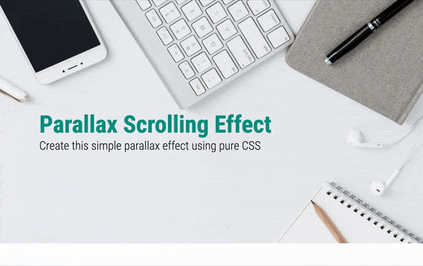
In this tutorial you will learn how to create a simple pure CSS parallax scrolling effect in the hero section of your landing page. Parallax scrolling is an effect where different visual elements on the page move at different speeds when the user scrolls. This creates a 3D effect adding a sense of depth and enhancing the visitor’s experience. This GIF shows what you will be able to create by the end of this tutorial.
You need to have basic knowledge of HTML and CSS to begin with. We will dive into a few advanced CSS topics such as perspective and transform towards the end. Let’s get started.
We are going to break this tutorial into two parts. In the first part we will be achieving almost the same look and feel of the page except for the parallax effect. That is, there will be no 3D effect. Just simple scrolling. If you already know how to do this, you can quickly rush through Part 1. In the second part, we will learn the advanced CSS concepts required and create the parallax scrolling effect.
Looking at the GIF, you can see that we have a header section with a background image occupying full viewport width and height, followed by a text section. Let us create this step by step.
Setting up
Create a blank HTML document and name it index.html. Add the basic HTML skeleton. If you use Visual Studio Code, all you need to do is type “!” and hit enter. You will end up with this.
I have used the font ‘Roboto’ for the heading and ‘Lato’ for the paragraphs. So add the following line below the title tag to embed these using Google fonts.
Create your stylesheet and name it style.css. Link the stylesheet to your HTML document below the Font Awesome CDN link using
<link rel="stylesheet" href="style.css">
You can download the background image used in the demo from Pexels or choose to include your own. But don’t forget to name it bg.jpg.
HTML
Add the following HTML code within body for the header:
<header>
<div>
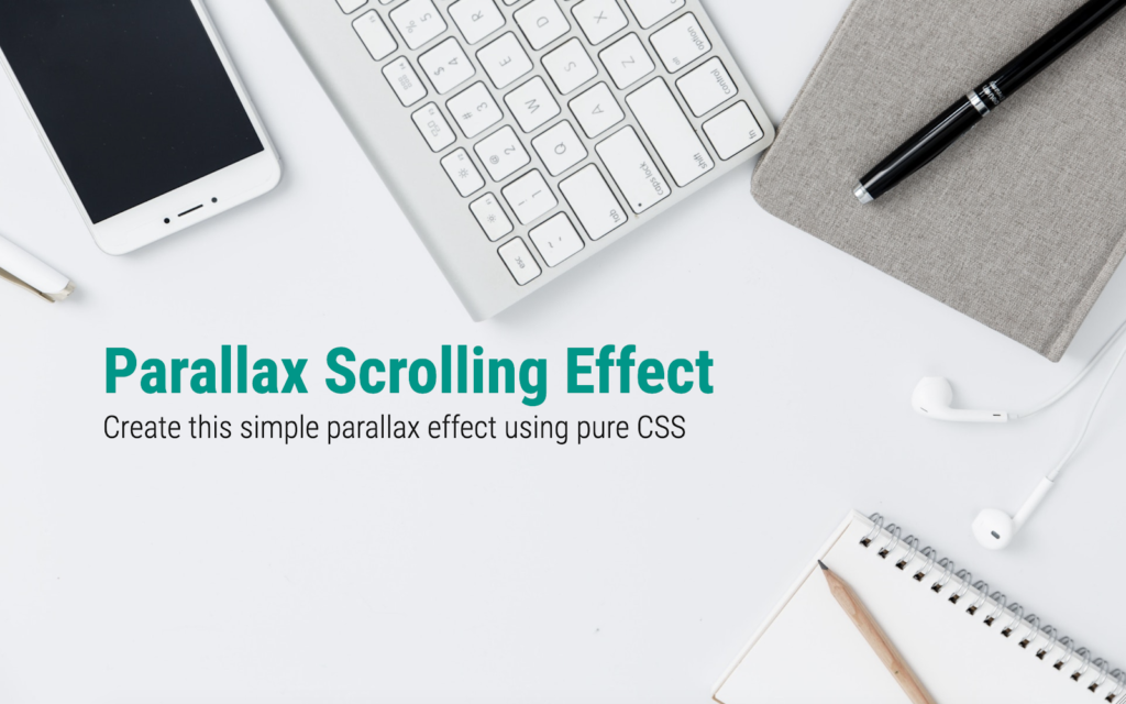
<h1>Parallax Scrolling Effect</h1>
<h2>Create this simple parallax effect using pure CSS</h2>
</div>
</header>
Add the text section below that.
<section>
   <div class="container">
       <h3>Some cool title here</h3>
       <p>
           Lorem ipsum dolor sit amet consectetur adipisicing elit. Asperiores harum veritatis nemo magni odio reprehenderit atque, esse animi porro suscipit vero nobis modi quis. Exercitationem quasi beatae, assumenda officia illum sunt. Cum voluptas maiores vitae eius hic inventore deleniti placeat perferendis quam ut nostrum maxime optio voluptatibus ab laboriosam, quia consectetur atque minus?
       </p>
       <p>
           Adipisci amet aut sint voluptates delectus aperiam? Veniam ab illum enim in libero nihil culpa explicabo perspiciatis veritatis non repellendus architecto excepturi nostrum porro voluptatem aperiam animi asperiores, a voluptatibus temporibus minima voluptas ipsa! Recusandae nostrum, aut, voluptates est error iusto, eaque excepturi soluta quas maiores amet.

       </p>
   </div>
</section>
Everything else is now taken care of by CSS.
CSS
In style.css, begin with some common styles for all elements:
section{
   width: 100%;
   background: white;
}
.container {
   margin: auto; /* To center the text horizontally */
   max-width: 1000px; /* Limiting the width for extra large screens */
   padding: 80px 40px;
}
.container h3 {
   font-family: 'Roboto Condensed', sans-serif;
   font-weight: 700;
   font-size: 3rem;
}
.container p {
   padding-top: 30px;
   line-height: 1.8;
}
So far we haven’t done anything exciting yet. Let’s get to Part 2 where we create the actual magic (with just 8 more lines of CSS).
Part 2 : Adding parallax effect
To create a parallax effect we need to create a sense of depth by introducing a 3rd dimension. The CSS property perspective helps us do just that. Let’s say we add perspective:20px to an element. This gives a depth of 20px to that element. This means, a 3D space is created, and so the child elements can be transformed to make them appear to be positioned near or far from the viewer, creating a sense of depth.
So let’s add perspective to our body element along with overflow properties.
body {
   /* Existing styles here */
   perspective: 4px; /* The depth */
   overflow-x: hidden;
   overflow-y: scroll;
}
The overflow-x is hidden because we do not want any horizontal scrollbar resulting due to the 3D space created.
We also need to set overflow: hidden to the root element.
html {
   /* Existing styles here */
   overflow: hidden;
}
If you check your browser now, nothing has changed yet. It’s because we have just created the 3D space but not transformed any objects within.
The parallax effect happens when two or more elements are placed at different distances from the viewer. For that, we use the CSS transform property and “translate” the objects along the z-axis. So let’s transform the background image and the div within the header.
header::before {
   /* Existing styles here */
   transform: translateZ(-4px);
}
header div {
   /* Existing styles here */
   transform: translateZ(-2px);
}
We are moving the background image 4px away from the viewer and the headings 2px away. So when you scroll down, they seem to move at different speeds. Check your browser now. Still nothing right?
When we want the objects to be transformed in a 3D space, we need an additional transform-style property. This property when applied to an element, determines if that element’s children are positioned in 3D space, or flattened.
To understand perspective, transforms and all this in more depth, you can refer to the detailed guide to 3D transforms with CSS.
For now, add this property to header:
header {
   /* Existing styles here */
   transform-style: preserve-3d;
}
Now look at the result in your browser. Surprised to see that your background image and headings have shrunk in size? Keeping that aside for a moment, scroll down and you will see that the parallax effect is actually created! Why did these two elements shrink? It’s because they have moved farther away from you, remember? Objects that move farther appear smaller. Simple. But how to fix this? There’s a scale factor to be added along with translateZ to correct the size. This Google article gives us a formula to calculate the scale to apply.
scale = (perspective - distance) / perspective
For our background image, perspective is 4px and distance (translateZ) is -4px. Calculate:
scale = (4 - (-4))/4 = 8/4 = 2
Similarly, for header div, the scale is 1.5. Let’s include these. Change the transform properties of both the elements to include scale.
This fixes it. Now scroll down. Do you see the effect? The only issue is that our text section is being overlapped by the header. The solution to this is to set a higher z-index to the section (along with a position property, otherwise z-index won’t work).
And there it is! A simple neat parallax scrolling effect for our hero section is achieved.
Extend this newly acquired skill and go create beautiful, pure CSS parallax scrolling websites. But be careful not to overdo it. If you got stuck somewhere in between and couldn’t achieve the desired output, here’s the complete source code.\
Technology makes our lives better, not just users, but also creators (developers and designers). In this article, I’ll introduce you to Tauri. This article will be useful to you if:
you have been building applications on the web with HTML, CSS, and JavaScript, and you want to use the same technologies to create apps targeted at Windows, macOS, or Linux platforms;
you are already building cross-platform desktop apps with technologies like Electron, and you want to check out alternatives;
you want to build apps with web technologies for Linux distributions, such as PureOS;
you are a Rust enthusiast, and you’d like to apply it to build native cross-platform applications.
We will look at how to build a native cross-platform application from an existing web project. Let’s get to it!
Note: This article assumes you are comfortable with HTML, CSS, JavaScript, and Vue.js.
Tauri is a polyglot toolchain for building more secure native apps with both tiny and fast binaries. By “polyglot”, I mean that Tauri uses multiple programming languages. At the moment, Rust, JavaScript, and TypeScript are used. But there are plans to let you use Go, C++, Python, and more.
It lets you use any HTML and JavaScript-based front-end framework, such as Vue.js, React, or Angular, to build a native desktop app, and it can be integrated into any pipeline.
It helps you build and bundle binaries for major desktop platforms (mobile and WebAssembly coming soon).
So, basically, Tauri allows you to use web technologies to create tiny and secure native desktop apps.
On its GitHub page, Tauri is described as a framework-agnostic toolchain for building highly secure native apps that have tiny binaries (i.e. file size) and that are very fast (i.e. minimal RAM usage).
Why Not Electron?
A popular tool for using web technologies to build desktop applications is Electron.
However, Electron apps have a rather large bundle size, and they tend to take up a lot of memory when running. Here is how Tauri compares to Electron:
Bundle
The size of a Tauri app can be less than 600 KB.
Memory
The footprint of a Tauri app is less than half the size of an Electron app.
Licence
Relicensing is possible with Tauri, but not with Electron. Electron ships with Chromium right out of the box. However, Chromium includes a digital rights-management system named Widevine. The inclusion of Widevine in Chromium makes apps created with Electron frowned upon by users of platforms such as PureOS for the sole reason that it is not free/libre open-source software (FLOSS). Platforms like PureOS are verified by the Free Software Foundation (FSF). This means that they can only publish free and open-source software in their app stores.
In a nutshell, if your app is built with Electron, it will never be shipped officially in the PureOS store. This should be a concern for developers targeting such distributions.
More Features Of Tauri
Security is really important to the Tauri team. Apps created with Tauri are meant to be secure from the get-go.
Tauri is compatible with any front-end framework, so you don’t have to change your stack.
It has many design patterns to help you choose important features with simple configurations.
Pros Of Tauri
Tauri enables you to take the code base you’ve built for the web and turn it into a native desktop app, without changing a thing.
Although you could use Rust in a Tauri-based project, it is completely optional. If you did, you wouldn’t need to change anything in your original code base targeted for the web.
Real-World Tauri
If you have been part of the Vue.js community for a while, then you’ll have heard of Guillaume Chau, a member of the core team of Vue.js. He is responsible for the Vue.js command-line interface (CLI), as well as other awesome Vue.js libraries. He recently created guijs, which stands for “graphical user interface for JavaScript projects”. It is a Tauri-powered native desktop app to visually manage your JavaScript projects.
Guijs is an example of what is possible with Tauri, and the fact that a core member of the Vue.js team works on the app tells us that Tauri plays nicely with Vue.js (amongst other front-end frameworks). Check out the guijs repository on GitHub if you are interested. And, yes, it is open-source.
How Tauri Works
At a high level, Tauri uses Node.js to scaffold an HTML, CSS, and JavaScript rendering window as a user interface (UI), managed and bootstrapped by Rust. The product is a monolithic binary that can be distributed as common file types for Linux (deb/appimage), macOS (app/dmg), and Windows (exe/msi).
How Tauri Apps Are Made
A Tauri app is created via the following steps:
First, make an interface in your GUI framework, and prepare the HTML, CSS, and JavaScript for consumption.
The Tauri Node.js CLI takes it and rigs the Rust runner according to your configuration.
In development mode, it creates a WebView window, with debugging and Hot Module Reloading.
In build mode, it rigs the bundler and creates a final application according to your settings.
Setting Up Your Environment
Now that you know what Tauri is and how it works, let me walk you through setting up your machine for development with Tauri.
Note: The setup here is for Linux machines, but guides for macOS and for Windows are also available.
Linux Setup
The polyglot nature of Tauri means that it requires a number of tool dependencies. Let’s kick it off by installing some of the dependencies. Run the following:
Once the above is successful, proceed to install Node.js (if you don’t already have it), because Tauri requires its runtime. You can do so by running this:
This will install nvm (Node.js version manager), which allows you to easily manage the Node.js runtime and easily switch between versions of Node.js. After it is installed, run this to see a list of Node.js versions:
nvm ls-remote
At the time of writing, the most recent version is 14.1.0. Install it like so:
nvm install v14.1.0
Once Node.js is fully set up, you would need to install the Rust compiler and the Rust package manager: Cargo. The command below would install both:
$ curl --proto '=https' --tlsv1.2 -sSf https://sh.rustup.rs | sh
After running this command, make sure that Cargo and Rust are in your $PATH by running the following:
rust --version
If everything has gone well, this should return a version number.
According to the Tauri documentation, make sure you are on the latest version by running the following command:
$ rustup update stable
Voilà! You are one step closer to getting your machine 100% ready for Tauri. All that’s left now is to install the tauri-bundler crate. It’s best to quit your CLI, and run the command below in a new CLI window:
$ cargo install tauri-bundler --force
Eureka! If everything went all right, your machine is now ready for Tauri. Next up, we will get started integrating Tauri with Vue.js. Let’s get to it!
Yarn
The Tauri team recommends installing the Yarn package manager. So let’s install it this way:
npm install -g yarn
Then run the following:
yarn --version
If everything worked, a version number should have been returned.
Integrating Tauri With Vue.js
Now that we have Tauri installed, let’s bundle an existing web project. You can find the live demo of the project on Netlify. Go ahead and fork the repository, which will serve as a shell. After forking it, make sure to clone the fork by running this:
After cloning the project, run the following to install the dependencies:
yarn
Then, run this:
yarn serve
Your application should be running on localhost:8080. Kill the running server, and let’s install the Vue.js CLI plugin for Tauri.
vue-cli-plugin-tauri
The Tauri team created a Vue.js CLI plugin that quickly rigs and turns your Vue.js single-page application (SPA) into a tiny cross-platform desktop app that is both fast and secure. Let’s install that plugin:
vue add tauri
After the plugin is installed, which might take a while, it will ask you for a window title. Just type in nota and press “Enter”.
Let’s examine the changes introduced by the Tauri plugin.
package.json
The Tauri plugin added two scripts in the scripts section of our package.json file. They are:
The tauri:serve script should be used during development. So let’s run it:
yarn tauri:serve
The above would download the Rust crates needed to start our app. After that, it will launch our app in development mode, where it will create a WebView window, with debugging and Hot Module Reloading!
src-tauri
You will also notice that the plugin added a src-tauri directory to the root of your app directory. Inside this directory are files and folders used by Tauri to configure your desktop app. Let’s check out the contents:
The only change we would need to make is in src-tauri/Cargo.toml. Cargo.toml is like the package.json file for Rust. Find the line below in Cargo.toml:
name = "app"
Change it to this:
name = "nota"
That’s all we need to change for this example!
Bundling
To bundle nota for your current platform, simply run this:
yarn tauri:build
Note: As with the development window, the first time you run this, it will take some time to collect the Rust crates and build everything. On subsequent runs, it will only need to rebuild the Tauri crates themselves.
When the above is completed, you should have a binary of nota for your current OS. For me, I have a .deb binary created in the src-tauri/target/release/bundle/deb/ directory.*
Going Cross-Platform
You probably noticed that the yarn tauri:build command just generated a binary for your operating system. So, let’s generate the binaries for other operating systems. To achieve this, we will set up a workflow on GitHub. We are using GitHub here to serve as a distribution medium for our cross-platform app. So, your users could just download the binaries in the “Release” tab of the project.
The workflow we would implement would automatically build our binaries for us via the power of GitHub actions. Let’s get to it.
Creating The Tauri Workflow
Thanks to Jacob Bolda, we have a workflow to automatically create and release cross-platform apps with Tauri on GitHub. Apart from building the binary for the various platforms (Linux, Mac, and Windows), the action would also upload the binary for you as a release on GitHub. It also uses the Create a Release action made by Jacob to achieve this.
To use this workflow, create a .github directory in the root of nota-web. In this directory, create another directory named workflows. We would then create a workflow file in .github/workflows/, and name it release-tauri-app.yml.
In release-tauri-app.yml, we would add a workflow that builds the binaries for Linux, macOS, and Windows. This workflow would also upload the binaries as a draft release on GitHub. The workflow would be triggered whenever we push to the master.
Open release-tauri-app.yml, and add the snippet below:
To test the workflow, commit and push your changes to your fork’s master branch. After successfully pushing to GitHub, you can then click on the “Actions” tab in GitHub, then click on the “Check build” link to see the progress of the workflow.
Upon successful execution of the action, you can see the draft release in “Releases” on the repository page on GitHub. You can then go on to publish your release!
Conclusion
This article has introduced a polyglot toolchain for building secure, cross-platform, and tiny native applications. We’ve seen what Tauri is and how to incorporate it with Vue.js. Lastly, we bundled our first Tauri app by running yarn tauri:build, and we also used a GitHub action to create binaries for Linux, macOS, and Windows.
Let me know what you think of Tauri — I’d be excited to see what you build with it. You can join the Discord server if you have any questions.
Do you want to easily embed TikTok videos on your WordPress website?
If you’re already creating successful, viral TikToks then it makes sense to post these videos to your website too. In this way, you can get more views, engagement, and social media followers with very little extra effort.
In this article, we’ll show you how to easily embed TikTok videos in WordPress.
Why Embed TikTok Videos in WordPress?
According to our ultimate list of blogging stats, posts with videos get 83% more traffic than those without video. That said, if you’re already posting TikToks then it makes sense to embed these videos on your WordPress website.
In this way, you can get more visitors, without having to spend a ton of time creating new content. These videos can also help capture the visitor’s attention and keep them on your website for longer, which will increase pageviews and reduce bounce rate in WordPress.
At the same time, these videos will promote your TikTok channel to people who visit your website. This can get you more engagement and followers on TikTok.
With that said, let’s see how you can embed TikTok videos in WordPress. Simply use the quick links below to jump straight to the method you want to use.
Method 1. Using the TikTok Block (Works With Any Theme)
The easiest way to embed TikToks on your WordPress site is by pasting the video’s URL into the page or post editor. WordPress will then detect the video and fetch it for you automatically.
First, you need to visit the TikTok video that you want to embed. Then, copy the video’s URL.
Next, open the WordPress page or post where you want to show the TikTok video. You can then simply paste the URL into the WordPress block editor.
WordPress will automatically detect that you’re embedding a TikTok video, and add a TikTok block with the video already embedded.
By default, WordPress will resize the TikTok video automatically for smaller screens, including smartphones and tablets. It will also preserve the video’s ratio when the browser gets resized.
This is a good user experience, so we recommend leaving the setting enabled. However, sometimes you may want to keep the video at the same size, no matter what. In that case, click to select the TikTok block and then disable the ‘Resize for smaller devices’ toggle.
You can get similar results by adding the TikTok block to a page or post. After that, you can add the TikTok video’s URL at any point.
This is useful if you’re unsure what TikTok video you’re going to embed, or if the video hasn’t been published yet. This is also a good way to plan your layout, particularly if you’re designing a landing page or sales page.
To add a TikTok block, simply click on the ‘+’ icon and then type in ‘TikTok.’
When the right block shows up, click to add it to the page or post.
After that, you can simply paste the TikTok URL into the block and click on ‘Embed.’
Another option is to embed the TikTok video in a widget-ready area such as the sidebar or similar section. This allows you to show the same video across your entire site. For example, if you’re trying to create a viral giveaway in TikTok, then you might embed the video announcing the contest.
To do this, go to Appearance » Widgets in your dashboard. Here, you’ll see all the different areas where you can add widgets in WordPress.
Simply find the area where you want to embed the TikTok video.
Then, click on the ‘+’ icon.
In the popup that appears, type in ‘TikTok.’
When the right block shows up, click to add it to the widget-ready area.
You can now paste the URL of the TikTok video you want to embed.
With that done, click on the ‘Embed’ button.
When you’ve finished, don’t forget to click on ‘Update’ to make the changes live.
You can now visit your WordPress blog or website to see the TikTok video live.
Method 2. Using the Full-Site Editor (Works With Block-Based WordPress Themes)
If you’re using a block theme then you can add a TikTok to any widget-ready area or template using the full-site editor. This allows you to show TikTok videos on pages and posts that you can’t edit using the standard content editor. For example, you might use TikTok videos to improve your 404 page template.
In your WordPress dashboard, go to Themes » Editor.
By default, the full-site editor will show your theme’s home template.
If you want to add the TikTok video to a different area, then click on either ‘Template’ or ‘Template Parts.’
You’ll now see all the templates or template parts that make up your WordPress theme.
Simply find the template where you want to embed a TikTok video and click on it. As an example, we’ll be adding a TikTok to the Archive page template but the steps will be largely the same no matter what template you’re using.
WordPress will now show a preview of the template.
To go ahead and edit the layout, click on the small pencil icon.
With that done, click on the ‘+’ button towards the top left of the screen.
In the search bar that appears, type in ‘TikTok.’
When the right block shows up, drag and drop it onto the layout.
You can now paste the video’s URL into the TikTok block, and click on the ‘Embed’ button.
When you’re happy with how the template looks, click on the ‘Save’ button. Now, simply visit your WordPress website to see the TikTok in action.
Method 3. Using QuadLayers (Embed Your Entire TikTok Feed)
If you just want to add a few TikToks to your WordPress website, then method 1 and method 2 are both great choices. However, sometimes you may want to show all your latest TikToks in a feed that updates automatically.
This is an easy way to keep your website fresh and interesting, while promoting your newest TikTok videos at the very same time.
The best way to embed a TikTok feed in WordPress is by using QuadLayers TikTok Feed. This free plugin allows you to connect WordPress to your TikTok account, and then show all your videos in a gallery or masonry layout.
Just be aware that you can only show TikToks from your own account.
First, you’ll need to install and activate the plugin. If you need help, then please see our guide on how to install a WordPress plugin.
The first step is creating an access token using your TikTok account. In the WordPress dashboard, head over to TikTok Feed » Accounts and click on ‘Add TikTok Account.’
Next, click ‘Login with TikTok.’
You can now type in your TikTok email address and password, and follow the onscreen instructions to connect QuadLayers to your TikTok account.
When you’re done, QuadLayers will take you back to the WordPress dashboard automatically.
Now, go to TikTok Feeds » Feeds and click on the ‘+ Feed’ button.
In the popup that appears, open the ‘Account’ dropdown and select your TikTok account.
You can now choose between Gallery and Masonry layouts for the TikTok feed. Masonry shows the videos in portrait mode, while Gallery displays the videos as square thumbnails.
By default, QuadLayers will show the most recent 12 TikToks posted to your account. To show more or fewer videos, simply type a different number into the ‘Limit’ field.
You can also change how many videos QuadLayers shows in each row, by typing into the ‘Columns’ field.
There are some more settings you can configure, but this is all you need to create an eye-catching TikTok feed.
When you’re happy with your settings, click on ‘Save.’
QuadLayers will now create a shortcode that adds the feed to your website.
Simply go ahead and copy the value in the ‘Shortcode’ column.
Now, just paste this shortcode into any page, page, or widget-ready area. For step-by-step instructions on how to place the shortcode, please see our guide on how to add a shortcode in WordPress.
With that done, simply visit your website to see the TikTok feed in action.


