Making animations that “feel right” can be tricky.
When I’m stuck, I find Disney’s 12 principles of animation useful. They’re from the book ‘The Illusion of Life’ and although the book was written about hand-drawn character animation, a lot of the principles are relevant for animation on the web.
The 7th principle of animation is about arcs:
Most natural action tends to follow an arched trajectory, and animation should adhere to this principle by following implied “arcs” for greater realism.
In other words, animating along a curved path can make movement feel more realistic.
Straight lines are what browsers do best though. When we animate an element from one place to another using a translation the browser doesn’t take realism into account. It’ll always take the fastest and most efficient route.
This is where motion paths can come in handy. Motion paths give us the ability to move an element along a predefined path. They’re great for creating trajectories to animate along.
If you google “SVG motion path animation”, you’re going to get a lot of hits talking about SMIL.
SMIL was the original proposed method for SVG animation. It included the ability to animate along a path using the <animatemotion> element.
It’s nice and declarative and currently the browser support is surprisingly good, covering all modern browsers except Edge and Opera Mini.
But, and this is a big but, the future of SMIL is uncertain, and has been for a while.
It was deprecated by Chrome a few years back and although they’ve now suspended that deprecation, implementations still vary and there’s no clear path towards cross-browser support.
Although it’s fun to play around with, SMIL isn’t very future-proof, so I’m only going to touch on it.
In order to animate along a path with the animateMotion element, you reference the path you want to animate along using path="..." and define the element you want to animate using xlink:href="#...":
If you’ve got all green smiley faces, you’re good to go. But you may have a sad face for offset-anchor. This is because this property is currently still experimental. It’s behind a flag in Chrome, meaning it’s not turned on by default.
You can choose to enable it by going to this URL in Chrome:
This module is joint work by the SVG and CSS working groups, so unlike SMIL, we’ll be able to use CSS motion paths to animate both, HTML and SVG DOM elements. I love a CSS-only solution, so although it’s not ready to use in production (yet), this is pretty exciting stuff.
The motion path module consists of five properties:
offset (shorthand property for the following)
offset-path
offset-distance
offset-anchor
offset-rotate
offset-path
offset-path defines the path that we can place our element on. There are a few proposed values but path() seems to be the only one supported right now.
path() takes a path string with SVG coordinate syntax, which may look scary, but you don’t have to write this out. You can create a path in a graphics editing program and copy and paste it in.
offset-distance
offset-distance specifies the position along an offset-path for an element to be placed. This can be either in pixels or as a percentage of the length of the path.
By default the element’s top left corner will be aligned with the path, but we can change this with offset-anchor. offset-anchor behaves a lot like transform-origin. In fact if set to auto, it’s given the same value as the element’s transform-origin, so we can optionally use transform-origin for the same results.
Like transform-origin it accepts a position with x and y values, either as a percentage or a keyword like bottom or left.
offset-rotate defines the direction the element faces on the path.
By default it’s set to auto and will rotate with the path. You can pass in an optional second value in degrees in order to tweak the direction of this rotation.
These properties were renamed from motion to offset since this spec was proposed. This is because alone, these properties just provide another way to set the position and rotation of absolutely positioned elements. But we can create motion by using them in conjunction with CSS animations and transitions.
.rocket {
  offset-path: path('M20.2...');
  offset-anchor: 50% 50%;
  offset-rotate: auto;
  /*   if offset anchor isn't supported we can use transform-origin instead */
  transform-origin: 50% 50%;
  animation: move 8s forwards linear;
  transform-box: fill-box;
}

@keyframes move {
  from {
    offset-distance: 0%;
  }
  to {
    offset-distance: 100%;
  }
}
In this demo, I’m using a relatively new CSS property, transform-box.
This is to avoid a browser quirk that’s caught me out a few times. When calculating transforms and transform-origin, some browsers use the element’s bounding box as the reference box and others use the SVG viewbox.
If you set the value to fill-box the objects bounding box is used as the reference box.
And if you set the value to view-box the nearest SVG viewbox is used as the reference box.
You can see what happens to the center of rotation when we change it here:
While we wait for the CSS solution to be more widely implemented we’re in a bit of a motion path limbo. Thankfully there’s some JavaScript animation libraries that are bridging this gap.
I usually use GreenSock for SVG animation for a few reasons.
There are some cross browser quirks with SVG, especially with how transforms are handled. The folks at GreenSock go above and beyond to handle these inconsistencies.
Animation can also be a bit fiddly, especially when it comes to fine-tuning timings and chaining different animations together. GreenSock gives you a lot of control and makes creating complex animations fun.
They’re all free to experiment with on Codepen, but some of the plugins are behind a membership fee. MotionPathPlugin is one of the free ones, and part of the new GSAP 3 release.
MotionPathPlugin gives you the ability to turn an SVG path into a motion path, or specify your own path manually. You can then animate SVG or DOM elements along that path, even if those elements are in a completely different coordinate space.
Here’s a demo with the necessary libraries added to start you off.
In order to use a plugin we have to register it, like this:
gsap.registerPlugin(MotionPathPlugin);
Then we can start animating. This is what a tween using the simplified GSAP 3 syntax looks like:
The name ‘tween’ comes from the world of hand-drawn animation, too.
Tweening is the process of generating intermediate frames between two images to give the appearance that the first image evolves smoothly into the second image.
That’s pretty much what a GSAP tween does. You feed in the element you want to animate, the duration, and the properties you want to target and the tween will figure out the in-between states.
The motionPath attribute can be used shorthand, and passed a path:
By default, the element’s top left corner will be the center of rotation and alignment. In order to align the element accurately on the path you’ll need to set the element’s center of rotation, like this:
If your element is starting off at a different position in the document and you want it to align with the path you might notice a jump as it moves from its position to the path.
You can fix force it to render immediately upon instantiation by adding immediateRender:true to the tween.
// animate the rocket along the path
gsap.to(".rocket", {
    motionPath: {
        path: "#path",
        align: "#path",
        autoRotate: true,
    },
    duration: 5,
    ease: "power1.inOut",
    immediateRender: true,
});
MotionPathHelper
Another super cool feature of the GSAP 3 release is the MotionPathHelper.
It enables you to edit paths directly in the browser! I found this really helpful, as I’m always going back and forth between the browser and my graphics editor.
Give it a go in the demo below. When you’re done, click “copy motion path” to copy the SVG path data to your clipboard. Paste the new path data into the d=”” attribute in the SVG code to update your path.
If you’ve had fun with these examples and want to explore GreenSock some more, Christina Gorton has written The New Features of GSAP 3 providing a practical overview.
Smashing TV Live: Privacy UX, A Session With Vitaly Friedman
Smashing TV Live: Privacy UX, A Session With Vitaly Friedman
Vitaly Friedman
Cookie consent prompts, push notifications, app install prompts, video autoplays and annoying pop-ups. Every time we enter a new site, it feels like a fight against all the annoying marketing messages endlessly streaming at us. If you’ve wondered why a product you looked up in a search engine one day keeps showing up in all your social channels over and over just a few hours later, that’s the power of data collection and retargeting at play. We can do better than that though.
For a few years now, we’ve been running live sessions with respected professionals on Smashing TV — our video channel for our dear Smashing Members, who support our little team and our little adventures every month. As the webinars have always been about sharing lessons learned with the community, we’d like to open them up to everybody, with Members having a chance to ask questions right after the session.
Live Stream On Privacy UX: Tue, Dec 3, 5:00 PM London time
The session took place on Dec. 3, at 5:00 PM London time (12:00 PM New York time). In case the video below doesn’t work, you can also watch it directly on YouTube.
Couldn’t tune in on time? No worries! The webinar is available for you on Youtube — enjoy!
In this session, Vitaly explores privacy UX patterns, techniques, strategies and important decisions to consider when designing and building privacy-aware websites and applcations. You’ll walk away with a toolbox of applicable techniques, privacy nightmares and a few notes on how to keep your website/app GDPR-compliant and privacy-focused.
From Smashing With Love
To help you stay on top of things, you can subscribe to our bi-weekly newsletter (193.000 subscribers), in which we announce what’s happening in the Smashing universe. Each and every newsletter issue is written and edited with love and care. No third-party mailings or hidden advertising, of course!
If you have ever tried to register a domain name before, then you have likely seen a wide-variety of prices ranging from $9 to several thousand dollars.
The cost of a domain name varies based on the domain extension (such as .com, .org, .net), domain registrar, availability, and few other factors.
Apart from new domain names, you can also buy premium domain names from someone else who has registered it before you. Domain name investors often register premium domain names that are shorter, brandable, and easy to remember for the sole purpose of reselling.
In this article, we’ll explain how much does a domain name really costs. We’ll also show you different ways to buy a domain name including a way to get one for free.
Since this is a comprehensive guide on domain name costs, we have broken it down into few sections:
Buying a new domain name would typically cost you anywhere between $9 and $14.99 per year. However, these prices may differ based on the domain extension or the domain registrar you choose.
If you are starting a new website, then we recommend using Bluehost. They are one of the top web hosting companies in the world.
They are offering WPBeginner users a free domain name + free SSL certificate on top of the 60% discount on their web hosting plans.
Since you need both a domain name and web hosting to make a website, this is the most affordable option to get started.
If you just want to purchase a domain name, then we recommend using Domain.com as your registrar. You can use our Domain.com coupon code to get 25% off your purchase.
Here is how much a new domain registration costs with different registrars.
DreamHost – Free domain with hosting $2.59 / month
These prices are for new .com domain names only. The pricing of other extensions such as .net, .org, .info, .blog, etc. will vary based on the domain registrar you use.
When it comes to domain extensions, we always recommend users to use .com because it’s the most popular one.
Hidden Costs of a Domain Name
Aside from the domain registration cost, there are few hidden domain costs and upsells that you should be aware of, so you can make the most educated decision.
Yearly Renewals
Domain name registration is done on a yearly basis. You can maintain control over your domain name as long as you continue to renew your registration each year.
Some domain registrars offer domain name discounts on first year purchase, but their renewal costs are much higher. If you see a promotion where you can pay $0.99 for a domain name, then please know that it’s usually for first year only. Your annual renewals will be at a much higher price.
WHOIS and Domain Privacy
ICANN is the not-for-profit public-benefit corporation that is responsible for coordinating the assignment and maintenance of domain names. They require each domain registrar to collect contact information for the website owner.
This information can be publicly accessed using WHOIS data. Other businesses and companies can use this information to contact you about a potential business partnership.
Having the WHOIS data publicly available can result in unwanted emails and phone calls. This is why many domain registrars sell an add-on called Domain Privacy.
This addon typically costs an additional $9.99, and it’s completely optional. The problem is that often registrars automatically add it to the cart, and you have to manually remove it if you don’t want to pay for it.
Some registrars like DreamHost offer free domain privacy with their domains.
Business Email Accounts (Email Domains)
When buying a domain name, you will likely see an addon for email domains for setting up a professional business email address.
You do not need to buy this because you can get a free business email address with most web hosting companies.
If you want a more professional option, then we recommend buying this directly from G Suite or Microsoft Office365, so you’re not locked into a registrar.
Pro Tip: Secure Domain Discounts for Multiple Years
Some registrars like Domain.com allows you to pre-pay for multiple years upfront. This is a great way to get the introductory discount offer for multiple years.
Since you have to pay for domain renewals every year, pre-paying for multiple years can be a significant saving. Not to mention, it saves you from future price increases.
What about premium domains or domains that you buy from other people? Let’s take a look at the premium domain costs in details.
How Much Does a Premium Domain Name Cost?
Premium domain names are pre-registered domain names that are often shorter, brandable, and more memorable. Often domain investors register these premium domain names to sell later at a higher price for profit.
Cost of premium domain names can range anywhere from a few hundred dollars to thousands of dollars. It all depends on the uniqueness of the name, domain length, and its overall brand potential.
Some premium domains may even cost hundreds of thousands to millions of dollars. Here are some of the most expensive domains sold in history:
Insurance.com – $35.6 million
PrivateJet.com – $30.18 million
Hotels.com – $11 million
Fb.com – $8.5 million
Business.com – $7.5 million
You can find premium domain names listed for sale by private sellers on various websites.
We recommend buying domain names from reputable websites to ensure a safe transfer of the domain name. See our guide on the best places to buy a premium domain name.
How to Estimate The Value of a Premium Domain Name?
Many beginners ask us about how to find the right offer to make for a premium domain or a pre-registered domain name?
Domain names that are already taken are often sold at a higher price. However, most of the time the asking price is outrageously high which discourages many inexperienced domain buyers from making an offer.
We recommend users to do some research and make a reasonable counter offer. Remember, the domain investor only makes money when they sell the domain.
Like most trades, the value of a premium domain largely depends on the maximum you’re willing to pay and the lowest the seller is willing to accept.
However, you can look at domain marketplaces like BuyDomains, Sedo, or Flippa to better understand the market rates, so you can make a respectable offer for a particular niche.
If the domain you are looking for already has a listed price, then you can start by offering 50-75% of the listed price.
Note: Most domain value estimation tools are completely useless, so it’s best to avoid using them as a reference.
We recommend caution when buying a registered domain name. If you are unsure about the domain’s potential worth to your business, then simply walk away.
How Much Does an Expired Domain Names Cost?
Each day thousands of domain names expire. These are the domain names where the owner decided not to renew their registration, or they simply forgot about these domain names.
Expired domains provide an excellent opportunity to find great brandable domain name. The following are a few places where you can look for recently expired domain names.
FreshDrop is a domain marketplace that allows you to follow expired and soon to be expired domain names. It comes with an advanced search tool that you can use to narrow down your search.
ExpiredDomains is a search engine dedicated to expired domain names. It may not look as easy to use as other domain search tools but it has a large and constantly updated index of domain names.
Note: You need to check for domain abuse and other problems before buying a used, pre-registered, or expired domain names (more on this later).
However if a domain name is soon to be expired, then you can use a domain backorder service. This allows you to place an advance order for the domain name.
If there is no other advance order for that domain name, then your order will become successful. Most domain name companies charge a small one-time fee ($25 – $99) to provide this service.
How to Buy a Domain Name Not Listed for Sale?
So far we have talked about the cost of domain names that are available for registration or sold by third-parties. What if you have your eye on a domain name that is already taken but not listed for sale?
There is a good chance that you can still get your hands on that particular domain name.
You see, many users register domain names to start a new online business idea. A lot of them end up never using that domain name or abandon the idea.
Since they’re not using the domain name, you can directly contact the domain owner to make an offer.
If the domain name has a website, then you can use the contact form on their website to reach out.
Alternatively, you can use the Whois search to find contact information of the domain owner and send them a message to show your interest.
Sometimes people register domain names for future ideas, so even if they’re not using it, they still wouldn’t want to sell it. Some folks get greedy and will ask for a premium to part ways with their domain.
Remember, you’re buying someone’s “dream idea”, so you need to be respectful but also realistic about the value.
Pro tip: If you have a business idea, then it’s better to register a domain name even if you’re not 100% sure. You don’t want to risk someone else registering it before you get around to it. We think of it as an insurance policy because a domain costs only $9.99.
Doing Your Homework Before Buying a Domain Name
If you are buying a domain name that has never been used before, then you are good to go.
However, if you are buying a domain name that was previously owned by someone else, then you need to do some basic due diligence.
These domain names could be violating copyright or trademark, used to distribute malware or spam, or misused in other malicious activities.
Don’t worry, there are plenty of tools that you can use to do your homework.
1. Check For Trademark
First, you would want to make sure that the domain name is not a registered trademark of an existing business.
According to ICANN rules, if a domain name violates a company’s registered trademark, then that company can claim the domain name or ask you to take it down.
You can check the United States Patent and Trademark Office’s database to do a quick trademark search. Simply enter your domain name in the search box to see if it returns any matches.
2. Check Past Domain Name Usage
Next, you would want to see how the domain name has been used in the past. What kind of websites were made using that particular domain name?
The easiest way to do this is by using the Wayback Machine. It is a massive historical archive of the internet with snapshots of websites archived on a regular basis.
3. Check Historical Whois Records
Whois tools provides you historical whois records for a domain name. This helps you see when a domain name was created, last renewed, DNS changes, and other historical data.
4. Run a Domain Health Check Test
Finally, you need to make sure that the domain is not used to send spam, launch DDoS attacks, or spread malware. You can use MxToolBox’s domain health tool to see if raises any red flags.
Frequently Asked Questions About Domain Name Costs
Having helped thousands of users start a blog and website, we have answered a lot of questions related to domain names. Below are some of the most common ones:
Can I get a domain name for free?
While domain name typically costs $14.99 / year, you can get a domain name for free as a bundled offer with various web hosting companies.
We believe that Domain.com is the best registrar right now because they have the features you need, and they’re offering a 25% off discount.
However it’s a smarter money decision to get a free domain with web hosting like Bluehost because it saves you time and money.
You can always transfer your domain name to another popular domain name registrar if you’re not happy with your existing provider.
Do I need both domain name and web hosting to build a website?
Yes, you need both the domain name and web hosting to build a website. Domain name is your website’s address on the internet whereas web hosting is where your website files are stored. For more details, see our guide on difference between domain name vs web hosting (explained).
Can I buy a domain name forever (permanently)?
No, you cannot buy a domain name permanently. Domain name registration is done on a yearly basis. However, you can pre-pay for up to 10 years which guarantees that you will have a domain name for 10 years.
How much does a domain name cost on Wix vs WordPress?
When using a hosted website builder platform, the cost of your domain name will vary. It’s important to remember that website builder platforms offer a combination of hosting + domain.
For example, Wix domains cost $14.95 / year, but they are free if you choose the annual plan which costs $13 / month.
WordPress.com domains cost $18 / year, but they are included for free with the annual Personal plan which costs $8 / month.
But if you use a self-hosted WordPress platform, then you can start a website with Bluehost for $2.75 per month, and it comes with a free domain name. For more details, see the difference between WordPress.com vs self-hosted WordPress.org.
Smashing Podcast Episode 4 With Heydon Pickering: What Are Inclusive Components?
Smashing Podcast Episode 4 With Heydon Pickering: What Are Inclusive Components?
Drew McLellan
In this episode of the Smashing Podcast, Drew McLellan talks to Heydon Pickering about his new book, Inclusive Components. Heydon is known for his work and writing on Accessibility, so what is Inclusive Design, and where do components come into play? Heydon eplains all this and more in this episode. You can listen below, or subscribe wherever you get your podcasts.
Drew McLellan: He’s a freelance web accessibility consultant, interface designer and writer. His work focuses on accessible user experience design, as well as writing and editing for Smashing Magazine. He’s the author of the acclaimed book about accessible web application design, Apps For All, and has just released a new book, Inclusive Components, all about how to build accessible web interfaces, again, with Smashing Magazine. So he’s clearly an expert on the subject of accessible design, but did you know he was the first male human to jump the Sydney Harbor Bridge in a speedboat? My Smashing friends, please welcome Heydon Pickering. Hi, Heydon. How are you?
Heydon Pickering: I’m smashing. I’m on brand.
Drew: I wanted to talk to you today about the subject of your new book, Inclusive Components.
Heydon: Yes.
Drew: Obviously just a two word title, but I feel like each of those words does a lot of heavy lifting. Starting at the end, as is obviously logical to do, components, is this about sort of component-based design? What is that?
Heydon: Yeah, so I suppose it’s been a while now since people, front end developers, designers and everyone who collaborates on making interfaces, started to think about things in terms of components and dividing things up into digestible and reusable morsels. And I suppose if you’re not familiar with that way of working for whatever reason, it really is a bit like electronic components. My father is an electronic engineer. He works in the sort of analog world of circuit boards and solder and all that kind of thing.
Heydon: In fact, he’s made some components, very small components, which have been used to regulate the current going into electromagnets at CERN. And he had a lot of faith in me as a kid, because he got me to actually solder some of the bits for them. I think that batch has now been retired, so don’t worry about my poor soldering, my poor teenage soldering, being involved in CERN anymore. But yeah, I think it is analogous to … Oh, there’s too many analogs in there.
Heydon: It’s analogous to analog circuit boards in that the idea is you have single responsibilities for individual parts or components and, together, they make the circuit and, together, they augment the current in the case of a circuit or the, I guess, the interface or the outcome in whatever way, in a design system or in an interface as manifested through a design system. And so, Inclusive Components because I wanted to address the fact that, while, I mean, accessibility does tend to get left behind generally when we advance what we’re doing in different arenas, and I wanted to bring accessibility and, in the broader sense, inclusive design to bear on this kind of new way of thinking and making things using components or modules or whatever you want to call them.
Heydon: So the idea was to both bring accessibility to design systems, but by the same token, think systemically when it comes to trying to address accessibility. Think about solving kind of one problem in one place in terms of accessibility and making sure that simply propagates around the pattern [inaudible 00:03:16] the design system at large.
Drew: In a sort of a practical sense, what does it actually look like to work in a component based way? What might an example of a component be?
Heydon: So, there’s different ways of conceiving and coding components. I tend to get straight into the sort of nitty gritty of it, past the conceptual stuff and think about how I might organize the code. I’ve actually come to focus a lot on custom elements, or if not custom elements, then normal elements but with kind of JavaScript behavior attached to them in a kind of isolated, componentized way. I really like the idea of components which are interoperable. And by that, I mean that they can be used across different frameworks and systems and approaches and technical stacks. And custom elements are nice in that because they’re native. You can define them in one place and then they could be used, say, in a react application or they could be used in a view application or they could be used in an angular application, or whatever sort of larger state management technology you’re using.
Heydon: So for me, usually a component will probably be a custom element. I’ve worked on a project recently which isn’t so much focused on accessibility, although I’ve tried to make it as accessible as possible, called Every Layout, and it’s all about kind of trying to isolate very specific kind of algorithms for CSS layout. And they’re defined as custom elements and kind of they sort of deploy themselves and run their own CSS and work as kind of like primitives within the larger system.
Drew: I mean, in actual practical terms, we’re talking a component might be something like a form field?
Heydon: Yeah, so it could be something as simple as an input. Say, like a text input or it could be something complex like a tab interface. And so, the idea with Inclusive Components was to take the concept of one component with its, hopefully, single purpose, like a text input, and then think about all of the different things that could trip up different kinds of people and try and avoid them. Not avoid the people, avoid the problems. It’s not so much about including people, it’s about trying not to arbitrarily exclude people.
Heydon: That seems to be the easiest way of approaching an inclusive design process for me, is to kind of identify the potential exclusionary elements of something and try and step around them. So with a text input, with a label, you’ve got a number of different things there that you might want to worry about. So, you’d have whether or not it’s actually labeled correctly for a start. So are you using a label element and is that label element pointing to the text field using a for attribute so that the two things are programmatically associated so that when a screen reader user focuses the input, they actually hear the label being announced? So that’s one thing to get right.
Heydon: Then, on a sort of more visual level, making sure that the label is clearly associated with that field and not a different fields, and that’s a question of white space and that kind of stuff. Also, making sure that the label is not, you’re not doing something fancy like putting the label underneath their form input because then when you, for instance, when a virtual keyboard comes up, that might become obscured. So, it’s taking into consideration those sorts of things.
Heydon: Making sure that the input itself has a focus style, so when you focus it with a keyboard, whether you’re a habitual keyboard user who uses keyboards to navigate or otherwise, making sure that it’s clear from the focus style that that’s the input that you’re focused on. Making sure that, I mean, things like autocomplete, worrying about that, whether autocomplete is appropriate and helpful in the context or whether it’s not. And a lot of these things address disability directly, but a lot of them are sort of broader in terms of usability and just making things as understandable as possible.
Heydon: Quite often, there’s a very sort of fine line or perhaps a blurred line between what addresses sort of usability for everyone and what addresses disability. And then, to make it even more kind of difficult to pin down, cognitive disabilities. So if something is not very usable for someone who does not have cognitive disabilities, then it’s going to be even more difficult to work out and be able to use for someone who does have those kinds of challenges.
Heydon: So it’s just trying to think about all of those things in one place. And really, the book is just my, it’s my thought process as I’m approaching each of those. So I did it as a blog to begin with. And each pattern or each component is a blog post and the text is just me going, “So, let’s now address this potential issue. How do we go about that? Okay, we’ve checked that one off. I think we’re okay there.” And, by no means am I trying to say that these are perfect and that I’ve thought of everything, because that’s not possible.
Drew: So does taking a component based approach to how you work on individual parts of an interface, I guess, it allows you to go really deep on that particular item and make sure that you’ve really heavily optimized it in the best way you can so that it’s accessible to everyone. Is there a danger in doing that and doing that on lots of different components and then putting them all together on a page? Is there a danger that you can create issues that you weren’t aware of because you’re testing them individually and not together?
Heydon: That’s a really good point, and I was going to bring that up earlier actually. I’m glad you said that. So, in lots of ways, I think we have, philosophically, we’ve decided that we need to separate things into these individual components. And there’s virtue to doing that, because if it’s isolated then it’s easier to kind of test and sort of treat as a single thing. And you can kind of, in terms of the way we work, it makes things easier to manage. We do have to consider, as well, the fact that these things ultimately have to share the same space and join together into a larger system.
Heydon: And I don’t think, actually, enough of our effort and thought goes into that, funnily enough. I think we componentize things more to make our lives as engineers easier, so that we know what we’re working on at what time. And, but then, we often do neglect the fact that these things will be living in dynamic systems and they have to be …
Heydon: I mean, the Every Layout project, although it’s more about visual design and about layout, is all about trying to make these little CSS primitives, these little layout primitives, in such a way that they can sort of self-manage algorithmically. It’s so that you can take them out of a narrow column and put them then a wide column and then it will be, the code itself will determine how many items abreast there should be or whether it should reconfigure itself in some other way. Because we can’t afford to constantly be intervening, and it has to be a system which is sort of self-knowing and intelligent, I think.
Heydon: There’s always things which you can forget about. So maybe you make a tab interface, you’ve got a row of tabs, you choose between the tab and the tab corresponds to a tab panel, that opens something up. And then, someone will come along and they’ll say, “Well, what if I want to put a tab interface inside a tab interface, or some other component inside a tap interface?”
Heydon: And of course, I mean, it’s partially a technical concern as to whether that would be possible, but yeah, you’ve got to make the choice about whether you’re going to make things as flexible as you can so that it’s possible to sort of imbricate things in a complex way, or simply write hard rules which say, “You can’t put something inside here because the level of complexity in terms of the code would probably be too high, but also possibly in terms of how the user can perceive and use the thing.” I’m all for writing rules which say, “Don’t nest loads of complex functionality inside itself,” because it’s just not likely that people are going to be able to get their head around it, really.
Drew: Is it possible to take a fully algorithmic or automated approach to designing for accessibility?
Heydon: I don’t believe so. No. So we have automated tools and I don’t want to disparage automated tools in any way. I think they are very useful, but I use them as kind of like an early warning system to try and kind of get an impression of where the problem areas are. So, if I was doing an audit for an organization who wanted some advice on how to make their products more accessible. So it’s a good way of kind of funding where the problem areas are, but I mean, you can have an interface which is technically 100% accessible, perhaps, according to some tool, even a good tool for judging it, say, against WCAG, the web content accessibility guidelines, or some other acceptance specification. And, even though it’s a 100% sort of all the boxes checked, it can still be entirely unusable for various reasons.
Heydon: For instance, going back to what we were saying before, it can just be entirely too complex. You can just overwhelm someone with links and there’s just no way that they’d be able to get through it and then that becomes, it’s a very sort of tacit thing and difficult thing to pin down, but it’s bound to just alienate people. But there’s also, you can get, it’s very easy to get false positives and things like that. I had a thing the other day, I said the other day, it was the other month, I was working for an organization and of course they wanted to have a 100% accessibility lighthouse school and there was an iframe which was dropped in there dynamically by a analytic script or something. You know the kind of thing where it’s some sort of slightly gross code, which is just sort of chucked in the page to do some task like that.
Heydon: Now I would recommend not using analytics at all, and I recommended to them to at least support the do not track protocol so that people could opt out. Unfortunately, that protocol is kind of, doesn’t really work anymore because it was never really supported properly. But this iframe, it was saying it doesn’t have a title on it. So the idea is that if you have an iframe, it should have a title attribute because that’s the best sort of longstanding way of identifying what the iframe is for to a screen reader user. But this was an iframe that also was set to display none, so it wasn’t even perceivable to a screen reader in the first place because display none, just as it hides things visually in a screen reader, it will essentially remove it from the interface, so it won’t be encountered or announced in any way.
Heydon: So it was a false positive. I mean, it was asking me to identify an iframe that was not there to be perceived in the first place. So, there’s always going to be those kinds of errors and problems in automated testing. But ultimately, it is about knowing, although it’s just sort of a thing that programmers, I guess, don’t really like to think that they’re involved in and they find it a bit icky, but it is about human behavior and about how people understand things and that’s a very difficult thing to just have a set of kind of binary sort of, or boolean sort of rules about.
Heydon: So, I mean, I spoke to a developer when I was consulting sometime ago about this and they kept saying, “Well, as long as we’ve got automated testing, we’re fine, aren’t we? It’s just, then we can just move forward.” And I said, “You still have to test manually. There’s no automated test which can really tell you if using the interface by keyboard is impossible in one way or another.” There are sort of discrete things you can look for, but the overall experience is still something that needs to be judged by human being. Yeah.
Drew: Sometimes the danger with automated tools is they look at items in isolation or they look at one interface in isolation and not see the wider context.
Heydon: Yes.
Drew: Certainly with using lighthouse for performance audits, sometimes I might make a decision as a developer to include, there may be a lot more CSS than is used on that one page and strictly speaking, I’m downloading too much CSS, but actually, I know that once that file is loaded, by the time the user browses to the next page, they’ve already got the CSS. So it’s an an optimization that’s being made across multiple pages the tool, looking at one page in isolation, sees as an error.
Heydon: Yes, absolutely. You’re thinking ahead and you’re making a judgment call, and until we get to advanced AI to anticipate that, then yeah, you really need human beings looking at it and going through it and going … I mean, so automated testing should be in place, as I say, a sort of early warning system, diagnostic system, but there should also be, if you’re interested in your organization really caring and making things more inclusive and more accessible, there needs to be training as well. There needs to be Q & A.
Heydon: So I would write scripts for, “This is how it should work when you interact with this component with a keyboard,” or, “This is how it should work when you interact with it with a screen reader and not actually step through it. So, when you do this, this should happen. When you do this, this should happen. When you do this, this should appear,” or that kind of stuff. So, and the kind of journey stuff, as you say, automated tools aren’t aware of that. They only just see, “Oh, this doesn’t have alt text here.” And actually, in a lot of cases, maybe it shouldn’t have alt text. And also, it can’t judge whether you’ve written the alt text well or not. So I think an image without all alternative text is probably better than an image with misleading or just bad alternative text. And that’s a judgment call again, isn’t it?
Drew: One of the things that I’ve struggled with, historically, in building things in an accessible way is keeping my knowledge of the best practice up to date because it’s, each time I refer to any documentation or any sort of recommendations, it seems like what I was doing and thought I was doing the right thing, the recommendations have moved on and now I should be doing something else. And that’s a familiar story with all areas of working on the web. But I think the danger is, of course, with accessibility issues, is that, if you’re not following the best practice, if you leave something in your interface that is now not good practice, that could be affecting your users in a negative way. Does a component based approach to building an interface or a site, does it help with that at all in any way?
Heydon: I think purely in the sense that, because you have one component which then, the idea of course in all cases and not just in terms of accessibility, is that you have this component defined in one place which will then be used in different places, at least when aspects or browser support or whatever it is changes and you want to update the component, you only then have to do it in one place and then wherever it’s used, that enhancement or that change will be felt. So from that regard, I think it’s certainly more useful to have things divided into components.
Heydon: But then, yeah, as I say, that doesn’t just affect accessibility, that can affect anything that changes. But then, I’m not sure really how much changes in its … I mean, there’ll be few sort of breaking changes in terms of sort of HTML accessibility, which is, obviously, a very narrow area. But in terms of the code quality or how the code works, things are introduced into the HTML spec, obviously, very slowly and not quite as slowly but fairly slowly into the ARIA spec as well. And then, much of ARIA just mirrors what’s in the underlying baseline HTML anyway.
Heydon: I think, more so than the technology, the perception and understanding of these things tends to change over time. I mean, there was recent, in the WebAIM survey recently, they identified the sites were using ARIA were more inaccessible than sites that didn’t use it. So this technology specifically conceived in order to help people make websites more accessible, was making it worse. So it’s really, it’s just a knowledge gap, not a technology gap or a technology shortcoming. It’s people just taking the technology and misusing it because they didn’t really actually understand how it’s intended to work, unfortunately. Hopefully, some of my writing might be able to help with that. In some areas, anyway.
Drew: But a sort of well structured component-based system would enable you, once you realize that something is out of date or you’ve made a poor decision and you now know better, would enable you to more easily go in and fix that across your application.
Heydon: Yeah, exactly. Yeah, yeah, absolutely. I mean, it’s all about efficiency isn’t it, really? And this dry principle or what have you, and see, that’s why I guess I was originally very excited about this opportunity, because people always complain that making things accessible is extra work and it’s hard and it’s upsetting and all of that. And so, it was kind of an opportunity to say, “Well, you know how you’re making this stuff really, efficiently building these component systems? Get your accessibility in there for that one component that you’re making, and then you didn’t have to worry about the accessibility anymore apart from the occasional spec change or update or what have you.”
Heydon: Or just, I mean, probably most of the time, the iteration will simply be based on user feedback and ongoing research, which, obviously, you should be, as much as possible, conducting with a diverse group of people. So, you should be getting people who use different devices and have different browsing habits and use different assistive technologies and that kind of thing. And you know, things are bound to come up all the time. I think I’ve really pinned down a component, think it’s really rock solid, and then I do a bit of research and I find that I’ve made some pretty bad assumptions. But yeah, with a component system you only have to fix it in one place.
Drew: Can a component ever be fully inclusive or is it a spectrum where you’re just working ever more towards inclusivity?
Heydon: Yeah, it would be possible for a component to be, in terms of let’s say WCAC error free, it meets all of the WCAC criteria, but as I said, that only takes you so far and it could still be entirely unusable or impossible to understand even with those technical criteria met. So yeah, this is something that I talk about a lot. I try to convince people that accessibility is like any other area of design, it’s just a part of the design process and nothing can be perfectly designed just like nothing can be perfectly accessible. I think, unfortunately, a lot of folks think of it just in terms of just making sure that it is compatible with screen readers, which is obviously a very narrow scope in terms of accessibility and inclusion in general.
Heydon: So then, there will be people who, some good folks I’ve worked with like at the Paciello Group, who would say, “Well actually, I want to be known as a accessible UX person.” So it’s not just about this box ticking exercise, it’s more about actually trying to make the experience better and more valuable for the greater number of people and move more towards sort of broader principles and things which are less binary. But ultimately, it’s all that, and WCAC and other such criteria can only really identify the real hard and fast, “This is wrong,” stuff, I suppose.
Drew: So if I’m a developer, what should I be doing differently as I approach how I design and plan and build a component? Is there anything that I should be considering in my work to make sure that that component is going to end up being as inclusive as possible?
Heydon: So, I mean, depending on what you’re building, there’s going to be different criteria which need to be met. So, for instance, not every component is going to have the to have accessible imagery with alternative text, because it might not use imagery at all. It might just be text-based or what have you. Some might not be interactive. So, in terms of the specific requirements, then, it would change between component, but hopefully what some of my writing and what the Inclusive Components book helps you to do is to fall into or kind of adopt a discipline of just thinking inclusively.
Heydon: So, when you’re approaching this stuff, not just thinking, well, basically just getting out of the mindset of, “If it works for me, it probably works for everyone else,” because it’s simply not the case that the way that you or I browse things, I mean, we’ll probably do things completely differently, just us two, right?
Drew: Right.
Heydon: And we’re Western, white, English as first language people. And so, yeah, the amount of diversity in terms of the people consuming this, I mean performance people always talk about this as well, people who are interested in advocating for better performance. You’re used to using a high spec set up on a good network and a lot of your users or a lot of your potential users will certainly not be, and same with accessibility. It’s just a question of, basically, just getting out of thinking about yourself, really. Literally just that. And trying, obviously, to reach out beyond just your immediate colleagues and people in your same social group as well.
Heydon: So hopefully, it’s really just, “Here’s what I solved for this stuff,” and what I was thinking about at the time. You can reuse some of those ideas and apply precisely what I’ve applied, if that’s useful or relevant to you. Hopefully, the book is more about just, “Here is a case study of a person who tries to think inclusively. See, the kind of things they were thinking about, when you’re designing something completely different, perhaps just employ the same kind of thinking and try and open your mind up to the diversity of of users and how they go about things.”
Drew: So the book itself, how did you decide how to structure it? It seems very fiercely practical, which I like in a book, but how have you structured it?
Heydon: Very much like the previous book, actually was Inclusive Design Patterns and I had a lot of trouble that book, to begin with, because I tried to organize it in terms of kind of abstract criteria. So I started out doing a chapter which was all about keyboard accessibility, but that was very hard because then I had to kind of, every time I talked about a different type of keyboard accessibility or the thing that you have to think about, then I had to conjure some sort of component and then ditch that component and then move onto something else.
Heydon: And so, it just made more sense for me to organize things in terms of components themselves. So, Inclusive Design Patterns does this and now Inclusive Components is really just a continuation, which just covers different components. It’s different in that, in terms of features, it’s a bit different because it also includes live code examples and stuff, which I didn’t do so much for the previous books. But yeah, it is literally just, “We’re going to do this component,” whether it’s a tap interface or a collapsible section or a theme switcher or a notification flash card or toaster or whatever they’re called, and then just everything is then organized around that component.
Heydon: So it’s, “This is what we’re doing and these are the things we should consider while we’re doing it to be more inclusive,” because that’s how I work and that’s how other folks work. And as soon as I started doing it like that, it was really just me working and writing notes as I worked. And so, the thing kind of wrote itself, and then all of the effort was really in actually just making sure that I was doing a decent job of making those things not inaccessible, I guess.
Drew: Yes, I mean the table of contents really reads almost like documentation or like a self-help manual or something. Straight in with chapter one, toggle buttons. If you want to implement some toggle buttons, go to this chapter, read it and you’ll get everything you need to know about how to do that, which is an approach I really like. I see things like collapsible sections, tabbed interface, theme switches, data tables, loads of actual, real practical stuff that we’re all building every day and I think we all, probably, could be building better.
Heydon: Yeah, that was totally the idea because it wasn’t just about me making my components, it was a case, and you’ve touched on it there, which I’m glad you did, which is it was of identifying common patterns that we all use. So I mean, there’s tab interfaces everywhere and they’re all implemented differently and they’re all implemented, variously, very badly. I mean, I’ve implemented terrible tab interfaces and that I’ve learned a little about how bad they were for people, and then I’ve tried to make them a bit better and a bit better and a bit better. I’ve probably made 15 or 16 different versions of tab interfaces in my time, having been doing this kind of thing for years now.
Heydon: And you know, they’re getting a bit better, hopefully, every time. But it is just a common thing. It was a common thing that I would use quite often between different websites, I use and everyone uses. So, part of the idea was to say, “Well, actually, let’s do a design system, kind of an accessible design system for the web.” Now, people are going to branch out and they’re going to do their own versions of these things, but to kind of get the core stuff down and the accessibility is a core thing that should be in things. It shouldn’t be an add on, it shouldn’t be an either/or, it shouldn’t be a feature. It should be a core thing. And if you get that core stuff paired down, then yeah, hopefully people would look at the chapters and go, “Oh, okay, I’ve made those. I’ve seen those. Let’s see how to do it as inclusively as possible,” and then hopefully they get some value from that.
Drew: Well, what I like about it is, certainly I know I’ve, in the past, I’ve had some interface features I’ve needed to implement and I know that it’s going to be tricky from an accessibility point of view, say some sort of a fly out menu, drop down menu, something like that. I think, “Okay, here be dragons in terms of accessibility. I need to make sure I do this right.” And so, I Google for how to do it, I find a reputable source saying, “Use this method,” I use that method, I implement it and I move on, but I actually haven’t learnt anything. I haven’t learnt why the solution was that. And what I really like about the way you go into it in the book is I can do two things at once. I can figure out how I should be doing it and I can figure out why I should be doing it like that because it’s all very carefully explained. So, I think it’s really successful from that point of view.
Heydon: Oh, great. That was what I was going for. So that’s good. But yeah, that seems to be my thing. I mean, I’ve been working with the BBC for some months and we’ve kind of made a thing a bit like Inclusive Components but for the BBC, so we’ve done this sort of technical implementation with a through the lens of accessibility version of their design language called GEL. And yeah, it explains the why as well as the how and it’s not a pattern, really. The idea is that the individual departments at the BBC, because there’s so many of them, because it’s such a large organization, so there’ll be BBC Sport, BBC Weather, BBC News, they’re the ones who would be taking care of the kind of technical stack and making their pattern library. And what we’ve really provided is just, we’ve just tried to exemplify the best practices. So it was really much more of a learning resource than a simple plug and play pattern library. Yeah.
Drew: Was it difficult deciding what patterns to include in the book? Was there anything that you left out?
Heydon: The only ones I really had problems with or second thoughts about were the ones where, the tab interface, for instance, I wasn’t going to include, because I really hate tab interfaces, but then I had folks saying, “Could you please do a tab interface? Could you include a chapter of that?” Because I get asked to put them in my interface all the time by clients or whoever. So, I ended up doing one. But it’s full of caveats. And the main caveat is, probably don’t use a tab interface. Use maybe an accordion, it’s a simpler interaction paradigm. It’s easier to make responsive, it’s easier to make compatible with screen readers, et cetera, et cetera.
Heydon: So I put all those caveats in. But yeah, and some of them were ones where I just thought, “Oh, I haven’t written about this before and I could do with having sort of thought about it so that I could actually use it in my design work.” And others were people requesting, saying, “I know this is a gnarly one, I just don’t know how to go about it. Could you give it a go?” And so I gave it a go as best as I could. That is going to be the last time I write a book about accessibility because I’ve done three now.
Heydon: So if anyone wants to know any more and if they think of any other components that they might want doing, just DM me on Twitter or something and I’ll try and deal with it in that way rather than writing a whole article, because those articles are quite long and they take up quite a lot of time and I’m kind of doing other things at the moment. But I’m always happy to chat with anyone who has any questions about this stuff. They might be working on something similar to what I’ve covered and there was just something that they were unsure about or which I, for whatever reason, I hadn’t made as clear as they’d liked it. Yeah, then just contact me because I’m always happy to talk about the stuff because it helps me to sort of ruminate over things and try to, it might challenge my assumptions and help me to do a better job as well.
Drew: So, the book, Inclusive Components, is available right now from Smashing Magazine, smashingmagazine.com/books, and I’d recommend everybody check it out.
Heydon: Thank you.
Drew: So I always like to ask people, I mean, Smashing is all about learning, right, with the books, the conferences, the magazine, we’re all about learning. What is it that you’ve been learning lately?
Heydon: So, recently, well, a couple of years ago I made something, I made a drum machine using the web audio API called Beads and it’s still available as a PWA, it’s a progressive web app. If you Google search Beads GitHub or something like that, you should get the GitHub page which has it on there. But that was a alpha version and I’m now working on doing a much more advanced version of this. And it’s a different kind of drum machine because it’s polymetric, it has different, you can have different tracks of different lengths. So you can have a track which has seven beats and a track which has nine beats, a track which has four beats. And then, the rhythm evolves over time because of the changing syncopation. You’ve got these, it’s multi-threaded.
Heydon: That was the main reason that I wanted to build it, because, as someone who’s interested in kind of experimental music, that’s something I wanted to play with. Obviously, I’m trying to make this drum machine as accessible as possible. And that’s been interesting from the point of view now that I’m working with, I’m turning it into an Electron app. So, for those of you that know Electron allows you to kind of wrap a sandbox version of Chromium browser and create a desktop application but using web technology, which was really great because it makes things, for this projects anyways, because it gets around a lot of performance problems.
Heydon: But also, although I’ve been doing cross browser testing for 12 years now, it’s really nice to have a break and just to design stuff for one browser. And it’s got some, so there’s a flag in Chromium. It’s a, what’s it called, an experimental web platform feature for focus visible. So I’ve been able to make this drum machine completely keyboard accessible with these really nice, big focus outlines without those appearing for mouse users, because focus visible uses this heuristic where it detects whether or not you’re using a keyboard. So that’s been nice, to be able to incorporate that.
Heydon: But the thing recently that I’ve been learning about, just I’ve, I guess, been learning about some of the more advanced things you can do with the web audio API itself. So I had this problem where I have, you can put multiple sounds on one track so you can load in an array of audio files and it places them one after the other, and by default they overlap, so they’ll always play out out, the audio buffer will play until it finishes. So if the next sounds comes before the end of that, it just overlaps, which is fine. It’s kind of like a reverb or something. But sometimes if you’re doing an arpeggio, like a baseline or something, you don’t want them to open up. That’s not how a bass guitar works, right? If you’re on the same string, you press the next note, the first one has to finish.
Heydon: So, I was stopping a note as the next one started and there was always an audible popping sound and it’s not the web audio API having a problem or anything like that. It’s just the human ear will hear a kind of a nasty popping sound where you kind of sever away from. You just cut it, stop it dead, it’s going to sound nasty. And then, so I found that there’s a function as part of the web audio API, which allows you to choose a point where you can taper off the sound. And so I was able to detect where the sounds should end because the other sound is beginning, then taper it off very quickly, but it is a taper, like a fade out, rather than a hard cut off thing.
Heydon: So I solved that problem after it annoying me for ages. So it’s basically been web audio API stuff and messing around with sounds because I’ve always been into, as I say, into experimental music and messing about with that sort of stuff. And I’m trying to write a talk about this. And in the talk, I’m using Billy Jean by Michael Jackson because it’s a very straight, fall to the floor rhythm and I’m going to kind of warp it in various different ways. So I’ve actually had to learn the parts for Billy Jean to kind of sequence that and stuff. So, weirdly enough, that was what I was doing before doing this podcast.
Drew: That sounds like a lot of fun. So if you, dear listener, would like to learn more about Heydon or hire him to consult on your projects, you can follow him on Twitter, where he’s @heydonworks, or visit his website at heydonworks.com. Thanks for joining us, Heydon. Do you have any parting words?
Dynadot, an ICANN-accredited domain name registrar headquartered in San Mateo, California, knows how important it is for its customers to find domain names that are right for them. That’s why they use Verisign’s NameStudioTM API Service, an innovative domain name suggestion solution that returns relevant domain name suggestions in 13 languages and across a wide range of TLDs*.
Chrome 79 Beta includes experimental support for the Wake Lock API. Wake Lock functionality prevents an app, or certain device features, from defaulting to an energy-saving state (e.g. mobile device screen from going black). The feature is especially useful for apps that need a device to remain awake during long periods of no use (e.g. recipe apps, boarding passes, etc.).
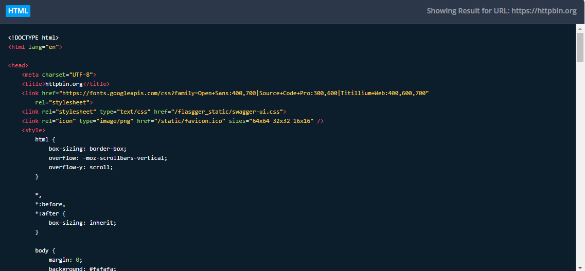
Let’s be honest here, web scraping isn’t the most fun task in the world. Unfortunately, it’s not the easiest, either. Scrapestack aims to change all of that by making things simple. No, you probably won’t be screaming with joy while running a scraping API, but thanks to Scrapestack, you won’t be pulling your hair out or losing any sleep over it, either.
What makes Scrapestack different?
If you’ve ever used a web scraping API, you know that it’s just a bunch of data. Scrapestack, like any other good scraping API makes all of this data easy to digest. But, they do it in milliseconds. Yeah you heard me, milliseconds. You’ll be gathering data faster than the web developers can produce it. Okay, maybe that’s an exaggeration, but you catch my drift. It’s
quick.
What does Scrapestack have to offer?
Ah, the real reason we’re all here. Talk is cheap in the SaaS world. What really matters is what you offer. So, the wait is over, here’s what you’ll get:
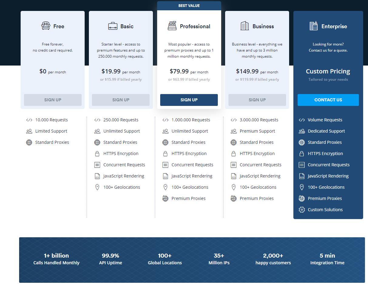
Millions of proxies and IPs
Use Scrapestack’s massive network of 35+ million datacenter and residential IP addresses spread across dozens of global ISPs.
100+ Global locations
You have lots of choices when it comes to sending your web scraping API requests. In fact, you have over 100. Or, you can simply use random geo-targets. It’s up to you.
Unrivaled infrastructure
Scrape the web with speed that even The Flash would be jealous of. Enjoy advanced features that you won’t find anywhere else while you’re at it.
Free option
Let’s be frank again and say that of course they have premium options. But, the free option is always a good place to start, and not everyone offers one. Scrapestack does, however, and it comes with everything you need to get started. But, I’m pretty sure you’ll be upgrading before too long.
Scrapestack is the world’s most trusted web scraping API
I’ve always felt much better when buying an online tool if I see that a big brand uses it, too. Well, the story for Scrapestack is a little different. They don’t have one single trusted brand… they have a ton. In fact, they have some of the biggest brands in the world using them.
With names like YouTube, Facebook, and even Amazon, you can pretty much guarantee that Scrapestack is a beast. These are all titans in their given industries, and they all choose Scrapestack.
Bringing it home
Scrapestack currently offers 5 different packages. Each level completely depends on your needs, as they all scale depending on the size of the requests needed.
I’ll be real, each package is an absolute steal based on what you get. I really appreciate how they have an option for any company at any size. I mean, depending on the package, you can get anywhere from 10,000 requests all the way up to 3,000,000 and beyond. The capabilities truly are limitless.
So the takeaway? You’re spending way too much time reading this! You should be signing up right now. Thank me later. You know, after you’ve signed up and all. Enjoy!
On November 27, Gutenberg 7.0 landed with several features, enhancements, and bug fixes. Most notably, the navigation block is now a stable feature. Theme authors can also start using block template parts and testing the post title and content blocks.
Gradient classes are now used for the cover block. Classes are a nicer solution than the inline styles used in earlier iterations. Note that gradients are still an experimental feature.
For developers, there is a new backward-compatibility document that outlines how the project preserves compatibility in its public APIs. This should be useful for all developers working on the project in the future.
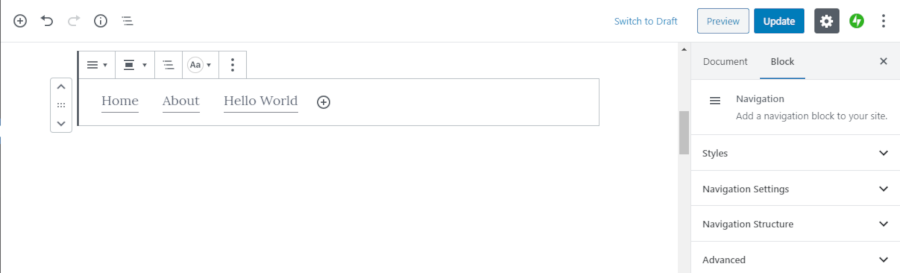
Navigation Block Now Stable
Creating a nav menu with the navigation block.
The navigation block is now a stable feature and no longer considered experimental. The interface is much improved over earlier implementations. For quickly building a menu of links, it does the job. Users can manually type a link or search for an existing link for the site.
A user interface for nav menus in the block editor is no easy beast to tame. The Gutenberg team managed to fit in the most common features without making it feel confusing. For users, theme integration may be limited until their themes are updated with full support. The default Gutenberg design may not be ideal or work at all in the context of the active theme.
The navigation block also comes with both light and dark block styles. Theme authors can design these how they prefer, add additional styles, or remove the styles altogether. More than likely, theme authors will begin adding several variations to their themes as a selling point in the long run.
The Gutenberg team dropped the background color option from the navigation block. Instead, users are encouraged to place it within a group block and add a background to the group. It is possible to change the link text color directly within the navigation block.
Currently, there is no parity between normal nav menu HTML classes and navigation block classes. This could result in bulkier theme CSS, at least in the transition between how themes currently work and the full site-editing era. Inconsistent classes is an issue that should be handled with a design framework.
Post Title and Content Blocks Added
Customized post title block output.
As part of the experimental site-editing feature, Gutenberg has introduced the post title and post content blocks. These blocks act as placeholders and will output either the title or content. Both blocks are foundational elements for true full-site editing. Eventually, users will no longer be as limited to how their posts are output on the screen.
Currently, the post title block simply outputs the post title inside of <h1> tags. There are no classes for customizing the design. The other missing element at this point is the post byline or meta area that often accompanies the title. In the long run, Gutenberg needs to have a method of handling post header and footer areas.
The custom post header feature has plagued theme authors for years, long before Gutenberg was around. There are dozens or more implementations in the wild. Some of them work with the block editor. Others use custom post meta or the featured image. However, users are often left with sub-par implementations that don’t always work in the context of a specific post.
One of the features I have wanted to implement within Gutenberg is the “hero” image with text set over the top. By using the built-in cover block and the post title block, I was able to accomplish this. However, it was still missing the post byline. Therefore, I put together a quick filter to output the post byline when the post title block is in use.
Any theme author who wants to test it out can modify the following code. I would not recommend this in production since this is an experimental feature, but it is good to start thinking ahead about possibilities.
Gutenberg 6.9 introduced block templates that resolve from a theme’s /block-templates folder as part of the site-building experiment. Version 7.0 takes that a step farther and introduces a block template parts system, which resolves from a theme’s /block-template-parts directory.
This new system allows top-level templates to house smaller, reusable template parts. This is a rather standard method of template-part handling that has become a part of the normal theme-building experience.
It will be interesting to see how this works in the long run. WordPress’ current template part system for theme authors (i.e., get_template_part()) is a bare-bones implementation with little flexibility for handling features like hierarchy and passing data. Thus far, the new feature seems to be a melding of blocks and old templating ideas, but it is too early in the process to see where it goes or whether theme authors will have to make customizations to bend the system to their will.
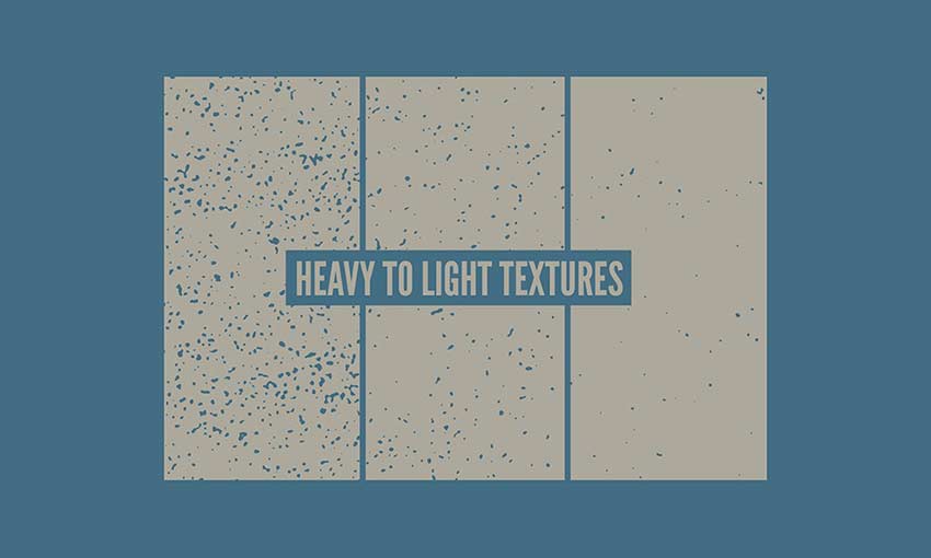
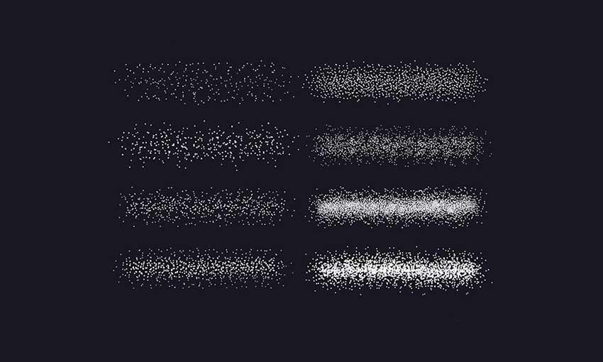
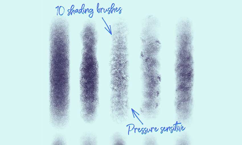
Every designer could use some high-quality textures for their projects. You can use them as backgrounds, overlays, or just to make your graphics a little more interesting. And they look great in posters, banners, or even as part of a website.
But free, high quality textures can be hard to come by. That’s why we’ve put together this huge collection of texture downloads, free for use by any designer. Some require an email subscription to download, but that’s all.
Altogether there are nearly 300 textures and brushes here, sorted into three categories: nature and materials, abstract, and brushes.
Your Designer Toolbox Unlimited Downloads: 500,000+ Web Templates, Icon Sets, Themes & Design Assets
Nature and Materials
These photorealistic textures draw from nature, as well as man-made materials like brick and plastic. You’ll find woods, stones, paper, and dirt that make great natural backgrounds or overlays.
Rather than drawing from nature, these textures are more abstract and random. They make great background textures for websites and posters, or pretty overlays for objects. You’ll find noise, splatters, foil, and watercolors mixed in here.
Last but not least we have textured brushes. These make it super easy to add shading, splatters, or grain to any image; just use the brush to draw it on, and add a little realism to your graphics.
Whether you’re using a brush to carefully draw realistic grain on an image, adding a pretty foil overlay to an object, or downloading a futuristic texture to use as a background, there’s something for every designer here.
Most of these are totally free for use, but make sure to check the licenses before you include any of these in a commercial project. Once you have the go-ahead, go crazy using these gorgeous high-res textures in your web and graphic designs.
This is an extremely basic question, but I haven't found an answer yet.
I recently purchased a brand-new computer with Windows 10 and at the moment am using the Microsoft Edge browser that came with it.
I would like to open some offline (HTML) pages, but the Control-O feature to which I am accustomed in IE, Chrome, and Firefox, doesn't work. In the Edge browser, the hotkey Control-O resets the zoom level.
Is there a replacement hotkey for Control-O in Microsoft Edge?
Alternately, what is the non-hotkey method for opening an offline page in Edge?
Note, I am not trying to set the default Start page. I would simply like a quick and easy way to navigate to and open an HTML page that is saved on the hard drive.
Every front-end developer has dealt or will deal with this scenario: your boss, client or designer thinks the outline applied by browsers on focused elements does not match the UI, and asks you to remove it. Or you might even be looking to remove it yourself.
So you do a little research and find out that this is strongly discouraged, because the focus outline is there for a reason: it provides visual feedback for keyboard navigation (using the Tab key), letting users who can't use a mouse or have a visual impairment know where they are on the screen.
This button shows a focus state with Chrome's default outline style.
That doesn't mean you're stuck with this outline, though. Instead of removing it, you can simply replace it with something else. That way, you’ll keep your interface accessible and get more flexibility on how it looks, so you can better match your UI.
You can start by removing the default browser outline by selecting the focused state of the element and applying outline: none. Then, you may choose from each of the options ahead to replace it:
Change the background color
This works best for elements that can be filled, such as buttons. Select the focused state of the element and apply a contrasting background color to it. The higher the contrast the better because subtle changes may not be strong enough visual cues, particularly in cases where with color blindness and low-vision.
In the example below, both background and border color change; you may pick either or both.
Click or focus with the Tab key to view how this state looks.
If the element has any text, you can select the focused state and change its color. This also works for icons applied with mask-image; you can select the icon as a descendant of the focused element and change its background color, like the example button below.
Again, contrast is key. You may also consider using an underline on text links and making it part of the changed state because, as the Web Content Accessibility Guidelines state:
Color is not used as the only visual means of conveying information, indicating an action, prompting a response, or distinguishing a visual element. (Level A) Understanding Success Criterion 1.4.1
Apply a box shadow
The box-shadow property can do exactly the same job as the outline, except it's much more powerful — you can now control its color, opacity, offset, blur radius and spread radius. And if a border-radius is specified, the box shadow follows the same rounded corners.
The key here is subtlety. Extreme size changes may cause content reflow, not to mention a poor experience for those who prefer reduced motion.
Replicate existing hover styles
If the element already has a contrasting hover style, you can simply take that style and apply it for the focused state as well. This is a rather elegant solution, as you don't have to add any new colors or outlines to the interface.
Here’s an example where both the focus and hover states adopt a high contrast to the background of an element’s default style:
Everything we’ve looked at so far takes the assumption that we want to remove the focus outline altogether. We don’t have to! In fact, it’s a border that we can customize.
button:focus {
  outline: 3px dashed orange;
}
That’s shorthand and could have been written this way if we want to fine-tune the styles:
One additional superpower we have is the outline-offset property, which is separate from the outline shorthand property but can be used alongside it to change the position of the focus ring:
You can mix and match all of these options to get custom styles that look appropriate for each component type within your interface.
And it’s worth repeating: Don't forget to use stark color contrasts and other visual cues in addition to color when adopting custom focus states. Sure, we all want an experience that aligns with our designs, but we can adhere to good accessibility practices in the process. The W3C recommends this tool to test the contrast of colors values against the WCAG guidelines.
A couple of months ago, we invited Marc Anton Dahmen to show off his database-less content management system (CMS) Automad. His post is an interesting inside look at templating engines, including how they work, how CMSs use them, and how they impact the way we write things, such as loops.
And what the heck is a "headless" CMS? I always find that name to be a little weird, but the idea is that the engine for content creation is fully separated from the front-end display and instead stitched together by APIs. This means we're able to get all the wonderful benefits of creating content in a CMS without being locked into its templating requirements. Chris has a more thorough explanation of the concept from a few years back.
A good example is WordPress and its REST API. We still enjoy the easy UI and extensible administrative features of WordPress, but can send the data anywhere via API to create the front end. Rather write your templates in JavaScript instead of PHP? Go for it!
If the CMS is a body and the front-end view is the head, then the body can unscrew its head and replace it with another. Weird, right?
In any case, whether it's Automad, WordPress, Sanity, Contentful, Ghost, Netlify CMS, or any others in the growing number of API-first options out there, the move toward headless is a space to watch. HeadlessCMS.org is a good place to do that. We could see vast changes that lead to both better content and developer experiences, which is what all of this is trying to accomplish.
Coming up with a fantastic app idea is hard, but it’s not as hard as finding the right mobile app development company that delivers to your expectations. According to research by Evans Data Corporation, there were about 23 million developers worldwide in 2018, working in different industry niches, such as web and mobile. Moreover, this […]
Check out this stellar Java tutorial on building applications with Maven.
As developers, we spend just as much — if not more — time working on tasks that support our code rather than writing the code itself. This includes writing test cases, creating build and deployment scripts, structuring Continuous Integration (CI) and Continuous Delivery (CD) pipelines, and managing the external dependencies that our projects rely upon. If handled incorrectly, these supports can grind our application development to a halt — regardless of how well our code is written.
Over the years, numerous tools have been developed to reduce the burden on developers, and many have become nearly as indispensable as programming languages themselves. In the Java ecosystem, one of the most popular of these tools is Maven. Maven is a management tool for Java (and Java-based languages) that has become so widely used that tens of millions of binaries from Maven projects have been packaged and hosted for public use.
Build database microservices that are as light as a feather!
The number of cloud-based Java database applications grows by the minute. Many organizations deploy hundreds — if not thousands — of microservice instances. However, most applications carry an astounding amount of unnecessary overhead with respect to the runtime environment. This, in turn, makes the application slower and more expensive to run.
In this article, I will demonstrate how to write a database application that is 10 times smaller than normal(*). The storage requirement will be about 32 MB instead of the usual(*) ~300 MB taking both the application, third-party libraries, and the Java runtime into account. As a bonus, the required RAM to run the application will also be reduced by 25 percent.
Check out this second installment on running Spring Boot apps on Kubernetes and Windows.
Welcome to part two of "Running Spring Boot Application on Kubernetes Minikube On Windows." This article assumes that reader has previous knowledge around Spring Boot, containers, and Kubernetes. I will briefly try to touch upon all of them a little bit. After finishing both articles, the reader will be able to do the following:
If you are waiting for the perfect time to join the Divi community or the best time to upgrade your current account to Lifetime, this is it! Don’t miss your chance because a better deal than this doesn’t exist!
A JSX-based page builder for creating beautiful websites without writing code. It’s currently in early alpha and only supports a constrained subset of JSX source code.
Twenty-five different surprises are awaiting you on Pico-8 this month, each made by a different developer. The first one is the UFO Santa Candy Blaster.
Patchbay.pub is a free web service you can use to implement things like static site hosting, file sharing, cross-platform notifications, and much more.


 In this episode of the Smashing Podcast, Drew McLellan talks to Heydon Pickering about his new book,