I tried alot to print this arrow with random generated values which are 0101 , every time it should be differnt,
please help me out thanks :)


Tips, Expertise, Articles and Advice from the Pro's for Your Website or Blog to Succeed

I tried alot to print this arrow with random generated values which are 0101 , every time it should be differnt,
please help me out thanks :)
Every day, the ProgrammableWeb team is busy, updating its three primary directories for APIs, clients (language-specific libraries or SDKs for consuming or providing APIs), and source code samples.
When Google released the Android 10 beta earlier this year, it introduced the bubbles notification feature. Bubbles are built into the notification system and are used as an alternative to using the SYSTEM_ALERT_WINDOW. Notifications are presented on top of the app in use when the bubble feature is enabled.
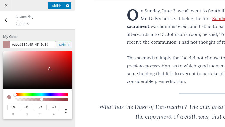
The WordPress Theme Review Team announced its color picker control today. The project is a single package that allows theme authors to include an advanced color control in the customizer. The control allows users to select a hex color with an optional alpha channel to handle transparency.
The color control is the fourth feature package released by the team in 2019. The idea for feature packages took off in June. Feature packages are repositories for single features that theme authors may use in their themes. Their purpose is to standardize common features so that developers do not have to recreate the wheel, so to speak.
Arguably, the color control is the most complex package the team has built. The bulk of the work was handled by feature packages lead, Ari Stathopoulos. The project is available via its GitHub repository and Packagist.
Officially, the team launched version 1.0 in October, but the project has undergone some changes since its release. Initially, the project utilized the Iris color picker script included with WordPress. However, the team ran into trouble making it work as they wanted with RGBA colors. The team refactored the project to use React Color instead.
“The main issue with this project was the thing that WordPress is most famous for — backward-compatibility,” said Stathopoulos. “Compatibility is one of WP’s greatest assets, but at the same time, a pain for developers. Things don’t get updated because they need to work for plugin A/B/C that hasn’t been updated in 6 years. So scripts like the Iris picker, things that were great half a decade ago, have been abandoned and are just dead weight. RGBA support could easily have been in WP core’s picker. There was always a demand for it. But it never happened.”
The team decided to move forward without relying on past solutions. Stathopoulos said the biggest hurdle with building the control to use React Color was making it look native to WordPress. He described the project as an example for others to see that it was possible to use React in the customizer.
Setting up the control with the basics is relatively easy. Theme authors should be able to quickly integrate it into their themes by following the usage instructions. Color data is stored as a hex value (e.g., #000000) if there is no transparency or as a RGBA value (e.g., rgba(0,0,0,0)) if there is.
The control does come with more advanced features. For example, it is possible to store color data as an array, which includes a slew of information, such as:
The accessibility properties are interesting and may allow theme authors to help to ensure users choose colors that meet accessibility standards. Some of the included data is the color’s luminance, contrast with white and black, max contrast color, and more.
Currently, the TRT’s feature packages are not widely adopted by theme authors. The overall project is still in its infancy. In the wake of the news that WordPress will be moving toward full-site editing, the team is not sure what that will mean for the project going forward.
Stathopoulos said that some theme authors are hesitant to do big things at the moment. It’s a tough sell to get developers on board when the future of theme development is in a holding pattern, waiting for the other Gutenberg shoe to drop.
“We’ve been discussing and thinking of what packages we should build,” said Stathopoulos. “The problem is that the editor is the centerpiece of WordPress. Everything else just surrounds the editor. Gutenberg is expanding, and it looks like it’s taking over everything else in WordPress. So we think the next packages should be around the editor too.”
He said some of the initial package ideas like a standardized hook system, more customizer controls, and accessible menus may not be the best route. Those ideas may not make sense in the context of a block-editing world. The team could see the launch of such packages dead on arrival.
“It’s a tricky, transitional period for themes and theme developers,” said Stathopoulos. “We all need to learn how to better leverage the editor.”
Cybercrime is on a steady rise and drastically impacts every industry imaginable. According to the Internet Crime Complaint Center of the FBI, cybercriminals cost consumers and business owners 2.7 billion dollars in losses in 2018.
Couple that alarming statistic with the fact that CyberCrime Magazine predicts there will be 3.5 million unfilled cybersecurity jobs in 2021. Due to the shortage of cybersecurity personnel, many developers, hobbyists, and business owners are trying to proactively learn about security threats so they can keep their hard work safe.
When you work as a freelance web designer or developer, it’s easy to get caught up in the day-to-day functions of your business and forget about some of the administrative tasks you need to attend to. Invoicing comes to mind.
Or, maybe invoicing is just taking you way longer than it needs to. If you’re managing invoices manually, that can take up a lot of unnecessary time. It’s time that you could be spending creating websites and doing client work. You know, the stuff that actually makes you money?
That’s why it’s important to reduce the time you spend on administrative tasks as much as possible. One way to accomplish this is through the use of an invoicing app. Lucky for you, there are plenty of online invoicing apps to choose from, that make it super simple to manage invoices for your freelance web development business.
With both free and premium options available, you’ll be able to get up and running with invoicing automation in no-time – and level up the tools you use as your budget increases.

AND.CO is a free app that makes it easy to send invoices and proposals with just a few clicks. With it, you can create custom invoices, accept payments, track expenses, track the time spent on a given task, and more.

Invoicera is another free invoicing app option for freelancers that greatly simplifies the invoicing process. Now, the free plan is only available to you if you have three clients or less, but it’s definitely a nice way to get your foot in the door with billing management. A few features include time tracking, workflows, and automatic billing.

Invoicely is a free-to-start using invoice app that makes it easy to not only invoice your clients, but also view business reports, accept credit card payments, as well as track time, mileage, expenses, and more.

ZipBooks bills itself (if you’ll pardon the pun) as simple accounting software and it lives up to that description beautifully. This app allows you to send invoices, accept payments, conduct reviews, view reports, and gain access to “smart insights” that help you to make better decisions about the future of your business.
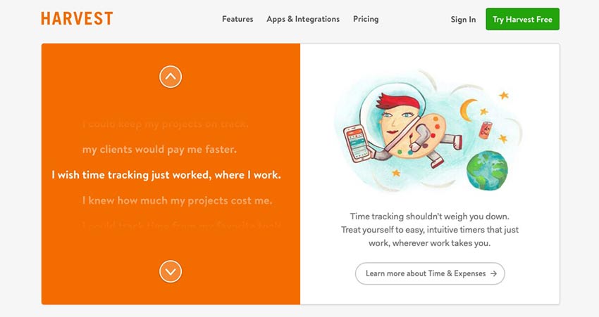
Harvest is a super simple invoicing app that prioritizes the time-tracking feature above all else. But it does so in an interesting way in that this app applies insights to your time tracked, allowing you to make smart choices about your workflow and time management.
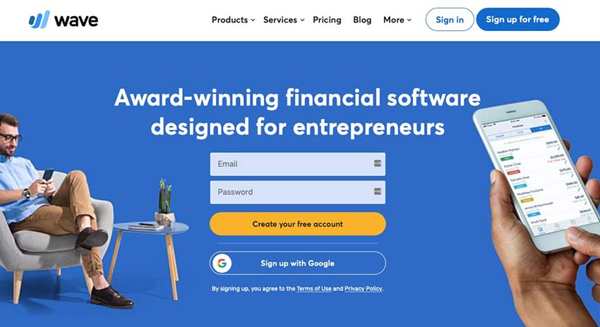
The last of the free (or free-to-try) invoicing apps on this list is Wave. This app offers a full set of accounting tools for entrepreneurs of all kinds. With it, you can create professional-looking invoices that match your brand, accept payments, and even organize payroll should your company ever blossom into an agency.

FreshBooks offers the total package when it comes to online accounting and invoicing. It can be used by any type of small business, makes it easy to organize expenses and track time, and it’s cloud-based so you can access your info from anywhere. And plans are pretty cheap to start with if you have a small client base.
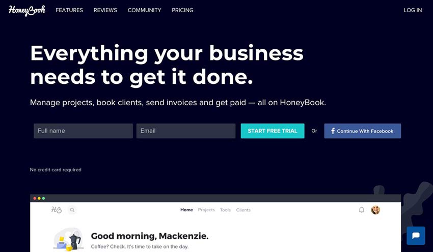
HoneyBook is another one-stop-shop sort of invoicing app. It promises to help you manage projects, send invoices, accept payments, and even book new clients, all by using its tools. The project tracking feature is especially nice because it offers a bird’s eye view of where you stand with all of your projects – from concept to payment.

QuickBooks has been an accounting staple for small business for years now. But it’s shift to an online app has made it even more beneficial for freelance web developers. Organize your expenses, send invoices, track payments, and more, all for a modest monthly fee.
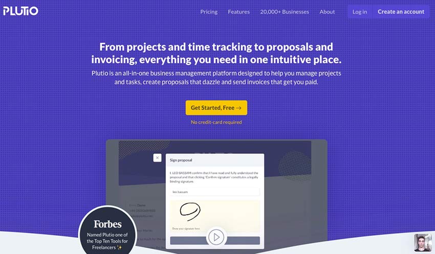
Plutio promotes itself as the “one app to manage your entire business,” and from its available feature set, it’s easy to see why they’d make such a claim. This app allows you to track proposals, projects, and expenses; send invoices; and even manage customer relationships all from within a single dashboard.

Harpoon sets itself apart from the other invoicing apps on this list because it not only allows you to track expenses, time, and send invoices. It also offers the ability to predict how successful your business will be in the future. The level of insight it offers makes Harpoon a worthy contender here.
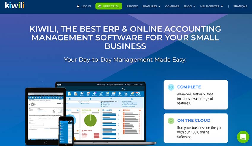
Last on our list is Kiwili. This online invoicing and accounting app strives to make day-to-day management of your business easier. It’s cloud-based and includes invoicing, estimates, CRM, accounting, time management, reporting, and more.
As a business owner, it seems like there is never enough time in the day. That’s why apps like the ones in this roundup are so helpful. They can take a task like invoicing and help you get it done in less time.
So, if you’re still doing your books the old-fashioned way, maybe it’s time to level up. You might be surprised at how much time you’ll save.
In this post, we'll talk about the value of HTTP test doubles in the context of integration tests and introduce the WireMock module to use in Mule 4.
When writing integration software for distributed systems the most critical part to test is the interaction between those systems. Obviously, this makes integration tests vital. Traditionally, we would test against live systems, but having a local instance of an upstream system or a dedicated test instance can be expensive and/or difficult to coordinate its state between tests.
Instead, we can opt to verify the interactions against test doubles, also known as narrow integration tests. WireMock is a pretty popular HTTP server test double that allows us to configure stubbed responses for particular requests, as well as verifying that the requests it received match what we expect the system under test to have made.
Page reloads are a thing. Sometimes we refresh a page when we think it’s unresponsive, or believe that new content is available. Sometimes we’re just mad at the dang site and rage-refresh to let it know we’re displeased.
Wouldn’t be nice to know when a user refreshes the page? Not just that, but how many times? That data can help us trigger some sort of behavior after a certain number of reloads.
A sports site is a good example. If I want to check the score of a game that’s in progress but the scores aren't live-updated, then I might find myself refreshing a bunch.
Our goal is to break users out of that habit. We’ll use our page-refresh-counting powers to let folks know that refreshes are unnecessary, thanks to real-time score updates. And if they reload more than three times? We’ll kick ‘em out of their session. That’ll show them.
Here’s a simple demo of that concept.
Let’s re-create it together. But before we get going, there are few questions we need to answer before we start coding:
reloadCount), this place needs to persist that value between the reloads — localStorage sounds like a good solution.reloadCount in localStorage it will persist the value between the reloads, but it will keep that value until we remove programmatically or clear the browser storage. It means that if we come back after few hours the site will still remember last reloadCount and may perform logout after first refresh without warning. We want to avoid that and allow user to reload the site two times each time the user comes back after some period of time. That last sentence holds the answer to the question. We need to store the time when the user left the site and then when the site loads again check when that happened. If that time period wasn’t long enough, we activate the reload counting logic.beforeunload window event and store that value in localStorage.OK, now that we have the answers, let’s dive into the code.
We will store the time of last reload using a beforeunload window event. We need two things: (1) an event listener that will listen to the event and fire the appropriate method, and (2) our beforeUnloadHandler method.
First, let’s create a function called initializeReloadCount that will set our event listener using the addEventListener method on the window object.
function initializeReloadCount() {
  window.addEventListener("beforeunload", beforeUnloadHandler)
}
Then we create a second method that will be fired before we leave the site. This method will save the time the refresh happens in localStorage.
function beforeUnloadHandler() {
  localStorage.setItem("lastUnloadAt", Math.floor(Date.now() / 1000))
  window.removeEventListener("beforeunload", beforeUnloadHandler);
}Now that we have the time when the site was last closed, we can proceed and implement logic that’s responsible for detecting and counting how many times the site was reloaded. We need a variable to hold our reloadCount and tell us how many times user reloaded the site.
let reloadCount = nullThen, in our initializeReloadCount function, we need to do two things:
reloadCount value stored in our localStorage, and if so, get that value and save it in our reloadCount. If the value doesn’t exist, it means that the user loaded the site for the first time (or at least did not reload it). In that case, we set the reloadCount to zero and save that value to localStorage.lastUnloadAt value. To detect if the site was actually reloaded, we need to compare the time when the site gets loaded (the current time) with the lastUnloadAt value. If those two happened within, say, five seconds (which is totally arbitrary), that means the user reloaded the site and we should run reload count logic. If the time period between those two events is longer, we reset the reloadCount value.With that, let’s create a new function called checkReload and keep that logic there.
function checkReload() {
  if (localStorage.getItem("reloadCount")) {
    reloadCount = parseInt(localStorage.getItem("reloadCount"))
  } else {
    reloadCount = 0
    localStorage.setItem("reloadCount", reloadCount)
  }
  if (
    Math.floor(Date.now() / 1000) - localStorage.getItem("lastUnloadAt") <
    5
  ) {
    onReloadDetected()
  } else {
    reloadCount = 0;
    localStorage.setItem("reloadCount", reloadCount)
  }
}
The last function we need in this step is a method responsible for what happens when we confirm that the user reloaded the site. We call that function onReloadDetected, and inside it, we increment the value of reloadCount. If the user refreshed the site third time, we drop the bomb and call our logout logic.
function onReloadDetected() {
  reloadCount = reloadCount + 1
  localStorage.setItem("reloadCount", reloadCount)
  if (reloadCount === 3) {
    logout()
  }
}In this step, we implement the logic responsible for the situation when the user reloads the site to the point of breaching our three-limit threshold, despite our clear warnings to stop doing it.
When that happens, we call our API to log the user out, then we clean up all properties related to the reload count logic. That will allow the user to come back and have a clean account of reloads. We can also redirect the user somewhere useful, like the login screen. (But wouldn’t it be funny to send them here instead?)
function logout(params) {
  // logout API call
  resetReloadCount()
}

function resetReloadCount() {
  window.removeEventListener("beforeunload", beforeUnloadHandler)
  localStorage.removeItem("lastUnloadAt")
  localStorage.removeItem("reloadCount");
}Now that we have the logic implemented, let’s see how can move that logic to a Vue site based on this example:
First, we need to move all of our variables into our component’s data, which is where all reactive props live.
export default {
  data() {
    return {
      reloadCount: 0,
      warningMessages: [...]
    }
  },
Then we move all our functions to methods.
// ...
  methods: {
    beforeUnloadHandler() {...},
    checkReload() {...},
    logout() {...},
    onReloadDetected() {...},
    resetReloadCount() {...},
    initializeReloadCount() {...}
  }
// ...
Since we are using Vue and its reactivity system, we can drop all direct DOM manipulations (e.g. document.getElementById("app").innerHTML) and depend on our warningMessages data property. To display the proper warning message we need to add a computed property that will re-calculate each time our reloadCount is changed so that we can return a string from our warningMessages.
computed: {
  warningMessage() {
    return this.warningMessages[this.reloadCount];
  }
},
Then we can access our computed property directly in the component’s template.
<template>
  <div id="app">
    <p>{{ warningMessage }}</p>
  </div>
</template>
Last thing we need to do is find a proper place to activate the reload prevention logic. Vue comes with component lifecycle hooks that are exactly what we need, specifically the created hook. Let’s drop that in.
// ...
  created() {
    this.initializeReloadCount();
  },
// ...
Nice.
And there it is, the logic that checks and counts how many times a page has been refreshed. I hope you enjoyed the ride and you find this solution useful or at least inspiring to do something better. 🙂
The post One Way to Break Users Out of the Habit of Reloading Too Much appeared first on CSS-Tricks.
Say you have a design system and you're having a moment where it doesn't have what you need. You need to diverge and create something new. Yesenia Perez-Cruz categorizes these moments from essentially ooops to niiice:
There are three kinds of deviations that come up in a design
system:
- Unintentional divergence typically happens when designers can’t find the information they’re looking for. They may not know that a certain solution exists within a system, so they create their own style. Clear, easy-to-find documentation and usage guidelines can help your team avoid unintentional variation.
- Intentional but unnecessary divergence usually results from designers not wanting to feel constrained by the system, or believing they have a better solution. Making sure your team knows how to push back on and contribute to the system can help mitigate this kind of variation.
- Intentional, meaningful divergence is the goal of an expressive design system. In this case, the divergence is meaningful because it solves a very specific user problem that no existing pattern solves.
We want to enable intentional, meaningful variation.
This is an excerpt from her book Expressive Design Systems on A Book Apart, the same publishers as the incredible iconic book Practical SVG.

And while we're linking up books about design systems, check out Andrew Couldwell's Laying the Foundations.
System design is not a scary thing — this book aims to dispel that myth. It covers what design systems are, why they are important, and how to get stakeholder buy-in to create one. It introduces you to a simple model, and two very different approaches to creating a design system. What's unique about this book is its focus on the importance of brand in design systems and creating documentation.

Direct Link to Article — Permalink
The post Making Room for Variation appeared first on CSS-Tricks.
Developing apps using web technologies has certain advantages. For example, you can use various platforms to run the software of your choice, such as JavaScript, HTML, and CSS. However, developing with web technologies also comes with limitations, like the interoperability with an operating system is restricted and web apps can only be accessed through the browser. Whereas for desktop apps, you can access the features of the operating system directly. You can quickly add to a start menu or the dock, and they run inside their own process. What if you can get a†ll the benefits of a desktop app while using a web tool of your choice? With Electron, you can.
Electron is a JavaScript wrapper around a Chromium web browser. An Electron program consists of two independent JavaScript threads. An outer thread that runs within Node and has access to Node’s operating system libraries, such as File System and Process libraries. Then, there is a JavaScript thread that runs within the browser window. This thread has the usual restrictions of web applications. The outer thread and the browser thread can communicate via inter-process communication (IPC) functions provided by Electron.
Document management software has become a crucial component of running a business in 2020. So many organizations are either going paperless, have remote employees, or both.
These new trends make it unrealistic to keep documents and paperwork in physical filing cabinets or boxes in an office.
Document management software allows you to declutter your office, improve security, and access files or data from anywhere. This software also enhances efficiency when sharing documents or collaborating with team members.
Are you ready to digitally upload, track, and securely archive your documents? You need document management software to achieve this.
Whether your company is going paperless, or you just want to digitize your records for improved organization, this guide has everything you need to know about DM software (DMS).
There are hundreds, if not thousands, of document management solutions on the market today. Cloud storage tools like Google Drive or Dropbox could technically fall into this category as well.
But for the purpose of this guide, I focused on DMS for businesses. For this instance, there are really only seven solutions that I would recommend.
The reviews below include a brief summary, features, benefits, prices, and any potential drawbacks of each software. Use this as a resource to find the best document management software for your unique situation.
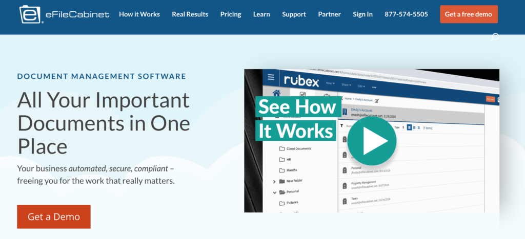
eFileCabinet is one of the best document management solutions on the market today. Since 2001, this company has helped individuals, small business owners, and enterprise-level companies organize data and files online.
The software makes it easy for you to stay organized and find a document, regardless of how many you have on file.
You can search for documents or locate them based on folder templates or pre-defined file names. eFileCabinet also keeps a portfolio of your most used documents for quick access.
The eFileCabinet solution does all of the hard work for you. Simply upload a document, and the software will file it for you. The automated workflow streamlines your time-consuming tasks to improve efficiency in the office.
All of your documents can be accessed from anywhere with a web browser or mobile app. You can upload documents directly from your phone using the camera on your device. eFileCabinet also allows you to sign contracts.
One of the biggest standouts for this solution is the collaboration features. The system allows you to create different levels of security, so only certain people can access data.
eFileCabinet has encrypted file sharing and requests, two-factor authentication, and role-based permissions. You can even set IP or location-based authentication.
The software integrates with popular third-party services like DocuSign, Salesforce, and Microsoft Office.
Here’s an overview of the plans and price points for eFileCabinet:
All prices are listed per user and billed on an annual basis. Once you upgrade from the Starter plan to Advantage, you’ll need to pay for a minimum of three users.
I’d only recommend the Starter plan to individuals. Sole proprietors or very small businesses can probably get away with the Advantage plan, but the Business package will likely be the best for the majority of you.
With eFileCabinet, you get to choose if you want your storage either on-site or on the cloud. Personally, I prefer the cloud storage. But there are advantages to on-premises as well.

M-Files represents the future of document management. The software leverages AI technology to automate your organizing process.
When you upload content to M-Files, the platform automatically organizes the data based on what it is, as opposed to just where you want to store it.
You even have the ability to connect M-Files to your existing network and systems to protect your information and categorize everything with AI, automatically and securely.
Another top benefit of M-Files is that they offer industry-specific solutions. Some popular industries that they service include:
M-Files is great for larger teams that need to access documents at different times. If someone on your staff needs a file that was uploaded and saved by another colleague, they won’t need to search through different folders to see what the document was saved as.
With AI technology, all you need to know is what type of document you’re looking for. Then you can organize the content based on criteria like project title, author, customer, or expiration date.
M-Files will automatically detect duplicate content. Rather than having multiple versions of the same or slightly different documents on your storage system, it will automatically update the latest document to one singular file. This way you always know that you’re viewing or working with the latest version.
With M-Files, you can store a wide range of document types, including emails. The software also allows you to collaborate with external users who don’t have M-Files. That content can be shared as a secure link.
M-Files offers cloud storage, on-site storage, and hybrid storage solutions as well.
You can try M-Files free for 30-days by filling out a form on their website. Pricing for M-Files is not listed on their website. You need to contact their sales team to inquire about a custom solution.
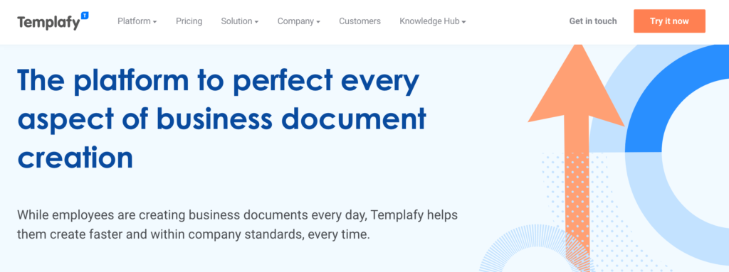
Templafy is a relatively new DMS. After launching in 2014, they have been providing all-in-one document management solutions for enterprises all over the world. It’s designed specifically for large businesses and helps streamline tasks to save time when it comes to storing and accessing files.
More than 300 enterprises across 80+ countries use Templafy for document management. This translates to more than one million users.
Using intelligence software, Templafy will automatically show the most relevant content to each employee based on their usage and position.
Your marketing team doesn’t need to see accounting documents, and vice versa.
One of the biggest pain points with DMS, in general, is having to create new documents using another platform. Templafy eliminates this pain point by giving users the ability to create and edit new content directly within the system.
Both new and uploaded content can all be managed in a simple and singular feed on your dashboard.
Templafy’s cloud storage software means you can access documents from anywhere, including on your smartphones and tablets.
You can integrate Templafy with Microsoft Office 365, G-Suite, and other platforms that you’re using to run your business on a daily basis. You can even integrate Templafy with CRM solutions like Salesforce or Microsoft Dynamics.
Big brands like Pandora and IKEA trust Templafy to manage their documents with enterprise-grade software.
In addition to managing documents and files, Templafy has solutions for maximizing employee productivity and creating an evergreen IT infrastructure.
Security is another top benefit of using Templafy. You and your team can securely store and access content from anywhere, using any device, whether you’re online or not.
Like most enterprise software, Templafy provides custom solutions for each unique company. So they don’t list any prices online. You can try Templafy for free before you commit to a contract by reaching out to their sales team.

For those of you who are looking for a high-quality cloud-based solution for document management, look no further than DocuWare.
This DMS is unique because it has specific solutions for tasks within your business processes:
DocuWare has everything you need for digital transformation and going paperless using cloud technology.
This is another software that’s used by large businesses and enterprises. Sony, Toshiba, Levi’s, and Kellog’s are just a handful of their most well-recognized customers.
But with that said, DocuWare stands out as a top option for small and medium-sized businesses as well.
Small business owners can use DocuWare to automate their digital workflow, securely organize and store documents, and automate certain tedious tasks.
DocuWare allows you and your staff to edit or annotate documents directly on the platform. Not every DMS on our list gives you this capability.
I like DocuWare because it has features designed to connect remote employees and your deskless workforce. Anyone can easily access content at home or on the go from any device.
More than 12,000 businesses in 90+ countries trust DocuWare for document management. So you know that the company is legitimate with a track record like that.
It has specific use cases for things like contract proposals, finance processes, and HR tasks as well.
The pricing for DocuWare follows a common theme in this guide. They offer a free trial, but you need to contact their customer support team directly for a custom quote.
Hightail is a document management solution with a specific purpose—sharing and collaboration.
Other DMS on the market have features for file sharing as well, but Hightail takes this to the next level.
I recommend Hightail to businesses that need the ability to send large files securely.
Sharing is simple. Just drag or upload a file from your device or cloud storage solution into your Hightail account. Enter the information for who you want to share it with, and automatically send an email notification to the recipient.
With Hightail, you’ll be able to track the delivery and downloads of content you shared. So you know exactly who opened it and when.
Hightail lets you send files of up to 500 GB. You can add password protection to files and set expiration dates as well.
Here’s an overview of the plans and pricing for Hightail:
Lite — Free
Pro — $12 per month per user
Teams — $24 per month per user
Business — $36 per user
As you can see, the pricing is largely based on the file sending limits. But the features get significantly better with each plan as well.
The free option is actually pretty good if you don’t need to send huge files, and even the entry-level Pro plan is suitable for a number of individuals.
If you’re interested in a paid plan, you can try Hightail free for 14 days.
MasterControl is a DMS made for businesses where security is a top priority and concern. Certain industries have strict regulations for companies to comply with.
MasterControl understands those compliance concerns and created a document management solution that meets any security requirements.
One of the top features of MasterControl is its ability to track changes and revisions. If a document needs to be reviewed by a particular person, you can schedule a time and send out reminders as well.
MasterControl can also limit revisions based on access. You have complete control over who can make changes to a document.
You can also create custom watermarks, sequential numbering, and location tracking to control copies of your files.
MasterControl is 21 CFR Part 11 compliant. This means that documents have a time-stamped audit trail, as well as e-sign functionality that complies with federal regulations.
Another unique standout of MasterControl is its learning center. You’ll have access to tons of free videos, documents, and other resources to educate you about the platform and security compliance in general.
If you need enterprise-grade security for document management in a strict industry, MasterControl will be a top option for you to consider. Contact their sales team for a custom quote.

PaperTracer has solutions for small, medium, and enterprise-level businesses. It’s a simple solution for document management.
With PaperTracer, you’ll have the ability to automate your contracts and digitize all of your documents in a centralized database. PaperTracer has tracking and reporting capabilities and HIPPA compliant solutions as well.
Your document management solution is completely customized. You can benefit from a cloud-based implementation with end-to-end workflow solutions.
E-signature capability is also available with PaperTracer.
PaperTracer is a top solution for businesses in healthcare and legal industries.
Here’s a brief overview of the available plans, although all pricing is customized.
Small
Mid Size
Enterprise
Demos and free trials are available for all three plans. I’d recommend PaperTracer for small and medium-sized businesses. While they do have an enterprise-grade solution, there are better options for that on our list.
Choosing a document storage solution can be challenging if you don’t know what to look for. There are certain features and benefits that you need to keep an eye on when you’re evaluating a prospective software.
I’ll show you the methodology that we used to come up with the choices in this guide. You can use the same system to help narrow your search.
In most cases, document management solutions are either cloud-based or on-site. Some companies offer just one, while others let you choose which one you prefer.
For example, eFileCabinet offers both on-premises and cloud-based storage. M-Files has both as well, and also has a hybrid solution. Other solutions, like DocuWare are completely cloud-based.
I personally prefer cloud solutions because you can access content from anywhere. But for security reasons, some companies want files stored locally on their network.
What can you do with your files once they are uploaded and stored? While organizing files is obviously important, it’s useless for some companies if the documents can’t be shared with teams or external users.
Look for a DMS that accommodates your internal needs for editing or collaborating on files. Features like automated version updates and in-platform editing capabilities are crucial here.
The size of your files will also depend on which solution is best for your business. If you need to share large files, Hightail is the best choice.
Most business-related files and data are sensitive. So it’s important to have a document management solution that can securely store information.
Some solutions offer access permissions based on individual clearance levels or even location.
Other platforms specialize in compliance for unique industries, like healthcare, legal, or government businesses.
Pricing for DMS is usually based on storage limits and users. At each price tier, you can expect the plan to have additional features and benefits.
The majority of the solutions on this list offer custom plans and pricing. So to get a better idea of how much your document management software will cost, you’ll need to consult with a sales representative.
For those of you who are looking for a cost-effective solution and instant sign-ups, eFileCabinet will be a top choice for you to consider.
Ideally, you want to find document management software that works with the platforms you’re already using. Whether it’s CRM like Salesforce, or document editing and creation software like Microsoft Office 365, certain platforms have a wide range of integrations for you to choose from.
However, other solutions that are niche-specific are a bit more limited. So make sure you use software that will actually benefit your workflow process.
Document management software is extremely diverse. Each solution offers unique benefits for businesses based on size, industry, or specific needs.
What’s the best document management software? It’s impossible to say since every option is so different. Here’s a quick recap of the platforms reviewed above:
If you’re looking for a basic all-in-one document management solution, eFileCabinet will probably be your best bet.
But for those of you with unique circumstances and needs, you can find custom software from one of the providers on our list.
Since 2003, WordPress is taking the world of content management by storm. So, if you are leading an online business portal, WordPress is your cup of tea! With more than 74 million sites relying on WordPress today, its popularity is quite evident. Isn’t it? Haven’t you opted for it yet? You are certainly running slow […]
The post 8 Reasons Why Entrepreneurs Should Use WordPress appeared first on WPArena.
To run a successful eCommerce business you are going to need to have a brilliant eCommerce SEO strategy in place. You may have brilliant products and fantastic deals but if you aren’t taking SEO seriously a big piece of the puzzle is missing. This is the difference between an online business that has a steady […]
The post The 4 Key Stages Of Ecommerce SEO appeared first on WPArena.
I move to a new state every two to three years, so it’s important for me to live “light”. Every time I prepare to move, I go through the “Do I really need to keep this?” exercise. Although I’ve been doing this for almost 20 years, it never gets any easier. I wonder things like:
What if I sell my bed and never have a comfortable night’s sleep again?
What if I get rid of the fancy dress I wore once but might need for some hypothetical future event?
What if I decide to start baking cupcakes again and don’t have my cupcake tin anymore?
It’s easy to get attached to things when they served you well at one time or another. But if you take a closer look at the “stuff” you’ve accumulated, you’ll realize that a lot of it has lost its usefulness along the way.
I think it’s important to run through a similar type of decluttering exercise in the work you do as a designer. That way, the apps you build always look fresh and modern instead of weighed down by antiquated features or functionality that at one time had a purpose.
Before you start charging ahead into the new year, take a moment to reflect on how you approach mobile app design. If you’re still holding onto components or functionality that no longer serve any purpose or, worse, intrude on the user experience, it’s time for a change.
Want some help? I’m going to run through some elements you can afford to scrap from mobile app builds in 2020 and beyond.
You know why marketers, influencers, and designers use FOMO (i.e. it can be really effective in boosting sales). However, you also know how damaging it can be for users’ mindsets (not to mention the distrust they feel towards brands as a result).
You could avoid FOMO altogether, but it’s a tricky thing, isn’t it?
You know that (when left to their own devices) mobile app users may forget that your app even exists on their phones without something to pull them back in. But it’s too easy to go overboard with FOMO-inducing components.
For example, this is ToonBlast:

The home screen is incredibly overwhelming. More than that, those ticking clocks (there are four of them) are a nightmare for users who can’t help but click on things they feel they’re going to miss out on by not doing so. And for users who can ignore the timers, they won’t be completely unaffected by them either. The game displays pop-up reminders for each of the countdowns. It’s impossible to ignore them.
This is FOMO at its absolute worst.
Even if reminders for each of the countdowns were sent as push notifications instead of disruptive pop-ups, it still would be bad for the user experience. There are just too many things competing for the user’s attention and each of the clocks is like a ticking time bomb.
I know it might seem like giving app users more reasons to engage is a good idea, especially if you’re struggling to attract and retain users. But if that’s really an issue, then you need to work on improving the core product first and foremost.
Going forward, I think we’d all do well to move away from harmful FOMO elements and embrace more simplified and stronger core products.
If you’re not sure what that looks like, I’d recommend turning your attention to Instagram:

Instagram is a simple and straightforward product. Users turn their news feeds into personal curations of people and accounts they want to follow while sharing their own content with the world.
Now, Instagram isn’t completely FOMO-free as you can see from the Stories bar at the top of the page. However, there’s nothing really urgent about the way these stories are displayed. They don’t take up much space in the app (unlike the way Facebook handles it, for instance) nor are there any screaming alarms that say, “Hey! So-and-so’s story is about to expire! Watch it now!”
That said, Instagram is working to remove the harmful effects of FOMO in its app by doing away with like counters and cracking down on influencers and companies that don’t mark ads as such. If you want to create a strong yet simple product that keeps harmful FOMO elements out of the picture, keep this one on your radar.
Unlike mobile websites and PWAs, mobile apps have the ability to get in front of 100% of users who activate push notifications. But that’s the catch. Your users have to be willing to press “OK” or “Allow” when you display that push notification (or phone access) request pop-up.
So, how do you get more of them to do that without constantly shoving those requests down their throats?
Some brands haven’t figured this out yet, to be honest. Take Snapchat, for example.

This is one of those apps that just goes way overboard when it comes to requesting access to users’ devices. It wants to:
Rather than ask for access when it’s relevant, it often sends a deluge of requests first thing when users sign into the app. That’s the wrong way to create a welcoming environment for your users.
A better way to go about asking for access or permissions would be to place it in the context of the app — and only when it makes sense. I’ll show you a couple of examples.
This is the app for ParkWhiz:

Look at the section called “Help Us Find You” toward the bottom.
Not only does ParkWhiz gently remind users to enable location tracking on their devices, but it does so by explaining the reasons why it would benefit them to do so. Notice also that this isn’t displayed in an intrusive pop-up at the point of entry. Instead, it’s in a spot in the app where, when enabled, it can help streamline the search experience.
YouTube is another app that does this well.
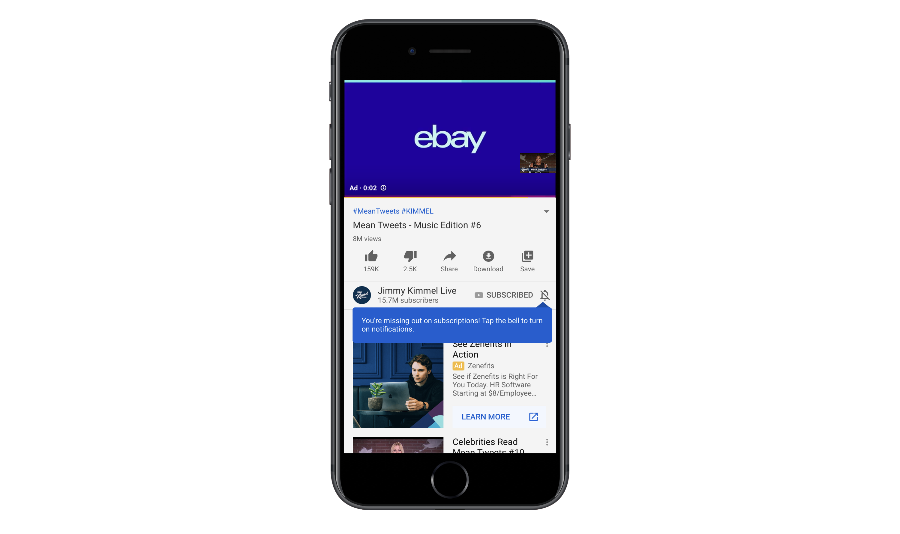
In this example, YouTube quickly displays a tooltip over the disabled notification icon. The notice reads:
“You’re missing out on subscriptions! Tap the bell to turn on notifications.”
They’re right. I’m subscribed to this channel and, yet, I haven’t received notifications (push or email) about new videos for a while. I hadn’t realized this until I saw this reminder.
The way this is handled is nice. It makes users stop and think about what they’re missing out on instead of rushing to close out another request pop-up. It also doesn’t force them to turn on push for everything. They can customize which notifications they receive.
Push notifications are supposed to be helpful. And access to your users’ phones is supposed to enhance their experience. That’s why it’s important to ask for their cooperation in enabling these features within the right context. Rather than bombard them with request after request at the outset of installing or opening an app, deliver them within the experience as in-line elements.
Note that this point is called unnecessary icon labels and not just a sweeping generalization of all of them. That’s because there are certain parts of an app where icon labels still work well. Like the navigation bar.
However, I’ve noticed an alarming trend lately whereby apps pair every page or tab name with a matching icon. There are a number of reasons why this is an issue and I’m going to use the GEICO app to demonstrate them.
This home page makes it easy for users to take advantage of their auto insurance and related services on the go. Let’s focus on the “Vehicle Trouble” section though.
There are four tabs:
The icons aren’t all that easy to decipher (except the tow truck) and I’m just not sure they add any value here. Really, if you can’t think of anything better than putting a letter “C” on a clipboard to represent claims, maybe icons aren’t needed after all?
Next, let’s take a look at the GEICO app’s list of settings:
There are a lot of settings pages here. Not only that, they’re not the kinds of pages you’d typically see in other mobile apps, so the designer has had to get creative in pairing them with icons.
If this navigation didn’t have icons, I think it would be much easier to read through the options. The same goes for the home page. Without the icons, the font size could be increased so the focus could strictly be on the page names and insured users could get to the information they need more quickly. As it stands now, the icons are just wasted space.
Let’s look at another example.
Rover is an app that pet owners can use to book pet sitting and walking services. Icons are used sparingly through the app to distinguish services from one another as well as to label the navigation pages.
I don’t think the icons on this page are necessary in terms of expediting user selection (e.g. “I need overnight house sitting so I’m going to choose the moon-over-the-house icon.”). That said, I don’t think the icons detract from the button text since each option is clearly labeled with big, bold font. What’s more, the icons do a nice job of bringing balance to the buttons so there aren’t huge white gaps in the middle.
Now, let’s look at what the designer has chosen to do under the “More” tab:
This is similar to GEICO’s slide-out navigation menu. But notice how Rover’s is text only. Considering how common these settings are from app to app, it would’ve been easy enough to add icons to each, but the designer chose to leave them off and I think that was a good decision.
There’s a time and place when icons serve a purpose. As far as labeling a secondary navigation menu in your app, it’s time to do away with that. I’d also express caution over labeling pages with icons if it’s a struggle to find a match. That should be a sign to you that they’re not needed to begin with.
In web design, we’re seeing much shorter home pages than in years past, thanks to the need for more efficient mobile experiences. So, why isn’t this something we’re doing in mobile app design?
There are some apps where this isn’t an issue. Namely, ones where there’s no scrolling at all (e.g. dating apps, gaming apps, etc.). And there are some cases where endless scrolling on the home page is fine (e.g. news and social media apps).
But what about other apps?
Listings apps (like for real estate or travel) sometimes have a hard time with this. For example, this is the top of the Airbnb mobile app:

This part of the page is well done and includes everything users need to find what they’re looking for:
But for some reason, Airbnb has designed this home page to go on and on and on with sections for:

I’m not sure what the logic was here. While I understand wanting to help your users by providing them with useful recommendations, this goes way overboard. It’s not even as though this is personalized content based on the user’s profile or recent searches. It’s just a smattering of categories that, if anything, are going to overload and overwhelm users with options.
If the app you’re building or have built runs into a similar problem, check out Hotels.com for inspiration:

Unlike Airbnb, Hotels.com’s home “Discover” page is short. All it takes is three swipes to get to the bottom of the page. Users see sections for:
For the most part, the content is 100% relevant to the user and not just meant to promote every possible service or feature of the app.
If you really feel like users would benefit from seeing every possible feature, create a secondary navigation for it. That way, they can quickly scan through the options and pick the one(s) they’re most interested in. When you give them an endless home page to scroll through and too many listings and buttons to click, you’re only going to make it harder for them to take action.
You have to monetize a mobile app if you’re going to make the original investment worth your while. It’s as simple as that.
But I’ve recently encountered some very scary dark patterns in mobile app monetization — specifically, with the way ads are designed. And it’s got me wondering if third-party ad networks are really the smartest way to monetize if they’re going to compromise everything you’ve done to create an awesome in-app experience otherwise.
Now, I understand that app designers usually don’t have any role in designing the ads that appear. That said, do you really think your users know anything about ad networks and how those ad placements get inside your app? Of course not!
So, when one of your users has a bad experience with an ad, what do you think is going to happen? They’re not going to think:
“Oh, that advertiser is terrible for doing that.”
Instead, they’re going to think:
“If I see one more ad like this, I’m uninstalling this app.”
Let me show you some examples of ads that will push the limits of your users’ patience.
This is Wordscapes, a gaming app I’m quite fond of:

I’ve been playing Wordscapes for a long time and when I first started, it was great. The banner ads were there, but they never really got in the way. And the interstitial video ads only appeared every few rounds or so. They were always easy to dismiss, too.
Over the past year or so, however, the quality of ads has majorly deteriorated. Take the banner ad above. That’s actually a video ad that doesn’t fit in the allotted space.
Then, you have this badly designed banner ad for Jynarque:

Neither of these banner ads are really dark patterns. However, they do suggest there’s something not quite right about where Wordscapes is sourcing their ad content from.
Now, I’m going to show you some of the more deceptive ads I’ve come across.
This is an ad from Showtime to promote the TV show Shameless:

See the number “5” in the top-right corner? That’s a countdown timer, which should tell users how long they have to wait until they can dismiss the ad. However, when the timer is up, this icon appears:

The timer gets to “0” and is replaced by this button. It’s not the traditional “X” that app users are accustomed to when it comes to watching ads, so they might not realize this will take them back into the game. In fact, they might misinterpret this “Next” symbol as a “Play” button and watch the ad in full. While it’s nice that Showtime gives users an exit, it would be better if the iconography were consistent with other video ads.
Then, there’s this interstitial ad for DoorDash:

This is what the ad looks like the second it appears on the screen, which is actually encouraging.
“An ad that’s going to let us exit out of it right away! Woohoo!”
But that’s not the case at all. Notice how there are two X’s in the top-right corner. One of them looks fake (the plain “X” symbol) while the other looks like an “X” you’d use to dismiss an ad.
The first time I saw this, I clicked on the good “X”, hoping my finger would be small enough to miss the fake target. Yet, this is where I ended up:
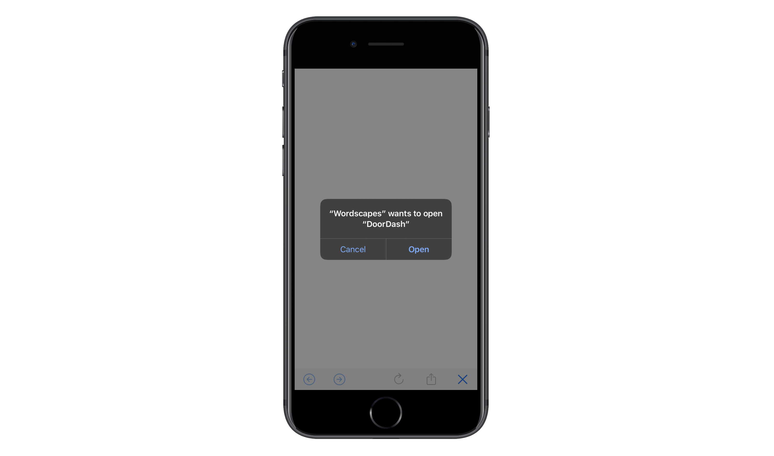
The click takes users out of the Wordscapes app and tries to move them to the app store. After hitting “Cancel” and sitting through five more seconds of the DoorDash ad, this new “X” appears in the top-right corner:
At this point, I can’t imagine users are very happy with DoorDash or Wordscapes for this experience.
These examples of bad ads and dark patterns in monetization are just the tip of the iceberg, too. There are ads that:
I know I’m picking on Wordscapes because I spend the most time inside the app, but it’s not the only one whose reputation is being hurt by third-party ad content.
Again, I recognize that you have no say in the design or execution of ads that come from ad networks. That said, I’d really urge you to talk to your clients about being more discerning about where they source their ads from. If mobile ads continue to be this bad, it might be worth sourcing your own ad content from partners and sponsors you trust instead of random companies that use deceptive advertising tactics.
There are a ton of reasons to declutter your mobile app designs. But if these examples have demonstrated anything, the most important reason to clean up is to get rid of useless and sometimes harmful design elements or techniques.
And if you’re having a hard time getting rid of the excess, I’d encourage you to reevaluate the core product. If it’s not strong enough to stand on its own, in its simplest of forms, then it’s time to go back to the drawing board because no amount of distractions you fill it with will make it a worthwhile download for your users.
In 2019, a new version of our Akaru studio website has been released.
After long discussions between developers and designers, we found the creative path we wanted to take for the redesign. The idea was to create a connection between our name Akaru and the graphic style. Meaning “to highlight” in Japanese, we wanted Akaru to transmit the light spectrum, the iridescence and reflections that light can have on some surfaces.
The particularity of the site is the mixing of regular content in the DOM/CSS and interactive background content in WebGL. We’ll have a look at how we planned and decided on the visuals of the main effect, and in the second part will share a technical overview and show how the “iridescent oil” effect was coded.
In the following, we will go through our iteration process between design and implementation and how we decided on the visuals of the interactive liquid/oil effect.
After some in-depth research, we built an inspirational mood board inspired by 3D artists and photographers. We have therefore selected several colors, and used all the details present in the images of liquids we considered: the mixture of fluids, streaks of colors and lights.

We started to create our first texture tests in Photoshop using vector shapes, brushes, distortions, and blurs. After several tests we were able to make our first environmental test with an interesting graphic rendering. The best method was to first draw the waves and shapes, then paint over and mix the colors with the different fusion modes.

The main challenge was to “feel” a liquid effect on the textures. It was from this moment that the exchange between designers and developers became essential. To achieve this effect, the developers created a parametric tool where the designers could upload a texture, and then decide on the fluid movements using a Flowmap. From there, we could manage amplitudes, noise speed, scale and a multitude of options.

Now we will go through the technical details of how the iridescent oil effect was implemented on every page. We are assuming some basic knowledge of WebGL with Three.js and the GLSL language so we will skip over commonly used code, like scene initialization.
For this project, we use the OrthographicCamera of Three.js. This camera removes all perspective so we can create our plane without caring about the depth of it.
We will create our plane with a geometry which has the width of the viewport, and we get the height by multiplying the width of the plane by the aspect ratio of our texture:
const PLANE_ASPECT_RATIO = 9 / 16;

const planeWidth = window.innerWidth;
const planeHeight = planeWidth * PLANE_ASPECT_RATIO;

const geometry = new PlaneBufferGeometry(planeWidth, planeHeight);
We could keep the number of segments by default since this effect runs on the fragment shader. By doing so, we reduce the amount of vertices we have to render, which is always good for performance.
Then, in the shader we use the UVs to sample our texture:
vec3 color = texture2D(uTexture, vUv).rgb;

gl_FragColor = vec4(color, 1.0);Now that our texture is rendered on our plane, we need to make it flow.
To create some movement, we sampled the texture with an offset two times with a different offset:
float phase1 = fract(uTime * uFlowSpeed + 0.5);
float phase2 = fract(uTime * uFlowSpeed + 1.0);

// mirroring phase
phase1 = 1.0 - phase1;
phase2 = 1.0 - phase2;

vec3 color1 = texture2D(
    uTexture,
    uv + vec2(0.5, 0.0) * phase1).rgb;

vec3 color2 = texture2D(
    uTexture,
    uv + vec2(0.5, 0.0) * phase2).rgb;
Then we blend our two textures together:
float flowLerp = abs((0.5 - phase1) / 0.5);
vec3 finalColor = mix(color1, color2, flowLerp);

return finalColor;
But we don’t want our texture to always flow in the same direction, we want some areas to flow up, some others to flow to the right, and so on. To achieve this, we used Flow Map or Vector Map, which look like this:
A flow map is a texture in which every pixel contains a direction represented as a 2d vector x and y. In this texture, the red component stores the direction on the x axis, while the green component stores the direction on the y axis. Areas where the liquid is stationary are mid red and mid green (you can find those areas on top of the map). In fact, the direction could be in two ways, for example on the x axis the liquid could go to the left or to the right. To store this information a red value of 0 will make the texture go to the left and a red value of 255 will make the texture go to the right. In the shader, we implement this logic like this:
vec2 flowDir = texture2D(uFlowMap, uv).rg;
// make mid red and mid green the "stationary flow" values
flowDir -= 0.5;

// mirroring phase
phase1 = 1.0 - phase1;
phase2 = 1.0 - phase2;

vec3 color1 = texture2D(
    uTexture,
    uv + flowDir * phase1).rgb;

vec3 color2 = texture2D(
    uTexture,
    uv + flowDir * phase2).rgb;
We painted this map using Photoshop and unfortunately, with all exports (jpeg, png, etc.), we always got some weird artefacts. We found out that using PNG resulted in the least “glitchy” exports we could obtain. We guess that it comes from the compression algorithm for exports in Photoshop. These artefacts are invisible to the eye and can only be seen when we use it as a map. To fix that, we blurred the texture two times with glsl-fast-gaussian-blur (one vertically and one horizontally) and blended them together:
vec4 horizontalBlur = blur(
    uFlowMap,
    uv,
    uResolution,
    vec2(uFlowMapBlurRadius, 0.0)
  );
vec4 verticalBlur = blur(
    uFlowMap,
    uv,
    uResolution,
    vec2(0.0, uFlowMapBlurRadius)
  );
vec4 texture = mix(horizontalBlur, verticalBlur, 0.5);
As you can see, we used glslify to import glsl modules hosted on npm; it’s very useful to keep you shader’s code split and as simple as possible.
Now that our liquid flows, we can clearly see when the liquid is repeating. But liquid doesn’t flow this way in real life. To create a better illusion of a realistic flow movement, we added some turbulence to distort our textures.
To create this turbulence we use glsl-noise to compute a 3D Noise in which x and y will be the UV downscaled a bit to create a large distortion, and Z will be the time elapsed since the first frame, this will create an animated seamless noise:
float x = uv.x * uNoiseScaleX;
float y = uv.y * uNoiseScaleY;

float n = cnoise3(vec3(x, y, uTime * uNoiseSpeed));
Then, instead of sampling our flow with the default UV, we distort them with the noise:
vec2 distordedUv = uv + applyNoise(uv);

vec3 color1 = texture2D(
    uTexture,
    distordedUv + flowDir * phase1).rgb;

...
On top of that, we use a uniform called uNoiseAmplitude to control the noise strength.
To observe how the noise influences the rendering, you can tweak it inside the “Noise” folder in the GUI at the top right of the screen. For example, try to tweak the “amplitude” value:
To add some user interaction, we wanted to create a trail inside the oil, like a finger pushing the oil, where the finger would be the user’s pointer. This effect consists of three things:
To achieve this we used a Frame Buffer (or FBO). I will not go very deep into what frame buffers are here but if you want to you can learn everything about it here.
Basically, it will:
By doing so, we have a trail drawn by the mouse and everything run on the GPU! For this kind of simulations, running them on the GPU is way more performant than running them on the CPU.
We can use the frame buffer as texture. It will be a black texture, with a white trail painted by the mouse. So we pass our trail texture via uniform to our Oil shader and we can compute it like this:
float trail = texture2D(uTrailTexture, uv).r;We use only the red component of our texture since it’s a grayscale map and all colors are equal.
Then inside our flow function we use our trail to change the direction our liquid texture flow:
flowDir.x -= trail;
flowDir.y += trail * 0.075;When we move our finger in a liquid, the trail it will create depends on the speed our finger moves. To recreate this feeling we make the radius of the trail depending on the mouse speed: the faster the mouse will go, the bigger the trail will be.
To find the mouse speed we compute the difference between the damped and the current mouse position:
const deltaMouse = clamp(this.mouse.distanceTo(this.smoothedMouse), 0.0, 1.0) * 100;Then we normalize it and apply an easing to this value with the easing functions provided by TweenMax to avoid creating a linear acceleration.
const normDeltaMouse = norm(deltaMouse, 0.0, this.maxRadius);
const easeDeltaMouse = Circ.easeOut.getRatio(normDeltaMouse);Here’s an overview of the technologies we’ve used in our project:
Prismic is a really easy to use headless CMS with a nice API for image formatting and a lot of others useful features.
We hope you liked this Case Study, if you have any questions, feel free to ask us on Twitter (@lazyheart and @colinpeyrat), we would be very happy to receive your feedback!
Case Study: Akaru 2019 was written by Jeremy Franzese and published on Codrops.