The mission of our company's information systems director is to guarantee the proper functioning of the IT department and its alignment with the company's strategy and IT strategy. He will have to ensure that the relationship with the business lines is the best possible, in direct contact with the IT stakeholders, but will also have to act as an interface with the company's management.
In today's Apache NiFi, there is a new and improved means of load balancing data between nodes in a cluster. With the introduction of NiFi 1.8.0, connection load balancing has been added between every processor in any connection. You now have an easy to set option for automatically load balancing between your nodes.
The legacy days of using Remote Process Groups to distribute the load between Apache NiFi nodes is over. For maximum flexibility, performance and ease, please make sure you upgrade your existing flows to use the built-in Connection Load Balancing.
A fast release cadence provides the ability to add features without casting them in stone, making them part of the Java SE standard.
It's now over two years since the release of JDK 9, and with it, the switch to a time-based rather than feature-based release schedule. It seems incredible that it took very nearly eleven years to get from JDK 6 to JDK 9, yet in just over two years, we've gone from JDK 9 to JDK 13.
Each release under this new strategy provides a smaller set of features than we had in the old major release approach. What we're seeing, though, is the overall rate of change is faster than it's ever been, which is a significant advantage for keeping Java vibrant and attractive to developers.
Hi, Spring fans! This week I am in beautiful Tokyo, Japan, where I just spoke at the always lovely annual Spring Fest event. I loved the show, and I hope that the audience got something out of my performance.
Last week was tough. Possibly the toughest week of my life. I didn’t publish an episode of A Bootiful Podcast, as such. You won’t see that episode reflected on the blog because it was my heartbroken dedication to my father, who passed away last week at the age of 81. No interview in that brief, less-than-20 minutes episode.
Do you want to see the keywords people use to find your WordPress website?
Keywords are the phrases users type in search engines to find the content they are looking for. You would want your website to rank for the right keywords that describe what you are offering.
In this guide, we will show you how to easily see the keywords people use to find your WordPress site.
What is Keyword Tracking and Why is it Important?
Keyword tracking is basically the activity of monitoring the position of your website for specific keywords in search engines like Google, Bing, etc.
Keyword tracking helps you see important metrics such as which specific keywords people use to find your website, so you can focus on what’s working and stop spending time on what’s not.
But what many beginners don’t know is that search rankings change quite often. If a new competitor enters the market or your previous competitor further improves their SEO, then you can lose the rankings that you previously had and thus the traffic along with it.
Sometimes Google algorithm updates can also cause your website to increase or decrease in rankings for your top keywords.
At WPBeginner, we believe that its easier to double your website traffic and sales when you know exactly how people find and use your website.
With that said, let’s take a look at how to see the keywords people use to find your website.
Tracking Keywords People Use to Find Your Site
The best way to track keywords people use and the keywords where your website ranks is by using Google Search Console.
Google Search Console is a free tool offered by Google to help website owners monitor and maintain their site’s presence in Google search results.
We’ll show you how to connect search console to your Google Analytics along with how to bring those reports right inside your WordPress dashboard.
Finally, we’ll cover how to track not just your own keywords, but also the keywords your competitors are ranking for.
Sounds good? Let’s get started.
Tracking Your Website Keywords in Google Search Console
You can simply visit the Google Search Console website and follow the instructions in our tutorial.
Once you have added your website to Google Search Console, you’ll be able to use it to monitor your search rankings.
To view your keyword positions, click on the Performance report and then click on the average position score.
Search Console will now load your reports with the average position column included.
Next, you need to scroll down a bit to see the full list of keywords your website ranks for.
You will see a list of keywords with number of clicks, impressions, and position of that keyword in search results.
You can sort the data by clicks, impressions, and position columns. You can see your top ranking keywords by sorting the data by position.
As you scroll down, you will be able to see keywords where your site appears deeper in search results. You can optimize your content to rank higher for those keywords as well.
Method 2. Track Your Keywords Inside WordPress with MonsterInsights
For this method, we’ll be using MonsterInsights to fetch our Google Search Console data inside the WordPress dashboard.
This method has two advantages.
You get to see your keywords right inside WordPress admin area
You’ll see it along with your other MonsterInsights reports which will help you plan more effeciently
MonsterInsights is the #1 Google Analytics plugin for WordPress. It allows you to easily install Google Analytics in WordPress and shows you human-readable reports right inside your WordPress dashboard.
Once you have installed and set up MonsterInsights, the next step is to connect your Google Analytics account to your Goole Search Console account.
Simply, login to your Google Analytics account and then click on the Admin button from the bottom left corner of the screen.
Next, you need to click on ‘All products’ under the property column and then click on the ‘Link Search Console’ button.
This will take you to the Search Console settings page where you need to click on the Add button. After that, you’ll see a list of websites added to your Google Search Console account.
Click on the OK button to continue and your Analytics and Search Console accounts will now be linked.
You can now view the keywords your website ranks for inside the WordPress admin area.
Simply go to Insights » Reports and then switch to the Search Console tab.
You’ll see a list of keywords where your website appears in the search result. Next, to each keyword you’ll also see the following parameters:
Clicks – How often your site is clicked when it appears for this keyword
Impressions – How often it appears in search results for that keyword
CTR – Click through rate for this keyword
Average position – Your site’s average position in search results for that particular keyword
Method 3. Tracking Your Keyword Rankings in Google Analytics
In the previous method, we showed you how to connect Google Search Console to your Google Analytics account and view the reports inside your WordPress dashboard.
However, you can also view your keyword rankings inside Google Analytics.
Simply, login to your Google Analytics dashboard and go to Acquisitions » Search Console » Queries report.
Your search keywords will be listed under the Search Query column. For each keyword, you’ll also see its CTR, impressions, and average position.
Method 4. Tracking Competitor Keywords using SEMRush
Do you want to track not just yours but also the keywords your competitors are ranking for? This method allows you to do that with actual tips on how to outrank your competition.
We’ll be using SEMRush for this method. It is one of the top SEO tools on the market because it helps you get more search traffic to your website.
We use it on our many websites to gather competitive intelligence.
First, you need to sign up for an SEMRush account. Note: You can use our SEMRush coupon to get a better deal.
After you have created an account, you can enter your domain name at the top search bar under SEMRush dashboard.
Next, SEMRush will show you full keyword report with a list of your top ranking keywords.
Click on the View Full Report button to get the full list of keywords.
Next to each keyword, you’ll see its position, volume of search, cost (for paid advertisement), and the percentage of traffic it sends to your website.
You can also enter your competitor’s domain name to download a full list of all the keywords where they rank.
Tips on Improving The Keywords Where Your Website Ranks
As you go through the list of keywords, you’ll notice some of your results rank quite well (under top 10) with significant impressions but very low CTR.
This means that users didn’t find your article interesting enough to click on. You can change that by improving your article’s title and meta descriptions. See our guide on how to improve blog post SEO to rank higher.
You’ll also see keywords where your website can easily rank higher. You can then edit those articles and improve them by adding more helpful content, adding a video, and making it easier to read.
If you are using SEMRush, then you can use their Writing Assistant Tool which helps you improve your content by making it more SEO friendly for that particular keyword. See our guide on using the SEO writing assistant for more details.
We hope this article helped you learn how to see the keywords people use to find your WordPress site. You may also want to see our guide on how to easily increase website traffic with practical tips for beginners.
If you liked this article, then please subscribe to our YouTube Channel for WordPress video tutorials. You can also find us on Twitter and Facebook.
Many UX designers are somewhat afraid of data, believing it requires deep knowledge of statistics and math. Although that may be true for advanced data science, it is not true for the basic research data analysis required by most UX designers. Since we live in an increasingly data-driven world, basic data literacy is useful for almost any professional — not just UX designers.
Aaron Gitlin, interaction designer at Google, argues that many designers are not yet data-driven:
“While many businesses promote themselves as being data-driven, most designers are driven by instinct, collaboration, and qualitative research methods.”
With this article, I’d like to give UX designers the knowledge and tools to incorporate data into their daily routines.
But First, Some Data Concepts
In this article I will talk about structured data, meaning data that can be represented in a table, with rows and columns. Unstructured data, being a subject in itself, is more difficult to analyze, as Devin Pickell (content marketing specialist at G2 Crowd, writing about data and analytics) pointed out in his article “Structured vs Unstructured Data – What’s the Difference?.” If the structured data can be represented in a table form, the main concepts are:
Dataset
The entire set of data we intend to analyze. This could be, for example, an Excel table. Another popular format for storing datasets is the comma-separated value file (CSV). CSV files are simple text files used to store table-like information. Each CSV row corresponds to a row in the table, and each CSV row has values separated (naturally) by commas, which correspond to table cells.
Data Point
A single row from a dataset table is a data point. In that way, a dataset is a collection of data points.
Data Variable
A single value from a data-point row represents a data variable — put simply, a table cell. We can have two types of data variables: qualitative variables, and quantitative variables. Qualitative variables (also known as categorical variables) have a discrete set of values, such as color = red/green/blue. Quantitative variables have numerical values, such as height = 167. A quantitative variable, unlike a qualitative one, can take any value.
Creating Our Data Project
Now we know the basics, it’s time to get our hands dirty and create our first data project. The scope of the project is to analyze a dataset by going through the entire data flow of importing, processing and plotting data. First, we will choose our dataset, then we will download and install the tools for analyzing the data.
Cars Dataset
For the purpose of this article, I’ve chosen a cars dataset, because it’s simple and intuitive. The data analysis will simply confirm what we already know about the cars — which is fine, since our focus is on data flow and tools.
We can download a used cars dataset from Kaggle, one of the biggest sources of free datasets. You’ll need to register first.
After downloading the file, open it and take a look. It’s a really big CSV file, but you should get the gist. A line in this file will look like this:
19500,2015,2965,Miami,FL,WBA3B1G54FNT02351,BMW,3
As you can see, this data point has several variables separated by commas. Since we now have the dataset, let’s talk a little about tools.
Tools of the Trade
We will use the R language and RStudio to analyze the dataset. R is a very popular and easy to learn language, used not only by data scientists, but also people in financial markets, medicine and many other areas. RStudio is the environment where R projects are developed, and there’s a free version, which is more than enough for our needs as UX designers.
It’s likely that some UX designers use Excel for their data workflow. If that means you, try R — there is a good chance you’ll like it, since it is easy to learn, and more flexible and powerful than Excel. Adding R to your tool kit will make a difference.
Installing the Tools
First, we need to download and install R and RStudio. You should install R first, then RStudio. The installation processes for both R and RStudio are simple and straightforward.
Project Setup
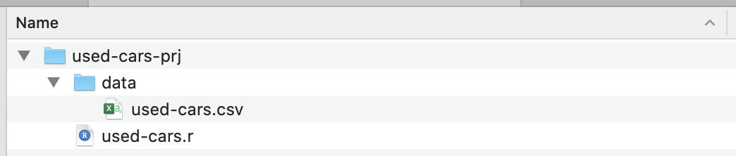
Once the installation is complete, create a project folder — I’ve called it used-cars-prj. In that folder, create a subfolder called data, and then copy the dataset file (downloaded from Kaggle) into that folder and rename it to used-cars.csv. Now go back to our project folder (used-cars-prj) and create a plain text file called used-cars.r. You should end up with the same structure as in the screenshot below.
Now we have the folder structure in place, we can open RStudio and create a new R project. Chose New Project… from the File menu and select the second option, Existing Directory. Then select the project directory (used-cars-prj). Finally, press the Create Project button and you’re done. Once the project is created, open used-cars.r in RStudio — this is the file where we will add all our R code.
Importing Data
We will add our first line in used-cars.r, for reading data from the used-cars.csv file. Remember that CSV files are just plain text files used for storing data. Our first line of R code will look like this:
It might look a little intimidating, but it really isn’t — by the way, this is the most complex line in the entire article. What we have here is the read.csv function, which takes three parameters.
The first parameter is the file to read, in our case used-cars.csv, which is located in the data folder. The second parameter, stringsAsFactors=FALSE is set to make sure strings like “BMW” or “Audi” aren’t converted to factors (the R jargon for categorical data) — as you recall, qualitative or categorical variables can have only discrete values like red/green/blue. Finally, the third parameter, sep="," specifies the kind of separator used to separate values in the CSV file: a comma.
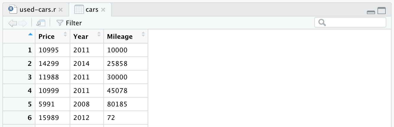
After reading the CSV file, the data is stored into the cars data frame object. A data frame is a two-dimensional data structure (like an Excel table), which is very useful in R to manipulate data. After introducing the line and running it, a cars data frame will be created for you. If you look in the top-right quadrant in RStudio, you will notice the cars data frame, in the Data section under the Environment tab. If you double click on cars, a new tab will open in the top-left quadrant of RStudio, and will present the cars data frame. As you might expect, it looks like an Excel table.
This is actually the raw data we downloaded from Kaggle. But since we want to perform data analysis, we need to process our dataset first.
Data Processing
By processing, we mean removing, transforming or adding information to our dataset, in order to prepare for the kind of analysis we want to perform. We have the data in a data frame object, so now we need to install the dplyr library, a powerful library for manipulating data. To install the library in our R environment, we need to write the following line at the top of our R file.
install.packages("dplyr")
Then, to add the library to our current project, we will use the next line:
library(dplyr)
Once the dplyr library has been added to our project, we can start processing data. We have a really big dataset, and we need only the data representing the same car maker and model, in order to correlate that with price. We’ll use the following R code to keep only data concerning the BMW 3 Series, and remove the rest. Of course, you could choose any other manufacturer and model from the dataset, and expect to have the same data characteristics.
cars <- cars %>% filter(Make == "BMW", Model == "3")
Now we have a more manageable dataset, though still containing more than 11,000 data points, that fits with our intended purpose: to analyze the cars’ price, age and mileage distributions, and also the correlations between them. For that, we need to keep only “Price”, “Year” and “Mileage” columns and remove the rest — this is done with the following line.
cars <- cars %>% select(Price, Year, Mileage)
After removing other columns, our data frame will look like this:
There is one more change we want to make to our dataset: to replace the manufacture year with the age of the car. We can add the following two lines, the first to calculate the age, the second to change the column name.
At this point, our R code will look like the following, and that’s all for the data processing. We can now see how easy and powerful the R language is. We’ve processed the initial dataset quite dramatically with only a few lines of code.
Our data is now in the right shape, so we can go to make some plots. As already mentioned, we will focus on two aspects: individual variables’ distribution, and the correlations between them. Variable distribution helps us to understand what is considered a medium or high price for a used car — or the percentage of cars above a specific price. The same applies for the age and mileage of the cars. Correlations, on the other hand, are helpful in understanding how variables like age and mileage are related to each other.
That said, we will use two kinds of data visualization: histograms for variable distribution, and scatter plots for correlations.
Price Distribution
Plotting the car price histogram in the R language is as easy as this:
hist(cars$Price)
A small tip: if you are in RStudio you can run the code line by line; for example, in our case, you need run only the line above to display the histogram. It’s not necessary to run all the code again since you ran it once already. The histogram should look like this:
If we look at the histogram, we notice a bell-like distribution of the cars’ prices, which is what we expected. Most of the cars fall in the middle range, and we have fewer and fewer as we move to each side. Almost 80% of the cars are between $10,000 and $30,000 USD, and we have a maximum of more than 2,500 cars between $20,000 and $25,000 USD. On the left side we have probably around 150 cars under $5,000 USD, and on the right side even fewer. We can easily see how useful such plots are to get insights into data.
Age Distribution
Just as for the cars’ prices, we’ll use a similar line to plot the cars’ age histogram.
This time the histogram looks counterintuitive — instead of a simple bell shape, we have here four bells. Basically, the distribution has three local and one global maximum, which is unexpected. It would be interesting to see if this strange distribution of the cars’ ages stays true for another car maker and model. For the purpose of this article we’ll stay with the BMW 3 Series dataset, but you can dig deeper into the data if you are curious. Regarding our car age distribution, we notice that more than 90% of the cars are less than 10 years old, and more than 80% less than 7 years old. Also, we notice that the majority of the cars are less than 5 years old.
Mileage Distribution
Now, what can we say about mileage? Of course, we expect to have the same bell shape we had for price. Here is the R code and the histogram:
Here we have a left-skewed bell shape, meaning that there are more cars with less mileage on the market. We also notice that the majority of the cars have less than 60,000 miles, and we have a maximum around 20,000 to 40,000 miles.
Age–Price Correlation
Regarding correlations, let’s take a closer look at the cars age–price correlation. We might expect the price to be negatively correlated with the age — as a car’s age increases, its price will go down. We will use the R plot function to display the price–age correlation as follows:
plot(cars$Age, cars$Price)
And the plot looks like this:
Car age–price correlation scatterplot (Large preview)
We notice how the cars’ prices go down with age: there are expensive new cars, and cheaper old cars. We can also see the price variation interval for any specific age, a variation that decreases with a car’s age. This variation is largely driven by the mileage, configuration and overall state of the car. For example, in the case of a 4-year-old car, the price varies between $10,000 and $40,000 USD.
Mileage–Age Correlation
Considering the mileage–age correlation, we would expect mileage to increase with age, meaning a positive correlation. Here is the code:
plot(cars$Mileage, cars$Age)
And here is the plot:
Car mileage–age correlation scatterplot (Large preview)
As you can see, a car’s age and mileage are positively correlated, unlike a car’s price and age, which are negatively correlated. We also have an expected mileage variation for a specific age; that is, cars of the same age have varying mileages. For example, most 4-year-old cars have the mileage between 10,000 and 80,000 miles. But there are outliers too, with greater mileage.
Mileage–Price Correlation
As expected, there will be a negative correlation between the cars’ mileage and the price, which means that increasing the mileage reduces the price.
plot(cars$Mileage, cars$Price)
And here is the plot:
Car mileage–price correlation scatterplot (Large preview)
As we expected, a negative correlation. We can also notice the gross price interval between $3,000 and $50,000 USD, and the mileage between 0 and 150,000. If we look closer at the distribution shape, we see that the price goes down much faster for cars with less mileage than it does for cars with more mileage. There are cars with almost zero mileage, where the price drops dramatically. Also, above 200,000 miles range — because the mileage is very high — the price stays constant.
From Numbers To Data Visualizations
In this article, we used two types of visualization: histograms for data distributions, and scatter plots for data correlations. Histograms are visual representations that take the values of a data variable (actual numbers) and show how they are distributed across a range. We used the R hist() function to plot a histogram.
Scatter plots, on the other hand, take pairs of numbers and represent them on two axes. Scatter plots use the plot() function and provide two parameters: the first and the second data variables of the correlation we want to investigate. Thus, the two R functions, hist() and plot() help us translate sets of numbers in meaningful visual representations.
Conclusion
Having got our hands dirty going through the entire data flow of importing, processing, and plotting data, things look much clearer now. You can apply the same data flow to any shiny new dataset that you will encounter. In user research, for example, you could graph time on task or error distributions, and you could also plot a time on task vs. error correlation.
To learn more about the R language Quick-R is a good place to start, but you could also consider R Bloggers. For documentation on R packages, like dplyr, you can visit RDocumentation. Playing with data can be fun, but it is also extremely helpful to any UX designer in a data-driven world. As more data is collected and used to inform business decisions, there is an increased chance for designers to work on data visualization or data products, where understanding the nature of data is essential.
What is the best way to get a domain name? Should you choose a hosting package with the domain included, or buy your domain and hosting in separate places? And with all of the options available, how do you choose the best domain name registrar for your business? In this guide, we'll take a look at what makes a good domain registrar, list the best options available, and share which registrars we would suggest for different types of businesses.
New Year is the last milestone in an annual email marketing campaign. Coming right after the biggest shopping events, Black Friday and Christmas, its importance is often overlooked and underestimated. The deal is that at the end of the day, …
Do you have a registered website on the world-famous provider of sites known as WordPress? And is your site reaching tons of traffic daily? If not, there must be a problem with the performance of...