Recently. while working on a requirement, there came a need to upload a file for further processing. Mostly in REST APIs, we are accustomed to using JSON input and output while it is XML for SOAP web services.
This leads us to research how to satisfy the requirement. In Spring, and mainly in Spring Boot, the auto-configuration feature gives us big-time help even though sometimes we have to disable some features to add custom once or to change the order they are sorted in.
Couldn't connect to new SQL Server install because I forgot to enable TCP/IP. I'm the lead author for a Microsoft Press book about SQL Server administration.
Aside from demonstrating that checklists are helpful, it did raise an interesting point about why this isn't a configurable option in the SQL Server Setup tool. After all, most people using SQL Server today are not connecting to it locally on the same machine, and the Linux and Docker container versions of SQL Server already have TCP/IP enabled.
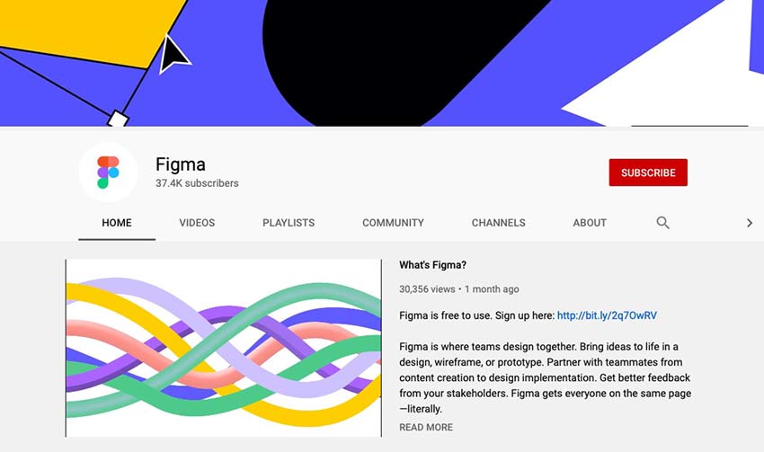
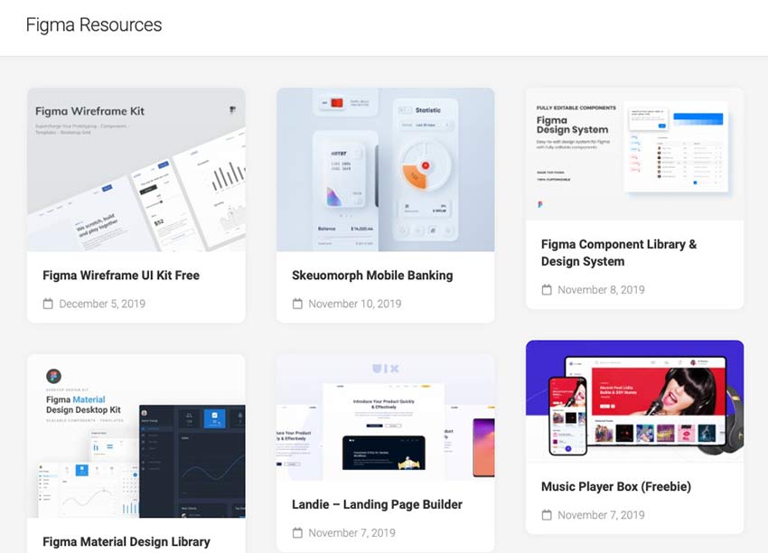
If you work in the design industry, Figma is an excellent resource. Not only does it allow you to work on design projects with your team remotely, it also allows you to collaborate in real-time. It’s a true-blue interfacing tool that includes a variety of features to make it easy to generate new ideas and follow them through to completion.
Figma also makes it possible to create animated prototypes, solicit contextual feedback from your team or clients, build systems to use again and again, and more. It’s a pretty versatile tool that makes collaborating on design projects across the office or across the country a snap.
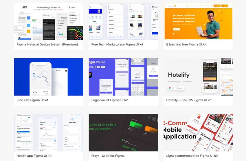
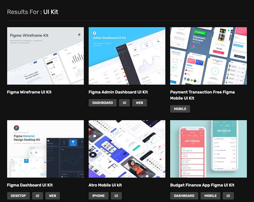
But as with getting started with any new tool, setting up everything and getting into a good workflow might take some trial and error. That’s why we’ve put together some useful Figma resources for establishing your team’s workflow, including tutorials, templates, UI kits, and more.
Your Web Designer Toolbox Unlimited Downloads: 500,000+ Web Templates, Icon Sets, Themes & Design Assets
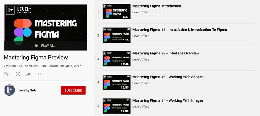
Tutorials
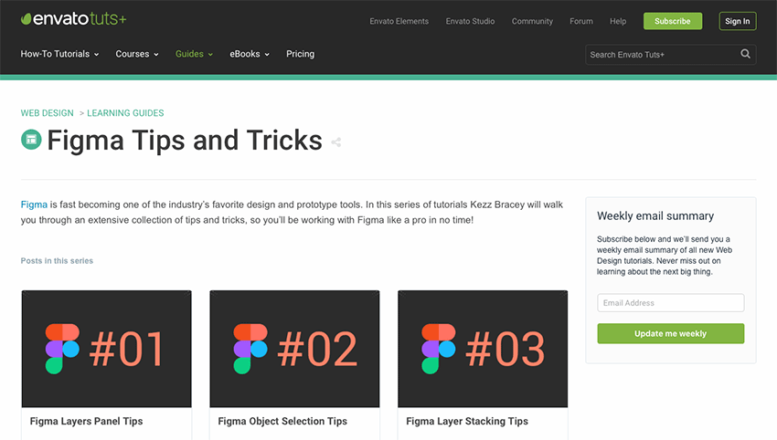
Here are some tutorials that walk you through getting started with Figma as well as some of its more complex features.
There’s no reason you have to go it alone when learning about how Figma works. This collection of tutorials, UI Kits, and other resources should make it a lot easier to get started and to learn how to best use Figma for your team.
All of the resources included here are listed as free, but make sure to read the terms for each before you use them in a project for personal or commercial use.
In language, there are many ways of saying the same thing. That creates a need to optimize the language conditions for your bot so that it can give the correct answer even when other words are used. Here is how you do it in Teneo Studio.
We have earlier seen examples of how to semi-automatically create language conditions based on positive example inputs. For example, we created a syntax trigger that can handle conversations like the following:
Cloud-native applications are a type of complex system that depends on the continuous effort of software professionals that combines the best of their expertise to keep them running. In other words, their reliability isn't self-sustaining, but is a result of the interactions of all the different actors engaged in their design, build, and operation.
Too often, there are factors that can lead to a major change. A change that affects a lot of processes and people involved in the software development process. Here, let’s have a look at how changing a test management tool can have an impact on a project that works perfectly well from all points of view.
Let's focus on using Spring profiles to switch clients.
In this lesson, we use Spring Profiles to enable an application to determine which of our two clients (server-sent events via WebClient, or RSocket) to use to connect to our Kotlin Spring Boot price service.
No matter what your profession is, it’s important to hone your craft. Uncle Bob (Rob Martin) in his book titled The Clean Codersuggests that us programmers should regularly practice writing code and solve common problems. Once we get good at solving them, he goes as far as recommending that we program to the rhythm of the music. Not to mention that we shouldn’t only stick to one programming language that we’ve mastered. We should constantly expose ourselves to different languages to get a better understanding of the programming universe.
Are you repeating your unit tests in an effort to expect a different result?
While moving our daughter into her new apartment, which happens to be on the 9th floor of the rental complex, I noticed an interesting situation while waiting for the elevator to arrive. As others walked up to wait for the elevator, they would push the button with the universal "arrow pointing up" symbol — even though we had already pushed the button to request the elevator's service.
Learn more about the implications of social robots.
Earlier generations predicted a future where household robots in our home would perform home cleaning, caring, and companion duties. In the last decade, we've seen a mishmash of robots used to replace humans in a range of tasks across society. Robots can now run agricultural farms and look after cows on a floating dairy farm.
Cross-browser testing is not a new term for someone who is into web development. If you are developing a website or a web application, you would want to run it smoothly on different browsers. It is not as easy as it sounds!
In this article, I'm going to propose my list of "golden rules" for building Spring Boot applications, which are a part of the microservices-based system. I'm basing on my experience in migrating monolithic SOAP applications running on JEE servers into REST-based small applications built on top of Spring Boot. This list of best practices assumes you are running many microservices on the production under huge incoming traffic. Let's begin.
Probably anyone who is connected to software development has heard about technical debt. But both salespeople, account managers and probably even CEOs rarely understand what tech debt means, how to measure technical debt, as well as the necessity to pay it. According to Claranet's survey, 48% of 100 IT decision-makers from the UK, say that their non – technical coworkers have no idea about the financial impact of tech debt.
It’s not a secret that a vast majority of college students are not into writing their assignments, which, as you know, are an integral and very important part of learning. Overburdened with loads of homework, everyday chores, part-time jobs, and other “blessings” of college life, students cannot devote enough time to essay writing. Lots of […]
Since I first became aware of the energy in this community, I felt the urge to be more engaged in this ‘digital avant-garde landscape’ that is being cultivated by the amazing people behind Codrops, Awwwards, CSSDA, The FWA, Webby Awards, etc. That energy has propelled me to set up this new portfolio, which acted as a way of putting my feet into the water and getting used to the temperature.
I see this community being responsible for pushing the limits of what is possible on the web, fostering the right discussions and empowering the role of creative developers and creative designers across the world.
With this in mind, it’s difficult not to think of the great art movements of the past and their role in mediating change. You can easily draw a parallel between this digital community and the Impressionists artists in the last century, or as well the Bauhaus movement leading our society into modernism a few decades ago. What these periods have in common is that they’re pushing the boundaries of what is possible, of what is the new standard, doing so through relentless experimentation. The result of that is the world we live in, the products we interact with, and the buildings we inhabit.
The websites that are awarded today, are so because they are innovating in some aspects, and those innovations eventually become a new standard. We can see that in the apps used by millions of people, in consumer websites, and so on. That is the impact that we make.
I’m not saying that a new interaction featured on a new portfolio launched last week is going to be in the hands of millions of people across the globe in the following week, although constantly pushing these interactions to its limits will scale it and eventually make these things adopted as new standards. This is the kind of responsibility that is in our hands.
Open Source
We decided to be transparent and take a step forward in making this entire project open source so people can learn how to make the things we created. We are both interested in supporting the community, so feel free to ask us questions on Twitter or Instagram (@brunoarizio and @lhbzr), we welcome you to do so!
With the portfolio, we took a meticulous approach to motion and collaborated to devise deliberate interactions that have a ‘realness’ to it, especially on the main page.
The mix of the bending animation with the distortion effect was central to making the website ‘tactile’. It is meant to feel good when you shuffle through the projects, and since it was published we received a lot of messages from people saying how addictive the navigation is.
A lot of my new ideas come from experimenting with shaders and filters in After Effects, and just after I find what I’m looking for — the ‘soul’ of the project — I start to add the ‘grid layer’ and begin to structure the typography and other elements.
In this project, before jumping to Sketch, I started working with a variety of motion concepts in AE, and that’s when the version with the convection bending came in and we decided to take it forward. So we can pretty much say that the project was born from motion, not from a layout in this matter. After the main idea was solid enough, I took it to Sketch, designed a simple grid and applied the typography.
Collaboration
Working in collaboration with Luis was so productive. This is the second (of many to come) projects working together and I can safely say that we had a strong connection from start to finish, and that was absolutely important for the final results. It wasn’t a case in which the designer creates the layouts and hands them over to a developer and period. This was a nuanced relationship of constant feedback. We collaborated daily from idea to production, and it was fantastic how dev and design had this keen eye for perfectionism.
From layout to code we were constantly fine-tuning every aspect: from the cursor kinetics to making overhaul layout changes and finding the right tone for the easing curves and the noise mapping on the main page.
When you design a portfolio, especially your own, it feels daunting since you are free to do whatever you want. But the consequence is that this will dictate how people will see your work, and what work you will be doing shortly after. So making the right decisions deliberately and predicting its impact is mandatory for success.
Technical Breakdown
Luis Henrique Bizarro, Creative Developer — @lhbzr
Motion Reference
This was the video of the motion reference that Bruno shared with me when he introduced me his ideas for his portfolio. I think one of the most important things when starting a project like this with the idea of implementing a lot of different animations, is to create a little prototype in After Effects to drive the developer to achieve similar results using code.
That’s my favorite stack to work with right now; it gives me a lot of freedom to focus on animations and interactions instead of having to follow guidelines of a specific framework.
In this particular project, most of the code was written from scratch using ECMAScript 2015+ features like Classes, Modules, and Promises to handle the route transitions and other things in the application.
In this case study, we’ll be focusing on the WebGL implementation, since it’s the core animation of the website and the most interesting thing to talk about.
1. How to measure things in Three.js
This specific subject was already covered in other articles of Codrops, but in case you’ve never heard of it before, when you’re working with Three.js, you’ll need to make some calculations in order to have values that represent the correct sizes of the viewport of your browser.
In my last projects, I’ve been using this Gist by Florian Morel, which is basically a calculation that uses your camera field-of-view to return the values for the height and width of the Three.js environment.
I usually store these two variables in the wrapper class of my applications, this way we just need to pass it to the constructor of other elements that will use it.
In the embed below, you have a very simple implementation of a PlaneBufferGeometry that covers 75% of the height and width of your viewport using this solution.
2. Uploading textures to the GPU and using them in Three.js
In order to avoid the textures to be processed in runtime while the user is navigating through the website, I consider a very good practice to upload all images to the GPU immediately when they’re ready. On Bruno’s portfolio, this process happens during the preloading of the website. (Kudos to Fabio Azevedo for introducing me this concept a long time ago in previous projects.)
Another two good additions, in case you don’t want Three.js to resize and process the images you’re going to use as textures, are disabling mipmaps and change how the texture is sampled by changing the generateMipmaps and minFilter attributes.
The method .initTexture() was introduced back in the newest versions of Three.js in the WebGLRenderer class, so make sure to update to the latest version of the library to be able to use this feature.
But my texture is looking stretched! The default behavior of Three.js map attribute from MeshBasicMaterial is to make your image fit into the PlaneBufferGeometry. This happens because of the way the library handles 3D models. But in order to keep the original aspect ratio of your image, you’ll need to do some calculations as well.
There’s a lot of different solutions out there that don’t use GLSL shaders, but in our case we’ll also need them to implement our animations. So let’s implement the aspect ratio calculations in our fragment shader that will be created for the ShaderMaterial class.
So, all you need to do is pass your Texture to your ShaderMaterial via the uniforms attribute. In the fragment shader, you’ll be able to use all variables passed via the uniforms attribute.
In Three.js Uniform documentation you have a good reference of what happens internally when you pass the values. For example, if you pass a Vector2, you’ll be able to use a vec2 inside your shaders.
We need two vec2 variables to do the aspect ratio calculations: the image resolution and the resolution of the renderer. After passing them to the fragment shader, we just need to implement our calculations.
In this snippet we’re using template strings to represent the code of our shaders only to keep it simple when using CodeSandbox, but I highly recommend using glslify to split your shaders into multiple files to keep your code more organized in a more robust development environment.
We’re all good now with the images! Our images are preserving their original aspect ratio and we also have control over how much space they’ll use in our viewport.
3. How to implement infinite scrolling
Infinite scrolling can be something very challenging, but in a Three.js environment the implementation is smoother than it’d be without WebGL by using CSS transforms and HTML elements, because you don’t need to worry about storing the original position of the elements and calculate their distance to avoid browser repaints.
Overall, a simple logic for the infinite scrolling should follow these two basic rules:
If you’re scrolling down, your elements move up — when your first element isn’t on the screen anymore, you should move it to the end of the list.
If you’re scrolling up, your elements move to down — when your last element isn’t on the screen anymore, you should move it to the start of the list.
Sounds reasonable right? So, first we need to detect in which direction the user is scrolling.
The variable this.scroll.values.target is responsible for defining to which scroll position the user wants to go. Then the variable this.position.current represents the current position of your scroll, it goes smoothly to the value of the target with the * 0.1 multiplication.
After detecting the direction the user is scrolling towards, we just store the current position to the this.position.previous variable, this way we’ll also have the right direction value inside the requestAnimationFrame.
Now we need to implement the checking method to make our items have the expected behavior based on the direction of the scroll and their position. In order to do so, you need to implement a method like this one below:
The website motion reference has four different animations happening while the user is scrolling:
Movement on the z-axis: the image moves from the back to the front.
Bending on the z-axis: the image bends a little bit depending on its position.
Image scaling: the image scales slightly when moving out of the screen.
Image distortion: the image is distorted when we start scrolling.
My approach to implementing the animations was to use a calculation of the element position divided by the viewport height, giving me a percentage number between -1 and 1. This way I’ll be able to map this percentage into other values inside the ShaderMaterial instance.
The implementation of the z-axis animation is pretty simple, because it can be done directly with JavaScript using this.position.z from Mesh, so the code for this animation looks like this:
The implementation of the bending animation is slightly more complex, we need to use the vertex shaders to bend our PlaneBufferGeometry. I’ve choose distortion as the value to control this animation inside the shaders. Then we also pass two other parameters distortionX and distortionY which controls the amount of distortion of the x and y axis.
We hope you liked the Case Study we’ve written together, if you have any questions, feel free to ask us on Twitter or Instagram (@brunoarizio and @lhbzr), we would be very happy to receive your feedback.
Adding Dynamic And Async Functionality To JAMstack Sites
Adding Dynamic And Async Functionality To JAMstack Sites
Jason Lengstorf
It’s increasingly common to see websites built using the JAMstack — that is, websites that can be served as static HTML files built from JavaScript, Markup, and APIs. Companies love the JAMstack because it reduces infrastructure costs, speeds up delivery, and lowers the barriers for performance and security improvements because shipping static assets removes the need for scaling servers or keeping databases highly available (which also means there are no servers or databases that can be hacked). Developers like the JAMstack because it cuts down on the complexity of getting a website live on the internet: there are no servers to manage or deploy; we can write front-end code and it just goes live, like magic.
(“Magic” in this case is automated static deployments, which are available for free from a number of companies, including Netlify, where I work.)
But if you spend a lot of time talking to developers about the JAMstack, the question of whether or not the JAMstack can handle Serious Web Applications™ will come up. After all, JAMstack sites are static sites, right? And aren’t static sites super limited in what they can do?
This is a really common misconception, and in this article we’re going to dive into where the misconception comes from, look at the capabilities of the JAMstack, and walk through several examples of using the JAMstack to build Serious Web Applications™.
JAMstack Fundamentals
Phil Hawksworth explains what JAMStack actually means and when it makes sense to use it in your projects, as well as how it affects tooling and front-end architecture. Read article →
What Makes A JAMstack Site “Static”?
Web browsers today load HTML, CSS, and JavaScript files, just like they did back in the 90s.
A JAMstack site, at its core, is a folder full of HTML, CSS, and JavaScript files.
These are “static assets”, meaning we don’t need an intermediate step to generate them (for example, PHP projects like WordPress need a server to generate the HTML on every request).
That’s the true power of the JAMstack: it doesn’t require any specialized infrastructure to work. You can run a JAMstack site on your local computer, by putting it on your preferred content delivery network (CDN), hosting it with services like GitHub Pages — you can even drag-and-drop the folder into your favorite FTP client to upload it to shared hosting.
Static Assets Don’t Necessarily Mean Static Experiences
Because JAMstack sites are made of static files, it’s easy to assume that the experience on those sites is, y’know, static. But that’s not the case!
JavaScript is capable of doing a whole lot of dynamic stuff. After all, modern JavaScript frameworks are static files after we get through the build step — and there are hundreds of examples of incredibly dynamic website experiences powered by them.
There is a common misconception that “static” means inflexible or fixed. But all that “static” really means in the context of “static sites” is that browsers don’t need any help delivering their content — they’re able to use them natively without a server handling a processing step first.
If someone asks about building a new app, it’s common to see suggestions for JAMstack approaches such as Gatsby, Eleventy, Nuxt, and other similar tools. It’s equally common to see objections arise: “static site generators can’t do _______”, where _______ is something dynamic.
But — as we touched on in the previous section — JAMstack sites can handle dynamic content and interactions!
Here’s an incomplete list of things that I’ve repeatedly heard people claim the JAMstack can’t handle that it definitely can:
Load data asynchronously
Handle processing files, such as manipulating images
Read from and write to a database
Handle user authentication and protect content behind a login
In the following sections, we’ll look at how to implement each of these workflows on a JAMstack site.
If you can’t wait to see the dynamic JAMstack in action, you can check out the demos first, then come back and learn how they work.
A note about the demos:
These demos are written without any frameworks. They are only HTML, CSS, and standard JavaScript. They were built with modern browsers (e.g. Chrome, Firefox, Safari, Edge) in mind and take advantage of newer features like JavaScript modules, HTML templates, and the Fetch API. No polyfills were added, so if you’re using an unsupported browser, the demos will probably fail.
Load Data From A Third-Party API Asynchronously
“What if I need to get new data after my static files are built?”
In the JAMstack, we can take advantage of numerous asynchronous request libraries, including the built-in Fetch API, to load data using JavaScript at any point.
Demo: Search A Third-Party API From A JAMstack Site
A common scenario that requires asynchronous loading is when the content we need depends on user input. For example, if we build a search page for the Rick & Morty API, we don’t know what content to display until someone has entered a search term.
To handle that, we need to:
Create a form where people can type in their search term,
Listen for a form submission,
Get the search term from the form submission,
Send an asynchronous request to the Rick & Morty API using the search term,
Display the request results on the page.
First, we need to create a form and an empty element that will contain our search results, which looks like this:
Next, we need to write a function that handles form submissions. This function will:
Prevent the default form submission behavior
Get the search term from the form input
Use the Fetch API to send a request to the Rick & Morty API using the search term
Call a helper function that displays the search results on the page
We also need to add an event listener on the form for the submit event that calls our handler function.
Here’s what that code looks like altogether:
<script type="module">
 import showResults from './show-results.js';

 const form = document.querySelector('form');

 const handleSubmit = async event => {
   event.preventDefault();

   // get the search term from the form input
   const name = form.elements['name'].value;

   // send a request to the Rick & Morty API based on the user input
   const characters = await fetch(
     `https://rickandmortyapi.com/api/character/?name=${name}`,
   )
     .then(response => response.json())
     .catch(error => console.error(error));

   // add the search results to the DOM
   showResults(characters.results);
 };

 form.addEventListener('submit', handleSubmit);
</script>
Note: to stay focused on dynamic JAMstack behaviors, we will not be discussing how utility functions like showResults are written. The code is thoroughly commented, though, so check out the source to learn how it works!
With this code in place, we can load our site in a browser and we’ll see the empty form with no results showing:
Handle Expensive Computing Tasks Off the User’s Device
In many apps, we need to do things that are pretty resource-intensive, such as processing an image. While some of these kinds of operations are possible using client-side JavaScript only, it’s not necessarily a great idea to make your users’ devices do all that work. If they’re on a low-powered device or trying to stretch out their last 5% of battery life, making their device do a bunch of work is probably going to be a frustrating experience for them.
So does that mean that JAMstack apps are out of luck? Not at all!
The “A” in JAMstack stands for APIs. This means we can send off that work to an API and avoid spinning our users’ computer fans up to the “hover” setting.
“But wait,” you might say. “If our app needs to do custom work, and that work requires an API, doesn’t that just mean we’re building a server?”
Thanks to the power of serverless functions, we don’t have to!
Serverless functions (also called “lambda functions”) are a sort of API without any server boilerplate required. We get to write a plain old JavaScript function, and all of the work of deploying, scaling, routing, and so on is offloaded to our serverless provider of choice.
Serverless functions are the peanut butter to our JAMstack: they unlock a whole world of high-powered, dynamic functionality without ever asking us to deal with server code or devops.
Demo: Convert An Image To Grayscale
Let’s assume we have an app that needs to:
Download an image from a URL
Convert that image to grayscale
Upload the converted image to a GitHub repo
As far as I know, there’s no way to do image conversions like that entirely in the browser — and even if there was, it’s a fairly resource-intensive thing to do, so we probably don’t want to put that load on our users’ devices.
Instead, we can submit the URL to be converted to a serverless function, which will do the heavy lifting for us and send back a URL to a converted image.
For our serverless function, we’ll be using Netlify Functions. In our site’s code, we add a folder at the root level called “functions” and create a new file called “convert-image.js” inside. Then we write what’s called a handler, which is what receives and — as you may have guessed — handles requests to our serverless function.
To convert an image, it looks like this:
exports.handler = async event => {
 // only try to handle POST requests
 if (event.httpMethod !== 'POST') {
   return { statusCode: 404, body: '404 Not Found' };
 }

 try {
   // get the image URL from the POST submission
   const { imageURL } = JSON.parse(event.body);

   // use a temporary directory to avoid intermediate file cruft
   // see https://www.npmjs.com/package/tmp
   const tmpDir = tmp.dirSync();

   const convertedPath = await convertToGrayscale(imageURL, tmpDir);

   // upload the processed image to GitHub
   const response = await uploadToGitHub(convertedPath, tmpDir.name);

   return {
     statusCode: 200,
     body: JSON.stringify({
       url: response.data.content.download_url,
     }),
   };
 } catch (error) {
   return {
     statusCode: 500,
     body: JSON.stringify(error.message),
   };
 }
};
This function does the following:
Checks to make sure the request was sent using the HTTP POST method
Grabs the image URL from the POST body
Creates a temporary directory for storing files that will be cleaned up once the function is done executing
Calls a helper function that converts the image to grayscale
Calls a helper function that uploads the converted image to GitHub
Returns a response object with an HTTP 200 status code and the newly uploaded image’s URL
Note: We won’t go over how the helper functions for image conversion or uploading to GitHub work, but the source code is well commented so you can see how it works.
Next, we need to add a form that will be used to submit URLs for processing and a place to show the before and after:
<form
 id="image-form"
 action="/.netlify/functions/convert-image"
 method="POST"
>
 <label for="imageURL">URL of an image to convert</label>
 <input type="url" name="imageURL" required />
 <button type="submit">Convert</button>
</form>

<div id="converted"></div>
Finally, we need to add an event listener to the form so we can send off the URLs to our serverless function for processing:
<script type="module">
 import showResults from './show-results.js';

 const form = document.querySelector('form');
 form.addEventListener('submit', event => {
   event.preventDefault();

   // get the image URL from the form
   const imageURL = form.elements['imageURL'].value;

   // send the image off for processing
   const promise = fetch('/.netlify/functions/convert-image', {
     method: 'POST',
     headers: { 'Content-Type': 'application/json' },
     body: JSON.stringify({ imageURL }),
   })
     .then(result => result.json())
     .catch(error => console.error(error));

   // do the work to show the result on the page
   showResults(imageURL, promise);
 });
</script>
After deploying the site (along with its new “functions” folder) to Netlify and/or starting up Netlify Dev in our CLI, we can see the form in our browser:
An empty form that accepts an image URL (Large preview)
If we add an image URL to the form and click “convert”, we’ll see “processing…” for a moment while the conversion is happening, then we’ll see the original image and its newly created grayscale counterpart:
The image is converted from full color to grayscale. (Large preview)
Oh dang! Our JAMstack site just handled some pretty serious business and we didn’t have to think about servers once or drain our users’ batteries!
Use A Database To Store And Retrieve Entries
In many apps, we’re inevitably going to need the ability to save user input. And that means we need a database.
You may be thinking, “So that’s it, right? The jig is up? Surely a JAMstack site — which you’ve told us is just a collection of files in a folder — can’t be connected to a database!”
Au contraire.
As we saw in the previous section, serverless functions give us the ability to do all sorts of powerful things without needing to create our own servers.
Similarly, we can use database-as-a-service (DBaaS) tools, such as Fauna and Amplify DataStore, to read and write to a database without having to set one up or host it ourselves.
DBaaS tools massively simplify the process of setting up databases for websites: creating a new database is as straightforward as defining the types of data we want to store. The tools automatically generate all of the code to manage create, read, update, and delete (CRUD) operations and make it available for us to use via API, so we don’t have to actually manage a database; we just get to use it.
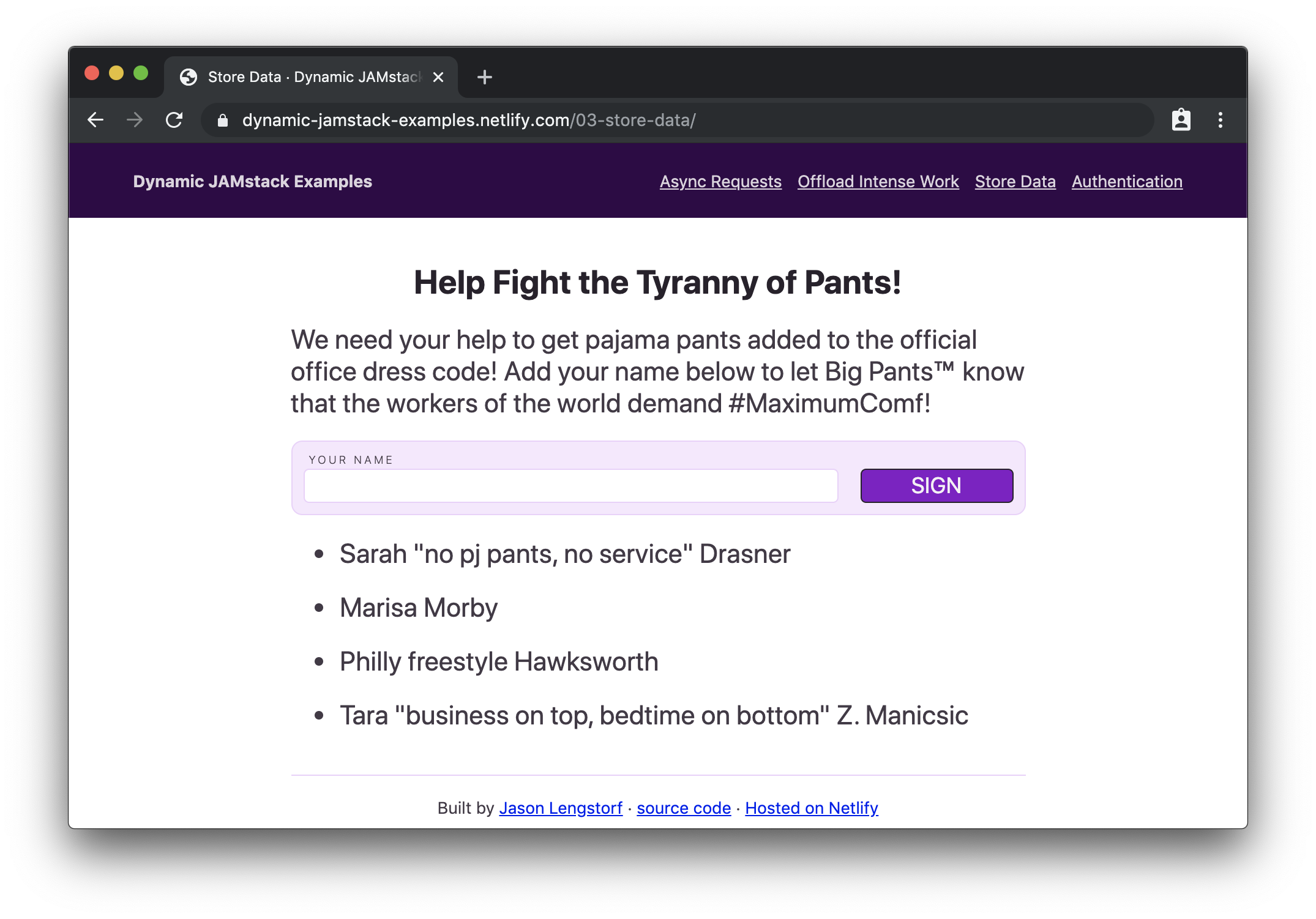
Demo: Create a Petition Page
If we want to create a small app to collect digital signatures for a petition, we need to set up a database to store those signatures and allow the page to read them out for display.
For this demo we’ll use Fauna as our DBaaS provider. We won’t go deep into how Fauna works, but in the interest of demonstrating the small amount of effort required to set up a database, let’s list each step and click to get a ready-to-use database:
Give the database a name (e.g. “dynamic-jamstack-demos”)
Click “create”
Click “security” in the left-hand menu on the next page
Click “new key”
Change the role dropdown to “Server”
Add a name for the key (e.g. “Dynamic JAMstack Demos”)
Store the key somewhere secure for use with the app
Click “save”
Click “GraphQL” in the left-hand menu
Click “import schema”
Upload a file called db-schema.gql that contains the following code:
type Signature {
 name: String!
}

type Query {
 signatures: [Signature!]!
}
Once we upload the schema, our database is ready to use. (Seriously.)
Thirteen steps is a lot, but with those thirteen steps, we just got a database, a GraphQL API, automatic management of capacity, scaling, deployment, security, and more — all handled by database experts. For free. What a time to be alive!
To try it out, the “GraphQL” option in the left-hand menu gives us a GraphQL explorer with documentation on the available queries and mutations that allow us to perform CRUD operations.
Note: We won’t go into details about GraphQL queries and mutations in this post, but Eve Porcello wrote an excellent intro to sending GraphQL queries and mutations if you want a primer on how it works.
With the database ready to go, we can create a serverless function that stores new signatures in the database:
const qs = require('querystring');
const graphql = require('./util/graphql');

exports.handler = async event => {
 try {
   // get the signature from the POST data
   const { signature } = qs.parse(event.body);

   const ADD_SIGNATURE = `
     mutation($signature: String!) {
       createSignature(data: { name: $signature }) {
         _id
       }
     }
   `;

   // store the signature in the database
   await graphql(ADD_SIGNATURE, { signature });

   // send people back to the petition page
   return {
     statusCode: 302,
     headers: {
       Location: '/03-store-data/',
     },
     // body is unused in 3xx codes, but required in all function responses
     body: 'redirecting...',
   };
 } catch (error) {
   return {
     statusCode: 500,
     body: JSON.stringify(error.message),
   };
 }
};
This function does the following:
Grabs the signature value from the form POST data
Calls a helper function that stores the signature in the database
Defines a GraphQL mutation to write to the database
Sends off the mutation using a GraphQL helper function
Redirects back to the page that submitted the data
Next, we need a serverless function to read out all of the signatures from the database so we can show how many people support our petition:
An important note about sensitive keys and JAMstack apps:
One thing to note about this app is that we’re using serverless functions to make these calls because we need to pass a private server key to Fauna that proves we have read and write access to this database. We cannot put this key into client-side code, because that would mean anyone could find it in the source code and use it to perform CRUD operations against our database. Serverless functions are critical for keeping private keys private in JAMstack apps.
Once we have our serverless functions set up, we can add a form that submits to the function for adding a signature, an element to show existing signatures, and a little bit of JS to call the function to get signatures and put them into our display element:
If we load this in the browser, we’ll see our petition form with signatures below it:
An empty form that accepts a digital signature (Large preview)
Then, if we add our signature…
The petition form with a name filled in (Large preview)
…and submit it, we’ll see our name appended to the bottom of the list:
The petition form clears and the new signature is added to the bottom of the list. (Large preview)
Hot diggity dog! We just wrote a full-on database-powered JAMstack app with about 75 lines of code and 7 lines of database schema!
Protect Content With User Authentication
“Okay, you’re for sure stuck this time,” you may be thinking. “There is no way a JAMstack site can handle user authentication. How the heck would that work, even?!”
I’ll tell you how it works, my friend: with our trusty serverless functions and OAuth.
OAuth is a widely-adopted standard for allowing people to give apps limited access to their account info rather than sharing their passwords. If you’ve ever logged into a service using another service (for example, “sign in with your Google account”), you’ve used OAuth before.
Note:We won’t go deep into how OAuth works, but Aaron Parecki wrote a solid overview of OAuth that covers the details and workflow.
In JAMstack apps, we can take advantage of OAuth, and the JSON Web Tokens (JWTs) that it provides us with for identifying users, to protect content and only allow logged-in users to view it.
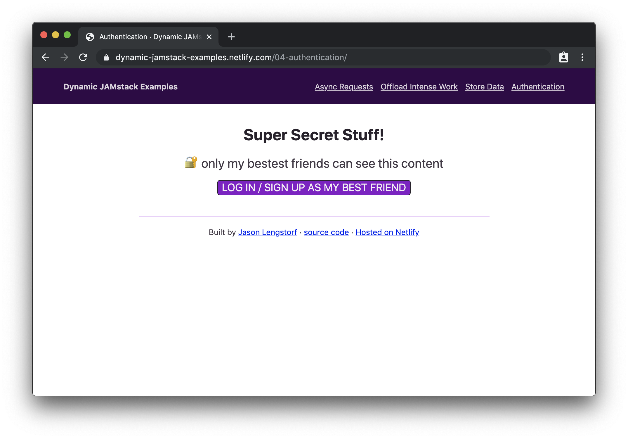
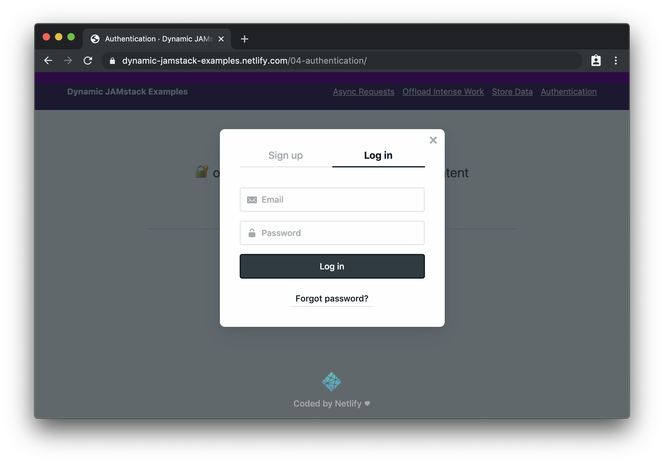
Demo: Require Login to View Protected Content
If we need to build a site that only shows content to logged-in users, we need a few things:
An identity provider that manages users and the sign-in flow
UI elements to manage logging in and logging out
A serverless function that checks for a logged-in user using JWTs and returns protected content if one is provided
For this example, we’ll use Netlify Identity, which gives us a really pleasant developer experience for adding authentication and provides a drop-in widget for managing login and logout actions.
Choose the site that needs auth from your sites list
Click “identity” in the top nav
Click the “Enable Identity” button
We can add Netlify Identity to our site by adding markup that shows logged out content and adds an element to show protected content after logging in:
<div class="content logged-out">
  <h1>Super Secret Stuff!</h1>
  <p>🔐 only my bestest friends can see this content</p>
  <button class="login">log in / sign up to be my best friend</button>
</div>
<div class="content logged-in">
  <div class="secret-stuff"></div>
  <button class="logout">log out</button>
</div>
This markup relies on CSS to show content based on whether the user is logged in or not. However, we can’t rely on that to actually protect the content — anyone could view the source code and steal our secrets!
Instead, we created an empty div that will contain our protected content, but we’ll need to make a request to a serverless function to actually get that content. We’ll dig into how that works shortly.
Next, we need to add code to make our login button work, load the protected content, and show it on screen:
Loads the Netlify Identity widget, which is a helper library that creates a login modal, handles the OAuth workflow with Netlify Identity, and gives our app access to the logged-in user’s info
Adds an event listener to the login button that triggers the Netlify Identity login modal to open
Adds an event listener to the logout button that calls the Netlify Identity logout method
Adds an event handler for logging out to remove the authenticated class on logout, which hides the logged-in content and shows the logged-out content
Adds an event handler for logging in that:
Adds the authenticated class to show the logged-in content and hide the logged-out content
Grabs the logged-in user’s JWT
Calls a serverless function to load protected content, sending the JWT in the Authorization header
Puts the secret content in the secret-stuff div so logged-in users can see it
Right now the serverless function we’re calling in that code doesn’t exist. Let’s create it with the following code:
Checks for a user in the serverless function’s context argument
Throws an error if no user is found
Returns secret content after ensuring that a logged-in user requested it
Netlify Functions will detect Netlify Identity JWTs in Authorization headers and automatically put that information into context — this means we can check for a valid JWTs without needing to write code to validate JWTs!
When we load this page in our browser, we’ll see the logged out page first:
When logged out, we can only see information about logging in. (Large preview)
If we click the button to log in, we’ll see the Netlify Identity widget:
The Netlify Identity Widget provides the whole login/sign up experience. (Large preview)
After logging in (or signing up), we can see the protected content:
After logging in, we can see protected content. (Large preview)
Wowee! We just added user login and protected content to a JAMstack app!
What To Do Next
The JAMstack is much more than “just static sites” — we can respond to user interactions, store data, handle user authentication, and just about anything else we want to do on a modern website. And all without the need to provision, configure, or deploy a server!
What do you want to build with the JAMstack? Is there anything you’re still not convinced the JAMstack can handle? I’d love to hear about it — hit me up on Twitter or in the comments!
Have you ever wanted to redirect users to a specific page after they login to your WordPress site?
Depending on the user’s role, WordPress would either take them to the dashboard or their profile section in the WordPress admin area.
In this guide, we’ll show you how to easily redirect users after a successful login in WordPress. We’ll also show you how to redirect after login based on user roles and permissions.
Why Redirect Users After Login in WordPress?
A lot of website owners run multi-user WordPress websites. For example, a multi-author blog, a membership community, or an online store.
All these websites require users to login to perform certain actions and access their account details.
Many WordPress membership plugins and eCommerce software automatically handle redirects by showing user custom login pages and redirect them to a custom account management page.
However, some websites may not be using such a plugin. In that case, users will be redirected to the default WordPress admin area.
The default WordPress method doesn’t offer users clear guidance on what to do next. While this may work for bloggers and writers, this is not an ideal user experience for your users and customers.
That being said, let’s take a look at how to easily redirect users after successful login in WordPress. We’ll show you two methods, and you can pick the one that best meets your requirements.
Method 1. Setting up Login Redirects in WordPress using Peter’s Login Redirect
This method is easier and allows you to set up login redirects based on user roles and permissions.
Upon activation, you need to visit Settings » Login/logout Redirects to setup the plugin.
It allows you to set up post login redirects for various situations. Let’s take a look at each one of them.
Setup Login Redirect for Specific Users
The first option on the settings page allows you to redirect only specific users. You can select a username from the drop-down menu. After that, you can enter the URLs to redirect a user on login and logout.
Once done, click on the Add username rule button to store this setting. Repeat the process if you need to set up redirects for more individual users.
Setting up Login Redirect by User Role in WordPress
You can also set up a login redirect based on user role in WordPress. You simply need to select a user role from the drop down list and then enter the redirect URL. For example, you can redirect editors to the admin-area and subscribers to a custom page.
Setting up Login Redirect by Capabilities in WordPress
The plugin also allows you to set up login redirects based on user levels and capabilities. This option is particularly useful if you are using user roles with custom capabilities in WordPress.
Simply select a user level from the drop-down menu and enter login and logout URLs. You can set order to any number, and this will determine how this rule is stored and displayed in plugin settings.
Setting up Login Redirect for All Users in WordPress
On the plugin’s settings page, there is an option to set a redirect for all other users. If a user does not match any rules you set above, then you can redirect them by entering a URL here.
You can also use this setting to create a site-wide redirect for all users.
Setting up a User Registration Redirect in WordPress
When a new user signs up on your site, WordPress redirects them to the login page. You can set up a redirect URL to send them to any other page on your site under the Post Registration section.
For example, you can redirect them to a welcome page with links to different things they can do on your website.
Important: Do not forget to change permission level under ‘Customize plugin settings’ section. The plugin allows anyone who can edit categories to edit redirect URLs. This means a user with the Editor user role can set up redirects. We recommend changing this to install_plugins, so only users with administrator role can setup redirects.
Method 2. Set up Login Redirects in WordPress Using WPForms
If you want to create a custom login form in WordPress, then you can use WPForms to set it up with a post-login redirect.
WPForms is the best WordPress contact form plugin on the market. It allows you to easily create beautiful forms and add them to your WordPress site.
It is a premium plugin, and you’ll need at least their “Pro” plan to access login form feature.
Upon activation, you need to visit WPForms » Settings page to enter your license key. You can find this information under your account on WPForms website.
After entering the license key, you would be able to install add-ons. Go ahead and visit WPForms » Addons page and locate the User Registration Addon.
Next, click on the Install Addon button to download and activate the addon. You are now ready to create your own custom login forms.
Next, you need to visit WPForms » Add New page and scroll down to the ‘User Login Form’ template. You need to click on the ‘Create a User Login Form’ button to continue.
WPForms will load the User Login Form with required fields. You can click on the fields to add your own description or text around them. You can also click on the Submit button and change its label to ‘Login’.
Finally, you can set up login redirect for this login form.
Go to Settings » Confirmation tab from left columnns and select ‘Go to URL’ redirect as your confirmation type.
Below that you can enter the URL where you want users to be redirected.
Your login form is now ready. You can save your settings and exit the WPForm builder interface.
Now let’s add your login form to your website.
Simply edit the page where you want to display the login form or create a new one. On the page edit screen, add the WPForms block to your content area.
Next, select the login form you created earlier, and WPForms block will automatically load it inside the content area.
The advantage of this method is that you can set up a redirect for your custom login form, and you can also use page builders like Beaver Builder or Divi to create stunningly beautiful login pages.
Troubleshooting Login Issues in WordPress
Setting up redirects using the methods described above works like a charm. On rare occasions, you may see issues, depending on how your WordPress website is set up, and the plugins you are using.
Here are some tips to help you resolve you resolve those issues.
1. Update Your Permalink Structure
Simply go to Settings » Permalinks page and click on the ‘Save settings’ button without making any changes.
This refreshes the WordPress permalink settings. Keep this tip handy as it can also help fix other redirect issues in WordPress.
2. Fix Login Page Redirect Issue
If you the WordPress login page keeps refreshing and redirecting you back to the login form, then this is a sign of a conflicting setting.
The most likely problem behind login issues is a plugin or theme conflict. To figure out which one is causing the problem, follow the step in our ultimate WordPress troubleshooting guide.
We hope this article helped you learn how to easily redirect users after successful login in WordPress. You may also want to see our complete WordPress security guide to keep your user data safe and secure.
If you liked this article, then please subscribe to our YouTube Channel for WordPress video tutorials. You can also find us on Twitter and Facebook.


