

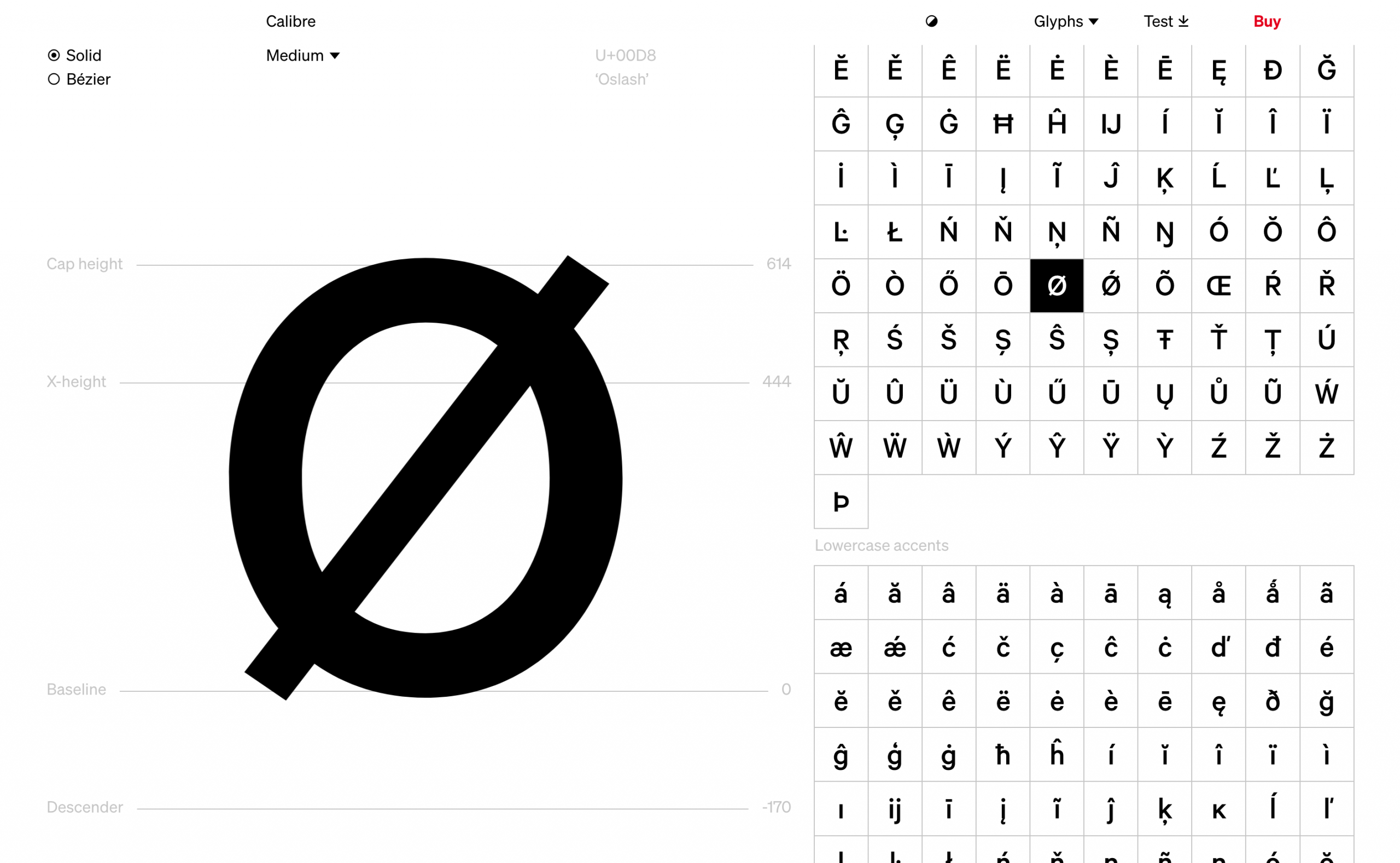
I’ve spent the last hour hunched over the new Klim Type foundry website with my arms outstretched as if it was a fire in a very dark cave. Klim Type makes and sells wondrous fonts — like Tiempos, and National 2 or Pitch — and this fresh redesign now showcases them in all their glory. Here’s an example of the type specimen from the Calibre typeface:
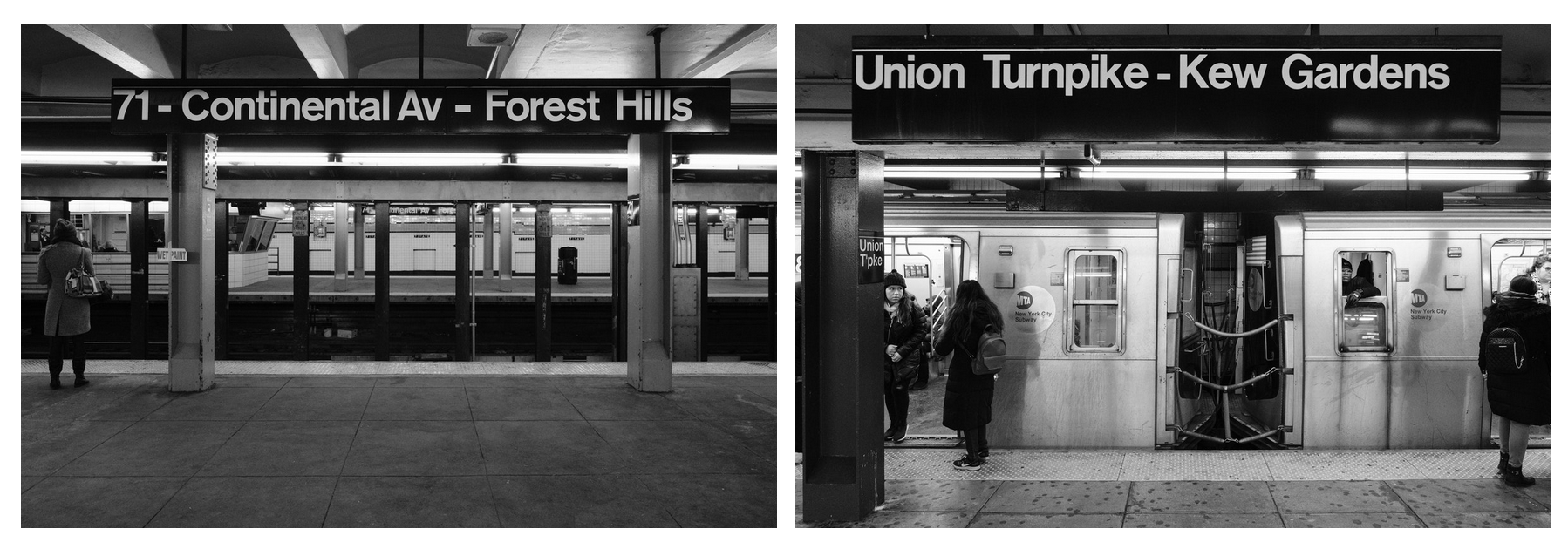
There’s a shocking amount of beautiful design in this little website and I particularly like the blog where Kris Sowersby recently wrote a wonderful essay about the design of their latest type release, Söhne, which looks into the design of the New York subway signage, too:
Direct Link to Article — Permalink
The post The New Klim Type Website is Impossibly Lovely appeared first on CSS-Tricks.