Every day, the ProgrammableWeb team is busy, updating its three primary directories for APIs, clients (language-specific libraries or SDKs for consuming or providing APIs), and source code samples.
Last year, the team here at CSS-Tricks compiled a list of our favorite posts, trends, topics, and resources from around the world of front-end development. We had a blast doing it and found it to be a nice recap of the industry as we saw it over the course of the year. Well, we're doing it again this year!
With that, here's everything that Sarah, Robin, Chris and I saw and enjoyed over the past year.
There are a few themes that cross languages, and one of them is good code review. Even though Nina Zakharenko gives talks and makes resources about Python, her talk about code review skills is especially notable because it applies across many disciplines. She’s got a great arc to this talk and I think her deck is an excellent resource, but you can take this a step even further and think critically about your own team, what works for it, and what practices might need to be reconsidered.
I also enjoyed this sarcastic tweet that brings up a good point:
When reviewing a PR, it’s essential that you leave a comment. Any comment. Even the PR looks great and you have no substantial feedback, find something trivial to nitpick or question. This communicates intelligence and mastery, and is widely appreciated by your colleagues.
I've been guilty myself of commenting on a really clean pull request just to say something, and it’s healthy for us as a community to revisit why we do things like this.
Sophie Alpert, manager of the React core team, also wrote a great post along these lines right at the end of the year called Why Review Code. It’s a good resource to turn to when you'd like to explain the need for code reviews in the development process.
The year of (creative) code
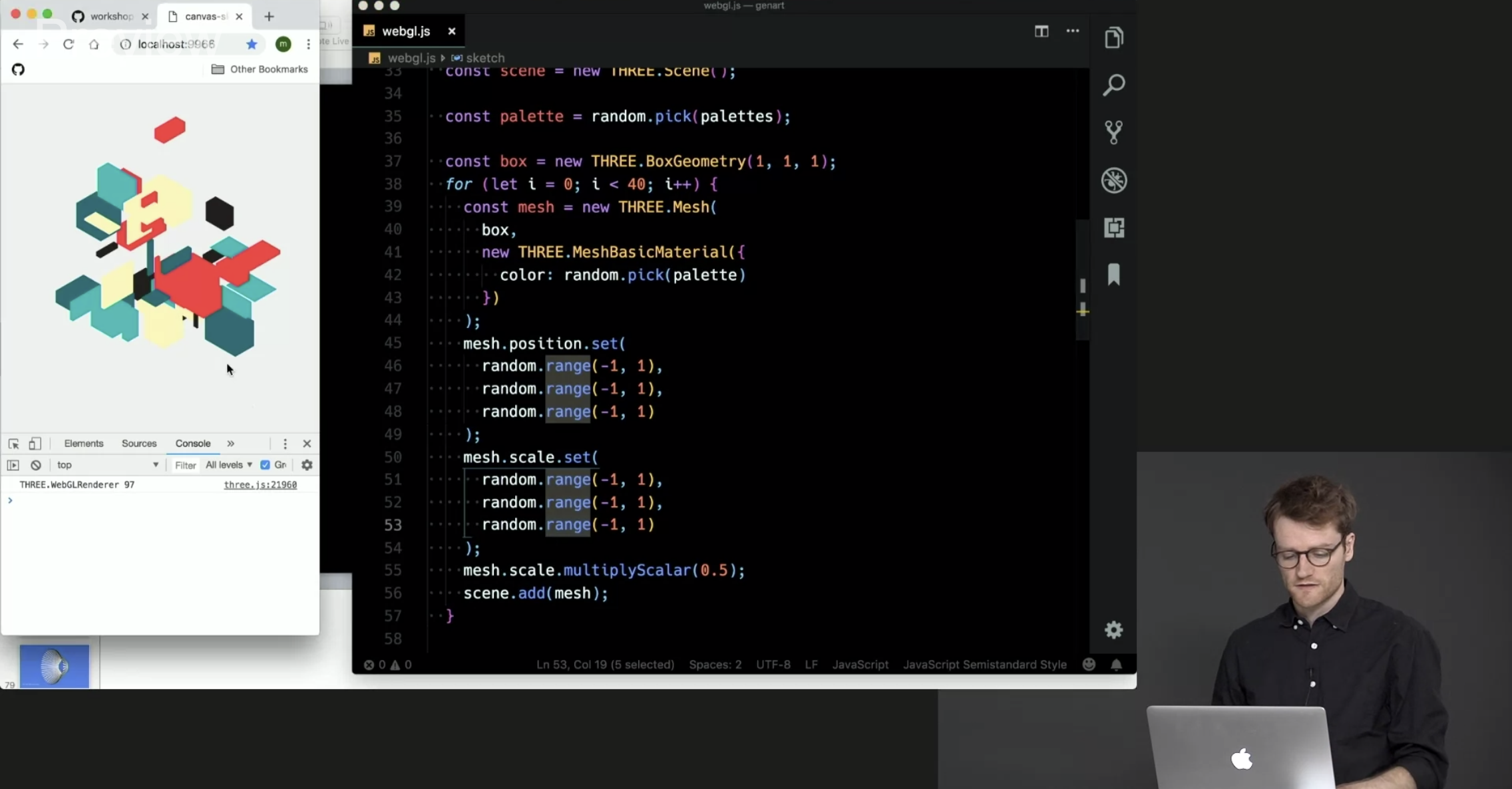
So many wonderful creative coding resources were made this year. Creative coding projects might seem frivolous but you can actually learn a ton from making and playing with them. Matt DesLauriers recently taught a course called Creative Coding with Canvas & WebGL for Frontend Masters that serves as a good example.
CodePen is always one of my favorite places to check out creative work because it provides a way to reverse-engineer the work of other people and learn from their source code. CodePen has also started coding challenges adding yet another way to motivate creative experiments and collective learning opportunities. Marie Mosley did a lot of work to make that happen and her work on CodePen's great newsletter is equally awesome.
You should also consider checking out Monica Dinculescu's work because she has been sharing some amazing work. There's not one, not two, but three (!) that use machine learning alone. Go see all of her Glitch projects. And, for what it's worth, Glitch is a great place to explore creative code and remix your own as well.
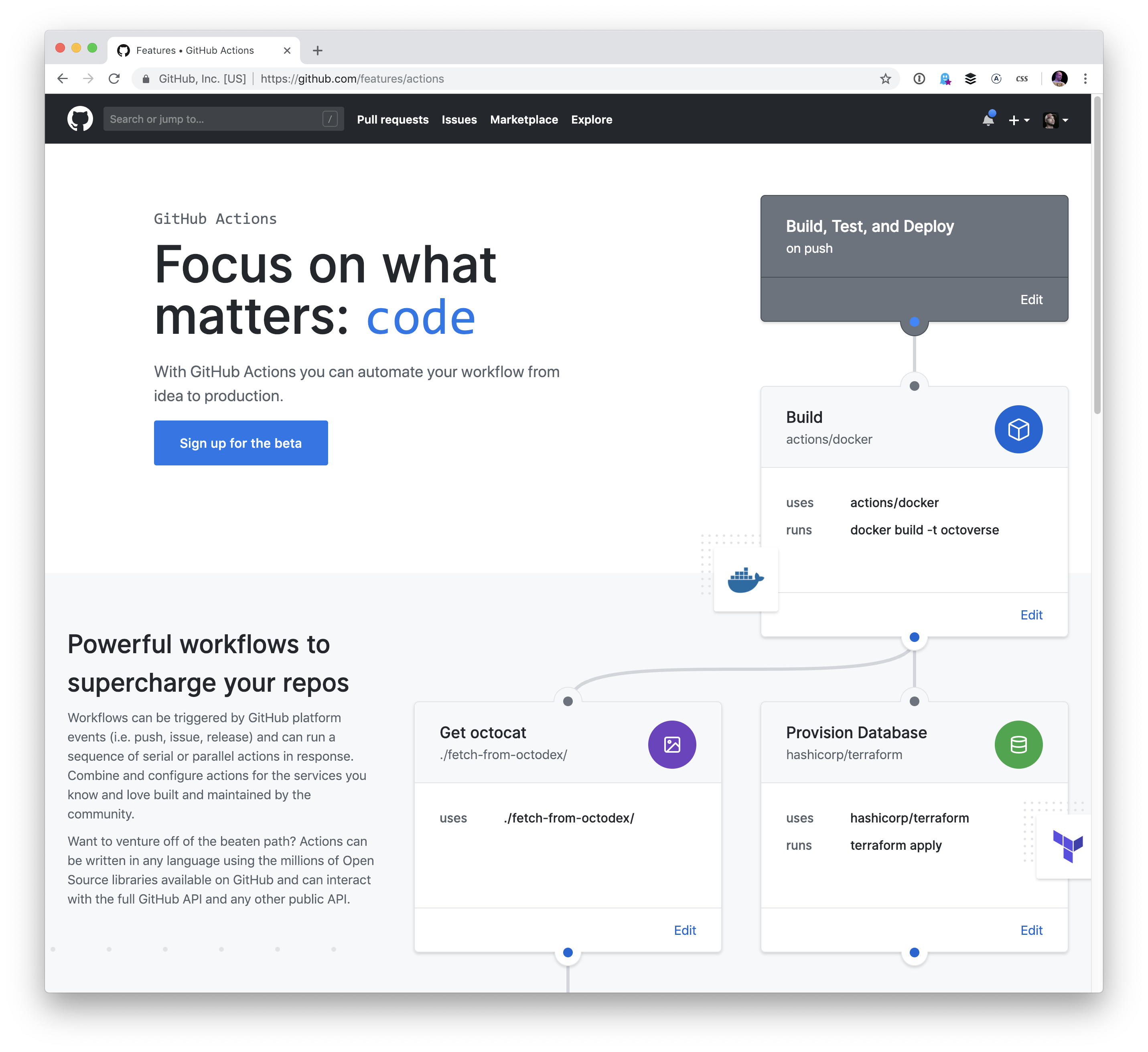
GitHub Actions
I think hands-down one of the most game-changing developments this year is GitHub Actions. The fact that you can manage all of your testing, deployments, and project issues as containers chained in a unified workflow is quite amazing.
Containers are a great for actions because of their flexibility — you’re not limited to a single kind of compute and so much is possible! I did a writeup about GitHub Actions covering the feature in full. And, if you're digging into containers, you might find the dive repo helpful because it provides a way to explore a docker image and layer contents.
Actions are still in beta but you can request access — they’re slowly rolling out now.
UI property generators
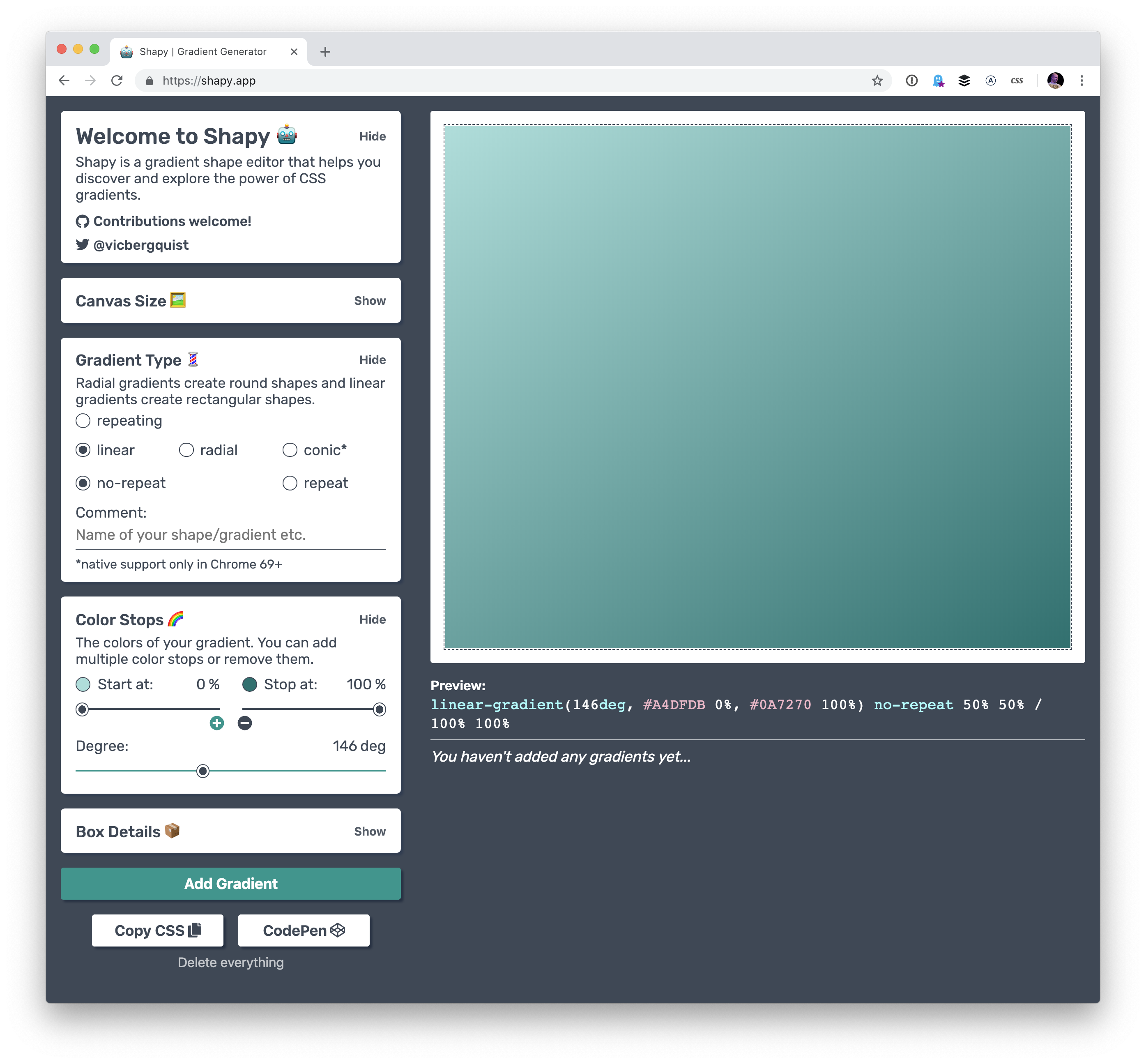
I really like that we’re automating some of the code that we need to make beautiful front-end experiences these days. In terms of color there’s color by Adobe, coolors, and uiGradients. There are even generators for other things, like gradients, clip-path, font pairings, and box-shadow. I am very much here for all for this. These are the kind of tools that speed up development and allow us to use advanced effects, no matter the skill level.
Ire has been writing a near constant stream of wondrous articles about front-end development on her blog, Bits of Code, over the past year, and it’s been super exciting to keep up with her work. It seems like she's posting something I find useful almost every day, from basic stuff like when hover, focus and active states apply to accessibility tips like the aria-live attribute.
"The All Powerful Front-end Developer"
Chris gave a talk this year about the ways the role of front-end development are changing... and for the better. It was perhaps the most inspiring talk I saw this year. Talks about front-end stuff are sometimes pretty dry, but Chris does something else here. He covers a host of new tools we can use today to do things that previously required a ton of back-end skills. Chris even made a website all about these new tools which are often categorized as "Serverless."
Even if none of these tools excite you, I would recommend checking out the talk – Chris’s enthusiasm is electric and made me want to pull up my sleeves and get to work on something fun, weird and exciting.
Future Fonts
The Future Fonts marketplace turned out to be a great place to find new and experimental typefaces this year. Obviously is a good example of that. But the difference between Future Fonts and other marketplaces is that you can buy fonts that are in beta and still currently under development. If you get in on the ground floor and buy a font for $10, then that shows the developer the interest in a particular font which may spur more features for it, like new weights, widths or even OpenType features.
It’s a great way to support type designers while getting a ton of neat and experimental typefaces at the same time.
React Conf 2018
The talks from React Conf 2018 will get you up to speed with the latest React news. It’s interesting to see how React Hooks let you "use state and other React features without writing a class."
It's also worth calling out that a lot of folks really improved our Guide to React here on CSS-Tricks so that it now contains a ton of advice about how to get started and how to level up on both basic and advanced practices.
The Victorian Internet
This is a weird recommendation because The Victorian Internet is a book and it wasn’t published this year. But! It’s certainly the best book I've read this year, even if it’s only tangentially related to web stuff. It made me realize that the internet we’re building today is one that’s much older than I first expected. The book focuses on the laying of the Transatlantic submarine cables, the design of codes and the codebreakers, fraudsters that used the telegraph to find their marks, and those that used it to find the person they’d marry. I really can’t recommend this book enough.
Figma
The browser-based design tool Figma continued to release a wave of new features that makes building design systems and UI kits easier than ever before. I’ve been doing a ton of experiments with it to see how it helps designers communicate, as well as how to build more resilient components. It’s super impressive to see how much the tools have improved over the past year and I’m excited to see it improve in the new year, too.
It seems there was a lot of chatter this year about the impact of third party scripts. Whether it’s the growing ubiquity of all-things-JavaScript or whatever, this topic covers a wide and interesting ground, including performance, security and even hard costs, to name a few.
My personal favorite post about this was Paulo Mioni’s deep dive into the anatomy of a malicious script. Sure, the technical bits are a great learning opportunity, but what really makes this piece is the way it reads like a true crime novel.
Gutenberg, Gutenberg and more Gutenberg
There was so much noise leading up to the new WordPress editor that the release of WordPress 5.0 containing it felt anti-climactic. No one was hurt or injured amid plenty of concerns, though there is indeed room for improvement.
Lara Schneck and Andy Bell teamed up for a hefty seven-party series aimed at getting developers like us primed for the changes and it’s incredible. No stone is left unturned and it perfectly suitable for beginners and experts alike.
Solving real life issues with UX
I like to think that I care a lot about users in the work I do and that I do my best to empathize so that I can anticipate needs or feelings as they interact with the site or app. That said, my mind was blown away by a study Lucas Chae did on the search engine experience of people looking for a way to kill themselves. I mean, depression and suicide are topics that are near and dear to my heart, but I never thought about finding a practical solution for handling it in an online experience.
So, thanks for that, Lucas. It inspired me to piggyback on his recommendations with a few of my own. Hopefully, this is a conversation that goes well beyond 2018 and sparks meaningful change in this department.
The growing gig economy
Freelancing is one of my favorite things to talk about at great length with anyone and everyone who is willing to talk shop and that’s largely because I’ve learned a lot about it in the five years I’ve been in it.
But if you take my experience and quadruple it, then you get a treasure trove of wisdom like Adam Coti shared in his collection of freelancing lessons learned over 20 years of service.
Freelancing isn’t for everyone. Neither is remote work. Adam’s advice is what I wish I had going into this five years ago.
Browser ecology
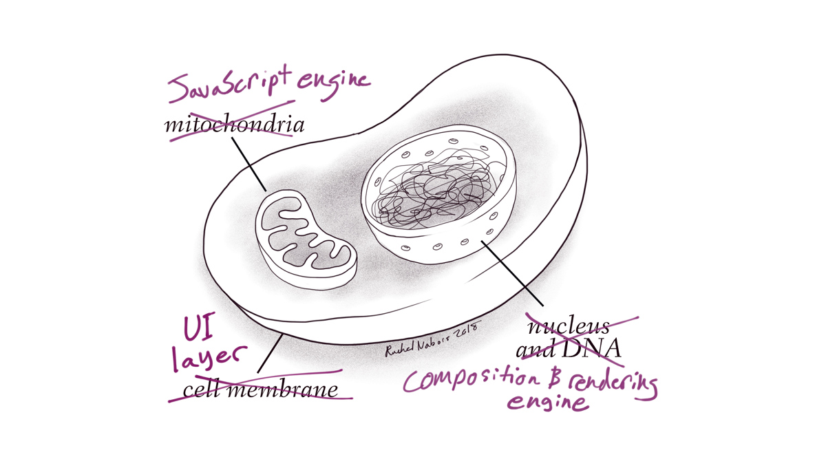
I absolutely love the way Rachel Nabors likens web browsers to a biological ecosystem. It’s a stellar analogy and leads into the long and winding history of browser evolution.
Speaking of history, Jason Hoffman’s telling of the history about browsers and web standards is equally interesting and a good chunk of context to carry in your back pocket.
These posts were timely because this year saw a lot of movement in the browser landscape. Microsoft is dropping EdgeHTML for Blink and Google ramped up its AMP product. 2018 felt like a dizzying year of significant changes for industry giants!
"Don’t tell me how to build a front end!" we, front-end developers, cry out. We are very powerful now. We like to bring our own front-end stack, then use your back-end data and APIs. As this is happening, we’re seeing healthy things happen like content management systems evolving to headless frameworks and focus on what they are best at: content management. We’re seeing performance and security improvements through the power of static and CDN-backed hosting. We’re seeing hosting and server usage cost reductions.
But we’re also seeing unhealthy things we need to work through, like front-end developers being spread too thin. We have JavaScript-focused engineers failing to write clean, extensible, performant, accessible markup and styles, and, on the flip side, we have UX-focused engineers feeling left out, left behind, or asked to do development work suddenly quite far away from their current expertise.
GraphQL
Speaking of powerful front-end developers, giving us front-end developers a well-oiled GraphQL setup is extremely empowering. No longer do we need to be roadblocked by waiting for an API to be finished or data to be massaged into some needed format. All the data you want is available at your fingertips, so go get and use it as you will. This makes building and iterating on the front end faster, easier, and more fun, which will lead us to building better products. Apollo GraphQL is the thing to look at here.
While front-end is having a massive love affair with JavaScript, there are plenty of front-end developers happily focused elsewhere
This is what I was getting at in my first section. There is a divide happening. It’s always been there, but with JavaScript being absolutely enormous right now and showing no signs of slowing down, people are starting to fall through the schism. Can I still be a front-end developer if I’m not deep into JavaScript? Of course. I’m not going to tell you that you shouldn’t learn JavaScript, because it’s pretty cool and powerful and you just might love it, but if you’re focused on UX, UI, animation, accessibility, semantics, layout, architecture, design patterns, illustration, copywriting, and any combination of that and whatever else, you’re still awesome and useful and always will be. Hugs. 🤗
Just look at the book Refactoring UI or the course Learn UI Design as proof there is lots to know about UI design and being great at it requires a lot of training, practice, and skill just like any other aspect of front-end development.
Shamelessly using grid and custom properties everywhere
I remember when I first learned flexbox, it was all I reached for to make layouts. I still love flexbox, but now that we have grid and the browser support is nearly just as good, I find myself reaching for grid even more. Not that it’s a competition; they are different tools useful in different situations. But admittedly, there were things I would have used flexbox for a year ago that I use grid for now and grid feels more intuitive and more like the right tool.
I'm still swooning over the amazing illustrations Lynn Fisher did for both our grid and flexbox guides.
Massive discussions around CSS-in-JS and approaches, like Tailwind
These discussions can get quite heated, but there is no ignoring the fact that the landscape of CSS-in-JS is huge, has a lot of fans, and seems to be hitting the right notes for a lot of folks. But it’s far from settled down. Libraries like Vue and Angular have their own framework-prescribed way of handling it, whereas React has literally dozens of options and a fast-moving landscape with libraries popping up and popular ones spinning down in favor of others. It does seem like the feature set is starting to settle down a little, so this next year will be interesting to watch.
Then there is the concept of atomic CSS on the other side of the spectrum, and interesting in that doesn’t seem to have slowed down at all either. Tailwind CSS is perhaps the hottest framework out there, gaining enough traction that Adam is going full time on it.
What could really shake this up is if the web platform itself decides to get into solving some of the problems that gave rise to these solutions. The shadow DOM already exists in Web Components Land, so perhaps there are answers there? Maybe the return of <style scoped>? Maybe new best practices will evolve that employ a single-stylesheet-per-component? Who knows.
I’ve heard of multiple agencies where design systems are literally what they make for their clients. Not websites, design systems. I get it. If you give a team a really powerful and flexible toolbox to build their own site with, they will do just that. Giving them some finished pages, as polished as they might be, leaves them needing to dissect those themselves and figure out how to extend and build upon them when that need inevitably arrives. I think it makes sense for agencies, or special teams, to focus on extensible component-driven libraries that are used to build sites.
Machine Learning
Stuff like this blows me away:
I made a music sequencer! In JavaScript! It even uses Machine Learning to try to match drums to a synth melody you create!
Having open source libraries that help with machine learning and that are actually accessible for regular ol’ developers to use is a big deal.
Stuff like this will have real world-bettering implications:
🔥 I think I used machine learning to be nice to people! In this proof of concept, I’m creating dynamic alt text for screenreaders with Azure’s Computer Vision API. 💫https://t.co/Y21AHbRT4Ypic.twitter.com/KDfPZ4Sue0
You gotta check out the Unicode Pattern work (more) that Yuan Chuan does. He even shared some of his work and how he does it right here on CSS-Tricks. And follow that name link to CodePen for even more. This <css-doodle> thing they have created is fantastic.
We've released the Most Hearted Pens, Posts, and Collections on CodePen for 2018! Just absolutely incredible work on here — it's well worth exploring.
Remember CodePen has a three-tiered hearting system, so while the number next to the heart reflects the number of users who hearted the item, each of those could be worth 1, 2, or 3 hearts total. This list is a great place to find awesome people to follow on CodePen as well, and we're working on ways to make following people a lot more interesting in 2019.
The Internet makes it possible for you to sell products to virtually anyone in the world.
Let that sink in for a moment.
You have a huge opportunity, yet, your competition is fiercer than ever. Every other business has the same opportunities as you.
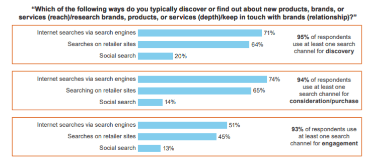
As a marketer, you need to create an advantage over your competitors. To do this effectively, you need to fully understand how consumers shop. What process do they take to go from identifying a need for something to making a purchase? In most cases, it starts with a general search.
That’s why product buying guides are so great. When a customer searches a product online, a buying guide can serve as a way to convince them to make a purchase. More specifically, the guide can convince them to buy from your brand. But there is a science behind this strategy.
This guide will show you how to leverage product buying guides to drive sales. Whether you have product buying guides that need improvement, or you’ve never used this tactic and want to try it out, you’ll benefit from the tips covered below.
Define your target audience
Before you create and publish a product buying guide, you need to determine who will be reading it. Not every guide should be intended to please everyone. It depends on who is going to be buying what you’re selling. It sounds obvious, but you’d be surprised how many businesses get this wrong.
The target market for a specific product category isn’t necessarily the same as your target audience for your entire brand. With your buying guides, it’s OK to be more specific.
For example, if you’re selling a hiking backpack, you’ll want to write your guide for people who are in the market for that item, even though you also sell other items, like a piece of carry-on luggage aimed at business travelers. People who are in the market for this product will get lost and be uninterested if the copy doesn’t speak to them specifically.
Once you create this persona, it’ll be much easier to develop a product buying guide based on the wants and needs of the consumer. You’ll have an image in your mind of who they are and what needs they have.
Your buying guide won’t necessarily appeal to as many people, but that’s OK. You’ll end up having much higher conversion rates for the audience that you’re targeting in the first place.
Choose a format
After you determine your audience, you need to figure out the style and format of your writing guide. You’ve got several different options to choose from here. You can develop a guide that’s mostly text, or have a guide with lots of pictures. It’s even possible to incorporate some video content into your buying guides. Maybe you want to use a combination of these styles. There are lots of ways to approach this.
You also need to decide the format of your buying guide content:
compare multiple products
general information about what to look for
beginner’s purchasing guide
introduce a new niche or type of product
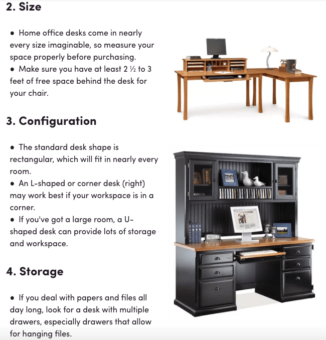
Here’s an example of a desk buying guide from Wayfair:
Rather than writing a guide on specific products, they created a list of the features that consumers should look for when buying a desk. The guide is mostly text but has pictures to illustrate the points they are trying to make. It’s a very simple and easy-to-follow format that uses visual elements well. Each feature is numbered, followed by a bulleted list with additional details. The images, numbers, and bullets break up the content, so it’s easy for website visitors to scan and consume it. No intimidating walls of text here!
Include a CTA
The whole purpose of your product buying guide is to inform consumers about their options, help them decide that they want to buy something, and then ultimately convert. Let’s not lose sight of that final stage when you’re writing these.
Obviously, you want them your customer to buy from you. But if you don’t give the reader a CTA or a way to buy, that might not happen. Here’s the thing. Yes, they are reading the guide on your website. But if they have to go back to your homepage and then search for the products that they’re looking for, it’s too many extra steps. It’d be easier for them to open a new window with a search engine, or go to Amazon, Walmart, or another retail giant to buy. We don’t want that to happen.
The consumer is on your website now. This is your chance to close the sale.
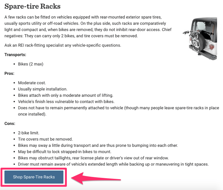
Check out this simple but effective CTA button from REI.
This example is from their car racks buying guide. It’s an extensive guide with plenty of options to choose from. They have sections for trunk racks, hitch racks, spare tire racks, roof racks, and cargo boxes. Each option follows the same format as the Wayfair guide.
Each section has a brief overview of the product. That’s followed by a description of how much this type of rack can transport. All of this is followed by a bulleted list of pros and cons. This is something worth stealing for any guide you write. You don’t want to seem biased, since customers will see right through that. If you’re giving too much of a sales pitch, people won’t want to buy. It’s difficult, but you want to try and appear as neutral as possible.
The cons list isn’t necessarily saying bad things about their specific products. Instead, it talks about some limitations of products in this particular category. For example, one of the cons of the spare tire bike rack is that there is a two-bike limit. If someone doesn’t need to transport more than two bikes, that’s not a problem. They don’t need to buy a rack that can hold three or four bikes. Listing the cons like this helps increase your authority and removes some of your bias in the eyes of the consumers. As a result, you can establish trust with the reader.
Last, but certainly not least, is a CTA that provides a link to buy. If someone is reading this guide and realizes that one of these options is what they’re looking for based on the information they found, all they need to do is click on the CTA. Even the CTA isn’t too pushy. But it needs to be there so the site visitor can ultimately convert and make a purchase with as little friction as possible.
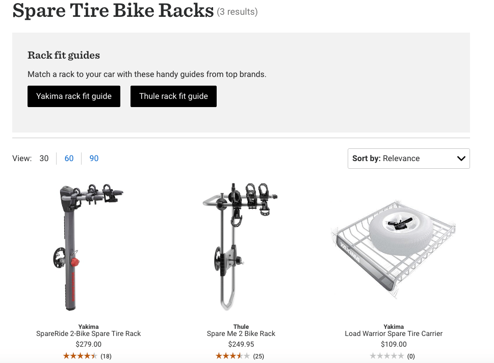
The CTA directs the visitor to the product options. From here, they can make a purchase.
Compare products in different price ranges
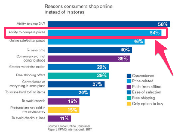
In a perfect world, customers would always buy your most expensive products with the highest margins. But the world we live in is far from perfect. Not every person has an unlimited budget for this one purchase. Even if they did have an unlimited budget, many consumers want the best bang for their buck. In fact, the ability to compare prices ranks high on the list of why consumers prefer to shop online in the first place.
So, help your customers out make it easy for them to compare prices right on your site. A product guide is a simple way to do this. For example, let’s say you’re selling couches. You can might have products segmented by price in categories like:
couches under $250
couches $250–$750
couches over $1,000
Include prices or price range categories in your buying guides and you’ll make this easier on the reader. This allows you to create anchor prices, which is a way for you to generate more profit by focusing on your pricing strategy. Psychologically, the customer will create a value in their head about what products are worth based on the anchor prices. Your less expensive and mid-range products will look more appealing when you put them next to premium-priced products. Consider marketing one of the options in your guide as a Best Budget pick or Best Value to hit that point home.
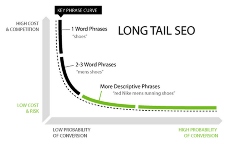
This makes sense: most consumers use search engines to find new products, a buying guide will help them learn and discover. To take advantage of this discoverability, conduct keyword research on each category to determine what people are actually searching for.
Again, you’re not trying to appeal to the masses with your buying guides. General search terms are going to have more competition and be more expensive if you’re running PPC campaigns.
If you make your SEO strategy too broad and general, there may be more people searching for that term, but your click-through rates will be much lower. For example, let’s say you’re selling something basic that everyone uses, like socks. A product buying guide about how to choose a pair of socks is way too general. Make it more specific for your target audience and certain niches with long-tail keywords:
best ankle socks for workouts
women’s waterproof running socks
best high socks for hiking
dress socks for sweaty feet
Do you see the difference? All of these potential search terms address more particular needs. People searching for these keywords have a specific want. So if they land on your buying guide from their search, they’ll have a much higher probability of clicking through and converting.
You can also showcase a customer review or testimonial to increase brand credibility. From that review, link the reader directly to the rest of your reviews for each product. You could even consider adding a superlative to your buying guide like Customer Favorite or Popular Choice.
In addition to reviews, you can add any statistics or references to back up claims you’re making about products or categories. Doing this will make your brand seem much more trustworthy and legitimate.
Conclusion
Product buying guides give you a unique opportunity to assist consumers during the research stage of the customer conversion funnel.
The first thing you need to do is determine the target audience of each buying guide. Figure out a format and style that works best for you, as well as the reader. Target long-tail keywords, and include CTAs to buy the products.
Showcase products in different price ranges to appeal to a wider range of prospective buyers and leverage your existing customer reviews.
How is your business using product buying guides to drive ecommerce sales?
Not too long ago, people invest in fancy cameras in order to take good quality photos. Some even hire professional photographers just to capture their life’s precious moments. Today, however, you no longer need to spend a huge sum of money on top-of-the-line equipment in order to take decent quality photos. In fact, your smartphone […]
HTML5 SVG Fill Animation With CSS3 And Vanilla JavaScript
HTML5 SVG Fill Animation With CSS3 And Vanilla JavaScript
Marina Ferreira
SVG stands for Scalable Vector Graphics and it is a standard XML-based markup language for vector graphics. It allows you to draw paths, curves, and shapes by determining a set of points in the 2D plane. Moreover, you can add twitch properties on those paths (such as stroke, color, thickness, fill, and more) in order to produce animations.
Since April 2017, CSS Level 3 Fill and Stroke Module allow SVG colors and fill patterns to be set from an external stylesheet, instead of setting attributes on each element. In this tutorial, we will use a simple plain hex color, but both fill and stroke properties also accept patterns, gradients and images as values.
Note: When visiting the Awwwards website, the animated note display can only be viewed with browser width set to 1024px or more.
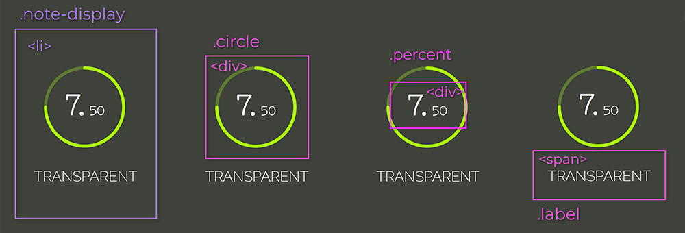
Each note element consists of a list item: li that holds the circle, the note value, and its label.
List item element and its direct children: .circle, .percent and .label. (Large preview)
The .circle_svg is an SVG element, that wraps two <circle> elements. The first is the path to be filled while the second is the fill that will be animated.
SVG elements. SVG wrapper and circle tags. (Large preview)
The note is separated into integer and decimals so different font sizes can be applied to them. The label is a simple <span>. So, putting all of this together looks like this:
The cx and cy attributes define the circle’s x-axis and y-axis center point. The r attribute defines its radius.
You have probably noticed the underscore/dash pattern in classes names. That’s BEM, which stands for block, element and modifier. It is a methodology that makes your element naming more structured, organized and semantic.
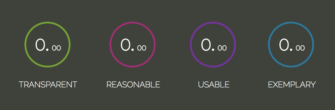
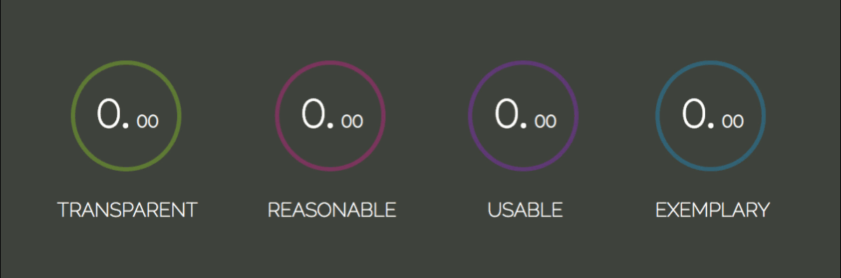
You must be asking yourself what the labels Transparent, Reasonable, Usable and Exemplary mean. The more acquainted you get with programming, you will realize that writing code is not only about making the application functional, but also assuring that it will be long-term maintainable and scalable. That is only achieved if your code is easy to change.
“The acronym TRUE should help decide if the code you write will be able to accommodate change in the future or not.”
So, next time, ask yourself:
Transparent: Are code changes consequences clear?
Reasonable: Is cost benefit worth it?
Usable: Will I be able to reuse it in unexpected scenarios?
Exemplary: Does it present high quality as an example for future code?
Note: “Practical Object-Oriented Design in Ruby” by Sandi Metz explains TRUE along with other principles and how to achieve those through design patterns. If you haven’t taken some time to study design patterns yet, consider adding this book to your bedtime reading.
CSS
Let’s import the fonts and apply a reset to all items:
The box-sizing: border-box property includes padding and border values into an element’s total width and height, so it’s easier to calculate its dimensions.
By combining the rules display: flex in the body and margin-auto in the .display-container, it’s possible to center the child element both vertically and horizontally. The .display-container element will also be a flex-container; that way, its children will be placed in the same row along the main axis.
The .note-display list item will also be a flex-container. Since there are many children for centering, let’s do it through the justify-content and align-items properties. All flex-items will be centered along the cross and main axis. If you’re not sure what those are, check out the alignment section at “CSS Flexbox Fundamentals Visual Guide.”
Let’s apply a stroke to the circles by setting the rules stroke-width, stroke-opacity and stroke-linecap that altogether style the stroke live ends. Next, let’s add a color to each circle:
In order to position the percent element absolutely, it’s necessary to know absolutely to what. The .circle element should be the reference, so let’s add position: relative to it.
Another way of centering elements is to combine top: 50%, left: 50% and transform: translate(-50%, -50%); which position the element’s center at its parent’s center.
The image to the left shows the property stroke-dasharray being set from 0 to 238px, which is the circle circumference length.
The second image represents the stroke-dashoffset property that offsets the beginning of the dash array. It is also set from 0 to the circle circumference length.
stroke-dasharray and stroke-dashoffset properties (Large preview)
To produce the filling effect, we will set the stroke-dasharray to the circumference length, so that all of its length gets filled with a big dash and no gap. We’ll also offset it by the same value, so it gets “hidden”. Then the stroke-dashoffset will be updated to the corresponding note value, filling the stroke accordingly to the transition duration.
The properties updating will be done in the scripts through CSS Variables. Let’s declare the variables and set the properties:
In order to set the initial value and update the variables, let’s start by selecting all .note-display elements with document.querySelectorAll. The transitionDuration will be set to 900 milliseconds.
Then, we iterate through the displays array, select its .circle__progress.circle__progress--fill and extract the r attribute set in the HTML to calculate the circumference length. With that, we can set the initial --dasharray and --dashoffset values.
The animation will occur when the --dashoffset variable gets updated by a 100ms setTimeout:
Now, let’s calculate the dashoffset value — relative to the note. The note value will be inserted to each li item through the data-* attribute. The * can be switched for any name that suits your needs and it can then, be retrieved in JavaScript through the element’s dataset: element.dataset.*.
Note: You can read more about the data-* attribute on MDN Web Docs.
The parseFloat method will convert the string returned by display.dataset.note into a floating point number. The offset represents the percentage missing to reach the maximum score. So, for a 7.50 note, we would have (10 - 7.50) / 10 = 0.25, which means the circumference length should be offset by 25% of its value:
let note = parseFloat(display.dataset.note);
let offset = circumference * (10 - note) / 10;
There is still the note transition from 0.00 to the note value to be built. The first thing to do is to separate the integer and decimal values. We will use the string method split() (it takes an argument that determines where the string will be broken and returns an array containing both broken strings). Those will be converted to numbers and passed as arguments to the increaseNumber() function, along with the display element and a flag indicating if its an integer or a decimal.
In the increaseNumber() function, we select either the .percent__int or .percent__dec element, depending on the className, and also in case the output should contain a decimal point or not. We’ve set our transitionDuration to 900ms. Now, to animate a number from 0 to 7, for example, the duration has to be divided by the note 900 / 7 = 128.57ms. The result represents how long each increase iteration will take. This means our setInterval will fire every 128.57ms.
With those variables set, let’s define the setInterval. The counter variable will be appended to the element as text and increased on each iteration:
function increaseNumber(display, number, className) {
  let element = display.querySelector(`.percent__${className}`),
      decPoint = className === 'int' ? '.' : '',
      interval = transitionDuration / number,
      counter = 0;

  let increaseInterval = setInterval(() => {
    element.textContent = counter + decPoint;
    counter++;
  }, interval);
}
Cool! It does increase the values, but it kind of does it forever. We need to clear the setInterval when the notes achieve the value we want. That is done with clearInterval function:
function increaseNumber(display, number, className) {
  let element = display.querySelector(`.percent__${className}`),
      decPoint = className === 'int' ? '.' : '',
      interval = transitionDuration / number,
      counter = 0;

  let increaseInterval = setInterval(() => {
+   if (counter === number) { window.clearInterval(increaseInterval); }

    element.textContent = counter + decPoint;
    counter++;
  }, interval);
}
Now the number is updated up to the note value and cleared with clearInterval() function.
That’s pretty much it for this tutorial. I hope you enjoyed it!
If you feel like building something a bit more interactive, check out my Memory Game Tutorial created with Vanilla JavaScript. It covers basic HTML5, CSS3 and JavaScript concepts such as positioning, perspective, transitions, Flexbox, event handling, timeouts and ternaries.
I am building an eCommerce website and I really new to PHP and MYSQL but loving the challenge.
On my website I have 9 different categories of products with each page having about 8 items to sell. Rather than duplicating the code from each .php/.html file into a new file and change the SQL query, is it possible to write a script that says when the user clicks on category1 in the navigation bar, show all the products in category1?
Whether you’re a photographer, artist or designer, Photoshop brushes can be a huge help. Simulate watercolors, clouds, smoke, grain, explosions – the extent of what they can do is limitless. People seem to collect and hoard Photoshop brushes like they’re going out of style.
The huge demand has led to an abundance of free resources across the web. Even if you can’t afford huge, premium packs, you can still find quality brushes for use in your work. Here are ten invaluable and beautiful brush sets – available for anyone to download.
Your Designer Toolbox Unlimited Downloads: 500,000+ Web Templates, Icon Sets, Themes & Design Assets
Who could say no to 87 high-resolution brushes? These explosive patterns can add a paint-like, textured feel to your images. Great for clouds, abstract pieces and anything that requires a dynamic texture.
Lens flares, sunbeams and bursts of light; these brushes can give any image a sunny, bright effect. It also works great for general lighting, magical effects and even as background textures. Along with rays and waves of light, there are also halos and coronas to give the sun a more striking ring.
Sometimes a picture needs some extra bling. Maybe some sparkles, a lens flare, or a perfectly-placed light flash will do the trick. The Bling Effects Pack can help you add some pizzazz to a boring picture. Just remember that effects like this should be used sparingly as enhancements.
This pack of nearly a hundred brushes was created from actual dabs of watercolor that were scanned. There are varying shapes, intensities and luminosities to each brush – so there’s a ton of variety. If you’re creating something that requires a softer look, these watercolors will do the trick.
Whether you’re painting hair or just need a wispy, soft texture, the Hair Brush Set can get the job done. You’ll need a pressure sensitive tablet to get the full detailing effect. Perfect for creating fine, feathery textures.
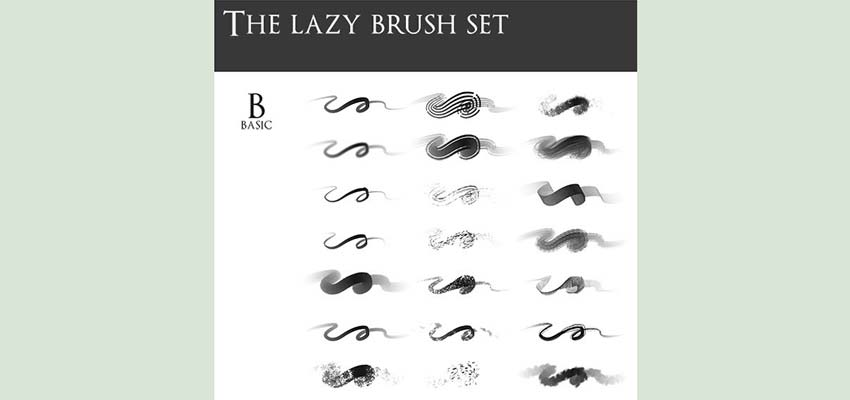
Need a huge pack of essentials? The lazy brush set contains 174 brushes, varying from basics to textures to silhouettes and light flares. It’s great for artists, but many of these brushes can be used in design work too. If you can only download one brush set, choose this one; it’s huge and contains just about everything you’ll need.
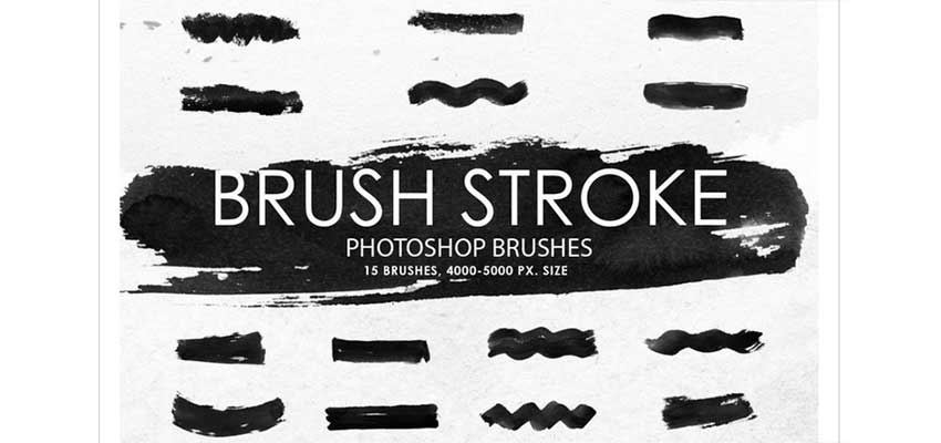
These 15 high-resolution brush strokes look great in almost any project. Modelled after watercolors, they have a multitude of uses, from professional effects to sketches to grungy art pieces. Basic, but essential.
If you need a rough, realistic, watercolor-like look, these acrylic textures will be perfect. At 2500px, every stroke will be detailed and gorgeous. If your designs turn out looking false or cartoony, these brushes can help them to appear more organic.
Looking for something a little more abstract? Great for posters, backgrounds and tech projects, Radiate was created by modifying different shapes. The fringe style is just what you need if you’re trying to make your piece look extra cool.
Fractal brushes are great for backgrounds, wispy textures and abstract designs. Their randomness makes an image more interesting. And there’s 30 brushes, so your design options with this collection are limitless.
Beautiful Brushes
Finding the best brushes can take some experimenting, so feel free to download lots of them to test out! The sites listed here have plenty of free brush packs to try. Do some digging and testing until you have some that you feel comfortable using. Once you find one (or ten) that work for you, you’ll be effortlessly crafting beautiful art, photos and web design layouts.
LUBUS, a web design agency in Mumbai, has published a site called WP Storybook that offers an interactive way to explore various WordPress React components. It allows developers to browse and search UI components and see a live preview of the component next to example source code.
WP Storybook lets you view different states for various UI components and even test them on different viewports. The development team at LUBUS is adding more as they discover them while building projects with Gutenberg using reusable components. Their goal in publishing the project is to help developers work faster by making components easier to discover and reference.
LUBUS’ roadmap for WP Storybook includes the following:
Add as many possible components and cases as possible
Capability to view and copy the example source
Playground to test out various props and options using knobs addon
Categorize components into groups for better discoverability
Recipe stories showcasing composing of various components
If you want to contribute to WP Storybook or log an issue, the code is open source (MIT license) on GitHub.
On the surface, changing a theme, might seem harmless. It’s so easy, it’s hard to imagine it can do any harm. You can even do it from within the dashboard these days, without any manual FTP upload required. It’s quick, painless and perfectly safe, right? Depends on how you’ve set up your site. The thing […]
Hilde Lysiak reports on local news in her community on her WordPress.com-powered Orange Street News website
WordPress.com is kicking off 2019 with a new national marketing campaign that features 14 entrepreneurs, writers, and non-profit organizations who are using the platform to make a big difference for their communities. The campaign is focused around the question: “What Would You Do If You Could Do Anything?”
WordPress.com published its inaugural ‘Anything Is Possible’ List, which includes 10 mini-documentaries ranging from 1 minute to 1:44. A few of the stories highlighted include Congolese-American sisters operating a successful hair salon in NYC, a 12-year-old journalist running her own online publication, a blogger who went viral and published her own book, and a non-profit fighting misinformation and extremist narratives. Each is presented more in depth on a new Do Anything campaign site that was launched today.
Do Anything is WordPress.com’s first large-scale national brand campaign. It will debut TV, print, and digital advertising spots in The New Yorker and on TV networks, including The History Channel, CNN, and National Geographic. WordPress.com will also be running ads on podcasts, including The Daily and NPR. The new 30-second TV ad was created by Interesting Development, an agency based in New York.
Much like gym memberships, WordPress.com tends to see more action at the beginning of a new year with 20% more sites are created in January than the average, according to Mark Armstrong at Automattic. The timing for the campaign is aimed at tapping into the motivation that millions of users have for starting a new business or blog at this time of year.
In 2016, Automattic started hiring for more marketing positions as an answer to Wix, Weebly, Squarespace, Web.com, EIG, and Godaddy, competitors that Matt Mullenweg identified as having spent over $350M in advertising that year. In 2017, the company created five commercials, its first ever TV spots, as part of a series called “Free to be.” Many found the commercials to be confusing and the messaging wasn’t clear.
By contrast, the 2019 “Do Anything” campaign is much better at demonstrating what people can do with WordPress. “As we share new work with the world we realize that some things will hit and some things will miss,” Automattic’s SVP of Brand, Michelle Broderick said. The company has continued to evolve its marketing based on feedback. This particular campaign was directly inspired by the people who are making things happen with WordPress.
“We were inspired by the people who use WordPress to imagine a better world,” Broderick said. “We saw everyone from bloggers to business owners to scientists to politicians using WordPress to share their story.”
The new TV spot is an improvement over previous campaigns in terms of communicating a clear message, but it doesn’t carry the same authenticity as the mini-documentaries. Each one is relatable and inspiring in telling the stories of people who have already answered the question “What would you do if you could do anything?” Many of those who were featured have carried on with their dreams through perseverance, despite tragedy and struggle along the way. The documentaries are more poignant than the TV spot, which has the added constraint of having to capture the viewer’s attention with a shorter amount of time.
The “Do Anything” campaign as a whole is a good representation of the power of WordPress and should also help boost name recognition for the software in general. Broderick said Automattic is expecting tens of millions of impressions across TV, print, digital, and podcasts. The campaign is aimed at the American market but Armstrong said they hope to branch out into international markets in the future.
A simple straightforward Creative Agency website with hidden surprises and interactive gems. It offers a little of everything this Agency is capable of.
Yugen is a clean, simple, minimal, modern & stylish WordPress blog theme, fully responsive design and easy to use. The minimalist design-oriented theme that helps you to showcase your posts super clean and beautiful and suitable for creative writers and bloggers ranging from Fashion, Travel, Music, Car, Real State, Beauty, Design, Food, Wedding, Movie, Photography, Technology and any other types of blog.
This custom WordPress Website Design and development project included a high impact looping video header that displays on mobile devices, a focus on aesthetics, SEO and usability. The company has seen a dramatic increase in user engagement, more inquiries as well as overall organic search traffic.
Facebook is on the wrong side of a privacy discussion, again. Privacy International recently published research indicating that almost half of Android apps have the ability to share data with Facebook, ranking Facebook second in third-party tracking on the Google Play store (Google being first). Accordingly, Privacy International chose 34 popular Android apps and analyzed their sharing with Facebook through the Facebook SDK.
Divi is powered by the Divi Builder, an insanely fast and incredibly intuitive front end editor like nothing you have seen before. It will change the way you build websites forever.
Students from Nara University in Japan have created this project where your face is matched to a Buddha statue image using Microsoft’s emotion analysis technology.


 On the surface, changing a theme, might seem harmless. It’s so easy, it’s hard to imagine it can do any harm. You can even do it from within the dashboard these days, without any manual FTP upload required. It’s quick, painless and perfectly safe, right? Depends on how you’ve set up your site. The thing […]


