What does your dream creative career look like? Take a moment to think about it. Now, how many steps are...
The post 7 Easy Creativity Routines that Make Your Day More Rewarding appeared first on Copyblogger.

Tips, Expertise, Articles and Advice from the Pro's for Your Website or Blog to Succeed

What does your dream creative career look like? Take a moment to think about it. Now, how many steps are...
The post 7 Easy Creativity Routines that Make Your Day More Rewarding appeared first on Copyblogger.
I love how Bruce steps up to the plate here:
If the importance of good HTML isn’t well-understood by the newer breed of JavaScript developers, then it’s my job as a DOWF (Dull Old Web Fart) to explain it.
Then he points out some very practical situations in which good HTML brings meaningful benefits. Maybe benefits isn't the right word, as much as requirement since most of it is centered around accessibility.
I hope I’ve shown you that choosing the correct HTML isn’t purely an academic exercise...
Semantic HTML will give usability benefits to many users, help to future-proof your work, potentially boost your search engine results, and help people with disabilities use your site.
I think it's fair to call HTML easy. Compared to many other things you'll learn in your journey building websites, perhaps it is. All the more reason to get it right.
Estelle Weyl has some similar thoughts:
... take the radio button. All you have to do is give all the radio buttons in your button group the same name, preferably with differed values. Associate a label to each radio button to define what each one means. Simply using allows for selecting only one value with completely accessible, fast keyboard navigation. Each radio button is keyboard focusable. Users can select a different radio button by using the arrow keys, or clicking anywhere on the label or button. The arrows cycle thru the radio buttons, going from the last in the group to the first with a click of the down or right arrow. Developers don’t have to listen for keyboard, mouse, or touch interactions with JavaScript. These native interactions are robust and accessible. There is rarely a reason to rewrite them, especially since they’ll always work, even if the JavaScript doesn’t.
Direct Link to Article — Permalink
The post The practical value of semantic HTML appeared first on CSS-Tricks.
Web performance is a tricky beast, isn’t it? How do we actually know where we stand in terms of performance, and what our performance bottlenecks exactly are? Is it expensive JavaScript, slow web font delivery, heavy images, or sluggish rendering? Is it worth exploring tree-shaking, scope hoisting, code-splitting, and all the fancy loading patterns with intersection observer, server push, clients hints, HTTP/2, service workers and — oh my — edge workers? And, most importantly, where do we even start improving performance and how do we establish a performance culture long-term?
Back in the day, performance was often a mere afterthought. Often deferred till the very end of the project, it would boil down to minification, concatenation, asset optimization and potentially a few fine adjustments on the server’s config file. Looking back now, things seem to have changed quite significantly.
Performance isn’t just a technical concern: it matters, and when baking it into the workflow, design decisions have to be informed by their performance implications. Performance has to be measured, monitored and refined continually, and the growing complexity of the web poses new challenges that make it hard to keep track of metrics, because metrics will vary significantly depending on the device, browser, protocol, network type and latency (CDNs, ISPs, caches, proxies, firewalls, load balancers and servers all play a role in performance).
So, if we created an overview of all the things we have to keep in mind when improving performance — from the very start of the process until the final release of the website — what would that list look like? Below you’ll find a (hopefully unbiased and objective) front-end performance checklist for 2019 — an updated overview of the issues you might need to consider to ensure that your response times are fast, user interaction is smooth and your sites don’t drain user’s bandwidth.
(You can also just download the checklist PDF (166 KB) or download editable Apple Pages file (275 KB) or the .docx file (151 KB). Happy optimizing, everyone!)
Micro-optimizations are great for keeping performance on track, but it’s critical to have clearly defined targets in mind — measurable goals that would influence any decisions made throughout the process. There are a couple of different models, and the ones discussed below are quite opinionated — just make sure to set your own priorities early on.
Without a strong alignment between dev/design and business/marketing teams, performance isn’t going to sustain long-term. Study common complaints coming into customer service and see how improving performance can help relieve some of these common problems.
Run performance experiments and measure outcomes — both on mobile and on desktop. It will help you build up a company-tailored case study with real data. Furthermore, using data from case studies and experiments published on WPO Stats will help increase sensitivity for business about why performance matters, and what impact it has on user experience and business metrics. Stating that performance matters alone isn’t enough though — you also need to establish some measurable and trackable goals and observe them.
How to get there? In her talk on Building Performance for the Long Term, Allison McKnight shares a comprehensive case-study of how she helped establish a performance culture at Etsy (slides).

To get a good first impression of how your competitors perform, you can use Chrome UX Report (CrUX, a ready-made RUM data set, video introduction by Ilya Grigorik), Speed Scorecard (also provides a revenue impact estimator), Real User Experience Test Comparison or SiteSpeed CI (based on synthetic testing).
Note: If you use Page Speed Insights (no, it isn’t deprecated), you can get CrUX performance data for specific pages instead of just the aggregates. This data can be much more useful for setting performance targets for assets like “landing page” or “product listing”. And if you are using CI to test the budgets, you need to make sure your tested environment matches CrUX if you used CrUX for setting the target (thanks Patrick Meenan!).
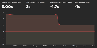
Collect data, set up a spreadsheet, shave off 20%, and set up your goals (performance budgets) this way. Now you have something measurable to test against. If you’re keeping the budget in mind and trying to ship down just the minimal script to get a quick time-to-interactive, then you’re on a reasonable path.
Need resources to get started?
Once you have a budget in place, incorporate them into your build process with Webpack Performance Hints and Bundlesize, Lightouse CI, PWMetrics or Sitespeed CI to enforce budgets on pull requests and provide a score history in PR comments. If you need something custom, you can use webpagetest-charts-api, an API of endpoints to build charts from WebPagetest results.
For instance, just like Pinterest, you could create a custom eslint rule that disallows importing from files and directories that are known to be dependency-heavy and would bloat the bundle. Set up a listing of “safe” packages that can be shared across the entire team.
Beyond performance budgets, think about critical customer tasks that are most beneficial to your business. Set and discuss acceptable time thresholds for critical actions and establish "UX ready" user timing marks that the entire organization has agreed on. In many cases, user journeys will touch on the work of many different departments, so alignment in terms of acceptable timings will help support or prevent performance discussions down the road. Make sure that additional costs of added resources and features are visible and understood.
Also, as Patrick Meenan suggested, it’s worth to plan out a loading sequence and trade-offs during the design process. If you prioritize early on which parts are more critical, and define the order in which they should appear, you will also know what can be delayed. Ideally, that order will also reflect the sequence of your CSS and JavaScript imports, so handling them during the build process will be easier. Also, consider what the visual experience should be in "in-between"-states, while the page is being loaded (e.g. when web fonts aren’t loaded yet).
Planning, planning, planning. It might be tempting to get into quick "low-hanging-fruits"-optimizations early on — and eventually it might be a good strategy for quick wins — but it will be very hard to keep performance a priority without planning and setting realistic, company-tailored performance goals.
One way or another, rather than focusing on full page loading time (via onLoad and DOMContentLoaded timings, for example), prioritize page loading as perceived by your customers. That means focusing on a slightly different set of metrics. In fact, choosing the right metric is a process without obvious winners.
Based on Tim Kadlec’s research and Marcos Iglesias’ notes in his talk, traditional metrics could be grouped into a few sets. Usually, we’ll need all of them to get a complete picture of performance, and in your particular case some of them might be more important than others.
To complete the picture, we’d usually look out for useful metrics among all of these groups. Usually, the most specific and relevant ones are:
Steve Souders has a detailed explanation of each metric. It’s important to notice that while Time-To-Interactive is measured by running automated audits in the so-called lab environment, First Input Delay represents the actual user experience, with actual users experiencing a noticeable lag. In general, it’s probably a good idea to always measure and track both of them.
Depending on the context of your application, preferred metrics might differ: e.g. for Netflix TV UI, key input responsiveness, memory usage and TTI are more critical, and for Wikipedia, first/last visual changes and CPU time spent metrics are more important.
Note: both FID and TTI do not account for scrolling behavior; scrolling can happen independently since it’s off-main-thread, so for many content consumption sites these metrics might be much less important (thanks, Patrick!).

If you don’t have a device at hand, emulate mobile experience on desktop by testing on a throttled network (e.g. 150ms RTT, 1.5 Mbps down, 0.7 Mbps up) with a throttled CPU (5× slowdown). Eventually switch over to regular 3G, 4G and Wi-Fi. To make the performance impact more visible, you could even introduce 2G Tuesdays or set up a throttled 3G network in your office for faster testing.
Keep in mind that on a mobile device, you should be expecting a 4×–5× slowdown compared to desktop machines. Mobile devices have different GPUs, CPU, different memory, different battery characteristics. While download times are critical for low-end networks, parse times are critical for phones with slow CPUs. In fact, parse times on mobile are 36% higher than on desktop. So always test on an average device — a device that is most representative of your audience.

Luckily, there are many great options that help you automate the collection of data and measure how your website performs over time according to these metrics. Keep in mind that a good performance picture covers a set of performance metrics, lab data and field data:
The former is particularly useful during development as it will help you identify, isolate and fix performance issues while working on the product. The latter is useful for long-term maintenance as it will help you understand your performance bottlenecks as they are happening live — when users actually access the site.
By tapping into built-in RUM APIs such as Navigation Timing, Resource Timing, Paint Timing, Long Tasks, etc., synthetic testing tools and RUM together provide a complete picture of performance in your application. You could use PWMetrics, Calibre, SpeedCurve, mPulse and Boomerang, Sitespeed.io, which all are great options for performance monitoring. Furthermore, with Server Timing header, you could even monitor back-end and front-end performance all in one place.
Note: It’s always a safer bet to choose network-level throttlers, external to the browser, as, for example, DevTools has issues interacting with HTTP/2 push, due to the way it’s implemented (thanks, Yoav, Patrick!). For Mac OS, we can use Network Link Conditioner, for Windows Windows Traffic Shaper, for Linux netem, and for FreeBSD dummynet.
However, it’s also a good idea to study which extensions your customers are using frequently, and test with a dedicated "customer" profile as well. In fact, some extensions might have a profound performance impact on your application, and if your users use them a lot, you might want to account for it up front. "Clean" profile results alone are overly optimistic and can be crushed in real-life scenarios.

Also, each frame of animation should be completed in less than 16 milliseconds, thereby achieving 60 frames per second (1 second ÷ 60 = 16.6 milliseconds) — preferably under 10 milliseconds. Because the browser needs time to paint the new frame to the screen, your code should finish executing before hitting the 16.6 milliseconds mark. We’re starting having conversations about 120fps (e.g. iPad’s new screens run at 120Hz) and Surma has covered some rendering performance solutions for 120fps, but that’s probably not a target we’re looking at just yet.
Be pessimistic in performance expectations, but be optimistic in interface design and use idle time wisely. Obviously, these targets apply to runtime performance, rather than loading performance.
Notice that, when speaking about interactivity metrics, it’s a good idea to distinguish between First CPU Idle and Time To Interactive to avoid misunderstandings down the line. The former is the earliest point after the main content has rendered (where there is at least a 5-second window where the page is responsive). The latter is the point where the page can be expected to always be responsive to input (thanks, Philip Walton!).
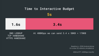
We have two major constraints that effectively shape a reasonable target for speedy delivery of the content on the web. On the one hand, we have network delivery constraints due to TCP Slow Start. The first 14KB of the HTML is the >most critical payload chunk — and the only part of the budget that can be delivered in the first roundtrip (which is all you get in 1 sec at 400ms RTT due to mobile wake-up times).
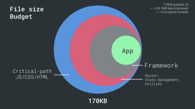
On the other hand, we have hardware constraints on memory and CPU due to JavaScript parsing times (we’ll talk about them in detail later). To achieve the goals stated in the first paragraph, we have to consider the critical file size budget for JavaScript. Opinions vary on what that budget should be (and it heavily depends on the nature of your project), but a budget of 170KB JavaScript gzipped already would take up to 1s to parse and compile on an average phone. Assuming that 170KB expands to 3× that size when decompressed (0.7MB), that already could be the death knell of a "decent" user experience on a Moto G4 or Nexus 2.
Of course, your data might show that your customers are not on these devices, but perhaps they simply don’t show up in your analytics because your service is inaccessible to them due to slow performance. In fact, Google’s Alex Russels recommends to aim for 130–170KB gzipped as a reasonable upper boundary, and exceeding this budget should be an informed and deliberate decision. In real-life world, most products aren’t even close: an average bundle size today is around 400KB, which is up 35% compared to late 2015. On a middle-class mobile device, that accounts for 30-35 seconds for Time-To-Interactive.
We could also go beyond the bundle size budget though. For example, we could set performance budgets based on the activities of the browser’s main thread, i.e. paint time before start render, or track down front-end CPU hogs. Tools such as Calibre, SpeedCurve and Bundlesize can help you keep your budgets in check, and can be integrated into your build process.
Also, a performance budget probably shouldn’t be a fixed value. Depending on the network connection, performance budgets should adapt, but payload on slower connection is much more "expensive", regardless of how they’re used.
Among the build tools, Webpack seems to be the most established one, with literally hundreds of plugins available to optimize the size of your builds. Getting started with Webpack can be tough though. So if you want to get started, there are some great resources out there:
With a 170KB budget that already contains the critical-path HTML/CSS/JavaScript, router, state management, utilities, framework and the application logic, we have to thoroughly examine network transfer cost, the parse/compile time and the runtime cost of the framework of our choice.
As noted by Seb Markbåge, a good way to measure start-up costs for frameworks is to first render a view, then delete it and then render again as it can tell you how the framework scales. The first render tends to warm up a bunch of lazily compiled code, which a larger tree can benefit from when it scales. The second render is basically an emulation of how code reuse on a page affects the performance characteristics as the page grows in complexity.
It might sound obvious but worth stating: some projects can also benefit benefit from removing an existing framework altogether. Once a framework is chosen, you’ll be staying with it for at least a few years, so if you need to use one, make sure your choice is informed and well considered.
Inian Parameshwaran has measured performance footprint of top 50 frameworks (against First Contentful Paint — the time from navigation to the time when the browser renders the first bit of content from the DOM). Inian discovered that, out there in the wild, Vue and Preact are the fastest across the board — both on desktop and mobile, followed by React (slides). You could examine your framework candidates and the proposed architecture, and study how most solutions out there perform, e.g. with server-side rendering or client-side rendering, on average.
Baseline performance cost matters. According to a study by Ankur Sethi, "your React application will never load faster than about 1.1 seconds on an average phone in India, no matter how much you optimize it. Your Angular app will always take at least 2.7 seconds to boot up. The users of your Vue app will need to wait at least 1 second before they can start using it." You might not be targeting India as your primary market anyway, but users accessing your site with suboptimal network conditions will have a comparable experience. In exchange, your team gains maintainability and developer efficiency, of course. But this consideration needs to be deliberate.
You could go as far as evaluating a framework (or any JavaScript library) on Sacha Greif’s 12-point scale scoring system by exploring features, accessibility, stability, performance, package ecosystem, community, learning curve, documentation, tooling, track record, team, compatibility, security for example. But on a tough schedule, it’s a good idea to consider at least the total cost on size + initial parse times before choosing an option; lightweight options such as Preact, Inferno, Vue, Svelte or Polymer can get the job done just fine. The size of your baseline will define the constraints for your application’s code.
A good starting point is to choose a good default stack for your application. Gatsby.js (React), Preact CLI, and PWA Starter Kit provide reasonable defaults for fast loading out of the box on average mobile hardware.

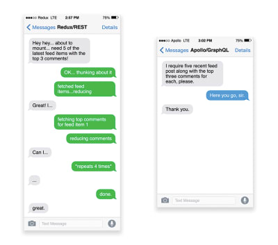
As with good ol' HTTP requests, when data is retrieved from an API, any delay in server response will propagate to the end user, hence delaying rendering. When a resource wants to retrieve some data from an API, it will need to request the data from the corresponding endpoint. A component that renders data from several resources, such as an article with comments and author photos in each comment, may need several roundtrips to the server to fetch all the data before it can be rendered. Furthermore, the amount of data returned through REST is often more than what is needed to render that component.
If many resources require data from an API, the API might become a performance bottleneck. GraphQL provides a performant solution to these issues. Per se, GraphQL is a query language for your API, and a server-side runtime for executing queries by using a type system you define for your data. Unlike REST, GraphQL can retrieve all data in a single request, and the response will be exactly what is required, without over or under-fetching data as it typically happens with REST.
In addition, because GraphQL is using schema (metadata that tells how the data is structured), it can already organize data into the preferred structure, so, for example, with GraphQL, we could remove JavaScript code used for dealing with state management, producing a cleaner application code that runs faster on the client.
If you want to get started with GraphQL, Eric Baer published two fantastic articles on yours truly Smashing Magazine: A GraphQL Primer: Why We Need A New Kind Of API and A GraphQL Primer: The Evolution Of API Design (thanks for the hint, Leonardo!).
The seemingly obvious benefit of these technologies for users is guaranteed performance, so at times they might even prefer AMP-/Apple News/Instant Pages-links over "regular" and potentially bloated pages. For content-heavy websites that are dealing with a lot of third-party content, these options could potentially help speed up render times dramatically.
Unless they don't. According to Tim Kadlec, for example, "AMP documents tend to be faster than their counterparts, but they don’t necessarily mean a page is performant. AMP is not what makes the biggest difference from a performance perspective."
A benefit for the website owner is obvious: discoverability of these formats on their respective platforms and increased visibility in search engines. You could build progressive web AMPs, too, by reusing AMPs as a data source for your PWA. Downside? Obviously, a presence in a walled garden places developers in a position to produce and maintain a separate version of their content, and in case of Instant Articles and Apple News without actual URLs (thanks Addy, Jeremy!).
Notice that CDNs can serve (and offload) dynamic content as well. So, restricting your CDN to static assets is not necessary. Double-check whether your CDN performs compression and conversion (e.g. image optimization in terms of formats, compression and resizing at the edge), support for servers workers, edge-side includes, which assemble static and dynamic parts of pages at the CDN’s edge (i.e. the server closest to the user), and other tasks.
Note: based on research by Patrick Meenan and Andy Davies, HTTP/2 is effectively broken on many CDNs, so we shouldn’t be too optimistic about the performance boost there.
Browsers will accept it only if the user is visiting a website over HTTPS though. What’s the catch? Brotli still doesn’t come preinstalled on some servers today, and it’s not straightforward to set up without self-compiling Nginx. Still, it’s not that difficult, and its support is coming, e.g. it’s available since Apache 2.4.26. Brotli is widely supported, and many CDNs support it (Akamai, AWS, KeyCDN, Fastly, Cloudlare, CDN77) and you can enable Brotli even on CDNs that don’t support it yet (with a service worker).
At the highest level of compression, Brotli is so slow that any potential gains in file size could be nullified by the amount of time it takes for the server to begin sending the response as it waits to dynamically compress the asset. With static compression, however, higher compression settings are preferred.
Alternatively, you could look into using Zopfli’s compression algorithm, which encodes data to Deflate, Gzip and Zlib formats. Any regular Gzip-compressed resource would benefit from Zopfli’s improved Deflate encoding because the files will be 3 to 8% smaller than Zlib’s maximum compression. The catch is that files will take around 80 times longer to compress. That’s why it’s a good idea to use Zopfli on resources that don’t change much, files that are designed to be compressed once and downloaded many times.
If you can bypass the cost of dynamically compressing static assets, it’s worth the effort. Both Brotli and Zopfli can be used for any plaintext payload — HTML, CSS, SVG, JavaScript, and so on.
The strategy? Pre-compress static assets with Brotli+Gzip at the highest level and compress (dynamic) HTML on the fly with Brotli at level 1–4. Make sure that the server handles content negotiation for Brotli or gzip properly. If you can’t install/maintain Brotli on the server, use Zopfli.
srcset, sizes and the <picture> element. While you’re at it, you could also make use of the WebP format (supported in Chrome, Opera, Firefox 65, Edge 18) by serving WebP images with the <picture> element and a JPEG fallback (see Andreas Bovens' code snippet) or by using content negotiation (using Accept headers). Ire Aderinokun has a very detailed tutorial on converting images to WebP, too.
Sketch natively supports WebP, and WebP images can be exported from Photoshop using a WebP plugin for Photoshop. Other options are available, too. If you’re using WordPress or Joomla, there are extensions to help you easily implement support for WebP, such as Optimus and Cache Enabler for WordPress and Joomla’s own supported extension (via Cody Arsenault).
It’s important to note that while WebP image file sizes compared to equivalent Guetzli and Zopfli, the format doesn’t support progressive rendering like JPEG, which is why users might see an actual image faster with a good ol' JPEG although WebP images might get faster through the network. With JPEG, we can serve a "decent" user experience with the half or even quarter of the data and load the rest later, rather than have a half-empty image as it is in the case of WebP. Your decision will depend on what you are after: with WebP, you’ll reduce the payload, and with JPEG you’ll improve perceived performance.
On Smashing Magazine, we use the postfix -opt for image names — for example, brotli-compression-opt.png; whenever an image contains that postfix, everybody on the team knows that the image has already been optimized. And — shameless plug! — Jeremy Wagner even published a Smashing book on WebP.
Every single image optimization article would state it, but keeping vector assets clean and tight is always worth reminding. Make sure to clean up unused assets, remove unnecessary metadata and reduces the amount of path points in artwork (and thus SVG code). (Thanks, Jeremy!)
There are more advanced options though. You could:
srcset and sizes alone will reap significant benefits.sizes to swap sources in a magnifier component.aspect-ratio property in CSS and intrinsicsize attribute which will allow us to set aspect ratios and dimensions for images, so browser can reserve a pre-defined layout slot early to avoid layout jumps during the page load.
The future of responsive images might change dramatically with the adoption of client hints. Client hints are HTTP request header fields, e.g. DPR, Viewport-Width, Width, Save-Data, Accept (to specify image format preferences) and others. They are supposed to inform the server about the specifics of user’s browser, screen, connection etc. As a result, the server can decide how to fill in the layout with appropriately sized images, and serve only these images in desired formats. With client hints, we move the resource selection from HTML markup and into the request-response negotiation between the client and server.
As Ilya Grigorik noted, client hints complete the picture — they aren’t an alternative to responsive images. "The <picture> element provides the necessary art-direction control in the HTML markup. Client hints provide annotations on resulting image requests that enable resource selection automation. Service Worker provides full request and response management capabilities on the client." A service worker could, for example, append new client hints headers values to the request, rewrite the URL and point the image request to a CDN, adapt response based on connectivity and user preferences, etc. It holds true not only for image assets but for pretty much all other requests as well.
For clients that support client hints, one could measure 42% byte savings on images and 1MB+ fewer bytes for 70th+ percentile. On Smashing Magazine, we could measure 19-32% improvement, too. Unfortunately, client hints still have to gain some browser support. Under
consideration in Firefox and
Edge. However, if you supply both the normal responsive images markup and the <meta> tag for Client Hints, then the browser will evaluate the responsive images markup and request the appropriate image source using the Client Hints HTTP headers.
Not good enough? Well, you can also improve perceived performance for images with the multiple background images technique. Keep in mind that playing with contrast and blurring out unnecessary details (or removing colors) can reduce file size as well. Ah, you need to enlarge a small photo without losing quality? Consider using Letsenhance.io.
These optimizations so far cover just the basics. Addy Osmani has published a very detailed guide on Essential Image Optimization that goes very deep into details of image compression and color management. For example, you could blur out unnecessary parts of the image (by applying a Gaussian blur filter to them) to reduce the file size, and eventually you might even start removing colors or turn the picture into black and white to reduce the size even further. For background images, exporting photos from Photoshop with 0 to 10% quality can be absolutely acceptable as well. Ah, and don’t use JPEG-XR on the web — "the processing of decoding JPEG-XRs software-side on the CPU nullifies and even outweighs the potentially positive impact of byte size savings, especially in the context of SPAs".
<video>, and, unlike with images, browsers do not preload <video> content, but they tend to be lighter and smaller than GIFs. Not an option? Well, at least we can add lossy compression to GIFs with Lossy GIF, gifsicle or giflossy.
Early tests show that inline videos within img tags display 20× faster and decode 7× faster than the GIF equivalent, in addition to being a fraction in file size. Although the support for <img src=".mp4"> has landed in Safari Technology Preview, we are far from it being adopted widely as it’s not coming to Blink any time soon.

In the land of good news though, video formats have been advancing massively over the years. For a long time, we had hoped that WebM would become the format to rule them all, and WebP (which is basically one still image inside of the WebM video container) will become a replacement for dated image formats. But despite WebP and WebM gaining support these days, the breakthrough didn’t happen.
In 2018, the Alliance of Open Media has released a new promising video format called AV1. AV1 has compression similar to H.265 codec (the evolution of H.264) but unlike the latter, AV1 is free. The H.265 license pricing pushed browser vendors to adopting a comparably performant AV1 instead: AV1 (just like H.265) compress twice as good as WebP.
In fact, Apple currently uses HEIF format and HEVC (H.265), and all the photos and videos on the latest iOS are saved in these formats, not JPEG. While HEIF and HEVC (H.265) aren’t properly exposed to the web (yet?), AV1 is — and it’s gaining browser support. So adding the AV1 source in your <video> tag is reasonable, as all browser vendors seem to be on board.
For now, the most widely used and supported encoding is H.264, served by MP4 files, so before serving the file, make sure that your MP4s are processed with a multipass-encoding, blurred with the frei0r iirblur effect (if applicable) and moov atom metadata is moved to the head of the file, while your server accepts byte serving. Boris Schapira provides exact instructions for FFmpeg to optimize videos to the maximum. Of course, providing WebM format as an alternative would help, too.
Video playback performance is a story on its own, and if you’d like to dive into it in details, take a look at Doug Sillar’s series on The Current State of Video and Video Delivery Best Practices that include details on video delivery metrics, video preloading, compression and streaming.
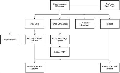
WOFF2 support is great, and you can use WOFF as fallback for browsers that don’t support it — after all, legacy browsers would probably be served well enough with system fonts. There are many, many, many options for web font loading, and you can choose one of the strategies from Zach Leatherman’s "Comprehensive Guide to Font-Loading Strategies," (code snippets also available as Web font loading recipes).
Probably the better options to consider today are Critical FOFT with preload and "The Compromise" method. Both of them use a two-stage render for delivering web fonts in steps — first a small supersubset required to render the page fast and accurately with the web font, and then load the rest of the family async. The difference is that "The Compromise" technique loads polyfill asynchronously only if font load events are not supported, so you don’t need to load the polyfill by default. Need a quick win? Zach Leatherman has a quick 23-min tutorial and case study to get your fonts in order.
In general, it’s a good idea to use the preload resource hint to preload fonts, but in your markup include the hints after the link to critical CSS and JavaScript. Otherwise, font loading will cost you in the first render time. Still, it might be a good idea to be selective and choose files that matter most, e.g. the ones that are critical for rendering or that would help you avoiding visible and disruptive text reflows. In general, Zach advises to preload one or two fonts of each family — it also makes sense to delay some font loading if they are less-critical.
Nobody likes waiting for the content to be displayed. With the font-display CSS descriptor, we can control the font loading behavior and enable content to be readable immediately (font-display: optional) or almost immediately (font-display: swap). However, if you want to avoid text reflows, we still need to use the Font Loading API, specifically to group repaints, or when you are using third party hosts. Unless you can use Google Fonts with Cloudflare Workers, of course. Talking about Google Fonts: consider using google-webfonts-helper, a hassle-free way to self-host Google Fonts. Always self-host your fonts for maximum control if you can.
In general, if you use font-display: optional, it might not be a good idea to also use preload as it it’ll trigger that web font request early (causing network congestion if you have other critical path resources that need to be fetched). Use preconnect for faster cross-origin font requests, but be cautious with preload as preloading fonts from a different origin wlll incur network contention. All of these techniques are covered in Zach’s Web font loading recipes.
Also, it might be a good idea to opt out of web fonts (or at least second stage render) if the user has enabled Reduce Motion in accessibility preferences or has opted in for Data Saver Mode (see Save-Data header). Or when the user happens to have slow connectivity (via Network Information API).
To measure the web font loading performance, consider the All Text Visible metric (the moment when all fonts have loaded and all content is displayed in web fonts), as well as Web Font Reflow Count after first render. Obviously, the lower both metrics are, the better the performance is. It’s important to notice that variable fonts might require a significant performance consideration. They give designers a much broader design space for typographic choices, but it comes at the cost of a single serial request opposed to a number of individual file requests. That single request might be slow blocking the entire typographic appearance on the page. On the good side though, with a variable font in place, we’ll get exactly one reflow by default, so no JavaScript will be required to group repaints.
Now, what would make a bulletproof web font loading strategy? Subset fonts and prepare them for the 2-stage-render, declare them with a font-display descriptor, use Font Loading API to group repaints and store fonts in a persistent service worker’s cache. You could fall back to Bram Stein’s Font Face Observer if necessary. And if you’re interested in measuring the performance of font loading, Andreas Marschke explores performance tracking with Font API and UserTiming API.
Finally, don’t forget to include unicode-range to break down a large font into smaller language-specific fonts, and use Monica Dinculescu’s font-style-matcher to minimize a jarring shift in layout, due to sizing discrepancies between the fallback and the web fonts.
Set up a spreadsheet. Define the basic core experience for legacy browsers (i.e. fully accessible core content), the enhanced experience for capable browsers (i.e. the enriched, full experience) and the extras (assets that aren’t absolutely required and can be lazy-loaded, such as web fonts, unnecessary styles, carousel scripts, video players, social media buttons, large images). A while back, we published an article on "Improving Smashing Magazine’s Performance," which describes this approach in detail.
When optimizing for performance we need to reflect our priorities. Load the core experience immediately, then enhancements, and then the extras.
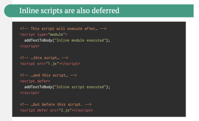
<script type="module">. Modern browsers would interpret the script as a JavaScript module and run it as expected, while legacy browsers wouldn’t recognize the attribute and ignore it because it’s unknown HTML syntax.
These days we need to keep in mind that feature detection alone isn’t enough to make an informed decision about the payload to ship to that browser. On its own, cutting-the-mustard deduces device capability from browser version, which is no longer something we can do today.
For example, cheap Android phones in developing countries mostly run Chrome and will cut the mustard despite their limited memory and CPU capabilities. Eventually, using the Device Memory Client Hints Header, we’ll be able to target low-end devices more reliably. At the moment of writing, the header is supported only in Blink (it goes for client hints in general). Since Device Memory also has a JavaScript API which is already available in Chrome, one option could be to feature detect based on the API, and fall back to "cutting the mustard" technique only if it’s not supported (thanks, Yoav!).
JavaScript has a cost, but it’s rarely the file size alone that drains on performance. Parsing and executing times vary significantly depending on the hardware of a device. On an average phone (Moto G4), a parsing time alone for 1MB of (uncompressed) JavaScript will be around 1.3–1.4s, with 15–20% of all time on mobile spent on parsing. With compiling in play, just prep work on JavaScript takes 4s on average, with around 11s before First Meaningful Paint on mobile. Reason: parse and execution times can easily be 2–5x times higher on low-end mobile devices.
To guarantee high performance, as developers, we need to find ways to write and deploy less JavaScript. That’s why it pays off to examine every single JavaScript dependency in detail.
There are many tools to help you make an informed decision about the impact of your dependencies and viable alternatives:
An interesting way of avoiding parsing costs is to use binary templates that Ember has introduced in 2017. With them, Ember replaces JavaScript parsing with JSON parsing, which is presumably faster. (Thanks, Leonardo, Yoav!)
Measure JavaScript parse and compile times. We can use synthetic testing tools and browser traces to track parse times, and browser implementors are talking about exposing RUM-based processing times in the future. Alternatively, consider using Etsy’s DeviceTiming, a little tool allowing you to instruct your JavaScript to measure parse and execution time on any device or browser.
Bottom line: while size matters, it isn’t everything. Parse and compiling times don’t necessarily increase linearly when the script size increases.
import chaining can be flattened and converted into one inlined function without compromising the code. With Webpack, we can also use JSON Tree Shaking as well.
Also, you might want to consider learning how to write efficient CSS selectors as well as how to avoid bloat and expensive styles. Feeling like going beyond that? You can also use Webpack to shorten the class names and use scope isolation to rename CSS class names dynamically at the compilation time.
Code-splitting is another Webpack feature that splits your code base into "chunks" that are loaded on demand. Not all of the JavaScript has to be downloaded, parsed and compiled right away. Once you define split points in your code, Webpack can take care of the dependencies and outputted files. It enables you to keep the initial download small and to request code on demand when requested by the application. Alexander Kondrov has a fantastic introduction to code-splitting with Webpack and React.
Consider using preload-webpack-plugin that takes routes you code-split and then prompts browser to preload them using <link rel="preload"> or <link rel="prefetch">. Webpack inline directives also give some control over preload/prefetch
Where to define split points? By tracking which chunks of CSS/JavaScript are used, and which aren’t used. Umar Hansa explains how you can use Code Coverage from Devtools to achieve it.
If you aren’t using Webpack, note that Rollup shows significantly better results than Browserify exports. While we’re at it, you might want to check out rollup-plugin-closure-compiler and Rollupify, which converts ECMAScript 2015 modules into one big CommonJS module — because small modules can have a surprisingly high performance cost depending on your choice of bundler and module system.
As the code base keeps growing, the UI performance bottlenecks will show up, slowing down the user’s experience. That’s because DOM operations are running alongside your JavaScript on the main thread. With web workers, we can move these expensive operations to a background process that’s running on a different thread. Typical use cases for web workers are prefetching data and Progressive Web Apps to load and store some data in advance so that you can use it later when needed. And you could use Comlink to streamline the communication between the main page and the worker. Still some work to do, but we are getting there.
Workerize allows you to move a module into a Web Worker, automatically reflecting exported functions as asynchronous proxies. And if you’re using Webpack, you could use workerize-loader. Alternatively, you could use worker-plugin as well.
Note that Web Workers don’t have access to the DOM because the DOM is not "thread-safe", and the code that they execute needs to be contained in a separate file.
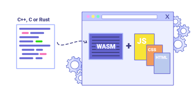
In real-world scenarios, JavaScript seems to perform better than WebAssembly on smaller array sizes and WebAssembly performs better than JavaScript on larger array sizes. For most web apps, JavaScript is a better fit, and WebAssembly is best used for computationally intensive web apps, such as web games. However, it might be worth investigating if a switch to WebAssembly would result in noticeable performance improvements.
If you’d like to learn more about WebAssembly:
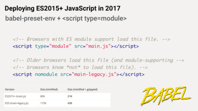
babel-preset-env to only transpile ES2015+ features unsupported by the modern browsers you are targeting. Then set up two builds, one in ES6 and one in ES5. As mentioned above, JavaScript modules are now supported in all major browsers, so use use script type="module" to let browsers with ES module support load the file, while older browsers could load legacy builds with script nomodule. And we can automate the entire process with Webpack ESNext Boilerplate.
Note that these days we can write module-based JavaScript that runs natively in the browser, without transpilers or bundlers. <link rel="modulepreload"> header provides a way to initiate early (and high-priority) loading of module scripts. Basically, it’s a nifty way to help in maximizing bandwidth usage, by telling the browser about what it needs to fetch so that it’s not stuck with anything to do during those long roundtrips. Also, Jake Archibald has published a detailed article with gotchas and things t keep in mind with ES Modules that’s worth reading.
For lodash, use babel-plugin-lodash that will load only modules that you are using in your source. Your dependencies might also depend on other versions of Lodash, so transform generic lodash requires to cherry-picked ones to avoid code duplication. This might save you quite a bit of JavaScript payload.
Shubham Kanodia has written a detailed low-maintenance guide on smart bundling: to shipping legacy code to only legacy browsers in production with the code snippet you could use right away.
As a result, we help reduce blocking of the main thread by reducing the amount of scripts the browser needs to process. Jeremy Wagner has published a comprehensive article on differential serving and how to set it up in your build pipeline in 2019, from setting up Babel, to what tweaks you’ll need to make in Webpack, as well as the benefits of doing all this work.
First, set up metrics that tracks if the ratio of legacy code calls is staying constant or going down, not up. Publicly discourage the team from using the library and make sure that your CI alerts developers if it’s used in pull requests. polyfills could help transition from legacy code to rewritten codebase that uses standard browser features.
import() (see the entire thread). Then repeat the coverage profile and validate that it’s now shipping less code on initial load.
You can use Puppeteer to programmatically collect code coverage and Canary already allows you to export code coverage results, too. As Andy Davies noted, you might want to collect code coverage for both modern and legacy browsers though. There are many other use-cases for Puppeteer, such as, for example, automatic visual diffing or monitoring unused CSS with every build.
Furthermore, purgecss, UnCSS and Helium can help you remove unused styles from CSS. And if you aren’t certain if a suspicious piece of code is used somewhere, you can follow Harry Roberts' advice: create a 1×1px transparent GIF for a particular class and drop it into a dead/ directory, e.g. /assets/img/dead/comments.gif. After that, you set that specific image as a background on the corresponding selector in your CSS, sit back and wait for a few months if the file is going to appear in your logs. If there are no entries, nobody had that legacy component rendered on their screen: you can probably go ahead and delete it all.
For the I-feel-adventurous-department, you could even automate gathering on unused CSS through a set of pages by monitoring DevTools using DevTools.
Add bundle auditing into your regular workflow as well. There might be some lightweight alternatives to heavy libraries you’ve added years ago, e.g. Moment.js could be replaced with date-fns or Luxon. Benedikt Rötsch’s research showed that a switch from Moment.js to date-fns could shave around 300ms for First paint on 3G and a low-end mobile phone.
That’s where tools like Bundlephobia could help find the cost of adding a npm package to your bundle. You can even integrate these costs with a Lighthouse Custom Audit. This goes for frameworks, too. By removing or trimming the Vue MDC Adapter (Material Components for Vue), styles drop from 194KB to 10KB.
Feeling adventurous? You could look into Prepack. It compiles JavaScript to equivalent JavaScript code, but unlike Babel or Uglify, it lets you write normal JavaScript code, and outputs equivalent JavaScript code that runs faster.
Alternatively to shipping the entire framework, you could even trim your framework and compile it into a raw JavaScript bundle that does not require additional code. Svelte does it, and so does Rawact Babel plugin which transpiles React.js components to native DOM operations at build-time. Why? Well, as maintainers explain, "react-dom includes code for every possible component/HTMLElement that can be rendered, including code for incremental rendering, scheduling, event handling, etc. But there are applications which do not need all these features (at initial page load). For such applications, it might make sense to use native DOM operations to build the interactive user interface."

Hence, every interactive element is receiving a probability score for engagement, and based on that score, a client-side script decides to prefetch a resource ahead of time. You can integrate the technique to your Next.js application, Angular and React, and there is a Webpack plugin which automates the setup process as well.
Obviously, you might be prompting the browser to consume unneeded data and prefetch undesirable pages, so it’s a good idea to be quite conservative in the number of prefetched requests. A good use case would be prefetching validation scripts required in the checkout, or speculative prefetch when a critical call-to-action comes into the viewport.
Need something less sophisticated? Quicklink is a small library that automatically prefetches links in the viewport during idle time in attempt to make next-page navigations load faster. However, it’s also data-considerate, so it doesn’t prefetch on 2G or if Data-Saver is on.
async or defer scripts to be parsed on a separate background thread once downloading begins, hence in some cases improving page loading times by up to 10%. Practically, use <script defer> in the <head>, so that the browsers can discover the resource early and then parse it on the background thread.
Caveat: Opera Mini doesn’t support script deferment, so if you are developing for India or Africa, defer will be ignored, resulting in blocking rendering until the script has been evaluated (thanks Jeremy!).
To avoid it, always break up the execution of functions into separate, asynchronous tasks, and where possible use requestIdleCallback. Consider lazy loading parts of the UI using WebPack’s dynamic import() support, avoiding the load, parse, and compile cost until the users really need them (thanks Addy!).
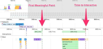
In its essence, Time to Interactive (TTI) tells us the time between navigation and interactivity. The metric is defined by looking at the first five-second window after the initial content is rendered, in which no JavaScript tasks take longer than 50ms. If a task over 50ms occurs, the search for a five-second window starts over. As a result, the browser will first assume that it reached Interactive, just to switch to Frozen, just to eventually switch back to Interactive.
Once we reached Interactive, we can then — either on demand or as time allows — boot non-essential parts of the app. Unfortunately, as Paul Lewis noticed, frameworks typically have no concept of priority that can be surfaced to developers, and hence progressive booting is difficult to implement with most libraries and frameworks. If you have the time and resources, use this strategy to ultimately boost performance.
So, client-side or server-side? If there is no visible benefit to the user, client-side rendering might not be really necessary — actually, server-side-rendered HTML could be faster. Perhaps you could even pre-render some of your content with static site generators and push them straight to the CDNs, with some JavaScript on top.
Limit the use of client-side frameworks to pages that absolutely require them. Server-rendering and client-rendering are a disaster if done poorly. Consider pre-rendering at build time and CSS inlining on the fly to produce production-ready static files. Addy Osmani has given a fantastic talk on the Cost of JavaScript that might be worth watching.
dns-prefetch or preconnect.
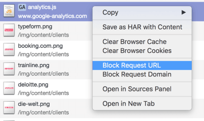
As Yoav Weiss explained in his must-watch talk on third-party scripts, in many cases these scripts download resources that are dynamic. The resources change between page loads, so we don’t necessarily know which hosts the resources will be downloaded from and what resources they would be.
What options do we have then? Consider using service workers by racing the resource download with a timeout and if the resource hasn’t responded within a certain timeout, return an empty response to tell the browser to carry on with parsing of the page. You can also log or block third-party requests that aren’t successful or don’t fulfill certain criteria. If you can, load the 3rd-party-script from your own server rather than from the vendor’s server.
Another option is to establish a Content Security Policy (CSP) to restrict the impact of third-party scripts, e.g. disallowing the download of audio or video. The best option is to embed scripts via <iframe> so that the scripts are running in the context of the iframe and hence don’t have access to the DOM of the page, and can’t run arbitrary code on your domain. Iframes can be further constrained using the sandbox attribute, so you can disable any functionality that iframe may do, e.g. prevent scripts from running, prevent alerts, form submission, plugins, access to the top navigation, and so on.
For example, it’s probably going to be necessary to allow scripts to run with <iframe sandbox="allow-scripts">. Each of the limitations can be lifted via various allow values on the sandbox attribute (supported almost everywhere), so constrain them to the bare minimum of what they should be allowed to do.
Consider using Intersection Observer; that would enable ads to be iframed while still dispatching events or getting the information that they need from the DOM (e.g. ad visibility). Watch out for new policies such as Feature policy, resource size limits and CPU/Bandwidth priority to limit harmful web features and scripts that would slow down the browser, e.g. synchronous scripts, synchronous XHR requests, document.write and outdated implementations.
To stress-test third parties, examine bottom-up summaries in Performance profile page in DevTools, test what happens if a request is blocked or it has timed out — for the latter, you can use WebPageTest’s Blackhole server blackhole.webpagetest.org that you can point specific domains to in your hosts file. Preferably self-host and use a single hostname, but also generate a request map that exposes fourth-party calls and detect when the scripts change. You can use Harry Roberts' approach for auditing third parties and produce spreadsheets like this one. Harry also explains the auditing workflow in his talk on third-party performance and auditing.
expires, max-age, cache-control, and other HTTP cache headers have been set properly. In general, resources should be cacheable either for a very short time (if they are likely to change) or indefinitely (if they are static) — you can just change their version in the URL when needed. Disable the Last-Modified header as any asset with it will result in a conditional request with an If-Modified-Since-header even if the resource is in cache. Same with Etag.
Use Cache-control: immutable, designed for fingerprinted static resources, to avoid revalidation (as of December 2018, supported in Firefox, Edge and Safari; in Firefox only on https:// transactions). In fact "across all of the pages in the HTTP Archive, 2% of requests and 30% of sites appear to include at least 1 immutable response. Additionally, most of the sites that are using it have the directive set on assets that have a long freshness lifetime."
Remember the stale-while-revalidate? As you probably know, we specify the caching time with the Cache-Control response header, e.g. Cache-Control: max-age=604800. After 604800 seconds have passed, the cache will re-fetch the requested content, causing the page to load slower. This slowdown can be avoided by using stale-while-revalidate; it basically defines an extra window of time during which a cache can use a stale asset as long as it revalidates it async in the background. Thus, it "hides" latency (both in the network and on the server) from clients.
In October 2018, Chrome published an intent to ship handling of stale-while-revalidate in HTTP Cache-Control header, so as a result, it should improve subsequent page load latencies as stale assets are no longer in the critical path. Result: zero RTT for repeat views.
You can use Heroku’s primer on HTTP caching headers, Jake Archibald’s "Caching Best Practices" and Ilya Grigorik’s HTTP caching primer as guides. Also, be wary of the vary header, especially in relation to CDNs, and watch out for the Key header which helps avoiding an additional round trip for validation whenever a new request differs slightly (but not significantly) from prior requests (thanks, Guy!).
Also, double-check that you aren’t sending unnecessary headers (e.g. x-powered-by, pragma, x-ua-compatible, expires and others) and that you include useful security and performance headers (such as Content-Security-Policy, X-XSS-Protection, X-Content-Type-Options and others). Finally, keep in mind the performance cost of CORS requests in single-page applications.
defer and async attributes in HTML.
In practice, it turns out we should prefer defer to async (at a cost to users of Internet Explorer up to and including version 9, because you’re likely to break scripts for them). According to Steve Souders, once async scripts arrive, they are executed immediately. If that happens very fast, for example when the script is in cache aleady, it can actually block HTML parser. With defer, browser doesn’t execute scripts until HTML is parsed. So, unless you need JavaScript to execute before start render, it’s better to use defer.
Also, as mentioned above, limit the impact of third-party libraries and scripts, especially with social sharing buttons and <iframe> embeds (such as maps). Size Limit helps you prevent JavaScript libraries bloat: If you accidentally add a large dependency, the tool will inform you and throw an error. You can use static social sharing buttons (such as by SSBG) and static links to interactive maps instead.
You might want to revise your non-blocking script loader for CSP compliance.
IntersectionObserver object, which receives a callback function and a set of options. Then we add a target to observe.
The callback function executes when the target becomes visible or invisible, so when it intercepts the viewport, you can start taking some actions before the element becomes visible. In fact, we have a granular control over when the observer’s callback should be invoked, with rootMargin (margin around the root) and threshold (a single number or an array of numbers which indicate at what percentage of the target’s visibility we are aiming).
Alejandro Garcia Anglada has published a handy tutorial on how to actually implement it, Rahul Nanwani wrote a detailed post on lazy-loading foreground and background images, and Google Fundamentals provide a detailed tutorial on lazy loading images and video with Intersection Observer as well. Remember art-directed storytelling long reads with moving and sticky objects? You can implement performant scrollytelling with Intersection Observer, too.
Also, watch out for the lazyload attribute that will allow us to specify which images and iframes should be lazy loaded, natively. Feature policy: LazyLoad will provide a mechanism that allows us to force opting in or out of LazyLoad functionality on a per-domain basis (similar to how Content Security Policies work). Bonus: once shipped, priority hints will allow us to specify importance on scripts and preloads in the header as well (currently in Chrome Canary).
Opinions differ if these techniques improve user experience or not, but it definitely improves time to first meaningful paint. We can even automate it by using SQIP that creates a low quality version of an image as an SVG placeholder, or Gradient Image Placeholders with CSS linear gradients. These placeholders could be embedded within HTML as they naturally compress well with text compression methods. In his article, Dean Hume has described how this technique can be implemented using Intersection Observer.
Browser support? Decent, with Chrome, Firefox, Edge and Samsung Internet being on board. WebKit status is currently supported in preview. Fallback? If the browser doesn’t support intersection observer, we can still lazy load a polyfill or load the images immediately. And there is even a library for it.
Want to go fancier? You could trace your images and use primitive shapes and edges to create a lightweight SVG placeholder, load it first, and then transition from the placeholder vector image to the (loaded) bitmap image.

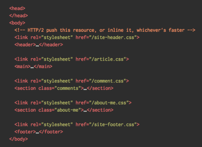
<head> of the page, thus reducing roundtrips. Due to the limited size of packages exchanged during the slow start phase, your budget for critical CSS is around 14 KB.
If you go beyond that, the browser will need additional roundtrips to fetch more styles. CriticalCSS and Critical enable you to do just that. You might need to do it for every template you’re using. If possible, consider using the conditional inlining approach used by the Filament Group, or convert inline code to static assets on the fly.
With HTTP/2, critical CSS could be stored in a separate CSS file and delivered via a server push without bloating the HTML. The catch is that server pushing is troublesome with many gotchas and race conditions across browsers. It isn’t supported consistently and has some caching issues (see slide 114 onwards of Hooman Beheshti’s presentation). The effect could, in fact, be negative and bloat the network buffers, preventing genuine frames in the document from being delivered. Also, it appears that server pushing is much more effective on warm connections due to the TCP slow start.
Even with HTTP/1, putting critical CSS in a separate file on the root domain has benefits, sometimes even more than inlining due to caching. Chrome speculatively opens a second HTTP connection to the root domain when requesting the page, which removes the need for a TCP connection to fetch this CSS (thanks, Philip!)
A few gotchas to keep in mind: unlike preload that can trigger preload from any domain, you can only push resources from your own domain or domains you are authoritative for. It can be initiated as soon as the server gets the very first request from the client. Server pushed resources land in the Push cache and are removed when the connection is terminated. However, since an HTTP/2 connection can be re-used across multiple tabs, pushed resources can be claimed by requests from other tabs as well (thanks, Inian!).
At the moment, there is no simple way for the server to know if pushed resources are already in one of the user’s caches, so resources will keep being pushed with every user’s visit. You may then need to create a cache-aware HTTP/2 server push mechanism. If fetched, you could try to get them from a cache based on the index of what’s already in the cache, avoiding secondary server pushes altogether.
Keep in mind, though, that the new cache-digest specification negates the need to manually build such "cache-aware" servers, basically declaring a new frame type in HTTP/2 to communicate what’s already in the cache for that hostname. As such, it could be particularly useful for CDNs as well.
For dynamic content, when a server needs some time to generate a response, the browser isn’t able to make any requests since it’s not aware of any sub-resources that the page might reference. For that case, we can warm up the connection and increase the TCP congestion window size, so that future requests can be completed faster. Also, all inlined assets are usually good candidates for server pushing. In fact, Inian Parameshwaran did remarkable research comparing HTTP/2 Push vs. HTTP Preload, and it’s a fantastic read with all the details you might need. Server Push or Not Server Push? Colin Bendell’s Should I Push? might point you in the right direction.
Bottom line: As Sam Saccone noted, preload is good for moving the start download time of an asset closer to the initial request, while Server Push is good for cutting out a full RTT (or more, depending on your server think time) — if you have a service worker to prevent unnecessary pushing, that is.
Also, avoid placing <link rel="stylesheet" /> before async snippets. If scripts don’t depend on stylesheets, consider placing blocking scripts above blocking styles. If they do, split that JavaScript in two and load it either side of your CSS.
Scott Jehl solved another interesting problem by caching an inlined CSS file with a service worker, a common problem familiar if you’re using critical CSS. Basically, we add an ID attribute onto the style element so that it’s easy to find it using JavaScript, then a small piece of JavaScript finds that CSS and uses the Cache API to store it in a local browser cache (with a content type of text/css) for use on subsequent pages. To avoid inlining on subsequent pages and instead reference the cached assets externally, we then set a cookie on the first visit to a site. Voilà!
We could create one stream from multiple sources. For example, instead of serving an empty UI shell and letting JavaScript populate it, you can let the service worker construct a stream where the shell comes from a cache, but the body comes from the network. As Jeff Posnick noted, if your web app is powered by a CMS that server-renders HTML by stitching together partial templates, that model translates directly into using streaming responses, with the templating logic replicated in the service worker instead of your server. Jake Archibald’s The Year of Web Streams article highlights how exactly you could build it. Performance boost is quite noticeable.
One important advantage of streaming the entire HTML response is that HTML rendered during the initial navigation request can take full advantage of the browser’s streaming HTML parser. Chunks of HTML that are inserted into a document after the page has loaded (as is common with content populated via JavaScript) can’t take advantage of this optimization.
Browser support? Getting there with Chrome 52+, Firefox 57+ (behind flag), Safari and Edge supporting the API and Service Workers being supported in all modern browsers.
The header is currently supported only in Chromium, on the Android version of Chrome or via the Data Saver extension on a desktop device. Finally, you can also use the Network Information API to deliver low/high resolution images and videos based on the network type. Network Information API and specifically navigator.connection.effectiveType (Chrome 62+) use RTT, downlink, effectiveType values (and a few others) to provide a representation of the connection and the data that users can handle.
In this context, Max Stoiber speaks of connection-aware components. For example, with React, we could write a component that renders different elements for different connection types. As Max suggested, a <Media /> component in a news article might output:
Offline: a placeholder with alt text,2G / save-data mode: a low-resolution image,3G on non-Retina screen: a mid-resolution image,3G on Retina screens: high-res Retina image,4G: an HD video.Dean Hume provides a practical implementation of a similar logic using a service worker. For a video, we could display a video poster by default, and then display the "Play" icon as well as the video player shell, meta-data of the video etc. on better connections. As a fallback for non-supporting browsers, we could listen to canplaythrough event and use Promise.race() to timeout the source loading if the canplaythrough event doesn’t fire within 2 seconds.
navigator.deviceMemory returns how much RAM the device has in gigabytes, rounded down to the nearest power of two. The API also features a Client Hints Header, Device-Memory, that reports the same value.
dns-prefetch (which performs a DNS lookup in the background), preconnect (which asks the browser to start the connection handshake (DNS, TCP, TLS) in the background), prefetch (which asks the browser to request a resource) and preload (which prefetches resources without executing them, among other things).
Most of the time these days, we’ll be using at least preconnect and dns-prefetch, and we’ll be cautious with using prefetch and preload; the former should only be used if you are confident about what assets the user will need next (for example, in a purchasing funnel).
Note that even with preconnect and dns-prefetch, the browser has a limit on the number of hosts it will look up/connect to in parallel, so it’s a safe bet to order them based on priority (thanks Philip!).
In fact, using resource hints is probably the easiest way to boost performance, and it works well indeed. When to use what? As Addy Osmani has explained, we should preload resources that we have high-confidence will be used in the current page. Prefetch resources likely to be used for future navigations across multiple navigation boundaries, e.g. Webpack bundles needed for pages the user hasn’t visited yet.
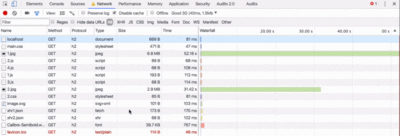
Addy’s article on "Loading Priorities in Chrome" shows how exactly Chrome interprets resource hints, so once you’ve decided which assets are critical for rendering, you can assign high priority to them. To see how your requests are prioritized, you can enable a "priority" column in the Chrome DevTools network request table (as well as Safari Technology Preview).
For example, since fonts usually are important assets on a page, it’s always a good idea to request the browser to download fonts with preload. You could also load JavaScript dynamically, effectively lazy-loading execution. Also, since <link rel="preload"> accepts a media attribute, you could choose to selectively prioritize resources based on @media query rules.
A few gotchas to keep in mind: preload is good for moving the start download time of an asset closer to the initial request, but preloaded assets land in the memory cache which is tied to the page making the request. preload plays well with the HTTP cache: a network request is never sent if the item is already there in the HTTP cache.
Hence, it’s useful for late-discovered resources, a hero image loaded via background-image, inlining critical CSS (or JavaScript) and pre-loading the rest of the CSS (or JavaScript). Also, a preload tag can initiate a preload only after the browser has received the HTML from the server and the lookahead parser has found the preload tag.
Preloading via the HTTP header is a bit faster since we don’t to wait for the browser to parse the HTML to start the request. Early Hints will help even further, enabling preload to kick in even before the response headers for the HTML are sent and Priority Hints (coming soon) will help us indicate loading priorities for scripts.
Beware: if you’re using preload, as must be defined or nothing loads, plus preloaded fonts without the crossorigin attribute will double fetch.
Browser support? As stated above, it’s widely supported (Chrome, Firefox, Safari TP, Samsung Internet, Edge 17+) and the fallback is the network anyway. Does it help boost performance? Oh yes, it does. And it’s getting better, e.g. with Background Fetch allowing background uploads/downloads from a service worker. Shipped in Chrome 71.
There are a number of use cases for a service worker. For example, you could implement "Save for offline" feature, handle broken images, introduce messaging between tabs or provide different caching strategies based on request types. In general, a common reliable strategy is to store the app shell in the service worker’s cache along with a few critical pages, such as offline page, frontpage and anything else that might be important in your case.
There are a few gotchas to keep in mind though. With a service worker in place, we need to beware range requests in Safari (if you are using Workbox for a service worker it has a range request module). If you ever stumbled upon DOMException: Quota exceeded. error in the browser console, then look into Gerardo’s article When 7KB equals 7MB.
As Gerardo writes, “If you are building a progressive web app and are experiencing bloated cache storage when your service worker caches static assets served from CDNs, make sure the proper CORS response header exists for cross-origin resources, you do not cache opaque responses with your service worker unintentionally, you opt-in cross-origin image assets into CORS mode by adding the crossorigin attribute to the <img> tag.”
A good starting point for using service workers would be Workbox, a set of service worker libraries built specifically for building progressive web apps.
For example, in A/B tests, when HTML needs to vary its content for different users, we could use Service Workers on the CDN servers to handle the logic. We could also stream HTML rewriting to speed up sites that use Google Fonts.
will-change to inform the browser of which elements and properties will change.
Also, measure runtime rendering performance (for example, in DevTools). To get started, check Paul Lewis’ free Udacity course on browser-rendering optimization and Georgy Marchuk’s article on Browser painting and considerations for web performance.
If you want to dive deeper into the topic, Nolan Lawson has shared tricks to accurately measure layout performance in his article, and Jason Miller suggested alternative techniques, too. We also have a lil' article by Sergey Chikuyonok on how to get GPU animation right. Quick note: changes to GPU-composited layers are the least expensive, so if you can get away by triggering only compositing via opacity and transform, you'll be on the right track. Anna Migas has provided a lot of practical advice in her talk on Debugging UI Rendering Performance, too.
What does it all mean? While loading assets, we can try to always be one step ahead of the customer, so the experience feels swift while there is quite a lot happening in the background. To keep the customer engaged, we can test skeleton screens (implementation demo) instead of loading indicators, add transitions/animations and basically cheat the UX when there is nothing more to optimize. Beware though: skeleton screens should be tested before deploying as some tests showed that skeleton screens can perform the worst by all metrics.

The most time-consuming task will be to migrate to HTTPS, and depending on how large your HTTP/1.1 user base is (that is, users on legacy operating systems or with legacy browsers), you’ll have to send a different build for legacy browsers performance optimizations, which would require you to adapt to a different build process. Beware: Setting up both migration and a new build process might be tricky and time-consuming. For the rest of this article, I’ll assume that you’re either switching to or have already switched to HTTP/2.
On the one hand, you might want to avoid concatenating assets altogether, instead breaking down your entire interface into many small modules, compressing them as a part of the build process, referencing them via the "scout" approach and loading them in parallel. A change in one file won’t require the entire style sheet or JavaScript to be re-downloaded. It also minimizes parsing time and keeps the payloads of individual pages low.
On the other hand, packaging still matters. First, compression will suffer. The compression of a large package will benefit from dictionary reuse, whereas small separate packages will not. There’s standard work to address that, but it’s far out for now. Secondly, browsers have not yet been optimized for such workflows. For example, Chrome will trigger inter-process communications (IPCs) linear to the number of resources, so including hundreds of resources will have browser runtime costs.
Still, you can try to load CSS progressively. In fact, since Chrome 69, in-body CSS no longer blocks rendering for Chrome. Obviously, by doing so, you are actively penalizing HTTP/1.1 users, so you might need to generate and serve different builds to different browsers as part of your deployment process, which is where things get slightly more complicated. You could get away with HTTP/2 connection coalescing, which allows you to use domain sharding while benefiting from HTTP/2, but achieving this in practice is difficult, and in general, it’s not considered to be good practice.
What to do? Well, if you’re running over HTTP/2, sending around 6–10 packages seems like a decent compromise (and isn’t too bad for legacy browsers). Experiment and measure to find the right balance for your website.
Consult Pat Meenan’s incredible research on HTTP/2 priorities and test server support for HTTP/2 prioritization. According to Pat, it’s recommended to enable BBR congestion control and set tcp_notsent_lowat to 16KB for HTTP/2 prioritization to work reliably on Linux 4.9 kernels and later (thanks, Yoav!). Andy Davies did a similar research for HTTP/2 prioritization across browsers, CDNs and Cloud Hosting Services.
You could also drive WebPageTest from a Google Spreadsheet and incorporate accessibility, performance and SEO scores into your Travis setup with Lighthouse CI or straight into Webpack.
And if you need to debug something quickly but your build process seems to be remarkably slow, keep in mind that "whitespace removal and symbol mangling accounts for 95% of the size reduction in minified code for most JavaScript — not elaborate code transforms. You can simply disable compression to speed up Uglify builds by 3 to 4 times."


When talking about fast Time to Interactive, usually we mean an indicator of how soon a user can interact with the page by clicking or tapping on links and buttons. The context is slightly different with screen readers. In that case, fast Time to Interactive means how much time passes by until the screen reader can announce navigation on a given page and a screen reader user can actually hit keyboard to interact.
Léonie Watson has given an eye-opening talk on accessibility performance and specifically the impact slow loading has on screen reader announcement delays. Screen readers are used to fast-paced announcements and quick navigation, and therefore might potentially be even less patient than sighted users.
Large pages and DOM manipulations with JavaScript will cause delays in screen reader announcements. A rather unexplored area that could use some attention and testing as screen readers are available on literally every platform (Jaws, NVDA, Voiceover, Narrator, Orca).
Look into using RUM-solutions to monitor changes in performance over time. For automated unit-test-alike load testing tools, you can use k6 with its scripting API. Also, look into SpeedTracker, Lighthouse and Calibre.
This list is quite comprehensive, and completing all of the optimizations might take quite a while. So, if you had just 1 hour to get significant improvements, what would you do? Let’s boil it all down to 12 low-hanging fruits. Obviously, before you start and once you finish, measure results, including start rendering time and Speed Index on a 3G and cable connection.
<head> of the page. (Your budget is 14 KB). For CSS/JS, operate within a critical file size budget of max. 170KB gzipped (0.7MB decompressed).<script type="module">.dns-lookup, preconnect, prefetch and preload.font-display in CSS for fast first rendering.With this checklist in mind, you should be prepared for any kind of front-end performance project. Feel free to download the print-ready PDF of the checklist as well as an editable Apple Pages document to customize the checklist for your needs:
If you need alternatives, you can also check the front-end checklist by Dan Rublic, the "Designer’s Web Performance Checklist" by Jon Yablonski and the FrontendChecklist.
Some of the optimizations might be beyond the scope of your work or budget or might just be overkill given the legacy code you have to deal with. That’s fine! Use this checklist as a general (and hopefully comprehensive) guide, and create your own list of issues that apply to your context. But most importantly, test and measure your own projects to identify issues before optimizing. Happy performance results in 2019, everyone!
A huge thanks to Guy Podjarny, Yoav Weiss, Addy Osmani, Artem Denysov, Denys Mishunov, Ilya Pukhalski, Jeremy Wagner, Colin Bendell, Mark Zeman, Patrick Meenan, Leonardo Losoviz, Andy Davies, Rachel Andrew, Anselm Hannemann, Patrick Hamann, Andy Davies, Tim Kadlec, Rey Bango, Matthias Ott, Peter Bowyer, Phil Walton, Mariana Peralta, Philipp Tellis, Ryan Townsend, Ingrid Bergman, Mohamed Hussain S. H., Jacob Groß, Tim Swalling, Bob Visser, Kev Adamson, Adir Amsalem, Aleksey Kulikov and Rodney Rehm for reviewing this article, as well as our fantastic community which has shared techniques and lessons learned from its work in performance optimization for everybody to use. You are truly smashing!
 (ra, il)

A great tool by yoksel for creating filters with Gradient Map allowing for Duotone effects.

The one hundred most loved Codepen demos of 2018.

554,210 customers are building amazing websites with Divi. You can try Divi with a 30 day money back guarantee.

Linzi Berry shows how to design accessible escape hatches for modals.

FBT is an internationalization framework by Facebook designed to be both powerful and flexible, but also simple and intuitive.

A free electronic version of a soon to be published textbook by Jeff Erickson, along with other lecture notes he has written for various theoretical computer science classes at the University of Illinois, Urbana-Champaign since 1998.

Leonardo Maldonado explains how GraphQL works in practice.

A mesmerizing demo by Gerard Ferrandez.

An insightful summary by Dan Abramov on the challenges of user interfaces.

An isomorphic and configurable JavaScript utility for objects deep cloning.

Jake Dohm shows how to refactor a function to make its declaration and uses cleaner and more readable.

Inspired by old Vietnamese book covers, Hiep Tong designed this typeface. It’s free for personal use and commercial use if you credit the author.

A tool that lets you turn articles to high-quality audio.

Jon Kantner created this demo of arrays of animated table flipping text emoticons.

Learn how to build the animated note display from the Awwwards website in this tutorial by Marina Ferreira.

Julia Enthoven shares her opinion on why founders should *almost* always build a website first instead of a native app in the early days of a startup.

Tania Rascia shares what she learned when writing a command line program that outputs a hex dump.

Kyle Wetton shares how he found a great new hobby on Codepen.

A boilerplate for static websites with automated build processes, a local development server, production minification and optimizations.

Described as “rough monospace type with cowboy boots”, the Justice font family is an outstanding gem. The regular style is free.
Collective #481 was written by Pedro Botelho and published on Codrops.
It isn’t very unusual to see developers having sorts of debates and discussions on the emerging tech topics, but the moment things go beyond developer discussion and dive into the mainstream where you and I hear them, they quickly get listed in controversial issues. Well, today’s topic is how the dawn of WordPress 5.0 featuring Read More →
The post Gutenberg vs. Elementor: Choosing One Is Actually A Tough Call! appeared first on WPArena.
Canon Europe announces the release of its new camera API package, offering a range of resources to developers. The combined EOS Digital software development kit (SDK) and all-new Camera Control API (CCAPI) create unique opportunities for developers and software engineers to take advantage of select Canon cameras and lenses, launching with the PowerShot SX70 HS.
The Bootstrap framework is quite popular with web designers. It provides everything you need to get a design project off to a running start. Plus, it’s been created with mobile devices in mind.
On the downside, it seems like many sites using Bootstrap tend to have a similar look and layout. But that is more of a product of taking design shortcuts rather than an indictment on the framework itself. Going beyond the default styles is quite possible and much easier than you may think.
With that in mind, we went on a search for free Bootstrap templates that lean toward the barebones end of the spectrum. They offer a virtual clean slate and give you the power to customize both the look and layout as much as you’d like. So, instead of ripping apart an existing design, you can get straight to making your own mark.

2M+ items from the worlds largest marketplace for Bootstrap Templates, Themes & Design Assets. All of it can be found at Envato Market.
Bare is designed to help you get started without any fuss. There are no fancy styles applied and it comes with predefined paths. The template works with Bootstrap 4 and sports a fixed top navigation.
Touted as both “Mini and Minimalist”, Simplex contains some basic styles that will provide you with a great starting point. You’ll find minimal navigation, buttons, typography, forms, containers and more goodies within this lightweight package.
Understrap is a clever mix of Automattic’s Underscores barebones WordPress theme and Bootstrap. Thus, your next WordPress project can utilize Bootstrap without the excess bloat of a prebuilt theme. Understrap features Bootstrap 4, is compatible with the WordPress Customizer and supports WooCommerce.
Initializr will generate a simple HTML template based on your requirements. Bootstrap 3.3.1 can be bundled right in with your template.
Use Bootply to build your own custom Boostrap starter template. Using their online builder, you can make things as simple (or complex) as you’d like. There are options for different layouts, various sidebars (including off-canvas) and more.
WP Bootstrap Starter is aimed at developers who want to build upon basic features to make their own custom theme. Like Understrap above, it’s based on Underscores. That means it’s lightweight and ready for full-on customization.
LayoutIt! is a tool featuring a drag-and-drop interface for quickly building Bootstrap-based templates. There are three base templates to choose from (Starter, Basic Marketing Site and Article). Once you’ve selected a template, you’ll be able to add elements such as grids, components and even JavaScript. You can have a basic, yet functional template set up within minutes.
A competitor to Undesrcores, Sage is a WordPress starter theme that comes with Bootstrap baked right in. The theme features task automation via gulp, and the ability to easily add front-end packages via Bower. Template markup is based on HTML5 Boilerplate.
If you’re looking for dead simple way to start off a new site, WebNots has put together their own Bootstrap 4 Starter Template. Not only can you grab a copy of their template, there is also a handy guide for building your own.
BS Starter provides the basics you’ll need to get up and running with your design project. The template features a full-width slider and is minimally styled. It gives you just enough to help you create your own look and layout.

When embarking on a new project, you’re better off using a starter Bootstrap template that lets you make all of the important design decisions. That’s where these minimal and barebones options really shine. Instead of having a Bootstrap-based theme that simply looks like everyone else, you’ll have the flexibility to use the framework to create something unique.
You might also like these Free Bootstrap Dashboard Admin Templates.
One of the certifications that most of the IT companies demand is the Linux Professional certification. Linux has grown and become one of the most common software brands in the companies and individuals with Linux certifications are getting better job opportunities and what not.
In this article, we will be talking about the Linux Essentials Professional Development Certificate (PDC) and 010-160 exam which is held by Linux and how one can prepare for it.
Linux has become one of the most used certificates in the world and many private, as well as government companies, have been making use of it in their daily tasks. This is the reason that more and more people who know Linux and its basics are being required by the companies. People who are just starting their career should get the Linux certifications and the best of the Linux certification for the beginners is the Linux Essential Certification. This is also one of the stepping stones for the people who want to get other specialization certification from Linux. To get this certification, the candidates have to pass an exam and get the passing score.
010-160 exam is the test that candidates should pass if they want to be eligible for the LPI Linux Essentials Certifications. This is an easy primary level exam that can be passed if the candidates have the fundamental knowledge in the subject. Note, that the previous version of the exam is 010-150 (version 1.5) and it is available until the 1st of July 2019.
To know more details about 010-150 exam, visit LPI website.
Since 010-160 is a newer version, let’s focus on some other important information about this exam.
The exam is a multiple choice questions exam. Each question will consist of 4 answers and the candidates will have to choose from them.
The candidates will be given 60 minutes to solve all the questions. They will be given 40 questions in total that they need to solve within an hour time frame.
The registration is easy and the ticket can be bought at the official website. The price of the ticket is $110 USD, but it can vary from region to region because of the currency difference.
All candidates with the basic knowledge of Linux software’s are eligible to give this exam. There is no qualification required. The candidates have to be 18 years or older.
The exam is available in three different languages including English, Japanese and German. However, more languages are being launched in the coming time.
LPI Linux Essentials Certification exam is a fundamental level exam, but this does not mean that it is easy. The question asked is pretty detailed and one needs thorough knowledge to score well. Here are some ways in which you can prepare for your exam.
The first way to study is the self-study which a lot of working individuals prefer. This is also the cheapest way you can prepare for your exam. Get the syllabus and by the related books that you will need to prepare. Now make a timetable and start studying in your own time. Make sure that you start as early as possible.
If you want a little help but do not have the time to attend full-time classes, the online classes are the best for you. These will cost you some money, but you will be able to get all the information specially designed for you. You will be given notes and lectures and also some tests to check your progress.
If you want a better understanding of the topics, the one on one classes are another option that you can take. These on one class are taken by learned professionals who will be teaching you about every topic in detail which will help you build a strong base of knowledge.
The last and the most important preparation material and strategy are solving practice papers. You need to solve the practice papers on a regular basis. The practice papers are really helpful in determining the growth of the individual and help you check what places you are lacking. At the beginning of the preparation, make a habit of solving at least one practice paper a week and then go to one a day.
To get reliable practice test questions for your certification exam, browse https://prepaway.com website.
Here are some important tips that will help you with the better preparation of the exam and in scoring better.
People who are just starting out with their IT careers should go for the LPI Linux Essential Certification since this is the foundation certificate that will build your base for getting the higher level certificates in the years to come. This certificate is surely really helpful for the people in the IT industry and will bag them better jobs and salaries. Keep the above tips in mind and score your best in 010-160 exam.
This is a guest article by Darren Demers.
Being a freelance web designer offers plenty of advantages. You get to work the way you want and for the type of clients you prefer. Whether you’re specializing in a niche or open to anything – it’s all for you to decide.
And, if you manage to hang around long enough, you’ll have found a certain level of success. That’s often a result of hard work coupled with outstanding skill. But at a certain point even the most talented and dedicated designers can find themselves in a period of stagnation.
Attaining growth can be difficult for any business. But it’s especially tough for someone who works solo. After all, there’s only so much work one person can do. So it seems somewhat natural that things eventually reach a plateau.
So, how do you grow when you’re faced with the limitations that come with a freelance design business? As they say, you find ways to work smarter – not harder.
Experience is something that can’t be taught – it’s rightly earned. Every one of your successes, failures and mixed bags has brought you valuable knowledge to take along to the next stop on your journey.
While experience alone doesn’t make you immune from mistakes, it does provide you with a much better picture of what works and what doesn’t. Theoretically, it means a smoother site building process for you and your clients. At worst, it means knowing how to handle bumps in the road. That’s worth something.
Your fees should reflect the experience you bring to the table. So if you’re charging the same rates you were five years ago – you’re missing out.
In my own journey, I can tell you that my hourly rates have gone up substantially over the nearly two decades I’ve been in business. And, surprisingly, the overwhelming majority of clients have stuck with me despite rising rates.
This can be tricky, however. In general, it’s best to raise fees in reasonable amounts. In other words, you don’t want to double your prices overnight. More incremental increases are much easier for clients to swallow.
The other part of the equation is to communicate the reasoning behind the rate hike. People tend to be more understanding if you’re upfront with them. Simply sending an invoice with an increased rate without prior warning is more likely to be upsetting.

Part of the reason a freelance design business can stagnate is the difficulty in extracting more revenue out of existing clients. While raising prices can do some good regarding the work you’re already doing for them, it doesn’t do much to entice them to start new projects. It takes a little bit of creativity on your part to get them on board.
One way to boost business is to offer various package deals. For example, if you normally charge a specific hourly rate for maintenance, give clients who are willing to prepay for services a price break. Maybe that amounts to a free hour of labor or some other goodies.
This can provide you with some upfront revenue and encourages your clients to spend. Not everyone will fully utilize their benefits – so you’ll come out ahead in some situations. But even if they do exhaust every last drop, you may well have convinced them to spend more than they would have otherwise.
Another opportunity lies with clients who have older websites. Perhaps their site isn’t mobile-friendly or it’s using some outdated technology. Take a look at where they all stand and reach out to those who could benefit from x, y or z. Offer them an upfront quote for making the improvements.
All it takes is a couple of positive responses to bring in some fresh funds. And with the way web technologies go out of favor, you’re sure to have plenty of improvements to suggest.

When it comes to bringing in new clients, you should be picky. This is incredibly important if you have a mature business. If you already have a lot of clients, there’s no sense in just chasing the fast cash. Instead, look for those who will be a good fit for now and in the long term.
Ideally, you’ll want to choose to work with clients who will mesh well with the way you do business. If you’re looking for someone who will be with you for years, don’t settle for a client that has a tiny upfront budget with little need for changes down the road. This often ends up being more trouble than it’s worth.
When you’re just starting out, you often end up settling just because you need the business. But over time you may regret having done so. You can get stuck in situations that no longer fit with what you do.
Now that you’re older and (hopefully) wiser, you can look for opportunities that encourage growth.
Flying solo is tough. There will be times when there simply isn’t enough of you to go around. To take that next step, it might make sense to look at bringing another freelancer aboard to help out.
This doesn’t necessarily mean hiring on an employee in the classic sense. It’s more like a trusted colleague who can pitch in occasionally. Perhaps they take care of some smaller tasks while you handle the bigger items on your agenda. Since it’s your business, you get to decide when and how to utilize the extra hand.
The challenge here is finding someone that is both trustworthy and affordable. On the first front, you want a person who does what you ask of them and isn’t afraid to ask questions. Second, you still want to make money on the tasks you assign to someone else. What you don’t need is a situation where you miss deadlines and run over budget.
Finding the right person can take some time – you may have to go through a few freelancers before you find “the one”. One way to minimize risk is to work with a candidate on a few small projects and see how things go. If all goes well, you’ll have a trusted source of help when you need it.

Keeping your design business moving full-steam ahead requires a lot of creative thinking. It’s about finding effective ways to bring in revenue from both new and existing clients. Beyond that, you need to think about how your business has evolved over time and make decisions that help keep things pointed in that direction.
Ultimately, you get to decide your own path to growth. It’s not always easy, but it is one of the unique aspects of being a freelance designer.
Every day, the ProgrammableWeb team is busy, updating its three primary directories for APIs, clients (language-specific libraries or SDKs for consuming or providing APIs), and source code samples.
Even if your website manages to consider all these aspects, it can only deliver so much value if it fails to encourage visitors to take action.
Your website’s conversion rate directly impacts your return on investment, so it’s worth researching and discovering how much your current website encourages its users to take the next step in your business relationship.
If you find that your conversion rates are lower than you want, make some simple tweaks to assure that it’s doing its intended job – bringing in new customers and converting customers to your brand.
We can’t talk about converting visitors without addressing conversion rate optimization (CRO), which is the practice of making improvements to your website in hopes of getting more visitors to take a desired action.

Examples of these conversion actions include filling out a contact form, making a purchase, or downloading an ebook. CRO can involve something as simple as changing the wording or a message on a landing page or changing the color of a button, to something as complex as redesigning the entire hierarchy of your site. At its core, CRO has two goals:
Now that we have an operational definition of CRO, the next logical question most have is, “How do we make it work for us?”
Conversion rate optimization, like its cousin, search engine optimization (SEO), is an always-evolving multifaceted discipline. What works for one company might not work for another. What makes CRO markedly different from SEO is that it will depend heavily on your market research and desired buyer personas. Your CRO approach will vary from other methods, but generally, it operates on a few principles:
Often, when a business is facing lackluster conversion rates, it’s because there is no clear value proposition on the homepage. If you optimize your site for search, a new user will come across it looking for a solution to a problem.
Your goal is to convince them, quickly and effectively, that your company is the solution. Businesses often fall prey to the “peacock” trope – they try to fill their homepages with what makes them different and effective, which makes the user (and thus your message) lost.
A better approach is to write a clear, concise value proposition for your homepage. Add this to a clean, simple homepage and an alluring photo, and your user will be encouraged to move on to the next step.
By now, most are familiar with the concept of responsive design and its importance to conversion rates. In case you need a refresher, here is a statistic to whet your appetite: According to the firm eMarketer, more than half the respondents to a recent survey reported they wouldn’t purchase from a brand that offers a poorly designed mobile experience.
In today’s era of data and personalization, our obligation extends far beyond mobile responsiveness. This is where the concept of demographic-responsive design comes into play. We know that each generation has unique qualities – we know millennials as idealists and see Gen Z’ers as being more cynical. With the power of demographic-responsive design, we can accommodate these two dichotomous traits with only a little extra effort.
Is the homepage dead? In today’s world of mobility and personalization, some web designers (and marketers, for that matter) are beginning to think so.
In today’s marketing landscape, the homepage has become less relevant, especially when combined with demographic-based responsive design. Instead of a central homepage, consider creating landing pages indexed by demographics, location, or other relevant metrics.
At its best, a landing page is a one-stop roadmap for your visitor. Provide everything your users need to convert on a tailored landing page, with little navigation required.
Forms are tedious, and users dread filling them out. This holds especially true in the online sphere, where user attention is diminished even more than in the real world.
Online forms are little more than digital paperwork. Since users already see this as a chore, take steps to minimize the drudgery and create forms that convert:
If your website is failing to convert, it might simply be because your calls to action aren’t effective enough. A good CTA guides the user to the next step in the business process, telling them they’re on the right track. There might be several reasons your CTA is failing to impress:
In web design, we talk a lot about simplicity and how important it is a site’s success. The reason we harp on this so often is because we’re following a scientific precedent.
Those with a marketing background are no doubt familiar with Gestalt psychology, which aims to explain how our brains maintain order and perception in an otherwise chaotic world. One of the main principles of this discipline is the Law of Pragnanz, or literally translated from German, the law of pithiness. This principle says that we crave order, and thus organize our experiences in the simplest manner possible. Instinctively, we like simplicity because it leaves less room for the element of surprise.

If you want an example of this concept in real life, consider the anxiety associated with a large purchase such as a home or car, which requires reams of paperwork. Contrast that with a website like Amazon, where we can review order history, print return labels, and schedule UPS pickup, even for large purchases or those coordinated through third-party vendors.
We can apply the same scientific principles to boost conversion rates. Simplifying your site in terms of typography, images, and content is a start. Deepen your efforts by simplifying forms and heeding these other tips:
Increasingly, the internet focuses on user behavior, so understanding your users and the conversations they have is more important than ever. Websites must be more than functional, they must be attractive, with a user experience that focuses on conversion optimization.
Simplicity will always trump pages overloaded with information, as these will confuse your user. To boost your conversion rate, consider using these tips and tricks to tweak your website’s design.
The hero is the section of a landing page which has the utmost importance.
It is contained within the fold of a website and therefore is the first area that communicates with the visitor. This means the message needs to be put across simply and concisely to convey the product or service effectively. It is also the area where the company can create high visual impact and interest, and lead the visitor on into the key content sections.
In this article we are going to look at some excellent hero design examples in landing pages to discover what makes them so efficient.

2M+ items from the worlds largest marketplace for Landing Page Templates, Themes & Design Assets. All of it can be found at Envato Market.
Headway maintains a beautifully clean hero section, while delivering a concise product description and clear call to action. The navigation options are simple and easy to understand and cast the primary focus on the hero message.
The colorful illustrations serve as a content break, and carry the brand through the design, while visually representing the product at the same time.
Rezi’s hero section sparks a tangible sense of emotion. It tempts the visitor with the emotion attached to receiving the property keys and moving home.
The message is short, large, and quickly gets across the use of the site as a tool to rent or let property. The imagery has a subtle purple hue to continuate the branding through the design. A clear call to action accompanies the hero section, allowing the site to capture the user’s initial interest and learn more about the service – in this case, getting an instant property offer.

Bonsai has executed their hero section with precision and simplicity. They have not even opted to include a description, going simply with a large title which quickly explains the product at hand.
The title is accompanied by a clear call to action and a product screenshot which reinforces the concept of the product further.
This user interface also allows them to sell their product through its clean and simple design. The waves behind serve to create visual interest, carrying through both the brand as well as the graphs which are so integral to the product and its underlying concept.
Glyph is one of the more simple approaches to hero design in landing pages. There is very little noise, distraction, or hard-selling. It’s as simple as a description of what Glyph does, and an accompanying call to action which stands out clearly against the minimal design.
The illustrative section is situated below the main hero section to keep the important information and call to action as high into the fold as possible. The section also serves as a break between written content, as not to overload the user with information.
Framer is probably the most polished and structured of all the examples. It uses a clear grid system with plenty of differentiation through color and spacing. The main hero area uses an effective video to quickly convey what would otherwise be a difficult product to describe to the everyday visitor.
The design is focused less on producing a hard-sell, and more on educating the user about the product, hence the positioning of the primary call to actions in the top right of the navigation. The use of color is clear, sharp and effective, cleverly using the brand colors throughout. The three cards provide a useful visual separator from the main written content.
Which are your favorite hero design examples in landing pages? Share them below in the comments section!
At WordCamp US I had the opportunity to chat with Beaver Builder co-founder Robby McCullough about how the page builder is navigating the Gutenberg era. The proliferation of blocks for the new editor has made it easy for non-technical WordPress users to add things like pricing tables, maps, tabs, accordions, and other UI elements. Future iterations of Gutenberg will soon tackle layouts. These improvements to core will radically change how page builder products are marketed to WordPress users.
“One of the decisions we made in response to the news of Gutenberg early on is that we wanted to double down on our professional power users,” McCullough said. “It took us a long time in our growth as a business to figure out who our customers were. We realized there were two distinct camps: one that was like a do-it-yourselfer type, someone who maybe had a small business or a hobby website who wanted to use WordPress but wasn’t familiar with writing code. The other was more of a freelancer – maybe a one or two person agency, people who were building lots of websites and had development and frontend skills. We see that as the space where we want to live now. We’re hoping to continue solving problems and making the experience better for folks with a few more skills in their tool belts.”
Following up with McCullough later, he said that applying this new direction to Beaver Builder is already translating into the features they are prioritizing for the plugin.
“For example, in our latest major release, we added percent, em, rem, and viewport-based units for things like font sizes, margins, and padding,” McCullough said. “Without a basic understanding of CSS, this feature wouldn’t be too helpful. We also added dozens of pre-built row templates. So, instead of creating single-page designs, our goal was to create a modular system of rows that can be mixed and matched to build out sites. We’re working to build features that better enable folks who build lots of websites.”
In the interview below we discussed the current integration between Gutenberg and Beaver Builder. McCullough said his team is considering bringing blocks into Beaver Builder or bringing Beaver Builder content into Gutenberg; both are possibilities. His team has been waiting to see how quickly the community adopts Gutenberg before making any major decisions.
“My hope is that there’s still going to be a place for page builders, Beaver Builder and everyone in this space, to have a little bit more agility,” McCullough said. “We can see Gutenberg kind of be like Instagram in that it’s going to appeal to a mass audience. We like to live in the Photoshop space where you’re going to get a lot of fine-tuned controls, solving problems and creating features that are going to help people build websites every day.”
Neurotechnology, Lithuania-based deep learning and biometric technology solution provider, has introduced its Face Verification SDK. The SDK enables app and device makers to integrate facial authentication into their products. Once integrated, the SDK provides enhanced security through biometric face recognition and liveness detection.
BullPay, a global blockchain data service provider, this week announced the launch of Longhorn, its multi-cryptocurrency block explorer and blockchain data API service in response to customer demand.


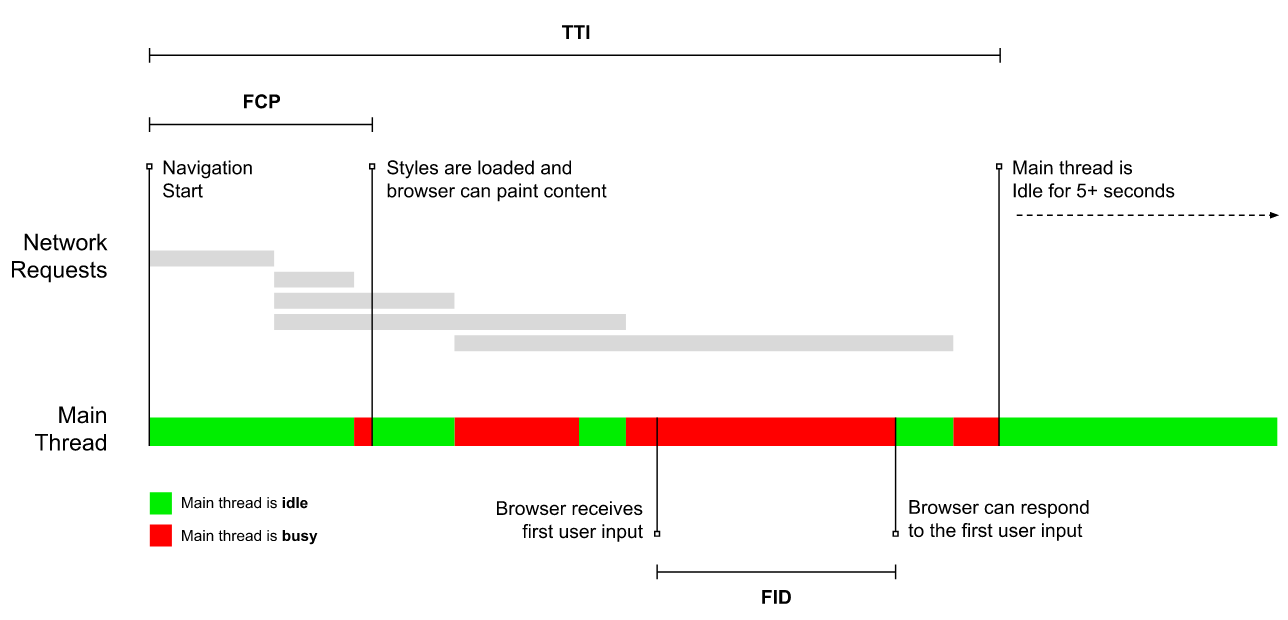
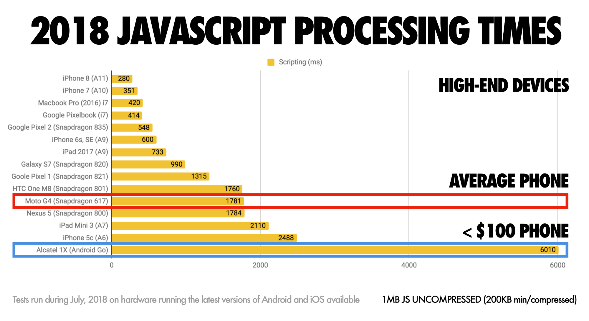
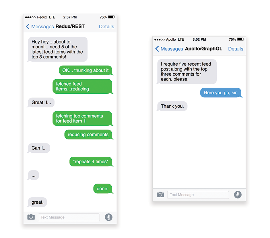
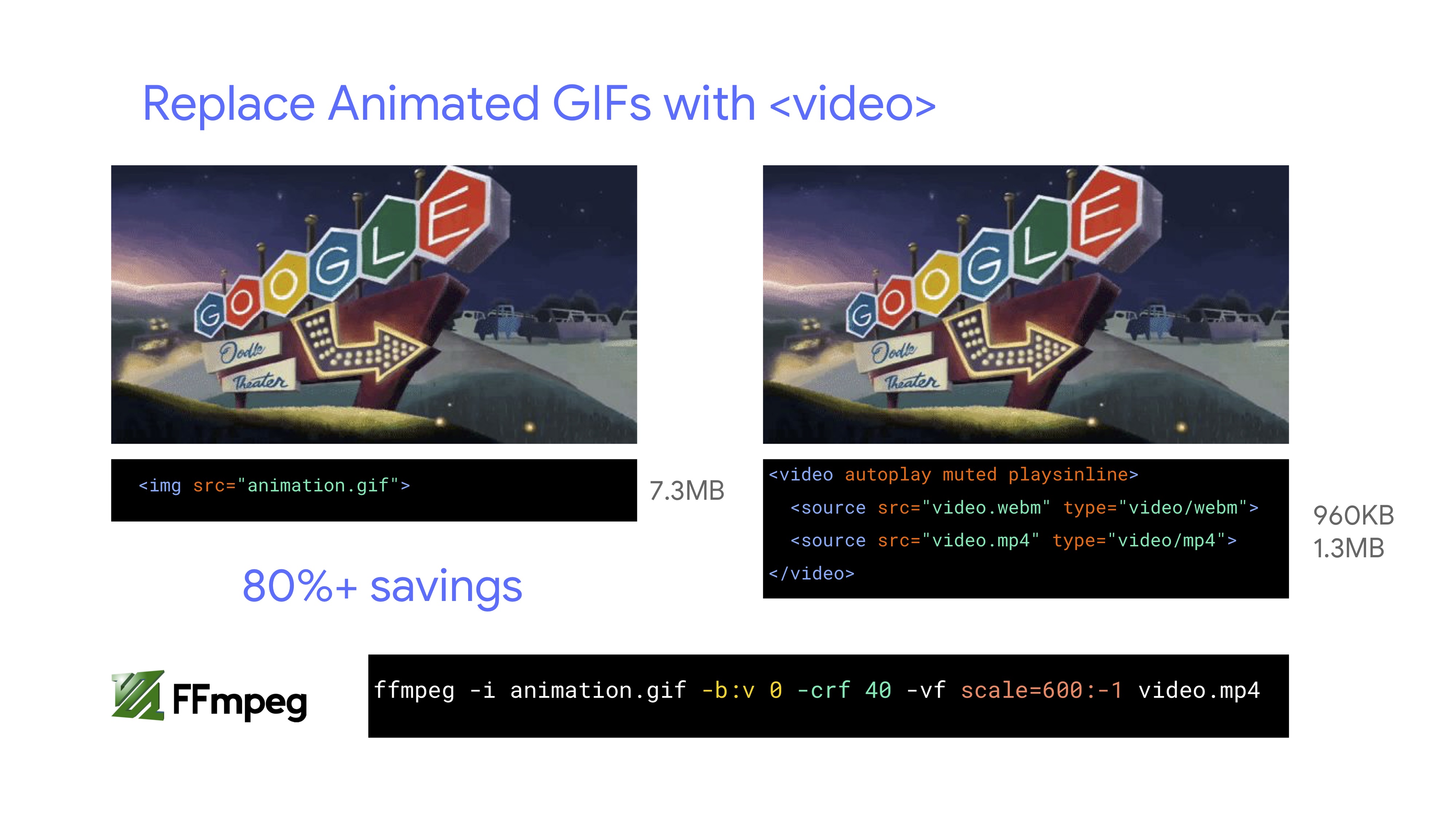
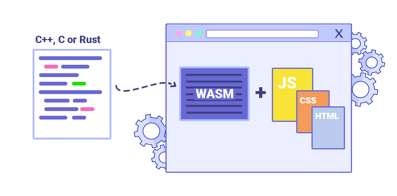
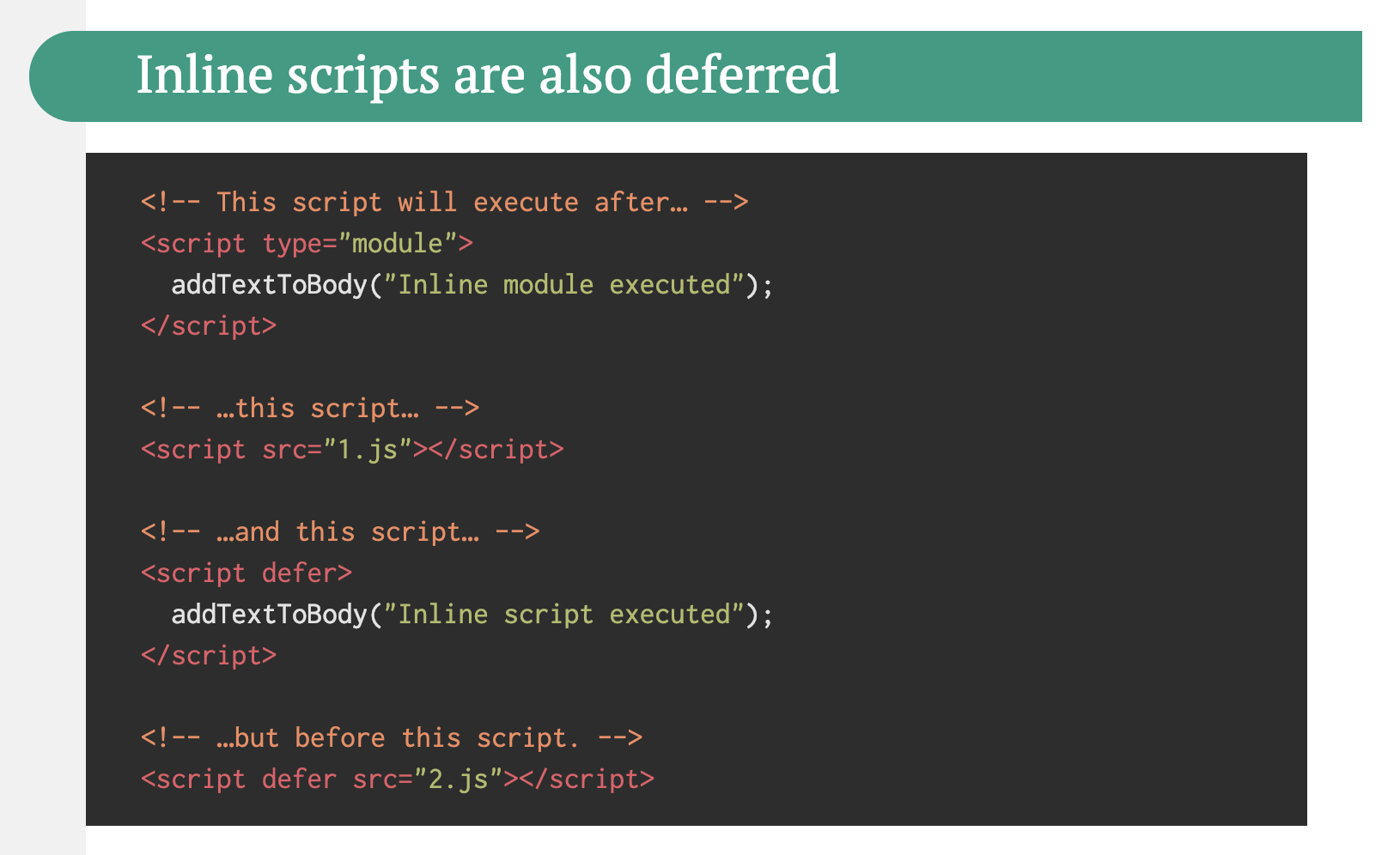
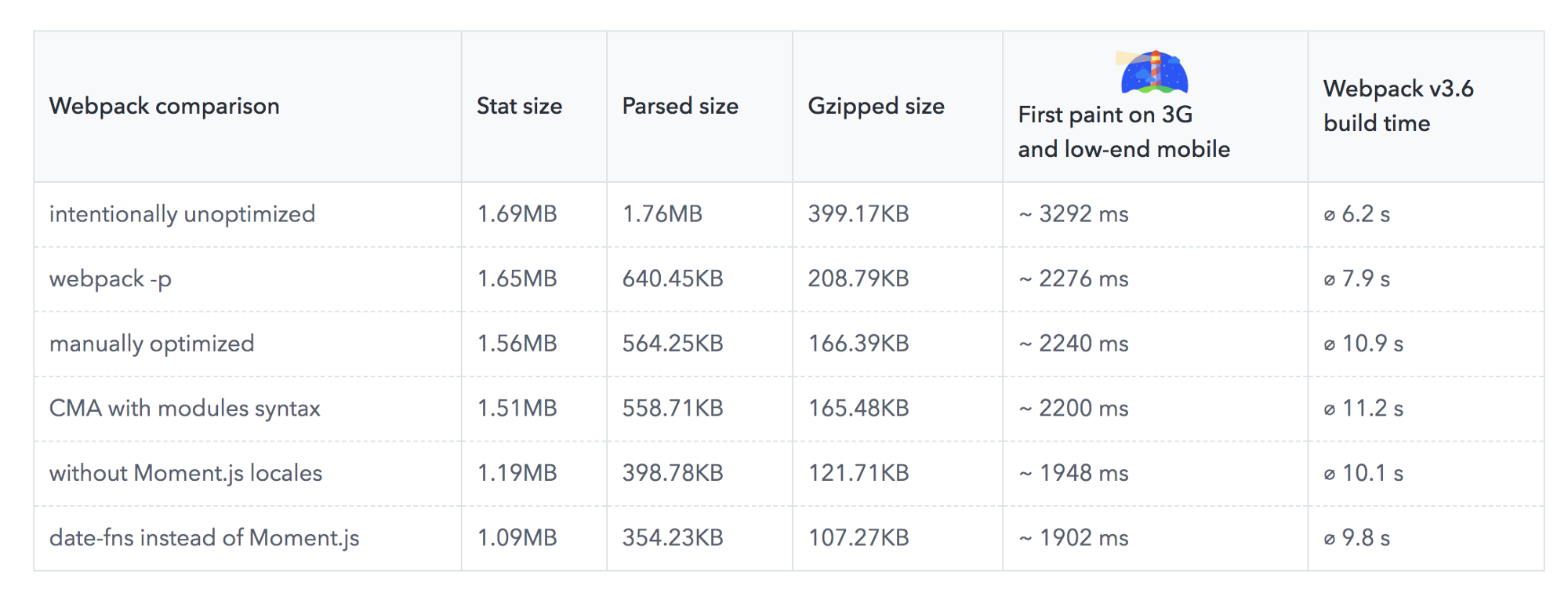