How to Create an Ecommerce Website With WordPress

In this guide, I’ll walk you through all the details of where you should set up your online store — if WordPress ecommerce is right for you or not. I’ll answer questions including:

  • Should I use an ecommerce platform, like Shopify?
  • Or should I monetize my blog with one of the WordPress ecommerce integrations, like Bluehost with WooCommerce?
  • What’s the Shopify buy button? Should I use that?
  • Once I choose where to build my store, how do I create it — which WordPress ecommerce plugins do I need, and how do I install them? Etc.

To cut to the chase, the answer is pretty simple. It comes down to one question: Are you creating a site that’s focused on content? Another version of this question is: Is your marketing strategy SEO?

Take a minute and really answer that two-part question. It’ll determine which route you go.

Top-Rated Web Hosting for WordPress to Create an ECommerce Website

If you want to create an ecommerce website, you’ll need a web hosting for WordPress solution. Here’s the best options.

  • Bluehost – Best for creating your first WordPress website
  • Hostinger – Best for hosting hundreds of sites on a shoestring budget
  • GreenGeeks – Best for eco-friendly website owners
  • WP Engine – Best for hosting multiple WordPress sites with tons of traffic
  • Nexcess – Best for effortless website staging
  • Siteground – Best for ecommerce websites with easy site migration
  • Flywheel – Best if you want experts to migrate your site for you
  • Kinsta – Best for managing unexpected surges in traffic
  • Scala Hosting – Most freebies in every WordPress hosting plans
  • Cloudways – Best for flexibility and extensive options

You can read our full reviews of each web hosting for WordPress solution here.

WordPress Ecommerce Website vs. Shopify Store

The choice here is easy. If you’re building a site that’s 100% focused on content or 100% focused on ecommerce, the best choice on how to build your site is very clear.

What WordPress does best: Content.

WordPress is over a decade old and is still the reigning champ for managing sites with a ton of content. If you plan on pursuing an SEO or content marketing strategy for your business, WordPress is the only legitimate choice for your site.

WordPress Dashboard

Nothing else comes close to giving you all the features that you need to manage so much content along with all the extra functionality for SEO and other traffic sources. It’s the default content management platform for a reason.

What Shopify does best: Ecommerce.

If you want to sell stuff with an ecommerce store, Shopify is by far your best choice. There really aren’t any legitimate contenders anymore; it’s the best ecommerce platform right now. The functionality, ease of use, and price are unmatched.

Shopify Dashboard

Even more impressive, Shopify will scale with your business no matter how large it gets — they’ve pushed into the enterprise segment in the last few years and are now considered ”best-in-class” at all tiers of ecommerce. From trying to sell your first product to selling one million products, Shopify is the default choice.

Why You Should (Almost) Always Use Shopify for Ecommerce

As much as I personally love WordPress, it just doesn’t compare to Shopify when it comes to ecommerce, even if you add an ecommerce plugin to WordPress.

There are a bunch of unique features that any ecommerce site needs:

  • Shopping carts
  • Check-out and payment flows
  • Integrations with payment providers
  • Fulfillment options and integrations
  • Integrations with shipping providers
  • Easy ways to manage all your product pages
  • Revenue reporting
  • Refund and return management
  • Integrations with ecommerce platforms like Amazon

Shopify was built from the ground up around all of these features. WordPress wasn’t.

With Shopify, you get every ecommerce feature you could ever need right out of the box. A bit of easy configuration and your site is ready to go. Of course, Shopify also has the ability to deeply customize anything you could want. With how popular Shopify has been, there’s now a large community of developers and marketers that can use the more advanced features of Shopify to tailor it to your exact situation.

When you’re ready to build your Shopify site sign up here

Already have your site built somewhere else and need to transfer it to Shopify? We’ve got a guide for that, too: How to Transfer your Website to Shopify.

How to Work Around Shopify’s Biggest Weakness

The only real weakness to Shopify is it’s blogging functionality. Yes, you can technically publish a blog on Shopify, using that for your content. But you won’t want to.

The blogging features in Shopify are so bare-bones that they’re only fit for the occasional company updates every few months. But if you’re only posting a few times a year, you might as well skip the blog entirely.

In other words, the only companies that would get value out of the Shopify blog feature shouldn’t have a blog in the first place.

What to do?

We’ve hit on the real problem between WordPress and Shopify is knowing what to do when you have a content and an ecommerce site?

This is when things get a bit trickier and more nuanced.

Let’s say that you have your core ecommerce store on Shopify. It’s going great. But you also want to start a high-caliber blog that could generate some serious traffic and help increase sales.

Your best best bet will be to use Shopify for your store and WordPress for your blog. You’ll be on both platforms.

Using multiple platforms on the same site is very common. Lots of sites do it.

The Easiest Way to Use Both Shopify and a WordPress Blog

Put one of them on a subdomain and the other on your main domain, like this:

  • WordPress installed at company.com
  • Shopify installed at store.company.com

This is easy enough that you’ll be able to get this set up with your WordPress host, domain registrar, and Shopify account on your own. There’s no need to hire a developer to do anything fancy. Simply set up WordPress on your main domain like normal while setting Shopify up on a subdomain.

Should Shopify or WordPress go on the subdomain?

In the example above, I put Shopify on the subdomain at store.company.com. The reverse also works by putting WordPress on a subdomain while Shopify is on the main domain, like this:

  • WordPress installed at blog.company.com
  • Shopify installed at company.com

Which one should you do? Which goes on the subdomain?

I would make this decision based on your marketing strategy.

If you’re pursuing an SEO strategy for your online store, your goal will be to get product pages to rank for keywords. In other words, your main SEO priority is the product pages within your store. In this case, you’d want Shopify to be on your main domain.

Why?

In SEO, the main domain will always carry a bit more weight than a subdomain. It’ll have an easier time ranking for any given keyword. So if your main goal is to get your product pages to rank for search terms in Google, install Shopify on your main domain so it gets as much help as possible.

Now let’s switch it up. What if you have a large blog and you’re using content to obtain the vast majority of your traffic? In this case, install WordPress on your main domain and put Shopify on a subdomain.

To recap, decide whether it’s a bigger priority for you to rank your WordPress content or your Shopify product pages for SEO. Once you’ve made a decision, put your first choice on your main domain and the other one on a subdomain.

What if I don’t care about SEO?

Then it doesn’t really matter. If you’re focusing on paid marketing or some other strategy for your ecommerce site then it’s completely up to you. In this situation, I’d use a subdomain for whichever tool hasn’t been installed yet since the main domain will already be taken.

When to Use WordPress for Ecommerce

It does make sense to turn your WordPress site into an ecommerce store if you meet these conditions:

  • You already have a large WordPress site built with lots of content.
  • You have a small store that you want to build out, in the range of 10–20 products.
  • You don’t plan on putting a ton of energy behind the store; you view it as a “one-and-done” project.

In this situation, you’re already on WordPress, so you’ll want to keep that. You also have enough products to warrant a store section on your site, you’ll need more than just a few buy buttons. But it doesn’t make sense to get an entire ecommerce platform set up on your site since you don’t plan on making it a major priority.

The best bet is to keep everything on WordPress and use an ecommerce WordPress plugin to add a store to your site. The most well-respected ecommerce plugin is WooCommerce. It gets plenty of great reviews.

Or if you really love WordPress and hate the thought of adding another tool to your site, WooCommerce is still a legitimate option. Feel free to use it if you’d prefer to spend as much of your time as possible within WordPress.

An Easy Way to Test Ecommerce on Your WordPress Site

Shopify also has Shopify Starter for $5 per month. It’s perfect for adding buy buttons to your WordPress site or your Facebook page and is not a separate ecommerce store. So even if you want to run a few small tests to see if you can sell items on your site, it’s still worth starting with Shopify.

Back in 2016, Shopify launched its own WordPress ecommerce plugin — and three WordPress ecommerce themes so you could run your Shopify store on WordPress.

It was free and allowed you to “manage all of your pages and posts in WordPress, but you’ll have Shopify to manage everything else: payments, secure checkout, shipping and fulfillment, inventory, and taxes—all the hard things about selling online.” It also promised that “with just a few clicks, you can now make any WordPress page or blog post shoppable using the free Shopify Ecommerce Plugin.”

However, they discontinued the plugin a year later. In April 2017, a Shopify spokesperson said the plugin was “outdated and difficult to maintain.” In its place, we have the buy button, “which is a better way of selling in WordPress.”

With the buy button, we have access to:

  • Updated features
  • Better fonts
  • Colors
  • Layouts
  • Buttons
  • Multiple images on variants

To add the Shopify buy button to your WordPress shop, it’s as easy as embedding a YouTube video, and the steps are very similar:

  1. Create your buy button from your Shopify admin panel.
  2. Copy the Embed Code.
  3. Go to the Post you want to add the buy button to in your WordPress dashboard. (If you haven’t started it yet, you’ll create New Post.)
  4. Click the Text editor tab, so you’re not in Visual anymore.
  5. Paste the code in.
  6. From here, I recommend clicking Preview to make sure your buy button looks the way that you want it to.
  7. Publish.

If you need help with this process, check out the Shopify Manual on this topic.

In Sum: Shopify Beats WordPress in Ecommerce

I really can’t over-hype the benefits of using Shopify — they’ve done an amazing job at building a tool to solve the needs of any ecommerce business owner.

Shopify’s content element does not compete with WordPress. If this post were about the right CMS to pick or how to start a blog, then my answer would be totally different. (As I type into the WordPress backend of Quick Sprout… which is not an ecommerce site, but a content site.)

The tl;dr is this: The benefits of Shopify are so large that it’s not worth trying to contort WordPress into an ecommerce site.

The Many Ways to Change an SVG Fill on Hover (and When to Use Them)

SVG is a great format for icons. Vector formats look crisp and razor sharp, no matter the size or device — and we get tons of design control when using them inline.

SVG also gives us another powerful feature: the ability to manipulate their properties with CSS. As a result, we can make quick and simple interactions where it used to take crafty CSS tricks or swapping out entire image files.

Those interactions include changing color on hover states. It sounds like such a straightforward thing here in 2019, but there are actually a few totally valid ways to go about it — which only demonstrates the awesome powers of SVG more.

First off, let’s begin with a little abbreviated SVG markup:

<svg class="icon">
  <path .../>
</svg>

Target the .icon class in CSS and set the SVG fill property on the hover state to swap colors.

.icon:hover {
  fill: #DA4567;
}

This is by far the easiest way to apply a colored hover state to an SVG. Three lines of code!

SVGs can also be referenced using an <img> tag or as a background image. This allows the images to be cached and we can avoid bloating your HTML with chunks of SVG code. But the downside is a big one: we no longer have the ability to manipulate those properties using CSS. Whenever I come across non-inline icons, my first port of call is to inline them, but sometimes that's not an option.

I was recently working on a project where the social icons were a component in a pattern library that everyone was happy with. In this case, the icons were being referenced from an <img> element. I was tasked with applying colored :focus and :hover styles, without adjusting the markup.

So, how do you go about adding a colored hover effect to an icon if it's not an inline SVG?

CSS Filters

CSS filters allow us to apply a whole bunch of cool, Photoshop-esque effects right in the browser. Filters are applied to the element after the browser renders layout and initial paint, which means they fall back gracefully. They apply to the whole element, including children. Think of a filter as a lens laid over the top of the element it's applied to.

These are the CSS filters available to us:

  • brightness(<number-percentage>);
  • contrast(<number-percentage>);
  • grayscale(<number-percentage>);
  • invert(<number-percentage>);
  • opacity(<number-percentage>);
  • saturate(<number-percentage>);
  • sepia(<number-percentage>);
  • hue-rotate(<angle>);
  • blur(<length>);
  • drop-shadow(<length><color>);

All filters take a value which can be changed to adjust the effect. In most cases, this value can be expressed in either a decimal or percent units (e.g. brightness(0.5) or brightness(50%)).

Straight out of the box, there's no CSS filter that allows us to add our own specific color.
We have hue-rotate(), but that only adjusts an existing color; it doesn't add a color, which is no good since we're starting with a monochromatic icon.

The game-changing bit about CSS filters is that we don't have to use them in isolation. Multiple filters can be applied to an element by space-separating the filter functions like this:

.icon:hover {
  filter: grayscale(100%) sepia(100%);
}

If one of the filter functions doesn't exist, or has an incorrect value, the whole list is ignored and no filter will be applied to the element.

When applying multiple filter functions to an element, their order is important and will affect the final output. Each filter function will be applied to the result of the previous operation.

So, in order to colorize our icons, we have to find the right combination.

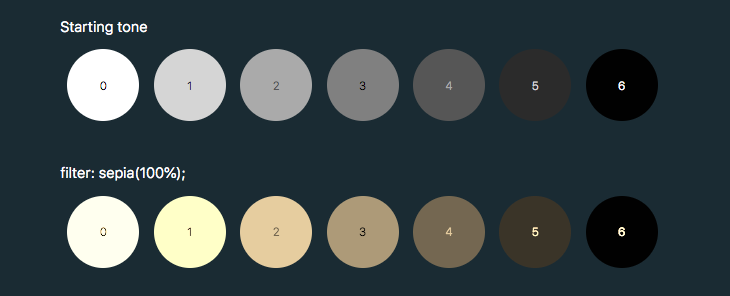
To make use of hue-rotate(), we need to start off with a colored icon. The sepia() filter is the only filter function that allows us to add a color, giving the filtered element a yellow-brown-y tinge, like an old photo.

The output color is dependent on the starting tonal value:

In order to add enough color with sepia(), we first need to use invert() to convert our icon to a medium grey:

.icon:hover {
  filter: invert(0.5)
}

We can then add the yellow/brown tone with sepia():

.icon:hover {
  filter: invert(0.5) sepia(1);
}

...then change the hue with hue-rotate():

.icon:hover {
  filter: invert(0.5) sepia(1) hue-rotate(200deg);                                  
}

Once we have the rough color we want, we can tweak it with saturation() and brightness():

.icon:hover {
  filter: 
    invert(0.5)
    sepia(1)
    hue-rotate(200deg)
    saturate(4)
    brightness(1);
}

I've made a little tool for this to make your life a little easier, as this is a pretty confusing process to guesstimate.

See the Pen CSS filter example by Cassie Evans (@cassie-codes)
on CodePen.

Even with the tool, it's still a little fiddly, not supported by Internet Explorer, and most importantly, you're unable to specify a precise color.

This browser support data is from Caniuse, which has more detail. A number indicates that browser supports the feature at that version and up.

Desktop

ChromeOperaFirefoxIEEdgeSafari
18*15*35No186*

Mobile / Tablet

iOS SafariOpera MobileOpera MiniAndroidAndroid ChromeAndroid Firefox
6.0-6.1*46No4.4*7164

So, what do we do if we need a specific hex code?

SVG Filters

If we need more precise control (and better browser support) than CSS filters can offer, then it's time to turn to SVG.

Filters originally came from SVG. In fact, under the hood, CSS filters are just shortcuts to SVG filters with a particular set of values baked in.

Unlike CSS, the filter isn't predefined for us, so we have to create it. How do we do this?

This is the syntax to define a filter:

<svg xmlns="<http://www.w3.org/2000/svg>" version="1.1">
  <defs>
    <filter id="id-of-your-filter">
      ...          
      
      ...
    </filter>
    ...
  </defs>
</svg>

Filters are defined by a <filter> element, which goes inside the <defs> section of an SVG.

SVG filters can be applied to SVG content within the same SVG document. Or, the filter can be referenced and applied to HTML content elsewhere.

To apply an SVG filter to HTML content, we reference it the same way as a CSS filter: by using the url() filter function. The URL points to the ID of the SVG filter.

.icon:hover {
  filter: url('#id-of-your-filter');
}

The SVG filter can be placed inline in the document or the filter function can reference an external SVG. I prefer the latter route as it allows me to keep my SVG filters tidied away in an assets folder.

.icon:hover {
  filter: url('assets/your-SVG.svg#id-of-your-filter');
}

Back to the <filter> element itself.

<filter id="id-of-your-filter">
  ...          
  
  ...
</filter>

Right now, this filter is empty and won't do anything as we haven't defined a filter primitive. Filter primitives are what create the filter effects. There are a number of filter primitives available to us, including:

  • [<feBlend>]
  • [<feColorMatrix>]
  • [<feComponentTransfer>]
  • [<feComposite>]
  • [<feConvolveMatrix>]
  • [<feDiffuseLighting>]
  • [<feDisplacementMap>]
  • [<feDropShadow>]
  • [<feFlood>]
  • [<feGaussianBlur>]
  • [<feImage>]
  • [<feMerge>]
  • [<feMorphology>]
  • [<feOffset>]
  • [<feSpecularLighting>]
  • [<feTile>]
  • [<feTurbulence>]

Just like with CSS filters, we can use them on their own or include multiple filter primitives in the <filter> tag for more interesting effects. If more than one filter primitive is used, then each operation will build on top of the previous one.

For our purposes we're just going to use feColorMatrix, but if you want to know more about SVG filters, you can check out the specs on MDN or this (in progress, at the time of this writing) article series that Sara Soueidan has kicked off.

feColourMatrix allows us to change color values on a per-channel basis, much like channel mixing in Photoshop.

This is what the syntax looks like:

<svg xmlns="<http://www.w3.org/2000/svg>" version="1.1">
  <defs>
    <filter id="id-of-your-filter">
      <feColorMatrix
        color-interpolation-filters="sRGB"
        type="matrix"
        values="1 0 0 0 0
                0 1 0 0 0
                0 0 1 0 0
                0 0 0 1 0 "/>
    </filter>
    ...
  </defs>
</svg>

The color-interpolation-filters attribute specifies our color space. The default color space for filter effects is linearRGB, whereas in CSS, RGB colors are specified in the sRGB color space. It's important that we set the value to sRGB in order for our colors to match up.

Let’s have a closer look at the color matrix values.

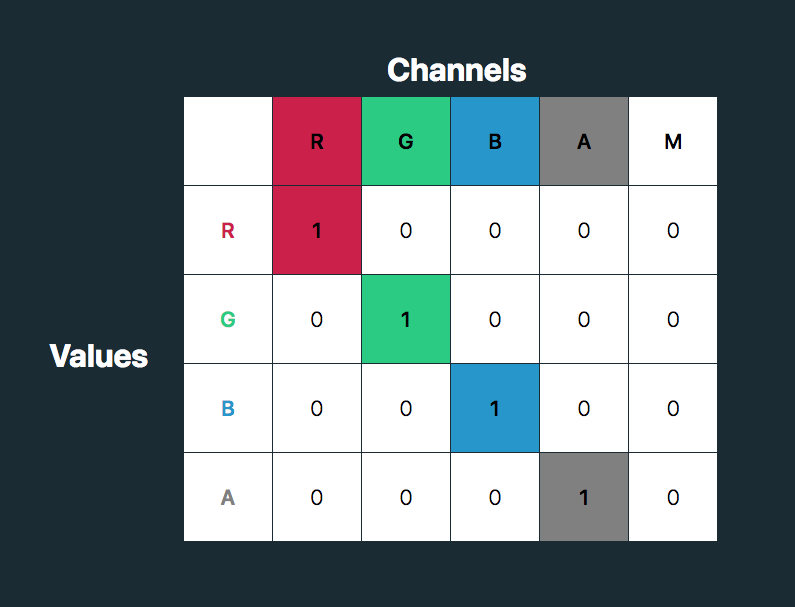
The first four columns represent the red, green and blue channels of color and the alpha (opacity) value. The rows contain the red, green, blue and alpha values in those channels.

The M column is a multiplier — we don’t need to change any of these values for our purposes here. The values for each color channel are represented as floating point numbers in the range 0 to 1.

We could write these values as a CSS RGBA color declaration like this:

rgba(255, 255, 255, 1)

The values for each color channel (red, green and blue) are stored as integers in the range 0 to 255. In computers, this is the range that one 8-bit byte can offer.

By dividing these color channel values by 255, the values can be represented as a floating point number which we can use in the feColorMatrix.

And, by doing this, we can create a color filter for any color with an RGB value!

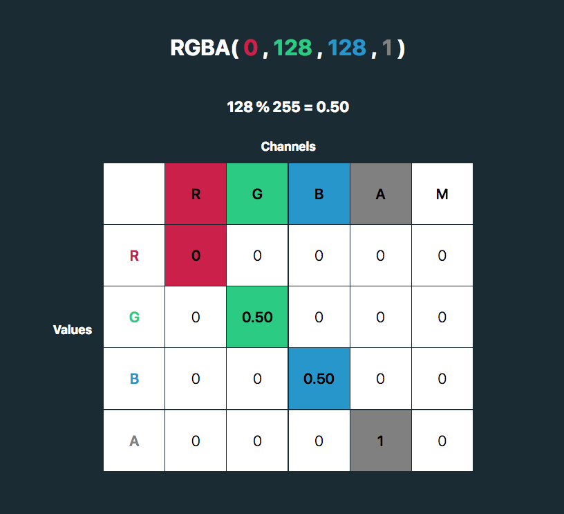
Like teal, for example:

rgba(0, 128, 128, 1). 128%255=0.50

See the Pen
SVG filter - teal hover
by Cassie Evans (@cassie-codes)
on CodePen.

This SVG filter will only impart color to icons with a white fill, so If we have an icon with a black fill, we can use invert() to convert it to white before applying the SVG filter.

.icon:hover {
  filter: invert(100%) url('assets/your-SVG.svg#id-of-your-filter');
}

If we just have a hex code, the math is a little trickier, although there are plenty of hex-to-RGBA converters out there. To help out, I've made a HEX to feColorMatrix converter.

See the Pen
HEX to feColorMatrix converterr
by Cassie Evans (@cassie-codes)
on CodePen.

Have a play around, and happy filtering!

The post The Many Ways to Change an SVG Fill on Hover (and When to Use Them) appeared first on CSS-Tricks.

How to Choose the Best Products to Sell Online (Beginner’s Guide)

You want to make extra money on the side, so you looked into several online business ideas and decided that creating an online store is the way to go.

The next step is where beginners often struggle the most: choosing which products to sell on your online store.

In this ultimate guide, we will explain how to easily choose the best products to sell online by following our step by step process.

Choosing products to sell online

1. Basics of Choosing Products to Sell on Your Ecommerce Store

Before you start looking into products that you can sell, there are some basics that you need to keep in mind. Let’s look at some of the most important ones first.

1. Choosing Your Ecommerce Platform

First you need to choose a platform that you want to use to sell your products.

Choosing the right eCommerce platform is important because it would affect your choice of products and how you do business.

Choosing an eCommerce platform

WooCommerce is the most popular eCommerce platform in the world. It is easy to use, and you can use it to sell all kind of products while accepting payments using multiple payment gateways. See our guide on how to start an online store to get started with WooCommerce.

However, WooCommerce is not the only platform out there. There are some great WooCommerce alternatives that could be better for you depending on what you are trying to sell.

If you lack technical skills and want a quicker way to build an online store, then you may want to look into Shopify. It is a fully hosted solution that takes care of all the technical stuff. The catch here is that you will be paying a little more, and your costs will grow as you make more sales.

For a side by side comparison, see our article on Shopify vs WooCommerce with the pros and cons of both platforms.

2. Shipping

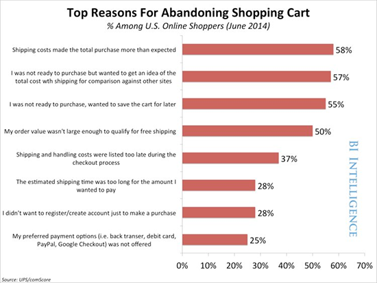
Shipping has a huge impact on the success of an eCommerce store. A study conducted by Business Insider discovered that higher shipping costs are the #1 cause of all abandoned shopping carts online.

Shipping costs more cart abandonment

You would obviously want to select products that you can ship at lower costs or for free. If you only plan to sell digital products (music, video, software, ebook, etc), then you don’t have to worry about shipping because the products will be downloaded by customers online.

3. Inventory

Do you want to manage inventory and keep products stocked? For that, you will need storage space and inventory management through your eCommerce software. Keeping products in stock will increase your cost of business.

On the other hand, drop-shipping solves this problem. You can select products that are shipped directly by the manufacturer or supplier.

4. Price

You’ll need to find products where you can offer a competitive price to your customers. If the product you are selling is more expensive than your competitors, then obviously that would discourage many first time buyers.

2. Types of Products That You Can Sell Easily

There are many different kinds of products that you can sell in your online store. Let’s narrow them down into two major sections.

1. Commoditized Products

These are products that everyone needs and are sold by many small and large stores without any difference in quality. For example, everyday products like soap, detergent, cereal, and more.

These products are made by some of the largest brands in the retail industry and are available widely with little to no difference in price.

This makes it harder for you to compete with giants like Amazon, Walmart, Target, etc. They can offer those products at lower costs, free shipping, and other perks.

This rules out a large number of products for you.

2. Niche Products

These are products that are unique or hand-made, available in limited stocks, and from specific suppliers. Think of home-made soaps, novelty t-shirts, ceramics, gift items, software, and countless other products.

Since these products are not widely available, they give you a competitive advantage.

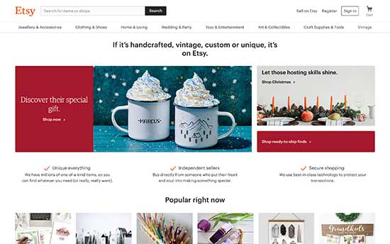
There are even unique platforms like Etsy stores where you can find small vendors who make beautiful products and would love to partner up with other stores.

Etsy stores

You can also find suppliers abroad using websites like AliExpress or Alibaba.com. These suppliers can make those niche products to your specifications and deliver them to you.

Niche products are available in almost any product category imaginable. You’ll find tons of unique ideas as you do your product research.

This brings us to our next tip.

3. Doing Product Research On Your Own

Don’t use your best guess to select products you sell online. Back it up with data so that you know there is a demand for these products and customers are looking for them.

The first tool you are going to use for your research is Amazon.

It is the world’s largest eCommerce store with thousands of products. Luckily, it is also a treasure trove of free data that you can scrap and make your decisions.

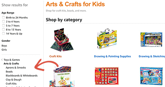
Go through different product categories to find out top performing products in each category. Keep narrowing down your search to sub-categories to find targeted sub-niches of products.

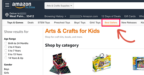
Let’s suppose you wanted to sell kid’s toys, narrow down your search to very specific toy categories. This excludes popular products, and you get a very focused set of products as you filter through.

Narrow down categories to find product data

Switch to the ‘Bestsellers’ view to find the top performing products on Amazon under each category.

Sort products by Bestsellers

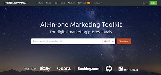
SEMRush is another great tool that you can use to gather data from competitors or any eCommerce store you want.

SEMRush

It shows you where those eCommerce stores are getting most of their traffic, which products they are promoting through paid advertisements, what are their most viewed products, and more.

It also shows your competitor’s product listing ads from Google. You can see their best performing product listing ads, keywords, and other data.

Here are some other tools you can use to gather product data from other websites.

  • Ahrefs – A powerful competitor research tool that will show what’s popular on the websites of your competitors.
  • AdPlexity – A popular eCommerce research tool that helps you collect eCommerce data from across the web, from competitors, or any other website.
  • AmazeOwl – It is an Amazon product reseach tool available as a free desktop application.

4. Use Customer Personas to Find Product Ideas

Using customer personas to find products

A customer persona is a fictional profile of an ideal customer that you want to target. You create this profile by answering simple questions about an ideal buyer.

This is your target audience and personifying them helps you understand them better when you are doing product research.

If you have an existing store, then you can use eCommerce tracking in Google Analytics to build an ideal buyer persona.

If you are just starting out, then use your best guess to build a customer persona. This exercise helps you understand your customer’s needs, questions they may have, and what kind of products they would like to buy.

To learn more about buyer persona, see this guide on creating a concrete buyer persona with ready-made templates and examples.

5. Find Products You are Passionate About

As career advisors say, ‘Choose a job you love, and you’ll never have to work a day in your life’.

Similarly, choosing products that you are passionate about helps you sell them more effectively.

These could be products that you personally love and passionately recommend to your family and friends. These could be products related to a hobby or activity that you are passionate about.

Nothing drives more passion when you build something useful and want others to use it.

Following your passion allows you to look deeply into products and find ideas that offer real value to your customers.

We hope this article helped you learn how to choose the best products to sell online. You may also want to see our article on tips to grow your business online without spending a lot of money.

If you liked this article, then please subscribe to our YouTube Channel for WordPress video tutorials. You can also find us on Twitter and Facebook.

The post How to Choose the Best Products to Sell Online (Beginner’s Guide) appeared first on WPBeginner.

Forms that Move With You with Wufoo

I've been into the idea of JAMstack lately. In fact, it was at the inaugural JAMstack_conf that I gave a talked called The All-Powerful Font-End Developer. My overall point there was that there are all these services that we can leverage as front-end developers to build complete websites without needing much help from other disciplines — if any at all.

Sometimes, the services we reach for these days are modern and fancy, like a real-time database solution with authentication capabilities. And sometimes those services help process forms. Speaking of which, a big thanks to Wufoo for so successfully being there for us front-end developers for so many years. Wufoo was one of my first tastes of being a powerful front-end developer. I can build and design a complex form super fast on Wufoo and integrate it onto any site in minutes. I've done it literally hundreds of times, including here on CSS-Tricks.

Another thing that I love about building Wufoo forms is that they travel so well. I use them all the time on my WordPress sites because I can copy and paste the embed code right onto any page. But say I moved that site off of traditional WordPress and onto something more JAMstacky (maybe even a static site that hits the WordPress API, whatevs). I could still simply embed my Wufoo form. A Wufoo form can literally be put on any type of site, which is awesome since you lose no data and don't change the experience at all when making a big move.

And, just in case you didn't know, Wufoo has robust read and write APIs, so Wufoo really can come with you wherever you go.

Try it Now

The post Forms that Move With You with Wufoo appeared first on CSS-Tricks.

Our WordPress Podcast “Hello,WP!” Available Now

Season 1 of our new podcast, “Hello, WP!”, about what it’s like to be new to WordPress, is now live at hellowp.world – go check it out! And let me tell you, your feedback and support has been more than special. Rave Reviews “I listened and was immediately blown away by its quality. I’m not […]

Spread The Love! Inspiring Wallpapers For February 2019

Spread The Love! Inspiring Wallpapers For February 2019

Spread The Love! Inspiring Wallpapers For February 2019

Cosima Mielke

As designers we usually turn to different sources of inspiration, and, well, sometimes the best inspiration lies right in front of us. With that in mind, we embarked on our wallpapers creativity mission more than nine years ago. The idea: to provide you with unique and inspiring desktop wallpapers each month anew. Wallpapers created by the community for the community.

We are very thankful to all artists and designers who have contributed and are still diligently contributing to this challenge, who tickle their creativity to keep the steady stream of wallpapers flowing. This post features their artworks for February 2019. All wallpapers come in two versions — with and without a calendar — and can be downloaded for free. At the end of this post, we also collected some wallpaper favorites from past February editions for you. After all, some things are just too good to be forgotten, right?

Please note that:

  • All images can be clicked on and lead to the preview of the wallpaper,
  • You can feature your work in our magazine by taking part in our Desktop Wallpaper Calendar series. We are regularly looking for creative designers and artists to be featured on Smashing Magazine. Are you one of them?

Further Reading on SmashingMag:

Savannah Stroll

“February is a month focused on romance and as a southerner, I can’t think of a more romantic way to spend a day than strolling the historic moss-draped streets of Savannah, GA. Spending time sitting on a bench on one of the many beautiful squares, holding hands and people watching as you sip a cappuccino.” — Designed by Heather Ozee Designs from the United States.

Savannah Stroll

Love Is Worth Fighting For

Designed by Maria Keller from Mexico.

Love Is Worth Fighting For

Dark Temptation

“A dark romantic feel, walking through the city on a dark and rainy night.” — Designed by Matthew Talebi from the United States.

Dark Temptation

Feel The Love!

“We’re celebrating Valentine’s Day with our February wallpaper. Whatever Valentine’s Day means to you we’re on board, love, relationships or the best of friends. It’s something to be celebrated!” — Designed by Focus from the United Kingdom.

Feel The Love!

Cold And Frost

“Frosts in Russia are very severe. Walking through the Park, I found these branches at the top and decided to capture the moment.” — Designed by Nikolay Belikov from Russia.

Cold And Frost

What Is Love

“We all feel it, even if we cannot define it. But, who needs a definition anyway? When you sense it in your gut and feel like standing on the top of the world. Happy. From the bottom of your heart. ‘Where there is love, there is life,’ said Mahatma Gandhi. And we couldn't agree more. May the love be with you. Always.” — Designed by PopArt Studio from Serbia.

What Is Love

Polar Cold

“February is the month of the bear. I would like to be in the Arctic and play with the bears.” — Designed by Verónica Valenzuela from Spain.

Polar Cold

Lovely Day

Designed by Ricardo Gimenes from Sweden.

Lovely Day

Let Love Speak

“As it’s February, we just thought of celebrating Valentine month. Let the love between nature and human being prosper. These days we are forgetting to take care of our nature. So it’s a kind of gentle reminder for all of us.” — Designed by Sweans Technologies from London.

Let Love Speak

Umbrella Day

“Always good to have an umbrella, on rainy or sunny days! On the 10th of February we celebrate the umbrellas.” — Designed by Melissa Bogemans from Belgium.

Umbrella Day

Sunset

“I want to emphasize February 14th because it’s Valentine’s Day. I thought it would be fun to use two cats that are in love watching the sunset in the park. I have tried to use as many warm and loving colors as possible, such as red, rose, orange and purple.” — Designed by Vince Teckmans from Belgium.

Sunset

World Radio Day

“Music is an important element in our everyday lives. It connects people all over the world, regardless of culture, religion etc.” — Designed by Ilke Cauwenbergh from Belgium.

World Radio Day

Oldies But Goodies

No matter if it’s a brave icebreaker that confronts even the most adverse weather conditions, a piece of design wisdom, or a pun — a lot of things have inspired our artists to design a February wallpaper in the past few years. Below you’ll find a little best-of. Please note that these wallpapers don’t come with a calendar.

Dog Year Ahead

Designed by PopArt Studio from Serbia.

Dog Year Ahead

Balloons

Designed by Xenia Latii from Germany.

Balloons

Febpurrary

“I was doodling pictures of my cat one day and decided I could turn it into a fun wallpaper – because a cold, winter night in February is the perfect time for staying in and cuddling with your cat, your significant other, or both!” — Designed by Angelia DiAntonio from Ohio, USA.

Febpurrary

Minimalistic Love

“This minimalistic love logo is designed from geometric shapes, where the heart represents the letter ‘O’ and love. The anchor represents the letter ‘V’ very delicately and stylish and it symbolizes your wanderlust. The anchor is a symbol of adventure and travels.” — Designed by Antun Hirsman from Croatia.

Minimalistic Love

“Greben” Icebreaker

“Danube is Europe’s second largest river, connecting 10 different countries. In these cold days, when ice paralyzes rivers and closes waterways, a small but brave icebreaker called Greben (Serbian word for ‘reef’) seems stronger than winter. It cuts through the ice on Đerdap gorge (Iron Gate) – the longest and biggest gorge in Europe – thus helping the production of electricity in the power plant. This is our way to give thanks to Greben!” — Designed by PopArt Studio from Serbia.

“Greben” Icebreaker

Winter Wonderland

“In February, nature shows its creativity. Our artwork occurs when it is being drawn.” — Designed by Ana Masnikosa from Belgrade, Serbia.

Winter Wonderland

Love Angel Vader

“Valentine’s Day is coming? Noooooooooooo!” — Designed by Ricardo Gimenes from Sweden.

Love Angel Vader

Febrewery

“I live in Madison, WI USA, which is famous for its breweries. Wisconsin even named their baseball team “The Brewers.” If you like beer, brats, and lots of cheese, it’s the place for you!” — Designed by Danny Gugger from the United States.

Febrewery

Farewell, Winter…

“Although I love winter (mostly because of the fun winter sports), there are other great activities ahead. February, the last winter month, this year is even one day longer. But I don’t mind. Thanks, winter, and see you next year!” — Designed by Igor Izhik from Canada.

Farewell, Winter...

Principles Of Good Design

“The simplicity seen in the work of Dieter Rams which has ensured his designs from the 50s and 60s still hold a strong appeal.” — Designed by Vinu Chaitanya from India.

Principles of Good Design- Dieter Rams

I Believe I Can Fly

Designed by Elise Vanoorbeek from Belgium.

Smashing Wallpaper - february 13

Out There, There’s Someone Like You

“I am a true believer that out there in this world there is another person who is just like us, the problem is to find her/him.” — Designed by Maria Keller from Mexico.

Out There, There’s Someone Like You

The Great Beyond

“My inspiration came mostly from ‘The Greay from’. It’s about a dog and an astronaut exploring a strange new world.” — Designed by Lars Pauwels from Belgium.

The Great Beyond

Join In Next Month!

Please note that we respect and carefully consider the ideas and motivation behind each and every artist’s work. This is why we give all artists the full freedom to explore their creativity and express emotions and experience throughout their works. This is also why the themes of the wallpapers weren’t anyhow influenced by us but rather designed from scratch by the artists themselves.

Thank you to all designers for their participation. Join in next month!

20 Great Websites to Find Free Stock Photos

We are all tired of fake stock pictures where people shake hands in perfect suits. The era of perfectly scented stock photos is gone. Now people want to see real-life pictures on their websites, banners, and flyers.

The number of sites you can download high-quality free stock photos increase day by day. Just in case, you can’t find a photo you need on one site, you can use another one.

In this showcase, we put together 20 great websites to find beautiful stock photos. Most of images featured there fall under Creative Common Licence, so you can use them without author credit. Just scroll down and choose the site to pick a stunning photo.

unsplash

1-unsplash

Pexels

freephotos

Foodies Feed

IM Free

Foter

Pixabay

StockSnap

Death to The Stock Photo

Picjumbo

The Pattern Library

Gratisography

Big Stock</h3>

Life of Pix

Free Refe Real Stock Photos

Magdeleine

Jay Mantri

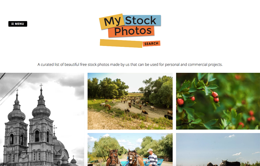
My Stock Photos

Public Domain Archive

Picography

Read More at 20 Great Websites to Find Free Stock Photos

Custom Cursor Effects


Custom cursors certainly were a big trend in web development in 2018. In the following tutorial we’ll take a look at how to create a magnetic noisy circle cursor for navigation elements as shown in Demo 4. We’ll be using Paper.js with Simplex Noise.

The custom cursor effect we’re going to build in this tutorial

The Cursor Markup

The markup for the cursor will be split up into two elements. A simple <div> for the small white dot and a <Canvas> element to draw the red noisy circle using Paper.js.


<body class="tutorial">
  <main class="page">
    <div class="page__inner">
      
      <!-- The cursor elements --> 
      <div class="cursor cursor--small"></div>
      <canvas class="cursor cursor--canvas" resize></canvas>
      
    </div>
  </main>
</body>

Basic Colors and Layout

To give our demo some color and layout we’re defining some basic styles.

body.tutorial {
  --color-text: #fff;
  --color-bg: #171717;
  --color-link: #ff0000;
  background-color: var(--color-bg);
}
.page {
  position: absolute;
  width: 100%;
  height: 100%;
  display: flex;
  justify-content: center;
  align-items: center;
}
.page__inner {
  display: flex;
  justify-content: center;
  width: 100%;
}

The Basic Cursor Styles

Basically both cursor elements have a fixed position. To be exactly at the tip of the mouse pointer, we adjust left and top of the small cursor. The canvas will simply fill the whole viewport.

.cursor {
  position: fixed;
  left: 0;
  top: 0;
  pointer-events: none;
}
.cursor--small {
  width: 5px;
  height: 5px;
  left: -2.5px;
  top: -2.5px;
  border-radius: 50%;
  z-index: 11000;
  background: var(--color-text);
}
.cursor--canvas {
  width: 100vw;
  height: 100vh;
  z-index: 12000;
}

The Link Element(s)

For the sake of simplicity we will just take one link element which contains an SVG icon that we can then animate on hover.

<nav class="nav">
 <a href="#" class="link">
  <svg class="settings-icon" xmlns="http://www.w3.org/2000/svg" viewBox="0 0 100 100">
   <g class="settings-icon__group settings-icon__group--1">
     <line class="settings-icon__line" x1="79.69" y1="16.2" x2="79.69" y2="83.8"/>
     <rect class="settings-icon__rect" x="73.59" y="31.88" width="12.19" height="12.19"/>
    </g>
   <g class="settings-icon__group settings-icon__group--2">
     <line class="settings-icon__line" x1="50.41" y1="16.2" x2="50.41" y2="83.8"/>
     <rect class="settings-icon__rect" x="44.31" y="54.33" width="12.19" height="12.19"/>
   </g>
   <g class="settings-icon__group settings-icon__group--3">
     <line class="settings-icon__line" x1="20.31" y1="16.2" x2="20.31" y2="83.8"/>
     <rect class="settings-icon__rect" x="14.22" y="26.97" width="12.19" height="12.19"/>
   </g>
  </svg>
 </a>
 <!-- you can add more links here -->
</nav>

The Navigation and Link Styles

Here we’re defining some styles for the navigation, its items and hover transitions.

.nav {
  display: flex;
  position: absolute;
  left: 50%;
  top: 50%;
  transform: translate(-50%, -50%);  
}
.link {
  display: flex;
  width: 75px;
  height: 75px;
  margin: 0 5px;
  justify-content: center;
  align-items: center;
}
.settings-icon {
  display: block;
  width: 40px;
  height: 40px;
}
.settings-icon__line {
  stroke: var(--color-text);
  stroke-width: 5px;
  transition: all 0.2s ease 0.05s;
}
.settings-icon__rect {
  stroke: var(--color-text);
  fill: var(--color-bg);
  stroke-width: 5px;
  transition: all 0.2s ease 0.05s;
}
.link:hover .settings-icon__line,
.link:hover .settings-icon__rect {
  stroke: var(--color-link);
  transition: all 0.2s ease 0.05s;
}
.link:hover .settings-icon__group--1 .settings-icon__rect {
  transform: translateY(20px);
}
.link:hover .settings-icon__group--2 .settings-icon__rect {
  transform: translateY(-20px);
}
.link:hover .settings-icon__group--3 .settings-icon__rect {
  transform: translateY(25px);
} 
This is what the result should look like by now.

Including Paper and SimplexNoise

As mentioned before, we need to include Paper.js. To animate the noisy circle we need Simplex Noise in addition to that.

<script src="https://cdnjs.cloudflare.com/ajax/libs/paper.js/0.12.0/paper-core.min.js"></script>
<script src="https://cdnjs.cloudflare.com/ajax/libs/simplex-noise/2.4.0/simplex-noise.min.js"></script>

Hiding the System Cursor

Because we’re building our own cursor, we need to make sure to not show the system’s cursor in its normal state and when hovering links.

.page, .page a {
 cursor: none;
}

Animating the Small Dot Cursor

In order to have smooth performance we use a requestAnimationFrame()-loop.

// set the starting position of the cursor outside of the screen
let clientX = -100;
let clientY = -100;
const innerCursor = document.querySelector(".cursor--small");

const initCursor = () => {
  // add listener to track the current mouse position
  document.addEventListener("mousemove", e => {
    clientX = e.clientX;
    clientY = e.clientY;
  });
  
  // transform the innerCursor to the current mouse position
  // use requestAnimationFrame() for smooth performance
  const render = () => {
    innerCursor.style.transform = `translate(${clientX}px, ${clientY}px)`;
    // if you are already using TweenMax in your project, you might as well
    // use TweenMax.set() instead
    // TweenMax.set(innerCursor, {
    //   x: clientX,
    //   y: clientY
    // });
    
    requestAnimationFrame(render);
  };
  requestAnimationFrame(render);
};

initCursor();

Setting up the Circle on Canvas

The following is the basis for the red circle part of the cursor. In order to move the red circle around we’ll use a technique called linear interpolation.

let lastX = 0;
let lastY = 0;
let isStuck = false;
let showCursor = false;
let group, stuckX, stuckY, fillOuterCursor;

const initCanvas = () => {
  const canvas = document.querySelector(".cursor--canvas");
  const shapeBounds = {
    width: 75,
    height: 75
  };
  paper.setup(canvas);
  const strokeColor = "rgba(255, 0, 0, 0.5)";
  const strokeWidth = 1;
  const segments = 8;
  const radius = 15;
  
  // we'll need these later for the noisy circle
  const noiseScale = 150; // speed
  const noiseRange = 4; // range of distortion
  let isNoisy = false; // state
  
  // the base shape for the noisy circle
  const polygon = new paper.Path.RegularPolygon(
    new paper.Point(0, 0),
    segments,
    radius
  );
  polygon.strokeColor = strokeColor;
  polygon.strokeWidth = strokeWidth;
  polygon.smooth();
  group = new paper.Group([polygon]);
  group.applyMatrix = false;
  
  const noiseObjects = polygon.segments.map(() => new SimplexNoise());
  let bigCoordinates = [];
  
  // function for linear interpolation of values
  const lerp = (a, b, n) => {
    return (1 - n) * a + n * b;
  };
  
  // function to map a value from one range to another range
  const map = (value, in_min, in_max, out_min, out_max) => {
    return (
      ((value - in_min) * (out_max - out_min)) / (in_max - in_min) + out_min
    );
  };
  
  // the draw loop of Paper.js 
  // (60fps with requestAnimationFrame under the hood)
  paper.view.onFrame = event => {
    // using linear interpolation, the circle will move 0.2 (20%)
    // of the distance between its current position and the mouse
    // coordinates per Frame
    lastX = lerp(lastX, clientX, 0.2);
    lastY = lerp(lastY, clientY, 0.2);
    group.position = new paper.Point(lastX, lastY);
  }
}

initCanvas();
cursor-move
The custom cursor already flying around on the screen.

Handling the Hover State

const initHovers = () => {

  // find the center of the link element and set stuckX and stuckY
  // these are needed to set the position of the noisy circle
  const handleMouseEnter = e => {
    const navItem = e.currentTarget;
    const navItemBox = navItem.getBoundingClientRect();
    stuckX = Math.round(navItemBox.left + navItemBox.width / 2);
    stuckY = Math.round(navItemBox.top + navItemBox.height / 2);
    isStuck = true;
  };
  
  // reset isStuck on mouseLeave
  const handleMouseLeave = () => {
    isStuck = false;
  };
  
  // add event listeners to all items
  const linkItems = document.querySelectorAll(".link");
  linkItems.forEach(item => {
    item.addEventListener("mouseenter", handleMouseEnter);
    item.addEventListener("mouseleave", handleMouseLeave);
  });
};

initHovers();

Making the Circle “Magnetic” and “Noisy”

The following snipped is the extended version of the above-mentioned paper.view.onFrame method.

// the draw loop of Paper.js
// (60fps with requestAnimationFrame under the hood)
paper.view.onFrame = event => {
  // using linear interpolation, the circle will move 0.2 (20%)
  // of the distance between its current position and the mouse
  // coordinates per Frame
  if (!isStuck) {
    // move circle around normally
    lastX = lerp(lastX, clientX, 0.2);
    lastY = lerp(lastY, clientY, 0.2);
    group.position = new paper.Point(lastX, lastY);
  } else if (isStuck) {
    // fixed position on a nav item
    lastX = lerp(lastX, stuckX, 0.2);
    lastY = lerp(lastY, stuckY, 0.2);
    group.position = new paper.Point(lastX, lastY);
  }
  
  if (isStuck && polygon.bounds.width < shapeBounds.width) { 
    // scale up the shape 
    polygon.scale(1.08);
  } else if (!isStuck && polygon.bounds.width > 30) {
    // remove noise
    if (isNoisy) {
      polygon.segments.forEach((segment, i) => {
        segment.point.set(bigCoordinates[i][0], bigCoordinates[i][1]);
      });
      isNoisy = false;
      bigCoordinates = [];
    }
    // scale down the shape
    const scaleDown = 0.92;
    polygon.scale(scaleDown);
  }
  
  // while stuck and big, apply simplex noise
  if (isStuck && polygon.bounds.width >= shapeBounds.width) {
    isNoisy = true;
    // first get coordinates of large circle
    if (bigCoordinates.length === 0) {
      polygon.segments.forEach((segment, i) => {
        bigCoordinates[i] = [segment.point.x, segment.point.y];
      });
    }
    
    // loop over all points of the polygon
    polygon.segments.forEach((segment, i) => {
      
      // get new noise value
      // we divide event.count by noiseScale to get a very smooth value
      const noiseX = noiseObjects[i].noise2D(event.count / noiseScale, 0);
      const noiseY = noiseObjects[i].noise2D(event.count / noiseScale, 1);
      
      // map the noise value to our defined range
      const distortionX = map(noiseX, -1, 1, -noiseRange, noiseRange);
      const distortionY = map(noiseY, -1, 1, -noiseRange, noiseRange);
      
      // apply distortion to coordinates
      const newX = bigCoordinates[i][0] + distortionX;
      const newY = bigCoordinates[i][1] + distortionY;
      
      // set new (noisy) coodrindate of point
      segment.point.set(newX, newY);
    });
    
  }
  polygon.smooth();
};
hover-perlin
And et voilà, there we have our smooth and noisy circle effect.

General Remarks

I hope you enjoyed this tutorial and have fun playing around with it in your own projects. Of course this is just a starting point and you can go crazier with animations, shapes, colors etc. If you have any questions, please feel free to reach out or shoot me a tweet!

References and Credits

Custom Cursor Effects was written by Stefan Kaltenegger and published on Codrops.

Multiple Background Clip

You know how you can have multiple backgrounds?

body {
  background-image: 
    url(image-one.jpg),
    url(image-two.jpg);
}

That's just background-image. You can set their position too, as you might expect. We'll shorthand it:

body {
  background: 
    url(image-one.jpg) no-repeat top right,
    url(image-two.jpg) no-repeat bottom left;
}

I snuck background-repeat in there just for fun. Another one you might not think of setting for multiple different backgrounds, though, is background-clip. In this linked article, Stefan Judis notes that this unlocks some pretty legit CSS-Trickery!

Direct Link to ArticlePermalink

The post Multiple Background Clip appeared first on CSS-Tricks.

WooCommerce Social Media Marketing Tips

Use Social Media Marketing to Boost WooCommerce SalesWooCommerce makes online retailers’ lives easier. Integrating with your WordPress site, WooCommerce lets you create your own online store with WordPress and customize it according to your liking. Given this fact, it’s not surprising that this open-source e-commerce WordPress plugin backs more than 20% of online stores. Impressive, right? However, even though creating a fully-functional […]

The post WooCommerce Social Media Marketing Tips appeared first on WPExplorer.

How to Create An Ecommerce Website in 7 Simple Steps

Want to just get started? Build an ecommerce website on WooCommerce for as low as $3.99 per month.

Every successful online business starts and ends with a great website. If you haven’t made one before, don’t let that stop you. After all, your first sale isn’t going to happen by itself—and online shopping is standard and common for most product categories.

Getting into the ecommerce industry now is your chance to win a share of the growing profits. The sooner you start, the sooner you can establish your brand and get the word out.

With the tools available on the market today, building your ecommerce website is easier and more intuitive than ever.

The most popular ecommerce website builder in the world is WooCommerce. It’s free to use, but it requires web hosting and a WordPress site.

We’ll show you how to get the best deal on web hosting, install WordPress in one click, and launch your very own WooCommerce site today.

7 Steps to Create an Ecommerce Website

Creating an ecommerce website is easy. Just follow the step-by-step instructions below:

  1. Sign up with an ecommerce builder
  2. Create your WordPress website
  3. Connect your WordPress site with WooCommerce
  4. Fine-tune your ecommerce website’s settings
  5. Add the products you want to sell
  6. Add plugins and extra content to boost conversions
  7. Make your ecommerce website public
How to create an ecommerce website in 7 easy steps.

The Easy Parts of Creating an Ecommerce Website

There are so many opportunities to thrive and succeed in the world of ecommerce. Consumers globally have already embraced the convenience of online shopping, and it’s become the new normal for many people.

This means that there’s already a vast customer base that’s willing to buy your stuff.

You can even sell your products to international consumers if you partner with the right couriers and fulfillment solutions. There are no virtually no geographical barriers when you’re selling online.

Just focus on making a site that’s well-optimized for users. If you sell high-quality products and provide excellent customer service, everything else will take care of itself.

Low Costs for Creating Your Ecommerce Website

WordPress hosting plan pricing for Hostinger
Hostinger offers affordable web hosting options for ecommerce sites using wordpress.

Thanks to all of the great website builders on the market, making an ecommerce website has never been easier. Platforms like Hostinger, WordPress, Wix, and Squarespace are just a handful of options to simplify this process.

Getting started here is as easy as creating an account and selecting a plan.

Best of all, these plans are very affordable. You can have a new ecommerce site up and running within a few hours for as little as $3.99 per month using WordPress + Hostinger. You can always upgrade to a more powerful subscription or tier as your business grows over time.

Creating Your Ecommerce Website

Reasons to choose WooCommerce Hosting from Hostinger
WooCommerce Hosting From Hostinger Makes it easy To Start and Launch Your Ecommerce Site.

With Hostinger and WooCommerce, you can get started in just a few clicks. Just install WordPress and add the WooCommerce plugin. This lets you create an online store without having to hire a web designer or code anything on your own.

WooCommerce lets you add ecommerce functionality to any WordPress site. It’s the easiest way to sell online if you want to power your site with WordPress.

Personalizing Your Ecommerce Website

Examples of WordPress themes
There are plenty of wordpress themes that will help your online store stand out from the crowd.

Using WordPress also means you’ll have access to thousands of themes that can help you build the perfect WordPress site. You can tailor everything specifically to your own unique needs and accommodate the tastes of your potential customers.

Even if you’re not using WordPress, you can still get started by choosing an ecommerce-specific theme on whatever platform you’re using.

You’ll still have total control over how your site looks and feels. But using a theme or template is much easier than starting from a blank screen.

The Hard Parts of Creating an Ecommerce Website

Creating and launching your ecommerce site is easy. But success in the ecommerce space can be challenging.

If your site takes too long to load or has low-quality product images, you’ll lose out on sales opportunities. Your ecommerce site should also be mobile-friendly and have seamless navigation.

You also need to consider how trustworthy your site is to new visitors. Some people might be hesitant to buy if you’re a new company and they’ve never heard of you.

Establishing trust requires third-party proof that your site is secure through things like SSL certificates and security authentication trust marks. People won’t give you their credit card details or personal information if they think your site is untrustworthy. 

Payment processing and shipping logistics are other common ecommerce challenges. 

Every consumer has a different payment preference. So if your site doesn’t offer their favorite methods, they may end up abandoning the purchase. For example, if your online store only accepts payments via PayPal and your customer wants to pay using a credit card, they may not buy your product. 

Ecommerce stores typically rely on third parties for shipping, which creates lots of room for error. While shipping problems and damaged goods may be out of your control, it’s still a poor reflection of your brand in the eyes of the customer.

Step 1: Sign Up With an Ecommerce Builder

Before you can have an ecommerce website, you’ll need an ecommerce account.

This is a crucial step, where you make tons of important decisions. You have to choose a reliable website builder, decide on a domain name, and create your account.

A common mistake that many ecommerce sellers make is rushing through these seemingly insignificant decisions. Don’t be one of them. 

Take your time, weigh the pros and cons, and then make the final payment. 

I highly recommend using WooCommerce hosting from Hostinger. WooCommerce is a WordPress plugin that allows you to create an online store.

It’s a tad more expensive than their WordPress hosting, but it comes with everything you need to build an online store.

It’s fully customizable and secure, gives you a free SSL certificate and domain name, AND gives you access to excellent WooCommerce tools to help you build, promote, and start selling from a secure online store!

Let’s jump in.

Head Over to Hostinger’s Website

First, you need an account with Hostinger. You’ll set up your WordPress account during the signup process for Hostinger’s WooCommerce hosting page.

Tip: Follow the link above. You can go to Hostinger’s homepage, but I haven’t always seen the WooCommerce hosting option available in the drop-down menu.

Once you’re there, you’ll see the different pricing plans they have available.

WooCommerce hosting plan pricing options.

Each plan comes with a different amount of hosting resources (like storage, RAM, and bandwidth) as well as tools to help you build your online store. You’ll find a complete list of everything that comes with each plan on the site.

Maximize Your Discount

Once you have selected a plan, you’ll be asked to select how long you want to sign up for.

Your options are paying month-to-month, or agreeing to a 1-year, 2-year, or 4-year commitment.

WooCommerce long-term signup discount pricing plans.

The longer you sign up for, the greater your discount and lower your eventual renewal price. Renewing a 1-year plan costs $9.99 per month, whereas a 4-year term renews at $7.99.

I recommend signing up for as long as possible. Yes, you have to pay upfront, but the savings are significant over time. Lock in the low promotional rate for as long as you can.

Once you’ve input your billing terms, complete the signup process. All you need to do is enter an email to create your Hostinger account and fill out the payment information.

You’ll receive an email confirmation with further instructions shortly after you submit your payment.

Step 2: Create Your WordPress Website

Follow the links in the confirmation email to verify your email address and log into your new Hostinger account.

It’s going to ask you what type of site you want to create. Select E-commerce.

Create your WordPress website on Hostinger account. Let us know what you are creating.

You’ll then be prompted to claim your free domain name that comes with all Hostinger WooCommerce packages.

Hostinger WooCommerce claim a free domain option example.

Enter the domain name you want into the Domain Checker tool. It will let you know if it’s available, or if you have to choose something else.

Get inventive with your domain name ideas. Brainstorm words and phrases that make sense with your online store.

I recommend .com domain extensions, but you may have more luck with a different one, like .net, or .biz.

For ecommerce, some of the newer domain extensions can also work very well, such as:

  • .store
  • .gift
  • .supply
  • .shop

Hostinger will automatically display other options and domain extensions if the one you want is not available:

Hostinger notification of this domain is already taken example.

Even though you aren’t paying for your domain name now, you will have to renew it next year. This isn’t a Hostinger thing, this is just the way domains work.

What’s important now is taking a close look at the renewal pricing. In the image above, each domain costs less than $5, but some of them renew for more than $50.

Install WordPress + WooCommerce

After you have selected a domain, Hostinger will prompt you to install a content management system (CMS). This is the system you will use to publish and maintain content online.

Select WooCommerce, which as you can see from the two logos, is actually the WordPress platform and the WooCommerce plugin.

Install WordPress and WooCommerce select a platform example.

You’ll be prompted to create a WordPress account. Write your username and password down, because you’ll need them again shortly.

After that, you can choose from any of the free WooCommerce themes. These themes determine the basic layout of your online store, but of course, you can customize them to fit your brand.

Over time, you’ll work with different themes to find out what you like. You might even spend money on a paid theme down the line.

For now, you can choose a free theme that looks good, or just skip this step and finish setting up your website. You can pick a new theme at any time.

At the bottom of the page, you’ll be able to review all the details. Double-check everything. Make sure the domain name is spelled right and the email account is correct.

Once you’re sure, click Finish Setup and Hostinger will start building your site.

Hostinger updating credentials screen.

In my experience, it really did take less than three minutes for Hostinger to get everything pushed online.

Step 3: Connect Your WordPress Site With WooCommerce

Once your account is ready to go, Hostinger takes you to a new screen that helps you finish setting up your site. You’ll find walkthroughs for activating your SSL certificate, launching WordPress, and installing WooCommerce.

I’ll cover the key points here, but you can always check out this in-depth tutorial on WooCommerce setup from Hostinger that walks you through each step of getting your store online.

You should be able to log right into your WordPress account with the credentials you created in the last step.

Install WooCommerce Plugin

Once you are in the WordPress dashboard, you will need to install WooCommerce. Here’s some guidance about how to install WordPress plugins if you’ve never done it before.

Follow the prompts once WooCommerce is installed. The setup could not be easier.

WooCommerce start setup process screen.

WooCommerce is one of the most popular plugins for transforming a basic WordPress website into a full-fledged ecommerce store—and not without reason.

It’s free, user-friendly, and an open-source platform. From product pages to implementing payment gateways to automated tax calculations, WooCommerce is a true lifesaver for ecommerce sellers.

Let’s walk through getting the nuts and bolts of your new online store set up.

Add Your Basic Information 

Here, you’ll find yourself entering all kinds of information related to your store, industry, product type, and business.

WooCommerce add information into field example.

From your address to the industry to the kind of product you want to list on your side, you’ll have to answer them all.

Choose Your Ecommerce Website Theme

At this point, you can either continue using the theme you chose in Step 2, or you can change your mind and proceed with another one.

I want to continue with Astra, so I’ll click on Continue with my active theme.

WooCommerce choose your ecommerce website theme example.

And that’s it! You’ll now see a popup welcoming you to your WooCommerce store’s online HQ.

WooCommerce welcome pop-up example.

Step 4: Fine-Tune Your Ecommerce Website’s Settings

This step focuses on setting up the must-have elements of an ecommerce website, including payment gateways, shipping options, and automatic tax calculations.

Now, this may sound intimidating, but it really isn’t. You only need the right guidance, which is exactly what this guide provides.

Set Up Payment Options

Click on Set up payments under the Get ready to start selling section of your WooCommerce dashboard. 

WooCommerce set up payment options screen.

Select the payment options you want to accept through your store: Stripe, Razorpay, PayU, or direct bank transfer.

The setup process is very straightforward, and you’ll have to connect your respective accounts with your website after clicking Set up. Remember, Stripe will allow you to take credit card payments. 

WooCommerce set up Stripe screen example.

You can also enable cash on delivery, but make sure you have the logistics in place. PayPal is another option.

For more information, check out our reviews of the best payment methods for your ecommerce site.

Configure Your Tax Rates

Clicking on Set up tax from the WooCommerce dashboard lets you configure your tax rates payable by your customers. Click Configure

WooCommerce configure your tax rate example.

You’ll then be directed to the Tax tab, where you can configure your standard tax rates, among other tax options.

WooCommerce Tax tab at standard rates example.

Set Up Shipping Options

To add shipping options, select Set up shipping from the list of displayed options on your WooCommerce dashboard.

WooCommerce shipping options page.

While WooCommerce will automatically recognize the area you are in, you can choose your shipping rates. What’s more, you can either set a fixed price for every zone or set it as free.

Once done, click Complete task.

WooCommerce complete task button screen.

Personalize Your Ecommerce Website

Stand apart from your competition by creating a custom homepage, uploading your company logo, and adding a store notice. Do this by clicking on Personalize my store on the WooCommerce dashboard.

WooCommerce allows you to customize everything that goes on your website. So you never have to worry about restricting your creative side.

Click Complete task once you’re satisfied with how everything looks.

WooCommerce complete task after customization example.

Step 5: Add the Products You Want to Sell

It makes no sense to have an ecommerce website if you have nothing to sell. Precisely why the next step is to add the products you want to sell.

Select Products from the WordPress menu sidebar on the left, followed by Add New.

WooCommerce adding products you want to sell example.

At this stage, you have a blank canvas. 

You will fill in the product’s name, price, and description and set the product category. You can also add product images, as well as any additional gallery images.

In addition to the above, you’ll also find other tabs—General (the one you’re currently in), Inventory (track your inventory and add SKUs), Shipping (product dimensions and shipping costs), Linked Product (upselling complementary products), and Attributes (size, color, etc.)

For more information on how the product categories and other attributes work, check out this detailed guide from WooCommerce.

Click on Publish when done.

WooCommerce  publish when everything is complete example.

If you click on All Products from the Products side menu bar, you’ll find your product list along with the previous examples.

WooCommerce Products tab with all products view option.

Here’s a quick checklist to ensure you’re adding the products correctly before hitting Publish.

  • Write the product title.
  • Enter the long product description and short description for the product you want to upload. Try to incorporate SEO words to rank higher in the SERPs.
  • Add product images.
  • Upload your product to your WordPress dashboard.
  • Organize each product by category to keep everything organized.

Step 6: Add Plugins and Extra Content to Boost Conversions 

You’ve done everything at this point to create a new ecommerce website. Next, we discuss tactics that can help you bring more traffic to your website and, in turn, earn more revenue.

Install Plugins

You may have already noticed the Jetpack tab on the WordPress menu bar. 

WordPress Jetpack tab and screen example.

You can activate this plugin, along with several other plugins like Yoast SEO, Securi, and Site Reviews—all of which will work excellently to activate payment setups and automate taxes, implement SEO best practices, enhance security, and add social proof, respectively.

Check out our guide of the best WordPress plugins for more recommendations.

Here’s how you can install and activate plugins:

  1. Click on Plugins from the side menu bar, followed by Add New.
WordPress plugins tab example.
  1. Enter the name of the plugin you want to install in the search bar and press Enter. 
WordPress search plugins example.
  1. Click on the Install Now or Activate button to add the plugin to your website.
WordPress plugins install now on plugin options example.

WooCommerce’s setup wizard will then take over from here, guiding you through the rest of the setup process.

Add Necessary Content

With the plugins sorted, your next focus should be on adding relevant copy and content to your ecommerce website. This includes the following:

  • UX copy or Microcopy (CTAs, error messages, navigational copy). Every single word matters here, so I recommend taking your time and writing with care. For instance, “Buy Now” can sound too pushy if it’s early in the buying stage. Something more subtle like “Learn More” might be better. It depends on your goals and where the customer is in the purchasing process.
  • Product Descriptions. As mentioned, you should take the initiative and write SEO-optimized product descriptions. But in addition to that, you should also structure it correctly and ensure it is descriptive. I highly recommend using bullet points to separate technical information from the prose.
  • About Us. Especially as a new site, customers will want to know more about you and the company. Great about us page copy tells the story of you and your business, including your vision. Customers enjoy knowing more about the people behind a brand.
  • Contact Page. You absolutely need a contact page where any customer can reach out with questions or if they need support. It can be very simple with fields for a name, email address, and message. You can easily find free contact page plugins or create your own.

Depending on the complexity of your product selection, you may want to add a few other content pages. For example, if you would like to emphasize that you offer returns or a money-back guarantee on your products, having a page that explains the rules for these items is a good idea.

For sites with a large number of products, you may want to sort them into categories. The category page gives you the chance to explain the background on the products in a little more detail than a simple product description. If your product categories have some unique aspects to them, a category page is a good place to highlight those aspects.

Step 7: Make Your Ecommerce Website Public

Are you happy with the way your website looks, works, and feels? Then it’s time to make it public and start selling!

Launch Your Website

Go to Settings from the WordPress sidebar, and click on Privacy.

WordPress settings and privacy tab example.

The first thing is to sort out your privacy settings. A privacy policy is a crucial aspect of every website—ecommerce or not. In fact, WordPress won’t let you go public unless you choose a privacy policy page. Luckily, there’s already a template in place, but you can also edit it or write up your own.

Lastly, make sure all your website’s must-haves—homepage, contact page, about page, and any other content—are all set and look the way you want. 

Finally, click Launch Your Site.

WordPress launch your website example.

Congratulations! You have your ecommerce website up and running! 

Sign up at Hostinger now.

Monitor and Update

Your responsibilities aren’t over when the website is published. Running a successful ecommerce store requires constant monitoring, especially in the early stages.

While your site will never be perfect, you should take every possible step to optimize your site for conversions.

Pay attention to key analytics like bounce rates, shopping cart abandonment, page loading time, average order value, conversions, and more. This will help you determine which pages or products on your site need improving. 

For example, you might discover that your site has a really high add-to-cart rate, but that 70% of those visitors are abandoning their carts when prompted to choose a shipping option. This type of information is extremely valuable and may prompt you to offer free shipping or additional shipping options. 

You can also experiment with different design and navigation elements on your ecommerce site. Subtle changes can significantly improve the user experience and lead to more conversions and revenue. 

When your site first goes live, you should verify that everything works as intended. Sometimes new ecommerce shops have broken buttons, images that don’t load, or invalid product pages. Identifying those as soon as possible will provide a smoother shopping experience for your customers and improve the way your site is ranked for SEO factors.

Creating an Ecommerce Website: Your Top Questions Answered

The Importance of One-on-Ones

What do we mean by 1:1 (pronounced one-on-one)? This is typically a private conversation between an Engineering Manager/Lead and their Employee. I personally have been a Lead, a Manager, and also an Independent Contributor/Software Engineer, so I’ve sat at each side of the table. I’ve both had great experiences on each side and have made mistakes on each side. That said, I'm going to cover some meditations on the subject because 1:1s open opportunities for personal and professional growth when they're effective.

What I’ve noticed about Software Engineering as a discipline, in particular, is that it has many people sharing posts about technical implementations and very few about engineering management. Management can influence and impact our ability to code efficiently and hone our craft, so it’s worth exploring publicly.

My thoughts on this change a lot and, like all humans, I’m always learning, so please don’t take any of these opinions as gospel. Think of them more like a dialogue where we can bounce ideas off one another.

Establishing baseline rules

I believe that 1:1s are crucial and should not be the kind of meeting anyone takes lightly, whether on the management or employee side. The meetings should have a regular cadence, scheduled either once a week or biweekly and only cancelled for pressing circumstances — and if they have to be cancelled, it's a good practice to let the other person know why rather than simply removing it from the calendar.

It might be tempting to think remote working means fewer 1:1s, but it's quite the opposite. Since each person is in a different space on a day-to-day basis, 1:1s help make up for sporadic contact by meeting regularly.

1:1s should be conducted in a space with the smallest amount of distractions possible. If you are in a room with one other person, shut off your computer and use a notepad so you won’t get notifications. If doing a 1:1 remotely, make sure you’re in a quiet place and that it has stable internet bandwidth. And, please, avoid taking 1:1s in a car or while running errands. It's also worth trying to limit the time you spend in noisy environments, like cafes. Another tip: if you have to be outside, wear headphones. Again, this is all for the benefit of limiting distractions so that everyone's focus is on the meeting itself.

Honestly, I would rather someone cancel on me or push the meeting off until they’re in a quiet place than take a call swarming with distractions. Nothing says, “I don’t value your time,” like multitasking during a 1:1 meeting. The whole purpose of the 1:1 should be to make the other person feel valuable and connected.

meeting between two people
📷 Credit: @rawpixel on Unsplash

So, why should we devote time to 1:1s anyway?

1:1s are crucial. If we constantly work on tasks without taking the time to step back and check in with our work, we risk being tactical rather than strategic. We risk working in a silo, which can lead to burnout and anxiety. We risk opportunities to spot errors early and reduce technical debt. At their root, 1:1s should reduce uncertainty by making us feel more connected to the rest of the team while clarifying intent.

For example, on the employee side, you might not be sure whether to invest your time in Task A or Task B and the progress of your commits slows down as a result. Which one is higher priority? On the manager side, you might not be sure what's happening — the employee could be stuck on a problem. They could be burnt out, but it's tough to be sure. It's totally normal for someone to get stuck once in a while, but it's common to not want to announce it in front of others, perhaps out of fear of embarrassment, among other things. A 1:1 is a good, safe, private place to explore concerns before they become tangible problems because they offer privacy that some open floor plans simply do not.

This privacy part is important. Candid exploration of high level topics, like career goals, or even low level topics, like code reviews, are best done and that is easier to do with one person in a private space rather than a full audience out in the open. At their best, 1:1s should create a good environment to resolve some of these issues.

Employees and managers alike should be fully invested in the meeting. This means using active body language that shows attention. This means emphasizing listening and speaking in turn without interrupting the other person.

Connection

Belonging is a core tenant of Maslow's hierarchy of needs because, as humans, we're designed for connectedness and kinship. I know this article is about engineering management, but engineers are no less in need of empathy and human connection than any other person in any other profession.

The reason I include this at all is because connecting with others on a personal level is something I really need to work on myself. I’m awkward. I’m an introvert. I don’t always know how to talk to people. But I do know that there have been plenty of 1:1s where I either felt heard or that I was hearing someone else. In other words, I felt in connected to the other person, be it through shared goals, personal similarities, or even common gripes about something.

A friend of mine mentioned that "people leave managers, not jobs." This is, for the most part, so true! Simply taking the time to develop a connection where a manager and employee both know each other better creates a higher level of comfort that can go a long way towards many benefits, including employee retention.

It might be worth asking the other person what modality works best if you're remote. Some people prefer video chats; some people prefer phone calls. That's all part of fostering a better connection.

1:1s are more for employees than managers

Don't let that headline give you pause. Yes, these meetings are for both parties. They really are. But here’s the thing: in the balance of power, the manager can always speak directly to the employee. The inverse isn’t always true. There are also dynamics between teammates. That means the manager’s job in a 1:1 is to provide a space for the employee to speak clearly and freely about concerns, particularly ones that might impact their performance.

Ideally, a manager will listen more than an employee, but a back and forth dialogue can be healthy, too. A 1:1 where a manager is speaking the most is probably the least productive. This isn't team time; it's time to give an employee the floor because it otherwise might not happen in other venues.

In my experience, it’s best if a manager first learns the an employee's Ultimate Goals™. Where do they see themselves in five years? What kind of work they like to do most? What environments do they work in best and which ones are the most difficult? A manager can’t always facilitate the ideal situation, but having this information is still extremely valuable for cultivating a person’s career trajectory, for the work that needs to be done, and for a general understanding of what will keep people working well together.

Let's say you have two employees: one wants to be a Principal Architect someday and another who tells you that they love refactoring. That actually gives you pretty good insight for a project that requires one person to drive direction and another to clean up the legacy code in preparation for the refactor!

Or, say you have an employee that wants to be Director someday but rarely helps others. You also concurrently get an intern. This is your chance to develop one's mentoring skills and scale the other's engineering skills.

When these meetings are focused on the employee instead of the manager, they help the employee feel heard and motivated, which can bolster their career and also give the manager the ability to make bigger decisions about how everyone works together to accomplish their individual and collective goals.

meeting between two people
📷 Credit: @rawpixel on Unsplash

Yes, agendas are required

Yes, even though 1:1s have a tendency to be informal because everyone already knows each other well, they’re way more successful when there's an agenda, at least in my opinion. And no, it’s not important for the agendas to be super formal either. They could be a couple bullet points on a sheet of paper. Or even items added to a private Slack channel. What's most important is that both parties come prepared to talk.

If both the manager and the employee have agendas, my preference is to either defer priority to the employee, or compare lists up front to prioritize items. It might be that the manager has to discuss something pressing and sensitive, like a team reorg that affects the employee's agenda. Regardless, communication is key. In a best-case scenario, you’re both in lock step and that all agenda items actually overlap.

Employees: Sometimes weeks are tough and it's easy to get frustrated. Taking time to write an agenda keeps the meeting from being all, “I hate everything and how could you have done me so wrong,” and more focused on actionable items. Why not just vent? Sure, there's a time and place for venting, but the problem with it is that your manager is a person, and might not know exactly how to help you on an emotional level. Having specific topics and items make it facilitate more actionable feedback for your manager, and therefore, make them better able to support you.

Managers: Let’s face it, you’re probably juggling a million plates. (That metaphor might be wrong, but you catch my drift.) There’s a lot on your mind and most of it is confidential. Agenda give you the context you need to prevent wandering into topics you might not be at liberty to discuss. It also keeps things on track. Are there four more things you need to cover and you’re already 15 minutes into a 30-minute meeting? You’re less likely to pontificate about your early career or foray into irrelevant paths and stay focused on the task and human right in front of you.

Direction and Guidance

One thing that a 1:1 can be useful for is guidance. On a few occasions, I’ve checked in with an employee who's communicated feeling like they’re in over their heads — whether they've overcommitted or have such a tall task in front of them, they’re not sure how to proceed and feel anxious to the point of paralysis.

As mentioned before, this is a great opportunity for a manager to reduce uncertainty. Some ways to do that:

  • Prioritize. If there’s too much work, spend time talking through the most important pieces, and even perhaps offer yourself as a shield from some of the work.
  • Make action items. Sometimes a task is too large and the employee needs help breaking it down into organized pieces making it easier to know where to start and how to move forward.
  • Clarify vision. People might feel overwhelmed because they don’t know why they’re doing something. If you can communicate the necessity of the work at hand, then it can align them with the goal of the project and make the work more rewarding and valuable.

One risk here is passive listening. For example, there's a fine line between knowing when to let an employee vent and when that venting needs actionable solutions. Or both! I have no hard rules about when one is needed over the other, and I sometimes get this wrong myself. This is why eye contact and active listening is important. You’ll receive subtle cues from the person that help reveal what is needed in the situation.

If you’re an employee and your manager isn’t providing the listening mode you need from them, I think it’s OK to gently mention that. Your manager isn’t a mind reader, and in many cases, they haven’t even received management training to develop proper listening skills. It’s perfectly fine to say something along the lines of, "It would be really great if you could sit with me and help me prioritize all these tasks on my to do list,” or “I really need to vent right now, but some of the venting is stuff I think is valuable for you to know about." Personally, I love it when someone tells me what they need. I’m usually trying to figure that out, so it takes out the guesswork.

Meeting adjourned...

You spend many waking hours at work. It’s important that your working relationships — particularly between manager and employee — are healthy and that you're intentionally checking in with purpose, both in the short-term and the long-term.

1:1s may appear to be time hogs on the calendar, but over the long haul, you’ll find they save valuable time. As a manager, having a team of employees who feel valued, aligned and connected is about the best thing you can ask for. So, value them because you'll get solid value in return.

More Resources