Collective #482


C482_DIVI

Our Sponsor

Divi: Just Click & Type

Divi comes with over 20 pre-made layouts right out of the box. These beautiful layouts can be used to jump-start your new projects, allowing you to build new pages in just a matter of minutes.

Check it out


C482_anime

Anime.js v3.0.0

The great animation library anime.js was updated with lots of new features, like spring easing, built-in staggering helper, new keyframes system, new callbacks and more.

Check it out


C482_dim

Dimensions.Guide

Dimensions.Guide is a comprehensive reference database of dimensioned drawings documenting the standard measurements and sizes of the everyday objects and spaces that make up our world.

Check it out


C482_Kawaii

React Kawaii

React Kawaii is a library of cute SVG illustrations that give some personality to your ReactJS application.

Check it out


Collective #482 was written by Pedro Botelho and published on Codrops.

The WordPress Agency and Freelancer Guide To CRMs

Every business that provides a service needs a CRM – we learned this the hard way. Don’t be like us. If you take nothing else away from this post, the most important idea is that if you don’t separate ‘sales’ from the rest of your business, it will suffer. One-person freelancers, agencies, and other businesses […]

Designing A Font Based On Old Handwriting

Designing A Font Based On Old Handwriting

Designing A Font Based On Old Handwriting

Carolyn Porter

Designers create handwriting-based connected cursive fonts for a variety of reasons: to immortalize the loops and swirls of a loved one’s handwriting, to digitize the penmanship of a person or document of historic significance, or to transform charming handwriting into a creative asset that can be licensed.

Let’s say you found a beautiful old handwriting specimen you want to digitize. You might presume you can trace individual letters, then seamlessly convert those tracings into a font. I will confess that was my assumption before I began to work on my first font. I had not taken into account the myriad of thoughtful and intentional decisions required to transform the specimen into an artful and functional font.

Before you begin the process of digitizing your specimen, it would be worthwhile to ask yourself a few questions about your goals and intent. Think of it as writing a creative brief for your project. Begin by assessing the importance of historical accuracy. Then conduct a close examination of the specimen: look at the idiosyncrasies in the handwriting, the variation in shape and position of individual letters, the method for connecting letters, and the texture. Possessing a keen familiarity of your specimen will allow you to make informed decisions about aesthetics as you design your font.

Recommended reading: Hands On The Sigmund Freud Typeface: Making A Font For Your Shrink

How Important Is Historical Accuracy?

One of the biggest decisions you will need to make is whether you want to capture every nuance of your handwriting specimen, or if you want to design something inspired by that handwriting. It is like watching a movie “based on a true story” versus one “inspired by real events.” In the first scenario, you can expect the movie (or font) maintains a higher degree of factual integrity than the second option, where the director (or designer) may take wide-ranging creative liberties.

If you choose to replicate your specimen with utmost precision, be aware that rigorously honoring accuracy may mean compromising legibility. “Old scripts, in particular, include letterforms that are less legible — even virtually illegible, like the old-style long s — than in modern handwriting,” notes Brian Willson, who has designed more than two dozen fonts based on the handwriting of notable figures such as Abigail Adams, Frederick Douglass, and Sam Houston.

Three examples of fonts based on, or inspired by, the handwriting of Abraham Lincoln.
Compare the similarities in these three fonts based on (or inspired by) the handwriting of Abraham Lincoln. Although 1863 Gettysburg (the font shown on the far right) was inspired by documents written by President Lincoln, the designer’s stated goal was not to replicate Lincoln’s exact writing, but to create a font that represented the era. (From left to right: LD Abe Lincoln by Lettering Delights/Illustration Ink, a Lincoln by Steve Woolf, and 1863 Gettysburg designed by GLC.) (Large preview)

You may find you want to make thoughtful revisions to strike a balance between historical accuracy and optimized legibility. As I designed the P22 Marcel Script, which is a connected cursive font based on handwritten WWII love letters, I chose to make small revisions to improve legibility.

The font retains the essential character of the original writing, but it is not a precise replica. Many of the original j’s, for example, did not have a tittle (a dot), and the original lowercase p did not have a closed curve on the bottom of the bowl. It looked like a hybrid between a p and an n. Knowing some people struggle to read cursive writing, I chose to dot the j and revise the shape of the p.

Three images showing original letter written by WWII French forced laborer Marcel Heuzé, a close-up of the greeting “Mes chères petites,” and the font P22 Marcel Script based on the handwriting sample shown.
Note the small revisions to improve legibility. (From left to right: The original handwriting specimen, a close-up of the greeting “Mes chères petites”, and a sample of the font P22 Marcel Script.) (Large preview)

Does Your Source Document Include Enough Material To Work With?

John Hancock had a fantastic signature, but designing an entire font based on the eight letters in his name — J, o, h, n, H, a, c, and k — would be a challenge. Assess whether your specimen is complete enough to support an entire font. Does it include both upper and lowercase letters? How about numbers?

When designing the font based on the handwriting of Jane Austen, designer Pia Frauss discovered she did not have a handwritten letter X to reference. If, like Frauss, you have a specimen that is mostly complete, you should be able to extrapolate what a specific letter might have looked like. That skill will also be necessary when it comes time to design new glyphs — the term for a specific character in a font file — like the Euro, which has only existed since 1999.

If your specimen only has a limited set of characters, gauge whether you feel comfortable designing the missing letters. If not, consider finding a handwritten specimen that is similar in style, then pulling the missing letters from the supplementary specimen.

What Idiosyncrasies Make The Handwriting Special?

Are crossbars unusually high, low, or angled? Are ascenders or descenders abnormally long or short? Are letters strikingly narrow or wide? Do specific letters extend above or below the baseline? Do letters loop in unusual ways?

If your goal is to create a historically accurate font, you will want to take care to ensure those idiosyncrasies are not lost as you digitize individual glyphs. If you are comfortable taking creative liberties, you might exaggerate those points of differentiation.

In the font Marydale, Brian Willson included quirky glyphs such as the loopy, two-story serif g found in the original handwriting. Brian thought it added friendly charm. But a risk of embracing idiosyncrasies is that some users may not like those letterforms — and indeed some users complained to Brian that the g was too unusual. Nevertheless, Marydale is one of Brian’s best-selling fonts.

To help you decode shapes and understand the mechanics behind some of your specimen’s idiosyncrasies, it may be helpful to identify the type of writing utensil that was used. A ballpoint pen will create uniform-width strokes; a split-nib pen can create graceful thicks and thins; a dip pen may carry evidence of ink being reapplied; a brush can create dramatic variation in thickness. You may also consider how the writing utensil had been held or if the writer had been in a hurry, since hand position and speed can influence the shape and style of the handwriting, too.

Assess Variations In Axis, Letter Height, Alignment To Baseline, And Stroke Width

Within any single handwriting specimen, you will likely see variation in axis, letter height, alignment to baseline, and stroke width. These irregularities enhance the individuality of handwriting — but transferring those irregularities to a digital font can be a challenge. If your font includes too many variations in axis, letter height, alignment to baseline, or stroke width, it may not reflect the visual unity of the original specimen. If your font does not include enough variation, it may lack the charm of the original writing.

Take time to assess which elements in the original specimen are consistent and which vary, then plan how you could incorporate those variations into your font. If you employ a consistent axis, consider varying alignment to baseline or stroke width. If you standardize stroke widths, consider varying axes and letter heights.

The word “Smashing” typeset in three different fonts that have three different levels of variability in stroke height, stroke width, and angle.
Fonts with increasing variability in axes, letter heights, alignment to baseline, and stroke thicknesses. (From left to right: Texas Hero by Brian Willson/Three Islands Press, P22 Cezanne Pro by Michael Want and James Grieshaber, and Selima by Jroh.) (Large preview)

When I began working on the P22 Marcel Script, I sourced favorite individual letters from five separate handwritten pages. The first time I pieced glyphs into words, I could see that the axes, letter heights, and stroke thicknesses were too variable. Even though each glyph had been a careful re-creation of one man’s handwriting, the resulting look was haphazard. I decided on a standard for axis and stroke thickness, then adjusted every glyph to that standard. Varying letter heights and alignment to baseline prevented the font from looking too mechanical.

Where And How Do Individual Letters Connect?

Are the connecting lines that sweep from one letter to the next high or low? Are the connecting lines thick or thin? Are there some letters that do not connect?

The key to designing a successfully connected cursive script font is to create an overlap so individual letters appear to seamlessly flow from one into the next. The trick is to identify one location for that overlap, then to start and end every glyph in that precise position. Some designers place those overlaps along the left-hand edge of a glyph, other designers place the overlap in the space between the glyphs. Some designers place the overlap low, others place the overlap high. There is no right or wrong answer; choose the location and method that makes sense for you.

Three detailed examples of ways glyphs in cursive script overlap to appear as if the letters connect in a fluid, seamless way.
Fonts that overlap on the left-hand edge of each glyph. The magenta circle shows the overlap; the horizontal magenta line shows the consistent placement of the sweeping connecting line on the letters m and a. (From left to right: Douglass Pen by Brian Willson/Three Islands Press, Rough Love by Positype, and Bambusa Pro by FontForecast.) (Large preview)
Three detailed examples of ways glyphs in cursive script overlap to appear as if the letters connect in a fluid, seamless way.
Fonts that overlap in the space between the glyphs. (From left to right: Dear Sarah Pro by Christian Robertson, Storyteller Script by My Creative Land, and Mila by Facetime.) (Large preview)

You may also discover that not all letters in your specimen connect. In that case, you will still need to identify one location and implement a consistent strategy for the overlaps, though you will only create the overlap on those glyphs that connect.* *

The word “Smashing” typeset in three different fonts where not all letters connect with the surrounding letters.
Fonts where some, but not all, letters connect. (From left to right: Blooms by DearType, JoeHand 2 by JOEBOB Graphics, and Brush Marker by Fenotype.) (Large preview)

Do You Want Your Font To Include A Texture Effect?

Adding texture can enhance a feeling of antiquity or nostalgia, but this treatment adds time, complexity, and increases file size. And it may influence whether or not someone will want to license and use your font, since they may or may not be looking for that specific effect.

Examine your original specimen to determine where the texture came from. Was it caused by the paper surface? Was variation caused by the writing tool or writing speed? Are irregularities clustered on curves? Does one side of the letter include more texture than the other? Do brush strokes or splatters of ink extend into the space surrounding each letter?

The word “Smashing” typeset in three different fonts that have three different textured looks: a paper texture look, rough edges, and brush strokes.
The word “Smashing” typeset in three different fonts that have three different textured looks: a paper texture look, rough edges, and brush strokes. (From left to right: Paper texture; Thirsty Rough by Yellow Design Studio, Scratchy pen and ink texture, Azalea Rough by Laura Worthington; Brush strokes, Sveglia by Wacaksara Co.) (Large preview)

Once you’ve made high-level decisions on the importance of historical accuracy, identified what idiosyncrasies make the handwriting special, considered how to add variation in axis, letter height, alignment to baseline, or stroke width, assessed how to connect glyphs, and decided if you want to include texture, it’s time to forge ahead with the design of your font.

Pick Your Letters

Make a copy of your specimen, and go through it line by line, flagging the specific characters you want to incorporate into your font. When designer Brian Willson begins a new font, it is not unusual for him to spend hours poring over the source material to select the individual letters he plans to include.

Consider flagging two types of letters:

  1. Favorite “workhorse” letters
    Workhorse letters will make up your basic glyph set. They might not be the fanciest option, but workhorse characters will make for a reliable and legible glyph set.

  2. Favorite swash letters
    Swash letters might include extra loops or flourishes, more or less texture, greater variation in position above or below the baseline, or exaggerated features such as extra-long crossbars.

Swash letters may be less legible, or may only be appropriate for use in specific instances, but can add variety, beauty, and personality. (Swash glyphs will be added later in the process; focus first on designing the workhorse glyph set.)

Ideally, at the end of your review, you will have flagged a complete set of upper and lowercase workhorse letters, numbers, punctuation marks, and an array of swash characters.

Scan Individual Letters And Prepare To Vectorize

Create high-resolution bitmap images of all letters you plan to include in your font. I have always used a flatbed scanner to capture those images, but I have heard of people exporting sketches from Procreate or taking high-resolution photos on their phones. If you take a photo, be sure your phone is parallel to your specimen to avoid distortion.

Once you have assembled a collection of bitmap images, you will need to choose between vectorizing the letterforms using Adobe Illustrator’s Image Trace feature or importing the scans directly into font editing software then vectorizing them by hand.

Using Illustrator’s Image Trace feature may be preferred if your specimen includes lots of texture since Illustrator can capture that texture for you. To create a vector outline, import a bitmap image into Illustrator, then using advanced Image Trace menu options, test combinations of Paths, Corners, and Noise to get the tracing result you prefer. Expand to get your vector outline.

Importing scans directly into font editing software may be preferred if your font is not going to include texture, if you are comfortable generating Bezier lines, or if you intend to make significant revisions to letter shapes.

Recommended reading: How New Font Technologies Will Improve The Web

Establish A New Font File

Popular font editing software options include FontLab Studio VI (Mac or Windows OS, $459), Glyphs (Mac OS, €249.90), Robofont (Mac OS, $490), Font Creator (Windows, $79–199), and Font Forge (free). There is also an extension for Illustrator and Photoshop CC called FontSelf which allows you to convert lettering into a font ($49–$98).

Establish a new font file. If you created vector outlines using Illustrator, import each outline into the applicable glyph cell (that is, place the vector outline of the letter a in the a glyph cell so that an a appears when you hit the a key on your keyboard).

If you chose to vectorize the glyphs within the font editing software, import each bitmap scan as a background sketch, then trace.

Identify Archetype Letters

Some font designers begin by designing or refining the letters n, b, o, v, A, H and O since those letters contain clues to the shape of many other letters. The n, for example, holds clues to the shape of the i and h; the b holds clues to the shape of d, p, and q; the O holds clues to C and G. Other designers begin with the most frequently used letters of the alphabet: e, t, a, o, i, and n. In the fantastic book Designing Type, which is chock full of images that compare variations in letter shapes, Karen Cheng notes some designers begin with the letters a, e, g, n, and o.

You may begin with one of those glyph sets, but if you’ve identified a few letters that quintessentially represent the aesthetic of your font, consider starting by refining those glyphs. When I began to work on the P22 Marcel Script, I began by working on the capital M for no other reason than the swoop of the original handwritten M was exquisite, and it brought joy to see that letter come to life as a glyph. (After working on the M, I focused on refining archetype letters n and e.)

Four images showing the original handwritten “M,” the original tracing, initial digitization, and the final letter “M” from the font P22 Marcel Script.
From left to right: Original scan, original tracing, glyph outline in FontLab (note the refinements to stroke width and axis), and final M in P22 Marcel Script. (Large preview)

No matter which glyphs you begin with, you will quickly want to establish standards for the axis, letter heights, alignment to baseline, and stroke widths. Ensure all glyphs meet those standards while simultaneously keeping in mind incorporating variability to achieve an organic look.

In order to introduce variability in an intentional way, it might be helpful to add guidelines to your workspace to define the lower and upper ranges of variability. Use these guidelines to introduce variation in ascender height, descender length, or in alignment to the baseline.

Do you want your font to have more variability? Increase the distance between the guidelines. Do you want your font to have less variability? Decrease the distance between the guidelines. Add variability to stroke widths in a similar way.

Lowercase a-z of connected cursive font P22 Marcel Script.
Lowercase glyph set of P22 Marcel Script. Notice variability in length of the descenders in the letters f, g, y, and z, variability in the height of letters i and j, and how I chose not to connect letters v and w with the following letter. (Large preview)

You will also want to establish a standard position for the overlap. Since there is not one correct place for these overlaps, experiment with a limited number of glyphs until the overlaps appear as natural as if the letters had been written with a pen without lifting the pen off the page. Then, test the position of the overlap on tricky letters such as r, o, s, f, v and w to confirm the overlap works. You’ll know if there are issues because glyphs won’t connect, or the connection won’t appear smooth. (If you see white where two black letters overlap, check for a Postscript path direction error.)

The good news is that once you have established the successful position for your overlaps you should be able to cut, copy, and paste the connecting line to replicate the position of the overlap on all remaining letters.

The word “Smashing” typeset in P22 Marcel Script with small circles highlighting small overlapping areas between letters.
Overlaps in P22 Marcel Script (Large preview)

Test As You Go

As soon as you have a collection of glyphs — even if it isn’t the entire alphabet — generate a test file and preview your font. If your goal was to replicate your specimen with accuracy, assess whether the font reflects the rhythm and character of the original handwriting. Evaluate whether the “color” — the overall darkness or lightness — matches the original. Refine glyphs as necessary to achieve the right rhythm, character, and color.

If you have chosen to take liberties with the shapes of letters or to introduce variability, your goal should still be to achieve an overall cohesive aesthetic. It is up to you as the designer to define precisely what that means.

As you test, it will be helpful to print blocks of sample text at a range of sizes. Reverse letters out of black. Look at the spaces between letters. Look at the spaces inside of letters. Look at strings of glyphs backwards, then upside down. Look at the font both when printed on paper and on a computer monitor. Testing under different conditions will help you notice glyphs that need additional refinement. I found that when I tested sample text set in a foreign language the unfamiliar letter combinations would help me see individual glyphs that were too heavy, too light, too narrow or too wide, along with individual curves that seemed too rounded or too flat.

For the first-time type designer, I recommend the book Inside Paragraphs: Typographic Fundamentals by Cyrus Highsmith (see list of references below). The book provides an invaluable primer on learning how to look at shapes and spaces in and around letters.

Continue testing and revising glyphs until your font includes a–z lowercase, A–Z uppercase, numbers, fractions, punctuation marks, and diacritics (marks such as the umlaut, acute, or tilde added to letters to indicate stress or change in pronunciation).

Add Swashes And Alternate Characters

Once your workhorse glyph set is complete, consider adding the swash characters you flagged when you picked your initial letters. A digital font can never offer the infinite variability found in handwriting, but by writing lines of OpenType code and incorporating swashes, ligatures (two or more letters that are combined into a single glyph), and alternate characters, you can begin to close the gap between the mechanical nature of a font and organic variation of handwriting. OpenType code allows you to do things like ensure two of the same glyphs never appear next to each other, or replace a workhorses glyph with a fancy swash or with a glyph that has more (or less) texture.

This work can be time-consuming, but you just might find it is addictive. You might discover every word you test could benefit from some custom flourish. The font Suomi, designed by Tomi Haaparanta, includes more than 700 ligatures. The font Hipster Script, designed by Ale Paul has 1,066. Syys Script by Julia Sysmäläinen for Art. Lebedev Studio has more than 2,000 glyphs. And between the Latin and Cyrillic versions, the font NIVEA Care Type by Juliasys has more than 4,000 glyphs.

Between swashes, ornaments, and alternate characters, the Pro version of the P22 Marcel Script includes more than 1,300 glyphs. Many of the alternate glyphs were inspired by flourishes in the original specimen; other glyphs were of my own invention, but were made in the style of the original writing. In my experience, incorporating swashes, ligatures, and alternate characters is the most exciting part about designing a connected cursive script font. In fact, it is what brings a connected cursive script font to life.

Four variations of the glyphs in the font P22 Marcel Script, beginning with the basic  “workhorse” glyphs progressing to variations with lots of flourishes.
From left to right: P22 Marcel Script basic (workhorse) glyph set, P22 Marcel Script Pro incorporating alternate glyphs, and P22 Marcel Script Pro showing additional alternate glyphs, swashes, and an ornament. (Large preview)

Final Steps

Once all your glyphs have been designed and the font has been thoroughly tested for technical performance and aesthetics, it is time to name the font and release it into the world.

Ensure no other font is already using the name you are considering. You can do a preliminary search on aggregator websites such as MyFonts, Fonts.com, FontShop, or Creative Market. Fonts are also distributed by individual font foundries and designers. Because there are so many distribution channels, the only way to guarantee availability and protect a name is to apply for a copyright with the U.S. Patent and Trademark Office (for U.S. designers). Consider hiring a lawyer to help with the filing process.

Finally, when it is time to release the font, if this is your first font it may be easiest to distribute your font through an established foundry or aggregator website. They should offer technical support, and will track licensing and sales tax. Consider working with one of the websites listed above; each website will have a different process to submit a font for consideration.

Further Reading

Smashing Editorial (ah, ra, il)

How to Move WordPress to a New Host or Server With No Downtime

Are you planning to move your WordPress site to a new hosting company or a different server? The biggest risk when switching web hosting or migrating a website to a new server is data loss and downtime.

Both of these can make your website temporarily inaccessible to users and search engines which can result in loss of sales and search engine rankings.

In this step by step tutorial, we will show you how to safely migrate your WordPress site to a new host without any downtime.

We’ll also answer the most frequently asked questions about moving a WordPress site to new hosting provider, so you can avoid making some common mistakes.
Migrating WordPress from one host to another

Important: Before we start, we want you to know that a lot of WordPress hosting companies offer a free migration service. It might not be listed on their website, so all you have to do is ask. Usually it’s free, but some may charge a small fee.

Having that said, let’s take a look at the steps we’ll cover to move WordPress to a new hosting server (without any downtime).

  1. Choose a new WordPress host
  2. Setup the Duplicator Plugin for Easy Migration
  3. Import your WordPress site to the new host
  4. Change the Hosts file to prevent downtime
  5. Create a MySQL database on your new host
  6. Run Duplicator website migration script
  7. Updating your domain name server
  8. FAQs about moving WordPress to new host

Ready? Let’s get started.

Step 1: Choose Your New WordPress Host

If you are stuck with a slow web host even after optimizing WordPress speed and performance, then it’s time to move your WordPress site to a new host that can handle your growing traffic.

When looking for a new WordPress hosting provider, it’s important to choose carefully, so you don’t have to move again any time soon.

Here’s who we recommend:

  • For reliable shared hosting, we recommend going with Bluehost. They’re officially recommended by WordPress.org. Using our Bluehost coupon, WPBeginner users get 60% off and a free domain name.
  • If you’re looking for cloud hosting or location-specific providers, then we recommend you check out Siteground. They have data centers across 3 different continents.
  • If you’re looking for managed WordPress hosting, then we recommend you check out WP Engine. They are the best and most well-known provider in the industry.

After buying your new hosting, do NOT install WordPress. We’ll do that in a later step.

For now, your new web hosting account should be completely empty with no files or folders in your main directory.

Step 2: Setup Duplicator for Easy Migration

The first thing you need to do is install and activate the free Duplicator plugin on the website that you want to move. For more details, see our step by step guide on how to install a WordPress plugin.

Duplicator is a free plugin that we highly recommend. You can also use it to move your website to a new domain name without losing SEO.

However, in this article, we will walk you through how to use it to migrate your WordPress site from one host to another with zero downtime.

Once you have installed and activated Duplicator, go to the Duplicator » Packages page in your WordPress admin area.

Next, you need to click the ‘Create New’ button in the top right corner.
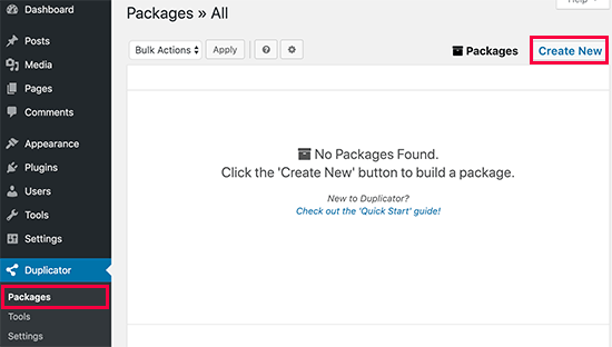
Creating a new package in Duplicator

After that, click the Next button and follow the steps to create your package.
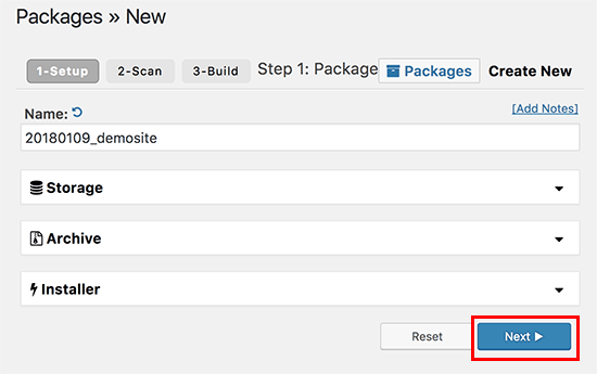
Duplicator create a package wizard

Make sure that your scan results check out (everything should say “Good”), and then click the Build button.
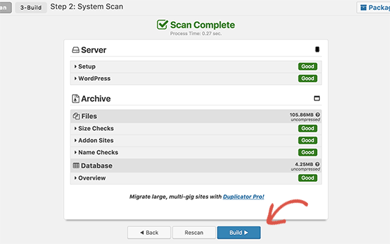
Build package

The process may take several minutes to complete, so leave the tab open as the plugin does its job.

Once the process is complete, you’ll see download options for Installer and the Archive package. You need to click on the ‘One click download’ link to download both files.
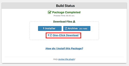
Download package files

The archive file is a copy of your complete website, and the installer file will automate the installation process for you.

Step 3: Import Your WordPress Site to the New Host

Now that you have downloaded both the archive and installer files, the next step is to upload them to your new web host.

You can do this by connecting to your new web host using FTP.

If you’ve never done this before, check out our beginner’s guide to uploading files via FTP to WordPress.

Normally, you would enter your website’s domain name as host when connecting your FTP client.

However, since your domain name is still pointing to your old host, you’ll need to connect by entering your server’s IP address or server hostname. You can find this information from your new hosting account’s cPanel dashboard.
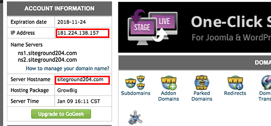
Finding server IP or Hostname in cPanel dashboard

If you are unable to find this information, then you can ask for support at your new web hosting company, and they will help you out.

Using the FTP client, you need to upload both installer.php file and your archive .zip file to the root directory of your website.

This is usually /username/public_html/ folder.

Again, if you are not sure, then ask your web hosting company.

Make sure that your root directory is completely empty. Some web hosting companies automatically install WordPress when you sign up.

If you have WordPress installed in your root directory, then you need to delete WordPress first.

Once done, you need to upload both the archive zip file and installer.php file to your site’s root directory.

Step 4: Change The Hosts File to Prevent Downtime

Once you’ve uploaded both files to your new host, you need to access the installer.php file in a browser.

Normally, this file can be accessed using a URL like this:

http://www.example.com/installer.php

However, this URL will take you to your old web host, and you will get a 404 error. This is because your domain name is still pointing to your old web host.

Normally, other tutorials might tell you to change your domain nameservers and point it to your new hosting company, but that’s wrong.

If you do this now, then your visitors will see a broken website as you migrate it.

We’ll show you how you can access your new site temporarily on your computer, without affecting your old site.

This is done with a hosts file on your computer.

The hosts file can be used to map domain names to specific IP addresses. In other words, it lets you trick your computer in thinking that the website is moved even though it’s not.

Let’s take a look at how to add an entry for your domain name in the hosts file, so that it points to your new hosting company.

Making these changes will allow you to access the files on your new host using your own domain name, while the rest of the world will still be accessing your site from the old host. This ensures 100% uptime.

The first thing you need to do is find the IP address of your new web hosting server. To find this, you need to log into your cPanel dashboard and click on expand stats link in the left-hand sidebar. Your server’s address will be listed as Shared IP Address.

On some web hosting companies, you will find this information under ‘Account Information’ heading.
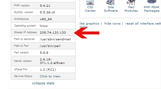
Find shared IP address

In the next step, Windows users need to go to Programs » All Programs » Accessories, right-click on Notepad and select Run as Administrator.

A Windows UAC prompt will appear, and you need to click on Yes to launch Notepad with administrator privileges.

On the Notepad screen, go to File » Open and then navigate to the C:\Windows\System32\drivers\etc folder. From this folder, select hosts file and open it.

If you’re using Mac, then you need to open the Terminal app and enter this command to edit hosts file:

sudo nano /private/etc/hosts

For both Windows and Mac users, at the bottom of the hosts file, you need to enter the IP address you copied and then enter your domain name. Like this:

192.168.1.22 www.example.com

Make sure that you replace the IP address with the one you copied from cPanel, and example.com with your own domain name.

Once you’re done, save your changes.

You can now access your files on the new host using your domain name on your computer.

Important: Don’t forget to undo the changes you made to hosts file after you have finished the migration (step 6).

Step 5: Creating MySQL Database on Your New Host

Before we run the installer on the new host, you will need to create a MySQL database on your new hosting account. If you have already created a MySQL database, then you can jump to the next step.

Creating a Database in cPanel

Go to your new hosting account’s cPanel dashboard, scroll down to Databases section and click on MySQL databases icon.

MySQL databases in cPanel

You will see a field to create a new database. Enter a name for your database, and click “Create Database” button.

Creating new database

After creating the MySQL database, you need to scroll down to the MySQL Users section.

Next, provide a username and password for your new user and click on the ‘Create a user’ button.
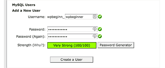
Create a MySQL user

After that, you need to add this user to your database. This will give the username you just created, all the permissions to work on that database.

You can do this by scrolling down to ‘Add User to a Database’ section. Simply select the database user you created from the dropdown menu next to user, then select database, and click on the add button.

Add user to database

Your database is now ready to be used with WordPress. Be sure to make note of the database name, username, and password. You’ll need that information in the next step.

Step 6: Begin the Duplicator Migration Process

Now we’re ready to run the installer. Navigate to the following address in your browser window, replacing example.com with your domain name:

http://www.example.com/installer.php
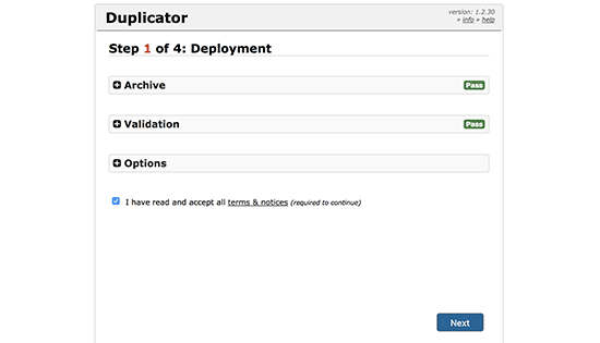
Duplicator installer initialized

The installer will run a few tests and will show you ‘Pass’ next to archive and validation tests.

You need to check the terms & conditions checkbox and continue by clicking on the Next button.

Now, you will be asked to enter your MySQL host, database name, username, and password.

Your host will likely be localhost. After that, you will enter the details of the database you created in the previous step.
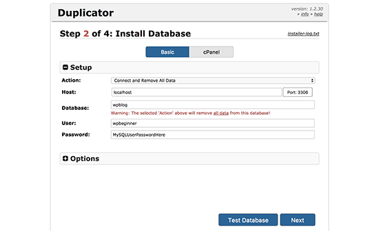
Connect to the database

You can click on the ‘Test Database’ button to make sure you entered the correct information.

If Duplicator is able to connect, then you will see a string starting with Pass. Otherwise, you will see the database connection error details.

Click on the next button to continue.

Duplicator will now import your WordPress database from the archive zip into your new database.

Next, it will ask you to update site URL or Path. Since you are not changing domain names, you DON’T need to change anything here.

Simply click on the next button to continue.

Duplicator will run the final steps and will show you the login button.
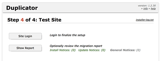
Duplicator website migration finished

You can now login to your WordPress site on the new host to make sure that everything is working as expected.

Step 7: Update Your Domain Name Servers (DNS)

At this point, you’ve created a complete copy of your WordPress database and files on your new hosting server, but your domain still points to your old web hosting account.

To update your domain, you need to switch your DNS nameservers. This ensures that your users are taken to the new location of your website when they type your domain into their browsers.

If you registered your domain with your hosting provider, then it’s best to transfer the domain to a new host. If you used a domain registrar like Domain.com, GoDaddy, etc, then you need to update your nameservers.

You will need the DNS nameserver information from your new web host. This is usually a couple of URLs that look like this:

ns1.hostname.com
ns2.hostname.com

For the sake of this guide, we will be showing you how to change DNS nameservers with GoDaddy.

Depending on your domain registrar or web host, the screenshots may look different. However, the basic concept is the same.

You need to look for domain management area and then look for nameservers. If you need assistance with updating your nameservers, then you can ask your web hosting company.

For GoDaddy, you need to login to your GoDaddy account and then click on Domains.

After that, you need to click on the Manage button next to the domain name you want to change.
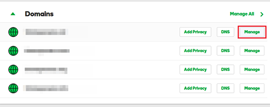
Manage domain

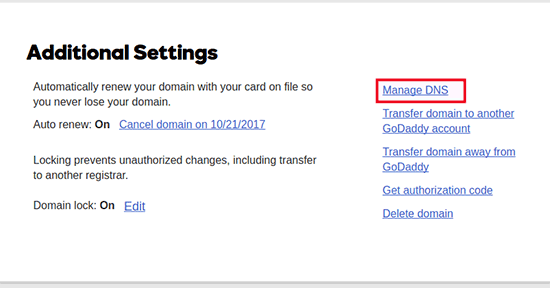
Under the ‘Additional Settings’ section, you will need to click on ‘Manage DNS’ to continue.
Manage DNS

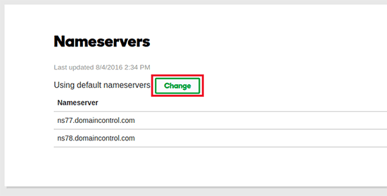
Next, you need to scroll down to the Nameservers section and click on the change button.
Change nameservers

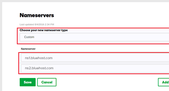
First, you will need to switch the nameserver type dropdown from ‘Default’ to ‘Custom’. After that, you can fill in the your new hosting provider’s information under Nameservers.
Updating DNS nameservers

Don’t forget to click on the save button to store your changes.

You have successfully changed the nameservers on your domain. DNS changes can take 4 – 48 hours to propagate for all users.

Since you have the same content on your old host and the new host, your users wouldn’t see any difference. Your WordPress migration will be seamless with absolutely no downtime.

To be on the safe side, we recommend that you wait to cancel your old hosting account until 7 days after your migration.

Frequently Asked Questions

Here are a few questions many of our users ask while moving WordPress from one host to another.

1. Can I signup for the new hosting account without registering a domain name?

Yes, you can absolutely signup for a hosting account without registering a domain name.

Domain name and hosting are two different services, and you don’t necessarily need to register a domain name when signing up for new host. For more details see our guide on the difference between domain name and web hosting.

Some hosting providers will ask you to select a domain name as the first step when purchasing hosting. They will also allow you to enter a domain name if you already got one.

2. Do I need to transfer my domain name to the new host?

No, you don’t need to transfer your domain name to the new host. However, transferring your domain name to your new hosting will make it easier to renew and manage under the same dashboard as your new hosting account.

For more on this topic, see our ultimate guide on domain names and how do they work.

3. How do I fix error establishing database connection error in Duplicator?

If you are seeing an error connecting to the database or database connection error in Duplicator, then the most likely reason for this is that you entered incorrect information for your database connection.

Make sure that your database name, MySQL username, and password are correct. Some web hosting companies do not use localhost as the host for their MySQL servers. If this is the case, then you will need to ask your web host’s support staff to provide you with the correct information.

4. How do I check if my website is loading from the new host?

There are several online tools that allow you to see who is hosting a website. After you have transferred your website to the new host, you can use any of these tools, and they will show you the name of the web hosting company hosting your website.

If it hasn’t been long since you migrated your website and made changes to your domain name server (DNS), then chances are that your site may still load from your old host. Domain name changes can take up to 48 hours to fully propagate.

5. Do I need to delete any files or data from old host?

When switching hosting companies, we recommend that you keep your old website for at least a week. After that, you can delete files from your old web host. If you are canceling your account, then your web hosting provider will delete all your data according to their policy.

6. How long should I keep my account active on the old host?

Once you have migrated your website to the new host, and if you don’t have any other websites hosted with your old web host, then you can cancel your old web hosting account.

However, in some cases, you may have already paid them for yearly hosting. You should check their refund policy to see if you are eligible for any refund upon cancellation.

7. How do I move a WordPress site with SSL/HTTPs?

You will need to install SSL certificate on your new hosting provider. After that, you can follow the same steps mentioned above. Just make sure that you use HTTPs in the URLs, like https://example.com

8. Bonus: Free Site Migration by Your New Host

If you’re looking to switch your web hosting, but the steps above sound too complicated, then you can choose the following providers, and they will migrate your website for you.

SiteGround, InMotion Hosting, and WP Engine offer free website migration for WPBeginner users.

We hope that this step by step guide helped you move WordPress to your new host with no downtime whatsoever. If you come across any issues with your WordPress migration, then check out our guide on the most common WordPress errors and how to fix them.

If you liked this article, then please subscribe to our YouTube Channel for WordPress video tutorials. You can also find us on Twitter and Facebook.

The post How to Move WordPress to a New Host or Server With No Downtime appeared first on WPBeginner.