In the online workshop, you will learn everything about how to set up responsive designs with Figma. We’ll dive deep into constraints, auto layout, and, most importantly but rarely discussed, breakpoints for your UI design. Combining those tools will allow you to really test and document your designs and components in line with the actual code settings.
Our Figma Auto Layout Masterclass equips you with everything you need to know to master responsive designs in Figma.
Building a responsive card and learning about the power of resizing;
Playing with the mighty power of nested auto layout frames;
Absolute positioning;
Creating more complex card setups;
Setting up an entire page in auto layout;
Learning about different stacking options;
Fixed aspect ratio with images.
How To Deal With Breakpoints In Figma
What they are;
How components and pages adapt;
How breakpoints and media queries work in CSS;
Which breakpoint values to use in your design;
How to set up breakpoints in Figma;
How to test pages and components with breakpoints;
Documenting the findings;
Responsive typography.
Who Is This Workshop For?
The masterclass is suitable for you if you have basic knowledge of Figma or are an advanced Figma user and want to brush up on your skills.
You might also like this workshop if you’re switching to Figma from other software like Sketch or XD. And, of course, a special welcome to developers who want to improve the collaboration between design and code and better understand the responsive setup in Figma.
About Christine Vallaure
Christine is a UX/UI Designer and founder of moonlearning.io. She has worked internationally, in-house, and remotely on projects for leading brands, agencies, and startups. Christine cares deeply about creating well-thought-through and aesthetic products and firmly believes that designers should understand code and that UX/UI is a match made in heaven.
Virtual doors open, registration, chat, and introductions.
9:00 AM – 11:30 AM
Deep dive into Figma responsive design, deep dive into constraints, auto layout, and, most importantly but rarely discussed, breakpoints for your UI design.
11:30 AM – 12:30 PM
Q&A with Christine on the day’s material. Networking!
You can always re-watch the session at a more convenient time and follow the webinar at your own pace.
To participate, please install the Zoom client for Meetings, which is available for all the main OSs. It may take a little time to download and install, so please grab it ahead of time if you can.
See You There?
Donate 35 USD or more to join — we’ll donate 100% of the proceeds to humanitarian aid in Ukraine. We are already looking forward to diving deeper into the little secrets of auto layout together with you. Thank you for your kind support. 💙💛
Remember all of the times you had to multiply your Figma or Sketch frames just so you can demonstrate single-word changes? Or having to mingle with the .json file in VS code whenever you needed to update that button text? What about irritating typos due to a lack of grammar checking plugins in most of the graphic editors? I’m afraid that calling copy docs (like any other framework) a silver bullet will be too much, but at least this technique can ease these struggles.
Let’s have a closer look.
Some History And Credit
One of the early public mentions of copy docs belongs to Andrea Drugay, a then UX writer at Dropbox. I encountered it during my certification in UX writing at the UX Writing Hub Academy (hi Yuval!) in 2019.
Since then, I’ve been largely using copy docs as a product designer and built on it to modify it to the needs of UX specialists at large, especially in small teams.
What Is A Copy Doc?
It’s a document where you keep and update all your in-product texts, their instances, and describe their behavior.
In this flow, Figma or Sketch is the ultimate source of UI elements while the copy doc is the ultimate source of in-product copy. It makes more sense: you use design tools for designing, and editing tools for working with content (including the handout process). All in all, it brings the work with in-product copy to the next level, both for the design specialist and the whole team.
Reasons To Use Copy Docs
Right now you might feel a bit curious about using this technique but still skeptical. Right you are: there should be a very good reason to make your workflow more compound.
So let me give you some motive.
Copy Docs Can Go With Any Design Tool
It can be used along with any software you like. Figma, Sketch, XD — you name it.
You Can Zero In On Content Solely
On one hand, a UX specialist’s focus is their dearest resource. On the other, the efficiency of the environment they are working in has a great impact on their ability. Copy docs level up both aspects.
Switching environments helps to refresh one’s focus. And working with content in a content-native tool means fewer distractions.
For me, it is one of the most valuable benefits of copy docs. Especially when you are both a designer and a writer in your team.
Additionally, you will be more likely not to miss out on “hidden” states (error or success feedback, etc.) and can use various graphic means for annotations. And it becomes easier to describe complex logic like “If event X happens… then the button copy becomes Y…” — you literally change just the text, without mingling with the graphic.
Here you can object that working with copy outside an interface feels dubious. In reality, in 9 cases out of 10, you can clearly tell what length is reasonable. As for uncertain cases, you can always try a specific line in your interface when you really need it.
Consistency Is Easy
While in IELTS the more synonyms you use the better, it is not the same in the UX field. For example, if you use the “Delete” term across your designs to mean an action of removing an item, but in a particular spot “Erase” for the same action pops in, it may confuse users: they might think that some other action is implied.
In a copy doc, you can quickly highlight all the instances of a word. It becomes handy when you want to check yourself. And if needed — say, you ran usability tests and discovered that in your very context “Erase” will do better, — you can do a bulk rename quickly and hand it out to developers or align your designs. Indeed, it is much better to fix a term in a doc and then just adapt your Figma or Sketch frames than to crawl over there hastily and peck at each element with the fear of skipping one.
And it works in the opposite direction: sometimes you may want to split a term. For example, first, working with my own copy doc, I used the word “comment” to denote two different ideas: in the first case, I meant the native Google docs commenting tool, and in the second case I referred to my remarks in the body of the copy doc. Essentially they are different: the first one implies a ping-pong discussion with my team while the second one means my only informational notes to the developers on the item behavior. So now I am using “comments” and “annotations” correspondingly.
Proofreaders Are Happy
The majority of language specialists usually work in Word-like formats. And here they can do an estimation based on word-count.
Collaboration Is Nice And Deep
Since an editing soft provides a wonderful toolset catered for content-specific cooperation, now your team is taken to the next level of collaboration.
And I already mentioned the benefits of the handout process. Now, in order to update the microcopy in live components, you actually hand out just the copy, organized and annotated.
Files Are Light
With copy docs you avoid redundancy when you copy-paste frames with only textual changes — now you keep it in a separate dedicated document. Needless to say that it boosts performance.
It means a “built-in” Grammarly for your designs
Haven’t you been dreaming of it every time you type a string of text in your Figma, Sketch, or XD mockups?
How To Create A Copy Doc
These are the steps I follow when creating my copy docs.
1. Draft Your Interface
To start with copy docs, you need the skeleton of your interface. I prefer creating copy docs at the stage of mockups but you can start at the prototyping stage. However, if you follow a content-first approach, it is even possible to prototype with copy docs and then use them as a list of necessary elements while designing the UI.
2. Create An Outline Of The Copy Doc
Create sections matching the names of your screens.
3. Paste Screenshots
You should follow a “Heading + Screenshot + Table” pattern for every unit.
4. Paste Tables
Ideally, you want to create an empty table with pre-set styles under each screenshot. For this, create a table for your first screen and fill it in. Then copy-paste the filled table under the second screenshot, clear, copy it again, and paste under the remaining screenshots multiple times.
5. Fill It In
All set for your copy work.
Work screen by screen. Start with namespaces. Then, fill in the very microcopy, avoiding common pitfalls that I share below.
6. Keep Your Copy Doc Up-to-Date
So, your copy doc is all set. Now you should pick up a habit of reflecting all the copy updates immediately. Anytime your copy doc is opened, it should show the most actual in-product copy.
It may require some work but the good news is that you need not update the screenshots unless they undergo dramatic changes.
As for your Figma, Sketch, or XD files, it is strongly advised that you reflect changes in copy as well, but now it is your second priority — you work with the copy in a copy doc and then just align your design files later.
Tips And Pitfalls
Pay Attention to Taxonomy
The common namespace for a content item will look like:
Section / Subsection / Group / … / Item
Table / Head / 1st column
Make sure you match names with your UI components’ names.
And, in their turn, the components should match the development framework. If you are not sure what name to pick up, consult with your developers.
Create The Legend
Being outside the design tool, you can use a variety of graphics to communicate ideas, not esthetics.
For example, use:
Highlights for variables
Brackets for annotations
Emoji or Unicode symbols for states
And be consistent — use the same highlighting method for every corresponding event. Remember about synonyms?
Also, remember about accessibility: it’s a good idea when different items differ with several parameters.
Avoid Redundancy And Conflicting Strings
Don’t reuse identical items.
For example, if you have a page with a common title and tabs, mention the title in the first unit, and later in other units don’t mention them again but reflect only changes on those pages.
Think Of States
Surely, the instances of your elements can vary, but below are the most common ones you need to think of.
Feedback: messages, alerts, notifications, etc.
Info
Success
Warning
Error
Inputs and the like:
Placeholder
Typing
Filled
Null
Various errors
You get the idea.
Literally use them as a checklist to provide exhaustive content for every change of your elements’ state.
As for their appearance, you can either create a separate row for each instance or group them in one cell, annotated.
Think Of Variables
Variables are those parts of copy that change with the context. Usually, it is date and time, users’ names, numbers, etc.
Probably, you already considered them at the stage of Information architecture or, partially, in Editorial policy. And now a copy doc is just the place to reflect what data is constant, and what data changes depending on the context, and how.
Highlight variables and choose their form. Follow the same counter-redundancy rule: state the variable’s form once, preferably at the beginning, and then refer to it across your doc.
Do not forget to think of the minimum and maximum value of every variable — if you spot that it affects the UI in some way, you can leave a corresponding annotation.
Afterword (And A Bonus)
This is pretty much it. The copy docs technique was a game changer for my workflow and I’d be happy if it boosts yours, too!
And please, let me know how you use it or, maybe, cater this framework to your needs. Screenshots, description of your experience, audio or video messages — anything will be great! I mean it.
And I prepared a template for you. So, copy your [Template] Copy doc — and stay safe!
ol ol ul,     ol ul ul,     ol menu ul,     ol dir ul,
ol ol menu,   ol ul menu,   ol menu menu,   ol dir menu,
ol ol dir,    ol ul dir,    ol menu dir,    ol dir dir,
ul ol ul,     ul ul ul,     ul menu ul,     ul dir ul,
ul ol menu,   ul ul menu,   ul menu menu,   ul dir menu,
ul ol dir,    ul ul dir,    ul menu dir,    ul dir dir,
menu ol ul,   menu ul ul,   menu menu ul,   menu dir ul,
menu ol menu, menu ul menu, menu menu menu, menu dir menu,
menu ol dir,  menu ul dir,  menu menu dir,  menu dir dir,
dir ol ul,    dir ul ul,    dir menu ul,    dir dir ul,
dir ol menu,  dir ul menu,  dir menu menu,  dir dir menu,
dir ol dir,   dir ul dir,   dir menu dir,   dir dir dir {
  list-style-type: square;
}
Browser support is just starting to get there and polyfilling is hard, so we aren't at day-to-day no-brainer use levels quite yet. I'd bet it's not too far away.
Among the biggest developments of interest to web designers in 2019 was the explosion of UI design tools. These apps signal a transition in how we create modern user interfaces. It might be that the days of creating PSD mockups in Photoshop are coming to a close.
Not convinced? Both Sketch and Figma have developed loyal followings over the past few years. But perhaps the biggest news is that Adobe, the design software behemoth, jumped into the game in January 2019 with its XD product. This shows that the way we work is indeed shifting towards more specialized tools.
With that in mind, let’s take a look at each of these “big three” applications. We’ll cover some core features as well as other factors that may influence which one is the best fit for your needs.
Your Web Designer Toolbox Unlimited Downloads: 500,000+ Web Templates, Icon Sets, Themes & Design Assets
What Makes UI Design Tools Unique?
For many years, web designers used the aforementioned Adobe Photoshop to create website mockups. This was preferable to jumping right into code in that it allowed us to build a highly-detailed interface and easily make edits – without having to tear apart HTML, CSS and the like.
While that can still be an effective workflow, this new breed of applications has features that are specific to web design. UI elements such as navigation and buttons are interactive – you can see hover effects or click through to other pages.
In addition, the interfaces built with a UI design app are often responsive. This means that you can see how they work at different viewports. You no longer need to build out an entirely separate PSD file for phones, tablets and desktop devices.
And there are a ton of premade UI kits and templates available, providing a head start on the design process.
In essence, you’re no longer creating a static screen, but a fully-immersive prototype.
Now, let’s look at the apps!
Sketch
The first of these newfangled tools to hit the market, Sketch was initially released back in 2010. This gave the app a head start over the others in this roundup. Thus, it also means there are a ton of resources available.
There is a library of various extensions that bring new capabilities and enhance workflow. Functionality can range from tweaking various design elements to tying in with stock photography services for easier imports.
Easily add text and image-based data to your demo;
Sketch Cloud service for sharing your creations;
Libraries for sharing resources (symbols, images, text, styles) across documents;
The ability to create and use templates;
A massive number of available plugins;
Sketch is a desktop app that offers a free 30-day trial, but otherwise costs $99 for a commercial license. Yearly renewals are available at a discounted price.
One big caveat here is that Sketch is only available for macOS. If you’re using Windows or Linux, you won’t be able to join in the fun.
Figma
First released in 2016, Figma is a browser-based application that touts a collaborative approach to design. The advantage here is that you can easily access it on the go, regardless of your operating system.
Plus, when you share projects with others, you’re doing so with a live link. This means that you won’t have to first export to a PDF or other image. What they’re seeing is exactly what you’ve created.
In addition, Figma has been built to support real-time collaboration. Team members can communicate with each other and manage their own project tasks. The included version history allows you to roll back changes, if needed.
Beyond that, you’ll find:
The ability to create consistent styles and apply them across projects;
Copy CSS directly from design files;
A library of searchable assets;
User permissions;
Create animated, interactive prototypes;
Auto Layout feature for responsive designs;
A plugin library, and the ability to create your own plugins;
Figma has a free plan that allows for 3 projects, 2 editors and a 30-day version history. Full-featured commercial plans start at $12 per month (billed annually).
Adobe XD
Now, to the new kid on the block. Adobe XD is aimed at designers who want to create websites, mobile apps or even games. It sports a built-in system for collaboration, called “Coediting”, and the ability for clients and colleagues to provide feedback.
Like its competitors, XD enables you to reuse design components again and again. You can also edit a component once and push it to all instances, allowing for better consistency in your design.
Perhaps the biggest plus here is the fact that Adobe XD plays nicely with other Adobe apps. You can, for instance, open and edit images in Photoshop directly from XD (just right-click the image to open it). Any changes you make to the image will automatically be reflected in XD as well. It also imports files from Adobe Illustrator, Photoshop and even Sketch.
Other features worth exploring include:
States allow you to edit design components based on user interactions, such as hover or click;
Easily replicate design elements;
Adobe Fonts integration;
Create interactions and triggers for your prototypes;
Preview mobile apps on real devices via a companion app;
Document history allows you to roll back to previous versions;
Developer-friendly assets like CSS, colors, downloadable assets;
Extensions that bolster functionality and tie in with third-party services;
Adobe XD is subscription-based software. It requires either a full Creative Cloud membership or, you can choose to subscribe to XD by itself for $9.99 per month. If you want to give it a try first, there is a free XD Starter Plan that will let you experiment with some limitations. You can run the application on macOS or Windows.
Making the Right Choice
Each of these tools has their own compelling set of features. In that way, it’s hard to say that you’ll go wrong with any of them.
But, to narrow down your options, think about how and where you plan to use the app. For example, if you are a Windows user, you won’t be able to use Sketch. If you prefer something browser-based and/or use Linux, then Figma is your choice. If you’re a Mac user who wants something with a lot of template and plugin choices, Sketch is the winner. Loyal Adobe customers will love the interoperability of XD.
Otherwise, you’ll find a number of similarities. Each app has at least some ability for collaboration. They all create vector graphics and offer asset libraries. All are adept at creating a design system. Plus, they are all extensible to one degree or another.
Regardless of what direction you go, you can be sure of one thing. You’ll be on the cutting edge of web design.
The world of web development has always had a gap between the design-to-development handoff. Ambitious designers want the final result of their effort to look unique and beautiful (and true to their initial vision), whereas many developers find more value in an outcome that is consistent, dependable, and rock solid (and easy to code). This dynamic can result in sustained tension between the two sides with both parties looking to steer things their own way.
While this situation is unavoidable to some extent, new front-end technology can play a role in bringing the two sides closer together. One such technology is CSS grid. This post explores how it can be used to write CSS styles that match design layouts to a high degree of fidelity (without the headache!).
A common way that designers give instructions to front-end developers is with design mockups (by mockups, we’re talking about deliverables that are built in Sketch, XD, Illustrator, Photoshop etc). All designers work differently to some degree (as do developers), but many like to base the structure of their layouts on some kind of grid system. A consistent grid system is invaluable for communicating how a webpage should be coded and how it should respond when the size of the user’s screen differs from the mockup. As a developer, I really appreciate designers who take the trouble to adopt a well thought-out grid system.
A 12-column layout is particularly popular, but other patterns are common as well. Software like Sketch and XD makes creating pages that follow a preset column layout pretty easy — you can toggle an overlay on and off with the click of a button.
A grid layout designed in Sketch (left) and Adobe XD (right)
Once a grid system is implemented, most design elements should be positioned squarely within it. This approach ensures that shapes line up evenly and makes for a more appealing appearance. In addition to being visually attractive, a predictable grid gives developers a distinct target to shoot for when writing styles.
Unfortunately, this basic pattern can be deceptively difficult to code accurately. Frameworks like Bootstrap are often used to create grid layouts, but they come with downsides like added page weight and a lack of fine-grained control. CSS grid offers a better solution for the front-end perfectionist. Let's look at an example.
A 14-column grid layout
The design above is a good application for grid. There is a 14-column pattern with multiple elements positioned within it. While the boxes all have different widths and offsets, they all adhere to the same grid. This layout can be made with flexbox — and even floats — but that would likely involve some very specific math to get a pixel-perfect result across all breakpoints. And let’s face it: many front-end developers don’t have the patience for that. Let’s look at three CSS grid layout strategies for doing this kind of work more easily.
The most intuitive way to write an evenly spaced 12-column layout would probably be some variation of this. Here, an outer container is used to control the outside gutter spacing with left and right padding, and an inner row element is used to restrain content to a maximum width. The row receives some grid-specific styling:
This rule defines the grid to consist of 12 columns, each having a width of one fractional unit (fr). A gap of 20px between columns is also specified. With the column template set, the start and end of any child column can be set quite easily using the grid-column property. For example, setting grid-column: 3/8 positions that element to begin at column three and span five columns across to column eight.
We can already see a lot of value in what CSS grid provides in this one example, but this approach has some limitations. One problem is Internet Explorer, which doesn’t have support for the grid-gap property. Another problem is that this 12-column approach does not provide the ability to start columns at the end of gaps or end columns at the start of gaps. For that, another system is needed.
Although grid-gap may be a no go for IE, the appearance of gaps can be recreated by including the spaces as part of the grid template itself. The repeat function available to grid-template-columns accepts not just a single column width as an argument, but repeating patterns of arbitrary length. To this end, a pattern of column-then-gap can be repeated 11 times, and then the final column can be inserted to complete the 12-column / 11 interior gap layout desired:
grid-template-columns: repeat(11, 1fr 20px) 1fr;
This gets around the IE issue and also allows for columns to be started and ended on both columns or gaps. While being a nice improvement over the previous method, it still has some room to grow. For example, what if a column was to be positioned with one side spanning to the outer edge of the screen, and the other fit within the grid system? Here’s an example:
A grid Layout with an that's item flush to the outer edge
In this layout, the card (our left column) begins and ends within the grid. The main image (our right column) begins within the grid as well, but extends beyond the grid to the edge of the screen. Writing CSS for this can be a challenge. One approach might be to position the image absolutely and pin it to the right edge, but this comes with the downside of taking it out of the document flow (which might be a problem if the image is taller than the card). Another idea would be to use floats or flexbox to maintain document flow, but this would entail some tricky one-off calculation to get the widths and spacing just right. Let’s look at a better way.
This technique builds on the idea introduced in the last revision. Now, instead of having the grid exist within other elements that define the gutter sizes and row widths, we’re integrating those spaces with the grid’s pattern. Since the gutters, columns, and gaps are all incorporated into the template, child elements can be positioned easily and precisely on the grid by using the grid-column property.
Yes, some math is required to get this just right. It’s important to have the template set differently before and after the maximum width of the row has been realized. I elected to use SCSS for this because defining variables can make the calculation a lot more manageable (not to mention more readable for other developers). What started as a 12-part pattern grew to a 23-part pattern with the integration of the 11 interior gaps, and is now 25 pieces accounting for the left and right gutters.
One cool thing about this approach is that it can be used as the basis for any layout that adheres to the grid once the pattern is set, including traditionally awkward layouts that involve columns spanning to outside edges. Moreover, it serves as a straightforward way to precisely implement designs that are likely to be handed down in quality mockups. That is something that should make both developers and designers happy!
There are a couple of caveats...
While these techniques can be used to crack traditionally awkward styling problems, they are not silver bullets. Instead, they should be thought of as alternative tools to be used for the right application.
One situation in which the second and third layout patterns are not appropriate are layouts that require auto placement. Another would be production environments that need to support browsers that don’t play nice with CSS grid.
The advantage of prototyping is that it allows designers to prove or disprove their concepts. Also, to fine tune their designs. And it can demonstrate how the final product will work once production is completed. Prototyping tools are used to simulate application flow, to test performance, and create a user experience.
In practice, designers use a variety of prototyping tools. Their capabilities range from simple to advanced.
Tools that support design handoff are relatively new on the scene. The available choices are still somewhat limited. Several tools that support both prototyping and handoff are described in this article.
When a tool of this type is right for your project’s workflow, it make’s life that much easier. And any one of the 5 presented here can easily make that happen.
Preparing a design for product development purposes is seldom an easy task. Taking a design and presenting it in the form of a beautiful user flow diagram isn’t always that much fun. Not only are these diagrams traditionally hard to build, but they can also be a pain to update and maintain.
Part of the problem lies in that, until recently, a tool that explicitly specialized in user flow diagramming for designers hasn’t existed. Essentially one that makes it easy to connect between visual screens to illustrate the bigger picture.
Overflow changed all of that. Overflow is the world’s first user flow diagramming tool specifically tailored for designers; a tool that will significantly accelerate your user flow design diagramming process. You can sync your designs from Figma, Sketch, or Adobe XD, upload images and add shapes and connectors to create interactive user flow presentations that tell the story behind your design work.
Overflow is available on MacOS for a 30-day free trial. A Windows version is expected to follow at a future time.
With Webflow, you can prototype anything from a website dashboard to a mobile app, and you can do so using fully-functional forms and real, dynamic content. That’s more than most prototyping tools allow — but there’s even more to come.
Because with Webflow, you can actually skip the handoff. It enables you to take your finished prototype and move right into the build and launch phases, creating a completely custom, production-ready website without any need for coding. HTML, CSS, and JavaScript coding is done for you.
When it’s time to launch, world-class hosting is available. It’s lightning-fast, hassle-free, and doesn’t involve any of the usual, cumbersome setup.
Plus, you can build your website or app from scratch, from a template, or by using any of a large array of community-created UI kits.
In short, Webflow is a single tool that could make much of your current toolkit completely obsolete. And who wouldn’t rather be using fewer tools?
UXPin is a prototyping tool created to help reduce the time spent on design and development. Fewer tools, faster collaboration, shorter time to market. Manage design tasks, create a prototype that perfectly mimics the real product, collaborate on iterations, and hand off the project to the development team – all from one tool.
The perfect solution for both professionals and those who are just starting in design. Try the free plan and scale if need be.
You can use this platform-independent tool to automate your project’s design handoff workflows, import and share design versions with team members and stakeholders, and turn Sketch, PSD, and other file formats like XD, Figma or Illustrator into code.
Avocode syncs and stores your design files in the cloud and helps you keep those files correctly versioned and organized; and you don’t have to prepare your files upfront in any way.
With Savah at your fingertips, it’s easy to create an end-to-end journey for your web or mobile app projects. This is not your typical prototyping and design collaboration tool in the sense that it does much more than help you build a prototype.
Savah promotes collaboration and team feedback. And it also has a built-in design workflow and approval system that can immediately speed up your project’s design phase. Savah is free to use for solo designers.
Looking for an ideal prototyping and handoff tool?
While there’s certainly no shortage of tools and techniques for building prototypes, finding what you need can be a challenge. Simply because what you need depends on the task at hand, making that need a variable.
You could choose blindly or simply throw your hands up in despair, but you don’t have to do either. Just take the following into account when it’s time to make a selection:
The tool should make collaboration and information sharing easy.
It should have a shallow learning curve and be easy to use.
It should serve you well for low-fi prototyping, medium-fi prototyping, hi-fi prototyping, or if need be, all the above.
And, the price should suit your budget.
You also want to look at the pros and cons of any given tool, whether it’s for prototyping or design handoff, taking into account the following criteria:
Fidelity: How well does the tool support visual and interaction design?
Consistency: Does it have the necessary features to ensure design consistency in your work?
Accuracy: Does it enable you to strictly adhere to your organization’s “source of truth”?
Collaboration: Does it make collaboration and co-design activities easy to perform and manage?
Developer Handoff: What processes does it follow to generate specifications and assets for developers?
Remember, you’re not looking for the “best”. You’re looking for a tool that will do the job and do it well without placing any bothersome constraints on you or on your design.
Conclusion
You can save a ton of time and avoid a certain amount of grief by staying up to date with the latest tools and techniques. That includes prototyping tools and most certainly handoff tools. The handoff tools are a recent addition to a web designer’s toolbox.
Some tools can be used for virtually any project, unless or until they become obsolete. Usually you need to consider the task at hand when selecting one. The ability to work on a given platform or any platform should always be considered. Also, a possible need to integrate with other design tools should be considered.
(This article is kindly sponsored by Adobe.) Voice-enabled interfaces are challenging the long dominance of graphical user interfaces and are quickly becoming a common part of our daily lives. According to a survey run by Adobe, 76 percent of smart speaker owners increased their usage of voice assistants over the last year.
In this article, I’ll share a flow that you can use to create voice-based experiences. But before we dive into the specific recommendations on how to design for voice, it’s important to understand the user expectations about it.
Why Do People Expect More From Voice?
Voice User Interfaces (VUIs) not only introduce a change in a way people interact with machines, but they also raise the bar for the quality of interaction. When people interact with GUI’s and have troubles with them, they often blame themselves, but when people interact with VUIs and are unable to complete a task, they blame the system.
Why is that? Well, talking is the most naturally convenient medium for communication between people, and people are confident in their talking skills. This can have a direct influence on the retention rate: A 2017 report by Voicelabs states there’s only a 6 percent chance a user will be active in the second week after downloading a voice application.
Design Process
Many designers think that designing voice-based experiences is completely different from graphical user interfaces. That’s not true.
Designing voice-based experiences is not a new direction in UX design; it’s a next natural step. It’s possible to adapt the design process that we use for visual interfaces for voice-based products.
There are five steps should take place before starting development a voice product:
The great thing about this process is that it can be applied to all types of voice interfaces, whether it is a voice-enabled, voice-only or voice-first.
1. Research
Similar to any other digital product we design, we need to apply user-first design in the context of voice user interfaces. The goal of user research is to understand the needs and behaviors of the target user. The information you gather during this step will be a foundation for product requirements.
Identify The Target Audience
Defining and researching the target audience of a product should be one of the first steps in the design process.
Here’s what to focus on during this step:
Look at the current experience and how the users are solving their problem now. By identifying pain points, you’ll find the cases where voice can benefit your users.
User language. The exact phrases that a target user uses when they speak with other people. This information will help us to design a system for different utterances.
2. Define
During this step, we need to shape our future product and define its capabilities.
Define Key Scenarios Of Interaction
Scenarios come before specific ideas for app — they’re a way to think about the reasons someone might have to use a VUI. You need design scenarios that have high value for your target users. If you have many scenarios and do not know which ones are important and which are not, create use case matrix to evaluate each individual scenario. The matrix will tell you what scenarios are primary, what are secondary what are nice-to-haves.
There should be a compelling reason to use voice. Users should be able to solve the problem faster or more efficiently using voice than any of the alternative experiences.
A few common cases when voice interaction might be preferable for users:
When user’s hands are busy (while driving or cooking);
When using voice is an easier and more natural way to interact (for example, it’s much easier to tell your smart speaker to “Play Jazz” rather than jump to a media center and select the right option using a GUI).
Your goal for this step is to identify both common and specific cases that your users will benefit from. It’s also important to consider the limitations of voice interactions. For example, selecting from a long list of menu items is problematic with voice interactions. A good rule of thumb is to keep choices short and to the point — 3 selections maximum. If you find you have more than 3, it’s best to reframe the scenario.
3. Create
With voice prototypes, it’s important to start at the drawing board. The first step is to tackle the voice user flows of your experience, which is the basis from which all user interaction will map back to.
Use Storyboards
Storyboards visualize interactions and flows in context and make them feel more realistic.
A storyboard that illustrate the flow. Image: BBC. (Large preview)
Write Dialogues
Dialogues are the building blocks of voice user flows. For each key scenario that the voice app will support, start creating conversational dialogues between the user and the app.
Strive to make interacting with the app as familiar as having a regular conversation with a real person. Human conversation is complex; it often has many twists and turns. It will be important to take this into account when working through your scenarios and writing dialogues.
A few general recommendations for creating great dialogues:
Reduce the number of steps it takes to complete a task.
Try to eliminate unnecessary information and questions wherever possible. Design should solve the user’s problem with the minimum number of steps. Remember that the longer it takes to complete the task, the less enjoyable the experience becomes. No one likes products that drain on their valuable time, and this is especially true for repetitive tasks. Your app should provide a delightful user experience whether it’s the first time a user completes the task, or it’s the 100th time this month.
Don’t teach “commands”.
Given how hard discovery can be in voice, some designers try to teach users commands so they know what to say. Don’t do that. Phrasing should be natural and intuitive, so users will know what to say in particular situations.
Be brief with your questions and responses.
It’s relatively easy to overload users with too much information when you use long sentences. Try to simplify messages to their essence wherever possible. Users enjoy concise and well-defined information from VUI.
Think about what information is primary, and what information is secondary. Follow the principle of Maximum of Quantity which says that a speaker provides the listener as much information as is necessary to advance the perceived purpose of the interaction but not too much.
Here is a dialogue that doesn’t follow the principle of Maximum of Quantity:
User: “Where’s a good place to go for pizza?”
System: “I have five places for you. The first one is “Pizza & Pasta” is located on 1300-1398 Diamond St San Francisco, 15 minutes away from you, open from 8:00 AM till 8:00 PM, the second is “Italy” which is located on 4100-4148 20th St San Francisco, 1 hour away from you, open from 9:00 AM till 6:00 PM,...”
The dialogue tries to present all options in a single turn. It’s better to try to narrow down the list by asking a clarifying question:
User: “Where’s a good place to go for pizza?”
System: “There are several pizza restaurants in the area — would you like to walk, or drive?”
Handle Errors
No matter how good your VUI will be, one thing is for sure: things will go wrong. And you need to design for those situations. Graceful handling of errors is one of the biggest challenges you’ll face when designing for voice and it’s vital to start thinking about it right at the time when you write your dialogues.
Here are a few common cases that can cause error states:
Misspellings
Some users can mispronounce words and the natural language processing system won’t understand the request.
Ambiguity
Even between humans, speech is sometimes ambiguous. For example, someone might say “Good” and that could be defined as ‘Yes, I agree’ or just be an indication that they’re listening.
Cases when the system is unable to provide valuable information for users. For example, the user wants to book a flight, but the system doesn’t have relevant options.
In all cases, the dialogue shouldn’t end up in a dead end; the system should provide valuable options. Always try to get the dialog back on track.
Let’s check out the first example:
User: “Book me a flight from San Diego to Dallas on Monday.”
System: “I couldn’t find any flights from San Diego to Dallas on Monday.”
It’s evident that users face a dead end. However, it’s relatively easy to modify the dialog to provide some options for users:
User: “Book me a flight from San Diego to Dallas on Monday.”
System: “I couldn’t find any flights from San Diego to Dallas on Monday. Would you like to search for another date?”
Another example for food ordering app:
User: “What’s the ZIP code for delivery?”
System: “Hmm, 811415”
User: “This ZIP is invalid. Try again.”
Not only the word “Invalid” is too technical, but it also doesn’t help get the user back on track. It’s better to offer a user a hint so they can understand what they should do next:
System: “What’s the ZIP code for delivery?”
User: “Hmm, 811415”
System: “This ZIP is longer than expected. It should be five digits, not six.“
User: “81415”
Reflect Your Unique Identity
All voices project a persona whether you plan for one or not. Don’t leave your VUI persona to chance, reflect your unique brand and identity in dialogues you write. Imagine how your ideal employee should interact with customers and try to reflect it in the wording of your dialogues.
Tone of voice has measurable impacts on users’ perceptions of a product. That’s why it’s important to consider the emotional needs of your users when choosing a tone.
A product’s tone of voice can be expressed as a function of the 4 tone dimensions. Image: NNGroup. (Large preview)
Bake Empathy In Interactions
Voice interfaces should take user emotions into account. People like not only friendly people but also friendly computers. For example, when someone wants to book a ticket for a flight and provides information about a trip, the system might respond ‘Sounds like a fun trip!’ The response should be slightly different each time to prevent a feeling of interaction with a machine.
Confirm When A Task Has Been Completed
It’s vital to think about where in the conversation flow the users need confirmations. Usually, people expect a final confirmation at the end of a dialogue. For example, when a user schedules an event, they might want to hear the “The event is on your calendar now.”
Another typical scenario is a checkout flow — let the user know that the transaction has been successfully recorded.
Use explicit confirmation for important actions and implicit for routine tasks. For example, if you ask your Alexa to send money to your friend, a user probably wants to hear “The [amount of money] was sent to [name of the person]” rather than just “OK.” At the same time, when you ask Alexa to turn off the lights in a garage, hearing “The lights in the garage are off” all the time might be too much, so be sure to test confirmations carefully to find out what confirmations your users feel is critical in order to feel successful with the VUI.
Leverage Context
A good conversational system keeps track of the dialog, memorizing all previous turns and of previous interactions. A solid system will use this information to create a better experience for users by offering a more personalized experience.
For example, when a user orders pizza, the system might remind them about their previous order:
User: “I want to order a pizza.”
System: “Last time you ordered Quattro Formaggio from Pizza & Pasta. Do you want to order it again?”
User: “Yay, I do!”
Cover Alternate Phrases
People can use different words to describe the same thing, and it’s vital to take this moment into account when designing your VUI. For each voice user flow that you designed in the previous step, think about the different ways users could phrase those requests. Consider word variations and synonyms that they might use.
Depending on the capabilities of your voice product, the number of utterances that users can vocalize when interacting with VUI can easily run into the hundreds, making the task of mapping them out really complex. Fortunately, there are special tools available to help you with that. For example, if you design apps for Alexa, you can use Amazon Echo Utterance Expander for that purpose.
Test Your Dialogues
Now when you have all your dialogues written, it’s time to start testing them. Why? Because the way we speak is far less formal than the way we write. To make sure you design dialogues that sound natural, it’s vital to test them before moving to prototyping.
Two simple techniques will help you do it:
Record and play audio with your dialogs. You’ll hear nuances of words and sentences that just aren’t natural.
Role play conversations to make sure they’re natural and intuitive. A technique called ‘Wizard of Oz’ will help you quickly identify the problems in your dialogues. If you’re Mac user, you can use a tool called Say Wizard to make things easier.
Prototype Your App
Now that we’ve written, mapped and tested our dialogues we can finally move on to designing and prototyping the experience. Adobe XD makes it easy for designers to create a working prototype for voice-enabled Amazon or Google apps and test it with real users. The tool allows you to prototype the actual voice inputs and outputs for the app.
A typical interaction consists of user input and system responses:
To design user requests, we need to create voice triggers. To add a new voice trigger, drag a connector from an element in one artboard to another. When the attributes menu opens, select Voice from Trigger menu and add your utterance in the Command field.
Speech Playback will simulate the response of the voice app. To add Speech Playback, you need to select Time as the Trigger and set the action to Speech Playback.
Prototyping with Voice in Adobe XD
Adobe XD allows you to prototype for voice-first products like the Amazon Echo Show, and voice-only products such as Google Home.
A few folx have asked about voice-only prototypes in #adobexd - below I made a quick prototype of a Google Home timer in XD using:
🔸Vector file from Illustrator to XD 🔸Auto Animate for the lights 🔸Voice Command as trigger 🔸Speech Response
Last but not least, if you design Amazon Alexa Skill for Amazon Echo Show or Amazon Echo Spot, XD provides a VUI kit for those devices. You can download it here. This VUI kit provides all the building blocks you need to get started building an Alexa skill.
VUI kit for Amazon Echo Show and Spot. (Large preview)
4. Test
Testing is a mandatory part of the design process. Without testing, you can’t say whether your app will work for your users or not.
Test Your Prototypes With Target Users
Conduct usability testing sessions with representatives from your target audience, and observe how users interact with your app. Track the tasks completion rate and CSAT (Customer Satisfaction Score). If possible, try to record a video for each session.
Use Test Simulators
Both Amazon and Google provide testing tools that let you test your Skill or Action in simulation of the hardware devices and their settings. This testing will give you a good feel for the voice experience in the real world.
5. Refine
Refine the voice application after sending it to the market.
Collect Analytics
Once you’ve rolled out your app, you should track how the app is being used with analytics. Here are some of the key metrics to keep an eye out for are:
Intents and utterances,
User engagement metrics,
Behavior flows.
Most of the metrics you need you will find within your Skill developer account without any additional coding.
Conclusion
Human-computer interaction has never been about graphical user interfaces. First and foremost, it has always been about communication. It’s evident that voice will be a natural way for the new generation of users to interact with technology, and as a designer, you should be ready for these new challenges and the opportunities they unlock for new ways of looking at interaction design.
This article is part of the UX design series sponsored by Adobe. Adobe XD tool is made for a fast and fluid UX design process, as it lets you go from idea to prototype faster. Design, prototype and share — all in one app. You can check out more inspiring projects created with Adobe XD on Behance, and also sign up for the Adobe experience design newsletter to stay updated and informed on the latest trends and insights for UX/UI design.
Sketch vs Figma, Adobe XD, And Other UI Design Applications
Sketch vs Figma, Adobe XD, And Other UI Design Applications
Ashish Bogawat
For a while now, Sketch has been the application of choice for many UX and UI designers. However, we have lately seen many new contenders for Sketch’s position #1 as a universal UI design tool. Two apps that I think stand out mostly from the rest (and that have made the biggest strides in their development) are Figma and Adobe XD.
This article is oriented towards user interface designers and developers. I’ll try to summarize my thoughts on how Figma and Adobe XD compete with Sketch and what unique features each one of them brings to the table. I will also reference some other alternative apps that are aiming to become leaders in the same niche.
Note: To profit from the article, you don’t need to have prior experience with Sketch, Figma, or Adobe XD. Still, if you have some experience with at least one of these apps, it will certainly help.
The Sketch Competitors (And Where It All Started For Us)
A while ago, Adobe Fireworks was the preferred user interface design app for our entire team. Fireworks was flexible, easy to use, and with the help of many free extensions was fitting perfectly in our design workflow. When Adobe discontinued Fireworks, the only alternative we had left was Sketch. We made the switch (and it was an expensive one, considering we had also to move from Windows to Mac), but the gain in productivity was huge, and we never regretted the choice made.
For a while now, Sketch has been the application of choice not only for our team but for many other user interface designers. But in the last couple of years, a number of competitors started to seriously rival Sketch as the current tool #1. Given how rapidly these new competitor apps have improved, our team was tempted to try some of them out and even considered switching over. In this article, I’m hoping to give you a comprehensive comparison of the top contenders of Sketch in the UI design tools arena.
Although it feels like a week doesn’t go by without a new screen design app launching, only a few of them have matured enough to stand up to Sketch’s currently leading position. The two that I think come the closest are Figma and Adobe XD. Both apps have fully functional free versions — making the entry barrier for new users much lower.
XD has versions for Mac and Windows, while Figma supports Mac, Windows, Linux, and Chrome OS — pretty much any operating system on which a modern modern browser can be installed and run.
Comparing Sketch, Figma, and Adobe XD. (Large preview)
Figma
Figma is a web app; you can run it in a browser and therefore on pretty much any operating system. That’s one aspect completely in contrast with Sketch, which has been a Mac-only app. Contrary to my presumptions, Figma runs perfectly smooth and even trumps Sketch’s responsiveness in a number of areas. Here’s an example:
A lot has been said about how Figma compares with Sketch, but the race has only been heating up with the recent updates to both apps.
Figma’s success has the developers of Sketch reconsidering their native-only approach. The company recently raised $20 million to help it add more features — including a web version of Sketch app.
Adobe XD
Although an entire generation of designers grew up using Adobe Photoshop for design, it was never built with user interface designers in mind. Adobe realized this and started working from the ground up on a new app called XD. Although it took a while for XD to get up-to-speed with Sketch in terms of features, Adobe seems to have taken it very seriously in the last year. New features — and some of them quite powerful — are being added to the app almost every month, to a point where I can actually consider it a viable alternative at this point.
Others
Figma and Adobe XD are by no means the only contenders to Sketch’s leadership. Although it may seem like a new one joins the race every few weeks, some are clearly ahead at this point — just not in the same league as the ones above, in my opinion.
Framer X
Although Framer started off as a code based tool for creating prototypes, they have been steadily adding design capabilities. The latest iteration is Framer X, which can be termed as a UI design tool with the ability to code interactions and animations for finer control and flexibility.
InVision Studio
InVision started as the best way to share design mockups with colleagues and clients. Over the years though, they have added features to the app and also built Studio as a standalone app for UI design, prototypes, and animations. (Studio is probably based off of Macaw, which InVision bought in early 2016.)
Gravit
This is another UI design app that has been slowly but steadily improving in the background. Corel bought Gravit a few months ago, which means we might soon start seeing it gain more features and traction within the community.
“Another up and coming category of apps in this domain are the ones that combine design and code to output actual production-ready code that developers can directly use in their apps. Framer X actually does this to an extent, but apps like Alva, Modulz, and Supernova take things one level further. I will not dig into these here because all of them are in very early stages of development, but I wanted to point them out because that’s where the future of UI design tools seems to be headed.”
As a design consultancy, we — me and my team at Kritii Design — end up adapting to whatever toolset clients use. I saw the gradual shift from Photoshop to Sketch over the years, but in the last year or so we have seen a sudden switch from Sketch to Figma. Sketch is still the dominant tool in most teams, but Figma — and even XD in some cases — have begun to find favor with larger teams. I’m yet to come across a group that prefers any of the other options, but I’m assuming that divergence is not very far.
Similarities And Differences
I’ve been a Sketch user for three years now and consider myself a power user. I’ve been trying Figma on and off for about a year now, but much more so in the last couple of months. Adobe XD is fairly new to me — about a month since I started experimenting with it. As such, the comparison below is based on my experience with all three apps. I’ll also include snippets about other apps that seem to do certain things better, but it’s mostly just those three.
User Interfaces
I will not get into the details of the user interfaces of each app because all three share an almost identical interface: layers panel on the left, the canvas is in the middle, properties panel on the right, and tools toolbar at the top. Safe to say Figma and XD’s interfaces are heavily inspired by what Sketch started with.
Note: The right panel (which lets you control the properties of the objects on the canvas) is called Inspector in Sketch app, Properties in Figma Design, and Property Inspector in Adobe XD. They all do the same thing though.
The Basics: Artboards And Pages
When you create a new file in Sketch or Figma, you are on ‘Page 1’ by default, with a plain canvas staring at you. You can create artboards on the page, or add more pages. You can choose from a bunch of presets (for iPhone/Android phones, or for the web), or just drag any size you need.
Adobe XD does not support multiple pages yet. Just a canvas that you can add artboards to. Given how large some of my projects can get, I find this extremely limiting.
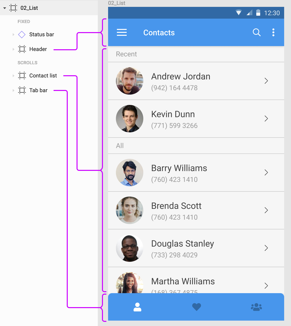
Artboards in Figma are called frames, and they’re much more powerful than Sketch. While Sketch stopped supporting nested artboards a few versions ago, Figma actually encourages nesting of frames. So you can have a frame for the screen, and then frames for the header, footer, lists, and so on. Each frame can have its own layout grid and can be set to clip content when resized.
The header, list and tab bar are frames nested within a frame for the entire screen in Figma. (Large preview)
When you create a new document in Adobe XD, it explicitly asks you to choose from a preset list of artboard sizes. You can choose “Custom,” of course. The preset selection in baked in the way XD lets you preview the designs. Anything beyond the preset height scrolls by default. When you increase the height of the artboard, XD adds a marker to show the original height of the device frame.
A blue line shows the height of the selected device’s viewport to help position content appropriately ‘above the fold’. (Large preview)
One thing Sketch does differently from the other two applications is that it adds a ‘Symbols’ page that holds all your symbols by default. You can decide not to send symbols to this page when you create them, but I’ve never seen anyone doing that. It actually makes a lot of sense to centralize all the symbols, so they are easy to organize.
Summary
Sketch and Figma support pages and artboards, although Figma’s artboards (or frames) — are more flexible because they can be nested. Adobe XD supports only artboards.
Grids And Layout
All three apps let you overlay grids on top of the artboards. In Adobe XD, you can use a square grid or a column grid. Sketch allows for both at the same time, plus allows for columns as well and rows in the layout grid.
Figma lets you add as many as you want of each type — grid, columns, and rows. Another example of the attention to detail in Figma — when you set the gutter to 0, it automatically switches from showing filled columns to showing lines only.
Comparing layout grid options in the three apps.
Figma takes layout grids a step further by allowing grids on frames (which can be nested) as well as individual components. One interesting possibility with the latter is that you can use them as guides for padding when working with resizable components.
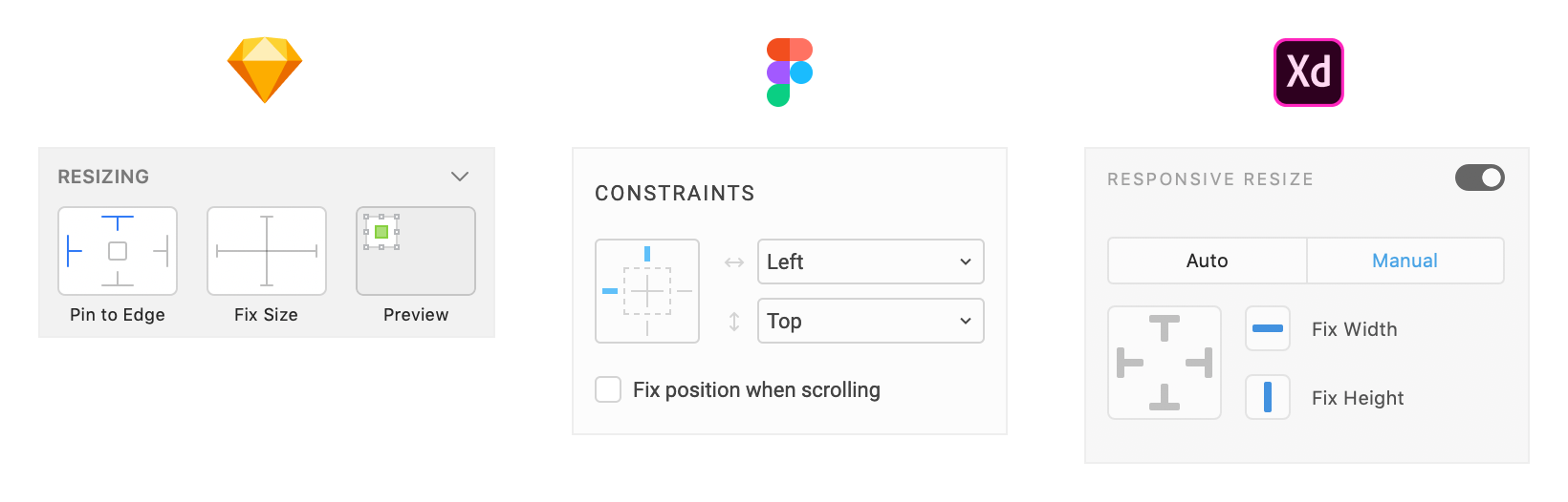
All three apps also let you set constraints to define how elements will scale or move when their containers are resized. Moreover, they all employ an almost identical user interface to set and manage those constraints. Figma was the first of the lot with this UI concept. Sketch followed and improved upon it in their latest release, and Adobe XD introduced the feature in September 2018.
The object resizing and constraints UI in all three apps. (Large preview)
In Figma, constraints work only on elements inside a frame, not groups (like in Sketch and Adobe XD). It is mildly annoying because you can set constraints, but they just don’t work when you resize the group. But Figma does actively encourage you to use nested frames which are much more powerful than groups. Another advantage with Figma is that when using layout grids, constraints apply to the column or cell the element is inside.
In Figma, layout constraints apply to columns when a layout grid is added.
Summary
All three apps let you use grids and column layouts inside artboards. Figma’s implementation feels more powerful because you can nest frames and therefore have separate grids for sections of a screen. Support for constraints in all three is pretty good and more-or-less at par.
Drawing And Editing Tools
Neither of these apps have the advanced vector tools like Adobe Illustrator or Affinity Designer. What you get are the bare basics — rectangle tool, ellipse tool, polygon tool, and a free form vector drawing tool. Plus boolean capabilities to combine and subtract shapes. For most user interface design needs, these are just fine.
That is not to say that you cannot create complex vector artwork in any of these apps. The images below represent what each app is capable of, if you’re willing to spend the time learning all of the tools and features.
Sketch has been my staple design tool for a few years now and I’ve never felt the need to go to Adobe Illustrator for any of the icons and the occasional illustration I needed in my designs. You get the usual rectangle, ellipse and polygon shapes, a bezier tool for everything else, and even a freeform line tool that probably only makes sense if you use a tablet/stylus.
Figma has an advantage in this department due to what they call ‘vector networks’. If you ever used Adobe Flash to draw, this will seem very familiar. Rather than try to describe it though, I’ll just show you what it does…
Figma’s vector networks in action.
Figma’s shape tools also feel a step ahead of Sketch. For ellipses, there is now the ability to easily carve out pies and donuts — a great feature for anyone who has tried to use Sketch’s dash settings to create donut charts. Corners of a rectangle can be dragged in to set the corner radius without bothering with the Properties panel.
Creating a donut chart in Figma.
Adobe XD falls behind here given it doesn’t even come with a polygon tool as of now. You also cannot align individual bezier nodes on a path, or change the roundness of these nodes — something we use very often to create smooth line graphs in dashboards.
Once you have added elements to your design, all three apps let you group them, arrange them above or below each other, align and distribute selected objects evenly, and so on.
One standout feature in XD is something called Repeat grid. It lets you create one item and repeat it in a list or grid, each with similar properties, but unique content. Figma’s answer to this is Smart selection. Rather than specify something as a list or grid, Figma lets you select a bunch of elements that are already a list or a grid, then arrange them by spacing them out evenly and easily sorting them via drag-n-drop.
Comparing XD’s Repeat grid feature with Figma’s smart selection.
Summary
Although none of the apps can hold a candle to the power of Illustrator or Affinity Designer when it comes to illustrations, they do provide an adequate enough drawing toolset for day-to-day UI design stuff. Figma’s vector networks place it ahead of the other two in terms of flexibility.
Symbols
All three apps support symbols — elements that all share the same properties and can be updated in one go. How they implement them though, changes quite dramatically from app to app.
Sketch
In Sketch, converting something to a symbol will send it to a page called “Symbols” by default, creating an instance of it in place of the selected elements. This clear separation between the symbol and its instances is by design. An instance of a symbol can only be updated in certain ways — size, text, images; while nested symbols can be updated via the Inspector panel on the right. To edit the original symbol, you can double-click it to go to the “Symbols” page and make changes. Any changes you make there will be applied to all instances of the symbol.
“You can set it so that symbols don’t get sent to the separate page, but I don’t know anyone who does that. Symbols in Sketch are designed to live on their own page.”
Starting with Sketch version 53, you can now select elements inside a symbol instance and then use the Overrides panel to change the content for just that element. This is an improvement from earlier when you could only select the entire instance.
Editing a symbol instance in Sketch.
Figma
In Figma, symbols are called components. When you create a component, it stays in place and is denoted as the ‘Master Component’. Copying it elsewhere in the design creates instances by default. Instances can be edited in a place like you would do with any other group, with the exception that placement of elements cannot be changed. You can change text, color, size and even swap nested symbols — all inline. This definitely feels more flexible than Sketch’s approach while at the same time putting adequate constraints in place as to not mess with the original component. For example, deleting the master component does not affect the instances. You can simply ‘recover’ the master component at any time and continue making changes.
Editing a component instance in Figma.
Adobe XD
Adobe XD’s symbols are the least powerful at the moment. It does not have the concept of a master symbol and instances. Every instance is a clone of the symbol, so any changes to any instance is applied to all the others. They’re also extremely limited in what you can customize per instance — which is basically text and background images.
All three apps support reusing symbols across files.
In Sketch, any file can be added as a library, which enables you to add its symbols and styles to any other file you have open. Changes made in the original library document can be synced in the files that use those symbols, as long as you open them and click the notification.
Adobe XD takes a more simplistic approach for its ‘linked symbols’. Copying a symbol from one document to another automatically links the two. Changes made to the symbol in any document show up as notifications in the others, giving you the ability to review and apply them within the other documents.
Figma’s approach is a centralized repository of components called ‘Team Library’. Everyone on a team with the right access can add components to the team library. Any changes made to the components in the library show up as notifications, allowing you to review and update them in the files you have open.
Summary
All three apps support symbols, but XD’s version is so basic it might as well not exist. Figma’s approach to editing a symbol — or component — instance is much more intuitive and powerful than Sketch’s, although the latter has been catching up in recent versions. Both have strong library features for easy management and collaboration.
Styles
Styles are one of the most basic elements of a design system. The ability to save sets of element properties, apply them to multiple elements and apply changes across the boards, is extremely helpful when working on medium to large design projects. All three apps include support for styles, but the implementation varies a fair bit.
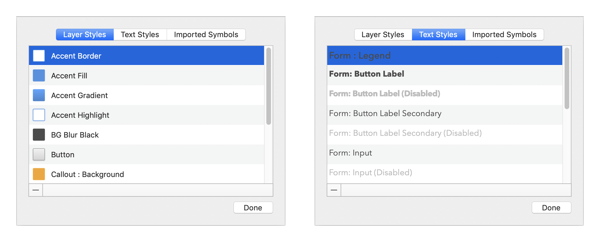
Sketch supports two style types — text styles and layer styles. Text styles include all font properties, color, and effects. Layer styles include fills, borders, and effects. As is obvious from the names, text styles apply only to text elements and layer styles to everything else. Starting with version 52, Sketch lets you override styles for elements inside of symbol instances. This is a huge upgrade to the utility of symbols in Sketch, eliminating a lot of hacky ways you would have to go through in the past for something as simple as changing icon colors inside symbol instances.
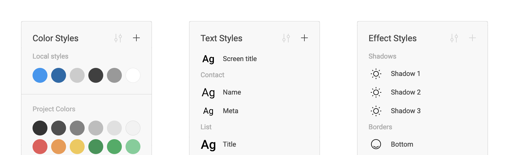
Figma takes a dramatically different approach by making styles cascade. That means you can save styles for text (font, size, weight, line-height, etc.), colors or effects (drop shadows, blurs, etc.), and then mix and match them on elements. For example, the font properties and color on a text block are independently changeable. This makes it possible to have a different color for a word inside a paragraph, something you can’t do in Sketch.
Color, Text and Effect Styles in Figma. (Large preview)
Styles in XD are limited to character styles for text elements. You can save colors and apply them from the library, but there is no way to save a set of characteristics (fill, border, shadow, and so on) as an individual style.
Summary
All three apps support text styles. Sketch also has layer styles that can be applied to non-text elements. Figma breaks styles down by characteristic and lets you mix and match them to get the result you need. It can be more flexible or too open-ended, depending on what your use case is.
Designing With Data
One of my most used Sketch plugins is Content Generator, which allowed me to quickly populate my designs with realistic dummy data instead of the usual lorem ipsum and John Doe and the likes. With the release of version 52, Sketch eliminated the need for that plugin by introducing built-in support for importing data. Now you can easily add realistic names, addresses, phone numbers, even photos in your design. A couple of sets are built in, but you can add more as you need.
You can add and manage external data sets from Sketch preferences. (Large preview)
The Adobe XD team demoed some work-in-progress support for built-in functionality at Adobe’s MAX conference, but we don’t know when that will make it into the product itself. The one feature that has already made it in is the ability to drag-n-drop a TXT file onto an element in a repeat grid — or a bunch of images onto an image in a repeat grid — to populate all items in the grid with that data. What’s more exciting to me though, is the plugin ecosystem that is bringing in much more powerful ways of importing realistic and real-time data in XD. Case in point are the Airtable and Google Sheets plugins, which allow you to connect with the apps and pull in data from spreadsheets in real time.
Figma lags behind Sketch and XD in this regard. As of now, there doesn’t seem to be any way to populate realistic content inside elements in Figma, other than copy-pasting the bits of content one by one.
Summary
Adobe XD finally takes the lead with a much more capable API that lets you pull in live data, not just static data like Sketch does. Figma has a lot of catch up to do on this front.
Plugins And Integrations
This is where Sketch’s position as the most popular UI design application shines. With a huge library of plugins and new ones coming every few days, Sketch has no rivals when it comes to its ecosystem of plugins and integrations. From plugins for animation, prototyping and version control, helpers for managing text, styles, to connectors for popular apps, there is a plugin for everything you can think of. Here are some of my favorites:
A suite of super useful plugins, including prototyping, external data and library management. (You can read more about Craft for Sketch in Christian Krammer’s article “Craft For Sketch Plugin: Designing With Real Data.”)
A bunch of helpers for managing artboards in Sketch.
As the leader of the pack, Sketch also enjoys the largest list of integrations with third-party apps. Be it prototyping and sharing via InVision, developer handoff via Zeplin, version control via Abstract or Plant, most apps have direct integration with Sketch, with the ability to import, sync or preview Sketch files.
You can enable, disable, update and delete plugins from Sketch preferences. (Large preview)
Plugins in XD launched as recently as a few months ago, but things are already looking quite good. Adobe, with its marketing might, was able to get a lot of companies and developers onboard to launch their plugin ecosystem with a bang. Although not as vast as Sketch’s, the list of plugins for XD is pretty good and growing at a quick pace. Here are some highlights:
Bring real data from spreadsheets into your designs in real time.
The Airtable plugin I mentioned above is an example of app integrations that XD is quickly getting very good at. There are also integrations with usertesting.com, Cloudapp, Dribbble and more.
You can quickly browse and install plugins directly from inside XD. (Large preview)
As far as plugin management goes, XD does a much better job with a nice UI to find, read about and install all plugins. For Sketch, you need to find the plugin on the web, download it and launch the .sketchplugin file to install it. You can disable or remove them from the preferences screen, but not much else.
Figma falls short on the plugins front when compared to Sketch and even XD. It does not have a plugin API specifically, but Figma did open up some APIs for integrations with other apps earlier this year. Apart from built-in integration with Principle, Zeplin, Avocode and Dribbble, the result has been mostly things you can do with your files outside of Figma — like this PDF exporter, the ability to push assets from Figma to Github using Relay, and so on.
“We have watched as our competitors added extension models which granted developers freedom at the expense of quality, robustness, and predictability. We’re eager to leverage the incredible collective brainpower of the Figma community in making our tool better, but we’re not going to introduce extensions until we are confident our extension model is robust. There’s no estimated date just yet, but we are actively exploring how to build this in a solid way.”
Summary
Again, Figma has some catching up to do on the plugins front, especially when compared to Sketch’s huge ecosystem, or Adobe’s powerful APIs and marketing might to get more developers onboard.
Prototyping, Interaction, And Motion Design
Sketch and Figma started off as static design apps, whereas Adobe XD launched with the built-in ability to link screens together to build low-fidelity prototypes. Figma added the prototyping functionality in mid-2017, while Sketch added prototyping in early 2018. As of today, all three apps let you create prototypes and share them with others.
Sketch and Figma’s prototyping tools were mostly limited to linking individual elements to other artboards on click/tap or hover, with a limited selection of transition effects. Figma just pulled ahead with the introduction of overlays in December 2018. This — combined with the fact that Figma’s frames are more flexible than Sketch’s rigid artboard structure — opens up the ability to prototype menus, dialog boxes and more. Both apps have support for other prototyping apps, though. Figma has an integration with Principle and Sketch with pretty much every prototyping tool out there.
While Figma lets you share the prototypes with a simple link (the perks of being in the cloud), with Sketch you need to upload your file to the Sketch cloud before you can share it with others.
Comparing the prototype controls in Sketch and Figma. (Large preview)
Adobe XD’s October 2018 release pushed it way ahead in the race when it comes to prototyping. It now does everything I mentioned above, but includes two more powerful features:
Auto-animate
Where designers had to pull their designs into apps like Principle or After Effects to add motion design, some of it is built into XD now. It works by automatically moving elements with the same name when transitioning from one screen to another. This may sound simple, but the kind of effects you can generate are pretty spectacular.
Adding animations to prototypes using ‘Auto animate’ in XD.
Voice prototypes
You can now trigger interactions in XD by voice commands, and even include speech responses to triggers. This is a huge addition that makes it easy to prototype conversational user interfaces in XD, something that is not possible in Sketch, Figma, or any of the leading prototyping apps out there.
If animation is important to you, one app to look out for is InVision Studio. It has a timeline based animation workflow, something none of the other apps on this list can boast of. Or if you’re comfortable getting your code on, Framer’s code based interaction model is definitely something to explore.
Summary
Adobe XD has the most powerful prototyping toolset of the three apps, with voice and auto animate leading the way. Sketch has rudimentary prototyping capabilities, but Figma’s implementation feels more seamless when it comes to sharing and gathering feedback.
Collaboration
Sketch and Adobe XD are traditional desktop apps — built for designers to work in isolation and share their designs when ready. Figma, on the other hand, was built for collaboration in mind, more like Google Docs for designers.
In Figma, multiple users can work on the same document at the same time. You can see colored cursors moving around the design when others are viewing or editing the design you’re on. This can take some getting used to, but in situations where we have multiple designers working on a project, this can be a godsend. The cherry on top is the ability to view the design from another designer’s perspective. Just click the user’s avatar in the header and you can see exactly what she is seeing and follow along.
Collaborative design in Figma, à la Google Docs.
Going beyond collaborative editing, sharing your work is also more streamlined in Figma than in the other apps. You can either invite others to see or edit a design or simply send a URL to the design file or prototype preview.
Developers who are viewing the file can get specs for the design elements — a la Zeplin or Avocode — and export any image assets they need. The assets don’t even need to be set to export like in Sketch.
Note:For Figma designs, there are three levels of access: 1) owner 2) can edit, and 3) can view. We use “can view” to give developers access to all the specs, and the ability to export assets as and when they need them.
Figma also has a built-in commenting system which is important when reviewing designs with broader teams and clients. Today, I rely on a combination of Sketch and InVision to achieve this.
Sketch allows you to upload files to its cloud services, and then share a link for others to view. Ensuring that the latest version is in the cloud is up to you, though. This can be a big risk if you have developers working off of a design that may not be current. XD’s December 2018 release added the ability to save files to the cloud, and you can decide which files to save in the cloud and which ones locally. This addresses the problem with maintaining latest versions in the cloud.
Summary
This is where Figma’s web-based roots really shine. It leaves the other two far behind on the collaboration front with built-in sharing, commenting and the single-source-of-truth approach. Sketch and XD are adding sharing features at a good pace, but their file-first approach is holding them back.
Which One Is Right For You?
If you’re a user interface designer, you can’t go wrong with either of the three apps that I have covered here. Or the others that I touched upon just briefly. They all will get the job done, but with varying levels of productivity.
If a native desktop app is necessary for you, and you don’t care about a Windows — or a Linux — version, Sketch is the best bet right now. Adobe XD is getting better at breakneck speed, but it is not as good as Sketch yet for day-to-day design tasks.
If you’re on Windows though, or if motion design is part of your requirements, Adobe XD is your best shot. Sketch simply does not have any animation capabilities and it doesn’t look like that a Windows version could appear on the horizon any time soon. For animation, InVision Studio might also be something you can look at. And if you’re comfortable with code, Framer X provides the most flexibility of the lot.
For me though, at this moment Figma strikes the best balance between features, usability, and performance. Yes, you need to be online to use it (unless you have a file open, in which case you can edit it offline). No, it doesn’t have plugins or any animation capabilities. But if UI design mockups are your core requirement, Figma does a far better job for creating, sharing and collaborating with others than either Sketch or Adobe XD. It has a very generous free tier, it is available on any platform that can run a modern browser, and it’s very actively in development, with new features and updates coming in faster than I can keep up learning them all.
In my team, for example, there seems to be an even split between folks who prefer Sketch or Figma. I’m myself beginning to lean in on Figma myself, but also use Adobe XD every now and then for some quick motion design experiment.
And if you’re looking for an even shorter tl;dr summary — trust Meng To:
“My thoughts on design tools and why you should pick them.
Figma: collaboration and all-in-one
Sketch: maturity and plugins
Framer: code and advanced prototyping
Studio: free and animation
XD: speed and adobe platform”


 Our Figma Auto Layout Masterclass equips you with everything you need to know to master responsive designs in Figma.
 Christine is a UX/UI Designer and founder of moonlearning.io. She has worked internationally, in-house, and remotely on projects for leading brands, agencies, and startups. Christine cares deeply about creating well-thought-through and aesthetic products and firmly believes that designers should understand code and that UX/UI is a match made in heaven.


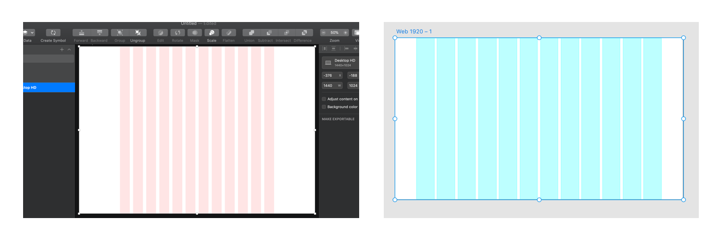

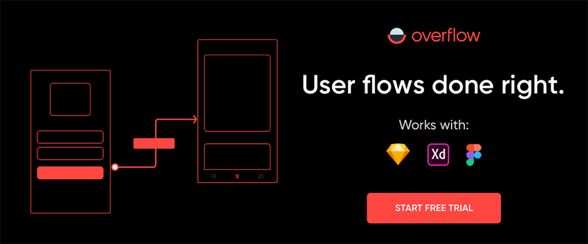
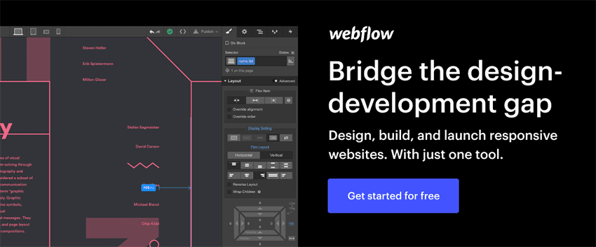


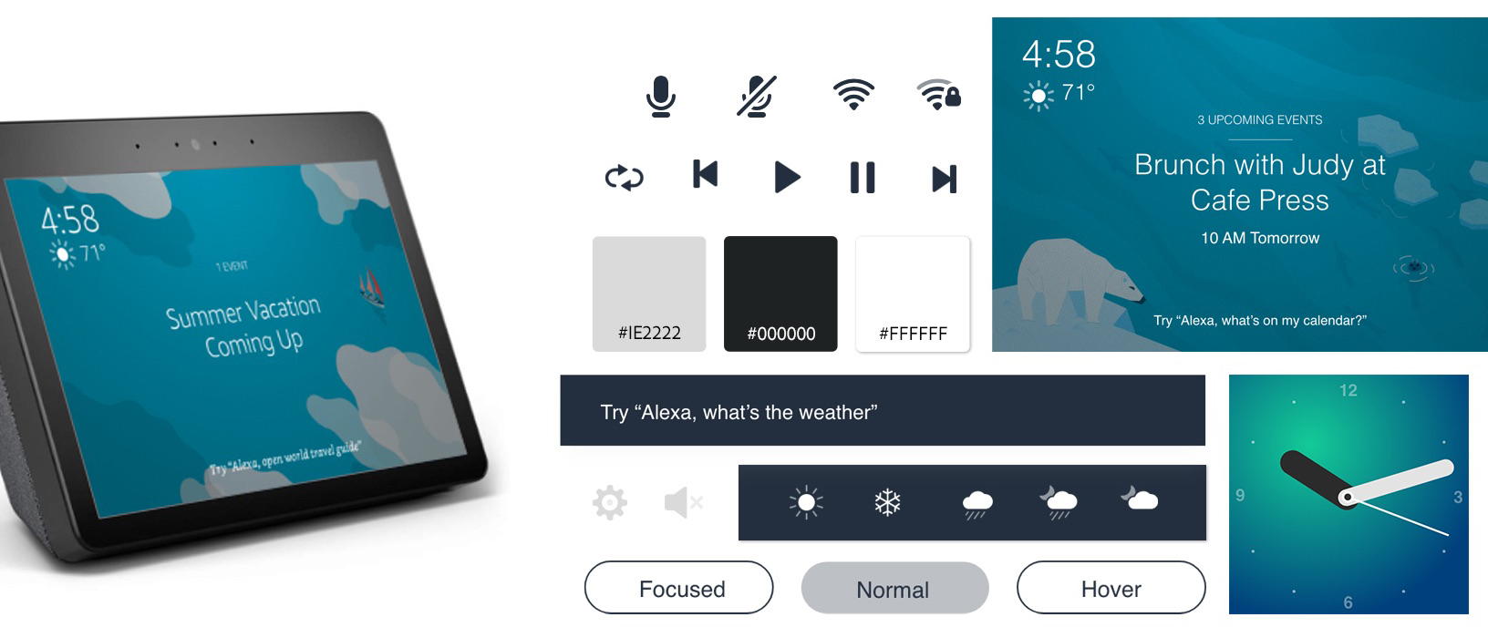