So Your Website Or App Is Live… Now What?

Whether you’ve launched a redesign of your website or rolled out a new feature in your app, that is the point where people normally move on to the next project. But, that is a mistake.

It’s only once a site, app, or feature goes live that we get to see actual users interacting with it in a completely natural way. It’s only then that we know if it has succeeded or failed.

Not that things are ever that black and white. Even if it does seem successful, there’s always room for improvement. This is particularly true with conversion rate optimization. Even small tweaks can lead to significant increases in revenue, leads, or other key metrics.

Want to learn more on testing and improving your website? Join Paul Boag in his upcoming live workshop on Fast and Budget-Friendly User Research and Testing, starting July 11.

Making Time for Post-Launch Iteration

The key is to build in time for post-launch optimization from the very beginning. When you define your project timeline or sprint, don’t equate launch with the end. Instead, set the launch of the new site, app, or feature about two-thirds of the way through your timeline. This leaves time after launch for monitoring and iteration.

Better still, divide your team’s time into two work streams. One would focus on “innovation” — rolling out new features or content. The second would focus on “optimization” and improving what is already online.

In short, do anything you can to ring-fence at least some time for optimizing the experience post-launch.

Once you’ve done that, you can start identifying areas in your site or app that are underperforming and could do with improvement.

Identifying Problem Points

This is where analytics can help. Look for areas with high bounce rates or exit points. Users are dropping off at these points. Also, look for low-performing conversion points. But don’t forget to consider this as a percentage of the traffic the page or feature gets. Otherwise, your most popular pages will always seem like the biggest problem.

To be honest, this is more fiddly than it should be in Google Analytics 4, so if you’re not familiar with the platform you might need some help.

Not that Google Analytics is the only tool that can help; I also highly recommend Microsoft Clarity. This free tool provides detailed user data. It includes session recordings and heatmaps. These help you find where to improve on your website or app.

Play particular attention to “insights” which will show you metrics including:

  • Rage clicks
    Where people repeatedly click something out of frustration.
  • Dead clicks
    Where people click on something that isn’t clickable.
  • Excessive scrolling
    Where people scroll up and down looking for something.
  • Quick backs
    Where people visit a page by mistake and quickly return to the previous page.

Along with exits and bounces, these metrics indicate that something is wrong and should be looked at in more depth.

Diagnosing The Specific Issues

Once you’ve found a problem page, the next challenge is diagnosing exactly what’s going wrong.

I tend to start by looking at heat maps of the page that you can find in Clarity or similar tools. These heatmaps will show you where people are engaged on the page and potentially indicate problems.

If that doesn’t help, I will watch recordings of people showing the problem behavior. Watching these session recordings can provide priceless insights. They show the specific pain points users are facing. They can guide you to potential solutions.

If I am still confused about the problem, I may run a survey. I’ll ask users about their experience. Or, I may recruit some people and run usability testing on the page.

Surveys are easier to run, but can be somewhat disruptive and don’t always provide the desired insights. If I do use a survey, I will normally only display it on exit-intent to minimize disruption to the user experience.

If I run usability testing, I favor facilitated testing in this scenario. Although more time-consuming to run, it allows me to ask questions that almost always uncover the problem on the page. Normally, you can get away with only testing with 3 to 6 people.

Once you’ve identified the specific issue, you can then start experimenting with solutions to address it.

Testing Possible Solutions

There are almost always multiple ways of addressing any given issue, so it’s important to test different approaches to find the best. How you approach this testing will depend on the complexity of your solution.

Sometimes a problem can be fixed with a simple solution involving some UI tweaks or content changes. In this case, you can simply test the variations using A/B testing to see which performs better.

A/B Test Smaller Changes

If you haven’t done A/B testing before, it really isn’t that complicated. The only downside is that A/B testing tools are massively overpriced in my opinion. That said, Crazy Egg is more reasonable (although not as powerful) and there is a free tier with VWO.

Using an A/B testing tool starts by setting a goal, like adding an item to the basket. Then, you make versions of the page with your proposed improvement. These are shown to a percentage of visitors.

Making the changes is normally done through a simple WYSIWYG interface and it only takes a couple of minutes.

If your site has lots of traffic, I would encourage you to explore as many possible solutions as possible. If you have a smaller site, focus on testing just a couple of ideas. Otherwise, it will take forever to see results.

Also, with lower-traffic sites, keep the goal as close to the experiment as possible to maximize the amount of traffic. If there’s a big gap between goal and experiment, a lot of people will drop out during the process, and you’ll have to wait longer for results.

Not that A/B testing is always the right way to test ideas. When your solution is more complex, involving new functionality or multiple screens, A/B testing won’t work well. That’s because to A/B test that level of change, you need to effectively build the solution, negating most of the benefits A/B testing provides.

Prototype And Test Larger Changes

Instead, your best option in such circumstances is to build a prototype that you can test with remote testing.

In the first instance, I tend to run unfacilitated testing using a tool like Maze. Unfacilitated testing is quick to set up, takes little of your time, and Maze will even provide you with analytics on success rates.

But, if unfacilitated testing finds problems and you doubt how to fix them, then consider facilitated testing. That’s because facilitated testing allows you to ask questions and get to the heart of any issues that might arise.

The only drawback of usability testing over A/B testing is recruitment. It can be hard to find the right participants. If that’s the case, consider using a service like Askable, who will carry out recruitment for you for a small fee.

Failing that, don’t be afraid to use friends and family as in most cases getting the exact demographic is less important than you might think. As long as people have comparable physical and cognitive abilities, you shouldn’t have a problem. The only exception is if the content of your website or app is highly specialized.

That said, I would avoid using anybody who works for the organization. They will inevitably be institutionalized and unable to provide unbiased feedback.

Whatever approach you use to test your solution, once you’re happy, you can push that change live for all users. But, your work is still not done.

Rinse And Repeat

Once you’ve solved one issue, return to your analytics. Find the next biggest problem. Repeat the whole process. As you fix some problems, more will become apparent, and so you’ll quickly find yourself with an ongoing program of improvements that can be made.

The more you carry out this kind of work, the more the benefits will become obvious. You will gradually see improvements in metrics like engagement, conversion, and user satisfaction. You can use these metrics to make the case to management for ongoing optimization. This is better than the trap of releasing feature after feature with no regard for their performance.

Meet Fast and Budget-Friendly User Research And Testing

If you are interested in User Research and Testing, check out Paul’s workshop on Fast and Budget-Friendly User Research and Testing, kicking off July 11.

Live workshop with real-life examples.
5h live workshop + friendly Q&A.

Collective #670


Codrops Collective 670

Building SDF fractal noise

Inigo Quilez wrote an article about natively building SDF fractal noise by iteratively blending spheres as opposed to traditional noise displacement.

Read it


Codrops Collective 670

gridless.design

A thesis that describes the problems with traditional design techniques when used to prepare web experiences and why the design grid is fundamentally flawed for crafting responsive, reusable interfaces.

Read it


Codrops Collective 670

Inline text editor

A free WYSIWYG editor with a clean UI and easy-to-use features to provide a simple and modern JavaScript rich text editor.

Check it out


Codrops Collective 670

Glass UI

Generate CSS and HTML components using the glassmorphism design specifications based on the Glass UI library.

Check it out


Codrops Collective 670

MeisterNote

MeisterNote is a beautiful, intuitive documentation software that helps teams write and organize information collaboratively.

Check it out


Codrops Collective 670

Lineicons

5000+ essential line icons available in WebFont, SVG, PNG, React, PNG, and PDF Files.

Check it out


Codrops Collective 670

Goomics

Take a look behind Google’s corporate curtain with a former employee’s critical comics.

Check it out


Codrops Collective 670

76.

A very nice demo where an image gets assembled on scroll. By ycw.

Check it out


The post Collective #670 appeared first on Codrops.

How to Add Special Characters in WordPress Posts

Ever wondered how popular sites add trademark ™, copyright ©, registered ®, or currency characters into their articles?

Recently one of our users asked us if there was an easy way to add special characters into WordPress posts and pages. These characters are not found on an average keyboard which makes it difficult for beginners to use them.

In this article, we will show you multiple ways to easily add special characters in WordPress posts. You can choose an approach that best suits your workflow.

Adding special characters to your WordPress posts and pages

Add Special Characters in WordPress Block Editor

WordPress block editor does not come with a special block or menu button in the paragraph formatting options.

However there are two ways you can use to add special characters in WordPress block editor. Let’s take a look at both of them, so you can decide which one is easier for you.

1. Add Special Characters using HTML Entity Code

When you write a blog post, WordPress automatically formats it into HTML. It is the markup language used by almost all websites.

HTML comes with a list of HTML entities. These are special codes that you can use inside HTML to display characters, symbols, arrows, and more.

This allows you to add special characters in HTML that are not normally found in keyboard layouts.

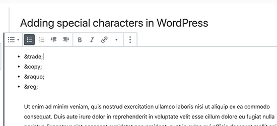
For example, if you wanted to add a trademark ™ symbol, then you can use the HTML entity code ™ to display it.

Similarly, if you wanted to add a copyright © symbol, then you can use © code in your article.

Adding HTML Entity in Gutenberg

Notice how each HTML entity code begins with an ampersand sign and ends with a semicolon.

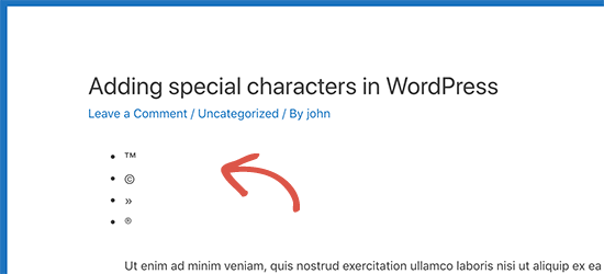
After you add an HTML entity code in the post editor, it will not immediately convert into the corresponding character. However, when you publish or preview your post, then you will see it automatically display the special character instead of the HTML entity code.

HTML entities converted into special characters

There is a whole range of characters available as HTML entities, including special characters, latin characters, mathematical symbols, currencies, scientific measurement symbols, and more.

For the complete reference, check out W3.org’s HTML character entity reference chart.

Method 2. Add Special Characters in WordPress using a Plugin

If you need to add special characters on a regular basis, then you would be better off using a plugin instead of checking the HTML entity reference chart each time.

First thing you need to do is install and activate the Insert Special Characters plugin. For more details, see our step by step guide on how to install a WordPress plugin.

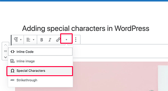
Upon activation, simply edit the post or page where you want to add special characters. Inside the paragraph block, click on the drop-down arrow in the block toolbar and select the ‘Special characters’ option.

Open special characters menu in block editor

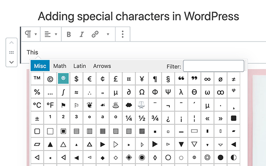
This will bring up a popup displaying special characters. Simply locate the special character you want to add and then click to insert it into the editor.

Add special characters in Gutenberg WordPress block editor

Adding Special Characters in Old WordPress Editor

If you are still using the old classic editor in WordPress, then here is how you can easily add special characters while writing blog posts.

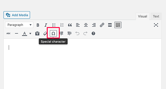
First, you need to click on the kitchen sink button. This will expand the second row of formatting options where you should see the Special Characters button.

Special characters button in the old editor

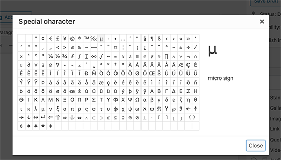
Clicking on the special characters button will bring up a pop-up window showing some commonly used special characters. It has currency symbols, trademark, copyright, registered signs, mathematical symbols and signs.

Special characters popup in old WordPress editor

Remember, this method would only work if you are using the old editor in WYSIWYG mode.

If you are using it in the text mode, then you’ll either need to switch to the Visual editor or use the HTML entities method described above.

You simply need to just click on the symbol or character you want to use, and it will be added in your post.

We hope this article helped you learn how to add special characters in WordPress posts and pages. You may also want to see our complete guide on mastering the WordPress block editor.

If you liked this article, then please subscribe to our YouTube Channel for WordPress video tutorials. You can also find us on Twitter and Facebook.

The post How to Add Special Characters in WordPress Posts appeared first on WPBeginner.

Bayleaf: A Food and Recipe Blog Theme

With the WordPress theme directory dominated by business-oriented themes, it’s sometimes tough to find themes that cater to more specific user groups. If you dig deep enough, you’ll find something outside the norm. Bayleaf is a blog theme specifically designed for sharing food and recipes.

The theme is designed and developed by Vedathemes. They currently have three themes in the theme directory, which follow the same clean design trend of Bayleaf.

Food-related themes excite me. In my off-time, I’m often browsing recipe blogs and looking for my next culinary experiment. The problem with many such sites is their designs have too much noise instead of just showcasing the content visitors are looking for. I was pleasantly surprised at the minimalist and open approach in the Bayleaf demo.

Admittedly, I was drawn in by all the yummy food pics.

The theme author has obviously taken a look at the food blogs and built a design that showcases what’s possible without adding complexity. The related posts feature is also a nice extra for site visitors who’ll likely look for related recipes.

Bayleaf combines the Poppins and Montserrat font families to create bold headers that are complimented by readable body copy. The theme comes with options for displaying a sidebar on single posts or pages, but I’d recommend opting out. The design works best without a sidebar, allowing more breathing room for sharing food images.

The theme is slowly building an audience since its release in February. It currently has 1,000+ installs and a five-star rating from six reviews in the theme directory.

Create a Unique Look with the Display Posts Widget

Screenshot of one of the grid styles for the Display Posts widget in the Bayleaf WordPress theme.

Bayleaf’s most prominent custom feature is its Display Posts widget. By placing this widget in the Homepage Above Content or Homepage Below Content sidebar, users have a ton of variety with how their site looks. No two homepages need look alike.

The widget comes with six list, grid, and slider styles to choose from. It supports custom post types and taxonomies, so users can use it for content such as events, products, or anything else they want to showcase.

My first thought when viewing the demo was, Not another complicated slider with a hard-to-configure customizer experience. While I’m not usually a fan of sliders, configuring this one was easy. Plus, the grid and list styles offered alternative options.

A lot of themes overdo features like this, offering a clunky experience within the customizer. However, Bayleaf keeps it simple by packaging the feature as a widget with just enough variety to cover most use cases.

My one complaint with the Display Posts widget is that it was hard to find at first. At this point, it should be standard practice to prefix custom widgets with the theme name. “Bayleaf: Display Posts” would’ve been far easier to pick from the widget lineup.

Handling Block Editor Support

Single post view of the Bayleaf theme, which showcases some of the core editor blocks.

I tested Bayleaf against the latest public release of the Gutenberg plugin. The theme is not without a few problems, which is par for the course with most themes supporting the block editor. The Gutenberg plugin’s development is fast-paced, and it’s tough for theme authors to keep up. Something that works one week could break the next.

The theme takes a minimalist approach with regards to the editor, allowing the default editor styles to handle much of the layout. With the break-neck pace of change, this can sometimes be a better approach than attempting to manage every style.

There are areas where Bayleaf could be more opinionated. For example, the alignment and typography for the post title aren’t a one-to-one match between the editor and front end. The content width is wider on the front end than the editor, which means the number of characters per line doesn’t match. There are several minor items where the block editor overrules theme styles.

The theme doesn’t offer a 100% WYSIWYG experience, but it’s close enough at this stage and doesn’t break anything. Most issues are trivial and will simply take some adjustment time, assuming Gutenberg development settles a bit.

How Does the Code Stand Up?

Bayleaf isn’t pushing any boundaries, but it’s solid in comparison to the average theme. It’s based on the Underscores starter, which serves as the de facto standard for many themes in the official directory.

The theme doesn’t have a ton of custom code, so there are few places it could go wrong.

Like all themes in the official directory, it undergoes a rigorous review process. It’s Trac history doesn’t show anything worrisome. Vedathemes seems to have a good grasp of building themes that meet the official theme review standards.

The Final Verdict

You won’t find a boatload of options in Bayleaf. What you will find is a clean design that gets out of the way but with enough features to have fun tinkering around on your blog for a couple of hours. The Display Posts widget can get you pretty far with little work.

If you’re looking for a change to your food or recipe blog, you can’t go wrong giving this theme a run.

The theme could also be used for other types of sites. There are no specific features that limit its use to only food blogging.