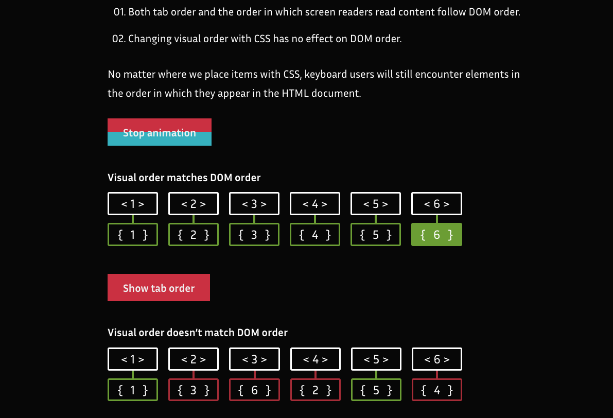
The second WCAG Guideline, Time-based Media, is part of the Perceivable principle and covers providing alternatives for audio and video content. Accessible Podcasts A text transcript can make audio-only content like a podcast accessible to deaf and hard-of-hearing users, as...
The first WCAG Guideline, Text Alternatives, is part of the Perceivable principle. The guideline states Provide text alternatives for any non-text content so that it can be changed into other forms people need, such as large print, braille, speech, symbols,...
It’s true, web animation can be accessible! Sometimes it just takes a little extra effort to make sure that it is. There are strategic things we can do to make sure our animations have a positive impact on accessibility, like planning how they contribute to the overall UX and ease of use of our site. There are also more tactical considerations for making sure the animations on our site are accessible, and that’s where the Web Content Accessibility Guidelines (WCAG) comes in.
While different contexts can affect the details of what you need to do, the WCAG provides a number of recommendations for animated content and interactions. These include guidelines for when to provide pause and play controls, limits for blinking or flashing the screen, and advice on when to provide reduced motion options for users with motion sensitivities. If you haven’t looked at it in a while, the specification has been updated to version 2.1, and now has even more useful guidance on how we can design web animations that are accessible.
Let’s dig into each of those recommendations in more detail to see how we can apply them to our work on the web:
Pause, Stop, Hide
The first of the WCAG recommendations that applies specifically to animation is Pause, Stop, Hide. For this one, the title gives a pretty big clue into what the recommendation is all about. It states:
For any moving, blinking or scrolling information that (1) starts automatically, (2) lasts more than five seconds, and (3) is presented in parallel with other content, there is a mechanism for the user to pause, stop, or hide it unless the movement, blinking, or scrolling is part of an activity where it is essential; […]
The recommendation specifically applies to motion initiated by the web page without user interaction, and it might sound like something that doesn’t apply to UI animation work at first. Most of the durations we might use in UI animation work are far under this five second threshold individually. But there are some common patterns where this would apply. For example: auto-advancing carousels or slideshows, animated backgrounds, or animated illustrations. While each individual animation within these patterns might still be very short, the overall motion that is created often plays out over more than five seconds. This is especially true when these are designed to play on an infinite loop, which is most definitely longer than five seconds.
How to meet the Pause, Stop, Hide criteria
If you have some of these longer playing animations, you’ll need to add some kind of pause and play controls that allow users to control the motion and/or auto playing behaviour. The WCAG specification doesn’t dictate what these controls need to look like though, you have complete design control over that.
A good example of this in practice is how the article series “Dark Side of The Grid” handles the example animations. Each animated figure loops infinitely once it starts, so they provide a play/stop button for readers to play the animation when they want to see it, and stop it when they’re done. Other more decorative or illustrative animations in the article play once and then present a button to replay them, if users want to. The placement and design of the buttons also fits the aesthetic of the overall design of the article which makes them both functional and aesthetically pleasing.
Animated GIFs are something to look out for too. If you’ve got a looping animated GIF, that’s going to need some sort of pause/play controls to successfully meet this criteria. Both of the techniques mentioned in this post are helpful for pulling that off.
There are some exceptions for this recommendation, as noted by the WCAG. One exception specifically worth noting is loaders and preloaders.
Three flashes or below threshold
This recommendation is one that probably has the most research behind it because it stems from the days of broadcast TV. The main reason behind this recommendation is that significant flashing on screen has been known to trigger seizures.
Web pages do not contain anything that flashes more than three times in any one second period, or the flash is below the general flash and red flash thresholds.
How to meet the three flashes or below threshold criteria
The WCAG provides details on the size, ratio and viewing angle thresholds under which flashing the screen could be considered safe. But for most of us, it’s probably easiest to avoid anything that flashes more than three times in one second. I don’t think many UX designers set out to flash the screen excessively on purpose, but it can happen. For example, a design that’s going for a video game sort of feel or a glitchy vibe might involve some screen flashing that happens more frequently than three times in a second.
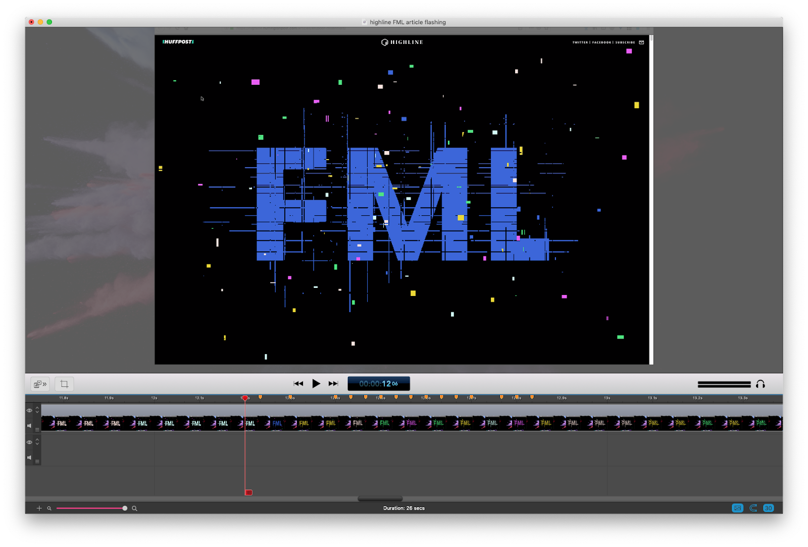
One specific example of a design that includes a significant amount of flashing is this article from the Huffington Post, pictured below. It’s a highly stylized piece on how millennials have a tougher go at things like jobs and saving for retirement than previous generations. Its glitchy 8-bit video game design is very on point with the theme of the article. Design-wise, it’s a great choice for the subject matter and is well executed. But there are times, as you can see from the frame-by-frame stills below, where the text color flashes more than three times a second.
This amount of flashing could be problematic for people with epilepsy or other physical reactions triggered by flashing. To their credit, the Huffington Post also provided a text-only version of the article for anyone sensitive to flashing, as Eileen mentions in this post, as well as advanced warning of the potential flashing hazard.
In general, avoiding effects that require frequent flashing is the safest way to meet this criteria. However, If you can’t avoid flashing animations in your project the WCAG provides detailed instructions around the safe thresholds for flashing the screen. Also, providing advanced warning of flashing content and an alternate version of the content without the flashing effect (like the example above) is a good thing to do as well.
The A, AA, and AAA levels of the WCAG
The WCAG has multiple levels of criteria and conformance, which is why each recommendation has a notation of what level it falls under. Level A compliance is the minimum level of conformance. Level AA is the middle level of conformance and indicates that the criteria for both level A and AA have been met. Level AAA is the highest level of conformance and requires satisfying the criteria from level A, AA and AAA. Typically, the guidelines found in level AAA require additional effort to meet. (If you want to learn more about these levels and what’s included in them outside of the animation-related recommendations we’re covering here, I’ve put together a list of helpful resources at the end of this article.)
In general, most people are aiming for level AA compliance when they say they are making an accessible website. This is also the level you might see requested in an RFP or project brief. The last two guidelines we discussed fall under the level AA criteria and, therefore, must be met to claim level AA compliance. The next guideline, however, is part of the level AAA criteria. Even though it’s outside of the typical level of conformance, it’s a very useful recommendation to take into consideration if your project relies significantly on animation. I highly recommend implementing it in your work.
Animation from interactions
This guideline covers a different kind of animation than the previous two. While the first two are generally applied to animation that’s initiated by the web page itself, this one applies to animation initiated by user interaction. More specifically, it states:
Motion animation triggered by interaction can be disabled, unless the animation is essential to the functionality or the information being conveyed.
At first read, the term “motion animation” can be confusing since we typically use the terms “motion” and “animation” interchangeably. It might seem overly specific at first, but it makes sense to get this specific in this case. The WCAG defines motion animation as animation that is used to ”create the illusion of movement”, and specifies that “motion animation does not include changes of color, blurring or opacity.”
Essentially, the term motion animation is used to indicate that certain types of animation create the sense of movement, while others do not. It’s those animations that create a sense of movement that concerns this guideline. It’s important to keep that distinction in mind when discussing animation and accessibility to help make sure you focus your efforts efficiently. If we were to express this distinction in a very eyeball-like Venn Diagram, it would look like this:
How to meet the animation from interactions criteria
The WCAG suggests we avoid unnecessary animation, provide a control for users to turn off any non-essential motion, or take advantage of the reduced motion setting in operating systems and user agents. Let’s look at each of these in a bit more detail. There are a few different things we can do to help avoid exposing people to animation that might make them dizzy, nauseous, or worse.
Avoid unnecessary animation
Context and expectations also play a role here. The amount of motion you might reasonably expect to encounter on a website for a movie or video game is very different from what you might reasonably expect to encounter on say a government site or construction company’s site. The same amazing effects that might fit in just fine on a video game’s site would feel unnecessary or out of place on, say, a government website. Consider the context and expectations that apply to your site and whether the amount of animation you’re using in your design fits that context.
Provide a way for users to turn off potentially problematic motion animation
If you have motion in your product that might be a trigger for folks with motion sensitivities, providing a way for users to avoid those triggering animations is the responsible thing to do. Based on the WCAG’s definition, any effect that could be considered motion animation should be one that includes a reduced version.
Parallax effects are a good example. Those are universally problematic for folks with motion sensitivities based on my own research, yet it’s also still a very popular technique. While it wouldn’t be realistic to call for an end to all parallax effects entirely, implementing parallax responsibly requires giving your users some level of control to turn off that triggering motion.
Typically, this is interpreted as including a toggle, setting, or preference for users to indicate their preference for reduced motion, and providing reduced versions of those motion animation effects when it’s activated. The Netlify 1 Million Devs site is one example of a motion toggle in action, and the official Animal Crossing site has one too.
Take advantage of the reduce motion feature
Sites or apps that don’t rely heavily on large amounts of motion might find that a custom toggle isn’t the right strategy for them, and instead use the prefers-reduced-motion media query on its own. This allows you to provide a reduced version of highly animated content when that preference is present globally via the user’s operating system. It’s also a setting they can set in one place and have it affect a variety of content they encounter. That makes it a great tool for us to use to detect and respond to a user’s need for reduced motion.
I’ve written about using prefers-reduced-motion in detail over at Smashing Magazine, and it’s also been covered by other articles on this site. In short, it allows us to access someone’s OS-level motion preference via a media query. We can access it in CSS or JavaScript and use the returned value to provide a reduced motion experience for those who want it. For example, we could do this to create a reduced motion variation of a bouncing CSS animation:
/* A constant bouncing motion effect applied to the title */
h2 {
  animation: bouncing 1.5s linear infinite alternate;
}

/* Replace it with a safer effect when prefers-reduced-motion returns true */
@media (prefers-reduced-motion: reduce) {
  h2 {
    animation: fade 0.5s ease-in both;
  }
}
Some sites opt to use both a custom toggle and reduced motion preferences together. If you go to the site with reduced motion requested in your operating system settings, you automatically get the reduced motion mode. This two-pronged approach is a great strategy for sites with large amounts of motion. Marcy Sutton covers the basics of how to set up this approach in her egghead.io course, as well as in this CodePen demo.
Use these guidelines for your next animation project
There you have it, everything the WCAG says about animation explained in one place. I hope this article will help you to confidently make your web animation work accessible. Sometimes it takes a little extra effort, but that extra effort is totally worth it when it means you’ve expanded the number of people who can meaningfully interact with your site.
This article focused on the recommendations specific to animation, but animation isn’t the only place in our work where accessibility considerations can make a big impact. There are some great resources on accessibility out there that cover a more holistic view on accessibility. One of my favorites is the book Accessibility for Everyone by Lara Kalbag. Sites like WebAIM and the A11y Project are great ones to check out for a wealth of resources. If you’re doing a lot of your animation work with SVG, Heather’s SVG accessibility article is a good resource as well. I highly recommend checking out these resources if you haven’t already.
Throughout my career as a web design and development educator, I’ve noticed a consistent lack of attention paid to Accessibility principles in both college and bootcamp curriculum. The results of a 2018 WebAIM global survey of web accessibility practitioners was...
Here’s the plan! We’re going to build a styled select element. Not just the outside, but the inside too. Total styling control. Plus we’re going to make it accessible. We’re not going to try to replicate everything that the browser does by default with a native <select> element. We’re going to literally use a <select> element when any assistive tech is used. But when a mouse is being used, we’ll show the styled version and make it function as a select element.
That’s what I mean by “hybrid” selects: they are both a native <select> and a styled alternate select in one design pattern.
Custom selects (left) are often used in place of native selects (right) for aesthetics and design consistency.
Select, dropdown, navigation, menu… the name matters
While doing the research for this article, I thought about many names that get tossed around when talking about selects, the most common of which are “dropdown” and “menu.” There are two types of naming mistakes we could make: giving the same name to different things, or giving different names to the same thing. A select can suffer from both mistakes.
Before we move ahead, let me try to add clarity around using “dropdown” as a term. Here’s how I define the meaning of dropdown:
Dropdown: An interactive component that consists of a button that shows and hides a list of items, typically on mouse hover, click or tap. The list is not visible by default until the interaction starts. The list usually displays a block of content (i.e. options) on top of other content.
A lot of interfaces can look like a dropdown. But simply calling an element a “dropdown” is like using “fish” to describe an animal. What type of fish it is? A clownfish is not the same as a shark. The same goes for dropdowns.
Like there are different types of fish in the sea, there are different types of components that we might be talking about when we toss the word “dropdown” around:
Menu: A list of commands or actions that the user can perform within the page content.
Navigation: A list of links used for navigating through a website.
Select: A form control (<select>) that displays a list of options for the user to select within a form.
Deciding what type of dropdown we’re talking about can be a foggy task. Here are some examples from around the web that match how I would classify those three different types. This is based on my research and sometimes, when I can’t find a proper answer, intuition based on my experience.
Dropdown-land: Five scenarios where different dropdowns are used across the internet. Read the table below for a detailed description.
Diagram Label
Scenario
Dropdown Type
1
The dropdown expects a selected option to be submitted within a form context (e.g. Select Age)
Select
2
The dropdown does not need an active option (e.g. A list of actions: copy, paste and cut)
Menu
3
The selected option influences the content. (e.g. sorting list)
Menu or Select (more about it later)
4
The dropdown contains links to other pages. (e.g. A “meganav” with websites links)
The dropdown has content that is not a list. (e.g. a date picker)
Something else that should not be called dropdown
Not everyone perceives and interacts with the internet in the same way. Naming user interfaces and defining design patterns is a fundamental process, though one with a lot of room for personal interpretation. All of that variation is what drives the population of dropdown-land.
There is a dropdown type that is clearly a menu. Its usage is a hot topic in conversations about accessibility. I won’t talk much about it here, but let me just reinforce that the <menu> element is deprecated and no longer recommended. And here’s a detailed explanation about inclusive menus and menus buttons, including why ARIA menu role should not be used for site navigation.
We haven’t even touched on other elements that fall into a rather gray area that makes classifying dropdowns even murkier because of a lack of practical uses cases from the WCAG community.
Uff… that was a lot. Let’s forget about this dropdown-land mess and focus exclusively on the dropdown type that is clearly a <select> element.
Let’s talk about <select>
Styling form controls is an interesting journey. As MDN puts it, there’s the good, the bad, and the ugly. Good is stuff like <form> which is just a block-level element to style. Bad is stuff like checkboxes, which can be done but is somewhat cumbersome. <select> is definitely in ugly terrain.
I could finish the article right here with “Don’t use <select>, period.” But let’s face reality: a select is still our best solution in a number of circumstances. That might include scenarios where we’re working with a list that contains a lot of options, layouts that are tight on space, or simply a lack of time or budget to design and implement a great custom interactive component from scratch.
Custom <select> requirements
When we make the decision to create a custom select — even if it’s just a “simple” one — these are the requirements we generally have to work with:
There is a button that contains the current selected option.
Clicking the box toggles the visibility of the options list (also called listbox).
Clicking an option in the listbox updates the selected value. The button text changes and the listbox is closed.
Clicking outside the component closes the listbox.
The trigger contains a small triangle icon pointing downward to indicate there are options.
Something like this:
Some of you may be thinking this works and is good to go. But wait… does it work for everyone? Not everyone uses a mouse (or touch screen). Plus, a native <select> element comes with more features we get for free and aren’t included in those requirements, such as:
The checked option is perceivable for all users regardless of their visual abilities.
The component can interact with a keyboard in a predictable way across all browsers (e.g. using arrow keys to navigate, Enter to select, Esc to cancel, etc.).
Assistive technologies (e.g. screen readers) announce the element clearly to users, including its role, name and state.
The listbox position is adjusted. (i.e. does not get cut off of the screen).
The element respects the user’s operating system preferences (e.g high contrast, color scheme, motion, etc.).
This is where the majority of the custom selects fail in some way. Take a look at some of the major UI components libraries. I won’t mention any because the web is ephemeral, but go give it a try. You’ll likely notice that the select component in one framework behaves differently from another.
Here are additional characteristics to watch for:
Is a listbox option immediately activated on focus when navigating with a keyboard?
Can you use Enter and/or Space to select an option?
Does the Tab key jump go to the next option in the listbox, or jump to the next form control?
What happens when you reach the last option in the listbox using arrow keys? Does it simply stay at the last item, does it go back to the first option, or worst of all, does focus move to the next form control?
Is it possible to jump directly to the last item in the listbox using the Page Down key?
Is it possible to scroll through the listbox items if there are more than what is currently in view?
This is a small sample of the features included in a native <select> element.
Once we decide to create our own custom select, we are forcing people to use it in a certain way that may not be what they expect.
But it gets worse. Even the native <select>behaves differently across browsers and screen readers. Once we decide to create our own custom select, we are forcing people to use it in a certain way that may not be what they expect. That’s a dangerous decision and it’s in those details where the devil lives.
Building a “hybrid” select
When we build a simple custom select, we are making a trade-off without noticing it. Specifically, we sacrifice functionality to aesthetics. It should be the other way around.
What if we instead deliver a native select by default and replace it with a more aesthetically pleasing one if possible? That’s where the “hybrid” select idea comes into action. It’s “hybrid” because it consists of two selects, showing the appropriate one at the right moment:
A native select, visible and accessible by default
A custom select, hidden until it’s safe to be interacted with a mouse
Let’s start with markup. First, we’ll add a native <select> with <option> items before the custom selector for this to work. (I’ll explain why in just a bit.)
Any form control must have a descriptive label. We could use <label>, but that would focus the native select when the label is clicked. To prevent that behavior, we’ll use a <span> and connect it to the select using aria-labelledby.
Finally, we need to tell Assistive Technologies to ignore the custom select, using aria-hidden="true". That way, only the native select is announced by them, no matter what.
This takes us to styling, where we not only make things look pretty, but where we handle the switch from one select to the other. We need just a few new declarations to make all the magic happen.
First, both native and custom selects must have the same width and height. This ensures people don’t see major differences in the layout when a switch happens.
There are two selects, but only one can dictate the space that holds them. The other needs to be absolutely positioned to take it out of the document flow. Let’s do that to the custom select because it’s the “replacement” that’s used only if it can be. We’ll hide it by default so it can’t be reached by anyone just yet.
Here comes the “funny” part. We need to detect if someone is using a device where hover is part of the primary input, like a computer with a mouse. While we typically think of media queries for responsive breakpoints or checking feature support, we can use it to detect hover support too using @media query (hover :hover), which is supported by all major browsers. So, let’s use it to show the custom select only on devices that have hover:
Great, but what about people who use a keyboard to navigate even in devices that have hover? What we’ll do is hide the custom select when the native select is in focus. We can reach for an adjacent Sibling combinatioron (+). When the native select is in focus, hide the custom select next to it in the DOM order. (This is why the native select should be placed before the custom one.)
That’s it! The trick to switch between both selects is done! There are other CSS ways to do it, of course, but this works nicely.
Last, we need a sprinkle of JavaScript. Let’s add some event listeners:
One for click events that trigger the custom select to open and reveal the options
One to sync both selects values. When one select value is changed, the other select value updates as well
One for basic keyboard navigation controls, like navigation with Up and Down keys, selecting options with the Enter or Space keys, and closing the select with Esc
Usability testing
I conducted a very small usability test where I asked a few people with disabilities to try the hybrid select component. The following devices and tools were tested using the latest versions of Chrome (81), Firefox (76) and Safari (13):
Desktop device using mouse only
Desktop device using keyboard only
VoiceOver on MacOS using keyboard
NVDA on Windows using keyboard
VoiceOver on iPhone and iPad using Safari
All these tests worked as expected, but I believe this could have even more usability tests with more diverse people and tools. If you have access to other devices or tools — such as JAWS, Dragon, etc. — please tell me how the test goes.
An issue was found during testing. Specifically, the issue was with the VoiceOver setting “Mouse pointers: Moves Voice Over cursor.” If the user opens the select with a mouse, the custom select will be opened (instead of the native) and the user won’t experience the native select.
What I most like about this approach is how it uses the best of both worlds without compromising the core functionality:
Users on mobile and tablets get the native select, which generally offers a better user experience than a custom select, including performance benefits.
Keyboard users get to interact with the native select the way they would expect.
Assistive Technologies can interact with the native select like normal.
Mouse users get to interact with the enhanced custom select.
This approach provides essential native functionality for everyone without the extra huge code effort to implement all the native features.
Don’t get me wrong. This technique is not a one-size-fits-all solution. It may work for simple selects but probably won’t work for cases that involve complex interactions. In those cases, we’d need to use ARIA and JavaScript to complement the gaps and create a truly accessible custom select.
A note about selects that look like menus
Let’s take a look back at the third Dropdown-land scenario. If you recall, it’s a dropdown that always has a checked option (e.g. sorting some content). I classified it in the gray area, as either a menu or a select.
Here’s my line of thought: Years ago, this type of dropdown was implemented mostly using a native <select>. Nowadays, it is common to see it implemented from scratch with custom styles (accessible or not). What we end up with is a select element that looks like a menu.
A <select> is a type of menu. Both have similar semantics and behavior, especially in a scenario that involves a list of options where one is always checked. Now, let me mention the WCAG 3.2.2 On Input (Level A) criterion:
Changing the setting of any user interface component should not automatically cause a change of context unless the user has been advised of the behavior before using the component.
Let’s put this in practice. Imagine a sortable list of students. Visually, it may be obvious that sorting is immediate, but that’s not necessarily true for everyone. So, when using <select>, we risk failing the WCAG guideline because the page content changed, and ignificantly re-arranging the content of a page is considered a change of context.
To ensure the criterion success, we must warn the user about the action before they interact with the element, or include a <button> immediately after the select to confirm the change.
<label for="sortStudents">
  Sort students
  <!-- Warn the user about the change when a confirmation button is not present. -->
  <span class="visually-hidden">(Immediate effect upon selection)</span>
</label>
<select id="sortStudents"> ... </select>
That said, using a <select> or building a custom menu are both good approaches when it comes to simple menus that change the page content. Just remember that your decision will dictate the amount of work required to make the component fully accessible. This is a scenario where the hybrid select approach could be used.
Final words
This whole idea started as an innocent CSS trick but, after all of this research, I was reminded once more that creating unique experiences without compromising accessibility is not an easy task.
Building truly accessible select components (or any kind of dropdown) is harder than it looks. WCAG provides excellent guidance and best practices, but without specific examples and diverse practical uses cases, the guidelines are mostly aspirational. That’s not to mention the fact that ARIA support is tepid and that native <select> elements look and behave differently across browsers.
The “hybrid” select is just another attempt to create a good looking select while getting as many native features as possible. Don’t look at this technique experiment as an excuse to downplay accessibility, but rather as an attempt to serve both worlds. If you have the resources, time and the needed skills, please do it right and make sure to test it with different users before shipping your component to the world.
P.S. Remember to use a proper name when making a “dropdown” component. 😉
The Web Content Accessibility Guidelines (WCAG), an organization that defines standards for web content accessibility, does not specify a minimum font size for the web.
But we know there’s such a thing as text that is too small to be legible, just as text that can be too large to consume. So, how can we make sure our font sizes are accessible? What sort of best practices can we rely on to make for an accessible reading experience?
The answer: it’s not up to us. It Depends™. We’ll get into some specific a bit later but, for now, let’s explore the WCAG requirements for fonts.
Sizing, contrast, and 300 alphabets
First, resizing text. We want to provide users with low vision a way to choose how fonts are displayed. Not in a crazy way. More like the ability to increase the size by 200% while maintaining readability and avoiding content collisions and overlaps.
Secondly, there’s contrast. This is why I said “it depends” on what makes an accessible font size. Text has to follow a contrast ratio of at least 4.5:1, with the exception of a large-scale text that should have a contrast ratio of at least 3:1. You can use tools like WebAIM’s Contrast Checker to ensure your text meets the guidelines. Stacy Arrelano’s deep dive on color contrast provides an excellent explanation of how contrast ratios are calculated.
Example of three color contrast measurements and their WCAG test results according to WebAIM’s contrast checker.
There are around 300 alphabets in the world. Some characters are simple and readable in smaller sizes, others are incredibly complex and would lose vital details at the same size. That’s why specs cannot define a font size that meets the specification for contrast ratios.
And when we talk about “text” and “large text” sizes, we’re referring to what the spec calls “the minimum large print size used for those languages and the next larger standard large print size.” To meet AAA criteria using Roman text, for example, “large” is 18 points. Since we live in a world with different screen densities, specs measure sizes in points, not pixels, and in some displays, 18pt is equal to 24px. For other fonts, like CJK (Chinese, Japanese, Korean) or Arabic languages, the actual size in pixel would be different. Here’s the word “Hello” compared next to three other languages:
Helloสวัสดีمرحبا你好
In short, WCAG specifies contrast instead of size.
The WCAG recommended font size for large text has greater contrast than something half the size. Notice how a larger font size lets in more of the background that sits behind the text.
Here is the good news: a browser’s default styles are accessible and we can leverage them to build an accessible font size strategy. Let’s see how.
Think about proportions, not size
The browser first loads its default styles (also known as the “User Agent stylesheet”), then those cascade to the author’s styles (the ones we define), and they both cascade and get overwritten by the user’s styles.
We don’t fully control the font-family property, either. The content might be translated, the custom font family might fail to load, or it might even be changed. For example, OpenDyslexic is a typeface created to increase readability for readers with dyslexia. In some situations, we may even explicitly allow switching between a limited set of fonts.
Therefore, when defining fonts, we have to avoid hindering the ability of a user or a device to change our styles and let go of assumptions: we just don’t know where our content is going to land and we can’t be sure about the exact size, language, or font that’s used to display content.
But there is one thing that we can control: proportions.
By using CSS relative units, we can set our content to be proportional to whatever the environment tells it to be. WCAG recommends using em units to define font size. There are several publications discussing the benefits of using ems and rems and it’s beyond the scope of this article. What I’d say here is to use rems and ems for everything, even for other properties besides font-size (with the exception of borders, where I use pixels).
Avoid setting a base font-size
My recommendation is to avoid setting font-size on the :root, <html> or <body> elements in favor of letting the browser’s default size serve as a baseline from where we can cascade our own styles. Since this default is accessible, the content will also be accessible. The WACAG 2.2 working draft states that:
When using text without specifying the font size, the smallest font size used on major browsers for unspecified text would be a reasonable size to assume for the font.
Of course, there is an exception to the rule. When using an intricate, thin, or super short x-height font, for example, you might consider bumping up the font size base to get the correct contrast. Remember that the spec defines contrast, not size:
Fonts with extraordinarily thin strokes or unusual features and characteristics that reduce the familiarity of their letter forms are harder to read, especially at lower contrast levels.
In the same manner, a user might change the base font size to fit their needs. A person with low vision would want to choose a larger size, while someone with an excellent vision can go smaller to gain real estate on their screens.
It’s all about proportions: we define how much larger or smaller parts of the content should be by leveraging the default base to set the main text size.
:root {
  /* Do not set a font-size on a :root, body nor html level */
  /* Let your main text size be decided by the browser or the user settings */
}
.small {
  font-size: .8rem;
}
.large {
  font-size: 2rem;
}
What about headings?
Since headings create a document outline that helps screenreaders navigate a document, we aren’t defining type selectors for heading sizes. Heading order is a WCAG criteria: the heading elements should be organized in descending order without skipping a level, meaning that an h4 should come right after an h3.
Sometimes resetting the font sizing of all headings to 1rem is a good strategy to make the separation of the visual treatment from the meaning mandatory.
How can we work with pixels?
Both rem or em sizing is relative to something else. For example, rem calculates size relative to the <html> element, where em is calculated by the sizing of its own element. It can be confusing, particularly since many of us came up working exclusively in pixels.
So, how can we still think in pixels but implement relative units?
More often than not, a typographical hierarchy is designed in pixels. Since we know about user agent stylesheets and that all major browsers have a default font size of 16px, we can set that size for the main text and calculate the rest proportionately with rem units.
Browser Name
Base Font Size
Chrome v80.0
16px
FireFox v74.0
16px
Safari v13.0.4
16px
Edge v80.0 (Chromium based)
16px
Android (Samsung, Chrome, Firefox)
16px
Safari iOS
16px
Kindle Touch
26px (renders as 16px since it’s a high density screen)
Now let’s explore three methods for using relative sizing in CSS by converting those pixels to rem units.
Method 1: The 62.5% rule
In order to seamlessly convert pixels to rem, we can set the root sizing to 62.5%. That means 1rem equals 10px:
Similar to calc() , we can leverage a preprocessor to create a “pixel-to-rem” function. There are implementations of this in many flavors, including this Sass mixin and styled-components polish.
The bottom line is this: we don’t have control over how content is consumed. Users have personal browser settings, the ability to zoom in and out, and various other ways to customize their reading experience. But we do have best CSS best practices we can use to maintain a good user experience alongside those preferences:
Work with proportions instead of explicit sizes.
Rely on default browser font sizes instead of setting it on the :root, <html> or <body>.
Use rem units to help scale content with a user’s personal preferences.
Avoid making assumptions and let the environment decide how your content is being consumed.
Special thanks to Franco Correa for all the help writing this post.
We’re all looking for low-hanging fruit to make our sites and apps more accessible. One of the easier things we can do is make sure the colors we use are easy on the eyes. High color contrast is something that benefits everyone. It not only reduces eye strain in general, but is crucial for folks who deal with reduced vision.
So let’s not only use better color combinations in our designs but find a way to make it easier for us to implement high contrasts. There’s one specific strategy we use over at Oomph that lets a Sass function do all the heavy lifting for us. I’ll walk you through how we put that together.
Want to jump right to the code because you already understand everything there is to know about color accessibility? Here you go.
What we mean by “accessible color combinations”
Color contrast is also one of those things we may think we have handled. But there’s more to high color contrasts than eyeballing a design. There are different levels of acceptable criteria that the WCAG has defined as being accessible. It’s actually humbling to crack open the WebAIM Contrast Checker and run a site’s color combinations through it.
My team adheres to WCAG’s Level AA guidelines by default. This means that:
Text that is 24px and larger, or 19px and larger if bold, should have a Color Contrast Ratio (CCR) of 3.0:1.
Text that is smaller than 24px should have a CCR of 4.5:1.
If a site needs to adhere to the enhanced guidelines for Level AAA, the requirements are a little higher:
Text that is 24px and larger, or 19px and larger if bold, should have a CCR of 4.5:1.
Text that is smaller than 24px should have a CCR of 7:1.
Ratios? Huh? Yeah, there’s some math involved here. But the good news is that we don’t need to do it ourselves or even have the same thorough understanding about how they’re calculated the way Stacie Arellano recently shared (which is a must read if you’re into the science of color accessibility).
That’s where Sass comes in. We can leverage it to run difficult mathematical computations that would otherwise fly over many of our heads. But first, I think it’s worth dealing with accessible colors at the design level.
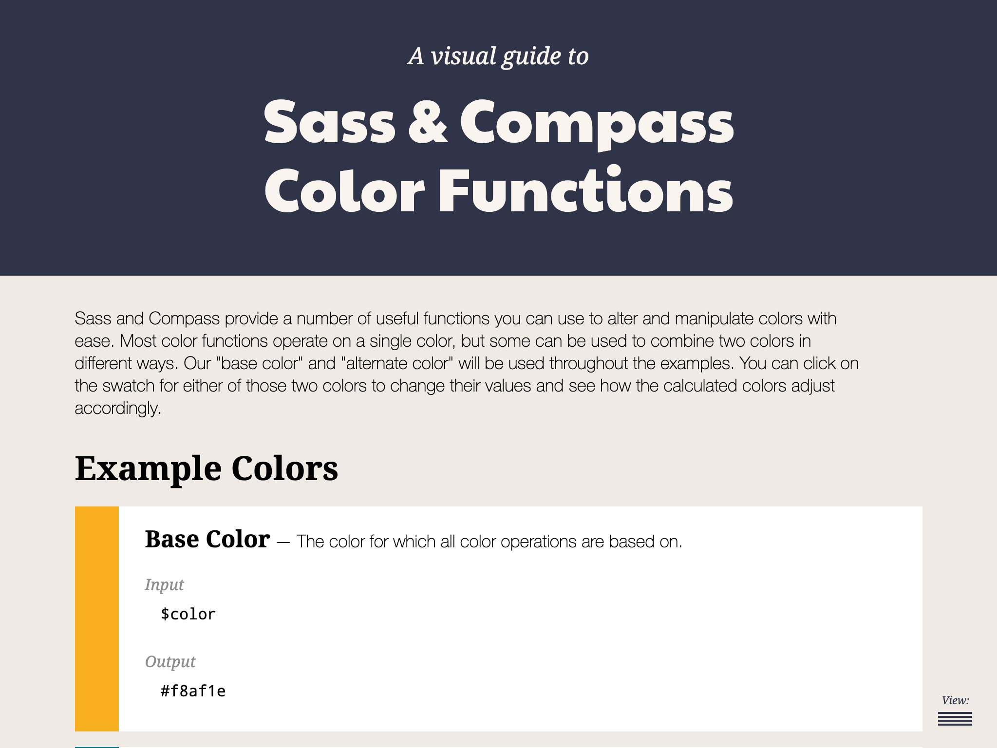
Accessible color palettes start with the designs
That’s correct. The core of the work of creating an accessible color palette starts with the designs. Ideally, any web design ought to consult a tool to verify that any color combinations in use pass the established guidelines — and then tweak the colors that don’t. When our design team does this, they use a tool that we developed internally. It works on a list of colors, testing them over a dark and a light color, as well as providing a way to test other combinations.
ColorCube provides an overview of an entire color palette, showing how each color performs when paired with white, black, and even each other. It even displays results for WCAG Levels AA and AAA next to each result. The tool was designed to throw a lot of information at the user all at once when evaluating a list of colors.
This is the first thing our team does. I’d venture to guess that many brand colors aren’t chosen with accessibility at the forefront. I often find that those colors need to change when they get translated to a web design. Through education, conversation, and visual samples, we get the client to sign off on the new color palette. I’ll admit: that part can be harder than the actual work of implementing accessible colors combinations.
The Color Contrast Audit: A typical design delivery when working with an existing brand’s color palette. Here, we suggest to stop using the brand color Emerald with white, but use an “Alt” version that is slightly darker instead.
The problem that I wanted to solve with automation are the edge cases. You can’t fault a designer for missing some instance where two colors combine in an unintended way — it just happens. And those edge cases will come up, whether it is during the build or even a year later when new colors are added to the system.
Developing for accessibility while keeping true to the intent of a color system
The trick when changing colors to meet accessibility requirements is not changing them so much that they don’t look like the same color anymore. A brand that loves its emerald green color is going to want to maintain the intent of that color — it’s “emerald-ness.” To make it pass for accessibility when it is used as text over a white background, we might have to darken the green and increase its saturation. But we still want the color to “read” the same as the original color.
To achieve this, we use the Hue Saturation Lightness (HSL) color model. HSL gives us the ability to keep the hue as it is but adjust the saturation (i.e. increase or decrease color) and lightness (i.e. add more black or more white). The hue is what makes a green that green, or a blue that blue. It is the “soul” of the color, to get a little mystical about it.
Hue is represented as a color wheel with a value between 0° and 360° — yellow at 60°, green at 120°, cyan at 180°, etc. Saturation is a percentage ranging from 0% (no saturation) to 100% (full saturation). Lightness is also a value that goes from 0% to 100%, where no lightness is at 0%, no black and no white is at 50%, and 100% is all lightness, or very light.
A quick visual of what tweaking a color looks like in our tool:
With HSL, changing the low-contrast green to a higher contrast meant changing the saturation from 63 to 95 and the lightness from 45 to 26 on the left. That's when the color gets a green check mark in the middle when used with white. The new green still feels like it is in the same family, though, because the Hue remained at 136, which is like the color’s “soul.”
Designers can adjust colors with the tools that we just reviewed, but so far, no Sass that I have found could do it with mathematical magic. There had to be a way.
These are some similar approaches I have seen in the wild:
An idea by Josh Bader uses CSS variables and colors split into their RGB values to calculate whether white or black is the best accessible color to use in a given situation.
I didn't like these approaches. I didn’t want to fallback to white or black. I wanted colors to be maintained but adjusted to be accessible. Additionally, changing colors to their RGB or HSL components and storing them with CSS variables seemed messy and unsustainable for a large codebase.
I wanted to use a preprocessor like Sass to do this: given two colors, automagically adjust one of them so the pair receives a passing WCAG grade. The rules state a few other things to consider as well — size of the text and whether or not the font is bold. The solution had to take this into account.
In code terms, I wanted to do this:
// Transform this non-passing color pair:
.example {
  background-color: #444;
  color: #0094c2; // a 2.79 contrast ratio when AA requires 4.5
  font-size: 1.25rem;
  font-weight: normal;
}


// To this passing color pair:
.example {
  background-color: #444;
  color: #00c0fc; // a 4.61 contrast ratio
  font-size: 1.25rem;
  font-weight: normal;
}
A solution that does this would be able to catch and handle those edge cases we mentioned earlier. Maybe the designer accounted for a brand blue to be used over a light blue, but not a light gray. Maybe the red used in error messages needs to be tweaked for this one form that has a one-off background color. Maybe we want to implement a dark mode feature to the UI without having to retest all the colors again. These are the use cases I had in mind going into this.
With formulas can come automation
The W3C has provided the community with formulas that help analyze two colors used together. The formula multiplies the RGB channels of both colors by magic numbers (a visual weight based on how humans perceive these color channels) and then divides them to come up with a ratio from 0.0 (no contrast) to 21.0 (all the contrast, only possible with white and black). While imperfect, this is the formula we use right now:
If L1 is the relative luminance of a first color
And L2 is the relative luminance of a second color, then
- Color Contrast Ratio = (L1 + 0.05) / (L2 + 0.05)
Where
- L = 0.2126 * R + 0.7152 * G + 0.0722 * B
And
- if R sRGB <= 0.03928 then R = R sRGB /12.92 else R = ((R sRGB +0.055)/1.055) ^ 2.4
- if G sRGB <= 0.03928 then G = G sRGB /12.92 else G = ((G sRGB +0.055)/1.055) ^ 2.4
- if B sRGB <= 0.03928 then B = B sRGB /12.92 else B = ((B sRGB +0.055)/1.055) ^ 2.4
And
- R sRGB = R 8bit /255
- G sRGB = G 8bit /255
- B sRGB = B 8bit /255
While the formula looks complex, it’s just math right? Well, not so fast. There is a part at the end of a few lines where the value is multiplied by a decimal power — raised to the power of 2.4. Notice that? Turns out that it’s complex math which most programming languages can accomplish — think Javascript’s math.pow() function — but Sass is not powerful enough to do it.
There’s got to be another way…
Of course there is. It just took some time to find it. 🙂
My first version used a complex series of math calculations that did the work of decimal powers within the limited confines of what Sass can accomplish. Lots of Googling found folks much smarter than me supplying the functions. Unfortunately, calculating only a handful of color contrast combinations increased Sass build times exponentially. So, that means Sass can do it, but that does not mean it should. In production, build times for a large codebase could increase to several minutes. That’s not acceptable.
After more Googling, I came across a post from someone who was trying to do a similar thing. They also ran into the lack of exponent support in Sass. They wanted to explore “the possibility of using Newtonian approximation for the fractional parts of the exponent.” I totally understand the impulse (not). Instead, they decided to use a “lookup table.” It’s a genius solution. Rather than doing the math from scratch every time, a lookup table provides all the possible answers pre-calculated. The Sass function retrieves the answer from the list and it’s done.
In their words:
The only part [of the Sass that] involves exponentiation is the per-channel color space conversions done as part of the luminance calculation. [T]here are only 256 possible values for each channel. This means that we can easily create a lookup table.
Now we’re cooking. I had found a more performant direction.
Usage example
Using the function should be easy and flexible. Given a set of two colors, adjust the first color so it passes the correct contrast value for the given WCAG level when used with the second color. Optional parameters will also take the font size or boldness into account.
// @function a11y-color(
//   $color-to-adjust,
//   $color-that-will-stay-the-same,
//   $wcag-level: 'AA',
//   $font-size: 16,
//   $bold: false
// );


// Sass sample usage declaring only what is required
.example {
  background-color: #444;
  color: a11y-color(#0094c2, #444); // a 2.79 contrast ratio when AA requires 4.5 for small text that is not bold
}


// Compiled CSS results:
.example {
  background-color: #444;
  color: #00c0fc; // which is a 4.61 contrast ratio
}
I used a function instead of a mixin because I preferred the output of a single value independent from a CSS rule. With a function, the author can determine which color should change.
An example with more parameters in place looks like this:
// Sass
.example-2 {
  background-color: a11y-color(#0094c2, #f0f0f0, 'AAA', 1.25rem, true); // a 3.06 contrast ratio when AAA requires 4.5 for text 19px or larger that is also bold
  color: #f0f0f0;
  font-size: 1.25rem;
  font-weight: bold;
}


// Compiled CSS results:
.example-2 {
  background-color: #087597; // a 4.6 contrast ratio
  color: #f0f0f0;
  font-size: 1.25rem;
  font-weight: bold;
}
A deeper dive into the heart of the Sass function
To explain the approach, let’s walk through what the final function is doing, line by line. There are lots of helper functions along the way, but the comments and logic in the core function explain the approach:
// Expected:
// $fg as a color that will change
// $bg as a color that will be static and not change
// Optional:
// $level, default 'AA'. 'AAA' also accepted
// $size, default 16. PX expected, EM and REM allowed
// $bold, boolean, default false. Whether or not the font is currently bold
//
@function a11y-color($fg, $bg, $level: 'AA', $size: 16, $bold: false) {
  // Helper: make sure the font size value is acceptable
  $font-size: validate-font-size($size);
  // Helper: With the level, font size, and bold boolean, return the proper target ratio. 3.0, 4.5, or 7.0 results expected
  $ratio: get-ratio($level, $font-size, $bold);
  // Calculate the first contrast ratio of the given pair
  $original-contrast: color-contrast($fg, $bg);

  @if $original-contrast >= $ratio {
    // If we pass the ratio already, return the original color
    @return $fg;
  } @else {
    // Doesn't pass. Time to get to work
    // Should the color be lightened or darkened?
    // Helper: Single color input, 'light' or 'dark' as output
    $fg-lod: light-or-dark($fg);
    $bg-lod: light-or-dark($bg);


    // Set a "step" value to lighten or darken a color
    // Note: Higher percentage steps means faster compile time, but we might overstep the required threshold too far with something higher than 5%
    $step: 2%;

    // Run through some cases where we want to darken, or use a negative step value
    @if $fg-lod == 'light' and $bg-lod == 'light' {
      // Both are light colors, darken the fg (make the step value negative)
      $step: - $step;
    } @else if $fg-lod == 'dark' and $bg-lod == 'light' {
      // bg is light, fg is dark but does not pass, darken more
      $step: - $step;
    }
    // Keeping the rest of the logic here, but our default values do not change, so this logic is not needed
    //@else if $fg-lod == 'light' and $bg-lod == 'dark' {
    //  // bg is dark, fg is light but does not pass, lighten further
    //  $step: $step;
    //} @else if $fg-lod == 'dark' and $bg-lod == 'dark' {
    //  // Both are dark, so lighten the fg
    //  $step: $step;
    //}

    // The magic happens here
    // Loop through with a @while statement until the color combination passes our required ratio. Scale the color by our step value until the expression is false
    // This might loop 100 times or more depending on the colors
    @while color-contrast($fg, $bg) < $ratio {
      // Moving the lightness is most effective, but also moving the saturation by a little bit is nice and helps maintain the "power" of the color
      $fg: scale-color($fg, $lightness: $step, $saturation: $step/2);
    }
    @return $fg;
  }
}
The final Sass file
Here’s the entire set of functions! Open this in CodePen to edit the color variables at the top of the file and see the adjustments that the Sass makes:
All helper functions are there as well as the 256-line lookup table. Lots of comments should help folks understand what is going on.
When an edge case has been encountered, a version in SassMeister with debug output was helpful while I was developing it to see what might be happening. (I changed the main function to a mixin so I can debug the output.) Feel free to poke around at this as well.
And finally, the functions have been stripped out of CodePen and put into a GitHub repo. Drop issues into the queue if you run into problems.
Cool code! But can I use this in production?
Maybe.
I’d like to say yes, but I’ve been iterating on this thorny problem for a while now. I feel confident in this code but would love more input. Use it on a small project and kick the tires. Let me know how the build time performs. Let me know if you come across edge cases where passing color values are not being supplied. Submit issues to the GutHub repo. Suggest improvements based on other code you’ve seen in the wild.
I’d love to say that I have Automated All the A11y Things, but I also know it needs to be road-tested before it can be called Production Ready™. I’m excited to introduce it to the world. Thanks for reading and I hope to hear how you are using it real soon.
What should you do when you get a complaint about the color contrast in your web design? It might seem perfectly fine to you because you’re able to read content throughout the site, but to someone else, it might be a totally different experience. How can put yourself in that person’s shoes to improve their experience?
There are some relatively easy ways to test contrast. For example, you can check the site on your phone or tablet in bright sunlight, or add a CSS filter to mimic a grayscale view). But… you don’t have to trust your eyes. Not everyone has your exact eyes anyway, so your subjective opinion can possibly be a faulty measurement.
You can mathematically know if two colors have enough contrast between them.
The W3C has a document called Web Content Accessibility Guidelines (WCAG) 2.1 that covers successful contrast guidelines. Before we get to the math, we need to know what contrast ratio scores we are aiming to meet or exceed. To get a passing grade (AA), the contrast ratio is 4.5:1 for most body text and 3:1 for larger text.
How did the W3C arrive at these ratios?
The guidelines were created for anyone using a standard browser, with no additional assistive technology. The contrast ratios that the WCAG suggests were based initially on earlier contrast standards and adjusted to accommodate newer display technologies, like antialiased text, so content would be readable by people with a variety of visual or cognitive difficulties, whether it be due to age, sickness, or other losses of visual acuity.
We’re basically aiming to make text readable for someone with 20/40 vision, which is equivilent to the vision of someone 80 years old. Visual acuity of 20/40 means you can only read something at 20 feet away that someone with perfect 20/20 vision could read if it was 40 feet away.
So, say your design calls for antialiased text because it looks much smoother on a screen. It actually sacrifices a bit of contrast and ding your ratio. The WCAG goes into more detail on how scoring works.
There are other standards that take contrast in consideration, and the WCAG used some of these considerations to develop their scoring. One is called the Human Factors Engineering of Computer Workstations (ANSI/HFES 100-2007) was published in 2007 and designated as an American standard for ergonomics. It combined and replaced two earlier standards that were created by separate committees. The goal of the combined standard was to accommodate 90% of computer users, and cover many aspects of computer use and ergonomics, including visual displays and contrast. So, that means we have physical screens to consider in our designs.
What does the ratio mean?
The contrast ratio explains the difference between the lightest color brightness and the darkest color brightness in a given range. It’s the relative luminance of each color.
Let’s start with an egregious example of a teal color text on a light gray background.
<h1>Title of Your Awesome Site</h1>
h1 {
  background-color: #1ABC9C;
  color: #888888;
}
Yikes!
It’s worth calling out that some tools, like WordPress, provide a helpful warning for this when there’s a poorly contrasted text and background combination. In the case of WordPress, a you get notice in the sidebar.
"This color combination may be hard for people to read. Try using a brighter background color and/or a darker text color."
“OK,” you say. “Perhaps you think that teal on gray color combination is not exactly great, but I can still make out what the content says.“ (I’m glad one of us can because it’s pretty much a muddy gray mess to me.)
The contrast ratio for that fine piece of hypertext is 1.47:1.
I wanted a better understanding of what the contrast scores were actually checking and came to find that it requires the use of mathematics… with a side of understanding the differences between human and computer vision. This journey taught me about the history of computer vision and a bit about biology, and gave me a small review of some math concepts I haven’t touched since college.
Here’s the equation:
(L1 + 0.05) / (L2 + 0.05)
L1 is the relative luminance of the lighter of the colors.
L2 is the relative luminance of the darker of the colors.
This seems simple, right? But first we need to determine the relative luminance for each color to get those variables.
OK, back to relative luminance
We mentioned it in passing, but it’s worth going deeper into relative luminance, or the relative brightness of any color expressed into a spectrum between 0 (black) and 1 (white).
To determine the relative luminance for each color, we first need to get the RGB notation for a color. Sometimes we’re working with HEX color values and need to covert that over to RGB. There are online calculators that will do this for us, but there’s solid math happening in the background that makes it happen. Our teal hex color, #1ABC9C, becomes an RGB of 26, 188, 156.
Next, we take each value of the RGB color and divide each one by 255 (the max integer of RGB values) to get a linear value between 0 and 1.
So now with our teal color it looks like this:
Component
Equation
Value
Red
26/255
0.10196078
Green
188/255
0.73725490
Blue
156/255
0.61176471
Then we apply gamma correction, which defines the relationship between a pixel's numerical value and its actual luminance, to each component part of the RGB color. If the linear value of a component is less than .03938, we divide it by 12.92. Otherwise, we add .055 and divide the total by 1.055 and take the result to the power of 2.4.
Our gamma corrected color components from our teal color end up like this:
We just sort of sped past gamma correction there without talking much about it and what it does. In short, it translates what a computer "sees” into the human perception of brightness. Computers record light directly where twice the photons equals twice the brightness. Human eyes perceive more levels of light in dim conditions and fewer in bright conditions. The digital devices around us make gamma encoding and decoding calculations all the time. It’s used to show us things on the screens that match up to our perception of how things appear to our eyes.
Finally, we multiply the different colors by numbers that signify how bright that color appears to the human eye. That means we determine the luminance of each color by multiplying the red component value by .2126, the green component value by .7152, and the blue component by .0722 before adding all three of those results together. You'll note that green gets the highest value here,
If we do the same to get our L2 value, that gives us 0.24620133.
We finally have the L1 and L2 values we need to calculate contrast. To determine which value is L1 and and which is L2 , we need to make sure that the larger number (which shows the lighter color) is always L1 and is divided by the smaller/darker color as L2.
Now compare that result with the WCAG success criterias. For standard text size, between 18-22 points, a minimul result of 4.5 will pass with a grade of AA. If our text is larger, then a slightly lower score of 3 will do the job. But to get the highest WCAG grade (AAA), we have to have a contrast ratio result of at least 7. Our lovely combination fails all tests, coming far under 4.5 for regular text or 3 for headline style text. Time to choose some better colors!
I’m so glad we have computers and online tools to do this work for us! Trying to work out the details step-by-step on paper gave me a couple weeks of frustration. It was a lot of me getting things wrong when comparing results to those of automated contrast checkers.
Remember how teachers in school always wanted you to show your math work to prove how you got to the answer? I made something to help us out.
If you view this demo with the console open, you’ll see the math that goes into each step of the calculations. Go ahead, try our two example colors, like #1ABC9C and #888888.
I just want my page to have proper contrast, what do I do?!
First, identify areas that are not serving your accessibility needs.
The WAVE accessibility tool is a good place to start. Run your site through that and it will give you contrast results and help identify trouble areas.
Yay, passing scores!
Follow the suggestions of the audit
Use best practices to improve your scores, and remove the errors. Once you identify contrast errors, you can try out some different options right there in the WAVE tool. Click on the color box to pop open a color picker. Then play around until the errors go away, and you’ll know what you can replace in your code.
Run the test again
This way, you can make sure your changes improved things. Congratulations! You just made your product better for all users, not just ones affected by the accessibility errors!
What comes next is up to you!
You can make it easier on yourself and start all new products with the goal of making them accessible. Make accessibility guidelines part of your requirements for both technology and design. You’ll save yourself potentially hundreds of hours of remediation, and potential legal complaints. U.S. government and education websites are required to comply, but other industries are often taken to task for not making their sites equally available for all people.
If you have the option, consider using established and tested frameworks and web libraries (like Bootstrap or Google’s Material Design) that have already figured out optimum contrast theme colors. In many cases, you can take just what you need (like only the CSS) or at least review their color palettes to inform choices. You should still check the contrast though because, while most standard text options in a framework may follow contrast ratio WCAG suggestions, things like alert and message styles may not. (I’m looking at you, Bootstrap!)
Derek Kay has reviewed a list of web frameworks with a focus on accessibility, which I suggest you read if you are looking for more options. The U.S. Web Design System shows one way to solve color/contrast puzzles using their CSS token system that labels colors to make contrast differences super clear), but they also link to several very good resources for improving and understanding contrast.
We took a deeper dive here than perhaps you ever really need to know, but understanding what a contrast ratio is and what it actually means should help you remember to keep contrast in mind when designing future sites, web apps, and other software.
Having a clearer understanding of what the contrast ratio means helps me to remember who poor contrast can affect, and how to improve web and mobile products overall.
I’m not the ultimate subject expert on contrast, just a very, very curious girl who sometimes has issues reading things on the web with low contrast.
If you have any additional thoughts, corrections or further research to share, please leave a comment and I’ll amend this article! The fuller our understanding of the needs and requirements of our sites is, the better we can plan improvements and ultimately serve the needs of our audiences.
For those who may not come from a design background, selecting a color palette is often based on personal preferences. Choosing colors might be done with an online color tool, sampling from an image, "borrowing" from favorite brands, or just sort of randomly picking from a color wheel until a palette "just feels right."
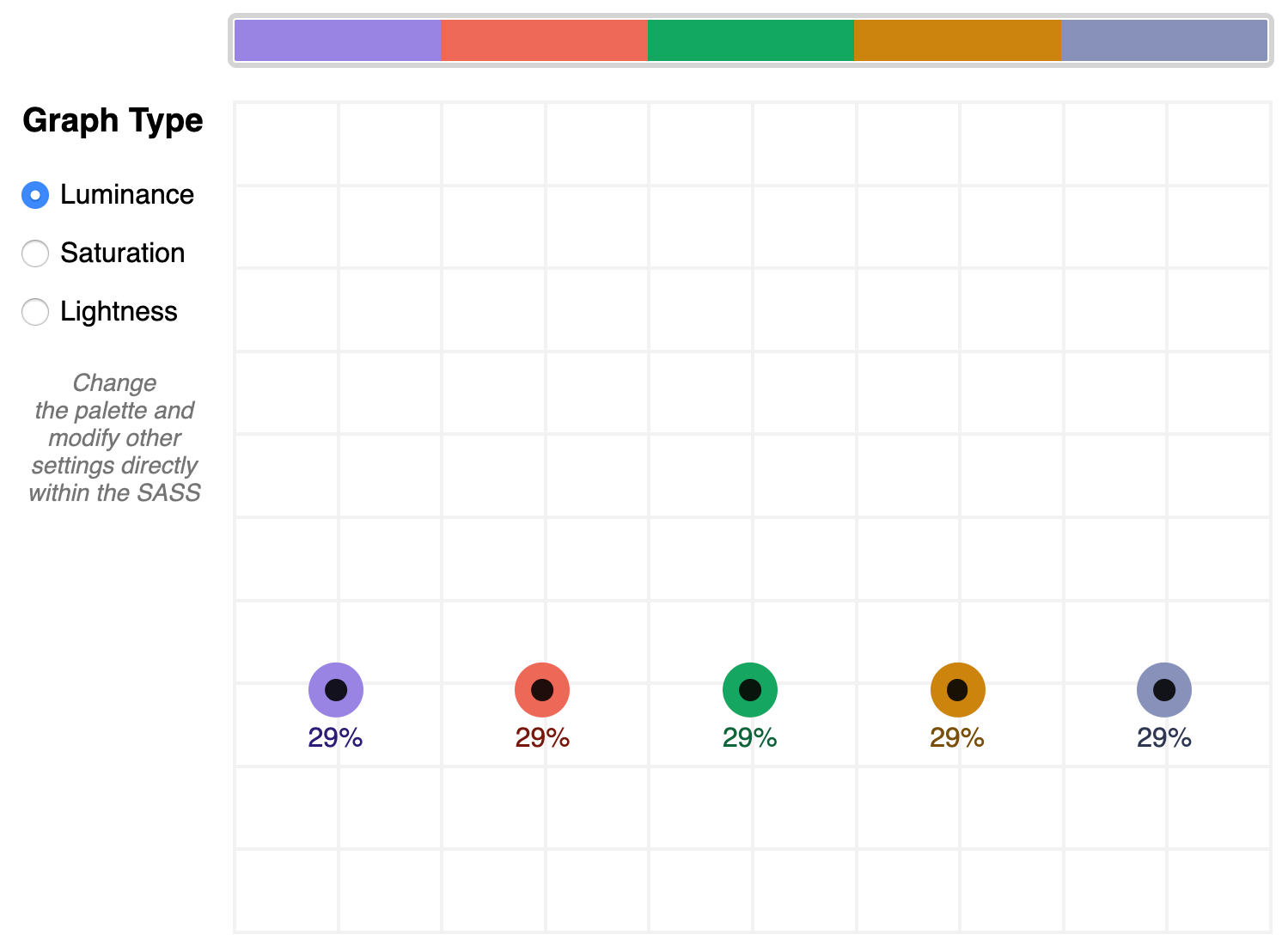
Our goal is to better understand what makes a palette "feel right" by exploring key color attributes with Sass color functions. By the end, you will become more familiar with:
The value of graphing a palette’s luminance, lightness, and saturation to assist in building balanced palettes
The importance of building accessible contrast checking into your tools
Advanced Sass functions to extend for your own explorations, including a CodePen you can manipulate and fork
What you’ll ultimately find, however, is that color on the web is a battle of hardware versus human perception.
What makes color graphing useful
You may be familiar with ways of declaring colors in stylesheets, such as RGB and RGBA values, HSL and HSLA values, and HEX codes.
Those values give devices instructions on how to render color. Deeper attributes of a color can be exposed programmatically and leveraged to understand how a color relates to a broader palette.
The value of graphing color attributes is that we get a more complete picture of the relationship between colors. This reveals why a collection of colors may or may not feel right together. Graphing multiple color attributes helps hint at what adjustments can be made to create a more harmonious palette. We’ll look into examples of how to determine what to change in a later section.
Two useful measurements we can readily obtain using built-in Sass color functions are lightness and saturation.
Lightness refers to the mix of white or black with the color.
Saturation refers to the intensity of a color, with 100% saturation resulting in the purest color (no grey present).
However, luminance may arguably be the most useful color attribute. Luminance, as represented in our tool, is calculated using the WCAG formula which assumes an sRGB color space. Luminance is used in the contrast calculations, and as a grander concept, also aims to get closer to quantifying the human perception of relative brightness to assess color relationships. This means that a tighter luminance value range among a palette is likely to be perceived as more balanced to the human eye. But machines are fallible, and there are exceptions to this rule that you may encounter as you manipulate palette values. For more extensive information on luminance, and a unique color space called CIELAB that aims to even more accurately represent the human perception of color uniformity, see the links at the end of this article.
Additionally, color contrast is exceptionally important for accessibility, particularly in terms of legibility and distinguishing UI elements, which can be calculated programmatically. That’s important in that it means tooling can test for passing values. It also means algorithms can, for example, return an appropriate text color when passed in the background color. So our tool will incorporate contrast checking as an additional way to gauge how to adjust your palette.
The functions demonstrated in this project can be extracted for helping plan a contrast-safe design system palette, or baked into a Sass framework that allows defining a custom theme.
Sass as a palette building tool
Sass provides several traditional programming features that make it perfect for our needs, such as creating and iterating through arrays and manipulating values with custom functions. When coupled with an online IDE, like CodePen, that has real-time processing, we can essentially create a web app to solve specific problems such as building a color palette.
Here is a preview of the tool we’re going to be using:
It outputs an aspect ratio-controlled responsive graph for accurate plot point placement and value comparing.
It leverages the result of Sass color functions and math calculations to correctly plot points on a 0–100% scale.
It generates a gradient to provide a more traditional "swatch" view.
It uses built-in Sass functions to extract saturation and lightness values.
It creates luminance and contrast functions (forked from Material Web Components in addition to linking in required precomputed linear color channel values).
It returns appropriate text color for a given background, with a settings variable to change the ratio used.
It provides functions to uniformly scale saturation and lightness across a given palette.
Using the palette builder
To begin, you may wish to swap from among the provided example palettes to get a feel for how the graph values change for different types of color ranges. Simply copy a palette variable name and swap it for $default as the value of the $palette variable which can be found under the comment SWAP THE PALETTE VARIABLE.
Next, try switching the $contrastThreshold variable value between the predefined ratios, especially if you are less familiar with ensuring contrast passes WCAG guidelines.
Then try to adjust the $palette-scale-lightness or $palette-scale-saturation values. Those feed into the palette function and uniformly scale those measurements across the palette (up to the individual color's limit).
Finally, have a go at adding your own palette, or swap out some colors within the examples. The tool is a great way to explore Sass color functions to adjust particular attributes of a color, some of which are demonstrated in the $default palette.
Interpreting the graphs and creating balanced, accessible palettes
The graphing tool defaults to displaying luminance due to it being the most reliable indicator of a balanced palette, as we discussed earlier. Depending on your needs, saturation and lightness can be useful metrics on their own, but mostly they are signalers that can help point to what needs adjusting to bring a palette's luminance more in alignment. An exception may be creating a lightness scale based on each value in your established palette. You can swap to the $stripeBlue example for that.
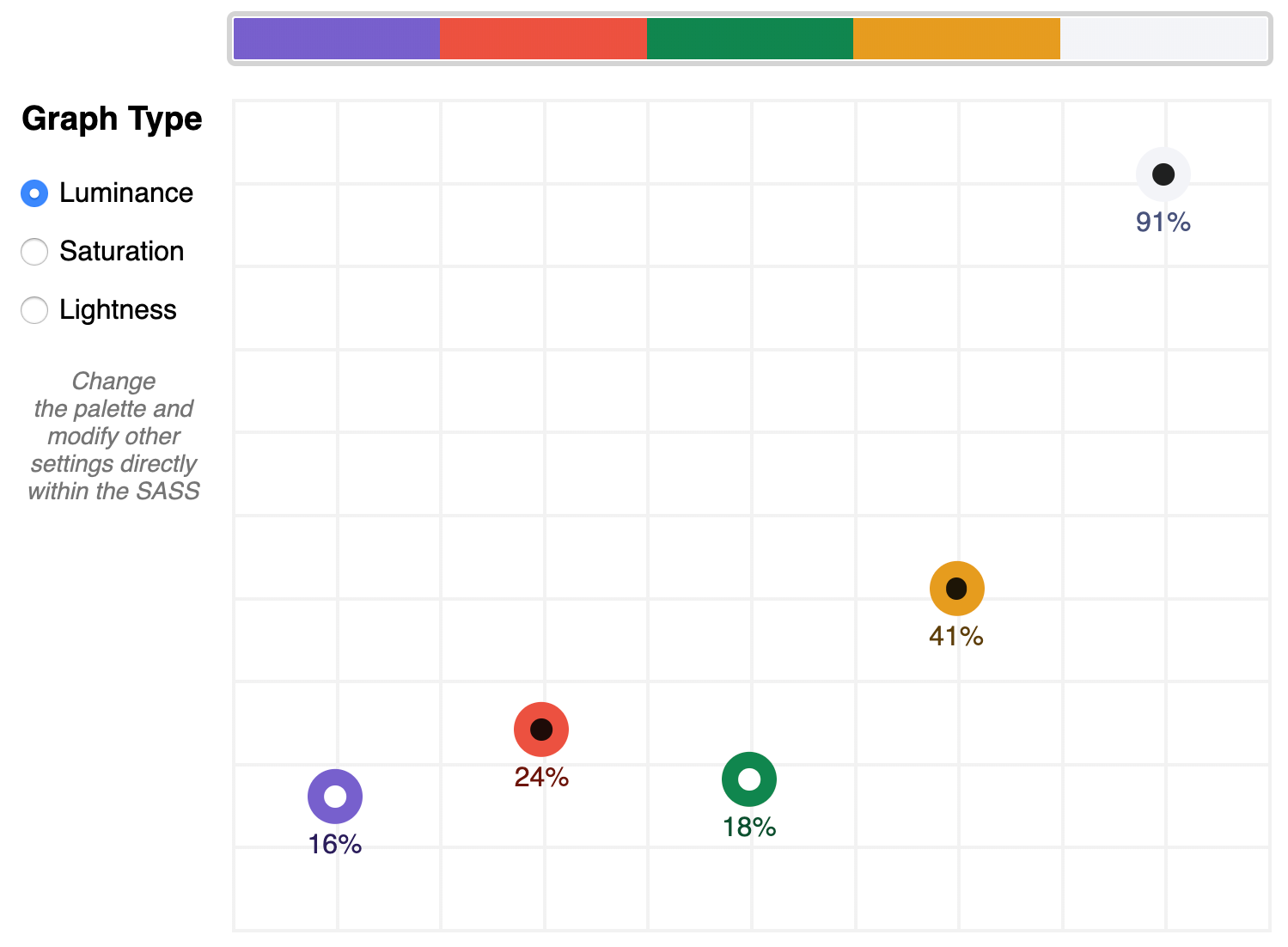
The $default palette is actually in need of adjustment to get closer to balanced luminance:
The $default palette’s luminance graph
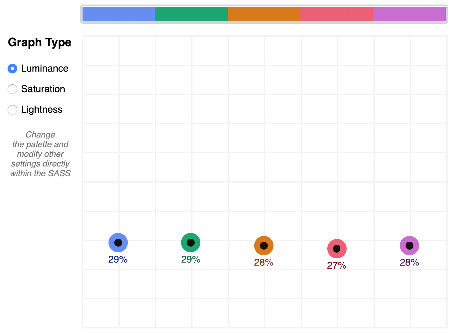
A palette that shows well-balanced luminance is the sample from Stripe ($stripe):
The $stripe palette luminance graph
Here's where the tool invites a mind shift. Instead of manipulating a color wheel, it leverages Sass functions to programmatically adjust color attributes.
Check the saturation graph to see if you have room to play with the intensity of the color. My recommended adjustment is to wrap your color value with the scale-color function and pass an adjusted $saturation value, e.g. example: scale-color(#41b880, $saturation: 60%). The advantage of scale-color is that it fluidly adjusts the value based on the given percent.
Lightness can help explain why two colors feel different by assigning a value to their brightness measured against mixing them with white or black. In the $default palette, the change-color function is used for purple to align it's relative $lightness value with the computed lightness() of the value used for the red.
The scale-color function also allows bundling both an adjusted $saturation and $lightness value, which is often the most useful. Note that provided percents can be negative.
By making use of Sass functions and checking the saturation and lightness graphs, the $defaultBalancedLuminance achieves balanced luminance. This palette also uses the map-get function to copy values from the $default palette and apply further adjustments instead of overwriting them, which is handy for testing multiple variations such as perhaps a hue shift across a palette.
Contrast comes into play when considering how the palette colors will actually be used in a UI. The tool defaults to the AA contrast most appropriate for all text: 4.5. If you are building for a light UI, then consider that any color used on text should achieve appropriate contrast with white when adjusting against luminance, indicated by the center color of the plot point.
Tip: The graph is set up with a transparent background, so you can add a background rule on body if you are developing for a darker UI.
Further reading
Color is an expansive topic and this article only hits the aspects related to Sass functions. But to truly understand how to create harmonious color systems, I recommend the following resources:
Color Spaces - is a super impressive deep-dive with interactive models of various color spaces and how they are computed.
Understanding Colors and Luminance - A beginner-friendly overview from MDN on color and luminance and their relationship to accessibility.
Perpetually Uniform Color Spaces - More information on perceptually uniform color systems, with an intro the tool HSLuv that converts values from the more familiar HSL color space to the luminance-tuned CIELUV color space.
Accessible Color Systems - A case study from Stripe about their experience building an accessible color system by creating custom tooling (which inspired this exploration and article).
A Nerd's Guide to Color on the Web - This is a fantastic exploration of the mechanics of color on the web, available right here on CSS-Tricks.
Tanaguru Contrast Finder - An incredible tool to help if you are struggling to adjust colors to achieve accessible contrast.
ColorBox - A web app from Lyft that further explores color scales through graphing.
Designing Systematic Colors - Describes Mineral UI's exceptional effort to create color ramps to support consistent theming via a luminance-honed palette.
How we designed the new color palettes in Tableau 10 - Tableau exposed features of their custom tool that helped them create a refreshed palette based on CIELAB, including an approachable overview of that color space.
Every front-end developer has dealt or will deal with this scenario: your boss, client or designer thinks the outline applied by browsers on focused elements does not match the UI, and asks you to remove it. Or you might even be looking to remove it yourself.
So you do a little research and find out that this is strongly discouraged, because the focus outline is there for a reason: it provides visual feedback for keyboard navigation (using the Tab key), letting users who can't use a mouse or have a visual impairment know where they are on the screen.
This button shows a focus state with Chrome's default outline style.
That doesn't mean you're stuck with this outline, though. Instead of removing it, you can simply replace it with something else. That way, you’ll keep your interface accessible and get more flexibility on how it looks, so you can better match your UI.
You can start by removing the default browser outline by selecting the focused state of the element and applying outline: none. Then, you may choose from each of the options ahead to replace it:
Change the background color
This works best for elements that can be filled, such as buttons. Select the focused state of the element and apply a contrasting background color to it. The higher the contrast the better because subtle changes may not be strong enough visual cues, particularly in cases where with color blindness and low-vision.
In the example below, both background and border color change; you may pick either or both.
Click or focus with the Tab key to view how this state looks.
If the element has any text, you can select the focused state and change its color. This also works for icons applied with mask-image; you can select the icon as a descendant of the focused element and change its background color, like the example button below.
Again, contrast is key. You may also consider using an underline on text links and making it part of the changed state because, as the Web Content Accessibility Guidelines state:
Color is not used as the only visual means of conveying information, indicating an action, prompting a response, or distinguishing a visual element. (Level A) Understanding Success Criterion 1.4.1
Apply a box shadow
The box-shadow property can do exactly the same job as the outline, except it's much more powerful — you can now control its color, opacity, offset, blur radius and spread radius. And if a border-radius is specified, the box shadow follows the same rounded corners.
The key here is subtlety. Extreme size changes may cause content reflow, not to mention a poor experience for those who prefer reduced motion.
Replicate existing hover styles
If the element already has a contrasting hover style, you can simply take that style and apply it for the focused state as well. This is a rather elegant solution, as you don't have to add any new colors or outlines to the interface.
Here’s an example where both the focus and hover states adopt a high contrast to the background of an element’s default style:
Everything we’ve looked at so far takes the assumption that we want to remove the focus outline altogether. We don’t have to! In fact, it’s a border that we can customize.
button:focus {
  outline: 3px dashed orange;
}
That’s shorthand and could have been written this way if we want to fine-tune the styles:
One additional superpower we have is the outline-offset property, which is separate from the outline shorthand property but can be used alongside it to change the position of the focus ring:
You can mix and match all of these options to get custom styles that look appropriate for each component type within your interface.
And it’s worth repeating: Don't forget to use stark color contrasts and other visual cues in addition to color when adopting custom focus states. Sure, we all want an experience that aligns with our designs, but we can adhere to good accessibility practices in the process. The W3C recommends this tool to test the contrast of colors values against the WCAG guidelines.
I started this year on a new path at Knowbility — to help people and organizations create accessible content and apps. But what was exciting and helped motivate me more were two things:
WebAIM's Accessibility Analysis of One Million Page Homepages. With over 97% of sites having WCAG failure of some kind, it's a stinging indictment on our industry. There's a lot of work to be done — that means outreach and education, helping other developers incorporate accessibility into their workflows, coding pull requests with accessibility fixes, making certain components for design systems are accessible and much more.
The Supreme Court of the United States rejecting Domino's appeal. The Supreme Court leaves the Ninth Circuit federal appeals court's ruling, which means that people with disabilities who have trouble with sites or apps that are not accessible can bring claims under the Americans with Disabilities Act (ADA). This result means that organizations can't kick the proverbial can down the road for making their apps and products accessible.
In regards to the One Million Pages, I noticed that web designers and developers outside of accessibility circles discussing accessibility with a sustained focus I hadn't witnessed before.
And I would have conversations with people outside web design and development altogether about accessibility due to this court case alone. Companies and organizations were watching it very closely.
This added increased awareness from both WebAIM's report and the Domino's appeal has helped fuel the discussion, making it easier to keep the conversation going to make digital accessible to all.
In this week's roundup: Firefox's new contrast checker, a simpler way to lasso substrings in a string, and a new experimental API that will let apps fiddle with a user's local files.
Firefox shows the contrast ratio range for text on a multicolored background
According to Success Criterion 1.4.3 of the Web Content Accessibility Guidelines (WCAG), text should have a contrast ratio of at least 4.5. (A lower contrast ratio is acceptable only if the text is 24px or larger.)
If the background of the text is not a solid color but a color gradient or photograph, you can use the special element picker in Firefox’s Accessibility panel to get a range of contrast ratios based on the element’s actual background.
Replacing all instances of a substring in a string
The new JavaScript replaceAll method makes it easier to replace all instances of a substring in a string without having to convert the substring to a regex first, which is “hard to get right since JavaScript doesn’t offer a built-in mechanism to escape regular expression patterns.”
// BEFORE
str = str.replace(/foo/g, "bar");

// AFTER
str = str.replaceAll("foo", "bar");
This new string method has not yet shipped in browsers, but you can start using it today via Babel (since it’s automatically polyfilled by @babel/preset-env).
The Native File System API, which is experimentally supported in Chrome, allows web apps to read or save changes directly to local files on the person’s computer. The app is granted permission to view and edit files in a specific folder via two separate prompts.
You can try out this new feature by visiting labs.vaadin.com in Chrome on desktop.
Before we come to how to style underlines, we should answer the question: should we underline?
In graphic design, underlines are generally seen as unsophisticated. There are nicer ways to draw emphasis, to establish hierarchy, and to demarcate titles.
If you feel the urge to underline, use bold or italic instead. In special situations, like headings, you can also consider using all caps, small caps, or changing the point size. Not convinced? I invite you to find a book, newspaper, or magazine that underlines text. That look is mostly associated with supermarket tabloids.
But the web is different. Hyperlinks are the defining feature of the internet; and from the internet’s inception, they have been underlined. It’s a universally understood convention. The meaning is crystal clear — an underline means a link.
However, plenty of popular websites have ditched underlines: The New York Times, New YorkMagazine, The Washington Post, Bloomberg, Amazon, Apple, GitHub, Twitter, Wikipedia. When they removed underlines from their search results page in 2014, Google lead designer Jon Wiley argued that it created a cleaner look. Notably though, the majority of these sites have kept slight variances on the traditional lurid blue color (#0000EE) that’s been the browser default since the beginning of the web. While this provides a visual cue for the majority of users, it may not be enough to pass WCAG accessibility compliance.
Color is not used as the only visual means of conveying information, indicating an action, prompting a response, or distinguishing a visual element.
— WCAG 2.1
WCAG do not strictly mandate using underlines for links, but it does recommend them. Color blind users need to be able to discern a link. You could differentiate them in other ways, such as with a bold font-weight. Or you could keep this long-established visual affordance. But if we’re going to use underlines, we want them to look nice. Marcin Wichary, a designer at Medium, described the perfect underline as:
[...] visible, but unobtrusive — allowing people to realize what’s clickable, but without drawing too much attention to itself. It should be positioned at just the right distance from the text, sitting comfortably behind it for when descenders want to occupy the same space.
Achieving this has traditionally required CSS tricks.
The hacks we’ve had
This is one trick all developers will be familiar with: border-bottom. By emulating an underline using border-bottom, we gain control over color and thickness. These pseudo-underlines have one problem: an overly large distance from the text. They are underneath the descenders of the letters. You could potentially solve this issue by using line-height, but that comes with its own issues. A similar technique utilises box-shadow. Marcin Wichary pioneered the most sophisticated technique, using background-image to simulate an underline. They were useful hacks but are thankfully no longer needed.
Styling real underlines
Finally we can demarcate links without sacrificing style thanks to two new CSS properties.
text-underline-offset controls the position of the underline.
text-decoration-thickness controls the thickness of underlines, as well as overlines, and line-throughs.
You can also specify from-font to both of these properties which will pull the relevant metric from the used font file itself.
UX agency Clearleft make bold use of (pseudo) underlines, calling clear attention to links with colorful styling. Here’s one example of a faux underline:
a {
  text-decoration: none;
  border-bottom: #EA215A 0.125em solid;
}
Notice that this fake underline is clearly below the descender of the letter "y":
Here’s the same paragraph, using DevTools to apply the same styling to a real underline using the new CSS properties:
a {
  text-decoration-color: #EA215A;
  text-decoration-thickness: .125em;
  text-underline-offset: 1.5px;
}
You’ll notice I’m using the em unit in my example code. The spec strongly encourages using it rather than pixels so that the thickness scales with the font.
These properties have already shipped in Safari and are coming in Firefox 70.
With the move to Chromium for Microsoft’s Edge browser, we will finally have cross browser support for the text-decoration-style property, which offers the options: solid (the default), double, dotted, dashed, and wavy. When combined, these new properties open up a whole range of possibilities.
Perhaps the biggest upgrade for underlines on the web, however, has come without developers needing to do anything. In the bad old days, descenders were unceremoniously sliced through by underlines, which was far from elegant. Developers used to hack around this shortcoming by applying a text-shadow that matched the background color. text-decoration-skip-ink brought a better way to make space for descenders.
The default value of auto (left) and a value of none (right)
Handily, it’s set as the new default value for underlines; meaning the look of underlines has improved while most web developers remain unaware that this property exists. Should you want an underline to cross over glyphs, you can set this property to none.