When building single-page applications many Vue developers forget about UX for browser button navigation. They mistakenly assume that this kind of navigation is the same as hyperlink navigation when in fact it can be quite different.
Unlike hyperlink navigation, if a user goes forward and back between pages they expect the page to still look like it did when they return or they'll consider the UX "weird" or "annoying."
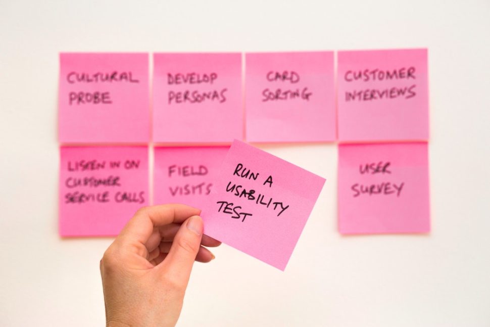
The decision to make a fundamental change in strategic direction, whether in re-launching a product, or revamping a service, may depend on several factors. Many companies get a second wind by reinventing themselves to capitalize on a shift in consumer perception, new processes, current trends, new technologies, etc., while others inexplicably plummet to new lows after periods of great success.
Do you want to monitor the server uptime for your WordPress site?
You want your website to be available whenever your customers come to visit, so you need to make sure it stays online. When you monitor server uptime, you’ll be alerted if your website goes down so you can get it fixed quickly.
In this article, we’ll show you how to easily monitor server uptime in WordPress. We’ll share multiple uptime monitoring solutions, and you can choose one that works best for you.
Why Monitor Your WordPress Website Server Uptime?
The servers used by poor-quality hosting companies go down frequently and stay down for minutes or even hours. While many WordPress hosting companies promise 99.9% server uptime, they don’t always live up to their promise.
Whether you run a blog, online store, or any other kind of site, downtime can affect your business, website reputation, and user experience:
More Downtime Means Losing Money: If your website remains inaccessible for a long period of time, then you will inevitably lose revenue.
User Experience and Brand Reputation: Having your website down is like closing your door in a visitor’s face, even if you’re not doing it intentionally. It creates a bad impression and you may lose potential customers.
Search Engine Influence: If your website is frequently down, then search engines might assume that your website is too unreliable to recommend. Often they penalize those websites that fail to maintain 24/7 uptime.
You can monitor your server’s actual uptime to track outages on your WordPress website. You use tools that will notify you immediately by email or SMS if something goes wrong with your site. This will allow you to get it fixed as soon as possible.
With that being said, let’s take a look at some of the best tools for monitoring server uptime for your website. You can use the list below to jump to the tool you are most interested in:
UptimeRobot is a website monitoring tool that offers both a free plan that checks your website every 5 minutes and a Pro plan that checks every 60 seconds.
Pro pricing starts at $7.00 per month and includes SMS, voice call, email, and other alerts.
The first thing you need to do is visit the UptimeRobot website. Once there, you should click the ‘Register for FREE’ button at the top of the screen.
Next, you create a free UptimeRobot account.
Simply fill in your personal details and a password, and then click the ‘Register Now’ button.
A message will be displayed asking you to go to your email inbox to proceed.
You should find an email with the subject ‘UptimeRobot – Account Activation.’ It will contain a link you need to click to activate your account.
This will take you back to the UptimeRobot website. You can click on the ‘Upgrade now’ button to get a discount on the Pro plan, or the ‘Maybe later’ link to choose the free plan.
In this tutorial, we’ll use the free plan.
You should now see your UptimeRobot Account Dashboard. From here, you need to click the ‘Add New Monitor’ button.
This will bring up a popup where you can configure the monitor.
You should select ‘HTTP(s)’ for the monitor type and then add the name and URL of your website. Make sure you set the monitoring interval to 5 minutes if you have the free plan, or 1 minute if you are a Pro user.
As you scroll down the popup you need to check the box next to your email address so you are notified when your site goes down.
Clicking the gear icon reveals additional optional controls for your notifications.
Pro users can select maintenance windows that allow you to automatically disable monitoring for predefined periods, such as when you perform maintenance on your site.
Once you are done, make sure you click the ‘Create Monitor’ button to save your changes.
UptimeRobot will now start monitoring your server uptime.
You’ll see detailed stats on your UptimeRobot account dashboard and receive alerts when your website is down.
Monitoring Server Uptime Using Pingdom
Pingdom is a popular performance monitoring tool that allows you to set up server uptime monitoring for your website. It is a paid service with plans starting from $10 per month.
Pingdom is a more robust platform offering a real-time uptime monitoring service. They offer detailed stats, logs, monitoring from various geographic locations, and more.
First, you need to visit the Pingdom website and click on one of the green buttons to start your free trial.
You’ll be asked to provide some personal details to create an account. These include your name, email address, password, and country.
When you’re ready, click the ‘Start Free Trial’ button.
Next, you will be asked to fill in some additional account information, including your state and time zone.
You should carefully check the phone number and email address because that is how you will be notified if your site goes down.
Finally, add the URL of your website so that Pingdom can monitor it.
As soon as you click the ‘Start using Pingdom’ button, Pingdom will automatically set up monitoring. You will receive a test alert to your email address and cell phone.
That’s all. You have successfully set up uptime monitoring for your website using Pingdom.
You can set multiple alerts and track for various locations. Pingdom documentation and support can help you set that up, but their interface is fairly straightforward.
Pingdom also keeps your uptime history so you can evaluate your web hosting company’s performance over time.
If you like the service, you can keep using it without interruption, starting at $10 per month.
Checking Whether Your Website Is Currently Up or Down
When you have difficulty accessing your website, you won’t know whether the site is really down or you’re simply facing internet issues. You can quickly check using IsItWP’s free uptime checker tool.
The Uptime Uptime Status Checker tool will quickly check your website and let you know if it is up or down.
What to Do When Your Website is Down
If your website is down and you need to figure out what to do next, then here are the step-by-step instructions you should follow.
You should start by checking your site with IsitWP’s Uptime Checker tool. This will let you know if your website is down for everyone, or just for you.
What to Do if Your Website Is Down for Just You
If your website is up but you’re unable to access it, then you should first clear your browser cache and DNS cache. After that, you should try reloading the website.
If that doesn’t work, then see if you can access your website from a different IP address. You can do so by using a VPN service or even just using your mobile phone’s internet.
If you can access your website this way, then this means that either your internet service provider or your hosting company has accidentally blocked your IP address. You can contact both service providers to resolve the issue.
If you recently changed your domain name‘s DNS settings, then this could also mean that the DNS has not been updated in your particular geographic location.
All you can do is wait until the DNS changes are propagated around the world. This may take a few hours to a day.
What to Do if Your Website Is Down for Everyone
If you have verified that your website is down for everyone, then you need to immediately reach out to your hosting provider. They may be having issues with their server and can provide you with more details.
Most hosting companies are quick to respond to such issues, and your website should be back up again soon.
However, if your website is down frequently, or you don’t get a satisfactory answer from the support team, then you should switch to a better hosting provider.
What to Do if You Need a Better Hosting Provider
Due to tough competition in the hosting industry, some less reputable companies have cut costs by using outdated technologies, unskilled staff, and inadequate customer service.
If your website is frequently down, then you need to move to a better hosting provider.
Here’s our list of reliable WordPress hosting providers:
Next, you’ll need to transfer your website to the new host. We have a complete step-by-step tutorial on how to move your website to a new hosting provider without losing SEO and without any downtime.
Some providers, like SiteGround, offer free website migration services. You just need to ask for their support.
As any UX designer can tell you, testing web sites as you build them is not easy. But, as they would also tell you, there are so many changes that happen during the design process! Well, thankfully, there’s a simple,...
Isn't this how you want your customers to view your software?
Since attending Forrester's CX SF conference, I’ve been reflecting lately upon the relationship between software quality and the customer experience for brands that are seeking to innovate and stand out in a sea of growing competition.
One recent experience of mine really highlighted this for me; I recently moved to Berkeley, so I’m still buying some furniture and other items for my home. I was about to complete an online order from a very famous store that included more than 20 items in my cart. All went well until I hit the “place order” button. After I had already finished the transaction, I was notified that some things were out of stock, others were discontinued, etc. This seems like an operational problem, but from my perspective, it’s also a software problem; the site didn’t alert me about these different issues, which caused this part of the process to ruin my experience. Then, I had to call customer service, spend an hour on the phone, follow a lengthy process to get my refund, and so on. In the end, I had undergone stress, frustration, and disappointment.
It's hard to believe, but 2020 means we will be heading into the decade’s final chapter. In these ten years, the internet has changed our everyday life. We have witnessed change and seen the reign of mobile, the introduction of a chatbot, IoT, AR, VR. As breakthrough as all of these new technologies have been, where I see and feel these transformations the most is in web design trends. It seems like UX design trends will be huge in 2020 as we will witness aesthetics and technology come together like never before.
Check out the newest AR use cases disguised as history lessons!
I love Chester — it's a walled Roman fort town in the North West of England, with heaps of history. On a walk through the Roman Gardens, we came across a real-world Augmented Reality experience that described the breach of the walls in the time of the English Civil War.
I thought it was rather neat: With the associated information on the board, it gave me a sense of what was happening in that period. The experience got me thinking about Augmented Reality on modern smartphones and headsets (I've been lucky enough to play with a Magic Leap) — the use cases we will demo with these devices are just not worth the cost of development right now.
If you really want to create the most value for your customer, you can't skimp on UX design.
We’ve all probably experienced it. We have this great project, we have this great interface, and suddenly UX (User Experience) comes in and points out all these flaws and stops things, making us scramble to catch up.
If you’ve had this happen, you know that the goal of a great interface, put out on time, isn’t met. So how can we change this?
During the TIBCO NOW 2019 keynote in Chicago, Rajeev Kozhikkattuthodi, vice president, product management and strategy, TIBCO announced the expansion of cloud-native offering to address developers' challenges.
According to Rajeev, in this the age of the customer, companies are getting tired of customer experience (CX) which is sad given how poor a job they are doing improving it. It's like they are clueless. Perhaps they need to better understand the customer journey? TIBCO is trying to help with connected intelligence CX.
So your customer-facing teams are inundated with inquiries that are repetitive and mundane, draining employee motivation and resources. You get an idea, “Let’s create a chatbot!” You do. But people don’t use it. The experience feels a little worse than a search engine and a little better than a static FAQ page. What went wrong? In this article, I uncover some simple tips that can drastically improve your content-retrieving chatbot experience.
At SAP Conversational AI, we have learned that as chatbot developers, we need to start honing our instincts when it comes to using chatbots as a solution to our problems.
In the era of Digital Transformation (DX) the IT landscape has expanded to environments that rely extensively on virtualization, hyper-converged infrastructure (HCI), and cloud computing. As a result, the number of servers and the quantity of traffic have been exploding exponentially.
The cohesive, albeit heterogeneous on-premises IT environments of the past have given way to a disaggregated, interdependent mélange of compute, network, and storage components, both on-premises and in the private and public clouds.
In early March, Treehouse and Dribbble announced a partnership to create job-ready designers through the User Experience (UX) Techdegree program. Considering that design is one of the most in-demand skills in today’s workforce, this partnership pairs...
If you are approaching the world of UX or you are already a navigated UX / UI Designer, then this article, in which I am going to talk about 6 principles that every UX Designer should know, is designed for you.
In this article, I want to deepen the discussion on what the founding principles of UX are and cause us all to think a little outside of the box.
The principles of UX: first of all, we need to know the people
Designing the experience of any product (physical or digital), or a service, means putting the user at the center of the project and then applying a user-centric thought.
Before getting in front of a computer, designing UX means knowing the people for whom we have to design and empathize with them through all our senses. It means observing them, listening to them, asking them questions; it even means smelling the smells of the context in which they live: yes, everything becomes fundamental!
Since birth, we have had 5 powerful tools that allow us to interact and retrieve information in the world we live in: the senses. Without them it would be impossible (or very complicated) to move independently in the spaces that surrounds us.
Precisely for this reason, understanding how people interact, through the senses, in the area in which we are going to treat their experience as users, is fundamental.
So if we need to know people to make UX, who can help us do it correctly?
The most correct answer is certainly psychology. In particular, some strands that have focused more on the study of human perception and experience.
Obviously this does not mean having the presumption of knowing it all! However, having familiarity with some theories and principles helps the designer to understand (first) and design (after) the most comfortable and rewarding experience for their user.
Here I would like to start with some key principles that govern the interaction between man and the real and / or virtual world. There are not many, but they are sufficient to determine the success or failure of the products with which we relate every day.
The most fascinating thing (for a UX Designer, of course) is that these theories apply to any existing object, and sector, that can come to mind.
To start talking about it – though – it is necessary to reference one of the fathers of this discipline who theorized them, and who presented himself with the title of the first UX designer.
The 6 ” never again without” UX principles.
Donald Arthur Norman, a US psychologist and engineer, along with another guru and his partner Jakob Nielsen, has dedicated himself to the research and study of ergonomics, design, and more generally of the human cognitive process. He based his analysis on anthropocentric design, bringing together two fields that, at the time, did not communicate: technology and psychology.
In the well-known book The Coffee Maker of the Masochist , the “bible” for the true aspiring UX designer, tells the deduction of the principles of usability and ergonomics that govern our world since ancient times. Subsequently, in a second text equally worthy of mention, Emotional design , Norman maintains that a product capable of stimulating positive emotions – through an experience – is perceived as “more beautiful” and “better functioning”.
30 years have passed since the publication of his first text, yet the principles listed are still alive and well, and most definitely put into practice today.
Let’s walk through them together:
1. Affordance
The affordance (which we could translate with “invitation”) is defined as the physical quality of an object that suggests appropriate actions to manipulate it.
As Norman writes,
Perceived affordances help us guess what actions are possible, without the need for signs or instructions.
In interactive design affordance is the first fundamental rule: being intuitive. That is, the interface must be understandable from the first glance, without needing instructions (labels, texts, CTA, and so forth).
2. Significance
The signifiers are “elements” that enrich an object, telling the intrinsic meaning of the same. In other words, they signal the possible actions through that object and how to execute them. They have the task of triggering the Feedforward, which means anticipating exactly what will happen.
The signifiers must be perceptible, otherwise they do not work.
– Donald Arthur Norman
A classic example is the anti-panic door handle, you don’t need to know it or even accompany it with the word “push”. There is only one correct way to use it.
In interactivity, in order to exploit the concept of signifiers, you have to be careful not to make two serious mistakes :
The signifiers that do not make sense: that is, the use of texts (in call-to-action) that do not clearly tell the action or page that the user is about to visit. To give an example just think of the superfluous Click here, which turns out to be a real tautology. It is obvious that a button needs to be clicked, tell me what happens if I do it! Another similar example of significant error is the Discover more, often inserted too generally in texts, videos or CTAs. As Yvonne Bindi, information architect and expert in language and communication, writes in his “Language design. Guide to the usability of words for communication professionals”: ” Discover thus becomes an empty navigation word, all too obviously borrowed from marketing.”
The excess of icons: In visual design, the overabundant use of icons, or icons that are forced where they aren’t necessary, gives rise to what is called visual pollution. The user is overloaded with information and is therefore impaired in the use of the product. The icon is useful when alone it represents something unequivocally, without being accompanied by texts. It is also necessary to pay close attention to cultural conventions.
3. Mapping
How many times have you mistaken the light switch or the cooktop knob?
Here, it means that there was a mapping error in the design phase.
The mapping principle indicates the relationship between two things. For example, between the operation of a key and its effects. A good mapping takes into account the cultural models learned or spatial analogies.
Let’s think about activating the directional arrows of a car.
To indicate the right, move the lever upwards (making a semicircular movement to the right) and vice versa for the left, move the lever downwards.
Norman writes:
When the mapping uses the spatial correspondence between the placement of the commands and that of the commanded devices, it is easy to understand how to use them.
In web design the mapping is extremely linked to the signifiers and is conveyed by the position and behavior of the elements. The most classic example is the vertical scroll on a screen, which indicates where you are compared to the page. As you drag it down (or up) the page moves at the same speed, maintaining the place of positioning in space.
4. Constraints
The limits are divided into physical, cultural, semantic and logical, depending on the context, but define, with the same force, “obligations” that guide the user along a path.
In an interface, the constraints can be obvious, like the physical ones of the screen size, or more refined ones, like the logical ones of a deactivated icon.
They are logical constraints of anticipation, like the images half inside the screen and half outside, which allow us to intuit a slideshow and swipe. Or the visualization of the steps of a process, for example during the checkout of an e-commerce sale, which allow the user to immediately understand the correct path to follow to get to the end.
5. Feedback
The feedback (which we can translate as a “response”) is a return message from an object that tells us that our action has been implemented.
Norman points out to us that
The feedback must be immediate, even a delay of one tenth of a second can be disconcerting.
Every day we receive feedback from the products / services we use: the light on the button of the elevator, or of the pedestrian traffic light, or of the coffee machine. They allow us to have confirmations, without groping in the darkness of uncertainty.
Also and above all, feedback is fundamental on the web. When we select a folder with a mouse click, for example, the folder takes on a different color, which tells us that the system has learned our request. If, on the contrary, this type of feedback does not occur, we would continue to click spasmodically on the folder, in the grip of a sense of frustration (why does it not open?!).
6. Conceptual model
A good example that helps us understand are the icons of files and folders on your computer. In the computer there are really no sheets or folders, but the concept of a “binder” (recovered from the way we organize things in reality) facilitates understanding and interaction.
Interactive design, as we have just understood, makes extensive use of this principle. In association with the signifiers (Home = house, Size = scissors, Funnel = filter), the conceptual models allow us to associate a virtual action with one that we perform in everyday life, and therefore more concrete, for an immediate and simple understanding.
In the design phase it is important to take into account the fact that, as in reality, even in the virtual experience users expect a similar response to that which they experience in everyday life.
Conclusion
Norman’s 6 principles are timeless because they are based on human psychology, and applying them in design is a way to ensure a significantly higher level of usability and clarity.
But I must be honest in telling you that they are not the only ones and it is not enough to know only these. There are other very interesting theories that explain the complex but fascinating way in which people act in front of daily stimuli.
And above all, remember that, although it may seem complicated at first, becoming a UX designer is a journey that must be cultivated day after day. (As with everything).
Pay attention to every experience you go through because each of them pays a small roll in the way a designer, whether they be UX or otherwise, conducts themselves and their work.
I often see User Experience (UX) Designers struggle to align focus, work, and approach with Scrum Teams building increments of product in iterations of 30 days or fewer. Common concerns and questions I hear include:
"Developers aren't really interested in the user, they just want to build."
"I'm trying to work side-by-side with the team, but I'm always a bit ahead of them, so what should we talk about in our Daily Scrum?"
"I don't work in sort cycles, or tactically. My work is strategic."
"Why don't developers use my design artifacts and decisions? Why do they never go back and refactor for good design? Why do I feel like I never have any influence?!?!"
These challenges often result in tenuous relationships between UX Designers (UXDs) and Scrum Teams — or even worse, distrust, separation, and "staggered Sprints" (where completely separate teams pass work to each other that they execute in completely separate blocks of time, which they still call "Sprints" — even though those blocks of time function exactly the same as waterfall phases).