Learn how to protect your site from bad bots while allowing visits from safe user agents with our all-in-one WordPress security plugin Defender.
Your website’s security is under threat 24/7, whether it’s from a serious DDoS attack, XSS attack, SQL injections, or just annoying spam. Defender’s User Agent Banning not only offers your WordPress site robust protection against requests from bad user agents at the server level, it also helps to free up server resources for all your good traffic.
A user agent is any software, acting on behalf of a user, which retrieves, renders and facilitates end-user interaction with Web content.
Network servers, email clients, search engines, and web browsers are all examples of user agents.
Essentially, a user agent is a “string” (i.e. a line of text) that identifies a client to a server. In other words, it’s a way of saying “Hello! This is who I am” to a web server.
A web browser, for example, includes a User-Agent field in its HTTP header identifying the browser and operating system to the web server (e.g. Chrome Browser Version 94.0.4606.61 on Windows 10).
The user agent string format for web browsers reads as follows:
Mozilla/[version] ([system and browser information]) [platform] ([platform details]) [extensions]
This allows each web browser to have its own, distinctive user agent and the contents of the user agent field can vary from browser to browser.
When I looked up my web browser’s user agent, for example, I got the following:
This information is useful to a web server, because it allows the web server to serve different web pages to different web browsers and different operating systems (e.g. send mobile pages to mobile web browsers, show different pages to different platforms or operating systems, and even display “please upgrade your browser” messages to older web browsers).
Good Bots vs Bad Bots
Most website owners want their content to be found on the web, especially by search engines like Google.
Google automatically discovers and scans websites by following links from one webpage to another employing user agents called “crawlers”. Google’s main crawler, for example, is called Googlebot.
Most website owners, therefore, would consider Googlebot to be a “good bot” and welcome having this user agent visit their website via their web server.
Not all user agents, however, are good guys.
Unwanted visitors like spammers, scrapers, email harvesters, and malicious bots can also make use of user agents to threaten the security of your information and your website.
For example…
Example of Cross Site Scripting (XSS) attack
A user agent name can be modified, by having a link with a malicious JS code in it:
A server will trust the user agent name and store the above string (e.g. in a Web Analytical tool).
A real user (e.g. an admin) then accesses the tool storing the string.
When the page with the logs containing the string is opened, the browser will then parse all listed user agents and execute the script. This script can be a simple redirect, or a spammy pop-up.
Defender’s User Agent Banning protects against the XSS attack from security headers by stopping the page from loading when such a User Agent name is detected.
Example of SQL injections
This is similar to the above. A User Agent name can contain an SQL query, for example, a single quote '.
If the server doesn’t have a high level of protection, it can cause an error, where an attacker can then start experimenting and executing SQL queries.
So, how can you let the good bots in and prevent the bad bots from visiting your site?
This is where Defender comes to the rescue.
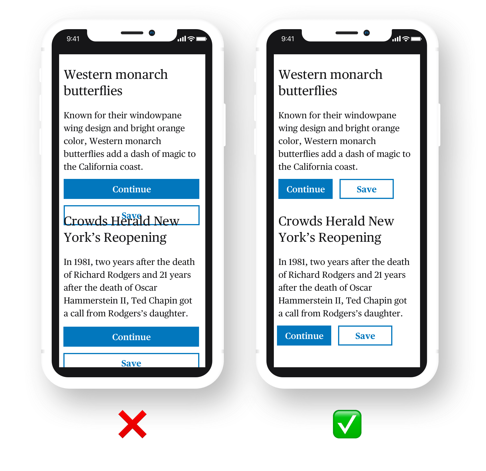
How To Set Up Defender’s User Agent Banning
Defender’s User Agent Banning feature lets you specify which user agents you will and will not allow to visit your site.
To access and enable this feature, log into your site and go to Defender > Firewall
Access Defender’s User Agent Banning from the Firewall menu.
Click the button to activate the feature…
Activate Defender’s User Agent Banning feature.
You can permanently ban malicious bots and bad user agents from accessing your site by entering these into the Blocklist field (one per line). Defender includes some common bad bots in the Blocklist by default. You can add more bad bots to the list by searching online for “bad user agent block lists”.
Ban user agents by adding them to the Blocklist.
Conversely, you can add good bots and user agents to the Allowlist field to allow them permanent access to your site. Defender includes a number of legitimate bots and user agents to this list by default.
Allow good bots permanent access to your site using the Allowlist.
Note: If you add the same user agent or bot to both fields, the Allowlist will override the Blocklist.
The Message section lets you customize and preview the message that will display on your site to blocked users throughout the lockout period.
Add a custom message to blocked users.
Bots are identified by their IP address and HTTP Header User-Agent. If the HTTP Header User-Agent is missing, this should be regarded as an unusual and suspicious red flag. Often, these come with an SQL injection. In this case, the best option is to block their IP address.
You can block any IP addresses that send Post requests with empty referer and user agent headers in the Empty Headers section. (Note: the word referer is not misspelled.)
Activate this function to block IP addresses with empty headers.
Note: Spam bots sometimes do not have a referer or HTTP header, so activating this option will also help prevent spammy form submissions and comments.
Finally, you can easily deactivate the feature at any time if you no longer want to use it.
Deactivate Defender’s User Agent Banning feature with just one click.
Remember to click the Save button when done to update your plugin settings.
To view a log of Defender’s activity and confirm that the feature is active and working, select Firewalls > Logs in the plugin’s menu.
Defender starts banning bad user agents right away!
No Whiffs or Bots
With Defender’s User Agent Banning feature activated, bad bots won’t even get a sniff in and malicious user agents will strike out every time they visit your site. Defender goes straight to work banning and locking out user agents as per your configured lockout settings.
Additionally, Defender’s continuous monitoring protects your site while saving server resources for legitimate traffic, thus helping to further improve your site’s performance.
For more information or help using this feature, check out our documentation section or contact our 24/7 support team.
Have you ever experienced the frustration of trying to tap a button on a mobile device only to have it do nothing because the target size is just notlarge enough **and it’s not picking up on your press? Maybe you have larger fingers, like I do, or maybe it’s due to limited dexterity. This is because the sadly ever-decreasing target area of elements we, the users, have to interact with.
Let’s talk about targetsize and how to make it large enough for users to easily interact with an element. This is an especially big deal if a user is accessing content on a small hand-held touch screen device where real estate is much tighter.
Success criterion revisited
I touched (no pun intended) on Success Criterion in a previous article covering the WCAG 2.1 criterion, Label in Name. In short, the WCAG criteria is the baseline from which we determine whether our work is “accessible.”
If you’re wondering whether there’s a criterion for target size, the answers is yes. It’s WCAG2.5.5. Pulling straight from the guidelines. passing WCAG 2.5.5 with a AAA grade requires “the size of the target for pointer inputs is at least 44 by 44 CSS pixels except when:
Equivalent: The target is available through an equivalent link or control on the same page that is at least 44×44 CSS pixels;
Inline: The target is in a sentence or block of text;
User Agent Control: The size of the target is determined by the user agent and is not modified by the author;
Essential: A particular presentation of the target is essential to the information being conveyed.”
What could possibly go wrong?
It’s just a size, right? Easy peasy. Nothing can possibly go awry.
Or can it?
Small target sizes can cause accessibility hurdles for many people. Have you ever been traveling in a vehicle on a bumpy road and you’re trying to interact with an app on your mobile can not press on an element? That is an accessibility hurdle. Those with motor skill or cognitive impairments will have a much harder time because it is much harder for them if the target size is too small and does not meet WCAG requirements.
I don’t mean to pick on Twitter here, but it’s the first notable example I found while hunting for examples of small targets.
There are some good examples of small targets in here, from the tiny contextual menu to the actions in the footer of a tweet, and even the small icons to add topics to a timeline. And notice that even with a properly sized target, like the floating button to compose a tweet, it overlaps with another target, obstructing access to it.
Imagine the hurdles someone with neuromuscular disorders, such as Multiple Sclerosis, Cerebral Palsy, arthritis, tremors, or Alzheimer’s Disease or any other motor impairment would have to overcome to activate a target in any of those cases.
Another favorite example I see quite often? Ads. Have you ever struggled to click the minuscule “X” button to close them?
You’re not alone if you’ve ever struggled to click, let alone even locate, the close button.
Having no motor skill or cognitive disabilities personally, I find myself fumbling around and taking multiple times to hit some target areas. The fact that someone who needs to use something like a pen or stylus on a target size that is not a minimum of 44×44 pixels can be a difficult task. These targets shouldn’t need multiple attempts to activate when the target size doesn’t meet recommended guidelines.
Target size considerations
WCAG 2.5.5 goes into specific detail to help us account for these things by defining the four types of controls we just saw: equivalent, inline, User Agent, and essential.
We’re going to look at different considerations for determining target sizes and hold them up next to the WCAG guidelines to help steer us toward making good, accessible design decisions.
Consider the difference between “click” and “tap”
This success criteria ensures that target sizes are large enough for users to easily activate targets, even if the user is accessing these targets on handheld devices. We typically associate small screens with “taps” instead of “clicks” when it comes to activating targets. And that’s something we need to consider in our target sizing.
Mice and similar input devices use a pointer on the screen, which is considered “fine” precision because it allows a user to access an element on the screen with exact precision. Fine precision makes it easier to access smaller target sizes in theory. The trouble is, that sort of input device can be tough for some users, whether it’s with gripping the device, or some other cognitive or motor skill. So, even with fine precision, having a clear target is still a benefit.
A Tale of Two Targets: Combining padding and color can help increase the size of a tap target while making it visually clear.
Touch, on the other hand, can be problematic as it is an input mechanism with very “coarse” precision. Users can lack a level of fine control when using a mouse or stylus, for example. A finger, which is larger than a mouse pointer, generally obstructs a user’s view of the exact location on the screen that is being activated or touched. Hence, “coarse” precision.
A smaller pointer offers more precision than a larger thumb when it comes to interacting with an element.
This issue is exacerbated in responsive design, which needs to accommodate for numerous types of fine and coarse inputs. Both input types must be supported for a site that can be accessed by a desktop or laptop with a mouse, as well as a mobile device or tablet with a touch screen.
That makes the actual size we use for a target a pretty important detail. Depending on who is using a control, what that control does, how often it’s used, and where it’s located, we ought to consider using larger, clearer targets to prevent things like unintended actions.
But with all this said, we do actually have a CSS media query that can detect a pointer device so we can target certain styles to either fine or coarse input interactions, and it’s well-supported. Here’s an example pulled right out of the spec:
/* Make radio buttons and check boxes larger if we have an inaccurate primary pointing device */
@media (pointer: coarse) {
  input[type="checkbox"], input[type="radio"] {
    min-width: 30px;
    min-height: 40px;
    background: transparent;
  }
}
Consider that different platforms have different requirements
When WCAG specifies exact values, it’s worth paying attention. Notice that we’re advised to make target sizes at least 44×44 pixels, which is mentioned no fewer than 18 times in the WCAG 2.5.5 explainer.
However, you may have also seen similar requirements with different guidance from the likes of Apple’s “Human Interface Guidelines” for iOS, and Google’s “Material Design” in their platform design requirements.
“Try to maintain a minimum tappable area of 44pt x 44pt for all controls.” (Apple, “Human Interface Guidelines”)
“Consider making pointer targets at least 44 x 44 dp.” (Material Design, “Accessibility”)
Consider the “tappable area” of a target
Notice that Apple’s platform requirements refer to a “tappable area” when describing the ideal target size. That means that we’re talking about space as much as we are about the appearance of a target. For example, Google’s Material Design suggests at least a 48×48 dp (density-independent pixels) target size for interactive elements. But what if your design requirements call for a 24×24 dp icon? It’s totally legit to use padding in our favor to create more interactive space around the icon, comprising the 48×48 dp target size. Or, as it’s documented in Material Design:
Touch targets are the parts of the screen that respond to user input. They extend beyond the visual bounds of an element. For example, an icon may appear to be 24×24 dp, but the padding surrounding it comprises the full 48×48 dp touch target.
Consider responsive layout behavior
That’s right, we’ve gotta consider how things shift and move around in a design that’s meant to respond to different viewport sizes. One example might be buttons that stack on small screens but are inline on larger screen. We want to make sure that transition accounts for the placement of surrounding elements in order to prevent overlapping elements or targets.
Speaking of inline, there’s a particular piece of the WCAG’s exception for inline targets that’s worth highlighting:
Inline: Content displayed can often be reflowed based on the screen width available (responsive design). In reflowed content, the targets can appear anywhere on a line and can change position based on the width of the available screen. Since targets can appear anywhere on the line, the size cannot be larger than the available text and spacing between the sentences or paragraphs, otherwise the targets could overlap. It is for this reason targets which are contained within one or more sentences are excluded from the target size requirements.
(Emphasis mine)
Now, we’re not necessarily talking about buttons that are side-by-side here. We can links within text and that text might break the target’s placement, possibly into two lines.
While it might be difficult to tap one target without inadvertently tapping the other, the WCAG makes an exception for inline targets, like links within paragraphs.
Consider the target’s relationship to its surroundings
We just saw how inline links within a block of text are exempt from the 44×44 rule. There are similar exceptions depending on the target’s relationship to the elements around it.
Let’s take the example that the WCAG explainer provides, again, in it’s description of inline target exceptions:
If the target is the full sentence and the sentence is not in a block of text, then the target needs to be at least 44 by 44 CSS pixels.
That’s a good one. We ought to consider whether the target is its own block or part of a larger block of text. If the target is its own block, then it needs to abide by the rules, whether it’s a button with a short label, or a complete sentence that’s linked up. On the flip side, a complete sentence that’s linked up inside another block of text doesn’t have to meet the target size requirements.
If the target is its own block of text (left), then it needs to adhere to the WCAG criterion. Otherwise, it is exempt (right).
You might think that something like a linked icon at the end of a sentence or paragraph would need to play by the rules, but the WCAG is clear that these targets are exempt:
A footnote or an icon within or at the end of a sentence is considered to be part of a sentence and therefore are excluded from the minimum target size.
And that makes sense. Imagine content with a line height of, say 32 pixels and an icon at the end that’s all padded up to be 44×44 pixels and how easy it would be to inadvertently activate the icon.
Consider whether the target is styled by the User Agent
If the target is completely un-styled — in the sense that you’ve added no CSS to it — and instead takes on the default styles provided by the browser, then there’s no need to stress the 44×44 rule. That makes sense. The User Agent is like system-level UI so changing it superficially with our own styles would be overriding an entire system which could lead to inconsistencies in that UI.
You’re fine just as you are, little button.
So, yeah, if you’re rockin’ a default <button> or the like, and there are no other styles or sizing applied to it, then it’s good to go. But lots of us use resets to normalize UI elements across browsers, so watch for that in your codebase because that’s going to affect the User Agent styles of your target.
Consider if there are other ways to activate the functionality
We’ve all used in-page anchor links, right? Heck, CSS-Tricks often has a table of contents at the top of an article that’s merely a list of anchor links.
Should these be at least 44×44 pixels?
WCAG actually uses anchor links as an example of something that’s off the hook as far as meeting the target size requirements. Why? Because it’s just as possible to manually scroll down to a specific location on a page as it is to click a link to jump there. There are two ways to accomplish the same thing, and one of those ways is built right into the browser.
But we still ought to use care when working with something like a table of contents. I’m not entirely clear here, but given that a table of contents is list of links, each link may very well constitute its own block of text that’s not part of a larger block of a text, like a paragraph. So, in this sort of case, maybe a little extra space between list items is still a good idea. There’s less change of accidentally clipping or tapping two or more targets at once.
Wrapping up
WCAG 2.5.5 criterion provides guidance for applying target sizes that are clear, unobstructed, and easy to activate. As we saw, there are plenty of cases where the size of a target can make all the difference in the world when it comes to completing an action.
The interesting thing about the target size guidelines is what is exempted from them. While we didn’t cover each specific exemption on its own, we did look at a bunch situations that require careful consideration for sizing a target, from the type of input device that’s in use to the relationship of the target to its surrounding elements, and plenty of things between.
The key to accessible target sizing isn’t necessary about using less styling on a target (although we did see that default User Agent styles are exempt), but rather having context and styling accordingly. There are probably dozens more situations we could have covered here and examined how styles come into play — so if you have some, share!
And as far as styling goes, CSS specifications have specific features, like the interation media query for pointer, to make target sizing even better for people. Used well, it could be a great way to detect if a visitor is using a fine or coarse input device. That way, we can tailor things to make their experience better than if we treated those differences the same.
So, yes, target sizes are an easy thing to brush off and ignore. But hopefully now you’re like me and have a genuine appreciation for targets that are correctly sized now that you have the information to make correctly sized targets of your own.
OAuth 2 has become a popular protocol to follow for authorizing users to access protected resources. A typical OAuth 2 scenario:
A user requests access to a protected resource managed by a resource server via a User Agent, typically the user's browser.
The resource server redirects the user via an HTTP redirect to an Authorization Endpoint managed by an Authorization Server that has an account for that user. The location of the redirect response has a field typically called redirect_uri.
The authorization server prompts the user for credentials to verify the user's identity. It might also confirm that the user is OK with allowing the user agent access to the resource held at the resource server.
The user enters credentials and confirms allowing access if required.
The authorization server verifies user credentials and sends an authorization_code value at the redirect_uri.
A service running at the redirect_uri sends POST request to a Token Endpoint managed by the authorization server with authorization_code.
Token endpoint validates the authorization_code, generates an access_token, and sends it back to redirect_uri in response.
Service at redirect_uri retries the initial HTTP request adding access_token as a query string parameter.
The resource server validates access-token and allows access to the protected resource.
Problem
Often in a single page application (SPA), we see that the UX layer is responsible for both the GET call to the authorization code endpoint as well as the POST call to the access token endpoint to exchange the authorization code with the access token. The SPA then uses this token to make back end, typically REST calls to the resource server.
Say you wanted to put the CSS-Tricks website in an <iframe>. You'd do that like this:
<iframe src="https://css-tricks.com"></iframe>
Without any other styling, you'd get a rectangle that is 300x150 pixels in size. That's not even in the User Agent stylesheet, it's just some magical thing about iframes (and objects). That's almost certainly not what you want, so you'll often see width and height attributes right on the iframe itself (YouTube does this).
Those attributes are good to have. It's a start toward reserving some space for the iframe that is a lot closer to how it's going to end up. Remember, layout jank is bad. But we've got more work to do since those are fixed numbers, rather than a responsive-friendly setup.
The best trick for responsive iframes, for now, is making an aspect ratio box. First you need a parent element with relative positioning. The iframe is the child element inside it, which you apply absolute positioning to in order to fill the area. The tricky part is that the parent element becomes the perfect height by creating a pseudo-element to push it to that height based on the aspect ratio. The whole point of it is that pushing the element to the correct size is a nicer system than forcing a certain height. In the scenario where the content inside is taller than what the aspect ratio accounts for, it can still grow rather than overflow.
I'll just put a complete demo right here (that works for images too):


