The End Of The Free Tier

I love free tiers, and I am not the only one. Everyone loves free things — they’re the best thing in life, after all. But maybe we have grown too accustomed to them, to the extent that a service switching from a “freemium” model to a fully paid plan would probably feel outrageous to you. Nowadays, though, the transition from free to paid services seems inevitable. It’s a matter of when a service drops its free tier rather than if it will.

Companies need to make money. As developers, we probably understand the most that a product comes with costs; there are startup funds, resources, and salaries spent to maintain and support the product against a competitive globalized market.

If I decided to take something I made and ship it to others, you darn well know I would charge money for it, and I assume you’re the same. At the same time, I’m typically more than happy to pay for something, knowing it supports the people who made it.

We get that, and we surely don’t go walk into a grocery store complaining that nothing they have is free. It’s just how things work.

What exactly, then, is so infuriating about a service offering a free tier and later deciding to transition to a priced one?

It’s Positioning, Not Money

It’s not so much about the money as it is the positioning. Who wouldn’t feel somewhat scammed, having invested time and resources into something that was initially advertised as “free” only to be blindsided behind a paywall?

Most of the time, the feeling is less anger than it is mildly annoying. For example, if your favorite browser suddenly became a paid premium offering, you would most likely switch to the next best option. But what happens when the free tier for a hosted product or service is retired? Switching isn’t as easy when hundreds of thousands of developers server their projects in a free-tier hosting plan.

The practice of offering a free tier only to remove it seems like a common practice on the web that won’t go away any time soon. It’s as though companies ditch them once (1) the product becomes mature enough to be a feature-rich offering or (2) the company realizes free customers are not converting into paid customers.

It has been a source of endless complaints, and one only needs to look back at PlanetScale’s recent decision to remove its free-tier database plan, which we will get deeper into in a bit. Are free tiers removed because of their unsustainable nature, or is it to appease profit-hungry companies? I want to explore the why and how of free tiers, better approaches for marketing “free” services, and how to smoothly retire a free tier when it inevitably goes away.

Glossary

Before we wade further into these waters, I think it’s worth having a baseline understanding of pricing concepts that are relevant to the discussion.

A free tier is one of several flavors:

  • Free trial opt-in
    Permits users to try out the product for a limited period without providing payment details. Once the trial ends, so does access to the product features.
  • Free trial opt-out
    Requires users to provide payment information during registration en route to a free trial that, once it ends, automatically converts to a paid account.
  • Freemium model
    Offers access to a product’s “core” features but requires upgrading to a paid account to unlock other features and benefits.
  • Reverse trial model
    Users start with access to the premium tier upon registration and then transition to a freemium tier after the trial period ends.
Case Study: PlanetScale

Let’s start this conversation by looking at PlanetScale and how it killed its free tier at the beginning of the year. Founded in 2018, PlanetScale launched its database as a service in 2021 and has raised $105 million in venture capital and seed funding, becoming one of the fastest-growing tech companies in North America by 2023. In March of this year, CEO Sam Lambert announced the removal of PlanetScale’s hobby tier.

In short, the decision was made to provide “a reliable and sustainable platform for our customers” by not “giving away endless amounts of free resources to keep growing,” which, of course, leaves everyone in the freemium tier until April 8 to either pay for one of the next plans at the outrageous starting price of $39 per month or migrate to another platform.

Again, a company needs steady revenue and a reliable business plan to stay afloat. But PlanetScale gave mixed signals when they stated in the bespoke memo that “[e]very unprofitable company has a date in the future where it could disappear.” Then they went on to say they are “the main database for companies totaling more than $50B in market cap,” and they “have been recognized [...] as one of the fastest growing tech companies in the US.”

In non-bureaucratic speak, PlanetScale says that the product is failing from one side of its mouth and that the company is wildly successful from the other.

The company is doing great. In November 2023, PlanetScale was ranked as the 188th fastest-growing company in North America by Deloitte Technology Fast 500™. Growth doesn’t necessarily equal revenue, but “to be eligible for Technology Fast 500 recognition, [...] [c]ompanies must have base-year operating revenues of at least US $50,000, and current-year operating revenues of at least US $5 million.”

PlanetScale’s decision can only be interpreted as “we want more money,” at least to me. There’s nothing about its current performance that suggests it needs the revenue to keep the company alive.

That’s a punch below the waist for the developer community, especially considering that those on the free tier are likely independent bootstrappers who need to keep their costs low. And let’s not overlook that ending the free tier was accompanied by a round of layoffs at the company.

PlanetScale’s story is not what worries me; it’s that retiring freemium plans is becoming standard practice, as we have seen with the likes of other big PaaS players, including Heroku and Railway.

That said, the PlanetScale case is perhaps the most frustrating because the cheapest alternative to the free tier they now offer is a whopping $39 per month. Compare that to the likes of others in that space, such as Heroku ($7 per month) and Railway ($5 per month).

Is This How A Free Tier Works?

With zero adoption, the value of a new service can’t be seen behind a paywall. Launching any kind of product or service with a freemium pricing model is often used to bring awareness to the product and entice early adopters who might convert into paying customers to help offset the costs of those on the free plan. It’s the old Pareto, or 80/20, rule, where 20% of paying customers ought to pay for the 80% of free users.

A conversion rate is the percentage of users that upgrade from a free tier to a paid one, and an “average” rate depends on the type of free tier or trial being offered.

In a freemium model — without sales assist — a good conversion rate is somewhere between 3–5%, but that’s optimistic. Conversion rates are often way lower in reality and perhaps the toughest to improve for startups with few or no customers. Early on, startups often have so few paying customers that they will have to operate at a loss until figuring out a way to land paying customers who can subsidize the ones who aren’t paying anything.

The longer a company operates at a loss, the more likely it races to generate the highest possible growth before undoubtedly having to cut benefits for free users.

A lot of those free users will feel misled and migrate to another service, but once the audience is big enough, a company can afford to lose free customers in favor of the minority that will switch to premium. Take Evernote, for example. The note-taking app allowed free users to save 100,000 notes and 250 notebooks only to do an about-face in 2023 and limit free users to 50 notes and one notebook.

In principle, a free tier serves the same purpose for SaaS (Software as a System) and PaaS (Product as a System) offerings, but the effects differ. For one, cloud computing costs lots of money, so offering an AWS wrapper in a free tier is significantly harder to sustain. The real difference between SaaS and PaaS, however, is clear when the company decides to kill off its free tier.

Let’s take Zoom as a SaaS example: there is a basic tier that gives you up to 40 minutes of free meeting time, and that is plenty for people who simply don’t need much beyond that. If Zoom were to remove its free tier, free users would most likely move to other freemium alternatives like Google Meet rather than upgrade to one of Zoom’s paid tiers. Those customers have invested nothing in Zoom that locks them in, so the cost of switching to another meeting app is only the learning curve of what app they switch to.

This is in contrast to a PaaS; if the free tier is removed, switching providers introduces costs since a part of your architecture lives in the provider’s free tier. Besides the effort needed to migrate to another provider, moving data and servers can be an expensive operation, thanks to data egress fees. Data egress fees are obscure charges that cloud providers make customers pay for moving data from one service to another. They charge you to stop paying!

Thankfully, there is an increased awareness of this issue through the European Union’s Data Act that requires cloud providers located in Europe to remove barriers that prevent customers from easily switching between companies, including the removal of artificial egress fees.

The Ethics Of The Free Tier

Is it the developer’s fault for hosting a project on a free pricing tier, considering that it can be rolled out at any moment? I have two schools of thought on this: principle and consequential.

  • Principle
    On the one hand, you shouldn’t have to expect a company to pull the rug out from under you by removing a free tier, especially if the company aims to be a reliable and sustainable platform.
  • Consequential
    On the other hand, you don’t expect someone to cut a red light and hit you when you are driving, but you still look at both sides of the street. So it is with using a free tier. Even if it is “immoral” for a company to remove the tier, a developer ought to have a backup plan in the event that it happens, especially as the disappearance of free tiers becomes more prevalent in the industry.

I think it boils down to a matter of transparency. No free tier is advertised as something that may disappear, even if it will in the future. In this case, a free tier is supposed to be another tier with fewer benefits than the paid plan offerings but just as reliable as the most expensive plan, so no user should expect to migrate their projects to other providers any time soon.

What’s The Alternative?

Offering customers a free tier only to remove it once the company gets a “healthy enough” share of the market is just wrong, particularly if it was never attached to an up-front sunset date.

Pretending that the purpose of a free tier is the same as a free trial is unjust since it surely isn’t advertised that way.

If a company wants to give people a taste of how a product or service works, then I think there are far better and more sincere alternatives to the free-tier pricing model:

  • Free trials (opt-in)
    Strapi is an open-source CMS and a perfect example of a service offering a free trial. In 2023, the company released a cloud provider to host Strapi CMS with zero configuration. Even though I think Strapi Cloud is on the pricey side, I still appreciate having a 14-day free trial over a free tier that can or maybe will be removed later. The free trial gives users enough time to get a feel for the product, and there’s no credit card required that would lock someone in (because, let’s face it, some companies count on you forgetting to cancel your free subscription before payments kick in).

  • Free credits
    I have used Railway to host Node.js + Postgres in the past. I think that its “free tier” is the best example of how to help customers try the service: the cheapest plan is a relatively affordable $5 per month, and a new subscriber is credited with $5 to start the project and evaluate the service, again, without the requirement of handing over credit card information or pulling any rugs out from under people. Want to continue your service after the free credits are exhausted? Buy more credits!

Railway is a particular case because it used to have a free tier, but it was withdrawn on June 2, 2023. However, the company removed it with a level of care and concern for customers that PlanetScale lacked and even gave customers who relied on the free tier a trial account with a number of free credits. It is also important to note (and I can’t get over it) that PlanetScale’s new cheapest plan is $39 per month, while Railway was able to limit the damage to $5 per month.

Free Tiers That I Use

I don’t want this article to be just a listicle of free services but rather the start of a conversation about the “free-tier dilemma”. I also want to share some of the free tiers I use, even for small but production-ready projects.

Supabase

You can make pretty much any imaginable web app using Supabase as the back-end since it brings a PostgreSQL database, authentication, real-time subscriptions, and storage in a central dashboard — complete with a generous allocation of database usage in its free tier.

Railway

I have been using Railway to host Strapi CMS for a long time. Aside from its beautiful UI, Railway includes seamless deployment workflows, automatic scaling, built-in CI/CD pipelines, and integration with popular frameworks and databases thanks to its hundreds of templates. It doesn’t include a free tier per se, but you can get the full feel of Railway with the $5 credit they offer.

GitHub Pages

I use GitHub Pages the way I know many of you do as well: for static pages and technical demos. I have used it before to make live examples for my blog posts. So, it’s more of a playground that I use to make a few artifacts when I need to deploy something fast, but I don’t rely on it for anything that would be of consequence if it were to suddenly go away.

Netlify

Beyond hosting, Netlify offers support for almost all modern frameworks, not to mention that they toss in lots of additional perks, including solid documentation, continuous deployment, templates, an edge network, and analytics — all of which are available in a free tier that pleases almost anyone’s needs.

Conclusion

If it isn’t totally clear where I fall on the free pricing tier situation, I’m not advocating that we end the practice, but for more transparency on the side of the companies that offer free tier plans and increased awareness on the side of developers like myself.

I believe that the only way it makes sense to offer a free tier for a SaaS/PaaS is for the company providing it to view it as part of the core product, one that cannot be sunset without a clear and transparent exit strategy, clearly communicated up-front during any sort of registration process. Have a plan for users to painlessly switch services. Allow the customer to make an informed choice and accept responsibility from there.

Free tiers should attract users rather than trap them, and there is an abysmal difference between replacing a free tier for $5 per month with one that costs nearly $40. Taking away the service is one thing; charging exorbitant rates on top of it only adds insult to injury.

We can do better here, and there are plenty of alternatives to free tiers for effectively marketing a product.

Further Reading On SmashingMag

Designing Web Design Documentation
As an occasionally competent software developer, I love good documentation. It explains not only how things work but why they work the way they do. At its best, documentation is much more than a guide. It is a statement of principles and best practices, giving people the information they need to not just understand but believe.

As soft skills go in tech land, maintaining documentation is right up there. Smashing has previously explored design documents in a proposal context, but what happens once you’ve arrived at the answer and need to implement? How do you present the information in ways that are useful to those who need to crack on and build stuff?

Documentation often has a technical bent to it, but this article is about how it can be applied to digital design — web design in particular. The idea is to get the best of both worlds to make design documentation that is both beautiful and useful — a guide and manifesto all at once.

An Ode To Documentation

Before getting into the minutia of living, breathing digital design documentation, it’s worth taking a moment to revisit what documentation is, what it’s for, and why it’s so valuable.

The documentation describes how a product, system, or service works, what it’s for, why it’s been built the way it has, and how you can work on it without losing your already threadbare connection with your own sanity.

We won’t get into the nitty-gritty of code documentation. There are plenty of Smashing articles to scratch that itch:

However, in brief, here are a few of the key benefits of documentation.

Less Tech Debt

Our decisions tend to be much more solid when we have to write them down and justify them as something more formal than self-effacing code comments. Having clear, easy-to-read code is always something worth striving for, but supporting documentation can give essential context and guidance.

Continuity

We work in an industry with an exceptionally high turnover rate. The wealth of knowledge that lives inside someone’s head disappears with them when they leave. If you don’t want to reinvent the wheel every time someone moves on, you better learn to love documentation. That is where continuity lies.

Prevents Needless Repetition

Sometimes things are the way they are for very, very good reasons, and someone, somewhere, had to go through a lot of pain to understand what they were.

That’s not to say the rationale behind a given decision is above scrutiny. Documentation puts it front and center. If it’s convincing, great, people can press on with confidence. If it no longer holds up, then options can be reassessed, and courses can be altered quickly.

Documentation establishes a set of norms, prevents needless repetition, allows for faster problem-solving, and, ideally, inspires.

Two Worlds

In 1959, English author C. P. Snow delivered a seminal lecture called “The Two Cultures” (PDF). It is well worth reading in full, but the gist was that the sciences and the humanities weren’t working together and that they really ought to do so for humanity to flourish. To cordon ourselves off with specialisations deprives each group of swathes of knowledge.

“Polarisation is sheer loss to us all. To us as people and to our society. It is at the same time practical and intellectual and creative loss [...] It is false to imagine that those three considerations are clearly separable.”

— Charles Percy Snow

Although Snow himself conceded that “attempts to divide anything into two ought to be regarded with much suspicion,” the framing was and remains useful. Web development is its own meeting of worlds — between designers and engineers, art and data — and the places where they meet are where the good stuff really happens.

“The clashing point of two subjects, two disciplines, two cultures — two galaxies, so far as that goes — ought to produce creative chances.”

— Charles Percy Snow

Snow knew it, Leonardo da Vinci knew it, Steve Jobs knew it. Magic happens when we head straight for that collision.

A Common Language

Web development is a world of many different yet connected specialisations (and sub-specialisations for that matter). One of the key relationships is the one between engineers and designers. When the two are in harmony, the results can be breathtaking. When they’re not, everything and everyone involved suffers.

Digital design needs its own language: a hybrid of art, technology, interactivity, and responsiveness. Its documentation needs to reflect that, to be alive, something you can play with. It should start telling a story before anyone reads a word. Doing so makes everyone involved better: writers, developers, designers, and communicators.

Design documentation creates a bridge between worlds, a common language composed of elements of both. Design and engineering are increasingly intertwined; it’s only right that documentation reflects that.

Design Documentation

So here we are. The nitty-gritty of design documentation. We’re going to cover some key considerations as well as useful resources and tools at your disposal.

The difference between design documentation, technical documentation, and a design system isn’t always clear, and that’s fine. If things start to get a little blurry, just remember the goal is this: establish a visual identity, explain the principles behind it, and provide the resources needed to implement it as seamlessly as possible.

What should be covered isn’t the point of this piece so much as how it should be covered, but what’s listed below ought to get you started:

The job of design documentation is to weave all these things (and more) together. Here’s how.

Share The Why

When thinking of design systems and documentation, it’s understandable to jump to the whats — the fonts, the colors, the components — but it’s vital also to share the ethos that helped you to arrive at those assets at all.

Where did this all come from? What’s the vision? The guiding principles? The BBC does a good job of answering these questions for Global Experience Language (GEL), its shared design framework.

On top of being public-facing (more on that later), the guidelines and design patterns are accompanied by articles and playbooks explaining the guiding principles of the whole system.

Include proposal documents, if they exist, as well as work practices. Be clear about who the designs are built for. Just about every system has a target audience in mind, and that should be front and center.

Cutting the guiding principles is like leaving the Constitution out of a US history syllabus.

Make Its Creation Is A Collaborative Process

Design systems are big tents. They incorporate design, engineering, copywriting, accessibility, and even legal considerations — at their best anyway.

All of those worlds ought to have input in the documentation. The bigger the company/project, the more likely multiple teams should have input.

If the documentation isn’t created in a collaborative way, then what reason do you have to expect its implementation to be any different?

Use Dynamic Platforms

The days are long gone when brand guidelines printed in a book are sufficient. Much of modern life has moved online, so too should guidance for its documentation. Happily (or dauntingly), there are plenty of platforms out there, many with excellent integrations with each other.

Potential resources/platforms include:

There can be a chain of platforms to facilitate the connections between worlds. Figma can lead into Storybook, and Storybook can be integrated directly into a project. Embrace design documentation as an ecosystem of skills.

Accommodate agile, constant development by integrating your design documentation with the code base itself.

Write With Use Cases In Mind

Although the abstract, philosophical aspects of design documentation are important, the system it described is ultimately there to be used.

Consider your users’ goals. In the case of design, it’s to build things consistent with best practices. Show readers how to use the design guidelines. Make the output clear and practical. For example,

  • How to make a React component with design system fonts;
  • How to choose appropriate colors from our palette.

As we’ve covered, the design breaks down into clear, recognizable sections (typography, color, and so on). These sections can themselves be broken down into steps, the latter ones being clearly actionable:

  • What the feature is;
  • Knowledge needed for documentation to be most useful;
  • Use cases for the feature;
  • Implementation;
  • Suggested tooling.

The Mailchimp Pattern Library is a good example of this in practice. Use cases are woven right into the documentation, complete with contextual notes and example code snippets, making the implementation of best practices clear and easy.

Humanising Your Documentation, a talk by Carolyn Stranksy, provides a smashing overview of making documentation work for its users.

Documentation should help people to achieve their goals rather than describe how things work.

As StackOverflow founder Jeff Atwood once put it, “A well-designed system makes it easy to do the right things and annoying (but not impossible) to do the wrong things.”

Use Case Driven Documentation” by Tyner Blain is a great breakdown of this ethos, as is “On Design Systems: Sell The Output, Not The Workflow” by our own Vitaly Friedman.

Language

The way things are said is important. Documentation ought to be clear, accessible, and accepting.

As with just about any documentation, give words like ‘just’, ‘merely’, and ‘simply’ a wide berth. What’s simple to one person is not always to another. Documentation should inform, not belittle. “Reducing bias in your writing” by Write the Docs gives excellent guidance here.

Another thing to keep in mind is the language you use. Instead of using “he” or “she,” use “one,” “they,” “the developer,” or some such. It may not seem like a big deal to one (see what I did there), but language like that helps reinforce that your resources are for everyone.

More generally, keep the copy clear and to the point. That’s easier said than done, but there are plenty of tools out there that can help tidy up your writing:

  • Alex, a tool for catching insensitive, inconsiderate writing;
  • Write Good, an English prose linter.

In a previous Smashing article, “Readability Algorithms Should Be Tools, Not Targets,” I’ve shared a wariness about tools like Grammarly or Hemingway Editor dictating how one writes, but they’re useful tools.

Also, I can never resist a good excuse to share George Orwell’s rules for language:

  1. Never use a metaphor, simile, or other figure of speech that you are used to seeing in print.
  2. Never use a long word where a short one will do.
  3. If it is possible to cut a word out, always cut it out.
  4. Never use the passive where you can use the active.
  5. Never use a foreign phrase, a scientific word, or a jargon word if you can think of an everyday English equivalent.
  6. Break any of these rules sooner than say anything outright barbarous.

Books like The Elements of Style (PDF) by William Strunk Jr are good to be familiar with, too. Keep things informative but snappy.

Make It Beautiful

Design documentation has a lot more credibility if it’s walking the walk. If it looks like a hot mess, what are the chances of it being taken seriously?

Ideally, you should be showcasing a design ethos, not just explaining it. NASA showed way back in 1976 (PDF) that manuals can themselves be beautiful. The Graphics Standards Manual by Richard Danne and Bruce Blackburn feels like a creative work in its own right.

Show the same care and attention to detail in your design documentation that you expect users to show in applying it. Documentation should be the first and best example of it in action.

Make your documentation easy to navigate and search. The most wonderful resources in the world aren’t doing anyone much good if they can’t be found. It’s also a splendid opportunity to show information architecture best practice in action too.

Publish it

Once you’ve gone through the trouble of creating a design system and explaining how it works, why keep that to yourself? Publishing documentation and making it freely available for anyone to browse is a fantastic final polish.

Here at the Guardian, for example, our Source design system Storybook can be viewed by anyone, and its code is publicly available on GitHub. As well as being a proving ground for the system itself, it creates a space for knowledge sharing.

Here are just a few fantastic examples of publicly available design documentation:

There are plenty more where these came from in the Design Systems Gallery — a fantastic place to browse for inspiration and guidance.

What’s more, if there are stories from the formation of your system, writing articles or blog posts are also totally legit ways of documenting it. What did the New York Times do when they developed a design system? They wrote an article about it, of course.

Publishing design documentation — in all its forms — is a commitment, but it’s also a statement of purpose. Why not share something beautiful, right?

And Maintain It

This is all well and good, I hear you say, arms crossed and brow furrowed, but who’s going to keep all this stuff up to date? That’s all the time that could be spent making things.

I hear you. There are reasons that Tweets (Xs?) like this make the rounds from time to time:

Yes, it requires hard work and vigilance. The time, effort, and heartache you’ll save by having design documentation will be well worth the investment of those same things.

The better integrated the documentation is with the projects it guides, the more maintenance will take care of itself. As components and best practices change, as common issues arise and are ironed out, the system and its documentation can evolve in kind.

To spare you the suspense, your design documentation isn’t going to be perfect off the bat. There will be mistakes and situations that aren’t accounted for, and that’s fine. Own them. Acknowledge blindspots. Include ways for users to give feedback.

As with most things digital, you’re never really “done.”

Start Small

Such thorough, polished design documentation can almost be deterrents, something only those with deep pockets can make. It may also seem like an unjustifiable investment of time. Neither has to be true.

Documentation of all forms saves time in the long run, and it makes your decisions better. Whether it’s a bash script or a newsletter signup component, you scrutinize it that little bit more when you commit to it as a standard rather than a one-off choice. Let a readme-driven ethos into your heart.

Start small. Choose fonts and colors and show them sitting together nicely on your repo wiki. That’s it! You’re underway. You will grow to care for your design documentation as you care for the project itself because they are part of each other.

Go forth and document!

Canadian and US postal code Java

hello, I am currently struggling so bad in understanding Java and how to implement the codes. I have to implement two subclasses for Canadian and US postal code in Java.
For Canadian Postal code, a valid postal postal code has the rule: positions at 0,2,5 are letters. Positions at 1,4,6 are digits. Position at 3 is white space.
(eg: V9A 7N2)
For a valid USA postal code, it starts with two letter, then white space and followed by 5 digits. (eg: WA 98001)
I only need to do implementation on the Canadian and US class.
I have included the parent class and main.java for reference.

Screenshot_(286).png

Screenshot_(285).png

Screenshot_(284).png

These are what was given:

Screenshot_(283).png

Unconscious Biases That Get In The Way Of Inclusive Design

As designers, we want to design optimal experiences for the diverse range of people a product will serve. To achieve this, we take steps in our research and design decisions to minimize the risk of alienating product-relevant social identities, including but not limited to disability, race/ethnicity, gender, skin color, age, sexual orientation, and language.

According to psychologists, we all have unconscious biases. So, designs are often biased, just like we are. This article is for anyone involved in the product design and development process — writers, researchers, designers, developers, testers, managers, and stakeholders. We’ll explore how our biases impact design outcomes and what we can do to design more inclusive experiences.

Once we recognize our unconscious biases, we can take steps to reduce their influence on our decision-making, both as individuals and as collective development and design teams. In this article, we will discuss six unconscious biases that commonly result in delivering user experiences that fall short of being inclusive.

Let’s discuss the six most common unconscious biases are:

Confirmation Bias

This is probably one of the most well-known biases, yet we tend to underestimate how much it impacts our own behavior. Confirmation bias is the tendency to unconsciously look for and give more weight to data, feedback, and users’ behavior that affirms our existing assumptions.

What Is The Impact?

When we approach our work with a confirming and validating mindset, we are more likely to skew our research plan and ignore or minimize any findings that contradict our beliefs. These flaws undermine the purpose of doing research — the goal of inclusive design — and can result in building the wrong thing or the right thing the wrong way. It can also create overconfidence in our assumptions and incline us not to conduct any research at all.

Abercrombie & Fitch dominated the teen clothing market in the 1990s and early 2000s, promoting a very exclusive, all-American, cool-kid image. In the early 2010s, when consumer preferences shifted, the company failed to listen to consumers and maintain its exclusive brand image. After three years of declining sales and pressure from investors, CEO Mike Jefferies resigned. The new CEO, Fran Horowitz, rebranded the company saying, “We are a much more inclusive company, we are closer to the customer, we’re responding to the customer wants and not what we want them to want.”

What Can We Do?

  • Be curious.
    Approach conversations with users with a curiosity mindset and ask non-leading and open-ended questions. Having someone else take notes can serve as an accountability partner as you may hear things differently and can discuss them to clear up discrepancies. And, as much as possible, document exact quotes instead of inferences.
  • Be responsive.
    View each design idea as a hypothesis with a willingness to change direction in response to research findings. Until we conduct primary research with users, our design concepts are merely our best guess based on our own experiences and limited knowledge about our users. We start with that hypothesis as a prototype, then test it with a diverse cross-section of our audience before coding. As quoted by Renee Reid at a UX Research Conference, we should “investigate not validate” our design concepts.

Optimism Bias

While optimism has been linked to many health benefits, optimism bias can be detrimental. Our tendency to minimize the potential of negative outcomes and underestimate risks when it comes to our own actions is referred to as optimism bias. Teams will optimistically think that overlooking socially responsible design will not adversely affect our users’ experience or the bottom line.

What Is The Impact?

As a result of optimistic bias, we may skip user research, ignore accessibility, disregard inclusive language, and launch products that don’t account for the diverse people who use the product.

It turns out that people want and expect products to be designed inclusively. A 2021 survey found that 65% of consumers worldwide purchase from brands that promote diversity and inclusion. And a study by Microsoft found that 49% of Gen-Z consumers in the US stopped purchasing from a brand that did not represent their values.

What Can We Do?

  • Recognize the powerful influence of negativity bias for those on the receiving end of our optimistic bias.
    Psychologists’ research has consistently affirmed that people expect to have good experiences and are more unhappy about bad experiences than good ones. So, one bad interaction has a much greater impact on our users’ perceptions about their experiences than multiple positive interactions.
  • Prioritize impact over output.
    Nobel Prize-winning psychologist Daniel Kahneman suggests running a project premortem. He has extensively researched optimism bias and ways to reduce its influence on our decision-making. Premortem is a loss aversion technique that encourages us to brainstorm potential oversights and identify preventive measures early in our processes.
Omission Bias

Similar to optimism bias, omission bias pertains to our expectations of outcomes. Omission bias occurs when we judge harmful outcomes worse when caused by action than when caused by inaction. This bias can lead us to believe that intentionally deceptive design is a greater offense than failing to implement inclusive design practices.

What Is The Impact?

When we allow our omission bias to prevail, we feel reassured by an illusion of innocence. However, delivering products to market without considering diverse user expectations has the risk of creating harmful user experiences.

This bias is a possible catalyst for skipping user research or leaving inclusive UX work in the product backlog. Some companies profit off this bias by providing accessibility overlays as a post-production solution. These third-party tools attempt to detect accessibility issues in the code and fix the problem for users on the website in real time. Unfortunately, accessibility overlays have been widely documented as problematic and can worsen access.

What Can We Do?

  • Remember that inaction is not without consequence and no less damaging to our users than deliberately harmful actions.
    When our product or service creates barriers or exclusion for our users, whether intentional or unintentional, the effect of the experience feels the same.
  • Plan for inclusive research and design by factoring the necessary time, people, and money into the product roadmap.
    Studies have found that the business cost of going back to fix a design can be 100 times as high as it would have been if the work was addressed during the development stage.

False Consensus Bias

The next two biases, false consensus and perceptual biases, are influential in how we think about others. False consensus bias is when we assume that other people think and behave the same as we do. Jakob Nielsen is known for the clever phrase, “you are not the user,” which is derived from this bias. Our false consensus bias can lead us to think, “well, I’m a user too,” when making design decisions. However, we all have a varied mix of identities — our age, ethnicity, abilities, gender, and so on — which are attributed to our unique needs and expectations.

What Is The Impact?

We design for a broad range of people, most of whom are not like us.

That is illuminated when we consider intersectionality. Law professor Kimberlé Crenshaw coined the term intersectionality “to describe how race, class, gender, and other individual characteristics ‘intersect’ with one another and overlap.”

In early 2022, Olay’s senior design strategist Kate Patterson redesigned the packaging for their facial moisturizer. The new Easy Open Lid not only has side handles allowing a better grip for dexterity challenges but also has the product type in Braille and larger lettering with higher contrast for vision impairments. The product was released as a limited edition, and the company has a feedback form on its website to get feedback from users to make improvements for a second edition.

What Can We Do?

  • Avoid relying on personal preferences.
    Start with conventions and design guidelines, but don’t rely on them solely. Design guidelines are generic, so they don’t, and can’t, address all contextual situations. Optimal user experiences are the result of context-sensitive design.
  • Let go of the notion of the average user and engage with users in interviews, accessibility and usability testing, and other empirical research methods.
    Conducting primary user research is immensely insightful as it allows us to learn how intersecting identities can vary users’ expectations, behavior, and contextual use cases.
Perceptual Bias (Stereotyping)

Continuing with biases that distort how we think of others, perceptual biases include halo effect, recency bias, primary effect, and stereotyping. Regarding biases that get in the way of inclusive design, we’ll address stereotyping, which is when we have overgeneralized beliefs about people based on group attributes.

What Is The Impact?

How we gather and interpret research can be greatly influenced by stereotyping. Surveys, for example, typically don’t reveal a person’s motivations or intent. This leaves room for our speculations of “why” when interpreting survey responses, which creates many opportunities for relying on stereotyping.

The Mr. Clean Magic Eraser Sponge advertisement, “This Mother’s Day, get back to the job that really matters,” reinforced antiquated gender roles. A Dolce & Gabbana campaign included an Asian woman wearing one of their dresses and trying to use chopsticks to eat Italian food while a voiceover mocked her and made sexual innuendos. Designing based on stereotypes and tropes is likely to insult and alienate some of our user groups.

What Can We Do?

  • Include a broad spectrum of our users in our participant pool.
    The more we understand the needs and expectations of our users that are different from us (different ages, ethnicities, abilities, gender identities, and so on), the more we reduce the need to depend on generalizations and offensive constructs about various social identities.
  • Conduct assumption mapping which is an activity of documenting our questions and assumptions about users and noting the degree of certainty and risk for each.
    Assumption mapping can help us uncover how much we’re relying on oversimplified generalizations about people and which segments of the audience our design might not be accounted for and help us prioritize areas to focus our research on.

Status Quo Bias

Lastly, let’s look at a decision-making bias. Status quo bias refers to our tendency to prefer how things are and to resist change. We perceive current practices as ideal and negatively view what’s unfamiliar, even when changes would result in better outcomes.

What Is The Impact?

When we rely on default thinking and societal norms, we run the risk of perpetuating systemic social biases and alienating segments of our users. Failing to get input and critique from people across a diverse spectrum can result in missed opportunities to design broadly-valued solutions.

It took Johnson & Johnson 100 years to redesign their skin-tone colored adhesive bandages. The product was released in 1920 with a Eurocentric design that was optimal for light skin tones, and it wasn’t until 2020 that Band-aid added more shades “to embrace the beauty of diverse skin.”

What Can We Do?

  • Leaders can build non-homogenous teams and foster a workplace where it’s safe to question the status quo.
    Having team members with diverse lived experiences creates a wealth of variance and opportunities for divergent perspectives. Teams that are encouraged to challenge the default and propose alternatives have significant potential to minimize the risks of embedding biases in our UX processes.
  • As individuals, we can employ our System 2 thinking.
    Psychologist Daniel Kahneman popularized two modes of thinking in his book Thinking, Fast and Slow to encourage us to move beyond our visceral thoughts to slower, effortful, and analytical thinking. In this mode, we can question our default System 1 thinking, which is automatic and impulsive, awaken our curiosity about novel ways to approach design challenges, and find opportunities to learn about and engage with people outside our typical circles.
Summary

Designing for many means designing for demographic groups whose needs and expectations differ from ours. Our unconscious biases typically keep us in our comfort zones and stem from systemic social constructs that have historically been an anti-pattern for inclusivity.

Unconscious biases, when unrecognized and unchallenged, seep into our design practices and can insidiously pollute our research and design decisions.

We start to counter our unconscious biases by acknowledging that we have biases. You do. We all do. Next, we can take steps to be more mindful of how our designs impact the people who interact with our products so that we design inclusive experiences.

Additional Resources

  • Learning to Recognize Exclusion
    An article by Lesley-Ann Noel and Marcelo Paiva on what it means to exclude, why we do it, and tips for moving out of our comfort zones.
  • Biased by Design
    A website with information about other biases that influence the design and links to additional resources.
  • Coded Bias
    A Netflix documentary investigating bias in algorithms after M.I.T. Media Lab researcher Joy Buolamwini uncovered flaws in facial recognition technology.
  • Thinking, Fast and Slow
    A book by Daniel Kahneman about how thinking more slowly can help us reduce biased decision-making.
  • Design for Cognitive Bias
    A book by David Dylan Thomas that discusses how biases influence decision-making and techniques for noticing our own biases so we can design more consciously.

How to Create a WordPress Popup Based on Location (Step by Step)

Do you want to create a WordPress popup based on the location of your visitors?

Creating WordPress popups based on location helps you deliver the right marketing message, to the right people, at the right time. This means a better user experience and more revenue for your WordPress site.

In this tutorial, we’ll show you how to create popups based on a user’s location and add them to WordPress.

 How to create a WordPress popup based on location

What Are Location Based Popups?

Location based popups are similar to standard popups, but they only display for visitors from specific locations.

So, visitors from the US will be shown different popups than visitors located in the UK or in Spain.

You can narrow down your location targeting even further, and target specific states and cities. This way visitors in Florida can be shown a different popup than visitors in California.

This process is known as geotargeting, and it lets you encourage your visitors to take specific actions on your site based on where they live.

Why Add WordPress Popups Based on Location?

Using location-based popups in WordPress gives your visitors a highly relevant experience. It shows your visitors that you understand their needs and can lead to better conversions.

This level of personalization can help you reach your website goals, like growing your email list or making money online.

Using geolocation popups can help your business website in a lot of ways.

  • Boost website credibility by showing visitors you’re aware of their location
  • Run eCommerce coupons and specials for visitors in certain areas
  • Promote local events and conferences to your visitors
  • Highlight products that are relevant to visitors in different locations

How to Create a WordPress Location-Based Popup

The easiest way to add popups to your WordPress website is using a plugin.

We recommend using OptinMonster. It’s the best WordPress popup plugin in the market with over 1.2 million users.

You can use the OptinMonster drag and drop editor to simply create a popup campaign in minutes. Plus, you can easily personalize your popups based on what page their viewing, actions they’ve taken on your site, and more.

The first thing you’ll need to do is install and activate the plugin. For more details, see our guide on how to install a plugin in WordPress.

The OptinMonster plugin acts as a link between your WordPress site and the OptinMonster software.

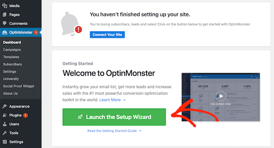
Once the plugin is activated, you’ll have a new menu item called ‘OptinMonster’ in your WordPress admin dashboard.

Open OptinMonster dashboard

Click ‘OptinMonster’ to open your OptinMonster dashboard.

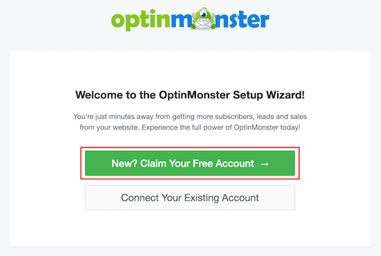
Then, click ‘Launch Setup Wizard’ to connect your site to OptinMonster. If it’s your first time, then you can create a new account for free.

OptinMonster launch setup wizard

After you’re done going through the setup wizard, your site will now be connected to OptinMonster.

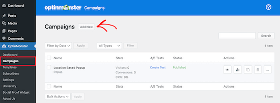
To create your location based popup navigate to OptinMonster » Campaigns.

Then, click ‘Add New’ to create a new popup campaign.

Add new OptinMonster popup campaign

Once you’ve done that, select the ‘Popup’ campaign type.

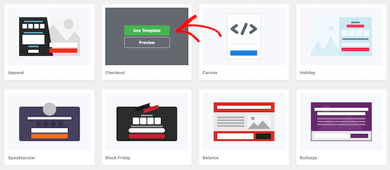
Next, you’ll select the campaign template. Your template forms the foundation for the design of your popup. So, choose a template that closely resembles the design you want.

For this tutorial, we’ll select the Checkout template. Once you find a template you like, hover over it and click ‘Use Template’.

Select OptinMonster template

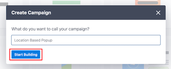
Then, you’ll need to name your campaign.

This name won’t appear in your design. Instead, it’s to help you remember what kind of campaign you created.

Start building popup

Next, click ‘Start Building’.

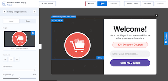
This will bring you to the OptinMonster app, where you can customize the appearance of your popup.

Customize location based popup

You can totally customize your popup by adding new blocks, text, headings, and more. Just click on the element you want to edit and the options menu will appear on the left.

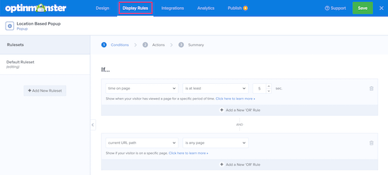
Once you’re satisfied with how your location based popup looks, click ‘Save’, then click on the ‘Display Rules’ tab at the top of the screen.

Set popup display rules

This is where you’ll set your location triggers.

The default rule is your popup will appear on any page after a visitor is on the site for 5 seconds.

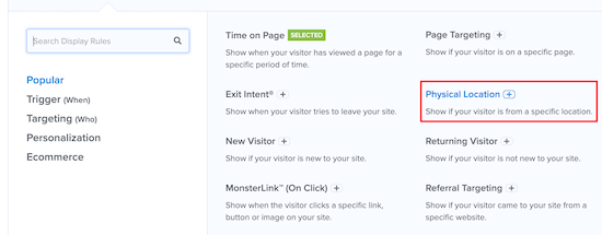
You’ll need to change the first rule to the visitor’s physical location. To do this, click on the ‘time on page’ display rule, then select ‘Physical Location’.

Set physical location rule

Now you can set the popup to display for visitors who are in a specific location.

You also have the option to include or exclude visitors who are in an EU country.

Popup visitor location settings

We’re going to set the rule so the popup will show when a visitor is in Las Vegas, NV.

Next, click ‘Validate’.

Set visitor location

Now, a popup will appear that lists available locations based on what you entered. Simply select the location you want and then click ‘Next Step’.

OptinMonster also gives you the option to add an animated effect or sound on the next screen, but we’ll leave the default settings.

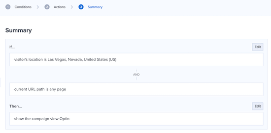
Once you’ve done that, click ‘Next Step’ again, and you’ll be taken to the summary page where you can review your location popup settings.

Location popup display rules summary

If your settings are correct, then navigate to the ‘Publish’ tab and switch the ‘Publish Status’ from Draft to Publish.

Next, click ‘Save’ and exit the screen.

Publish location popup

Your popup based on your user’s location will now be live on your site.

If you want to create multiple popups based on location, then follow the same process above and change the ‘Display’ rules to the new user location.

With OptinMonster, you can have multiple popup campaigns running at once and provide a targeted experience for all your visitors.

We hope this article helped you add a WordPress popup based on location to WordPress. You may also want to see our list of the best email marketing services and best live chat software to boost your sales.

If you liked this article, then please subscribe to our YouTube Channel for WordPress video tutorials. You can also find us on Twitter and Facebook.

The post How to Create a WordPress Popup Based on Location (Step by Step) appeared first on WPBeginner.

Obscure Mobile Design Techniques That Boost UX

It’s no secret that smartphone usage has doubled over the last five years, accounting for an estimated 3.8 billion users this year. This tells us clearly where people’s attention is and how important mobile web designers are to improving the user experience.

We’ve seen plenty of web design experiments in recent years adopted by companies of all sizes. These changes include trends such as the infamous parallax scrolling, non-traditional layouts, and improved accessibility with dark mode. However, many paths are still left to explore, if we’re willing to break out of trends.

To get those creative juices flowing, let’s look at some hidden design gems related to navigation and confirmation dialogs, the waiting experience, and swiping animations. While these solutions are mostly unconventional, the point isn't to highlight them for their own sake. Design solutions have to be built with the pillars of accessibility and usability, but they can be refined according to your ultimate goals for user interaction and experience.

So, let’s bring these elegant off-the-beaten-path design solutions into the spotlight.

Rethinking Navigation

The change of pinning the navigation menu to the bottom has been a game-changer for handheld devices because it allows for more natural thumb-controlled navigation. But as smartphone screens get more expansive, the thumb’s reach gets more restricted. Therefore, we’re long overdue for new mobile design solutions that allow easy access using only the thumb.

Some creative approaches to this problem combine elegant design and functionality. Let’s look at a couple of examples.

Nature Encyclopedia

Nature Encyclopedia is a great learning resource for youth and adults alike. It features interactive infographics and on-point illustrations, but that’s not the part that captures our curiosity.

In addition to all of the swiping functionality that we’ve become accustomed to in other mobile apps, there’s a nifty feature that allows you to change the information displayed by scrolling a wheel. You can also access previously shown information simply by scrolling the other way.

While the action wheel was implemented to ease access to information, it could also be used to navigate between screens. This could potentially address the restriction of the thumb’s reach at the left and right edges of the screen, as you would now be able to effortlessly swipe left or right to navigate.

V For Wiki

You can already access Wikipedia in your phone’s browser. However, V for Wiki has made it even more accessible by featuring an elegant style of presenting the content. It features a nifty world map that instantly pops up information related to the area you’re browsing from.

While the interactive map makes browsing a lot more entertaining, it’s not the feature that first caught our eye.

If you look at the navigation, on top of the guide you’ll see interactive lines to various landmarks, and you can scroll between the locations horizontally. This is a beautifully designed alternate way to navigate the menu because you can use your thumb effortlessly.

This approach could serve as inspiration for a scrolling navigation menu, in which a customer can bring the far-left or far-right menu items closer by scrolling the wheel.

Ada

Ada is an application for the startup Ada Health, which aims to revolutionize how we approach going to the doctor with modern solutions, such as AI, video calls, and interactive design. We’ve all gone through the rabbit hole of looking on Google for advice on symptoms, so getting straightforward access to reliable information is a godsend.

Apart from the app’s clean look, it’s clear from the start that it’s designed to be used effortlessly with the thumb, because the navigation button is on the bottom right and opens the menu in a sidebar on the right. Furthermore, all of the actionable elements are within reach of the thumb, so the user would generally only need to click on the bottom or the right sidebar to get to where they want to go.

Ada, then, is another example of solid navigation built into the app’s concept from the start. The experience of navigating the app feels natural and accessible.

Overhauling Confirmation Dialogs

Confirmation dialogs face the same challenges as navigation menus as a result of people holding their smartphones with one hand. The options are usually binary, one on the left side and the other on the right. As handheld devices get wider, access to one of the two dialog choices becomes complicated due to the limited range of thumb movement.

Let’s look at some unconventional solutions to hard-to-reach confirmation dialogs.

Vice Versa

Vice versa is a diagonal UI pattern for binary options. It takes into account the thumb’s natural movement and acknowledges the limitations of abnormal movement. On a small screen, you could reach to the opposite side with your thumb, but that creates tension and feels uncomfortable.

The vice versa pattern addresses this problem by diagonally dividing the screen in two, allowing binary options to be made using only the thumb. Not only does it make it easier for the thumb to reach both options, but the accuracy issue is solved by giving users a larger area to touch.

While the concept is intended to make voting mechanisms easily accessible, you could adapt this interactive design to all kinds of binary options.

One of the obvious downsides of the pattern is that it’s heavily optimized for right-handed usage. The solution to this problem is that a customer can shake the phone, and the orientation will change. Good solution? We don’t know, but definitely an interesting alternative for confirmation dialogs.

Omni Swipe

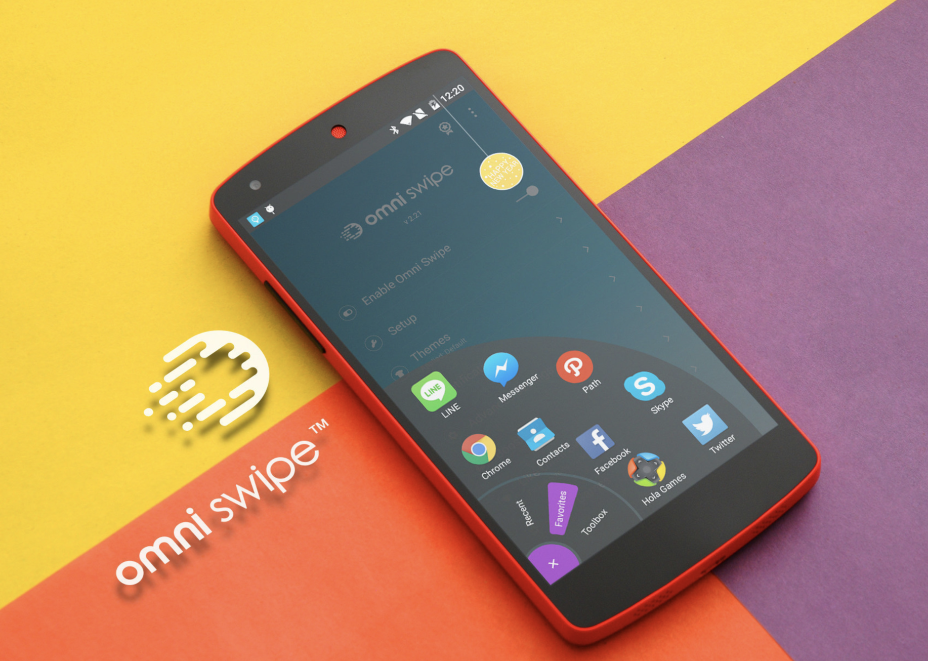
Another solution for hard-to-reach confirmation buttons (or navigation, for that matter) is found in Omni Swipe. While this concept is meant for personalizing a smartphone’s UI, it could also be adapted to standalone applications.

While most navigation buttons open the menu horizontally or vertically, Omni Swipe allows users to access the controls in the thumb’s range of movement. This solves the complex challenge of creating a confirmation solution for all screen widths, because, regardless of size, the actionable elements would appear under the user’s thumb.

Unlike the last concept explored, which allows only binary options, this solution has virtually no limitation to the choices you can add to the menu.

Gamifying the Waiting Experience

In a study by Statista in 2020, 65% of respondents in the US said they used a smartphone for online shopping in the past 12 months. This indicates that e-commerce UX and mobile design go hand in hand. Furthermore, if we look at modern e-commerce platforms, we can see that pretty much all of them highlight mobile-optimized themes. Together, both of these factors paint a clear picture of where the online retail industry is headed.

However, even the slightest disturbance can cause a cart to be abandoned or create a negative shopping experience. Research into the psychology of speed perception shows that a person’s mood affects how they perceive time. In a relaxed and happy environment, you’ll sense time flying by. However, if you’re grumpy, in a bad mood, or anxious, time seems almost to stand still.

Loading screens, shipping flows, preparation stages, and so on all keep users waiting. Let’s look at examples of how mobile designers have tackled the perception of speed in the online food-ordering and food-delivery industry.

Wolt

We used to get anxious waiting in line at a canteen. Well, we still do, but nowadays, we can comfortably order food online and have it delivered to us. However, we still need to wait until the courier arrives.

Wolt is one of the many apps that enable you to purchase food and have it delivered to your doorstep by a courier. If you didn’t have anything better to do, you’d feel like, instead of waiting in line, you’d be waiting for the courier instead.

Wolt has numerous nifty features that target this perception of speed. It shows you the progress in stages, notifying you once a step is complete and showing you the courier’s GPS location. There’s also a clever little game hidden away that helps you to pass the time more quickly and elevate your mood (if you’re OK with being a little competitive). In this minigame, you tap the screen as many times as you can in five seconds, trying to beat Wolt’s team.

While a simple feature, it plays straight into human psychology. Even though the gaming element doesn’t take away your feeling of hunger, it helps you to pass the time more quickly.

Bolt Food

In the previous example, we saw how gamifying waiting times helps users to pass the time more quickly. Bolt Food is another example of a food courier facing the same challenge of waiting times.

Their approach to showing progress is to animate the delivery steps. While not a straightforward game, it still combines a sense of movement with the user’s perception of time. In short, the principle is that if something is moving, then it’s making progress. If the user were to stare at a lifeless screen, their sense of time would slow down, and, with an empty stomach, that would make them more anxious.

So, if your service relies on multiple steps, instead of taking the order and sending a confirmation email afterward, engage with the customer by showing progress at all stages.

Using Animation for Swiping

Card screens have long been a favorite of designers. Customers can easily access different parts of an app simply by swiping and switching cards. However, instead of just applying the swiping function’s UI aspects, you could gamify the app to enhance the user experience.

It’s common for people to react to movement and get drawn into animation. Let’s look at a couple of examples that use the gamify principle in action.

Bookotel

Bookotel is an online reservation app for restaurants and cafes. What strikes home with this app’s design is the innovative way they’ve created the swiping animation in the intro cards.

Instead of just switching to the next card, the whole application seems to move and transform to the following image, message, and prompt.

We don’t see this interaction applied to other parts of the application, so we’re left with some guesswork about how it would look on a larger scale. However, you can’t deny that it would draw the user in and get them to play around with the app.

It’s worth noting that these movements might need to be readjusted if the customer opts-in for reduced motion to prevent accessibility issues from creeping in.

Teatr Lalka

Teatr Lalka was one of the first puppet theatres in Poland and is now over 75 years old. However, its website is anything but ancient. Its dominant motif is interactivity, which is what you’d hope to see on an entertainment-related website.

The first animations you see when visiting Teatr Lalka’s website are the puppets. While representing the actual puppets used in the shows, they also serve another purpose: gamification. You can swipe through animated puppets in a carousels and interact with them by clicking on them, prompting sound and vibrations from your smartphone. The puppets also react to tilting. It’s a wonderful example of how a mobile website can engage with the user from the very first page.

You can apply the same techniques to other applications and websites, enhancing the user experience and playfully engaging with visitors.

Unconventional Solutions Pave the Way for Future Mobile Design

There you have some clever solutions to seemingly simple problems; solutions that hopefully improve the user experience in turn. While following trends isn’t necessarily bad, veering to the edge of innovation can yield a more rewarding result.

With user experience becoming an ever more critical part of our digital lives, it pays to see things from a psychological perspective. Don’t be afraid to test cutting-edge solutions that play into people’s habits, psychology, and sense of convenience. It might be worth it.

Further Resources

The State Of Mobile And Why Mobile Web Testing Matters

Things have changed quite a bit over the last decade when we just started exploring what we could do on a tiny, shiny mobile screen. These days, with mobile traffic accounting for over 50% of web traffic, it’s fair to assume that the very first encounter of your prospect customers with your brand will happen on a mobile device.

Depending on the nature of your product, the share of your mobile traffic will vary significantly, but you will certainly have some mobile traffic — and being prepared for it can make or break the deal. This requires your website or application to be heavily optimized for mobile. This optimization is quite complex in nature though. Obviously, our experiences will be responsive — and we’ve learned how to do so well over the years — but it also has to be accessible and fast.

This goes way beyond basic optimizations such as color contrast and server response times. In the fragmented mobile landscape, our experiences have to be adjusted for low data mode, low memory, battery and CPU, reduced motion, dark and light mode and so many other conditions.

Leaving these conditions out of the equation means abandoning prospect customers for good, and so we seek compromises to deliver a great experience within tight deadlines. And to ensure the quality of a product, we always need to test — on a number of devices, and in a number of conditions.

State Of Mobile 2021

While many of us, designers and developers, are likely to have a relatively new mobile phone in our pockets, a vast majority of our customers isn’t quite like us. That might come a little bit unexpected. After all, when we look at our analytics, we will hardly find any customers browsing our sites or apps with a mid-range device on a flaky 3G connection.

The gotcha here is that, if your mobile experience isn’t optimized for various devices and network conditions, these customers will never appear in your analytics — just because your website or app will be barely usable on their devices, and so they are unlikely to return.

In the US and the UK, Comscore’s Global State of Mobile 2020 report discovered in August 2020, that mobile usage accounted to 79% and 81% of total digital minutes respectively. Also, there was a 65% increase in video consumption on mobile devices in 2020. While a vast majority of the time is spent in just a few mobile apps, social media platforms provide a gateway to the web and your services — especially in education.

On the other hand, while devices do get better over time in terms of their capabilities and battery life, older devices don’t really get abandoned or disappear into the void. It’s not uncommon to see customers using devices that are 5-6 years old as these devices often get passed through the generations, serving as slightly older but "good enough" devices for simple, day-to-day tasks. In fact, an average consumer upgrades their phone every 2 years, and in the US phone replacement cycle is 33 months.

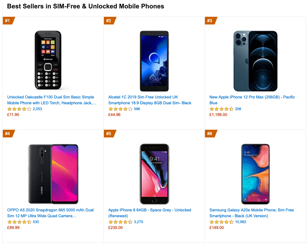
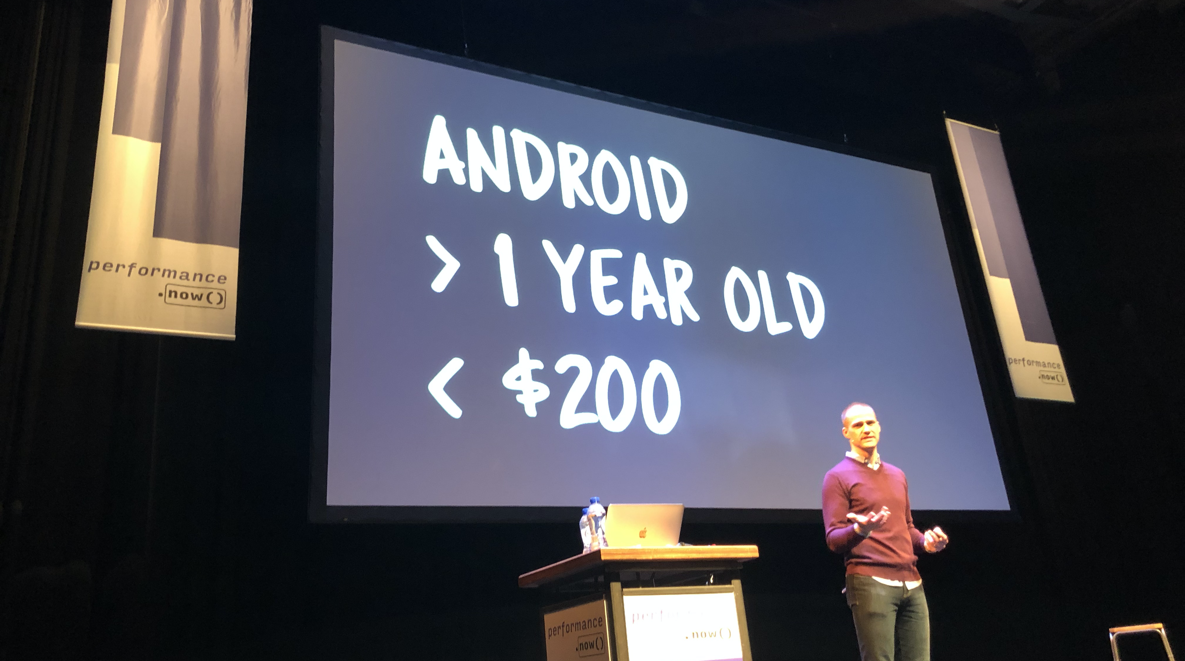
Globally in 2020, 84.8% of all shipped mobile phones are Android devices, according to the International Data Corporation (IDC). Average bestselling phones around the world cost just under $200. A representative device, then, is an Android device that is at least 24 months old, costing $200 or less, running on slow 3G, 400ms RTT and 400kbps transfer, just to be slightly more pessimistic.

This might be very different for your company, of course, but that’s a close enough approximation of a majority of customers out there. In fact, it might be a good idea to look into current Amazon Best Sellers for your target market.

Mobile is a spectrum, and a quite entrenched one. While the mobile landscape is very fragmented already, the gap between the experience on various devices will be widening much further with the growing adoption of 5G.

According to Ericsson Mobility Visualizer, we should be expecting a 15× increase in mobile 5G subscribers, from 212 million in 2020, to 3.3 billion by 2026.

If you’d like to dive deeper into the performance of Android and iOS devices, you can check Geekbench Android Benchmarks for Android smartphones and tablets, and iOS Benchmarks for iPhones and iPads.

It goes without saying that testing thoroughly on a variety of devices — rather just on a shiny new Android or iOS device — is critical for understanding and improving the experience of your prospect customers, and how well your website or app performs on a large scale.

Making A Case For Business

While it might sound valuable to test on mobile devices, it might not be convincing enough to drive the management and entire organization towards mobile testing. However, there are quite a few high-profile case studies exploring the impact of mobile optimization on key business metrics.

WPO stats collects literally hundreds of them — case studies and experiments demonstrating the impact of web performance optimization (WPO) across verticals and goals.

Driving Business Metrics

One of the famous examples is Flipkart, India’s largest e-commerce website. For a while, Flipkart adopted an app-only strategy and temporarily shut down its mobile website altogether. The company found it more and more difficult to provide a user experience that was as fast and engaging as that of their mobile app.

A few years ago, they’ve decided to unify their web presence and a native app into a mobile-optimized progressive web app, resulting in a 70% increase in conversion rate. They discovered that customers were spending three times more time on the mobile website, and the re-engagement rate increased by 40%.

Improving Search Engine Visibility

It’s not big news that search engines have been considering mobile friendliness as a part of search engine ranking. With Core Web Vitals, Google has been pushing the experience factors on mobile further to the forefront.

In his article on Core Web Vitals and SEO, Simon Hearne discovered that Google’s index update on 31st of May 2021 will result in a positive ranking signal for page experience in mobile search only, for groups of similar URLs, which meet all three Core Web Vital targets. The impact of the signal is expected to be small, similar to HTTPS ranking boost.

One thing is certain though: your websites will rank better if they are better optimized for mobile, both in terms of speed and mobile-friendliness — it goes for accessibility as well.

Improving Accessibility

Building accessible pages and applications isn’t easy. The challenges start with tiny hit targets, poor contrast and small font size, but it quickly gets much more complicated when we deal with complex single-page-applications. To ensure that we cater well for our customers in various situations — with permanent, temporary and situational disabilities — we need to test for accessibility.

That means considering keyboard navigation, how navigation landmarks are properly assigned, how updates are announced by a screen reader, and whether we avoid any inaccessible libraries or third-party scripts. And then, for every component we are building, we need to ensure that we keep them accessible over time.

It shouldn’t be surprising that if a website isn’t accessible to a customer, they are unlikely to access your product either. The earlier you invest in accessibility testing, the more you’ll save down the road on expensive consultancy, expensive third-party services, or expensive lawyers.

Mobile Web Testing

So, with all the challenges in the mobile space, how, then, do we test on mobile? Fortunately, there is no shortage of mobile testing tools out there. However, most times, when performing mobile testing, the focus is mostly on consistency and functionality but for a more thorough mobile test, we need to go a layer deeper into some not-so-obvious specifics of testing.

Screen sizes

Screen sizes are one of the many things that are always changing in the realm of mobile devices. Year after year new screen sizes and pixel densities appear with new device releases. This poses a problem in testing websites and apps on these devices, making debugging more difficult and time-consuming.

OS Version fragmentation

With iOS having a high adoption rate on its latest OS releases (a rate of 57% on its latest iOS 14), and the plethora of versions still being used by Android devices going as far back as Ice Cream Sandwich, one must make sure to account to this fragmentation when doing mobile testing.

Browser fragmentation

With Chrome and Safari having a global usage of 62.63% and 24.55% on mobile respectively, one might be tempted to focus on just these browsers when performing mobile tests. However, depending on the region of the world, you are more likely to test in other, less-known browsers, or proxy browsers, such as Opera Mini. Even though their percentage usage might be small, it might run into hundreds of thousands of usage globally.

Performing Mobile Web Testing

To perform mobile web testing, one option is to set up a device lab, and run tests locally. In times of remote work, it’s quite challenging as you usually need a number of devices at your disposal. Acquiring these devices doesn’t have to be expensive, and experiencing the loading on your own is extremely valuable. However, if we want to check how consistent the experience is, or conduct automated tests, it’s probably not going to be enough.

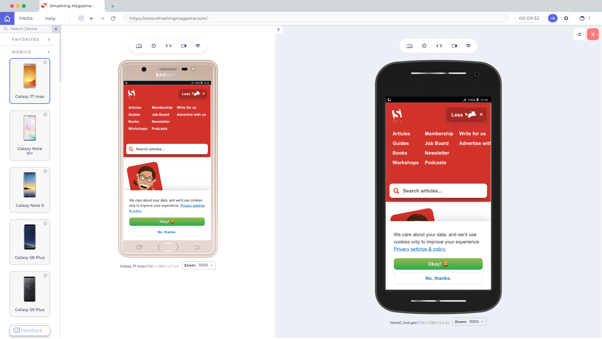
In such cases, a good starting point is Responsively, a free open-source tool with mirrored interactions, customizable layout, 30+ built-in device profiles, hot reloading and screenshot tools.

Also, you might want to look into dedicated developer-focused browsers for mobile testing as well.

Sizzy supports sync scrolling, clicking and navigation across devices, as well as takes screenshots of all devices at once, with and without a device frame. Plus, it includes a Universal Inspect Element to inspect all devices at once.

Blisk supports over 50 devices out of the box, along with sync scrolling. You can test touch support and preview devices side-by-side, working with the same piece of code across all opened devices. Hot-reloading is supported as well, as well as video recording and screenshots.

Another little helpful tool is LT Browser, a web application allowing you to perform mobile view debugging on 45+ devices — on mobile, tablet and desktop. (Full disclosure and reminder: LambdaTest is a friendly sponsor of this article).

Once you have downloaded the browser and registered, you can build, test, and debug your website, as well as take screenshots and videos of bugs, assign them to specific devices, run a performance profiling and observe multiple devices side by side. By default, a free version provides 30 mins per day.

If you need something slightly more advanced, LambdaTest allows you to run a cross-browser test on 2000+ devices on different operating systems. Also, BrowserStack provides an option to automate testing as well as testing for low battery, abrupt power off, and interruptions such as calls or SMS.

Conclusion

In this article, we have looked into the state of mobile in 2021. We’ve seen the growing usage of mobile devices as the primary means to access the web, and we’ve looked into some challenges related to that. We’ve also looked into some specific challenges around mobile testing, and how some tools can help us find and fix bugs on mobile.

Keep in mind that your website is the face of your business and more and more users are going to access it via their mobile phones. It’s important to make sure that your users can access the services you provide on your website and have an accessible and fast experience on their devices as they do on the desktop version. This will ensure that the benefits of brand visibility get the attention they deserve.

Using DevOps During the COVID-19 Pandemic

The COVID-19 pandemic we’re all facing this year is transforming the workforce throughout the whole world. As it doesn't seem like we're going back to the office any time soon, looks like companies are going to need DevOps more than ever.

The COVID-19 pandemic we’re all facing this year is transforming the workforce throughout the whole world. In fact, according to Stanford University research, the US has become a work-from-home economy. 42% of the workforce now working from home full-time. While some businesses are finding it difficult to adjust to this modern lifestyle, others went on immediately. Looking ahead, for a large number of organizations, the inability to adapt could be fatal. 

Looking for a partner from US.

Hi All,

I would personally looking for someone from the US for a partnership. This will be something like a part-time job that needs 5 hrs per week.

Requirements:
US citizenship for legal issues.
Basic understanding of technical - Junior Full-stack (web and mobile development)
Experience working remotely.
Open-minded and think out of the box.
Always kind & cooperative.

Compensation:
Estimate $1k+ per month as a base salary and get a bonus if this works out well.
DM me for more details if you have an interest.
Thank you for your attention.

Are you interested to get $1k per month?

Thanks,
Kevin

10 Open Source Fonts That Are Actually Amazing | Free Fonts 2020

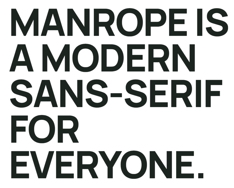
free fonts 2020 manrope

There’s nothing like creating an amazing design that your client loves, while also saving some money in the process.

You don’t have to compromise on the quality of the fonts you choose, just because you’re not paying the big bucks for them.

Better yet, why pay for fonts at all when there are some really great ones out there that are ready for you to use for free?

10 Free Fonts That’ll Change Your Life

I’m going to introduce you to your new best friends, aka 10 open source fonts that’ll spice up all your designs in 2020.

You ready to do this? Cause I am.

Let’s jump right into it.

1. Manrope

We’re going to start today’s list of 10 free fonts with Manrope.

I’ve mentions this font before, but that’s only because it’s my all time favorite.

It’s modern, it’s sleek, it’s everything you want in a free font.

It’s versatility is what really hits home for me and that’s why I recommend that you start incorporating it into all your new designs.

2. Inter

You might’ve seen Inter take a step into the scene as of recent, and I truly believe it’s here to stay.

Inter has become a staple font for many, so don’t be the exception! Add this font to your collection and start adding it to your design projects right away.

3. Public Sans

I can’t lie, I love a good sans serif font.

But what’s special about this font is that it was developed for the US government and is all over their websites and is a huge part of their design.

It looks very similar to another open-source font that you may know of, Libre Franklin.

4. Alice

It’s time to step away from the sans serif, and into the serifs.

When I saw the type-face Alice, I knew it was going to have a new and special spot in my font collection.

Alice is a very unique serif font, which seems kinda old-fashioned, but at the same time, pretty modern.

You can find this font on Google-fonts!

5. Urbanist

Another one of my all time favorite free fonts is Urbanist.

This geometric sans serif is most definitely a modern font that can be used in a variety of different projects.

From logos, to headlines, this font is perfect to add to your colelction of fonts.

What are you waiting for? Go and download it now!

6. Evolventa

Were you surprised when you saw another modern sans serif?

Me either.

Evolventa is a Cyrillic extension of the open-source URW Gothic L font family.

7. Object Sans

If this font isn’t eye-catching, I don’t know what is.

If you’re looking for the perfect combination of Swiss neo-grotesks and geometric fonts, then Object Sans is the one for you.

This font is perfect to replace any of those pricey fonts, because it looks just as good as the rest of them.

8. Lunchtype

I love a good back-story to any font that I use, and Lunchtype has one of the best.

The designer who created this font created it during a lunch break on 100-day project.

We love a good lunch-break, and I can’t deny that that’s when some of my best ideas come to me.

Food is life, and so is an amazing font.

9. Work Sans

What’s cuter than a good font and a hedgehog?

I’ll answer that for you.

nothing.

Absolutely nothing.

10. Monoid

And finally, we’ve come to our last free font, which is Monoid.

Monoid is another great font that we know you’ll love and be using on the daily, if you code.

“The clever thing about Monoid is that it has font-awesome built into it, which they call Monoisome. This means when writing code, you can pop a few icons in there easily. Monoid looks just as great when you’re after highly readable website body text.”

Let us know in the comments which font was your favorite of this list and which ones you’ll be incoporating into your daily design life.

Until next time,

Stay creative folks!

Read More at 10 Open Source Fonts That Are Actually Amazing | Free Fonts 2020

COVID-19 Trackers Launch in Virginia and Alabama

Before jumping into the US news regarding COVID-19 tracker apps, I’ll reiterate a universal grain of salt to take whenever reading about tracker apps: the success of these apps hinges entirely on users self-reporting a positive test result. ProgrammableWeb has a working list of APIs launched with the aim of assisting the effort to battle COVID-19.

How to Develop SaaS Application

Software as a Service (SaaS) is a new approach that is replacing traditional software license purchase. That is why the SaaS delivery model has gained a lot of popularity in the last decade.

According to research conducted by The Insight Partners, “the SaaS market accounted for US$31.57 billion in 2015 and is estimated to expand at a CAGR of 18.6% between 2016 to 2025, accounting for US$ 172.20 billion in 2025.

What Does a Typical Day in the Life of Software Engineer Looks Like

As per the US Bureau of Labor studies, the number of software jobs in the US alone is 1,365,500, with a median salary of $105,000. Software Engineers are computer professionals who use programming languages and tools to build software products and systems. It is an attractive job that pays well, is in demand, and can […]

The post What Does a Typical Day in the Life of Software Engineer Looks Like appeared first on WPArena.

4 Best Ways to Build Security in IoT Development

There’s a running joke in IoT circles that the S in IoT stands for security. The joke, of course, being there is no S or security in making devices for the Internet of Things. 

This is a serious concern since we’re looking at 21.4 million smart speakers in use in 2020. The trend is only like to continue as at least 20% of searches on Google take place through voice assistants and 22% of people in the US have made a purchase using their IoT smart speaker. 

How to Develop a Telemedicine App?

Today, you can get anything on demand, from taxis to food, personal tutors and even doctors. While the first three services have been popular for some time, on-demand doctor consultations came into the picture not so long ago. Telemedicine app development has drawn lots of interest from doctors, hospitals, clinics and patients.

According to a report by MarketWatch, the US telemedicine market saw revenue of around $11.8 billion. 50% of the hospitals in the US use telemedicine programs, but it has now also become interesting for private medical practices, healthcare systems, entrepreneurs, healthcare systems, and insurance companies.

How COVID-19 Affects Information Archiving

At the time of writing this text, in early April 2020, there were 1,348,628 people infected with COVID-19 worldwide, 367,758 across the States. A month later, the figure stands at 4.18 million cases of infection and 1.37 million cases in the US.

It’s been a little over three months since the WHO declared COVID-19 outbreak a global health emergency. In the meantime, the virus has managed to spread across the globe, taking lives, jobs, and families apart.