React 16.6.0 was released October 2018 and with it came goodies that spice up the way we can develop with React. We’re going to cover what I consider the best of those new goodies with examples of how we can put them to use in our work.
React.memo() avoids unnecessary re-rendering
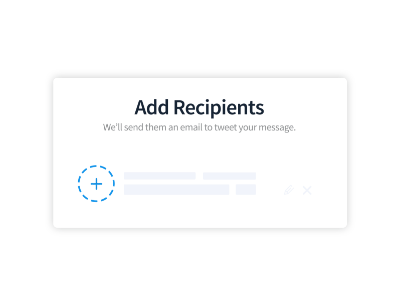
There are situations where a component re-renders, even if neither its state nor its props changed. That adds up and can be an expensive operation.
Here’s an example of a counter to show what we’re talking about:
That’s where React.memo() comes into play. It’s a higher-order component we can wrap around the child and, presto, now the child is shielded from unnecessary additional rendering.
React.lazy() makes importing files a breeze while Suspense provides a fallback UI
Code splitting is crucial in web development—it enables us to import only the files we, which is not only reduces an application’s initial load, but is a core principle of the React framework.
Well, React now enables code splitting using React.lazy() and suspense right at the component level.
By default, if making use of a component (even if its usage depends on a condition), then we import it into the file where you will be using it. React.lazy() can now handle the importation like this:
This single line returns a promise that resolves to the imported component. From here, we can use the component as we normally would.
const App = () => (
  <div>
    <MyCounter />
  </div>
);
There are cases where we might want to render a fallback UI before the component is ready to render. For example, it might take a moment for an API call to fetch and return data. This is a great opportunity to show a loading state while the user waits. Suspense can do just that.
// Using React.lazy() to import the Counter component
const MyCounter = lazy(() => import("./Counter"));
const App = () => (
  <div>
    // Using Suspense to render a loading state while we wait for the Counter
    <Suspense fallback={<div>Loading...</div>}>
      <MyCounter />
    </Suspense>
  </div>
);
Suspense’s fallback prop can accept a React element, so go nuts. It can be used to display whatever fallback UI we want while the component loads.
contextType accesses provider context and passes state without render props
The Context API made it possible to share state among multiple components without having to make use of a third-party library.
Well, React 16.6 makes it possible to declare contextType in a component to access the context from a provider. This saves us from having to make use of render props to pass down context to the consumer.
The provider passes the state and the methods to consumer components that will make use of them via the value prop. To access the context, we’ll make use of this.context instead of making render props like we normally would.
We set static contextType to UserContext which we created earlier. With that, we are able to extract the context which includes the state and methods from this.context. We make use of ES6 destructuring to get the values so we can make use of them in the User component, which is the consumer. This looks so much cleaner and is easier to read compared to doing this with render props.
getDerivedStateFromErrors()
We have error boundary to handle errors, which makes use of componentDidCatch() and that gets fired after the DOM has been updated. It’s well suited for error reporting. But now we have getDerivedStateFromErrors() to render a fallback UI before the render completes if an error is caught. Sort of the same concept as Suspense, but for error states instead of loading states.
Let’s create our error boundary component to capture the moment something goes awry:
class ErrorBoundary extends React.Component {
  constructor(props) {
    super(props);
    this.state = {
      hasError: false
    };
  }

  // If hasError is true, then trigger the fallback UI
  static getDerivedStateFromError(error) {
    return { hasError: true };
  }

  // The fallback UI
  render() {
    if (this.state.hasError) {
      return (
        <h1>Oops, something went wrong :(</h1>
      );
    }
    return this.props.children;
  }
}
We make use of getDerivedStateFromError() to spot that an error was caught by the error boundary and then return hasError as true when an error occurs. When this happens, we want to display a message to inform the user that an error has encountered.
class Counter extends React.Component {
  state = {
    count: 1
  }

  handleClick = () => {
    this.setState({
      count: this.state.count + 1
    })
  }

  // If the count is greater than 5, throw an error
  render() {
    if (this.state.count > 5) {
      throw new Error('Error')
    }
    return (
      <div>
        <h2>{this.state.count}</h2>
        <button onClick={this.handleClick}>+</button>
      </div>
    )
  }
}
That’s going to trigger an error when the value of count is greater than five. Next, we need to wrap our Counter component as a child of ErrorBoundary component to apply the error conditions to the component:
const App = () => (
  <div>
    // Wrap the component in the ErrorBoundary to attach the error conditions and UI
    <ErrorBoundary>
      <Counter />
    </ErrorBoundary>
  </div>
)
We can even limit the error to the specific piece that is broken. So, for example, let’s take a listing of locations. Instead swapping the entire list of locations for the error UI, we can slap it at the specific location where the error happened.
React continues to add a bunch of useful features while making it easier to write code with each release and v16.6 is no exception. If you’ve already started using any of the latest goodies that shipped in this release, please let me—I’d be interested in seeing how you’re using them in a real project.
The Galen framework is a test automation framework which was originally introduced to perform cross-browser layout testing. It has become a fully functional testing framework with rich reporting and test management systems. This framework supports both Java and JavaScript.
Are you wondering about what cross-browser layout testing is? Well, let me clarify. So, you've developed a fast-functioning website using Google Chrome. Everything is working as expected. The UI is neat and you feel a sense of accomplishment. Now, you show this to your product manager, stakeholder, or any other user who has his/her default browser set to Mozilla Firefox/Safari/Opera or any browser other than Google Chrome, and you are surprised to notice the UI look different. This implies that your website isn’t cross-browser compatible. The practice to ensure that the layout of a website looks and runs seamlessly across various browsers is called cross-browser layout testing. We are living in an era where responsive design is turning into a necessity for every website. If you are looking to address the following challenges for responsive site layout across multiple devices, then Galen is one of the best open source frameworks to choose:
Let’s say there is a divide happening in front-end development. I feel it, but it's not just in my bones. Based on an awful lot of written developer sentiment, interviews Dave Rupert and I have done on ShopTalk, and in-person discussion, it’s, as they say... a thing.
The divide is between people who self-identify as a (or have the job title of) front-end developer, yet have divergent skill sets.
On one side, an army of developers whose interests, responsibilities, and skill sets are heavily revolved around JavaScript.
On the other, an army of developers whose interests, responsibilities, and skill sets are focused on other areas of the front end, like HTML, CSS, design, interaction, patterns, accessibility, etc.
Let’s hear from people who are feeling this divide.
I think we need to move away from the term myself. We should split into UX Engineers and JavaScript Engineers. They are different mindsets. Most people are not amazing at both JavaScript and CSS. Let UX Engineers work closely with UX/Design to create great designs, interactions, prototypes, etc. and let JavaScript Engineers handle all the data parts.
So sick of being great at CSS but being forced into JavaScript. I'm not a programmer!
This schism isn't happening under our feet. We're asking for it.
Frameworks like Angular or libraries like React require developers to have a much deeper understanding of programming concepts; concepts that might have historically been associated only with the back end. MVC, functional programming, higher-order functions, hoisting... hard concepts to grasp if your background is in HTML, CSS, and basic interactive JavaScript.
This rings true for me. I enjoy working with and reading about modern frameworks, fancy build tools, and interesting data layer strategies. Right now, I'm enjoying working with React as a UI library, Apollo GraphQL for data, Cypress for integration testing, and webpack as a build tool. I am constantly eying up CSS-in-JS libraries. Yet, while I do consider those things a part of front-end development, they feel cosmically far away from the articles and conversations around accessibility, semantic markup, CSS possibilities, UX considerations, and UI polish, among others. It feels like two different worlds.
When companies post job openings for "Front-End Developer," what are they really asking for? Assuming they actually know (lolz), the title front-end developer alone isn't doing enough. It's likely more helpful to know which side of the divide they need the most.
Who gets the job? Who's right for the job? Is the pay grade the same for these skill sets?
My hope is that the solution is writing more descriptive job postings. If clearly defined and agreed upon job titles are too much of an ask for the industry at large (and I fear that it is), we can still use our words. Corey Ginnivan put it well:
I'd love more job descriptions to be more vulnerable and open — let people know what you want to achieve, specify what they'll be working on, but open it as a growth opportunity for both parties.
This seemed to work pretty well for us at CodePen. Our own Cassidy Williams said she really appreciated this writeup when Rachel Smith sent it to her to consider.
"Front-end developer" is still a useful term. Like Mina Markham described to us recently, it's who people that primarily work with browsers and people using those browsers are. But it's a generic shorthand, says Miriam Suzanne:
Front-end developer is shorthand for when the details don't matter. Like being in an indie-rock band — who knows what that is, but I say it all the time. Shorthand is great until you're posting a job description. When the details matter, we already have more detailed language — we just have to use it.
To put a point on this divide a bit more, consider this article by Trey Huffine, "A Recap of Frontend Development in 2018." It's very well done! It points to big moments this year, shows interesting data, and makes predictions about what we might see next year. But it's entirely based around the JavaScript ecosystem. HTML is only mentioned in the context of JavaScript-powered static site generators and CSS is only mentioned in the context of CSS-in-JS. It's front-end development, but perhaps one half of it: the JavaScript half. If you read that summary and don't connect with much in there, then my advice would be:
That's OK. You can still be a front-end developer. 🙏
You might be exploring layout possibilities, architecting a CSS or design system, getting deep into UX, building interesting animations, digging into accessibility, or any other number of firmly front-end development jobs. There's more than enough to go around.
Remember just last last year how Frank Chimero, who builds incredibly great websites for himself and clients, was totally bewildered with where front-end development had gone? To summarize:
... other people’s toolchains are absolutely inscrutable from the outside. Even getting started is touchy. Last month, I had to install a package manager to install a package manager. That’s when I closed my laptop and slowly backed away from it. We’re a long way from the CSS Zen Garden where I started.
A long way indeed. I might argue that you don't have to care. If you've been and continue to be successful building websites any way you know how for yourself and clients, hallelujah! Consider all this new toolchain stuff entirely as an opt-in deal that solves different problems than you have.
And yet, this toolchain opaqueness prods at even the people necessarily embedded in it. Dave Rupert documents a real bug with a solution buried so deep that it's a miracle it was rooted out. Then he laments:
As toolchains grow and become more complex, unless you are expertly familiar with them, it’s very unclear what transformations are happening in our code. Tracking the differences between the input and output and the processes that code underwent can be overwhelming.
Who needs these big toolchains? Generally, it's the big sites. It's a bit tricky to pin down what big means, but I bet you have a good feel for it. Ironically, while heaps of tooling add complexity, the reason they are used is for battling complexity. Sometimes it feels like releasing cougars into the forest to handle your snake problem. Now you have a cougar problem.
The most visible discussions around all of this are dominated by people at the companies that are working on these big and complex sites. Bastian Allgeier wrote:
Big team needs "x" that’s why "x" is the best solution for everyone. I think this is highly toxic for smaller teams with different requirements and definitions of what’s "maintainable" or "sustainable". I get in touch with a lot of smaller agencies and freelancers from all over the world and it's interesting how their work is often completely detached from the web’s VIP circus.
What is going on here? What happened? Where did this divide come from? The answer is pretty clear to me:
So big:
It's everywhere on the front end of websites. The major JavaScript front-end frameworks are seeing explosive growth and dominating job postings. These frameworks are used by loads of teams to power loads of websites. Native JavaScript is evolving quickly as well, which has lots of people excited.
It powers backends, too. Your site might be powered by or involve a Node.js server. Your build process is likely to be powered by JavaScript.
Third-party JavaScript powers so many front-end features, from a site's ad network and analytics to full-blown features like reviews, comments, and related content.
Concepts like Node-powered cloud functions, storage, and authentication, combined with low-cost and low-effort scalable hosting, have empowered the crap out of JavaScript-focused front-end developers. They can use their skills exclusively to ship entire functional products.
A front-end developer with a strong JavaScript skill set is wildly empowered these days. I've been calling it the all-powerful front-end developer, and I did a whole talk on it:
Through all the possibilities that swirl around the idea of serverless combined with prepackaged UI frameworks, a front-end developer can build just about anything without needing much, if any, help from other disciplines. I find that exciting and enticing, but also worthy of pause. It's certainly possible that you become so framework-driven going down this path that your wider problem-solving skills suffer. I heard that sentiment from Estelle Weyl who goes so far as to say she thinks of developers more as "framework implementers," reserving the title of engineer for tool-agnostic problem solvers.
This front-end empowerment is very real. Particularly in the last few years, front-end developers have gotten especially powerful. So powerful that Michael Scharnagl says he's seen companies shift their hiring in that direction:
What I am seeing is that many developers focus entirely on JavaScript nowadays and I see companies where they replace back-end developers with JavaScript developers.
What some don’t understand is that a JavaScript developer is not per se a front-end developer. A JavaScript developer may not like to write CSS or care about semantics. That’s the same way I prefer not to work directly with databases or configure a server. That’s okay. What is not okay is if you don’t want to use something and at the same time tell others what they do is easy or useless. Even worse is if you try to tell experts in their field that they are doing it all wrong and that they should do it your way.
Over the last few years, we’ve started to see a significant shift in the role of the front-end developer. As applications have become increasingly JavaScript-heavy there has been a necessity for front-end engineers to understand and practice architectural principles that were traditionally in the domain of back-end developers, such as API design and data modeling.
It's happened even with my own small scale work. We were looking for a back-end Go developer to help evolve our web services at CodePen. When we didn't have a lot of luck finding the perfect person, we decided to go another direction. We saw that our stack was evolving into something that's extremely welcoming to JavaScript-focused front-end developers to the point where we could easily put more of them to work right away. So that's what we did.
There may be a cyclical nature to some of this as well. We're seeing coding schools absolutely explode and produce fairly talented developers in less than a year. These code school graduates are filling labor gaps, but more importantly, as Brad Westfall tells me, starting to lead industry discussions rather than be passive followers of them. And make no mistake: these schools are producing developers on the JavaScript side of the divide. Every single code school web development curriculum I've ever seen treats HTML/CSS/UI/UX/A11Y topics as early fundamentals that students breeze through or they are sprinkled in as asides while JavaScript dominates the later curriculum. Can you come in and teach our students all the layout concepts in three hours?
Maybe the term front-end developer needs some rethinking. When I started working, front-end was mostly HTML, CSS, and some JavaScript. A good front-end developer needed to be able to translate a Photoshop layout to a pixel perfect website. Front end today is much much more. If you want to learn front-end development, people seem to start learning git, npm, angular, react, vue and all of this is called front-end development.
I am a designer and I think I’m pretty good at HTML and CSS, but that's not enough anymore to be a front-end developer.
Robin himself gave himself the job title, Adult Boy That Cares Too Much About Accessibility and CSS and Component Design but Doesn’t Care One Bit About GraphQL or Rails or Redux but I Feel Really Bad About Not Caring About This Other Stuff Though.
It's also frustrating to people in other ways. Remember Lara Schenck's story of going in for a job interview? She met 90% of the listed qualifications, only to have the interview involve JavaScript algorithms. She ultimately didn't get the job because of that. Not everybody needs to get every job they interview for, but the issue here is that front-end developer isn't communicating what it needs to as an effective job title.
It feels like an alternate universe some days.
Two "front-end web developers" can be standing right next to each other and have little, if any, skill sets in common. That's downright bizarre to me for a job title so specific and ubiquitous. I'm sure that's already the case with a job title like designer, but front-end web developer is a niche within a niche already.
Jina Anne is a front-end developer and designer I admire. Yet, in a panel discussion I was on with her a few years ago, she admits she doesn't think of herself with that title:
When I was at Apple, my job title when I first started out there was front-end developer. Would I call myself that now? No, because it's become such a different thing. Like, I learned HTML/CSS, I never learned JavaScript but I knew enough to work around it. Now—we're talking about job titles—when I hear "front-end developer," I'm going to assume you know a lot more than me.
It seems like, at the time, that lack of a JavaScript focus made Jina feel like she's less skilled than someone who has the official title of front-end developer. I think people would be lucky to have the skills that Jina has in her left pinky finger, but hey that's me. Speaking to Jina recently, she says she still avoids the title specifically because it leads to incorrect assumptions about her skill set.
What I don’t understand is why it’s okay if you can “just write JS”, but somehow you’re not good enough if you “just write HTML and CSS”.
When every new website on the internet has perfect, semantic, accessible HTML and exceptionally executed, accessible CSS that works on every device and browser, then you can tell me that these languages are not valuable on their own. Until then we need to stop devaluing CSS and HTML.
Mandy uses her post for peacemaking. She's telling us, yes, there is a divide, but no, neither side is any more valuable than the other.
Another source of frustration is when the great divide leads to poor craftsmanship. This is what I see as the cause of most of the jeering and poking that occurs across aisles. Brad Frost points to the term "full-stack developer" as a little misleading:
In my experience, “full-stack developers” always translates to “programmers who can do front-end code because they have to and it’s ‘easy’.” It’s never the other way around. The term “full-stack developer” implies that a developer is equally adept at both frontend code and backend code, but I’ve never in my personal experience witnessed anyone who truly fits that description.
... one of the most glaring issues with making Full Stack Developers the gatekeepers of all-things-code is the pitiful quality of the HTML output. Most come from a computer science background, and document structure is simply not taught alongside control structure. It’s not their competency, but we still make it their job.
Just like it may not be my job to configure our deployment pipeline and handle our database scaling (I'd do a terrible job if that task fell to me), perhaps it's best to leave the job of HTML and CSS to do those who do it well. Maybe it's easier to say: Even if there is a divide, that doesn't absolve any of us from doing a good job.
Just as architecture and developer ergonomics are all our jobs, we should view performance, accessibility, and user experience among our line of work. If we can't do a good job with any particular part of it, make sure there's someone else who can do that part. Nobody is allowed to do a bad job.
It's worth mentioning that there are plenty of developers with skill sets that cross the divide and do so gracefully. I think of our own Sarah Drasner who is known as an incredible animator, SVG expert, and a core team member of Vue who also works at Microsoft on Azure. Full stack, indeed.
I expand upon a lot of these topics in another recent conference talk I gave at WordCamp US:
Is there any solution to these problems of suffering craftsmanship and skill devaluation? Are the problems systemic and deeply rooted, or are they surface level and without severe consequence? Is the divide real, or a temporary rift? Is the friction settling down or heating up? Will the front-end developer skill set widen or narrow as the years pass? Let's keep talking about this!
Even as JavaScript continues heating up, Rachel Andrew tells me it used to be hard to fill a CSS workshop, but these days conference organizers are asking for them as they are in hot demand. One thing is certain, like ol' Heraclitus likes to say, the only constant is change.
As per a survey conducted by The State of Javascript for 2018, React surpassed Angular and others in becoming the most loved UI framework. The popularity of React has left many of us wondering whether it will be the most dominant framework of 2019. The framework, developed and maintained by Facebook, is widely used by PayTM, Fiverr, Instagram, IMDB, and many other popular organizations. Let’s discuss the benefits of React and the reasons why it has become so popular.
So, What Is React.js?
The social media giant, Facebook, introduced React.js to the world in 2013. It is an open-source JavaScript framework, the purpose of which is to create engaging and rich web applications that can run efficiently with minimal coding. Earlier, Angular was considered to be the most preferred option for developing single page web applications, but with the introduction of React, which focuses on the features of individual components, developers found their newly developed web pages rendered faster. Along with the flexibility to cover a larger number of use test cases, React has a vast tutorial base and a large community of developers who can provide solutions to problems faced by new, as well as experienced, developers.
Last year, the team here at CSS-Tricks compiled a list of our favorite posts, trends, topics, and resources from around the world of front-end development. We had a blast doing it and found it to be a nice recap of the industry as we saw it over the course of the year. Well, we're doing it again this year!
With that, here's everything that Sarah, Robin, Chris and I saw and enjoyed over the past year.
There are a few themes that cross languages, and one of them is good code review. Even though Nina Zakharenko gives talks and makes resources about Python, her talk about code review skills is especially notable because it applies across many disciplines. She’s got a great arc to this talk and I think her deck is an excellent resource, but you can take this a step even further and think critically about your own team, what works for it, and what practices might need to be reconsidered.
I also enjoyed this sarcastic tweet that brings up a good point:
When reviewing a PR, it’s essential that you leave a comment. Any comment. Even the PR looks great and you have no substantial feedback, find something trivial to nitpick or question. This communicates intelligence and mastery, and is widely appreciated by your colleagues.
I've been guilty myself of commenting on a really clean pull request just to say something, and it’s healthy for us as a community to revisit why we do things like this.
Sophie Alpert, manager of the React core team, also wrote a great post along these lines right at the end of the year called Why Review Code. It’s a good resource to turn to when you'd like to explain the need for code reviews in the development process.
The year of (creative) code
So many wonderful creative coding resources were made this year. Creative coding projects might seem frivolous but you can actually learn a ton from making and playing with them. Matt DesLauriers recently taught a course called Creative Coding with Canvas & WebGL for Frontend Masters that serves as a good example.
CodePen is always one of my favorite places to check out creative work because it provides a way to reverse-engineer the work of other people and learn from their source code. CodePen has also started coding challenges adding yet another way to motivate creative experiments and collective learning opportunities. Marie Mosley did a lot of work to make that happen and her work on CodePen's great newsletter is equally awesome.
You should also consider checking out Monica Dinculescu's work because she has been sharing some amazing work. There's not one, not two, but three (!) that use machine learning alone. Go see all of her Glitch projects. And, for what it's worth, Glitch is a great place to explore creative code and remix your own as well.
GitHub Actions
I think hands-down one of the most game-changing developments this year is GitHub Actions. The fact that you can manage all of your testing, deployments, and project issues as containers chained in a unified workflow is quite amazing.
Containers are a great for actions because of their flexibility — you’re not limited to a single kind of compute and so much is possible! I did a writeup about GitHub Actions covering the feature in full. And, if you're digging into containers, you might find the dive repo helpful because it provides a way to explore a docker image and layer contents.
Actions are still in beta but you can request access — they’re slowly rolling out now.
UI property generators
I really like that we’re automating some of the code that we need to make beautiful front-end experiences these days. In terms of color there’s color by Adobe, coolors, and uiGradients. There are even generators for other things, like gradients, clip-path, font pairings, and box-shadow. I am very much here for all for this. These are the kind of tools that speed up development and allow us to use advanced effects, no matter the skill level.
Ire has been writing a near constant stream of wondrous articles about front-end development on her blog, Bits of Code, over the past year, and it’s been super exciting to keep up with her work. It seems like she's posting something I find useful almost every day, from basic stuff like when hover, focus and active states apply to accessibility tips like the aria-live attribute.
"The All Powerful Front-end Developer"
Chris gave a talk this year about the ways the role of front-end development are changing... and for the better. It was perhaps the most inspiring talk I saw this year. Talks about front-end stuff are sometimes pretty dry, but Chris does something else here. He covers a host of new tools we can use today to do things that previously required a ton of back-end skills. Chris even made a website all about these new tools which are often categorized as "Serverless."
Even if none of these tools excite you, I would recommend checking out the talk – Chris’s enthusiasm is electric and made me want to pull up my sleeves and get to work on something fun, weird and exciting.
Future Fonts
The Future Fonts marketplace turned out to be a great place to find new and experimental typefaces this year. Obviously is a good example of that. But the difference between Future Fonts and other marketplaces is that you can buy fonts that are in beta and still currently under development. If you get in on the ground floor and buy a font for $10, then that shows the developer the interest in a particular font which may spur more features for it, like new weights, widths or even OpenType features.
It’s a great way to support type designers while getting a ton of neat and experimental typefaces at the same time.
React Conf 2018
The talks from React Conf 2018 will get you up to speed with the latest React news. It’s interesting to see how React Hooks let you "use state and other React features without writing a class."
It's also worth calling out that a lot of folks really improved our Guide to React here on CSS-Tricks so that it now contains a ton of advice about how to get started and how to level up on both basic and advanced practices.
The Victorian Internet
This is a weird recommendation because The Victorian Internet is a book and it wasn’t published this year. But! It’s certainly the best book I've read this year, even if it’s only tangentially related to web stuff. It made me realize that the internet we’re building today is one that’s much older than I first expected. The book focuses on the laying of the Transatlantic submarine cables, the design of codes and the codebreakers, fraudsters that used the telegraph to find their marks, and those that used it to find the person they’d marry. I really can’t recommend this book enough.
Figma
The browser-based design tool Figma continued to release a wave of new features that makes building design systems and UI kits easier than ever before. I’ve been doing a ton of experiments with it to see how it helps designers communicate, as well as how to build more resilient components. It’s super impressive to see how much the tools have improved over the past year and I’m excited to see it improve in the new year, too.
It seems there was a lot of chatter this year about the impact of third party scripts. Whether it’s the growing ubiquity of all-things-JavaScript or whatever, this topic covers a wide and interesting ground, including performance, security and even hard costs, to name a few.
My personal favorite post about this was Paulo Mioni’s deep dive into the anatomy of a malicious script. Sure, the technical bits are a great learning opportunity, but what really makes this piece is the way it reads like a true crime novel.
Gutenberg, Gutenberg and more Gutenberg
There was so much noise leading up to the new WordPress editor that the release of WordPress 5.0 containing it felt anti-climactic. No one was hurt or injured amid plenty of concerns, though there is indeed room for improvement.
Lara Schneck and Andy Bell teamed up for a hefty seven-party series aimed at getting developers like us primed for the changes and it’s incredible. No stone is left unturned and it perfectly suitable for beginners and experts alike.
Solving real life issues with UX
I like to think that I care a lot about users in the work I do and that I do my best to empathize so that I can anticipate needs or feelings as they interact with the site or app. That said, my mind was blown away by a study Lucas Chae did on the search engine experience of people looking for a way to kill themselves. I mean, depression and suicide are topics that are near and dear to my heart, but I never thought about finding a practical solution for handling it in an online experience.
So, thanks for that, Lucas. It inspired me to piggyback on his recommendations with a few of my own. Hopefully, this is a conversation that goes well beyond 2018 and sparks meaningful change in this department.
The growing gig economy
Freelancing is one of my favorite things to talk about at great length with anyone and everyone who is willing to talk shop and that’s largely because I’ve learned a lot about it in the five years I’ve been in it.
But if you take my experience and quadruple it, then you get a treasure trove of wisdom like Adam Coti shared in his collection of freelancing lessons learned over 20 years of service.
Freelancing isn’t for everyone. Neither is remote work. Adam’s advice is what I wish I had going into this five years ago.
Browser ecology
I absolutely love the way Rachel Nabors likens web browsers to a biological ecosystem. It’s a stellar analogy and leads into the long and winding history of browser evolution.
Speaking of history, Jason Hoffman’s telling of the history about browsers and web standards is equally interesting and a good chunk of context to carry in your back pocket.
These posts were timely because this year saw a lot of movement in the browser landscape. Microsoft is dropping EdgeHTML for Blink and Google ramped up its AMP product. 2018 felt like a dizzying year of significant changes for industry giants!
"Don’t tell me how to build a front end!" we, front-end developers, cry out. We are very powerful now. We like to bring our own front-end stack, then use your back-end data and APIs. As this is happening, we’re seeing healthy things happen like content management systems evolving to headless frameworks and focus on what they are best at: content management. We’re seeing performance and security improvements through the power of static and CDN-backed hosting. We’re seeing hosting and server usage cost reductions.
But we’re also seeing unhealthy things we need to work through, like front-end developers being spread too thin. We have JavaScript-focused engineers failing to write clean, extensible, performant, accessible markup and styles, and, on the flip side, we have UX-focused engineers feeling left out, left behind, or asked to do development work suddenly quite far away from their current expertise.
GraphQL
Speaking of powerful front-end developers, giving us front-end developers a well-oiled GraphQL setup is extremely empowering. No longer do we need to be roadblocked by waiting for an API to be finished or data to be massaged into some needed format. All the data you want is available at your fingertips, so go get and use it as you will. This makes building and iterating on the front end faster, easier, and more fun, which will lead us to building better products. Apollo GraphQL is the thing to look at here.
While front-end is having a massive love affair with JavaScript, there are plenty of front-end developers happily focused elsewhere
This is what I was getting at in my first section. There is a divide happening. It’s always been there, but with JavaScript being absolutely enormous right now and showing no signs of slowing down, people are starting to fall through the schism. Can I still be a front-end developer if I’m not deep into JavaScript? Of course. I’m not going to tell you that you shouldn’t learn JavaScript, because it’s pretty cool and powerful and you just might love it, but if you’re focused on UX, UI, animation, accessibility, semantics, layout, architecture, design patterns, illustration, copywriting, and any combination of that and whatever else, you’re still awesome and useful and always will be. Hugs. 🤗
Just look at the book Refactoring UI or the course Learn UI Design as proof there is lots to know about UI design and being great at it requires a lot of training, practice, and skill just like any other aspect of front-end development.
Shamelessly using grid and custom properties everywhere
I remember when I first learned flexbox, it was all I reached for to make layouts. I still love flexbox, but now that we have grid and the browser support is nearly just as good, I find myself reaching for grid even more. Not that it’s a competition; they are different tools useful in different situations. But admittedly, there were things I would have used flexbox for a year ago that I use grid for now and grid feels more intuitive and more like the right tool.
I'm still swooning over the amazing illustrations Lynn Fisher did for both our grid and flexbox guides.
Massive discussions around CSS-in-JS and approaches, like Tailwind
These discussions can get quite heated, but there is no ignoring the fact that the landscape of CSS-in-JS is huge, has a lot of fans, and seems to be hitting the right notes for a lot of folks. But it’s far from settled down. Libraries like Vue and Angular have their own framework-prescribed way of handling it, whereas React has literally dozens of options and a fast-moving landscape with libraries popping up and popular ones spinning down in favor of others. It does seem like the feature set is starting to settle down a little, so this next year will be interesting to watch.
Then there is the concept of atomic CSS on the other side of the spectrum, and interesting in that doesn’t seem to have slowed down at all either. Tailwind CSS is perhaps the hottest framework out there, gaining enough traction that Adam is going full time on it.
What could really shake this up is if the web platform itself decides to get into solving some of the problems that gave rise to these solutions. The shadow DOM already exists in Web Components Land, so perhaps there are answers there? Maybe the return of <style scoped>? Maybe new best practices will evolve that employ a single-stylesheet-per-component? Who knows.
I’ve heard of multiple agencies where design systems are literally what they make for their clients. Not websites, design systems. I get it. If you give a team a really powerful and flexible toolbox to build their own site with, they will do just that. Giving them some finished pages, as polished as they might be, leaves them needing to dissect those themselves and figure out how to extend and build upon them when that need inevitably arrives. I think it makes sense for agencies, or special teams, to focus on extensible component-driven libraries that are used to build sites.
Machine Learning
Stuff like this blows me away:
I made a music sequencer! In JavaScript! It even uses Machine Learning to try to match drums to a synth melody you create!
Having open source libraries that help with machine learning and that are actually accessible for regular ol’ developers to use is a big deal.
Stuff like this will have real world-bettering implications:
🔥 I think I used machine learning to be nice to people! In this proof of concept, I’m creating dynamic alt text for screenreaders with Azure’s Computer Vision API. 💫https://t.co/Y21AHbRT4Ypic.twitter.com/KDfPZ4Sue0
You gotta check out the Unicode Pattern work (more) that Yuan Chuan does. He even shared some of his work and how he does it right here on CSS-Tricks. And follow that name link to CodePen for even more. This <css-doodle> thing they have created is fantastic.
When implementing a user interface in a browser, it’s good to minimize those differences and issues wherever you can, so that the UI is predictable. Keeping track of all of those differences is hard, so I’ve put together a list of common issues, with their solutions, as a handy reference guide for when you’re working on a new project.
Let’s begin.
1. Reset The Backgrounds Of button And input Elements
When adding a button, reset its background, or else it will look different across browsers. In the example below, the same button is shown in Chrome and in Safari. The latter adds a default gray background.
To limit the height of an element and allow the user to scroll within it, add overflow: scroll-y. This will look good in Chrome on macOS. However, on Chrome Windows, the scroll bar is always there (even if the content is short). This is because scroll-y will show a scroll bar regardless of the content, whereas overflow: auto will show a scroll bar only when needed.
Left: Chrome on macOS. Right: Chrome on Windows. (Large preview)
Make an element behave as a flex container simply by adding display: flex. However, when the screen size shrinks, the browser will display a horizontal scroll bar in case flex-wrap is not added.
4. Don’t Use justify-content: space-between When The Number Of Flex Items Is Dynamic
When justify-content: space-between is applied to a flex container, it will distribute the elements and leave an equal amount of space between them. Our example has eight card items, and they look good. What if, for some reason, the number of items was seven? The second row of elements would look different than the first one.
In this case, using CSS grid would be more suitable.
5. Long Words And Links
When an article is being viewed on a mobile screen, a long word or inline link might cause a horizontal scroll bar to appear. Using CSS’ word-break will prevent that from happening.
When adding gradient with a transparent start and end point, it will look black-ish in Safari. That's because Safari doesn’t recognize the keyword transparent. By substituting it with rgba(0, 0, 0, 0), it will work as expected. Note the below screenshot:
7. The Misconception About The Difference Between auto-fit And auto-fill In CSS Grid
In CSS grid, the repeat function can create a responsive column layout without requiring the use of media queries. To achieve that, use either auto-fill or auto-fit.
In short, auto-fill will arrange the columns without expanding their widths, whereas auto-fit will collapse them to zero width but only if you have empty columns. Sara Soueidan has written an excellent article on the topic.
8. Fixing Elements To The Top Of The Screen When The Viewport Is Not Tall Enough
If you fix an element to the top of the screen, what happens if the viewport is not tall enough? Simple: It will take up screen space, and, as a result, the vertical area available for the user to browse the website will be small and uncomfortable, which will detract from the experience.
When adding an image, define max-width: 100%, so that the image resizes when the screen is small. Otherwise, the browser will show a horizontal scroll bar.
img {
    max-width: 100%;
}
10. Using CSS Grid To Define main And aside Elements
CSS grid can be used to define the main and aside sections of a layout, which is a perfect use for grid. As a result, the aside section’s height will be equal to that of the main element, even if it’s empty.
To fix this, align the aside element to the start of its parent, so that its height doesn’t expand.
.wrapper {
  display: grid;
  grid-template-columns: repeat(12, minmax(0, 1fr));
  grid-gap: 20px;
}

// align-self will tell the aside element to align itself with the start of its parent.
aside {
  grid-column: 1 / 4;
  grid-row: 1;
  align-self: start;
}

main {
  grid-column: 4 / 13;
}
Sometimes, while working with SVGs, fill won’t work as expected if the fill attribute has been added inline in the SVG. To solve this, either to remove the fill attribute from the SVG itself or override fill: color.
Take this example:
.some-icon {
    fill: #137cbf;
}
This won’t work if the SVG has an inline fill. It should be this instead:
.some-icon path {
    fill: #137cbf;
}
12. Working With Pseudo-Elements
I love to use pseudo-elements whenever I can. They provide us with a way to create fake elements, mostly for decorative purposes, without adding them to the HTML.
When working with them, the author might forget to do one of the following:
add the content: "" property,
set the width and height without defining the display property for it.
In the example below, we have a title with a badge as a pseudo-element. The content: "" property should be added. Also, the element should have display: inline-block set in order for the width and height to work as expected.
13. The Weird Space When Using display: inline-block
Setting two or more elements to display: inline-block or display: inline will create a tiny space between each one. The space is added because the browser is interpreting the elements as words, and so it’s adding a character space between each one.
In the example below, each item has a space of 8px on the right side, but the tiny space caused by using display: inline-block is making it 12px, which is not the desired result.
14. Add for="ID" When Assigning A Label Element To An Input
When working with form elements, make sure that all label elements have an ID assigned to them. This will make them more accessible, and when they’re clicked, the associated input will get focus.
15. Fonts Not Working With Interactive HTML Elements
When assigning fonts to the whole document, they won’t be applied to elements such as input, button, select and textarea. They don’t inherit by default because the browser applies the default system font to them.
Some elements will cause a horizontal scroll bar to appear, due to the width of those elements.
The easiest way to find the cause of this issue is to use CSS outline. Addy Osmani has shared a very handy script that can be added to the browser console to outline every element on the page.
Using object-fit won’t be the perfect solution in all cases. Some images need to appear without cropping or resizing, and some platforms force the user to upload or crop an image at a defined size. For example, Dribbble accepts thumbnails uploads at 800 by 600 pixels.
18. Add The Correct type For input.
Use the correct type for an input field. This will enhance the user experience in mobile browsers and make it more accessible to users.
When adding a phone number like + 972-123555777 in a right-to-left layout, the plus symbol will be positioned at the end of the number. To fix that, reassign the direction of the phone number.
All of the issues mentioned here are among the most common ones I’ve faced in my front-end development work. My goal is to keep a list to check regularly while working on a web project.
Do you have an issue that you always face in CSS? Let us know in the comments!
Writing A Multiplayer Text Adventure Engine In Node.js
Writing A Multiplayer Text Adventure Engine In Node.js
Fernando Doglio
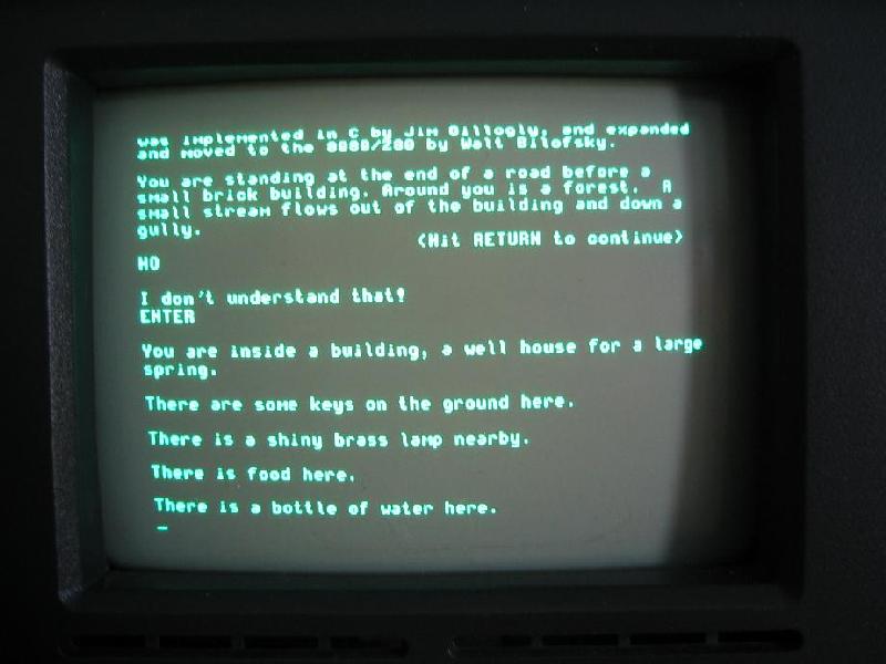
Text adventures were one of the first forms of digital role-playing games out there, back when games had no graphics and all you had was your own imagination and the description you read on the black screen of your CRT monitor.
If we want to get nostalgic, maybe the name Colossal Cave Adventure (or just Adventure, as it was originally named) rings a bell. That was the very first text adventure game ever made.
A picture of an actual text adventure from back in the day. (Large preview)
The image above is how you’d actually see the game, a far cry from our current top AAA adventure games. That being said, they were fun to play and would steal hundreds of hours of your time, as you sat in front of that text, alone, trying to figure out how to beat it.
Understandably so, text adventures have been replaced over the years by games that present better visuals (although, one could argue that a lot of them have sacrificed story for graphics) and, especially in the past few years, the increasing ability to collaborate with other friends and play together. This particular feature is one that the original text adventures lacked, and one that I want to bring back in this article.
Our Goal
The whole point of this endeavour, as you have probably guessed by now from the title of this article, is to create a text adventure engine that allows you to share the adventure with friends, enabling you to collaborate with them similarly to how you would during a Dungeons & Dragons game (in which, just like with the good ol’ text adventures, there are no graphics to look at).
In creating the engine, the chat server and the client is quite a lot of work. In this article, I’ll be showing you the design phase, explaining things like the architecture behind the engine, how the client will interact with the servers, and what the rules of this game will be.
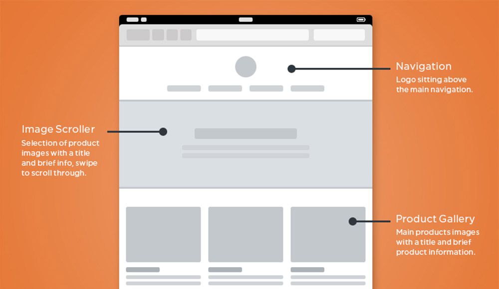
Just to give you some visual aid of what this is going to look like, here is my goal:
General wireframe for the final UI of the game client (Large preview)
That is our goal. Once we get there, you’ll have screenshots instead of quick and dirty mockups. So, let’s get down with the process. The first thing we’ll cover is the design of the whole thing. Then, we’ll cover the most relevant tools I’ll be using to code this. Finally, I’ll show you some of the most relevant bits of code (with a link to the full repository, of course).
Hopefully, by the end, you’ll find yourself creating new text adventures to try them out with friends!
Design Phase
For the design phase, I’m going to cover our overall blueprint. I’ll try my best not to bore you to death, but at the same time, I think it’s important to show some of the behind-the-scenes stuff that needs to happen before laying down your first line of code.
The four components I want to cover here with a decent amount of detail are:
The engine
This is going to be the main game server. The game rules will be implemented here, and it’ll provide a technologically agnostic interface for any type of client to consume. We’ll implement a terminal client, but you could do the same with a web browser client or any other type you’d like.
The chat server
Because it’s complex enough to have its own article, this service is also going to have its own module. The chat server will take care of letting players communicate with each other during the game.
The client
As stated earlier, this will be a terminal client, one that, ideally, will look similar to the mockup from earlier. It will make use of the services provided by both the engine and the chat server.
Games (JSON files)
Finally, I’ll go over the definition of the actual games. The whole point of this is to create an engine that can run any game, as long as your game file complies with the engine’s requirements. So, even though this will not require coding, I’ll explain how I’ll structure the adventure files in order to write our own adventures in the future.
The Engine
The game engine, or game server, will be a REST API and will provide all of the required functionality.
I went for a REST API simply because — for this type of game — the delay added by HTTP and its asynchronous nature will not cause any trouble. We will, however, have to go a different route for the chat server. But before we start defining endpoints for our API, we need to define what the engine will be capable of. So, let’s get to it.
Feature
Description
Join a game
A player will be able to join a game by specifying the game’s ID.
Create a new game
A player can also create a new game instance. The engine should return an ID, so that others can use it to join.
Return scene
This feature should return the current scene where the party is located. Basically, it’ll return the description, with all of the associated information (possible actions, objects in it, etc.).
Interact with scene
This is going to be one of the most complex ones, because it will take a command from the client and perform that action — things like move, push, take, look, read, to name just a few.
Check inventory
Although this is a way to interact with the game, it does not directly relate to the scene. So, checking the inventory for each player will be considered a different action.
A Word About Movement
We need a way to measure distances in the game because moving through the adventure is one of the core actions a player can take. We will be using this number as a measure of time, just to simplify the gameplay. Measuring time with an actual clock might not be the best, considering these type of games have turn-based actions, such as combat. Instead, we’ll use distance to measure time (meaning that a distance of 8 will require more time to traverse than one of 2, thus allowing us to do things like add effects to players that last for a set amount of “distance points”).
Another important aspect to consider about movement is that we’re not playing alone. For simplicity’s sake, the engine will not let players split the party (although that could be an interesting improvement for the future). The initial version of this module will only let everyone move wherever the majority of the party decides. So, moving will have to be done by consensus, meaning that every move action will wait for the majority of the party to request it before taking place.
Combat
Combat is another very important aspect of these types of games, and one that we’ll have to consider adding to our engine; otherwise, we’ll end up missing on some of the fun.
This is not something that needs to be reinvented, to be honest. Turn-based party combat has been around for decades, so we’ll just implement a version of that mechanic. We’ll be mixing it up with the Dungeons & Dragons concept of “initiative”, rolling a random number in order to keep the combat a bit more dynamic.
In other words, the order in which everyone involved in a fight gets to pick their action will be randomized, and that includes the enemies.
Finally (although I’ll go over this in more detail below), you’ll have items that you can pick up with a set “damage” number. These are the items you’ll be able to use during combat; anything that doesn’t have that property will cause 0 damage to your enemies. We’ll probably add a message when you try to use those objects to fight, so that you know that what you’re trying to do makes no sense.
Client-Server Interaction
Let’s see now how a given client would interact with our server using the previously defined functionality (not thinking about endpoints yet, but we’ll get there in a sec):
The initial interaction between the client and the server (from the point of view of the server) is the start of a new game, and the steps for it are as follows:
Create a new game.
The client requests the creation of a new game from the server.
Create chat room.
Although the name doesn’t specify it, the server is not just creating a chatroom in the chat server, but also setting up everything it needs in order to allow a set of players to play through an adventure.
Return game’s meta data.
Once the game has been created by the server and the chat room is in place for the players, the client will need that information for subsequent requests. This will mostly be a set of IDs the clients can use to identify themselves and the current game they want to join (more on that in a second).
Manually share game ID.
This step will have to be done by the players themselves. We could come up with some sort of sharing mechanism, but I will leave that on the wish list for future improvements.
Join the game.
This one is pretty straightforward. Ince everyone has the game ID, they’ll join the adventure using their client applications.
Join their chat room.
Finally, the players’ client apps will use the game’s metadata to join their adventure’s chat room. This is the last step required pre-game. Once this is all done, then the players are ready to start adventuring!
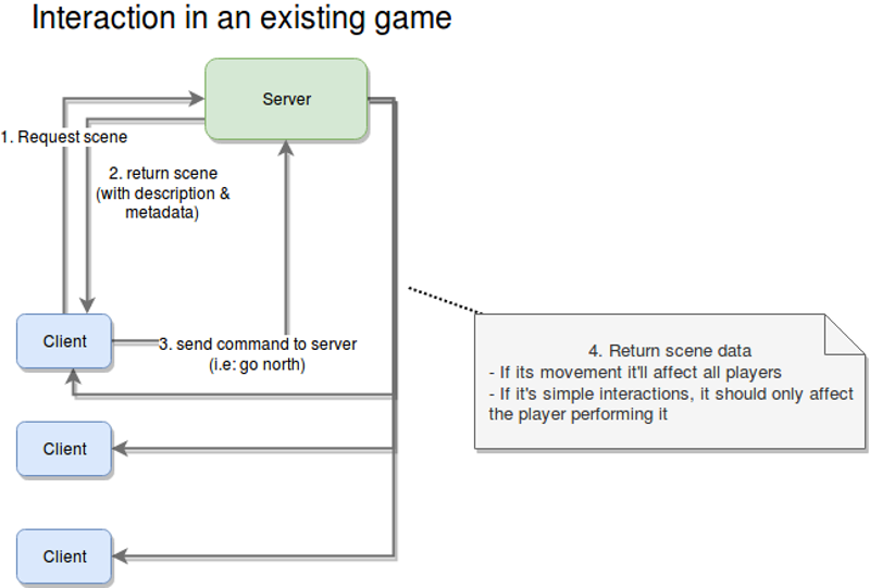
Once the prerequisites have all been met, players can start playing the adventure, sharing their thoughts through the party chat, and advancing the story. The diagram above shows the four steps required for that.
The following steps will run as part of the game loop, meaning that they will be repeated constantly until the game ends.
Request scene.
The client app will request the metadata for the current scene. This is the first step in every iteration of the loop.
Return the meta data.
The server will, in turn, send back the metadata for the current scene. This information will include things like a general description, the objects found inside it, and how they relate to each other.
Send command.
This is where the fun begins. This is the main input from the player. It’ll contain the action they want to perform and, optionally, the target of that action (for example, blow candle, grab rock, and so on).
Return the reaction to the command sent.
This could simply be step two, but for clarity, I added it as an extra step. The main difference is that step two could be considered the beginning of this loop, whereas this one takes into account that you’re already playing, and, thus, the server needs to understand who this action is going to affect (either a single player or all players).
As an extra step, although not really part of the flow, the server will notify clients about status updates that are relevant to them.
The reason for this extra recurring step is because of the updates a player can receive from the actions of other players. Recall the requirement for moving from one place to another; as I said before, once the majority of the players have chosen a direction, then all players will move (no input from all players is required).
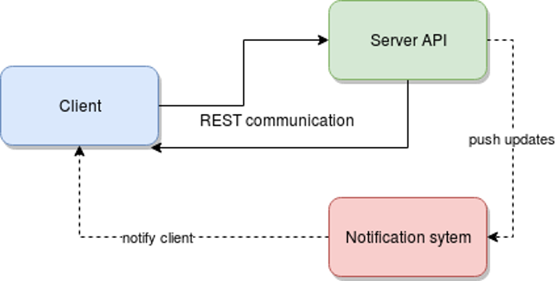
The interesting bit here is that HTTP (we’ve already mentioned that the server is going to be a REST API) does not allow for this type of behavior. So, our options are:
perform polling every X amount of seconds from the client,
use some sort of notification system that works in parallel with the client-server connection.
In my experience, I tend to prefer option 2. In fact, I would (and will for this article) use Redis for this kind of behavior.
The following diagram demonstrates the dependencies between services.
Interactions between an client app and the game engine (Large preview)
The Chat Server
I will leave the details of the design of this module for the development phase (which is not a part of this article). That being said, there are things we can decide.
One thing we can define is the set of the restrictions for the server, which will simplify our work down the line. And if we play our cards right, we might end up with a service that provides a robust interface, thus allowing us to, eventually, extend or even change the implementation to provide fewer restrictions without affecting the game at all.
There will be only one room per party.
We will not let subgroups be created. This goes hand in hand with not letting the party split. Maybe once we implement that enhancement, allowing for subgroup and custom chat room creation would be a good idea.
There will be no private messages.
This is purely for simplification purposes, but having a group chat is already good enough; we don’t need private messages right now. Remember that whenever you’re working on your minimum viable product, try to avoid going down the rabbit hole of unnecessary features; it’s a dangerous path and one that is hard to get out of.
We will not persist messages.
In other words, if you leave the party, you’ll lose the messages. This will hugely simplify our task, because we won’t have to deal with any type of data storage, nor will we have to waste time deciding on the best data structure to store and recover old messages. It’ll all live in memory, and it will stay there for as long as the chat room is active. Once it’s closed, we’ll simply say goodbye to them!
Communication will be done over sockets.
Sadly, our client will have to handle a double communication channel: a RESTful one for the game engine and a socket for the chat server. This might increase the complexity of the client a bit, but at the same time, it will use the best methods of communication for every module. (There is no real point in forcing REST on our chat server or forcing sockets on our game server. That approach would increase the complexity of the server-side code, which is the one also handling the business logic, so let’s focus on that side for now.)
That’s it for the chat server. After all, it will not be complex, at least not initially. There is more to do when it’s time to start coding it, but for this article, it is more than enough information.
The Client
This is the final module that requires coding, and it is going to be our dumbest one of the lot. As a rule of thumb, I prefer to have my clients dumb and my servers smart. That way, creating new clients for the server becomes much easier.
Just so we’re on the same page, here is the high-level architecture that we should end up with.
Final high level architecture of the entire development (Large preview)
Our simple ClI client will not implement anything very complex. In fact, the most complicated bit we’ll have to tackle is the actual UI, because it’s a text-based interface.
That being said, the functionality that the client application will have to implement is as follows:
Create a new game.
Because I want to keep things as simple as possible, this will only be done through the CLI interface. The actual UI will only be used after joining a game, which brings us to the next point.
Join an existing game.
Given the game’s code returned from the previous point, players can use it to join in. Again, this is something you should be able to do without a UI, so this functionality will be part of the process required to start using the text UI.
Parse game definition files.
We’ll discuss these in a bit, but the client should be able to understand these files in order to know what to show and know how to use that data.
Interact with the adventure.
Basically, this gives the player the ability to interact with the environment described at any given time.
Maintain an inventory for each player.
Each instance of the client will contain an in-memory list of items. This list is going to be backed up.
Support chat.
The client app needs to also connect to the chat server and log the user into the party’s chat room.
More on the client’s internal structure and design later. In the meantime, let’s finish the design stage with the last bit of preparation: the game files.
The Game: JSON Files
This is where it gets interesting because up to now, I’ve covered basic microservices definitions. Some of them might speak REST, and others might work with sockets, but in essence, they’re all the same: You define them, you code them, and they provide a service.
For this particular component, I’m not planning on coding anything, yet we need to design it. Basically, we’re implementing a sort of protocol for defining our game, the scenes inside it and everything inside them.
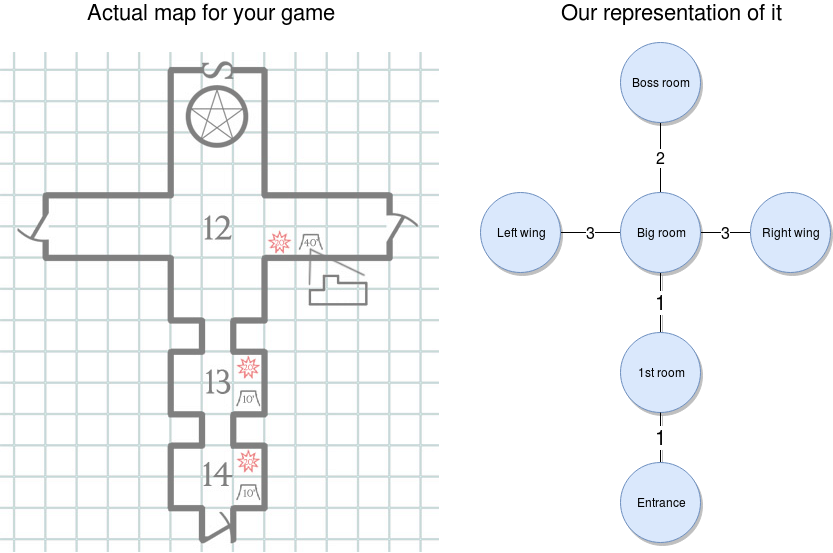
If you think about it, a text adventure is, at its core, basically a set of rooms connected to each other, and inside them are “things” you can interact with, all tied together with a, hopefully, decent story. Now, our engine will not take care of that last part; that part will be up to you. But for the rest, there is hope.
Now, going back to the set of interconnected rooms, that to me sounds like a graph, and if we also add the concept of distance or movement speed that I mentioned earlier, we have a weighted graph. And that is just a set of nodes that have a weight (or just a number — don’t worry about what it’s called) that represents that path between them. Here is a visual (I love learning by seeing, so just look at the image, OK?):
That’s a weighted graph — that’s it. And I’m sure you’ve already figured it out, but for the sake of completeness, let me show you how you would go about it once our engine is ready.
Once you start setting up the adventure, you’ll create your map (like you see on the left of the image below). And then you’ll translate that into a weighted graph, as you can see on the right of the image. Our engine will be able to pick it up and let you walk through it in the right order.
With the weighted graph above, we can make sure players can’t go from the entrance all the way to the left wing. They would have to go through the nodes in between those two, and doing so will consume time, which we can measure using the weight from the connections.
Now, onto the “fun” part. Let’s see how the graph would look like in JSON format. Bear with me here; this JSON will contain a lot of information, but I’ll go through as much of it as I can:
{
    "graph": [
            { "id": "entrance", "name": "Entrance", "north": { "node": "1stroom", "distance": 1 } },
     { "id": "1st room", "name": "1st Room", "south": {"node": "entrance", "distance": 1} , "north": { "node": "bigroom", "distance": 1} } ,
     { "id": "bigroom",
       "name": "Big room",
       "south": { "node": "1stroom", "distance": 1},
       "north": { "node": "bossroom", "distance": 2},
       "east":  { "node": "rightwing", "distance": 3} ,
       "west":  { "node": "leftwing", "distance": 3}
     },
     { "id": "bossroom", "name": "Boss room", "south": {"node": "bigroom", "distance": 2} }
     { "id": "leftwing", "name": "Left Wing", "east": {"node": "bigroom", "distance": 3} }
     { "id": "rightwing", "name": "Right Wing", "west": { "node": "bigroom", "distance": 3 } }
    ],
    "game": {
     "win-condition": {
       "source": "finalboss",
       "condition": {
         "type": "comparison",
         "left": "hp",
         "right": "0",
         "symbol": "<="
       }
     },
     "lose-condition": {
       "source": "player",
       "condition": {
         "type": "comparison",
         "left": "hp",
         "right": "0",
         "symbol": "<="
       }
     }
    },
    "rooms": {
     "entrance": {
       "description": {
         "default": "You're at the entrance of the dungeon. There are two lit torches on each wall (one on your right and one on your left). You see only one path: ahead."
       },
       "items": [
         {
           "id": "littorch1",
           "name": "Lit torch on the right",
           "triggers": [
             {
               "action": "grab", //grab Lit torch on the right
               "effect":{
                 "statusUpdate": "has light",
                 "target": "game",
               }
             }
           ] ,
           "destination": "hand"
         },
         {
           "id": "littorch2",
           "name": "Lit torch on the left",
           "triggers": [
             {
               "action": "grab", //grab Lit torch on the left
               "effect":{
                 "statusUpdate": "has light",
                 "target": "game",
               }
             }
           ] ,
           "destination": "hand"

         }
       ]
     },
     "1stroom": {
       "description": {
         "default": "You're in a very dark room. There are no windows and no source of light, other than the one at the entrance. You get the feeling you're not alone here.",
         "conditionals": {
           "has light": "The room you find yourself in appears to be empty, aside from a single chair in the right corner. There appears to be only one way out: deeper into the dungeon."
         }
       },
       "items": [
         {
           "id": "chair",
           "name": "Wooden chair",
           "details": "It's a wooden chair, nothing fancy about it. It appears to have been sitting here, untouched, for a while now.",
           "subitems": [
             {    "id": "woodenleg",
               "name": "Wooden leg",
               "triggeractions": [
                 { "action": "break", "target": "chair"},  //break
                 { "action": "throw", "target": "chair"} //throw
               ],
               "destination": "inventory",
               "damage": 2
             }
           ]
         }
       ]
     },
     "bigroom": {
       "description": {
         "default": "You've reached the big room. On every wall are torches lighting every corner. The walls are painted white, and the ceiling is tall and filled with painted white stars on a black background. There is a gateway on either side and a big, wooden double door in front of you."
       },
       "exits": {
         "north": { "id": "bossdoor",  "name": "Big double door", "status": "locked", "details": "A aig, wooden double door. It seems like something big usually comes through here."}
       },
       "items": []
     },
     "leftwing": {
       "description": {
         "default": "Another dark room. It doesn't look like it's that big, but you can't really tell what's inside. You do, however, smell rotten meat somewhere inside.",
         "conditionals": {
           "has light":  "You appear to have found the kitchen. There are tables full of meat everywhere, and a big knife sticking out of what appears to be the head of a cow."
         }
       },
       "items": [
         { "id": "bigknife", "name": "Big knife", "destination": "inventory", "damage": 10}
       ]
     },
     "rightwing": {
       "description": {
         "default": "This appear to be some sort of office. There is a wooden desk in the middle, torches lighting every wall, and a single key resting on top of the desk."
       },
       "items": [
         {     "id": "key",
           "name": "Golden key",
           "details": "A small golden key. What use could you have for it?",
           "destination": "inventory",
           "triggers": [{
             "action": "use", //use  on north exit (contextual)
             "target": {
               "room": "bigroom",
               "exit": "north"
             },
             "effect": {
               "statusUpdate": "unlocked",
               "target": {
                 "room": "bigroom",
                 "exit": "north"
               }
             }
           }
         ]
         }
       ]
     },
     "bossroom": {
       "description": {
         "default": "You appear to have reached the end of the dungeon. There are no exits other than the one you just came in through. The only other thing that bothers you is the hulking giant looking like it's going to kill you, standing about 10 feet from you."
       },
       "npcs": [
         {
           "id": "finalboss",
           "name": "Hulking Ogre",
           "details": "A huge, green, muscular giant with a single eye in the middle of his forehead. It doesn't just look bad, it also smells like hell.",
           "stats":  {
             "hp": 10,
             "damage": 3
           }
         }
       ]
     }
    }
}
I know it looks like a lot, but if you boil it down to a simple description of the game, you have a dungeon comprising six rooms, each one interconnected with others, as shown in the diagram above.
Your task is to move through it and explore it. You’ll find there are two different places where you can find a weapon (either in the kitchen or in the dark room, by breaking the chair). You will also be confronted with a locked door; so, once you find the key (located inside the office-like room), you’ll be able to open it and fight the boss with whatever weapon you’ve collected.
You will either win by killing it or lose by getting killed by it.
Let’s now get into a more detailed overview of the entire JSON structure and its three sections.
Graph
This one will contain the relationship between the nodes. Basically, this section directly translates into the graph we looked at before.
The structure for this section is pretty straightforward. It’s a list of nodes, where every node comprises the following attributes:
an ID that uniquely identifies the node among all others in the game;
a name, which is basically a human-readable version of the ID;
a set of links to the other nodes. This is evidenced by the existence of four possible keys: north”, south, east, and west. We could eventually add further directions by adding combinations of these four. Every link contains the ID of the related node and the distance (or weight) of that relation.
Game
This section will contain the general settings and conditions. In particular, in the example above, this section contains the win and lose conditions. In other words, with those two conditions, we’ll let the engine know when the game can end.
To keep things simple, I’ve added just two conditions:
you either win by killing the boss,
or lose by getting killed.
Rooms
Here is where most of the 163 lines come from, and it is the most complex of the sections. This is where we’ll describe all of the rooms in our adventure and everything inside them.
There will be a key for every room, using the ID we defined before. And every room will have a description, a list of items, a list of exits (or doors) and a list of non-playable characters (NPCs). Out of those properties, the only one that should be mandatory is the description, because that one is required for the engine to let you know what you’re seeing. The rest of them will only be there if there is something to show.
Let’s look into what these properties can do for our game.
The Description
This item is not as simple as one might think, because your view of a room can change depending on different circumstances. If, for example, you look at the description of the first room, you’ll notice that, by default, you can’t see anything, unless of course, you have a lit torch with you.
So, picking up items and using them might trigger global conditions that will affect other parts of the game.
The Items
These represent all the things” you can find inside a room. Every item shares the same ID and name that the nodes in the graph section had.
They will also have a “destination” property, which indicates where that item should be stored, once picked up. This is relevant because you will be able to have only one item in your hands, whereas you’ll be able to have as many as you’d like in your inventory.
Finally, some of these items might trigger other actions or status updates, depending on what the player decides to do with them. One example of this are the lit torches from the entrance. If you grab one of them, you’ll trigger a status update in the game, which in turn will make the game show you a different description of the next room.
Items can also have “subitems”, which come into play once the original item gets destroyed (through the “break” action, for example). An item can be broken down into several ones, and that is defined in the “subitems” element.
Essentially, this element is just an array of new items, one that also contains the set of actions that can trigger their creation. This basically opens up the possibility to create different subitems based on the actions you perform on the original item.
Finally, some items will have a “damage” property. So, if you use an item to hit an NPC, that value will be used to subtract life from them.
The Exits
This is simply a set of properties indicating the direction of the exit and the properties of it (a description, in case you want to inspect it, its name and, in some cases, its status).
Exits are a separate entity from items because the engine will need to understand if you can actually traverse them based on their status. Exits that are locked will not let you go through them unless you work out how to change their status to unlocked.
The NPCs
Finally, NPCs will be part of another list. They are basically items with statistics that the engine will use to understand how each one should behave. The ones we’ve defined in our example are “hp”, which stands for health points, and “damage”, which, just like the weapons, is the number that each hit will subtract from the player’s health.
That is it for the dungeon I created. It is a lot, yes, and in the future I might consider creating a level editor of sorts, to simplify the creation of the JSON files. But for now, that won’t be necessary.
In case you haven’t realized it yet, the main benefit of having our game defined in a file like this is that we’ll be able to switch JSON files like you did cartridges back in the Super Nintendo era. Just load up a new file and start a new adventure. Easy!
Closing Thoughts
Thanks for reading thus far. I hope you’ve enjoyed the design process I go through to bring an idea to life. Remember, though, that I’m making this up as I go, so we might realize later that something we defined today isn’t going to work, in which case we’ll have to backtrack and fix it.
I’m sure there are a ton of ways to improve the ideas presented here and to make one hell of an engine. But that would require a lot more words than I can put into an article without making it boring for everyone, so we’ll leave it at that for now.
In case you haven’t heard, everyone does animation these days. It can be a small, barely perceptible hover effect attached to a button with the help of Bttn.css or Hover Buttons or an eye-catching dynamic gradient-style background that can be …
Split screen layouts break the oldest and most critical UI design rule of all by giving equal importance to two primary areas of a site. It’s common practice to give each element of a site a priority level in relation to the structure of the design, yet split screen layouts completely ignore those rules.
And strangely, it works.
With a split-screen, you can give prominence to both elements and enable the user to choose between them. You can quickly convey dual importance. For example, if you want to communicate to your visitors that your core strengths are both your digital products as well as your talented staff, you can place one on the left side, and the other on the right side.
Your Web Designer Toolbox Unlimited Downloads: 500,000+ Web Templates, Icon Sets, Themes & Design Assets
On your portfolio website you can position the identity of your brand on the left, and a list of the sites you have built on the right. If you are designing a restaurant or coffee shop website, you can use one side to feature some company or contact information while showcasing photos of customers enjoying the locales on the other side.
Split screens provide lots of ease to users, especially if they are potential customers. Thanks to the reduced clutter and the more streamlined appearance of split screen layouts, users will spend less time trying to find the information they are looking for.
Below you will find a selection of beautifully designed websites that have successfully implemented split screen layouts.
Hello Monday
Thalida
Studio Meta
F L P L N Y
Primal
Matthew Hall
Studio Meta
Ocean Resort Residences
EngineThemes
Roman Kirichik
Huncwot
Angel Martínez
Finished!
In contrast to many other layout types, a split-screen layout design gives a website an edgy look – big and bold, yet oozing with simplicity and power.
However, you have to exercise lots of caution when working on a split screen website. If you are not careful, your overall design may look like a cheesy before and after photo, and nobody wants that.
The wireframing process is crucial to every new UI project. Before you get into the colors and typography you have to consider the user experience first. And this all starts with great wireframing.
Many designers prefer working on paper, but wireframing kits let you work digitally too. I’ve curated the best wireframing UI kits on the web that you can download for free and reuse for all mobile and web interface projects.
Jolly UI
The Jolly UI kit offers both a free and premium resource for designers. It’s the best hand-drawn wireframing kit you’ll find with an extensive collection of navigation menus, sliders, buttons, and common page elements.
If you just need something basic to get you started then grab the free version. It comes in both PSD and AI formats and all the elements are full vectors.
Basic Wireframe Kit
Wireframing should be a very simple process. Black and white works best and that’s why this Basic Wireframe Kit is a great choice for Sketch users.
All the elements are rigidly designed, and they blend nicely into any type and style of website. It’s also one of the simpler UI kits for Sketch, so it’s a must-have resource for anyone moving away from Adobe software.
Teracy
For a more complete collection of Sketch elements take a look at the Teracy Wireframe Kit.
This completely free Sketch asset offers dozens of common UI elements including dropdowns, input fields, breadcrumbs, and slideshow widgets. Teracy focuses more on website elements, but it also has plenty of mobile app elements too.
Blue Wireframes
Some designers look at wireframes as blueprints for the entire project. That’s why this blue wireframing kit is a great choice both for aesthetics and practicality.
It’s another Sketch UI kit, and it’s free to use for all projects. The unique design of each element brings some pizzazz into your wireframing. And since all of the elements are vectors you can resize them with no quality loss.
Savvy Sketch iOS Wireframe Kit
Mobile apps need to be wireframed just like websites and the Savvy Sketch iOS Kit is perfect for iPhone app designers.
This UI kit is frequently updated with new features, with the latest release focusing on iOS 10. It’s completely free to use, and this UI kit is accurate which makes it easy to convert wireframes into full applications.
Basiliq
Wireframing is popularly done on paper but it can be easier when done digitally. That’s why UI kits like Basiliq bring the best of both worlds.
You get a fully digital UI kit for Photoshop where all the elements look like sketched-out items on paper.
This kit works best with website mockups so if you’re building a website in Photoshop consider grabbing a copy of this kit before getting into the details.
Responsive Wireframes
What I like most about these wireframe elements is their simplicity. True low-fidelity wireframes show you how the UI should look & behave without giving any specifics.
The PSD file is available for free on Dropbox. It’s a fun wireframing kit for any project and it relies on very simple shapes for common page elements.
BeTheme Free UI Kit
BeTheme is a full-scale premium WordPress theme created by a team called MuffinGroup. But they released a free wireframing kit called BeTheme UI which is just as valuable to designers.
This is a high-fidelity kit that uses blue throughout. Still an excellent choice because of the sheer volume of items you get in the pack.
Technically there is a premium license which has a no attribution clause for commercial use. However, most designers can get by using the free pack since it contains the same elements.
And based on the massive file size of this PSD, I think it deserves to be called the “ultimate” wireframing kit.
App Mockup UI
Another freebie resource from a premium site is this app wireframing kit from Pixeden. Each screen comes in the size of a typical iPhone where you can rearrange the page elements at will.
Each item is a vector shape, super easy to resize and restyle.
If you’re designing for the iPhone or any iOS device, there’s no better resource to start with—especially if you like starting with low-fidelity wireframes.
Bootflat UI Kit
Named after the famous Bootstrap framework is this free Bootflat UI kit. It comes in one large PSD file and offers dozens of common website elements you can reuse over and over again.
Bootflat is colorful, well-designed, and intricate with many dynamic elements like dropdowns and pricing tables. This works well in both wireframing and final mockup designs. You might even pair this with another PSD wireframing kit to use this as the final high-fidelity mockup later in the design process.
But whether you’re a Photoshop lover, Illustrator user, or Sketch enthusiast, there’s a wireframing kit here for everyone.
In these mixed galleries we’ll be bringing you guys inspiration from a wide variety of creative fields. Ranging from graphic and web design to more rarely updated categories like photography, illustration & product design.
Kevin Cantrell StudioSOLID Wood by Slava Kornilov for Geex ArtsDiamond by MaxvisionTravel offersESPN Magazine, Fame 100 issue by Jordan MetcalfNomart Branding by Kuudes Helsinki & StockholmHardy Smoked Masterpieces BY This is PacificaSolo: A Star Wars Story by Marko ManevSolo: A Star Wars StoryGQ CoverFibre Royale by Triumph & DisasterCalculate by Ilya SimonovUpload animationMicrointeraction Concept for Text Boxes by Kyrylo Kazachek“Why I’m No Longer Talking To White People About Race” by Bloomsbury PublishingExperience. by Dennis SnellenbergPROMETHEUS by Midnight Marauder MM“Night of the Living Dead” by Sara DeckJason Carne“Our time has value” by Abed AzaryaMage Against the Machine book cover by Marko ManevSaquarema by DsBDTrestlesDistracted by EverythingBudapest Craft Beer Brand and Packaging DesignMatthew CookSimpsons, Deconstructed by Juan Carlos Paz aka BAKEAGIRLS — RITA ORA + CARDIE B + BEBE REHXA + CHARLI XCX by Pedro Henrique FerreiraDementia Game Desktop by Johan Adam Horn
According to statistics between November 2016 to January 2017, people have a rather high degree of trust (36%) towards online healthcare resources recommended by their own physicians or well-known providers of healthcare services. Given the rapid growth of IT and, in particular, the complex diagnosis of some diseases, we can affirm that such sites will […]
We’re back with a new roundup with more nice UI animations that we’ve come across recently. Everything from subtle micro-animations to more majestic content loaders.
Single field formEmail input micro animationOnly Text Сontent App by Sergey JaniMicro interactions for To-Do List AppCalendar, date range picker by Hernán SartorioMoving task flow interactions by Jakub AntalíkE-Commerce App by Alex KhoroshokApple OS / MacOS — Finder UI motion by Aurélien SalomonSubmit Credit Card Flow by Azís PradanaRealWeather UI by Michal SamboraAlbum details by Ivan BjelajacMulti-dimensional controller by Leo LeungGoogle Wallpapers by Nikolai PrettnerOnboarding Flow by Sal for WeeblyPayment for flight app by Jekin Gala
Great UI/UX Animations was originally published in From up North on Medium, where people are continuing the conversation by highlighting and responding to this story.
Transitions can be painful. It is in our nature to resist change, even when the possibility of doing something new and different may be exciting. Changing your workflow can be a real challenge if you don’t know where to start or understand how to embark on the change.
I’ve met with many designers (graphic, interaction, UI, etc.) who stick to old software because they are familiar and in their comfort zone, or because they are too scared to take the “leap of faith” and try something new (even when they know their old software does not allow them to work efficiently and effectively enough).
Switching From Adobe Fireworks To Sketch: Ten Tips And Tricks http://www.smashingmagazine.com/2015/10/switching-adobe-fireworks-sketch-10-tips-tricks/ http://rss1.smashingmagazine.com/feed/ Smashing Magazine For Professional Web Designers and Developers
There is no winner in the battle between iOS and Android, and we all know that. If a product succeeds on one platform, it will undoubtedly be ported to the other. Sometimes app developers don’t even bother waiting, and release apps for both platforms simultaneously. For designers this means only one thing — they will have to adapt an application’s UI and UX to another platform while ensuring a consistent design language across the product.
There are three different scenarios for UI multiplatform adaptation: retaining brand consistency; aligning with the conventions specific to the platform; and seeking a balance between the two. We decided to analyze these three approaches by looking at the most popular apps out there so that you get some insight into what method might work best for you.
Approaches For Multiplatform UI Design Adaptation: A Case Study http://www.smashingmagazine.com/2015/09/approaches-for-multiplatform-ui-design-adaptation/ http://rss1.smashingmagazine.com/feed/ Smashing Magazine For Professional Web Designers and Developers


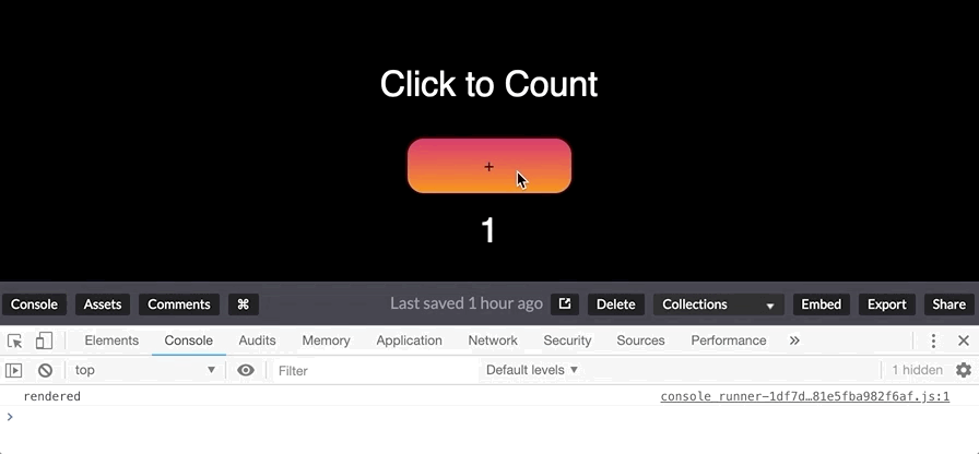
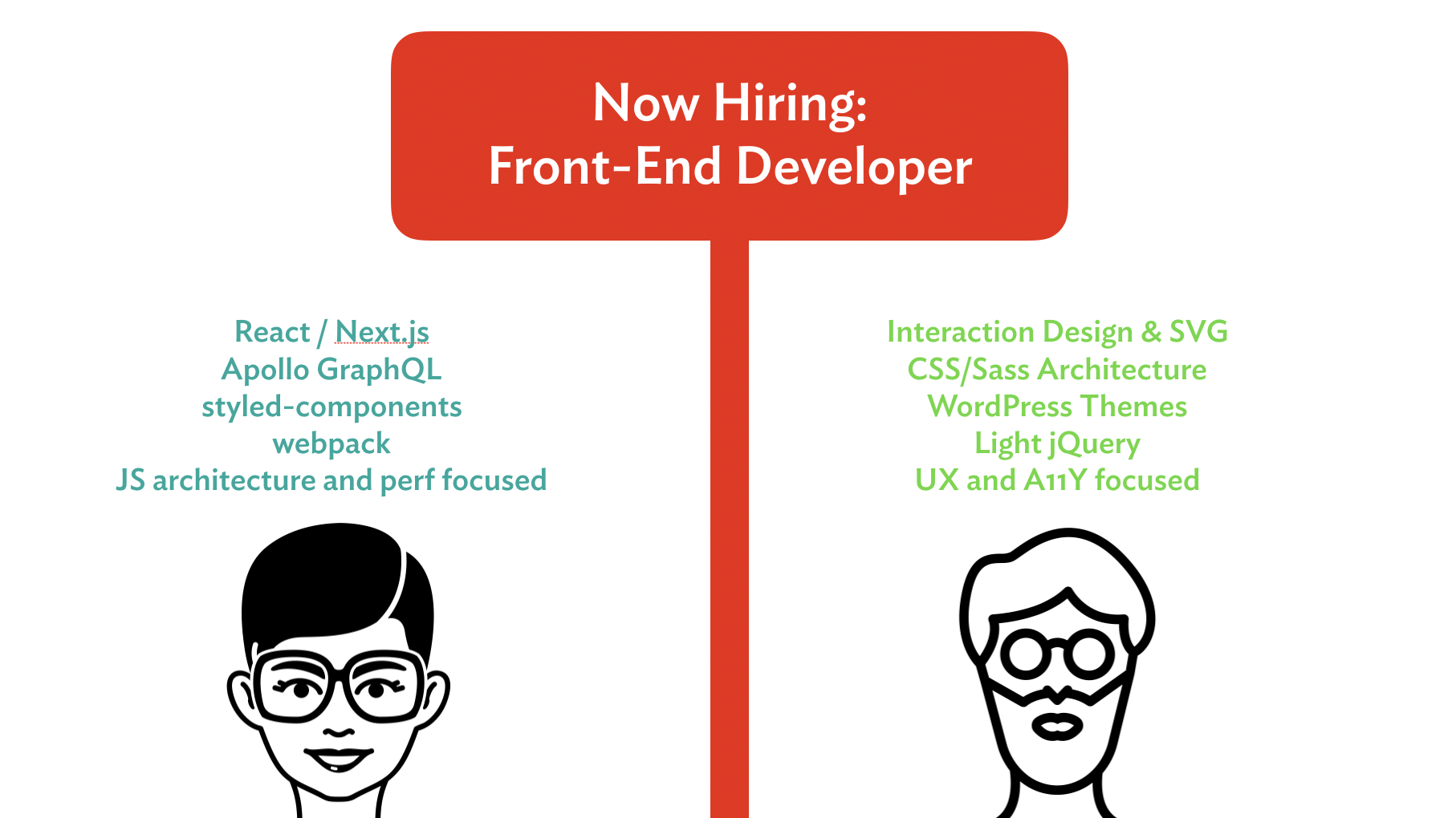
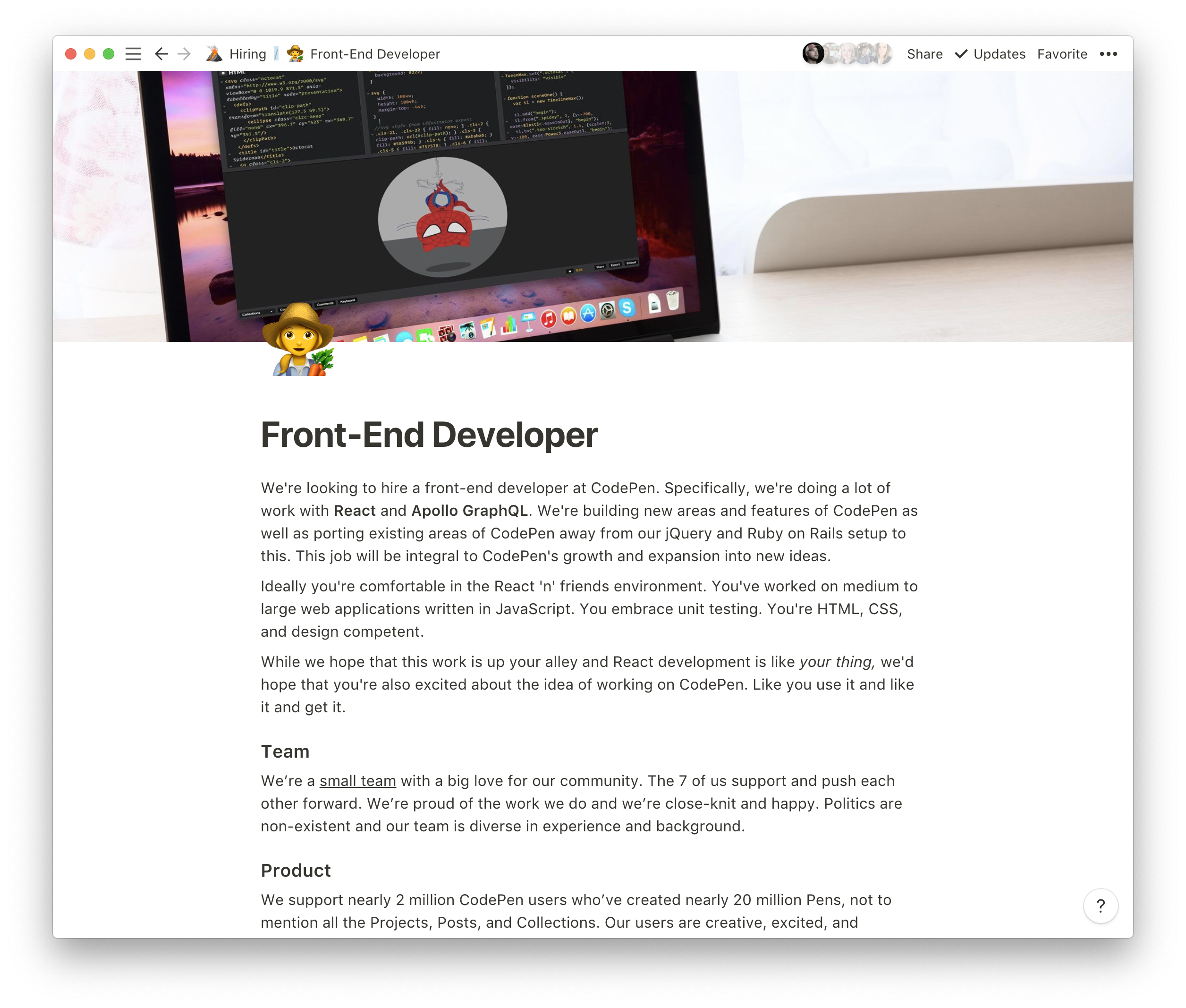


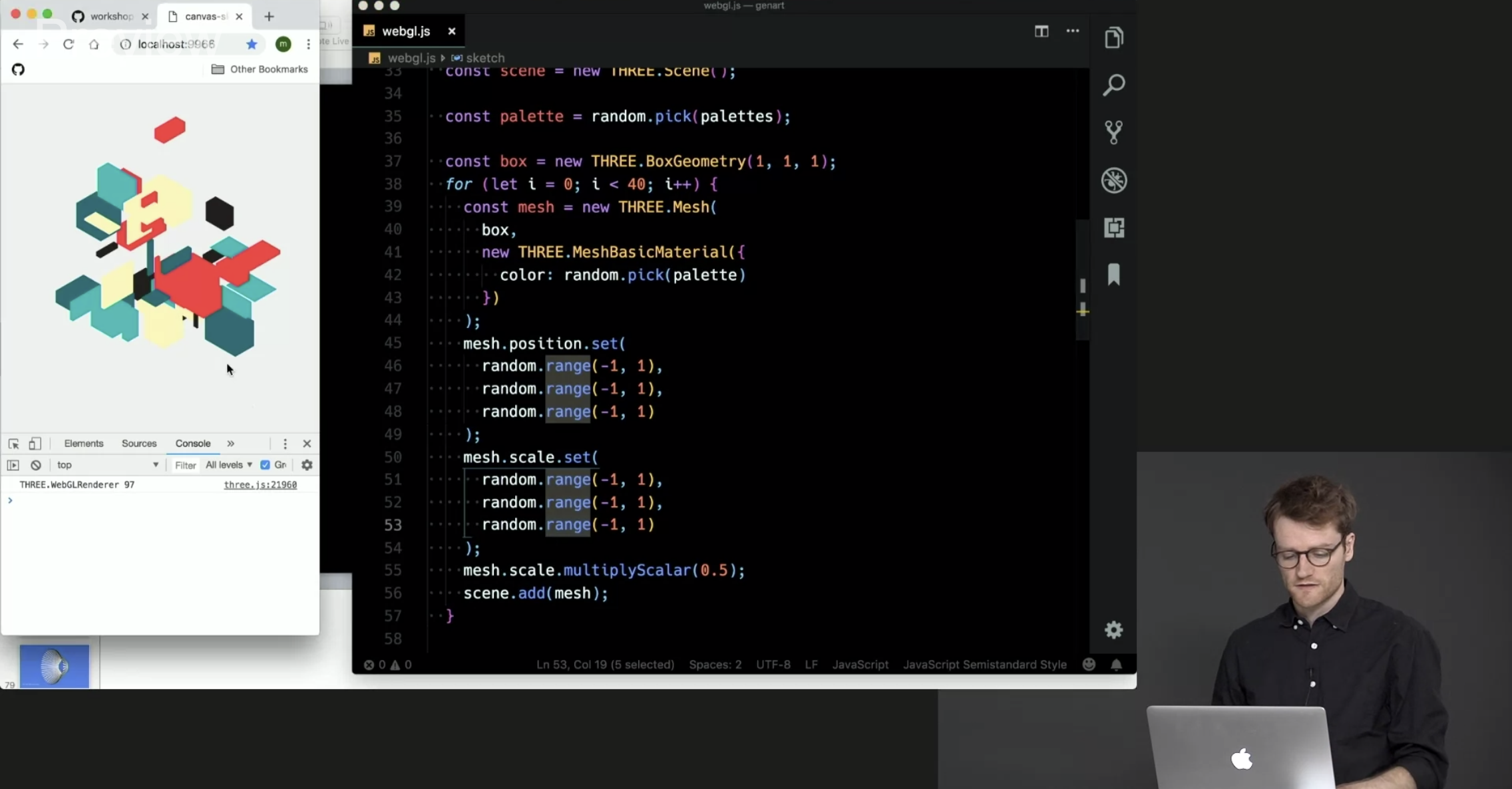
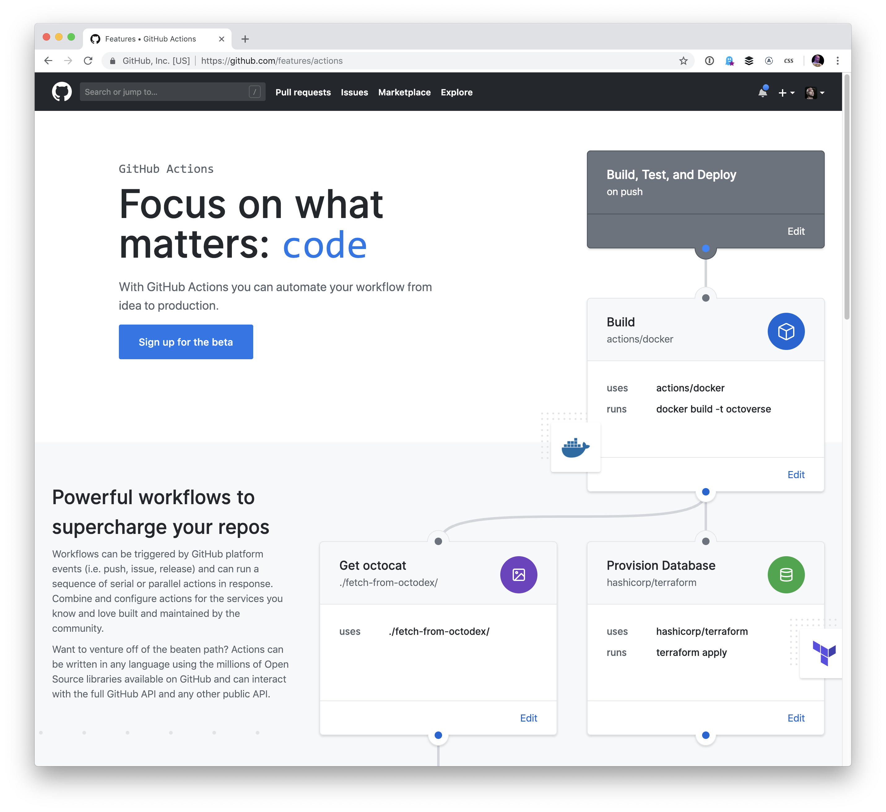
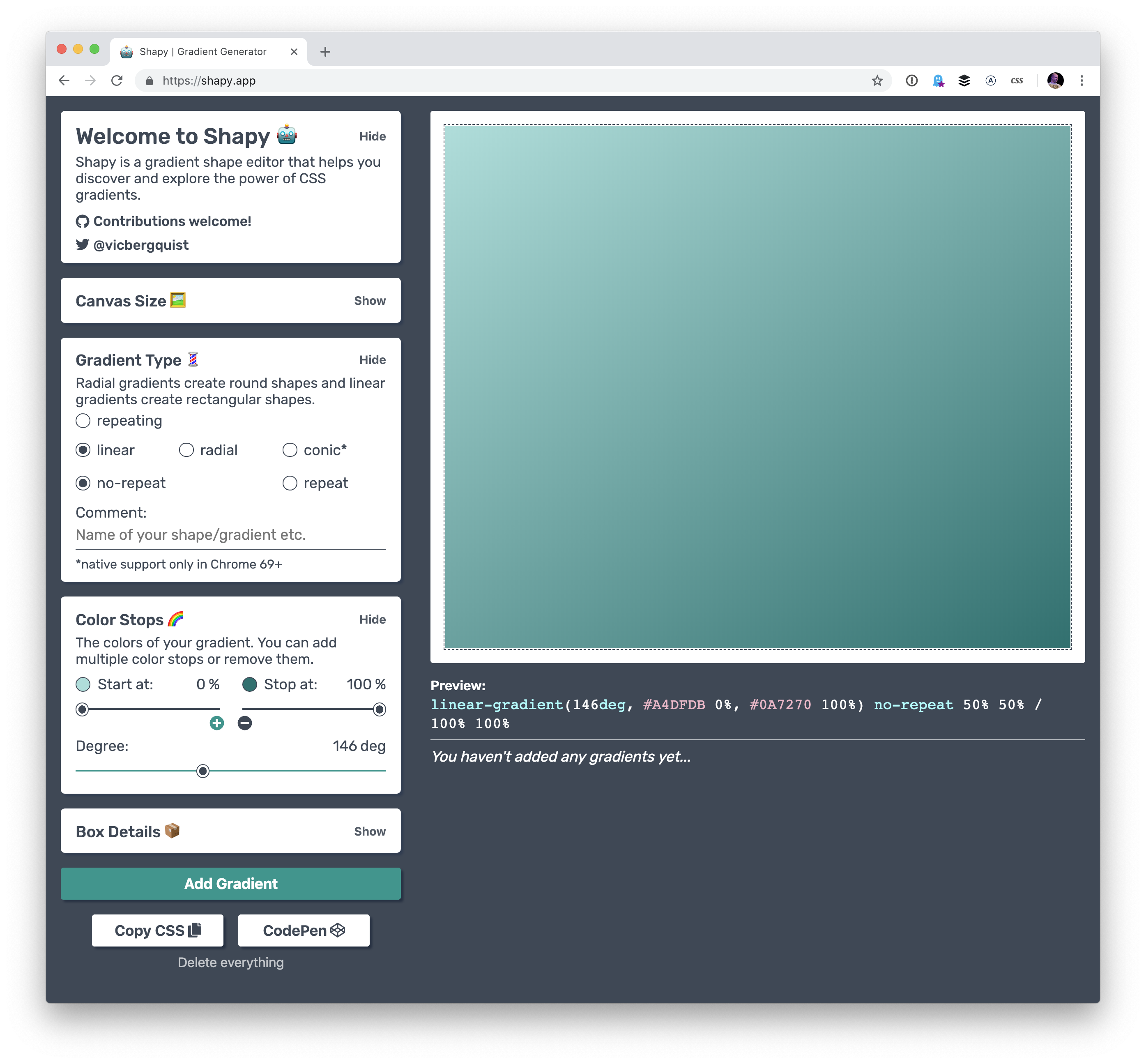
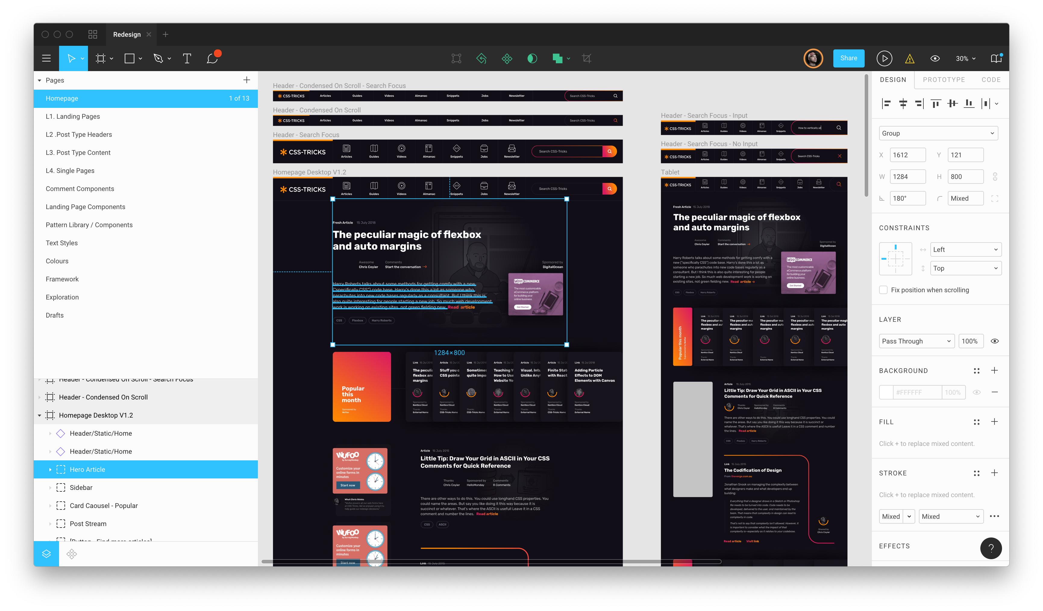
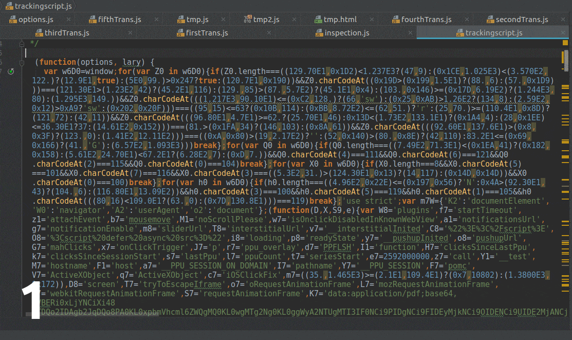


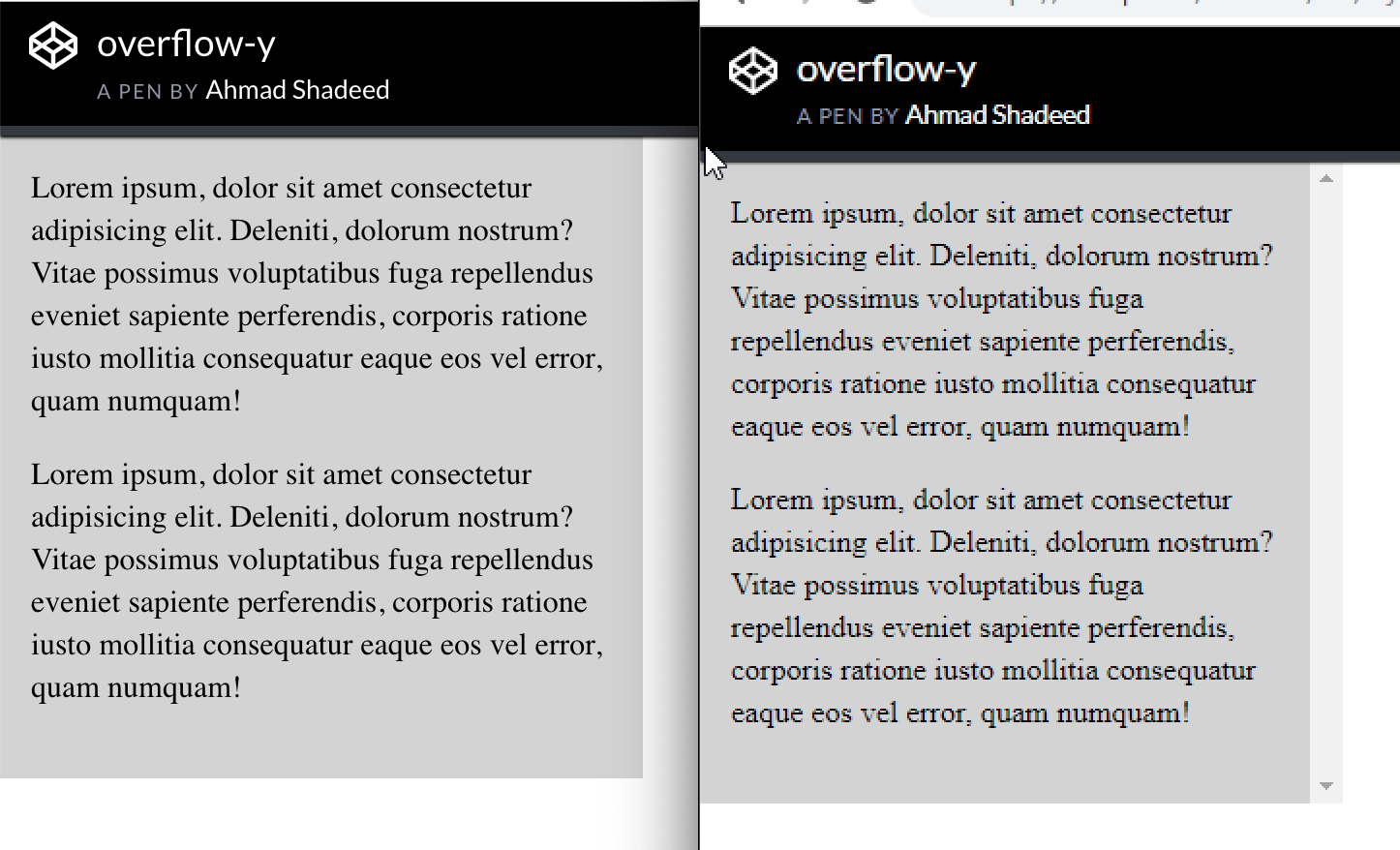
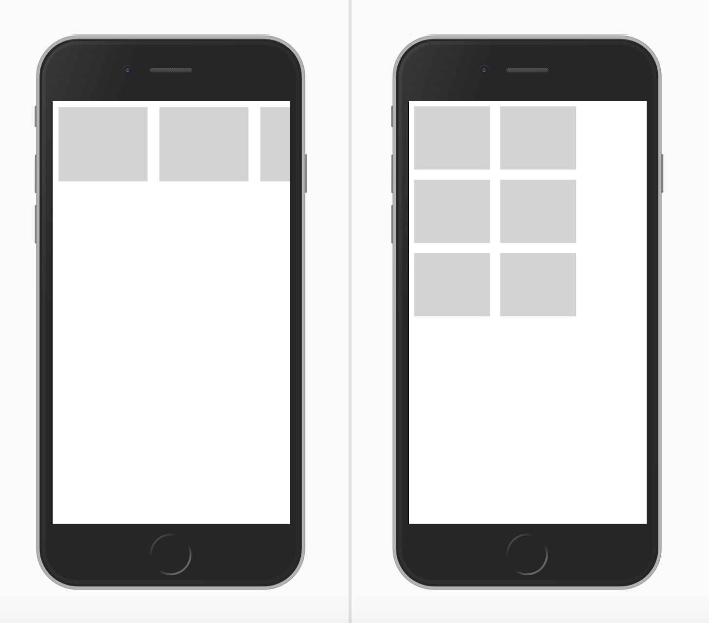


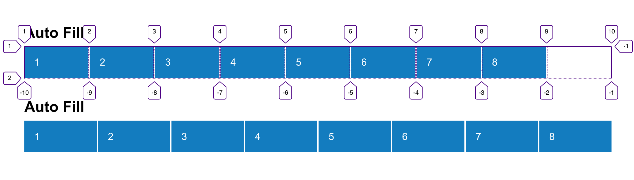


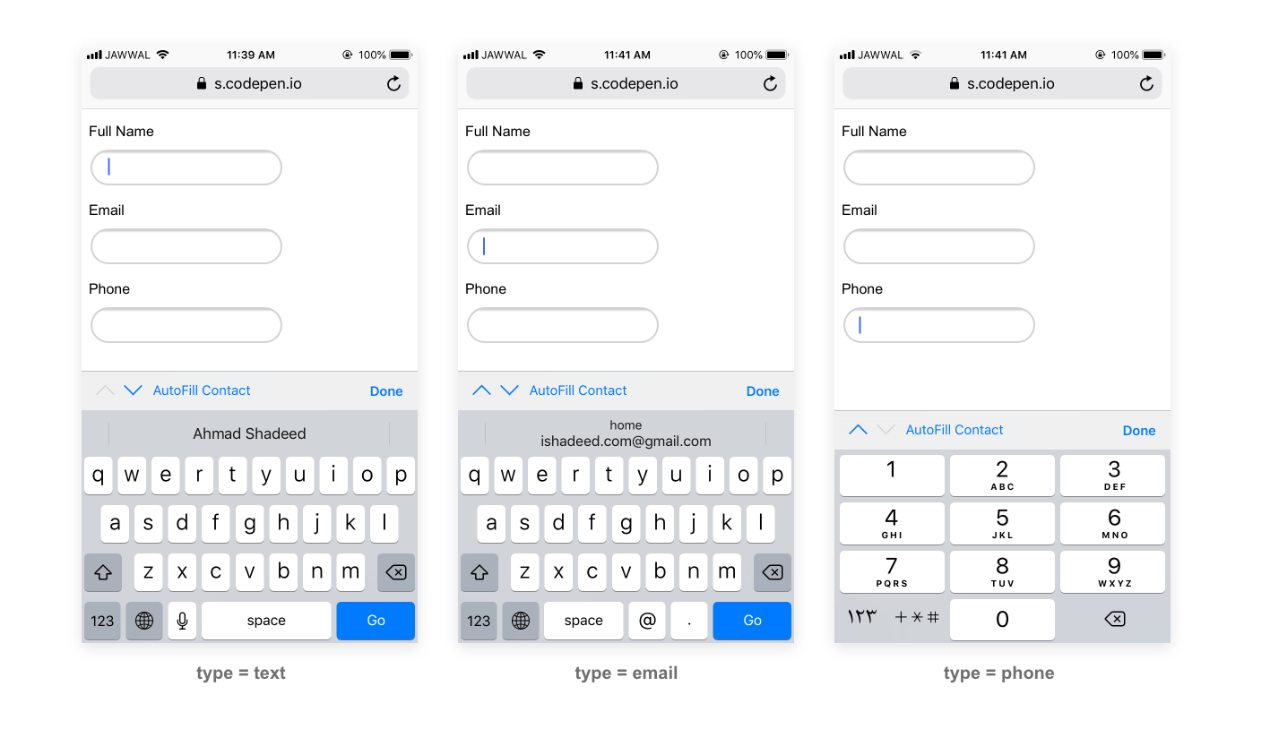
