This is the third in a series of articles exploring SVG filters and some effects made possible through them. The first article introduced us to SVG filters, what they are, how they work, and how to create and use them. The second article explored the creation of paint-like image effects as well as text outlines using the <feMorphology> filter primitive.
This article assumes that you’re already familiar with the basics of SVG filters, or that you’ve read the first (SVG Filters 101) article in this series. If you haven’t, please feel free to take a few minutes to read it.
The feComponentTransfer is one of SVG’s most powerful filter primitives. It gives us control over the individual RGBA channels of our source graphic, enabling us to create Photoshop-like effects in SVG. In this article, which is the first article focusing on feComponentTransfer, we’ll get to know this primitive and see how it can be used to posterize images.
Posterization or posterisation of an image entails conversion of a continuous gradation of tone to several regions of fewer tones, with abrupt changes from one tone to another. This was originally done with photographic processes to create posters. — Wikipedia
Posterization occurs across an image but is most obvious in areas of subtle variation in tone.
Example of a photograph in JPEG format (24-bit color or 16.7 million colors) before posterization, contrasting the result of saving to GIF format (256 colors). (Source: Wikipedia)
In this article, we’ll use feComponentTransfer to reduce the number of colors in an image, which, in turn, will result in the creation of a nice poster effect similar to what we see in commercial or graphic design posters.
Applying a posterizing effect to an image (left) with feComponentTransfer reduces the number of colors in that image (right).
But first, let’s cover the technical basics…
Quick Overview of feComponentTransfer
The feComponentTransfer primitive allows you to modify each of the R, G, B and A components present in a pixel. In other words, feComponentTransfer allows the independent manipulation of each color channel, as well as the alpha channel, in the input graphic. It allows operations like brightness adjustment, contrast adjustment, color balance or thresholding.
The RGBA components are modified by running transfer functions on these components. To do that, each component has its own element, referred to as Transfer Function Element. I will be referring to these elements as “component elements” throughout this article — elements that refer to individual RGBA components. These elements are nested within feComponentTransfer. So the feComponentTransfer does nothing aside from housing the individual RGBA component elements. The RGBA component elements are: feFuncR, feFuncG, feFuncB, and feFuncA.
The type attribute is used on a component element to define the type of function you want to use to modify this component. There are currently five available function types: identity, table, discrete, linear, and gamma. These function types are used to modify the R/G/B/A components of a source graphic. We will cover most of these and see how they can be used in this series.
<feComponentTransfer>
    <!-- The RED component -->
    <feFuncR type="identity | table | discrete | linear | gamma"></feFuncR>

    <!-- The GREEN component -->
    <feFuncG type="identity | table | discrete | linear | gamma"></feFuncG>

    <!-- The BLUE component -->
    <feFuncB type="identity | table | discrete | linear | gamma"></feFuncB>

    <!-- The ALPHA component -->
    <feFuncA type="identity | table | discrete | linear | gamma"></feFuncA>
</feComponentTransfer>">
For each function type, one or more attributes exist that allow you to specify more details of, and for, the function used. For example, the linear function has a slope attribute that is used to specify the slope of the linear function that will be used to modify the component it is applied to.
You can modify one or more component at a time. This means that the feComponentTransfer may contain one, two, three, or all of the component elements at a time. You can also modify channels independently, applying a different function to each component element.
The ability to use different functions on different component elements means that you have very large control over the colors of your source graphic on the lowest pixel level. You may choose to modify the red and blue channels by mapping them to two new colors while keeping the green unchanged or only increasing its intensity, for example. This low-level component control means that you will be able to apply Photoshop-grade functions to your images in the browser using a few lines of code. I don’t know about you but the (wannabe-)designer in me thinks this is super exciting!
Example: Using the Alpha component to reduce the opacity of an object
A simple real-life example is using the feFuncA component element to reduce the transparency of a source graphic. In the first article in this series, we saw how we can use feColorMatrix to reduce the opacity of an element by changing the value of the alpha channel in a color matrix. I personally prefer using feComponentTransfer for this singular operation.
Applied to a source, the following filter reduces the opacity of that source to 0.5:
We mentioned above that we have five different functions that we can use to manipulate the RGBA components. The table function type works by mapping the values of the component (which is the alpha channel in our example) to a series of values provided in the tableValues attribute.
So, what does that mean?
The alpha channel of an element usually lies in the range [0, 1]. By using the table function and providing two values: 0 and 0.5, we’re essentially telling the browser to map the [0, 1] alpha range to a new range: [0, 0.5]. By doing so, the opacity is reduced to half.
We’ll go into a more detailed example of the table function in the next article. In this article, I want to shed the light on the discrete function type. So, let’s see how it works and what we can do with it.
Poster Image Effect: Reducing the number of colors in an image with the discrete function
The discrete function is used to decrease the number of colors in an image (or in a component if used on only one component). Reducing the number of colors in an image means that, instead of smooth, linear gradient color changes, you will see more sudden color shifts, which make the image look like it is made of bands or clusters of color, thus resulting in a poster-like effect.
The image on the right is a copy of the image on the left with a discrete function used to reduce the number of colors in it to only 5 values per component. You can see how instead of smooth color changes (using gradients), the colors change suddenly, creating color bands and clusters, and the image looks more “posterized”.
Personally, the discrete function reminds me of the steps() timing function in CSS. When compared to a linear function, a step-by-step function jumps from one value to another, instead of moving linearly between them.
Like the table function, the discrete function accepts a series of values provided in the tableValues attribute. The discrete function differs from table in the way it uses these values.
Using tableValues you provide the browser with a finite list of values that you want it to map a color component to. And since you are providing a finite list of values, you will end up with a finite number of colors, thus creating color bands and clusters, that would otherwise normally be linear gradient shifts of colors.
The function is defined by the step function given in the attribute tableValues, which provides a list of n values in order to identify a step function consisting of n steps.— The SVG Filters Specification
Let’s see what that means in plain English. Assume we have the following code snippet:
In the above snippet, we are applying a discrete function to modify the Red color channel in our source image. We provide 3 discrete values that we want the browser to map the red color values to. In an SVG filter, component values are represented in fraction values in the range [0, 1]. This means that the Red component value in any pixel can be 0 (0% Red / fully black) or 1 (100% Red) or any value (shade of red) in between. This is the same for the Green, Blue and Alpha channels too.
For every n number of values you provide, the browser will create n ranges. More specifically, it will divide the [0, 1] into n ranges. Then it will map the color values that lie within those ranges to the n values you provided. Applying this logic to our snippet:
The browser sees three discrete values for red in tableValues;
It divides the red color values to three equal ranges within the [0, 1] range. So our three ranges look like this:
[0, 0.33]
[0.33, 0.66]
[0.66, 1]
Next, the browser checks the current value of red in each and every pixel in the image. For each pixel, it determines which range that red color value belongs in.
Then, it maps that red value to the corresponding new value you provided. The mapping looks like this:
Colors within the [0, 0.33] range are mapped to 0;
Colors within the [0.33, 0.66] range are mapped to 0.5;
Colors within the [0.66, 1] range are mapped to 1;
You can also think of this process as turning shades of color ON or OFF. When you provide discrete values for a color, you’re telling the browser that only these values will be ON, and if a pixel contains a value that is not equal to one of these three, it should be turned OFF and replaced by one of these three. So, for example, the 0.8 color value is considered OFF and will be replaced with 1 (because it lies in the third range).
The following is a hand-drawn illustration of this color mapping that I drew when I was wrapping my head around it. You might find it useful.
By the time the browser goes over all the pixels in the image, you will have replaced a large number of red values with a small number you’ve chosen in tableValues, thus replacing smooth color changes with sudden color changes, and the image looks like it’s made of clusters or bands of colors.
The following is a live demo of applying the above code snippet to an image with a lot of red in it. By limiting the number of Reds in the pixels of the image and zeroing the reds out in some of those pixels, the image shows an overall noticeable reduction in red, especially in the bottom area of the image:
Changing the number of discrete values and/or changing the values themselves will change the overall result. You may want to avoid providing 0 as a value sometimes if you want to avoid having any black areas in an image. For example, if we were to revisit the sky image above, we probably don’t want to have any clusters or bands of black in the poster version of the image because it is still an image of a sky after all. We also want more than just two or three colors because having too few colors would make the image lose a lot of its visual affordance.
To create that effect, I limited the number of RGB colors to five, starting at 0.25 as the lowest value:
And that’s how you posterize images (or any other content, for that matter) using SVG filters.
Final Words
I hope this article has helped demystify feComponentTransfer a little and has shown you how powerful pixel- and component-level color control can be.
In the next article, we will look at two more powerful feComponentTransfer transfer function types. We’ll take a look at how we can mimic Photoshop’s duotone image effect, and how we can control the brightness, contrast, and intensity of colors within an image using feComponentTransfer. Stay tuned.
Some real use cases solved with CSS Flexbox like the holy grail layout, columns with same heights, vertical and horizontal centering and more. By Geoffrey Crofte.
A free 4 day bootcamp where you’ll learn why GraphQL exists, its syntax, and how you can incorporate it into your React, Angular, or Vue.js applications.
In this second part of our SVG Filter series you’ll learn all about the feMorphology filter, how it works and how you can use it to create interesting effects.
Last week, in the first post of this series on SVG filter effects, we covered the basics of SVG filters—how to create them and how to use them. We also covered a few of the most frequently used filter operations (a.k.a. filter primitives). We will be reusing a little of what we covered in the first post in this article. So, unless you’re already familiar with those, I recommend taking a few minutes to read that article before moving forward with this one.
<feMorphology> is one of my favorite SVG filter operations. It is one of the simplest operations, too, and the results of applying it to different elements are predictable most of the time.
What is Morphing?
To morph means to transform or alter the form or the shape of an object.
The morphology filter operates on the form of an object. It provides two predefined shape transformations: erosion (a.k.a thinning, or shrinking) and dilation (a.k.a. thickening, or expanding). In other words, the feMorphology primitive can be used to shrink or expand elements.
Technically speaking, both these operations operate on a pixel level, expanding a pixel into its neighboring pixels (dilate) or crumbling the neighboring pixels at the edges of the pixel being operated on (erode), while still maintaining strokes around the edge of that pixel. The amount by which a pixel is dilated, or the number of neighboring pixels used to “stretch” or “expand” a pixel upon, is determined by a radius parameter.
You can think of the morphing radius as the radius of a circle or ellipse; any neighboring pixels that lie within the circle determined by this radius and starting at the input pixel then counts as a neighboring pixel and will be used in the dilation or erosion effect.
In reality, though, the radius actually defines the size of a kernel known as the structuring element and which looks more like a matrix. For now, it’s enough to think about it in terms of a small rectangle whose width and height are determined in pixels specified in the radius attribute.
To use the filter we don’t need to get into the nerdy details of what morphing does on a pixel level. Suffice it to know that you can provide one or two radius values to feMorphology that will determine the amount by which your element will be shrunk or expanded. If you provide two numbers in the radius attribute, the first one will correspond to the x-radius and the second one will determine the y-radius.
Morphing Images
When the feMorphology operation is applied to images, it results in two, usually predictable, results:
The image size (dimensions) get smaller if the erode operator is used, and larger if the dilate operator is used.
With either operator, the image looks like it’s been painted with a large painting brush, with not a lot of fine detail in it.
So, assuming we want to apply the morphing effect to an image, our code would look as simple as this:
In this snippet, we are eroding (shrinking) the (pixels in the) image by 3 pixels. The following image shows the result of this code. Notice how the size of the image is slightly smaller on the right:
The result (on the right) of applying the erode morphing effect to the image on the left.
Now, if we keep the same morph radius and change the operator from erode to dilate, the effect looks similar, but also distinctively different:
The result (on the right) of applying the dilate morph operation to the image on the left.
In both cases, the image looks like an abstract painted version of itself, and its overall size changes as its pixels expand or shrink.
But in addition to the these results, probably the first thing you’ll notice is the difference in colors resulting from each of these two effects: erode produces an image that has more dark pixels, whereas dilate produces a light output. This is due to the fact that:
erode (the default value) sets each pixel to its darkest or most transparent neighbor, respectively for each of the R, G, B, and A channels, and
dilate sets each channel of each pixel to match the brightest or least transparent value from its neighbors, for each channel respectively.
All this technicality aside, applying feMorphology to images will almost always have the same result: a shrunken or expanded low-detail paint-like version of the image with either dark or light main strokes.
When applied to single-color elements, however, such as text, feMorphology only shrinks or expands the element—no noticeable pixel color changes happen because we only have one color to work with anyway…
Adding Colored Outline to Text with feMorphology
We can currently add an outline to text in SVG using the stroke attribute on that text.
<!-- Adding an outline to SVG text using strokes -->
<text font-size="80px" dx="100" dy="200" font-weight="700" stroke="deepPink" stroke-width="3px">Stroked Text</text>
By adding a stroke, the stroke is usually centered at the edges of the text so that half of its thickness overlaps with the text itself, making the text thinner, even when it’s not supposed to. Instead of reducing the thickness of the text to add an outline, we should be able to expand (or dilate) the text so that the thickness of the outline or stroke is added to that of the text. We can do that using feMorphology.
Unless otherwise styled, text usually comes in one color. So, applied to text, feMorphology allows us to shrink or thicken that text. Once the text is thickened using feMorphology, it can be used as input to other filter primitives which then allow us to create text outlines the way they are meant to be created.
Before we dig into how to do that, here is an image showing the difference between text with a stroke outline and an outline added using feMorphology.
Notice how the stroked text in the middle has become thinner after adding the stroke outline, compared to the text dilated using feMorphology.
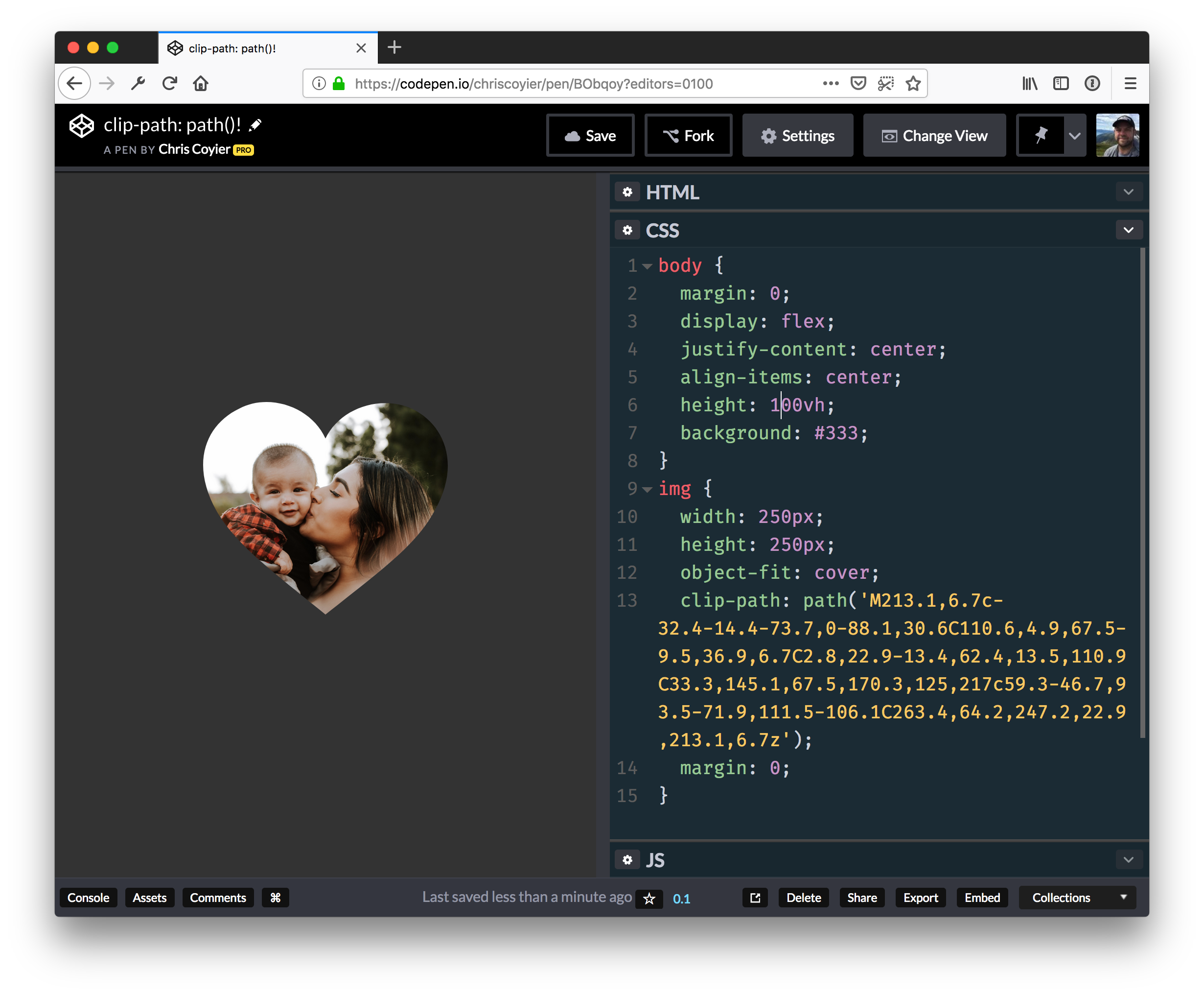
So, let’s create a colored piece of text with an outline. We’ll take it step by step. This is the result we will be aiming for:
So we’ll start with an SVG containing our text and a filter that starts with a simple dilation operation. The amount you dilate the text by depends on the thickness of the outline that you want.
The above code will get the alpha channel of the text—which is just a black version of the text—and will thicken it by 4px. The result of the code at this point looks like this:
..compared to the original text which has a dark navy blue fill color:
In order to create the outline effect, we will layer the original text on top of the dilated text, which will leave only the edges of the dilated text (the additional 4px) visible behind the original text, thus making them look like an outline. Overlaying the text on top of its outline (the dilated text) will be achieved using feMerge. We covered feMerge in the previous article.
Another thing we want to do before we position the outline behind the text is to colorize this outline. Also similar to what we did in the previous article, we will flood the filter region area with the color we want, and then composite the color layer with the dilated text layer (our outline) using the in operator. As a result, only the parts of the flood color that intersect with the dilated text will be rendered and the color will be blended with that text, thus colorizing it. Finally, we will merge the resulting colored outline with the original text to get the result we want. Our code now looks like this:
Creating a filter effect in SVG is a matter of thinking of the final result in terms of smaller operations, and using the result of one operation as input to another, and finally merging any layers we have created to achieve the final result.
The fill color of the text can be specified either in your CSS or on the text element using the fill attribute. The color of the outline can be tweaked in the flood-color attribute of the feFlood primitive.
Knocking the Text Out
In addition to adding an outline to text by dilating its alpha channel and layering it behind the text, we can create outline-only text, a.k.a. knockout text, meaning that the inside of the text will be “carved out” so you can see the background behind it through the outline. An example of such effect might look like the text in the following GIF, which shows a background changing color, and how that background can be seen within our text. This is the demo we will be creating in this section:
This effect is easier to create, and the code required to make it is noticeably shorter. The main difference here is that instead of layering the source text on top of the dilated text, we will use that source text to cut out the inner parts of the dilated text. This means that only the added thickness of the dilated text will remain, while the inside will be removed, thus giving us our outline.
We can do that by compositing the source text with the dilated text. Our source text will go on top, and the dilated text will be its backdrop. Using the out composite operator, only the parts of the backdrop that do not overlap with the source layer will be rendered, which in our case means that only our outline will be rendered.
<svg width="900" height="450" viewBox="0 0 900 450">
    <filter id="outliner">

        <!-- Start by grabbing the alpha channel of the text and dilating it-->
        <feMorphology operator="dilate" radius="8" in="SourceAlpha" result="THICKNESS" />

         <!-- Next, grab the original text (SourceGraphic) and use it to cut out the inside of the dilated text -->
        <feComposite operator="out" in="THICKNESS" in2="SourceGraphic"></feComposite>
    </filter>

    <text dx="100" dy="300" filter="url(#outliner)" letter-spacing="10px">SVG Rocks</text>
</svg>
Using a nice font face, our demo now looks like this:
Cool. Now, what if you want to change the color of the outline? You’d have to use the feFlood primitive again and composite the Flood color with the outline. And then every time you want to change the color of the outline, you’d have to do the same over and over again. This is, admittedly, too tedious. Fortunately, there is a simpler way.
If instead of grabbing and dilating the alpha channel of the text (which is black by default) you grab the source text itself (which could have any fill color!) and dilate it, and then use the text again to carve out the inside of the dilated text, you end up with an outline that comes from the source text itself. This means that the color of that outline will always be the same as the color of the source text. And since we can define the fill color of the source text in CSS, this means that you have an outline text that is separated from its styles. (Yay separation of concerns!) You can then apply the filter to any piece of text, and change the color of that text in the CSS any time you need to, without having to tweak the filter’s code. Our improved code now looks like this:
<svg width="900" height="450" viewBox="0 0 900 450">
    <filter id="outliner">

        <!-- Start by grabbing the source graphic (the text) and dilating it-->
        <feMorphology operator="dilate" radius="8" in="SourceGraphic" result="THICKNESS" />

         <!-- Then use the text (the SourceGraphic) again to cut out the inside of the dilated text -->
        <feComposite operator="out" in="THICKNESS" in2="SourceGraphic"></feComposite>
    </filter>

    <text dx="100" dy="300" filter="url(#outliner)" letter-spacing="10px">SVG Rocks</text>
</svg>
In our style sheet, we can choose the outline color as well as the SVG background color. You can also choose to have an image behind the text inside the SVG. I’m using CSS animations in the code below to animate the color of the background, for no reason other than it being cool.
svg text {
    font-family: 'Bangers', cursive;
    font-size: 150px;
    letter-spacing: 13px;
    fill: #000; /* This fill color determines the color of the outline */
}

svg {
    background-color: gold;
    animation: colorsssss 2s linear infinite;
    animation-delay: 3s;
}

@keyframes colorsssss {
    50% {
        background-color: deepPink;
    }
}
The above SVG filter is reusable across SVG as well as HTML. If you want to apply it to an HTML element, you can do that using the filter property; just place the filter in your HTML and “call” it in your CSS:
h2 {
    filter: url(#outliner);

    /* You can change the color of the outline here by changing the color of the heading */
    color: deepPink;
}
And our finished demo that includes an HTML heading with the filter applied to it:
My favorite thing about this filter recipe is that it can be used as a visual enhancement. If a browser does not support SVG filters, or if it does not support CSS filters, or it does not support applying SVG filters to HTML elements, the user will get the original text without the outline/knockout effect applied to it. Oh, and the cherry on top of the cake? Both the SVG and the HTML text will be fully accessible, searchable and selectable. Yay progressive enhancement! Yay SVG!
Final Words
Using just two filter operations in SVG, you can apply an outlined text effect to your SVG or HTML text content. Place this filter in your HTML and use and reuse it as often as you need.
In the next article in this series, we will have a look at the <feComponentTransfer>, one of my favorite filter primitives, and see how it works and what effects we can create with it. Stay tuned.
We are living in an era where everything is digital and artificial. However, there’s still room for old-time crafting tools. CSS-based illustrations, SVG icons and images, WebGL-powered pieces and dynamic effects of all types and kinds are the most popular …
Today we’re happy to share an exclusive set of 50 icons from the Emojious icon pack. This hand picked selection spans various categories from the more than 1200 quirky, happy icons for your next joyful project.
About the free Emojious icon set
This colorful icon set contains 50 adorable illustrations with a unique, eye-catching look. Each icon has lots of personality and fits to the modern tech and app world with its stylish color theme and symbolism.
The icons are free for personal and commercial use. Please don’t resell or redistribute them.
About Emojious PRO
Emojious PRO is an innovative icon set that collects 3700 icons, each with a smile, making it the first, quirky and eye-catching five-star product. It currently has 26 categories and it’s a growing set.
With PRO version you get 3 styles for each icon and free updates for life. Head over to emojious.com to check out all the icons.
We offer a special discount for all Codrops readers! Use coupon “CODROP30” for 30% off!
We hope you enjoy this freebie and find it useful!
If you’d like to contribute and publish your exclusive freebie on Codrops just drop us a line.
A book that will teach you how to use SVG not only for illustrations but also as graphical documents that you can integrate into complex HTML5 web pages, and style with custom CSS. Web developers will discover ways to adapt designs by adding data based graphics, dynamic styles, interaction, or animation.
By utilizing a simple and minimal usage syntax, rels enables you to easily view various analytics and stats regarding the releases of any GitHub repository.
An API that can be used for searching the largest database of immersive face filters, 360 videos, and 360 photos. The SVRF API is free to use across all types of apps: camera, messaging, chat, dating, creation, community, and more.
Spectrum is a cross-platform image transcoding library by Facebook that can easily be integrated into an Android or iOS project to efficiently perform common image operations.
The first article in a series on SVG filters. This guide will help you understand what they are and show you how to use them to create your own visual effects.
In this article, I want to show off the flexibility and real power of amCharts 4. We’re going to learn how to combine multiple charts that run together with animations that form a movie experience. Even if you’re only interested in creating a different kind of animation that has nothing to do with charts, you can still use this library, since it’s more than making charts. The core of amCharts is made to help with everything SVG: creation, layout, animation — basically a library that makes working with SVG fun!
Here’s the kind of thing I’m talking about. It's actually a demonstration of seven different charts animated together. We’ll walk through this together, covering how it works and how to re-create it so you can have amCharts in your tool belt the next time you’re working with charts or complex animations.
There’s a lot going on in the movie. Let’s break it up into digestible parts that allow us to parse out what’s going on and re-create those parts under the hood.
The first thing we’re hit is a pie chart rising from the depths with a curved line wrapped around it. There’s nothing special about the pie chart at this point, but we’ll cover it in the next section.
But what about that curved line? Remember, we make charts, so this line is simply a XY chart with a single line on it. All the other details — grid, labels, tick marks, etc. — are hidden. So, what we’re really looking at is a stripped-down line chart!
Setting up the line and pie chart animations
amCharts calls the lines on this chart a line series. A line series has a variable called tensionX and, in this case, it’s been set to 0.75, making for a curvy line. We have to think of tension like we would a rope that is being held by two people and both ends: the tighter the rope is pulled, the greater the tension; conversely, the tension gets looser as the two ends let up. That 0.75 value is a taking a quarter of a unit away from the initial value (1), creating less tension.
// Creates the line on the chart
var lineSeries = lineChart.series.push(new am4charts.LineSeries());
lineSeries.dataFields.dateX = "date";
lineSeries.dataFields.valueY = "value";
lineSeries.sequencedInterpolation = true;
lineSeries.fillOpacity = 0.3;
lineSeries.strokeOpacity = 0;
lineSeries.tensionX = 0.75; Loosens the tension to create a curved line
lineSeries.fill = am4core.color("#222a3f");
lineSeries.fillOpacity = 1;
Initially, all the values of the series are the same: a flat line. Then, we set valueY value of the line’s animation to 80, meaning it pops up to the eights row of the chart height — that will make plenty of room for the pie when it comes in.
// Defines the animation that reveals the curved line
lineSeries.events.on("shown", function(){
  setTimeout(showCurve, 2000)
});

// Sets the animation properties and the valueY so the line bounces up to
// 80 on the chart's y-axis
function showCurve() {
  lineSeries.interpolationEasing = am4core.ease.elasticOut;
  lineSeries.dataItems.getIndex(3).setValue("valueY", 80, 2000);
  setTimeout(hideCurve, 2000);
}

// This is the initial state where the line starts at 30 on the y-axis
// before it pops up to 80
function hideCurve() {
  lineSeries.interpolationEasing = am4core.ease.elasticOut;
  lineSeries.dataItems.getIndex(3).setValue("valueY", 30, 2000);
  setTimeout(showCurve, 2000);
}
Here is the line chart alone so we have a better visual for how that looks:
Next, the pie chart pops up from the bottom. Like a line series, amCharts includes a pie series and it has a dy property that we can set to hidden with a state of 400.
// Make the circle to show initially, meaning it will animate its properties from hidden state to default state
circle.showOnInit = true;

// Set the circle's easing and the duration of the pop up animation
circle.defaultState.transitionEasing = am4core.ease.elasticOut;
circle.defaultState.transitionDuration = 2500;

// Make it appear from bottom by setting dy of hidden state to 300;
circle.hiddenState.properties.dy = 300;
To illustrate this concept, here is a demo with that simple circle in place of a pie chart:
The idea of states in amCharts is this: you can have any number of custom states on any sprite. Then, instead of creating multiple animations with a slew of various different properties, state is changed from one to another and all the required properties that are set on the target state will animate from current values to the new state values.
Any numeric, percentage or color property of a sprite can be animated. By default, sprites have hidden and default states baked in. The hidden state is applied initially and followed by the revealed state, which is the default. There are other states, of course, like hover, active, disabled, among others, including custom states. Here is another demo showing a slice chart with innerRadius, radius and fill animating on hover:
If you look at the code in the demo, you will see some of properties of the slices are customized via pieSeries.slices.template or pieSeries.labels.template. Most of the customization, of course, can be done using themes (amCharts 4 supports using multiple themes at the same time), but since we only need to change a few properties, we can use a template. We’re using a pie chart type and all of the slices of the pie series will be created using the provided template which passes any of the inherited properties we use from the template onto our pie chart.
// Call included themes for styling and animating
am4core.useTheme(am4themes_amchartsdark);
am4core.useTheme(am4themes_animated);
// ...
// Call the Pie Chart template
var pieChart = mainContainer.createChild(am4charts.PieChart);
What if you want to set a custom color for the chart’s font? We can do this by adding a field in the data, like fontColor. That allows us to set custom colors there and then tell the label template that it should look at the field to inform the color property value.
// Define custom values that override one provided by the template
pieChart.data = [{
  "name": "[bold]No[/]",
  "fontColor": am4core.color("#222a3f"),
  "value": 220,
  "tickDisabled":true
}, {
  "name": "Hm... I don't think so.",
  "radius":20,
  "value": 300,
  "tickDisabled":false
}, {
  "name": "Yes, we are using amCharts",
  "value": 100,
  "labelDisabled": true,
  "tickDisabled":true
}];
Any property of a sprite can be customized like this. And even later, after the chart is initialized, we can change any property via the template, or if we need to access some individual object, we can get any value using something like series.slices.getIndex(3) to isolate it.
To summarize: there isn't a single object on the chart that can’t be customized or accessed, changed, even after the chart is built. We’re working with a lot of flexibility!
The pie chart morphs into a country
I’ll be blunt: There is no way to morph a whole pie chart or some other complex object to the shape of a country. In amCharts 4, one polygon can morph into another one. And there are prebuilt methods that simply morph a polygon to a circle or to a rectangle. Here’s what we’ll do:
First, we hide all the slices of a pie chart, except one. This makes effectively transforms the remaining slice into a circle.
Then we animate the innerRadius property to 0, and the slice becomes a true circle.
There’s already a map chart at this moment, but it is hidden out of view. While it hides, we zoom into a selected country and morph it into a circle as well.
Next, we’ll show the country (which is now a circle) and hide the pie chart (which looks like the same circle at this time).
Finally, we morph the country back to its original shape.
Here is a simplified demo where we zoom in to the country, morph it to a circle, then morph it back to its default state:
Inspect that code. Note that all the methods we call, like zoomToMapObject, morphToCircle or morphBack, return an Animation object. An animation object dispatches events like animationstarted, animationprogress or animationended and we can attach listeners to them. This ensures that one animation is triggered only after another one is finished. And, if we change the duration of an animation, we won't need to adjust timers accordingly, because events will handle it. In amCharts 4, Sprites, Components, DataItems, Animations, and other objects have an event dispatcher object which regulate any events. You can add listeners for these events and use them to make your applications super interactive.
The plane flies from one country to another
At one point, an airplane surfaces at London on a map chart and travels all the way to Silicon Valley.
It might look complex and scary, but it’s using a lot of the concepts we’ve already covered and the features come standard with the map chart included in amCharts:
MapImageSeries is created and sprites (circles and labels) are mapped to the actual longitude latitude coordinates of both cities.
// Create first image container
var imageSeries = mapChart.series.push(new am4maps.MapImageSeries());

// London properties
var city1 = imageSeries.mapImages.create();
// London's latitude/longitude
city1.latitude = 51.5074;
city1.longitude = 0.1278;
// prevent from scaling when zoomed
city1.nonScaling = true;

// New York City properties
var city2 = imageSeries.mapImages.create();
// NY latitude/longitude
city2.latitude = 40.7128;
city2.longitude = -74.0060;
// Prevent scaling when zoomed
city2.nonScaling = true;
MapLineSeries, like the standard line series we saw earlier, creates a line between the cities based on the coordinates that are provided, going from one map image to another. By default, the line is drawn so that it follows the shortest distance between the objects. That happens to be a curved line in this case. We could make it a straight line if we’d like.
// Create the map line series
var lineSeries = mapChart.series.push(new am4maps.MapLineSeries());
var mapLine = lineSeries.mapLines.create();

// Tell the line to connect the two cities (latitudes/longitudes an be used alternatively)
mapLine.imagesToConnect = [city1, city2]

// Draw the line in dashes
mapLine.line.strokeDasharray = "1,1";
mapLine.line.strokeOpacity = 0.2;
An object (plane) is added to the MapLine and it moves between the endpoints of the line by animating the plane’s position property from 0 to 1.
// Create the plane container
var planeContainer = mapLine.lineObjects.create();

planeContainer.position = 0;
// Set the SVG path of a plane for the sprite
var plane = planeContainer.createChild(am4core.Sprite);
planeContainer.nonScaling = false;
planeContainer.scale = 0.015;

// SVG plane illustration
plane.path = "M71,515.3l-33,72.5c-0.9,2.1,0.6,4.4,2.9,4.4l19.7,0c2.8,0,5.4-1,7.5-2.9l54.1-39.9c2.4-2.2,5.4-3.4,8.6-3.4 l103.9,0c1.8,0,3,1.8,2.3,3.5l-64.5,153.7c-0.7,1.6,0.5,3.3,2.2,3.3l40.5,0c2.9,0,5.7-1.3,7.5-3.6L338.4,554c3.9-5,9.9-8,16.2-8c24.2,0,85.5-0.1,109.1-0.2c21.4-0.1,41-6.3,59-17.8c4.2-2.6,7.9-6.1,11.2-9.8c2.6-2.9,3.8-5.7,3.7-8.5c0.1-2.8-1.1-5.5-3.7-8.5c-3.3-3.7-7-7.2-11.2-9.8c-18-11.5-37.6-17.7-59-17.8c-23.6-0.1-84.9-0.2-109.1-0.2c-6.4,0-12.3-2.9-16.2-8L222.6,316.6c-1.8-2.3-4.5-3.6-7.5-3.6l-40.5,0c-1.7,0-2.9,1.7-2.2,3.3L237,470c0.7,1.7-0.5,3.5-2.3,3.5l-103.9,0c-3.2,0-6.2-1.2-8.6-3.4l-54.1-39.9c-2.1-1.9-4.7-2.9-7.5-2.9l-19.7,0c-2.3,0-3.8,2.4-2.9,4.4l33,72.5C72.6,507.7,72.6,511.8,71,515.3z";
plane.fill = am4core.color("#eeeab5");

plane.horizontalCenter = "middle";
plane.verticalCenter = "middle";
Here is a demo of a plane flying from London to New York:
Notice that the plane becomes bigger when it hits the line’s halfway point? This is done with three additional lines of code we can stick at the end.
// Make the plane to be bigger in the middle of the line
planeContainer.adapter.add("scale", function(scale, target) {
  return (0.07 - 0.10 * (Math.abs(0.5 - target.position))) / mapChart.zoomLevel;
})
We’re using a method that called an adapter, which is another super-powerful feature of amCharts 4. In this case, the adapter modifies the scale property (0.07 to 0.10), based on planes position (0.5).
The plane becomes big and flies away
When our plane reaches the target city (Silicon Valley in the full movie), we scale and rotate it to become horizontal and big.
At the same moment, we create another chart (the SlicedChart type) and add a PictorialSeries to it. The series share’s the same path as the plane, which creates a mask for the slices. We can use any SVG path here.
When the slices are shown, we want the plane to fly away:
This happens by animating the chart object’s dx property.
flyAway()

function flyAway(){
  var animation = pictorialChart.animate({property:"dx", to:2000}, 1500, am4core.ease.quadIn).delay(2000);
  animation.events.on("animationended", flyIn);
}

function flyIn(){
  var animation = pictorialChart.animate({property:"dx", from:-2000, to:0}, 1500, am4core.ease.quadOut);
  animation.events.on("animationended", flyAway);
}
The trail of a plane is again made with a line series, similar to the one we had in the beginning. This time, it's a combination of two separate series: one with positive and another with negative values. When a series has the sequencedInterpolation property set to true, the animation happens with some delay for each data value and we get an effect like this:
This uses the same chart as the plane trail. We basically add another value axis to the chart and create a column series:
// Add a new axis to the chart
var valueAxis = chart.yAxes.push(new am4charts.ValueAxis());
// ... shortened for brevity

// Configure the column series
var series = chart.series.push(new am4charts.ColumnSeries())
series.dataFields.dateX = "date";
series.dataFields.valueY = "value";
series.sequencedInterpolation = true;
series.fillOpacity = 1;
series.fill = am4core.color("#222a3f");
series.stroke = am4core.color("#222a3f")

// Establish the columns at full width
series.columns.template.width = am4core.percent(100);
Then we update the background to gradient:
chart.background.fillOpacity = 0.2;
  var gradient = new am4core.LinearGradient();
  gradient.addColor(am4core.color("#222a3f"));
  gradient.addColor(am4core.color("#0975da"));
  gradient.rotation = -90;
  chart.background.fill = gradient;
And finally, we zoom in on the chart to half of the total range so that we can slowly change the zoom level later to create the moving city effect.
function startZoomAnimation(){
  // Animate the start and end values slowly to make it look like the city is moving
  var animation = dateAxis.animate([{property:"start", from:0, to:0.5}, {property:"end", from:0.5, to:1}], 15000, am4core.ease.linear);
  animation.events.on("animationended", startZoomAnimation);
}
Here is all the code, without the trail part for brevity:
am4core.useTheme(am4themes_amchartsdark);
am4core.useTheme(am4themes_animated);

// Main container
var mainContainer = am4core.create("introchart", am4core.Container);
mainContainer.width = am4core.percent(100);
mainContainer.height = am4core.percent(100);

var chart = mainContainer.createChild(am4charts.XYChart);
chart.padding(0, 0, 0, 0)
chart.zIndex = 20;

var data = [];
var date = new Date(2000, 0, 1, 0, 0, 0, 0);

for (var i = 0; i < 40; i++) {
  var newDate = new Date(date.getTime());
  newDate.setDate(i + 1);

  var value = Math.abs(Math.round(((Math.random() * 100 - i + 10) / 10)) * 10)

  data.push({ date: newDate, value: value });
}

chart.data = data;
chart.zoomOutButton.disabled = true;
chart.seriesContainer.zIndex = -1;

chart.background.fillOpacity = 0.2;
var gradient = new am4core.LinearGradient();
gradient.addColor(am4core.color("#222a3f"));
gradient.addColor(am4core.color("#0975da"));
gradient.rotation = -90;
chart.background.fill = gradient;

var dateAxis = chart.xAxes.push(new am4charts.DateAxis());
dateAxis.renderer.grid.template.location = 0;
dateAxis.renderer.ticks.template.disabled = true;
dateAxis.renderer.axisFills.template.disabled = true;

dateAxis.renderer.labels.template.disabled = true;
dateAxis.rangeChangeEasing = am4core.ease.sinIn;
dateAxis.renderer.inside = true;
dateAxis.startLocation = 0.5;
dateAxis.endLocation = 0.5;
dateAxis.renderer.baseGrid.disabled = true;
dateAxis.tooltip.disabled = true;
dateAxis.renderer.line.disabled = true;
dateAxis.renderer.grid.template.strokeOpacity = 0.07;

var valueAxis = chart.yAxes.push(new am4charts.ValueAxis());
valueAxis.tooltip.disabled = true;
valueAxis.renderer.ticks.template.disabled = true;
valueAxis.renderer.axisFills.template.disabled = true;
valueAxis.renderer.labels.template.disabled = true;
valueAxis.renderer.inside = true;
valueAxis.min = 0;
valueAxis.max = 100;
valueAxis.strictMinMax = true;
valueAxis.tooltip.disabled = true;
valueAxis.renderer.line.disabled = true;
valueAxis.renderer.baseGrid.disabled = true;
valueAxis.renderer.grid.template.strokeOpacity = 0.07;

var series = chart.series.push(new am4charts.ColumnSeries())
series.dataFields.dateX = "date";
series.dataFields.valueY = "value";
series.sequencedInterpolation = true;
series.fillOpacity = 1;
series.fill = am4core.color("#222a3f");
series.stroke = am4core.color("#222a3f")

series.columns.template.width = am4core.percent(100);

chart.events.on("ready", startZoomAnimation);

function startZoomAnimation(){
  // Animate the start and end values slowly to make it look like city is moving
  var animation = dateAxis.animate([{property:"start", from:0, to:0.5}, {property:"end", from:0.5, to:1}], 15000, am4core.ease.linear);
  animation.events.on("animationended", startZoomAnimation);
}
The column chart appears and bends to a radar column chart
Can you guess what happens in the final scene? The initial chart (which looks like a regular column chart) is actually what’s called a radar chart with a very small arc between the chart’s startAngle (269.9°) and endAngle (270.1°) properties.
var radarChart = mainContainer.createChild(am4charts.RadarChart);
// ... Chart properties go here

radarChart.startAngle = 269.9;
radarChart.endAngle = 270.1;
The total arc angle is only 0.2° degrees and that's why the radius of a chart becomes very big and tough tell it apart from a regular XY chart. And all we do to bend the chart is animate the start and end angles. I told you… we can literally animate everything, including angles!
radarChart.events.on("ready", bend);

function bend() {
  var animation = radarChart.animate([{ property: "startAngle", to: 90 }, { property: "endAngle", to: 450 }], 3500, am4core.ease.cubicIn).delay(1000);
    animation.events.on("animationended", unbend);
}

function unbend() {
  var animation = radarChart.animate([{ property: "startAngle", to: 269.9 }, { property: "endAngle", to: 270.1 }], 3500, am4core.ease.cubicIn).delay(500);
  animation.events.on("animationended", bend);
}
Oh, but there is one last, important thing I would like to mention: Containers. All charts and other non-chart objects in this movie are contained in a single div element. Initially, we created mainConatainer and arranged all the objects inside it. Containers support horizontal, vertical, grid and absolute layouts. Fixed or absolute positions can be used for a container's children, and containers can be nested inside other containers. They can be aligned horizontally or vertically, set to a fixed or absolute width or height… and so on. And did I mentioned, that amCharts has built-in date, number and text formatters? Seriously, I will stop here.
As a part of the amCharts team, I often hear comments like, "but you can do all of this with d3.” Yes, you are probably right. But there are still real benefits we’re working with here — fewer lines of code, time spent writing it, and a relatively simple startup. All the animation is made up of 1,000 lines of code, so this is also a pretty lightweight resource.
But, I’m really interested in what you think. Have you tried amCharts before and have examples to show off? How about questions about getting started? Or maybe you’re not sold on the concept altogether and want to chat the pros and cons? Let’s hear it in the comments!
CSS currently provides us with a way to apply color effects to images such as saturation, lightness, and contrast, among other effects, via the filter property and the filter functions that come with it.
We now have 11 filter functions in CSS that do a range of effects from blurring to changing color contrast and saturation, and more. We have a dedicated entry in the CSS Reference if you want to learn more about them.
Albeit powerful and very convenient, CSS filters are also very limited. The effects we are able to create with them are often applicable to images and limited to color manipulation and basic blurring. So, in order to create more powerful effects that we can apply to a wider range of elements, we’ll need a wider range of functions. These functions are available today —and have been available for over a decade— in SVG. In this article, which is the first in a series about SVG filters, you will learn about the SVG filter functions — known as “primitives” — and how to use them.
CSS filters are imported from SVG. They are fairly more optimized versions of a subset of filter effects present in SVG, and that have been around in the SVG specification for years.
There are more filters effects in SVG than there are in CSS, and the SVG versions are more powerful and capable of far more complex effects than their CSS shortcuts. For example, it is currently possible to blur an element using the CSS blur() filter function. Applying a blur effect using this function will create a uniform Gaussian Blur to the element it is applied to. The following image shows the result of applying a 6px blur to an image in CSS:
The blur() function creates a blur effect that is uniformly applied in both directions — X & Y — on the image. But this function is merely a simplified and limited shortcut for the blur filter primitive available in SVG, which allows us to blur an image either uniformly, or apply a one-directional blur effect along either the X- or the Y-axis.
The result of applying a blur along the x and y axes, respectively, using SVG filters.
SVG filters can be applied to HTML elements as well as SVG elements. An SVG filter effect can be applied to an HTML element in CSS using the url() filter function. For example, if you have a filter effect with an ID “myAwesomeEffect” defined in your SVG (we’ll talk about defining filters effects in SVG shortly), you can apply that effect to an HTML element or image like this:
.el {
   filter: url(#myAwesomeEffect);
}
Best of all, as you’re going to see in this series, SVG filters are capable of creating Photoshop-grade effects in the browser, using a few lines of code. I hope this series will help demystify and unlock part of SVG Filters’ potential and inspire you to start using them in your own projects.
But what about browser support, you ask..?
Browser Support
Browser support for the majority of SVG filters is impressively good. How an effect is applied may, however, vary across a few browsers depending on the browser support for the individual filter primitives used in the SVG filter effect, as well as depending on any possible browser bugs. Browser support may also vary when the SVG filter is applied to SVG elements versus HTML elements.
I would recommend that you treat filter effects as an enhancement: you can almost always apply an effect as an enhancement on top of a perfectly usable filter-less experience. (Those of you who know me would know that I endorse a progressive enhancement approach to building UIs whenever possible.) So, we won’t be too concerned about browser support in this series.
Lastly, even though SVG Filter support is generally good, do keep in mind that some of the effects we will cover later in the series may be considered experimental. I will mention any major issues or bugs if and when there are any.
So, how do you define and create a filter effect in SVG?
The <filter> Element
Just like linear gradients, masks, patterns, and other graphical effects in SVG, filters have a conveniently-named dedicated element: the <filter> element.
A <filter> element is never rendered directly; its only usage is as something that can be referenced using the filter attribute in SVG, or the url() function in CSS. Such elements (elements that are not rendered unless explicitly referenced) are usually defined as templates inside <defs> elements in SVG. But an SVG <filter> doesn’t need to be wrapped in a defs element. Whether you wrap the filter in a defs element or not, it will simply not be displayed.
The reason for that is that a filter requires a source image to work on, and unless you explicitly define that source image by calling the filter on that source image, it won’t have anything to render, and so it doesn’t.
A very basic, minimal code sample defining an SVG filter and applying it to a source image in SVG would look like this:
<svg width="600" height="450" viewBox="0 0 600 450">
    <filter id="myFilter">
        <!-- filter effects go in here -->
    </filter>
    <image xlink:href="..."
           width="100%" height="100%" x="0" y="0"
           filter="url(#myFilter)"></image>
</svg>
The filter in the above code sample does nothing at this point because it is empty. In order to create a filter effect, you need to define a series of one or more filter operations that create that effect inside the filter. In other words, the filter element is a container to a series of filter operations that, combined, create a filter effect. These filter operations are called “Filter Primitives” in SVG.
Filter Primitives
So, in SVG, each <filter> element contains a set of filter primitives as its children. Each filter primitive performs a single fundamental graphical operation on one or more inputs, producing a graphical result.
A filter primitive is conveniently named after whatever graphical operation it performs. For example, the primitive that applies a Gaussian Blur effect to the source graphic is called feGaussianBlur. All primitives share the same prefix: fe, which is short for “filter effect”. (Again, names in SVG are conveniently chosen to resemble what an element is or does.)
The following snippet shows what a simple filter would look like if that filter were to apply a 5px Gaussian Blur to an image:
There are currently 17 filter primitives defined in the SVG Filter specification that are capable of extremely powerful graphical effects, including but not limited to noise and texture generation, lighting effects, color manipulation (on a channel by channel basis), and more.
A filter primitive works by taking a source graphic as input and outputting another one. And the output of one filter effect can be used as input to another. This is very important and very powerful because it means that you have an almost countless combination of filter effects and therefore you can create an almost countless number of graphical effects.
Each filter primitive can take one or two inputs and output only one result. The input of a filter primitive is defined in an attribute called in. The result of an operation is defined in the result attribute. If the filter effect takes a second input, the second input is set in the in2 attribute. The result of an operation can be used as input to any other operation, but if the input of an operation is not specified in the in attribute, the result of the previous operation is automatically used as input. If you don’t specify the result of a primitive, its result will automatically be used as input to the primitive that follows. (This will become clearer as we start looking into code examples.)
In addition to using the result(s) of other primitives as input, a filter primitive also accepts other types of inputs, the most important of which are:
SourceGraphic: the element to which the entire filter is applied; for example, an image or a piece of text.
SourceAlpha: this is the same as the SourceGraphic, except that this graphic contains only the alpha channel of the element. For a JPEG image, for example, it is a black rectangle the size of the image itself.
You’ll find that you’ll sometimes want to use the source graphic as input and sometimes only its alpha channel. The examples we will cover in this post and the following posts will provide a clear understanding of when to use which.
This code snippet is an example of what a filter with a bunch of filter primitives as children could look like. Don’t worry about the primitives and what they do. At this point, just pay attention to how the inputs and outputs of certain primitives are being defined and used amongst them. I’ve added some comments to help.
<svg width="600" height="400" viewBox="0 0 850 650">
    <filter id=“filter">
        <feOffset in="SourceAlpha" dx="20" dy=“20"></feOffset>

        <!-- since the previous filter did not have a result defined and this following one
        does not have the input set, the result of the above primitive is automatically used
        as input to the following filter -->
        <feGaussianBlur stdDeviation="10" result=“DROP"></feGaussianBlur>

        <!-- setting/defining the result names in all caps is a good way to make them more
        distinguishable and the overall code more readable -->
        <feFlood flood-color="#000" result="COLOR"></feFlood>

        <!-- This primitive is using the outputs of the previous two primitives as
        input, and outputting a new effect -->
        <feComposite in="DROP" in2="COLOR" operator="in" result="SHADOW1"></feComposite>

        <feComponentTransfer in="SHADOW1" result="SHADOW">
                <feFuncA type="table" tableValues="0 0.5"></feFuncA>
        </feComponentTransfer>

        <!-- You can use ANY two results as inputs to any primitive, regardless
        of their order in the DOM.
        The following primitive is a good example of using two previously-generated
        outputs as input. -->
        <feMerge>
            <feMergeNode in="SHADOW"></feMergeNode>
            <feMergeNode in="SourceGraphic"></feMergeNode>
        </feMerge>
    </filter>
    <image xlink:href="..." x="0" y="0" width="100%" height="100%" filter="url(#filter)"></image>
</svg>
Now, the last concept I want to cover briefly before moving to our first filter example is the concept of a Filter Region.
The Filter Region
The set of filter operations need a region to operate on— an area they can be applied to. For example, you may have a complex SVG with many elements and you want to apply the filter effect only to a specific region or one or a group of elements inside that SVG.
In SVG, elements have “regions” whose boundaries are defined by the borders of the element’s Bounding Box. The Bounding Box (also abbreviated “bbox“) is the smallest fitting rectangle around an element. So for example for a piece of text, the smallest fitting rectangle looks like the pink rectangle in the following image.
The smallest fitting rectangle around a piece of text.
Note that this rectangle might include some more white space vertically because the line height of the text is taken into consideration when calculating the height of the bounding box.
The default filter region of an element is the element’s bounding box. So if you were to apply a filter effect to our piece of text, the effect will be restricted to this rectangle, and any filter result that lies beyond the boundaries of it will be clipped off. Albeit sensible, this is not very practical because many filters will impact pixels slightly outside the boundaries of the bounding box and, by default, those pixels will end up being cut off.
For example, if we apply a blur effect to our piece of text, you can see the blur getting cut off at the left and right edges of the text’s bounding box:
The blur effect applied to the text is cut off on both the right and left side of the text’s bounding box area.
So how do we prevent that from happening? The answer is: by extending the filter region. We can extend the region the filter is applied to by modifying the x, y, width and height attributes on the <filter> element.
According to the specification,
It is often necessary to provide padding space in the filter region because the filter effect might impact bits slightly outside the tight-fitting bounding box on a given object. For these purposes, it is possible to provide negative percentage values for ‘x’ and ‘y’, and percentage values greater than 100% for ‘width’ and ‘height’.
By default, filters have regions extending 10% the width and height of the bounding box in all four directions. In other words, the default values for the x, y, width and height attributes are as follows:
If you omit these attributes on the <filter> element, these values will be used by default. You can also override them to extend or shrink the region as you need.
One thing to keep in mind is that the units used in the x, y, width and height attributes are dependent on which filterUnits value is in use. The filterUnits attribute defines the coordinate system for the x, y, width and height attributes. It takes one of two values:
objectBoundingBox: this is the default value. When the filterUnits is objectBoundingBox, the values of the x, y, width and height attributes are percentages or fractions of the size of the element’s bounding box. This also means that you can use fractions as values instead of percentages if you prefer.
userSpaceOnUse: when filterUnits is set to userSpaceOnUse the coordinates of the x, y, width and height attributes are set relative to the current user coordinate system in use. In other words, it is relative to the current coordinate system in use in the SVG, which uses pixels as a unit and is, usually, relative to the size of the SVG itself, assuming the viewBox values matches that of the initial coordinate system. (You can learn all you need to know about coordinate systems in SVG in this post I wrote a few years ago.)
<!-- Using objectBoundingBox units -->
<filter id="filter"
        x=“5%" y=“5%” width="100%" height=“100%”>

<!-- Using userSpaceOnUse units -->
<filter id=“filter"
        filterUnits="userSpaceOnUse"
        x=“5px" y=“5px” width="500px" height="350px">
Quick Tip: Visualizing the current filter region with feFlood
If you ever need to see the extent of your filter region you can visualize it by flooding the filter region with color. Conveniently, a filter primitive called feFlood exists whose sole purpose is to do exactly that: fill the current filter region with a color that you specify in the flood-color attribute.
So, assuming we have a piece of text whose filter region we want to visualize, the code would look as simple as:
As you can see in the above code snippet, the feFlood primitive also accepts a flood-opacity attribute which you can use to make the flood color layer translucent.
The above snippet floods the filter region with a pink color. But here is the thing: when you flood the region with color, you’re literally flooding it with color, meaning that the color will cover everything in the filter region, including any elements and effects you’ve created before, as well as the text itself. After all, this is what the definition of flooding is, right?
Before and after flooding the text’s filter region with color.
In order to change that, we need to move the color layer to the “back” and show the source text layer on top.
Whenever you have multiple layers of content that you want to display on top of each other in an SVG filter, you can use the <feMerge> filter primitive. As its name suggests, the feMerge primitive is used to merge together layers of elements or effects.
The <feMerge> primitive does not have an in attribute. To merge layers, two or more <feMergeNode>s are used insidefeMerge, each of which has its own in attribute that represents a layer that we want to add.
Layer (or “node”) stacking depends on the <feMergeNode> source order — the first <feMergeNode> will be rendered “behind” or “below” the second. The last <feMergeNode> represents the topmost layer. And so on.
So, in our text example, the flood color is a layer, and the source text (the source graphic) is another layer, and we want to place the text on top of the flood color. Our code will hence look like this:
Notice how I named the result of the feFlood in the result attribute so that I can reference that name in the <feMergeNode> as input. Since we want to display the source text on top of the flood color, we reference this text using SourceGraphic. The following is a live demo of the result:
Now that we’ve gotten a quick introduction into the world of SVG filters with this demo, let’s create a simple SVG drop shadow.
Applying a drop shadow to an image
Let me start with a quick disclaimer: you’re better off creating a simple drop shadow using the CSS drop-shadow() filter function. The SVG filter way is much more verbose. After all, as we mentioned earlier, the CSS filter functions are convenient shortcuts. But I want to cover this example anyway as a simple entry point to the more complex filter effects we’ll cover in the coming articles.
So, how is a drop shadow made?
A drop shadow is usually a light-gray layer behind—or underneath—an element, that has the same form (or shape) as the element itself. In other words, you can think of it as a blurred gray copy of the element.
When creating SVG filters, we need to think in steps. What steps are needed to achieve a particular effect? For a drop shadow, a blurred gray copy of the element can be created by blurring a black copy of the element and then colorizing that black copy (making it gray). Then that newly created blurred grey copy is positioned behind the source element, and offset a little in both directions.
So we’re going to start by getting a black copy of our element and blurring it. The black copy can be created by using the alpha channel of the element, using SourceAlpha as input to our filter.
The feGaussianBlur primitive will be used to apply a Gaussian blur to that SourceAlpha layer. The amount of blur you need is specified in the stdDeviation (short for: Standard Deviation) attribute. If you provide one value to the stdDeviation attribute, that value will be used to apply a uniform blur to the input. You can also provide two numerical values— the first will be used to blur the element in the horizontal direction and the second will be used to apply a vertical blur. For a drop shadow, we need to apply a uniform blur, so our code will start with this:
<svg width="600" height="400" viewBox="0 0 850 650">
    <filter id="drop-shadow">

        <-- Grab a blakc copy of the source image and blur it by 10 -->
        <feGaussianBlur in="SourceAlpha" stdDeviation="10" result="DROP"></feGaussianBlur>

    </filter>
    <image xlink:href="..." x="0" y="0" width="100%" height="100%" filter="url(#drop-shadow)"></image>
</svg>
The above code snippet results in the following effect, where only the blurred alpha channel of the image is rendered at this point:
Next, we want to change the color of the drop shadow and make it grey. We will do that by applying a flood color to the filter region and then compositing that flood color layer with the drop shadow layer we have created.
Compositing is the combining of a graphic element with its backdrop. A backdrop is the content behind the element and is what the element is composited with. In our filter, the Flood color is the upper layer, and the blurred shadow is its backdrop (because it lies behind it). We will see the feComposite primitive more in the upcoming articles, so if you’re not familiar with what compositing is and how it works, I have a very comprehensive introductory article on my blog that I recommend checking out.
The feComposite primitive has an operator attribute which is used to specify which composite operation we want to use.
By using the in composite operator, the flood color layer will be “cropped” and only the area of the color that overlaps with our shadow layer will be rendered, and the two layers will be blended where they intersect, which means that the grey color will be used to colorize our black drop shadow.
The feComposite primitive requires two inputs to operate on, specified in the in and in2 attributes. The first input is our color layer, and the second input is our blurred shadow backdrop. With the composite operation specified in the operator attribute, our code now looks like this:
Notice how the results of the feGaussianBlur and the feFlood primitives are used as inputs for feComposite. Our demo now looks like this:
Before we layer our original image on top of the drop shadow, we want to offset the latter vertically and/or horizontally. How much you offset the shadow and in which direction is completely up to you. For this demo, I’ll assume we have a source light coming from the top left corner of our screen, so I will move it by a few pixels down to the right.
To offset a layer in SVG, we use the feOffset primitive. In addition to the in and result attributes, this primitive takes two main attributes: dx and dy, which determine the distance by which you want to offset the layer along the x and y axes, respectively.
After offsetting the drop shadow, we will merge it with the source image using feMerge, similar to how we merged the text and flood color in the previous section— one mergeNode will take our drop shadow as input, and another mergeNode will layer the source image using SourceGraphic as input. Our final code now looks like this:
<svg width="600" height="400" viewBox="0 0 850 650">
    <filter id="drop-shadow">

        <!-- Get the source alpha and blur it; we'll name the result "DROP"  -->
        <feGaussianBlur in="SourceAlpha" stdDeviation="10" result="DROP"></feGaussianBlur>

        <!-- flood the region with a ligh grey color; we'll name this layer "COLOR" -->
        <feFlood flood-color="#bbb" result="COLOR"></feFlood>

        <!-- Composite the DROP and COLOR layers together to colorize the shadow. The result is named "SHADOW"  -->
        <feComposite in="COLOR" in2="DROP" operator="in" result="SHADOW"></feComposite>

        <!-- Move the SHADOW layer 20 pixels down and to the right. The new layer is now called "DROPSHADOW"  -->
        <feOffset in="SHADOW" dx="20" dy="20" result="DROPSHADOW"></feOffset>

        <!-- Layer the DROPSHADOW and the Source Image, ensuring the image is positioned on top (remember: MergeNode order matters)  -->
        <feMerge>
            <feMergeNode in="DROPSHADOW"></feMergeNode>
            <feMergeNode in="SourceGraphic"></feMergeNode>
        </feMerge>
    </filter>

    <!-- Apply the filter to the source image in the `filter` attribute -->
    <image xlink:href="..." x="0" y="0" width="100%" height="100%" filter="url(#drop-shadow)"></image>
</svg>
And the following is a live demo of the above code:
And that is how you apply a filter effect in SVG using SVG filters. You’ll find that this effect works across all major browsers.
There is another way…
There is another, more common way of creating a drop shadow. Instead of creating a black shadow and applying color to it to make it lighter, you could apply transparency to it, thus making it translucent and, consequently, lighter.
In the previous demo, we learned how to apply color to the drop shadow using feFlood, which is a coloring technique you’ll probably find yourself needing and using often. This is why I thought it was necessary to cover. It is also useful to learn because this is the way to go if you want to create a shadow that, for whatever reason, has a colorful shadow, for example, instead of a black or grey one.
In order to change the opacity of a layer, you can use either the feColorMatrix primitive or the feComponentTransfer primitive. I’ll talk about the feComponentTransfer primitive in more detail in upcoming articles, so I’ll use feColorMatrix to reduce the opacity for our shadow now.
The feColorMatrix primitive deserves an article of its own. For now, I highly recommend reading Una Kravet’s article which is a great introduction with really good examples.
In short, this filter applies a matrix transformation to the R(Red), G(Green), B(Blue), and A(Alpha) channels of every pixel in the input graphic to produce a result with a new set of color and alpha values. In other words, you use a matrix operation to manipulate the colors of your object. A basic color matrix looks like this:
<filter id="myFilter">
    <feColorMatrix
      type="matrix"
      values="R 0 0 0 0
              0 G 0 0 0
              0 0 B 0 0
              0 0 0 A 0 "/>
    </feColorMatrix>
</filter>
Once again I recommend checking Una’s article out to learn more about this syntax.
Since we only want to reduce the opacity of our shadow, we will use an identity matrix that does not alter the RGB channels, but we will reduce the value of the alpha channel in that matrix:
<filter id="filter">

        <!-- Get the source alpha and blur it,  -->
        <feGaussianBlur in="SourceAlpha" stdDeviation="10" result="DROP"></feGaussianBlur>

        <!-- offset the drop shadow  -->
        <feOffset in="SHADOW" dx="20" dy="20" result="DROPSHADOW"></feOffset>

        <!-- make the shadow translucent by reducing the alpha channel value to 0.3  -->
        <feColorMatrix type="matrix" in="DROPSHADOW" result="FINALSHADOW"
                                  values="1 0 0 0 0
					  0 1 0 0 0
					  0 0 1 0 0
					  0 0 0 0.3 0">
        </feColorMatrix>

        <!-- Merge the shadow and the source image  -->
        <feMerge>
            <feMergeNode in="FINALHADOW"></feMergeNode>
            <feMergeNode in="SourceGraphic"></feMergeNode>
        </feMerge>
    </filter>
In this series, I will try to steer away from the very technical definitions of filter operations and stick to simplified and friendly definitions. Often, you don’t need to get into the gnarly little details of what happens under the hood, so getting into those details would only add to the complexity of the articles, possibly make them less digestible, and would bring little benefit. Understanding what a filter does and how to use it is more than enough, in my opinion, to take advantage of what it has to offer. If you do want to get into more details, I recommend consulting the specification to start. That said, the spec may prove to be of little help, so you’ll probably end up doing your own research on the side. I’ll provide a list of excellent resources for further learning in the final article of this series.
Now that we’ve covered the basics of SVG filters and how to create and apply one, we will look into more examples of effects using more filter primitives in the upcoming articles. Stay tuned.
The third edition of the JavaScript Rising Stars that looks at which projects got traction in 2018 by comparing the numbers of stars added on GitHub over the last 12 months.
Divi is powered by the Divi Builder, an insanely fast and incredibly intuitive front end editor like nothing you have seen before. It will change the way you build websites forever.
A set of five demos with animated WebGL lines created with the THREE.MeshLine library. Find out how to animate and build these lines to create your own animations.
This library tackles the problem that you cannot handle the width of your lines with classic lines in Three.js. A MeshLine builds a strip of triangles billboarded to create a custom geometry instead of using the native WebGL GL_LINE method that does not support the width parameter.
These lines shaped as ribbons have a really interesting graphic style. They also have less vertices than a TubeGeometry usually used to create thick lines.
Animate a MeshLine
The only thing missing is the ability to animate lines without having to rebuild the geometry for each frame.
Based on what had already been started and how SVG Line animation works, I added three new parameters to MeshLineMaterial to visualize animated dashed line directly through the shader.
DashRatio: The ratio between what is visible or not (~0: more visible, ~1: less visible)
DashArray: The length of a dash and its space (0 == no dash)
DashOffset: The location where the first dash begins
Like with an SVG path, these parameters allow you to animate the entire traced line if they are correctly handled.
Here is a complete example of how to create and animate a MeshLine:
  // Build an array of points
  const segmentLength = 1;
  const nbrOfPoints = 10;
  const points = [];
  for (let i = 0; i < nbrOfPoints; i++) {
    points.push(i * segmentLength, 0, 0);
  }

  // Build the geometry
  const line = new MeshLine();
  line.setGeometry(points);
  const geometry = line.geometry;

  // Build the material with good parameters to animate it.
  const material = new MeshLineMaterial({
    lineWidth: 0.1,
    color: new Color('#ff0000'),
    dashArray: 2,     // always has to be the double of the line
    dashOffset: 0,    // start the dash at zero
    dashRatio: 0.75,  // visible length range min: 0.99, max: 0.5
  });

  // Build the Mesh
  const lineMesh = new Mesh(geometry, material);
  lineMesh.position.x = -4.5;

  // ! Assuming you have your own webgl engine to add meshes on scene and update them.
  webgl.add(lineMesh);

  // ! Call each frame
  function update() {
    // Check if the dash is out to stop animate it.
    if (lineMesh.material.uniforms.dashOffset.value < -2) return;

    // Decrement the dashOffset value to animate the path with the dash.
    lineMesh.material.uniforms.dashOffset.value -= 0.01;
  }
Create your own line style
Now that you know how to animate lines, I will show you some tips on how to customize the shape of your lines.
These classes smooth an array of points that is roughly positioned. They are perfect to build curved and fluid lines and keep control of them (length, orientation, turbulences…).
For instance, let’s add some turbulences to our previous array of points:
  const segmentLength = 1;
  const nbrOfPoints = 10;
  const points = [];
  const turbulence = 0.5;
  for (let i = 0; i < nbrOfPoints; i++) {
    // ! We have to wrapped points into a THREE.Vector3 this time
    points.push(new Vector3(
      i * segmentLength,
      (Math.random() * (turbulence * 2)) - turbulence,
      (Math.random() * (turbulence * 2)) - turbulence,
    ));
  }
Then, use one of these classes to smooth your array of lines before you create the geometry:
  // 2D spline
  // const linePoints = new Geometry().setFromPoints(new SplineCurve(points).getPoints(50));

  // 3D spline
  const linePoints = new Geometry().setFromPoints(new CatmullRomCurve3(points).getPoints(50));

  const line = new MeshLine();
  line.setGeometry(linePoints);
  const geometry = line.geometry;
And like that you create your smooth curved line!
Note that SplineCurve only smoothes in 2D (x and y axis) compared to CatmullRomCurve3 that takes into account three axes.
I recommend to use the SplineCurve, anyway. It is more performant to calculate lines and is often enough to create the desired curved effect.
For instance, my demos Confetti and Energy are only made with the SplineCurve method:
Use Raycasting
Another technique taken from a THREE.MeshLine example is using a Raycaster to scan a Mesh already present in the scene.
Thus, you can create your lines that follow the shape of an object:
  const radius = 4;
  const yMax = -4;
  const points = [];
  const origin = new Vector3();
  const direction = new Vector3();
  const raycaster = new Raycaster();

  let y = 0;
  let angle = 0;
  // Start the scan
  while (y < yMax) {
    // Update the orientation and the position of the raycaster
    y -= 0.1;
    angle += 0.2;
    origin.set(radius * Math.cos(angle), y, radius * Math.sin(angle));
    direction.set(-origin.x, 0, -origin.z);
    direction.normalize();
    raycaster.set(origin, direction);

    // Save the coordinates raycsted.
    // !Assuming the raycaster cross the object in the scene each time
    const intersect = raycaster.intersectObject(objectToRaycast, true);
    if (intersect.length) {
      points.push(
        intersect[0].point.x,
        intersect[0].point.y,
        intersect[0].point.z,
      );
    }
  }
This method is employed in the Boreal Sky demo. Here I used a sphere part as geometry to create the mesh objectToRaycast:
Now, you have enough tools to play and animate MeshLines. Many of these methods are inspired by the library’s examples. Feel free to explore these and share your own experiments and methods to create your own lines!
HTML5 SVG Fill Animation With CSS3 And Vanilla JavaScript
HTML5 SVG Fill Animation With CSS3 And Vanilla JavaScript
Marina Ferreira
SVG stands for Scalable Vector Graphics and it is a standard XML-based markup language for vector graphics. It allows you to draw paths, curves, and shapes by determining a set of points in the 2D plane. Moreover, you can add twitch properties on those paths (such as stroke, color, thickness, fill, and more) in order to produce animations.
Since April 2017, CSS Level 3 Fill and Stroke Module allow SVG colors and fill patterns to be set from an external stylesheet, instead of setting attributes on each element. In this tutorial, we will use a simple plain hex color, but both fill and stroke properties also accept patterns, gradients and images as values.
Note: When visiting the Awwwards website, the animated note display can only be viewed with browser width set to 1024px or more.
Each note element consists of a list item: li that holds the circle, the note value, and its label.
List item element and its direct children: .circle, .percent and .label. (Large preview)
The .circle_svg is an SVG element, that wraps two <circle> elements. The first is the path to be filled while the second is the fill that will be animated.
SVG elements. SVG wrapper and circle tags. (Large preview)
The note is separated into integer and decimals so different font sizes can be applied to them. The label is a simple <span>. So, putting all of this together looks like this:
The cx and cy attributes define the circle’s x-axis and y-axis center point. The r attribute defines its radius.
You have probably noticed the underscore/dash pattern in classes names. That’s BEM, which stands for block, element and modifier. It is a methodology that makes your element naming more structured, organized and semantic.
You must be asking yourself what the labels Transparent, Reasonable, Usable and Exemplary mean. The more acquainted you get with programming, you will realize that writing code is not only about making the application functional, but also assuring that it will be long-term maintainable and scalable. That is only achieved if your code is easy to change.
“The acronym TRUE should help decide if the code you write will be able to accommodate change in the future or not.”
So, next time, ask yourself:
Transparent: Are code changes consequences clear?
Reasonable: Is cost benefit worth it?
Usable: Will I be able to reuse it in unexpected scenarios?
Exemplary: Does it present high quality as an example for future code?
Note: “Practical Object-Oriented Design in Ruby” by Sandi Metz explains TRUE along with other principles and how to achieve those through design patterns. If you haven’t taken some time to study design patterns yet, consider adding this book to your bedtime reading.
CSS
Let’s import the fonts and apply a reset to all items:
The box-sizing: border-box property includes padding and border values into an element’s total width and height, so it’s easier to calculate its dimensions.
By combining the rules display: flex in the body and margin-auto in the .display-container, it’s possible to center the child element both vertically and horizontally. The .display-container element will also be a flex-container; that way, its children will be placed in the same row along the main axis.
The .note-display list item will also be a flex-container. Since there are many children for centering, let’s do it through the justify-content and align-items properties. All flex-items will be centered along the cross and main axis. If you’re not sure what those are, check out the alignment section at “CSS Flexbox Fundamentals Visual Guide.”
Let’s apply a stroke to the circles by setting the rules stroke-width, stroke-opacity and stroke-linecap that altogether style the stroke live ends. Next, let’s add a color to each circle:
In order to position the percent element absolutely, it’s necessary to know absolutely to what. The .circle element should be the reference, so let’s add position: relative to it.
Another way of centering elements is to combine top: 50%, left: 50% and transform: translate(-50%, -50%); which position the element’s center at its parent’s center.
The image to the left shows the property stroke-dasharray being set from 0 to 238px, which is the circle circumference length.
The second image represents the stroke-dashoffset property that offsets the beginning of the dash array. It is also set from 0 to the circle circumference length.
stroke-dasharray and stroke-dashoffset properties (Large preview)
To produce the filling effect, we will set the stroke-dasharray to the circumference length, so that all of its length gets filled with a big dash and no gap. We’ll also offset it by the same value, so it gets “hidden”. Then the stroke-dashoffset will be updated to the corresponding note value, filling the stroke accordingly to the transition duration.
The properties updating will be done in the scripts through CSS Variables. Let’s declare the variables and set the properties:
In order to set the initial value and update the variables, let’s start by selecting all .note-display elements with document.querySelectorAll. The transitionDuration will be set to 900 milliseconds.
Then, we iterate through the displays array, select its .circle__progress.circle__progress--fill and extract the r attribute set in the HTML to calculate the circumference length. With that, we can set the initial --dasharray and --dashoffset values.
The animation will occur when the --dashoffset variable gets updated by a 100ms setTimeout:
Now, let’s calculate the dashoffset value — relative to the note. The note value will be inserted to each li item through the data-* attribute. The * can be switched for any name that suits your needs and it can then, be retrieved in JavaScript through the element’s dataset: element.dataset.*.
Note: You can read more about the data-* attribute on MDN Web Docs.
The parseFloat method will convert the string returned by display.dataset.note into a floating point number. The offset represents the percentage missing to reach the maximum score. So, for a 7.50 note, we would have (10 - 7.50) / 10 = 0.25, which means the circumference length should be offset by 25% of its value:
let note = parseFloat(display.dataset.note);
let offset = circumference * (10 - note) / 10;
There is still the note transition from 0.00 to the note value to be built. The first thing to do is to separate the integer and decimal values. We will use the string method split() (it takes an argument that determines where the string will be broken and returns an array containing both broken strings). Those will be converted to numbers and passed as arguments to the increaseNumber() function, along with the display element and a flag indicating if its an integer or a decimal.
In the increaseNumber() function, we select either the .percent__int or .percent__dec element, depending on the className, and also in case the output should contain a decimal point or not. We’ve set our transitionDuration to 900ms. Now, to animate a number from 0 to 7, for example, the duration has to be divided by the note 900 / 7 = 128.57ms. The result represents how long each increase iteration will take. This means our setInterval will fire every 128.57ms.
With those variables set, let’s define the setInterval. The counter variable will be appended to the element as text and increased on each iteration:
function increaseNumber(display, number, className) {
  let element = display.querySelector(`.percent__${className}`),
      decPoint = className === 'int' ? '.' : '',
      interval = transitionDuration / number,
      counter = 0;

  let increaseInterval = setInterval(() => {
    element.textContent = counter + decPoint;
    counter++;
  }, interval);
}
Cool! It does increase the values, but it kind of does it forever. We need to clear the setInterval when the notes achieve the value we want. That is done with clearInterval function:
function increaseNumber(display, number, className) {
  let element = display.querySelector(`.percent__${className}`),
      decPoint = className === 'int' ? '.' : '',
      interval = transitionDuration / number,
      counter = 0;

  let increaseInterval = setInterval(() => {
+   if (counter === number) { window.clearInterval(increaseInterval); }

    element.textContent = counter + decPoint;
    counter++;
  }, interval);
}
Now the number is updated up to the note value and cleared with clearInterval() function.
That’s pretty much it for this tutorial. I hope you enjoyed it!
If you feel like building something a bit more interactive, check out my Memory Game Tutorial created with Vanilla JavaScript. It covers basic HTML5, CSS3 and JavaScript concepts such as positioning, perspective, transitions, Flexbox, event handling, timeouts and ternaries.
Divi is powered by the Divi Builder, an insanely fast and incredibly intuitive front end editor like nothing you have seen before. It will change the way you build websites forever.
Students from Nara University in Japan have created this project where your face is matched to a Buddha statue image using Microsoft’s emotion analysis technology.
One thing that has long surprised (and saddened) me is that the clip-path property, as awesome as it is, only takes a few values. The circle() and ellipse() functions are nice, but hiding overflows and rounding with border-radius generally helps there already. Perhaps the most useful value is polygon() because it allows us to draw a shape out of straight lines at arbitrary points.
The sad part comes in when you find out that clip-path doesn't accept path(). C'mon it's got path in the name! The path syntax, which comes from SVG, is the ultimate syntax. It allows us to draw literally any shape.
More confusingly, there already is a path() function, which is what properties like offset-path take.
The talk goes into the shape-outside property and how it can't use path(). It also goes into the fact that we can change the d property of a literal <path>.
I don't really blame anyone, though. This is weird stuff and it's being implemented by different teams, which inevitably results in different outcomes. Even the fact that SVG uses unit-less values in the <path> syntax is a little weird and an anomaly in CSS-land. How that behaves, how values with units behave, what comma-syntax is allowed and disallowed, and what the DOM returns when asked is plenty to make your head spin.
Anyway! Along comes Firefox with an implementation!
Does anyone know if clip-path: path() is behind a flag in chrome or something. Can't seem to find it, but they do support offset-path: path(), so figured they would support both.
Here's that flag in Firefox (layout.css.clip-path-path.enabled):
And here's a demo... you'll see a square in unsupported browsers and a heart in the ones that support clip-path: path(); — which is only Firefox Nightly with the flag turned on at the time of this writing.
Today we’d like to share a simple morphing page transition effect with you. The idea is to morph an SVG path while moving an intro page up, creating an interesting, flowy look. For the animations we use anime.js and for some letter effects we use Charming. In the demos we use an “intro transition” in order to showcase the effect, but that’s of course only one of the many use cases for this kind of page transition.
This demo is kindly sponsored by PageCloud, the website builder you’ll love to use. If you would like to become a demo sponsor, you can find out more here.
Attention: For the demos use some modern properties like CSS Flexbox and CSS variables without a fallback, so please view them in a up-to-date browser.
The structure that allows us to move the shape along with the intro content, looks as follows:
The fixed content lies beneath the intro content, and once we move the intro content up, it gets revealed. At the same time we morph the SVG path into the one defined in the pathdata:id. When creating the two paths, one needs to make sure that they both have the same amount of points so that the morphing happens smoothly.
We hope you enjoy this little effect and find it useful!
Hear, hear! SmashingConf NYC 2016 is coming! A spectacular performance about failures, successes and superpowers in front-end and UX — now on Broadway! A flabbergasting show on fascinating endeavours in web design, with busted myths, horror design stories and wisdom gained from daunting real-life struggles! Don’t miss the most remarkable show of the year!
Can you dispel the truth from the lies? Honesty from deception? Myths from heartbreaking real-life experience? Have you figured out responsive design, mobile, pattern libraries, SVG, flexbox, performance, HTTP/2 — and all of the other mischievous, erratic facets of designing for the web today?


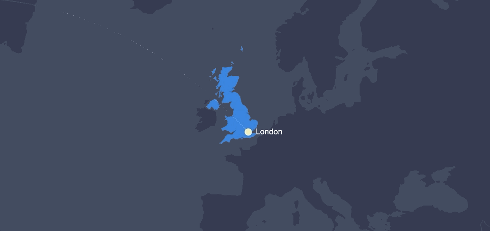
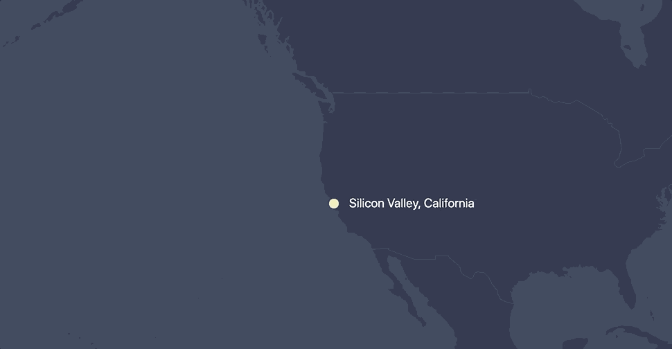


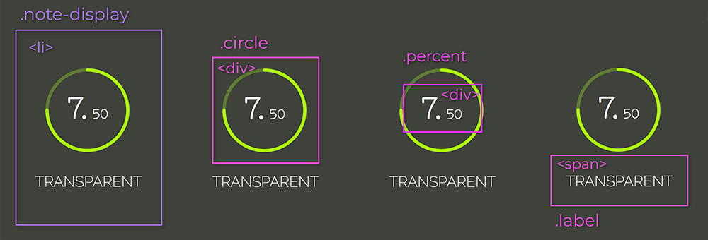


