Stop hating regex and start learning; iHateRegex is a very useful regex cheatsheet that also explains the commonly used expressions so that you can easily understand them.
Welcome to an incredibly controversial topic in the land of front-end development! I’m sure that a majority of you reading this have encountered your fair share of #hotdrama surrounding how CSS should be handled within a JavaScript application.
I want to preface this post with a disclaimer: There is no hard and fast rule that establishes one method of handling CSS in a React, or Vue, or Angular application as superior. Every project is different, and every method has its merits! That may seem ambiguous, but what I do know is that the development community we exist in is full of people who are continuously seeking new information, and looking to push the web forward in meaningful ways.
Preconceived notions about this topic aside, let’s take a look at the fascinating world of CSS architecture!
Let us count the ways
Simply Googling "How to add CSS to [insert framework here]" yields a flurry of strongly held beliefs and opinions about how styles should be applied to a project. To try to help cut through some of the noise, let’s examine a few of the more commonly utilized methods at a high level, along with their purpose.
Option 1: A dang ol’ stylesheet
We’ll start off with what is a familiar approach: a dang ol’ stylesheet. We absolutely are able to <link> to an external stylesheet within our application and call it a day.
<link rel="stylesheet" href="styles.css">
We can write normal CSS that we’re used to and move on with our lives. Nothing wrong with that at all, but as an application gets larger, and more complex, it becomes harder and harder to maintain a single stylesheet. Parsing thousands of lines of CSS that are responsible for styling your entire application becomes a pain for any developer working on the project. The cascade is also a beautiful thing, but it also becomes tough to manage in the sense that some styles you — or other devs on the project — write will introduce regressions into other parts of the application. We’ve experienced these issues before, and things like Sass (and PostCSS more recently) have been introduced to help us handle these issues
We could continue down this path and utilize the awesome power of PostCSS to write very modular CSS partials that are strung together via @import rules. This requires a little bit of work within a webpack config to be properly set up, but something you can handle for sure!
No matter what compiler you decide to use (or not use) at the end of the day, you’ll be serving one CSS file that houses all of the styles for your application via a <link> tag in the header. Depending on the complexity of that application, this file has the potential to get pretty bloated, hard to load asynchronously, and render-blocking for the rest of your application. (Sure, render-blocking isn’t always a bad thing, but for all intents and purposes, we’ll generalize a bit here and avoid render blocking scripts and styles wherever we can.)
That’s not to say that this method doesn’t have its merits. For a small application, or an application built by a team with less of a focus on the front end, a single stylesheet may be a good call. It provides clear separation between business logic and application styles, and because it’s not generated by our application, is fully within our control to ensure exactly what we write is exactly what is output. Additionally, a single CSS file is fairly easy for the browser to cache, so that returning users don’t have to re-download the entire file on their next visit.
But let’s say that we’re looking for a bit more of a robust CSS architecture that allows us to leverage the power of tooling. Something to help us manage an application that requires a bit more of a nuanced approach. Enter CSS Modules.
Option 2: CSS Modules
One fairly large problem within a single stylesheet is the risk of regression. Writing CSS that utilizes a fairly non-specific selector could end up altering another component in a completely different area of your application. This is where an approach called "scoped styles" comes in handy.
Scoped styles allow us to programmatically generate class names specific to a component. Thus scoping those styles to that specific component, ensuring that their class names will be unique. This leads to auto-generated class names like header__2lexd. The bit at the end is a hashed selector that is unique, so even if you had another component named header, you could apply a header class to it, and our scoped styles would generate a new hashed suffix like so: header__15qy_.
CSS Modules offer ways, depending on implementation, to control the generated class name, but I’ll leave that up to the CSS Modules documentation to cover that.
Once all is said and done, we are still generating a single CSS file that is delivered to the browser via a <link> tag in the header. This comes with the same potential drawbacks (render blocking, file size bloat, etc.) and some of the benefits (caching, mostly) that we covered above. But this method, because of its purpose of scoping styles, comes with another caveat: the removal of the global scope — at least initially.
Imagine you want to employ the use of a .screen-reader-text global class that can be applied to any component within your application. If using CSS Modules, you’d have to reach for the :global pseudo selector that explicitly defines the CSS within it as something that is allowed to be globally accessed by other components in the app. As long as you import the stylesheet that includes your :global declaration block into your component’s stylesheet, you’ll have the use of that global selector. Not a huge drawback, but something that takes getting used to.
Here’s an example of the :global pseudo selector in action:
You may run the risk of dropping a whole bunch of global selectors for typography, forms, and just general elements that most sites have into one single :global selector. Luckily, through the magic of things like PostCSS Nested or Sass, you can import partials directly into the selector to make things a bit more clean:
This way, you can write your partials without the :global selector, and just import them directly into your main stylesheet.
Another bit that takes some getting used to is how class names are referenced within DOM nodes. I’ll let the individual docs for Vue, React, and Angular speak for themselves there. I’ll also leave you with a little example of what those class references look like utilized within a React component:
The CSS Modules method, again, has some great use cases. For applications looking to take advantage of scoped styles while maintaining the performance benefits of a static, but compiled stylesheet, then CSS Modules may be the right fit for you!
It’s worth noting here as well that CSS Modules can be combined with your favorite flavor of CSS preprocessing. Sass, Less, PostCSS, etc. are all able to be integrated into the build process utilizing CSS Modules.
But let’s say your application could benefit from being included within your JavaScript. Perhaps gaining access to the various states of your components, and reacting based off of the changing state, would be beneficial as well. Let’s say you want to easily incorporate critical CSS into your application as well! Enter CSS-in-JS.
Option 3: CSS-in-JS
CSS-in-JS is a fairly broad topic. There are several packages that work to make writing CSS-in-JS as painless as possible. Frameworks like JSS, Emotion, and Styled Components are just a few of the many packages that comprise this topic.
As a broad strokes explanation for most of these frameworks, CSS-in-JS is largely operates the same way. You write CSS associated with your individual component and your build process compiles the application. When this happens, most CSS-in-JS frameworks will output the associated CSS of only the components that are rendered on the page at any given time. CSS-in-JS frameworks do this by outputting that CSS within a <style> tag in the <head> of your application. This gives you a critical CSS loading strategy out of the box! Additionally, much like CSS Modules, the styles are scoped, and the class names are hashed.
As you navigate around your application, the components that are unmounted will have their styles removed from the <head> and your incoming components that are mounted will have their styles appended in their place. This provides opportunity for performance benefits on your application. It removes an HTTP request, it is not render blocking, and it ensures that your users are only downloading what they need to view the page at any given time.
Another interesting opportunity CSS-in-JS provides is the ability to reference various component states and functions in order to render different CSS. This could be as simple as replicating a class toggle based on some state change, or be as complex as something like theming.
Because CSS-in-JS is a fairly #hotdrama topic, I realized that there are a lot of different ways that folks are trying to go about this. Now, I share the feelings of many other people who hold CSS in high regard, especially when it comes to leveraging JavaScript to write CSS. My initial reactions to this approach were fairly negative. I did not like the idea of cross-contaminating the two. But I wanted to keep an open mind. Let’s look at some of the features that we as front-end-focused developers would need in order to even consider this approach.
If we’re writing CSS-in-JS we have to write real CSS. Several packages offer ways to write template-literal CSS, but require you to camel-case your properties — i.e. padding-left becomes paddingLeft. That’s not something I’m personally willing to sacrifice.
Some CSS-in-JS solutions require you to write your styles inline on the element you’re attempting to style. The syntax for that, especially within complex components, starts to get very hectic, and again is not something I’m willing to sacrifice.
The use of CSS-in-JS has to provide me with powerful tools that are otherwise super difficult to accomplish with CSS Modules or a dang ol’ stylesheet.
We have to be able to leverage forward-thinking CSS like nesting and variables. We also have to be able to incorporate things like Autoprefixer, and other add-ons to enhance the developer experience.
It’s a lot to ask of a framework, but for those of us who have spent most of our lives studying and implementing solutions around a language that we love, we have to make sure that we’re able to continue writing that same language as best we can.
Here’s a quick peek at what a React component using Styled Components could look like:
We also need to address the potential downsides of a CSS-in-JS solution — and definitely not as an attempt to spark more drama. With a method like this, it’s incredibly easy for us to fall into a trap that leads us to a bloated JavaScript file with potentially hundreds of lines of CSS — and that all comes before the developer will even see any of the component’s methods or its HTML structure. We can, however, look at this as an opportunity to very closely examine how and why we are building components the way they are. In thinking a bit more deeply about this, we can potentially use it to our advantage and write leaner code, with more reusable components.
Additionally, this method absolutely blurs the line between business logic and application styles. However, with a well-documented and well-thought architecture, other developers on the project can be eased into this idea without feeling overwhelmed.
TL;DR
There are several ways to handle the beast that is CSS architecture on any project and do so while using any framework. The fact that we, as developers, have so many choices is both super exciting, and incredibly overwhelming. However, the overarching theme that I think continues to get lost in super short social media conversations that we end up having, is that each solution has its own merits, and its own inefficiencies. It’s all about how we carefully and thoughtfully implement a system that makes our future selves, and/or other developers who may touch the code, thank us for taking the time to establish that structure.
In a perfect world, our projects would have unlimited resources and time. Our teams would begin coding with well thought out and highly refined UX designs. There would be consensus among developers about the best way to approach styling. There’d be one or more CSS gurus on the team who could ensure that functionality and style could roll out simultaneously without it turning into a train-wreck.
I’ve actually seen this happen in large enterprise environments. It’s a beautiful thing. This article is not for those people.
On the flip side of the coin is the tiny startup that has zero funding, one or two front-end developers, and a very short timeline to demonstrate some functionality. It doesn’t have to look perfect, but it should at least render reasonably well on desktop, tablet, and mobile. This gets them to a point where it can be shown to advisors and early users; maybe even potential investors who’ve expressed an interest in the concept. Once they get some cashflow from sales and/or investment, they can get a dedicated UX designer and polish the interface.
What follows is for this latter group.
Project Kickoff Meeting
Let’s invent a company to get the ball rolling.
Solar Excursions is a small travel agency aiming to serve the near-future’s burgeoning space tourism industry.
Our tiny development team has agreed that React will be used for the UI. One of our front-end developers is big on Sass, and the other is enamored with CSS in JavaScript. But they’ll be hard pressed to knock out their initial sprint goals; there’s certainly no time for arguing about the best possible styling approach. Both coders agree the choice doesn’t matter much in the long run, as long as its consistently executed. They’re certain that implementing the styling from scratch under the gun now will incur technical debt that will have to be cleaned up later.
After some discussion, the team opts to plan for one or more "styling refactor" sprints. For now, we’ll just focus on getting something up on the screen using React-Bootstrap. That way we’ll be able to quickly build working desktop and mobile layouts without much fuss.
The less time spent on front-end styling the better, because we’ll also need the UI to hook up to the services our backend developer will be cranking out. And, as our application architecture begins to take shape, both front-enders agree it’s important that it be unit tested. They have a lot on their plate.
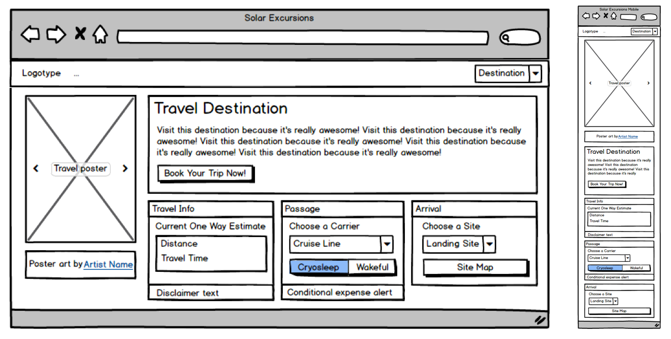
Based on my discussions with the Powers That Be, as a dedicated project manager, I slaved over Balsamiq for at least ten minutes to provide the team with mockups for the booking page on desktop and mobile. I assume they’ll make tablet meet in the middle and look reasonable.
Initial mockups for the Solar Excursions Trip Booking Page on desktop (left) and mobile (right).
Sprint Zero: Review Meeting
Pizza all around! The team worked really hard to hit its goals, and we now have a booking page with a layout that approximates the mockups. The infrastructure for services is coming together, but there’s quite a way to go before we can connect the UI to it. In the interim, the front-enders are using a hardcoded mock data structure.
The first iteration of the page in code using react-bootstrap.
Here’s a look at our UI code so far:
This is all straightforward React. We’re using some of that Hooks hotness, but it’s probably passé to most of you by now.
The key takeaway to notice here is how four of our five application components import and use components from react-bootstrap. Only the main App component is unaffected. That’s because it just composes the top level view with our custom components.
// App.js imports
import React, { useState } from "react";
import Navigation from "./Navigation";
import Page from "./Page";

// Navigation.js imports
import React from "react";
import { Navbar, Dropdown, Nav } from "react-bootstrap";

// Page.js imports
import React from "react";
import PosterCarousel from "./PosterCarousel";
import DestinationLayout from "./DestinationLayout";
import { Container, Row, Col } from "react-bootstrap";

// PosterCarousel.js imports
import React from "react";
import { Alert, Carousel, Image } from "react-bootstrap";

// DestinationLayout.js imports
import React, { useState, useEffect } from "react";
import {
  Button,
  Card,
  Col,
  Container,
  Dropdown,
  Jumbotron,
  ListGroup,
  Row,
  ToggleButtonGroup,
  ToggleButton
} from "react-bootstrap";
The decision to move fast with Bootstrap has allowed us to hit our sprint goals, but we’re already accumulating technical debt. This is just four affected components, but as the application grows, it’s clear the "styling refactor" sprints that we planned for are going to become exponentially harder. And we haven’t even customized these components much. Once we have tens of components, all using Bootstrap with lots of inline styling to pretty them up, refactoring them to remove react-bootstrap dependencies will be a scary proposition indeed.
Rather than building more of the booking pipeline pages, the team decides that we’ll spend the next sprint working to isolate the react-bootstrap usage in a custom component kit since our services are still under construction. Application components will only use components from this kit. That way, when it comes time to ween ourselves from react-bootstrap, the process will be much easier. We won’t have to refactor thirty usages of the react-bootstrap Button throughout the app, we’ll just rewrite the internals of our KitButton component.
Sprint One: Review Meeting
Well, that was easy. High-fives. No change to the visual appearance of the UI, but we now have a "kit" folder that’s sibling to "components" in our React source. It has a bunch of files like KitButton.js, which basically export renamed react-bootstrap components.
An example component from our kit looks like this:
We wrap those all kit components up into a module like this:
// kit/index.js
import { KitCard } from "./KitCard";
import { KitHero } from "./KitHero";
import { KitList } from "./KitList";
import { KitImage } from "./KitImage";
import { KitCarousel } from "./KitCarousel";
import { KitDropdown } from "./KitDropdown";
import { KitAttribution } from "./KitAttribution";
import { KitNavbar, KitNav } from "./KitNavbar";
import { KitContainer, KitRow, KitCol } from "./KitContainer";
import { KitButton, KitToggleButton, KitToggleButtonGroup } from "./KitButton";
export {
  KitCard,
  KitHero,
  KitList,
  KitImage,
  KitCarousel,
  KitDropdown,
  KitAttribution,
  KitButton,
  KitToggleButton,
  KitToggleButtonGroup,
  KitContainer,
  KitRow,
  KitCol,
  KitNavbar,
  KitNav
};
And now our application components are completely free of react-bootstrap. Here are the imports for the affected components:
// Navigation.js imports
import React from "react";
import { KitNavbar, KitNav, KitDropdown } from "../kit";


// Page.js imports
import React from "react";
import PosterCarousel from "./PosterCarousel";
import DestinationLayout from "./DestinationLayout";
import { KitContainer, KitRow, KitCol } from "../kit";


// PosterCarousel.js imports
import React from "react";
import { KitAttribution, KitImage, KitCarousel } from "../kit";


// DestinationLayout.js imports
import React, { useState, useEffect } from "react";
import {
  KitCard,
  KitHero,
  KitList,
  KitButton,
  KitToggleButton,
  KitToggleButtonGroup,
  KitDropdown,
  KitContainer,
  KitRow,
  KitCol
} from "../kit";
Here’s the front-end codebase now:
Although we’ve corralled all of the react imports into our kit components, our application components still rely a bit on the react-bootstrap implementation because the attributes we place on our kit component instances are the same as those of react-bootstrap. That constrains us when it comes to re-implementing the kit components, because we need to adhere to the same API. For instance:
// From Navigation.js
<KitNavbar bg="dark" variant="dark" fixed="top">
Ideally, we wouldn’t have to add those react-bootstrap specific attributes when we instantiate our KitNavbar.
The front-enders promise to refactor those out as we go, now that we’ve identified them as problematic. And any new references to react-bootstrap components will go into our kit instead of directly into the application components.
Meanwhile, we’ve shared our mock data with the server engineer, who is working hard to build separate server environments, implement the database schema, and expose some services to us.
That gives us time to add some gloss to our UI in the next sprint — which is good because the Powers That Be would like to see separate themes for each destination. As the user browses destinations, we need to have the UI color scheme change to match the displayed travel poster. Also, we want to try and spiff up those components a bit to begin evolving our own look and feel. Once we have some money coming in, we’ll get a designer to do a complete overhaul, but hopefully we can reach a happy medium for our early users.
Sprint Two: Review Meeting
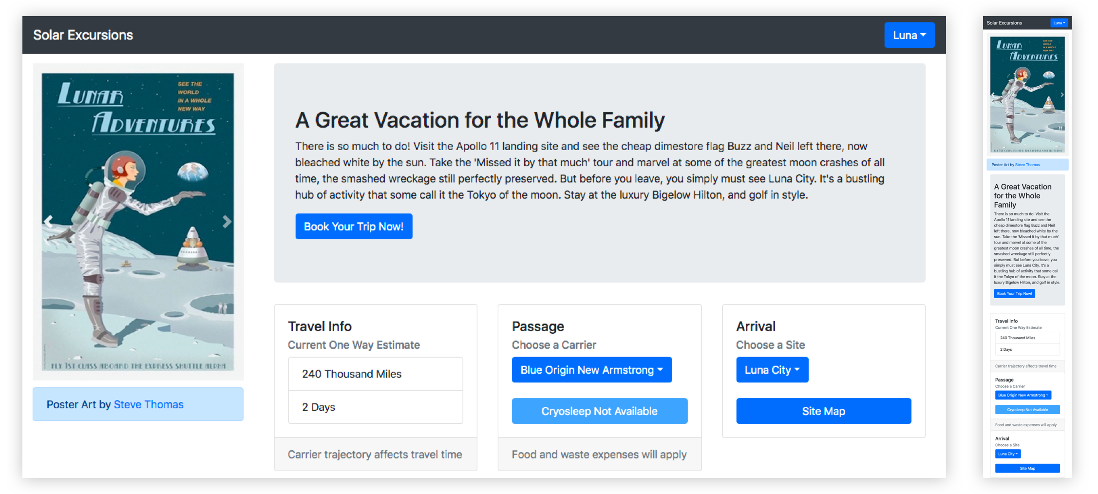
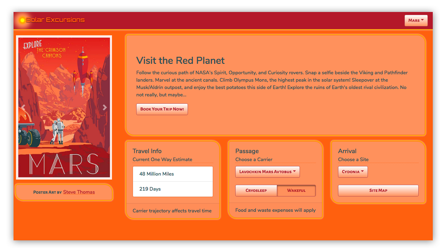
Wow! The team really pulled out all the stops this sprint. We got per-destination themes, customized components, and a lot of the lingering react-bootstrap API implementations removed from the application components.
Here’s what the desktop looks like now:
Check out the solarized theme for the red planet!
In order to pull this off, the front-enders brought in the Styled Components library. It made styling the individual kit components a breeze, as well as adding support for multiple themes.
Let’s look at a few highlights of their changes for this sprint.
First, for global things like pulling in fonts and setting the page body styles, we have a new kit component called KitGlobal.
It uses the createGlobalStyle helper to define the CSS for the body element. That imports our desired web fonts from Google, sets the background color to whatever the current theme’s "foreground" value is, and turns off overflow in the x-direction to eliminate a pesky horizontal scrollbar. We use that KitGlobal component in the render method of our App component.
Also in the App component, we import ThemeProvider from styled-components, and something called "themes" from ../theme. We use React’s useState to set the initial theme to themes.luna and React’s useEffect to call setTheme whenever the "destination" changes. The returned component is now wrapped in ThemeProvider, which is passed "theme" as a prop. Here’s the App component in its entirety.
KitGlobal is rendering like any other component. Nothing special there, only that the body tag is affected. ThemeProvider is using the React Context API to pass theme down to whatever components need it (which is all of them). In order to fully understand that, we also need to take a look at what a theme actually is.
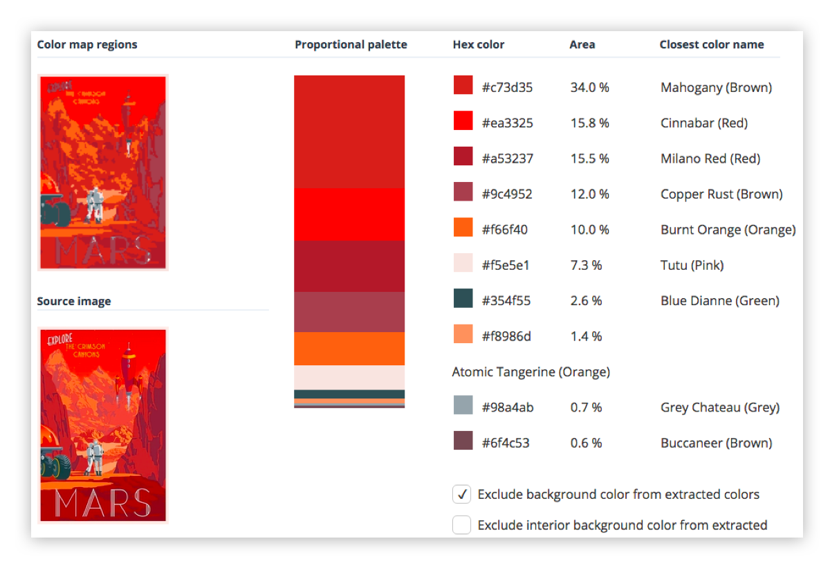
To create a theme, one of our front-enders took all the travel posters and created palettes for each by extracting the prominent colors. That was fairly simple.
Obviously, we weren’t going to use all the colors. The approach was mainly to dub the most used two colors foreground and background. Then we took three more colors, generally ordered from lightest to darkest as accent1, accent2, and accent3. Finally, we picked two contrasting colors to call text1 and text2. For the above destination, that looked like:
Once we have a theme for each destination, and it is being passed into all the components (including the kit components that our application components are now built from), we need to use styled-components to apply those theme colors as well as our custom visual styling, like the panel corners and "border glow."
This is a simple example where we made our KitHero component apply the theme and custom styles to the Bootstrap Jumbotron:
Then there are more complex cases where we want to preset some attributes on the react-bootstrap component. For instance, the KitNavbar component which we identified earlier as having a bunch of react-bootstrap attributes that we’d rather not pass from the application’s declaration of the component.
First, we create a component called StyledBootstrapNavbar using styled-components. We were able to handle some of the attributes with the CSS we passed to styled-components. But in order to continue leveraging (for now) the reliable stickiness of the component to the top of the screen while everything else is scrolled, our front-enders elected to continue using react-bootstrap’s fixed attribute. In order to do that, we had to create a KitNavbar component that rendered an instance of StyledBootstrapNavbar with the fixed=top attribute. We also passed through all the props, which includes its children.
We only have to create a separate class that renders styled-component’s work and passes props through to it if we want to explicitly set some attributes in our kit component by default. In most cases, we can just name and return styled-component’s output and use it as we did with KitHero above.
Now, when we render the KitNavbar in our application’s Navigation component, it looks like this:
Finally, we took our first stabs at refactoring our kit components away from react-bootstrap. The KitAttribution component is a Bootstrap Alert which, for our purposes, is little more than an ordinary div. We were able to easily refactor to remove its dependency on react-bootstrap.
This is the component as it emerged from the previous sprint:
After three sprints, our team is well on its way to having a scalable component architecture in place for the UI.
We are moving quickly thanks to react-bootstrap, but are no longer piling up loads of technical debt as a result of it.
Thanks to styled-components, we were able to implement multiple themes (like how almost every app on the Internet these days sports dark and light modes). We also don’t look like an out-of-the-box Bootstrap app anymore.
By implementing a custom component kit that contains all references to react-bootstrap, we can refactor away from it as time permits.
Such a fragmented ecosystem was far from appealing. Which one should you pick, (if any)?
Contributing to Javascript fatigue — you need at most one. Also feel free to not learn any.
GitHub stars are one useful metric:
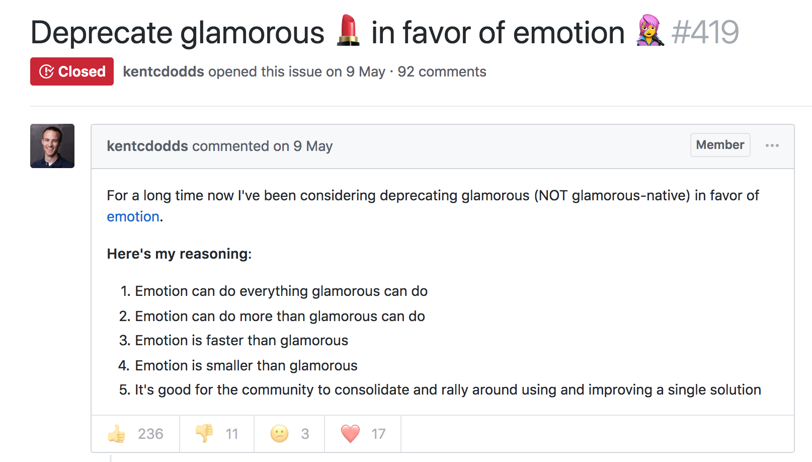
However, GitHub stars say nothing about a project’s trajectory — perhaps they were accumulated long ago and the repo has since fallen out of favor or is no longer maintained. Glamor has plenty of open issues, and hasn’t seen a commit in over a year. Its author advises:
...it mostly works, I'm not going to do any major changes… if you need something more modern, I'd recommend emotion, it mostly matches glamor's api, and is actively maintained.
The similarly named Glamorous was recently deprecated with its author also recommending users switch to Emotion:
At the time, Emotion had some features that Styled Components didn’t. Since then, Styled Components has made some big announcements.
Styled Components sells itself as the CSS-in-JS library for people that *like* CSS. Styled Components gained popularity by utilizing tagged template literals — allowing developers to *just write CSS* in the same syntax they already know, but inside JavaScript files. While this has proven popular, some developers prefer to [write styles as JavaScript objects. Emotion offered flexibility — developers could choose how to write their styles. Styled Components eventually followed suit.
styled-components v3.3.0 is out with first-class object support! 😍
Lots of people have been asking for this, your wishes have been heard! Shoutout to @probablyup for taking care of this release.
The rival CSS-in-JS libraries have stolen from each other until landing upon the same feature set and the same syntax — Emotion and Styled Components have an almost identical API. What once felt like a total mess of competing methodologies and libraries now feels somewhat stable. Even if CSS-in-JS hasn’t standardized on a dependency, it now has standardized a way of doing things — they’re just implemented differently:
Internally, quite a bit. SC has a lot of complexity around organizing style tag order. Re css prop: SC requires Babel plugin and uses the entire SC custom component creation. Emotion will skip the custom component if it can and just renders the element with the className directly
Styled Components is by far the most popular CSS-in-JS library, but Emotion has seen a rapid increase in usage.
Both are used by some major companies. Styled Components are utilized by plenty of large companies, including Bloomberg, Atlassian, Reddit, Target, BBC News, The Huffington Post, Coinbase, Patreon, Vogue, Ticketmaster, Lego, InVision and Autodesk just to name a few.
Emotion boasts fewer recognizable names, but has been recently adopted by the New York Times.
Great article about the launch of our new Story designs on the NYT today. It mentions our Shared Components initiative - would have been impossible without Emotion / CSS-in-JS. Absolute game-changer. Living in the future. https://t.co/pZLDJjsbEr
While these libraries certainly do seem to be most popular amongst React users, they can be used with other frameworks. While they seem to have converged on the same features at last, it’s difficult to say whether this is the end point of CSS-in-JS, or whether we’ll see a continued evolution from here.