New Year, New Beginnings: Smashing Workshops & Audits

With the new year sinking in and everyone’s resolutions still being put to the test, we are slowly returning back to our day-to-day projects. And as we do so, we focus on the new targets for 2021: improving accessibility, conversion, engagement, retention, and of course web performance. We all have different personal goals for this year, but one thing unites us all: improving the web for everyone.

The time between the years is always a great time to calm down; but it's also a wonderful time to do some reseach, thinking, writing and perhaps even unsolicited coding and designining. And almost as if it was an annual tradition (it actually is), Vitaly has been reading through everything that happened in front-end in 2021, and compiling it all in the front-end performance checklist 2021 yet again.

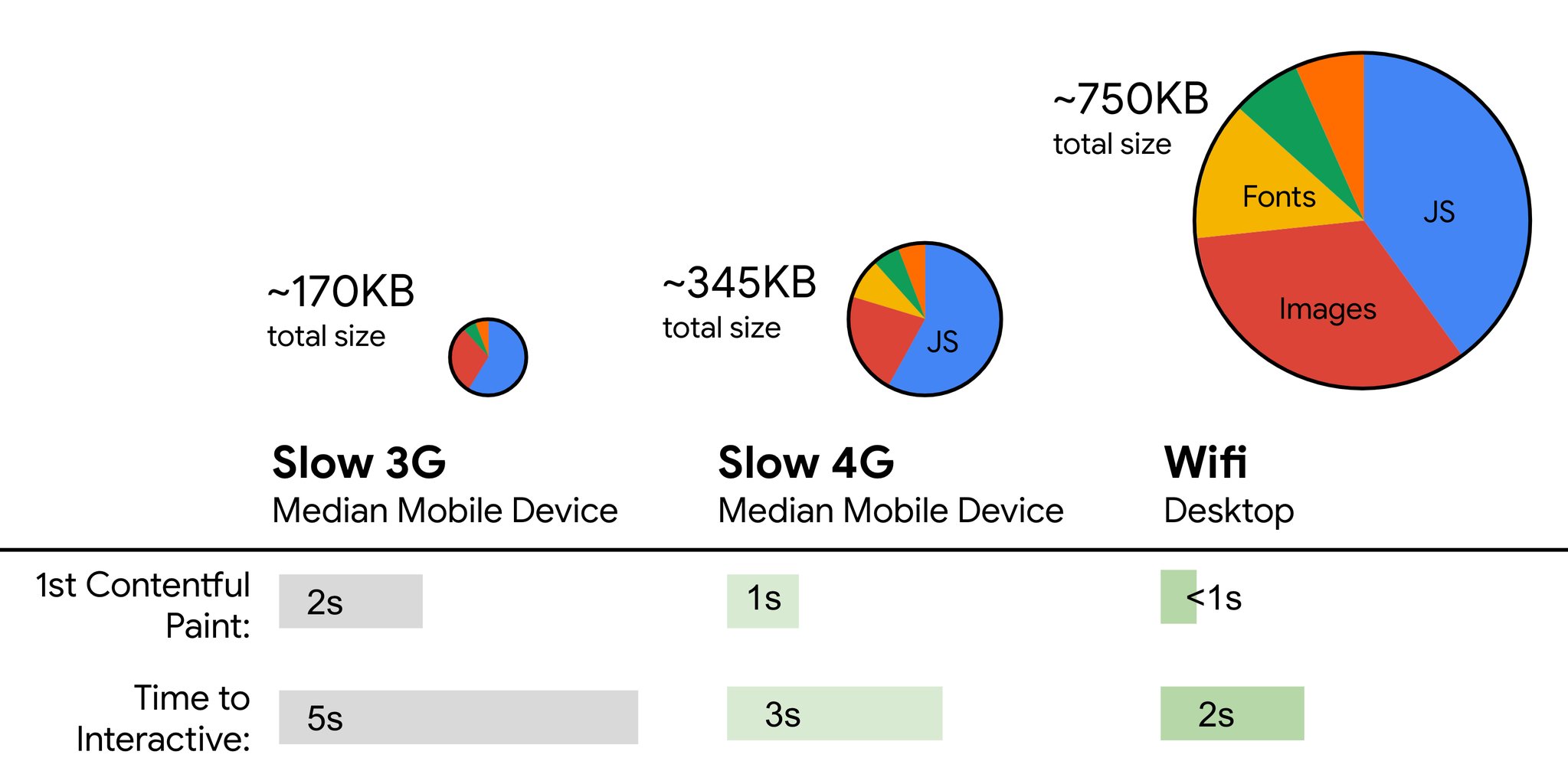
This guide covers pretty much everything you need to build fast experiences on the web today — from metrics to tooling and front-end techniques and strategies. It has proved to be quite useful to many readers in the past years, so hopefully it will be useful for you, too. You can also edit the checklist (PDF, MS Word Doc and Apple Pages) and adjust it to your own personal needs, or even use it for your organization.

Now, without further ado, let’s take a look at what the Smashing team has in store for you in the next months.

Plan Your Year Ahead With Online Workshops

Have you attended one of our workshops yet? We are thrilled each and every time we run practical, online workshops with all of the wonderful attendees from all over the world coming together to learn together. It has proved to be a great opportunity to connect with people around the world, and share experiences live. So many ideas have been brought to life thanks to the live design and coding sessions, and there are many folks that have found new friends, too!

It gets even better: We now have workshop bundles from which you can choose 3, 5 or even 10 tickets for the workshops of your choice — ongoing, upcoming or the ones happening in the future! Pick the online workshops of your choice — at the best price and at the best dates — for yourself, your team or your agency. Jump to workshop bundles.


Jan. 19 – 27 Form Design Masterclass Adam Silver Design & UX
Jan. 21 – Feb. 5 New Adventures In Front-End, 2021 Edition Vitaly Friedman Code
Feb. 2 – Feb. 10 Building Modern HTML Emails Rémi Parmentier Code
Feb. 11 – Feb. 26 The SVG Animation Masterclass Cassie Evans Code
Feb. 16 – Feb. 17 The CSS Layout Masterclass Rachel Andrew Code
Feb. 23 – Mar. 9 Successful Design Systems Brad Frost Workflow, Code
Mar. 4 – Mar. 12 Psychology For UX and Product Design Joe Leech Design & UX
Mar. 16 – Mar. 24 Finding Clients Masterclass Paul Boag Design & UX
Mar. 18 – Apr. 1 Behavioral Design Susan & Guthrie Weinschenk Design & UX
Mar. 30 – Mar. 31 Designing The Perfect Navigation Vitaly Friedman Design & UX
Feb. 23 – Mar. 9 Architecting Design Systems Nathan Curtis, Kevin Powell Workflow, Code

We keep working on the program for this year, and there are more workshops to announce. Let us know if you'd like to run one, get in touch on Twitter DM and we promise to do our best to make it happen. Also, feel free to subscribe here if you’d like to be the first to be notified when new workshops come up. Plus, you get access to early-bird tickets as well.

New: Smashing Online Audits on Front-End & UX

Just last week we've silently launched our new little product — online audits — 30–60 mins video review along with a written report of our findings. It's a simple quick way to validate your ideas and get an honest, unbiased feedback (for now just from Vitaly) on the front-end & UX of your website, app, or mock-ups. Plus, guidelines and action points to do better.

Book an audit of your choice and share some details about your website, app, or mock-ups, and we’ll get back to you in almost no time!

Smashing Podcast: Tune In And Get Inspired

This year, we’ve published a new Smashing Podcast episode every two weeks, and the feedback has been awesome! With over 56k downloads (just over a thousand per week, and growing!), we’ve had 34 guests on the podcast with different backgrounds and so much to share!

If you don’t see a topic you’d like to hear and learn more about, please don’t hesitate to reach out to host Drew McLellan or get in touch via Twitter anytime — we’d love to hear from you!

1. What Is Art Direction? 2. What’s So Great About Freelancing?
3. What Are Design Tokens? 4. What Are Inclusive Components?
5. What Are Variable Fonts? 6. What Are Micro-Frontends?
7. What Is A Government Design System? 8. What’s New In Microsoft Edge?
9. How Can I Work With UI Frameworks? 10. What Is Ethical Design?
11. What Is Sourcebit? 12. What Is Conversion Optimization?
13. What Is Online Privacy? 14. How Can I Run Online Workshops?
15. How Can I Build An App In 10 Days? 16. How Can I Optimize My Home Workspace?
17. What’s New In Drupal 9? 18. How Can I Learn React?
19. What Is CUBE CSS? 20. What Is Gatsby?
21. Are Modern Best Practices Bad For The Web? 22. What Is Serverless?
23. What Is Next.js? 24. What Is SVG Animation?
25. What Is RedwoodJS? 26. What’s New In Vue 3.0?
27. What Is TypeScript? 28. What Is Eleventy?
29. How Does Netlify Dogfood The Jamstack? 30. What Is Product Design?
31. What Is GraphQL? 32. Review Of The Year 2020
33. What Is Machine Learning? 32. Coming up on January 26

Stay tuned for the next episode coming out on January 26!

Smashing Newsletter: Best Picks

With our weekly newsletter, we aim to bring you useful, practical tidbits and share some of the helpful things that folks are working on in the web industry. There are so many talented folks out there working on brilliant projects, and we’d appreciate it if you could help spread the word and give them the credit they deserve!

Also, by subscribing, there are no third-party mailings or hidden advertising, and your support really helps us pay the bills. ❤️

Interested in sponsoring? Feel free to check out our partnership options and get in touch with the team anytime — they’ll be sure to get back to you as soon as they can.

Below are some of the popular newsletter pieces that we've shared in our newsletter recently:

Default Local Fonts Compatibility

Default fonts vary significantly across different operating systems. To provide an easy way to look up a system’s default fonts, especially the ones that need to be available through CSS font-family, Zach Leatherman built Font Family Reunion.

The compatibility table works like a Can I Use for default local fonts: Once you enter a font-family, it will tell you if it is supported, as well es what the five standard CSS keyword font-families (serif, sans-serif, monospace, and the lesser known fantasy and cursive) are aliased to in each operating system. One for the bookmarks.

Improving Google Fonts Performance

Self-hosting fonts is widely accepted to be the fastest option when using web fonts. However, Google Fonts can be speedy, too: their ability to serve the tiniest possible font files to specific user agents and platforms and their relatively new support for font-display via the URL parameter &display=swap are already a good base. And, as Harry Roberts shows, there are quite some things that you can do to improve their performance even further and mitigate a lot of the issues that Google Fonts are commonly known for.

For his article “The Fastest Google Fonts,” Harry went down the performance testing rabbit hole to find the best combination for fast Google Fonts: asynchronously loading CSS, asynchronously loading font files, opting into FOFT, fast-fetching asynchronous CSS files, and warming up external domains. All of these techniques combined might sound a bit overwhelming at first, but Harry concludes his article with a slim and maintainable snippet that helps you get the most out of Google Fonts.

#### Responsive Emails Made Easy

Coding clean, responsive emails that provide a solid experience in all popular email clients can be a time-consuming challenge. HEML is here to change that. The open-source markup language gives you the native power of HTML without having to deal with all of the email quirks. There are no special rules or styling paradigms to master, so if you know HTML and CSS, you are ready to start.

MJML is based on the same idea of simplifying the process of creating responsive emails. The markup language is based on a semantic syntax that makes the process straightforward while an open-source engine does the heavy lifting and translates the MJML you wrote into responsive HTML. A library of standard components saves you extra time and lightens your email code base. And if you want to build your own, Modular Template System Guide might help, too. Promising!

Bulletproof HTML Email Templates

Making an HTML email work across email clients ain’t an easy task. Fortunately, there are plenty of reliable tools, templates and frameworks to make it easier to get your work done. For example, Maizzle is a framework that helps you quickly build HTML emails with Tailwind CSS and advanced, email-specific post-processing. It also provides a few ready-made projects (Maizzle Starters) that you can start with right away.

Cerberus and HTML Email provide small collections of reliable, solid patterns for responsive HTML emails that are well-tested in 50+ email clients, including Gmail, Outlook, Yahoo, AOL, and many others. EmailFrame.work allows you to build responsive HTML email templates with pre-built grid options and basic components, supported in over 60+ email clients.

Stripo, Chamaileon, Postcards, Topol.io and Bee Free feature plenty of free HTML email templates, Litmus provides Responsive Email Templates for newsletters, product updates and receipts, and CampaignMonitor has a free HTML email template builder with drag’n’drop functionality.

From CSS Gradients To Fake Data

Imagine that you just need to find CSS triangle styles for elements and pseudo-elements. Or perhaps refine the color palette a bit by exploring tints and shades of a given color. Or perhaps generate a linear and radial CSS gradient for a section of the page. There is no need to do it all manually or try to find those CSS snippets all over the web. You can always find them on Omatsuri.

Omatsuri means festival in Japanese, and the site is a lovely little festival of open-source browser tools for everyday use. On the site, you’ll find a triangle generator, a color shades generator, a gradient generator, page dividers, SVG compressor, SVG → JSX converter, a fake data generator, CSS cursors, and keyboard event codes. Designed and built by Vitaly Rtishchev and Vlad Shilov. The source code of the site is available as well.

CSS Shadow Generator

Looking for a tool that’ll automatically generate CSS code for really smooth, layered box-shadows? Well, you’re going to love SmoothShadow. Inspired by an article written by Tobias Ahlin Bjerrome, this nifty tool was created to help anyone generate the code they need on the spot.

Once you’ve given it a try, it will be difficult to not use it. The little tool allows you to visually design a layered smooth box-shadow, but also tweak alpha, offset and blur with individual easing curves. And it gets even better: The creator of the tool, Philipp Brumm, has also released SmoothShadow as a Figma plugin, so you can optimize your workflow just like you’ve always wanted to!

Understanding CSS Variables

CSS variables are powerful. They cascade normally, inherit, make it possible to reuse code, and they are extremely permissive. But what can you actually put in a CSS variable to make full use of its potential? Since some of the things aren’t that obvious, Will Boyd explored the possibilities in a blog post.

From unit values to pre-defined keywords, content strings, images, and even fancy animated values, Will’s summary shines a light on the most common things that you might want to use in combination with a CSS variable. A great overview.

Never Stop Learning

The learning never stops. And since it’s often the little insights, code tidbits, and tips that turn out to be the most useful, Stefan Judis started “Today I Learned”.

Whether it’s the awareness that SVG filters can be inlined in CSS or how to tell browsers that your site supports color schemes, for each little thing he learned, Stefan shares a brief summary — not only related to CSS but also accessibility, bash, git, GraphQL, HTML, JavaScript, and much more. Samantha Ming’s code tidbits are also a treasure chest of quick but invaluable web dev wisdom that is bound to make your live easier.

And That's A Wrap Up!

We sincerely wish you a truly wonderful year this time around — full of laughs, memorable moments and remarkably smashing experiences. For one, we can't wait to see you online or in person, but one thing is certain: we sincerely appreciate you being smashing month after month, and for that we are eternally grateful.

Stay smashing!

Counting Down To Bundles Of Smashing Joy And Workshops In 2021

This year has been quite a ride — all the more reason to look forward to a new year with new beginnings, right? Well, we’ll never really know what awaits us in the next months to come, but what I do know is that everyone on this planet can do only so much and really just the best they can to pull through. It’s certainly been a year of less ups and more downs for so many people around the world, and we hope that with everything we’ve been doing at Smashing has helped make life at least a lil’ bit easier.

Plan Your Year Ahead With Online Workshops

Have you attended one of our workshops yet? The Smashing Events team is thrilled each and every time they run a workshop with all of the wonderful attendees from all over the world coming together to learn together. So many ideas have been brought to life thanks to the live design and coding sessions, and there are many folks that have found new friends, too!

It gets even better: We now have workshop bundles from which you can choose three, five or even ten workshop tickets for the workshops of your choice — ongoing, upcoming or the ones happening in the future!


Jan. 5 – Jan. 19 Build, Ship and Extend GraphQL APIs from Scratch Christian Nwamba Dev
Jan. 19 – Jan. 27 Form Design Masterclass Adam Silver Dev
Jan. 21 – Feb. 5 New Adventures In Front-End, 2021 Edition Vitaly Friedman Design & UX
Feb. 2 – Feb. 10 Building Modern HTML Emails Rémi Parmentier Dev
Feb. 11 – Feb. 26 The SVG Animation Masterclass Cassie Evans Dev
Feb. 16 – Feb. 17 The CSS Layout Masterclass Rachel Andrew Dev
Feb. 23 – Mar. 9 Successful Design Systems Brad Frost Dev
Mar. 4 – Mar. 12 Psychology For UX and Product Design Joe Leech Design & UX
Mar. 16 – Mar. 24 Finding Clients Masterclass Paul Boag Design & UX
Mar. 18 – Apr. 1 Behavioral Design Susan & Guthrie Weinschenk Design & UX
Mar. 30 – Mar. 31 Designing The Perfect Navigation Vitaly Friedman Design & UX

We hope you’ll find at least one workshop in the list above that fits your projects and career path, and if not, please do get in touch with us on Twitter and we promise to do our best to make it happen. Also, feel free to subscribe here if you’d like to be one of the first folks to be notified when new workshops come up, and get access to early-bird prices as well — we’ll have lots of goodies coming your way very soon!

Members Get Access To Videos And More

We’re proud to have a steadily growing Membership family who love good content, appreciate friendly discounts, and are an active part of our lovely web community. If you’re not involved yet, we’d love for you to join in and become a member, too! There are constant discounts on printed books, job postings, conference tickets, and your support really helps us pay the bills. ❤️

Smashing Podcast: Tune In And Get Inspired

This year, we’ve published a new Smashing Podcast episode every two weeks, and the feedback has been awesome! With over 56k downloads (just over a thousand per week, and growing!), we’ve had 34 guests on the podcast with different backgrounds and so much to share!

If you don’t see a topic you’d like to hear and learn more about, please don’t hesitate to reach out to host Drew McLellan or get in touch via Twitter anytime — we’d love to hear from you!

1. What Is Art Direction? 2. What’s So Great About Freelancing?
3. What Are Design Tokens? 4. What Are Inclusive Components?
5. What Are Variable Fonts? 6. What Are Micro-Frontends?
7. What Is A Government Design System? 8. What’s New In Microsoft Edge?
9. How Can I Work With UI Frameworks? 10. What Is Ethical Design?
11. What Is Sourcebit? 12. What Is Conversion Optimization?
13. What Is Online Privacy? 14. How Can I Run Online Workshops?
15. How Can I Build An App In 10 Days? 16. How Can I Optimize My Home Workspace?
17. What’s New In Drupal 9? 18. How Can I Learn React?
19. What Is CUBE CSS? 20. What Is Gatsby?
21. Are Modern Best Practices Bad For The Web? 22. What Is Serverless?
23. What Is Next.js? 24. What Is SVG Animation?
25. What Is RedwoodJS? 26. What’s New In Vue 3.0?
27. What Is TypeScript? 28. What Is Eleventy?
29. How Does Netlify Dogfood The Jamstack? 30. What Is Product Design?
31. What Is GraphQL? 32. Coming up on December 29

Stay tuned for the next episode coming out very soon!

Smashing Newsletter: Best Picks

With our weekly newsletter, we aim to bring you useful content and share all the cool things that folks are working on in the web industry. There are so many talented folks out there working on brilliant projects, and we’d appreciate it if you could help spread the word and give them the credit they deserve!

Also, by subscribing, there are no third-party mailings or hidden advertising involved, and your support really helps us pay the bills. ❤️

Interested in sponsoring? Feel free to check out our partnership options and get in touch with the team anytime — they’ll be sure to get back to you as soon as they can.

Preventing Layout Shifts With CSS Grid

It’s no news that CSS Grid is a fantastic tool to build complex layouts. But did you know that it can help you prevent layout shifts, too? When Hubert Sablonnière discovered a layout shift problem with a toggling state on a UI component he worked on, he came up with a solution: the “Anti Layout Shift Grid Stacking Technique”.

Compared to solving the layout shift with absolute positioning, Hubert’s Grid-based technique supports complex situations that require more than two panels. Another benefit: You don’t need to assume which panel should guide the size of the whole component. If you want to dive in deeper, Hubert wrote up everything you need to know to prevent both vertical and horizontal shifts in a practical blog post. (cm)

Fixing Headers And Jump Links

Jump links in combination with fixed headers can cause quite some frustration. Maybe you’ve run into the same issue before: When clicked, your jump link takes you to the desired element, but a fixed header is hiding it. In the past, wild hacks were required to solve the issue. Luckily, there’s now a straightforward and well-supported CSS solution.

The trick: scroll-margin-top. Assign it to your headers, and the position: fixed header won’t get into their way anymore when you navigate to them with a jump link. A short line of code that makes a huge difference. (cm)

Fluid Typography With clamp()

When it comes to fluid scaling, CSS has some exciting new features: clamp(), min(), and max(). They cap and scale values as the browser grows and shrinks. min() and max() return the respective minimum and maximum values at any given time while clamp lets you you pass in both a minimum and maximum plus a preferred size for the browser to use.

As Trys Mudford points out, clamp() comes in particularly handy when you want broadly fluid typography without being 100% specific about the relationship between the varying sizes. In his in-depth article about the new feature, he shares valuable hands-on tips for using clamp() effectively. (cm)

Open-Source Screen Recorder And Annotation Tool

If you’ve been looking for a free and easy-to-use tool to record your screen, it might be hard to find something more powerful than Alyssa X’s open-source screen recorder Screenity.

No matter if you want to give contextual feedback on a project, provide detailed explanations, or showcase your product to potential customers, Screenity offers a number of practical features to capture, annotate, and edit your recordings — without any time limit. You can draw on the screen and add text and arrows, for example, highlight clicks and focus on the mouse, push to talk, and much more. Screenity is available for Chrome. (cm)

A Human-Friendly Date Picker

Date pickers can be hard to get right. A beautiful example of a human-friendly and fully accessible date picker comes from Tommy Feldt.

Thanks to Chrono.js, it supports natural language inputs, so that a user can type something like “tomorrow”, “December 2”, or “in 5 days” to select a date. Shortcut buttons also help to select the most common dates. The date picker is fully accessible with the keyboard and screen readers (there’s even an on-demand help feature for screen reader and keyboard users) and degrades gracefully when JavaScript or CSS aren’t available. A very inspiring proof of concept. (cm)

Become A Jamstack Explorer

The Jamstack is still unexplored territory for you? Jamstack Explorers helps change that. Its mission: teaching you about building for the web with modern tools and techniques.

You can choose from three courses, track your progress, and earn rewards as you proceed through the Jamstack universe. Tara Z. Manicsic leads you through the wilds of Angular, Phil Hawksworth teaches you how to serve and track multiple versions of your site with Netlify, and Cassidy Williams guides you through all the essentials of Next.js. Once you’ve completed the three missions, there’s not only a certificate waiting, but you can call yourself a Jamstack Explorer, ready to use the newest tools to build experiences that are robust, performant, and secure. (cm)

Making Remote Design Work

Design reviews, sprints, feedback — design is a collaborative effort that brings along quite some challenges when doing it remotely. The folks at InVision put together a collection of handy resources to help you and your team master these challenges.

The content covers three of the most trickiest aspects of working remotely: fostering creativity, aiding collaboration, and staying focused. For more best practices for running a remote design team, InVision also published a free eBook drawing from their own experience of working remotely with 700 employees spread across 30 countries and no single office. (cm)

Full-Screen Countdown Timer To Stay On Track

Sticking to the schedule can be tricky when you are running a long video call or are giving a talk or workshop. To help you make sure the session stays on track, Koos Looijesteijn built Big Timer.

The bold yet minimalist timer counts down the remaining minutes right in your browser window — and even if you accidentally close the browser tab or need to restart your device, it will take the disruption into account. Keyboard shortcuts make it easy to adjust the duration and pause or stop the countdown. One for the bookmarks. (cm)

Sounds And Music To Help You Focus

Are you the type of person who can’t focus when it’s quiet around them? Then one of the following tools might help you become more productive. If you’re missing the familiar office sounds when working from home, I Miss The Office brings some office atmosphere into your home office — with virtual colleagues who produce typical sounds like typing, squeaking chairs, or the occasional bubbling of the watercooler.

Office sounds have always distracted you more than helped you focus? Then Noizio could be for you. The app lets you mix nature and city sounds to create your personal ambient sound. Another approach to increasing focus with sound comes from Brain.fm. Their team of scientists, musicians, and developers designs functional music that affects the brain to achieve the desired mental state. Last but not least, Focus@Will is also based on neuroscience and helps increase focus by changing the characteristics of music at the right time intervals. Promising alternatives to your usual playlist. (cm)

The Web Almanac 2020

Looking back at 2020, what’s the state of the web this year? The yearly Web Almanac gives in-depth answers to this question, combining the raw stats and trends of the HTTP Archive with the expertise of the web community. The results are backed up by real data taken from more than 7.5 million websites and trusted web experts.

22 chapters make up this years’ almanac. They are divided into four parts — content, experience, publishing, distribution —, and each one of them is explored from different angles. An insightful look into the state of performance is included, too, of course. (cm)

Generate A Request Map Of Your Site

Where do all the transmitted bytes on your site come from? Analyzing third-party components in detail is a time-consuming task, but it’s already a good start to know which third parties are on your site — and how they got there.

Simon Hearne’s request map generator tool visualizes a node map of all the requests on a page for any given URL. The size of the nodes on the map is proportional to the percentage of total bytes, and, when you hover over a node, you’ll get information on its size, response and load times. No more bad surprises. (cm)

Let’s Tweak Our JavaScript Bundles!

Chances are high that with your JavaScript code being around for a while, your JavaScript bundles are a little bit outdated. You might have some outdated polyfills, or you might be using a slightly outdated JavaScript syntax. But now there is a little tool that helps you identify those bottlenecks and fix them for good.

EStimator calculates the size and performance improvement a site could achieve by switching to modern JavaScript syntax. It shows which bundles could be improved, and what impact this change would have on your overall performance. The source code is also available on GitHub. (vf)

What A Time To Be Smashing!

For many of us, it didn't take long to get used to the idea of online conferences and workshops. They may not be as rewarding as in-person experiences are (and always will be), but they have their advantages, too. Online makes it possible for everyone to attend without leaving the comfort of their desks, as well as learn and network at their own individual pace. It’s also more affordable and makes traveling optional, which makes events accessible for young families and people who prefer not to travel.

We’ve been running online workshops since April this year, and each and every one has been an incredible experience. With wonderful attendees from all over the world coming together to learn together, so many ideas have been brought to life, especially in the live design and coding sessions. Check out this awesome pen created by Cassie Evans at SmashingConf SF just last week. Rock on!

Smashing Podcast: Tune In And Get Inspired

We all have busy schedules, but there’s always time to pop in those earplugs and listen to some music or podcasts that make you happy! We’re soon moving on to our 30th episode of the Smashing Podcast — with folks from different backgrounds and so much to share!

1. What Is Art Direction? 2. What’s So Great About Freelancing?
3. What Are Design Tokens? 4. What Are Inclusive Components?
5. What Are Variable Fonts? 6. What Are Micro-Frontends?
7. What Is A Government Design System? 8. What’s New In Microsoft Edge?
9. How Can I Work With UI Frameworks? 10. What Is Ethical Design?
11. What Is Sourcebit? 12. What Is Conversion Optimization?
13. What Is Online Privacy? 14. How Can I Run Online Workshops?
15. How Can I Build An App In 10 Days? 16. How Can I Optimize My Home Workspace?
17. What’s New In Drupal 9? 18. How Can I Learn React?
19. What Is CUBE CSS? 20. What Is Gatsby?
21. Are Modern Best Practices Bad For The Web? 22. What Is Serverless?
23. What Is Next.js? 24. What Is SVG Animation?
25. What Is RedwoodJS? 26. What’s New In Vue 3.0?
27. What Is TypeScript? 28. What Is Eleventy?
29. How Does Netlify Dogfood The Jamstack? 30. Coming up on Dec. 1!

Is there a topic that you’d love to hear and learn more about? Or perhaps you or someone you know would like to talk about a web- and design-related topic that is dear to your hearts? Feel free to reach out to us on Twitter anytime — we’d love to hear from you!

Smashing Newsletter: Best Picks

With our weekly newsletter, we aim to bring you useful content and share all the cool things that folks are working on in the web industry. There are so many talented folks out there working on brilliant projects, and we’d appreciate it if you could help spread the word and give them the credit they deserve!

Also, by subscribing, there are no third-party mailings or hidden advertising involved, and your support really helps us pay the bills. ❤️

Interested in sponsoring? Feel free to check out our partnership options and get in touch with the team anytime — they’ll be sure to get back to you as soon as they can.

Take Your Figma Workflow To The Next Level

Figma’s popularity is growing and with its popularity, the number of plugins, templates, and general tips and tricks that make working with the browser-based design tool even smoother is growing, too. If you’re a Figma user yourself (or are planning to become one), we came across some useful resources that are worth checking out.

One of them is “Awesome Figma Tips,” a collection of small but powerful tips to work faster in Figma, compiled by Trong Nguyen. If the design you’re working on is based on a design system, the Design System Manager plugin might come in handy. It lets you define or update design tokens in one single panel, right from Figma, and you’ll immediately see the changes cascading through your Figma design.

Breakpoints, on the other hand, is a plugin that brings resizable frames to the design tool to help you quickly resize to a breakpoint to create dynamic layouts. Last but not least, once your design is ready and you want to present it to your team or stakeholders, Templatery has got your back with free templates that you can use for your Figma presentations. Little timesavers that take your workflow to the next level.

SVG Squircicle Maker

There are squares, there are circles, and apparently, there are also squircicles! George Francis’s Squircley is a generator of organic shapes for any kind of visuals or background images. You choose the rotation, the scale, the “curvature” and the fill color, and the tool takes care of the rest.

The generator exports SVGs which they can be dropped straight into your HTML/CSS code, or used in your design application. Just a fun little application to use. If that’s not good enough, you can also use GetWaves to generate SVG waves, or Blobmaker to generate some fancy blobs. Happy experimenting!

The Ultimate Guide To UX Research

User experience research is a crucial component of the human-centered design process. But how do you tackle the task and integrate a UX research process into your team’s workflow? To get you up and running, the folks at Maze put together the “Ultimate Guide to UX Research”.

The comprehensive guide dives into the fundamentals of UX research and its various methods. It starts off taking a closer look at what UX research is all about and why it’s the backbone of building good products, dissects different research methods and tools, and shares tips for creating a research plan and establishing a UX research process. A great read for UX designers and product managers alike.

A Complete Guide To Dark Mode On The Web

Dark mode is quickly becoming a user preference with Apple, Windows, and Google having it implemented into their operating systems. But what about dark mode on the web? Adhuham wrote a comprehensive guide to dark mode that delves into different options and approaches to implementing a dark mode design on the web.

To start off, the guide looks at the technical considerations that implementing a dark mode entails, covering different approaches to toggling the themes and how to store a user’s preferences so that they will be applied consistently throughout the site and on subsequent visits. Tips for handling user agent styles with the color-scheme meta tag help avoid potential FOIT situations. Design considerations are also tackled, of course, with valuable tips to get images, shadows, typography, icons, and colors ready for dark mode.

Streamlining The Checkout Experience

56. That’s the number of actions a customer needs to complete to buy an American Airlines ticket. Let’s face it, checkout forms are often too long and a hassle to fill out. In the worst case, customers might even abandon the process. To help us do better, UX Planet published a four-part article series on streamlining the checkout experience back in 2017 which is still gold for everyone working on a checkout flow today.

The first part in the series examines examples where the checkout experience has gone wrong and why. The second part pins down the most important things that will help improve any checkout form experience in 16 easy-to-follow tips. Part three is dedicated to form validation and how to minimize the number of errors a customer might make, while also taking a closer look at differences between B2C and B2B markets that lead to differences in design. Last but not least, part four is all about bank card details, teaching you how to detect and validate a card number and how to deal with the other payment form fields. A long but worthwhile read.

The Maturity Of UX Writing

For the past five years, organizations and designers have turned their focus to the importance of writing. They’ve realized that content can indeed help to design clear and meaningful experiences. But what is UX Writing and why is it that important?

According to the UX Writing Worldwide Report, UX Writing focuses on users and helps create experiences that are relevant to their needs. The survey results are quite interesting and useful because they can help to better understand the role of the UX Writer in companies around the world.

The State of Developer Ecosystem 2020

What’s the most popular programming language among developers? Which languages do developers plan to migrate to? And which is the most studied language? These are only some of the questions that the State of Developer Ecosystem 2020 report answers.

At the beginning of this year, JetBrains surveyed almost 19,700 developers to identify the latest trends around tools, technologies, programming languages, and other facets of the development world. Some of the key takeaways: Java is the most popular primary programming language, JavaScript the most-used overall programming language, and when it comes to adopting a new language, Go, Kotlin, and Python are at the top of developers’ lists. Apart from hard facts like these, the survey also takes a closer look at open-source contribution, team tools, life habits, and information seeking. Precious insights into what moves the development community.

Designing The Inline Form Validation Experience

Sometimes you come across an article that is already a few years old but that still turns out to be gold. Like Mihael Konjević’s post about inline validation. To find out what’s the best default user experience when it comes to displaying inline validation errors, Mihael analyzed different sites. As his findings show, there’s no consensus on validation handling, but asking the right questions can help you design a bug-free and user-friendly experience.

Mihael suggests a hybrid “reward early, punish late” approach: If the user is entering data in the field that was in a valid state, perform the validation after the data entry. If the user is entering the data in the field that was in an invalid state, perform the validation during the data entry. Different forms will have different needs, of course, so be sure to adjust the approach accordingly.

Tools To Improve Your Site’s Performance

Almost every part of web design and development — from your choice of images to the performance of web servers — add up to how quickly your site will load. Metrics help you uncover bottlenecks that might stay unnoticed when you only test the site on your local setup. We collected some handy tools that make gathering and interpreting such data easy.

To help you assess how well your site performs, Measure by web.dev audits for performance, best practices, SEO, and accessibility and gives you tips to improve the user experience. The tests are run using a simulated mobile device, throttled to a fast 3G network and 4x CPU slowdown. Just like Measure, Lighthouse Metrics is also powered by Lighthouse to give you global performance insights and show you how your site performs from six different regions. Last but not least, Google’s PageSpeed Insights reports on the performance of a page on both mobile and desktop devices based on lab data which is collected in a controlled environment and field data to capture the real-world UX. If you need some more assistance to improve performance, our new performance guide with checklists, articles, and talks has got your back.

JavaScript The Right Way

Learning a new language can be quite a challenge, especially when there are so many tools and frameworks out there to get the most out of it as there are in the case of JavaScript. To prevent you from getting lost in all the possibilities and help you learn the best practices from the ground up instead, William Oliveira and Allan Esquina put together the guide “JavaScript The Right Way”.

Aimed at both beginners as well as experienced developers who want to dive deeper into JavaScript best practices, the guide gathers articles, tips, and tricks from top developers, covering everything from the very basics to code style, tools, frameworks, game engines, reading resources, screencasts, and much more to make a developer’s life easier. The guide is available in eight languages. A gold mine full of JavaScript wisdom.

Tailwind Versus BEM

Tailwind and BEM are two approaches to writing and maintaining CSS. But when to use which? Comparing them is a bit like comparing apples and oranges, as Eric Bailey points out. Based on years of practical experience of using Tailwind and BEM on a variety of projects and scales, he summarized the benefits and drawbacks of each one of them.

Tailwind’s utility CSS approach with pre-written classes makes the implementation very similar across multiple projects and teams and promotes easier cross-project familiarity. However, it does not describe all of CSS’ capabilities, especially newer features. BEM, on the other hand, allows you to describe any user interface component you can think of in a flexible, modular, extensible way, making it a great choice for highly art-directed pieces. The strengths of both approaches lie in different areas, but Eric’s list helps you find the one to master the challenges your project brings along. By the way, have you heard of CUBE CSS yet? The methodology capitalizes on the strength of both approaches and is worth taking a closer look, too.

Interactive Origami Simulation

For years, Origami has been known to be one of the most fun craft art activities worldwide, but have you ever wondered how it would look like on screen? Well, Amanda Ghassaei had exactly this thought and took on the challenge of creating an app that simulates how any Origami crease pattern folds.

With the help of a number of external libraries such as Three.js and jQuery, Origami Simulator was brought to life. This app calculates the geometry of folded (or partially folded) Origami using a dynamic, GPU-accelerated solver and illustrates the physical properties of the folded material. It also supports an immersive, interactive VR mode using WebVR. Impressive!

Enhancing User Experience With CSS Animations

Animations have become a popular way to improve the user experience in the last years. But how do we make sure that our CSS animations and transitions will be meaningful to users and not just decorative eye candy? Stéphanie Walter gave a talk about enhancing UX with CSS animations at the virtual Shift Remote conference back in August. In case you missed it, she summarized everything you need to know in a blog post accompanying the talk.

Starting with a reminder of CSS syntax to build transitions and animations, Stéphanie explores why certain animations work better than others. She shares tips for finding the correct timing and duration to make UI animations feel right and explains why and how animations do contribute to improving the user experience. And since great powers bring along great responsibility, she also takes a closer look at how you can make sure your animations don’t trigger motion sickness. A great reference guide.

A Little Game To Improve Your Pen Tool Skills

How well do you master the Pen tool? If it causes you headaches when working with Photoshop, Illustrator, XD, or other tools, the Bézier Game helps you take your skills to the next level, in a quick and fun way.

After completing the quite self-explanatory tutorial stage, the challenge begins: In the first level, an unassuming (but quite tricky) little car shape is waiting for you to redraw it using the least amount of nodes possible. Each node and each curve that snaps into place reveals a little piece of the rainbow-colored path and brings you a step closer towards becoming a Pen tool master. Don’t despair if you can’t make it on the first try. As with everything, practice makes perfect.

Tips And Tricks For Debugging JavaScript

Bugs happen, and when they happen, it’s good to know how to tackle them in a smart way. If you need to debug JavaScript code, Sean Higgings wrote a handy article to help you find the right debugging approach and master the challenge while adhering to best practices.

Sometimes you might want to log events to the console when debugging JavaScript events. For those occasions, Matthias Kupperschmidt shares a nifty trick that prevents sending and tracking browser events multiple times — perfect for when you want to see how many submit events a form sends out, for example.

Stay Smashing, And See You Next Time!

I hope you found today’s monthly update useful. As the new year approaches us with new challenges, we’re sure that there are many more good times ahead of us. Thanks for sticking around and for your ongoing support — we sincerely appreciate it! Let’s rock this together!

Bringing You The Best Of Smashing

Bringing You The Best Of Smashing

Bringing You The Best Of Smashing

Iris Lješnjanin

Well, I guess we can all agree that this year has been quite something. We’ve all been challenged in one way or the other, and the new normal is not quite the old normal. Still, the overriding emphasis remains on safety and everyone’s wellbeing, as well as the importance on sharing thoughts and feelings on creative wellness within the community.

Unfortunately, the effects of COVID-19 are still so wide-reaching throughout the world, so that the Smashing team has had to make big changes to our plans this year. As Rachel Andrew, editor-of-chief of Smashing Magazine, nicely puts it:

“The pandemic has made life unpredictable and scary for many people. At Smashing, we’ve had to very quickly figure out new ways of delivering great content — in a way that supports the business but also our speakers and workshop leaders. We have been encouraged by the enthusiasm from the community, the messages of support, and the willingness to try these new formats.”

On that note, we have decided to take all 2020 dates online. We hope to see you there!

August 20–21 SmashingConf Live Tell me more →
September 7–8 SmashingConf Freiburg Tell me more →
October 13–14 SmashingConf Austin Tell me more →
November 10–11 SmashingConf San Francisco Tell me more →

We’re able to do these all these wonderful things because of your support, and we truly and sincerely appreciate it.

Interactive Workshops To Help You Boost Your Skills

With online workshops, we aim to give you the same experience and access to experts as in an in-person workshop, without needing to leave your desk. So you can learn at your own pace, in your own time, and follow interactive exercises along the way.

We’ve done our best to provide you with a mix of both design- and frontend-related workshops:

July 28–29 Designing For Emotion Aarron Walter Design
August 6–14 Web Application Security Scott Helme Front-end
August 17–31 Behavioral Design Susan and Guthrie Weinschenk Design
Aug. 19 – Sept. 3 Front-End Testing Umar Hansa Front-end
Aug. 20 – Sept. 4 Designing For A Global Audience Yiying Lu Design
September 1–16 Jamstack! Jason Lengstorf Front-end
September 10–11 The CSS Layout Masterclass Rachel Andrew Front-end
Sept. 17 – Oct. 2 Vue.js: The Practical Guide Natalia Tepluhina Front-end
Sept. 22 – Oct. 6 Smart Interface Design Patterns, 2020 Edition Vitaly Friedman Design & UX
Attending a Smashing online event means that you’ll be taking part in live sessions, Q&As, discussion zones, challenges, and so much more! See all schedules and events →

Sit Back, Relax, And Tune In!

The Smashing Podcast is the perfect way to take a little bit of Smashing along with you on your morning commute, when working out at the gym, or just washing the dishes. Every two weeks, Drew McLellan talks to design and development experts about their work on the web. You can subscribe in your favorite app to get new episodes as soon as they’re ready.

1. What Is Art Direction? 2. What’s So Great About Freelancing?
3. What Are Design Tokens? 4. What Are Inclusive Components?
5. What Are Variable Fonts? 6. What Are Micro-Frontends?
7. What Is A Government Design System? 8. What’s New In Microsoft Edge?
9. How Can I Work With UI Frameworks? 10. What Is Ethical Design?
11. What Is Sourcebit? 12. What Is Conversion Optimization?
13. What Is Online Privacy? 14. How Can I Run Online Workshops?
15. How Can I Build An App In 10 Days? 16. How Can I Optimize My Home Workspace?
17. What’s New In Drupal 9? 18. How Can I Learn React?
19. What Is CUBE CSS? 20. What Is Gatsby?

Is there a topic that you’d love to hear and learn more about? Or perhaps you or someone you know would like to talk about a web- and design-related topic that is dear to your hearts? We’d love to hear from you! Feel free to reach out to us on Twitter and we’ll do our best to get back to you as soon as possible.

Catching up with what’s new in the web industry doesn’t mean you have to be tied up to a chair and desk! Do as Topple the Cat does it: grab your headphones and stretch those legs! You can subscribe and tune in anytime with any of your favorite apps.

Our Most Recent Addition To The Smashing Bookshelf

We shipped the first copies of Click! How to Encourage Clicks Without Shady Tricks a few weeks ago, and if you pre-ordered a copy of the book, you must have received a personal note from the author himself, Paul Boag. It was fun to follow the reactions pop up on social media — Ari Stiles shared some tweets in her recent post.

Click! comes along at a time when many of us need a creative “nudge.” The book inspires us to think differently about our routines for building online sites and services—what works, and what doesn’t. You can jump to the table of contents, or if you’d like to take a peek first, you can download a free PDF excerpt right away (17.3 MB). Happy reading!

Print + eBook

$ 39.00

Quality hardcover. Free worldwide shipping. 100 days money-back-guarantee.

eBook

$ 19.00

DRM-free, of course. ePUB, Kindle, PDF.
Included with Smashing Membership.

As you may already know, we aim to publish a new article every single day that is dedicated to various topics current in the web industry. Here are some that our readers enjoyed most and have recommended further:

Best Picks From Our Newsletter

We’ll be honest: Every second week, we struggle with keeping the Smashing Newsletter issues at a moderate length — there are just so many talented folks out there working on brilliant projects! Kudos to everyone involved!

Interested in sponsoring? Feel free to check out our partnership options and get in touch with the team anytime — they’ll be sure to get back to you right away.

P.S. A huge thank you to Cosima Mielke for writing and preparing these posts!

Free Fonts With Personality

Typography is a powerful communication tool, a way to express ideas, and a trigger for creativity. Based on this understanding, the Argentinian-based type foundry Rostype creates fonts that are free to use for anyone, in personal and commercial projects.

Rostype

There are currently 15 fonts available, and each one of them shines with a unique personality. Some are designed with a special focus on readability, others are the perfect display typefaces, made to stand out, some are retro-inspired, others more futuristic and dynamic. There’s even a typeface inspired by the coronavirus lockdown. A treasure chest if you’re looking for a typeface that is a bit more distinctive.

The Making Of A Typeface

It’s always insightful to sneak a peek behind the scenes of how other design teams work and think. Chris Bettig, Design Director at YouTube, now shares an interesting case study on how he and his team created YouTube Sans, a tailor-made font that doubles as a brand ambassador.

YouTube Sans

Before the new typeface made its appearance, YouTube used the iconic play button and a modified version of Alternate Gothic for the wordmark. However, as Chris Bettig explains, there was no clear typographical guidance. Designed to work across the entire range of YouTube’s products and reflecting the platform’s worldview as well as the community of creators who use it, YouTube Sans changed that. For more insights into how the font came to life and the challenges the design team faced along the way, be sure to check out the case study.

Dealing With Browser Font Rendering Inconsistencies

We all know those moments when a bug literally bugs us but we can’t seem to figure out how to solve it. Stephanie Stimac recently came across such an issue: When she opened her personal website in Safari, she noticed how drastically different the title of her page was rendering compared to other browsers. It appeared much bolder than expected.

Browser Font Rendering Inconsistencies

To find the reason for these rendering inconsistencies, Stephanie started to dissect differences between the user agent style sheet and the computed CSS properties and soon found herself far down the rabbit hole, comparing the confusing behavior with Chrome, Firefox, and Edge. There’s no simple answer to the question which browser is actually handling the styling correctly, but after running a number of tests, Stephanie found out how to prevent the browser from deciding how to bold font-weights: you need to explicitly define the font weight with numerical values. A small detail that makes a significant difference.

Continuous Performance Measurements Made Easy

When launching a website, it’s common to run performance tests to ensure the site is fast and follows best practices. But how do we keep it fast as soon as deploys are happening every day? Speedlify is Zach Leatherman’s answer to this question.

Speedlify

Speedlify is a static site published as an open-source repository that uses Lighthouse and Axe to continuously measure performance and publish the performance statistics — at most once an hour and automatically once a day. You can run it manually, locally on your computer and check in the data to your repo, or, if you’re using Netlify, it can run entirely self-contained. A great way to keep performance always in sight.

The Anatomy Of A Push Notification

Push notifications were first introduced on iOS back in 2009, web push followed five years later. Today, they are supported across a lot of platforms and browsers — from iOS and Android to Amazon Echo, Windows, Chrome, Safari, Firefox, Edge, and more. Each one of these platforms is a bit different, though, making it complicated for designers to wrap their heads around what exactly goes into a push notification.

Design and Anatomy of a Push Notification 2020

A useful reminder comes from Lee Munroe. He summarized how many lines of text you need on which platform, requirements for images, if there are character restrictions, and other details that can be hard to remember. The overview also comes in handy to assess what your notification will look like on operating systems you don’t have access to. One for the bookmarks.

Editing Keyframe Animations Live

When you’re creating animations, it’s always helpful to see the animation in action as you tweak it. Unfortunately, that also involves a lot of switching back and forth between your text editor and the browser. Mitch Samuels was tired of doing that, so he built a tool to save him time: Keyframes.app.

Keyframes.app

The tool lets you create a CSS keyframe animation with a visual timeline editor. You can add steps to a timeline, use the simple UI to adjust the CSS properties you want your target element to have at each step, and the animated preview will update live. Once you’re happy with the result, you can copy the CSS and use it in your project right away. Keyframe.app is also available as a Chrome extension. A real timesaver.

Determining The Best Build Tool For Your Project

Build tools aim to make the lives of developers easier by streamlining workflows and codifying best practices. However, picking the right build tool for a project can be a challenge. To help you make a more informed decision, folks from the Google Chrome developer relations team built Tooling.Report.

Tooling Report

Based on a suite of tests to assess how well a build tool adheres to best practices, Tooling.Report gives you an overview of various bundlers and the features they support. It’s not only a quick way to determine the best tool for a project but also a reference for incorporating best practices into existing codebases — with the long-term goal of improving all build tools and, thus, the health of the web.

Turning A Flat Image Into A Folded Poster

Some coding experiments leave even the most experienced developers in awe. And even if it’s something you won’t be using every day, it’s always inspiring to see fellow developers think outside the box and explore what’s possible with web technologies. The folded poster effect that Lynn Fisher created with pure CSS is such an experiment.

CSS Folded Poster Effect

With a bit of CSS, Lynn makes your average image look like a folded poster. With paper creases running over the image horizontally and vertically and a background shadow that gives the poster a 3D effect. A cool little project that beautifully shows what can be achieved with CSS.

Striking A Balance Between Native And Custom Select Elements

How do you build a styled select element that is not only styled on the outside but on the inside, too? In her article “Striking a Balance Between Native and Custom Select Elements”, Sandrina Pereira shares her attempt to create a good-looking, accessible select that benefits from as many native features as possible.

Striking A Balance Between Native And Custom Select Elements

The idea is to make the select “hybrid”, which means that it’s both a native <select> and a styled alternate select in one design pattern. Users of assistive technology will get a native <select> element, but when a mouse is being used, the approach relies on a styled version that is made to function as a select element. Clever!

Hybrid Positioning With CSS Variables And max()

Some ideas require you to think outside the box and explore new paths to make them happen. Imagine this example: You want to have a page navigation on the side, right under the header when it’s scrolled all the way to the top. It is supposed to scroll with the page when the header is out of view and stay at the top for the rest of the scrolling. That’s exactly what Lea Verou wanted to achieve in a recent project.

Hybrid positioning with CSS variables and max()

You might say, that’s a case of position: sticky, but there’s a more finely-tuned approach to getting the job done, as Lea shows. Without any JavaScript. Her solution relies on CSS variables and the new max() function that lets you apply min/max constraints to CSS properties. A fallback helps in browsers that don’t support max() yet. Clever!

Stories From The Dark Side Of The Web

Hackers, data breaches, shadow government activities, cybercrime, hacktivism — a lot is going on on the dark side of the web. But who are the people behind these activities? And what’s their “mission”? Jack Rhysider dedicated a podcast to the stories that happen on the hidden parts of the network: Darknet Diaries.

Darknet Diaries

No matter if it’s the story of a gambler who finds a bug in a video poker machine that lets him win excessive amounts of money, the story of a penetration tester breaking into buildings, or a nation state hacking into a company within another nation, the Darknet Diaries is full of gripping insights into a secret world. The podcast adheres to journalistic standards by fact-checking and ethical sourcing of information, and while all of this is great entertainment, it also aims at explaining the culture around cybersecurity to make listeners more responsive, informed citizens of their digital lives. Be sure to tune in.

Smashing Editorial (cm, vf, ra)