We’ve been passionate about design & UX for years. We’ve written about design systems and usability, inclusive design and product design, UX research and enterprise UX. And now it’s time to bring it all together. In-person. In a new location. With a new spirit of curiosity and community. And it’s happening this October.
Roll up your sleeves and meet SmashingConf Antwerp 🇧🇪, our shiny new conference for designers & UI engineers who love design, UX and the web. On design systems, usability, product design, accessibility and complex UIs. 1 track, 2 days, 4 full-day-workshops, mysteries and friendly networking. A bright new gem in the heart of Belgium — the land of incredible chocolate, waffles and truly Belgian fries! 🍫 🧇 🍟 🍺
With all video recordings, of course. Save up to 25% with Smashing Membership.
Ah, perhaps your manager needs a little bit convincing? We’ve got your back! Download the Convince Your Boss PDF to tip the scales in your favor. And we’ve prepared a “letter to the boss” template for you as well. Good luck! 🤞🤞🏼🤞🏾
What Should You Expect?
SmashingConfs have always been about how we work, how we fail and how we succeed. We kindly encourage speakers to share lessons learned and show how they work. Don’t be surprised by speakers sitting down and showing their design process, or setting up a Figma board and designing live with the audience. Check what SmashingConfs are like (+ video).
Don’t expect big picture talks or abstract concepts — Smashing Conferences are always honest, practical and passionate. Speakers are also very approachable and there is enough time for you to ask all your questions and get all the answers, in 1:1-conversations or in round tables.
But it’s also very friendly and inclusive. In fact, we know many attendees by names, and we love friendships emerging as people get together and learn together, during the talks and in the workshops. Plus, we design our side events to help everyone take part in meaningful, respectful conversations.
Everybody is welcome. Not everyone has to speak, but everyone has to feel heard.
We don’t choose venues randomly either. We love the contrast of beautiful historical venues and digital craftsmanship. So for Antwerp, we’ve chosen Bourla Schouwburg, an unforgettable neoclassical theatre in the heart of Antwerp, meticulously designed and built in 1820s and decorated with statues of Apollo and the nine muses (to get your creativity flowing!). The Bourla Theatre will be your home for both conference days.
Finally, we love a good mystery, and we love to have fun! This shows in plenty of side events, morning runs, mysterious riddles, design challenges and walking tours around the chocolate factory and waffle shops.
For Designers and UI Engineers
We’ve designed the conference for UX designers, product designers and interface designers, but it will have plenty of insights for UI engineers and jacks of all trades as well. If you want to boost your design and UX skills, you’ll be in the right place: with insightful talks and practical workshops.
All workshops are hands-on and practical, so you can apply your new skills immediately.
We’ll dive into:
design systems,
design patterns,
usability and UX research,
product design and workflow,
enterprise UX and complex UIs,
inclusive design and accessibility,
new design techniques (in Figma, Miro etc.),
sustainable and age-friendly design,
UX writing.
We will announce the first talks and workshops shortly. The speakers we’ve invited are not just knowledgeable and amongst the best in their fields. They are also excellent speakers and teachers, smart and kind friends, and wonderfully nice and approachable.
Team Tickets? 👫👭
Bring the entire team to SmashingConf, and save some of your training budget along the way as well. With our friendly bundle tickets and team discounts, we’ve got your back! If you want to come with a large team, or are interested in something special, please send us a short email and we’ll get back to you right away!
We Can’t Wait To See You!
As we are getting ready for the event, we couldn’t be more excited to meet you in Antwerp. Let’s boost our design and UX skills, together, and create memorable experiences that will last for a while. ❤️
We’re so happy to be back after all these years! Let’s brush up our front-end and design skills, together — at the wonderful SmashingConf New York, with plenty of practical sessions and hands-on workshops all around design systems, UX, CSS, JavaScript, performance and accessibility. And it’s not just about the content: it’s inclusive environment, memorable experiences and fun activities along the way as well. (Check what SmashingConfs are like).
Here’s the gist: single track, 2 practical days, 5 hands-on workshops, 12 experienced speakers, loads of mysteries and friendly networking! Get your ticket!
Tobi the DJ will be back in New York as well, of course! Wonderful photos by Marc Thiele.
Our speakers are not just knowledgeable and amongst the best in their fields. They are also excellent speakers and teachers, smart and kind friends, and wonderfully nice and approachable.
Meet Jason Pamental, Cassie Evans, Harrison Wheeler, Una Kravets, Laura Kalbag, Steve Schoger, Eva Fereirra, Guillaume Kurkdjian and of course the Mystery Speaker. Topics range from SVG animation to design systems and from Figma to web performance, and beyond.
Practical Workshops
If you attend a conference, why not join a practical workshop as well? The day before and the day after the conference, we run a full-day training focusing around tangible, applicable insights that you can use right after the workshop. We’ll be diving into SVG animation, accessibility testing and complex interface design patterns. Plenty of topics to choose from, and bundle discounts are available, too!
All workshops are hands-on and practical, so you can apply your new skills immediately.
Side Events
It’s not all business at SmashingConf, of course! We have many friendly side events before, during, and after the conference. The evening before the conference kicks off, join us for some drinks, lightning talks, and meet some new friends already.
Want to start the conference fit and fresh? Every day, we’ll have a morning run in Central Park. And for all the photo enthusiasts, we are closing the conference with a lovely Photo Walk around the city. Our little side events are all friendly, fun, and a great way to meet people and hang out!
Team Tickets? 👫👭
Bring the entire team to the SmashingConf, and save some of your training budget along the way as well. With our friendly bundle tickets and team discounts, we’ve got your back! If you want to come with a large team, or are interested in something special, please send us a short email and we’ll get back to you right away!
SmashingConf NYC Online
If you can’t travel to New York, that’s no problem either. We run a SmashingConf Live Stream Online for the main stage talks. Plus, you get some behind-the-scenes footage and backstage interviews with speakers, organizers, and friends. 🎉🥳
As we are getting ready for the event, we can’t be more excited to see you again after all these years. Let’s boost our skills in-person, together, and creating memorable experiences that will last for a while. ❤️
Front-end accessibility is still somewhat mysterious these days. How do we build accessible buttons and dropdowns? What about keyboard-friendly tooltips, tabs and notifications? Or inclusive accordions, sliders, data tables and modals? Let’s figure it out together. Meet Inclusive Components, our new handbook for building fully accessible digital products. Download a free sample PDF (1.1 MB).
At its heart, Inclusive Components is a detailed, practical handbook for building fully accessible interfaces. The book examines 12 common interface patterns — accordions, tables, modals, notifications, tabs, toggles, and everything in-between — through the lens of inclusion. The result is accessible and robust components we author, plug in, and use daily.
For years, Heydon Pickering, a seasoned front-end developer with a focus on accessibility, has been writing about accessible solutions. We’ve teamed up with Heydon to produce a book with common challenges and solutions that he’s been refining over all these years.
For each component, the in-depth explorations are meticulously illustrated and all solutions are available as bulletproof code snippets, applicable to your work right away. Bonus: you’ll learn how to build your own accessible components with inclusive design in mind — all in a single book. Jump to table of contents ↓
332 pages. Quality hardcover with a stitched binding and ribbon page marker. The eBook is available as PDF, ePUB, Amazon Kindle. Written and designed by Heydon. Download a sample PDF (1.1 MB).
Each chapter tackles a single component, addressing how different and vulnerable people might read and interact with it, and how they can be better accommodated. Download a sample PDF (1.1 MB).
1. Toggle Buttons
+
What does it take to make toggle buttons inclusive? To start off, Heydon takes a look at common pitfalls and what you need to keep in mind to do better.
2. A Todo List
+
You’ll learn how to build an integrated todo list component from the ground up. This doesn’t have to apply only to todo lists but also to making the basic creation and deletion of content inclusive.
3. Menus & Menu Buttons
+
Menus, dropdowns, subnavigation. There’s a lot of confusion happening around these terms. Why is this happening, why are WAI-ARIA semantics often misused here, how do we properly use “hamburgers” and “navicons,” and what do you need to consider to make your menus keyboard- and screen-reader-accessible?
4. Tooltips & Toggletips
+
Inclusive design is often about providing the user with the right tool for the job and the right kind of tooltip to go with that tool. In this chapter, we’ll be looking at situations which might call for a tooltip and learn how to formulate inclusive implementations for them.
5. A Theme Switcher
+
Offering alternative themes often represents a maintenance issue. This chapter explores how to make an efficient and portable React component that allows users to switch a default light theme into “dark mode”.
6. Tabbed Interfaces
+
What makes a tabbed interface a tabbed interface is in the ergonomics of its keyboard behavior. Heydon takes you step-by-step through the process of applying ARIA semantics to master the challenges that tabbed interfaces might bring along.
7. Collapsible Sections
+
Although implementing collapsible sections is rather simple, the interaction does not have a consistent native implementation across browsers. The tips in this chapter will help you turn your collapsible regions into web components that are easy to include as part of larger patterns and in content files.
8. A Content Slider
+
Carousels don’t have to be bad, but we have a culture of making them bad. This chapter explores how you can create something that fulfills a basic purpose without overloading it with features.
9. Notifications
+
When web pages undergo changes as you operate them, it’s important that users are kept abreast of changing states. This chapter looks at notification components and how they can increase confidence in the use of web applications, in an inclusive way.
10. Data Tables
+
Let’s explore what it takes to make your data tables screen reader accessible, responsive, and as ergonomic as possible for everyone. Plus a trick for fixing old layout tables that cause confusion for visually-impaired users.
11. Modal Dialogs
+
Modal dialogs are often contentious and problematic, so let’s reconsider if they really make sense for your use case and, if yes, examine them in the context of inclusive design thinking and performance.
12. Cards
+
The card component is the last component tackled in the book as it requires the most invention. So in this final chapter, we’ll look into a few permutations of a simple card component and find a balance between sound HTML structure and ergonomic interaction.
Heydon Pickering (@heydonworks) has worked with The Paciello Group, The BBC, Smashing Magazine, and Bulb Energy as a designer, engineer, writer, editor, and illustrator. He was shortlisted for Designer Of The Year in The Net Awards.
Heydon previously wrote Inclusive Design Patterns which sold over 10,000 copies. Proceeds from this title were donated to the ACLU and The Democratic Socialists Of America, to help these organizations fight fascism and create a more inclusive society.
Here’s what Heydon shared when asked why he decided to write this book:
“A few years back, I was getting bored with web design. Then responsive design came along, presenting me with fresh challenges. It made my life and my job interesting again. Then I discovered the world of web accessibility, and my enthusiasm was once again renewed. Some people seem to think I do web accessibility because I feel morally obliged, or that I would feel guilty if I didn’t.
While I believe strongly that all sorts of people should be able to access the web, I’m also grateful for the web accessibility challenges I’ve encountered, and covered in this book, for stimulating me, and giving my work new depth.
I have written this book because I want you to know how fun it can be to make your interfaces more accessible, as well as how accomplished you can feel for having done so. Thank you for reading this, and hopefully the book as well.”
Testimonials
“Inclusive Components is a very deep and thorough explanation of development of accessible components with real world examples. Heydon Pickering shows several alternative approaches and explains pros and cons of each. It’s also a pleasure to read!”
“Inclusive Components is chock-full of practical and comprehensive advice on building accessible UI. It’s my go-to resource after the official WCAG and ARIA documentation. I’ve found it extremely helpful when building our design system!”
“What Heydon achieves with his work on Inclusive Components is a pragmatic, friendly and approachable set of guides that help you to generate not just accessible components, but also resilient and progressive starting-points that will help you to build better websites and web apps in general. I often describe this work as crucial learning material for this exact reason.”
A preview of the book, with examples ranging from accordions to toggles, tables, notifications, dialogs etc. Download a sample PDF (1.1 MB). Large preview.
Why This Book Might Be For You
The devil is in the detail and often the things you do with good intentions can impose accessibility barriers unknowingly. Inclusive Components is for every front-end developer who wants to learn how to detect and address potential accessibility issues in their work. The book will teach you:
How to use <button> elements, how to apply styles to your toggle buttons, and how to label them.
How to create managed lists that allow users to create and delete content — in an inclusive way.
How to address and resolve accessibility issues with navigation menus and submenus (aka “dropdowns”).
How to create accessible and keyboard-friendly tooltips and toggletips.
How to create a “dark mode” theme that’s both accessible and maintainable long-term.
How to build an accessible content slider to prevent harm for motion-sensitive people.
How to create inclusive notifications with live regions to communicate with your users through visual and aural channels simultaneously.
How to create data tables that are semantically correct, responsive, and sortable.
How to build accessible dialogs and modal dialogs with performance and inclusive design in mind.
How to create and group inclusive cards (e.g. for teasers).
With Inclusive Components, we've tried to create a very focused handbook with applicable, long-living solutions and strategies to create accessible and inclusive interfaces.
Our hope is that with Heydon’s book, you will be able to make better design and coding decisions as you build your interfaces. Perhaps it will even become one of those reference books you’ll reach to every time you need to build one of those common UI components.
Producing a book takes quite a bit of time, and we couldn’t pull it off without the support of our wonderful community. A huge shout-out to Smashing Members for their ongoing support in our adventures. As a result, the eBook is and always will be free for Smashing Members. Plus, Members get a friendly discount when purchasing their printed copy.
Stay smashing, and thank you for your ongoing support, everyone!
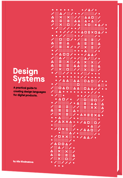
Promoting best practices and providing you with practical tips to master your daily coding and design challenges has always been (and will be) at the core of everything we do at Smashing. In the past few years, we were very lucky to have worked together with some talented, caring people from the web community to publish their wealth of experience as books that stand the test of time. Alla, Adam and Andy are some of these people. Have you checked out their books already?
Meet “Inclusive Components”, A New Printed Book By Heydon Pickering
Meet “Inclusive Components”, A New Printed Book By Heydon Pickering
Vitaly Friedman
The web is full of interfaces that leave people out. Of course, it’s not designers’ malicious intent or developers’ lack of empathy that bring us there. It’s just really difficult to foresee a wide range of situations in which our users might find themselves in. We need to build robust and reliable solutions in a world that’s inherently chaotic and unpredictable. Where do we even start?
Because we often build and deploy under tough deadlines, we tend to break accessibility without even noticing it. Our products become slower, clunkier and more painful to use — often simply unbearable for keyboard- and screen reader users, and as such fragile and vulnerable for legal disputes. Let’s fix it.
Meet Inclusive Components, our new handbook for building fully accessible websites and apps.
Because accessibility matters. We've teamed up with one-and-only Heydon Pickering to create a handbook for building accessible, inclusive interfaces. The eBook is finished, and it's being printed this very moment.
About The Book
At its heart, Inclusive Components is a detailed, practical handbook for building fully accessible interfaces. The book examines 12 common interface patterns — accordions, tables, modals, notifications, tabs, toggles, and everything in-between — through the lens of inclusion. The result is accessible and robust components we author, plug in, and use daily.
For years, Heydon Pickering, a seasoned front-end developer with a focus on accessibility, has been writing about accessible solutions. We’ve teamed up with Heydon to produce a book with common challenges and solutions that he’s been refining over all these years.
For each component, the in-depth explorations are meticulously illustrated and all solutions are available as bulletproof code snippets, applicable to your work right away. Bonus: you’ll learn how to build your own accessible components with inclusive design in mind — all in a single book. Jump to table of contents.
332 pages. eBook already available as PDF, ePUB, Amazon Kindle. Printed book will be shipped early December. Written and designed by Heydon. Download a sample PDF (1.1 MB).
Print + eBook
$
29.00$
39.00
Quality hardcover. Free shipping worldwide, starting from early December.
Each chapter tackles a single component, addressing how different and vulnerable people might read and interact with it, and how they can be better accommodated. Download a sample PDF (1.1 MB).
1. Toggle Buttons
+
What does it take to make toggle buttons inclusive? To start off, Heydon takes a look at common pitfalls and what you need to keep in mind to do better.
2. A Todo List
+
You’ll learn how to build an integrated todo list component from the ground up. This doesn’t have to apply only to todo lists but also to making the basic creation and deletion of content inclusive.
3. Menus & Menu Buttons
+
Menus, dropdowns, subnavigation. There’s a lot of confusion happening around these terms. Why is this happening, why are WAI-ARIA semantics often misused here, how do we properly use “hamburgers” and “navicons,” and what do you need to consider to make your menus keyboard- and screen-reader-accessible?
4. Tooltips & Toggletips
+
Inclusive design is often about providing the user with the right tool for the job and the right kind of tooltip to go with that tool. In this chapter, we’ll be looking at situations which might call for a tooltip and learn how to formulate inclusive implementations for them.
5. A Theme Switcher
+
Offering alternative themes often represents a maintenance issue. This chapter explores how to make an efficient and portable React component that allows users to switch a default light theme into “dark mode”.
6. Tabbed Interfaces
+
What makes a tabbed interface a tabbed interface is in the ergonomics of its keyboard behavior. Heydon takes you step-by-step through the process of applying ARIA semantics to master the challenges that tabbed interfaces might bring along.
7. Collapsible Sections
+
Although implementing collapsible sections is rather simple, the interaction does not have a consistent native implementation across browsers. The tips in this chapter will help you turn your collapsible regions into web components that are easy to include as part of larger patterns and in content files.
8. A Content Slider
+
Carousels don’t have to be bad, but we have a culture of making them bad. This chapter explores how you can create something that fulfills a basic purpose without overloading it with features.
9. Notifications
+
When web pages undergo changes as you operate them, it’s important that users are kept abreast of changing states. This chapter looks at notification components and how they can increase confidence in the use of web applications, in an inclusive way.
10. Data Tables
+
Let’s explore what it takes to make your data tables screen reader accessible, responsive, and as ergonomic as possible for everyone. Plus a trick for fixing old layout tables that cause confusion for visually-impaired users.
11. Modal Dialogs
+
Modal dialogs are often contentious and problematic, so let’s reconsider if they really make sense for your use case and, if yes, examine them in the context of inclusive design thinking and performance.
12. Cards
+
The card component is the last component tackled in the book as it requires the most invention. So in this final chapter, we’ll look into a few permutations of a simple card component and find a balance between sound HTML structure and ergonomic interaction.
A preview of the book, with examples ranging from accordions to toggles, tables, notifications, dialogs etc. Download a sample PDF (1.1 MB). Large preview.
About The Author
Heydon Pickering (@heydonworks) has worked with The Paciello Group, The BBC, Smashing Magazine, and Bulb Energy as a designer, engineer, writer, editor, and illustrator. He was shortlisted for Designer Of The Year in The Net Awards.
Heydon previously wrote Inclusive Design Patterns which sold over 10,000 copies. Proceeds from this title were donated to the ACLU and The Democratic Socialists Of America, to help these organizations fight fascism and create a more inclusive society.
Testimonials
“Inclusive Components is a very deep and thorough explanation of development of accessible components with real world examples. Heydon Pickering shows several alternative approaches and explains pros and cons of each. It’s also a pleasure to read!”
“Inclusive Components is chock-full of practical and comprehensive advice on building accessible UI. It’s my go-to resource after the official WCAG and ARIA documentation. I’ve found it extremely helpful when building our design system!”
“What Heydon achieves with his work on Inclusive Components is a pragmatic, friendly and approachable set of guides that help you to generate not just accessible components, but also resilient and progressive starting-points that will help you to build better websites and web apps in general. I often describe this work as crucial learning material for this exact reason.”
The devil is in the detail and often the things you do with good intentions can impose accessibility barriers unknowingly. Inclusive Components is for every front-end developer who wants to learn how to detect and address potential accessibility issues in their work. The book will teach you:
How to use <button> elements, how to apply styles to your toggle buttons, and how to label them.
How to create managed lists that allow users to create and delete content — in an inclusive way.
How to address and resolve accessibility issues with navigation menus and submenus (aka “dropdowns”).
How to create accessible and keyboard-friendly tooltips and toggletips.
How to create a “dark mode” theme that’s both accessible and maintainable long-term.
How to build an accessible content slider to prevent harm for motion-sensitive people.
How to create inclusive notifications with live regions to communicate with your users through visual and aural channels simultaneously.
How to create data tables that are semantically correct, responsive, and sortable.
How to build accessible dialogs and modal dialogs with performance and inclusive design in mind.
How to create and group inclusive cards (e.g. for teasers).
With Inclusive Components, we've tried to create a very focused handbook with applicable, long-living solutions and strategies to create accessible and inclusive interfaces.
Our hope is that with Heydon's book, you will be able to make better design and coding decisions as you build your interfaces. Perhaps it will even become one of those reference books you'll reach to every time you need to build one of those common UI components.
Producing a book takes quite a bit of time, and we couldn't pull it off without the support of our wonderful community. A huge shout-out to Smashing Members for their ongoing support in our adventures. As a result, the eBook is and always will be free for Smashing Members. Plus, Members get a friendly discount when purchasing their printed copy.
Stay smashing, and thank you for your ongoing support, everyone!
Print + eBook
$
29.00$
39.00
Quality hardcover. Free shipping worldwide, starting from early December.
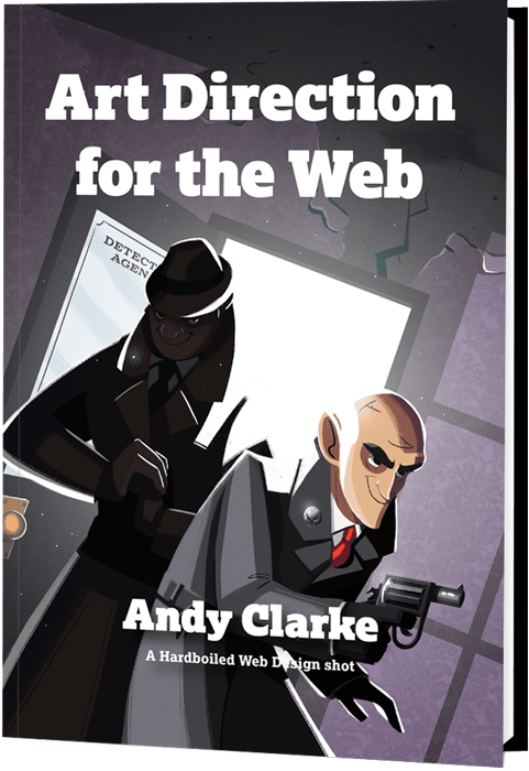
Meet “Art Direction For The Web,” A New Smashing Book By Andy Clarke
Meet “Art Direction For The Web,” A New Smashing Book By Andy Clarke
Bruce Lawson
A page on the Web isn’t like a printed page. Many of us learned that the hard way when we abandoned fixed-width layouts and embraced the web’s inherent flexibility and responsiveness. Read the excerpt chapter.
Modern web technologies like CSS Grid, Flexbox and Shapes have made it possible for us to implement print’s often distinctive designs, and the web’s now full of tutorials on how to use them. But the most important question is not “how” we can use art direction techniques to improve our designs for the web, but instead “when” and “why”.
This is the reason why Andy Clarke wrote his new book Art Direction for the Web. This is a book about why art direction matters and how you can art-direct compelling and effective experiences across devices and platforms.
Andy explores the work of some of the most influential art directors, luminaries like Alexey Brodovitch, Bea Feitler, and Neville Brody. He doesn’t encourage us to merely mimic work from a previous era and medium, but to understand their thinking and learn how to apply that knowledge to art direction for the web.
Andy writes,
“You needn’t have been to art school to learn and apply the principles I teach you. Just like art direction itself, they’re something which everyone — no matter what your background and current area of expertise — can use every day to improve the effectiveness of a product or website’s design.”
Andy’s goal is to teach people about the importance of art direction for the web and explain how art direction can help people tell stories by using design. That way, products and websites will connect with audiences and also manage to keep them engaged. After a thorough investigation of the methodology of art direction, Andy teaches how to accomplish it by embracing the web using modern CSS.
Art Direction for the Web will help you make your sites more effective at communicating, persuading, and selling. If you develop products, this book will make them more compelling and more enjoyable to use. Read the excerpt chapter →
Table Of Contents
Part 1: Explaining Art Direction
What Art Direction Means
Ask what art direction means to developers, and they might answer: using the <picture> element or sizes attribute in HTML for responsive images; presenting alternative crops, orientations, or sizes at various screen sizes. But there’s more to it.
One Hundred Years Of Art Direction
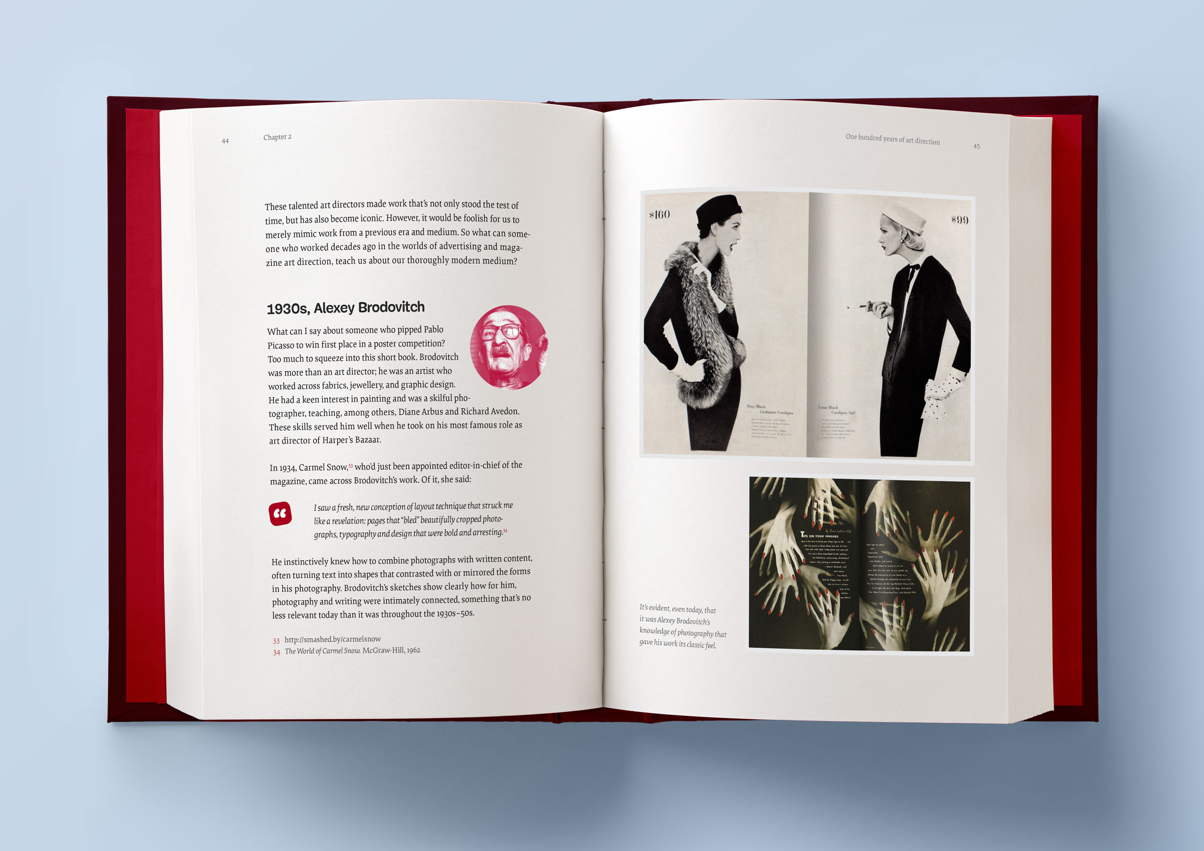
Bradley, Brodovitch, Brody, and Feitler — together, their names sound like a Mad Men-era advertising agency. In this chapter, we’ll take a look at their iconic works, from the 1930’s to the 1980’s.
Art-Directing Experiences
Whether we write fact or fiction, sell or make products, the way to engage people, create desire, make them happy, and encourage them to stay that way, is by creating narratives. So what do we need to consider when doing so?
Art Direction And Creative Teams
Let’s take a look at how we can embrace collaboration and form teams who follow strategies built around common goals.
Part 2: Designing For Art Direction
Principles Of Design
Are the principles which have guided design in other media for generations relevant to the world of digital products and websites? Of course! In this chapter, we’ll explore the principles of symmetry, asymmetry, ratios, and scale.
Directing Grids
Grids have a long and varied history in design, from the earliest books, through movements like constructivism right up to the present-day popularity of grids in frameworks like Bootstrap and material design. This chapter explains grid anatomy and terminology and how to use modular and compound grids.
Directing Type
White space, typographic scale, and creative uses of type are the focus in this chapter.
Directing Pictures
Images and how we display them have an enormous impact on how people perceive our designs, whether that be on a commercial or editorial website, or inside a product. In this chapter, you’ll learn how to position and arrange images to direct the eye.
Part 3: Developing For Art Direction
Developing Layouts With CSS Grids
CSS Grid plus thoughtful, art-directed content offers us the best chance yet of making websites which are better at communicating with our audiences. In this chapter, Andy explains properties and techniques which are most appropriate for art direction.
Developing Components With Flexbox
While Grid is ideal for implementing art-directed layouts, Flexbox is often better suited to developing molecules and organisms such as navigation links, images, captions, search inputs, and buttons. This chapter explores how to make use of it.
Developing Typography
From multi-column layout and arranging type with writing modes to text orientation and decorative typography, this chapter dives deep into the code side of type.
Developing With Images
How do you fit your art-directed images to a user’s viewport? And what do CSS shapes and paths have in store for your design? Let’s find out in this final chapter.
Smashing TV Webinars
To accompany this book, Andy is also giving a series of webinars on Smashing TV. Webinars are free with Smashing Membership, which costs a couple of cups of coffee a month (cancel anytime).
About The Author
Andy Clarke is a well-known designer, design consultant, and mentor. He has been called plenty of things since he started working on the web. His ego likes terms such as “Ambassador for CSS,” “industry prophet,” and “inspiring,” but he’s most proud that Jeffrey Zeldman once called him a “triple-talented bastard.”
With his wife, Sue, Andy founded Stuff & Nonsense in 1998. They’ve helped companies around the world to improve their designs by providing consulting and design expertise.
Andy’s written several popular books on website design and development, including Hardboiled Web Design: Fifth Anniversary Edition, Hardboiled Web Design, and Transcending CSS: The Fine Art Of Web Design. He’s a popular speaker and gives talks about art direction and design-related topics all over the world.
Testimonials
It has been our goal to make the book as inspiring, practical, and useful as possible, and we feel honored to have already received such positive reviews.
“With ‘Art Direction for the Web,’ Andy provides a framework for harnessing the web’s potential. With historical context and real-life examples, Andy inspires each of us to be more purposeful about the choices we make. And true to form, he follows up all that inspiration with demos and the practical knowledge needed to see our ideas manifest online.”
— Trent Walton, co-founder of Paravel Inc.
Why This Book Is For You
The content of this book is based on Andy’s twenty years’ experience of working with clients, plus the expertise of the art directors and designers he interviewed. You’ll learn:
What art direction means, why it matters, and who can do it.
How to make art direction work for digital products and websites.
How to improve conversions and bring your customers’ journeys to life.
How to maintain brand values and design principles by connecting touch points across marketing, product design, and websites.
How to use art direction priciples such as layout, typography, proportions, ratio, and grids in a more imaginative way to communicate what you’re trying to do much better.
How to implement your designs on any platform with the latest HTML and CSS.
…Plus, we’ll explore outstanding designs from 100 years of media and print publishing for some extra art direction inspiration.
Andy’s new book explores 100 years of art direction and how we can use this knowledge and the newest web technologies to create better digital products.
As we come to the end of 2018, I spoke to some of the Smashing team, to get some thoughts on what the past year has been like for Smashing Magazine. We’re a small and fully remote team, communicating via Slack and Notion. Many of us only work part-time for Smashing, however, in many ways, I think that is one of our strengths.
We’re not just the publishers of an online magazine or conference organizers, we are people who work in the web industry. Among the team, products have been launched, books are being written, conferences have been spoken at, and websites launched that have nothing to do with Smashing Magazine itself. I love that. It stops us being insular, and I hope this helps us to constantly broaden our reach — bringing people together from all over the world to share ideas and inspiration as we all work together to build a better web.
As Editor in Chief of Smashing Magazine, I look after the content that goes out on the online magazine, and also our upcoming print magazine for members. This year, we have published almost every weekday — that represents over 290 articles! That’s a whole lot of content on subjects from privacy and accessibility to CSS and WordPress. While I read every article that goes out, I do not have the expertise to know everything about all of these subjects. I couldn’t do my job without the help of our talented editors who work with individual authors: Alma Hoffmann (Design), Chui Chui Tan (UX Design), Drew McLellan (Coding), Jim Dabell (Mobile), Marko Dugonjić (Typography), Michel Bozgounov (Graphics), and Rey Bango (Coding). Plus thanks to Iris Lješnjanin, Markus Seyfferth, Yana Kirilenko, Cosima Mielke, Andrew Lobo and Ricardo Gimenes for their hard work and efforts.
In Between Timezones
On a personal note, this year has once again involved a lot of travel, as I continue to tour around speaking about new CSS and CSS Layout. That has included talks and workshops for Smashing. In total (with speaking engagements, workshops and CSS Working Group meetings), I have traveled 272,865 kilometers while visiting 45 cities and 15 countries. That amounts to spending 146 days on the road.
Here’s a fun fact: My weekly standup post in our Smashing Slack usually starts with sharing the timezones I’m going to be in that week. Well, next year will involve more travel, and I’ll be bringing my new CSS Layout workshop to San Francisco, Toronto, and New York.
As for the magazine, I hope we can continue to publish great content from authors — those who are experienced writers but also folks writing for the first time. We are very happy to work with you to shape an article for publication. Personally, writing has helped boost my career more than anything else I have done. I love to help other people get started. So, if you have an idea, read this and then send over an outline.
Please don’t hesitate. Some of our most popular posts have been beginner guides to a technology, so don’t feel you need to have solved a big problem, or have some brand new technique in order to contribute. A nice technique, demonstrated and explained well, is worth a lot to someone who has just hit that same issue.
Anyway, enough from me! What were the highlights of the year for everyone else here at Smashing?
2018 was a quite busy and adventurous year for me, with a good number of ups and downs, challenges, surprises, and rewards. I was honored to have had the opportunity to run trainings, workshops and even offer consultancy to the European Parliament, EPAM, OTTO, Sipgate, Axel Springer and Wondrous, among others. I was happy to support dozens of local meet-ups and conferences around the world with the kind help of our Smashing Members.
Earlier this year, I explored how we can improve the level of education for front-end and design. While speaking at universities and schools, I was also teaching to get a sense of what’s required to set up a proper design school. In February, I taught at the New Digital School in Porto, Portugal, for a week, while exploring the state of front-end and responsive interface design in a class of 20 students. In June, I helped dear friends from the Projector Design School in Kyiv, Ukraine, set up Berlin Design Campus, an initiative for Ukrainian students to explore how digital agencies and designers work and live in Berlin. In October, I participated in a week-long co-working co-living campus in Mokrin, Serbia.
Specifically, I was exploring the state of design and front-end in uncommon locations, mostly second- and third-largest cities: Porto and Braga in Portugal (thanks Tiago!), Yerevan in Armenia (thanks Sona and Sargis!), Gdansk in Poland (thanks Patrycja!), Salzburg in Austria (thanks Markus!), Moscow and Saint Petersburg in Russia (thanks Julia, Daria, Alex, Andrey, Vadim and Alexey!), Split and Labin in Croatia (thanks Toni, Antonio and Domagoj!), Belgrade and Mokrin in Serbia (thanks Tatjana and Marija!), Belfast in Northern Ireland (thanks Tash and Oliver!), Manila in Philippines (thanks Sophia!), Tallinn in Estonia (thanks Artur!).
Much of the time in the second half of the year was spent with wonderful people at the European Parliament in Brussels, where Nicolas and Manuel were kind enough to invite me to work on refinements and improvements of UIs for election sites, media library, and a few smaller sites. That was quite a bit of traveling, with the absolute worst highlight of the last years being a massively delayed 47-hour trip to the Philippines due to a closed runway at the Manila airport (thanks for bearing with me through this, dear Sophia and the crew!)
Over the course of the year, I have spoken at 17 conferences, and was privileged to meet many — many! — remarkable people. It ended up with conversations I will remember for years to come. Some of these conversations changed me for the better as a person and professional, so I was happy to receive constructive criticism on MCing skills, writing, as well as code and design. I managed to wrap my head around the intricacies of CSS Grid Layout and Service Workers but also spent a lot of time learning about network protocols and the underlying layers of the Internet. I also attended 6 workshops to stay afloat of what’s happening in our industry these days and sharpened up my front-end/UX/communication skills. In September, I was honored to participate in the Mozilla Tech Speakers coaching, along with Ada Rose Edwards and Marc Thiele, mentoring and giving feedback to dozens of new speakers (here’s a review of the event by Havi Hoffman).
In terms of the Smashing Universe, we spent quite a bit of time revising our workflows and streamlining our processes for conferences, books, and the Smashing Membership. With fantastic event management skills of Mariona Ciller, Amanda Tamny Annandale and Charis Rooda, we’ve run 5 conferences this year: in London, San Francisco, Toronto, Freiburg and New York.
For the first time, we experimented with a ’no-slides’ format in Toronto (every speaker presented “live” on stage in front of a large screen shwoing how they build and design — with performance and accessibility audits to live designing/coding/sketching sessions on stage. In fact, that’s the format we are going to continue exploring in 2019.
Editor’s Note: If this format sounds interesting to you, you can watch all of the SmashingConf talks on Vimeo.
Nadieh Bremer presenting at SmashingConf Toronto (watch on Vimeo)
After many months of work, we finally published “Smashing Book 6” and “Form Design Patterns” by Adam Silver, but quite a bit of time was spent on the next upcoming books that will be published in the next years. For the Membership, we were able to secure Scott Whitehead and Bruce Lawson to help evolve the Membership program.
On a more personal level, I will vividly remember vacations to Morocco (Marrakesh, Fez and the Sahara desert trip) and Sardinia (Northern part) earlier this year. Also, on a sad note, I’ve moved out from Vilnius, Lithuania, where I’ve resided for the past 3 years.
Overall, I see 2018 as an important “transitional” year which took a lot of time, effort, and hard work. It feels like it’s been a transitional year between how things used to be and what’s coming up next. With this in mind, I couldn’t be more excited to see what 2019 will bring us! Expect a few new books coming up, Smashing Magazine Print edition, four Smashing Conferences (San Francisco, Toronto, Freiburg, New York) and many wonderful Smashing TV sessions!
Change happens everywhere and all the time — in all organizations, agencies, and businesses. If you don’t thrive change on your own, then there comes a time when change takes place on its own and things get out of control.
Looking back on the year 2018, we’ve undergone changes to even better fit the needs of our readers. We published the Smashing Book 6: New Frontiers in Web Design, a book packed into the probably the most beautiful cover that we have had designed so far. It’s a book that sheds light on all kinds of upcoming challenges that await web designers and developers in the near future.
We also published Form Design Patterns, a book that focusses on building all sorts of accessible and resilient web forms, and how to make them pretty (thanks to progressive enhancement) — a book that I personally learned a lot from. We’ve also started working on two new books that we’ll be publishing early next year: “Art Direction on the Web” by Andy Clarke, and “Inclusive Components” by Heydon Pickering. I am eagerly looking forward to holding both of them in my hands!
At the end of last year, we did something that we usually wouldn’t do because it would be too much of a risk. We launched a fully redesigned site: we migrated the entire magazine, the Job Board, and our Smashing Shop onto a new platform, and also launched our Membership initiative to reduce advertising on the site and to make Smashing more independent from ads in the long run. All of this took place at the same time. Was it worth it? A definite “Yes!” We’ve seen a noticeable uptrend in our analytics and many positive outcomes. At around mid-2018, we had already crossed the 1,000 members mark, and we look forward to breaking the next big mark in the next year (always with the long-term goal of getting fully independent within the next three years)!
That’s right; Smashing Membership continues to evolve. In the upcoming months, we’ll be introducing a new print magazine for our Members — something that is both visually appealing and also most useful to read. Rachel will be building the print magazine mostly with print.css, so I’m really looking forward to seeing how this will turn out and whether we can reuse some of it for our upcoming books!
And that’s not the only sort of change that is still ongoing at Smashing. We also tried a new live coding and design conference format at this year’s SmashingConf in Toronto; we thought that the old format had gotten a bit too much of the same, something that makes SmashingConf a bit too similar with what others already do. After all, we want to run conferences that contain content that we ourselves find most useful and interesting, and the new live format brings precisely that! It did take quite a bit of a risk though, and we’re thrilled that it turned out to be a tremendous success! So we are going to double down with this new format in the next year.
Last but not least, we also moved our smashingconf.com site to Netlify just recently, but that happened mostly in the background, so if no one really noticed the change, I guess that’s a good thing.
Yes, 2018 was a year full of transitions, but I guess you never can afford to stand still anyway? ;-)
Before the end of the first year of Smashing Membership, we reached a thousand members — thank you so much, everyone! Those extra-special people who were with us for the whole year received a little thank you in the post.
I joined Scott in October, which allowed us to increase the number of Smashing TV webinars (which are free to Members and Smashing Members, of course). We’ve had sessions on coding Machine Learning, Designing with Ethics, the State of the Web in South-East Asia, and statistical techniques for collecting user data without compromising privacy. (All are recorded and available to members, if you have FOMO!)
When we set up Membership, we promised that it would be an inclusive place where lesser-heard voices (in addition to big names) would be beamed straight to your living room/ home office/ sauna over Smashing TV. While we’ve been speaking at other non-Smashing events, we’ve watched other sessions from lesser-known talents in our industry. With only $5 to $9 a month, your Membership subscription allows us to bring you even greater content, pay all our contributors fairly, and reduce advertising on the site.
Next year, we’ll be increasing the number of webinars again. Lined up is a course on how to make Progressive Web Apps, Internationalization, Semantic HTML, Houdini, as well as a monthly show hosted by me and Vitaly with industry guests. We sincerely hope you’ll join us!
2018 was a year of firsts, new cities, new attendees, new speakers, and even a couple new formats. We had more than a few challenges in store, but if you have any experience with the Smashing Team, you’ll know that we thrive on challenges.
We started the year in London (our first time in the capital city and the first time in England in a couple of years). The sold-out conference took place in LSO’s St. Luke’s Church, and bathed in sunlight. This performance-based conference brought in a new crowd of attendees and speakers — all discussing why Performance Matters, the common pitfalls, and the tips and tricks for improving the day to day user experience. With Una Kravets and Patrick Hamman as MCs, the experience was new and empowering.
In April, the Smashing team headed back to San Francisco. The weather was wonderful as we returned to the bay, with 14 speakers, 8 workshops, and nearly 500 attendees. Held at the Palace of Fine Arts, Mina Markham walked us through the process of redesigning Slack, while Joe Leech broke down the process of “Designing Powerful User Experiences With Psychology.” We toured the area, competed with each other at the arcade, and came together to find new ways to solve new processes and challenges.
Backstage at Smashing Conf Toronto (Photo credit: Marc Thiele)
A couple of months later, SmashingConf experimented with its boldest change: no slides! All of the presenters, from Aaron Draplin to Rachel Andrew, tossed out their ‘normal’ presentation format and showed the attendees how they work. The experience was enlightening, showing how similar we all are in our work processes in some ways, while approaching things from an entirely different angle in others. In fact, we loved it so much that we’ve decided 2019 should be the year of No Slides!
The end of the summer is when Smashing goes home. Set on the foothills of the Black Forest, at the infamous Markethall, SmashingConf came back to Freiburg, Germany with 14 speakers. Chui Chui Tan spoke about Designing for Global Audiences while Josh Clark talked about Design in the Era of the Algorithm. In addition, we had a new experience adding community lightning talks to our program. No matter what changes though, there’s nothing like hosting SmashingConf Freiburg and bringing people to our home.
And finally, we ended the year in the city that never sleeps — and lived up to the name! In New York City, we had 14 speakers, 8 workshops, a packed speaker panel, a couple of retro parties, and events that kept everyone busy for four days. Smashing challenged the sold-out audience with an engaging group of speakers from John Maeda to Debbie Millman and Sara Soueidan. No matter how many times we go back, the experiences always change us in a way.
But, then again, that’s how the Smashing team always feels at the end of a season: challenged, moved, and driven. We’ve learned from over 30 speakers, met over 1500 attendees, flown to 5 cities, eaten lots of incredible food, and had countless wonderful experiences. Now, the team is ready to create, improve, and progress to see what 2019 has in store for us!
If you ask me, I think that this year went by really quickly. When I look back, I see five Smashing conferences, which took place in London, San Francisco, Toronto, Freiburg and New York, as well as many improvements which we’ve achieved in the background.
Editor’s note: Marc has taken photos of many of our conferences, you can find the albums on his Flickr account.
When I say background, I mean that maybe readers, attendees or folks who visit Smashing Magazine don’t even recognize the work we do behind the curtains. Of course, there are final products that are presented in the articles published on Smashing Magazine, the Smashing Books, or projects that have been brought to your attention via Smashing TV or while attending a Smashing conference or workshops, but there is a small team of people who work hard to continue improving workflows and experiences for our cherished customers. What you often don’t see is see the messy middle and the bumpy journey we are on — from talking about a new idea to the final product. There actually is a lot of work, a lot of failure, and many discussions and conversations involved.
From the end of April onwards, we had many meetings and conversations to see where we can improve the work that we do. Defining clear roles and tasks, checking how the many different parts of the Smashing Universe can grow closer together, and also looking for new, exciting ideas to bring to life. There are also many new faces on board of the Smashing boat — fresh energy to move forward — and I am very much looking forward to seeing the results of their passion and input. Expect the quality you know from the magazine and the events and an even better Smashing Membership, Smashing TV, and maybe the one or other new idea.
So, when I personally speak about 2018, I tend to say that this year was not too good and felt strange for a reason that I can’t really grab and describe. Perhaps it is the overall mood and spirit that comes from what you see when you turn on the news, read the newspaper in the morning or talk to your neighbor? All I know is that it is important to stay positive and have a positive look into the future. I ran three very successful beyond tellerrand shows in Munich, Dusseldorf and Berlin, and I’ve seen the success we had with all the Smashing conferences and the improvements we’ve accomplished for the overall Smashing experience.
My wish for the upcoming new year: let’s meet — even more. Let’s share ideas and what we’ve learned. Let’s not just meet on the web, but in real life. It is wonderful to teach and share and to see other people taking what they’ve learned from you and take it further to create, inspire and teach others with it. One more thing that also is important: Stay curious and ask questions. Never fear to ask a question as you “might look stupid asking.” If you have a question, then it’s stupid not to ask.
With this, I wish everyone a wonderful journey over to 2019 and I am looking forward to meeting you in 2019!
Working at Smashing Magazine has been a very rewarding experience. Each time one of the articles I have edited gets published, I think I am happier than the authors.
One article, in particular, that was very meaningful to me was written by Trine Falbe and titled “Ethical Design The Practical Getting-Started Guide.” We all talk about ethical design, but not often we are provided with a way to get started. It is a good article to reflect upon as the current year ends and the new starts.
Thank you, Smashing, for keeping me around!
A Truly Smashing Year
Reading all of this certainly makes me proud to be part of the Smashing team. At the heart of everything Smashing, is an absolute focus on you, our readers, members, and conference attendees. We hope that the things we do demonstrate that, and we are always happy to listen and to learn when we get it wrong!
I’m excited for the things we will be sharing in 2019, and along with all of the team I am always happy to hear your feedback. What can we do better? What do you want to learn? How can we help? We will be opening up a survey for some more formal feedback early in 2019, but our door (or email inbox at least) is always open!
Introduction To Animation And The iMessage App Store With Shruggie
Introduction To Animation And The iMessage App Store With Shruggie
Simon Schmid
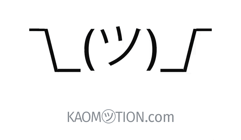
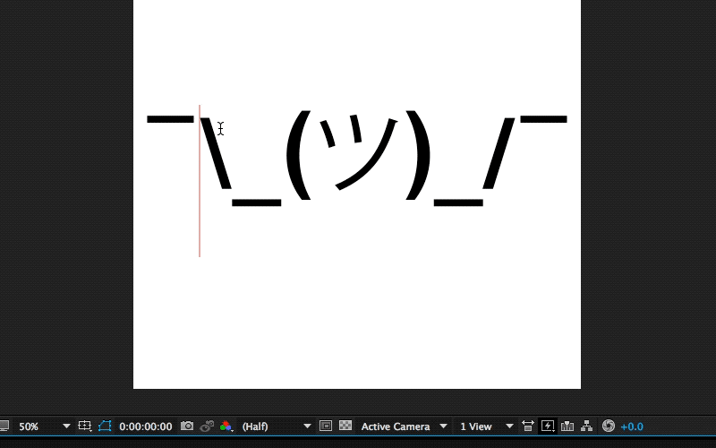
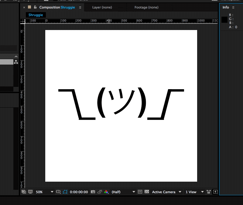
When the App Store for iMessage in late 2016 went live, I releasedKaomotion, a sticker app with animated kaomoji inside. Ever since the release of this app, I wanted to write up a tutorial about how a simple text character like shruggie (i.e. ¯\_(ツ)_/¯) can be animated to give it life-like features:
The Shruggie animation we’re going to make. (Large preview)
What you are going to read in this article is a step-by-step guide of setting up a canvas in After Effects and then going through with the animation. You’ll also read about how well the app containing more than 30 animated stickers worked and what some of the specific issues are you might be having on the App Store for iMessage:
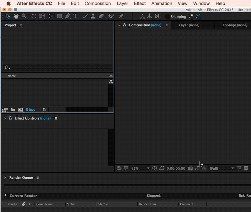
We’re starting with setting up a new composition (⌘ + N) within After Effects with the following settings:
1000px × 1000px;
a frame rate of 30 frames per second;
a quarter on resolution;
a run time of 2 seconds.
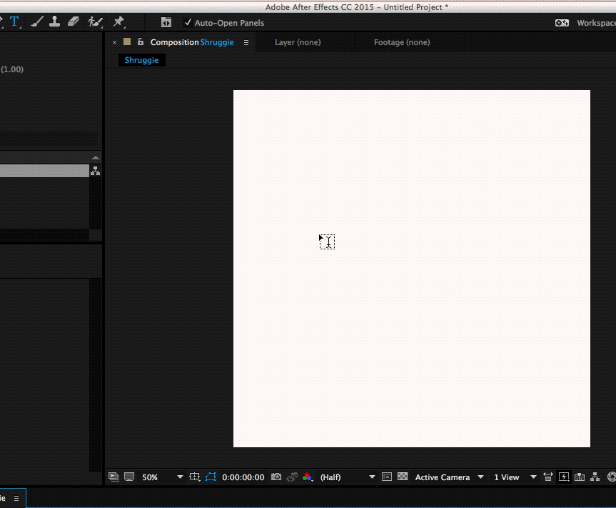
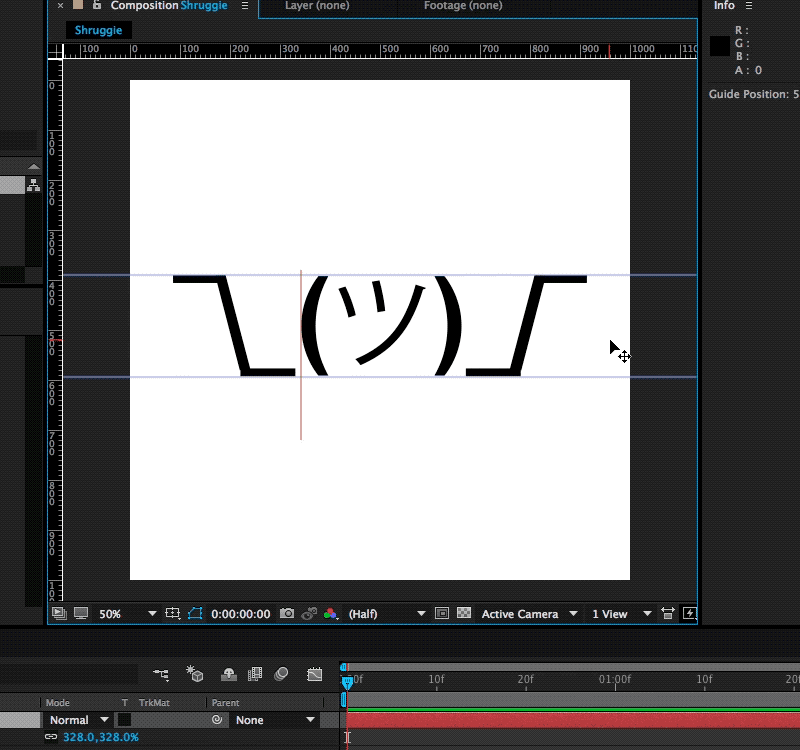
This is going to be the basic canvas we’re going to work with during the animation. We’re choosing a square since that is what you have to deal with within iMessage and Apple’s sticker implementation.
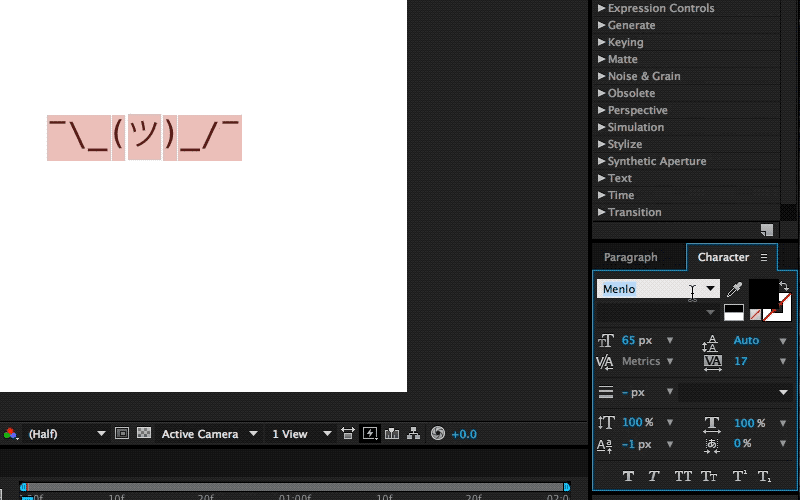
Since kaomoji are simple text-based emoticons we’re going to copy-paste a a Shruggie “¯\_(ツ)_/¯” from the first source we can find being Jeremy Burge’s Emojipedia via Google.
After having found it on Emojipedia we’re pasting it as a text layer into After Effects. It’s time to utilise the text tool.
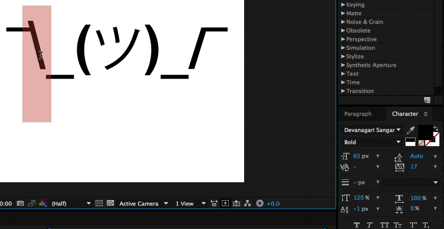
The Shruggie inside your canvas might not look exactly the way you’ve found him on Google, or on Emojipedia for that matter, that’s because of differences in font types. We’ve chosen a font that makes Shruggie look decent and made him stretch across the canvas to prepare him for his facelift: double-click on the Source Name to select all characters.
The Character Menu
Double click Name Source and then get the font type in your Character menu.
Select Layer, then S + Scale (by sliding right for example).
To position the layer properly, we’re scaling it up to fill the canvas by selecting the layer by pressing S, then Scale and then finally moving the scale until it fits.
To further explore some smaller tweaks let’s look into making our Shruggie a little more connected. For that we’re looking into some kerning and height options. To adjust the gap between Shruggie’s arm and hand, we’ll use the kerning tool (V/A) either manually in the menu or with another keyboard shortcut:
Kerning
Select Space + ALT + ← →. When we’re happy with the kerning gaps, we’ll adjust the height of the arms and make it look like the arms are actually connected. To join up the slashes with the underscore we’re going to play around with increasing the height of the slash/vertical scale, moving it vertically and potentially adjusting the baseline. In our case we’ve increased the height of the slash character to 120% and then adjusted vertically:
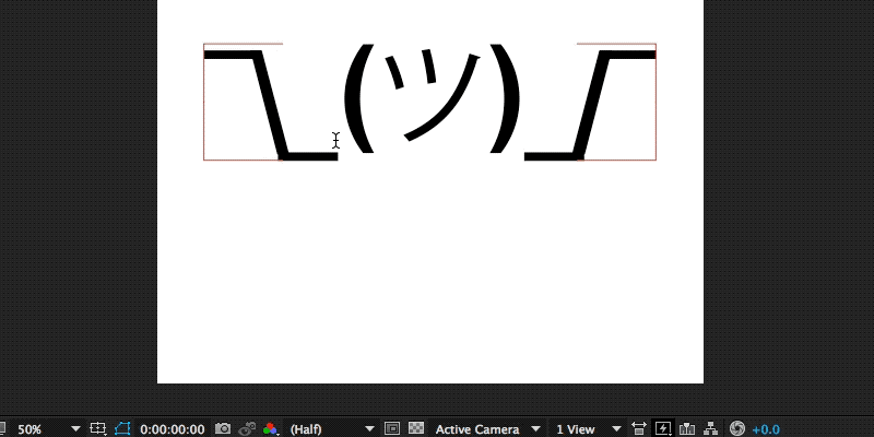
If you repeat the steps above on the other side we’ll by now have a pretty looking Shruggie, but what’s that, we don’t like how it aligns at all, do we?
The next steps are a repetition of what we’ve done before: we’re selecting the middle part and moving it down vertically to align with Shruggie’s arms, shoulders, and hands. It looks pretty good, but let’s double-check on that first impression by zooming in!
Zoom in
You can zoom in by pressing ⌘ + +, and also by pressing on the , + . keys. In our case, we found we need to change it to properly align Shruggie’s face with his arms, which is another repetition of the above resizing and realigning skills.
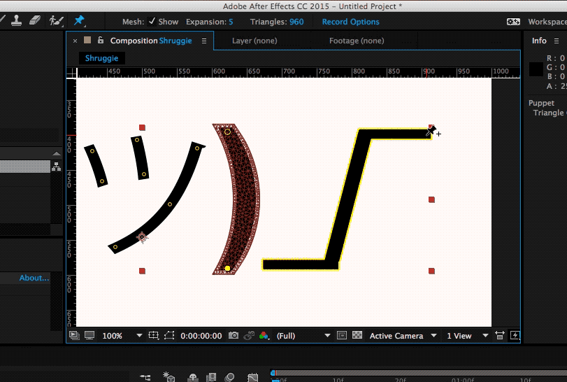
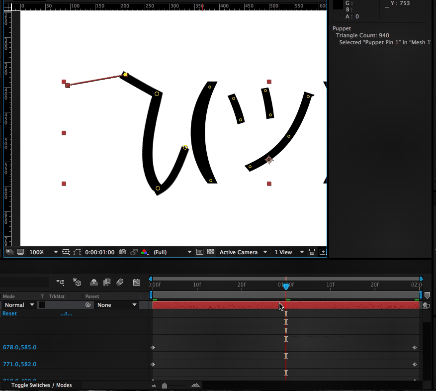
In order to animate our base Shruggie, we’re going to use the Puppet Pin Tool. Essentially it lets us work on any vector elements within After Effects, which includes our text assets. Let’s start:
The Puppet Pin Tool
Now what we’ll want to do is put pins where we want the joints to be: hands, elbows, shoulders, and so on. Press on ⌘ + P to do the trick:
When you get a yellow highlight, that means that everything has been well done and After Effects recognizes the element as a vector and therefore you can place your pins. One thing that’s worth looking out for is to make sure that your pins/keyframes are at time 0 in your timeline at this stage:
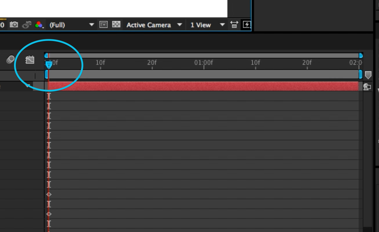
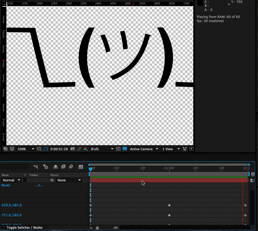
The key to doing this effectively is to start with your main poses. We’re going to start with our start and end poses in place. We can do that by copying the keyframes that have been set up by our puppet pins in the beginning to our end state. The reason for this is simple: this is the start and our default pose, that’s the pose we want to return to in order to get a coherent animation.
Set Up Start And End Point
Select the layout and press U, then copy-paste to the end state.
Copying keyframes from start state and end state. (Large preview)
As you can see it in in the gif above selecting the layout and pressing U returns every property of a layer that has keyframes as little diamonds. These little ? now also constitute your end state.
Setting the Middle Stage
In order to have a stage that we want to animate to and from, we’ll put that right in the middle:
Select the timeline in the middle (1 sec in our example). (Large preview)
Now that we’re in the middle of our animation we’re going to make changes to our default state in such a way that we want to constitute our middle state:
This means we’re going to raise the shoulder puppet pin, get the elbow and arms a little closer to your body and give the hand a proper “shrug” movement. This will automatically create those keyframes at that point in time, which will then animate our two default stages between each other.
Here’s the demonstration of the animation we get when we manually move the timeline with our cursor:
We’re following the exact same process for the right part of Shruggie’s shoulder and then add a bit of movement to Shruggies face which gives him a distinct look smirking over his shoulders and giving us the impression of: “Meh, you know, nothing to do about that”.
Space Bar To Play
Select layer + Space. When you hit the Space key you can get a first impression of our animation:
What you’ll notice immediately is that the character seems to miss character. That is mostly due to the fact that our animation plays at the same speed for the entire two seconds. That is the hallmark of mostly dodgy animation — you’ll want it to not just evenly move between two points.
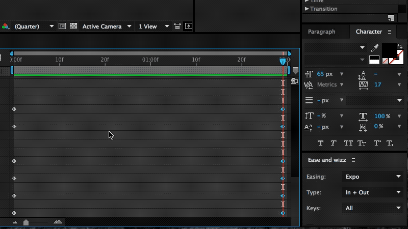
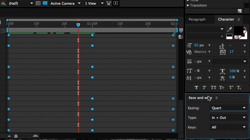
The easiest way to fix it up and give Shruggie a bit more realism, believability is to use a technique called ease-in and ease-out (or cushioning or a number of other ways). It’s basically speeding up the animation and then speeding it down again before reaching the end of the animation timeline.
It’s a cheap way of breathing some more life into our Shruggie. To do that we’re using a great little After Effects plugin called Ease and wiz that lets us apply some easing without much work:
Select all keyframes and then apply Ease and wizz with the options most suitable for your animation.
Applying Ease and wizz and some options. (Large preview)
In our case we’ve chosen to go with the following settings:
Easing:Quart
Type:In and Out
Keys:All
Curvaceous:no
If we now run our animation again with the space bar, you’ll notice you’ll get something very close to the animation embedded at the beginning of this post. This means that we’re done, and we can be very proud of our work.
6. Further Reading About The Motion Basics
The tutorial you’ve just read introduces only the very basics of animation by way of making Shruggie move. In order to progress in animation, you’ll need to dig in further into the basics of motion. Further reading on some of those basics will help you improve further.
Below you’ll find an article describing the basics of motion and then some that relate to motion/animation with UX and software to come back full circle on the web:
7. Bonus Reading: Life On The App Store For iMessage
The above tactics were applied to a whole bunch of kaomoji for the already mentioned as stated in the introduction.
I’ve launched the sticker app to some early support on Product Hunt, however, the app itself failed to be picked up by Apple or any audience on the App Store at large. I’d like to point out two realities on the App Store that anyone trying to make a sticker app needs to face:
Competition by big brands;
The wrath of users who don’t get the concept of stickers.
Problem: Prevalence Of Brands
If you want a shot at being consistently in the top 50 of the top paid iMessage stickers, then it helps to be a big brand or a notoriously known character. I’m not going to attach much meaning to this, just state it as a fact and provide the evidence below of screenshots collected in April 2018 (when I first wrote the draft on this article) on the Swiss App Store for iMessage.
Of the top 40 (that’s the top paid category), around 18 are likely to be well known characters turning that fact into downloads:
The subtitle of this section is somewhat provocatively chosen, as there is no intrinsic problem with this as these characters are uniquely suited for stickers, though it’s an issue as this is just what you’re up against. Of course, the economic reality also shows around curation:
The left shows a screenshot of the first batch of curated stickers (66% big brand) in April of 2018, the right shows a screenshot of late August of 2018, where I encountered the exact same setup.
Again, this is not to pass judgment at Apple as I think they’ve become much better at curation in the App Store in general. As a summary of this situation, I think it is fair to say that other sticker ecosystems such as LINE’s have allowed more creativity to flourish and that the sticker ecosystem on the App Store is hard to advance into successfully.
Users still don’t get (or do not want?) stickers and the next point is a testament to this:
Problem: Facing The Wrath Of Users
The most annoying problem with the App Store for iMessage is still the fact that users do not know how to use them (i.e. stickers). That results in an abundance of one-star reviews.
In the case of Korea, Kaomotion got 80 one-star reviews in a matter of a few days by users complaining about the app not being there on their phone.
“아니 삭제하는갓두 업네요..삭제좀요 사용하는 법도 모르겟어요” translates to “I don’t know how to use it.” (Large preview)
This can then look like the next screenshot fast, and Apple doesn’t seem to care to help clean out the mess, even after trying to address the users in Korean:
What an abundance of 1 star reviews in Korean looks like. (Large preview)
They’re essentially all saying the same: “The App isn’t on our phone.” Any one-star reviews are essentially also going to stay forever as no-one seems to care about what you have to say.
Solutions to the discoverability problem of stickers in the interface
I’m not the first one or the only one to write about this problem, however I’d like to offer some possible remedies below.
18 months after the introduction of the App Store for iMessage users still don’t know how to send and receive stickers (though I must say that Apple tried to stitch the interface up within iMessage).
In this regard, you can only try to fix these problems by attacking the problem head-on and giving as much information as possible to users.
Writing guides on the App Store page Use the (text) screen real estate Apple gives you to write a step to step guide about how stickers are sent.
Writing more in-depth guides elsewhere Do a blog post or something similar about the same topic with screenshots, gifs, or a video (I’ve made one here for Kaomotion).
Use a screenshot or app preview Finally, you may want to be explicit even on your screenshots about how your app is used. Even Wonder Woman seems to have been experiencing the same problem and used a screenshot to offer remedy:
Wonder Woman: “How to send stickers”. (Large preview)
You will likely still get users complaining, this way you’ll have an easy way to describe to them what needs to be done in order to use your stickers.
Were I to go back to the launch of the sticker store, I probably wouldn’t go through the hardship of creating Kaomotion once again, however, I’m glad I got to write about animation basics for After Effects!
I hope this tutorial gave you an interesting glimpse at both After Effects and the iMessage App Store. If you’re into this, you might want to go hang out at this new animation community called Keyframes.


 All workshops are hands-on and practical, so you can apply your new skills immediately.