

When working on a new project, there are certain features that are necessary depending on how the application is supposed to be used. For example, if you’ll be storing user-specific data, you’ll need to handle authentications, this will require the setting up of a form that needs to be validated. Things such as authentication and form validations are common; there are solutions that possibly fit your use case.
To properly utilize your development time, it is better you use what is available, instead of inventing yours.
As a new developer, there’s the possibility that you won’t be aware of all that the Vue ecosystem provides you. This article will help with that; it will cover certain useful tools that will aid you in building better Vue applications.
Note: There are alternatives to these libraries and this article is in no way placing these few over the others. They are just the ones I’ve worked with.
This tutorial is aimed at beginners that either just started learning about Vue or already have basic knowledge of Vue. All code snippets used in this tutorial can be found on my GitHub.
Vue-notification
During user interaction, there is often a need to display a success message, error message, or random info to the user. In this section, we’re going to look at how to display messages and warnings to your user using vue-notification. This package provides an interface with a nice animation/transition for displaying errors, general information, and success messages to your user across your application and it does not require a lot of configuration to get up and running.
Installation
You can install vue-notification in your project using either Yarn or NPM depending on the package manager for your project
Yarn
yarn add vue-notification
npm
npm install --save vue-notification
After the installation is complete, the next thing would be to add it to the entry point in your app, the main.js file.
main.js
//several lines of existing code in the file
    import Notifications from 'vue-notification'
    Vue.use(Notifications)
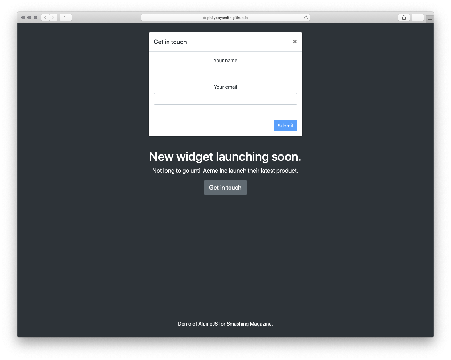
At this point, we only need to add the notifications component in the App.vue file before we can display notifications in our app. The reason why we’re adding this component to the App.vue file is to avoid repetition in our application because no matter the page the user is on in our app, components in App.vue (e.g the header & footer components) would always be available. This takes the pain of having to register the notification component in every file that we need to display a notification to the user.
App.vue
<template>
  <div id="app">
    <div id="nav">
      <router-link to="/">Home</router-link> |
      <router-link to="/about">Notifications</router-link>
    </div>
    <notifications group="demo"/>
    <router-view />
  </div>
</template>
Here, we add one instance of this component which accepts a group prop which would be used in grouping the different types of notifications we have. This is because the notifications component accepts a number of props that dictate how the component behaves and we’re going to look at a few of these.
group
This prop is used to specify the different types of notifications you might have in your app. For instance, you might decide to use different styles and behavior depending on what purpose the notification is supposed to serve, form validation, API response, etc.type
This prop accepts a value that serves as a ‘class name’ for each notification type we have in our application and examples can includesuccess,error, andwarn. If we use any one of these as a notification type, we can easily style the component by using this class formatvue-notification + '.' + type, i.e.vue-notification.warnforwarn, and so on.duration
This prop specifies how long thenotificationcomponent should appear before disappearing. It accepts a number as a value inmsand also accepts a negative number (-1) if you want it to remain on your user’s screen till they click on it.position
This prop is used in setting the position you want notifications to appear from in your app. Some of the available options aretop left,top right,top center,bottom right,bottom left, andbottom center.
We can add these props to our component in App.vue so it now looks like this;
<template>
  <div id="app">
    <div id="nav">
      <router-link to="/">Home</router-link> |
      <router-link to="/about">Notifications</router-link>
    </div>
    <notifications
      :group="group"
      :type="type"
      :duration="duration"
      :position="position"
    />
    <router-view />
  </div>
</template>
<script>
  export default {
    data() {
      return {
        duration: -1,
        group: "demo",
        position: "top center",
        type: "info",
      };
    },
  };
</script>
<style>
  .vue-notification.info {
    border-left: 0;
    background-color: orange;
  }
  .vue-notification.success {
    border-left: 0;
    background-color: limegreen;
  }
  .vue-notification.error {
    border-left: 0;
    background-color: red;
  }
</style>
We also add styling for the different notification types that we would be using in our application. Note that other than group, we can pass each of the remaining props on the fly whenever we want to display a notification and it would still work accordingly. To display a notification in any of your Vue files, you can do the following.
vueFile.vue
this.$notify({
  group: "demo",
  type: "error",
  text: "This is an error notification",
});
Here, we create a notification of type error under the group notification of demo. The property text accepts the message you want the notification to contain and in this case, the message is ‘This is an error notification’. This is what the notification would look like in your app.

You can find out the other available props and other ways to configure the notification on the official docs page.
Vuelidate
One of the most common elements used on the web are form elements (input[type='text'], input[type='email'], input[type='password'], and so on) and there is always a need to validate user input to make sure they’re sending the right data and/or using the right format in the input field. With Vuelidate, you can add validation to the forms in your Vue.js application, saving time and benefitting from the time put into this package. I had been hearing about Vuelidate for a while but I was a little reluctant to take a look at it because I thought it would be too complex which meant I was writing validations from scratch for most of the form fields in the apps I worked on.
When I eventually looked at the docs, I found out it was not difficult to get started with and I could validate my form fields in no time and move on to the next thing.
Installation
You can install Vuelidate using any of the following package managers.
Yarn
yarn add vuelidate
npm
npm install vuelidate --save
After installation, the next thing would be to add it to your app’s config in the main.js file so you can use it in your vue files.
import Vuelidate from 'vuelidate'
Vue.use(Vuelidate)
Assuming you have a form that looks like this in your app;
vuelidate.vue
<template>
  <form @submit.prevent="login" class="form">
    <div class="input__container">
      <label for="fullName" class="input__label">Full Name</label>
      <input
        type="text"
        name="fullName"
        id="fullName"
        v-model="form.fullName"
        class="input__field"
      />
    </div>
    <div class="input__container">
      <label for="email" class="input__label">Email</label>
      <input
        type="email"
        name="email"
        id="email"
        v-model="form.email"
        class="input__field"
      />
    </div>
    <div class="input__container">
      <label for="email" class="input__label">Age</label>
      <input
        type="number"
        name="age"
        id="age"
        v-model="form.age"
        class="input__field"
      />
    </div>
    <div class="input__container">
      <label for="password" class="input__label">Password</label>
      <input
        type="password"
        name="password"
        id="password"
        v-model="form.password"
        class="input__field"
      />
    </div>
    <input type="submit" value="LOGIN" class="input__button" />
    <p class="confirmation__text" v-if="submitted">Form clicked</p>
  </form>
</template>
<script>
  export default {
    data() {
      return {
        submitted: false,
        form: {
          email: null,
          fullName: null,
          age: null,
          password: null,
        },
      };
    },
    methods: {
      login() {
        this.submitted = true;
      },
    },
  };
</script>
Now to validate this type of form, you first need to decide on what type of validation you need for each form field. For instance, you can decide you need the minimum length of the fullName to be 10 and the minimum age to be 18.
Vuelidate comes with built-in validators that we only need to import it to use. We can also choose to validate the password field based on a particular format, e.g Password should contain at least a lower case letter, an upper case letter, and a special character. We can write our own little validator that does this and plug it into the list of Vuelidate’s plugin.
Let’s take it step by step.
Using Built-In Validators
<script>
  import {
    required,
    minLength,
    minValue,
    email,
  } from "vuelidate/lib/validators";
  export default {
    validations: {
      form: {
        email: {
          email,
          required,
        },
        fullName: {
          minLength: minLength(10),
          required,
        },
        age: {
          required,
          minValue: minValue(18),
        },
      },
    },
  };
</script>
Here, we import some validators that we need to properly validate our form. We also add a validations property where we define the validation rules for each form field that we want to validate.
At this point, if you inspect the devTools for your app, you should see something that looks like this;

The $v computed property contains a number of methods that are useful in confirming the validity of our form but we’re only going to focus on a few of them:
$invalid
To check if the form passes all validation.email
To check that the value is a valid email address.minValue
To check that the value ofagepasses theminValuecheck.minLength
To verify the length offullName.required
To ensure all required fields are provided.
If you enter a value for age less than the minimum age set in the validation and check $v.form.age.minValue, it would be set to false and this means the value in the input field doesn’t pass the minValue validation check.
Using Custom Validators
We also need to validate our password field and ensure it contains the required format but Vuelidate does not have a built-in validator that we can use to achieve this. We can write our own custom validator that does this using RegEx. This custom validator would look like this;
<script>
  import {
    required,
    minLength,
    minValue,
    email,
  } from "vuelidate/lib/validators";
  export default {
    validations: {
      form: {
//existing validator rules
        password: {
          required,
          validPassword(password) {
            let regExp = /^(?=.[0-9])(?=.[!@#$%^&])(?=.[A-Z]+)[a-zA-Z0-9!@#$%^&*]{6,}$/;
            return regExp.test(password);
          },
        },
      },
    },
  };
</script>
Here, we create a custom validator that uses a Regex to check that the password contains the following;
- At least one uppercase letter;
- At least one lowercase letter;
- At least one special character;
- At least one number;
- Must have a minimum length of 6.
If you try to enter any password that doesn’t meet any of the requirements listed above, the validPassword would be set to false.
Now that we’re sure our validations are working, we have to display the appropriate error messages so the user knows why they can’t proceed. This would look like this:
<template>
  <form @submit.prevent="login" class="form">
    <div class="input__container">
      <label for="fullName" class="input__label">Full Name</label>
      <input
        type="text"
        name="fullName"
        id="fullName"
        v-model="form.fullName"
        class="input__field"
      />
      <p class="error__text" v-if="!$v.form.fullName.required">
        This field is required
      </p>
    </div>
    <div class="input__container">
      <label for="email" class="input__label">Email</label>
      <input
        type="email"
        name="email"
        id="email"
        v-model="form.email"
        class="input__field"
      />
      <p class="error__text" v-if="!$v.form.email.required">
        This field is required
      </p>
      <p class="error__text" v-if="!$v.form.email.email">
        This email is invalid
      </p>
    </div>
    <div class="input__container">
      <label for="email" class="input__label">Age</label>
      <input
        type="number"
        name="age"
        id="age"
        v-model="form.age"
        class="input__field"
      />
      <p class="error__text" v-if="!$v.form.age.required">
        This field is required
      </p>
    </div>
    <div class="input__container">
      <label for="password" class="input__label">Password</label>
      <input
        type="password"
        name="password"
        id="password"
        v-model="form.password"
        class="input__field"
      />
      <p class="error__text" v-if="!$v.form.password.required">
        This field is required
      </p>
      <p class="error__text" v-else-if="!$v.form.password.validPassword">
        Password should contain at least a lower case letter, an upper case
        letter, a number and a special character
      </p>
    </div>
    <input type="submit" value="LOGIN" class="input__button" />
  </form>
</template>
Here, we add a paragraph that displays either a text telling the user that a field is required, an inputted value for email is not valid or that the password doesn’t contain the required characters. If we look at this in your browser, you would see the errors already appearing under each input field.

This is bad for user experience as the user is yet to interact with the form and as such the error texts should not be visible at least, till the user tries to submit the form. To fix this, we would add submitted to the condition required for the error texts to show and also switch the value of submitted to true when the user clicks on the submit button.
<template>
  <form @submit.prevent="login" class="form">
    <div class="input__container">
      <label for="fullName" class="input__label">Full Name</label>
      <input
        type="text"
        name="fullName"
        id="fullName"
        v-model="form.fullName"
        class="input__field"
      />
      <p class="error__text" v-if="submitted && !$v.form.fullName.required">
        This field is required
      </p>
    </div>
    <div class="input__container">
      <label for="email" class="input__label">Email</label>
      <input
        type="email"
        name="email"
        id="email"
        v-model="form.email"
        class="input__field"
      />
      <p class="error__text" v-if="submitted && !$v.form.email.required">
        This field is required
      </p>
      <p class="error__text" v-if="submitted && !$v.form.email.email">
        This email is invalid
      </p>
    </div>
    <div class="input__container">
      <label for="email" class="input__label">Age</label>
      <input
        type="number"
        name="age"
        id="age"
        v-model="form.age"
        class="input__field"
      />
      <p class="error__text" v-if="submitted && !$v.form.age.required">
        This field is required
      </p>
    </div>
    <div class="input__container">
      <label for="password" class="input__label">Password</label>
      <input
        type="password"
        name="password"
        id="password"
        v-model="form.password"
        class="input__field"
      />
      <p class="error__text" v-if="submitted && !$v.form.password.required">
        This field is required
      </p>
      <p
        class="error__text"
        v-else-if="submitted && !$v.form.password.validPassword"
      >
        Password should contain at least a lower case letter, an upper case
        letter, a number and a special character
      </p>
    </div>
    <input type="submit" value="LOGIN" class="input__button" />
  </form>
</template>
Now the error texts do not appear until the user clicks on the submit button and this is much better for the user. Each validation error would appear if the value inputted in the form does not satisfy the validation.
Finally, we would only want to process the user’s input when all validations on our form have passed and one way we can do this would be to use the $invalid property on the form which is present in the $v computed property. Let us take a look at how to do that:
methods: {
      login() {
        this.submitted = true;
        let invalidForm = this.$v.form.$invalid;
        //check that every field in this form has been entered correctly.
        if (!invalidForm) {
          // process the form data
        }
      },
    },
Here, we’re checking to ensure that the form has been completely filled and filled correctly. If it returns false, that means the form is valid and we can process the data from the form but if it is true , it means that the form is still invalid and the user still needs to tend to some errors in the form. We can also use this property to disable or style the submit button depending on your preference.
Vuex-persistedstate
During development, there are instances where you would store data like a user’s info and token in your Vuex store. But your Vuex store data would not persist if your users try to refresh your app from the browser or enter a new route from the URL tab of your browser and the current state of your application gets lost with it. This causes the user to be redirected to the login page if the route is being protected with navigation guard which is abnormal behavior for your app to have. This can be fixed with vuex-persistedstate, let look at how.
Installation
You can install this plugin using any one of the two methods:
Yarn
yarn add vuex-persistedstate
npm
npm install --save vuex-persistedstate
After the installation process is complete, the next step would be to configure this plugin to be ready for use in your Vuex store.
import Vue from 'vue'
import Vuex from 'vuex'
import createPersistedState from "vuex-persistedstate";
Vue.use(Vuex)
export default new Vuex.Store({
    state: {},
    mutations: {},
    actions: {},
    modules: {},
    plugins: [createPersistedState()]
})
At this point, all of our Vuex Store would be stored in localStorage (by default) but vuex-persistedstate comes with the option to use sessionStorage or cookies.
import Vue from 'vue'
import Vuex from 'vuex'
import createPersistedState from "vuex-persistedstate";
Vue.use(Vuex)
export default new Vuex.Store({
    state: {},
    mutations: {},
    actions: {},
    modules: {},
  // changes storage to sessionStorage
    plugins: [createPersistedState({ storage: window.sessionStorage });
]
})
To confirm that our Store would persist after refreshing or closing the browser tab, let us update our store to look like this:
import Vue from 'vue'
import Vuex from 'vuex'
import createPersistedState from "vuex-persistedstate";
Vue.use(Vuex)
export default new Vuex.Store({
    state: {
        user: null
    },
    mutations: {
        SET_USER(state, user) {
            state.user = user
        }
    },
    actions: {
        getUser({ commit }, userInfo) {
            commit('SET_USER', userInfo)
        }
    },
    plugins: [createPersistedState()]
})
Here, we add a user state that would store user data from the form created in the previous section. We also add a SET_USER mutation that would be used in modifying the user state. Finally, we add a getUser action that would receive the user object and pass it to the SET_USER mutation property. The next would be to dispatch this action after validating our form successfully. This looks like this:
methods: {
    login() {
      this.submitted = true;
      let invalidForm = this.$v.form.$invalid;
      let form = this.form;
      //check that every field in this form has been entered correctly.
      if (!invalidForm) {
        // process the form data
        this.$store.dispatch("getUser", form);
      }
    },
  },
Now, if you correctly fill the form, submit it, and open the localStorage section in the applications tab in the devTools of your browser, you should see a vuex property that looks like this:

At this point, if you refresh your browser or open your app in a new tab, your user state would still persist across these tabs/session (on localStorage).
Conclusion
There are a lot of libraries that can be very useful in Vuejs web development and sometimes it can be hard to choose the one to use or where to find them. The following links contain libraries that you can use in your Vue.js application.
There is often more than one library that does the same thing that you’re trying to achieve in your application when searching for a ‘library’, the important thing is to make sure the option you settle for works for you and is being maintained by its creator(s) so it doesn’t cause your application to break.
Further Resources
- “Vue.js Notifications,” Official docs, GitHub
- “Vuelidate,” Official website
- “Form Validation In Under An Hour With Vuelidate ,” Sarah Drasner, CSS-Tricks
- “
vuex-persistedstate,” Yarn


 The same drawing opened in Photoshop.


