A beautiful font pairing and saturated colors make this design really inviting. The result of a fantastic collaboration between Big Horror and No Matter.
A very interesting article by Remy Sharp where he explains why “the problem with developing front end projects isn’t that it’s harder or more complicated, it’s that you made it harder and more complicated”.
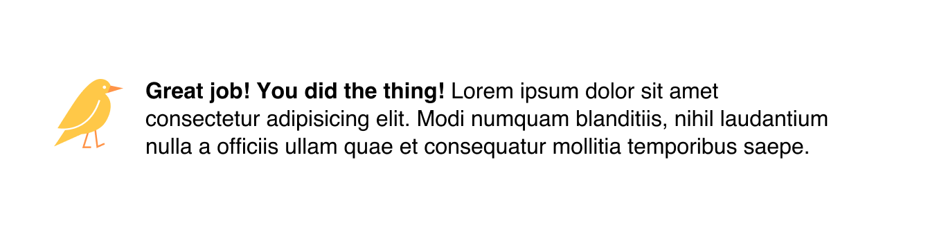
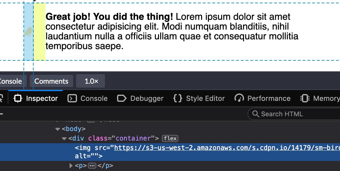
Yikes! Well, that's kinda okay, I guess. It makes sense that the image would bump right up against the text like that because we haven’t set a width on the image. Ideally, though, we’d like that image to have a fixed width and then the text should take up whatever space is left over.
This looks great in Chrome. But wait, what? If we inspect the image tag in Firefox DevTools, we’ll find that it’s not the width value that we set at all:
We could use min-width to force the image to the 50px width we want:
img {
  min-width: 50px;
  margin-right: 20px;
}
Buuuuuuut, that only sets helps with the width so we've got to put a margin in as well.
img {
  min-width: 50px;
  margin-right: 20px;
}
There we go. That's better in Firefox and still works in Chrome.
The even longer answer
I realized the image is getting the squished treatment because we need to use the flex-shrink property to tell flex items not to decrease in size, regardless of whether or not they have a width.
All flex-items have a flex-shrink value of 1. We need to set the image element to 0:
If we set the flex-shrink value to 0 and the flex-basis value to the default width we want the image to be, then we can get rid of the width property altogether.
That flex-shrink property solves a ton of other problems and is pretty dang important if you want to start using flexbox. Here’s another example why: I stumbled upon yet another problem like the one above and I mentioned it in a recent edition of the newsletter. I was building a navigation component that would let users scroll left and right through multiple items. I noticed the following problem when checking my work:
That longer navigation item shouldn’t break into multiple lines like that — but I finally understood why this was happening, thanks to the previous issue. If you set the flex-shrink property to 0 then it will tell each item in this navigation not to shrink and instead assume the width of the content instead, like this:
And, yes, we can go the extra step once again to use the flex property instead, this time using auto as the flex-basis since we want the maximum amount of space for all items to be considered when divvying up space in the navigation container.
I reckon that a lot of our uses of Sass maps can be replaced with CSS Custom properties – but hear me out for a sec.
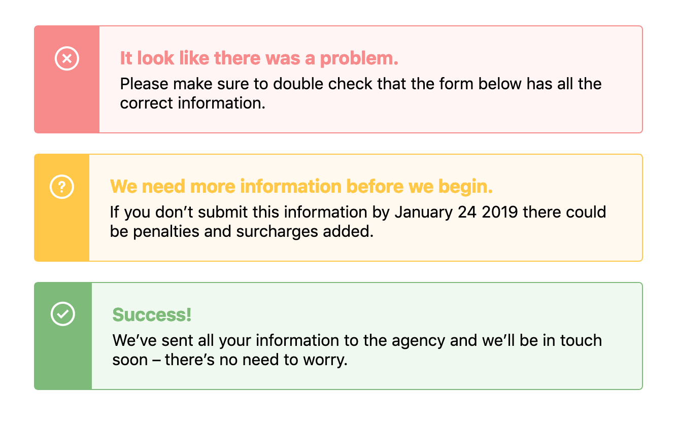
When designing components we often need to use the same structure of a component but change its background or text color based on a theme. For example, in an alert, we might need a warning style, an error style, and a success style – each of which might be slightly different, like this:
There’s a few ways we could tackle building this with CSS, and if you were asking me a couple of years ago, I would’ve tried to solve this problem with Sass maps. First, I would have started with the base alert styles but then I’d make a map that would hold all the data:
Pretty complicated, huh? This would output classes such as .alert-error, .alert-success and .alert-warning, each of which would have a bunch of CSS within them that overrides the default alert styles.
This would leave us with something that looks like this demo:
However! I’ve always found that using Sass maps and looping over all this data can become unwieldy and extraordinarily difficult to read. In recent projects, I’ve stumbled into fantastically complicated uses of maps and slowly closed the file as if I’d stumbled into a crime scene.
How do we keep the code easy and legible? Well, I think that CSS Custom Properties makes these kinds of loops much easier to read and therefore easier to edit and refactor in the future.
Let’s take the example above and refactor it so that it uses CSS Custom Properties instead. First we’ll set out core styles for the .alert component like so:
As we create those base styles, we can setup variables in our .alert class like this:
.alert {
  --theme: #ccc;
  --darkTheme: #777;
  --icon: '';
  background: var(--theme);
  border: 1px solid var(--darkTheme);
  /* other styles go here */

  &:before {
    background-image: var(--icon);
  }
}
We can do a lot more with CSS Custom Properties than changing an interface to a dark mode or theme. I didn’t know until I tried that it's possible to set an image in a custom property like that – I simply assumed it was for hex values.
Anyway! From there, we can style each custom .alert class like .alert-warning by overriding these properties in .alert:
However! I think there’s an enormous improvement here that’s been made in terms of legibility. It’s much easier to look at this code and to understand it right off the bat. With the Sass loop it almost seems like we are trying to do a lot of clever things in one place – namely, nest classes within other classes and create the class names themselves. Not to mention we then have to go back and forth between the original Sass map and our styles.
With CSS Custom Properties, all the styles are contained within the original .alert.
There you have it! I think there’s not much to mention here besides the fact that CSS Custom Properties can make code more legible and maintainable in the future. And I reckon that’s something we should all be a little excited about.
Although there is one last thing: we should probably be aware of browser support whilst working with Custom Properties although it’s pretty good across the board.
How do we avoid the most common mistakes when it comes to setting type on the web? That’s the question that’s been stuck in my head lately as I’ve noticed a lot of typography that’s lackluster, frustrating, and difficult to read. So, how can we improve interfaces so that our content is easy to read at all times and contexts? How do learn from everyone else’s mistakes, too?
These questions encouraged me to jot down some rules that are easy to apply and have the greatest impact on legibility, based on my own personal experience. And, if you didn't know, I'm kinda a geek when it comes to typography. So, I thought I'd share the following six rules that I've come to adopt to get us started.
Rule #1: Set a good max-width for paragraphs
This is typically referred to as the measure in typographic circles and highly esteemed typographers will recommend that a paragraph have a width of around 75 characters for legibility reasons. Anything longer than that becomes difficult to read and causes unnecessary strain on the eyes because of the distance the eye has to travel left-to-right and back again (assuming ltr that is).
Here’s a quick example of a good max-width setting for a paragraph. Oh, and make sure to check out this demo on larger screen devices.
Now, this all depends on a ton of factors that great designers contemplate when setting a paragraph. However, as web designers, the difficulty for us is that we have to make sure that paragraphs feel good in additional contexts, like on mobile devices, too. So, while this rule of ~75 characters is nice to have in our back pocket, it's most helpful when we’re trying to figure out the maximum width of our text block. More on this in a bit.
Also, I’d recommend setting that width on a container or grid class that wraps the paragraph instead of setting a max-width value on the paragraph element itself.
Kind of like this:
<div class="container">
  <p>This is where our text goes.</p>
</div>
Otherwise, there may be moments in the future when there's a need for certain paragraphs to be bigger and have a wider measure (like for introductory paragraphs perhaps). In those situations, making a different container class that just handles the larger width of the elements inside them is a nice and modular approach.
I’ve found that by having a system of classes that just deals with the width of things encourages writing much less code but also much more legible code as well. Although, yes, there is more HTML to write but I’d say that’s preferable to a lot of whacky CSS that has to be refactored in the future.
In short: make sure to set a good max-width for our paragraphs but also ensure that we set the widths on a parent class to keep our code readable.
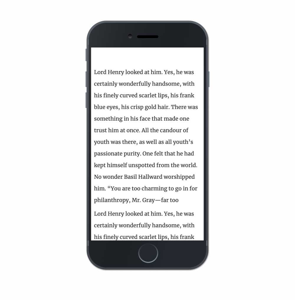
Rule #2: Make the line height smaller than you think
One problem I often see in the wild is with paragraphs that have a line height that’s just way too big. This makes reading long blocks of text pretty exhausting and cumbersome as each hop from one line to the next feels like an enormous jump.
On mobile devices this is particularly egregious as I tend to see something like this often:
For some reason, a lot of folks tend to think that paragraphs on smaller devices require a larger line-height value — but this isn’t the case! Because the width of paragraphs are smaller, line-height can be even smaller than you might on desktop displays. That’s because on smaller screens, and with smaller paragraphs, the reader’s eye has a much shorter distance to hop from the end of one line to the beginning of the next.
This demo certainly isn’t typographically perfect (there’s no such thing), but it’s much easier to read than the majority of websites I stumble across today. In this example, notice how the line-height is probably much smaller than you’re familiar with and see how it feels as you read it:
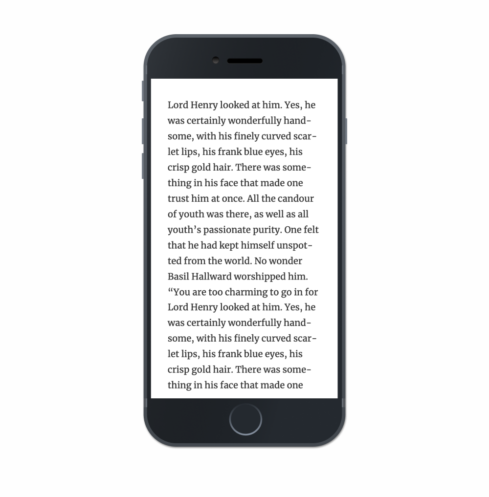
Another common mistake I frequently see is the use of very large margins on either side of a paragraph of text, it's often on mobile devices that make for blocks of text that are difficult to read like this:
Just — yikes! How are we expected to read this?
Instead try using no more than 10-15px of margin on either side of the paragraph because we need to ensure that our paragraphs are as wide as possible on smaller devices.
I even see folks bump the font-size down on mobile to try and have a nice paragraph width but I’d highly recommend to avoid this as well. Think of the context, because mobile devices are often held in front of the user's face. There's no need to force the user to bring the device any closer to read a small block of text.
Most of the time, smaller margins are the better solve.
Rule #4: Make sure that the type isn’t too thin
This is perhaps my biggest complaint when it comes to typography on the web because so many websites use extraordinarily thin sans-serif typefaces for paragraph text. This makes reading difficult because it’s harder to see each stroke in a letter when they begin to fade away into the background due to the lack of contrast.
Here’s an example of using a typeface that’s too thin:
Try and read the text there. Do you notice yourself struggling to read it? Because we’re using the light weight of Open Sans in this example, letterforms start to break apart and fall to bits. More focus is required to read it. Legibility decreases and reading becomes much more annoying than it really has to be.
I recommend picking a regular weight for body text, then trying to read a long string of text with those settings. Thin fonts look cute and pretty at a glance, but reading it in a longer form will reveal the difficulties.
Rule #5: Use bold weights for headings
Clear hierarchy is vital for controlling the focus of the reader, especially in complex applications that show a ton of data. And although it used to be more common a couple of years ago, I still tend to see a lot folks use very thin weights or regular weights for headings on websites. Again, this isn’t necessarily a die-hard rule — it’s a suggestion. That said, how difficult is it to scan this headline:
It’s a little difficult to see in this example but it's easy to missing the headline altogether in a large application with lots of UI. I’ve often found that inexperienced typographers tend to create hierarchy with font-size whilst experienced typographers will lead with font-weight instead.
Here’s an example of something much easier to scan:
In this example, I’ve set the paragraph text to a dark gray and the heading to a color closer to black while applying a bold weight. It’s not a substantial change in the code but it’s an enormous improvement in terms of hierarchy.
Little improvement like this will quickly add up to a better experience overall when the user is asked to slog through a ton of text.
Rule #6: Don’t use Lorem Ipsum to typeset a page
I think this advice might be the most underrated and I rarely hear it raised in front-end, typography, or design groups. I’ve even noticed seasoned designers struggle to typeset a page because Lorem Ipsum is used for the placeholder content, which makes it impossible for to gauge whether a paragraph of text is easy to read or not.
Setting text in Lorem Ipsum makes good typesetting kind of impossible.
Instead, pick text that you really enjoy reading. Ideally, typesetting would be done with finalized content but that's often a luxury in front-end development. That's why I’d recommend picking text that sounds close to the voice and tone of the project if there's a lack of actual content.
Seriously though, this one change will have an enormous impact on legibility and hierarchy because it encourages reading the text instead of looking at it all aesthetically. I noticed a massive improvement in my own designs when I stopped using undecipherable Lorem Ipsum text and picked content from my favorite novels instead.
And that’s it! There sure are a lot of rules when it comes to typography and these are merely the ones I tend to see broken the most. What kind of typographic issues do you see on the web though? Let us know in the comments!


