JavaScript Basics is the best beginner course for JavaScript at Treehouse. JavaScript is the world’s most popular programming language. What is JavaScript? JavaScript is a programming language that drives the web: from front-end user interface design to server-side backend programming,...
Treehouse is proud to announce an all-new learning Track: Learn to Code for Beginners. Learn to Code for Beginners is a two hour learning Track that will help you figure out your best career path in tech. Learn to Code...
Get started creating web pages with HTML and CSS, the basic building blocks of web development. Introduction to HTML & CSS is a 134 minute course from Treehouse teacher Treasure Porth that teaches HTML and CSS for beginners. HTML, or...
Python Basics is a popular course at Treehouse, and one that we recommend to all of our students. It’s the best way to learn Python for beginners. Why you should learn Python There are a number of popular programming languages...
The number of handheld devices operating worldwide is growing exponentially. According to stats, more than 90% of adults own a cell phone, whereas almost 50% of smartphone users admit that they could not live without their devices. What can we …
As there is an exponential growth in the number of mobile and tablet, it is important for the brands to ensure that their website design is user responsive and makes it easy for them to navigate easily. Listed below are the top reasons for choosing responsive web design: Mobile Usage Is on The Rise As […]
We all have a role to play in the building of a website. Designers create beautiful and interactive interfaces. Copywriters create messaging that gets visitors to take notice and action. Developers bring it all together with code.
But there’s one piece of the puzzle that can’t be handed off to just one person. And that’s SEO.
If you’re building websites for clients and they’re expecting impressive outcomes in the end (i.e. high conversion rates), SEO has to be part of your process. You can’t just leave it in the hands of your writer or a dedicated SEO and assume that’s enough.
Google is a demanding overlord and we must appease it if we want our websites to reach the top of search. And what that means is taking a well-rounded approach to SEO throughout the lifecycle of the website design and development process.
If you haven’t accounted for this already or you want to make sure you’ve covered all the bases in what you currently do, this post is for you. I’m going to run through when and how SEO needs to enter the picture in your workflow. In addition, I’ve included an SEO checklist at the bottom of this post that you and your team can adapt to your workflow.
Where Does SEO Belong in Your Web Design Process?
SEO should be something you’re always thinking about and planning for, from the prospecting phase all the way to the launch date.
SEO During the Proposal Phase
When you talk to a prospect about what they need your help for, they’re going to focus on the website itself.
“I need a website so I can sell my products online/grow my presence/get new customers.”
But that’s not really what they’re asking for. What they want is a website to help their business get found in Google and to convert visitors, which requires something more complex from you than just slapping together some copy and designs.
You know that the website needs to be optimized for search if the website is to do what the client needs it to. Because of this, it’s going to impact things like cost, timeline and process flow. All of these details should be mapped out on your end as you prepare the proposal.
As for what you actually tell your clients? This is where things get tricky.
You have to somehow address SEO with your prospect 1) to set the right expectations and 2) to justify what you’re about to propose to them in terms of scope and cost. The only problem is, some clients might know the term “SEO”, but they don’t really understand what it entails.
The conversation could quickly devolve into something like this:
You: [You explain the details of your design offering and mention that SEO is part of it.]
Client: “Oh, great. I have a list of 20 keywords I want included in every page.”
You: “Well, that’s not really what search engine optimization is. If you want your website to perform well, you need to pay attention to things like caching, security and mobile-first design.”
Client: “What are you talking about? Cashing? What even is that? I thought you said you do SEO. I want to rank for these 20 keywords.”
It’s your job to get clients the results they need, not to try and explain to them the technicalities of how you do it. That’s why they’re paying you to do this, after all. So, here’s what I’d recommend for your proposal and early discussions with clients:
First, let your website do all the talking about SEO like UPQODE’s does:
UPQODE briefly details the kinds of SEO services it provides. (Image source: UPQODE) (Large preview)
This would allow you to clearly spell out the kinds of SEO you provide (which will also help those SEO-minded clients find you in the first place). It’s okay to include technical terms here so long as you briefly explain what each is in layman’s terms:
UPQODE explains what’s involved in on-page SEO. (Image source: UPQODE) (Large preview)
What I like about this approach is that it enables you to say “We’re going to do X, Y and Z” while framing it in a light that the client actually understands. In this case, what you’d really be saying is “We handle all the technical stuff so your site’s visibility grows in search and, consequently, you get more traffic.”
This is how you should be talking to your prospects and laying out SEO-related details in your proposals and contracts, too.
In other words, don’t delve too much into your SEO tasks. Instead, just spell out the benefits. For example:
Responsive web design that looks great on all devices.
Web pages that load in three seconds or less for optimal visitor experiences.
Tightened up security to keep all your business data as well as your visitors’ data private.
Content that’s easy for humans to read and even easier for Google bots to understand.
Custom-built user pathways that turn visitors into customers in no time.
The goal is to get them onboard with your search-optimized web design services and perhaps even ongoing maintenance and support afterwards. To do that, you have to clearly convey the benefits without getting them wrapped up in the technicalities of SEO.
SEO During the Setup and Planning Phase
In the early phases of an approved project, SEO shouldn’t be far from your mind. While you might not actively be working on optimizations yet, it’s a good idea to make sure the baseline you’re working from won’t cause more work for you down the line.
Here are some things to keep in mind:
Review the Client’s Design Assets
You probably ask clients to provide you with assets, logins and even copy before a project gets underway. While this is mainly to protect yourself from scope creep, it can also come in handy for SEO.
Say your client hands over logos and other image assets that are really low quality or look super outdated. The earlier you have these assets in hand, the sooner you can let them know that they need to be replaced if they want people to take their website seriously.
If visitors don’t like the look of a website, they’re going to abandon it without fail and that high bounce rate is going to kill the site’s ranking. So, make sure your clients don’t stand in the way of the results you’re trying to help them achieve.
Work in Tandem with the Copywriter
Even if a professional copywriter is creating the content for your website, if you’re not working closely with them from the start, there could be problems.
Web design agencies often debate the merits of content-first website development vs. design-first. The truth is, they should be created together. If you don’t, you put the whole project at risk.
For starters, a writer and designer working in isolation are bound to come up with different ways to handle style and layout. But if you establish guidelines from the get-go (which you can easily do with wireframes), you can avoid any disjoint in how the copy and design are created.
Designers can use a tool like Wireframe.cc to create wireframes that both they and the writer can work out of. (Image source: Wireframe.cc) (Large preview)
You’re going to wireframe any website you build anyway, so why not provide a copy of it to the writer so you two can be on the same page from the beginning? Even better, why not collaborate with the writer? They might not know design techniques or best practices, but they can certainly provide insight on things like optimal text length, the priority of certain sales or marketing messages and so on.
Then, there’s the matter of optimizing copy for search. Ideally, you’d want to work with a copywriter who can do the following:
Create actionable messaging and CTAs,
Naturally weave target keywords into the copy,
Write for user intent,
Write in HTML,
Create copy that’s both readable and scannable,
Build a system of internal links from page to page,
Create meta tags and optimize URLs for search,
Write alt tags for images.
The more of this that gets built into the copy from the get-go, the less back-and-forth you have to do with them later. It’ll also spare you the trouble of trying to fix this on your own (which you shouldn’t attempt to do).
Design for Sales Funnels
In order to increase conversions on a site, you should be designing sales funnels into them. But sales funnels aren’t just a series of steps that you lay down for visitors on the website.
It all begins with understanding user intent outside of the site. If you know what draws visitors to your site from search engines and social media, you can design your metadata and landing pages to align with that intent.
Again, if you do the research and planning upfront with SEO in mind, you’ll have less cleanup work to do later.
SEO During Design and Development
This, obviously, is the most important and labor-intensive stage for you. And while it’s easy to get wrapped up in designing and coding, it’s important not to lose sight of SEO here.
What I’d recommend is creating a universal SEO checklist you can use from project to project. If you account for every possible optimization now, you can take the guesswork out of SEO. Plus, a checklist allows you to become better acquainted with everything that needs to be done, which will enable you to find more efficient ways of building search optimizations into your process.
To help you along, I’ve created the following SEO checklist. Feel free to copy and use for your own needs:
Technical SEO
Web hosting with 99.9%+ uptime
Domain with clean web history
SSL certificate installed
Firewall implemented
Caching enabled (page, browser, object, etc.)
Image compression and resizing (in-house system or automated)
Automated backups
Google Analytics account connected
Google Analytics goal tracking, ecommerce tracking and other special tracking enabled
Google Search Console account connected
XML sitemap set up and submitted to Google
Separate sitemap submitted for images and for videos
Robots.txt set up
Schema.org markup (when relevant) written
Design SEO
Information architecture mapped out
Responsive web design
Mobile-first web design
1 clear CTA per page
Custom 404 page set up
All links, buttons and forms tested and working
On-page SEO
1 unique focus keyword per page
Focus keyword density between 1-3%
50-60 character meta title including the focus keyword
150-160 character meta description including the focus keyword
Short but descriptive slug including the focus keyword
Error-free content
At least 1 relevant internal link per page
Featured image for each page
Descriptive alt text for each image
Header tags used (focus keyword included in at least 1)
Headers appear every 300 words or so
Sentences stretch no more than two lines
Paragraphs stretch no more than five lines
Duplicate content analysis
Plagiarism check
Local SEO
Google My Business page set up
Geo-specific keywords included
Location-specific pages created (when relevant)
Contact information provided (e.g. phone number, address, etc.)
Ongoing SEO Support
Web server uptime, speed and security analysis
Page speed testing
Security monitoring
Google blacklist monitoring
Keyword rank monitoring
Broken link checking
Software updates
A Few Notes
Anything that’s not relevant to the kinds of clients you serve or the kinds of services you offer, delete the row.
If there’s anything I’m missing, feel free to add it on (like if you specialize in e-commerce design and want to prep product pages to appear in Google Shopping results).
If you’re not comfortable checking the on-page SEO stuff, hand it off to a proofreader or editor (someone who didn’t do the copywriting).
For those of you looking for additional opportunities to make money, this SEO checklist can also be used to analyze an existing website and present a prospective client with a website redesign or optimization plan.
Wrapping Up
Keyword optimization and link building are only part of the SEO puzzle. As a web designer or developer, you have a huge contribution to make here as well.
Whether it’s in the quality of code written on the backend, the way images are optimized or how well-secured the site is, these are the kinds of tasks you’re responsible for managing that no writer or SEO is going to or should handle. And, without these optimizations, Google and your visitors will fail to take notice of the site you worked so hard to build for them.
There are constantly new features appearing in browsers—from subgrid to variable fonts to better developer tools. It's a really great time to be re-thinking everything we know about design on the web. Responsive design has served us well over the years, but it's still rooted in the limitations of the web from 2010. Ten years later, we're able to create more "Intrinsic" designs (a term coined by Jen Simmons) and hopefully, re-think some "best practices" that are now holding us back.
That's exciting but even more interesting to me in the context of a universal web. I began my career during the height of the Web Standards Project, CSS Zen Garden, Designing with Web Standards, and A Dao of Web Design—saturated in the philosophy of universally accessible design. CSS was relatively new, and explicitly designed to balance the desires of a web-creator (like me) with the needs of each individual user (also me), on any number of devices. Terms like "progressive enhancement" and "unobtrusive JavaScript" dominated the industry. We were moving away from "only works in X browser" warnings, to embrace an accessible and resilient user-centered medium.
Over the years, some of those concerns have become industry best-practice. CSS is now standard, and responsive design is the norm. But I also see (and build!) more and more apps targeted at a narrow range of modern, evergreen browsers. Or we ignore new features for years in order to support a browser like IE11. We've become resigned to a sense that browser support is binary, and we can only use the features that exactly match our "supported" browsers.
There are many reasons for that shift, including excitement around very cool new features. I don't think it's surprising for an industry to have these cycles, but I do think it's time to reflect on where we're heading. These new features are designed with universal accessibility in mind, and we also have new features for managing browser-support on a continuum, much like viewport-size.
Whatever we want to call it—Intrinsic Design, Resilient CSS, Progressive Enhancement, Universal Accessibility, or something else—I think we're poised for a new movement and a new era of web creation. It's time for us to take the lessons we learned from Responsive Web Design, adapting to screen sizes, and expand out: adapting to screen readers, legacy browsers, "smart" speakers, and any number of other interfaces.
I'm interested in new methodologies and conventions that move past managing specificity and cascade, or phones and laptops, to help us all manage accessibility and universal compatibility. I'm interested in finding ways to embrace all that is wonderful and new on the web, without abandoning the beautiful vision of a universal web. We have the tools. Let's do this.
Phillip Walton shows how to deploy native JavaScript modules in production today and improve the load and runtime performance of your site by doing so.
NuxtPress is a microframework that will automatically register routes, templates and configuration options in your Nuxt application. It also takes care of loading Markdown files and making pre-rendered static files automatically available.
Over the last few years, the browsing habits of end users have evolved to include a variety of devices. As a result, responsive web design is a necessity for every website that is developed today. However, creating a responsive design from scratch for every project can be time-consuming. One great solution that makes your life easier is to use a CSS framework. Such a framework takes care of basic responsive design principles for you. In this comparison, we take a look at some of the best CSS frameworks out there and see which is best. Here’s Bootstrap vs Foundation vs Bulma vs Semantic vs UIkit.
I hate to admit it, but five or six years ago my interest in web design started to wane. Of course, owning a business meant I had to keep working, but staying motivated and offering my best thinking to clients became a daily struggle.
Looking at the web didn’t improve my motivation. Web design had stagnated, predictability had replaced creativity, and ideas seemed less important than data.
The reasons why I’d enjoyed working on the web no longer seemed relevant. Design had lost its joyfulness. Complex sets of build tools and processors had even supplanted the simple pleasure of writing HTML and CSS.
When I began working with the legendary newspaper and magazine designer Mark Porter, I became fascinated by art direction and editorial design. As someone who hadn’t studied either at art school, everything about this area of design was exciting and new. I read all the books about influential art directors I could find and started collecting magazines from the places I visited around the world.
The more inspired I became by mag- azine design, the faster my enthusiasm for web design bounced back. I wondered why many web designers think that print design is old-fashioned and irrelevant to their work. I thought about why so little of what makes print design special is being transferred to the web.
My goal became to hunt for inspiring examples of editorial design, study what makes them unique, and find ways to adapt what I’d learned to create more compelling, engaging, and imaginative designs for the web.
My bookcases are now chock full of magazine design inspiration, but my collection is still growing. I have limited space, so I’m picky about what I pick up. I buy a varied selection, and rarely collect more than one issue of the same title.
I look for exciting page layouts, inspiring typography, and innovative ways to combine text with images. When a magazine has plenty of interesting design elements, I buy it. However, if a magazine includes only a few pieces of inspiration, I admit I’m not above photographing them before putting it back on the shelf.
I buy new magazines as regularly as I can, and a week before Christmas, a few friends and I met in London. No trip to the “Smoke” is complete without a stop at Magma, and I bought several new magazines. After I explained my inspiration addition, one friend suggested I write about why I find magazine design so inspiring and how magazines influence my work.
That conversation sparked the idea for a series on making inspired design decisions. Every month, I’ll choose a publication, discuss what makes its design distinctive, and how we might learn lessons which will help us to do better work for the web.
As an enthusiastic user of HTML and CSS, I’ll also explain how to implement new ideas using the latest technologies; CSS Grid, Flexbox, and Shapes.
I’m happy to tell you that I’m inspired and motivated again to design for the web and I hope this series can inspire you too.
Andy Clarke April 2019
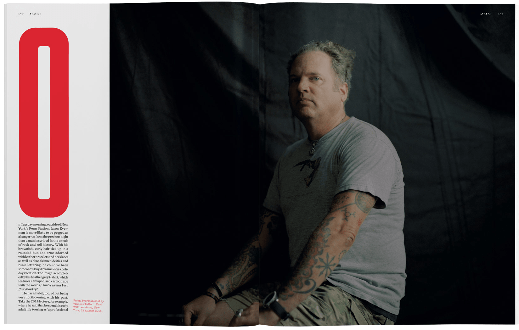
Avaunt Magazine: Documenting The Extraordinary
What struck me most about Avaunt was the way its art director has colour, layout, and type in diverse ways while maintaining a consistent feel throughout the magazine. (Large preview)
One look at me is going to tell you I’m not much of an adventurer. I don’t consider myself particularly cultured and my wife jokes regularly about what she says is my lack of style.
So what drew me to Avaunt magazine and its coverage of “adventure,” “culture,” and “style” when there are so many competing and varied magazines?
It often takes only a few page turns for me to decide if a magazine offers the inspiration I look for. Something needs to stand out in those first few seconds for me to look closer, be it an exciting page layout, an inspiring typographic treatment, or an innovative combination of images with text.
Avaunt has all of those, but what struck me most was the way its art director has used colour, layout, and type in diverse ways while maintaining a consistent feel throughout the magazine. There are distinctive design threads which run through Avaunt’s pages. The bold uses of a stencil serif and geometric sans-serif typeface are particularly striking, as is the repetition of black, white, a red which Avaunt’s designers use in a variety of ways. Many of Avaunt’s creative choices are as adventurous as the stories it tells.
Plenty of magazines devote their first few spreads to glossy advertising, and Avaunt does the same. Flipping past those ads finds Avaunt’s contents page and its fascinating four-column modular grid.
This layout keeps content ordered within spacial zones but maintains energy by making each zone a different size. This layout could be adapted to many kinds of online content and should be easy to implement using CSS Grid. I’m itching to try that out.
For sans-serif headlines, standfirsts, and other type elements which pack a punch, Avaunt uses MFred, designed initially for Elephant magazine by Matt Willey in 2011. Matt went on to art direct the launch of Avaunt and commissioned a stencil serif typeface for the magazine’s bold headlines and distinctive numerals.
Avaunt Stencil was designed in 2014 by London based studio A2-TYPE who have since made it available to license. There are many stencil fonts available, but it can be tricky to find one which combines boldness and elegance — looking for a stencil serif hosted on Google Fonts? Stardos would be a good choice for display size type. Need something more unique, try Caslon Stencil from URW.
Avaunt’s use of a modular grid doesn’t end with the contents page and is the basis for a spread on Moscow’s Polytechnic Museum of Cold War curiosities which first drew me to the magazine. This spread uses a three-column modular grid and spacial zones of various sizes.
What fascinates me about this Cold War spread is how modules in the verso page combine to form a single column for text content. Even with this column, the proportions of the module grid still inform the position and size of the elements inside.
While the design of many of Avaunt’s pages is devoted to a fabulous reading experience, many others push the grid and pull their foundation typography styles in different directions. White text on dark backgrounds, brightly coloured spreads where objects are cut away to blend with the background. Giant initial caps which fill the width of a column, and large stencilled drop caps which dominate the page.
Avaunt’s playful designs add interest, and the arrangement of pages creates a rhythm which I very rarely see online. These variations in design are held together by the consistent use of Antwerp — also designed by A2-TYPE — as a typeface for running text, and a black, white, and red colour theme which runs throughout the magazine.
Studying the design of Avaunt magazine can teach and inspire. How a modular grid can help structure content in creative ways without it feeling static. (I’ll teach you more about modular grids later.)
How a well-defined set of styles can become the foundation for distinctive and diverse designs, and finally how creating a rhythm throughout a series of pages can help readers stay engaged.
Next time you’re passing your nearest magazine store, pop in a pick up a copy of Avaunt Magazine. It’s about adventure, but I bet it can help inspire your designs to be more adventurous too.
Say Hello To Skinny Columns
For what feels like an eternity, there’s been very little innovation in grid design for the web. I had hoped the challenges of responsive design would result in creative approaches to layout, but sadly the opposite seems to be true.
Top: Squeezing an image into one column reduces its visual weight and upsets the balance of my composition. Middle: Making the image fill two standard columns also upsets that delicate balance. Bottom: Splitting the final column, then add- ing half its width to another, creates the perfect space for my image, and a more pleasing overall result. (Large preview)
Instead of original grid designs, one, two, three, or four block arrangements of content became the norm. Framework grids, like those included with Bootstrap, remain the starting point for many designers, whether they use those frameworks or not.
It’s true that there’s more to why so much of the web looks the same as web designers using the same grid. After all, there have been similar conventions for magazines and newspapers for decades, but somehow magazines haven’t lost their personality in the way many websites have.
I’m always searching for layout inspiration and magazines are a rich source. Reading Avaunt reminded me of a technique I came across years ago but hadn’t tried. This technique adds one extra narrow column to an otherwise conventional column grid. In print design, this narrow column is often referred to as a “bastard column or measure” and describes a block of content which doesn’t conform to the rest of a grid. (This being a family friendly publication, I’ll call it a “skinny column.”)
In these first examples, squeezing an image into one column reduces its visual weight and upsets the balance of my composition. Making the image fill two standard columns also upsets that delicate balance.
Splitting the final column, then adding half its width to another, creates the perfect space for my image, and a more pleasing overall result.
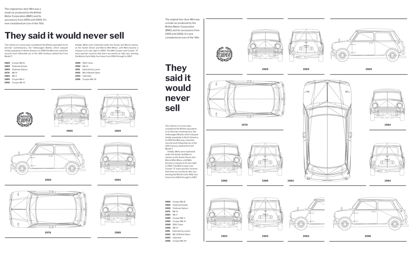
I might use a skinny column to inform the width of design elements. This Mini Cooper logo matches the width of my skinny column, and its size feels balanced with the rest of my composition.
Sometimes, content won’t fit into a single column comfortably, but by combining the widths of standard and skinny columns, I create more space and a better measure for running text. I can place a skinny column anywhere within a layout to wherever I need my content.
An empty skinny column adds whitespace which allows the eye to roam around a design. The asymmetry created by placing a skinny column between two standard columns also makes a structured layout feel more dynamic and energetic.
Another empty skinny column carves a wide gutter into this design and confines my running text to a single column, so that its height reflects the image’s vertical format. I can also use a skinny column to turn typographic elements into exciting design elements.
Developing With Skinny Columns
Designs like these are surprisingly simple to implement using today’s CSS. I need just four structural elements; a logo, header, figure, plus an article to contain my running text:
I start with a design for medium size screens by applying CSS Grid to the body element within my first media query. At this size, I don’t need a skinny column so instead am developing a symmetrical three-column grid which expands evenly to fill the viewport width:
@media screen and (min-width : 48em) {
body {
display: grid;
grid-template-columns: 1fr 1fr 1fr;
grid-column-gap: 2vw; }
}
I use line numbers to place items into my grid columns and rows. I place my logo into the skinny first column and the first row using a substring matching attribute selector. This targets an image with “logo” anywhere in its source value:
[src*="logo"] {
grid-column: 1;
grid-row: 1; }
Next, I place the header element — containing my headline and standfirst paragraph — into the second row. Using line numbers from 1 to -1 spreads this header across all columns:
header {
grid-column: 1 / -1;
grid-row: 2; }
With display:grid; applied, all direct descendants of a grid-container become grid-items, which I can place using areas, line numbers, or names.
This design includes a figure element with a large Mini image, plus caption text about the original Cooper model design. This figure is crucial because it describes a relationship between the img and figcaption. However, while this figure makes my markup more meaningful, I lose the ability to place the img and figcaption using CSS Grid, because by neither are direct descendants of the body where I defined my grid.
Luckily, there’s a CSS property which — when used thoughtfully — can overcome this problem. I don’t need to style the figure, I only need to style its img and figcaption. By applying display:contents; to my figure, I effectively remove it from the DOM for styling purposes, so its descendants take its place:
figure {
display: contents; }
It’s worth noting that although display effectively removes my figure from the DOM for styling purposes, any properties which inherit — including font sizes and styles — are still inherited:
It’s time to implement a design which includes a skinny column for larger screens. I use a media query to isolate these new styles, then I create a five-column grid which starts with a 1fr wide skinny column:
@media screen and (min-width : 64em) {
body {
grid-template-columns: 1fr repeat(4, 2fr); }
}
Radically changing how a design looks using CSS alone, without making changes to the structure of HTML makes me smile, even after almost two decades. I also smile when I change the composition to create a dramatically different layout without changing the grid. For this alternative design, I’m aiming for a more structured look.
To improve the readability of my running text, I divide into three columns. Then, to separate this block of content from other text elements, I place my skinny column between the first two standard columns. There’s no need to change the structure of my HTML. All I need are minor changes to grid values in my stylesheet. This time, my 1fr wide skinny column value comes between two standard column widths:
@media screen and (min-width : 64em) {
body {
grid-template-columns: 2fr 1fr 2fr 2fr 2fr; }
}
I place my header in the second row and the article in a row directly underneath:
Because neither the img and figcaption are direct descendants of the body element where I defined my grid, to place them I need the display:contents; property again:
Depending on how you use them, introducing skinny columns into your designs can make content more readable or transform a static layout into one which feels dynamic and energetic.
Skinny columns are just one example of learning a technique from print and using it to improve a design for the web. I was itching to try out skinny columns and I haven’t been disappointed.
Adding a skinny column to your designs can often be an inspired decision. It gives you extra flexibility and can transform an otherwise static layout into one which is filled with energy.
Designing Modular Grids
Avaunt magazine contains plenty of inspiring layouts, but I want to focus on two pages in particular. This spread contains ‘Cold War Design’ objects within a design which could be applied to a wide variety of content types.
‘Cold War Design’ from Avaunt magazine issue 7, January 2019. (Large preview)
On first glance, modular grids can look complicated, however, they’re easy to work with. It surprises me that so few web designers use them. I want to change that.
When you use modular grids thoughtfully, they can fill your designs with energy. They’re excellent for bringing order to large amounts of varied content, but can also create visually appealing layouts when there’s very little content.
For this design — inspired by Avaunt — I base my modular grid on six symmetrical columns and four evenly spaced rows. Grid modules define the placement and size of my content.
Modular grid design inspired by Avaunt. (Large preview)
I bind several modules together to create spacial zones for large images and running text in a single-column on the left. Boundary lines help emphasise the visual structure of the page.
This type of layout might seem complicated at first, but in reality, it’s beautifully simple to implement. Instead of basing my markup on the visual layout, I start by using the most appropriate elements to describe my content. In the past, I would’ve used table elements to implement modular grids. Fast forward a few years, and divisions replaced those table cells. Incredibly, now I need just two structural HTML elements to accomplish this design; one article followed by an ordered list:
<body>
<article>…</article>
<ol>…</ol>
</body>
That article contains a headline, paragraphs, and a
table for tabular information:
The modular grid of Mini blueprints is the most complicated visual aspect of my design, but the markup which describes it is simple. The blueprints are in date order, so an ordered list seems the most appropriate HTML element:
My HTML weighs in at only 2Kb and is under sixty lines. It’s a good idea to validate that markup as a little time spent validating early will save plenty more time on debugging CSS later. I also open the unstyled page in a browser as I always need to ensure my content’s accessible without a stylesheet.
I begin developing a symmetrical three-column layout for medium size screens by isolating grid styles using a media query:
@media screen and (min-width : 48em) {
body {
display: grid;
grid-template-columns: 1fr 1fr 1fr;
grid-column-gap: 2vw; }
}
The article and ordered list are the only direct descendants of body, but it’s what they contain which I want to place as grid-items. I use display:contents; to enable me to place their contents anywhere on my grid:
article, ol {
display: contents; }
Every element in my article should span all three columns, so I place them using line numbers, starting with the first line (1), and ending with the final line (-1):
The items in my ordered list are evenly placed into the three-column grid grid. However, my design demands that some items span two columns and one spans two rows. nth-of-type selectors are perfect tools for targetting elements without resorting to adding classes into my markup. I use them, the span keyword, and the quantity of columns or rows I want the items to span:
When elements don’t fit into the available space in a grid, the CSS Grid placement algorithm leaves a module empty. (Large preview)
Previewing my design in a browser, I can see it’s not appearing precisely as planned because some grid modules are empty. By default, the normal flow of any document arranges elements from left to right and top to bottom, just like western languages. When elements don’t fit the space available in a grid, the CSS Grid placement algorithm leaves spaces empty and places elements on the following line.
A browser fills any empty module with the next element which can fit into that space without altering the source order. This may have implications for accessibility. (Large preview)
I can override the algorithm’s default by applying the grid-auto-flow property and a value of dense to my grid-container, in this case the body:
body {
grid-auto-flow: dense; }
Row is the default grid-auto-flow value, but you can also choose column, column dense, and row dense. Use grid-auto-flow wisely because a browser fills any empty module with the next element in the document flow which can fit into that space. This behaviour changes the visual order without altering the source which may have implications for accessibility.
My medium size design now looks just like I’d planned, so now it’s time to adapt it for larger screens. I need to make only minor changes to the grid styles to first turn my article into a sidebar — which spans the full height of my layout — then place specific list items into modules on a larger six-column grid:
Keeping track of grid placement lines can sometimes be difficult, but fortunately, CSS Grid offers more than one way to accomplish a modular grid design. Using grid-template-areas is an alternative approach and one I feel doesn’t get enough attention.
Using grid-template-areas, I first define each module by giving it a name, then place elements into either one module or several adjacent modules known as spacial zones. This process may sound complicated, but it’s actually one of the easiest and most obvious ways to use CSS Grid.
I give each element a grid-area value to place it in my grid, starting with the logo and article:
Next, I assign a grid-area to each of my list items. I chose a simple i+n value, but could choose any value including words or even letters like a, b, c, or d.
My grid has six explicit columns, and four implicit rows, the height of which are being defined by the height of the content inside them. I draw my grid in CSS using the grid-template-areas property, where each period (.) represents a grid module:
Then, I place elements into that grid using the grid-area values I defined earlier. If I repeat values across multiple adjacent modules — across either columns or rows — that element expands to create a spacial zone. Leaving a period (.) creates an empty module:
In every example so far, I isolated layout styles for different screen sizes using media query breakpoints. This technique has become the standard way of dealing with the complexities of responsive web design. However, there’s a technique for developing responsive modular grids without using media queries. This technique takes advantage of a browser’s ability to reflow content.
I need make only minor changes to my grid styles to adapt this layout for larger screens. The sidebar article on the left and each list item are placed into my grid. (Large preview)
Before going further, it’s worth remembering that my design requires just two structural HTML elements; one ordered list for the content and an article which I transform into a sidebar when there’s enough width available for both elements to stand side-by-side. When there’s insufficient width, those elements stack vertically in the order of the content:
<body>
<article>…</article>
<ol>…</ol>
</body>
The ordered list forms the most important part of my design and should always occupy a minimum 60% of a viewport’s width. To ensure this happens, I use a min-width declaration:
ol {
min-width: 60%; }
While I normally recommend using CSS Grid for overall page layout and Flexbox for flexible components, to implement this design I turn that advice on its head.
I make the body element into a flex-container, then ensure my article grows to fill all the horizontal space by using the flex-grow property with a value of 1:
body {
display: flex; }

article {
flex-grow: 1; }
To make sure my ordered list also occupies all available space whenever the two elements stand side-by-side, I give it a ridiculously high flex-grow value of 999:
article {
flex-grow: 999; }
Using flex-basis provides an ideal starting width for the article. By setting the flex container’s wrapping to wrap, I ensure the two elements stack when the list’s minimum width is reached, and there’s insufficient space for them to stand side-by-side:
body {
flex-wrap: wrap; }

article {
flex-basis: 20rem; }
I want to create a flexible modular grid which allows for any number of modules. Rather than specifying the number of columns or rows, using repeat allows a browser to create as many modules as it needs. autofill fills all available space, wrapping the content where necessary. minmax gives each module a minimum and maximum width, in this case 10rem and 1fr:
ol {
grid-template-columns: repeat(auto-fill, minmax(10rem, 1fr)); grid-column-gap: 2vw; }
To avoid modules staying empty, I use grid-auto-flow again with a value of dense. The browser’s algorithm will reflows my content to fill any empty modules:
ol {
grid-auto-flow: dense; }
Just like before, some list items span two columns, and one spans two rows. Again, I use nth-of-type selectors to target specific list items, then grid-column or grid-row with the span keyword followed by the number of columns or rows I want to span:
By using of modern CSS including Grid and Flexbox, relying on browsers’ ability to reflow content, plus a few smart choices on minimum and maximum sizes, this approach comes closest to achieving the goals of a truly responsive web.
If you search for how to style apps for the web, you’ll come across many different approaches and libraries, some even changing day by day. Block Element Modifier (BEM); preprocessors such as Less and SCSS; CSS-in-JS libraries, including JSS and styled-components; and, lately, design systems. You come across all of these in articles and blogs, tutorials and talks, and — of course — debates on Twitter.
How do we choose between them? Why do so many approaches exist in the first place? If you’re already comfortable with one method, why even consider moving to another?
In this article, I’m going to take a look at the tools I have used for production apps and sites I’ve worked on, comparing features from what I’ve actually encountered rather than summarizing the content from their readmes. This is my journey through BEM, SCSS, styled-components, and design systems in particular; but note that even if you use different libraries, the basic principles and approach remain the same for each of them.
CSS Back In The Day
When websites were just getting popular, CSS was primarily used to add funky designs to catch the user’s attention, such as neon billboards on a busy street:
Microsoft’s first site (left) and MTV’s site from the early 2000s. (Large preview)
Its use wasn’t for layout, sizing, or any of the basic needs we routinely use CSS for today, but as an optional add-on to make things fancy and eye-catching. As features were added to CSS, newer browsers supporting a whole new range of functionality and features appeared, and the standard for websites and user interfaces evolved — CSS became an essential part of web development.
It’s rare to find websites without a minimum of a couple hundred lines of custom styling or a CSS framework (at least, sites that don’t look generic or out of date):
Wired’s modern responsive site from InVision’s responsive web design examples post. (Large preview)
What came next is quite predictable. The complexity of user interfaces kept on increasing, along with the use of CSS; but without any guidelines suggested and with a lot of flexibility, styling became complicated and dirty. Developers had their own ways of doing things, with it all coming down to somehow getting things to look the way the design said it was supposed to be.
This, in turn, led to a number of common issues that many developers faced, like managing big teams on a project, or maintaining a project over a long period of time, while having no clear guides. One of the main reasons this happens even now, sadly, is that CSS is still often dismissed as unimportant and not worth paying much attention to.
CSS Is Not Easy To Manage
There’s nothing built into CSS for maintenance and management when it comes to large projects with teams, and so the common problems faced with CSS are:
Lack of code structure or standards greatly reduces readability;
Maintainability as project size increases;
Specificity issues due to code not being readable in the first place.
If you’ve worked with Bootstrap, you’ll have noticed you’re unable to override the default styles and you might have fixed this by adding !important or considering the specificity of selectors. Think of a big project’s style sheets, with their large number of classes and styles applied to each element. Working with Bootstrap would be fine because it has great documentation and it aims to be used as a solid framework for styling. This obviously won’t be the case for most internal style sheets, and you’ll be lost in a world of cascaded styles.
In projects, this would be like a couple thousand lines of CSS in a single file, with comments if you’re lucky. You could also see a couple of !important used to finally get certain styles to work overriding others.
Which of the styles applied to the same element would be applied to the image on the right, assuming they both point to it?
What is the order of weight of selectors such as inline styles, IDs, classes, attributes, and elements? Okay, I made it easy there; they’re in order of weight:
Start at 0; add 1,000 for a style attribute; add 100 for each id; add 10 for each attribute, class or pseudo-class; add 1 for each element name or pseudo-element.
This is a simplified way of calculating and representing specificity which works in usual cases, but do note that the real representation would look like: (0,0,0,0). Here, the first number signifies the style attribute, second the ID, and so on. Each selector can actually have a value greater than 9 and it’s only when there is an equal number of selectors of highest weight that selectors of lower weight are considered.
Do you see why the second example was the correct answer? The id selector clearly has far more weight than element selectors. This is essentially the reason why your CSS rule sometimes doesn’t seem to apply. You can read about this in detail in Vitaly Friedman’s article, “CSS Specificity: Things You Should Know”.
The larger the codebase, the greater the number of classes. These might even apply to or override different styles based on specificity, so you can see how quickly it can become difficult to deal with. Over and above this we deal with code structure and maintainability: it’s the same as the code in any language. We have atomic design, web components, templating engines; there’s a need for the same in CSS, and so we’ve got a couple of different approaches that attempt to solve these different problems.
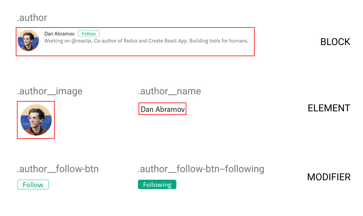
Block Element Modifier (BEM)
“BEM is a design methodology that helps you to create reusable components and code sharing in front-end development.”
— getbem.com
The idea behind BEM is to create components out of parts of apps that are reused or are independent. Diving in, the design process is similar to atomic design: modularize things and think of each of them as a reusable component.
I chose to start out managing styles with BEM as it was very similar the way React (that I was already familiar with) breaks down apps into reusable components.
BEM is nothing more than a guide: no new framework or language to learn, just CSS with a naming convention to organize things better. Following this methodology, you can implement the patterns you’ve already been using, but in a more structured manner. You can also quite easily do progressive enhancements to your existing codebase as it requires no additional tooling configuration or any other complexities.
Advantages
At its heart BEM manages reusable components, preventing random global styles overriding others. In the end, we have more predictable code, which solves a lot of our specificity problems.
There’s not much of a learning curve; it is just the same old CSS with a couple of guides to improve maintainability. It is an easy way of making code modular by using CSS itself.
Drawbacks
While promoting reusability and maintainability, a side effect of the BEM naming principle is making naming the classes difficult and time-consuming.
The more nested your component is in the block, the longer and more unreadable the class names become. Deeply nested or grandchild selectors often face this issue.
<div class="card__body">
  <p class="card__body__content">Lorem ipsum lorem</p>
  <div class="card__body__links">
    <!-- Grandchild elements -->
    <a href="#" class="card__body__links__link--active">Link</a>
  </div>
</div>
That was just a quick intro to BEM and how it solves our problems. If you’d like to take a deeper look into its implementation, check out “BEM For Beginners” published here in Smashing Magazine.
Sassy CSS (SCSS)
Put blandly, SCSS is CSS on steroids. Additional functionality such as variables, nesting selectors, reusable mixins, and imports help SCSS make CSS more of a programming language. For me, SCSS was fairly easy to pick up (go through the docs if you haven’t already) and once I got to grips with the additional features, I’d always prefer to use it over CSS just for the convenience it provided. SCSS is a preprocessor, meaning the compiled result is a plain old CSS file; the only thing you need to set up is tooling to compile down to CSS in the build process.
Super handy features
Imports help you split style sheets into multiple files for each component/section, or whichever makes readability easier.
Note: SCSS mixin: Check out more handy SCSS features over here.
Nesting of selectors improves readability as it works the same way HTML elements are arranged: in a nested fashion. This approach helps you recognize hierarchy at a glance.
BEM With SCSS
It is possible to group the code for components into blocks, and this greatly improves readability and helps in ease of writing BEM with SCSS:
This code is relatively less heavy and complicated as opposed to nesting multiple layers. (Large preview)
Note: For further reading on how this would work, check out Victor Jeman’s “BEM with Sass” tutorial.
Styled-Components
This is one of the most widely used CSS-in-JS libraries. Without endorsing this particular library, it has worked well for me, and I’ve found its features quite useful for my requirements. Take your time in exploring other libraries out there and pick the one that best matches your needs.
I figured a good way to get to know styled-components was to compare the code to plain CSS. Here’s a quick look at how to use styled-components and what it’s all about:
Instead of adding classes to elements, each element with a class is made into a component. The code does look neater than the long class names we have with BEM.
Interestingly, what styled-components does under the hood is take up the job of adding relevant classes to elements as per what’s specified. This is essentially what we do in style sheets (note that it is in no way related to inline styling).
Why Are Styled-Components One Of The Widely Used CSS-In-JS Libraries?
For styling, here we’re just using template literals with normal CSS syntax. This allows you to use the full power of JavaScript to handle the styling for you: conditionals, properties passed in as arguments (using an approach similar to React), and essentially all the functionality that can be implemented by JavaScript.
While SCSS has variables, mixins, nesting, and other features, styled-components only adds on, making it even more powerful. Its approach, based heavily on components, might seem daunting at first since it’s different from traditional CSS. But as you get used to the principles and techniques, you’ll notice that everything possible with SCSS can be done in styled-components, as well as a lot more. You just use JavaScript instead.
Note: Template literals in styled-components allow you to use JS directly for conditional styling and more.
Another thing to note is how perfectly this fits into the world of web components. A React component has its own functionality with JavaScript, JSX template, and now CSS-in-JS for styling: it’s fully functional all by itself and handles everything required internally.
Without us realizing, that was the answer to a problem we’ve been talking about for too long: specificity. While BEM was a guideline to enforce component-based structure for elements and styles but still relying on classes, styled-components impose it for you.
Styled-components has a couple of additional features I’ve found especially useful: themes, which can configure a global prop (variable) passed down to each styled-component; automatic vendor prefixing; and automatic clean-up of unused code. The amazingly supportive and active community is just the icing on the cake.
Note: There’s a lot more to check out and take advantage of. Read more in the styled-components docs.
Quick Recap On Features
Template literals are used for syntax, the same as traditional CSS.
It imposes modular design.
It solves specificity issues by handling class names for you.
Everything that can be done with SCSS and more, implemented with JS.
Why It Might Not Be For You
It obviously relies on JavaScript, which means without it the styles don’t load, resulting in a cluttered mess.
Previously readable class names are replaced with hashes that really have no meaning.
The concept of components rather than cascading classes might be a bit hard to wrap your head around, especially since this affects the way you arrange things a lot.
Design Systems
As usage of web components increases, as well as the need for atomic design (basically breaking down UI into basic building blocks), many companies are choosing to create component libraries and design systems. Unlike the technologies or approaches on how to handle styling mentioned above, design systems represent an organizational approach to handling components and consistent design across whole platforms or apps.
It’s possible to use an approach we’ve discussed within a design system to organize styles, while the design system itself focuses on the building blocks of the apps rather than internal implementations.
“Design systems are essentially collections of rules, constraints, and principles implemented in design and code.”
Design systems and component libraries are aimed at whole ecosystems spanning different platforms and media, and can determine the overall outlook of the company itself.
“A design system is an amalgamation of style, components, and voice.”
Once they gain momentum, tech businesses sometimes have to scale up extremely fast, and it can be hard for the design and development teams to keep up. Different apps, new features and flows, constant reevaluation, changes, and enhancements are to be shipped as rapidly as possible when the business requires them.
Take the case of a simple modal; for instance, one screen has a confirmation modal which simply accepts a negative or positive action. This is worked on by Developer A. Then the design team ships another screen that has a modal comprising a small form with a few inputs — Developer B takes this up. Developers A and B work separately and have no idea that both of them are working on the same pattern, building two different components that are essentially the same at base level. If different developers worked on the different screens we might even see UI inconsistencies committed to the codebase.
Now imagine a large company of multiple designers and developers — you could end up with a whole collection of components and flows that are supposed to be consistent, but instead are distinct components existing independently.
The main principle of design systems is to help meet business requirements: build and ship new features, functionality, and even full apps while maintaining standards, quality, and consistency of design.
When talking about styling in particular, we’d be specifically interested in the component library part, although the design system itself is far more than just a collection of components. A component handles its functionality, template, and styling internally. A developer working on the app needn’t be aware of all of the internal working of the components, but would just need to know how to put them together within the app.
Now imagine a couple of these components that are further made reusable and maintainable, and then organized into a library. Developing apps could be almost as simple as drag-and-drop (well, not exactly, but a component could be pulled in without worrying about any internal aspects of its working). That’s essentially what a component library does.
Why You Might Want To Think About Building A Design System
As mentioned earlier, it helps the engineering and design teams keep up with rapidly changing business needs while maintaining standards and quality.
It ensures consistency of design and code throughout, helping considerably with maintainability over a long period of time.
One of the greatest features of design systems is that they bring the design and development teams closer, making work more of a continuous collaboration. Rather than whole pages of mock-ups given to developers to work on from scratch, components and their behaviors are well-defined first. It’s a whole different approach, but a better and faster way to develop consistent interfaces.
Why It Might Not Be The Best Fit For You
Design systems require a lot of time and effort up front to plan things out and organize from scratch — both code- and design-wise. Unless really required, it might not be worth delaying the development process to focus on building the design system at first.
If a project is relatively small, a design system can add unnecessary complexity and end up a waste of effort when what was actually required was just a couple of standards or guidelines to ensure consistency. Because several high-profile companies have adopted design systems, the hype can influence developers into thinking this is the always best approach, without analyzing the requirements and ensuring this could actually be practical.
Styling applications is a world in itself, one not often given the importance and attention it deserves. With complex modern user interfaces, it’s only matter of time before your app becomes a mess of unordered styles, reducing consistency and making it harder for new code to be added or changes made to the existing codebase.
Distilling what we’ve discussed so far: BEM, along with SCSS, could help you organize your style sheets better, take a programming approach to CSS, and create meaningful structured class names for cleaner code with minimal configuration. Building over a front-end framework like React or Vue, you might it find it convenient to hand class naming to a CSS-in-JS library if you’re comfortable with a component-based approach, putting an end to all your specificity issues, along with a couple of other benefits. For larger applications and multiple platforms, you might even consider building a design system in combination with one of the other methods, to boost development speeds while maintaining consistency.
Essentially, depending on your requirements and the size and scale of your software, it’s important to spend time determining your best approach to styling.
With more than half of the web traffic (51.89%) coming from smartphones in the second quarter of 2018, having a responsive web design has become a necessity. The three most critical elements of responsive web design are a fluid grid, flexible images and media, and adjustable text. However, web designers often tend to overlook the […]
How Frontend Developers Can Help To Bridge The Gap Between Designers And Developers
How Frontend Developers Can Help To Bridge The Gap Between Designers And Developers
Stefan Kaltenegger
Within the last nine years, almost every designer I used to work with expressed their frustration to me about them frequently having to spend days giving feedback to developers to correct spacings, font sizes, visual as well as layout aspects that had simply not been implemented correctly. This often lead to weakening the trust between designers and developers, and caused unmotivated designers along with a bad atmosphere among the two disciplines.
A lot of times developers still seem to have the bad reputation of being overly technical and ignorant when it comes to being considerate about details the design team came up with. According to an article by Andy Budd, “[…] a lot of developers are in the same position about design — they just don’t realize it.” In reality though (as Paul Boag points out), “developers [need to] make design decisions all the time.”
In this article, I’ll provide practical points of advice for frontend developers to avoid frustration and increase productivity when working with their creative counterpart.
Looking Through The Eyes Of A Designer
Let’s for one moment imagine you were a designer and spent the last weeks — if not months — to work out a design for a website. You and your teammates went through multiple internal revisions as well as client presentations, and put a solid effort into fine-tuning visual details such as white space, font styles, and sizes. (In a responsive era — for multiple screen sizes, of course.) The designs have been approved by the client and were handed off to the developers. You feel relieved and happy.
A few weeks later, you receive an email from your developer that says:
“Staging site is set up. Here’s the link. Can you please QA?”
In a thrill of anticipation, you open that staging link and after scrolling through some of the pages, you notice that the site looks a little off. Spacings are not even close to what your design suggested and you notice some kinks in the layout: wrong font faces and colors as well as incorrect interactions and hover states. Your excitement starts to slowly fade and turn into a feeling of frustration. You can’t help but ask yourself, “How could that have happened?”
The Search For Reasons
Maybe there were just a lot of unfortunate misunderstandings in the communication between the designers and developers. Nevertheless, you continue asking yourself:
What did the the handover of designs look like? Were there just some PDFs, Photoshop or Sketch files shared via e-mail with some comments, or was there an actual handover meeting in which various aspects such as a possible design system, typography, responsive behavior, interactions and animations were discussed?
Did interactive or motion prototypes that help to visualize certain interactions exist?
Was a list of important aspects with defined levels of priority created?
How many conversations took place — with both designers and developers in the same room together?
Since communication and handover are two very important key points, let’s take a closer look at each.
Communication Is Key
Designers and developers, please talk to each other. Talk a lot. The earlier on in the project and the more often, the better. If possible, review design work in progress together early in the project (and regularly) in order to constantly evaluate feasibility and get cross-disciplinary input. Designers and developers naturally both focus on different aspects of the same part and therefore see things from different angles and perspectives.
Checking in early on lets developers become familiarized with the project so they can start researching and planning ahead on technical terms and bring in their ideas on how to possibly optimize features. Having frequent check-ins also brings the team together on a personal and social level, and you learn how to approach each other to communicate effectively.
The Handover From Design To Development
Unless an organization follows a truly agile workflow, an initial handover of design comps and assets (from the design team to the developers) will likely happen at some point in a project. This handover — if done thoroughly — can be a solid foundation of knowledge and agreements between both sides. Therefore, it is essential not to rush through it and plan some extra time.
Ask a lot of questions and talk through every requirement, page, component, feature, interaction, animation, anything — and take notes. If things are unclear, ask for clarification. For example, when working with external or contract-based teams, both designers and developers can sign off the notes taken as a document of mutual agreement for future reference.
Flat and static design comps are good for showing graphical and layout aspects of a website but obviously lack the proper representation of interactions and animations. Asking for prototypes or working demos of complex animations will create a clearer vision of what needs to be built for everyone involved.
Nowadays, there’s is a wide range of prototyping tools available that designers can utilize to mockup flows and interactions in different levels of fidelity. Javier Cuello explains how to choose the right prototyping tool for your project in one of his comprehensive articles.
Every project is unique, and so are its requirements. Due to these requirements, not all conceptualized features can always be built. Often the available time and resources to build something can be a limiting factor. Furthermore, constraints can come from technical requirements such as feasibility, accessibility, performance, usability and cross-browser support, economic requirements like budget and license fees or personal constraints like the skill level and availability of developers.
So, what if these constraints cause conflicts between designers and developers?
Finding Compromises And Building Shared Knowledge
In order to successfully ship a project on time and meet all defined requirements, finding compromises between the two disciplines is mostly inevitable. Developers need to learn to speak to designers in non-technical terms when they explain reasons why things need changes or can’t be built in a specific situation.
Instead of just saying, “Sorry, we can’t build this,” developers should try to give an explanation that is understandable for designers and — in the best case — prepare suggestions for an alternative solution that works within the known constraints. Backing your point with statistics, research, or articles, can help to emphasize your argument. Also, if timing is an issue, maybe the implementation of some time-consuming parts can be moved to a later phase of the project?
Even though it is not always possible, having designers and developers sit next to each other can shorten feedback loops and make it easier to work out a compromised solution. Adapting and prototyping can be done directly through coding and optimizing with DevTools open.
Show your fellow designers how to use DevTools in a browser so that they can alter basic information and preview small changes in their browser (e.g. paddings, margins, font sizes, class names) on the fly.
If the project and team structure allow it, building and prototyping in the browser as soon as possible can give everyone involved a better understanding of the responsive behavior and can help eliminate bugs and errors in the early stage of the project.
The longer designers and developers work together, the better designers will understand what is easier and what is more difficult for the developers to build. Over time, they can eventually refer to solutions that have worked for both sides in the past:
“We’ve used that solution to find a compromise in Project A. Can we use it for this project as well?”
This also helps developers get a better sense of what details the designers are very specific about and what visual aspects are important to them.
Designers Expect The Frontend To Look (And Function) Like Their Design
The Design File Vs. Browser Comparison
A helpful technique to prevent designers from frustration is to make a simple left-right comparison between the design file you got handed over and what your current state of development looks like. This might sound trivial, but as a developer, you have to take care of so many things that need to function under the hood that you might have missed some visual details. If you see some noticeable discrepancies, simply correct them.
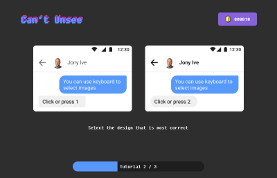
Think of it this way: Every detail in your implementation that looks exactly as it was designed saves both you and the designer valuable time and headaches, and encourages trust. Not everyone might have the same level of attention to detail, but in order to train your eye to notice visual differences, a quick round of Can’t Unsee might be a good help.
This nostalgically reminds me of a game we used to play a long time ago called “Find it”. You had to find discrepancies by comparing two seemingly similar images in order to score points.
“What if there simply is no noticeable system of font sizes and spacings in the design?”
Well, good point! Experience has shown me that it can help to start a conversation with the designer(s) by asking for clarification rather than radically starting to change things on your own and creating unwanted surprises for the designer(s) later.
Learn Basic Typographic And Design Rules
As Oliver Reichenstein states in one of his articles, 95% of the information on the web is written language. Therefore, typography plays a vital role not only in web design but also in development. Understanding basic terms and concepts of typography can help you communicate more effectively with designers, and will also make you more versatile as a developer. I recommend reading Oliver’s article as he elaborates the importance of typography on the web and explains terms such as micro- and macro-typography.
In the “Reference Guide For Typography In Mobile Web Design”, Suzanne Scacca thoroughly covers typography terminology such as typeface, font, size, weight, kerning, leading and tracking as well as the role of typography in modern web design.
One thing I found particularly useful in responsive web design is that one should aim for an average line length (characters per line) of 45 to 90 characters since shorter lines are more comfortable to read than longer lines.
There has been a lot of discussion whether designers should learn to code, and you may be asking yourself the same question the other way around. I believe that one can hardly excel in both disciplines, and that’s totally fine.
One way to become more knowledgable in the field of design is an online course known as “Design for Developers” that is offered by Sarah Drasner in which she talks about basic layout principles and color theory — two fundamental areas in web design.
“The more you learn outside of your own discipline, is actually better for you [...] as a developer.”
— Sarah Drasner
The Visual Center
By collaborating with designers, I learned the difference between the mathematical and visual center. When we want to draw the reader’s attention to a certain element, our eye’s natural focal point lies just slightly above the mathematical center of the page.
We can apply this concept, for example, to position modals or any kinds of overlays. This technique helps us to naturally get the user’s attention and makes the design appear more balanced:
In fast-paced and not-so-agile agency environments with tight deadlines, developers are often asked to implement fully functional responsive frontends based on a mobile and desktop mockup. This inevitably forces the developer to take design decisions throughout the process. Questions such as, “At what width will we decrease the font size of headlines?” or “When should we switch our three-column layout to a single column?” may arise.
Also, in the heat of the moment, it may happen that details like error states, notifications, loading states, modals or styles of 404 pages simply fall through the cracks. In such situations, it’s easy to start finger-pointing and blaming the people who should have thought about this earlier on. Ideally, developers shouldn’t ever be put in such a situation, but what if that’s the case?
When I listened to Ueno’s founder and CEO, Haraldur Thorleifsson, speak at a conference in San Francisco in 2018, he presented two of their core values:
“Nothing here is someone else’s problem.”
“We pick up the trash we didn’t put down.”
What if more developers proactively start mocking-up the above-mentioned missing parts as good as they can in the first place, and then refine together with the designer sitting next to them? Websites live in the browser, so why not utilize it to build and refine?
While winging missing or forgotten parts might not always be ideal, I’ve learned in my past experiences that it has always helped us to move forward faster and eliminate errors on the fly — as a team.
Of course, this does not mean that designers should be overruled in the process. It means that developers should try to respectfully meet designers halfway by showing initiative in problem-solving. Besides that, I as a developer was valued way more by the team simply for caring and taking on responsibility.
Building Trust Between Designers And Developers
Having a trustful and positive relationship between the creative and tech team can strongly increase productivity and outcome of work. So what can we, as developers, do to increase trust between the two disciplines? Here are a few suggestions:
Show an eye for details. Building things exactly as they were designed will show the designers that you care and put a big smile on their faces.
Communicate with respect. We’re all human beings in a professional environment striving for the best possible outcome. Showing respect for each other’s discipline should be the basis for all communication.
Check in early on and regularly. Involving developers from the start can help to eliminate errors early on. Through frequent communication, team members can develop a shared language and better understanding of each other’s positions.
Make yourself available. Having at least an optional 30-minute window a day when designers can discuss ideas with developers can give designers a feeling of being supported. This also gives developers the opportunity to explain complex technical things in words that not-so-technical people can understand better.
The Result: A Win-Win Situation
Having to spend less time in QA through effective communication and a proper handover of designs gives both the creative and dev team more time to focus on building actual things and less headaches. It ultimately creates a better atmosphere and builds trust between designers and developers. The voice of frontend developers that show interest and knowledge in some design-related fields will be heard more in design meetings.
Proactively contributing to finding a compromise between designers and developers and problem-solving as a developer can give you a broader sense of ownership and involvement with the whole project. Even in today’s booming creative industry, it’s not easy to find developers who — besides their technical skillset — care about and have an eye for visual details. This can be your opportunity to help bridge the gap in your team.
Undoubtedly the basic purpose of websites is to attract new visitors and keep the older ones and make them perform the specific task on your website. Each website is designed to perform the above basic functions. On the other hand, the website owner makes it a point to upload the content and images that serve […]


