How Frontend Developers Can Empower Designer’s Work

How Frontend Developers Can Empower Designer’s Work

How Frontend Developers Can Empower Designer’s Work

Sandrina Pereira

This article is mostly directed at you, dear Frontend Developer, who enjoys implementing user interfaces but struggles in aligning expectations with designers you work with. Perhaps you are referred to as the “UI Developer” or “UX Engineer.” Regardless of the title that you carry around, your job (and as well as mine) consists of more than breathing life into design files. We are also responsible for filling the gap between the design and development workflows. However, when crossing that bridge, we are faced with multiple challenges.

Today, I’d like to share with you practical tips that have helped me to collaborate more efficiently with designers in the past years.

I believe it’s our job, as UI Developers, to not only help designers in their journey to learn how the web works, but also to get to know their reality and learn their language.

Understanding UX Designers’ Background

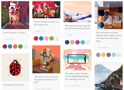
Most of the UX designers (also referred to as Web Designers or Product Designers) out there took their first steps in the design world through tools like Photoshop and Illustrator. Perhaps they were Graphic Designers: their main goal was to create logos and brand identities and to design layouts for magazines. They could also have been Marketing Designers: printing billboards, designing banners and creating infographics.

This means that most UX designers spent their early days designing for print, which is a totally different paradigm from their current medium, the screen. That was their first big challenge. When dealing with print, designers cared about pixel alignment, but on a fixed area (paper). They didn’t have to contend with a dynamic layout (screens). Thinking about text breaking or states of interactions was simply not part of their job either. Designers also had complete freedom over colors, images, and typography without performance constraints.

Fortunately, there have been many efforts from the self-taught UX designers community, to teach development fundamentals, discuss whether designers should learn to code and understand how to best perform hand-off to developers. The same held true for the development side as well (more about that in a minute.) However, there is still friction happening between the two fields.

On the one hand, designers complaining each time an implementation doesn’t match their designs or feeling misunderstood when those are rejected by the developers without a clear explanation. On the other hand, developers might take for granted that designers know something technical when that might not be true. I believe we can all do better than that.

Embracing A New Way Of Thinking

The websites and apps that we are building will be displayed on a wide range of screen sizes. Each person will use them on multiple devices. Our common goal is to create a familiar experience across their journeys.

When we, as developers, think that designers are being picky about pixel alignments, we need to understand why that is. We need to recognize that it’s beyond fidelity and consistency. It’s about the sum of all the parts working together. It’s cohesion. We have to embrace it and do our best to accomplish it. Learning the fundamentals of design principles is a good starting point. Understand the importance of selecting the right colors, how the hierarchy works, and why white space matters.

Note: There’s an online course known as “Design for Developers” and a book called “Refactoring UI” — both are great to get you started. With these, you’ll be able to implement user interfaces with a sharp eye for detail and gain significant leverage when communicating with designers.

Magnifying Your Designers’ Awareness

You might take for granted that designers know the web as much as you do. Well, they might not. Actually, they don’t have to! It’s our responsibility, as developers, to keep them updated with the current state of the web.

I’ve worked with the two sides of this spectrum: Designers who think that anything can be built (such as complex filters, new scroll behaviors or custom form inputs) without giving browser compatibility a thought. Then, there are designers with assumptions about the “low limitations of the web” and just assume by themselves that something is impossible to implement. We need to show them the true possibilities of web design and not let the limitations hold back their skills.

Teach Them Code, Not How To Code

This seems contradictory but bear with me: knowing how to code is at the core of a developer’s job. We work in a fast-paced industry with new stuff popping up every day. It would be a hypocritical request from us to demand designers to learn how to code. However, we can help them to understand code.

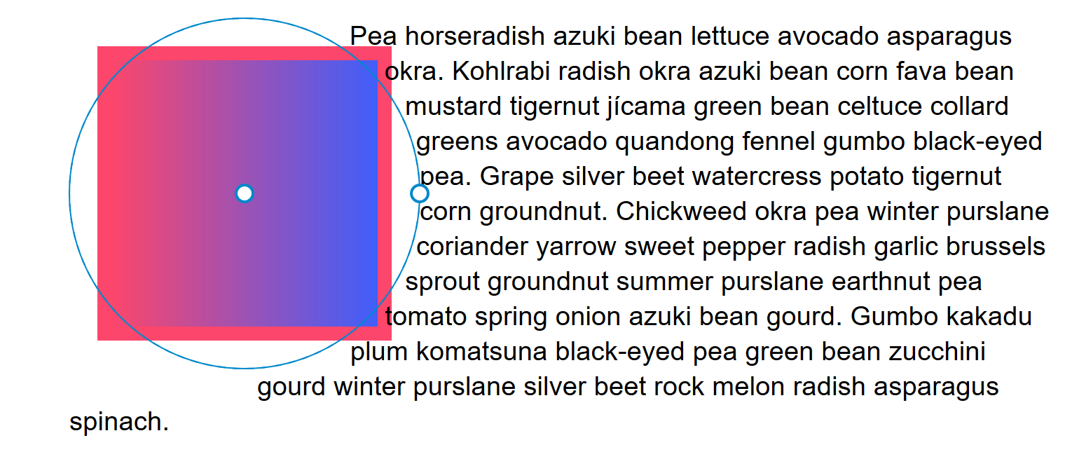
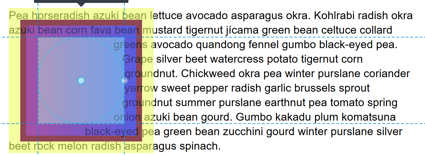
Sit next to the designer you work with for 15 minutes and teach them how they can see for themselves whether the specs of an element are correct and how to change them. I find Firefox Page Inspector remarkably user-friendly for this.

Nowadays, it’s a joy to visualize layouts, debug CSS animations and tweak typography. Show them a ready-to-use code playground like Codepen for them to explore. They don’t need to know all CSS specs to understand how the layout paradigm works. However, they need to know how elements are created and behave in order to empower their daily work.

Include Designers In The Development Process

Invite designers to join you in the stand-up meeting, to be part of the QA process and to sit down with you while you refine visual details in your implementations. This will make them understand the constraints of the web and, soon enough, they’ll recognize why a feature takes time to implement.

Ask Designers To Include You In Their Design Process

You’ll realize that they do much more than “make things pretty”. You’ll learn more about the research process and how user testing is done. You’ll discover that for each design proposal they show to you, several other studies were previously dropped. When designers request a change, ask the reason behind it, so you can learn more about the decisions being made. Ultimately, you’ll start to understand why they are picky about white space and alignments, and hopefully, soon you’ll be too!

I find it crucial to treat frontend development as a core part of the design process, and design as a core part of the development process. Advocating a mindset where everyone gets the chance to be involved in the design and development cycle will help us all to better understand each other’s challenges and to create great experiences as well.

We May Use Different Tools, But We Must Speak The Same Language

Now that we are starting to understand each other’s workflow a little better, it’s time for the next step: to speak the same language.

Looking Beyond The Code Editor

Once you start to pay attention to your surroundings, you’ll be better equipped to tackle problems. Get to know the business better and be willing to listen to what designers have to say. That will make you a team member with richer contributions to the project. Collaborating in areas beyond our expertise is the key to creating meaningful conversations and mutual trust.

Using UI Systems As A Contract

Ask designers to share their design system with you (and if they don’t use one, it’s never too late to start). That will save you the bother of handpicking the colors used, figuring out margins or guessing a text style. Make sure you are familiar with the UI System as much as they are.

You might already be familiar with the component-based concept. However, some designers might not perceive it in the same way as you do. Show them how components can help you to build user interfaces more efficiently. Spread that mindset and also say bye-bye to similar-but-not-equal-names: header vs hero, pricing info vs price selector. When a piece of the user interface (a.k.a ‘a component’) is built, stride to use the same names so they can be reflected in both design and code files. Then, when someone says, “We need to tweak the proposal invitation widget,” everyone knows exactly what is being talked about.

Acknowledging The Real Source Of Truth

Despite the fact that the user interface is first created in the design files, the real source of truth is on the development side. At the end of the day, it is what people actually see, right? When a design is updated, it’s a good idea to leave a side note about its development status, especially in projects where a large number of people are involved. This trick helps to keep the communication smooth, so nobody (including you) wonders: “This is different from the live version. Is it a bug or hasn’t so-and-so been implemented just yet?

Keeping The Debt Under Control

So, you know all about technical debt — it happens when the cost to implement something new is high because of a shortcut we took in the past to meet a deadline. The same can happen on the design side too and we call it design debt.

You can think about it like this: The higher the UX & UI inconsistency, the higher the debt (technical and design). One of the most common inconsistencies is in having different elements to represent the same action. This is why bad design is usually reflected in bad code. It’s up to all of us, both as designers and developers, to treat our design debt seriously.

Being Accessible Doesn’t Mean It Has To Be Ugly

I’m really pleased to see that both we, as developers and designers, are finally starting to bring accessibility into our work. However, a lot of us still think that designing accessible products is hard or limits our skills and creativity.

Let me remind you that we are not creating a product just for ourselves. We are creating a product to be used by all the people, including those who use the product in different ways from you. Take into account how individual elements can be more accessible while keeping the current userflows clear and coherent.

For example, if a designer really believes that creating an enhanced select input is necessary, stand by their side and work together to design and implement it in an accessible way to be used by a wide range of people with diverse abilities.

Giving Valuable Feedback To Designers

It’s unavoidable that questions will pop up when going through the designs. However, that’s not a reason for you to start complaining about the designers’ mistakes or about their ambitious ideas. The designers are not there to drive you mental, they just don’t always intuitively know what you need to do your job. The truth is that, in the past, you didn’t know about this stuff either, so be patient and embrace collaboration as a way of learning.

The Earlier The Feedback, The Better

The timing for feedback is crucial. The feedback workflow depends a lot on the project structure, so there isn’t a one-size-fits-all solution for it. However, when possible, I believe we should aim for a workflow of periodic feedback — starting in the early stages. Having this mindset of open collaboration is the way to reduce the possibility of unexpected big re-iterations later in the road. Keep in mind that the later you give the designer your first feedback, the higher will be the cost for them to explore a new approach if needed.

Explain Abstract Ideas In Simple Terms

Remember when I said that performance was not a concern of the designers’ previous jobs? Don’t freak out when they are not aware of how to create optimized SVGs for the web. When faced with a design that requires a lot of different fonts to be loaded, explain to them why we should minimize the number of requests, perhaps even take advantage of Variable Fonts. Asides from loading faster, it also provides a more consistent user experience. Unless designers are keen to learn, avoid using too many technical terms when explaining something. You can see this as an opportunity of improving your communication skills and clarifying your thoughts.

Don’t Let Assumptions Turn Into Decisions

Some questions about a design spec only show up when we get our hands dirty in the code. To speed things up, we might feel tempted to make decisions based on our assumptions. Please, don’t. Each time you turn an assumption into a decision, you are risking the trust that the design team puts on you to implement the UI. Whenever in doubt, reach out and clarify your doubts. This will show them that you care about the final result as much as they do.

Don’t Do Workarounds By Yourself

When you are asked to implement a design that is too hard, don’t say “It’s impossible” or start to implement a cheap alternative version of it by yourself. This immediately causes friction with the design team when they see their designs were not implemented as expected. They might react angrily, or not say anything but feel defeated or frustrated. That can all be avoided if we explain to them why something it’s not possible, in simple terms and suggest alternative approaches. Avoid dogmatic behaviors and be open to collaborating on a new solution.

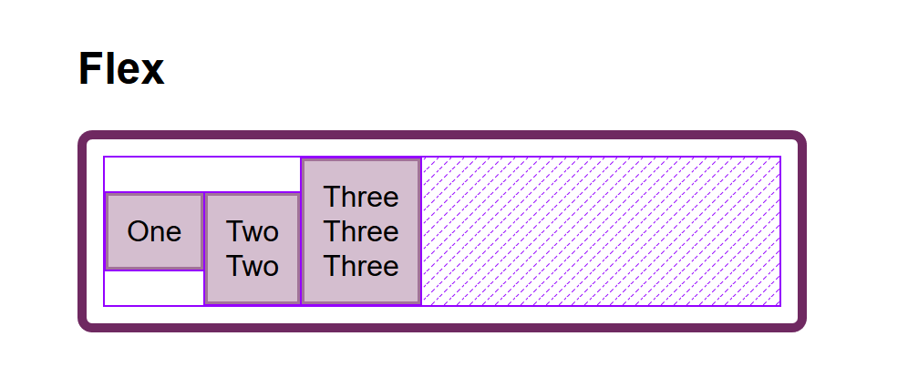
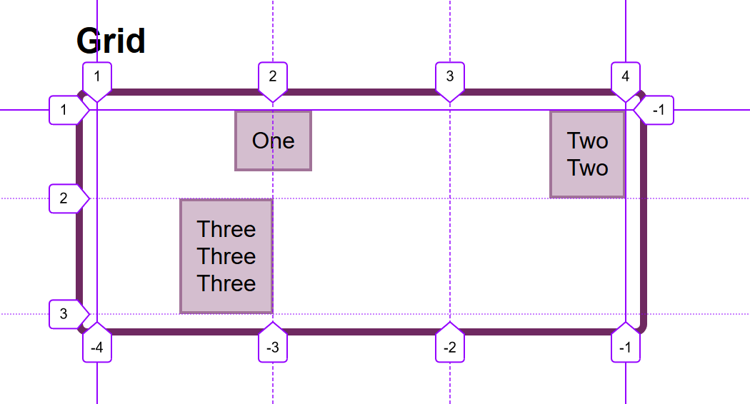
Let them know about the Graceful Degradation and Progressive Enhancement techniques and build together an ideal solution and a fallback solution. For example, we can enhance a layout from flexbox to CSS Grid. This allows us to respect the core purpose of a feature and at the same time make the best use of web technologies.

When it comes to animations, let’s be real: deep down you are as thrilled to implement the next wow animation as much as the designers are to create it. The difference between us and them is that we are more aware of the web’s constraints. However, don’t let that limit your own skills! The web evolves fast, so we must use that in our favor.

The next time you are asked to bring a prototype to life, try not to reject it upfront or do it all by yourself. See it as an opportunity to push yourself. Animations are one of the pickiest parts of web development, so make sure to refine each keyframe with your designer — in person or by sharing a private synced link.

Think Beyond The Ideal State — Together

Here’s the thing: it’s not all about you. One of the designers’ challenges is to really understand their users and present the designs in the most attractive way to sell to the Product Manager. Sometimes they forget about what’s beyond the ideal state and developers forget it too.

In order to help avoid these gaps from happening, align with designers the scenario requirements:

  • The worst-case scenario
    A scenario where the worst possibilities are happening. This helps designers to say no to fixed content and let it be fluid. What happens if the title has more than 60 characters or if the list is too long? The same applies to the opposite, the empty scenario. What should the user do when the list is empty?
  • Interaction states
    The browser is more than hovering and clicking around. There are a bunch of states: default, hover, focus, active, disable, error… and some of them can happen at the same time. Let’s give them the proper attention.
  • The loading state
    When building stuff locally, we might use mocks and forget that things actually take time to load. Let designers know about that possibility too and show them that are ways to make people perceive that things don’t take that long to load.

Taking into consideration all these scenarios will save you a lot of time going back and forth during the development phase.

Note: There’s a great article by Scott Hurff about how to fix bad user interfaces that will take us a step closer to an accessible product.

Embrace Change Requests

Developers are known for not being too happy about someone finding a bug in their code — especially when it’s a design bug reported by a designer. There are a lot of memes around it, but have you ever reflected how those bugs can compoundingly rot both the quality of the experience as well as your relationship when these design bugs are casually dismissed? It happens slowly, almost like falling asleep. Bit by bit, then all at once. Designers might start out saying, “It’s just a tiny little detail,” until the indifference and resentment builds up and nothing is said. The damage has then already been done.

This situation is two-fold: both to your peers and to your work. Don’t let that happen. Work on what’s coloring your reaction. A designer being ‘picky’ can be inconvenient, but it can also be an engineer’s shallow interpretation of attentiveness and enthusiasm. When someone tells you that your implementation is not perfect (yet), put your ego aside and show them how you recognize their hard work in refining the final result.

Go Off The Record Once In A While

We all have tasks to deliver and roadmaps to finish. However, some of the best work happens off the record. It won’t be logged into the TO DO board and that’s okay. If you find a designer you have a rapport with, go sneak into their workspace and explore together new experiments. You never know what can come from there!

Conclusion

When you are willing to learn from the design team, you are also learning different ways of thinking. You’ll evolve your mindset of collaboration with other areas out of your experience while refining your eye for creating new experiences. Be there to help and be open to learning, because sharing is what makes us better.


This article wouldn’t be possible without the feedback of many great people. I want to gratefully thank to the designers Jasmine Meijer and Margarida Botelho for helping me to share a balanced perspective about the misunderstandings between designers and developers.

Related Reading on SmashingMag:

Smashing Editorial (ra, yk, il)

Editorial Design Patterns With CSS Grid And Named Columns

Editorial Design Patterns With CSS Grid And Named Columns

Editorial Design Patterns With CSS Grid And Named Columns

Rachel Andrew

Many websites, in particular those which display long-form content, have a fairly straightforward repeating pattern of components: a full-width area for images, a central content area, and perhaps a split view of two half-width blocks. These components repeat to display an article, images and other related content — with content editors selecting the right component as they create articles for publication.

In this article, I’m going to demonstrate an approach to this kind of editorial design, which builds on a few techniques some of which are discussed in the following articles:

In addition to this being a nice way to name sections of your layout, this technique exposes a whole bunch of interesting things about Grid Layout which you may find useful in creating your own layout patterns. It also demonstrates more of the promise of subgrid (a part of the upcoming Level 2 of the grid specification and being implemented in Firefox).

Naming Things In CSS Grid Layout

When using CSS Grid Layout, you can name lines and areas. Both of these things can make working with Grid — especially complex grids — more straightforward. Defining naming conventions for things in your layout can be useful when working with your team; it is much easier to understand where anything placed with grid-area: content will end up than having something placed from column-line: 3 / 9.

When using the grid-template-areas approach, you give the items that you want to place on the grid a name by using the grid-area property and then placing them around the grid. In the following example, the item with grid-area: content goes into the grid area defined by the grid-template-areas property:

See the Pen [Layout With Named Area](https://codepen.io/rachelandrew/pen/zYOQBba) by Rachel Andrew.

See the Pen Layout With Named Area by Rachel Andrew.

This works well for components where you have one item to go into one area; however, if you want to place multiple things into the content area (one below the other), using grid-area is the wrong approach. Instead, you might define names for the column lines and place the item from the start to end line.

See the Pen [Layout With Named Columns](https://codepen.io/rachelandrew/pen/xxKNONQ) by Rachel Andrew.

See the Pen Layout With Named Columns by Rachel Andrew.

This isn’t as neat, however, when using the grid-area approach we have to know both the start and end line when placing an item using grid-column or grid-row — or do we?

Take a look at this next CodePen example. My items are placed using a single name or ident by using the grid-column property, even though some of the grid areas being targeted cross a number of columns:

See the Pen [Layout with Named Columns](https://codepen.io/rachelandrew/pen/mdbYEod) by Rachel Andrew.

See the Pen Layout with Named Columns by Rachel Andrew.

My aim here is to abstract away the complexity of the grid setup when actually using the grid. I can put a lot of work into creating the initial grid, but then place things without thinking too much about it as I populate my pages. I also want to make sure that we can repeat the components as often as we need to as we build up the article. What I have in mind is a content creator using a CMS, and creating blocks of content using the different patterns whilst knowing that they will be placed correctly one below the other on the overall grid.

In order to understand how I got to this point requires an understanding of a few things about CSS Grid Layout as well as named lines and areas.

We Can Name Lines

As you’ve already seen in my second example above, we can name lines on the grid that can be pretty much anything we like — other than the word span. The name is an ident rather than a string which is why it is not quoted.

However, you will see many examples where the naming conventions name-start and name-end are used that append -start onto the name of the start line and -end on the name of the end line. This is not purely convention and for the technique I am going to show you why we need to name our lines this way. So you should pick a name for the area you are describing, and then add the -start and -end suffixes — which need to match, of course!

We name our lines inside square brackets. Lines can (and often need to) have multiple names. In this case, space separates the names. When placing the items using line-based positioning, you can pick any name for the line to do the placement.

With our named lines in place, we could place our items using grid-column by specifying the start and end line name. This pattern is just the same as using line numbers, so the name before the slash is the start line and the name after is the end line.

See the Pen [Example using start and end lines](https://codepen.io/rachelandrew/pen/VwZOPgO) by Rachel Andrew.

See the Pen Example using start and end lines by Rachel Andrew.

This places the items but isn’t the neat single name per item that I used in the example. However, we now have everything in place due to the special way that Grid handles named areas and lines.

Line Names Give Us A Named Area

Assuming you have named your lines with -start and -end as I have, Grid will give you a named area of the main name you used. Therefore, in my case, I have areas named content, start-half, end-half, full and center. Each of these areas is a single row (as I don’t have named rows), however, it will span the column tracks from the -start to the -end line.

Named Areas Give Us A Named Line Of The Main Name Used

If we want to be able to place our items as if we have a column name, we also need to make use of the fact that when we create a grid area, we get a line name of the main name used; that is, the main name being the name with -start and -end removed. This line name resolves to the start or end of the area depending on whether we are targeting grid-column-start or grid-column-end.

So, we have an area named content, because we have column lines named content-start and content-end. The area named content also gives us the ability to use grid-column-start: content which will resolve to the start line of that content area, while grid-column-end: content will resolve to the end line of the content area.

This, therefore, means that we can place an item into the content area by using the following:

.content {
    grid-column: content / content;
}

Next, we can now tidy up this technique further due to the fact that if you use a named line for grid-column-start and omit the end line (rather than spanning one track as would be the case if you used line numbers), grid copies the name over to the end line. Therefore, grid-column: content is exactly the same as grid-column: content / content;

This is then all we need to be able to place items using grid-column with a simple, single name. This behavior is all exactly as specified and not some kind of “hack”. It demonstrates the depth of thinking that went into the creation of the Grid Layout specification, and the amount of careful work that has gone into making it so straightforward to lay items out in our designs.

Giving This Technique Superpowers With Subgrid

I think this technique is a nice one that enables a very straightforward way of declaring where elements should be placed on the grid. However, if we add subgrid support to the mix, it becomes very powerful indeed.

Currently, subgrid is being implemented in Firefox, and so these next examples require Firefox Nightly to run. You can download Nightly here.

The subgrid value of grid-template-columns and grid-template-rows means that sizing created on a parent grid can be opted into by an item which is a child of the grid (assuming it is also using grid layout) by having display: grid applied.

Note: You can read more about the features of subgrid in my articles here on Smashing Magazine “CSS Grid Level 2: Here Comes Subgrid” and “Digging Into The Display Property: Grids All The Way Down”.

Line Names From The Parent Are Passed Into Subgrids

In addition to the track sizing information being passed into the child grid, any line names set on the parent will be passed in. This means that we can use our “column names” within subgridded components, making this solution very useful in a world where subgrid exists. An item placed in content — even if nested down inside subgrids — will line up with one placed as a direct child of the main grid.

In this next example, I have nested two elements directly inside the div with a class of full-2. I have also placed a ul inside .content. If we look at the items inside full-2, in order to place these on the parent grid, we need to make the selector full-2 a grid with display: grid then use the grid-template-columns property with a value of subgrid.

This causes the grid on .full-2 to use the tracks defined on the parent grid, and have access to the named lines defined there. As this is a full-width item, this really will behave just like the parent grid in terms of placing our items. We can then use any of the names we defined for the different columns to place the items. In this case, I have set both child elements to grid-column: center and they display one after the other in that center area.

.full-2 {
  grid-row: 4;
  grid-column: full;
  display: grid;
  row-gap: 10px;
  grid-template-columns: subgrid;
}

.full-2 > div {
  background-color: rgb(124,222,220);
  grid-column: center;
}
A set of boxes, one with other boxes nested instead
The nested elements line up with the grid on the parent (Large preview)

If we take a look at our nested ul inside .content, we will need to create a subgrid on the selector .content just as with the last example; when we do this, the ul falls into the first track of the subgrid. If we want to lay out the listen items on the subgrid, we need to do two things: cause the ul to take up the same area as its parent by placing it with grid-column: content, and then making it a grid which is a subgrid.

Having done this the list items will lay out using auto-placement into the column tracks of the subgrid:

.content {
  grid-row: 1;
  grid-column: content;
  display: grid;
  grid-template-columns: subgrid;
}

.content ul {
  grid-column: content;
  display: grid;
  row-gap: 10px;
  grid-template-columns: subgrid;
}
A set of boxes, the nested boxes falling into the tracks of the grid
With auto-placement the items fall into the tracks of the parent (Large preview)

Once you have your grid, you can use the names from the parent in exactly the same way as before.

.content li:nth-child(1) {
  grid-column: center;
}

.content li:nth-child(2) {
  grid-column: start-half;
}

.content li:nth-child(3) {
  grid-column: end-half;
}

.content li:nth-child(4) {
  grid-column: content;
}
Screenshot of various boxes, which line up in columns
The completed subgrid layout (Large preview)

If you have Firefox Nightly, you can see the full demo in this CodePen example:

See the Pen [Naming Column and Subgrid](https://codepen.io/rachelandrew/pen/OJLYRRb) by Rachel Andrew.

See the Pen Naming Column and Subgrid by Rachel Andrew.

You can keep “nesting’ subgrids into your markup structure like this, and each time the line names will be passed through. This is a feature that I think will be particularly useful.

When you create a subgrid, the line numbers correspond to the lines of the subgrid and not the parent grid. Therefore, if you do want to ensure that elements in the subgrid line up with the parent grid, then using line names or named areas (as shown in this example) will make that straightforward and logical.

Wrapping Up

You now know how to use this technique for your main grid, and hopefully, it won’t take too long before we start seeing support for subgrid in all browsers. It’ll enable techniques such as this one and make it incredibly powerful for us to use.

Smashing Editorial (il)

Overflow And Data Loss In CSS

Overflow And Data Loss In CSS

Overflow And Data Loss In CSS

Rachel Andrew

CSS is designed to keep your content readable. If you consider an HTML document that is marked up with headings and paragraphs (with no CSS applied), it displays in the browser in a readable way. The headings are large and bold, and the paragraphs have space between them which is controlled by the browser default stylesheet. As soon as you want to change the layout of your page, however, you start to take some of the control into your own hands. In some cases, this will mean that you give yourself the job of dealing with overflow.

In this article, I’m going to take a look at the different ways we encounter overflow on the web. We’ll see how new layout methods and new values in CSS can help us to deal with overflow and create less fragile designs. I’ll also explain one of the fundamental concepts behind the design of CSS — that of avoiding data loss.

CSS Lists, Markers, And Counters

There is more to styling lists in CSS than you might think. Let’s take a look at lists in CSS, and moving onto some interesting features defined in the CSS Lists specification: markers and counters. Read more  →

What Do We Mean By Overflow?

If we look back a few years (before the advent of layout methods such as Flexbox and Grid Layout), then consider being handed a design like the one below. A very simple layout of three boxes, different amounts of content in each, but the bottom of those boxes needs to line up:

Screenshot three boxes, variable amounts of content, the bottoms of the boxes line up
A neat set of boxes (Large preview)

With a floated layout, such a seemingly straightforward task was impossible. When floated, each box has no relationship to its neighbor; this means that has no way to know that the next door box is taller and to grow to match the height.

Screenshot three boxes, variable amounts of content, the bottoms of the boxes do not line up
The box bottoms do not align (Large preview)

Sometimes, in an attempt to make things line up, designers would then restrict the height of the boxes by second-guessing the amount of content in order to make the boxes tall enough to match. Of course, things are never that simple on the web and when the amount of content differed, or the text size was larger, the text would start to poke out of the bottom of the box. It would overflow.

Screenshot three boxes, variable amounts of content, content overflowing the bottom of the box
Overflow caused by fixing the box heights (Large preview)

This would sometimes lead to people asking how they could prevent too much content getting into the site. I’ve had people in support for my own CMS product asking how to restrict content for this very reason. They tell me that this extra content is “breaking the design”. For those of us who understood that not knowing how tall things were was a fundamental nature of web design, we would create designs that hid the lack of equal height boxes. A common pattern would have a gradient fading away — to mask the unevenness. We would avoid using background colors and borders on boxes. Or, we would use techniques such as faux columns to create the look of full-height columns.

This inability to control the height of things in relationship to other things therefore influenced web design — a technical limitation changing the way we designed. (I enjoy the fact that with Flexbox and Grid.) Not only did this problem disappear but the default behavior of these new layout methods is to stretch the boxes to the same height. The initial value of align-items is stretch, which causes the boxes to stretch to the height of the grid area or flex container.

See the Pen [Equal Height Boxes](https://codepen.io/rachelandrew/pen/VwZzxjV) by Rachel Andrew.

See the Pen Equal Height Boxes by Rachel Andrew.

In addition, CSS Grid gives us a nice way to ask for things to be at least a certain size, but grow larger if they need to. If you set a track size using the minmax() function, you can see a minimum and maximum size for the track. Setting rows to minmax(200px, auto) means that the track will always be at least 200 pixels in the block dimension — even if the grid items are empty. If, however, the content of a grid item means that it will be larger than 200 pixels, with the max set to auto it can grow. You can see this in the example below: The first row is 200 pixels as there are no items making it larger. The second row has a grid item with more content in than will fit, and so auto is being used and the track has grown larger than 200 pixels.

See the Pen [Minmax()](https://codepen.io/rachelandrew/pen/zYOdjKP) by Rachel Andrew.

See the Pen Minmax() by Rachel Andrew.

The minmax() function gives you the ability to create designs that look as if they have that perfect fixed size. In an ideal world (when the amount of content is pretty much as you expected), you will get those nice uniform rows. However, if additional content is added, there will be no overflow as there would be if you had fixed the height of the rows to 200 pixels. The row will expand; it might not be exactly what you wanted as a designer, but it will not be unreadable.

Inline Overflow

The potential for overflow happens whenever we restrict the size of things. In the above example, I am describing restriction in the block dimension, which horizontal language users will think of as height. However, we can also end up with overflow in the inline direction if we restrict the inline size or width of a box. This is something that we see in the “CSS is Awesome” meme:

Image contains the words ‘CSS is Awesome’ in a bordered box. The word awesome is too long to fit in the box so pokes out past the border
The ‘CSS Is Awesome’ meme (Large preview)

The author of this meme commented on a CSS-Tricks post about it saying,

“I do have a slightly better grasp on the concept of overflow now, but at the time it just blew my mind that someone thought the default behavior should be to just have the text honk right out of the box, instead of just making the box bigger like my nice, sensible tables had always done.”

So why does CSS make the text “honk right out of the box” rather than grow the box?

In the meme, you have overflow in the inline direction. The word “awesome” is larger than the width applied to the box, and so it overflows. CSS fairly reasonably assumes that if you have made the box a certain width, you want the box that width. Perhaps it needs to fit into a layout which would break if boxes suddenly became larger than set.

That particular issue (i.e. the need to set sizes on everything in a layout and making sure they did not total more than the available inline size of the container) is something that our modern layout methods have addressed for us. If we imagine that our box had that absolute inline size so that it could fit in a line with other boxes in a float-based grid, today you might choose to approach that layout using Flexbox.

With the floated layout, you have to set the sizing on each item — potentially before you know what the content will be. You will then have big things forced into small containers and small things left with a lot of space around them.

Irregular sized items in regular sized boxes
Items in a floated layout need to have a width set (Large preview)

However, if we use Flexbox, we can allow the browser to work out how much space to assign each item. Flexbox will then ensure that bigger things get assigned more space while smaller things get less. This squishy sizing means that the box that contains the word “awesome” will grow to contain the box, and the text won’t honk right out or overlap anything else. Overflow issue solved; this behavior is really what Flexbox was designed for. Flexbox excels at taking a bunch of unevenly sized stuff and returning the most useful layout for those things.

Irregular sized items in boxes which are sized to make best use of space
Flexbox distributes space between the items (Large preview)

Outside of Flexbox, it is possible to tell our box to be as big as is needed for the content and no more. The min-content keyword can be used as a value for width or inline-size if working with flow-relative logical properties. Set width: min-content and the box grows just as big as is needed to contain the word “awesome”:

See the Pen [Awesome with min-content](https://codepen.io/rachelandrew/pen/LYPjmbJ) by Rachel Andrew.

See the Pen Awesome with min-content by Rachel Andrew.

Avoiding Data Loss

The reason that the box overflows as it does (with the word escaping from the border of the box), is that the default value for the overflow property is visible. You could (if you wanted) manage that overflow in a different way. For example, using overflow: auto or overflow: scroll would give your box scrollbars. This is probably not something you want in this scenario, but there are design patterns where a scrolling box is appropriate.

Another possibility would be to decide that you are happy to crop the overflow by using overflow: hidden. Perhaps you might think that hiding the overflow would have been a better default, however, the fact that CSS chooses to make the overflow visible by default (and not hidden) is a clue to a core value of designing CSS. In CSS (as in most places), we try to avoid data loss. When we talk about data loss in CSS, we are typically describing some of your content going missing. In the case of overflow: hidden, the overflowing content disappears. This means that we have no way to get to it to see what we have missed out on.

In some cases, this could be a real problem. If you have managed to create a design so fragile that the button of your form is in the cropped-off area, your user has no ability to complete the form. If the final paragraph is trimmed off, we never know how the story ends! Also, the problem with things vanishing is that it isn’t always obvious that they have gone. As the designer, you may not spot the problem, especially if it only happens in certain viewport sizes in a responsive design. Your users may not spot the problem — they just don’t see the call to action, or think it is somehow their problem they can’t place their order and so go away. However, if things overflow messily, you will tend to spot it. Or, at worse, someone using the site will spot it and let you know.

So this is why CSS overflows in a messy, visible way. By showing you the overflow, you are more likely to get a chance to fix it than if it hides the overflow. With the overflow property, however, you get a chance to make the decision yourself about what should happen. If you would prefer the overflow be cropped (which may be the right decision in some cases), use overflow: hidden.

Data Loss And Alignment

The better alignment abilities we have gained in recent years also have the potential for data loss. Consider a column of flex items that are up against the edge of the viewport and with different sizes. Aligned to flex-start, the items all stick out more to the right. Aligned to center, however, the longer item would actually end up off the side of the viewport. Alignment could therefore cause data loss.

To prevent accidental data loss caused by alignment, CSS now has some new keywords which can be used along with the alignment properties. These are specified in the Box Alignment specification — the specification which deals with alignment across all layout methods including Grid and Flexbox. They are currently only supported in Firefox. In our example above, if we set align-items: safe center, then the final item would become aligned to start rather than forcing the content to be centered. This would prevent the data loss caused by the item being centered and therefore pushed off the side of the viewport.

If you do want the alignment (even if it would cause overflow), then you can specify unsafe center. You’ve then requested that the browser does your chosen alignment no matter what then happens to the content. If you have Firefox, then you can see the two examples: one with safe and the second with unsafe alignment.

See the Pen [Safe and unsafe alignment](https://codepen.io/rachelandrew/pen/QWLMrpE) by Rachel Andrew.

See the Pen Safe and unsafe alignment by Rachel Andrew.

In the talk on which I based this article, I described web design as being a constant battle against overflow. One of the truths of designing for the web is that it’s very hard to know how tall or how large any element that contains text (in the block dimension) will be. However, as I have shown above, we have never had so many ways to manage overflow or the potential of overflow. This means that our designs can be far more resilient, and we can create patterns that will work with varying amounts of content. These might seem like small shifts in our capabilities, but I think the possibilities they open up to us are huge.

Smashing Editorial (il)

Writing Modes And CSS Layout

Writing Modes And CSS Layout

Writing Modes And CSS Layout

Rachel Andrew

In this article I am going to take a look at the CSS writing-mode property. However this is not an article about the practical or creative application of this property. Instead, I want to demonstrate why understanding writing modes is so important, even to those of us who rarely need to change the writing mode of a page or component. The support of multiple writing modes is key to the way that our new layout methods of Flexbox and Grid Layout have been designed. Understanding this can unlock a better understanding of how these layout methods work.

What Are Writing Modes?

The writing mode of a document or a component refers to the direction that text flows. In CSS, to work with writing modes we use the writing-mode property. This property can take the following values:

  • horizontal-tb
  • vertical-rl
  • vertical-lr
  • sideways-rl
  • sideways-lr

If you are reading this article on Smashing Magazine in English then the writing mode of this document is horizontal-tb, or Horizontal Top To Bottom. In English sentences are written horizontally, the first letter of each line starting on the left.

A language such as Arabic also has a horizontal-tb writing mode. It is written horizontally, top to bottom, however Arabic script is written right to left, and so sentences in Arabic start on the right.

Chinese, Japanese and Korean are written vertically, with the first character of the first sentence being top right. Following sentences being added to the left. Therefore the writing mode used is vertical-rl. A vertical writing mode running from right to left.

Mongolian is also written vertically, but from left to right. Therefore, should you want to typeset Mongolian script you would use the writing mode vertical-lr.

The other two values of writing-mode are designed more for creative purposes than for typesetting vertical scripts. Using sideways-lr and sideways-rl turns text sideways - even characters normally written vertically and upright. The values unfortunately are only supported in Firefox at the moment. The following CodePen shows all of the different values of writing-mode, you will need to use Firefox if you want to see the sideways-* ones in action.

See the Pen [Writing Mode demo](https://codepen.io/rachelandrew/pen/dxVVRj) by Rachel Andrew.

See the Pen Writing Mode demo by Rachel Andrew.

Writing Modes can be used when creating a document that uses a language written using that writing mode. They can also be used creatively, for example to set a heading vertically down the side of some content. In this article however, I want to take a look at the impact that supporting vertical languages, and the possibility of vertical text, has on CSS layout, and across CSS in general.

Before I do so, if you are interested in the use of writing modes for vertical text, here are some useful resources.

The Block And Inline Dimensions

When we change the writing mode of a document, what we are doing is switching the direction of the block flow. Therefore it quickly becomes very useful for us to understand what is meant by block and inline.

One of the first things we learn about CSS is that some elements are block elements, for example a paragraph. These elements display one after the other in the block direction. Inline elements, such as a word in a sentence display one after the other in the inline direction. Working in a horizontal writing mode, we become used to the fact that the block dimension runs top to bottom vertically, and the inline dimension left to right horizontally.

As block and inline elements relate to the writing mode of our document however, the inline dimension is horizontal only if we are in a horizontal writing mode. It doesn’t relate to width, but instead to inline size. The block dimension is only vertical when in a horizontal writing mode. Therefore it doesn’t relate to height, but to block size.

Logical, Flow-relative Properties

These terms, inline size and block size are also used as the names of new CSS properties designed to reflect our new writing mode aware world. If, in a horizontal writing mode you use the property inline-size instead of width, it will act in exactly the same way as width - until you switch the writing mode of your component. If you use width that will always be a physical dimension, it will always be the size of the component horizontally. If you use inline-size, that will be the size in the inline dimension, as the below example shows.

See the Pen [width vs. inline-size](https://codepen.io/rachelandrew/pen/RXLLyd) by Rachel Andrew.

See the Pen width vs. inline-size by Rachel Andrew.

The same is true for height. The height property will always be the size vertically. It relates to how tall the item is. The block-size property however gives the size in the block dimension, vertically if we are in a horizontal writing mode and horizontal in a vertical one.

As I described in my article “Understanding Logical Properties And Values”, there are mappings for all of the physical properties, those which are tied to the dimensions of the screen. Once you start to think about it, so much of CSS is specified in relation to the physical layout of a screen. We set positioning, margins, padding and borders using top, right, bottom, and left. We float things left and right. Sometimes tying things to the physical dimension will be what we want, however increasingly we are thinking about our layouts without reference to physical location. The Logical Properties and Values specification rolls out this writing mode agnostic way of working right across CSS.

Writing Modes, Grid and Flexbox

When our new layout methods landed on the scene, they brought with them an agnostic way of looking at the writing mode of the component being laid out as a flex or grid layout. For the first time people were being asked to think about start and end, rather than left and right, top and bottom.

When I first started to present on the subject of CSS Grid, my early presentations were a rundown of all of the properties in the specification. I mentioned that the grid-area property could be used to set all four lines to place a grid item. The order of those lines was not however the familiar top, right, bottom and left we use to set all four margins. Instead, we need to use top, left, bottom, right - the reverse of that order! Until I understood the connection between grid and writing modes, this seemed a very odd decision. I came to realise that what we are doing is setting both start lines, then both end lines. Using top, right, bottom and left would work fine if we were in a horizontal writing mode, turn the grid on its side however and that makes no sense. If we use grid-area: 1 / 2 / 3 / 5; as in the pen below the lines are set as follows:

  • grid-row-start: 1; - block start
  • grid-column-start: 2 - inline start
  • grid-row-end: 3 - block end
  • grid-column-end: 5 - inline end

See the Pen [grid-area](https://codepen.io/rachelandrew/pen/zgEEQW) by Rachel Andrew.

See the Pen grid-area by Rachel Andrew.

Flexbox Rows And Columns

If you use flexbox, and add display: flex to a container, your items will display as a row as the intial value of the flex-direction property is row. A row will follow the inline dimension of the writing mode in use. Therefore if your writing mode is horizontal-tb a row runs horizontally. If the text direction of the current script is left to right then items will line up starting from the left, if it is right to left they will line up starting on the right.

Use a vertical writing mode however, such as vertical-rl and flex-direction: row will cause the items to lay out vertically, as the inline direction is vertical. In this next CodePen all of the examples have flex-direction: row, only the writing mode or direction has changed.

See the Pen [flex-direction: row](https://codepen.io/rachelandrew/pen/XvezrE) by Rachel Andrew.

See the Pen flex-direction: row by Rachel Andrew.

Add flex-direction: column, and the items layout in the block dimension of your writing mode. In a horizontal writing mode the block dimension is top to bottom, so a column is vertical. With a writing mode of vertical-rl a column is horizontal. As with the previous example, the only difference between the below flex layouts, is the writing mode being used.

See the Pen [flex-direction: column](https://codepen.io/rachelandrew/pen/RXLjbX) by Rachel Andrew.

See the Pen flex-direction: column by Rachel Andrew.

Grid Auto-placement

When using auto-placement in grid, you will see similar behavior to that in flex layout. Grid items auto-place according to the writing mode of the document. The default is to place items in rows, which will be the inline direction - horizontally in a horizontal writing mode and vertically in a vertical one.

See the Pen [Grid auto-placement row](https://codepen.io/rachelandrew/pen/eqGeYV) by Rachel Andrew.

See the Pen Grid auto-placement row by Rachel Andrew.

Try changing the flow of items to column as in the example below. The items will now flow in the block dimension - vertically in a horizontal writing mode and horizontally in a vertical one.

See the Pen [Grid auto-placement column](https://codepen.io/rachelandrew/pen/xvXPby) by Rachel Andrew.

See the Pen Grid auto-placement column by Rachel Andrew.

Grid Line-placed Placement

Line-based placement also respects writing mode. The lines of our grid start at 1, both for rows and columns. If we position an item from column line 1 to column line 3, and are in a horizontal writing mode with a left to right direction, that item will stretch from the left-most column line across two grid tracks horizontally. Thus spanning two columns.

Change the writing mode to vertical-rl and column line 1 will be at the top of the grid, the item spanning two tracks vertically. Still spanning two columns, but the columns are now running horizontally.

See the Pen [Margins: adjacent siblings](https://codepen.io/rachelandrew/pen/mNBqEy) by Rachel Andrew.

See the Pen Margins: adjacent siblings by Rachel Andrew.

Alignment In Grid And Flexbox

One of the first places many people will have come into contact with the way Flexbox dealt with writing modes, would be when aligning items in a flex layout. If we take the flex-direction: row example above, and use the justify-content property to align all of the items to flex-end the items move to the end of their row. This means that in a horizontal writing mode with left to right direct the items all move to the right, as the end of that row is on the right. If the direction is right to left they all move to the left.

In the vertical writing mode they move to the bottom, assuming there is space for them to do so. I have set an inline-size on the components in this example to ensure that we have spare space in our flex containers to see the alignment in action.

Alignment is a little easier to understand in grid layout, as we always have the two axes to play with. Grid is two-dimensional, those two dimensions are block and inline. Therefore, you can remember one rule if you want to know whether to use the properties that begin with align- or those which begin with justify-. In grid layout the align- properties:- align-content, align-items, align-self are used to do block axis alignment. In a horizontal writing mode that means vertically, and in a vertical writing mode horizontally.

Once again we don’t use left and right or top and bottom, as we want our grid layout to work in exactly the same way no matter what the writing mode. So we align using start and end. If we align to start on the block dimension, that will be top when in horizontal-tb, but will be right when in vertical-rl. Take a look in the example below, the alignment values are identical in both grids, the only difference is the writing mode used.

See the Pen [Margins: adjacent siblings](https://codepen.io/rachelandrew/pen/jgGaML) by Rachel Andrew.

See the Pen Margins: adjacent siblings by Rachel Andrew.

The properties justify-content, justify-items,justify-self are always used for inline alignment in grid layout. That will be horizontal in a horizontal writing mode and vertical in a vertical writing mode.

See the Pen [Margins: adjacent siblings](https://codepen.io/rachelandrew/pen/RXLjpP) by Rachel Andrew.

See the Pen Margins: adjacent siblings by Rachel Andrew.

Flexbox alignment is complicated somewhat by the fact that the main axis can be switched from row to column. Therefore in flexbox we need to think about the alignment method as main axis versus cross axis. The align- properties are used on the cross axis. On the main axis all you have is justify-content due to the fact that in flexbox we deal with items as a group. On the cross axis you can use align-content in cases where you have multiple flex lines AND space in the flex container to space them out. You can also use align-items and align-self to move the flex items on the cross axis in relationship to each other and their flex line.

See the Pen [Flexbox alignment](https://codepen.io/rachelandrew/pen/YmrExP) by Rachel Andrew.

See the Pen Flexbox alignment by Rachel Andrew.

For more on alignment in CSS layout see my previous Smashing Magazine articles:

Writing Mode Awareness And Older CSS

Not all of CSS has fully caught up with this flow-relative, writing mode agnostic way of working. The places where it has not start to stand out as unusual the more you think of things in terms of block and inline, start and end. For example in multi-column layout we specify column-width, which really means column inline-size, as it isn’t mapped to the physical width when working in a vertical writing mode.

See the Pen [Multicol and writing-mode](https://codepen.io/rachelandrew/pen/pMWdLL) by Rachel Andrew.

See the Pen Multicol and writing-mode by Rachel Andrew.

As you can see, writing modes underpin much of what we do in CSS, even if we never use a writing mode other than horizontal-tb.

I find it incredibly helpful to think about CSS layout in this writing mode agnostic way. While it is perhaps a little early to be switching all of our properties and values to logical ones, we are already in a flow-relative world when dealing with new layout methods. Having your mental model be one of block and inline, start and end, rather than tied to the four corners of your screen, clarifies many of the things we come across when using flexbox and grid.

Smashing Editorial (ra)

Everything You Need To Know About CSS Margins

Everything You Need To Know About CSS Margins

Everything You Need To Know About CSS Margins

Rachel Andrew

One of the first things most of us learned when we learned CSS, was details of the various parts of a box in CSS, described as The CSS Box Model. One of the elements in the Box Model is the margin, a transparent area around a box, which will push other elements away from the box contents. The margin-top, margin-right, margin-bottom and margin-left properties were described right back in CSS1, along with the shorthand margin for setting all four properties at once.

A margin seems to be a fairly uncomplicated thing, however, in this article, we will take a look at some of the things which trip people up with regard to using margins. In particular, we will be looking at how margins interact with each other, and how margin collapsing actually works.

The CSS Box Model

As with all articles about parts of the CSS Box Model, we should define what we mean by that, and how the model has been clarified through versions of CSS. The Box Model refers to how the various parts of a box — the content, padding, border, and margin — are laid out and interact with each other. In CSS1, the Box Model was detailed with the ASCII art diagram shown in the image below.

ascii art drawing of the box model
Depiction of the CSS Box Model in CSS1

The four margin properties for each side of the box and the margin shorthand were all defined in CSS1.

The CSS2.1 specification has an illustration to demonstrate the Box Model and also defines terms we still use to describe the various boxes. The specification describes the content box, padding box, border box, and margin box, each being defined by the edges of the content, padding, border, and margin respectively.

diagram of the CSS Box Model
Depection of the CSS Box Model in CSS2

There is now a Level 3 Box Model specification as a Working Draft. This specification refers back to CSS2 for the definitions of the Box Model and margins, therefore it is the CSS2 definition we will be using for the majority of this article.

Margin Collapsing

The CSS1 specification, as it defined margins, also defined that vertical margins collapse. This collapsing behavior has been the source of margin-related frustration ever since. Margin collapsing makes sense if you consider that in those early days, CSS was being used as a documenting formatting language. Margin collapsing means that when a heading with a bottom margin, is followed by a paragraph with a top margin, you do not get a huge gap between those items.

When margins collapse, they will combine so that the space between the two elements becomes the larger of the two margins. The smaller margin essentially ending up inside the larger one.

Margins collapse in the following situations:

Let’s take a look at each of these scenarios in turn, before looking at the things which prevent margins from collapsing in these scenarios.

Adjacent Siblings

My initial description of margin collapsing is a demonstration of how the margins between adjacent siblings collapse. Other than in the situations mentioned below, if you have two elements displaying one after the other in normal flow, the bottom margin of the first element will collapse with the top margin of the following element.

In the CodePen example below, there are three div elements. The first has a top and bottom margin of 50 pixels. The second has a top and bottom margin of 20px. The third has a top and bottom margin of 3em. The margin between the first two elements is 50 pixels, as the smaller top margin is combined with the larger bottom margin. The margin between the second two elements in 3em, as 3em is larger than the 20 pixels on the bottom of the second element.

See the Pen [Margins: adjacent siblings](https://codepen.io/rachelandrew/pen/OevMPo) by Rachel Andrew.

See the Pen Margins: adjacent siblings by Rachel Andrew.

Completely Empty Boxes

If a box is empty, then it’s top and bottom margin may collapse with each other. In the following CodePen example, the element with a class of empty has a top and bottom margin of 50 pixels, however, the space between the first and third items is not 100 pixels, but 50. This is due to the two margins collapsing. Adding anything to that box (even padding) will cause the top and bottom margins to be used and not collapse.

See the Pen [Margins: empty boxes](https://codepen.io/rachelandrew/pen/JQLGMr) by Rachel Andrew.

See the Pen Margins: empty boxes by Rachel Andrew.

Parent And First Or Last Child Element

This is the margin collapsing scenario which catches people out most often, as it does not seem particularly intuitive. In the following CodePen, I have a div with a class of wrapper, and I have given that div an outline in red so that you can see where it is. The three child elements all have a margin of 50 pixels. However, the first and last items are flush with the edges of the wrapper; there is not a 50-pixel margin between the element and the wrapper.

See the Pen [Margins: margin on first and last child](https://codepen.io/rachelandrew/pen/BgrKGp) by Rachel Andrew.

See the Pen Margins: margin on first and last child by Rachel Andrew.

This is because the margin on the child collapses with any margin on the parent thus ending up on the outside of the parent. You can see this if you inspect the first child using DevTools. The highlighted yellow area is the margin.

The item with a yellow highlighted margin showing outside the parent
DepvTools can help you see where your margin ends up

Only Block Margins Collapse

The last example also highlights something about margin collapsing. In CSS2, only vertical margins are specified to collapse — that is the top and bottom margins on an element if you are in a horizontal writing mode. So the left and right margins above are not collapsing and ending up outside the wrapper.

Note: It is worth remembering that margins only collapse in the block direction, such as between paragraphs.

Things Which Prevent Margin Collapsing

Margins never collapse if an item has absolute positioning, or is floated. However, assuming you have run into one of the places where margins collapse outlined above, how can you stop those margins collapsing?

The first thing that stops collapsing is situations where there is something between the elements in question.

For example, a box completely empty of content will not collapse it’s top and bottom margin if it has a border, or padding applied. In the example below I have added 1px of padding to the box. There is now a 50-pixel margin above and below the box.

See the Pen [Margins: empty boxes with padding do not collapse](https://codepen.io/rachelandrew/pen/gNeMpg) by Rachel Andrew.

See the Pen Margins: empty boxes with padding do not collapse by Rachel Andrew.

This has logic behind it, if the box is completely empty with no border or padding, it is essentially invisible. It might be an empty paragraph element thrown into the markup by your CMS. If your CMS was adding redundant paragraph elements, you probably wouldn’t want them to cause large gaps between the other paragraphs due to their margins being honored. Add anything to the box, and you will get those gaps.

Similar behavior can be seen with margins on first or last children which collapse through the parent. If we add a border to the parent, the margins on the children stay inside.

See the Pen [Margins: margin on first and last child doesn’t collapse if the parent has a border](https://codepen.io/rachelandrew/pen/vqRKKX) by Rachel Andrew.

See the Pen Margins: margin on first and last child doesn’t collapse if the parent has a border by Rachel Andrew.

Once again, there is some logic to the behavior. If you have wrapping elements for semantic purposes that do not display visually, you probably don’t want them to introduce big gaps in the display. This made a lot of sense when the web was mostly text. It is less useful as behavior when we are using elements to lay out a design.

Creating a Block Formatting Context

A new Block Formatting Context (BFC) will also prevent margin collapsing through the containing element. If we look again at the example of the first and last child, ending up with their margins outside of the wrapper, and give the wrapper display: flow-root, thus creating a new BFC, the margins stay inside.

See the Pen [Margins: a new Block Formatting Context contains margins](https://codepen.io/rachelandrew/pen/VJXjEp) by Rachel Andrew.

See the Pen Margins: a new Block Formatting Context contains margins by Rachel Andrew.

To find out more about display: flow-root, read my article “Understanding CSS Layout And The Block Formatting Context”. Changing the value of the overflow property to auto will have the same effect, as this also creates a new BFC, although it may also create scrollbars that you didn’t want in some scenarios.

Flex And Grid Containers

Flex and Grid containers establish Flex and Grid formatting contexts for their children, so they have different behavior to block layout. One of those differences is that margins do not collapse:

“A flex container establishes a new flex formatting context for its contents. This is the same as establishing a block formatting context, except that flex layout is used instead of block layout. For example, floats do not intrude into the flex container, and the flex container’s margins do not collapse with the margins of its contents.”

Flexbox Level 1

If we take the example above and make the wrapper into a flex container, displaying the items with flex=direction: column, you can see that the margins are now contained by the wrapper. Additionally, margins between adjacent flex items do not collapse with each other, so we end up with 100 pixels between flex items, the total of the 50 pixels on the top and bottom of the items.

See the Pen [Margins: margins on flex items do not collapse](https://codepen.io/rachelandrew/pen/mZxreL) by Rachel Andrew.

See the Pen Margins: margins on flex items do not collapse by Rachel Andrew.

Margin Strategies For Your Site

Due to margin collapsing, it is a good idea to come up with a consistent way of dealing with margins in your site. The simplest thing to do is to only define margins on the top or bottom of elements. In that way, you should not run into margin collapsing issues too often as the side with a margin will always be adjacent to a side without a margin.

Note: Harry Roberts has an excellent post detailing the reasons why setting margins only in one direction is a good idea, and not just due to solving collapsing margin issues.

This solution doesn’t solve the issues you might run into with margins on children collapsing through their parent. That particular issue tends to be less common, and knowing why it is happening can help you come up with a solution. An ideal solution to that is to give components which require it display: flow-root, as a fallback for older browsers you could use overflow to create a BFC, turn the parent into a flex container, or even introduce a single pixel of padding. Don’t forget that you can use feature queries to detect support for display: flow-root so only old browsers get a less optimal fix.

Most of the time, I find that knowing why margins collapse (or didn’t) is the key thing. You can then figure out on a case-by-case basis how to deal with it. Whatever you choose, make sure to share that information with your team. Quite often margin collapsing is a bit mysterious, so the reason for doing things to counter it may be non-obvious! A comment in your code goes a long way to help — you could even link to this article and help to share the margin collapsing knowledge.

I thought that I would round up this article with a few other margin-related pieces of information.

Percentage Margins

When you use a percentage in CSS, it has to be a percentage of something. Margins (and padding) set using percentages will always be a percentage of the inline size (width in a horizontal writing mode) of the parent. This means that you will have equal-sized padding all the way around the element when using percentages.

In the CodePen example below, I have a wrapper which is 200 pixels wide, inside is a box which has a 10% margin, the margin is 20 pixels on all sides, that being 10% of 200.

See the Pen [Margins: percentage margins](https://codepen.io/rachelandrew/pen/orqzrP) by Rachel Andrew.

See the Pen Margins: percentage margins by Rachel Andrew.

Margins In A Flow-Relative World

We have been talking about vertical margins throughout this article, however, modern CSS tends to think about things in a flow relative rather than a physical way. Therefore, when we talk about vertical margins, we really are talking about margins in the block dimension. Those margins will be top and bottom if we are in a horizontal writing mode, but would be right and left in a vertical writing mode written left to right.

Once working with logical, flow relative directions it becomes easier to talk about block start and block end, rather than top and bottom. To make this easier, CSS has introduced the Logical Properties and Values specification. This maps flow relative properties onto the physical ones.

For margins, this gives us the following mappings (if we are working in English or any other horizontal writing mode with a left-to-right text direction).

  • margin-top = margin-block-start
  • margin-right = margin-inline-end
  • margin-bottom = margin-block-end
  • margin-left = margin-inline-start

We also have two new shorthands which allow for the setting of both blocks at once or both inline.

  • margin-block
  • margin-inline

In the next CodePen example, I have used these flow relative keywords and then changed the writing mode of the box, you can see how the margins follow the text direction rather than being tied to physical top, right, bottom, and left.

See the Pen [Margins: flow relative margins](https://codepen.io/rachelandrew/pen/BgrQRj) by Rachel Andrew.

See the Pen Margins: flow relative margins by Rachel Andrew.

You can read more about logical properties and values on MDN or in my article “Understanding Logical Properties And Values” here on Smashing Magazine.

To Wrap-Up

You now know most of what there is to know about margins! In short:

  • Margin collapsing is a thing. Understanding why it happens and when it doesn’t will help you solve any problems it may cause.
  • Setting margins in one direction only solves many margin related headaches.
  • As with anything in CSS, share with your team the decisions you make, and comment your code.
  • Thinking about block and inline dimensions rather than the physical top, right, bottom and left will help you as the web moves towards being writing mode agnostic.
Smashing Editorial (il)

CSS Lists, Markers, And Counters

CSS Lists, Markers, And Counters

CSS Lists, Markers, And Counters

Rachel Andrew

Lists in CSS have particular properties which give us the standard list styling we expect. An unordered list gains a list bullet, of the type disc, and ordered lists are numbered. My interest in exploring lists in more detail came from some work I did to document the ::marker pseudo-element for MDN. This pseudo-element ships in Firefox 68 and is being released today. With the ::marker pseudo element available to us, we can start to do some interesting things with lists, and in this article, I’ll explain more.

Deconstructing A List

You may not have thought much about lists, although we use them frequently in our markup. Many things can be marked up quite logically as a list. While step-by-step instructions or ranked elements may naturally be described by an ordered list <ol>, many things in a design can be described using an unordered list <ul>. A very common usage of the element, for example, is to mark up navigation, as it is a list of destinations on the site. For our exploration, let’s start by finding out exactly what a list is in CSS.

As with many things in CSS, lists have some initial values applied to them. These values make them look like a list. These special values begin with the information that a list item has the display property with a value of list-item. This creates a block-level box, with an additional marker box. The marker box is where the list bullet or number is added.

Lists were defined early on in CSS, and much of the definition of lists as we use them today is from CSS2. The CSS2 specification describes a list item as follows:

“An element with display: list-item generates a principal block box for the element’s content and, depending on the values of list-style-type and list-style-image, possibly also a marker box as a visual indication that the element is a list item.”

The principal block box is the main box of the element and contains all of the children as a list item can contain other markup. The marker box is then placed in respect to this principal box. The specification goes on to detail the fact that any background color will be only behind this principal box, and not the marker. Also that the marker can be set to one of a range of pre-defined values:

  • disc
  • circle
  • square
  • decimal
  • decimal-leading-zero
  • lower-roman
  • upper-roman
  • lower-greek
  • lower-latin
  • upper-latin
  • armenian
  • georgian
  • lower-alpha
  • upper-alpha
  • none
  • inherit

The Level 3 display specification defines display: list-item along with the other possible values for the display property. It refers back to CSS 2.1 — as do many CSS properties and values which come from CSS2 — but describes the list-item keyword as, “causing the element to generate a ::marker pseudo-element”.

The Level 3 specification also introduces the ability to create an inline list item with the two value syntax being used display: inline list-item. This is as yet unimplemented by browsers.

Creating Marker Boxes On Non-List Items

As with other values of display, it is perfectly valid to give any HTML element a display type of list-item (should you wish to generate a ::marker pseudo-element on the item). This will not cause the element to become a list item semantically, but instead it will only visually display as a list item, and therefore be able to have a ::marker. When we discuss the ::marker pseudo-element below, you will discover some cases where giving other elements display: list-item can be useful.

The CSS Lists Level 3 Specification: ::marker And Counters

The display specification expands and clarifies the definition of lists that we find in CSS2, however, there is also a specification which defines list behavior in detail: the CSS Lists Specification Level 3. As the basic behavior of list items is defined in display, this specification details the marker box generated when something has display: list-item along with the counters which are used by default whenever you create an ordered list. There is some potentially useful functionality accessed via these features.

The ::marker Pseudo-Element

The ::marker pseudo-element allows you to target the list marker — separately from the content of the list item. This was not possible in previous versions of CSS, therefore, if you changed the color or font size of the ul or li, this would also change the color and font size of the markers. In order to do something as seemingly simple as having different color list bullets than text, would involve either wrapping the content of the list item in a span (or using an image for the marker).

ul {
  color: #00b7a8;
}

ul span {
  color #333;
}

With the ::marker pseudo element, the simplest thing you might want to try is having a different bullet to text color, which means that instead of the code in the example above you can use:

ul {
    color: #333;
}

ul ::marker {
    color: #00b7a8;
}

You might also want to use a different size and font-family for the numbering on an ordered list.

ol ::marker {
  font-size: 200%;
  color: #00b7a8;
  font-family: "Comic Sans MS", cursive, sans-serif;
}

You can see all of these in a supporting browser by using my CodePen example:

See the Pen [Colored bullets with and without marker](https://codepen.io/rachelandrew/penVJQyoR) by Rachel Andrew.

See the Pen Colored bullets with and without marker by Rachel Andrew.

You could use the ::marker pseudo-element on non-list items. In the code below, I have set a heading to display: list-item. This gives it a bullet and therefore a ::marker box to target.

I have changed the bullet to use an emoji:

h1 {
  display: list-item;
}

h1::marker {
  content: "🐱";
}
 Heading with a cat emoji to the left of it
In Firefox, you can see the emoji used as a marker.

See the Pen [Heading and marker](https://codepen.io/rachelandrew/pen/wLyyMG) by Rachel Andrew.

See the Pen Heading and marker by Rachel Andrew.

In the above example, I have used generated content in the rules for the marker. Only a small subset of CSS properties is available for use on ::marker. These include font properties and color, however, they also include the content property, for including generated content.

The addition of content as an allowed property for ::marker is recent, however, it is included in the Firefox implementation. The inclusion means that you can do things like include a string of text in a ::marker. It also raises additional possibilities for formatting of markers when you combine the use of counters with ::marker.

Browser Support And Fallbacks

For browsers that do not support the ::marker pseudo-element, the fallback is the regular marker that would have been displayed anyway. Unfortunately, we can’t currently use Feature Queries to detect support for selectors such as this pseudo-element right now, although there has been an issue raised about adding this to the specification. This means that you can’t fork your code to do one thing when you have support and something else if you do not. In most cases, falling back to the regular marker will be a reasonable solution.

Counters

Ordered lists have list numbering — something which is achieved by way of a CSS Counter. The CSS Lists specification therefore also describes these counters. We can access and create counters ourselves which, combined with the ::marker pseudo-element can give us some useful functionality. These counters can also be used in regular (non ::marker) generated content.

If I have a numbered list of steps (and I would like to write out “Step 1”, “Step 2”, and so on), I can do this by using generated content in my marker and appending the list-item counter, this represents the built-in counter:

::marker {
  content: "Step " counter(list-item) ": ";
}
An ordered list with Step 1, Step 2, and so on, before each list item
In Firefox, you will see the counter prefixed with the word “Step”.

See the Pen [Counters and marker](https://codepen.io/rachelandrew/pen/BgRaoz) by Rachel Andrew.

See the Pen Counters and marker by Rachel Andrew.

Nested Counters

If you have nested lists, a common way to number them is to have the top-level item a whole number, (1), then child items as (1.1, 1.2) and their children (1.1.1, 1.1.2), and so on. You can achieve this by using more functionality of counters.

When you nest HTML lists, you will end up with multiple counters of the same name — nested inside each other. The nest of counters can be accessed using the counters() function.

In the code below, I am using counters() to format my list markers as described above. The first argument for counters() is the name of the counter to use. I’m using the built-in list-item counter. The second argument is a string — this is what will be concatenated between output counters (I’m using a .). Finally, I add a : outside of the counter function but inside the value of content so that my counter output will be separated from the content by a colon.

::marker {
  content: counters(list-item,'.') ':';
  color: #00b7a8;
  font-weight: bold;
}

This gives me the output as in the image. If you are using a browser which supports ::marker and counters, then you can see it working in the CodePen example — try changing the string from a . to something else to see how that changes the output.

A set of nested lists
In Firefox, you will see nested list numbering separated by dots.

See the Pen [Nested counters](https://codepen.io/rachelandrew/pen/VJbwxL) by Rachel Andrew.

See the Pen Nested counters by Rachel Andrew.

What’s The Difference Between counter() And counters()?

The counter() function we used in the first example to write out our steps uses the innermost counter only. Therefore, in the situation where you have a set of nested lists, you will write out the counter which related to the level you are currently on.

The counters() function essentially writes out that whole branch and gives you the opportunity to concatenate a string between counters in the branch. So if you have a list item with a counter of 2 (which is part of a list nested inside a list item with a counter of 4), then the branch contains:

  • 4
  • 2

You can output this as 4.2 in the marker by using:

::marker {
  content: counters(list-item,'.');
}

Counters On Other Elements

Counters can be used on things which are not lists — either to output a marker — in which case the element will need to have display: list-item — or to output regular generated content. Counters are used extensively in book production, in order to enable chapter and figure numbering amount other things. There is no reason not to take a similar approach on the web, in particular for longer articles.

The CSS properties defined in the CSS Lists specification which deal with these counters are:

  • counter-set
  • counter-reset
  • counter-increment

To see how these work outside of lists we can look at an example of using counters to number the headings in a document.

The first thing I need to do is to create a counter for headers on the body element — ready for use. I’m using the counter-reset property to do this. The counter-reset and counter-set properties are very similar. The counter-reset property will create a new counter if a counter of the specified name does not already exist, but will also create nested counters as described above if a counter of that name does exist. The counter-set property will only create a new counter if there is no counter of that name. For this, use either property would work just fine, however, counter-set does not have as good browser support as counter-reset, so I am taking the practical route:

body {
  counter-reset: heading-counter;
}

Now that I have a counter, I can then use the counter-increment property on the selector for the headers; this should increment the counter every time the selector matches.

h2 {
  counter-increment: heading-counter;
}

To see the value, I need to output it to the document. I can do this by using Generated Content and adding it before the heading as shown in the following CodePen example:

h2::before {
  content: counter(heading-counter) ": ";
  color: #00b7a8;
  font-weight: bold;
}

See the Pen [Headings and counters](https://codepen.io/rachelandrew/pen/gNGjxq) by Rachel Andrew.

See the Pen Headings and counters by Rachel Andrew.

Alternatively, I could make the h2 element into a list-item and then use ::marker, as demonstrated below. As already detailed, using the ::marker element has limited browser support. In Firefox, you should see the counter used as the marker for the heading, while other browsers will show the default bullet.

h2 {
  display: list-item;
}

h2::marker {
  content: counter(heading-counter)  ": ";
  color: #00b7a8;
  font-weight: bold;
}

See the Pen [Headings, markers, and counters](https://codepen.io/rachelandrew/pen/pXWZay) by Rachel Andrew.

See the Pen Headings, markers, and counters by Rachel Andrew.

Counters On Form Elements

There is also a little bit of interactivity that you can achieve using CSS Counters — something that you might think you need JavaScript to do.

I have a form which has a number of required fields. The required status can be selected in CSS with a :required pseudo-class, and the fact that a field has not been completed can be detected by way of the :invalid pseudo class. This means that we can check for fields which are both required and invalid, and increment a counter. Then output that as generated content.

See the Pen [Counting required form fields](https://codepen.io/rachelandrew/pen/vqpJdM) by Rachel Andrew.

See the Pen Counting required form fields by Rachel Andrew.

How useful this is in reality is debatable — given that we can’t really do anything with that value other than stick it into generated content. There are also concerns with regard to generated content being inaccessible to certain screen readers, therefore any usage that is more than decorative would need to ensure other ways of accessing that information. Read, “Accessibility Support For CSS Generated Content” and the more recent information, “CSS Content Property Screen Reader Compatibility” for more details regarding accessibility and generated content.

However, it demonstrates that counters can achieve more useful things than simply numbering lists. It may be that one day that knowledge does come in handy to solve some problem you are working on.

Find Out More

This article ended up rather a long way from styling lists, despite the fact that everything I have described is found in the CSS Lists specification. You can find more information about the things described in the links below. If you have found an interesting use for CSS Counters, or can think of things you could use ::marker for, add a note in the comments.

Smashing Editorial (il)

Collective #522


C522_slidertype

Embla

An extensible low level carousel for the web, written in TypeScript.

Check it out


C522_px

Px

Px is a tiny 2D canvas framework for turn-based puzzle games.

Check it out


Collective #522 was written by Pedro Botelho and published on Codrops.

Weekly Platform News: Favicon Guidelines, Accessibility Testing, Web Almanac

Šime posts regular content for web developers on webplatform.news.

Google posts guidelines for defining favicons

Jamie Leach: Google Search now displays favicons in search results on mobile. Your favicon should be a multiple of 48×48 (Google will re-scale it to 16×16 for use in search results). If a website doesn’t have a favicon or Google deems the favicon inappropriate, a generic globe icon will be displayed instead.

Your favicon should be a visual representation of your website’s brand, in order to help users quickly identify your site when they scan through search results.

Top websites are surprisingly inconsistent in the way they declare icons (via <link> elements in the page’s head). Twitter and Pinterest, two relatively modern progressive web apps, provide icons in two sizes.

<!-- example -->
<link rel="icon" href="/icon-32x32.png">
<link rel="apple-touch-icon" href="/icon-192x192.png">

The Paciello Group releases ARC Toolkit

The Paciello Group: ARC Toolkit, our professional-level accessibility testing tool, is now available as a Chrome DevTools extension. This tool detects issues related to the WCAG 2.1 guidelines. You can run the test on the entire page or just the node selected in the DevTools Elements panel.

Remember, automated accessibility tools are only able to find some accessibility issues, and manual testing is necessary to ensure full accessibility. Lighthouse (via the Audits panel) suggests manual checks after performing an accessibility audit.

Other news

  • Jeff Jaffe: W3C and WHATWG have reached an agreement to collaborate on the development of HTML. "W3C shall encourage the community ... to contribute directly to the WHATWG HTML and DOM repositories; raising issues, proposing solutions, commenting on proposed solutions, and indicating support or otherwise for proposals."
  • Paul Calvano: "There is a significant gap in the first- vs. third-party resource age of CSS and web fonts. 95% of first-party fonts are older than one week compared to 50% of third-party fonts ... This makes a strong case for self-hosting web fonts!"
  • Rachel Andrew: The CSS subgrid value is a relatively straightforward addition to grid layout. For example, if you have nested grids, and you apply grid-template-rows: subgrid to the child grid, then this grid will use the row tracks of the parent grid instead of creating its own row tracks. That’s all there is to it. (This feature is currently only supported in Firefox Nightly.)
  • GitHub Blog: GitHub can now generate automated security fixes for your dependencies with known security vulnerabilities. On GitHub’s website, check your repository’s Security tab for security alerts. If you open an alert and press the "Create automated security fix" button, GitHub will create an automated pull request that fixes the security vulnerability.
  • Rick Viscomi: HTTP Archive plans to release the first annual Web Almanac in November, a report of the state of the web with interesting insights written by different experts. About 50 volunteers from the web community are currently working on it, and they are looking for more contributors.

The post Weekly Platform News: Favicon Guidelines, Accessibility Testing, Web Almanac appeared first on CSS-Tricks.

Digging Into The Display Property: Grids All The Way Down

Digging Into The Display Property: Grids All The Way Down

Digging Into The Display Property: Grids All The Way Down

Rachel Andrew

Today, we are going to take a look at what happens when we use display: grid and how we might use the new subgrid value of grid-template-columns and grid-template-rows to allow for grids all the way down through our markup, which relate to each other.

This article is part of a series that look at various aspects of the CSS display property, and is a follow-on to the first two articles:

  1. The Two Values Of display
  2. Box Generation
  3. Grids All The Way Down

What Happens When We Create A Grid Container?

CSS Grid Layout is switched on by using display: grid. If you have read the first article in this series, you will know that what this single value property actually means is display: block grid. We get a block level box which is defined as a grid container, with direct children that are grid items and participate in grid layout.

If you take a look at the display specification, you will see that in the table that defines all of the different values for display. The words grid container are linked to the definition of a grid container in the Grid Specification. Therefore, to find out what this actually means we need to go look there. When we do, we get some useful clarification of the behavior of a grid container.

A grid container is said to establish a Grid Formatting Context which is similar to a Block Formatting Context (BFC). I’ve written an extensive guide to the Block Formatting Context. In that article you will discover two things about a BFC that are the same for a grid formatting context. Floats do not intrude into the grid container, and the margins on the container do not collapse with those of the contents.

There are differences, however, only once we get inside the grid container. The children of a grid container and not participating in block and inline layout, they are grid items and therefore participating in grid layout. This means that a few things we are used to in block and inline layout do not hold true.

If any item in the layout is floated or cleared, the float and clear properties do not have an effect once the item becomes a grid item. The vertical-align property has no effect, and the ::first-letter and ::first-line pseudo-elements cannot be used.

The fact that an item cannot be both floated and a grid item is helpful in terms of creating fallbacks. When creating a fallback for browsers which do not support grid using floats (when grid is supported), you don’t need to do anything special: the float is overwritten.

I outline this approach in my article on supporting browsers without grid. There are situations where the behavior has turned out to be problematic, although these issues could be solved by using another part of CSS as described in this post unpacking an issue with grid and floats, “Editorial Layouts, Exclusions, and CSS Grid”.

With all that said, if we do nothing else than change the value of display to grid, we won’t see much of a difference to our layout. The direct children are grid items, however, by default we end up with a one-column grid. A grid always has one column and one row. The rest of the rows that we can see after doing this are implicit rows, i.e. rows created to hold the content.

A set of cards laid out one below the other in a single column.
When we create a grid container with no columns, we get a one column grid. (Large preview)

We can start to form something that looks more like a grid to us by giving the property grid-template-columns a value. The property takes a track listing as a value; if I give it three 1fr tracks, we now find ourselves with a three-column grid, and using the gap property gives me spacing between those cards.

We now have something that looks to us like a grid:

Cards laid out in three columns and two rows
We define some column tracks and a gap to get an obvious grid layout (Large preview)

Each of the grid items in our example has children of its own. The cards have headers and footers and an area for the main content of the card. These children are grid items, but their children have returned to block and inline layout. The header, content area and footer do not do any grid like things. This is because when we change the value of display to grid, it doesn’t inherit but instead only the children become grid items; their children return to block layout.

Nesting Grids

If a card has more content than the other cards, the cards in that row get taller. The initial value of align-items for grid items is stretch. Our cards stretch to full height. The items inside, however, are in normal block and inline flow and so they don’t stretch magically to fill the card. (This is why in the image above you can see that the cards with less content have a gap at the bottom.)

If we wanted them to (in order to make that footer always sit at the bottom), we could make our grid item a grid, too. In this case, a single-column grid is all we need. We can then define row tracks, giving the area into which the div with a class of content sits, a track size of 1fr. This causes it to take up all of the available space in the container, and will push the footer to the bottom of the card.

See the Pen display: subgrid is not what we want by Rachel Andrew.

See on Codepen

You can do this nesting of grids as much as you need. I don’t really think of it as nesting since we’re not creating nested tables here, and we are usually using the structural HTML elements already in place. We are just changing the value of display one level at a time to what is most appropriate for the children of that element. That might be flex layout or grid layout, but most often it will be block and inline layout. In that case, we don’t need to do anything because that is what happens by default.

Lining Up The Headers And Footers

As we have now seen, if we want a set of cards laid out on a grid, and we want them to display as tall as the tallest card, and we want the footers pushed to the bottom of the card, we need very little CSS. The layout CSS for the above example is as follows:

.cards {
  display: grid;
  gap: 20px;
  grid-template-columns: 1fr 1fr 1fr;
}

article {
  display: grid;
  grid-template-rows: auto 1fr auto;
  row-gap: 20px;
}

What if we want the background color on the headers and footers to line up though? Each card is a grid item, but the headers and footers are in the grid on the item. They have no relationship to each other and so we can’t line them up. Here it would be nice if we could somehow inherit the grid through the children.

If we could define a grid on the parent which had three rows, then place the cards across these three rows and have the header, content and footer each sit in one of the rows. That way, each header would be in the same row, and therefore if one header got taller, the whole row would get taller.

We don’t have a good solution to that in browsers today, but it is on the way. The subgrid feature of CSS Grid Layout Level 2 will enable this exact pattern. You will be able to create a grid on the parent and then selectively opt the rows and/or columns to use that grid, rather than define a new grid on the child element which is completely independent of that grid.

Note that the examples which follow only work at the time of writing in Firefox Nightly. The subgrid value of grid-template-columns and grid-template-rows is a new feature and part of Level 2 of the CSS Grid Specification. To try out this feature, download a copy of Firefox Nightly.

You can see how this works in the images below. In the first image, I have created three row tracks on the parent and spanned the card across them. With the Firefox Grid Inspector highlighting the grid, you can see that the rows of the parent don’t relate to the rows used by the children.

An image of a three column grid with the Firefox Grid Inspector tracks overlaid.
Inspecting the grid with the Firefox Grid Inspector shows the elements are not displaying in the tracks of the parent. (Large preview)

If, instead of defining three rows on the child, I use the subgrid value for grid-template-rows, the card now uses those rows on the parent. You can see how the two are now aligned and therefore the headers and footers align as well:

An image of a three column grid, all elements inside the cards aligned.
Using subgrid each part of the card goes into its own track (Large preview)

What we are doing here with subgrid isn’t a new value of display. The item which is a subgrid is a grid container itself, as we have set display: grid on it. The grid items are behaving as grid items normally do. This is regular grid layout — no different from the original nested grid except that (instead of the item having its own row track sizing) it is using the tracks of the parent.

.cards {
  display: grid;
  gap: 20px;
  grid-template-columns: 1fr 1fr 1fr;
  grid-template-rows: repeat(2,auto 1fr auto);
}

article {
  grid-row-end: span 3;
  display: grid;
  grid-template-rows: subgrid;
}

This is the nice thing about subgrid; there isn’t a whole lot to learn if you already know how to use grid layout. You can read about the rest of the details in my previous post here on Smashing Magazine, “CSS Grid Level 2: Here Comes Subgrid”.

Yesterday (23rd May 2019), subgrid landed in Firefox Nightly, so we have a testable implementation of the subgrid value of grid-template-columns and grid-template-rows. Please do grab a copy of Nightly and try this out. With a copy of Nightly, you can see the final example working in this CodePen:

See the Pen display: subgrid is not what we want by Rachel Andrew.

See on Codepen

See if you can think up other use cases that are solved by having the subgrid feature, or perhaps things which you think are missing. While a feature is only available in a Nightly browser, that’s the time where it is possible to make changes to the spec if some issue are discovered. So, do a favor to your future web developing self and try out features like this in order that you can help contribute to the web platform and make things better.

If you think you have found a bug in the Firefox implementation, you can take a look at the main implementation bug on Bugzilla which links to related issues in the Depends on section. If you can’t see your issue, create as a simple a reduced test case as possible and raise the bug. If you think that subgrid should do something in order to solve a use case, and that is something not detailed in the specification, you can raise an issue on the CSS Working Group GitHub for a potential enhancement.

What About display: contents?

If you have been following along, you might think that display: contents (as described in the previous article about display) might solve the problems that subgrid seeks to solve — that of allowing indirect children to participate in a grid layout. That isn’t the case, and our example of cards is a perfect way to demonstrate the difference.

If, instead of making our card a grid layout with display: grid, we removed the box using display: contents, we would get this result in this next CodePen. (Try removing the display: contents line from the rules for .card to see the difference.)

See the Pen display: subgrid is not what we want by Rachel Andrew.

See on Codepen

In this example, the box of the card has been removed and so the header, content and footer directly participate in grid layout and are autoplaced across the grid. This wasn’t what we wanted at all! The contents value of display will be really helpful once the accessibility issues in browsers mentioned in my last article are dealt with, however, it solves different problems to the one that we are exploring.

More Reading And Examples

I’ve been creating a number of examples and demos to help everyone understand subgrid. You can try those out at the links below:

Smashing Editorial (il)

Digging Into The Display Property: Box Generation

Digging Into The Display Property: Box Generation

Digging Into The Display Property: Box Generation

Rachel Andrew

This is the second in a short series of articles about the display property in CSS. You can read the initial article in the series at “The Two Values Of Display”. The display specification is a very useful spec to understand as it underpins all of the different layout methods we have.

While many of the values of display have their own specification, many terms and ideas are detailed in display. This means that understanding this specification helps you to understand the specifications which essentially detail the values of display. In this article, I am going to have a look at the box generation values of displaynone and contents.

Everything Is A Box

In CSS everything generates boxes. A webpage is essentially a set of block and inline boxes, something you get to understand very well if you open up DevTools in your favorite browser and start selecting elements on the page. You can see the boxes that make up the layout, and how their margins, padding and borders are applied.

An image of a simple layout with an unordered list highlighted in browser DevTools
I have highlighted the ul element using Firefox DevTools so I can inspect the different parts of the box. (Large preview)

Controlling Box Generation

The none and contents values of display deal with whether boxes should appear at all. If you have elements in your markup and don’t want them to generate a box in CSS then you need to somehow suppress generation of the box. There are two possible things you might want to do. Which are:

  • Prevent generation of a box and all of its children.
  • Prevent generation of a box but still display the children.

We can take a look at each of these scenarios in turn.

display: none

The none value of display is how we prevent the generation of a box and all the children of that box. It acts as if the element was not there at all. Therefore, it is useful in situations where you intend to completely hide that content, perhaps because it will be revealed later after activating a link.

If I have an example with a paragraph, an unordered list, and another paragraph you can see that the items are displaying in normal flow. The ul has a background and border applied, plus some padding.

See the Pen Box Generation example by Rachel Andrew.

See on Codepen

If I add display: none to the ul it disappears from the visual display, taking with it the children of the ul plus the background and border.

See the Pen Box Generation example display: none by Rachel Andrew.

See on Codepen

If you use display: none it hides the content from all users of the website. This includes screen reader users. Therefore, you should only use this if your intention is that the box and everything inside it is completely hidden to everyone.

There are situations where you might want to add additional information for users of assistive technology like screen readers but hide it for other users; in such cases, you need to use a different technique. Some excellent suggestions are made by Scott O ’Hara in his article “Inclusively Hidden”.

Using display: none is therefore pretty straightforward. Use it in a situation where you want a box and contents to vanish from the display, from the box tree, and from the accessibility tree (as if it were never there in the first place).

display: contents

For the second scenario, we need to look at a much newer value of display. The value display: contents will remove the box it is applied to from the box tree in the same way that display: none does, but leave the children in place. This causes some useful behavior in terms of things we can then do in our layouts. Let’s look at a simple example and then explore further.

I am using the same example as before, but this time I have used display: contents on the ul. The list items are now visible, however, they have no background and borders and are acting as if you have added li elements to the page without any enclosing ul.

See the Pen Box Generation example display: contents by Rachel Andrew.

See on Codepen

The reason that removing a box and keeping the children is useful is due to the way that other values of display behave. When we change the value of display we do so on a box and the direct children of that box, as I described in the last article. If I add display: flex to the CSS rules for an element, that element becomes a block-level box, and the direct children become flex items. The children of those flex items return to normal flow (they are not part of the flex layout).

You can see this behavior in the next example. Here I have a containing element set to display flex, it has four direct children, three div elements and a ul. The ul has two list items. The direct children all participate in the flex layout and lay out as flex items. The list items are not direct children and so display as list items inside the box of the ul.

See the Pen Box Generation flexbox and display: contents 1 by Rachel Andrew.

See on Codepen

If we take this example and add display: contents to the ul, the box is removed from the visual display and now the children participate in the flex layout. You can see that they do not become direct children. They are not selected by the direct child universal selector (.wrapper > *) in the way that the div and ul elements are, and they maintain the background given to them. All that has happened is that the box of the containing ul has been removed, everything else carries on as normal.

See the Pen Box Generation flexbox and display: contents 2 by Rachel Andrew.

See on Codepen

This has potentially very useful implications if we consider elements in HTML which are important for accessibility and semantic data, but which generate an additional box that may prevent us from laying the content out with flex or grid layout.

This Is Not A CSS “Reset”

You may have noticed how one side effect of using display: contents is that the margin and padding on the element are removed. This is because they are related to the box, part of the CSS Box Model. This might lead to you think that display: contents is a good way to quickly rid yourself of the padding and margin on an element.

This is a use that Adrian Roselli has spotted in the wild; he was concerned enough to write a detailed post explaining the problems of doing so — “display: contents is not a CSS reset.” Some of the issues he raises are due to an unfortunate accessibility issue in browsers currently with display: contents which we will discuss below. However, even once those issues are resolved, removing an element from the box tree simply to rid yourself of the margin and padding is somewhat extreme.

If nothing else, it would be problematic for the future maintenance of the site, a future developer might wonder why they didn’t seem to be able to apply anything to this mysterious box — missing the fact it had been removed! If you need margin and padding to be 0, do your future self a favor and set them to 0 in a time-honored way. Reserve use of display: contents for those special cases where you really do want to remove the box.

It is also worth noting the difference between display: contents and CSS Grid Layout subgrid. Where display: contents completely removes the box, background, and border from the display, making a grid item a subgrid would maintain any box styling on that item, and just pass through the track sizing so that nested items could use the same grid. Find out more in my article, “CSS Grid Level 2: Here Comes Subgrid.”

Accessibility Issues And display: contents

A serious issue currently makes display: contents not useful for the very thing it would be most useful for. The obvious cases for display: contents are those cases where additional boxes are required to add markup that makes your content more easily understood by those using screen readers or other assistive devices.

The ul element of our list in the first display: contents CodePen is a perfect example. You could get the same visual result by flattening out the markup and not using a list at all. However, if the content was semantically a list, would be best understood and read out by a screen reader as a list, it should be marked up as one.

If you then want the child elements to be part of a flex or grid layout, just as if the box of the ul was not there, you should be able to use display: contents to magic away the box and make it so — yet leave the semantics in place. The specification says that this should be the case,

“The display property has no effect on an element’s semantics: these are defined by the document language and are not affected by CSS. Aside from the none value, which also affects the aural/speech output and interactivity of an element and its descendants, the display property only affects visual layout: its purpose is to allow designers freedom to change the layout behavior of an element without affecting the underlying document semantics.”

As we have already discussed, the none value does hide the element from screen readers, however, other values of display are purely there to allow us to change how things display visually. They should not touch the semantics of the document.

For this reason, it took many of us by surprise to realize that display: contents was, in fact, removing the element from the accessibility tree in the two browsers (Chrome and Firefox) that had implemented it. Therefore changing the document semantics, making it so that a screen reader did not know that a list was a list once the ul had been removed using display: contents. This is a browser bug — and a serious one at that.

Last year, Hidde de Vries wrote up this issue in his post “More Accessible Markup with display:contents” and helpfully raised issues against the various browsers in order to raise awareness and get them to work on a fix. Firefox have partially fixed the problem, although issues still exist with certain elements such as button. The issue is being actively worked on in Chrome. There is also an issue for WebKit. I’d encourage you to star these bugs if you have use cases for display: contents that would be impacted by the issues.

Until these issues are fixed, and the browser versions which exhibited the issue fall out of use, you need to be very careful when using display: contents on anything which conveys semantic information and needs to be exposed to assistive technology. As Adrian Roselli states,

“For now, please only use display: contents if you are going to test with assistive technology and can confirm the results work for users.”

There are places where you can safely use display: contents without this concern. One would be if you need to add additional markup to create fallbacks for your grid of flex layouts in older browsers. Browsers which support display: contents also support grid and flexbox, therefore you could display: contents away the redundant div elements added. In the example below, I have created a float based grid, complete with row wrappers.

I then use display: contents to remove the row wrappers to allow all of the items to become grid items and therefore be able to be part of the grid layout. This could give you an additional tool when creating fallbacks for advanced layouts in that if you do need to add extra markup, you can remove it with display: contents when doing your grid or flex layout. I don’t believe this usage should cause any issues — although if anyone has better accessibility information than me and can point out a problem, please do that in the comments.

See the Pen Removing row wrappers with display: contents by Rachel Andrew.

See on Codepen

Wrapping Up

This article has taken a look into the box generation values of the display property. I hope you now understand the different behavior of display: none — which removes a box and all children completely, and display: contents which removes just the box itself. You also should understand the potential issues of using these methods where accessibility is concerned.

Smashing Editorial (il)

Digging Into The Display Property: The Two Values Of Display

Digging Into The Display Property: The Two Values Of Display

Digging Into The Display Property: The Two Values Of Display

Rachel Andrew

A flex or grid layout starts out with you declaring display: flex or display: grid. These layout methods are values of the CSS display property. We tend not to talk about this property on its own very much, instead concentrating on the values of flex or grid, however, there are some interesting things to understand about display and how it is defined that will make your life much easier as you use CSS for layout.

In this article, the first in a short series, I’m going to take a look at the way that the values of display are defined in the Level 3 specification. This is a change to how we defined display in earlier versions of CSS. While it may seem unusual at first for those of us who have been doing CSS for many years, I think these changes really help to explain what is going on when we change the value of display on an element.

Block And Inline Elements

One of the first things we teach people who are new to CSS are the concepts of block and inline elements. We will explain that some elements on the page are display: block and they have certain features because of this. They stretch out in the inline direction, taking up as much space as is available to them. They break onto a new line; we can give them width, height, margin as well as padding, and these properties will push other elements on the page away from them.

We also know that some elements are display: inline. Inline elements are like words in a sentence; they don’t break onto a new line, but instead reserve a character of white space between them. If you add margins and padding, this will display but it won’t push other elements away.

The behavior of block and inline elements is fundamental to CSS and the fact that a properly marked up HTML document will be readable by default. This layout is referred to as “Block and Inline Layout” or “Normal Flow” because this is the way that elements lay themselves out if we don’t do anything else to them.

Inner And Outer Values Of display

We understand block and inline elements, but what happens if we make an item display: grid? Is this something completely different? If we look at a component on which we have specified display: grid, in terms of the parent element in the layout it behaves like a block level element. The element will stretch out and take up as much space in the inline dimension as is available, it will start on a new line. It behaves just like a block element in terms of how it behaves alongside the rest of the layout. We haven’t said display: block though, or have we?

It turns out that we have. In Level 3 of the Display specification, the value of display is defined as two keywords. These keywords define the outer value of display, which will be inline or block and therefore define how the element behaves in the layout alongside other elements. They also define the inner value of the element — or how the direct children of that element behave.

This means that when you say display: grid, what you are really saying is display: block grid. You are asking for a block level grid container. An element that will have all of the block attributes — you can give it height and width, margin and padding, and it will stretch to fill the container. The children of that container, however, have been given the inner value of grid so they become grid items. How those grid items behave is defined in the CSS Grid Specification: the display spec gives us a way to tell the browser that this is the layout method we want to use.

I think that this way of thinking about display is incredibly helpful; it directly explains what we are doing with various layout methods. If you were to specify display: inline flex, what would you expect? Hopefully, a box that behaves as an inline element, with children that are flex items.

There are a few other things neatly explained by thinking about display in this new way, and I’ll take a look at some of these in the rest of this article.

We Are Always Going Back To Normal Flow

When thinking about these inner and outer display properties, it can be helpful to consider what happens if we don’t mess around with the value of display at all. If you write some HTML and view it in a browser, what you get is Block and Inline Layout, or Normal Flow. The elements display as block or inline elements.

See the Pen Block and Inline Layout by Rachel Andrew.

See on Codepen

The example below contains some markup that I have turned into a media object, by making the div display: flex (the two direct children) now become flex items, so the image is now in a row with the content. If you see in the content, however, there is a heading and a paragraph which are displaying in normal flow again. The direct children of the media object became flex items; their children return to normal flow unless we change the value of display on the flex item. The flex container itself is a block box, as you can see by the fact the border extends to the edge of its parent.

See the Pen Block and Inline Layout With Flex Component by Rachel Andrew.

See on Codepen

If you work with this process, the fact that elements on your page will lay themselves out with this nice readable normal flow layout, rather than fighting against it and trying to place everything, CSS is much easier. You are also less likely to fall into accessibility issues, as you are working with the document order, which is exactly what a screen reader or a person tabbing through the document is doing.

Explaining flow-root And inline-block

The value of inline-block is also likely to be familiar to many of us who have been doing CSS for a while. This value is a way to get some of the block behavior on an inline element. For example, an inline-block element can have a width and a height. An element with display: inline-block also behaves in an interesting way in that it creates a Block Formatting Content (BFC).

A BFC does some useful things in terms of layout, for example, it contains floats. To read about Block Formatting Contexts in more detail see my previous article “Understanding CSS Layout And The Block Formatting Context.” Therefore saying display: inline-block gives you an inline box which also establishes a BFC.

As you will discover (if you read the above-mentioned article about the Block Formatting Context), there is a newer value of display which also explicitly creates a BFC. This is the value of flow-root. This value creates a BFC on a block, rather than an inline element.

  • display: inline-block gives you a BFC on an inline box.
  • display: flow-root gives you a BFC on a block box.

You are now probably thinking that is all a bit confusing: why do we have two completely different keywords here, and what happened to the two-value syntax we were talking about before? This leads neatly into the next thing I need to explain about display, i.e. the fact that CSS has a history we need to deal with in terms of the display property.

Legacy Values Of Display

The CSS2 Specification detailed the following values for the display property:

  • inline
  • block
  • inline-block
  • list-item
  • none
  • table
  • inline-table

Also defined were the various table internal properties such as table-cell which we are not dealing with in this article.

We then added to these some values for display, to support flex and grid layout:

  • grid
  • inline-grid
  • flex
  • inline-flex

Note: The specification also defines ruby and inline-ruby to support Ruby Text which you can read about in the Ruby specification.

These are all single values for the display property, defined before the specification was updated to explain CSS Layout in this way. Something very important about CSS is the fact that we don’t go around breaking the web; we can’t simply change things. We can’t suddenly decide that everyone should use this new two-value syntax and therefore every website ever built that used the single value syntax will break unless a developer goes back and fixes it!

While thinking about this problem, you may enjoy this list of mistakes in the design of CSS which are less mistakes in many cases as things that were designed without a crystal ball to see into the future! However, the fact is that we can’t break the web, which is why we have this situation where right now browsers support a set of single values for display, and the specification is moving to two values for display.

The way we get around this is to specify legacy and short values for display, which includes all of these single values. This means that a mapping can be defined between single values and new two keyword values. Which gives us the following table of values:

Single Value Two-Keyword Values Description
block block flow Block box with normal flow inner
flow-root block flow-root Block box defining a BFC
inline inline flow Inline box with normal flow inner
inline-block inline flow-root Inline box defining a BFC
list-item block flow list-item Block box with normal flow inner and additional marker box
flex block flex Block box with inner flex layout
inline-flex inline flex Inline box with inner flex layout
grid block grid Block box with inner grid layout
inline-grid inline grid Inline box with inner grid layout
table block table Block box with inner table layout
inline-table inline table Inline box with inner table layout

To explain how this works, we can think about a grid container. In the two-value world, we would create a block level grid container with:

.container {
    display: block grid;
}

However, the legacy keyword means that the following does the same thing:

.container {
    display: grid;
}

If, instead, we wanted an inline grid container, in the two-value world we would use:

.container {
    display: inline grid;
}

And if using the legacy values:

.container {
    display: inline-grid;
}

We can now go back to where this conversation began and look at display: inline-block. Looking at the table, you can see that this is defined in the two-value world as display: inline flow-root. It now matches display: flow-root which in a two-value world would be display: block flow-root. A little bit of tidying up and clarification of how these things are defined. A refactoring of CSS, if you like.

Browser Support For The Two-Value Syntax

As yet, browsers do not support the two-value syntax for the display property. The implementation bug for Firefox can be found here. Implementation — when it happens — would essentially involve aliasing the legacy values to the two-value versions. It’s likely to be a good while, therefore, before you can actually use these two-value versions in your code. However, that really isn’t the point of this article. Instead, I think that looking at the values of display in the light of the two-value model helps explain much of what is going on.

When you define layout on a box in CSS, you are defining what happens to this box in terms of how it behaves in relation to all of the other boxes in the layout. You are also defining how the children of that box behave. You can think in this way long before you can explicitly declare the values as two separate things, as the legacy keywords map to those values, and it will help you understand what happens when you change the value of display.

Smashing Editorial (il)

How To Align Things In CSS

How To Align Things In CSS

How To Align Things In CSS

Rachel Andrew

We have a whole selection of ways to align things in CSS today, and it isn’t always an obvious decision which to use. However, knowing what is available means that you can always try a few tactics if you come across a particular alignment problem.

In this article, I will take a look at the different alignment methods. Instead of providing a comprehensive guide to each, I’ll explain a few of the sticking points people have and point to more complete references for the properties and values. As with much of CSS, you can go a long way by understanding the fundamental things about how the methods behave, and then need a place to go look up the finer details in terms of how you achieve the precise layout that you want.

Aligning Text And Inline Elements

When we have some text and other inline elements on a page, each line of content is treated as a line box. The property text-align will align that content on the page, for example, if you want your text centered, or justified. Sometimes, however, you may want to align things inside that line box against other things, for example, if you have an icon displayed alongside text, or text of different sizes.

In the example below, I have some text with a larger inline image. I am using vertical-align: middle on the image to align the text to the middle of the image.

The line-height Property And Alignment

Remember that the line-height property will change the size of the line-box and therefore can change your alignment. The following example uses a large line-height value of 150px, and I have aligned the image to top. The image is aligned to the top of the line box and not the top of the text, remove that line-height or make it less than the size of the image and the image and text will line up at the top of the text.

It turns out that line-height and indeed the size of text is pretty complicated, and I’m not going to head down that rabbit hole in this article. If you are trying to precisely align inline elements and want to really understand what is going on, I recommend reading “Deep Dive CSS: Font Metrics, line-height And vertical-align.”

When Can I Use The vertical-align Property?

The vertical-align property is useful if you are aligning any inline element. This includes elements with display: inline-block. The content of table cells can also be aligned with the vertical-align property.

The vertical-align property has no effect on flex or grid items, and therefore if used as part of a fallback strategy, will cease to apply the minute the parent element is turned into a grid or flex Container. For example, in the next pen, I have a set of items laid out with display: inline-block and this means that I get the ability to align the items even if the browser does not have Flexbox:

See the Pen inline-block and vertical-align by Rachel Andrew.

In this next pen, I have treated the inline-block as a fallback for Flex layout. The alignment properties no longer apply, and I can add align-items to align the items in Flexbox. You can tell that the Flexbox method is in play because the gap between items that you will get when using display: inline-block is gone.

See the Pen inline-block flex fallback by Rachel Andrew.

The fact that vertical-align works on table cells is the reason that the trick to vertically center an item using display: table-cell works.

Now that we do have better ways to align boxes in CSS (as we will look at in the next section), we don’t need to employ the vertical-align and text-align properties in places other than the inline and text elements for which they were designed. However, they are still completely valid to use in those text and inline formats, and so remember if you are trying to align something inline, it is these properties and not the Box Alignment ones that you need to reach for.

Box Alignment

The Box Alignment Specification deals with how we align everything else. The specification details the following alignment properties:

  • justify-content
  • align-content
  • justify-self
  • align-self
  • justify-items
  • align-items

You might already think of these properties as being part of the Flexbox Specification, or perhaps Grid. The history of the properties is that they originated as part of Flexbox, and still exist in the Level 1 specification; however, they were moved into their own specification when it became apparent that they were more generally useful. We now also use them in Grid Layout, and they are specified for other layout methods too, although current browser support means that you won’t be able to use them just yet.

Therefore, next time someone on the Internet tells you that vertical alignment is the hardest part of CSS, you can tell them this (which even fits into a tweet):

.container {
  display: flex;
  align-items: center;
  justify-content: center;
}

In the future, we may even be able to dispense with display: flex, once the Box Alignment properties are implemented for Block Layout. At the moment, however, making the parent of the thing you want centering a flex container is the way to get alignment horizontally and vertically.

The Two Types Of Alignment

When aligning flex and grid items, you have two possible things to align:

  1. You have the spare space in the grid or flex container (once the items or tracks have been laid out).
  2. You also have the item itself inside the grid area you placed it in, or on the cross axis inside the flex container.

I showed you a set of properties above, and the alignment properties can be thought of as two groups. Those which deal with distribution of spare space, and those which align the item itself.

Dealing With Spare Space: align-content And justify-content

The properties which end in -content are about space distribution, so when you choose to use align-content or justify-content you are distributing available space between grid tracks or flex items. They don’t change the size of the flex or grid items themselves; they move them around because they change where the spare space goes.

Below, I have a flex example and a grid example. Both have a container which is larger than required to display the flex items or grid tracks, so I can use align-content and justify-content to distribute that space.

See the Pen justify-content and align-content by Rachel Andrew.

Moving Items Around: justify-self, align-self, justify-items And align-items

We then have align-self and justify-self as applied to individual flex or grid items; you can also use align-items and justify-items on the container to set all the properties at once. These properties deal with the actual flex or grid item, i.e. moving the content around inside the Grid Area or flex line.

  • Grid Layout You get both properties as you can shift the item on the block and inline axis as we have a defined Grid Area in which it sits.
  • Flex Layout You can only align on the cross axis as the main axis is controlled by space distribution alone. So if your items are a row, you can use align-self to shift them up and down inside the flex line, aligning them against each other.

In my example below, I have a flex and a grid container, and am using align-items and align-self in Flexbox to move the items up and down against each other on the cross axis. If you use Firefox, and inspect the element using the Firefox Flexbox Inspector, you can see the size of the flex container and how the items are being moved vertically inside of that.

Flex items aligned in their container
Aligned flex items with the flex container highlighted in Firefox (Large preview)

In grid, I can use all four properties to move the items around inside their grid area. Once again, the Firefox DevTools Grid Inspector will be useful when playing with alignment. With the grid lines overlaid, you can see the area inside which the content is being moved:

Aligned grid items
Aligned grid items with the Grid highlighted in Firefox (Large preview)

Play around with the values in the CodePen demo to see how you can shift content around in each layout method:

See the Pen justify-self, align-self, justify-items, align-items by Rachel Andrew.

Confused By align And justify

One of the cited issues with people remembering the alignment properties in Grid and Flexbox, is that no one can remember whether to align or to justify. Which direction is which?

For Grid Layout, you need to know if you are aligning in the Block or Inline Direction. The Block direction is the direction blocks lay out on your page (in your writing mode), i.e. for English that is vertically. The Inline direction is the direction in which sentences run (so for English that is left to right horizontally).

To align things in the Block Direction, you will use the properties which start with align-. You use align-content to distribute space between grid tracks, if there is free space in the grid container, and align-items or align-self to move an item around inside the grid area it has been placed in.

The below example has two grid layouts. One has writing-mode: horizontal-tb (which is the default for English) and the other writing-mode: vertical-rl. This is the only difference between them. You can see that the alignment properties which I have applied work in exactly the same way on the block axis in both modes.

See the Pen Grid Block Axis Alignment by Rachel Andrew.

To align things in the inline direction, use the properties which begin with justify-. Use justify-content to distribute space between grid tracks, and justify-items or justify-self to align items inside their grid area in the inline direction.

Once again, I have two grid layout examples so that you can see that inline is always inline — no matter which writing mode you are using.

See the Pen Grid Inline Alignment by Rachel Andrew.

Flexbox is a little trickier due to the fact that we have a main axis which can be changed to row or column. So, let’s first think about that main axis. It is set with the flex-direction property. The initial (or default) value of this property is row which will lay the flex items out as a row in the writing mode currently in use — this is why when working in English, we end up with items laid out horizontally when we create a flex container. You can then change the main axis to flex-direction: column and the items will be laid out as a column which means they are laid out in the block direction for that writing mode.

As we can do this axis switching, the most important factor in Flexbox is asking, “Which axis is my main axis?” Once you know that, then for alignment (when on your main axis) you simply use justify-content. It doesn’t matter if your main axis is row or column. You control space between the flex items with justify-content.

See the Pen justfy-content in Flexbox by Rachel Andrew.

On the cross axis, you can use align-items which will align the items inside the flex container or flex line in a multi-line flex container. If you have a multi-line container using flex-wrap: wrap and have space in that container, you can use align-content to distribute the space on the cross axis.

In the example below, we are doing both with a flex container displayed as a row and a column:

See the Pen Cross axis alignment in Flexbox by Rachel Andrew.

When justify-content Or align-content Do Not Work

The justify-content and align-content properties in Grid and Flexbox are about distributing extra space. So the thing to check is that you have extra space.

Here is a Flex example: I have set flex-direction: row and I have three items. They don’t take up all of the space in the flex container, so I have spare space on the main axis, the initial value for justify-content is flex-start and so my items all line up at the start and the extra space is at the end. I am using the Firefox Flex Inspector to highlight the space.

Flex items aligned left, highlighted spare space on the right
The spare space at the end of the container (Large preview)

If I change flex-direction to space-between, that extra space is now distributed between the items:

Flex items aligned so space is distributed between the items
The spare space is now between the items (Large preview)

If I now add more content to my items so they become larger and there is no longer any additional space, then justify-content does nothing — simply because there is no space to distribute.

Flex items are filling the container with no spare space
There is now no space to distribute (Large preview)

A common question I’m asked is why justify-content isn’t working when flex-direction is column. This is generally because there is no space to distribute. If you take the above example and make it flex-direction: column, the items will display as a column, but there will be no additional space below the items as there is when you do flex-direction: row. This is because when you make a Flex Container with display: flex you have a block level flex container; this will take up all possible space in the inline direction. In CSS, things do not stretch in the block direction, so no extra space.

Flex items arranged as a column
The column is only as tall as needed to display the items (Large preview)

Add a height to the container and — as long as that is more than is required to display the items — you have extra space and therefore justify-content will work on your column.

A column of flex items with space between them.
Adding a height to the container means we have spare space (Large preview)

Why Is There No justify-self In Flexbox?

Grid Layout implements all of the properties for both axes because we always have two axes to deal with in Grid Layout. We create tracks (which may leave additional space in the grid container in either dimension,) and so we can distribute that space with align-content or justify-content. We also have Grid Areas, and the element in that area may not take up the full space of the area, so we can use align-self or justify-self to move the content around the area (or align-items, justify-items to change the alignment of all items).

Flexbox does not have tracks in the way that Grid layout does. On the main axis, all we have to play with is the distribution of space between the items. There is no concept of a track into which a flex item is placed. So there is no area created in which to move the item around in. This is why there is no justify-self property on the main axes in Flexbox.

Sometimes, however, you do want to be able to align one item or part of the group of items in a different way. A common pattern would be a split navigation bar with one item being separated out from the group. In that situation, the specification advises the use of auto margins.

An auto margin will take up all of the space in the direction it is applied, which is why we can center a block (such as our main page layout) using a left and right margin of auto. With an auto margin on both sides, each margin tries to take up all the space and so pushes the block into the middle. With our row of flex items, we can add margin-left: auto to the item we want the split to happen on, and as long as there is available space in the flex container, you get a split. This plays nicely with Flexbox because as soon as there is no available space, the items behave as regular flex items do.

Flexbox And Micro-Components

One of the things I think is often overlooked is how useful Flexbox is for doing tiny layout jobs, where you might think that using vertical-align is the way to go. I often use Flexbox to get neat alignment of small patterns; for example, aligning an icon next to text, baseline aligning two things with different font sizes, or making form fields and buttons line up properly. If you are struggling to get something to line up nicely with vertical-align, then perhaps try doing the job with Flexbox. Remember that you can also create an inline flex container if you want with display: inline-flex.

There is no reason not to use Flexbox, or even Grid for tiny layout jobs. They aren’t just for big chunks of layout. Try the different things available to you, and see what works best.

People are often very keen to know what the right or wrong way to do things is. In reality, there often is no right or wrong; a small difference in your pattern might mean the difference between Flexbox working best, where otherwise you would use vertical-align.

Wrapping Up

To wrap up, I have a quick summary of the basics of alignment. If you remember these few rules, you should be able to align most things with CSS:

  1. Are you aligning text or an inline element? If so, you need to use text-align, vertical-align, and line-height.
  2. Do you have an item or items you want to align in the center of the page or container? If so, make the container a flex container then set align-items: center and justify-content: center.
  3. For Grid Layouts, the properties that start with align- work in the Block direction; those which start with justify- work in the inline direction.
  4. For Flex Layouts, the properties that start with align- work on the Cross Axis; those which start with justify- work on the main axis.
  5. The justify-content and align-content properties distribute extra space. If you have no extra space in your flex or grid container, they will do nothing.
  6. If you think you need justify-self in Flexbox, then using an auto margin will probably give you the pattern you are after.
  7. You can use Grid and Flexbox along with the alignment properties for tiny layout jobs as well as main components — experiment!

For more information about alignment, see these resources:

Smashing Editorial (il)

Designing An Aspect Ratio Unit For CSS

Designing An Aspect Ratio Unit For CSS

Designing An Aspect Ratio Unit For CSS

Rachel Andrew

One of the things that come up again and again in CSS is the fact that there is no way to size things based on their aspect ratio. In particular when working with responsive designs, you often want to be able to set the width to a percentage and have the height correspond to some aspect ratio. This is something that the folks who are responsible for designing CSS (i.e. the CSS Working Group) have recently been discussing and a proposed solution was agreed upon at a recent CSSWG meeting in San Francisco.

This is a new resolution, so we have no browser implementations yet, but I thought it would be worth writing up the proposal in case anyone in the wider web community could see a showstopping issue with it. It also gives something of an insight into the work of the CSSWG and how issues like this are discussed, and new features designed.

What Is The Problem We Are Trying To Solve?

The issue in in regard to non-replaced elements, which do not have an intrinsic aspect ratio. Replaced elements are things like images or a video placed with the <video> element. They are different to other boxes in CSS as they have set dimensions, and their own behavior. These replaced elements are said to have an intrinsic aspect ratio, due to them having dimensions.

A div or some other HTML element which may contain your content has no aspect ratio, you have to give it a width and a height. There is no way to say that you want to maintain a 16 / 9 aspect ratio, and that whatever the width is, the height should be worked out using the given aspect ratio.

A very common situation is when you want to embed an iframe in order to display a video from a video sharing site such as YouTube. If you use the <video> element then the video has an aspect ratio, just like an image. This isn’t the case if the video is elsewhere and you are using an embed. What you want is for your video to be responsive, yet remain at the correct aspect ratio for the video. What you get however, if you set width to 100%, is the need to then set a height. Your video ends up stretched or squished.

Let’s also look at a really simple case of creating a grid layout with square cells. If we were using fixed column track sizes, then it is easy to get our square cells as we can define rows to be the same size as the column tracks. We could also make our row tracks auto-sized, and have items and set the height on the items.

The problem comes when we want to use auto-fill and fill a container with as many column tracks as will fit. We now can’t simply give the items a height, as we don’t know what the width is. Our items are no longer square.

Being able to size things based on their aspect ratio would mean we could calculate the correct aspect ratio once the grid item is laid out. Thus making the grid items as tall as they are wide, so that they always maintain as a square no matter what their width.

Current Aspect Ratio Solutions

Web developers have been coping with the lack of any aspect ratio in CSS in various ways — the main one being the “padding hack”. This solution uses the fact that padding % in the block direction (so top and bottom padding in a horizontal top to bottom language) is calculated from the inline size (width).

The article “Aspect Ratio Boxes” on CSS-Tricks has a good rundown of the current methods of creating aspect ratio boxes. The padding hack works in many cases but does require a bunch of hoops to jump through in order to get it working well. It’s also not in the slightest bit intuitive — even if you know why and how it works. It’s those sort of things that we want to try and solve in the CSS Working Group. Personally, I feel that the more we get elegant solutions for layout in CSS, the more the messy hacks stand out as something we should fix.

For the video situation, you can use JavaScript. A very popular solution is to use FitVids — as also described in the CSS-Tricks article. Using JavaScript is a reasonable solution, but there’s more script to load, and also something else to remember to do. You can’t simply plonk a video into your content and it just works.

The Proposed Solution

What we are looking for is a generic solution that will work for regular block layouts (such as a video in an iframe or a div on the page). It should also work if the item is a grid or flex item. There is a different issue of wanting grid tracks to maintain an aspect ratio (having the row tracks match the columns), this solution would fix many cases, however, where you might want that (you would be working from the item out rather than the track in).

The soluion will be part of the CSS Sizing Specification, and is being written up in the CSS Sizing 4 specification. This is the first step for new features being designed by the CSS Working Group, the idea is discussed, and then written up in a specification. An initial proposal for this feature was brought to the group by Jen Simmons, and you can see her slide deck which goes through many of the use cases discussed in this article here.

The new property introduced to the Sizing specification is the aspect-ratio property. This property will accept a value which is an aspect ratio such as 16/9. For example, if you want a square box with the same width and height, you would use the following:

.box {
  width: 400px;
  height: auto;
  aspect-ratio: 1/1;
}

For a 16 / 9 box (such as for a video):

.box {
  width: 100%;
  height: auto;
  aspect-ratio: 16/9;
}

For the example with the square items in a grid layout, we leave our grid tracks auto-sized, which means they will take their size from the items; we then make our items sized with the aspect-ratio unit.

.grid {
    display: grid;
    grid-template-columns: repeat(autofill, minmax(200px, 1fr));
}

.item {
    aspect-ratio: 1/1;
}

Features often go through various iterations before browsers start to implement them. Having discussed the need for an aspect ratio unit previously, this time we were looking at one particular concern around the proposal.

What happens if you specify an aspect ratio box, but then add too much content to the box? This same issue is brought up in the CSS-Tricks article about the padding hack — with equally unintuitive solutions required to fix it.

Dealing With Overflow

What we are dealing with here is overflow, as is so often the case on the web. We want to have a nice neatly sized box: our design asks for a nice neatly sized box, our content is less well behaved and turns out to be bigger than we expected and breaks out of the box. In addition to specifying how we ask for an aspect ratio in one dimension, we also have to specify what happens if there is too much content, and how the web developer can tell the browser what to do about that overflowing content.

There is a general design principle in CSS that we use in order to avoid data loss. Data loss in a CSS context is where some of your content vanishes. That might either be because it gets poked off the side of the viewport, or is cropped when it overflows. It’s generally preferable to have a messy overflow (as you will notice it and do something about it). If we cause something to vanish, you may not even realize it, especially if it only happens at one breakpoint.

We have a similar issue in grid layout which is nicely fixed with the minmax() function for track sizes. You can define grid tracks with a fixed height using a length unit. This will give you a lovely neat grid of boxes, however, as soon as someone adds more content than you expected into one of those boxes, you will get overflow.

The fix for this in grid layout is to use minmax() for your track size, and make the max value auto. In this case, auto can be thought of as “big enough to fit the content”. What you then get is a set of neat looking boxes that, if more content than expected gets in, grow to accept that content. (Infinitely better than a messy overflow or cropped content.)

In the example below, you can see that while the first row with the box with extra content has grown, the second row is sized at 100 pixels.

We need something similar for our aspect ratio boxes, and the suggestion turns out to be relatively straightforward. If you do nothing about overflow, then the default behavior will be that the content is allowed to grow past the height that is inferred by the aspect ratio. This will give you the same behavior as the grid tracks size with minmax(). In the case of height, it will be at least the height defined by the aspect ratio, i.e. if the content is taller, the height can grow to fit it.

If you don’t want that, then you can change the value of overflow as you would normally do. For example hiding the overflow, or allowing it to scroll.

Commenting On Proposals In Progress

I think that this proposal covers the use cases detailed in the CSS-Tricks article and the common things that web developers want to do. It gives you a way to create aspect ratio-sized boxes in various layout contexts, and is robust. It will cope with the real situation of content on the web, where we don’t always know how much content we have or how big it is.

If you spot some real problem with this, or have some other use case that you think can’t be solved, you can directly comment on the proposal by raising an issue in the CSSWG GitHub repo. If you don’t want to do that, you can always comment here, or post to your own blog and link to it here so I can see it. I’d be very happy to share your thoughts with the working group as this feature is discussed.

Smashing Editorial (il)

Breaking Boxes With CSS Fragmentation

Breaking Boxes With CSS Fragmentation

Breaking Boxes With CSS Fragmentation

Rachel Andrew

In this article, I’m going to introduce you to the CSS Fragmentation specification. You might never have heard of it, however, if you have ever created a print stylesheet and wanted to control where the content breaks between pages, or multi-column layout and wanted to stop a figure breaking between columns, you have encountered it.

I find that quite often problems people report with multicol are really problems with browser support of fragmentation. After a quick rundown of the properties contained in this specification, I’ll be explaining the current state of browser support and some of the things you can do to get it working as well as it can in your multicol and print projects.

What Is Fragmentation?

Fragmentation in CSS describes the process by which content becomes broken up into different boxes. Currently, we have two places in which we might run into fragmentation on the web: when we print a document, and if we use multi-column layout. These two things are essentially the same. When you print (or save to PDF) a webpage, the content is fragmented into as many pages as are required to print your content.

When you use multicol, the content is fragmented into columns. Each column box is like a page in the paged context. If you think of a set of columns as being much like a set of pages it can be a helpful way to think about multicol and how fragmentation works in it.

If you take a look at the CSS Fragmentation Specification you will see a third fragmented context mentioned — that context is Regions. As there are no current usable implementations of Regions, we won’t be dealing with that in this article, but instead looking at the two contexts that you might come across in your work.

Block And Inline Boxes

I am going to mention block boxes a lot in this article. Every element of your page has a box. Some of those boxes are laid out as blocks: paragraphs, list items, headings. These are said to be participating in a block formatting context. Others are inline such as the words in a paragraph, spans and anchor elements. These participate in an inline formatting context. Put simply, when I refer to a block box, I’m talking about boxes around things like paragraphs. When dealing with fragmentation, it is important to know which kind of box you are dealing with.

For more information on block and inline layout, see the MDN article “Block And Inline Layout In Normal Flow”. It is one of those things that we probably all understand on some level but might not have encountered the terminology of before.

Controlling Breaks

Whether you are creating a print stylesheet, using a specific print user agent to make a PDF,or using multicol, you will sometimes run into problems that look like this.

In the below multicol example, I have some content which I am displaying as three columns. In the middle of the content is a boxed out area, which is being broken across two columns. I don’t want this behavior — I would like the box to stay together.

Three columns with a boxed out area broken across two of them
The box breaks across two columns (Large preview)

To fix this, I add the property break-inside: avoid to the box. The break-inside property controls breaks inside elements when they are in a fragmented context. In a browser which supports this property, the box will now stay in one of the columns. The columns will look less well balanced, however, that is generally a better thing than ending up with the boxout split across columns.

The break-inside property is one of the properties detailed in the fragmentation spec. The full list of properties is as follows:

  • break-before
  • break-after
  • break-inside
  • orphans
  • widows
  • box-decoration-break

Let’s have a look at how these are supposed to work before we move onto what actually happens in browsers.

The break-before And break-after Properties

There are two properties that control breaks between block-level boxes: break-before and break-after. If you have an h2 followed by two paragraphs <p> you have three block boxes and you would use these properties to control the breaks between the heading and first paragraph, or between the two paragraphs.

The properties are used on selectors which target the element you want to break before or after.

For example, you might want your print stylesheet to break onto a new page every time there is a level 2 heading. In this case, you would use break-before: page on the h2 element. This controls the fragmentation and ensures there is always a break before the box of the h2 element.

h2 {
    break-before: page;
}

Another common requirement is to prevent headings ending up as the last thing on a page or column. In this case, you might use break-after with a value of avoid. This should prevent a break directly after the box of the element:

h1, h2, h3, h4 {
    break-after: avoid;
}
Fragments Within Fragments

It is possible that you might have an element that is fragmented nested inside another. For example, having a multicol inside something which is paged. In that case, you might want to control breaks for pages but not for columns, or the other way around. This is why we have values such as page which would always force a break before or after the element but only when the fragment is a page. Or avoid-page which would avoid a break before or after the element only for paged contexts.

The same applies to columns. If you use the value column, this would always force a break before or after that element, but only for multicol contexts. The value avoid-column would prevent a break in multicol contexts.

There is an always value in the Level 4 specification which indicates that you want to break through everything - page or column. However, as a recent addition to the spec it is not currently useful to us.

Additional Values For Paged Media

If you are creating a book or magazine, you have left and right pages. You might want to control breaking in order to force something onto the left or right page of a spread. Therefore, using the following would insert one or two-page breaks before the h2 to ensure it was formatted as a right page.

h2 {
    break-before: right;
}

There are also recto and verso values which relate to page progression as books written in a vertical or right to left language have a different page progression than books written in English. I’m not going to cover these values further in this article as I’m primarily concerned with what is possible from the browser this time.

break-inside

We have already seen an example of the break-inside property. This property controls breaking inside block boxes, e.g. inside a paragraph, heading or a div.

Things that you may not want to break can include a boxout as described above: figures where you do not want the caption detached from the image, tables, lists and so on. Add break-inside: avoid to any container you don’t wish to break in any fragmentation context. If you only wish to avoid breaks between columns use break-inside: avoid-column and between pages break-inside: avoid-page.

The orphans And widows Properties

The orphans and widows properties deal with how many lines should be left before or after a break (either caused by a column or a new page). For example, if I want to avoid a single line being left at the end of a column, I would use the orphans property, as in typography, an orphan is the first line of a paragraph that appears alone at the bottom of a page with the rest of the paragraph broken onto another page. The property should be added to the same element which is fragmenting (in our case, the multicol container).

.container {
    column-count: 3;
    orphans: 2;
}

To control how many lines should be at the top of a column or page after a break, use widows:

.container {
    column-count: 3;
    widows: 2;
}

These properties deal with breaks between inline boxes such as the lines of words inside a paragraph. Therefore, they don’t help in the situation where a heading or other block element is alone at the bottom of a column or page, you need the break properties discussed above for that.

Box Decoration

A final property that may be of interest is the box-decoration-break property. This controls the situation where you have a box with a border broken between two column boxes or pages. Do you want the border to essentially be sliced in half? Or do you want each of the two halves of the box to be wrapped fully in a border?

The first scenario is the default, and is as if you set the box-decoration-break property to slice on the box.

.box {
    box-decoration-break: slice;
}
A box with a border which is broken between columns
A value of slice means the border is effectively sliced in half (Large preview)

To get the second behavior, set box-decoration-break to clone.

.box {
    box-decoration-break: clone;
}
Boxes are completely wrapped in borders
A value of clone means the border is wrapped fully round each fragment of the box (Large preview)

Browser Support For Fragmentation

Now we come to the reason I don’t have a bunch of CodePen examples above to demo all of this to you, and the main reason for my writing this article. Browser support for these properties is not great.

If you are working in Paged Media with a specific user agent such as Prince, then you can enjoy really good support for fragmentation, and will probably find these properties very useful. If you are working with a web browser, either in multicol, creating print stylesheets, or using something like Headless Chrome to generate PDFs, support is somewhat patchy. You’ll find that the browser with the best support is Edge — until it moves to Chromium anyway!

Can I Use isn’t overly helpful with explaining support due to mixing the fragmentation properties in with multicol, then having some separate data for legacy properties. So, as part of the work I’ve been doing for MDN to document the properties and their support, I began testing the actual browser support. What follows is some advice based on that testing.

Legacy And Vendor Prefixed Properties

I can’t go much further without a history lesson. If you find you really need support for fragmentation then you may find some relief in the legacy properties which were originally part of CSS2 (or in some prefixed properties that exist).

In CSS2, there were properties to control page breaking. Multicol didn’t exist at that point, so the only fragmented context was a paged one. This meant that three specific page breaking properties were introduced:

  • page-break-before
  • page-break-after
  • page-break-inside

These work in a similar way to the more generic properties without the page- prefix, controlling breaks before, after and inside boxes. For print stylesheets, you will find that some older browsers which do not support the new break- properties, do support these page prefixed properties. The properties are being treated as aliases for the new properties.

In a 2005 Working Draft of the multicol specification are details of breaking properties for multicol — using properties prefixed with column- (i.e. column-break-before, column-break-after, and column-break-inside). By 2009, these had gone, and a draft was in the multicol specification for unprefixed break properties which eventually made their way into the CSS Fragmentation specification.

However, some vendor prefixed column-specific properties were implemented based on these properties. These are:

  • -webkit-column-break-before
  • -webkit-column-break-after
  • -webkit-column-break-inside

Support For Fragmentation In Multicol

The following is based on testing these features in multicol contexts. I’ve tried to explain what is possible, but do take a look at the CodePens in whichever browsers you have available.

Multicol And break-inside

Support in multicol is best for the break-inside property. Up to date versions of Chrome, Firefox, Edge, and Safari all support break-inside: avoid. So you should find that you can prevent boxes from breaking between columns when using multicol.

Several browsers, with the exception of Firefox, support the -webkit-column-break-inside property, this can be used with a value of avoid and may prevent boxes breaking between columns which do not have support for break-inside.

Firefox supports page-break-inside: avoid in multicol. Therefore, using this property will prevent breaks inside boxes in Firefox browsers prior to Firefox 65.

This means that if you want to prevent breaks between boxes in multicol, using the following CSS will cover as many browsers as possible, going back as far as possible.

.box {
    -webkit-column-break-inside: avoid;
    page-break-inside: avoid;
    break-inside: avoid;
}

As for the column value, explicitly stating that you only want to avoid breaks between columns, and not pages, works in all browsers except Firefox.

The below CodePen rounds up some of these tests in multicol so you can try them for yourself.

Multicol And break-before

In order to prevent breaks before an element, you should be able to use break-before: avoid or break-before: avoid-column. The avoid property has no browser support.

Edge supports break-before: column to always force a break before the box of the element.

Safari, Chrome and Edge also support -webkit-column-break-before: always which will force a break before the box of the element. Therefore, if you want to force a break before the box of an element, you should use:

.box {
    -webkit-column-break-before: always;
    break-before: column;
}

Preventing a break before the box is currently an impossible task. You can play around with some examples of these properties below:

Multicol And break-after

To prevent breaks after an element, to avoid it becoming the last thing at the bottom of a column, you should be able to use break-after: avoid and break-after: avoid-column. The only browser with support for these is Edge.

Edge also supports forcing breaks after an element by using break-after: column, Chrome supports break-after: column and also -webkit-column-break-after: always.

Firefox does not support break-after or any of the prefixed properties to force or allow breaks after a box.

Therefore, other than Edge, you cannot really avoid breaks after a box. If you want to force them, you will get results in some browsers by using the following CSS:

.box {
    -webkit-break-after: always;
    break-after: column;
}

Support When Printing From The Browser

Whether you print directly from your desktop browser or generate PDF files using headless Chrome or some other solution reliant on browser technology doesn’t make any difference. You are reliant on the browser support for the fragmentation properties.

If you create a print stylesheet you will find similar support for the break properties as for multicol, however, to support older browsers you should double up the properties to use the page- prefixed properties.

In modern browsers ,the break-inside property can be used to prevent breaks inside boxes, add the page-break-inside property to add support for older browsers.

.box {
    page-break-inside: avoid;
    break-inside: avoid;
}

To force breaks before a box use break-before:page along with page-break-before: always.

.box {
    page-break-before: always;
    break-before: page;
}

To avoid breaks before a box use break-before: avoid-page along with page-break-before: avoid.

.box {
    page-break-before: avoid;
    break-before: avoid-page;
}

There is better support for the page and avoid-page values than we see for the equivalent multicol values. The majority of modern browsers have support.

To force breaks after a box, use break-after: page along with page-break-after: always.

.box {
    page-break-after: always;
    break-after: page;
}

To prevent breaks after a box use break-after: avoid-page along with page-break-after: avoid.

.box {
    page-break-after: avoid;
    break-after: avoid-page;
}

Widows And Orphans

The widows and orphans properties enjoy good cross-browser support — the only browser without an implementation being Firefox. I would suggest using these when creating a multicol layout or print stylesheet. If they don’t work for some reason, you will get widows and orphans, which isn’t ideal but also isn’t a disaster. If they do work your typography will look all the better for it.

box-decoration-break

The final property of box-decoration-break has support for multicol and print in Firefox. Safari, Chrome and other Chromium-based browsers support -webkit-box-decoration-break, but only on inline elements. So you can clone borders round lines of a sentence for example; they do not have support in the context we are looking at.

In the CodePen below, you can see that testing for -webkit-box-decoration-break: clone with Feature Queries returns true, however, the property has no effect on the border of the box in the multicol context.

Using Fragmentation

As you can see, the current state of fragmentation in browsers is somewhat fragmented! That said, there is a reasonable amount you can achieve and where it fails, the result tends to be suboptimal but not a disaster. Which means it is worth trying.

It is worth noting that being too heavy handed with these properties could result in something other than what you hoped for. If you are working on the web rather than print and force column breaks after every paragraph, then end up with more paragraphs than space for columns, multicol will end up overflowing in the inline direction. It will run out of columns to place your additional paragraphs. Therefore, even where there is support, you still need to test carefully, and remember that less is more in a lot of cases.

More Resources

To read more about the properties head over to MDN, I’ve recently updated the pages there and am also trying to keep the browser compat data up to date. The main page for CSS Fragmentation links to the individual property pages which have further examples, browser compat data and other information about using these properties.

Smashing Editorial (il)

When And How To Use CSS Multi-Column Layout

When And How To Use CSS Multi-Column Layout

When And How To Use CSS Multi-Column Layout

Rachel Andrew

In all of the excitement about CSS Grid Layout and Flexbox, another layout method is often overlooked. In this article I’m going to take a look at Multi-column Layout — often referred to as multicol or sometimes “CSS Columns”. You’ll find out which tasks it is suited for, and some of the things to watch out for when making columns.

What Is Multicol?

The basic idea of multicol, is that you can take a chunk of content and flow it into multiple columns, as in a newspaper. You do this by using one of two properties. The column-count property specifies the number of columns that you would like the content to break into. The column-width property specifies the ideal width, leaving the browser to figure out how many columns will fit.

It doesn’t matter which elements are inside the content that you turn into a multicol container, everything remains in normal flow, but broken into columns. This makes multicol unlike other layout methods that we have in browsers today. Flexbox and Grid for example, take the child elements of the container and those items then participate in a flex or grid layout. With multicol, you still have normal flow, except inside a column.

In the below example I am using column-width, to display columns of at least 14em. Multicol assigns as many 14em columns as will fit and then shares out the remaining space between the columns. Columns will be at least 14em, unless we can only display one column in which case it may be smaller. Multicol was the first time that we saw this kind of behavior in CSS, columns being created which were essentialy responsive by default. You do not need to add Media Queries and change the number of columns for various breakpoints, instead we specify an optimal width and the browser will work it out.

See the Pen Smashing Multicol: column-width by Rachel Andrew (@rachelandrew) on CodePen.

Styling Columns

The column boxes created when you use one of the column properties can’t be targeted. You can’t address them with JavaScript, nor can you style an individual box to give it a background color or adjust the padding and margins. All of the column boxes will be the same size. The only thing you can do is add a rule between columns, using the column-rule property, which acts like border. You can also control the gap between columns using the column-gap property, which has a default value of 1em however you can change it to any valid length unit.

See the Pen Smashing Multicol: column styling by Rachel Andrew (@rachelandrew) on CodePen.

That is the basic functionality of multicol. You can take a chunk of content and split it into columns. Content will fill the columns in turn, creating columns in the inline direction. You can control the gaps between columns and add a rule, with the same possible values as border. So far so good, and all of the above is very well supported in browsers and has been for a long time, making this spec very safe to use in terms of backwards compatibility.

There are some further things you might want to consider with your columns, and some potential issues to be aware of when using columns on the web.

Spanning Columns

Sometimes you might like to break some content into columns, but then cause one element to span across the column boxes. Applying the column-span property to a descendent of the multicol container achieves this.

In the example below, I have caused a <blockquote> element to span across my columns. Note that when you do this, the content breaks into a set of boxes above the span, then starts a new set of column boxes below. The content doesn’t jump across the spanned element.

The column-span property is currently being implemented in Firefox and is behind a feature flag.

See the Pen Smashing Multicol: column-span by Rachel Andrew (@rachelandrew) on CodePen.

Be aware that in the current spec, the values for column-span are either all or none. You can’t span just some of the columns, but you can get the kind of layout you might see in a newspaper by combining multicol with other layout methods. In this next example, I have a grid container with two column tracks. The left-hand track is 2fr, the right-hand track 1fr. The article in the left-hand track I have turned into a multicol container with two tracks, it also has a spanning element.

On the right, we have an aside which goes into the second Grid column track. By playing around with the various layout methods available to us, we can figure out exactly which layout method suits the job at hand — don’t be afraid to mix and match!

See the Pen Smashing Multicol: mixing layout methods by Rachel Andrew (@rachelandrew) on CodePen.

Controlling Content Breaks

If you have content containing headings, then you probably want to avoid the situation where a heading ends up as the last thing in a column with the content going into the next column. If you have images with captions then the ideal situation would be for the image and caption to stay as one unit, not becoming split across columns. To deal with these problems CSS has properties to control where the content breaks.

When you split your content into columns, you perform what is known as fragmentation. The same is true if you split your content between pages, such as when you create a stylesheet for a print context. Therefore, multicol is closest to Paged Media than it is to other layout methods on the web. Because of this, for several years the way to control breaks in the content has been to use the page-break- properties which were part of CSS2.1.

  • page-break-before
  • page-break-after
  • page-break-inside

More recently the CSS Fragmentation specification has defined properties for fragmentation which are designed for any fragmented context, the spec includes details for Paged Media, multicol and the stalled Regions spec; Regions also fragments a continuous piece of content. By making these properties generic they can apply to any future fragmented context to, in the same way that the alignment properties from Flexbox were moved into the Box Alignment spec in order that they could be used in Grid and Block layout.

  • break-before
  • break-after
  • break-inside

As an example, I have used break-inside avoid on the <figure> element, to prevent the caption being detached from the image. A supporting browser should keep the figure together even if that causes the columns to look unbalanced.

See the Pen Smashing Multicol: break-inside by Rachel Andrew (@rachelandrew) on CodePen.

Unfortunately, support for these properties in multicol is pretty patchy. Even where supported they should be seen as a suggestion due to the fact that it would be possible to make so many requests while trying to control breaking, that essentially the browser can’t really break anywhere. The spec does define priorities in this case, however it is probably more useful for you to control only the most important cases.

The Problem Of Columns On the Web

One reason why we don’t see multicol used much on the web is the fact that it would be very easy to end up with a reading experience which made the reader scroll in the block dimension. That would mean scrolling up and down vertically for those of us using English or another vertical writing mode. This is not a good reading experience!

If you fix the height of the container, for example by using the viewport unit vh, and there is too much content, then overflow will happen in the inline direction and so you get a horizontal scrollbar instead.

See the Pen Smashing Multicol: overflow columns by Rachel Andrew (@rachelandrew) on CodePen.

Neither of these things are ideal, and making use of multicol on the web is something we need to think about very carefully in terms of the amount of content we might be aiming to flow into our columns.

Block Overflow Columns

For Level 2 of the specification, we are considering how to enable a method by which overflow columns, those which currently end up causing the horizontal scrollbar, could instead be created in the block direction. This would mean that you could have a multicol container with a height, and once the content had made columns which filled that container, a new set of columns would be created below. This would look a little like our spanning example above, however, instead of having a spanner causing the new column boxes to start, it would be the overflow caused by a container with a restriction in the block dimension.

This feature would make multicol far more useful for the web. While we are a little way off right now, you can keep an eye on the issue in the CSS Working Group repo. If you have additional use cases for this feature do post them, it can really help when designing the new feature.

What Is Multicol Useful For Today?

With the current specification, splitting all of your content into columns without consideration for the problems of scrolling isn’t advised. However, there are some cases where multicol is ideal on the web. There are enough uses cases to make it something you should consider when looking at design patterns.

Collapsing Small UI Or Text Elements

Multicol can be useful in any place where you have a small list of items that you want to take up less space. For example a simple listing of checkboxes, or a list of names. Often in these scenarios, the visitor is not reading down one column and then going back to the top of the next, but scanning the content for a checkbox to click or an item to select. Even if you do create a scrolled experience, it may not be an issue.

You can see an example of multicol used in this way by Sander de Jong on the DonarMuseum website.

Names are arranged into multiple columns on the DonarMuseum website
On DonarMuseum, we can see multicol used to display lists of names. (Image source) (Large preview)

Known Small Amounts Of Content

There are times when we design a site where we know that some piece of content is relatively small, and will fit on the majority of screens without causing unwanted scrolling. I’ve used multicol on Notist presentation pages, for the introduction to a talk.

Andy Clarke designed a lovely example for the Equfund website.

A two-column layout including various content
On the Equfund website, you can see how different HTML elements remain in normal flow while displayed inside columns. (Image source) (Large preview)

To avoid the possibility of very small screens causing scrolling, remember that you can use media queries to check for height as well as width (or in a logical world, block as well as inline). If you only enable columns at a breakpoint which has a min-height large enough for their content, this can save users of very small devices having a poor scrolling experience.

Masonry-Like Display Of Content

Another place where Multiple-column Layout works beautifully is if you want to create a Masonry type of display of content. Multicol is the only layout method that will currently create this kind of layout with unequal height items. Grid would either leave a gap, or stretch the items to make a strict two-dimensional grid.

Veerle Pieters has a beautiful example of using multicol in this way on her inspiration page.

An arrangement of multiple boxes in columns designed by Veerle Pieters
In this design by Veerle Pieters, multicol is used to layout multiple boxes or cards as columns. (Large preview)

Grid And Flexbox Fallbacks

The column- properties can also be used as a fallback for Grid and Flex layout. If you specify one of the properties on a container, then turn that container into a Flex or Grid layout by using display: flex or display: grid any column behavior will be removed. If you have, for example, a cards layout that uses Grid Layout, and the layout would be readable if it ran in columns rather than across the page, you could use multicol as a simple fallback. Browsers that do not support Grid will get the multicol display, those which support Grid will get the Grid Layout.

Don’t Forget Multicol!

Fairly frequently I answer Grid and Flexbox questions where the answer is to not use Grid or Flexbox, but instead to look at Multicol. You probably won’t use it on every site, but when you come across a use case it can be really helpful. Over at MDN there are useful resources for multicol and the related fragmentation properties.

If you have used multicol on a project, perhaps drop a note in the comments, to share other ways in which we can use the feature.

Smashing Editorial (il)

Take A New Look At CSS Shapes

Take A New Look At CSS Shapes

Take A New Look At CSS Shapes

Rachel Andrew

CSS Shapes Level 1 has been available in Chrome and Safari for a number of years, however, this week it ships in a production version of Firefox with the release of Firefox 62 — along with a very nice addition to the Firefox DevTools to help us work with Shapes. In this article, I’ll take a look at some of the things you can do with CSS Shapes. Perhaps it’s time to consider adding some curves to your designs?

What Are CSS Shapes?

The CSS Shapes specification Level 1 defines three new properties:

  • shape-outside
  • shape-image-threshold
  • shape-margin

The purpose of this specification is to allow content to flow around a non-rectangular shape, something which is quite unusual on our boxy web. There are a few different ways to create shapes, which we will have a look at in this tutorial. We will also have a look at the Shape Path Editor, available in Firefox, as it can help you to easily understand the shapes on your page and work with them.

In the current specification, shapes can only be applied to a float, so any shapes example needs to start with a floated element. In the example below, I have a PNG image with a transparent background in which I have floated the image left. The text that follows the image now flows around the right and bottom of my image.

What I would like to happen is for my content to follow the shape of the opaque part of the image, rather than follow the line of the physical image file. To do this, I use the shape-outside property, with the value being the URL of my image. I’m using the actual image file to create a path for the content to flow around.

See the Pen Smashing Shapes: image by Rachel Andrew (@rachelandrew) on CodePen.

Note that your image needs to be CORS compatible, so hosted on the same server as the rest of your content or sending the correct headers if hosted on a CDN. Browser DevTools will usually tell you if your image is being blocked due to CORS.

This method of creating shapes uses the alpha channel of the image to create the shape, as we have a shape with a fully transparent area, then all we need do is pass the URL of the image to shape-outside and the shape path follows the line of the fully opaque area.

Creating A Margin

To push the line of the text away from the image we can use the shape-margin property. This creates a margin between the line of the shape and the content running alongside it.

See the Pen Smashing Shapes: shape-margin by Rachel Andrew (@rachelandrew) on CodePen.

Using Generated Content For Our Shape

In the case above, we have the image displayed on the page and then the text curved around it. However, you could also use an image as the path for the shape in order to create a curved text effect without also including the image on the page. You still need something to float, however, and so for this, we can use Generated Content.

See the Pen Smashing Shapes: generated content by Rachel Andrew (@rachelandrew) on CodePen.

In this example, we have inserted some generated content, floated it left, given it a width and a height and then used shape-outside with our image just as before. We then get a curved line against the whitespace, but no visible image.

Using A Gradient For Our Shape

A CSS gradient is just like an image, which means we can use a gradient to create a shape, which can make for some interesting effects. In this next example, I have created a gradient which goes from blue to transparent; your gradient will need to have a transparent or semi-transparent area in order to use shapes. Once again, I have used generated content to add the gradient and am then using the gradient in the value for shape-outside.

Once the gradient becomes fully transparent, then the shape comes into play, and the content runs along the edge of the gradient.

See the Pen Smashing Shapes: gradients by Rachel Andrew (@rachelandrew) on CodePen.

Using shape-image-threshold To Position Text Over A Semi-Opaque Image

So far we have looked at using a completely transparent part of an image or of a gradient in order to create our shape, however, the third property defined in the CSS Shapes specification means that we can use images or gradients with semi-opaque areas by setting a threshold. A value for shape-image-threshold of 1 means fully opaque while 0 means fully transparent.

A gradient like our example above is a great way to see this in action as we can change the shape-image-threshold value and move the line along which the text falls to more opaque areas or more transparent areas. This property works in exactly the same way with an image that has an alpha channel yet is not fully transparent.

See the Pen Smashing Shapes: shape-image-threshold by Rachel Andrew (@rachelandrew) on CodePen.

This method of creating shapes from images and gradients is — I think — the most straightforward way of creating a shape. You can create a shape as complex as you need it to be, in the comfort of a graphics application and then use that to define the shape on your page. That said, there is another way to create our shapes, and that’s by using Basic Shapes.

CSS Shapes With Basic Shapes

The Basic Shapes are a set of predefined shapes which cover a lot of different types of shapes you might want to create. To use a basic shape, you use the basic shape type as a value for shape-outside. This type uses functional notation, so we have the name of the shape followed by brackets (inside which are some values for our shape).

The options that you have are the following:

  • inset()
  • circle()
  • ellipse()
  • polygon()

We will take a look at the circle() type first as we can use this to understand some useful things which apply to all shapes which use the basic shape type. We will also have a look at the new tools in Firefox for inspecting these shapes.

In the example below, I am creating the most simple of shapes: a circle using shape-outside: circle(50%). I’m using generated content again, and I have given the box a background color, and also added a margin, border, and padding to help highlight some of the concepts of using CSS Shapes. You can see in the example that the circle is created centered on the box; this is because I have given the circle a value of 50%. That value is the <shape-radius> which can be a length or a percentage. I’ve used a percentage so that the radius is half of the size of my box.

See the Pen Smashing Shapes: shape-outside: circle() by Rachel Andrew (@rachelandrew) on CodePen.

This is a really good to time have a look at the shape that has been created using the Firefox Shape Path Editor. You can inspect the shape by clicking on the generated content and then clicking the little shape icon next to the property shape-outside; your shape will now highlight.

The shape highlighted with a line
The Shape Path Editor highlights the circle shape (Large preview)

You can see how the circle extends to the edge of the margin on our box. This is because the initial reference box used by our shape is margin-box. You already know something of reference boxes if you have ever added box-sizing: border-box to your CSS. When you do this, you are asking CSS to use the border-box and not the default content-box as the size of elements. In Shapes, we can also change which reference box is used. After any basic shape, add border-box to use the border to define the shape or content-box to use the edge of the content (inside the padding). For example:

.content::before {
    content: "";
    width: 150px;
    height: 150px;
    margin: 20px;
    padding: 20px;
    border: 10px solid #FC466B;
    background: linear-gradient(90deg, #FC466B 0%, #3F5EFB 100%);
    float: left;
    circle(50%) content-box;
}

You will see the circle appear to become much smaller. It is now using the width of the content — in this case the width of the box at 150px — rather than the margin box which includes the padding, border, and margin.

A smaller circle is highlighted
The content-box is the edge of the content of the square we created with our generated content (Large preview)

Inspecting your element in Firefox DevTools will also show you the reference boxes so you can choose which might give you the best result with your particular shape.

Highlights showing the margin, border and padding
Reference boxes highlighted in Firefox (Large preview)
The Position Value

A second value can be passed to circle() which is a position; if you do not pass this value, it defaults to center. However, you can use this value to pull your circle around. In the next example, I have positioned the circle by using shape-outside(50% at 30%); this changes where the center of the circle is positioned.

See the Pen Smashing Shapes: circle() with position by Rachel Andrew (@rachelandrew) on CodePen.

clip-path

Something useful to know is that the same <basic-shape> values can be used as a value for clip-path. This means that after creating a shape, you can clip away the image or background color that extends outside of the shape. In the example below, I am going to do this with our example gradient background, so that we end up with a circle that has text curved around from our square box.

See the Pen Smashing SHapes: circle() with clip-path by Rachel Andrew (@rachelandrew) on CodePen.

All of the above concepts can be applied to our other basic shapes. Now let’s have a quick look at how they work.

inset()

The inset() value defines a rectangle. This might not seem very useful as a float is a rectangle, however, this value means that you can inset the content wrapping your shape. It takes four values for top, right, bottom, and left plus a final value which defines a border radius.

In the example below, I am using the values to inset the content on the right and bottom of the floated image, plus adding a border radius around which my content will wrap using shape-outside: inset(0 30px 100px 0 round 40px). You can see how the content is now over the background color of the box:

See the Pen Smashing Shapes: inset() by Rachel Andrew (@rachelandrew) on CodePen.

ellipse()

An ellipse is a squashed circle and as such needs two radii for x and y (in that order). You can then push the ellipse around just as with circle using the position value. In the example below, I am creating an ellipse and then using clip-path with the same values to remove the content outside of my shape.

See the Pen Smashing Shapes: ellipse() by Rachel Andrew (@rachelandrew) on CodePen.

In the above example, I also used shape-margin to demonstrate how we can use this property as with our image generated shapes to push the content away.

polygon()

Creating polygon shapes gives us the most flexibility, as our shapes can be created with three or more points. The value passed to the polygon needs to be three or more pairs of values which represent coordinates.

It is here where the Firefox tools become really useful as we can use them to help create our polygon. In the below example, I have created a polygon with four points. In the Firefox DevTools, you can double-click on any line to create a new point, and double-click again to remove it. Once you have created a polygon that you are happy with, you can then copy the value out of DevTools for your CSS.

See the Pen Smashing Shapes: polygon() by Rachel Andrew (@rachelandrew) on CodePen.

Fallbacks

As CSS Shapes are applied to a float, in many cases the fallback is that instead of seeing the content wrap around a shape, the content will wrap around a floated element (in the way that content has always wrapped around floats). Browsers ignore properties they do not understand, so if they don’t understand Shapes, it doesn’t matter that the shape-outside property is there.

Where you should take care would be in any situation where not having shapes could mean that content overlaid an area which made it difficult to read. Perhaps you are using Shapes to push content away from a busy area of a background image, for example. In that case, you should first make sure that your content is usable for the non-Shapes people, then use Feature Queries to check for support of shape-outside and overwrite that CSS and apply the shape. For example, you could use a margin to push the content away for non-Shapes visitors and remove the margin inside your feature query.

.content {
    margin-left: 120px;
}

@supports (shape-outside: circle()) {
    .content {
        margin-left: 0;
        /* add the rest of your shapes CSS here */
    }

}

With Firefox releasing their support we now only have one main browser without support for Shapes — Edge. If you want to see Shapes support across the board you could go and vote for the feature here, and see if we can encourage the implementation of the feature in Edge.

Find Out More About CSS Shapes

In this article, I’ve tried to give a quick overview of some of the interesting things that are possible with CSS Shapes. For a more in-depth look at each feature, check out the Guides to CSS Shapes over at MDN. You can also read a guide to the Shape Path Editor in Firefox.

Smashing Editorial (il)