Smashing Podcast Episode 61 With Rachel Andrew: What Is Web Platform Baseline?

In this episode of the Smashing Podcast, we’re talking about Web Platform Baseline. What is it, and how can it help determine your browser support policy? Drew McLellan talks to expert Rachel Andrew to find out.

Show Notes

Weekly Update

Transcript

Drew: She’s a web developer and technical writer and editor. She’s currently working for Google on the Chrome team where she’s a staff technical writer and content lead for web.dev and developer.chrome.com. Prior to Google, she spent 20 years as a freelancer and business owner and she’s written almost countless books and articles where she excels at taking complex technical subjects and making them more readily understandable. She’s also an experienced conference speaker, able to deliver a technical talk to teach an audience about CSS layouts or a keynote to inspire them drawing from her wealth of experience developing for the web. So we know she’s an experienced technical writer, teacher and developer, but did you know she once taught a Canada goose to make a bourbon cocktail? My smashing friends, please welcome back Rachel Andrew. Hi Rachel, how are you?

Rachel: I’m smashing.

Drew: Welcome back to the podcast. It’s been a couple of years and theres been a change of day-to-day role for you.

Rachel: Yes, yes. I guess last time I was here it was mid pandemic and I was still editor-in-chief of Smashing Magazine and yes, these days I’m over at Google on the DevRel team with my content team sort of helping to get good docs and information out to our developers about things on the web platform.

Drew: So still in the realms of helping people learn about the web platform and assisting their busy lives, trying to keep a pace of all the new technologies and developments?

Rachel: Yes. Yeah, it’s kind of a perfect role for someone who spent most of their life sort of explaining things to web developers. So yeah, it’s great and within a really great team of people who were very dedicated to talking about all this new stuff.

Drew: So speaking of new developments and also Google, last week was Google I/O 2023, which is always an exciting time for us tech nerds because there are all sorts of announcements and updates from Google. With Google being such a large contributor to the web platform, it then becomes an exciting time to see whats been worked on for the web in particular and see what might be coming out next. I feel like we’re in a place with a web platform where it’s continuing to develop a fantastic pace at the moment.

Rachel: Yeah.

Drew: Those of us who have been working in the industry for a while remember the years when nothing was added in terms of browser capabilities, I mean sometimes years at a time. You were working on the web back then. Was it frustrating that things weren’t getting added or did it just make it easier to keep up?

Rachel: I think it was frustrating. You know, when we had, we had five years between IE6 and IE7 so that was kind of five years that the web platform just basically stopped because so many people were using IE6, although there were new other browsers around you couldn’t really use all the new stuff that they were putting into the browser because the majority of people coming to your website were in a browser that didn’t support it. So I think it was very frustrating because that’s a very, very long time, especially when IE6 had all sorts of bugs and issues as well so that we weren’t getting fixes to things.

Rachel: It wasn’t even new features. We were dealing with problems, like bits of your content disappearing for no apparent reason. So yeah, it was frustrating, but it was very stable. Buggy but at least the bugs that we could list them, there were websites that listed all of the IE6 CSS problems, so you’d hit one and you’d be like, oh yeah, that’s that. I know how to fix that. So we all became pretty expert in dealing with browser bugs basically and knowing what they were.

Drew: I remember things like Peekaboo, was it Peekaboo bug was that era.

Rachel: Yes.

Drew: And what was the website that listed them, listed them all? I can’t remember it’s name now, but the list of known bugs just got longer and longer and longer over time to the point where it became difficult to find the one you were, the particular bug you were experiencing because the list was so long. We were in a place back then where the dominant browser, which was Internet Explorer at the time, was the browser that was seeing the least technical innovation but that doesn’t mean there was no technical innovation because there was a broader ecosystem, but was it ever possible to use new bits of CSS that were appearing in things like Firefox? Is that something we could do when the dominant browser was so far behind?

Rachel: It was pretty hard. I mean, I think all the ideas of things like polyfills and also there was a lot of us kind of pushing the progressive enhancement story as well and saying, look, it’s fine, your website doesn’t need to look the same in all browsers. I think I’ve been saying that for most of my life at this point. And that was a big thing at the time because people were just sort of A/B test in the browsers, you know, there was no... you’re sensing off to your client and they would just open it in another browser and be like, "Oh no, this is wrong 'cause it’s three pixels out on this other browser."

Rachel: And that was very, very common. People would talk about pixel perfect and what they would typically mean is it should be exactly the same as the PDF or whatever that you were working from or the Photoshop file and all of the browsers that they were aware of, or at least both browsers typically. So I think it was quite difficult to push the web forward at the time, you got quite a lot of resistance and you’d often have to just do it anyway and hope you’d get away with it quite a lot of the time.

Drew: We don’t seem to see that so much these days where clients or anyone really is looking at a web experience side by side in two different browsers and saying, oh, they’re not quite the same. Is that because browsers are much more standardized now and they do look the same or have the expectations changed, do you think, because of so many devices that we’re looking at, the fact that mobile devices and tablets and so many different screen sizes that has that expectation gone away?

Rachel: Yeah, I think it’s a bit of both, isn’t it? I think the web browser is how we do everything these days and it’s less of a separate bit of software, it’s just kind of how you use your computer and a lot of the time and I think theres less of an awareness of, oh, we should be checking this for someone who isn’t a developer, we should be checking this in the different browsers. Far more likely, I think, would be someone saying, "This doesn’t work well on my phone." 'Cause they’ll get the email saying, oh look at the new site, and they’re probably on their phone when they get that email and they’ll open it on their phone and then they find, oh, somethings overlaying something or it’s hard to get to something because of a toolbar or whatever.

Rachel: So I think it’s far more likely that a client is going to be coming back with that kind of problem. Maybe they’ve got an older version, an older phone that they’ve not updated and it’s got an older version of software on it or whatever than doing that kind of desktop A/B testing that used to be really common, even with a fairly non-technical client, they would’ve been told by someone that they should make sure it works in these browsers and so they would be doing that checking.

Drew: Yeah, I mean clients would come along to those of us who are building sites for them and they would say, right, we need this site built and it needs to work in IE6 or it needs to work in IE7 and they’d have these very definitive browser versions that things had to work in. And now between, as you mentioned, between IE6 and IE7, there was a multiple year gap, so that constraint from the client could have, it could massively impact your sort of choice of technology or design, couldn’t it?

Rachel: Oh, absolutely. Yeah, I mean that was just sort of fairly standard when you were building sites and at the time I was building sites for clients that would be on the spec for the site would be which browsers that you had to support and you would be expected to test it in those browsers and if it worked in those browsers, that was all good. That was the line that you were following.

Drew: Yeah, I guess even things, even that things were pretty limited. It was a fairly easy decision to make to say these are the browsers that we’re supporting. It’s got to work in IE7 for whatever reason.

Rachel: Yeah.

Drew: It was fairly clear cut, but these days I don’t think I could even tell you what version of Chrome or Firefox or Safari I’m running or if that’s the latest, I’m presuming it’s the latest, but it’s not so clear cut and straightforward now, is it?

Rachel: Right, yeah. You don’t even notice that the things update. They just update and you don’t realize if that’s a major version or just some say security release that’s come out that you need to update to. I don’t think most people know which features landed in which version of a browser. We used to know. We used to know exactly what was available in each browser, so it’d be like, "Oh great, this project is IE8 and therefore I’ve got, I don’t know, display table" or something that landed in that browser.

Rachel: We used to know. These days we don’t know. I know I spend all of my time documenting this stuff and writing about whats new in the web platform and even so, I’m fairly hazy. If you said to me, "Oh, what was in Chrome 113?" And I’ve just done the work on that, I’d be like, "Err, was that in that one or was that in the beta?" So the average developer then you’re not going to be able to keep track of all that stuff. Theres so much stuff landing all the time.

Drew: So it makes the situation quite difficult, doesn’t it, when you might have sometimes contracts with people you’re building stuff for and certainly expectations that theres going to be a level of browser support but it’s not, if you don’t know what versions things are and they move really quickly, it can be really difficult to pin down to a targeted browser version. And this is, I believe it’s the crux of the problem that’s addressed by one of the big announcements at Google I/O. How do we figure out whats safe to use?

Rachel: Yeah, and so this is something we’ve been thinking about actually for as long as I’ve been at Google is we’ve been thinking of this top pain point that we hear from developers that they struggle to keep up with the web platform and they struggle to know what is safe to use, what is okay to roll out in production without worrying about it. Typically developers will be building for the latest versions of a site and then suddenly they’ll realize that, oh, this is broken over here and they just don't, they didn’t realize that and to actually figure out the browser support involves going kind of property-by-property, feature-by-feature to say, can I use our MDN and looking at the compatibility data. It’s all out there, but you have to do that on a feature-by-feature basis.

Rachel: And so we’re kind of thinking about this issue and it always comes up, we talk to a lot of developers and it always comes up as the top problem and so we’re thinking about how we can resolve that. And that’s what kind of came to this idea of, well, can we create this line and say that everything that’s passed this line has interoperability, is kind of safe to use without worrying about it. And that’s where this idea of Baseline came from, to have this kind of moving line that includes all of the features that are interoperable and don’t have any major standout issues. And that’s what we’re calling Baseline.

Rachel: And the whole project is it’s not just a Google thing, this comes from the Web DX community group. So we’re working with other browsers and other people on defining this and kind of coming up with the feature groupings so that we can try and create this clarity for developers that they’ve got a sort of line where they can say, they can look at that and say, oh yes, this thing is in Baseline and therefore I know it’s going to work everywhere in the most modern browsers.

Drew: So instead of saying this, we’re supporting these particular browsers, you’re saying this is a core feature set that’s common across all the currently available browsers. This is a safe set of features and it’s that set that I’m going to be developing for compatibility with.

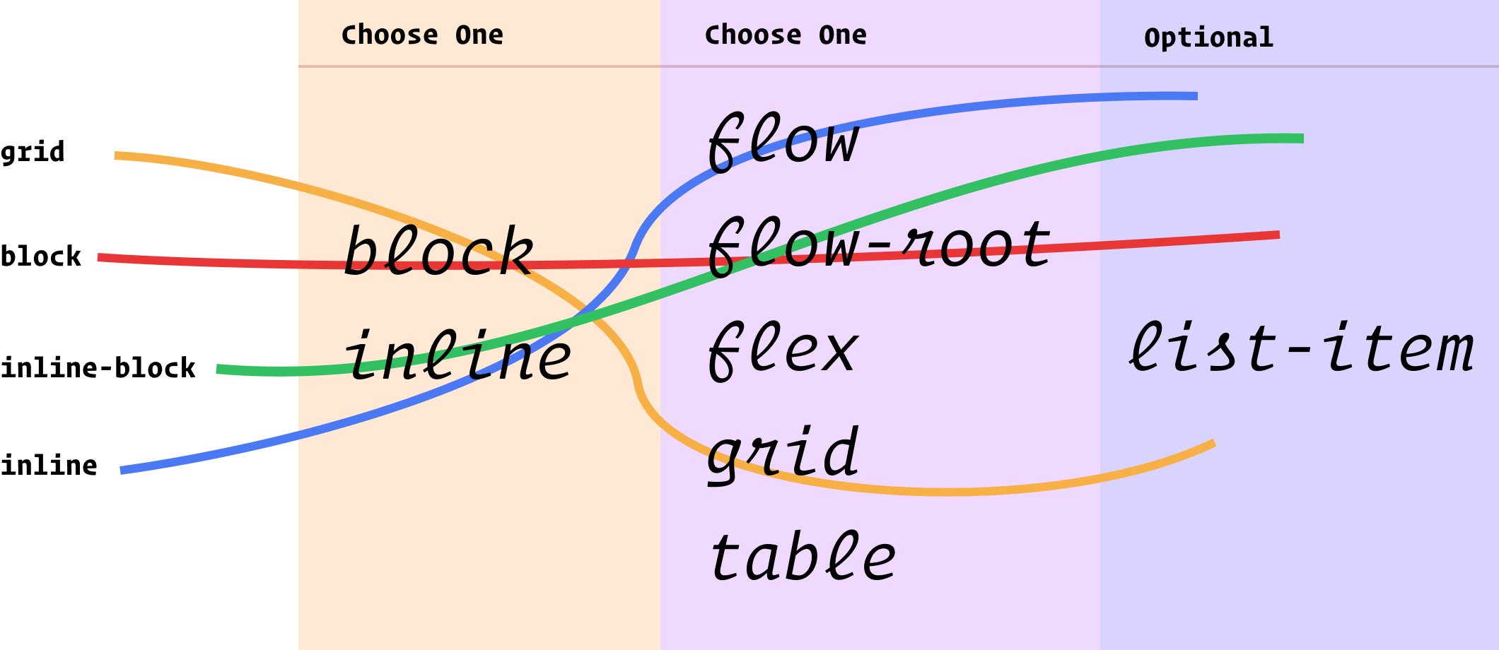
Rachel: Right, yeah. And that sort of takes that requirement to figure out each individual feature for, and also because we get partial implementations of stuff all the time on the platform and it’s like, so the kind of feature grouping part of this, it is the big piece of work really to actually identify, does the feature completely work everywhere because sometimes there will be support for things. I think one of the things that, an obvious thing that people understand is the gap property in where in Flexbox and Grid and so on. Now you could test for that. You could test for where the gap was supported and a browser would say yes because it was supported in grid layout even when it wasn’t supported in flex layout and therefore there was no way to check for this. And it was quite confusing for people if they were just doing that test. So I think theres these sort of groupings of things is also quite useful. So the things that are in Baseline are things that do work as a feature, even if that does actually involve various moving parts.

Drew: Yes, because theres been a trend from the sort of latest CSS specs to be, whats the word, sort of unifying some of the properties isn’t there rather than-

Rachel: Yes.

Drew:span> ... rather than having individual properties that do the same thing in different context, using the same-

Rachel: Right.

Drew:span> ... keywords across different uses.

Rachel: Yeah, so things like alignment, fragmentation, we’ve got these specifications that deal with sort of alignment across all of the different layout specs, which is great because it means that say if you want to switch from a flex to a grid layout or whatever, all the alignment stuff should work in the same way, but does mean that we potentially get these partial implementations and that’s quite difficult to understand. So yeah, I think it’s things like that and so that theres an awful lot actually goes into the creation of this sort of feature set grouping and we’re not all the way there yet. We’re hoping to get most of CSS and JavaScript done by the end of the year because it’s actually quite a job just to figure out how things all fit together.

Drew: So it’s almost like instead of targeting a version of any particular browser, we’re targeting a version of the web platform. We’re saying-

Rachel: Yeah.

Drew:span> ... look at the web platform as it is here today, these are the things that are universal, that are reliable to use and that’s what we’re going to support. And anything that falls out of that boundary included because the implementation might be patchy.

Rachel: Right, yeah. It might need a bit more care. And it’s not saying to people, oh, you can’t ever use these things, but if you know it’s not in Baseline then maybe theres some things you need to think about there and it might be fine for your project or it might be that it has a good fallback or it’s something that is polyfillable but those are things that you do need to think about on a case-by-case basis rather than just, this should be fine to use.

Drew: I think most of us are familiar with sites like canIuse.com, which you mentioned briefly before. Is this just replicating information that already exists or is it different from can I use?

Rachel: I think it’s different in that, so something that can I use does, and also the MDN BCD data, they work very much on a sort of feature-by-feature basis. They don’t actually cover all of the web platform. Theres definitely, certainly Can I use has made some decisions in terms of how to group certain things. I have a long standing open issue to split out fragmentation from multicar for example, because they’re bundled together, making multicar look harder to use than it actually is because there are fragmentation bugs in there.

Rachel: So they’ve done some of the same stuff, but what we haven’t got there is this sort of full view of the platform and this idea of this is within Baseline, this is out, you still have to go to each thing and make those decisions. Ideally we’re hoping, I mean as MDN are using Baseline on feature pages, they’re rolling that out at the moment. It’s probably saying that we’re hoping that Can I use, we’ll also be able to use and say, "Oh, this feature is in Baseline" as well as that more fine grained data.

Drew: And how do you make that decision to say that yes, this, not only is this supported but this is widely supported enough that we can include it in Baseline. How do you make that distinction?

Rachel: So at the moment we’re going back the last two major versions of browsers and theres been a lot of debate about that — as you can imagine. It’s something that’s great to [inaudible 00:17:38]. The fact is I think the line will always be wrong for if we say this is the line, two versions back, a lot of people are saying, "Oh, you should use minor versions of Safari" because we’ve seen some massive features going in doc releases because of the way that Safari do their versioning because obviously a main version of Firefox and Chrome, that’s every month we’ve got a new main version. And so that’s obviously up for debate. Some people are saying we should go further back. Other people are pointing out the fact that just because Chrome has updated, all of the browsers are derivatives that use chromium, they might not have updated. So I think the line will always be wrong, I think.

Rachel: But what it does give is this sort of stable view onto things. And the other thing that we’re planning to do as part of this is to have these kind of moments in time. So at the end of the year we’re going to say, right this cut is where we are at that point is going to be Baseline 24 and that will be a static line. That will be whats in Baseline at this point in time. And then in a years time we’ll do Baseline 25. And I think an interesting thing then will be the difference between those two points because I think a conservative web team could say, "Right, I am sticking with Baseline 24" even though maybe they’re well into 25, we’re sticking with this.

Rachel: But the things between those two lines then I think become the things that you might want to make judgments on rather than having to look at the entire web platform and say, "Oh, can I use this? Can I use that?" And say, "Well, we’re going to use this yearly cut of Baseline." And then the things that came after that that are in Baseline as it moves forward we’ll take a look at and see, oh, I can polyfill that or this is fine as a progressive enhancement.

Drew: It puts me in mind slightly of things like Ubuntu Linux distribution and their long-term support releases that they do.

Rachel: Right.

Drew: They’ll say, "This is the one that we offer long-term support. It’s stable, it’s reliable to use." And so you might adopt that and that doesn’t mean that you wouldn’t necessarily install a couple of key extra, more frequently updated packages or whatever, but you know that the system that you’re working with is sort of frozen in time and supported and is a known quantity going forward.

Rachel: Yeah.

Drew: I guess those who work in very regulated industries who sort of frequently go under contract with customers or suppliers, whatever, to say they’ll provide compatibility with certain browsers as it is at the moment. Surely this would be a very welcome change because these are actually more concrete measures that support can be tied to and it’s a stability that’s more in line with the stability of a binding agreement than an arbitrary version number that some nerd in Silicon Valley might attach to a build of a browser.

Rachel: Right.

Drew: So you can say our platform is targeting Baseline 24 and you could keep that way for three, four years maybe.

Rachel: Yeah.

Drew: And then review it and update.

Rachel: Yeah, I like that. I like that stuff, yeah, the idea, this is a sort of stable thing and I think that that yearly release will become, I think, quite important. So I think I can see libraries and frameworks and so on tying themselves essentially to a stable release, one of the yearly cuts and then moving on. And I think it should be really interesting as well being able to see, well actually how has the platform moved on between those two yearly points? We don’t really have a look at that at the moment. I mean you could work it out, but it’d be quite a lot of work. It’d be nice just to be able to see that and see how things are changing.

Drew: I always enjoy a list of features that are included in whatever. Heres things that you can use that you won't, perhaps weren’t aware of. And I can see how a big list of Baseline features might highlight different things that an individual developer might not be aware of that-

Rachel: Yeah.

Drew:span> ... have arrived on the web platform and are ready to be used.

Rachel: Yeah, I mean the awareness is a big thing. I mean, I’ve been doing, me and a colleague as well have been doing talks, whats new on the web platform type talks and typically introducing things that are interoperable. And every time there will be people saying, "Oh, I never knew you could do that", or "I never knew that worked. I thought that was an experimental thing." And then realizing that it’s actually a feature that’s in all engines. And I think that that’s very, very common. So I think that’s the other sort of side of this is that it also raises awareness of features that now are interoperable, that people have got an idea that the web platform moves incredibly slowly.

Rachel: I think particularly people like us who’ve been doing this for a long time and remember those days. And so people are very surprised, you know, you still see people saying about a new feature, "Oh well it’ll be five years before I can use that." And yet you’re looking at things like container queries and cascade layers. All of these things landed cross browser very, very quickly, which is great. And I think that’s a story that this can help tell as well.

Drew: So this was a big announcement from Chrome at the big Google I/O conference, but you mentioned it’s not just a Google thing is it, there are other parties involved. So who is deciding whats in the collective Baseline? What parties are involved in this?

Rachel: Right, yeah, so I mean obviously we partnered very closely with Mozilla and MDN in launching this. So that actually during the developer keynote we launched this on web.dev and on MDN at the same time on a select number of pages because we haven’t got a full feature site yet. But it was nice to actually show what it would look like rather than it being a kind of theoretical thing. And also MDN published a blog post about it too and their thinking. But yeah, the work has been done within the Web DX community group and that group has representatives from all of the browsers and various other people including interested developers.

Rachel: Anyone can join that group and be part of those discussions. So that’s where we’re also asking people to go and comment on this stuff rather than, I mean people are very welcome to come and talk to me about it, but in terms of getting sort of information out there and discussed by the wider group, raise issues on the Web DX community group site because that’s where the people are who are making the decisions. And at the moment it’s just fantastic to be getting the feedback into that group so that we can actually see is this solving a problem, what problems maybe we’ve missed and be able to talk about that.

Drew: So it’s a broader community effort, but it just so happens that the major players Google, Mozilla and everything are putting a lot of time and effort into it and really backing it as an idea.

Rachel: Yeah, yeah. And I think that’s something that as DevRel, you know, as developer relations, that’s kind of what we do. We try and bridge the gap between browser engineers and spec writers and the developer community. And so I think that’s something that we can do as DevRel for the web is to actually bring forward these things that we think might help and see where we can take them.

Drew: Now I’ve heard about the Interop 2022 and now 2023 initiatives. Does Baseline relate to Interop at all? Or maybe you could talk us through that where it fits in?

Rachel: Yeah, I mean it’s kind of the same group of people certainly as Google who are involved with those projects. So the Interop project takes a set of features that if it’s based on web platform tests, so it takes a set of features that have some sort of interoperability problem. So it might be that they don’t work in one or more browsers or they have sort of bugs that are causing pupil problems. So we’ve got this set of features and then over the year all of the engines work to implement or fix those things. So we’ve kind of got a score, a scoreboard where you can go and look and see how everyones doing.

Rachel: So the Interop project works to fix known issues, either make things interoperable or fix books and things that look on paper like they work, but have some sort of problems. And so that project is getting more things essentially into Baseline. So they’re linked in that way and they’re a lot of the very similar people are working together on those from the browsers. So I think in terms of the relationships there and the fact that Interop did bring, for the first time, all of the vendors together in this sort of common goal to make the platform better, theres definitely a link there in terms of this is what we care about. Whereas Baselines kind of from the other side, it’s saying, well, okay, what is there? What is interoperable? What can we already use? So yeah, hopefully things like Interop will help to add more things to Baseline as we go along.

Drew: So it is basically just identifying things that could potentially go into Baseline, might be nearly there, and then swarming on those features to get them across the line and get them interoperable and usable on the platform because they’re seen as important or significant in some way.

Rachel: Yeah, and I mean we know that that developers aren’t going to use things in general unless they are available across all engines. So it’s kind of in everyones interest to work together to get to that point because then people use the stuff that we’re building so that, yeah, it’s said so they kind of work very well together. And I think it’s just this sort of spirit of collaboration and trying to make things better for developers.

Drew: We’ve talked about how developers might target, in past, a browser version and now we’re saying would target Baseline, but it works the other way around, doesn’t it? If the frameworks and the tools that we are using as dependencies in our projects, they can also declare that as a level of support. Is that right?

Rachel: Yeah, absolutely. I think that’s something that we’d love to see how a framework or whatever you could say, everything that is used by this framework is Baseline or is Baseline 24 or what have you. That’s going to give a lot of clarity to developers to not then need to fish around in the framework and find out what they’re doing to make sure 'cause if you’ve got to do a certain level of browser support in your project, you need to make sure that everything you use also has that level of browser support so that it could definitely make that a lot clearer.

Rachel: And I think also things like publishing articles. One of the things that frustrates people, and I know as someone who writes and edits a lot of content, is if people get halfway through an article and then they find something that is experimental or is so new or only works in Chrome or whatever, that’s really frustrating because you think, oh, I’ve found the thing that helps me solve my problem. You’re working through it and then you’re like, oh, that’s not coming 'til next year. And so have been able to put on an article, everything in this article is in Baseline. That gives you a lot of confidence to go forward. So I think theres lots of uses for this out in the community and that’s something we really hope will happen, that just to give that kind of clarity to developers.

Drew: It’s that last section of an article, isn’t it? You’re reading along about some interesting technology and then it comes to the section of how you might work around it for the browsers that don’t support it.

Rachel: Yeah.

Drew: I thought-

Rachel: Exactly.

Drew:span> ... we were into a good thing here.

Rachel: Yeah, 'cause when you’re searching, you’re searching to solve a problem, things come up. It’s very frustrating if you realize that it’s a year away or other browsers have said we’re not doing that or whatever, you know? So yeah, I think theres a lot of opportunities for clarity for people who are writing and for developers of libraries and frameworks to actually just make it very obvious to developers what the status is.

Drew: And things like WordPress themes for example, or any of these sorts of things where you’re taking somebody elses code and making it part of your project to know that what level of support in terms of web functionality is in that is invaluable. I guess it would make sense for things like tools that any tool that gives you code to embed into your site, be that a Stripe checkout or a live chat widget or any of those sorts of things, I guess it would make sense for them to declare their state of compatibility too.

Rachel: Yeah, yeah, it’s just kind of a shorthand. It saves you having to do all of that investigating for each thing that you use. And we know that every website these days has tons and tons of third party stuff in it. We’re not all sitting down with Notepad anymore and carefully crafting our websites. So I think anything that makes that easier and allows people to show the status of things is really helpful.

Drew: It actually is a really simple concept, isn’t it, to say heres the set of features, they’re well supported, we’re giving it a label, we’re documenting it. It’s actually so simple, it’s really rather genius I think. It’s some amazing work that’s been done there by everyone involved.

Rachel: Yeah, I think it speaks to a lot of what I’ve thought about over many years in terms of that kind of clarity. And that’s always been my thing is making things clear to people, making things seem straightforward rather than trying to make things complex. And so I really love being able to be involved with this and bring it forward.

Drew: The HTML spec for example has a process for an element or an attribute to be deprecated. So things get removed from the spec as they become obsolete or they’re replaced by a newer specification. Is it possible for features to drop out of Baseline once they’ve been included?

Rachel: It could be possible. It’s one of the things we’ve talked about a lot. I think really the devil will definitely be in the detail with all this stuff. And that’s one of the things is well what happens if something essentially gets broken? Maybe one engine does something which causes a problem with something. There is a possibility that yes, we’d have to remove something. That’s definitely something we’ve talked about. I mean hopefully browsers aren’t going around breaking stable features, but it is a possibility or something might get deprecated although we tend not to fully remove things from the web platform very often. It’s more that we say, "Yeah, maybe don’t use this," but there is a possibility that something that is in Baseline could start to have a problem because of something that one of the engines does.

Drew: I guess then that’s one area where these sort of yearly cuts as you’ve described them, become sort of quite useful in that something might have appeared in Baseline 24 but then in Baseline 30 it might be gone and there is a way of having a distinction there.

Rachel: Yeah, and it would also highlight that stuff I think a lot more clearly than we have a way of doing at the moment because I think hard to know what things have actually been deprecated on the platform. A lot of things that are deprecated are things that are only in one engine and therefore would never have been in Baseline in the first place. But yeah, it is possible as things move forward that that would happen and it would make it clearer.

Drew: And such as the way of the web, we do deprecate things, but as you say, they don’t ever go away really.

Rachel: Yeah.

Drew: We don't-

Rachel: I was just saying maybe don’t use—

Drew:span> ... tend to remove things, you know, can still use the, I’m guessing you can still use HTML font tags because we don’t break things once they’re standardized.

Rachel: Yeah.

Drew: Even though nobody would ever recommend using them, they’re still going to work in your browser because sites have been developed to that standard and the browser-

Rachel: Yeah.

Drew:span> ... will continue to support it. I guess, in a way, theres Baseline forms a little bit of a positive pressure. If a feature does get broken, then the fact that it was in Baseline and the whole community is relying on it being there is a factor in prioritizing what gets worked on by that particular maintainer of that browser engine. They’re going to see that, no, this is important, we need to fix it pretty quick.

Rachel: Yeah.

Drew: So hopefully it’s a sort of positive pressure in that regard. There seems to be so much really in development and coming to the web platform. Are there any particular things that you’re really looking forward to seeing becoming interoperable in the coming months?

Rachel: Yeah, I mean theres a bunch of interesting stuff. I’ve always been interested in the things that look at things that developers are already doing. So they’re using JavaScript to do it, or what have you, and then having them built into the platform because obviously things that are built into the platform we can build in things like accessibility and also performance. Things that tend to perform an awful lot better if they’re a built-in feature as opposed to being JavaScript on top. So theres sort of interesting stuff from the open UI group. The next thing that is about to land in Chrome is the Popover API. And of course popovers are something like everybodys building all the time.

Drew: Yeah.

Rachel: And I think a lot of these open UI things are very much those sorts of features that pretty much every developer, every front end developer has built on numerous occasions. And every front end developer has tried to solve the accessibility issues and the performance issues and the sort of weird bugs that come up when they interact with other things. And so the fact that these are getting actually built into browsers, I think, is very exciting because it just, it’s a bunch of work you don’t have to do and it’s probably going to have better accessibility and so on than most people are going to be able to manage for themselves and it gives something to build on top of as well, you know, can add things to them.

Rachel: So yeah, so I’m excited to see Popover and in a similar sort of vein is the work on scroll-driven animations because that’s a thing that people like to do and is very hard to do well, you know, having things that animate on scroll and that, again, is something that is coming in. It should be in Chrome 115. So it’s, again, it’s these things that we’re doing on the front end of the web and we’re actually able then to build into the browser. I’m always very keen to see those 'cause I think they solve a lot of problems.

Drew: Yeah, definitely. I mean anywhere where a developer has to mimic something that you think is native browser UI and you’re trying to build it yourself, there are so many places to go wrong, aren’t there?

Rachel: Yeah.

Drew: If you’ve ever had any of your work through an accessibility audit, you know that it’s things like modal dialogues and all these sort of things that constantly will contain flaws that need to be addressed because theres just so many things to think about in terms of keyboard focus and clicking away and all these different subtleties that you need to make sure that you take care of, that is, as much as anything, as much as it being bad for accessibility, if you get it wrong, it’s a massive waste of time for all us developers doing this all ourselves over and over again when it just makes sense. Most apps will have some sort of modal or popover functionality. So yeah, it makes complete sense for it to be part of the platform implemented by the browser vendors in a way where it’s accessible and it’s just a good solid layer to then build on top of in terms of styling and yeah-

Rachel: Yeah.

Drew:span> ... it makes total sense. It’s a exciting way to see the platform go.

Rachel: Yeah and I think, because the other thing with everyone building their own thing is that a lot of people don’t build their own thing, they rely on a third party thing and quite often things people are relying on are actually really old and they haven’t been updated to, they might have issues with accessibility or whatever and they haven’t really been updated for more modern browsers. And so it’s sort of, I think the more that people can use whats built into the browser, the sort of better experience that the end user of the site is likely to have.

Drew: So your team at Google maintains a bunch of resources to help developers keep up-to-date with the web platform. What are those resources and where should people go to look and find things? What would they expect to find there?

Rachel: Yeah, so we’ve got web.dev and developer.chrome.com are our two sites that DevRel own. It used to be, back in the day, when I sort of arrived, there was a real mixture of things on each site and a sort of thing that was commonly said was that Chrome were using web.dev to pretend things that were only in Chrome were stable APIs, lets say I don’t think anyone ever intended to pretend that. I think there was just a slightly disorganized content strategy. So as kind of part of the preparation for Baseline, because I wanted to make sure that we could be clear because if we’re talking about developer clarity, it’s pretty bad if all of our stuffs in a mess. I started moving content. And so now, certainly all the newer content, there may be some older stuff that we haven’t tracked down, but the newer content, if you go to web.dev, you should really be seeing stuff about stable APIs.

Rachel: So things that are interoperable and also things that are coming onto the platform. I do a sort of whats new on the web platform that includes some new stuff from all engines. So that kind of looking at what the broader landscape is and also things like our best practices. So things like about performance, which while some of the tooling is Chrome-only, raising the performance of your site, it is going to help in all engines. So that’s whats there on web.dev. So that’s kind of the practical side of things. You’re building a website, you want some advice. That’s what we’re doing there. And I try very hard to make that about the web, not about Chrome and that’s the sort of content there.

Rachel: But obviously we are a team that’s supporting Chrome and supporting the things that Chromes releasing and so we do that over on developer.chrome.com. So that’s going to be your new APIs. You want to find out about popover that’s landing, there’ll be an article about that soon. So all the things that Chrome is doing for the web, essentially you can find on developer.chrome.com. So that will be experimental things or Chrome-only things, things that are Chrome-only for now, all that stuff is there. And I hope that brings a bit of clarity to our content and that we’re not trying to pretend anything. We’re just trying to be clear about what we’re doing and how well supported it is.

Drew: Great. So we’ve been learning all about Web Platform Baseline. What have you been learning about lately, Rachel?

Rachel: Theres always something interesting to learn about. I’ve done a couple of things. I’ve been learning Python because it’s a language that I, for whatever reason, never learned. I’ve learned various languages over the years, but I do less web development these days and more kind of comparing of data sets and Python is the language that a lot of that stuff is done in. So it’s quite fun to learn new language anyway and it’s useful for the sort of stuff I tend to find myself doing these days.

Rachel: And I’ve also been thinking a bit about the whole generative AI space and in particular as a content lead, how do we prepare our content to make it more useful to those kind of models because theres a lot of stuff about asking questions of a chatbot and so on. And so I’ve been kind of just starting to read around that subject a little bit and start to see, well, if we’re preparing content, how can we be making that more useful for that kind of thing and that interaction?

Drew: If you, dear listener would like to hear more from Rachel, you can find her on the web at rachelandrew.co.uk where you’ll find links to her socials, her writing and numerous other projects. And you can find her writing regularly about the web platform at web.dev. Thanks for joining us today, Rachel. Did you have any parting words?

Rachel: Let us know about Baseline. Comment and raise some issues, or just join in the chat on the Web DX community group, on the GitHub repo there. We’d really like to hear what you think. This is, we’ve been talking about it internally for a long time and so now we’ve got it out there and I think the work starts now and the discussion with the community starts now. And so we’re all very, very excited to read the feedback and find out what you think.

Resources

Delightful UI Animations With Shared Element Transitions API (Part 1)

Animations are an essential part of web design and development. They can draw attention, guide users on their journey, provide satisfying and meaningful feedback to interaction, add character and flair to make the website stand out, and so much more!

Before we begin, let’s take a quick look at the following video and imagine how much CSS and JavaScript would take to create an animation like this. Notice that the cart counter is also animated, and the animation runs right after the previous one completes.

Although this animation looks alright, it’s just a minor improvement. Currently, the API doesn’t really know that the image (shared element) that is being moved from the container to the overlay is the same element in their respective states. We need to instruct the browser to pay special attention to the image element when switching between states, so let’s do that!

Creating A Shared Element Animation

With page-transition-tag CSS property, we can easily tell the browser to watch for the element in both outgoing and incoming images, keep track of element’s size and position that are changing between them, and apply the appropriate animation.

We also need to apply the contain: paint or contain: layout to the shared element. This wasn’t required for the crossfade animations, as it’s only required for elements that will receive the page-transition-tag. If you want to learn more about CSS containment, Rachel Andrew wrote a very detailed article explaining it.

.gallery__image--active {
  page-transition-tag: active-image;
}

.gallery__image {
  contain: paint;
}

Another important caveat is that page-transition-tag has to be unique, and we can apply it to only one element during the duration of the animation. This is why we apply it to the active image element right before the image is moved to the overlay and remove it when the image overlay is closed and the image is returned to its original position:

async function toggleImageView(index) {
   const image = document.getElementById(js-gallery-image-${index});

  // Apply a CSS class that contains the page-transition-tag before animation starts.
  image.classList.add("gallery__image--active");

  const imageParentElement = image.parentElement;

  const moveTransition = document.createDocumentTransition();
  await moveTransition.start(() => moveImageToModal(image));

  overlayWrapper.onclick = async function () {
    const moveTransition = document.createDocumentTransition();
    await moveTransition.start(() => moveImageToGrid(imageParentElement));

    // Remove the class which contains the page-transition-tag after the animation ends.
    image.classList.remove("gallery__image--active");
  };
}

Alternatively, we could have used JavaScript to toggle the page-transition-tag property inline on the element. However, it’s better to use the CSS class toggle to make use of media queries to apply the tag conditionally:

// Applies page-transition-tag to the image.
image.style.pageTransitionTag = "active-image";

// Removes page-transition-tag from the image.
image.style.pageTransitionTag = "none";

And that’s pretty much it! Let’s take a look at our example with the shared element applied:

Customizing Animation Duration And Easing Function

We’ve created this complex transition with just a few lines of CSS and JavaScript, which turned out great. However, we expect to have more control over the animation properties like duration, easing function, delay, and so on to create even more elaborate animations or compose them for even greater effect.

Shared Element Transitions API makes use of CSS animation properties and we can use them to fully customize our state animation. But which CSS selectors to use for these outgoing and incoming states that the API is generating for us?

Shared Element Transition API introduces new pseudo-elements that are added to DOM when its animations are run. Jake Archibald explains the pseudo-element tree in his Chrome developers article. By default (in case of crossfade animation), we get the following tree of pseudo-elements:

::page-transition
└─ ::page-transition-container(root)
   └─ ::page-transition-image-wrapper(root)
      ├─ ::page-transition-outgoing-image(root)
      └─ ::page-transition-incoming-image(root)

These pseudo-elements may seem a bit confusing at first, so I’m including WICG’s concise explanation for these pseudo-elements and their general purpose:

  • ::page-transition sits in a top-layer, over everything else on the page.
  • ::page-transition-outgoing-image(root) is a screenshot of the old state, and ::page-transition-incoming-image(root) is a live representation of the new state. Both render as CSS replaced content.
  • ::page-transition-container animates size and position between the two states.
  • ::page-transition-image-wrapper provides blending isolation, so the two images can correctly cross-fade.
  • ::page-transition-outgoing-image and ::page-transition-incoming-image are the visual states to cross-fade.

For example, when we apply the page-transition-tag: active-image, its pseudo-elements are added to the tree:

::page-transition
├─ ::page-transition-container(root)
│  └─ ::page-transition-image-wrapper(root)
│     ├─ ::page-transition-outgoing-image(root)
│     └─ ::page-transition-incoming-image(root)
└─ ::page-transition-container(active-image)
   └─ ::page-transition-image-wrapper(active-image)
      ├─ ::page-transition-outgoing-image(active-image)
      └─ ::page-transition-incoming-image(active-image)

In our example, we want to modify both the crossfade (root) animation and the shared element animation. We can use the universal selector * with the pseudo-element to change animation properties for all available transition elements and target pseudo-elements for specific animation using the page-transition-tag value.

In this example, we are applying 400ms duration for all animated elements with an ease-in-out easing function, and then override the active-image transition easing function and setting a custom cubic-bezier value:

::page-transition-container(*) {
  animation-duration: 400ms;
  animation-timing-function: ease-in-out;
}

::page-transition-container(active-image) {
  animation-timing-function: cubic-bezier(0.215, 0.61, 0.355, 1);
}

Accessible Animations

It’s important to be aware of accessibility requirements when working with animations. Some people prefer browsing the web with reduced motion, so we must either remove an animation or provide a more suitable alternative. This can be easily done with a widely supported prefers-reduced-motion media query.

The following code snippet turns off animations for all elements using the Shared Element Transitions API. This is a shotgun solution, and we need to ensure that DOM updates smoothly and remains usable even with the animations turned off:

@media (prefers-reduced-motion) {
    /* Turn off all animations */
    ::page-transition-container(*),
    ::page-transition-outgoing-image(*),
    ::page-transition-incoming-image(*) {
        animation: none !important;
    }

    /* Or, better yet, create accessible alternatives for these animations  */
}

@keyframes fadeOut {
    from {
        filter: blur(0px) brightness(1) opacity(1);
    }
    to {
        filter: blur(6px) brightness(8) opacity(0);
    }
}

@keyframes fadeIn {
    from {
        filter: blur(6px) brightness(8) opacity(0);
    }
    to {
        filter: blur(0px) brightness(1) opacity(1);
    }
}

Now, all we have to do is assign the exit animation to the outgoing image pseudo-element and the entry animation to the incoming image pseudo-element. We can set a page-transition-tag directly to the HTML image element as it’s the only element that will perform this animation:

/* We are applying contain property on all browsers (regardless of property support) to avoid differences in rendering and introducing bugs */
.gallery img {
    contain: paint;
}

@supports (page-transition-tag: supports-tag) {
    .gallery img {
        page-transition-tag: gallery-image;
    }

    ::page-transition-outgoing-image(gallery-image) {
        animation: fadeOut 0.4s ease-in both;
    }

    ::page-transition-incoming-image(gallery-image) {
        animation: fadeIn 0.4s ease-out 0.15s both;
    }
}

Even the seemingly simple crossfade animations can look cool, don’t you think? I think this particular animation fits really nicely with the dark theme we have in the example.

/* We are applying contain property on all browsers (regardless of property support) to avoid differences in rendering and introducing bugs */
.product__dot {
  contain: paint;
}

.shopping-bag__counter span {
  contain: paint;
}

@supports (page-transition-tag: supports-tag) {
  ::page-transition-container(cart-dot) {
    animation-duration: 0.7s;
    animation-timing-function: ease-in;
  }

  ::page-transition-outgoing-image(cart-counter) {
    animation: toDown 0.3s cubic-bezier(0.4, 0, 1, 1) both;
  }

  ::page-transition-incoming-image(cart-counter) {
    animation: fromUp 0.3s cubic-bezier(0, 0, 0.2, 1) 0.3s both;
  }
}

@keyframes toDown {
  from {
    transform: translateY(0);
    opacity: 1;
  }
  to {
    transform: translateY(4px);
    opacity: 0;
  }
}

@keyframes fromUp {
  from {
    transform: translateY(-3px);
    opacity: 0;
  }
  to {
    transform: translateY(0);
    opacity: 1;
  }
}

And that is it! It amazes me every time how elaborate these animations can turn out with so few lines of additional code, all thanks to Shared Element Transitions API. Notice that the header element with the cart icon is fixed, so it sticks to the top, and our standard animation setup works like a charm, regardless!

See the Pen Add to cart animation - completed (2) [forked] by Adrian Bece.

Conclusion

When done correctly, animations can breathe life into any project and offer a more delightful and memorable experience to users. With the upcoming Shared Element Transitions API, creating complex UI state transition animations has never been easier, but we still need to be careful how we use and implement animations.

This simplicity can give way to bad practices, such as not using animations correctly, creating slow or repetitive animations, creating needlessly complex animations, and so on. It’s important to learn best practices for animations and on the web so we can effectively utilize this API to create truly amazing and accessible experiences or even consult with the designer if we are unsure on how to proceed.

In the next article, we’ll explore the API’s potential when it comes to transition between different pages in Single Page Apps (SPA) and the upcoming Cross-document same-origin transitions, which are yet to be implemented.

I am excited to see what the dev community will build using this awesome new feature. Feel free to reach out on Twitter or LinkedIn if you have any questions or if you built something amazing using this API.

Go ahead and build something awesome!

Many thanks to Jake Archibald for reviewing this article for technical accuracy.

References

Native CSS Masonry Layout In CSS Grid

A Level 3 of the CSS Grid specification has been published as an Editor’s Draft, this level describes a way to do Masonry layout in CSS. In this article, I’ll explain the draft spec, with examples that you can try out in Firefox Nightly. While this is a feature you won’t be able to use in production right now, your feedback would be valuable to help make sure it serves the requirements that you have for this kind of layout. So let’s take a look.

What Is A Masonry Layout?

A masonry layout is one where items are laid out one after the other in the inline direction. When they move onto the next line, items will move up into any gaps left by shorter items in the first line. It’s similar to a grid layout with auto-placement, but without sticking to a strict grid for the rows.

The most well-known example of masonry is on Pinterest, and you will sometimes hear people refer to the layout as a "Pinterest layout".

There are a number of JavaScript tools to help you create this kind of layout, such as David DeSandro’s Masonry plugin.

Can’t We Already Do This In CSS?

We can come close to a masonry layout in a couple of ways. The closest way to achieve the look of this type of layout is to use Multi-column Layout. In the example below, you see something which looks visually like a masonry layout. However, the order of the boxes runs down the columns. Therefore, if the first items have the highest priority (e.g. if this were search results), then the apparent first items in the top row aren’t actually the ones that came back first.

That’s all you need to do to get a simple masonry layout. Using Firefox, you can see that in the CodePen example below.

Note: You can use any of the values used for align-content for align-tracks and justify-tracks. There are some nice examples in the spec of different combinations.

If you set align-tracks: stretch, then any auto-sized items in the layout will stretch. The masonry effect is retained, but anything with a definite size on that axis will not be stretched out of shape.

See the Pen Masonry align-tracks: stretch by Rachel Andrew (@rachelandrew) on CodePen.

The align-tracks and justify-tracks properties can take multiple values. One for each track in the grid axis. This means that in our four-track grid we could have the first track stretching, the second aligned to start, the third aligned to end, and the fourth aligned to center.

This did not seem to work at the time of writing in Firefox.

The spec details that if there are fewer values than tracks, the remaining tracks will use the final specified value. If there are more values than tracks, additional ones will be ignored.

Fallback Behavior

The inclusion of this feature into the grid specification has a definite benefit where creating a fallback layout is concerned. As masonry behaves in a similar way to auto-placement, if a browser doesn’t support masonry then regular auto-placement can be used instead. This is likely to create the gaps in the layout as seen in the earlier example, but is certainly not terrible.

You can see this in action by looking at any of the demos so far using a browser with no support for masonry. You still get a layout. If you wanted to do something entirely different then you could check for support for masonry with feature queries. You could perhaps do the layout with multicol for non-supporting browsers.

@supports (grid-template-rows: masonry) {
  /* masonry code here */
}

If the masonry layout is vital then you could check for masonry support using CSS.supports and only use the JavaScript masonry script if there is no support. This would mean that as browsers implement native masonry they would lose the overhead of the scripted version, but it would be there as a polyfill.

Potential Accessibility Concerns

While masonry in CSS is exciting, it is yet another place where content reordering and a disconnection of the document order from the visual order may happen. As I noted on a recent issue that was raised, I feel that we are creating exciting layout possibilities and then needing to tell people to be very careful how they use them.

I’ve written about this problem in Grid, content reordering, and accessibility. I hope that as we move forward with this specification, there are also renewed efforts to find a good way forward with regard to content vs. display order.

Your Feedback Is Needed

We are really lucky to not only have this new spec, but to have a browser implementation to test it in. If you have examples where you have used masonry, why not try replacing your JavaScript with the grid version and see if it works for you? If you run into problems or can’t do something you were able to do in your previous implementation, please let the CSSWG know by raising an issue.

While things are in an experimental state, this is your chance to help influence any changes and point out any problems. So please do, and help make this really great feature even better!

Collective #623


Sidebar Webring

The Sidebar Webring is a collection of handpicked sites and blogs focused on design and the web. Read more about reviving this cool old concept in this article by Sacha Greif.

Check it out


BGJar

A Free SVG background generator with lots of patterns to choose from.

Check it out


Is this evil?

Lars Wikman asks an interesting and important question reagrding some “evil” things that can be done with CSS.

Read it


Crumbskees

Such a cool game: The Crumbskees are lunch-munching couch potatoes on the hunt for more food. Eat as many snacks as you can before your show comes back from commercial!

Check it out


How to use CSS masking

Rachel Andrew explains how to use the mask-image property in CSS, which lets you specify an image to use as a mask layer.

Read its


The post Collective #623 appeared first on Codrops.

How to Use CSS Grid for Sticky Headers and Footers

CSS Grid is a collection of properties designed to make layout easier than it’s ever been. Like anything, there’s a bit of a learning curve, but Grid is honestly fun to work with once you get the hang of it. One area where it shines is dealing with headers and footers. With a little adjustment in our thinking, we can pull off headers and footers that behave like they are fixed, or have that “sticky” treatment (not position: sticky, but the kind of footer that hugs the bottom of the screen even if there isn’t enough content to push it there, and is pushed away with more content). 

Hopefully this sparks further interest in modern layouts, and if it does, I can’t recommend Rachel Andrew’s book The New CSS Layout strongly enough: it covers both of the major modern layout techniques, grid and flexbox.

What we’re making

Let’s implement a fairly classic HTML layout that consist of a header, main content and footer.

We’ll make a truly fixed footer, one that stays at the bottom of the viewport where the main content scrolls within itself, as needed, then later update the footer to be a more traditional sticky footer that starts at the bottom of the viewport, even if the main content is small, but gets pushed down as needed. Further, to broaden our exposure to grid, let’s design our main content holder so that it can either span the whole width of the viewport, or take up a nicely centered strip down the middle.

A fixed footer is slightly unusual. Footers are commonly designed to start at the bottom of the viewport, and get pushed down by main content as needed. But a persistent footer isn’t unheard of. Charles Schwab does it on their homepage. Either way, it’ll be fun to implement!

But before we move on, feel free to actually peek at the fixed footer implemented on the Charles Schwab site. Unsurprisingly, it uses fixed positioning, which means it has a hard-coded size. In fact, if we crack open DevTools, we see that right off the bat:

body #qq0 {
  border-top: 4px solid #133568;
  background-color: #eee;
  left: 0;
  right: 0;
  bottom: 0;
  height: 40px!important;
}

Not only that, but there’s the balance of making sure the main content doesn’t get hidden behind that fixed footer, which it does by setting hard-coded paddings (including 15px on the bottom of the <footer> element), margins (including 20px on <ul> in the footer), and even line breaks.

Let’s try to pull this off without any of these restrictions.  

Our baseline styles

Let’s sketch out a bare minimum UI to get us started, then enhance our grid to match our goals. There’s a CodeSandbox below, plus additional ones for the subsequent steps that get us to the end result.

First, let’s do some prep work. We’ll make sure we’re using the whole height of the viewport, so when we add our grid, it’ll be easy to put the footer at the bottom (and keep it there).  There’s only going to be one element inside the document’s <body> with an ID of #app, which will hold the <header, <main> and <footer> elements.

body {
  margin: 0; /* prevents scrollbars */
}


#app {
  height: 100vh;
}

Next, let’s set up our header, main, and footer sections, as well as the grid they’ll all sit in. To be clear, this will not work the way we want right out of the gate. It’s just to get us started, with a base to build from.

body {
  margin: 0;
}


#app {
  height: 100vh;
  
  /* grid container settings */
  display: grid;
  grid-template-columns: 1fr;
  grid-template-rows: auto 1fr auto;
  grid-template-areas: 
    'header'
    'main'
    'footer';
}


#app > header {
  grid-area: header;
}


#app > main {
  grid-area: main;
  padding: 15px 5px 10px 5px;
}


#app > footer {
  grid-area: footer;
}

We’ve created a simple one-column layout, with a width of 1fr. If that 1fr is new to you, it essentially means “take the remaining space” which, in this case, is the entire width of the grid container, #app.

We’ve also defined three rows:

#app {
  /* etc. */
  grid-template-rows: auto 1fr auto;
  /* etc. */
}

The first and third rows, which will be our header and footer, respectively, are sized with auto, which means they’ll take up as much space as needed. In other words: no need for hard-coded sizes! This is a super important detail and a perfect example of how we benefit from using CSS Grid.

The middle row is where we’ll put our content. We’ve assigned it a size of 1fr which, again, just means it takes up all of the remaining space that’s left over from the other two rows. If you’re wondering why we aren’t making it auto as well, it’s because the entire grid spans the viewport’s whole height, so we need one section to grow and fill up any unused space. Note that we do not have, nor will we ever need at any point, any fixed heights, margins, paddings — or even line breaks! — to push things into place. Such is the good life when working with grid!

Shall we try some content?

You’ll notice in the Sandbox that I used React to build this demo, but since this isn’t a post about React, I won’t belabor those details; React has absolutely nothing to do with any of the CSS Grid work in this post. I’m only using it as an easy way to navigate between different chunks of markup. If you hate React, that’s fine: hopefully you can ignore it in this post.

We have Header, Main and Footer components that render the expected <header> , <main>  and <footer> elements, respectively. And, of course, this all sits inside our #app container. Yes, in theory, #app should be an <article> element, semantically speaking, but that’s always looked weird to me. I just wanted to covey these details so we’re all one the same page as we plow ahead.

For the actual content, I have Billing and Settings sections that you can navigate between in the header. They both render fake, static content, and are only meant to show our layout in action. The Settings section will be the content that we put in a centered strip on our page, Billing will be the one that spans our whole page.

Here’s the Sandbox with what we have so far.

The Billing section looks good, but the Settings section pushes our footer off screen. Not only that, but if we scroll, the entire page scrolls, causing us to lose our header. That may be desirable in some cases, but we want both the header and footer to stay in view, so let’s fix that.

Fixed header, fixed footer

When we initially set up our grid, we gave it a height of 100vh, which is the entire height of the viewport. We then assigned the rows for the header and footer an auto height, and the main a height of 1fr to take up the remaining space. Unfortunately, when content exceeds the space available, it expanded beyond the viewport bounds, pushing our footer down and out of view.

The fix here is trivial: adding overflow: auto will cause our <main> element to scroll, while keeping our <header> and <footer> elements in place.

#app > main {
  grid-area: main;
  overflow: auto;
  padding: 15px 5px 10px 5px;
}

Here’s the updated demo that puts this to use.

Adjustable width main section

We want our <main> element to either span the whole width of the viewport, or be centered in a 600px space. You might think we could simply make <main> a 600px fixed width, with an auto margins on either side. But since this is a post about grid, let’s use moar grid. (Plus, as we’ll see later, a fixed width won’t work anyway).

To achieve our centered 600px element, we’ll actually make the <main> element a grid container. That’s right, a grid within a grid! Nesting grids is a totally legit approach, and will even get easier in the future when subgrid is officially supported across browsers. In this scenario, we’ll make <main> a grid with three column tracks of 1fr 600px 1fr or, stated simply, 600px in the middle, with the remaining space equally divided on the sides.

#app > main {
  display: grid;
  grid-template-rows: 1fr;
  grid-template-columns: 1fr 600px 1fr;
}

Now let’s position our the content in the grid. Our different modules all render in a <section> child. Let’s say that by default, content will occupy the middle section, unless it has a .full class, in which case it will span the entire grid width. We won’t use named areas here, and instead specify precise grid coordinates of the form [row-start] / [col-start] / [row-end] / [col-end]:

#app > section {
  grid-area: 1 / 2 / 1 / 3;
}


#app > section.full {
  grid-area: 1 / 1 / 1 / 4
}

You might be surprised to see a col-end value of 4, given that there’s only three columns. This is because the column and row values are column and row grid lines. It takes four grid lines to draw three grid columns. 

Our <section> will always be in the first row, which is the only row. By default it’ll span column lines 2 through 3, which is the middle column, unless the section has a full class on it, in which case it’ll span column lines 1 through 4, which is all three columns.

Here’s an updated demo with this code. It’ll probably look good, depending on your CodeSandbox layout, but there’s still a problem. If you shrink the display to smaller than 600px, the content is abruptly truncated. We don’t really want a fixed 600px width in the middle. We want a width of up to 600px. It turns out grid has just the tool for us: the minmax() function. We specify a minimum width and a maximum width, and the grid will compute a value that falls in that range. That’s how we prevent the content from blowing out of the grid.

All we need to do is swap out that 600px value with minmax(0, 600px):

main {
  display: grid;
  grid-template-rows: 1fr;
  grid-template-columns: 1fr minmax(0, 600px) 1fr;
}

Here’s the demo for the finished code.

One more approach: The traditional fixed footer

Earlier, we decided to prevent the footer from being pushed off the screen and did that by setting the <main> element’s overflow property to auto.

But, as we briefly called out, that might be a desirable effect. In fact, it’s more of a classic “sticky” footer that solves that annoying issue, and places the footer on the bottom edge of the viewport when the content is super short.

Hey, get back to the bottom!

How could we keep all of our existing work, but allow the footer to get pushed down, instead of fixing itself to the bottom in persistent view?

Right now our content is in a grid with this HTML structure:

<div id="app">
  <header />
  <main>
    <section />
  </main>
  <footer />
</div>

…where <main> is a grid container nested within the #app grid container, that contains one row and three columns that we use to position our module’s contents, which go in the <section> tag.

 Let’s change it to this:

<div id="app">
  <header />
  <main>
    <section />
    <footer />
  </main>
</div>

…and incorporate <footer> into the <main> element’s grid. We’ll start by updating our parent #app grid so that it now consists of two rows instead of three:

#app {
  /* same as before */


  grid-template-columns: 1fr;
  grid-template-rows: auto 1fr;
  grid-template-areas: 
    'header'
    'main';
}

Just two rows, one for the header, and the other for everything else. Now let’s update the grid inside our <main> element:

#app > main {
  display: grid;
  grid-template-rows: 1fr auto;
  grid-template-columns: 1fr minmax(0, 600px) 1fr;
}

We’ve introduced a new auto-sized row. That means we now have a 1fr row for our content, that holds our <section>, and an auto row for the footer.

Now we position our <footer> inside this grid, instead of directly in #app:

#app > footer {
  grid-area: 2 / 1 / 2 / 4;
}

Since <main> is the element that has scrolling, and since this element now has our footer, we’ve achieved the sticky footer we want! This way, if <main> has content that exceeds the viewport, the whole thing will scroll, and that scrolling content will now include our footer, which sits at the very bottom of the screen as we’d expect.

Here’s an updated demo. Note that the footer will be at the bottom of the screen if possible; otherwise it’ll scroll as needed. 

I made a few other small changes, like minor adjustments to paddings here and there; we can’t have any left or right paddings on <main>, because the <footer> would no longer go edge-to-edge.

I also made a last-minute adjustment during final edits to the <section> element—the one we enabled adjustable width content on. Specifically, I set its display to flex, its width to 100%, and its immediate descendant to overflow: auto. I did this so the <section> element’s content can scroll horizontally, within itself, if it exceeds our grid column boundary, but without allowing any vertical scrolling.

Without this change, the work we did would amount to the fixed footer approach we covered earlier. Making section> a flex container forces its immediate child — the <div> that contains the content — to take up all of the available vertical space. And, of course, setting that child div to overflow: auto enables scrolling. If you’re wondering why I didn’t just set the section’s overflow-x to auto, and overflow-y to visible, well, it turns out that’s not possible.

Parting thoughts 

We haven’t done anything revolutionary in this post, and certainly nothing that couldn’t be accomplished before CSS Grid. Our fixed width <main> container could have been a block element with a max-width value of 600px, and auto margins on the left and right. Our fixed footer could have been made with position: fixed (just make sure the main content doesn’t overlap with it). And, of course, there are various ways to get a more traditional “sticky footer.”

But CSS Grid provides a single, uniform layout mechanism to accomplish all of this, and it’s fun to work with — honestly fun. In fact, the idea of moving the footer from fixed to sticky wasn’t even something I planned at first. I threw it in at the last minute because I thought the post was a bit too light without it. It was trivial to accomplish, basically moving grid rows around, not unlike putting lego blocks together. And again, these UIs were trivial. Imagine how brightly grid will shine with more ambitious designs!


The post How to Use CSS Grid for Sticky Headers and Footers appeared first on CSS-Tricks.

You can support CSS-Tricks by being an MVP Supporter.

SmashingConf Fully Online For 2020

SmashingConf Fully Online For 2020

SmashingConf Fully Online For 2020

Rachel Andrew

2020 has been quite the year, and it’s only July. None of us can be certain what the rest of the year looks like, in particular for travel and events where lots of folks gather together. Given the uncertainty and the success of our online workshop series and Meets events, we’re taking all of our 2020 conferences online. How will that work? Read on to find out!

All of our online conference events will take place on the Hopin platform. We roadtested this platform for our Smashing Meets, and we love the way it allows for social chat and side events alongside the main conference. It’s as close as we can get to an in-person experience.

First Up: The Rescheduled SmashingConf Live!

We will be presenting SmashingConf Live on August 20th-21st. Two half-days, with four talks each day on UX, data visualization, CSS, and JavaScript.

Meet other people in our chat or network on our event platform. Join in on our Design and Coding Tournament, or enjoy watching folks taking part.

Join one of the many sessions! Listen to one of the fireside chats on privacy, web performance, and Machine Learning (ML). Get your website reviewed by one of our speakers.

Take a look at the full schedule. If you have bought a ticket to the postponed SmashingConf Live, your ticket will still be valid. We still have tickets available: register here and we will see you at the event.

We are still scheduling new workshops and repeats of our most popular workshops. Purchase a workshop with your conference ticket and save 100USD.

Then, we have moved our in-person events online. These will be as close as possible to the in-person experience, with side-events, a mystery speaker, and all the fun you expect from a SmashingConf.

September 7th–8th: SmashingConf Freiburg Online

SmashingConf Freiburg Online 2020The Freiburg conference is moving online on the original dates: September 7th–8th. One track, two days and 13 speakers, with all of the actionable insights you expect from SmashingConf. We’ll be running the event tied to the timezone in Germany — making this a great event for Europeans. Check out the schedule, and buy tickets here.

October 13th–14th: SmashingConf Austin (and New York) Online

SmashingConf Austin Online 2020We have combined the programming for New York and Austin as these two events were so close together and similar to each other. We’ll be running this event in Central time, just as if we were all in Austin. Check out the schedule, and buy tickets here. We’d love to see you in October!

November 10th–11th: SmashingConf San Francisco Online

SmashingConf San Francisco Online 2020In PST join us for a virtual San Francisco event on November 10th–11th. The schedule and tickets are online for you to take a look. We’ll be sure to have a great celebration for our final event of 2020!

Existing Ticketholders

We have moved your in-person ticket to the 2021 edition of your chosen conference and in order that you don’t miss out this year, you are invited to the online version of the event you registered for. Two for the price of one as our thanks for your support. If that doesn’t work out for you, we do have options as explained in the email. Didn’t get the email? Drop the team a line at hello@smashingconf.com and we will get back to you.

Join Us!

There are tickets now on sale for all of the above events — we are really looking forward to all of them! One thing we have learned with our online workshops is that taking events online means that lots of people can attend who can’t travel to conferences even in more usual times. That’s really exciting, and we look forward to sharing some days of learning and fun with you all!

Smashing Editorial (cr, aa, il)

CSS News July 2020

CSS News July 2020

CSS News July 2020

Rachel Andrew

Things move a lot faster than they used to in terms of the implementation of Web Platform features, and this post is a round-up of news about CSS features that are making their way into the platform. If you are the sort of person who doesn’t like reading about things if you can’t use them now, then this article probably isn’t for you — we have many others for you to enjoy instead! However, if you like to know what is on the way and read more about the things you can play with in a beta version of a browser, read on!

Flexbox Gaps

Let’s start with something that is implemented in the shipping version of one browser, and in beta in another. In CSS Grid, we can use the gap, column-gap and row-gap properties to define the gaps between rows and columns or both at the same time. The column-gap feature also appears in the Multi-column layout to create gaps between columns.

While you can use margins to space out grid items, the nice thing about the gap feature is that you only get gaps between your items; you do not end up with additional space to account for at the start and end of the grid. Adding margins has typically been how we have created space between flex items. To create a regular space between flex items, we use a margin. If we do not want a margin at the start and end, we have to use a negative margin on the container to remove it.

It would be really nice to have that gap feature in Flexbox as well, wouldn’t it? The good news is that we do have — it’s already implemented in Firefox and is in the Beta version of Chrome.

In the next CodePen, you can see all three options. The first are flex items using margins on each side. This creates a gap at the start and end of the flex container. The second uses a negative margin on the flex container to pull that margin outside of the border. The third dispenses with margins altogether and instead uses gap: 20px, creating a gap between items but not on the start and end edge.

See the Pen Flex Items with margins and negative margin, and the gap feature by Rachel Andrew (@rachelandrew) on CodePen.

See the Pen Flex Items with margins and negative margin, and the gap feature by Rachel Andrew (@rachelandrew) on CodePen.

Mind The Gap

The Flexbox gap implementation highlights a few interesting things. Firstly, you may well remember that when the gap feature was first introduced to Grid Layout, the properties were:

  • grid-gap
  • grid-row-gap
  • grid-column-gap

These properties were shipped when grid first appeared in browsers. However, in much the same way as the alignment features (justify-content, align-content, align-items, and so on) first appeared in Flexbox and then became available to Grid (once it was decided the gap features were useful to more than grid), they were moved and renamed.

Along with those alignment features, the gap properties are now in the Box Alignment specification. The specification deals with alignment and space distribution so is a natural home for them. To prevent us from having multiple properties prefixed with a spec name, they were also renamed to drop the grid- prefix.

If you have the grid- prefixed versions in your code, you don’t need to worry. They have been kept as an alias of the properties so your code won’t break. For new projects, however, the unprefixed versions are implemented in all browsers.

Detecting Gap Support For Flexbox

You might be thinking that you could use the gap feature in Flexbox and use Feature Queries to test for support by using a margin as fallback. Sadly, this isn’t the case because feature queries test for a name and value. For example, if I want to test for grid support, I can use the following query:

@supports (display: grid) {
  .grid {
    /* grid layout code here */
  }
}

If I were to test for gap: 20px, however, I would get a positive response in Chrome which currently does not support gap in Flexbox but does support it in Grid. All those feature queries do is check to see if the browser recognizes the property and value. They have no way to test for support within a particular layout mode. I raised this as an issue in the CSS WG, however, it turns out to not be an easy thing to fix, and there are limited places currently where we have this partial implementation problem.

Aspect Ratio Unit

Some things have an aspect ratio that we want to preserve, and image or a video for example. If you place an image or video directly on the page using the HTML img or video element, then it nicely keeps the aspect ratio it arrives with (unless you forcibly change the width or height). However, we sometimes want to add an element with no intrinsic aspect ratio while making one dimension flexible with the other retaining a specific aspect ratio. This most often happens when we embed a video with an iframe, however, you might also want to make perfectly square areas on your grid (something which also requires that one dimension can react to another).

The way we currently deal with this is by way of the padding hack. This uses the fact that padding in the block direction is copied from the inline direction when we use a percentage. It’s a not very elegant solution to the problem, but it works.

The aspect ratio unit seeks to solve that by allowing us to specify an aspect ratio for a length. Chrome has implemented this in Canary, so you can take a look at the demo below using Canary if you enable the Experimental Web Platform Features flag.

I have created a grid layout and set my grid items to use a 1 / 1 aspect ratio. The width of the items is determined by their grid column track size (as is flexible). The height is then being copied from that to make a square. Just for fun, I then rotated the items.

A grid of square items

In Canary, you can take a look in the demo and see how the items remain square even as their track grows and shrinks, due to the fact that the block size is using a 1/1 ratio of the inline size.

See the Pen Grid using the aspect ratio for items (needs Chrome Canary and Exp Web Platform Features flag) by Rachel Andrew (@rachelandrew) on CodePen.

See the Pen Grid using the aspect ratio for items (needs Chrome Canary and Exp Web Platform Features flag) by Rachel Andrew (@rachelandrew) on CodePen.

Native Masonry Support

Developers often ask if CSS Grid can be used to create a Masonry- or Pinterest-styled layout. While some demos look a bit like that, Grid was never designed to do Masonry.

To explain, you need to know what a Masonry layout is. In a typical Masonry layout, items display by row. Once the first row is filled, new items populate another row. However, if some of the items in the first row are shorter than others, the second-row items will rise up to fill the gap. The Masonry library is how many people achieve this using JavaScript.

If you try to create this layout using CSS Grid and auto-placement, you will see that you lose that block direction rearrangement of items. They lay themselves out in strict rows and columns because that is what a grid does.

So could grid ever be used as a Masonry layout? One of the engineers at Mozilla thinks so, and has created a prototype of the functionality. You can test it out by using Firefox Nightly with the flag layout.css.grid-template-masonry-value.enabled set to true by going to about:config in the Firefox Nightly URL bar.

Masonry Layout in Firefox Nightly

See the Pen Proposed Masonry (needs Firefox Nightly and the ) by Rachel Andrew (@rachelandrew) on CodePen.

See the Pen Proposed Masonry (needs Firefox Nightly and the ) by Rachel Andrew (@rachelandrew) on CodePen.

While this is very exciting for anyone who has had to create this kind of layout using JavaScript, a number of us do wonder if the grid specification is the place to define this very specific layout. You can read some of my thoughts in my article “Does Masonry Belong In The CSS Grid Specification?”.

Subgrid

We have had support for the subgrid value of grid-template-columns and grid-template-rows in Firefox for some time. Using this value means that you can inherit the size and number of tracks from a parent grid down through child grids. Essentially, as long as a grid item has display: grid, it can inherit the tracks that it covers rather than creating new column or row tracks.

The feature can be tested in Firefox, and I have lots of examples that you can test out. The article “Digging Into The Display Property: Grids All The Way Down” explains how subgrid differs from nested grids, and “CSS Grid Level 2: Here Comes Subgrid” introduces the specification. I also have a set of broken-down examples at “Grid by Example”.

However, the first question people have when I talk about subgrid is, “When will it be available in Chrome?” I still can’t give you a when, but some good news is on the horizon. On June 18th in a Chromium blog post, it was announced that the Microsoft Edge team (now working on Chromium) are working to reimplement Grid Layout into the LayoutNG engine, i.e. Chromium’s next-generation layout engine. Part of this work will involve also added subgrid support.

Adding features to browsers isn’t a quick process, however, the Microsoft team brought us Grid Layout in the first place — along with the early prefixed implementation that shipped in IE10. So this is great news and I look forward to being able to test the implementation when it ships in Beta.

prefers-reduced-data

Not yet implemented in any browser — but with a bug listed for Chrome with recent activity— is the prefers_reduced_data media feature. This will allow CSS to check if the visitor has enabled data saving in their device and adjust the website accordingly. You might, for example, choose to avoid loading large images.

@media (prefers-reduced-data: reduce) {
  .image {
    background-image: url("images/placeholder.jpg");
  }
}

The prefers_reduced_data media feature works in the same way as some of the already implemented user preference media features in the Level 5 Media Queries Specification. For example, the media features prefers_reduced_motion and prefers_color_scheme allow you to test to see if the visitor has requested to reduce motion or a dark mode in their operating system and tailor your CSS to suit.

::marker

The ::marker pseudo-element allows us to target the list marker. At a very straightforward level, this means that we can target the list bullet and change its color or size. (This was previously impossible due to the fact that you could only target the entire list item — text and marker.)

See the Pen ::marker by Rachel Andrew (@rachelandrew) on CodePen.

See the Pen ::marker by Rachel Andrew (@rachelandrew) on CodePen.

Support for ::marker is already available in Firefox, and can now be found in Chrome Beta, too.

In addition to styling bullets on actual lists, you can use ::marker on other elements. In the example below, I have a heading which has been given display: list-item and therefore has a marker which I have replaced with an emoji.

See the Pen display: list-item and ::marker by Rachel Andrew (@rachelandrew) on CodePen.

See the Pen display: list-item and ::marker by Rachel Andrew (@rachelandrew) on CodePen.

Note: You can read more about ::marker and other list-related things in my article “CSS Lists, Markers and Counters” here on Smashing Magazine.

Please Test New Features

While it’s fun to have a little peek into what is coming up, I recommend testing out the implementations if you have a use case for any of these things. You may well find a bug or something that doesn’t work as you expect. Browser vendors and the CSS Working Group would love to know. If you think you have found a bug in a browser — perhaps you are testing ::marker in Chrome and find it displays differently to the implementation in Firefox — then raise an issue with the browser: “How To File A Good Bug” explains how. If you think that the specification could do something it doesn’t yet, then raise an issue against the specification over at the CSS Working Group GitHub repository.

Smashing Editorial (il)

Just another +1 for subgrid

I’d say 85% of my grid usage is in one of these two categories…

  1. I just need some pretty basic (probably equal width) columns that ends up being something like like grid-template-columns: repeat(3, minmax(0, 1fr)); to be safe.
  2. Actually doing some real layout where five minutes in I realize I’d really like subgrid.

Subgrid? It’s a nice intuitive way to have a child element on the grid inherit relevant grid lines from the parent grid.

Here’s a great recent video from Rachel Andrew covering it. Last year, we linked up her talk on the same! It’s such a clutch feature and I wish we could rely on it cross-browser. Right now, Firefox is the only one that has it. (Chrome issue, Safari issue)

In my recent video, right about at 20 minutes, I realize subgrid would make even a fairly simple layout much nicer, like removing the need for variables or resorting to magic numbers.

The post Just another +1 for subgrid appeared first on CSS-Tricks.

Smashing Meets Gives A Sneak Preview Of What To Expect At Live!

Smashing Meets Gives A Sneak Preview Of What To Expect At Live!

Smashing Meets Gives A Sneak Preview Of What To Expect At Live!

Rachel Andrew

Last week we had our first Smashing Meets event. A free event across two days and many timezones, with three speakers each day and plenty of chance for attendees to chat and ask questions of the speakers. In addition to brightening your day with a virtual meetup, Meets was a chance for us to test the conference platform we’ll be using for our first Smashing Live conference. So, how did it go?

What Was Smashing Meets?

With Smashing Meets, we were attempting to bring some of the feel of a community meetup to an online format. We’ve all been missing meeting up, chatting, and hearing from speakers at local events. As Smashing readers live all over the world, we decided to do two events, one which was better suited to US timezones, and another more suited to Europe and Asia.

“What a delightful few hours over both days it was! I had a blast, and I think the experience as a speaker was great. Well done to all the team!”

— Mark Boulton

Across the two days, over 500 attendees heard talks from:

  • Yiying Lu
  • Phil Hawksworth
  • Mark Boulton
  • Mandy Michael
  • and me, Rachel Andrew!

As a speaker, I really enjoyed the format. Presenting online can seem a bit strange as you have none of the immediate audience feedback from the faces in front of you. However, after the talk, I moved to a session room to take questions. I was definitely able to answer far more individual questions than I normally can after an in-person talk. Attendees seemed to really enjoy getting to talk to speakers in this way too. One attendee told us in the feedback form:

“I am more likely to ask a question in a chat setting (nerves/shyness keep me from physically asking questions in a conference setting.) It was SO cool to have my question answered and be able to directly interact with the speaker!”
A screenshot of the screen during Smashing Meets
(Large preview)

In addition to the Q&A sessions with speakers, we tried other ways to encourage people to interact with other attendees from around the world. We encouraged them to meet our community partners, do challenges, and take part in a quiz. We were pleased to get feedback that some of our attendees picked up on the meetup atmosphere:

“It really felt like a community meetup: laidback, fun and just everyone wanting to have a good time, having the chat along with the talks was fun.”

What Did We Learn?

The attendees certainly seemed to take a lot away from our speakers, but we also learned a lot about running an online event.

We found that, in some ways, online is the same as offline; if we place the experience of our attendees first, we don’t go too far wrong. Good talks by smashing speakers are why people attend. Interactive Sessions are an added value.

Just as with offline events, some people prefer a single track and not missing anything, while others love the idea of picking their favorite things to do. It is possible to make online events social and interactive. It takes work, and a reimagining of how things work in this setting, however as I have found in workshops people are often more keen to chat online than off. The choice of platform is important here too, if the event isn’t to just be one presentation playing after another.

Ultimately, we found the only things people really missed are the snacks and lunches!

Up Next, Smashing Live!

We hope to do another Meets at some point, however, our next event is on a somewhat larger scale. We’ll be taking everything we learned from Meets and using it to make our Smashing Live conference even better. Join us for Smashing Live, a virtual conference with plenty of real-life fun and interaction with new friends from all over the world.

A woman sitting at two screens, one has lots of people on video
(Large preview)

We have managed to secure an amazing speaker line-up.

  • Josh Clarke on Machine Learning and UX
  • Sarah Drasner on JavaScript and Vue
  • Nadieh Bremer on Data Visualisation
  • Brad Frost and Dan Mall on Design Workflow
  • Chris Coyier on Front-end
  • Miriam Suzanne on CSS
  • Jared Spool on UX
  • Guillaume Rauch on Static Websites and Serverless

And, of course, a Mystery Speaker, and unlike a regular SmashingConf, where you might spot a likely candidate walking around the venue, it’s going to be pretty hard to work out who they are this time! If you think you know, we’ll be inviting you to guess, and maybe win a prize.

Timings And Practical Things

Smashing Live is on June 9th and 10th, 2020. 11am - 4pm in New York, making it 5pm-10pm in Amsterdam. You can find more timezones on the website.

We have thought a lot about what it means to attend a virtual conference. Feedback from Meets and our workshops tells us that shorter days make more sense than one long day. Many of you are also doing stellar work homeschooling children, taking care of family tasks, and trying to do your regular job all from home. Therefore Live will run for two half days, this also has the advantage of making the content accessible for more timezones. Recordings will be available after the event too, so no-one misses a thing.

A ticket for SmashingLive is USD $225, with a discount for Smashing Members (10% for Members, 25% for Smashers). If you are a member head over to your Member Dashboard for your discount links. For everyone else, book your ticket here.

Workshops

We’ll run online workshops before and after the conference, just as we do at our regular events. The aim is to give attendees the same experience and access to experts as with an in-person workshop, without needing to leave a desk. The workshops are taught live, and you’ll have plenty of chances to ask questions. You save USD $100 if you add a workshop to your conference ticket.

We have the following workshops planned:

June 11–12 The CSS Layout Masterclass Rachel Andrew
June 16–30 Front-End Accessibility Masterclass Marcy Sutton
June 18–26 Building Modern HTML Emails Rémi Parmentier
July 2–17 Buy! The eCommerce UX Workshop Vitaly Friedman
July 7–21 Design Systems Brad Frost

Feedback from our previous workshops has been amazing, and many of them have sold out as we have limited capacity depending on how each expert likes to teach. So don’t delay if you see a favorite on the list.

The whole team thanks you for your support of our events and everything else we’ve been doing since we all ended up in lockdown. We’re happy we have managed to keep the community spirit going, and provide lots of chances to learn from our speakers and each other.

Find out all the details of Smashing Live and book tickets on the SmashingConf site.

Smashing Editorial (jn, il)

Stay Calm And Read Smashing

Stay Calm And Read Smashing

Stay Calm And Read Smashing

Iris Lješnjanin

For all the times we asked folks about Smashing, most still seem to believe that we’re some sort of large publishing company situated somewhere in the United States — both of which are wrong. It all started in Freiburg, Germany, and the team consists of folks scattered all over the world — with most of us not working fulltime for Smashing.

That’s right, working remotely is quite familiar to us, and so with the current situation going on with COVID-19 that is making everyone uneasy, we’d like to make the best of things and help our friends who are having to work or lead teams remotely for the first time. Our editor-in-chief, Rachel Andrew, has prepared a nice post to help you stay connected and keep learning while we go through this together.

You may have already heard that SmashingConf SF has been postponed to November due to the unfortunate travel restrictions and many other reasons. It was truly a difficult decision for the team to make, but we believe it is the best way forward — safety and health always come first.

Without further ado, here’s a short update of things going on at Smashing and some super creative work shared from and to the community!

Happy reading — from my computer to yours!

Designing With Ethics In Mind

...After months of hard work, the “The Ethical Design Handbook” is finally here — and it’s shipping! The response has already been overwhelmingly positive, and we’re excited to share reviews with you soon. There is still quite a bit of work to do on the web, but our hope is that with this book, you will be equipped with enough tooling to slowly move a company towards a more sustainable and healthy digital footprint!

Of course, you can jump to the table of contents right away, or download a free PDF excerpt to get a first impression of the book — we’re sure you won’t be disappointed! Read our official release post with all the details →

Always Learning New Things From One Another

Smashing PodcastWe all have busy schedules, but there’s always time to pop in those earplugs and listen to some music or podcasts that make you happy! We’re moving on to our 12th episode of the Smashing Podcast — with folks from different backgrounds and so much to share! You’re always welcome to tune in and share your questions and thoughts with us anytime!

Apart from the heart-breaking news about our postponed SmashingConf SF, our SmashingConfs are known to be friendly, inclusive events where front-end developers and designers come together to attend live sessions and hands-on workshops. From live designing to live debugging, all of our speakers like to go into detail and show useful examples from their own projects on the big screen.

Here are some talks you may like to watch and learn from:

Talk Title Speaker’s Name
Thinking With Grids Jen Simmons
Building Accessible Interfaces: Patterns And Techniques Sara Soueidan
Dynamic CSS Miriam Suzanne
Dynamic Web Typography Jason Pamental
Making A Difference With Differential Serving Jeremy Wagner
Slam Dunk Your Javascript Fundamentals Wes Bos
Think Like An Email Geek Rémi Parmentier
Effortless Performance Debugging Anna Migas
Move Fast & Don’t Break Things Scott Jehl
Designer vs Developer! Dan Mall, Brad Frost and Ian Frost

The first SmashingConf took place in Freiburg back in 2012, so there are so many more talks you can watch. See all SmashingConf videos →

Shining The Spotlight On React, Redux And Electron

Advent calendarsMark your calendars! Next week on March 19, we’ll be hosting a Smashing TV webinar with Cassidy Williams who’ll be explaining how to organize a modern React application and build an Electron application (with React). Join us at 17:00 London time — we’d love to hear your thoughts and experiences you’ve had with React in your projects!

Smashing TV is a series of webinars and live streams packed with practical tips for designers and developers. They’re not just talks, but more like conversations and “here-is-how-I-work”-sessions. Smashing Members can download recordings, and also receive discounts and lots of goodies to make their membership worthwhile. Tell me more →

We publish a new article every day on various topics that are current in the web industry. Here are some that our readers seemed to enjoy the most and have recommended further:

  • Why Are We Talking About CSS4?
    by Rachel Andrew
    Around the web and within the CSS Working Group, there has been some discussion about whether we should specify a version of CSS — perhaps naming it CSS4. In this article, Rachel Andrew rounds up some of the pros and cons of doing so, and asks for your feedback on the suggestion.
  • Setting Height And Width On Images Is Important Again
    by Barry Pollard
    Thanks to some recent changes in browsers, it’s now well worth setting width and height attributes on your images to prevent layout shifts and improve the experience of your site visitors.
  • Setting Up Tailwind CSS In A React Project
    by Blessing Krofegha
    This article introduces Tailwind CSS, a CSS library that gives you all of the building blocks you need to build bespoke designs without opinionated styles. You’ll also learn how to seamlessly set up Tailwind CSS in a React project.
  • Introducing Alpine.js: A Tiny JavaScript Framework
    by Phil Smith
    Ever built a website and reached for jQuery, Bootstrap, Vue.js or React to acheive some basic user interaction? Alpine.js is a fraction of the size of these frameworks because it involves no build steps and provides all of the tools you need to build a basic user interface.
  • How To Design Mobile Apps For One-Hand Usage
    by Maitrik Kataria
    90% of the smartphones sold today have >5-inch displays. Bigger screen real estate presents newer challenges and opportunities for app makers and designers. Let’s look at how designing apps for one-handed usage can solve those challenges.

Best Picks From Our Newsletter

We’ll be honest: Every second week, we struggle with keeping the Smashing Newsletter issues at a moderate length — there are just so many talented folks out there working on brilliant projects! So, without wanting to make this monthly update too long either, we’re shining the spotlight on the following projects:

P.S.: A huge thank you to Cosima Mielke for writing and preparing these posts!

Find And Fix Errors In Your Designs

We all know those moments when we are so immersed in a project that we lose the distance we need to be able to catch little inconsistencies: an incorrect border-radius around an image or missing styles or text, for example. If you’re designing in Figma, the free and open-source plugin Design Lint makes finding and fixing errors like these easy so that no bug makes it into production.

Design Lint
A free and open-source plugin for Figma built to help you find and fix errors in your designs.: Design Lint.

Design Lint checks for missing text, fill, stroke, and effects styles, and catches incorrect border-radius values on all your layers. To not interrupt your workflow, the plugin automatically updates as you fix errors. The repo is available on GitHub, so feel free to write specific rules to tailor the plugin to your needs.

Learn CSS Positioning With… Cats!

Could there be a better way to learn CSS positioning as with a bunch of friendly cats? That’s probably what Ahmad Shadeed thought, too, when he created his interactive guide to how CSS positioning works.

Learn CSS Positioning
Meow! Ahmad Shadeed has prepared a great guide for you to learn everything about CSS positioning!

The guide teaches you to use CSS to position three cartoon cats and their blanket inside a box, and once you’ve grasped the concept, you can start tinkering with the interactive demo that visualizes how the result changes as you edit the values. Now who said learning can’t be fun?

Intimacy, An Interactive Short Poem

An inspiring experiment comes from the French graphic and interaction design student Thibaud Giffon: “Intimacy”. The interactive short poem uses abstract images, sound, and text to explore intimacy from different angles.

Intimacy
The “Mixed Up” musical poem is brought to life (sound ON) by just moving your cursor across the cords. Try it out!

Compassion, distance, confusion, touch — these are four of the eight chapters that make up the poem; and each one of them reflects the topic in its own, unique way: with warm and harmonious waves or circles that melt into each other but also with dissonant strings or colorful bubbles that burst as they make space for themselves. Beautiful!

All Your SVG Icons In One Place

Having one central place to organize all your assets is always a good thing, not only for teams — to keep track of what you have and to quickly find what you’re looking for. The free cross-platform app Iconset is such a place: it helps you collect, customize, share, and manage all your SVG icon sets.

Iconset
Organizing SVG icons all in one place with Iconset.

To make it easier to find the icon you’re looking for, you can organize your icons in sets or with tags, and, once you’ve found the icon you need, you can drag it directly into your favorite tool. A real timesaver. Iconset supports cloud services like Dropbox or OneDrive so that all your icons are always in sync between team members. The app is available for Mac and Windows.

An Ancient Hero’s WebGL Adventure

A reluctant hero on a quest he never asked for — that’s the story behind the browser-based adventure video game Heraclos. Set in ancient Greece, the young Heraclos stumbles across an amphora that belongs to one of the gods. He is declared to be the chosen one and gets sent off to climb the secret mountain and return the amphora to his owner.

Heraclos
Heraclos, an adventure video game made in WebGL.

What makes the game so noteworthy is the fun twist in the interaction between the hero and the god (a parody of common heroic stories) but also the technical background: Heraclos was designed in only three months by a group of students at the Gobelins school of images in Paris — with WebGL and Cannon.js. A great example of what’s possible on the web.

An Open-Source Screen Recorder Built With Web Technology

Have you heard of Kap, yet? The open-source screen recorder is one that is definitely worth checking out if you’re frequently doing screen recordings.

Kap
Kap, an open-source screen recorder built with web technology.

Built with web technologies, Kap produces high-quality recordings in GIF, MP4, WebM, or APNG formats. You can include audio (even from your microphone), highlight clicks, and trim the recordings. As a bonus goodie, there are also options to share your recorded GIFs on Giphy, deploy them with ZEIT now, or upload them to Streamable. Perfect for technical demos.

Open Peeps, A Free Hand-Drawn Illustration Library

584,688 possible combinations. That’s the number of different characters you could create with Pablo Stanley’s hand-drawn illustration library Open Peeps.

Open Peeps
“Open Peeps,” a hand-drawn illustration library created by Pablo Stanley.

Open Peeps lets you mix and match different vector elements to create diverse personalities: combine clothing and hairstyles, change emotion with facial expressions, set the scene with different poses — the possibilities are sheer endless. And if you’re in a hurry, Pablo also prepared some ready-to-download Peeps that you can use right away. Open Peeps is released under a CC0 license, so you are free to use the illustrations in both personal and commercial projects. A great way to add a handmade touch to your design.

How To Make Inputs More Accessible

In 2019, WebAim analyzed the accessibility of the top one million websites, with a shocking conclusion: the percentage of error-free pages was estimated to be under one percent. To make our sites inclusive and usable for people who rely on assistive technology, we need to get the basics of semantic HTML right. With its credo of starting small, sharing, and working together, Oscar Braunert’s article on inclusive inputs is a great starting point to do so.

Starting off with the basics of WAI, ARIA, and WCAG, the article explores how to make inputs more accessible. The tips can be implemented without changing the user interface, and, as Oscar puts it: “If in doubt, just do it. Nobody will notice. Except some of your users. And they will thank you for it.”

An Open-Source Font For Developers

High readability, quick text scanning, no distraction — these are just some of the demands developers have on a typeface. Well, the free and open-source typeface JetBrains Mono meets all of them beautifully.

JetBrains Mono
JetBrains Mono’s typeface forms are simple and free from unnecessary details. Rendered in small sizes, the text looks crisper.

To do so, Jet Brains Mono takes advantage of some small but mighty details: Compared to other monospace fonts, the height of JetBrains Mono is increased while the characters remain standard in width to keep code lines to the length developers expect. To improve readability even further, 138 code-specific ligatures reduce noise so that your eyes need to process less and whitespace becomes more balanced. Clever! JetBrains Mono comes in four weights and supports 145 languages.

The Ultimate Guide To iframes

With a lot of articles advising against them, iframes don’t have the best reputation. JavaScript developer Nada Rifki sees things differently: She suggests not to let their reputation prevent you from relying on iframes. After all, they have many legitimate use cases.

The Ultimate Guide To iframes
The ultimate guide to iframes written by Nada Rifki.

To help you form your own opinion on this controversial element, Nada wrote an ultimate guide to iframes which explores iframe features and how to use them; tricky situations where iframes might come in handy; last but not least, how you can secure your iframe against potential vulnerabilities. A great opportunity to see things from a different perspective.

A Guide To Console Commands

The capabilities of the developer’s debugging console have evolved significantly in the past years — from a means to report errors to automatically logging information like network requests and security errors or warnings. There’s also a way for a website’s JavaScript to trigger various commands that output to the console for debugging purposes. And while these features are mostly consistent between browsers, there are also some functional differences.

A Guide To Console Commands
“A Guide to Console Commands” by Travis Almand

If you’re looking for an overview of what console commands are capable of, Travis Almand put together a helpful guide. It covers Firefox and Chrome and examines various commands that can be used in the browser’s console output or with JavaScript. A handy summary.

Smashing Editorial (cm, vf, ra, il)

Understanding CSS Grid: Grid Template Areas

Understanding CSS Grid: Grid Template Areas

Understanding CSS Grid: Grid Template Areas

Rachel Andrew

When using CSS Grid Layout, you can always place items from one grid line to another. However, there is an alternate way of describing your layout, one that is visual in nature. In this article, we will learn how to use the grid-template-areas property to define placement on the grid and find out how the property really works.

In case you missed the previous articles in this series, you can find them over here:

Describing Layout With grid-template-areas

The grid-template-areas property accepts one or more strings as a value. Each string (enclosed in quotes) represents a row of your grid. You can use the property on a grid that you have defined using grid-template-rows and grid-template-columns, or you can create your layout in which case all rows will be auto-sized.

The following property and value describe a grid with four areas — each spanning two column tracks and two row tracks. An area is caused to span multiple tracks by repeating the name in all of the cells that you would like it to cover:

grid-template-areas: "one one two two"
                     "one one two two"
                     "three three four four"
                     "three three four four";

Items are placed into the layout by being named with an indent using the grid-area property. Therefore, if I want to place an element with a class of test into the area of the grid named one, I use the following CSS:

.test {
  grid-area: one;
}

You can see this in action in the CodePen example shown below. I have four items (with classes one to four); these are assigned to the relevant grid area using the grid-area property and therefore display on the grid in the correct boxes.

See the Pen Simple grid-template-areas example by Rachel Andrew (@rachelandrew) on CodePen.

See the Pen Simple grid-template-areas example by Rachel Andrew (@rachelandrew) on CodePen.

If you use the Firefox Grid Inspector, then you can see the area names and the grid lines demonstrating that each item does indeed span two row and two column tracks — all without doing any line-based positioning on the item itself.

A grid of four items with the Firefox Grid Inspector highlighting the lines
Each items spans two rows and two columns

Rules For Using grid-template-areas

There are a few rules when creating a layout in this way. Breaking the rules will make the value invalid and therefore your layout will not happen. The first rule is that you must describe a complete grid, i.e. every cell on your grid must be filled.

If you do want to leave a cell (or cells) as empty space, you do this by inserting a . or series such as ... with no space between them.

Therefore, if I change the value of grid-template-areas as follows:

grid-template-areas: "one one two two"
                     "one one two two"
                     ". . four four"
                     "three three four four";

I now have two cells with no content in them. Item three only displays in the last row of the grid.

One item now only spans one row with the Firefox Grid Inspector highlighting the lines
There is now whitespace in the grid

You can only define each area once, meaning that you can’t use this property to copy content into two places on the grid! So the following value would be invalid and cause the entire property to be ignored as we have duplicated the area three:

grid-template-areas: "one one three three"
                     "one one two two"
                     "three three four four"
                     "three three four four";

You can’t create a non-rectangular area, so the property can’t be used to create an ‘L’ or ‘T’ shaped area — making the following value also invalid:

grid-template-areas: "one one two two"
                     "one one one one"
                     "three three four four"
                     "three three four four";

Formatting The Strings

I like to display the value of grid-template-areas as I have above (with each string representing a row below the row before). This gives me a visual representation of what the layout will be.

To help with this, it is valuable to add additional whitespace characters between each cell, and also to use multiple . characters denoting empty cells.

In the value below, I have used multiple whitespace characters between smaller words, and also multiple . characters so the empty cells line up:

grid-template-areas: "one   one   two  two"
                     "one   one   two  two"
                     "..... ..... four four"
                     "three three four four";

That said, it is also completely valid to have all of the strings on one line, so we could write our example as follows:

grid-template-areas: "one one two two" "one one two two" "three three four four" "three three four four";

Explaining grid-template-areas And grid-area

The reason that each area needs to be a complete rectangle is that it needs to be the same shape that you could create by using line-based placement. If we stick with our example above, we could make this layout with grid lines as in the next CodePen. Here I have created my grid as before. This time, however, I used grid lines to create the positioning using the longhand grid-column-start, grid-column-end, grid-row-start and grid-row-end properties.

See the Pen Grid Line placement by Rachel Andrew (@rachelandrew) on CodePen.

See the Pen Grid Line placement by Rachel Andrew (@rachelandrew) on CodePen.

Note: If you read my previous article “Understanding CSS Grid: Grid Lines” you will know that it is possible to use grid-area as a shorthand for declaring all four lines at once.

This means that we could also create our layout with the following order of lines:

  • grid-row-start
  • grid-column-start
  • grid-row-end
  • grid-column-end
.one {
  grid-area: 1 / 1 / 3 / 3;
}

.two {
  grid-area: 1 / 3 / 3 / 5;
}

.three {
  grid-area: 3 / 1 / 5 / 3;
}

.four {
  grid-area: 3 / 3 / 5 / 5;
}

The grid-area property is interesting as it can take line numbers and line names. It is also important to understand the different way it behaves when in each mode.

Using grid-area With Line Numbers

If you use the grid-area property with line numbers, then the lines are assigned in the order described above.

If you miss off any values — therefore providing 1, 2 or 3 line numbers — missing values are set to auto which means that the area will span 1 track (that being the default). So the following CSS would place an item grid-row-start: 3 with all other values set to auto, therefore, the item would be auto-placed in the first available column track, and span one row track and one column track.

grid-area: 3;

Using grid-area With Idents

If you use an ident (which is what a named area is called in Grid Layout), then the grid-area property also takes four lines. If you have named lines on your grid as described in “Understanding CSS Grid: Creating A Grid Container”, then you can use these named lines in the same way as numbered lines.

However, what happens when you miss off some lines is different to when you use idents and not numbers.

Below, I have created a grid with named lines and used grid-area to place an item (missing off the final value):

.grid {
  display: grid;
  grid-template-columns:
      [one-start three-start] 1fr 1fr
      [one-end three-end two-start four-start] 1fr 1fr [two-end four-end];
  grid-template-rows:
    [one-start two-start] 100px 100px
    [one-end two-end three-start four-start] 100px 100px [three-end four-end];;
}

.two {
  grid-area: two-start / two-start / two-end;
}

This means that we are missing the line name for grid-column-end. The spec says that in this situation, grid-column-end should use a copy of grid-column-start. If grid-column-end and grid-column-start are identical, then the end line is thrown away, and essentially the value is set to auto so we span one track as in the numbered version.

The same thing happens if we miss off the third value grid-row-end; it becomes the same as grid-row-start and therefore becomes auto.

Take a look at the next CodePen example of how each grid-area is used and how this then changes the layout of the item:

See the Pen Missing idents in grid-area by Rachel Andrew (@rachelandrew) on CodePen.

See the Pen Missing idents in grid-area by Rachel Andrew (@rachelandrew) on CodePen.

This then explains why grid-area works with a single value ident representing an area name.

When we create a named area with the grid-template-areas property, the edge of each area can be referenced by a line name which is the same as the area name you used. In our case, we could take our area named one and place our item using named lines as follows:

.one {
  grid-row-start: one;
  grid-row-end: one;
  grid-column-start: one;
  grid-row-end: one;
}

If the line is a -start line, then one resolves to the start end of the column or row. If it is an -end line, then one resolves to the end line of the column or row.

This means that when we say grid-area: one, we have omitted the last three values for the grid-area shorthand; they all end up being copies of the first value — all in our case become one and the item is placed just as with our longhand usage.

The way that naming works in Grid Layout is clever and enables some interesting things, which I have written about in my previous articles “Naming Things In CSS Grid Layout” and “Editorial Design Patterns With CSS Grid And Named Columns”.

Layering Items When Using grid-template-areas

Only one name can occupy each cell when using grid-template-areas, however, you can still add additional items to the grid after doing your main layout in this way. You can use the line numbers as usual.

In the below CodePen example, I have added an additional item and positioned it using line-based positioning over the items already positioned:

See the Pen Placing an item with line numbers by Rachel Andrew (@rachelandrew) on CodePen.

See the Pen Placing an item with line numbers by Rachel Andrew (@rachelandrew) on CodePen.

You can also use lines names defined when creating your usual columns or rows. Even better, you’ll have some line names created by the formation of the areas. We’ve already seen how you can get four line names with the name of the area. You also get a line on the start edge of each area with -start appended to the name of the area, and a line at the end edge of each area with -end appended.

Therefore, the area named one has start edge lines named one-start and end edge lines named one-end.

You can then use these implicit line names to place an item on the grid. This can be useful if you are redefining the grid at different breakpoints as long as you always want the placed item to come after a certain line name.

See the Pen Placing an item with implicit line names by Rachel Andrew (@rachelandrew) on CodePen.

See the Pen Placing an item with implicit line names by Rachel Andrew (@rachelandrew) on CodePen.

Using Grid Template Areas In Responsive Design

I often work with building up components in a component library and I find that using grid-template-areas can be helpful in terms of being able to see exactly what a component will look like from the CSS. It is also very straightforward to redefine the component at different breakpoints by redefining the value of grid-template-areas sometimes in addition to changing the number of available column tracks.

In the CSS below, I have defined a single column layout for my component. Next, at a minimum width of 600px, I redefine the number of columns and also the value of grid-template-areas in order to create a layout with two columns. The nice thing about this approach is that anyone looking at this CSS can see how the layout works!

.wrapper {
  background-color: #fff;
  padding: 1em;
  display: grid;
  gap: 20px;
  grid-template-areas:
    "hd"
    "bd"
    "sd"
    "ft";

}

@media (min-width: 600px) {
  .wrapper {
    grid-template-columns: 3fr 1fr;
    grid-template-areas:
      "hd hd"
      "bd sd"
      "ft ft";
  }
}

header { grid-area: hd; }
article {grid-area: bd; }
aside { grid-area: sd; }
footer { grid-area: ft; }

Accessibility

You need to be aware when using this method that it is very easy to move things around and cause the problem of disconnecting the visual display from the underlying source order. Anyone tabbing around the site, or who is watching the screen while having the content spoken, will be using the order that things are in the source. By moving the display from that order, you could create a very confusing, disconnected experience. Don’t use this method to move things around without also ensuring that the source is in a sensible order and matching the visual experience.

Summary

That’s the lowdown on using the grid-template-area and grid-area properties to create layouts. If you haven’t used this layout method before, give it a try. I find that it is a lovely way to experiment with layouts and often use it when prototyping a layout — even if for one reason or another we will ultimately use a different method for the production version.

Overflow And Data Loss In CSS

CSS is designed to keep your content readable. Let’s explore situations in which you might encounter overflow in your web designs and how CSS has evolved to create better ways to manage and design around unknown amounts of content. Read article →

Smashing Editorial (il)

An Interview With Zach Leatherman: A SmashingConf Austin Speaker

An Interview With Zach Leatherman: A SmashingConf Austin Speaker

An Interview With Zach Leatherman: A SmashingConf Austin Speaker

Rachel Andrew

We are so excited to be bringing SmashingConf to a new city this year. We’re bringing you SmashingConf Austin and we have a fantastic line-up of speakers.

Check out this post, where we introduce our new venue of Austin and share an interview with Miriam Suzanne. This time we have an interview with Zach Leatherman.

Zach will be talking about type and font performance at SmashingConf Austin. See you there?

Zach is no stranger to the Smashing stage, and if you want to find out more about web fonts and loading strategies, you can watch his talk from SmashingConf London 2018, paired with a talk by Monica Dinculescu from SmashingConf Barcelona, “Web Fonts And Performance: SmashingConf Videos".

Also, take a look at some of the resources that Zach has made available on the subject in his archive of posts about web fonts. There is plenty to get you started, and I think you can agree that there is no-one better to help us understand the current state of font loading while we are in Austin!

Tickets Are On Sale Now!

If you want to join in the fun, tickets are on sale. Last year, we sold out three of our conferences well before the conference date, and popular workshops also fill up fast. Just saying!

Smashing Editorial (il)

Understanding CSS Grid: Grid Lines

Understanding CSS Grid: Grid Lines

Understanding CSS Grid: Grid Lines

Rachel Andrew

In the first article in this series, I took a look at how to create a grid container and the various properties applied to the parent element that make up your grid. Once you have a grid, you have a set of grid lines. In this article, you will learn how to place items against those lines by adding properties to the direct children of the grid container.

We will cover:

  1. The placement properties grid-column-start, grid-column-end, grid-row-start, grid-row-end and their shorthands grid-column and grid-row.
  2. How to use grid-area to place by line number.
  3. How to place items according to line name.
  4. The difference between the implicit and explicit grid when placing items.
  5. Using the span keyword, with a bit of bonus subgrid.
  6. What to watch out for when mixing auto-placed and placed items.

Basic Concepts Of Line-Based Positioning

To place an item on the grid, we set the line on which it starts, then the line that we want it to end on. Therefore, with a five-column, five-row grid, if I want my item to span the second and third column tracks, and the first, second and third row tracks I would use the following CSS. Remember that we are targetting the line, not the track itself.

.item {
  grid-column-start: 2;
  grid-column-end: 4;
  grid-row-start: 1;
  grid-row-end: 4;
}

This could also be specified as a shorthand, the value before the forward slash is the start line,m the value after is the end line.

.item {
  grid-column: 2 / 4;
  grid-row: 1 / 4;
}

On CodePen you can see the example, and change the lines that the item spans.

See the Pen Grid Lines: placement shorthands by Rachel Andrew (@rachelandrew) on CodePen.

See the Pen Grid Lines: placement shorthands by Rachel Andrew (@rachelandrew) on CodePen.

Note that the reason our box background stretches over the entire area is because the initial values of the alignment properties align-self and justify-self are stretch.

If you only need your item to span one track, then you can omit the end line, as the default behavior is that items span one track. We see this when we auto place items as in the last article, each item goes into a cell - spanning one column and one-row track. So to cause an item to span from line 2 to 3 you could write:

.item {
  grid-column: 2 / 3;
}

It would also be perfectly correct to miss off the end line:

.item {
  grid-column: 2;
}

The grid-area Shorthand

You can also place an item using grid-area. We’ll encounter this property again in a future article, however, when used with line numbers it can be used to set all four lines.

.item {
  grid-area: 1 / 2 / 4 / 4;
}

The order of those line numbers is grid-row-start, grid-column-start, grid-row-end, grid-column-end. If working in a horizontal language, written left to right (like English), that’s top, left, bottom, right. You may have realized this is the opposite of how we normally specify shorthands such as margin in CSS - these run top, right, bottom, left.

The reason for this is that grid works in the same way no matter which writing mode or direction you are using, and we’ll cover this in detail below. Therefore, setting both starts then both ends makes more sense than mapping the values to the physical dimensions of the screen. I don’t tend to use this property for line-based placement, as I think the two-value shorthands of grid-column and grid-row are more readable when scanning through a stylesheet.

Lines On The Explicit Grid

I mentioned the explicit versus the implicit grid in my last article. The explicit grid is the grid that you create with the grid-template-columns andgrid-template-rows properties. By defining your column and row tracks, you also define lines between those tracks and at the start and end edges of your grid.

Those lines are numbered. The numbering starts from 1 at the start edge in both the block and inline direction. If you are in a horizontal writing mode, with sentences which begin on the left and run towards the right this means that line 1 in the block direction is at the top of the grid, and line 1 in the inline direction is the left-hand line.

Item is shown in position with the Firefox Grid Inspector highlighting the lines
The item placed on the grid

If you are working in a horizontal RTL language - as you might be if working in Arabic - then line 1 in the block direction is still at the top, but line 1 in the inline direction is on the right.

The item is now placed from the right-hand side of the grid
The same placement with direction: rtl

If you are working in a Vertical Writing Mode, and in the image below I have set writing-mode: vertical-rl, then line 1 will be at the start of the block direction in that writing mode, in this case on the right. Line 1 in the inline direction is at the top.

The entire grid is now rotated 90 degrees
The same placement in writing-mode: vertical-rl

Therefore, grid lines are tied to the writing mode and script direction of the document or component.

The end line of your explicit grid is number -1 and lines count back in from that point, making line -2 the second from the last line. This means that if you want to span an item across all tracks of the explicit grid you can do so with:

.item {
  grid-column: 1 / -1;
}

Lines On The Implicit Grid

If you have created implicit grid tracks then they also count up from 1. In the example below, I have created an explicit grid for columns, however, row tracks have been created in the implicit grid, where I am using grid-auto-rows to size these to 5em.

The item with a class of placed has been placed to span from row line 1 to row line -1. If we were working with an explicit grid for our two rows, then the item should span two rows. Because the row tracks have been created in the implicit grid, line -1 resolved to line 2, and not line 3.

See the Pen Grid Lines: explicit vs. implicit grid by Rachel Andrew (@rachelandrew) on CodePen.

See the Pen Grid Lines: explicit vs. implicit grid by Rachel Andrew (@rachelandrew) on CodePen.

There is currently no way to target the last line of the implicit grid, without knowing how many lines you have.

Placing Items Against Named Lines

In the last article I explained that in addition to line numbers, you can optionally name lines on your grid. You name the lines by adding a name or names inside square brackets between your tracks sizes.

.grid {
  display: grid;
  grid-template-columns: [full-start] 1fr [main-start] 2fr 2fr [main-end full-end];
}

Once you have some named lines, you can swap out the line number for a name when placing your items.

.item {
  grid-column: main-start / main-end;
}

See the Pen Grid Lines: naming lines by Rachel Andrew (@rachelandrew) on CodePen.

See the Pen Grid Lines: naming lines by Rachel Andrew (@rachelandrew) on CodePen.

If your line has several names, you can pick whichever one you like when placing your item, all of the names will resolve to that same line.

Note: There are some interesting things that happen when you name lines. Take a look at my article “Naming Things In CSS Grid Layout” for more.

What Happens If There Are Multiple Lines With The Same Name?

You get some interesting behavior if you have multiple lines that have the same name. This is a situation that could happen if you name lines within repeat() notation. In the example below I have an 8 column grid, created by repeating 4 times a pattern of 1fr 2fr. I have named the line before the smaller track sm and the larger track lg. This means that I have 4 lines with each name.

In this situation, we can then use the name as an index. So to place an item starting at the second line named sm and stretching to the third line named lg I use grid-column: sm 2 / lg 3. If you use the name without a number that will always resolve to the first line with that name.

See the Pen Grid Lines: naming lines by Rachel Andrew (@rachelandrew) on CodePen.

See the Pen Grid Lines: naming lines by Rachel Andrew (@rachelandrew) on CodePen.

Using The span Keyword

There are situations where you know that you want an item to span a certain number of tracks, however, you don’t know exactly where it will sit on the grid. An example would be where you are placing items using auto-placement, but want them to span multiple tracks rather than the default 1. In this case, you can use the span keyword. In the example below, my item starts on line auto, this is the line where auto-placement would put it, and it then spans 3 tracks.

.item {
  grid-column: auto / span 3;
}

See the Pen Grid Lines: span keyword by Rachel Andrew (@rachelandrew) on CodePen.

See the Pen Grid Lines: span keyword by Rachel Andrew (@rachelandrew) on CodePen.

This technique will become very useful once we have wide support of the subgrid value for grid-template-columns and grid-template-rows. For example, in a card layout where the cards have a header and main content area in which you want to align with each other, you can cause each card to span 2 rows, while still allowing for the usual auto-placement behavior. The individual cards will use subgrid for their rows (i.e. getting two rows each). You can see this in the below example if you use Firefox, and read my article CSS Grid Level 2: Here Comes Subgrid to learn more about subgrid.

See the Pen Grid Lines: span keyword and subgrid by Rachel Andrew (@rachelandrew) on CodePen.

See the Pen Grid Lines: span keyword and subgrid by Rachel Andrew (@rachelandrew) on CodePen.

/

A grid of cards with the Firefox Grid Inspector showing they each sit over two rows of the grid
The example in Firefox using the Grid Inspector

Layering Items With Line-Based Placement

Grid will auto-place items into empty cells on the grid, it won’t stack items into the same cell. However, by using line-based placement you can put items into the same grid cell. In this next example, I have an image that spans two-row tracks, and a caption which is placed in the second track and given a semi-transparent background.

See the Pen Grid Lines: card with layered elements by Rachel Andrew (@rachelandrew) on CodePen.

See the Pen Grid Lines: card with layered elements by Rachel Andrew (@rachelandrew) on CodePen.

Items will stack up in the order that they appear in the document source. So in the above example, the caption comes after the image and therefore displays on top of the image. If the caption had come first then it would end up displaying behind the image and we wouldn’t be able to see it. You can control this stacking by using the z-index property. If it was important for the caption to be first in the source, then you can use z-index, with a higher value for the caption than the image. This would force the caption to display on top of the image so that it can be read.

Mixing Line-Based And Auto-Placement

You need to take a little extra care if you are mixing placed items with auto-placed ones. When items are fully auto-placed in grid, they will place themselves sequentially onto the grid, each finding the next available empty space to put themselves into.

See the Pen Grid Lines: auto-placement by Rachel Andrew (@rachelandrew) on CodePen.

See the Pen Grid Lines: auto-placement by Rachel Andrew (@rachelandrew) on CodePen.

The default behavior is always to progress forwards, and to leave a gap if an item does not fit on the grid. You can control this behavior by using the property grid-auto-flow with a value of dense. In this case, if there is an item that fits a gap already left in the grid, it will be placed out of source order in order to fill the gap. In the example below using dense packing, item 3 is now placed before item 2.

See the Pen Grid Lines: auto-placement and dense packing by Rachel Andrew (@rachelandrew) on CodePen.

See the Pen Grid Lines: auto-placement and dense packing by Rachel Andrew (@rachelandrew) on CodePen.

Note that this behavior can cause problems for users who are tabbing through the document as the visual layout will be out of sync with the source order that they are following.

Auto-placement works slightly differently if you have already placed some items. The placed items will be positioned first, and auto-placement will then look for the first available gap to start placing items. If you have left some whitespace at the top of your layout by way of an empty grid row, then introduce some items which are auto-placed, they will end up in that track.

To demonstrate in this final example I have placed with the line-based positioning properties, items 1 and 2 leaving the first row empty. Later items have moved up to fill the gaps.

See the Pen Grid Lines: auto-placement mixed with placed items by Rachel Andrew (@rachelandrew) on CodePen.

See the Pen Grid Lines: auto-placement mixed with placed items by Rachel Andrew (@rachelandrew) on CodePen.

This behavior is worth understanding, as it can mean that items end up in strange places if you introduce some new elements to your layout which haven’t been given a placement on the grid.

Wrapping Up

That is pretty much all you need to know about grid lines. Remember that you always have numbered lines, no matter how else you are using grid you can always place an item from one line number to another. The other methods we will look at in future articles are alternate ways to specify your layout, but are based on the grid created by numbered lines.

Smashing Editorial (il)

Understanding CSS Grid: Creating A Grid Container

Understanding CSS Grid: Creating A Grid Container

Understanding CSS Grid: Creating A Grid Container

Rachel Andrew

This is the start of a new series here at Smashing Magazine concentrating on CSS Grid Layout. While Grid has been available in browsers since 2017, many developers won’t have had a chance to use it on a project yet. There seem to be a lot of new properties and values associated with CSS Grid Layout. This can make it seem overwhelming. However, quite a lot of the specification details alternate ways to do things, meaning that you don’t have to learn the entire spec to get started. This series aims to take you from grid novice to expert — with lots of practical usage tips along the way.

This initial article will cover what happens when you create a grid container and the various properties that you can use on the parent element to control that grid. You will discover that there are several use cases that are fulfilled only with the properties that you apply to the grid container.

In this article, we will cover:

  • Creating a grid container with display: grid or display: inline-grid,
  • Setting up columns and rows with grid-template-columns and grid-template-rows,
  • Controlling the size of implicit tracks with grid-auto-columns and grid-auto-rows.

Overflow And Data Loss In CSS

CSS is designed to keep your content readable. Let’s explore situations in which you might encounter overflow in your web designs and how CSS has evolved to create better ways to manage and design around unknown amounts of content. Read article →

Creating A Grid Container

Grid, like Flexbox, is a value of the CSS display property. Therefore to tell the browser that you want to use grid layout you use display: grid. Having done this, the browser will give you a block-level box on the element with display: grid and any direct children will start to participate in a grid formatting context. This means they behave like grid items, rather than normal block and inline elements.

However, you may not immediately see a difference on your page. As you haven’t created any rows or columns, you have a one-column grid. Enough rows are being generated to hold all of your direct children, and they are displaying one after the other in that single column. Visually they look just like block elements.

You will see a difference if you had any string of text, not wrapped in an element, and a direct child of the grid container, as the string will be wrapped in an anonymous element and become a grid item. Any element which is normally an inline element, such as a span, will also become a grid item once its parent is a grid container.

The example below has two block-level elements, plus a string of text with a span in the middle of the string. We end up with five grid items:

  • The two div elements,
  • The string of text before the span,
  • The span,
  • The string of text after the span.

See the Pen Grid Container: Direct children and strings of text become grid items by Rachel Andrew (@rachelandrew) on CodePen.

See the Pen Grid Container: Direct children and strings of text become grid items by Rachel Andrew (@rachelandrew) on CodePen.

If you inspect the grid using the Firefox Grid Inspector, you can see the five-row tracks that have been created for the items.

A single column grid with five rows
The Grid Inspector is useful to help you see how many rows have been created

You can also create an inline grid by using display: inline-grid; in this case, your grid container becomes an inline-level box. However, the direct children are still grid items and behave in the same way as grid items inside a block-level box (it is only the outer display type). That is why the grid container behaves the way it does above when it is alongside other boxes on the page.

This next example has a grid followed by a string of text, as this is an inline-level grid, the text can display alongside it. Inline-level things do not stretch to take up all the space in the inline dimension in that way that block-level things do.

See the Pen Grid Container: inline-grid by Rachel Andrew (@rachelandrew) on CodePen.

See the Pen Grid Container: inline-grid by Rachel Andrew (@rachelandrew) on CodePen.

Note: In the future, we will be able to better describe our layout by using display: block grid in order to create our block-level container, and display: inline grid to create an inline-level container. You can read about this change to the display specification in my article, “Digging Into The DIsplay Property: The Two Values Of Display”.

Columns And Rows

To get something that looks like a grid, we will need to add columns and rows. These are created using the grid-template-columns and grid-template-rows properties. These properties are defined in the spec as accepting a value called a track-list.

These properties specify, as a space-separated track list, the line names and track sizing functions of the grid. The grid-template-columns property specifies the track list for the grid’s columns, while grid-template-rows specifies the track list for the grid’s rows.

Some valid track-list values are as follows:

grid-template-columns: 100px 100px 200px; Creates a three-column grid: The first column is 100px, the second 100px, the third 200px.
grid-template-columns: min-content max-content fit-content(10em) Creates a three-column grid: The first column is the min-content size for that track, the second the max-content size. The third is either max-content unless the content is larger than 10em, in which case it is clamped to 10em.
grid-template-columns: 1fr 1fr 1fr; Creates a three-column grid using the fr unit. The available space in the grid container is divided into three and shared between the three columns.
grid-template-columns: repeat(2, 10em 1fr); Creates a four-column grid with a repeating pattern of 10em 1fr 10em 1fr as the track-list in the repeat statement is repeated twice.
grid-template-columns: repeat(auto-fill, 200px); Fills the container with as many 200px columns as will fit leaving a gap at the end if there is spare space.
grid-template-columns: repeat(auto-fill, minmax(200px, 1fr)); Fills the container with as many 200px columns as will fit then distributes the remaining space equally between the created columns.
grid-template-columns: [full-start] 1fr [content-start] 3fr [content-end] 1fr [full-end]; Creates a three-column grid: The first and third columns have 1 part each of the available space while the middle column has 3 parts. The lines are named by putting line names in square brackets.

As you can see there are many ways to create a track listing! Let’s have a look at exactly how these all work, with a few tips in terms of why you might use each one.

Using Length Units

You can use any length units, or a percentage to create your tracks. If the size of the tracks adds up to less than is available in the grid container, then by default the tracks will line up at the start of the container and the spare space will go to the end. This is because the default value of align-content and justify-content is start. You can space out the grid tracks, or move them to the end of the container using the alignment properties, which I explain in detail in my article “How To Align Things In CSS”.

See the Pen Grid Container: length units by Rachel Andrew (@rachelandrew) on CodePen.

See the Pen Grid Container: length units by Rachel Andrew (@rachelandrew) on CodePen.

You can also use the keywords min-content, max-content and fit-content(). Using min-content will give you a track that is as small as it can be without causing overflow. Therefore, when used as a column size, the content will softly wrap wherever possible. The track becoming the size of the longest word in the column or largest fixed-size element.

Using max-content will cause the content to not do any soft-wrapping at all. In a column, any string of text will unwrap which may cause overflow.

The fit-content keyword can only be used by passing in a value. That value becomes the max that this track will grow to. Therefore, the track will act like max-content with the content unwrapping and stretching out until it hits the value you passed in. At that point, it will start wrapping as normal. So your track may be smaller than the value you pass in, but never larger.

See the Pen Grid Container: min-content, max-content, fit-content() by Rachel Andrew (@rachelandrew) on CodePen.

See the Pen Grid Container: min-content, max-content, fit-content() by Rachel Andrew (@rachelandrew) on CodePen.

You can find out more about sizing in Grid and other layout methods in my article “How Big Is That Box? Understanding Sizing In CSS Layout”.

If you end up with tracks that take up more space than you have in your container, they will overflow. If you use percentages then, as with percentage-based float or flex layouts, you will need to take care that the total percentage is not more than 100% if you want to avoid overflow.

The fr Unit

Grid Layout includes a method that can save you calculating percentages for yourself — track sizing with the fr unit. This unit isn’t a length, and therefore can’t be combined with calc(); it is a flex unit and represents the available space in the grid container.

This means that with a track-list of 1fr 1fr 1fr; the available space is divided into three and shared evenly between the tracks. With a track-list of 2fr 1fr 1fr, the available space is divided into four and two parts are given to track one — one part each to tracks two and three.

See the Pen Grid Container: fr by Rachel Andrew (@rachelandrew) on CodePen.

See the Pen Grid Container: fr by Rachel Andrew (@rachelandrew) on CodePen.

Something to watch out for is that what is being shared out by default is available space which is not the total space in the container. If any of your tracks contain a fixed-size element or a long word that can’t be wrapped, this will be laid out before the space is shared out.

In the next example, I removed the spaces between the words of ItemThree. This made a long unbreakable string so space distribution happens after the layout of that item has been accounted for.

See the Pen Grid Container: fr with larger content by Rachel Andrew (@rachelandrew) on CodePen.

See the Pen Grid Container: fr with larger content by Rachel Andrew (@rachelandrew) on CodePen.

You can mix the fr unit with fixed length tracks, and this is where it becomes very useful. For example, you could have a component with two fixed-sized columns and a center area that stretches:

See the Pen Grid Container: mixing fr units and fixed-size tracks by Rachel Andrew (@rachelandrew) on CodePen.

See the Pen Grid Container: mixing fr units and fixed-size tracks by Rachel Andrew (@rachelandrew) on CodePen.

You can have a component with one track set to fit-content(300px) and the other to 1fr. This makes for a component that can have something smaller than 300px in the first track, in which case it only takes the space it needs and the fr unit expands to take up the rest of the space.

If you add something larger (such as an image with max-width: 100%), the first track will stop growing at 300px and the fr unit takes the rest of the space. Mixing the fr unit with fit-content is a way to make some very flexible components for your site.

See the Pen Grid Container: mixing fr and fit-content() by Rachel Andrew (@rachelandrew) on CodePen.

See the Pen Grid Container: mixing fr and fit-content() by Rachel Andrew (@rachelandrew) on CodePen.

The repeat() Function

Using repeat() in your track-list can save typing out the same value or values over and over again. For example the following two lines are the same:

grid-template-columns: 1fr 1fr 1fr 1fr 1fr 1fr 1fr 1fr 1fr 1fr 1fr 1fr;
grid-template-columns: repeat(12, 1fr);

When using repeat() the value before the column is the number of times to repeat the track-list that comes after the comma. That track-list can be multiple values. This means you can repeat a pattern of tracks.

You can use the repeat() function for part of a track-list. For example, the following line would give you a 1fr track, 3 200px tracks, and a final 1fr track.

grid-template-columns: 1fr repeat(3,200px) 1fr

In addition to a number before the comma to indicate a fixed number of times to repeat the pattern, you can also use the keywords auto-fill or auto-fit. Using one of these keywords means that instead of a fixed number of tracks, your grid container will be filled with as many tracks as will fit.

See the Pen Grid Container: auto-fill by Rachel Andrew (@rachelandrew) on CodePen.

See the Pen Grid Container: auto-fill by Rachel Andrew (@rachelandrew) on CodePen.

Using a fixed-length unit means that, unless the container is able to be exactly divided by that size, you will end up with some spare space remaining. In the example above my container is 500px wide, so I get two 200px tracks plus space at the end.

We can use another grid function to make the value a minimum, with any spare space distributed across all of the tracks. The minmax() function takes a minimum and a maximum size. With a minimum of 200px and a max of 1fr, we get as many 200px tracks as will fit and because the max is 1fr, which we already know will share out the space evenly, the extra is distributed across the tracks.

See the Pen Grid Container: auto-fill and minmax() by Rachel Andrew (@rachelandrew) on CodePen.

See the Pen Grid Container: auto-fill and minmax() by Rachel Andrew (@rachelandrew) on CodePen.

I mentioned there are two possible keywords: auto-fill and auto-fit. If you have enough content to fill the first row of cells, then these will behave in exactly the same way. If, however, you do not (e.g. if we remove all but one item inside the container above), then they behave differently.

Using auto-fill will maintain the available track sizing even if there is no content to go into it.

See the Pen Grid Container: auto-fill and minmax() with one item by Rachel Andrew (@rachelandrew) on CodePen.

See the Pen Grid Container: auto-fill and minmax() with one item by Rachel Andrew (@rachelandrew) on CodePen.

If, instead, you use auto-fit, the empty tracks will be collapsed:

See the Pen Grid Container: auto-fit and minmax() with one item by Rachel Andrew (@rachelandrew) on CodePen.

See the Pen Grid Container: auto-fit and minmax() with one item by Rachel Andrew (@rachelandrew) on CodePen.

By using the Firefox Grid Inspector, you can see that the tracks are still there, but have been collapsed to zero. The end line of our grid is still line 3 as we can fit two tracks.

A single grid item fills the container, the grid inspector highlights the column lines
The track is still there but collapsed

Named Lines

My final example above used the named lines approach. When using Grid. you always have line numbers, however, you can also name the lines. Lines are named inside square brackets. You can have multiple names for one line; in that case, a space separates them. For example, in the following track-list, all of my lines have two names.

grid-template-columns: [main-start sidebar-start] 1fr [sidebar-end content-start] 4fr [content-end main-end]

You can name your lines anything that you like, except the word span as that is a reserved word due to being used when placing items on the grid.

Note: In the next article in this series, I’ll be talking more about line-based placement and how named lines are used. In the meantime, read my article on “Naming Things in CSS Grid Layout” to help you learn more on the topic.

The Explicit vs The Implicit Grid

When creating a grid using grid-template-columns and grid-template-rows with a track-list, you are creating what is referred to as the explicit grid. This is the grid you have defined which has the sizing you have chosen for each track.

If you have more items than will fit, or place an item so it falls outside of the bounds of the grid you have created, Grid will create tracks in the implicit grid. These implicit tracks will be auto-sized by default. We saw this implicit grid in action when I declared display: grid on the parent element and grid created rows, one for each item. I didn’t define these rows, but as there were grid items, the row tracks were created to give them somewhere to go.

You can set a size for implicit rows or columns by using the grid-auto-rows or grid-auto-columns properties. These properties take a track-listing, so if you want all implicit columns to be at least 200 pixels tall but grow if there is more content, you could use the following:

grid-auto-rows: minmax(200px, auto)

If you want the first implicit row to be auto-sized, and the second to be min-content sized, and so on (until all of the grid items have been accommodated), you can pass in multiple values:

grid-auto-rows: auto 100px

See the Pen Grid Container: grid-auto-rows by Rachel Andrew (@rachelandrew) on CodePen.

See the Pen Grid Container: grid-auto-rows by Rachel Andrew (@rachelandrew) on CodePen.

Using A Grid With Auto-Placement

Creating a grid (and allowing the browser to auto-place items) gets you a long way in terms of the useful patterns you can achieve. We have not yet looked at placing items on the grid, but many layouts that make use of Grid don’t do any placement. They simply rely on placing the items in source order — one in each grid cell.

If you are new to CSS Grid, then playing with different track sizes and seeing how the items place themselves into the cells you create is a great way to start.

Smashing Editorial (il)

Now You See It

I recently accepted a teaching position at a local college here in SoCal where I'll be spouting off whatever I know (or more likely don't know!) about HTML and CSS. It's suffice to say I was all ears (well, actually eyes) when Rachel Andrew recently published a post on teaching CSS.

The display property is a core piece to understanding the layout possibilities of CSS, particularly, as Rachel points out, the outer value (block and inline) and the inner formatting context (coming in grid, flex and normal flow varieties). Understanding that difference is what led to my personal CSS "A-ha!" moment.

That's why I'm so glad to see Rachel publish the slides from her presentation at An Event Apart in San Francisco this month.

We're talking 114 slides of pure box-y goodness! Pay close attention to slides 37-42 because they cover information on the refactored two-value display syntax.

Direct Link to ArticlePermalink

The post Now You See It appeared first on CSS-Tricks.

Building A CSS Layout: Live Stream With Rachel Andrew

Building A CSS Layout: Live Stream With Rachel Andrew

Building A CSS Layout: Live Stream With Rachel Andrew

Vitaly Friedman

We’re opening up our Smashing TV webinars to everyone, and today you’re welcome to follow along as Rachel Andrew builds a layout using CSS Grid and Flexbox.

In the session, Rachel will be building a component of a layout, talking through her thinking as she does so. Is Flexbox or Grid the right method to use? How will the component respond to different screen sizes? And, what about those old browsers?

If you are a Smashing Member then you will get the added benefit of being able to ask your own questions after the session.

Rachel Andrew On CSS Layouts

The session took place on December 10 at 6:00 PM Berlin time (12:00 PM New York time). In case the video below doesn’t play, you can also watch it directly on YouTube.

From Smashing With Love

To help you stay on top of things, you can subscribe to our bi-weekly newsletter, in which we announce what’s happening in the Smashing universe. Each and every newsletter issue is written and edited with love and care. No third-party mailings or hidden advertising — promise!

You can also follow us on Twitter, Facebook, LinkedIn and even stay updated with our bi-weekly Smashing Podcast. Please do always feel free to reach out and share your thoughts with us — we love hearing from you!

Smashing Editorial (ra, il)

Two-Value Display Syntax (and Sometimes Three)

You know the single-value syntax: .thing { display: block; }. The value "block" being a single value. There are lots of single values for display. For example, inline-flex, which is like flex in that it becomse a flex container, but behaves like an inline-level element rather than a block-level element. Somewhat intuitive, but much better served by a two-value system that can apply that same concept more broadly and just as intuitively.

For a deep look, you should read Rachel Andrew's blog post The two-value syntax of the CSS Display property. The spec is also a decent read, as is this video from Miriam:

This is how it maps in my brain

Choose block or inline, then choose flow, flow-root, flex, grid, or table. If it's a list-item that's a third thing.

You essentially pick one from each column to describe the layout you want. So the existing values we use all the time map out something like this:

Another way to think about those two columns I have there is "outside" and "inside" display values. Outside, as in, how it flows with other elements around it. Inside, as in, how layout happens inside those elements.

Can you actually use it?

Not really. Firefox 70 is first out of the gate with it, and there are no other signals for support from Chrome-land or Safari-land that I know about. It's a great evolution of CSS, but as far as day-to-day usage, it'll be years out. Something as vital as layout isn't something you wanna let fail just for this somewhat minor descriptive benefit. Nor is it probably worth the trouble to progressively enhance with @supports and such.

Weirdnesses

  • You can't block flow because that doesn't really make sense. It'll be reset to block flow-root.
  • There is implied shorthand. Like if you inline list-item, that's really inline flow list-item whereas list-item is block flow list-item. Looks all fairly intuitive.
  • You still use stuff like table-row and table-header-group. Those are single-value deals, as is contents and none.
  • Column one technically includes run-in too, but as far as I know, no browser has ever supported run-in display.
  • Column two technically includes ruby, but I have never understood what that even is.

How we talk about CSS

I like how Rachel ties this change to a more rational mental and teaching model:

... They properly explain the interaction of boxes with other boxes, in terms of whether they are block or inline, plus the behavior of the children. For understanding what display is and does, I think they make for a very useful clarification. As a result, I’ve started to teach display using these two values to help explain what is going on when you change formatting contexts.

It is always exciting to see new features being implemented, I hope that other browsers will also implement these two-value versions soon. And then, in the not too distant future we’ll be able to write CSS in the same way as we now explain it, clearly demonstrating the relationship between boxes and the behavior of their children.

The post Two-Value Display Syntax (and Sometimes Three) appeared first on CSS-Tricks.

Things We Can’t (Yet) Do In CSS

Things We Can’t (Yet) Do In CSS

Things We Can’t (Yet) Do In CSS

Rachel Andrew

Building “magazine-style layouts” by using CSS Grid has become something of a pastime of CSS fans, keen to play with the capabilities of new Grid Layout. It’s something I’ve done myself as well as with people who’ve attended my workshops. However, I always have to pick the layouts carefully because, in truth, there are a number of very common print layout patterns that we can’t currently do on the web.

In a lot of cases, however, we can do these things with CSS —just not on the web. If you have read some of my previous articles, such as “Designing For Print With CSS”, you’ll be aware that CSS is also used for print formatting via user agents designed for outputting to PDF. These user agents have often implemented specifications or extensions to specifications that have never been implemented in continuous media, such as the scrolling and non-paged content that we have on the web.

In addition, we have some CSS specifications that haven’t yet been implemented by a browser or have only been implemented in an experimental way on one browser. We also have some things which are just at the discussion phase, perhaps as a note in the current level of a spec as to where we might take it in future.

So while most of my articles are about things we can do, this one is about things we can’t but that perhaps we might be able to do in the future. Take a look.

Floating Things From Specific Points

On the web, a floated element is taken out of flow and following text wraps around it (due to the line boxes of the following text becoming shortened). Therefore, you only have the option to float a thing to the left or right.

In print, however, you often need to float items to specific places on the page. For example, by floating an element to the top or bottom of a page.

When creating a printed document, you define the size of your pages by using the @page rule, and then your content flows into those pages. By increasing the amount of content or the font size of the text, more pages will be created. Therefore, you might have an element that you know you want to display at the top of the page it appears in, but don’t know exactly on which page it will be.

The CSS Specification that deals with this behavior is called Page Floats. Your image would display in the normal flow of the content — just as on the web — except that the content is fragmented into pages. When the page with the image is encountered, the image is moved out of the normal flow and floated to the top of the page where it appears on. (Content that would have been above the image will display below it and normal flow resumes.)

img {
    float-reference: page;
    float: top;
}
A diagram showing two pages, one with an image partway through the content the other with the image at the top
On the left is the image in normal flow, using Page Floats it can be made to appear at the top of the page with the rest of the content coming after it (Large preview)

There is an issue raised against the Page Floats specification to rename it, as there are use cases for this kind of pattern continuous media, e.g. in a multicolumn layout. Currently, if you float an item inside a column, it behaves in the same way as a float in regular normal flow. Assuming there is room, the line boxes of the following items will be shortened and text will wrap around the float within the column.

By using a “page float”, we could float an item to the top of the column that could give you much more control over the placement of elements within the flow of content in a multicolumn context.

Columns are essentially just like pages; we fragment our content between column boxes in the same way that we fragment our content between pages. Therefore, a more generic name would make sense in terms of this behavior being the same for columns and pages.

There are more examples of Page Floats in the excellent exploration of the subject, “Paged Media Approaches: Page Floats” by Julie Blanc.

Overflow In The Block Dimension For Multicol

The concept of “page” floats, would be even more necessary if we were to implement block dimension overflow columns in Multicol. Currently, if you fix the height of a multicol container, additional columns will be created in the inline direction causing an inline scrollbar.

See the Pen Smashing Multicol: overflow columns by Rachel Andrew (@rachelandrew) on CodePen.

See the Pen Smashing Multicol: overflow columns by Rachel Andrew (@rachelandrew) on CodePen.

As I describe in my article “When And How To Use Multiple-Column Layout”, in the CSS Working Group we have considered how we might specify overflow in the block dimension. This would allow us to fix the height of the multicol container in the block dimension, and if there was more content that could fit, create another row of columns below and fill that with content.

How does this tie into Page Floats? Well, in this scenario, you would want more control over where images and other elements end up in these rows of columns. I wouldn’t want, for example, an image to have one line of text below it before the content, and then fragmented to form the next row of columns. Page Floats would enable me to specify that images in that situation would be floated to the bottom of the column or to the top of the first column in the new row.

Spanning n Columns

In the next version of Firefox (Firefox 71), the column-span property from the Multiple-Column Layout specification is implemented, meaning that all of our web browsers implement column-span. The column-span property can take one of two values, all or none. If the value is all, it spans all of the columns; if it is none (which is the initial value), it doesn’t span.

What about multi-column layouts with elements that span some columns? This is a pattern I find in print design quite frequently. The spanning element will generally be at the top or bottom of the page, shortening the columns below or above it.

A photograph of a three column magazine layout, with a quote spanning two columns
A quote spans two columns in this article (Large preview)

This is not currently possible on the web, and we don’t have a spec yet for this behavior, however, some print user agents have already implemented an extension to the spec to do this. By using Prince, I can use the following CSS to span two columns:

img {
    float: column-top-corner;
    column-span: 2;
}

This would enable an element to be floated to the top corner using the Prince version of Page Floats, and then span two of the columns. The rest of the content flows into column boxes as is normal when using multicol. In Prince, the spanning of some columns is tied to floated elements; non-floated elements behave as per the Level 1 multicol spec and can only span all or none.

Specifying this raises some interesting issues. Currently, when we introduce a spanner in multicol, the spanning element essentially creates a row of column boxes above it, and a row of column boxes below. The content doesn’t jump over the spanning element and continue — as you can see in his next CodePen.

See the Pen Smashing Multicol: column-span by Rachel Andrew (@rachelandrew) on CodePen.

See the Pen Smashing Multicol: column-span by Rachel Andrew (@rachelandrew) on CodePen.

What should happen if we have an item spanning two out of three columns that is placed in the middle of the content? In many of the print examples I have seen, the content jumps the spanner when encountering these partial spans, rather than behaving as multicol does today.

A photograph of a magazine article
In this example, the column content jumps over the spanner and continues. (Large preview)

There are further explorations of column-spanning and extensions ot floats in the CSS Figures Living Idea document. In an older post of mine, I also explored some of these ideas, “Thinking About Page Floats, Figures, Regions And Grids”.

Different Sized Columns In Multicol

Both Flexbox and Grid Layout give us the ability to do columns which are of different sizes that remain in proportion to one another as they flex. Multicol, however, can only split content into equal-sized columns. It is common in print design to have columns of unequal sizes.

Now that Flexbox and Grid have this behavior it makes sense that multicol should follow suit and allow for different column sizes. Perhaps something to consider for level 2 of the Multicol specification.

Text Wrapping All Sides Of An Element

You will have trouble opening a magazine and not spotting something like the image below. Content wrapping all sides of a quote, callout or image. It is a very common pattern and seems reasonable as a pattern we might want to use on the web.

The article title is centered and wrapped by text set as two columns
Content wrapping three sides of a floated element in this article in Monocle (Large preview)

We do have a CSS Specification that enables this behavior. CSS Exclusions, at one time bundled with the CSS Shapes specification as CSS Exclusions and Shapes, defines the wrap-flow and wrap-through properties. Exclusions doesn’t define positioning. Instead, you would use it with another positioning method — most likely CSS Grid Layout. This enables a pattern such as in the image below (taken in IE11):

An image wrapped on all sides with text
Exclusions in Internet Explorer 11 (Large preview)

Note: If you have a pre-Chromium Edge or Internet Explorer 11 installed, see the CodePen example.

The above example works in Internet Explorer 11 (or pre-Chromium Edge) using the -ms prefixed grid version. Internet Explorer is the only browser to have attempted to implement the property. I am very keen to see implementations of exclusions. I think it solves a number of issues that we have with editorial layouts on the web.

Note: For more, see my post “Editorial Layouts, Exclusions and Grid” or read this issue on the CSS Working Group Drafts repository.

Disconnected Text Flows

Print design often includes content that flows in a similar way to multicol, however, the content boxes are not connected to each other.

You can see an example below from the magazine Monocle:

A photograph of a magazine article with text, quotes and images in boxes
The content of this article flows between two boxes (Large preview)

This is very difficult to do on the web. If you know how much content you are likely to have, you can make these layouts using Grid in many cases. However, they are then fairly fragile; they rely on us understanding how much content we have and in breaking it up into separate HTML elements. This will usually require us to wrap chunks of content in a div in order to have an element to position on the grid.

A more ideal scenario would be to keep the article as one (properly marked-up thread of content) which could flow into defined areas in the layout.

A diagram showing some content on one side, which is then displayed in different boxes of the grid
An article which is then displayed in disconnected areas of the grid

We do have a specification that details something like this: the CSS Regions specification. This was implemented in IE10 (and is therefore in pre-Chromium Edge), and was also in Chrome and WebKit before being removed. Can I use shows the state of affairs.

Chart showing that Regions was in several browsers but has now been removed
Can I Use CSS Regions (Large preview)

There were some significant issues with the Regions specification in that it required HTML elements to be present to flow the content into. Unlike multicol, in which anonymous column boxes are generated to hold the content, Regions requires an existing HTML element to host the content. So while you did get the nice behavior of content flowing through these disconnected boxes, you still had to work out how many boxes you needed and create empty divs to hold that content.

Your solution for more content than would fit would be to have a final auto-sized element to “mop up” this extra content without a home. This doesn’t seem like a very elegant solution!

For more information on the problems with the Regions spec as it currently stands, see “CSS Regions Considered Harmful.”

A Future For Regions?

I would be very keen to see something like Regions make a comeback. I think that we know more now about the sorts of layouts that we want to build — now that we have Grid Layout. Regions would enable a sensibly marked-up article to flow through defined boxes in a grid layout, and enable exactly the sort of layouts we see in magazines. From the very simple — skipping a center column that contains a quote or image — to complex sets of boxes and images.

In the Paged Media specification, we have a model for a defined box which is duplicated over and over to create as many pages as needed for the content we have — you don’t need to define those pages upfront. In the developing idea for block dimension overflow columns in multicol, we are considering a model where new rows of columns can be created, as many as are needed until we run out of content. Could we see a future for Regions where we can define a pattern of areas and keep repeating that pattern until we run out of content to fill it?

A diagram showing a longer article flowing through two grids of boxes
The article is flowed into the layout, once all the boxes are filled the pattern repeats

Whatever solution is found for Regions, it would reply on solid support for Fragmentation in browsers. Once you break your content across Regions, you will be keen to avoid things like a heading becoming the last thing in a Region — with the associated content somewhere completely disconnected. As with the multicol ideas, I think it would also require support for Page Floats so that we’re able to better control how certain elements display in a Region and stop orphan lines displaying below an image as the content fragments to another Region. In addition Regions would add to the potential of confusing content re-ordering on the web, therefore I think there are a number of related things to get right before we could see a robust and elegant solution to this problem.

Share Your Use Cases

I would love to know if you have use cases for any of the above types of layouts, or if there are other layouts you would love to do but are impossible (or only possible in a fragile way). Let me know in the comments — or even better — write up the issue on your own site and drop a link into the comments section below. Adding new features to CSS starts with understanding what the use cases and requirements are.

You can also follow the discussion on all CSS specifications at the CSS Working Group GitHub repo and Issues List.

Smashing Editorial (il)