How To Draw Radar Charts In Web

I got to work with a new type of chart for data visualization called a radar chart when a project asked for it. It was new to me, but the idea is that there is a circular, two-dimensional circle with plots going around the chart. Rather than simple X and Y axes, each plot on a radar chart is its own axis, marking a spot between the outer edge of the circle and the very center of it. The plots represent some sort of category, and when connecting them together, they are like vertices that form shapes to help see the relationship of category values, not totally unlike the vectors in an SVG.

Sometimes, the radar chart is called a spider chart, and it’s easy to see why. The axes that flow outward intersect with the connected plots and form a web-like appearance. So, if your Spidey senses were tingling at first glance, you know why.

You already know where we’re going with this: We’re going to build a radar chart together! We’ll work from scratch with nothing but HTML, CSS, and JavaScript. But before we go there, it’s worth noting a couple of things about radar charts.

First, you don’t have to build them from scratch. Chart.js and D3.js are readily available with convenient approaches that greatly simplify the process. Seeing as I needed just one chart for the project, I decided against using a library and took on the challenge of making it myself. I learned something new, and hopefully, you do as well!

Second, there are caveats to using radar charts for data visualization. While they are indeed effective, they can also be difficult to read when multiple series stack up. The relationships between plots are not nearly as decipherable as, say, bar charts. The order of the categories around the circle affects the overall shape, and the scale between series has to be consistent for drawing conclusions.

That all said, let’s dive in and get our hands sticky with data plots.

The Components

The thing I like immediately about radar charts is that they are inherently geometrical. Connecting plots produces a series of angles that form polygon shapes. The sides are straight lines. And CSS is absolutely wonderful for working with polygons given that we have the CSS polygon() function for drawing them by declaring as many points as we need in the function’s arguments.

We will start with a pentagonal-shaped chart with five data categories.

See the Pen Radar chart (Pentagon) [forked] by Preethi Sam.

There are three components we need to establish in HTML before we work on styling. Those would be:

  1. Grids: These provide the axes over which the diagrams are drawn. It’s the spider web of the bunch.
  2. Graphs: These are the polygons we draw with the coordinates of each data plot before coloring them in.
  3. Labels: The text that identifies the categories along the graphs’ axes.

Here’s how I decided to stub that out in HTML:

<!-- GRIDS -->
<div class="wrapper">
  <div class="grids polygons">
    <div></div>
  </div>
  <div class="grids polygons">
    <div></div>
  </div>
  <div class="grids polygons">
    <div></div>
  </div>
</div>

<!-- GRAPHS -->
<div class="wrapper">
  <div class="graphs polygons">
    <div><!-- Set 1 --></div>
  </div>
  <div class="graphs polygons">
    <div><!-- Set 2 --></div>
  </div>
  <div class="graphs polygons">
    <div><!-- Set 3 --></div>
  </div>
  <!-- etc. -->
</div>

<!-- LABELS -->
<div class="wrapper">
  <div class="labels">Data A</div>
  <div class="labels">Data B</div>
  <div class="labels">Data C</div>
  <div class="labels">Data D</div>
  <div class="labels">Data E</div>
  <!-- etc. -->
</div>

I’m sure you can read the markup and see what’s going on, but we’ve got three parent elements (.wrapper) that each holds one of the main components. The first parent contains the .grids, the second parent contains the .graphs, and the third parent contains the .labels.

Base Styles

We’ll start by setting up a few color variables we can use to fill things in as we go:

:root {
  --color1: rgba(78, 36, 221, 0.6); /* graph set 1 */
  --color2: rgba(236, 19, 154, 0.6); /* graph set 2 */
  --color3: rgba(156, 4, 223, 0.6); /* graph set 3 */
  --colorS: rgba(255, 0, 95, 0.1); /* graph shadow */
}

Our next order of business is to establish the layout. CSS Grid is a solid approach for this because we can place all three grid items together on the grid in just a couple of lines:

/* Parent container */
.wrapper { display: grid; }

/* Placing elements on the grid */
.wrapper > div {
  grid-area: 1 / 1; /* There's only one grid area to cover */
}

Let’s go ahead and set a size on the grid items. I’m using a fixed length value of 300px, but you can use any value you need and variablize it if you plan on using it in other places. And rather than declaring an explicit height, let’s put the burden of calculating a height on CSS using aspect-ratio to form perfect squares.

/* Placing elements on the grid */
.wrapper div {
  aspect-ratio: 1 / 1;
  grid-area: 1 / 1;
  width: 300px;
}

We can’t see anything just yet. We’ll need to color things in:

/* ----------
Graphs
---------- */
.graphs:nth-of-type(1) > div { background: var(--color1); }
.graphs:nth-of-type(2) > div { background: var(--color2); }
.graphs:nth-of-type(3) > div { background: var(--color3); }

.graphs {
  filter: 
    drop-shadow(1px 1px 10px var(--colorS))
    drop-shadow(-1px -1px 10px var(--colorS))
    drop-shadow(-1px 1px 10px var(--colorS))
    drop-shadow(1px -1px 10px var(--colorS));
}

/* --------------
Grids 
-------------- */
.grids {
  filter: 
    drop-shadow(1px 1px 1px #ddd)
    drop-shadow(-1px -1px 1px #ddd)
    drop-shadow(-1px 1px 1px #ddd)
    drop-shadow(1px -1px 1px #ddd);
    mix-blend-mode: multiply;
}

.grids > div { background: white; }

Oh, wait! We need to set widths on the grids and polygons for them to take shape:

.grids:nth-of-type(2) { width: 66%; }
.grids:nth-of-type(3) { width: 33%; }

/* --------------
Polygons 
-------------- */
.polygons { place-self: center; }
.polygons > div { width: 100%; }

Since we’re already here, I’m going to position the labels a smidge and give them width:

/* --------------
Labels
-------------- */
.labels:first-of-type { inset-block-sptart: -10%; }

.labels {
  height: 1lh;
  position: relative;
  width: max-content;
}

We still can’t see what’s going on, but we can if we temporarily draw borders around elements.

See the Pen Radar chart layout [forked] by Preethi Sam.

All combined, it doesn’t look all that great so far. Basically, we have a series of overlapping grids followed by perfectly square graphs stacked right on top of one another. The labels are off in the corner as well. We haven’t drawn anything yet, so this doesn’t bother me for now because we have the HTML elements we need, and CSS is technically establishing a layout that should come together as we start plotting points and drawing polygons.

More specifically:

  • The .wrapper elements are displayed as CSS Grid containers.
  • The direct children of the .wrapper elements are divs placed in the exact same grid-area. This is causing them to stack one right on top of the other.
  • The .polygons are centered (place-self: center).
  • The child divs in the .polygons take up the full width (width:100%).
  • Every single div is 300px wide and squared off with a one-to-one aspect-ratio.
  • We’re explicitly declaring a relative position on the .labels. This way, they can be automatically positioned when we start working in JavaScript.

The rest? Simply apply some colors as backgrounds and drop shadows.

Calculating Plot Coordinates

Don’t worry. We are not getting into a deep dive about polygon geometry. Instead, let’s take a quick look at the equations we’re using to calculate the coordinates of each polygon’s vertices. You don’t have to know these equations to use the code we’re going to write, but it never hurts to peek under the hood to see how it comes together.

x1 = x + cosθ1 = cosθ1 if x=0
y1 = y + sinθ1 = sinθ1 if y=0
x2 = x + cosθ2 = cosθ2 if x=0
y2 = y + sinθ2 = sinθ2 if y=0
etc.

x, y = center of the polygon (assigned (0, 0) in our examples)

x1, x2… = x coordinates of each vertex (vertex 1, 2, and so on)
y1, y2… = y coordinates of each vertex
θ1, θ2… = angle each vertex makes to the x-axis

We can assume that 𝜃 is 90deg (i.e., 𝜋/2) since a vertex can always be placed right above or below the center (i.e., Data A in this example). The rest of the angles can be calculated like this:

n = number of sides of the polygon

𝜃1 = 𝜃0 + 2𝜋/𝑛 = 𝜋/2 + 2𝜋/𝑛
𝜃2 = 𝜃0 + 4𝜋/𝑛 = 𝜋/2 + 4𝜋/𝑛
𝜃3 = 𝜃0 + 6𝜋/𝑛 = 𝜋/2 + 6𝜋/𝑛
𝜃3 = 𝜃0 + 8𝜋/𝑛 = 𝜋/2 + 8𝜋/𝑛
𝜃3 = 𝜃0 + 10𝜋/𝑛 = 𝜋/2 + 10𝜋/𝑛

Armed with this context, we can solve for our x and y values:

x1 = cos(𝜋/2 + 2𝜋/# sides)
y1 = sin(𝜋/2 + 2𝜋/# sides)
x2 = cos(𝜋/2 + 4𝜋/# sides)
y2 = sin(𝜋/2 + 4𝜋/# sides)
etc.

The number of sides depends on the number of plots we need. We said up-front that this is a pentagonal shape, so we’re working with five sides in this particular example.

x1 = cos(𝜋/2 + 2𝜋/5)
y1 = sin(𝜋/2 + 2𝜋/5)
x2 = cos(𝜋/2 + 4𝜋/5)
y2 = sin(𝜋/2 + 4𝜋/5)
etc.
Drawing Polygons With JavaScript

Now that the math is accounted for, we have what we need to start working in JavaScript for the sake of plotting the coordinates, connecting them together, and painting in the resulting polygons.

For simplicity’s sake, we will leave the Canvas API out of this and instead use regular HTML elements to draw the chart. You can, however, use the math outlined above and the following logic as the foundation for drawing polygons in whichever language, framework, or API you prefer.

OK, so we have three types of components to work on: grids, graphs, and labels. We start with the grid and work up from there. In each case, I’ll simply drop in the code and explain what’s happening.

Drawing The Grid

// Variables
let sides = 5; // # of data points
let units = 1; // # of graphs + 1
let vertices = (new Array(units)).fill(""); 
let percents = new Array(units);
percents[0] = (new Array(sides)).fill(100); // for the polygon's grid component
let gradient = "conic-gradient(";
let angle = 360/sides;

// Calculate vertices
with(Math) { 
  for(i=0, n = 2 * PI; i < sides; i++, n += 2 * PI) {
    for(j=0; j < units; j++) {
      let x = ( round(cos(-1 * PI/2 + n/sides) * percents[j][i]) + 100 ) / 2; 
      let y = ( round(sin(-1 * PI/2 + n/sides) * percents[j][i]) + 100 ) / 2; 
      vertices[j] += ${x}% ${y} ${i == sides - 1 ? '%':'%, '};
  }
  gradient += white ${
    (angle &#42; (i+1)) - 1}deg,
    #ddd ${ (angle &#42; (i+1)) - 1 }deg,
    #ddd ${ (angle &#42; (i+1)) + 1 }deg,
    white ${ (angle &#42; (i+1)) + 1 }deg,;}
}

// Draw the grids
document.querySelectorAll('.grids>div').forEach((grid,i) => {
  grid.style.clipPath =polygon(${ vertices[0] });
});
document.querySelector('.grids:nth-of-type(1) > div').style.background =${gradient.slice(0, -1)} );

Check it out! We already have a spider web.

See the Pen Radar chart (Grid) [forked] by Preethi Sam.

Here’s what’s happening in the code:

  1. sides is the number of sides of the chart. Again, we’re working with five sides.
  2. vertices is an array that stores the coordinates of each vertex.
  3. Since we are not constructing any graphs yet — only the grid — the number of units is set to 1, and only one item is added to the percents array at percents[0]. For grid polygons, the data values are 100.
  4. gradient is a string to construct the conic-gradient() that establishes the grid lines.
  5. angle is a calculation of 360deg divided by the total number of sides.

From there, we calculate the vertices:

  1. i is an iterator that cycles through the total number of sides (i.e., 5).
  2. j is an iterator that cycles through the total number of units (i.e., 1).
  3. n is a counter that counts in increments of 2*PI (i.e., 2𝜋, 4𝜋, 6𝜋, and so on).

The x and y values of each vertex are calculated as follows, based on the geometric equations we discussed earlier. Note that we multiply 𝜋 by -1 to steer the rotation.

cos(-1 * PI/2 + n/sides) // cos(𝜋/2 + 2𝜋/sides), cos(𝜋/2 + 4𝜋/sides)...
sin(-1 * PI/2 + n/sides) // sin(𝜋/2 + 2𝜋/sides), sin(𝜋/2 + 4𝜋/sides)...

We convert the x and y values into percentages (since that is how the data points are formatted) and then place them on the chart.

let x = (round(cos(-1 * PI/2 + n/sides) * percents[j][i]) + 100) / 2;
let y = (round(sin(-1 * PI/2 + n/sides) * percents[j][i]) + 100) / 2;

We also construct the conic-gradient(), which is part of the grid. Each color stop corresponds to each vertex’s angle — at each of the angle increments, a grey (#ddd) line is drawn.

gradient += 
  `white ${ (angle * (i+1)) - 1 }deg,
   #ddd ${ (angle * (i+1)) - 1 }deg,
   #ddd ${ (angle * (i+1)) + 1 }deg,
   white ${ (angle * (i+1)) + 1 }deg,`

If we print out the computed variables after the for loop, these will be the results for the grid’s vertices and gradient:

console.log(polygon( ${vertices[0]} )); /* grid’s polygon */
// polygon(97.5% 34.5%, 79.5% 90.5%, 20.5% 90.5%, 2.5% 34.5%, 50% 0%)

console.log(gradient.slice(0, -1)); /* grid’s gradient */
// conic-gradient(white 71deg, #ddd 71deg,# ddd 73deg, white 73deg, white 143deg, #ddd 143deg, #ddd 145deg, white 145deg, white 215deg, #ddd 215deg, #ddd 217deg, white 217deg, white 287deg, #ddd 287deg, #ddd 289deg, white 289deg, white 359deg, #ddd 359deg, #ddd 361deg, white 361deg

These values are assigned to the grid’s clipPath and background, respectively, and thus the grid appears on the page.

The Graph

// Following the other variable declarations 
// Each graph's data points in the order [B, C, D... A] 
percents[1] = [100, 50, 60, 50, 90]; 
percents[2] = [100, 80, 30, 90, 40];
percents[3] = [100, 10, 60, 60, 80];

// Next to drawing grids
document.querySelectorAll('.graphs > div').forEach((graph,i) => {
  graph.style.clipPath =polygon( ${vertices[i+1]} );
});

See the Pen Radar chart (Graph) [forked] by Preethi Sam.

Now it looks like we’re getting somewhere! For each graph, we add its set of data points to the percents array after incrementing the value of units to match the number of graphs. And that’s all we need to draw graphs on the chart. Let’s turn our attention to the labels for the moment.

The Labels

// Positioning labels

// First label is always set in the top middle
let firstLabel = document.querySelector('.labels:first-of-type');
firstLabel.style.insetInlineStart =calc(50% - ${firstLabel.offsetWidth / 2}px);

// Setting labels for the rest of the vertices (data points). 
let v = Array.from(vertices[0].split(' ').splice(0, (2 * sides) - 2), (n)=> parseInt(n)); 

document.querySelectorAll('.labels:not(:first-of-type)').forEach((label, i) => {
  let width = label.offsetWidth / 2; 
  let height = label.offsetHeight;
  label.style.insetInlineStart = calc( ${ v[i&#42;2] }% + ${ v[i&#42;2] &lt; 50 ? - 3&#42;width : v[i&#42;2] == 50 ? - width: width}px );
  label.style.insetBlockStart = calc( ${ v[(i&#42;2) + 1] }% - ${ v[(i &#42; 2) + 1] == 100 ? - height: height / 2 }px );
});

The positioning of the labels is determined by three things:

  1. The coordinates of the vertices (i.e., data points) they should be next to,
  2. The width and height of their text, and
  3. Any blank space needed around the labels so they don’t overlap the chart.

All the labels are positioned relative in CSS. By adding the inset-inline-start and inset-block-start values in the script, we can reposition the labels using the values as coordinates. The first label is always set to the top-middle position. The coordinates for the rest of the labels are the same as their respective vertices, plus an offset. The offset is determined like this:

  1. x-axis/horizontal
    If the label is at the left (i.e., x is less than 50%), then it’s moved towards the left based on its width. Otherwise, it’s moved towards the right side. As such, the right or left edges of the labels, depending on which side of the chart they are on, are uniformly aligned to their vertices.
  2. y-axis/vertical
    The height of each label is fixed. There’s not much offset to add except maybe moving them down half their height. Any label at the bottom (i.e., when y is 100%), however, could use additional space above it for breathing room.

And guess what…

We’re Done!

See the Pen Radar chart (Pentagon) [forked] by Preethi Sam.

Not too shabby, right? The most complicated part, I think, is the math. But since we have that figured out, we can practically plug it into any other situation where a radar chart is needed. Need a four-point chart instead? Update the number of vertices in the script and account for fewer elements in the markup and styles.

In fact, here are two more examples showing different configurations. In each case, I’m merely increasing or decreasing the number of vertices, which the script uses to produce different sets of coordinates that help position points along the grid.

Need just three sides? All that means is two fewer coordinate sets:

See the Pen Radar chart (Triangle) [forked] by Preethi Sam.

Need seven sides? We’ll produce more coordinate sets instead:

See the Pen Radar chart (Heptagon) [forked] by Preethi Sam.

Smashing Podcast Episode 65 With Alex Older: How Do You Run A Grassroots Conference?

We’re talking about running grassroots conferences and meet-ups. What does it take to organize a small industry event for your community? Drew McLellan talks to WDC’s Alex Older to find out.

Note: This episode of The Smashing Podcast isn’t sponsored by anyone. However, our guest Alex has generously offered listeners a 10% discount on tickets to WebDevConf. So if you’re in or able to get to Bristol for the conference go to webdevconf.com for tickets and use the code smashing to claim your discount. Thanks Alex!

Show Notes

  • Alex Older’s website.
  • Save the date for WDC2023: 20 October in Bristol, UK.

Weekly Update

Transcript

Drew: He’s a full stack developer and founder of development agency Bluefly Digital here in the UK. He’s also the founder and core organizer of the UK’s longest running web design conference, WDC, which is now entering its 14th year, all of which makes him the perfect candidate for our discussion today. So we know he’s an accomplished developer, business owner, and conference organizer, but did you know he invented the pork jam roly-poly? My smashing friends, please welcome Alex Older. Hi, Alex. How are you?

Alex Older: Hi, Drew. I’m good. I’m smashing.

Drew: Good to hear it. Congratulations on what’s about to be the 14th year of WDC...

Alex: [inaudible] facts are wrong there.

Drew: My facts are wrong? Oh...

Alex: So it might be the 14th event, but it’s been running since 2007.

Drew: Okay. So the 14th edition, is what we should be saying, the 14th edition of WDC.

Alex: Yeah. Absolutely.

Drew: Okay. My introduction and everything is incorrect due to my poor research, but I think we’ll get away with it. But your 14th edition this October.

Alex: Yes.

Drew: For those who don’t know, it’s a very much... It’s a local feeling event, even though actually its reach is felt across the region and across the UK. Correct me if I’m wrong here, you have a day of workshops, and then a conference day, or have done in the past?

Alex: We have done in the past. What I’ve found is that, whilst it’s great to do workshops, is that it can be quite hard to find subjects that are appealing to a lot of people. I’ve seen it work for events and conferences that are very focused in one area. So if it’s a WordPress conference or a design systems conference or something like that, because they’re focusing on one area, a workshop relating to that works a lot better than stuff for WDC, because it’s very general.

Drew: Yeah. It’s a broad subject area, isn’t it? So finding enough people who want to focus down on a small bit for a workshop is trickier.

Alex: Yes.

Drew: Yeah. That makes sense. I remember a few years back, I attended one of your workshops, I think it was a node workshop with Jack Franklin, which was great. I learned a lot that day. That was brilliant. These days you’re sticking to just the main conference day?

Alex: Yeah. So last year because of various things, we hadn’t done an event for a few years, so we decided to come back with a bang and do two days, which was nice because it meant we could get lots of people to come and speak for it, and it drew a slightly different crowd as well, which was quite nice. But the organizing headache of it all, I was like, "No, I’m just going to do one day." It’s a lot nicer just to manage one day with eight speakers than it is to try and manage two days with 16 speakers, because it doubles all the worry.

Drew: Yes. So what was it that spurred you to start this in the first place? Where did the idea come from?

Alex: So I started... This is where I realized how old I am. So I started uni in 2006, and Joe Leach came in one of our induction days, and gave a talk about what the world of the web is, and what it does, and all this, that, and the other. And a couple of friends of mine were talking to me afterwards, "But I don’t understand what this is or that is." And so the idea from there also came about that we were learning command line Java.

Drew: Okay. My condolences.

Alex: Yes. And the university I was at was there going, "You need to learn this module, because if we go to this job site and put in this web development without Java, the results disappear. You get a third of the results." So a lot of it was trying to show my fellow students that what people are doing in the web isn’t necessarily what’s being taught, and showing that actually the web technologies that are out there aren’t necessarily what we’re learning in a classroom or in a lecture. And also trying to get rid of the idea of buzzwords as well. So it started off as an event to get professionals in to speak to students, and then go, "As we’re in Bristol, if you’re in the area and want to come to the event, come to the event." So that’s how it started, and it’s just grown from there as I went through uni.

Drew: That’s amazing. When I think about everything that’s involved in running an event like a conference, it must be like finding venues, finding speakers, finding an audience, it’s overwhelming. As someone personally, I’ve had a bit of a long-running community side project, I’m thinking of the website I used to run, 24 ways, and I just know that organizing something like that year after year, it really takes it out of you. I can’t imagine if it was then a physical event, like a web conference. So what is it that keeps you coming back year after year and doing it again to yourself?

Alex: It might sound really bad, but it’s effectively... One of the reasons I keep doing it is because it gives me a chance to go to a conference, with life and family and everything else. You don’t get as much time as you think you might to go to all these things and fly around and go to events. So it’s a chance for me to see people I’ve heard of talking about something they love doing, and gets me out of the house for at least a couple of days. So it was there, kept going because I want to do an event, and it just benefits me that I don’t have to pay for a ticket, as it were. And then I just have to stand up in front of people and make a fool of myself, very briefly.

Drew: But you get to put on your dream event as much as possible. You can tailor it to you.

Alex: Yes, exactly. And it’s not an event we take far too seriously. And I’ve been fortunate enough with venues that we’ve always, aside from a small test of another venue, we’ve always been at the same venue. And it’s in a really good location in the center of Bristol. And it just means that if people are coming in, it’s quite easy for them to go, "That’s where the venue is, and there are 20 hotels around it. So I can come into Bristol, I can stay in Bristol, and walk to the event, and it’s all good."

Drew: So talking about practicalities then, when you’re thinking about organizing another addition of this, you say you’ve got your preferred venue. So what comes first? Finding a date? Or...

Alex: Yes. So over 14 events, we’ve... It used to be that it was organized early September, because the unis would start then, and it would then mean that I could speak to the union and go, "This is when the event is." It would mean that they can tie it into stuff that they’re doing. And since then, it’s migrated to October, and it’s always been the first Friday in October, except for this year because we’ve had to push it back for other reasons. But we go, "This is the date..." It’s always October now. And then from that, I know the venue’s there, the venue hasn’t gone up in flames, it’s quite established, and it’s... Because it’s at the Watershed, so it’s quite an established venue in Bristol. And so I know that’s sorted, I know roughly when it is, and then it’s just working back from then to make sure that things are launched with enough time to make sales to cover the bills.

Drew: So how do you decide on the lineup? So you’ve got your dates sorted, you’ve got the event booked. How do you decide what’s going to happen on stage on that day?

Alex: So I think I’ve been very fortunate, and I’ve lucked into a lot of it. So I’ve gone, "I really want to see Drew speak," so I’ll invite you along, and you’ll tell me what you’re speaking about. And then I’ll go, "I want to see someone else," and I’ll invite them along. Over the last few years I’ve teamed up with Luke to put the event on. So because of his role, he’s got a lot more contacts that I maybe wouldn’t have come across. And so it’s going, I really like what this person’s tweeting about or blogging about, and I’ve read this article, and they happen to be based in Leeds or Manchester, and I’ll invite them down. And I’ve been really lucky in that, over the years, the theme of the day has echoed through every talk. And I even had, at one point I had Paul Boag speaking, and he panicked a bit, he was like, "But my talk is really similar to the talk that was on now." And it was like, he was speaking to me, there was a talk between the one he was going on about and his, and he was worried that his would basically be sounding the same. And I said to him, "It doesn’t matter. What your talk does will tie everything together at the end of the day." And it worked really well. So I’ve been really lucky, in that there’s been a theme that’s worked with a spattering of other bits and pieces in the middle.

Drew: Yeah. It’s funny how that can happen, because there’s often themes running through the industry at a certain time. Everybody’s thinking about the next ideas, and often they are interconnected, because the web as an industry is moving forward towards the same sort of places. I can remember a similar situation speaking at a conference, where the talk that came directly before mine covered about, I don’t know, about 25% of the same stuff that I was about to go over. And so I had to get on stage and I’d say things like, "I hope you’re seeing a theme here. You’re seeing what we’re trying between us, what we’re trying to say," and make it sound intentional. And of course it wasn’t a problem. It was reinforcing the ideas. It was actually saying, "Here’s the important ideas that we’re all thinking about at the moment."

Alex: Yeah, exactly. And I think it helps attendees as well almost see that these people are up in front of them saying these things, and it’s not just one person saying these things, it’s four or five, and they’re not necessarily saying it in... It’s not a pulled quote that they’re going over and over again. They’re saying it in their way and how it applies to them and what they’re doing.

Drew: Yeah. It reinforces the point and gives different perspectives on it as well at the same time. So at this point, we’ve got a venue, we’ve got a date, you’ve invited some people to speak, they’re working away on their presentations and looking forward to visiting Bristol. How do you go about getting the word out? How do you sell tickets? How do you find an audience and let people know?

Alex: I cross my fingers, and... So I think my biggest thing is I’m not that social, as it were, and what I do is I hope that the speakers who are coming to the event will go, "I’m speaking at this event, here it is." I’ve got an adequate Twitter following for the conference. And what I also do is, before tickets are launched, I’ll say, "Look, register your interest. We’ll tell you as soon as you can get a ticket," and stuff like this. And I’m really thankful that there’s a kind of almost core community around the event that will go, "Yep, I’m coming, I’ve bought my ticket, it’s there, I’ll be there." And slowly but surely word spreads out to different areas of the country as people... Some people would take a chance in it and go, "I had a really great time." And then many years ago, it used to be the thing that people would write up their experiences and do a review, and for a while you could see the referrals coming in through analytics and stuff and going, "Okay." And so it’s grown word of mouth more than, I need to make sure I’m speaking to this publisher or this site or whoever to mention my event.

Drew: Sorry, I’ve noticed that your ticket prices are incredibly low for a full-day conference. So it’s, what, the full price is...

Alex: The full price this year is going to be £100.

Drew: £100. Which is great value. And I guess that enables people to take a bit of a punt on... If it’s not going to cost them too much to get to Bristol, and they’ve heard good things, 100 quid, actually that’s exceptional value.

Alex: Yeah, exactly. The idea is that it... The theory being is that, if you’re missing a day of work and you’re a freelancer, you don’t get paid for that day of work. So the idea being that the whole trip to Bristol, staying in Bristol, coming to the event, shouldn’t cost more than a day of work. And the whole idea of the ticket price is that it covers the event cost. I don’t sit there and go, "I need to charge 250 quid a ticket to make X amount at the end of the event once all the bills are settled." I need to be at zero once all the bills are settled, so that it can keep funding itself every year. And I’ve been unfortunate a few times where it’s lost money, but over 14 events, it’s happened twice. So being able to sit there and go, I know... People will then know and come to expect that the cost of the ticket is reasonable, and I’m not suddenly sitting there going, "Yeah, now I’ve got 100,000 Twitter followers, I’m going to charge this much money because it’ll make it." I’m going to keep doing what I’m doing, because it gives even the smaller freelancers the chance to attend an event that isn’t out of a price range.

Drew: And do you find, as a result, your audience is primarily freelancers and primarily people who are paying their own way for their ticket? Sounds like that’s the sort of...

Alex: I think these days now it’s more of a 50/50 split, because being able to see the way... Because I use Tito for the ticket sales, is that I can see how tickets are ordered. And there are lots of freelance, but then you’ll get an order for five, ten tickets from one company. There are definitely companies out there that are buying tickets for their employees to attend the event, but there are freelancers as well. And it makes quite a nice mix, because we’ve even had partnerships with companies in the past who are recruiting. So there might be freelancers who are like, "I’ve been doing this for a couple of years and it’s all right, but I’ve met these guys at WDC, and I had a chat with them, and they’ve got a job, and I might apply for it." So hopefully the idea [inaudible] the networking side [inaudible] event leads to that, and the split in ticket sales between freelancers and companies and bits and pieces like that spurs that on, I think.

Drew: Yes. And I think it’s in contrast to what we’ve seen from a lot of the... Because going back ten years, there were a lot more conferences, single-day conferences at affordable prices that were going on in the UK. And we had Carsonified back in the day running their events, Future Of... We used to have things from Clearleft, dConstruct, and... What’s the typography one called? Ampersand. And some of those people are still running conferences, Clearleft are still running conferences, but what we’ve seen from them is they’ve gone very upmarket, where a ticket will cost over £1,000 or... And I very much suspect their audience are people who are not paying their own way, that their company has sent them, or it’s a significant business purchase, not an individual thinking, "I’ll just go and learn about this thing." So it’s interesting that most of the UK market of what’s left of conferences has tended to go up higher-end. Is there something about putting conferences on in the UK that makes it really hard, that you’ve got to charge a lot of money? Or... I’m just wondering if you have any insight what goes on there.

Alex: I don’t think so. I think a lot of it is that the more higher-end conferences seem to be in London, and from that, the venue’s going to cost an extortionate amount of money. And then you’ve got to get... Especially depending on who your target is, you’ve got to have the right names of people in the industry at that event, which will then be charging their fee, which will be relevant to their experience, and so on and so forth. Whereas outside of London, a venue hire doesn’t cost a huge amount of money, hotel costs don’t cost a huge amount of money, and everything else. But I think that the target for those upscale events, as you say, is our big organizations who have maybe heard of a keyword that happens to be relevant and gone, "We must put some resource into this, and we’ve got our spending for the year, and if we don’t spend it, we lose it." Drew, you’ll go into that event and you might go, "Oh, great," and then you realize that maybe two or three of the talks are relevant to what you’re doing, and not all of it. And I think that there’s obviously a place for them, but outside of that, the costs of everything are a lot less. And for me, it’s not just about putting on the event, it’s about being able to put on all the bits around it, and make more of a community effort to it, and have a community around the event, than it is to go, "I’ve put on this massive event, and we’ve got eight great speakers, it’s going to cost you two grand for a ticket." But you’ll go to the day, you’ll leave, and that’ll be it, because you’re probably London-based, so you’ve gone home.

Drew: Yeah. Yes. It’s amazing the different feel that a more community-based conference like WDC has, than some of the more upmarket and therefore a little bit more corporate events have. And I think you’re right about... Because you mentioned briefly about the ability to network and things, and if you are a freelancer, a community event like this is a great opportunity to get to meet other people, meet potential customers, but also potential collaborators or contacts. And as a freelancer, it’s always useful to know other people with different specialisms who you might want to bring into a project, and it’s a great opportunity to make those connections and meet people. Once you’re advertising your tickets, they’re on sale, you’ve got your fingers crossed, hoping that people buy tickets, I guess you’ve got quite a lot on the line at that point. You’ve committed to a whole load of costs. How do you cope with that? Does it keep you up at night?

Alex: No, because [inaudible] this year’s a bit different to the norm, because normally... So with an event in October, we launched late spring, so April, May sort of time. And then the first thing... If I’ve got that gap between launching the site for the year and the event, what I’ll do, the first thing that I do is I’ll go, "Let me get in 50 ticket sales." So I’ll do what I’ve called in the past a super early bird ticket. I get those ticket sales in, and I know that I’ve got... I believe normally I’ve got the cost of the venue and half the hotel cost covered at that point. And they’re normally on sale for two weeks or until they sell out. So I sit there and try and make a deal about the fact that there’s only 50 of them, and once and they’re gone. And so once I get that in, it sits away in a pot, and I’ve got a space in my banking that’s for WDC, and every ticket sale money just sits in there until I need to pay the bills. And then what tends to happen after that is you then hit the summer, and everything goes quiet.

Drew: Yep.

Alex: So you get to a point where you’re like, "I’ve got at least this cost covered. I’m only out a little bit of money." And then everyone gets back to work in September and it picks up again. And at that point it’s the general admission tickets for the event. And then you get to the point... I think normally by then, I know I’ve got the base costs covered, because of the way I cover speaker travel and stuff, I know all I’ve got to worry about then is their travel. And some people will be Bristol-based anyway. Some people will... I’ve had it before where some people have driven in with friends and everything else. So actually, you’re not sat there going, "Oh no, I’m going to be... I’ve got all this expense to cover that I haven’t covered yet." So what I’ve got to cover now is very small, and every time a ticket sale comes in, it gets closer and closer to zero.

Drew: Yep. So those super early bird, which presumably has snapped up by your core regulars who are going to come back every year, because they just know it’s great and they don’t need to know anything about the lineup, they just know they’re coming.

Alex: Yeah. Yes. I did once do blind birds, where I went, "This is the date of the event. And over the next couple of months, we’ll sort out all the speakers and stuff." And they did all right. It wasn’t an instant success, but I hope that as the track record grows, more and more people go, "If he does a blind bird and it’s 50 quid, I’ll do that." So...

Drew: It’s worth a gamble because the odds are pretty good.

Alex: Yeah, exactly. Yeah.

Drew: Yeah. And that then helps your cashflow to make sure that any initial expenses are coverable. Yes. That’s smart. The conference industry as it is has taken a pretty big hit over the last few years with the pandemic and things. I’m guessing you just didn’t run WDC through the pandemic, because you couldn’t.

Alex: Yeah, so we got... It was really unfortunate. I’m just going to bring up the... Because I’m slowly filling out the site. So we didn’t run in 2019, 2020, 2021. 20 19 was because of family commitments and my kids being very little, and they take up an extraordinary amount of time. And then what I was trying to do through the pandemic and stuff like that was at least have something there that people could watch and get to. And we’d done a slot on a conference where we had... It was like a Q&A session, but a very tongue in cheek Q&A session. And I was trying to plan to do something like that, to have people keep engaged, but that again didn’t happen. People got busy. So it took a break just before that, and I was like, "I’m getting ready for 2020." [inaudible] probably sat there in January going, "The ideas are forming..." [inaudible] And then everything went all to hell. So we took a break. And then, as I say, we came back last year once we were past it all. And as I say, we’re back now, and this is what we’re doing, and trying to now essentially build up a bit more momentum to be like, "So we’re back this year, we’re going to be back next, year after that, we’re going to keep going, keep people interested in those things happening."

Drew: And did you find that the audience returned as you’d expected last year? Or was it a little bit slower?

Alex: It was a little bit slower. I think partly that was down to, it was a two-day event. And I spoke to various people about the fact that two days for them, especially with everything else that was going on, is that... It’s just a bit too much time to take off. Which I completely understood and would never... If someone’s got to do something else than attend my conference, then let them do it. I’m not going to hold it against them. And that was part of the reason, to go back to one, is one, it’s always on a Friday. The worst you’ve got to do is travel... If you are an employee, you can travel to Bristol the Thursday evening after the event... Not after the event, sorry. After work. That’s the one. And then you’re traveling home again on a Saturday. So you’re not there panicking that you’ve got to get up after the event, get back on a train to get to an office. No, you’ve got the Saturday, so you can... I’ve known people who’ve gone, "Well, I’m going to spend the day in Bristol."

Drew: The important point then as well is, if you are a freelancer deep in the weeds of a project, taking one Friday off to do some personal development stuff and go to WDC is... No client’s going to bat an eyelid, really.

Alex: Yeah [inaudible].

Drew: I’m not around this Friday, back on Monday and... Fine.

Alex: Yeah. And the worst I seem to have had on a Friday is, "Could you look at this on Monday for me?" Yeah, of course. That’s Monday. That’s after the weekend. So I’ve had it a couple of times where there’s been talks going on and I’m like, "Okay, phone down, respond to the email. Okay, done." And then there’s nothing.

Drew: Yeah. I feel as we dig into the weeds of what’s involved in organizing a conference, there’s a lot going on. It’s a big endeavor, right?

Alex: Yeah. There’s always little things you forget about. And as you’ve covered venue... Date, venue, speakers, and hotels, probably the four big things you’ve got to get sorted out. Then you’ve got to worry about the schedule on the day. The schedule on the day, there’s always one you forget about, because they’re all there, and you sit and go, "When are they speaking?" Or... And the big one as well is that people always tweet or contact you to go, "What is the schedule? What are they talking about?" You’re like, "Okay, yeah, I’ve got to put those details together for them." Because [inaudible] it works, especially for bigger organizations, is that they want to be able to see what these people are talking about to make sure it’s relevant if they’re sending employees. And then you’ve got lanyards, stickers or... I do pin badges, I’ve got a little set of pin badges that I’ve done. Then you’ve got to worry about volunteers. And volunteers I always forget about, and they’re amazing. They give up their time to sit in the Watershed, and they sit out the front and check people into the event.

Drew: Do registration and... [inaudible]

Alex: While I run around crazily going... I’ve got to put banners up here, so I’ve got to make sure I’ve got banners, and I’ve got to make sure that this person’s set up and ready to speak, and... Thankfully the tech team at the Watershed are amazing. So I come in and they go, "Yeah, okay. We’re doing this again. Okay." And they get everyone set up, it’s all working, and they’re all mic’d up and all ready to go. And volunteers just sit there and go, "Right, they’re in, they’re in." And you check on them a couple of times, and they’re like, "Yep, I’ve had these people." What other small details are there? Oh, getting myself to the event. So I live just on the outskirts of Bristol, so what I’ve done in the past is I’ve driven in the morning to get to the venue for 8:00 with a... And I’ve got it in the garage now, it’s a conference box, which has various bits of...

Drew: Canned food, firelighters. Emergency flares.

Alex: [inaudible] Hi-vis jackets. It’s got all the bits and pieces that have built up over the years. Because you sit there and go, "I can put an event on for 300 people, and so I want 300 of these things." And then you get 200 people show up. So you have to go, "I’ve got 100..." I’ve got old dot grid notebooks and stuff that are from event many years ago that I’m like, "I’ve got those to put out so people can have them, because I don’t want them in my garage." So what I’m now doing is I’m making sure that I can book a hotel room for myself, to make sure I can get up at 4:00 in the morning, because I can’t sleep anyway, because I’m like, "I’m putting on conference today," and being close to the venue anyway. And... What else? There’s loads of little bits you always forget about every time you put on a thing, you’re like, "I did that last year. Why did I forget this year?" And stuff like that.

Drew: I guess it’s one of the advantages of having a regular venue that you go back to year after year.

Alex: Yes.

Drew: Is that, as you say with the tech team, they know you, they know your event, they know what they’re doing. You don’t have to waste energy thinking about, "Where do we put the registration desks? Where do we do this?" Because you just know. You’ve done it before, you just fall into the pattern, and it takes off a lot of mental load.

Alex: Yeah. Yeah. If it was my first one, I’d be... I wouldn’t sleep for the week before the event, because I’d be like, "Have I got X? Have I got Y? No. Oh, no. What am I going to do?" And then I’ve been really fortunate with, if we’re doing printing of schedules and stuff and name badges, is that I’ve got a printer I can go to the week before and go, "I need this." [inaudible] "Okay, great." And within... In the past, I’ve had a 24-hour notification to go, "It’s been dispatched." You’re like, "This is great." And then I’ve gone, "There was a typo and it’s my fault. I’m really sorry. Can you print these?" So thankfully I’ve now got my wife and a couple of friends who will proofread anything I send that’s going to be printed.

Drew: Yeah. Yes. When you’re used to working digitally, sending stuff to print is terrifying, isn’t it?

Alex: Yeah. I don’t know about you, but it’s the thing I’m always saying to clients is, "You’ve got to remember a website can be changed, as and when you want it to be changed. Can’t do that with a schedule book that you’ve printed out."

Drew: No. And have you ever had any situations like with speakers needing to cancel last minute, or being ill, or anything like that?

Alex: I’ve had an issue with a speaker before where, because of train... We’ve had issues with train strikes and stuff before. I had an issue with a speaker who went to get on a train, to find out that the train was canceled, and they were traveling down late the night before, and they were meant to be on early first thing the following morning. So there was a lot of panic there about what we were going to do, and they made it in the end, and it was just... Essentially, I could probably give a course in crisis management for it. We had... Again, last year, even though I’ve done 14 events, I’ve never spoken at them, because it’s not something I do. And last year we got to a point where I was like, "We’ve got one lightning slot, and the person we wanted to speak at it is unavailable." And I think was 48 hours before that slot was to take place, I was like, "I’ll do it. How bad can it be?" And having spoken to people who’ve never spoken at events before, who’ve done it, and their nerves and stuff like this, I thought I had a really good idea for a talk for 15 minutes. It’s only 15 minutes. And I was there panicking about it, and thankfully we had Gavin Strange on after me. I spotted him walking in the room after I was about seven minutes in. I’m like, "I’ve run out of content, I’ve run out of stuff to say," because I’d panicked my way through it. I was like, "That’s me done." [inaudible] So a lot of it is just making sure... Knowing enough in advance when things are happening, I think. We’ve been caught out with train strikes, I think at least twice now. And that’s always the thing... If it’s something we can control, so if it’s a speaker who’s sat there [inaudible] "I’m really sorry, I can’t do it," we can... We’ve done it before where we’ve had a slightly extended break, or moved things around ever so slightly because they’ve been unable to attend. But something that we can’t control is industrial action and bits and pieces like that. Thankfully they published it well in advance [inaudible] like, "Is this going to impact travel?" And it did last year, which was a bit annoying. And had it been a one-day event, it wouldn’t have happened.

Drew: Yeah. What seems to be clear is that organizing something like WDC, you probably can’t do it as a business. It has to be something you do out of passion and you do because of the love for it, because it’s so much work. And to be able to keep it to being so accessible in terms of cost and things, as a business move, it doesn’t make any sense, right?

Alex: No. If I wanted to do it as a business, I’d have to charge a lot more for a ticket, and I couldn’t do one event a year. I’d have to explore options and go down those very narrow lanes of content to make it a business. And at that point I’m like, "Do I really want to organize 10 events plus a year to run a business?2 And the answer’s no.

Drew: Yeah. It’s a complete change of business, isn’t it?

Alex: Yeah, exactly.

Drew: No longer a software engineer, an event organizer. What would you say to somebody who is thinking about setting something like WDC up, who wanted to do that themselves, a grass root, accessible event, other than don’t do it in Bristol in October? Would you have any advice to give to them?

Alex: So I’ve spoken to people about it before, and the advice I can give is, if you’ve got the community locally... I’ve been very fortunate with the web scene in Bristol, is that if there’s the community locally and you start off with meetups and networking locally, then if you then put on an event that’s aimed at that community, the chances are that it’ll start in Bristol... Not in Bristol, sorry. It’ll start in your location of choice that isn’t Bristol. And what will happen is that the people who are local will obviously have a network that’s ever so slightly further apart, and it’ll grow out that way. And if you get the right people to speak at that event as well, they will tweet about it and everything else. And that’s the way WDC has grown, is through, as I say, word of mouth. I got extremely lucky in that I could work with the uni that I was at to put on the first three events. And so if there’s a partner who’s willing to help you as well [inaudible] "I’ve got an idea for this, but what I need is just someone to help me cover the cost," you can grow it that way as well. So if you know that there’s a community in your area, and it’s... The other thing that I think is very important is good travel links for people traveling in. So obviously Bristol’s quite a good location, because we can get trains from the Southwest, from the East, from the North, all relatively easily. The travel links are really good for Bristol. So if you’ve got that infrastructure in place as well, it means that people coming from outside of your area, can get to it, stay there, and get home again without fuss. And it’s making sure that you’re getting people talking about things that people want to listen to. So it can be about following trends, but what we’ve done with our lightning talks is that it’s a 15-minute slot that you don’t have to talk about web stuff. You can talk about anything. So we’ve had people talking about building desks and furniture and stuff like that, which is great to show that people in the industry do other things. It’s not that you sit in front of a computer all day. Find the community to build the event in the middle of, and let it... I’ve been very fortunate [inaudible] word of mouth, it’ll grow, because whilst your network could be 50 people, their network is then another 50 people for each one of them, and it grows that way.

Drew: Fantastic. I’ve been learning all about what it takes to put on an independent web conference. What have you been learning about lately, Alex?

Alex: So I’ve been learning about Eleventy. Because I’m a big WordPress person. I’ve been doing WordPress for 15 years professionally. And the conference site has been a mismatch of different things over the years. So I’ve been learning Eleventy to pull it all together in one platform. Because obviously it’s a conference, so nothing changes dynamically a lot. So what I’m currently doing is filling in the back catalog of event sites, so that people can see what... Because we’ve tried fun themes and stuff with them over the years, is that I’m using Eleventy to bring all that in and going, "How do I do this with this thing?" And "Why does it error when I do this thing this way, and do something similar but not quite the same this way?"

Drew: It’s always very challenging and a little bit humbling, isn’t it? When you pick up a different bit of software, where you know how to do the task with something else you’re familiar with, and you pick up something different, and suddenly you feel like an idiot.

Alex: Yes.

Drew: But also, it’s so fulfilling, isn’t it? Once you figure out how to do something and just... That sort of dopamine hit you get from achieving things is amazing.

Alex: Yeah. For me it’s like, "But the documentation says this." And what’s getting in my way of using documentation properly is that I think I can do it another way, because in the other systems I use and the frameworks I use, this is how I do it. [inaudible] read what we’re saying. You’re like, "Fine. I surrender."

Drew: I surrender. I will do what the documentation says. If you, dear listener, would like to hear more from Alex, you can find his personal site at alexolder.com, and of course, WebDevConf returns to Bristol on the 20th of October this year. You can find all about that and get your tickets at webdevconf.com. Thanks for joining us today, Alex. Did you have any parting words?

Alex: No, but please do say hello, because I don’t use social stuff very much because I’m always busy. But do say hello if you ever see me anywhere.

Weaving One Element Over and Under Another Element

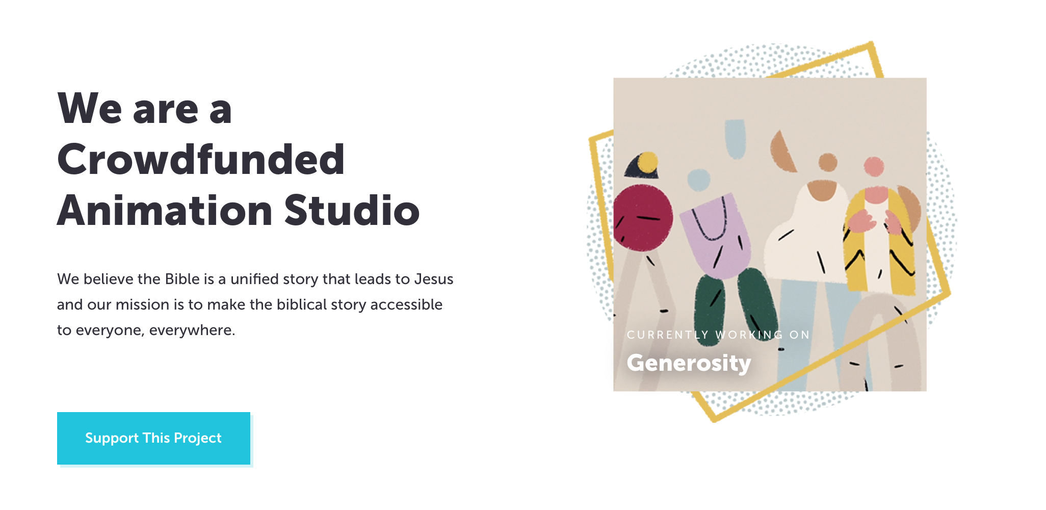
In this post, we’re going to use CSS superpowers to create a visual effect where two elements overlap and weave together. The epiphany for this design came during a short burst of spiritual inquisitiveness where I ended up at The Bible Project’s website. They make really cool animations, and I mean, really cool animations.

My attention, however, deviated from spiritualism to web design as I kept spotting these in-and-out border illustrations.

Screenshot form The Bible Project website.

I wondered if a similar could be made from pure CSS… and hallelujah, it’s possible!

See the Pen
Over and under border design using CSS
by Preethi Sam (@rpsthecoder)
on CodePen.

The principal CSS standards we use in this technique are CSS Blend Modes and CSS Grid.

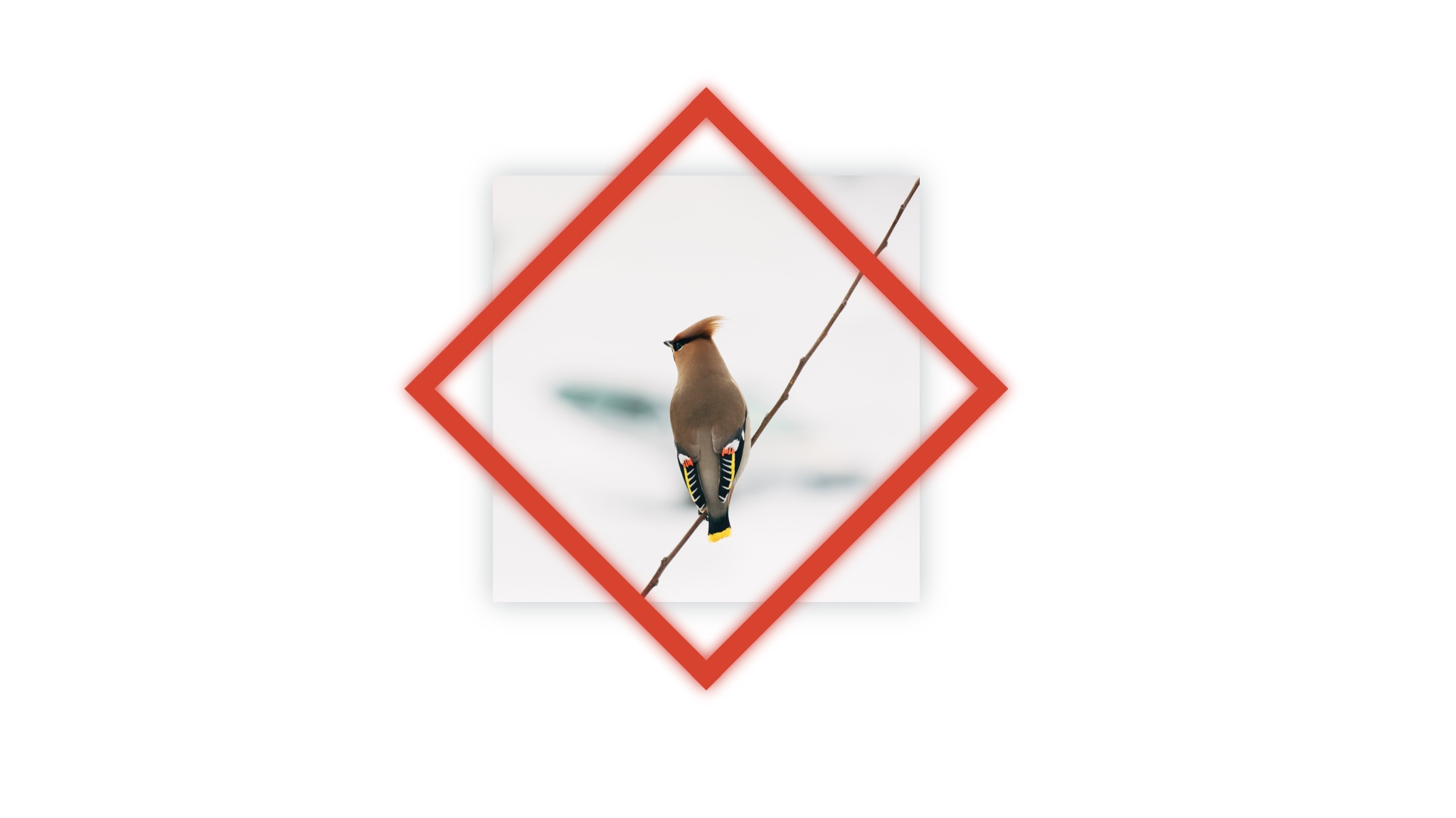
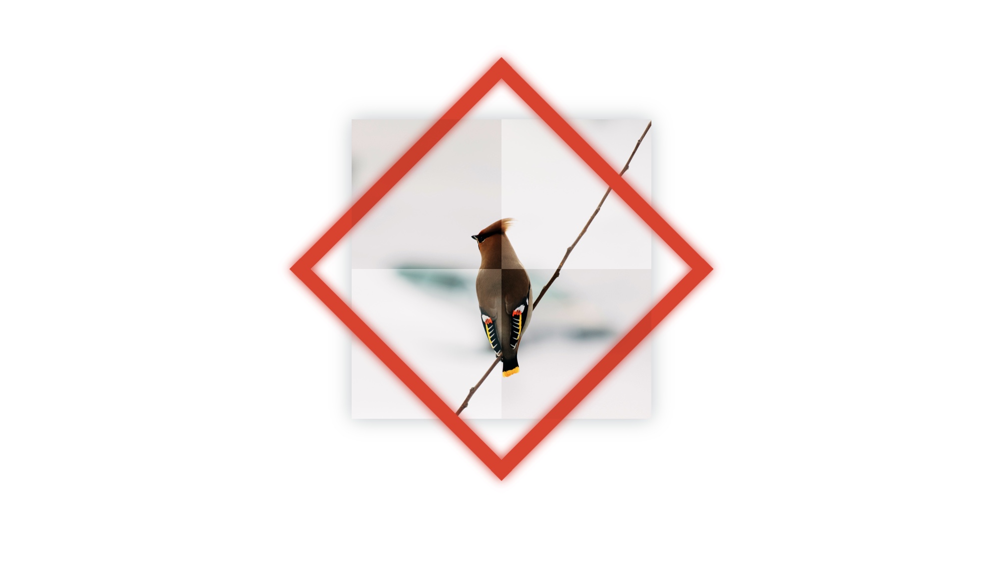
First, we start with an image and a rotated frame in front of that image.

<div class="design">
  <img src="bird-photo.jpg">
  <div class="rotated-border"></div>
</div>
.design {
  position: relative;
  height: 300px;
  width: 300px;
}

.design > * {
  position: absolute;
  height: 100%;
  width: 100%;
}

.rotated-border {
  box-sizing: border-box;
  border: 15px #eb311f solid;
  transform: rotate(45deg);
  box-shadow: 0 0 10px #eb311f, inset 0 0 20px #eb311f;
}

The red frame is created using border. Its box-sizing is set to include the border size in the dimensions of the box so that the frame is centered around the picture after being rotated. Otherwise, the frame will be bigger than the image and get pulled towards the bottom-right corner.

Then we pick a pair of opposite corners of the image and overlay their quadrants with their corresponding portion in a copy of the same image as before. This hides the red frame in those corners.

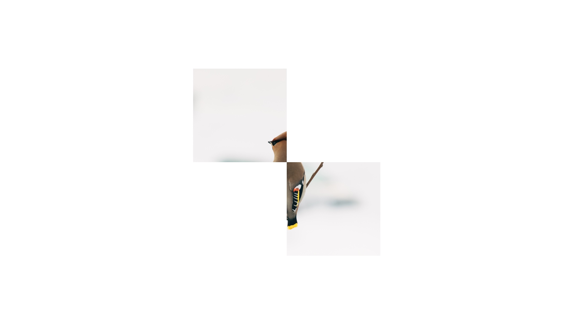
We basically need to make a cut portion of the image that looks like below to go on top of the red frame.

The visible two quadrants will lay on top of the .rotated-border element.

So, how do we alter the image so that only two quadrants of the image are visible? CSS Blend Modes! The multiply value is what we’re going to reach for in this instance. This adds transparency to an element by stripping white from the image to reveal what’s behind the element.

Chris has a nice demo showing how a red background shows through an image with the multiply blend mode.

See the Pen
Background Blending
by Chris Coyier (@chriscoyier)
on CodePen.

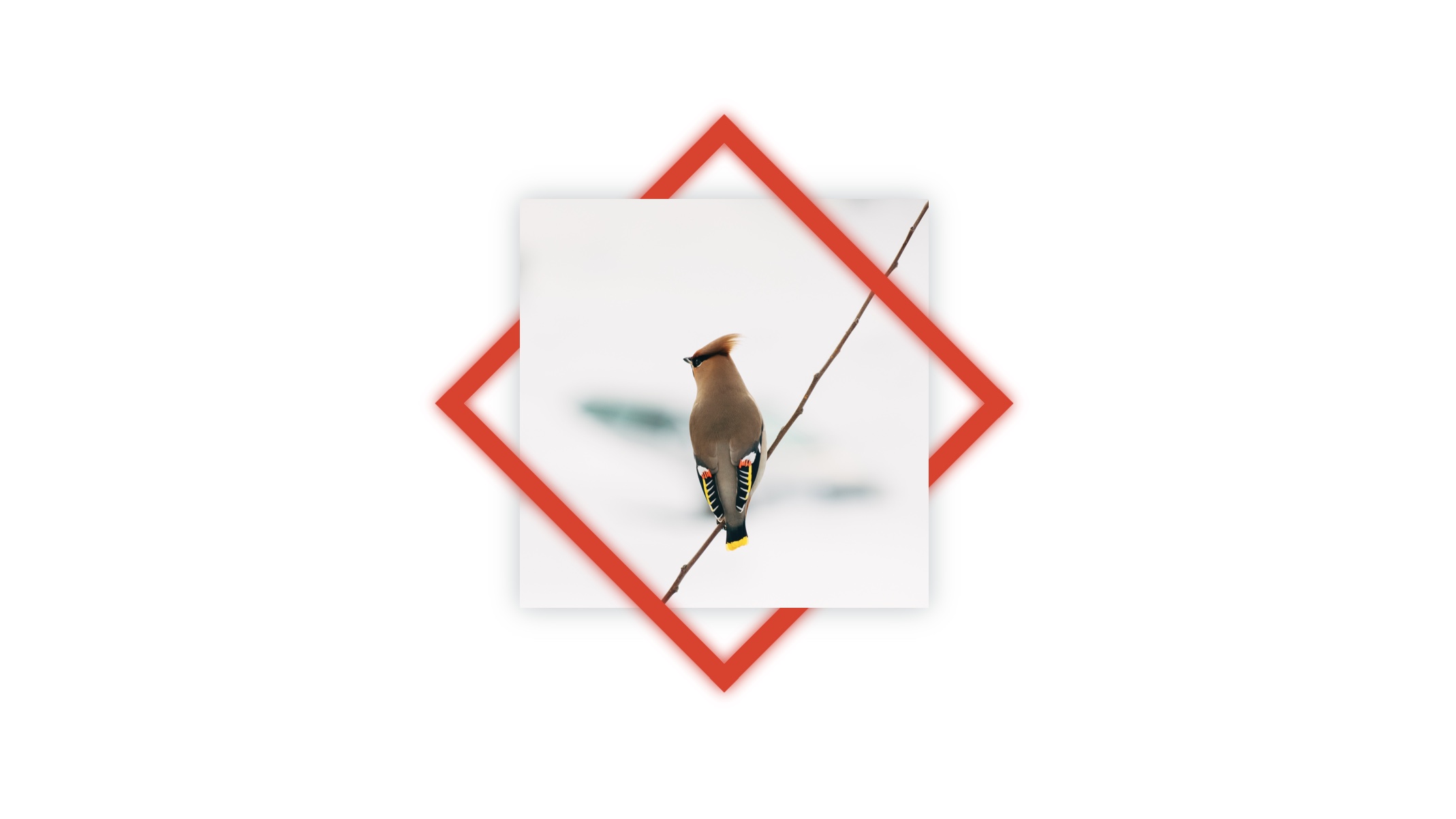
OK, nice, but what about those quadrants? We cover the quadrants we want to hide with white grid cells that will cause the image to bleed all the way through in those specific areas with a copy of the bird image right on top of it in the sourcecode.

<div id="design">
    <img src="bird-photo.jpg">
    <div class="rotated-border"></div>

    <div class="blend">
      <!-- Copy of the same image -->
      <img src="bird-photo.jpg">
      <div class="grid">
        <!-- Quadrant 1: Top Left -->
        <div></div>
        <!-- Quadrant 2: Top Right -->
        <div data-white></div>
        <!-- Quadrant 3: Bottom Left -->
        <div data-white></div>
        <!-- Quadrant 4: Bottom Right -->
        <div></div>
      </div>
    </div>

</div>
.blend > * {
  position: absolute;
  height: 100%;
  width: 100%;
}

/* Establishes our grid */
.grid {
  display: grid;
  grid: repeat(2, 1fr) / repeat(2, 1fr);
}

/* Adds white to quadrants with this attribute */
[data-white]{
  background-color: white;
}

The result is a two-by-two grid with its top-right and bottom-left quadrants that are filled with white, while being grouped together with the image inside .blend.

To those of you new to CSS Grid, what we’re doing is adding a new .grid element that becomes a "grid" element when we declare display: grid;. Then we use the grid property (which is a shorthand that combines grid-template-columns and grid-template-rows) to create two equally spaced rows and columns. We’re basically saying, "Hey, grid, repeat two equal columns and repeat two equal rows inside of yourself to form four boxes."

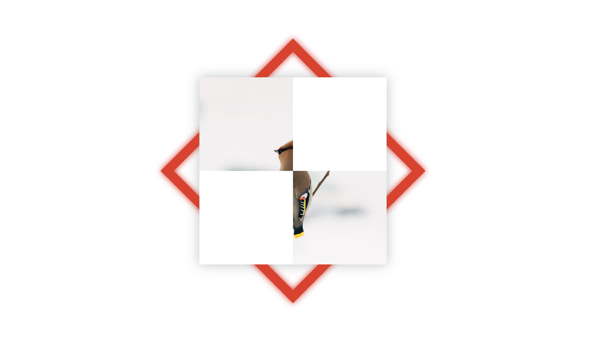
A copy of the image and a grid with white cells on top of the red border.

Now we apply the multiply blend mode to .blend using the mix-blend-mode property.

.blend { mix-blend-mode: multiply; }

The result:

As you can see, the blend mode affects all four quadrants rather than just the two we want to see through. That means we can see through all four quadrants, which reveals all of the red rotated box.

We want to bring back the white we lost in top-left and bottom-right quadrants so that they hide the red rotated box behind them. Let’s add a second grid, this time on top of .blend in the sourcecode.

<div id="design">
  <img src="bird-photo.jpg">
  <div class="rotated-border"></div>
    
  <!-- A second grid  -->
  <!-- This time, we're adding white to the image quandrants where we want to hide the red frame  -->
  <div class="grid">
    <!-- Quadrant 1: Top Left -->
    <div data-white></div>
    <!-- Quadrant 2: Top Right -->
    <div></div>
    <!-- Quadrant 3: Bottom Left -->
    <div></div>
    <!-- Quadrant 4: Bottom Right -->
    <div data-white></div>
  </div>

  <div class="blend">
    <img src="bird-photo.jpg">
    <div class="grid">
      <!-- Quadrant 1: Top Left -->
      <div></div>
      <!-- Quadrant 2: Top Right -->
      <div data-white></div>
      <!-- Quadrant 3: Bottom Left -->
      <div data-white></div>
      <!-- Quadrant 4: Bottom Right -->
      <div></div>
    </div>
  </div>

</div>

The result!

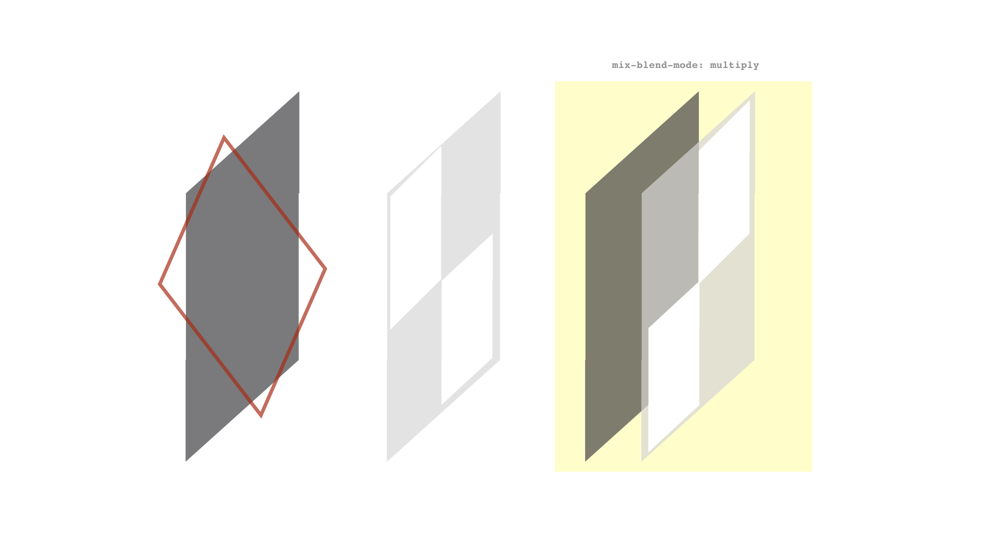
Summing up, the browser renders the elements in our demo like this:
​​

  1. ​​At bottommost is the bird image (represented by the leftmost grey shape in the diagram below)
  2. ​​Then a rotated red frame
  3. ​​On top of them is a grid with top-left and bottom-right white cells (corners where we don’t want to see the red frame in the final result)
  4. ​​Followed by a copy of the bird image from before and a grid with top-right and bottom-left white cells (corners where we do want to see the red frame) – both grouped together and given the blending mode, multiply​.

You may have some questions about the approach I used in this post. Let me try to tackle those.

What about using CSS Masking instead of CSS Blend Modes?

For those of you familiar with CSS Masking – using either mask-image or clip-path – it can be an alternative to using blend mode.

I prefer blending because it has better browser support than masks and clipping. For instance, WebKit browsers don't support SVG <mask> reference in the CSS mask-image property and they also provide partial support for clip-path values, especially Safari.

Another reason for choosing blend mode is the convenience of being able to use grid to create a simple white structure instead of needing to create images (whether they are SVG or otherwise).

Then again, I’m fully on board the CSS blend mode train, having used it for knockout text, text fragmentation effect... and now this. I’m pretty much all in on it.

Why did you use grid for the quadrants?

The white boxes needed in the demo can be created by other means, of course, but grid makes things easier for me. For example, we could've leaned on flexbox instead. Use what works for you.

Why use a data-attribute on the grid quadrant elements to make them white?

I used it while coding the demo without thinking much about it – I guess it was quicker to type. I later thought of changing it to a class, but left it as it is because the HTML looked neater that way… at least to me. :)

Is multiply the only blend mode that works for this example?

Nope. If you already know about blend modes then you probably also know you can use either screen, darken, or lighten to get a similar effect. (Both screen and lighten will need black grid cells instead of white.)

The post Weaving One Element Over and Under Another Element appeared first on CSS-Tricks.

A Few Functional Uses for Intersection Observer to Know When an Element is in View

You might not know this, but JavaScript has stealthily accumulated quite a number of observers in recent times, and Intersection Observer is a part of that arsenal. Observers are objects that spot something in real-time — like birdwatchers going to their favorite place to sit and wait for the birds to come.

Different observers observe different things (not everyone watches hawks).

The very first observer I came to know was the Mutation Observer that looks for changes to the DOM tree. It was a one-of-a-kind at the time, but now we have many more observers.

Intersection Observer observes the "intersection" (i.e. the passing across) of an element through one of its ancestor elements or the area on screen where the page is visible (aka the viewport).

It’s sort of like watching a train pass through a station. You can see when the train comes in, when it leaves, and how long it was stationary.

Knowing when an element is about to come into view, if it has gone out of view, or how long it’s been since it came into view all have useful applications. So, we’ll see some of those use cases now — right after seeing the code for creating an IntersectionObserver object by way of the Intersection Observer API.

A quick overview of IntersectionObserver

The Intersection Observer API has already gained wide support at the time of this writing.

This browser support data is from Caniuse, which has more detail. A number indicates that browser supports the feature at that version and up.

Desktop

ChromeOperaFirefoxIEEdgeSafari
584555No1612.1

Mobile / Tablet

iOS SafariOpera MobileOpera MiniAndroidAndroid ChromeAndroid Firefox
12.246No677466

But if you want to check whether Intersection Observer is supported while you’re working with it, you could see if the property IntersectionObserver exists in the window object:

if(!!window.IntersectionObserver){}
/* or */
if('IntersectionObserver' in window){}

OK, now for a look at the object creation:

var observer = new IntersectionObserver(callback, options);

The IntersectionObserver object’s constructor takes two parameters. The first one is a callback function that’s executed once the observer notices an intersection and has asynchronously delivered some data about that intersection.

The second (optional) parameter is options, an object with information to define what’s going to be the "intersection." We may not want to know when an element is about to come into view, but only when it’s fully visible. Something like that is defined through the options parameter.

Options has three properties:

  • root - The ancestor element/viewport that the observed element will intersect. Think of it as the train station that the train will intersect.
  • rootMargin - A perimeter of the root element, shrinking or growing the root element’s area to watch out for intersection. It’s similar to the CSS margin property.
  • threshold - An array of values (between 0 and 1.0), each representing the distance an element has intersected into or crossed over in the root at which the callback is to be triggered.

Let’s say our threshold is 0.5. The callback is triggered when the element is in or passes its half-visible threshold. If the value is [0.3, 0.6], then the callback is triggered when the element is in or passes its 30% visible threshold and also, its 60% visible threshold.

That’s enough of the theory now. Let’s see some demos. First up, lazy loading.

Use Case 1: Lazy loading images

See the Pen
Intersection Observer - Lazy Load
by Preethi Sam (@rpsthecoder)
on CodePen.

To see the loading at the mark, view this webpage since the embedded demo doesn't show that.

CSS-Tricks has thoroughly covered lazy loading in before and it’s typically done like this: display a lightweight placeholder where images are intended, then swap them out for the intended images as they come (or are about to come) into view. Believe me, there’s nothing lazy about implementing this — that is, until we get something native to work with.

We’ll apply the same mechanics. First, we’ve a bunch of images and have defined a placeholder image to display initially. We’re using a data attribute carrying the URL of the original image to be shown that defines the actual image to load when it comes into view.

<img src="placeholder.png" data-src="img-1.jpg">
<img src="placeholder.png" data-src="img-2.jpg">
<img src="placeholder.png" data-src="img-3.jpg">
<!-- more images -->

The rest is scripting.

let observer = new IntersectionObserver(
(entries, observer) => { 
  entries.forEach(entry => {
    /* Here's where we deal with every intersection */
  });
}, 
{rootMargin: "0px 0px -200px 0px"});

The callback function above is an arrow function (though you can use a normal function instead).

The callback function receives two parameters: a set of entries carrying the information about each intersection and the observer itself. Those entries can be filtered or looped through so we can then deal with the intersection entries that we want. As for the options, I’ve only provided the rootMargin value, letting the root and threshold properties fall into their default values.

The root default is the viewport and threshold default is 0 — which can be roughly translated to "ping me the very moment that the element appears in the viewport!"

The oddity, though, is that I reduced the viewport’s observation area by two hundred pixels at the bottom using rootMargin. We wouldn’t typically do this for lazy loading. Instead, we might increase the margin or let it default. But reducing isn’t something we would usually do in this situation. I did it only because I want to demonstrate the original images loading at the threshold in the observed area. Otherwise, all the action would happen out of view.

When the image intersects the viewport’s observer area (which is 200px above the bottom in the demo), we replace the placeholder image with the actual image.

let observer = new IntersectionObserver(
(entries, observer) => { 
entries.forEach(entry => {
    /* Placeholder replacement */
    entry.target.src = entry.target.dataset.src;
    observer.unobserve(entry.target);
  });
}, 
{rootMargin: "0px 0px -200px 0px"});

entry.target is the element observed by the observer. In our case, those are the image elements. Once the placeholder is replaced in an image element, we don’t have to observe it anymore, so we call the observer’s unobserve method for it.

Now that the observer is ready, it’s time to start observing all the images by using its observer method:

document.querySelectorAll('img').forEach(img => { observer.observe(img) });

That’s it! we’ve lazy loaded the images. Onto the next demo.

Use Case 2: Auto-pause video when it’s out of view

Let’s say we’re watching a video on YouTube and (for whatever reason) we want to scroll down to read the comments. I don’t know about you, but I don’t usually pause the video first before doing that, which means I miss some of the video while I’m browsing.

Wouldn’t it be nice if the video paused for us when we scroll away from it? It would be even nicer if the video resumed when it’s back in view so there’s no need to hit Play or Pause at all.

Intersection Observer can certainly do that.

See the Pen
IntersectionObserver: auto-pause out of view video
by Preethi Sam (@rpsthecoder)
on CodePen.

Here’s our video in the HTML:

<video src="OSRO-animation.mp4" controls=""></video>

Here’s how we toggle between play and pause:

let video = document.querySelector('video');
let isPaused = false; /* Flag for auto-paused video */
let observer = new IntersectionObserver((entries, observer) => { 
  entries.forEach(entry => {
    if(entry.intersectionRatio!=1  && !video.paused){
      video.pause(); isPaused = true;
    }
    else if(isPaused) {video.play(); isPaused=false}
  });
}, {threshold: 1});
observer.observe(video);

Before I show you how we’re pausing and playing the video during each intersection (i.e. entry), I want to bring your attention to the threshold property of the options.

Th threshold has a value of 1. Both root and rootMargin will default. This is the same as saying, "hey, let me know as soon the element is fully visible on the viewport."

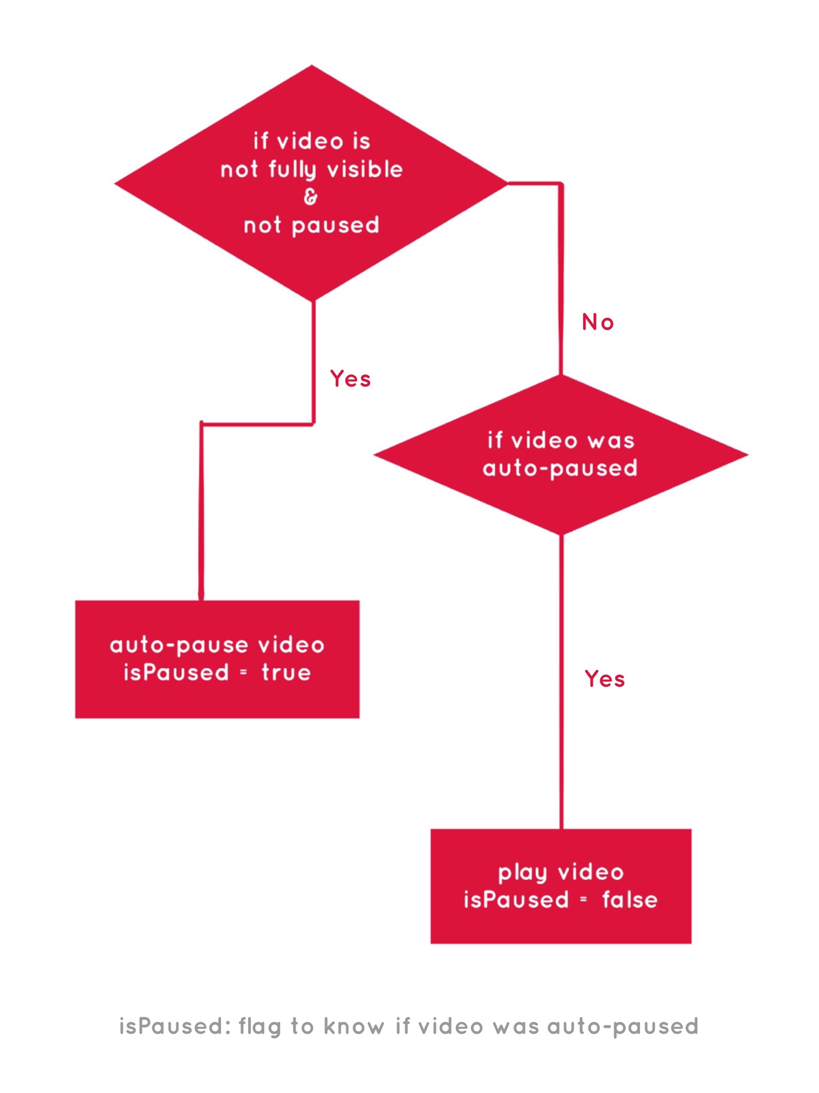
Once the intersection happens and the callback is triggered, we pause or play the video based on this logic:

A flow chart for toggling play and pause on a video, where if video not fully visible and not paused, then isPaused is true. But if video was auto-paused, then IsPaused is false.

I have not called unobserve for the video, so the observer keeps observing the video and pauses every time it goes out of view.

Use Case 3: See how much content is viewed

This can be interpreted and implemented in many ways depending on what your content is and the way you prefer to measure how much of it has been viewed.

For a simple example, we’ll observe the last paragraph of every article in a list of articles on a page. Once an article’s last paragraph becomes fully visible, we will consider that article read — like how we might say that seeing the last coach of a train counts as having seen the whole train.

Here’s a demo that shows two articles on a page, each containing a number of paragraphs.

See the Pen
IntersectionObsever: content viewed
by Preethi Sam (@rpsthecoder)
on CodePen.

Our simplified HTML is something like this:

<div id="count"><!-- The place where "number of articles viewed" is displayed --></div>

<h2>Article 1</h2>
<article>
  <p><!-- Content --></p>
  <!-- More paragraphs -->
</article>
<h2>Article 2</h2>
<article>
  <p><!-- Content --></p>
  <!-- More paragraphs -->
</article>
<!-- And so on... -->
let n=0; /* Total number of articles viewed */
let count = document.querySelector('#count');
let observer = new IntersectionObserver((entries, observer) => { 
  entries.forEach(entry => {
    if(entry.isIntersecting){
      count.textContent= `articles fully viewed - ${++n}`; 
      observer.unobserve(entry.target);
    }
  });
}, {threshold: 1});

document.querySelectorAll('article > p:last-child').forEach(p => { observer.observe(p) });

During each intersection — the full view of the last paragraph of an article — we’re incrementing a count: n, that represents the total number of articles read. Then we display that number above the list of articles.

Once we’ve counted in an intersection of the last paragraph, it doesn’t need to be observed anymore, so we call unobserve for it.

Thanks for observing along!

That’s it for the examples we’re going to look at together for this post. You probably get the idea of how using it is, to be able to observe elements and trigger events based on where they intersect the viewport.

That said, it’s worth using caution when making visual changes based on the intersection data obtained through the observer. Sure, Intersection Observer is hassle free when it comes to logging intersection data. But when it’s being used to make onscreen changes, we need to ensure the changes aren’t lagging, which is a possibility because we’re basically making changes based on data retrieved asynchronously. That might require a little bit of time to load.

As we saw, each intersection entry has a set of properties conveying information about the intersection. I didn’t cover all of them in this post, so be sure to review them.

The post A Few Functional Uses for Intersection Observer to Know When an Element is in View appeared first on CSS-Tricks.

Extracting Text from Content Using HTML Slot, HTML Template and Shadow DOM

Chapter names in books, quotes from a speech, keywords in an article, stats on a report — these are all types of content that could be helpful to isolate and turn into a high-level summary of what's important.

For example, have you seen the way Business Insider provides an article's key points before getting into the content?

That’s the sort of thing we're going to do, but try to extract the high points directly from the article using HTML Slot, HTML Template and Shadow DOM.

These three titular specifications are typically used as part of Web Components — fully functioning custom element modules meant to be reused in webpages.

Now, what we aim to do, i.e. text extraction, doesn’t need custom elements, but it can make use of those three technologies.

There is a more rudimentary approach to do this. For example, we could extract text and show the extracted text on a page with some basic script without utilizing slot and template. So why use them if we can go with something more familiar?

The reason is that using these technologies permits us a preset markup code (also optionally, style or script) for our extracted text in HTML. We’ll see that as we proceed with this article.

Now, as a very watered-down definition of the technologies we’ll be using, I’d say:

  • A template is a set of markup that can be reused in a page.
  • A slot is a placeholder spot for a designated element from the page.
  • A shadow DOM is a DOM tree that doesn’t really exist on the page till we add it using script.

We’ll see them in a little more depth once we get into coding. For now, what we’re going to make is an article that follows with a list of key points from the text. And, you probably guessed it, those key points are extracted from the article text and compiled into the key points section.

See the Pen
Text Extraction with HTML Slot and HTML Template
by Preethi Sam (@rpsthecoder)
on CodePen.

The key points are displayed as a list with a design in between the points. So, let’s first create a template for that list and designate a place for the list to go.

<article><!-- Article content --></article>

<!-- Section where the extracted keypoints will be displayed -->
<section id='keyPointsSection'>
  <h2>Key Points:</h2>
  <ul><!-- Extracted key points will go in here --></ul>
</section>

<!-- Template for the key points list -->
<template id='keyPointsTemplate'>
  <li><slot name='keyPoints'></slot></li>
  <li style="text-align: center;">&#x2919;&mdash;&#x291a;</li>
</template>

What we’ve got is a semantic <section> with a <ul> where the list of key points will go. Then we have a <template> for the list items that has two <li> elements: one with a <slot> placeholder for the key points from the article and another with a centered design.

The layout is arbitrary. What’s important is placing a <slot> where the extracted key points will go. Whatever’s inside the <template> will not be rendered on the page until we add it to the page using script.

Further, the markup inside <template> can be styled using inline styles, or CSS enclosed by <style>:

<template id='keyPointsTemplate'>
    <li><slot name='keyPoints'></slot></li>
    <li style="text-align: center;">&#x2919;&mdash;&#x291a;</li>
    <style>
        li{/* Some style */}
    </style>
</template>

The fun part! Let’s pick the key points from the article. Notice the value of the name attribute for the <slot> inside the <template> (keyPoints) because we’ll need that.

<article>
  <h1>Bears</h1>
  <p>Bears are carnivoran mammals of the family Ursidae. <span><span slot='keyPoints'>They are classified as caniforms, or doglike carnivorans</span></span>. Although only eight species of bears <!-- more content --> and partially in the Southern Hemisphere. <span><span slot='keyPoints'>Bears are found on the continents of North America, South America, Europe, and Asia</span></span>.<!-- more content --></p>
  <p>While the polar bear is mostly carnivorous, <!-- more content -->. Bears use shelters, such as caves and logs, as their dens; <span><span slot='keyPoints'>Most species occupy their dens during the winter for a long period of hibernation</span></span>, up to 100 days.</p>
  <!-- More paragraphs --> 
</article>

The key points are wrapped in a <span> carrying a slot attribute value ("keyPoints") matching the name of the <slot> placeholder inside the <template>.

Notice, too, that I’ve added another outer <span> wrapping the key points.

The reason is that slot names are usually unique and are not repeated, because one <slot> matches one element using one slot name. If there’re more than one element with the same slot name, the <slot> placeholder will be replaced by all those elements consecutively, ending in the last element being the final content at the placeholder.

So, if we matched that one single <slot> inside the <template> against all of the <span> elements with the same slot attribute value (our key points) in a paragraph or the whole article, we’d end up with only the last key point present in the paragraph or the article in place of the <slot>.

That’s not what we need. We need to show all the key points. So, we’re wrapping the key points with an outer <span> to match each of those individual key points separately with the <slot>. This is much more obvious by looking at the script, so let’s do that.

const keyPointsTemplate = document.querySelector('#keyPointsTemplate').content;
const keyPointsSection = document.querySelector('#keyPointsSection > ul');
/* Loop through elements with 'slot' attribute */
document.querySelectorAll('[slot]').forEach((slot)=>{
  let span = slot.parentNode.cloneNode(true);
  span.attachShadow({  mode: 'closed' }).appendChild(keyPointsTemplate.cloneNode(true));
  keyPointsSection.appendChild(span);
});

First, we loop through every <span> with a slot attribute and get a copy of its parent (the outer <span>). Note that we could also loop through the outer <span> directly if we’d like, by giving them a common class value.

The outer <span> copy is then attached with a shadow tree (span.attachShadow) made up of a clone of the template’s content (keyPointsTemplate.cloneNode(true)).

This "attachment" causes the <slot> inside the template’s list item in the shadow tree to absorb the inner <span> carrying its matching slot name, i.e. our key point.

The slotted key point is then added to the key points section at the end of the page (keyPointsSection.appendChild(span)).

This happens with all the key points in the course of the loop.

That’s really about it. We’ve snagged all of the key points in the article, made copies of them, then dropped the copies into the list template so that all of the key points are grouped together providing a nice little CliffsNotes-like summary of the article.

Here's that demo once again:

See the Pen
Text Extraction with HTML Slot and HTML Template
by Preethi Sam (@rpsthecoder)
on CodePen.

What do you think of this technique? Is it something that would be useful in long-form content, like blog posts, news articles, or even Wikipedia entries? What other use cases can you think of?

The post Extracting Text from Content Using HTML Slot, HTML Template and Shadow DOM appeared first on CSS-Tricks.

Using the Little-Known CSS element() Function to Create a Minimap Navigator

W3C’s CSS Working Group often gives us brilliant CSS features to experiment with. Sometimes we come across something so cool that sticks a grin on our face, but it vanishes right away because we think, “that’s great, but what do I do with it?” The element() function was like that for me. It’s a CSS function that takes an element on the page and presents it as an image to be displayed on screen. Impressive, but quixotic.

Below is a simple example of how it works. It’s currently only supported in Firefox, which I know is a bummer. But stick with me and see how useful it can be.

<div id="ele">
  <p>Hello World! how're you?<br>I'm not doing that<br>great. Got a cold &#x1F637;</p>
</div>
<div id="eleImg"></div>
#eleImg {
  background: -moz-element(#ele) no-repeat center / contain; /* vendor prefixed */
}

The element() function (with browser prefix) takes the id value of the element it’ll translate into an image. The output looks identical to the appearance of the given element on screen.

When I think of element()’s output, I think of the word preview. I think that’s the type of use case that gets the most out of it: where we can preview an element before it’s shown on the page. For example, the next slide in a slideshow, the hidden tab, or the next photo in a gallery. Or... a minimap!

A minimap is a mini-sized preview of a long document or page, usually shown at on one side of the screen or another and used to navigate to a corresponding point on that document.

You might have seen it in code editors like Sublime Text.

The minimap is there on the right.

CSS element() is useful in making the “preview” part of the minimap.

Down below is the demo for the minimap, and we will walk through its code after that. However, I recommend you see the full-page demo because minimaps are really useful for long documents on large screens.

If you’re using a smartphone, remember that, according to the theory of relativity, minimaps will get super mini in mini screens; and no, that’s not really what the theory of relativity actually says, but you get my point.

See the Pen Minimap with CSS element() & HTML input range by Preethi Sam (@rpsthecoder) on CodePen.

A screenshot of the final result of the demo. It consists of a large block of styled paragraph text with a

If you’re designing the minimap for the whole page, like for a single page website, you can use the document body element for the image. Otherwise, targeting the main content element, like the article in my demo, also works.

<div id="minimap"></div>
<div id="article"> <!-- content --> </div>
#minimap {
  background: rgba(254,213,70,.1) -moz-element(#article) no-repeat center / contain;
  position: fixed; right: 10px; top: 10px; /* more style */
}

For the minimap’s background image, we feed the id of the article as the parameter of element() and, like with most background images, it’s styled to not repeat (no-repeat) and fit inside (contain) and at center of the box (center) where it’s displayed.

The minimap is also fixed to the screen at top right of the viewport.

Once the background is ready, we can add a slider on top of it and it will serve to operate the minimap scrolling. For the slider, I went with input: range, the original, uncomplicated, and plain HTML slider.

<div id="minimap">
  <input id="minimap-range" type="range" max="100" value="0">
</div>
#minimap-range {
  /* Rotating the default horizontal slider to vertical */
  transform: translateY(-100%) rotate(90deg);
  transform-origin: bottom left;
  background-color: transparent;  /* more style */
}

#minimap-range::-moz-range-thumb {
  background-color: dodgerblue; 
  cursor: pointer; /* more style */
}

#minimap-range::-moz-range-track{
  background-color: transparent;
}

Not entirely uncomplicated because it did need some tweaking. I turned the slider upright, to match the minimap, and applied some style to its pseudo elements (specifically, the thumb and track) to replace their default styles. Again, we’re only concerned about Firefox at the moment since we’re dealing with limited support.

All that’s left is to couple the slider’s value to a corresponding scroll point on the page when the value is changed by the user. That takes a sprinkle of JavaScript, which looks like this:

onload = () => {
  const minimapRange = document.querySelector("#minimap-range");
  const minimap = document.querySelector("#minimap");
  const article = document.querySelector("#article");
  const $ = getComputedStyle.bind();
  
  // Get the minimap range width multiplied by the article height, then divide by the article width, all in pixels.
  minimapRange.style.width = minimap.style.height = 
    parseInt($(minimapRange).width) * parseInt($(article).height) / parseInt($(article).width) + "px";
  
  // When the range changes, scroll to the relative percentage of the article height    
  minimapRange.onchange = evt => 
    scrollTo(0, parseInt($(article).height) * (evt.target.value / 100));
};

The dollar sign ($) is merely an alias for getComputedStyle(), which is the method to get the CSS values of an element.

It’s worth noting that the width of the minimap is already set in the CSS, so we really only need to calculate its height. So, we‘re dealing with the height of the minimap and the width of the slider because, remember, the slider is actually rotated up.

Here’s how the equation in the script was determined, starting with the variables:

  • x1 = height of minimap (as well as the width of the slider inside it)
  • y1 = width of minimap
  • x2 = height of article
  • y2 = width of article
x1/y1 = x2/y2
x1 = y1 * x2/y2
    
height of minimap = width of minimap * height of article / width of article

And, when the value of the slider changes (minimapRange.onchange), that’s when the ScrollTo() method is called to scroll the page to its corresponding value on the article. 💥

Fallbacks! We need fallbacks!

Obviously, there are going to be plenty of times when element() is not supported if we were to use this at the moment, so we might want to hide the minimap in those cases.

We check for feature support in CSS:

@supports (background: element(#article)) or (background: -moz-element(#article)){
  /* fallback style */
}

...or in JavaScript:

if(!CSS.supports('(background: element(#article)) or (background: -moz-element(#article))')){
  /* fallback code */
}

If you don’t mind the background image being absent, then you can still keep the slider and apply a different style on it.

There are other slick ways to make minimaps that are floating out in the wild (and have more browser support). Here’s a great Pen by Shaw:

See the Pen
Mini-map Progress Tracker & Scroll Control
by Shaw (@shshaw)
on CodePen.

There are also tools like pagemap and xivimap that can help. The element() function is currently specced in W3C’s CSS Image Values and Replaced Content Module Level 4. Defintely worth a read to fully grasp the intention and thought behind it.

This browser support data is from Caniuse, which has more detail. A number indicates that browser supports the feature at that version and up.

Desktop

ChromeOperaFirefoxIEEdgeSafari
NoNo4*NoNoNo

Mobile / Tablet

iOS SafariOpera MobileOpera MiniAndroidAndroid ChromeAndroid Firefox
NoNoNoNoNo64*

Psst! Did you try selecting the article text in the demo? See what happens on the minimap. 😉

The post Using the Little-Known CSS element() Function to Create a Minimap Navigator appeared first on CSS-Tricks.