What Web Designers Can Do To Speed Up Mobile Websites

What Web Designers Can Do To Speed Up Mobile Websites

What Web Designers Can Do To Speed Up Mobile Websites

Suzanne Scacca

I recently wrote a blog post for a web designer client about page speed and why it matters. What I didn’t know before writing it was that her agency was struggling to optimize their mobile websites for speed. As a result, she came back to me concerned with publishing a post on a strategy her agency had yet to adopt successfully.

She was torn though. She understood how important mobile page speeds were to the user experience and, by proxy, SEO. However, their focus has always been on making a great-looking and effective design. Something like page speed optimization was always left to the developers to worry about.

In the end, we decided to hold on publishing it until they could get their own website as well as their clients’ sites properly optimized. In the meantime, it got me thinking:

Is there anything designers can do when creating mobile websites to help developers optimize for speed?

Developers are already optimizing front end performance with:

  • Fast web hosting
  • CDNs
  • Clean coding practices
  • Caching
  • Minification
  • Image optimization
  • And more

So, is there anything left?

To me, this is a lot like how search optimization is handled. As a writer, I take care of the on-page optimizations while the developer I hand content over to does the technical SEO stuff. Web designers and developers can easily tackle the parts of speed optimization that are in each of their wheelhouses.

Understanding What “Slow” Means On The Mobile Web

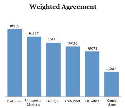
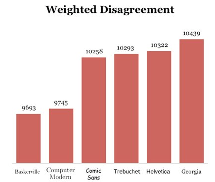
There are a number of tools to help you analyze page speeds and implement various fixes to improve them. One tool that’s particularly helpful is called Lighthouse. The only thing is, it’s meant for web developers.

Instead, I suggest that web designers use another Google testing tool called Test My Site.

Test My Site speed test
Test My Site is a mobile page speed testing tool from Think with Google. (Source: Test My Site) (Large preview)

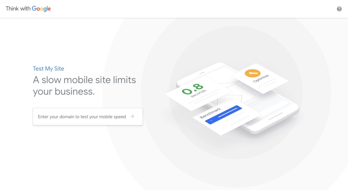
This is strictly for those who want to get a quick evaluation of their mobile site speed. All you need to do is enter your domain name into the field and let the test run.

Test My Site results example
An example of your page speed test results from Test My Site. (Source: Test My Site) (Large preview)

What I like about this tool compared to other site speed tests is that it’s all spelled out for you in layman’s terms. In this case, my website is “slow”, even when served on 4G networks. Although we’ve been told for years that visitors are willing to wait three seconds for a web page to load, Google considers 2.9 seconds too long. (Which I wholeheartedly agree with.)

You can get an expanded report from Google that tells you how to speed up your mobile loading times, but the suggestions are no different than the updates you’d make on the development side. For example:

Think with Google report suggestions
Think with Google suggests the typical page speed optimizations. (Source: Test My Site) (Large preview)

We already know this. However, if you (or your developer) haven’t yet implemented any of these fixes, this is a good checklist to work off of.

That said, I didn’t point you to this tool so you could keep doing the same optimizations over and over again, expecting the same result. What is it they always say about the definition of insanity?

Instead, I think you should use this as a quick gut check:

Is my mobile site fast enough in Google’s eyes? No? Then, it won’t be fast enough in your visitors’ eyes either.

And if you want to really drive that point home, scroll to the bottom of the Test My Site analysis page and run your numbers through the impact analysis calculator:

Test My Site revenue impact calculator
Test My Site’s revenue impact assessment. (Source: Test My Site) (Large preview)

If you aren’t completely convinced that you need to take your 3-second mobile speed down any further, look at the financial impact just .5 seconds would have on your monthly bottom line.

What Web Designers Can Do To Optimize Mobile Sites For Speed

Let the web developer handle all of the necessary speed optimizations like caching and file minification while you take on the following design tips and strategies:

1. Host Fonts From A CDN

There’s enough you have to worry about when it comes to designing fonts for the mobile experience that you probably don’t want to hear this… but custom web fonts suck when it comes to loading. In fact, there are two recent case studies that demonstrate why custom web fonts are detrimental to page loading speeds.

Thankfully, a CDN could end up being your saving grace.

The Downtime Monkey Example

The first comes from Downtime Monkey. In this case study, Downtime Monkey boasts a page speed improvement of 58% through a variety of optimizations — two of which pertained to how they served fonts to their site.

For their Font Awesome icons, they decided to host them from a CDN. However, Font Awesome’s own CDN proved unreliable, so they switched to the Bootstrap CDN. As a result, this saved them between 200 and 550 milliseconds per page load.

For their Google Font “Cabin”, they decided to host it from the Google CDN. What’s funny to note, however, is that when they ran a page speed test on the site afterwards, they received an optimization suggestion related to the font.

It seems that the link they put in the head of their site was slowing down the rendering of the page. So, they had to implement a workaround that would allow the font to load asynchronously without harming the display of the page as it loaded. They used Web Font Loader to fix the issue and ended up saving between 150 and 300 milliseconds per page load as a result.

Brian Jackson’s Test

Brian Jackson, the Chief Marketing Officer at Kinsta, wrote a post for KeyCDN that demonstrates the best way to serve custom web fonts on a website.

You can see in his example that he suggests a number of optimizations, like limiting which styles and character sets are available for use on the website. However, it’s his experimentation with CDN hosting that’s really interesting.

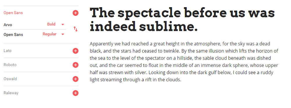
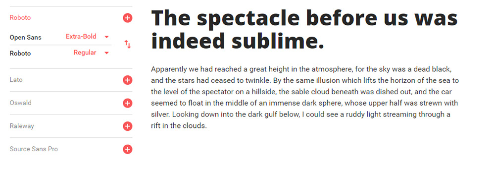
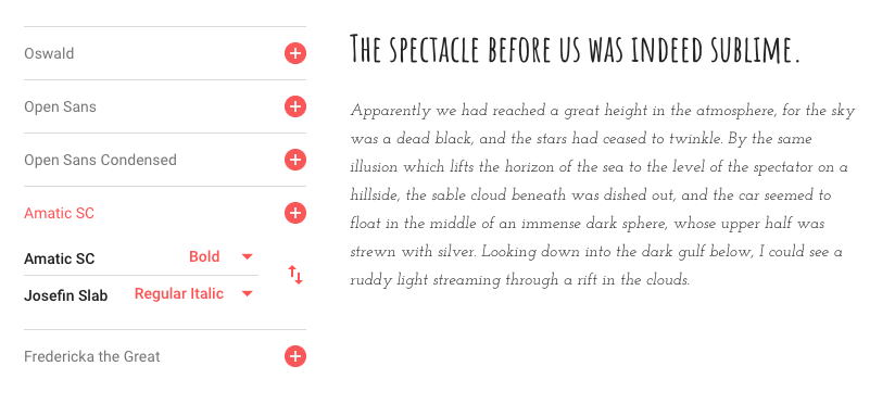
First, he isolated the most popular Google Fonts and tested how quickly they loaded through Google’s CDN:

Google font loading speeds
Open Sans was the fast Google Font. (Source: KeyCDN) (Large preview)

Open Sans loaded the fastest.

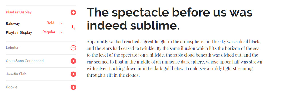
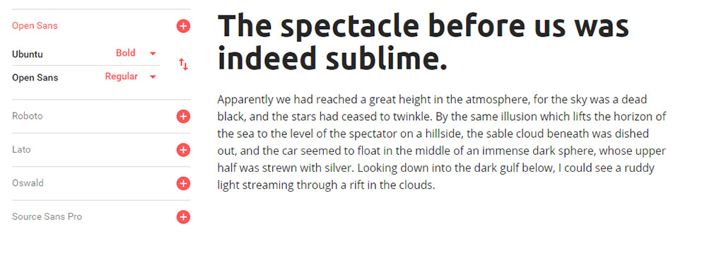
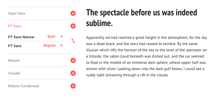
But that shouldn’t automatically make Open Sans the best choice if you’re trying to speed up your website. After all, Opens Sans is a Google Font that has to be served from Google’s servers. When compared against Arial, a web-safe font that isn’t pulled from an external source, this is what happened:

Arial vs Open Sans loading speeds
A comparison of loading speeds between Arial and Open Sans. (Source: KeyCDN) (Large preview)

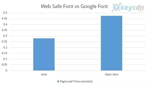
Arial beat Open Sans by almost 200 milliseconds.

Before we move on, I’ll just say that this is one way to solve the slow-loading font dilemma: rather than use externally hosted fonts, use your system ones. They might not be as exciting to design with, but they won’t force users to sit around and wait for your website to load, costing you visitors and customers in the process.

You might be thinking that downloading and hosting your Google font would make more sense then. That way, you don’t have to compromise on which fonts you use and it’ll shave time off of their normal loading speeds. Right?

Well, Brian was curious about that, too, so he did a test:

Opens Sans - local host vs Google CDN
A comparison between Open Sans hosted locally vs. hosted on Google CDN. (Source: KeyCDN) (Large preview)

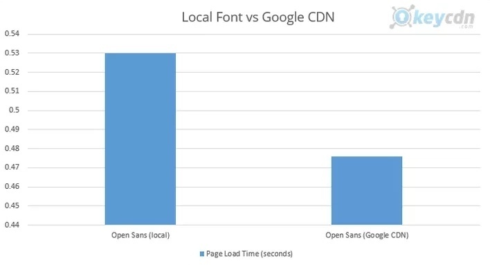
When served from a local server, Open Sans took 0.530 milliseconds to load. It’s not a huge difference, but it’s obviously not the right direction to go in.

So, what’s the conclusion? Well, you have a few options.

  1. You can use a web safe font and avoid the issues that come with using externally hosted fonts in the first place.
  2. You can use a Google font and make sure it’s hosted through Google’s CDN.
  3. You can download a Google font and upload it to your own CDN (if you can get it loading faster from there, that is).

Either way, hosting your fonts and icons from a location where they’ll load more quickly can help you optimize your website for performance.

2. Stop Using Cumbersome Design Elements

The following list is somewhat of a rehashing of topics that have been covered before, so I don’t want to waste your time trying to recreate the wheel here. However, I do think this strategy of removing unnecessary design elements (especially weightier ones) to optimize the mobile experience is one worth summarizing here:

Stop with On-Page Ads

When I wrote about elements you should ditch on mobile websites, I called out advertisements as one of the things you could easily toss out. I still stand by that conviction.

For starters, advertisements are served from a third party. Any time you have to call on another party’s servers, you’re further increasing your own loading times as you wait for them to deliver the content to your page.

Secondly, over 26% of the U.S. population alone uses ad-blocking technology on their devices, so they’re not likely to see your on-page ads anyway.

Statista - ad-blocking tech data
Statista data on the usage of ad-blocking technology in the U.S. (Source: Statista) (Large preview)

Instead, use monetization methods that move the advertising away from your website, increase your own on-site conversions and won’t drain your server’s resources:

  • Remarketing
    Let your tracking pixel follow visitors around the web and then serve your own ads on someone else’s site.
  • PPC
    There’s good money to be made if you can nail the pay-per-click advertising formula in Google.
  • Social media ads
    These are especially easy to run if your site is publishing new content on a regular basis and you have a compelling offer.
Stop With Pop-Ups

I know that Google says that mobile pop-ups are okay in certain instances. However, if you’re building a website with WordPress or another content management system and you’re using a plugin to create those pop-ups, that’s going to slow down your loading times. It might not be by much, but you’ll notice the difference.

ThemeIsle decided to do some analysis of how certain plugins affect WordPress website speeds. Here is what happened when they tested the effects each of these plugins had on the loading time:

Base loading time (in seconds) Loading time after install (in seconds) Change in %
Security plugins 0.93 s 1.13 s 21.50%
Backup plugins 0.93 s 0.94 s 1.07%
Contact form plugins 0.93 s 0.96 s 3.22%
SEO plugins 0.93 s 1.03 s 10.75%
E-commerce plugins 0.93 s 1.22 s 31.10%

Granted, some plugins are coded to be more lightweight than others, but there will always be some sort of difference felt in your loading times. Based on this data, the difference could be as small as .01 and as much as .29 seconds.

If you know that pop-ups aren’t really kosher on the mobile web anyway, why push your luck? Instead, take that promotional offer, cookie notice or announcement and place it on your web pages.

Stop With Cumbersome Contact Channels

Don’t forget about your website’s contact channels. In particular, you have to be careful about designing mobile forms. Of course, part of that has to do with how long it actually takes a user to fill one out. However, there’s also what a lengthy or multi-page form does to your loading speeds that you should think about.

In general, your mobile forms should be lean — only include what’s absolutely necessary.

There is an alternate school of thought to consider as well.

You could ditch the contact form altogether, something I discussed when talking about the trend of replacing mobile forms with chatbots. There are websites that have removed their forms and left information like FAQs, email addresses and phone numbers for visitors to use if they need to get in touch. That would certainly lighten things up from a loading standpoint. I just don’t know if it would be ideal for the user experience.

3. Create A Single-Page Website

The above tips are going to be the simplest and quickest ones to implement, so you should definitely start there if a client or web developer comes to you with issues of too-slow websites. However, if page speed tests still show that a site takes more than 2.5 seconds to load, consider a different approach to redesigning a website for the purposes of speed optimization.

As Adam Heitzman said in an article for Search Engine Journal:

“Single page sites typically convert much easier to mobile and users find them simple to navigate.”

But does that mean that a single-page website will always load more quickly than a multi-page website? Of course not. However, most professional designers choose a single-page design over multi-page for very specific purposes. DevriX has a nice graphic that sums this up:

DevriX graphic - single-page websites
DevriX sums up the limitations of single-page websites. (Source: DevriX) (Large preview)

To be clear, I’m not suggesting that you turn your website into a single-page application (SPA). If you want to speed up your client’s digital property with service workers, a PWA is a better solution. (More info on that in the next point.)

Instead, what I’m suggesting is that you convert a multi-page website into a single-page one if your client fulfills certain criteria:

  • Businesses with an extremely narrow and singular focus.
  • Websites that don’t require much content to get their point across.
  • A limited range of keywords you need to rank for.

That said, if you are designing a website that fits within those three criteria (or at least two out of three), you could realistically move your website to a more simplistic single-page design.

Because single-page websites force you to do more with less, the limited content and features naturally create a lightweight website. Even if you did push the limits slightly, you could still create a faster-loading website for mobile as Tempus does:

Test My Site report for Tempus
Test My Site reports that the Tempus website loads in 2.1 seconds. (Source: Test My Site) (Large preview)

What’s cool about this single-page website is that it doesn’t skimp on the extensive imagery needed to sell luxury homes. And, yet, its mobile site loads in 2.1 seconds.

On the other hand, not all single-page websites are built with speed in mind. Take developer Davide Marchet’s website:

Test My Site report for Davide Marchet
Test My Site reports that Davide Marchet’s website loads in 5.4 seconds. (Source: Test My Site) (Large preview)

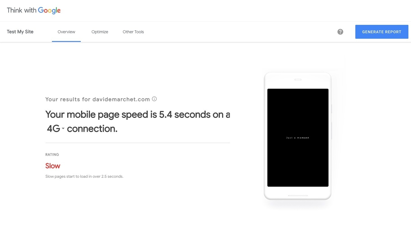
Because it’s overloaded with animations, it takes 5.4 seconds for the page to load on mobile. You can even see this from the screenshot presented by Think with Google. The image seen there is actually the message that appears while the first animation loads in the background.

So, I would suggest being careful if you’re hoping to use a single-page design to solve your website’s performance woes. The design needs to be simple, super focused and unencumbered by scripts and animation effects that undo the benefits of trimming your content down to one page.

4. Turn Your Mobile Site Into A PWA

According to Google, there are three characteristics that define every PWA:

  1. Reliable
  2. Fast
  3. Engaging

Speed is an inherent part of progressive web apps thanks to the service workers they’re built with. Because service workers exist outside of the web browser and are not contingent on the speed of the user’s network, they load cached content for visitors more quickly.

I would also say that because the design of a PWA more closely resembles that of a native mobile app (at least the shell of it), this forces the design itself to be more trimmed-back than a mobile website.

If you’re struggling to speed up your website after implementing all of the traditional performance optimizations you’re supposed to, now would be a good time to turn your mobile website into a PWA.

Let me show you why:

Imagine you are planning a trip to Chicago with a friend. You’re out at a bar or coffee shop discussing the trip, then realize you have no idea where to stay. So, you do a search for “downtown Chicago hotels” on one of your smartphones.

You’re not thinking about purchasing a room yet; you just want to research your options. So, you click on the website links for two of the top listings Google provides you.

This is the progressive web app for the Best Western River North Hotel:

River North Hotel PWA
The home page of the Best Western River North Hotel PWA. (Source: Best Western River North Hotel) (Large preview)

This is the website of the Palmer House Hilton, a nearby hotel in downtown Chicago:

Palmer House Hilton website
The home page of the Palmer House Hilton website. (Source: Palmer House Hilton) (Large preview)

For starters, the PWA is a much better looking and easier to navigate on your smartphone, so it’s going to win major points there. There’s also the matter of speed:

Test My Site website speed comparison
Test My Site compares the two competing hotels’ loading speeds. (Source: Test My Site) (Large preview)

The River North Hotel loads in 2.4 seconds on mobile whereas its Hilton competitor loads in 4 seconds. (You can actually see in the Hilton screenshot that the site hadn’t completely loaded yet.) That’s a difference that visitors are sure to notice.

Even if we’re not doing a side-by-side comparison between the competing websites, the River North Hotel’s PWA blows its former mobile website out of the water.

Brewer Digital Marketing, the agency that developed the PWA for them, shared what happened after they made the switch over. The hotel saw a 300% increase in earnings and a 500% increase in nights booked with the PWA.

5. Convert Your Website Or Blog Into AMP

We have Google to thank for another speedy design trick for the mobile web. This one is called Accelerated Mobile Pages, or AMP, for short.

Initially, AMP was released to help publishers strip down their blog or news pages for faster loading on mobile devices. However, AMP is a web component framework you can use to design whole websites or just specific parts of them (like blog posts). Once implemented, pages load almost instantaneously from search.

Why is AMP so fast to load? There are a number of reasons:

With AMP, you can only load asynchronous JavaScript and inline CSS on your website, which means that your code won’t block or delay page rendering.

Images are also another source of slower loading times. However, AMP solves that issue by automatically loading the page layout before the resources (e.g. images, ads, etc.) Think of it as a form of lazy loading.

There’s a lot more to it, but the basic idea is that it cuts out the elements that tend to drag websites down and forces designers to mostly depend on lightweight HTML to build their pages.

If you want to see an example of this in action, you can look at pretty much any leading digital magazine or news site. If you’re unfamiliar with AMP content, simply look for the lightning bolt icon that appears next to the web page name in Google search. Like this:

The AMP lightning bolt symbol in search
Pages with the recognizable lightning bolt symbol were created using Google AMP. (Source: Google AMP) (Large preview)

Gizmodo is a good example of AMP content:

Gizmodo AMP
This Gizmodo AMP page loaded almost instantly from search results. (Source: Gizmodo) (Large preview)

In fact, when Gizmodo made the transition to AMP back in 2016, it saw huge lifts in terms of performance. Its page speeds increased by 300% and it got 50% more page impressions as a result.

If you really want to get the most out of AMP speeds, Mobify suggests pairing AMP with your PWA. That way, you can load your web pages lightning-fast for visitors:

First Page Load With AMP
Percent of Websites Load Time (seconds)
10% 0.3
20% 0.5
50% 1.1
60% 1.4
80% 2.2
90% 3.4
95% 5.2

Mobify reports on the loading times of AMP (Source: Mobify)

Then, sustain those fast-loading times with the PWA:

Subsequent Page Loads On PWA
Percent of Websites Load Time (seconds)
10% 0.6
20% 0.8
50% 1.4
60% 1.8
80% 3.0
90% 4.5
95% 6.2

Mobify reports on the loading times of PWAs (Source: Mobify)</>

Just be careful with AMP and PWAs.

Look at the tables above and you’ll see that some sites have implemented these speedy design tactics and they still don’t beat Google’s 2.5-second benchmark for mobile loading. Just because there is a promise of faster-loading web pages with both, that doesn’t necessarily mean your website will automatically be lightning-fast.

Wrapping Up

As Google does more to reward mobile websites over desktop, this isn’t really a matter you can table for much longer. All versions of your website — but mobile especially — must be optimized for the user experience.

That means the design, the code, the content and everything else within and around it must be optimized. Once the developer has taken care of the traditional performance optimizations to speed up the website, it’s time for the designer to make some changes of their own. In some cases, simple changes like how fonts are served through the website will help. In other cases, more drastic matters may need to be considered, like redesigning your website as a PWA.

First, consider how slowly your client’s website is loading. Then, examine what’s causing the biggest issue on mobile. Trim the fat, bit by bit, and see what you can do as a designer to complement the developer’s technical speed optimizations.

Smashing Editorial (ra, il)

Top 10 Google Web Fonts For Bold Header Text

Since webfont support is basically universal there’s no good reason to stick to the defaults. Google Webfonts is the largest source of free fonts with hundreds of typefaces to pick from.

Since page headers are the strongest elements they usually work best with custom fonts. However it can be tough whittling down the best choices, and that’s exactly why I wrote this post.

All the Fonts You Could Ask For


1. Montserrat

montserrat font

The first in my collection is Montserrat. This font can work for pretty much anything but I think it works incredibly well as header text.

I’ve used this for navigation text with all caps, customized letter spacing, along with many different font styles from thin to super thick. Montserrat fits the bill perfectly across the board and it’s one of the more universal fonts blending into anything from a tech blog to a funeral parlor website.

The font only weighs about 500 bytes using the default style so it’s incredibly light. And with so many different styles you can get a lot of different looks from this one family.

If you’re looking for a unique heading font try Montserrat. It probably won’t work for everyone but it’s a safe starting font that many designers love.

2. Merriweather

merriweather typeface

A much thicker serif alternative is Merriweather which I also like as a body font. This versatile typeface really looks great anywhere on your site and it’ll bring plenty of attention to your headers.

If you try Merriweather for a larger page heading I suggest using the bold or bold italic style. They are surprisingly clean but they probably need some letter spacing adjustments. Either way the style and darkness of the letters are super easy to follow.

When pairing this font I usually do a sans-serif body typeface. The contrasting styles create a natural divide between headers & body copy. Plus most people find sans-serif easier to read on average for body content.

But I see a lot of sites with serif headers and they all look great. Merriweather is a nice starting point for serif, but if you don’t like it you’ll find tons of alternatives in this post.

3. Josefin Sans

josefin sans font

Modern and classy best describes Josefin Sans. It feels like a font straight from a 1950s jazz lounge, or maybe something you’d see on the front page of The New Yorker.

It does have a distinct curvy style and the thin letters save a lot of horizontal space. You can toy with all-caps or different letter spacings to create many unique styles all from this one font family.

Some sites just look better with thin heading fonts. If you’re looking for one to try I absolutely recommend Josefin Sans with its unique letter designs and its many bold/italic styles.

4. Arvo

arvo webfont

One other serif font I really like is Arvo. This font has a lot of character which you’ll notice right away in the bolder styles.

I really feel like Arvo works best on blogs and digital magazines because the font grabs so much focus. It’s one of the strongest fonts in this list and the serif design grabs even more attention.

If you’re launching a magazine-style blog then Arvo can work well as a strong header. But if your blog works better with sans-serif fonts this can be too much. One alternative that’s a bit more subtle is Crete Round but it doesn’t have the same eye-catching appeal as Arvo.

5. Raleway

raleway font

I’ve seen Raleway on many larger blogs and online magazines for its distinct style and large variety of font variations.

For big heading text I think a mid-level thickness works best so the letters don’t get too wide. Default letter spacing is great so every word is clearly legible.

One feature unique to Raleway is the “w” letter form. It crosses in the middle which looks like two “v”s stacked together. Some may like this, others won’t. But it’s definitely unique to Raleway so it’ll stand out in your page headers too.

6. Catamaran

catamaran font

One of the newer fonts I found recently is Catamaran. It comes with 9 font styles from thin to black and varying thicknesses inbetween.

What I like most about this font is the offbeat lettering. Each letter takes on a very unique style and you can see this in the bolder styles. When used in heading text these letters really shine and jump off the page.

Because the bold styles are so thick you should only use Catamaran in headers with larger font sizes. It can look OK at all sizes but Catamaran really feels like a thick header typeface.

7. PT Sans

pt sans font

PT Sans is soft with smooth edges and thin letters. For headers I only like the bold style of PT Sans because the “normal” style just feels way too thin.

I also prefer PT Sans for headers only since it just feels too soft for regular body text. But any PT Sans header is going to look amazingly clean and readable. This font actually has a sister named PT Serif that also works well.

Between the two, I personally prefer PT Sans. It has smoother edges than the serif version and I feel it just works better in page headings and especially for blogs.

8. Open Sans

open sans font

Open Sans is small, versatile, and super clean. It deserves a spot in this collection because it’s a simple font and one of the fastest loading fonts from the entire Google Fonts library.

The majority of sans-serif fonts play well with any site. Plus you can use sans-serif fonts in both your header and body text making Open Sans a reasonable choice for the entire website. One alternative I really like is Muli which has a lot more character as a header font.

But Muli’s downside is the larger file size. Ultimately this is what makes Open Sans so great because slower sites don’t rank as well and they provide a worse UX all around.

9. Roboto Slab

roboto slab

For a strong serif header font you might try Roboto Slab and just see how it looks. The letters aren’t too thick and the tags that hang off don’t distract the reader.

I generally prefer Roboto Slab for headers instead of the sans-serif version called Roboto. The serif version just feels stronger and leaves a much bigger impression on the viewer.

Truth be told they’re both awesome and you can’t go wrong either way. They both support all the common unicode characters and they’re both amazing choices for your website headings.

10. Ubuntu

ubuntu webfont

The free Ubuntu font can be used for practically anything from nav text to large headers and even body copy. It’s extremely versatile and it’s lightweight with a pretty fast load time.

Rounded edges on the letters make this feel sleek and modern. It’s also one of the few fonts that really can be used in multiple places on your site which can cut down the total number of fonts you need.

Ubuntu was designed back in 2010 so it’s been around for quite a while. Now that webfonts are much more common the Ubuntu family is widely used in web design.

Wrapping Up

Whenever I design a new site these 10 fonts are my go-to choices for headers. They’re much better than the stock OS defaults and your layout will really stand out from the others with these strong header fonts.

The Best Website Fonts That Go Together in 2019

There are so many components to a killer website design. But all too often I see people overlook minor details, like typography.

I know what some of you might be thinking. How important can a website’s font really be?

Believe it or not, something as simple as choosing the right font can have a major impact on conversion. Plus, website fonts affect the overall appearance of your site.

Now it’s unlikely that you’ve been on a website and thought, “Wow! I absolutely love this font!”

This just isn’t something that our minds are trained to look for and I’m not expecting you to find a font that’s going to “wow” your website visitors. But, I can guarantee that you’ve been on websites that have fonts that were generic, unappealing, difficult to read, or felt out of place. You obviously don’t want people to have that impression of your website.

Why your website font matters

Here’s something to consider: different website fonts can change the reader’s perception of a particular topic.

Errol Morris conducted a survey in an article published in The New York Times in 2012. He included a passage from a book that claimed we live in an ear of unprecedented safety, and followed the passage up with two questions:

  1. Is the claim true? (yes or no)
  2. How confident are you with the answer? (slightly, moderately, very)

As it turns out, Morris didn’t care about anyone’s opinion. He just wanted to know if the font could influence their answers. Forty thousand people unknowingly participated in this experiment. While everyone read the same passage; they did not all see it in the same typography.

Check out these results.

Weighted Agreement

This graph shows all of the respondents who agreed to the first question. Morris took their levels of confidence in the second question and assigned a weighted value to each response.

In doing so, it’s clear that there was a difference between how confident people were in agreeing with the claims being made based on the font they were presented in. Now let’s look and see the results of respondents who disagreed with the passage.

Weighted Disagreement

Compare the two graphs. Do you notice any similarities?

As you can see, the Baskerville font was ranked highest for weighted agreement and lowest for weighted disagreement. Comic Sans font ranked lowest for weighted agreement, and ranked high for weighted disagreement.

Based on this data, Morris was able to conclude that fonts can influence the way people perceive information. Basically, the typeface can actually affect the credibility of your website.

In short — yes, website fonts matter.

The best Google Font pairings for 2019

You don’t want to have the same font everywhere on your site; that’s too boring. Mix it up! But make sure you pick fonts that go well together. I created this guide to help you do just that.

There are plenty of platforms for finding free fonts, but Google Fonts is my favorite. I identified the top Google Fonts pairings for 2019. So check out my list, and pick out a combination that works best for your website.

Open Sans and Roboto

Open Sans and Roboto Font

The header of this screenshot is Open Sans semi-bold. The paragraph below it is Roboto regular. I think the semi-bold header just ads a bit more punch than the regular weight of Open Sans, but it’s fine if you go with that option as well.

The reason why these fonts work so well together is because they are both crisp and extremely legible.

You’ve got lots of different options here to consider for your website design. This combination could be used to convey the value proposition on your homepage. Use the Open Sans header as a point of emphasis, and then elaborate on the subject using Roboto.

These fonts work well together if you swap them as well. You could use Roboto as the header, and Open Sans for the paragraph. In this case, I’d recommend going with Roboto medium, and Open Sans regular.

Playfair Display and Montserrat

Playfair Display and Montserrat Font

This font combination works best for shorter text on your website. I wouldn’t necessarily use it on a blog post or something like that.

However, this pairing is perfect for a product title and product description, especially for ecommerce shops in the fashion industry. The lighter weight font, like Montserrat light, gives the text a certain level of elegance that fits with a luxury brand persona.

Interestingly enough, if you swap the two and use Montserrat as the header, the persona changes to something that feels futuristic or techy. That combination can work well for some of you who are promoting a game, or even on a landing page to download your mobile gaming app.

Either way, these two fonts work well together. It depends on the theme and overall message that you’re going for on your website.

Lora and Alegreya

Lora and Alegreya Font

Lora bold is strong and legible, which is why it’s perfect for title pages. While the typography is powerful, it’s still friendly and inviting.

Alegreya regular compliments Lora really well, especially when used for captioning images.

While Alegreya is definitely legible, it can be challenging to read for long stretches, which is why it’s better for short text like captions or quick descriptions. I would not recommend experimenting with any other variations of Alegreya. Adding weight or italics to this font loses the legibility.

Now if you swap their positions, Alegreya bold works fine for title and header text. Lora regular is legible, so you could consider using it for longer text. I think this combination would be perfect for something like a customer testimonial or short case study.

Merriweather and Lato

Merriweather and Lato Font

Merriweather light and Lato regular is a very clean and professional combination.

It’s a popular choice because the options are so versatile. Merriweather light is modern, tasteful, and appealing. When it’s followed up with text written in Lato, the pairing feels trustworthy.

I’d recommend using this combination on your homepage. For those of you who have a design that involves scrolling to learn more information, this text combination will work perfectly. I’m picturing a website visitor scrolling down your home screen, seeing an image on the left side of the page and this font combination on the right. When they continue scrolling, the next image will be on the right, and the text will be on the left.

If this sounds like your current design, definitely consider using this combination to add a touch of professionalism to your content.

Amatic SC and Josefin Slab

Amatic SC and Josefin Slab Font

The font combination of Amatic SC bold and Josefin Slab italic is definitely not for everyone. I can’t say that I would recommend it to the majority of websites, but it’s an ideal combination for artsy websites. If you’re a musician, painter, or photographer, these fonts can be used sparingly on your pages.

The key here is to make sure that the text has plenty of space to breathe. I’d recommend using it against white or very light backgrounds. So check out my post on the top trending website color schemes of 2019 as well.

If you sell ceramics or sculptures, this font can be very appealing to your audience and fit nicely with the overall theme of your business.

Just make sure you don’t go overboard. Using too much of this on the screen is unappealing and challenging to read. So pick something else for longer blocks of text, such as your biography or about me pages.

Cinzel and Raleway

Cinzel and Raleway Font

Cinzel is a bold font (no pun intended). It’s all capital letters, which makes it more suitable for short text as opposed to long blog posts or things of that nature.

It’s complemented really by a font that’s a bit more traditional, like Raleway. These two fonts are perfect for websites in the food and drink industry.

You could consider using this to spice up your online menu. Have the menu categories in Cinzel black, the meal titles in Cinzel bold, and the description of the item written in Raleway regular.

If you really want to be unique, you can swap the two and use Raleway for headings and Cinzel for the body text. This could work well for local coffee shops that update their website with daily specials or weekly brews.

PT Sans Narrow and PT Sans

PT Sans Narrow and PT Sans

PT Sans Narrow and PT Sans is a classic combination. This versatile choice will work well for nearly any website in 2019.

Since both fonts are so legible, you can use it for text in short-form, as well as long-form content such as blog posts.

I like these fonts because they are easy to read, but not too generic and boring. PT Sans Narrow and PT Sans are inviting, so consider using them on home screens and landing pages.

How to pick the best website fonts

Now that you’ve seen some of the best Google Fonts combinations of 2019, how can you decide which one is best for your website?

The first thing you need to do is determine what type of content the font will be used for. Decide if the fonts are for your blog, homepage, landing page, product description, or navigation menu.

You’ll also want to consider the type of business you have, as well as the audience you’re targeting. Does the font need to be professional? Or do you have some room to be a bit unique?

The key to pairing two fonts together is contrast. The fonts should be different enough that each is distinguishable, but not so different that the reader is distracted.

You may want to use a few font combinations on your website, but don’t go overboard. Keep it simple. Each page should just have two fonts; three at most. If you want to use more, consider using variations of the fonts already on the page (light, italic, medium, bold, etc.) instead.

Conclusion

Fonts are important, so it time to get rid of the default. Google Fonts is one of the best resources for free website fonts. The platform has some of the top site fonts that go together.

  • Open Sans and Roboto
  • Playfair Display and Montserrat
  • Lora and Alegreya
  • Merriweather and Lato
  • Amatic SC and Josefin Slab
  • Cinzel and Raleway
  • PT Sans Narrow and PT Sans

I tried to provide a little bit of something for everyone. Keep in mind, not all of these fonts will work for every website. So go through these and see which fonts fit best for your business, industry, audience, and theme.

Which website font pairings are you using in 2019?