Interviewing for a Technical Position Doesn’t Have to Be Scary

Jacob Schatz (@jakecodes) is a staff engineer over at GitLab and was kind enough to share how he conducts job interviews for technical positions and his thinking process for them. Technical interviews are talked about often and can be a touchy subject for some, so it’s worth noting that this article expresses Jacob’s own opinions and are not necessarily shared by his employer.

Are you an interviewee who is terrified, exhausted, sad, or disappointed? I'd love to change that stigma.

I believe that people can have a great interview experience, and that I can simultaneously find the right candidate. Both things can happen at the same time! After your interview process is over, in a perfect world, regardless of outcome, you should feel good about yourself and the process. You might feel sad that you didn't get the job or excited to start your new job, but you should understand why in either situation.

At GitLab, I was put in charge of hiring very early on, and as such, I've seen thousands of resumes. When I first joined, I was asked to hire and form a team of front-end developers. I was employee #29 (we now have 500+), and I was the first front-end developer, so there was no hiring process for our team. We gradually created a process.

This article is aimed at both the interviewee, and interviewer. For the interviewee, I want you to know what a perfect interview can be like. Interviewing should not be scary or intimidating. This is a guide you can follow to do your part in creating the perfect interview. If you are an interviewer, maybe you have perfected your process. This is my view on how interviews can go in a perfect world. There are all different types of interviews, and this article focuses on interviewing developers of all experience levels. Over the years, I’ve latched on to some great processes, and this article is a behind-the-scenes look at that process for both sides of the candidacy.

Before I begin, it's important to remember that everyone is human and humans are not perfect. There are no perfect developers. Treat everyone like a regular human being. It's OK to be amazed at what some people are doing, but not OK to worship others. Talent is both congenital and acquired and you can acquire it too. Your interviewer and you are both imperfect. Interviews should not be focused around perfection. Here's what interviews should be.

Five things I look for in a candidate

The GitLab Values cover a lot of great points and you should read it. This is loosely based on those.

As an interviewer, I can only focus on so many things at once while being a productive, active listener. But I do have five specific things I am try to focus on:

  1. Does this person have a "good head on their shoulders"?
  2. Is this person technically where they need to be for this role?
  3. Is this person going to be self sufficient in this role?
  4. Does this person communicate well and will they communicate well with the team?
  5. Does this person handle positive and negative feedback well?

There are other things I'm looking for, of course, but these five things are enough to get you the job you want if you’re interviewing with me.

Forget nervousness. I won't ever hold it against you. I know you may be nervous, and that's totally fine. There is the rare occasion that nervousness becomes a debilitating factor, and in those cases, I just ask that you reschedule. Just don't hang up on me!

Recognize there's going to be bias

We have training on bias at GitLab. One thing I learned from the training is that everyone is biased, whether or not you think you are. At one point, I had the idea of doing blind interviews like they do for some orchestras. We never implemented it (and it would be tough) but that's why I keep a list of questions and a summary of what I want to cover in each interview. Each interview has a script I can follow. Everything is as repeatable and similar as possible. As the interview progresses, I'll be able to tell if I can hit the harder questions. Harder questions are not there to disqualify people, but to qualify people. If you get to my hard questions it means you have a ton of experience and knowledge under your belt. It's really important to know that I must ask trivia questions in some form but I don't qualify candidates based on trivia questions. It's about figuring the depth of your JavaScript knowledge and programming in general.

That being said, there is still one trivia question no one has ever gotten right. I'll just keep asking it, and I am sure some day, someone will get it. Trivia questions are fun, because I am a major JavaScript dork. I just love talking about all the ins and outs of JavaScript. I am looking for people that can be my coding buddy. Hiring people is about finding other people you can work with, not people that will work for you.

I want to know you're technically sound

This may be people's worst fear. The part of the interview where we ask questions like, "Why are manholes round?" The truth is that some companies may ask the medium-to-hard questions from LeetCode, and some may never ask any technical questions.

What I'm looking for in your skillset

Experience speaks louder than any technical interview question I can ask. For example, if I'm hiring for a front-end engineering role and someone tells me they built their own cool things that we can talk about, then that's awesome. I still may need to throw some more questions their way after that, or maybe the demo answers all my questions (though unlikely, but possible). But if we can walk through the code of something that you are super proud of, that’s great.

It’s helpful if you can tell me about something that you built for another company where I can see your code, or you can explain it sufficiently enough. What were the challenges? How did you deal with 10,000 comments? How did you deal with mobile? What were some challenges? I'll give you an example: You built the comment system for GitLab. For the comment system, an interesting challenge was dealing with loading users for the @ drop-down to mentioning other users. It turns out that the JSON payload for that drop-down can get quite large and loading it on page load makes the page load significantly slower. But loading that data on the first @ keypress is also slow because the payload can be more than 10 MB. We want the user to have a seamless experience and not realize the data needs time to load. So, a good way to talk about that experience would be to describe some of the approaches you considered, like:

  1. Load the data when the comment box first appears in the viewport.
  2. Load the data on the user's first mouseover of the textarea.
  3. Load the data once the user starts scrolling with enough momentum.

That last one isn't a boring solution, but is something I've heard someone say in an interview.

I might ask about algorithms and data structures

Hey interviewers, are you hiring someone for your marketing site? Don't ask them the hardest algorithms and data structure questions. Yes, algorithms and data structures play a huge part in everything, but it's more important that the candidate knows about responsive design, and maybe animations, and performance. Since we are talking about performance, they should know about Big O notation. They should know what causes re-paints. Look at Firefox Monitor and compare it to Salesforce. Everything about the Firefox site is much more snappy. Why is it more snappy? Why is the Salesforce site so chunky and slow? Resize them... oy vey! Big O would probably help you explain some parts, but being able to explain the whole picture is important.

Quick aside on Big O notation since I brought it up.

Big O is a way of describing the time your code will run in and/or the memory space your code will take up in a worst case scenario. I think it's really great to learn, and helps out in every day programming. You can and should learn it, which might take about an hour. After one hour, done or not, you’ll more than likely be prepared for any legitimate Big O question that interviewers would ask.

Big O is not something you need to take a course on. Here are some articles that can explain it to you in under an hour:

OK, back to algorithms and data structures in interviews.

Since there's a chance these types of questions will come up, it's worth doing a little homework in advance. There are two typical gold standards when studying for interviews that ask about algorithms and data structures.

There are many other things that are recommended for algorithm and data structure, heavy coding interviews, but rather than memorizing every example in the world (which won't solve any problems for you), it's better to learn how to solve these problems.

As I said above, front-end engineers should learn Big O for their health, because it's good for you, like eating your Wheaties. Interviewers should not ask extensive algorithms and data structure questions unless the job requires extensive knowledge of them. If I was designing a front-end framework, say like Vue, it would be important to optimize a DOM diffing algorithm or at least understand the implementation of the algorithm you are using. But does that mean I would ask seven extra hard questions from a CTCI? No. You are testing for understanding, not for memorization. When people work through these questions (when I ask them), I want to see that they thought through the problem and we worked it out together more than I want to see that they got the right answer. It's all about figuring out what you will be able to do, as an engineer, when you get the job — not what you memorized yesterday. A person who has knowledge of algorithms is going to be better at implementing them than someone who has to learn them on the job.

Are you hiring someone to build a dependency management system? This person needs to know a lot about algorithms and data structures.

These are two extreme ends of the spectrum, but in my opinion, not everyone needs to know how to write a red-black tree from scratch — but everyone should understand Big O. However, it will dramatically improve your skills as a software developer to learn typical algorithms and data structures.

When I do ask algorithm and data structure questions here are a few I do ask:

  • What is a linked list and can you show me how to implement one with and without an array in JavaScript?
  • What is the difference between BFS and DFS and can you implement one of them?

Getting these wrong will not disqualify anyone. Remember, I don't use trivia to qualify people.

Do you have a good head on your shoulders?

There are a lot of soft skills I'm looking for as well during the interview. It's my way of determining whether you have a "good head on your shoulders."

Pedantically speaking, that means you make good decisions, but it's much more than that to me. People who have a good head on their shoulders make sound decisions. It's good to have different opinions than me, but there is a standard of knowledge we should agree on. For example, we should all agree that laying out an entire blog with only absolute positioning is a bad idea. That is not a sound decision.

But I might create a scenario like this to check on those skills:

Let's go into CodePen and create a static blog homepage. We'll need a navigation menu, and we'll need a place for the title and article, and then at the bottom let's have some comments and a footer.

I'd then talk you through different ways you could create the navigation and the pros and cons to each. For a lot of the front-end developers I hire, I'd like to know that they know some core JavaScript so I might ask them add some small functionality using only vanilla JavaScript.

When a framework does everything for you, you don't need to do things yourself. I want to know that you get the whole picture.

A “good head on you shoulders" is a fancy way of telling me that you have your crap together. This is not an exhaustive list, but are the types of things that catch my attention:

  • You take care of yourself
  • You speak professionally (this has more of an impact than most people know)
    • Leave out super personal details
    • Answer questions succinctly
    • Take time to think
    • Say, "I don't know," when you don't know
    • Be confident, but not cocky, even if you aren't
  • You finish what you start
  • You are honest
  • You are able to say no
  • You know what you want and you want to help others get what they want
  • You'll disagree and even debate, but know when to let something go
  • You are able to effectively communicate in an interview
    • Is this conversation easy or exhausting?
    • Are you fluent in English? Accents are totally OK!
    • Do you grasp the concepts being discussed?
  • You’re a kind person.

On that last point: kindness doesn't mean you are a pushover. Kindness is a major part of challenging others and giving feedback.

I want to see that you are self-sufficient

It seems obvious now, but I am convinced — after working at GitLab — that self-sufficiency is what interviewers should seek in everyone being hired. Self-sufficiency plays a big part in your role in the company.

For example, to go extreme, think about a GM, who may have the least amount of external direction of anyone on a team. Everyone has responsibilities, but a GM must often be good at many things, including (but not limited to) marketing, sales, and management. All this changes based on the size of the team. Their role may be the most vague. They are very self-sufficient. A senior developer (in my opinion) should be able to take on an entire large piece of functionality and implement it properly.

This is not to say a developer shouldn't communicate during the process. They should ask questions, and pair with other people to find the best way forward.

Reviewing an interviewee’s code has the opportunity to be boring (in a good way) as we know what to expect from them. We are relying on them to mentor less experienced developers. Junior developers should be self sufficient too, but probably won't take on large initiatives alone. Junior developers often work great in small chunks. For example, it might be a great thing for a junior developer to take on the smaller tasks that a senior developer has on a larger project. Senior developers can also mentor junior developers and nudge them in the right direction to help them become more self-sufficient, which is a great thing for both parties — and also a great thing for the manager, as they can delegate more work to a senior developer.

If you are a front-end developer and need hand-holding at this point in your career, that is totally 100% OK, and everyone has been there. Or, if you are applying to a lot of places and not getting anywhere, and are extremely frustrated: I suggest that you become a little more self-sufficient before you apply. One way I suggest to become more self-sufficient and nab that job you want: Forget code examples, little shopping cart apps, and their ilk, as they don't fair well for job interviews. Build something full-fledged for someone and do it for cheap or free. Find a church, synagogue, homeless shelter or someone near you and offer to make them a website.

Just remember that free clients are often the worst clients. It will be worth it when you can say that you've done work for a few clients. For bonus points, document your work in a few blog posts. This stuff looks great on resumes and will make you stick out from the rest. I know that anyone can get an easy website through Wix or other site building platforms, but there's nothing like a wonderful custom-designed website. I think I made around 10 or so websites before I had my first programming job. I could fill a book with crazy stories from those times.

Communication and feedback is key

This is another point that seems obvious, but is hard to do right. Communication is well documented in the GitLab Handbook so I won't cover it, except to say that I follow GitLab's values and we are looking for others who desire to follow those values as well. Positive and negative feedback is also well documented in the GitLab Handbooks, so I won't cover it here.

How I go about the rest of the interview

Because we interview a lot of candidates at GitLab, we follow a common flow so we can repeat it easily. I won't go into specifics about our interview process, because it's constantly evolving. But, in general, this is the flow I follow.

Tell me about yourself

You'll get asked the famous question that goes along the lines of "tell me about yourself," "tell me what you've been doing," or "tell me about your time at [Company Name]." When I ask this question, I am trying to find the connection between the job you applied for and the jobs you've had in the past. It's good to find the common ground ahead of time.

Like, for example, as an employee of GitLab, if I were personally applying to a FAANG as a front-end engineer, I am sure both GitLab and that company are trying to get page load times to be faster. Maybe I noticed there were 26K event listeners on a page when I first joined GitLab and was able to reduce it down to 0, decrease the loading time by 50%, down to a speed of 200ms. I am sure this would be something relevant to the conversation.

So, as an interviewee, I might say something like this:

"Hi! I am a front-end engineer at GitLab, I've been here for 3.5 years and during my tenure I've made a ton of huge improvements, some of the areas I loved working on are performance, UX design implementation, and architectural design.

You don't want to get into tons of details at this point, but it's good to give the interviewer some facts to work with. It is frustrating when I ask this question and someone goes into a 10-minute detailed account of their entire career.

What made you apply to our company?

The interviewer might ask, "What made you decide to apply to our company?" Hopefully, you are excited to work at this company — otherwise, why bother applying for it?

For some reason or another, this question often sends a candidate into overdrive and they wind up mixing up the name our company. That's perfectly normal behavior, especially if your company sounds like another company.

What I'm looking for at this point is to see whether you are just looking for a job or that you’re really excited to work with us. We want people who really want to work with us. This is when I can also see if a person knows anything about our company. For example, some people like our values, have read them and want to work at a company with these values. Some people want to solve big problems like the ones we are tackling. Some people have seen talks and read articles from our team and would love to work around smart people like them.

What are your five things?

Lastly, I like to ask if a candidate has any questions for me. This is an important part of the interview, and you should extensively think this through beforehand. Your goal is to make me respond with: “Oooohhh, great question!" On one hand, I am truly trying to answer any questions you have, so don’t be shy. On the other hand, I am also trying to gauge your interest in the job, so something like, “Uh, I dunno," is usually a big bummer to hear because it signals that maybe you’ve tuned out, or the job is not interesting to you. that’s can leave an undesirable aftertaste.

Look up your interviewers and find out about them. Doing this in advance can be an eye-opening exercise. You might find out about their customer acquisition strategy which could lead to a ton of other interesting questions. If the company is a startup, do they plan on being acquired, or do they want to IPO? When you have a clear, well-thought question, it makes you sound professional, which again, is one of the things I listed as important.

If you can’t think of any questions to ask, then do you really want this job in the first place? If the interviewer has a personal website, go check it out, and if nothing else, you can ask them about the comic book they wrote and posted to their website.

But I’d advise:

  1. Ask the interview questions that you are generally interested about. Think about this before the interview because a really thoughtful question generally improves your candidacy quite a bit.
  2. What are you, the candidate, looking for in a company? What does this person, the interviewer, need to prove to you in order for you to take this job?
  3. Do these people have a good head on their shoulders like you do? It works both ways, you know.
  4. Does this look like a fun job? Do you even want a fun job?
  5. Who would you report to? Did you talk to them? Will you get a chance to during the interview process?
  6. Are you underrepresented? Like, are you replacing someone or filling a new role? How many others will be doing what you’re doing? What signs should other underrepresented people look out for? What signs would show you that this is a good environment for you?

Don't ask about money or benefits at this point; those things can (and likely should) be covered with a recruiter introduction call before you get to a person like me.

Conclusion

Interviewing, unlike programming, is not an exact science. You’re trying to prove that you are excited about the prospect of working with a company. You want to prove this to the interviewer and yourself. Hopefully, you want a job that is interesting. This guide isn’t a script to follow, but more of a few loose ideas to help you get into the mindset of the interviewer, with a few tips for other interviewers strung in there as well. Maybe I pointed out things you might not have known before.

Just remember that, in theory, interviewing should not be a scary process, but more of a find-some-buddies-to-work-with process.

The post Interviewing for a Technical Position Doesn’t Have to Be Scary appeared first on CSS-Tricks.

So, You Wanna Submit a Proposal to Speak at an Event

You’ve been scouring the web for upcoming events. You’ve subscribed to Developer Avocados and you’ve bookmarked conferences.css-tricks.com. And now you’ve found a call for proposals (CFP) that you can’t wait to enter. You quickly fill out the online form and your pinky races towards the Enter button...

Stop. Take a deep breath. And move slowly away from the keyboard.

As a conference organizer, I’ve gone through hundreds — if not thousands — of speaking proposals. While many are excellent, there are always a bunch that show a profound misunderstanding of the event, audience, and duties of a speaker. These are the ones that immediately get dumped onto the "No Thanks" list on my Trello board. And, as a regular speaker, I’ve learned more than a few things about getting proposals accepted.

While there’s no magic bullet for fast tracking your talk, there are a number of habits you can develop and questions you can ask yourself before hitting "submit" to improve your chances of getting invited to events. If you’re a fan of checklists, I’ve put one together to guide you through the process of submitting a proposal.

It’s even available on CodePen. 😉

See the Pen
The CFP Checklist
by Jason Rodriguez (@rodriguezcommaj)
on CodePen.

Start with some research

The first thing before submitting a proposal is to research the heck out of the event.

There are a ton of events out there, each with its own unique audience and vibe. Some are big, some are small; some have huge budgets and some are bootstrapped and brand new. Your first task as a potential speaker is to learn as much as you can about the event to make sure that you’re a good fit for it and the audience. There are a few ways to do this.

First, check out the website to get a feel for the event. See when and where it is, check out past years (if there are any), and read every last bit of copy on the site. A few things to keep an eye out for: an FAQ page, a CFP page, info about sponsorships or speaking opportunities, lists of past speakers, and a hashtag. The event hashtag is important, as that will allow you to check out hype and past attendee experiences on Twitter, as well to as get a sense of excitement about the upcoming event. If there isn’t a hashtag, or all of the comments about the event are terrible, then perhaps it’s time to move on to the next CFP.

Next, do a search on YouTube, Speaker Deck, SlideShare, and Notist for past talks and slide decks. These will give you a great idea of what to expect at the event and what kinds of talks go over well with the audience.

After you’ve completed a first pass of research, it’s time to answer some key questions:

  • When and where is the event?
  • Who’s organizing it?
  • Do they have a code of conduct?
  • Do they value diversity and inclusion?
  • Are they looking for specific topics or proposals?
  • Do they cover travel/hotel?
  • Do they pay speakers?
  • Most importantly: who is their audience?

You may not be able to find an answer to all of these, but try your hardest. Feel free to reach out to organizers — most are happy to answer questions for potential speakers, and the more you know, the better you’ll be able to determine whether or not you’re a good fit for their event.

Add focus your idea

After you’ve done your research, it’s time to focus in on your proposal idea. Chances are good that you’re hunting around for events with a talk idea already in mind, but even so, you should take a few steps to make it’s as compelling for organizers as possible.

The main question you want to answer when developing a talk idea is, "What will attendees get out of my session?" This is where knowing about the audience and event — all of that research — pays off.

Far too many would-be speakers submit proposals for the wrong reasons. Many think of events as marketing and sales opportunities for their business. Others are looking to make a name for themselves so they can start charging on the speakers circuit. But the best talks come from sharing personal experiences, challenges, and solutions to problems you’ve experienced in your own work.

By researching the audience, you can determine what’s likely to be important to them. You get a feel for their challenges and interests, and you can think more deeply about how your experiences and skills can best serve them. Try to forget about the actual organizers and making a pitch to them, and instead focus all of your energy on clearly communicating how attendees’ lives and work will be improved after they sit in on your session.

A great exercise is to list out the key things attendees would take away from your talk. Try to focus on 3-5 things that people can put to work when they get back home. Making them as actionable as possible is a fantastic idea. While some proposals are all about inspiration, wrapping practical advice into inspirational examples is an excellent way to make that inspiration stick in people’s minds.

Another suggestion is to run your idea by colleagues, friends, or your partner. Put together a two-minute summary, stand up in front of them, and give them the ol’ elevator pitch. Not only will this force you to add a clear focus to your idea, but it’ll let you know if you’re ready to get up on stage in front of strangers. If you can’t give a short talk in a few minutes now, then you should probably sit back down and prepare some more before answering that call for proposals.

Craft your proposal into something worth reading

Finally, it’s time to craft your proposal and get it ready to submit.

Most CFPs consist of an online form. They can range from a few questions to multiple pages of inputs, but you’ll be filling something out for organizers to review. Although some speakers are able to fly through the forms and quickly hit "Submit," I’d recommend prepping your CFPs outside of the form first.

Open up a text file or make a note in your app of choice on one side of your screen and the CFP form on the other. Go through each field in the form and write down your response in your notes. Putting together a rough draft outside of the form gives you the opportunity to think through your answers and edit them until they clearly reflect your focused idea and the value for attendees. What’s better is that you can take that note and share it with someone you trust and respect. Gather feedback from them and use it to further refine your proposal.

A lot of CFP ask for supporting materials. These can be videos showing that you are a clear communicator, links to your website or social media accounts showing your personal interests, or even slides from previous talks. Instead of fumbling around and potentially timing out the CFPs form (and having to start all over), collect all of those materials in your note or a folder on your computer. If you’re a seasoned speaker, make sure you curate your materials to show your best and most recent talks.

Submit and wait

OK. You’ve done the research. You’ve focused your idea. You’ve even drafted the answers to the CFP, pitched the idea to your partner in the kitchen, and collected feedback from a co-worker or two. It’s time to scratch that itch and submit your proposal.

Go back to the CFP form, open up your notes and resources, and start copying and pasting. Take your time to work through the form and triple-check that you’ve filled everything out. Attach any supporting materials (seriously, how many times have we all sent an email that says "See attached file" without actually attaching anything?) and take a deep breath. Scroll to the top and read through every response as many times as you need to before you feel comfortable submitting.

Now, press "Submit." Do a little celebration, take another deep breath, and move on with your life.

It can take a long time for organizers to process submissions and figure out an agenda. Try to be patient. It’s tempting to email organizers and ask about the status of your proposal, but resist the urge. Organizers are extraordinarily busy — with the conference and their full-time jobs — and should be left to review proposals instead of fielding emails from impatient potential speakers.

A good organizer will get back to you when they’re ready and let you know the status of your submission — good or bad. If they don’t, chances are the event wasn’t that great to begin with. The key thing is to try to forget about your submission as much as possible (while still keeping the event on your calendar, just in case) and focus on more important things. Not only will this ease your anxiety but you’ll be in for a wonderful surprise when your proposal is accepted.


Speaking at events can be incredibly rewarding. Sure, it’s massively time-consuming and, depending on your disposition, extremely stressful, but it’s an excellent way to build connections and help others in the industry. While you could start spamming every event with proposals, your chances of being invited to speak all hinge on the amount of preparation you put into your submission. Taking the time to make sure you’re a good fit for an event, that you understand the audience, and that you have a focus and are able to clearly communicate your idea will up the odds of you standing onstage, clicking through slides, and (hopefully) solving some problems for the folks that paid to be there.

I’m definitely not the first person to write about answering CFPs. There are a ton of good tips out there for crafting the perfect proposal. Here are a few of my favorites:

Finally, if you have any hesitation about not being "good enough" to speak at conferences, read this excellent post from Sara Wachter-Boettcher. Then start crafting that perfect proposal.

The post So, You Wanna Submit a Proposal to Speak at an Event appeared first on CSS-Tricks.
How to Fix Image Upload Issue in WordPress (Step by Step)

Are you facing image upload issues on your WordPress website? For most beginners, image upload errors can be quite confusing because they can appear without you doing anything different.

Failure to upload images is one of the most common image issues in WordPress. Luckily, it is quite easy to fix, and you can do it yourself.

In this article, we will show you how to easily fix the image upload issue in WordPress. We will also explain what causes this issue, and how you can prevent it in the future.

Fixing image upload issues in WordPress

What Causes The Image Upload Issue in WordPress

The image upload issue in WordPress is typically caused by incorrect file permissions. Your WordPress files are stored on your web hosting server and need specific file and directory permissions to work.

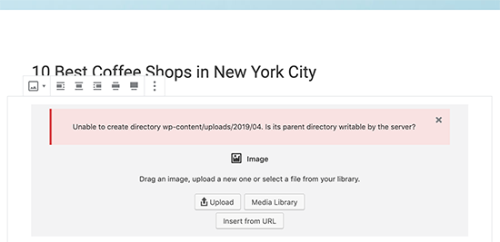
Wrong file permissions prevent WordPress from reading or uploading file on the hosting server. You may get the following error when uploading image file:

‘Unable to create directory wp-content/uploads/2019/04. Is its parent directory writable by the server?’

Unable to create directory error

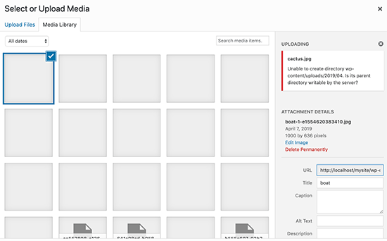
Another sign of this issue is that your images may disappear from the media library.

Missing images in media library

My site was working fine before? Who changed the file permissions?

This could happen due to a number of reasons. A misconfiguration on your shared hosting server can sometimes change those permissions without you doing anything.

For example, your web hosting provider ran an upgrade which unexpectedly changed file permissions.

If everything else is working fine on your website, then you can simply apply the correct file permissions to fix the image upload issue.

That being said, let’s take a look at how to set correct file permissions to fix image upload issues in WordPress.

Fixing Image Upload Issue in WordPress

You will need to use an FTP client to change file permissions.

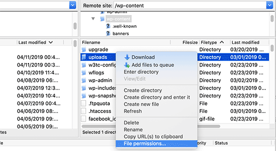
First, connect to your website via FTP and then go to /wp-content/ folder. Inside, you’ll find the uploads folder, which is where WordPress stores all your media uploads including images.

Now right click on the uploads directory and then select File Permissions.

Opening file permissions dialog box for uploads folder

This will bring up the file permissions dialog box.

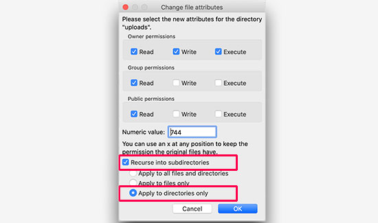
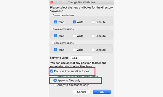
First, you will need to set file permissions for the uploads directory and all the subdirectories inside it to 744.

Change folder permissions

To do that, enter 744 in the numeric value box, and then check the box next to Recurse into subdirectories option. Now click on the ‘Apply to directories only’ radio button.

Click on the OK button to apply these changes. Your FTP client will now start applying file permissions to the directories.

Note: If setting directory permissions to 744 does not seem to solve your problem, then try 755.

In the next step, you will need to set file permissions for all the files in the uploads directory.

To do that, right click on uploads directory and select file permissions. In the file permissions dialog box, change the numeric value to 644.

Check the box next to Recurse into subdirectories. Lastly, you need to click on ‘Apply to files only’ radio button. Click on the OK button to apply these changes.

File permissions

The FTP client will now change the permissions for all files inside the uploads folder. Once it is done, you can go back to your WordPress admin area and try uploading images again.

Note: if you don’t know how to use a FTP client, then you can also use the file manager provided by your WordPress hosting company. Since the screenshots will vary from each host, you will need to talk to their support to find instructions.

We hope this article helped you fix the image upload issue in WordPress. You may also want to see our article on how to optimize image SEO to get more organic traffic to your website.

If you liked this article, then please subscribe to our YouTube Channel for WordPress video tutorials. You can also find us on Twitter and Facebook.

The post How to Fix Image Upload Issue in WordPress (Step by Step) appeared first on WPBeginner.

How to Use Tumblr To Drive Traffic and Land New Customers

With millions of passionate users, Tumblr is a social media powerhouse that can’t be ignored.

Even if you’ve never read a Tumblr blog, I’ll walk you through the steps you need to take to create an awesome Tumblr blog from scratch.

I’ll also go over how you can promote your blog within Tumblr without being pushy or salesy.

Your first step is to head over to Tumblr.com and sign up on the home page. So you put in your email, your password, and your username, and your username is really important so just like at any social media site, like Pinterest or Facebook or Twitter, you want your username to be a brand name.

So if we are signing up for Quick Sprout, you would want to make it Quick Sprout and click “Sign up,” and then put your age, and agree to the terms and services and click done. And you’re in.

Y next step once you have your account is to look for other blogs in your niche and then follow them because Tumblr is all about following other people’s blogs and sharing their content on your blog. Head over to the search bar here and put in a keyword related to what your blog is going to be about.

Let’s say that I search for marketing, and then you just want to find blogs that look like a good fit for the type of traffic that I want, they produce good content, and they are related to what your blog is going to be about. When you find some, just click on the little blue plus sign and you will be following them. Just do it until you’ve found five, and then click on next step.

Next you want to add some more details about you and your brand. So if you’re creating a Tumblr around a brand, you want to add your logo, but if it was more of a personal brand, you’d want to upload a head shot. So we’re going to add a picture of Neil, and you can adjust it, then click “Save” when it looks good, and then under title, you want to add your title and a description. You can put a little description about what your brand is about, and you can put something like a slogan or something that is associated with your brand.

Then click “Next step.” And if you want, you can download their app depending on what mobile device that you use but I’m just going to click I’ll get it later. So once you see this screen you’re good. You officially have a Tumblr blog. So your next step is to find a theme that’s in line with your brand and what your Tumblr blog is going to be all about. So to do that, click on the picture here, and this will actually take you to your blog. So this is what it looks like right now.

Now to find a theme, click on the “Customize” button in the top right corner, and then click on themes. And then you can choose from hundreds of different themes that Tumblr has, just like with Word Press. So, if you want a free theme, you can click on “Free,” or if you have an idea of what you want your blog to look like, whether it’s single-column or two-column, you can choose that. But let’s just choose free themes to get started.

Now when you find one that looks nice, just click on it, and Tumblr will show you a live preview of what your blog would look like with that theme. So depending on your brand, this might be the perfect theme, or, maybe this one, Esquire theme, might work better for you. OK? So when you find one that looks nice, click on the “Use” button, and from here you can make any changes to your theme that you want. So if you wanted to change the background color from yellow to another color, you click on the color, and then choose one that works best for you.

Or if you want to change the accent color, you can do the same thing. And if you want to get really hard core about changing the themes to make sure it’s super in line with what the brand is all about, you can click on “Edit HTML,” and you can actually edit the HTML of the document. When you make a change, click on update preview, and it will show you what that change will look like on your blog.

So once everything looks good, click on save, then go back to appearance, click on “Save” again, and then click on close and you’ll see what your blog looks like with that theme. So obviously, it’s a little bit bare here, so you want to start adding some content to make your blog a real blog. So to do that, click on the “Dashboard” button, and that will take you back to your Tumblr dashboard. Now, there’s a number of different ways to add content to Tumblr.

So if you wanted to add text, you could add text. Now unlike other blogging platforms, you don’t want to do things like 5 tips for whatever at Tumblr. That’s not the kind of content that tends to perform well. It’s more eye-catching and engaging stuff. So you want to do like, “Four Examples of Bad-ass Marketing.” OK, because that’s the type of audience that tends to hang out on Tumblr. And then you can add content, just like you would on any blog post, and when it looks good, click on “Publish,” and then if you want to see what it looks like, on your site, you can always click on your face or your logo and it will take you back to your blog. So this is what it looks like.

Now there are some other ways to add content to your Tumblr blog, one of the most important of which is reblogging other people’s content. So when we first signed up, we followed some bloggers, but now we want to be a little more particular about who we’re following so then we can get their feed. So when you follow someone, their feed ends up here on your dashboard. OK, so what you want to do is follow people strategically who are going to post content that your audience would be interested in and then you can reblog it. So to do that, click on “Find blogs,” and Tumblr will show you some of the most popular blogs.

So what you want to do is look on the right hand side of the page and find a category that fits best with your blog’s topic, so in the case of Quick Sprout, we choose business. And then you want to find blogs in that space that publish content that your audience would be interested in. And when you find a blog that looks like a good fit, hover over it and click on the “Follow” button. And now you will follow that blog.

So, when you go into your Tumblr dashboard, and that blog publishes something new, so in the case of Planet Money they just published this, and if you think it’s cool and something that your audience would want to see, just like with any other social media network, you want to share it. So what you do is you click these little arrow buttons, and that will reblog the post. So now when you go back to your Tumblr blog, the post is here.

So when your audience sees this and they think that it’s cool, they’ll appreciate it just like they would if you shared a great piece of content on Twitter or Facebook. Reblogging also puts you on the radar screen of influential Tumblr blogs, because when you reblog someone else’s content, they are notified. So when we reblogged this piece of content from Planet Money, if we go to the page where the content originally appeared, we can see that it shows that Quick Sprout reblogged it. So, when they see that, they say hey, what’s Quick Sprout? Then they click on it, and when they go to your blog and they see something cool, they reblog to return the favor.

But obviously, for them to do that, you need to have great original content and that’s what I’m going to show you how to do right now. As I mentioned earlier, not all content performs well on Tumblr. In general, pictures perform really well, so let’s say that you wanted to announce that you just opened a forum on Tumblr. Now instead of heading back to your dashboard, clicking the text button and making a text-based announcement like, “Hey, we just launched a forum.” You wouldn’t want to do that.

You would want to announce it with a picture. So you head back to your site, and take a picture of whatever it is you’re announcing, copy the image location, and then click photo, and then click URL, and then enter the image URL, and the image will be the centerpiece of your post. So, whenever you want to publish something, whether it’s tips on how to do something or an announcement for your company, you want to make it image-focused.

So if you were going to do, like five tips for getting more Twitter followers, you would want to put that as five different images or one big image instead of making that text. And to explain what your images are about, you can add a caption here. So, put something like “Announcing for Quick Sprout forum,” and then click “Publish.” And then when you go back to your blog by clicking on your face or logo, you’ll see, it’s right here. It has a nice little frame around it, thanks to the theme.

So, that’s all there is to marketing your business on Tumblr, and just like with any social media site, the most important thing is to get involved with the community and share great content. And the only twist is that when you share content on Tumblr, make sure it’s images most of the time.

Unable to choose GRUB menu choice after reboot

I've discovered a weird problem with my Linux Mint-system (Linux Mint 18).
After rebooting my system (or restarting as well) I got the GRUB menu, but my keyboard is not responding...
So I have to wait for the timeout to get my system booted.

The keyboard is wired to the computer through an USB-connection. So it's not wireless.
And it works OK as soon as my system has booted.. (?).

I have installed/loaded Linux kernel 4.4.142, 4.4.143 and 4.4.145.
When running kernel 4.4.142 Virtualbox and VMWare Workstation works as it should, but when I try to use 4.4.143 or 4.4.145 they both refuse to load.
So I want to be able to choose which kernel to run depending on what I want to do.. :-)

Form Validation in Under an Hour with Vuelidate

Form validation has a reputation for being tricky to implement. In this tutorial, we’ll break things down to alleviate some of that pain. Creating nice abstractions for forms is something that Vue.js excels at and Vuelidate is personally my favorite option for validations because it doesn't require a lot of hassle. Plus, it's really flexible, so we don’t even have to do it how I’m going to cover it here. This is just a launching point.

If you simply want to copy and paste my full working example, it’s at the end. Go ahead. I won’t tell. Then your time spent is definitely under an hour and more, like, two minutes amirite?! Ahh, the internet is a beautiful place.

You may find you need to modify the form we're using in this post so, in that case, you can read the full thing. We’ll start with a simple case and gradually build out a more concrete example. Finally, we’ll go through how to show form errors when the user has completed the form.

Simplest case: showing the entry once you’re done with the input

First, let’s show how we’d work with Vuelidate. We’ll need to create an object called validations that will mirror the data structure of what we’re trying to capture in the form. In the simplest terms, it would look like this:

data: {
  name: ‘’
},
validations: {
  name: {
    required
  }
}

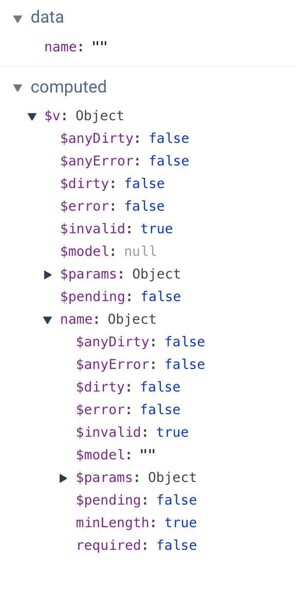
This would create an object within computed properties that we can find with $v. It looks like this in Vue DevTools:

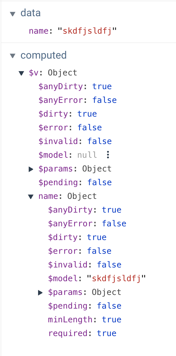
computed properties when empty

A couple things to note here: $v is a computed property. This is great because that means it’s cached until something updates, which is a very performant way to deal with these state changes. Check out my article here if you want more background on this concept.

Another thing to note: there are two objects — one general object about all validations (there’s only one here currently) and one about the property name in specific. This is great because if we’re looking for general information about all fields, we have that information. And if we need to gather specific data, we have that too.

Let’s take a look at what happens when we start typing in that input:

random typing shown in computed properties

We can see in data that we have... well, me typing like a lunatic. But let’s check out some of these other fields. $dirty, in this case, refers to whether the form has been touched at all. We can also see that the $model field is now filled in for the name object, which mirrors what’s in data.

$error and $invalid sound the same but are actually a little different. $invalid is checking if it passes validation, but $error checks both for something that's $invalid and whether or not it's $dirty (whether the form has been touched yet or not). If this all seems like a lot to parse (haha get it? parse?), don't worry, we'll walk through many of these pieces step by step.

Installing Vuelidate and creating our first form validation

OK, so that was a very simple example. Let’s build something real out of it. We’ll bring this into our application and this time we’ll make the field required and give it a minimum length requirement. In the Vue app, we’ll first add Vuelidate:

yarn add vuelidate

Now, let’s go into the main.js file and update it as follows:

import Vue from 'vue';
import Vuelidate from "vuelidate";
import App from './App.vue';
import store from './store';

Vue.use(Vuelidate);
Vue.config.productionTip = false

new Vue({
 store,
 render: h => h(App)
}).$mount('#app')

Now, in whatever component holds the form element, let’s first import the validators we’ll need:

import { required, minLength } from 'vuelidate/lib/validators'

Then, we’ll put the data inside of a function so we can reuse the component. You likely know about that one. Next, we’ll put our name form field in an object, because typically, we'd want to capture all of the form data together.

We’ll also need to include the validations, which will mirror our data. We’ll use required again, but this time we’ll also add a key/value pair for the minimum length of the characters, minLength(x), which will look something like this:

<script>
import { required, minLength } from 'vuelidate/lib/validators'

export default {
 data() {
   return {
     formResponses: {
       name: '',
     }
   }
 },
 validations: {
   formResponses: {
     name: {
       required,
        minLength: minLength(2)
     },
   }
 }
}
</script>

Next, in the template, we’ll create a label for accessibility purposes. Instead of using what’s in the data to create the relationship in v-model, we’ll use that computed property ($model) that we saw earlier in the validations object.

<template>
 <div id="app">
   <label for="fname">Name*</label>
   <input id="fname" class="full" v-model="$v.formResponses.name.$model" type="text">
 </div>
</template>

Finally, beneath the form input, we’ll place some text beneath the form. We can use required attached to formResponses.name to see if it evaluates correctly and whether it’s provided at all. We can also see if there’s more than the minimum length of characters. We even have a params object that will tell us the number of characters we specified. We’ll use all of this to create informative error messages for our user.

<p class="error" v-if="!$v.formResponses.name.required">this field is required</p>
<p class="error" v-if="!$v.formResponses.name.minLength">Field must have at least {{ $v.formResponses.name.$params.minLength.min }} characters.</p>

And we’ll style our error class so it’s clear at a glance that they’re errors.

.error {
  color: red;
}

Be a little lazy

You may have noticed in that last demo that the errors are present right away and update while typing. Personally, I don’t like to show form validations that way because I think it’s distracting and confusing. What I like to do is wait to evaluate until typing has completed. For that kind of interaction, Vue comes equipped with a modifier for v-model: v-model.lazy. This will only evaluate the two-way binding once the user has completed the task with the input.

We can now improve on our single form input like this:

<label for="fname">Name*</label>
<input id="fname" class="full" v-model.lazy="$v.formResponses.name.$model" type="text">

Creating custom validators

Vuelidate comes with a lot of validators out of the box, which is really helpful. However, there are times when we need something a little more custom. Let’s make a custom validator for a strong password, and check that it matches with Vuelidate’s sameAs validator

The first thing we’ll do is make a label attached to an input, and the input will be type="password".

<section>
  <label for="fpass1">Password*</label>
  <input id="fpass1" v-model="$v.formResponses.password1.$model" type="password">
</section>

In our data, we’ll create password1 and password2 (which we’ll use these in a moment to validate matching passwords) in our formResponses object, and import what we need from the validators.

import { required, minLength, email, sameAs } from "vuelidate/lib/validators";

export default {
 data() {
   return {
     formResponses: {
       name: null,
       email: null,
       password1: null,
       password2: null
     }
   };
 },

Then, we’ll create our custom validator. In the code below you can see that we’re using regex for different types of evaluation. We’ll create a strongPassword method, passing in our password1, and then we can check it several ways with .test(), which works as you might expect: it has to pass true if it is passing and false if not.

validations: {
  formResponses: {
    name: {
      required,
      minLength: minLength(3)
    },
    email: {
      required,
      email
    },
    password1: {
      required,
      strongPassword(password1) {
        return (
          /[a-z]/.test(password1) && // checks for a-z
          /[0-9]/.test(password1) && // checks for 0-9
          /\W|_/.test(password1) && // checks for special char
          password1.length >= 6
        );
      }
    },
 }

I am separating out each line so you can see what's going on, but we could also write the whole thing as a one-liner like this:

const regex = /^[a-zA-Z0-9!@#\$%\^\&*\)\(+=._-]{6,}$/g

I prefer to break it out because it is easier to modify.

This allows us to make the error text for our validation. We can make it say whatever we like, or even take this out of a v-if and make it present on the page. Up to you!

<section>
  <label for="fpass1">Password*</label>
  <input id="fpass1" v-model="$v.formResponses.password1.$model" type="password">
  <p class="error" v-if="!$v.formResponses.password1.required">this field is required</p>
  <p class="error" v-if="!$v.formResponses.password1.strongPassword">Strong passwords need to have a letter, a number, a special character, and be more than 8 characters long.</p>
</section>

Now we can check if the second password matches the first with Vuelidate’s sameAs method:

validations: {
  formResponses: {
    password1: {
      required,
      strongPassword(password1) {
        return (
          /[a-z]/.test(password1) && // checks for a-z
          /[0-9]/.test(password1) && // checks for 0-9
          /\W|_/.test(password1) && // checks for special char
          password1.length >= 6
        );
      }
    },
    password2: {
      required,
      sameAsPassword: sameAs("password1")
    }
  }
}

And we can create our second password field:

<section>
  <label for="fpass2">Please re-type your Password</label>
  <input id="fpass2" v-model="$v.formResponses.password2.$model" type="password">
  <p class="error" v-if="!$v.formResponses.password2.required">this field is required</p>
  <p class="error" v-if="!$v.formResponses.password2.sameAsPassword">The passwords do not match.</p>
</section>

Now you can see the whole thing in action all together:

Evaluate on completion

You can see how noisy that last example is until the form has been completed. In my opinion, a better route is to evaluate when the entire form is completed so the user isn't interrupted in the process. Here's how we can do that.

Remember when we looked at the computed properties $v contained? It had objects for all the individual properties, but also one for all validations as well. Inside, there were three very important values:

  • $anyDirty: if the form was touched at all or left blank
  • $invalid: if there are any errors in the form
  • $anyError: if there are any errors at all (even one), this will evaluate to true

You can use $invalid, but I prefer $anyError, because it doesn't require us to check if it’s dirty as well.

Let’s improve on our last form. We’ll put in a submit button, and a uiState string to keep track of, well, the UI state! This is incredibly useful as we can keep track of whether we’ve attempted submission, and whether we’re ready to send what we’ve collected. We’ll also make a small style improvement: position the error on the form so that it’s not moving around to in order to show the errors.

First, let’s add a few new data properties:

data() {
  return {
    uiState: "submit not clicked",
    errors: false,
    empty: true,
    formResponses: {
      ...
    }
  }
}

Now, we’ll add in a submit button at the end of the form. The .prevent modifier at the end of the @click directive acts like preventDefault, and keeps the page from reloading:

<section>
  <button @click.prevent="submitForm" class="submit">Submit</button>
</section>

We’ll handle some different states in the submitForm method. We’re going to use that computed property from Vuelidate ($anyDirty) to see if the form is empty. Remember, we can gather that information from this.$v. We used the formResponses object to hold all the form responses, so what we’ll use is this.$v.formResponses.$anyDirty. We’ll map that value to our "empty" data property. We’ll also do the same with errors and we’ll change the uiState to "submit clicked":

submitForm() {
  this.formTouched = !this.$v.formResponses.$anyDirty;
  this.errors = this.$v.formResponses.$anyError;
  this.uiState = "submit clicked";
  if (this.errors === false && this.formTouched === false) {
    //this is where you send the responses
    this.uiState = "form submitted";
  }
}

If the form has no errors and it’s not empty, we’ll send the responses and change the uiState to "form submitted" as well.

Now, we can handle some states for errors and empty states as well and, finally, if the form is submitted, we’ll evaluate a success.

<section>
  <button @click.prevent="submitForm" class="submit">Submit</button>
  <p v-if="errors" class="error">The form above has errors,
    <br>please get your act together and resubmit
  </p>
  <p v-else-if="formTouched && uiState === 'submit clicked'" class="error">The form above is empty,
    <br>cmon y'all you can't submit an empty form!
  </p>
  <p v-else-if="uiState === 'form submitted'" class="success">Hooray! Your form was submitted!</p>
</section>

In this form, we’ve given each section relative positioning and added a little padding at the bottom. That will allow us to give absolute positioning to the error state, which will prevent the form from moving around.

.error {
  color: red; 
  font-size: 12px;
  position: absolute;
  text-transform: uppercase;
}

There’s one last thing we need to do: now that we’ve placed the errors in the form absolutely, they’ll stack on top of each other unless we place them next to each other instead. We also want to check if the form is in the error state, which will be true only after the submit button is clicked. This can be a useful way of doing things- we won’t show the errors until the user is done with the form, which can be less invasive. It's up to you if you'd like to do it this way or the v-model.lazy example used in previous sections.

Our previous errors looked like this:

<section>
  ...
  <p class="error" v-if="!$v.formResponses.password2.required">this field is required</p>
  <p class="error" v-if="!$v.formResponses.password2.sameAsPassword">The passwords do not match.</p>
 </section>

Now, they’ll be contained together like this:

<p v-if="errors" class="error">
  <span v-if="!$v.formResponses.password1.required">this field is required.</span>
  <span v-if="!$v.formResponses.password1.strongPassword">Strong passwords need to have a letter, a number, a special character, and be more than 8 characters long.</span>
</p>

To make things even easier on you, there's a library that dynamically figures out what error to display based on your validation. Super cool! If you're doing something simple, it's probably too much overhead, but if you have a really complex form, it might save you time :)

And there we have it! Our form is validated and we have both errors and empty states when we need them, but none while we’re typing.

Sincere thanks to Damian Dulisz, one of the maintainers for Vuelidate, for proofing this article.

The post Form Validation in Under an Hour with Vuelidate appeared first on CSS-Tricks.
Creating a Reusable Pagination Component in Vue

The idea behind most of web applications is to fetch data from the database and present it to the user in the best possible way. When we deal with data there are cases when the best possible way of presentation means creating a list.

Depending on the amount of data and its content, we may decide to show all content at once (very rarely), or show only a specific part of a bigger data set (more likely). The main reason behind showing only part of the existing data is that we want to keep our applications as performant as possible and avoid loading or showing unnecessary data.

If we decide to show our data in "chunks" then we need a way to navigate through that collection. The two most common ways of navigating through set of data are:

The first is pagination, a technique that splits the set of data into a specific number of pages, saving users from being overwhelmed by the amount of data on one page and allowing them to view one set of results at a time. Take this very blog you're reading, for example. The homepage lists the latest 10 posts. Viewing the next set of latest posts requires clicking a button.

The second common technique is infinite scrolling, something you're likely familiar with if you've ever scrolled through a timeline on either Facebook or Twitter.

The Apple News app also uses infinite scroll to browse a list of articles.

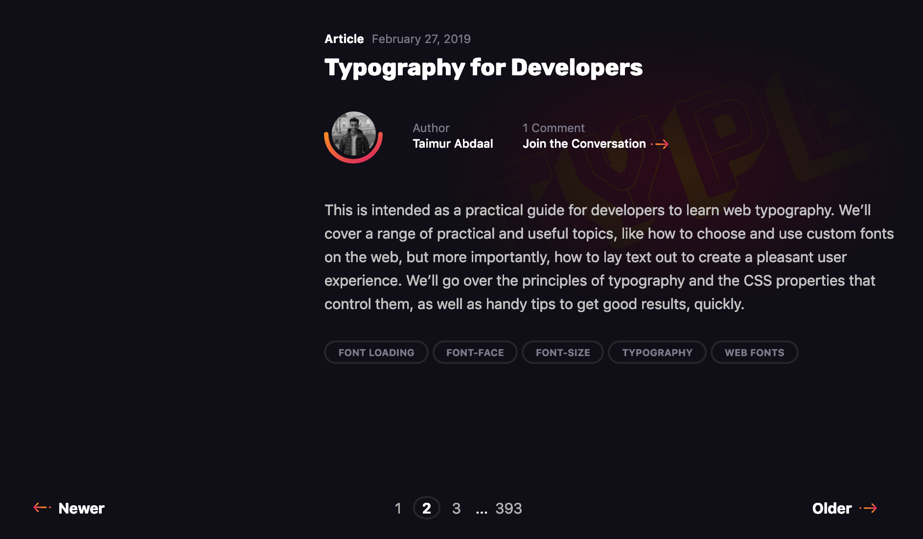
We're going to take a deeper look at the first type in this post. Pagination is something we encounter on a near-daily basis, yet making it is not exactly trivial. It's a great use case for a component, so that's exactly what we're going to do. We will go through the process of creating a component that is in charge of displaying that list, and triggering the action that fetches additional articles when we click on a specific page to be displayed. In other words, we’re making a pagination component in Vue.js like this:

Let's go through the steps together.

Step 1: Create the ArticlesList component in Vue

Let’s start by creating a component that will show a list of articles (but without pagination just yet). We’ll call it ArticlesList. In the component template, we’ll iterate through the set of articles and pass a single article item to each ArticleItem component.

// ArticlesList.vue
<template>
  <div>
    <ArticleItem
      v-for="article in articles"
      :key="article.publishedAt"
      :article="article"
    />
  </div>
</template>

In the script section of the component, we set initial data:

  • articles: This is an empty array filled with data fetched from the API on mounted hook.
  • currentPage: This is used to manipulate the pagination.
  • pageCount : This is the total number of pages, calculated on mounted hook based on the API response.
  • visibleItemsPerPageCount: This is how many articles we want to see on a single page.

At this stage, we fetch only first page of the article list. This will give us a list two articles:

// ArticlesList.vue
import ArticleItem from "./ArticleItem"
import axios from "axios"
export default {
  name: "ArticlesList",
  static: {
    visibleItemsPerPageCount: 2
  },
  data() {
    return {
      articles: [],
      currentPage: 1,
      pageCount: 0
    }
  },
  components: { 
    ArticleItem, 
  },
  async mounted() {
    try {
      const { data } = await axios.get(
        `?country=us&page=1&pageSize=${
          this.$options.static.visibleItemsPerPageCount
        }&category=business&apiKey=065703927c66462286554ada16a686a1`
      )
      this.articles = data.articles
      this.pageCount = Math.ceil(
        data.totalResults / this.$options.static.visibleItemsPerPageCount
      )
    } catch (error) {
      throw error
    }
  }
}

Step 2: Create pageChangeHandle method

Now we need to create a method that will load the next page, the previous page or a selected page.

In the pageChangeHandle method, before loading new articles, we change the currentPage value depending on a property passed to the method and fetch the data respective to a specific page from the API. Upon receiving new data, we replace the existing articles array with the fresh data containing a new page of articles.

// ArticlesList.vue
...
export default {
...
  methods: {
    async pageChangeHandle(value) {
      switch (value) {
        case 'next':
          this.currentPage += 1
          break
        case 'previous':
          this.currentPage -= 1
          break
        default:
          this.currentPage = value
      }
      const { data } = await axios.get(
        `?country=us&page=${this.currentPage}&pageSize=${
          this.$options.static.visibleItemsPerPageCount
        }&category=business&apiKey=065703927c66462286554ada16a686a1`
      )
      this.articles = data.articles
    }
  }
}

Step 3: Create a component to fire page changes

We have the pageChangeHandle method, but we do not fire it anywhere. We need to create a component that will be responsible for that.

This component should do the following things:

  1. Allow the user to go to the next/previous page.
  2. Allow the user to go to a specific page within a range from currently selected page.
  3. Change the range of page numbers based on the current page.

If we were to sketch that out, it would look something like this:

Let’s proceed!

Requirement 1: Allow the user to go to the next or previous page

Our BasePagination will contain two buttons responsible for going to the next and previous page.

// BasePagination.vue
<template>
  <div class="base-pagination">
    <BaseButton
      :disabled="isPreviousButtonDisabled"
      @click.native="previousPage"
    >
      ←
    </BaseButton>
    <BaseButton
      :disabled="isNextButtonDisabled"
      @click.native="nextPage"
    >
      →
    </BaseButton>
  </div>
</template>

The component will accept currentPage and pageCount properties from the parent component and emit proper actions back to the parent when the next or previous button is clicked. It will also be responsible for disabling buttons when we are on the first or last page to prevent moving out of the existing collection.

// BasePagination.vue
import BaseButton from "./BaseButton.vue";
export default {
  components: {
    BaseButton
  },
  props: {
    currentPage: {
      type: Number,
      required: true
    },
    pageCount: {
      type: Number,
      required: true
    }
  },
  computed: {
    isPreviousButtonDisabled() {
      return this.currentPage === 1
    },
    isNextButtonDisabled() {
      return this.currentPage === this.pageCount
    }
  },
  methods: {
    nextPage() {
      this.$emit('nextPage')
    },
    previousPage() {
      this.$emit('previousPage')
    }
  }

We will render that component just below our ArticleItems in ArticlesList component.

// ArticlesList.vue
<template>
  <div>
    <ArticleItem
      v-for="article in articles"
      :key="article.publishedAt"
      :article="article"
    />
    <BasePagination
      :current-page="currentPage"
      :page-count="pageCount"
      class="articles-list__pagination"
      @nextPage="pageChangeHandle('next')"
      @previousPage="pageChangeHandle('previous')"
    />
  </div>
</template>

That was the easy part. Now we need to create a list of page numbers, each allowing us to select a specific page. The number of pages should be customizable and we also need to make sure not to show any pages that may lead us beyond the collection range.

Requirement 2: Allow the user to go to a specific page within a range

Let's start by creating a component that will be used as a single page number. I called it BasePaginationTrigger. It will do two things: show the page number passed from the BasePagination component and emit an event when the user clicks on a specific number.

// BasePaginationTrigger.vue
<template>
  <span class="base-pagination-trigger" @click="onClick">
    {{ pageNumber }}
  </span>
</template>
<script>
export default {
  props: {
    pageNumber: {
      type: Number,
      required: true
    }
  },
  methods: {
    onClick() {
      this.$emit("loadPage", this.pageNumber)
    }
  }
}
</script>

This component will then be rendered in the BasePagination component between the next and previous buttons.

// BasePagination.vue
<template>
  <div class="base-pagination">
    <BaseButton />
    ...
    <BasePaginationTrigger
      class="base-pagination__description"
      :pageNumber="currentPage"
      @loadPage="onLoadPage"
    />
    ...
    <BaseButton />
  </div>
</template>

In the script section, we need to add one more method (onLoadPage) that will be fired when the loadPage event is emitted from the trigger component. This method will receive a page number that was clicked and emit the event up to the ArticlesList component.

// BasePagination.vue
export default {
  ...
    methods: {
    ...
    onLoadPage(value) {
      this.$emit("loadPage", value)
    }
  }
}

Then, in the ArticlesList, we will listen for that event and trigger the pageChangeHandle method that will fetch the data for our new page.

// ArticlesList
<template>
  ...
    <BasePagination
      :current-page="currentPage"
      :page-count="pageCount"
      class="articles-list__pagination"
      @nextPage="pageChangeHandle('next')"
      @previousPage="pageChangeHandle('previous')"
      @loadPage="pageChangeHandle"
    />
  ...
</template>

Requirement 3: Change the range of page numbers based on the current page

OK, now we have a single trigger that shows us the current page and allows us to fetch the same page again. Pretty useless, don't you think? Let's make some use of that newly created trigger component. We need a list of pages that will allow us to jump from one page to another without needing to go through the pages in between.

We also need to make sure to display the pages in a nice manner. We always want to display the first page (on the far left) and the last page (on the far right) on the pagination list and then the remaining pages between them.

We have three possible scenarios:

  1. The selected page number is smaller than half of the list width (e.g. 1 - 2 - 3 - 4 - 18)
  2. The selected page number is bigger than half of the list width counting from the end of the list (e.g. 1 - 15 - 16 - 17 - 18)
  3. All other cases (e.g. 1 - 4 - 5 - 6 - 18)

To handle these cases, we will create a computed property that will return an array of numbers that should be shown between the next and previous buttons. To make the component more reusable we will accept a property visiblePagesCount that will specify how many pages should be visible in the pagination component.

Before going to the cases one by one we create few variables:

  • visiblePagesThreshold:- Tells us how many pages from the centre (selected page should be shown)
  • paginationTriggersArray: Array that will be filled with page numbers
  • visiblePagesCount: Creates an array with the required length
// BasePagination.vue
export default {
  props: {
    visiblePagesCount: {
      type: Number,
      default: 5
    }
  }
  ...
  computed: {
    ...
      paginationTriggers() {
        const currentPage = this.currentPage
        const pageCount = this.pageCount
        const visiblePagesCount = this.visiblePagesCount
        const visiblePagesThreshold = (visiblePagesCount - 1) / 2
        const pagintationTriggersArray = Array(this.visiblePagesCount - 1).fill(0)
      }
    ...
    }
  ...
}

Now let's go through each scenario.

Scenario 1: The selected page number is smaller than half of the list width

We set the first element to always be equal to 1. Then we iterate through the list, adding an index to each element. At the end, we add the last value and set it to be equal to the last page number — we want to be able to go straight to the last page if we need to.

if (currentPage <= visiblePagesThreshold + 1) {
  pagintationTriggersArray[0] = 1
  const pagintationTriggers = pagintationTriggersArray.map(
    (paginationTrigger, index) => {
      return pagintationTriggersArray[0] + index
    }
  )
  pagintationTriggers.push(pageCount)
  return pagintationTriggers
}
Scenario 2: The selected page number is bigger than half of the list width counting from the end of the list

Similar to the previous scenario, we start with the last page and iterate through the list, this time subtracting the index from each element. Then we reverse the array to get the proper order and push 1 into the first place in our array.

if (currentPage >= pageCount - visiblePagesThreshold + 1) {
  const pagintationTriggers = pagintationTriggersArray.map(
    (paginationTrigger, index) => {
      return pageCount - index
    }
  )
  pagintationTriggers.reverse().unshift(1)
  return pagintationTriggers
}
Scenario 3: All other cases

We know what number should be in the center of our list: the current page. We also know how long the list should be. This allows us to get the first number in our array. Then we populate the list by adding an index to each element. At the end, we push 1 into the first place in our array and replace the last number with our last page number.

pagintationTriggersArray[0] = currentPage - visiblePagesThreshold + 1
const pagintationTriggers = pagintationTriggersArray.map(
  (paginationTrigger, index) => {
    return pagintationTriggersArray[0] + index
  }
)
pagintationTriggers.unshift(1);
pagintationTriggers[pagintationTriggers.length - 1] = pageCount
return pagintationTriggers

That covers all of our scenarios! We only have one more step to go.

Step 5: Render the list of numbers in BasePagination component

Now that we know exactly what number we want to show in our pagination, we need to render a trigger component for each one of them.

We do that using a v-for directive. Let's also add a conditional class that will handle selecting our current page.

// BasePagination.vue
<template>
  ...
  <BasePaginationTrigger
    v-for="paginationTrigger in paginationTriggers"
    :class="{
      'base-pagination__description--current':
        paginationTrigger === currentPage
    }"
    :key="paginationTrigger"
    :pageNumber="paginationTrigger"
    class="base-pagination__description"
    @loadPage="onLoadPage"
  />
  ...
</template>

And we are done! We just built a nice and reusable pagination component in Vue.

When to avoid this pattern

Although this component is pretty sweet, it’s not a silver bullet for all use cases involving pagination.

For example, it’s probably a good idea to avoid this pattern for content that streams constantly and has a relatively flat structure, like each item is at the same level of hierarchy and has a similar chance of being interesting to the user. In other words, something less like an article with multiple pages and something more like main navigation.

Another example would be browsing news rather than looking for a specific news article. We do not need to know where exactly the news is and how much we scrolled to get to a specific article.

That’s a wrap!

Hopefully this is a pattern you will be able to find useful in a project, whether it’s for a simple blog, a complex e-commerce site, or something in between. Pagination can be a pain, but having a modular pattern that not only can be re-used, but considers a slew of scenarios, can make it much easier to handle.

The post Creating a Reusable Pagination Component in Vue appeared first on CSS-Tricks.

CSS Houdini Could Change the Way We Write and Manage CSS

CSS Houdini may be the most exciting development in CSS. Houdini is comprised of a number of separate APIs, each shipping to browsers separately, and some that have already shipped (here's the browser support). The Paint API is one of them. I’m very excited about it and recently started to think about how I can use it in my work.

One way I’ve been able to do that is to use it as a way to avoid reinventing the wheel. We’ll go over that in this post while comparing it with methods we currently use in JavaScript and CSS. (I won’t dig into how to write CSS Houdini because there are great articles like this, this and this.)

Houdini brings modularity and configurations to CSS

The way CSS Houdini works brings two advantages: modularity and configurability. Both are common ways to make our lives as developers easier. We see these concepts often in the JavaScript world, but less-so with CSS world… until now.

Here’s a table the workflows we have for some use cases, comparing traditional CSS with using Houdini. I also added JavaScript for further comparison. You can see CSS Houdini allows us to use CSS more productively, similar to how the JavaScript world had evolved into components.

Traditional CSS CSS Houdini JavaScript
When we need a commonly used snippets Write it from scratch or copy-paste from somewhere. Import a worklet for it. Import a JS library.
Customize the snippet for the use case Manually tweak the value in CSS. Edit custom properties that the worklet exposes. Edit configs that the library provides.
Sharing code Share code for the raw styles, with comments on how to tweak each piece. Share the worklet (in the future, to a package management service) and document custom properties. Share the library to a package management service (like npm) and document how to use and configure it.

Modularity

With Houdini, you can import a worklet and start to use it with one line of code.

<script>
  CSS.paintWorklet.addModule('my-useful-paint-worklet.js');
</script>

This means there’s no need to implement commonly used styles every time. You can have a collection of your own worklets which can be used on any of your projects, or even shared with each other.

If you're looking for modularity for HTML and JavaScript in additional to styles, then web components is the solution.

It’s very similar to what we already have in the JavaScript world. Most people won’t re-implement commonly used functions, like throttling or deep-copying objects. We simply import libraries, like Lodash.

I can imagine we could have CSS Houdini package management services if the popularity of CSS Houdini takes off, and anyone could import worklets for interesting waterfall layouts, background patterns, complex animation, etc.

Configurability

Houdini works well with CSS variables, which largely empowers itself. With CSS variables, a Houdini worklet can be configured by the user.

.my-element {
  background-image: paint(triangle);
  --direction: top;
  --size: 20px;
}

In the snippet, --direction and --size are CSS variables, and they’re used in the triangle worklet (defined by the author of the triangle worklet). The user can change the property to update how it displays, even dynamically updating CSS variables in JavaScript.

If we compare it to what we already have in JavaScript again, JavaScript libraries usually have options that can be passed along. For example, we can pass values for speed, direction, size and so on to a carousel library to make it perform the way we want. Offering these APIs at the element level in CSS is very useful.

A Houdini workflow makes my development process much more efficient

Let’s see a complete example of how this whole thing can work together to make development easier. We’ll use a tooltip design pattern as an example. I find myself using this pattern often in different websites, yet somehow re-implement for each new project.

Let’s briefly walk through my old experience:

  1. OK, I need a tooltip.
  2. It’s a box, with a triangle on one side. I’ll use a pseudo-element to draw the triangle.
  3. I can use the transparent border trick to draw the triangle.
  4. At this time, I most likely dig up my past projects to copy the code. Let me think… this one needs to point up, which side is transparent?
  5. Oh, the design requires a border for the tooltip. I have to use another pseudo-element and fake a border for the pointing triangle.
  6. What? They decide to change the direction of the triangle?! OK, OK. I will tweak all the values of both triangles...

It’s not rocket science. The whole process may only take five minutes. But let’s see how it can be better with Houdini.

I built a simple worklet to draw a tooltip, with many options to change its looks. You can download it on GitHub.

Here’s my new process, thanks to Houdini:

  1. OK, I need a tooltip.
  2. I’ll import this tooltip worklet and use it.
  3. Now I’ll modify it using custom properties.
<div class="tooltip-1">This is a tip</div>
<script>CSS.paintWorklet.addModule('my-tooltip-worklet.js')</script>
<style>
.tooltip-1 {
  background-image: paint(tooltip);
  padding: calc(var(--triangle-size) * 1px + .5em) 1em 1em;
  --round-radius: 0;
  --background-color: #4d7990;
  --triangle-size: 20;
  --position: 20;
  --direction: top;
  --border-color: #333;
  --border-width: 2;
  color: #fff;
}
</style>

Here’s a demo! Go ahead and play around with variables!

CSS Houdini opens a door to modularized, configurable styles sharing. I look forward to seeing developers using and sharing CSS Houdini worklets. I’m trying to add more useful examples of Houdini usage. Ping me if you have ideas, or want to contribute to this repo.

The post CSS Houdini Could Change the Way We Write and Manage CSS appeared first on CSS-Tricks.
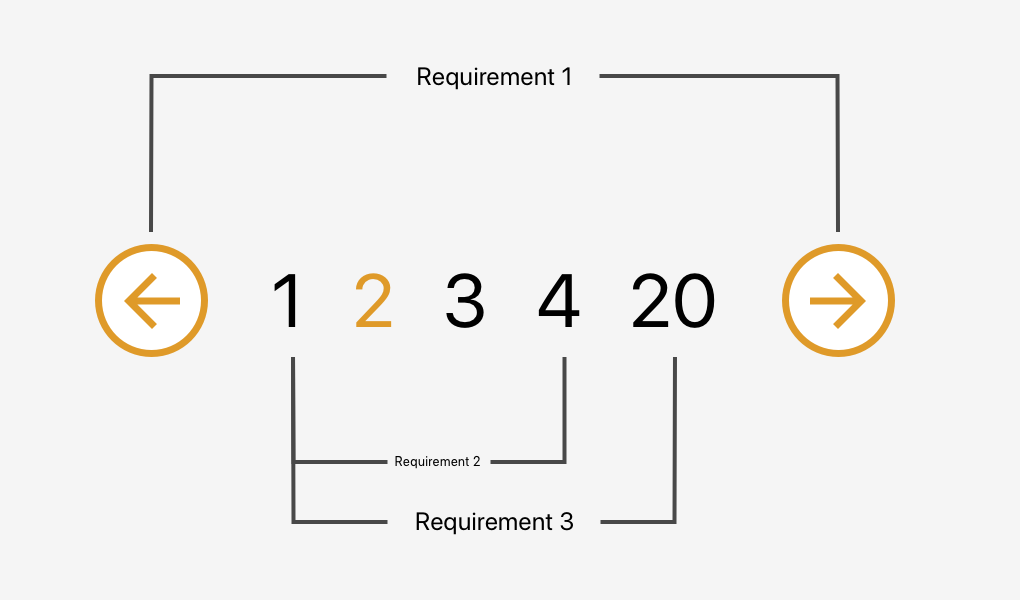
Is Your Cluster Ready for Jenkins X?

If you're reading this, chances are that you do not want to use jx cluster create to create a new cluster that will host Jenkins X. That is OK, and even welcome. That likely means that you are already experienced with Kubernetes and that you already have applications running in Kubernetes. That's a sign of maturity and your desire to add Jenkins X to the mix of whichever applications you are already running there. After all, it would be silly to create a new cluster for each set of applications.

However, using an existing Kubernetes cluster is risky. Some people assume that it will be easy to create a cluster from scratch. "We're so awesome that we don't need tools like Rancher to create a cluster for us. We'll do it with kubeadm." Then, after a lot of sweat, we announce that the cluster is operational, only to discover that there is no StorageClass or that networking does not work. So, if you assembled your own cluster and you want to use Jenkins X inside it, you need to ask yourself whether that cluster is set up correctly. Does it have everything we need? Does it comply with standards, or did you tweak it to meet your corporate restrictions? Did you choose to remove StorageClass because all your applications are stateless? Were you forced by your security department to restrict communication between Namespaces? Is the Kubernetes version too old? We can answer those and many other questions by running compliance tests.

The Magic of React-Based Multi-Step Forms

One way to deal with long, complex forms is to break them up into multiple steps. You know, answer one set of questions, move on to another, then maybe another, and so on and so forth. We often refer to these as multi-step forms (for obvious reasons), but others also take to calling it a “wizard” form.

Multi-step forms can be a great idea! By only showing a few inputs on a screen at a time, the form may feel more digestible and prevent users from feeling overwhelmed by a sea of form fields. Although I haven’t looked it up, I’m willing to say no one enjoys completing a ginormous form — that’s where multiple steps can come in handy.

The problem is that multi-step forms — while reducing perceived complexity on the front end — can feel complex and overwhelming to develop. But, I’m here to tell you that it’s not only achievable, but relatively straightforward using React as the base. So, that’s what we’re going to build together today!

Here’s the final product:

See the Pen
React Simple Wizard Form
by Nathan Sebhastian (@nathansebhastian)
on CodePen.

Let’s build it!

The easiest way to create a multi-step form is to create a container form element that contains all the steps inside of it as components. Here’s a visual showing that container (<MasterForm/>), the components inside of it (<Step1/>, <Step2/>, <Step3/>) and the way states and props are passed between them.

A diagram showing the master form component above three rectangles representing the three steps of the form, from left to right. Between the master form and the steps is a constructor, setState, and render.
<MasterForm/> serves as the container while three child components inside of it act as each step of the form.

Although it seems to be more complex than a regular form, a multi-step form still uses the same principles as a React form:

  • State is used for storing data and user inputs.
  • Component is used for writing methods and the interface.
  • Props are used for passing data and function into elements.

Instead of having one form component, we will have one parent component and three child components. In the diagram above, <MasterForm/> will send data and functions to the child components via props, and in turn, the child components will trigger a handleChange() function to set values in the state of <MasterForm/>. It’s one big happy family over here!

We'll need a function to move the form from one step to another as well, and we’ll get to that a little later.

The step child (get it?) components will receive props from the <MasterForm/> parent component for value and onChange props.

  • <Step1/> component will render an email address input
  • <Step2/> will render a username input
  • <Step3/> will render a password input and a submit button

<MasterForm/> will supply both data and function into child components, and child components will pass user inputs back to the parent using its props.

Creating the step (child) components

First, we’ll create the form’s child components. We’re keeping things pretty barebones for this example by only using one input per step, but each step could really be as complex as we’d like. Since the child components look almost similar between one another, I’m just gonna show one of them here. But be sure to take a look at the demo for the full code.

class Step1 extends React.Component {
  render() {
    if (this.props.currentStep !== 1) { // Prop: The current step
      return null
    }
    // The markup for the Step 1 UI
    return(
      <div className="form-group">
        <label htmlFor="email">Email address</label>
        <input
          className="form-control"
          id="email"
          name="email"
          type="text"
          placeholder="Enter email"
          value={this.props.email} // Prop: The email input data
          onChange={this.props.handleChange} // Prop: Puts data into state
        />
      </div>
    )
  }
}

Now we can put this child component into the form’s render() function and pass in the necessary props. Just like in React’s form documentation, we can still use handleChange() to put the user’s submitted data into state with setState(). A handleSubmit() function will run on form submit.

Next up, the parent component

Let’s make the parent component — which we’re all aware by now, we’re calling <MasterForm/> — and initialize its state and methods.

We’re using a currentStep state that will be initialized with a default value of 1, indicating the first step (<Step1/>) of the form. We’ll update the state as the form progresses to indicate the current step.

class MasterForm extends Component {
  constructor(props) {
    super(props)
    // Set the initial input values
    this.state = {
      currentStep: 1, // Default is Step 1
      email: '',
      username: '',
      password: '', 
    }
    // Bind the submission to handleChange() 
    this.handleChange = this.handleChange.bind(this)
  }

  // Use the submitted data to set the state
  handleChange(event) {
    const {name, value} = event.target
    this.setState({
      [name]: value
    })    
  }
  
  // Trigger an alert on form submission
  handleSubmit = (event) => {
    event.preventDefault()
    const { email, username, password } = this.state
    alert(`Your registration detail: \n 
      Email: ${email} \n 
      Username: ${username} \n
      Password: ${password}`)
  }
  
  // Render UI will go here...
}

OK, that’s the baseline functionality we’re looking for. Next, we want to create the shell UI for the actual form add call the child components in it, including the required state props that will be passed from <MasterForm/> via handleChange().

render() {    
return (
  <React.Fragment>
  <h1>A Wizard Form!</h1>
  <p>Step {this.state.currentStep} </p> 
    
  <form onSubmit={this.handleSubmit}>
  
    // Render the form steps and pass in the required props
    <Step1 
      currentStep={this.state.currentStep} 
      handleChange={this.handleChange}
      email={this.state.email}
    />
    <Step2 
      currentStep={this.state.currentStep} 
      handleChange={this.handleChange}
      username={this.state.username}
    />
    <Step3 
      currentStep={this.state.currentStep} 
      handleChange={this.handleChange}
      password={this.state.password}
    />       

  </form>
  </React.Fragment>
)
}

One step at a time

So far, we’ve allowed users to fill the form fields, but we've provided no actual way to proceed to the next step or head back to the previous one. That calls for next and previous functions that check if the current step has a previous or next step; and if it does, push the currentStep prop up or down accordingly.

class MasterForm extends Component {
  constructor(props) {
    super(props)
    // Bind new functions for next and previous
    this._next = this._next.bind(this)
    this._prev = this._prev.bind(this)
  }

  // Test current step with ternary
  // _next and _previous functions will be called on button click
  _next() {
    let currentStep = this.state.currentStep
    // If the current step is 1 or 2, then add one on "next" button click
    currentStep = currentStep >= 2? 3: currentStep + 1
    this.setState({
      currentStep: currentStep
    })
  }
    
  _prev() {
    let currentStep = this.state.currentStep
    // If the current step is 2 or 3, then subtract one on "previous" button click
    currentStep = currentStep <= 1? 1: currentStep - 1
    this.setState({
      currentStep: currentStep
    })
  }
}

We’ll use a get function that will check whether the current step is 1 or 3. This is because we have three-step form. Of course, we can change these checks as more steps are added to the form. We also want to display the next and previous buttons only if there actually are next and previous steps to navigate to, respectively.

// The "next" and "previous" button functions
get previousButton(){
  let currentStep = this.state.currentStep;
  // If the current step is not 1, then render the "previous" button
  if(currentStep !==1){
    return (
      <button 
        className="btn btn-secondary" 
        type="button" onClick={this._prev}>
      Previous
      </button>
    )
  }
  // ...else return nothing
  return null;
}

get nextButton(){
  let currentStep = this.state.currentStep;
  // If the current step is not 3, then render the "next" button
  if(currentStep <3){
    return (
      <button 
        className="btn btn-primary float-right" 
        type="button" onClick={this._next}>
      Next
      </button>        
    )
  }
  // ...else render nothing
  return null;
}

All that’s left is to render those buttons:

// Render "next" and "previous" buttons
render(){
  return(
    <form onSubmit={this.handleSubmit}>
      {/* 
        ... other codes
      */}
      
      {this.previousButton}
      {this.nextButton}
      
    </form>
  )
}

Congrats, you’re a form wizard! 🧙

That was the last step in this multi-step tutorial on multi-step forms. Whoa, how meta! While we didn’t go deep into styling, hopefully this gives you a solid overview of how to go about making complex forms less… complex!

Here’s that final demo again so you can see all the code in it’s full and glorious context:

See the Pen
React Simple Wizard Form
by Nathan Sebhastian (@nathansebhastian)
on CodePen.

React was made for this sort of thing considering it makes use of states, property changes, reusable components and such. I know that React may seem like a high barrier to entry for some folks, but I’ve written a book that makes it a much lower hurdle. I hope you check it out!

The post The Magic of React-Based Multi-Step Forms appeared first on CSS-Tricks.
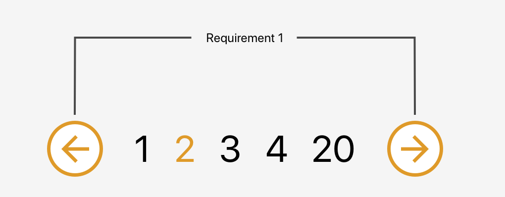
React’s Experimental Suspense API Will Rock for Fallback UI During Data Fetches

Most web applications built today receive data from an API. When fetching that data, we have to take certain situations into consideration where the data might not have been received. Perhaps it was a lost connection. Maybe it was the endpoint was changed. Who knows. Whatever the issue, it's the end user who winds up with a big bag of nothing on the front end.

So we ought to account for that!

The common way of handling this is to have something like an isLoading state in the app. The value of isLoading is dependent on the data we want to receive. For example, it could be a simple boolean where a returned true (meaning we're still waiting on the data), we display a loading spinner to indicate that the app is churning. Otherwise, wee'll show the data.

Oh god, no!
📷 Credit: Jian Wei

While this isn‘t entirely bad, the awesome folks working on React have implemented (and are continuing to work on) a baked-in solution to handle this using a feature called Suspense.

Suspense sorta does what its name implies

You may have guessed it from the name, but Suspense tells a component to hold off from rendering until a condition has been met. Just like we discussed with isLoading, the rendering of the data is postponed until the API fetches the data and isLoading is set to false. Think of it like a component is standing in an elevator waiting for the right floor before stepping out.

At the moment, Suspense can only be used to conditionally load components that use React.lazy() to render dynamically, without a page reload. So, say we have a map that takes a bit of time to load when the user selects a location. We can wrap that map component with Suspense and call something like the Apple beachball of death to display while we're waiting on the map. then, once the map loads, we kick the ball away.

// Import the Map component
const Map = React.lazy(() => import('./Map'));

function AwesomeComponent() [
  return (
    // Show the <Beachball> component until the <Map> is ready
    <React.Suspense fallback={<Beachball />}>
      <div>
        <Map />
      </div>
    </React.Suspense>
  );
}

Right on. Pretty straightforward so far, I hope.

But what if we want the fallback beachball, not for a component that has loaded, but when waiting for data to be returned from an API. Well, that's a situation Suspense seems perfectly suited for, but unfortunately, does not handle that quite yet. But it will.

In the meantime, we can put an experimental feature called react-cache (the package previously known as simple-cache-provider) to demonstrate how Suspense ought to work with API fetching down the road.

Let's use Suspense with API data anyway

OK, enough suspense (sorry, couldn‘t resist). Let's get to a working example where we define and display a component as a fallback while we're waiting for an API to spit data back at us.

Remember, react-cache is experimental. When I say experimental, I mean just that. Even the package description urges us to refrain from using it in production.

Here's what we're going to build: a list of users fetched from an API.

Get Source Code

Alright, let's begin!

First, spin up a new project

Let's start by generating a new React application using create-react-app.

## Could be any project name
create-react-app csstricks-react-suspense

This will bootstrap your React application. Because the Suspense API is still a work in progress, we will make use of a different React version. Open the package.json file in the project's root directory, edit the React and React-DOM version numbers, and add the simple-cache-provider package (we'll look into that later). Here's what that looks like:

"dependencies": {
  "react": "16.4.0-alpha.0911da3",
  "react-dom": "16.4.0-alpha.0911da3",
  "simple-cache-provider": "0.3.0-alpha.0911da3"
}

Install the packages by running yarn install.

In this tutorial, we will build the functionality to fetch data from an API. We can use the createResource() function from simple-cache-provider to do that in the src/fetcher.js file:

import { createResource } from 'simple-cache-provider';

const sleep = (duration) => {
  return new Promise((resolve) => {
    setTimeout(() => {
      resolve()
    }, duration)
  })
}

const loadProfiles = createResource(async () => {
  sleep(3000)
  const res = await fetch(`https://randomuser.me/api/?results=15`);
  return await res.json();
});

export default loadProfiles

So, here's what's happening there. The sleep() function blocks the execution context for a specific duration, which will be passed as an argument. The sleep() function is then called in the loadProfiles() function to stimulate a delay of three seconds (3,000ms). By using createResource() to make the API call, we either return the resolved value (which is the data we are expecting from the API) or throw a promise.

Next, we will create a higher-order component called withCache that enable caching on the component it wraps. We'll do that in a new file called, creatively, withCache.js. Go ahead and place that in the project's src directory.

import React from 'react';
import { SimpleCache } from 'simple-cache-provider';

const withCache = (Component) => {
  return props => (
    <SimpleCache.Consumer>
      {cache => <Component cache={cache} {...props} />}
    </SimpleCache.Consumer>
  );
}

export default withCache;

This higher-order component uses SimpleCache from the simple-cache-provider package to enable the caching of a wrapped component. We'll make use of this when we create our next component, I promise. In the meantime, create another new file in src called Profile.js — this is where we'll map through the results we get from the API.

import React, { Fragment } from 'react';
import loadProfiles from './fetcher'
import withCache from './withCache'

// Just a little styling
const cardWidth = {
  width: '20rem'
}

const Profile = withCache((props) => {
  const data = loadProfiles(props.cache);
  return (
    <Fragment>
      {
        data.results.map(item => (
        <div key={item.login.uuid} className="card" style={cardWidth}>
          <div>
            <img src={item.picture.thumbnail} />
          </div>
            <p>{item.email}</p>
          </div>
        ))
      }
    </Fragment>
  )
});

export default Profile

What we have here is a Profile component that's wrapped in withCache the higher-order component we created earlier. Now, whatever we get back from the API (which is the resolved promise) is saved as a value to the data variable, which we've defined as the props for the profile data that will be passed to the components with cache (props.cache).

To handle the loading state of the app before the data is returned from the API, we'll implement a placeholder component which will render before the API responds with the data we want.

Here's what we want the placeholder to do: render a fallback UI (which can be a loading spinner, beach ball or what have you) before the API responds, and when the API responds, show the data. We also want to implement a delay (delayMs ) which will come in handy for scenarios where there's almost no need to show the loading spinner. For example; if the data comes back in less than two seconds, then maybe a loader is a bit silly.

The placeholder component will look like this;

const Placeholder = ({ delayMs, fallback, children }) => {
  return (
    <Timeout ms={delayMs}>
      {didTimeout => {
        return didTimeout ? fallback : children;
      }}
    </Timeout>
  );
}

delayMs, fallback and children will be passed to the Placeholder component from the App component which we will see shortly. The Timeout component returns a boolean value which we can use to either return the fallback UI or the children of the Placeholder component (the Profile component in this case).

Here's the final markup of our App, piecing together all of the components we've covered, plus some decorative markup from Bootstrap to create a full page layout.

class App extends React.Component {
  render() {
    return (
      <React.Fragment>
        // Bootstrap Containers and Jumbotron     
        <div className="App container-fluid">
          <div className="jumbotron">
            <h1>CSS-Tricks React Suspense</h1>
          </div>
          <div className="container">
            <div>
              // Placeholder contains Suspense and wraps what needs the fallback UI
              <Placeholder
                delayMs={1000}
                fallback={
                  <div className="row">
                    <div className="col-md">
                      <div className="div__loading">
                        <Loader />
                      </div>
                    </div>
                  </div>
                }
              >
                <div className="row">
                  // This is what will render once the data loads
                  <Profile />
                </div>
              </Placeholder>
            </div>
          </div>
        </div>
      </React.Fragment>
    );
  }
}

That's a wrap

Pretty neat, right? It's great that we're in the process of getting true fallback UI support right out of the React box, without crafty tricks or extra libraries. Totally makes sense given that React is designed to manage states and loading being a common state to handle.

Remember, as awesome as Suspense is (and it is really awesome), it is important to note that it's still in experimental phase, making it impractical in a production application. But, since there are ways to put it to use today, we can still play around with it in a development environment all we want, so experiment away!

Folks who have been working on and with Suspense have been writing up their thoughts and experience. Here are a few worth checking out:

The post React’s Experimental Suspense API Will Rock for Fallback UI During Data Fetches appeared first on CSS-Tricks.

Google has banned all third party repair ads? Since Nov. 2018.

Start with https://www.google.com/search?q=google+banned+all+apple+repair+ads and there it is. It appears to be mostly about Apple products and when two juggernauts, dare I write collude even if openly, we all lose.

Apple's repair system is OK when your device is under AppleCare but beyond that we see the repair price climb to levels where they essentially tell you to buy a new on.

I've had no qualms about many third party repair companies but Apple seems to have declared war.

Piecing Together Approaches for a CSS Masonry Layout

Masonry layout, on the web, is when items of an uneven size are laid out such that there aren't uneven gaps. I would guess the term was coined (or at least popularized) for the web by David DeSandro because of his popular Masonry JavaScript library, which has been around since 2010.

JavaScript library. Nothing against JavaScript, but it's understandable we might not want to lean on it for doing layout. Is there anything we can do in CSS directly these days? Sorta.

Is vertical order with ragged bottoms OK?

If it is, then CSS columns will do just fine.

See the Pen Masonry with Columns by Chris Coyier (@chriscoyier) on CodePen.

Flexbox can do vertical columns with ragged endings too

But it's not quite as clever, because you'll need to set a height of some kind to get it to wrap the columns. You'll also have to be explicit about widths rather than having it decide columns for you.

But it's doable and it does auto space the gaps if there is room.

See the Pen Masonry with Flexbox by Chris Coyier (@chriscoyier) on CodePen.

Do you need a clean bottom edge? A Flexbox/JavaScript combo can help.

Jamie Perkins originally wrote this, then Janosh Riebesell re-wrote it and, now I'm porting it here.

It totally messes with the order and requires the children to be flexy about their height, but it does the trick:

See the Pen Masonry with Flexbox + JS by Chris Coyier (@chriscoyier) on CodePen.

Is horizontal line masonry OK?

If it's just the uneven brick-like look you're after, then horizontal masonry is way easier. You could probably even float stuff if you don't care about the ragged edge. If you wanna keep it a block... flexbox with allowed flex-grow is the ticket.

See the Pen Masonry with Flexbox + JS by Chris Coyier (@chriscoyier) on CodePen.

You'd think CSS grid could help

CSS grid is very amazing and useful in a CSS developer’s everyday life, but it's not really designed for masonry style layouts. CSS grid is about defining lines and placing things along those lines, where masonry is about letting elements end where they may, but still exerting some positional influence.

Balázs Sziklai has a nice example of auto-flowing grids that all stack together nicely, with pretty good horiziontal ordering:

See the Pen True Masonry with Grid Layout by Balázs Sziklai (@balazs_sziklai) on CodePen.

But you can see how strict the lines are. There is a way though!

Grid + JavaScript-maniplated row spans

Andy Barefoot wrote up a great guide. The trick is setting up repeating grid rows that are fairly short, letting the elements fall into the grid horizontally as they may, then adjusting their heights to match the grid with some fairly light math to calculate how many rows they should span.

See the Pen CSS Grid Masonry (Step 10) by Andy Barefoot (@andybarefoot) on CodePen.

Rahul Arora went down this road as well:

See the Pen Rahul Arora's Left-to-right Masonry Layout using CSS Grid by Chris Coyier (@chriscoyier) on CodePen.

DOM-shifted elements in a CSS columns layout

What people generally want is column-stacking (varied heights on elements), but with horizontal ordering. That last grid demo above handles it pretty well, but it's not the only way.

Jesse Korzan tackled it with CSS columns. It needs JavaScript as well to get it done. In this case, it shifts the elements in the DOM to order them left-to-right while providing a horizontal stack using a CSS columns layout. This introduces a bit of an accessibility problem since the visual order (left-to-right) and source order (top-to-bottom) are super different & dash; though perhaps fixable with programmatic tabindex?

There’s also the original library and variations

Float away, my pretties.

See the Pen Masonry with Masonry by Chris Coyier (@chriscoyier) on CodePen.

And it's newer, hipper verion: Colcade!

See the Pen Masonry with Colcade by Chase (@chasebank) on CodePen.

And here's MagicGrid, in which a flexbox layout is lightly manipulated with a JavaScript lib:

See the Pen Magic Grid by Chris Coyier (@chriscoyier) on CodePen.

The post Piecing Together Approaches for a CSS Masonry Layout appeared first on CSS-Tricks.

DaniWeb Hall of Fame

OK, so we are thinking about bringing back the 'Member of the Month' feature in the monthly newsletter that goes out to all DaniWeb members. This was a staple in the DaniWeb Digest for many years, coming to an end at the start of 2016. The hall of fame was, aptly, entirely virtual but the kudos of being included as real as it gets.

Three questions then:

  1. Would you read the Member of the Month interview if it was brought back?

  2. Would you be interested in being interviewed, or want to nominate another member for the interview?

  3. What one question would you most like to ask other DaniWeb members being interviewed?

For The Record, My Liberty Lite Earbuds Review

I am something of a self-confessed Anker hardware fan. I've been using their cables, power supplies and portable chargers for years now. However, I never really thought of Anker in the audio space, until now. Soundcore is an Anker brand with just audio products out there, as the name suggests. So, I needed some new earphones for my daily multi-mile walks and thought I'd give Soundcore a go. Especially when I saw these 'Liberty Lite' wireless earbuds were so much cheaper than the big brand versions from the likes of Apple, Bose and Samsung. Not that I have an iPhone, I'm currently a Samsung kind of a guy for my sins. Anyway, I took the plunge and as these earbuds have had something of a mixed bag of reviews on Amazon I thought I'd share my experiences with DaniWeb users.

First things first then, the price. Here in the UK, Apple is currently asking a whopping £159 ($200) for a pair of AirPods. Way too expensive an ask for me, especially as I say I don't have an iPhone. OK, so seeing as I do have a Samsung phone what sort of price are a set of the latest Gear IconX earbuds? Erm, amazingly they are even more expensive at £179 ($230) which is the same as a set of Bose SoundSport buds. All far too rich for my blood I'm afraid. There's always the you get what you pay for argument to consider, which is why I wouldn't go near the no-brand £20 a set clones that are all over Amazon. The Liberty Lite's, however, are branded and hit the middle ground when looking at cost: you can currently pick them up at Amazon for £59.99 ($75).

What do you get for your money? Well, what you don't get is the quite the same top-end feel as those other aforementioned products. Yes, you get a charging case but it's very much a hard plastic job and not particularly pleasant to hold. Do I care? Nope, why would I? The thing stays either in my backpack, my pocket or on my bedside table. It works, and works well. Drop the buds in, and they snap into place thanks to the magnetized charging points, and start charging immediately. You get nine hours of charge from the case, with LED indicators on the outside to show the current level as well as LEDs on the buds to show they are charging. That's on top of the three hours the buds hold themselves.

The buds are also a little plasticky, but not so as to be uncomfortable in the ear. Not least as you get a bunch of different ear tips (in sizes ranging from extra small to large) and a bunch of rubberized 'wings' which make for a much nicer touch experience once fitted. More importantly, I was able to find a combination of the two that fit my unhuman-shaped ears really nicely. Comfort has not been an issue even when worn for two hours straight during one of my walks around the West Yorkshire countryside where I live. Nor do I fear that they are going to fall out and I'll watch my investment quite literally go down the drain.

I kind of miss having a volume control, you can only skip backwards and forwards between tracks, pause and take/reject calls with different presses of one or the other buds. Talking of which, I also miss the volume being a bit louder if I'm honest. Yeah, I know, it's not good for me but I'm a big boy now and can deafen myself if I want. Except I can't, at least not with these buds. Don't get me wrong, they are not stupid quiet, far from it. They just aren't as loud as I am used to. They are pretty noise isolating though, which kind makes up for it.

What they are, though, is truly really nice sounding. I was half expecting a compromise on the audio, but was pleasantly surprised to discover a really broad soundstage delivery and a decent amount of warmth in the tone. I've had more detail from headphones, but generally they are going to be closed ear jobbies and costing twice as much as these babies. Again, no complaints from me on the audio quality whether I'm listening to Adele or Five Finger Death Punch!

As for the specs, seeing as we are all tech geeks here, the Liberty Lites don't disappoint either. Bluetooth 5 makes for a reliable connection, and I've not experienced the dropouts I note some buyers on Amazon have complained about. There's the IPX5 'sweat proofing' which is good enough not to worry about a bit of singing in the rain. They aren't waterproof though, so no singing in the shower.