Chris’ Corner: Good & Useful Ideas

I was ogling the idea of Exit Animations recently, that is, a recent proposal for (something like) @exit-style which could allow us to animate elements as we remove them from the DOM. That is largely just a proposal at the moment, with many challenges ahead.

But there is new tech that helps with exit (and entrance!) animations right now (in Chrome, anyway). They are some relatively new things that, if you’re like me, don’t pop to mind immediately just yet when we’re in these DOM enter/exit situations. Una Kravets and Joey Arhar covered them in a great blog post back in August: Four new CSS features for smooth entry and exit animations. Allow me to summarize!

  1. If you’re using a @keyframes animation, you can now set the display property anywhere within it and it’ll flip at that keyframe. It didn’t use to be like this. Animations would immediately move the display property to the final value. This makes “exit” animations where the very last thing you do is set display: none, which removes the element from view and the accessibility tree, very possible with @keyframes.
  2. If you’re using transition, however, the display property still instantly flips to the final value. That is, unless you use the new transition-behavior: allow-discrete; property/value which flips it so that display changes at the end of a transition instead of the beginning.
  3. Those first two are pretty darn handy for exit animations (they don’t help with leaving-DOM situations, but are still “exits” of a sort). But for entrance or “starting” animations, when an element is added to the DOM, now we have @starting-style that allows us to set some styles which then immediately transition to the styles set on the element outside of that at-rule, assuming they are present.
  4. Common HTML elements that you can imagine having entrances and exists are <dialog> and any element behaving as a “popover” (like a menu or tooltip). These elements benefit from being magically transported to a “top layer”, meaning less fiddling with z-index and stacking context problems and such. But now, if you decide to animate the transitions in and out of visibility, in order to make that happen smoothly, you need to add a new keyword overlay to your transitions. Hey, sometimes you gotta do more work to have nice things.

And all of that doesn’t even get into View Transitions. View Transitions can actually help with “real” exit animations, so that’s worth a look if you’re in that situation. Una and Joey do cover that, so definitely dig into that blog post.


You know how some analytics tools can track clicks on outgoing links on websites? That always boggled my mind. In order for the analytics tool to know that, it needs to shoot that information to a server in the tiny split second of time before the website is gone and replaced with the new one at the link the user followed. I just assume that is fairly unreliable.

There is actually a web platform API that is specifically designed for this “just before a user leaves” situation: navigator.sendBeacon(). That’s nice to have, but you still have to call it, and call it at the right time. Erik Witt researched this in the blog post Unload Beacon Reliability: Benchmarking Strategies for Minimal Data Loss.

He compared calling sendBeacon in an event listener for unload, beforeunload, pagehide, and visibilitychange. I would have put my money on beforeunload, but that was by far the worst reporting only 37% of data reliably. The best of the four is visibilitychange at 90%. Erik also covers an experimental API in Chrome that is reporting 98% so check out the post for that (it also looks a bit easier to use).


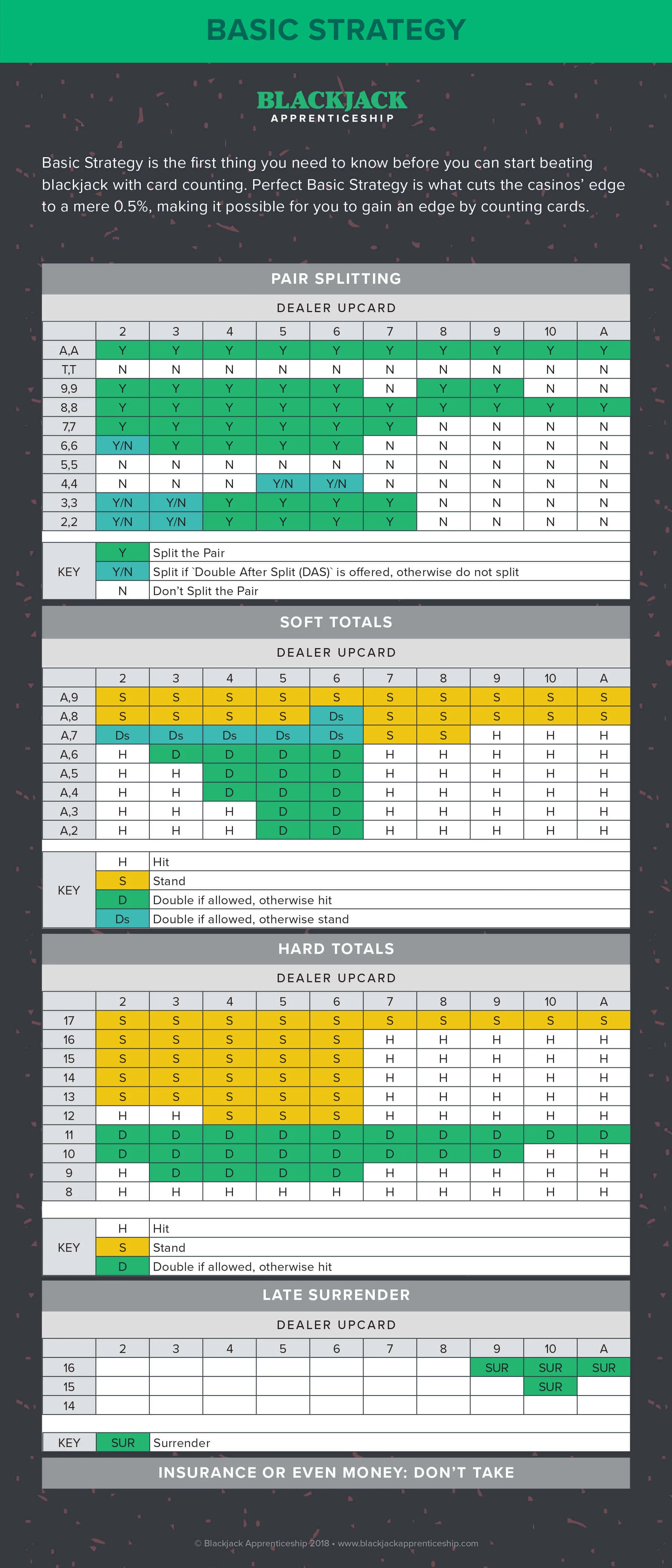
Once in a while, I see an AI/LLM API example that I’m like OK fine that’s pretty clever. I thought that when reading Raymond Camden’s Can GenAI help you win in Vegas? As Raymond says, uh, no, it can’t, but it can help you make the best-possible decision at a game like Blackjack that has a reasonably complex decision tree.

Of course what you could/should do, if you were going to write software to help you with Blackjack, is have the software return the correct result from the data in that tree. But there is something more fun and futuristic about asking an LLM for the answer instead. Like talking to a computer in your ear.

I’m playing blackjack and the dealer has a six of diamonds showing. I’ve got a jack of clubs and a jack of hearts. Should I hit or should I stay?

You have 20, which is a good hand. The dealer has 16, which is below the average. If you hit, you risk getting a card that will bust you. So it’s better to stay and hope that the dealer busts.

Again this isn’t a good idea, because as Raymond struggled through the AI was more than happy to provided horrible answers, but there is something interesting about crafting the prompt to get the best results and getting the results in “plain language” way that feels less boring than coordinates off a chart.


A Discord I’m in was chatting it up the other day about a recent Kevin Powell video: A new approach to container and wrapper classes (he credits a handful of others). The idea was setting up a grid with columns like this:

.grid {
  display: grid;
  grid-template-columns:
    [full-width-start] minmax(var(--padding-inline), 1fr)
    [breakout-start] minmax(0, var(--breakout-size))
    [content-start] min(
      100% - (var(--padding-inline) * 2),
      var(--content-max-width)
    )
    [content-end]
    minmax(0, var(--breakout-size)) [breakout-end]
    minmax(var(--padding-inline), 1fr) [full-width-end];
}

Kinda complicated looking right? Broken down into steps it’s really not that bad, it’s mostly the naming-things that makes it look like a lot. But the real beauty of it is in the naming. With this in place, you can very easily place an item edge-to-edge on the grid by just calling grid-column: full-width;, but regular content is set in the middle. There are some nice details to pick up in the video. Perhaps the best of which is how you can set the content within a full-width container back to the same center content area by applying the exact same template columns to that container.


Anything layout-related that requires JavaScript I usually side-eye pretty hard. The idea of layout failing, or even shifting, when JavaScript loads (or doesn’t) just bothers me.

But sometimes, when the layout updating is entirely a bonus enhancement, I relent. I think I might be there with Yihui Xie’s idea for making elements “full width” (like the class names Kevin makes available in the section above).

The idea is that you can use a little bit of JavaScript to dynamically decide if an element should be full width or not. Here are the situations:

  1. Code blocks (<pre><code>).If the scrollWidth is greater than offsetWidth, it means the code block has a horizontal scrollbar, and we may want to make it full-width.
  2. Tables (<table>).If its offsetWidth is greater than its parent’s offsetWidth, it is too wide.
  3. Table of contents (an element that has the ID TableOfContents, e.g., <nav id="TableOfContents">).If any TOC item has multiple rectangles on the layout (getClientRects().length > 1), it means the item is wrapped, and the TOC may benefit from more space.

If the elements become full-width, great, it’s a likely enhancement, but if they don’t, it’s not a big deal.

Yihui Xie does the full-width-ing with a class like this:

.fullwidth {
  width: 100vw;
  margin-left: calc(50% - 50vw);
}

Which is also a classic technique, but I’d say isn’t quite as robust or flexible as the above techniques.


Say you wanted to track page views on a site, but very much want to avoid any bots. That is, anything requesting your site that isn’t a real life human user. Herman Martinus is trying that with his Bear blogging platform like this:

body:hover {
  border-image: url("/hit/{{ post.id }}/?ref={{ request.META.HTTP_REFERER }}");
}

Now, when a person hovers their cursor over the page (or scrolls on mobile) it triggers body:hover which calls the URL for the post hit. I don’t think any bots hover and instead just use JS to interact with the page, so I can, with reasonable certainty, assume that this is a human reader.

I then confirm the user-agent isn’t a bot (which isn’t perfect, but still something). I also extract the browser and platform from the user-agent string.

Perhaps not rigorous computer science but I bet it’s a lot more useful number than just a server side counter.

When is it OK to Disable Text Selection?

Using CSS, it’s possible to prevent users from selecting text within an element using user-select: none. Now, it’s understandable why doing so might be considered “controversial”. I mean, should we be disabling standard user behaviors? Generally speaking, no, we shouldn’t be doing that. But does disabling text selection have some legitimate (albeit rare) use-cases? I think so.

In this article we’ll explore these use cases and take a look at how we can use user-select: none to improve (not hinder) user experiences. It’s also worth nothing that the user-select property has other values besides none that can be used to alter the behavior of text selection rather than disable it completely, and another value that even enforces text selection, so we’ll also take a look at those.

Possible user-select values

Let’s kick things off by running through the different user-select values and what they do.

Applying user-select: none; to an element means that its text content and nested text content won’t be functionally selectable or visually selectable (i.e. ::selection won’t work). If you were to make a selection that contained some non-selectable content, the non-selectable content would be omitted from the selection, so it’s fairly well implemented. And the support is great.

This browser support data is from Caniuse, which has more detail. A number indicates that browser supports the feature at that version and up.

Desktop

ChromeFirefoxIEEdgeSafari
4*2*10*12*3.1*

Mobile / Tablet

Android ChromeAndroid FirefoxAndroidiOS Safari
1051042.1*3.2*

Adversely, user-select: text makes the content selectable. You’d use this value to overwrite user-select: none.

user-select: contain is an interesting one. Applying it means that if a selection begins within the element then it must end within it too, containing it. This oddly doesn’t apply when the selection begins before the element, however, which is probably why no browser currently supports it. (Internet Explorer and earlier versions of Microsoft Edge previously supported it under the guise of user-select: element.)

With user-select: all, selecting part of the element’s content results in all of it being selected automatically. It’s all or nothing, which is very uncompromising but useful in circumstances where users are more likely to copy content to their clipboard (e.g. sharing and embedding links, code snippets, etc.). Instead of double-clicking, users will only need to click once for the content to auto-select.

Be careful, though, since this isn’t always the feature you think it is. What if users only want to select part of the content (e.g. only the font name part of a Google Fonts snippet or one part of a code snippet)? It’s still better to handle ”copy to clipboard” using JavaScript in many scenarios.

A better application of user-select: all is to ensure that quotes are copied entirely and accurately.

The behavior of user-select: auto (the initial value of user-select) depends on the element and how it’s used. You can find out more about this in our almanac.

Now let’s turn to exploring use cases for user-select: none

Stripping non-text from the selection

When you’re copying content from a web page, it’s probably from an article or some other type of long-form content, right? You probably don’t want your selection to include images, emoji (which can sometimes copy as text, e.g. “:thinkingface:”), and other things that you might expect to find wrapped in an <aside> element (e.g. in-article calls to action, ads, or something else that’s not part of the main content).

To prevent something from being included in selections, make sure that it’s wrapped in an HTML element and then apply user-select: none to it:

<p>lorem <span style="user-select: none">🤔</span> ipsum</p>

<aside style="user-select: none">
  <h1>Heading</h1>
  <p>Paragraph</p>
  <a>Call to action</a>
</aside>

In scenarios like this, we’re not disabling selection, but rather optimizing it. It’s also worth mentioning that selecting doesn’t necessarily mean copying — many readers (including myself) like to select content as they read it so that they can remember where they are (like a bookmark), another reason to optimize rather than disable completely.

Preventing accidental selection

Apply user-select: none to links that look like buttons (e.g. <a href="/whatever" class="button">Click Me!</a>).

It’s not possible to select the text content of a <button> or <input type="submit"> because, well, why would you? However, this behavior doesn’t apply to links because traditionally they form part of a paragraph that should be selectable.

Fair enough.

We could argue that making links look like buttons is an anti-pattern, but whatever. It’s not breaking the internet, is it? That ship has sailed anyway, so if you’re using links designed to look like buttons then they should mimic the behavior of buttons, not just for consistency but to prevent users from accidentally selecting the content instead of triggering the interaction.

I’m certainly prone to selecting things accidentally since I use my laptop in bed more than I care to admit. Plus, there are several medical conditions that can affect control and coordination, turning an intended click into an unintended drag/selection, so there are accessibility concerns that can be addressed with user-select too.

Interactions that require dragging (intentionally) do exist too of course (e.g. in browser games), but these are uncommon. Still, it just shows that user-select does in fact have quite a few use-cases.

Avoiding paywalled content theft

Paywalled content gets a lot of hate, but if you feel that you need to protect your content, it’s your content — nobody has the right steal it just because they don’t believe they should pay for it.

If you do want to go down this route, there are many ways to make it more difficult for users to bypass paywalls (or similarly, copy copyrighted content such as the published work of others).

Blurring the content with CSS:

article { filter: blur(<radius>); }

Disabling the keyboard shortcuts for DevTools:

document.addEventListener("keydown", function (e) {
  if (e.keyCode == 123) e.preventDefault();
  else if ((e.ctrlKey || e.metaKey) && e.altKey && e.keyCode == 73) e.preventDefault();
  else if ((e.ctrlKey || e.metaKey) && e.altKey && e.keyCode == 74) e.preventDefault();
  else if ((e.ctrlKey || e.metaKey) && e.altKey && e.keyCode == 85) e.preventDefault();
});

Disabling access to DevTools via the context menu by disabling the context menu itself:

document.addEventListener("contextmenu", e => e.preventDefault())

And of course, to prevent users from copying the content when they’re not allowed to read it at the source, applying user-select: none:

<article style="user-select: none">

Any other use cases?

Those are the three use cases I could think of for preventing text selection. Several others crossed my mind, but they all seemed like a stretch. But what about you? Have you had to disable text selection on anything? I’d like to know!


When is it OK to Disable Text Selection? originally published on CSS-Tricks, which is part of the DigitalOcean family. You should get the newsletter.

Single Element Loaders: Going 3D!

For this fourth and final article of our little series on single-element loaders, we are going to explore 3D patterns. When creating a 3D element, it’s hard to imagine that just one HTML element is enough to simulate something like all six faces of a cube. But  maybe we can get away with something more cube-like instead by showing only the front three sides of the shape — it’s totally possible and that’s what we’re going to do together.

Article series

The split cube loader

Here is a 3D loader where a cube is split into two parts, but is only made with only a single element:

Each half of the cube is made using a pseudo-element:

Cool, right?! We can use a conic gradient with CSS clip-path on the element’s ::before and ::after pseudos to simulate the three visible faces of a 3D cube. Negative margin is what pulls the two pseudos together to overlap and simulate a full cube. The rest of our work is mostly animating those two halves to get neat-looking loaders!

Let’s check out a visual that explains the math behind the clip-path points used to create this cube-like element:

We have our variables and an equation, so let’s put those to work. First, we’ll establish our variables and set the sizing for the main .loader element:

.loader {
  --s: 150px; /* control the size */
  --_d: calc(0.353 * var(--s)); /* 0.353 = sin(45deg)/2 */

  width: calc(var(--s) + var(--_d)); 
  aspect-ratio: 1;
  display: flex;
}

Nothing too crazy so far. We have a 150px square that’s set up as a flexible container. Now we establish our pseudos:

.loader::before,
.loader::after {
  content: "";
  flex: 1;
}

Those are two halves in the .loader container. We need to paint them in, so that’s where our conic gradient kicks in:

.loader::before,
.loader::after {
  content: "";
  flex: 1;
  background:
    conic-gradient(from -90deg at calc(100% - var(--_d)) var(--_d),
    #fff 135deg, #666 0 270deg, #aaa 0);
}

The gradient is there, but it looks weird. We need to clip it to the element:

.loader::before,
.loader::after {
  content: "";
  flex: 1;
  background:
    conic-gradient(from -90deg at calc(100% - var(--_d)) var(--_d),
    #fff 135deg, #666 0 270deg, #aaa 0);
  clip-path:
    polygon(var(--_d) 0, 100% 0, 100% calc(100% - var(--_d)), calc(100% - var(--_d)) 100%, 0 100%, 0 var(--_d));
}

Let’s make sure the two halves overlap with a negative margin:

.loader::before {
  margin-right: calc(var(--_d) / -2);
}

.loader::after {
  margin-left: calc(var(--_d) / -2);
}

Now let’s make ‘em move!

.loader::before,
.loader::after {
  /* same as before */
  animation: load 1.5s infinite cubic-bezier(0, .5, .5, 1.8) alternate;
}

.loader::after {
  /* same as before */
  animation-delay: -.75s
}

@keyframes load{
  0%, 40%   { transform: translateY(calc(var(--s) / -4)) }
  60%, 100% { transform: translateY(calc(var(--s) / 4)) }
}

Here’s the final demo once again:

The progress cube loader

Let’s use the same technique to create a 3D progress loader. Yes, still only one element!

We’re not changing a thing as far as simulating the cube the same way we did before, other than changing the loader’s height and aspect ratio. The animation we’re making relies on a surprisingly easy technique where we update the width of the left side while the right side fills the remaining space, thanks to flex-grow: 1.

The first step is to add some transparency to the right side using opacity:

This simulates the effect that one side of the cube is filled in while the other is empty. Then we update the color of the left side. To do that, we either update the three colors inside the conic gradient or we do it by adding a background color with a background-blend-mode:

.loader::before {
  background-color: #CC333F; /* control the color here */
  background-blend-mode: multiply;
}

This trick only allows us to update the color only once. The right side of the loader blends in with the three shades of white from the conic gradient to create three new shades of our color, even though we’re only using one color value. Color trickery!

Let’s animate the width of the loader’s left side:

Oops, the animation is a bit strange at the beginning! Notice how it sort of starts outside of the cube? This is because we’re starting the animation at the 0% width. But due to the clip-path and negative margin we’re using, what we need to do instead is start from our --_d variable, which we used to define the clip-path points and the negative margin:

@keyframes load {
  0%,
  5% {width: var(--_d); }
  95%,
  100% {width: 100%; }
}

That’s a little better:

But we can make this animation even smoother. Did you notice we’re missing a little something? Let me show you a screenshot to compare what the final demo should look like with that last demo:

It’s the bottom face of the cube! Since the second element is transparent, we need to see the bottom face of that rectangle as you can see in the left example. It’s subtle, but should be there!

We can add a gradient to the main element and clip it like we did with the pseudos:

background: linear-gradient(#fff1 0 0) bottom / 100% var(--_d) no-repeat;

Here’s the full code once everything is pulled together:

.loader {
  --s: 100px; /* control the size */
  --_d: calc(0.353*var(--s)); /* 0.353 = sin(45deg) / 2 */

  height: var(--s); 
  aspect-ratio: 3;
  display: flex;
  background: linear-gradient(#fff1 0 0) bottom / 100% var(--_d) no-repeat;
  clip-path: polygon(var(--_d) 0, 100% 0, 100% calc(100% - var(--_d)), calc(100% - var(--_d)) 100%, 0 100%, 0 var(--_d));
}
.loader::before,
.loader::after {
  content: "";
  clip-path: inherit;
  background:
    conic-gradient(from -90deg at calc(100% - var(--_d)) var(--_d),
     #fff 135deg, #666 0 270deg, #aaa 0);
}
.loader::before {
  background-color: #CC333F; /* control the color here */
  background-blend-mode: multiply;
  margin-right: calc(var(--_d) / -2);
  animation: load 2.5s infinite linear;
}
.loader:after {
  flex: 1;
  margin-left: calc(var(--_d) / -2);
  opacity: 0.4;
}

@keyframes load {
  0%,
  5% { width: var(--_d); }
  95%,
  100% { width: 100%; }
}

That’s it! We just used a clever technique that uses pseudo-elements, conic gradients, clipping, background blending, and negative margins to get, not one, but two sweet-looking 3D loaders with nothing more than a single element in the markup.

More 3D

We can still go further and simulate an infinite number of 3D cubes using one element — yes, it’s possible! Here’s a grid of cubes:

This demo and the following demos are unsupported in Safari at the time of writing.

Crazy, right? Now we’re creating a repeated pattern of cubes made using a single element… and no pseudos either! I won’t go into fine detail about the math we are using (there are very specific numbers in there) but here is a figure to visualize how we got here:

We first use a conic-gradient to create the repeating cube pattern. The repetition of the pattern is controlled by three variables:

  • --size: True to its name, this controls the size of each cube.
  • --m: This represents the number of columns.
  • --n: This is the number of rows.
  • --gap: this the gap or distance between the cubes
.cube {
  --size: 40px; 
  --m: 4; 
  --n: 5;
  --gap :10px;

  aspect-ratio: var(--m) / var(--n);
  width: calc(var(--m) * (1.353 * var(--size) + var(--gap)));
  background:
    conic-gradient(from -90deg at var(--size) calc(0.353 * var(--size)),
      #249FAB 135deg, #81C5A3 0 270deg, #26609D 0) /* update the colors here */
    0 0 / calc(100% / var(--m)) calc(100% / var(--n));
}

Then we apply a mask layer using another pattern having the same size. This is the trickiest part of this idea. Using a combination of a linear-gradient and a conic-gradient we will cut a few parts of our element to keep only the cube shapes visible.

.cube {
  /* etc. */
  mask: 
    linear-gradient(to bottom right,
       #0000 calc(0.25 * var(--size)),
       #000 0 calc(100% - calc(0.25 * var(--size)) - 1.414 * var(--gap)),
       #0000 0),
    conic-gradient(from -90deg at right var(--gap) bottom var(--gap), #000 90deg, #0000 0);  
  mask-size: calc(100% / var(--m)) calc(100% / var(--n));
  mask-composite: intersect;
}

The code may look a bit complex but thanks to CSS variables all we need to do is to update a few values to control our matrix of cubes. Need a 10⨉10 grid? Update the --m and --n variables to 10. Need a wider gap between cubes? Update the --gap value. The color values are only used once, so update those for a new color palette!

Now that we have another 3D technique, let’s use it to build variations of the loader by playing around with different animations. For example, how about a repeating pattern of cubes sliding infinitely from left to right?

This loader defines four cubes in a single row. That means our --n value is 4 and --m is equal to 1 . In other words, we no longer need these!

Instead, we can work with the --size and --gap variables in a grid container:

.loader {
  --size: 70px;
  --gap: 15px;  

  width: calc(3 * (1.353 * var(--size) + var(--gap)));
  display: grid;
  aspect-ratio: 3;
}

This is our container. We have four cubes, but only want to show three in the container at a time so that we always have one sliding in as one is sliding out. That’s why we are factoring the width by 3 and have the aspect ratio set to 3 as well.

Let’s make sure that our cube pattern is set up for the width of four cubes. We’re going to do this on the container’s ::before pseudo-element:

.loader::before { 
  content: "";
  width: calc(4 * 100% / 3);
  /*
     Code to create four cubes
  */
}

Now that we have four cubes in a three-cube container, we can justify the cube pattern to the end of the grid container to overflow it, showing the last three cubes:

.loader {
  /* same as before */
  justify-content: end;
}

Here’s what we have so far, with a red outline to show the bounds of the grid container:

Now all we have to do is to move the pseudo-element to the right by adding our animation:

@keyframes load {
  to { transform: translate(calc(100% / 4)); }
}

Did you get the trick of the animation? Let’s finish this off by hiding the overflowing cube pattern and by adding a touch of masking to create that fading effect that the start and the end:

.loader {
  --size: 70px;
  --gap: 15px;  
  
  width: calc(3*(1.353*var(--s) + var(--g)));
  display: grid;
  justify-items: end;
  aspect-ratio: 3;
  overflow: hidden;
  mask: linear-gradient(90deg, #0000, #000 30px calc(100% - 30px), #0000);
}

We can make this a lot more flexible by introducing a variable, --n, to set how many cubes are displayed in the container at once. And since the total number of cubes in the pattern should be one more than --n, we can express that as calc(var(--n) + 1).

Here’s the full thing:

OK, one more 3D loader that’s similar but has the cubes changing color in succession instead of sliding:

We’re going to rely on an animated background with background-blend-mode for this one:

.loader {
  /* ... */
  background:
    linear-gradient(#ff1818 0 0) 0% / calc(100% / 3) 100% no-repeat,
    /* ... */;
  background-blend-mode: multiply;
  /* ... */
  animation: load steps(3) 1.5s infinite;
}
@keyframes load {
  to { background-position: 150%; }
}

I’ve removed the superfluous code used to create the same layout as the last example, but with three cubes instead of four. What I am adding here is a gradient defined with a specific color that blends with the conic gradient, just as we did earlier for the progress bar 3D loader.

From there, it’s animating the background gradient’s background-position as a three-step animation to make the cubes blink colors one at a time.

If you are not familiar with the values I am using for background-position and the background syntax, I highly recommend one of my previous articles and one of my Stack Overflow answers. You will find a very detailed explanation there.

Can we update the number of cubes to make it variables?

Yes, I do have a solution for that, but I’d like you to take a crack at it rather than embedding it here. Take what we have learned from the previous example and try to do the same with this one — then share your work in the comments!

Variations galore!

Like the other three articles in this series, I’d like to leave you with some inspiration to go forth and create your own loaders. Here is a collection that includes the 3D loaders we made together, plus a few others to get your imagination going:

That’s a wrap

I sure do hope you enjoyed spending time making single element loaders with me these past few weeks. It’s crazy that we started with seemingly simple spinner and then gradually added new pieces to work ourselves all the way up to 3D techniques that still only use a single element in the markup. This is exactly what CSS looks like when we harness its powers: scalable, flexible, and reusable.

Thanks again for reading this little series! I’ll sign off by reminding you that I have a collection of more than 500 loaders if you’re looking for more ideas and inspiration.

Article series


Single Element Loaders: Going 3D! originally published on CSS-Tricks. You should get the newsletter.

Single Element Loaders: The Dots

We’re looking at loaders in this series. More than that, we’re breaking down some common loader patterns and how to re-create them with nothing more than a single div. So far, we’ve picked apart the classic spinning loader. Now, let’s look at another one you’re likely well aware of: the dots.

Dot loaders are all over the place. They’re neat because they usually consist of three dots that sort of look like a text ellipsis (…) that dances around.

Article series

  • Single Element Loaders: The Spinner
  • Single Element Loaders: The Dots — you are here
  • Single Element Loaders: The Bars — coming June 24
  • Single Element Loaders: Going 3D — coming July 1

Our goal here is to make this same thing out of a single div element. In other words, there is no one div per dot or individual animations for each dot.

That example of a loader up above is made with a single div element, a few CSS declarations, and no pseudo-elements. I am combining two techniques using CSS background and mask. And when we’re done, we’ll see how animating a background gradient helps create the illusion of each dot changing colors as they move up and down in succession.

The background animation

Let’s start with the background animation:

.loader {
  width: 180px; /* this controls the size */
  aspect-ratio: 8/5; /* maintain the scale */
  background: 
    conic-gradient(red   50%, blue   0) no-repeat, /* top colors */
    conic-gradient(green 50%, purple 0) no-repeat; /* bottom colors */
  background-size: 200% 50%; 
  animation: back 4s infinite linear; /* applies the animation */
}

/* define the animation */
@keyframes back {
  0%,                       /* X   Y , X     Y */
  100% { background-position: 0%   0%, 0%   100%; }
  25%  { background-position: 100% 0%, 0%   100%; }
  50%  { background-position: 100% 0%, 100% 100%; }
  75%  { background-position: 0%   0%, 100% 100%; }
}

I hope this looks pretty straightforward. What we’ve got is a 180px-wide .loader element that shows two conic gradients sporting hard color stops between two colors each — the first gradient is red and blue along the top half of the .loader, and the second gradient is green and purple along the bottom half.

The way the loader’s background is sized (200% wide), we only see one of those colors in each half at a time. Then we have this little animation that pushes the position of those background gradients left, right, and back again forever and ever.

When dealing with background properties — especially background-position — I always refer to my Stack Overflow answer where I am giving a detailed explanation on how all this works. If you are uncomfortable with CSS background trickery, I highly recommend reading that answer to help with what comes next.

In the animation, notice that the first layer is Y=0% (placed at the top) while X is changes from 0% to 100%. For the second layer, we have the same for X but Y=100% (placed at the bottom).

Why using a conic-gradient() instead of linear-gradient()?

Good question! Intuitively, we should use a linear gradient to create a two-color gradients like this:

linear-gradient(90deg, red 50%, blue 0)

But we can also reach for the same using a conic-gradient() — and with less of code. We reduce the code and also learn a new trick in the process!

Sliding the colors left and right is a nice way to make it look like we’re changing colors, but it might be better if we instantly change colors instead — that way, there’s no chance of a loader dot flashing two colors at the same time. To do this, let’s change the animation‘s timing function from linear to steps(1)

The loader dots

If you followed along with the first article in this series, I bet you know what comes next: CSS masks! What makes masks so great is that they let us sort of “cut out” parts of a background in the shape of another element. So, in this case, we want to make a few dots, show the background gradients through the dots, and cut out any parts of the background that are not part of a dot.

We are going to use radial-gradient() for this:

.loader {
  width: 180px;
  aspect-ratio: 8/5;
  mask:
    radial-gradient(#000 68%, #0000 71%) no-repeat,
    radial-gradient(#000 68%, #0000 71%) no-repeat,
    radial-gradient(#000 68%, #0000 71%) no-repeat;
  mask-size: 25% 40%; /* the size of our dots */
}

There’s some duplicated code in there, so let’s make a CSS variable to slim things down:

.loader {
  width: 180px;
  aspect-ratio: 8/5;
  --_g: radial-gradient(#000 68%, #0000 71%) no-repeat;
  mask: var(--_g),var(--_g),var(--_g);
  mask-size: 25% 40%;
}

Cool cool. But now we need a new animation that helps move the dots up and down between the animated gradients.

.loader {
  /* same as before */
  animation: load 2s infinite;
}

@keyframes load {      /* X  Y,     X   Y,    X   Y */
  0%     { mask-position: 0% 0%  , 50% 0%  , 100% 0%; } /* all of them at the top */
  16.67% { mask-position: 0% 100%, 50% 0%  , 100% 0%; }
  33.33% { mask-position: 0% 100%, 50% 100%, 100% 0%; }
  50%    { mask-position: 0% 100%, 50% 100%, 100% 100%; } /* all of them at the bottom */
  66.67% { mask-position: 0% 0%  , 50% 100%, 100% 100%; }
  83.33% { mask-position: 0% 0%  , 50% 0%  , 100% 100%; }
  100%   { mask-position: 0% 0%  , 50% 0%  , 100% 0%; } /* all of them at the top */
}

Yes, that’s a total of three radial gradients in there, all with the same configuration and the same size — the animation will update the position of each one. Note that the X coordinate of each dot is fixed. The mask-position is defined such that the first dot is at the left (0%), the second one at the center (50%), and the third one at the right (100%). We only update the Y coordinate from 0% to 100% to make the dots dance.

Dot loader dots with labels showing their changing positions.

Here’s what we get:

Now, combine this with our gradient animation and magic starts to happen:

Dot loader variations

The CSS variable we made in the last example makes it all that much easier to swap in new colors and create more variations of the same loader. For example, different colors and sizes:

What about another movement for our dots?

Here, all I did was update the animation to consider different positions, and we get another loader with the same code structure!

The animation technique I used for the mask layers can also be used with background layers to create a lot of different loaders with a single color. I wrote a detailed article about this. You will see that from the same code structure we can create different variations by simply changing a few values. I am sharing a few examples at the end of the article.

Why not a loader with one dot?

This one should be fairly easy to grok as I am using the same technique but with a more simple logic:

Here is another example of loader where I am also animating radial-gradient combined with CSS filters and mix-blend-mode to create a blobby effect:

If you check the code, you will see that all I am really doing there is animating the background-position, exactly like we did with the previous loader, but adding a dash of background-size to make it look like the blob gets bigger as it absorbs dots.

If you want to understand the magic behind that blob effect, you can refer to these interactive slides (Chrome only) by Ana Tudor because she covers the topic so well!

Here is another dot loader idea, this time using a different technique:

This one is only 10 CSS declarations and a keyframe. The main element and its two pseudo-elements have the same background configuration with one radial gradient. Each one creates one dot, for a total of three. The animation moves the gradient from top to bottom by using different delays for each dot..

Oh, and take note how this demo uses CSS Grid. This allows us to leverage the grid’s default stretch alignment so that both pseudo-elements cover the whole area of their parent. No need for sizing! Push the around a little with translate() and we’re all set.

More examples!

Just to drive the point home, I want to leave you with a bunch of additional examples that are really variations of what we’ve looked at. As you view the demos, you’ll see that the approaches we’ve covered here are super flexible and open up tons of design possibilities.

Next up…

OK, so we covered dot loaders in this article and spinners in the last one. In the next article of this four-part series, we’ll turn our attention to another common type of loader: the bars. We’ll take a lot of what we learned so far and see how we can extend them to create yet another single element loader with as little code and as much flexibility as possible.

Article series

  • Single Element Loaders: The Spinner
  • Single Element Loaders: The Dots — you are here
  • Single Element Loaders: The Bars — coming June 24
  • Single Element Loaders: Going 3D — coming July 1

Single Element Loaders: The Dots originally published on CSS-Tricks. You should get the newsletter.

A Farewell from Justin Tadlock

Around three years ago, I was at a crossroads. I had spent nearly my entire adult life and most of my professional career within the WordPress space. However, the responsibilities of being a solo theme/plugin shop owner were like a boulder upon my shoulders that I could no longer hold up. After 11 years in the business, I was ready to throw in the towel.

My work was my life, and my life was my work. I was not sure if I even knew how to do anything else. I briefly considered returning to South Korea for another year-long stint teaching English as a second language. But, I had already spent years rebuilding my life and relationships back in my home state of Alabama. Plus, I was not prepared to say goodbye to my cats for that long.

The only other practical experience I had was gardening and farming work. I have spent many summers working watermelon fields and hauling hay under the heat of the Alabama sun, and I have piddled around in my own garden over the years. However, I was not in a financially stable position to start my own farm. It was too risky a proposition at that stage in my life.

I was also not quite ready to let go of WordPress. There was more that I wanted to accomplish, but I still faced the reality of needing to move on from the place I was at or find some way to get more joy out of the work I was doing.

It was not until a few months later that the writing position for WP Tavern opened. I was hesitant about it at first. I figured I had the credentials and experience to do the job, but daily writing, editing, and publishing would be unlike anything I had taken on before. Sarah Gooding, who has been the best colleague anyone could ask for, convinced me that I should pursue this job.

It turned out to be one of the best things to ever happen to me.

As I got into the swing of things and began to find my voice, I was once again genuinely happy to be involved with the WordPress project. Since I have been here, I have rekindled the flame I once had with our beloved platform.

I have made wonderful friends along the way. It has been a blessing to have the Tavern and its readers in my life.

Today, I am ready for a new challenge. I am stepping down from my role as a writer at WP Tavern.

No, I am not ready to start that farm just yet. Y’all cannot get rid of me that easily. I will stick around the WordPress community for a while, but today is not about my new role. It is a celebration of the Tavern.

I have published 647 stories and written 857 comments as of this post. I can only hope that, somewhere along the way, I have made an impact in some of your lives or work.

As I leave, I have one request: be kind to one another.

I believe we all want WordPress to be successful. We might have different opinions about how to make that happen. Sometimes, those ideas clash, but if we all treat one another with respect and have constructive discussions, things will work themselves out.

To our readers, thank you for going on this journey with me.

There are two remaining questions I want to answer before closing this chapter in my part of that journey. Feel free to continue reading. Otherwise, thank you for making it this far.

Writing About WordPress

Written text on a spiral-bound paper notebook with a pen lying on top of it.
Photo by David Chandra Purnama.

Someone messaged me a week or so into my employment at WP Tavern about writing for WordPress. They wanted to know how they could become a writer on WordPress-related topics and one day work in the field. At the time, I did not have a great answer to the question. Maybe I still do not, but I will take a crack at it.

We might as well start with the advice of one of the most prolific writers in modern history, Stephen King. At the end of The Stand, one of my favorites from him, he answered this same question, and it has always resonated with me.

When asked, “How do you write?” I invariably answer, “One word at a time,” and the answer is invariably dismissed. But that is all it is. It sounds too simple to be true, but consider the Great Wall of China, if you will: one stone at a time, man. That’s all. One stone at a time. But I’ve read you can see that mother— from space without a telescope.

I think he may be wrong about seeing the Great Wall from space (Where’s a fact-checker when you need one?), but it is still generally sound advice.

I have been writing about WordPress for 17 years. Sometimes on my personal blog. At other times, I have taken one-off jobs. And, of course, I have written 100s of posts here at the Tavern. What has always helped me is sticking to topics I am passionate about. There are days when the job can be a grind (especially during slow news weeks), so you must love what you are doing to sustain any sort of career in writing.

I have a B.A. in English with a secondary concentration in journalism. However, my education merely provided a solid foundation. It is not a prerequisite for doing the job.

No one can teach you how to build those habits necessary for a sustainable career. They are too personal, and you can only figure out what works by practicing.

No one can give you your voice. That is a discovery that only you can make, and writing is a discovery in and of itself.

My advice to would-be writers is to give National Novel Writing Month a shot this November. It is a challenge to write 50,000 words in 30 days. I have won twice and hope to do it again this year. I guarantee that you will figure out everything you need to know about yourself as a writer if you push yourself through the challenge. It is OK to fail. Just dust yourself off and try again if you have your heart set on it.

To the person who asked this question: I am sorry for not remembering your name. It has been over two years, and my memory is not what it once was. But, I hope you are reading now.

Spilling the Beans

Coffee Beans. Photo by Chuck Grimmett

There is a question I get asked. A lot. Some of you probably already know what it is and have, perhaps, asked it or some variation of it yourself.

Does Matt dictate or control the content that we cover?

Since it is my last day on the job, I might as well let readers peek behind the curtain. And the answer is no.

Sorry to let down our conspiracy-theory-loving readers, but the truth is just not that juicy.

I always joke that I have only talked with “the boss” a handful of times while working here. That is pretty close to the truth (I have not actually kept count).

From the day I arrived until today, I have had complete independence to thrive or fail by the result of my work. It felt like our small team had been left on an island to fend for ourselves at times. We must go through the same channels as other publications for information and have never been given special treatment.

This level of autonomy is vital for journalistic integrity.

The WordPress community will always need a publication where its writers have the independence to do their work without conflicts of interest. The Tavern has always been that place, and I do not expect it to change going forward.

I appreciate that our readers have trusted our team to perform this job. It is a responsibility that has not been taken lightly. I am proud to have contributed in at least in some small way.

Android Native – How to create an Options Menu

Introduction

The Android platform provides many different types of menus to be added to an Android app. In this tutorial, we will learn how to add the most common type of menu, an Options Menu.

An Options Menu is one that appears at the right corner of the Action Bar/Toolbar. By default, all items in the menu is contained inside the overflow action.

options_menu_1.png

Goals

At the end of the tutorial, you would have learned:

  1. How to add an Options Menu to an Android app.
Tools Required
  1. Android Studio. The version used in this tutorial is Bumblebee 2021.1.1 Patch 3.
Prerequisite Knowledge
  1. Basic Android.
  2. Action Bar/Toolbar.
Project Setup

To follow along with the tutorial, perform the steps below:

  1. Create a new Android project with the default Empty Activity.

  2. Give the default TextView an android:id of hello.

  3. Change its android:textSize to 32sp.

     <?xml version="1.0" encoding="utf-8"?>
     <androidx.constraintlayout.widget.ConstraintLayout xmlns:android="http://schemas.android.com/apk/res/android"
        xmlns:app="http://schemas.android.com/apk/res-auto"
        xmlns:tools="http://schemas.android.com/tools"
        android:layout_width="match_parent"
        android:layout_height="match_parent"
        tools:context=".MainActivity">
    
        <TextView
            android:id="@+id/hello"
            android:layout_width="wrap_content"
            android:layout_height="wrap_content"
            android:text="Hello World!"
            android:textSize="32sp"
            app:layout_constraintBottom_toBottomOf="parent"
            app:layout_constraintLeft_toLeftOf="parent"
            app:layout_constraintRight_toRightOf="parent"
            app:layout_constraintTop_toTopOf="parent" />
    
     </androidx.constraintlayout.widget.ConstraintLayout>
Add an Options Menu using XML

The easiest way to add an Options Menu to an Action Bar is by declaring the menu in an XML file and then inflating it in the Activitys onCreateOptionsMenu() function.

We will start with creating a simple menu with three items in it:

  • Refresh.
  • Help.
  • Settings.
  1. Right-click on res -> New -> Android Resource File.

  2. Name the file options.

  3. Change the Resource type to Menu.
    options_menu_2.png

  4. Select OK.

  5. Add these string resources into strings.xml.

     <string name="refresh">Refresh</string>
     <string name="help">Help</string>
     <string name="settings">Settings</string>
  6. Now that we have the XML file with <menu> as the root element, we can either build the menu in the Code View by ourselves, or using the Design Surface. Regardless of how you choose to build your menu, add three Menu Item/<item> that corresponds to the three options Refresh, Help, and Settings.

  7. Make sure that your Menu Items are using the string resources created in step 5 as the value for their android:title attributes.

  8. Your menu should look like the screenshot below if using the Design Surface.
    options_menu_3.png

  9. In Code View, they should look like the code below.

     <?xml version="1.0" encoding="utf-8"?>
     <menu xmlns:android="http://schemas.android.com/apk/res/android">
        <item android:title="@string/refresh" />
        <item android:title="@string/help" />
        <item android:title="@string/settings" />
     </menu>
  10. We are now done with the XML file for now, but the app will not make use of the menu resource file yet. We still have to inflate the XML resource into the Action Bar. To do this, override MainActivitys onCreateOptionsMenu(), inflate the XML resource using the built-in menuInflater object, and return true.

     override fun onCreateOptionsMenu(menu: Menu?): Boolean {
        menuInflater.inflate(R.menu.options, menu)
        return true
     }

Run the app now to check whether the menu is working. It should behave similarly to the animation below.

OptionsMenu1.gif

Handle Click Events for Menu Items

The menu that we have created looks nice, but it does not perform any action when clicked. To respond to click events on each menu item, we will have to do a couple more things.

  1. When an item in the menu is clicked, MainActivitys onOptionsItemSelected() will be called, so we will have to override this function if we want to respond to click events.

  2. We should also give the menu items android:id attributes to make it easy to filter them out in onOptionsItemSelected().

  3. Modify options.xml to add android:ids to each <item>.

     <?xml version="1.0" encoding="utf-8"?>
     <menu xmlns:android="http://schemas.android.com/apk/res/android">
        <item
            android:title="@string/refresh"
            android:id="@+id/refresh"/>
        <item
            android:title="@string/help"
            android:id="@+id/help"/>
        <item android:title="@string/settings"
            android:id="@+id/settings"/>
     </menu>
  4. Override onOptionsItemSelected() in MainActivity using the code below. The app will now change the value of the default TextView to match the menu items title.

     override fun onOptionsItemSelected(item: MenuItem): Boolean {
        val textView = findViewById<TextView>(R.id.hello)
    
        return when(item.itemId){
            R.id.refresh,
            R.id.help,
            R.id.settings -> {
                textView.text = item.title
                true
            }
            else -> false
        }
     }

When we run the app now, we can see that clicks on any menu item will modify the TextView like the animation below.

OptionsMenu2.gif

Solution Code

MainActivity.kt

class MainActivity : AppCompatActivity() {
   override fun onCreate(savedInstanceState: Bundle?) {
       super.onCreate(savedInstanceState)
       setContentView(R.layout.activity_main)
   }

   override fun onCreateOptionsMenu(menu: Menu?): Boolean {
       menuInflater.inflate(R.menu.options, menu)
       return true
   }

   override fun onOptionsItemSelected(item: MenuItem): Boolean {
       val textView = findViewById<TextView>(R.id.hello)

       return when(item.itemId){
           R.id.refresh,
           R.id.help,
           R.id.settings -> {
               textView.text = item.title
               true
           }
           else -> false
       }
   }
}

activity_main.xml

<?xml version="1.0" encoding="utf-8"?>
<androidx.constraintlayout.widget.ConstraintLayout xmlns:android="http://schemas.android.com/apk/res/android"
   xmlns:app="http://schemas.android.com/apk/res-auto"
   xmlns:tools="http://schemas.android.com/tools"
   android:layout_width="match_parent"
   android:layout_height="match_parent"
   tools:context=".MainActivity">

   <TextView
       android:id="@+id/hello"
       android:layout_width="wrap_content"
       android:layout_height="wrap_content"
       android:text="Hello World!"
       android:textSize="32sp"
       app:layout_constraintBottom_toBottomOf="parent"
       app:layout_constraintLeft_toLeftOf="parent"
       app:layout_constraintRight_toRightOf="parent"
       app:layout_constraintTop_toTopOf="parent" />

</androidx.constraintlayout.widget.ConstraintLayout>

options.xml

<?xml version="1.0" encoding="utf-8"?>
<menu xmlns:android="http://schemas.android.com/apk/res/android">
   <item
       android:title="@string/refresh"
       android:id="@+id/refresh"/>
   <item
       android:title="@string/help"
       android:id="@+id/help"/>
   <item android:title="@string/settings"
       android:id="@+id/settings"/>
</menu>

strings.xml

<resources>
   <string name="app_name">Daniweb Android Options Menu</string>
   <string name="refresh">Refresh</string>
   <string name="help">Help</string>
   <string name="settings">Settings</string>
</resources>
Summary

Congratulations, we have learned how to add an Options menu into our apps Action Bar. The full project code can be found at https://github.com/dmitrilc/DaniwebAndroidOptionsMenu.

Android Native – How to Add Material 3 Top App Bar

Introduction

The release of Android 12 also came together with Material 3. Whether you love it or hate it, it is likely to be here to stay for a couple of years, therefore, it would be useful to know how to use it. In this tutorial, we will learn how to enable Material 3 themes and how to add the Material 3 Top App Bar into our app.

Goals

At the end of the tutorial, you would have learned:

  1. How to subclass a Material 3 theme.
  2. How to add Material 3 Top App Bar.
Tools Required
  1. Android Studio. The version used in this tutorial is Arctic Fox 2020.3.1 Patch 4.
Prerequisite Knowledge
  1. Basic Android.
Project Setup

To follow along with the tutorial, perform the steps below:

  1. Create a new Android project with the default Empty Activity.
Inherit Material 3 Theme

It is recommended that you apply an app-wide Material 3 theme before using any Material 3 component. Because we wanted to use the Material 3 Top App Bar, we should apply a theme such as Theme.Material3.DayNight.NoActionBar to our App.

  1. In your current project, navigate to res > values > themes.

  2. Open up both themes.xml and themes.xml (night).

  3. Inspect both files. Notice that both of their <style> elements have Theme.MaterialComponents.DayNight.DarkActionBar as the parent. This is only true on my build of Android Studio. If you are using a newer build in the future, you might see a different parent theme. The current theme is a Material 2 theme, so we will need to upgrade it to Material 3 that supports a Top App Bar.

     <style name="Theme.DaniwebAndroidMaterial3TopAppBar" parent="Theme.MaterialComponents.DayNight.DarkActionBar">
  4. Replace the current value of the parent attribute with Theme.Material3.DayNight.NoActionBar for both XML files. This theme does not contain an ActionBar, which allows us to add a Top App Bar that conforms to Material 3 guidelines.

  5. Both of your <style> elements should look similar to this.

     <style name="Theme.DaniwebAndroidMaterial3TopAppBar" parent="Theme.Material3.DayNight.NoActionBar">
  6. But the code will not compile yet because you must add the gradle dependency for Material 3. Open up your gradle module file and replace the current material dependency of implementation 'com.google.android.material:material:1.4.0'to

     implementation' com.google.android.material:material:1.5.0-rc01'
  7. Sync the project.

  8. Run the app now and you can see that the old Action Bar is gone. The background color is also a little bit different, too.

10000201000002F600000326DF919741D4D5F1C0.png

Material 3 Top App Bar

There are many variants of the Top App Bar:

  1. Center aligned.
  2. Small.
  3. Medium.
  4. Large.

1000020100000184000001D9A011BFE668CF7C73.png

For this tutorial, we will add the center-aligned Top App Bar. Follow the steps below to add it to our app:

  1. Open up activity_main.xml in the Design view.

  2. Under the Component Tree, Right-click on ConstraintLayout > Convert view.
    10000201000001870000012397161C328A901CB1.png

  3. Select CoordinatorLayout > Apply.
    10000201000001ED000000C73E800DC420CFA532.png

  4. Switch to Code view.

  5. Add an <AppBarLayout> child to the <CoordinatorLayout>.

     <com.google.android.material.appbar.AppBarLayout
         android:layout_width="match_parent"
         android:layout_height="wrap_content">
    
     </com.google.android.material.appbar.AppBarLayout>
  6. Add a <MaterialToolBar> child to <AppBarLayout>.

     <com.google.android.material.appbar.MaterialToolbar
        android:id="@+id/topAppBar"
        android:layout_width="match_parent"
        android:layout_height="?attr/actionBarSize"
        app:title="@string/page_title"
        app:titleCentered="true"
        app:menu="@menu/top_app_bar"
        app:navigationIcon="@drawable/ic_baseline_menu_24" />
  7. Add the string resource below to strings.xml.

     <string name="page_title">App Brand</string>
  8. Create a new xml resource for the menu by right-clicking on res > New > Android Resource File. Use the configuration from the screenshot below, select OK.
    100002010000040300000250CD341651C7332B4C.png

  9. Create a new drawable for the navigation icon by right-clicking on drawable > New > Vector Asset. Use the configuration from the screenshot below, and then select Next > Finish.
    1000020100000350000001CB6BC6276F2DE66846.png

  10. Remove the default Hello World! TextView.

Run the App

We are now ready to run the app, so run it now and we can see that we have a centered Top App Bar from the Material 3 library.

10000201000001940000034E7C9F50B56EFC9AD8.png

Solution Code

ic_baseline_menu_24.xml

<vector xmlns:android="http://schemas.android.com/apk/res/android"
   android:width="24dp"
   android:height="24dp"
   android:viewportWidth="24"
   android:viewportHeight="24"
   android:tint="?attr/colorControlNormal">
 <path
     android:fillColor="@android:color/white"
     android:pathData="M3,18h18v-2L3,16v2zM3,13h18v-2L3,11v2zM3,6v2h18L21,6L3,6z"/>
</vector>

activity_main.xml

<?xml version="1.0" encoding="utf-8"?>
<androidx.coordinatorlayout.widget.CoordinatorLayout xmlns:android="http://schemas.android.com/apk/res/android"
   xmlns:app="http://schemas.android.com/apk/res-auto"
   xmlns:tools="http://schemas.android.com/tools"
   android:layout_width="match_parent"
   android:layout_height="match_parent"
   tools:context=".MainActivity">

   <com.google.android.material.appbar.AppBarLayout
       android:layout_width="match_parent"
       android:layout_height="wrap_content">

       <com.google.android.material.appbar.MaterialToolbar
           android:id="@+id/topAppBar"
           android:layout_width="match_parent"
           android:layout_height="?attr/actionBarSize"
           app:title="@string/page_title"
           app:titleCentered="true"
           app:menu="@menu/top_app_bar"
           app:navigationIcon="@drawable/ic_baseline_menu_24" />

   </com.google.android.material.appbar.AppBarLayout>

</androidx.coordinatorlayout.widget.CoordinatorLayout>

top_app_bar.xml

<?xml version="1.0" encoding="utf-8"?>
<menu xmlns:android="http://schemas.android.com/apk/res/android">

</menu>

strings.xml

<resources>
   <string name="app_name">DaniwebAndroid Material 3 Top App Bar</string>
   <string name="page_title">App Brand</string>
</resources>

themes.xml

<resources xmlns:tools="http://schemas.android.com/tools">
   <!-- Base application theme. -->
   <style name="Theme.DaniwebAndroidMaterial3TopAppBar" parent="Theme.Material3.DayNight.NoActionBar">
       <!-- Primary brand color. -->
       <item name="colorPrimary">@color/purple_500</item>
       <item name="colorPrimaryVariant">@color/purple_700</item>
       <item name="colorOnPrimary">@color/white</item>
       <!-- Secondary brand color. -->
       <item name="colorSecondary">@color/teal_200</item>
       <item name="colorSecondaryVariant">@color/teal_700</item>
       <item name="colorOnSecondary">@color/black</item>
       <!-- Status bar color. -->
       <item name="android:statusBarColor" tools:targetApi="l">?attr/colorPrimaryVariant</item>
       <!-- Customize your theme here. -->
   </style>
</resources>

build.gradle

plugins {
   id 'com.android.application'
   id 'kotlin-android'
}

android {
   compileSdk 31

   defaultConfig {
       applicationId "com.example.daniwebandroidmaterial3topappbar"
       minSdk 21
       targetSdk 31
       versionCode 1
       versionName "1.0"

       testInstrumentationRunner "androidx.test.runner.AndroidJUnitRunner"
   }

   buildTypes {
       release {
           minifyEnabled false
           proguardFiles getDefaultProguardFile('proguard-android-optimize.txt'), 'proguard-rules.pro'
       }
   }
   compileOptions {
       sourceCompatibility JavaVersion.VERSION_1_8
       targetCompatibility JavaVersion.VERSION_1_8
   }
   kotlinOptions {
       jvmTarget = '1.8'
   }
}

dependencies {

   implementation 'androidx.core:core-ktx:1.7.0'
   implementation 'androidx.appcompat:appcompat:1.4.0'
   implementation 'com.google.android.material:material:1.5.0-rc01'
   implementation 'androidx.constraintlayout:constraintlayout:2.1.2'
   testImplementation 'junit:junit:4.+'
   androidTestImplementation 'androidx.test.ext:junit:1.1.3'
   androidTestImplementation 'androidx.test.espresso:espresso-core:3.4.0'
}
Summary

We have learned how to add a Material 3 Top App Bar into our App. The full project code can be found at https://github.com/dmitrilc/DaniwebAndroidMaterial3TopAppBar

Android Native – How to add static App shortcuts

Introduction

Starting on API level 25, static Shortcuts can be used to quickly navigate to a specific point in your app. In this tutorial, we will learn how to create static shortcuts for an Android app.

Goals

At the end of the tutorial, you would have learned:

  1. How to create static shortcuts.
Tools Required
  1. Android Studio. The version used in this tutorial is Arctic Fox 2020.3.1 Patch 3.
Prerequisite Knowledge
  1. Basic Android.
Project Setup

To follow along with the tutorial, perform the steps below:

  1. Create a new Android project with the default Empty Activity.
Static Shortcuts

Static shortcuts are simply icons that allow your users to quickly go to a specific point in your app. For example, in the animation below, Search, Subscriptions, and Explore are all shortcuts.

shortcut.gif

In supported launchers, shortcuts are shown when the app icon is held down by the end user.

Static shortcuts should only be used to navigate to content that stays the same during the lifetime of your app. There are also two other types of shortcuts, dynamic shortcuts and pinned shortcuts, but they are out of scope for this tutorial.

Creating a static shortcut

The steps to create a static shortcut, at the minimum, include:

  1. Create an XML file to house the shortcut(s) declarations.
  2. Identifying the Intent for your shortcut.
  3. Bind shortcuts to their intents.
  4. Provide the meta-data key-value pair to the application entry point activity in the manifest file.
shortcuts.xml

To create the shortcuts resource for the static shortcuts, follow the steps below.

  1. In the Android view, right-click on res > New > Android Resource Directory.

  2. Both the Directory name and the Resource type should have the value xml.

  3. Because static shortcuts were only added in API level 25, this new Resource Directory must contain the qualifier v25. Scroll all the way to the bottom of the Available qualifiers list, add the API 25 qualifier. You will see the Directory name changes automatically to xml-v25.
    image1.png

  4. Select OK.

  5. Right click on the xml resource directory > New > XML Resource File.

  6. Set both the File name and the root element to shortcuts.
    image3.png

  7. Select OK.

  8. Open the file shortcuts.xml (v25).

  9. Inside the shortcuts element is where we need to add our individual <shortcut> tags. Copy and paste the code below inside <shortcuts>.

     <shortcut></shortcut>
  10. The <shortcut> element is currently empty. For a static shortcut, we must add at least the two required attributes, android:shortcutId and android:shortcutShortLabel.

  11. Add these two attributes to <shortcut>. Please note that android:shortcutId cannot reference a String resource, while android:shortcutShortLabel must reference a String resource. Your code will not compile if these rules are not followed.

     android:shortcutId="Shortcut ID"
     android:shortcutShortLabel="@string/shortcut_label">
  12. Open up the file strings.xml and add the String resource used by android:shortcutShortLabel previously.

     <string name="shortcut_label">Example Shortcut Label</string>
The shortcut Intent

The <shortcut> element supports an inner element called the <intent> element. This element requires an android:action attribute at the minimum.

To keep the code simple, we can just have the action open up the Main activity of our app. To do that, add the <intent> below as an inner element of <shortcut>.

<intent
   android:action="android.intent.action.VIEW"
   android:targetPackage="com.example.daniwebstaticshortcut"
   android:targetClass="com.example.daniwebstaticshortcut.MainActivity" />
Add meta-data to the manifest

The very last step in our project would be to add the required shortcuts information to the App entry point in the manifest file. To do that, follow the steps below:

  1. Open up the file app/manifests/AndroidManifest.xml

  2. Find the <activity> with the <intent-filter> below.

     <action android:name="android.intent.action.MAIN" />
     <category android:name="android.intent.category.LAUNCHER" />
  3. Add the <meta-data> element below as an inner element of <activity>.

     <meta-data android:name="android.app.shortcuts"
        android:resource="@xml/shortcuts" />
Test the shortcut

We have completed all of the steps required to create a static shortcut. It is time to see if it works.

  1. Launch the app.
  2. Press Home to return to the home screen.
  3. If the app icon is not on the launcher screen, add it to the launcher screen.
  4. Hold down your cursor/finger on the icon until the static shortcut appears.

static_shortcut.gif

If your static shortcut is not showing, check the Solution Code section to verify that you are not missing anything.

Solution Code

shortcuts.xml (v25)

<?xml version="1.0" encoding="utf-8"?>
<shortcuts xmlns:android="http://schemas.android.com/apk/res/android">
   <shortcut
       android:shortcutId="Shortcut ID"
       android:shortcutShortLabel="@string/shortcut_label">
       <intent
           android:action="android.intent.action.VIEW"
           android:targetPackage="com.example.daniwebstaticshortcut"
           android:targetClass="com.example.daniwebstaticshortcut.MainActivity" />
   </shortcut>
</shortcuts>

strings.xml

<resources>
   <string name="app_name">Daniweb Static Shortcut</string>
   <string name="shortcut_label">Example Shortcut Label</string>
</resources>

AndroidManifest.xml

<?xml version="1.0" encoding="utf-8"?>
<manifest xmlns:android="http://schemas.android.com/apk/res/android"
   package="com.example.daniwebstaticshortcut">

   <application
       android:allowBackup="true"
       android:icon="@mipmap/ic_launcher"
       android:label="@string/app_name"
       android:roundIcon="@mipmap/ic_launcher_round"
       android:supportsRtl="true"
       android:theme="@style/Theme.DaniwebStaticShortcut">
       <activity
           android:name=".MainActivity"
           android:exported="true">
           <intent-filter>
               <action android:name="android.intent.action.MAIN" />

               <category android:name="android.intent.category.LAUNCHER" />
           </intent-filter>
           <meta-data android:name="android.app.shortcuts"
               android:resource="@xml/shortcuts" />

       </activity>
   </application>

</manifest>
Summary

We have learned how to create static shortcuts. The project only uses required minimum attributes for shortcut elements. You can play around and add other things such as icons if you wish.

The full project code can be found here https://github.com/dmitrilc/DaniwebStaticShortcut

How to Automatically Post to Facebook From WordPress

Do you want your blog posts to be automatically posted to Facebook from your WordPress site?

Facebook is one of the largest social media sites in the world with more than 2 billion active users. Sharing your blog posts there will help increase pageviews and drive traffic to your site.

In this article, we’ll show you how to automatically post to Facebook whenever you publish a new WordPress blog post.

How to Automatically Post to Facebook From WordPress

Why Automatically Share WordPress Posts on Facebook?

The easiest way to build a following and staying in touch with your users is by building an email list. Still, you can’t ignore the huge userbase of social media websites like Facebook.

As the largest social media website, Facebook has more than 2 billion active users. This global audience can become a big source of traffic for your WordPress website.

You will need to engage with users on Facebook to build a strong following. This means answering comments, sharing content, and posting regular updates on Facebook.

This can become overwhelming, so we’ve put together a complete social media cheat sheet for WordPress to help you get started.

With that being said, let’s have a look at how to easily post to Facebook when you publish a new post in WordPress.

Automatically Post to Facebook from WordPress Using Uncanny Automator

Uncanny Automator is the best WordPress automation plugin that helps create automated workflows without writing any code.

It connects with 50+ plugins and thousands of apps, including Facebook, Google Drive, Slack, Asana, Twitter, Instagram, and more.

Uncanny Automator

A free version is available and gives you 1,000 free credits to use with Facebook. Once you have used those credits you’ll need a Pro account or higher to continue posting automatically to Facebook.

The first thing you need to do is install and activate the Uncanny Automator plugin. For more details, see our step by step guide on how to install a WordPress plugin.

Upon activation, you will also be asked to install the free version of Uncanny Automator. This light version of the plugin is limited in features but is used as the base for the Pro version.

Next, you need to navigate to the Automator » License Activation page to enter your license key. You can find this information under your account on the Uncanny Automator website.

Uncanny Automator License Key

Connecting Your Facebook Page to Uncanny Automator

Before you can start to create a Facebook automation, you’ll need to connect your Facebook page to Uncanny Automator.

To do that, navigate to Automator » Settings and click on the Facebook tab. Once there, you’ll need to click the Connect Facebook Pages button.

Click the Connect Facebook Pages Button

After you click this button, a popup will appear where you can log in to your Facebook account.

Once you log in you will be asked if you want to continue and let Uncanny Automator receive your name and profile picture. You’ll need to click the ‘Continue as’ button.

Click the Continue Button

Next, you’ll be asked whether you want to use an Instagram business account with Uncanny Automator. You might like to do that if you plan to create automated workflows with Instagram, too.

For this tutorial, we’ll just click the Next button.

You Can Connect Uncanny Automator to an Instragram Business Account

You’ll then be shown a list of your Facebook pages. You need to select the one you wish to post to and then click the Next button.

Select the Page You Wish to Post To

Having done that, you’ll be asked to give Uncanny Automator permission to do certain things with your Instagram account and Facebook page.

You need to answer Yes to the options regarding the Facebook page, and then you should click the Done button.

Give Uncanny Automator Permission

You should answer Yes to the Instagram options as well if you plan to create Instagram automations using Uncanny Automator.

Uncanny Automator is now linked to Facebook and you should click the OK button to finish the setup.

Uncanny Automator Is Now Linked to Facebook

Automatically Posting to Facebook from Uncanny Automator

Now we’re ready to create an automated workflow to post to Facebook. Uncanny Automator calls these ‘Recipes’. Simply navigate to the Automator » Add new page to create your first recipe.

You’ll be asked to select whether you want to create a ‘Logged-in’ recipe or an ‘Everyone’; recipe. You should select ‘Logged-in users’ and then click the Confirm button.

Select 'Logged-in Users'

You can now start to build your first Uncanny Automator recipe.

First, you’ll need to add a title. We’ll call the recipe ‘Automatically Post to Facebook’ and type this in the title field.

Add a Title

Next, you need to define the condition that will trigger the action. We want to post to Facebook whenever a WordPress post is published. So you’ll need to click the WordPress icon under ‘Select an integration’.

You’ll now see a list of WordPress triggers. You should search for ‘publish’ and choose the trigger called ‘A user publishes a type of post with a taxonomy term in a taxonomy‘.

You'll See a List of WordPress Triggers

For this tutorial, we want to post to Facebook when we publish a blog post, not a page. So we’ll change the post type to Post and leave the other settings unchanged. Don’t forget to save your settings by clicking the Save button.

Change the Post Type to 'Post'

If you only want certain types of content to be posted on Facebook, then you can choose a single category or tag by selecting the appropriate options from the Taxonomy and Taxonomy term drop downs.

Next, you’ll need to choose the action that will happen each time a post is published. Start by clicking the ‘Add action’ button.

Click the Add Action Button

You should now see the list of integrated services that Uncanny Automator supports. Simply click the Facebook button.

Click the Facebook Button

You’ll now see a list of Facebook actions. You should select the option that says ‘Publish a post to a Facebook page’.

Select the Option that Says 'Publish a Post to a Facebook Page

If you have connected to more than one Facebook page, then you’ll need to select the one you wish to post to.

After that, you should type the message in the Message text box that you wish to be published to your Facebook page with each post.

Select the Facebook Page You Wish to Post To

Next, you need to add the post title and URL to the message. You need to press the Enter key to start a new line, and then you should click the asterisk button at the right of the Message text box.

Click the Asterisk Icon

Now you need to click the down arrow icon next to ‘A user publishes a Post’ to access the fields that add information about the post that has been published.

The available tokens include the post type and title, the post URL and content, and more. You should click on ‘Post title’ to insert it into the message.

Click Post Title to Insert It into the Message

Follow the same steps to add the post URL to a line of its own. The message should now look like the screenshot below, and you can customize it to suit your own WordPress site and Facebook page.

Completed Message

Don’t forget to click the Save button to store your action.

If you like, you can set add a delay before Uncanny Automator posts to Facebook. That way you can schedule the post for when your social media audience is most active.

You need to hover your mouse above the Live switch on the right until a Delay button appears. Once you click it you’ll be able to choose whether the action will be triggered after a time delay or on a specific date and time.

Trigger After a Time Delay or on a Specific Date and Time

Now your recipe is complete but inactive. The trigger and action have been set, but won’t be activated when you publish a new post. To change that, you need to switch the toggle button from Draft to Live.

Switch the Toggle Button from Draft to Live

Now that your recipe is live, the next time you publish a post on your WordPress website, a message will also be posted to your Facebook page.

To test this, we published a new blog post on our test site, and this is how the post appeared on our Facebook page.

This Is How the Post Appeared on Our Facebook Page

If you see that the right thumbnail image isn’t appearing, then you can see our guide on how to fix the incorrect Facebook thumbnail issue in WordPress.

We hope this tutorial helped you learn how to automatically post to Facebook from WordPress.

You may also want to learn how to create an email newsletter the right way, or check out our list of must have plugins to grow your site.

If you liked this article, then please subscribe to our YouTube Channel for WordPress video tutorials. You can also find us on Twitter and Facebook.

The post How to Automatically Post to Facebook From WordPress appeared first on WPBeginner.

Understanding flex-grow, flex-shrink, and flex-basis

When you apply a CSS property to an element, there’s lots of things going on under the hood. For example, let’s say we have some HTML like this:

<div class="parent">
  <div class="child">Child</div>
  <div class="child">Child</div>
  <div class="child">Child</div>
</div>

And then we write some CSS…

.parent {
  display: flex;
}

These are technically not the only styles we’re applying when we write that one line of CSS above. In fact, a whole bunch of properties will be applied to the .child elements here, as if we wrote these styles ourselves:

.child {
  flex: 0 1 auto; /* Default flex value */
}

That’s weird! Why do these elements have these extra styles applied to them even though we didn’t write that code? Well, that’s because some properties have defaults that are then intended to be overridden by us. And if we don’t happen to know these styles are being applied when we’re writing CSS, then our layouts can get pretty darn confusing and tough to manage.

That flex property above is what’s known as a shorthand CSS property. And really what this is doing is setting three separate CSS properties at the same time. So what we wrote above is the same as writing this:

.child {
  flex-grow: 0;
  flex-shrink: 1;
  flex-basis: auto;
}

So, a shorthand property bundles up a bunch of different CSS properties to make it easier to write multiple properties at once, precisely like the background property where we can write something like this:

body {
  background: url(sweettexture.jpg) top center no-repeat fixed padding-box content-box red;                   
}

I try to avoid shorthand properties because they can get pretty confusing and I often tend to write the long hand versions just because my brain fails to parse long lines of property values. But it’s recommended to use the shorthand when it comes to flexbox, which is…weird… that is, until you understand that the flex property is doing a lot of work and each of its sub-properties interact with the others.

Also, the default styles are a good thing because we don’t need to know what these flexbox properties are doing 90% of the time. For example, when I use flexbox, I tend to write something like this:

.parent {
  display: flex;
  justify-content: space-between;
}

I don’t even need to care about the child elements or what styles have been applied to them, and that’s great! In this case, we’re aligning the child items side-by-side and then spacing them equally between each other. Two lines of CSS gives you a lot of power here and that’s the neatest thing about flexbox and these inherited styles — you don’t have to understand all the complexity under the hood if you just want to do the same thing 90% of the time. It’s remarkably smart because all of that complexity is hidden out of view.

But what if we want to understand how flexbox — including the flex-grow, flex-shrink, and flex-basis properties — actually work? And what cool things can we do with them?

Just go to the CSS-Tricks Almanac. Done!

Just kidding. Let’s start with a quick overview that’s a little bit simplified, and return to the default flex properties that are applied to child elements:

.child {
  flex: 0 1 auto;
}

These default styles are telling that child element how to stretch and expand. But whenever I see it being used or overridden, I find it helpful to think of these shorthand properties like this:

/* This is just how I think about the rule above in my head */

.child {
  flex: [flex-grow] [flex-shrink] [flex-basis];
}

/* or... */

.child {
  flex: [max] [min] [ideal size];
}

That first value is flex-grow and it’s set to 0 because, by default, we don’t want our elements to expand at all (most of the time). Instead, we want every element to be dependent on the size of the content within it. Here’s an example:

.parent { 
  display: flex; 
}

I’ve added the contenteditable property to each .child element above so you can click into it and type even more content. See how it responds? That’s the default behavior of a flexbox item: flex-grow is set to 0 because we want the element to grow based on the content inside it.

But! If we were to change the default of the flex-grow property from 0 to 1, like this…

.child {
  flex: 1 1 auto;
}

Then all the elements will grow to take up an equal portion of the .parent element:

This is exactly the same as writing…

.child {
  flex-grow: 1;
}

…and ignoring the other values because those have been set by default anyway. I think this confused me for such a long time when I started working with flexible layouts. I would see code that would add just flex-grow and wonder where the other styles are coming from. It was like an infuriating murder mystery that I just couldn’t figure out.

Now, if we wanted to make just one of these elements grow more than the others we’d just need to do the following:

.child-three {
  flex: 3 1 auto;
}

/* or we could just write... */

.child-three {
  flex-grow: 3;
}

Is this weird code to look at even a decade after flexbox landed in browsers? It certainly is for me. I need extra brain power to say, “Ah, max, min, ideal size,” when I’m reading the shorthand, but it does get easier over time. Anyway, in the example above, the first two child elements will take up proportionally the same amount of space but that third element will try to grow up to three times the space as the others.

Now this is where things get weird because this is all dependent on the content of the child elements. Even if we set flex-grow to 3, like we did in the example above and then add more content, the layout will do something odd and peculiar like this:

That second column is now taking up too much darn space! We’ll come back to this later, but for now, it’s just important to remember that the content of a flex item has an impact on how flex-grow, flex-shrink, and flex-basis work together.

OK so now for flex-shrink. Remember that’s the second value in the shorthand:

.child {
  flex: 0 1 auto; /* flex-shrink = 1 */
}

flex-shrink tells the browser what the minimum size of an element should be. The default value is 1, which is saying, “Take up the same amount of space at all times.” However! If we were to set that value to 0 like this:

.child {
  flex: 0 0 auto;
}

…then we’re telling this element not to shrink at all now. Stay the same size, you blasted element! is essentially what this CSS says, and that’s precisely what it’ll do. We’ll come back to this property in a bit once we look at the final value in this shorthand.

flex-basis is the last value that’s added by default in the flex shorthand, and it’s how we tell an element to stick to an ideal size. By default, it’s set to auto which means, “Use my height or width.” So, when we set a parent element to display: flex

.parent {
  display: flex;
}

.child {
  flex: 0 1 auto;
}

We’ll get this by default in the browser:

Notice how all the elements are the width of their content by default? That’s because auto is saying that the ideal size of our element is defined by its content. To make all the elements take up the full space of the parent we can set the child elements to width: 100%, or we can set the flex-basis to 100%, or we can set flex-grow to 1.

Does that make sense? It’s weird, huh! It does when you think about it. Each of these shorthand values impact the other and that’s why it is recommended to write this shorthand in the first place rather than setting these values independently of one another.

OK, moving on. When we write something like this…

.child-three {
  flex: 0 1 1000px;
}

What we’re telling the browser here is to set the flex-basis to 1000px or, “please, please, please just try and take up 1000px of space.” If that’s not possible, then the element will take up that much space proportionally to the other elements.

You might notice that on smaller screens this third element is not actually a 1000px! That’s because it’s really a suggestion. We still have flex-shrink applied which is telling the element to shrink to the same size as the other elements.

Also, adding more content to the other children will still have an impact here:

Now, if we wanted to prevent this element from shrinking at all we could write something like this:

.child-three {
  flex: 0 0 1000px;
}

Remember, flex-shrink is the second value here and by setting it to 0 we’re saying, “Don’t shrink ever, you jerk.” And so it won’t. The element will even break out of the parent element because it’ll never get shorter than 1000px wide:

Now all of this changes if we set flex-wrap to the parent element:

.parent {
  display: flex;
  flex-wrap: wrap;
}

.child-three {
  flex: 0 0 1000px;
}

We’ll see something like this:

This is because, by default, flex items will try to fit into one line but flex-wrap: wrap will ignore that entirely. Now, if those flex items can’t fit in the same space, they’ll break onto a new line.


Anyway, this is just some of the ways in which flex properties bump into each other and why it’s so gosh darn valuable to understand how these properties work under the hood. Each of these properties can affect the other, and if you don’t understand how one property works, then you sort of don’t understand how any of it works at all — which certainly confused me before I started digging into this!

But to summarize:

  • Try to use the flex shorthand
  • Remember max, min and ideal size when doing so
  • Remember that the content of an element can impact how these values work together, too.

The post Understanding flex-grow, flex-shrink, and flex-basis appeared first on CSS-Tricks.

You can support CSS-Tricks by being an MVP Supporter.

How to delete old snapshots when original VDI are going to be removed ?

I installed Windows 7 on a guest machine in Virtualbox on my Linux Mint 18 host.
Installation OK, activation OK.
Then I tried to upgrade this guest from Windows 7 to Windows 10 I encountered some problems which rendered my installation useless. While I was working with these problems I created some snapshots so I had a fallback if something went really wrong.

Since I now had a digital right for Windows 10 for this virtual machine I decided to put up a new VDI so I could install a fresh copy of Windows 10 on this. Version 20H2 worked as it should and now I'm happy.. :-)

But: What shall I do with the old (original) VDI-disk and the snapshots on it ?
The whole thing is installed on a Samsung 970 EVO Plus 500 gb M.2 disk and I want to save as much space as possible without harming my new VDI.
Any suggestions ?
Virtuabox version: 6.1.16 r140961 (Qt5.6.1) and both the Extension Pack and the Guest Addons are updated.

Retrieving data from the db with an ID or with a search term?

I 'm building an application to store and retrieve books, but I have an issue with retrieving data from the db.
I'm using REST and testing with postman. Everything works OK. Currently I have a series of methods written in Java at the backend like so

@Override
    @POST
    @Path("/add")
    //@Produces("application/json") 
    @Produces(MediaType.APPLICATION_JSON)
    @Consumes(MediaType.APPLICATION_JSON)

    public Response addBook(Book book) {        
        dbAccess.connectToDb();
        return dbAccess.addBook(book);
    }

    @Override
    @DELETE
    @Path("/{id}/delete")
    @Produces("application/json")
    public Response deleteBook(@PathParam("id") int id) {
        dbAccess.connectToDb();
    return  dbAccess.deleteBook(id);
    }

    @Override
    @GET
    @Path("/{id}/get")
    @Produces("application/json")
    public Book getBook(@PathParam("id") int id) {
        dbAccess.connectToDb();
        return dbAccess.getBook(id);
    }

So in postman I have a request like http://localhost:8080/book-storage-REST/book/15/get to retrieve a record.
Eventually I will write a front end, maybe in angular, which allows users to do their searches and display the results back to them.
Now, in the real world, a user of course wouldn't use an ID to search for a record, but he/she will be more likely to use the author name or book title. So my question is:
do I need to rewrite the methods above and not use an id parameter or should the front end do the job of taking a search term (title or author), query the db to find the equivalent id, do the necessry filtering in case of more than 1 record and only then, call the relevant methods above wth only one ID?

One Action, Multiple Terminal Windows Running Stuff

Many development environments require running things in a terminal window. npm run start, or whatever. I know my biggest project requires me to be running a big fancy Docker-based thing in one terminal, Ruby on Rails in another, and webpack in another. I’ve worked on other projects that require multiple terminal windows as well, and I don’t feel like I’m that unusual. I’ve heard from several others in this situation. It’s not a bad situation, it’s just a little cumbersome and annoying. I’ve got to remember all the commands and set up my command line app in a way that feels comfortable. For me, splitting panels is nicer than tabs, although tabs for separate projects seems OK.

I asked the question on Twitter, of course. I figured I’d compile the options here.

  • tmux was the most popular answer. I’m very sure I don’t understand all it can do, but I think I understand that it makes “fake” panes within one terminal session that emulates multiple panes. So, those multiple panes can be configured to open and run different commands simultaneously. I found this interesting because it came literally days later my CodePen co-founder let us all know the new dev environment he’s been working on will use tmux.
  • I was pointed to kitty by a fella who told me it feels like a grown-up tmux to him. It can be configured into layouts with commands that run at startup.
  • There are native apps for all the platforms that can run multiple panels.
    • macOS: I’ve long used iTerm which does split panels nicely. It can also remember window arrangements, which I’ve used, but I don’t see any built-in option for triggering commands in that arrangement. The native terminal can do tabs and splitting, too, but it feels very limited.
    • Linux: Terminator
    • Windows: The default terminal has panes.
  • There are npm things for running multiple scripts, like concurrently and npm-run-all, but (I think?) they are limited to running only npm scripts, rather than any terminal command. Maybe you can make npm scripts for those other commands? But even then, I don’t think you’d see the output in different panels, so it’s probably best for scripts that are run-and-done instead of run-forever.

Being a Mac guy, I was most interested in solutions that would work with iTerm since I’ve used that anyway. In lieu of a built-in iTerm solution, I did learn it was “scriptable.” Apparently, they are sunsetting AppleScript support in favor of Python but, hey, for now it seems to work fine.

It’s basically this:

The Code
tell application "iTerm"
	
  tell current window
		
    create window with default profile
    tell current session of current tab
      set name to "run.sh"
      write text "cd '/Users/chriscoyier/GitHub/CPOR'"
      write text "./run.sh"
    end tell
		
    create tab with default profile
    tell current session of current tab
      set name to "Rails"
      write text "cd '/Users/chriscoyier/GitHub/CPOR'"
      write text "nvm use"
      write text "yarn"
      write text "bundle install"
      write text "yarn run rails"
    end tell
		
    create tab with default profile
    tell current session of current tab
      set name to "webpack"
      write text "cd '/Users/chriscoyier/GitHub/CPOR'"
      write text "nvm use"
      write text "yarn"
      write text "yarn run dev"
    end tell
		
    # split vertically
    # tell application "System Events" to keystroke "d" using command down
    # delay 1
		
    # split horizontally
    # tell application "System Events" to keystroke "d" using {shift down, command down}
    # delay 1
		
    # moving... (requires permission)
    # tell application "System Events" to keystroke "]" using command down
		
    end tell
	
end tell

I just open that script, hit run, and it does the job. I left the comments in there because I’d like to figure out how to get it to do split screen the way I like, rather than tabs, but I got this working and then got lazy again. It felt weird to have to use keystrokes to have to do it, so I figured if I was going to dig in, I’d figure out if their newer Python stuff supports it more directly or what. It’s also funny I can’t like compile it into a little mini app or something. Can’t Automator do that? Shrug.

The other popular answer I got for Mac folks is that they have Alfred do the work. I never got into Alfred, but there clearly is fancy stuff you can do with it.


The post One Action, Multiple Terminal Windows Running Stuff appeared first on CSS-Tricks.

You can support CSS-Tricks by being an MVP Supporter.

A multiple timer application in Python/wxPython

This project implements a multiple timer application. It was written in
  1. Python 3.8.2
  2. wxPython 4.1.0

Feel free to experiment. Here are some possible enhancements:

  1. Add the ability to run a program when the timer expires. With a little scripting you could, for example, schedule the sending of an email.
  2. Add the option to auto-restart a timer after it has alarmed.
  3. Autosave timers on close and reload them on restart.
  4. Add a taskbar icon with pop-up summary of timers on mouse over.
The Files:
Timer.pyw

This file contains the mainline GUI code. It displays a list of custom timer entries and three control buttons. The three buttons allow the user to:

  1. create a new timer
  2. start all existing timers
  3. stop all existing timers

Timer entries are displayed one per line. Each timer contains the following controls:

  1. a button which will run/stop the timer
  2. a button that will stop and reset the timer (countdown only)
  3. a button that will delete a timer
  4. a checkbox to enable a popup message when the timer expires
  5. display of the time remaining
  6. description of the timer
TimerEntry.py

This is a custom control that is subclassed from a wx.BoxSizer. The fields mentioned above are arranged horizontally in this sizer.

A timer entry object can delete all of the controls within it, however, it is up to the parent object to delete the actual timer entry object. I decided that the easiest way to do this was to pass the TimerEntry constructor the address of a delete method from the parent object.

Countdown timers are updated once per second by subtracting one second from the time remaining. Absolute timers, however, must recalculate the time remaining on every timer event otherwise, if you put the computer to sleep then wake it up the time remaining would not account for the sleep period.

TimerDialog.py

This is a custom control that is subclassed from wx.Dialog. This control displays a GUI where the user can select a timer type (absolute or countdown), and specify timer values and a description. For absolute timers, the values entered represent an absolute date/time at which the alarm is to sound. Countdown timers represent a time span after which the alarm will sound. The dialog offers three closing options:

  1. Create - creates the timer but does not start it
  2. Create & Run - creates the timer and automatically starts it
  3. Cancel - does not create a timer
GetMutex.py

This module is used to ensure that only one copy of Timer.pyw can run at a time. It does this by creating a mutex which uses the app name (Timer.pyw) as the mutex prefix. If you want to be able to run multiple copies you can remove the lines:

from GetMutex import *
if (single := GetMutex()).AlreadyRunning(): 
    wx.MessageBox(__file__ + " is already running", __file__, wx.OK)
    sys.exit()
alarm.wav

This is the wav file that will be played whenever a timer expires. If you do not like the one provided just copy a wav file of your choice to a file of the same name.

The entire project is attached as a zip file.

Local Avatars in WordPress? Yes, Please

It is an age-old question. OK, well, it’s really a 10-year-old feature request, but that is age-old in software development years. Should WordPress have a local avatar system?

Let’s be honest. Most of us have kind of gritted our teeth and quietly — and sometimes not so quietly — lived with the Automattic-owned properties that are integrated directly with the core WordPress software. At least Akismet is a plugin and somewhat detached from the platform. But, avatars, a feature courtesy of Automattic’s Gravatar service, is baked deep into the platform. Users must disable avatars completely or opt into another plugin to distance themselves from it.

There are the obvious privacy concerns that some people have around uploading an image to the Gravatar service and creating an account with WordPress.com. Even aside from such concerns, regardless of whether they are warranted, new users who are unfamiliar with local avatar plugins are essentially guided to create an account with a third-party service to have one of the most basic features expected from a CMS.

Not all WordPress installs have access to Gravatar, such as within companies that use intranets. Some countries have the power to effectively block access to the service, as shown by the move China made in 2013 to block WordPress.com and Gravatar, leaving users to seek out alternatives.

The itch that many want to scratch is to simply remove Automattic-connected services from the core software. Gravatar’s inclusion in WordPress has hampered any chance of competing services gaining a foothold. To be fair, at the time of Gravatar’s initial inclusion in WordPress, there were few good options. It made sense to leverage a working solution that would get an avatar system rolling. And the notion of a globally-recognized avatar is noble — one service to control your avatar across the web. However, having that service under the control of a for-profit U.S. company will always be an issue that could potentially hold it back from being the service that the web truly needs. It will certainly always be a contentious issue in the WordPress community. Even those of us who love the software and services that Automattic offers can see the problem.

WordPress should be agnostic about what services it includes out of the box. Gravatar should be a separate plugin, even if it is bundled with core a la Akismet. Local avatars is not an insurmountable feature, and it might just be time to make the change.

While possible to build into core, it is not a simple matter of plugging in an image upload form on the user profile screen. The feature carries its own privacy concerns too. For example, uploading images currently requires certain permissions that would also provide the user with access to the entire media library. There is the question of how to deal with registered vs. non-registered users in such a system along with several other hurdles.

Recent chatter in the 10-year-old ticket and the #core-privacy and #core-media Slack channels have reignited the idea of local avatars. There is also an early spreadsheet on local avatar requirements and research.

Much of this discussion is amidst the backdrop of the WP Consent API proposal, which seeks to create a standardized method for core, plugins, and themes to obtain consent from users. Presumably, Gravatar usage would tie into this API somehow.

Matt Mullenweg, the co-founder of WordPress and CEO of Automattic, seems open to the discussion. “It’s exciting to see this older ticket picking up so much steam,” he said on the Trac ticket. However, he further pushed for a separate featured plugin that focused on broader privacy concerns.

In many ways, local avatars feel like the early days of the web in which users had to upload a custom avatar to every single website they joined. At times, it could be tedious. Gravatar solved this issue by creating a single service for people to bring their avatars along their journey across the net. However, we have seemingly come full circle in the last few years. With the passage of the European GDPR and other jurisdictions beginning to follow suit with similar privacy laws, it easy to see why there is renewed discussion around Gravatar in core.

We should have local avatars because it is the right thing to do. Provide a basic avatar upload system on the user profile screen. Beyond that, let users choose what they want by installing their preferred plugin without guiding them toward one particular service over another.

If nothing else, I’m excited about a wider discussion around local avatars in WordPress and welcome the possibility of such a featured explored via an officially-sanctioned plugin.

Halfmoon: A Bootstrap Alternative with Dark Mode Built In

I recently launched the first production version of Halfmoon, a front-end framework that I have been building for the last few months. This is a short introductory post about what the framework is, and why I decided to build it.

The elevator pitch

Halfmoon is a front-end framework with a few interesting things going for it:

  • Dark mode built right in: Creating a dark mode version of a site is baked in and a snap.
  • Modular components: A lot of consideration has gone into making modular components — such as forms, navbars, sidebars, dropdowns, toasts, shortcuts, etc. — that can be used anywhere to make layouts, even complex ones like dashboards.
  • JavaScript is optional: Many of the components found in Halfmoon are built to work without JavaScript. However, the framework still comes with a powerful JavaScript library with no extra dependencies.
  • All the CSS classes you need: The class names should be instantly familiar to anyone who has used Bootstrap because that was the inspiration.
  • Cross-browser compatibility: Halfmoon fully supports nearly every browser under the sun, including really old ones like Internet Explorer 11.
  • Easily customizable: Halfmoon uses custom CSS properties for things like colors and layouts, making it extremely easy to customize things to your liking, even without a CSS preprocessor.

In many ways, you can think of Halfmoon as Bootstrap with an integrated dark mode implementation. It uses a lot of Bootstrap’s components with slightly altered markup in many cases.

OK, great, but why this framework?

Whenever a new framework is introduced, the same question is inevitably pops up: Why did you actually build this? The answer is that I freaking love dark modes and themes. Tools that come with both a light and a dark mode (along with a toggle switch) are my favorite because I feel that being able to change a theme on a whim makes me less likely to get bored looking at it for hours. I sometimes read in dim lighting conditions (pray for my eyes), and dark modes are significantly more comfortable in that type of situation. 

Anyway, a few months ago, I wanted to build a simple tool for myself that makes dark mode implementation easy for a dashboard project I was working on. After doing some research, I concluded that I had only two viable options: either pickup a JavaScript-based component library for a front-end framework — like Vuetify for Vue — or shell out some cash for a premium dark theme for Bootstrap (and I did not like the look of the free ones). I did not want to use a component library because I like building simple server-rendered websites using Django. That’s just my cup of tea. Therefore, I built what I needed: a free, good-looking front-end framework that’s along the same lines as Bootstrap, but includes equally good-looking light and dark themes out of the box.

Future plans

I just wanted to share Halfmoon with you to let you know that it exists and is freely available if you happen to be looking for an extensible framework in the same vein as Bootstrap that prioritizes dark mode in the implementation.

And, as you might imagine, I’m still working on Halfmoon. In fact I have plenty of enhancements in mind:

  • More components
  • More customization options (using CSS variables)
  • More examples and templates
  • Better tooling
  • Improved accessibility examples in the docs
  • Vanilla JavaScript implementations of useful components, such as custom multi-select (think Select2, only without jQuery), data tables and form validators, among other things.

In short, the plan is to build a framework that is really useful when it comes to building complex dashboards, but is still great for building any website. The documentation for the framework can be found on the project’s website. The code is all open-source and licensed under MIT. You can also follow the project on GitHub. I’d love for you to check it out, leave feedback, open issues, or even contribute to it.


The post Halfmoon: A Bootstrap Alternative with Dark Mode Built In appeared first on CSS-Tricks.

You can support CSS-Tricks by being an MVP Supporter.

how to load text file into exe

Hi. here is my code, actually what i meant is , i have created a button called button into my exe, and linked it to text file. so when user click on the update button, it will copy all the text file data into the exe.

i tried it works, but it only updating the last data.

any ideas?

Private Sub ButtonUpdate_Click(sender As System.Object, e As System.EventArgs) Handles ButtonUpdate.Click

    Dim Lines() As String
    Dim SplitText() As String
    Dim PLArraySize As Integer = 1
    Dim PLExist(0) As String
    Dim ItemNumberArraySize As Integer = -1
    Dim ItemNumberExist(0) As String

    If IO.File.Exists(MLabelPath) Then
        Lines = IO.File.ReadAllLines(MLabelPath)

        For i As Integer = 1 To Lines.Length - 1

            SplitText = Lines(i).Split(vbTab)

            ProductionDataGridView.Rows(index).Cells(0).Value = SplitText(0).ToString.Trim
            ProductionDataGridView.Rows(index).Cells(1).Value = SplitText(1).ToString.Trim
            ProductionDataGridView.Rows(index).Cells(2).Value = SplitText(4).ToString.Trim
            ProductionDataGridView.Rows(index).Cells(3).Value = SplitText(2).ToString.Trim
            ProductionDataGridView.Rows(index).Cells(4).Value = SplitText(5).ToString.Trim
            ProductionDataGridView.Rows(index).Cells(5).Value = SplitText(6).ToString.Trim

        Next

        ' Cursor.Current = Cursors.Default
    Else
        MessageBox.Show("File is loading." & vbCrLf & "Please Try Again.")
    End If

    MessageBox.Show("Modular Label is Added!", "Information Added", MessageBoxButtons.OK, MessageBoxIcon.None)

End Sub

Understanding Machines: An Open Standard For JavaScript Functions

Understanding Machines: An Open Standard For JavaScript Functions

Understanding Machines: An Open Standard For JavaScript Functions

Kelvin Omereshone

As developers, we always seek ways to do our job better, whether by following patterns, using well-written libraries and frameworks, or what have you. In this article, I’ll share with you a JavaScript specification for easily consumable functions. This article is intended for JavaScript developers, and you’ll learn how to write JavaScript functions with a universal API that makes it easy for those functions to be consumed. This would be particularly helpful for authoring npm packages (as we will see by the end of this article).

There is no special prerequisite for this article. If you can write a JavaScript function, then you’ll be able to follow along. With all that said, let’s dive in.

What Are Machines?

Machines are self-documenting and predictable JavaScript functions that follow the machine specification, written by Mike McNeil. A machine is characterized by the following:

  • It must have one clear purpose, whether it’s to send an email, issue a JSON Web Token, make a fetch request, etc.
  • It must follow the specification, which makes machines predictable for consumption via npm installations.

As an example, here is a collection of machines that provides simple and consistent APIs for working with Cloudinary. This collection exposes functions (machines) for uploading images, deleting images, and more. That’s all that machines are really: They just expose a simple and consistent API for working with JavaScript and Node.js functions.

Features of Machines

  • Machines are self-documenting. This means you can just look at a machine and knows what it’s doing and what it will run (the parameters). This feature really sold me on them. All machines are self-documenting, making them predictable.
  • Machines are quick to implement, as we will see. Using the machinepack tool for the command-line interface (CLI), we can quickly scaffold a machine and publish it to npm.
  • Machines are easy to debug. This is also because every machine has a standardized API. We can easily debug machines because they are predictable.

Are There Machines Out There?

You might be thinking, “If machines are so good, then why haven’t I heard about them until now?” In fact, they are already widely used. If you’ve used the Node.js MVC framework Sails.js, then you have either written a machine or interfaced with a couple. The author of Sails.js is also the author of the machine specification.

In addition to the Sails.js framework, you could browse available machines on npm by searching for machinepack, or head over to http://node-machine.org/machinepacks, which is machinepack’s registry daemon; it syncs with npm and updates every 10 minutes.

Machines are universal. As a package consumer, you will know what to expect. So, no more trying to guess the API of a particular package you’ve installed. If it’s a machine, then you can expect it to follow the same easy-to-use interface.

Now that we have a handle on what machines are, let’s look into the specification by analyzing a sample machine.

The Machine Specification

    module.exports = {
  friendlyName: 'Do something',
  description: 'Do something with the provided inputs that results in one of the exit scenarios.',
  extendedDescription: 'This optional extended description can be used to communicate caveats, technical notes, or any other sort of additional information which might be helpful for users of this machine.',
  moreInfoUrl: 'https://stripe.com/docs/api#list_cards',
  sideEffects: 'cacheable',
  sync: true,

  inputs: {
    brand: {
      friendlyName: 'Some input',
      description: 'The brand of gummy worms.',
      extendedDescription: 'The provided value will be matched against all known gummy worm brands. The match is case-insensitive, and tolerant of typos within Levenstein edit distance <= 2 (if ambiguous, prefers whichever brand comes first alphabetically).',
      moreInfoUrl: 'http://gummy-worms.org/common-brands?countries=all',
      required: true,
      example: 'haribo',
      whereToGet: {
        url: 'http://gummy-worms.org/how-to-check-your-brand',
        description: 'Look at the giant branding on the front of the package. Copy and paste with your brain.',
        extendedDescription: 'If you don\'t have a package of gummy worms handy, this probably isn\'t the machine for you. Check out the `order()` machine in this pack.'
      }
    }
  },

  exits: {
    success: {
      outputFriendlyName: 'Protein (g)',
      outputDescription: 'The grams of gelatin-based protein in a 1kg serving.',
    },
    unrecognizedFlavors: {
      description: 'Could not recognize one or more of the provided `flavorStrings`.',
      extendedDescription: 'Some **markdown**.',
      moreInfoUrl: 'http://gummyworms.com/flavors',
    }
  },

  fn: function(inputs, exits) {
    // ...
    // your code here
    var result = 'foo';
    // ...
    // ...and when you're done:
    return exits.success(result);
  };
}

The snippet above is taken from the interactive example on the official website. Let’s dissect this machine.

From looking at the snippet above, we can see that a machine is an exported object containing certain standardized properties and a single function. Let’s first see what those properties are and why they are that way.

  • friendlyName
    This is a display name for the machine, and it follows these rules:
    • is sentence-case (like a normal sentence),
    • must not have ending punctuation,
    • must be fewer than 50 characters.
  • description
    This should be a clear one-sentence description in the imperative mood (i.e. the authoritative voice) of what the machine does. An example would be “Issue a JSON Web Token”, rather than “Issues a JSON Web Token”. Its only constraint is:
    • It should be fewer than 80 characters.
  • extendedDescription (optional)
    This property provides optional supplemental information, extending what was already said in the description property. In this field, you may use punctuation and complete sentences.
    • It should be fewer than 2000 characters.
  • moreInfoUrl (optional)
    This field contains a URL in which additional information about the inner workings or functionality of the machine can be found. This is particularly helpful for machines that communicate with third-party APIs such as GitHub and Auth0.
  • sideEffects (optional)
    This is an optional field that you can either omit or set as cacheable or idempotent. If set to cacheable, then .cache() can be used with this machine. Note that only machines that do not have sideEffects should be set to cacheable.
  • sync (optional)
    Machines are asynchronous by default. Setting the sync option to true turns off async for that machine, and you can then use it as a regular function (without async/await, or then()).

inputs

This is the specification or declaration of the values that the machine function expects. Let’s look at the different fields of a machine’s input.

  • brand
    Using the machine snippet above as our guide, the brand field is called the input key. It is normally camel-cased, and it must be an alphanumeric string starting with a lowercase letter.
    • No special characters are allowed in an input key identifier or field.
  • friendlyName
    This is a human-readable display name for the input. It should:
    • be sentence-case,
    • have no ending punctuation,
    • be fewer than 50 characters.
  • description
    This is a short description describing the input’s use.
  • extendedDescription
    Just like the extendedDescription field on the machine itself, this field provides supplemental information about this particular input.
  • moreInfoUrl
    This is an optional URL that provides more information about the input, if needed.
  • required
    By default, every input is optional. What that means is that if, by runtime, no value is provided for an input, then the fn would be undefined. If your inputs are not optional, then it’s best to set this field as true because this would make the machine throw an error.
  • example
    This field is used to determined the expected data type of the input.
  • whereToGet
    This is an optional documentation object that provides additional information on how to locate adequate values for this input. This is particularly useful for things like API keys, tokens, and so on.
  • whereToGet.description
    This is a clear one-sentence description, also in the imperative mood, that describes how to find the right value for this input.
  • extendedDescription
    This provides additional information on where to get a suitable input value for this machine.

exits

This is the specification for all possible exit callbacks that this machine’s fn implementation can trigger. This implies that each exit represents one possible outcome of the machine’s execution.

  • success
    This is the standardized exit key in the machine specification that signifies that everything went well and the machine worked without any errors. Let’s look at the properties it could expose:
    • outputFriendlyName
      This is simply a display name for the exit output.
    • outputDescription
      This short noun phrase describes the output of an exit.

Other exits signify that something went wrong and that the machine encountered an error. The naming convention for such exits should follow the naming convention for the input’s key. Let’s see the fields under such exits:

  • description
    This is a short description describing when the exit would be called.
  • extendedDescription
    This provides additional information about when this exit would be called. It’s optional. You may use full Markdown syntax in this field, and as usual, it should be fewer than 2000 characters.

You Made It!

That was a lot to take in. But don’t worry: When you start authoring machines, these conventions will stick, especially after your first machine, which we will write together shortly. But first…

Machinepacks

When authoring machines, machinepacks are what you publish on npm. They are simply sets of related utilities for performing common, repetitive development tasks with Node.js. So let’s say you have a machinepack that works with arrays; it would be a bundle of machines that works on arrays, like concat(), map(), etc. See the Arrays machinepack in the registry to get a full view.

Machinepacks Naming Convention

All machinepacks must follow the standard of having “machinepack-” as a prefix, followed by the name of the machine. For example, machinepack-array, machinepack-sessionauth.

Our First Machinepack

To better understand machines, we will write and publish a machinepack that is a wrapper for the file-contributors npm package.

Getting Started

We require the following to craft our machinepack:

  1. Machinepack CLI tool
    You can get it by running:
    npm install -g machinepack
    
  2. Yeoman scaffolding tool
    Install it globally by running:
     npm install -g yo
    
  3. Machinepack Yeomen generator
    Install it like so:
    npm install -g generator-machinepack
    

Note: I am assuming that Node.js and npm are already installed on your machine.

Generating Your First Machinepack

Using the CLI tools that we installed above, let’s generate a new machinepack using the machinepack generator. Do this by first going into the directory that you want the generator to generate the files in, and then run the following:

yo machinepack

The command above will start an interactive process of generating a barebones machinepack for you. It will ask you a couple of questions; be sure to say yes to it creating an example machine.

Note: I noticed that the Yeoman generator has some issues when using Node.js 12 or 13. So, I recommend using nvm, and install Node.js 10.x, which is the environment that worked for me.

If everything has gone as planned, then we would have generated the base layer of our machinepack. Let’s take a peek:

DELETE_THIS_FILE.md
machines/
package.json
package.lock.json
README.md
index.js
node_modules/

The above are the files generated for you. Let’s play with our example machine, found inside the machines directory. Because we have the machinepack CLI tool installed, we could run the following:

machinepack ls

This would list the available machines in our machines directory. Currently, there is one, the say-hello machine. Let’s find out what say-hello does by running this:

machinepack exec say-hello

This will prompt you for a name to enter, and it will print the output of the say-hello machine.

As you’ll notice, the CLI tool is leveraging the standardization of machines to get the machine’s description and functionality. Pretty neat!

Let’s Make A Machine

Let’s add our own machine, which will wrap the file-contributors and node-fetch packages (we will also need to install those with npm). So, run this:

npm install file-contributors node-fetch --save

Then, add a new machine by running:

machinepack add

You will be prompted to fill in the friendly name, the description (optional), and the extended description (also optional) for the machine. After that, you will have successfully generated your machine.

Now, let’s flesh out the functionality of this machine. Open the new machine that you generated in your editor. Then, require the file-contributors package, like so:

const fetch = require('node-fetch');
const getFileContributors = require('file-contributors').default;

global.fetch = fetch; // workaround since file-contributors uses windows.fetch() internally

Note: We are using node-fetch package and the global.fetch = fetch workaround because the file-contributors package uses windows.fetch() internally, which is not available in Node.js.

The file-contributors’ getFileContributors requires three parameters to work: owner (the owner of the repository), repo (the repository), and path (the path to the file). So, if you’ve been following along, then you’ll know that these would go in our inputs key. Let’s add these now:

...
 inputs: {
    owner: {
      friendlyName: 'Owner',
      description: 'The owner of the repository',
      required: true,
      example: 'DominusKelvin'
    },
    repo: {
      friendlyName: 'Repository',
      description: 'The Github repository',
      required: true,
      example: 'machinepack-filecontributors'
    },
    path: {
      friendlyName: 'Path',
      description: 'The relative path to the file',
      required: true,
      example: 'README.md'
    }
  },
...

Now, let’s add the exits. Originally, the CLI added a success exit for us. We would modify this and then add another exit in case things don’t go as planned.

exits: {

    success: {
      outputFriendlyName: 'File Contributors',
      outputDescription: 'An array of the contributors on a particular file',
      variableName: 'fileContributors',
      description: 'Done.',
    },

    error: {
      description: 'An error occurred trying to get file contributors'
    }

  },

Finally let’s craft the meat of the machine, which is the fn:

 fn: function(inputs, exits) {
    const contributors = getFileContributors(inputs.owner, inputs.repo, inputs.path)
    .then(contributors => {
      return exits.success(contributors)
    }).catch((error) => {
      return exits.error(error)
    })
  },

And voilà! We have crafted our first machine. Let’s try it out using the CLI by running the following:

machinepack exec get-file-contributors

A prompt would appear asking for owner, repo, and path, successively. If everything has gone as planned, then our machine will exit with success, and we will see an array of the contributors for the repository file we’ve specified.

Usage In Code

I know we won’t be using the CLI for consuming the machinepack in our code base. So, below is a snippet of how we’d consume machines from a machinepack:

    var FileContributors = require('machinepack-filecontributors');

// Fetch metadata about a repository on GitHub.
FileContributors.getFileContributors({
  owner: 'DominusKelvin',
  repo: 'vue-cli-plugin-chakra-ui',
   path: 'README.md' 
}).exec({
  // An unexpected error occurred.
  error: function (){
  },
  // OK.
  success: function (contributors){
    console.log('Got:\n', contributors);
  },
});

Conclusion

Congratulations! You’ve just become familiar with the machine specification, created your own machine, and seen how to consume machines. I’ll be glad to see the machines you create.

Resources

Check out the repository for this article. The npm package we created is also available on npm.

Smashing Editorial (ra, il, al)