NPM, which stands for Node Package Manager, is a package manager for the JavaScript programming language. It provides a central repository for managing and sharing packages of code that can be used in a variety of projects. With NPM, developers can easily install, update, and manage packages without having to manually download and manage dependencies.
Your Web Designer Toolbox
Unlimited Downloads: 500,000+ Web Templates, Icon Sets, Themes & Design Assets
Starting at only $16.50/month!
Getting Started with NPM
Before you can start using NPM, you need to have Node.js installed on your computer. You can download the latest version of Node.js from the official website (https://nodejs.org/).
Once you have Node.js installed, you can start using NPM by opening a terminal or command prompt window. You can then use the following command to check if it is installed:
npm -v
Creating a Package.json File
The first step in using NPM is to create a package.json file for your project. This file is used to manage your project’s dependencies, scripts, and metadata. You can create a package.json file by running the following command in your project’s directory:
npm init
Installing Packages
NPM makes it easy to install packages and add them to your project. You can install packages using the following command:
npm install <package_name>
For example, to install the lodash package, you would run the following command:
npm install lodash
The installed packages will be added to the dependencies section in your package.json file.
Using Packages in Your Project
Once you have installed a package, you can use it in your project by requiring it in your code. For example, to use the lodash package, you would add the following code to your project:
var _ = require(“lodash”);
Updating Packages
NPM makes it easy to keep your packages up-to-date. You can update all packages in your project by running the following command:
npm update
Or, you can update a specific package by running the following command:
npm update <package_name>
Uninstalling Packages
You can uninstall a package from your project by running the following command:
npm uninstall <package_name>
Conclusion
NPM is a powerful tool for managing packages and dependencies in your JavaScript projects. With its simple commands and centralized repository, this tool makes it easy for developers to install, update, and manage packages in their projects. By following the steps outlined in this article, you can get started using NPM today and start taking advantage of its many benefits.
This item was in the news a few days ago. I'd like to know people's thoughts.
I'm torn. On the one hand, it erodes trust in all open source software. On the other hand, it selectively targets the aggressor nations in an illegal and immoral war. But where do we draw the line? If you have access to modify critical open soure software, what happens if, for example, you oppose a state government that passes, or tries to pass, anti-LGBTQ legislation (currently in progress in at least 33 states). Is it then fair game to target computer systems in those states?
And if your problem is that this code affects people not directly involved in the waging of the war, or possibly not even indirectly involved, how does this differ from economic sanctions that do the same thing, but for far greater numbers of people?
At our company, Unplatform, we have been building e-commerce sites for decades now. Over those years, we have seen the technology stack evolve from server-rendered pages with some minor JavaScript and CSS to full-blown JavaScript applications.
The platform we used for our e-commerce sites was based on ASP.NET and when visitors started to expect more interaction, we added React for the front-end. Although mixing the concepts of a server web framework like ASP.NET with a client-side web framework like React made things more complicated, we were quite happy with the solution. That was until we went to production with our highest traffic customer. From the moment we went live, we experienced performance issues. Core Web Vitals are important, even more so in e-commerce. In this Deloitte study: Milliseconds Make Millions, the investigators analyzed mobile site data of 37 different brands. As a result, they found that a 0.1s performance improvement can lead to a 10% increase in conversion.
To mitigate the performance issues, we had to add a lot of (unbudgeted) extra servers and had to aggressively cache pages on a reverse proxy. This even required us to disable parts of the site’s functionality. We ended up having a really complicated, expensive solution that in some cases just statically served some pages.
Obviously, this didn’t feel right, until we found out about Next.js. Next.js is a React-based web framework that allows you to statically generate pages, but you can also still use server-side rendering, making it ideal for e-commerce. It can be hosted on a CDN like Vercel or Netlify, which results in lower latency. Vercel and Netlify also use serverless functions for the Server Side Rendering, which is the most efficient way to scale out.
Challenges
Developing with Next.js is amazing, but there are definitely some challenges. The developer experience with Next.js is something you just need to experience. The code you write visualizes instantly in your browser and productivity goes through the sky. This is also a risk because you can easily get too focused on productivity and neglect the maintainability of your code. Over time, this and the untyped nature of JavaScript can lead to the degradation of your codebase. The number of bugs increases and productivity starts to go down.
It can also be challenging on the runtime side of things. The smallest changes in your code can lead to a drop in performance and other Core Web Vitals. Also, careless use of server-side rendering can lead to unexpected service costs.
Let’s have a closer look at our lessons learned in overcoming these challenges.
Front-end frameworks like Next.js make it so easy to get started these days. You just run npx create-next-app and you can start coding. But if you are not careful and start banging out code without thinking about design, you might end up with a big ball of mud.
When you run npx create-next-app, you will have a folder structure like the following (this is also how most examples are structured):
We started out using the same structure. We had some subfolders in the components folder for bigger components, but most of the components were in the root components folder. There is nothing wrong with this approach and it’s fine for smaller projects. However, as our project grew it became harder to reason about components and where they are used. We even found components that were no longer used at all! It also promotes a big ball of mud, because there is no clear guidance on what code should be dependent on what other code.
To solve this, we decided to refactor the codebase and group the code by functional modules (kind of like NPM modules) instead of technical concepts:
In this small example, there is a checkout module and a catalog module. Grouping the code this way leads to better discoverability: by merely looking at the folder structure you know exactly what kind of functionality is in the codebase and where to find it. It also makes it a lot easier to reason about dependencies. In the previous situation, there were a lot of dependencies between the components. We had pull requests for changes in the checkout that also impacted catalog components. This increased the number of merge conflicts and made it harder to make changes.
The solution that worked best for us was to keep the dependencies between the modules to an absolute minimum (if you really need a dependency, make sure its uni-directional) and introduce a “project” level that ties everything together:
The project level contains the code for the layout of the e-commerce site and page templates. In Next.js, a page component is a convention and results in a physical page. In our experience, these pages often need to reuse the same implementation and that is why we have introduced the concept of “page templates”. The page templates use the components from the different modules, for example, the product detail page template will use components from the catalog to display product information, but also an add to cart component from the checkout module.
We also have a common module, because there is still some code that needs to be reused by the functional modules. It contains simple atoms that are React components used to provide a consistent look and feel. It also contains infrastructure code, think of certain generic react hooks or GraphQL client code.
Warning: Make sure the code in the common module is stable and always think twice before adding code here, in order to prevent tangled code.
Micro Front-Ends
In even bigger solutions or when working with different teams, it can make sense to split up the application even more into so-called micro-frontends. In short, this means splitting up the application even more into multiple physical applications that are hosted independently on different URLs. For example: checkout.mydomain.com and catalog.mydomain.com. These are then integrated by a different application that acts as a proxy.
Next.js’ rewrite functionality is great for this and using it like this is supported by so-called Multi Zones.
The benefit of multi-zones is that every zone manages its own dependencies. It also makes it easier to incrementally evolve the codebase: If a new version of Next.js or React gets out, you can upgrade the zones one by one instead of having to upgrade the entire codebase at once. In a multi-team organization, this can greatly reduce dependencies between teams.
This is something we learned in an earlier project: if you work in the same codebase with multiple people and don’t use a formatter, your code will soon become very inconsistent. Even if you are using coding conventions and are doing reviews, you will soon start to notice the different coding styles, giving a messy impression of the code.
A linter will check your code for potential issues and a formatter will make sure the code is formatted in a consistent way. We use ESLint & prettier and think they are awesome. You don’t have to think about the coding style, reducing the cognitive load during development.
Fortunately, Next.js 11 now supports ESLint out of the box (https://nextjs.org/blog/next-11), making it super easy to set up by running npx next lint. This saves you a lot of time because it comes with a default configuration for Next.js. For example, it is already configured with an ESLint extension for React. Even better, it comes with a new Next.js-specific extension that will even spot issues with your code that could potentially impact the Core Web Vitals of your application! In a later paragraph, we will talk about quality gates that can help you to prevent pushing code to a product that accidentally hurts your Core Web Vitals. This extension gives you feedback a lot faster, making it a great addition.
As components got modified and refactored, we noticed that some of the component props were no longer used. Also, in some cases, we experienced bugs because of missing or incorrect types of props being passed into the components.
TypeScript is a superset of JavaScript and adds types, which allows a compiler to statically check your code, kind of like a linter on steroids.
At the start of the project, we did not really see the value of adding TypeScript. We felt it was just an unnecessary abstraction. However, one of our colleagues had good experiences with TypeScript and convinced us to give it a try. Fortunately, Next.js has great TypeScript support out of the box and TypeScript allows you to add it to your solution incrementally. This means you don’t have to rewrite or convert your entire codebase in one go, but you can start using it right away and slowly convert the rest of the codebase.
Once we started migrating components to TypeScript, we immediately found issues with wrong values being passed into components and functions. Also, the developer feedback loop got shorter and you get notified of issues before running the app in the browser. Another big benefit we found is that it makes it a lot easier to refactor code: it is easier to see where code is being used and you immediately spot unused component props and code. In short, the benefits of TypeScript:
Lesson Learned: Plan For Performance And Measure Performance
Next.js supports different types of pre-rendering: Static generation and Server-side rendering. For best performance, it is recommended to use static generation, which happens during build time, but this is not always possible. Think of product detail pages that contain stock information. This kind of information changes often and running a build every time does not scale well. Fortunately, Next.js also supports a mode called Incremental Static Regeneration (ISR), which still statically generates the page, but generates a new one in the background every x seconds. We have learned that this model works great for larger applications. Performance is still great, it requires less CPU time than Server-side rendering and it reduces build times: pages only get generated on the first request. For every page you add, you should think of the type of rendering needed. First, see if you can use static generation; if not, go for Incremental Static Regeneration, and if that too is not possible, you can still use server-side rendering.
Next.js automatically determines the type of rendering based on the absence of getServerSideProps and getInitialProps methods on the page. It’s easy to make a mistake, which could cause the page to be rendered on the server instead of being statically generated. The output of a Next.js build shows exactly which page uses what type of rendering, so be sure to check this. It also helps to monitor production and track the performance of the pages and the CPU time involved. Most hosting providers charge you based on the CPU time and this helps to prevent any unpleasant surprises. I will describe how we monitor this in the Lesson learned: Use a log aggregation service paragraph.
Bundle Size
To have a good performance it is crucial to minimize the bundle size. Next.js has a lot of features out of the box that help, e.g. automatic code splitting. This will make sure that only the required JavaScript and CSS are loaded for every page. It also generates different bundles for the client and for the server. However, it is important to keep an eye on these. For example, if you import JavaScript modules the wrong way the server JavaScript can end up in the client bundle, greatly increasing the client bundle size and hurting performance. Adding NPM dependencies can also greatly impact the bundle size.
Fortunately, Next.js comes with a bundles analyzer that gives you insight into which code takes up what part of the bundles.
Lesson Learned: Add Performance Checks To Your Quality Gate
One of the big benefits of using Next.js is the ability to statically generate pages and to be able to deploy the application to the edge (CDN), which should result in great performance and Web Vitals. We learned that, even with great technology like Next.js, getting and keeping a great lighthouse score is really hard. It happened a number of times that after we deployed some changes to production, the lighthouse score dropped significantly. To take back control, we have added automatic lighthouse tests to our quality gate. With this Github Action you can automatically add lighthouse tests to your pull requests. We are using Vercel and every time a pull request is created, Vercel deploys it to a preview URL and we use the Github action to run lighthouse tests against this deployment.
If you don’t want to set up the GitHub action yourself, or if you want to take this even further, you could also consider a third-party performance monitoring service like DebugBear. Vercel also offers an Analytics feature, which measures the core Web Vitals of your production deployment. Vercel Analytics actually collects the measures from the devices of your visitors, so these scores are really what your visitors are experiencing. At the time of writing, Vercel Analytics only works on production deployments.
Lesson Learned: Add Automated Tests
When the codebase gets bigger it gets harder to determine if your code changes might have broken existing functionality. In our experience, it is vital to have a good set of End-to-end tests as a safety net. Even if you have a small project, it can make your life so much easier when you have at least some basic smoke tests. We have been using Cypress for this and absolutely love it. The combination of using Netlify or Vercel to automatically deploy your Pull request on a temporary environment and running your E2E tests is priceless.
We use cypress-io/GitHub-action to automatically run the cypress tests against our pull requests. Depending on the type of software you're building it can be valuable to also have more granular tests using Enzyme or JEST. The tradeoff is that these are more tightly coupled to your code and require more maintenance.
Lesson Learned: Aggressively Manage Your Dependencies
Managing dependencies becomes a time-consuming, but oh so important activity when maintaining a large Next.js codebase. NPM made adding packages so easy and there seems to be a package for everything these days. Looking back, a lot of times when we introduced a new bug or had a drop in performance it had something to do with a new or updated NPM package.
So before installing a package you should always ask yourself the following:
What is the quality of the package?
What will adding this package mean for my bundle size?
Is this package really necessary or are there alternatives?
Is the package still actively maintained?
To keep the bundle size small and to minimize the effort needed to maintain these dependencies it is important to keep the number of dependencies as small as possible. Your future self will thank you for it when you are maintaining the software.
Keeping up with Next.js & React is important. Not only will it give you access to new features, but new versions will also include bug fixes and fixes for potential security issues. Fortunately, Next.js makes upgrading incredibly easy by providing Codemods (https://nextjs.org/docs/advanced-features/codemods. These are automatic code transformations that automatically update your code.
Update Dependencies
For the same reason, it is important to keep the Next.js and React versions actual; it is also important to update other dependencies. Github’s dependabot (https://github.com/dependabot) can really help here. It will automatically create Pull Requests with updated dependencies. However, updating dependencies can potentially break things, so having automated end-to-end tests here can really be a lifesaver.
Lesson learned: Use A Log Aggregation Service
To make sure the app is behaving properly and to preemptively find issues, we have found it is absolutely necessary to configure a log aggregation service. Vercel allows you to log in and view the logs, but these are streamed in real-time and are not persisted. It also does not support configuring alerts and notifications.
Some exceptions can take a long time to surface. For example, we had configured Stale-While-Revalidate for a particular page. At some point, we noticed that the pages were not being refreshed and that old data was being served. After checking the Vercel logging, we found that an exception was happening during the background rendering of the page. By using a log aggregation service and configuring an alert for exceptions, we would have been able to spot this a lot sooner.
Log aggregation services can also be useful to monitor the limits of Vercel’s pricing plans. Vercel’s usage page also gives you insights in this, but using a log aggregation service allows you to add notifications when you reach a certain threshold. Prevention is better than cure, especially when it comes to billing.
Vercel offers a number of out-of-the-box integrations with log aggregation services, featuring Datadog, Logtail, Logalert, Sentry, and more.
Unless there are some serious issues with the current website, not a lot of customers are going to be excited to rewrite the entire website. But what if you could start with rebuilding only the pages that matter most in terms of Web Vitals? That is exactly what we did for another customer. Instead of rebuilding the entire site, we only rebuild the pages that matter most for SEO and conversion. In this case the product detail and category pages. By rebuilding those with Next.js, performance greatly increased.
Next.js rewrite functionality is great for this. We built a new Next.js front-end that contains the catalog pages and deployed that to the CDN. All other existing pages are rewritten by Next.js to the existing website. This way you can start having the benefits of a Next.js site in a low-effort or low-risk manner.
When we released the first version of the project and started doing serious performance testing we were thrilled by the results. Not only were the page response times and Web Vitals so much better than before, but the operational costs were also a fraction of what it was before. Next.js and JAMStack generally allow you to scale out in the most cost-efficient way.
Switching over from a more back-end-oriented architecture to something like Next.js is a big step. The learning curve can be quite steep, and initially, some team members really felt outside of their comfort zone. The small adjustments we made, the lessons learned from this article, really helped with this. Also, the development experience with Next.js gives an amazing productivity boost. The developer feedback cycle is incredibly short!
Over the years, the React ecosystem has grown with the invention of libraries that help the development of React applications. In this tutorial, we are going to learn to use Grommet for developing responsive, accessible, and mobile-first components for React applications. We’ll take a closer look at its core concepts, some of its use cases, and build a simple example. It’s important to note that Grommet is open-source with 6.9k stars on GitHub.
This tutorial will be beneficial to readers who are interested in developing responsive components in their React application using Grommet. This article requires a basic understanding of React and Styled-components.
What Is Grommet?
Grommet is a React component library that boasts of responsive and accessible mobile-first code components. It does this through its components — which are the building blocks for the library. They include Layouts, Types, Colors, Controls, Inputs, Visualizations Media and utilities. All grommet components are inbuilt with accessibility and responsiveness in mind.
Grommet provides support for W3C’s spec which makes it score a huge point in terms of accessibility. It also provides powerful themes and tools that allow you to customize your color, type, component elements and layout needs according to your project needs.
Some popular alternatives to Grommet include tailwindcss and styled components, although very popular among developers, each framework differ in approach in building applications. Grommet is mobile-first, accessible, responsive and themes out of the box and has support for W3C for easy creation of React applications while Tailwind CSS is a highly customizable and utility framework that allows developers to build applications without the restrictions of CSS such as its cascading rules. Styled-components aim to help developers write reusable React components by allowing us to write CSS code in our JavaScript using object literals and it also uses components as low-level styling construct.
In our project, we will be using Grommet in our projects due to its customizable components, accessibility, and theme properties which we’d need as we go forward in this tutorial.
Using Grommet Components
Grommet like so many other component libraries comes pre-built with some components for layouts and themes such as Box, Card and Header components. To use first you’d need to install the grommet package using NPM or yarn, like the code block below.
npm i grommet styled-components
Or:
yarn add grommet styled-components
From the above, you can see that we also installed styled-components. This is because Grommet uses styled-components for customizing styles in components; it's advisable to install styled-components in your projects.
To use a Grommet component in a React project, you need to import grommet. Let’s build a card component below to explain:
import React from 'react';
import { Grommet, Card } from 'grommet';

export default function GrommetExample() {
  return (
     <Card>
        <CardBody pad="medium">Body</CardBody>
          <Button
            icon={<Icons.Favorite color="red" />}
              hoverIndicator
            />
        </Card>
      );
    }
In the code block above, first imported Grommet and the Card component from grommet package into your file, next we wrapped our component using the Card component we’ve imported. Styles can be added to a Grommet component as objects like we did to the Button or they can be styled using styled-components.
Let’s see more examples of Grommet components by looking at Form components.
Why Grommet?
Grommet's primary purpose is to improve the experience of developers and make for a faster way of building React applications with its mobile-first, accessible, and responsive components. Grommet seamlessly aligns a design and a developer workflow to create a seamless experience, making it very easy for anyone to get started with.
Grommet also provides support for screen readers out of the box, theme variants such as dark-mode are gotten from grommet out of the box and they can be set up using the themeMode prop in a React application, like below.
In the code block above, we are using the themeMode property to add a dark mode. Using a ternary operator, we check if the page is on dark mode, we can toggle it to light mode, next we added a button for toggling between the light and dark mode on our application, you can check here for a demo on Codesandbox.
Grommet can also exist with other frameworks and doesn’t add a global style that will affect existing components in your React application, functions and styles can be interpolated into an object literal for styles. Grommet also features Layout components, which features some CSS properties such as flexbox, it also takes in all flexbox properties as props.
Grommet features a big library of SVG icons that are accessible using the <Icon /> component, unlike many other frameworks. Grommet features components for data visualization such as bar charts, maps and even progress trackers.
Several firms use Grommet today to create real-world applications, including Netflix, IBM, Sony, Samsung, Shopify, GitHub and Twilio.
Building A Pricing Component With Grommet
Now we know the basics and core concepts of Grommet, we are going to create a pricing component using Grommet components, it should feature components such as Card, Box and Buttons from the Grommet library.
Without further ado, let’s start!
Setting Up Your Environment
First, let’s create a bare React application, write the code block below on your terminal.
create-react-app grommet-app
The above code will create a bare React application using the create-react-app package. Move into the project directory.
cd grommet-app
Next is to install the dependencies we’d need in our project.
yarn add grommet styled-components
If you’ve done this, then start the project server using the command below.
yarn start
For this project, we’d need a single component for our cards and style with styled-components.
In the code block above, we are using the component CardWrapper to wrap all of our Card components, next we added a new component, CardContent which is used to wrap all of our content in each card component. The CardButton component is a button component that is used on cards on Grommet.
Next, let’s create styles for our application using styled-components. Write the file below:
Here, we created two more card components, adding our own custom components with styled-components and used the style objects we defined above to wrap our Grommet components and improve styling.
Our final price card application should look like the image below.
Using Grommet In Production (Building List App)
To see an example of what it’d look like using Grommet in another application, we are going to build a simple app that will allow a user to add, view and delete list items. We will be using in-built React Context API to manage the state of the application, Grommet for our UI components and styled-components for styling our application.
Again, let’s initialize a react app using the command below.
Icons and controls packages we need to install to work with Grommet
styled-components
For utilizing tagged literals for styling react components and grommet
Building The App Context
In the application we need to share the user’s data across multiple components, to achieve that we would make use of Context API. With this, we can create an App Context that would hold the lists and logic for our application. You can check out this article to learn more about Context API.
To create our app context, first create a folder called context in the src directory of our application, next create a file called AppContext.js this will be the file for all our app context, let’s do that in the code block below:
In the code block above, we imported the context API hook createContext and the useState hook all from React, using the useState component, we created a central state for our application, this was done so that the component can act as a Context Provider for other components in our application. Next, we created a new variable named removeList that takes in an item as a parameter, using the spread operator we are spreading what’s in the state and splicing out the object that’s equal to the item we want to remove.
Next, we will use the logic above to create methods for adding and deleting list items in our application, we do that in the code block below:
Here, we are returning the Context.Provider and accepting children props, we are doing this so that other component will be able to access the properties we pass in the value prop, we initialized the lists object to take in our lists, the addToList method takes in a newItem parameter to add new lists to our application state and the deleteFromList removes or deletes an item from the list store.
Building The List Component
In this section, we are going to build our List component using Grommet for our UI components and styled-components to style some parts of our UI. First, create a components folder inside our application src directory, then inside the components folder, create a new file List.js and inside it, write the code below.
In the code above, we first imported components Card, CardBody, Box, Text and Button from grommet, next we created a List component to take in props, using Grommet components we created a card component with a delete button that will be automatically added to a list. Next is to style our component below:
Once we do the above, our component should look like the image below.
Building The List Display Component
This component displays all the lists we’ve added and also automatically generates a delete button as soon as a new list is added.
import React from "react";
import List from "./List";
import { Context } from '../context/AppContext';
function ListDisplay() {
  return (
    <Context.Consumer>
      {(context) => (
        <div className="container">
          {context.lists.length ?
            context.lists.map((list, id) => (
              <List key={id} list={list} deleteList={context.deleteFromList} />
            )) : null
          }
        </div>
      )}
    </Context.Consumer>
  );
}
export default ListDisplay;
In this component, we created a function ListDisplay and wrapped it using the Context.Consumer from our appContext component, next using a div for our container tag, we destructured the list and deleteList methods from the app context, by doing this we can be able to pass them as props. Next, we map through the lists to return a new list, which we can use in building a single list by passing the returned object as props to the List component.
Our component should look like this with lists added:
NavBar Component
This component will be the bulk of our application, here we will wrao our component using the Context.Consumer and similar to our other components, we will be styling with styled components for styling. Let’s build this component below.
First, in order to access the properties in the application context provider, we wrapped our component in a Context.Consumer component. Next, we added a Heading tag from Grommet, and then we created an input form for adding our lists by using the method addToList which takes in a value parameter (in our case the value is the user’s input). Last but not least, we added a Submit button to handle the form submit.
Once done correctly, our app should look like this:
Conclusion
In this article, we learned about Grommet, a component library with responsiveness and accessibility in mind. We also went through the process of creating a pricing component application using Grommet and a list application. Have fun using Grommet for your component and UI needs for your next React application. The code for the Grommet list application can be found on Codesandbox and the pricing component can be found here.
Having a semantically versioned software will help you easily maintain and communicate changes in your software. Doing this is not easy. Even after manually merging the PR, tagging the commit, and pushing the release, you still have to write release notes. There are a lot of different steps, and many are repetitive and take time.
Let’s look at how we can make a more efficient flow and completely automating our release process by plugin semantic versioning into a continuous deployment process.
Semantic versioning
A semantic version is a number that consists of three numbers separated by a period. For example, 1.4.10 is a semantic version. Each of the numbers has a specific meaning.
Major change
The first number is a Major change, meaning it has a breaking change.
Minor change
The second number is a Minor change, meaning it adds functionality.
Patch change
The third number is a Patch change, meaning it includes a bug fix.
It is easier to look at semantic versioning as Breaking . Feature . Fix. It is a more precise way of describing a version number that doesn’t leave any room for interpretation.
Commit format
To make sure that we are releasing the correct version — by correctly incrementing the semantic version number — we need to standardize our commit messages. By having a standardized format for commit messages, we can know when to increment which number and easily generate a release note. We are going to be using the Angular commit message convention, although we can change this later if you prefer something else.
It goes like this:
<header>
<optional body>
<optional footer>
Each commit message consists of a header, a body, and a footer.
The commit header
The header is mandatory. It has a special format that includes a type, an optional scope, and a subject.
The header’s type is a mandatory field that tells what impact the commit contents have on the next version. It has to be one of the following types:
feat: New feature
fix: Bug fix
docs: Change to the documentation
style: Changes that do not affect the meaning of the code (e.g. white-space, formatting, missing semi-colons, etc.)
refactor: Changes that neither fix a bug nor add a feature
perf: Change that improves performance
test: Add missing tests or corrections to existing ones
chore: Changes to the build process or auxiliary tools and libraries, such as generating documentation
The scope is a grouping property that specifies what subsystem the commit is related to, like an API, or the dashboard of an app, or user accounts, etc. If the commit modifies more than one subsystem, then we can use an asterisk (*) instead.
The header subject should hold a short description of what has been done. There are a few rules when writing one:
Use the imperative, present tense (e.g. “change” instead of “changed” or “changes”).
Lowercase the first letter on the first word.
Leave out a period (.) at the end.
Avoid writing subjects longer than 80 charactersThe commit body.
Just like the header subject, use the imperative, present tense for the body. It should include the motivation for the change and contrast this with previous behavior.
The commit footer
The footer should contain any information about breaking changes and is also the place to reference issues that this commit closes.
Breaking change information should start with BREAKING CHANGE: followed by a space or two new lines. The rest of the commit message goes here.
Enforcing a commit format
Working on a team is always a challenge when you have to standardize anything that everyone has to conform to. To make sure that everybody uses the same commit standard, we are going to use Commitizen.
Commitizen is a command-line tool that makes it easier to use a consistent commit format. Making a repo Commitizen-friendly means that anyone on the team can run git cz and get a detailed prompt for filling out a commit message.
Generating a release
Now that we know our commits follow a consistent standard, we can work on generating a release and release notes. For this, we will use a package called semantic-release. It is a well-maintained package with great support for multiple continuous integration (CI) platforms.
semantic-release is the key to our journey, as it will perform all the necessary steps to a release, including:
Figuring out the last version you published
Determining the type of release based on commits added since the last release
Generating release notes for commits added since the last release
Updating a package.json file and creating a Git tag that corresponds to the new release version
Pushing the new release
Any CI will do. For this article we are using GitHub Action, because I love using a platform’s existing features before reaching for a third-party solution.
There are multiple ways to install semantic-release but we’ll use semantic-release-cli as it provides takes things step-by-step. Let’s run npx semantic-release-cli setup in the terminal, then fill out the interactive wizard.
Th script will do a couple of things:
It runs npm adduser with the NPM information provided to generate a .npmrc.
It creates a GitHub personal token.
It updates package.json.
After the CLI finishes, it wil add semantic-release to the package.json but it won’t actually install it. Run npm install to install it as well as other project dependencies.
The only thing left for us is to configure the CI via GitHub Actions. We need to manually add a workflow that will run semantic-release. Let’s create a release workflow in .github/workflows/release.yml.
name: Release
on:
  push:
    branches:
      - main
jobs:
  release:
    name: Release
    runs-on: ubuntu-18.04
    steps:
      - name: Checkout
        uses: actions/checkout@v2
      - name: Setup Node.js
        uses: actions/setup-node@v1
        with:
          node-version: 12
      - name: Install dependencies
        run: npm ci
      - name: Release
        env:
          GITHUB_TOKEN: ${{ secrets.GITHUB_TOKEN }}
        # If you need an NPM release, you can add the NPM_TOKEN
        #   NPM_TOKEN: ${{ secrets.NPM_TOKEN }}
        run: npm run release
Steffen Brewersdorff already does an excellent job covering CI with GitHub Actions, but let’s just briefly go over what’s happening here.
This will wait for the push on the main branch to happen, only then run the pipeline. Feel free to change this to work on one, two, or all branches.
on:
  push:
    branches:
      - main
Then, it pulls the repo with checkout and installs Node so that npm is available to install the project dependencies. A test step could go, if that’s something you prefer.
- name: Checkout
uses: actions/checkout@v2
- name: Setup Node.js
uses: actions/setup-node@v1
with:
    node-version: 12
- name: Install dependencies
run: npm ci
# You can add a test step here
# - name: Run Tests
# run: npm test
Finally, let semantic-release do all the magic:
- name: Release
run: npm run release
Push the changes and look at the actions:
Now each time a commit is made (or merged) to a specified branch, the action will run and make a release, complete with release notes.
Release party!
We have successfully created a CI/CD semantic release workflow! Not that painful, right? The setup is relatively simple and there are no downsides to having a semantic release workflow. It only makes tracking changes a lot easier.
semantic-release has a lot of plugins that can make an even more advanced automations. For example, there’s even a Slack release bot that can post to a project channel once the project has been successfully deployed. No need to head over to GitHub to find updates!
Searching records between two dates is very simple. In this article, we will see how we can perform this using a stored procedure with Web API and ReactJS.
Prerequisites
Basic Knowledge of ReactJS.
Visual Studio Code.
Visual studio and SQL Server Management studio.
Node and NPM installed.
Bootstrap.
React-datepicker.
Create a React.js Project
To create a new React project, open the command prompt and enter the following command:
Reactstrap is a component library for React. It provides inbuilt Bootstrap components that make it easy to create UI with self-contained components that provide flexibility and inbuilt validations. Reactstrap is easy to use and supports Bootstrap 4.
Prerequisites
We should have a basic knowledge of HTML and JavaScript.
Visual Studio Code should be installed.
Node and NPM installed.
First of all, let's check that Node is installed in your system. If not, check out this link: https://nodejs.org/en/download/
You've made an awesome component with Vue.js that you think other developers could use in their projects. How can you share it with them?
In this article, I'll show you how to prepare your component so that it can be packaged and published on NPM. I'll use an example project and demonstrate the following:
It's just a word to evoke the idea that serving as much as you can statically while using client-side code and hitting serverless APIs for any needs after that.
The "official website"changed their language from JAMstack (evoking the JavaScript, APIs, and Markup acronym) to Jamstack. It's nothing to be overly concerned about, but I care as someone who has to write the word in a professional context quite often. If we're going to "Jamstack," so be it.
There are all kinds of tech words like this to remember to get right:
In this article, we will learn how to add a text editor in an Angular 8 application. The text editor is a program for adding and editing text. In this demo, we will use an ng2-ckeditor editor. Learn more about Cheditor with their official docs.
Designing And Building A Progressive Web Application Without A Framework (Part 3)
Designing And Building A Progressive Web Application Without A Framework (Part 3)
Ben Frain
Back in the first part of this series, we explained why this project came to be. Namely a desire to learn how a small web application could be made in vanilla JavaScript and to get a non-designing developer working his design chops a little.
In part two we took some basic initial designs and got things up and running with some tooling and technology choices. We covered how and why parts of the design changed and the ramifications of those changes.
In this final part, we will cover turning a basic web application into a Progressive Web Application (PWA) and ‘shipping’ the application before looking at the most valuable lessons learned by making the simple web application In/Out:
The enormous value of JavaScript array methods;
Debugging;
When you are the only developer, you are the other developer;
Design is development;
Ongoing maintenance and security issues;
Working on side projects without losing your mind, motivation or both;
Shipping some product beats shipping no product.
So, before looking at lessons learned, let’s look at how you turn a basic web application written in HTML, CSS, and JavaScript into a Progressive Web Application (PWA).
In terms of total time spent on making this little web-application, I’d guestimate it was likely around two to three weeks. However, as it was done in snatched 30-60 minute chunks in the evenings it actually took around a year from the first commit to when I uploaded what I consider the ‘1.0’ version in August 2018. As I’d got the app ‘feature complete’, or more simply speaking, at a stage I was happy with, I anticipated a large final push. You see, I had done nothing towards making the application into a Progressive Web Application. Turns out, this was actually the easiest part of the whole process.
Making A Progressive Web Application
The good news is that when it comes to turning a little JavaScript-powered app into a ‘Progressive Web App’ there are heaps of tools to make life easy. If you cast your mind back to part one of this series, you’ll remember that to be a Progressive Web App means meeting a set of criteria.
To get a handle on how your web-application measures up, your first stop should probably be the Lighthouse tools of Google Chrome. You can find the Progressive Web App audit under the ‘Audits’ tab.
This is what Lighthouse told me when I first ran In/Out through it.
Initial scores for Progressive Web App weren’t great. (Large preview)
At the outset In/Out was only getting a score of 55⁄100 for a Progressive Web App. However, I took it from there to 100⁄100 in well under an hour!
The expediency in improving that score was little to do with my ability. It was simply because Lighthouse told me exactly what was needed to be done!
Some examples of requisite steps: include a manifest.json file (essentially a JSON file providing metadata about the app), add a whole slew of meta tags in the head, switch out images that were inlined in the CSS for standard URL referenced images, and add a bunch of home screen images.
Making a number of home screen images, creating a manifest file and adding a bunch of meta tags might seem like a lot to do in under an hour but there are wonderful web applications to help you build web applications. How nice is that! I used https://app-manifest.firebaseapp.com. Feed it some data about your application and your logo, hit submit and it furnishes you with a zip file containing everything you need! From there on, it’s just copy-and-paste time.
Things I'd put off for some time due to lack of knowledge, like a Service Worker, were also added fairly easily thanks to numerous blog posts and sites dedicated to service workers like https://serviceworke.rs. With a service worker in place it meant the app could work offline, a requisite feature of a Progressive Web Application.
Whilst not strictly related to making the application a PWA, the 'coverage' tab of the Chrome Dev Tools were also very useful. After so much sporadic iteration on the design and code over months, it was useful to get a clear indication of where there was redundant code. I found a few old functions littering the codebase that I'd simply forgotten about!
In short order, having worked through the Lighthouse audit recommendations I felt like the teacher’s pet:
Lighthouse makes it easy to get good scores by telling you exactly what to change. (Large preview)
The reality is that taking the application and making it a Progressive Web Application was actually incredibly straightforward.
With that final piece of development concluded I uploaded the little application to a sub-domain of my website and that was it.
Retrospective
Months have passed since parking up development my little web application.
I’ve used the application casually in the months since. The reality is much of the team sports organization I do still happens via text message. The application is, however, definitely easier than writing down who is in and out than finding a scrap of paper every game night.
So, the truth is that it’s hardly an indispensable service. Nor does it set any bars for development or design. I couldn’t tell you I’m 100% happy with it either. I just got to a point I was happy to abandon it.
But that was never the point of the exercise. I took a lot from the experience. What follows are what I consider the most important takeaways.
Design Is Development
At the outset, I didn’t value design enough. I started this project believing that my time spent sketching with a pad and pen or in the Sketch application, was time that could be better spent with coding. However, it turns that when I went straight to code, I was often just being a busy fool. Exploring concepts first at the lowest possible fidelity, saved far more time in the long run.
There were numerous occasions at the beginning where hours were spent getting something working in code only to realize that it was fundamentally flawed from a user experience point of view.
My opinion now is that paper and pencil are the finest planning, design and coding tools. Every significant problem faced was principally solved with paper and a pencil; the text editor merely a means of executing the solution. Without something making sense on paper, it stands no chance of working in code.
The next thing I learned to appreciate, and I don’t know why it took so long to figure out, is that design is iterative. I’d sub-consciously bought into the myth of a Designer with a capital “D”. Someone flouncing around, holding their mechanical pencil up at straight edges, waxing lyrical about typefaces and sipping on a flat white (with soya milk, obviously) before casually birthing fully formed visual perfection into the world.
This, not unlike the notion of the ‘genius’ programmer, is a myth. If you’re new to design but trying your hand, I’d suggest you don’t get hung up on the first idea that piques your excitement. It’s so cheap to try variations so embrace that possibility. None of the things I like about the design of In/Out were there in the first designs.
I believe it was the novelist, Michael Crichton, who coined the maxim, “Books are not written — they’re rewritten”. Accept that every creative process is essentially the same. Be aware that trusting the process lessens the anxiety and practice will refine your aesthetic understanding and judgment.
You Are The Other Dev On Your Project
I’m not sure if this is particular to projects that only get worked on sporadically but I made the following foolhardy assumption:
“I don’t need to document any of this because it’s just me, and obviously I will understand it because I wrote it.”
Nothing could be further from the truth!
There were evenings when, for the 30 minutes I had to work on the project, I did nothing more than try to understand a function I had written six months ago. The main reasons code re-orientation took so long was a lack of quality comments and poorly named variables and function arguments.
I’m very diligent in commenting code in my day job, always conscientious that someone else might need to make sense of what I’m writing. However, in this instance, I was that someone else. Do you really think you will remember how the block of code works you wrote in six months time? You won’t. Trust me on this, take some time out and comment that thing up!
I’ve since read a blog post entitled, Your syntax highlighter is wrong on the subject of the importance of comments. The basic premise being that syntax highlighters shouldn’t fade out the comments, they should be the most important thing. I’m inclined to agree and if I don’t find a code editor theme soon that scratches that itch I may have to adapt one to that end myself!
Debugging
When you hit bugs and you have written all the code, it’s not unfair to suggest the error is likely originating between the keyboard and chair. However, before assuming that, I would suggest you test even your most basic assumptions. For example, I remember taking in excess of two hours to fix a problem I had assumed was due to my code; in iOS I just couldn’t get my input box to accept text entry. I don’t remember why it hadn’t stopped me before but I do remember my frustration with the issue.
Turns out it was due to a, still yet to be fixed, bug in Safari. Turns out that in Safari if you have:
* {
  user-select: none;
}
In your style sheet, input boxes won’t take any input. You can work around this with:
Which is the approach I take in my “App Reset” CSS reset. However, the really frustrating part of this was I had learned this already and subsequently forgotten it. When I finally got around to checking the WebKit bug tracking whilst troubleshooting the issue, I found I had written a workaround in the bug report thread more than a year ago complete with reduction!
Want To Build With Data? Learn JavaScript Array Methods
Perhaps the single biggest advance my JavaScript skills took by undergoing this app-building exercise was getting familiar with JavaScript Array methods. I now use them daily for all my iteration and data manipulation needs. I cannot emphasize enough how useful methods like map(), filter(), every(), findIndex(), find() and reduce() are. You can solve virtually any data problem with them. If you don’t already have them in your arsenal, bookmark https://developer.mozilla.org/en-US/docs/Web/JavaScript/Reference/Global_Objects/Array now and dig in as soon as you are able. My own run-down of my favored array methods is documented here.
ES6 has introduced other time savers for manipulating arrays, such as Set, Rest and Spread. Indulge me while I share one example; there used to be a bunch of faff if you wanted to remove duplicates from even a simple flat array. Not anymore.
Consider this simple example of an Array with the duplicate entry, “Mr Pink”:
Something that used to require hand-rolling a solution or reaching for a library is now baked into the language. Admittedly, on such as short Array that may not sound like such a big deal but imagine how much time that saves when looking at arrays with hundreds of entries and duplicates.
Maintenance And Security
Anything you build that makes any use of NPM, even if just for build tools, carries the possibility of being vulnerable to security issues. GitHub does a good job of keeping you aware of potential problems but there is still some burden of maintenance.
For something that is a mere side-project, this can be a bit of a pain in the months and years that follow active development.
The reality is that every time you update dependencies to fix a security issue, you introduce the possibility of breaking your build.
And by June 2019, I was getting these warnings from GitHub:
Keeping dependencies listed on GitHub means infrequent security warnings. (Large preview)
None were related to plugins I was using directly, they were all sub-dependencies of the build tools I had used. Such is the double-edged sword of JavaScript packages. In terms of the app itself, there was no problem with In/Out; that wasn’t using any of the project dependencies. But as the code was on GitHub, I felt duty-bound to try and fix things up.
It’s possible to update packages manually, with a few choice changes to the package.json. However, both Yarn and NPM have their own update commands. I opted to run yarn upgrade-interactive which gives you a simple means to update things from the terminal.
Yarn makes upgrading project dependencies a little more predicatble. (Large preview)
Seems easy enough, there’s even a little colored key to tell you which updates are most important.
You can add the --latest flag to update to the very latest major version of the dependencies, rather than just the latest patched version. In for a penny…
Trouble is, things move fast in the JavaScript package world, so updating a few packages to the latest version and then attempting a build resulted in this:
As such, I rolled back my package.json file and tried again this time without the --latest flag. That solved my security issues. Not the most fun I’ve had on a Monday evening though I’ll be honest.
That touches on an important part of any side project. Being realistic with your expectations.
Side Projects
I don’t know if you are the same but I’ve found that a giddy optimism and excitement makes me start projects and if anything does, embarrassment and guilt makes me finish them.
It would be a lie to say the experience of making this tiny application in my spare time was fun-filled. There were occasions I wish I’d never opened my mouth about it to anyone. But now it is done I am 100% convinced it was worth the time invested.
That said, it’s possible to mitigate frustration with such a side project by being realistic about how long it will take to understand and solve the problems you face. Only have 30 mins a night, a few nights a week? You can still complete a side project; just don’t be disgruntled if your pace feels glacial. If things can’t enjoy your full attention be prepared for a slower and steadier pace than you are perhaps used to. That’s true, whether it’s coding, completing a course, learning to juggle or writing a series of articles of why it took so long to write a small web application!
Simple Goal Setting
You don’t need a fancy process for goal setting. But it might help to break things down into small/short tasks. Things as simple as ‘write CSS for drop-down menu’ are perfectly achievable in a limited space of time. Whereas ‘research and implement a design pattern for state management’ is probably not. Break things down. Then, just like Lego, the tiny pieces go together.
Thinking about this process as chipping away at the larger problem, I’m reminded of the famous Bill Gates quote:
“Most people overestimate what they can do in one year and underestimate what they can do in ten years.”
Shipping Something Is Better Than Shipping Nothing
Before ‘shipping’ this web application, I reviewed the code and was thoroughly disheartened.
Although I had set out on this journey from a point of complete naivety and inexperience, I had made some decent choices when it came to how I might architect (if you’ll forgive so grand a term) the code. I’d researched and implemented a design pattern and enjoyed everything that pattern had to offer. Sadly, as I got more desperate to conclude the project, I failed to maintain discipline. The code as it stands is a real hodge-bodge of approaches and rife with inefficiencies.
In the months since I’ve come to realize that those shortcomings don’t really matter. Not really.
I’m a fan of this quote from Helmuth von Moltke.
“No plan of operations extends with any certainty beyond the first contact with the main hostile force.”
That’s been paraphrased as:
“No plan survives first contact with the enemy”.
Perhaps we can boil it down further and simply go with “shit happens”?
I can surmise my coming to terms with what shipped via the following analogy.
If a friend announced they were going to try and run their first marathon, them getting over the finish line would be all that mattered — I wouldn’t be berating them on their finishing time.
I didn’t set out to write the best web application. The remit I set myself was simply to design and make one.
More specifically, from a development perspective, I wanted to learn the fundamentals of how a web application was constructed. From a design point of view, I wanted to try and work through some (albeit simple) design problems for myself. Making this little application met those challenges and then some. The JavaScript for the entire application was just 5KB (gzipped). A small file size I would struggle to get to with any framework. Except maybe Svelte.
If you are setting yourself a challenge of this nature, and expect at some point to ‘ship’ something, write down at the outset why you are doing it. Keep those reasons at the forefront of your mind and be guided by them. Everything is ultimately some sort of compromise. Don’t let lofty ideals paralyze you from finishing what you set out to do.
Summary
Overall, as it comes up to a year since I have worked on In/Out, my feelings fall broadly into three areas: things I regretted, things I would like to improve/fix and future possibilities.
Things I Regretted
As already alluded to, I was disappointed I hadn’t stuck to what I considered a more elegant method of changing state for the application and rendering it to the DOM. The observer pattern, as discussed in the second part of this series, which solved so many problems in a predictable manner was ultimately cast aside as ‘shipping’ the project became a priority.
I was embarrassed by my code at first but in the following months, I have grown more philosophical. If I hadn’t used more pedestrian techniques later on, there is a very real possibility the project would never have concluded. Getting something out into the world that needs improving still feels better than it never being birthed into the world at all.
Improving In/Out
Beyond choosing semantic markup, I’d made no affordances for accessibility. When I built In/Out I was confident with standard web page accessibility but not sufficiently knowledgeable to tackle an application. I’ve done far more work/research in that area now, so I’d enjoy taking the time to do a decent job of making this application more accessible.
The implementation of the revised design of ‘Add Person’ functionality was rushed. It’s not a disaster, just a bit rougher than I would like. It would be nice to make that slicker.
I also made no consideration for larger screens. It would be interesting to consider the design challenges of making it work at larger sizes, beyond simply making it a tube of content.
Possibilities
Using localStorage worked for my simplistic needs but it would be nice to have a ‘proper’ data store so it wasn’t necessary to worry about backing up the data. Adding log-in capability would also open up the possibility of sharing the game organization with another individual. Or maybe every player could just mark whether they were playing themselves? It’s amazing how many avenues to explore you can envisage from such simple and humble beginnings.
SwiftUI for iOS app development is also intriguing. For someone who has only ever worked with web languages, at first glance, SwiftUI looks like something I’m now emboldened to try. I’d likely try rebuilding In/Out with SwiftUI — just to have something specific to build and compare the development experience and results.
And so, it’s time to wrap things up and give you the TL;DR version of all this.
If you want to learn how something works on the web, I’d suggest skipping the abstractions. Ditch the frameworks, whether that’s CSS or JavaScript until you really understand what they are dong for you.
Design is iterative, embrace that process.
Solve problems in the lowest fidelity medium at your disposal. Don’t go to code if you can test the idea in Sketch. Don’t draw it in Sketch if you can use pen and paper. Write out logic first. Then write it in code.
Be realistic but never despondent. Developing a habit of chipping away at something for as little as 30 minutes a day can get results. That fact is true whatever form your quest takes.
Power your WordPress application with Vue.js – the progressive JavaScript framework that now shares the stage with the likes of React and Angular.
In this article, I’ll show you how to integrate a Single Page Search App within your existing WordPress application with Vue.js – an extremely popular JavaScript framework for developing rich user interfaces. I’ll walk you through the entire process of building a Vue app from the ground up, interacting with the WordPress REST API and creating a search app with Vue’s reusable components.
Continue reading, or jump ahead using these links:
If you’ve never worked with Vue or other modern JavaScript frameworks/libraries, it’s a great time to jump in. While the sheer number of frameworks urging you to up your JavaScript game can be quite overwhelming, Vue makes the journey nothing less than enjoyable.
Note: This article is intended for intermediate-advanced WordPress developers and assumes that you have a working knowledge of PHP, JavaScript, Vue.js and the WordPress REST API. If you’d like a refresher, I recommend that you read through the following:
Familiarity with Vue.js (2.x) is also essential. The Single Page App (SPA) uses many of Vue’s features such as single-file components, custom events, computed properties, lifecycle hooks, as well as Axios to interact with the WordPress REST API. If you’re new to Vue, it’s really easy to pick up, and you can get started in just a couple of hours with these tutorials:
Although Vue apps can be written in pure ES5 syntax, I will be using some new features of JavaScript introduced in versions ES6 and ES7. If you need to get up to speed with ES6, take a look at the following:
Whether you need to use modern JavaScript or Vue.js will completely depend on your requirements and preferences. My goal is to help you explore the possibilities of integrating Single Page Applications in WordPress with a practical Search app. So let’s get started!
Overview of the Vue SPA in WordPress
For this article, I’ve built a Single Page Search app in WordPress with Vue.js using a child theme of the Twenty Seventeen WordPress theme. You can download the child theme from here to follow along with the article.
The Search app can be rendered on any WordPress page using Custom Page Templates. The Page Template basically provides the Vue instance with an existing DOM element to mount on.
Integrating a Vue.js App in WordPress with Custom Page Templates
The app thus adopts a hybrid or a mixed approach, where a server-side application (WordPress) also serves the frontend, but portions of it are rendered with a client-side application like Vue. This is different from a pure SPA that may use a headless or a decoupled CMS, where the server-side engine is only responsible for providing the content (through an API) and does not generate the HTML for rendering it.
Enhancing Search Experience with Vue.js
In a traditional search scenario, each request to the server causes the page to reload. However, with Vue.js or an SPA approach, the page is dynamically updated as the user interacts with the search but without the constant reloads. This makes for a very pleasing user experience. In fact, you can try it out right here in this pen that I’ve created:
My Vue Search app builds on the example from the pen above. So, let’s get a sense of the inner workings of the Search app before diving into the code.
Anatomy of the Vue Single Page Search App
The following infographic explains how the Search App is composed using several reusable components that interact with each other.
Internals of the Vue Single Page Search App
At a high-level, here’s what the various components do:
AppNavigation provides the router links for Vue Router to render the AppQuickSearch and AppCustomSearch components.
AppQuickSearch and AppCustomSearch work as parent components to AppFilterSwitches and AppGetPosts. However, they result in two completely independent Search applications, each equipped with its own of data, methods and properties.
AppFilterSwitches renders input toggle switches that may either be checkboxes or radio buttons depending on the parameters passed to it.
AppGetPosts fetches data from the WordPress REST API and filters it using the search key and toggle inputs. It then calls the AppDisplayPost component for each post in the filtered result.
AppDisplayPost renders the markup for an individual post item and displays it in the search results.
All of this takes place inside a Custom Page Template assigned to a specific page(s) in WordPress.
Using Vue Single-File Components
You may have seen many examples of Vue components created with the Vue.component syntax that use in-DOM templates or JavaScript template strings. However, to build the Search app in WordPress, I’ve made use of Vue’s powerful single-file components instead.
Single-file components have many inherent advantages – the ability to provide pre-compiled JavaScript (render functions) to the browser, syntax highlighting, case-insensitive component selectors, and component-scoped CSS to name a few. They also allow me to write modular and manageable code by splitting the codebase into multiple (.Vue) files.
Now that you have a fair idea of how things work, let’s start building the app.
Using Vue-CLI to Set Up a Local Development Workflow
Splitting the code into multiple (.Vue) files with single-file components will require the use of development tools like Vue Loader, Webpack, Babel etc. However, don’t let this throw you off as I’m going to keep things very simple and not deal with configuration files.
With the Vue-CLI you can quickly scaffold a Vue app that’s pre-configured with the best build tools for a modern frontend workflow. So, let’s set up the CLI first.
Step 1: Install Node.js
To use the Vue-CLI, you’ll require Node.js ( 8.x preferred, npm version 3+) installed on your system. You can download the installer for your platform from the Node.js downloads page here. Once you’ve set that up, test that the following commands work:
node --version and npm --version
Step 2: Install Vue-CLI
Next, open your system’s terminal (PowerShell in my case), and install the Vue-CLI (2.x) globally by running the npm install -g vue-cli command. Once complete, test that it works by running the vue --version command.
Setting up Vue-CLI (2.x) for creating Vue apps
In the image above, you’ll notice that I’ve also installed ESLint globally with npm install -g eslint. This is because I use the Visual Studio Code editor and its plugins to format and lint my JavaScript. You can use any code editor of your choice but configuring one with a JavaScript linter is highly recommended.
With the basic setup done, let’s create an app in WordPress with the Vue-CLI.
Scaffolding a Vue app with Vue-CLI
To create the Vue app, I’ve used the official webpack-simple vuejs-template. However, you may want to use a more sophisticated template based on your requirements.
The template sets up a Vue project with Webpack and configures it with a development server and other modern build tools. This provides us with an elaborate development workflow. Among other things, it allows us to write code using NextGen (ES6/ES7) JavaScript during development, but ship the compiled JavaScript bundle in ES5 for better browser compatibility.
Step 1: Set up the Vue app inside WordPress
To set up the Vue project, navigate to your WordPress theme or child theme using your system’s terminal. Here, I am using PowerShell (in Windows 10) integrated with the Visual Studio Code editor.
Navigate to the directory of your WordPress theme
Step 2: Create a Vue app with the Webpack-Simple template
Next, run the command vue init webpack-simple project-name, substituting project-name with the name of your project (spa in my example), and follow the on-screen instructions.
Scaffolding a Vue app with vue init and a Webpack template
Note: Skip this step if you’re following along with my vuetwentyseventeen child theme. It already contains the app in the spa project folder.
This creates the Vue project inside the <project-name> directory with configurations for modern build tools.
Step 3: Install Development Dependencies
If you head over to your WordPress theme using your code editor, and look inside the newly created project folder, among the many new files, you’ll notice a file called package.json. It basically lists all the development tools that the app will require. These tools still need to be installed though, and to do so, run the following:
cd project-name(substitue project-name with your project-folder)
npm install
NPM will then download and install all the required dependencies in a folder called node_modules
Installing development dependencies with NPM
Note that we won’t be deploying any of these downloaded files in WordPress. They are only required during the development phase.
Step 4: Run the Webpack Dev Server alongside WordPress
The final step involves running the Webpack development server that was installed in the previous step. It may seem strange at first, but you have to run the development server (installed in the previous step), and keep it running along with your local WordPress server (XAMP, WAMP, VVV etc.).
Even though the Vue SPA is a client-side application, it initially needs to be served by a server, and the Webpack server will do this for us. Only when development is complete, will we serve the final JavaScript bundle through WordPress.
To start the development server, run the command npm run dev from the Vue project folder. You will then see the starter Vue app automatically open at localhost:8080 in your browser.
Running the Webpack development server
The Vue Bundle (build.js)
If you look at the page source of the starter app in your browser, you’ll notice that the page contains only a single script file – build.js. This is because when you ran the development server, Webpack automatically compiled the Vue app and bundled it with the Vue library, and any other dependencies into a single JavaScript file.
However, do note that the file does not physically exist on your system, and is dynamically generated by Node and Webpack at runtime.
The JavaScript bundle dynamically generated at runtime by Webpack
To generate a physical build file that you can ship with your app, you have to run npm run build, which we will see at a later stage.
At this stage, we have a fully functional Vue app served by a development server from inside the WordPress theme folder. However, it has nothing to do with WordPress yet. So, let’s look at how you can integrate the Vue app with your WordPress theme.
Integrating the Vue SPA with WordPress
Integrating the Vue app with WordPress essentially requires three things:
A DOM element in WordPress for the Vue app to mount on
Enqueueing the Vue bundle in WordPress
Informing Vue about the DOM mount point in WordPress
Providing the DOM Element in WordPress for Vue
You may want to hook the Vue app on a single WordPress page or multiple pages, or conditionally. All Vue needs is a DOM element that exists on your WordPress page of choice.
For this, you can make use of the WordPress Template Hierarchy to decide the necessary template file that needs to be edited. In my example, I want the Search app to appear on any WordPress page that uses a specific Custom Page Template. You may instead want to use regular Page Templates to target specific pages based on your requirements.
The Custom Page Template templates/vue-search-app-template.php of my example child theme provides the DOM element, #wp-vue-app for Vue.
To let WordPress know about the Vue app, you have to register/enqueue the Vue bundle in WordPress. However, it is not feasible to generate a build file after every modification during development. For this, we can take advantage of the dynamic build that you saw earlier.
For as long as the Webpack development server is running, we can use the dynamic build path http://localhost:8080/dist/build.js to register the Vue script in WordPress.
The Webpack server will also automatically re-compile the Vue bundle and update the page as the app is modified.
Registering the dynamic build path in WordPress during development
This is the reason you have to run both the local WordPress server and the Webpack server during your development. When development is complete, you will have to modify the path to reflect the physical file that’s generated by running npm run build.
Registering the physical build file in WordPress after development
Also note, except for the final Vue bundle, none of the files in the Vue project folder needs to be shipped with your WordPress theme. They are required only during development, and when you have to make modifications to regenerate the Vue bundle.
In my theme example, I’ve registered the Vue bundle in the includes/enqueue-scripts.php
Finally, to load the Vue app in WordPress, all that is required is to tell Vue where to mount itself. This is done by specifying the WordPress DOM element with the el option in main.js of your Vue project. Alternatively, you can also use the $mount method instead.
In my example, I mount the app on the #wp-vue-app DIV container of my Custom Page Template.
Specifying the mount point in Vue using the ‘el’ option
And just like that, the starter Vue app will be rendered in WordPress.
Rendering the starter Vue app in WordPress
Great, with the Vue starter app successfully injected into WordPress, you can now build pretty much anything with Vue. So, let’s get into the details of my Vue Search app.
To build this, I simply used the Vue starter app as a base. I got rid of spa/index.html and src/assets from the Vue project, and arrived at the following folder structure:
Folder structure of the Vue Search app in WordPress
If you’re wondering about the includes folder in the child theme, it’s because I use functions.php only to specify the WordPress Hooks, and define the respective callbacks in individual PHP files under includes/. I prefer this approach to dumping everything in a single functions.php file.
Adding Additional Dependencies for ESLint and ECMAScriptNext Features (Optional)
If you intend to use ESLint (which I highly recommend) or ESNext features like Async/Await, you’ll have to add some additional development packages to your project.
Configuring ESLint for WordPress and Vue
To configure ESLint, I’ve installed the eslint-plugin-vue plugin and the eslint-config-wordpress configuration. To do this, stop the development server (Ctrl+C), and run the following from inside your Vue project folder: npm install --save-dev eslint eslint-plugin-vue npm install --save-dev eslint-config-wordpress
Next, add the following to your .eslintrc.json file: "extends": ["eslint:recommended", "wordpress", "plugin:vue/recommended"]
This will setup the JavaScript Coding Standards for WordPress, and the vue/strongly-recommended pre-defined linting rules for Vue. With modern editors like VS Code, this immensely helps me to catch and fix errors on the fly:
Catching errors with ESLint in Visual Studio Code
Adding Babel Presets for Async/Await
Babel presets are out of the scope of this article, but the following will basically allow you to use ES7 Async/Await in your Vue app. For this, you have to add babel-preset-vue-app by running: npm install --save-dev babel-preset-vue-app
Then, add the preset vue-app to the .babelrc file in your Vue project folder: "presets": [["env", { "modules": false }], "stage-3", "vue-app"]
When you’re done, don’t forget to start the development server with npm run dev. My example Vue child theme has all of this already configured for you, so you only need to install the packages by running npm install from within the spa directory.
Making Local WordPress Data Available to Vue
Vue is ultimately JavaScript that runs in your browser, and so, it won’t have access to any data in WordPress. To make local WordPress data available to the Vue app, you’ll have to use the good old wp_localize_script WordPress function.
I’ve done this in the includes/enqueue-scripts.php of my vuetwentyseventeen child theme.
The gist above should be pretty self-explanatory with all my comments, so I’ll instead focus on the data that I’ve made available to my Vue app:
wpData.template_directory_uri – to build the file path for static assets (like images) in the theme folder
wpData.rest_url – URL to retrieve posts from the WP REST API
wpData.app_path – the SPA WordPress page to build relative links
wpData.post_categories – to render checkboxes for filtering posts
With this out of the way, let’s finally explore the single-file components of the Search app.
Building the Search App with Vue Single-File Components
With the Search app structure chalked out, the first component that I actually built was the AppDisplayComponent. I started off with a very basic component to display only post titles using the JavaScript Fetch APIand the WordPress Posts resource – /wp/v2/posts.
A Basic Version of the AppDisplayPost Component
A very basic version of the AppDisplayPost component to get started
And to render it on the WordPress page, I deleted all of the starter content in App.vue, and invoked the AppDisplayPost component as shown below:
A very basic App.vue to render the AppDisplayPost Component
However, not everything worked on the first try (or even a few after that), which is when the Chrome extension of the Vue DevTools came to my rescue. I’d suggest you have it installed as well, as it will allow you to debug and inspect your Vue application with a more user-friendly interface rather than just logging everything to the console.
Debugging Vue applications with Vue Devtools
I’d also recommend that you use a tool like Postman to interact with the WP REST API. It’ll save you a lot of time understanding the API response, and provides the data in a format that’s much easier to view. This is what I mean:
Using a REST client like Postman to interact with the WordPress REST API
Rendering posts from WordPress in the Vue app did take me a while to set up initially, but after a few rounds between the Vue DevTools and Postman, I was good to go. At this point, I also decided to extend the API response to add custom content.
Extending the WordPress REST API for Custom Content
The default response from the REST API is pretty comprehensive; however, it’s likely that it may not satisfy all your requirements.
For example, you may want to display information such as the author name, comments and the featured image of a post. If you make a GET request to the posts route in Postman (or your preferred REST client), you’ll notice that these are not directly available in the default response. While extending the API is an option here, you can also retrieve these by simply adding the _embed=true parameter to the resource – wp/v2/posts?_embed=true. With _embed, the API will collate all metadata marked with embeddable: true in the post response.
For my Vue Search app, I decided to extend the API instead, and added the following custom content:
Extending the default response of the WordPress REST API
If you look at the final version of the AppDisplayPost component in my child theme, you’ll notice that I’ve used a field vue_meta which is not part of the default response. It was added with the register_rest_field function in includes/extend-api.php of the child theme. The code in there is fairly basic, and to know more about extending the API, take a look at the Modifying Reponses section of the REST API Handbook.
With this, I then moved the logic for retrieving posts to the AppGetPosts component, and only used AppDisplayPost for rendering the required content of individual post items.
The AppGetPosts Component to Consume Data from the REST API
Separating the logic for data retrieval also meant passing the Posts array to AppDisplayPosts via props.
I also decided to use Axios instead of the native Fetch API to retrieve posts from the WordPress REST API. I’m more comfortable using Axios to consume data from APIs but you can also choose to use jQuery (which is already included in WordPress) to make AJAX calls.
Retrieving only Specific Fields from the WordPress REST API
I recently discovered that you can use the _fields parameter to retrieve only the required fields from the API response. This significantly reduces the payload size, especially when you don’t want the post content in the JSON response. To do this, simply add the _fields parameter with a comma-separated list of field-names as values – wp/v2/posts?_fields=id,title,excerpt
Using the _fields parameter to selectively include fields in response JSON
The _fields parameter still needs to find its way into the REST API Handbook, so you might want to keep an eye on it.
Retrieving All Posts from the WordPress REST API
Currently, there is no way to retrieve all posts from the WordPress REST API. To do this, you’ll have to run a loop and make multiple requests to the API until the required data has been fetched.
To calculate the number of API requests, I made use of the Pagination Parameterper_page=100 and the X-WP-Total header field, which provides the total number of records in the collection. The per_page parameter is currently capped at at 100 records, which is why we need to make multiple requests to the API when there are more than 100 posts. You’ll see this in action in the get_posts method of the AppGetPosts component in the gist below:
In the gist above, get_posts is automatically invoked when the component is mounted. I’ve made use of the ES7 Async/Await feature to mark the method as an aynchronous function that contains await expressions.
You’ll notice that the very first Axios request is marked with await – const response = await axios( ... ) . This prevents the subsequent lines of code from executing until the request is resolved. I did this to retrieve the x-wp-total header to calculate the required number of API requests.
The second usage of await is at the end, where it waits for all Promises to resolve with Promise.all before rendering the data on the page. However, you can also render data as soon as it’s available like this:
With the required data available, I then added the search input box and filter logic in a computed property. In the gist below, notice how FilteredResults replaced wpPosts to invoke the AppDisplayPost component.
The AppQuickSearch and AppFilterSwitches Components
With AppGetPosts nicely taking care of the data retrieval and filtering, I then moved the user input to the parent component AppQuickSearch and used props to pass the data down the chain.
I created a new component AppFilterSwitches to render category filters using the localized WordPress wpData object. The component emits a custom event onFilterToggle that the parent component AppQuickSearch must listen to.
Finally, all the components were amalgamated in AppQuickSearch
In the end, I simply enqueued the final build generated by running npm run build.
Generating the final build with npm run build
If you’ve come this far, you should feel comfortable exploring the rest of the app on your own. The final versions of the components do have a lot more but they are built on all that you just saw.
Exploring Routing and Keep-Alive Components
While I could have ended the app with just the quick search, I’ve added another component AppCustomSearch for you to explore Vue routing, and how the various components can be reused easily with the help of props.
The Vue Router is beyond the scope of this article, but you can find the functionality for routing in spa/src/app-routes.js. It provides the mapping between the AppQuickSearch, AppCustomSearch and the navigation links. If you do end up using the Vue router on a WordPress page, just remember that Vue will use the URL '#' to simulate a page, so that it doesn’t reload when you switch between the router links. If you try to exclude the hash (see my comments in app-routes.js), the WordPress Rewrite API will take over, and you’ll end up with a 404 not found.
The App.vue component hosts the AppNavigation and router-view components. You’ll also notice that the router-view is wrapped with keep-alive to preserve the component states and avoids re-rendering of the AppQuickSearch and AppCustomSearch when you switch between them.
That’s it!
Summing Up
I hope you’ve found this article useful. Feel free to play around with my Vue Search app which you can download as part of the twenty-seventeen child theme here. You can use it as a playground to practice and grow your skills in WordPress and modern JavaScript.


 Introduction
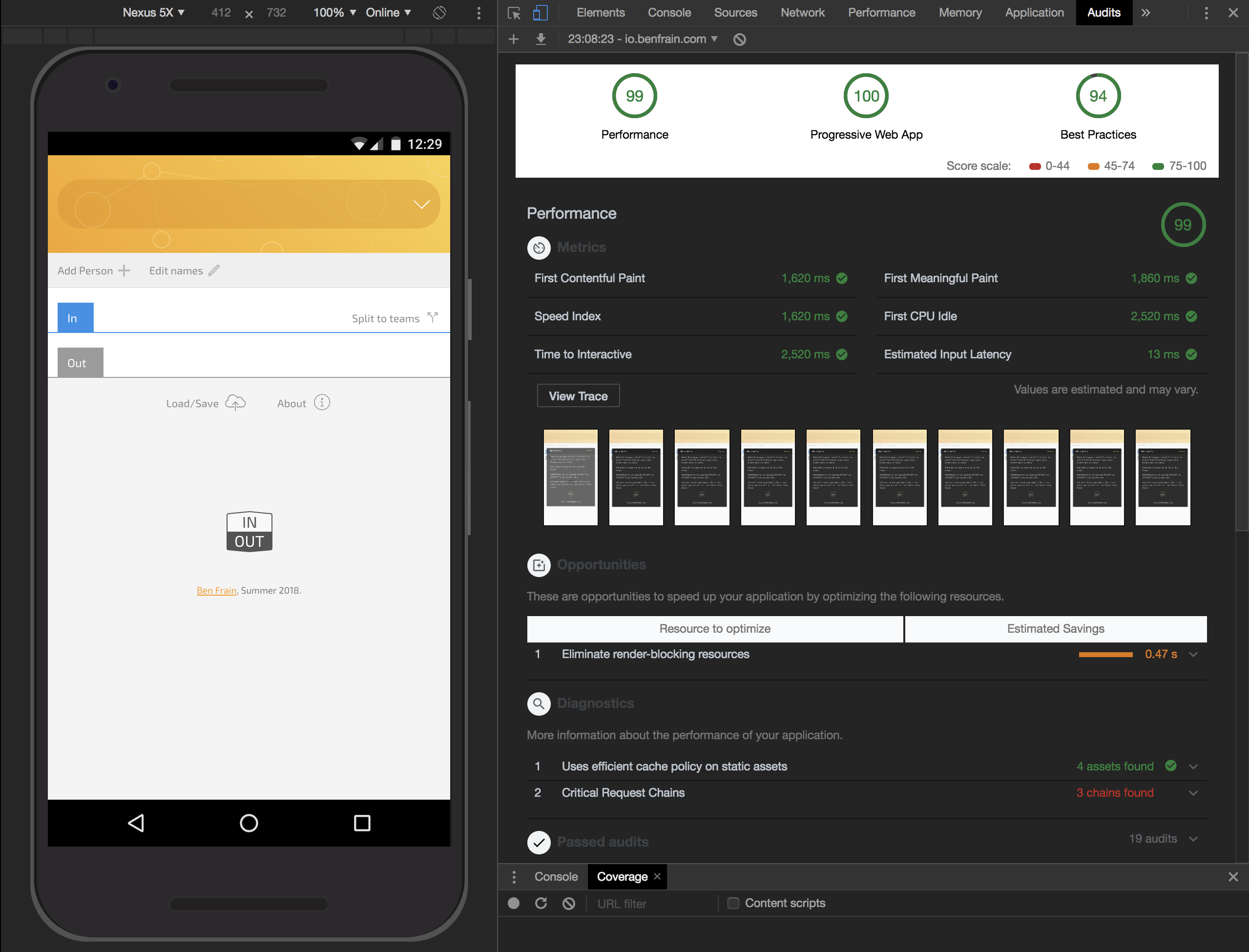
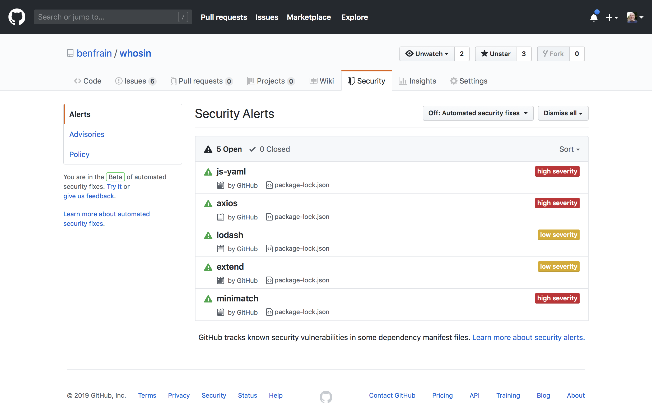


