The Complete Guide to Project Management Institute

The project management field has evolved over the years. New technology, project management methodologies, frameworks, and project management software have changed the way PMs oversee projects throughout different industries.

One thing that has remained constant is the Project Management Institute (PMI). For over 50 years, this organization has become the go-to resource for project management professionals across the globe.

For those of you who want to learn new skills and advance your career in project management, you need to get familiar with the PMI—and this guide will explain everything you need to know.

What is the Project Management Institute?

The Project Management Institute is a nonprofit organization and certification provider that was founded back in 1969. It’s globally recognized as an industry leader in training, research, networking, and credentialing for the project management industry.

The PMI has assisted 3+ million project, program, and portfolio management professionals across the globe.

This organization has developed industry standards in the project management field. They offer everything from project management tools to project management job boards, awards, and events related to project management.

3 PMI Tools to Improve Your Project Management Skills

There are dozens of resources available from the Project Management Institute. But these are my three favorite tools that can immediately improve your career as a project manager.

#1 — PMP Certification

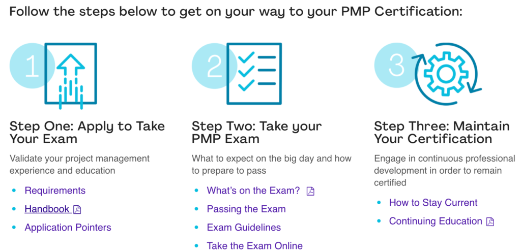
The Project Management Institute offers lots of different certifications. But the PMP Certification is arguably the most prestigious and most reputable. This is the world’s leading PM certificate and includes predictive, agile, and hybrid frameworks. It’s one of the best ways for project managers to instantly make themselves more appealing in prospective job opportunities.

According to the PMI, PM professionals with a PMP certification in North America are paid 25% more than those who aren’t certified.

To qualify, you must have a four-year degree, 36 months of experience as a project leader, and 35 hours of project management training (a CAPM certificate nullifies the last requirement). If you don’t have a four-year degree but have a high school diploma or an associate’s degree, you’ll need 60 months of experience leading projects to qualify.

The PMP Certification exam fee costs $405 for PMI members and $555 for non-members.

#2 — PMBOK Guide

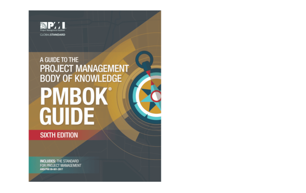
The PMBOK Guide is the Project Management Institute’s flagship publication. It’s an essential resource for managing projects in any industry. This guide contains the foundation and knowledge required to be an effective project manager. If you’re only going to read one book on project management, this is my recommendation.

PMI members can download the PMBOK Guide for free. Non-members can purchase a physical paperback copy of the book for $99 or download the digital ebook for the same price. It’s something that you can always refer back to throughout your project management career.

When you order this book, the PMI will send you a free copy of the Agile Practice Guide as well. With agile project management skills in high demand, the extra book is a nice bonus for any project manager to have on their bookshelf.

#3 — CAPM Certification

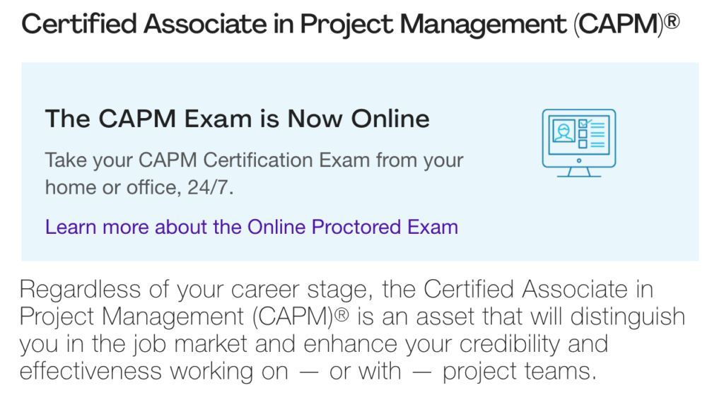
A Certificate Associate in Project Management (CAPM) is the perfect credential to start your career as a project manager. It’s ideal for existing project managers that want to start managing bigger projects or prospective project managers that want to stand out in a competitive job market. For a fast way to add credibility to your resume, I highly recommend the CAPM certification.

To qualify, you need to have a high school diploma or an associate’s degree. You’ll also need to complete 23 hours of project management education before you take the exam. Unlike other PMI certifications, you don’t need any experience as a project manager for the CAPM. The CAPM exam fee is $225 for PMI members and $300 for non-members.

The Basics of the Project Management Institute

To say the PMI’s offerings are vast would be a drastic understatement. But everything that this organization provides can be summarized in the following core elements:

Membership

The PMI has membership opportunities for project management professionals who want to advance their careers.

There are over 600,000 members in the PMI community. Joining the PMI community is one of the best ways to network with peers in your industry. Anyone can create a PMI account for free and use it to track their certification status (more on this shortly). But to get the most out of your account, I’d recommended upgrading to the paid PMI membership.

The cost to join is just $129 per year, plus a one-time application fee of $10. But the paid membership pays for itself almost immediately.

In addition to joining the PMI community, you’ll also get to download the PMBOK guide for free—normally $99. The PMI also gives you access to over 1,000 free tools and templates as part of your membership. You can take these templates and immediately apply them to real-world projects that you’re managing. Use your membership to find relevant career opportunities on the PMI job board as well, which is only available to members.

Another top benefit of the PMI membership is the discount that you’ll get on project management certifications. Members pay a lower exam fee than non-members. For example, you’ll save $150 on your PMP certification with a PMI membership.

Certifications

The Project Management Institute is a reputable certification body for project management professionals. With a globally recognized certification, project managers are able to advance their careers, seek new opportunities, and get paid more for their added value.

A certification from the PMI is a big deal. It shows organizations that you’re qualified to manage certain types of projects. Available certifications include:

  • Project Management Professional (PMP)
  • Certified Associate in Project Management (CAPM)
  • Program Management Professional (PgMP)
  • Professional in Business Analysis (PMI-PBA)
  • Portfolio Management Professional (PfMP)
  • PMI Risk Management Professional (PMI-RMP)
  • PMI Scheduling Professional (PMI-SP)
  • PMI Project Management Ready
  • Disciplined Agile Scrum Master (DASM)
  • PMI Agile Certified Practitioner (PMI-ACP)
  • Disciplined Agile Senior Scrum Master (DASSM)
  • Disciplined Agile Coach (DAC)
  • Disciplined Agile Value Stream Consultant (DAVSC)

Each certification comes with a certain level of prestige attached to it. For example, the PMP certification is known as the gold standard in the project management field. Whereas the Project Management Ready certification is designed to prepare students with basic information related to project management.

All certifications follow the same standard process. First, you must meet certain eligibility requirements. The criteria are typically based on education level, completed training, and experience as a project manager.

If you meet the eligibility requirements, you can complete an application with information. You’ll also need to submit audit materials with proof of your eligibility. Once the application has been approved and you’ve submitted payment, you can schedule an exam appointment. The PMI will officially issue certifications after you’ve passed the exam.

Continuing Certification Requirements (CCR) Program

Earning your certificate is just one step. But to maintain your certifications from the PMI, you’ll need to complete some additional requirements.

That’s where the CCR Program comes into play. It’s designed to help project professionals continue to grow and develop skills while maintaining their certification status.

Each certification requires recipients to earn a certain number of PDUs during a three-year cycle. PDU stands for “professional development units.” Each unit represents a one-hour time block for learning, teaching, or volunteering.

The number of PDUs required will depend on the certificate that you’re trying to maintain. For example, the PMP certification calls for 60 PDUs, while a CAPM only requires 15.

Track your progress on the PMI’s CCR system, a simple online tool for reporting PDUs. This will make it much easier for you to renew your certifications.

Education and Training

In addition to the project management certifications, the PMI is also known for its training resources. The PMI believes that professional development in the project management industry is more than just a one-time thing—it’s something that should be an ongoing component of your project management career.

The PMI has developed an ideal skill set for modern project management, known as the “Talent Triangle.” The triangle contains three crucial aspects of project management—technical project management, strategic and business management, and leadership.

There are training materials offered directly by the PMI, including online courses, disciplined agile toolkits, seminars, and webinars. If you have a PMI membership, you’ll have full access to 1,000+ webinars on projectmanagement.com. These contain tips, best practices, trends, how-to tutorials, and so much more. It’s also an easy way to earn PDUs for maintaining certifications.

The PMI also has authorized training partners that have exceeded rigorous standards for quality. You can discover these third-party training resources directly from the PMI website.

I enjoy the thought leadership resource from the PMI as well. This contains the latest ideas and principles from industry leaders in the project management field. It covers everything from portfolio management to cost management, sustainability, business analysis, scheduling, and everything else you could possibly need. Use this resource to gain a fresh perspective on certain areas of project management.

Events

Another excellent way to network and further your career as a project manager is by attending events hosted by the Project Management Institute.

Through uncertain times and struggles with in-person learning due to a public health crisis, the PMI has gone digital. You can still attend virtual events from the comfort of your own home.

In-person events will slowly get back to normal over the coming months and years. But in the meantime, virtual events are the next best thing. In some instances, this provides you with better access to an event that you might have otherwise been unable to attend.

There are also local PMI chapter events that you can join with your PMI membership. The events calendar is updated on a regular basis. So be sure to check it out to see what’s available and register online for any virtual event.

Core Values

The PMI stands out from other organizations in the project management space by maintaining a set of common values. These values remain unchanged, regardless of management trends or changes to business environments.

The Project Management Institute’s core values include:

  • Project Management Impact
  • Professionalism
  • Volunteerism
  • Diversity, Equity, and Inclusion
  • Community
  • Engagement

As you continue to familiarize yourself with the PMI, you’ll see that these core values are a staple in everything that the organization offers.

For example, if you refer to the requirements to maintain different certifications, you’ll see that you can earn credits for giving back, which would fall into the volunteerism and community core values categories.

3 Tricks For The Project Management Institute

Apply these quick tricks and best practices to get the most out of your experience at the Project Management Institute. These simple steps will make your life much easier.

Trick #1: Get a PMI Membership

If you truly want to commit yourself to a career in project management, start with a PMI membership. You’ll get tons of benefits for joining, all of which we discussed in greater detail earlier.

But aside from those perks, the membership symbolizes your commitment as a project manager. You’ll be more likely to obtain certifications and maintain credentials throughout your career. The membership will give you access to exclusive materials and other useful pieces of information that you can apply to real projects.

As a leader, your team will always look to you for guidance. This is not always an easy position to be in. So it’s really helpful if you have a community of peers that you can fall back on for advice and insight.

Trick #2: Take Advantage of Free Online Courses

Not everything from the PMI will cost you money. There are plenty of great free classes as well. This is perfect for project management beginners or students who are considering a career in project management.

Before you dive in head-first, these free courses can provide you with a basic overview of project management to see if it’s something you’re interested in pursuing further.

Just head over to the PMI store and search for eLearning materials. Then sort the options by price from low to high, and you’ll see a handful of free courses. Examples include Project Management For Beginners, Free Introduction: Basics of Disciplined Agile, Foundations of Change Management, and Business Continuity.

Trick #3: Use Practice Guides

Earlier, we talked about the PMBOK Guide, which is arguably the most popular and well-known publication from the PMI. But there are other excellent practice guides that can be used to apply PMI standards in specific disciplines.

Some of my favorite practice guides include:

  • Agile Practice Guide
  • Governance of Portfolios, Programs, and Projects: A Practice Guide
  • Benefits Realization Management
  • Managing Change in Organizations: A Practice Guide
  • Navigating Complexity: A Practice Guide
  • Business Analysis For Practitioners: A Practice Guide
  • Requirements Management: A Practice Guide

All of these can help take your project management career to the next level.

The Psychology Of Color

Color and visual cues can have a dramatic impact on conversion rates. On Quick Sprout, for instance, the Hellobar — a red bar on the top of the page accounts for 11% of all new leads.

Hello Bar - Color Example

The same is true for KimberlySnyder.net — she generates around 20% of her revenue through a bright, red Hellobar.

This tool may not be beautiful. In fact, on some websites, it looks like a total eyesore. But it stands out.

You see, audiences online have limited attention spans. They’re powering through websites (and digesting information at a million miles an hour). The only way to grab their attention is to stand out from everything that is competing for their attention. That is where color comes in.

Color has value beyond aesthetics. Yes, we all have preferences, but why? The answer to that question will directly affect your online marketing and conversion optimization strategy. Color is something that’s always around us, but we rarely think about how it impacts us. In this chapter, we’re going to overthink it. Everything you’ve ever wanted to know about color will be captured in the next 20+ pages.

Color Theory

There is a clear science to picking colors that work together. There is a definite element of subjectivity involved (culture, generational perspectives, and personal preferences), but there is also a set of best practices that psychologists and designers will stick to. Colm Tuite, a user experience designer, breaks down color into the following framework.

Pures, Tints, Shades & Tones

PURE COLOR

Pure Color

These are colors that are not mixed with other hues. They’re usually incorporated into bright designs. Anything youthful, summery, cheerful, energetic, or ‘cool’ can benefit from using pure colors.

TINTS

Tints

These are colors mixed with white. They convey a lighter, more peaceful, and less energetic feeling than pure colors. They’re also considered more feminine. Companies in the health, spa, and beauty industries could benefit from using these colors.

SHADES

Shades

These are colors mixed with black and are effective in communicating mysterious, dark, evil, or dangerous moods. Shades can work well with gradients when used with either a pure color or lighter shade.

The Meanings Of Colors

Certain colors are tied to cultural, emotional, and social connotations. Here are some meanings of colors in the western world.

Meanings of Color

Tints and shades can help influence the feelings that color conveys. For instance, a darker shade of blue would convey more security and integrity. Lighter shades of blue would convey more tranquility and peace. Some colors have developed a particular meaning over time due to use from certain organizations (i.e. a branding effective).

For instance, the Catholic Church uses deep shades of purple and red, giving the colors a spiritual meaning. Pink has also become associated with femininity. Countries have also adopted certain colors as their own (for instance, Ireland and green).

Maintaining Simplicity

A common mistake when working with colors is to use too many of them. It is usually better to use one prominent color that is offset by a neutral color like white, gray, or black. When you use too many colors, you may end up conveying too many feelings or messages at once — something that will potentially confuse the person viewing your design.

Contrast

For the most part, dark colors are strong complements to bright colors. That is why most books are designed using white backgrounds and black text. Each color has a contrast value (white is the lightest and black is the darkest). Yellow and green have light values (so they would be difficult to read on a white background).

Contrast Example

Example

Let’s say that a client approaches your (hypothetical design) company looking for a logo. The company is a beauty spa, which uses natural, organic products. The target market is women, and she is trying to convey a peaceful messages, rather than an energetic one. So, she knows that tints are the best route to take, as opposed to pure colors or shades. Colors to convey tranquility and femininity are pink, yellow, purple, and blue.

The client really wants to drive home that products are organic. One option is green, which conveys thoughts of freshness and the environment. The following shade of green, however, is not very feminine:

So the shade would need to be a little light

If you also want to convey a bit of tranquility, you would add a bit of blue.

Color And Conversions

Here’s the quick facts on how colors impact conversions:

  • 92.6% of people say the visual dimension is the #1 influencing factor affecting their purchase decision (over taste, smell, etc.).
  • Studies suggest that people make a subconscious judgment about a product within 90 seconds of initial viewing. Up to 90% of that assessment is based on color alone.
  • One study found that magazine readers recognize full-color ads 26% more often than black-and-white ads.
  • Heinz changed the color of their signature ketchup from red to green and sold over 10 million bottles in the first 7 months, resulting in $23 million in sales.

How Colors Impact Conversions

Here’s some additional facts on how color effects purchase decisions:

  • When marketing new products, it is important to understand that consumers place visual appearance and color above other factors when they shop.
  • 85% of shoppers place color as a primary reason for why they buy a particular product.
  • Color increases brand recognition by 80%. Brand recognition is directly tied to consumer confidence.
  • Colors are not universal in nature. Colors that entice in North America are different from those that entice in India. See the infographic (below) to see how different colors affect online consumers in North America.
  • Color is not the only element that influences consumer behavior. For online shoppers, design, buzzwords and convenience also affect the need to shop.

Color affects us in countless ways, both mentally and physically. Psychologists have suggested that color impression can account for 60% of the acceptance or rejection of a product or service. A bad color combination can have the same user experience consequences of poor copy or slow page load times.

Gender

ender is something we’ve talked about in the last few sections — but it’s important for us to call out specifically. At any given time, your audience is some proportion of men and women. For the sake of argument, we’re going to say 50/50, but the reality is that this number can fluctuate depending on your business and industry. If you’re not careful (and create gender-centric marketing imagery), you could end up losing out on up to 50% of your web traffic and conversions.

In our everyday lives, we see the world as individuals. We need to change our perspective and start seeing the world as marketers instead. Color is out of the ways to market to people who aren’t like us.

Color by Gender

In general, research says that gender associations with color are ambiguous.

Some observations that some analysts have made:

  • A review of color studies done by Eysenck in early 1940’s notes the following results to the relationship between gender and color. Dorcus (1926) found yellow had a higher affective value for the men than women and St. George (1938) maintained that blue for men stands out far more than for women.
  • An even earlier study by Jastrow (1897) found men preferred blue to red and women red to blue. Eysenck’s study, however, found only one gender difference with yellow being preferred to orange by women and orange to yellow by men. This finding was reinforced later by Birren (1952) who found men preferred orange to yellow; while women placed orange at the bottom of the list.
  • Guilford and Smith (1959) found men were generally more tolerant toward achromatic colors than women. Thus, Guilford and Smith proposed that women might be more color-conscious and their color tastes more flexible and diverse. Likewise, McInnis and Shearer (1964) found that blue green was more favored among women than men, and women preferred tints more than shades. They also found 56% of men and 76% of women preferred cool colors, and 51% men and 45% women chose bright colors. In a similar study, Plater (1967) found men had a tendency to prefer stronger chromas than women.

What’s important to keep in mind is that cultural and social contexts are changing all the time. There is so much variation in the population that you’re not going to be able to appease everybody with just one color scheme. You could read all of the psychology studies in the world, but if you sit around trying to be a perfectionist, you’re never going to get anything done.

The best way to figure out if you’re excluding men and women in your marketing? Talk to people in your target customer base. Research some of the color schemes that your competitors are using. Don’t leave the decision to guess work, but don’t dwell on finding the “right” answer either (because you probably won’t).

The best answer is in your data. In addition to conducting qualitative research with your target customers, make sure that you’re running consistent A/B tests.

Accessibility

As you’re designing your website, keep in mind that your audiences perceive the world differently. Even if you have perfect vision, the world doesn’t. The W3C Web Accessibility initiative has put together a list of resources to help website owners ensure that their websites are accessible to people with disabilities. Here is a guide to help you establish checkpoints for accessible colors.

Brightness

rightness, for the purpose of this discussion, is defined as the intensity of light illuminating an object. It can be calculated as the arithmetic mean of the red, green, and blue color coordinates. The W3C suggests using the following formula to determine color brightness:

BRIGHTNESS = ((RED X 299) + (GREEN X 587) + (BLUE X 114))/1000

A visible color should be brighter than 125

Color Difference

Color difference is the variation in hugh between the foreground and the background color of your website. Here is a formula to help you calculate the color difference:

RED = MAX(RED FOREGROUND, RED BACKGROUND)
-MIN(RED FOREGROUND, RED BACKGROUND)

GREEN = MAX(GREEN FOREGROUND, GREEN BACKGROUND) -MIN(GREEN FOREGROUND, GREEN BACKGROUND)

BLUE = MAX(BLUE FOREGROUND, BLUE BACKGROUND)
-MIN(BLUE FOREGROUND, BLUE BACKGROUND)

= (RED) + (GREEN) + (BLUE)

Background and foreground color are visible if the color difference has a value greater than 500.

Rules Of Thumb

To make sure that your website is accessible, start by following these best practices:

  • Use font sizes that are large enough to read. While this tip is not directly related to color, it is important to keep in mind. Ultimately, color is not a standalone concept — it works together with other elements of your website, advertisements, and landing pages.
  • Keep paragraphs short so that information is easy to digest (and readers don’t feel like they’re looking a giant block of color).
  • Use complimentary but contrasting colors between your background and foreground. You can use a color wheel to figure out which colors will potentially work well together.

Relevance To Sales

When you’re choosing colors for your website, landing pages, and call to action buttons, you’re not just choosing colors for the sake of aesthetics. Here is a chart from Ren Walker at AdPearance that gives an overview of colors within the context of call to action buttons (in the Western world):

Color impact on sales

Wow. That’s a lot of options. Which one should you choose? Even if you’re a color psychology expert, it can be tough to decide on just one color — for a form button, for instance. What if you want to create a sense of urgency but also trust?

The most important way to narrow down your options is to consider the context of your form. What type of information are you looking to collect? If the potential lead needs to include personal information beyond basic contact details, you might consider choosing a calming color like green or blue. You should also consider what the rest of your page looks like. A red button, for instance, won’t stand out on a page that is based on the same color. Choose contrasting colors so that your call to action (CTA) buttons stand out on your landing pages.

Capturing Audience’s Attention

Take this commonly cited A/B test, for instance:

Performable Button Test

Performable — an email marketing platform that was acquired by HubSpot, experienced a 21% boost in conversions when the company changed its call to action button color from green to red.

The effect of the color change has everything to do with the CTA’s context.

The page on the left is very-much geared towards a green palette. The green CTA just blends within the page’s surrounding context. Red, however, presents a drastic visual context. The button truly stands out from the other elements on the page.

Website Elements Affected

In a blog post for CrazyEgg, Stephanie Hamilton put together a comprehensive list of website elements impacted by color:

Text Links

One solution for drawing attention to monochromatic links is to give them a faint background to lift them off the page. This technique helps to remind users where they are on your website. Check out how AppZapper makes the “overview” link by highlighting it in green when the user is on the page.

Text Link Color

Navigation

Bronto uses saturated colors to bring attention to its website navigation. This helps focus the reader’s attention to this extremely important (but small) part of the website.

Navigation Color

Buttons

Use colors to make your website’s call to action (CTA) buttons stand out from other elements on your website. Large, vibrant buttons will help your users understand what actions they should be taking on your website.

Button Color Example

Headings

Vibrant (but minimal) headings can help illuminate the most important concepts that you’re trying to communicate on your website.

Headings Color Example

List Items

If you want to draw attention to a certain feature or section of your website, you can use colors in a way that don’t overwhelm the rest of your page’s design.

Complement Your Brand’s Personality

Brand personality is a concept that we’ve talked about earlier in this guide. Color presents a powerful opportunity for self-expression. Use colors to accentuate your existing brand identity, and make sure that you piece together a cohesive style. At the end of the day, color is only one part of your branding equation and ultimately needs to complement your voice, persona, tone, and company values.

Here are the steps that we advises marketers take:

1. Decide which emotions you want to convey

This decision will help you decide what color(s) you want to pick and whether you’ll need to create a blend with others. You’ll need to pick a range of colors from the following options:

  • Monochromatic: stick with colors that belong to one color family (such as brown or blue)
  • Analogous: use two or three colors that appear next to one another on the color wheel
  • Complementary: Chose two colors that are opposite one another on the color wheel
  • Triadic: Chose three colors, equally spaced around the color wheel

2. Choose the palette that best communicates your company’s style

Warm and Comforting Browns
Browns evoke home, hearth, comfort, and warmth. You can combine different shades of brown with grays or blues to create a highly comforting vibe.

Brown Color Scheme Example

Playful Greens
If your brand is playful of energetic, consider using a palette with greens, blues, and oranges. This color scheme combines a pleasing, down to earth vibe with high energy.

Green Color Scheme Example

Serious Blues
Blues are calming and serious You can combine your color scheme with gray, tan, or orange, but you’ll want to keep secondary colors toned down so that you’re not overloading your audience with a chaotic look and feel.

Blue Color Scheme Example

Energetic Reds
Reds provide a burst of energy. If you’re not careful, however, you’ll risk overwhelming your audience. Offer plenty of white space to give your users’ eyes a break.

Red Color Scheme Example

Know Your Niche

Your industry has everything to do with your website’s color scheme and brand personality. A finance website, for instance, should be down to earth. If you move too far from the established path, you’ll risk confusing or causing cognitive dissonance with your customer base. Here are some examples of color schemes that work well for finance sites:

Finance Color Scheme Site

This color palette relies on greens that users are used to seeing with financial institutions. The gold switches it up a bit, and the black gives the scheme a foundation of strength and authority.

This is a strong color combination for a financial brand because it goes beyond the obvious association with money (green). Gold and black reinforce the concept of wealth and provide a sense of stability.

Here is an example of a ‘cool’ color palette that uses traditional financial colors (green and blue):

Cool Finance Site Color Scheme Site

By using these colors in lighter, brighter values, the brand associates itself with the finance world in a way that looks modern and youthful rather than heavy and overbearing.

The use of white space gives the website a clean, light feel. This is especially valid for a finance site, which drives business by building trust with its user base.

Key Takeaways

Color is something that we could seriously talk about forever, but there are still many more topics that we need to cover in this guide. Now is a good time to step back, reflect on key concepts covered, and prep our brains for what’s coming next.

  • There is a clear science to picking colors that work well together. Pure colors, tints, and shades are some of the most basic color variations that you’ll be working with. Know the moods and feelings that your color choices are likely to evoke.
  • Colors come with social and cultural connotations. Remember your frame of reference when you think about how your color choices will affect your audience.
  • Remember that people are reading your content from different perspectives. Eyeballs were not created differently. Some of us have perfect vision while others strain to read text on a screen. Make sure that your text is easy to read by using contrasting colors.
  • Red and green are the colors most affected by vision deficiency, especially among men. Be careful when you’re working with these colors.
  • Color can help you boost conversion rates. When creating your CTAs, pick colors that contrast dramatically from the rest of your color scheme. This boldness ensures that your visual cues stand out. Remember, people on the Internet have limited attention spans and are flaky. The more that you can (quickly) capture their attention, the easier time you’ll have engaging them.
  • A/B testing should be a part of your conversion optimization process. Instead of debating which colors to use, let the data decide for you.
  • Pay attention to standard color schemes in your industry. If you choose something that is too out-of-the-box, you risk causing cognitive dissonance among your audience. In other words, people will have no clue what your brand is about.
  • Remember that gender can have a significant impact on color. One way to play it safe (and appeal to a wide audience) is to choose blues and greens.
  • When buying new products, consumers are heavily swayed by visual appearance. Don’t take any shortcuts with your color choices and design. There are professional designers and branding consultants who can help you figure out what works well together and what doesn’t. Ultimately, everything should complement your brand personality.
  • Color can help you accentuate elements on your website (like navigation, lists, certain buttons of content, etc.).
  • Color has the potential to increase brand recognition by 80%. Choose color schemes that are memorable (but for the right reasons). A carefully chosen color scheme will help your identity shine.
  • When in doubt, ask your customers what they like. Take a look at the colors that brands catering to the same audience are using. There are so many free and creative resources out there — you’re never just jumping in blind