Grabbing Visual Attention With The Visual Cortex

Grabbing Visual Attention With The Visual Cortex

Grabbing Visual Attention With The Visual Cortex

Susan Weinschenk

(This is a sponsored post.) You are designing a landing page. The goal of the page is to get people to notice, and hopefully click on a button on the screen to subscribe to a monthly newsletter. “Make sure the button captures people’s attention” is the goal you’ve been given.

So how, exactly, do you do that?

Research on the visual cortex in the brain can give you some ideas. The visual cortex is the part of the brain that processes visual information. Each of the senses has an area of the brain where the signals for that sensory perception are usually sent and processed. The visual cortex is the largest of the sensory cortices because we are very visual animals.

Recommended reading: What Is The Role Of Creativity In UX Design?

The Pre-Attention Areas Of The Visual Cortex

There are special areas of the visual cortex that process visual information very quickly. These are called the “pre-attention” areas because they process information faster than someone may realize they’ve even noticed something visually.

Within the visual cortex are four areas called V1, V2, V3 and V4. These are the “pre-attention” areas of the visual cortex, and they are dedicated to very small and specific visual elements.

Let’s take a look at each one:

Orientation

If one item is oriented differently than others, then it is noticed right away:

An image of fifteen short lines with one that stands out because it is oriented differently
(Large preview)

Size And Shape

If one item is either a different size or shape than others then it is noticed right away:

An image of twelve circles with one larger than the rest
(Large preview)

Color

If one item is a different color than others around it then it is noticed right away:

An image of thirteen black circles with one of them shown in red
(Large preview)

Movement

If one item moves in quickly, especially if it zooms in from starting at a small size and then becoming larger quickly (think tiger running quickly towards you), that grabs attention.

But Only One At A Time

The interesting, not immediately obvious factor here is that if you use these factors together at the same time then nothing really attracts attention.

An abstract image of colorful circles in different sizes
(Large preview)

If you want to capture attention then, pick one of the methods and use it only.

Take a look at the two designs presented below. Which one draws your attention to the idea that you should enroll?

A minimalistic image that uses mostly two colors
(Large preview)
An image using a variety of colors and tones
(Large preview)

Obviously, the image that has just one color area draws your attention more, rather than the one area that is color.

The Fusiform Facial Area

The pre-attention areas of the visual cortex are not the only visual/brain connection to use. Another area of the brain you can tap to grab attention on a page could be the Fusiform Facial Area (or FFA).

The FFA is a special part of the brain that is sensitive to human faces. The FFA is located in the mid/social part of the brain near the amygdala which processes emotions. Faces grab attention because of the FFA.

A screenshot of the WIX website with a smiling person presented on the front page
(Large preview)

The FFA identifies:

  • Is this a face?
  • Someone I know?
  • Someone I know personally?
  • What are they feeling?

What stimulates the FFA?

  • Faces that look straight out stimulate the FFA.
  • Faces that are in profile may eventually stimulate the FFA, but not as quickly. In the example below the face is in profile and obscured by hair. It may not stimulate the FFA at all.
  • An image of a woman with her face covered by her hair so that her facial features cannot be seen well
    (Large preview)
  • Even inanimate objects like the picture of the car below may stimulate the FFA area if they have things that look like facial parts such as eyes and a mouth.
A picture of a car that looks like it has facial parts such as eyes and a mouth (front)
(Large preview)

Looking Where The Face Looks?

You may have seen the heat maps that show that if you show a face and the face is looking at an object (for example, a button or a product) on the screen then the person looking at the page will also look at the same object. Here’s an example:

An advertisement for Sunsilk Shampoo in which the lady in the picture is looking at the product compared to a picture of her looking straight
(Large preview)

The red areas show where people looked most. When the model looks at the shampoo bottle then people tend to look there too.

But be careful about drawing too many conclusions from this. Although the research shows that people’s eye gaze will follow the eye gaze of the photo, that doesn’t necessarily mean that people will take action. Highly emotional facial expressions lead to more action taking than just eye gaze.

Recommended reading: The Importance Of Macro And Micro-Moment Design

Takeaways

If you want to grab someone’s visual attention:

  • Use the pre-attention areas of the visual cortex: make everything on the page plain except for one element.

or

  • Show a large face, facing forward;
  • If you want to spur action have the face show a strong emotion;
  • Resist the urge to use many methods at once, such as a face, and color, and size, and shape, and orientation.

This article is part of the UX design series sponsored by Adobe. Adobe XD tool is made for a fast and fluid UX design process, as it lets you go from idea to prototype faster. Design, prototype and share — all in one app. You can check out more inspiring projects created with Adobe XD on Behance, and also sign up for the Adobe experience design newsletter to stay updated and informed on the latest trends and insights for UX/UI design.

Smashing Editorial (cm, ms, yk, il)

API Security Weekly: Issue #13

Vulnerabilities

Another OAuth hack, and another reason why using OAuth for authentication can be dangerous. Researches by SafetyDetective found that Microsoft had 400 million users exposed. Outlook, Store, and other services allowed wildcard *.office.com as a valid wreply URL for tokens from login.live.com. Attackers noticed that and managed to grab the success.office.com domain in Azure. Now, the attackers could construct login URLs that, whenever users clicked the URLs, provided the attackers valid tokens they could intercept and use to access Microsoft Outlook and Microsoft Store as those users.

In addition, yet another intranet/open ports hack, similar to the printer hack last month. This time, attackers are using the Shodan search engine to locate Chromecast devices exposed to the Internet by local routers. Once located, attackers can take over the Chromecast devices and stream the videos that they want onto users’ TVs. Again, the reason is that Chromecast APIs were designed with home Wi-Fi network in mind, so it is assumed that whoever gets access to the API must be the device owner. To protect yourself, if you have a Chromecast device at home, make sure you disable UPnP on your home router.

Reader Mode: The Button to Beat

As a young nerd, I loved to immerse myself in digital worlds, learning the ins and outs of the rules someone else had created for me (intentionally or not). But the older and crankier I get, the more I find myself losing patience when navigating these "delightful" experiences.

This fascination was great for my eventual career as a designer, but unfortunately, it was also like teaching someone kerning—once you learn how to quantify a bad user experience, you can’t go back.

These days, I’m an impatient grump who doesn't want to take work home. I just want to get in, get what I need, and get out. If there’s any delight I’m experiencing, it’s lost on me because I had such an effortless and annoyance-free time that it simply doesn’t stand out.

One of the features I find myself turning to over and over again is Safari’s Reader Mode. I read a lot of news, and with that comes a lot of bullshit. I now tap the cryptic little icon almost reflexively, confident that I’ll be transported to a land where I can focus on what matters most to me: content.

An iPhone screenshot highlighting the Reader Mode button located in the top-right corner of the screen.

Tapping this button transports me to a land free of newsletter signup modals, surveys, pop-ups, pop-unders, flashing ad banners, automatically-playing video, app install prompts, breaking news alerts, passive-aggressive interstitials, and faux notification permission banners. It slices through the undesirable and unnecessary with ease; the Alexander the Great to the Gordian Knot that is poor user interface design.

Firefox also offers this reading mode. So does Edge. I find myself using it more and more on my laptop with every passing day—especially for reading long-form articles, like this piece. I’d be very surprised to see Chrome institute one natively, as Google is ultimately in the advertising business.

I’m not going to talk about how to best craft your content for Reader Mode. Mandy Michael already covered this in her article, Building websites for Safari Reader Mode and other reading apps. She’s great, and it is a must-read piece.

Building with accessible HTML standards is not a dead-end skill. Far from it. If you spend the effort to craft your experiences with a mind to semantics from the start, your content will be able to adapt to specialized reading modes, as well as whatever the future holds with little to no additional effort. Today’s Reader Mode could be tomorrow’s smart bathroom mirror.

Spending the effort is an important point: Good design isn’t about forcing someone to walk a tightrope across your carefully manicured lawn. Nor is it a puzzle box casually tossed to the user, hoping they’ll unlock it to reveal a hidden treasure. Good design is about doing the hard work to accommodate the different ways people access a solution to an identified problem.

For reading articles, the core problem is turning my ignorance about an issue into understanding (the funding model for this is a whole other complicated concern). The more obstructions you throw in my way to achieve this goal, the more I am inclined to leave and get my understanding elsewhere—all I’ll remember is how poor a time I had while trying to access your content. What is the value of an ad impression if it ultimately leads to that user never returning?

But this isn’t a website about digital media strategy, nor is it one about user conversion. This is a website about CSS and front-end development. What we’re going to discuss is how to keep people like me from hitting that button by relying on this nifty programming language the W3C so wisely gave us. Because if you don’t, all that other stuff—your newsletter signup boxes, your comments, your related articles, your engagement—will be cut away.

Inclusivity

What you want to do first is cast a wide net. The more people you can proactively accommodate from the outset, the more people you don’t unintentionally alienate. Our design choices should be invisible—we’re not trying to say, "this is for you." That should be self-evident. What we’re trying to avoid are scenarios where someone encounters something that communicates, "this is for someone else."

It’s not too difficult, provided you know what to look out for. Carie Fisher outlines the bulk of it in her brilliant post, Designing Accessible Content: Typography, Font Styling, and Structure.

Priority

A basic paragraph style is the wellspring from which all your other type decisions should flow. It’s probably the most common and frequently invoked content type a website has, so it’s important to treat it with the care and respect it deserves. The web is typography, after all.

Heydon Pickering wrote about styling paragraphs way back when in 2011 with his post, The Perfect Paragraph. And here’s the thing: eight years later, this is all still solid advice (sheesh, I’ve been doing this for awhile). When you make design decisions that work with the grain of the web platform, you gain the confidence that you’re creating resilient, robust, and accessible solutions that last.

The neat part about this is that it frees up time to do other things, say reading about gender bias and the undervaluing of HTML and CSS. If anything, do it for me. I am honestly not sure I can handle another case of 2,000 lines of JavaScript used to recreate position: absolute;.

Circumstance

Form

Even though responsive design is nearly a decade old at this point(!), we still seem to ignore a lot of the wisdom Ethan Marcotte so nicely teaches us for free. He’s a smart guy, you should pay attention to what he has to say.

After a complete lack of breakpoints, perhaps the biggest offender I still come across with regards to responsive design is the assumption that a small viewport means teeny-tiny type. Typically, the opposite is true. Small devices are made to be worn or carried, meaning that we move them in physical space to get them into a comfortable reading position. This is the opposite of a larger, more stationary device, such as a monitor, where we move our body to accommodate it instead.

A comfortable reading position means not forcing someone to hold a phone two centimeters away from their face. Ergonomics aren’t likely to change, but devices will. Because of that, you should craft your breakpoint names to be abstract. I personally like names that keep usability in mind, so something along the lines of, "wrist, palm, lap, desk, wall." It helps keep the user’s circumstance top-of-mind, and moves you away from associating only certain kinds of content as being viable on certain kinds of devices.

These ergonomically-derived designs can be achieved with the help from people like Rachel Andrew, whose in-depth explorations of CSS grid help us understand the power behind a real CSS layout system. Sass experts like Miriam Suzanne then teach us how to use True to codify these layouts and reliably integrate them into our larger Sass systems.

You also want to avoid fallacious device sniffing approaches, or making gross assumptions about a user’s circumstances and capabilities. Just let me increase and decrease that type size. Reader Mode lets me, so I’m going to get there one way or another.

Connection

The other thing you need to think about is how that ideal paragraph design actually gets served to a device. A big part of that involves loading our fonts, and ensuring that the loading process prioritizes user experience.

Text

Text downloads quickly; a lot faster than other exotic kinds of content. Browsers will render it gleefully, as it is historically the most important part of the payload. This means that the Reader Mode button is going to show up a lot faster than that distracting auto-playing video of talking heads so thoughtfully jammed into the bottom right-hand corner of my viewport.

And what if we’re on a slow, intermittent, and/or metered connection? Top-of-the-line MacBooks still have to use hotel wifi, just like everyone else.

You want to keep the page from jumping around when our paragraph font loads. This prevents the terrible experience of forcing me to scroll around to rediscover my place as things shift into place. It also helps prevent me from mis-clicking, taking me away from what I want to read because I had the audacity to interact with the page before the bitcoin miners are deployed (thankfully, good people like Laura Kalbag can help us with that one).

The temptation to hit that Reader Mode button is strong, because when I see the main text of the page show up, I know I can easily and reliably avoid all these potential issues.

Helen V. Holmes wrote Type is Your Right!, a beautiful article that effortlessly blends typographic history, capability, and performance. Notably, she discusses how to manage the Flash of Invisible Text (FOIT) and Flash of Unstyled Text (FOUT) to best corral all the aforementioned issues. In response, Monica Dinculescu made Font style matcher, a fantastic tool that lets you bend, stretch, squish, squash, and torture type in ways that would make your stodgy typography professor faint, all in the service of preventing layout jank.

Images

You can (and should) make all sorts of clever optimizations to ensure we’re delivering our images as efficiently as possible. But what happens while I’m waiting for those images to show up? What if they never do?

Since you’re a responsible, inclusive web professional, you’ve already made sure to include alternative text descriptions for our image content. Ire Aderinokun teaches us that you can take that one step further and style broken images. Now even the content that isn’t working as intended looks good. No brittle, overwrought JavaScript here—just good, old fashioned progressive enhancement.

The other type of image you want to consider are icons. There’s lots of reasons to not use icon fonts. Adding one more reason to toss on the pile: icon fonts may not hold up in Reader Mode, as they are constructed using text glyphs. When Reader Mode passes over a page, it may convert the glyph to use the font you specify. This could make for a disastrous experience, especially if the icon is used to communicate critical functionality (e.g. "Press the Home button (☒) to return to the main menu.").

To avoid this issue, Sara Soueidan teaches us how to convert those icon fonts to SVG . But you know what? She’s so much more than just a SVG expert. She’s an incredible UX developer, and you’d do well to read up on what she’s written. I, for one, have learned a ton.

Control

To help make my reading experience as comfortable as possible, Reader Mode allows me to adjust things like the typeface, the text and background colors, the font size and line height, and the number of words per line. This is great. I’ll frequently toggle back and forth between light and dark backgrounds depending on the time of day.

I also wear glasses, and I know that the older I get, the worst my vision will be. Thanks to Jennifer Aldrich’s writing, I know that this is the norm. After all, we’re all just temporarily abled. I might also need something like Windows High Contrast Mode one day. Thanks to Amelia Bellamy-Royds, I now know how to make my content be the best it can be when viewed in that mode.

The web is flexible. Working on it means getting over your ego and learning to let go. That means accepting that the medium will never be pixel perfect. It means embracing technology like relative units, and more importantly, philosophies like Intrinsic Web Design. That’s brought to us by Jen Simmons, a tireless and passionate advocate for web standards.


I’d love to read your website. I’d love for your harmonious typography to quietly usher me into a flow state, making me forget I was even browsing your site at all.

The post Reader Mode: The Button to Beat appeared first on CSS-Tricks.

DaniWeb Hall of Fame

OK, so we are thinking about bringing back the 'Member of the Month' feature in the monthly newsletter that goes out to all DaniWeb members. This was a staple in the DaniWeb Digest for many years, coming to an end at the start of 2016. The hall of fame was, aptly, entirely virtual but the kudos of being included as real as it gets.

Three questions then:

  1. Would you read the Member of the Month interview if it was brought back?

  2. Would you be interested in being interviewed, or want to nominate another member for the interview?

  3. What one question would you most like to ask other DaniWeb members being interviewed?

How to Generate Sales With Welcome Emails

Email marketing is alive and thriving more than ever. 80% of marketing professionals name email as the top driving factor of customer acquisition and customer retention. And it’s got a great ROI: For every $1 spent on email, you can expect an average of $38 in return.

It doesn’t matter if you’re growing your first email list from scratch or adding new subscribers to your existing list, you need be sending out welcome emails.  

At their simplest, welcome emails confirm that a new subscriber was added to your list.

If you’re only using this message for that purpose, you’re missing out on a huge opportunity to make money. Compared to other promotional emails, welcome messages generate an average of 320% more revenue.

Furthermore, customers who buy products from email campaigns spend 138% more than customers who haven’t subscribed to your list.

Stop missing out on your opportunity to make money with welcome emails. This article will tell what you need to do to drive sales directly with these campaigns.

Use a double opt-in strategy

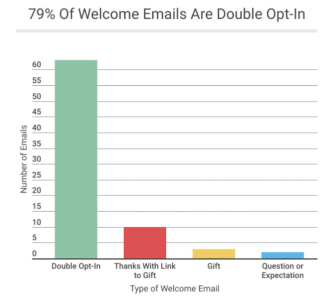
Lots of businesses use a single opt-in strategy. With this method, a new subscriber submits their email address and automatically gets added to your list. That’s it.

But there are a few problems with this method.

If you’re not using a double opt-in, it’s possible that customers think they signed up for your emails but actually didn’t. Maybe they misspelled their email address — they’ll never know.

On the flip side, a new subscriber could also sign up by mistake, thinking that they’re submitting the email address for another reason.

In this case, you’re going to be emailing people who don’t want to receive your promotional content, and not emailing the people who do want to receive it.

The double opt-in strategy eliminates these problems. That’s why the majority of welcome emails are double opt-in.

79% of welcome emails are double opt-in

Without a double opt-in strategy, you’ll also end up with fake email addresses and spam accounts on your list. This will throw off your metrics. A huge list of email subscribers won’t do you any good if they aren’t qualified leads who are ready to buy.

When you force new subscribers to confirm their subscription to your email list, it increases their lead score.

Sure, it’s an extra step, and you may lose some subscribers as a result. However, the people who follow through with the double opt-in genuinely want to receive your promotional content. As a result, it’s much more likely that they’re willing to spend money.

It’s also worth noting that double opt-in messages have higher unique open rates than single opt-in campaigns.

We already talked about the fact that welcome emails have higher open rates than other types of emails. By using a double opt-in strategy, you can increase those open rates even more.

Opening the email is the first step in subscribers completing the end-goal action: making a purchase.

Send welcome emails immediately

The timing of your welcome message is crucial. As soon as someone signs up, the welcome email needs to be sent.

Some companies wait and batch out all of their welcome emails for the week at the same time, but that’s not as effective. Here’s why: Your new subscriber was just on your website and signed up to receive your email content because of some benefit that you’re offering, so your brand is fresh on their mind.

Don’t miss out on this opportunity to make a sale. This new subscriber is definitely more likely to buy something if the message is sent in real-time.

Just look at transaction rates for real-time welcomes compared to batched emails.

real time emails get 10X results

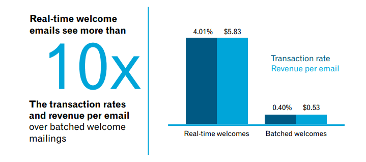
Furthermore, real-time welcome emails have an 88% open rate compared to just 53% of bulk welcome emails.

Though 29% of people click on the CTA of welcome emails that are sent immediately, only 12% of subscribers click on CTAs that are sent in bulk welcomes.

If you’re not sending a welcome email within seconds of the person subscribing, you’re lowering the chances of that customer making a purchase.

Thank your new subscribers

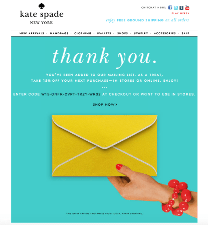
By thanking your customers for signing up to receive promotional content from your company, it shows that you appreciate them. Here’s an example of this strategy used by Kate Spade.

kate spade thank you email

Saying thank you is just good manners. Even though they haven’t bought something yet, you can still thank them for having enough interest in your brand to subscribe to your email list.

Saying thank you can be more beneficial than you think. That’s why you need to nurture your leads with thank you pages. Take this same strategy and apply it to your welcome email.

Set a precedent for relevant content

Your welcome emails should be a good indication of what consumers can expect from you moving forward.

Tell your customers how often they’ll get emails from you, and what kind of messages they’ll be receiving. Make sure you follow through with that promise.

For example, if someone signs up for a monthly newsletter, don’t send them an email every day. That’s not what they asked for.

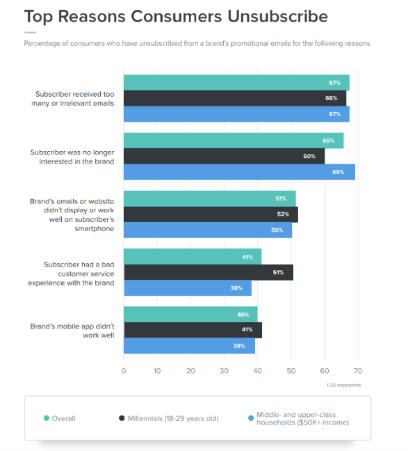
In fact, too many irrelevant emails from brands is the top reason why people unsubscribe from email lists.

top reasons consumers unsubscribe from email

The last thing you want to do is bother a new subscriber with too many messages. You just went through all of the trouble and effort to get them to sign up in the first place. All of that hard work goes out the window if they unsubscribe.

To learn more, here’s how to get more email subscribers without annoying your customers.

Start a drip campaign

Welcome emails should be the first message of a drip campaign, which is a series of emails that entice an action. Ultimately, you want your subscribers to buy.

Drip campaigns nurture your leads by sending them timely information. As soon as someone signs up, you can have them automatically entered into a drip cycle.

After the welcome email, they’ll receive subsequent emails spaced out over the coming weeks, or however you set it up.

Here’s an example path of what a drip campaign will look like:

example of an email drip campaign

The great part about a drip campaign is that the customer doesn’t need to buy something right away in order for the message to be effective.

While you definitely want to create an actionable drip campaign, it’s not the end of the world if that first message doesn’t result in a conversion. You can still plant the seed for a future purchase.

After all, this new subscriber just signed up to receive your emails. Depending on the circumstances, they may not be familiar with your brand, products, and services just yet. But as these subscribers continue to receive subsequent messages throughout the drip campaign, it will increase the chances that they’ll buy something down the road.

Provide valuable information

To get the most out of your email campaigns, you need to understand why people are signing up in the first place.

It’s a common misconception that people only join email lists to get a discount. While that’s definitely a motivating factor, there are other reasons why people sign up for promotional content from your brand. Your welcome letter needs to provide all of this to be most effective.

why people subscribe to email lists

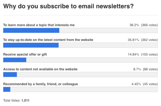
As you can see, receiving a special offer or a gift ranked third on this list. The majority of people say they subscribe to newsletters to learn more about topics and stay up to date on new content. It’s still worth giving a discount to new subscribers, but it doesn’t necessarily have to be your top priority.

You can also keep them engaged by giving a new subscriber an added benefit that they wouldn’t have received if they didn’t sign up for emails. Talk about new or exclusive product releases. Give them an opportunity to create an account to benefit from a more personalized customer experience.

Offer an incentive to buy

Even though it isn’t first on the list of reasons, getting a gift or something in return is still one of the top three reasons why people sign up for emails. And, offering a discount is a great way to get people to sign up for emails in the first place.

Let’s look at an example from Freemans:

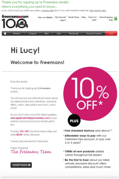
By signing up for emails, this welcome message gives the new subscriber 10% off of their purchase. In addition to providing a discount, this message thanks the new subscriber for signing up. It’s personalized with her name. It also gives a sense of inside information with phrases like, “Be the first to hear” and “Here’s all you need to know.” All of these tactics used in one message will definitely increase the chances that a customer will make a purchase.

Send personalized content

People don’t want to feel like they are just a number on your list, when in reality, that may actually be the case. If you’re sending out generic welcome emails with opening lines like “Dear Sir or Madam,” it’s not going to convey the personalized touch that you want to offer.

Start simple by personalizing the subject line.

personalized subject lines have higher open rates

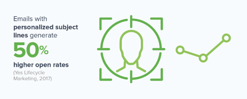
Getting your new subscribers to open your message is half of the battle. Obviously, nobody is going to buy anything if the message goes unopened. Good news: personalized subject lines have higher open rates.

However, opening the message alone won’t automatically translate to a sale. You need people to engage with your messages as well. The best way to do this is by providing interactive content. For example, adding a video to your welcome email can increase clicks by 300%.

It’s also worth noting that 64% of people are more likely to buy something online after watching a video about a product. By combining engaging content with a personalized message, your welcome emails will have a greater chance of driving sales.

Encourage customer referrals

Welcome emails can be used to get even more people to subscribe to your list. In order to do this effectively, you need to implement a customer referral program that drives sales.

Give your new subscribers a reason to invite their friends and family to sign up as well. Take a look at how Blinq does this in their welcome email:

blinq referral email

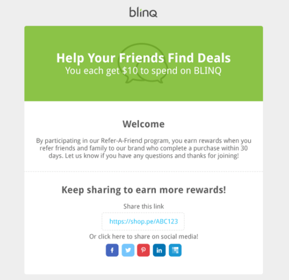
This refer-a-friend program offers an incentive to the current subscriber as well as any new people who sign up. Both receive a $10 credit. The more people who join as a result of the referral, the more rewards the new subscriber gets. This will also increase their chances of buying.

Here’s something else to consider, if someone who gets referred by a new customer ends up signing up for emails as well, they’ll also receive the same welcome message. As a result, it will increase the chances that they’ll refer new customers too. This strategy encourages business growth without much work on your end.

Plus, consumers are four times more likely to buy something if they are referred by a friend.

Conclusion

Your company needs to prioritize its email marketing strategy. But you don’t need to wait months to encourage new subscribers to make a purchase. You should be trying to drive sales right away with your welcome emails.

  • Send welcome messages immediately.
  • Use a double opt-in strategy to increase opens and qualify your leads.
  • Let your welcome email serve as the first message of your drip campaigns.
  • Don’t forget to thank your new subscribers for signing up.
  • Give them what they’re looking for by providing valuable information, and tell them what to expect from you in the future.
  • Personalize your content and add other incentives to increase the chances that people will buy.
  • Use your welcome email as an opportunity to promote your customer referral program.

By applying these strategies to your welcome emails, you’ll be able to generate more sales from new subscribers.

How is your brand leveraging welcome messages to drive sales?

12 Days of WhiPmas and the Best WordPress Puns of the Year

The WhiP is my second longest newsletter relationship. I looked through my Gmail archives and the oldest issue I was able to dig up was issue 345 from December 2015. I’ve been reading the WhiP for half its life and like the best relationships, it has been a delightful partner all the way through. The […]

DigWP Newsletter

What up! Just to help spread the word about the DigWP newsletter. Get WordPress news, tips, and special offers delivered fresh to your inbox. 3-4 times per year max. Always good stuff, never spam, and we never share your info with anyone. Just a quality newsletter letting you know about awesome stuff happening in our corner of the WordPress universe.

Direct link to article | View post at DigWP.com

How to Import Custom HTML Email Template from Postcards to Intercom (YouTube Tutorial)

You're reading How to Import Custom HTML Email Template from Postcards to Intercom (YouTube Tutorial), originally posted on Designmodo. If you've enjoyed this post, be sure to follow on Twitter, Facebook, Google+!

How to Import Custom HTML Email Template from Postcards to Intercom (YouTube Tutorial)

In this video, I will show you how to import a custom email template created in Postcards directly to Intercom. Open the Postcards App and let’s prepare our template for Intercom. First, insert all of the required tags into your …

3 Ways to Get More Subscribers for Your Blog

I have hundreds of readers coming to my blog every day – but nobody ever subscribes to my newsletter. Help!?!

This request came in via email today and I thought I’d share my reply with the 3 suggestions I offered.

—–

Thanks for the question – I suspect you’re not alone with this problem. While a lot can probably be written on the topic, let me suggest 3 things I’ve found helpful increasing subscriber numbers.

Note: the #1 thing I did to building subscriber numbers on Digital Photography School was introduce a lightbox subscriber box. I spoke about this in my 10 Things I Wish I Knew About Blogging webinar so I won’t rehash it here.

1. Ask People to Subscribe

This sounds a little too simple to be effective but I’m amazed how many people do subscribe once you mention you’ve got a newsletter. I’m also amazed how many of our regular and loyal readers don’t know we even have a newsletter, despite it being promoted around the blog.

Some semi-regular calls to subscribe can be very effective.

You can do this in a number of ways, including:

  • Writing a dedicated blog post, every now and again, explaining you have a newsletter and the benefits of subscribing.
  • Mentioning your newsletter in passing in your blog posts. I don’t mean every single post, but a mention now and then will work wonders.
  • Promoting your newsletter across social media. I regularly mention our newsletters on Twitter, when I’m writing a newsletter and when it goes out.

The key to remember, when mentioning your newsletter regularly, is to find fresh ways to talk about it. Don’t just have the same tweet to subscribe every 2nd day.

  • Mention something that is in the next newsletter, that you won’t get anywhere else.
  • Mention that you’ve just hit a milestone number of subscribers to build social proof.
  • Mention that it’s a milestone newsletter. We recently sent out 250th on dPS and made a bit of a big deal about it.

2. Start a Series

Announce that you’re going to be doing a series of posts, on your blog, on a topic that you know will really be useful to your readers.

I remember the first time I announced that I was going to run the 31 Days to Build a Better Blog series (the series that later became the eBook by the same name) I was amazed at how many people subscribed to my blog over the next 24 hours.

I was signalling to readers that I was going to do something that would serve them and in doing so, created anticipation among my readers. This anticipation (as I’ve written about in the past) is a key reason people will subscribe to your blog.

3. Place Calls to Subscribe in ‘Hot Zones’

One last tip is to identify some ‘hot zones’ on your blog, to place calls to subscribe. These zones are either places that your readers will be looking or pages that they’ll be visiting.

Let me suggest a couple:

1. Under Posts

I’m not currently doing this on my blogs, as I use the space under my blog posts for other things, but I’ve found over the years that the area under your blog post (and directly above comments) is a ‘hot zone’ where readers often look for what to do next.

Put yourself in the position of a reader. You’ve read the post and have found it useful. This is the perfect time to ask readers to subscribe because they’re hopefully feeling satisfied, stimulated and helped in some way.

A bold call to subscribe can work wonders here.

2. On Hot Posts

Dig into your blogs analytics package and identify which posts are the most read posts on your blog.

You’ll probably find that these posts are receiving traffic from search engines and are likely being read by first time readers to your blog – people that are often quick to leave again once they’ve got what they’re searching for.

These posts are a real opportunity to make your blog a little more sticky and to hopefully call some of those first time readers to subscribe.

You can do this either by adding a call to subscribe directly to the posts – or you might like to link from these posts to a ‘sneeze page’ (see below).

3. Sneeze Pages

Screen Shot 2013 06 20 at 1 25 12 PMLet me show you a page on dPS, which is a page that generates a large number of subscribers. It is our Photography Tips for Beginners page.

This page is a page in which I link to 33 of the best articles in our archives for beginner photographers. It is a page that ‘sneezes’ readers deep into our archives to good quality content.

It is a great page for driving traffic and getting readers deep into the site but you’ll also note we have a couple of strong calls to subscribe on that page. People click those calls to action like crazy because they can see on the page that we’ve created a heap of useful content.

We link to this sneeze page prominently in the navigation areas all around the site to drive traffic to it and regularly promote the page on social media (as I write this it has received over 90,000 ‘pins’ on Pinterest for example).

Take home lesson – create a sneeze page with a strong call to action to subscribe and drive as much traffic to it as you can!

Note: Sneeze pages are written about on day 18 of 31 Days to Build a Better Blog.

How Have You Increases Subscribers to Your Blog?

I have barely scratched the surface here on how to increase subscribers to a blog and would love to hear your suggestions and experiences on the topic in comments below.

What has worked for you?

3 Ways to Get More Subscribers for Your Blog
http://www.problogger.net/archives/2013/06/21/3-ways-to-get-more-subscribers-for-your-blog/
http://www.problogger.net/archives/category/miscellaneous-blog-tips/feed/
@ProBlogger» Miscellaneous Blog Tips
Blog Tips to Help You Make Money Blogging – ProBlogger
http://www.problogger.net/wp-content/plugins/podpress/images/powered_by_podpress_large.jpg