Inspired Design Decisions With Giovanni Pintori: Publicity Becomes An Art Form
Andrew ClarkeWith one or two occasional exceptions, I’ve spent the past twenty-two years designing for countless clients. A few of these projects lasted a year, some several months, but the majority for no more than a few weeks.
Being completely absorbed for a few weeks or months in designing a product interface or a website can be a thrill. It often starts with the gratification which comes from winning the work. Gaining a new client’s confidence and trust can be addictive. During the seductive “getting to know you” phase, you learn about the client and what they expect from you and your work. Addictive personalities like mine crave the intensity of these feelings, but — just like some relationships — the initial excitement soon fades into the realities of working together.
This creative promiscuity has suited my often short attention span and restless curiosity very well. But, there were times I wished I could stay with an organization for longer, get to know them better, and be a positive influence on what they do and make.
I know many designers who work in-house. While I never envy their commute or the money they spend on living close to work, there’s a part of me that envies their ability to stay and shape the long-term creative direction of a company in the way which Giovanni Pintori helped Olivetti.
“In our day and age, publicity has become an art form, and increasingly needs to live up to this name. Publicity is a form of discourse that should eschew vagueness in favor of brevity, clarity, and persuasiveness. Those who engage in publicity (writers, painters, architects) need logic and imagination in equal measure.”
— Giovanni Pintori
Italian designer Giovanni Pintori worked for business products manufacturer Olivetti for over 31 years. During this time, his style developed into the company’s unique design vocabulary. The appeal of working with one company for longer than a few months has become stronger as I’ve got older. For the past 18 months, I’ve devoted most of my time to working with a Swiss cybersecurity company, based not far from Milan and where Giovanni Pintori called home.
Like Olivetti, this company values design in every form. While my top priority is the design of the company’s products, I’ve also had the opportunity to influence their brand, marketing, and overall creative direction.
I still spend time on other people’s projects when the work attracts me, but I’ve learned how rewarding a long-term client relationship can be. I’m happy and more creatively satisfied than I have been in years. Plus, as old age catches up with me, I don’t have the energy to chase every attractive project like I used to.
Read More From The Series
- Inspired Design Decisions: Avaunt Magazine
- Inspired Design Decisions: Pressing Matters
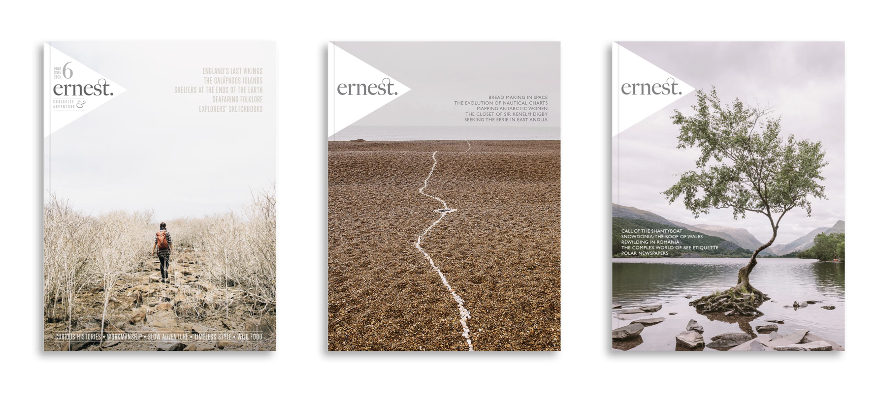
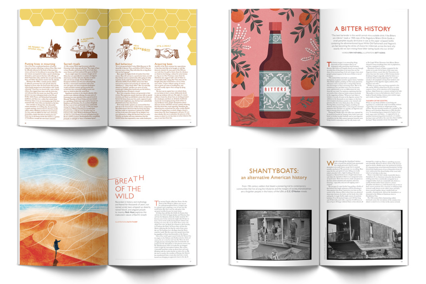
- Inspired Design Decisions: Ernest Journal
- Inspired Design Decisions: Alexey Brodovitch
- Inspired Design Decisions: Bea Feitler
- Inspired Design Decisions: Neville Brody
- Inspired Design Decisions: Otto Storch
- Inspired Design Decisions: Herb Lubalin
- Inspired Design Decisions: Max Huber
Inspired By Giovanni Pintori
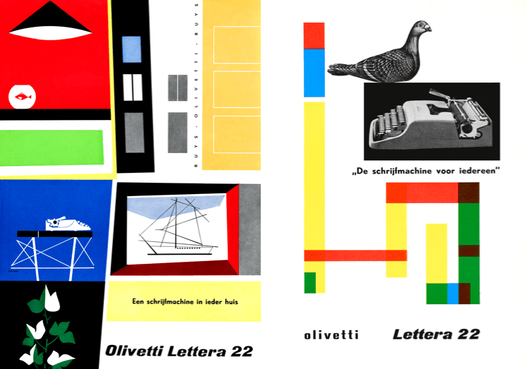
Born in Sardinia in 1912, Giovanni Pintori became one of the most influential European graphic designers of the 20th century. He became known for the distinctive style he crafted into Olivetti’s design language for over 30 years.
Pintori studied design at Italy’s influential L’Istituto Superiore per le Industrie Artistiche (Higher Institute for Artistic Industries) where he was surrounded by the creative arts. ISIA was a progressive school where students studied ceramics, painting, metalwork, and woodwork.
While studying at ISIA, Pintori met Renato Zveteremich the advertising director and publicist who headed Olivetti’s advertising department during the 1930s. After graduating from HIAI, Pintori joined Olivetti to work under Zveteremich and became the company’s art director in 1950.

Olivetti manufactured business machines, most famously its range of typewriters. When Pintori joined Olivetti, the company was already known for its original product designs. Its products were immediately recognizable, and under the guidance of industrial designer Marcello Nizzoli, every detail of their designs—from the shape of a spacebar to the color of their outer casings was carefully considered.
“If artists are called upon to interpret, express, and defend the functional purity of a machine, it is truly a sign that the machine has entered the human spirit and that the problem of forms and relationships is still of an intuitive nature.”
— Renato Zveteremich
But Olivetti’s preoccupation with design didn’t end with its products. Creativity was an essential part of the company’s culture which was evident from the architecture of its factories and offices to its advertising and graphic design used to promote its products.
Over his 30 year career at Olivetti, Pintori designed the company’s advertising, brochures, and even their annual calendars. Pintori’s aesthetic style was bold and confident. He used bright colors from minimal color palettes and combined them with shapes to fill his designs with energy.
But Pintori’s work wasn’t just playful, it was thoughtful. His choice of shapes wasn’t abstract. Shapes suggested the benefits of using a product rather than describe its features literally. Pintori didn’t just illustrate products, he brought them to life through his designs by suggesting how they might be used and what they could do to enhance people’s lives and work.
“I do not attempt to speak on behalf of the machines. Instead, I have tried to make them speak for themselves, through the graphic presentation of their elements, their operations and their use.”
Pintori defined Olivetti’s image far beyond his time at the company, and he continued to work on projects with them after leaving in 1967. He established his own studio in Milan, where he worked as a freelance designer, before retiring and dedicating himself to painting.

Giovanni Pintori died in Milan in 1999, and there’s a book, Pintori by Marta Sironi and published by Moleskine which catalogs his astonishing career.
Pintori’s work inspires not only because of the boldness of his colorful shapes, but because of what they represent. Pintori understood that promoting a product required more than listing its features. Publicity should tell a story that resonates with customers, and that’s a lesson we should all be inspired by.

Creating Color Palettes
The colors we choose should tell a story about a company, product, or service as eloquently as our layout or typography. Our color choices can attract someone’s attention, influence their perception of what we do, and even stimulate emotions. Color plays an essential role in making a product or website easy and intuitive to use. As well as brand colors, color palettes for the web help people to navigate, let them know what they can press, and where they’ve been.
I like to keep my colors simple, and my palettes rarely contain more than three hues; a dominant color, secondary or supporting color, and an accent. To these, I add a small selection of neutral colors for use as backgrounds, borders, and text.
To add depth to my designs — and to give me greater flexibility — I also introduce shades and tints of each of my hues. I use darker shades for borders — for example — around buttons — and lighter tints to add highlights.

Since operating system dark modes have become more prevalent, I also subtly alter the lightness and saturation of colors in my palettes, so they appear more vibrant against dark backgrounds.

Using Primary Colors

The HTML needed to implement my first Pintori-inspired design is meaningful and simple as the design itself. I need just four structural elements; a header which contains two SVGs of the iconic Morris Traveller’s profile, the main element for my running text, an SVG of the Traveller’s front, and finally a footer which contains the Morris Motors company logo:
<header>
  <svg>…</svg>
  <svg>…</svg>
</header>

<main>
  <h1>…</h1>
  <p>…</p>
</main>

<figure>
  <svg>…</svg>
</figure>

<footer>
  <svg>…</svg>
</footer>
While external SVG files will be cached and ready to render, I now embed SVG in my HTML whenever possible. Fewer external files mean fewer HTTP requests, but the benefits of embedding go far beyond performance.
Subtle changes in color saturation and lightness between light themes and dark modes are often necessary to maintain the punchiness of design elements against contrasting background colors. When an SVG is embedded in HTML, its fills and strokes can be subtlety altered using CSS.
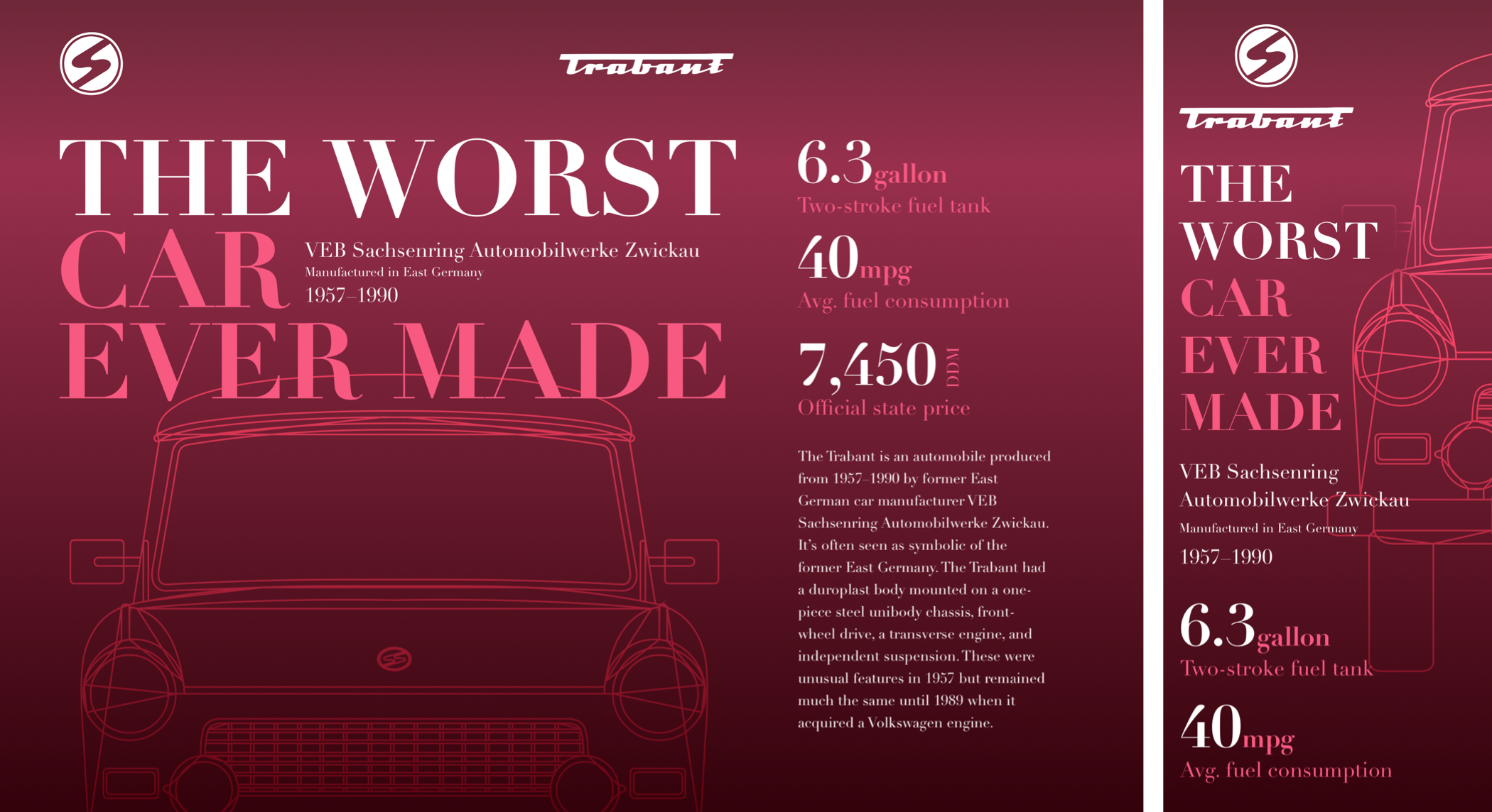
I start by applying color and typography foundation styles for the distinguished dark version of my design. These include Moderna Sans, a versatile sans-serif typeface designed by Luciano Vergara and Alfonso García which I chose to evoke the style of Pintori’s work for Olivetti:
body {
padding: 2rem;
background-color: #262626;
font-family: "moderna_sans-light";
color: #fff; }

h1 {
font-family: "moderna_sans-bold-cnd-it";
font-size: 2.8rem;
font-weight: normal;
line-height: 1; }
Flexbox transforms my header into a horizontally scrolling panel, one of the most effective ways to maintain visual hierarchy in a small screen design:
header {
display: flex;
flex-wrap: nowrap;
overflow-x: scroll; }
The flex-grow property with its value of 1 ensures all images expand to fill any available space, while flex-basis makes sure these flex items start from a minimum of 640px;
header svg {
flex-grow: 1;
flex-basis: 640px; }
header svg:not(:last-of-type) {
margin-right: 2rem; }
Finally, I add large amounts of horizontal padding and align the Morris logo to the centre of my footer:
footer {
padding-right: 8rem;
padding-left: 8rem;
text-align: center; }
My horizontal scrolling panel adds interest to a small screen, but the extra space available on medium-size screens allows me to show more of my quintessentially English Travellers.
CSS Grid offers the precise placement and stacking of elements which Flexbox lacks and is the perfect choice for this header on medium to large screens. I change the display property’s value from flex to grid, then add three symmetrical columns and rows.
While the width of the two outer columns is fixed at 270px, the inner column expands to fill all remaining space. I use a similar technique for the three rows, fixing the outer two at a height of 100px. This offsets the position of both images and adds depth to this design:
header {
display: grid;
grid-template-columns: 270px 1fr 270px;
grid-template-rows: 100px 1fr 100px; }
Using pseudo-class selectors and line numbers, I place the first SVG, then reduce it in size to add perspective:
header svg:first-of-type {
grid-column: 2 / 4;
grid-row: 1 / 2;
transform: scale(.85); }
Then, I place the second of my two graphics. I raise it within the stacking order by adding a higher z-index value which brings it visually closer to the viewer:
header svg:last-of-type {
grid-column: 1 / 3;
grid-row: 2 / 4;
z-index: 2; }
Even a seemingly mundane even-ratio grid can result in an original layout when a design includes plenty of whitespace to help lead the eye. For this medium-size design, I apply a symmetrical six-column grid with column and rows gap values which are proportional to the width and height of a screen:
@media (min-width: 48em) {
body {
display: grid;
grid-template-columns: repeat(6, 1fr);
column-gap: 2vw;
row-gap: 2vh; }
}
My header element fills the entire width of my grid. Then, I place the main, figure, and footer elements, adding proportionally more white space to narrow the width of my figure and footer:
header {
grid-column: 1 / -1; }

main {
grid-column: 2 / 6; }

figure {
grid-column: 3 / 5; }

footer {
grid-column: 3 / 5;
padding-right: 4rem;
padding-left: 4rem; }
This design becomes more distinguished with the space available on large screens.
For them, I apply grid values to the body element to create the eight columns of a 6+4 compound grid:
@media (min-width: 64em) {

body {
grid-template-columns: 2fr 1fr 1fr 2fr 2fr 1fr 1fr 2fr; }
}
Basing my medium-size design on six columns, then including the same grid in my large screen compound, helps to maintain proportions throughout all sizes of my design. Then, I reposition the four structural elements onto my new grid:
header {
grid-column: 1 / 8; }

main {
grid-column: 2 / 5;
text-align: right; }

figure {
grid-column: 5 / 7; }

footer {
grid-column: 4;
padding: 0; }
Finally, to create a solid block of content in the centre of my design, I bind the main content to its now adjacent figure by realigning its text to the right:
main {
text-align: right; }

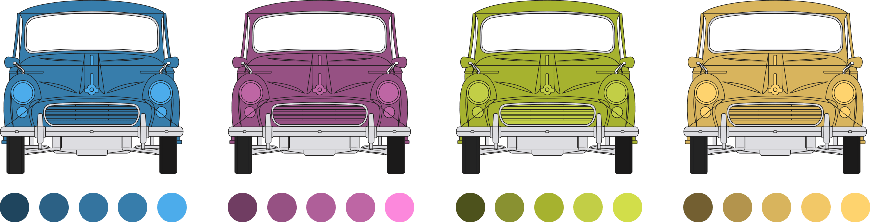
Monochromatic Palettes
Even after over twenty years in the business, I still find working with color the most challenging aspect of design. Perhaps that’s why I so often gravitate towards monochromatic color schemes because they make achieving a visually cohesive look quite simple.
Monochromatic color palettes contain variations in shade, tints, and tones, by adding varying percentages of black, grey, or white to a chosen base color.
- Shades: Darken color using black
- Tints: Lighten color using white
- Tones: Desaturate color using grey
When they’re used for backgrounds, borders, and details, shades and tints can make a design feel harmonious.
Using shades, tints, and tones can help to tone down vibrant colors which might draw unwanted attention to aspects of a design. They are particularly useful when developing a more varied color palette from a set of existing brand colors.
I often choose either a purely monochromatic or partially-monochromatic palette which includes an accent color. This added color acts as a counterpoint to the base color and gives a design greater depth.

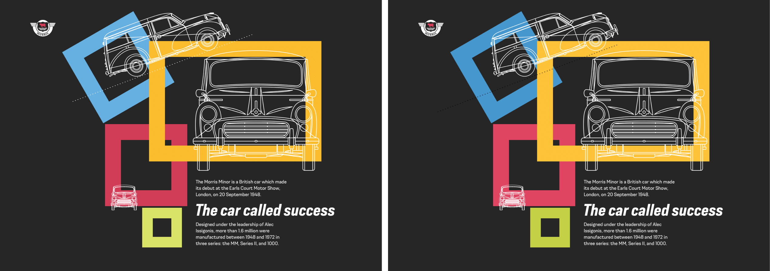
Limiting The Palette

Thanks to CSS Grid, background image gradients, and pseudo elements, this next Pintori-inspired design achieves enormous value from a very small set of HTML elements. I need only a headline, a single paragraph, plus seven empty divisions. I give each division its own identity. This allows me to give them their own distinctive style:
<h1>…</h1>
<p>…</p>
<div id="panel-a"></div>
<div id="panel-b"></div>
<div id="panel-c"></div>
<div id="panel-d"></div>
<div id="panel-e"></div>
<div id="panel-f"></div>
<div id="panel-g"></div>
This HTML places the headline and paragraph before the seven panels, but look closely at the finished small screen design, and you’ll see this content has been reordered to place the Morris logo, then a picture of the Traveller’s front-end at the top.
Whereas I often introduce grid properties to medium and large screens, CSS Grid is also useful for reordering content on smaller screens. For this design, I change the body element’s display value to grid, then introduce a viewport height-based gap between the intrinsic, unspecified rows:
body {
display: grid;
row-gap: 2vh; }
Then, I reorder the panels which contain my Morris Motors logo and image, plus the headline, using row line numbers:
#panel-d { grid-row: 1; }
#panel-e { grid-row: 2; }
h1 { grid-row: 3; }
Because my panel divisions have no other elements, their height will collapse to zero, leaving only their borders. To ensure there’s space to display their generated backgrounds and content, I specify a minimum height for all panels:
[id*="panel"] {
min-height: 380px; }
The panel which appears first in my small screen design shows the Morris Motors logo, which I insert using a CSS generated content data URI. If you’re unfamiliar with this handy content type, a data URI is a file which has been encoded into a string. You can use a data URI anywhere in your CSS or HTML:
<img src="data:image/png…">
<img src="data:image/svg+xml…">
div {
background-image: url("data:image/svg+xml…"); }
When a browser finds a data URI, it decodes the content and reconstructs the original file. Data URIs aren’t limited to encoded images but are frequently used to encode PNG format images and SVGs. You will find several tools for converting images to data URIs online.
First, I change the minimum height of this panel to match the height of my logo, then I insert the logo:
#panel-d {
min-height: 90px;
text-align: center; }

#panel-d:before {
content: url("data:image/svg+xml…");
display: block;
width: 135px;
height: 90px;
margin: 0 auto; }
I use a similar technique to place a background image behind my paragraph. I add repeat, position, and size properties which make the background flexible and place it always at the horizontal and vertical centre of my paragraph:
p {
background-image: url("data:image/svg+xml…"); }

p {
background-repeat: no-repeat;
background-position: 50% 50%;
background-size: 50% 50%; }
Each one of my panels has its own distinctive graphic design. I could’ve placed images into these seven panels, but this would’ve required at least seven additional HTTP requests. So instead, I use various combinations of multiple background images using data URIs and CSS gradients to achieve the results I need.
The first panel contains a graphic of the Morris’s hub cap over a striped blue, white, and black background. The hub cap background image comes from a data URI:
#panel-a {
background-image: url("data:image/svg+xml…"); }
Then, I add the second, striped background image using a linear-gradient:
#panel-a {
background-image: url("data:image/svg+xml…"),
linear-gradient(
to bottom,
#34749F,
#34749F 65px,
#fff 65px,
#fff 80px,
#262626 80px); }
I specify two sets of comma separated repeat, position, and size values, remembering to keep them in the same order as my background images:
#panel-a {
background-repeat: no-repeat, repeat-x;
background-position: 50% 100%, 0 0;
background-size: 75% 75%, auto auto; }
This next panel includes two SVG images, followed by more complex black, yellow, and white stripes. By placing color stops with different colors at the same position in my gradient, I create a striped background with hard lines between my colors:
#panel-b {
background-image:
url("data:image/svg+xml…"),
url("data:image/svg+xml…"),
linear-gradient(
to bottom,
#B5964D,
#B5964D 125px,
#262626 125px,
#262626 140px,
#fff 140px,
#fff 155px,
#262626 155px); }

#panel-b {
background-repeat: no-repeat, no-repeat, repeat-x;
background-position: 50% 45px, 50% 190px, 0 0;
background-size: 90%, 90%, auto; }
I developed each of my panels using different combinations of these same techniques, making them fast loading and flexible. It’s rare to find designs online which are based on a modular grid, but it is the perfect choice for this Pintori-inspired, large screen design. This modular grid is comprised of three columns and rows.
I add grid properties to the body element, then specify my column widths to fill all available space. To make sure there’s always enough height to show the content of each panel, I use Grid’s minmax value, setting the minimum height at 300px and the maximum at 1fr:
@media (min-width: 64em) {

body {
display: grid;
grid-template-columns: 1fr 1fr 1fr;
grid-template-rows: repeat(3, minmax(300px, 1fr));
gap: 1rem;
min-height: 100vh; }
}
Elements in this design don’t overlap, so I use grid-template-areas for their simplicity. This design has nine grid areas, and I give each one a single letter name, a–h. As the letter d is used for two adjacent areas, the item placed using that letter will occupy both:
body {
grid-template-areas:
"a b c"
"d d e"
"f g h"; }
In this large screen implementation, the CSS Grid minmax value controls the height of my rows, making the min-height I applied earlier redundant:
[id*="panel"] {
min-height: none; }
I place my panels using area names which allows me to change where they appear in my layout without altering their position in my HTML:
#panel-a { grid-area: a; }
#panel-b { grid-area: b; }
#panel-c { grid-area: c; }
#panel-d { grid-area: d; }
#panel-e { grid-area: e; }
#panel-f { grid-area: f; }
#panel-g { grid-area: g; }
p { grid-area: h; }
While the design of my panels remains consistent across screen sizes, there’s one panel where the content and backgrounds change for larger screens. This panel contains the familiar Morris logo and what appears to be the main headline, “Style… in a BIG way.”
To develop this panel, I first add a deep solid border at the top, followed by a data URI background image:
#panel-d {
border-top: 15px solid #262626;
background-image: url("data:image/svg+xml…"); }
Then, I add a second gradient background image which creates the black panel and two vertical yellow stripes:
#panel-d {
background-image: url("data:image/svg+xml…"),
linear-gradient(
to right,
#fff,
#fff 280px,
#B5964D 280px,
#B5964D 320px,
#fff 320px,
#fff 335px,
#262626 335px,
#262626 calc(100% - 40px),
#F2C867 calc(100% - 40px),
#F2C867 100%); }
Earlier in my process, I used a :before pseudo-element to add the Morris logo to this design. For large screens, I reposition that logo to the bottom-left of my panel:
#panel-d
position: relative; }
#panel-d:before {
position: absolute;
bottom: 0;
left: 0;
margin: 0; }
My large headline is immediately descended from the HTML body and is not part of this panel, making it tricky to position across flexible screen sizes. To reproduce my design precisely, without compromising accessibility, I first use an accessible method to hide this headline visually for people who use screen readers:
h1 {
position: absolute !important;
height: 1px;
width: 1px;
overflow: hidden;
clip: rect(1px, 1px, 1px, 1px);
white-space: nowrap; }
Then, I reinstate the headline’s text using generated content and an :after pseudo-element. I position it to the bottom-right of my panel and replicate its bold, condensed, italic style:
#panel-d:after {
content: "Style… in a BIG way";
position: absolute;
bottom: 0;
right: 0;
font-family: "moderna_sans-bold-cnd-it";
font-size: 2.8rem;
line-height: 1;
text-align: right; }


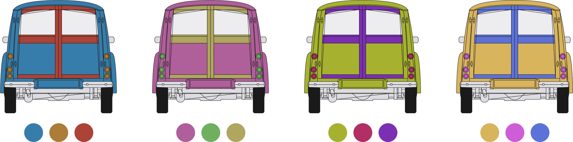
Complementary Palettes
Colors that complement each other sit on opposite sides of a color wheel. But, although it’s easy to understand their mathematical relationship, working with complementary colors can be challenging.
Adjacent complementary color combinations can look harsh, and rather than complement each other, can feel unharmonious. To prevent them from clashing, use shades, tints, or tones of complementary colors which will also help to expand your palette of usable colors.
Alternatively, use split complementary colors where instead of opposing colors, the palette includes two colors on either side of the complementary.
Complementing Colors
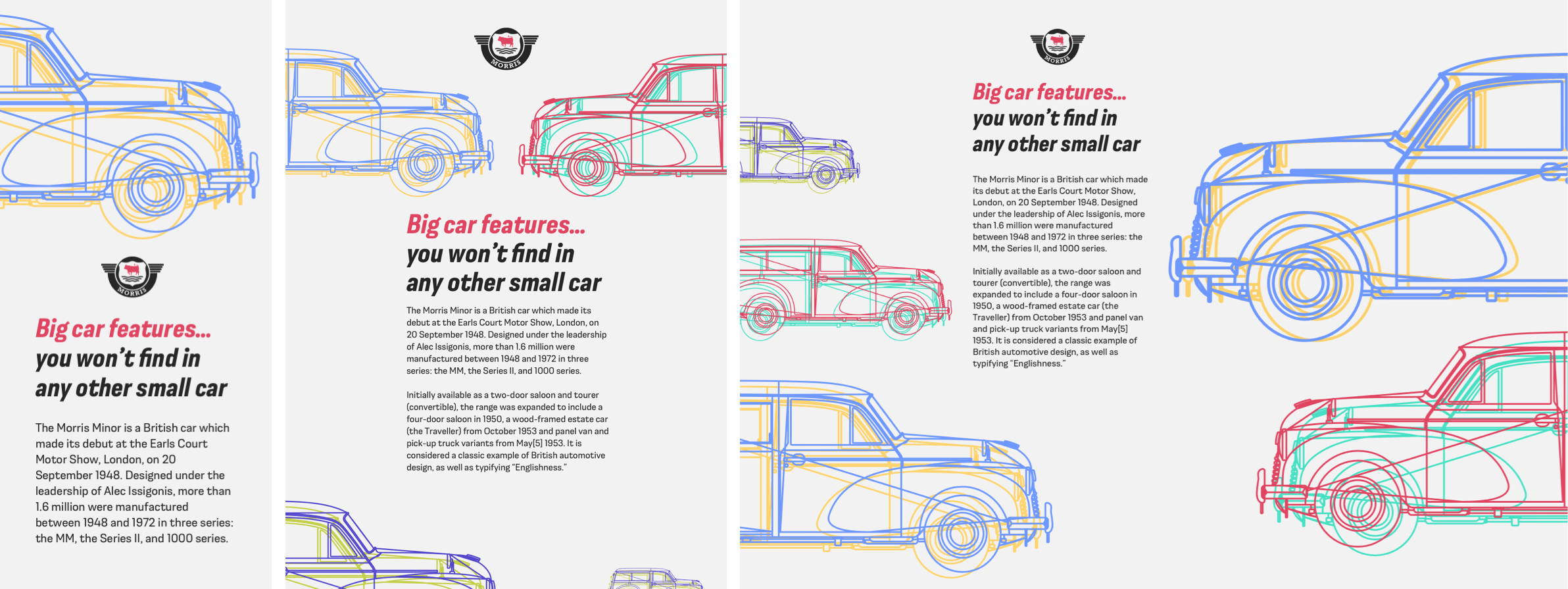
Several colorfully complementary Morris Traveller blueprints overlap in my next Pintori-inspired design. The HTML needed to develop this design is as minimal as the depictions of this car. A banner division includes an SVG of the Morris logo, and the main element contains the headline and running text.
But, the flexibility of this design across several screen sizes comes from using two picture elements, each containing three images. I include one picture element in the header, then another in my footer:
<div class="banner">
  <svg>…</svg>
</div>

<header>
  <picture>
    <source media="(min-width: 72em)">
    <source media="(min-width: 48em)">
    <img>
  </picture>
</header>

<main>
  <h1><b>…</b></h1>
  <p>…</p>
</main>

<footer>
  <picture>
    <source media="(min-width: 72em)">
    <source media="(min-width: 48em)">
    <img>
  </picture>
</footer>
Every one of my development projects starts by adding the now familiar foundation styles, this time adding an off-white background color and almost black sans-serif text:
body {
background-color: #f3f2f2;
font-family: "moderna_sans-light";
color: #262626; }
I align the content of my banner division to the centre, then set the logo’s maximum width to a diminutive 150px:
.banner {
text-align: center; }

.banner svg {
max-width: 150px; }
The main headline in this design is set in the bold, condensed, italic style of Moderna Sans:
h1 {
font-family: "moderna_sans-bold-cnd-it";
font-size: 2.027rem;
font-weight: normal;
line-height: 1.2; }
Part of this headline is enclosed within a span element which enables me to change its color to match other aspects of this design, including the bull emblem at the center of the Morris Motors logo:
h1 span {
color: #df4561; }

#logo .emblem {
fill: #df4561; }
On small screens, both the header and footer contain a single Traveller image. When there’s space to place two Travellers side-by-side, a browser changes the images in the two picture elements.
For medium-size screens, I make use of the extra space available space and introduce a four-column symmetrical grid:
@media (min-width: 48em) {

body {
display: grid;
grid-template-columns: repeat(4, 1fr); }
}
I place the banner division in the two centre columns, centre my logo, then shift it vertically to fit between the bumpers of my two Travellers:
.banner {
grid-column: 2 / 4;
text-align: center;
transform: translateY(2vh); }
Both my header and footer span the grid from edge to edge, while placing the main content into the two centre columns creates a comfortable measure:
header,
footer {
grid-column: 1 / -1; }
main {
grid-column: 2 / 4; }
The most significant changes to the layout of this design can be seen at larger screen sizes. Despite their names, you needn’t place a header or footer element at the top and bottom of a layout. They can be placed anywhere within a design, including on the left or right.
For more precise control over my layout, I increase the number of columns in my grid from four to eight, then introduce two rows. The first row has a fixed height of 160px, while the height of the second will be dictated by the content:
@media (min-width: 72em) {

body {
grid-template-columns: repeat(8, 1fr);
grid-template-rows: 160px auto;
column-gap: 2vw; }
}
I reposition my banner division across three columns and set the main element below to match:
.banner,
main {
grid-column: 3 / 5; }
Then, I place the footer into the first three columns, and the header into the final four to create an asymmetrical layout from the symmetrical grid:
header {
grid-column: 5 / -1; }

footer {
grid-column: 1 / 4; }
Both header and footer fill the height of my grid from top to bottom:
header,
footer {
grid-row: 1 / 3; }
While the banner division occupies the first row:
.banner {
grid-row: 1;  }
And the main element fits neatly underneath it:
main {
grid-row: 2 / 3;
z-index: 2; }
Implementing light themes and dark designs has become part of everyday product and website design since Apple introduced a dark mode to iOS and macOS. Developing dark/light modes is easy, and there’s now a widely supported media query for this user preference. There are three values to choose from:
- no-preference: Someone hasn’t expressed a preference
- light: Someone has selected a light theme
- dark: Someone has chosen a dark theme
Introducing a dark mode version of this design involves little more than adding changes to certain color values within that media query. For example, by reversing the background and foreground text colors, and changing the path fill colors in my SVG logo:
@media (prefers-color-scheme: dark) {

body {
background-color: #262626;
color: #fff; }
#logo .metal,
#logo .emblem {
fill: #fff; }
}
Deciding on dark mode colors sometimes involves more than simply inverting them, making white backgrounds black, and the black text white. Pure white text on full black backgrounds makes reading long passages of text tiring for the eye, so consider softening this contrast by using an off-white:
body {
color: #f3f2f2; }
Sometimes, even vibrant complementary colors can appear different when they’re placed against a dark background. Thankfully, CSS filters can increase a color’s brightness, saturation, or both, with no need to export a different version of a file for darker backgrounds:
header img,
footer img {
filter: saturate(1.5) brightness(1.1); }

Brightening Colors

In my final Pintori-inspired design, colorful rectangles float above the dark grey background. This design needs just three structural elements; a header which again includes the Morris Motors logo, a figure element which contains not one, not two, but three outline images of the Morris Traveller, and the main element containing my running text:
<header>
  <svg>…</svg>
</header>

<figure>
  <img>
  <img>
  <img>
</figure>

<main>
  <h1>…</h1>
  <p>…</p>
  <p>…</p>
</main>
To this minimal HTML, I add four purely presentational SVG images. As I don’t want these to be announced by assistive technologies, I add an ARIA hidden attribute to each of them:
<svg id="bg-1" aria-hidden="true">…</svg>
<svg id="bg-2" aria-hidden="true">…</svg>
<svg id="bg-3" aria-hidden="true">…</svg>
<svg id="bg-4" aria-hidden="true">…</svg>
First, I specify foundation styles for background and foreground colors, then apply those same presentational SVG images to the background using data URIs:
body {
background-color: #262626; }
background-image:
url("data:image/svg+xml…"),
url("data:image/svg+xml…"),
url("data:image/svg+xml…"),
url("data:image/svg+xml…");
color: #f3f2f2; }
Then, I specify background repeat and position values, placing each SVG in the centre, and stacking them vertically on the page. Finally, I set their sizes:
body {
background-repeat: no-repeat;
background-position:
50% 20px,
50% 240px,
50% 460px,
50% 680px;
background-size:
200px 200px,
300px 200px,
200px 200px,
100px 100px; }
So the logo in my header matches the size of the SVG background behind it, I restrict its maximum width, then centre it using horizontal margins:
header {
max-width: 200px;
margin: 0 auto; }
Again, a horizontal scrolling panel is a useful way to present my three outlined Traveller images, so I set their figure’s display value to flex and prevent any horizontal overflow by setting its value to scroll:
figure {
display: flex;
flex-wrap: nowrap;
margin: 0;
padding: 0;
max-width: 100vw;
overflow-x: scroll; }
Then, I specify a flex-basis value and an height to match:
figure img {
flex-grow: 1;
flex-basis: 320px;
height: 320px; }
I applied my four colorful SVGs as background images, so I don’t want them to appear on small screens. Using attribute selectors to precisely match a style’s property and value is an ideal way to target elements without resorting to additional class attributes:
[aria-hidden="true"] {
display: none; }
This design needs only one media query breakpoint to apply layout styles for medium and large screens. I apply eight equal-width columns and eight rows, then remove the background images I applied for small screens:
@media (min-width: 48em) {

body {
display: grid;
grid-template-columns: repeat(8, 1fr);
grid-template-rows: repeat(8, auto);
background-image: none; }
Then, I place the header and main elements between line numbers in my grid:
header {
grid-column: 1;
grid-row: 1; }
main {
grid-column: 5 / 8;
grid-row: 5 / 7; }
I need to place the figure’s images and division onto my grid, not the figure itself, so I change its display property to contents, which effectively removes it from the DOM for styling purposes:
figure {
display: contents; }
Then, I place each Traveller image into a different set of grid columns and rows, which alters their sizes along with their positions:
figure img:nth-of-type(1) {
grid-column: 3 / 6;
grid-row: 2 / 4; }

figure img:nth-of-type(2) {
grid-column: 5 / 8;
grid-row: 2 / 5; }

figure img:nth-of-type(3) {
grid-column: 3 / 4;
grid-row: 5 / 6; }
CSS transforms are ideal tools for fine-tuning the size and position of elements within grids’ constraints. They’re also useful for adding unusual touches to a design. I use rotate, scale, and translate to finely tune these images:
figure img:nth-of-type(1) {
transform: rotate(-20deg) translateX(-12rem); }
figure img:nth-of-type(2) { transform: scale(1.1); }
figure img:nth-of-type(3) { transform: scale(1.25); }
I now reveal the colorful, presentational rectangles and push them behind my content by setting a low z-index value. Where these images overlap, a mix-blend-mode adds even more color to this design:
[aria-hidden="true"] {
display: block;
z-index: 0;
mix-blend-mode: multiply; }
In this final step, I place these shapes onto my grid, using rotations to add even more personality to this already colorful design:
.bg-1 {
grid-column: 2 / 4;
grid-row: 2 / 4;
transform: rotate(-30deg);
transform-origin: 75% 50%; }

.bg-2 {
grid-column: 4 / 8;
grid-row: 2 / 5; }

.bg-3 {
grid-column: 3 / 5;
grid-row: 4 / 6; }

.bg-4 {
grid-column: 4 / 5;
grid-row: 6 / 7;
transform: rotate(5deg);
transform-origin: 0 0; }
NB: Smashing members have access to a beautifully designed PDF of Andy’s Inspired Design Decisions magazine and full code examples from this article. You can also buy the PDF and examples from this, and every issue from Andy’s website.
Read More From The Series
- Inspired Design Decisions: Avaunt Magazine
- Inspired Design Decisions: Pressing Matters
- Inspired Design Decisions: Ernest Journal
- Inspired Design Decisions: Alexey Brodovitch
- Inspired Design Decisions: Bea Feitler
- Inspired Design Decisions: Neville Brody
- Inspired Design Decisions: Otto Storch
- Inspired Design Decisions: Herb Lubalin
- Inspired Design Decisions: Max Huber
 (ra, yk, il)