Bayleaf: A Food and Recipe Blog Theme

With the WordPress theme directory dominated by business-oriented themes, it’s sometimes tough to find themes that cater to more specific user groups. If you dig deep enough, you’ll find something outside the norm. Bayleaf is a blog theme specifically designed for sharing food and recipes.

The theme is designed and developed by Vedathemes. They currently have three themes in the theme directory, which follow the same clean design trend of Bayleaf.

Food-related themes excite me. In my off-time, I’m often browsing recipe blogs and looking for my next culinary experiment. The problem with many such sites is their designs have too much noise instead of just showcasing the content visitors are looking for. I was pleasantly surprised at the minimalist and open approach in the Bayleaf demo.

Admittedly, I was drawn in by all the yummy food pics.

The theme author has obviously taken a look at the food blogs and built a design that showcases what’s possible without adding complexity. The related posts feature is also a nice extra for site visitors who’ll likely look for related recipes.

Bayleaf combines the Poppins and Montserrat font families to create bold headers that are complimented by readable body copy. The theme comes with options for displaying a sidebar on single posts or pages, but I’d recommend opting out. The design works best without a sidebar, allowing more breathing room for sharing food images.

The theme is slowly building an audience since its release in February. It currently has 1,000+ installs and a five-star rating from six reviews in the theme directory.

Create a Unique Look with the Display Posts Widget

Screenshot of one of the grid styles for the Display Posts widget in the Bayleaf WordPress theme.

Bayleaf’s most prominent custom feature is its Display Posts widget. By placing this widget in the Homepage Above Content or Homepage Below Content sidebar, users have a ton of variety with how their site looks. No two homepages need look alike.

The widget comes with six list, grid, and slider styles to choose from. It supports custom post types and taxonomies, so users can use it for content such as events, products, or anything else they want to showcase.

My first thought when viewing the demo was, Not another complicated slider with a hard-to-configure customizer experience. While I’m not usually a fan of sliders, configuring this one was easy. Plus, the grid and list styles offered alternative options.

A lot of themes overdo features like this, offering a clunky experience within the customizer. However, Bayleaf keeps it simple by packaging the feature as a widget with just enough variety to cover most use cases.

My one complaint with the Display Posts widget is that it was hard to find at first. At this point, it should be standard practice to prefix custom widgets with the theme name. “Bayleaf: Display Posts” would’ve been far easier to pick from the widget lineup.

Handling Block Editor Support

Single post view of the Bayleaf theme, which showcases some of the core editor blocks.

I tested Bayleaf against the latest public release of the Gutenberg plugin. The theme is not without a few problems, which is par for the course with most themes supporting the block editor. The Gutenberg plugin’s development is fast-paced, and it’s tough for theme authors to keep up. Something that works one week could break the next.

The theme takes a minimalist approach with regards to the editor, allowing the default editor styles to handle much of the layout. With the break-neck pace of change, this can sometimes be a better approach than attempting to manage every style.

There are areas where Bayleaf could be more opinionated. For example, the alignment and typography for the post title aren’t a one-to-one match between the editor and front end. The content width is wider on the front end than the editor, which means the number of characters per line doesn’t match. There are several minor items where the block editor overrules theme styles.

The theme doesn’t offer a 100% WYSIWYG experience, but it’s close enough at this stage and doesn’t break anything. Most issues are trivial and will simply take some adjustment time, assuming Gutenberg development settles a bit.

How Does the Code Stand Up?

Bayleaf isn’t pushing any boundaries, but it’s solid in comparison to the average theme. It’s based on the Underscores starter, which serves as the de facto standard for many themes in the official directory.

The theme doesn’t have a ton of custom code, so there are few places it could go wrong.

Like all themes in the official directory, it undergoes a rigorous review process. It’s Trac history doesn’t show anything worrisome. Vedathemes seems to have a good grasp of building themes that meet the official theme review standards.

The Final Verdict

You won’t find a boatload of options in Bayleaf. What you will find is a clean design that gets out of the way but with enough features to have fun tinkering around on your blog for a couple of hours. The Display Posts widget can get you pretty far with little work.

If you’re looking for a change to your food or recipe blog, you can’t go wrong giving this theme a run.

The theme could also be used for other types of sites. There are no specific features that limit its use to only food blogging.

12 Outstanding Free Fonts for Minimal Blogs and Websites

There is a seemingly endless supply of crazy fonts to choose from. But few of those fonts are actually good for a blog or website. Minimal and simple fonts make great headers and body text for a website that wants to be clean and readable. With 58% of people visiting webpages on mobile devices, it’s important that web fonts be very legible even at small sizes. These fonts are all geometrically sound, have well-thought-out spacing and kerning, and were often specifically designed for screens.

What fonts look good where is often fairly subjective, but most people can appreciate a good minimal font. We live in a cluttered world with a lot of distractions, so simple fonts are seeing a revival in web design.

Here are 12 of the best free fonts for minimal blogs and websites!

Montserrat

Example of Montserrat

Montserrat is a sans serif font that tends to be on the thinner side. It has a bit of personality, with the inspiration coming from signage in the Montserrat neighborhood of Buenos Aires. Certain characters such as the capital ‘J’, and the capital ‘R’ have special aspects that make this font really stand out, despite being minimalist. You’ll always recognize the use of Montserrat in a webpage, with iconic curves and lines.

Source Sans Pro

Example of Source Sans Pro

Source Sans Pro is another sans serif mainstay that was specifically designed to work well in user interfaces. This makes it the perfect font for blogs and websites. Most of the characters are very simple, straightforward, and balanced. It was inspired by gothic fonts, but spread out the character’s elements vertically and horizontally, to increase readability.

Simplifica

Example of Simplifica

The Simplifica typeface is a somewhat condensed sans serif font. It has very consistent character heights, to increase readability. This font flows easily and legibly across any webpage. It really shows off why the word “simple” is in the name. The tall character heights make for a smashed-together look, but the wide variety of ascenders and descenders provide enough interest to prevent Simplifica from being hard to read.

Blogger Sans

Example of Blogger Sans

Blogger Sans was designed for website headers, and focuses on legibility. Some characters are shorter or more compact, which means this font is great for headings with small line spacings. While many minimalist fonts involve just straight lines, Blogger Sans employs more rounded corners. It’s a slippery slope to Comic Sans from here, so use something like this only when very appropriate.

Caviar Dreams

Example of Caviar Dreams

Caviar dreams is a thinner sans serif font that features a lot of straight lines and a few surprises. The lowercase ‘e’ in particular has a 45-degree angle line that adds a lot of personality to any header text you use this on. The “caviar” in the name makes this font seem ideal for elegant looks, and its clean lines would certainly imply that as well.

Quicksand

Example of Quicksand

Quicksand is designed for display purposes but is still legible at small sizes. It has rounded terminals, which makes it easy to read whether using light or bold styles. Overall, it is based on geometric shapes, so all of the characters just make sense when seen together. It is clear that the entire font is based around a few curves, and lines jutting out of those curves in a deliberate fashion.

Roboto

Example of Roboto

The Roboto font has a geometric core that also features a lot of open spaces to increase readability. This typeface lets characters take up their natural amount of space, rather than forcing a grid. That makes Roboto easy to read on a webpage, and look pleasing to the eyes at the same time.

Lato

Example of Lato

Lato was originally conceived for corporate logos, which is probably why it works so well as a professional-looking blog or website font. It is a sans serif font that has a fairly timeless, simple design. Its simplicity makes it great for body text, but stands out enough with some unique characters and rounded elements, to be a great header font as well.

Oswald

Example of Oswald

Oswald is a play on Alternate Gothic sans serif fonts, and was optimized for digital displays. All of the characters are well-balanced with a combination of straight lines and rounded details. The letters have a very tight spacing between them, but everything is still legible at a small size. The entire font has an “upwards” feeling to it, making it seem tall and strong.

Raleway

Example of Raleway

Raleway was designed for headings and other large usages. It is a sans serif font that comes with a unique look – some of the numbers have additional ascenders and descenders that can give some special character to a heading, although that doesn’t work for every situation.

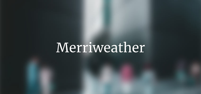
Merriweather

Example of Merriweather

Merriweather is a serif font, but one that works nicely for web display. It was specifically created for being easily read on screens. The serifs make the font appear sturdy and strong, while a taller overall design gives plenty of room to legibly read this typeface. This makes a great, subtle replacement for a classic font like Times New Roman, which is similar in many ways.

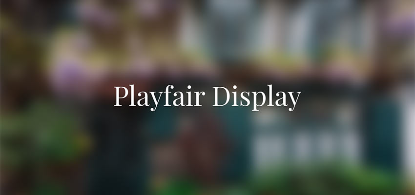
Playfair Display

Example of Playfair Display

Playfair is a stylistic serif font that works great on any website trying to convey a sense of elegance. This font is elegant while not sacrificing simplicity. There are just enough details and unique serifs to make it exciting. It feels like an old, classical font, while still maintaining modern sensibilities. Most sans serif fonts will pair nicely as body text, with Playfair used for headings.

Fonts That Add Simple Personality

Quite often, simple, no-frills fonts are more effective than their over-the-top counterparts. The selections above enable you to make a statement in a clean, simplistic manner. That, in turn, will allow your content to speak for itself.