Working with JavaScript Media Queries

What’s the first thing that comes to mind when you think of media queries? Maybe something in a CSS file that looks like this:

body {
  background-color: plum;
}


@media (min-width: 768px) {
  body {
    background-color: tomato;
  }
}

CSS media queries are a core ingredient in any responsive design. They’re a great way to apply different styles to different contexts, whether it’s based on viewport size, motion preference, preferred color scheme, specific interactions and, heck, even certain devices like printers, TVs and projectors, among many others.

But did you know that we have media queries for JavaScript too? It’s true! We may not see them as often in JavaScript, but there definitely are use cases for them I have found helpful over the years for creating responsive plugins, like sliders. For example, at a certain resolution, you may need to re-draw and recalculate the slider items.

Working with media queries in JavaScript is very different than working with them in CSS, even though the concepts are similar: match some conditions and apply some stuff.

Using matchMedia() 

To determine if the document matches the media query string in JavaScript, we use the matchMedia() method. Even though it’s officially part of the CSS Object Model View Module specification which is in Working Draft status, the browser support for it is great going as far back as Internet Explorer 10 with 98.6% global coverage.

This browser support data is from Caniuse, which has more detail. A number indicates that browser supports the feature at that version and up.

Desktop

ChromeFirefoxIEEdgeSafari
9610125.1

Mobile / Tablet

Android ChromeAndroid FirefoxAndroidiOS Safari
847935.0-5.1

The usage is nearly identical to CSS media queries. We pass the media query string to matchMedia() and then check the .matches property.

// Define the query
const mediaQuery = window.matchMedia('(min-width: 768px)')

The defined media query will return a MediaQueryList object. It is an object that stores information about the media query and the key property we need is .matches. That is a read-only Boolean property that returns true if the document matches the media query.

// Create a media condition that targets viewports at least 768px wide
const mediaQuery = window.matchMedia('(min-width: 768px)')


// Check if the media query is true
if (mediaQuery.matches) {
  // Then trigger an alert
  alert('Media Query Matched!')
}

That’s the basic usage for matching media conditions in JavaScript. We create a match condition (matchMedia()) that returns an object (MediaQueryList), check against it (.matches), then do stuff if the condition evaluates to true. Not totally unlike CSS!

But there’s more to it. For example, if we were change the window size below our target window size, nothing updates the way it will with CSS right out of the box. That’s because .matches is perfect for one-time instantaneous checks but is unable to continuously check for changes. That means we need to…

Listen for changes

 MediaQueryList has an addListener() (and the subsequent removeListener()) method that accepts a callback function (represented by the .onchange event) that’s invoked when the media query status changes. In other words, we can fire additional functions when the conditions change, allowing us to “respond” to the updated conditions.

// Create a condition that targets viewports at least 768px wide
const mediaQuery = window.matchMedia('(min-width: 768px)')


function handleTabletChange(e) {
  // Check if the media query is true
  if (e.matches) {
    // Then log the following message to the console
    console.log('Media Query Matched!')
  }
}


// Register event listener
mediaQuery.addListener(handleTabletChange)

// Initial check
handleTabletChange(mediaQuery)

The one-two punch of matchMedia() and MediaQueryList gives us the same power to not only match media conditions that CSS provides, but to actively respond to updated conditions as well.

When you register an event listener with addListener() it won’t fire initially. We need to call the event handler function manually and pass the media query as the argument.

The old way of doing things

For the sake of context — and a little nostalgia — I would like to cover the old, but still popular, way of doing “media queries” in JavaScript (and, yes, those quotes are important here). The most common approach is binding a resize event listener that checks window.innerWidth or window.innerHeight.

You’ll still see something like this in the wild:

function checkMediaQuery() {
  // If the inner width of the window is greater then 768px
  if (window.innerWidth > 768) {
    // Then log this message to the console
    console.log('Media Query Matched!')
  }
}


// Add a listener for when the window resizes
window.addEventListener('resize', checkMediaQuery);

Since the resize event is called on each browser resize, this is an expensive operation! Looking at the performance impact of an empty page we can see the difference.

That’s a 157% increase in scripting!

An even simpler way to see the difference is with the help of a console log.

That’s 208 resize events versus six matched media events.

Even if we look past the performance issues, resize is restrictive in the sense that it doesn’t let us write advanced media queries for things like print and orientation. So, while it does mimic “media query” behavior by allowing us to match viewport widths, it’s incapable of matching much of anything else — and we know that true media queries are capable of so much more.

Conclusion

That’s a look at media queries in JavaScript! We explored how matchMedia() allows us to define media conditions and examined the MediaQueryList object that lets us do one-time (.matches) and persistent (addListener()) checks against those conditions so that we can respond to changes (.onchange) by invoking functions.

We also saw the “old” way of doing things by listening for resize events on the window. While it’s still widely used and a totally legit way to respond to changes to the size of the window.innerWidth, it’s unable to perform checks on advanced media conditions.

To finish the article here is a useful example that is not achievable in the old way. Using a media query I will check if the user is in the landscape mode. This approach is common when developing HTML5 games and is best viewed on a mobile device.


The post Working with JavaScript Media Queries appeared first on CSS-Tricks.

You can support CSS-Tricks by being an MVP Supporter.

Creative Background Patterns Using Gradients, CSS Shapes, and Even Emojis

You can create stripes in CSS. That’s all I thought about in terms of CSS background patterns for a long time. There’s nothing wrong with stripes; stripes are cool. They can be customized into wide and narrow bands, criss-crossed into a checked pattern, and played with in other ways using the idea of hard stops. But stripes can be boring, too. Too conventional, out of fashion, and sometimes even unpleasant.

Thankfully, we can conjure up far more background patterns than you can even imagine with CSS, with code that is similar in spirit to stripes.

Background patterns are images repeated across a background. They can be done by referencing an external image, like a PNG file, or can be drawn with CSS, which is traditionally done using CSS gradients. 

Linear gradients (and repeating linear gradients) for instance, are typically used for stripes. But there are other ways to create cool background patterns. Let’s see how we can use gradients in other ways and toss in other things, like CSS shapes and emoji, to spice things up.

Gradient patterns

There are three types of CSS gradients.

Linear (left), radial (center) and conic (right) gradients
  1. linear-gradient(): Colors flow from left-to-right, top-to-bottom, or at any angle you choose in a single direction.
  2. radial-gradient(): Colors start at a single point and emanate outward
  3. conic-gradient(): Similar in concept to radial gradients, but the color stops are placed around the circle rather than emanating from the center point.

I recommend checking out the syntax for all the gradients to thoroughly understand how to start and end a color in a gradient.

Radial gradient patterns

Let’s look at radial gradients first because they give us very useful things: circles and ellipses. Both can be used for patterns that are very interesting and might unlock some ideas for you!

background: radial-gradient(<gradient values>)

Here’s a pattern of repeating watermelons using this technique:

background: 
	radial-gradient(circle at 25px 9px, black 2px, transparent 2px), 
	radial-gradient(circle at 49px 28px, black 2px, transparent 2px), 
	radial-gradient(circle at 38px 1px, black 2px, transparent 2px), 
	radial-gradient(circle at 20px 4px, black 2px, transparent 2px), 
	radial-gradient(circle at 80px 4px, black 2px, transparent 2px), 
	radial-gradient(circle at 50px 10px, black 2px, transparent 2px), 
	radial-gradient(circle at 60px 16px, black 2px, transparent 2px), 
	radial-gradient(circle at 70px 16px, black 2px, transparent 2px), 
	radial-gradient(ellipse at 50px 0, red 33px, lime 33px, lime 38px, transparent 38px) 
	white;
background-size: 100px 50px;

We start by providing a background size on the element then stack up the gradients inside it. An ellipse forms the green and red parts. Black circles are scattered across to represent the watermelon seeds. 

The first two parameters for a radial gradient function determine whether the gradient shape is a circle or an ellipse and the starting position of the gradient. That’s followed by the gradient color values along with the start and ending positions within the gradient.

Conic gradient patterns

Conic gradients create ray-like shapes. Like linear and radial gradients, conic gradients can be used to create geometric patterns.

background: conic-gradient(<gradient values>)
background: 
  conic-gradient(yellow 40deg, blue 40deg, blue 45deg, transparent 45deg), 
  conic-gradient(transparent 135deg, blue 135deg, blue 140deg, transparent 140deg) ;
background-size: 60px 60px;
background-color: white;

The rub with conic gradient is that it’s not supported in Firefox, at least at the time of writing. It’s always worth keeping an eye out for deeper support.

This browser support data is from Caniuse, which has more detail. A number indicates that browser supports the feature at that version and up.

Desktop

ChromeFirefoxIEEdgeSafari
69NoNo7912.1

Mobile / Tablet

Android ChromeAndroid FirefoxAndroidiOS Safari
81No8112.2-12.4

Emoji icon patterns

This is where things begin to get interesting. Rather than just using geometric patterns (as in gradients), we now use the organic shapes of emojis to create background patterns. 🎉 

It starts with emoji icons. 

Solid-color emoji patterns

We can create emoji icons by giving emojis a transparent color and text shadow.

color: transparent;
text-shadow: 0 0 black;

Those icons can then be turned into an image that can be used as a background, using SVG.

<svg>
  <foreignObject>
    <!-- The HTML code with emoji -->
  </foreignObject>
</svg>

The SVG can then be referred by the background property using data URL

background: url("data:image/svg+xml,<svg xmlns=%22http://www.w3.org/2000/svg%22 viewBox=%220 0 100 100%22><!-- SVG code --></svg>");

And, voilá! We get something like this:

background: 
    url("data:image/svg+xml,<svg xmlns=%22http://www.w3.org/2000/svg%22 viewBox=%220 0 100 100%22><foreignObject width=%22100px%22 height=%22100px%22><div xmlns=%22http://www.w3.org/1999/xhtml%22 style=%22color:transparent;text-shadow: 0 0 %23e42100, -2px 2px 0 black;font-size:70px%22>🏄‍♀️</div></foreignObject></svg>"), 
    white; 
background-size: 60px 60px; 

Other than emojis, it’s also possible to draw CSS shapes and use them as patterns. Emojis are less work, though. Just saying. 

Gradient-colored emoji patterns

Instead of using plain emoji icons, we can use gradient emoji icons. To do that, skip the text shadow on the emojis. Add a gradient background behind them and use background-clip to trim the gradient background to the shape of the emojis. 

color: transparent;
background: linear-gradient(45deg, blue 20%, fuchsia);
background-clip: text; /* Safari requires -webkit prefix */

Then, just as before, use the combination of SVG and data URL to create the background pattern.

Translucent-colored emoji patterns

This is same as using block colored emoji icons. This time, however, we take away the opaqueness of the colors by using rgba() or hsla() values for the text shadow. 

color: transparent;
text-shadow: 20px 10px rgba(0, 255, 0, .3), 
             0 0 red;

SVG-text emoji patterns

We’ve already looked at all the working methods I could think of to create background patterns, but I feel like I should also mention this other technique I tried, which is not as widely supported as I’d hoped.

 I tried placing the emoji in an SVG <text> element instead of the HTML added using <foreignObject>. But I wasn’t able to create a solid shadow behind it in all the browsers.

background: 
  url("data:image/svg+xml,<svg xmlns=%22http://www.w3.org/2000/svg%22 viewBox=%220 0 100 100%22><text y=%221em%22 font-size=%2270%22 fill=%22transparent%22 style=%22text-shadow: 0 0 %23e42100, -2px 2px 5px black, 0 0 6px white; ;%22>🏄‍♀️</text></svg>")

Just in case, I tried using CSS and SVG filters for the shadow as well, thinking that might work. It didn’t. I also tried using the stroke attribute, to at least create an outline for the emoji, but that didn’t work, either. 

CSS element() patterns

I didn’t think of SVG when I first thought of converting emoji icons or CSS shapes into background images. I tried CSS element(). It’s a function that directly converts an HTML element into an image that can be referenced and used. I really like this approach, but browser support is a huge caveat, which is why I’m mentioning it here at the end.

Basically, we can drop an element in the HTML like this:

<div id=snake >🐍</div>

…then pass it into the element() function to use like an image on other elements, like this:

background: 
  -moz-element(#snake), /* Firefox only */
  linear-gradient(45deg, transparent 20px, blue 20px, blue 30px, transparent 30px) 
  white;
background-size: 60px 60px;
background-color: white;

Now that snake emoji is technically an image that we get to include in the pattern.

Again, browser support is spotty, making this approach super experimental.

This browser support data is from Caniuse, which has more detail. A number indicates that browser supports the feature at that version and up.

Desktop

ChromeFirefoxIEEdgeSafari
No4*NoNoNo

Mobile / Tablet

Android ChromeAndroid FirefoxAndroidiOS Safari
No68*NoNo

In this method, the original emoji (or any CSS shape for that matter) used for the background pattern needs to render on screen for it to appear in the background pattern as well. To hide that original emoji, I used mix-blend-mode — it sort of masks out the original emoji in the HTML so it doesn’t show up on the page.


I hope you find the methods in this post useful in one way or another and learned something new in the process! Give them a try. Experiment with different emojis and CSS shapes because gradients, while cool and all, aren’t the only way to make patterns.. The background property takes multiple values, allowing us to think of creative ways to stack things.

The post Creative Background Patterns Using Gradients, CSS Shapes, and Even Emojis appeared first on CSS-Tricks.

Custom Styling Form Inputs With Modern CSS Features

It’s entirely possible to build custom checkboxes, radio buttons, and toggle switches these days, while staying semantic and accessible. We don’t even need a single line of JavaScript or extra HTML elements! It’s actually gotten easier lately than it has been in the past. Let’s take a look.

Here’s where we’ll end up:

Things sure have gotten easier than they were!

The reason is that we can finally style the ::before and ::after pseudo-elements on the <input> tag itself. This means we can keep and style an <input> and won’t need any extra elements. Before, we had to rely on the likes of an extra <div> or <span>, to pull off a custom design.

Let’s look at the HTML

Nothing special here. We can style our inputs with just this HTML:

<!-- Checkbox -->
<input type="checkbox">

<!-- Radio -->
<input type="radio">

<!-- Switch -->
<input type="checkbox" class="switch">

That’s it for the HTML part, but of course it’s recommended to have name and id attributes, plus a matching <label> element:

<!-- Checkbox -->
<input type="checkbox" name="c1" id="c1">
<label for="c1">Checkbox</label>

<!-- Radio -->
<input type="radio" name="r1" id="r1">
<label for="r1">Radio</label>

<!-- Switch -->
<input type="checkbox" class="switch" name="s1" id="s1">
<label for="s1">Switch</label>

Getting into the styling 

First of all, we check for the support of appearance: none;, including it’s prefixed companions. The appearance property is key because it is designed to remove a browser’s default styling from an element. If the property isn’t supported, the styles won’t apply and default input styles will be shown. That’s perfectly fine and a good example of progressive enhancement at play.

@supports(-webkit-appearance: none) or (-moz-appearance: none) {
  input[type='checkbox'],
  input[type='radio'] {
    -webkit-appearance: none;
    -moz-appearance: none;
  }
}

As it stands today, appearance  is a working draft, but here’s what support looks like:

This browser support data is from Caniuse, which has more detail. A number indicates that browser supports the feature at that version and up.

Desktop

ChromeFirefoxIEEdgeSafari
82*74*No79*TP*

Mobile / Tablet

Android ChromeAndroid FirefoxAndroidiOS Safari
79*68*76*13.3*

Like links, we’ve gotta consider different interactive states with form elements. We’ll consider these when styling our elements:

  • :checked
  • :hover
  • :focus
  • :disabled

For example, here’s how we can style our toggle input, create the knob, and account for the :checked state:

/* The toggle container */
.switch {
  width: 38px;
  border-radius: 11px;
}

/* The toggle knob */
.switch::after {
  left: 2px;
  top: 2px;
  border-radius: 50%;
  width: 15px;
  height: 15px;
  background: var(--ab, var(--border));
  transform: translateX(var(--x, 0));
}

/* Change color and position when checked */
.switch:checked {
  --ab: var(--active-inner);
  --x: 17px;
}

/* Drop the opacity of the toggle knob when the input is disabled */
.switch:disabled:not(:checked)::after {
  opacity: .6;
}

We are using the <input> element like a container. The knob inside of the input is created with the ::after pseudo-element. Again, no more need for extra markup!

If you crack open the styles in the demo, you’ll see that we’re defining some CSS custom properties because that’s become such a nice way to manage reusable values in a stylesheet:

@supports(-webkit-appearance: none) or (-moz-appearance: none) {
  input[type='checkbox'],
  input[type='radio'] {
    --active: #275EFE;
    --active-inner: #fff;
    --focus: 2px rgba(39, 94, 254, .25);
    --border: #BBC1E1;
    --border-hover: #275EFE;
    --background: #fff;
    --disabled: #F6F8FF;
    --disabled-inner: #E1E6F9;
  }
}

But there’s another reason we’re using custom properties — they work well for updating values based on the state of the element! We won’t go into full detail here, but here’s an example how we can use custom properties for different states.

/* Default */
input[type='checkbox'],
input[type='radio'] {
  --active: #275EFE;
  --border: #BBC1E1;
  border: 1px solid var(--bc, var(--border));
}

/* Override defaults */
input[type='checkbox']:checked,
input[type='radio']:checked {
  --b: var(--active);
  --bc: var(--active);
}
  
/* Apply another border color on hover if not checked & not disabled */
input[type='checkbox']:not(:checked):not(:disabled):hover,
input[type='radio']:not(:checked):not(:disabled):hover {
  --bc: var(--border-hover);
}

For accessibility, we ought to add a custom focus style. We are removing the default outline because it can’t be rounded like the rest of the things we’re styling. But a border-radius along with a box-shadow can make for a rounded style that works just like an outline.

input[type='checkbox'],
input[type='radio'] {
  --focus: 2px rgba(39, 94, 254, .25);
  outline: none;
  transition: box-shadow .2s;
}

input[type='checkbox']:focus,
input[type='radio']:focus {
  box-shadow: 0 0 0 var(--focus);
}

It’s also possible to align and style the <label> element which directly follows the <input> element in the HTML:

<input type="checkbox" name="c1" id="c1">
<label for="c1">Checkbox</label>
input[type='checkbox'] + label,
input[type='radio'] + label {
  display: inline-block;
  vertical-align: top;
  /* Additional styling */
}

input[type='checkbox']:disabled + label,
input[type='radio']:disabled + label {
    cursor: not-allowed;
}

Here’s that demo again:

Hopefully, you’re seeing how nice it is to create custom form styles these days. It requires less markup, thanks to pseudo-elements that are directly on form inputs. It requires less fancy style switching, thanks to custom properties. And it has pretty darn good browser support, thanks to @supports.

All in all, this is a much more pleasant developer experience than we’ve had to deal with in the past!

The post Custom Styling Form Inputs With Modern CSS Features appeared first on CSS-Tricks.

Building Multi-Directional Layouts

There are some new features in CSS that can assist us with building layouts for different directions and languages with ease. This article is about CSS logical properties and values (e.g. margin-inline-start).  These are a W3C working draft that still going under heavy editing, but have shipped in many browsers. I want to talk about this because I’ve been using these properties for a little while and have seen a significant boost to my workflow after switching to them.

I’ll talk about the specifications and how can you use it today in your work. I live in Egypt where we use Arabic as a primary language. Arabic is written from right to left, which means Arabic websites look like a mirror image of an English version. Most of the websites we create are bilingual, which means we provide a stylesheet specific for each direction. We do that by flipping values and properties of almost everything! I will not talk in details about this part but you can talk a quick look about a past article I wrote on the topic. 

It starts with declaring the dir attribute on the HTML tag. 

 <html dir="rtl">

This attribute accepts one of two values: ltr (which is the default value if none is specified) and rtl. According to its value, the browser starts to paint the elements following a specific algorithm. Text will be written with respect to the direction and punctuations will be placed in their correct location. Some elements, like tables, will have their direction switched (for example, a <td> starting from the right in rtl). Thankfully, some new specifications, like CSS Grid, and flexbox follow a similar approach to the table. That means we don't have to change the order of anything because the browser will take care of it!

HTML5 introduced a new auto value for the dir attribute. It will check for the first character within the element and, if it belongs to a language that is written from left-to-right (like Latin characters), the element will have an ltr direction and vice versa. The W3C urges authors to avoid relying on this value to determine text direction and use a server-side solution instead. 

An interesting use case for the auto value is when you're unsure about the direction of the content, such user-generated content, like a comment thread. I see a lot of people contributing to discussions in Arabic websites in English. The support for auto is pretty good except, for Internet Explorer and Edge.

Introducing the :dir() pseudo-class

The :dir() pseudo-class is a new selector modifier that selects an element based on its direction value. It works like this:

/* Select all paragraphs that have their direction value set to rtl */
p:dir(rtl) {
  font-size: 16px; /* Sometimes Arabic glyphs need a size boost to feel right. */
}


/* Select all paragraphs that have their direction value set to ltr */
p:dir(ltr) {
  font-size: 14px;
}

This selector will select the element if it has a direction set directly or evaluates the automatically set value using auto, it will still correctly the element based on its content!

<style>
  p:dir(ltr) {
    background: green;
  }
  p:dir(rtl) {
    background: red;
  }
</style>


<!-- The following paragraph will have a green background -->
<p dir="auto">This is a paragraph that starts with a latin character</p>
<!-- The following paragraph will have a red background -->
<p dir="auto">هذا النص يستخدم حروف عربية</p>

Sadly, the support for :dir() isn't great and limited only to Firefox.

This browser support data is from Caniuse, which has more detail. A number indicates that browser supports the feature at that version and up.

Desktop

ChromeOperaFirefoxIEEdgeSafari
NoNo17*NoNoNo

Mobile / Tablet

iOS SafariOpera MobileOpera MiniAndroidAndroid ChromeAndroid Firefox
NoNoNoNoNo68

Even if the browser support was great, the selector only allows you to target elements and manually apply certain styles to them. That means that we still should flip the values for everything (like margins, paddings, floats, positions, etc.) which doesn't really enhance our workflow or reduce the effort to produce multi-directional layouts.

Introducing CSS logical properties and values

As defined by the W3C, logical properties and values provide us with the ability to control layout through logical, rather than physical, direction and dimension mappings. Let's skip the technical jargon and jump directly to the details. These provide us with new properties and values that will evaluate differently according to certain conditions.

Logical values

Let's say we have a paragraph that we want to align in a direction that’s opposite to the natural direction of the language. Let's say this is in English that follows the ltr direction. We would do something like this:

<article>
  <p class="opposite">
    Lorem ipsum dolor sit amis ..
  </p>
</article>

And the CSS file would be like this:

.opposite {
  text-align: right;
}

To provide the opposite for the rtl version, we would override the selector by targeting the <html> tag with the dir attribute, or simply provide a different file for the rtl version, like this:

html[dir="rtl"] .opposite {
  text-align : left;
}

Logical properties and values were created to solve this problem. Why don't we use values that evaluates to the correct context instead of using left and right? In an ltr element, the value left means the beginning or the start of the element while on the rtl element, the value right means the start! It's simple, right?

So instead of what we wrote before, we can use:

.opposite {
  text-align: end;
}

And that's it! If the element’s computed direction is ltr, the text would be aligned right; and the computed direction would be opposite for the rtl elements. So, instead of using left and right values for text-align, we can simply replace it with start and end. This is a lot easier and more convenient than our previous options.

Logical properties

What we just looked at were logical values, so let's turn now to logical properties. Logical properties are new properties that have the same idea; they evaluate differently according to the direction of the element. Take a look at margin as an example. Previously, we wanted to add some space toward the start of the paragraph. We can do so in the ltr document by using:

article img {
  margin-left: 15px;
}

Now, in the case of the rtl version, we will need to add the margin to the opposite direction in addition to resetting the left value:

html[dir="rtl"] article img {
  margin-left: 0;
  margin-right: 15px;
}

We can do better with logical properties. Consider the following:

article img {
  margin-inline-start: 15px;
}

The -inline-start part evaluates to the beginning of the horizontal axis of the image. In the case of ltr, that means left, and in the case of rtl, that means right.

The start and end are probably obvious by now, but what is with the word inline and why do we need it? To understand it, we need to talk about something called CSS writing modes. Jen Simmons wrote an excellent article on that topic. I won’t regurgitate everything explained there, but the bottom line is that we can use writing modes to define the writing direction. Some languages, like the Chinese, Korean, and Japanese, can be written vertically from top to bottom. CSS writing modes allow us to control that flow. Take a look at the following paragraph:

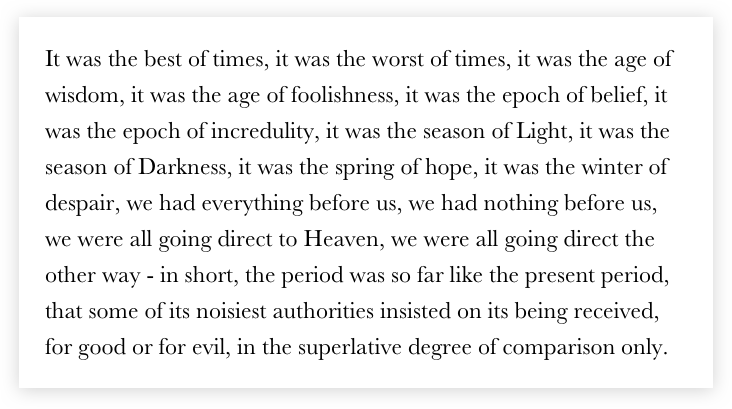
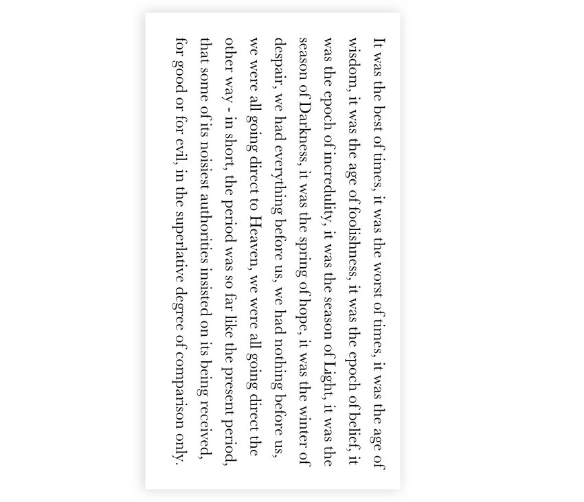
You can clearly identify the top, bottom, left and right edges of the block. What will happen if we change the direction of the paragraph using CSS writing modes to flow vertically?

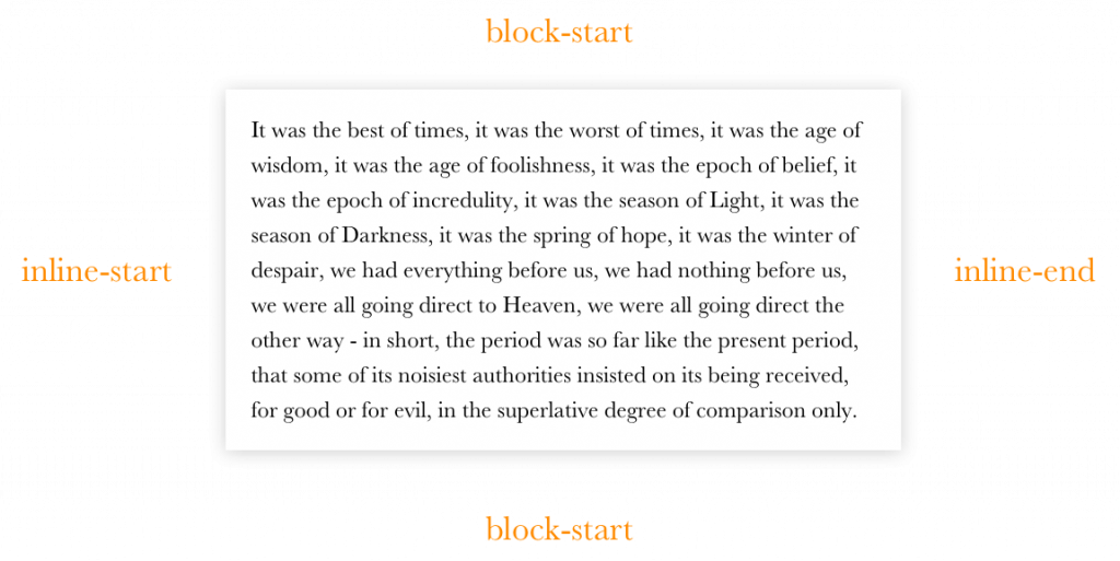
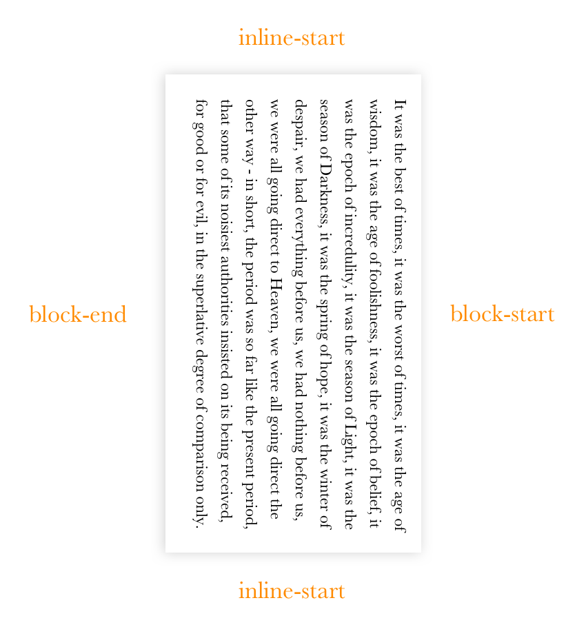
When we talk about the “top” of this rotated paragraph, do we mean the where the content begins or what was the right edge when it wasn’t rotated? Identifying the four directions becomes confusing. Let's look at them from a different perspective. In “normal” writing conditions, the vertical axis will have the suffix -block and the horizontal axis will have the suffix -inline, both followed by start or end:

And if we rotate it, it should be like this:

Since we are talking about normal horizontal layout, we will be using -inline-start and -inline-end, but it is good to know about the other properties as well. We can also write logical shorthand values by using the logical keyword. Consider the following:

article img {
  margin: logical 10px 20px 30px 40px;
}

The computed value of the image's margin will be the following:

article img {
  margin-block-start: 10px;
  margin-inline-start: 20px;
  margin-block-end: 30px;
  margin-inline-end: 40px;
}

The logical keyword is an experimental feature at this point in time, which means it may change or it may be replaced by the time the spec becomes official. There’s an open discussion on the topic that you can follow in the meantime.

Logical properties also allow us to apply values to a certain axis, meaning we have margin-inline and margin-block for the horizontal and vertical axises, respectively.

PropertyLogical Property
margin-topmargin-block-start
margin-leftmargin-inline-start
margin-rightmargin-inline-end
margin-bottommargin-block-end

Just like with the logical margin properties, we also have logical padding properties which follow the same rules as the margin.

PropertyLogical Property
padding-toppadding-block-start
padding-leftpadding-inline-start
padding-rightpadding-inline-end
padding-bottompadding-block-end

Logical positioning properties

In the previous examples we were able to modify the meaning of the property by appending suffixes, but what about the positions? The properties names changed completely from what we know now as top, right, bottom, and left.

.element {
  position: absolute;
  inset-block-start: 0;  /* evaluates to top */
  inset-block-end: 0;    /* evaluates to bottom */
  inset-inline-start: 0; /* evaluates to left in ltr and right in rtl */
  inset-inline-end: 0;   /* evaluates to right in ltr and left in rtl */
}

Learning new properties and values can be hard but, hey, we get a shorthand property called inset to make it a little easier:

/* Shorthand FTW! */
.element {
  position: absolute;
  inset: logical 10px 20px 30px 40px;
}


/* It evaluates to this */
.element {
  position: absolute;
  inset-block-start: 10px;
  inset-inline-start: 20px;
  inset-block-end: 30px;
  inset-inline-end: 40px;
}

inset supports both inset-block and inset-inline just like margin and padding.

PropertyLogical Property
topinset-block-start
leftinset-inline-start
rightinset-inline-end
bottominset-block-end

Logical border properties

Border properties can also become logical by appending the -inline-start and -block-start.

PropertyLogical Property
border-top{-size|style|color}border-block-start{-size|style|color}
border-left{-size|style|color}border-inline-start{-size|style|color}
border-right{-size|style|color}border-inline-end{-size|style|color}
border-bottom{-size|style|color}border-block-end{-size|style|color}

In her deep dive on logical properties and values, Rachel Andrew includes an excellent demo that demonstrates logical border properties and how they respond to different writing modes.

How can we start using all this today?

We can start using all the magic of logical properties and value today, thanks to the power of PostCSS! Jonathan Neal wrote this lovely PostCSS plugin that enables us to write logically and compile the code to something today’s browsers will understand. The plugin works in three stages:

  • It translates the new syntax to existing standards that unsupported browsers will recognize, using the :dir pseudo-class to create output to ltr and rtl.
  • It uses another one of Neal’s plugins to translate :dir to an attribute selector, like this:
 .element:dir(ltr) {
   ...
 }
 [dir="ltr"] .element {
   ...
 }
  • It uses the postcss-nested plugin to transform nested selectors to one-line selectors, the same way other CSS preprocessors do.

PostCSS works with any workflow. You can try it with Grunt, Gulp, and webpack.


I will close by saying I have seen a lot of benefits since making the shift to logical properties and values. Sure, building multi-directional layouts takes time. There’s the learning curve, the addition of more properties to write, and of course, testing. Our previous methods for creating multi-directional layouts were either taking care of both directions in development or working on one direction at a time — neither of which is all that suitable for big projects. With logical properties and values you write your code once and it works for both directions without any consideration.

References

The post Building Multi-Directional Layouts appeared first on CSS-Tricks.

Finally, it Will Be Easy to Change the Color of List Bullets

In my germinating years, the general advice was this:

<ul>
  <li><span>List item</span></li>
  <!-- ... -->
</ul>
li { color: red; } /* bullet */
li span (color: black; } /* text */

Not terrible, but not great. You're "resetting" everything at the span level, so it gets more complicated the more you do.

Things are getting much easier. Let's take a walk through this world getting more modern as we go.


An alternative was to rip off the default list styling and replace it with a pseudo-element.

ul {
  list-style: none;
}

li::before {
  content: "• ";
  color: red;
}

If we need to count, we could do that with CSS counters.

ol {
  list-style: none;
  counter-reset: my-awesome-counter;
}

ol li {
  counter-increment: my-awesome-counter;
}

ol li::before {
  content: counter(my-awesome-counter) ". ";
  color: red;
}

Quick aside here: this doesn't help with the color, but you can specify what character to use for the bullet by setting a string, like:

ul {
  list-style-type: '✽ ';
}

This is as of Firefox 39 (2015) and Chrome 79 (which comes out Dec 9, 2019).

For ordered lists, there is a ton of language-specific options. And those language styles work for CSS counters as well, which you can learn more about in Hui Jing's deep dive.

See the Pen
Random CSS counters playground
by Chen Hui Jing (@huijing)
on CodePen.


But all the while, we only wanted to select the stupid bullet (or whatever it is) and style it. Now we are starting to be able to do just that.

As of Firefox 68 (July 2019), you can do like:

li::marker {
  color: red;
  content: "►";
}

...which, as you can see, changes the color and the bullet thing That is definitely the cleanest and easiest way to go, so it's nice to see progress.

Tejas demonstrates:

See the Pen
::marker example
by Tejas (@tejask)
on CodePen.

Manuel Matuzović notes that if you set an element to a list-item display type, you can use markers on them as well.

h2 {
  display: list-item;
}

h2::marker {
  color: orange;
  content: "☞";
}

Even Safari has support at the time of this writing, so we should lean on Chrome here.

This browser support data is from Caniuse, which has more detail. A number indicates that browser supports the feature at that version and up.

Desktop

ChromeOperaFirefoxIEEdgeSafari
NoNo68NoNo11.1

Mobile / Tablet

iOS SafariOpera MobileOpera MiniAndroidAndroid ChromeAndroid Firefox
11.3-11.4NoNoNoNoNo

The post Finally, it Will Be Easy to Change the Color of List Bullets appeared first on CSS-Tricks.

Show Search Button when Search Field is Non-Empty

I think the :placeholder-shown selector is tremendously cool. It allows you to select the placeholder of an input (<input placeholder="...">) when that placeholder is present. Meaning, the input does not yet have any value. You might think input[value] could do that, or help match on the actual value, but it can't.

This makes :placeholder-shown one of the few CSS properties that we have that can react to user-initiated state joining the likes of :hover-and-friends, :checked (checkbox hack!), and the also-awesome :focus-within.

One way we can use it is to check whether the user entered any text into a search field. If yes, then reveal the search button visually (never hide it for assistive tech). If no, then leave it hidden. It's just a fun little "space-saving" technique not terrible unlike float labels.

So, perhaps we start with a semantic search form:

<form action="#" method="GET" class="search-form">
  <!-- Placeholders aren't labels! So let's have a real label -->
  <label for="search" class="screen-reader-text">Search</label>
  <input id="search" type="search" class="search-input" placeholder="Enter search terms...">
  <button class="search-button">Search</button>
</form>

We hide the search label visually with one of those special screen-reader-only classes because it will always be hidden visually. But we'll hide the button by pushing it outside the form with hidden overflow.

.search-form {
  /* we'll re-use this number, so DRYing up */
  --searchButtonWidth: 75px;

  overflow: hidden;
  position: relative;
}

.search-input {
  /* take full width of form */
  width: 100%;
}

.search-button {
  position: absolute; 
  /* push outside the form, hiding it */
  left: 100%;
  width: var(--searchButtonWidth);
}

Then the trick is to pull the search button back in when the placeholder goes away (user has entered a value):

/* ... */

.search-input:not(:placeholder-shown) ~ .search-button {
  /* pull back the negative value of the width */
  transform: translateX(calc(-1 * var(--searchButtonWidth)));
}
.search-button {
  position: absolute; 
  left: 100%;
  width: var(--searchButtonWidth);
  /* animate it */
  transition: 0.2s;
}

Which ends up like this:

See the Pen
:placeholder-shown revealing button
by Chris Coyier (@chriscoyier)
on CodePen.

I saw this idea in a Pen by Liam Johnston. Cool idea, Liam!

I know that using the placeholder attribute at all is questionable, so your mileage may vary. I'll admit that I'm mostly intrigued by the state-handling aspects of it directly in CSS and how it can be used — like the infamous checkbox hack.

Support is good. One of those where when Edge is firmly Chromium, it's in the clear.

This browser support data is from Caniuse, which has more detail. A number indicates that browser supports the feature at that version and up.

Desktop

ChromeOperaFirefoxIEEdgeSafari
47345111*769

Mobile / Tablet

iOS SafariOpera MobileOpera MiniAndroidAndroid ChromeAndroid Firefox
9.0-9.2NoNo767868

The post Show Search Button when Search Field is Non-Empty appeared first on CSS-Tricks.

Multi-Line Truncation with Pure CSS

Truncating a single line of text if is fairly straightforward. Truncating multiple lines is a bit harder. Using just CSS (no JavaScript or server-side dancing) is nice for the simplicity. It's gotten a little easier lately since Firefox (since version 68) has started supporting the ultra-bizarre -webkit-line-clamp soup method, which makes browser support for that pretty OK.

There is another way though, which is very clever and something I'd call a bonafide CSS trick. We somehow failed to cover it properly in our canonical post on line clamping, so I'll cover it here then add it to that post. I first saw this trick on the now-dead Mobify blog, and more recently covered by Natalia Onischuk on HackingUI.

The trick uses line height for measuring

Here's a big part of the trick. Imagine an element has a line-height of 1.4rem and you want to make sure it only shows a maximum of three lines of text. If you set the max-height to 1.4rem * 3, you've done it!

I'm not the worlds biggest fan of united line-height, but alas, it's necessary here to do the math. I'm also not the biggest fan of setting it over and over on elements, so let's set a variable we can use later, and then use it to set a global line-height.

html {
  --lh: 1.4rem;
  line-height: var(--lh);
}

Set that max height

The truncation happens just like this:

.truncate-overflow {
  --max-lines: 3;
  max-height: calc(var(--lh) * var(--max-lines));
  overflow: hidden;
}

You actually could leave it like this. That might be good enough if you don't care about the ellipsis.

The rest of the trick comes in when you want to display that ellipsis stuff

An ellipsis ("...") signifies that text has been truncated and continues longer than what it displayed. Using it is probably a pretty good practice when truncating text so the content doesn't come to an abrupt, awkward end. (Well, the content itself might be awkward anyway, but hey, you tried.)

If you set position: relative on the element, you can absolutely position the ellipsis in the bottom-right corner.

.truncate-overflow::before {
  content: "...";
  position: absolute;
  bottom: 0;
  right: 0;
}

I was very tempted to, instead of setting the bottom, to set the top and use top: calc(var(--lh) * (var(--max-lines) - 1)). My thinking there was that you might as well place the ellipsis at the exact point you need it. If the text is too short, the hidden overflow will cut it off. The problem with that is that it doesn't deal with the "exactly max lines lines" problem. The ellipsis will show when the text matches the max lines — not only when it exceeds that space.

We'll have to get trickier!

Note that this "setting stuff in the bottom-right" thing is pretty specific to left-to-right languages. I'm going to make the demo with CSS logical properties like inset-inline-end instead of right in hopes to make it more friendly to different languages and flow scenarios.

Another limitation is that the ellipsis doesn't attach itself to the final word since it's absolutely placed. We're not going to fix that as well.

Let's cover up the ellipsis when the text is too short

This is the second part of the trick. If we position the absolute at the bottom/end of the text all the time, that's fine. But if the text is exactly equal to the --max-lines value or less, we want to hide it.

The trick there is to make a little box that is the same background as what is behind it and set it on top of the ellipsis to cover it. We can do that with the other pseudo-element:

.truncate-overflow::after {
  content: "";
  position: absolute;
  right: 0; /* note: not using bottom */
  width: 1rem;
  height: 1rem;
  background: white;
}

Another trick we're using here is not setting a bottom (inset-block-end) property. This places the box at the bottom of the content rather than the bottom of the relative parent, which is very useful.

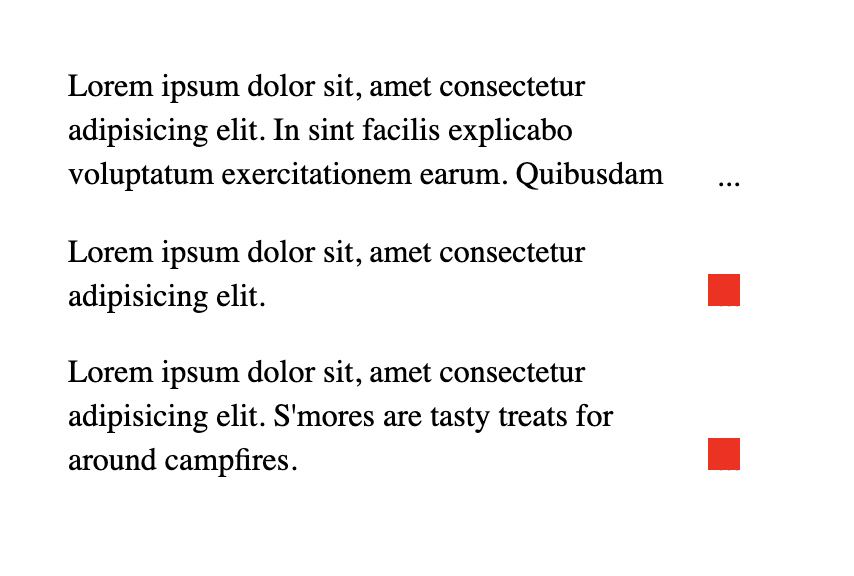
Let me make the boxes red so you can see them in these three different examples:

The top example has more than three lines, so we see the ellipsis. The second example only has two lines, so the red box shows that the ellipsis will be covered up (but imagine a white box instead). The last example shows that this system works even when the content is exactly the same as the value of --max-lines.

Demo

See the Pen
Pure CSS multi-line truncation
by Chris Coyier (@chriscoyier)
on CodePen.

I usedwanted to use CSS logical properties here, as the browser support has gotten pretty good. If you're supporting any version of IE, you'll have to use the bottom and right.

This browser support data is from Caniuse, which has more detail. A number indicates that browser supports the feature at that version and up.

Desktop

ChromeOperaFirefoxIEEdgeSafari
6962*41No7612.1

Mobile / Tablet

iOS SafariOpera MobileOpera MiniAndroidAndroid ChromeAndroid Firefox
12.2-12.346*No677567

The post Multi-Line Truncation with Pure CSS appeared first on CSS-Tricks.

Different Approaches for Creating a Staggered Animation

Animating elements, at its most basic, is fairly straightforward. Define the keyframes. Name the animation. Call it on an element.

But sometimes we need something a little more complex to get the right “feel" for the way things move. For example, a sound equalizer might use the same animation on each bar, but they are staggered to give the illusion of being animated independently.

See the Pen
Apple Music Sound Equilizer in SVG
by Geoff Graham (@geoffgraham)
on CodePen.

I was recently building a dashboard and wanted the items in one of the widgets to flow into view with a staggered animation.

Just like the sound equalizer above, I started going down the :nth-child route. I used the unordered list (<ul>) as the parent container, gave it a class and employed the :nth-child pseudo selector to offset each list item with animaton-delay.

.my-list li {
  animation: my-animation 300ms ease-out;
}

.my-list li:nth-child(1) {
  animation-delay: 100ms;
}

.my-list li:nth-child(2) {
  animation-delay: 200ms;
}

.my-list li:nth-child(3) {
  animation-delay: 300ms;
}

/* and so on */

This technique does indeed stagger items well, particularly if you know how many items are going to be in the list at any given time. Where things fall apart, however, is when the number of items is unpredictable, which was the case for the widget I was building for the dashboard. I really didn’t want to come back to this piece of code every time the number of items in the list changed, so I knocked out a quick Sass loop that accounts for up to 50 items and increments the animation delay with each item:

.my-list {
  li {
    animation: my-animation 300ms ease-out;
      
    @for $i from 1 through 50 {
      &:nth-child(#{$i}) {
        animation-delay: 100ms * $i;
      }
    }
  }
}

That should do it! Yet, it feels way too hacky. Sure, it doesn’t add that much weight to the file, but you know the compiled CSS will include a bunch of unused selectors, like nth-child(45).

There must be a better way. This is where I would normally reach for JavaScript to find all of the items and add a delay but… this time I spent a little time exploring to see if there is a way to do it with CSS alone.

How about CSS counters?

The first thing I thought of was using a CSS counter in combination with the calc() function:

.my-list {
  counter-reset: my-counter;
}

.my-list li {
  counter-increment: my-counter;
  animation-delay: calc(counter(my-counter) * 100ms);
}

Unfortunately, that won’t work because the spec says counters cannot be used in calc()):

Components of a calc() expression can be literal values or attr() or calc() expressions.

Turns out a few people like this idea, but it hasn’t gone further than the draft stage.

How about a data attribute?

Having read that excerpt from the spec, I learned that calc() can use attr(). And, according to the CSS Values and Units specification):

In CSS3, the attr() expression can return many different types

This made me think; perhaps a data attribute could do the trick.

<ul class="my-list">
  <li data-count="1"></li>
  <li data-count="2"></li>
  <li data-count="3"></li>
  <li data-count="4"></li>
</ul>
.my-list li {
  animation-delay: calc(attr(data-count) * 150ms);
}

But my hopes were dashed as the browser support for this is diabolical!

This browser support data is from Caniuse, which has more detail. A number indicates that browser supports the feature at that version and up.

Desktop

ChromeOperaFirefoxIEEdgeSafari
NoNoNoNoNoNo

Mobile / Tablet

iOS SafariOpera MobileOpera MiniAndroidAndroid ChromeAndroid Firefox
NoNoNoNoNoNo

So, back to the drawing board.

How about custom properties?

The next idea I had was using CSS custom properties. It’s not pretty, but it worked 🙂

See the Pen
CSS variables animation order
by Dan Benmore (@dbenmore)
on CodePen.

Turns out it’s pretty flexible too. For example, the animation can be reversed:

See the Pen
CSS variables reverse animation order
by Dan Benmore (@dbenmore)
on CodePen.

It can also do something completely random and animate elements at the same time:

See the Pen
CSS variables random animation order
by Dan Benmore (@dbenmore)
on CodePen.

We can even push it a bit further and do a diagonal swoosh:

See the Pen
Set animation stagger with CSS properties / variables
by Dan Benmore (@dbenmore)
on CodePen.

The browser support isn’t all that bad (pokes stick at Internet Explorer).

This browser support data is from Caniuse, which has more detail. A number indicates that browser supports the feature at that version and up.

Desktop

ChromeOperaFirefoxIEEdgeSafari
493631No169.1

Mobile / Tablet

iOS SafariOpera MobileOpera MiniAndroidAndroid ChromeAndroid Firefox
9.346No677567

One of the great features of CSS is that it will ignore things it doesn’t understand, thanks to the cascade. That means everything will animate in into view together. If that’s not your bag, you can add a feature query to override a default animation:

.my-list li {
  animation: fallback-animation;
}

@supports (--variables) {
  .my-list li {
    animation: fancy-animation;
    animation-delay: calc(var(--animation-order) * 100ms);
  }
}

Vanilla CSS FTW

The more I stop and ask myself whether I need JavaScript, the more I’m amazed what CSS can do on its own. Sure, it would be nice if CSS counters could be used in a calc() function and it would be a pretty elegant solution. But for now, inline custom properties provide both a powerful and flexible way to solve this problem.

The post Different Approaches for Creating a Staggered Animation appeared first on CSS-Tricks.

Using the Little-Known CSS element() Function to Create a Minimap Navigator

W3C’s CSS Working Group often gives us brilliant CSS features to experiment with. Sometimes we come across something so cool that sticks a grin on our face, but it vanishes right away because we think, “that’s great, but what do I do with it?” The element() function was like that for me. It’s a CSS function that takes an element on the page and presents it as an image to be displayed on screen. Impressive, but quixotic.

Below is a simple example of how it works. It’s currently only supported in Firefox, which I know is a bummer. But stick with me and see how useful it can be.

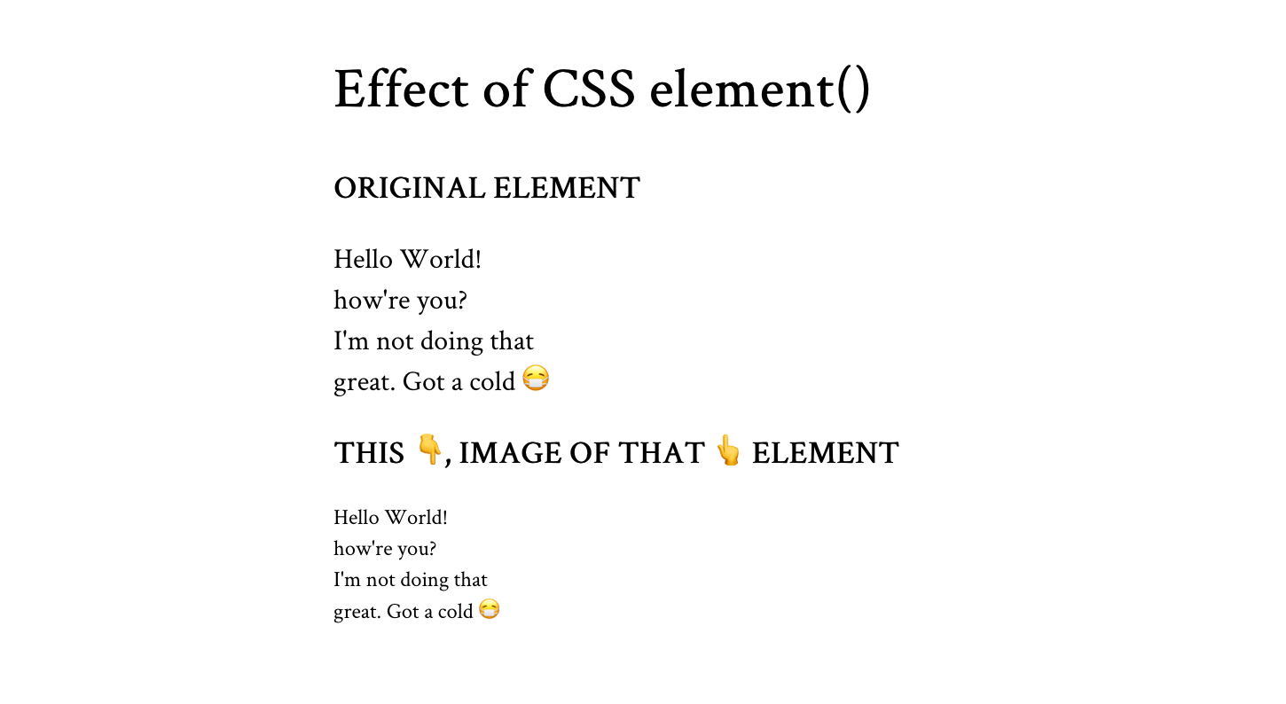
<div id="ele">
  <p>Hello World! how're you?<br>I'm not doing that<br>great. Got a cold &#x1F637;</p>
</div>
<div id="eleImg"></div>
#eleImg {
  background: -moz-element(#ele) no-repeat center / contain; /* vendor prefixed */
}

The element() function (with browser prefix) takes the id value of the element it’ll translate into an image. The output looks identical to the appearance of the given element on screen.

When I think of element()’s output, I think of the word preview. I think that’s the type of use case that gets the most out of it: where we can preview an element before it’s shown on the page. For example, the next slide in a slideshow, the hidden tab, or the next photo in a gallery. Or... a minimap!

A minimap is a mini-sized preview of a long document or page, usually shown at on one side of the screen or another and used to navigate to a corresponding point on that document.

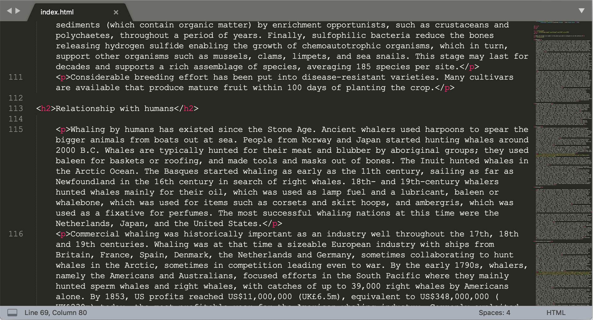
You might have seen it in code editors like Sublime Text.

The minimap is there on the right.

CSS element() is useful in making the “preview” part of the minimap.

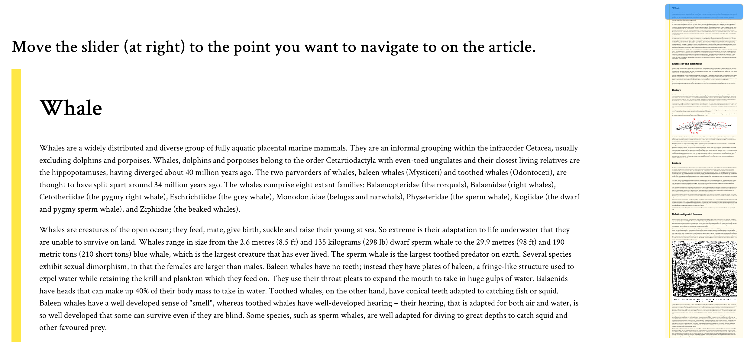
Down below is the demo for the minimap, and we will walk through its code after that. However, I recommend you see the full-page demo because minimaps are really useful for long documents on large screens.

If you’re using a smartphone, remember that, according to the theory of relativity, minimaps will get super mini in mini screens; and no, that’s not really what the theory of relativity actually says, but you get my point.

See the Pen Minimap with CSS element() & HTML input range by Preethi Sam (@rpsthecoder) on CodePen.

A screenshot of the final result of the demo. It consists of a large block of styled paragraph text with a

If you’re designing the minimap for the whole page, like for a single page website, you can use the document body element for the image. Otherwise, targeting the main content element, like the article in my demo, also works.

<div id="minimap"></div>
<div id="article"> <!-- content --> </div>
#minimap {
  background: rgba(254,213,70,.1) -moz-element(#article) no-repeat center / contain;
  position: fixed; right: 10px; top: 10px; /* more style */
}

For the minimap’s background image, we feed the id of the article as the parameter of element() and, like with most background images, it’s styled to not repeat (no-repeat) and fit inside (contain) and at center of the box (center) where it’s displayed.

The minimap is also fixed to the screen at top right of the viewport.

Once the background is ready, we can add a slider on top of it and it will serve to operate the minimap scrolling. For the slider, I went with input: range, the original, uncomplicated, and plain HTML slider.

<div id="minimap">
  <input id="minimap-range" type="range" max="100" value="0">
</div>
#minimap-range {
  /* Rotating the default horizontal slider to vertical */
  transform: translateY(-100%) rotate(90deg);
  transform-origin: bottom left;
  background-color: transparent;  /* more style */
}

#minimap-range::-moz-range-thumb {
  background-color: dodgerblue; 
  cursor: pointer; /* more style */
}

#minimap-range::-moz-range-track{
  background-color: transparent;
}

Not entirely uncomplicated because it did need some tweaking. I turned the slider upright, to match the minimap, and applied some style to its pseudo elements (specifically, the thumb and track) to replace their default styles. Again, we’re only concerned about Firefox at the moment since we’re dealing with limited support.

All that’s left is to couple the slider’s value to a corresponding scroll point on the page when the value is changed by the user. That takes a sprinkle of JavaScript, which looks like this:

onload = () => {
  const minimapRange = document.querySelector("#minimap-range");
  const minimap = document.querySelector("#minimap");
  const article = document.querySelector("#article");
  const $ = getComputedStyle.bind();
  
  // Get the minimap range width multiplied by the article height, then divide by the article width, all in pixels.
  minimapRange.style.width = minimap.style.height = 
    parseInt($(minimapRange).width) * parseInt($(article).height) / parseInt($(article).width) + "px";
  
  // When the range changes, scroll to the relative percentage of the article height    
  minimapRange.onchange = evt => 
    scrollTo(0, parseInt($(article).height) * (evt.target.value / 100));
};

The dollar sign ($) is merely an alias for getComputedStyle(), which is the method to get the CSS values of an element.

It’s worth noting that the width of the minimap is already set in the CSS, so we really only need to calculate its height. So, we‘re dealing with the height of the minimap and the width of the slider because, remember, the slider is actually rotated up.

Here’s how the equation in the script was determined, starting with the variables:

  • x1 = height of minimap (as well as the width of the slider inside it)
  • y1 = width of minimap
  • x2 = height of article
  • y2 = width of article
x1/y1 = x2/y2
x1 = y1 * x2/y2
    
height of minimap = width of minimap * height of article / width of article

And, when the value of the slider changes (minimapRange.onchange), that’s when the ScrollTo() method is called to scroll the page to its corresponding value on the article. 💥

Fallbacks! We need fallbacks!

Obviously, there are going to be plenty of times when element() is not supported if we were to use this at the moment, so we might want to hide the minimap in those cases.

We check for feature support in CSS:

@supports (background: element(#article)) or (background: -moz-element(#article)){
  /* fallback style */
}

...or in JavaScript:

if(!CSS.supports('(background: element(#article)) or (background: -moz-element(#article))')){
  /* fallback code */
}

If you don’t mind the background image being absent, then you can still keep the slider and apply a different style on it.

There are other slick ways to make minimaps that are floating out in the wild (and have more browser support). Here’s a great Pen by Shaw:

See the Pen
Mini-map Progress Tracker & Scroll Control
by Shaw (@shshaw)
on CodePen.

There are also tools like pagemap and xivimap that can help. The element() function is currently specced in W3C’s CSS Image Values and Replaced Content Module Level 4. Defintely worth a read to fully grasp the intention and thought behind it.

This browser support data is from Caniuse, which has more detail. A number indicates that browser supports the feature at that version and up.

Desktop

ChromeOperaFirefoxIEEdgeSafari
NoNo4*NoNoNo

Mobile / Tablet

iOS SafariOpera MobileOpera MiniAndroidAndroid ChromeAndroid Firefox
NoNoNoNoNo64*

Psst! Did you try selecting the article text in the demo? See what happens on the minimap. 😉

The post Using the Little-Known CSS element() Function to Create a Minimap Navigator appeared first on CSS-Tricks.