Mexico City is one of those places that offer a perfect blend of contemporary and classic architecture. If you enjoy buildings with a modern feel, this city won’t leave you disappointed. Here are three modern icons worth checking out during your visit. Soumaya Museum Soumaya is one of Mexico City’s must-see museums, and it’s equally […]
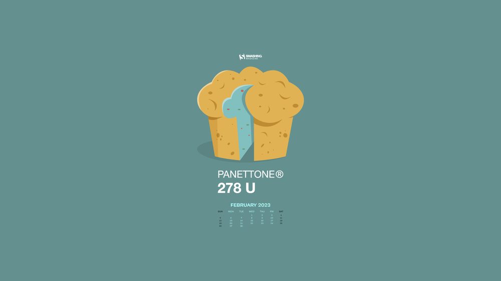
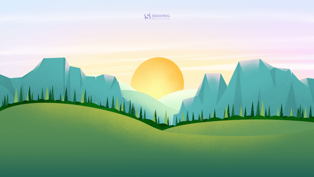
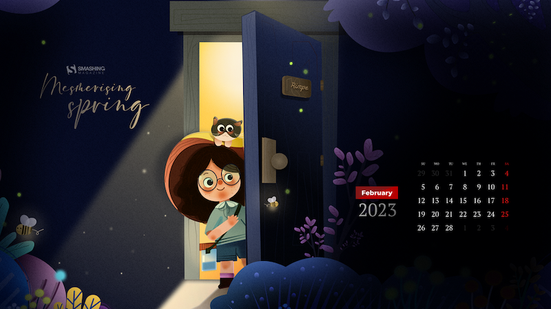
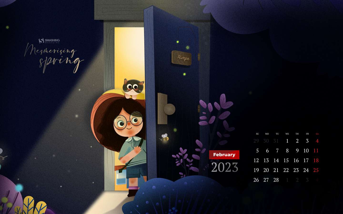
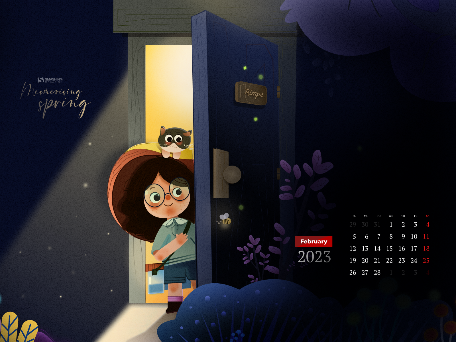
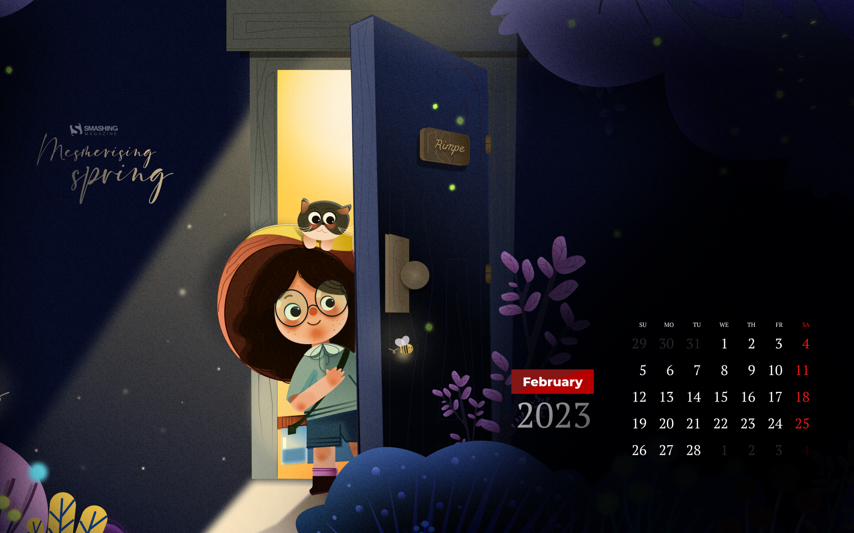
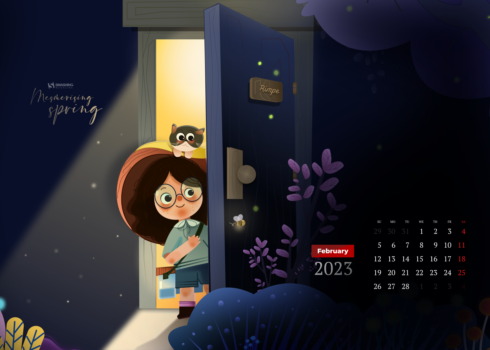
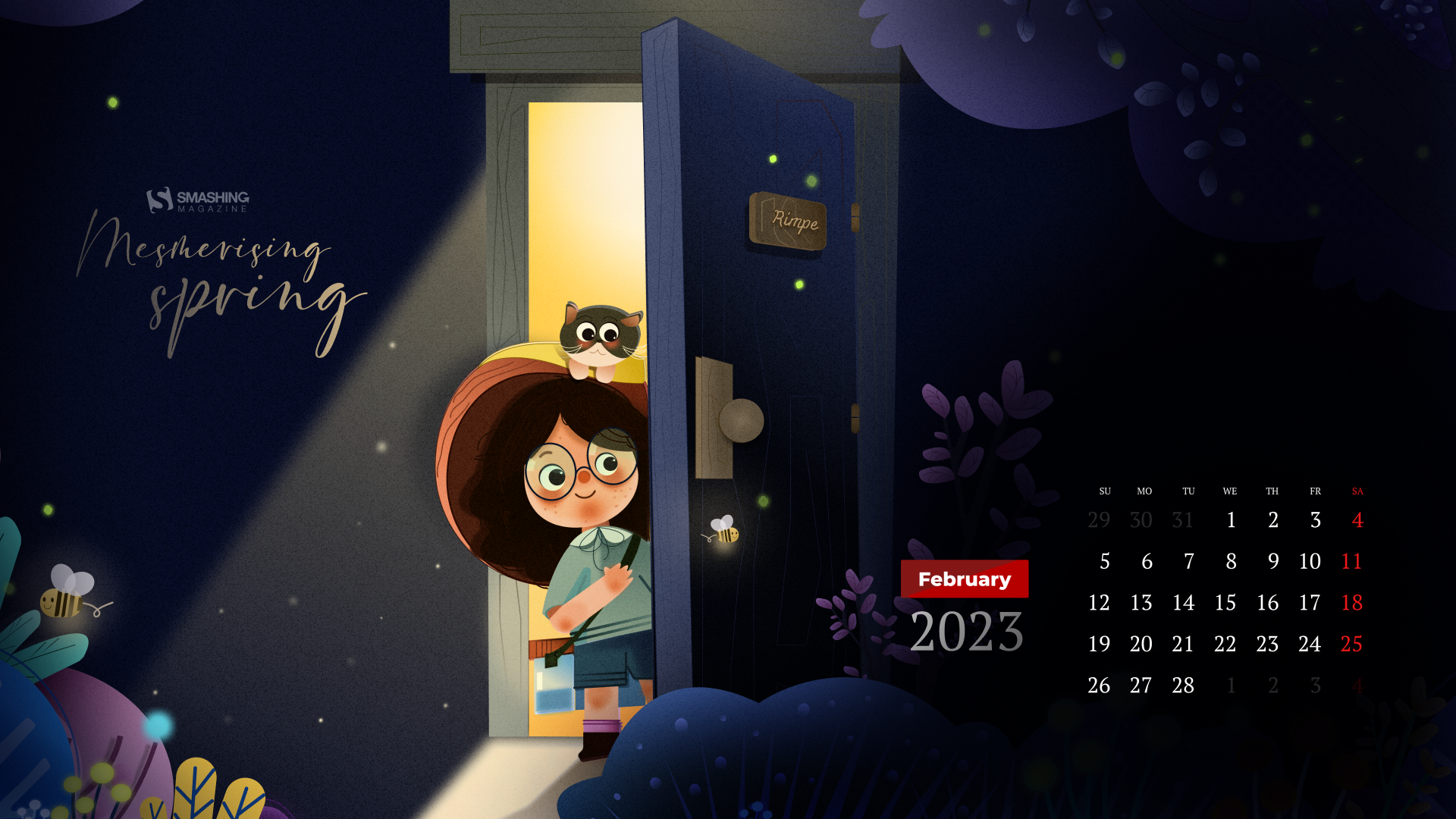
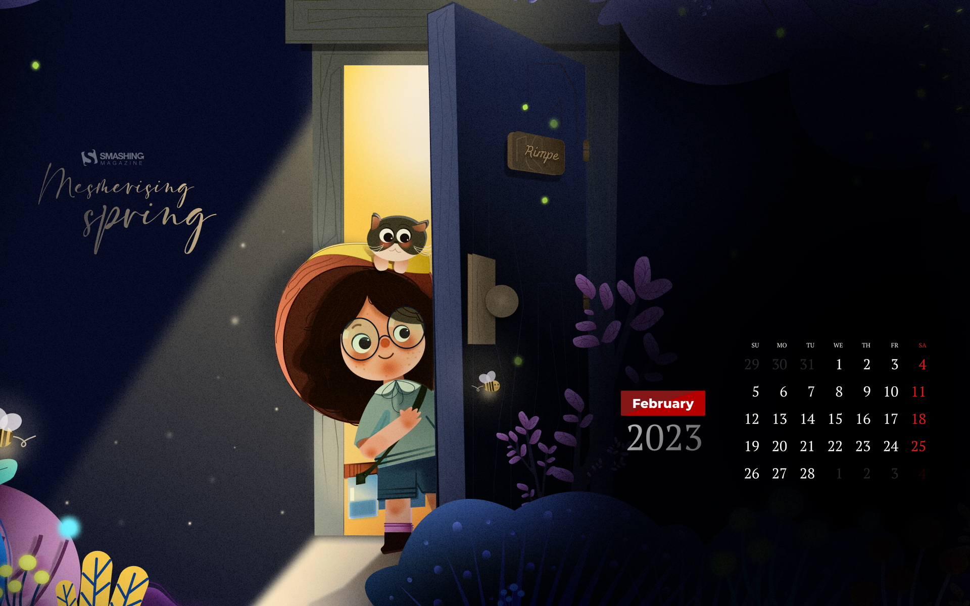
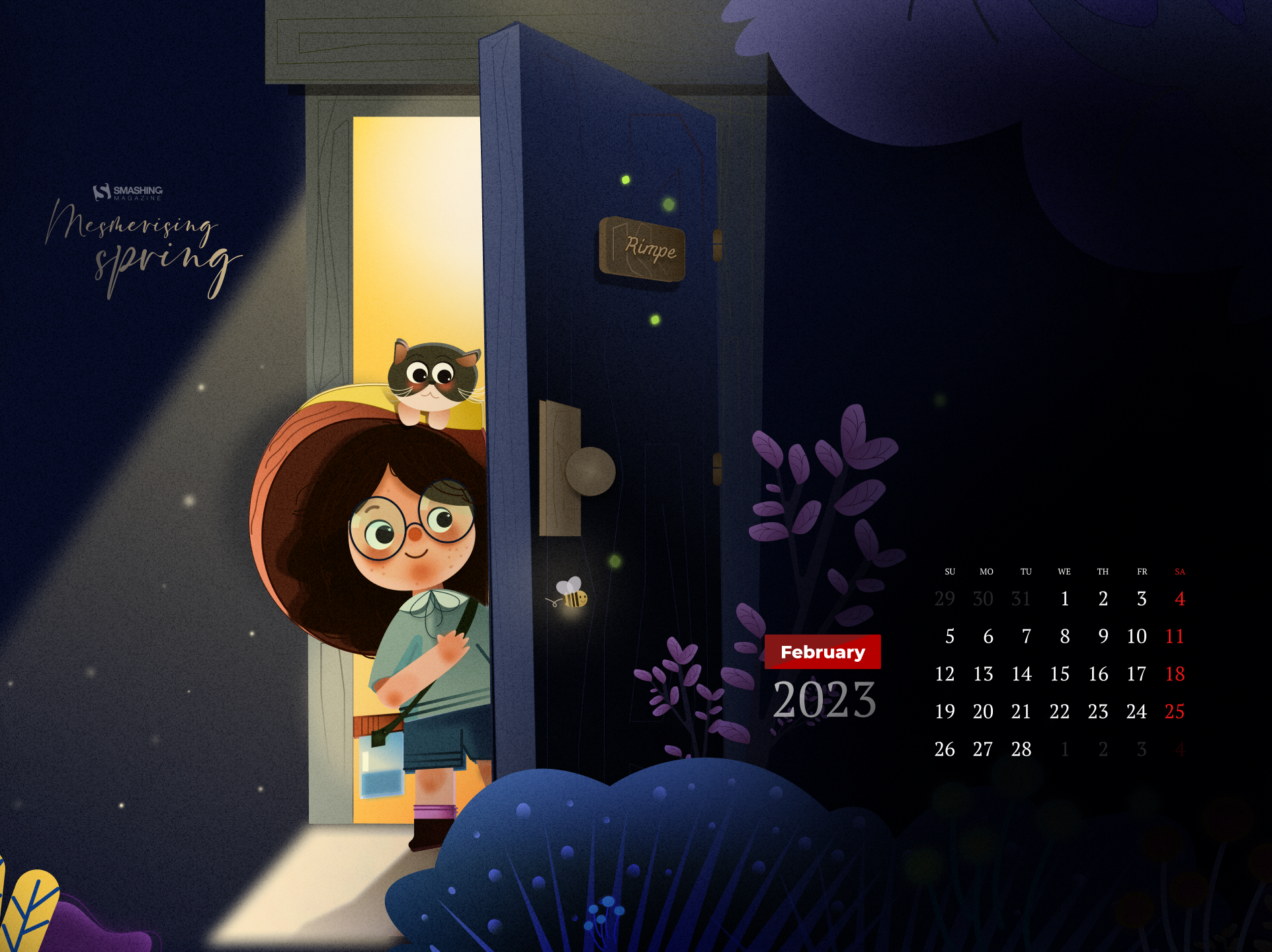
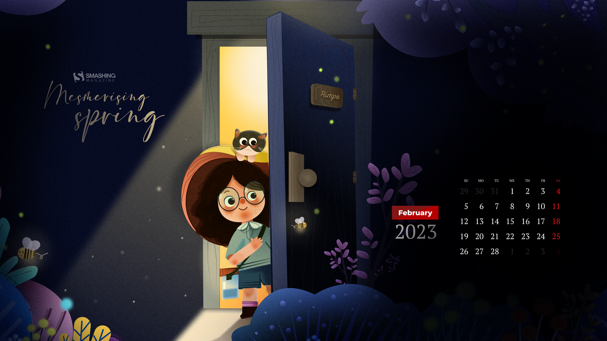
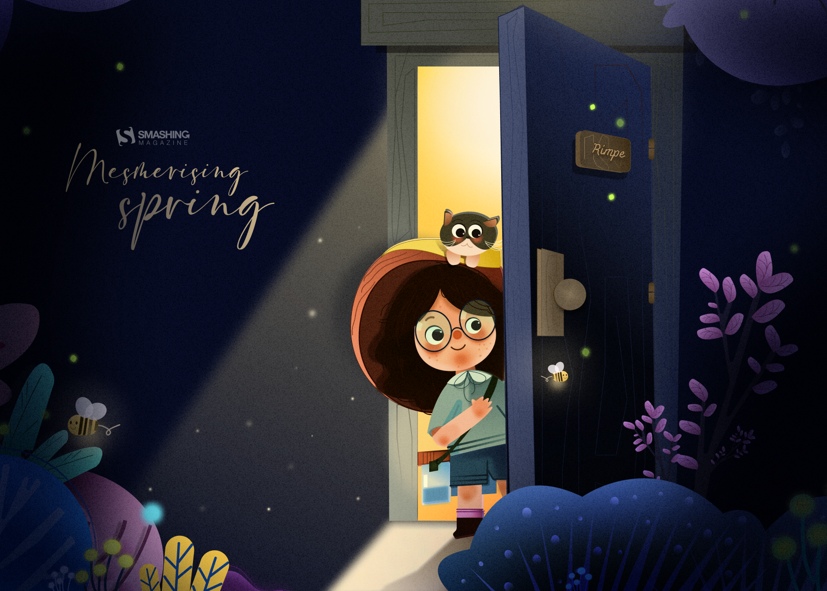
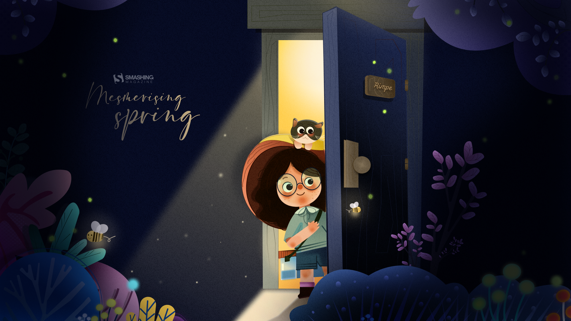
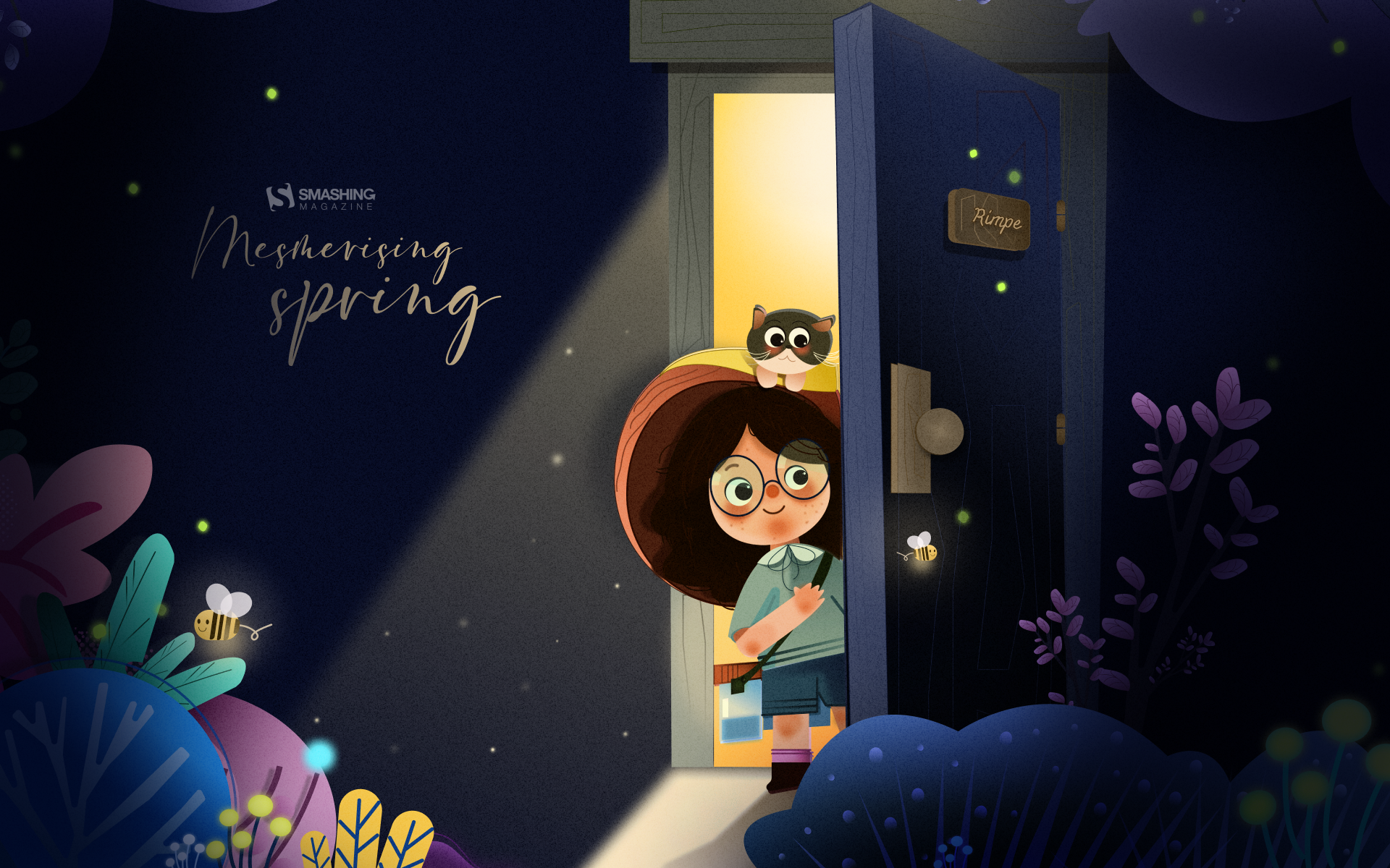
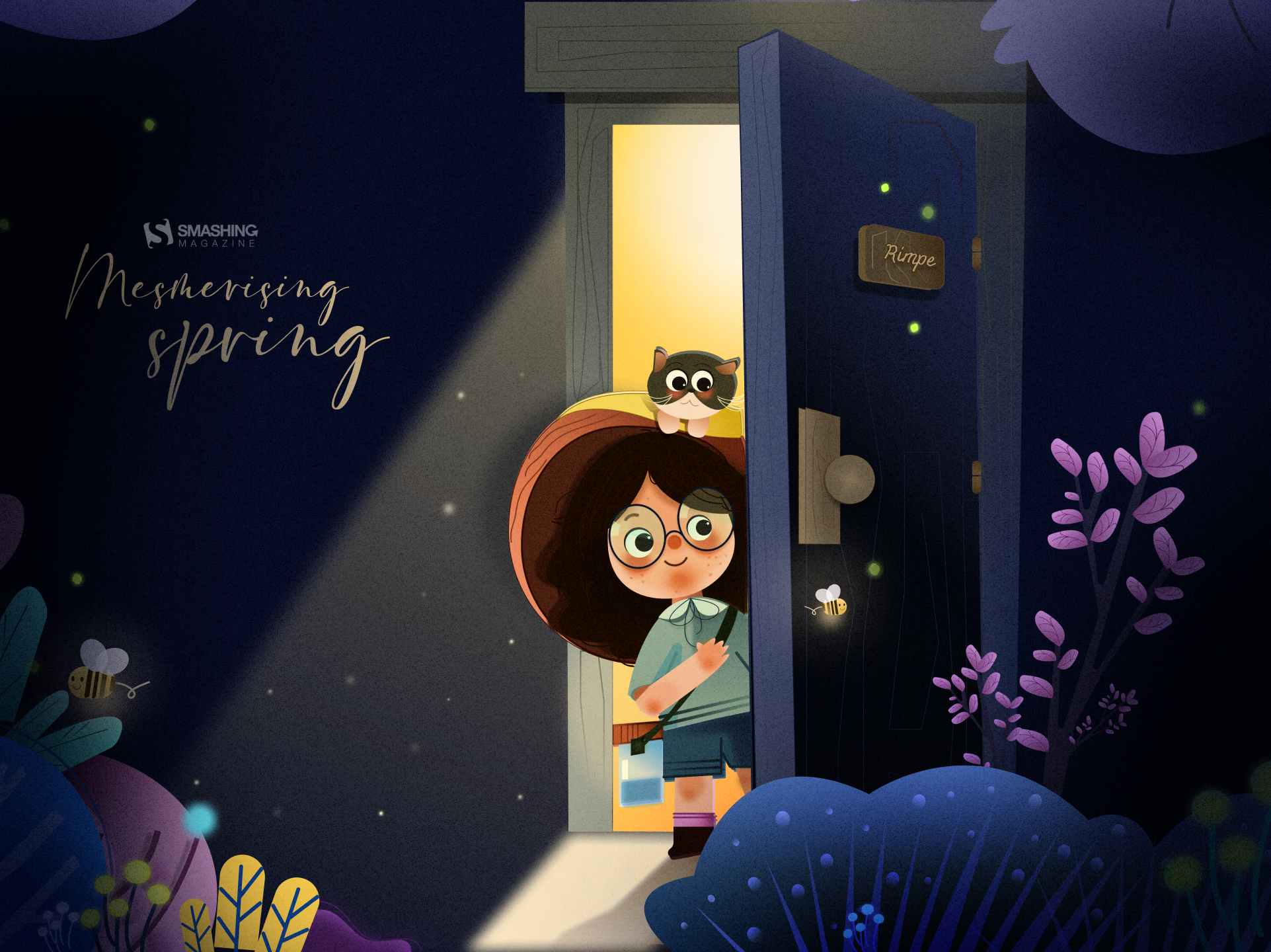
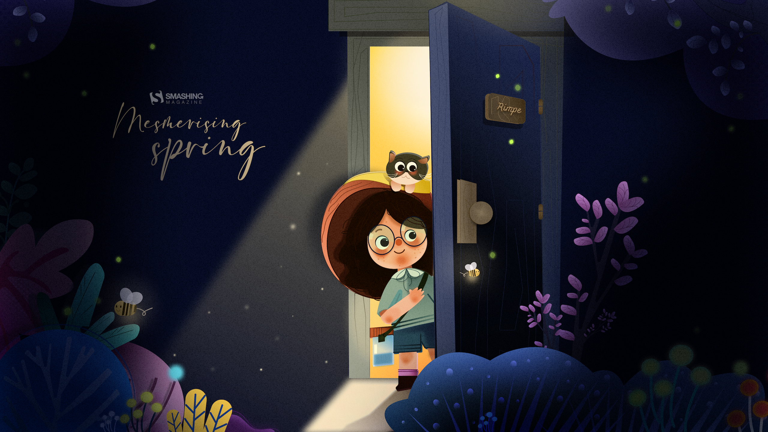
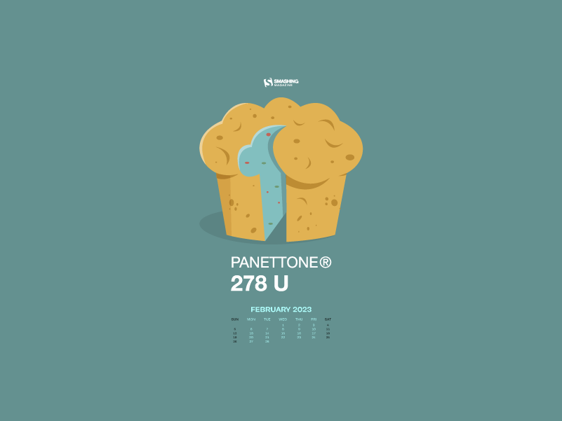
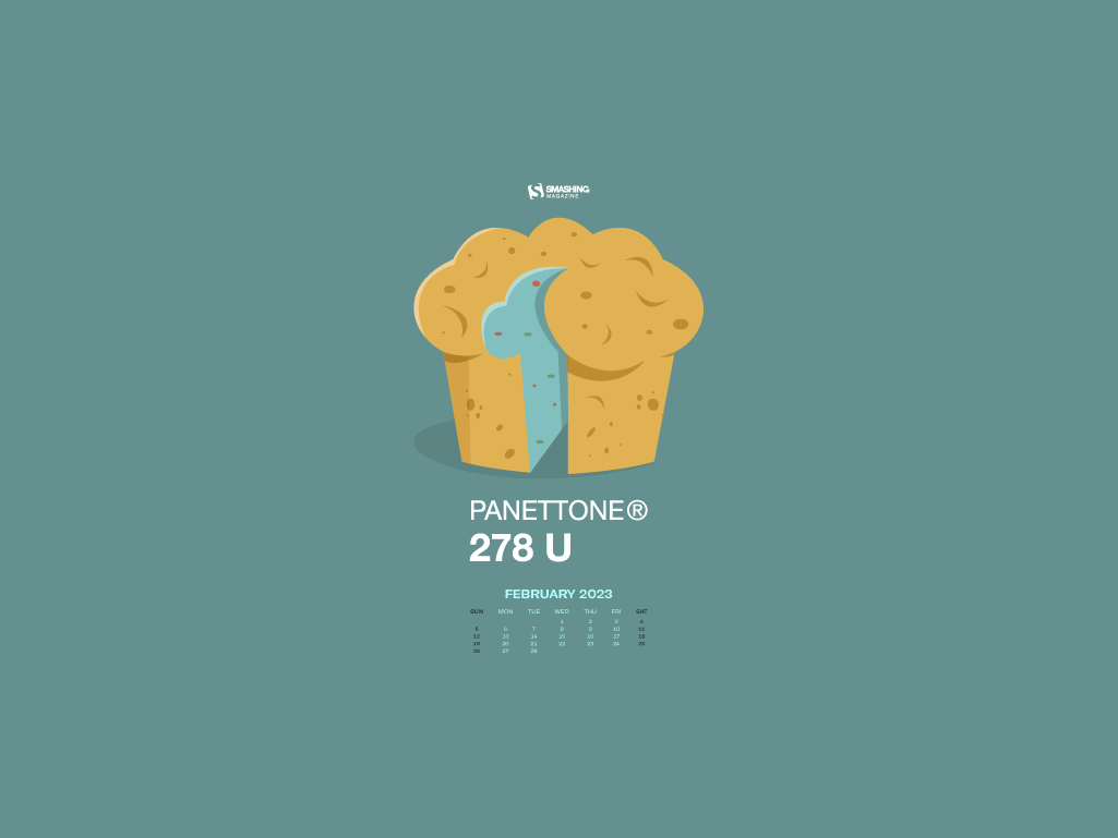
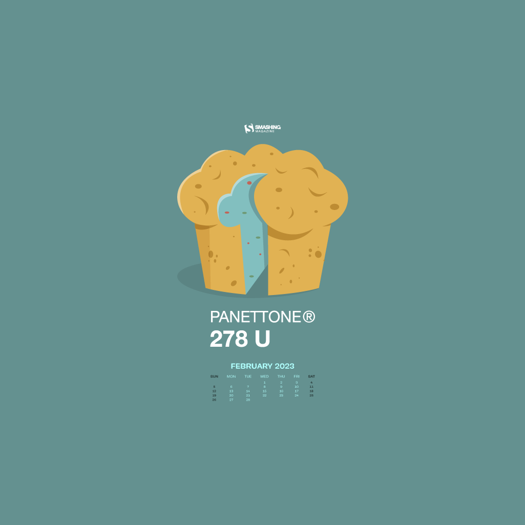
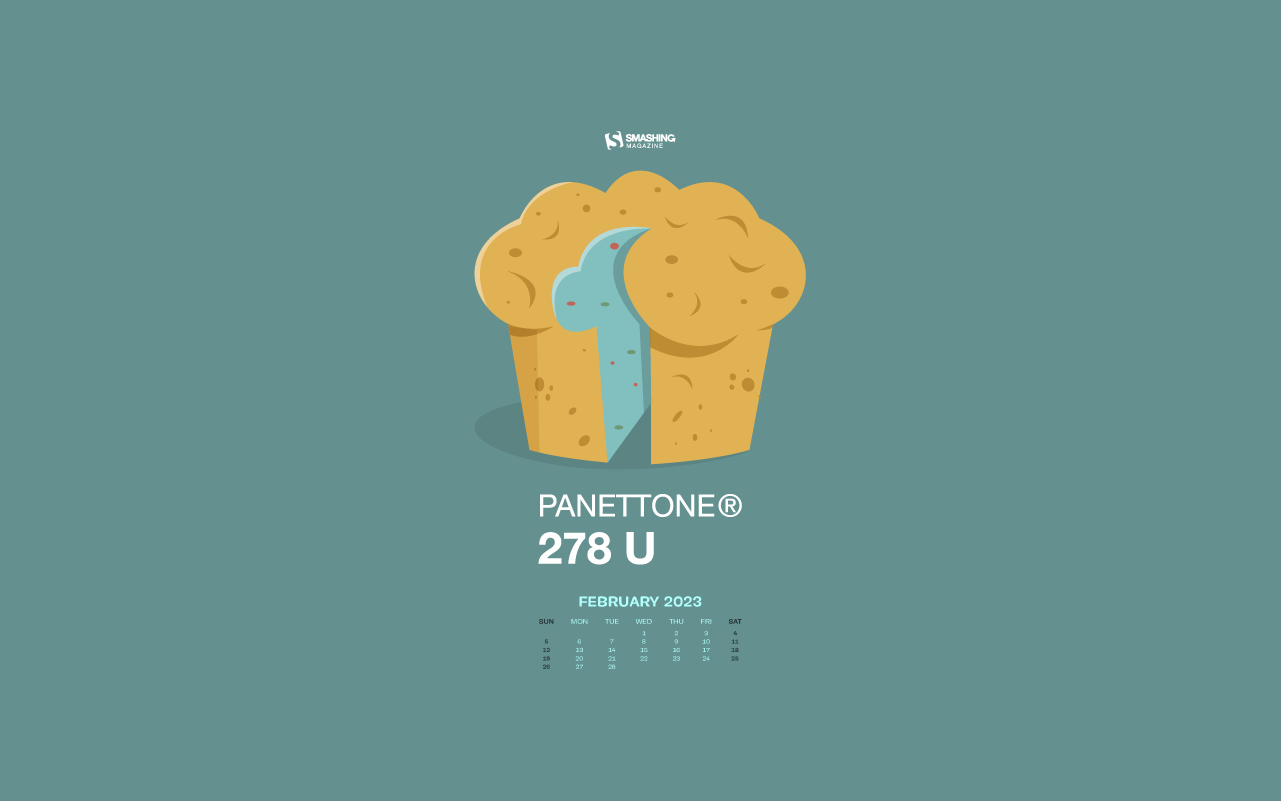
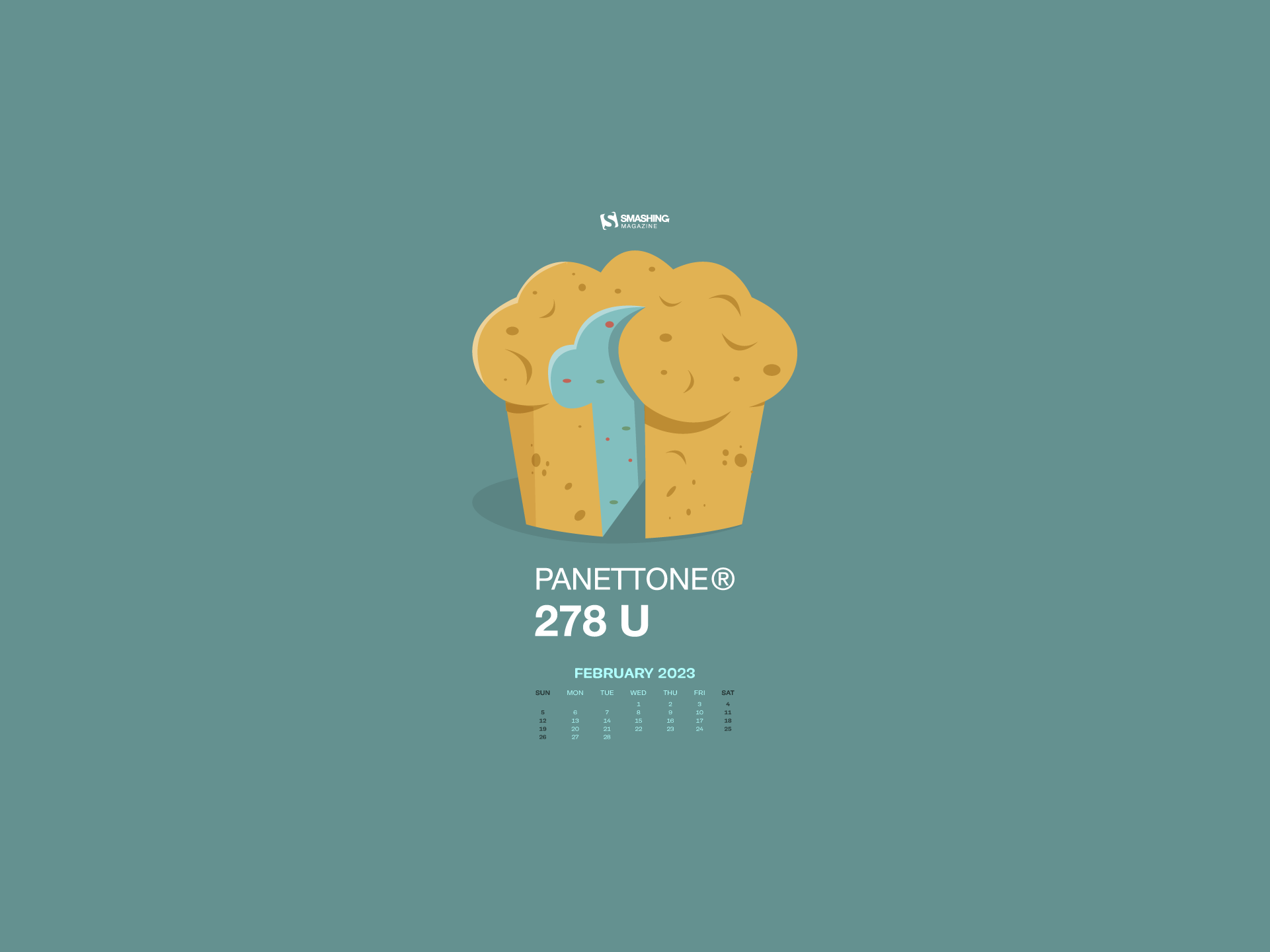
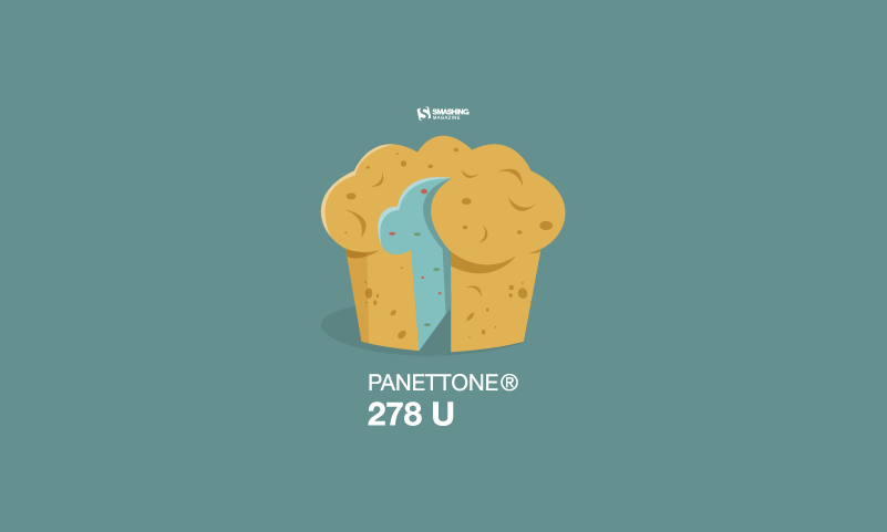
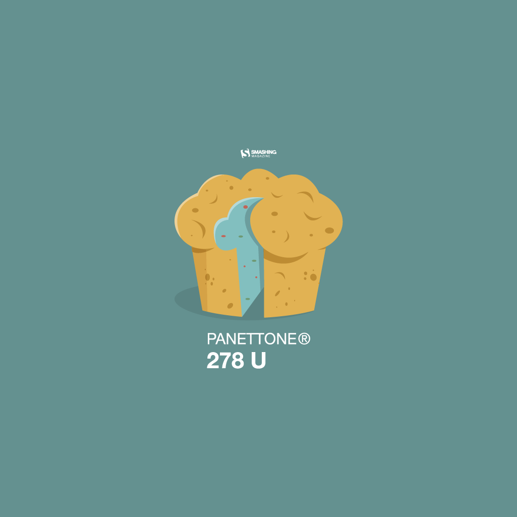
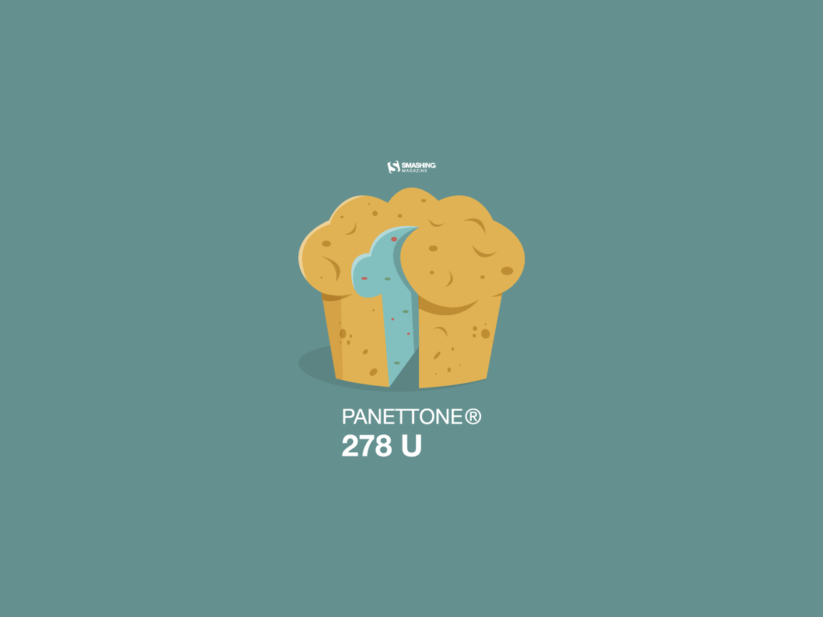
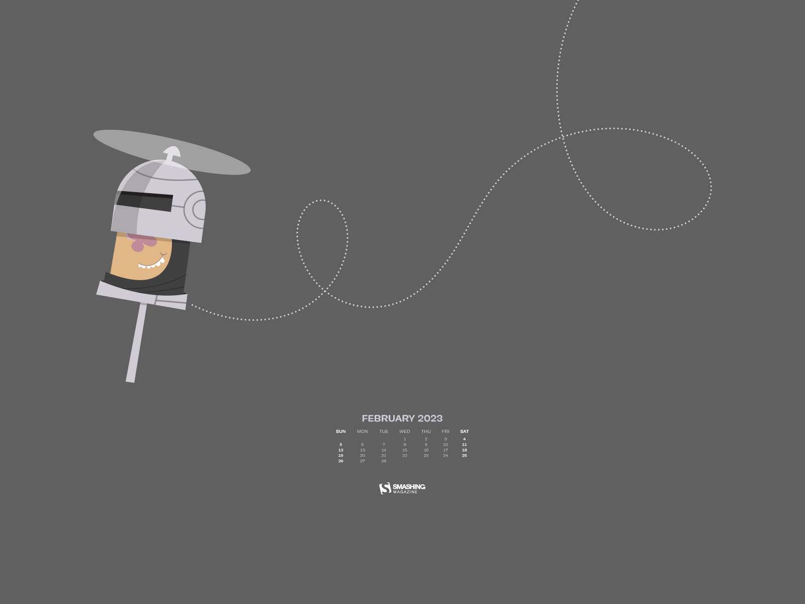
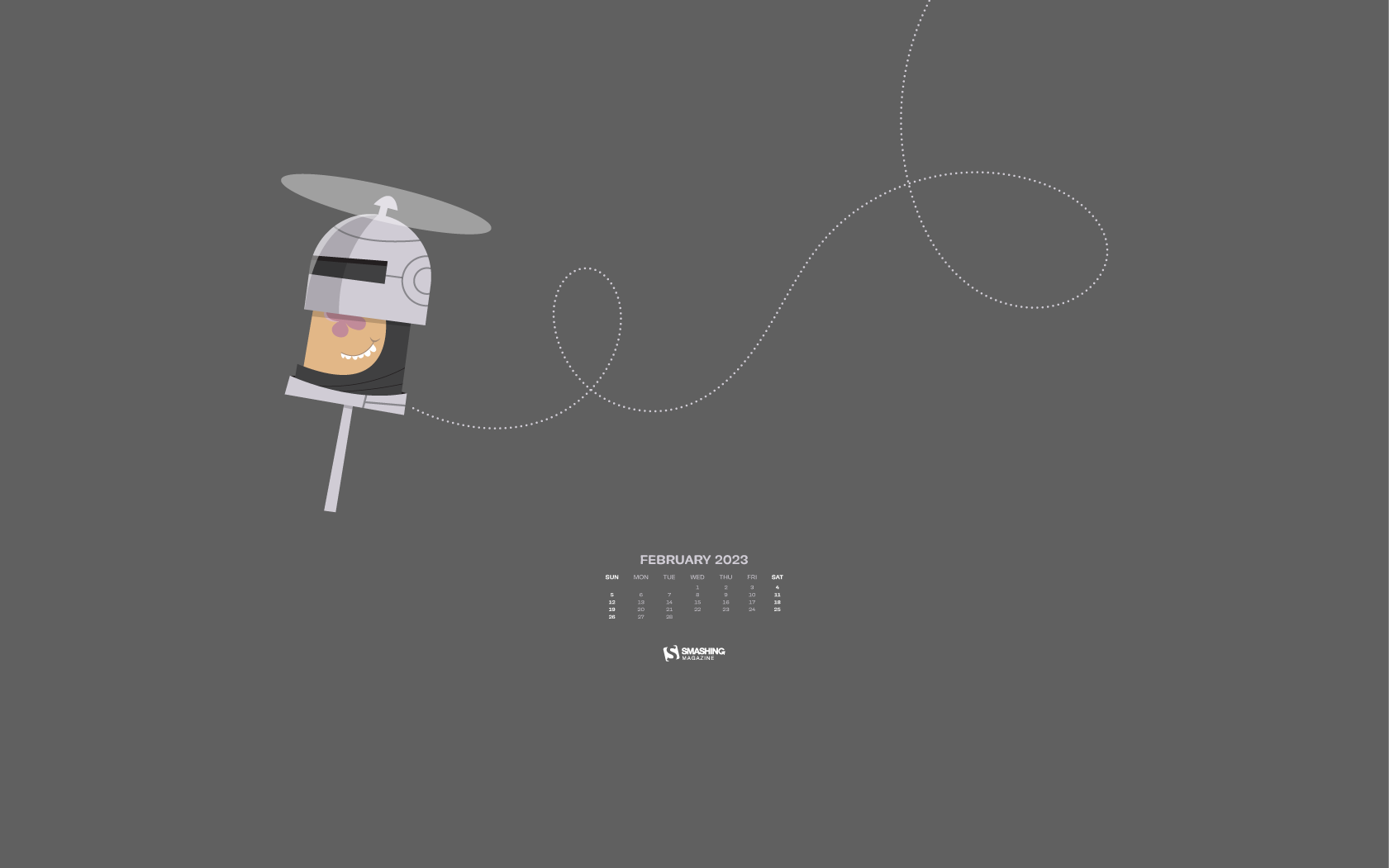
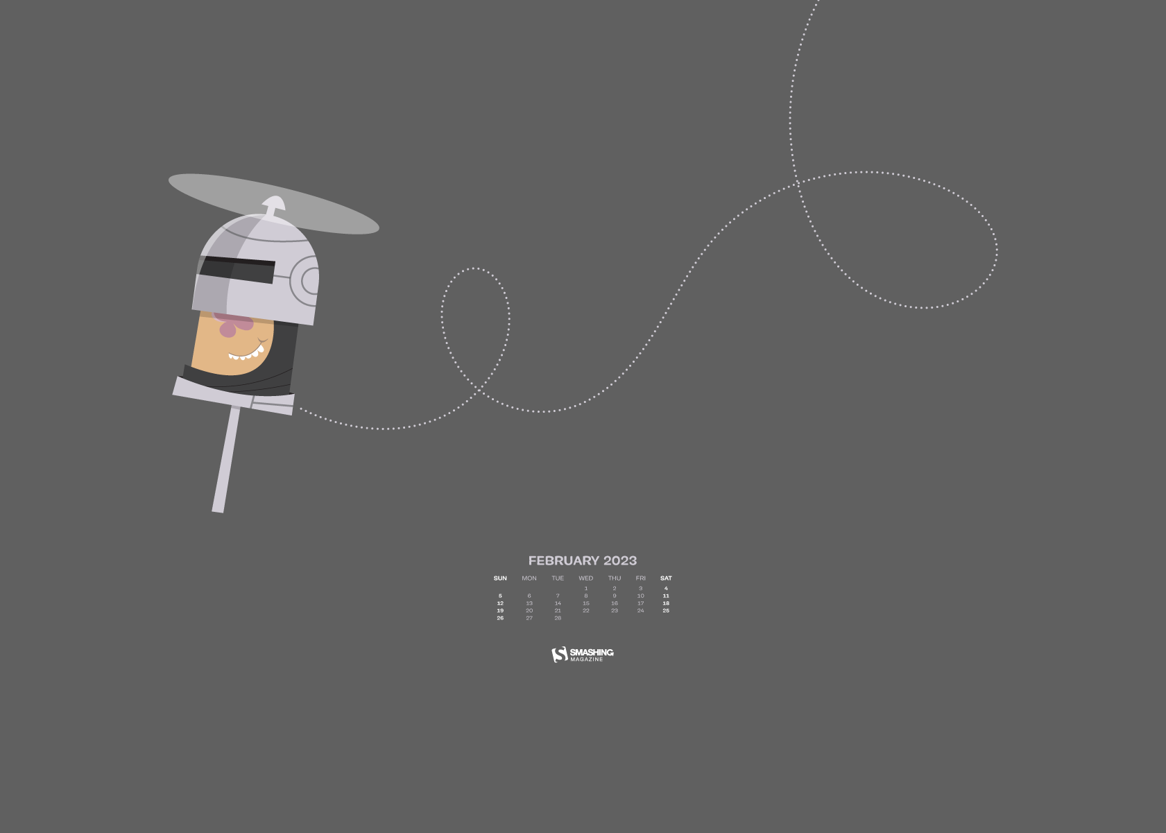
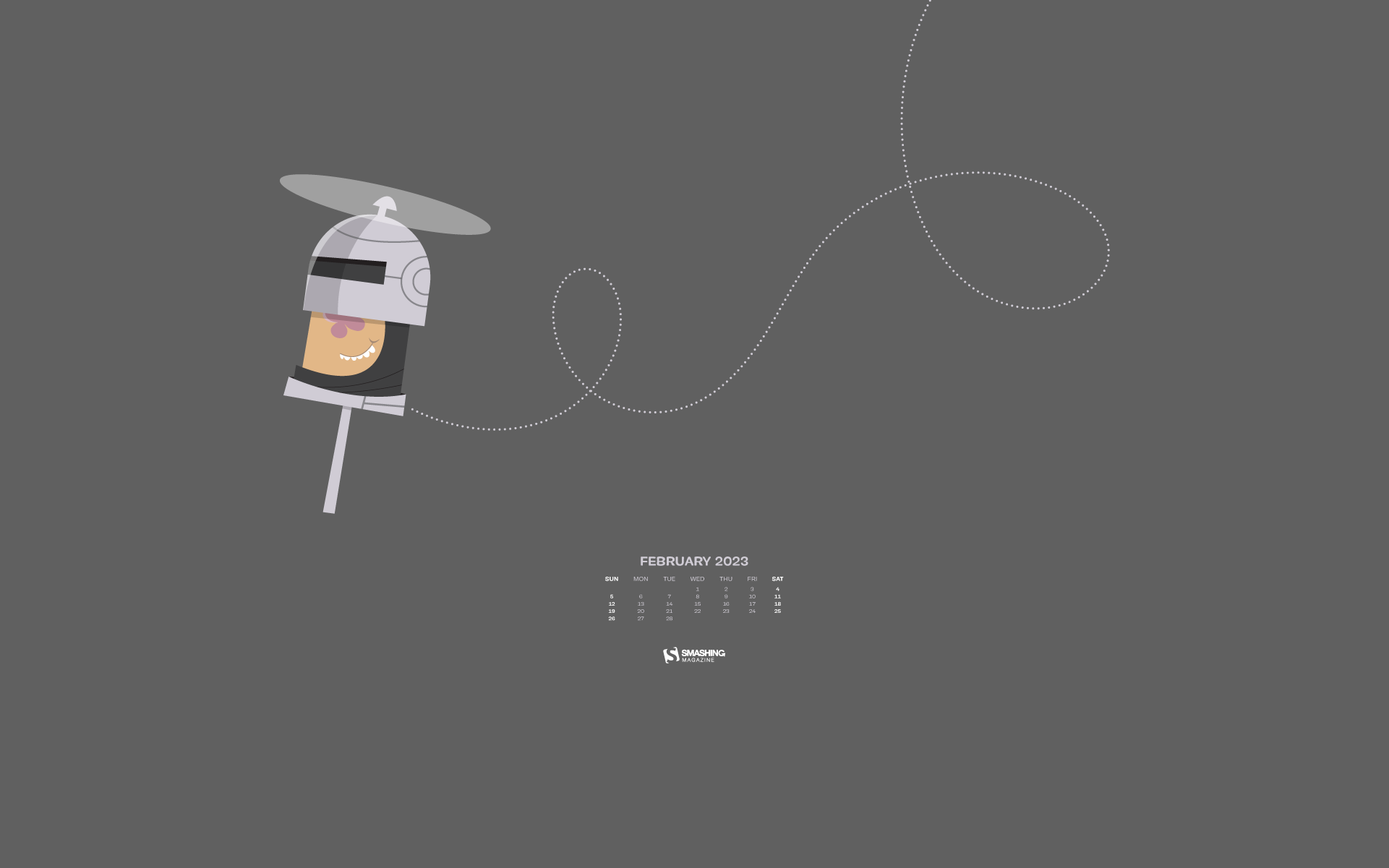
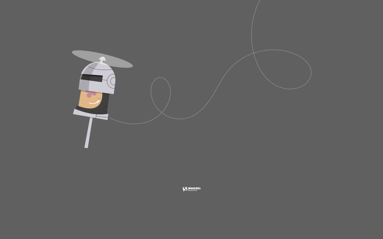
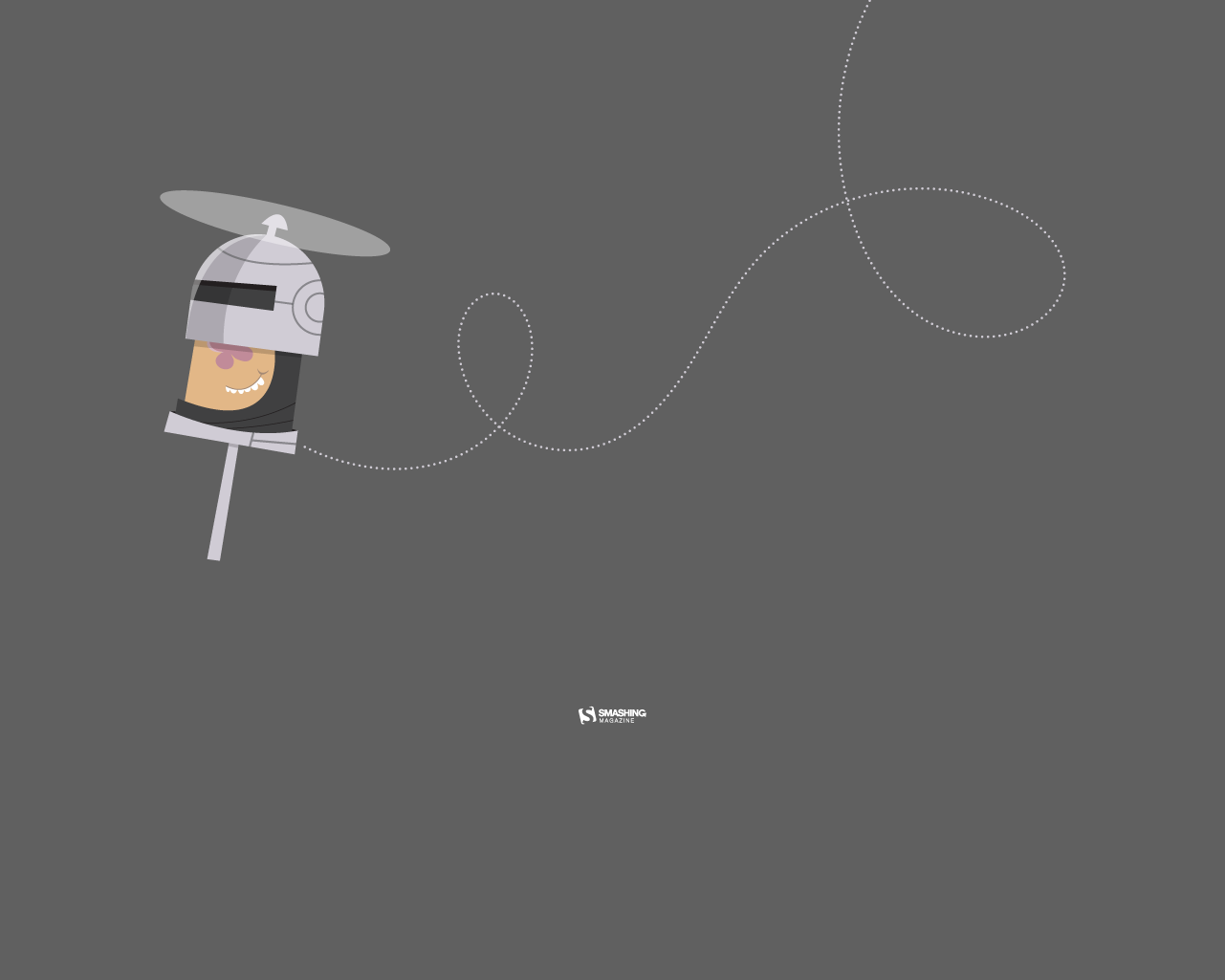
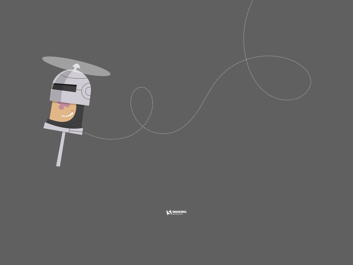
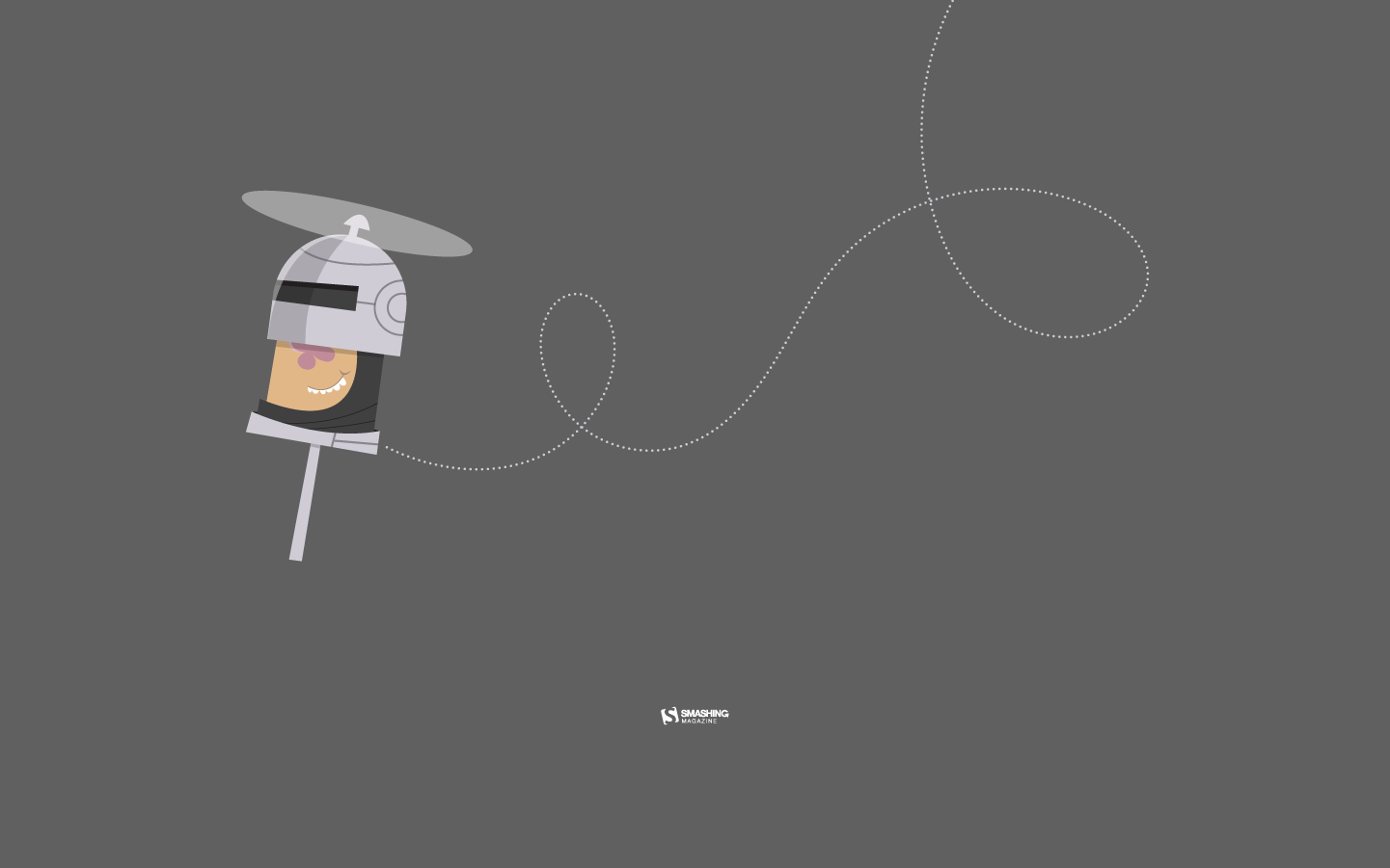
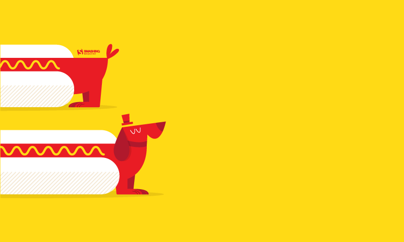
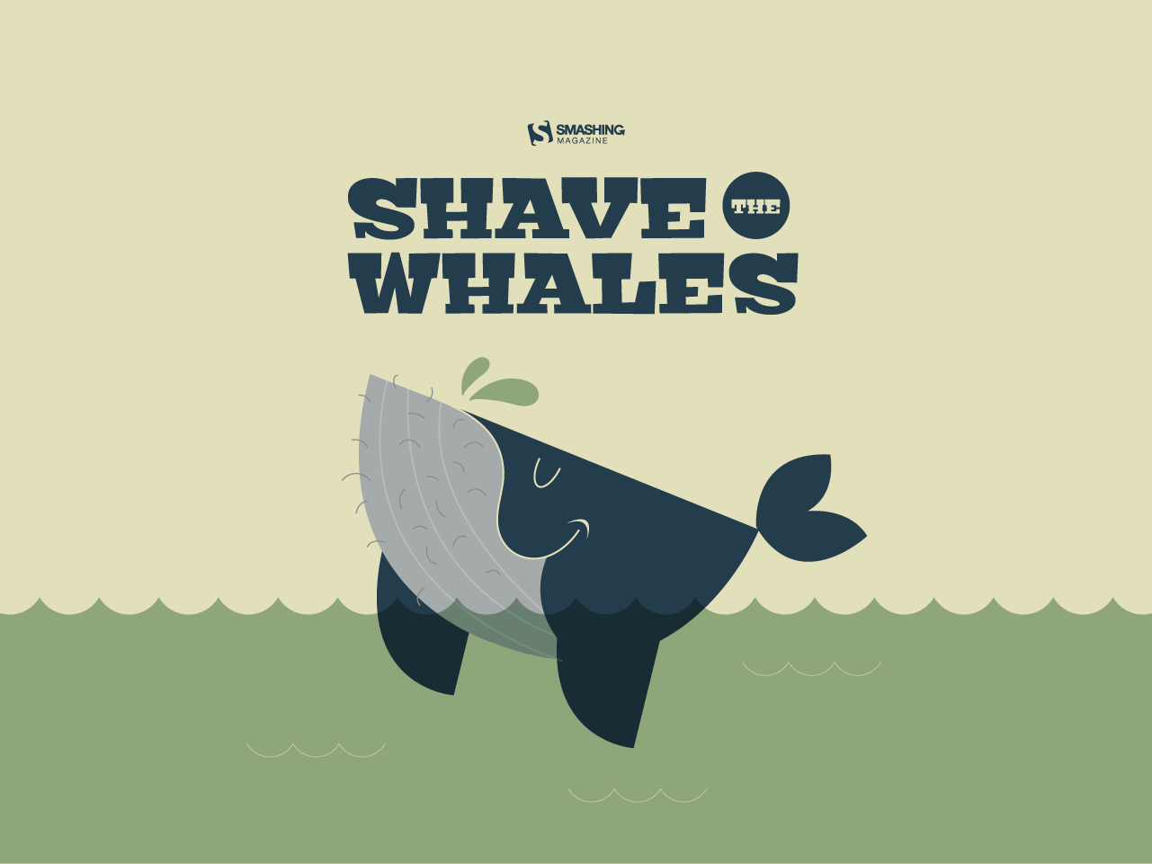
As designers we usually turn to different sources of inspiration, and, well, sometimes the best inspiration lies right in front of us. With that in mind, we embarked on our wallpapers adventure more than eleven years ago. The idea: to provide you with unique and inspiring desktop wallpapers each month anew. Wallpapers created by the community for the community.
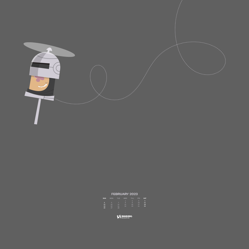
We are very thankful to all artists and designers who have contributed and are still diligently contributing to this challenge, who tickle their creativity to keep the steady stream of wallpapers flowing. This post features their artworks for February 2023. All wallpapers come in two versions — with and without a calendar — and can be downloaded for free. At the end of this post, we also compiled some February “oldies but goodies” from our archives for you. Maybe you’ll discover one of your almost-forgotten favorites in there, too? Enjoy!
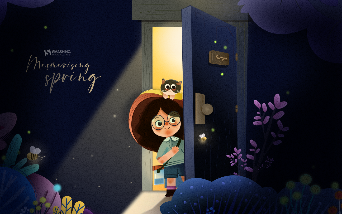
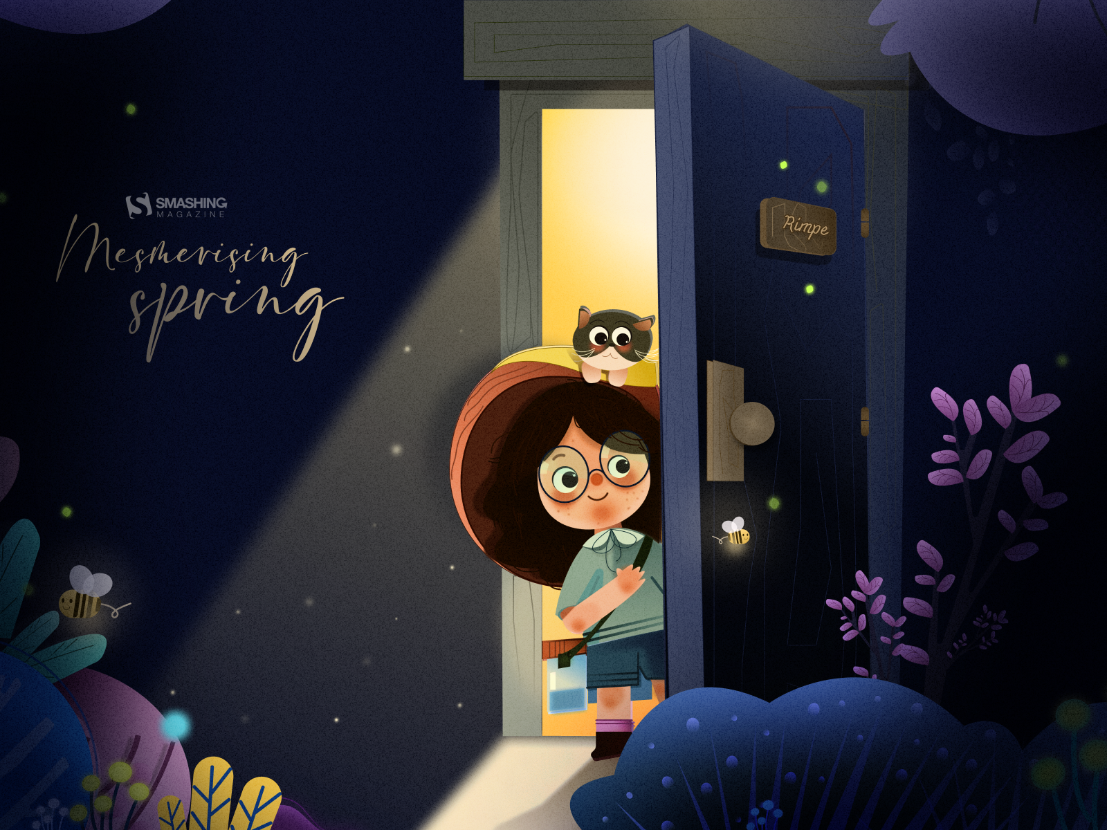
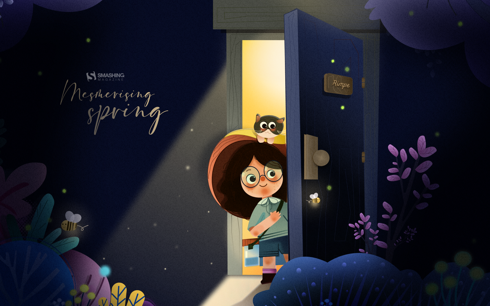
You can click on every image to see a larger preview,
We respect and carefully consider the ideas and motivation behind each and every artist’s work. This is why we give all artists the full freedom to explore their creativity and express emotions and experience through their works. This is also why the themes of the wallpapers weren’t anyhow influenced by us but rather designed from scratch by the artists themselves.
Submit a wallpaper! Did you know that you could get featured in our next wallpapers post, too? We are always looking for creative talent.
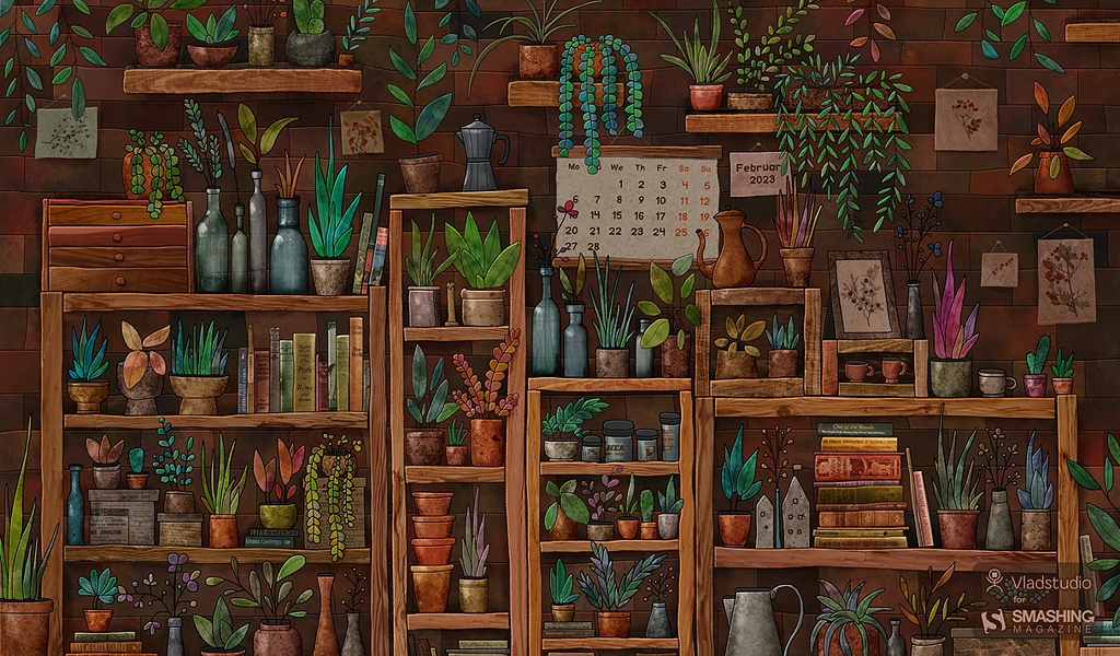
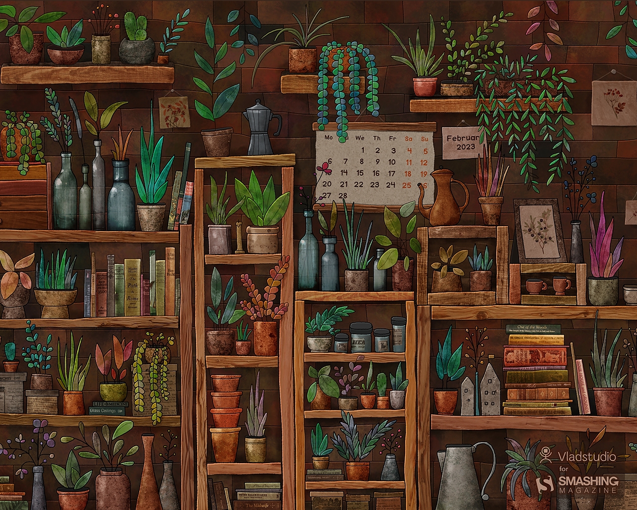
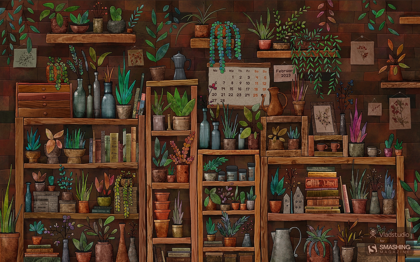
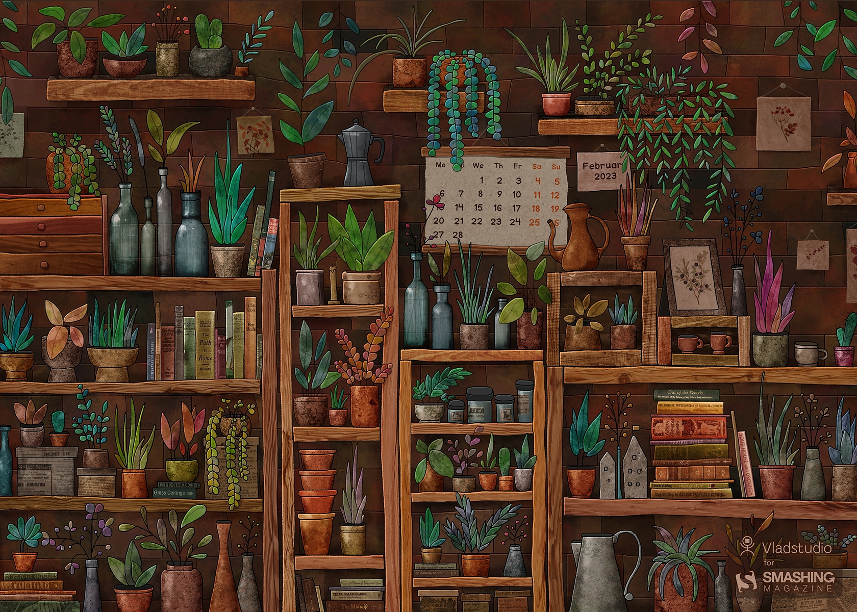
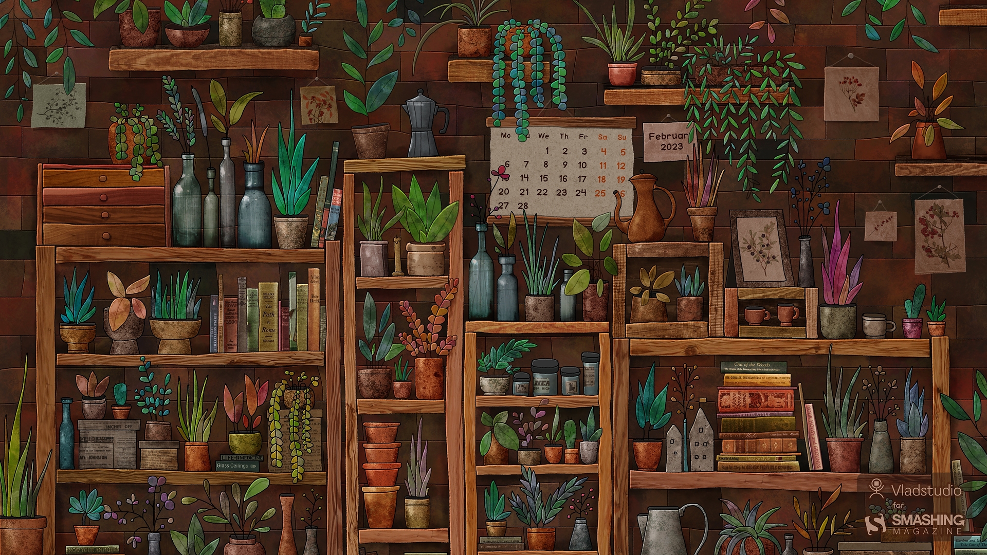
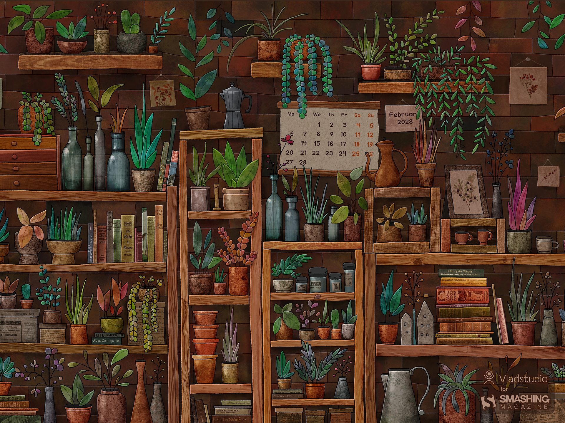
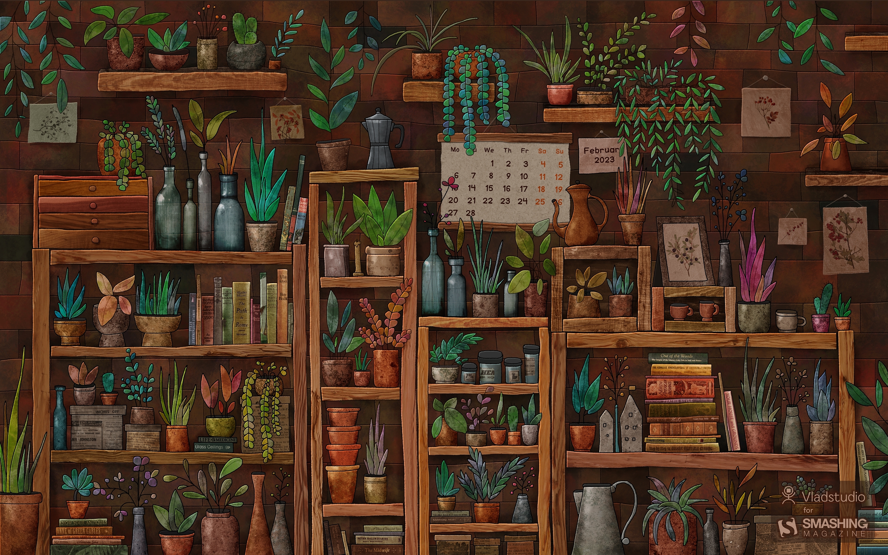
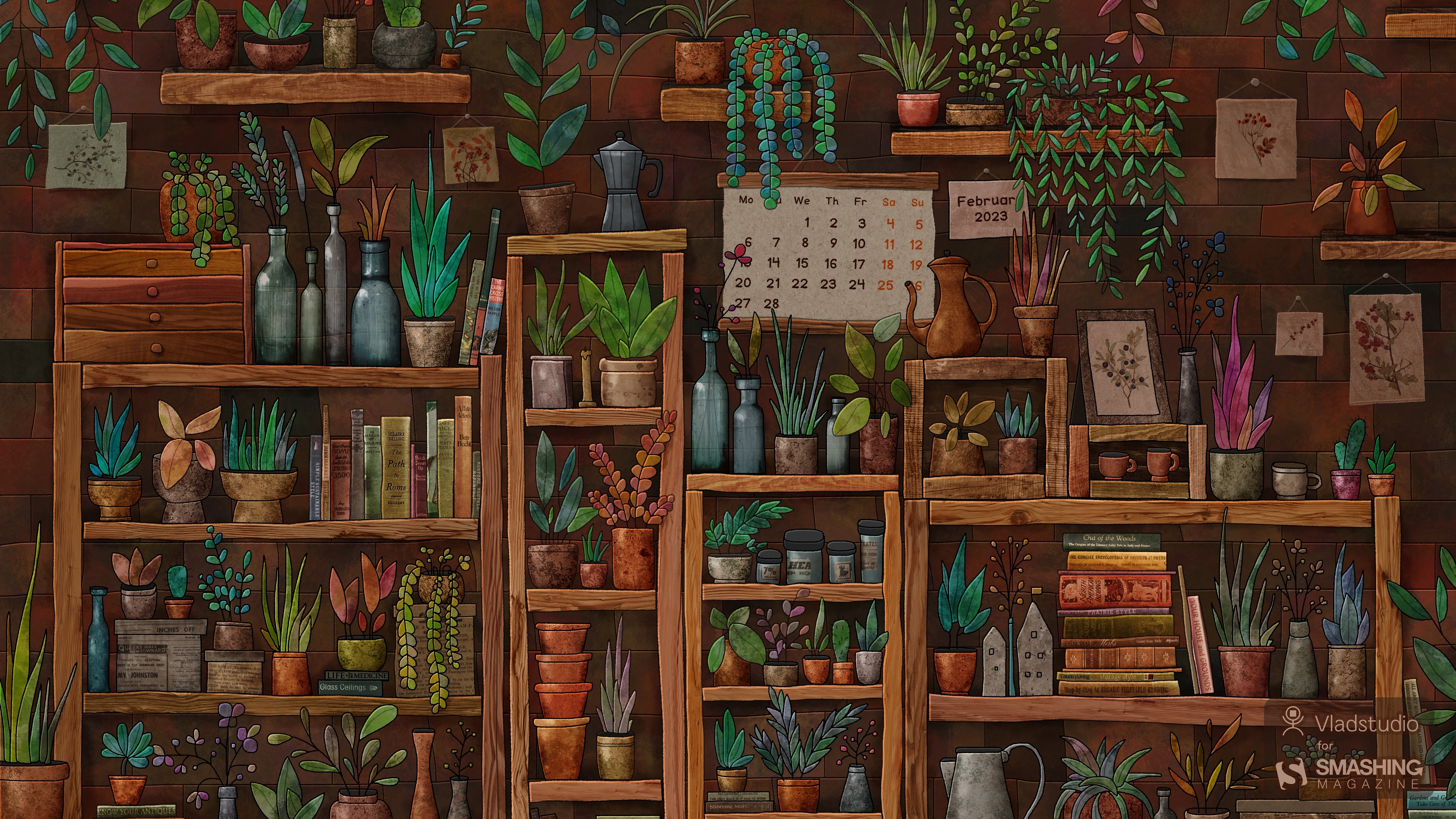
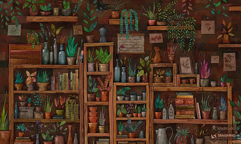
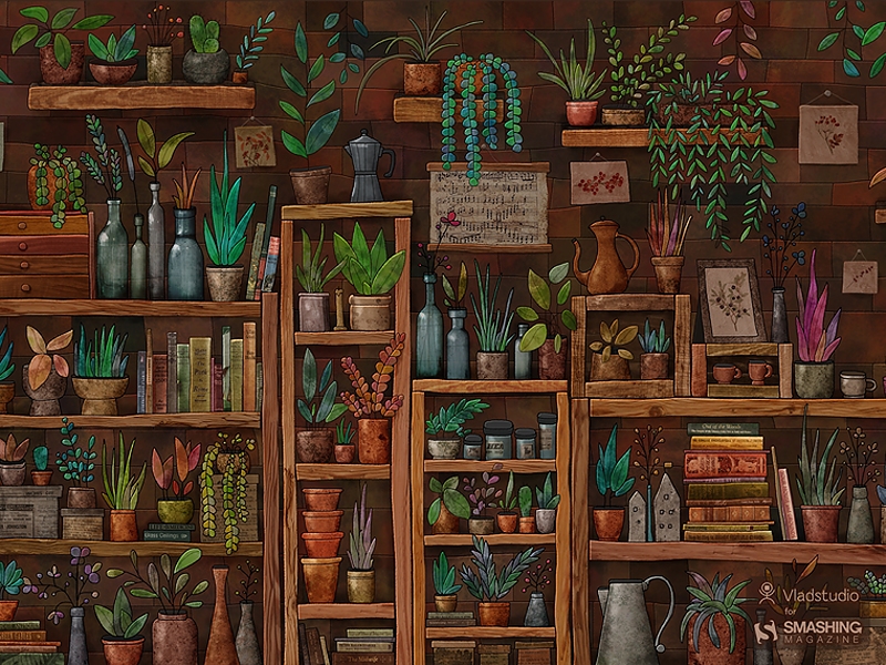
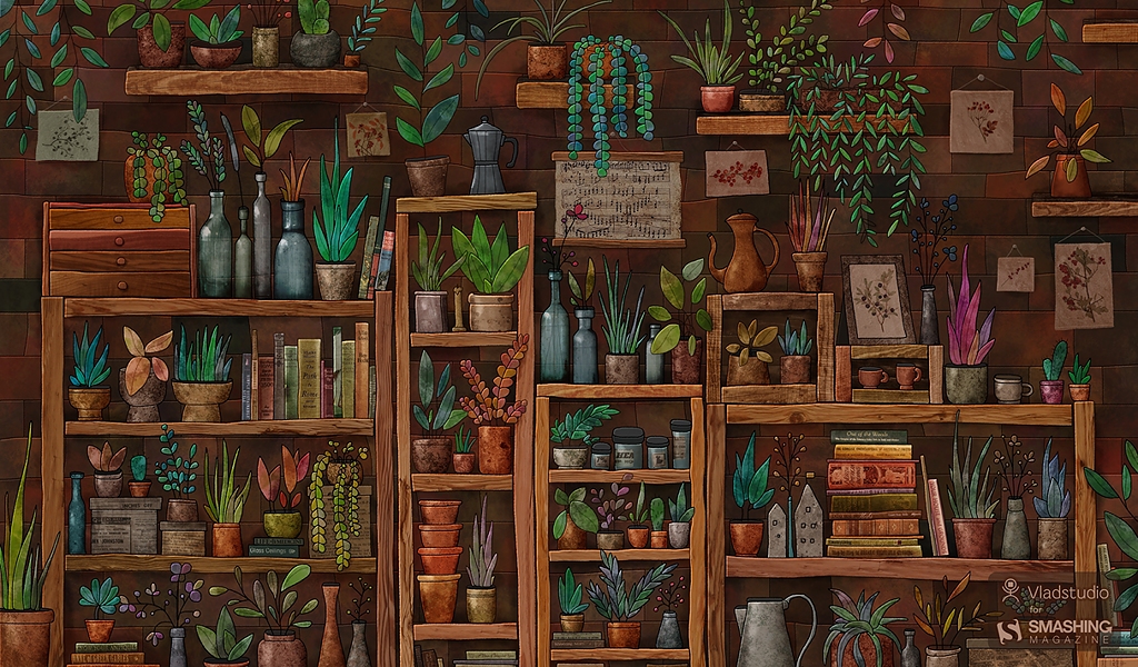
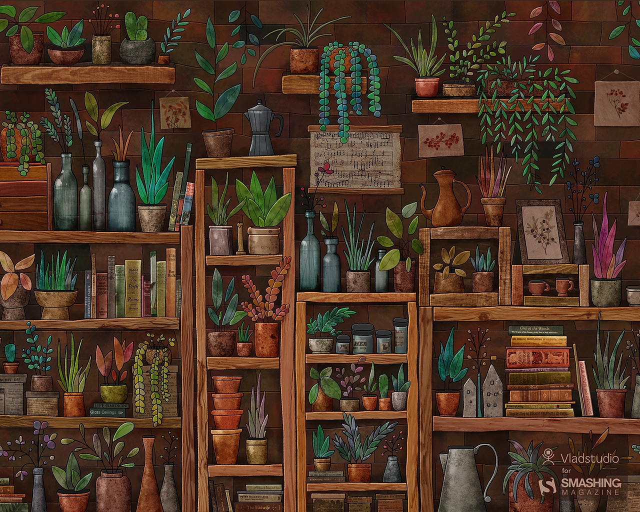
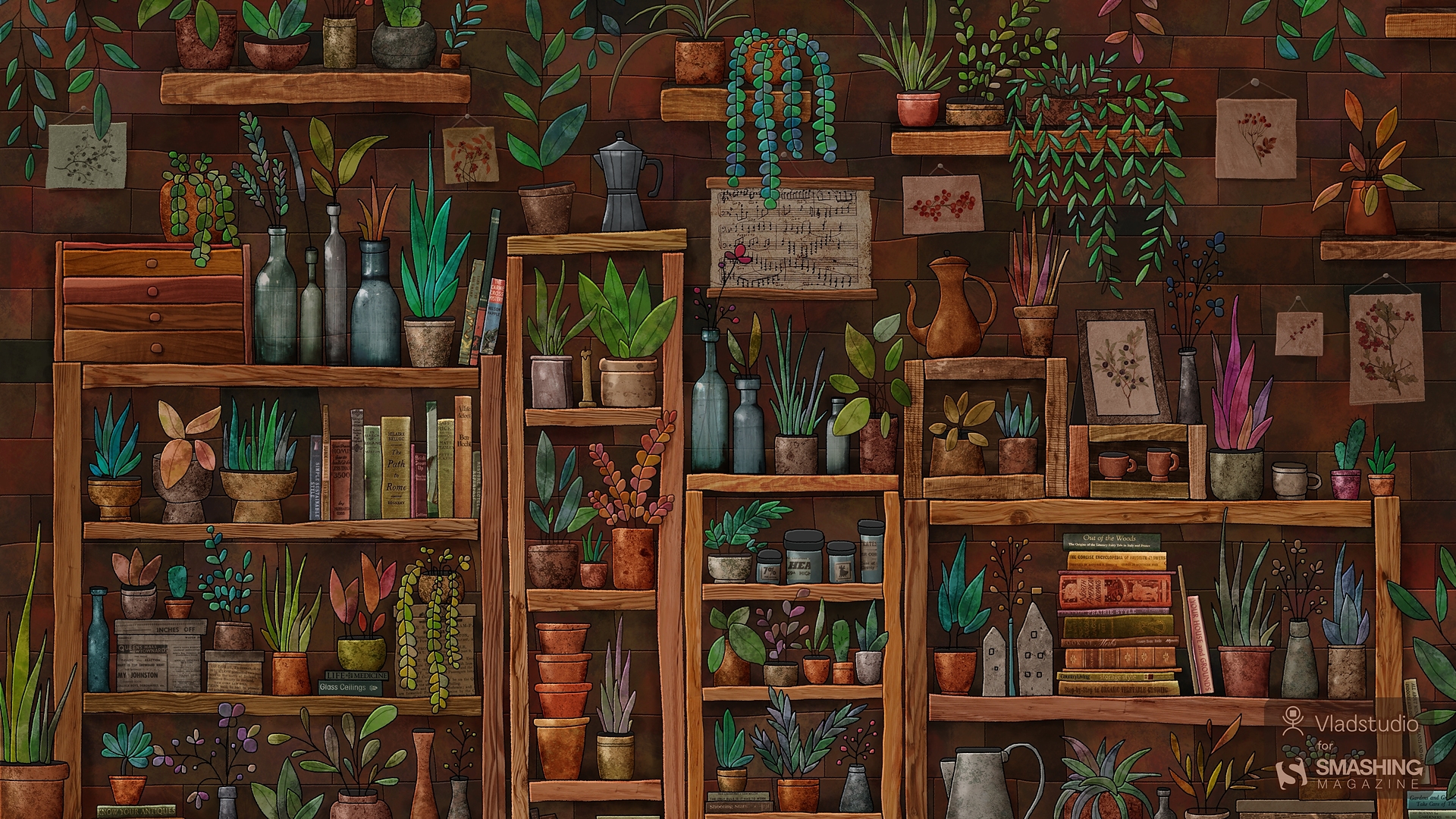
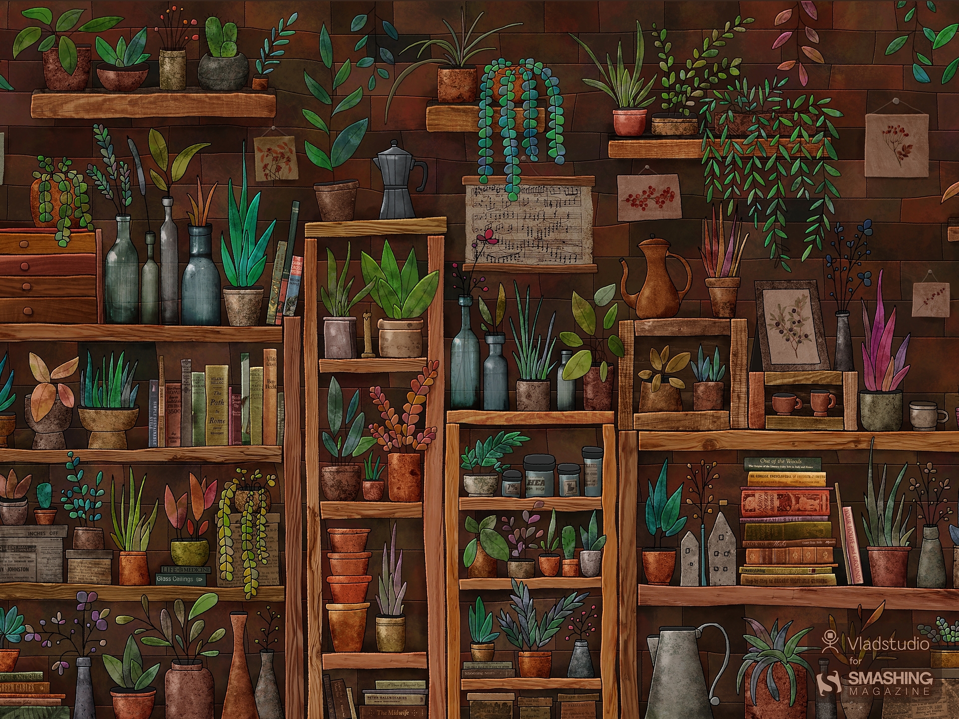
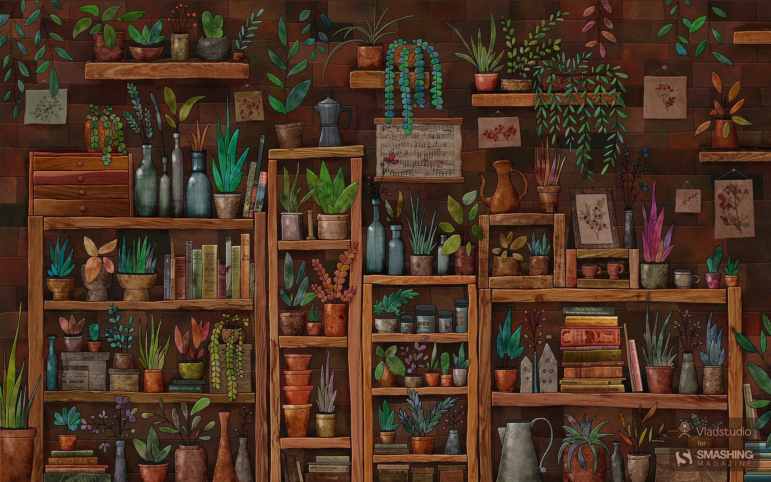
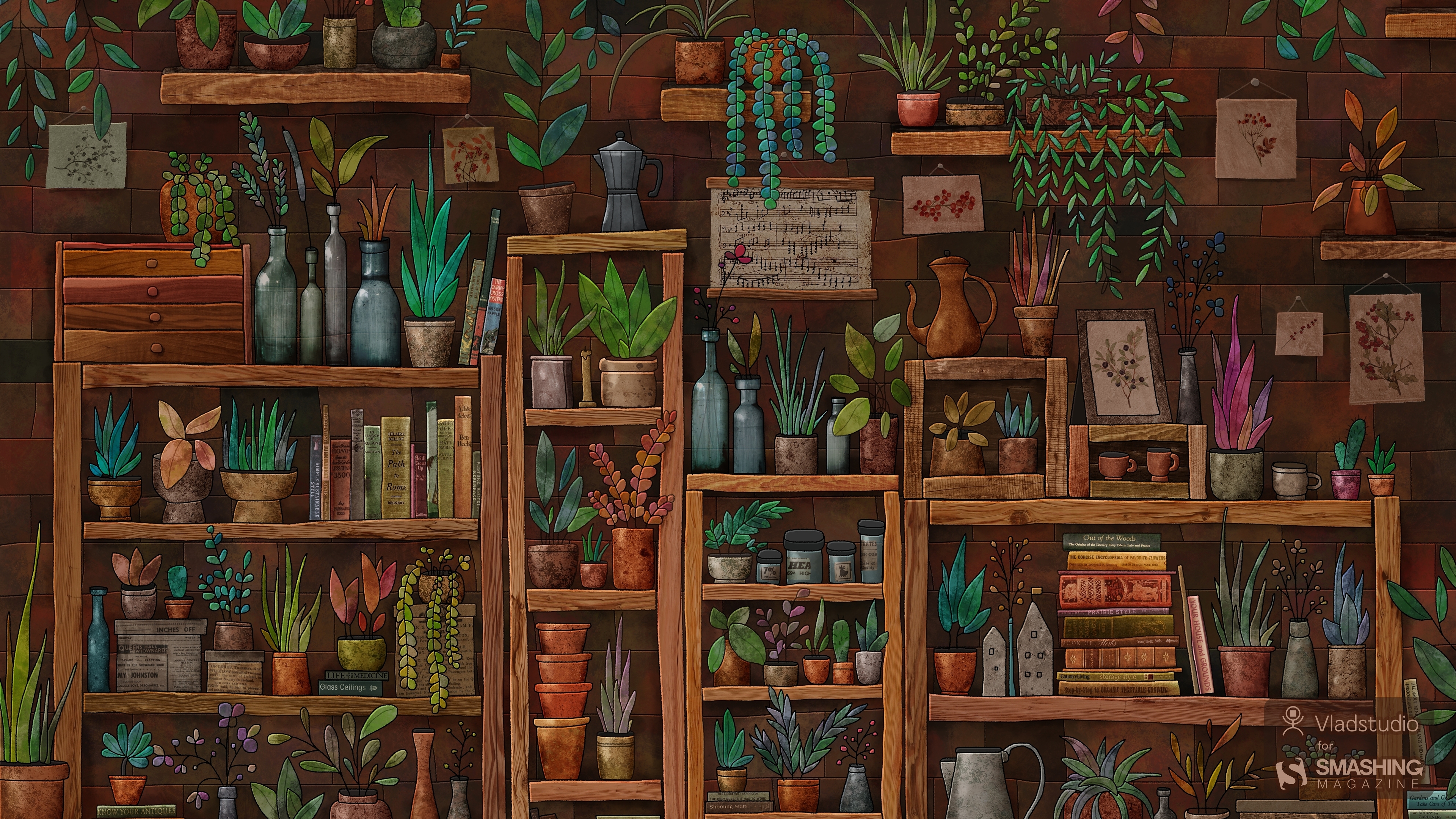
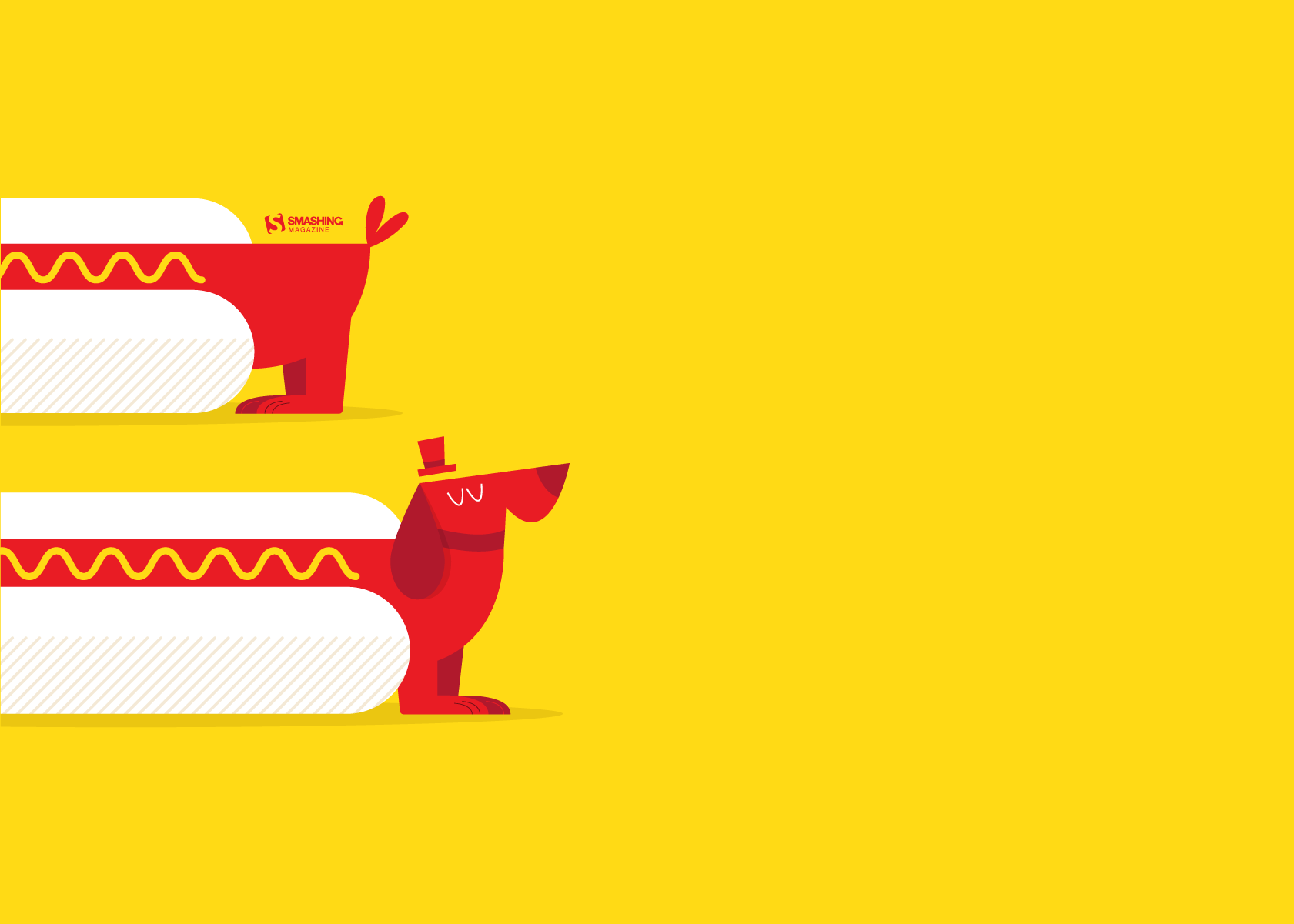
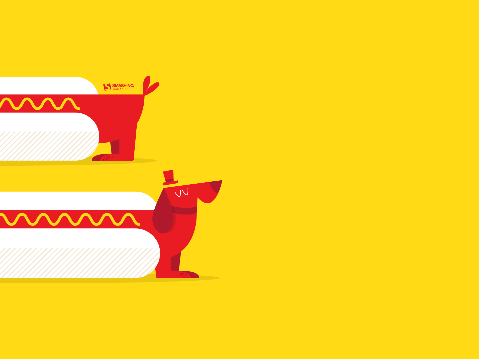
Plants
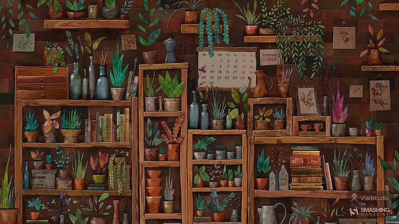
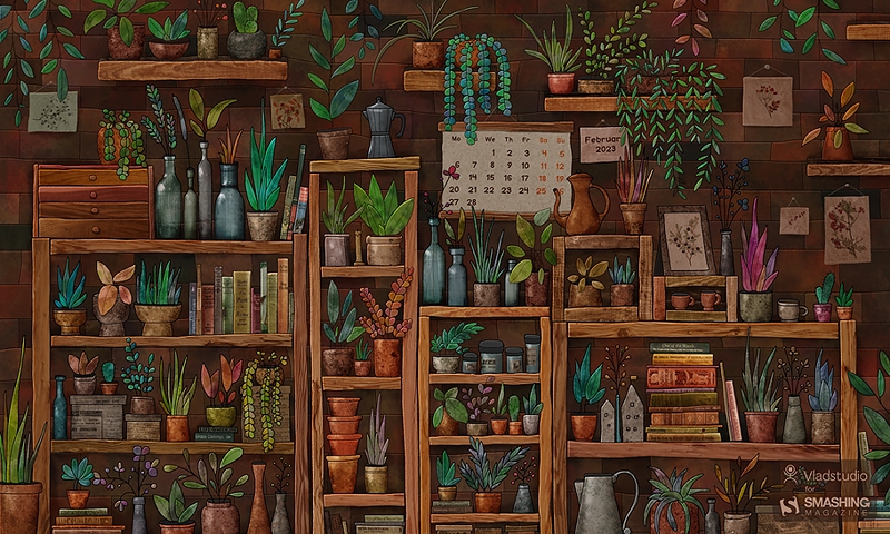
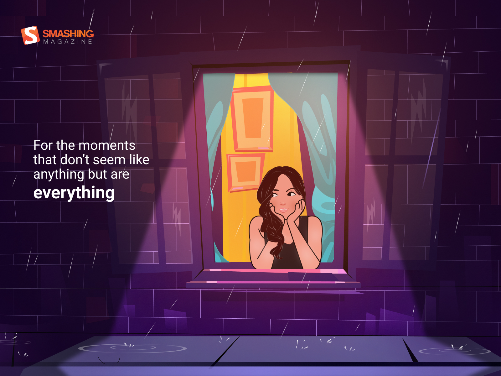
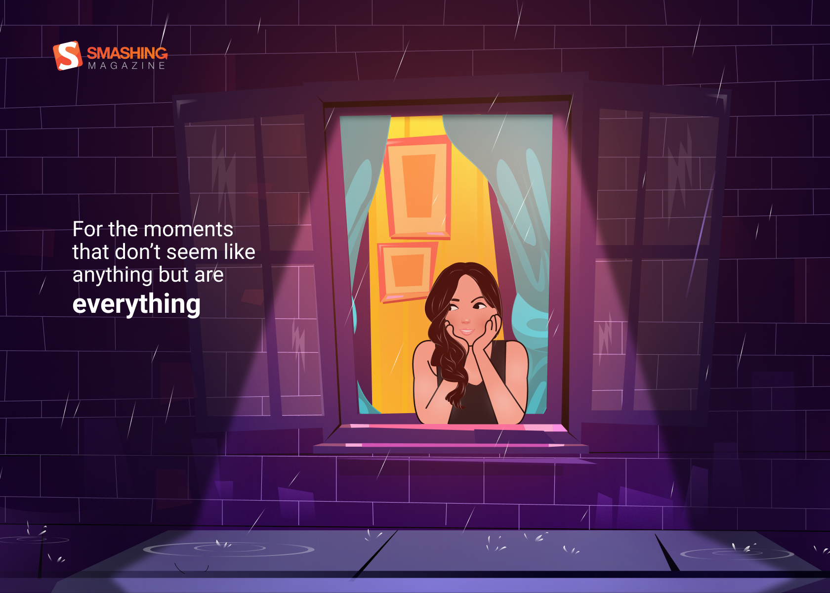
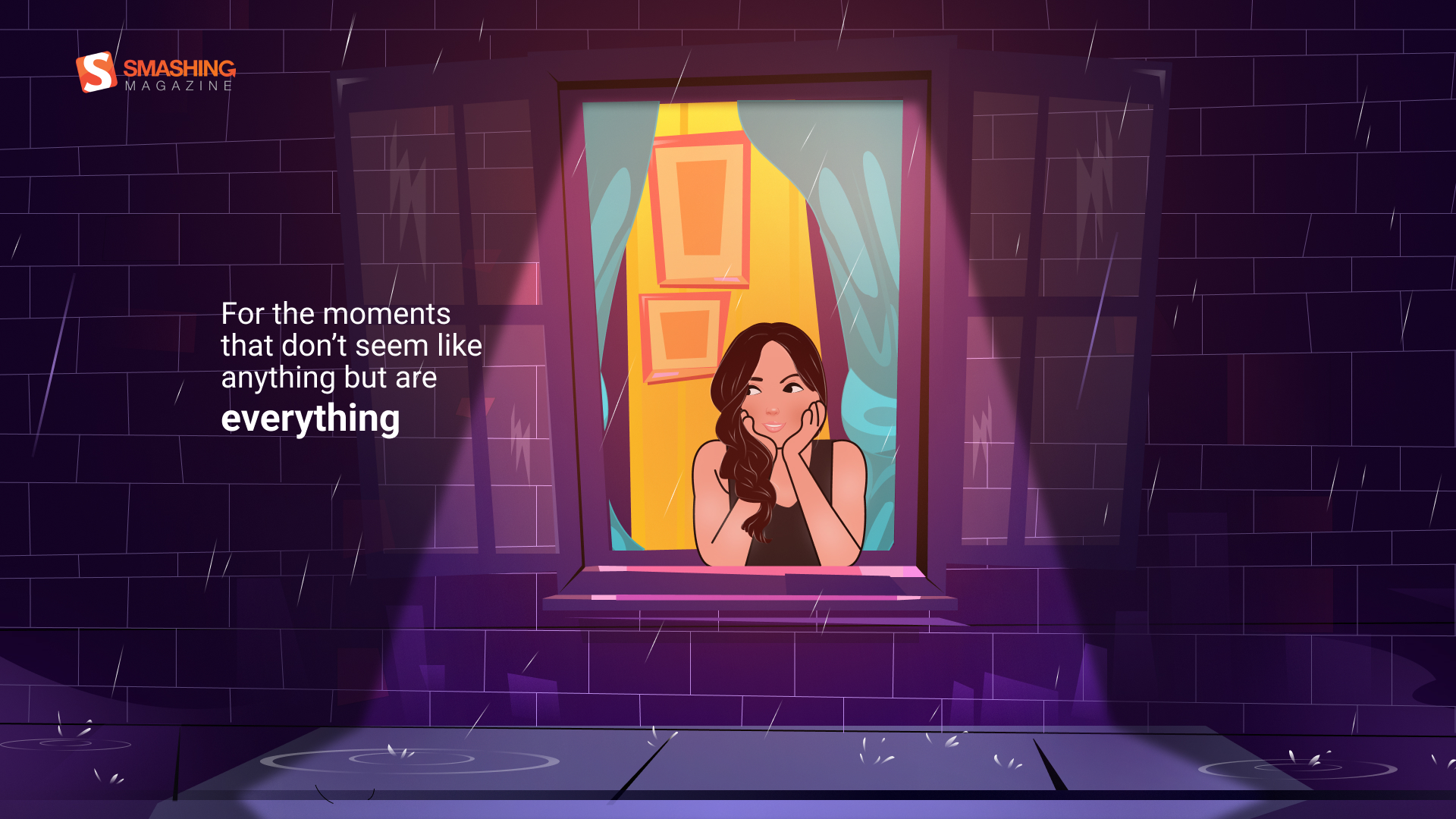
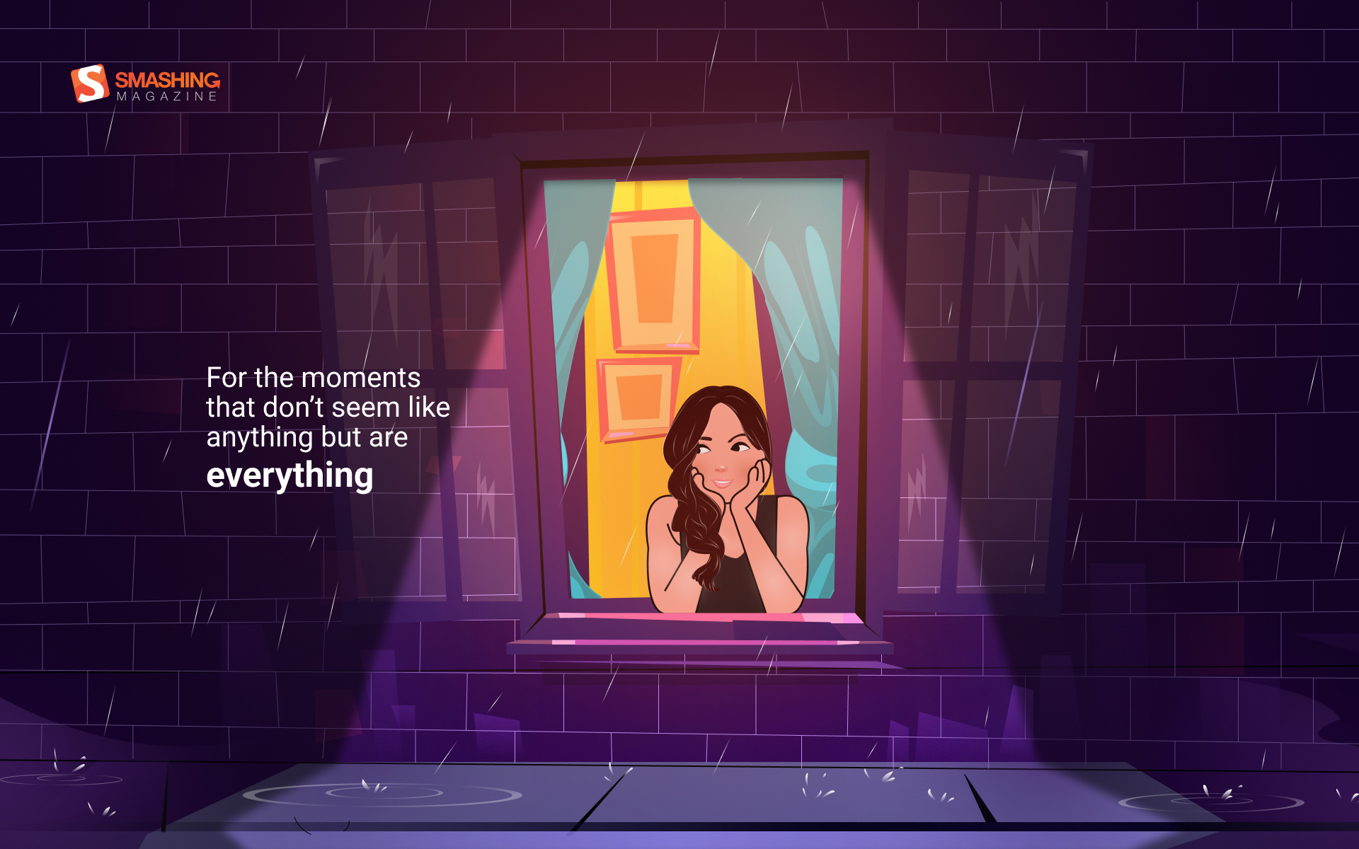
“I wanted to draw some very cozy place, both realistic and cartoonish, filled with little details. A space with a slightly unreal atmosphere that some great shops or cafes have. A mix of plants, books, bottles, and shelves seemed like a perfect fit. I must admit it took longer to draw than most of my other pictures! But it was totally worth it. Watch the making-of.” — Designed by Vlad Gerasimov from Georgia.
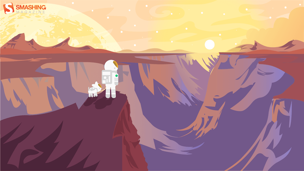
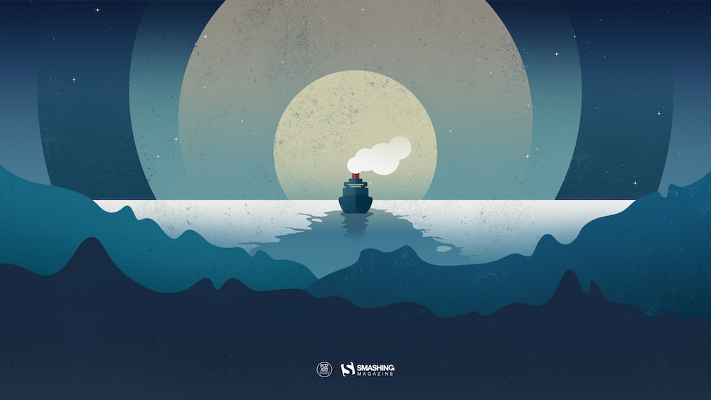
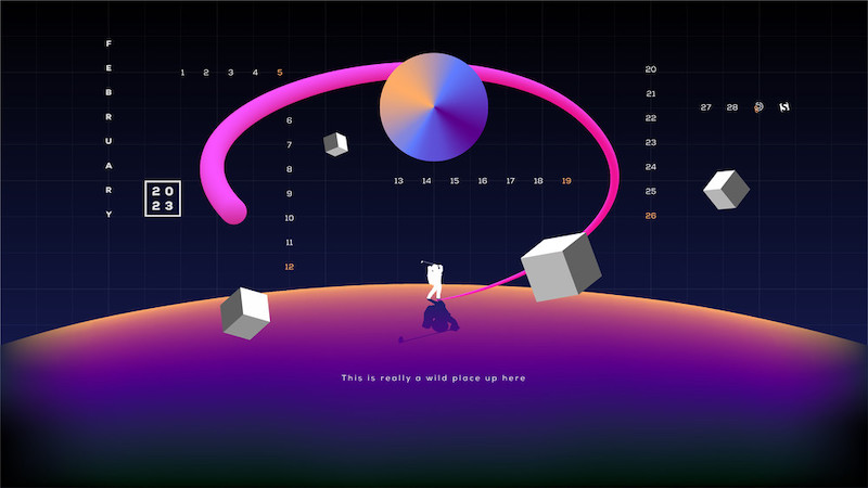
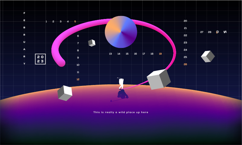
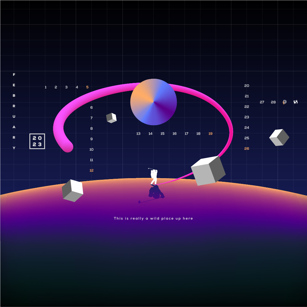
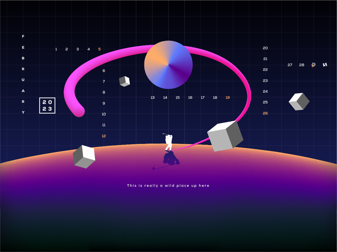
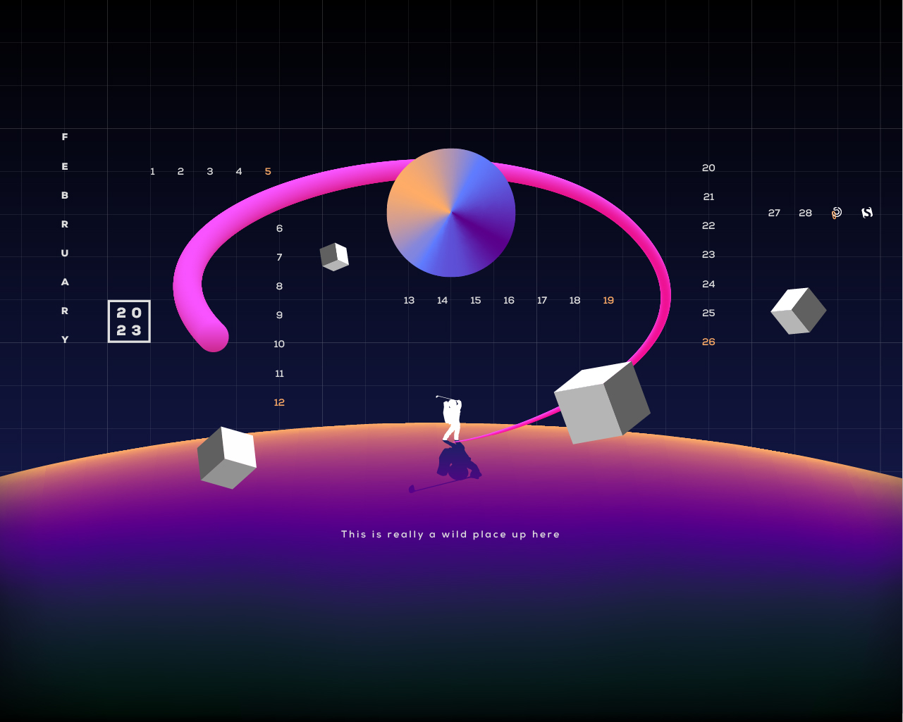
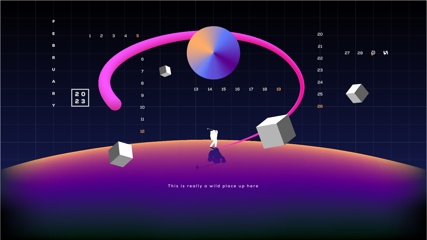
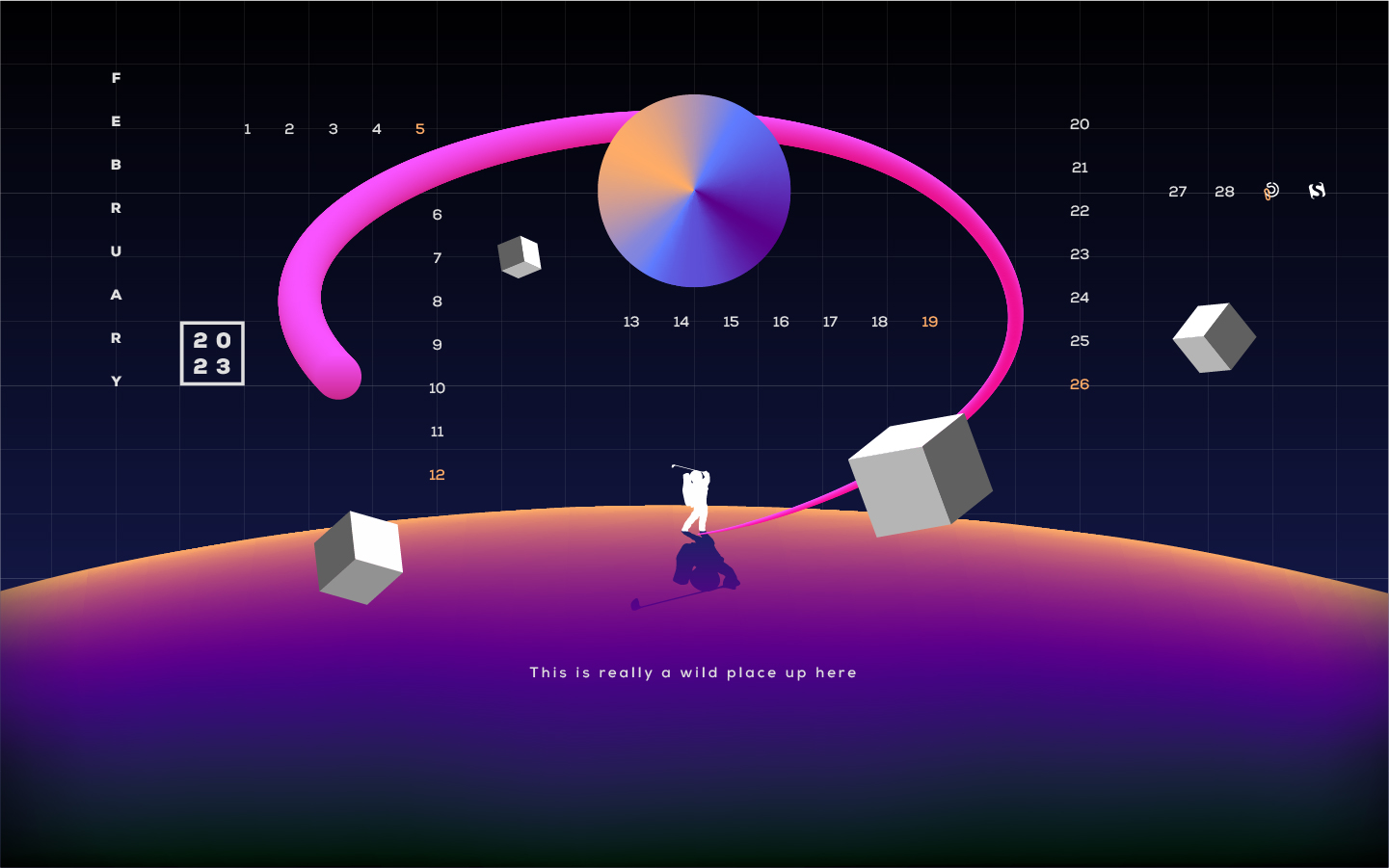
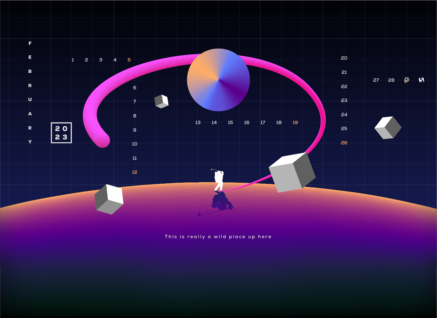
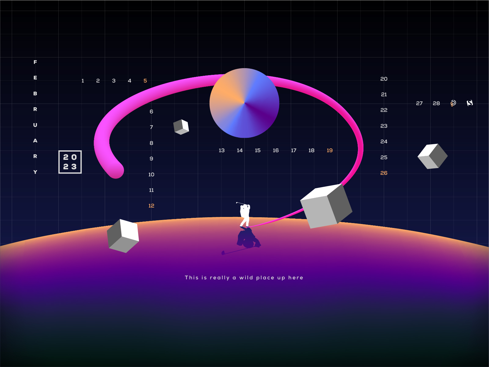
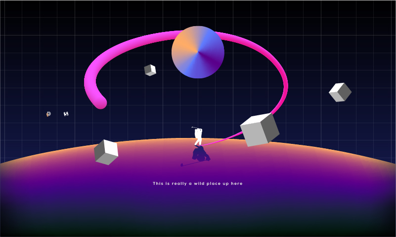
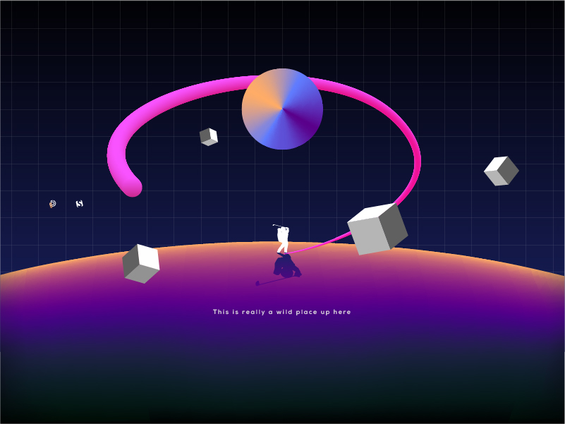
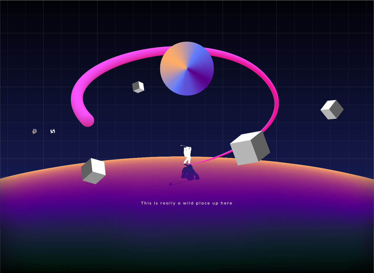
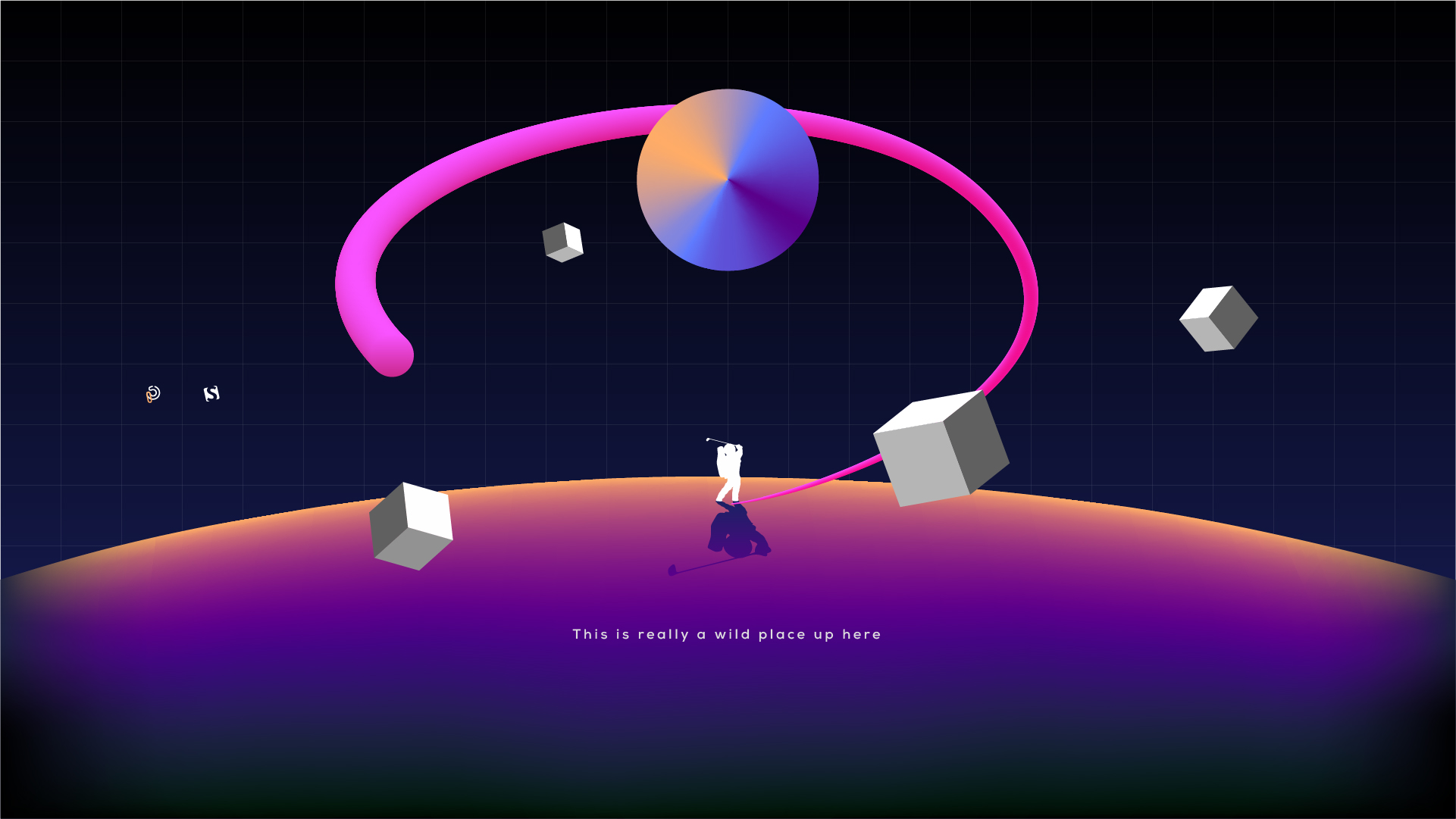
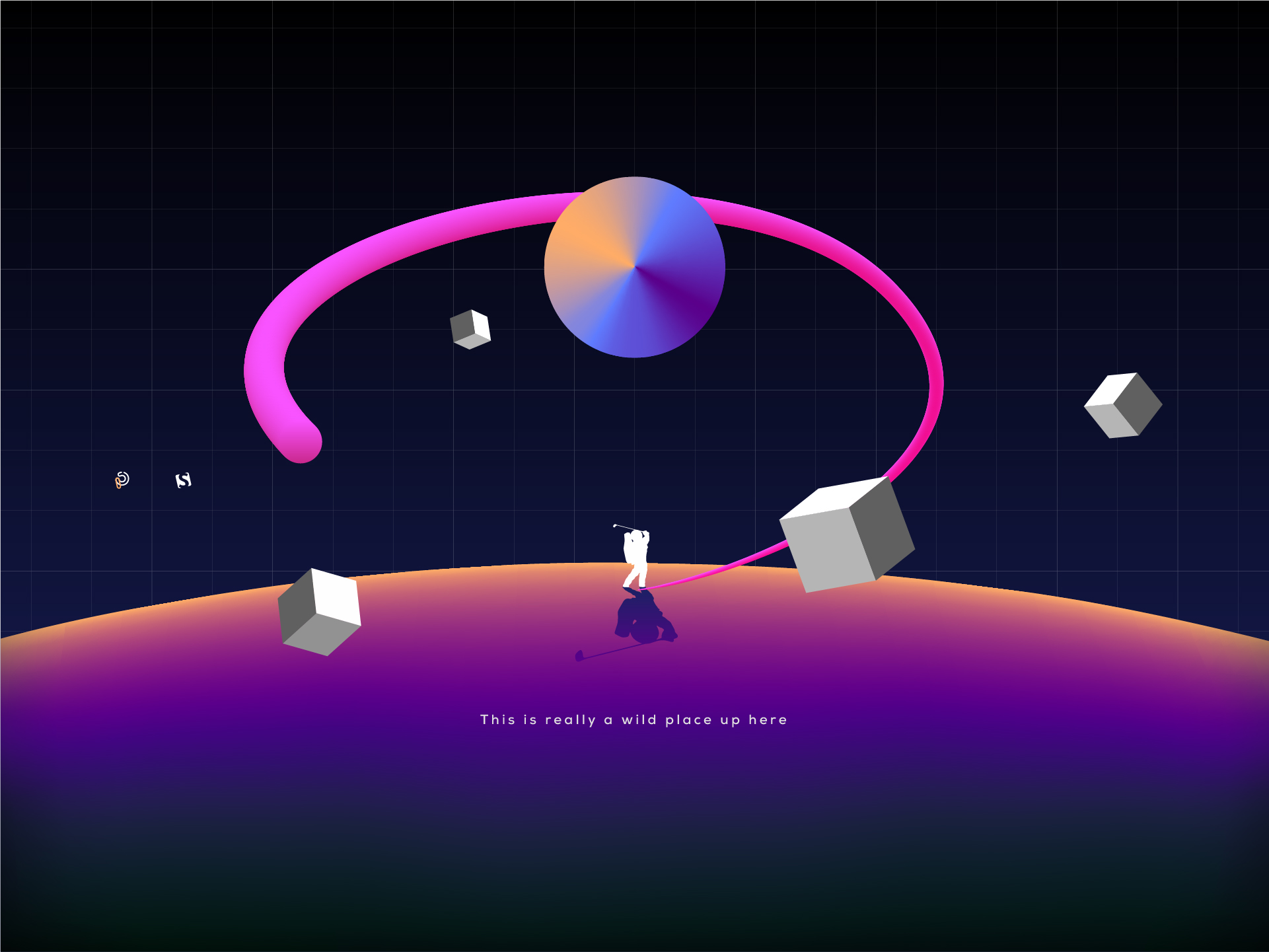
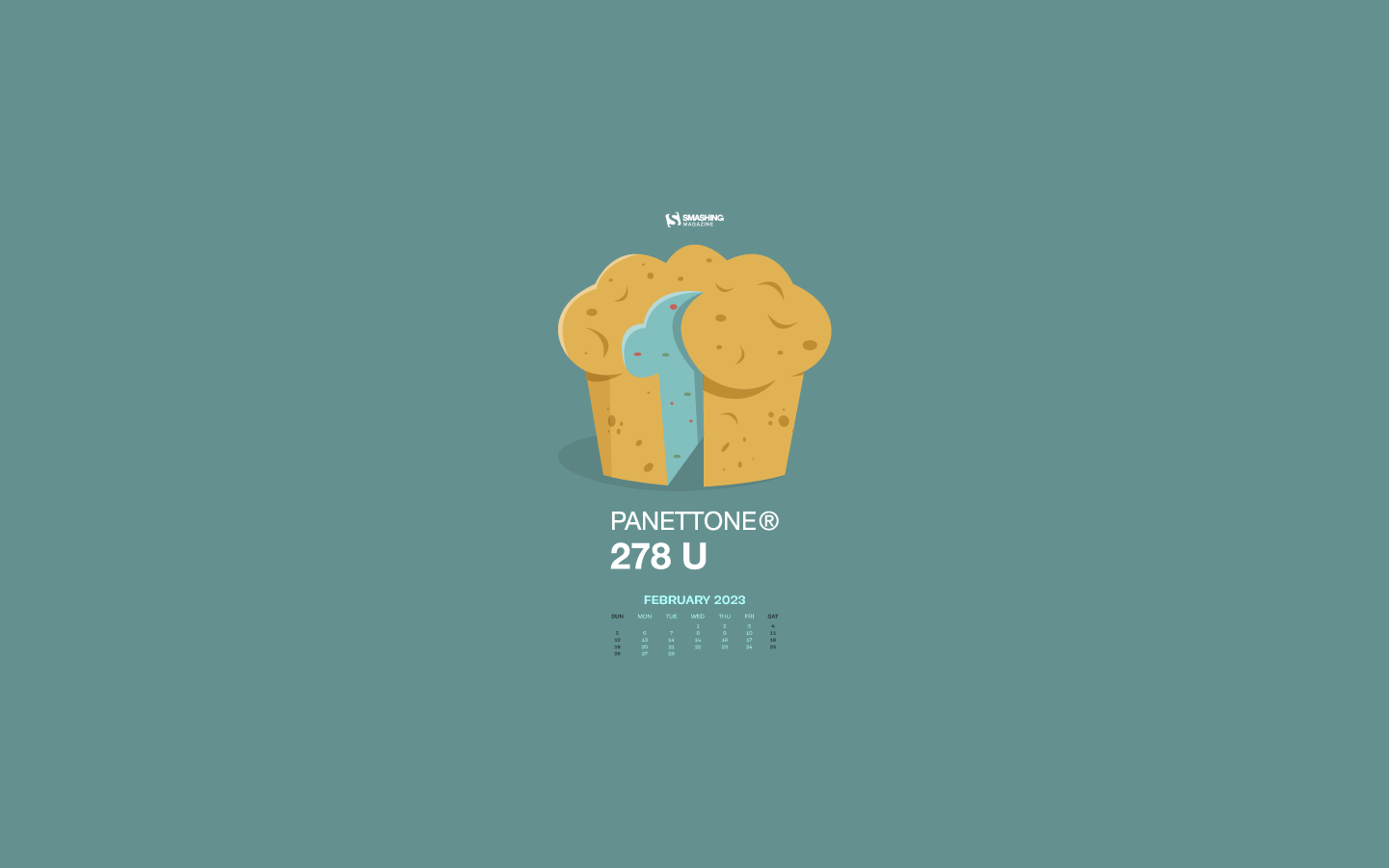
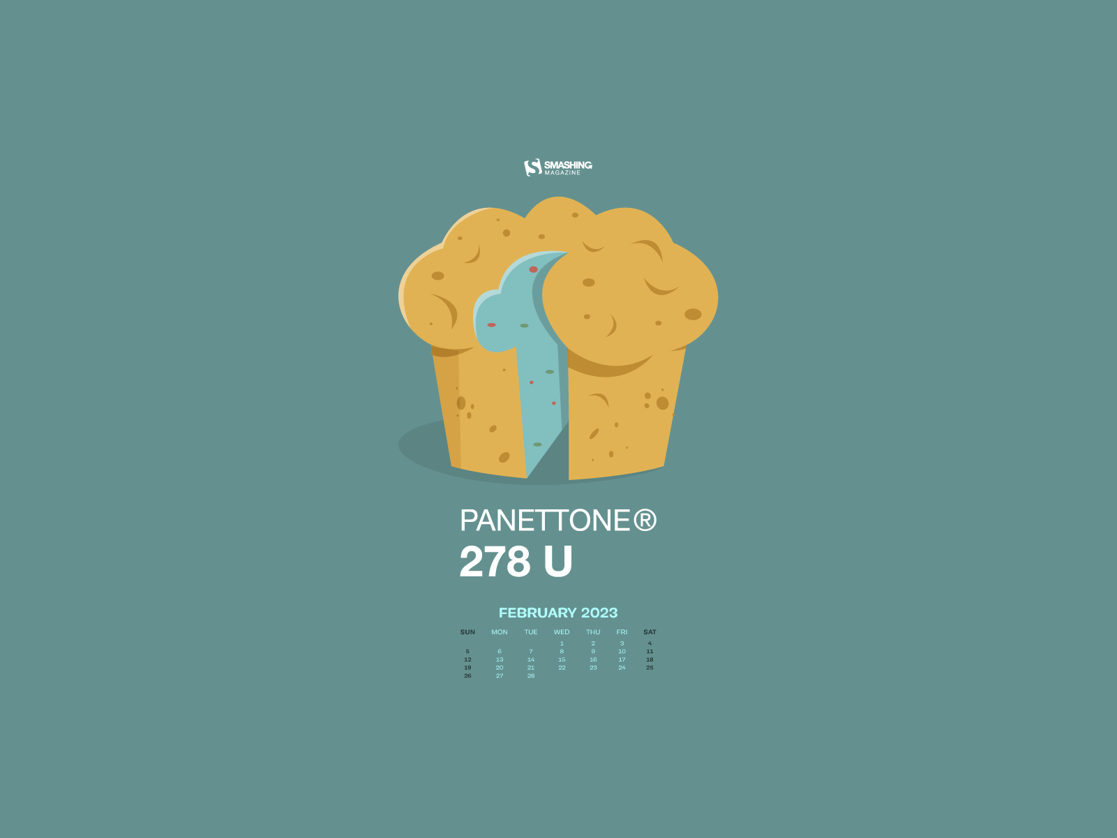
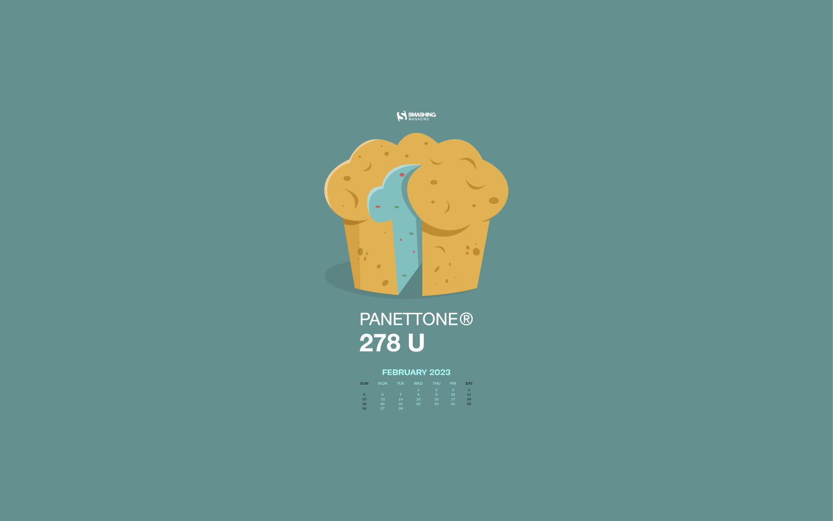
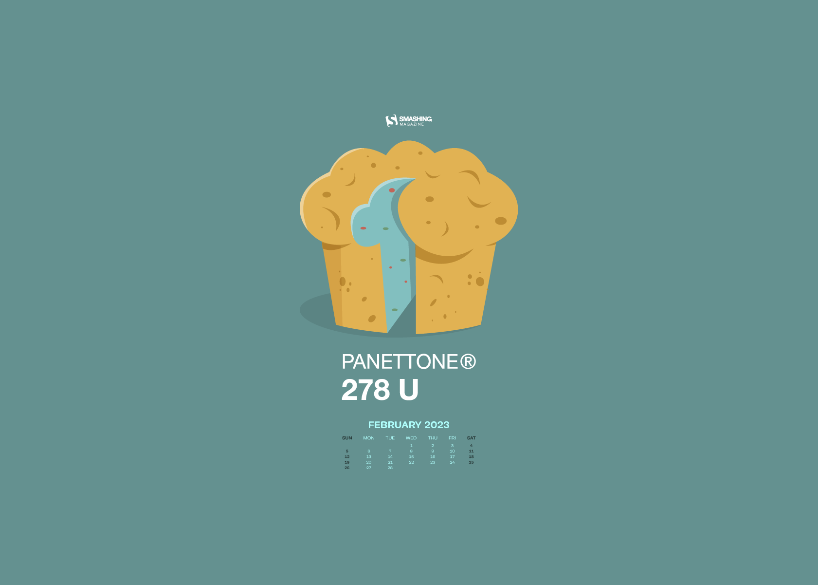
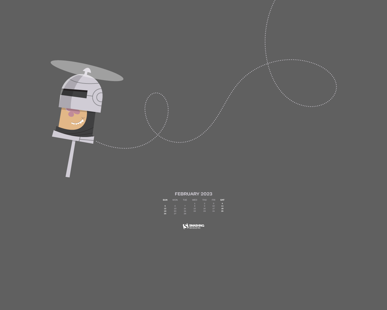
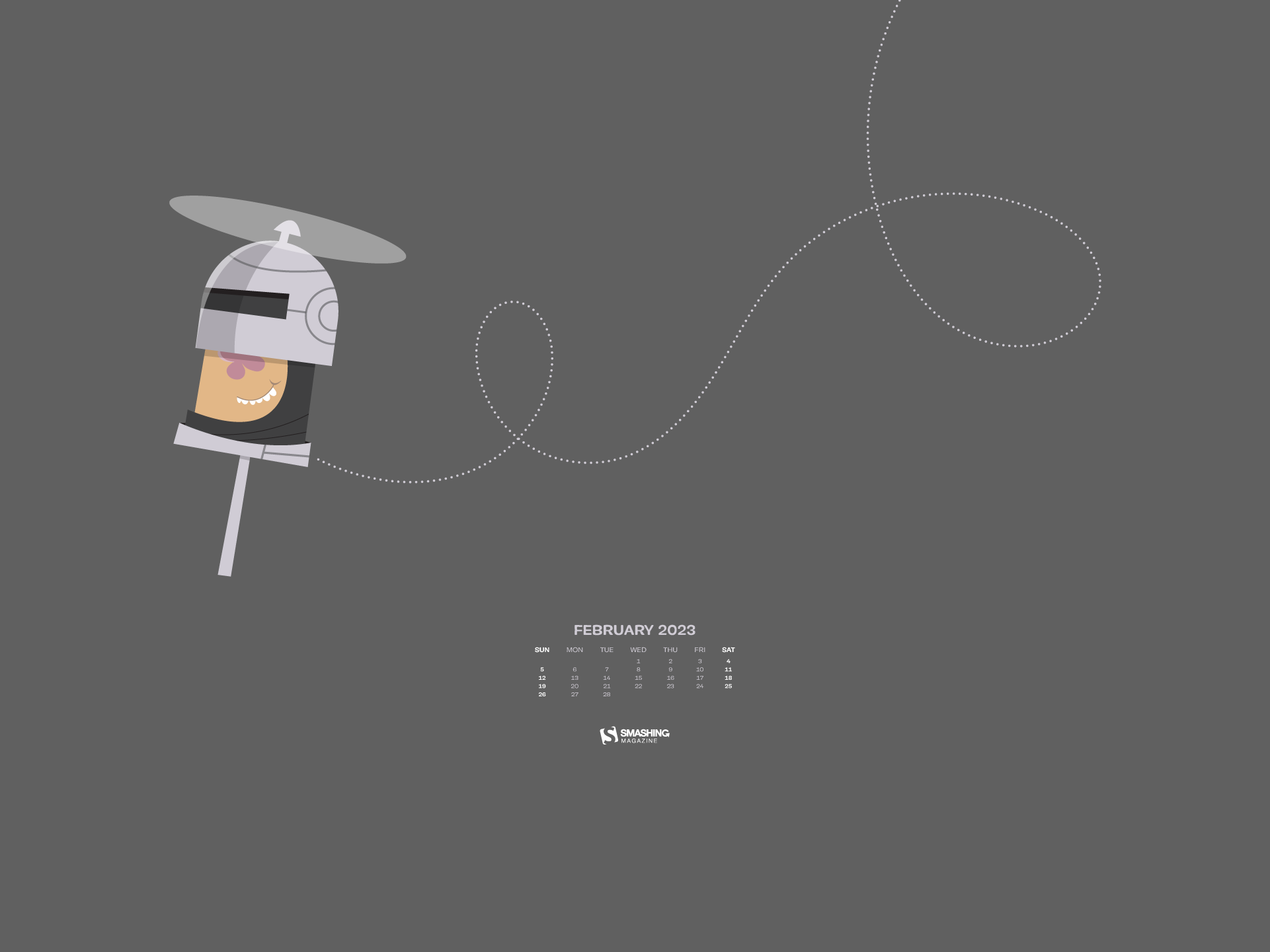
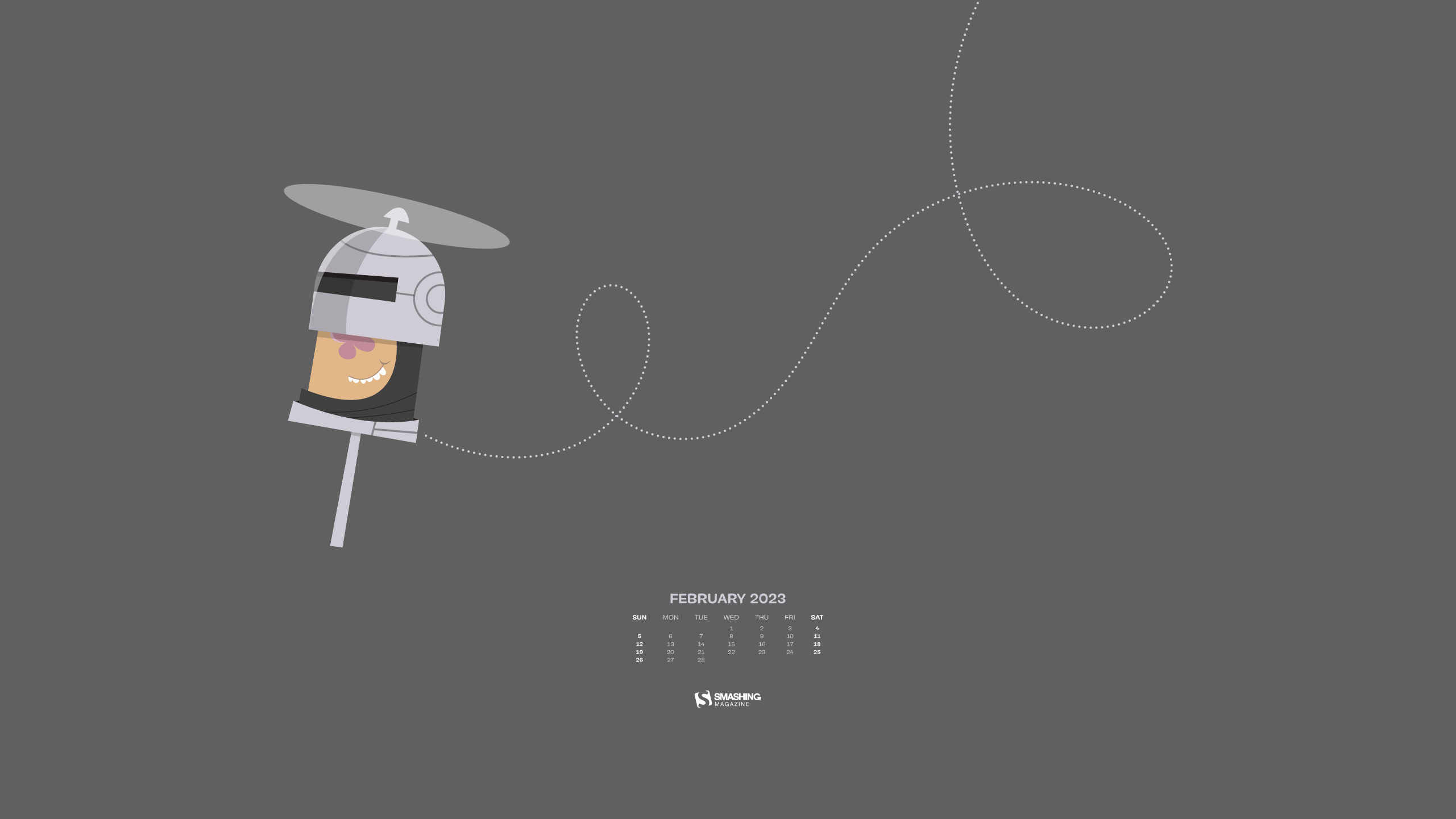
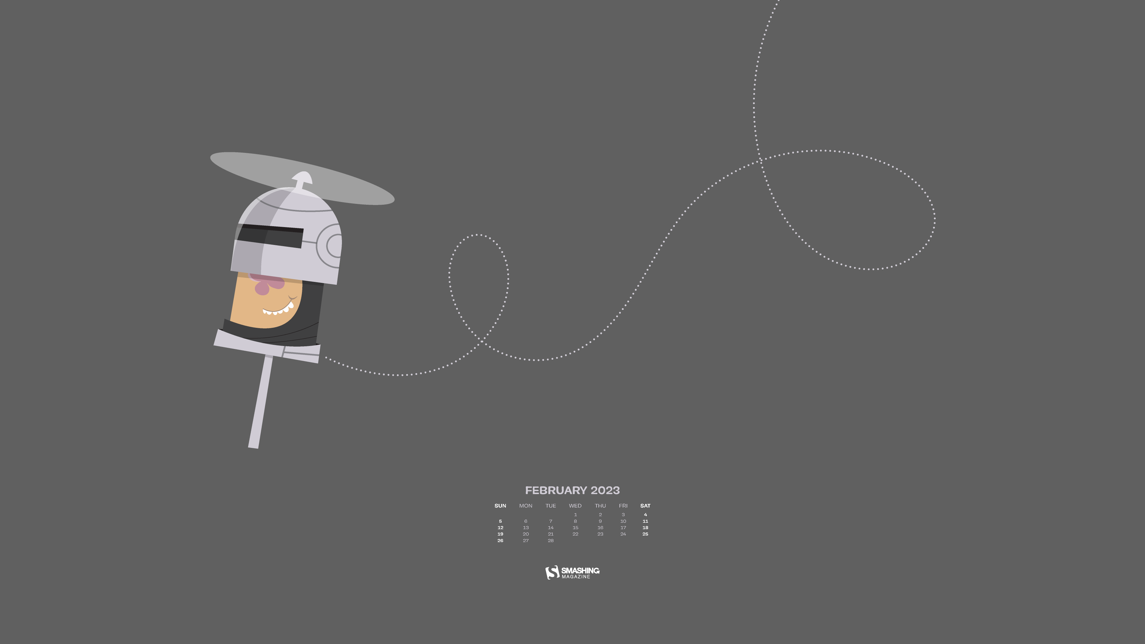
“In times of never-greater hype around the future of technological advancements, we go back to another tech revolution of the past. February 9th marks the day of Apollo 14’s landing on the moon, the third in NASA’s crewed space program. Our February calendar design aims to connect the tech endeavors of the present and past and serve as a reminder that innovation should always be used for a good cause.” — Designed by PopArt Studio from Serbia.
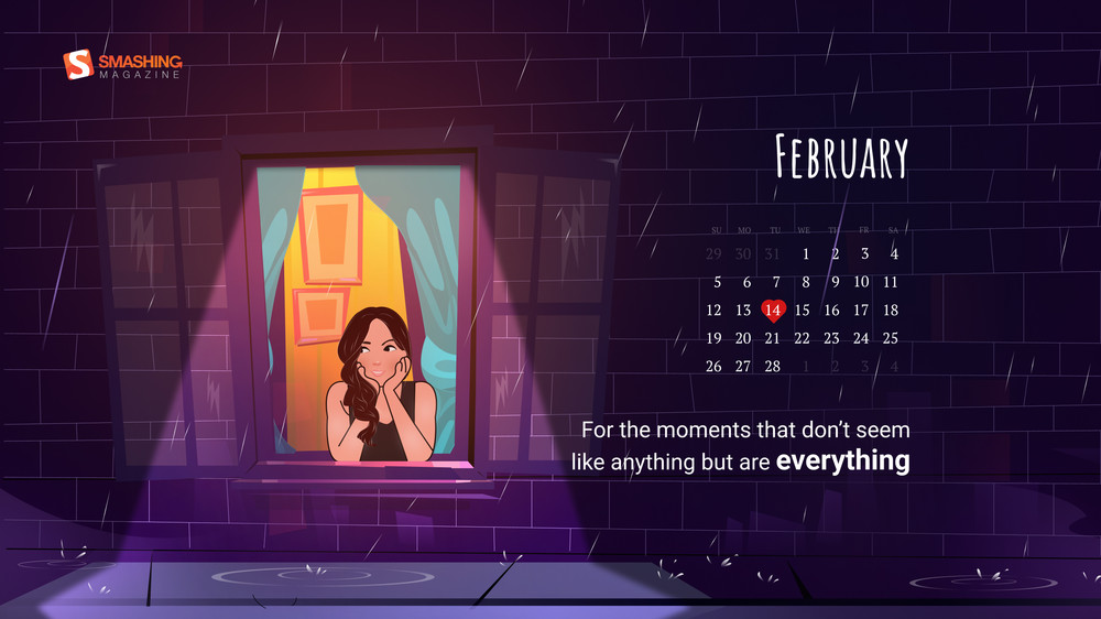
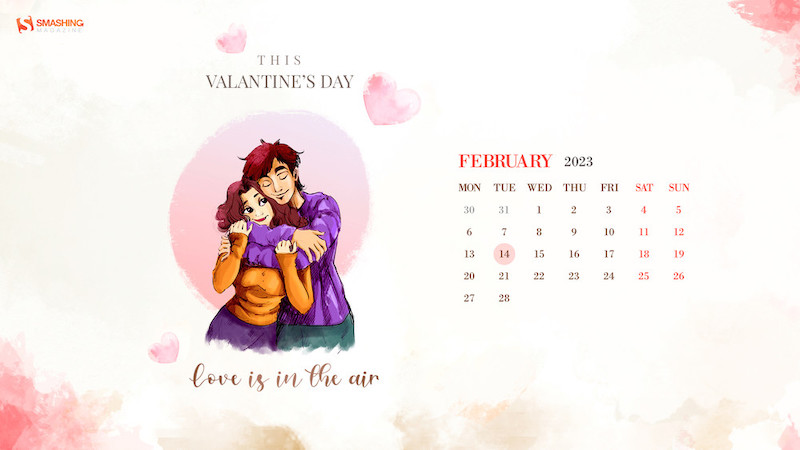
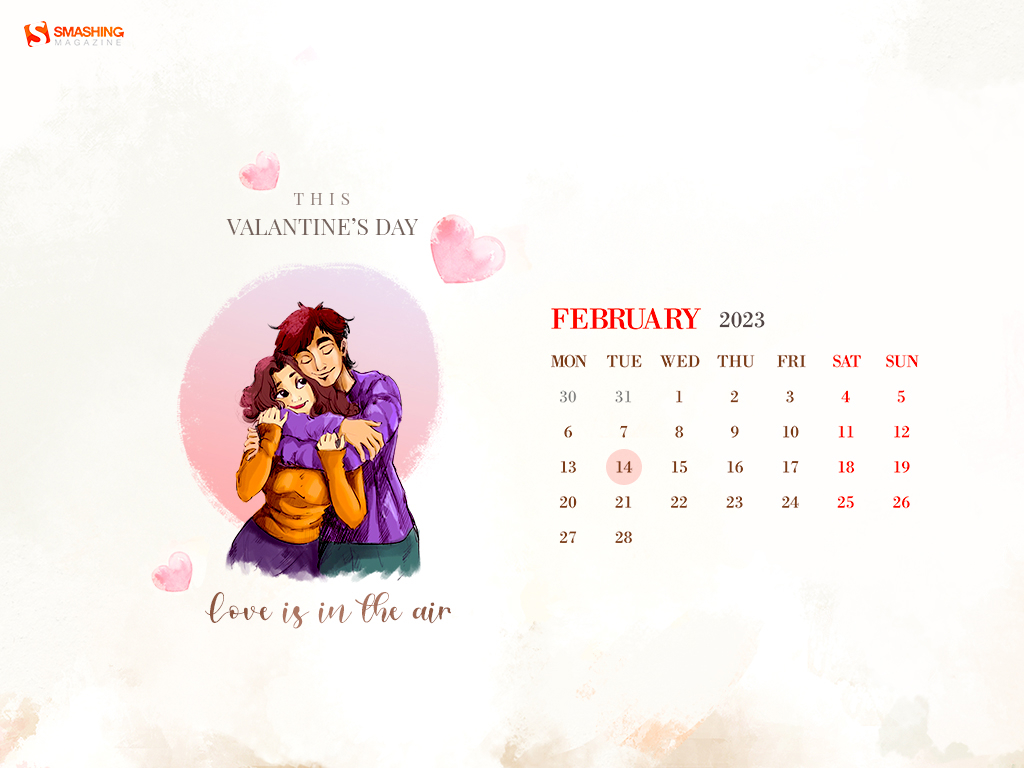
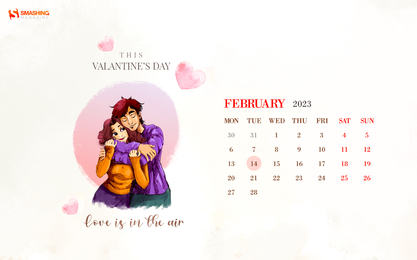
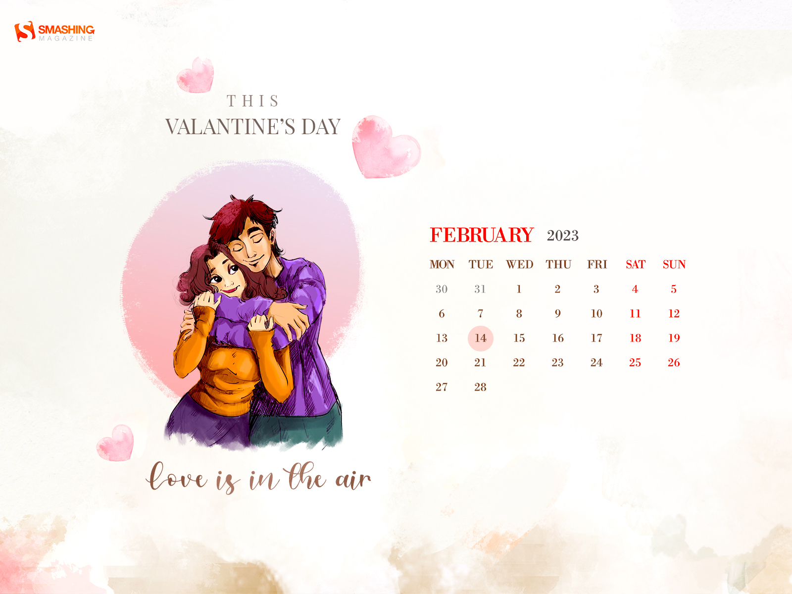
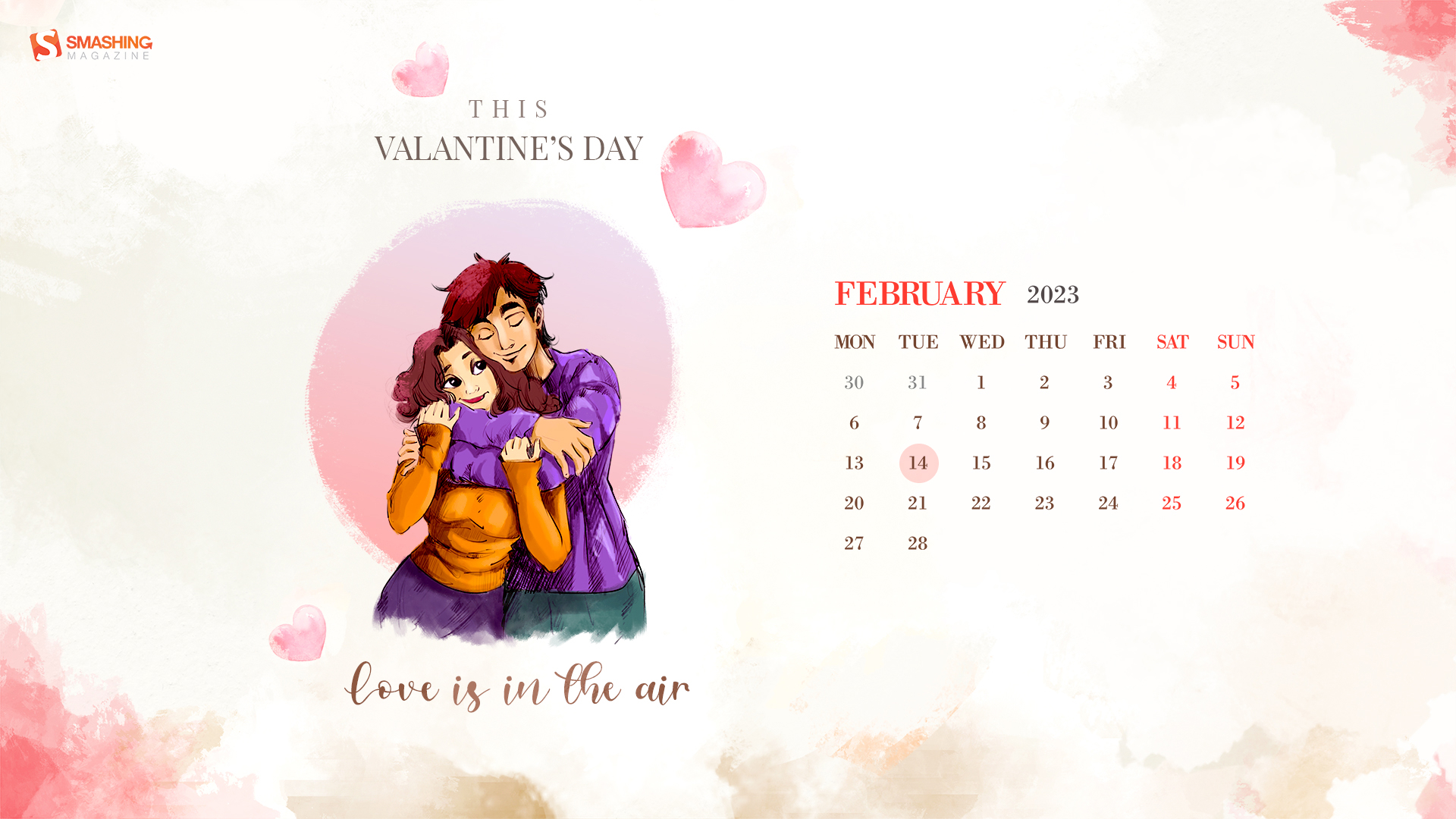
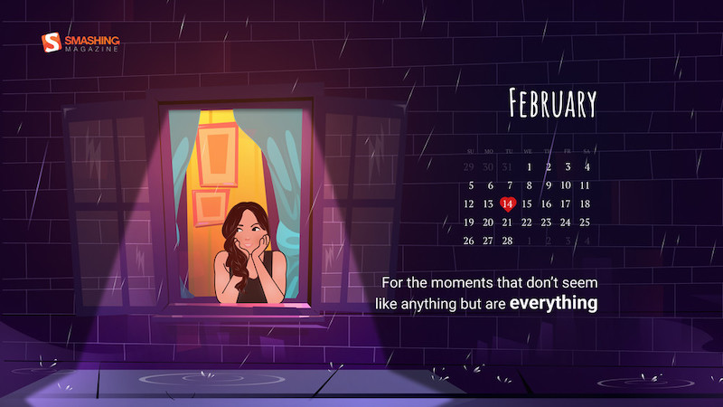
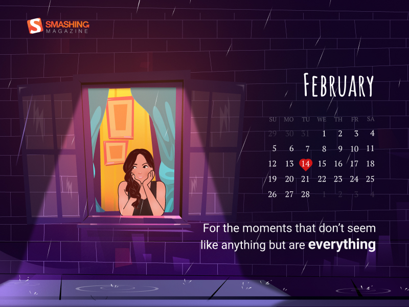
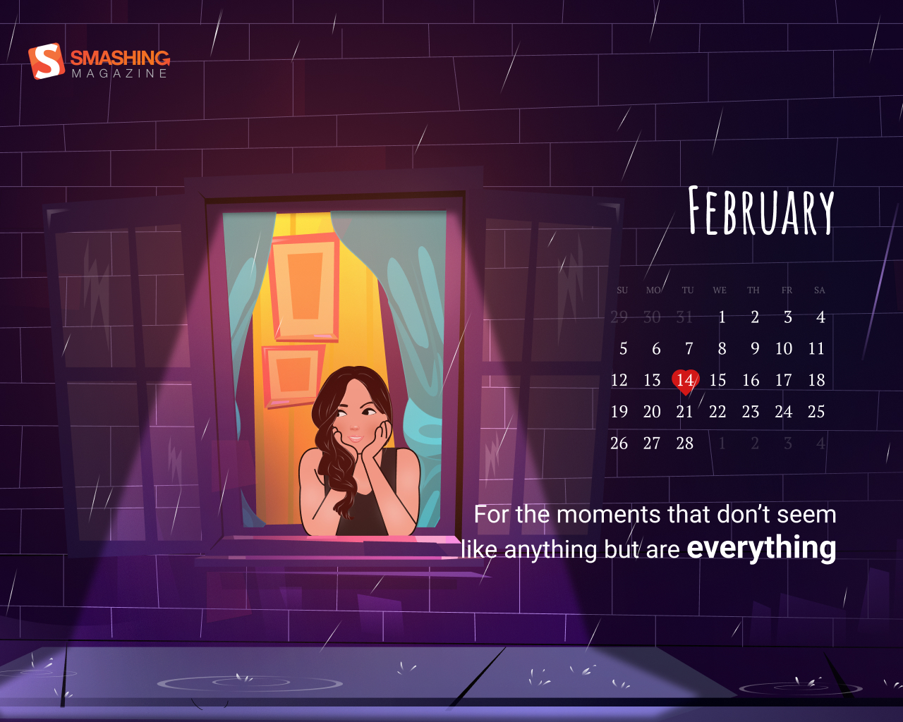
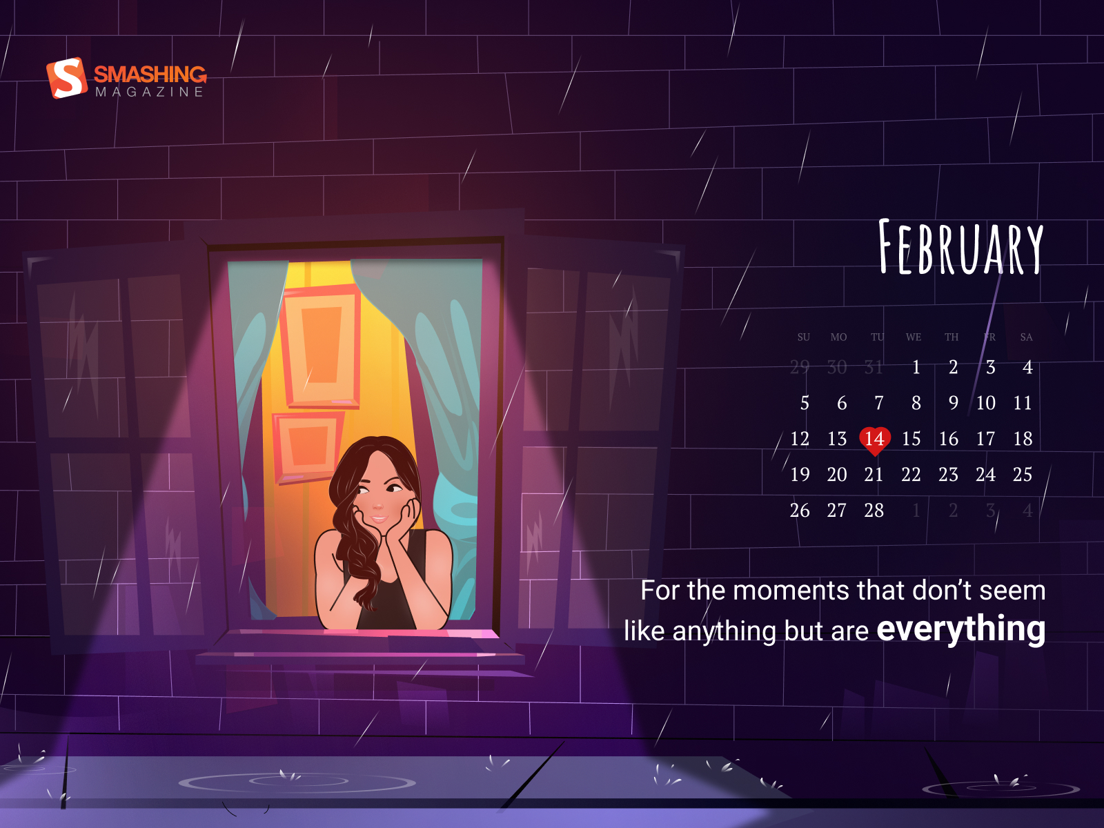
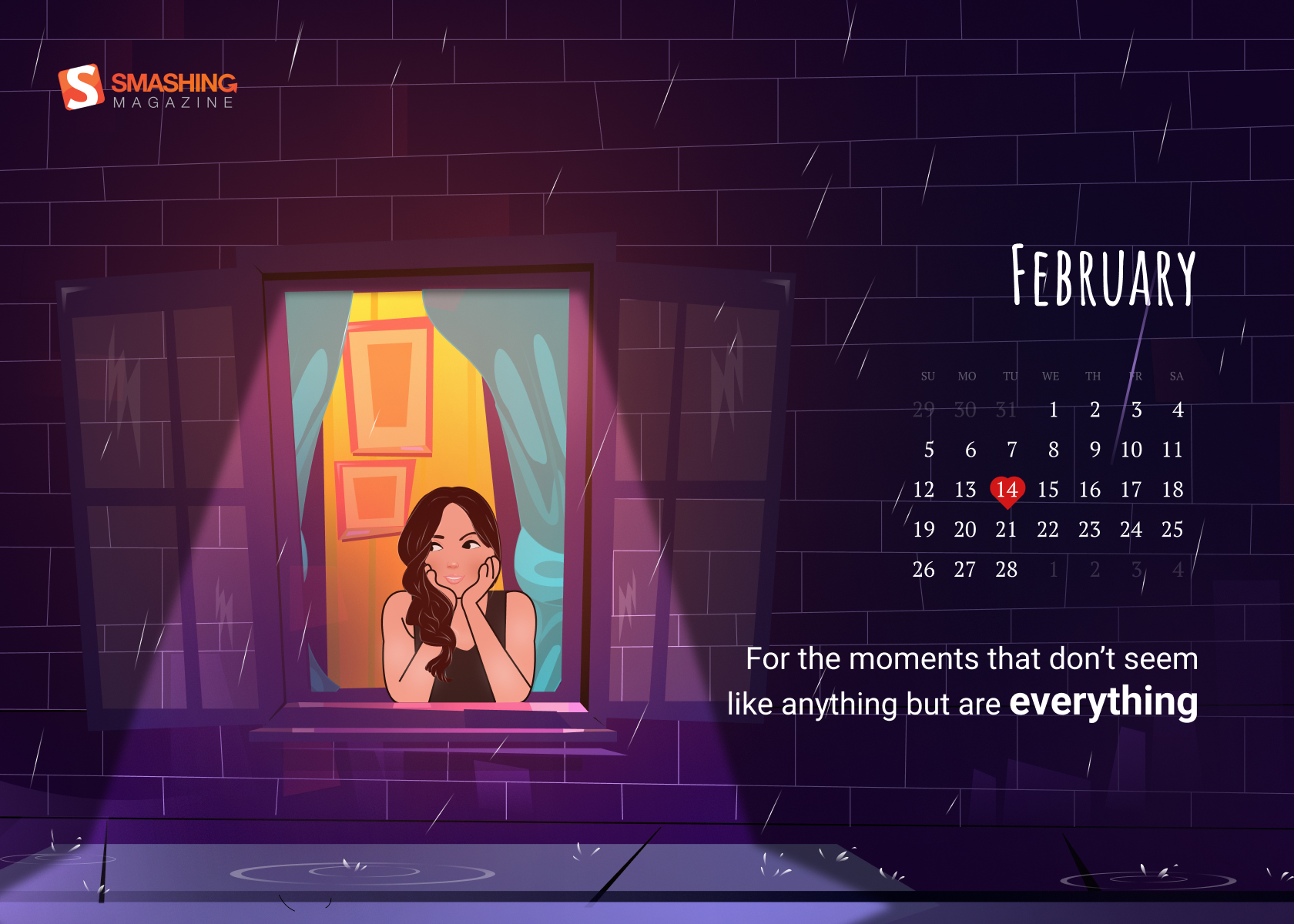
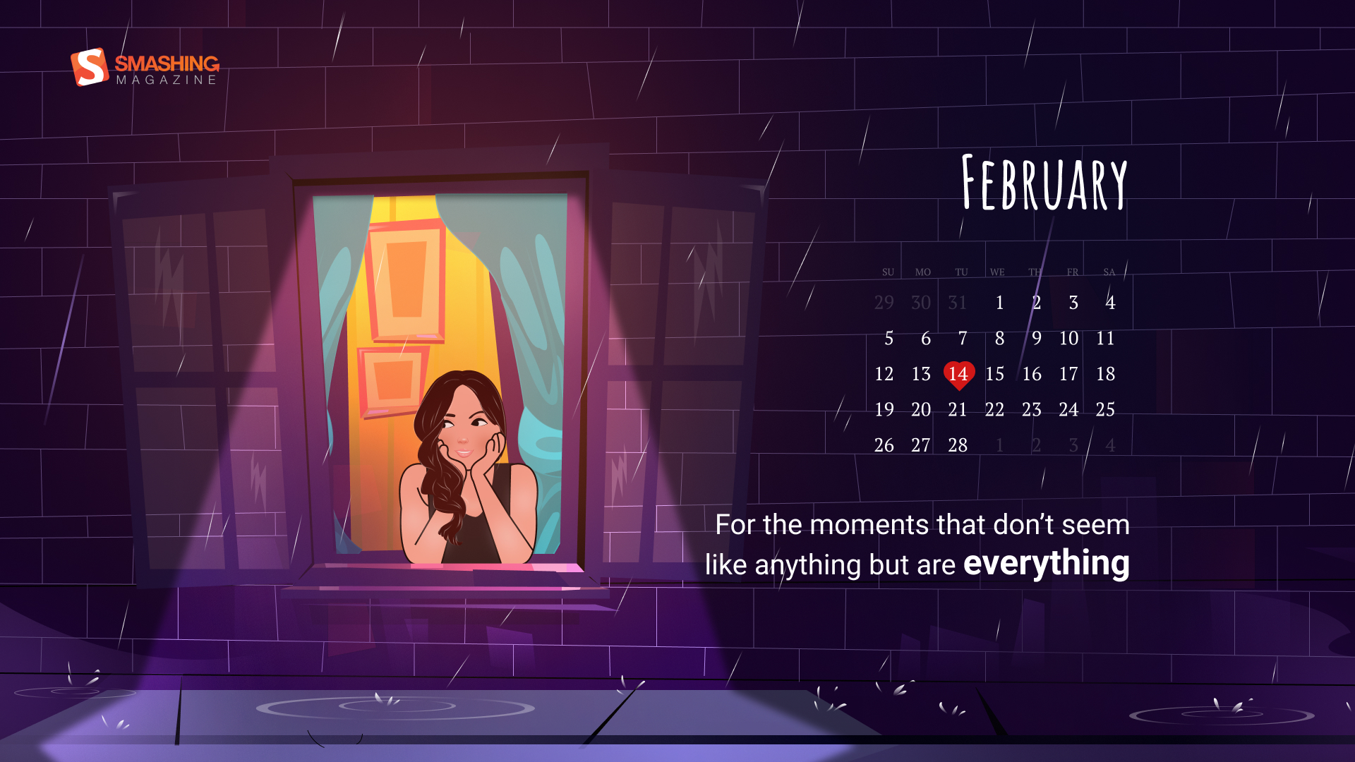
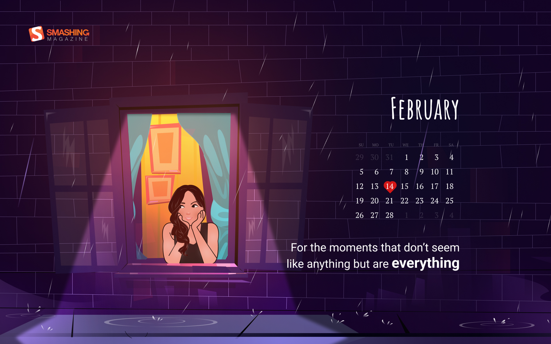
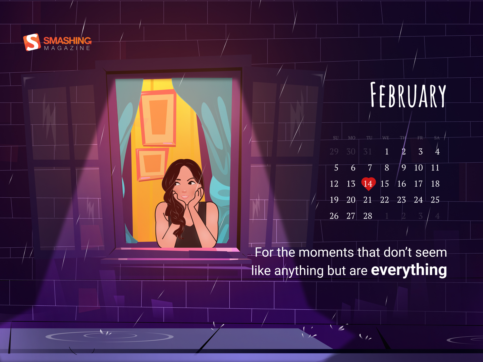
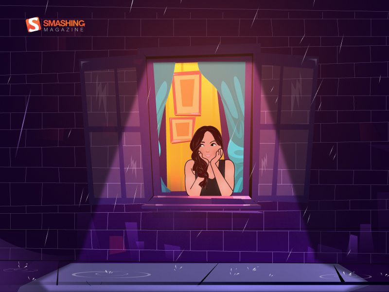
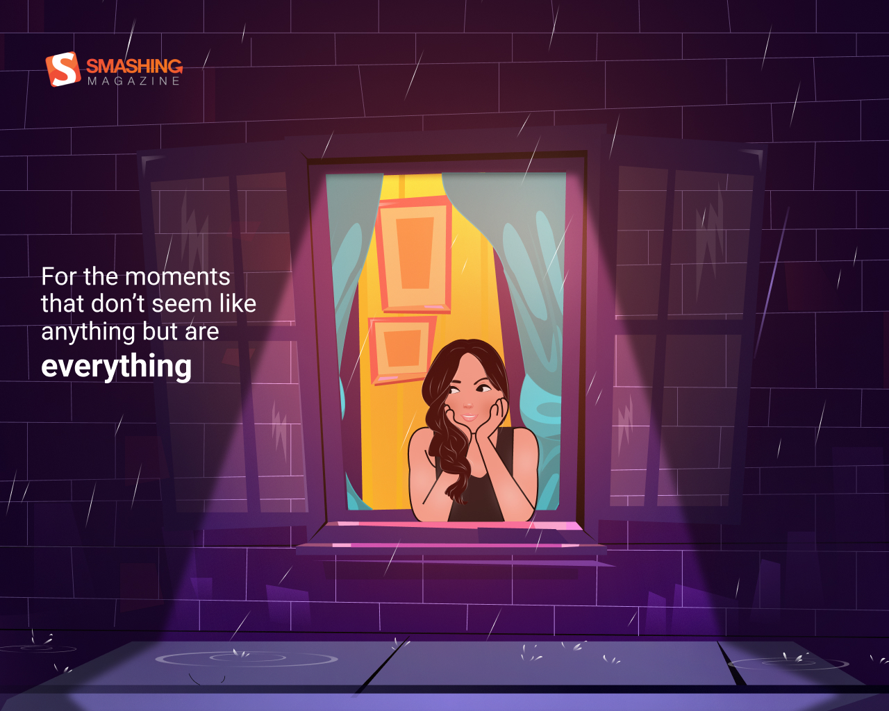
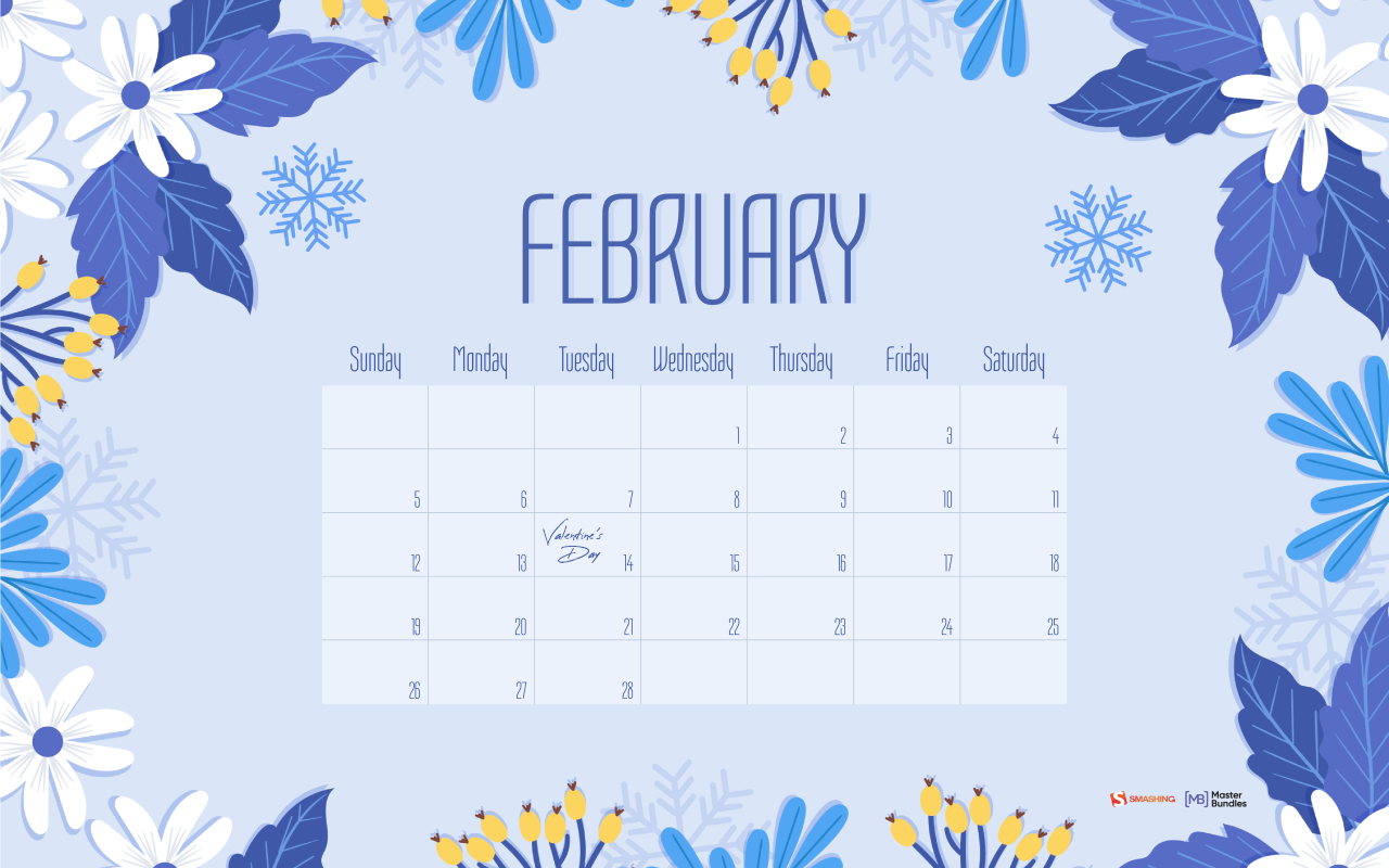
“February comes with Valentine’s vibes. Valentine’s week begins on February 7 which is celebrated as Rose Day and lasts until the most important day, Valentine’s Day, on February 14. This week, from the 7th to the 14th is likewise called the Love Week, Valentine’s Week, or the Romance Week. So I decided to design this wallpaper to remind everyone to enjoy the loving vibes throughout this week.” — Designed by Hrishikesh Shome from India.
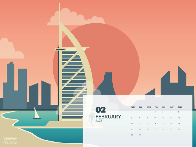
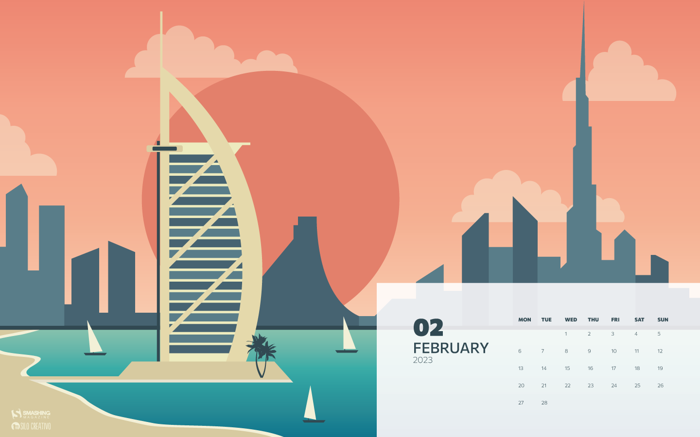
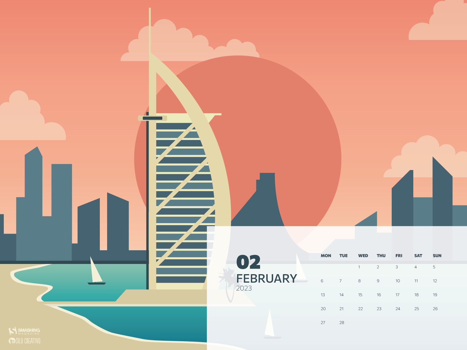
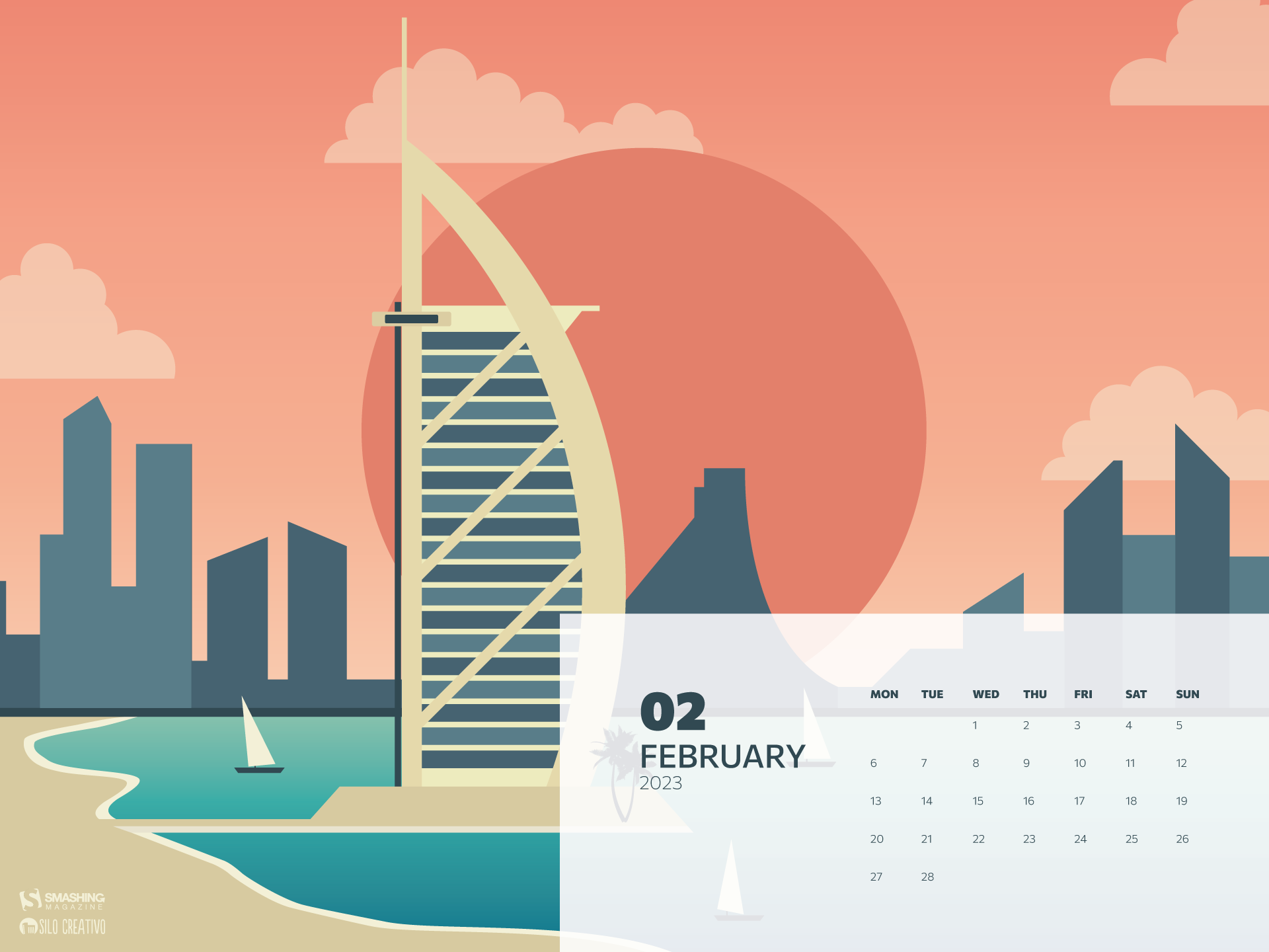
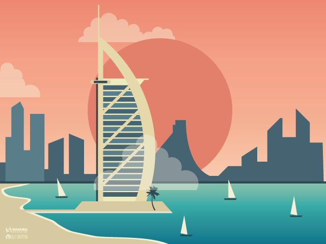
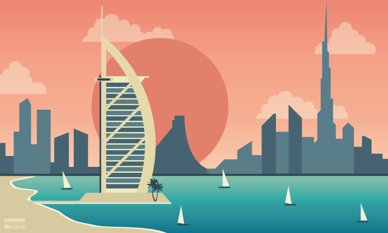
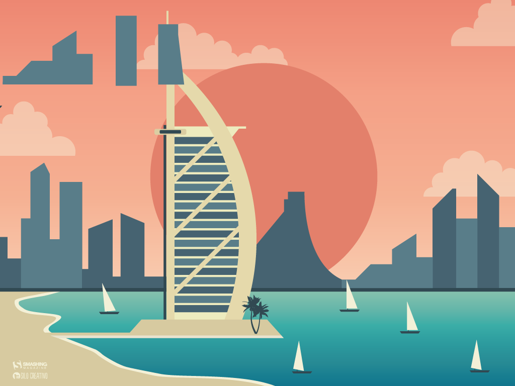
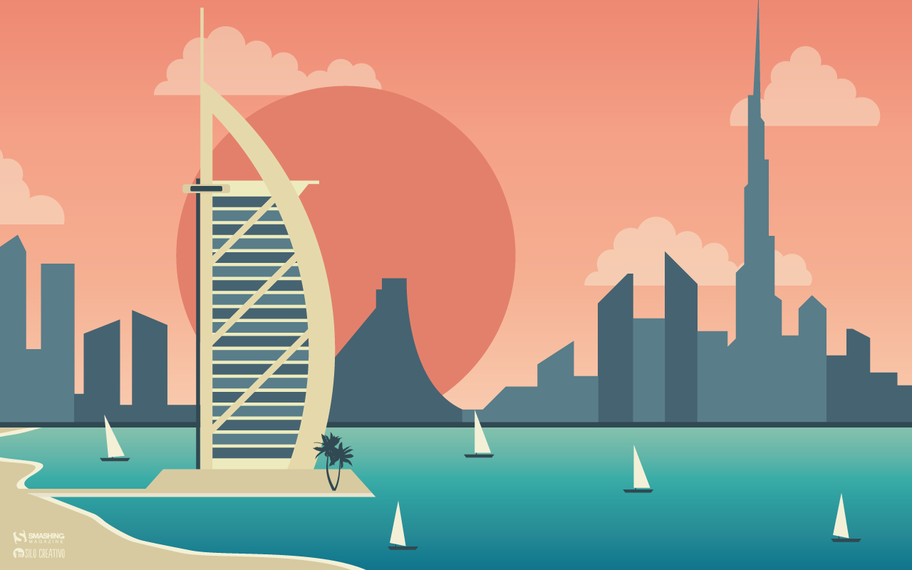
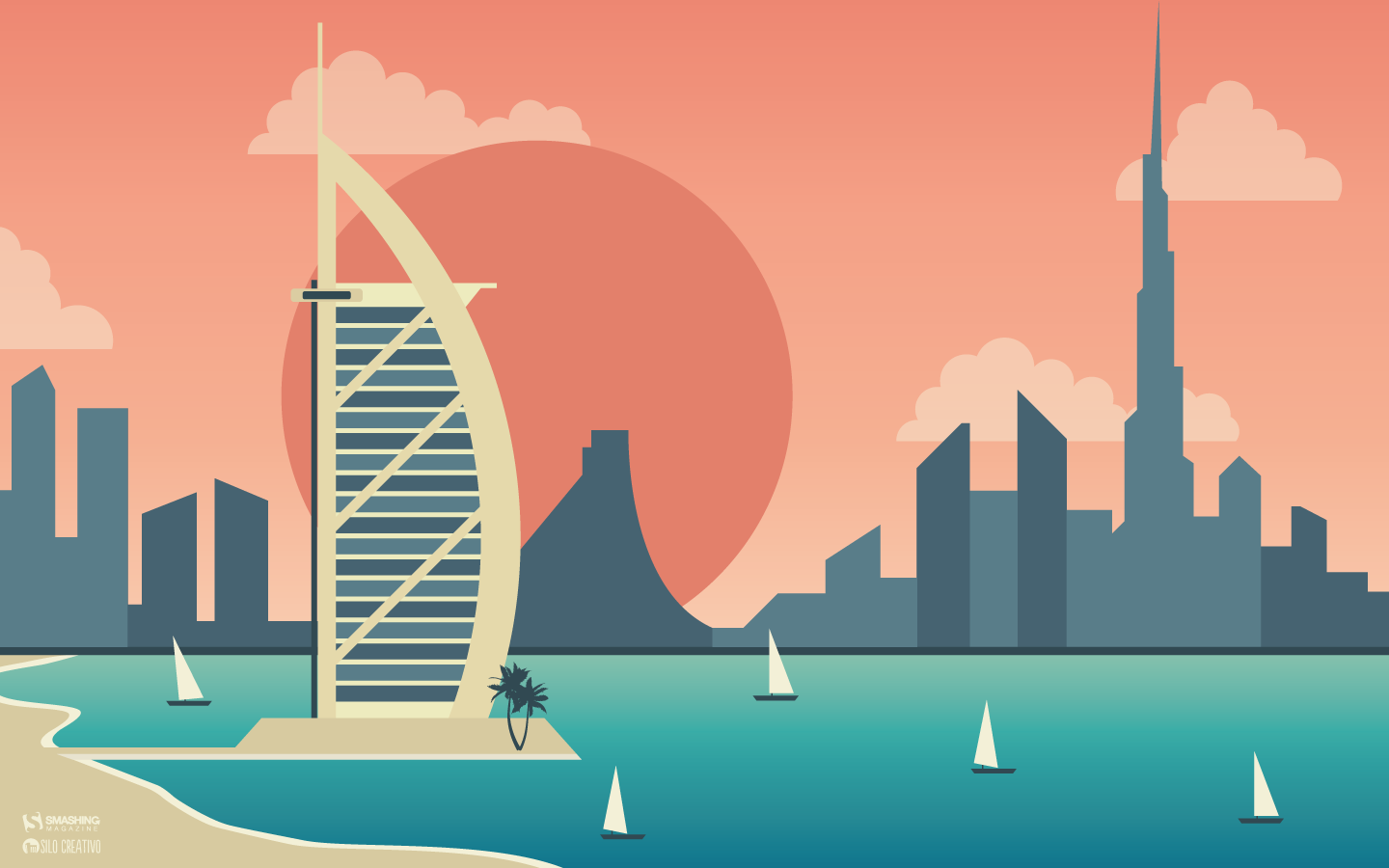
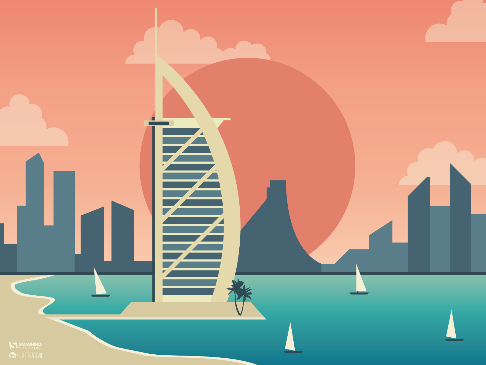
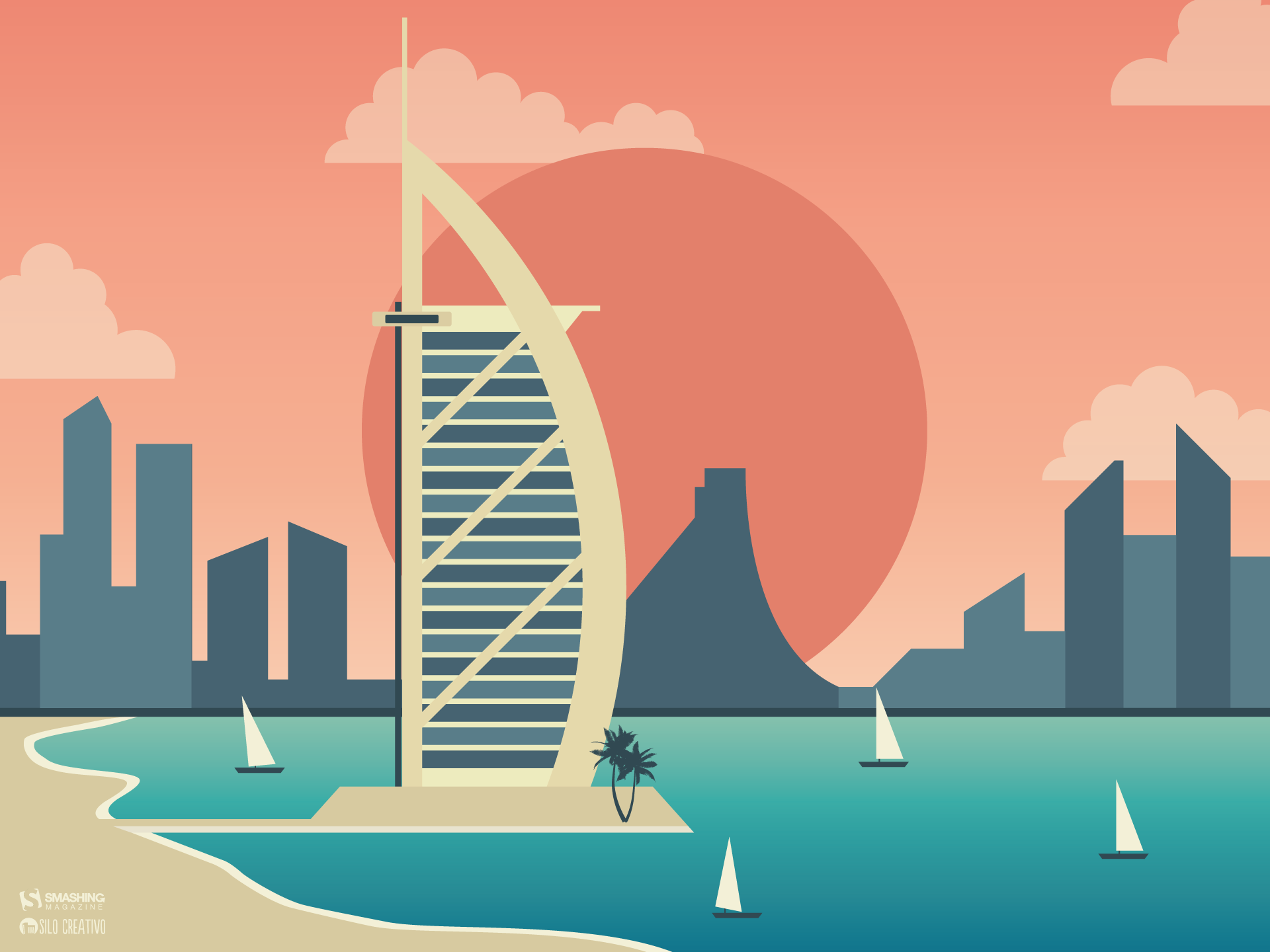
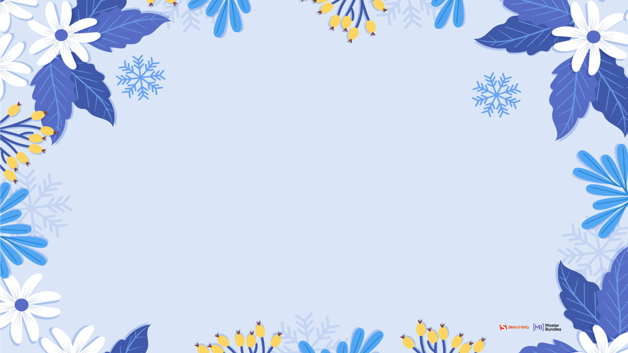
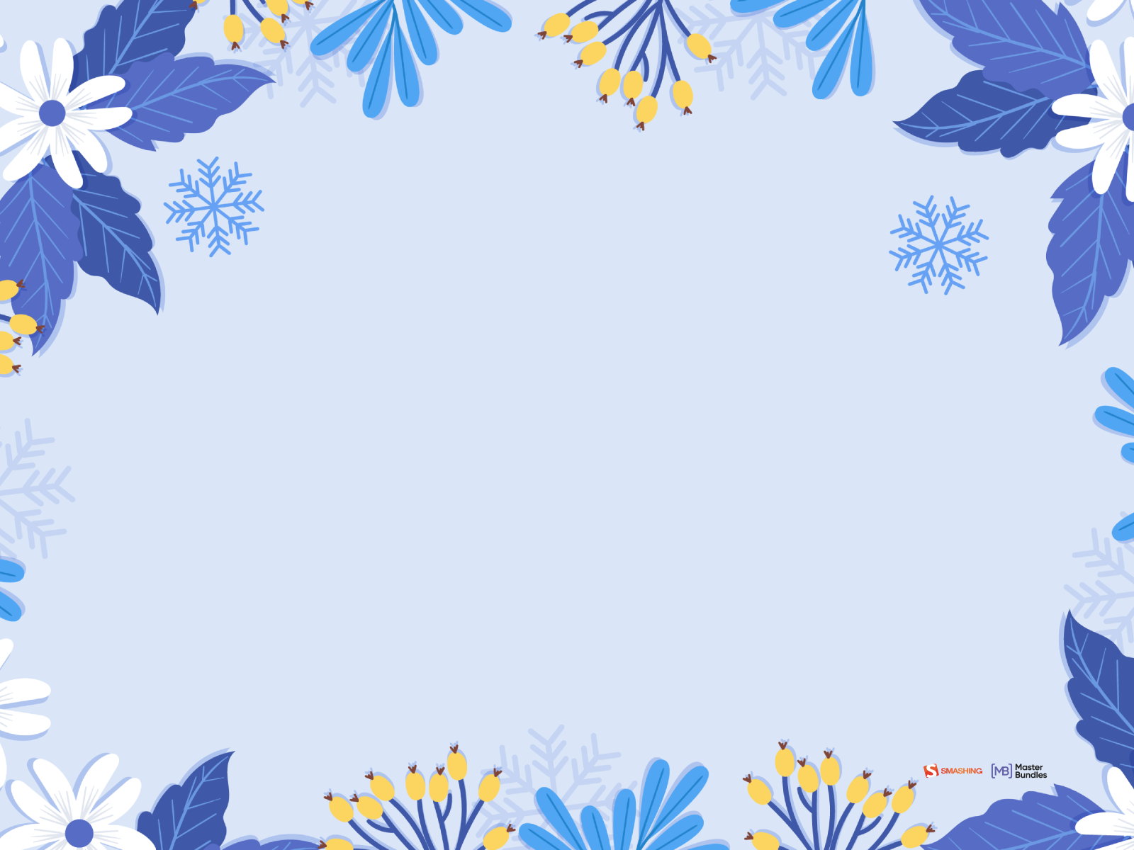
“Winter in Dubai is less winter. There we can enjoy pleasant temperatures while we watch the sunset. Did you sign up?” — Designed by Veronica Valenzuela from Spain.
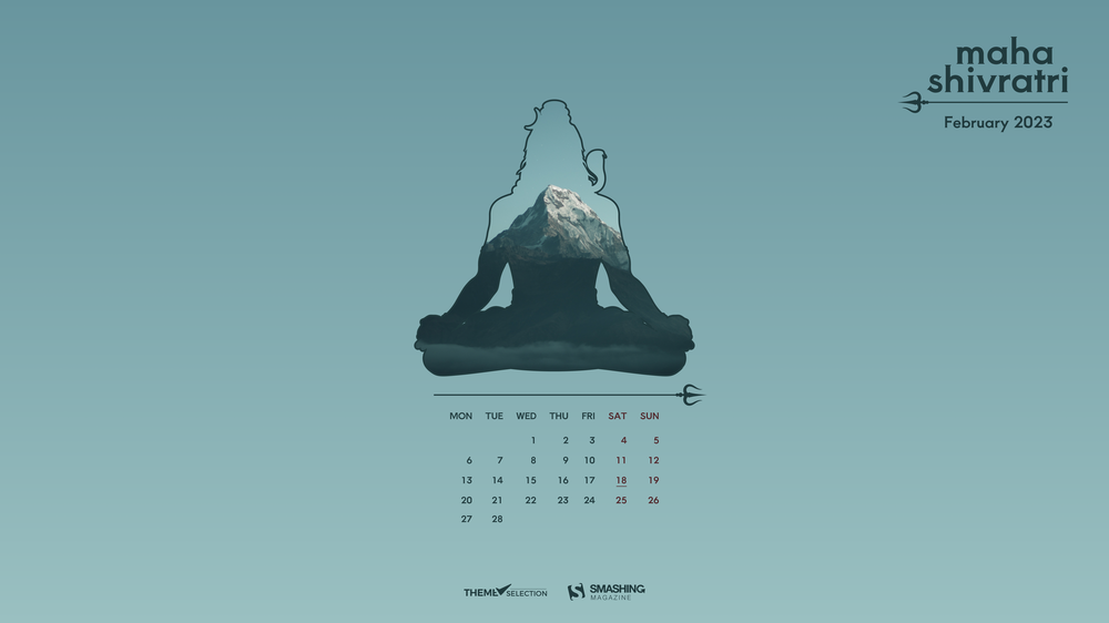
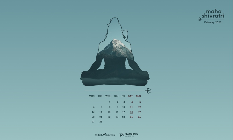
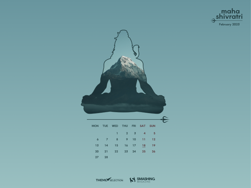
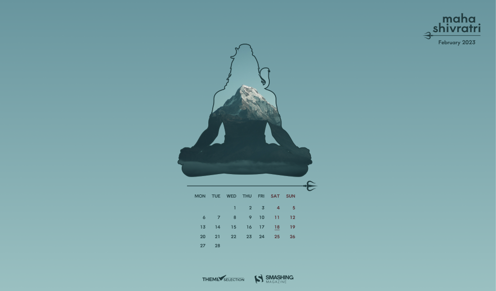
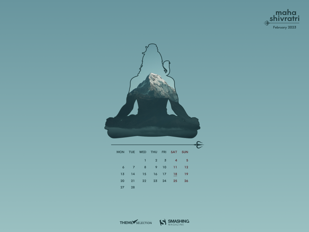
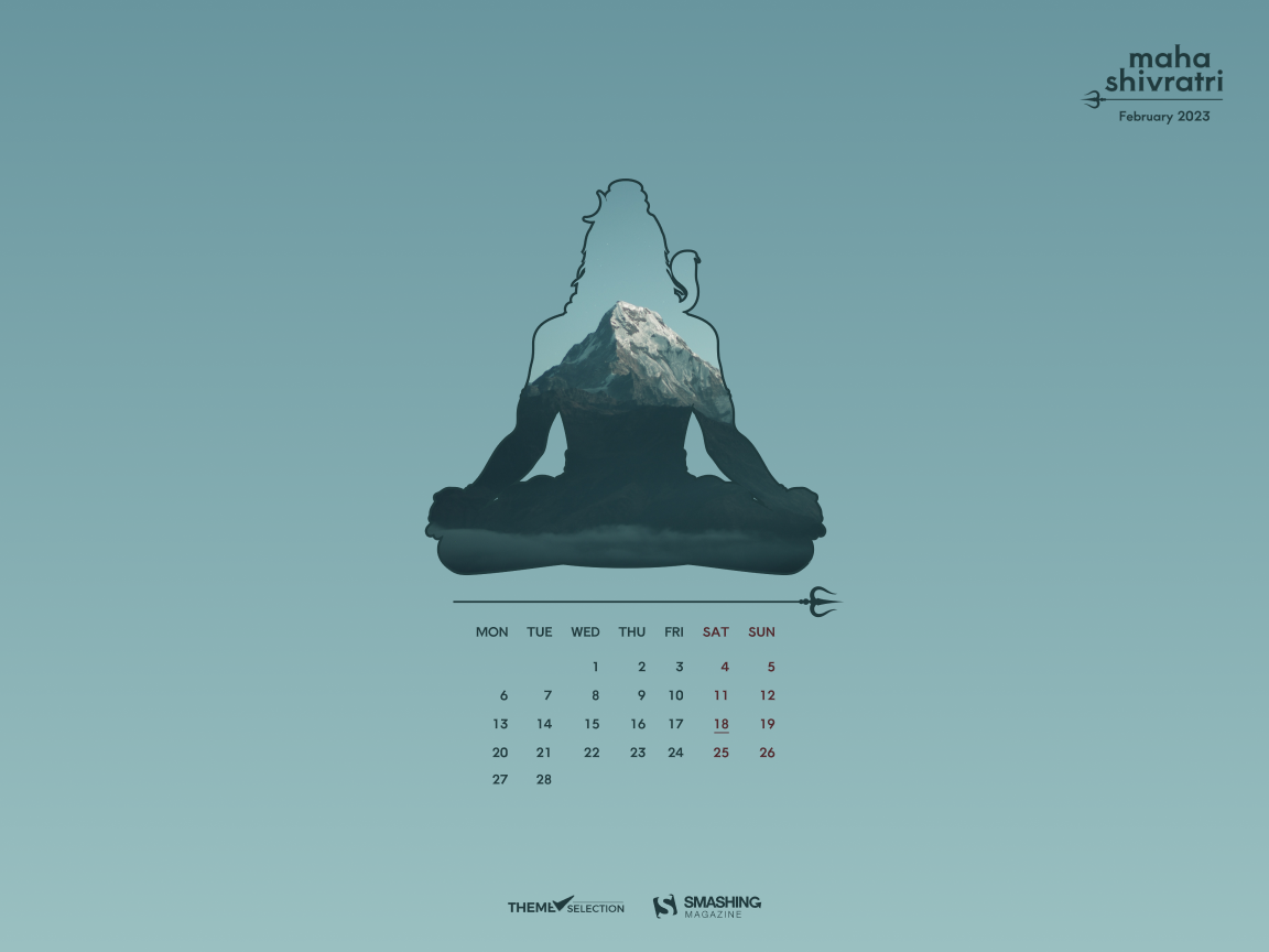
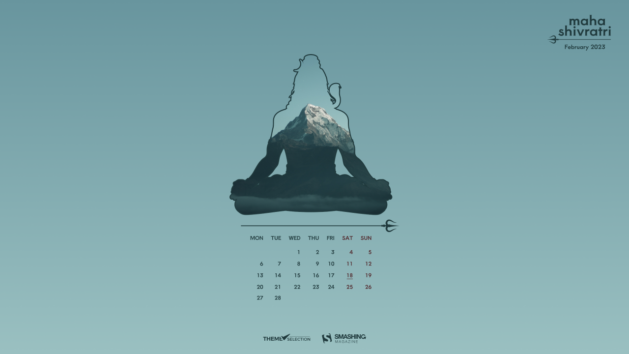
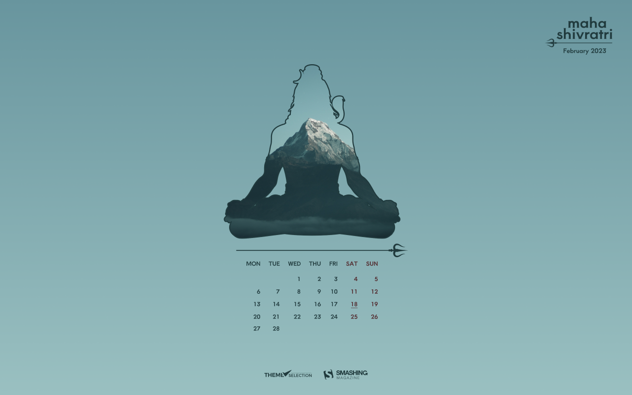
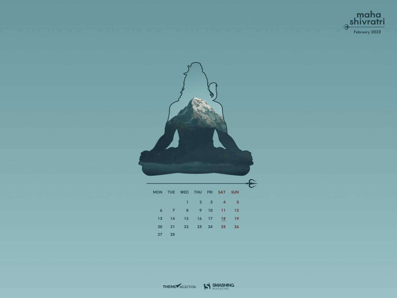
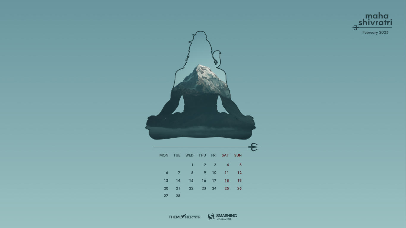
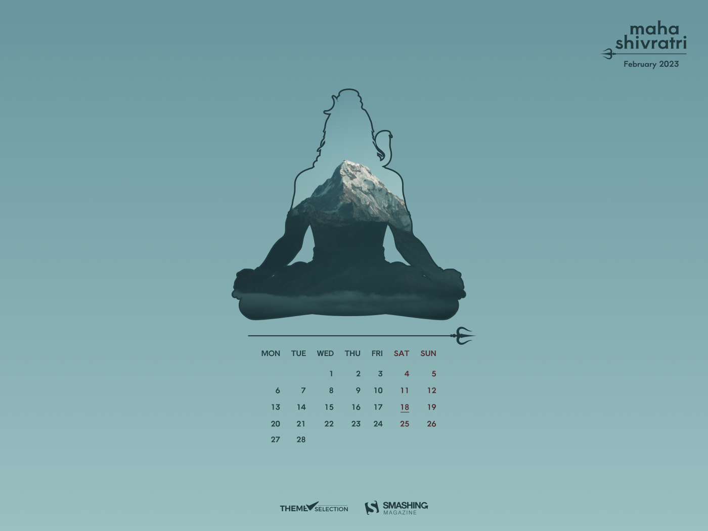
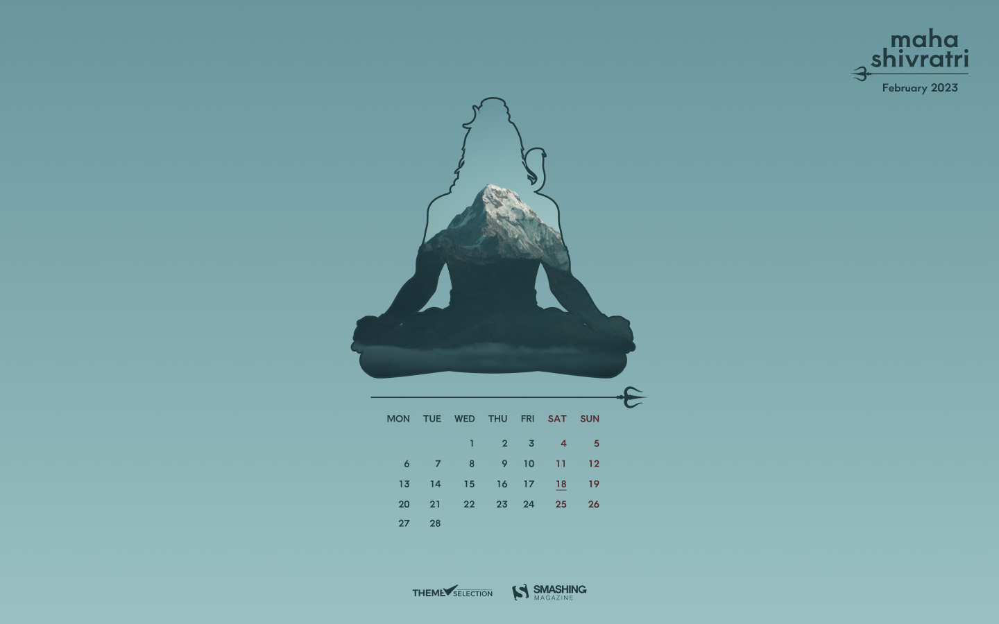
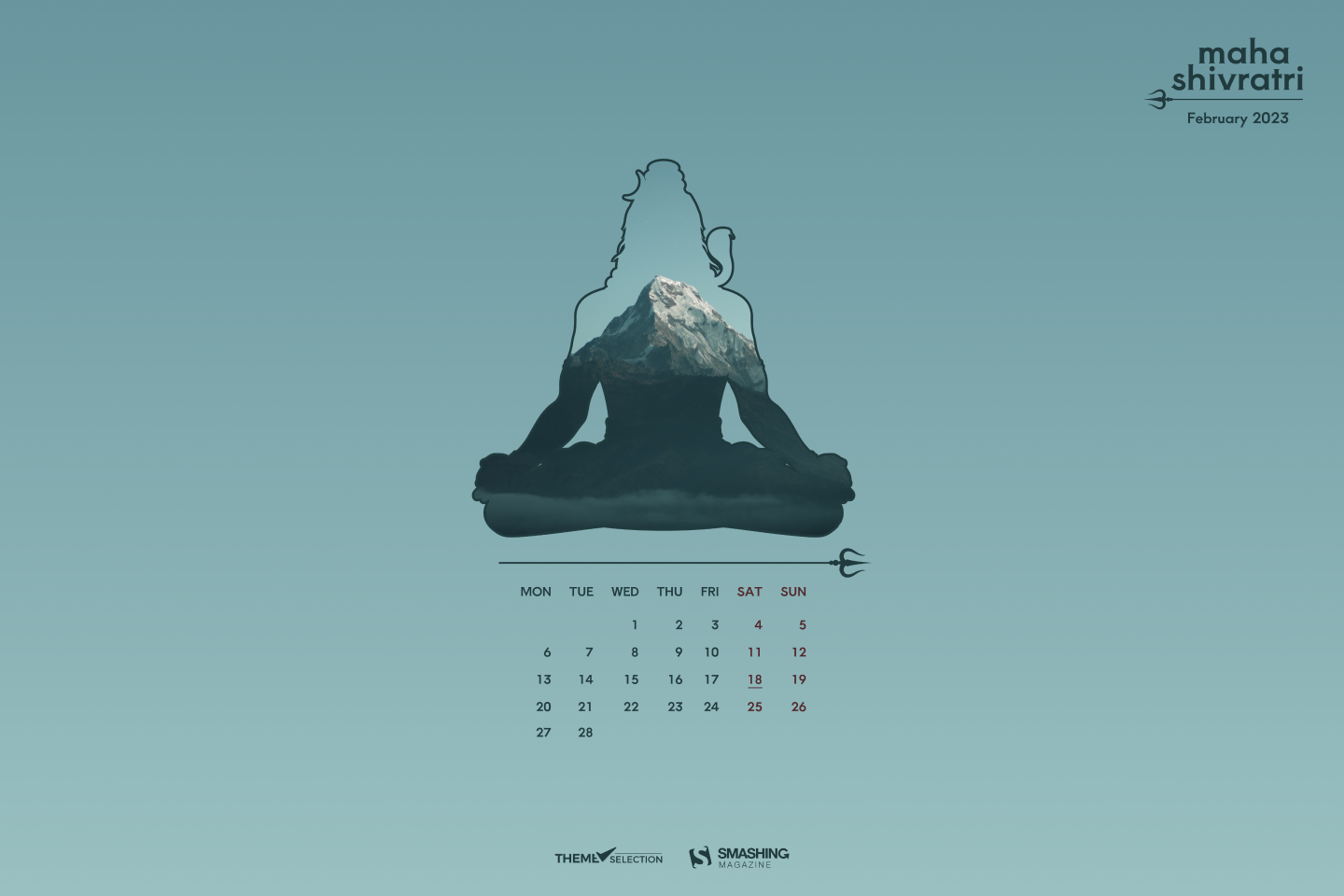
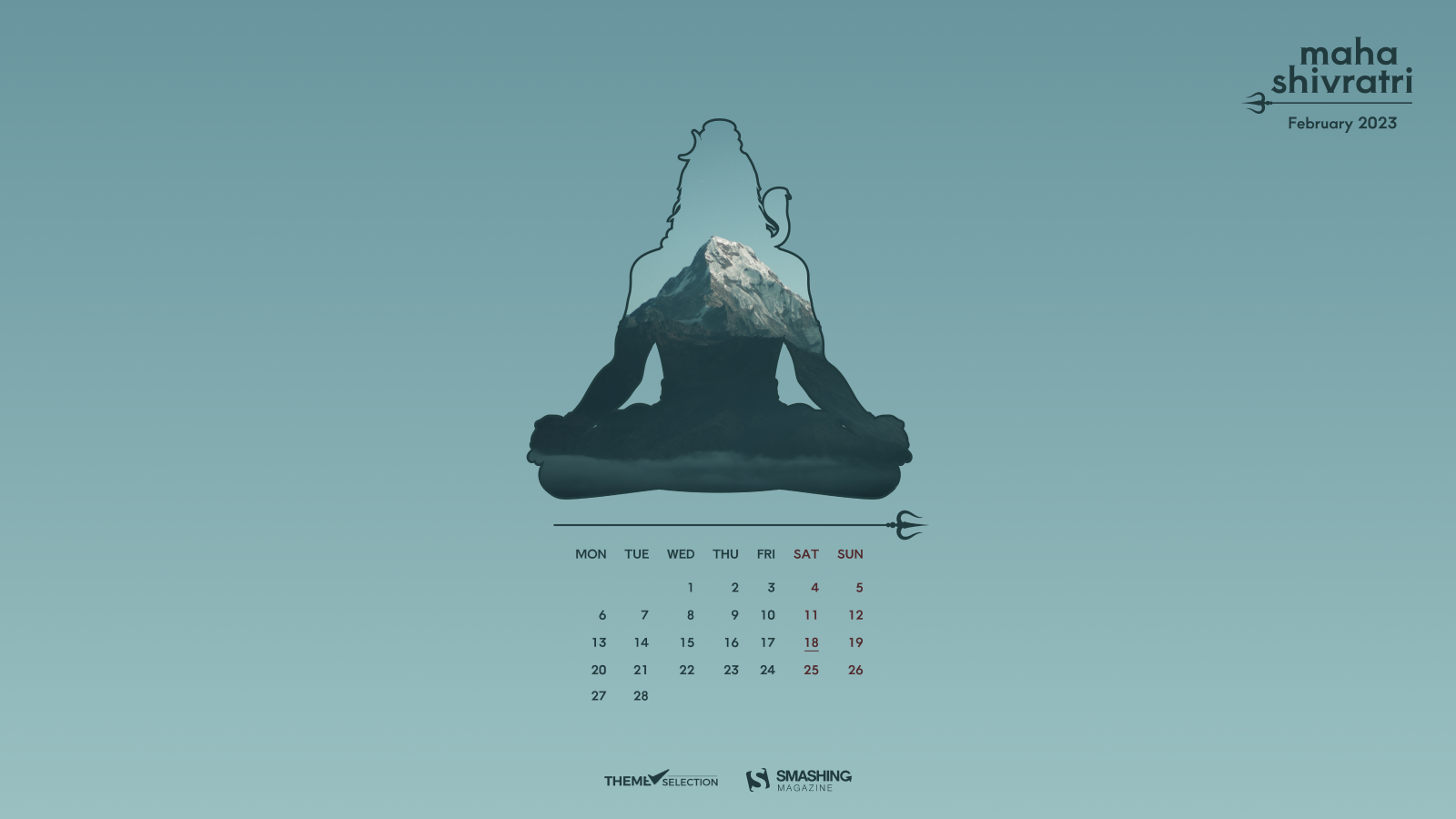
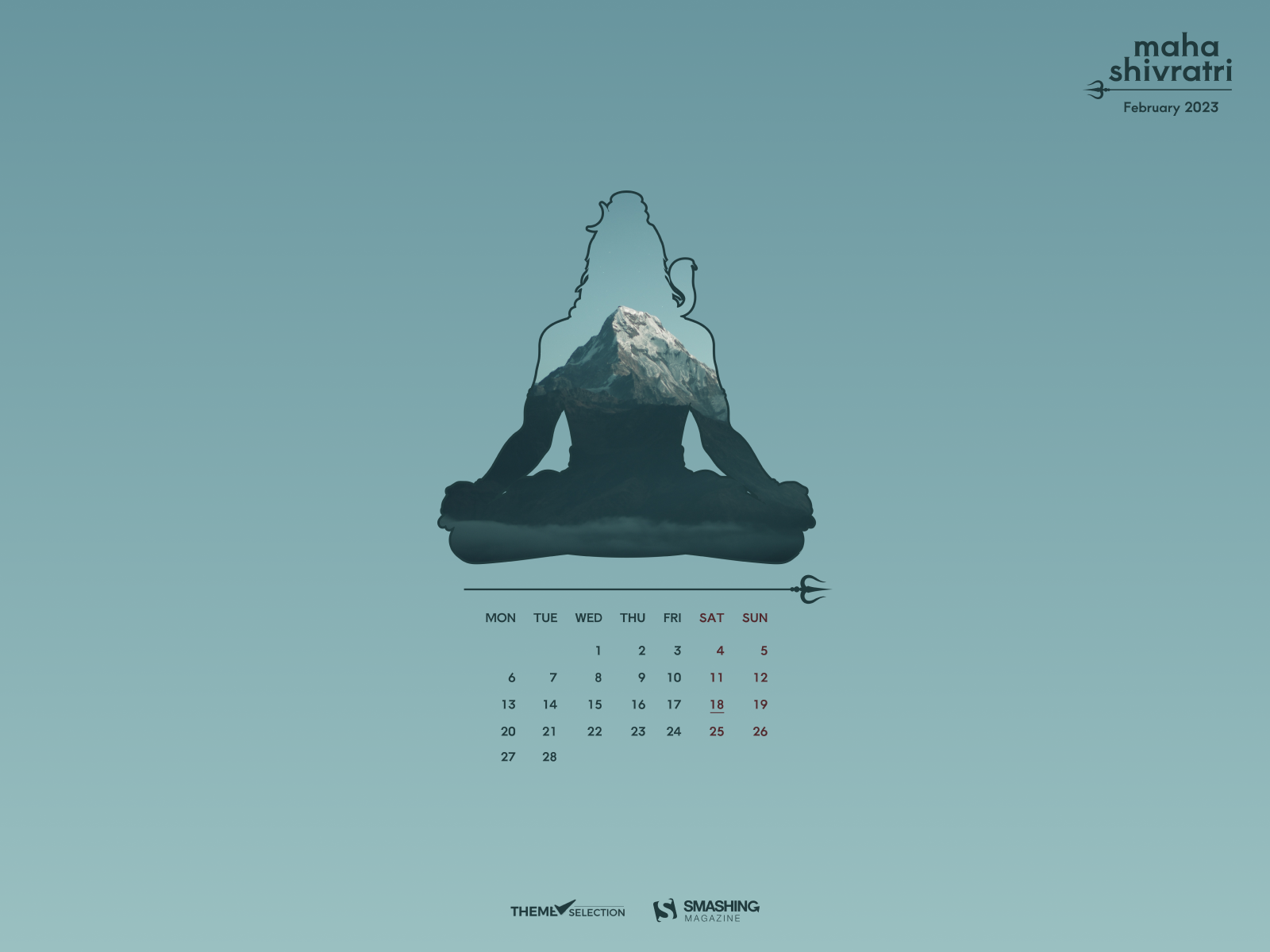
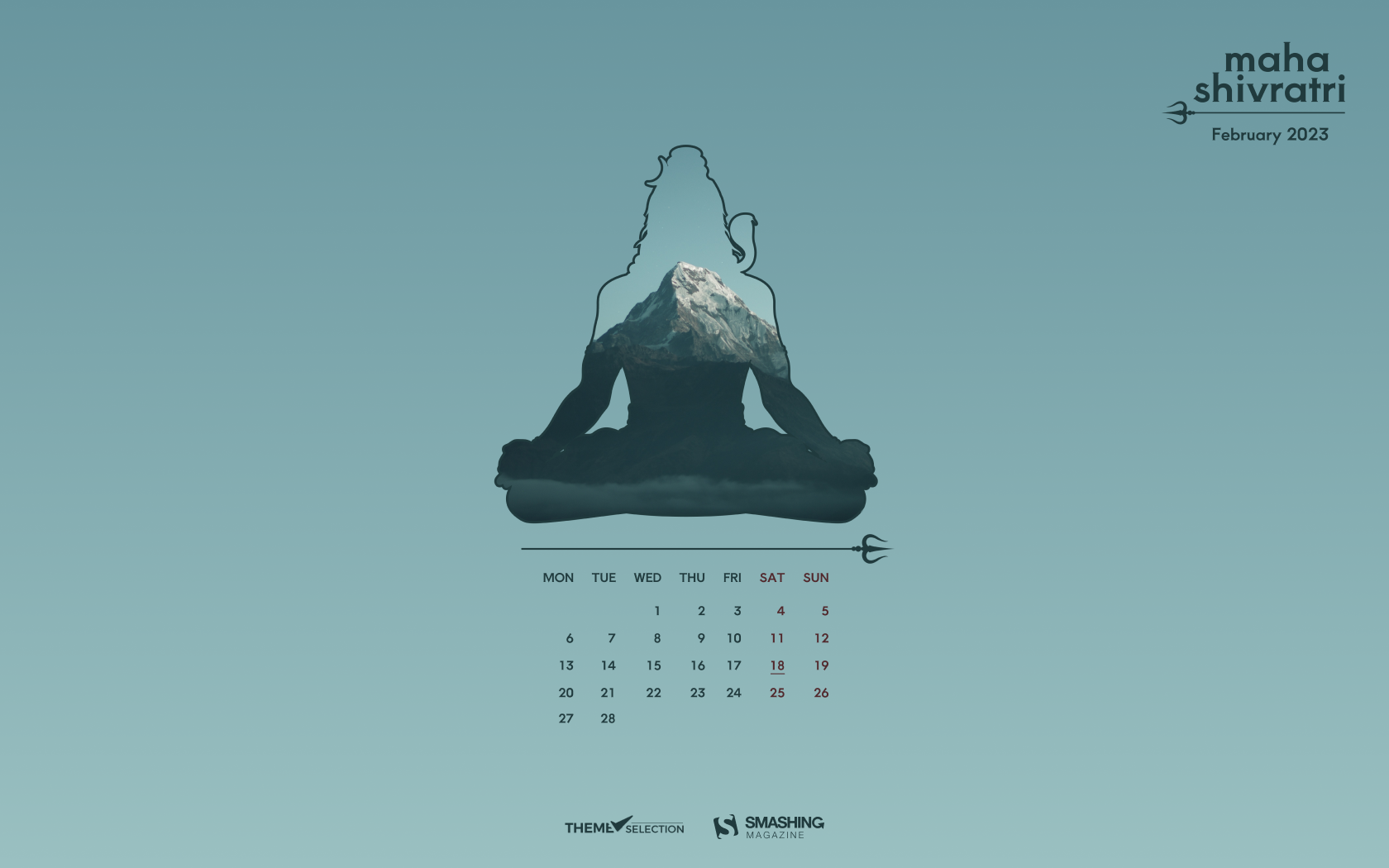
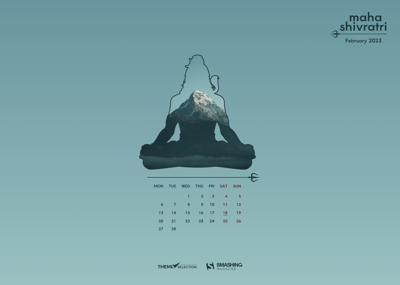
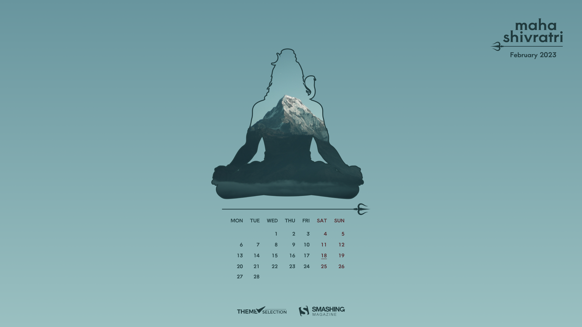
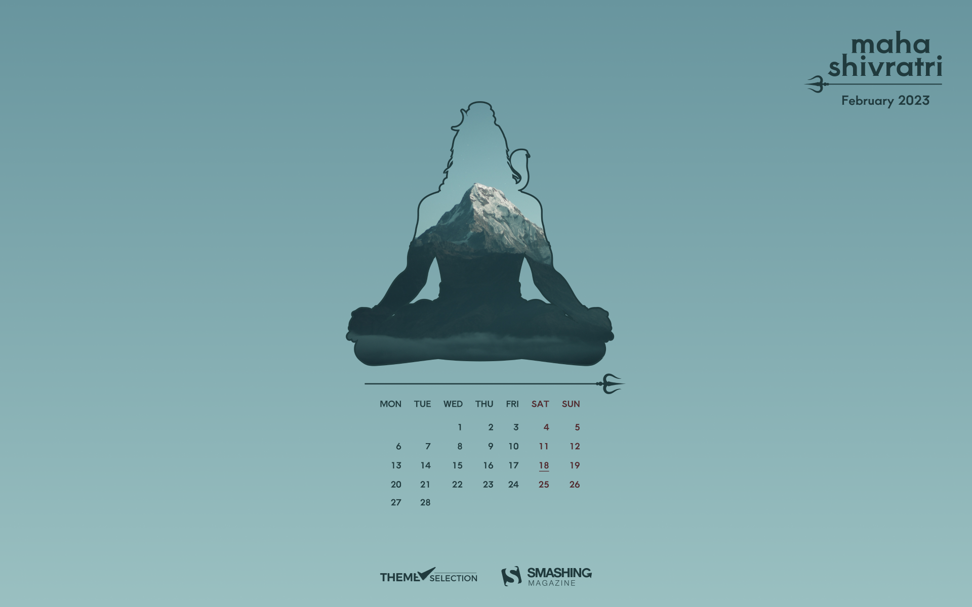
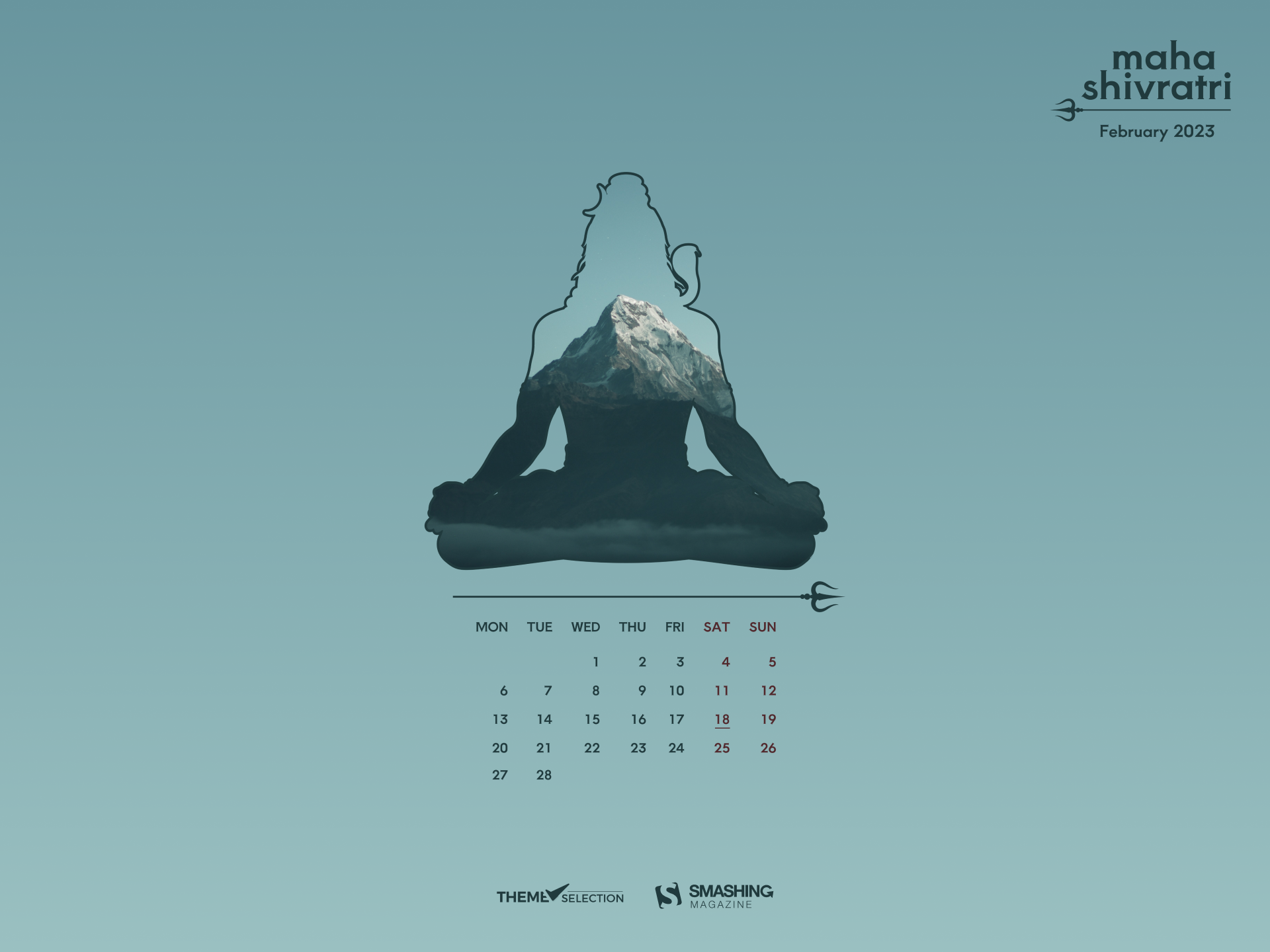
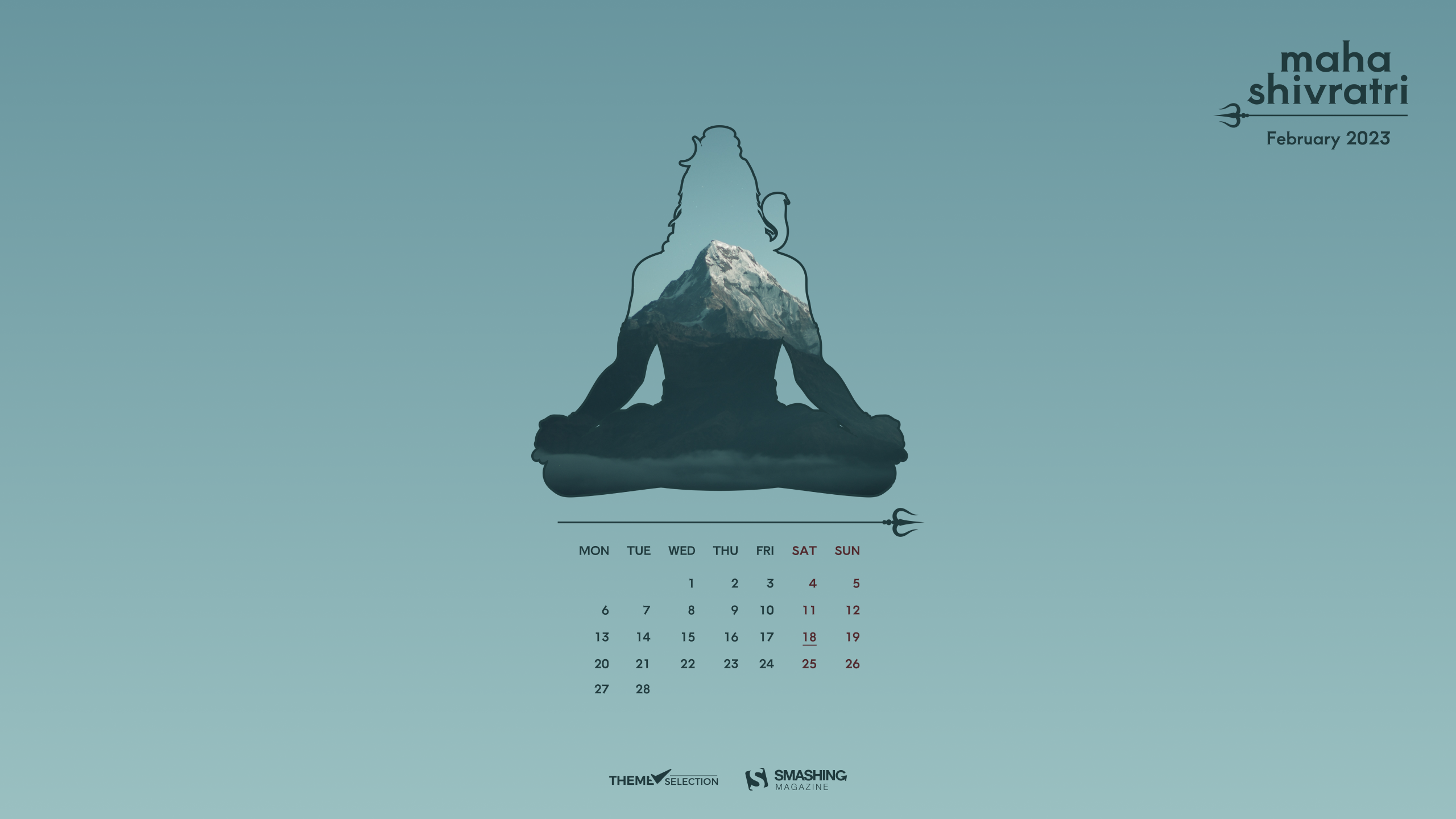
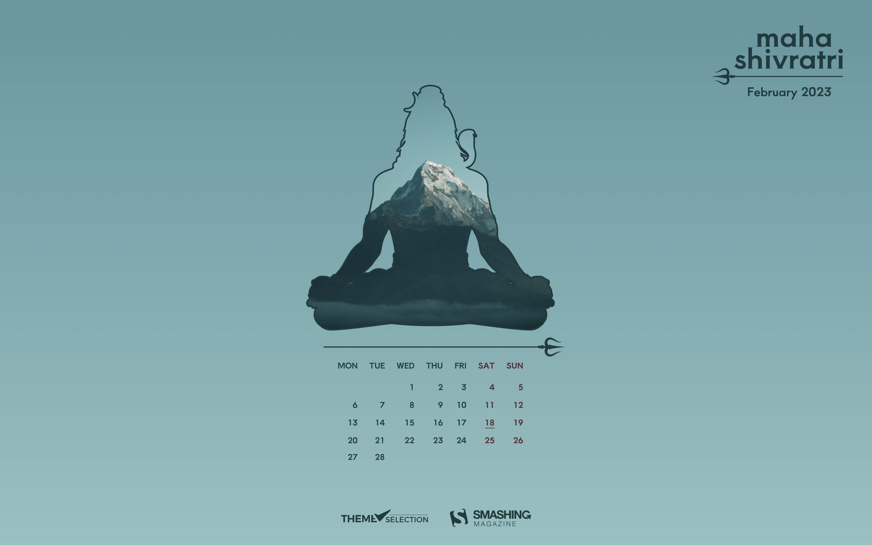
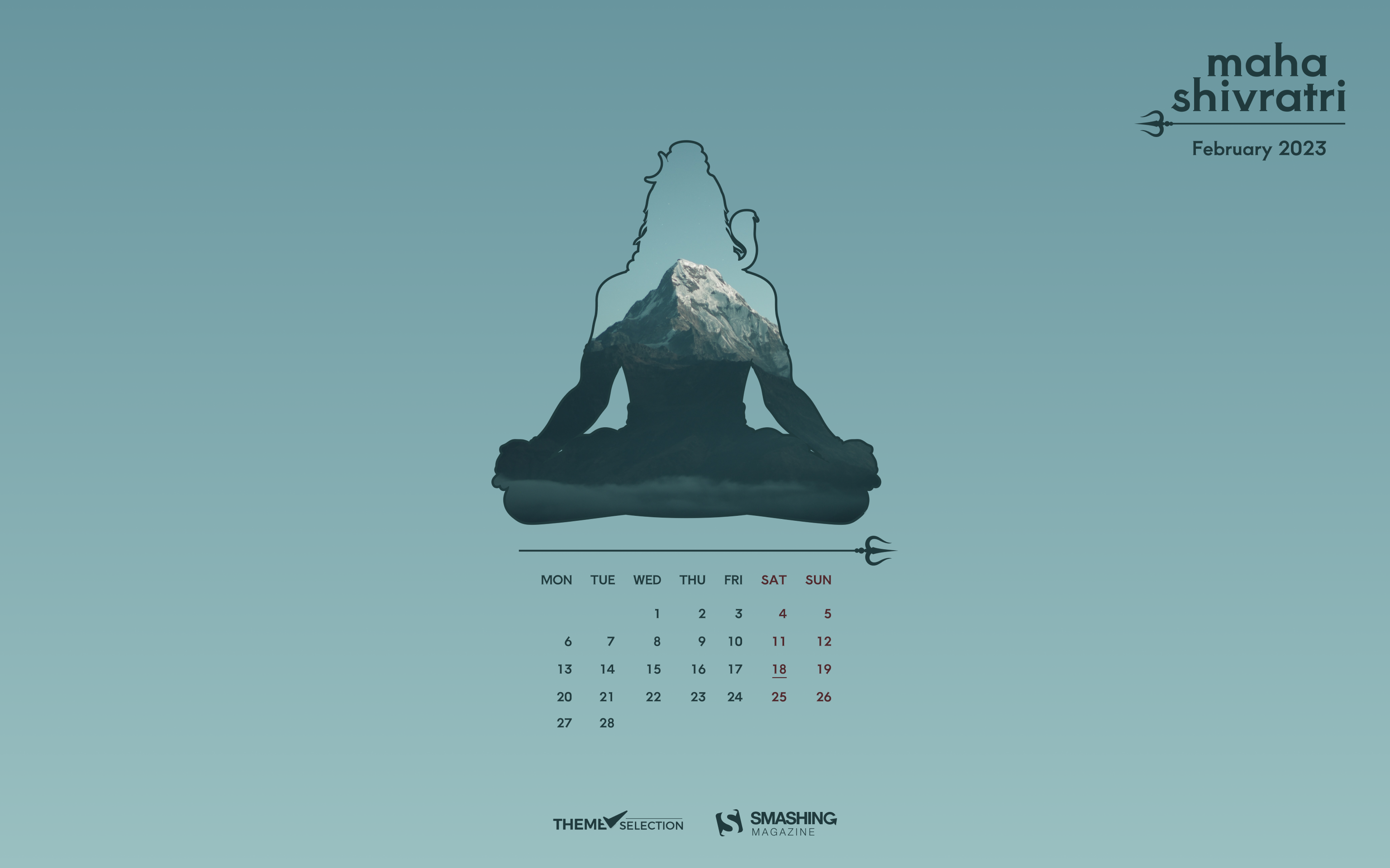
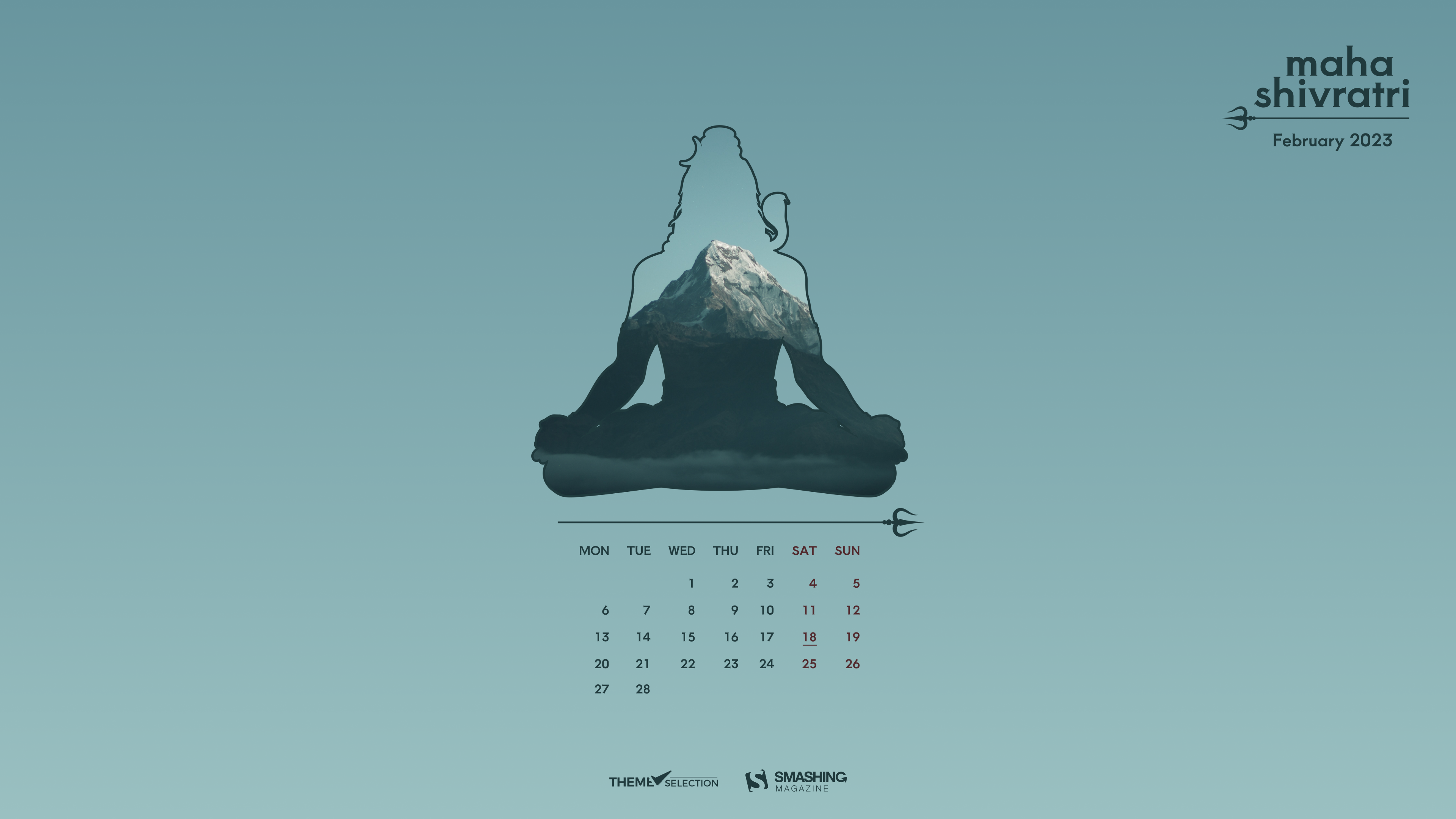
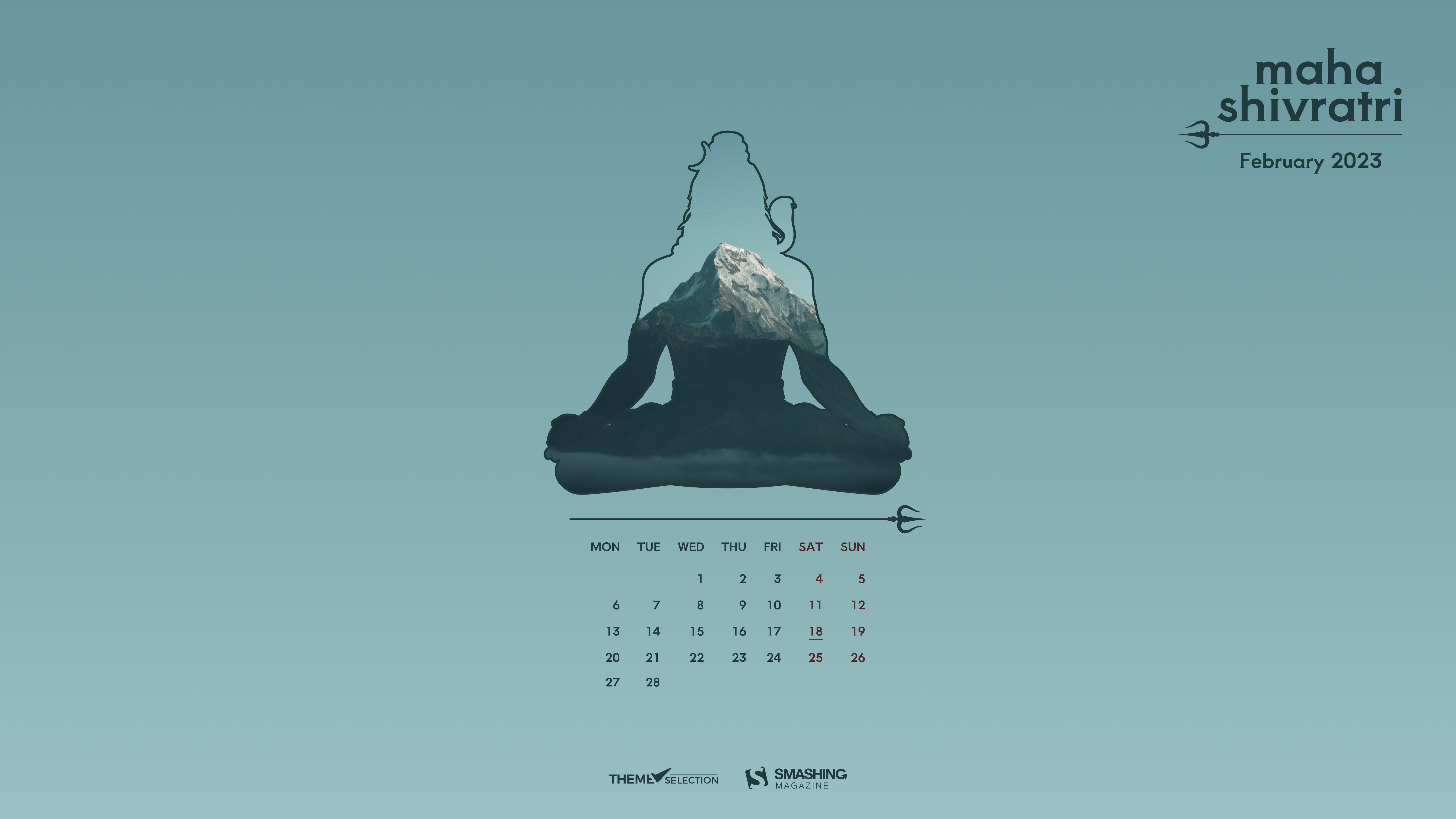
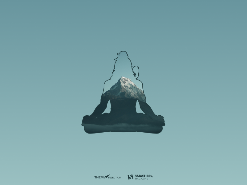
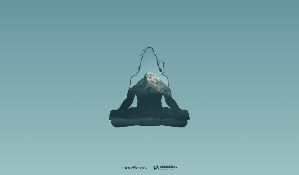
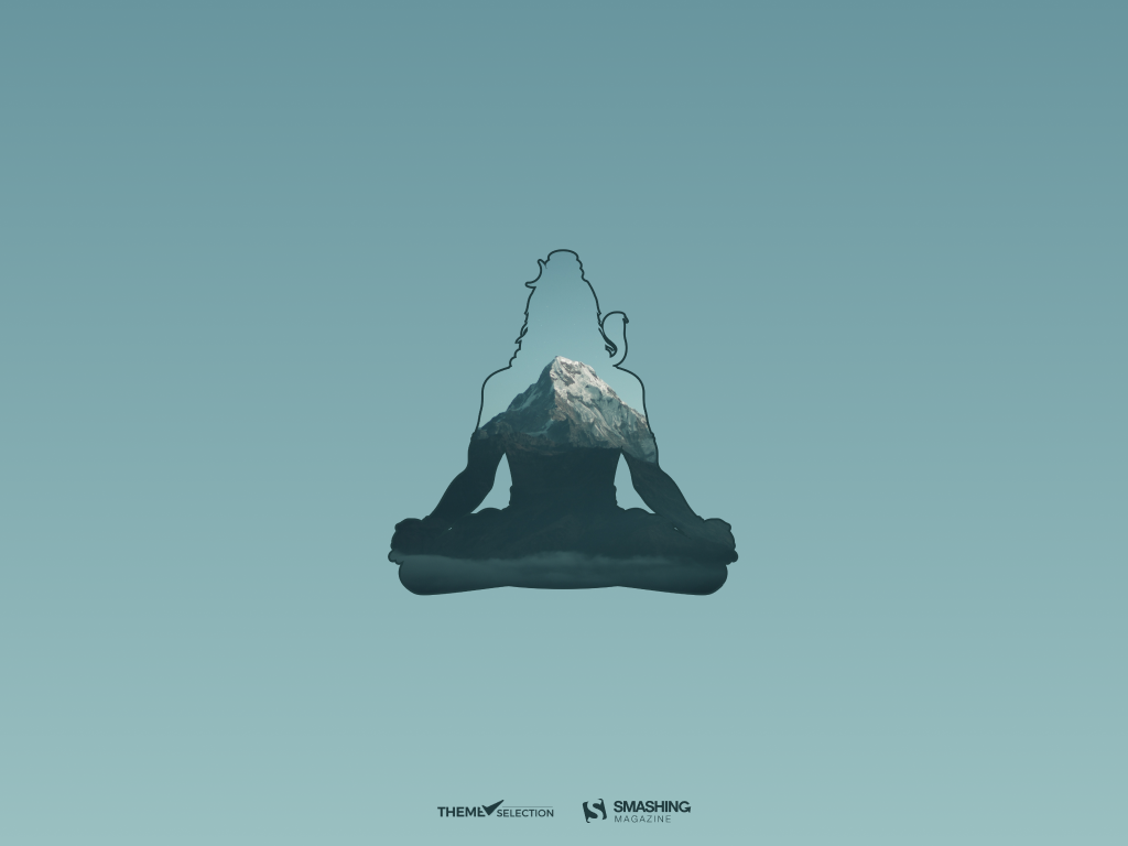
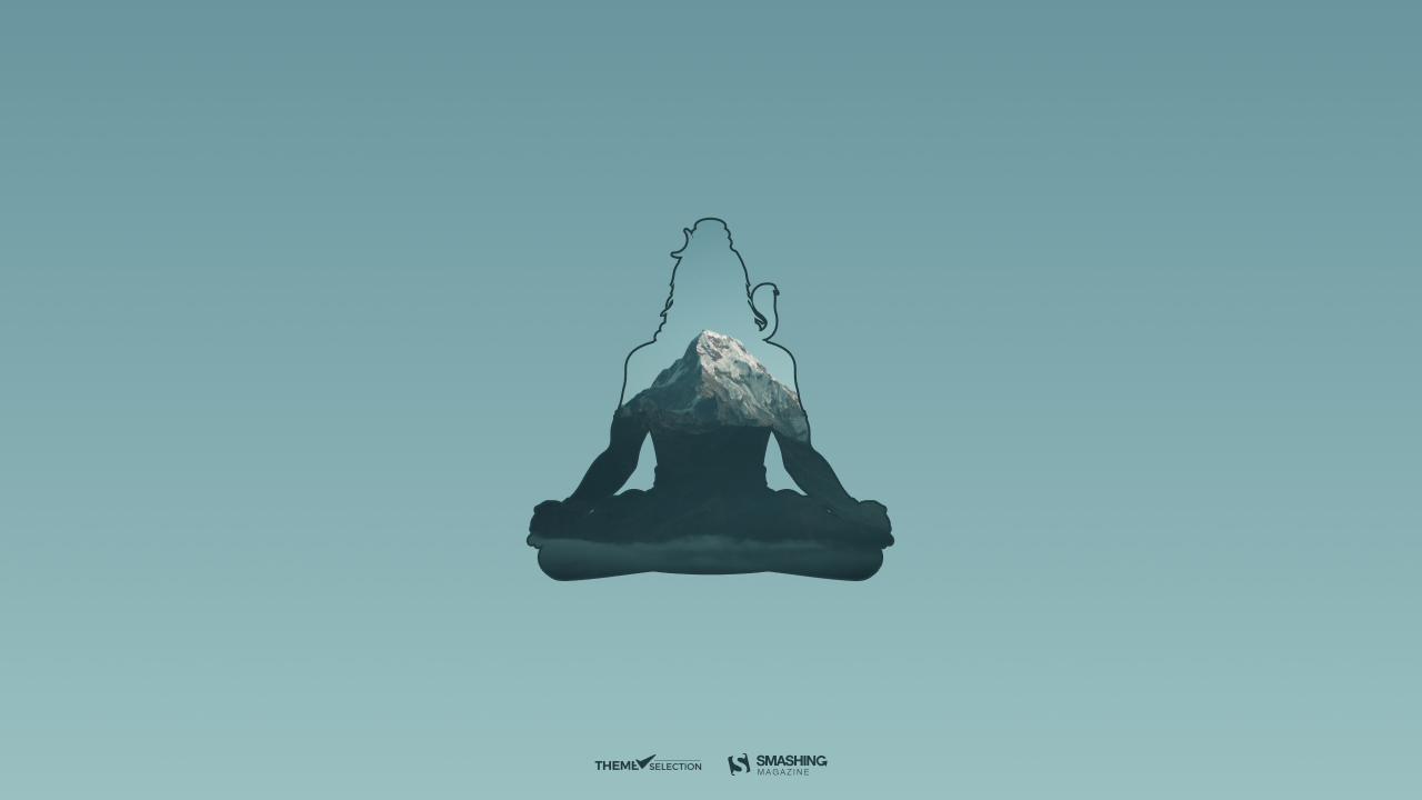
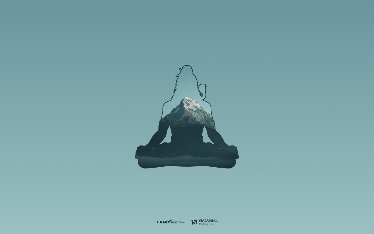
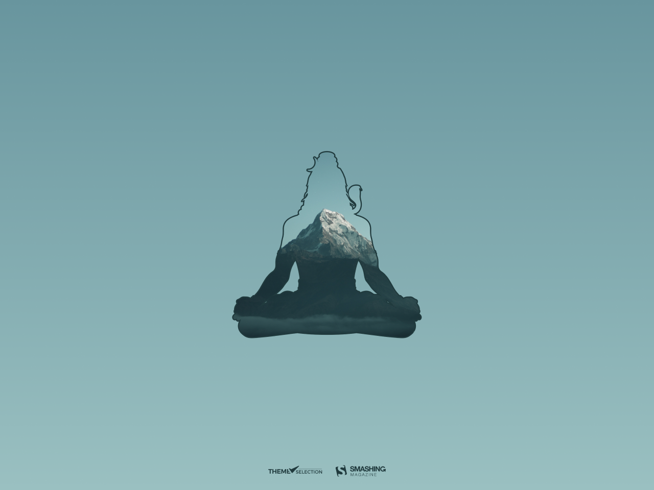
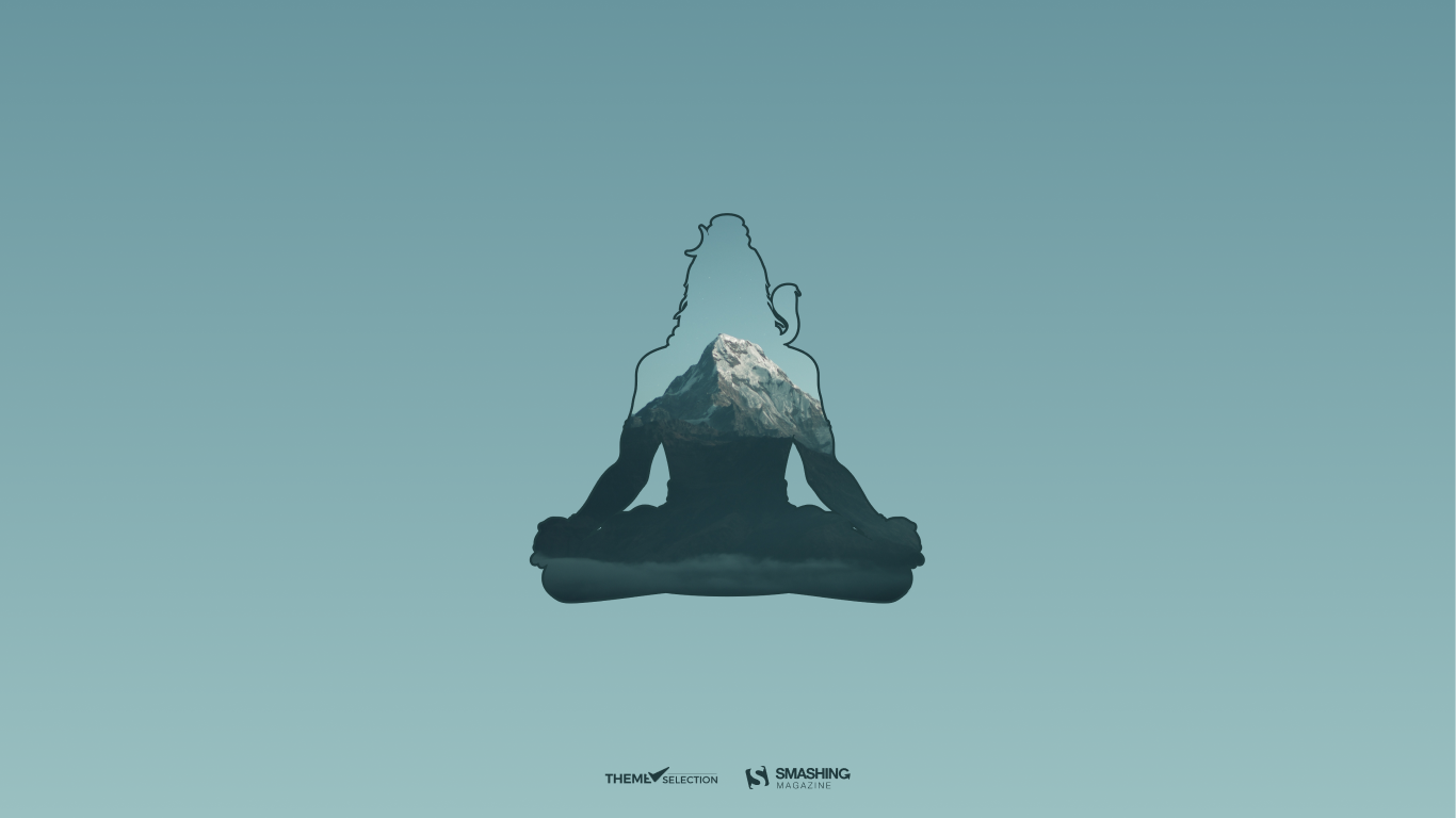
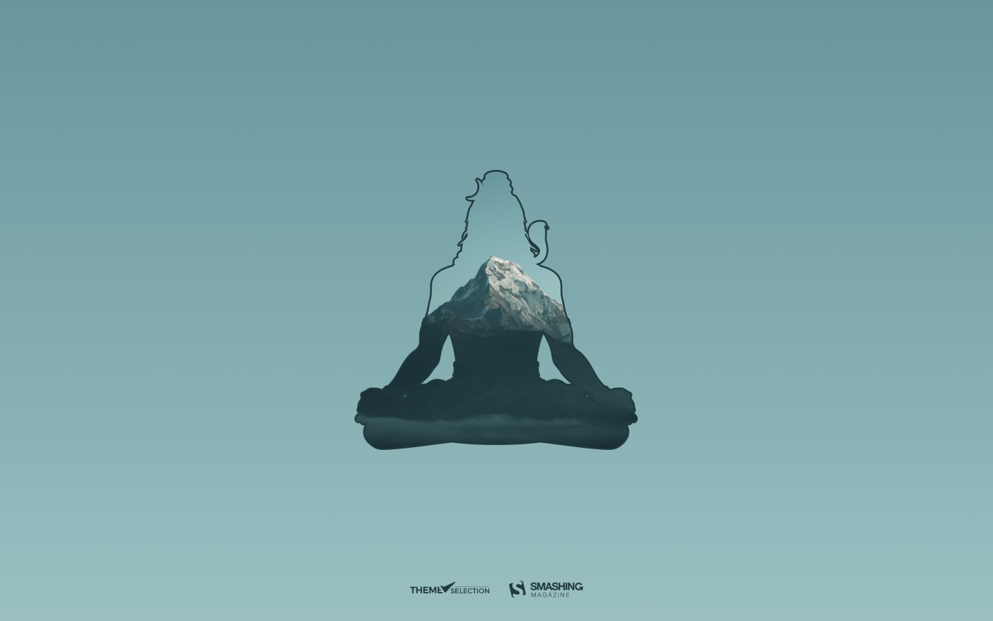
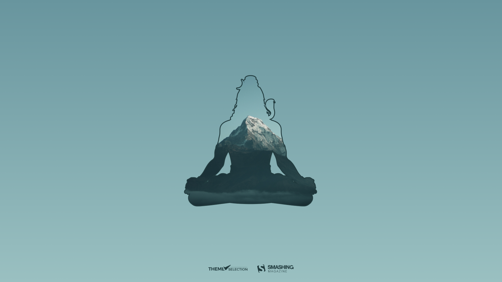
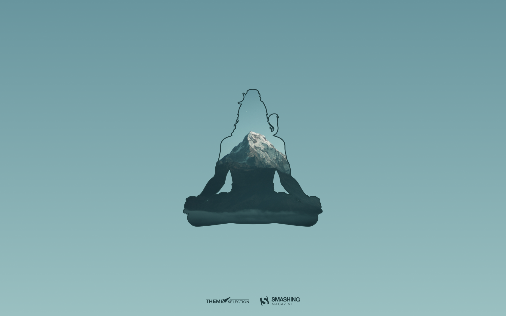
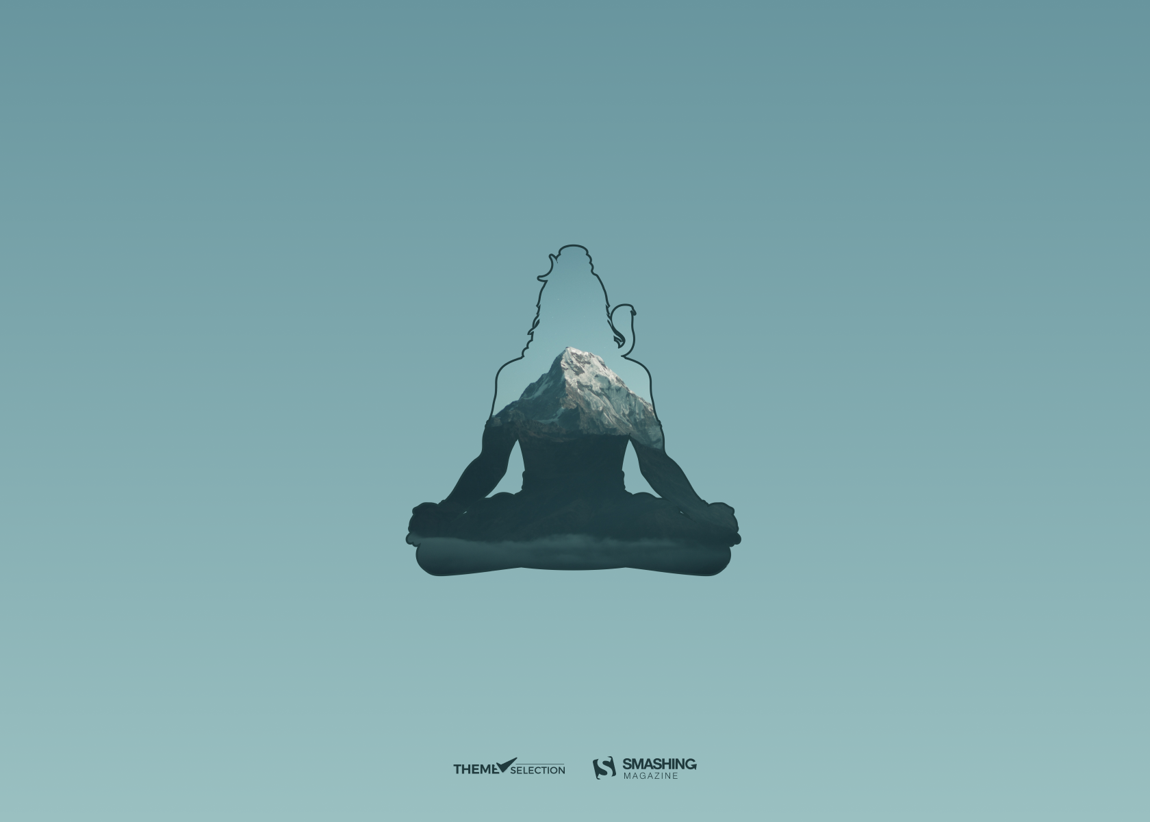
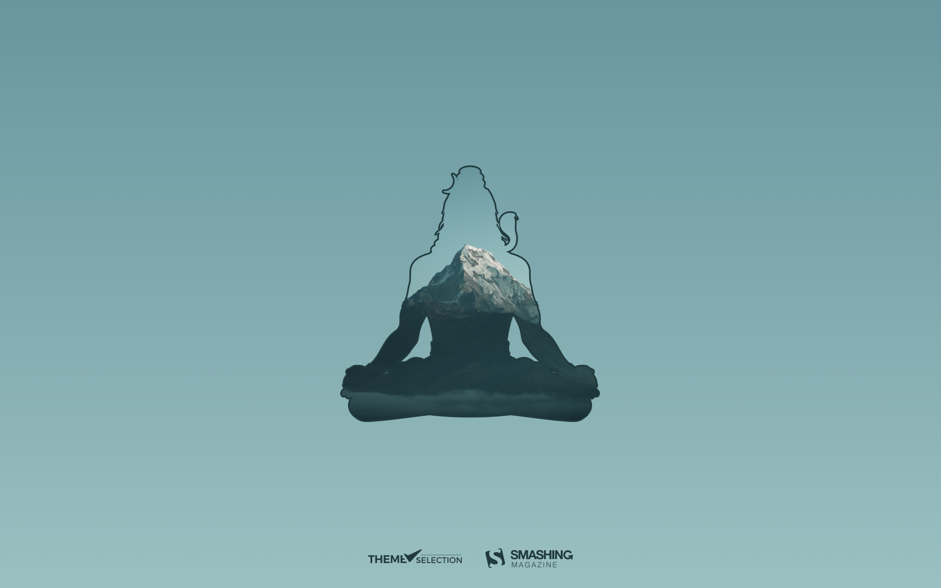
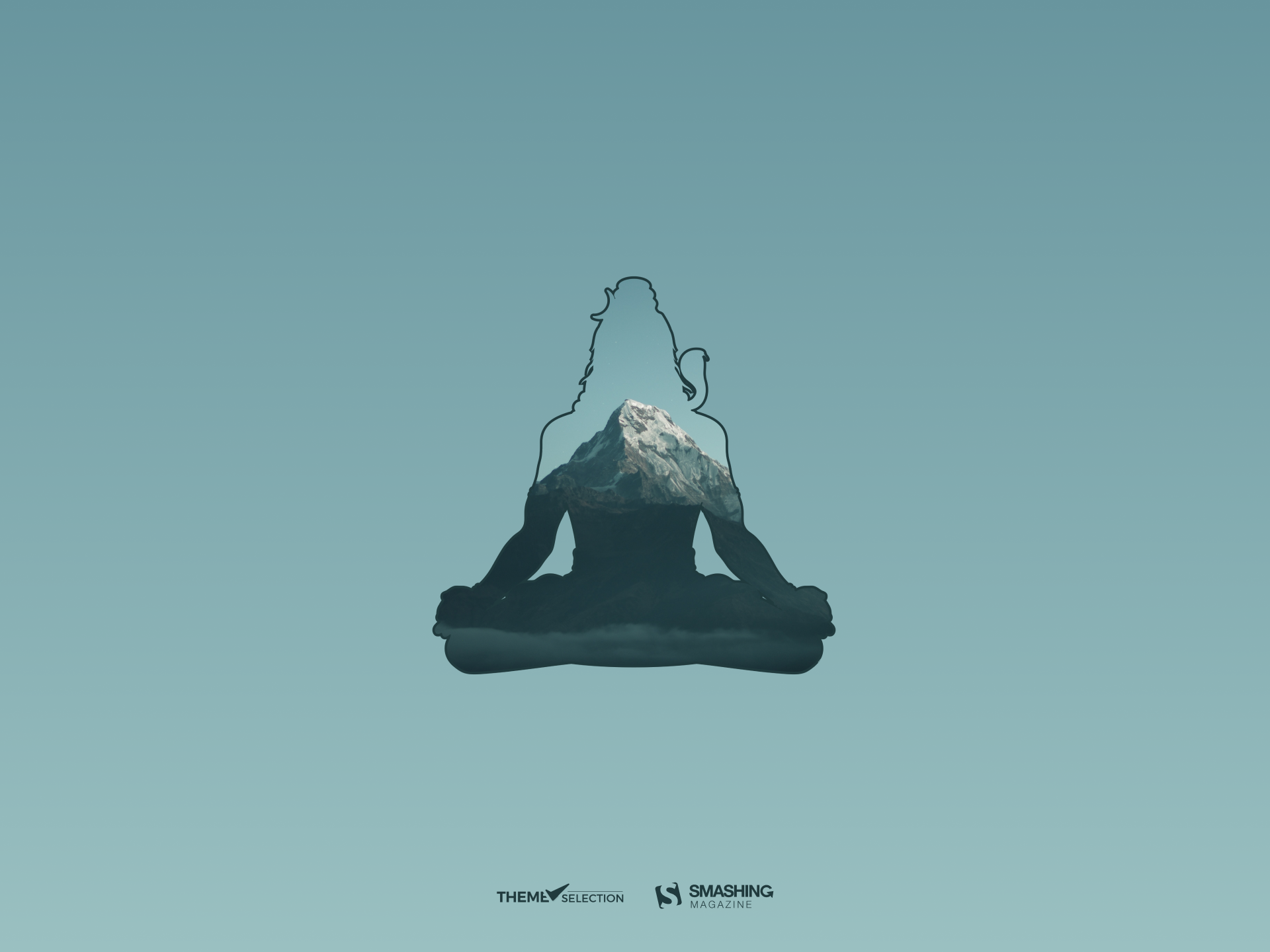
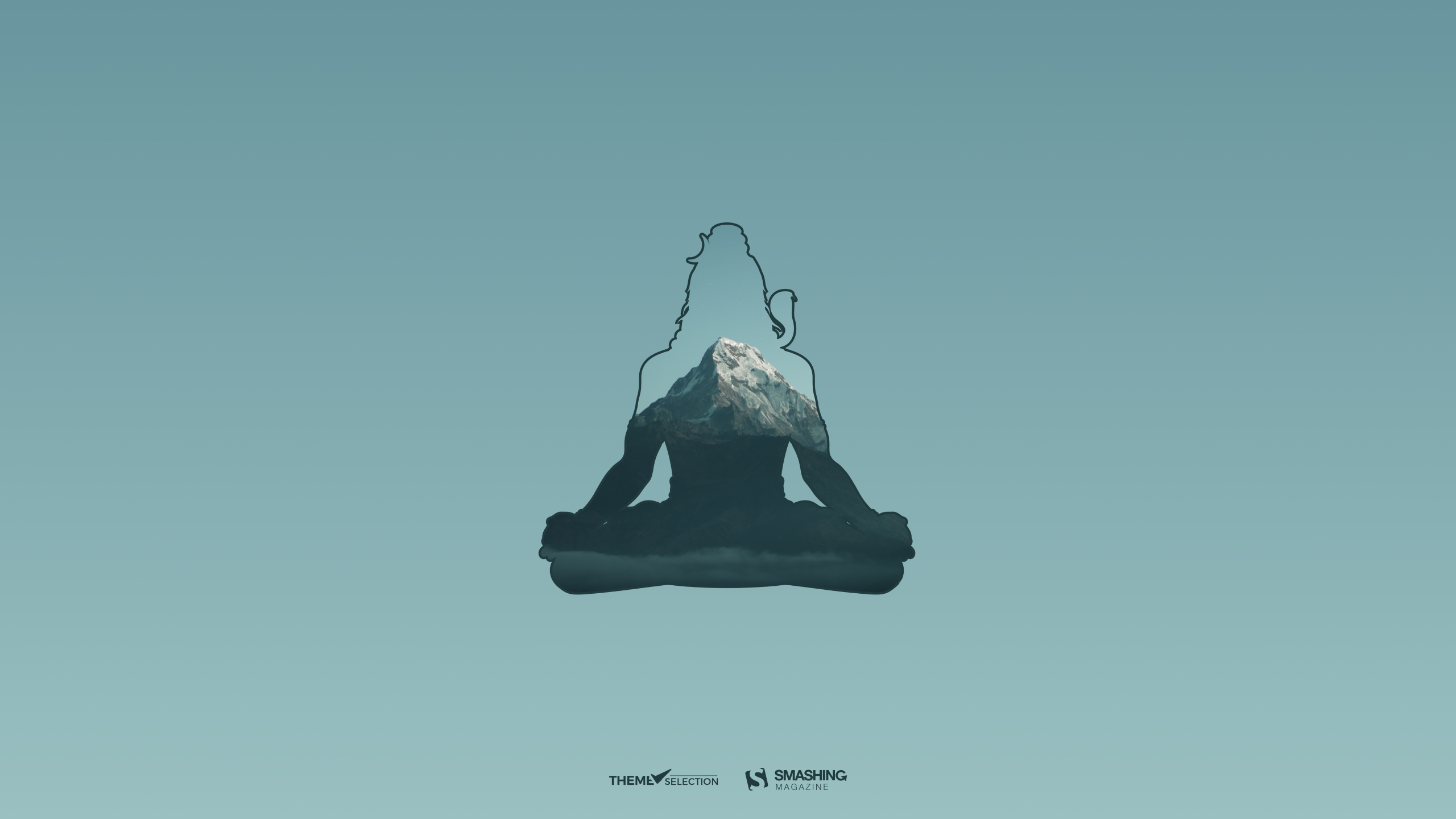
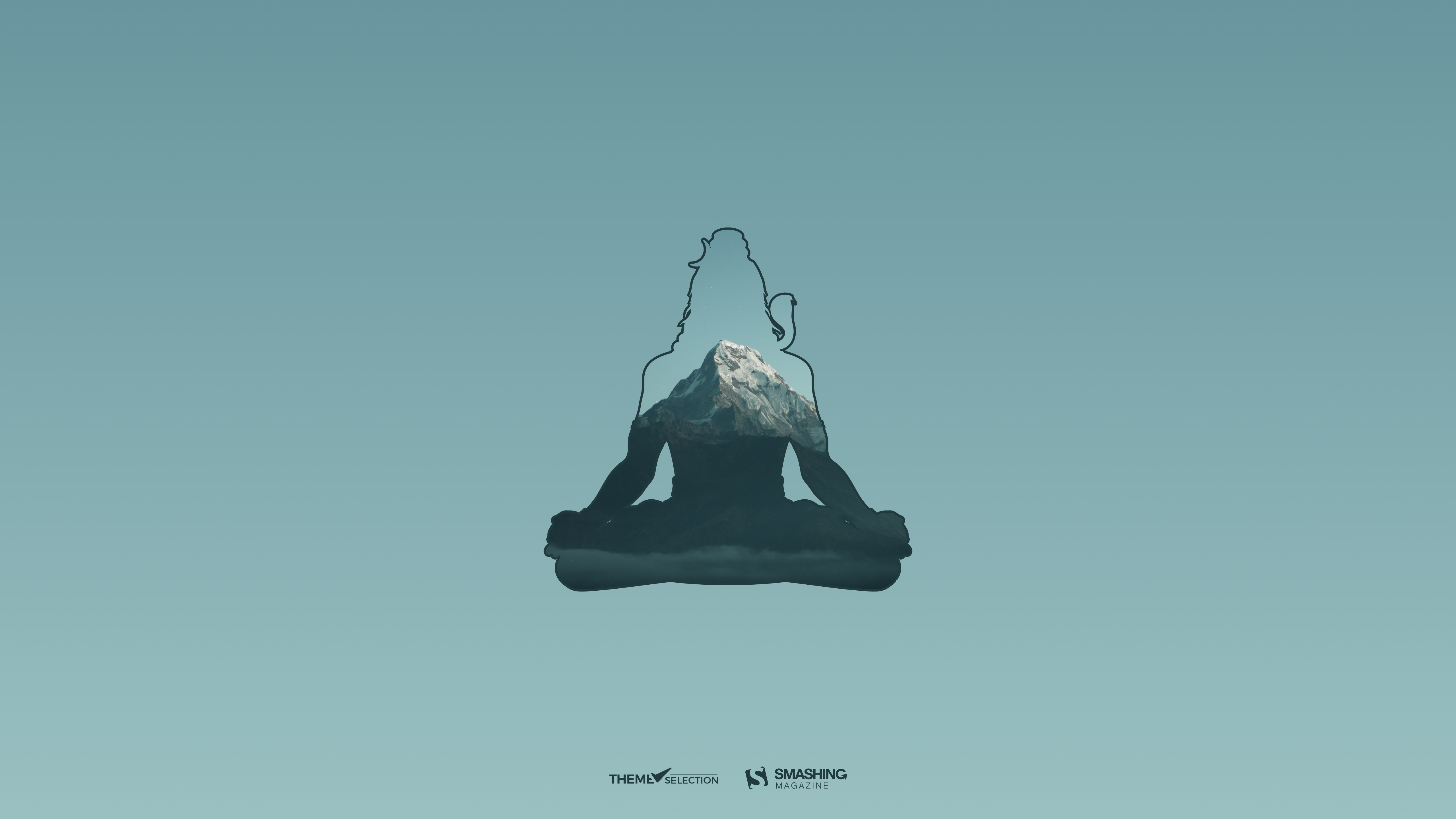
“Discover your hidden potential and inner self as you meditate on the thought of reaching closer to Lord Shiva on the occasion of Maha Shivratri.” — Designed by ThemeSelection from India.
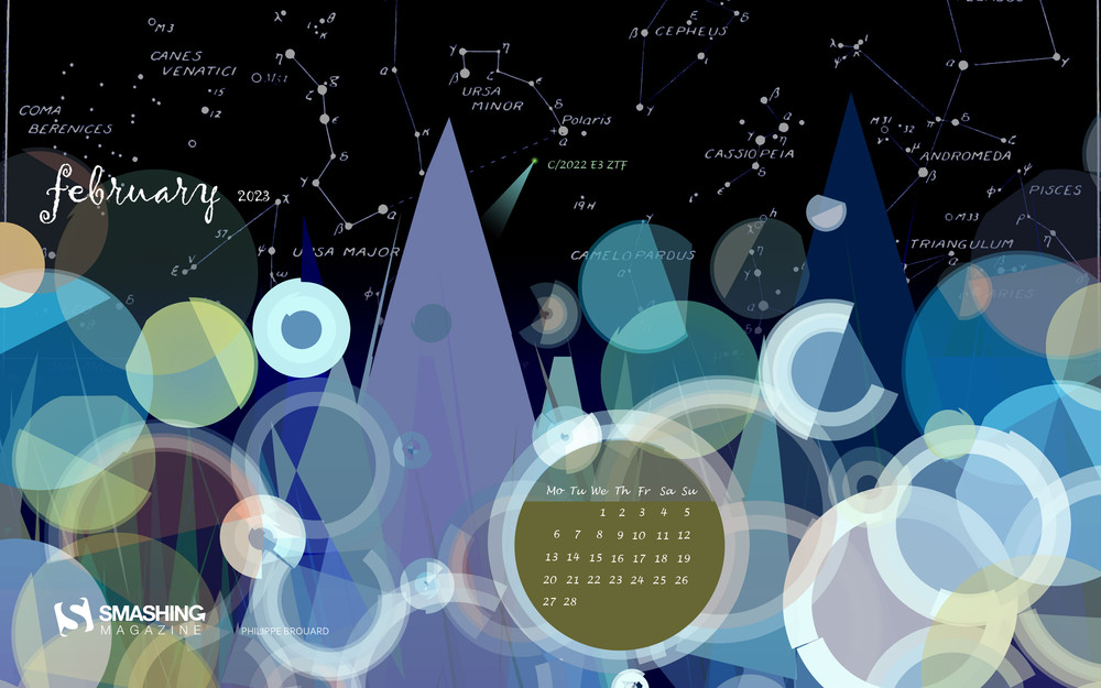
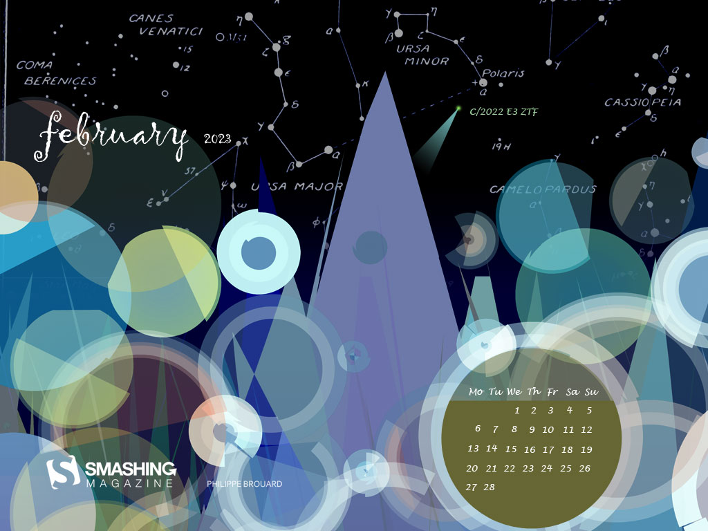
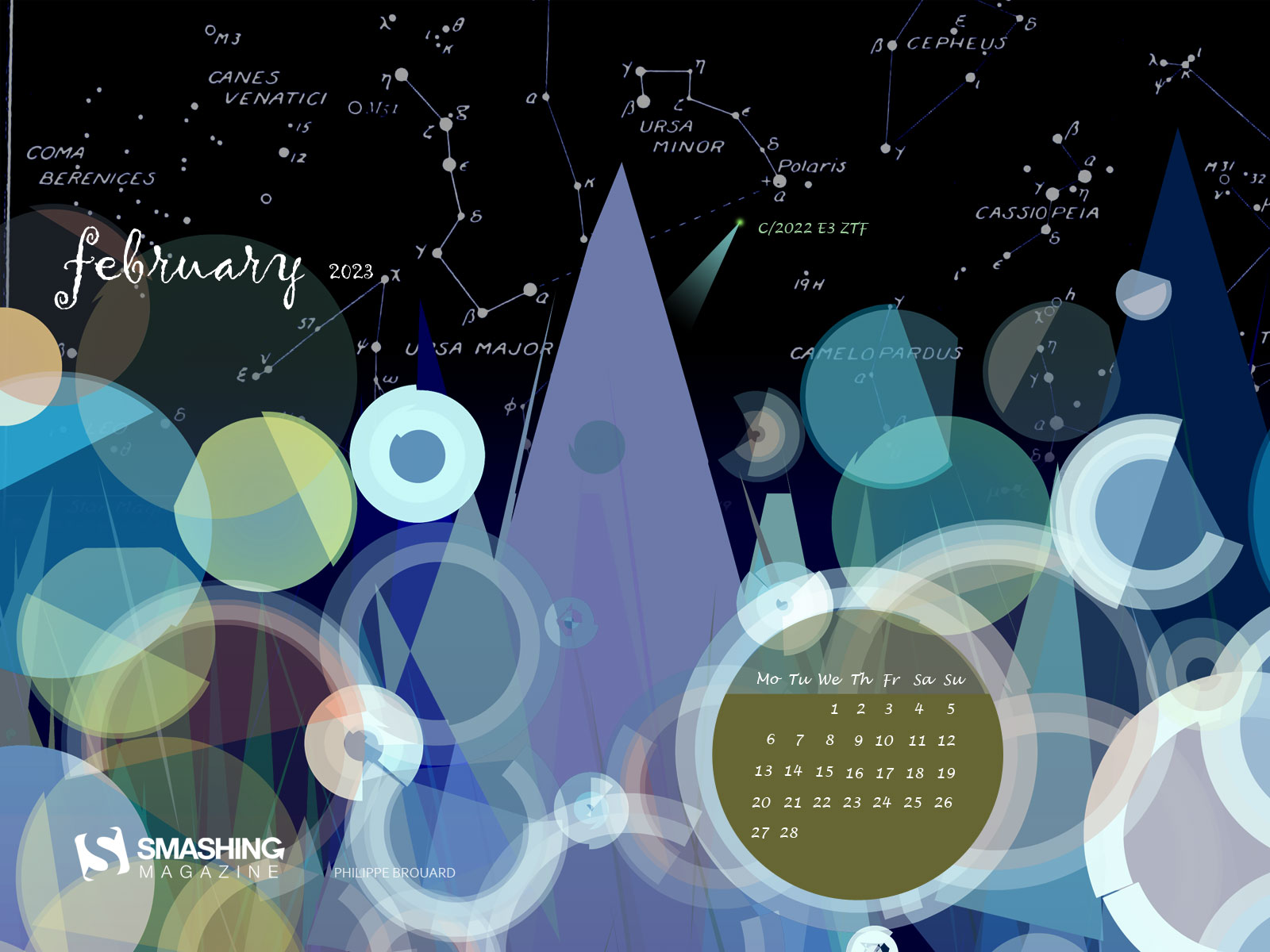
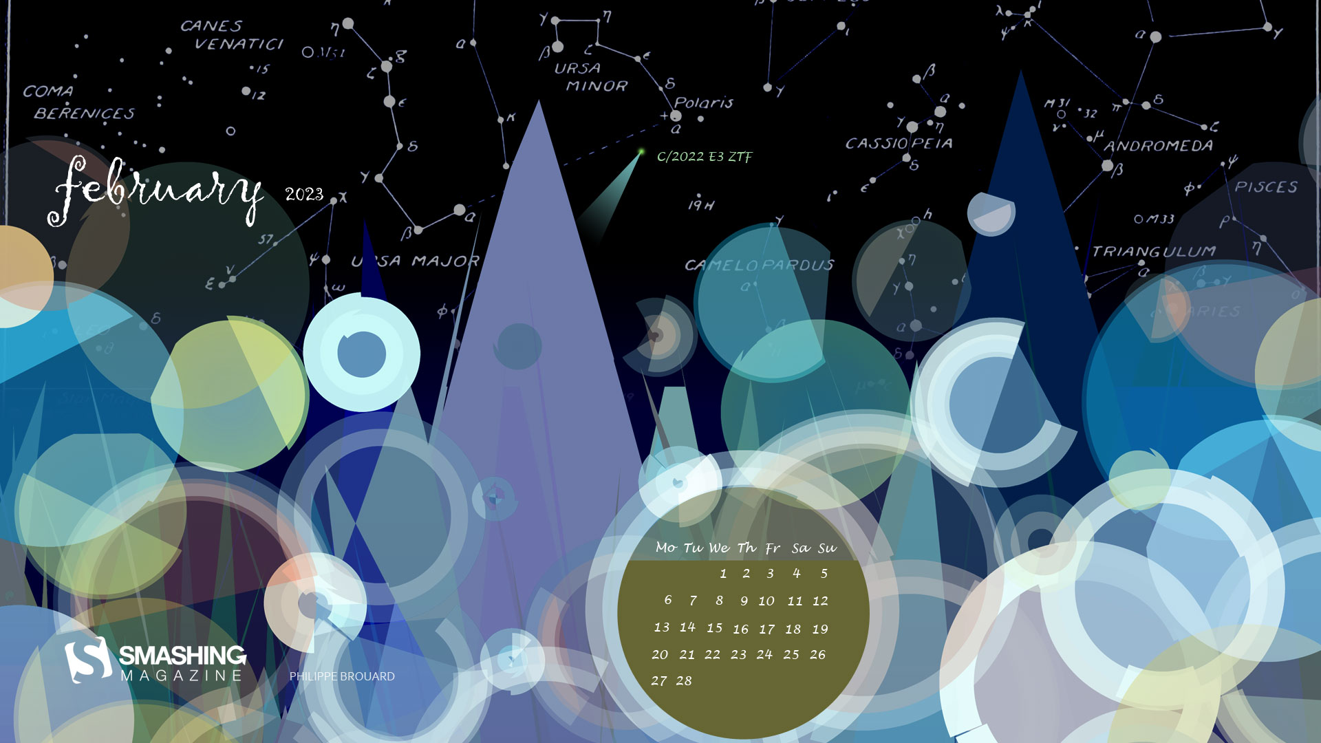
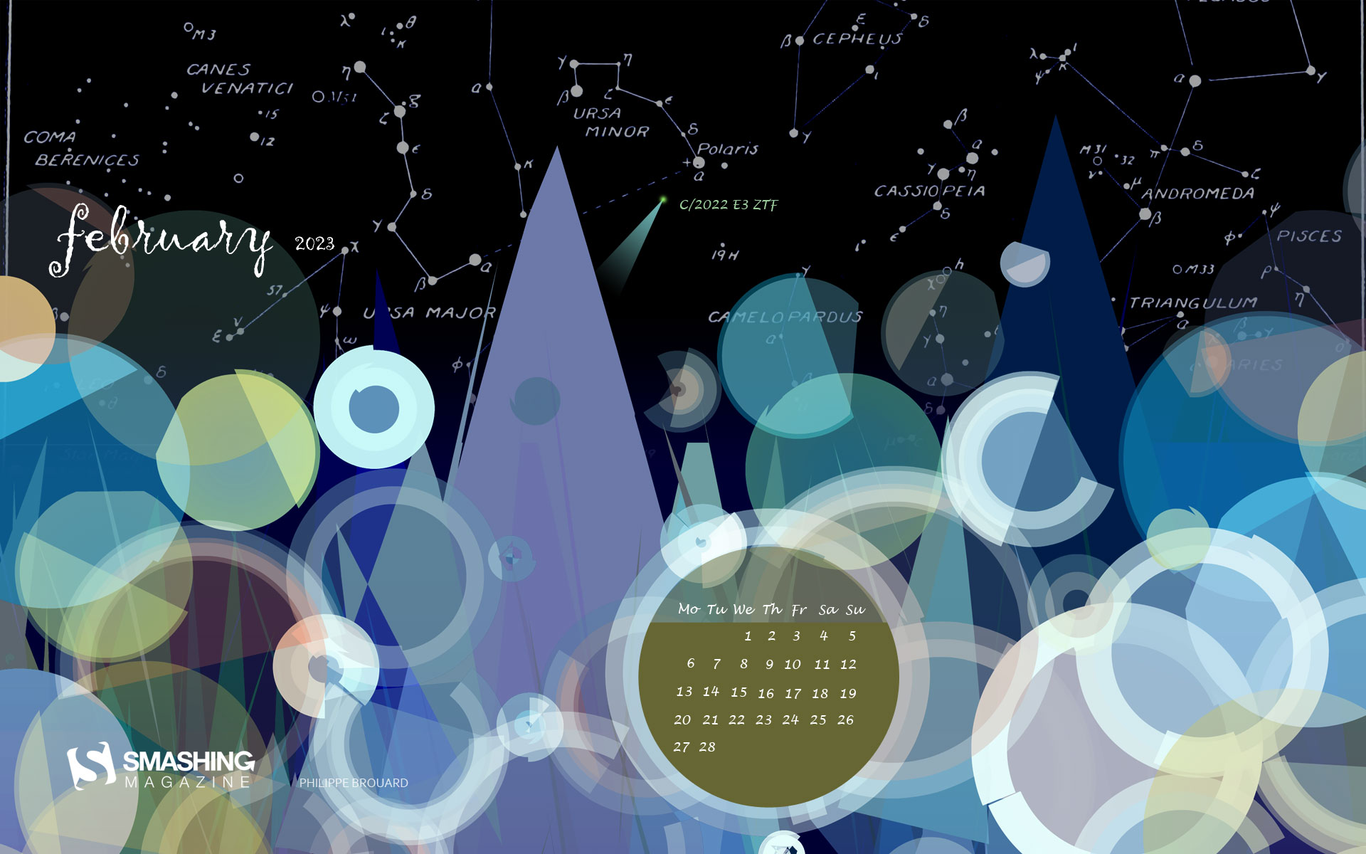
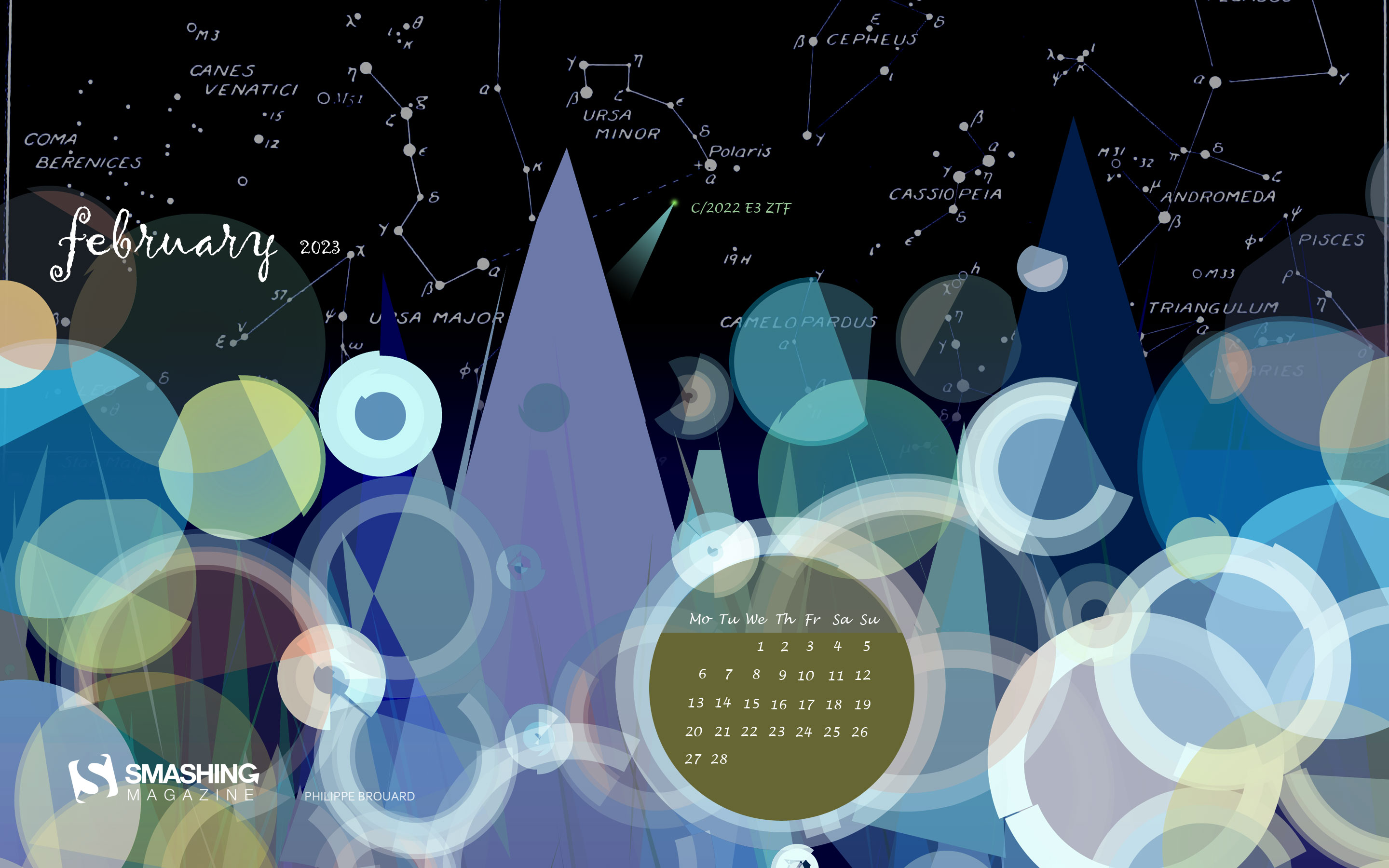
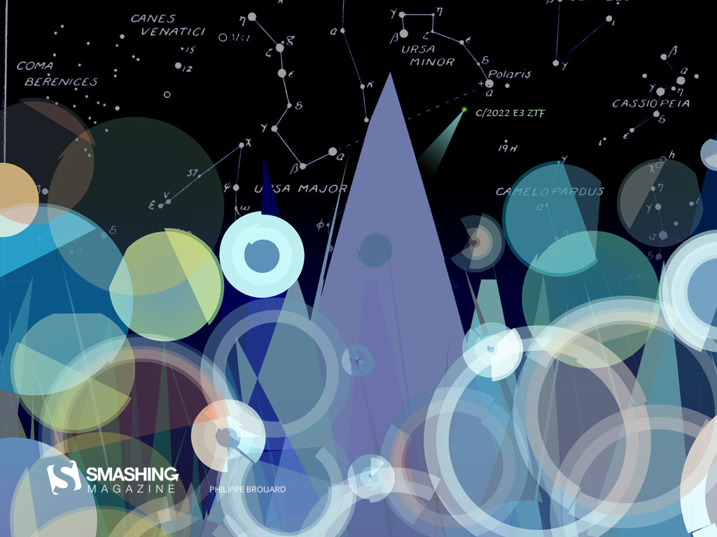
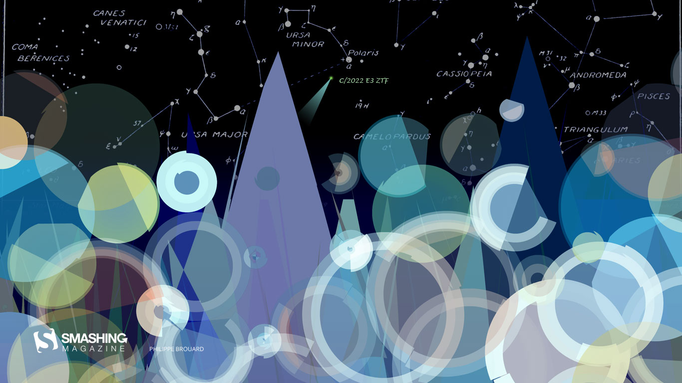
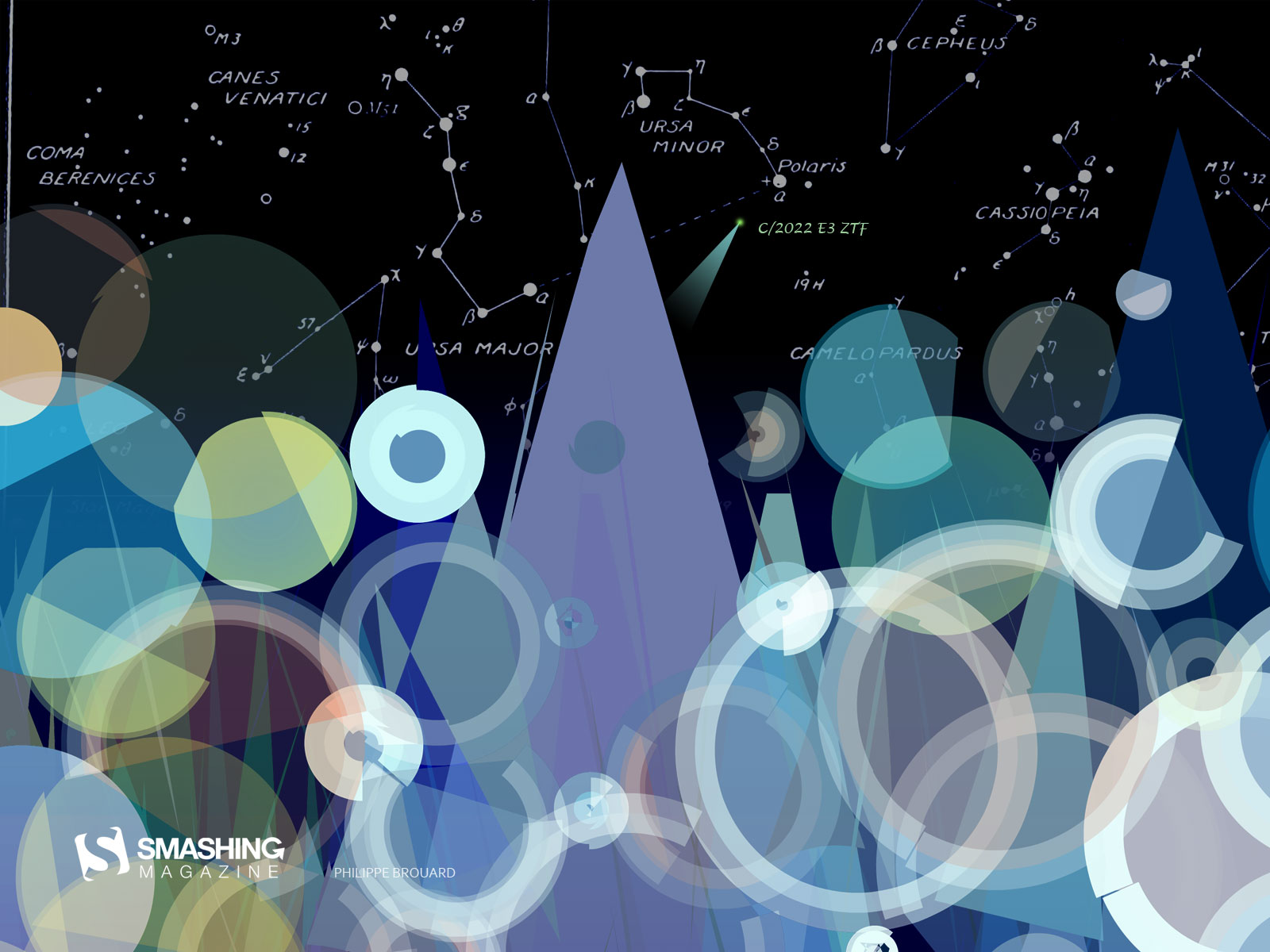
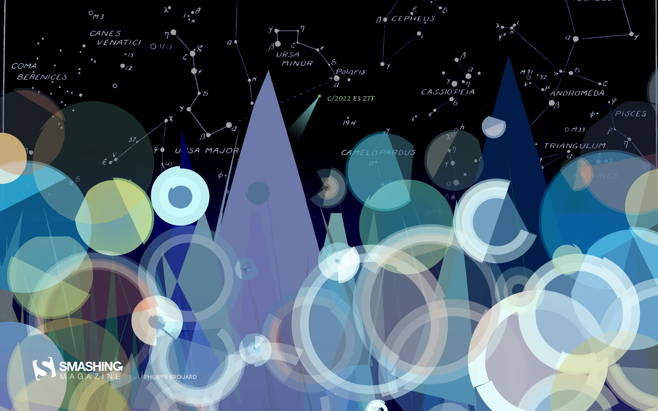
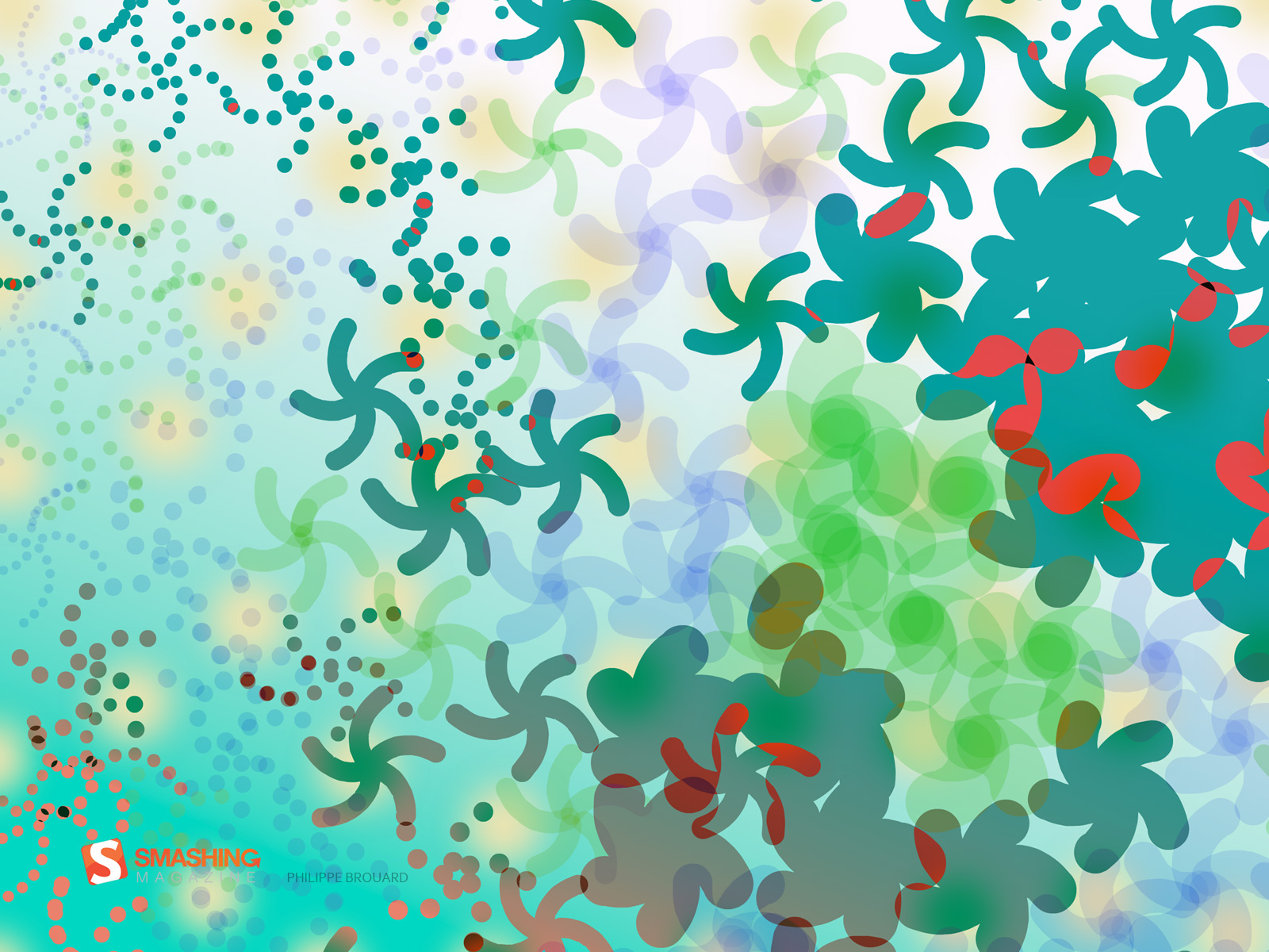
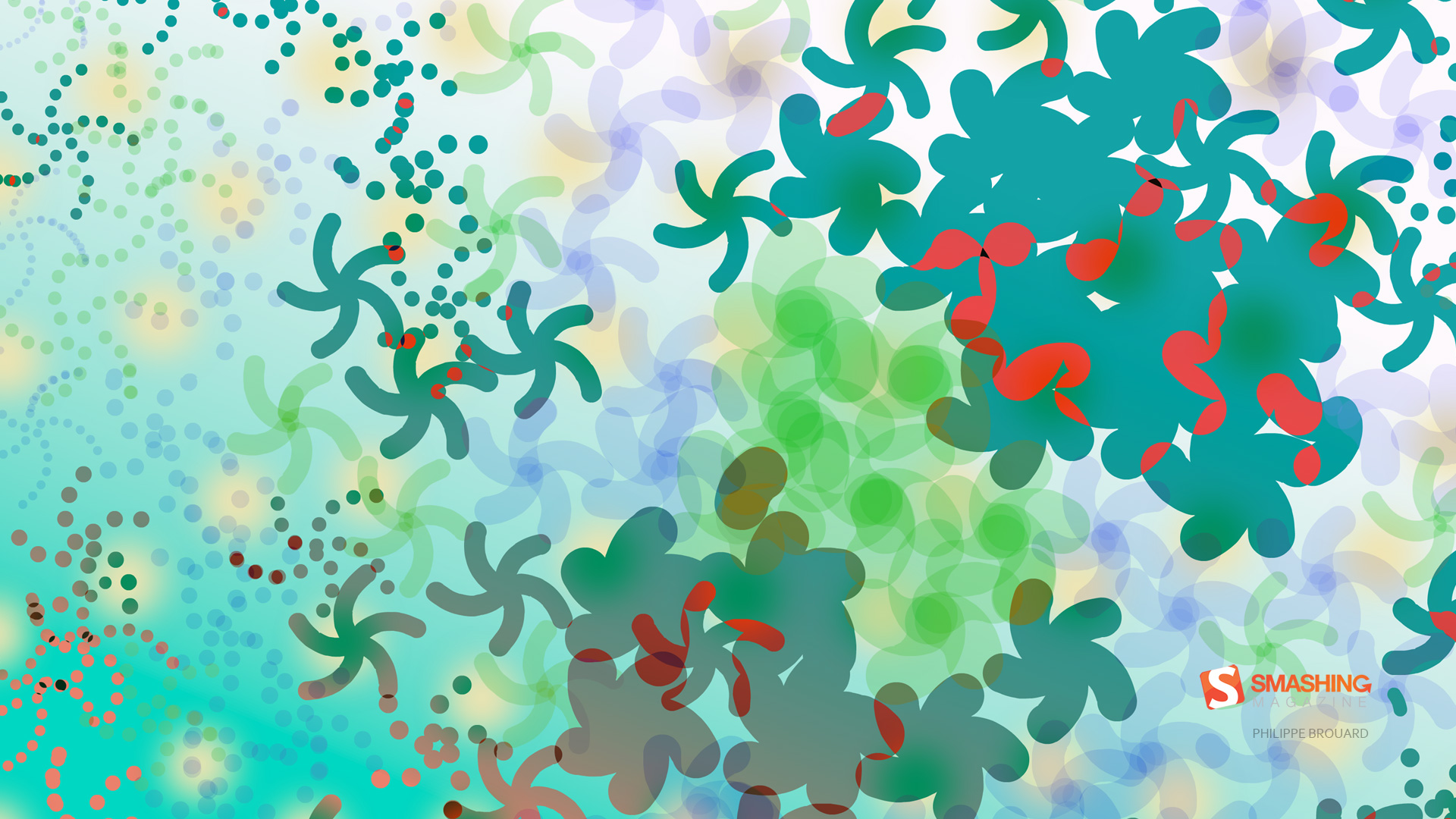
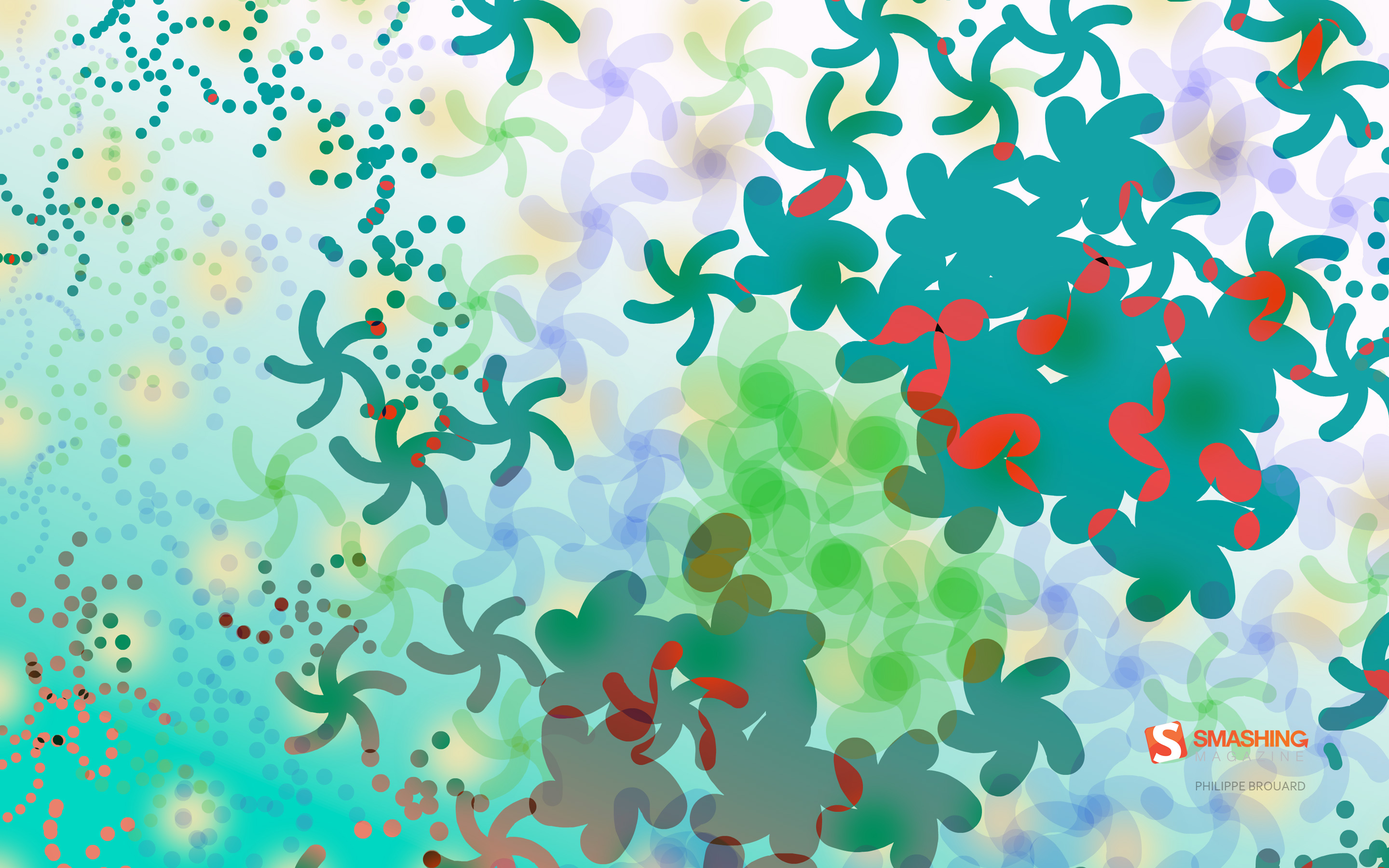
“On February 1, the recently discovered comet C/2022 E3 ZTF is at its nearest position to Earth. Whaouh, it’s not every year we can see a comet in the sky and this one will return in… well, we’ll never see it again. Farewell little comet!” — Designed by Philippe Brouard from France.
“Our designers decided not to overuse the topic of Valentine’s Day and used its basic attributes and a pure pastel blue color scheme for the wallpaper instead. But if you still need more red and pink colors, check out our listicle with more options.” — Designed by MasterBundles from Ukraine.
Whether it’s a brave icebreaker that confronts even the most adverse weather conditions, a piece of design wisdom, or, well, french fries — many things have inspired folks from across the globe to create a February wallpaper for our monthly series. Below you’ll find a little best-of from our wallpapers archives. Please note that these wallpapers don’t come with a calendar.
Magic Of Music
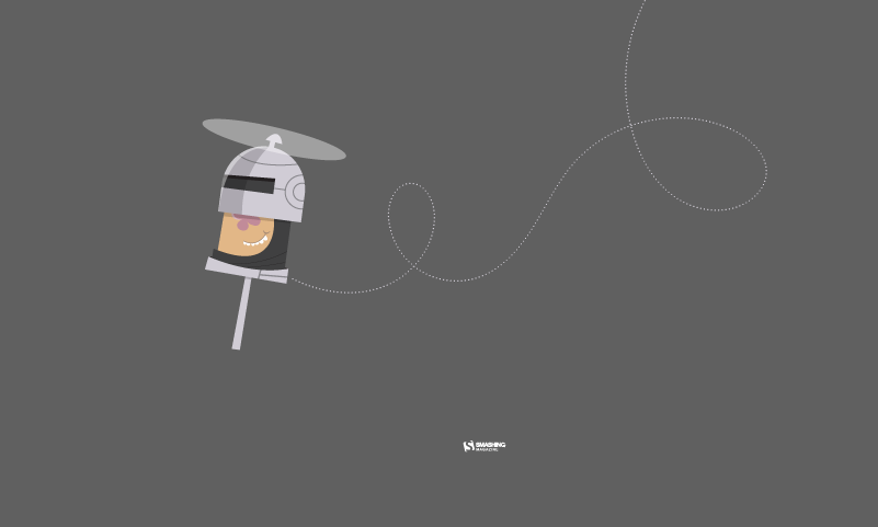
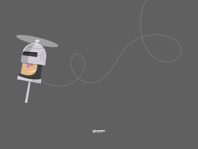
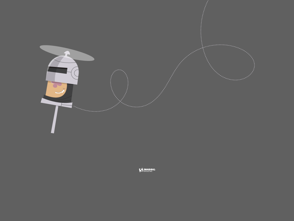
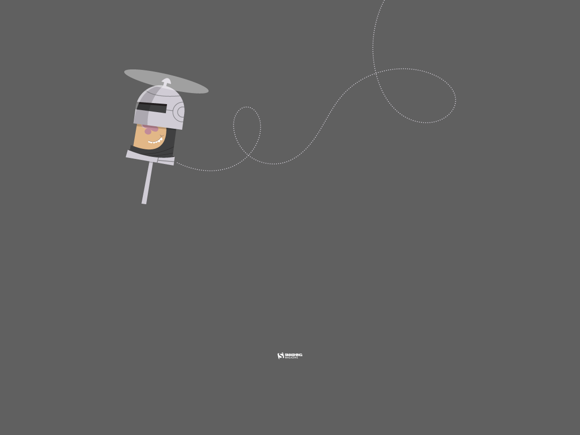
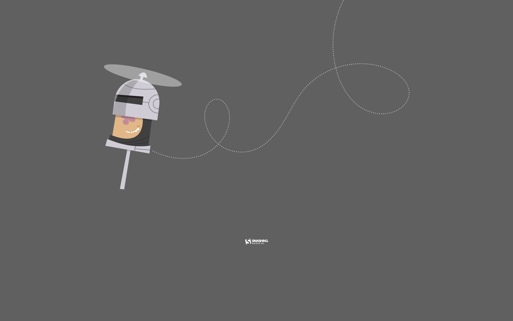
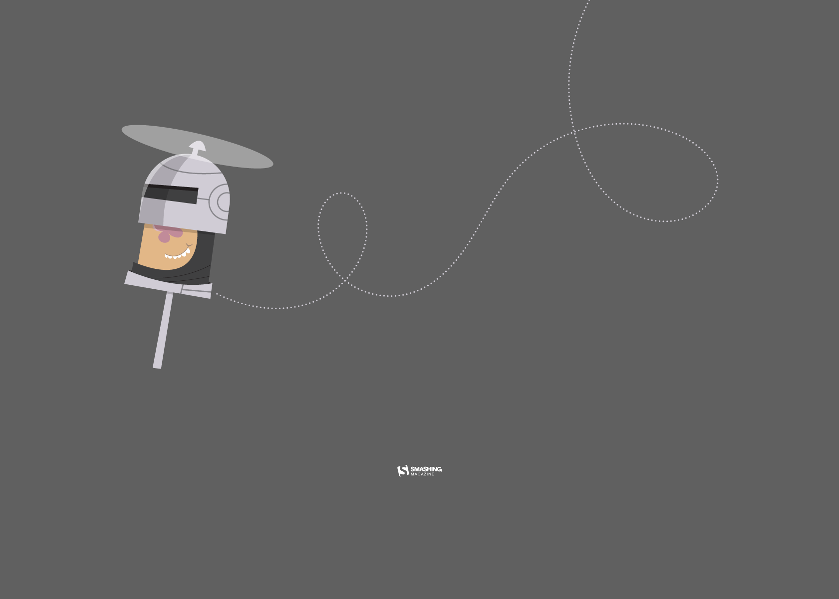
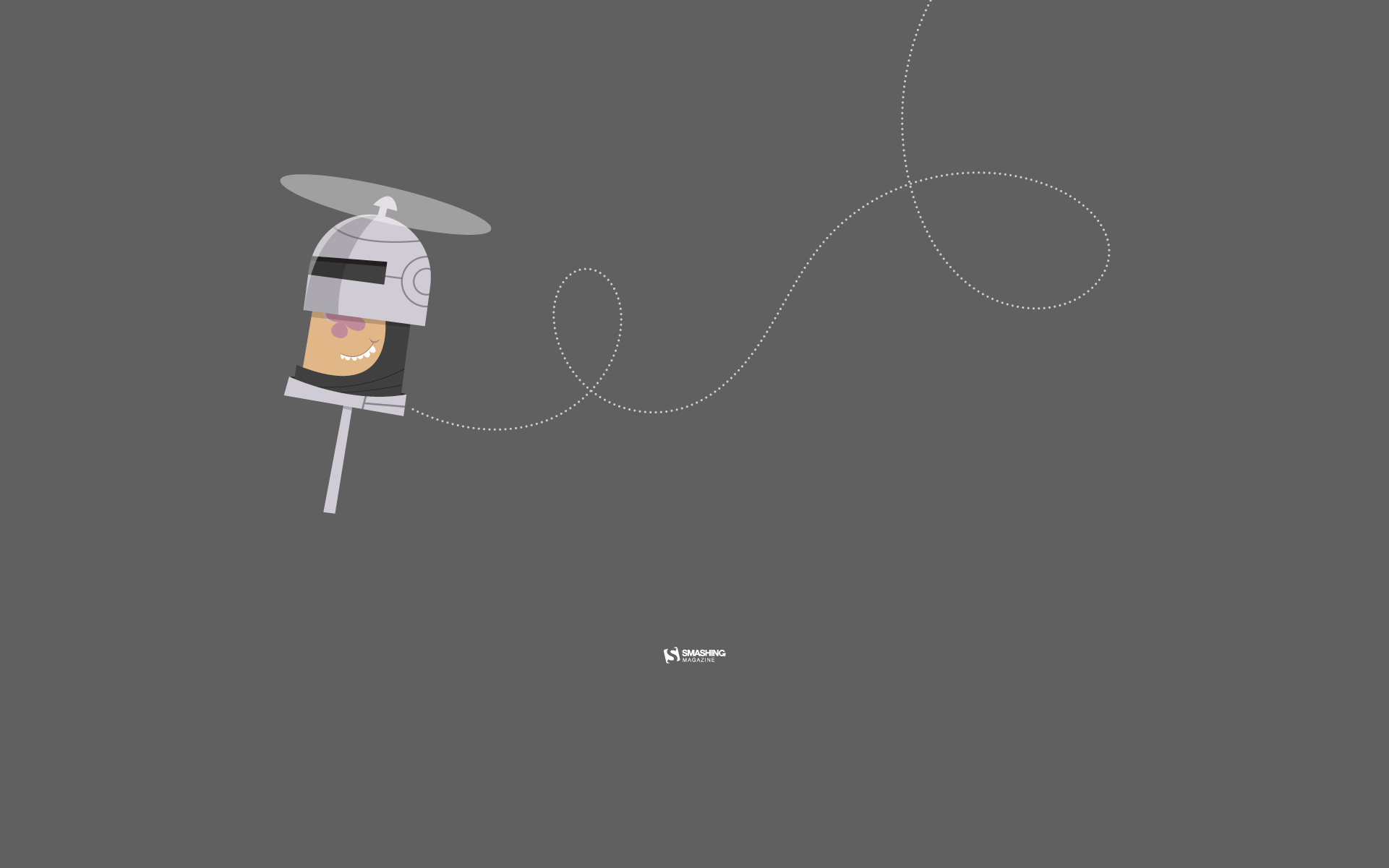
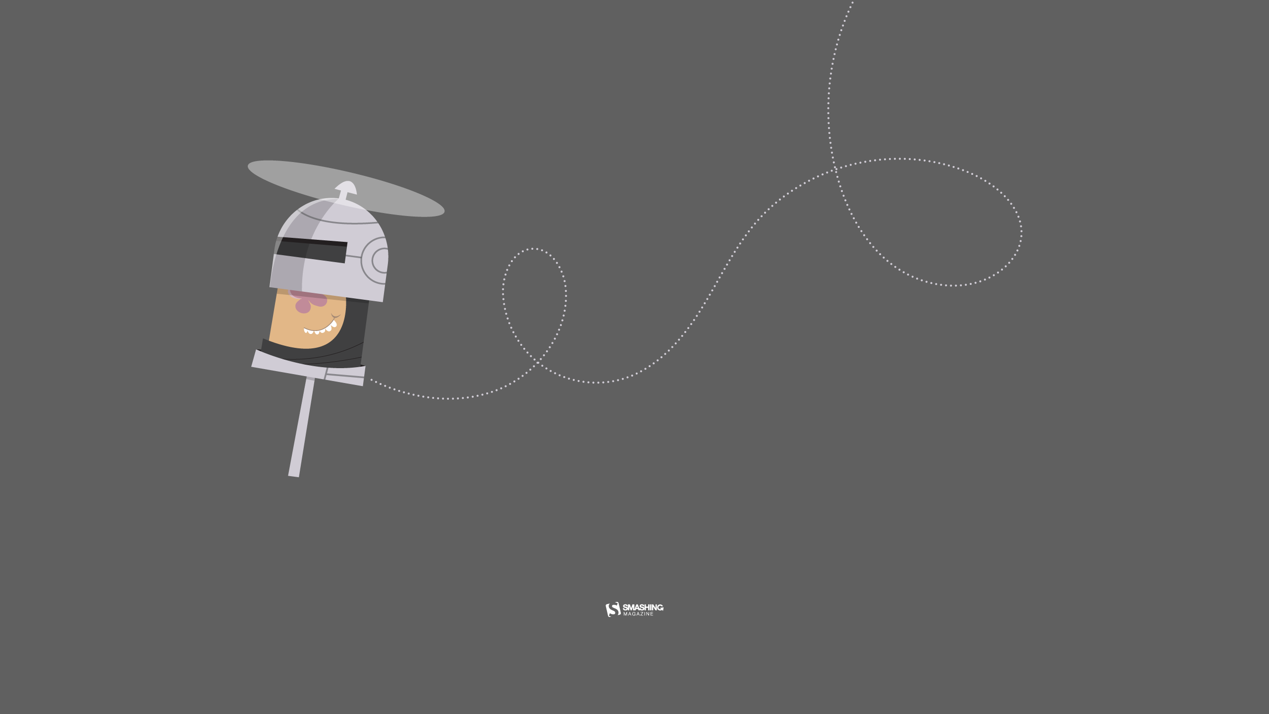
“Please visit Vladstudio website if you like my works!” — Designed by Vlad Gerasimov from Russia.
“Forget Lady and the Tramp and their spaghetti kiss, ’cause Snowflake and Cloudy are enjoying their bliss. The cold and chilly February weather made our kitties knit themselves a sweater. Knitting and playing, the kitties tangled in the yarn and fell in love in your neighbor’s barn.” — Designed by PopArt Studio from Serbia.
“The simplicity seen in the work of Dieter Rams which has ensured his designs from the 50s and 60s still hold a strong appeal.” — Designed by Vinu Chaitanya from India.
“Although I love winter (mostly because of the fun winter sports), there are other great activities ahead. February, the last winter month, this year is even one day longer. But I don’t mind. Thanks, winter, and see you next year!” — Designed by Igor Izhik from Canada.
“Danube is Europe’s second largest river, connecting ten different countries. In these cold days, when ice paralyzes rivers and closes waterways, a small but brave icebreaker called Greben (Serbian word for ‘reef’) seems stronger than winter. It cuts through the ice on Đerdap gorge (Iron Gate) – the longest and biggest gorge in Europe – thus helping the production of electricity in the power plant. This is our way to give thanks to Greben!” — Designed by PopArt Studio from Serbia.
“I live in Madison, WI, which is famous for its breweries. Wisconsin even named their baseball team “The Brewers.” If you like beer, brats, and lots of cheese, it’s the place for you!” — Designed by Danny Gugger from the United States.
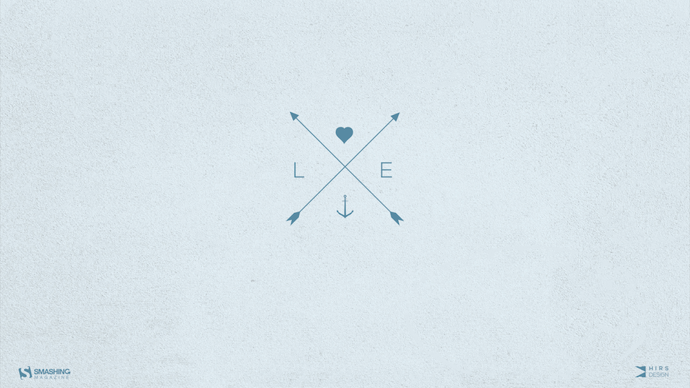
“This minimalistic love logo is designed from geometric shapes, where the heart represents the letter ‘O’ and love. The anchor represents the letter ‘V’ very delicately and stylish and it symbolizes your wanderlust. The anchor is a symbol of adventure and travels.” — Designed by Antun Hirsman from Croatia.
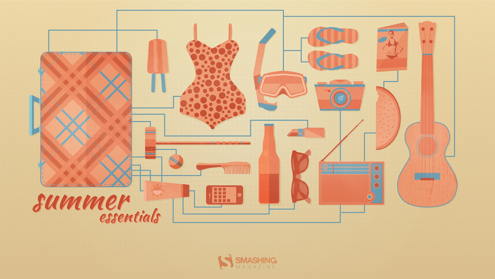
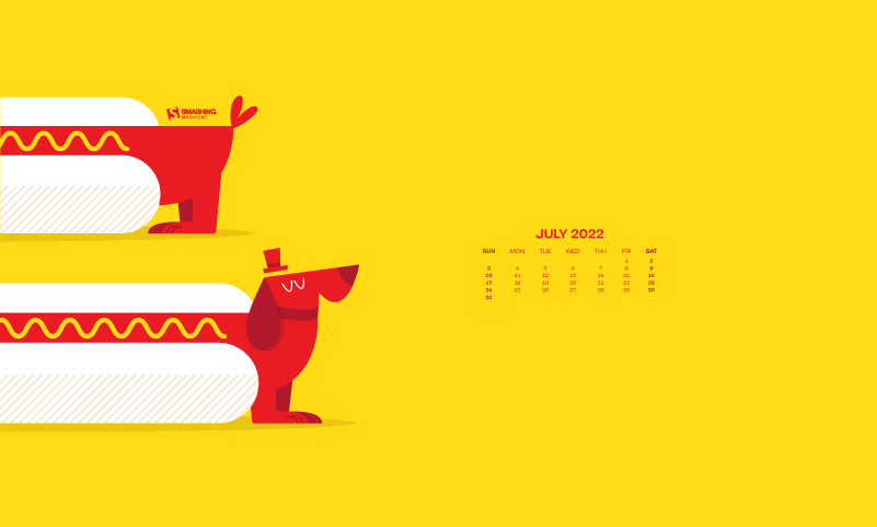
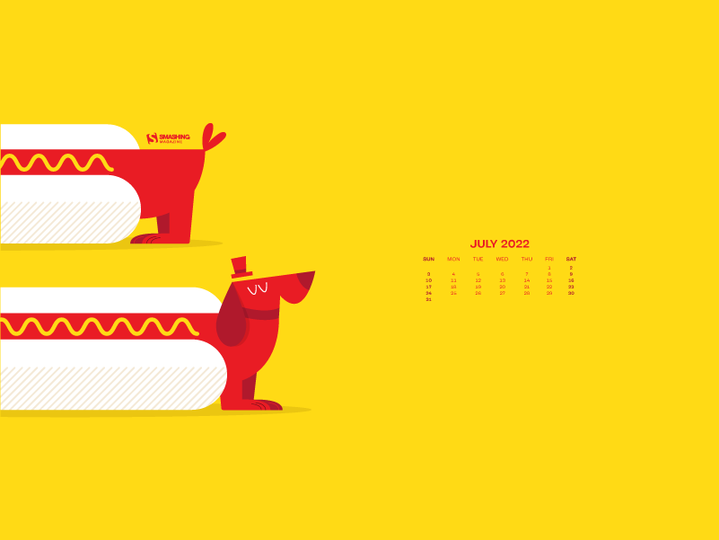
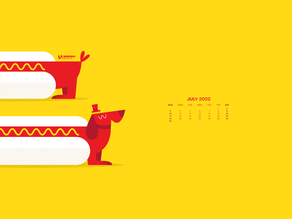
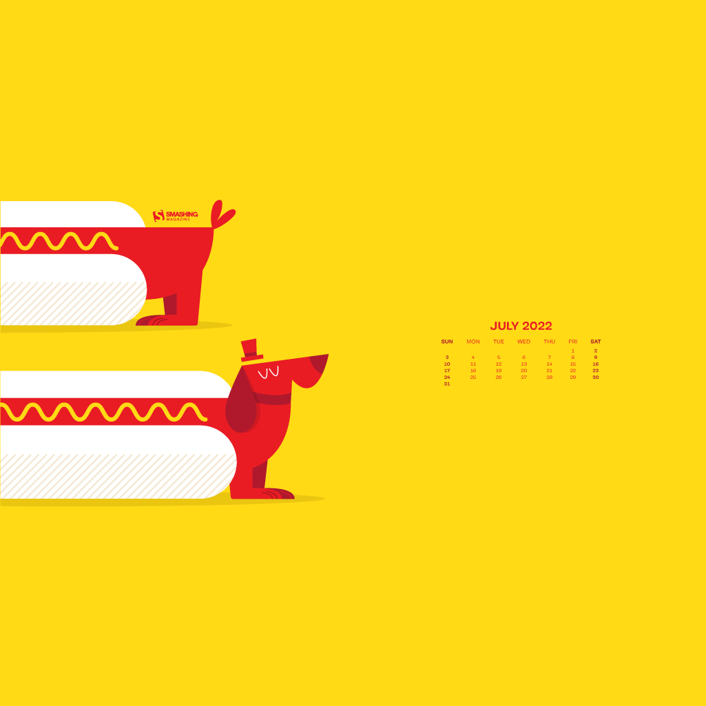
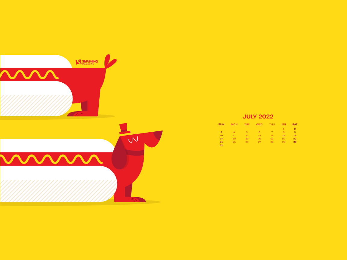
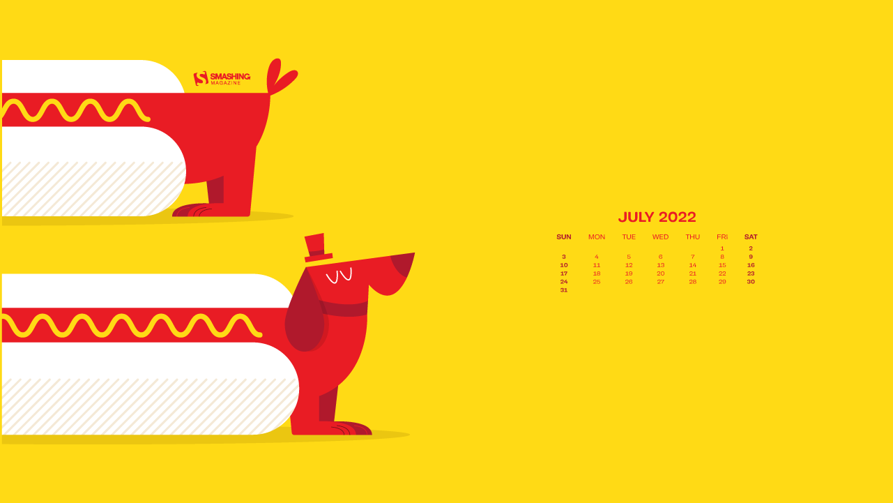
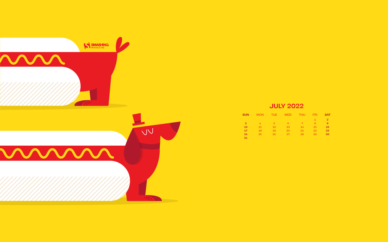
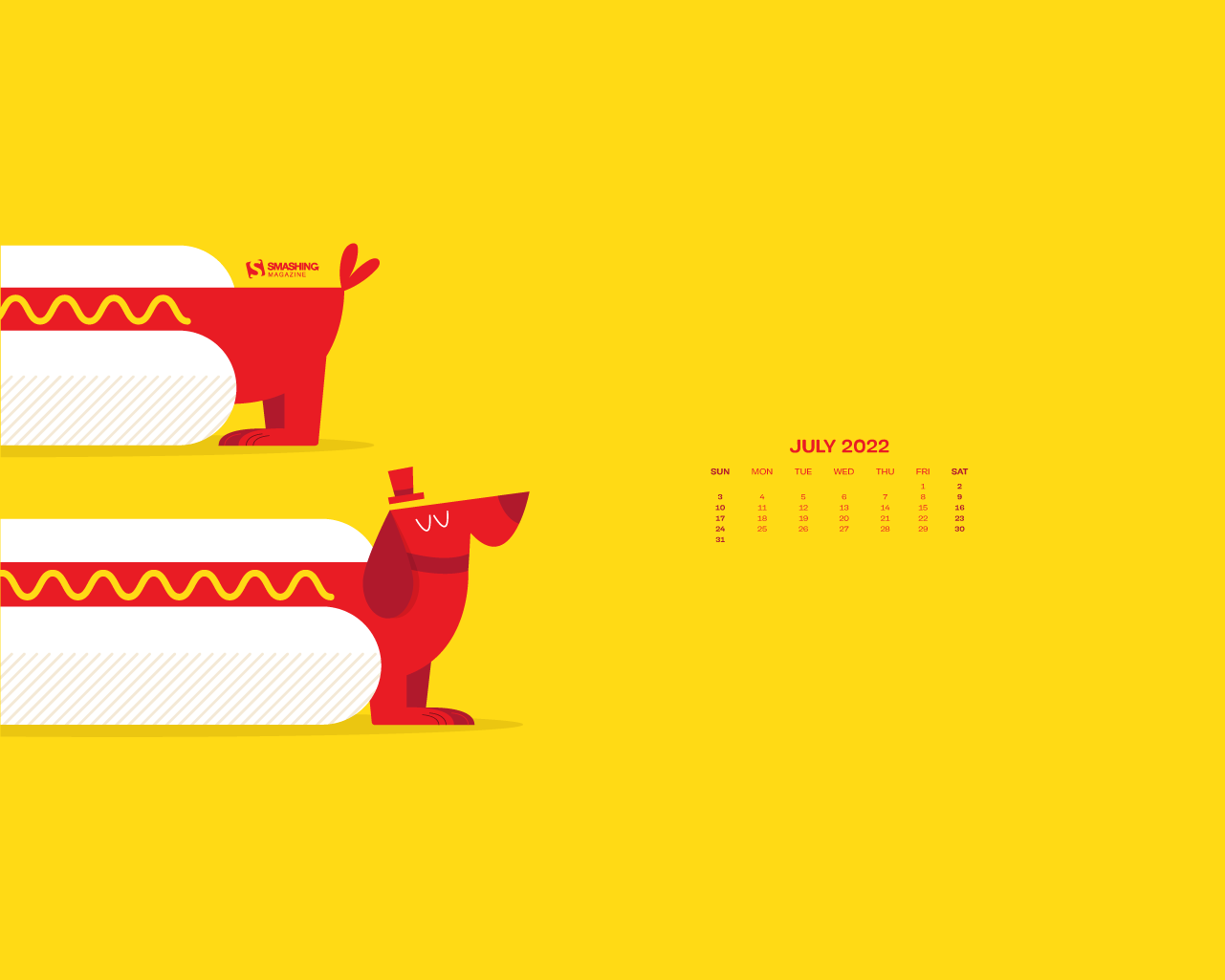
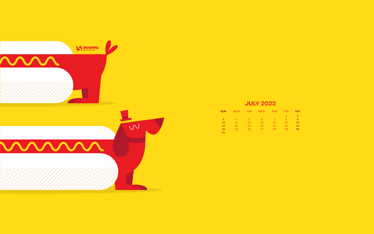
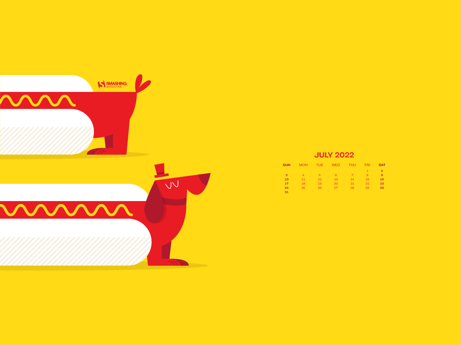
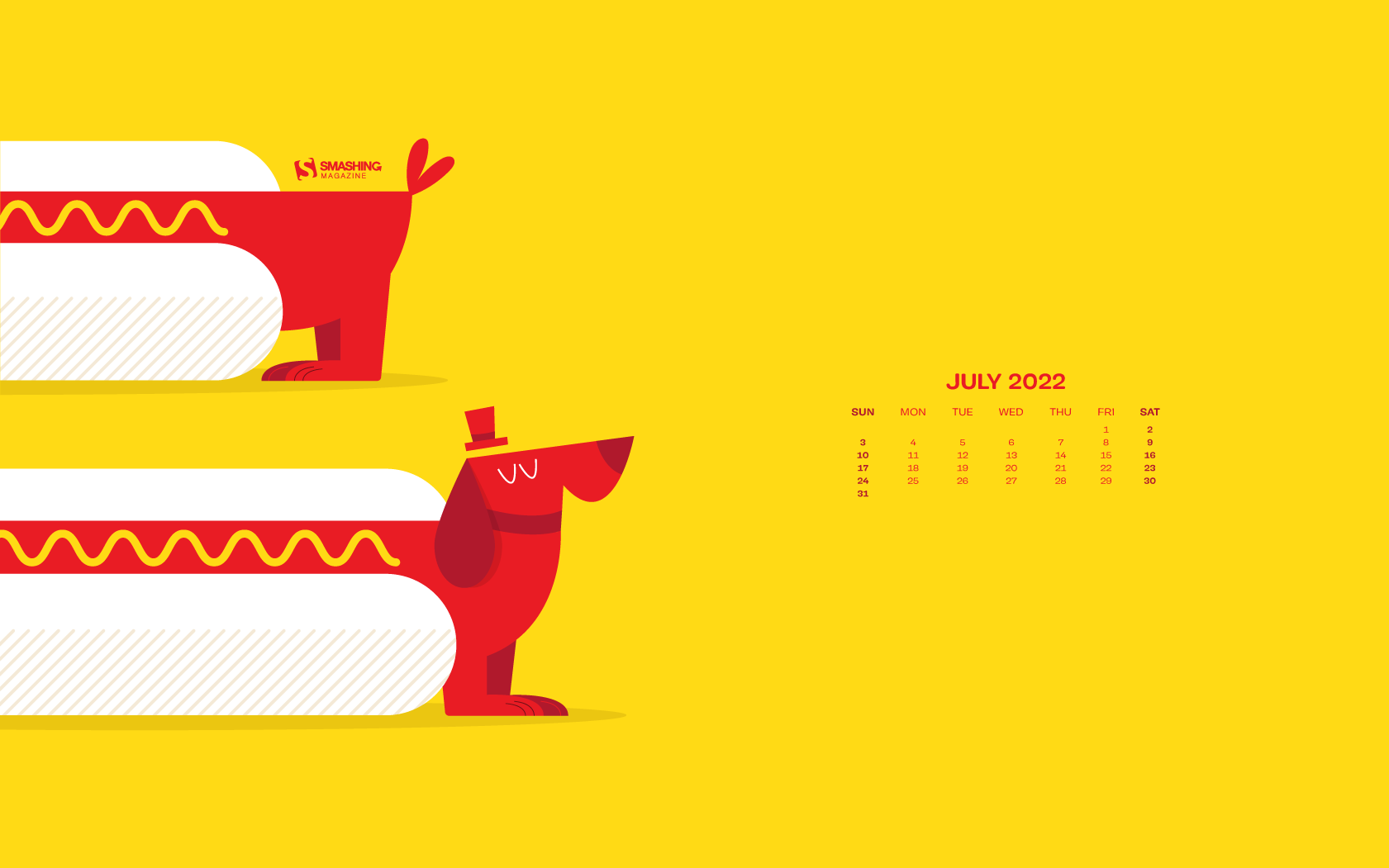
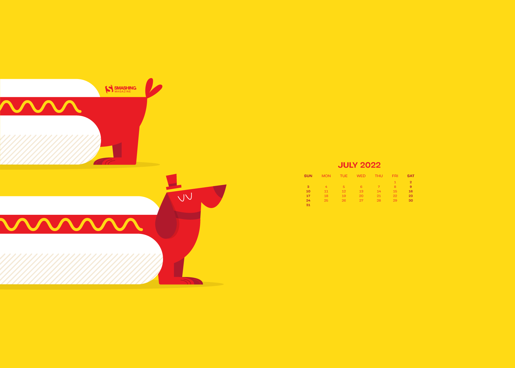
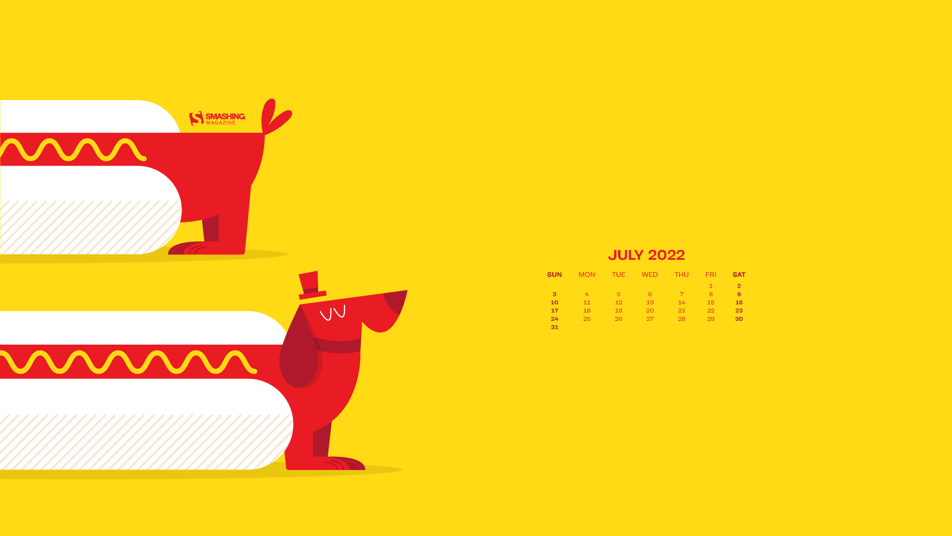
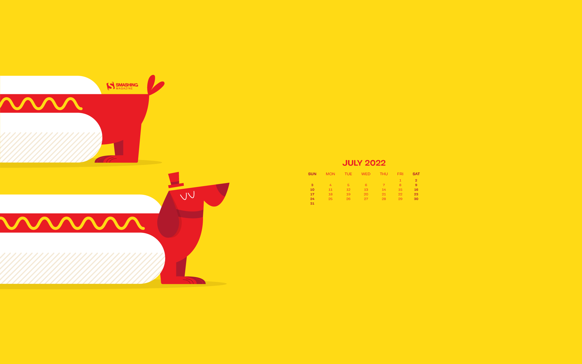
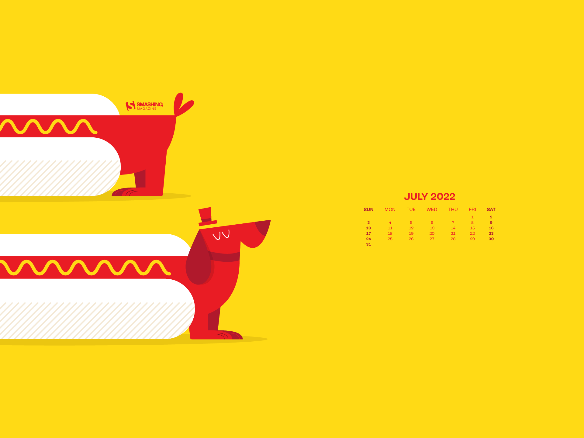
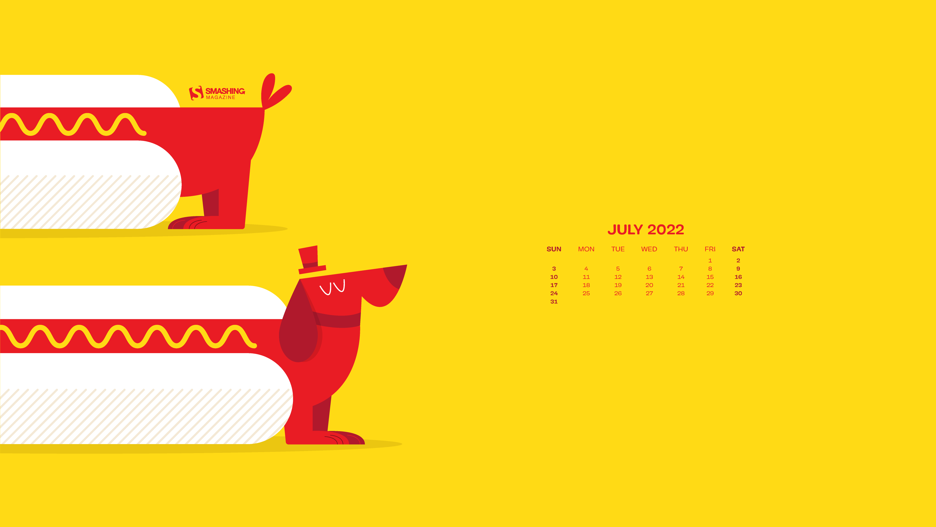
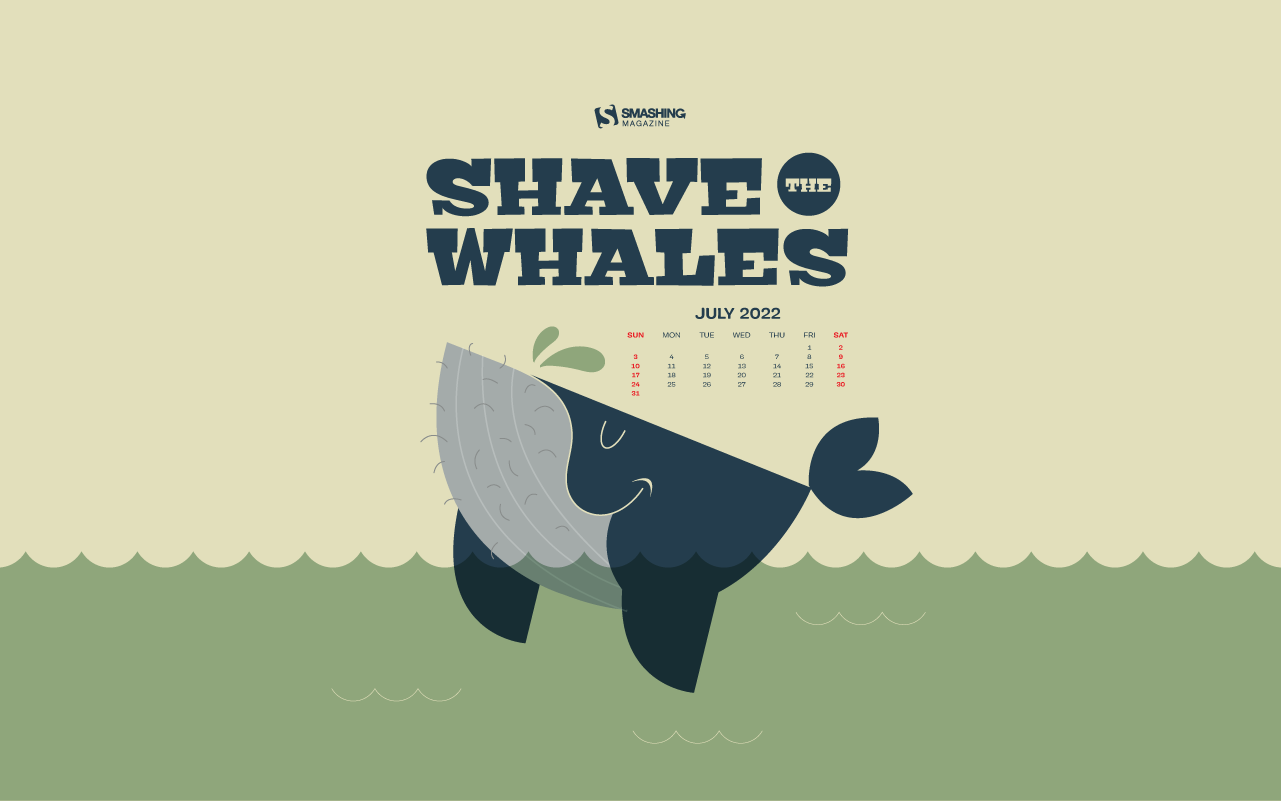
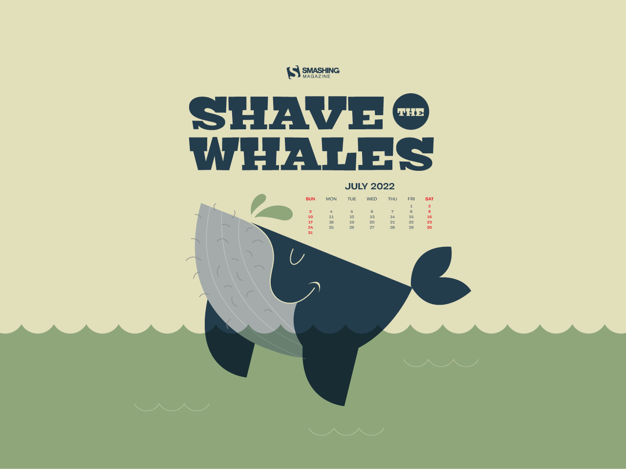
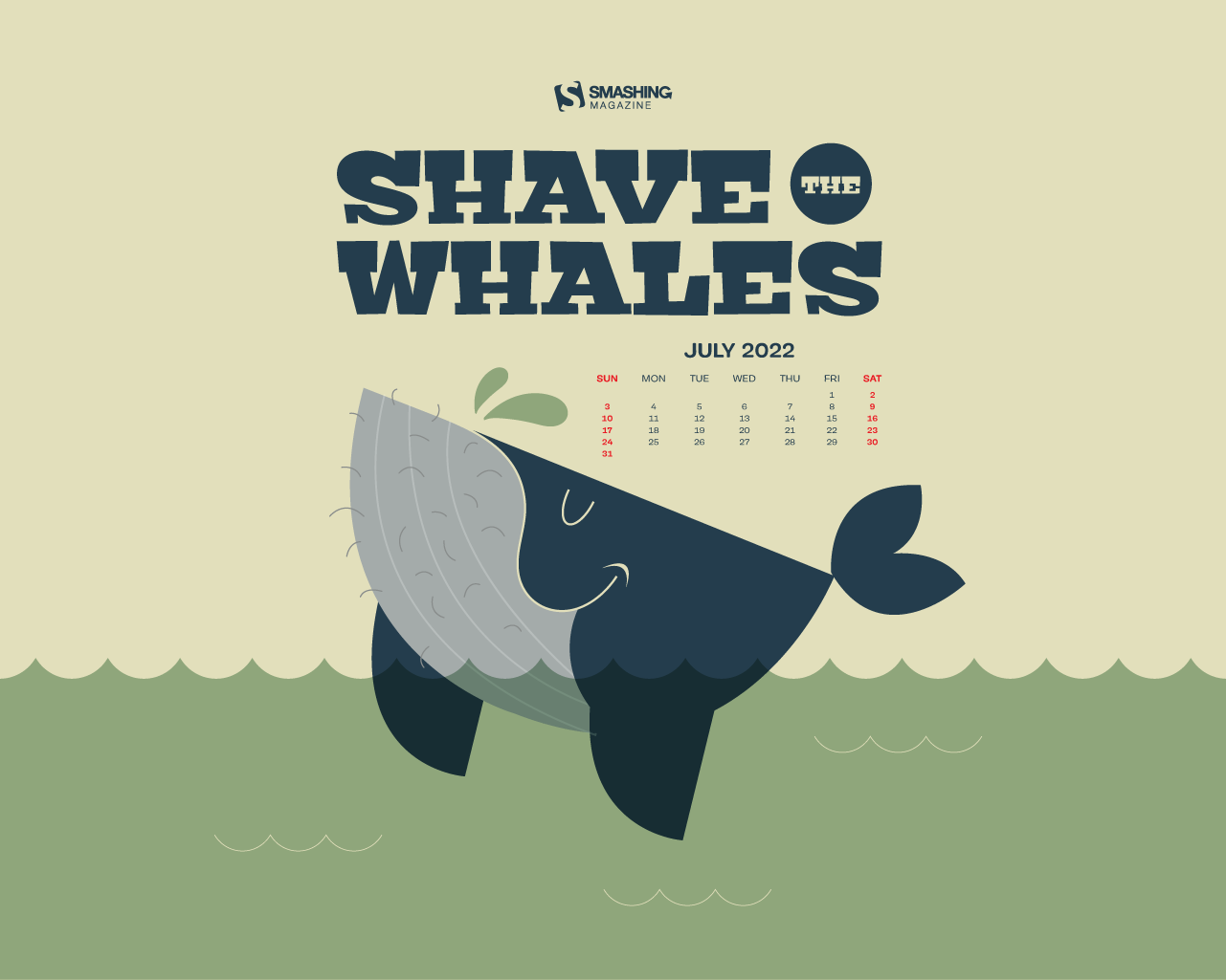
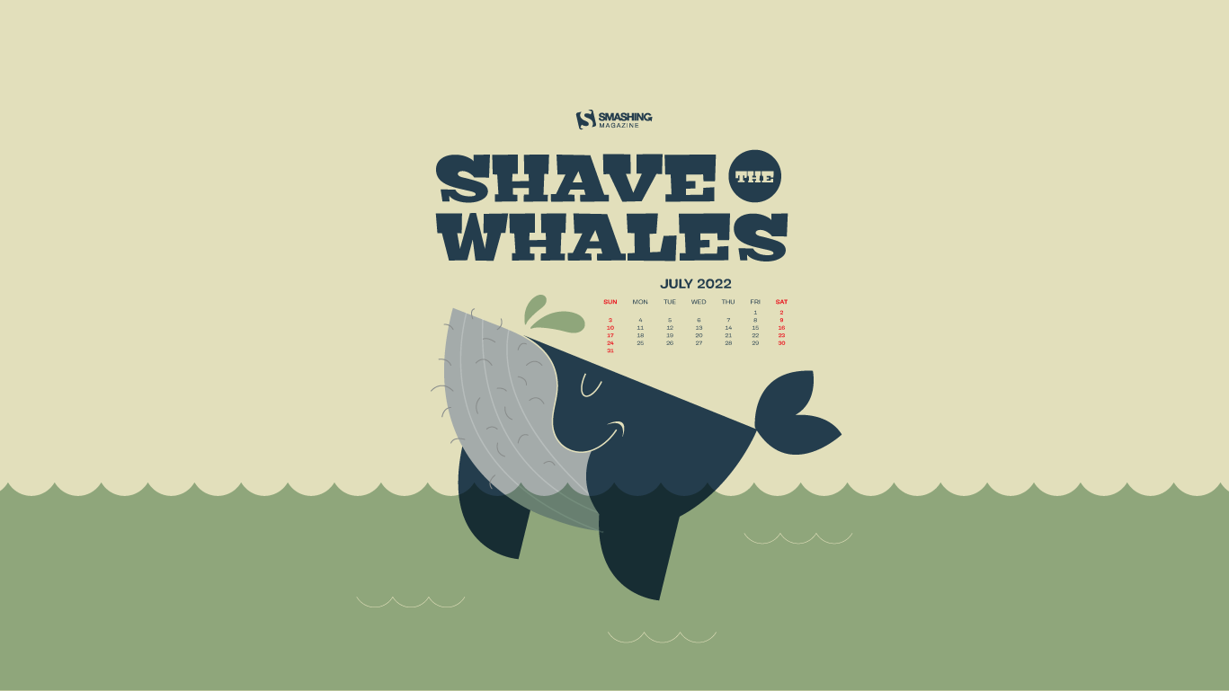
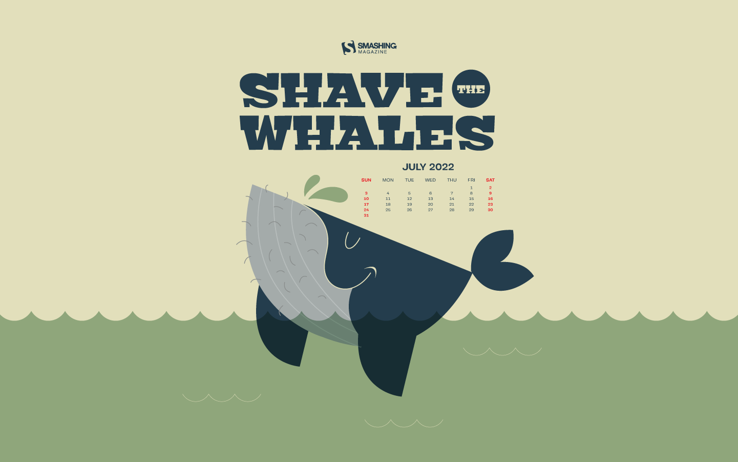
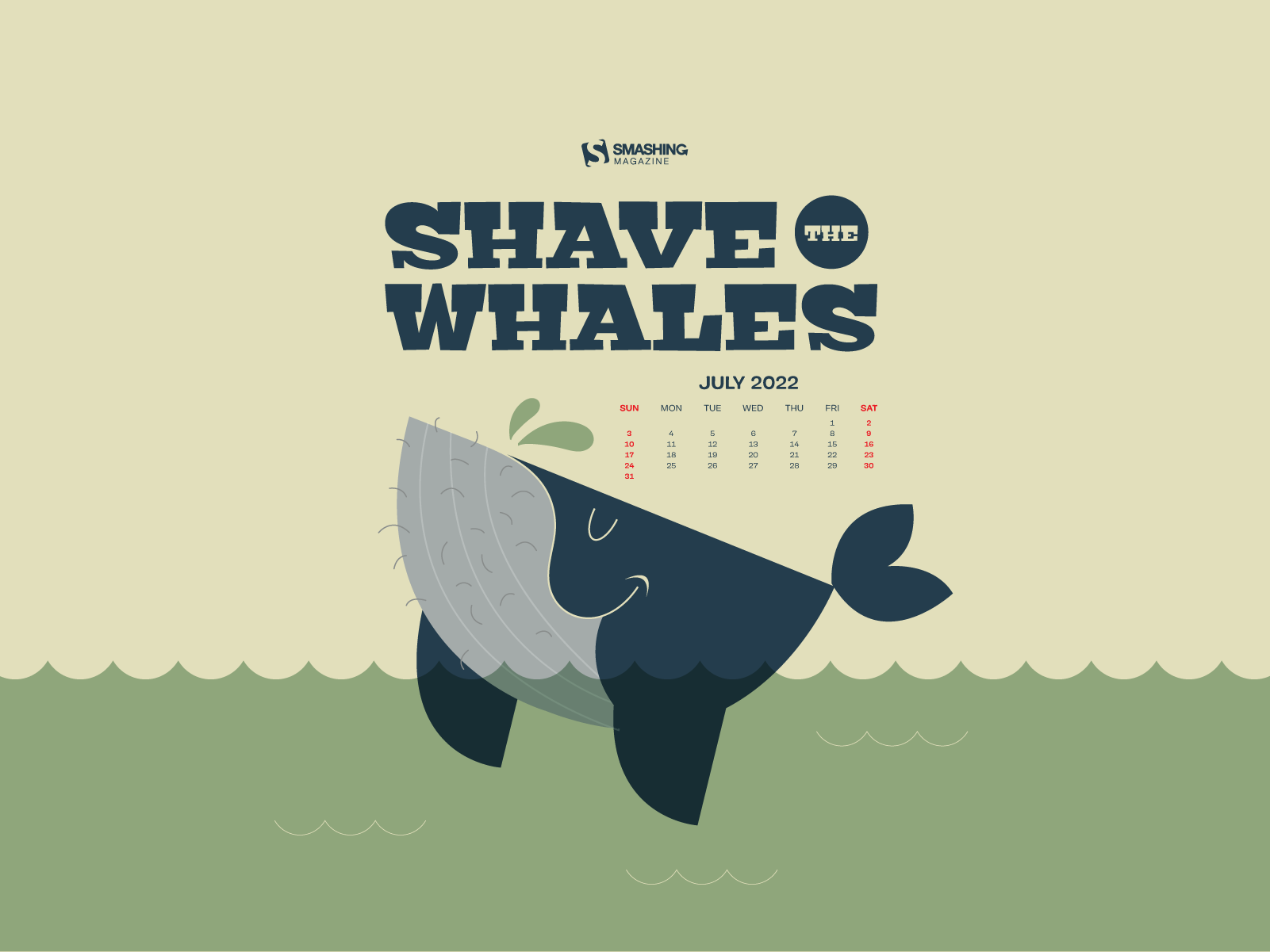
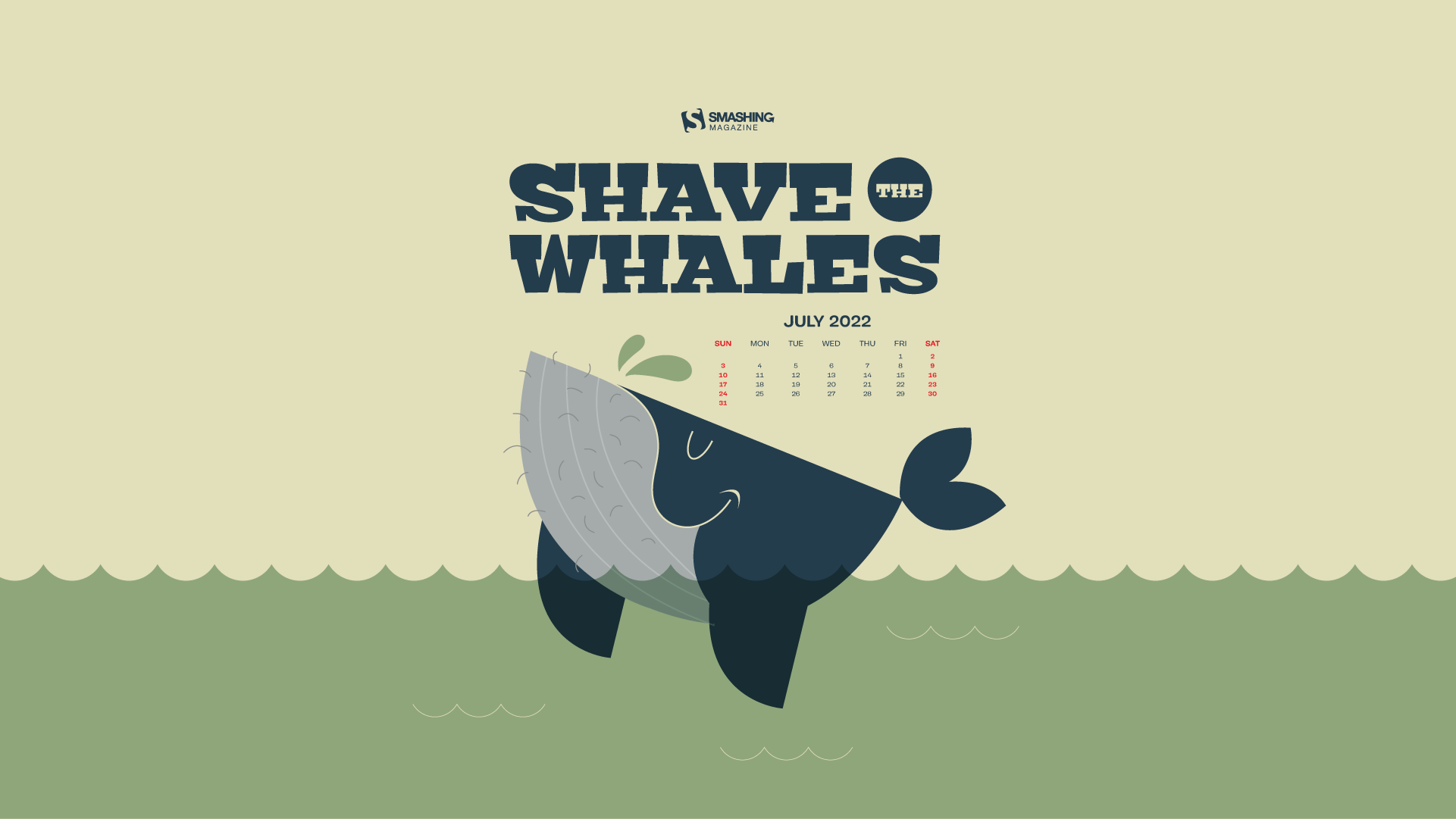
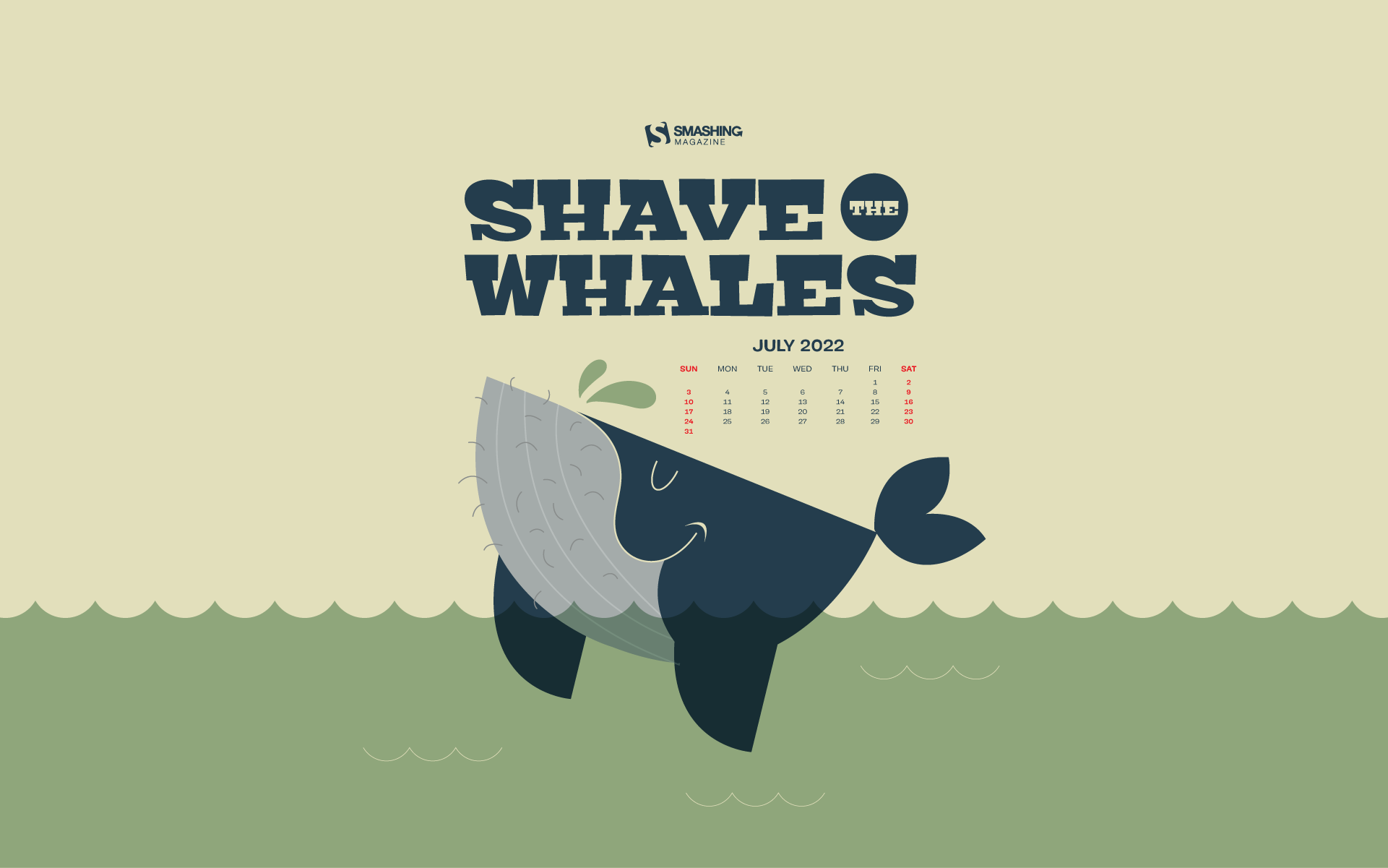
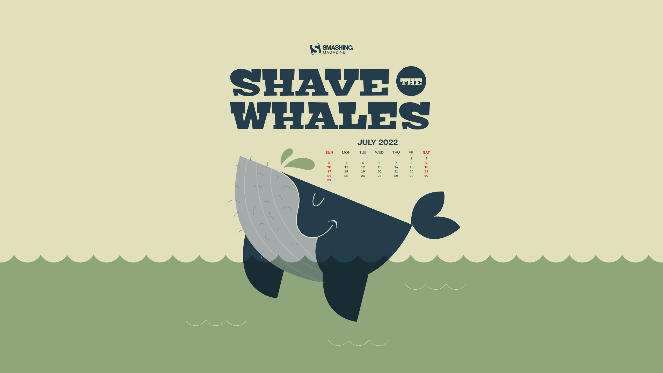
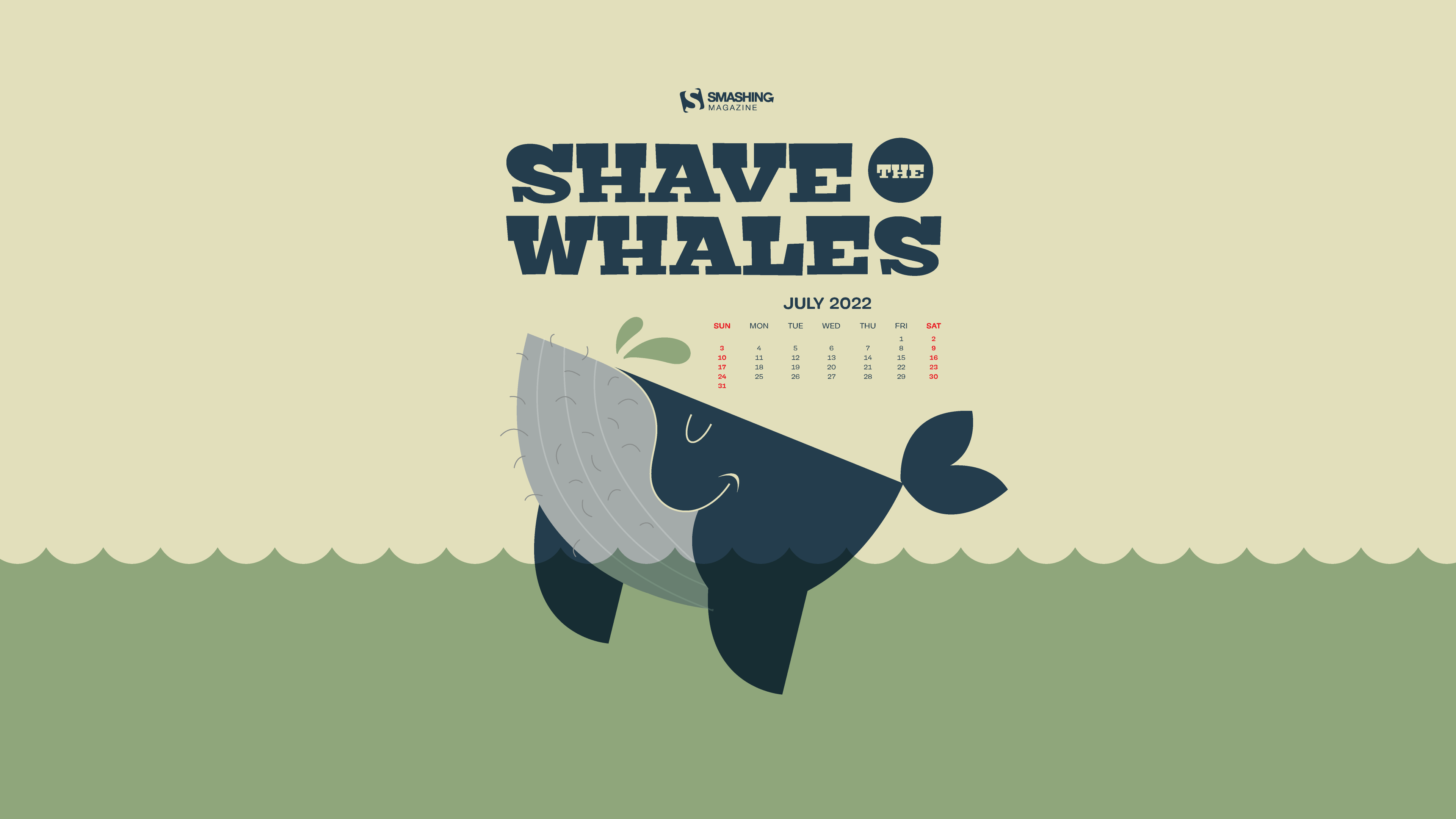
Starting off the new month with a little inspiration boost — that’s the motivation behind our monthly wallpapers series that we’ve been running for more then eleven years now. Every month, we invite you, our dear readers, to challenge your creative skills and submit your wallpaper designs to it. And, of course, it wasn’t any different this time around.
For this edition, creative folks from all across the globe took on the challenge and created beautiful and unique wallpapers to tell their story or, well, just cater for some good vibes on your screens. The wallpapers all come in versions with and without a calendar for July 2022 and can be downloaded for free. Thank you to everyone who shared their artworks with us — you’re smashing!
Last but not least, to make your July even more colorful, you’ll also find a little best-of from our wallpapers archives at the end of this post. Maybe you’ll rediscover one of your almost forgotten favorites in there, too? Enjoy!
You can click on every image to see a larger preview,
We respect and carefully consider the ideas and motivation behind each and every artist’s work. This is why we give all artists the full freedom to explore their creativity and express emotions and experience through their works. This is also why the themes of the wallpapers weren’t anyhow influenced by us but rather designed from scratch by the artists themselves.
Submit a wallpaper! Did you know that you could get featured in our next wallpapers post, too? We are always looking for creative talent.
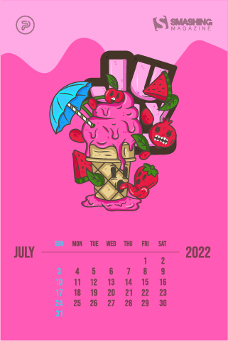
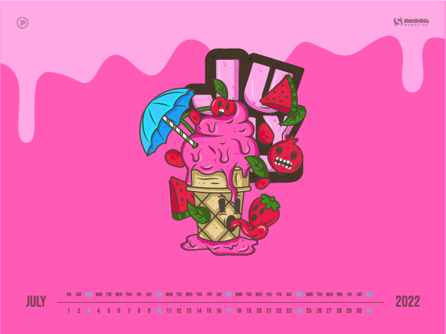
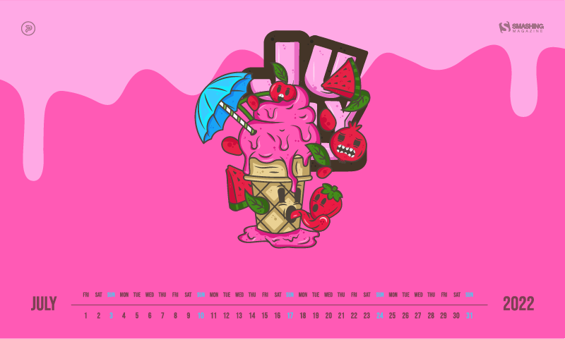
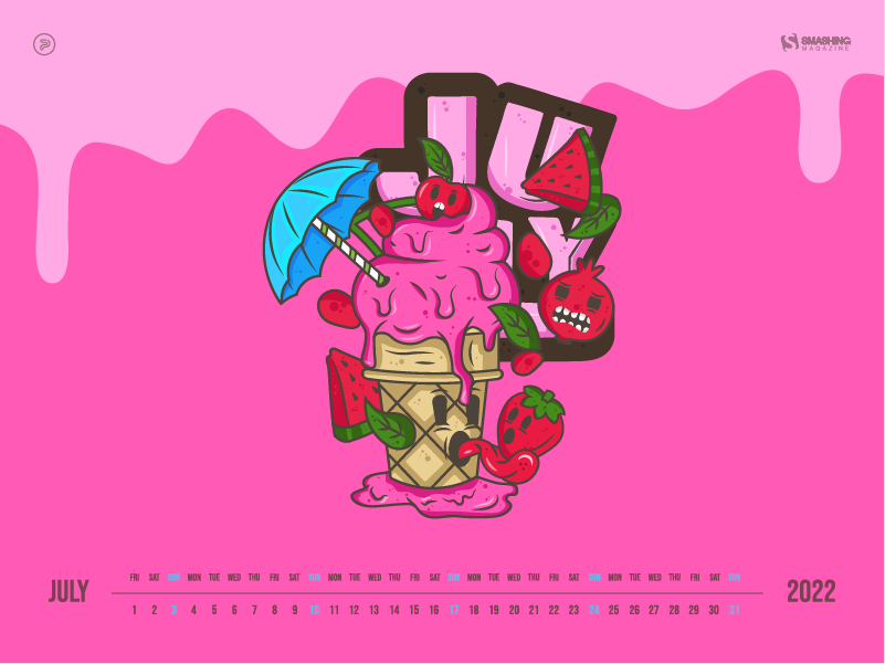
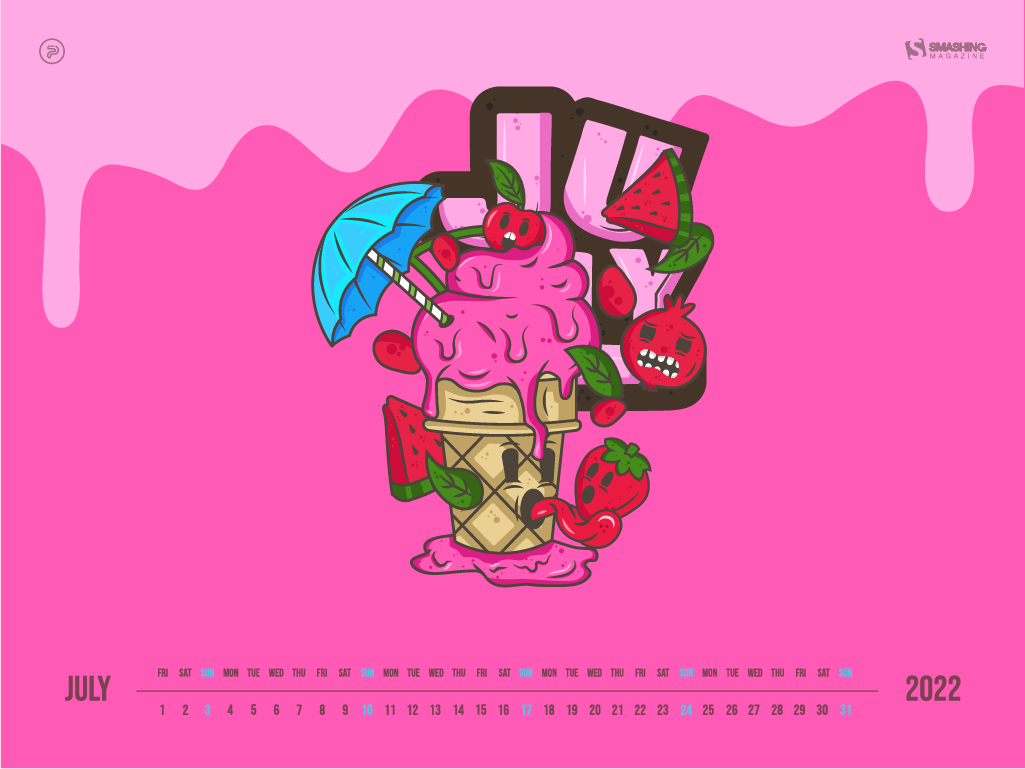
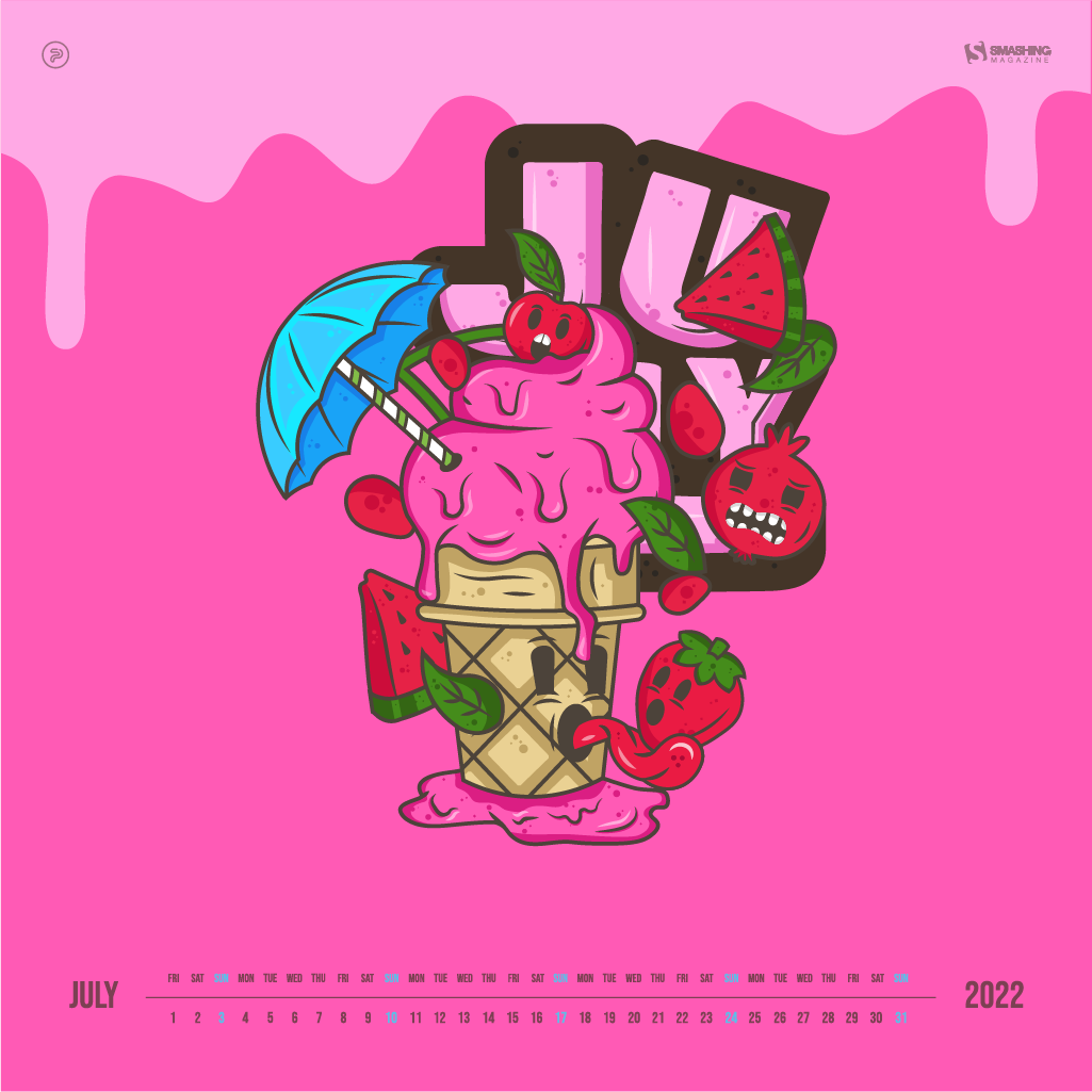
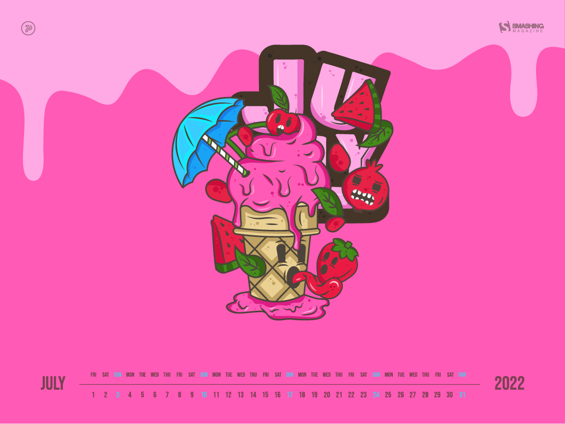
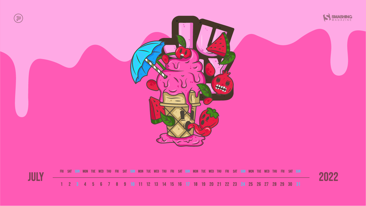
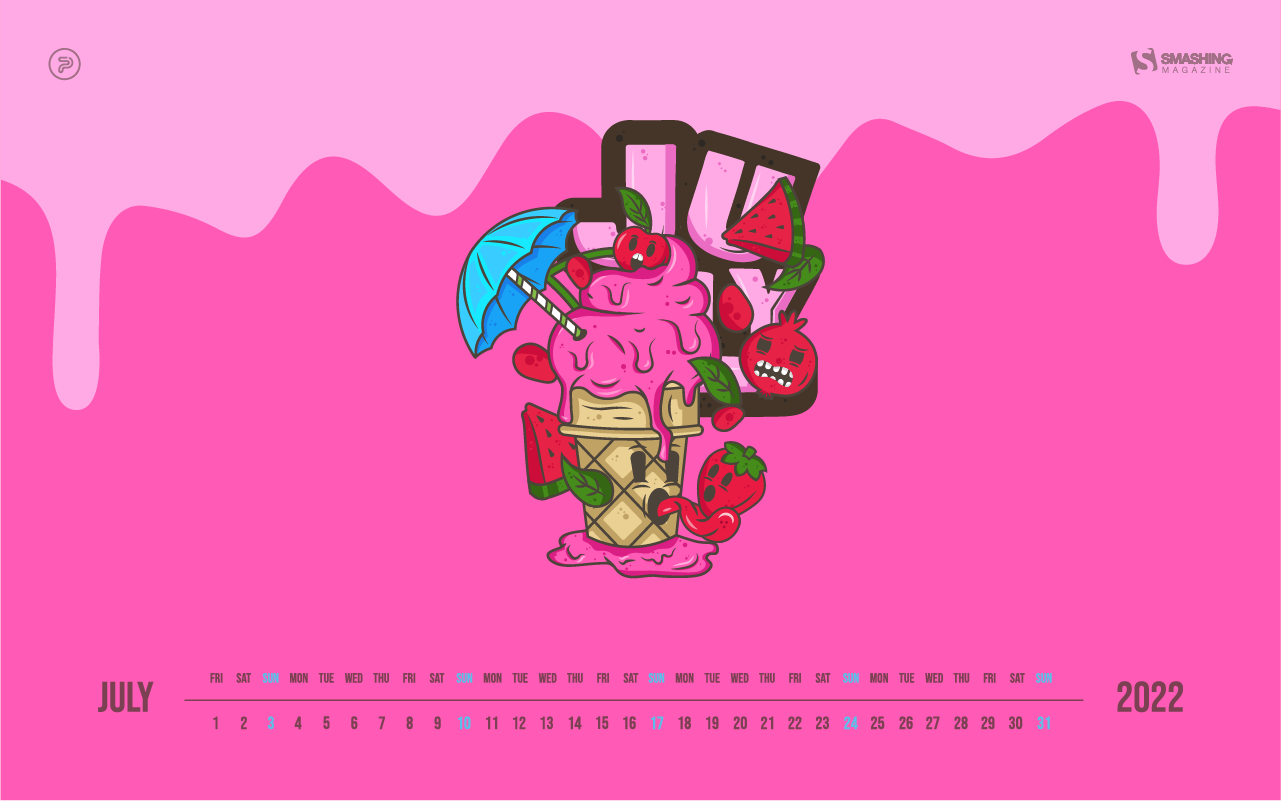
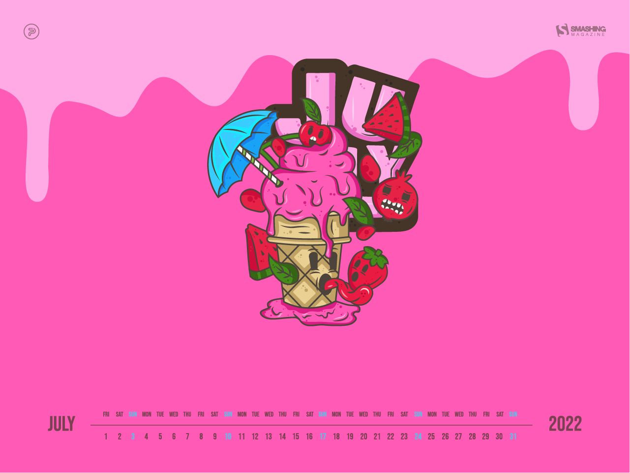
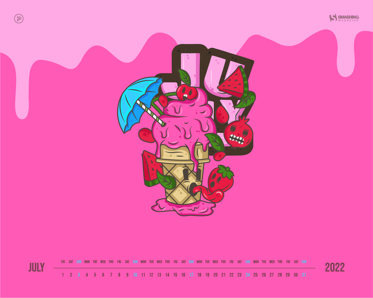
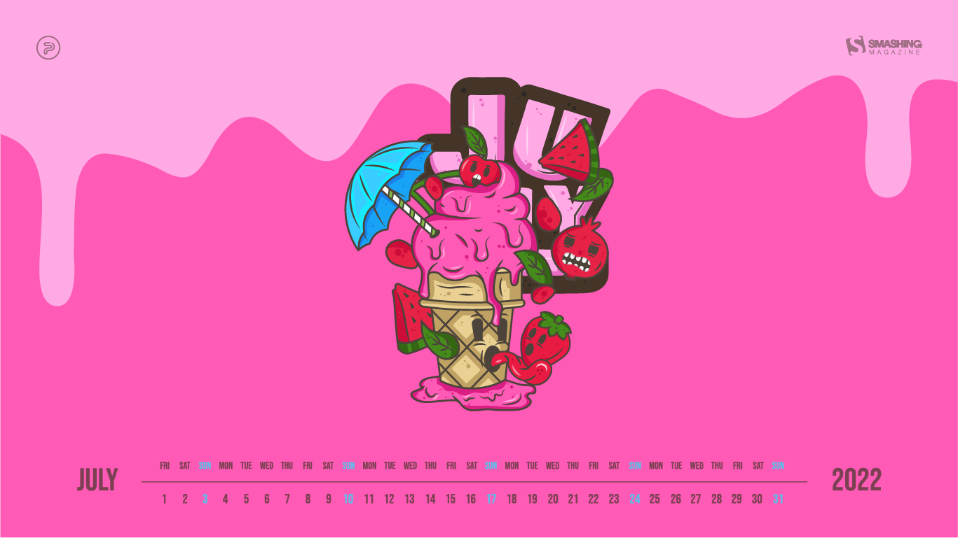
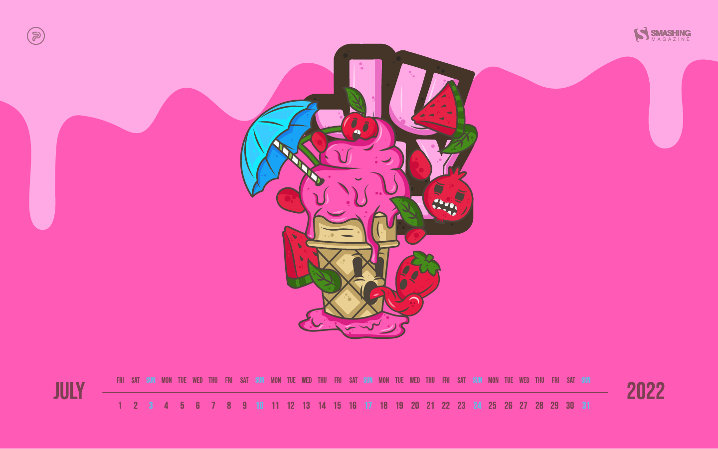
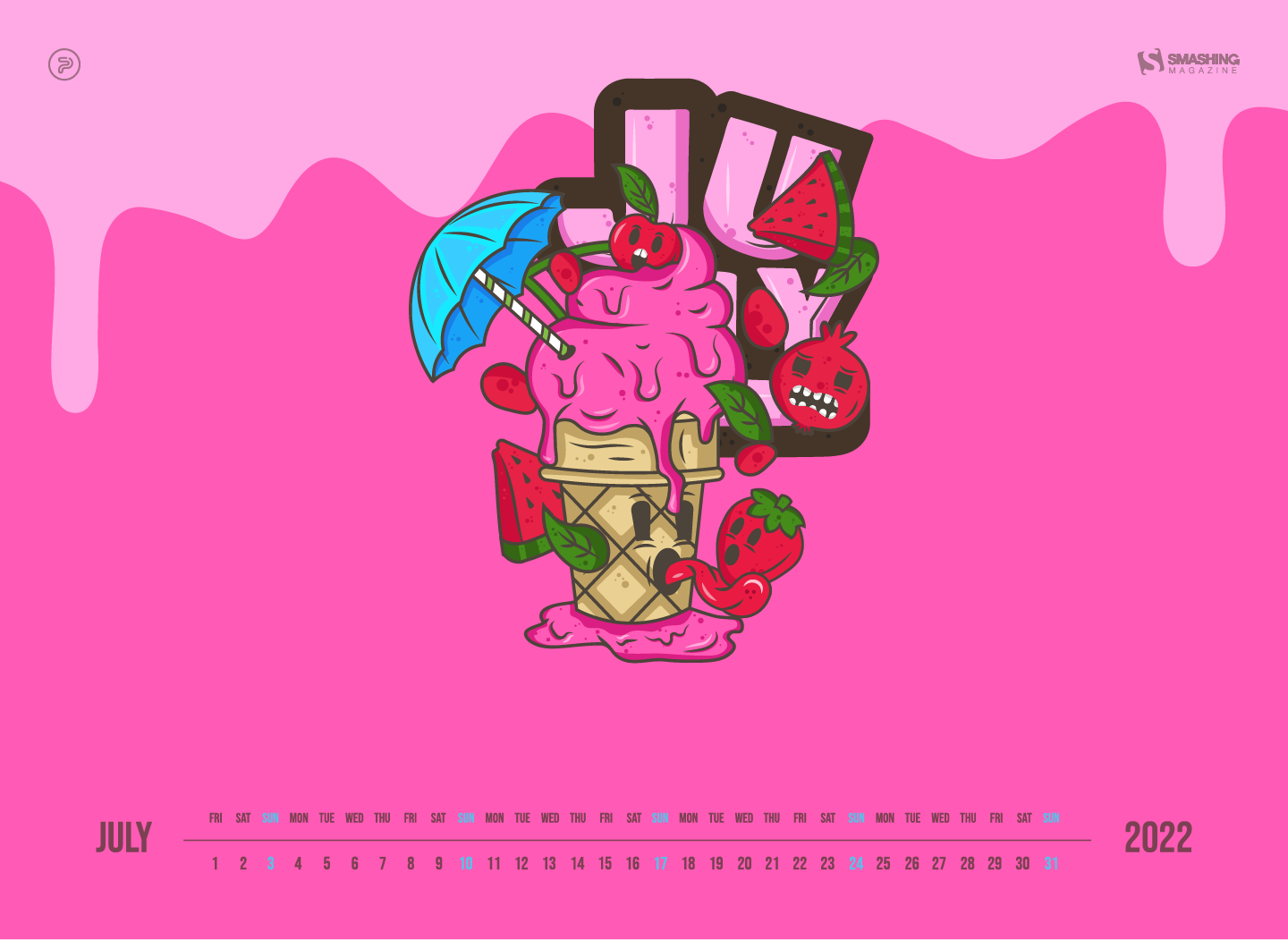
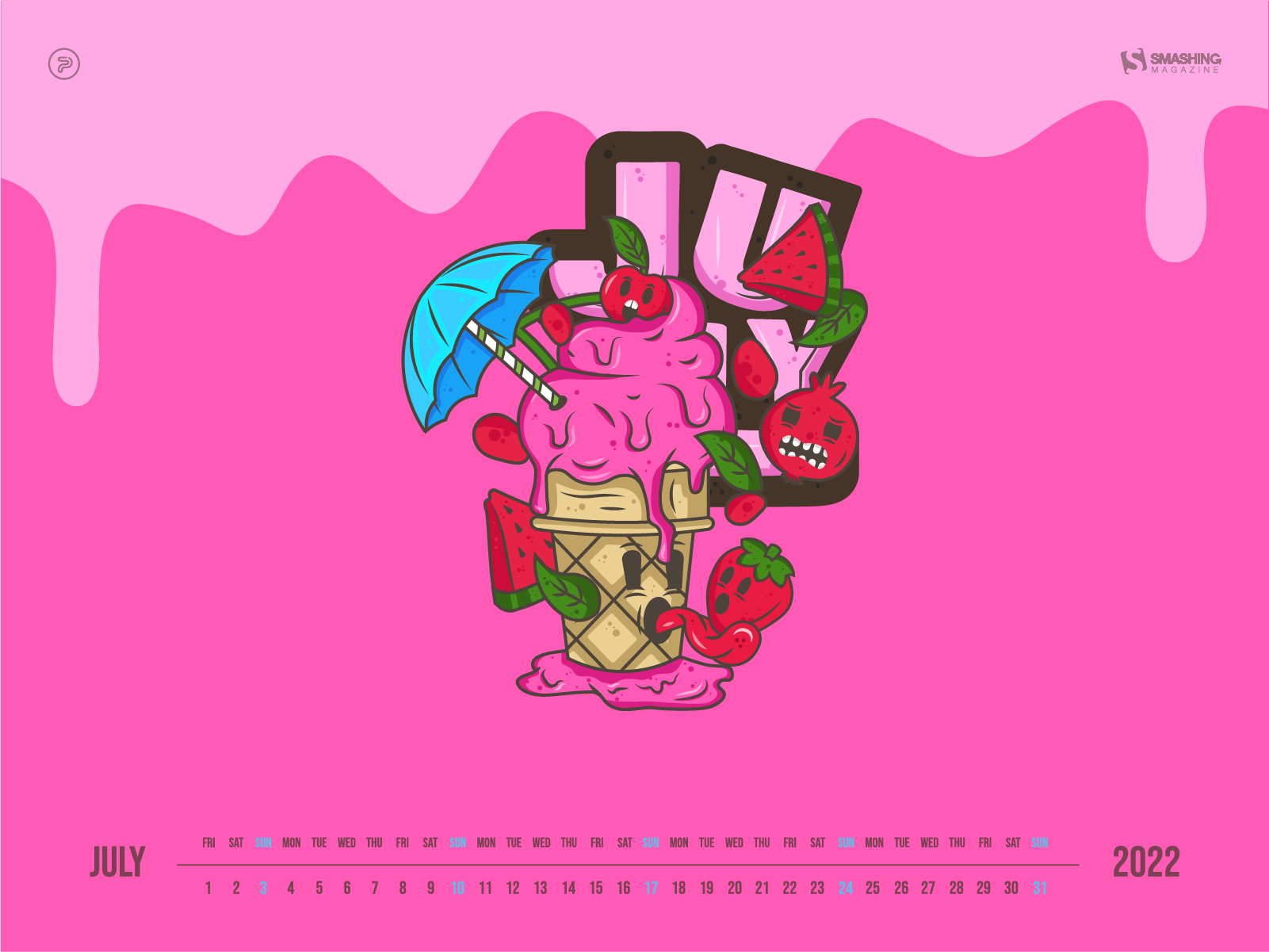
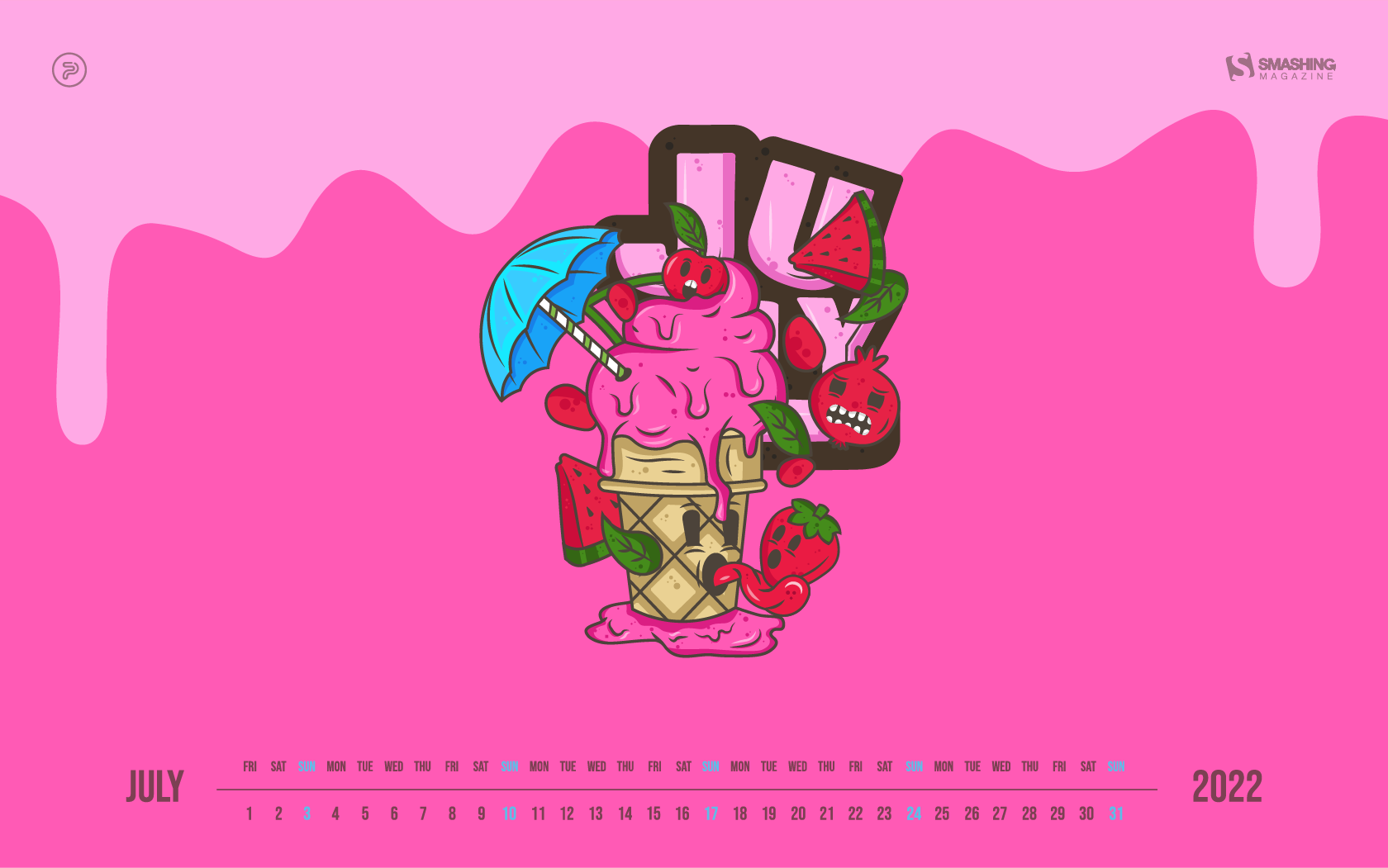
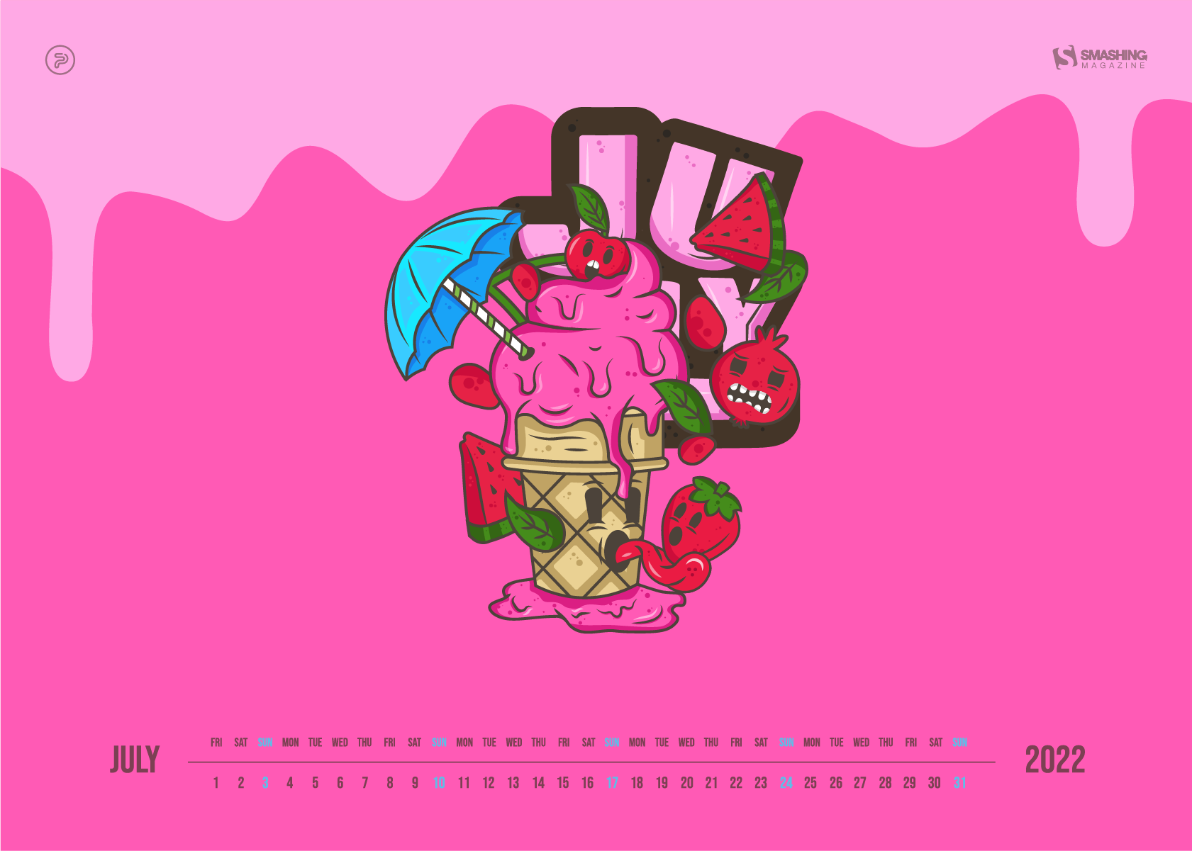
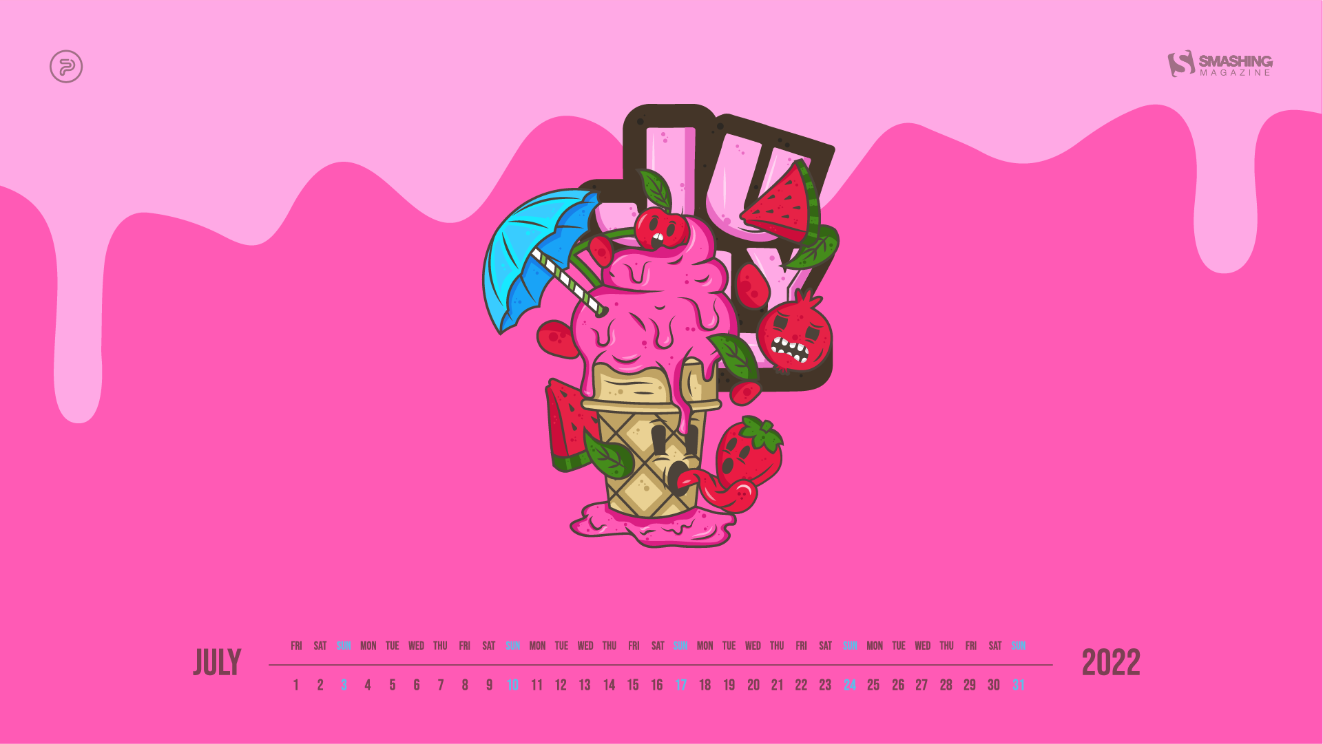
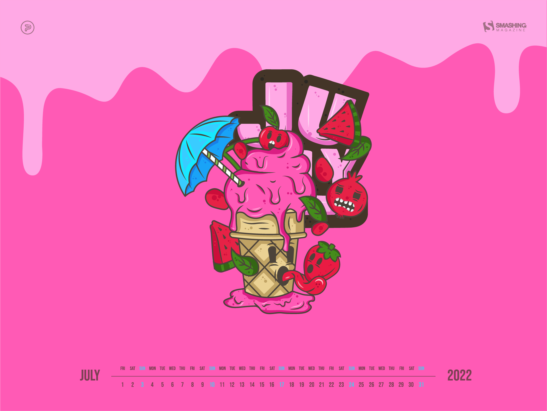
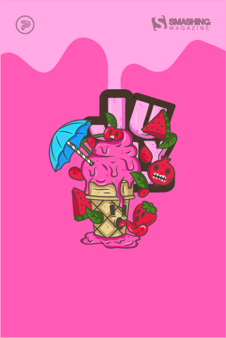
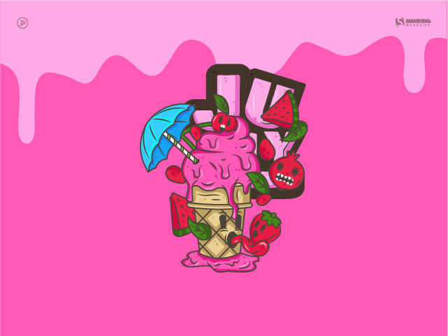
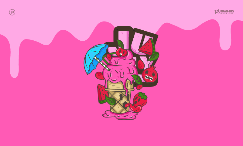
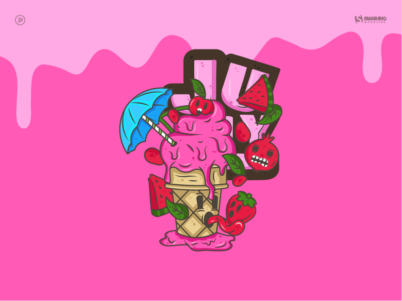
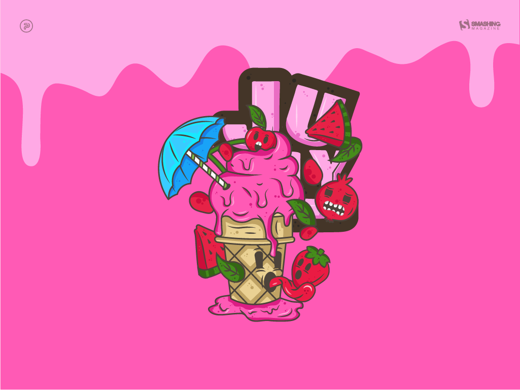
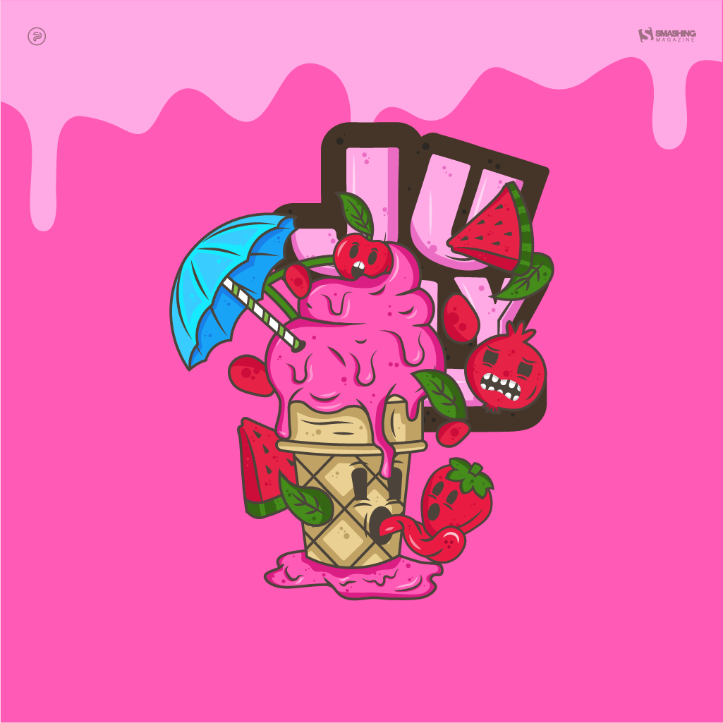
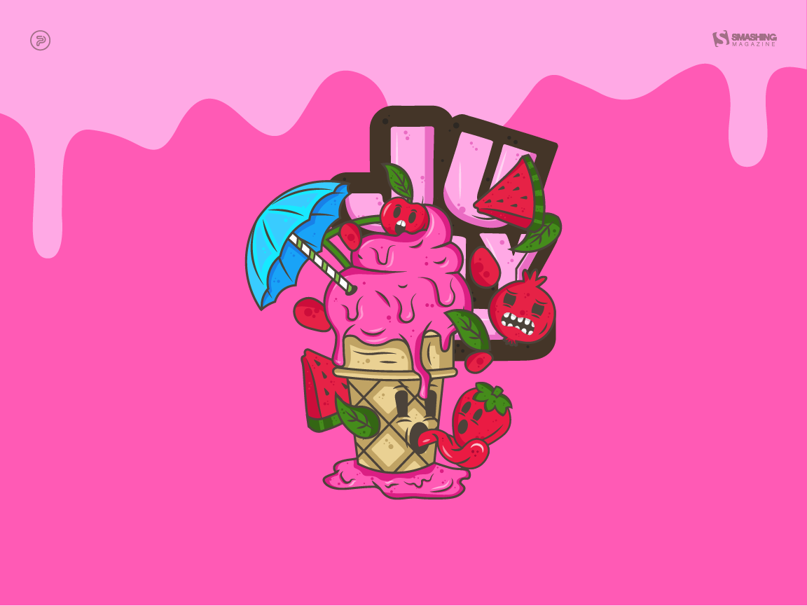
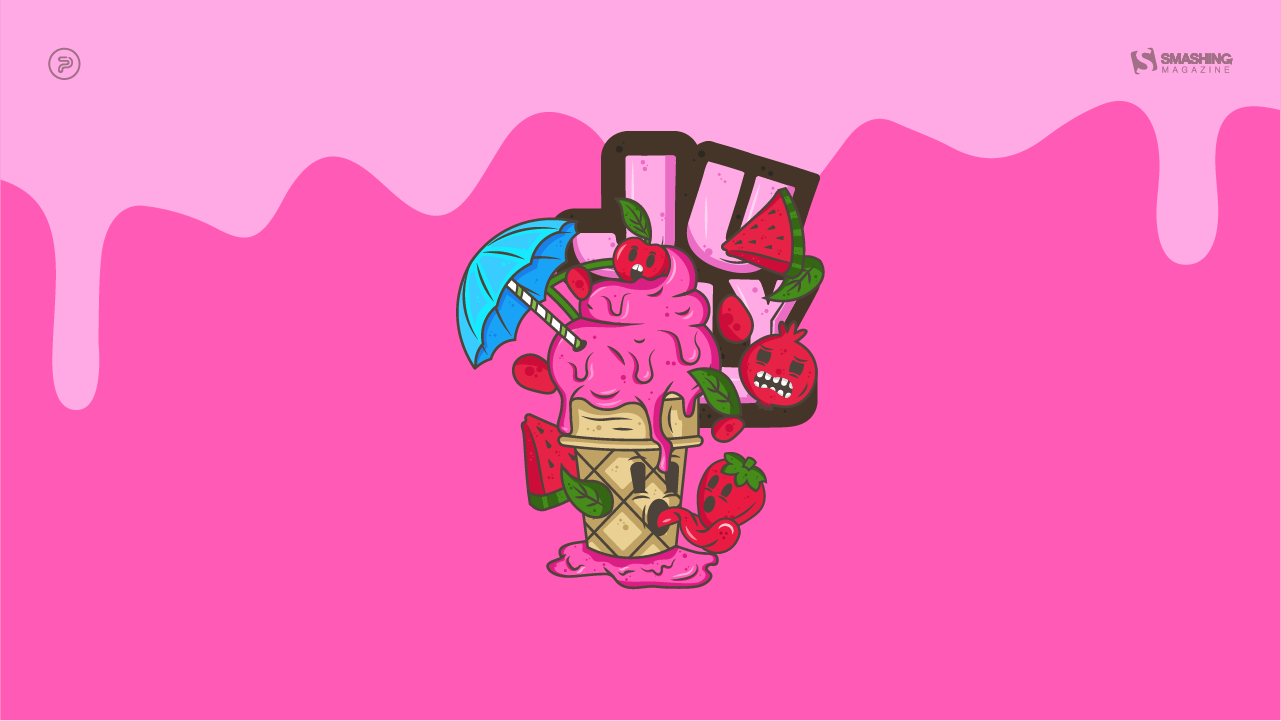
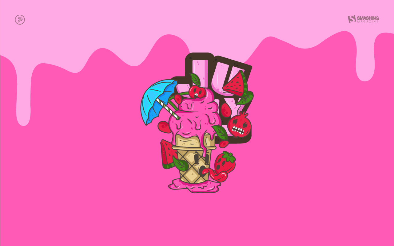
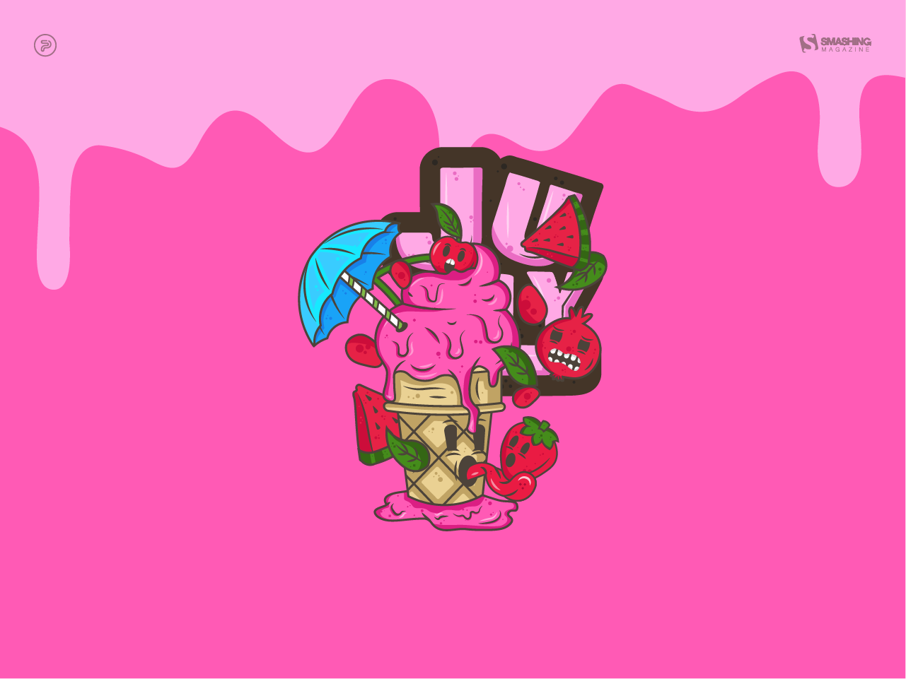
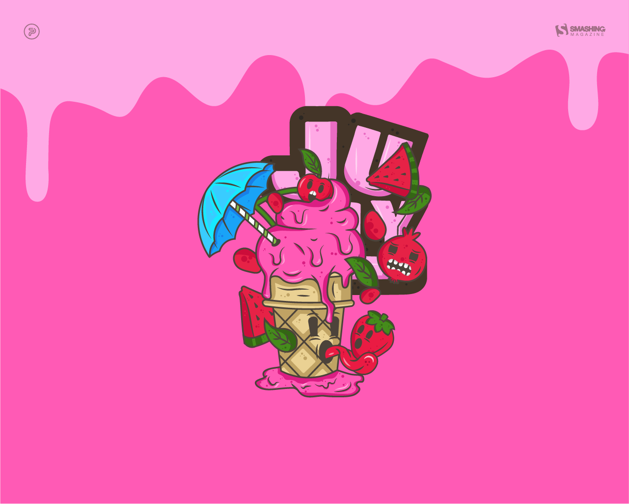
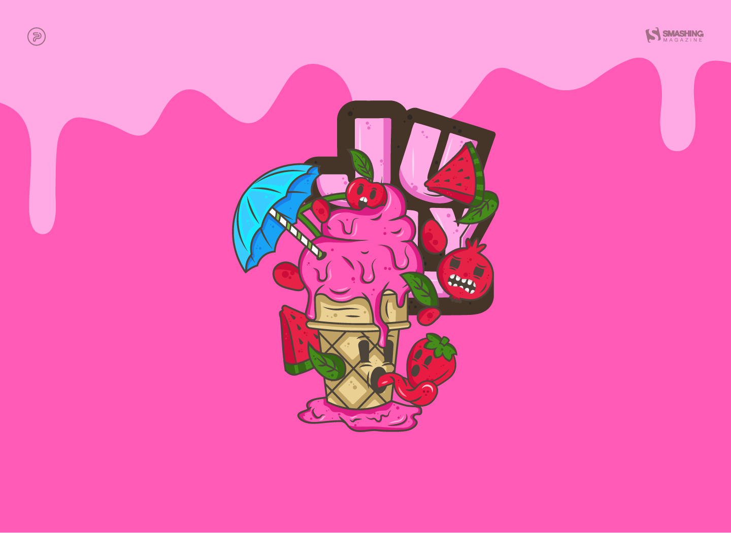
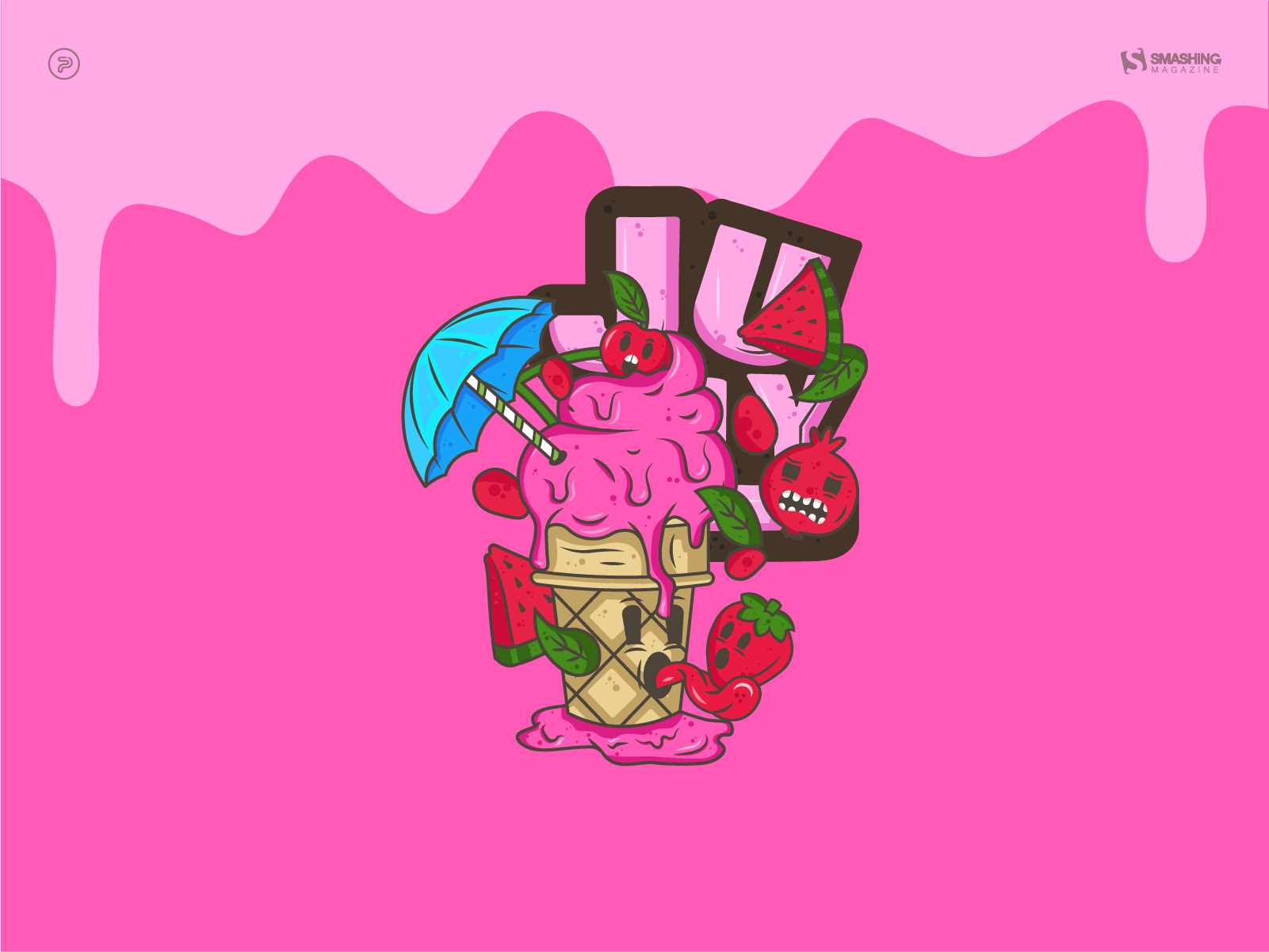
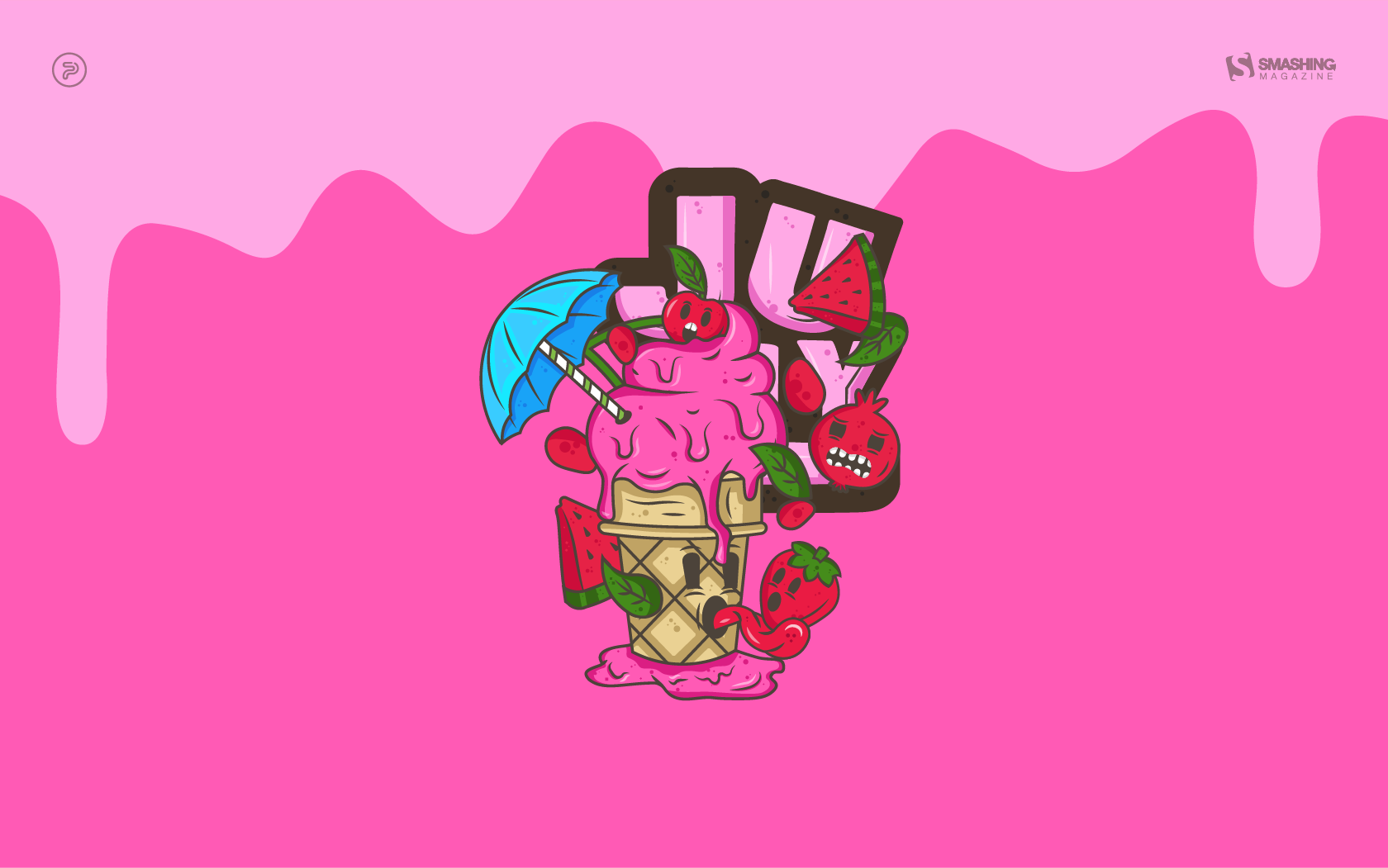
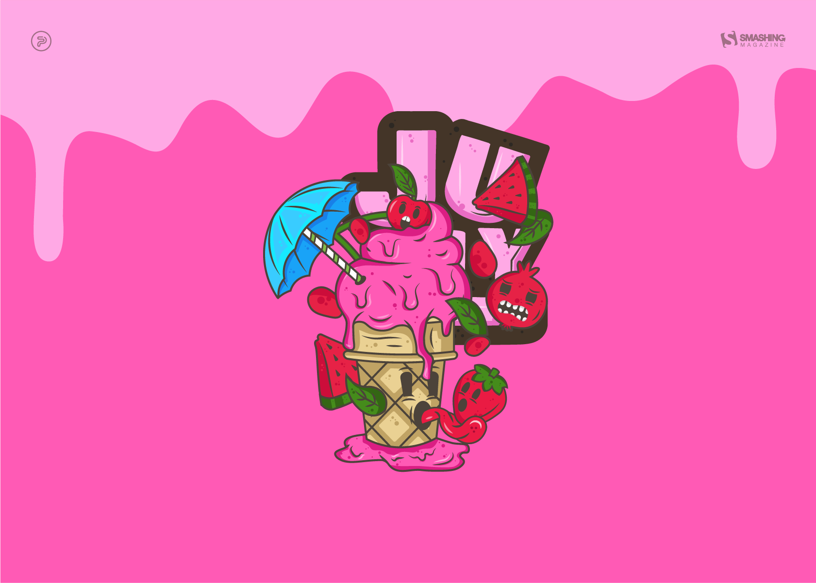
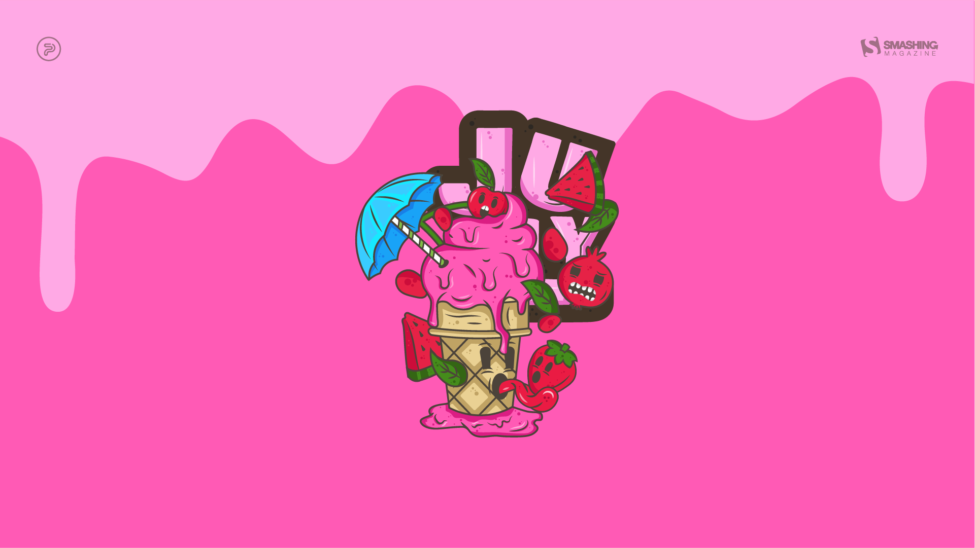
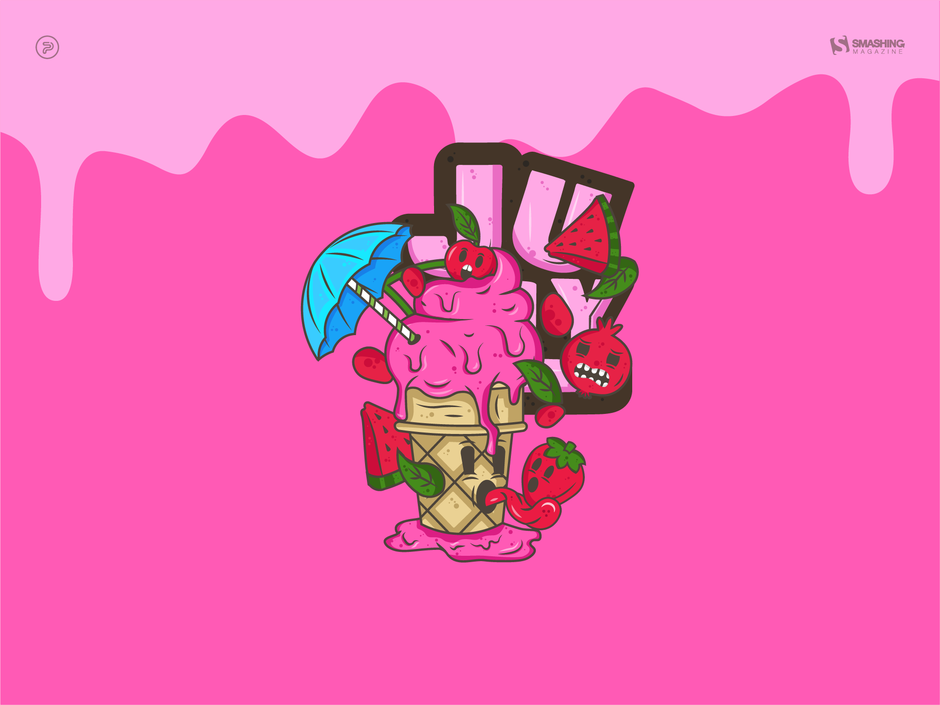
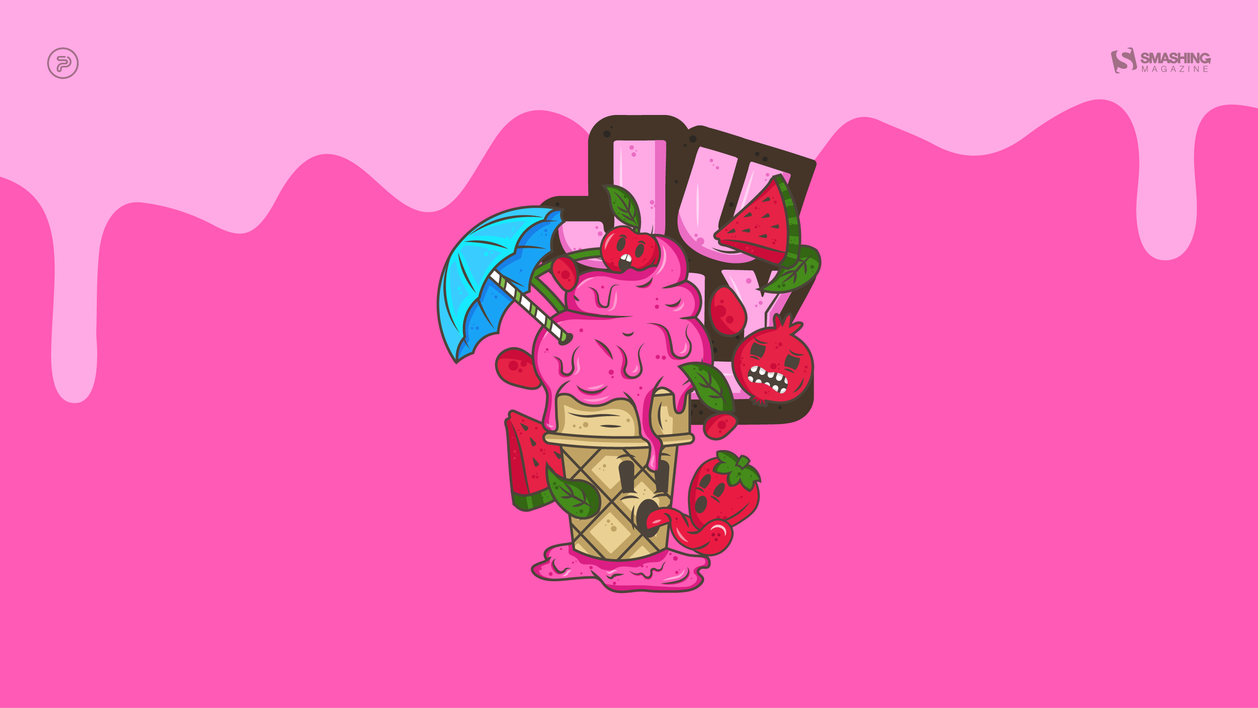
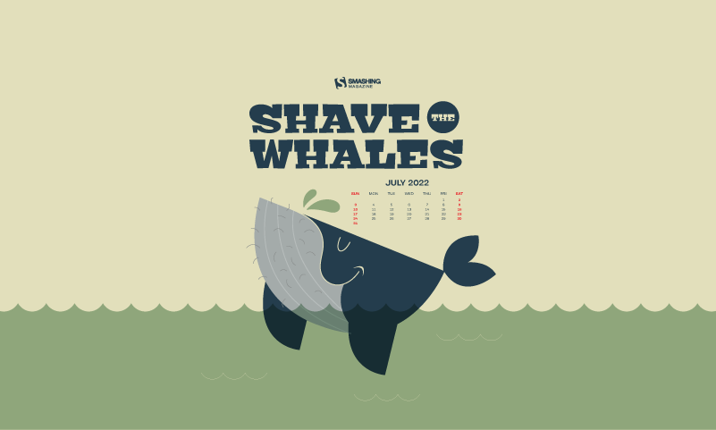
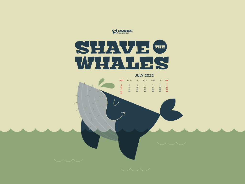
Melting July
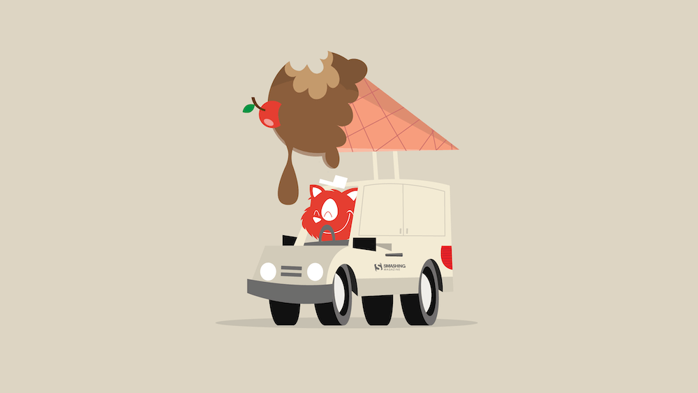
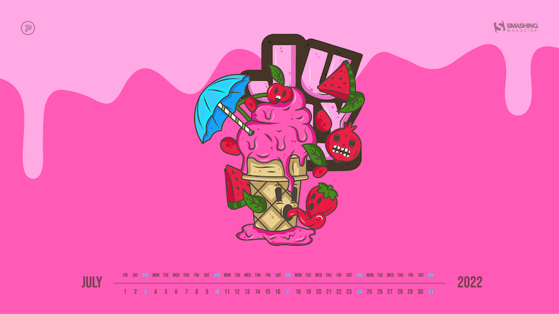
“Welcome to the sweltering July — the month when it’s so hot that even the fruits are edgy. Our ice-creamy, vibrantly-colored monthly calendar is melting as the temperature rises, so make sure to download it as quickly as possible!” — Designed by PopArt Studio from Serbia.
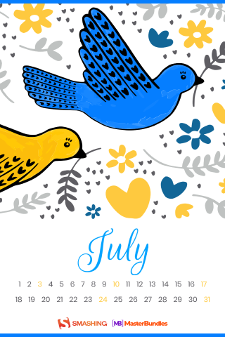
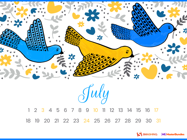
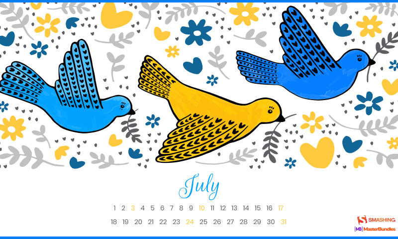
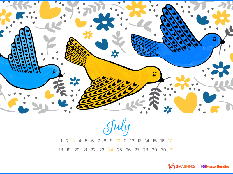
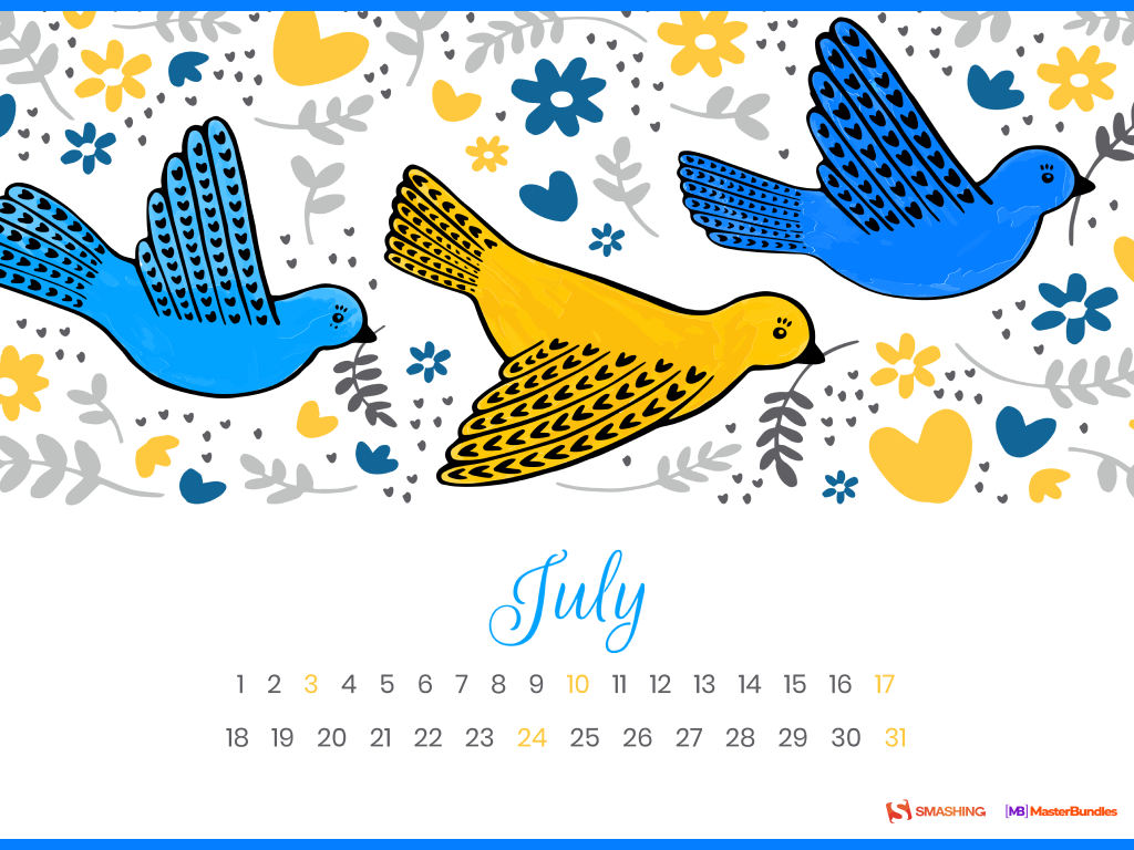
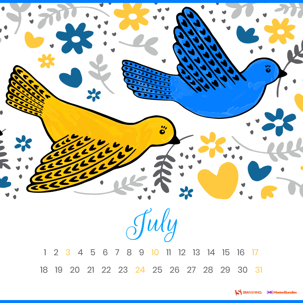
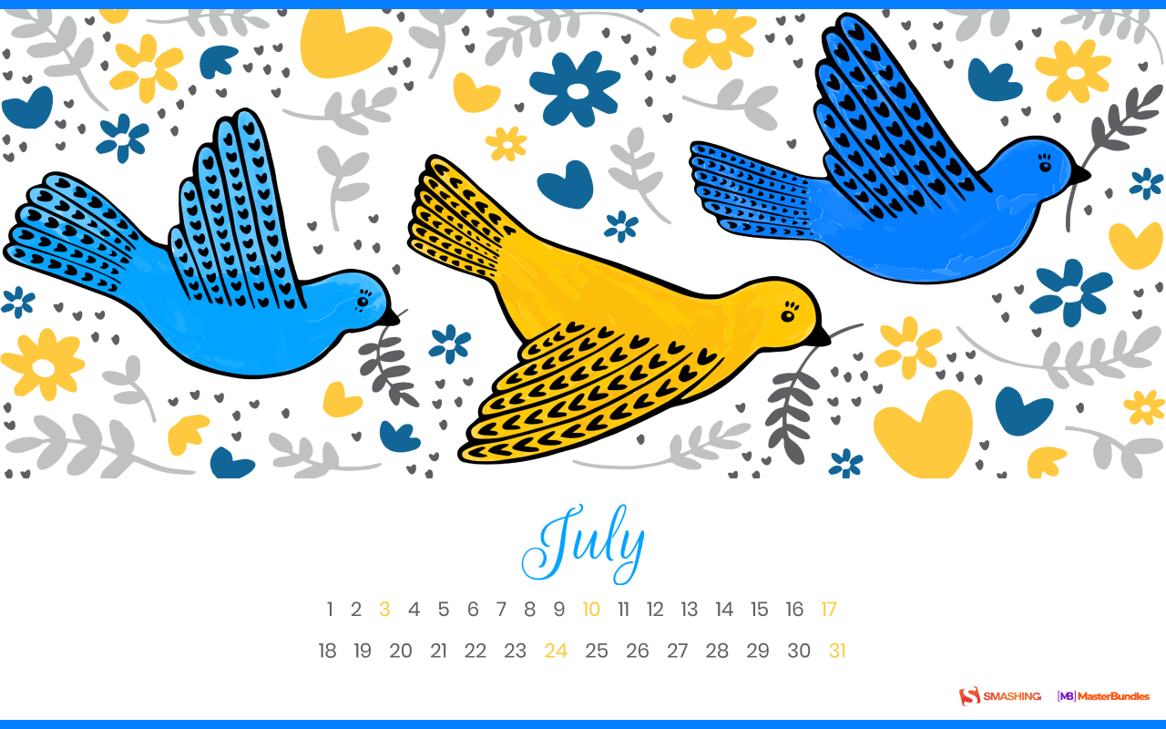
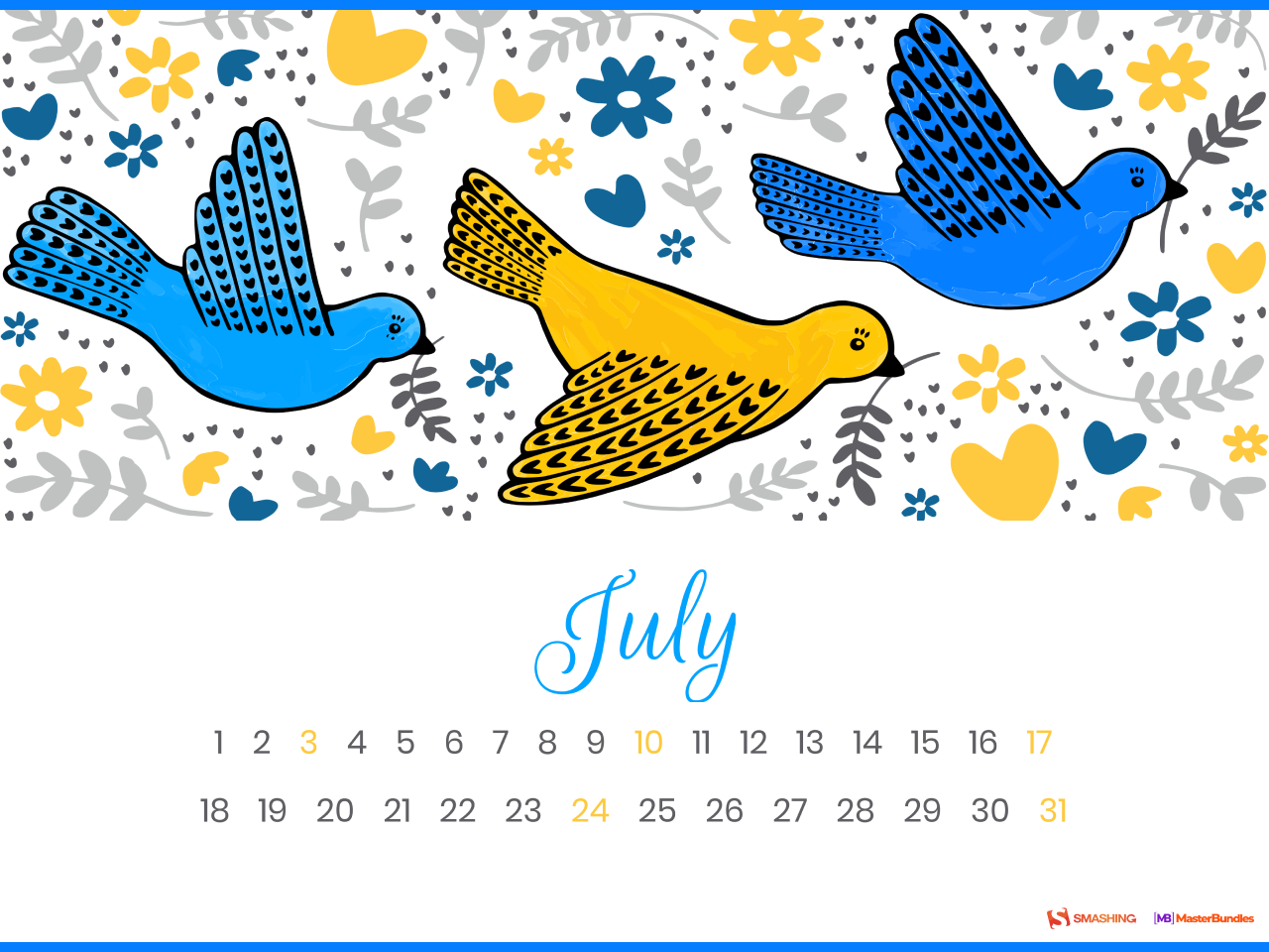
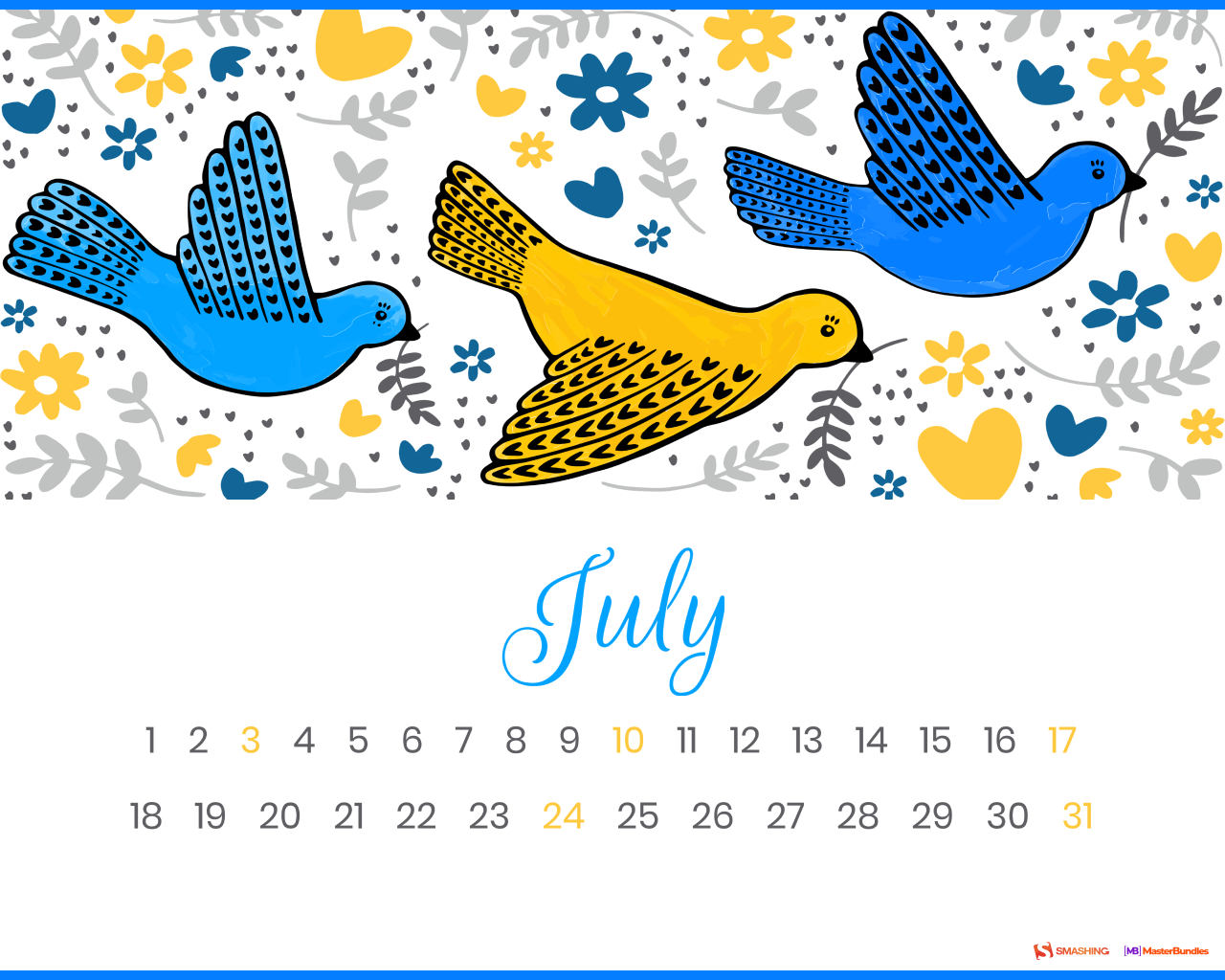
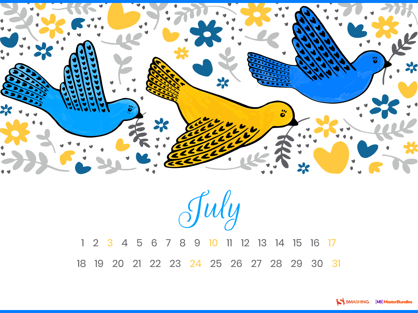
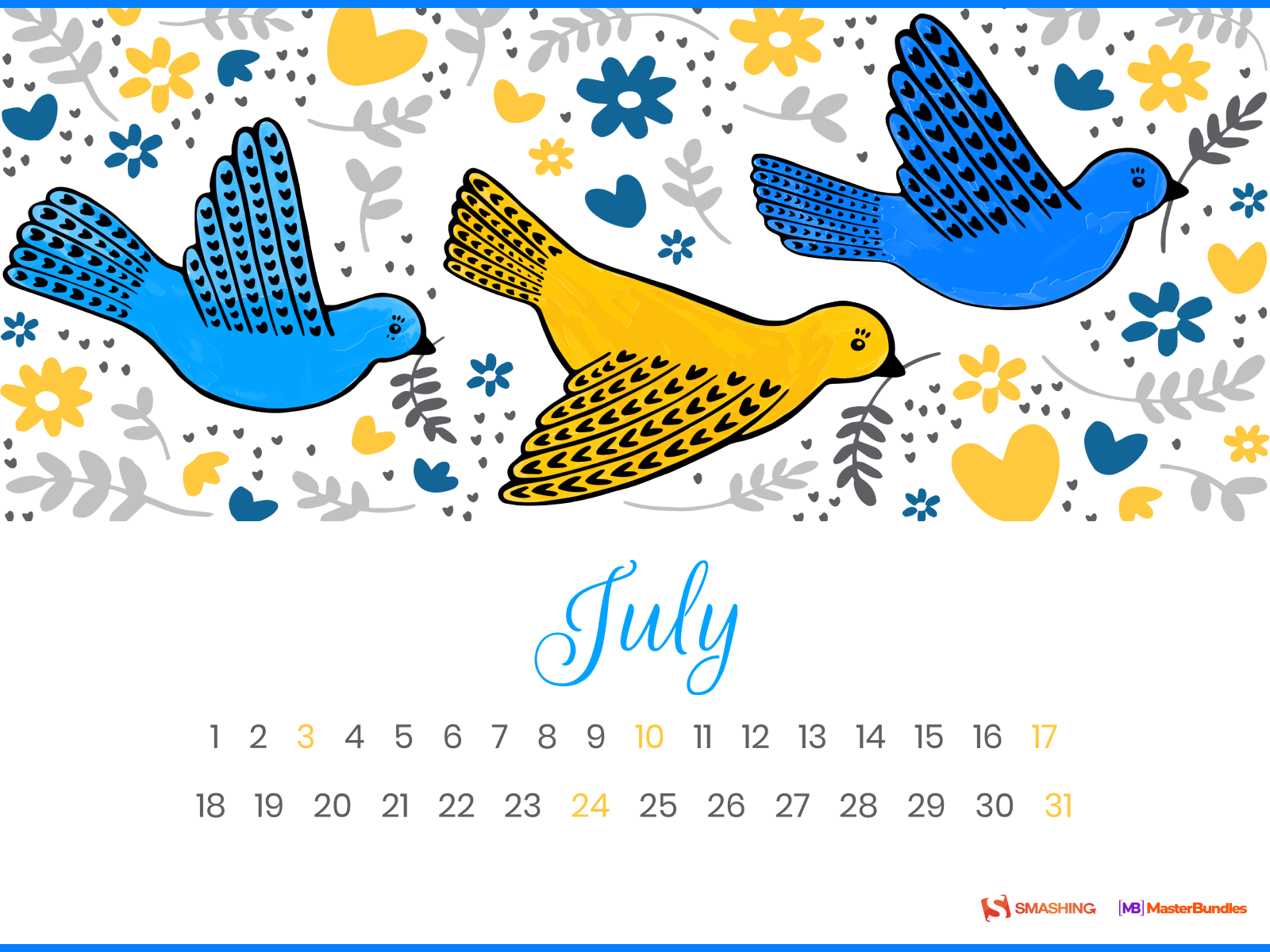
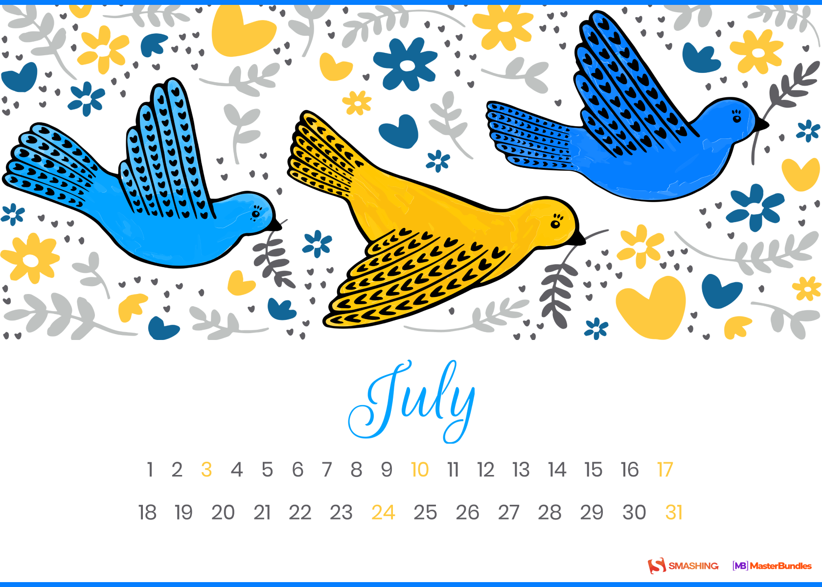
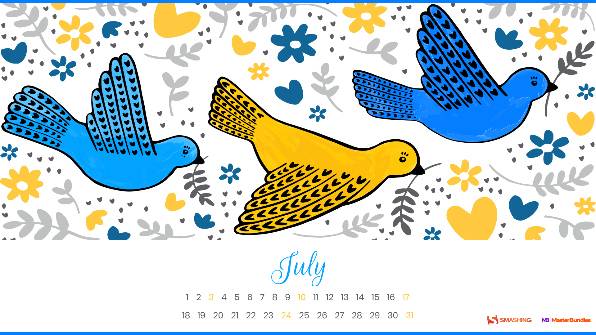
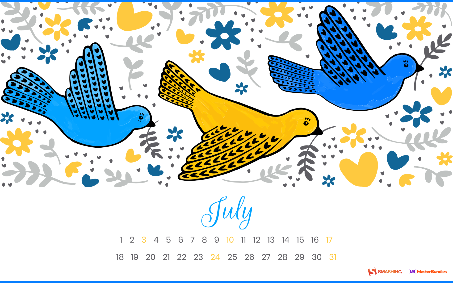
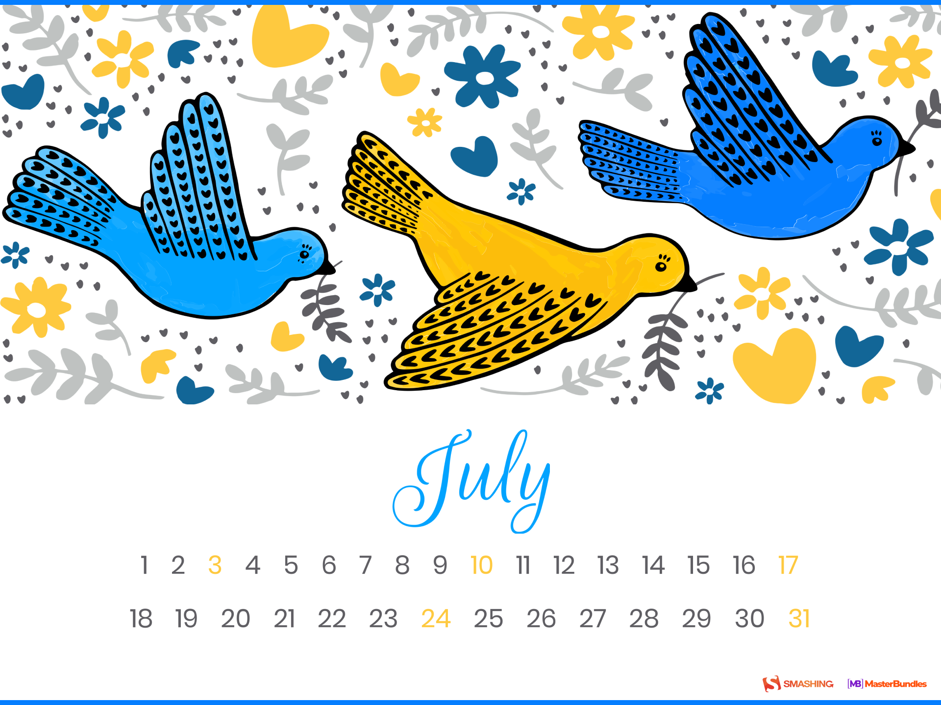
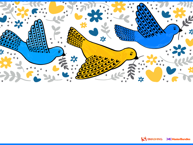
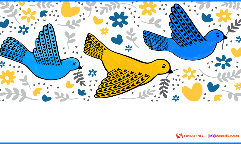
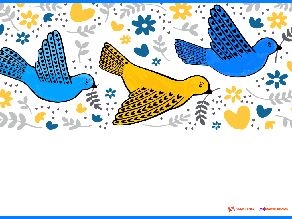
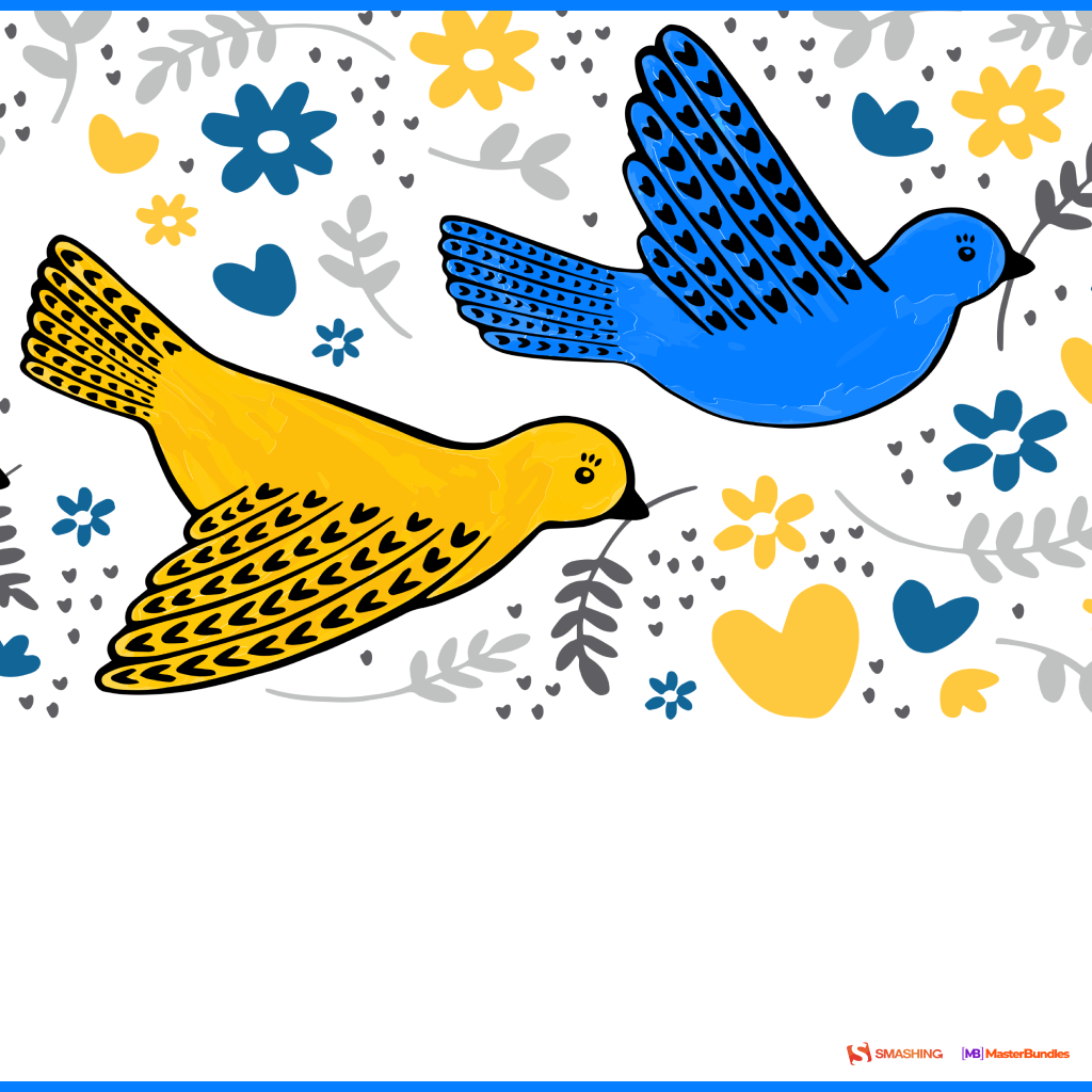
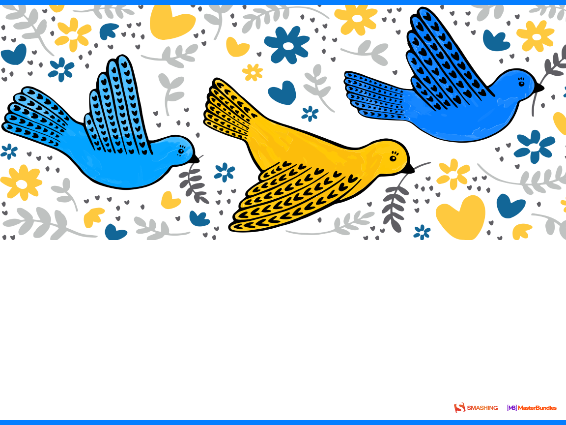
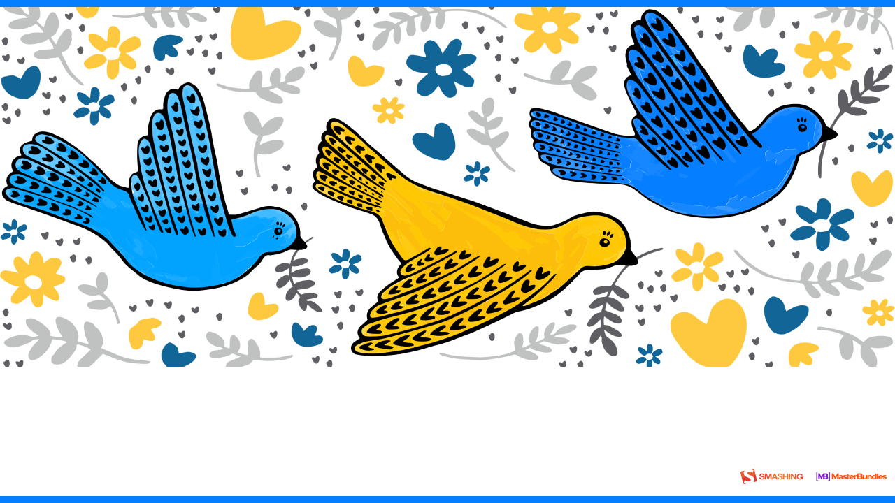
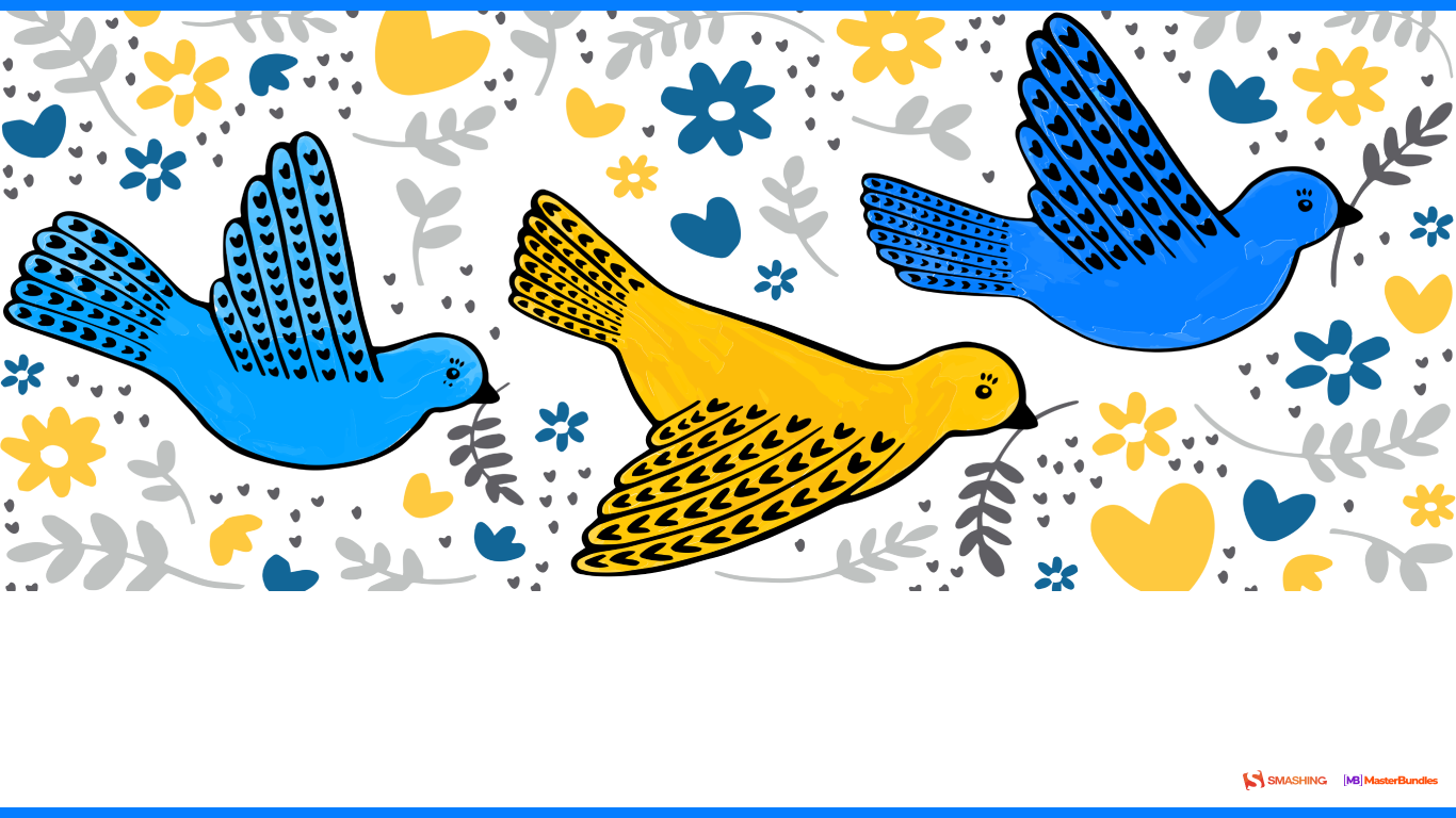
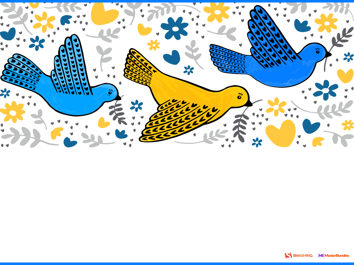
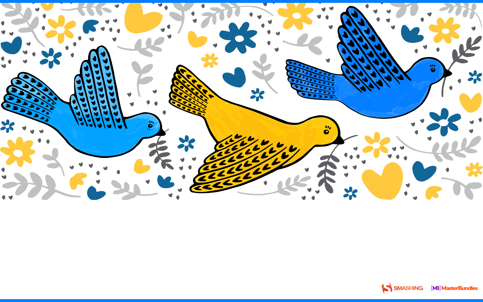
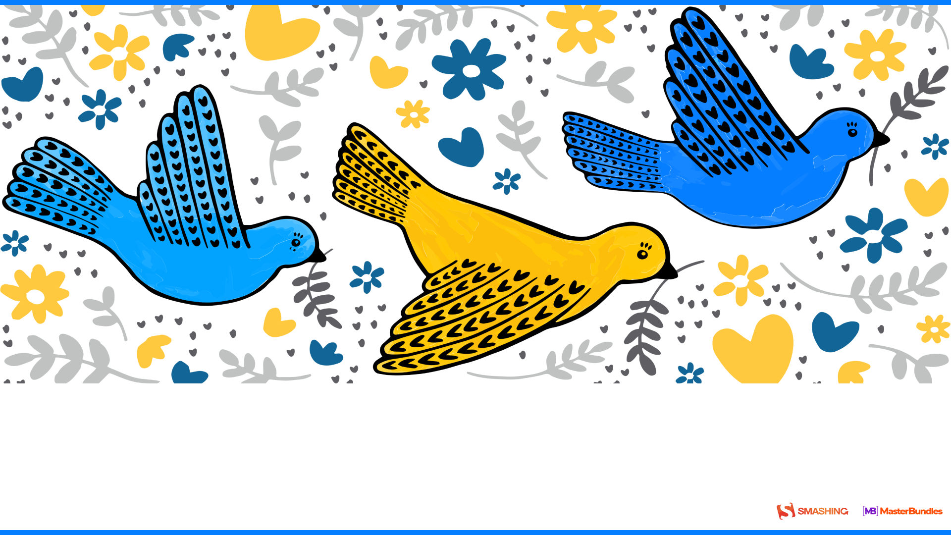
“Our designers can’t live without being affected by the war in Ukraine. Recent escalation and missile attacks on civilian objects made them reflect on that and as a result, they created this wonderful calendar in the colors of the Ukrainian flag. The bird represents the freedom that we sooner or later get through a long struggle. You can find more free calendars in our post. Thank you!” — Designed by MasterBundles from Ukraine.
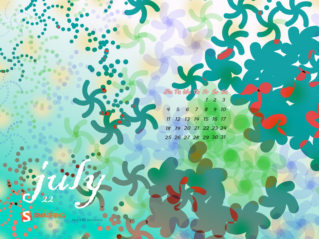
“I played with a shape looking like a starfish, this one is made with a mathematical formula. Then I put all the shapes on the screen, according to a Poisson disc sampling distribution. Poisson is the french word for fish, it’s also the name of a french mathematician. Finally, all this made me think of a pond with water lilies, a refreshing atmosphere for July.” — Designed by Philippe Brouard from France.
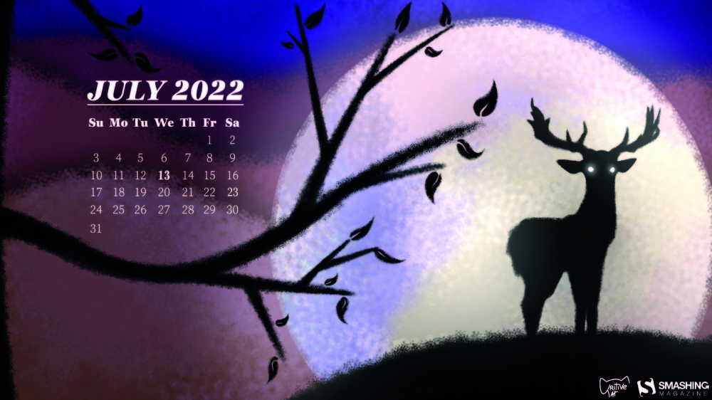
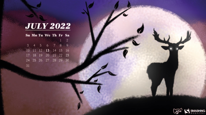
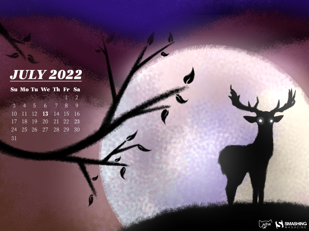
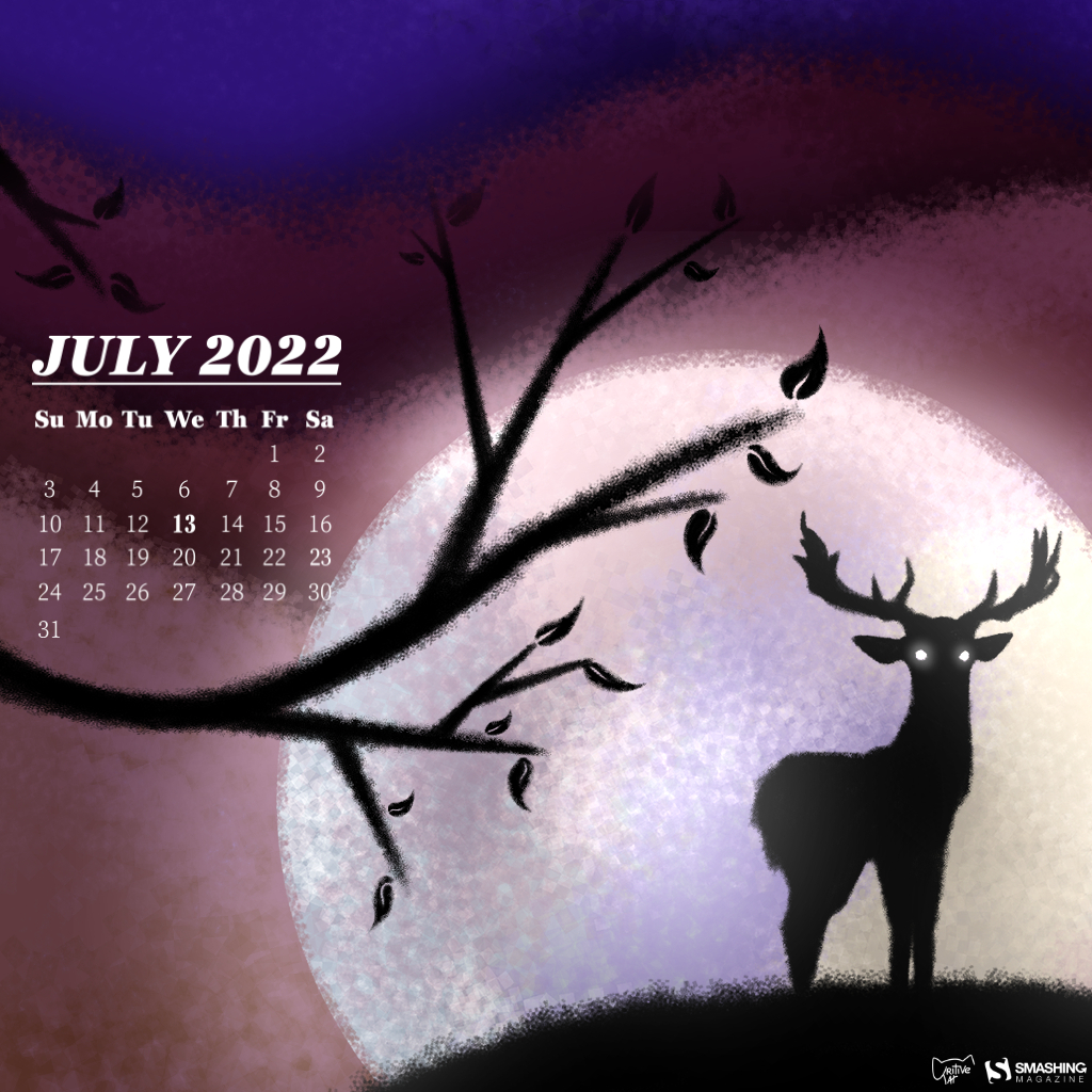
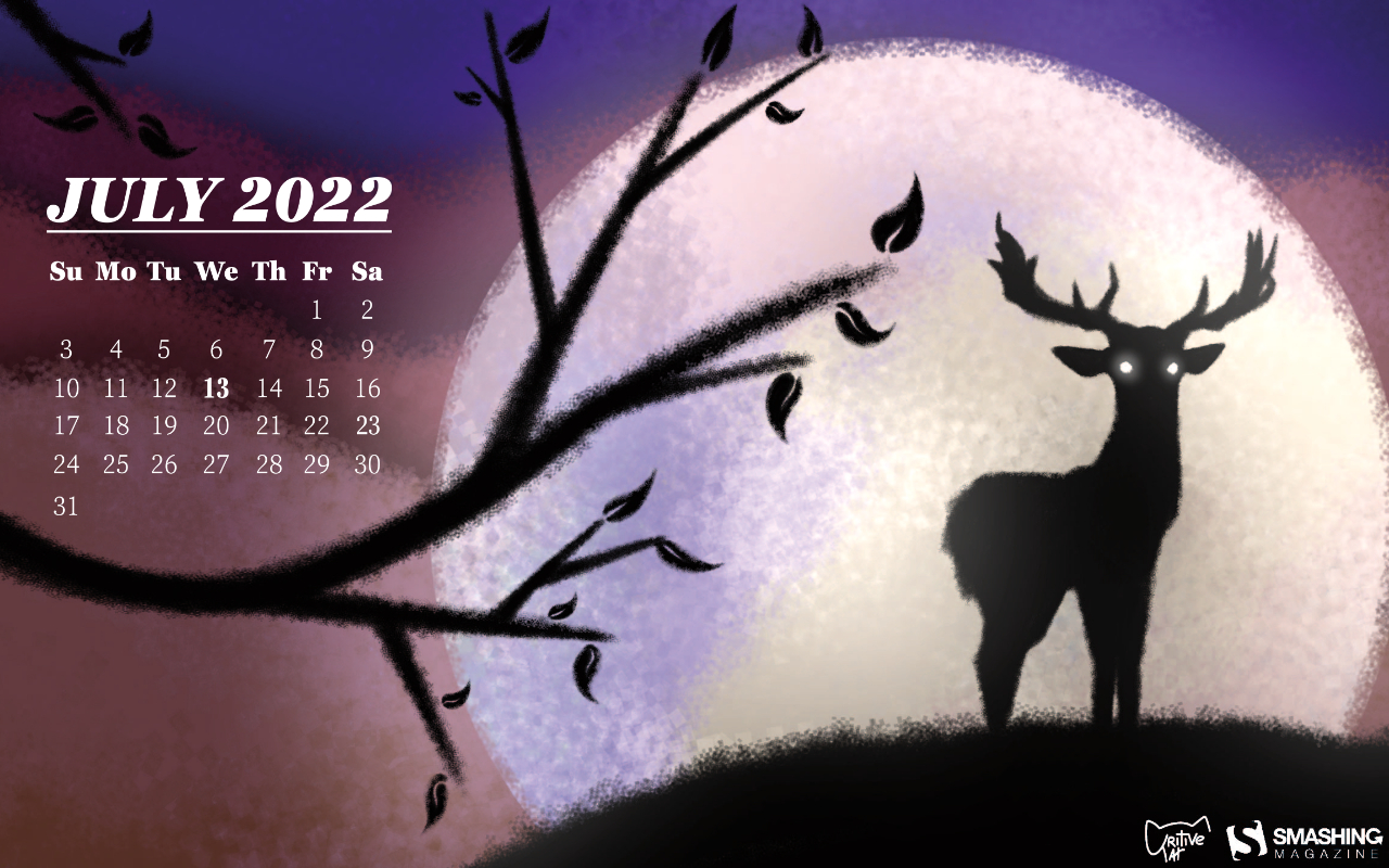
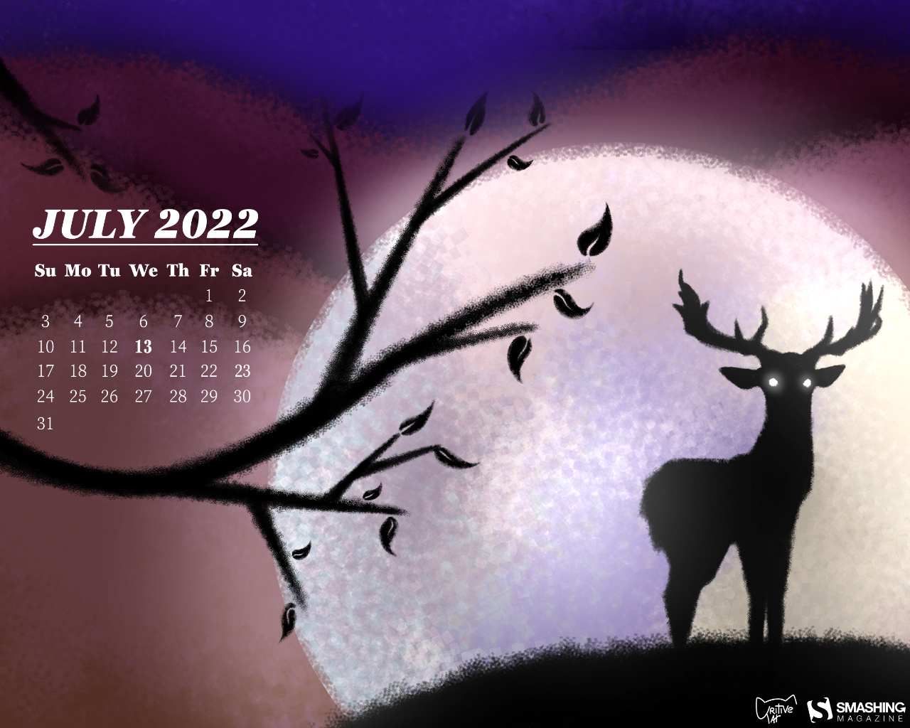
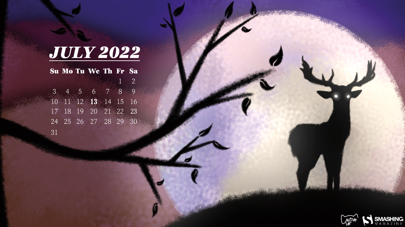
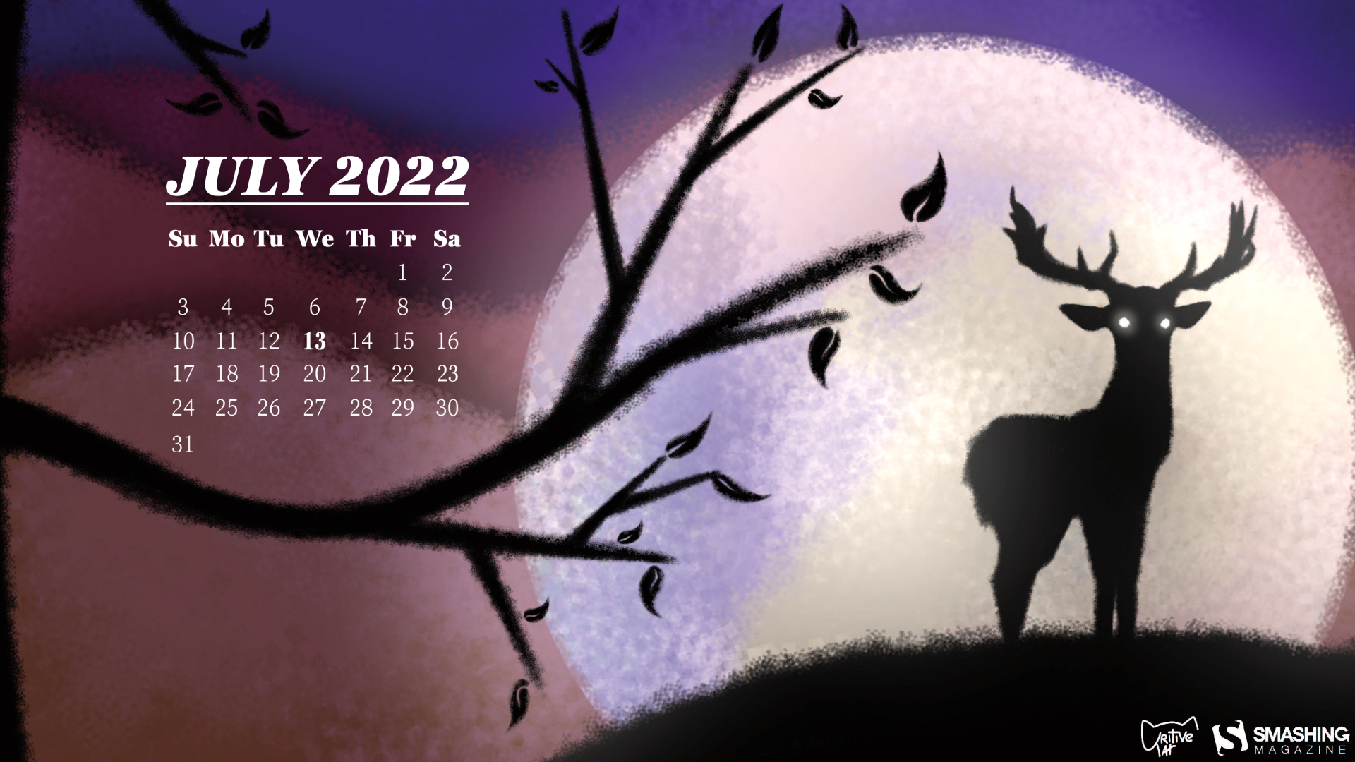
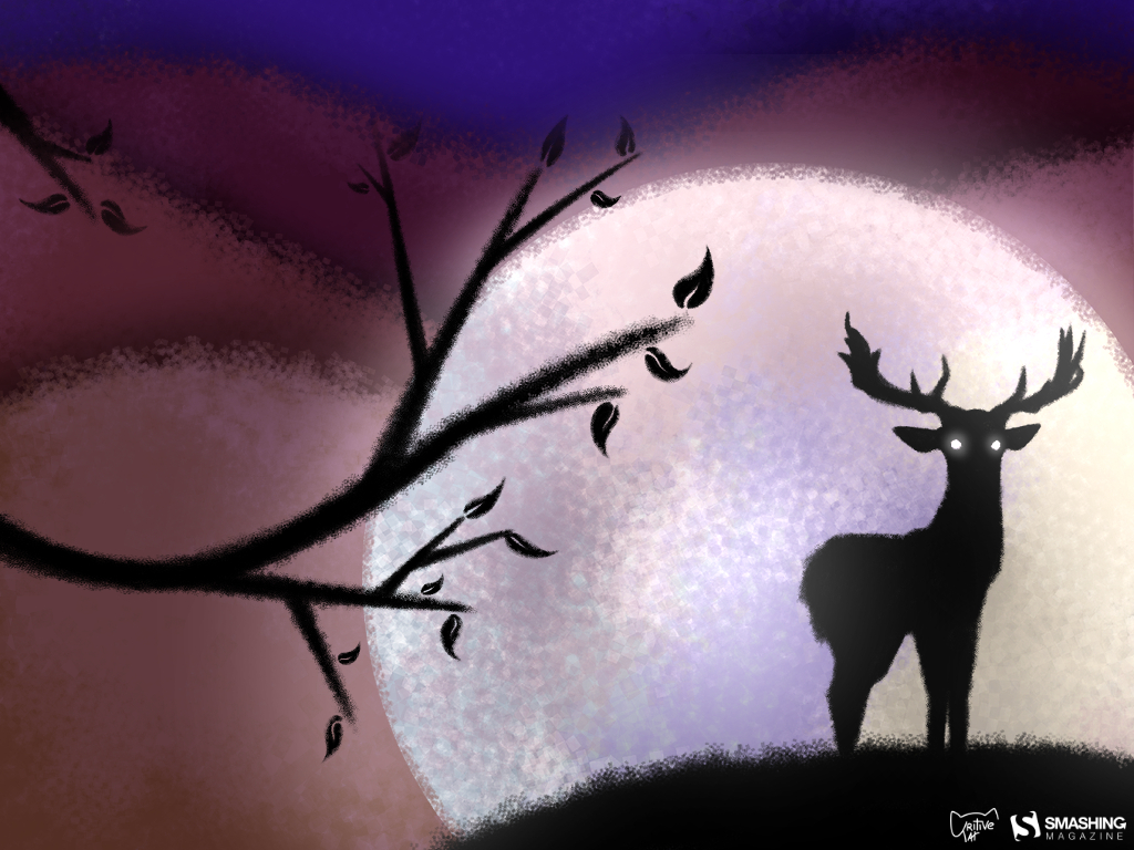
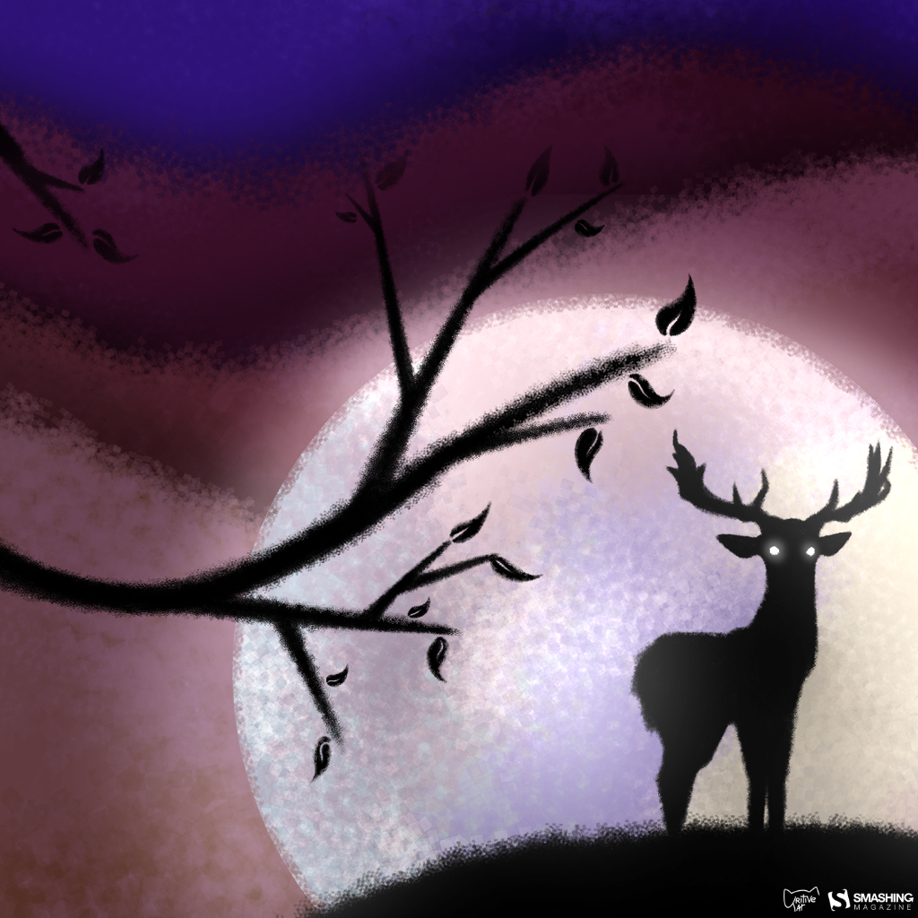
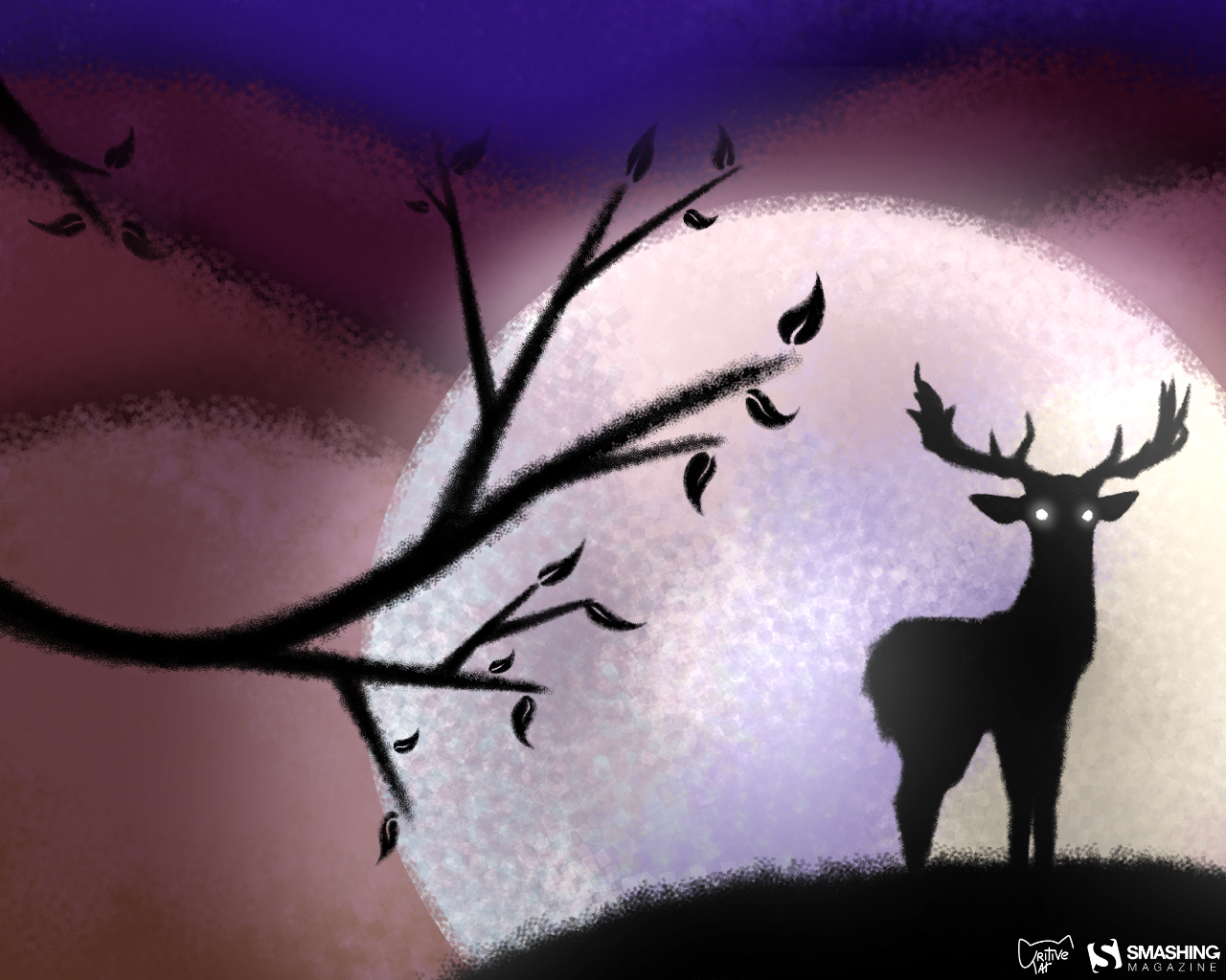
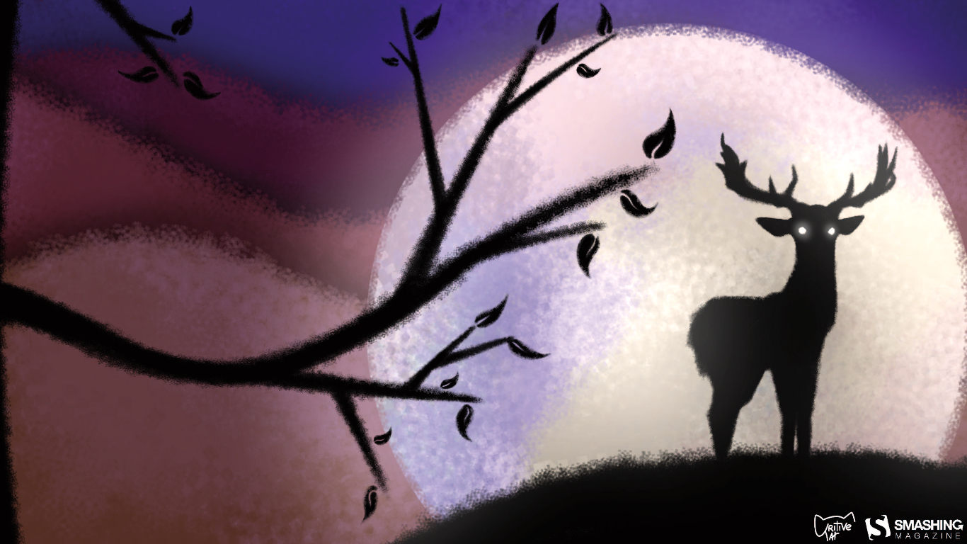
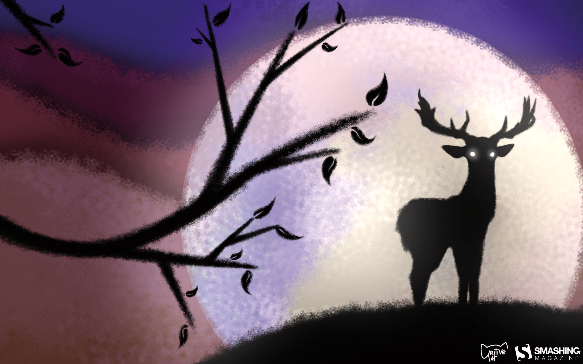
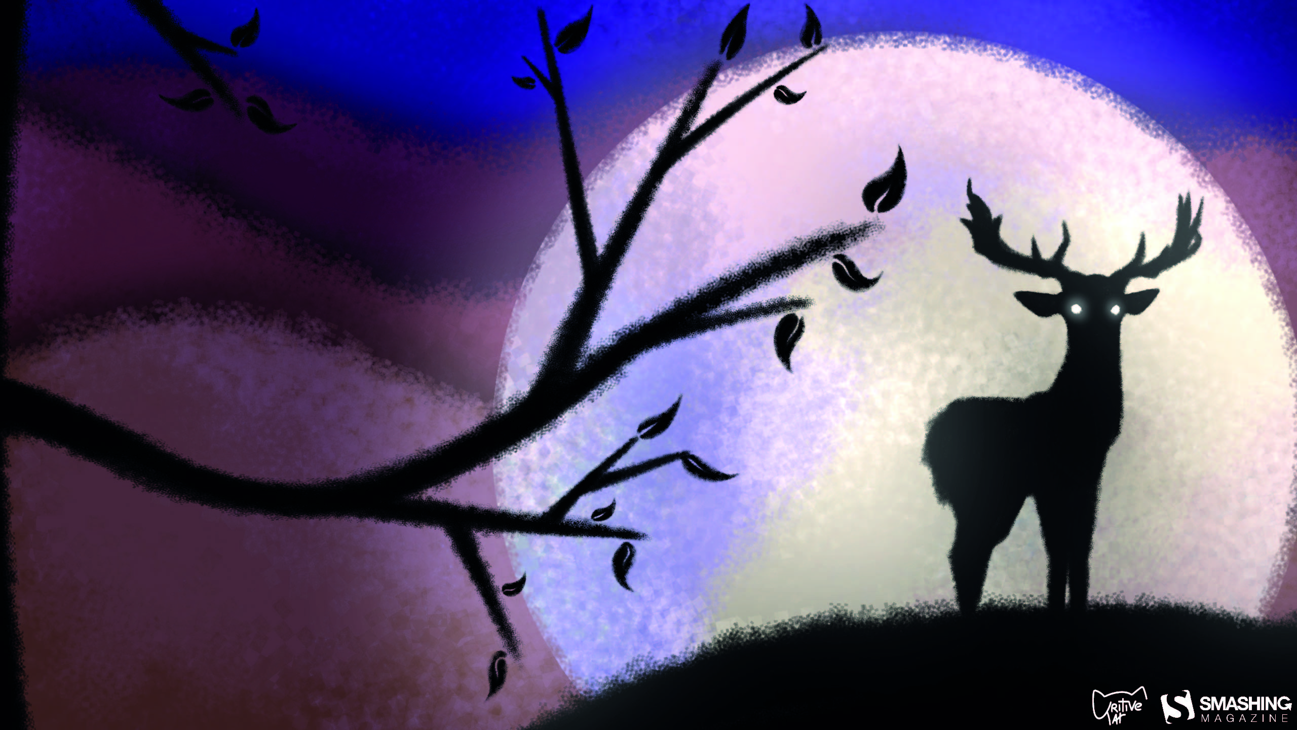
“July is the month where the Buck Moon takes place, also known as the full moon. With the brightest light shining upon Earth’s night and the male deer’s antlers growing at their fullest.” — Designed by Linda Lin from the Netherlands.
Our wallpapers archives are full of timeless treasures that are just too good to be forgotten. So here’s a small selection of favorites from past July editions. Please note that these designs don’t come with a calendar.
“I’m an avid runner, and I have some beautiful natural views surrounding my city. The Smoky Mountains are a bit further east, so I took some liberties, but Tennessee’s nature is nothing short of beautiful and inspiring.” — Designed by Cam Elliott from Memphis, TN.
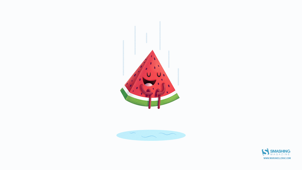
“Summer is coming in the northern hemisphere and what better way to enjoy it than with watermelons and cannonballs.” — Designed by Maria Keller from Mexico.
“July in South Africa is dreary and wintery so we give all the southern hemisphere dwellers a bit of colour for those grey days. And for the northern hemisphere dwellers a bit of pop for their summer!” — Designed by Wonderland Collective from South Africa.
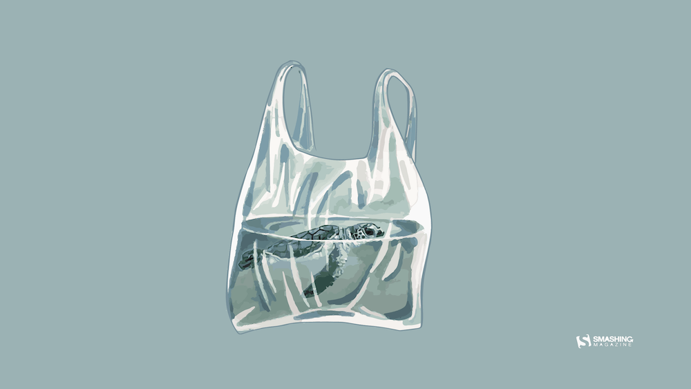
“The objective of this date is to draw attention to the production and over-consumption of plastic bags worldwide, presenting alternatives to solve this serious environmental problem. It is urgent to change the behavior of all human beings regarding the use of plastic bags. For the preservation of the environment, we should use the same plastic bag for shopping, recycling or use paper bags. In this wallpaper I drew a plastic bag with a turtle inside it, as if it was imprisoned by its own bag, as if the ocean was reduced to a plastic bag, emphasizing the seriousness of this environmental problem, which has tortured both turtles and many others marine species.” — Designed by Carolina Santos from Portugal.
“What’s better than a starry summer night with an (unexpected) friend around a fire camp with some marshmallows? Happy July!” — Designed by Etienne Mansard from the UK.
“It is July and the most awaited moment arrives… Holidays! We pack our bags and go to relax! Happy holidays!” — Designed by Veronica Valenzuela from Spain.
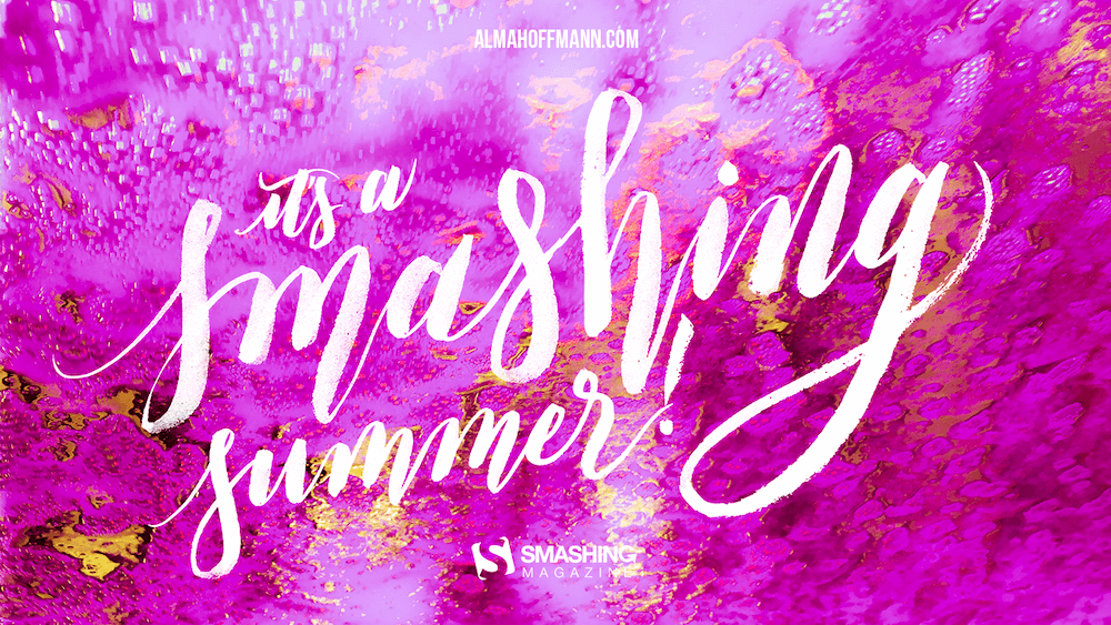
“The car wash down the street. I went to get my car washed for free and when the car entered the tunnel, the soap and the lights created some colorful and gorgeous images. I photographed them all. Car wash businesses remind me of my family. My Dad owned gas stations and my brother used to wash cars when he was young. Plus, back where I am originally from, car washing is done frequently because we have warm weather all year around.” — Designed by Alma Hoffmann from Puerto Rico, US.
“And once you let your imagination go, you find yourself surrounded by eternal summer, unexplored worlds and all-pervading warmth, where there are no rules of physics and colors tint the sky under your feet.” — Designed by Ana Masnikosa from Belgrade, Serbia.
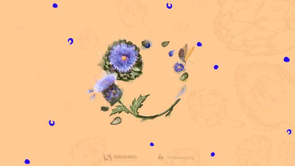
“In times of clean eating and the world of superfoods there is one vegetable missing. An old, forgotten one. A flower actually. Rare and special. Once it had a royal reputation (I cheated a bit with the blue). The artichocke — this is my superhero in the garden! I am a food lover — you too? Enjoy it — dip it!” — Designed by Alexandra Tamgnoué from Germany.
“I enjoy creating tropical designs, they fuel my wanderlust and passion for the exotic. Instantaneously transporting me to a tropical destination.” — Designed by Tamsin Raslan from the United States.
“Snails can be inspiring! If you keep heading towards your goal, even if it is just tiny steps, enjoy the journey and hopefully it will be worth the effort.” — Designed by Glynnis Owen from Australia.
“Make sure you have a refreshing source of ideas, plans and hopes this July. Especially if you are to escape from urban life for a while.” — Designed by Igor Izhik from Canada.
Why is it that when nine innocent Americans get shot and killed by gangs in Mexico, Tom Cotton says the US should basically invade Mexico and clean thisi mess up. But when 40,000+ (2018) get killed by guns in the US the GOP just shrugs its collective shoulders and say "there's nothing we can do"?
Nearly everyone has experienced frustration while using a website, mobile app, or web application. In these moments, we might wonder “What were they thinking?” followed by “They sure were not thinking about making this easy for me.” One reason we encounter such frustrating moments is that the process of making sound and user-friendly decisions is difficult.
In this article, we’ll identify four decision-related traps that impede good design and offer techniques for avoiding these traps. These decision traps are based on research conducted by psychologists, neuroscientists, molecular biologists, and behavioral economists including several cited in this article.
Too many design decisions occur in isolation, are based on gut feel, or are not carefully examined. The web offers many examples of poor design decisions. For instance, let’s take a look at the example below.
On the left: Are they asking for city, state, or country? On the right: This tooltip does not answer the user’s question. (Large preview)
At first glance, it seems quite straightforward: type the place of birth in the text field. A moment’s reflection, however, raises a question. Should we type the country, state, or city? It’s not clear. Clicking the question mark icon displays the help text shown below, to the right. The problem? The text does not answer the question; it simply restates the original request about entering the place of birth.
The design shown above violates a basic tenet of user experience (UX) immortalized by the title of Steven Krug’s famous book Don’t Make Me Think. Sure, it’s an amusing title, but he’s serious. The entire field of user experience is based on the idea of reducing the user’s cognitive load:
“Just like computers, human brains have a limited amount of processing power. When the amount of information coming in exceeds our ability to handle it, our performance suffers.”
In other words, when a design requires users to guess or think too hard about something as simple as one text entry, users will often make mistakes (costing your organization time and money) or abandon the task altogether.
Lightening the user’s cognitive load means increasing our own cognitive load as designers. We do have to think, hard and carefully. Essential to this effort is learning how to make good design decisions.
There are four common decision traps that we often fall into. I’ll explain how you can avoid them.
A heuristic is a mental shortcut that helps us make decisions quickly. These mental shortcuts are essential in certain situations. For example, if a car veers into your lane, you must act quickly; you don’t have time to review several options.
Unfortunately, heuristics become a flaw when making decisions in situations where many factors and participants must be considered. One such flaw is the availability heuristic, which involves an incomplete examination of current and past information.
A particularly distressing example of the availability heuristic in the design space is the software on the Boeing 737 Max. As of this writing, it appears that this software contributed to the tragedy of the downed airplanes. People around the world have asked how to prevent such tragedies in the future.
Part of the answer lies in avoiding quick fixes. Airbus, Boeing’s chief competitor, had refitted their A320 planes with larger engines. Boeing felt pressured to do the same leading to a variety of changes:
“The bigger engines altered the aerodynamics of the plane, making it more likely to pitch up in some circumstances.”
To compensate, Boeing added new software to the 737 Max:
This software “would automatically push the nose down if it sensed the plane pointing up at a dangerous angle. The goal was to avoid a stall. Because the system was supposed to work in the background, Boeing believed it didn’t need to brief pilots on it, and regulators agreed. Pilots weren’t required to train in simulators.”
The obvious and horrifying conclusion is that Boeing engineers and designers were placed under immense pressure to re-design the 737 Max at record speed resulting in a series of misjudgments. Less obvious, but equally troubling, is the likely role of the availability heuristic in these tragedies.
In short, the information used to make critical design decisions was not sufficient and resulted in tragedy.
The availability heuristic limits our perspective (Large preview)
Solution
One solution is for designers to identify their area of competence. Within this sphere their intuitions are likely to serve them well, explains author Rolf Dobelli in The Art of Thinking Clearly. For example, UX designers should feel comfortable making decisions about layout and interaction design issues like flow, navigation, and how much information to present at one time.
When designers face a decision outside their circle of competence, it’s worth taking time to apply hard, slow, rational thinking. For example, when designing cockpit software for jets, designers would be well advised to work closely with engineers and pilots to ensure that everything in the proposed user interface (UI) is precise, accurate, and provides the information pilots need when they need it.
We are all subject to the availability heuristic. Designers must strive to mitigate this heuristic by consulting a variety of subject matter experts (SMEs), not simply the programmers and engineers on their immediate teams. The downside risk is simply too high.
2. Focalism Bias
The availability heuristic hinders our ability to assess current and past information. The focalism bias concerns our ability to look forward. It refers to the inclination to concentrate on a single point when considering the future. As Harvard psychologist Daniel Gilbert explains in his book Stumbling on Happiness:
“It is difficult to escape the focus of our own attention — difficult to consider what it is we may not be considering.”
The focalism bias restricts our view of the future. (Large preview)
For example, while my colleagues and I were conducting UX research for a U.S. government agency, we discovered that caseworkers could not access information essential to processing applications for medical assistance.
As shown in the diagram below, these caseworkers literally had to stop in the middle of the application process in order to request critical information from another division. Typically, caseworkers had to wait 24 to 48 hours to receive this information.
The focalism bias led to a delay, the opposite of the desired results. Our re-design resolved the issue. (Large preview)
Caseworkers found this delay stressful because it made it more difficult to meet a federal law requiring all applications to be processed within 10 days of receipt.
How did this happen? One reason, surprisingly, was the emphasis on deadlines. Through our observation and interviews, we learned that the system had been rushed into production to meet a project deadline (all too common) and to give caseworkers a way to process applications more efficiently.
The intentions were good, the goals made sense. Unfortunately, the focus on rushing a system into production to supposedly expedite the process had the opposite effect. Designers created a system that delayed the application process.
Solution: Become An Active Problem Seeker
This idea may sound counterintuitive. Why would we look for problems? Don’t we already have enough to deal with? In truth, however, organizations that seek problems, such as Toyota, often demonstrate impressive performance. They’re called high-reliability organizations (HROs). Other examples include the U.S. Navy’s aircraft carriers and air traffic control centers in the U.S., both of which have incredibly low error and failure rates.
As decision expert Michael Roberto of Bryant University explains, leaders of HROs do not wall themselves off from the possibility of failure. On the contrary, they preoccupy themselves with failure. For example, they:
Do not simplify explanations.
Remain sensitive and attentive to their front-line operations as we did while observing caseworkers.
Defer to those who have the local, specialized knowledge as opposed to those who simply have authority in the hierarchy. Again, we relied on the expertise of caseworkers on the ground.
Commit to resilience, to the notion that you cannot prevent all small problems. Rather, the goal is to focus on fixing these small problems before they mushroom into large problems.
Actively seeking problems leads to better decisions. (Large preview)
Problems are not the enemy; hidden problems are because these hidden problems become serious threats down the road as we saw in the government agency examples outlined above. In both cases, earlier and additional contextual inquiry (observing users in their natural home or work environments) would likely have identified current problems and possible UI solutions to these problems.
For example, while conducting contextual inquiry for a large Mexican bank, I observed customers trying (and failing) to transfer money to family members who held accounts at different banks. Customers expressed frustration at this limitation because they wanted an easy way to send money to family members, especially those who lived far away.
While living in Mexico, I learned that loaning and giving money to family members is more common in Mexico than in the U.S., Canada, or parts of Western Europe.
Given the deeply rooted Mexican tradition of supporting family members in financial need, I was initially surprised by this banking limitation. Upon reflection, however, I realized that this limitation was simply a hidden problem. When coding the banking web site, the developers were likely focused on security, paramount in all matters financial. They had not considered including a cross-bank transfer feature.
I identified this missing feature by conducting UX Research with banking customers in Mexico. This real-world example shows how critical it is to become an active problem seeker.
3. Optimism Bias
Focusing on a single point or problem impedes our ability to plan and design for the future. An equally troubling challenge is the optimism bias. We tend to imagine the best-case scenario.
“For example, we underrate our chances of getting divorced, being in a car accident, or suffering from cancer. We also expect to live longer than objective measures would warrant, overestimate our success in the job market, and believe that our children will be especially talented.”
“Sure, this part of the UI is a bit clunky, but customers will get used to it, and then it won’t be an issue.”
In other words:
“We need to ship the product; we don’t want to deal with the cumbersome interaction.”
As anyone who has conducted a survey or usability test knows, this optimism is misplaced. Users and customers are easily frustrated and often show little patience when products and UIs are hard to use.
I witnessed this bias when designing a web application for financial advisers — 70% of whom were male. The client insisted on using a red font to emphasize certain numbers. Even after I explained that approximately 9% of males are color blind, she refused to change the font color. She reasoned that financial advisers would see the numbers in context. In other words, no problem. When I conducted multiple rounds of usability testing, however, two male advisers struggled to distinguish the numbers in red. They could read those numbers, but the figures did not stand out.
The reason for this type of wishful thinking is our tendency to see the future as a variant of the present. We tend to assume that things will go on more or less as they have. In the case of the financial application, because advisers had not complained before so my client assumed that they would not complain in the future. What she failed to grasp was the significance of changing the font to red.
“We tend to simulate the future by re-constructing the past, and the re-construction is rarely accurate.”
Solution: The Pre-Mortem Technique
That’s why it’s essential to resist this innate tendency by leveraging techniques like psychologist Gary Klein’s pre-mortem. The idea is to describe a scenario in which the project failed to meet a specific goal such as a revenue target, an increase in the percentage of new purchases, requests for more information, etc.
Here’s how it works. Before committing to a major initiative, the key stakeholder (often an executive) gathers everyone who is slated to participate. She outlines the key objective and explains “what went wrong.” The statement will sound something like this:
“Imagine that we have rolled out a new e-commerce mobile app at a cost of $3 million with a projected revenue of $10 million for the first year. At the end of one year, revenue is $1 million, a huge failure. Please take 20 minutes to write a history of this failure.”
This pre-mortem exercise:
Legitimizes doubt by providing a safe space for asking questions and expressing concerns about the decision.
Encourages even supporters of the decision to search for threats not previously considered.
An e-commerce mobile app is simply an example. The pre-mortem technique can be applied to nearly any project in any industry because it’s about expanding our perspective in order to identify what could realistically go wrong.
4. Overconfidence Bias
We unconsciously exaggerate our ability to accurately assess the present and predict the future. A study of patients who died in a hospital ICU compared the doctor’s diagnosis to the actual autopsy results. The doctors who were completely confident in their diagnosis were wrong 40% of the time.
When designers fall prey to the optimism bias, they exaggerate their ability to understand how users think. The most common results are information overload and confusing terminology and controls (buttons, checkboxes, sliders, and so on).
For example, while evaluating a client’s tablet-based investment application targeted at lay people, my team and I immediately noticed that:
The screen where users would create a risk profile included extraneous information.
The phrase “time zone” would likely confuse users. The client intended the term to refer to the customer’s investment time horizon. Yet, “time zone” usually means the time in a country or region, such as the U.K. or South Africa.
Plus and minus controls exhibited low affordance meaning that it was hard to tell whether they could be tapped or were simply part of the display.
These observations were supported during a subsequent usability test when participants expressed confusion over these specific points. In short, the designers for this project had overestimated their ability to create an interface that users would understand.
Solution
One solution is to conduct user research as we did with the tablet-based financial application outlined above. If such research is not possible, a second solution is to actively seek case studies beyond your immediate context. For example:
If you are designing an investment application, it might make sense to **refer to banking applications** to identify potential design challenges and what is already working well for customers.
If you are designing a tablet application to help nurse practitioners make a preliminary diagnosis, **look to other projects that are related** but outside your immediate context. Has your company developed a medical device UI for surgeons or ER doctors? What worked well for users? What did not?
Referring to other projects may sound like a no-brainer. Ask yourself, however, how often a systematic review of previous, related (but not identical) projects occurs within your organization. Remember, we are all subject to overconfidence.
Conclusion
In this piece, we’ve identified four common decision traps and corresponding solutions:
The availability heuristic causes us to ignore potentially important current or past information when making decisions. The solution is to expand our perspective by reaching beyond our circle of competence. For designers, this often means consulting highly technical experts.
Closely related is the focalism bias, our tendency to concentrate on a single point when designing thus overlooking other, equally important factors. The solution is to actively seek problems in order to identify and address hidden problems now before they become even larger difficulties.
The optimism bias refers to our tendency to imagine the best-case scenario. The solution is the pre-mortem technique. In this exercise, we imagine that a design project has gone terribly wrong and discuss why and how this happened. As with active problem seeking, the idea is to identify issues before they occur or get worse.
In the design space, the overconfidence bias refers to exaggerating our ability to understand how users think and design accordingly. The solution is to conduct user research and seek case studies similar to the current design initiative.
The cognitive biases discussed here are not intended to criticize designers (I am one). Rather, they are scientific observations about human nature. While we can’t change our biology, we can remain mindful of this biology and apply the four solutions outlined in this article. In so doing, we will increase the chances of creating better, safer, and more engaging designs.


