Sliding In And Out Of Vue.js

Sliding In And Out Of Vue.js

Sliding In And Out Of Vue.js

Kevin Ball

Vue.js has achieved phenomenal adoption growth over the last few years. It has gone from a barely known open-source library to the second most popular front-end framework (behind only React.js).

One of the biggest reasons for its growth is that Vue is a progressive framework — it allows you to adopt bits and pieces at a time. Don’t need a full single page application? Just embed a component. Don’t want to use a build system? Just drop in a script tag, and you’re up and running.

This progressive nature has made it very easy to begin adopting Vue.js piecemeal, without having to do a big architecture rewrite. However, one thing that is often overlooked is that it’s not just easy to embed Vue.js into sites written with other frameworks, it’s also easy to embed other code inside of Vue.js. While Vue likes to control the DOM, it has lots of escape hatches available to allow for non-Vue JavaScript that also touches the DOM.

This article will explore the different types of third-party JavaScript that you might want to use, what situations you might want to use them inside of a Vue project, and then cover the tools and techniques that work best for embedding each type within Vue. We’ll close with some considerations of the drawbacks of these approaches, and what to consider when deciding if to use them.

This article assumes some familiarity with Vue.js, and the concepts of components and directives. If you are looking for an introduction to Vue and these concepts, you might check out Sarah Drasner’s excellent introduction to Vue.js series or the official Vue Guide.

Types Of Third-Party JavaScript

There are three major types of third-party JavaScript that we’ll look at in order of complexity:

  1. Non-DOM Touching Libraries
  2. Element Augmentation Libraries
  3. Components And Component Libraries

Non-DOM Libraries

The first category of third-party JavaScript is libraries that provide logic in the abstract and have no direct access to the DOM. Tools like moment.js for handling dates or lodash for adding functional programming utilities fall into this category.

These libraries are trivial to integrate into Vue applications, but can be wrapped up in a couple of ways for particularly ergonomic access. These are very commonly used to provide utility functionality, the same as they would in any other type of JavaScript project.

Element Augmentation Libraries

Element augmentation is a time-honored way to add just a bit of functionality to an element. Examples include tasks like lazy-loading images with lozad or adding input masking using Vanilla Masker.

These libraries typically impact a single element at a time, and expect a constrained amount of access to the DOM. They will likely be manipulating that single element, but not adding new elements to the DOM.

These tools typically are tightly scoped in purpose, and relatively straightforward to swap out with other solutions. They’ll often get pulled into a Vue project to avoid re-inventing the wheel.

Components And Component Libraries

These are the big, intensive frameworks and tools like Datatables.net or ZURB Foundation. They create a full-on interactive component, typically with multiple interacting elements.

They are either directly injecting these elements into the DOM or expect a high level of control over the DOM. They were often built with another framework or toolset (both of these examples build their JavaScript on top of jQuery).

These tools provide extensive functionality and can be challenging to replace with a different tool without extensive modifications, so a solution for embedding them within Vue can be key to migrating a large application.

How To Use In Vue

Non-DOM Libraries

Integrating a library that doesn’t touch the DOM into a Vue.js project is relatively trivial. If you’re using JavaScript modules, simply importor require the module as you would in another project. For example:

import moment from 'moment';

Vue.component('my-component', {
  //…
  methods: {
    formatWithMoment(time, formatString) {
      return moment(time).format(formatString);
    },
});

If using global JavaScript, include the script for the library before your Vue project:

<script src="https://cdnjs.cloudflare.com/ajax/libs/moment.js/2.24.0/moment.js"></script>
<script src="https://cdnjs.cloudflare.com/ajax/libs/vue/2.5.22/vue.min.js"></script>
<script src="/project.js"></script>

One additional common way to layer on a bit more integration is to wrap up your library or functions from the library using a filter or method to make it easy to access from inside your templates.

Vue Filters

Vue Filters are a pattern that allows you to apply text formatting directly inline in a template. Drawing an example from the documentation, you could create a ‘capitalize’ filter and then apply it in your template as follows:

{{myString | capitalize}}

When importing libraries having to do with formatting, you may want to wrap them up as a filter for ease of use. For example, if we are using moment to format all or many of our dates to relative time, we might create a relativeTime filter.

const relativeTime = function(value) {
  if (!value) return '';
  return moment(value).fromNow();
}

We can then add it globally to all Vue instances and components with the Vue.filter method:

Vue.filter(’relativeTime', relativeTime);

Or add it to a particular component using the filters option:

const myComponent = {
  filters: {
    ’relativeTime': relativeTime,
  } 
}

You can play with this on CodePen here:

See the Pen Vue integrations: Moment Relative Value Filter by Kevin Ball.

Element Augmentation Libraries

Element augmentation libraries are slightly more complex to integrate than libraries that don’t touch the DOM — if you’re not careful, Vue and the library can end up at cross purposes, fighting each other for control.

To avoid this, you need to hook the library into Vue’s lifecycle, so it runs after Vue is done manipulating the DOM element, and properly handles updates that Vue instigates.

This could be done in a component, but since these libraries typically touch only a single element at a time, a more flexible approach is to wrap them in a custom directive.

Vue Directives

Vue directives are modifiers that can be used to add behavior to elements in your page. Vue ships with a number of built-in directives that you are likely already comfortable with — things like v-on, v-model, and v-bind. It is also possible to create custom directives that add any sort of behavior to an element — exactly what we’re trying to achieve.

Defining a custom directive is much like defining a component; you create an object with a set of methods corresponding to particular lifecycle hooks, and then add it to Vue either globally by running:

Vue.directive('custom-directive', customDirective);

Or locally in a component by adding it to the directives object in the component:

const myComponent = {
  directives: {
    'custom-directive': customDirective,
  } 
}
Vue Directive Hooks

Vue directives have the following hooks available to define behavior. While you can use all of them in a single directive, it is also not uncommon to only need one or two. They are all optional, so use only what you need.

  • bind(el, binding, vnode)
    Called once and only once, when the directive is first bound to an element. This is a good place for one-time setup work, but be cautious, i.e. the element exists, may not yet actually be in the document.
  • inserted(el, binding, vnode)
    Called when the bound element has been inserted into its parent node. This also does not guarantee presence in the document, but does mean if you need to reference the parent you can.
  • update(el, binding, vnode, oldVnode)
    Called whenever the containing component’s VNode has updated. There are no guarantees that other children of the component will have updated, and the value for the directive may or may not have changed. (You can compare binding.value to binding.oldValue to see and optimize away any unnecessary updates.)
  • componentUpdated(el, binding, vnode, oldVnode)
    Similar to update, but called after all children of the containing component have updated. If the behavior of your directive depends on its peers (e.g. v-else), you would use this hook instead of update.
  • unbind(el, binding, vnode)
    Similar to bind, this is called once and only once, when the directive is unbound from an element. This is a good location for any teardown code.

The arguments to these functions are:

  • el: The element the directive is bound to;
  • binding: An object containing information about the arguments and value of the directive;
  • vnode: The virtual node for this element produced by Vue’s compiler;
  • oldVNode: The previous virtual node, only passed to update and componentUpdated.

More information on these can be found in the Vue Guide on custom directives.

Wrapping The Lozad Library In A Custom Directive

Let’s look at an example of doing this type of wrapping using lozad, a lazy-loading library built using the Intersection Observer API. The API for using lozad is simple: use data-src instead of src on images, and then pass a selector or an element to lozad() and call observe on the object that is returned:

const el = document.querySelector('img');
const observer = lozad(el); 
observer.observe();

We can do this simply inside of a directive using the bind hook.

const lozadDirective = {
  bind(el, binding) {
    el.setAttribute('data-src', binding.value) ;
    let observer = lozad(el);
    observer.observe();
  }
}
Vue.directive('lozad', lozadDirective)

With this in place, we can change images to lazy load by simply passing the source as a string into the v-lozad directive:

<img v-lozad="'https://placekitten.com/100/100'" />

You can observe this at work in this CodePen:

See the Pen Vue integrations: Lozad Directive Just Bind by Kevin Ball).

We’re not quite done yet though! While this works for an initial load, what happens if the value of the source is dynamic, and Vue changes it? This can be triggered in the pen by clicking the “Swap Sources” button. If we only implement bind, the values for data-src and src are not changed when we want them to be!

To implement this, we need to add an updated hook:

const lozadDirective = {
  bind(el, binding) {
    el.setAttribute('data-src', binding.value) ;
    let observer = lozad(el);
    observer.observe();
  },
  update(el, binding) {
    if (binding.oldValue !== binding.value) {
      el.setAttribute('data-src', binding.value);
      if (el.getAttribute('data-loaded') === 'true') {
        el.setAttribute('src', binding.value);
      }
    }
  }
}

With this in place, we’re set! Our directive now updates everything lozad touches whenever Vue updates. The final version can be found in this pen:

See the Pen Vue integrations: Lozad Directive With Updates by Kevin Ball.

Components And Component Libraries

The most complex third-party JavaScript to integrate is that which controls entire regions of the DOM, full-on components and component libraries. These tools expect to be able to create and destroy elements, manipulate them, and more.

For these, the best way to pull them into Vue is to wrap them in a dedicated component, and make extensive use of Vue’s lifecycle hooks to manage initialization, passing data in, and handling events and callbacks.

Our goal is to completely abstract away the details of the third-party library, so that the rest of our Vue code can interact with our wrapping component like a native Vue component.

Component Lifecycle Hooks

To wrap around a more complex component, we’ll need to be familiar with the full complement of lifecycle hooks available to us in a component. Those hooks are:

  • beforeCreate()
    Called before the component is instantiated. Pretty rarely used, but useful if we’re integrating profiling or something similar.
  • created()
    Called after the component is instantiated, but before it is added to the DOM. Useful if we have any one-off setup that doesn’t require the DOM.
  • beforeMount()
    Called just before the component is mounted in the DOM. (Also pretty rarely used.)
  • mounted()
    Called once the component is placed into the DOM. For components and component libraries that assume DOM presence, this is one of our most commonly used hooks.
  • beforeUpdate()
    Called when Vue is about to update the rendered template. Pretty rarely used, but again useful if integrating profiling.
  • updated()
    Called when Vue has finished updating the template. Useful for any re-instantiation that is needed.
  • beforeDestroy()
    Called before Vue tears down a component. A perfect location to call any destruction or deallocation methods on our third-party component
  • destroyed()
    Called after Vue has torn down a component.
Wrapping A Component, One Hook At A Time

Let’s take a look at the popular jquery-multiselect library. There exist many fine multiselect components already written in Vue, but this example gives us a nice combination: complicated enough to be interesting, simple enough to be easy to understand.

The first place to start when implementing a third-party component wrapper is with the mounted hook. Since the third-party component likely expects the DOM to exist before it takes charge of it, this is where you will hook in to initialize it.

For example, to start wrapping jquery-multiselect, we could write:

mounted() { 
  $(this.$el).multiselect();
}

You can see this functioning in this CodePen:

This is looking pretty good for a start. If there were any teardown we needed to do, we could also add a beforeDestroy hook, but this library does not have any teardown methods that we need to invoke.

Translating Callbacks To Events

The next thing we want to do with this library is add the ability to notify our Vue application when the user selects items. The jquery-multiselect library enables this via callbacks called afterSelect and afterDeselect, but to make this more vue-like, we’ll have those callbacks emit events. We could wrap those callbacks naively as follows:

mounted() { 
  $(this.$el).multiSelect({
     afterSelect: (values) => this.$emit('select', values),
     afterDeselect: (values) => this.$emit('deselect', values)
   });
}

However, if we insert a logger in the event listeners, we’ll see that this does not provide us a very vue-like interface. After each select or deselect, we receive a list of the values that have changed, but to be more vue-like, we should probably emit a change event with the current list.

We also don’t have a very vue-like way to set values. Instead of this naive approach then, we should look at using these tools to implement something like the v-model approach that Vue provides for native select elements.

Implementing v-model

To implement v-model on a component, we need to enable two things: accepting a value prop that will accept an array and set the appropriate options as selected, and then emit an input event on change that passes the new complete array.

There are four pieces to handle here: initial setup for a particular value, propagate any changes made up to the parent, and handle any changes to value starting outside the component, and finally handle any changes to the content in the slot (the options list).

Let’s approach them one at a time.

  1. Setup With A Value Prop
    First, we need to teach our component to accept a value prop, and then when we instantiate the multiselect we will tell it which values to select.
    export default {
      props: {
        value: Array,
        default: [],
      },
      mounted() { 
        $(this.$el).multiSelect();
        $(this.$el).multiSelect('select', this.value);
      },
    }
    
  2. Handle Internal Changes
    To handle changes occurring due to the user interacting with the multiselect, we can go back to the callbacks we explored before — but ‘less naively’ this time. Instead of simply emitting what they send us, we want to turn a new array that takes into account our original value and the change made.
    mounted() { 
      $(this.$el).multiSelect({
        afterSelect: (values) => this.$emit('input', [...new Set(this.value.concat(values))]),
        afterDeselect: (values) => this.$emit('input', this.value.filter(x => !values.includes(x))),
      });
      $(this.$el).multiSelect('select', this.value);
    },
    

    Those callback functions might look a little dense, so let’s break them down a little.

    The afterSelect handler concatenates the newly selected value with our existing values, but then just to make sure there are no duplicates, it converts it to a Set (guarantees uniqueness) and then a destructuring to turn it back to an array.

    The afterDeselect handler simply filters out any deselected values from the current value list in order to emit a new list.
  3. Handling External Updates To Value
    The next thing we need to do is to update the selected values in the UI whenever the value prop changes. This involves translating from a declarative change to the props into an imperative change utilizing the functions available on multiselect. The simplest way to do this is to utilize a watcher on our value prop:
    watch:
      // don’t actually use this version. See why below
      value() {
        $(this.$el).multiselect('select', this.value);
      }
    }
    

    However, there’s a catch! Because triggering that select will actually result in our onSelect handler, and thus use updating values. If we do this naive watcher, we will end up in an infinite loop.

    Luckily,for us, Vue gives us the ability to see the old as well as the new values. We can compare them, and only trigger the select if the value has changed. Array comparisons can get tricky in JavaScript, but for this example, we’ll take advantage of the fact that our arrays are simple (not containing objects) and use JSON stringify to do the comparison. After taking into account that we need to also deselect any that options that have been removed, our final watcher looks like this:
    watch: {
        value(newValue, oldValue) {
          if (JSON.stringify(newValue) !== JSON.stringify(oldValue)) {
            $(this.$el).multiSelect('deselect_all');
            $(this.$el).multiSelect('select', this.value);
          }
        }
      },
    
  4. Handling External Updates To Slot
    We have one last thing that we need to handle: our multiselect is currently utilizing option elements passed in via a slot. If that set of options changes, we need to tell the multiselect to refresh itself, otherwise the new options don’t show up. Luckily, we have both an easy API for this in multiselect (the ’refresh' function and an obvious Vue hook to hook into) updated. Handling this last case is as simple as:
    updated() {
      $(this.$el).multiSelect(’refresh');
    },
    

    You can see a working version of this component wrapper in this CodePen:

    See the Pen Vue integrations: Multiselect Wrapper with v-model by Kevin Ball.

Drawbacks And Other Considerations

Now that we’ve looked at how straightforward it is to utilize third-party JavaScript within Vue, it’s worth discussing drawback of these approaches, and when it appropriate to use them.

Performance Implications

One of the primary drawbacks of utilizing third-party JavaScript that is not written for Vue within Vue is performance — particularly when pulling in components and component libraries or things built using entire additional frameworks. Using this approach can result in a lot of additional JavaScript that needs to be downloaded and parsed by the browser before the user can interact with our application.

For example, by using the multiselect component, we developed above means pulling in not only that component’s code, but all of jQuery as well. That can double the amount of framework related JavaScript our users will have download, just for this one component! Clearly finding a component built natively with Vue.js would be better.

Additionally, when there are large mismatches between the APIs used by third-party libraries and the declarative approach that Vue takes, you may find yourself implementing patterns that result in a lot of extra execution time. Also using the multiselect example, we had to refresh the component (requiring looking at a whole bunch of the DOM) every time a slot changed, while a Vue-native component could utilize Vue’s virtual DOM to be much more efficient in its updates.

When To Use

Utilizing third-party libraries can save you a ton of development time, and often means you’re able to use well-maintained and tested software that you don’t have the expertise to build. The primary drawback is performance, particularly when bringing in large frameworks like jQuery.

For libraries that don’t have those large dependencies, and particularly those that don’t heavily manipulate the DOM, there’s no real reason to favor Vue-specific libraries over more generic ones. Because Vue makes it so easy to pull in other JavaScript, you should go based on your feature and performance needs, simply picking the best tool for the job, without worrying about something Vue-specific.

For more extensive component frameworks, there are three primary cases in which you’d want to pull them in.

  1. Prototyping
    In this case, speed of iteration matters far more than user performance; use whatever gets the job done fastest.
  2. Migrating an existing site.
    If you’re migrating from an existing site to Vue, being able to wrap whatever framework you’re already using within Vue will give you a graceful migration path so you can gradually pull out the old code piece by piece, without having to do a big bang rewrite.
  3. When the functionality simply isn’t available yet in a Vue component.
    If you have a specific and challenging requirement you need to meet, for which a third-party library exists but there isn’t a Vue specific component, by all means consider wrapping the library that does exist.

When there are large mismatches between the APIs used by third-party libraries and the declarative approach that Vue takes, you may find yourself implementing patterns that result in a lot of extra execution time.

Examples In The Wild

The first two of these patterns are used all over the open-source ecosystem, so there are a number of different examples you can investigate. Since wrapping an entire complex component or component library tends to be more of a stopgap/migration solution, I haven’t found as many examples of that in the wild, but there are a couple out there, and I’ve used this approach for clients occasionally as requirements have dictated. Here is a quick example of each:

  1. Vue-moment wraps the moment.js library and creates a set of handy Vue filters;
  2. Awesome-mask wraps the vanilla-masker library and creates a directive for masked inputs;
  3. Vue2-foundation wraps up the ZURB Foundation component library inside of Vue components.

Conclusion

The popularity of Vue.js shows no signs of slowing down, with a huge amount of credit being due to the framework’s progressive approach. By enabling incremental adoption, Vue’s progressive nature means that individuals can start using it here and there, a bit at a time, without having to do massive rewrites.

As we’ve looked at here, that progressive nature extends in the other direction as well. Just as you can embed Vue bit by bit in another application, you can embed other libraries bit by bit inside of Vue.

Need some piece of functionality that hasn’t been ported to a Vue component yet? Pull it in, wrap it up, and you’re good to go.

Further Reading on SmashingMag:

Smashing Editorial (rb, ra, il)

Improving WordPress Code With Modern PHP

Improving WordPress Code With Modern PHP

Improving WordPress Code With Modern PHP

Leonardo Losoviz

WordPress was born fifteen years ago, and because it has historically preserved backwards compatibility, newer versions of its code couldn’t make full use of the latest capabilities offered by the newer versions of PHP. While the latest version of PHP is 7.3.2, WordPress still offers support up to PHP 5.2.4.

But those days will soon be over! WordPress will be upgrading its minimum PHP version support, bumping up to PHP 5.6 in April 2019, and PHP 7 in December 2019 (if everything goes according to plan). We can then finally start using PHP’s imperative programming capabilities without fear of breaking our clients’ sites. Hurray!

Because WordPress’ fifteen years of functional code have influenced how developers have built with WordPress, our sites, themes and plugins may be littered with less-than-optimal code that can gladly receive an upgrade.

This article is composed of two parts:

  1. Most relevant new features
    Further features have been added to PHP versions 5.3, 5.4, 5.5, 5.6 and 7.0 (notice that there is no PHP 6) and we’ll explore the most relevant ones.
  2. Building better software
    We’ll take a closer look through these features and how they are able to help us build better software.

Let’s start by exploring PHP’s “new” features.

Classes, OOP, SOLID And Design Patterns

Classes and objects were added to PHP 5, so WordPress already makes use of these features, however, not very extensively or comprehensively: The paradigm of coding in WordPress is mostly functional programming (performing computations by calling functions devoid of application state) instead of object-oriented programming (OOP) (performing computations by manipulating objects’ state). Hence I also describe classes and objects and how to use them through OOP.

OOP is ideal for producing modular applications: Classes allow the creation of components, each of which can implement a specific functionality and interact with other components, and can provide customization through its encapsulated properties and inheritance, enabling a high degree of code reusability. As a consequence, the application is cheaper to test and maintain, since individual features can be isolated from the application and dealt with on their own; there is also a boost of productivity since the developer can use already-developed components and avoid reinventing the wheel for each application.

A class has properties and functions, which can be given visibility by usingprivate (accessible only from within the defining class), protected (accessible from within the defining class and its ancestor and inheriting classes) and public (accessible from everywhere). From within a function, we can access the class’ properties by prepending their names with $this->:

class Person {

  protected $name;
  
  public function __construct($name) {
    $this->name = $name;
  }

  public function getIntroduction() {
    return sprintf(
      __('My name is %s'),
      $this->name
    );
  }
}

A class is instantiated into an object through the new keyword, after which we can access its properties and functions through ->:

$person = new Person('Pedro');
echo $person->getIntroduction(); 
// This prints "My name is Pedro"

An inheriting class can override the public and protected functions from its ancestor classes, and access the ancestor functions by prepending them with parent:::

class WorkerPerson extends Person {

  protected $occupation;
  
  public function __construct($name, $occupation) {

    parent::__construct($name);
    $this->occupation = $occupation;
  }

  public function getIntroduction() {
    return sprintf(
      __('%s and my occupation is %s'),
      parent::getIntroduction(),
      $this->occupation
    );
  }
}

$worker = new WorkerPerson('Pedro', 'web development');
echo $worker->getIntroduction();
// This prints "My name is Pedro and my occupation is web development"

A method can be made abstract, meaning that it must be implemented by an inheriting class. A class containing an abstract method must be made abstract itself, meaning that it cannot instantiated; only the class implementing the abstract method can be instantiated:

abstract class Person {
  
  abstract public function getName();

  public function getIntroduction() {
    return sprintf(
      __('My name is %s'),
      $this->getName()
    );
  }
}
// Person cannot be instantiated

class Manuel extends Person {
  
  public function getName() {
    return 'Manuel';
  }
}

// Manuel can be instantiated
$manuel = new Manuel();

Classes can also define static methods and properties, which live under the class itself and not under an instantiation of the class as an object. These are accessed through self:: from within the class, and through the name of the class + :: from outside it:

class Factory {

  protected static $instances = [];
  public static function registerInstance($handle, $instance) {
    self::$instances[$handle] = $instance;
  }
  public static function getInstance($handle) {
    return self::$instances[$handle];
  }
}

$engine = Factory::getInstance('Engine');

To make the most out of OOP, we can use the SOLID principles to establish a sound yet easily customizable foundation for the application, and design patterns to solve specific problems in a tried-and-tested way. Design patterns are standardized and well documented, enabling developers to understand how different components in the application relate to each other, and provide a way to structure the application in an orderly fashion which helps avoid the use of global variables (such as global $wpdb) that pollute the global environment.

Namespaces

Namespaces were added to PHP 5.3, hence they are currently missing altogether from the WordPress core.

Namespaces allow organizing the codebase structurally to avoid conflicts when different items have the same name — in a fashion similar to operating system directories which allow to have different files with the same name as long as they are stored in different directories. Namespaces do the same encapsulation trick for PHP items (such as classes, traits, and interfaces) avoiding collisions when different items have the same name by placing them on different namespaces.

Namespaces are a must when interacting with third-party libraries since we can’t control how their items will be named, leading to potential collisions when using standard names such as “File”, “Logger” or “Uploader” for our items. Moreover, even within a single project, namespaces prevent class names from becoming extremely long as to avoid clashes with other classes, which could result in names such as “MyProject_Controller_FileUpload”.

Namespaces are defined using the keyword namespace (placed on the line immediately after the opening <?php) and can span several levels or subnamespaces (similar to having several subdirectories where placing a file), which are separated using a \:

<?php
namespace CoolSoft\ImageResizer\Controllers;

class ImageUpload {

}

To access the above class, we need to fully qualify its name including its namespace (and starting with \):

$imageUpload = new \CoolSoft\ImageResizer\Controllers\ImageUpload();

Or we can also import the class into the current context, after which we can reference the class by its name directly:

use CoolSoft\ImageResizer\Controllers\ImageUpload;
$imageUpload = new ImageUpload();

By naming namespaces following established conventions, we can get additional benefits. For instance, by following the PHP Standards Recommendation PSR-4, the application can use Composer’s autoloading mechanism for loading files, thus decreasing complexity and adding frictionless interoperability among dependencies. This convention establishes to include the vendor name (e.g. the company’s name) as the top subnamespace, optionally followed by the package name, and only then followed by an internal structure in which each subnamespace corresponds to a directory with the same name. The result maps 1 to 1 the physical location of the file in the drive with the namespace of the element defined in the file.

Traits

Traits were added to PHP 5.4, hence they are currently missing altogether from the WordPress core.

PHP supports single inheritance, so a subclass is derived from a single parent class, and not from multiple ones. Hence, classes that do not extend from one another can’t reuse code through class inheritance. Traits is a mechanism that enables horizontal composition of behavior, making it possible to reuse code among classes which live in different class hierarchies.

A trait is similar to a class, however, it can’t be instantiated on its own. Instead, the code defined inside a trait can be thought of as being “copied and pasted” into the composing class on compilation time.

A trait is defined using the trait keyword, after which it can be imported to any class through the use keyword. In the example below, two completely unrelated classes Person and Shop can reuse the same code through a trait Addressable:

trait Addressable {

  protected $address;
  
  public function getAddress() {
    return $this->address;
  }
  
  public function setAddress($address) {
    $this->address = $address;
  }
}

class Person {

  use Addressable;
}

class Shop {

  use Addressable;
}

$person = new Person('Juan Carlos');
$person->setAddress('Obelisco, Buenos Aires');

A class can also compose more than one trait:

trait Exportable {
  
  public class exportToCSV($filename) {
    // Iterate all properties and export them to a CSV file
  }
}

class Person {

  use Addressable, Exportable;
}

Traits can also be composed of other traits, define abstract methods, and offer a conflict resolution mechanism when two or more composed traits have the same function name, among other features.

Interfaces

Interfaces were added to PHP 5, so WordPress already makes use of this feature, however, extremely sparingly: the core includes less than ten interfaces in total!

Interfaces allow creating code which specifies which methods must be implemented, yet without having to define how these methods are actually implemented. They are useful for defining contracts among components, which leads to better modularity and maintainability of the application: A class implementing an interface can be a black box of code, and as long as the signatures of the functions in the interface do not change, the code can be upgraded at will without producing breaking changes, which can help prevent the accumulation of technical debt. In addition, they can help reduce vendor lock-in, by allowing to swap the implementation of some interface to that of a different vendor. As a consequence, it is imperative to code the application against interfaces instead of implementations (and defining which are the actual implementations through dependency injection).

Interfaces are defined using the interface keyword, and must list down just the signature of its methods (i.e. without having their contents defined), which must have visibility public (by default, adding no visibility keyword also makes it public):

interface FileStorage {

  function save($filename, $contents);
  function readContents($filename);
}

A class defines that it implements the interface through the implements keyword:

class LocalDriveFileStorage implements FileStorage {

  function save($filename, $contents) {
    // Implement logic
  }
  function readContents($filename) {
    // Implement logic
  }
}

A class can implement more than one interface, separating them with ,:

interface AWSService {
  function getRegion();
}

class S3FileStorage implements FileStorage, AWSService {

  function save($filename, $contents) {
    // Implement logic
  }
  function readContents($filename) {
    // Implement logic
  }
  function getRegion() {
    return 'us-east-1';
  }
}

Since an interface declares the intent of what a component is supposed to do, it is extremely important to name interfaces appropriately.

Closures

Closures were added to PHP 5.3, hence they are currently missing altogether from the WordPress core.

Closures is a mechanism for implementing anonymous functions, which helps declutter the global namespace from single-use (or seldom-used) functions. Technically speaking, closures are instances of class Closure, however, in practice, we can most likely be blissfully unaware of this fact without any harm.

Before closures, whenever passing a function as an argument to another function, we had to define the function in advance and pass its name as the argument:

function duplicate($price) {
  return $price*2;
}
$touristPrices = array_map('duplicate', $localPrices);

With closures, an anonymous (i.e. without a name) function can already be passed directly as a parameter:

$touristPrices = array_map(function($price) {
  return $price*2;
}, $localPrices);

Closures can import variables to its context through the use keyword:

$factor = 2;
$touristPrices = array_map(function($price) use($factor) {
  return $price*$factor;
}, $localPrices);

Generators

Generators were added to PHP 5.5, hence they are currently missing altogether from the WordPress core.

Generators provide an easy way to implement simple iterators. A generator allows to write code that uses foreach to iterate over a set of data without needing to build an array in memory. A generator function is the same as a normal function, except that instead of returning once, it can yield as many times as it needs to in order to provide the values to be iterated over.

function xrange($start, $limit, $step = 1) {
    for ($i = $start; $i <= $limit; $i += $step) {
        yield $i;
    }
}
foreach (xrange(1, 9, 2) as $number) {
    echo "$number ";
}
// This prints: 1 3 5 7 9 

Argument And Return Type Declarations

Different argument type declarations were introduced in different versions of PHP: WordPress is already able to declare interfaces and arrays (which it does not: I barely found one instance of a function declaring an array as parameter in core, and no interfaces), and will soon be able to declare callables (added in PHP 5.4) and scalar types: bool, float, int and string (added in PHP 7.0). Return type declarations were added to PHP 7.0.

Argument type declarations allow functions to declare of what specific type must an argument be. The validation is executed at call time, throwing an exception if the type of the argument is not the declared one. Return type declarations are the same concept, however, they specify the type of value that will be returned from the function. Type declarations are useful to make the intent of the function easier to understand and to avoid runtime errors from receiving or returning an unexpected type.

The argument type is declared before the argument variable name, and the return type is declared after the arguments, preceded by ::

function foo(boolean $bar): int {

}

Scalar argument type declarations have two options: coercive and strict. In coercive mode, if the wrong type is passed as a parameter, it will be converted to the right type. For example, a function that is given an integer for a parameter that expects a string will get a variable of type string. In strict mode, only a variable of the exact type of declaration will be accepted.

Coercive mode is the default. To enable strict mode, we must add a declare statement used with the strict_types declaration:

declare(strict_types=1);
function foo(boolean $bar) {

}

New Syntax And Operators

WordPress can already identify variable-length argument lists through function func_num_args. Starting from PHP 5.6, we can use the ... token to denote that the function accepts a variable number of arguments, and these arguments will be passed into the given variable as an array:

function sum(...$numbers) {
  $sum = 0;
  foreach ($numbers as $number) {
    $sum += $number;
  }
  return $sum;
}

Starting from PHP 5.6, constants can involve scalar expressions involving numeric and string literals instead of just static values, and also arrays:

const SUM = 37 + 2; // A scalar expression
const LETTERS = ['a', 'b', 'c']; // An array

Starting from PHP 7.0, arrays can also be defined using define:

define('LETTERS', ['a', 'b', 'c']);

PHP 7.0 added a couple of new operators: the Null coalescing operator (??) and the Spaceship operator (<=>).

The Null coalescing operator ?? is syntactic sugar for the common case of needing to use a ternary in conjunction with isset(). It returns its first operand if it exists and is not NULL; otherwise, it returns its second operand.

$username = $_GET['user'] ?? 'nobody';
// This is equivalent to:
// $username = isset($_GET['user']) ? $_GET['user'] : 'nobody';

The Spaceship operator <=> is used for comparing two expressions, returning -1, 0 or 1 when the first operand is respectively less than, equal to, or greater than the second operand.

echo 1 <=> 2; // returns -1
echo 1 <=> 1; // returns 0
echo 2 <=> 1; // returns 1

These are the most important new features added to PHP spanning versions 5.3 to 7.0. The list of the additional new features, not listed in this article, can be obtained by browsing PHP’s documentation on migrating from version to version.

Next, we analyze how we can make the most out of all these new features, and from recent trends in web development, to produce better software.

PHP Standards Recommendations

The PHP Standards Recommendations was created by a group of PHP developers from popular frameworks and libraries, attempting to establish conventions so that different projects can be integrated more seamlessly and different teams can work better with each other. The recommendations are not static: existing recommendations may be deprecated and newer ones created to take their place, and new ones are released on an ongoing basis.

The current recommendations are the following:

GroupRecommendationDescription
Coding Styles
Standardized formatting reduces the cognitive friction when reading code from other authors
PSR-1Basic Coding Standard
PSR-2Coding Style Guide
Autoloading
Autoloaders remove the complexity of including files by mapping namespaces to file system paths
PSR-4Improved Autoloading
Interfaces
Interfaces simplify the sharing of code between projects by following expected contracts
PSR-3Logger Interface
PSR-6Caching Interface
PSR-11Container Interface
PSR-13Hypermedia Links
PSR-16Simple Cache
HTTP
Interoperable standards and interfaces to have an agnostic approach to handling HTTP requests and responses, both on client and server side
PSR-7HTTP Message Interfaces
PSR-15HTTP Handlers
PSR-17HTTP Factories
PSR-18HTTP Client

Think And Code In Components

Components make it possible to use the best features from a framework without being locked-in to the framework itself. For instance, Symfony has been released as a set of reusable PHP components that can be installed independently of the Symfony framework; Laravel, another PHP framework, makes use of several Symfony components, and released its own set of reusable components that can be used by any PHP project.

All of these components are published in Packagist, a repository of public PHP packages, and can be easily added to any PHP project through Composer, an extremely popular dependency manager for PHP.

WordPress should be part of such a virtuous development cycle. Unfortunately, the WordPress core itself is not built using components (as evidenced by the almost total absence of interfaces) and, moreover, it doesn’t even have the composer.json file required to enable installing WordPress through Composer. This is because the WordPress community hasn’t agreed whether WordPress is a site’s dependency (in which case installing it through Composer would be justified) or if it is the site itself (in which case Composer may not be the right tool for the job).

In my opinion, if we are to expect WordPress to stay relevant for the next fifteen years (at least WordPress as a backend CMS), then WordPress must be recognized as a site’s dependency and made available for installation through Composer. The reason is very simple: with barely a single command in the terminal, Composer enables to declare and install a project’s dependencies from the thousands of packages published in Packagist, making it possible to create extremely-powerful PHP applications in no time, and developers love working this way. If WordPress doesn’t adapt to this model, it may lose the support from the development community and fall into oblivion, as much as FTP fell out of favor after the introduction of Git-based deployments.

I would argue that the release of Gutenberg already demonstrates that WordPress is a site dependency and not the site itself: Gutenberg treats WordPress as a headless CMS, and can operate with other backend systems too, as Drupal Gutenberg exemplifies. Hence, Gutenberg makes it clear that the CMS powering a site can be swappable, hence it should be treated as a dependency. Moreover, Gutenberg itself is intended to be based on JavaScript components released through npm (as explained by core committer Adam Silverstein), so if the WordPress client is expected to manage its JavaScript packages through the npm package manager, then why not extend this logic to the backend in order to manage PHP dependencies through Composer?

Now the good news: There is no need to wait for this issue to be resolved since it is already possible to treat WordPress as a site’s dependency and install it through Composer. John P. Bloch has mirrored WordPress core in Git, added a composer.json file, and released it in Packagist, and Roots’ Bedrock provides a package to install WordPress with a customized folder structure with support for modern development tools and an enhanced security. And themes and plugins are covered too; as long as they have been listed on the WordPress theme and plugin directories, they are available under WordPress Packagist.

As a consequence, it is a sensible option to create WordPress code not thinking in terms of themes and plugins, but thinking in terms of components, making them available through Packagist to be used by any PHP project, and additionally packaged and released as themes and plugins for the specific use of WordPress. If the component needs to interact with WordPress APIs, then these APIs can be abstracted behind an interface which, if the need arises, can be implemented for other CMSs too.

Adding A Template Engine To Improve The View Layer

If we follow through the recommendation of thinking and coding in components, and treat WordPress as a site’s dependency other than the site itself, then our projects can break free from the boundaries imposed by WordPress and import ideas and tools taken from other frameworks.

Rendering HTML content on the server-side is a case in point, which is done through plain PHP templates. This view layer can be enhanced through template engines Twig (by Symfony) and Blade (by Laravel), which provide a very concise syntax and powerful features that give it an advantage over plain PHP templates. In particular, Gutenberg’s dynamic blocks can easily benefit from these template engines, since their process to render the block’s HTML on the server-side is decoupled from WordPress’ template hierarchy architecture.

Architect The Application For The General Use

Coding against interfaces, and thinking in terms of components, allows us to architect an application for general use and customize it for the specific use that we need to deliver, instead of coding just for the specific use for each project we have. Even though this approach is more costly in the short term (it involves extra work), it pays off in the long term when additional projects can be delivered with lower efforts from just customizing a general-use application.

For this approach to be effective, the following considerations must be taken into account:

Avoid Fixed Dependencies (As Much As Possible)

jQuery and Bootstrap (or Foundation, or <–insert your favorite library here–>) could’ve been considered must-haves a few years ago, however, they have been steadily losing ground against vanilla JS and newer native CSS features. Hence, a general-use project coded five years ago which depended on these libraries may not be suitable nowadays anymore. Hence, as a general rule of thumb, the lower the amount of fixed dependencies on third-party libraries, the more up-to-date it will prove to be for the long term.

Progressive Enhancement Of Functionalities

WordPress is a full-blown CMS system which includes user management, hence support for user management is included out of the box. However, not every WordPress site requires user management. Hence, our application should take this into account, and work optimally on each scenario: support user management whenever required, but do not load the corresponding assets whenever it is not. This approach can also work gradually: Say that a client requires to implement a Contact us form but has no budget, so we code it using a free plugin with limited features, and another client has the budget to buy the license from a commercial plugin offering better features. Then, we can code our functionality to default to a very basic functionality, and increasingly use the features from whichever is the most-capable plugin available in the system.

Continuous Code And Documentation Review

By periodically reviewing our previously-written code and its documentation, we can validate if it is either up-to-date concerning new conventions and technologies and, if it is not, take measures to upgrade it before the technical debt becomes too expensive to overcome and we need to code it all over again from scratch.

Recommended reading: Be Watchful: PHP And WordPress Functions That Can Make Your Site Insecure

Attempt To Minimize Problems But Be Prepared When They Happen

No software is ever 100% perfect: the bugs are always there, we just haven’t found them yet. As such, we need to make sure that, once the problems arise, they are easy to fix.

Make It Simple

Complex software cannot be maintained in the long term: Not just because other team members may not understand it, but also because the person who coded it may not understand his/her own complex code a few years down the road. So producing simple software must be a priority, more since only simple software can be correct and fast.

Failing On Compile Time Is Better Than On Runtime

If a piece of code can be validated against errors at either compile time or runtime time, then we should prioritize the compile time solution, so the error can arise and be dealt with in the development stage and before the application reaches production. For instance, both const and define are used for defining constants, however, whereas const is validated at compile time, define is validated at runtime. So, whenever possible, using const is preferable over define.

Following this recommendation, hooking WordPress functions contained in classes can be enhanced by passing the actual class as a parameter instead of a string with the class name. In the example below, if class Foo is renamed, whereas the second hook will produce a compilation error, the first hook will fail on runtime, hence the second hook is better:

class Foo {
  public static function bar() {

  }
}

add_action('init', ['Foo', 'bar']); // Not so good
add_action('init', [Foo::class, 'bar']); // Much better

For the same reason as above, we should avoid using global variables (such as global $wpdb): these not only pollute the global context and are not easy to track where they originate from, but also, if they get renamed, the error will be produced on runtime. As a solution, we can use a Dependency Injection Container to obtain an instance of the required object.

Dealing With Errors/Exceptions

We can create an architecture of Exception objects, so that the application can react appropriately according to each particular problem, to either recover from it whenever possible or show a helpful error message to the user whenever not, and in general to log the error for the admin to fix the problem. And always protect your users from the white screen of death: All uncaught Errors and Exceptions can be intercepted through function set_exception_handler to print a non-scary error message on screen.

Adopt Build Tools

Build tools can save a lot of time by automating tasks which are very tedious to execute manually. WordPress doesn’t offer integration with any specific build tool, so the task of incorporating these to the project will fall entirely on the developer.

There are different tools for accomplishing different purposes. For instance, there are build tools to execute tasks for compressing and resizing images, minifying JS and CSS files, and copying files to a directory for producing a release, such as Webpack, Grunt and Gulp; other tools help create the scaffolding of a project, which is helpful for producing the folder structure for our themes or plugins, such as Yeoman. Indeed, with so many tools around, browsing articles comparing the different available tools will help find the most suitable one for our needs.

In some cases, though, there are no build tools that can achieve exactly what our project needs, so we may need to code our own build tool as an extension to the project itself. For instance, I have done this to generate the service-worker.js file to add support for Service Workers in WordPress.

Conclusion

Due to its strong emphasis on keeping backwards compatibility, extended even up to PHP 5.2.4, WordPress has not been able to benefit from the latest features added to PHP, and this fact has made WordPress become a not-very-exciting platform to code for among many developers.

Fortunately, these gloomy days may soon be over, and WordPress may become a shiny and exciting platform to code for once again: The requirement of PHP 7.0+ starting in December 2019 will make plenty of PHP features available, enabling developers to produce more powerful and more performant software. In this article, we reviewed the most important newly-available PHP features and how to make the most out of them.

The recent release of Gutenberg could be a sign of the good times to come: even if Gutenberg itself has not been fully accepted by the community, at least it demonstrates a willingness to incorporate the latest technologies (such as React and Webpack) into the core. This turn of events makes me wonder: If the frontend can get such a makeover, why not extend it to the backend? Once WordPress requires at least PHP 7.0, the upgrade to modern tools and methodologies can accelerate: As much as npm became the JavaScript package manager of choice, why not making Composer become the official PHP dependency manager? If blocks are the new unit for building sites in the frontend, why not use PHP components as the unit for incorporating functionalities into the backend? And finally, if Gutenberg treats WordPress as a swappable backend CMS, why not already recognize that WordPress is a site dependency and not the site itself? I’ll leave these open questions for you to reflect upon and ponder about.

Smashing Editorial (rb, ra, il)

An Introduction To WebBluetooth

An Introduction To WebBluetooth

An Introduction To WebBluetooth

Niels Leenheer

With Progressive Web Apps, the web has been ever more closely moving towards native apps. However, with the added benefits that are inherent to the web such as privacy and cross-platform compatibility.

The web has traditionally been fantastic about talking to servers on the network, and to servers on the Internet specifically. Now that the web is moving towards applications, we also need the same capabilities that native apps have.

The amount of new specifications and features that have been implemented in the last few years in browsers is staggering. We’ve got specifications for dealing with 3D such as WebGL and the upcoming WebGPU. We can stream and generate audio, watch videos and use the webcam as an input device. We can also run code at almost native speeds using WebAssembly. Moreover, despite initially being a network-only medium, the web has moved towards offline support with service workers.

That is great and all, but one area has been almost the exclusive domain for native apps: communicating with devices. That is a problem we’ve been trying to solve for a long time, and it is something that everybody has probably encountered at one point. The web is excellent for talking to servers, but not for talking to devices. Think about, for example, trying to set up a router in your network. Chances are you had to enter an IP address and use a web interface over a plain HTTP connection without any security whatsoever. That is just a poor experience and bad security. On top of that, how do you know what the right IP address is?

HTTP is also the first problem we run into when we try to create a Progressive Web App that tries to talk to a device. PWAs are HTTPS only, and local devices are always just HTTP. You need a certificate for HTTPS, and in order to get a certificate, you need a publicly available server with a domain name (I’m talking about devices on our local network that is out of reach).

So for many devices, you need native apps to set the devices up and use them because native apps are not bound to the limitations of the web platform and can offer a pleasant experience for its users. However, I do not want to download a 500 MB app to do that. Maybe the device you have is already a few years old, and the app was never updated to run on your new phone. Perhaps you want to use a desktop or laptop computer, and the manufacturer only built a mobile app. Also not an ideal experience.

WebBluetooth is a new specification that has been implemented in Chrome and Samsung Internet that allows us to communicate directly to Bluetooth Low Energy devices from the browser. Progressive Web Apps in combination with WebBluetooth offer the security and convenience of a web application with the power to directly talk to devices.

Bluetooth has a pretty bad name due to limited range, bad audio quality, and pairing problems. But, pretty much all those problems are a thing of the past. Bluetooth Low Energy is a modern specification that has little to do with the old Bluetooth specifications, apart from using the same frequency spectrum. More than 10 million devices ship with Bluetooth support every single day. That includes computers and phones, but also a variety of devices like heart rate and glucose monitors, IoT devices like light bulbs and toys like remote controllable cars and drones.

Recommended reading: Understanding API-Based Platforms: A Guide For Product Managers

The Boring Theoretical Part

Since Bluetooth itself is not a web technology, it uses some vocabulary that may seem unfamiliar to us. So let’s go over how Bluetooth works and some of the terminology.

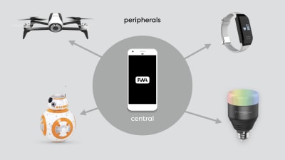
Every Bluetooth device is either a ‘Central device’ or a ‘Peripheral’. Only central devices can initiate communication and can only talk to peripherals. An example of a central device would be a computer or a mobile phone.

A peripheral cannot initiate communication and can only talk to a central device. Furthermore, a peripheral can only talk to one central device at the same time. A peripheral cannot talk to another peripheral.

a phone in the middle, talking to multiple peripherals, such as a drone, a robot toy, a heart rate monitor and a lightbulb
A central device can talk to multiple peripherals. (Large preview)

A central device can talk to multiple peripherals at the same time and could relay messages if it wanted to. So a heart rate monitor could not talk to your lightbulbs, however, you could write a program that runs on a central device that receives your heart rate and turns the lights red if the heart rate gets above a certain threshold.

When we talk about WebBluetooth, we are talking about a specific part of the Bluetooth specification called Generic Attribute Profile, which has the very obvious abbreviation GATT. (Apparently, GAP was already taken.)

In the context of GATT, we are no longer talking about central devices and peripherals, but clients and servers. Your light bulbs are servers. That may seem counter-intuitive, but it actually makes sense if you think about it. The light bulb offers a service, i.e. light. Just like when the browser connects to a server on the Internet, your phone or computer is a client that connects to the GATT server in the light bulb.

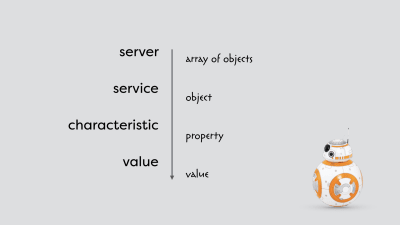
Each server offers one or more services. Some of those services are officially part of the standard, but you can also define your own. In the case of the heart rate monitor, there is an official service defined in the specification. In case of the light bulb, there is not, and pretty much every manufacturer tries to re-invent the wheel. Every service has one or more characteristics. Each characteristic has a value that can be read or written. For now, it would be best to think of it as an array of objects, with each object having properties that have values.

the hierarchy of services and characteristics compared to more familiar constructs from JavaScript - a server is similar to an array of objects, a service to an object in that array, a characteristic to a property of that object and both have values
A simplified hierarchy of services and characteristics. (Large preview)

Unlike properties of objects, the services and characteristics are not identified by a string. Each service and characteristic has a unique UUID which can be 16 or 128 bits long. Officially, the 16 bit UUID is reserved for official standards, but pretty much nobody follows that rule. Finally, every value is an array of bytes. There are no fancy data types in Bluetooth.

A Closer Look At A Bluetooth Light Bulb

So let’s look at an actual Bluetooth device: a Mipow Playbulb Sphere. You can use an app like BLE Scanner, or nRF Connect to connect to the device and see all the services and characteristics. In this case, I am using the BLE Scanner app for iOS.

The first thing you see when you connect to the light bulb is a list of services. There are some standardized ones like the device information service and the battery service. But there are also some custom services. I am particularly interested in the service with the 16 bit UUID of 0xff0f. If you open this service, you can see a long list of characteristics. I have no idea what most of these characteristics do, as they are only identified by a UUID and because they are unfortunately a part of a custom service; they are not standardized, and the manufacturer did not provide any documentation.

The first characteristic with the UUID of 0xfffc seems particularly interesting. It has a value of four bytes. If we change the value of these bytes from 0x00000000 to 0x00ff0000, the light bulb turns red. Changing it to 0x0000ff00 turns the light bulb green, and 0x000000ff blue. These are RGB colors and correspond exactly to the hex colors we use in HTML and CSS.

What does that first byte do? Well, if we change the value to 0xff000000, the lightbulb turns white. The lightbulb contains four different LEDs, and by changing the value of each of the four bytes, we can create every single color we want.

The WebBluetooth API

It is fantastic that we can use a native app to change the color of a light bulb, but how do we do this from the browser? It turns out that with the knowledge about Bluetooth and GATT we just learned, this is relatively simple thanks to the WebBluetooth API. It only takes a couple of lines of JavaScript to change the color of a light bulb.

Let’s go over the WebBluetooth API.

Connecting To A Device

The first thing we need to do is to connect from the browser to the device. We call the function navigator.bluetooth.requestDevice() and provide the function with a configuration object. That object contains information about which device we want to use and which services should be available to our API.

In the following example, we are filtering on the name of the device, as we only want to see devices that contain the prefix PLAYBULB in the name. We are also specifying 0xff0f as a service we want to use. Since the requestDevice() function returns a promise, we can await the result.

let device = await navigator.bluetooth.requestDevice({
    filters: [ 
        { namePrefix: 'PLAYBULB' } 
    ],
    optionalServices: [ 0xff0f ]
});

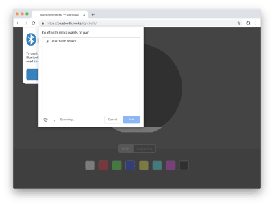
When we call this function, a window pops up with the list of devices that conform to the filters we’ve specified. Now we have to select the device we want to connect to manually. That is an essential step for security and privacy and gives control to the user. The user decides whether the web app is allowed to connect, and of course, to which device it is allowed to connect. The web app cannot get a list of devices or connect without the user manually selecting a device.

the Chrome browser with the window that the user needs to use to connect to a device, with the lightbulb visible in the list of devices
The user has to manually connect by selecting a device. (Large preview)

After we get access to the device, we can connect to the GATT server by calling the connect() function on the gatt property of the device and await the result.

let server = await device.gatt.connect();

Once we have the server, we can call getPrimaryService() on the server with the UUID of the service we want to use as a parameter and await the result.

let service = await server.getPrimaryService(0xff0f);

Then call getCharacteristic() on the service with the UUID of the characteristic as a parameter and again await the result.

We now have our characteristics which we can use to write and read data:

let characteristic = await service.getCharacteristic(0xfffc);

Writing Data

To write data, we can call the function writeValue() on the characteristic with the value we want to write as an ArrayBuffer, which is a storage method for binary data. The reason we cannot use a regular array is that regular arrays can contain data of various types and can even have empty holes.

Since we cannot create or modify an ArrayBuffer directly, we are using a ‘typed array’ instead. Every element of a typed array is always the same type, and it does not have any holes. In our case, we are going to use a Uint8Array, which is unsigned so it cannot contain any negative numbers; an integer, so it cannot contain fractions; and it is 8 bits and can contain only values from 0 to 255. In other words: an array of bytes.

characteristic.writeValue(
    new Uint8Array([ 0, r, g, b  ])
);

We already know how this particular light bulb works. We have to provide four bytes, one for each LED. Each byte has a value between 0 and 255, and in this case, we only want to use the red, green and blue LEDs, so we leave the white LED off, by using the value 0.

Reading Data

To read the current color of the light bulb, we can use the readValue() function and await the result.

let value = await characteristic.readValue();
    
let r = value.getUint8(1); 
let g = value.getUint8(2);
let b = value.getUint8(3);

The value we get back is a DataView of an ArrayBuffer, and it offers a way to get the data out of the ArrayBuffer. In our case, we can use the getUint8() function with an index as a parameter to pull out the individual bytes from the array.

Getting Notified Of Changes

Finally, there is also a way to get notified when the value of a device changes. That isn’t really useful for a lightbulb, but for our heart rate monitor we have constantly changing values, and we don’t want to poll the current value manually every single second.

characteristic.addEventListener(
    'characteristicvaluechanged', e => {
        let r = e.target.value.getUint8(1); 
        let g = e.target.value.getUint8(2);
        let b = e.target.value.getUint8(3);
    }
);

characteristic.startNotifications();

To get a callback whenever a value changes, we have to call the addEventListener() function on the characteristic with the parameter characteristicvaluechanged and a callback function. Whenever the value changes, the callback function will be called with an event object as a parameter, and we can get the data from the value property of the target of the event. And, finally extract the individual bytes again from the DataView of the ArrayBuffer.

Because the bandwidth on the Bluetooth network is limited, we have to manually start this notification mechanism by calling startNotifications() on the characteristic. Otherwise, the network is going to be flooded by unnecessary data. Furthermore, because these devices typically use a battery, every single byte that we do not have to send will definitively improve the battery life of the device because the internal radio does not need to be turned on as often.

Conclusion

We’ve now gone over 90% of the WebBluetooth API. With just a few function calls and sending 4 bytes, you can create a web app that controls the colors of your light bulbs. If you add a few more lines, you can even control a toy car or fly a drone. With more and more Bluetooth devices making their way on to the market, the possibilities are endless.

Further Resources

Smashing Editorial (dm, ra, il)

Adobe Experience Manager vs. WordPress: The Authoring Experience Compared

Adobe Experience Manager vs. WordPress: The Authoring Experience Compared

Adobe Experience Manager vs. WordPress: The Authoring Experience Compared

Kevin Weber

Thanks, WordPress and Gutenberg, for making block-based editing the standard for authoring web pages. In this article, I’m going to compare the new authoring experience in WordPress with the experience from Adobe Experience Manager (AEM), an enterprise content management system that also embraces block-based editing. I’ve implemented both WordPress and AEM for multiple companies (such as Informatica and Twitter) and had to realize that despite the authoring experience is critical for non-technical authors, it is often neglected by developers.

Note: With the term “authoring experience” I’m referring to the user experience for those people whose goal it is to create and publish content on a website. I’m not referring to the people that are going to consume the published content. If you haven’t thought about the authoring experience before, here’s a primer by Eileen Webb who was also featured in Smashing Book 5.

Adobe Experience Manager is, compared to WordPress, a complex system with a steep learning curve, especially for developers. At the same time, AEM is easier to use than more established and more expensive content management solutions, placing AEM somewhere in between free and very costly solutions.

From a technical perspective, AEM is a conglomerate of open source technologies with several touches from Adobe, placing AEM somewhere in between open-source and proprietary software. It is those touches from Adobe that make the system shiny and usable. For example, a visual drag and drop page builder has been the standard way for creating pages in AEM — long before WordPress Gutenberg was born.

Let’s take a look at some of the features that elevate the authoring experience above average.

Components (Blocks)

One of the most significant ideas for websites is the concept of a component (or block in WordPress lingo). A component represents a piece of content that follows specific rules instead of being a blob of anything. For example, you can have a video component where the author can only paste in a Youtube link and control Youtube-specific settings. Or you can have a quote component where the author adds a quote to one text field and the name of the person being quoted to another text field. You can even have a layout component that contains other components and displays them below each other on a mobile device, whereas on a large screen, those components get spread across three columns.

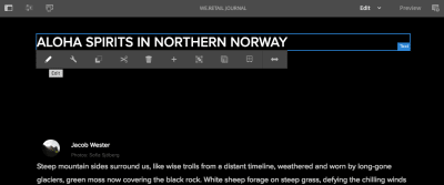
Title component in AEM with an overlay that includes an edit button
Authors can update components right in the visual editor. Available editing options get displayed based on the selected component. (Image source) (Large preview)

An author knows exactly what to expect from a specific component and can easily fill it with the appropriate content. Equally important are the long-term benefits and new opportunities that wouldn’t be feasible for the old school “one text field fits all content” approach that has been prevalent for the past decades:

  • If a component requires a date input, the component authoring dialog can display a date picker instead of a plain text field, making it easier for the author to pick a date with the right format.
  • If a designer wants the name of a quoted person to be displayed above the quote instead of below the quote, the developer can easily rearrange the code because the quote and the name are stored separately. If the quote and name would be stored the old-fashioned way, the developer would have to manually extract the name from the text blob and move it in front of the quote.
  • If a quote needs to be translated from English to German, the quote can be submitted to a translation service. If the translation service has translated this quote before already, it can return the saved translation. If the quote would be part of a longer paragraph instead of being standalone, the translation would be much harder and probably require a human translator.
  • If a video lacks a transcript and therefore prevents deaf users from consuming it, the component can be complemented with a summary text that makes the video more accessible to deaf users.

Component-based editing has been embraced by users of AEM for a while already, and because of the arrival of Gutenberg in WordPress 5.0, component-based editors are now the de facto standard for authoring web pages.

Note: Leonardo Losoviz dives deeper into the implications of blocks in the context of WordPress.

Fragments

Content fragments and experience fragments are new terms that have been dominating the AEM scene for the past year. I’ll summarize those two concepts simply as fragments. In essence, fragments allow authors to create neutral content that can be used across web, mobile, social media and other channels.

Fragments are created outside of a page editor and are, compared to a component, less opinionated about how their data is going to be used. Let’s imagine a fragment called “Quote of the day” that authors update once a day with a new quote. Now the quoted text of this fragment can be used in a variety of places:

  • A footer widget displays the quote of the day at the bottom of every page. As soon as an author updates the fragment, the footer updates as well. The fragment determines what is going to be displayed whereas the footer widget determines how the quote is going to be displayed.
  • A quote component allows authors to import a quote from past “Quotes of the day” and add it to the blog post.
  • A plugin adds a “Share quote of the day” button to the homepage. Whenever someone clicks on that button, the plugin takes the quote of the day and formats it to meet best practices for sharing via Facebook, Twitter, and email.
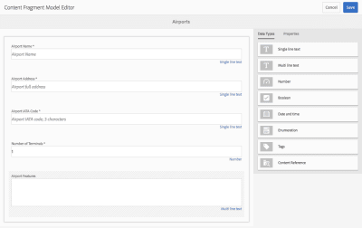
Fragment editor for populating a component with airport data
Using an editor for fragments, authors focus on related data without having to know how exactly it is going to be displayed on websites and in apps. (Image source) (Large preview)

In WordPress, widgets and menus resemble fragments: Authors create menu items in a neutral interface, then developers display those items as part of the theme in a way that makes sense for the theme. If the theme gets replaced with a new theme, those menu items persist and can be displayed in the new theme as well, even though the new theme might look very different from the previous one.

I expect fragments to become more widely used, even though the concept has different names in different systems. Indeed, Matt Mullenweg already announced that his team is currently focusing on “expanding the block interface to other aspects of content management [including the creation of] a navigation menu block [and] porting all widgets over to blocks.”

Page Templates

Pages templates can be described as higher-level components because they include several other components. In AEM, authors can create templates that lock components such as a header component into a fixed position while also defining flexible areas where components can be added on a per page basis.

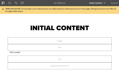
Page template editor
The template on this screen provides a heading, image and text component by default. It prevents authors from removing the “Text Locked” text and allows authors to add more components below that text. (Image source) (Large preview)

One important aspect of this is that such a flexible area can limit which components can go into it. That way you can create page templates for different purposes:

  • Template #1: Article page template
    Header, title, content area and footer are fixed. The author can update the title component but can’t remove it. The author can drop text, image and video components into the content area.
  • Template #2: Landing page template
    Only a logo and a title component at the top of the page are fixed. The author can choose among a set of landing page-specific components that are optimized for converting visitors into customers.

Permissions And Workflows

It’s unlikely that every author in a large team should be able to modify critical templates such as the article page template. In order to prevent people from being able to accidentally and irrevocably break the site, it is important to define who can modify which part of the site. Welcome to the concept of permissions and workflows. This concept is neither new nor special, but it’s important for large teams.

Screen where admins handle detailed permissions.
Yes, AEM’s interface for handling permissions could need a facelift. Anyhow, it works. (Image source) (Large preview)

A typical AEM site includes the actual production website and at least one production-like site, aka staging. Authors can publish content to a private staging site before publishing it to the public production site. The process of publishing content to staging followed by publishing content to production can be called a workflow. Another common type of workflow is that the content must go through an approval process before it can be published to the production site, and only certain people are able to hit the “publish to production” button.

Page editor with workflow message
This page indicates that a workflow has been initiated and the author can either complete or delegate the “Request for Activation”. (Image source) (Large preview)

Permissions and workflows are features that are negligible on small teams. However, as a team grows, those features become critical for the productivity and success of the team. Despite AEM comes with the basics for creating workflows and developers can make AEM work for any specific need, it requires quite some code changes and isn’t implemented with the snap of a finger. This is even more true for WordPress. It would be nice to have an authoring-friendly tool to create custom workflows.

Visual workflow editor in Git
Imagine how a user-friendly tool could simplify the creation of workflows. Here is how the creation of workflows in Github will look like once Github Actions are out of beta. (Large preview)

Editing Modes

In AEM, authors can quickly edit and view each page in different modes. The author switches between modes based on what job needs to get done:

  • To arrange components and edit their content, choose Edit mode.
  • To change how components should be arranged on an iPad, choose Layout mode.
  • To look at the content as if you were a visitor, choose Preview mode.
Page editor emulating an iPad-sized screen
On this page responsive layout mode is active. The author can emulate different device sizes and adjust the position of components within a responsive grid. (Image source) (Large preview)

There are a few more modes that show up based on how the site is set up. One ideal scenario is that A/B testing and personalization is set up by integrating AEM with Adobe Target. Using Targeting mode, authors can define when to show certain components based on a visitor’s location, age, referral page, the time of the day, etc.

Integrations in AEM are comparable to plugins in WordPress but with the difference that AEM integrations are more complex and usually custom-tailored. Especially integrating AEM Target can be more painful than salespeople make it sound. 😉

Dropdown with layout modes
Switch the mode through a dropdown. (Image source) (Large preview)
Editor where author defines a target audience
In targeting mode, content can be personalized and tested right from the page editor. (Image source) (Large preview)

Putting development complexity and money aside, the consequence of such an effort can result in a superb authoring experience. The concept of editing modes demonstrates how a simple dropdown creates an opportunity for authors to get a range of jobs done while staying on a single page.

Visual Single-Page Editor

Looking at the screenshots in this article, you must have realized that AEM’s page editor is not just component-based but also visual: If a component gets updated, the change becomes visible immediately and the author doesn’t have to open a preview in a new window. Quite a feature. Even though page builders are omnipresent in the WordPress ecosystem, the team behind WordPress has yet to define a best practice for visual editing. Let me take this one step further and ask: What happens if you marry visual editors with single-page applications (SPAs)?

SPAs are websites where navigating from one page to another feels seamless because the browser doesn’t have to reload the whole page. Some popular websites such as Gmail and Facebook are SPAs but most of the sites on the internet are not. One reason for rather low adoption is that creating SPAs is hard, and maintaining SPAs with thousands of pages is even harder. There are currently two major ways for managing content in SPAs:

  • The content of a site gets updated by updating code. That’s obviously not authoring-friendly.
  • The content is managed in a CMS that is decoupled from the visitor-facing part of the website. The content from the CMS is consumed via an API, for example by a React app. The authoring interface looks different from the assembled site that the visitor will see.

Implementing a visual editor and an SPA each by itself is already a tough technical challenge. Having a visual editor that works with an SPA is nearly unheard. Adobe’s team is working on supporting SPAs in AEM while trying not to compromise any benefits of their existing system. Even though promising first versions have been released to the AEM community in 2018, there’s still a lot of work to be done.

Weather component with overlay
This page shows a React app. Note how AEM has added a layer on top of the weather component so authors can edit its properties. (Image source) (Large preview)

Summary

Adobe Experience Manager comes with several useful features that have already made or will make their way into popular open-source projects. AEM didn’t necessarily invent the concepts highlighted in this article, but it certainly commercializes well as one of the most authoring-friendly systems on the market.

The concept of components became mainstream with the introduction of blocks in WordPress. The concept of fragments, page templates, permissions and workflows are at least partially implemented in WordPress and are important for teams with many authors that serve content to multiple channels.

The authoring experience can be improved even more using a visual editor with edit modes and support for single-page applications. Such an editor is difficult to implement but as the efforts by Adobe indicate, the improved experience might be worth the effort and eventually make it into WordPress as well.

Further Reading

Smashing Editorial (dm, ra, il)

Designing Emotional Interfaces Of The Future

Designing Emotional Interfaces Of The Future

Designing Emotional Interfaces Of The Future

Gleb Kuznetsov

Emotions play a vital role in our decision-making process. One second of emotion can change the whole reality for people engaging with a product.

Humans are an emotionally driven species; we choose certain products not because of what makes sense, but because of how we think they will make us feel. The interfaces of the future will use the concept of emotions within the foundation of product design. The experiences that people use will be based both on intellectual quotient (IQ) and emotional quotient (EQ).

This article is my attempt to look into the future and see what interfaces we will design in the next ten years. We’ll be taking a closer look at the three mediums for interaction:

  1. Voice
  2. Augmented Reality (AR)
  3. Virtual Reality (VR)

Developing For Virtual Reality

It’s not that difficult to create content for VR nowadays. Still, if you’re looking for a way to get a better understanding of VR development, working a demo project can help. Learn more →

Practical Examples Of Future Emotional Interfaces

How will interfaces look like in the future? Even though we do not have an answer to this question just yet, we can discuss what characteristics interfaces might have. In my opinion, I’m sure that we will eventually move away from interfaces full of menus, panels, buttons, and move towards more ‘natural interfaces’, i.e. interfaces that extend our bodies. The interfaces of the future will not be locked in a physical screen, but instead they will use the power of all five senses. Because of that, they will require a less learning curve — ideally, no learning curve at all.

The Importance Of EQ Emotional Intelligence In Business

Apart from making the experience more natural and reducing the learning curve, designing for emotion has another benefit for product creators: it improves user adoption of the product. It’s possible to use humans’ ability to act on emotions to create better user engagement.

Voice Interfaces That Feel Real

Products that use voice as the primary interface are becoming more and more popular. Many of us use Amazon Echo and Apple Siri for daily routine activities such as setting an alarm clock or making an appointment. But a majority of voice interaction systems available on the market today still have a natural limitation: they do not take user emotions into account. As a result, when users interact with products like Google Now, they have a strong sense of communicating with a machine — not a real human being. The system responds predictably, and their responses are scripted. It’s impossible to have a meaningful dialogue with such a system.

But there are some completely different systems available on the market today. One of them is Xiaoice, a social chatbot application. This app has an emotional computing framework at its core; the app is built on the idea that it’s essential to establish an emotional connection with the user first. Xiaoice can dynamically recognize emotion and engage the user throughout long conversations with relevant responses. As a result, when users interact with Xiaoice they feel like they’re having a conversation with a real human being.

The limitation of Xiaoice is that it’s a text-based chat app. It’s evident that you can achieve a more powerful effect by making voice-based interactions (the human voice has different characteristics such as a tone that can convey a powerful spectrum of emotions).

Many of us have seen the power of voice-based interactions in the film “Her” (2013). Theodore (the main character played by Joaquin Phoenix) fell in love with Samantha (a sophisticated OS). This also makes us believe that one of the primary purposes of voice-based systems of the future will be a virtual companion to users. The most interesting thing about this film is that Theodore did not have a visual image of the Samantha — he only had her voice. To build that kind of intimacy, it’s essential to generate responses that reflect a consistent personality. This will make the system both predictable and trustworthy.

Technology is still a long away from a system like Samantha, but I believe that voice-first multimodal interfaces will be the next chapter in the evolution of voice-enabled interfaces. Such interfaces will use voice as a primary way of interaction and provide additional information in a context that creates and builds a sense of connection.

Voice interfaces for Brain.ai Image: Gleb Kuznetsov
An example of a voice interface designed for Brain.ai (Image credit: Gleb Kuznetsov)

The Evolution Of AR Experience

Augmented Reality (AR) is defined as a digital overlay on top of the real world and transforms the objects around us into interactive digital experiences. Our environment becomes more ‘intelligent’ and users have an illusion of ‘tangible’ objects on the tips of their fingers, which establishes a deeper connection between a user and a product (or content).

Reimagine Existing Concepts Using AR

The unique aspect of AR is that it gives us an extraordinary ability to physically interact with digital content. It allows us to see things that we could not see before and this helps us learn more about the environment around us. This AR property helps designers to create new level experiences using familiar concepts.

For example, by using mobile AR, it’s possible to create a new level of in-flight experience that allows a passenger to see detailed information about her class or current flight progress:

AR in flight experience for Airbus A380
AR in flight experience for Airbus A380. (Image credit: Gleb Kuznetsov)

AR helps us find our way through spaces and get the required information at a glance. For example, AR can be used to create rich contextual hints for your current location. The technology known as SLAM (Simultaneous Localization And Mapping) is perfect for this. SLAM allows real-time mapping of an environment and also makes it possible to place multimedia content into the environment.

There are massive opportunities for providing value to users. For example, users can point their devices at a building and learn more about it right there on their screens. It significantly reduces the effort and allows for an emotional experience of ease by allowing navigation and access.

Providing additional information in context
Providing additional information in context (Image credit: Gleb Kuznetsov)

The environment around us (such as walls or floors) can become a scene for interactivity in ways that used to be limited to our smartphones and computers.

The concept that you see below does just that; it uses a physical object (white wall) as a canvas for the content usually delivered using a digital device:

The concept of interactive walls a digital overlay on top of the real world.
The concept of interactive walls — a digital overlay on top of the real world. (Image credit: Gleb Kuznetsov)

Avoiding Information Overload

Many of us saw the video called “HYPER-REALITY”. In this video, the physical and digital worlds have merged, and the user is overwhelmed with a vast amount of information.

Technology allows us to display several different objects at the same time. When it’s misused, it can easily cause overload.

Information overload is a serious issue that has a negative impact on user experience and avoiding it will be one of the goals of designing for AR. Well-designed apps will filter out elements that are irrelevant to users using the power of AI.

Advanced Personalization

Personalization in digital experience happens when the system curates the content or functionality to users’ needs and expectations in real time. Many modern mobile apps and websites use the concept of personalization to provide relevant content. For example, when you visit Netflix, the list of movies you see is personalized based on your interests.

AR glasses allow creating a new level of personalization, i.e. an ‘advanced’ level of personalization. Since the system ‘sees’ what the user sees, it’s possible to utilize this information to make a relevant recommendation or provide additional information in context. Just imagine that you’ll soon be wearing AR glasses, and the information that is transferred to your retina will be tailored to your needs.

Here’s a foretaste of what’s in store for us:

Moving From Augmented Reality Towards Virtual Reality To Create An Immersive Experience

AR experience has a natural limitation. As users, we have a clear line between us and content; this line separates one world (AR) with another (real world). This line causes a sense that the AR world is clearly not real.

You probably know how to solve this limitation, i.e. with virtual reality (VR), of course. VR is not exactly a new medium, but it’s only been in the last few years that technology has reached a point where it allowed designers to create immersive experiences.

Immersive VR experiences remove the barrier between the real world and digital. When you put on a VR headset, it’s difficult for your brain to process whether the information that you are receiving is real. The idea of how VR experiences can look in the nearest future is well explained in the movie “Ready Player One”:

Here is what designers need to remember when creating immersive virtual environments:

  1. Write a story
    Meaningful VR has a strong story at its core. That’s why before you even start designing for a VR environment, you need to write a narrative for the user journey. A powerful tool known as a ‘storyboard’ can help you with that. Using a storyboard, it’s possible to create a story and examine all the possible outcomes. When you examine your story, you will see when and how to use both visual and audio cues to create an immersive experience.
  2. Create a deeper connection with a character
    In order to make users believe that all things around them in VR are real, we need to create a connection with the characters played by the users. One of the most obvious solutions is to include a representation of users’ hands in the virtual scene. This representation should be of actual hands — not just a rigged replica. It’s vital to consider different factors (such as gender or skin color) because it’ll make interactions more realistic.
    If a user looks at her hands she sees that she is a character.
    A user can look at his or her hands and see themselves appear as a character. (Source: leapmotion)

    It’s also possible to bring some objects from real life to a VR environment in order to create this connection. For instance, a mirror. When the user looks at a mirror and sees their character in the reflection, it enables more realistic interactions between the user and virtual characters.
    A VR user looks into a virtual mirror and sees himself as a character in a VR environment. (Image credit: businesswire)
    A virtual reality user looks into a virtual mirror and sees himself as a character in a VR environment. Credits: businesswire. (Large preview)
  3. Use gestures instead of menus
    When designing immersive VR experiences, we can’t rely on traditional menus and buttons. Why? Because it is relatively easy to break a sense of immersion by showing a menu. Users will know that everything around them is not real. Instead of using traditional menus, designers need to rely on gestures. The design community is still in the process of defining a universal language for using gestures, and taking part in this activity is fun and exciting exercise. The tricky part is to make gestures familiar and predictable for users.
    Hovercast VR menu is an attempt to reuse existing concepts of interaction for VR experience. Unfortunately, this concept can break the sense of  immersion. New medium requires a new model of interaction.
    Hovercast VR menu is an attempt to reuse existing concepts of interaction for VR experience. Unfortunately, this concept can break the sense of immersion. New medium requires a new model of interaction.
  4. Interact with elements in the VR environment
    To create an environment that feels real, we need to give the user the ability to interact with objects in that reality. Ideally, all objects in the environment can be designed in a way that allows users to touch and inspect them. Such objects will act as stimuli and will help you create a more immersive experience. Touch is extremely important for exploring the environment; the most important information that babies get in the first days is received through touch.
  5. Share emotion in VR
    VR has a real opportunity to become a new level of social experience. But to make it happen, we need to solve one significant problem, i.e. bring the non-verbal cues into the interaction.

    When we interact with other people, a significant part on information that we get comes from body language. Surprise, disgust, anger — all these emotions are in our facial expressions, and during face-to-face interactions, we infer information from the eye region. It’s important to provide this information when people interact in a VR environment to create more realistic interactions.

    The good news is that the head-mounted devices (HMDs) will soon cover emotion recognition. Almost any area of human-to-human interaction will benefit from facial expressions in VR.
    Sharing emotions in VR space. Credits: Rachel Metz of MITReview
    Sharing emotions in VR space (Source: Rachel Metz of MITReview)
  6. Design sound and music suitabke for a VR environment
    Audio is a huge component of the immersive experience. It’s impossible to create a genuinely immersive experience without designing sound for the environment. The sound can both be used as a background element (i.e., ambient sound of wind) or directional. In the latter case, the sound can be used as a cue — by playing with directionality (where the sound comes from) and distance (it’s possible to focus user attention on particular elements).

    When it comes to designing audio for VR, it’s essential to make the sound 3D. 2D sound doesn’t work for VR very well because it makes everything too flat. The 3D sound is the sound that you can hear in every direction around you — front, behind, above and beyond — all over the place. You don’t need specialized headphones to experience 3D sound; it’s possible to create it using standard stereo speakers of HMD.

    Head tracking is another critical aspect of a good sound design. It’s vital to make sounds behave in a realistic manner. That’s why when a user moves his head, the sound should change according to the head movement.
  7. Prevent motion sickness
    Motion sickness is one of the primary pain-points in VR. It’s a condition in which a disagreement exists between visually perceived movement and the vestibular system’s sense of movement. It’s vital to keep users comfortable while they experience VR.

    There are two popular theories what causes motion sickness in VR:
    • ‘Sensory Conflict’ Theory
      According to this theory, motion sickness occurs as a result of a sensory disagreement between expected motion and motion that is actually experienced.
    • ‘Eye Movement’ Theory
      In the book “The VR Book: Human-Centered Design For Virtual Reality”, Jason Jerald mentions that motion sickness occurs because of the unnatural eye motion that is required to keep the scene’s image stable on the retina.
    Here are a few tips that will help you prevent users from reaching for the sickbag:
    • Physical body movement should match with visual movement. Sometimes even a small visual jitter can have an enormously negative impact on the experience.
    • Let users rest between moving scenes (this is especially important when the VR experience is really dynamic).
    • Reduce virtual rotations.

Conclusion

When we think about the modern state of product design, it becomes evident that we are only at the tip of the iceberg because we’re pretty limited to flat screens.

We’re witnessing a fundamental shift in Human-Computer Interaction (HCI) — rethinking the whole concept of digital experience. In the next decade, designers will break the glass (the era of mobile devices as we know them today) and move to the interfaces of the future — sophisticated voice interfaces, advanced ARs, and truly immersive VRs. And when it comes to creating a new experience, it’s essential to understand that the only boundary we have are our brains telling us it’s got to be how it’s always been.

Smashing Editorial (cc, ra, yk, il)