Diving Into the Book Review Block Plugin

Created by Donna Peplinskie, a Product Wrangler at Automattic, the Book Review Block plugin is nearly three years old. However, it only came to my attention during a recent excursion to find interesting block plugins.

The plugin does pretty much what it says on the cover. It is designed to review books. It generally has all the fields users might need to add to their reviews, such as a title, author, image, rating, and more. The interesting thing is that it can automatically fill in those details with a simple ISBN value. Plus, it supports Schema markup, which may help with SEO.

Rain or shine, sick or well, I read every day. I am currently a month and a half shy of a two-year reading streak. When the mood strikes, I even venture to write a book review. As much as I want to share interesting WordPress projects with the community, I sometimes have personal motives for testing and writing about plugins like Book Review Block. Anything that might help me or other avid readers share our thoughts on the world of literature with others is of interest.

Admittedly, I was excited as I plugged in the ISBN for Rhthym of War, the upcoming fourth book of my favorite fantasy series of all time, The Stormlight Archive. I merely needed to click the “Get Book Details” button.

Success! The plugin worked its magic and pulled in the necessary information. It had my favorite author’s name, the publisher, the upcoming release date, and the page count. It even had a long description, which I could trim down in the editor.

Using the Book Review Block in the WordPress editor.
Default output of the Book Review block.

There was a little work to make this happen before the success. To automatically pull in the book details, end-users must have an API Key from Google. It took me around a minute to set that up and enter it into the field available in the block options sidebar. The great thing about the plugin is that it saves this key so that users do not have to enter each time they want to review a book.

Book Review Block a good starting point. It is straightforward and simple to use. It is not yet at a point where I would call it a great plugin. However, it could be.

Falling Short

The plugin’s Book Review block should be taking its cues from the core Media & Text block. When you get right down to it, the two are essentially doing the same thing visually. Both are blocks with an image and some content sitting next to each other.

The following is a list of items where it should be following core’s lead:

  • No way to edit alt text (book title is automatically used).
  • The image is always aligned left and the content to the right with no way to flip them.
  • The media and content are not stackable on mobile views.
  • Cannot adjust the size of the image or content columns.
  • While inline rich-text controls are supported, users cannot add Heading, List, or Paragraph blocks to the content area and use their associated block options.

That is the shortlist that could offer some quick improvements to the user experience. Ultimately, the problems with the plugin essentially come down to not offering a way to customize the output.

One of the other consistent problems is that the book image the plugin loads is always a bit small. This seems to be more of an issue from the Google Books API than the plugin. Each time I tested a book, I opted to add a larger image — the plugin does allow you to replace the default.

The color settings are limited. The block only offers a background color option with no way to adjust the text color. A better option for plugin users is to wrap it in a Group block and adjust the background and text colors there.

Wrapping the Book Review block inside of a Group block in the WordPress editor.
Book Review block wrapped inside a Group block.

It would also be nice to have wide and full-alignment options, which is an often-overlooked featured from many block plugin authors.

Using the Media & Text Block to Recreate the Book Review Block

The Book Review Block plugin has a lot of potential, and I want to see it evolve by providing more flexibility to end-users. Because the Media & Text block is the closest core block to what the plugin offers, I decided to recreate a more visually-appealing design with it.

Creating a book review section with the Media & Text block in the editor.
Book review section created with the Media & Text block.

I made some adjustments on the content side of things. I used the Heading block for the book title, a List block for the book metadata, and a Paragraph block for the description.

The Media & Text block also provided me the freedom to adjust the alignment, stack the image and content on mobile views, and tinker with the size of the image. Plus, it has that all-important field for customizing the image alt attribute.

The Media & Text block gave me much more design mileage.

However, there are limitations to the core block. It does not fully capture some of the features available via the Book Review block. The most obvious are the automatic book details via an ISBN and the Schema markup. Less obvious, there is no easy way to recreate the star rating — I used emoji stars — and long description text does not wrap under the image. To recreate that, you would have to opt to use a left-aligned image followed by content.

Overall, the Media & Text block gives me the ability to better style the output, which is what I am more interested in as a user. I want to put my unique spin on things. That is where the Book Review Plugin misfires. It is also the sort of thing that the plugin author can iterate on, offering more flexibility in the future.

This is where many block plugins go wrong, particularly when there is more than one or two bits of data users should enter. Blocks represent freedom in many ways. However, when plugin developers stick to a rigid structure, users can sometimes lose that sense of freedom that they would otherwise have with building their pages.

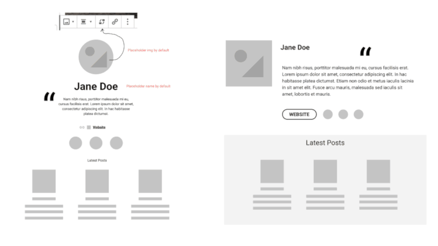
One of the best blocks, hands down, that preserves that freedom is from the Recipe Block plugin. It has structured inputs and fields. However, it allows freeform content for end-users to make it their own.

When block authors push beyond this rigidness, users win.

One Year After Beta, Elmastudio’s Aino Blocks Plugin Lands in the Plugin Directory

One year ago today, Elmastudio launched a beta version of its Aino WordPress theme and Aino Blocks plugin. While the team pushed the theme live in the theme directory earlier this year, it wasn’t until a couple of weeks ago that they officially released their blocks plugin.

Elmastudio’s beta launch was one of the first pieces of news I noted when I began writing for the Tavern — I was already lining up stories a couple of weeks before I officially started. But, the story fell down the list over time. After seeing Aino Blocks land in the plugin directory two weeks ago, I thought it would be interesting to check out what the plugin looked like today.

Aside from a few minor styling issues, the Aino theme is a solid offering for users who are looking for a block-ready theme that provides an open canvas. I am generally a fan of Elmastudio’s work with themes. However, most of the blocks from the Aino Blocks plugin are not particularly impressive. At best, they are par for the course for these types of block library plugins. I tend to install them to see if I can find a gem of an idea or two, some missing element that would solve one of the various problems I have. No such luck this time.

The Plugin’s Blocks

The one block that caught my eye the most was the Grid block. I am still hopeful that core WordPress adopts some sort of grid layout block or system. Therefore, I test every such block I come across.

The Grid block in the Aino Blocks plugin works well enough for people who have a background in CSS code. The terminology for the block options may be hard to understand for average users. On the whole, it does not feel intuitive enough for me to recommend it over better options.

Using the Grid block from the Aino Blocks plugin.
Using the Grid block.

Layout Grid by Automattic still holds the title for best grid block plugin thus far. Yes, its options can be confusing too, but it does provide dragging capabilities that will autofill those settings for less tech-savvy users. GenerateBlocks also has a powerful Grid block that is far easier to use.

The most complex block and the one that seemingly pushes some boundaries is the Hero block. It is essentially a block that combines content, buttons, and media in a specific layout. The problem is that there may not be a need for the block in every case. It is far better suited as a block pattern, and because the plugin already introduces a custom pattern, there is little reason not to move along the same route with the Hero block.

Within a couple of minutes, I was able to recreate the default Hero block output with core WordPress blocks. The only exception to this was the use of the Badge block included with the Aino Blocks plugin.

To recreate the Hero block, an end-user merely needs to add a Media & Text block. In the content/text panel for the block, they can add the Badge, Heading, Paragraph, and Buttons blocks. After adding an image in the media section, they would have recreated the Hero block. Because of the multiple inner blocks involved in this, it can be a bit complicated for some users. That’s where patterns come into play. By using a pattern, the plugin would have:

  • Used less JavaScript.
  • Used less CSS.
  • Mostly used core blocks.

Users may be stuck with an unnecessary block in this case. And, if this is their first foray into the world of blocks, they are unlikely to learn that there was a better way.

The one thing the Hero block brings to the table is its custom grid settings. It provides end-users with control over the placement of content and media columns. That is the only thing it has going for it as an individual block, but such a feature might be better as custom block options, such as those provided through EditorPlus.

Aino Blocks does include a single block pattern. It is called Hero Aino. It is a customized version of the Hero block in pattern form and showcases what users can accomplish with a few adjustments of the block options.

Aino Hero block pattern from the Aino Blocks WordPress plugin.
Aino Hero block pattern.

This pattern is the one area where the plugin shines. It will be interesting to see if the developers continue with more patterns in the future.

The plugin also adds Badge, Card, Author, Testimonial, Buttons, and Arrow Button blocks. The Badge block allows users to add a small bit of text with an inline background. The Arrow Button is essentially a link with an arrow icon next to it. Everything else feels like it has been done before by a plethora of other block collection plugins.

Final Verdict

I question whether most of these types of block library plugins are necessary at this point. Few of them feel like they are pushing any limits, raising the bar beyond what has already been done. My fear is that we will continue to see more and more of these collections packaged from every plugin and theme shop to the point where everyone is simply building the same blocks in-house.

This is why the block directory needs to be integrated into core. Instead of downloading an entire collection of blocks for something like a plain ol’ testimonial block, end-users can simply download a single testimonial block.

Perhaps I am being a bit harsh on Aino Blocks. Maybe it appeared in the plugin directory too late. Bigger plugins have already carved the path that Aino is trekking. I want to see more than yet another block collection by yet another theme/plugin company. I want to be dazzled.

For the most part, the plugin works well. I did not see anything technically wrong with it. I just do not see it appealing to many people outside of Elmastudio’s current theme users, not when there are more mature plugins of its type out there. There is still room to grow. The company’s best bet is to focus on building patterns. Its first pattern shows some promise. I am holding out hope for more interesting work to come.

What Should an Author Bio Block Look Like?

Mockups of two author bio blocks. One with centered elements. The other with a left image and right bio.
Two author bio block mock-ups compared.

Joshua Wold, co-representative for the WordPress design team, shared an early exploration of an author card block. Community members explored several ideas at the design table during the contributor day at WordCamp US 2019. In the post, Wold followed up on the original sketches from that melding of design minds.

The original idea for the author block was a GitHub ticket created in July 2017, but it was far ahead of its time. The Gutenberg project needed to focus on the basics and more common blocks for post content at that point. Now is the time to shift gears and begin work on these more complex blocks that will likely be a large part of the full-site editing phase of the project.

Currently, there are several proposed components to the author block:

  • Image/Avatar
  • Name
  • Description/Biography
  • Website Link
  • Social Network Links
  • Recommended Posts

I am on the fence about a recommended posts option as part of the block. If they were recommended posts written by that author, it could be an interesting concept to explore. However, version 1 of the block should focus on the most common elements, which the other components in the list cover.

Wold asked four key questions about the future of the block. The following are my responses to each.

What Is the Value of the Block and How Will It Be Used?

Coming from the theme world, what surprises me is that WordPress has never standardized on this feature at this point. Author bio sections are commonplace in theme development. Core should have standardized this feature years ago. We have a standard search form, comment list, featured image, and more. Many of the features that WordPress has standardized over the years were born out of theme designers carving the path forward, and author bios are no different.

It has long made sense for an author bio template tag to exist. However, we are living in a block world. The concept has merely shifted.

We do not need an author bio block today. We will need it tomorrow. As we shift closer and closer to full-site editing, we need to be building, iterating, and testing these types of blocks in preparation for the point of no return. This block, along with similar blocks, should drop in core at the same time the switch is flipped on full-site editing.

The primary use case will be for end-users to edit their theme’s block templates to stick the author bio at the end of their single post views. However, such a block need not be limited to that scenario. Users could create a “team” or “authors” page on their site. Some may want to drop these into columns or create some sort of gallery of author bios.

I could see taking this even further and naming it a “user bio” block. Use cases do not have to be centered around the concept of an author.

Where Should the Author Data Come From?

The primary, or at least initial, source of data should come from user data and metadata stored in the database. It does not make sense to duplicate efforts by retyping content within the block if it already exists.

One big question will be around social icons. If these are a part of the block, there is no current source to pull the URLs from. If automatically generating the data, WordPress will need to add social media contact methods to the user profile screen in the admin. That can be a slippery slope when deciding which social networks to include. However, core WordPress could stick to three or four major networks and provide a filter hook for plugin authors to utilize along with a standard for how additional fields are handled.

There is also the possibility that this block could simply be a pre-defined pattern of existing, smaller blocks that pulled in data like a user biography, user social icons, and user avatar. Then, the site owner could move other blocks in and out as they saw fit.

What Block Design Options Should Be Available?

The obvious design options are the standard text color, background color, and font size options. Border design options would be a bonus, but that goes beyond the scope of this specific block.

The standard alignment options would be welcome, particularly center, wide, and full. An alignment option for the avatar image to shift it left or right could also be useful. It could work similarly to the existing Media & Text core block.

I would not go overboard with design options. Let theme authors create custom block styles for users to choose from. That is the theme author’s job.

What Additional Features Should the Block Handle?

Outside of an avatar and biography, a social icon list is the most necessary feature. It is almost ubiquitous with author bio boxes.

What I would like to see is an author/user “gallery” block that builds upon this initial idea. At the moment, I am already imagining the painful user experience of creating a team page and putting individual user bio blocks into columns. Then, I am further imagining having to update that page and potentially move columns around. As an end-user, there are times when I want to micro-manage certain aspects of my site. This would not be one of them. Just give me a simple block to list user bios in some sort of columnized format.

Such a block could provide an avenue for many types of options. Maybe an option to list authors of a certain post type. Perhaps an option to list users by role. Or, let me list the top users by post count.

This idea may be pushing over into plugin territory. However, in terms of what I would want to do with my sites, this would be high on the list.