Oftentimes we need to detect when a click has happened outside of an element or when the focus has shifted outside of it. Some of the evident examples for this use case are fly-out menus, dropdowns, tooltips and popovers. Let’s start the process of making this detection functionality.
The DOM Way To Detect Outside Click
If you were asked to write code to detect if a click happened inside a DOM node or outside of it, what would you do? Chances are you’d use the Node.contains DOM API. Here’s how MDN explains it:
The Node.contains() method returns a Boolean value indicating whether a node is a descendant of a given node, i.e. the node itself, one of its direct children (childNodes), one of the children’s direct children, and so on.
Let’s quickly test it out. Let’s make an element we want to detect outside click for. I’ve conveniently given it a click-text class.
<section>
  <div class="click-text">
    click inside and outside me
  </div>
</section>
Selected the HTML element with the class click-text.
Put a mouse down event listener on document and set an event handler callback function.
In the callback function, we are checking if our concerned element — for which we have to detect outside click — contains the element (including itself) which triggered the mousedown event (event.target).
If the element which triggered the mouse down event is either our concerned element or any element which is inside the concerned element, it means we have clicked inside our concerned element.
Let’s click inside and outside of the element in the Codesandbox below, and check the console.
Wrapping DOM Hierarchy Based Detection Logic In A React Component
Great! So far we saw how to use DOM’s Node.contains API to detect click outside of an element. We can wrap that logic in a React component. We could name our new React component OutsideClickHandler. Our OutsideClickHandler component will work like this:
<OutsideClickHandler
  onOutsideClick={() => {
    console.log("I am called whenever click happens outside of 'AnyOtherReactComponent' component")
  }}
>
  <AnyOtherReactComponent />
</OutsideClickHandler>
OutsideClickHandler takes in two props:
children It could be any valid React children. In the example above we are passing AnyOtherReactComponent component as OutsideClickHandler’s child.
onOutsideClick This function will be called if a click happens anywhere outside of AnyOtherReactComponent component.
Sounds good so far? Let’s actually start building our OutsideClickHandler component.
import React from 'react';

class OutsideClickHandler extends React.Component {
  render() {
    return this.props.children;
  }
}
Just a basic React component. So far, we are not doing much with it. We’re just returning the children as they are passed to our OutsideClickHandler component. Let’s wrap the children with a div element and attach a React ref to it.
We’ll use this ref to get access to the DOM node object associated with the div element. Using that, we’ll recreate the outside detection logic we made above.
Let’s attach mousedown event on document inside componentDidMount React life cycle method, and clean up that event inside componentWillUnmount React lifecycle method.
class OutsideClickHandler extends React.Component {
  componentDidMount() {
    document
      .addEventListener('mousedown', this.handleClickOutside);
  }

  componentWillUnmount(){
    document
      .removeEventListener('mousedown', this.handleClickOutside);
  }

  handleClickOutside = (event) => {
    // Here, we'll write the same outside click
    // detection logic as we used before.
  }
}
Now, let’s write the detection code inside handleClickOutside handler function.
The logic inside handleClickOutside method says the following:
If the DOM node that was clicked (event.target) was neither our container div (this.wrapperRef.current) nor was it any node inside of it (!this.wrapperRef.current.contains(event.target)), we call the onOutsideClick prop.
This should work in the same way as the outside click detection had worked before. Let’s try clicking outside of the grey text element in the codesandbox below, and observe the console:
The Problem With DOM Hierarchy Based Outside Click Detection Logic
But there’s one problem. Our React component doesn’t work if any of its children are rendered in a React portal.
But what are React portals?
“Portals provide a first-class way to render children into a DOM node that exists outside the DOM hierarchy of the parent component.”
In the image above, you can see that though Tooltip React component is a child of Container React component, if we inspect the DOM we find that Tooltip DOM node actually resides in a completely separate DOM structure i.e. it’s not inside the Container DOM node.
The problem is that in our outside detection logic so far, we are assuming that the children of OutsideClickHandler will be its direct descendants in the DOM tree. Which is not the case for React portals. If children of our component render in a React portal — which is to say they render in a separate DOM node which is outside the hierarchy of our container div in which our OutsideClickHandler component renders its children — then the Node.contains logic fails.
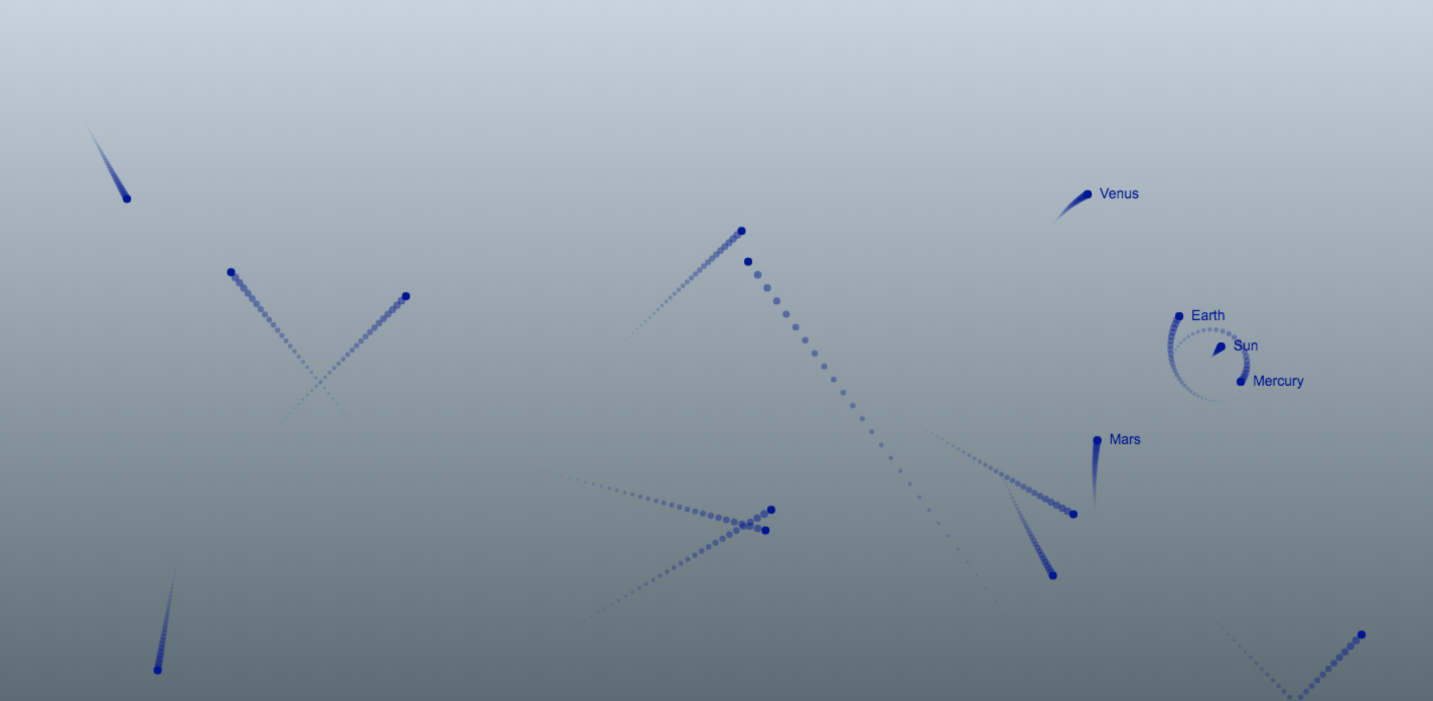
How would it fail though? If you’d try to click on the children of our OutsideClickHandler component — which renders in a separate DOM node using React portals — our component will register an outside click, which it shouldn’t. See for yourself:
Using Node.contains to detect outside click of React component gives wrong result for children rendered in a React portal. (Large preview)
Try it out:
Even though the popover that opens on clicking the button, is a child of OutsideClickHandler component, it fails to detect that it isn’t outside of it, and closes it down when it’s clicked.
Using Class Instance Property And Event Delegation To Detect Outside Click
So what could be the solution? We surely can’t rely on DOM to tell us if the click is happening outside anywhere. We’ll have to do something with JavaScript by rewriting out OutsideClickHandler implementation.
Let’s start with a blank slate. So at this moment OutsideClickHandler is an empty React class.
The crux of correctly detecting outside click is:
To not rely on DOM structure.
To store the ‘clicked’ state somewhere in the JavaScript code.
For this event delegation will come to our aid. Let’s take an example of the same button and popover example we saw above in the GIF above.
We have two children of our OutsideClickHandler function. A button and a popover — which gets rendered in a portal outside of the DOM hierarchy of OutsideClickHandler, on button click, like so:
When either of our children are clicked we set a variable clickCaptured to true. If anything outside of them is clicked, the value of clickCaptured will remain false.
We will store clickCaptured’s value in:
A class instance property, if you are using a class react component.
A ref, if you are using a functional React component.
We aren’t using React state to store clickCaptured’s value because we aren’t rendering anything based off of this clickCaptured data. The purpose of clickCaptured is ephemeral and ends as soon as we’ve detected if the click has happened inside or outside.
Let’s seee in the image below the logic for setting clickCaptured:
Whenever a click happens anywhere, it bubbles up in React by default. It’ll reach to the document eventually.
When the click reaches document, there are two things that might have happened:
clickCaptured will be true, if children where clicked.
clickCaptured will be false, if anywhere outside of them was clicked.
In the document’s event listener we will do two things now:
If clickCaptured is true, we fire an outside click handler that the user of OutsideClickHandler might have given us through a prop.
We reset clickCaptured to false, so that we are ready for another click detection.
Let’s translate this into code.
import React from 'react'

class OutsideClickHandler extends React.Component {
  clickCaptured = false;

  render() {
    if ( typeof this.props.children === 'function' ) {
      return this.props.children(this.getProps())
    }

    return this.renderComponent()
  }
}
We have the following things:
set initial value of clickCaptured instance property to false.
In the render method, we check if children prop is a function. If it is, we call it and pass it all the props we want to give it by calling getProps class method. We haven’t implemented getProps just yet.
If the children prop is not a function, we call renderComponent method. Let’s implement this method now.
Since we aren’t using JSX, we are directly using React’s createElement API to wrap our children in either this.props.component or a span. this.props.component can be a React component or any of the HTML element’s tag name like ‘div’, ‘section’, etc. We pass all the props that we want to pass to our newly created element by calling getProps class method as the second argument.
Our newly created React element, will have the following props passed down to it: onMouseDown and onTouchStart for touch devices. Both of their values is the innerClick class method.
If our new React component or anything inside of it — which could be a React portal — is clicked, we set the clickCaptured class instance property to true. Now, let’s add the mousedown and touchstart events to the document, so that we can capture the event that is bubbling up from below.
In the document mousedown and touchstart event handlers, we are checking if clickCaptured is falsy.
clickCaptured would only be true if children of our React component would have been clicked.
If anything else would have been clicked clickCaptured would be false, and we’d know that outside click has happened.
If clickCaptured is falsy, we’ll call the onClickOutside method passed down in a prop to our OutsideClickHandler component.
That’s it! Let’s confirm that if we click inside the popover it doesn’t get closed now, as it was before:
Using event delegation logic correctly detects outside click, even if children are rendered in a React portal. (Large preview)
Let’s try it out:
Wonderful!
Outside Focus Detection
Now let’s take a step further. Let’s also add functionality to detect when focus has shifted outside of a React component. It’s going to be very similar implementation as we’ve done with click detection. Let’s write the code.
Everything’s added mostly in the same fashion, except for one thing. You might have noticed that though we are adding an onFocus react event handler on our children, we are setting a focusin event listener to our document. Why not a focus event you say? Because, 🥁🥁🥁, Starting from v17, React now mapsonFocusReact event tofocusinnative event internally.
In case you are using v16 or before, instead of adding a focusin event handler to the document, you’ll have to add a focus event in capture phase instead. So that’ll be:
Since I’m using v17 in all my examples, I’m going to go ahead use the former. Let’s see what we have here:
React Foco component correctly detecting outside click and focus by using event delegation detection logic. (Large preview)
Let’s try it out ourselves, try clicking inside and outside of the pink background. Also use tab and shift + tab keys ( in chrome, firefox, edge ) or Opt/Alt + Tab and Opt/Alt + Shift + Tab ( in Safari ) to toggle focussing between inner and outer button and see how focus status changes.
Conclusion
In this article, we learned that the most straightforward way to detect a click outside of a DOM node in JavaScript is by using Node.contains DOM API. I explained the importance of knowing why using the same method to detect clicks outside of a React component doesn’t work when the React component has children which render in a React portal. Also, now you know how to use a class instance property alongside an event delegation to correctly detect whether a click happened outside of a React component, as well as how to extend the same detection technique to outside focus detection of a React component with the focusin event caveat.
Looks like all the content of MDN is on GitHub now. That’s pretty rad. That’s been the public plan for a while. Chris Mills:
We will be using GitHub’s contribution tools and features, essentially moving MDN from a Wiki model to a pull request (PR) model. This is so much better for contribution, allowing for intelligent linting, mass edits, and inclusion of MDN docs in whatever workflows you want to add it to (you can edit MDN source files directly in your favorite code editor).
Looks like that transition is happening basically today, and it’s a whole new back-end and front-end architecture.
Say you wanted to update the article for :focus-within. There will be a button on that page that takes you to the file in the repo (rather than the wiki editing page), and you can edit it from the GitHub UI (or however you like to do Git, but that seems like right-on-GitHub will be where the bulk of editing happens). Saving the changed document will automatically become a Pull Request, and presumably, there is a team in place to approve those.
We think that your changes should be live on the site in 48 hours as a worst case scenario.
Big claps from me here, I think this is a smart move. I can’t speak to the tech, but the content model is smart. I’d maybe like to see the content in Markdown with less specialized classes and such, but I suspect that kind of thing can evolve over time and this is already a behemoth of an update to ship all at once.
In August 2020, the entire MDN (writers) team was laid off, so it looks like the play here is to open up the creation and editing of these technical docs to the world of developers. Will it work? It super didn’t work for the “Web Platform Docs” (remember those?). But MDN has way more existing content, mindshare, and momentum. I suspect it will work great for the maintenance of existing docs, decently for new docs on whatever is hot ‘n’ fresh, but less so for anything old and “boring”.
Seems a little risky to fire all the writers before you find out if it works, so that speaks to the product direction. Things are changing and paying a content creation team directly just ain’t a part of whatever the new direction is.
As a React developer, you should be already familiar with the principle that state should not be mutated directly. You might be wondering what that means (most of us had that confusion when we started out).
This tutorial will do justice to that: you will understand what immutable state is and the need for it. You’ll also learn how to use Immer to work with immutable state and the benefits of using it.
You can find the code in this article in this Github repo.
Immutability In JavaScript And Why It Matters
Immer.js is a tiny JavaScript library was written by Michel Weststrate whose stated mission is to allow you “to work with immutable state in a more convenient way.”
But before diving into Immer, let’s quickly have a refresher about immutability in JavaScript and why it matters in a React application.
The latest ECMAScript (aka JavaScript) standard defines nine built-in data types. Of these nine types, there are six that are referred to as primitive values/types. These six primitives are undefined, number, string, boolean, bigint, and symbol. A simple check with JavaScript’s typeof operator will reveal the types of these data types.
A primitive is a value that is not an object and has no methods. Most important to our present discussion is the fact that a primitive’s value cannot be changed once it is created. Thus, primitives are said to be immutable.
The remaining three types are null, object, and function. We can also check their types using the typeof operator.
These types are mutable. This means that their values can be changed at any time after they are created.
You might be wondering why I have the array [0, 1] up there. Well, in JavaScriptland, an array is simply a special type of object. In case you’re also wondering about null and how it is different from undefined. undefined simply means that we haven’t set a value for a variable while null is a special case for objects. If you know something should be an object but the object is not there, you simply return null.
To illustrate with a simple example, try running the code below in your browser console.
String.prototype.match should return an array, which is an object type. When it can’t find such an object, it returns null. Returning undefined wouldn’t make sense here either.
Enough with that. Let’s return to discussing immutability.
According to the MDN docs:
“All types except objects define immutable values (that is, values which can’t be changed).”
This statement includes functions because they are a special type of JavaScript object. See function definition here.
Let’s take a quick look at what mutable and immutable data types mean in practice. Try running the below code in your browser console.
let a = 5;
let b = a
console.log(`a: ${a}; b: ${b}`) // a: 5; b: 5
b = 7
console.log(`a: ${a}; b: ${b}`) // a: 5; b: 7
Our results show that even though b is “derived” from a, changing the value of b doesn’t affect the value of a. This arises from the fact that when the JavaScript engine executes the statement b = a, it creates a new, separate memory location, puts 5 in there, and points b at that location.
What about objects? Consider the below code.
let c = { name: 'some name'}
let d = c;
console.log(`c: ${JSON.stringify(c)}; d: ${JSON.stringify(d)}`) // {"name":"some name"}; d: {"name":"some name"}
d.name = 'new name'
console.log(`c: ${JSON.stringify(c)}; d: ${JSON.stringify(d)}`) // {"name":"new name"}; d: {"name":"new name"}
We can see that changing the name property via variable d also changes it in c. This arises from the fact that when the JavaScript engine executes the statement, c = { name: 'some name'}, the JavaScript engine creates a space in memory, puts the object inside, and points c at it. Then, when it executes the statement d = c, the JavaScript engine just points d to the same location. It doesn’t create a new memory location. Thus any changes to the items in d is implicitly an operation on the items in c. Without much effort, we can see why this is trouble in the making.
Imagine you were developing a React application and somewhere you want to show the user’s name as some name by reading from variable c. But somewhere else you had introduced a bug in your code by manipulating the object d. This would result in the user’s name appearing as new name. If c and d were primitives we wouldn’t have that problem. But primitives are too simple for the kinds of state a typical React application has to maintain.
This is about the major reasons why it is important to maintain an immutable state in your application. I encourage you to check out a few other considerations by reading this short section from the Immutable.js README: the case for immutability.
Having understood why we need immutability in a React application, let’s now take a look at how Immer tackles the problem with its produce function.
Immer’s produce Function
Immer’s core API is very small, and the main function you’ll be working with is the produce function. produce simply takes an initial state and a callback that defines how the state should be mutated. The callback itself receives a draft (identical, but still a copy) copy of the state to which it makes all the intended update. Finally, it produces a new, immutable state with all the changes applied.
The general pattern for this sort of state update is:
// produce signature
produce(state, callback) => nextState
In the above code, we simply pass the starting state and a callback that specifies how we want the mutations to happen. It’s as simple as that. We don’t need to touch any other part of the state. It leaves initState untouched and structurally shares those parts of the state that we didn’t touch between the starting and the new states. One such part in our state is the pets array. The produced nextState is an immutable state tree that has the changes we’ve made as well as the parts we didn’t modify.
Armed with this simple, but useful knowledge, let’s take a look at how produce can help us simplify our React reducers.
We can see that this is unnecessarily verbose and prone to mistakes for this relatively simple state object. We also have to touch every part of the state, which is unnecessary. Let’s see how we can simplify this with Immer.
And with a few lines of code, we have greatly simplified our reducer. Also, if we fall into the default case, Immer just returns the draft state without us needing to do anything. Notice how there is less boilerplate code and the elimination of state spreading. With Immer, we only concern ourselves with the part of the state that we want to update. If we can’t find such an item, as in the `UPDATE_INSTALLED` action, we simply move on without touching anything else.
The `produce` function also lends itself to currying. Passing a callback as the first argument to `produce` is intended to be used for currying. The signature of the curried `produce` is
//curried produce signature
produce(callback) => (state) => nextState
Let’s see how we can update our earlier state with a curried produce. Our curried produce would look like this:
The curried produce function accepts a function as its first argument and returns a curried produce that only now requires a state from which to produce the next state. The first argument of the function is the draft state (which will be derived from the state to be passed when calling this curried produce). Then follows every number of arguments we wish to pass to the function.
All we need to do now to use this function is to pass in the state from which we want to produce the next state and the action object like so.
// add a new package to the starting state
const nextState = curriedProduce(initState, {
  type: 'ADD_PACKAGE',
  package: newPackage,
});

// update an item in the recently produced state
const nextState2 = curriedProduce(nextState, {
  type: 'SET_INSTALLED',
  name: 'immer',
  installed: true,
});
Note that in a React application when using the useReducer hook, we don’t need to pass the state explicitly as I’ve done above because it takes care of that.
You might be wondering, would Immer be getting a hook, like everything in React these days? Well, you’re in company with good news. Immer has two hooks for working with state: the useImmer and the useImmerReducer hooks. Let’s see how they work.
Using The useImmer And useImmerReducer Hooks
The best description of the useImmer hook comes from the use-immer README itself.
useImmer(initialState) is very similar to useState. The function returns a tuple, the first value of the tuple is the current state, the second is the updater function, which accepts an immer producer function, in which the draft can be mutated freely, until the producer ends and the changes will be made immutable and become the next state.
To make use of these hooks, you have to install them separately, in addition to the main Immer libarary.
And it’s as simple as that. You could say it’s React’s useState but with a bit of steroid. To use the update function is very simple. It receives the draft state and you can modify it as much as you want like below.
// make changes to data
updateData(draft => {
  // modify the draft as much as you want.
})
The creator of Immer has provided a codesandbox example which you can play around with to see how it works.
useImmerReducer is similarly simple to use if you’ve used React’s useReducer hook. It has a similar signature. Let’s see what that looks like in code terms.
We can see that the reducer receives a draft state which we can modify as much as we want. There’s also a codesandbox example here for you to experiment with.
And that is how simple it is to use Immer hooks. But in case you’re still wondering why you should use Immer in your project, here’s a summary of some of the most important reasons I’ve found for using Immer.
Why You Should Use Immer
If you’ve written state management logic for any length of time you’ll quickly appreciate the simplicity Immer offers. But that is not the only benefit Immer offers.
When you use Immer, you end up writing less boilerplate code as we have seen with relatively simple reducers. This also makes deep updates relatively easy.
With libraries such as Immutable.js, you have to learn a new API to reap the benefits of immutability. But with Immer you achieve the same thing with normal JavaScript Objects, Arrays, Sets, and Maps. There’s nothing new to learn.
Immer also provides structural sharing by default. This simply means that when you make changes to a state object, Immer automatically shares the unchanged parts of the state between the new state and the previous state.
With Immer, you also get automatic object freezing which means that you cannot make changes to the produced state. For instance, when I started using Immer, I tried to apply the sort method on an array of objects returned by Immer’s produce function. It threw an error telling me I can’t make any changes to the array. I had to apply the array slice method before applying sort. Once again, the produced nextState is an immutable state tree.
Immer is also strongly typed and very small at just 3KB when gzipped.
Conclusion
When it comes to managing state updates, using Immer is a no-brainer for me. It’s a very lightweight library that lets you keep using all the things you’ve learned about JavaScript without trying to learn something entirely new. I encourage you to install it in your project and start using it right away. You can add use it in existing projects and incrementally update your reducers.
I’d also encourage you to read the Immer introductory blog post by Michael Weststrate. The part I find especially interesting is the “How does Immer work?” section which explains how Immer leverages language features such as proxies and concepts such as copy-on-write.
I’d also encourage you to take a look at this blog post: Immutability in JavaScript: A Contratian View where the author, Steven de Salas, presents his thoughts about the merits of pursuing immutability.
I hope that with the things you’ve learned in this post you can start using Immer right away.
There has been some discussion recently about whether there should be a CSS4, as in a defined “next version” of CSS. In this article, I take a look at the discussions around this, the pros and cons of creating a feature release for CSS, and the potential problems in deciding what goes into it.
I’m using the term CSS4 as that is how the discussion was started, and not attempting to discuss what the naming should actually be, should this approach be taken forward. Bikeshedding naming is an excellent distraction from the discussion of whether we should do this at all, so I will use CSS4 as a placeholder for the version of CSS we are proposing to define, and CSS5 for the next one along the line.
The Issue
A discussion around whether we should define a CSS4 has been raised in the community, and Jen Simmons then raised a CSS Working Group issue which neatly rounds up some of that existing debate. Outside of the actual issue that we are discussing, it is fantastic to see so many people who are not part of the CSS WG replying on this thread, and I hope that having commented once, people will be happy to come and comment on some of our other issues.
In order to understand why there is no CSS4, we need to look at a little bit of web platform history. The initial versions of CSS were as a single, monolithic specification. These specifications contained every possible CSS property and value. This worked well as there wasn’t a lot of CSS to detail. CSS1 mostly covered features for formatting text documents, additional features and clarifications were added to CSS2 and CSS2.1 however CSS was still a relatively small specification.
CSS3
At the point the CSS Working Group began work on CSS3, it was decided to split the big spec into modules. These modules would each cover part of CSS. Not all of CSS was immediately placed into a new module. Many things remained defined in CSS2.1 as there were no changes or additions to them. For this reason, you will still find links to the CSS2 specification in modern modules, if the thing that is being referenced is still defined in CSS2. However, any new CSS is created in separate modules. This modularization continues today as new CSS is being created. For example, several of the features that make up the Box Alignment specification initially started life in the Flexbox spec. Once it became apparent that they could apply to other layout methods such as Grid Layout, they were moved into a new module to be defined for that other method too.
We stopped referring to new specifications as CSS3 Specifications, partly because it didn’t make a lot of sense. The way that modules are versioned is that the modules which were a progression of CSS2, for example Selectors, became a Level 3 module. Brand new CSS, for example CSS Grid Layout, did not exist at all in CSS2 and so start life as a Level 1 module. Some of those initial modules are now at Level 4 or even Level 5. Therefore, calling all new CSS CSS3 doesn’t map to the level numbers anymore, and is potentially rather confusing.
Specification Maturity Levels
In addition to specification levels, each individual level goes through a staged process from the initial draft to becoming a W3C Recommendation, the steps in the process are referred to as Maturity Levels. A W3C Recommendation is what you might think of as a “web standard”, however many of the things we use daily in our work are defined in specifications that are not at that maturity level yet. You can see the list of specifications and their status on the CSS WG Current Work page.
Explaining The Missing CSS4
Many of us involved with the process saw the confusion about CSS3 or the apparent lack of progress to CSS4 and began to write articles, post videos, and try to help people understand a bit about how the process actually worked. That said, while it was important to share this information so that people teaching CSS would explain it correctly, I am not sure how much this information matters to the average web developer. What level a specification is at, or the internal W3C process of specification maturity, is far less important to a web developer than the issue of what CSS can actually be used in browsers.
Looking through the responses to the issue, and the discussion around the web, there are certainly some potential benefits of having a clear version number for CSS.
As a writer of books and a producer of educational materials, I would probably benefit from CSS version numbers. It’s an excuse to publish an updated book that covers the latest and greatest version of CSS. On the other side of that, it is a way for the purchasers of books and courses to be sure that what they are buying is reasonably up to date - although the publishing date is arguably a better indication of that than anything else.
One thing we did lose by moving away from a version number of all of CSS, was the ability to do something like the Acid Test. The Acid 1 Test tested for support of CSS1, Acid 2 for support of CSS2.1. These tests were reasonably well known and seen as a good benchmark for browser support of web standards. A version 3 test was developed, however, it tested for a range of features and was less tightly tied to the Level 3 CSS Modules than previous tests had been to CSS1 and 2.1. A definite line drawn around a set of features would allow for user agents to declare their level of support for those features.
Some commenters on the issue have mentioned that a version would allow them to push for dropping of older browser versions because they “don’t support CSS4”.
“[...] perhaps CSS4 could help to push their mindset towards a more secure and better web. During pitch meeting, it’s hard to tell them we can’t support IE10 because we want CSS Variables and Grid Layout. Stakeholders do not know and do not care. They just want to support as many browsers as they could (very typical FOMO mindset) and they have the dollars to throw.
However, if we could tell them we can’t support IE10 because it doesn’t have the latest CSS4 technology and throw them the "Are you sure you want your newly created website to be behind your competitors because of that?" question, that might ponder them (of course, on top of the fact that IE10 is completely obsolete and vulnerable).”
There is an argument that defining a version gives developers a clear set of things to learn. In opening the issue on the CSS WG Jen Simmons said,
“I see a lot of resistance to learning the CSS that came after CSS3. People are tired and overwhelmed. They feel like they’ll never learn it all, never catch up, so why try, or why try now? If the CSSWG can draw a line around the never-ending pile of new, and say 'Here, this. This part is ready. This part is done. This part is what you should take the time to learn. You can do this. It’s not infinite.' I believe that will help tremendously.”
What Are The Problems Of Versioning CSS?
The first issue is that any collection of “ready for the primetime” CSS, is not as straightforward as selecting a set of specifications. Many specifications are partially implemented, with great support for some properties and none for others. There are features which many web developers would see as mature, sat in specifications still at Working Draft status alongside features which are still being debated and clarified in the Working Group.
If we take Multiple-column Layout as an example. The majority of properties have had widespread browser implementation for many years. However, the column-span property has only recently been implemented in Firefox, and there are a number of features that have recently been clarified, such as column-fill.
We could decide to ignore specifications altogether and look at properties. That isn’t straightforward either due to the fact that we have partial implementations across layout methods. The Box Alignment Properties are an excellent example. These are defined for all layout methods, where the property makes sense in that layout method. However support for Box Alignment is currently only seen in Grid and Flexbox. Therefore is justify-self, which is defined for block-level boxes, absolutely-positioned boxes, and grid items stable? Yes in a Grid context, no in a Block Layout context.
Box Sizing is another area, we have support for the intrinsic sizing valuefit-content() in CSS Grid Layout for track sizing, yet not as a value for width. Then, none of the intrinsic sizing keywords are implemented for flex-basis by browsers other than Firefox.
Finally, if we return to multicol, many of the problems people have with multicol are nothing to do with the properties themselves, but are to do with poor support of fragmentation across browsers. This makes multicol seem to behave badly despite there being excellent support of the various properties. Disentangling all of these dependencies to come up with a set of features is going to be quite a difficult job.
CSS Is Not Just For Web Browsers
As I and one other commenter have mentioned, CSS is not just for web browsers. There are a whole raft of user agents that take CSS and HTML and output printed documents by way of creating a print-ready PDF. They typically have excellent support for the Paged Media specification, fragmentation and so on. However, they often lag behind browsers in terms of implementing newer CSS, for example Grid Layout. How do they fit into CSS4?
People Expect A Feature Release To Include Currently Non-Existent Features
Something interesting that has happened in the discussion on the issue, is that a number of people have commented saying that their expectations of a CSS4 are that it would contain certain features that are not yet part of CSS at all. Joshua Lindquist, in his excellent roundup of the comments notes that,
“When discussing authors that do not keep up with the latest developments, I think this approach will be simple to understand. Everything will feel like it's brand new to them, even though some of these features, like Grid and Flexbox, have been in browsers for years.
But anyone who does keep up will likely be confused about why there is a ‘new’ specification full of things that are actually old.”
Who Would Decide What Makes The Cut?
Given the fact that the features that would make up CSS4 are not completely straightforward, someone is going to have to make the decision as to what is included.
The CSS Working Group has criteria for stability via the Maturity Levels already discussed. Once a spec has two implementations of each feature it can progress from Candidate Recommendation Status to become a Recommendation. However, as detailed above, it can take some time for that to happen, and while we are waiting for some features in a spec to have implementations, other may have widespread and stable browser support. If we were to say that CSS4 was only those specifications that were at Recommendation Status it would include:
CSS Color Level 3
CSS Namespaces
Selectors Level 3
CSS Level 2 Revision 1
Media Queries
CSS Style Attributes
CSS Fonts Level 3
CSS Writing Modes Level 3
CSS Basic User Interface Level 3
CSS Containment Level 1
So, no Grid, Flexbox, Box Alignment, and many more specifications that most of us are using.
If we are going to define a version of CSS, that is separate to the existing specification levels and maturity that we already have as part of the W3C process, then there needs to be a group with the time and resources to work on this. That group not only needs to define CSS4, but needs to do that as part of developing a framework to make these decisions this time, and for the next n versions of CSS. Otherwise, we will be having this discussion again in another two years, about the fact that no-one has shipped CSS5. I don’t believe the CSS Working Group is the right venue for that, even if only that there is other work that the WG needs to be doing to actually develop and define new CSS. There are already more jobs to be done than we have time to do. In addition, having another consideration when working on specifications will make decisions around each spec harder. Currently, we have situations where parts of a spec are marked as at-risk if their inclusion might prevent the spec from progressing to a Recommendation. It was for this reason that subgrid was bumped to Level 2 of Grid. If we have this additional level of abstraction, which doesn’t really fit into the process, will this just be another thing to consider and thus delay work on specifications?
What Problem Are We Trying To Solve?
In many of the responses to this issue, web developers brought up browser support as being key to what should be included in a CSS4, and I think that the issue we face is less one of CSS versioning and more of web developers being clear as to which collection of features should generally be considered usable in their projects.
“One of the advantages of a CSS4 approach is that it signals two things. First, that there’s a significant bundle of new CSS features that have been developed after CSS3 and which are ready for use and second, that they are ready for use. Not experimental or implemented by Chrome but no one else, but ready for broad adoption.”
The fact that browser support comes up so frequently in this discussion makes me wonder if a better place to be defining this would be somewhere like MDN. MDN is already contributed to by all browser vendors, it already has support data for these features in a way that allows us to see partial implementations of things like Box Alignment. MDN is the documentation for the web platform, so we could sidestep the issue of print implementations, or any other implementations of CSS, scoping the feature set to the web alone.
I remain unconvinced that a CSS4, or whatever we choose to call a version of CSS, will actually make any difference to the perception of CSS outside of a relatively small community. Nor do I think it will help to solve the problems that web developers have in terms of convincing their bosses and clients to upgrade browsers. If Microsoft, who provides the software, is telling companies to upgrade and companies are not upgrading, I fail to see what the carrot of supporting CSS4 will do. And, I’ve been doing this a long time and know that back when we did have versions of CSS, people still didn’t upgrade their browsers. However, I think it will make it easier to talk about a particular chunk of functionality in a less abstract way, but I think that it needs to happen outside of the CSS Working Group and the specification process, and be based on what is usable as opposed to what is well specified.
“However, I must agree with several others that major marketing versions only have meaning in a compatibility situation. If we announce that CSS5 is finally here, it must mean all major browsers have full or near-full support.
Without this compatibility condition met, I think some developers will be cynical, and return to feature or module based thinking, the current status quo.”
I wanted to bring the discussion to Smashing Magazine as I think that many of our readers won’t have noticed this discussion. I’d be interested in what you think. Are there ways in which declaring a version of CSS would help you, that I haven’t mentioned here? Would checking to see what was in this version be something you would do, or would you be more inclined to check Can I Use, or MDN to find out what is supported? Do you think the average web developer cares about this stuff? Let us know in the comments, post to the original issue, or join the new Community Group set up to discuss this.
I was extremely excited when I first heard that clip-path: path() was coming to Firefox. Just imagine being able to easily code a breathing box like the one below with just one HTML element and very little CSS without needing SVG or a huge list of points inside the polygon function!
I decided to give it a try. I went on CodePen, dropped a <div> in the HTML panel, gave it dimensions in viewport units so that it scales nicely, added a background so that I could see it. Then I went on MDN to check out some usage examples... and my fluffy cloud of a dream began to crash!
Note that clip-path: path() only works in Firefox 63-70 with the layout.css.clip-path-path.enabled flag set to true in about:config and in Firefox 71+ without needing to enable any flag. (Source: MDN.)
What are those coordinates? The sad answer is pixel values! Those are used because the path() function takes an SVG <path> string as an argument which — like the value of the SVG d attribute on a <path> element — only contains one kind of coordinate value: unit-less pixels. In the SVG case, these pixels scale with the viewBox of the <svg> element but they don't scale at all inside the CSS path() function!
This means the element always gets clipped to the same fixed area if we have a responsive element with a path() value for the clip-path property. For example, consider a square .box whose edge length is 35vw. We clip it to a heart using the path() function:
This heart shape stays the same size while the dimensions of our actual .box element changes with the viewport:
The issue with a fixed pixel path().
This is bad news here in 2020, where responsive design is the standard, not the exception. Save for the odd case where the element we want to clip actually has a fixed pixel size, the path() function is completely useless! We're still better off using an actual SVG today, or even a polygon() approximation value for clip-path. In short, path() is still in need of improvement, despite getting off the ground.
Amelia Bellamy-Royds has suggested two possibilities here:
Option 1: Allow calc() values/units inside path data. This would probably be done while extending SVG path syntax in general.
Option 2: Specify viewBox in clip-path declaration, scale path to fit.
I personally prefer the first option. The only advantage the second one offers over using SVG is the fact that we don't have to include an actual SVG. That said, including an actual SVG is always going to have better support.
The first option, however, could be a huge improvement over using SVG — at least enough of an improvement to justify using clip-path on an HTML element instead of including an SVG inside it. Let's consider the breathing box at the top of this post. Using SVG, we have the following markup:
<svg viewBox='-75 -50 150 100'>
  <path/>
</svg>
Note that the viewBox is set such that the 0,0 point is dead in the middle. This means we've got to make the coordinates of the top-left corner (i.e. first two viewBox values) equal to minus half the viewBox dimensions (i.e. the last two viewBox values).
In SCSS, we set the edge length ($l) of the initial square box as the smallest viewBox dimension (which is the smallest of the last two values). This is 100 in our case.
We start the path from the top-left corner of our square box. This means a move to (M) command to this point, with coordinates that are both equal to minus half the length of the edge.
We then go down to the bottom-left corner. This requires drawing a vertical line with a length that equals an edge length ($l) and goes down, in the positive direction of the y axis. So, we'll use the v command.
Next, we go to the bottom-right corner. We'll draw a horizontal line with a length that equals an edge length ($l) and goes right, in the positive direction of the x axis. We'll use the h command to make that happen.
Going to the top-right corner means drawing another vertical line of with a length equal to the edge length ($l), so we will use the v command again — only this time, the difference is the fact that we go in the opposite direction of the y axis, meaning we use the same coordinates, but with a minus sign.
Putting it all together, we have the SCSS that allows us to create the initial square box:
The result can be seen in the interactive demo below where hovering a part of the path data highlights the corresponding part in the resulting SVG and the other way around:
However, if we want the lateral edges to breathe, we can't use straight lines. Let's replace those with quadratic Bézier (q) ones. The end point remains the same, which is one edge length down along the same vertical line. We travel by 0,#{$l} to get there.
But what about the control point we need to specify before that? We place the point to be vertically midway between the start and end points, meaning we go down to it by half of we travel to get to the end point.
And let's say that, horizontally, we place it by a quarter of an edge length to the side in one direction or the other. If we want the lines to protrude to widen the box or squeeze them in to narrow it, we need to do something like this:
The interactive demo below shows how this path works. You can hover over path data components to see them highlighted on the SVG graphic. You can also toggle between the swollen and squished versions.
This is only the left edge. We need to do the same thing for the right edge as well. The difference here is that we're going from the bottom-right corner to the top-right corner instead, which is up (in the negative direction of the y axis). We'll place the control point outside the box to get the wide ox effect, which also means placing it to the right of its endpoints (in the positive direction of the x axis). Meanwhile, we'll place the control point inside to get the narrow box effect, which means placing it to the left of its endpoints (in the negative direction of the x axis).
Since the only thing that differs between the two states is the sign of the horizontal difference to the control points (the sign of the first number after the quadratic Bézier curve q command), we can simplify things with a mixin:
This is pretty much what I'm doing for the actual breathing box demo, though the motion is slightly more discreet. Still, this does absolutely nothing for the generated CSS — we still have two long, ugly and almost identical paths in the compiled code.
However, if we were able to use a <div>, clipped with a clip-path: path() that supported all sorts of values, including calc() values inside, then we could make the sign a custom property --sgn, which we could then animate between -1 and 1 with the help of Houdini.
Being able to do this would make a whole world of difference. Our element would scale nicely with the viewport and so would the breathing box we clip out of it. And, most importantly, we wouldn't need to repeat this clipping path in order to get the two different versions of it (the swollen one and the squished one), because using the sign custom property (--sgn) inside a calc() value would do the trick. As it is right now, however, clip-path: path() is pretty much useless.
The drag-and-drop API is one of the coolest features of HTML. It helps us implement drag-and-drop features in web browsers.
In the current context, we will be dragging files from outside the browser. On dropping the file(s), we put them on a list and display their names. With the files in hand, we could then perform some other operation on the file(s), e.g. upload them to a cloud server.
In this tutorial, we’ll be focusing on how to implement the action of dragging and dropping in a React application. If what you need is a plain JavaScript implementation, perhaps you’d first like to read “How To Make A Drag-And-Drop File Uploader With Vanilla JavaScript,” an excellent tutorial written by Joseph Zimmerman not too long ago.
The dragenter, dragleave, dragover, And drop Events
There are eight different drag-and-drop events. Each one fires at a different stage of the drag-and-drop operation. In this tutorial, we’ll focus on the four that are fired when an item is dropped into a drop zone: dragenter, dragleave, dragover and drop.
The dragenter event fires when a dragged item enters a valid drop target.
The dragleave event fires when a dragged item leaves a valid drop target.
The dragover event fires when a dragged item is being dragged over a valid drop target. (It fires every few hundred milliseconds.)
The drop event fires when an item drops on a valid drop target, i.e dragged over and released.
We can turn any HTML element into a valid drop target by defining the ondragover and ondrop event handler attributes.
You can learn all about the eight events from the MDN web docs.
Drag-And-Drop Events In React
To get started, clone the tutorial repo from this URL:
https://github.com/chidimo/react-dnd.git
Check out the 01-start branch. Make sure you have yarn installed as well. You can get it from yarnpkg.com.
But if you prefer, create a new React project and replace the content of App.js with the code below:
If you cloned the repo, issue the following commands (in order) to start the app:
yarn # install dependencies
yarn start # start the app
The next step is to create a drag-and-drop component. Create a file DragAndDrop.js inside the src/ folder. Enter the following function inside the file:
In the return div, we have defined our focus HTML event handler attributes. You can see that the only difference from pure HTML is the camel-casing.
The div is now a valid drop target since we have defined the onDragOver and onDrop event handler attributes.
We also defined functions to handle those events. Each of these handler function receives the event object as its argument.
For each of the event handlers, we call preventDefault() to stop the browser from executing its default behavior. The default browser behavior is to open the dropped file. We also call stopPropagation() to make sure that the event is not propagated from child to parent elements.
Import the DragAndDrop component into the App component and render it below the heading.
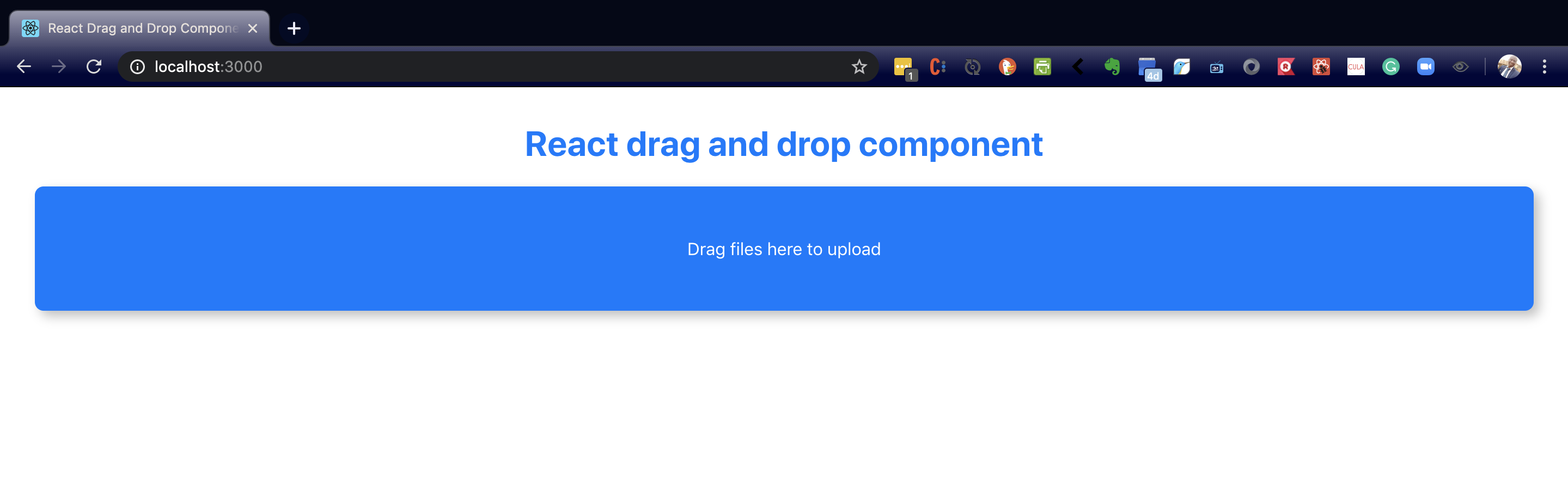
Now view the component in the browser and you should see something like the image below.
div to be converted into a drop zone (Large preview)
If you’re following with the repo, the corresponding branch is 02-start-dragndrop
Managing State With The useReducer Hook
Our next step will be to write the logic for each of our event handlers. Before we do that, we have to consider how we intend to keep track of dropped files. This is where we begin to think about state management.
We will be keeping track of the following states during the drag-and-drop operation:
dropDepth
This will be an integer. We’ll use it to keep track of how many levels deep we are in the drop zone. Later on, I will explain this with an illustration. (Credits to Egor Egorov for shining a light on this one for me!)
inDropZone
This will be a boolean. We will use this to keep track of whether we’re inside the drop zone or not.
FileList
This will be a list. We’ll use it to keep track of files that have been dropped into the drop zone.
To handle states, React provides the useState and useReducer hooks. We’ll opt for the useReducer hook given that we will be dealing with situations where a state depends on the previous state.
The useReducer hook accepts a reducer of type (state, action) => newState, and returns the current state paired with a dispatch method.
You can read more aboutuseReducerin the Reactdocs.
Inside the App component (before the return statement), add the following code:
The useReducer hook accepts two arguments: a reducer and an initial state. It returns the current state and a dispatch function with which to update the state. The state is updated by dispatching an action that contains a type and an optional payload. The update made to the component’s state is dependent on what is returned from the case statement as a result of the action type. (Note here that our initial state is an object.)
For each of the state variables, we defined a corresponding case statement to update it. The update is performed by invoking the dispatch function returned by useReducer.
Now pass data and dispatch as props to the DragAndDrop component you have in your App.js file:
<DragAndDrop data={data} dispatch={dispatch} />
At the top of the DragAndDrop component, we can access both values from props.
const { data, dispatch } = props;
If you’re following with the repo, the corresponding branch is 03-define-reducers.
Let’s finish up the logic of our event handlers. Note that the ellipsis represents the two lines:
In the illustration that follows, we have nested drop zones A and B. A is our zone of interest. This is where we want to listen for drag-and-drop events.
An illustration of the ondragenter and ondragleave events (Large preview)
When dragging into a drop zone, each time we hit a boundary, the ondragenter event is fired. This happens at boundaries A-in and B-in. Since we’re entering the zone, we increment dropDepth.
Likewise, when dragging out of a drop zone, each time we hit a boundary, the ondragleave event is fired. This happens at boundaries A-out and B-out. Since we’re leaving the zone, we decrement the value of dropDepth. Notice that we don’t set inDropZone to false at boundary B-out. That is why we have this line to check the dropDepth and return from the function dropDepth greater than 0.
if (data.dropDepth > 0) return
This is because even though the ondragleave event is fired, we’re still within zone A. It is only after we have hit A-out, and dropDepth is now 0 that we set inDropZone to false. At this point, we have left all drop zones.
Each time this event fires, we set inDropZone to true. This tells us that we’re inside the drop zone. We also set the dropEffect on the dataTransfer object to copy. On a Mac, this has the effect of showing a green plus sign as you drag an item around in the drop zone.
We can access the dropped files with e.dataTransfer.files. The value is an array-like object so we use the array spread syntax to convert it to a JavaScript array.
We now need to check if there is at least one file before attempting to add it to our array of files. We also make sure to not include files that are already on our fileList.
The dataTransfer object is cleared in preparation for the next drag-and-drop operation. We also reset the values of dropDepth and inDropZone.
Update the className of the div in the DragAndDrop component. This will conditionally change the className of the div depending on the value of data.inDropZone.
<div className={data.inDropZone ? 'drag-drop-zone inside-drag-area' : 'drag-drop-zone'}
      ...
    >
  <p>Drag files here to upload</p>
</div>
Render the list of files in App.js by mapping through data.fileList.
Now try dragging and dropping some files onto the drop zone. You’ll see that as we enter the drop zone, the background becomes less opaque because the inside-drag-area class is activated.
When you release the files inside the drop zone, you’ll see the file names listed under the drop zone:
Drop zone showing low opacity during dragover (Large preview)
A list of files dropped into the drop zone (Large preview)
The complete version of this tutorial is on the 04-finish-handlers branch.
Conclusion
We’ve seen how to handle file uploads in React using the HTML drag-and-drop API. We’ve also learned how to manage state with the useReducer hook. We could extend the file handleDrop function. For example, we could add another check to limit file sizes if we wanted. This can come before or after the check for existing files. We could also make the drop zone clickable without affecting the drag-and-drop functionality.
Tomasz Łakomy posted a joke tweet about naming all the CSS attributes and Tejas Kumar replied with a joke answer, going as far as making an npm module. You can even run a terminal command to see them:
npx get-all-css-properties
You'll get 259 of them. The source code uses the website quackit.com for the data, which I'd never heard of. 🤷♂️
I would have probably looked at MDN, where some quick querySelectorAll handiwork in the console yields a different number: 584. But ooops, that's full of selectors, at-rules, and other stuff. Their reference only lists 72, but says it's incomplete.
W3Schools lists 228 of them. HTML Dog lists 125. Our almanac has 176, and I know we omit stuff on purpose (e.g. we file margin-left under margin instead of making its own entry).
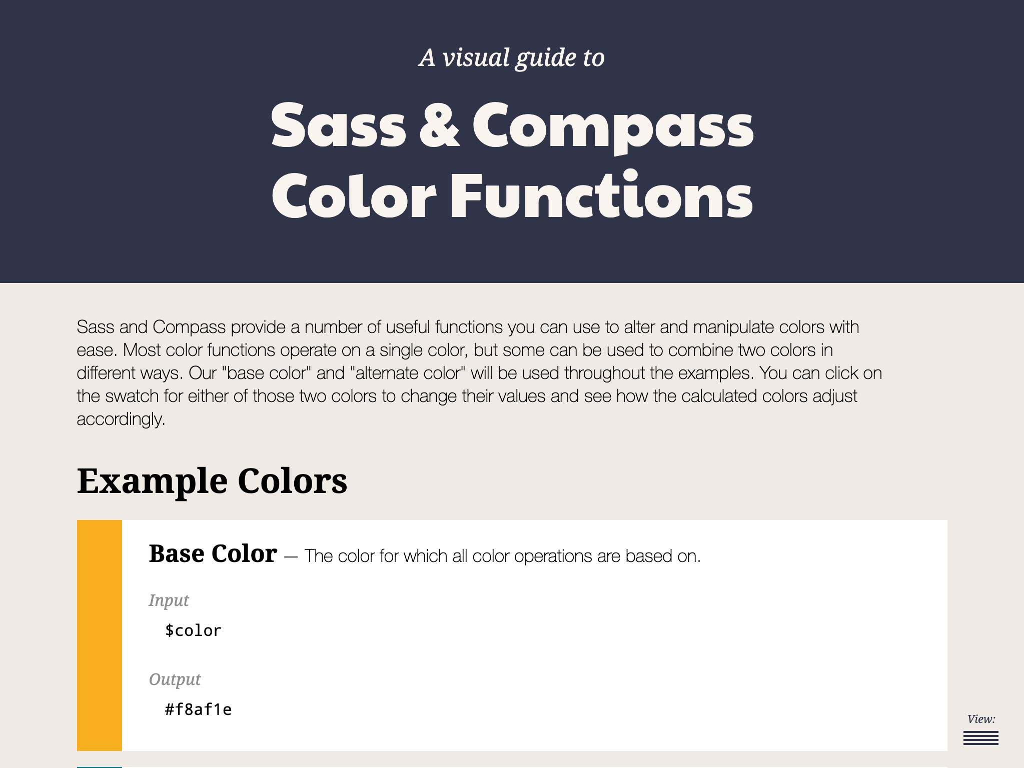
For those who may not come from a design background, selecting a color palette is often based on personal preferences. Choosing colors might be done with an online color tool, sampling from an image, "borrowing" from favorite brands, or just sort of randomly picking from a color wheel until a palette "just feels right."
Our goal is to better understand what makes a palette "feel right" by exploring key color attributes with Sass color functions. By the end, you will become more familiar with:
The value of graphing a palette’s luminance, lightness, and saturation to assist in building balanced palettes
The importance of building accessible contrast checking into your tools
Advanced Sass functions to extend for your own explorations, including a CodePen you can manipulate and fork
What you’ll ultimately find, however, is that color on the web is a battle of hardware versus human perception.
What makes color graphing useful
You may be familiar with ways of declaring colors in stylesheets, such as RGB and RGBA values, HSL and HSLA values, and HEX codes.
Those values give devices instructions on how to render color. Deeper attributes of a color can be exposed programmatically and leveraged to understand how a color relates to a broader palette.
The value of graphing color attributes is that we get a more complete picture of the relationship between colors. This reveals why a collection of colors may or may not feel right together. Graphing multiple color attributes helps hint at what adjustments can be made to create a more harmonious palette. We’ll look into examples of how to determine what to change in a later section.
Two useful measurements we can readily obtain using built-in Sass color functions are lightness and saturation.
Lightness refers to the mix of white or black with the color.
Saturation refers to the intensity of a color, with 100% saturation resulting in the purest color (no grey present).
However, luminance may arguably be the most useful color attribute. Luminance, as represented in our tool, is calculated using the WCAG formula which assumes an sRGB color space. Luminance is used in the contrast calculations, and as a grander concept, also aims to get closer to quantifying the human perception of relative brightness to assess color relationships. This means that a tighter luminance value range among a palette is likely to be perceived as more balanced to the human eye. But machines are fallible, and there are exceptions to this rule that you may encounter as you manipulate palette values. For more extensive information on luminance, and a unique color space called CIELAB that aims to even more accurately represent the human perception of color uniformity, see the links at the end of this article.
Additionally, color contrast is exceptionally important for accessibility, particularly in terms of legibility and distinguishing UI elements, which can be calculated programmatically. That’s important in that it means tooling can test for passing values. It also means algorithms can, for example, return an appropriate text color when passed in the background color. So our tool will incorporate contrast checking as an additional way to gauge how to adjust your palette.
The functions demonstrated in this project can be extracted for helping plan a contrast-safe design system palette, or baked into a Sass framework that allows defining a custom theme.
Sass as a palette building tool
Sass provides several traditional programming features that make it perfect for our needs, such as creating and iterating through arrays and manipulating values with custom functions. When coupled with an online IDE, like CodePen, that has real-time processing, we can essentially create a web app to solve specific problems such as building a color palette.
Here is a preview of the tool we’re going to be using:
It outputs an aspect ratio-controlled responsive graph for accurate plot point placement and value comparing.
It leverages the result of Sass color functions and math calculations to correctly plot points on a 0–100% scale.
It generates a gradient to provide a more traditional "swatch" view.
It uses built-in Sass functions to extract saturation and lightness values.
It creates luminance and contrast functions (forked from Material Web Components in addition to linking in required precomputed linear color channel values).
It returns appropriate text color for a given background, with a settings variable to change the ratio used.
It provides functions to uniformly scale saturation and lightness across a given palette.
Using the palette builder
To begin, you may wish to swap from among the provided example palettes to get a feel for how the graph values change for different types of color ranges. Simply copy a palette variable name and swap it for $default as the value of the $palette variable which can be found under the comment SWAP THE PALETTE VARIABLE.
Next, try switching the $contrastThreshold variable value between the predefined ratios, especially if you are less familiar with ensuring contrast passes WCAG guidelines.
Then try to adjust the $palette-scale-lightness or $palette-scale-saturation values. Those feed into the palette function and uniformly scale those measurements across the palette (up to the individual color's limit).
Finally, have a go at adding your own palette, or swap out some colors within the examples. The tool is a great way to explore Sass color functions to adjust particular attributes of a color, some of which are demonstrated in the $default palette.
Interpreting the graphs and creating balanced, accessible palettes
The graphing tool defaults to displaying luminance due to it being the most reliable indicator of a balanced palette, as we discussed earlier. Depending on your needs, saturation and lightness can be useful metrics on their own, but mostly they are signalers that can help point to what needs adjusting to bring a palette's luminance more in alignment. An exception may be creating a lightness scale based on each value in your established palette. You can swap to the $stripeBlue example for that.
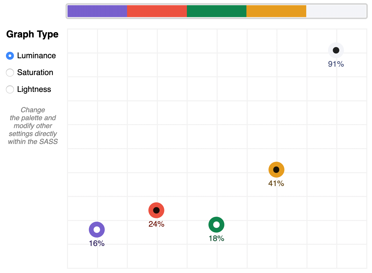
The $default palette is actually in need of adjustment to get closer to balanced luminance:
The $default palette’s luminance graph
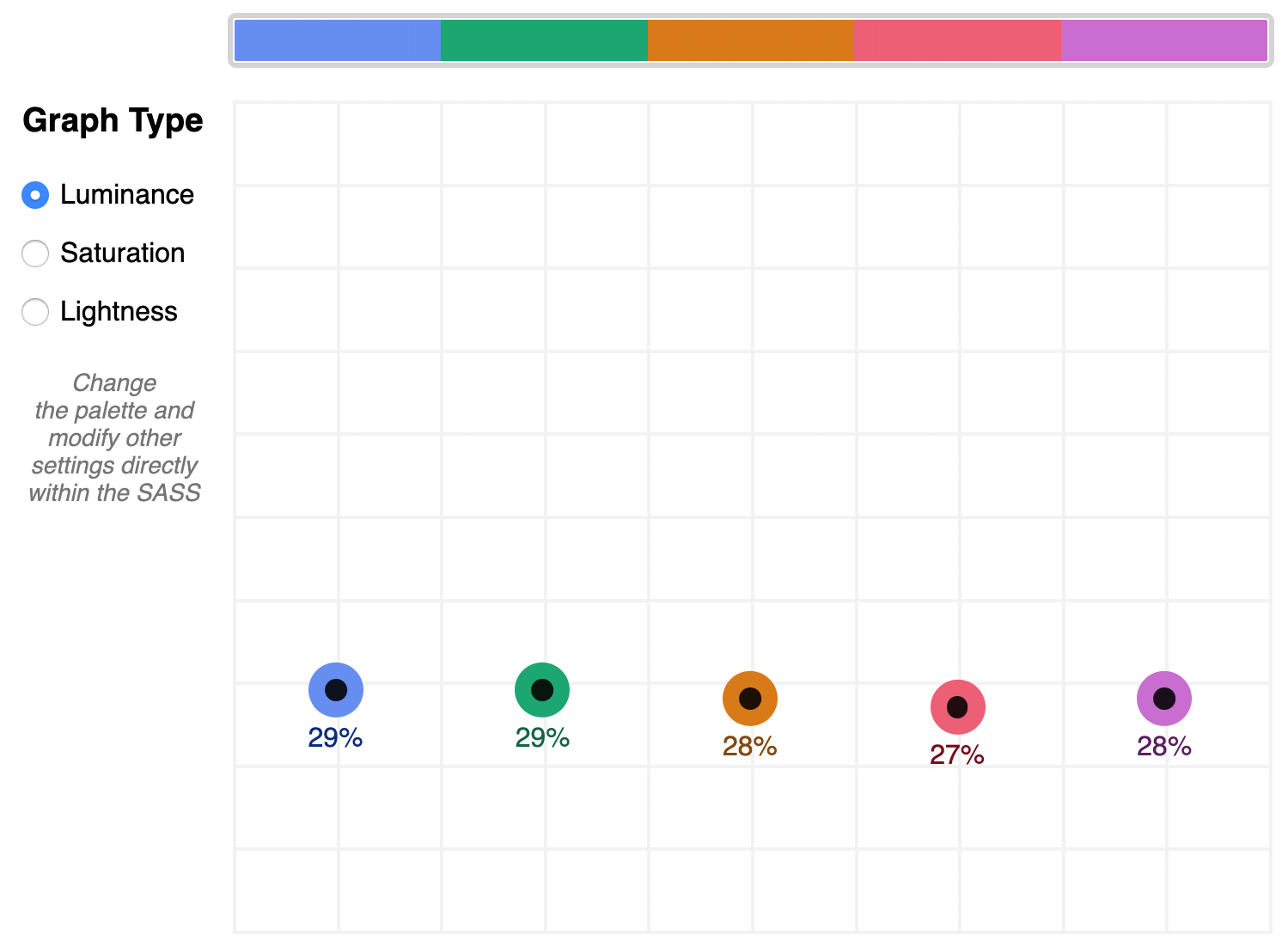
A palette that shows well-balanced luminance is the sample from Stripe ($stripe):
The $stripe palette luminance graph
Here's where the tool invites a mind shift. Instead of manipulating a color wheel, it leverages Sass functions to programmatically adjust color attributes.
Check the saturation graph to see if you have room to play with the intensity of the color. My recommended adjustment is to wrap your color value with the scale-color function and pass an adjusted $saturation value, e.g. example: scale-color(#41b880, $saturation: 60%). The advantage of scale-color is that it fluidly adjusts the value based on the given percent.
Lightness can help explain why two colors feel different by assigning a value to their brightness measured against mixing them with white or black. In the $default palette, the change-color function is used for purple to align it's relative $lightness value with the computed lightness() of the value used for the red.
The scale-color function also allows bundling both an adjusted $saturation and $lightness value, which is often the most useful. Note that provided percents can be negative.
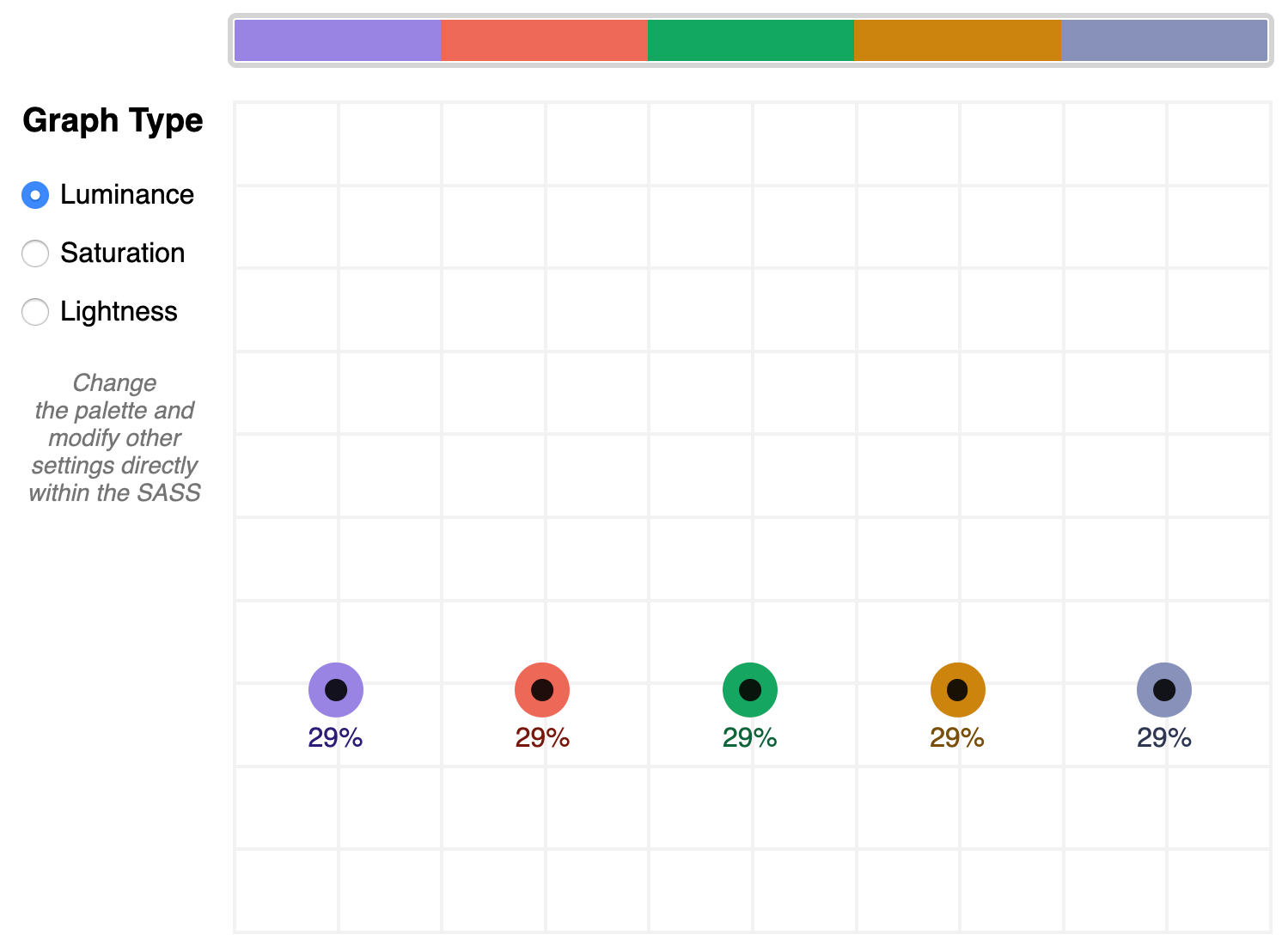
By making use of Sass functions and checking the saturation and lightness graphs, the $defaultBalancedLuminance achieves balanced luminance. This palette also uses the map-get function to copy values from the $default palette and apply further adjustments instead of overwriting them, which is handy for testing multiple variations such as perhaps a hue shift across a palette.
Contrast comes into play when considering how the palette colors will actually be used in a UI. The tool defaults to the AA contrast most appropriate for all text: 4.5. If you are building for a light UI, then consider that any color used on text should achieve appropriate contrast with white when adjusting against luminance, indicated by the center color of the plot point.
Tip: The graph is set up with a transparent background, so you can add a background rule on body if you are developing for a darker UI.
Further reading
Color is an expansive topic and this article only hits the aspects related to Sass functions. But to truly understand how to create harmonious color systems, I recommend the following resources:
Color Spaces - is a super impressive deep-dive with interactive models of various color spaces and how they are computed.
Understanding Colors and Luminance - A beginner-friendly overview from MDN on color and luminance and their relationship to accessibility.
Perpetually Uniform Color Spaces - More information on perceptually uniform color systems, with an intro the tool HSLuv that converts values from the more familiar HSL color space to the luminance-tuned CIELUV color space.
Accessible Color Systems - A case study from Stripe about their experience building an accessible color system by creating custom tooling (which inspired this exploration and article).
A Nerd's Guide to Color on the Web - This is a fantastic exploration of the mechanics of color on the web, available right here on CSS-Tricks.
Tanaguru Contrast Finder - An incredible tool to help if you are struggling to adjust colors to achieve accessible contrast.
ColorBox - A web app from Lyft that further explores color scales through graphing.
Designing Systematic Colors - Describes Mineral UI's exceptional effort to create color ramps to support consistent theming via a luminance-honed palette.
How we designed the new color palettes in Tableau 10 - Tableau exposed features of their custom tool that helped them create a refreshed palette based on CIELAB, including an approachable overview of that color space.
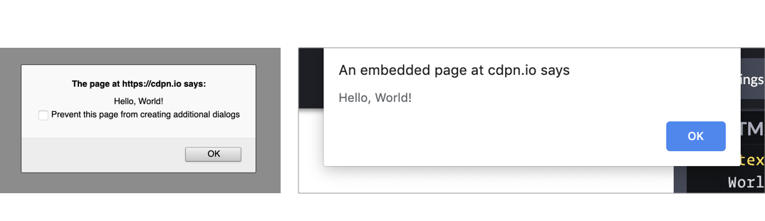
JavaScript has a variety of built-in popup APIs that display special UI for user interaction. Famously:
alert("Hello, World!");
The UI for this varies from browser to browser, but generally you’ll see a little window pop up front and center in a very show-stopping way that contains the message you just passed. Here’s Firefox and Chrome:
Native popups in Firefox (left) and Chrome (right). Note the additional UI preventing additional dialogs in Firefox from triggering it more than once. You can also see how Chrome is pinned to the top of the window.
There is one big problem you should know about up front
JavaScript popups are blocking.
The entire page essentially stops when a popup is open. You can’t interact with anything on the page while one is open — that’s kind of the point of a “modal” but it’s still a UX consideration you should be keenly aware of. And crucially, no other main-thread JavaScript is running while the popup is open, which could (and probably is) unnecessarily preventing your site from doing things it needs to do.
Nine times out of ten, you’d be better off architecting things so that you don’t have to use such heavy-handed stop-everything behavior. Native JavaScript alerts are also implemented by browsers in such a way that you have zero design control. You can’t control *where* they appear on the page or what they look like when they get there. Unless you absolutely need the complete blocking nature of them, it’s almost always better to use a custom user interface that you can design to tailor the experience for the user.
With that out of the way, let’s look at each one of the native popups.
What it’s for: Displaying a simple message or debugging the value of a variable.
How it works: This function takes a string and presents it to the user in a popup with a button with an “OK” label. You can only change the message and not any other aspect, like what the button says.
The Alternative: Like the other alerts, if you have to present a message to the user, it’s probably better to do it in a way that’s tailor-made for what you’re trying to do.
If you’re trying to debug the value of a variable, consider console.log(<code>"`Value of variable:"`, variable); and looking in the console.
window.confirm();
window.confirm("Are you sure?");

<button onclick="confirm('Would you like to play a game?');">Ask Question</button>

let answer = window.confirm("Do you like cats?");
if (answer) {
  // User clicked OK
} else {
  // User clicked Cancel
}
What it’s for: “Are you sure?”-style messages to see if the user really wants to complete the action they’ve initiated.
How it works: You can provide a custom message and popup will give you the option of “OK” or “Cancel,” a value you can then use to see what was returned.
The Alternative: This is a very intrusive way to prompt the user. As Aza Raskin puts it:
...maybe you don’t want to use a warning at all.”
There are any number of ways to ask a user to confirm something. Probably a clear UI with a <button>Confirm</button> wired up to do what you need it to do.
window.prompt();
window.prompt("What’s your name?");

let answer = window.prompt("What is your favorite color?");
// answer is what the user typed in, if anything
What it’s for: Prompting the user for an input. You provide a string (probably formatted like a question) and the user sees a popup with that string, an input they can type into, and “OK” and “Cancel” buttons.
How it works: If the user clicks OK, you’ll get what they entered into the input. If they enter nothing and click OK, you’ll get an empty string. If they choose Cancel, the return value will be null.
The Alternative: Like all of the other native JavaScript alerts, this doesn’t allow you to style or position the alert box. It’s probably better to use a <form> to get information from the user. That way you can provide more context and purposeful design.
window.onbeforeunload();
window.addEventListener("beforeunload", () => {
  // Standard requires the default to be cancelled.
  event.preventDefault();
  // Chrome requires returnValue to be set (via MDN)
  event.returnValue = '';
});
What it’s for: Warn the user before they leave the page. That sounds like it could be very obnoxious, but it isn’t often used obnoxiously. It’s used on sites where you can be doing work and need to explicitly save it. If the user hasn’t saved their work and is about to navigate away, you can use this to warn them. If they *have* saved their work, you should remove it.
How it works: If you’ve attached the beforeunload event to the window (and done the extra things as shown in the snippet above), users will see a popup asking them to confirm if they would like to “Leave” or “Cancel” when attempting to leave the page. Leaving the site may be because the user clicked a link, but it could also be the result of clicking the browser’s refresh or back buttons. You cannot customize the message.
MDN warns that some browsers require the page to be interacted with for it to work at all:
To combat unwanted pop-ups, some browsers don't display prompts created in beforeunload event handlers unless the page has been interacted with. Moreover, some don't display them at all.
The Alternative: Nothing that comes to mind. If this is a matter of a user losing work or not, you kinda have to use this. And if they choose to stay, you should be clear about what they should to to make sure it’s safe to leave.
Accessibility
Native JavaScript alerts used to be frowned upon in the accessibility world, but it seems that screen readers have since become smarter in how they deal with them. According to Penn State Accessibility:
The use of an alert box was once discouraged, but they are actually accessible in modern screen readers.
It’s important to take accessibility into account when making your own modals, but there are some great resources like this post by Ire Aderinokun to point you in the right direction.
General alternatives
There are a number of alternatives to native JavaScript popups such as writing your own, using modal window libraries, and using alert libraries. Keep in mind that nothing we’ve covered can fully block JavaScript execution and user interaction, but some can come close by greying out the background and forcing the user to interact with the modal before moving forward.
You may want to look at HTML’s native <dialog> element. Chris recently took a hands-on look) at it. It’s compelling, but apparently suffers from some significant accessibility issues. I’m not entirely sure if building your own would end up better or worse, since handling modals is an extremely non-trivial interactive element to dabble in. Some UI libraries, like Bootstrap, offer modals but the accessibility is still largely in your hands. You might to peek at projects like a11y-dialog.
Wrapping up
Using built-in APIs of the web platform can seem like you’re doing the right thing — instead of shipping buckets of JavaScript to replicate things, you’re using what we already have built-in. But there are serious limitations, UX concerns, and performance considerations at play here, none of which land particularly in favor of using the native JavaScript popups. It’s important to know what they are and how they can be used, but you probably won’t need them a heck of a lot in production web sites.
In this article, I’m going to introduce you to the CSS Fragmentation specification. You might never have heard of it, however, if you have ever created a print stylesheet and wanted to control where the content breaks between pages, or multi-column layout and wanted to stop a figure breaking between columns, you have encountered it.
I find that quite often problems people report with multicol are really problems with browser support of fragmentation. After a quick rundown of the properties contained in this specification, I’ll be explaining the current state of browser support and some of the things you can do to get it working as well as it can in your multicol and print projects.
What Is Fragmentation?
Fragmentation in CSS describes the process by which content becomes broken up into different boxes. Currently, we have two places in which we might run into fragmentation on the web: when we print a document, and if we use multi-column layout. These two things are essentially the same. When you print (or save to PDF) a webpage, the content is fragmented into as many pages as are required to print your content.
When you use multicol, the content is fragmented into columns. Each column box is like a page in the paged context. If you think of a set of columns as being much like a set of pages it can be a helpful way to think about multicol and how fragmentation works in it.
If you take a look at the CSS Fragmentation Specification you will see a third fragmented context mentioned — that context is Regions. As there are no current usable implementations of Regions, we won’t be dealing with that in this article, but instead looking at the two contexts that you might come across in your work.
Block And Inline Boxes
I am going to mention block boxes a lot in this article. Every element of your page has a box. Some of those boxes are laid out as blocks: paragraphs, list items, headings. These are said to be participating in a block formatting context. Others are inline such as the words in a paragraph, spans and anchor elements. These participate in an inline formatting context. Put simply, when I refer to a block box, I’m talking about boxes around things like paragraphs. When dealing with fragmentation, it is important to know which kind of box you are dealing with.
For more information on block and inline layout, see the MDN article “Block And Inline Layout In Normal Flow”. It is one of those things that we probably all understand on some level but might not have encountered the terminology of before.
Controlling Breaks
Whether you are creating a print stylesheet, using a specific print user agent to make a PDF,or using multicol, you will sometimes run into problems that look like this.
In the below multicol example, I have some content which I am displaying as three columns. In the middle of the content is a boxed out area, which is being broken across two columns. I don’t want this behavior — I would like the box to stay together.
To fix this, I add the property break-inside: avoid to the box. The break-inside property controls breaks inside elements when they are in a fragmented context. In a browser which supports this property, the box will now stay in one of the columns. The columns will look less well balanced, however, that is generally a better thing than ending up with the boxout split across columns.
The break-inside property is one of the properties detailed in the fragmentation spec. The full list of properties is as follows:
break-before
break-after
break-inside
orphans
widows
box-decoration-break
Let’s have a look at how these are supposed to work before we move onto what actually happens in browsers.
The break-before And break-after Properties
There are two properties that control breaks between block-level boxes: break-before and break-after. If you have an h2 followed by two paragraphs <p> you have three block boxes and you would use these properties to control the breaks between the heading and first paragraph, or between the two paragraphs.
The properties are used on selectors which target the element you want to break before or after.
For example, you might want your print stylesheet to break onto a new page every time there is a level 2 heading. In this case, you would use break-before: page on the h2 element. This controls the fragmentation and ensures there is always a break before the box of the h2 element.
h2 {
    break-before: page;
}
Another common requirement is to prevent headings ending up as the last thing on a page or column. In this case, you might use break-after with a value of avoid. This should prevent a break directly after the box of the element:
h1, h2, h3, h4 {
    break-after: avoid;
}
Fragments Within Fragments
It is possible that you might have an element that is fragmented nested inside another. For example, having a multicol inside something which is paged. In that case, you might want to control breaks for pages but not for columns, or the other way around. This is why we have values such as page which would always force a break before or after the element but only when the fragment is a page. Or avoid-page which would avoid a break before or after the element only for paged contexts.
The same applies to columns. If you use the value column, this would always force a break before or after that element, but only for multicol contexts. The value avoid-column would prevent a break in multicol contexts.
There is an always value in the Level 4 specification which indicates that you want to break through everything - page or column. However, as a recent addition to the spec it is not currently useful to us.
Additional Values For Paged Media
If you are creating a book or magazine, you have left and right pages. You might want to control breaking in order to force something onto the left or right page of a spread. Therefore, using the following would insert one or two-page breaks before the h2 to ensure it was formatted as a right page.
h2 {
    break-before: right;
}
There are also recto and verso values which relate to page progression as books written in a vertical or right to left language have a different page progression than books written in English. I’m not going to cover these values further in this article as I’m primarily concerned with what is possible from the browser this time.
break-inside
We have already seen an example of the break-inside property. This property controls breaking inside block boxes, e.g. inside a paragraph, heading or a div.
Things that you may not want to break can include a boxout as described above: figures where you do not want the caption detached from the image, tables, lists and so on. Add break-inside: avoid to any container you don’t wish to break in any fragmentation context. If you only wish to avoid breaks between columns use break-inside: avoid-column and between pages break-inside: avoid-page.
The orphans And widows Properties
The orphans and widows properties deal with how many lines should be left before or after a break (either caused by a column or a new page). For example, if I want to avoid a single line being left at the end of a column, I would use the orphans property, as in typography, an orphan is the first line of a paragraph that appears alone at the bottom of a page with the rest of the paragraph broken onto another page. The property should be added to the same element which is fragmenting (in our case, the multicol container).
.container {
    column-count: 3;
    orphans: 2;
}
To control how many lines should be at the top of a column or page after a break, use widows:
.container {
    column-count: 3;
    widows: 2;
}
These properties deal with breaks between inline boxes such as the lines of words inside a paragraph. Therefore, they don’t help in the situation where a heading or other block element is alone at the bottom of a column or page, you need the break properties discussed above for that.
Box Decoration
A final property that may be of interest is the box-decoration-break property. This controls the situation where you have a box with a border broken between two column boxes or pages. Do you want the border to essentially be sliced in half? Or do you want each of the two halves of the box to be wrapped fully in a border?
The first scenario is the default, and is as if you set the box-decoration-break property to slice on the box.
.box {
    box-decoration-break: slice;
}
A value of slice means the border is effectively sliced in half (Large preview)
To get the second behavior, set box-decoration-break to clone.
.box {
    box-decoration-break: clone;
}
A value of clone means the border is wrapped fully round each fragment of the box (Large preview)
Browser Support For Fragmentation
Now we come to the reason I don’t have a bunch of CodePen examples above to demo all of this to you, and the main reason for my writing this article. Browser support for these properties is not great.
If you are working in Paged Media with a specific user agent such as Prince, then you can enjoy really good support for fragmentation, and will probably find these properties very useful. If you are working with a web browser, either in multicol, creating print stylesheets, or using something like Headless Chrome to generate PDFs, support is somewhat patchy. You’ll find that the browser with the best support is Edge — until it moves to Chromium anyway!
Can I Use isn’t overly helpful with explaining support due to mixing the fragmentation properties in with multicol, then having some separate data for legacy properties. So, as part of the work I’ve been doing for MDN to document the properties and their support, I began testing the actual browser support. What follows is some advice based on that testing.
Legacy And Vendor Prefixed Properties
I can’t go much further without a history lesson. If you find you really need support for fragmentation then you may find some relief in the legacy properties which were originally part of CSS2 (or in some prefixed properties that exist).
In CSS2, there were properties to control page breaking. Multicol didn’t exist at that point, so the only fragmented context was a paged one. This meant that three specific page breaking properties were introduced:
page-break-before
page-break-after
page-break-inside
These work in a similar way to the more generic properties without the page- prefix, controlling breaks before, after and inside boxes. For print stylesheets, you will find that some older browsers which do not support the new break- properties, do support these page prefixed properties. The properties are being treated as aliases for the new properties.
In a 2005 Working Draft of the multicol specification are details of breaking properties for multicol — using properties prefixed with column- (i.e. column-break-before, column-break-after, and column-break-inside). By 2009, these had gone, and a draft was in the multicol specification for unprefixed break properties which eventually made their way into the CSS Fragmentation specification.
However, some vendor prefixed column-specific properties were implemented based on these properties. These are:
-webkit-column-break-before
-webkit-column-break-after
-webkit-column-break-inside
Support For Fragmentation In Multicol
The following is based on testing these features in multicol contexts. I’ve tried to explain what is possible, but do take a look at the CodePens in whichever browsers you have available.
Multicol And break-inside
Support in multicol is best for the break-inside property. Up to date versions of Chrome, Firefox, Edge, and Safari all support break-inside: avoid. So you should find that you can prevent boxes from breaking between columns when using multicol.
Several browsers, with the exception of Firefox, support the -webkit-column-break-inside property, this can be used with a value of avoid and may prevent boxes breaking between columns which do not have support for break-inside.
Firefox supports page-break-inside: avoid in multicol. Therefore, using this property will prevent breaks inside boxes in Firefox browsers prior to Firefox 65.
This means that if you want to prevent breaks between boxes in multicol, using the following CSS will cover as many browsers as possible, going back as far as possible.
In order to prevent breaks before an element, you should be able to use break-before: avoid or break-before: avoid-column. The avoid property has no browser support.
Edge supports break-before: column to always force a break before the box of the element.
Safari, Chrome and Edge also support -webkit-column-break-before: always which will force a break before the box of the element. Therefore, if you want to force a break before the box of an element, you should use:
To prevent breaks after an element, to avoid it becoming the last thing at the bottom of a column, you should be able to use break-after: avoid and break-after: avoid-column. The only browser with support for these is Edge.
Edge also supports forcing breaks after an element by using break-after: column, Chrome supports break-after: column and also -webkit-column-break-after: always.
Firefox does not support break-after or any of the prefixed properties to force or allow breaks after a box.
Therefore, other than Edge, you cannot really avoid breaks after a box. If you want to force them, you will get results in some browsers by using the following CSS:
Whether you print directly from your desktop browser or generate PDF files using headless Chrome or some other solution reliant on browser technology doesn’t make any difference. You are reliant on the browser support for the fragmentation properties.
If you create a print stylesheet you will find similar support for the break properties as for multicol, however, to support older browsers you should double up the properties to use the page- prefixed properties.
Print Stylesheets And break-inside
In modern browsers ,the break-inside property can be used to prevent breaks inside boxes, add the page-break-inside property to add support for older browsers.
There is better support for the page and avoid-page values than we see for the equivalent multicol values. The majority of modern browsers have support.
Print Stylesheets And break-before
To force breaks after a box, use break-after: page along with page-break-after: always.
The widows and orphans properties enjoy good cross-browser support — the only browser without an implementation being Firefox. I would suggest using these when creating a multicol layout or print stylesheet. If they don’t work for some reason, you will get widows and orphans, which isn’t ideal but also isn’t a disaster. If they do work your typography will look all the better for it.
box-decoration-break
The final property of box-decoration-break has support for multicol and print in Firefox. Safari, Chrome and other Chromium-based browsers support -webkit-box-decoration-break, but only on inline elements. So you can clone borders round lines of a sentence for example; they do not have support in the context we are looking at.
In the CodePen below, you can see that testing for -webkit-box-decoration-break: clone with Feature Queries returns true, however, the property has no effect on the border of the box in the multicol context.
As you can see, the current state of fragmentation in browsers is somewhat fragmented! That said, there is a reasonable amount you can achieve and where it fails, the result tends to be suboptimal but not a disaster. Which means it is worth trying.
It is worth noting that being too heavy handed with these properties could result in something other than what you hoped for. If you are working on the web rather than print and force column breaks after every paragraph, then end up with more paragraphs than space for columns, multicol will end up overflowing in the inline direction. It will run out of columns to place your additional paragraphs. Therefore, even where there is support, you still need to test carefully, and remember that less is more in a lot of cases.
More Resources
To read more about the properties head over to MDN, I’ve recently updated the pages there and am also trying to keep the browser compat data up to date. The main page for CSS Fragmentation links to the individual property pages which have further examples, browser compat data and other information about using these properties.
Space is vast. Space is awesome. Space is difficult to understand — or so people tend to think. But in this tutorial I am going to show you that this is not the case. Quite the contrary; the laws that govern the motion of the stars, planets, asteroids and even entire galaxies are incredibly simple. You could argue that if our Universe was created by a developer, she sure was concerned about writing clean code that would be easy to maintain and scale.
What we are going to do is create a simulation of the inner region of our solar system using nothing but plain old JavaScript. It will be a gravitational n-body simulation where every mass feels the gravity of all the other masses being simulated. To spice things up, I will also show how you can enable users of your simulator to add planets of their own to the simulation with nothing but a little bit of mouse drag action, and in doing so, cause all sorts of cosmic mayhem. A gravity or space simulator would not be worthy of its name without motion trails, so I will show you how to create some fancy looking trails, too, in addition to some other shenanigans that will make the simulator a little bit more fun for the average user.
You will find the complete source code for this project in the Pen above. There is nothing fancy going on there. No bundling of modules, or transpilation of TypeScript or JSX into JavaScript; just HTML markup, CSS, and a healthy dose of JavaScript.
I came up with the idea for this while working on a project that is close to my heart, namely Harmony of the Spheres. Harmony of the Spheres is open source and very much a work in progress, so if you enjoy this tutorial and got your appetite for all things space and physics related going, check out the repository and fire away a pull request if you find a bug or have a cool new feature that you would like to see implemented.
For this tutorial, it is assumed that you have a basic grasp of JavaScript and the syntax and features that were introduced with ES6. Also, if you are able to draw a rectangle onto a canvas element, that would help, too. If you are not yet in possession of this knowledge, I suggest you head over to MDN and start reading up on ES6 classes, arrow functions, shorthand notation for defining key-value pairs for object literals and const and let. If you are not quite sure how to set up a canvas animation, go check out the documentation on the Canvas API on MDN.
Part 1: Writing a Gravitational N-Body Algorithm
To achieve the goal outlined above, we are going to draw on numerical integration, which is an approach to solving gravitational n-body problems where you take the positions and velocities of all objects at a given time (T), calculate the gravitational force they exert on each other and update their velocities and positions at time (T + dt, dt being shorthand for delta time), or in other words, the change in time between iterations. Repeating this process, we can trace the trajectories of a set of masses through space and time.
We will use a Cartesian coordinate system for our simulation. The Cartesian coordinate system is based on three mutually perpendicular coordinate axes: the x-axis, the y-axis, and the z-axis. The three axes intersect at the point called the origin, where x, y and z are equal to 0. An object in a Cartesian space has a unique position that is defined by its x, y and z values. The benefit of using the Cartesian coordinate system for our simulation is that the Canvas API, with which we will visualize our simulation, uses it, too.
For the purpose of writing an algorithm for solving the gravitational n-body problem, it is necessary to have an understanding of what is meant by velocity and acceleration. Velocity is the change in position of an object with time, while acceleration is the change in an object's velocity with time. Newton's first law of motion stipulates that every object will remain at rest or in uniform motion in a straight line unless compelled to change its state by the action of an external force. The Earth does not move in a straight line, but orbits the Sun, so clearly it is accelerating, but what is causing this acceleration? As you have probably guessed, given the subject matter of this tutorial, the answer is the gravitational forces exerted on Earth by the Sun, the other planets in our solar system and every other celestial object in the Universe.
Before we discuss gravity, let us write some pseudo code for updating the positions and velocities of a set of masses in Cartesian space. We store our masses as objects in an array where each object represents a mass with x, y and z position and velocity vectors. Velocity vectors are prefixed with a v — v for velocity!
Looking at the code above, we can see that — as outlined in our discussion on numerical integration — every time we advance the simulation by a given time step, dt, we update the velocities of the masses being simulated and, with those velocities, we update the positions of the masses. The relationship between position and velocity is also made clear in the code above, as we can see that in one step of our simulation, the change in, for example, the x position vector of our mass is equal to the product of the mass's x velocity vector and dt. Similarly, we can make out the relationship between velocity and acceleration.
How, then, do we get the x, y and z acceleration vectors for a mass so that we can calculate the change in its velocity vectors? To get the contribution of massJ to the x acceleration vector of massI, we need to calculate the gravitational force exerted by massJ on massI, and then, to obtain the x acceleration vector, we simply calculate the product of this force and the distance between the two masses on the x axis. To get the y and z acceleration vectors, we follow the same procedure. Now we just have to figure out how to calculate the gravitational force exerted by massJ on massI to be able to write some more pseudo code. The formula we are interested in looks like this:
f = g * massJ.m / dSq * (dSq + s)^1/2
The formula above tells us that the gravitational force exerted by massJ on massI is equal to the product of the gravitational constant (g) and the mass of massJ (massJ.m) divided by the product of the sum of the squares of the distance between massI and massJ on the x, y and z axises (dSq) and the square root of dSq + s, where s is what is referred to as a softening constant (softeningConstant). Including a softening constant in our gravity calculations prevents a situation where the gravitational force exerted by massJ becomes infinite because it is too close to massI. This "bug," if you will, in the Newtonian theory of gravity arises for the reason that Newtonian gravity treats masses as point objects, which they are not in reality. Moving on, to get the net acceleration of massI along, for example, the x axis, we simply sum the acceleration induced on it by every other mass in the simulation.
Let us transform the above into code for updating the acceleration vectors of all the masses in the simulation.
const updateAccelerationVectors = (masses, g, softeningConstant) => {
  const massesLen = masses.length;

  for (let i = 0; i < massesLen; i++) {
    let ax = 0;
    let ay = 0;
    let az = 0;

    const massI = masses[i];

    for (let j = 0; j < massesLen; j++) {
      if (i !== j) {
        const massJ = masses[j];

        const dx = massJ.x - massI.x;
        const dy = massJ.y - massI.y;
        const dz = massJ.z - massI.z;

        const distSq = dx * dx + dy * dy + dz * dz;

        f = (g * massJ.m) / (distSq * Math.sqrt(distSq + softeningConstant));

        ax += dx * f;
        ay += dy * f;
        az += dz * f;
      }
    }

    massI.ax = ax;
    massI.ay = ay;
    massI.az = az;
  }
};
We iterate over all the masses in the simulation, and for every mass we calculate the contribution to its acceleration by the other masses in a nested loop and increment the acceleration vectors accordingly. Once we are out of the nested loop, we update the acceleration vectors of massI, which we can then use to calculate its new velocity vectors! Whowie. That was a lot. We now know how to update the position, velocity and acceleration vectors of n bodies in a gravity simulation using numerical integration.
But wait; there is something missing. That is right, we have talked about distance, mass and time, but we have never specified what units we ought to use for these quantities. As long as we are consistent, the choice is arbitrary, but generally speaking, it is a good idea to go for units that are suitable for the scales under consideration, so as to avoid awkwardly long numbers. In the context of our solar system, scientists tend to use astronomical units for distance, solar masses for mass and years for time. Adopting this set of units, the value of the gravitational constant (g in the formula for calculating the gravitational force exerted by massJ on massI) is 39.5. For the position and velocity vectors of the Sun and planets of the inner solar system — Mercury, Venus, Earth and Mars — we turn to NASA JPL's HORIZONS Web-Interface where we change the output setting to vector tables and the units to astronomical units and days. For whatever reason, Horizons does not serve vectors with years as the unit of time, so we have to multiply the velocity vectors by 365.25, the number of days in a year, to obtain velocity vectors that are consistent with our choice of years as the unit of time.
To think, that with the simple equations and laws discussed above, we can calculate the motion of every galaxy, star, planet and moon contained within this dazzling cosmic panorama captured by the Hubble Telescope, is nothing short of awe-inspiring. It is not for nothing Newton’s theory of gravity is referred to as "Newton’s law of universal gravitation."
A JavaScript class seems like an excellent way of encapsulating the methods we wrote above together with the data on the masses and the constants we need for our simulation, so let us do some refactoring:
class nBodyProblem {
  constructor(params) {
    this.g = params.g;
    this.dt = params.dt;
    this.softeningConstant = params.softeningConstant;

    this.masses = params.masses;
  }

  updatePositionVectors() {
    const massesLen = this.masses.length;

    for (let i = 0; i < massesLen; i++) {
      const massI = this.masses[i];

      massI.x += massI.vx * this.dt;
      massI.y += massI.vy * this.dt;
      massI.z += massI.vz * this.dt;
    }

    return this;
  }

  updateVelocityVectors() {
    const massesLen = this.masses.length;

    for (let i = 0; i < massesLen; i++) {
      const massI = this.masses[i];

      massI.vx += massI.ax * this.dt;
      massI.vy += massI.ay * this.dt;
      massI.vz += massI.az * this.dt;
    }
  }

  updateAccelerationVectors() {
    const massesLen = this.masses.length;

    for (let i = 0; i < massesLen; i++) {
      let ax = 0;
      let ay = 0;
      let az = 0;

      const massI = this.masses[i];

      for (let j = 0; j < massesLen; j++) {
        if (i !== j) {
          const massJ = this.masses[j];

          const dx = massJ.x - massI.x;
          const dy = massJ.y - massI.y;
          const dz = massJ.z - massI.z;

          const distSq = dx * dx + dy * dy + dz * dz;

          const f =
            (this.g * massJ.m) /
            (distSq * Math.sqrt(distSq + this.softeningConstant));

          ax += dx * f;
          ay += dy * f;
          az += dz * f;
        }
      }

      massI.ax = ax;
      massI.ay = ay;
      massI.az = az;
    }

    return this;
  }
}
That looks much nicer! Let us create an instance of this class. To do so, we need to specify three constants, namely the gravitational constant (g), the time step of the simulation (dt) and the softening constant (softeningConstant). We also need to populate an array with mass objects. Once we have all of those, we can create an instance of the nBodyProblem class, which we will call the innerSolarSystem, since, well, our simulation is going to be of the inner solar system!
const g = 39.5;
const dt = 0.008; // 0.008 years is equal to 2.92 days
const softeningConstant = 0.15;

const masses = [{
    name: "Sun", // We use solar masses as the unit of mass, so the mass of the Sun is exactly 1
    m: 1,
    x: -1.50324727873647e-6,
    y: -3.93762725944737e-6,
    z: -4.86567877183925e-8,
    vx: 3.1669325898331e-5,
    vy: -6.85489559263319e-6,
    vz: -7.90076642683254e-7
  }
  // Mercury, Venus, Earth and Mars data can be found in the pen for this tutorial
];

const innerSolarSystem = new nBodyProblem({
  g,
  dt,
  masses: JSON.parse(JSON.stringify(masses)),
  softeningConstant
});
At this moment, you are probably looking at how I instantiated the nBodyProblem class and asking yourself what is up with the JSON parsing and string-ifying nonsense. The reason for why I went about passing the data contained in the masses array to the nBodyProblem constructor in this way is that we want our users to be able to reset the simulation. However, if we pass the masses array itself to the constructor of the nBodyProblem class when we create an instance of it, and then set the value of the masses property of this instance to be equal to the masses array when the user clicks the reset button, the simulation would not have been reset; the state of the masses from the end of the previous simulation run would still be there, and so would any masses the user had added. To solve this problem, we need to pass a clone of the masses array when we instantiate the nBodyProblem class or reset the simulation, so as to avoid modifying the masses array, which we need to keep pristine and untouched, and the easiest way of cloning it is to simply parse a string-ified version of it.
Okay, moving on: to advance the simulation by one step, we simply call:
Congratulations. You are now one step closer to collecting a Nobel prize in physics!
Part 2: Creating a Visual Manifestation for our Masses
We could represent our masses with cute little circles created with the Canvas API's arc method, but that would look kind of dull, and we would not get a sense of the trajectories of our masses through space and time, so let us write a JavaScript class that will be our template for how our masses manifest themselves visually. It will create a circle that leaves a predetermined number of smaller and faded circles where it has been before, which conveys a sense of motion and direction to the user. The farther you get from the current position of the mass, the smaller and more faded out the circles will become. In this way, we will have created a pretty looking motion trail for our masses.
The constructor accepts three arguments, namely the drawing context for our canvas element (ctx), the length of the motion trail (trailLength) that represents the number of previous positions of our mass that the trail will visualize and finally the radius (radius) of the circle that represents the current position of our mass. In the constructor we will also initialize an empty array that we will call positions, which will — quell surprise — store the current and previous positions of the mass that are included in the motion trail.
At this point, our manifestation class looks like this:
How do we go about populating the positions array with positions and making sure that we do not store more positions than the number specified by the trailLength property? The answer is that we add a method to our class that accepts the x and y coordinates of the mass's position as arguments and stores them in an object in the array using the array push method, which appends an element to an array. This means that the current position of the mass will be the last element in the positions array. To make sure we do not store more positions than specified when we instantiated the class, we check if the length of the positions array is greater than the trailLength property. If it is, we use the array shift method to remove the first element, which represents the oldest stored position of the positions array.
class Manifestation {

  constructor() { /* The code for the constructor outlined above */ }

  storePosition(x, y) {
    this.positions.push({ x, y });

    if (this.positions.length > this.trailLength)
      this.positions.shift();
  }

}
Okay, let us write a method that draws our motion trail. As you have probably guessed, it will accept two arguments, namely the x and y positions of the mass we are drawing the trail for. The first thing we need to do is to store the new position in the positions array and discard any superfluous positions stored in it. Then we iterate over the positions array and draw a circle for every position and voilà, we have ourselves a motion trail! But it does not look very nice, and I promised you that our trail would be pretty with circles that would become increasingly smaller and faded out according to how close they were to the current position of our mass in time.
What we need is, clearly, a scale factor whose size depends on how far away the position we are drawing is from the current position of our mass in time! An excellent way of obtaining an appropriate scale factor, for our intents and purposes, is to simply divide the index (i) of the circle being drawn by the length of the positions array. For example, if the number of elements allowed in the positions array is 25, element number 23 in that array will get a scale factor of 23 / 25, which gives us 0.92. Element number 5, on the other hand, will get a scale factor of 5 / 25, which gives us 0.2; the scale factor decreases the further we get from the current position of our mass, which is the relationship we want! Do note that we need a condition that makes sure that if the circle being drawn represents the current position, the scale factor is set to 1, as we do not want that circle to be either faded or smaller, for that matter. With all this in mind, let us write the code for the draw method of our Manifestation class.
class Manifestation {

  constructor() { /* The code for the constructor outlined above */ }

  storePosition() { /* The code for the storePosition method discussed above */ }

  draw(x, y) {
    this.storePosition(x, y);

    const positionsLen = this.positions.length;

    for (let i = 0; i < positionsLen; i++) {
      let transparency;
      let circleScaleFactor;

      const scaleFactor = i / positionsLen;

      if (i === positionsLen - 1) {
        transparency = 1;
        circleScaleFactor = 1;
      } else {
        transparency = scaleFactor / 2;
        circleScaleFactor = scaleFactor;
      }

      this.ctx.beginPath();
      this.ctx.arc(
        this.positions[i].x,
        this.positions[i].y,
        circleScaleFactor * this.radius,
        0,
        2 * Math.PI
      );
      this.ctx.fillStyle = `rgb(0, 12, 153, ${transparency})`;

      this.ctx.fill();
    }
  }

}
Part 3: Visualizing Our Simulation
Let us write some canvas boilerplate and bind it together with the gravitational n-body algorithm and the motion trails, so that we can get an animation of our inner solar system simulation up and running. As mentioned in the introduction to this tutorial, I do not discuss the Canvas API in any great depth, as this is not an introductory tutorial on the Canvas API, so if you find yourself looking rather bemused and or perplexed, make haste and change this state of affairs by heading over to MDN’s documentation on the subject.
Before we continue, though, here is the HTML markup for our simulator:
Now, we turn to the interesting part: the JavaScript. We start by getting a reference to the canvas element and then we proceed by getting its drawing context. Next, we set the dimensions of our canvas element. When it comes to canvas animations on the web, I do not spare any expenses in terms of screen real estate, so let us set the width and height properties of the canvas element to the width and height of the browser window, respectively. You will notice that I have drawn on a peculiar syntax for setting the width and height of the canvas element in that I have declared, in one statement, that the width variable is equal to the width property of the canvas element which, in turn, is equal to the width of the window. Some developers frown upon the use of this syntax, but I find it to be semantically beautiful. If you do not feel the same way, you can deconstruct that statement into two statements. Generally speaking, do whatever you feel most comfortable with, or if you find yourself collaborating with others, what the team has agreed on.
At this point, we are going to declare some constants for our animation. More specifically, there are three of them. The first is the radius (radius) of the circle, which represents the current position of a mass, in pixels. The second is the length of our motion trail (trailLength), which is the number of previous positions that it includes. Last, but not least, we have the scale (scale) constant, which represents the number of pixels per astronomical unit; Earth is one astronomical unit from the Sun, so if we did not introduce this scale factor, our inner solar system would look very claustrophobic, to say the least.
Let us now turn to the visual manifestations of the masses we are simulating. We have written a class that encapsulates their behavior, but how do we instantiate and work with these manifestations in our code? The most convenient and elegant way would be to populate every element of the masses array we are simulating with an instance of the Manifestation class, so let us write a simple method that iterates over these masses and does just that, which we then invoke.
const populateManifestations = masses => {
  masses.forEach(
    mass =>
    (mass["manifestation"] = new Manifestation(
      ctx,
      trailLength,
      radius
    ))
  );
};

populateManifestations(innerSolarSystem.masses);
Our simulator is meant to be a playful affair, so it is only to be expected that users will spawn masses left and right and that after a minute, or so, the inner solar system will look like an unrecognizable cosmic mess, which is why I think it would be decent of us to provide them with the ability to reset the simulation. To achieve this goal, we start by attaching an event listener to the reset button, and then we write a callback for this event listener that sets the value of the masses property of the innerSolarSystem object to a clone of the masses array. As we cloned the masses array, we no longer have the manifestations of our masses in it, so we call the populateManifestations method to make sure that our users have something to look at after having reset the simulation.
Okay, enough setting things up. Let us breathe some life into the inner solar system by writing a method that, with the help of the requestAnimationFrame API, will run 60 steps of our simulation a second and animate the results with motion trails and labels for the planets of the inner solar system and the Sun.
The first thing this method does is advance the inner solar system by one step and it does so by updating the position, acceleration and velocity vectors of its masses. Then we prepare the canvas element for the next animation cycle by clearing it of what was drawn in the preceding animation cycle using the Canvas API’s clearRect method.
Next, we iterate over the masses array and invoke the draw method of each mass manifestation. Moreover, if the mass being drawn has a name, we draw it onto the canvas, so that the user can see where the original planets are after things have gone haywire. Looking at the code in the loop, you will probably notice that we are not setting, for example, the value of the mass’s x coordinate on the canvas to massI times scale, and that we are in fact setting it to the width of the viewport divided by two plus massI times scale. Why is this? The answer is that the origin (x = 0, y = 0) of the canvas coordinate system is set to the top left corner of the canvas element, so to center our simulation on the canvas where it is clearly visible to the user, we must include this offset.
After the loop, at the end of the animate method, we call requestAnimationFrame with the animate method as the callback, and then the whole process discussed above is repeated again, creating yet another frame — and run in quick succession, these frames have brought the inner solar system to life. But wait, we have missed something! If you were to run the code I have walked you through thus far, you would not see anything at all. Fortunately, all we have to do to change this sad state of affairs is to proverbially give the inner solar system a kick in its rear end (no, I am not going to fall for the temptation of inserting a Uranus joke here; grow up!) by invoking the animate method!
const animate = () => {
  innerSolarSystem
    .updatePositionVectors()
    .updateAccelerationVectors()
    .updateVelocityVectors();

  ctx.clearRect(0, 0, width, height);

  const massesLen = innerSolarSystem.masses.length;

  for (let i = 0; i < massesLen; i++) {
    const massI = innerSolarSystem.masses[i];

    const x = width / 2 + massI.x * scale;
    const y = height / 2 + massI.y * scale;

    massI.manifestation.draw(x, y);

    if (massI.name) {
      ctx.font = "14px Arial";
      ctx.fillText(massI.name, x + 12, y + 4);
      ctx.fill();
    }
  }

  requestAnimationFrame(animate);
};

animate();
Our visualization of Mercury, Venus, Earth and Mars going about their day-to-day business of running circles around the sun. Looks pretty neat.
Woah! We have now gotten to the point where our simulation is animated, with the masses represented by dainty little blue circles stalked by marvelous looking motion trails. That is pretty cool in itself, if you were to ask me; but I did promise to also show how you can enable the user to add masses of their own to the simulation with a little bit of mouse drag action, so we are not done quite yet!
Part 4: Adding Masses with the Mouse
The idea here is that the user should be able to press down on the mouse button and draw a line by dragging it; the line will start where the user pressed down and end at the current position of the mouse cursor. When the user releases the mouse button, a new mass is spawned at the position of the screen where the user pressed down the mouse button, and the direction the mass will move is determined by the direction of the line; the length of the line determines the velocity vectors of the mass. So, how do we go about implementing this? Let us run through what we need to do, step by step. The code for steps one through six go above the animate method, while the code for step seven is a small addition to the animate method.
1. We need two variables that will store the x and y coordinates where the user pressed down the mouse button on the screen.
let mousePressX = 0;
let mousePressY = 0;
2. We need two variables that store the current x and y coordinates of the mouse cursor on the screen.
let currentMouseX = 0;
let currentMouseY = 0;
3. We need one variable that keeps track of whether the mouse is being dragged or not. The mouse is being dragged in the time that passes from when the user has pressed down the mouse button to the point where he releases it.
let dragging = false;
4. We need to attach a mousedown listener to the canvas element that logs the x and y coordinates of where the mouse was pressed down and sets the dragging variable to true.
6. We need to attach a mouseup listener to the canvas element that sets the drag variable to false, and pushes a new object representing a mass into the innerSolarSystem.masses array where the x and y position vectors are the point where the user pressed down the mouse button divided by value of the scale variable.
If we did not divide these vectors by the scale variable, the added masses would end up way out in the solar system, which is not what we want. The z position vector is set to zero and so is the z velocity vector. The x velocity vector is set to the x coordinate where the mouse was released subtracted by the x coordinate where the mouse was pressed down, and then you divide this number by 35. I will be honest and admit that 35 is a magical number that just happens to give you reasonable velocities when you add masses with the mouse to the inner solar system. Same procedure for the y velocity vector. The mass (m) of the mass we are adding is set by the user with a select element that we have populated with the masses of some famous celestial objects in the HTML markup. Last, but not least, we populate the object representing our mass with an instance of the Manifestation class so that the user can see it on the screen!
7. In the animate function, after the loop where we draw our manifestations and, before we call requestAnimationFrame, check if the mouse is being dragged. If that is the case, we’ll draw a line between the position where the mouse was pressed down and the mouse cursors current position.
const animate = () => {
  // Preceding code in the animate method down to and including the loop where we draw our mass manifestations

  if (dragging) {
    ctx.beginPath();
    ctx.moveTo(mousePressX, mousePressY);
    ctx.lineTo(currentMouseX, currentMouseY);
    ctx.strokeStyle = "red";
    ctx.stroke();
  }

  requestAnimationFrame(animate);
};
The inner solar system is about to get a lot more interesting — we can now add masses to our simulation!
Adding masses to our simulation with your mouse is not more difficult than that! Now, grab your mouse and unleash some mayhem on the inner solar system.
Part 5: Fencing off the Inner Solar System
As you will probably have noticed after adding some masses to the simulation, celestial objects are very shenanigan-prone in that they have a tendency to dance their way out of the viewport, especially if the added masses are very massive or they have too high of a velocity, which is kind of annoying. The natural solution to this problem is, of course, to fence off the inner solar system so that if a mass reaches the edge of the viewport, it will bounce back in! Sounds like quite a project, implementing this functionality, but fortunately doing so is a rather simple affair. At the end of the loop where we iterate over the masses and draw them in the animate method, we have insert two conditions: one that checks if our mass is outside the bounds of the viewport on the x-axis, and another that does the same check for the y axis. If the position of our mass is outside of the viewport on the x axis we reverse its x velocity vector so that it bounces back into the viewport, and the same logic applies if our mass is outside of the viewport on the y axis. With these two conditions, the animate method will look like so:
const animate = () => {
  // Advance the simulation by one step; clear the canvas

  for (let i = 0; i < massesLen; i++) {

    // Preceding loop code

    if (x < radius || x > width - radius) massI.vx = -massI.vx;

    if (y < radius || y > height - radius) massI.vy = -massI.vy;
  }

  requestAnimationFrame(animate);
};
Absolute madness! Venus, you silly planet, what are you doing out there?! You are supposed to be orbiting the Sun!
Ping, pong! It is almost as though we are playing a game of cosmic billiards with all those masses bouncing off the fence that we have built for the inner solar system!
Concluding Remarks
People have a tendency to think of orbital mechanics — which is what we have played around with in this tutorial — as something that is beyond the understanding of mere mortals such as yours truly. Truth, though, is that orbital mechanics follows a very simple and elegant set of rules, as this tutorial is a testament to. With a little bit of JavaScript and high-school mathematics and physics, we have reconstructed the inner solar system to a reasonable degree of accuracy, and gone beyond that to make things a little bit more spicy and, therefore, more interesting. With this simulator, you can answer silly what-if questions along the lines of, "What would happen if I flung a star with the mass of the Sun into our inner solar system?" or develop a feeling for Kepler's laws of planetary motion by, for example, observing the relationship between the distance of a mass from the Sun and its velocity.
I sure had fun writing this tutorial, and it is my sincere hope that you had as much fun reading it!


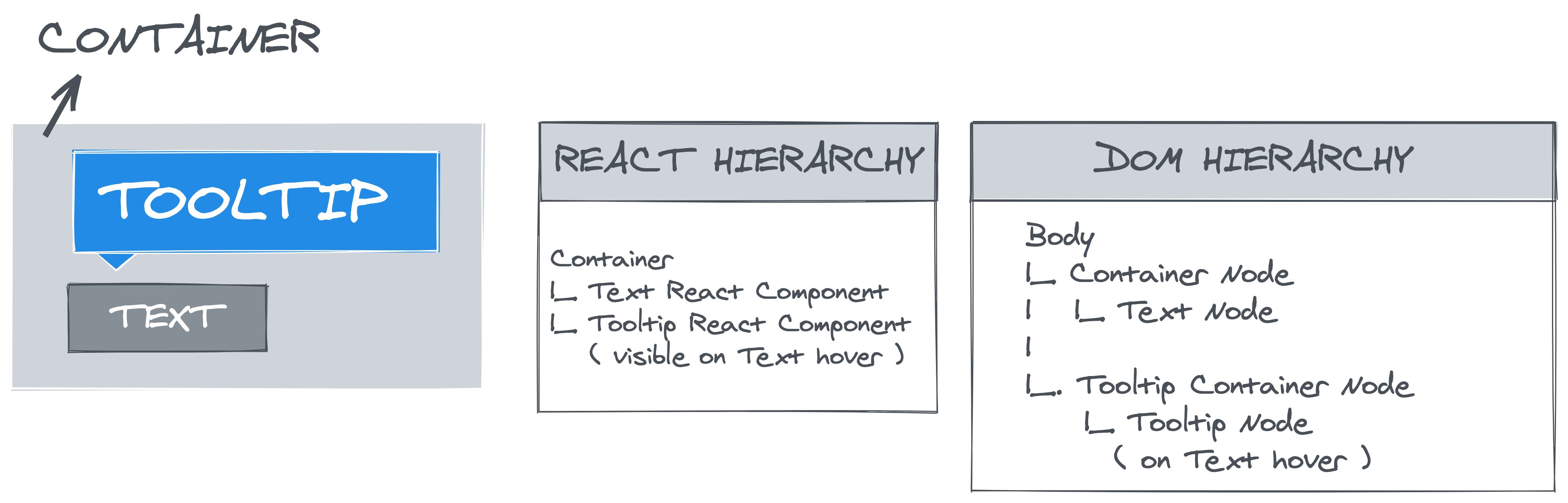
 Using
Using 


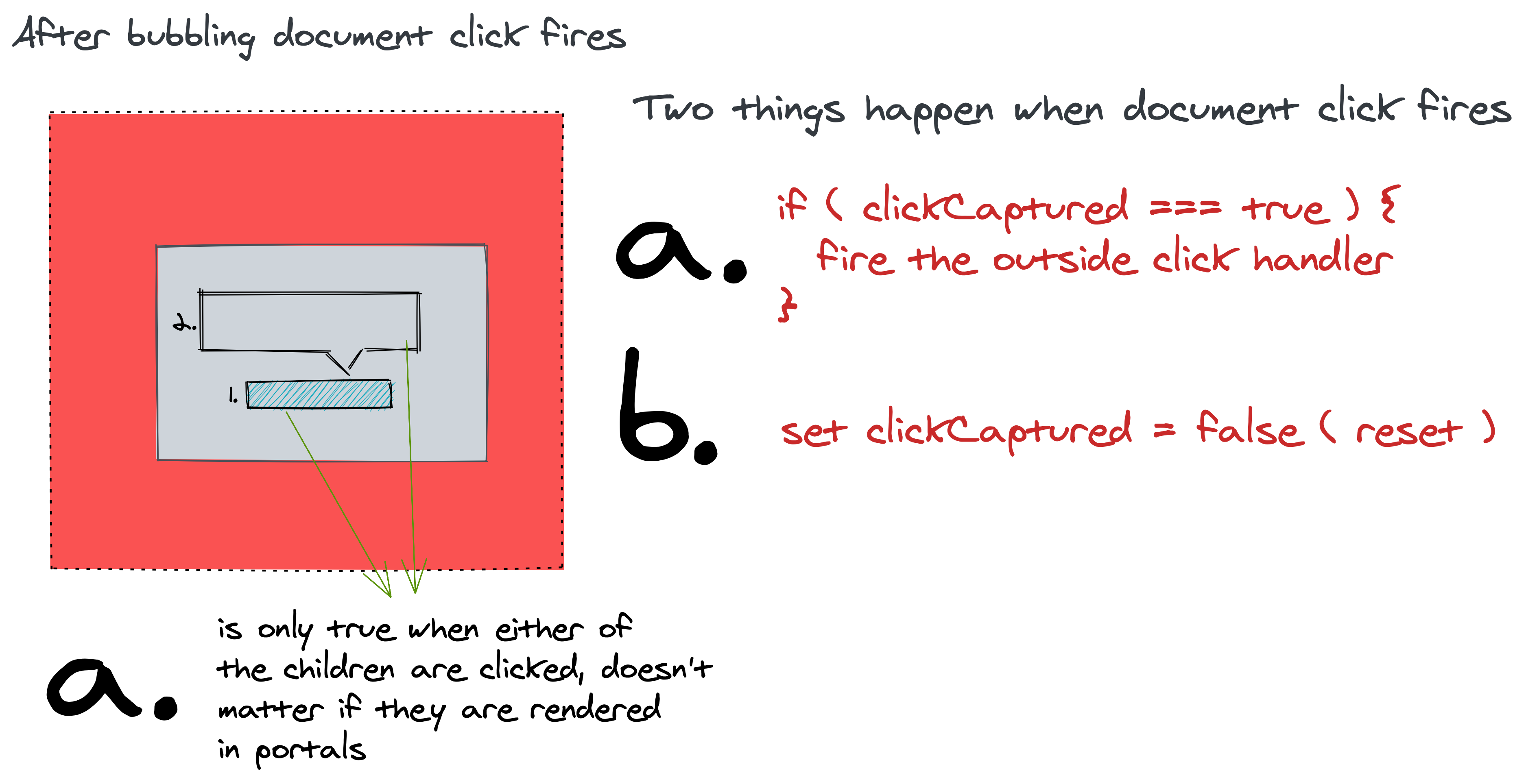
 Using event delegation logic correctly detects outside click, even if children are rendered in a React portal. (Large preview)
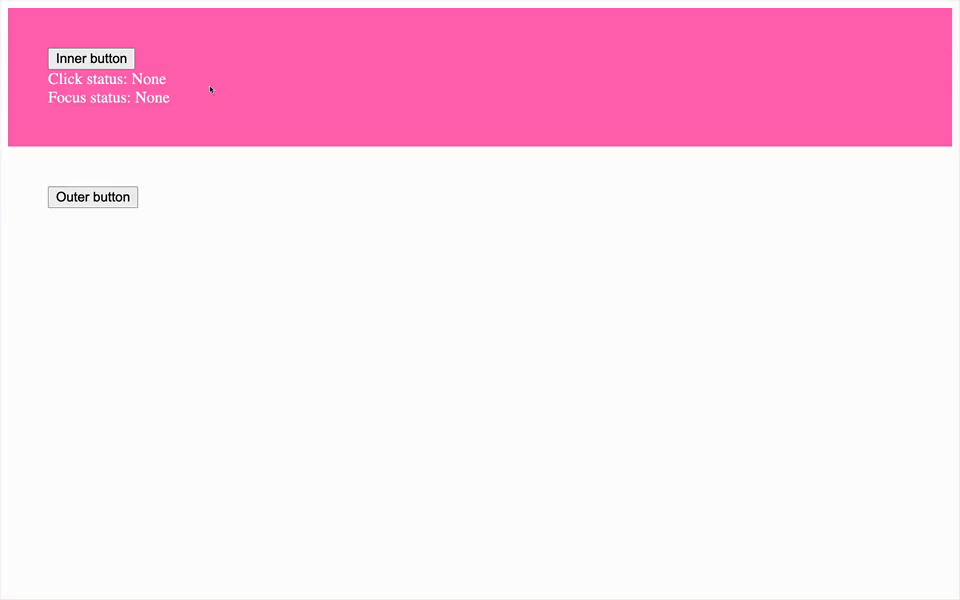 React Foco component correctly detecting outside click and focus by using event delegation detection logic. (Large preview)