Building Components For Consumption, Not Complexity (Part 1)

Design systems are on the tip of every designer’s tongue, but the narrative in the industry mainly focuses on why you need a design system and its importance rather than the reality of endless maintenance and internal politics. The truth is that design teams spend years creating these systems only to find out that few people adhere to the guidelines or stay within the “guardrails.”

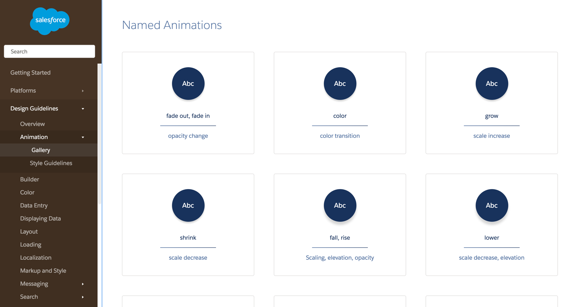
I’ve been fortunate with Figma to host and run workshops at various conferences across Europe that center on one very specific aspect of product design: components.

I love components! They are the start, the end, the hair-tearing-out middle, the “building blocks,” and the foundation — the everything within every great product design organization.

The reason they are so important to me is because, firstly, who doesn’t like efficiency? Second, and more importantly, they are proven to increase the time-to-delivery from design to engineering, and here comes a buzzword — they offer a route to return on investment (ROI) within design teams. This is becoming increasingly important in a tough hiring market. So what’s not to love?

Note: You may be interested in watching Matt Gottschalk’s talk from Figma’s Config 2023 conference, which was dedicated to the topic of ROI within small design teams. The talk explored how small design teams can use design systems and design operations to help designers have the right environment for them to deliver better, more impactful results.

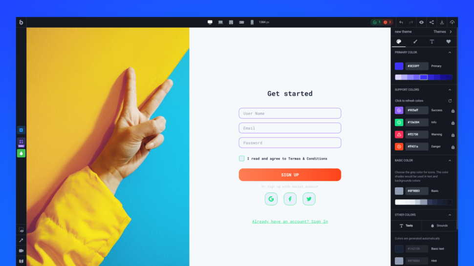
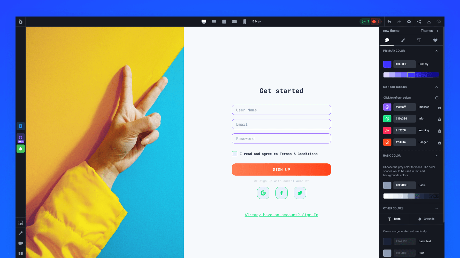
Like in most things, a solution to this is education and communication. If you aren’t comfortable with modifications on styles, you may want to set up your components in such a way as to indicate this. For example, using emojis in layers is the quickest way to say, “Hey, please don’t edit this!” or “You can edit this!”.

Or, consider shipping out components that are named for intention. Would separating components entirely (components named for intention) work better? An Input/Error, rather than a customizable Input?

When considering the emoji name approach, here’s a set that I’ve relied on in the past:

  1. Components
    • 🚨 Deprecated
    • 🟠 Not ready
  2. Component instances
    • 🔐️ Not editable
    • ✍️ Overwritten name
  3. Layers
    • ✍️ Editable
    • 🚨 Important
  4. Component properties
    • ◈ Type
    • ✍️ Edit text
    • 🔁️ Swap instance
    • 🔘 Toggle
    • ←️ Left
    • →️ Right
    • 🖱 Interaction
    • 📈 Data
    • ↔️ Size

Flexible: Responsive Design

Ahh, our old friend, responsive design (RWD)!

“The control which designers know in the print medium, and often desire in the web medium, is simply a function of the limitation of the printed page. We should embrace the fact that the web doesn’t have the same constraints and design for this flexibility. But first, we must accept the ebb and flow of things.”

— John Allsopp, “A Dao of Web Design

As it stands, there is no native solution within Figma to create fully responsive components. What I mean by “fully responsive” is that layout directions and contents change according to their breakpoint.

Here’s an example:

Note: It is technically possible to achieve this example now with auto layout wrapping and min/max widths on your elements, but this does not mean that you can build fully responsive components. Instead, you will likely end up in a magic numbers soup with a lengthy list of variables for your min and max widths!

With this limitation in mind, we may want to reconsider goals around responsive design within our component libraries. This may take the form of adapting their structure by introducing… more components! Do we want to be able to ship one component that changes from mobile all the way up to the desktop, or would it be easier to use, find, and customize separate components for each distinct breakpoint?

“Despite the fun sounding name, magic numbers are a bad thing. It is an old school term for ‘unnamed numerical constant,’ as in, just some numbers put into the code that are probably vital to things working correctly but are very difficult for anyone not intimately familiar with the code to understand what they are for. Magic numbers in CSS refer to values which ‘work’ under some circumstances but are frail and prone to break when those circumstances change.”

— Chris Coyier, “Magic Numbers in CSS

Never be hesitant to create more components if there is a likelihood that adoption will increase.

Then, what does this look like within Figma? We have a few options, but first, we need to ask ourselves a few questions:

  1. Does the team design for various screen sizes/dimensions? E.g., mobile and desktop web.
  2. Does the development team build for a specific platform/screen size(s)? E.g., an iOS team.
  3. Do you build apps aligning with native style guides? E.g., Material Design.

The answers to these questions will help us determine how we should structure our components and, more importantly, what our library structures will look like.

If the answer to questions 1. (Design for various screen sizes/dimensions?) and 2. (build for a specific platform/screen sizes?) is “No,” and to 3. (Build apps aligning with native style guides?) is “Yes,” to me, this means that we should split out components into separate component library files. We don’t want to enter into a world where an iOS component is accidentally added to a web design and pushed to production! This becomes increasingly common if we share component naming conventions across different platforms.

If the answer to question 3. (“Do we build native apps, using their design guidelines?”) is “Yes,” this definitely requires a separate component library for the platform-specific styles or components. You may want to investigate an option where you have a global set of styles and components used on every platform and then a more localized set for when designing on your native platforms.

The example below, with an example mapping of library files for an iOS design project, is inspired by my Figma community file (“Simple design system structure”), which I created to help you set up your design system more easily across different platforms.

Get “Simple design system structure” [FigJam file / Luis Ouriach, CC-BY license]

If you are designing across multiple platforms in a device-agnostic manner, you can bring components a lot closer together! If you aren’t currently working with an agnostic codebase, it might be worth checking Mitosis (“Write components once, run everywhere”).

A common challenge among development teams is using the same language; while one sub-team may be using Vue, another perhaps is using React, causing redundant work and forcing you to create shared components twice. In “Create reusable components with Mitosis and Builder.io,” Alex Merced explores in detail Mitosis, a free tool developed under the MIT license. Mitosis can compile code to standard JavaScript code in addition to frameworks and libraries such as Angular, React, and Vue, allowing you to create reusable components with more ease and speed.

Using A Variant

This may look like a variant set, with a specific property for device/size/platform added. For example,

As you can imagine, as those components increase in complexity (with different states added, for example), this can become unwieldy. Combining them into the same variant is useful for a smaller system, but across larger teams, I would recommend splitting them up.

Using Sections

You could consider grouping your components into different sections for each platform/device breakpoint. The approach would be the following:

  1. Use pages within Figma libraries to organize components.
  2. Within the pages, group each breakpoint into a section. This is titled by the breakpoint.
  3. Name the component by its semantic, discoverable name.

There is a caveat here! I’m sure you’re wondering: “But couldn’t variables handle these breakpoints, removing the need for different components?” The answer, as always, is that it’s down to your specific implementation and adoption of the system.

If your designer and developer colleagues are comfortable working within the variable workflow, you may be able to consolidate them! If not, we may be better served with many components.

Additionally, the split-component approach allows you to handle components in a structurally different manner across these different sizes — something that is not currently possible with variants.

Auto Layout

Regardless of how we organize the components, responsiveness can be pushed very far with the use of auto layout at every level of our screens. Although it can be intimidating at first, the auto layout makes components work similarly to how they would be structured in HTML and CSS, moving design and engineering teams closer together.

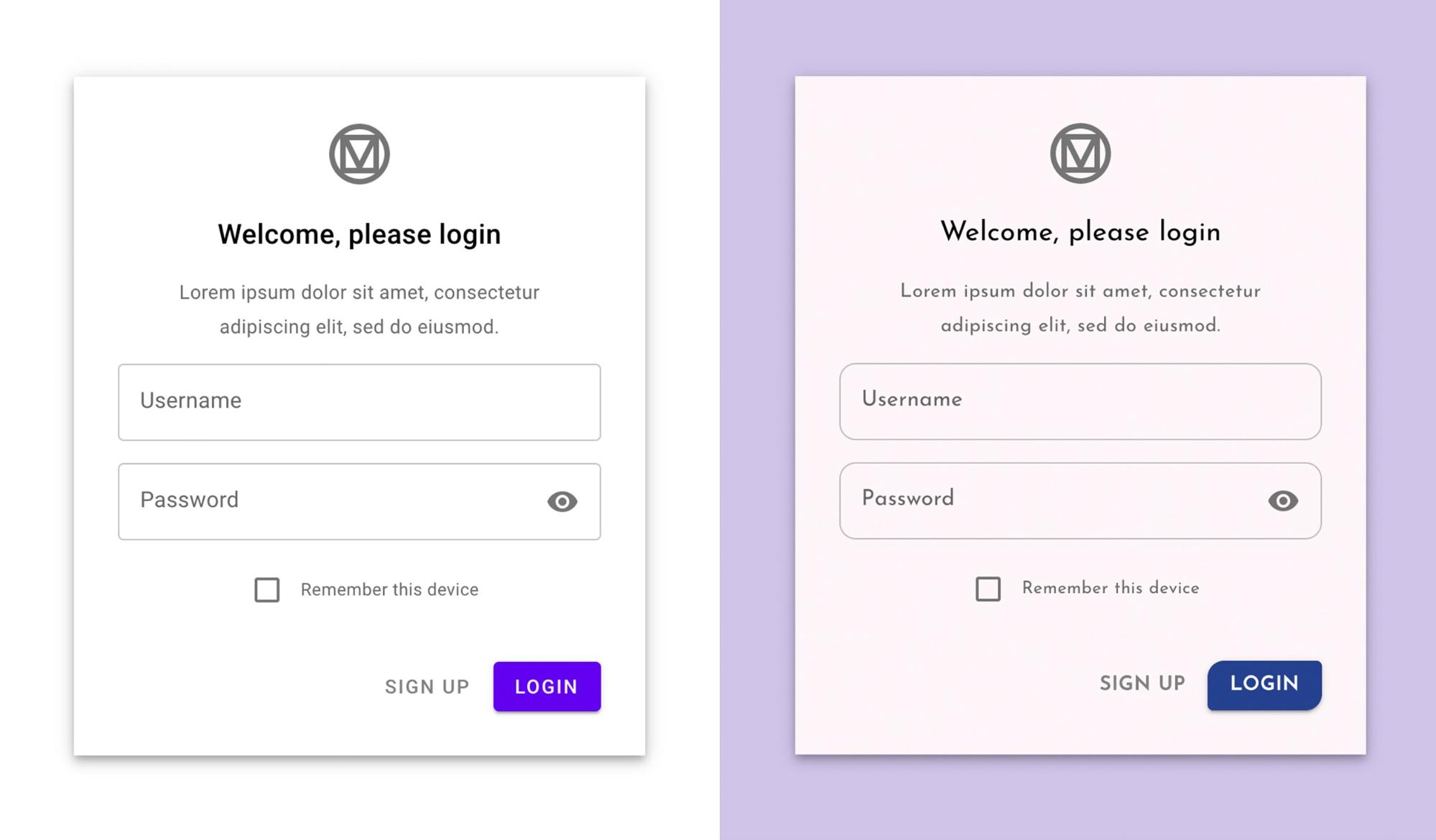
Let’s take a simple example: a generic input field. In your main component, you’re likely to have a text label within it with the text, e.g., “Label.” Generics are useful! It means that we can swap this content to be specific to our needs at an instance level.

Now, let’s say you insert this component into your design and swap that “Label” content for a label that reads “Email address.” This is our override; so far, so good.

However, if you then decide to change your main component structurally, you put that label at risk of losing its overrides. As an example of a structural change, your original “Placeholder” now becomes a “Label” above the input field. Instinctively, this may mean creating a new text element for the label. But! Should you try this, you are losing the mapping between your original text element and the new one.

This could potentially break your existing signed-off designs. Even though this seems like it could work — layer names are a great way to preserve overrides — they are separate elements, and Figma won’t know how to transfer that override to the new element.

At this point, introducing component properties can save us from this trouble. I’d recommend adding a text component property to all of your text layers in order to try to prevent any loss of data across the design files in which we are using the component.

As I showed before, I find adding a writing emoji (✍️) to the property name is a nice way to keep our component properties panel as scannable as possible.

Content Specificity

A decision then needs to be made about how specific the default content is within the component.

And this is where we should ask ourselves a question: do we need to change this content frequently? If the answer is yes, abstracting specific textual values from components means that they can be interpreted more widely. It’s a little bit of reverse psychology, but a text layer reading “[placeholder]” would prompt a designer to change it to their local use case.

If the answer is no, we will bake the fixed value we want into the component. Going back to our input field example, we might set the default label value to be “Email address” instead of “placeholder.” Or, we could create an entirely new email address component! (This is a call we’d need to make based on anticipated/recorded usage of the component.)

Imagery / Media

When setting up a content system within Figma, a few different questions immediately pop up:

  1. How do you use specific media for specific components?
  2. How do you fix aspect ratios for media?

Within Figma, an image is essentially a fill within a shape rather than its own content type, and this impacts how we manage that media. There are two ways to do this:

  1. Using styles.
  2. Using component sets (variants).

Before we look at styles and components, though, let’s take a look at the format that all assets within Figma could take.

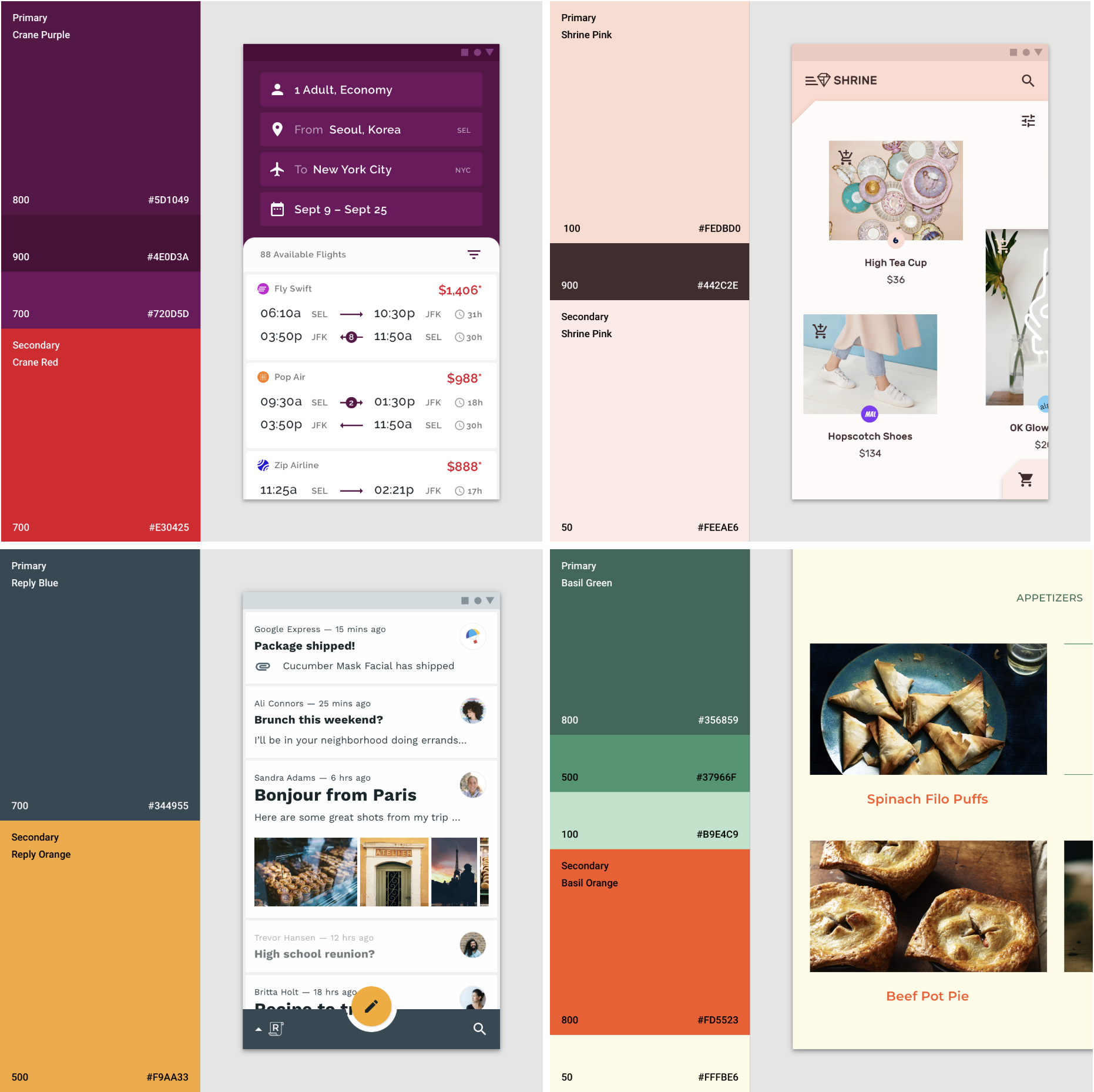
Practically, I would advise setting up your media assets as their own library within Figma, potentially even setting up a few libraries if you work across various products/brands with different approaches to media.

For example, the imagery your product team uses within design files and marketing materials is likely to be very different, so we would look to set these up as different Figma libraries. A designer using those assets would toggle “on” the library they need to create an asset for a specific intention, keeping the right media in the right place.

Because this media is the same as any other style or component within Figma, we can use slash naming conventions to group types of media within the names.

Domain examples:

  • Company website,
  • Product,
  • Marketing,
  • Sub brand/s.

Media types:

  • Logo,
  • Icon,
  • Illustration,
  • Image,
  • Video.

Example names, using the format:

  • Figma.com/Logo/Figma,
  • Figma.com/Icon/Variable,
  • Figma.com/Illustration/Components,
  • Figma.com/Image/Office,
  • Designsystems.com/Logo/Stripe,
  • Designsystems.com/Icon/Hamburger,
  • Designsystems.com/Illustration/Orbs,
  • Designsystems.com/Image/Modular grid.

These are split into:

  • Library: Figma.com or Designsystems.com,
  • Media type: Illustration or Logo,
  • Media name: e.g., Component libraries, Iconography.

Although I’m using images for the examples here, it works with video assets, too! This means we can move in the direction of effectively using Figma like a mini DAM (digital asset manager) and iterate fast on designs using brand-approved media assets, rather than relying on dummy content.

“A digital asset management solution is a software solution that provides a systematic approach to efficiently storing, organizing, managing, retrieving, and distributing an organization’s digital assets. DAM functionality helps many organizations create a centralized place where they can access their media assets.”

— IBM, “What is digital asset management?

Using Fill Styles

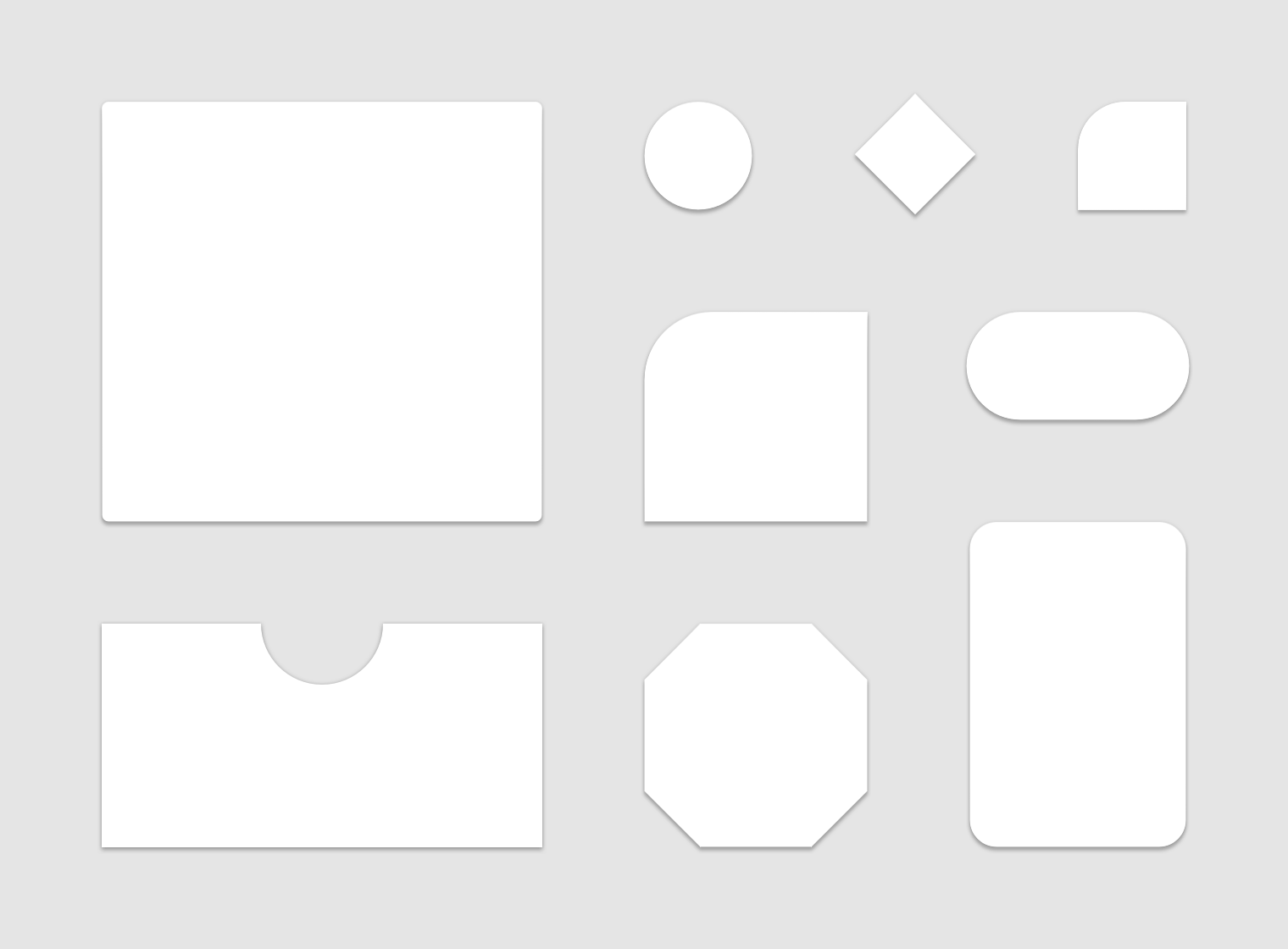
Fill styles aren’t just for color! We can use them for images, videos, and even illustrations if we want to. It’s worth bearing in mind that because of the flexible nature of fills, you may want to consider working within fixed sizes or aspect ratios to ensure cropping is kept to a minimum.

Figma’s redline “snapping” feature lets us know when the original asset’s aspect ratio is being respected as we resize. It’s a pretty cool trick!

You can get the above example from Figma’s community:

Fixed aspect ratio images with variants” [Figma file / Luis Ouriach, CC-BY license]

For this world, though, I would advise against trying to hack Figma into setting up fully responsive images. Instead, I’d recommend working with a predefined fixed set of sizes in a component set. This may sound like a limitation, but I strongly believe that the more time we spend inside Figma, the further we get from the production environment. “Can we test this in the actual product?” is a question we should be asking ourselves frequently.

Practically, this looks like creating a component set where we set the fixed sizes along one dimension and the aspect ratio along the other. Creating a matrix like this means we can use the Component Properties panel to toggle between sizes and aspect ratios, preserving the media inside the component.

This can be used in tandem with a separate set of components specifically for images. If we combine this with Figma’s “nested instances” feature within variant components, we can “surface” all the preferred images from our component set within every instance at the aspect ratios needed!

Arrangement

This is the hardest thing to predict when we think through the usability of customizable components. The simplest example here is our old enemy: the form. Instinctively, we may create a complete form in a component library and publish it to the team. This makes sense!

The issue is that when a designer working on a particular project requires a rearrangement of that structure, we are kind of in trouble.

This problem extends to almost all component groups that require manipulation. Tables, menus, lists, forms, navigation… we will hit this wall frequently. This is where I’d like to introduce the concept of fixed vs flexible content within components, which should help to address the future problems of a world where we put the DRY (don’t repeat yourself) principles at risk.

As design system maintainers, we naturally want to keep components as composable as possible. How can this one component be used in lots of different ways without requiring us to ship an infinite number of variations? This is the central theme of the DRY principle but can be challenging in design tools because of the lack of component order management within the main components.

As a result, we often end up in a world where we build, maintain, and ship endless variations of the same component in an attempt to keep up with snowflake implementations of our core component.

“‘When should we make something a component?’ is a question I’ve been fielding for years. My strong answer: right from the start. Creating things with a component-based mindset right out the gate saves countless hours — everything is a component!”

— Brad Frost, “Design system components, recipes, and snowflakes

For example, the form we spoke about before could be one for:

  • Logging in;
  • Registering;
  • Signing up to the newsletter;
  • Adding billing information.

These are all clearly forms that require different data points and functionality from an engineering perspective, but they will most likely share common design foundations, e.g., padding, margins, headings, labels, and input field designs. The question then becomes, “How can we reduce repetition whilst also encouraging combinatorial design?”

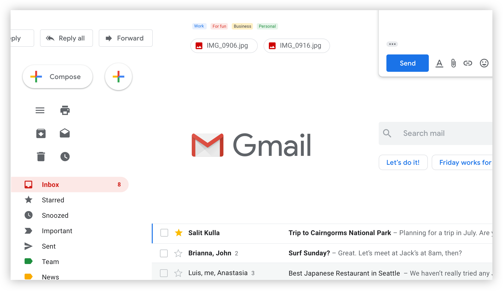
A concept that has been long-used in the developer world and loosely agreed upon in the design community is termed “component slots.” This approach allows the design system maintainers to ship component containers with agreed properties — sizing, padding, and styles — whilst allowing for a flexible arrangement of components inside it.

Taking our previous form examples, we can then abstract the content — login form, register form, newsletter form, and billing information form — and provide a much simpler shell component from the library. The designers using this shell (let’s call it a “form/wrapper”) will then build their forms locally and replace the slot component inside the shell with this new custom main component.

This is best explained visually:

Does this custom component need to live in multiple files? If yes, we move it to the next level up, either team-level libraries or global, if working on a smaller system. If not, we can comfortably keep that component local to the specific Figma file on a page (I like to call it “❖ Components”).

Important: For this premise to really work, we must employ auto layout at every level, with no exceptions!

Conclusion

That was a lot to process (over five thousand words, actually), and I think it‘s time for us to stop staring at the computer screen and take a little break before walking through the next set of principles.

Go grab a drink or take some rest, then meet me in Part 2, where you will learn even more about the adoptable, indexable, logical, and specific components.

You Don’t Need A UI Framework

Every now and then, someone will ask for my recommendations on UI frameworks. By “UI framework”, I mean any third-party package that is focused on providing styled UI components. It includes CSS frameworks like Bootstrap, as well as JS component libraries like Material UI or Ant Design.

My answer to this question tends to catch people off guard: I don’t use them, and I don’t think they should be used for most consumer-facing products. 😅

To be clear, I have nothing against these tools, and I do think there are some valid use cases for them. But I’ve seen so many developers reach for these tools with unrealistic expectations about the problems they’ll solve, or how easy it’ll be to build applications with them.

In this article, I’m going to make my case for why you probably don’t need these tools. I’ll also share some of my go-to strategies for building professional-looking applications without a design background.

The Appeal Of UI Frameworks

There are lots of reasons that developers reach for a UI framework. Here are the three most common reasons I’ve seen:

  1. They want their app/site to look polished and professional, and these tools provide nicely-designed UI components.
  2. They want to get something up and running quickly without spending a bunch of time building everything from scratch.
  3. They recognize that many UI components — things like modals, dropdowns, and tooltips — are really hard to get right, especially when considering accessibility, so they want to make sure they get it right.

These are totally reasonable things to want, and I can absolutely see the appeal of finding a solution for these problems. But in some cases, I think there’s a mismatch between expectation and reality. In others, I think there are better tools for the job.

Let’s get into it.

Professional Design

This first reason might be the most common. There are tons of developers who want to build stuff, but who don’t have a design background. Rather than spend years learning how to design, why not use a third-party package that provides beautifully-designed components right out of the box?

Here’s the problem, in my opinion: design is about so much more than nice-looking pieces.

A little while ago, I received a LEGO Nintendo Entertainment System as a gift:

It was a really fun kit to build. If you’re a LEGO fan, I highly recommend checking it out!

Here’s the thing, though: I was able to build this model because the kit came with a 200-page book that told me exactly where to place each brick.

If I was given all of the pieces but no instructions, my NES would look much worse than it does. Having high-quality bricks isn’t enough, you also need to know how to use them.

A component library can give you nice buttons, date pickers, and pagination widgets, but it’s still your job to assemble them.

The blocks in a design system like Material Design were built by a talented design team. That team understands the framework, and they have the skills to assemble the pieces into beautiful interfaces. We have access to the same pieces, but that doesn’t mean we’ll automatically achieve the same results.

I remember hearing a designer say that only Google can make Material Design apps that look good. The Android App Store is full of third-party apps that use the same professionally-designed components but don’t look professional at all.

There are so many intangible aspects to good design — things such as balance, spacing, and consistency. To use a component library effectively, you need to put yourself in the shoes of the designers who created it and understand how they’re intended to be deployed.

Plus, no matter how comprehensive the library is, it’ll never have all the pieces you need. Every app and website is unique, and there will always be special requirements. Creating a brand-new component that “blends in” with an existing third-party design system is really friggin’ hard.

I don’t think it’s impossible — I’m sure there are examples of professional-looking apps with third-party styles. But if you’re able to make it look good, you probably have some pretty significant design chops and don’t need these tools in the first place.

I empathize with developers who want to launch a professional-looking project without any sort of design intuition… But it doesn’t usually work out that way, from what I’ve seen.

Saving Time

The next reason I’ve heard is that UI frameworks help save time. Building a whole component library from scratch is a significant undertaking and one that can be skipped by relying on a UI framework.

There’s some truth to this, but from what I’ve seen, it’s often a tortoise-and-hare situation.

I spent a few years teaching web development fundamentals to bootcamp students at Concordia University. The program culminates in a 2-week personal project. Students decide what to build, and it’s up to them to do it. As an instructor, I’d answer questions and help get them unstuck.

We noticed a trend: students who pick a UI framework like Bootstrap or Material UI get off the ground quickly and make rapid progress in the first few days. But as time goes on, they get bogged down. The daylight grows between what they need, and what the component library provides. And they wind up spending so much time trying to bend the components into the right shape.

I remember one student spent a whole afternoon trying to modify the masthead from a CSS framework to support their navigation. In the end, they decided to scrap the third-party component, and they built an alternative themselves in 10 minutes.

Writing your own styles feels a bit to me like writing tests: it’s a bit slower at first, but that early effort pays off. In the long run, you’ll save a lot of time, energy, and frustration.

Usability And Accessibility

The final reason I've heard is a super valid one. The web doesn’t have a very robust “standard library” when it comes to things like modals, dropdowns, and tooltips. Building a modal that works well for mouse users, keyboard users, and screen-reader users is incredibly difficult.

UI frameworks have a hit-or-miss record when it comes to usability and accessibility. Some of the libraries are actually quite good in this respect. But in most cases, it’s a secondary focus.

Thankfully, there’s another category of tools that focuses exclusively on usability and accessibility, without prescribing a bunch of styles.

Here are some of my favorite tools in this category:

  • Reach UI
    A set of accessibility-focused primitives for React. Built by Ryan Florence, co-creator of React Router and Remix.
  • Headless UI
    A set of unstyled, fully accessible UI components for React and Vue. Built and maintained by the Tailwind team.
  • Radix Primitives
    A set of unstyled, accessibility-focused components for React. This library has a very broad set of included components, lots of really neat stuff!
  • React ARIA
    A library of React hooks you can use to build accessible components from scratch.

Note: I realize that this list is very React-heavy; there may be similar tools for Angular, Svelte, and other frameworks, but I’m not as active in those communities, so I’m not sure. Feel free to let me know on Twitter if you know of any!

Nobody should be building a modal from scratch in the year 2022, but that doesn’t mean you need an enormous styles-included UI framework! There are tools that precisely solve the most important accessibility challenges while remaining totally agnostic when it comes to cosmetics and styles.

Rebuttals

I’ve been speaking with developers about this subject for a couple of years now, and I have heard some pretty compelling rebuttals.

Familiarity

First, Daniel Schutzsmith pointed out that “industry-standard” tools like Bootstrap have one big advantage: familiarity.

It’s easier to onboard new developers and designers when using tools that are widely understood. New teammates don’t have to spend a ton of time learning the ins and outs of a custom framework, they can hit the ground running.

From the perspective of an agency that takes on lots of short/medium-term projects, this could make a lot of sense. They don’t have to start every new project from zero. And as the team gets more and more comfortable with the tool, they learn to use it really effectively.

I haven’t done much agency work, so it’s hard for me to say. I’ve spent most of my career working for product companies. None of the places I’ve worked for have ever used a third-party UI framework. We always built something in-house (eg. Wonder Blocks at Khan Academy, or Walrus at DigitalOcean).

Internal Tools

I think that it can make sense to use a UI framework when building internal tools or other not-for-public-consumption projects (eg. prototypes).

If the goal is to quickly get something up and running, and you don’t need the UI to be 100% professional, I do think it can be a bit of a time-saver to quickly drop in a bunch of third-party components.

What About Tailwind and Chakra UI?

So, I don’t consider Tailwind or Chakra UI to be in this same category of “UI frameworks”.

Tailwind doesn’t provide out-of-the-box components, but it does provide design tokens. As Max Stoiber says, Tailwind gives developers a set of guardrails. You still need a design intuition to use it effectively, but it isn’t quite as daunting as designing something from scratch.

Chakra UI does provide styled-components out of the box, but they’re very minimal and low-level. They mostly just look like nicer versions of platform defaults.

My good friend Emi mentioned to me that she likes using Chakra UI because it provides her with a set of sensible defaults for things like checkboxes and radio buttons. She’s good enough at design to avoid the customization pitfalls, but not so confident that she’d be comfortable creating a whole design system from scratch. This tool is the perfect middle ground for someone in her situation.

I think the difference is that these solutions don’t claim to solve design for you. They help nudge you in the right direction, but they make sure that everything is customizable, and that you aren’t locked into a specific design aesthetic.

My Suggested Alternative

So, if you’re a solo developer who wants to build professional-looking websites and applications, but who doesn’t have a design background, what should you do?

I have some suggestions.

Develop a Design Intuition

So, here’s the bad news: I do think you should spend a bit of time learning some design fundamentals.

This is one of those things where a little bit goes a long way. You don’t need to go to an art school or dedicate years to learning a new craft. Design is hard, but we aren’t trying to become world-class designers. Our goals are much more modest, and you might be surprised by how quickly they can be attained, or how far along you are already!

Even if you’re not that interested in design, I think building a design intuition is a critical skill for front-end developers. Believe it or not, we’re constantly making design decisions in our work. Even the most detailed high-fidelity mockup is still missing a ton of important context.

For example:

  • If we’re lucky, we might be given 3 screen sizes, but it’s up to us to decide how the UI should behave between those screen sizes.
  • Data is rarely as clean as it appears in mockups, and we have to decide how to handle long names, missing data, etc.
  • Loading, empty, and error states are often missing from mockups.

One of my super-powers as a developer is having enough design sense to be able to figure out what to do when I run into a situation not clearly specified in the design. Instead of being blocked, while I wait for the designer to respond to my questions, I can rely on my intuition. I won’t always get it right, but I usually will (and when I don’t, it’s another opportunity to improve my design intuition!).

How do you develop a design intuition?

If you work with a product/design team, you have a tremendous resource available to you! Think critically about the designs they produce. Ask lots of questions — most designers will be delighted to help you understand how things are structured, and why they made the decisions they did. Treat it as an engineering challenge. You can learn the systems and processes that lead to good designs.

I wrote a blog post a while back, called “Effective Collaboration with Product and Design”. It goes a bit deeper into some of these ideas.

If you don’t work with any designers (or have any designer friends), you can try to reverse-engineer the products you use every day. Take a note of how things are spaced, and what font sizes are used. With a critical eye, you’ll start to see patterns.

Steal

Alright, so even with a keen design instinct, it’s still really hard to come up with a design from scratch. So, let’s not do that.

Instead, let’s try and find some professional designs that are similar to the thing we’re trying to build. You can search on designer-community sites like dribbble or behance or use archives like awwwards.

For example, let’s say we’re building an Uber-for-dogs startup, and we’re trying to design the driver dashboard. A Dribbble search for “dashboard” turns up a ton of interesting designs:

Dribbble tends to skew very “designery”, and so you might want to use real-world products for inspiration. That works too!

The trick is to use multiple sources. If you steal 100% of a design, it’s plagiarism and a bad form. People will notice, and it’ll cause problems.

Instead, we can mix 3 or 4 designs together to create something unique. For example, maybe I’ll take the color scheme from one site, the general layout and spacing from another, and the typography styles from the third!

When I’ve mentioned this strategy to actual designers, they laugh and say that it’s what they all do. I think this is their version of the “joke” that programmers spend half their time googling things.

This strategy feels like such a life hack. It’s not effortless, and it does require some design chops. The designs you use for inspiration won’t 100% match the thing you’re building, and you’ll need to use your intuition to fill in the gaps. But it’s by far the fastest way I’ve found to come up with a professional-looking design without a design background.

Putting It All Together

As developers, it can be tempting to believe that a UI framework will absolve us from needing to learn anything about design. Unfortunately, it doesn’t usually work out that way. At least, not from what I’ve seen.

Here’s the good news: you can definitely build a professional-looking product without a designer! With a few high-quality reference designs and a dash of design intuition, you can build something that hits the “good-enough” threshold, where a product feels legitimate and “real”.

There’s one more aspect we haven’t really spoken much about CSS.

Lots of front-end developers struggle with CSS. I struggled with it too! CSS is a deceptively complex language, and it can often feel inconsistent and frustrating, even after you have years of experience with the language.

This is a problem I feel very passionately about. I spent all of last year focused full-time on building and developing a CSS course, to help developers gain confidence with the language.

It’s called CSS for JavaScript Developers. It’s made specifically for folks who use a JS framework like React or Angular. The course is focused on giving you a robust mental model so that you have an intuitive understanding of how CSS works.

If you feel like CSS is unpredictable, I really hope you'll check it out. 9000+ developers have gone through the course, and the response has been overwhelmingly positive.

You can learn more here: css-for-js.dev.

Don’t put pointer-events: none on form labels

Bruce Lawson with the tip of the day, warning against the use of pointer-events: none on forms labels. We know that pointer-events is used to change how elements respond to click, tap, hover, and active states. But it apparently borks form labels, squashing their active hit target size to something small and tough to interact with. Bruce includes examples in his post.

That’s not the striking part of the post though. It’s that the issue was pinned to an implementation of Material Design’s floating labels component. Bruce fortunately had pointer events expert Patrick Lauke’s ear, who pointed (get it?) out the issue.

That isn’t a dig at frameworks. It’s just the reality of things. Front-end developers gotta be aware, and that includes awareness of third-party code.

Direct Link to ArticlePermalink


The post Don’t put pointer-events: none on form labels appeared first on CSS-Tricks.

You can support CSS-Tricks by being an MVP Supporter.

Top 6 Tools For Creating an MVP (Designers’ Choice)

Top 6 Web App Builders Designers Choose to Create an MVP or an App Prototype in 2020

Whether you’re a mature product designer, or only starting your design career, regardless of your knowledge in web design, UI/UX, development, you can build and design a working prototype, or a minimum viable product (MVP) on your own. Today, it’s possible due to the existence of visual app builders.

We’ve compiled a list of the visual web app building platforms popular among UI/UX designers in 2020. Some of these app development & design tools are more feature-rich than others. Some lock you inside the platform, while the others allow you to download your app code, and go your own way. Consider all the factors when choosing your perfect match.

Let’s now look at the app makers designers choose to build & design MVPs and prototypes – clear, simple, viable enough to show the real value, created at minimal costs, and with almost no development skills (like you can do in Webflow, for example).

#1. Bubble.io

Bubble is a full-stack app development platform allowing you to create and design pixel-perfect web apps. You can build social network apps, SaaS, marketplaces, and more.

Pros:

  • An intuitive interface with a convenient drag-n-drop editor.
  • Mobile-friendly design.
  • A variety of free and paid templates.
  • An ability to create hybrid mobile apps.
  • About 1,000 plugins you can integrate your app with.
  • Code’s editable with Javascript.
  • SQL Database Connector’s available to connect the built app to databases.
  • An ability to deploy & host your app on the Bubble.io domain.

Cons:

  • No code export.
  • Limited functionality’s available for free.
  • You need to buy a separate plan for each new app.
  • Interface is rather complex, which makes it difficult to onboard for a newcomer.
  • No ability to host an app on a custom domain.

#2. Fluid UI 

Fluid UI is a tool helping designers, developers, product managers to wireframe and design apps, build minimum viable products using pre-built UI kits for Wireframing, Material Design, etc.

Pros:

  • Over 2,000 built-in components are available in pre-built UI Kits for Material Design, iOS, Windows, Wireframing, and more.
  • An ability to add existing graphic assets to your prototype.
  • An ability to use mouse and touch gestures to build & design interactive app prototypes.
  • Built-in review and feedback collecting feature.
  • Downloadable Android and iOS preview apps.
  • An ability to retrieve a ready-made project by scanning QR code with your smartphone.

Cons:

  • App code is not downloadable.
  • Only for app prototyping – no ability to build a full-fledged web app with a responsive design.
  • Only 1 project you can create for free.

#3. UI Bakery 

UI Bakery is a visual app builder allowing to create & design minimum viable products, white-label apps, and fully-functional web apps with the connected data & integrated APIs.

Pros:

  • A very intuitive and understandable apps builder.
  • Responsive design.
  • Nebular Open Source UI library and Eva Design System – under the hood.
  • A range of predefined layouts, widgets, and UI components.
  • Downloadable code allowing you to use an app outside UI Bakery.
  • Free ready-made web app templates & dashboards with an ability to request the one you need.
  • Data connection & API integration’s available within the platform.
  • An unlimited number of pages you can create in one project.

Cons:

  • No ability to build a backend within the platform.
  • Few third-party integrations available for now.
  • Reusable UI components are not available (yet).

#4. Marvel

Marvel is a web app prototyping and design platform allowing you to create interactive prototypes and MVPs without writing even a line of code. 

Pros:

  • An intuitive and user-friendly UI.
  • An ability to download assets, and generate CSS, Swift, or Android XML code.
  • A big collection of pre-made assets, images, icons are available for use.
  • An offline working mode.
  • Third-party integrations (Jira, Confluence, Sketch, Microsoft, and many others).
  • An ability to use GraphQL API to customise your workflows.
  • An integrated user testing feature.
  • Built-in collaboration for reviewing & collecting feedback in real-time.
  • A lot of educational articles and video tutorials.

Cons:

  • You can build only 1 project for free.
  • Only 1 user working on the project is included in a free plan.
  • An app branding feature is paid.

#5. Glide 

Glide is an app-building tool you can use to turn Google spreadsheets into easy-to-use apps with no coding. You can build an app on top of a spreadsheet, or use a customizable template. 

Pros:

  • A convenient drag-n-drop editor.
  • A huge library of ready-made templates, both free and paid.
  • Allows you to build apps based on Google spreadsheets.
  • Easy onboarding with no needed technical experience.
  • Google and Zapier integration is available.
  • A free app deployment feature to the glideapp.io domain.

Cons:

  • Custom branding is paid.
  • Very few integrations are available for now.
  • Lacks customization flexibility.
  • Limits in a number of data rows available in a free plan.
  • Only a mobile layout is included in a free plan.

#6. AppSheet

AppSheet is an online app builder allowing you to create & design full-fledged mobile and desktop applications that are automatically compatible across different devices.

Pros:

  • Quite a big choice of free ready-made templates.
  • A created app fits for different screen sizes automatically.
  • Custom app branding.
  • Integrations with Salesforce, Dropbox, Amazon Web Services, and other third-party services are available.
  • Useful videos, tutorials, etc., and how-to webinars on the YouTube channel.
  • Offline working mode.
  • Built-in application lifecycle monitoring & management.

Cons:

  • The need to pay for each end-user (“active user”) of your created application.
  • Only 10 users are available for free.
  • Very limited development & design functionality you can use for free.
  • The need to reach the support team to build your app on your SQL databases.

On a final note

The visual development platforms mentioned above greatly decrease the time from a product ideation and its MVP creation to its successful implementation. Once you build your app, you might want to export the code, give it to developers, let them connect a backend to a frontend you’ve created, etc. Be careful when choosing an apps builder that gives you as much development & design freedom as you need. 

There’s a great number of other visual web app builders allowing designers and developers with different skill levels create MVPs before building a full-fledged product to test their ideas without overpaying for it.

Hope this overview of the most popular visual app makers will help you bring your next software solution to life faster, easier, with less costs and efforts.

Read More at Top 6 Tools For Creating an MVP (Designers’ Choice)

Using Your Own Design System with KendoReact Components

Maybe you’ve already heard of (or even worked with!) KendoReact. It’s popped up in some of my day-to-day conversations, especially those about working with design systems and React. You could think of it as a component library like Bootstrap or Material Design, except the components in KendoReact are far more robust. These are interactive, state-driven components ready to start building full-blown UI’s right out of the gate (not to mention, if you want to use Bootstrap as the theme, you absolutely can).

Whenever you’re thinking about using a UI library, you need to think about the styling capabilities. Are you able to really express your brand with these? Were they meant to be styled? What is the styling experience going to be like?

Fortunately, KendoReact really makes styling a citizen of the entire UI library.

KendoReact is a collection of UI components for building sites. It’s a pretty massive one. Over 80 by my count, and that doesn’t include the child components of heavy lifters like the <Grid /> family.

Here’s one, the <DropDownList />, and just using the default theme (even that is optional):

If I want to style this, I don’t need any special proprietary skills, I can just use CSS. Here’s me forcing a whole new look onto it with different colors and fonts, with just some simple CSS:

But hey, maybe you want to do something a bit more systematized than cowboying some random override CSS. I don’t blame you. Good news: KendoReact themes are Sass-powered. So you can control a lot of the colorization and styling just by changing a few Sass variables.

They have a whole theme builder you can use right on their site that spits out exactly what you need. Say you want to start from their base theme and go from there, select the Default theme:

Then you can play with all the colors in the UI to your liking. Here’s me poking at a theme with some CSS-Tricks colors.

I can download that from the site which will give me the variables as a SCSS file that I can apply before the default theme in my build (there is a great tutorial covering how to do that over on the Telerik blog). Plus, it gives me the whole dang CSS file of the theme if I want to use it that way, which is simple and quick. Here’s me using their conversational chat widget with that theme:

Again, I can start with Bootstrap, I can start with Material, I can start with their default theme, or I can start from scratch. Styling is totally up to me. Each theme has its perks and, as you might expect, are super flexible as far as configuring colors, fonts, and other design elements.

If you really get into this, of course you’ll be consulting their docs and finding your way around there (it’s nice to know they have really comprehensive docs). It’s all pretty straightforward though, you’ll do great! If you need to get going building out a state-driven interactive interface quickly without sacrificing any customizability or power, you’ll find KendoReact is your friend.


The post Using Your Own Design System with KendoReact Components appeared first on CSS-Tricks.

You can support CSS-Tricks by being an MVP Supporter.

How to Recreate the Ripple Effect of Material Design Buttons

When I first discovered Material Design, I was particularly inspired by its button component. It uses a ripple effect to give users feedback in a simple, elegant way.

How does this effect work? Material Design’s buttons don’t just sport a neat ripple animation, but the animation also changes position depending on where each button is clicked.

We can achieve the same result. We’ll start with a concise solution using ES6+ JavaScript, before looking at a few alternative approaches.

HTML

Our goal is to avoid any extraneous HTML markup. So we’ll go with the bare minimum:

<button>Find out more</button>

Styling the button

We’ll need to style a few elements of our ripple dynamically, using JavaScript. But everything else can be done in CSS. For our buttons, it’s only necessary to include two properties.

button {
  position: relative;
  overflow: hidden;
}

Using position: relative allows us to use position: absolute on our ripple element, which we need to control its position. Meanwhile, overflow: hidden prevents the ripple from exceeding the button’s edges. Everything else is optional. But right now, our button is looking a bit old school. Here’s a more modern starting point:

/* Roboto is Material's default font */
@import url('https://fonts.googleapis.com/css2?family=Roboto&display=swap');

button {
  position: relative;
  overflow: hidden;
  transition: background 400ms;
  color: #fff;
  background-color: #6200ee;
  padding: 1rem 2rem;
  font-family: 'Roboto', sans-serif;
  font-size: 1.5rem;
  outline: 0;
  border: 0;
  border-radius: 0.25rem;
  box-shadow: 0 0 0.5rem rgba(0, 0, 0, 0.3);
  cursor: pointer;
}

Styling the ripples

Later on, we’ll be using JavaScript to inject ripples into our HTML as spans with a .ripple class. But before turning to JavaScript, let’s define a style for those ripples in CSS so we have them at the ready:

span.ripple {
  position: absolute; /* The absolute position we mentioned earlier */
  border-radius: 50%;
  transform: scale(0);
  animation: ripple 600ms linear;
  background-color: rgba(255, 255, 255, 0.7);
}

To make our ripples circular, we’ve set the border-radius to 50%. And to ensure each ripple emerges from nothing, we’ve set the the default scale to 0. Right now, we won’t be able to see anything because we don’t yet have a value for the top, left, width, or height properties; we’ll soon be injecting these properties with JavaScript.

As for our CSS, the last thing we need to add is an end state for the animation:

@keyframes ripple {
  to {
    transform: scale(4);
    opacity: 0;
  }
}

Notice that we’re not defining a starting state with the from keyword in the keyframes? We can omit from and CSS will construct the missing values based on those that apply to the animated element. This occurs if the relevant values are stated explicitly — as in transform: scale(0) — or if they’re the default, like opacity: 1.

Now for the JavaScript

Finally, we need JavaScript to dynamically set the position and size of our ripples. The size should be based on the size of the button, while the position should be based on both the position of the button and of the cursor.

We’ll start with an empty function that takes a click event as its argument:

function createRipple(event) {
  //
}

We’ll access our button by finding the currentTarget of the event.

const button = event.currentTarget;

Next, we’ll instantiate our span element, and calculate its diameter and radius based on the width and height of the button.

const circle = document.createElement("span");
const diameter = Math.max(button.clientWidth, button.clientHeight);
const radius = diameter / 2;

We can now define the remaining properties we need for our ripples: the left, top, width and height.

circle.style.width = circle.style.height = `${diameter}px`;
circle.style.left = `${event.clientX - (button.offsetLeft + radius)}px`;
circle.style.top = `${event.clientY - (button.offsetTop + radius)}px`;
circle.classList.add("ripple"); 

Before adding our span element to the DOM, it’s good practice to check for any existing ripples that might be leftover from previous clicks, and remove them before executing the next one.

const ripple = button.getElementsByClassName("ripple")[0];

if (ripple) {
  ripple.remove();
}

As a final step, we append the span as a child to the button element so it is injected inside the button.

button.appendChild(circle);

With our function complete, all that’s left is to call it. This could be done in a number of ways. If we want to add the ripple to every button on our page, we can use something like this:

const buttons = document.getElementsByTagName("button");
for (const button of buttons) {
  button.addEventListener("click", createRipple);
}

We now have a working ripple effect!

Taking it further

What if we want to go further and combine this effect with other changes to our button’s position or size? The ability to customize is, after all, one of the main advantages we have by choosing to recreate the effect ourselves. To test how easy it is to extend our function, I decided to add a “magnet” effect, which causes our button to move towards our cursor when the cursor’s within a certain area.

We need to rely on some of the same variables defined in the ripple function. Rather than repeating code unnecessarily, we should store them somewhere they’re accessible to both methods. But we should also keep the shared variables scoped to each individual button. One way to achieve this is by using classes, as in the example below:

Since the magnet effect needs to keep track of the cursor every time it moves, we no longer need to calculate the cursor position to create a ripple. Instead, we can rely on cursorX and cursorY.

Two important new variables are magneticPullX and magneticPullY. They control how strongly our magnet method pulls the button after the cursor. So, when we define the center of our ripple, we need to adjust for both the position of the new button (x and y) and the magnetic pull.

const offsetLeft = this.left + this.x * this.magneticPullX;
const offsetTop = this.top + this.y * this.magneticPullY;

To apply these combined effects to all our buttons, we need to instantiate a new instance of the class for each one:

const buttons = document.getElementsByTagName("button");
for (const button of buttons) {
  new Button(button);
}

Other techniques

Of course, this is only one way to achieve a ripple effect. On CodePen, there are lots of examples that show different implementations. Below are some of my favourites.

CSS-only

If a user has disabled JavaScript, our ripple effect doesn’t have any fallbacks. But it’s possible to get close to the original effect with just CSS, using the :active pseudo-class to respond to clicks. The main limitation is that the ripple can only emerge from one spot — usually the center of the button — rather than responding to the position of our clicks. This example by Ben Szabo is particularly concise:

Pre-ES6 JavaScript

Leandro Parice’s demo is similar to our implementation but it’s compatible with earlier versions of JavaScript: 

jQuery 

This example use jQuery to achieve the ripple effect. If you already have jQuery as a dependency, it could help save you a few lines of code. 

React

Finally, one last example from me. Although it’s possible to use React features like state and refs to help create the ripple effect, these aren’t strictly necessary. The position and size of the ripple both need to be calculated for every click, so there’s no advantage to holding that information in state. Plus, we can access our button element from the click event, so we don’t need refs either.

This React example uses a createRipple function identical to that of this article’s first implementation. The main difference is that — as a method of the Button component — our function is scoped to that component. Also, the onClick event listener is now part of our JSX:


The post How to Recreate the Ripple Effect of Material Design Buttons appeared first on CSS-Tricks.

You can support CSS-Tricks by being an MVP Supporter.

Material Theming: Making Material Your Own!

The web is a beautiful, expressive medium that’s evolved over time as trends and technology have changed. Moments of delight and flair are what set companies apart from one another. At the same time, today’s top products rely on scalable, component-based design systems to efficiently develop a coherent brand. And it’s more important than ever to have accessibility and a solid user experience baked in from the start! But these two worlds — creative web design and systematic web design — don’t need to be at arms. The beautiful gooey center of the web design world is where we can find a way to meld creative web design in with our systems, and luckily, you can have both!

One of those design systems is called Material Design (the team I just joined at Google!). Material is built on years of research and best practices to give designers and developers access to creating beautiful, accessible UIs with the least amount of work possible. But in its initial launch, one thing was missing from the equation: the ability to express a brand’s personality in an easy-to-implement way. The team heard two key pieces of feedback:

  1. Material wasn’t stylistically flexible enough to meet the needs of all products, brands, and users.
  2. It wasn’t easy enough to apply and build brand experiences systematically across products.

And as of last year (specifically, I/O 2018), Material announced new theming capabilities! Theming allows developers and designers to benefit from all the parts of Material that make it a world-class design system — and make it their own! In other words: You can customize the look and feel of Material Components by applying global changes to your product’s color, shape, and typography.

Material Components are built for multiple systems like Android, iOS, and Flutter, and we’re going to focus on the web for this post (this is CSS-Tricks after all). Let’s start off with a base login template using Material Components for the web to see how easy implementing a theme atop this will be:

About theming

The current theming implementations allow for color, typography, and shape adjustments that trickle down to every component in your product. These three subsystems may not sound like many options, but together they bring a big impact to the design, and are a great springboard to jump off of with more design changes on a more granular level.

Color

The first themable option is color. There’s a great color picker tool on Material.io for you to be able to see contrast and aid your color selection process. Since this is CSS-Tricks, let’s write some CSS (okay, more like SCSS), to get started with an example. In a few lines of code in our my-theme.scss file, we can entirely change the look and feel of this login screen:

We’ve set:

$mdc-theme-primary: #26418f;
$mdc-theme-secondary: #d1c4e9;
$mdc-theme-background: #fdf6f9;

Even though we have not specified a $mdc-theme-on-primary, the system knows to make this white now (using a Sass contrast function) to help us ensure accessible color contrast. We can also override the text color on the primary and secondary themes with $mdc-theme-on-primary and $mdc-theme-on-secondary. However, if no value is explicitly set, these will either be black or white based on the background. See the color picker for more information.

Typography

Material sets up a base typography scale, which can be customized with theming. You can adjust the typography for each individual headline level and apply it throughout your product in two ways:

  1. Using CSS classes to apply the styles. I.e. <h1 class="mdc-typography--headline1">
  2. Using mixins to extend the styles from a header component onto another (i.e. h1 {@include mdc-typography(headline1);}). You can see an example of this in our starter kit example on Glitch.

A quick way to change the typeface is by using Google Fonts — a really nice directory of free web fonts. We’re going to make this easy for ourselves and pick out a Google font called Josefin Sans. In order to use this in our project, we’ll need to import it, and then can set the base typography to use it:

@import url('https://fonts.googleapis.com/css?family=Josefin+Sans');
$mdc-typography-font-family: unquote("Josefin Sans, sans-serif");

We use unquote here because the typography in Material is set in a map. We can specify more styles like so:

$mdc-typography-styles-button: (
 font-size: 14px,
 font-weight: 600,
 letter-spacing: 0.05em,
);

Now our login page looks like this:

Shape

Shape is another way to be expressive with your code! What do I mean by shape? In Material, shape affects the corner radius of components, such as buttons, cards, and sheets. In product design, shape helps to define your brand. Is it angular and machine-like, or is it more rounded and organic? Changing shape trickles down through the rest of the system. Here are some examples of shape in Material:

The other cool thing about shape in Material Components is that you don’t have to have the same shape on each corner, or even the same component at different sizes. There are small, medium, and large components in Material, and you can apply different styles for these different component types, and you can mix it up and specify each corner, one-by-one, in a space-separated list of values just as you would with border-radius.

MDC Web does not currently support cut corners like the other platforms do since it is a non-trivial operation with current web standards. This is another reason I personally love Houdini and see a lot of impact for it in future CSS development!

In the example we’re working with, we have both large and small components. The large components are the text field inputs, and the small component is the “login” button. We can apply different shapes to these with:

$mdc-shape-small-component-radius: 12px 4px;
$mdc-shape-large-component-radius: 8px;

And voilà! We have transformed our application in 12 lines of code.

Themes, themes, everywhere!

Now here’s the part where you get creative. There are so many ways to mix and match the elements of color, typography, and shape to really make your brand stand out. Here are four very distinct example apps that use color theory, typography, and shape to differentiate their products, each based on the baseline Material Components:

Themes IRL

Google itself customizes and extends upon the baseline Material Components with its own products. This is called the Google Material Theme, and it was defined by a number of product teams, including Gmail, Google News, Google Play, and Google Home:

But they are not the only company to use Material Design and its principles. A few companies have also extended Material Components in their own large-scale products.

Lyft, a ridesharing service, is just one example. They used an extended FAB component to highlight key actions, and designed it with a gradient to give it a unique feel that users were still familiar with. Lyft also leveraged Material’s elevation system in their own product.

Anchor, a free app that helps people record, distribute, and host podcasts, is another great example of making Material your own. They showcase their bold color palette, and integrate it with choice chips to delineate display options, a list of cards for content selection, and an extended FAB anchored to the bottom to remain persistently available for user actions.

Get started

Now you have everything you need to make own Material Theme with Material Components for the web. It’s easy to start building your web project with our Material Starter Kit, and exploring theming with the Build a Material theme Glitch project we’ve just released. Change around the variables in my-theme.scss to explore how they can customize the individual components. Then, you can open any template, paste those variables into the my-theme.scss, and start building.

TL;DR: If you thought that Material Design wasn’t for you in the past, it’s a great time to start exploring. Happy theming!

The post Material Theming: Making Material Your Own! appeared first on CSS-Tricks.

Including Animation In Your Design System

Including Animation In Your Design System

Including Animation In Your Design System

Val Head

(This article is sponsored by Adobe.) Design systems come in all shapes and sizes, but as Sparkbox’s design system survey noted, not all of them include guidelines for animation. Sure, some teams may have decided that motion wasn’t something their product needed guidance on, but I suspect that in some cases motion was left out because they weren’t sure what to include.

In the past few years, I’ve talked with many teams and designers who admit they think motion is something they should address, but they just aren’t sure how. If you’re in that boat, you’re in luck. This article is all about what to include in a set of motion guidelines for your design system and how to pull it off.

Why Animation?

Animation is an important design tool for both UX and brand messaging. Just like typography and color, the animation you use says something about your product and its personality. So, when it’s not addressed in a design system, that system essentially leaves that area of UI design tooling unaccounted for. Then people following the design system either do whatever they want with animation — which can lead to a strange mish-mash of animation execution across the experience — or, they just don’t use animation at all because they don’t have time to figure out all the details themselves. Neither case is ideal.

Having a clear stance on how animation is used (or not used) in your design system can help ensure your brand is using animation consistently and effectively while also helping your team work faster. Let’s dig in to get started on a set of motion guidelines for your design system.

The Groundwork: Defining What You Need To Cover

First, Talk To People

As Jina Anne says, “Design systems are for people.” I’ve often heard the advice that talking to the people who will be using the design system you’re creating is key to making a design system people will actually use. That holds true for the guidelines you create around animation too. The biggest thing you can gain from this is finding out what they need and what to focus on. This helps you set an appropriate scope for what you need to cover in your guidelines. No one wants to spend hours on extensive guidelines that address more than your team will ever actually need. That wouldn’t be any fun (or use).

Your team may not tell you about their animation pain points unprompted, but that doesn’t mean they don’t have any.

Set up some user interviews (the users of your design system) and ask them about where they get stuck with animation. Ask them how/if they use animation, and where animation falls in their design process. Ask them about what they wish they had to help with the pain points they encounter. Most importantly, listen to how they talk about using animation in their work and what goes well or not so well.

While every team is different, the concerns and questions I’ve heard most often when doing this research are things like: “How do I know an animation is good, or fits with our brand?”, “How can I convey the animation details to our engineers effectively?”,or “Our developers always say there’s no time to implement the animations we design.”

You’ve probably guessed where I’m going with this, but all of those concerns are things you can help provide answers to in your motion guidelines. And you can use the questions and pain points that come up most often to guide and focus your motion guideline efforts.

Reference Other Systems

Not every design system has to be public, but it’s great that so many of them are. They make for a helpful resource when planning your design system, and they can be useful research for your design system’s motion guidelines too. (In fact, we’ll be referencing a few them in this very article.)

Using other motion sections as reference for your own design system is very helpful, but I don’t recommend adopting another brand’s motion guidelines wholesale in place of your own. No, not even if it’s Material Design’s motion guidelines.

Material Design’s motion section is Google’s take on motion guidelines. A good one, yes, but its aim is to show you how to animate the Google way. That’s perfect if you’re making something for the Google ecosystem (or intentionally wanting to seem like you are). But it’s not a good fit when that’s not your goal. You wouldn’t use another brand’s colors or typeface on your product, so don’t just follow another brand’s motion guidelines either.

The most effective design systems contain a branded point of view unique to them — things that make their design system more specific to the product they’re for — along with common design best practices. Spend a little time researching and reading through other systems’ motion guidelines, and you start to get a feel for which parts are best practices and which parts are customized to that brand or product’s point of view. Then you can decide which best practices you might also like to include in your guidelines, as well as where to customize the guidelines for your product.

For example, using ease-ins for exits and ease-outs for entrances is a common best practice for UI animation. But the exact ease-in or ease-out curve is usually customized to a brand’s intended message and personality.

To quote Dan Mall:

“This is the kind of thing a design system should have guidelines for: perspective, point of view, extending creative direction to everyone that decides to build something with the design system. That stuff should be baked in.”

I totally agree.

The Two Main Sections Of A Design System’s Motion Guidelines

There’s no specific rule out there stating that you must have these two sections, but I’ve found this breakdown to be an effective way to approach the motion guidelines I’ve worked on. And I’ve also noticed that most design systems out there that address motion have these two categories as well, so it seems to be an approach that works for others too.

The two main sections are:

  1. Motion Principles
    Principles are typically high-level statements that explain how that brand uses motion. They’re the big picture point of view or design intention behind why the brand uses animation and their perspective on it.
  2. Implementation
    This section focuses on how to carry out those principles practically in design and/or code. It serves as the building blocks of animation for the design system, and the amount of detail they cover varies based on brand needs.

Motion Principles

The principles section is where to state your brand values around animation. They’re the high-level principles to measure design decisions against, and a place to state some specific definitions or values around animation. Principles often tend to focus on the “why” of using animation within a particular design system and the UX-driven purpose they serve. In many cases, design systems list these under the heading of Principles in their motion section. However, you can see the concept of principles present in ones that don’t include a specific section for them as well.

Your motion principles can be modeled after existing global design principles that your brand might have, extrapolated from things like voice and tone guidelines, or even be inferred from looking at your product’s existing UI animations in a motion audit.

Let’s look at some examples to get a better idea of how these play out. Microsoft’s Fluent design system lists their motion principles as being physical, functional, continuous, and contextual. They include a short description and illustration of each to explain how it applies to UI animation.

Screenshot of the Fluent’s first motion principle
A segment of Fluent’s motion principles page (Large preview)

Audi doesn’t have a separate principles section, but they start off their animation section with a declaration of why they use animation, which is setting the stage for what sort of motion is to be used in the design system, just like a principle would. They state:

“We stand for dynamic premium mobility. As such, movements in the Audi look have a typically dynamic character.”

While developing the motion section for Spectrum, Adobe’s design system, we opted for a principles section to match the pattern used in other sections of the system. Within Spectrum, animation aims to be purposeful, intuitive, and seamless.

Note: Spectrum does not have a publicly available site at the time of writing.

Spectrum’s motion principles of purposeful, intuitive and seamless
Spectrum’s guiding motion principles for UI animation (Large preview)

No matter how you decide to present them, your design system’s animation principles can be used to both establish the system’s expectation around animation and to evaluate potential future UI animation for the product(s) the design system is applied to. For example, if a designer following the Fluent design system wanted to introduce a large bouncing animation into a component, there could be discussion around whether that meets the motion principles. (Does it fit the principles of functional and continuous?) Then a decision could be made as to whether or not that particular animation warranted breaking from the stated principles, or if the animation should be redesigned to fit the principles.

This helps to keep the design discussions away from the “do you like it?” or personal opinion realm and gives a structure for evaluating animation in a more pragmatic design-oriented way. That’s my favorite advantage of having declared motion principles; they make discussing animation meaningfully so much easier, even for people who don’t have a lot of animation experience.

Quick Tip: For more motion principles references, check out Photon’s motion principles, Material Design motion principles and Carbon’s motion principles. There are also others out there, but these are a good start.

Implementation

Motion principles are great for some high-level guidance, but without some details on exactly how to implement them, you’ll be missing the biggest time-saving benefits of including animation in your design system. The implementation section (though rarely actually titled as such) helps to answer many of the “how” and “what” questions your team has around animation. The objective is to provide smart defaults for anyone following the design system. That way, instead of spending ages playing around with durations and easing for every animation, they can use the smart defaults you’ve provided in the guidelines and be on their way. It’s a huge timesaver that also makes your UI animation much more consistent across the board.

The implementation guidelines are where a lot of design systems diverge in their approach and coverage. The amount of detail you include and the topics you cover in these guidelines will depend on how big of a role animation plays in your design efforts and what your team needs. For example, Photon’s implementation section includes just one duration and one easing curve, while Material Design’s includes individual sections on duration and easing as well as additional pages full of implementation details.

There’s no perfect length for a motion section; it’s more about covering the details your team needs than hitting a specific number of pages or rules. Some of the animation building blocks to consider including in your motion guidelines are:

The first three in the list are the main ways we customize or style animation. Variations in the properties, durations, and easings used for animation can drastically affect how animations come across. (And the last one is a way of packing up the first three.)

Let’s dig into each in more detail, and for each of these I’ll point out some of the common best practices and where there’s room for your own customized interpretation.

Durations, Ranges, And Rhythm

Duration has to do with how long animations should be, and when we’re talking about UI animation, these values tend to be very short. It’s amazing how much information we can convey in fractions of a second! This is a key aspect of animation, so every design system with motion guidelines covers it, but they do it in a variety of ways.

Some of the best practices around duration that you’ll see addressed in most motion guidelines include:

  • Shorter durations should be used for simpler effects and animationsof relatively small-sized (such as fades or color changes);
  • Longer durations should be used for more complex effects andanimations of larger relative scale (such as page transitions or moving objects on and offscreen);
  • Optimal timing can change based on viewport size. While the specifics of each set of guidelines varies — sometimes even greatly — you’ll see these common best practices in almost all of them. Different systems have different definitions of exactly what “short” or “long” durations are, and go into varying amounts of detail on the difference between the two. Also, while it’s more of a design system thing than an animation best practice, providing design tokens for your specified duration values is a useful thing to consider here as well.

Carbon provides a short table of ranges of duration values based on the type of animation in question. While Material Design breaks down recommendations on duration speed in categories based on the complexity of the animation, as well as by the relative area covered by the animation. Pluralsight takes a different approach and provides a set of keywords for different durations paired with cute animals.

An animated illustration and data table for guidance on Carbon’s animation duration
Carbon’s illustration and table sorted by interaction type give guidance on what durations to use for UI animation within the system. (Large preview)
Animals ranging from a snail to a cheetah to represent possible animation durations
Pluarsight’s design system lists durations, animals and design tokens for each of its duration options. (Large preview)

Easing Values

My number one advice for easing guidelines is to create your own customized curves and don’t just use the CSS defaults. This is the most effective way to build some consistent motion association for your brand and as Sarah Drasner puts it: build “motion equity.” You’ll be on solid ground with just three curves: a custom eas-out, ease-in, and ease-in-out. And there’s always the option to add more if needed.

Quick Tip: If you’re totally stumped on where to start on easing curves, check out the Penner Easing equations on easings.net. These are designed to give you some nice looking motion and are grouped in threes for easy use. They’re much more expressive and flexible than the CSS defaults. Using a set of these in your motion guidelines can be a great place to start.

Six sets of easing curves that vary in their range of speed changes for an animation
A few of the Penner Easing Equations illustrated as cubic-bezier curves. (Large preview)
Essential Easing Functions

I recommend defining the three core easing curves because that will cover all your main easing needs for various animations.

  • Ease-in This curve is the one that accelerates as it begins any movement which reads well for moving an object out of view.
  • Ease-out This curve causes objects to decelerate before stopping which makes for a more natural feeling way to bring objects into view.
  • Ease-in-out As the name suggests, this curve combines the features of the first two and is best for moving elements from point to point.

With these three custom curves, you’ll have almost all your animation needs covered.

One curve for accelerating into the action, one for decelerating out of the action, and one for doing both
The three main types of curves most motion guidelines include (Large preview)

For Spectrum, we did exactly that and created three custom easing curves along with recommendations on which kinds of animation to use each for. (We came up with these curves through looking at existing animation and experimenting with some motion studies.)

Carbon and Pluralsight take a similar approach, designating three curves with suggested uses, as well as designating one as the default curve to use when in doubt. In some cases, you might only feel the need to have one custom easing curve (like Photon does) defining one curve for use across all animations.

The ease-out curve for Spectrum
One of Spectrum’s three custom easing curves (Large preview)

Along with the easing curves, it’s helpful to provide some supporting information like associated design tokens, language-specific code (for CSS, JS, iOS and/or Android), or After Effects keyframe velocities depending on which tools your team uses. This adds to the ease of use and helps make following the smart defaults in your motion guidelines the path of least resistance.

A visual illustration of the curve and interactive examples of the curve are also a big plus for quickly demonstrating how the easing curves work and what they look like. Never underestimate the power of showing instead of telling. (Or showing along with telling!)

Easing Hierarchy

Including a hierarchy of easing is one way you can take things a little further than the three core custom curves. This can be especially useful for brands that use motion as a core method of conveying their design message. Just like with type, you may want a way to make certain animation stand out more than others. Animations that stand out more strongly can be used to emphasize a particular point or interaction. In these cases, structuring your easing curves so that you have one that is more dramatic to stand out from the others can be a useful technique.

Off To A Good Start

At this point, armed with principles plus your durations and easing sections, you have a solid set of motion guidelines. That might be all you need for a version one of your motion guidelines, or for a brand that doesn’t rely heavily on motion in its design. If you’re pressed for time, establishing smart defaults for durations and easing will get far enough to see the benefits of establishing motion guidelines and save your team time.

Named Effects

Providing a listing of named effects or a library of animations to use can be a useful thing to have in your motion guidelines. Not all design system’s motion guidelines have these, some opt to bake the animation guidelines into their components instead (or as well), and some just don’t need this level of detail.

One word of caution on these though: more isn’t always better. It might look cool to have a huge library of animations as part of your design system, but the more effects you list, the more time and effort it will take to maintain those effects. To avoid creating a huge time sink for you and your team, I’d suggest making any collection of named effects as small as you possibly can.

There tend to be two approaches to providing a library of effects in motion guidelines. One approach is the way the Lightning design system does it, providing a library of small animation effects (molecules of animation, if you will) that can be used individually or composed together to build up more complex animations.

A listing of small named animations that can be composed into more complex effects
A few of Lightning Design System’s named animation library (Large preview)

The other approach is to provide more comprehensive and purpose-specific effects like Audi does for its show and hide, transform, shift, and superimposing effects and Fluent does for its page transition effects. For either approach, providing the design rationale and specific code implementations for each is useful.

Quick Tip: If you’re looking for additional motion guidelines for research, Adele is a design system collection that lets you filter by topics like motion, and styleguides.io is always a great resource for finding public design systems too.

Other Places Motion Might Come Up In Your Design System

Design systems come in all shapes and sizes. And in many cases these animation guidelines are also baked into the DNA or components of your design systems. Digging into how to do that is beyond the scope of what we’re covering here, but I do want to note that can also be useful to include animation information on component-specific pages instead of in a named effects section. It all depends on what works best for your team and your design system.

Additionally, it might be useful to call out performance and accessibility considerations for animation either in those sections of your design system, in guidelines for components, or in the motion section itself. Performance and accessibility goals affect all aspects of our design work, and animation is no exception there.

Some Parting Thoughts

I hope this article has helped to show that including motion guidelines in your design system can be incredibly useful, and helped to demystify the process of creating one. Addressing animation in your design system can be beneficial to the consistency of your product’s design and doesn’t have to be an overly time-consuming effort.

As you’re working on your motion guidelines, I encourage you to work in stages instead of waiting for your motion guidelines to be perfect. Shipping a version one with the intention of adding to it and updating it is much easier on you, the person or people authoring the guidelines, and can help you make sure you’re creating guidelines that are useful.

As hard as it can be to share something that you know is missing some detail, it can be hugely useful to ship a version one of your motion guidelines then talk to your team again to see how the first version of the guidelines has helped them and which pain points are still a factor. This iterative approach can go far towards making your guidelines cover the most relevant topics, and lets you adapt them to your team’s needs. Both are good for having a system that’s useful and avoiding unnecessary extra effort.

Smashing Editorial (il)

This article is part of the UX design series sponsored by Adobe. Adobe XD is made for a fast and fluid UX design process, as it lets you go from idea to prototype faster. Design, prototype and share — all in one app. You can check out more inspiring projects created with Adobe XD on Behance, and also sign up for the Adobe experience design newsletter to stay updated and informed on the latest trends and insights for UX/UI design.

#CodePenChallenge: Primary Colors 🍎

It's the second week of the Color Palettes challenge!

Last week, we kicked off the month with a color palette that was just peachy! Check out the Pens from the first week of the challenge in our collection #CodePenChallenge: Peach Beach 🍑.

January Challenge Sponsor: Monday.com

A new way to manage your work. Plan. Organize. Track. In one visual, collaborative space.

With monday.com, you can manage all of your projects in a single place. See projects at a glance, stay on top of your schedule, and collaborate better with your team.

Week Two Prompt: Primary Colors 🍎

This week we're going back to basics with the primary colors red, blue, and yellow in these shades: #F44336, #1E88E5, #FDD835.

Your Challenge

Create a Pen inspired by this week's palette. You could choose to only use these colors, or use them as a starting point to experiment with a wider palette.

How to Participate

Create a Pen and tag it codepenchallenge and the weekly tag cpc-primary. We'll gather those Pens into a collection and share our favorites on Twitter and Instagram (Use the #CodePenChallenge tag on Twitter and Instagram as well).

Ideas

  1. In-browser paint tools are fun! Create a paint tool that features red, blue, and yellow on the palette.
  2. These three colors happen to be part of the Material Design color palette. Could you build a clean, Material-style UI with the primaries?
  3. Explore or explain how these three colors blend together to create new colors.

Resources

  1. Building a painting tool? Check out Frank Dip's Pixel Art Maker or Mona La's Paint Blocks for inspiration.
  2. Read about how the color system works in Material Design. You can grab light and dark variants from CodePen's built-in design assets.
  3. Digging into color blending? Check out how painters mix colors on a real palette, and take a peek at the blending on Letter mix blend mode from Tobias Reich.

The post #CodePenChallenge: Primary Colors 🍎 appeared first on CodePen Blog.