How To Monitor And Optimize Google Core Web Vitals

This article is a sponsored by DebugBear

Google’s Core Web Vitals initiative has increased the attention website owners need to pay to user experience. You can now more easily see when users have poor experiences on your website, and poor UX also has a bigger impact on SEO.

That means you need to test your website to identify optimizations. Beyond that, monitoring ensures that you can stay ahead of your Core Web Vitals scores for the long term.

Let’s find out how to work with different types of Core Web Vitals data and how monitoring can help you gain a deeper insight into user experiences and help you optimize them.

What Are Core Web Vitals?

There are three web vitals metrics Google uses to measure different aspects of website performance:

  • Largest Contentful Paint (LCP),
  • Cumulative Layout Shift (CLS),
  • Interaction to Next Paint (INP).

Largest Contentful Paint (LCP)

The Largest Contentful Paint metric is the closest thing to a traditional load time measurement. However, LCP doesn’t track a purely technical page load milestone like the JavaScript Load Event. Instead, it focuses on what the user can see by measuring how soon after opening a page, the largest content element on the page appears.

The faster the LCP happens, the better, and Google rates a passing LCP score below 2.5 seconds.

Cumulative Layout Shift (CLS)

Cumulative Layout Shift is a bit of an odd metric, as it doesn’t measure how fast something happens. Instead, it looks at how stable the page layout is once the page starts loading. Layout shifts mean that content moves around, disorienting the user and potentially causing accidental clicks on the wrong UI element.

The CLS score is calculated by looking at how far an element moved and how big the element is. Aim for a score below 0.1 to get a good rating from Google.

Interaction to Next Paint (INP)

Even websites that load quickly often frustrate users when interactions with the page feel sluggish. That’s why Interaction to Next Paint measures how long the page remains frozen after user interaction with no visual updates.

Page interactions should feel practically instant, so Google recommends an INP score below 200 milliseconds.

What Are The Different Types Of Core Web Vitals Data?

You’ll often see different page speed metrics reported by different tools and data sources, so it’s important to understand the differences. We’ve published a whole article just about that, but here’s the high-level breakdown along with the pros and cons of each one:

  • Synthetic Tests
    These tests are run on-demand in a controlled lab environment in a fixed location with a fixed network and device speed. They can produce very detailed reports and recommendations.
  • Real User Monitoring (RUM)
    This data tells you how fast your website is for your actual visitors. That means you need to install an analytics script to collect it, and the reporting that’s available is less detailed than for lab tests.
  • CrUX Data
    Google collects from Chrome users as part of the Chrome User Experience Report (CrUX) and uses it as a ranking signal. It’s available for every website with enough traffic, but since it covers a 28-day rolling window, it takes a while for changes on your website to be reflected here. It also doesn’t include any debug data to help you optimize your metrics.
Start By Running A One-Off Page Speed Test

Before signing up for a monitoring service, it’s best to run a one-off lab test with a free tool like Google’s PageSpeed Insights or the DebugBear Website Speed Test. Both of these tools report with Google CrUX data that reflects whether real users are facing issues on your website.

Note: The lab data you get from some Lighthouse-based tools — like PageSpeed Insights — can be unreliable.

INP is best measured for real users, where you can see the elements that users interact with most often and where the problems lie. But a free tool like the INP Debugger can be a good starting point if you don’t have RUM set up yet.

How To Monitor Core Web Vitals Continuously With Scheduled Lab-Based Testing

Running tests continuously has a few advantages over ad-hoc tests. Most importantly, continuous testing triggers alerts whenever a new issue appears on your website, allowing you to start fixing them right away. You’ll also have access to historical data, allowing you to see exactly when a regression occurred and letting you compare test results before and after to see what changed.

Scheduled lab tests are easy to set up using a website monitoring tool like DebugBear. Enter a list of website URLs and pick a device type, test location, and test frequency to get things running:

As this process runs, it feeds data into the detailed dashboard with historical Core Web Vitals data. You can monitor a number of pages on your website or track the speed of your competition to make sure you stay ahead.

When regression occurs, you can dive deep into the results using DebuBears’s Compare mode. This mode lets you see before-and-after test results side-by-side, giving you context for identifying causes. You see exactly what changed. For example, in the following case, we can see that HTTP compression stopped working for a file, leading to an increase in page weight and longer download times.

How To Monitor Real User Core Web Vitals

Synthetic tests are great for super-detailed reporting of your page load time. However, other aspects of user experience, like layout shifts and slow interactions, heavily depend on how real users use your website. So, it’s worth setting up real user monitoring with a tool like DebugBear.

To monitor real user web vitals, you’ll need to install an analytics snippet that collects this data on your website. Once that’s done, you’ll be able to see data for all three Core Web Vitals metrics across your entire website.

To optimize your scores, you can go into the dashboard for each individual metric, select a specific page you’re interested in, and then dive deeper into the data.

For example, you can see whether a slow LCP score is caused by a slow server response, render blocking resources, or by the LCP content element itself.

You’ll also find that the LCP element varies between visitors. Lab test results are always the same, as they rely on a single fixed screen size. However, in the real world, visitors use a wide range of devices and will see different content when they open your website.

INP is tricky to debug without real user data. Yet an analytics tool like DebugBear can tell you exactly what page elements users are interacting with most often and which of these interactions are slow to respond.

Thanks to the new Long Animation Frames API, we can also see specific scripts that contribute to slow interactions. We can then decide to optimize these scripts, remove them from the page, or run them in a way that does not block interactions for as long.

Conclusion

Continuously monitoring Core Web Vitals lets you see how website changes impact user experience and ensures you get alerted when something goes wrong. While it’s possible to measure Core Web Vitals using a wide range of tools, those tools are limited by the type of data they use to evaluate performance, not to mention they only provide a single snapshot of performance at a specific point in time.

A tool like DebugBear gives you access to several different types of data that you can use to troubleshoot performance and optimize your website, complete with RUM capabilities that offer a historial record of performance for identifying issues where and when they occur. Sign up for a free DebugBear trial here.

Chris’ Corner: Performance is Good for Brains

I was darn impressed by Scott Jehl’s personal charge to bring back an idea known as “responsive video”. If you’ve seen the <picture> element, and how you can provide multiple <source>s with different @media queries allowing for only the best match to be shown, you already get it. It turns out that browsers, at one time, sensibly thought that was a good idea and it made it to browsers, then it got ripped out for not-great reasons, and Scott wanted it back.

Instead of just writing snarky blog posts like I would do, or using my best pretty please eyes on people I think could help, Scott just rolled up his sleeves and did it.

First, he had to kick it back up in the working group, the WhatWG as it’s called, and get conversation going. Conversation did get going, but then it died away. For years. That’s just how it goes sometimes. But by some stroke of luck, it kicked back up again and the spark moment happened:

… representatives from Firefox and Chrome chimed in to say that they agreed and intend to reinstate their support! Following that, implementation bugs were filed in the Chromium and Firefox trackers.

You might think first things get into “the spec” then browsers agree to implement them. But it’s actually the other way around. Now that the agreement to implement was in, the spec was appended to put responsive video back in.

Phew! That’s a lot!

But wait!

Just because browsers agree and the spec is updated still doesn’t mean it’s actually going to happen anytime soon. Because someone still needs to roll up their sleeves and actually do it. As an aside, I assume that’s why Igalia is so successful and involved in so many things like this — because they do the doing.

In this case, the doer of the doing was… Scott.

The tricky part is that writing code for web sites and web browsers is very different. Scott tackled Firefox, which is C++.

Following the initial steps, it took my aging Macbook Pro at least a few hours to clone and build Firefox Nightly, but I was pleased to see it all work without any trouble. After that, I moved on to reinstating the C++ code that would enable media attribute support in video source elements.

Fortunately, by the good graces of open source, Scott was able to find the old commits where these features were added/removed, so he had a starting point. But there ended up being a lot more to it, and I think through Scott’s intelligence, enthusiasm, and sheer will, he got it all pushed through! He was about the do Chrome but they ended up doing it themselves. Cool!

Well! I accidentally re-blogged Scott’s blog post. Oops. Sorry Scott. But that tees us up for a few more performance related links.


Rick Viscomi has a good overview of web performance, how to think about it, and whats going on as we start 2024. Unlike the accessibility world where status quo or regressions are sadly common, there is some slow movement forward:

At the start of 2023, 40.1% of websites passed the Core Web Vitals assessment for mobile user experiences. Since then, we’ve seen steady growth. As of September 2023, we’re at 42.5% of websites passing the Core Web Vitals assessment, an improvement of 2.4 percentage points, or 6.0%. This is a new high, representing an incredible amount of work by the entire web ecosystem.

2.4% movement of the entire web seems pretty darn good to me.

The post is loaded with more data and information. I found this bit about image performance interesting.

The slowest part is actually the resource load delay. Therefore, the biggest opportunity to speed up slow LCP images is to load them sooner. To reiterate, the problem is less about how long the image takes to load, it’s that we’re not loading it soon enough.

We often think so much about the image size and format as being so vital to image performance, but them not loading soon enough is like a 4× bigger issue overall. There are all sorts of things hurting this. Entirely clienet-side rendered apps hurt this. Using loading="lazy" on an image included in the “Largest Contentful Paint” hurts this, too. You can fight back with a rel="preload" thing, but better to avoid the problem at all if you can.


Speaking of image performance, Tim Severien asks: Should AVIF be the dominant image format on the web? It’s very complicated, ultimately a little subjective, and varies with type of image and your goals. My brain loves declaring a winner, but I’m afraid that’s not going to happen here. This didn’t get into stuff like the computational cost, which I always understood to be much higher with AVIF. I like the idea of tools that make the call based on individual images.


There are so many “why”s of web performance. They are all good, like it’s good for business because it makes the site feel more reliable and trustworthy, and people don’t get distracted waiting for things, meaning less abandonment. It’s good for the planet (less carbon emissions). It’s good for accessibility (more people can use the site on slow connections).

It’s also just… in our brains. Tammy Everts says:

If you don’t consider time a crucial usability factor, you’re missing a fundamental aspect of the user experience.

Her research, and citing the research of others, shows just about important all this is. We’re just impatient beings, and it hasn’t changed over time, and isn’t likely to.

The internet may change, and web pages may grow and evolve, but user expectations are constant. The numbers about human perception and response times have been consistent for more than 45 years. These numbers are hard-wired. We have zero control over them. They are consistent regardless of the type of device, application, or connection we are using at any given moment.


A lot of us have some locked-in knowledge that document.write() is bad and should never be used. It must be some maxim from the early days of people taking web performance seriously. Harry Roberts dug into that and explains exactly why, as it’s still definitely true.


Bonus:

1MB Club is a growing collection of performance-focused web pages weighing less than 1 megabyte.

Improving The Performance Of Wix Websites (Case Study)

A website’s performance can make or break its success, yet in August 2020, despite many improvements we had previously made, such as implementing Server-Side Rendering (SSR), the ratio of Wix websites with good Google Core Web Vitals (CWV) scores was only 4%. It was at this point that we realized we needed to make a significant change in our approach towards performance, and that we must embrace performance as part of our culture.

Implementing this change enabled us to take major steps such as updating our infrastructure along with completely rewriting our core functionality from the ground up. We deployed these enhancements gradually over time to ensure that our users didn’t experience any disruptions, but instead only a consistent improvement of their site speed.

Since implementing these changes, we have seen a dramatic improvement in the performance of websites built and hosted on our platform. In particular, the worldwide ratio of Wix websites that receive a good (green) CWV score has increased from 4% to over 33%, which means an increase of over 750%. We also expect this upwards trend to continue as we roll out additional improvements to our platform.

You can see the impact of these efforts in the Core Web Vitals Technology Report from Google Chrome User Experience Report (CrUX) / HTTP Archive:

These performance improvements provide a lot of value to our users because sites that have good Google CWV scores are eligible for the maximum performance ranking boost in the Google search results (SERP). They also likely have increased conversion rates and lower bounce rates due to the improved visitor experience.

Now, let’s take a deeper look into the actions and processes we put in place in order to achieve these significant results.

The Wix Challenge

Let’s begin by describing who we are, what are our use-cases, and our challenges.

Wix is a SaaS platform providing products and services for any type of user to create an online presence. This includes building websites, hosting websites, managing campaigns, SEO, analytics, CRM, and much more. It was founded in 2006 and has since grown to have over 210 million users in 190 countries, and hosts over five million domains. In addition to content websites, Wix also supports e-commerce, blogs, forums, bookings and events, and membership and authentication. And Wix has its own app store with apps and themes for restaurants, fitness, hotels, and much more. To support all this, we have over 5,000 employees spread around the globe.

This high rate of growth, coupled with the current scale and diversity of offerings presents a huge challenge when setting out to improve performance. It’s one thing to identify bottlenecks and implement optimizations for a specific website or a few similar websites, and quite another when dealing with many millions of websites, having such a wide variety of functionality, and an almost total freedom of design. As a result, we cannot optimize for a specific layout or set of features that are known in advance. Instead, we have to accommodate all of this variability, mostly on-demand. On the positive side, since there are so many users and websites on Wix, improvements that we make benefit millions of websites, and can have a positive impact on the Web as a whole.

There are more challenges for us in addition to scale and diversity:

  • Retaining existing design and behavior
    A key requirement we set for ourselves was to improve the performance of all existing websites built on Wix without altering any aspect of their look and feel. So essentially, they need to continue to look and work exactly the same, only operate faster.
  • Maintaining development velocity
    Improving performance requires a significant amount of resources and effort. And the last thing we want is to negatively impact our developers' momentum, or our ability to release new features at a high rate. So once a certain level of performance is achieved, we want to be able to preserve it without being constantly required to invest additional effort, or slow down the development process. In other words, we needed to find a way to automate the process of preventing performance degradations.
  • Education
    In order to create change across our entire organization, we needed to get all the relevant employees, partners, and even customers up to speed about performance quickly and efficiently. This required a lot of planning and forethought, and quite a bit of trial and error.
Creating A Performance Culture

Initially, at Wix, performance was a task assigned to a relatively small dedicated group within the company. This team was tasked with identifying and addressing specific performance bottlenecks, while others throughout the organization were only brought in on a case-by-case basis. While some noticeable progress was made, it was challenging to implement significant changes just for the sake of speed.

This was because the amount of effort required often exceeded the capacity of the performance team, and also because ongoing work on various features and capabilities often got in the way. Another limiting factor was the lack of data and insight into exactly what the bottlenecks were so that we could know exactly where to focus our efforts for maximum effect.

About two years ago, we came to the conclusion that we cannot continue with this approach. That in order to provide the level of performance that our users require and expect we need to operate at the organizational level. And that if we do not provide this level of performance it will be detrimental to our business and future success. There were several catalysts for this understanding, some due to changes in the Web ecosystem in general, and others to our own market segment in particular:

  • Changes in device landscape
    Six years ago, over 70% of sessions for Wix websites originated from desktops, with under 30% coming from mobile devices. Since then the situation has flipped, and now over 70% of sessions originate on mobile. While mobile devices have come a long way in terms of network and CPU speed, many of them are still significantly underpowered when compared to desktops, especially in countries where mobile connectivity is still poor. As a result, unless performance improves, many visitors experience a decline in the quality of experience they receive over time.
  • Customer expectations
    Over the past few years, we’ve seen a significant shift in customer expectations regarding performance. Thanks to activities by Google and others, website owners now understand that having good loading speed is a major factor in the success of their sites. As a result, customers prefer platforms that provide good performance — and avoid or leave those that don’t.
  • Google search ranking
    Back in 2018 Google announced that sites with especially slow pages on mobile would be penalized. But starting in 2021, Google shifted its approach to instead boost the ranking of mobile sites that have good performance. This has increased the motivation of site owners and SEOs to use platforms that can create fast sites.
  • Heavier websites
    As the demand for faster websites increases, so does the expectation that websites provide a richer and more engaging experience. This includes features like videos and animations, sophisticated interactions, and greater customization. As websites become heavier and more complex, the task of maintaining performance becomes ever more challenging.
  • Better tooling and metrics standardization
    Measuring website performance used to be challenging and required specific expertise. But in recent years the ability to gauge the speed and responsiveness of websites has improved significantly and has become much simpler, thanks to tools like Google Lighthouse and PageSpeed Insights. Moreover, the industry has primarily standardized on Google’s Core Web Vitals (CWV) performance metrics, and monitoring them is now integrated into services such as the Google Search Console.

These changes dramatically shifted our perception of website performance from being just a part of our offerings to become an imperative company focus and a strategic priority. And that in order to achieve this strategy implementing a culture of performance throughout the organization is a must. In order to accomplish this, we took a two-pronged approach. First, at an “all hands” company update, our CEO announced that going forward ensuring good performance for websites built on our platform will be a strategic priority for the company as a whole. And that the various units within the company will be measured on their ability to deliver on this goal.

At the same time, the performance team underwent a huge transformation in order to support the company-wide prioritization of performance. It went from working on specific speed enhancements to interfacing with all levels of the organization, in order to support their performance efforts. The first task was providing education on what website performance actually means, and how it can be measured. And once the teams started working off of the knowledge, it meant organizing performance-focused design and code reviews, training and education, plus providing tools and assets to support these ongoing efforts.

To this end, the team built on the expertise that it had already gained while working on specific performance projects. And it also engaged with the performance community as a whole, for example by attending conferences, bringing in domain experts, and studying up on modern architectures such as the Jamstack.

Measuring And Monitoring

Peter Drucker, one of the best-known management consultants, famously stated:

“If you can’t measure it, you can’t improve it.”

This statement is true for management, and it’s undoubtedly true for website performance.

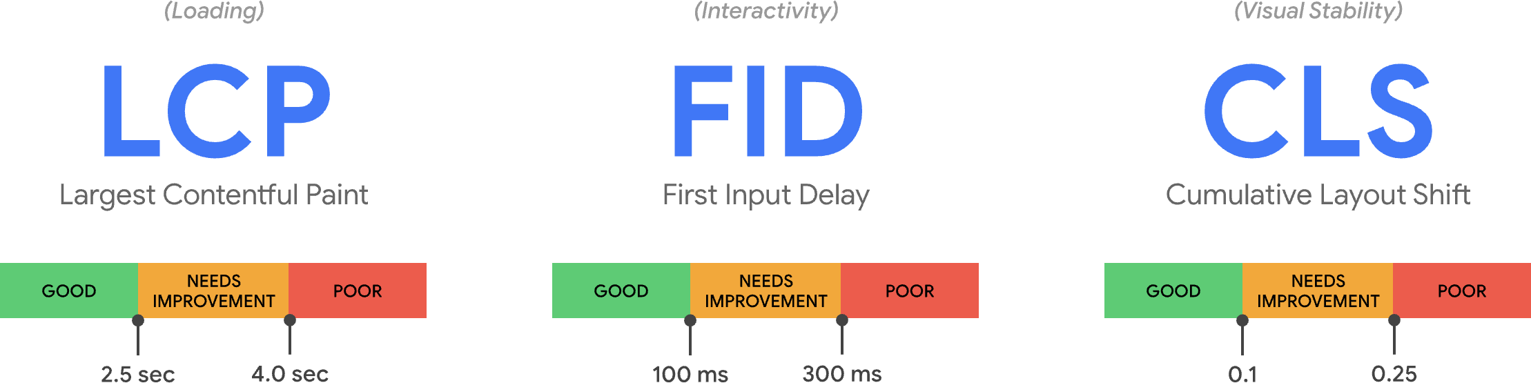
But which metrics should be measured in order to determine website performance? Over the years many metrics have been proposed and used, which made it difficult to compare results taken from different tools. In other words, the field lacked standardization. This changed approximately two years ago when Google introduced three primary metrics for measuring website performance, known collectively as Google Core Web Vitals (CWV).

The three metrics are:

  1. LCP: Largest Contentful Paint (measures visibility)
  2. FID: First Input Delay (measures response time)
  3. CLS: Cumulative Layout Shift (measures visual stability)

CWV have enabled the industry to focus on a small number of metrics that cover the main aspects of the website loading experience. And the fact that Google is now using CWV as a search ranking signal provides additional motivation for people to improve them.

Recommended Reading: An In-Depth Guide To Measuring Core Web Vitals” by Barry Pollard

At Wix, we focus on CWV when analyzing field data, but also use lab measurements during the development process. In particular, lab tests are critical for implementing performance budgets in order to prevent performance degradations. The best implementations of performance budgets integrate their enforcement into the CI/CD process, so they are applied automatically, and prevent deployment to production when a regression is detected. When such a regression does occur it breaks the build, forcing the team to fix it before deployment can proceed.

There are various performance budgeting products and open-source tools available, but we decided to create our own custom budgeting service called Perfer. This is because we operate at a much larger scale than most web development operations, and at any given moment hundreds of different components are being developed at Wix and are used in thousands of different combinations in millions of different websites.

This requires the ability to test a very large number of configurations. Moreover, in order to avoid breaking builds with random fluctuations, tests that measure performance metrics or scores are run multiple times and an aggregate of the results is used for the budget. In order to accommodate such a high number of test runs without negatively impacting build time, Perfer executes the performance measurements in parallel on a cluster of dedicated servers called WatchTower. Currently, WatchTower is able to execute up to 1,000 Lighthouse tests per minute.

After deployment performance data is collected anonymously from all Wix sessions in the field. This is especially important in our case because the huge variety of Wix websites makes it effectively impossible to test all relevant configurations and scenarios “in the lab.” By collecting and analyzing RUM data, we ensure that we have the best possible insight into the experiences of actual visitors to the websites. If we identify that a certain deployment degrades performance and harms that experience, even though this degradation was not identified by our lab tests, we can quickly roll it back.

Another advantage of field measurements is that they match the approach taken by Google in order to collect performance data into the CrUX database. Since it is the CrUX data that is used as an input for Google’s performance ranking signal, utilizing the same approach for performance analysis is very important.

All Wix sessions contain custom instrumentation code that gathers performance metrics and transmits this information anonymously back to our telemetry servers. In addition to the three CWV, this code also reports Time To First Byte (TTFB), First Contentful Paint (FCP), Total Blocking Time (TBT), and Time To Interactive (TTI), and also low-level metrics such as DNS lookup time and SSL handshake time. Collecting all this information makes it possible for us to not only quickly identify performance issues in production, but also to analyze the root causes of such issues. For example, we can determine if an issue was caused by changes in our own software by the changes in our infrastructure configuration, or even by issues affecting third-party services that we utilize (such as CDNs).

Upgrading Our Services And Infrastructure

Back when I joined Wix seven years ago, we only had a single data center (along with a fallback data center) in the USA which was used to serve users from all around the world. Since then we’ve expanded the number of data centers significantly, and have multiple such centers spread around the globe. This ensures that wherever our users connect from, they’ll be serviced both quickly and reliably. In addition, we use CDNs from multiple providers to ensure rapid content delivery regardless of location. This is especially important given that we now have users in 190 countries.

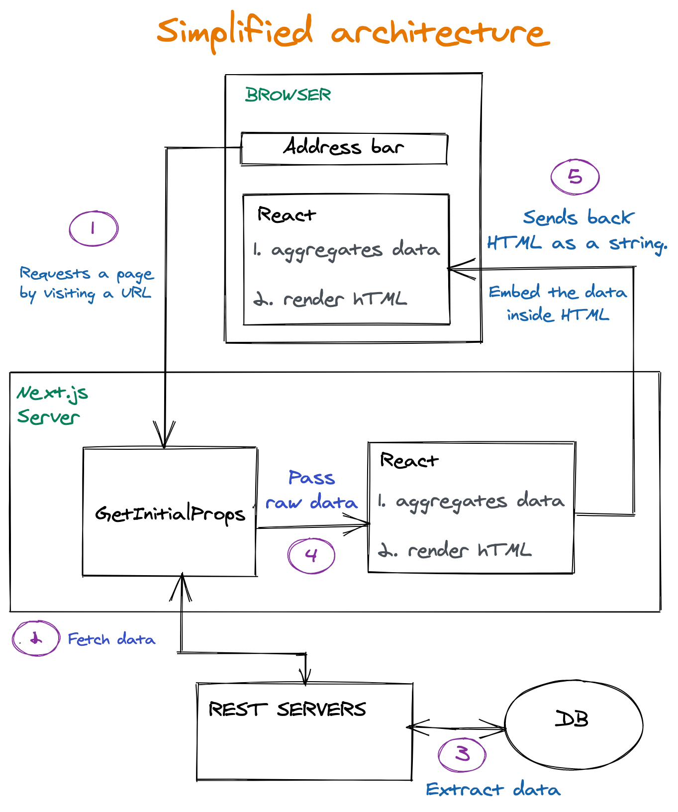
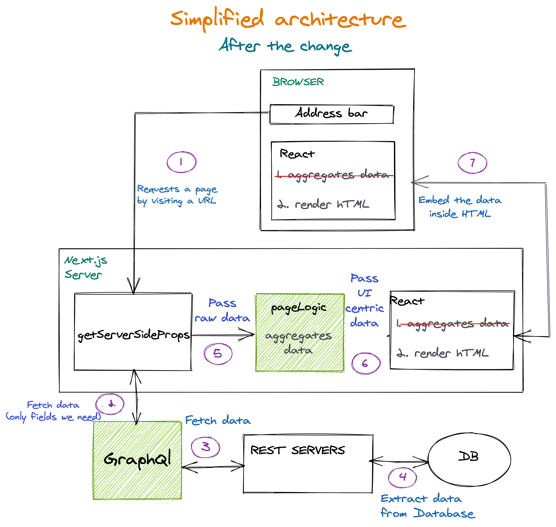
In order to make the best possible use of this enhanced infrastructure, we completely redesigned and rewrote significant portions of our front-end code. The goal was to shift as much of the computation as possible off of the browsers and onto fast servers. This is especially beneficial in the case of mobile devices, which are often less powerful and slower. In addition, this significantly reduced the amount of JavaScript code that needs to be downloaded by the browser.

Reducing JavaScript size almost always benefits performance because it decreases the overhead of the actual download as well as parsing and execution. Our measurements showed a direct correlation between the JavaScript size reduction and performance improvements:

Another benefit of moving computations from browsers to servers is that the results of these computations can often be cached and reused between sessions even for unrelated visitors, thus reducing per-session execution time dramatically. In particular, when a visitor navigates to a Wix site for the first time, the HTML of the landing page is generated on the server by Server-Side Rendering (SSR) and the resulting HTML can then be propagated to a CDN.

Navigations to the same site — even by unrelated visitors — can then be served directly from the CDN, without even accessing our servers. If this workflow sounds familiar that’s because it’s essentially the same as the on-demand mechanism provided by some advanced Jamstack services.

Note: “On-demand” means that instead of Static Site Generation performed at build time, the HTML is generated in response to the first visitor request, and propagated to a CDN at runtime.

Similarly to Jamstack, client-side code can enhance the user interface, making it more dynamic by invoking backend services using APIs. The results of some of these APIs are also cached in a CDN as appropriate. For example, in the case of a shopping cart checkout icon, the HTML for the button is generated on the server, but the actual number of items in the cart is determined on the client-side and then rendered into that icon. This way, the page HTML can be cached even though each visitor is able to see a different item count value. If the HTML of the page does need to change, for example, if the site owner publishes a new version, then the copy in the CDN is immediately purged.

In order to reduce the impact of computations on end-point devices, we moved business logic that does need to run in the browsers into Web Workers. For example, business logic that is invoked in response to user interactions. The code that runs in the browser’s main thread is mostly dedicated to the actual rendering operations. Because Web Workers execute their JavaScript code off of the main thread, they don’t block event handling, enabling the browser to quickly respond to user interactions and other events.

Examples of code that runs in Web Workers include the business logic of various vertical solutions such as e-commerce and bookings. Sending requests to backend services is mostly done from Web Workers, and the responses are parsed, stored and managed in the Web Workers as well. As a result, using Web Workers can reduce blocking and improve the FID metric significantly, providing better responsiveness in general. In lab measurements, this improved TBT measurements.

Enhanced Media Delivery

Modern websites often provide a richer user experience by downloading and presenting much more media resources, such as images and videos, than ever before. Over the past decade the median amount of bytes of images downloaded by websites, according to the Google CrUX database, has increased more than eightfold! This is more than the median improvement in network speeds during the same period, which results in slower loading times. Additionally, our RUM data (field measurements) shows that for almost ¾ of Wix sessions the LCP element is an image. All of this highlights the need to deliver images to the browsers as efficiently as possible and to quickly display the images that are in a webpage’s initially visible viewport area.

At the same time, it is crucial to deliver the highest quality of images possible in order to provide an engaging and delightful user experience. This means that improving performance by noticeably degrading visual experience is almost always out of the question. The performance enhancements we implement need to preserve the original quality of images used, unless explicitly specified otherwise by the user.

One technique for improving media-related performance is optimizing the delivery process. This means downloading required media resources as quickly as possible. In order to achieve this for Wix websites, we use a CDN to deliver the media content, as we do with other resources such as the HTML itself. And by specifying a lengthy caching duration in the HTTP response header, we allow images to be cached by browsers as well. This can improve the loading speed for repeat visits to the same page significantly by completely avoiding downloading the images over the network again.

Another technique for improving performance is to deliver the required image information more efficiently by reducing the number of bytes that need to be downloaded while preserving the desired image quality. One method to achieve this is to use a modern image format such as WebP. Images encoded as WebP are generally 25% to 35% smaller than equivalent images encoded as PNG or JPG. Images uploaded to Wix are automatically converted to WebP before being delivered to browsers that support this format.

Very often images need to be resized, cropped, or otherwise manipulated when displayed within a webpage. This manipulation can be performed inside the browser using CSS, but this usually means that more data needs to be downloaded than is actually used. For example, all the pixels of an image that have been cropped out aren’t actually needed but are still delivered. We also take into account viewport size and resolution, and display pixel depth, to optimize the image size. For Wix sites, we perform these manipulations on the server-side before the images are downloaded, this way we can ensure that only the pixels that are actually required are transmitted over the network. On the servers, we employ AI and ML models to generate resized images at the best quality possible.

Yet another technique that is used for reducing the amount of image data that needs to be downloaded upfront is lazy loading images. This means not loading images that are wholly outside the visible viewport until they are about to scroll in. Deferring image download in this way, and even avoiding it completely (if a visitor never scrolls to that part of the page), reduces network contention for resources that are already required as soon as the page loads, such as an LCP image. Wix websites automatically utilize lazy loading for images, and for various other types of resources as well.

Looking Forward

Over the past two years, we have deployed numerous enhancements to our platform intended to improve performance. The result of all these enhancements is a dramatic increase in the percentage of Wix websites that get a good score for all three CWVs compared to a year ago. But performance is a journey, not a destination, and we still have many more action items and future plans for improving websites’ speed. To that end, we are investigating new browser capabilities as well as additional changes to our own infrastructure. The performance budgets and monitoring that we have implemented provide safeguards that these changes provide actual benefits.

New media formats are being introduced that have the potential to reduce download sizes even more while retaining image quality. We are currently investigating AVIF, which looks to be especially promising for photographic images that can use lossy compression. In such scenarios, AVIF can provide significantly reduced download sizes even compared to WebP, while retaining image quality. AVIF also supports progressive rendering which may improve perceived performance and user experience, especially on slower connections, but currently won’t provide any benefits for CWV.

Another promising browser innovation that we are researching is the content-visibility CSS property. This property enables the browser to skip the effort of rendering an HTML element until it’s actually needed. In particular, when content-visibility:auto setting is applied to an element that is off-screen its descendants are not rendered. This enables the browser to skip most of the rendering work, such as styling and layout of the element’s subtree. This is especially desirable for many Wix pages that tend to be lengthy and content-rich. In particular, Wix’s new EditorX responsive sites editor support sophisticated grid and flexbox layouts that can be expensive for the browser to render, so that avoiding unnecessary rendering operations is especially desirable. Unfortunately, this property is currently only supported in Chromium-based browsers. Also, it’s challenging to implement this functionality in such a way that no Wix website is ever adversely affected in terms of its visual appearance or behavior.

Priority Hints is an upcoming browser feature that we are also investigating, which promises to improve performance by providing greater control over when and how browsers download resources. This feature will inform browsers about which resources are more urgent and should be downloaded ahead of other resources. For example, a foreground image could be assigned a higher priority than a background image since it’s more likely to contain significant content. On the other hand, if applied incorrectly, priority hints can actually degrade download speed, and hence also CWV scores. Priority hints are currently undergoing Origin Trial in Chrome.

In addition to enhancing Wix’s own infrastructure, we’re also working on providing better tooling for our users so that they can design and implement faster websites. Since Wix is highly customizable, users have the freedom and flexibility to create both fast and slow websites on our platform, depending on the decisions they make while building these sites. Our goal is to inform users about the performance of their decisions so that they can make appropriate choices. This is similar to the SEO Wiz tool that we already provide.

Summary

Implementing a performance culture at Wix enabled us to apply performance enhancements to almost every part of our technological stack — from infrastructure to software architecture and media formats. While some of these enhancements have had a greater impact than others, it’s the cumulative effect that provides the overall benefits. And these benefits aren’t just measurable at a large scale; they’re also apparent to our users, thanks to tools like WebPageTest and Google PageSpeed Insights and actual feedback that they receive from their own users.

The feedback we ourselves receive, from our users and the industry at large, and the tangible benefits we experience, drive us forward to continue improving our speed. The performance culture that we’ve implemented is here to stay.

Related Resources

Let There Be Light(house)! SmartCrawl Now Integrates Lighthouse SEO Scan Feature

Google Lighthouse is the industry standard for testing website performance, and is now built into our SEO plugin, SmartCrawl.

Lighthouse has historically been able to run in several ways: as a Chrome DevTools, as a separate Chrome add-on (with a few restrictions), and as a Node package (incorporating it into your build process).

Now, you can do it from right within SmartCrawl’s dashboard (or if you’re a WPMU DEV member, from our streamlined Hub interface), without touching a line of code.

Continue reading for the full article, or use the links below to jump to any section:

Alright, let’s delve into this illuminating new feature.

Why Lighthouse?

Google Lighthouse logo
Google’s Lighthouse beckons you to test the surfing waters.

Lighthouse is an open-source auditing tool that provides standardized scores across five areas:

  • Performance
  • Progressive Web App
  • Best Practices
  • Accessibility
  • SEO

Lighthouse runs performance tests using emulated data, also known as lab data. This is performance data collected within a controlled environment (with predefined device and network settings), and is helpful for assessing and debugging performance issues.

As mentioned in many of our optimization articles in the past, many variables go into your testing results. What Lighthouse tests via your local machine in a controlled environment does not equate 1:1 to real-world usage. Still, it is a useful indicator on the whole, and a valuable addition to your toolkit.

A Guided Lighthouse Tour

The Start of Something Big

In May of 2020, the Google-backed Chromium project announced a set of three metrics with which the browser would measure performance.

Known as Web Vitals, these metrics ― Loading, Interactivity, & Visual Stability ― became part of a Google initiative to provide guidance for quality signals.

With Web Core Vitals comprising more than half of Lighthouse’s performance score, the focus changed to new, more refined goals.

Looming Large: Page Experience

Google also announced in May of 2020 that Page Experience signals would be included in Google Search ranking.

The new Page Experience signals combine Core Web Vitals with Google’s existing search signals: Mobile-friendliness, Safe Browsing, HTTPS Security, and Intrusive Interstitial Guidelines.

Google’s Page Experience is slated to be complete by the end of August 2021, at which time it will join the hundreds of signals that Google considers when generating Search results.

Google page experience
Google’s Page Experience combines Core Web Vitals + Web Search signals.

What to Look for in Lighthouse Results

We know Google Lighthouse analyzes your site based on the five factors mentioned above; performance is simply the heaviest contributor to the score.

When you double click into performance, Google measures: First Contentful Paint (FCP); Speed Index (SI); Largest Contentful Paint (LCP); Time to Interactive (TTI); Total Blocking Time (TBT); Cumulative Layout Shift (CLS).

TBT has surpassed LCP in the latest version of Lighthouse, and is now weighted the heaviest in the score. TBT measures the total amount of time that a page is blocked from responding to user input, such as mouse clicks, screen taps, or keyboard presses. The sum is calculated by adding the blocking portion of all long tasks between First Contentful Paint and Time to Interactive.

You can see how the score is calculated by going to the Lighthouse Scoring Calculator:

Lighthouse scoring calculator
Lighthouse scoring calculator allows you to select device type and scoring version.

The Lighthouse report also features some opportunities to improve the site speed of your mobile site, including how much loading time they will save. These include reducing render-blocking stylesheets, render-blocking scripts, properly sizing images, and fixing offscreen images.

Lighthouse gives you a tremendous amount of insight into the performance of your page. You can and should parlay these findings to your advantage.

Setting Up Lighthouse in SmartCrawl

Armed with the knowledge of how important search metrics are, let’s implement our supreme surveyor of SEO-ness, SmartCrawl. (Say that five times fast!!)

You will have the option to continue using SEO check ups, but we highly recommend switching to the new SEO Audits. With it, you’ll get the best of the web on your own site, ensuring it’s always optimized for search engine results ranking. (Also, please note that our SEO Checkup tool will become fully depreciated after the next few version releases.)

WordPress Dashboard Settings

After you install and activate SmartCrawl from your WP site, navigate to her dashboard and the Quick Setup Wizard will pop up.

SmartCrawl quick setup wizard
SmartCrawl pre-selects the above options during quick setup.

Let’s leave all the pre-selected elements on, and click the Get Started button.

She’ll take a few seconds to do her thing, then the full dashboard with the various menus and markers will load. As you can see from the list of found issues, SmartCrawl ran her first test during the setup process.

SmartCrawl initial dashboard view
SmartCrawl’s Checkup provides a comprehensive report of our site’s SEO optimization.

Before we try to fix anything, let’s switch from the SEO Checkup default to the new, recommended Google Lighthouse SEO. To do so, click on the Switch to Lighthouse SEO audits text.

SmartCrawl SEO checkup
Switching to Google Lighthouse through SEO Checkup settings.

From the SmartCrawl informational strip that loads at page top, click on the blue Try Lighthouse Audits button, which will take you to the settings panel.

SmartCrawl confirm switch to Lighthouse SEO
Confirmation message after integrating the Google Lighthouse feature in settings.

Click on the Lighthouse Audits tab, select whether you want to scan Desktop or Mobile, then click Save Settings.

SC SEO health settings
You can switch between Desktop & Mobile anytime in the Lighthouse Audits settings.

With Lighthouse Audits selected, you’ll now be viewing the SEO Audit screen and Dashboard widget.

Now let’s run a test using Lighthouse. From the dashboard, SEO Audits tab, click Run Test.

SC SEO audits run test
In this case, we’ve selected Desktop, so those are the results we’ll be capturing.

After running the test, SmartCrawl lays out her findings. SEO audits are divided into four categories: Content audits, Crawling and indexing audits, Responsive audits, and Manual audits. You can read about these in depth in SmartCrawl’s documentation.

SC SEO health post test
One health test you’ll be glad to test positive for is SmartCrawls’s SEO.

Each Audit includes an overview, a status, and a description on best practices or how to fix. Click the dropdown arrow next to any listed audit to see suggestions on how to improve your SEO.

Single-click simplicity to all the fixes or recommendations SmartCrawl makes.

We recommend addressing as many of the identified issues as possible to ensure your site is the most SEO friendly.

(Re)Ports of Call

Reports are a great way to keep track of your all-important SEO indicators, and nip any issues in the bud. SmartCrawl brings this to the table with the ability to send SEO Audits Reports. There are two different kinds: Scheduled (automated), and Conditional.

For Scheduled Reports, you can choose the frequency ― daily, weekly, monthly― as well as which day of the week & what time of the day. You can also select which device types to include in said reports ― Desktop, Mobile, or both.

With Conditional Reports, you can select to send an SEO Audits Report based on degrees of variance from baseline values. Settings allow for triggering a report send when your SEO score drops below a specified threshold (any incremental percentage of ten, between 10 and 100).

To set up reports, go to Dashboard, Reporting, Emails & Report, and click on the plus sign for SEO Audits or Sitemap Crawler to get reports on each. (Note: Sitemap Crawler can do scheduled reports only.)

SC setup emails thru dashboard
With SmartCrawl, SEO reports and email notifications come based on your selections.

From here you can cater to your preferences, having reports come at your will on selected days & times, or based on specific conditions.

SC conditional reports
Report sends can be automatic or conditionally based.

We’ve seen how easy and helpful controlling SmartCrawl’s settings through the WordPress dashboard can be. Now let’s look at what we can do with them through the Hub.

The Hub Settings

From WPMU Dev’s Hub 2.0, click on the SmartCrawl icon in line with any of your hosted sites, and it will install the plugin.

HUB SmartCrawl activate icon
The green icons in these Hub settings indicate the plugin or feature is already installed & active.

The SmartCrawl splash screen comes into view, with a blue Install button. Let’s click that.

SC landing page in Hub
SmartCrawl shines a light in the darkness with her superior SEO skills.

A nearly identical screen loads, this time with a blue Run Test button, which we are going to click now.

A quick overview of your latest Lighthouse Audit results is provided below the SEO score.

HUB SEO scan test results
Click any audit category to view additional details in SmartCrawl’s SEO Health screen.

Beneath Other SEO tools, you can select any listed items that you’d like displaying in your Hub. Clicking Activate on any of these will take you back to the WP plugin dashboard, where you will need to enter other pertinent information in order to include them as active panels in the Hub.

HUB SEO scan test results, other tools
Some of the SEO tools require other information in order to activate them in the Hub.

For example, to see MozRank data, you will need to connect to your Moz account by providing your API credentials (Access ID and Secret Key).

Checking SEO tools via the Hub interface is visually pleasing, useful, and convenient, as users can view all their sites’ scores in the same place. And, this can be done in tandem with accessing the information through the WP plugin dashboard, or instead of it. It’s really nice having the option for both.

Advantages of Using Lighthouse SEO in SmartCrawl

  1. Single Source Testing
    With SmartCrawl’s Lighthouse SEO integration, users can check Desktop and Mobile audits, at the same time, from the same place. (On console, you would need to do this separately for each device.)
  2. Fixes at Your Fingertips
    SmartCrawl provides users with fixes for any issues directly in its UI. (Disclaimer: there are some audits that do not.)
  3. Advice and Assistance At-the-Ready
    SmartCrawl shows best practices & contextual help for each audit. (On console, you would be redirected to a separate Docs page.)
  4. Send Scheduled Reports
    SmartCrawl allows you to send regularly scheduled SEO Audits Reports.
  5. Send Conditional Reports
    SmartCrawl allows you to send SEO Audits Reports based on conditional changes.
  6. Location, Location, Location
    ALL of your sites’ scores are viewable in the SmartCrawl Dashboard. Or alternately… The Hub.
  7. Hubba Hubba.
    The Hub. This deserves a second shoutout, because it is just that cool and that useful. SmartCrawl’s powerful suite of SEO features are fully integrated with the Hub, so you can manage all your connected sites from a single, streamlined point of access.

A Beacon of Light(house)

Most users won’t be clocking speed scores when they visit your site; but they will remember whether the experience felt fast or slow (with the line between the two separated by milliseconds). We’re living in the tech-forward 2020’s, and most folks won’t settle for delayed gratification.

SmartCrawl is free, and packed with benefits. But if you really want to go full throttle, opt for the ultimate bundle of SEO tools & services, with all of our highly rated plugins, plus our 5-star 24/7 support. There’s no commitment! You can do a free trial of our full membership, or our fully dedicated individual site hosting service. If you’re not completely happy, we’ll refund your hard-earned moolah.

Whoever you use as a hosting service, and whatever plugins or tools you avail yourself of, keep Google Lighthouse and Page Experience signals in mind, and make sure your tools & providers are trusted and reliable.

How We Improved Our Core Web Vitals (Case Study)

Last year, Google started emphasizing the importance of Core Web Vitals and how they reflect a person’s real experience when visiting sites around the web. Performance is a core feature of our company, Instant Domain Search—it’s in the name. Imagine our surprise when we found that our vitals scores were not great for a lot of people. Our fast computers and fiber internet masked the experience real people have on our site. It wasn’t long before a sea of red “poor” and yellow “needs improvement” notices in our Google Search Console needed our attention. Entropy had won, and we had to figure out how to clean up the jank—and make our site faster.

I founded Instant Domain Search in 2005 and kept it as a side-hustle while I worked on a Y Combinator company (Snipshot, W06), before working as a software engineer at Facebook. We’ve recently grown to a small group based mostly in Victoria, Canada and we are working through a long backlog of new features and performance improvements. Our poor web vitals scores, and the looming Google Update, brought our focus to finding and fixing these issues.

When the first version of the site was launched, I’d built it with PHP, MySQL, and XMLHttpRequest. Internet Explorer 6 was fully supported, Firefox was gaining share, and Chrome was still years from launch. Over time, we’ve evolved through a variety of static site generators, JavaScript frameworks, and server technologies. Our current front-end stack is React served with Next.js and a backend service built-in Rust to answer our domain name searches. We try to follow best practice by serving as much as we can over a CDN, avoiding as many third-party scripts as possible, and using simple SVG graphics instead of bitmap PNGs. It wasn’t enough.

Next.js lets us build our pages and components in React and TypeScript. When paired with VS Code the development experience is amazing. Next.js generally works by transforming React components into static HTML and CSS. This way, the initial content can be served from a CDN, and then Next can “hydrate” the page to make elements dynamic. Once the page is hydrated, our site turns into a single-page app where people can search for and generate domain names. We do not rely on Next.js to do much server-side work, the majority of our content is statically exported as HTML, CSS, and JavaScript to be served from a CDN.

When someone starts searching for a domain name, we replace the page content with search results. To make the searches as fast as possible, the front-end directly queries our Rust backend which is heavily optimized for domain lookups and suggestions. Many queries we can answer instantly, but for some TLDs we need to do slower DNS queries which can take a second or two to resolve. When some of these slower queries resolve, we will update the UI with whatever new information comes in. The results pages are different for everyone, and it can be hard for us to predict exactly how each person experiences the site.

The Chrome DevTools are excellent, and a good place to start when chasing performance issues. The Performance view shows exactly when HTTP requests go out, where the browser spends time evaluating JavaScript, and more:

There are three Core Web Vitals metrics that Google will use to help rank sites in their upcoming search algorithm update. Google bins experiences into “Good”, “Needs Improvement”, and “Poor” based on the LCP, FID, and CLS scores real people have on the site:

  • LCP, or Largest Contentful Paint, defines the time it takes for the largest content element to become visible.
  • FID, or First Input Delay, relates to a site’s responsiveness to interaction—the time between a tap, click, or keypress in the interface and the response from the page.
  • CLS, or Cumulative Layout Shift, tracks how elements move or shift on the page absent of actions like a keyboard or click event.

Chrome is set up to track these metrics across all logged-in Chrome users, and sends anonymous statistics summarizing a customer’s experience on a site back to Google for evaluation. These scores are accessible via the Chrome User Experience Report, and are shown when you inspect a URL with the PageSpeed Insights tool. The scores represent the 75th percentile experience for people visiting that URL over the previous 28 days. This is the number they will use to help rank sites in the update.

A 75th percentile (p75) metric strikes a reasonable balance for performance goals. Taking an average, for example, would hide a lot of bad experiences people have. The median, or 50th percentile (p50), would mean that half of the people using our product were having a worse experience. The 95th percentile (p95), on the other hand, is hard to build for as it captures too many extreme outliers on old devices with spotty connections. We feel that scoring based on the 75th percentile is a fair standard to meet.

To get our scores under control, we first turned to Lighthouse for some excellent tooling built into Chrome and hosted at web.dev/measure/, and at PageSpeed Insights. These tools helped us find some broad technical issues with our site. We saw that the way Next.js was bundling our CSS and slowed our initial rendering time which affected our FID. The first easy win came from an experimental Next.js feature, optimizeCss, which helped improve our general performance score significantly.

Lighthouse also caught a cache misconfiguration that prevented some of our static assets from being served from our CDN. We are hosted on Google Cloud Platform, and the Google Cloud CDN requires that the Cache-Control header contains “public”. Next.js does not allow you to configure all of the headers it emits, so we had to override them by placing the Next.js server behind Caddy, a lightweight HTTP proxy server implemented in Go. We also took the opportunity to make sure we were serving what we could with the relatively new stale-while-revalidate support in modern browsers which allows the CDN to fetch content from the origin (our Next.js server) asynchronously in the background.

It’s easy—maybe too easy—to add almost anything you need to your product from npm. It doesn’t take long for bundle sizes to grow. Big bundles take longer to download on slow networks, and the 75th percentile mobile phone will spend a lot of time blocking the main UI thread while it tries to make sense of all the code it just downloaded. We liked BundlePhobia which is a free tool that shows how many dependencies and bytes an npm package will add to your bundle. This led us to eliminate or replace a number of react-spring powered animations with simpler CSS transitions:

Through the use of BundlePhobia and Lighthouse, we found that third-party error logging and analytics software contributed significantly to our bundle size and load time. We removed and replaced these tools with our own client-side logging that take advantage of modern browser APIs like sendBeacon and ping. We send logging and analytics to our own Google BigQuery infrastructure where we can answer the questions we care about in more detail than any of the off-the-shelf tools could provide. This also eliminates a number of third-party cookies and gives us far more control over how and when we send logging data from clients.

Our CLS score still had the most room for improvement. The way Google calculates CLS is complicated—you’re given a maximum “session window” with a 1-second gap, capped at 5 seconds from the initial page load, or from a keyboard or click interaction, to finish moving things around the site. If you’re interested in reading more deeply into this topic, here’s a great guide on the topic. This penalizes many types of overlays and popups that appear just after you land on a site. For instance, ads that shift content around or upsells that might appear when you start scrolling past ads to reach content. This article provides an excellent explanation of how the CLS score is calculated and the reasoning behind it.

We are fundamentally opposed to this kind of digital clutter so we were surprised to see how much room for improvement Google insisted we make. Chrome has a built-in Web Vitals overlay that you can access by using the Command Menu to “Show Core Web Vitals overlay”. To see exactly which elements Chrome considers in its CLS calculation, we found the Chrome Web Vitals extension’s “Console Logging” option in settings more helpful. Once enabled, this plugin shows your LCP, FID, and CLS scores for the current page. From the console, you can see exactly which elements on the page are connected to these scores. Our CLS scores had the most room for improvement.

Of the three metrics, CLS is the only one that accumulates as you interact with a page. The Web Vitals extension has a logging option that will show exactly which elements cause CLS while you are interacting with a product. Watch how the CLS metrics add when we scroll on Smashing Magazine’s home page:

The best way to track progress from one deploy to the next is to measure page experiences the same way Google does. If you have Google Analytics set up, an easy way to do this is to install Google’s web-vitals module and hook it up to Google Analytics. This provides a rough measure of your progress and makes it visible in a Google Analytics dashboard.

This is where we hit a wall. We could see our CLS score, and while we’d improved it significantly, we still had work to do. Our CLS score was roughly 0.23 and we needed to get this below 0.1—and preferably down to 0. At this point, though, we couldn’t find something that told us exactly which components on which pages were still affecting the score. We could see that Chrome exposed a lot of detail in their Core Web Vitals tools, but that the logging aggregators threw away the most important part: exactly which page element caused the problem.

To capture all of the detail we need, we built a serverless function to capture web vitals data from browsers. Since we don’t need to run real-time queries on the data, we stream it into Google BigQuery’s streaming API for storage. This architecture means we can inexpensively capture about as many data points as we can generate.

After learning some lessons while working with Web Vitals and BigQuery, we decided to bundle up this functionality and release these tools as open-source at vitals.dev.

Using Instant Vitals is a quick way to get started tracking your Web Vitals scores in BigQuery. Here’s an example of a BigQuery table schema that we create:

Integrating with Instant Vitals is easy. You can get started by integrating with the client library to send data to your backend or serverless function:

import { init } from "@instantdomain/vitals-client";

init({ endpoint: "/api/web-vitals" });

Then, on your server, you can integrate with the server library to complete the circuit:

import fs from "fs";

import { init, streamVitals } from "@instantdomain/vitals-server";

// Google libraries require service key as path to file
const GOOGLE_SERVICE_KEY = process.env.GOOGLE_SERVICE_KEY;
process.env.GOOGLE_APPLICATION_CREDENTIALS = "/tmp/goog_creds";
fs.writeFileSync(
  process.env.GOOGLE_APPLICATION_CREDENTIALS,
  GOOGLE_SERVICE_KEY
);

const DATASET_ID = "web_vitals";
init({ datasetId: DATASET_ID }).then().catch(console.error);

// Request handler
export default async (req, res) => {
  const body = JSON.parse(req.body);
  await streamVitals(body, body.name);
  res.status(200).end();
};

Simply call streamVitalswith the body of the request and the name of the metric to send the metric to BigQuery. The library will handle creating the dataset and tables for you.

After collecting a day’s worth of data, we ran this query like this one:

SELECT
  `<project_name>.web_vitals.CLS`.Value,
  Node
FROM
  `<project_name>.web_vitals.CLS`
JOIN
  UNNEST(Entries) AS Entry
JOIN
  UNNEST(Entry.Sources)
WHERE
  Node != ""
ORDER BY
  value
LIMIT
  10

This query produces results like this:

Value Node
4.6045324800736724E-4 /html/body/div[1]/main/div/div/div[2]/div/div/blockquote
7.183070668914928E-4 /html/body/div[1]/header/div/div/header/div
0.031002668277977697 /html/body/div[1]/footer
0.035830703317463526 /html/body/div[1]/main/div/div/div[2]
0.035830703317463526 /html/body/div[1]/footer
0.035830703317463526 /html/body/div[1]/main/div/div/div[2]
0.035830703317463526 /html/body/div[1]/footer
0.03988482067913317 /html/body/div[1]/footer

This shows us which elements on which pages have the most impact on CLS. It created a punch list for our team to investigate and fix. On Instant Domain Search, it turns out that slow or bad mobile connections will take more than 500ms to load some of our search results. One of the worst contributors to CLS for these users was actually our footer.

The layout shift score is calculated as a function of the size of the element moving, and how far it goes. In our search results view, if a device takes more than a certain amount of time to receive and render search results, the results view would collapse to a zero-height, bringing the footer into view. When the results come in, they push the footer back to the bottom of the page. A big DOM element moving this far added a lot to our CLS score. To work through this properly, we need to restructure the way the search results are collected and rendered. We decided to just remove the footer in the search results view as a quick hack that’d stop it from bouncing around on slow connections.

We now review this report regularly to track how we are improving — and use it to fight declining results as we move forward. We have witnessed the value of extra attention to newly launched features and products on our site and have operationalized consistent checks to be sure core vitals are acting in favor of our ranking. We hope that by sharing Instant Vitals we can help other developers tackle their Core Web Vitals scores too.

Google provides excellent performance tools built into Chrome, and we used them to find and fix a number of performance issues. We learned that the field data provided by Google offered a good summary of our p75 progress, but did not have actionable detail. We needed to find out exactly which DOM elements were causing layout shifts and input delays. Once we started collecting our own field data—with XPath queries—we were able to identify specific opportunities to improve everyone’s experience on our site. With some effort, we brought our real-world Core Web Vitals field scores down into an acceptable range in preparation for June’s Page Experience Update. We’re happy to see these numbers go down and to the right!

Reducing HTML Payload With Next.js (Case Study)

I know what you are thinking. Here’s another article about reducing JavaScript dependencies and the bundle size sent to the client. But this one is a bit different, I promise.

This article is about a couple of things that Bookaway faced and we (as a company in the traveling industry) managed to optimize our pages, so that the HTML we send is smaller. Smaller HTML means less time for Google to download and process those long strings of text.

Usually, the HTML code size is not a big issue, especially for small pages, not data-intensive, or pages that are not SEO-oriented. However, in our pages, the case was different as our database stores lots of data, and we need to serve thousands of landing pages at scale.

You may be wondering why we need such a scale. Well, Bookaway works with 1,500 operators and provide over 20k services in 63 countries with 200% growth year over year (pre Covid-19). In 2019, we sold 500k tickets a year, so our operations are complex and we need to showcase it with our landing pages in an appealing and fast manner. Both for Google bots (SEO) and to actual clients.

In this article, I’ll explain:

  • how we found the HTML size is too big;
  • how it got reduced;
  • the benefits of this process (i.e. creating improved architecture, improving ode organization, providing a straightforward job for Google to index tens of thousands of landing pages, and serving much fewer bytes to the client — especially suitable for people with slow connections).

But first, let’s talk about the importance of speed improvement.

Why Is Speed Improvement Necessary To Our SEO Efforts?

Meet “Web Vitals”, but in particular, meet LCP (Largest Contentful Paint):

“Largest Contentful Paint (LCP) is an important, user-centric metric for measuring perceived load speed because it marks the point in the page load timeline when the page’s main content has likely loaded — a fast LCP helps reassure the user that the page is useful.”

The main goal is to have a small LCP as possible. Part of having a small LCP is to let the user download as small HTML as possible. That way, the user can start the process of painting the largest content paint ASAP.

While LCP is a user-centric metric, reducing it should make a big help to Google bots as Googe states:

“The web is a nearly infinite space, exceeding Google’s ability to explore and index every available URL. As a result, there are limits to how much time Googlebot can spend crawling any single site. Google’s amount of time and resources to crawling a site is commonly called the site’s crawl budget.”

— “Advanced SEO,” Google Search Central Documentation

One of the best technical ways to improve the crawl budget is to help Google do more in less time:

Q: “Does site speed affect my crawl budget? How about errors?”

A: “Making a site faster improves the users' experience while also increasing the crawl rate. For Googlebot, a speedy site is a sign of healthy servers so that it can get more content over the same number of connections.”

To sum it up, Google bots and Bookaway clients have the same goal — they both want to get content delivered fast. Since our database contains a large amount of data for every page, we need to aggregate it efficiently and send something small and thin to the clients.

Investigations for ways we can improve led to finding that there is a big JSON embedded in our HTML, making the HTML chunky. For that case, we’ll need to understand React Hydration.

React Hydration: Why There Is A JSON In HTML

That happens because of how Server-side rendering works in react and Next.js:

  1. When the request arrives at the server — it needs to make an HTML based on a data collection. That collection of data is the object returned by getServerSideProps.
  2. React got the data. Now it kicks into play in the server. It builds in HTML and sends it.
  3. When the client receives the HTML, it is immediately pained in front of him. In the meanwhile, React javascript is being downloaded and executed.
  4. When javascript execution is done, React kicks into play again, now on the client. It builds the HTML again and attaches event listeners. This action is called hydration.
  5. As React building the HTML again for the hydration process, it requires the same data collection used on the server (look back at 1.).
  6. This data collection is being made available by inserting the JSON inside a script tag with id __NEXT_DATA__.

What Pages Are We Talking About Exactly?

As we need to promote our offerings in search engines, the need for landing pages has arisen. People usually don’t search for a specific bus line’s name, but more like, “How to get from Bangkok to Pattaya?” So far, we have created four types of landing pages that should answer such queries:

  1. City A to City B
    All the lines stretched from a station in City A to a station in City B. (e.g. Bangkok to Pattaya)
  2. City
    All lines that go through a specific city. (e.g. Cancun)
  3. Country
    All lines that go through a specific country. (e.g. Italy)
  4. Station
    All lines that go through a specific station. (e.g. Hanoi-airport)

Now, A Look At Architecture

Let’s take a high-level and very simplified look at the infrastructure powering the landing pages we are talking about. Interesting parts lie on 4 and 5. That’s where the wasting parts:

Key Takeaways From The Process

  1. The request is hitting the getInitialProps function. This function runs on the server. This function’s responsibility is to fetch data required for the construction of a page.
  2. The raw data returned from REST Servers passed as is to React.
  3. First, it runs on the server. Since the non-aggregated data was transferred to React, React is also responsible for aggregating the data into something that can be used by UI components (more about that in the following sections)
  4. The HTML is being sent to the client, together with the raw data. Then React is kicking again into play also in the client and doing the same job. Because hydration is needed (more about that in the following sections). So React is doing the data aggregation job twice.

The Problem

Analyzing our page creation process led us to the finding of Big JSON embedded inside the HTML. Exactly how big is difficult to say. Each page is slightly different because each station or city has to aggregate a different data set. However, it is safe to say that the JSON size could be as big as 250kb on popular pages. It was Later reduced to sizes around 5kb-15kb. Considerable reduction. On some pages, it was hanging around 200-300 kb. That is big.

The big JSON is embedded inside a script tag with id of ___NEXT_DATA___:

<script id="__NEXT_DATA__" type="application/json">
// Huge JSON here.
</script>

If you want to easily copy this JSON into your clipboard, try this snippet in your Next.js page:

copy($('#__NEXT_DATA__').innerHTML)

A question arises.

Why Is It So Big? What’s In There?

A great tool, JSON Size analyzer, knows how to process a JSON and shows where most of the bulk of size resides.

That was our initial findings while examining a station page:

There are two issues with the analysis:

  1. Data is not aggregated.
    Our HTML contains the complete list of granular products. We don’t need them for painting on-screen purposes. We do need them for aggregation methods. For example, We are fetching a list of all the lines passing through this station. Each line has a supplier. But we need to reduce the list of lines into an array of 2 suppliers. That’s it. We’ll see an example later.
  2. Unnecessary fields.
    When drilling down each object, we saw some fields we don’t need at all. Not for aggregation purposes and not for painting methods. That’s because We fetch the data from REST API. We can’t control what data we fetch.

Those two issues showed that the pages need architecture change. But wait. Why do we need a data JSON embedded in our HTML in the first place? 🤔

Architecture Change

The issue of the very big JSON had to be solved in a neat and layered solution. How? Well, by adding the layers marked in green in the following diagram:

A few things to note:

  1. Double data aggregation was removed and consolidated to just being made just once on the Next.js server only;
  2. Graphql Server layer added. That makes sure we get only the fields we want. The database can grow with many more fields for each entity, but that won’t affect us anymore;
  3. PageLogic function added in getServerSideProps. This function gets non-aggregated data from back-end services. This function aggregates and prepares the data for the UI components. (It runs only on the server.)

Data Flow Example

We want to render this section from a station page:

We need to know who are the suppliers are operating in a given station. We need to fetch all lines for the lines REST endpoint. That’s the response we got (example purpose, in reality, it was much larger):

[
  {
    id: "58a8bd82b4869b00063b22d2",
    class: "Standard",
    supplier: "Hyatt-Mosciski",
    type: "bus",
  },
  {
    id: "58f5e40da02e97f000888e07a",
    class: "Luxury",
    supplier: "Hyatt-Mosciski",
    type: "bus",
  },
  {
    id: "58f5e4a0a02e97f000325e3a",
    class: 'Luxury',
    supplier: "Jones Ltd",
    type: "minivan",
  },
];
[
  { supplier: "Hyatt-Mosciski", amountOfLines: 2, types: ["bus"] },
  { supplier: "Jones Ltd", amountOfLines: 1, types: ["minivan"] },
];

As you can see, we got some irrelevant fields. pictures and id are not going to play any role in the section. So we’ll call the Graphql Server and request only the fields we need. So now it looks like this:

[
  {
    supplier: "Hyatt-Mosciski",
    type: "bus",
  },
  {
    supplier: "Hyatt-Mosciski",
    type: "bus",
  },
  {
    supplier: "Jones Ltd",
    type: "minivan",
  },
];

Now that’s an easier object to work with. It is smaller, easier to debug, and takes less memory on the server. But, it is not aggregated yet. This is not the data structure required for the actual rendering.

Let’s send it to the PageLogic function to crunch it and see what we get:

[
  { supplier: "Hyatt-Mosciski", amountOfLines: 2, types: ["bus"] },
  { supplier: "Jones Ltd", amountOfLines: 1, types: ["minivan"] },
];

This small data collection is sent to the Next.js page.

Now that’s ready-made for UI rendering. No more crunching and preparations are needed. Also, it is now very compact compared to the initial data collection we have extracted. That’s important because we’ll be sending very little data to the client that way.

How To Measure The Impact Of The Change

Reducing HTML size means there are fewer bits to download. When a user requests a page, it gets fully formed HTML in less time. This can be measured in content download of the HTML resource in the network panel.

Conclusions

Delivering thin resources is essential, especially when it comes to HTML. If HTML is turning out big, we have no room left for CSS resources or javascript in our performance budget.

It is best practice to assume many real-world users won’t be using an iPhone 12, but rather a mid-level device on a mid-level network. It turns out that the performance levels are pretty tight as the highly-regarded article suggests:

“Thanks to progress in networks and browsers (but not devices), a more generous global budget cap has emerged for sites constructed the "modern" way. We can now afford ~100KiB of HTML/CSS/fonts and ~300-350KiB of JS (gzipped). This rule-of-thumb limit should hold for at least a year or two. As always, the devil’s in the footnotes, but the top-line is unchanged: when we construct the digital world to the limits of the best devices, we build a less usable one for 80+% of the world’s users.”

Performance Impact

We measure the performance impact by the time it takes to download the HTML on slow 3g throttling. that metric is called “content download” in Chrome Dev Tools.

Here’s a metric example for a station page:

HTML size (before gzip) HTML Download time (slow 3G)
Before 370kb 820ms
After 166 540ms
Total change 204kb decrease 34% Decrease

Layered Solution

The architecture changes included additional layers:

  • GraphQl server: helpers with fetching exactly what we want.
  • Dedicated function for aggregation: runs only on the server.

Those changed, apart from pure performance improvements, also offered much better code organization and debugging experience:

  1. All the logic regarding reducing and aggregating data now centralized in a single function;
  2. The UI functions are now much more straightforward. No aggregation, no data crunching. They are just getting data and painting it;
  3. Debugging server code is more pleasant since we extract only the data we need—no more unnecessary fields coming from a REST endpoint.

Speed Report replaced by Core Web Vitals

As of this morning, the Speed Report (Experimental) in Google Search Console has been replaced by a more robust Core Web Vitals report.

It still is broken up into a Mobile and Desktop version. However, instead of just monitoring FCP (First Contentful Paint) and FID (First Input Delay), it now seems to monitor CLS and LCP ... or at least those are the issues it's flagging for my site.

Issue type is the status of the various measures:

LCP (largest contentful paint): How long it takes the page to render the largest visible element
FID (first input delay): How long it takes the page to start responding to user actions
CLS (cumulative layout shift): How much the page UI shifts during page loading.

Speed issues are assigned separately for desktop and mobile users.

As you may recall, the experimental Speed Report was disallowing any revalidation because of an alert message saying that it would be changing soon. Well it looks like it's here!

Is anyone else seeing this yet?