Since optimizing your images can make your site load faster, it will improve your WordPress SEO, and help you get more traffic.
The best way to do this is by using Photoshop or another image editing software before you upload the image to WordPress. This gives you a lot more control on the quality of images on your website.
However, not all users are comfortable working with an image editing program. For some people, optimizing every single image they upload sounds like a lot of work.
Luckily, there are several WordPress image compression plugins that can help you with that. These plugins optimize your images by automatically compressing them and using the smaller sized version on your website.
That being said, let’s take a look at the best WordPress image compression plugins, and how they stack up in terms of image optimization, performance, and quality.
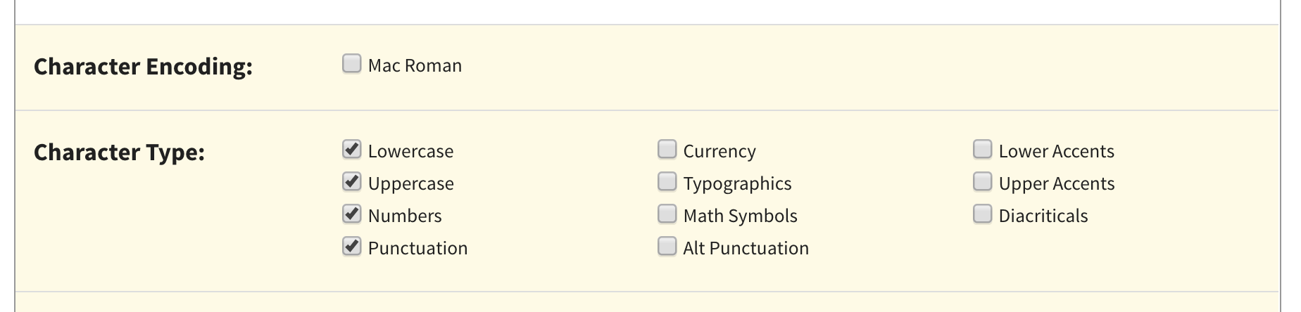
EWWW Image Optimizer is the best WordPress image compression plugin. It is easy to use and can automatically optimize images you upload on the fly.
It can also compress and optimize your previously uploaded images in bulk.
Even though your images are being compressed, it’ll be very hard to tell the difference between compressed and uncompressed in terms of quality.
Plus, the entire process of compressing and optimizing is automated. This includes image scaling to fit the right size page and device, lazy loading, and even conversion into the next-gen WebP image format.
It can also optimize images generated by other WordPress plugins and stored outside your media library folders. This plugin support JPG, PNG, GIF, and even PDF optimization.
There is also a free version of the plugin available, which lets you perform image optimizations on your own server. This can be great for WordPress website owners concerned about privacy.
However, sites with a lot of images or sites that get a lot of traffic will want to opt for the paid plan, since it includes an image optimizing CDN, which will automatically compress and convert images as they are viewed.
Best of all, EWWW Image Optimizer is very affordable. Plans start at $7 per month and support unlimited images. If you have more than one site, then you’ll need a higher priced plan.
Included in your plan is a caching engine, CSS/JS optimization, and Google Font optimization to help your site load even faster.
Optimole is another excellent option for a WordPress image compression plugin.
Using this plugin requires a quick account creation and API key setup. After that, it’s straightforward to use and gives you complete control over your image optimization.
Optimole is powered by an image CDN, so your images will load quickly no matter where your visitors are coming from. With a CDN, your images are optimized in real-time and delivered to your website visitors in the perfect size.
You can view all of your optimized images in a single dashboard, making it easy to customize compression settings for individual images.
It lets you adjust things like the compression quality, large image resizing, lazy loading, and more.
There’s even a unique setting that will automatically watermark your images for you. This is great for photographers who are trying to protect their work.
Pricing is based on the number of visitors you have per month. The free plugin allows for up to 5,000 visitors per month. While the paid plans start at $19.08 per month when billed yearly and support up to 25,000 visitors per month.
It’s packed with advanced features and gives you the ability to choose compression formats. It starts compressing images as soon you as activate plugin and stores your original images in a separate folder.
If you’re using the free plugin, then it requires you to get an API key by providing your email address.
The basic free account allows you to compress up to 100 images per month, and you will need to upgrade to their paid plans to increase this limit.
You can even simply convert PNG to JPEG and vice versa with the click of a button.
It’s also compatible with WooCommerce, NextGEN Gallery, and the WPML translation plugins.
If you’re using Cloudflare as your WordPress CDN, then you can integrate the service, so your images will be automatically updated with the new version.
ShortPixel is also very affordable. Plans are based on the number of images and start at $4.99 per month for up to 5,000 images per month.
reSmush.it is another great choice for a WordPress image compression plugin. It allows you to automatically optimize images on upload as well as offer a bulk optimization option for older images.
You have full control over the image quality and compression with an easy to use slider.
It uses the reSmush API to optimize images and allows you to choose the optimization level for your uploads.
The downside is that it doesn’t have different compression levels. It also limits optimization to uploads lower than 5MB in size. You can exclude individual images from compression in case you need to add an image in full size.
Compress JPEG & PNG is created by the team behind TinyPNG, and you will need to create an account to use the plugin. You can only optimize 500 images each month with the free account.
It can automatically compress images upon upload, and you can also bulk optimize older images.
The plugin settings allow you to choose which image sizes you want to optimize. You can also set a maximum size for your original uploads. Images larger than that size will be automatically resized by the plugin.
You can also choose to save image data like time and date, copyright information, and GPS location on JPEG files.
There are image optimization features within WP Rocket, like lazy loading, which will only load images when they are viewed.
They also developed a plugin called Imagify. This plugin lets you optimize all of your images with a single click. It will also resize your images on the fly and lets you restore your images to their original size.
You also have full control over your image optimization and compression settings. All of your images will be optimized to your preferences.
Jetpack is a powerful WordPress plugin suite that combines essential WordPress features into a single plugin. The primary focus is security, performance, and marketing.
The image optimization features fall under the performance category. To enable image compression, all you have to do is turn on a single setting. There are no additional settings for you to set up.
What it does is automatically optimize your image and serve images to your visitors using a CDN. This reduces your server load and provides faster image loading for your visitors.
Comparison Test Scores for Image Compression Plugins
Now that you know about the different WordPress image compression options, let’s take a look at how they compare against each other in terms of performance.
To measure this, we ran test by uploading the same image using each of these plugins.
Testing JPEG Image Compression
We used the following JPEG image for our tests, it is 118.3 KB in file size.
We didn’t touch any of the plugin settings and tested the compression with out of the box settings. Here are our test results:
Plugin
Compressed Size
Saved (%)
Method
EWWW Image Optimizer
64 KB
54.24%
Lossless
Optimole
64 KB
54.24%
Lossless
ShortPixel Image Optimizer
72 KB
39.30%
Lossless
reSmush.it
78 KB
20.81%
Lossless
Compress JPEG & PNG images
118.1 KB
2 %
Lossy
Testing PNG Image Compression
Next we wanted to test a PNG image to see how our contenders optimize it.
We used the following PNG image for the test, and it is 99.4 KB in file size.
Here are our test results:
Plugin
Compressed Size
Saved (%)
Method
EWWW Image Optimizer
97 KB
1.9%
Lossless
Optimole
41 KB
64%
Lossless
ShortPixel Image Optimizer
36 KB
56%
Lossy
reSmush.it
36 KB
56%
Lossless
Compress JPEG & PNG images
34.3 KB
54%
Lossy
Which is The Best Image Compression Plugin for WordPress?
If you are looking for the best image compression plugin, then EWWW Image Optimizer is the best choice.
It offers high levels of compression that don’t sacrifice image quality, plus it’s equipped with an image CDN and other features that will optimize your website for speed.
Another great option for sites that get less traffic is Optimole. It operates entirely in the background and takes care of image optimization for you, plus it’s free up to 5,000 visitors per month.
If you’re looking for an affordable plugin that offers high levels of compression and image conversion, then ShortPixel is worth checking out.
We hope you found this comparison of best WordPress image compression plugins useful. You may also want to see our beginner’s guide to image SEO to optimize images for search engines, and our expert picks of the best email marketing services for businesses.
If you liked this article, then please subscribe to our YouTube Channel for WordPress video tutorials. You can also find us on Twitter and Facebook.
In this article, Michelle Barker walks us through the process of taking a seemingly simple design for a text-and-media component and deciding how best to translate it into code, keeping in mind the needs of both users and content authors.
A youtube-dl fork based on the now inactive youtube-dlc. The main focus of this project is adding new features and patches while also keeping up to date with the original project.
Roadroller is a heavyweight JavaScript packer designed for large demos of at least 10 KB in size, like js13kGames. Depending on the input it can provide up to 15% additional compression compared to Zopfli.
Pollen is a TailwindCSS-inspired library of CSS variables for rapid prototyping, consistent styling, and as a zero-runtime utility-first foundation for your own design systems.
Madbox is a mobile gaming company and for their new website they collaborated with Bruno Simon. There’s also this awesome little game that you can play in the browser.
I've had a number of browser tabs open to articles all related to web performance and gosh darn it if blogging them is a way for me get some closure. They are all good!
Yes, I know, it depends. 543 KB aren't always bad, but on that specific page there's only a single image (the logo ~20 KB) and a single paragraph. So why then is the page still relatively large, where are the remaining 523 KB coming from?
Spoiler: it was the JavaScript. Also, I had no idea Google has a recommended ideal DOM that:
Bundle splitting will result in more requests being made to load your app. But as long as the requests are made in parallel that’s not a big problem, especially if your site served over HTTP/2.
This is all about assuming the app is largely a client-side JavaScript site. I think there is a huge pile of low-hanging performance fruit, but it's almost like a different list when talking about client-side JavaScript sites. It makes code-splitting one of the top priorities.
In this post, I’ll discuss what I did at ALDO to measure the revenue impact of web performance without having to spend time making performance improvements.
Not surprising that users with faster experiences generate more revenue. What is surprising is that it's a lot more. Over 3x more on mobile and nearly 6x more on desktop.
A slow website is everyone’s concern. Not only that it chases visitors away but it also affects your SEO. So trying to keep it ‘in shape’ is definitely one of the main items to tick when you run a business or even a personal site.
There are many ways to speed up your WordPress site, each one complementing the other. There is not a universal method. Improving your site speed is actually the sum of more of these methods combined. One of them is image optimization, which we will tackle extensively in this post.
So read further to learn how to manually and automatically optimize all the images on your WordPress site. This is a step-by-step guide on image optimization that will make your site lightweight and faster.
The Importance Of Image Optimization
According to Snipcart, the three main reasons why images are affecting your WordPress site are:
They are too large. Use smaller sizes. I will talk about this later in the article.
They are too many, which demands as many HTTP requests. Using a CDN will help.
They contribute to a synchronous loading of elements, together with HTML, CSS, and JavaScript. This ends up with an increase of the render time. Displaying your images progressively (via lazy loading) will stop your images from loading at the same time with the other elements, which will make the page load quicker.
So yes, optimizing your images is an essential practice to make your site lighter. But first, you need to discover what makes your site load slowly. This is where speed tests intervene.
How To Test Your WordPress Site Speed
There are many tools that test your website’s speed. The simplest method is Pingdom.
Pingdom is a popular tool used by both casual users and developers. All you need to do is to open Pingdom and insert your WordPress site URL, choose the location that’s closest to the data center location of your hosting (based on your hosting’s servers), and start the test. If you have a CDN installed on your site, the location matters a great deal. But more on that later.
What’s nice about this tool is that, regardless of how simple its interface is, it displays advanced information about how a website performs, which is pure music to developers’ ears.
From these statistics, you will find out whether your site is doing well or it needs to be improved (or both). It’s nice because it gives you plenty of data and advice on pages, requests, and other sorts of issues and performance analysis.
Note: GTmetrix usually displays a rather slower WordPress website than Pingdom; this is how the tool calculates the metrics. There are no discrepancies, it’s just that GTmetrix measures the fully loaded time, unlike Pingdom which only counts the onload time.
The onload time calculates the speed after a page has been processed completely and all the files on that page have finished downloading. That’s why the onload time will always be faster than the fully loaded time.
The fully loaded time happens after the onload process when a page starts transferring data over again, which means that GTmetrix includes the onload times when it calculates the speed of a page. It basically measures the whole cycle of responses and transfers it gets from the page in question. Hence the slower times.
Google PageSpeed Insights is yet another popular tool for testing your site speed. Unlike the first two tools that only display your site performance on desktops, Google’s official testing tool is good at measuring the speed of your website’s mobile version, too.
Apart from that, Google will also give you its best recommendations on what needs to be improved on your site for getting faster loading times.
Usually, with either of these three tools, you can detect how heavily your images are affecting your site speed.
How To Speed Up Your WordPress Website
Of course, since this article is about image optimization, you guessed right that this is one of the methods. But before getting into the depths of the image optimization per se, let’s briefly talk about other ways that will help you if you have loads of images uploaded on your site.
Caching
Caching is the action of temporarily storing data in a cache so that, if a user accesses your site frequently, the data will be automatically delivered without going through the initial loading process again (which takes place when the site files are requested for the first time). A cache is a sort of memory that collects data that’s being requested many times from the same viewport and is used to increase the speed of serving this data.
Caching is in fact really simple. No matter if you do it manually or by installing a plugin, it can be implemented on your site pretty quickly. Some of the best plugins are W3 Total Cache and WP Super Cache — they are both free and best rated on WordPress.org official repository.
Content Delivery Networks
A CDN will request your site content from the nearest server location to your readers’ accessing point. It means that it keeps a copy of your site in many data centers located in different places around the world. Once a visitor accesses your site via their home location, the nearest server will request your content, which translates into faster loading times. Cloudflare and MaxCDN (now StackPath) are the most popular solutions for WordPress.
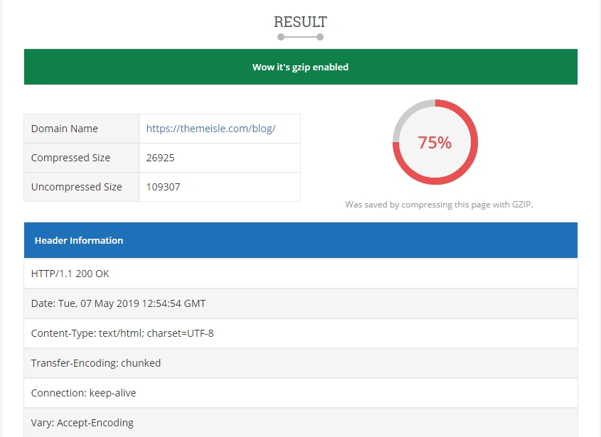
GZIP compression
Through this method, you can compress your site’s files by making them smaller. This will reduce your site bandwidth and will transfer the respective files to the browser faster.
Both WP Super Cache and W3 Total Cache come with GZIP compression feature that you can enable after installation. Also, many of the popular WordPress hosting providers have this feature already enabled via their standard packages. To find out if GZIP compression is enabled on your site, use this tool for a quick inspection.
Other simple and common (sometimes omitted, though) tricks would be to use a lightweight WordPress theme, deactivate unnecessary plugins (those that you don’t use anymore or those that you don’t need temporarily), and clean your WordPress database regularly.
Paying attention to these details also contributes to reducing the time that WordPress needs to build and display a page. Sometimes, a feature-heavy theme or plugin can be a major factor in slowing down your site. Caching plugins can intervene in this situation but keeping your WordPress site as light and clean as possible might be a better approach.
Image Optimization
This is a very efficient and simple technique that contributes to speeding up your WordPress site. And this is today’s topic, so let’s break it down into pieces.
Why Image Optimization?
Nowadays, websites are using more visuals than ever in their quest to catch the user’s attention. Multimedia (images, videos, podcasts) grew in popularity so much over the last five years, which led site owners to use pages that are increasingly graphical and image-heavy.
At this very moment, we are surrounded by billions of high-resolution images, videos, and graphics. They are the key to better-converting sites, hence to better marketing and business cards.
Sometimes, people tend to forget or simply do not pay enough attention to the fact that uploading images on a regular basis affects their WordPress site speed gradually.
Especially if you have an image-heavy site and your content relies mostly on images and visuals, this should be your main concern.
How To Optimize Your Website Images
This can be done either manually or with plugins. Let’s start with the manual method. (This is mostly for those of you who are very keen on having control over your site and doing everything on your own.) Optimizing images manually will also help you understand to a great extent how plugins (the automated method that we’ll talk about a bit later) work.
If you want to automate the process of image optimization, you have a backup. There are lots of great WordPress plugins out there that can save you a lot of time and also deliver great results. We’ll talk more about that and test a few tools later on.
Optimize Your Website Images Manually
Optimizing might mean a lot of stuff. Here, we can talk about compression, resizing, using the right formats, cropping and so on.
Use The Right Image Format
How can you tell what format is the best for your site images and which one has a higher resistance when it comes to editing and compression? The answer is, there is no general best format, but there are recommended formats based on the content that each image has.
PNG is mostly used for graphics, logos, illustrations, icons, design sketches or text because it can be easily edited in photo editors and still keep a great quality after compression. That’s because the PNGs are lossless — they don’t lose any significant data during compression.
JPG is more popular among photographers, casual users, or bloggers. It is lossy and can be compressed to smaller sizes while still preserving a good quality as seen with the naked eye. JPG is the format that supports millions of colors, that’s why people use it mostly for photos. It also supports high-compression levels.
An alternative to JPG and PNG could be WebP, a web image format introduced by Google, which has the role of providing even smaller sizes than JPG (or any other formats) while keeping the image quality similar to the latter. WebP format allows both lossy and lossless compression options. According to Google, a WebP image can get up to 34% smaller than a JPG image and up to 26% smaller than PNG images.
But WebP image format has its cons, such as not being supported by all browsers yet or by WordPress by default (you need tools for that). Learn more about how to integrate WebP images with WordPress.
The conclusion regarding the image formats is that there is no such thing as a universally right format. It really depends on the type of images that you need on your site. If you’re using photos with a large variety of colors, JPG might be the right format because it’s good at compressing color-heavy photos, which can be reduced to a considerable extent. It does not suit images with only a few color data like graphics or screenshots.
Let’s do a quick test. I saved a JPG image containing a multitude of colors, then converted it to PNG. After conversion, the photo became much bigger in size. Then, I used ImageResize.org tool to compress both images (I chose this tool because it allowed me to compress both formats and use files larger than 1MB).
On the other hand, PNG is the right format if you’re using many screenshots, graphics, logos, or transparent images — in general, images with very few colors or images that contain block colors (for instance, transitions between light and dark backgrounds). PNG is lossless and can often result in very small sizes after compression, which could otherwise be bigger as JPG. Saving this kind of images as JPG can make them low-quality and blurry.
Let’s do another test. I saved a screenshot of my WordPress dashboard both as JPG and PNG. Then I used the same ImageResize.org for compressing each format. It’s worth mentioning that the PNG file was saved in a significantly smaller size than the JPG to begin with.
If you’re into optimizing images by yourself, you should first find out what’s their maximum display size. Since your site is responsive, all the images you upload will be served at different resolutions based on the user viewport (the device they’re browsing your site from).
The maximum display size is the largest resolution the image can take counting all the potential viewports and screens that can access it.
How can you check the maximum display size of an image?
First, open a page or a post that contains the image you want to check. You need to resize your browser manually (make it gradually smaller by dragging its edges) to the point where the image jumps to the largest dimension. This point is called a “breakpoint” — because the image size suddenly breaks.
After the image jumped to the large dimension, press right click -> Inspect (if your browser is Chrome). Hover over the URL of the image in the top-right of the screen and you’ll see both the dimensions it is served at and its original dimensions (intrinsic). The latter is what the users will be downloading, while the former ones represent the maximum display size of the image on that page.
With this information in mind, you can now resize and crop your image so it can correspond to the given dimensions. This way, you’ll make sure you will optimize it efficiently so it can still look great on the screen and, at the same time, not weigh much on your site.
For instance, if you want your images to be Retina-friendly, edit them using twice the maximum display size for better quality. The image in the screenshot has 428x321 pixels, so make it 856x642 pixels for a better Retina quality.
Resize And Crop Images
When you’re dealing with files that have dimensions a lot bigger than you normally need to showcase on your site, you can simply resize or crop them and only then upload them on your site. You will save disk space and keep your site lighter.
Of course, if you have a photography portfolio and it’s important for you that the visitors see your works in their original form, then yes, you have a real motive for presenting them at their best.
You can also crop your images anytime if there’s only one single detail that you want to show to the people and there’s no reason to upload the broad, full image if the rest of the content is redundant.
Compress Images
All the photo editors have this option where they ask you at what quality you want to save your edited image. You usually go with a quality of 100% (for obvious reasons), but you can lower it a bit to, say, 70-80%. You won’t notice a big difference if the image already has a huge resolution. Its size will be smaller in this case.
After you’ve set a lower quality percentage and saved the image, you can go deeper with another round of optimization of the same image by using an online tool to reduce its size even more.
JPEG Optimizer and JPEG.io have a reduction percentage of around 60%, while TinyPNG (if you choose to work with PNGs) of around 70%. Kraken is good for both formats, returning files of around 70% smaller via lossy compression.
Mac users can try ImageOptim, which compresses both JPG and PNG formats up to 50%.
Set Image Optimization On Autopilot
In order to automate the image optimization process on your site, you need tools (aka WordPress plugins). It means that they will do all the things that we talked about earlier but on autopilot.
There are several automatic WordPress solutions for image optimization but, in this post, I will only present to you those that come with solid features that can put on the table the full set for complete image optimization.
I’ll also show you the tests I conducted with each of the next three tools so you can observe everything in detail.
We are going to compare Optimole, ShortPixel, and Smush.
Optimole is probably the most complex of them all because it encapsulates all the features one might need for efficient image optimization. So if you’re looking for smart image optimization in its all aspects, then you might like Optimole.
Optimole transfers your images to a cloud where they are being optimized. Then, the optimized images are sifted through a CDN that makes them load fast. The plugin replaces each image’s URL with a custom one.
Adapting the images to each user’s screen size is another key feature of Optimole. It means that it automatically optimizes your images to the right dimension based on the user viewport, so if you’re seeing the image from a tablet, it will deliver the perfect size and quality for a tablet standard. These transformations are being made fast, without consuming any extra space on your site.
Another smart approach that you will enjoy about Optimole is its wit for detecting when a user has a slower connection. When it recognizes a slow connection, the plugin compresses the images on your site on a higher rate so that your visitors’ page loading time won’t be affected.
If you want lazy loading, the plugin also allows you to use it on your site. You just tick one box and Optimole does the work for you.
Another interesting thing about Optimole is that it won’t optimize all the images in your WordPress media library automatically. It only optimizes the images that people request by entering a page on your site. So don’t panic if you install the plugin and nothing happens. Once an image is requested by a user, the plugin will do what I already explained above. This is very space-saving since this plugin only uses one image, which it transforms in the cloud based on the users’ requests and devices.
What I love about this plugin is that it is smart and efficient and it’s never doing unnecessary work or conversions. We are using it on three of our sites: ThemeIsle, CodeinWP, and JustFreeThemes. You can check them out as demos.
ShortPixel is a popular WordPress plugin that’s great at optimizing your images in bulk. The plugin works on autopilot and optimizes by default every image that you upload to your media library. You can deactivate this option if you don’t need it, though.
The plugin offers lossy, glossy, and lossless compression, which you can apply even to thumbnails. All the modified images are saved in a separate folder on your site where you can always go back and forth to undo/redo an optimization. For example, convert back from lossless to lossy and vice-versa, or simply restore to the original files.
Moreover, if you go to the WordPress media library and select the list view instead of the grid view that comes by default, you will notice that the last column keeps you up to date regarding the compression status. This way, you can manually skim through all the images and compress/decompress those that you need. For every image, you will see by what percentage it was compressed.
If you want to optimize them all at once, just select Bulk Actions -> Optimize with ShortPixel (or any of its sub-items), and click Apply. Your images will be compressed in just a few moments.
Moreover, ShortPixel lets you convert PNG to JPG automatically, create WebP versions of your images, and optimize PDF files. It also provides CMYK to RGB conversion. It works with Cloudflare CDN service to upload the optimized images on a cloud server.
Another big name in the WordPress plugin space, Smush is a friendly tool that optimizes your images on the run. Smush comes with a beautiful tracking dashboard where it keeps you up to date on your website’s total savings, how many items were not optimized yet, how many were optimized already, and what methods it used for that.
It also has bulk compression, lazy loading, automatic PNG to JPG, and CDN integration. Same as ShortPixel, Smush also adds the compression status to each image in your media library, so you can either manage them individually or in bulk.
Smush uses lossless compression by default, focusing on keeping the images as close to their original version as possible. The downside of this plugin is that it doesn’t offer the same amount of features in the free version, like the aforementioned plugins do. You need to pay for some of the basic functionality.
Testing The Three Image Optimization Plugins
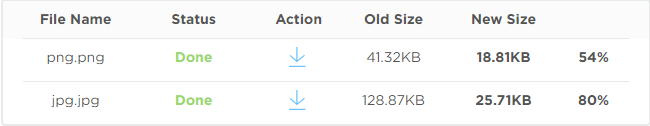
I took the next image of 904 KB from MyStock.photos and ran it through a series of tests with the three plugins I presented above.
Optimole: 555 KB (312 KB if you pick the High compression level)
ShortPixel: 197.87 KB
Smush: 894 KB
*Optimole and ShortPixel are using lossy compression, while Smush is using lossless compression.
The next approach is even more interesting.
I uploaded this very image on my WordPress site and used it in a blog post afterwards. Both Optimole and ShortPixel automatically reduced its size to make it match my screen resolution and post layout. So instead of using an almost 1 MB image, shrunk to fit the post, I am now using the same image reduced to its maximum display size. The plugins found the right size and dimensions needed in my blog post and modified the image accordingly.
And these are the reduced dimensions per each plugin:
Optimole: 158 KB, 524x394 pixels
ShortPixel: 71.7 KB, 768x577 pixels
Smush: didn’t optimize for this specific request
That being said, it’s important to note down two things:
ShortPixel returned the best compression size but in larger dimensions; overall, a good result only it lost a bit of the image’s original quality.
Optimole (which I set on Auto compression this time) returned a higher size but with smaller dimensions and with better quality as seen with the naked eye. Optimole somehow found a great mix between size and dimensions so that the quality won’t lose much ground here.
As it happened in the first example, Optimole returned a bigger, more quality-focused version, while ShortPixel converted the image to a better size but with a slight loss in quality.
I initially used an image of 6 MB for the main desktop test but, since Smush doesn’t allow files larger than 1 MB in its free version (the others do allow), I had to pick an image under 1 MB.
I’ll do this test anyway with Optimole and ShortPixel only.
So, let’s do the fourth test, this time on a larger image.
Optimole: 798 KB with Auto compression level, 480 KB with High compression level
ShortPixel: 400.58 KB
There’s also EWWW Image Optimizer plugin that, similarly to Smush, only uses lossless compression and only reduces images by a fairly small percentage.
The conclusions after the four tests:
ShortPixel is delivering the best optimization rates (around 70-80%), while Optimole is somewhere at 40% on Auto compression level and at 70% on High compression level.
Optimole is adapting the content better to the users’ viewport and internet connection. If you set it on Auto, it will know how to both reduce size consistently and preserve a great quality. I like that it knows how to juggle with all these variables so it both helps to improve your site’s loading time and display high-quality images to your visitors.
If I had to put together not only the results of the tests but also the other features of the plugins (aka simplicity and user-friendliness), I would go with Optimole. But ShortPixel is also a great contender that I warmly recommend. Smush is a decent option too if you are willing to pay for it or you are a photographer that wants to keep their images as little processed as possible.
Wrapping Up
Do not underestimate the impact of image optimization. Images are always one of the main reasons for a slow website. Google doesn’t like slow websites and nor do your visitors and clients. Especially if you’re seeking monetization via your WordPress site. An unoptimized site will influence your SEO, drag you down in SERPs, increase your bounce rates, and will lose you money.
No matter if you prefer doing the image optimization manually or choosing a plugin to automate it for you, you will see the good results sooner rather than later.
What other methods are you using to hold the images in check on your WordPress site?
Today's websites are packed with heavy media assets like images and videos. Images make up around 50% of an average website's traffic. Many of them, however, are never shown to a user because they're placed way below the fold.
What’s this thing about images being lazy, you ask? Lazy-loading is something that’s been covered quite a bit here on CSS-Tricks, including a thorough guide with documentation for different approaches using JavaScript. In short, we’re talking about a mechanism that defers the network traffic necessary to load content when it’s needed — or rather when trigger the load when the content enters the viewport.
The benefit? A smaller initial page that loads faster and saves network requests for items that may not be needed if the user never gets there.
If you read through other lazy-loading guides on this or other sites, you’ll see that we’ve had to resort to different tactics to make lazy-loading work. Well, that’s about to change when lazy-loading will be available natively in HTML as a new loading attribute… at least in Chrome which will hopefully lead to wider adoption. Chrome has already merged the code for native lazy-loading and is expected to ship it in Chrome 75, which is slated to release June 4, 2019.
The pre-native approach
Until now, developers like ourselves have had to use JavaScript (whether it’s a library or something written from scratch) in order to achieve lazy-loading. Most libraries work like this:
The initial, server-side HTML response includes an img element without the src attribute so the browser does not load any data. Instead, the image's URL is set as another attribute in the element's data set, e. g. data-src.
That keeps track of the user's scrolling behavior and tells the browser to load the image when it is about to be scrolled into view. It does that by copying the data-src attribute's value to the previously empty src attribute.
This has worked for a pretty long time now and gets the job done. But it’s not ideal for good reasons.
The obvious problem with this approach is the length of the critical path for displaying the website. It consists of three steps, which have to be carried out in sequence (after each other):
Load the initial HTML response
Load the lazy-loading library
Load the image file
If this technique is used for images above the fold the website will flicker during loading because it is first painted without the image (after step 1 or 2, depending on if the script uses defer or async) and then — after having been loaded — include the image. It will also be perceived as loading slowly.
In addition, the lazy-loading library itself puts an extra weight on the website's bandwidth and CPU requirements. And let’s not forget that a JavaScript approach won't work for people who have JavaScript disabled (although we shouldn't really care about them in 2019, should we?).
Oh, and what about sites that rely on RSS to distribute content, like CSS-Tricks? The initial image-less render means there are no images in the RSS version of content as well.
And so on.
Native lazy-loading to the rescue!
As we noted at the start, Chromium and Google Chrome will ship a native lazy-loading mechanism in the form of a new loading attribute, starting in Chrome 75. We’ll go over the attribute and its values in just a bit, but let’s first get it working in our browsers so we can check it out together.
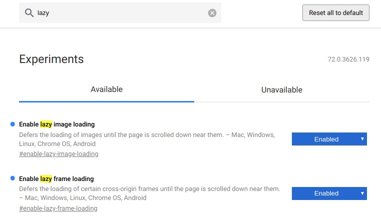
Enable native lazy-loading
Until Chrome 75 is officially released, we have Chrome Canary and can enable lazy-loading manually by switching two flags.
Open chrome://flags in Chromium or Chrome Canary.
Search for lazy.
Enable both the "Enable lazy image loading" and the "Enable lazy frame loading" flag.
Restart the browser with the button in the lower right corner of the screen.
Native lazy-loading flags in Google Chrome
You can check if the feature is properly enabled by opening your JavaScript console (F12). You should see the following warning:
[Intervention] Images loaded lazily and replaced with placeholders. Load events are deferred."
All set? Now we get to dig into the loading attribute.
The loading attribute
Both the img and the iframe elements will accept the loading attribute. It's important to note that its values will not be taken as a strict order by the browser but rather as a hint to help the browser make its own decision whether or not to load the image or frame lazily.
The attribute can have three values which are explained below. Next to the images, you'll find tables listing your individual resource loading timings for this page load. Range response refers to a kind of partial pre-flight request made to determine the image's dimensions (see How it works) for details). If this column is filled, the browser made a successful range request.
Please note the startTime column, which states the time image loading was deferred after the DOM had been parsed. You might have to perform a hard reload (CTRL + Shift + R) to re-trigger range requests.
Setting the loading attribute to auto (or simply leaving the value blank, as in loading="") lets the browser decide whether or not to lazy-load an image. It takes many things into consideration to make that decision, like the platform, whether Data Saver mode is enabled, network conditions, image size, image vs. iframe, the CSS display property, among others. (See How it works) for info about why all this is important.)
The eager value provides a hint to the browser that an image should be loaded immediately. If loading was already deferred (e. g. because it had been set to lazy and was then changed to eager by JavaScript), the browser should start loading the image immediately.
The lazy value provides a hints to the browser that an image should be lazy-loaded. It's up to the browser to interpret what exactly this means, but the explainer document states that it should start loading when the user scrolls "near" the image such that it is probably loaded once it actually comes into view.
How the loading attribute works
In contrast to JavaScript lazy-loading libraries, native lazy-loading uses a kind of pre-flight request to get the first 2048 bytes of the image file. Using these, the browser tries to determine the image's dimensions in order to insert an invisible placeholder for the full image and prevent content from jumping during loading.
The image's load event is fired as soon as the full image is loaded, be it after the first request (for images smaller than 2 KB) or after the second one. Please note that the load event may never be fired for certain images because the second request is never made.
In the future, browsers might make twice as many image requests as there would be under the current proposal. First the range request, then the full request. Make sure your servers support the HTTP Range: 0-2047 header and respond with status code 206 (Partial Content) to prevent them from delivering the full image twice.
Due to the higher number of subsequent requests made by the same user, web server support for the HTTP/2 protocol will become more important.
Let’s talk about deferred content. Chrome's rendering engine Blink uses heuristics to determine which content should be deferred and for how long to defer it. You can find a comprehensive list of requirements in Scott Little's design documentation. This is a short breakdown of what will be deferred:
Images and frames on all platforms which have loading="lazy" set
Images on Chrome for Android with Data Saver enabled and that satisfy all of the following:
loading="auto" or unset
no width and height attributes smaller than 10px
not created programmatically in JavaScript
Frames which satisfy all of the following:
loading="auto" or unset
is from a third-party (different domain or protocol than the embedding page)
larger than 4 pixels in height and width (to prevent deferring tiny tracking frames)
not marked as display: none or visibility: hidden (again, to prevent deferring tracking frames)
not positioned off-screen using negative x or y coordinates
Responsive images with srcset
Native lazy-loading also works with responsive img elements using the srcset attribute. This attribute offers a list of image file candidates to the browser. Based on the user's screen size, display pixel ratio, network conditions, etc., the browser will choose the optimal image candidate for the occasion. Image optimization CDNs like tiny.pictures are able to provide all image candidates in real-time without any back end development necessary.
At the time of this writing, no browser supports native-loading by default. However, Chrome will enable the feature, as we’ve covered, starting in Chrome 75. No other browser vendor has announced support so far. (Edge being a kind of exception because it will soon make the switch to Chromium.)
You can detect the feature with a few lines of JavaScript:
if ("loading" in HTMLImageElement.prototype) {
  // Support.
} else {
  // No support. You might want to dynamically import a lazy-loading library here (see below).
}
Automatic fallback to JavaScript solution with low-quality image placeholder
One very cool feature of most JavaScript-based lazy-loading libraries is the low-quality image placeholder (LQIP). Basically, it leverages the idea that browsers load (or perhaps I should say used to load) the src of an img element immediately, even if it gets later replaced by another URL. This way, it’s possible to load a tiny file size, low-quality image file on page load and later replace it with a full-sized version.
We can now use this to mimic the native lazy-loading’s 2 KB range requests in browsers that do not support this feature in order to achieve the same result, namely a placeholder with the actual image dimensions and a tiny file size.
I'm really excited about this feature. And frankly, I'm still wondering why it hasn't got much more attention until now, given the fact that its release is imminent and the impact on global internet traffic will be remarkable, even if only small parts of the heuristics are changed.
Think about it: After a gradual roll-out for the different Chrome platforms and with auto being the default setting, the world's most popular browser will soon lazy-load below-the-fold images and frames by default. Not only will the traffic amount of many badly-written websites drop significantly, but web servers will be hammered with tiny requests for image dimension detection.
And then there's tracking: Assuming many unsuspecting tracking pixels and frames will be prevented from being loaded, the analytics and affiliate industry will have to act. We can only hope they don't panic and add loading="eager" to every single image, rendering this great feature useless for their users. They should rather change their code to be recognized as tracking pixels by the heuristics described above.
Web developers, analytics and operations managers should check their website's behavior with this feature and their servers' support for Range requests and HTTP/2 immediately.
Image optimization CDNs could help out in case there are any issues to be expected or if you’d like to take image delivery optimization to the max (including automatic WebP support, low-quality image placeholders, and much more). Read more about tiny.pictures!
Fonts are vector. Vector art with more points makes for larger files than vector art with fewer points. Custom fonts are downloaded. So, fonts with less points in their vector art are smaller. That's the theory anyway. Shall we see if there is any merit to it?
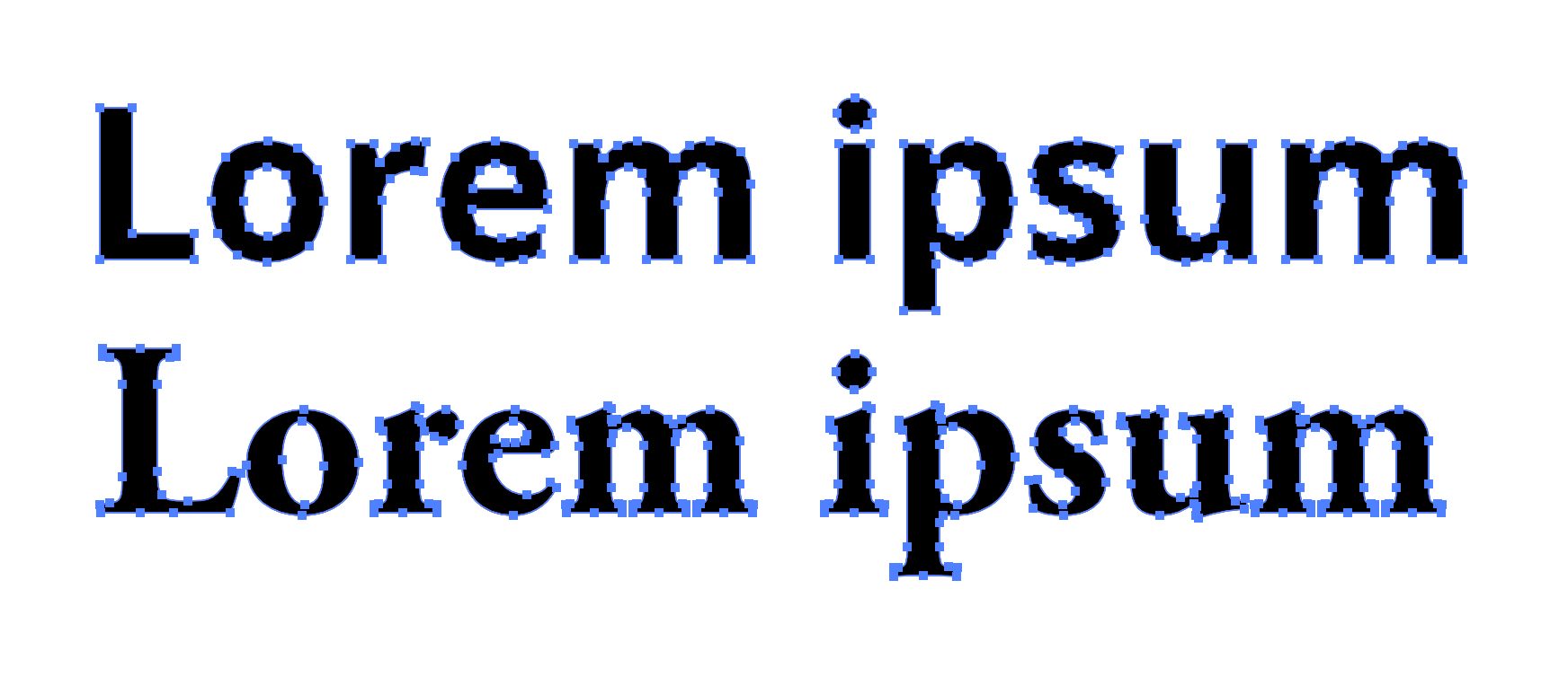
Open Sans (top) and Garamond (bottom)
Let's take two fonts off of Google Fonts: Open Sans and EB Garamond. The number of points isn't a dramatic difference, but the seriffed Garamond does have more of them, particularly in looking at the serif areas.
It's not just serifs, but any complication. Consider Bleeding Cowboys, a masterpiece of a font and a favorite of pawn shops and coffee carts alike where I live in the high desert:
Let's stick to our more practical comparison.
We get some hint at the size cost by downloading the files. If we download the default "Latin" set, and compare the regular weight of both:
OpenSans-Regular.ttf
96 KB
EBGaramond-Regular.ttf
545 KB
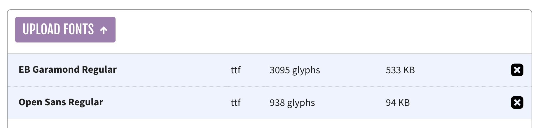
I'm not 100% sure if that's apples-to-apples there, as I'm not exactly a font file expert. Maybe EB Garamond has a whole ton of extra characters or something? I dunno. Also, we don't really use .ttf files on the web where file size actually matters, so let's toss them through Font Squirrel's generator. That should tell us whether we're actually dealing with more glyphs here.
It reports slightly different sizes than the Finder did and confirms that, yes, Garamond has way more glyphs than Open Sans.
In an attempt to compare sizes with a font file with the same number of available characters, I did a custom subset of just upper, lower, punctuation, and numbers (things that both of them will have), before outputting them as .woff2 files instead of .ttf.
After that...
opensans-regular-webfont.woff2
10 KB
ebgaramond-regular-webfont.woff2
21 KB
I didn't serve them over a network with GZIP or brotli or anything, but my understanding is that WOFF2 is already compressed, so it's not super relevant.
Roughly two-to-one when comparing the file size of these two pretty popular fonts? Seems somewhat significant to me. I'm not above picking a font, assuming it works with the brand and whatnot because of size.
Whoa! A single stroke? Unfortunately, I don't think actual fonts can be make from strokes, so the number-of-points savings can't come from that. I purchased the "ExtraLight" variation and the points are like this:
Still pretty lean on points.
The TTF is 244 KB, so not the sub-100 of Open Sans, but again I'm not sure how meaningful that is without a matching subset and all that. Either way, I wasn't able to do that as it's against the terms of Ping to convert it.


