How to Speed Up Hosting with Static Server Cache

What the H double T P? If site loading slowdowns have you shaking your fist, it’s probably time to cache out.

When it comes to fast loading WordPress sites, caching is crucial. A well-optimized page cache can dramatically improve page load speed for visitors, and reduce the load on your server.

You have a slew of options when it comes to caching. You could go with a caching plugin from WordPress.org (there are many, so we compiled a “best of the bunch” short list), or a caching module installed on top of a web server.

Of course the caching method you choose will produce greatly varying results in terms of the quality and impact on your site performance. So what’s the best option?

Continue reading, or jump ahead using these links:

In this article, we’re going to look more closely at what static server cache is, explain why we recommend FastCGI (with a peek into Static Server Cache FastCGI), and how implementing it can optimize your site speed and user experience.

Let’s get started.

All About That Cache

Rendering or fetching a page or post in WordPress requires queries to be sent back and forth from the database. A lot of these posts and pages won’t be updated everyday.

Rather than the server interpreting the site code itself, querying the database, and returning an HTML document back to the customer and finally loading the page, static caching saves a single result from the first two steps and provides that document to anyone else making the request.

Static assets like CSS, JavaScript, and images are stored in browser caching, so the browser can retrieve them from its local cache. This is faster than downloading the resources again from the page’s server.

Caching in WordPress has multiple benefits, the top amongst them being: speed and performance boosts, hosting server load reductions, and more favorable rankings with search engines. As stated in prior optimization articles, this will be affected by other metrics as well, as there are many components that factor into speed and performance.

There are different caching modules, such as Varnish and FastCGI, along with different types of web servers, such as Nginx, Apache, and LiteSpeed. These modules and servers work in tandem to provide superior caching.

Caching modules and services
Some modules and servers in the caching arena.

Varnish is a web application accelerator, also known as a caching HTTP reverse proxy. One of its key features is its configuration language, VCL. Offering great flexibility, VCL enables you to write policies on the handling of incoming requests, such as what content you want to serve, where you want to get the content from, and how the request or response should be altered.

Nginx (pronounced Engine-X) started as a simple web server designed for maximum stability and performance, and has evolved into a multi-performance powerhouse, with capabilities to handle reverse proxy with caching, load balancing, WebSockets, index files & auto-indexing, FastCGI support with caching, and more. As the fastest‑growing open source web server, with more than 450 million sites dependent on their technology, Nginx is incredibly stable.

We believe FastCGI, served by Nginx, is the cream of the crop. Read on for why.

Why FastCGI Rules

FastCGI―an enhanced version of its predecessor, CGI (Common Gateway Interface)―is a binary protocol for interfacing interactive programs with a web server. It’s primary function is to reduce the overhead related to interfacing web server and CGI programs, allowing a server to handle more web page requests per unit of time.

Instead of creating a new process for each request, FastCGI uses persistent processes to handle a series of requests. Using Nginx FastCGI, when a user visits the same WordPress page as they did prior, your website will not perform the same PHP and database requests again because the page is already cached and served by FastCGI. Thus, users will have a much faster server response time after the initial visit.

You’ll also have reduced PHP-FPM and MariaDB (MySQL) load, as well as lower CPU usage. And finally, your server will be able to handle more traffic with the same specs, enabling you to better meet more demanding needs.

For a visual on how these elements work together for superior caching, see the infographic below. (We’ll talk about object caching in a bit.)

Browser request path infographic
Serving a browser request, using FastCGI and Memcached Object Cache.

All WordPress pages can gain huge benefits when using FastCGI.

Caching Policies

There are two content types to consider when setting your cache: static and dynamic.

Static content is any file that is stored in a server and is the same every time it’s delivered to users. Dynamic content changes based on factors specific to the user such as time of visit, location, and device.

Social media pages are a good example of dynamic content. Twitter feeds look totally different for any given user, and users can interact with the content in order to change it (e.g., by liking, re-tweeting, or commenting).

E-commerce sites are commonly heavy on dynamic content as well. With WooCommerce, for example, certain pages like Home, Shop, and single product pages can be fully cached. However, Cart, Checkout, and My Account pages should be excluded. You do not want to page cache these dynamic pages fully as the latest changes would not be seen.

Dynamic web pages are not stored as static HTML files. Generated server-side, these typically come via origin servers, not from a cache. Since dynamic content can’t be served to multiple users (as it’s unique to each one), it’s difficult to cache. However with advancements in technology, caching dynamic content is possible.

One way to speed up dynamic web pages is to use dynamic compression. In this manner, the content still comes from the origin server instead of a cache, but the HTML files generated are made significantly smaller so that they can reach the client device more quickly.

Just as page caching works on HTML page output, object caching works on your database queries. Object caching is a fantastic solution for caching dynamic content.

Like the other caching components we discussed, there are several persistent object cache contenders in the field, the most well-known being Memcached, Redis, and APCu.

As far as setting your caching policies goes, there isn’t a one size fits all. However, what determines a more or less desirable static cache policy is basing it on the type of content your site is comprised of.

For sites where user comments are steadily being added & approved (often by the minute), or frequent new content is the norm, you should structure your cache policy to clear more often, such as daily or even hourly.

For content that is regularly updated, just not that often, a 30-day cache policy is more than enough.

For static elements like logos, images, page fonts, JS, and core CSS stylesheets, you can extend the max age to one year.

Even Google says there’s no one best cache policy, but they do offer some tips to assist in devising your caching strategy, beyond the scope of your static assets. These are:

  • Use consistent URLs
  • Ensure that the server provides a validation token (ETag)
  • Identify which resources can be cached by intermediaries (like a CDN)
  • Determine the optimal lifetime for each resource
  • Determine the best cache hierarchy for your site
  • Minimize churn (for a particular part of a resource that is often updated [e.g., JS function or set of CSS styles], deliver that code as a separate file)

Popular site speed performance testers, GTmetrix, consider resources cacheable if the following conditions are met:

  • It’s a font, image, media file, script, or stylesheet
  • It has a 200, 203, or 206 HTTP status code
  • It doesn’t have an explicit no-cache policy

If you use a CDN like Cloudflare, you can set your cache policies through your account. Additionally, if you use our Hummingbird plugin, you can access these settings via the built in integrations for Cloudflare.

As a WPMU DEV hosted member, you can access the primary Static Cache settings through The Hub to enable the extremely efficient static cache policy.

Static Server Cache
Turn on Static Server Cache from The Hub.

Ultimately, how you design your cache policy should be based on the type of content you serve, your web traffic, and any application-specific needs that exist for that new new data.

There are a number of tools you can use directly within WordPress that make implementing a static cache policy quick and easy. We’ll look at those next.

Plugin Possibilities

A quick search for caching plugins on WordPress.org will return in excess of a thousand results. That’s a lot of options to wade through. We handpicked a few that we believe to be solid options.

Hummingbird

Hummingbird banner

Hummingbird is a one of a kind, world-class caching suite, active on more than +1 million websites.

With Hummingbird’s WordPress speed optimization, your pages will load faster, your search rankings and PageSpeed scores will be higher, and your visitors will be happier. In fact, speeding up your site has never been easier.

Here is just a selection of HB’s standout features: full Page, Browser, RSS, & Gravatar caching; performance reports; minify and combine Javascript, CSS, and Google Font files; GZIP compression for blazing-fast HTML, JS, and stylesheet transfer; configs (set & save your preferred performance settings, and instantly upload to any other site)―and more.

Hummingbird scans your site and provides one-click fixes to speed up WordPress in a flash. And it’s completely free. (Consider Smush as well; while not a static caching solution, it will compress and lazy load your images for marked speed improvements, and is also free.)

WP Rocket

WP Rocket banner

With more than 1.5 million users, WP Rocket is a favored caching plugin for WordPress. It’s a premium service, which you can only install directly from their website.

It’s easy for non-techie users to understand, while more knowledgeable developers can customize it to their liking. It’s compatible with many hosting providers, e-commerce platforms, themes, and other plugins.

WP Rocket automatically starts caching your pages, without any need to tweak the code or mess with settings. Pricing starts at $49, for 1 website/1 year.

WP Super Cache

WP Super Cache Banner

WP Super Cache is from the team behind WordPress.com and WooCommerce… Automattic. This plugin is free, and has an astounding 2 million+ active installations.

WP Super Cache serves cached files in 3 ways, which are ranked by speed. Expert (the fastest), bypasses PHP by using Apache mod-rewrite to serve static html files. Simple (mid-level speed, and the recommended way of using the plugin), uses PHP & does not require configuration of the .htaccess file, allowing you to keep portions of your page dynamic. WP-Caching mode (the slowest), mainly caches pages for known users, and is the most flexible method.

WP Super Cache comes with recommended settings, one of which is: If you’re not comfortable with editing PHP files, use Simple mode.

W3 Total Cache

W3 Total Cache banner

W3 Total Cache (W3TC) has over a million users, with an average rating of 4.4 out of 5 stars. It is a free plugin.

W3TC improves the SEO and user experience of your site by increasing website performance, and reducing load times, leveraging features like CDN integration and the latest best practices.

W3 Total Cache remedies numerous performance-reducing aspects of any website. It requires no theme modifications, modifications to your .htaccess (mod_rewrite rules) or programming compromises to get started. The options are many and setup is easy.

Some of W3TC features include: transparent CDN management with Media Library, theme files and WordPress itself; mobile support; SSL support; AMP support; minification & compression of pages/posts in memory; and minification of CSS, JavaScript, and HTML with granular control.

WP Fastest Cache

WP Fastest Cache banner

WP Fastest Cache is another million+ user caching plugin.

Setup is easy; no need to modify the .htaccess file (it’s done automatically). It’s got a more minimal set of features, including SSL support, CDN support, Cloudflare support, preload cache, cache timeout for specific pages, and the ability to enable/disable cache option for mobile devices. WP Fastest Cache is also compatible with WooCommerce.

WP Fastest Cache is free, but offers a premium-for-pay version, which adds additional features, such as: Widget Cache, Minify HTML Plus, Minify CSS Plus, Minify JS, Defer Javascript, Optimize Images, Convert WebP, Google Fonts Async, and Lazy Load.

LiteSpeed Cache

LiteSpeed Cache banner

LiteSpeed Cache for WordPress (LSCWP) is an all-in-one site acceleration plugin, with more than 2 million active installations.

It features an exclusive server-level cache and a collection of optimization features, such as: free QUIC.cloud CDN cache; lossless/lossy image optimization; minification of CSS, JavaScript, and HTML; asynchronous loading of CSS; deferred/delayed JS loading; and WebP image format support.

LSCWP does require use with a web server (LiteSpeed, Apache, NGINX, etc.). It supports WordPress Multisite, and is compatible with most popular plugins, including WooCommerce, bbPress, and Yoast SEO.

LiteSpeed Cache is free, but some of the premium online services provided through QUIC.cloud (CDN Service, Image Optimization, Critical CSS, Low-Quality Image Placeholder, etc.) require payment at certain usage levels.

Ok, now that we’ve covered some viable plugin options for caching, let’s look at what you can do with the cache settings in WPMU DEV’s hosting platform.

(Con)figuring it All Out

The best WordPress hosting providers―leading in sales and racking up rave reviews―have caching built in. Without it, they wouldn’t be competitive enough in today’s market of tech-savvy web developers.

If you’re looking for tools that are integrated on managed WordPress hosting environments, WPMU DEV Hosting, WPEngine, Flywheel, and Kinsta all have caching built in. Quite frankly, the systems used by hosting companies are quicker and more effective than WordPress plugins.

With WPMU DEV hosting, we use our own mega caching tool, Static Server Cache. This is page caching at the server level using FastCGI. Much faster than any PHP plugin, Static Server Cache greatly speeds up your site and allows for an average of 10 times more concurrent visitors.

Understanding and managing the settings for caching in WPMU DEV hosting is an easy, hassle-free experience. C’mon along and you’ll see what I mean.

From your WordPress admin page, go to WPMU DEV, Plugins, then click on The Hub icon.

Hub icon in WP dashboard
One-click access to the Hub from the WPMU DEV dashboard.

Next, from The Hub landing page, click on the site of your choice, under My Sites.

Listed sites in WPMU DEV's Hub
The Hub lists all of your hosted sites.

From here, click on either of the Hosting headers.

Hub hosting settings in WPMU DEV
Two options to get to the hosting tools page.

Next you’ll click on Tools, and scroll down to Static Server Cache. Click the Off button, then click Continue from the “Turn on Static Server Cache” popup window. (Note: Static Server Cache will be enabled by default for all new server/hosting accounts created with us.)

Turning Static Server Cache on is a breeze through The Hub.

You can also do a quick manual clear of the Static Server Cache from here. Simply click the Clear button, then click Continue from the “Are you sure?” popup window.

Clear static server cache
You’ll get a confirmation message indicating the cache clearing action is complete.

Static Server Cache is fully integrated with our Hummingbird performance plugin, so any action or process in Hummingbird that triggers clearing of the page cache will clear the Static Server Cache as well.

For example, if you click the Clear Cache button in the Hummingbird plugin and have Page Caching enabled in settings, the Static Server Cache will be cleared as well. Likewise, if you have options like Clear cache on interval or Clear full cache when post/page is updated enabled in Hummingbird, Static Server Cache will follow suit with those settings.

Cache setting in Hummingbird
Static Server Cache respects cache settings enabled in Hummingbird.

WooCommerce is also supported by default, hence any dynamic process in Woo is not cached. So if a user on your site adds items to their cart, that would not be cached by the Static Server Cache.

Below is an itemized list of what does or does not get cached when Static Server Cache is enabled. (Note: The max size of any item is 1 GB.)

Cached:

  • GET/HEAD requests (that’s your content; e.g., posts, pages, etc.)

NOT cached:

  • POST requests (e.g., forms or any other frontend submission)
  • Query strings
  • wp-admin, xmlrpc, wp-*.php, feed, index.php, sitemap URIs
  • If these cookies are found:
    comment_author, wordpress_, wp-postpass, wordpress_no_cache, wordpress_logged_in, woocommerce_items_in_cart
  • If these WooCommerce URIs are found:
    /store, /cart, /my-account, /checkout, /addons

If you want to check if any page is being cached by our Static Server Cache, pull up our detailed documentation for a walkthrough.

Please note that Static Server Cache is not enabled on staging sites.

Your Cache Cow

Caching is a reliable and worthy solution to improve your pages’ load speed, and thus your users’ experience. It’s powerful enough to allow refined subtleties for specific content types, but yielding enough to allow easy updates when your site content changes.

While many forms of caching are available, static caching is a method for converting the page generated by a user’s request into an HTML document to serve any subsequent requests to that same page.

Caching images and other static objects will certainly speed up page load time, but caching items such as full HTML documents is what can really amplify a website.

Apart from just basic page caching, make sure your caching solution combines and minifies JavaScript and CSS. Then add Object Caching to take advantage of serving dynamic content, without sacrificing load time or CPU usage.

If you’re looking for a full-featured caching solution, then WPMU DEV’s Hosting plan might be your answer. Pair our FastCGI, accessible via the streamlined Hub interface, with our caching queen, Hummingbird, for the speed round’s 1-2 knock-out punch. With our 30-day money-back guarantee, you’ve got nothing to lose!

If you’re a WPMU DEV paid plan user, you already enjoy the full functionality of this feature. Not a member yet? Try it for yourself, free for 7 days, and see why we have so many five-star reviews.

Whatever method you opt for, you’re well advised to put caching tools and policies in place, so response and loading time is never a hindrance to your visitors’ experience, or your conversion success rates. As someone once said… Cache is King!

6 Resources For JavaScript Code Snippets

When it comes to writing JavaScript (or any other code, for that matter) you can save a lot of time by not trying to reinvent the wheel – or coding something that is common enough that it has already been written countless times. In these instances it is helpful to have a list of collections of commonly (or sometimes not so commonly) used scripts or snippets you can refer to or search through to find what you need to either get your code started or solve your whole problem.

That is why we’ve put together this list of collections of JavaScript snippets so you can bookmark and refer back to them whenever you are in need. Here are six useful resources for Javascript code snippets.

The UX Designer Toolbox

Unlimited Downloads: 500,000+ Wireframe & UX Templates, UI Kits & Design Assets
Starting at only $16.50 per month!


30 seconds of code

This JavaScript snippet collection contains a wide variety of ES6 helper functions. It includes helpers for dealing with primitives, arrays and objects, as well as algorithms, DOM manipulation functions and Node.js utilities.

30 seconds of code - JavaScript snippets

JavaScriptTutorial.net

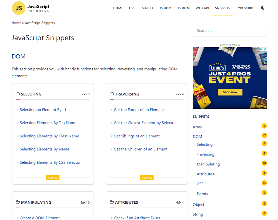
This website has a section that provides you with handy functions for selecting, traversing, and manipulating DOM elements.

JavaScript Tutorial snippets

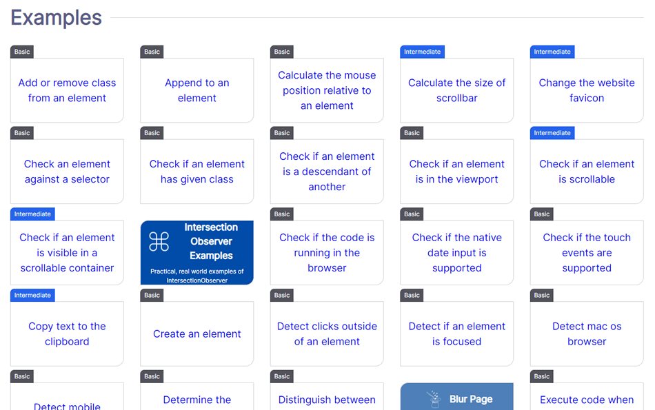
HTMLDOM.dev

This website focuses on scripts that manage HTML DOM with vanilla JavaScript, providing a nice collection of scripts that do just that.

HTMLDOM.dev

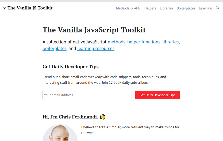
The Vanilla JavaScript Toolkit

Here’s a collection of native JavaScript methods, helper functions, libraries, boilerplates, and learning resources.

Vanilla JavaScript Toolkit

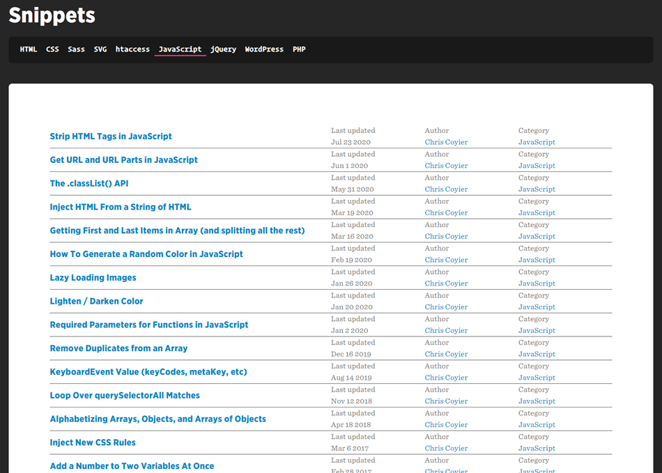
CSS Tricks

CSS Tricks has a nice collection of all different kinds of code snippets, including this great list of JS snippets.

CSS Tricks snippets

Top 100 JavaScript Snippets for Beginners

Focusing on beginners, and a bit dated, but this list is still a worthwhile resource to keep in your back pocket.

Topp 100 Scripts for beginners

We hope you find this list helpful in your future projects. Be sure to check out all of the other JavaScript resources we have here at 1stWebDesigner while you’re at it!

Is Blitz.js the JavaScript Framework I’ve Been Waiting For?

The year was 2007. I was about to leave corporate America and try my first startup. I had been a Java architect for the past 10+ years and was ready to try something new. A friend of mine introduced me to a framework called “Ruby on Rails.” She said it was amazing how fast you could build stuff. Here is a link to the original “How to build a blog engine in 15 minutes with Ruby on Rails” video where David Heinemeier Hansson (DHH) shows us how to build a blog using Rails. After watching the video, I was sold that it was worth a try. I spent most of the next year building my startup primarily programming in Ruby on Rails. It took me a while to climb the fairly steep learning curve of Rails, and also to really learn the Ruby programming language, but once I did, I could build stuff faster than at any point in my 20+ year career. Rails has a doctrine of what makes it great; you can look at the nine items here. Looking back, what made Rails great for me personally was a handful of key things:

  • Convention over Configuration – Now most frameworks follow this paradigm, but Rails was the first to bring it to the masses. No more struggling with configuration files to get your environment set up properly, everything works right out of the box, and if you follow the rules, it’s painless.
  • DRY Coding – (Do NOT repeat yourself) – The idea here is that you only need to code something in one place to get it done. You don’t need to copy and paste code into five different places to get something to work. 
  • Developer Happiness & Productivity – Rails came with generators to get you started. They would create all the code you need to CRUD (Create, Read, Update, Delete) your resources. Rails also came with a handy console where you could test and debug your code in a full working environment. You could also code everything in one language, Rails provided helpers to generate most of the JavaScript you would need. Rails eliminated the multiple layers upon layers of coding you used to have to do to get something done.
  • True Reuse – We have been looking for the ability to reuse code for 20+ years. We have tried many different approaches, but Rails, because it is a complete ecosystem, has done the best job at it. When you are building an app, you can find a “gem” (which is a library) to do just about anything you want. For example, authentication, authorization, uploading files, paginating results – all these things come for free by using “gems” that are open source.
  • Majestic Monolith – For most of the applications we build, having a fully integrated, simple, coherent platform, and structure is the easiest way to build things. Sure, microservices and serverless have their place, but for 80% of the applications out there, having everything set up in one platform is the easiest way to construct software. Rails comes with all you need to build your User Interface, API, business logic and database.

Also worth noting is that Enterprise Java was the “state of the art” application architecture before Rails. The architecture of Enterprise Java looked something like this:

Collective #668


Collective 668 image

Indiepen

An independent and privacy-friendly solution to embed HTML, CSS and JS code examples.

Check it out


Collective 668 image

GitHub Copilot

GitHub Copilot works alongside you directly in your editor, suggesting whole lines or entire functions for you.

Check it out


Collective 668 image

What’s new in ES2021

Every year the TC39 committee releases the new features coming to JavaScript. Here’s whats coming in 2021. By R. Alex Anderson.

Read it


Collective 668 image

Wikidata

Wikidata is a free, collaborative, multilingual, secondary database, collecting structured data to provide support for Wikipedia, Wikimedia Commons, the other wikis of the Wikimedia movement, and to anyone in the world.

Check it out


The post Collective #668 appeared first on Codrops.

Creating Custom Emmet Snippets In VS Code

Earlier this year, I shared the HTML boilerplate I like to use when starting new web projects with line-by-line explanations on my blog. It’s a collection of mostly <head> tags and attributes I usually use on every website I build. Until recently, I would just copy and paste the boilerplate whenever I needed it, but I’ve decided to improve my workflow by adding it as a snippet to VS Code — the editor of my choice.

  • Click “Add Item”, enter the path to the folder where you’ve saved the snippets.json file you’ve created earlier and press “OK”.
  • That’s it. Now we’re ready to create snippets by adding properties to the html and css objects where the key is the name of the snippet and the value an abbreviation or a string.

    Some Of My Custom HTML Snippets

    Before we dive deep into snippet creation and I show you how I created a snippet for my HTML boilerplate, let’s warm up first with some small, but useful snippets I’ve created, as well.

    Lazy Loading

    Out of the box, there’s an img abbreviation, but there’s none for lazily loaded images. We can use the default abbreviation and just add the additional attributes and attribute values we need in square brackets.

    {
      "html": {
        "snippets": {
          "img:l": "img[width height loading='lazy']"
        }
      }
    }
    

    img:l + Enter/Tab now creates the following markup:

    <img src="" alt="" width="" height="" loading="lazy">
    

    Page

    Most pages I create consist of <header>, <main> and <footer> landmarks and an <h1>. The custom page abbreviation lets me create that structure quickly.

    "snippets": {
      "page": "header>h1^main+footer{${0:©}}"
    }
    

    page + Enter/Tab creates the following markup:

    <header>
      <h1></h1>
    </header>
    <main></main>
    <footer>©</footer>
    

    That abbreviation is quite long, so let’s break it down into smaller bits.

    Breakdown

    Create an <header> element and a child <h1>.

    header>h1
    

    Move up, back to the level of the <header>, and create a <footer> that follows <main>.

    ^main+footer
    

    Set the final tab stop within the <footer> and set the default text to &copy.

    {${0:©}}
    

    Navigation

    The abbreviation nav just creates a <nav> start and end tag by default, but what I usually need is a <nav> with a nested <ul>, <li> elements and links ( <a>). If there are multiple <nav> elements on a page, they should also be labeled, for example by using aria-label.

    "nav": "nav[aria-label='${1:Main}']>ul>(li>a[aria-current='page']{${2:Current Page}})+(li*3>a{${0:Another Page}})"
    

    That looks wild, so let’s break it down again.

    Breakdown

    We start with a <nav> element with an aria-label attribute and a nested <ul>. ${1:Main} populates the attribute with the text “Main” and creates a tab stop at the attribute value by moving the cursor to it and highlighting it upon creation.

    nav[aria-label='${1:Main}']>ul
    

    Then we create four list items with nested links. The first item is special because it marks the active page using aria-current="page". We create another tab stop and populate the link with the text “Current Page”.

    (li>a[aria-current='page']>{${2:Current Page}})
    

    Finally, we add three more list items with links and the link text “Another page”.

    (li*3>a>{${0:Another Page}})
    

    Before our adaptations, we got this:

    Now we get this:

    <-- After: nav + TAB/Enter -->
    
    <nav aria-label="Main">
      <ul>
        <li><a href="" aria-current="page">Current Page</a></li>
        <li><a href="">Another Page</a></li>
        <li><a href="">Another Page</a></li>
        <li><a href="">Another Page</a></li>
      </ul>
    </nav>
    

    Style

    The default style abbreviation only creates the <style> start and end tag, but usually when I use the <style> element I do it because I quickly want to test or debug something.

    Let’s add some default rules to the <style> tag:

    "style": "style>{\\* { box-sizing: border-box; \\}}+{\n${1:*}:focus \\{${2: outline: 2px solid red; }\\} }+{\n${0}}"
    
    Breakdown

    Some characters (e.g. $, *, { or }) have to be escaped using \\.

    style>{\\* { box-sizing: border-box; \\}}
    

    \n creates a linebreak and ${1:*} places the first tab stop at the selector *.

    {\n${1:*}:focus \\{${2: outline: 2px solid red; }\\}}
    
    • Before: &lt;style&gt;&lt;/style&gt;
    • After:
      <style>
      * { box-sizing: border-box; }  
      *:focus { outline: 2px solid red; }
      </style>
      

    Alright, enough warming-up. Let’s create complex snippets. At first, I wanted to create a single snippet for my boilerplate, but I created three abbreviations that serve different needs.

    Boilerplate Small

    This is a boilerplate for quick demos, it creates the following:

    • Basic site structure,
    • viewport meta tag,
    • Page title,
    • <style> element,
    • A <h1>.
    {
      "!": "{<!DOCTYPE html>}+html[lang=${1}${lang}]>(head>meta:utf+meta:vp+{}+title{${2:New document}}+{}+style)+body>(h1>{${3: New Document}})+{${0}}"
    }
    
    Breakdown

    A string with the doctype:

    {<!DOCTYPE html>}
    

    The <html> element with a lang attribute. The value of the lang attribute is a variable you can change in the VS code settings (Code → Preferences → Settings).

    html[lang=${1}${lang}]
    

    You can change the default natural language of the page by searching for “emmet variables” in VS Code settings and changing the lang variable. You can add your custom variables here, too.

    The <head> includes the charset meta tag, viewport meta tag, <title>, and <style> tag. {} creates a new line.

    (head>meta:utf+meta:vp+{}+title{${2:New document}}+{}+style)
    

    Let’s have a first quick look at what this gives us.

    <!DOCTYPE html>
    <html lang="en">
    <head>
      <meta http-equiv="Content-Type" content="text/html;charset=UTF-8">
      <meta name="viewport" content="width=device-width, initial-scale=1.0">
    
      <title>New document</title>
    </head>
    </html>
    

    Looks okay, but the meta:utf abbreviation creates the old way in HTML to define the charset and meta:vp creates two tab stops I don’t need because I never use a different setting for the viewport.

    Let’s overwrite these snippets before we move on.

    {
      "meta:vp": "meta[name=viewport content='width=device-width, initial-scale=1']",
      "meta:utf": "meta[charset=${charset}]"
    }
    

    Last but not least, the <body> element, an <h1> with default text, followed by the final tab stop.

    body>(h1>{${3: New Document}})+{${0}}
    

    The final boilerplate:

    <!DOCTYPE html>
    <html lang="en">
    <head>
      <meta charset="UTF-8">
      <meta name="viewport" content="width=device-width, initial-scale=1">
    
      <title>New document</title>
    
      <style>
        * { box-sizing: border-box; }
    
        *:focus { outline: 2px solid red; } 
    
    
      </style>
    </head>
    <body>
      <h1> New Document</h1>
    
    </body>
    </html>
    

    For me, that’s the perfect minimal debugging setup.

    Boilerplate Medium

    While I use the first boilerplate only for quick demos, the second boilerplate can be used for complex pages. The snippet creates the following:

    • Basic site structure,
    • viewport meta tag,
    • Page title,
    • .no-js/.js classes,
    • External screen and print stylesheets,
    • description and theme-color meta tag,
    • Page structure.
    {
      "!!": "{<!DOCTYPE html>}+html[lang=${1}${lang}].no-js>{<!-- TODO: Check lang attribute --> }+(head>meta:utf+meta:vp+{}+title{${1:🛑 Change me}}+{}+(script[type=\"module\"]>{document.documentElement.classList.replace('no-js', 'js');})+{}+link:css+link:print+{}+meta[name=\"description\"][content=\"${2:🛑 Change me (up to ~155 characters)}\"]+{<!-- TODO: Change page description --> }+meta[name=\"theme-color\"][content=\"${2:#FF00FF}\"])+body>page"
    }
    

    Yeaaah, I know, that looks like gibberish. Let’s dissect it.

    Breakdown

    The doctype and the root element are like in the first example, but with an additional no-js class and a comment that reminds me to change the lang attribute, if necessary.

    {<!DOCTYPE html>}+html[lang=${1}${lang}].no-js>{ }
    

    The TODO Highlight extension makes the comment really pop.

    The <head> includes the charset meta tag, viewport meta tag, <title>. {} creates a new line.

    (head>meta:utf+meta:vp+{}+title{${1:🛑 Change me}}+{}
    

    A script with a line of JavaScript. I’m cutting the mustard at the JS module support. If a browser supports JavaScript modules, it means that it’s a browser that supports modern JavaScript (e.g. modules, ES 6 syntax, fetch, and so on). I ship most JS only to these browsers, and I use the js class in CSS, if the styling of a component is different, when JavaScript is active.

    (script[type=\"module\"]>{document.documentElement.classList.replace('no-js', 'js');})+{}
    

    Two <link> elements; the first links to the main stylesheet and the second to a print stylesheet.

    link:css+link:print+{}
    

    The page description:

    meta[name=\"description\"\][content=\"${2:🛑 Change me (up to ~155 characters)}\"]+{ }
    

    The theme-color meta tag:

    meta[name=\"theme-color\"\][content=\"${2:#FF00FF}\"])
    

    The body element and the basic page structure:

    body>page
    

    The final boilerplate looks like this:

    <!DOCTYPE html>
    <html lang="en" class="no-js">
    <!-- TODO: Check lang attribute --> 
    <head>
      <meta charset="UTF-8">
      <meta name="viewport" content="width=device-width, initial-scale=1.0">
    
      <title>🛑 Change me</title>
    
      <script type="module">
        document.documentElement.classList.replace('no-js', 'js');
      </script>
    
      <link rel="stylesheet" href="style.css">
      <link rel="stylesheet" href="print.css" media="print">
    
      <meta name="description" content="🛑 Change me (up to ~155 characters)">
      <!-- TODO: Change page description --> 
      <meta name="theme-color" content="#FF00FF">
    </head>
    <body>
      <header>
        <h1></h1>
      </header>
      <main></main>
      <footer>©</footer>
    </body>
    </html>
    

    Full Boilerplate

    The full boilerplate is similar to the second boilerplate; the differences are additional meta tags and a script tag.

    The snippet creates the following:

    • Basic site structure,
    • viewport meta tag,
    • Page title,
    • js/no-js classes,
    • External screen and print stylesheets,
    • description and open graph meta tags,
    • theme-color meta tag,
    • canonical <link> tag,
    • Favicon tags,
    • Page structure,
    • <script> tag.
    {
      "!!!": "{<!DOCTYPE html>}+html[lang=${1}${lang}].no-js>{<!-- TODO: Check lang attribute --> }+(head>meta:utf+meta:vp+{}+title{${1:🛑 Change me}}+{}+(script[type=\"module\"]>{document.documentElement.classList.replace('no-js', 'js');})+{}+link:css+link:print+{}+meta[property=\"og:title\"][content=\"${1:🛑 Change me}\"]+meta[name=\"description\"][content=\"${2:🛑 Change me (up to ~155 characters)}\"]+meta[property=\"og:description\"][content=\"${2:🛑 Change me (up to ~155 characters)}\"]+meta[property=\"og:image\"][content=\"${1:https://}\"]+meta[property=\"og:locale\"][content=\"${1:en_GB}\"]+meta[property=\"og:type\"][content=\"${1:website}\"]+meta[name=\"twitter:card\"][content=\"${1:summary_large_image}\"]+meta[property=\"og:url\"][content=\"${1:https://}\"]+{<!-- TODO: Change social media stuff --> }+{}+link[rel=\"canonical\"][href=\"${1:https://}\"]+{<!-- TODO: Change canonical link --> }+{}+link[rel=\"icon\"][href=\"${1:/favicon.ico}\"]+link[rel=\"icon\"][href=\"${1:/favicon.svg}\"][type=\"image/svg+xml\"]+link[rel=\"apple-touch-icon\"][href=\"${1:/apple-touch-icon.png}\"]+link[rel=\"manifest\"][href=\"${1:/my.webmanifest}\"]+{}+meta[name=\"theme-color\"][content=\"${2:#FF00FF}\"])+body>page+{}+script:src[type=\"module\"]"
    }
    

    This incredibly long snippet creates this:

    <!DOCTYPE html>
    <html lang="en" class="no-js">
    <!-- TODO: Check lang attribute --> 
    <head>
      <meta charset="UTF-8">
      <meta name="viewport" content="width=device-width, initial-scale=1.0">
    
      <title>🛑 Change me</title>
    
      <script type="module">
        document.documentElement.classList.replace('no-js', 'js');
      </script>
    
      <link rel="stylesheet" href="style.css">
      <link rel="stylesheet" href="print.css" media="print">
    
      <meta property="og:title" content="🛑 Change me">
      <meta name="description" content="🛑 Change me (up to ~155 characters)">
      <meta property="og:description" content="🛑 Change me (up to ~155 characters)">
      <meta property="og:image" content="https://">
      <meta property="og:locale" content="en_GB">
      <meta property="og:type" content="website">
      <meta name="twitter:card" content="summary_large_image">
      <meta property="og:url" content="https://">
      <!-- TODO: Change social media stuff --> 
    
      <link rel="canonical" href="https://">
      <!-- TODO: Change canonical link --> 
    
      <link rel="icon" href="/favicon.ico">
      <link rel="icon" href="/favicon.svg" type="image/svg+xml">
      <link rel="apple-touch-icon" href="/apple-touch-icon.png">
      <link rel="manifest" href="/my.webmanifest">
    
      <meta name="theme-color" content="#FF00FF">
    </head>
    <body>
      <header>
        <h1></h1>
      </header>
      <main></main>
      <footer>©</footer>
    
      <script src="" type="module"></script>
    </body>
    </html>
    

    Custom CSS Snippets

    For the sake of completeness, here are some of the CSS snippets I’m using.

    Debugging

    This snippet creates a 5px red outline with a custom offset.

    "debug": "outline: 5px solid red;\noutline-offset: -5px;"
    

    Centering

    A snippet that sets display to flex, and centers its child items.

    "center": "display: flex;\njustify-content: center;\nalign-items: center;"
    

    Sticky

    Sets the position property to sticky, with two tab stops at the top and left property.

    "sticky": "position: sticky;\ntop: ${1:0};\nleft: ${2:0};"
    

    User Snippets

    At the beginning of this article, I mentioned that VS Code also provides custom snippets. The difference to Emmet snippets is that you can’t use abbreviations, but you can also define tab stops and make use of internal variables.

    How to get the best out of user snippets could be a topic for another article, but here’s an example of a custom CSS snippet I’ve defined:

    "Visually hidden": {
    "prefix": "vh",
    "body": [
      ".u-vh {",
      "  position: absolute;\n  white-space: nowrap;\n  width: 1px;\n  height: 1px;\n  overflow: hidden;\n  border: 0;\n  padding: 0;\n  clip: rect(0 0 0 0);\n  clip-path: inset(50%);\n  margin: -1px;",
      "}"
    ],
    "description": "A utility class for screen reader accessible hiding."
    }
    

    This snippet doesn’t just create CSS rules, but a whole declaration block when we type vh and press Enter or Tab.

    .u-vh {
      position: absolute;
      white-space: nowrap;
      width: 1px;
      height: 1px;
      overflow: hidden;
      border: 0;
      padding: 0;
      clip: rect(0 0 0 0);
      clip-path: inset(50%);
      margin: -1px;
    }
    

    Final Words

    It takes some time to create these snippets, but it’s worth the effort because you can customize Emmet to your personal preferences, automate repetitive tasks and save time in the long run.

    I’d love to see which snippets you use, so please share them with us in the comments. If you want to use my settings, you can find my final snippets.json on GitHub.

    Resources

    Trigonometry in CSS and JavaScript: Beyond Triangles

    In the previous article we looked at how to clip an equilateral triangle with trigonometry, but what about some even more interesting geometric shapes?

    This article is the 3rd part in a series on Trigonometry in CSS and JavaScript:

    1. Introduction to Trigonometry
    2. Getting Creative with Trigonometric Functions
    3. Beyond Triangles (this article)

    Plotting regular polygons

    A regular polygon is a polygon with all equal sides and all equal angles. An equilateral triangle is one, so too is a pentagon, hexagon, decagon, and any number of others that meet the criteria. We can use trigonometry to plot the points of a regular polygon by visualizing each set of coordinates as points of a triangle.

    Polar coordinates

    If we visualize a circle on an x/y axis, draw a line from the center to any point on the outer edge, then connect that point to the horizontal axis, we get a triangle.

    A circle centrally positioned on an axis, with a line drawn along the radius to form a triangle

    If we repeatedly rotated the line at equal intervals six times around the circle, we could plot the points of a hexagon.

    A hexagon, made by drawing lines along the radius of the circle

    But how do we get the x and y coordinates for each point? These are known as cartesian coordinates, whereas polar coordinates tell us the distance and angle from a particular point. Essentially, the radius of the circle and the angle of the line. Drawing a line from the center to the edge gives us a triangle where hypotenuse is equal to the circle’s radius.

    Showing the triangle made by drawing a line from one of the vertices, with the hypotenuse equal to the radius, and the angle as 2pi divided by 6

    We can get the angle in degrees by diving 360 by the number of vertices our polygon has, or in radians by diving 2pi radians. For a hexagon with a radius of 100, the polar coordinates of the uppermost point of the triangle in the diagram would be written (100, 1.0472rad) (r, θ).

    An infinite number of points would enable us to plot a circle.

    Polar to cartesian coordinates

    We need to plot the points of our polygon as cartesian coordinates – their position on the x and y axis.

    As we know the radius and the angle, we need to calculate the adjacent side length for the x position, and the opposite side length for the y position.

    Showing the triangle superimposed on the hexagon, and the equations needed to calculate the opposite and adjacent sides.

    Therefore we need Cosine for the former and Sine for the latter:

    adjacent = cos(angle) * hypotenuse
    opposite = sin(angle) * hypotenuse

    We can write a JS function that returns an array of coordinates:

    const plotPoints = (radius, numberOfPoints) => {
    
    	/* step used to place each point at equal distances */
    	const angleStep = (Math.PI * 2) / numberOfPoints
    
    	const points = []
    
    	for (let i = 1; i <= numberOfPoints; i++) {
    		/* x & y coordinates of the current point */
    		const x = Math.cos(i * angleStep) * radius
    		const y = Math.sin(i * angleStep) * radius
    
    		/* push the point to the points array */
    		points.push({ x, y })
    	}
    	
    	return points
    }

    We could then convert each array item into a string with the x and y coordinates in pixels, then use the join() method to join them into a string for use in a clip path:

    const polygonCoordinates = plotPoints(100, 6).map(({ x, y }) => {
    		return `${x}px ${y}px`
    	}).join(',')
    
    shape.style.clipPath = `polygon(${polygonCoordinates})`

    See the Pen Clip-path polygon by Michelle Barker (@michellebarker) on CodePen.dark

    This clips a polygon, but you’ll notice we can only see one quarter of it. The clip path is positioned in the top left corner, with the center of the polygon in the corner. This is because at some points, calculating the cartesian coordinates from the polar coordinates is going to result in negative values. The area we’re clipping is outside of the element’s bounding box.

    To position the clip path centrally, we need to add half of the width and height respectively to our calculations:

    const xPosition = shape.clientWidth / 2
    const yPosition = shape.clientHeight / 2
    
    const x = xPosition + Math.cos(i * angleStep) * radius
    const y = yPosition + Math.sin(i * angleStep) * radius

    Let’s modify our function:

    const plotPoints = (radius, numberOfPoints) => {
    	const xPosition = shape.clientWidth / 2
    	const yPosition = shape.clientHeight / 2
    	const angleStep = (Math.PI * 2) / numberOfPoints
    	const points = []
    
    	for (let i = 1; i <= numberOfPoints; i++) {
    		const x = xPosition + Math.cos(i * angleStep) * radius
    		const y = yPosition + Math.sin(i * angleStep) * radius
    
    		points.push({ x, y })
    	}
    	
    	return points
    }

    Our clip path is now positioned in the center.

    See the Pen Clip-path polygon by Michelle Barker (@michellebarker) on CodePen.dark

    Star polygons

    The types of polygons we’ve plotted so far are known as convex polygons. We can also plot star polygons by modifying our code in the plotPoints() function ever so slightly. For every other point, we could change the radius value to be 50% of the original value:

    /* Set every other point’s radius to be 50% */
    const radiusAtPoint = i % 2 === 0 ? radius * 0.5 : radius
    		
    /* x & y coordinates of the current point */
    const x = xPosition + Math.cos(i * angleStep) * radiusAtPoint
    const y = yPosition + Math.sin(i * angleStep) * radiusAtPoint

    See the Pen Clip-path star polygon by Michelle Barker (@michellebarker) on CodePen.dark

    Here’s an interactive example. Try adjusting the values for the number of points and the inner radius to see the different shapes that can be made.

    See the Pen Clip-path adjustable polygon by Michelle Barker (@michellebarker) on CodePen.dark

    Drawing with the Canvas API

    So far we’ve plotted values to use in CSS, but trigonometry has plenty of applications beyond that. For instance, we can plot points in exactly the same way to draw on a <canvas> with Javascript. In this function, we’re using the same function as before (plotPoints()) to create an array of polygon points, then we draw a line from one point to the next:

    const canvas = document.getElementById('canvas')
    const ctx = canvas.getContext('2d')
    
    const draw = () => {
    	/* Create the array of points */
    	const points = plotPoints()
    	
    	/* Move to starting position and plot the path */
    	ctx.beginPath()
    	ctx.moveTo(points[0].x, points[0].y)
    	
    	points.forEach(({ x, y }) => {
    		ctx.lineTo(x, y)
    	})
    	
    	ctx.closePath()
    	
    	/* Draw the line */
    	ctx.stroke()
    }

    See the Pen Canvas polygon (simple) by Michelle Barker (@michellebarker) on CodePen.dark

    Spirals

    We don’t even have to stick with polygons. With some small tweaks to our code, we can even create spiral patterns. We need to change two things here: First of all, a spiral requires multiple rotations around the point, not just one. To get the angle for each step, we can multiply pi by 10 (for example), instead of two, and divide that by the number of points. That will result in five rotations of the spiral (as 10pi divided by two is five).

    const angleStep = (Math.PI * 10) / numberOfPoints

    Secondly, instead of an equal radius for every point, we’ll need to increase this with every step. We can multiply it by a number of our choosing to determine how far apart the lines of our spiral are rendered:

    const multiplier = 2
    const radius = i * multiplier
    const x = xPosition + Math.cos(i * angleStep) * radius
    const y = yPosition + Math.sin(i * angleStep) * radius

    Putting it all together, our adjusted function to plot the points is as follows:

    const plotPoints = (numberOfPoints) => {
    	const angleStep = (Math.PI * 10) / numberOfPoints
    	const xPosition = canvas.width / 2
    	const yPosition = canvas.height / 2
    
    	const points = []
    
    	for (let i = 1; i <= numberOfPoints; i++) {
    		const radius = i * 2 // multiply the radius to get the spiral
    		const x = xPosition + Math.cos(i * angleStep) * radius
    		const y = yPosition + Math.sin(i * angleStep) * radius
    
    		points.push({ x, y })
    	}
    	
    	return points
    }

    See the Pen Canvas spiral – simple by Michelle Barker (@michellebarker) on CodePen.dark

    At the moment the lines of our spiral are at equal distance from each other, but we could increase the radius exponentially to get a more pleasing spiral. By using the Math.pow() function, we can increase the radius by a larger number for each iteration. By the golden ratio, for example:

    const radius = Math.pow(i, 1.618)
    const x = xPosition + Math.cos(i * angleStep) * radius
    const y = yPosition + Math.sin(i * angleStep) * radius

    See the Pen Canvas spiral by Michelle Barker (@michellebarker) on CodePen.dark

    Animation

    We could also rotate the spiral, using (using requestAnimationFrame). We’ll set a rotation variable to 0, then on every frame increment or decrement it by a small amount. In this case I’m decrementing the rotation, to rotate the spiral anti-clockwise

    let rotation = 0
    
    const draw = () => {
    	const { width, height } = canvas
    	
    	/* Create points */
    	const points = plotPoints(400, rotation)
    	
    	/* Clear canvas and redraw */
    	ctx.clearRect(0, 0, width, height)
    	ctx.fillStyle = '#ffffff'
    	ctx.fillRect(0, 0, width, height)
    	
    	/* Move to beginning position */
    	ctx.beginPath()
    	ctx.moveTo(points[0].x, points[0].y)
    	
    	/* Plot lines */
    	points.forEach((point, i) => {
    		ctx.lineTo(point.x, point.y)
    	})
    	
    	/* Draw the stroke */
    	ctx.strokeStyle = '#000000'
    	ctx.stroke()
    	
    	/* Decrement the rotation */
    	rotation -= 0.01
    	
    	window.requestAnimationFrame(draw)
    }
    
    draw()

    We’ll also need to modify our plotPoints() function to take the rotation value as an argument. We’ll use this to increment the x and y position of each point on every frame:

    const x = xPosition + Math.cos(i * angleStep + rotation) * radius
    const y = yPosition + Math.sin(i * angleStep + rotation) * radius

    This is how our plotPoints() function looks now:

    const plotPoints = (numberOfPoints, rotation) => {
    	/* 6 rotations of the spiral divided by number of points */
    	const angleStep = (Math.PI * 12) / numberOfPoints 
    	
    	/* Center the spiral */
    	const xPosition = canvas.width / 2
    	const yPosition = canvas.height / 2
    
    	const points = []
    
    	for (let i = 1; i <= numberOfPoints; i++) {
    		const r = Math.pow(i, 1.3)
    		const x = xPosition + Math.cos(i * angleStep + rotation) * r
    		const y = yPosition + Math.sin(i * angleStep + rotation) * r
    
    		points.push({ x, y, r })
    	}
    	
    	return points
    }

    See the Pen Canvas spiral by Michelle Barker (@michellebarker) on CodePen.dark

    Wrapping up

    I hope this series of articles has given you a few ideas for how to get creative with trigonometry and code. I’ll leave you with one more creative example to delve into, using the spiral method detailed above. Instead of plotting points from an array, I’m drawing circles at a new position on each iteration (using requestAnimationFrame).

    See the Pen Canvas spiral IIII by Michelle Barker (@michellebarker) on CodePen.dark

    Special thanks to George Francis and Liam Egan, whose wonderful creative work inspired me to delve deeper into this topic!

    The post Trigonometry in CSS and JavaScript: Beyond Triangles appeared first on Codrops.

    Improving The Performance Of Shopify Themes (Case Study)

    The dreaded refactor of old code can be challenging. Code evolves over time with more features, new or changing dependencies, or maybe a goal of performance improvements. When tackling a big refactor, what are the things you should focus on and what performance improvements can you expect?

    I’ve been building Shopify themes for the better part of a decade. When I worked in-house at Shopify in 2013, themes were fairly simple in terms of code complexity. The hardest part was that Shopify required themes to support IE8, and up until late 2020, IE11. That meant there was a lot of modern JavaScript we couldn’t utilize without sometimes sizable polyfills.

    Eight years later, in 2021, themes are infinitely more complex because Shopify has released a ton of new features (to go along with our in-house ideas at Archetype Themes). The problem is that building new performant features will only go so far when some of your codebase is so old that it has old IE polyfills or IE10 CSS hacks. Our themes had pretty good speed scores for how much they offered, but they were undoubtedly bloated.

    Our Goal Was Simple

    Better performance across the board. Faster time to first paint. Less blocking JS. Less code complexity.

    Getting there was the hard part. It included:

    • Remove jQuery and rewrite ~6k lines of JS per theme in Vanilla JS
    • Remove Handlebars.js, as our templating needs were way too small for such a large package
    • Standardizing code shared between themes (remove duplication)

    Moving away from jQuery was a blessing, but a long process. Thankfully, Tobias Ahlin has a fantastic guide on some of the quick conversions away from jQuery. While going through these changes, it was the perfect time to rethink some more basic issues like how my JS was structured and how elements were initialized.

    Remove jQuery

    Writing Vanilla JS always seemed like a pipe dream. We had to support old IE, so it was just so easy to ignore any attempt at removing it. Then IE 11 support was dropped by Shopify and the clouds parted — it was our time.

    Why remove jQuery anyway? I’ve heard lots of arguments about this, such as its package size isn’t that bad compared to a framework like React. Well, jQuery isn’t a framework like React so it’s a bit of a non-starter comparison. jQuery is a way of using CSS-like selectors and developer-friendly syntax for things like animations and Ajax requests. Most of all, it helped with cross-browser differences so developers didn’t have to think about it.

    We wanted to remove it for a few reasons:

    I’m one of those developers who were stuck in the past. I knew jQuery inside and out and could make it pull off nearly anything I tried. Was it perfect? No, of course not. But when you look at the lifecycle of some JS frameworks that flamed out, jQuery has always been steady and that was familiar and safe to me. Removing our reliance on it and untangling it from ~6k lines of code (for each theme) felt insurmountable — especially when I couldn’t know for sure my performance scores would benefit or by how much.

    Our approach was to comment out each module we had, remove jQuery, and slowly add in each module or function one at a time while it was rewritten. We started with the simplest file, one with a few functions and a few selectors. Nice and easy, no errors in dev tools, time to move on.

    We did this one by one, remembering the easy fixes from the early files when we got to the complex ones like refactoring all of the potential features associated with a product and its add-to-cart form (I counted, it’s 24 unique things). In the end, we got the product JS from 1600 lines of code to 1000. Along the way, we found better ways to do some things and would go back and refactor as needed.

    We realized Vanilla JS isn’t scary, it’s just a bit more of an intentional way of writing code than jQuery. We also realized some ancient code was a mess — we needed to organize the JS to be more modular and remove duplicate code (more on that below). But before that, we wanted to play with some of the fun JS we’d only used in other projects.

    Intersection Observer API

    Shopify themes are powerful in that they let merchants move elements around the page however they want. That means, as the developer, you don’t know where the element is, whether it exists, or how many exist.

    To initialize these elements, we had been using scroll events that continuously checked if an element was visible on the page with this function:

    theme.isElementVisible = function($el, threshold) {
      var rect = $el[0].getBoundingClientRect();
      var windowHeight = window.innerHeight || document.documentElement.clientHeight;
      threshold = threshold ? threshold : 0;
    
      // If offsetParent is null, it means the element is entirely hidden
      if ($el[0].offsetParent === null) {
        return false;
      }
    
      return (
        rect.bottom >= (0 - (threshold / 1.5)) &&
        rect.right >= 0 &&
        rect.top <= (windowHeight + threshold) &&
        rect.left <= (window.innerWidth || document.documentElement.clientWidth)
      );
    };
    

    Even though these scroll events were throttled, there was a lot of math being done by the browser all the time. It never really felt too sluggish, but it did take up a spot in the call stack which impacted other JS competing for priority. I wish we had done more performance research on this update specifically because I think it’s responsible for many of the improvements in Time to interactive and Total blocking time that you’ll see below.

    In comes the Intersection Observer API. Now that IE11 support wasn’t required, I was so happy to be able to fully utilize this. In short, it’s an asynchronous way of knowing when an element is visible in the window. No more sluggish measurements and scroll events.

    To initialize an element when it’s visible, we use something as simple as this:

    theme.initWhenVisible({
      element: document.querySelector('div'),
      callback: myCallback
    });
    

    All of the JS required for the element will be handled inside myCallback, preventing it from doing anything until it’s visible.

    This sets up an observer for that element, and then removes the observer once it’s visible. It’s always good to clean up after yourself even if you think there might not be much impact without it. If there’s a callback, we run it and our module is ready to go.

    theme.initWhenVisible = function(options) {
      var threshold = options.threshold ? options.threshold : 0;
    
      var observer = new IntersectionObserver((entries, observer) => {
        entries.forEach(entry => {
          if (entry.isIntersecting) {
            if (typeof options.callback === 'function') {
              options.callback();
              observer.unobserve(entry.target);
            }
          }
        });
      }, {rootMargin: '0px 0px '+ threshold +'px 0px'});
    
      observer.observe(options.element);
    };
    

    You can pass a threshold to initialize the element before it’s on the screen too, which can be handy if you want to preload something like Google’s Map API slightly before the element is visible so it’s ready when it is.

    Layzloading Images And object-fit

    We use lazysizes for lazy-loading our images. It has some helpful plugins for also loading background images, but requires a lot more markup on your element. While the plugins are quite small, it’s one more thing that’s easily removed with pure CSS.

    Using object-fit in CSS meant that we could position an image just like a background image, but as an <img> element and get all the benefits of normal lazy-loading without extra JS. The real benefit in this is we’re one step closer to using native browser lazy-loading (which doesn’t support background images). We’ll still have to load in lazysizes as a fallback when the native approach isn’t supported, but it means removing an entire dependency.

    <script>
    if ('loading' in HTMLImageElement.prototype) { 
        // Browser supports `loading`
    } else {
       // Fetch and initialize lazysizes
    }
    </script>
    

    MatchMedia API

    In the past, we used enquire.js to know when breakpoints changed. This is used when resizing elements, changing a module’s arguments for desktop vs mobile, or simply to show/hide elements that you can’t with CSS.

    Instead of relying on another package, once again we can go with a native solution in matchMedia.

    var query = 'screen and (max-width:769px)';
    var isSmall = matchMedia(query).matches;
    
    matchMedia(query).addListener(function(mql) {
        if (mql.matches) {
          isSmall = true;
          document.dispatchEvent(new CustomEvent('matchSmall'));
        }
        else {
          isSmall = true;
          document.dispatchEvent(new CustomEvent('unmatchSmall'));
        }
      });
    

    With just a few lines of code, we can listen for breakpoint changes and change a helpful variable that’s used elsewhere and trigger a custom event that specific modules can listen for.

    document.addEventListener('matchSmall', function() {
      // destroy desktop-only features
      // initialize mobile-friendly JS
    });
    

    Hunting down duplicate code

    As I mentioned at the beginning, we had slowly built features into our themes for years. It didn’t take long for some elements to be built out that were kind of like others, like a full-width homepage video and later videos on your product listing or a popup video modal.

    YouTube’s API, for example, initialized differently three times and had nearly identical callbacks and accessibility features built out per-module. It was a bit embarrassing we didn’t build it smarter in the first place, but that’s how you know you’re growing as a developer.

    We took this time to consolidate many of our modules to be standalone helpers. YouTube became its own method that all sections from all of our themes could use. It meant refactoring by breaking it down into the most basic parts:

    • Default API arguments (overridable by the initializing module)
    • A div ID to initialize the video onto
    • ID of the YouTube video to load
    • Events (API is ready, video state changed, etc)
    • Play/pause when not in view
    • Handle iOS low power mode when autoplay not supported

    My approach was to do this all on paper before coding, which is something that always helps me sort out what’s integral to the module I’m building vs what’s custom by the parent that’s initializing it — a division of labor if you will.

    Now our three themes that initialize YouTube videos a total of nine different ways use a single file. That’s a big code complexity win for us, and makes any future updates much easier for me and other developers that might touch the code. By using this same approach for other modules while converting to Vanilla JS, it allowed us to move nearly half of each theme’s JS to a single shared module across them all.

    This is something that was invaluable to our team and our multi-project setup and might not be useful to your projects exactly, but I believe the process is. Thinking about simplicity and avoiding duplication will always benefit your project.

    We did the same for slideshow modules (image slideshows, testimonials, product page images, announcement bars), drawers and modals (mobile menus, cart drawers, newsletter popups), and many more. One module has one purpose and will share back to the parent only what is required. This meant less code shipped, and cleaner code to develop with.

    Performance Stats

    Finally, the good stuff. Was this all worth it? Most of this was done blindly with the assumption that less JS, smarter initializing, and more modern approaches would result in faster themes. We weren’t disappointed.

    We started all of this work with Motion, our first theme. It had the most bloated JS and the biggest room for improvement.

    • 52% less JS shipped
    • Desktop home page speeds (with heavy elements like multiple videos, featured products, slideshows with large images)
    Desktop home page Before After Change
    Lighthouse score 57 76 +33
    Total blocking time 310ms 50ms -83.8%
    Time to interactive 2.4s 2.0s -16%
    Largest contentful paint 3.8s 2.6s -31.5%
    • Mobile product pages
    Mobile product page Before After Change
    Lighthouse score 26 65 +150%
    Total blocking time 1440ms 310ms -78%
    Time to interactive 11.3s 6.1s -46%
    Largest contentful paint 13s 4.2s -67.6%

    Then we moved on to Impulse, our second and most feature-heavy theme.

    • 40% less JS shipped
    • 28% faster mobile home page speeds
    Desktop home page Before After Change
    Lighthouse score 58 81 +39.6%
    Total blocking time 470ms 290ms -38%
    Time to interactive 6.1s 5.6s -8%
    Largest contentful paint 6s 2.9s -51.6%
    • 30% faster mobile home page and product page speeds
    Mobile product page Before After Change
    Lighthouse score 32 45 +40.6%
    Total blocking time 1490ms 780ms -47.6%
    Time to interactive 10.1s 8.3s -17.8%
    Largest contentful paint 10.4s 8.6s -17.3%

    While you may notice these numbers got a lot better, they’re still not great. Shopify themes are handcuffed by the platform so our starting point is already challenging. That could be an entirely separate article, but here’s the overview:

    • Shopify has a lot of overhead: feature detection, tracking, and payment buttons (Apple Pay, Google Pay, ShopPay). If you’re on a product page with dynamic payment buttons you can be looking at about 187kb of Shopify scripts vs. 24.5kb theme files. Most sites will have Google Analytics, and maybe a Facebook Pixel or other tracking scripts loaded on top of all this.

    The good news is that these scripts are loaded fairly efficiently and most don’t block the page rendering much. The bad news is that there's still a lot of JavaScript loading on those pages that are out of the theme’s control and cause some flags on Lighthouse scores.

    • Apps are a huge bottleneck and store owners, generally, have no idea. We routinely see shops with 20+ apps installed, and even a simple app can drop your Shopify speed score by 10+ points. Here’s the breakdown of our Impulse theme with three apps installed.

    Note: Here’s a great case study on apps and their effect on performance.

    We’re still in the process of finishing these updates to our third theme, Streamline. Streamline also has some other performance features built in that we’re exploring adding to our other themes, such as loadCSS by Filament Group to prevent the CSS from being a render-blocking resource.

    These numbers aren’t insignificant. It’s widely reported that speed matters and even small changes can make big impacts. So while we are happy with all of this progress, it’s not the end. Performance will continue to be a dominant part of our builds and we won’t stop looking for more ways to simplify code.

    What’s Next?

    Performance is an ongoing challenge, one we’re excited to keep pushing on. A few things on our list are:

    Resources For Shopify Developers

    If you’re building on Shopify, or want to get started, here are some helpful resources for you:

    Collective #645


    Collective 645 Item image

    My Favorite Typefaces of 2020

    After a decade, ILT’s annual Favorite Fonts list is back. The top-ten favorite typefaces is now joined by another 50 typefaces in the extended Honorable Mentions list.

    Read it


    Collective 645 Item image

    Noise Planets

    Atul Vinayak studies and replicates some generative line artwork by Tyler Hobbs using p5js.

    Read it


    The post Collective #645 appeared first on Codrops.

    Best Node.JS Frameworks for Web Apps in 2021

    In the 2020 COVID pandemic, most enterprises have realized the importance of creating an effective digital presence. While some businesses used digital presence to promote their services and business continuity, other companies used the latest trends to stay ahead among competitors. One of the most popular and widely used platforms is Node.JS, which is widely used for the development process.

    What is Node.JS? 

    Protecting Your React.js Source Code With Jscrambler

    React.js is one of the most popular JavaScript libraries. The 2019 "State of JavaScript" survey puts React as the front-end framework of choice, with 72% of responders stating that they have used it and would use again.

    With its elegant programming style, rich package ecosystem and good documentation, React has found its way into powering the applications of large enterprises. Specifically, the developer survey found that 18% of responders who are using React work for companies with over 1000 employees.

    Collective #633


    Webbed Briefs

    Webbed Briefs are brief, hilarious videos about the web, its technologies, and how to make the most of them. By no other than Heydon Pickering.

    Check it out


    Flow CSS Utility

    Learn how the flow utility provides flow and rhythm between direct sibling elements. By Andy Bell.

    Read it


    #30DayMapChallenge

    If you’re into maps: The official repository for #30DayMapChallenge, It is a daily mapping, cartography and data visualization challenge aimed at the spatial community.

    Check it out


    Block Rage

    Block Rage is a super cool pixel art game where you must move descending blocks of different shapes to form lines.

    Check it out


    The post Collective #633 appeared first on Codrops.

    Collective #628


    Collective 628 item image

    This content is sponsored via Thought Leaders

    Cut Your IT Bills in Half

    Deploy more with Linux virtual machines, global infrastructure, and simple pricing. No surprise invoices, no lock-in, and the same price across 11 global data centers. Industry-leading price-performance. Shared, Dedicated, High Memory, and GPU instances plus S3-Compatible Object Storage, Managed Kubernetes, and more. $100 in cloud infrastructure credit.

    Try Linode Free


    Collective 628 item image

    Faster Web App Delivery with PRPL

    Learn all about PRPL, a pattern for structuring and serving web applications and Progressive Web Apps (PWAs) with an emphasis on improved app delivery and launch performance.

    Read it


    Collective 628 item image

    Webpack 5 Headache

    Sindre Sorhus on how Webpack no longer automatically polyfilling Node.js APIs is a huge breaking change and will inconvenience both users and package maintainers.

    Read it


    Collective 628 item image

    Announcing Ionic Vue

    Read about the release of Ionic Vue, a native Vue version of Ionic Framework that makes it easy to build apps for iOS, Android, and the web as a Progressive Web App.

    Read it


    Collective 628 item image

    Tailwind CSS tutorial

    A Tailwind CSS tutorial that covers the installation via a package manager, generating the configuration file, building a website and reducing the final CSS file.

    Read it


    The post Collective #628 appeared first on Codrops.

    How to Fix Render-Blocking JavaScript and CSS in WordPress

    Do you want to eliminate render-blocking JavaScript and CSS in WordPress?

    If you test your website on Google PageSpeed insights, then you will likely see a suggestion to eliminate render-blocking scripts and CSS. However, it does not provide any details on how to do that on your WordPress site.

    In this article, we’ll show you how to easily fix render-blocking JavaScript and CSS in WordPress to improve your Google PageSpeed score.

    How to fix render blocking JavaScript and CSS in WordPress

    What is Render-Blocking JavaScript and CSS?

    Render blocking JavaScript and CSS are files that prevent a website from displaying a web page before loading these files.

    Every WordPress site has a theme and plugins that add JavaScript and CSS files to the front-end of your website. These scripts can increase your site’s page load time, and they can also block rendering of the page.

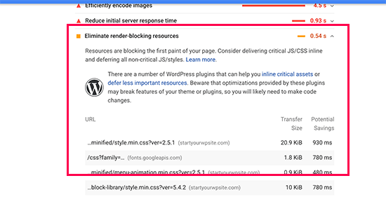
    Render blocking issue highlighted in Google Pagespeed Insights

    A user’s browser will have to load those scripts and CSS before loading the rest of the HTML on the page. This means that users on a slower connection will have to wait a few milliseconds more to see the page.

    These scripts and stylesheets are referred to as render-blocking JavaScript and CSS.

    Website owners who are trying to achieve the Google PageSpeed score of 100 will need to fix this issue to attain that perfect score.

    What is Google PageSpeed Score?

    Google PageSpeed Insights is a website speed test tool created by Google to help website owners optimize and test their websites. This tool tests your website against Google’s guidelines for speed and offers suggestions to improve your site’s page load time.

    It shows you a score based on the number of rules that your site passes. Most websites get somewhere between 50-70. However, some website owners feel compelled to achieve 100 (the highest a page can score).

    Do You Really Need the Perfect “100” Google PageSpeed Score?

    The purpose of Google PageSpeed insights is to provide you guidelines to improve the speed and performance of your website. You are not required to follow these rules strictly.

    Remember that speed is only one of the many website SEO metrics that help Google determine how to rank your site. The reason speed is so important is because it improves user experience on your site.

    Better user experience requires a lot more than just speed. You also need to offer useful information, a better user interface, and engaging content with text, images, and videos.

    Your goal should be to create a fast website that offers a great user experience.

    During the last WPBeginner redesign, we kept our focus on speed as well as improving user experience.

    We recommend that you use Google Pagespeed rules as suggestions, and if you can implement them easily without ruining user experience, then that’s great. Otherwise, you should strive to do as much as you can, and then don’t worry about the rest.

    Having said that, let’s take a look at what you can do to fix render-blocking JavaScript and CSS in WordPress.

    We will cover two methods that will fix the render-blocking JavaScript and CSS in WordPress. You can choose the one that works best for your website.

    1. Fix Render Blocking Scripts and CSS with WP Rocket

    For this method, we’ll be using the WP Rocket plugin. It is the best WordPress caching plugin on the market and allows you to quickly improve your website performance without any technical skills or complicated set up.

    First, you need to install and activate the WP Rocket plugin. For more details, see our step by step guide on how to install a WordPress plugin.

    WP Rocket works out of the box, and it will turn on caching with optimal settings for your website. You can learn more about it in our complete guide on how to properly install and set up WP Rocket in WordPress.

    By default, it does not turn on JavaScript and CSS optimization options. These optimizations can potentially affect your website’s appearance or some features, which is why the plugin allows you to enable these settings optionally.

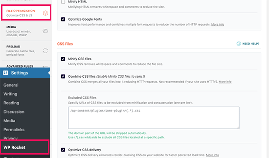
    To do that, you need to visit Settings » WP Rocket page and then switch to the ‘File Optimization’ tab. From here, scroll to the CSS Files section and check the boxes next to Minify CSS, Combine CSS Files, and Optimize CSS Delivery options.

    CSS Optimization settings in WP Rocket

    Note: WP Rocket will attempt to minify all your CSS files, combine them, and only load CSS needed for the visible part of your website. This could affect your website’s appearance, so you need to thoroughly test your website on multiple devices and screen sizes.

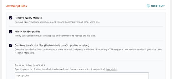
    Next, you need to scroll to the JavaScript Files section. From here, you can check all the options for maximum performance improvement.

    JavaScript optimization

    You can minify and combine JavaScript files like you did for CSS.

    You can also stop WordPress from loading jQuery Migrate file. It is a script that WordPress loads to provide compatibility for plugins and themes using old versions of jQuery.

    Most websites don’t need this file, but you would still want to check your website to make sure that removing it does not affect your theme or plugins.

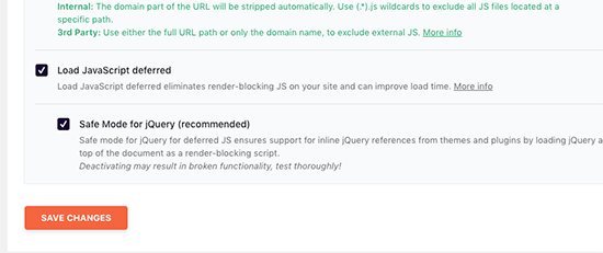
    Next, scroll down a little further and check the boxes next to ‘Load JavaScript Defered’ and ‘Safe Mode for jQuery’ options.

    Optimize JavaScript delivery

    These options delay loading non-essential JavaScripts, and the jQuery safe mode allows you to load jQuery for themes that may use it inline. You can leave this option unchecked if you are certain that your theme does not use inline jQuery anywhere.

    Don’t forget to click on the Save Changes button to store your settings.

    After that, you may also want to clear cache in WP Rocket before testing your website again with Google Page Speed Insights.

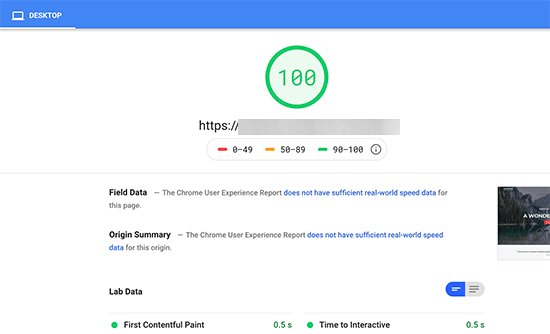
    On our test site, we were able to achieve 100% score on Desktop and render-blocking issue was solved in both mobile and desktop scores.

    Fixed render-blocking issue to achieve perfect page speed score

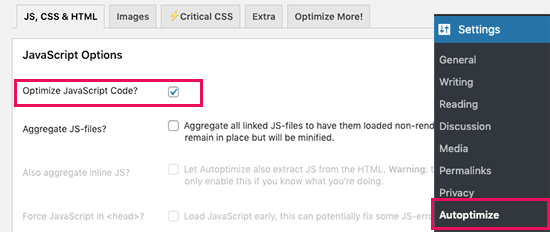
    2. Fix Render Blocking Scripts and CSS with Autoptimize

    For this method, we will be using a separate plugin made specifically for improving delivery of your website’s CSS and JS files. While this plugin gets the job done, it does not have the other powerful features that WP Rocket has.

    First thing you need to do is install and activate the Autoptimize plugin. For more details, see our step by step guide on how to install a WordPress plugin.

    Upon activation, you need to visit the Settings » Autoptimize page to configure the plugin settings.

    First, you need to check the box next to ‘Optimize JavaScript Code’ option under the JavaScript Options block. Make sure that ‘Aggregate JS-files’ option is unchecked.

    Optimize JS files in Autoptimize

    Next, scroll down to the CSS Options box and check the ‘Optimize CSS Code’ option. Make sure that ‘Aggregate CSS-files’ option is unchecked.

    Optimize CSS in Autoptimize

    You can now click on the ‘Save Changes and Empty Cache’ button to store your settings.

    Go ahead and test your website with the Page Speed Insights tool. On our demo site, we were able to fix the render-blocking issue with these basic settings.

    Fixed render blocking issue in WordPress with Autoptimize plugin

    If there are still render-blocking scripts, then you need to come back to the plugin’s settings page and review options under both JavaScript and CSS options.

    For instance, you can allow the plugin to include inline JS and remove scripts that are excluded by default like seal.js or jquery.js.

    Click on the ‘Save changes and Empty Cache’ button to save your changes and empty plugin cache.

    Once you are done, go ahead and check your website again with the Page Speed tool.

    How does it work?

    Autoptimize aggregates all enqueued JavaScript and CSS. After that, it creates minified CSS and JavaScripts files and serves cached copies to your website as async or deferred.

    This allows you to fix the render-blocking scripts and styles issue. However, please keep in mind that it can also affect the performance or appearance of your website.

    Troubleshooting

    Depending on how the plugins and your WordPress theme uses JavaScript and CSS, it could be quite challenging to completely fix all render-blocking JavaScript and CSS issues.

    While the above tools can help, your plugins may need certain scripts at a different priority level to work properly. In that case, the above solutions can break the functionality of such plugins, or they could behave unexpectedly.

    Google may still show you certain issues like optimizing CSS delivery for above the fold content. WP Rocket allows you to fix that by manually adding Critical CSS required to display the above fold area of your theme.

    However, it could be quite difficult to find out what CSS code you will need to display above the fold content.

    We hope this article helped you learn how to fix render-blocking JavaScript and CSS in WordPress. You may also want to see our ultimate guide on how to speed up WordPress performance for beginners, and our comparison of the best managed WordPress hosting companies.

    If you liked this article, then please subscribe to our YouTube Channel for WordPress video tutorials. You can also find us on Twitter and Facebook.

    The post How to Fix Render-Blocking JavaScript and CSS in WordPress appeared first on WPBeginner.

    Solving Common Cross-Platform Issues When Working With Flutter

    Solving Common Cross-Platform Issues When Working With Flutter

    Solving Common Cross-Platform Issues When Working With Flutter

    Carmine Zaccagnino

    I’ve seen a lot of confusion online regarding Web development with Flutter and, often, it’s sadly for the wrong reasons.

    Specifically, people sometimes confuse it with the older Web-based mobile (and desktop) cross-platform frameworks, which basically were just Web pages running within browsers running within a wrapper app.

    That was truly cross-platform in the sense that the interfaces were the same anyway because you only had access to the interfaces normally accessible on the Web.

    Flutter isn’t that, though: it runs natively on each platform, and it means each app runs just like it would run if it were written in Java/Kotlin or Objective-C/Swift on Android and iOS, pretty much. You need to know that because this implies that you need to take care of the many differences between these very diverse platforms.

    In this article, we’re going to see some of those differences and how to overcome them. More specifically, we’re going to talk about storage and UI differences, which are the ones that most often cause confusion to developers when writing Flutter code that they want to be cross-platform.

    Example 1: Storage

    I recently wrote on my blog about the need for a different approach to storing JWTs in Web apps when compared to mobile apps.

    That is because of the different nature of the platforms’ storage options, and the need to know each and their native development tools.

    Web

    When you write a Web app, the storage options you have are:

    1. downloading/uploading files to/from disk, which requires user interaction and is therefore only suitable for files meant to be read or created by the user;
    2. using cookies, which may or may not be accessible from JS (depending on whether or not they’re httpOnly) and are automatically sent along with requests to a given domain and saved when they come as part of a response;
    3. using JS localStorage and sessionStorage, accessible by any JS on the website, but only from JS that is part of the pages of that website.

    Mobile

    The situation when it comes to mobile apps is completely different. The storage options are the following:

    1. local app documents or cache storage, accessible by that app;
    2. other local storage paths for user-created/readable files;
    3. NSUserDefaults and SharedPreferences respectively on iOS and Android for key-value storage;
    4. Keychain on iOS and KeyStore on Android for secure storage of, respectively, any data and cryptographic keys.

    If you don’t know that, you’re going to make a mess of your implementations because you need to know what storage solution you’re actually using and what the advantages and drawbacks are.

    Cross-Platform Solutions: An Initial Approach

    Using the Flutter shared_preferences package uses localStorage on the Web, SharedPreferences on Android and NSUserDefaults on iOS. Those have completely different implications for your app, especially if you’re storing sensitive information like session tokens: localStorage can be read by the client, so it’s a problem if you’re vulnerable to XSS. Even though mobile apps aren’t really vulnerable to XSS, SharedPreferences and NSUserDefaults are not secure storage methods because they can be compromised on the client side since they are not secure storage and not encrypted. That’s because they are meant for user preferences, as mentioned here in the case of iOS and here in the Android documentation when talking about the Security library which is designed to provide wrappers to the SharedPreferences specifically to encrypt the data before storing it.

    Secure Storage On Mobile

    The only secure storage solutions on mobile are Keychain and KeyStore on iOS and Android respectively, whereas there is no secure storage on the Web.

    The Keychain and KeyStore are very different in nature, though: Keychain is a generic credentials storage solution, whereas the KeyStore is used to store (and can generate) cryptographic keys, either symmetric keys or public/private keys.

    This means that if, for instance, you need to store a session token, on iOS you can let the OS manage the encryption part and just send your token to the Keychain, whereas on Android it’s a bit more of a manual experience because you need to generate (not hard-code, that’s bad) a key, use it to encrypt the token, store the encrypted token in SharedPreferences and store the key in the KeyStore.

    There are different approaches to that, as are most things in security, but the simplest is probably to use symmetric encryption, as there is no need for public key cryptography since your app both encrypts and decrypts the token.

    Obviously, you don’t need to write mobile platform-specific code that does all of that, as there is a Flutter plugin that does all of that, for instance.

    The Lack Of Secure Storage On the Web

    That was, actually, the reason that compelled me to write this post. I wrote about using that package to store JWT on mobile apps and people wanted the Web version of that but, as I said, there is no secure storage on the Web. It doesn’t exist.

    Does that mean your JWT has to be out in the open?

    No, not at all. You can use httpOnly cookies, can’t you? Those aren’t accessible by JS and are sent only to your server. The issue with that is that they’re always sent to your server, even if one of your users clicks on a GET request URL on someone else’s website and that GET request has side effects you or your user won’t like. This actually works for other request types as well, it’s just more complicated. It’s called Cross-Site Request Forgery and you don’t want that. It’s among the web security threats mentioned in Mozilla’s MDN docs, where you can find a more complete explanation.

    There are prevention methods. The most common one is having two tokens, actually: one of them getting to the client as an httpOnly cookie, the other as part of the response. The latter has to be stored in localStorage and not in cookies because we don’t want it to be sent automatically to the server.

    Solving Both

    What if you have both a mobile app and a Web app?

    That can be dealt with in one of two ways:

    1. Use the same backend endpoint, but manually get and send the cookies using the cookie-related HTTP headers;
    2. Create a separate non-Web backend endpoint that generates different token than either token used by the Web app and then allow for regular JWT authorization if the client is able to provide the mobile-only token.

    Running Different Code On Different Platforms

    Now, let’s see how we can run different code on different platforms in order to be able to compensate for the differences.

    Creating A Flutter Plugin

    Especially to solve the problem of storage, one way you can do that is with a plugin package: plugins provide a common Dart interface and can run different code on different platforms, including native platform-specific Kotlin/Java or Swift/Objective-C code. Developing packages and plugins is rather complex, but it’s explained in many places on the Web and elsewhere (for example in Flutter books), including the official Flutter documentation.

    For mobile platforms, for instance, there already is a secure storage plugin, and that’s flutter_secure_storage, for which you can find an example of usage here, but that doesn’t work on the Web, for example.

    On the other hand, for simple key-value storage that also works on the web, there’s a cross-platform Google-developed first-party plugin package called shared_preferences, which has a Web-specific component called shared_preferences_web which uses NSUserDefaults, SharedPreferences or localStorage depending on the platform.

    TargetPlatform on Flutter

    After importing package:flutter/foundation.dart, you can compare Theme.of(context).platform to the values:

    • TargetPlatform.android
    • TargetPlatform.iOS
    • TargetPlatform.linux
    • TargetPlatform.windows
    • TargetPlatform.macOS
    • TargetPlatform.fuchsia

    and write your functions so that, for each platform you want to support, they do the appropriate thing. This will come especially useful for the next example of platform difference, and that is differences in how widgets are displayed on different platforms.

    For that use case, in particular, there is also a reasonably popular flutter_platform_widgets plugin, which simplifies the development of platform-aware widgets.

    Example 2: Differences In How The Same Widget Is Displayed

    You can’t just write cross-platform code and pretend a browser, a phone, a computer, and a smartwatch are the same thing — unless you want your Android and iOS app to be a WebView and your desktop app to be built with Electron. There are plenty of reasons not to do that, and it’s not the point of this piece to convince you to use frameworks like Flutter instead that keep your app native, with all the performance and user experience advantages that come with it, while allowing you to write code that is going to be the same for all platforms most of the time.

    That requires care and attention, though, and at least a basic knowledge of the platforms you want to support, their actual native APIs, and all of that. React Native users need to pay even more attention to that because that framework uses the built-in OS widgets, so you actually need to pay even more attention to how the app looks by testing it extensively on both platforms, without being able to switch between iOS and Material widget on the fly like it’s possible with Flutter.

    What Changes Without Your Request

    There are some aspects of the UI of your app that are automatically changed when you switch platforms. This section also mentions what changes between Flutter and React Native in this respect.

    Between Android And iOS (Flutter)

    Flutter is capable of rendering Material widgets on iOS (and Cupertino (iOS-like) widgets on Android), but what it DOESN’T do is show exactly the same thing on Android and iOS: Material theming especially adapts to the conventions of each platform.

    For instance, navigation animations and transitions and default fonts are different, but those don’t impact your app that much.

    What may affect some of your choices when it comes to aesthetics or UX is the fact that some static elements also change. Specifically, some icons change between the two platforms, app bar titles are in the middle on iOS and on the left on Android (on the left of the available space in case there is a back button or the button to open a Drawer (explained here in the Material Design guidelines and also known as a hamburger menu). Here’s what a Material app with a Drawer looks like on Android:

    image of an Android app showing where the app bar title appears on Flutter Android Material apps
    Material app running on Android: the AppBar title is in the left side of the available space. (Large preview)

    And what the same, very simple, Material app looks like on iOS:

    image of an iOS app showing where the app bar title appears on Flutter iOS Material apps
    Material app running on iOS: the AppBar title is in the middle. (Large preview)
    Between Mobile and Web and With Screen Notches (Flutter)

    On the Web there is a bit of a different situation, as mentioned also in this Smashing article about Responsive Web Development with Flutter: in particular, in addition to having to optimize for bigger screens and account for the way people expect to navigate through your site — which is the main focus of that article — you have to worry about the fact that sometimes widgets are placed outside of the browser window. Also, some phones have notches in the top part of their screen or other impediments to the correct viewing of your app because of some sort of obstruction.

    Both of these problems can be avoided by wrapping your widgets in a SafeArea widget, which is a particular kind of padding widget which makes sure your widgets fall into a place where they can actually be displayed without anything impeding the users’ ability to see them, be it a hardware or software constraint.

    In React Native

    React Native requires much more attention and a much deeper knowledge of each platform, in addition to requiring you to run the iOS Simulator as well as the Android Emulator at the very least in order to be able to test your app on both platforms: it’s not the same and it converts its JavaScript UI elements to platform-specific widgets. In other words, your React Native apps will always look like iOS — with Cupertino UI elements as they are sometimes called — and your Android apps will always look like regular Material Design Android apps because it’s using the platform’s widgets.

    The difference here is that Flutter renders its widgets with its own low-level rendering engine, which means you can test both app versions on one platform.

    Getting Around That Issue

    Unless you’re going for something very specific, your app is supposed to look different on different platforms otherwise some of your users will be unhappy.

    Just like you shouldn’t simply ship a mobile app to the web (as I wrote in the aforementioned Smashing post), you shouldn’t ship an app full of Cupertino widgets to Android users, for example, because it’s going to be confusing for the most part. On the other hand, having the chance to actually run an app that has widgets that are meant for another platform allows you to test the app and show it to people in both versions without having to use two devices for that necessarily.

    The Other Side: Using The Wrong Widgets For The Right Reasons

    But that also means that you can do most of your Flutter development on a Linux or Windows workstation without sacrificing the experience of your iOS users, and then just build the app for the other platform and not have to worry about thoroughly testing it.

    Next Steps

    Cross-platform frameworks are awesome, but they shift responsibility to you, the developer, to understand how each platform works and how to make sure your app adapts and is pleasant to use for your users. Other small things to consider may be, for example, using different descriptions for what might be in essence the same thing if there are different conventions on different platforms.

    It’s great to not have to build the two (or more) apps separately using different languages, but you still need to keep in mind you are, in essence, building more than one app and that requires thinking about each of the apps you are building.

    Further Resources

    Smashing Editorial (ra, yk, il)

    8 Reasons To Opt for Angular.JS in The Development Process

    Angular.JS is a well-known platform to develop dynamic web applications. It helps to build interactive and feature-rich websites for the users.  However, this framework supports Single Page web apps and MVC (Model-View-Controller) architecture. It is considered as the most preferred platform for the developers and delivers enterprise profitability. 

    Learn about Angular.JS

    Angular.JS is a JavaScript framework and written in Javascript language only. It helps to develop Single Page Applications and runs on Javascript engine platform. This framework is known to develop front end web frameworks. Launched on 20 Oct 2010,  under MIT License. 

    Collective #606


    Collective Item Image

    WebGL guide

    Maxime Euzière’s complete, summarized WebGL tutorial, with tiny interactive demos in each chapter.

    Check it out


    Collective Item Image

    DOM diffing with vanilla JS

    Previously, Chris Ferdinandi explains how to build reactive, state-based components with vanilla JS and in this article he shows how to add DOM diffing to a component.

    Read it


    Collective #606 was written by Pedro Botelho and published on Codrops.

    Making dark theme switcher with PostCSS.

    You have noticed that there is a new design trend that is floating around web design since 2019, the dark mode. Facebook, Apple, and Google both introduced the dark version of their software.

    Why a dark theme

    Most of you probably think this is just a trend that will disappear after some years, well, let me say that this is not like many other trends, dark UI provide different advantages and they are not something just related to the “designer mood”. Let’s see why a dark mode on your applications and websites are something useful.

    Better for batteries

    Pixels on a screen consume more energy to display light colors rather than dark ones. Consequently, devices’ batteries can save energy and improve their daily duration while using dark UI.

    Better for dark environments

    Most of us use their smartphone and laptops while at home. Such environments are typically not so bright. The dark mode can help the use of the application while indoor, without causing visual disturbances.

    Better for people

    Some people with — or without — visual diseases, like epilepsy, can have unfortunate events by being flashed by bright applications. Having a dark mode means being more accessible.

    Preparing styles

    A very simple theme switcher should offer at least 3 options:

    • Dark theme
    • Light theme
    • Automatic theme (should be on by default)

    Wait, what’s the automatic theme? Well, modern operating systems allow users to change the global visual appearance by setting os-wide options that enable the dark or light mode. The automatic option make sure to respect the OS preference if the user has not specified any theme.

    To make this even more simple, we’ll use PostCSS and a simple but useful plugin called postcss-dark-theme-class.

    yarn add postcss-dark-theme-class

    This plugin will do 70% of the work, once installed, add it to your PostCSS config and configure the selectors you want to use to activate the correct theme, which will be used by the plugin to generate the correct CSS:

    module.exports = {
      plugins: [
        /* ...other plugins */
    
        require('postcss-dark-theme-class')({
          darkSelector: '[data-theme="dark"]',
          lightSelector: '[data-theme="light"]'
        })
      ]
    }

    Once the plugin is up and running, we can start defining our dark and light themes using a CSS specific media query prefers-color-scheme. This special media query will handle the automatic part of our themes by applying the correct theme based on the user’s OS preferences:

    :root {
      --accent-color: hsl(226deg 100% 50%);
      --global-background: hsl(0 0% 100%);
      --global-foreground: hsl(0 0% 0%);
    }
    
    @media (prefers-color-scheme: dark) {
      :root {
        --accent-color: hsl(226deg 100% 50%);
        --global-background: hsl(0 0% 0%);
        --global-foreground: hsl(0 0% 100%);
      }
    }

    If the user is using a dark version of his OS, the set inside the media query will apply, overwriting others, otherwhise the set of properties outside the media query is used. Since it’s pure CSS, this behaviour is on by default.

    Browsers will now adapt the color scheme automatically based on the users’ OS preferences. Nice done! 🚀 Now it’s time to make the theme switcher allow users to specify what theme to use, overriding the OS preference.

    Preview(opens in a new tab)

    Making the theme switcher

    s we said, our switcher should have three options, we can use a simple select element, or build a set of buttons:

    <button type="button" data-set-theme="auto">Auto</button>
    <button type="button" data-set-theme="dark">Dark</button>
    <button type="button" data-set-theme="light">Light</button>

    We’ll build the switcher using vanilla JS, but you can do it with any framework you want, the concept is the same: we have to add the selectors we defined inside the PostCSS plugin to the root element, based on the clicked button.

    const html = document.documentElement
    const themeButtons = document.querySelectorAll('[data-set-theme]');
    
    themeButtons.forEach((button) => {
      const theme = button.dataset.setTheme;
    
      button.addEventListener('click', () => {
        html.dataset.theme = theme;
      })
    })
    This is a very basic and ugly JS example

    Each time we click on a theme button, the value set as data-set-theme is applied as value of the data-theme attribute on the docEach time we click on a theme button, the value set as `data-set-theme` is applied as value of the `data-theme` attribute on the document root element, we also change the [aria-current] attribute.

    Check it live:


    Where is the magic?

    The magic is made by postcss-dark-theme-class — which will add our [data-theme] custom attribute to the :root selectors we wrote — during the CSS transpilation. Here what it generates from our code:

    /* Our automatic and user specified light theme */
    :root {
      --accent-color: hsl(226deg, 100%, 50%);
      --global-background: hsl(0, 0%, 100%);
      --global-foreground: hsl(0, 0%, 0%);
    }
    
    /* Our automatic dark theme */
    @media (prefers-color-scheme: dark) {
      :root:not([data-theme="light"]) {
        --accent-color: hsl(226deg, 100%, 50%);
        --global-background: hsl(0, 0%, 0%);
        --global-foreground: hsl(0, 0%, 100%);
      }
    }
    
    /* Our dark theme specified by the user */
    :root[data-theme="dark"] {
      --accent-color: hsl(226deg, 100%, 50%);
      --global-background: hsl(0, 0%, 0%);
      --global-foreground: hsl(0, 0%, 100%);
    }

    Bonus tip

    You may notice that the --accent-color custom property defined inside themes doesn’t change. If you have colors that will not change based on the theme, you can remove them from the prefers-color-scheme at-rule.

    In this way, they will not be duplicated and the one defined outside the media query will always apply.

    :root {
      --accent-color: hsl(226deg 100% 50%);
      --global-background: hsl(0 0% 100%);
      --global-foreground: hsl(0 0% 0%);
    }
    
    @media (prefers-color-scheme: dark) {
      :root {
        --global-background: hsl(0 0% 0%);
        --global-foreground: hsl(0 0% 100%);
      }
    }

    The post Making dark theme switcher with PostCSS. appeared first on CSS-Tricks.