JavaScript is bigger than ever, and the ecosystem is nothing short of overwhelming. In this JS toolbox 2024 series, we’ve selected and analyzed the most noteworthy JS tools, so that you don’t have to.
In part 1 of this series, we reviewed runtimes and package managers, the foundational building blocks of your software project. So in part 2, we're analyzing the tools that form the walls and roof that give your software project its structure: frameworks and static site generators.
Last week I linked up a Web Component (feels like we should do Captial W and Captial C when referring to the official technology, yes?) that would take an image and output a “dithered” version of it.
Why did Andrew make it a Web Component? I can’t be sure, but check out how you use it:
Link up a JavaScript file that has one job: instantiate usage of the Web Component.
Use the Web Component in HTML alone.
Like…
<script src="./as-dithered-image.js"></script>

<as-dithered-image
   crunch="1"
   src="./surfer.jpg"
   alt="Description of the image for screen readers">
</as-dithered-image>
That’s just… a nice API! It’s easy to use and easy to control. This idea could have been developed and delivered any number of other ways, but this way feels pretty good. Web Components allow you to build (and distribute, really) a bit of design and functionality that anybody can use anywhere on the web.
Well, I say anywhere, but if you’re using a JavaScript framework, it does require that JavaScript framework plays nicely with them. A good place to check is the website Custom Elements Everywhere that has tests for it. React, famously, isn’t great with them. And, well, server-side rendering of them is a bit tricky. And the accessibility story is a bit messy. And styling them isn’t my favorite. So the whole story isn’t so clear.
Still, personally, my brain reaches for the idea of a Web Component more and more. When I made my Calendar with Container Queries demo, I thought a great way to showcase the fact that you don’t need to change the viewport width for the container queries to hit was if you could resize the area that component is in some other way. I figured there must be a Web Component for this and of course, there was.
So are Web Components destined to be used for small bits of framework-agnostic functionality? Maybe! Maybe not! I mean you can’t discount that Adobe literally built the entire application of Photoshop on the web with Web Components.
… the entire Photoshop app is built using Lit-based Web Components. Leaning on the browser’s built-in component model and Shadow DOM encapsulation, the team found it easy to cleanly integrate a few “islands” of React code provided by other Adobe teams.
They aren’t alone, either. EisenbergEffect’s 2023 State of Web Components starts off with loads of examples of big production sites going fairly big on Web Components, like YouTube, MSN, Salesforce, and SpaceX. I always think of GitHub too which felt like a pretty early adopter.
What makes all this Web Component stuff so tricky and nuanced is that they aren’t just one technology, they are really quite a big bucket of technologies that all come together to form what the world (well, me at least) thinks of as Web Components.
The classics are Shadow DOM, Custom Elements, and HTML Templating. But even among them, the details of how they are implemented and what advancements are coming to them is complex. EisenbergEffect’s’s article gets pretty deeply into it so is worth checking out if nothing else to understand how wide this subject is.
As a CSS guy kinda, I try to follow the styling story for them. The Shadow DOM is where that story starts, offering the unique ability to contain styles quite strongly. But how do you get the CSS in there? Do you put special HTML attributes on everything so you can reach in with ::part selectors? Do you put Custom Properties on everything so you can “reach in” from the outside to style them? Do you put a block of CSS in the HTML template? Do you @import CSS from inside? Sort of “yes” to all of them, but also sort of “🤢” to all of that if you ask me. But then there are Constructible Stylesheets and Adopted Stylesheets which seem like a web platform win allowing for more proper programmatic access to CSS. Then CSS Module Scripts allowing for proper importing of CSS in JavaScript which has long been a bundler-only aberration. And making that CSS declarative just might bring it full circle. Phew!
Back to the idea of actually using these things. Brad Frost believes the job of Web Components really isn’t at odds with JavaScript frameworks at all. (I always thought it was a fair comparison, since all JavaScript frameworks teach you to build in composable components that are isolated bits of design and functionality). But Brad splits it along another dichotomy he is famous for:
Web components handle front-of-the-front-end code (e.g. the look and feel of a button)
JS libraries/frameworks handle back-of-the-front-end code (e.g. what happens when a user clicks on that button)
If that’s pull-off-able, it sounds reasonable to me. I’d have to see some examples. I think of how even the most basic interactivity, like <button onClick={}> means putting framework-specific code into the “HTML” and I don’t totally get how to untangle that since both the native HTML template and the framework-specific HTML (e.g. JSX) are involved.
All this talk so far is also about using the Web Components technology “raw”, that is, the web platform APIs directly. I heard from people early on in this world, who were part of shaping the whole idea, that the APIs were more designed around framework authors and that your average website crafting citizen was meant to use abstractions around Web Components, not the APIs directly. That’s a wild claim to me since there is little precedent for that, but OK.
The first wave of those abstractions were libraries that just made things a little more ergonomic at the cost of a few KB of a client-side library. Lit is a famous one. It just makes the instantiation of web components a little easier. Re-rendering efficiently wasn’t an early aim (wtf), so it helped with that. Styling, as I laid out, is rough, so it helps with that a little. Personally, I was never hugely drawn to it as it seemed like it bought you a little niceness, but not enough to feel locked to some new framework (might as well have just picked a more robust JavaScript framework then).
I think we’re seeing the next wave of Web Components frameworks now, like WebC and Enhance. They both make SSR the primary feature. I thought that was a weird choice at first as, that’s nice and all, but didn’t seem to be the main reason Web Components weren’t “winning”. But I’m coming around to it. I think when SSR gets “solved” like this, other solutions come along for the ride. Like styling gets easier. But also solves bigger questions like “how do I build whole sites with this?” by including things like data-fetching advice and real routing.
Perhaps the most clutch part about Web Components is that, even if the beginnings were shaky (they were) and even if the story still isn’t perfectly clear (it isn’t), the technologies are now built into browsers and browsers are wonderfully long-term and backward-compatible. They aren’t just going to rip out Web Components support. It’s just going to get better over time.
Need help understanding the tech more? I’d pass you over to my friend Dave’s course HTML with Superpowers.
Face recognition, as a biometric recognition technology based on artificial intelligence, has been widely applied in many fields in recent years. In web applications, facial recognition-based identity authentication is also becoming increasingly popular. At the same time, the user experience continues to improve. This article will introduce how to integrate FaceIO in Vue.js and Golang to achieve identity authentication for facial recognition.
In web applications, the security and convenience factors brought by facial recognition-based identity authentication can enhance the user experience.
NextJS13 was just released, and as of now, all tutorials present online have become outdated. Therefore, this article will get into NextJS and explore the NextJS 13 newly introduced features.
Instead of optimizing for single-page applications, NextJS is designed for teams building ambitious, complex applications.
Fine tuning your website through manual optimization can be tricky, but our new Safe Mode feature in Hummingbird puts that problem in the rearview.
Now, you can now test optimization in a temporary area that allows for non-permanent changes, so you can work out any kinks, then push them to your live site. For free!
Introducing Safe Mode for Manual Asset Optimization – allowing you to optimize in a private space while your users still enjoy a fully functioning site.
In this article, we’re going to look at how Safe Mode in Hummingbird works, while touching on a few related features and settings in the plugin. Plus, we’ll take a look at an additional (surprise!) feature also included in this release.
Continue reading, or jump ahead using these links:
Hummingbird makes your website faster by optimizing site performance with fine-tuned controls. Setting enhancements make things easy and efficient, giving you new ways to boost PageSpeed Insights.
First, it identifies files that can be optimized (HTML, Javascript, and CSS), then offers a variety of means (compress, combine, or move) to make that happen.
The result gives you marked improvement in your website’s performance.
There are two different modes for asset optimization in Hummingbird:
Automatic – use our preset options to optimize your assets and improve page load times.
Manual – configure each file yourself to achieve the setup best suited to your specific site needs.
Drilling down even further, there are two options within Automatic Optimization mode:
Speedy – compresses & auto-combines smaller files together, and optimizes your fonts for faster delivery.
Basic – compresses all your files to deliver a faster version of each.
Automatic mode allows for a quick setup, providing positive gains without the time commitment that manual adjustment requires.
Both of the Automatic options can be configured for Files (CSS, JavaScript), and/or Fonts.
Hummingbird lets you optimize CSS, JS, and font files.
Manual mode allows you to tinker with any and every file individually, so you can optimize your site on a very granular level.
It’s a good idea to test files one at a time to measure results; that way if something doesn’t work it’s easy to identify what caused it and revert back without issue.
We’ve mapped out specific steps for what to do in each mode, so that you can easily follow along in Hummingbird and produce optimal results.
You can see these anytime by navigating to Hummingbird > Asset Optimization > Assets, then click on the How Does it Work? text at right.
There is a page for Automatic and one for Manual; just click on the corresponding header button that you’d like to read about.
Get one-click access to summarized details on both modes of asset optimization.
If you’re just starting out with Hummingbird, we recommend selecting Automatic optimization in Speedy mode to start. As you use and test your site and the plugin further, you can switch to auto basic or manual mode to check for possible improvements.
And of course, you can always view our detailed documentation, or reach out to our customer support gurus, available 24/7/365.
Testing Changes in Safe Mode
We’re going to zero in today on optimization done in Manual, as that’s where the new Safe Mode lives.
Hummingbird’s Safe Mode allows you to test different asset optimization settings in a safe environment, without affecting your website visitors’ experience.
You’ll be able to preview your site from the frontend and check for any errors in your browser’s console, then publish your changes to go live once you’ve got everything just right.
To enable this feature, go to Asset Optimization > Manual Asset Optimization, and click on the toggle button next to Safe Mode.
From here, you can also click on the filter icon, which will open a panel for finding files faster. You can free type or select from the dropdown menu.
You can filter to search for files while in Safe Mode.
When you’re in Safe Mode, clicking on any icon box will change its state.
You will see a solid outline around it, indicating it’s been selected, and a circular info icon will also appear on the far left of the row.
These visuals are to remind you’re in preview mode, and will remain until you click Publish, committing the changes you’ve made.
Visual cues will alert you to unsaved changes.
With Safe Mode enabled, you can start tweaking your files for peak optimization.
Each asset will have a status icon indicating its current state, and these vary based on the asset they’re attached to.
As an example, the Compress option can have the following states:
Gray icon – files that are already compressed
White icon – indicates which files can be compressed
Blue icon – New assets selected for compression
Can’t be compressed – marks files that can’t be compressed
Hover your mouse over any icon for a popup description of what action this change would make.
Need info on a particular icon? Just hover over it for a status popup.
To see the effect any change makes, click the Preview button.
The Preview button shows up once you turn Safe Mode on, taking the place of the Publish Changes button.
Hitting Preview will load the frontend of your site, where you can check on the asset optimization you configured, making sure it doesn’t generate errors or break anything on your site.
What our Preview page looks like in Hummingbird’s Safe Mode.
As you can see, the preview page has three clickable buttons at the top: Go Back, Copy Test Link, and Publish.
Click on Copy Test Link if you want to gauge asset optimization you’ve made using a third-party performance test. Just paste the copied text into your preferred tool.
Click on the Publish button if you’re content with the change(s) you made, and are ready to save.
Click on the Go Back button if you’ve gotten an error message, a site break, or had no observable performance improvements, so you can continue to tweak your assets further.
Once you’ve completed this exercise, turn Safe Mode OFF, as leaving it on can cause page load delays on your live site.
And there you go! Maximum optimization achieved, which is completely changeable at any time.
What’s The Other New Feature in Hummingbird 3.4?
There’s another new feature in the latest release that I wanted to mention, as it’s sure to make your search experience in Hummingbird better.
In the past, if you were working with a particular encrypted file from your performance test reports, locating it on the Manual Asset optimization tab by filename was a bit messy.
That was because Hummingbird generates special filenames for optimized files, and there was no direct way to find them there. Until now!
Copy filenames, then use Ctrl/Cmd+F to quickly find them in the browser search.
With this release, you can copy filenames from the performance reports, then look them up directly in the browser search in the Manual Asset Optimization tab.
This makes finding optimized files easier and faster.
Get Your Site Humming with Optimal Performance
Hummingbird is the ultimate performance suite for all users – whether you’re looking for simple, one-click solutions, or want to fine-tune your site performance down to the last CSS file.
You’ll get faster loading pages and higher search rankings and PageSpeed scores with Hummingbird’s speed optimization.
Now with Safe Mode for asset optimization, you can manually configure and test any files without worrying about a site break or interrupting the visitor experience on your site.
Hummingbird is only one of our highly rated and multi-functional Pro plugins. You can try them all – along with WPMU DEVs membership or hosting – for free! Everything comes with our money-back guarantee, fully supported by our always on-call, 5-star support.
We’ll help you keep your sites humming and your clients happy.
I’m a web developer for more than 10 years now, and I know how hard it would be to work on more serious projects without using third-party libraries.
This is why I love them so much, and in this article, I’m going to share one of my recent findings.
A gem that I deem very helpful for profile photos on a website such as a forum or LMS (learning management system), although this plugin is so much more.
It’s a paid JS plugin, but for a very good reason.
Let’s see how we can save a ton of time in the development process by using this neat image editor, compatible with most of the development stacks out there.
What is Pintura?
Pintura is an image editing tool, packed with so many great features that I don’t know where to start first.
In fact, the scope of this article simply can’t hold the number of possibilities that this plugin provides, so I’ll try focusing briefly on the main features and showing some quick examples.
In a nutshell, Pintura is a robust JS image editor, allowing you to crop, resize, rotate, apply filters, or fine-tune your images.
Pintura also supports annotation, stickers (including custom ones), removal of sensitive information from the photos (such as location), enforced crop ratio, and others.
It is responsive and works on both desktops and mobiles, very lightweight and fast to use.
And while you as a website owner can use it for your own website or project, this tool is perfect for developers.
Yes, this library is self-sufficient and can be used on your website as an image editor (check this website for example), but the real power comes in accessibility for developers and the support for a wide range of development platforms.
Should you try Pintura for your own project?
While I always encourage fellow devs to shake their heads and make the best of any tool they are trying to build, certain things are best when implemented.
I mean, if you want to build your own image editor tool, you can do that, but it can take months, especially if you need more than 1-2 features that Pintura provides.
Plus, you need to test on different devices and cover a wide range of use cases, which basically takes a solid team and a solid amount of time.
But what if you’re a solo rider?
Or if your team is working on a large-scale project, yet you want or need to make it better when it comes to image processing?
This is where Pintura comes in really handy.
The pool of use cases is rather deep, but you can think of it like this:
When you need a photo fitting certain criteria in your project, Pintura makes it effortless.
Profile photos in a certain size or ratio, filtered and styled featured images, equal images for slides, galleries, or carousels, and a website where you can strip all the privacy information from a photo… are just some of the many possibilities.
So, although someone with no coding experience can use it, Pintura shows real strength when used by developers.
It saves time and provides an elegant solution for image editing on the fly, whether automatically in the code or by allowing website users to fulfill a certain requirement or just make their photos more appealing!
We will cover the usage basics in the next section, but keep in mind that Pintura can be used in plain JS, jQuery, React, Vue, Angular, Svelte, and around 15 other frameworks.
Adding Pintura to your project
As mentioned a few times already, Pintura can be implemented in many frameworks, but to keep things simple I’m going to show you how to use the Pintura input field.
Pintura input field is a tiny wrapper over the <input type=”file”> field.
In other words, by using the Pintura input field, you will get a file upload button in HTML, but constrained to images and packed with a powerful set of options to process the image.
Once you have your account and license ready, simply log in to the dashboard and download the package.
Click on your license and download the latest release:
Unpack the Pintura archive and you will get a folder structure like this:
The locale folder contains translation files for various languages and is very useful if you need to use Pintura on a non-English project.
The packages folder contains packages for embedding Pintura in various development stacks, and the presets folder is a collection of examples on how to use Pintura in 20 different frameworks:
To locate the example we’re going to test, open the “pintura-input” folder:
As you can see, this example also contains a “pintura-input” folder, which consists of one JS and one CSS file, that power the Pintura input field.
We also have a favicon, one image for a test, and the index.html file that combines them all.
The demonstration should start working as soon as you start the index.html file:
What can we do with the Pintura input field?
As mentioned above, the Pintura input field can be used for any of your image processing needs, either predefined or based on visitor input.
Let’s say we have an LMS website where students can enroll in courses and get a certificate.
Such LMS needs profile photos of students, shown in various sections of the website, and also in the certificate.
To keep the design and layout consistent, we want each profile photo to be 256×256 pixels, but standard solutions do come with certain cons.
You can force the students to do it themselves on their PC, and then upload the proper photo.
Or use CSS to tweak photos on the fly or PHP to crop the photos as desired.
But instead of forcing students to do external work and research for the best tool, having to deal with the distortion that CSS brings or weirdly cropped photos in PHP, you can just use Pintura.
For this example, we are going to use a free stock photo from Unsplash:
The photo itself is beautiful, no questions about that, but for our needs, there are two big problems:
It’s not in the desired proportion or dimensions of 256×256
It’s actually 3744×5616 pixels, which is very big and gives a total size of 1.36MB.
Let’s go back to our example and see how Pintura can help:
<style>
/* The empty state grey box */
pintura-input.base [data-empty] {
display: flex;
align-items: center;
justify-content: center;
background-color: #eee;
}
/* To make each state equal size */
pintura-input.base [data-empty], pintura-input.base img {
width: 400px;
height: 300px;
object-fit: cover;
}
</style>
<pintura-input class="base" src="image.jpeg" name="my_field" image-crop-aspect-ratio="4/3">
<template>
<div data-empty data-drop>
<p>
Drag & Drop your image here or
<button type="button" data-browse>Browse</button>
</p>
</div>
<div data-load>
<img src="image.jpeg" width="300" alt="" />
<div>
<button type="button" data-remove>Remove</button>
<button type="button" data-edit>Edit</button>
</div>
</div>
<output data-process>
<img src="{url}" width="300" alt="" />
<p role="status">"{filename}" saved</p>
<div>
<button type="button" data-remove>Remove</button>
<button type="button" data-edit>Edit</button>
</div>
</output>
</template>
</pintura-input>
As you can see in the code above, this part defines our Pintura input field, along with options to display, change or remove the image.
In order to tweak this example to our needs, we need to do just a few things:
Change the aspect ratio from:
image-crop-aspect-ratio="4/3"
to:
image-crop-aspect-ratio="4/4"
This will make sure that our profile photos are cropped as squares, without students needing to guess the right proportion.
In order to properly show the image on the front end, we also need to change the image HTML width attribute so it matches our needs of 256×256:
We also want to tweak the CSS for the same reason:
/* To make each state equal size */
pintura-input.base [data-empty], pintura-input.base img {
	width: 256px;
	height: 256px;
	object-fit: cover;
}
and finally, we want to set the output image to be resized to 256×256 pixels, which will save us a ton of bandwidth on the server and also make it easy for web browsers to process the image in any template of our LMS:
That wasn’t hard, was it? Now let’s see if we assembled everything properly.
Let’s go to the Pintura Input Base Template section and remove the photo by clicking on the remove button:
This will remove the default image and allow us to upload any image that we want:
Simply click the browse button and choose a profile photo, or just drag and drop it.
This will trigger the Pintura interface, and allow the student to tweak their photo:
As you can see, the crop board is locked into a 4×4 proportion, so all we need to do is to move it around a bit to get the desired part of the image:
And just for a sake of showing some more features, let’s apply some filters to the photo:
Keep in mind that there are many filters and tweaks that can be applied, but also disabled if you want to be very specific on what kind of changes are available for this profile photo.
And that’s it. Once done, click the yellow “Done” button in the top right corner, and your new photo will be ready:
How awesome is this!
In just a few tweaked lines of code, we managed to allow our students to upload their profile photos in a neat way.
Furthermore, we easily enforced the needed rules, making usage of this image a breeze in our system.
And we saved a ton of bandwidth and processing power while browsing!
While the original image was 3744×5616 pixels and 1.36MB, the resulting image is in the desired 256×256 resolution and just 20KB in size.
Final thoughts on Pintura
While the Pintura editor is very easy to use and implement, it comes packed with a powerful set of features.
Combine that with a beautiful GUI and support for most of the environments out there, and we can tell this is a big-time saver and a UI asset to make your projects shine.
The blend of possible constraints and uploader freedom makes the opportunities rather unlimited.
While some may fall into thinking that this tool is mostly targeted to projects that deal with galleries and similar media, this tool can actually vastly improve any project that requires a photo to be uploaded, and also make the image processing easier for developers.
I highly encourage you to test it out and believe that you will fall in love as I did.
What should you focus on when designing your security strategy? This question becomes more and more tricky as your organization grows and matures. At an initial stage, you might be able to make due with a periodic penetration test. But you will soon find that as you scale up to hundreds and thousands of services, some of the procedures have to change. The focus shifts from project-based assessments to building and maintaining a lasting mindset and framework with security at the core, so you can minimize risk across your environment.
In this article, we’ll share some guiding principles and ideas for incorporating security by design into your own development process, taken from our work at Wix serving 220M+ users.
First And Foremost: Security By Design
Also known as security by default, security by design (SbD) is a concept in which we aim to “limit the opportunities” for making security-related mistakes. Consider a case where a developer builds a service to query a database. If the developer is required (or allowed) to build queries “from scratch” writing SQL directly into his code, they can very well end up introducing SQL Injections (SQLI) vulnerabilities. However, with a security by default approach, the developer can get a safe Object-Relational Mapping (ORM), letting the code focus on logic where the DB interactions are left for the ORM libraries. By ensuring the ORM library is safe once, we are able to block SQLI everywhere (or at least everywhere the library is used). This approach might restrict some developer liberties, but except for specific cases, the security benefits tend to outweigh the cons.
That previous example is rather well known, and if you use a mature application development framework, you’re probably using an ORM anyway. But the same logic can be applied to other types of vulnerabilities and issues. Input validation? Do this by default using your app framework, according to the declared var type. What about Cross-Site Resource Forgery (CSRF)? Solve it for everyone in your API gateway server. Authorization confusion? Create a central identity resolution logic to be consumed by all other services.
By following this methodology, we’re able to allow our developers the freedom to move quickly and efficiently, without needing to introduce security as a “blocker” in later stages before new features go live.
1. Establish Secure Defaults For Your Services
Take the time to ensure that your services are served by default with secure settings. For example, users should not need to actively choose to make their data private. Instead, the default should be “private” and users can have the option to make it public if they choose to. This of course depends on product decisions as well, but the concept stands. Let’s look at an example. When you build a site on our platform, you can easily set up a content “Collection”, which is like a simplified database. By default, editing permissions to this collection are restricted to admin users only, and the user has the option to expose it to other user types using the Roles & Permissions feature. The default is secure.
2. Apply The Principle Of Least Privilege (PoLP)
Put simply, users shouldn’t have permission for stuff they don’t need. A permission granted is a permission used, or if not needed, then abused. Let’s look at a simple example: When using Wix, which is a secure system with support for multiple users, a website owner can use Roles & Permissions to add a contributor, say with a Blog Writer role, to their site. As derived from the name, you would expect this user to have permissions to write blogs. However, would this new contributor have permissions, for example, to edit payments? When you put it like this, it sounds almost ridiculous. But the “least permission” concept (PoLP) is often misunderstood. You need to apply it not only to users, but also to employees, and even to systems. This way even if you are vulnerable to something like CSRF and your employees are exploited, the damage is still limited.
In a rich microservice environment, thinking about least permission might become challenging. Which permission should Microservice A have? Should it be allowed to access Microservice B? The most straightforward way to tackle this question is simply starting with zero permissions. A newly launched service should have access to nothing. The developer, then, would have an easy, simple way to extend their service permission, according to need. For example, a “self service” solution for allowing developers to grant permissions for services to access non-sensitive databases makes sense. In such an environment, you can also look at sensitive permissions (say for a database holding PII data), and require a further control for granting permissions to them (for example, an OK from the data owner).
3. Embrace The Principle Of Defense In Depth (DiD)
As beautifully put by a colleague, security is like an onion — it’s made of many layers built on top of layers, and it can make you cry. In other words, when building a secure system, you need to account for different types of risk and threats, and subsequently you need to build different types of protections on top of others.
Again, let’s look at a simple example of a login system. The first security gateway you can think of in this context is the “user-password” combination. But as we all know, passwords can leak, so one should always add a second layer of defense: two-factor authentication (2FA), also known as multi-factor authentication (MFA). Wix encourages users to enable this feature for their account security. And by now, MFA is pretty standard — but is it enough? Can we assume that someone who successfully logged into the system is now trusted?
Unfortunately, not always. We looked until now at one type of attack (password stealing), and we provided another layer to protect against it, but there are certainly other attacks. For example, if we don’t protect ourselves, a Cross Site Scripting (XSS) attack can be used to hijack a user’s sessions (for example by stealing the cookies), which is as good as a login bypass. So we need to consider added layers of defense: cookie flags to prevent JS access (HTTP only), session timeouts, binding a session to a device, etc. And of course, we need to make sure we don’t expose XSS issues.
You can look at this concept in another way. When writing a feature, you should almost protect it “from scratch”, thinking all defenses might have been broken. That doesnt mean writing every line of code again, it just means being aware that certain assumptions cannot be made. For example, you can’t assume that just because your service does not have an externally reachable endpoint, it has never been accessed by malicious entities. An attacker exploiting Server-Side Request Forgery (SSRF) issues can hit your endpoint any minute. Is it protected against such issues?
At Wix, we assume a “breach mindset” at all times, meaning each developer assumes the controls leading up to the application they’re working on have already been breached. That means checking permissions, input validations and even logic — we never assume previous services are sensible.
4. Minimize Attack Surface Area
What’s the safest way to secure a server? Disconnect it from the electricity socket. Jokes aside, while we don’t want to turn our services off just to ensure they’re not abused, we certainly don’t want to leave them on if they serve no real function. If something is not needed or being used, it should not be online.
The most straightforward way to understand this concept is by looking at non-production environments (QA, staging, etc). While such environments are often needed internally during the development process, they have no business being exposed such that external users can access them. Being publicly available means they can serve as a target for an attack, as they are not “production ready” services (after all, they are in the testing phase). The probability for them to become vulnerable increases.
But this concept doesn’t apply only to whole environments. If your code contains unused or unnecessary methods, remove them before pushing to production. Otherwise, they become pains instead of assets.
5. Fail Securely
If something fails, it should do so securely. If that’s confusing, you’re not alone. Many developers overlook this principle or misunderstand it. Imagining every possible edge case on which your logic can fail is almost impossible, but it is something you need to plan for, and more often than not it’s another question of adopting the right mindset. If you assume there will be failures, then you’re more likely to include all possibilities.
For instance, a security check should have two possible outcomes: allow or deny. The credentials inputted are either correct, or they’re not. But what if the check fails entirely, say, because of an unexpected outage of electricity in the database server? Your code keeps running, but you get a “DB not found” error. Did you consider that?
In this particular instance, the answer is probably “yes”, you thought of it, either because your framework forced you to consider it (such as Java’s “checked exceptions”) or simply because it actually happens often enough that your code failed in the past. But what if it is something more subtle? What if, for example, your SQL query fails due to non-unicode characters that suddenly appeared as input? What if your S3 bucket suddenly had its permissions changed and now you can’t read from it anymore? What if the DNS server you’re using is down and suddenly instead of an NPM repo you’re hitting a compromised host?
These examples might seem ludacris to you, and it would be even more ludacris to expect you to write code to handle them. What you should do, however, is expect things to behave in an expected manner, and make sure if such things occur, you “fail securely”, like by just returning an error and stopping the execution flow.
It would make no sense to continue the login flow if the DB server is down, and it will make no sense to continue the media processing if you can’t store that image on that bucket. Break the flow, log the error, alert to the relevant channel — but don’t drop your security controls in the process.
6. Manage Your Third-Party Risk
Most modern applications use third-party services and/or import third-party code to enhance their offering. But how can we ensure secure integrations with third parties? We think about this principle a lot at Wix, as we offer third-party integrations to our user sites in many ways. For example, users can install apps from our App Market or add third-party software to their websites using our full-stack development platform called Velo.
Third-party code can be infiltrated, just like your own, but has the added complication that you have no control over it. MPM node libraries, for instance, are some of the most used in the world. But recently a few well-known cases involved them being compromised, leaving every site that used them exposed.
The most important thing is to be aware that this might happen. Keep track of all your open-source code in a software bill of materials (SBOM), and create processes for regularly reviewing it. If you can, run regular checks of all your third-party suppliers’ security practices. For example, at Wix we run a strict Third-Party Risk Management Program (TPRM) to vet third parties and assess security while working with them.
7. Remember Separation Of Duties (SoD)
Separation of duties really boils down to making sure tasks are split into (and limited to) appropriate user types, though this principle could also apply to subsystems.
The administrator of an eCommerce site, for example, should not be able to make purchases. And a user of the same site should not be promoted to administrator, as this might allow them to alter orders or give themselves free products.
The thinking behind this principle is simply that if one person is compromised or acting fraudulently, their actions shouldn’t compromise the whole environment.
8. Avoid Security By Obscurity
If you write a backdoor, it will be found. If you hard-code secrets in your code, they will be exposed. It’s not a question of “if”, but “when” — there is no way to keep things hidden forever. Hackers spend time and effort on building reconnaissance tools to target exactly these types of vulnerabilities (many such tools can be found with a quick Google search), and more often than not when you point at a target, you get a result.
The bottom line is simple: you cannot rely on hidden features to remain hidden. Instead, there should be enough security controls in place to keep your application safe when these features are found.
For example, it is common to generate access links based on randomly generated UUIDs. Consider a scenario where an anonymous user makes a purchase on your store, and you want to serve the invoice online. You cannot protect the invoice with permissions, as the user is anonymous, but it is sensitive data. So you would generate a “secret” UUID, build it into the link, and treat the “knowledge” of the link as “proof” of identity ownership.
But how long can this assumption remain true? Over time, such links (with UUID in them) might get indexed by search engines. They might end up on the Wayback Machine. They might be collected by a third-party service running on the end user’s browser (say a BI extension of some sort), then collected into some online DB, and one day accessed by a third party.
Adding a short time limit to such links (based on UUIDs) is a good compromise. We don’t rely on the link staying secret for long (so there’s no security by obscurity), just for a few hours. When the link gets discovered, it’s already no longer valid.
9. Keep Security Simple
Also known as KISS, or keep it simple, stupid. As developers, we need to keep users in mind at all times. If a service is too complicated to use, then its users might not know how to use it, and bypass it or use it incorrectly.
Take 2FA for example. We all know it’s more secure, but the process also involves a degree of manual setup. Making it as simple as possible to follow means more users will follow it, and not compromise their own accounts with weaker protections.
Adding new security functionality always makes a system more complex, so it can have an unintended negative impact on security. So keep it simple. Always weigh the value of new functionality against its complexity, and keep security architecture as simple as possible.
10. Fix Security Issues, Then Check Your Work
Thoroughly fixing security issues is important for all aspects of a business. At Wix, for example, we partner with ethical hackers through our Bug Bounty Program to help us find issues and vulnerabilities in our system, and practice fixing them. We also employ internal security and penetration testing, and the security team is constantly reviewing the production services, looking for potential bugs.
But fixing a bug is just the start. You also need to understand the vulnerability thoroughly before you fix it, and often get whoever spotted it to check your fix too. And then, when a bug is fixed, carry out regression tests to make sure it’s not reintroduced by code rollbacks. This process is crucial to make sure you’re actually advancing your application security posture.
Conclusion
By implementing security by design at Wix, we were able to build a robust and secure platform — and we hope that sharing our approach will help you do the same. We applied these principles not just to security features, but to all components of our system. We recommend considering this, whether you build from scratch or choose to rely on a secure platform like ours.
More importantly, following security by design instilled a security mindset into our company as a whole, from developers to marketing and sales. Cybersecurity should be top priority in everyone’s minds, as attacks increase and hackers find new ways of accessing sensitive information.
Taking a defensive position right from the start will put you at an advantage. Because when thinking about cybersecurity, it’s not if a breach happens. It’s when.
For more information on security by design, visit the Open Web Application Security Project. This non-profit community is dedicated to securing the web, and produces a range of free open-source tools, training and other resources to help improve software security.
When we develop some apps which integrate with third-party services, we need to make our local development server to be exposed to the Internet. To do that, we need an HTTP tunnel for our local server. How does the HTTP tunnel work? In this article, I will show you how I build an HTTP tunnel tool.
Why Do We Need To Deploy Our Own HTTP Tunnel Service?
There are lots of awesome online services for HTTP tunnels. For example, we can use ngrok to get paid fixed public domain to connect your local server. It also has a free package. But for the free package, you can’t get a fixed domain. Once you restart the client, you will get a new random domain. It is inconvenient when you need to save the domain in a third-party service.
In this excerpt, we will be dealing with logic statements. Logic statements allow us to make multiple paths in our code. Depending on the outcome of a certain expression, we will follow one code path or another.
We will look at if and if-else statements before testing your learning with a project.
In the web development process, various technologies are used. It depends on the project's complexity, budget, and other criteria. Web servers, libraries, front-end environments, and database systems are among them. Developers these days are using the strategy of using a combination of such tools and technologies to speed up and improve the web development process. MEAN stack is one of them.
D3 is a great JavaScript library for building data visualizations using SVG elements. Today we’re going to walk through how to use it to build a simple line graph with an interactive element, taking inspiration from the NPM website.
What we’re building
Visit any individual package page on the NPM website and you’ll notice a small line graph on the right, showing the total weekly downloads trend over a period, with the total figure to the left.
This type of chart is known as a sparkline. If you hover over the graph on the NPM site, you can scrub through the trend and see the weekly downloads figure for the preceding week, marked by a vertical line and circle. We’re going to build something similar, with a few of our own adaptations. If you’d rather jump straight into the code yourself, you can find the complete demo here.
It’ll come in handy if you have some familiarity with SVG elements. SVGs use their own internal co-ordinate system. For a primer I recommend this timeless article by Sara Soueidan on SVG Coordinate Systems and Transformations.
Data
The first thing we’ll need is some data to work with. I’ve created an API endpoint we can use to fetch some data here. We could use the Fetch API to retrieve it, but instead we’re going to use D3, which conveniently parses the data for us.
HTML
Now let’s add some HTML. We should make sure that our markup makes sense without JS in the first instance. (Let’s assume that our weekly downloads total is a known value, perhaps coming from a CMS.)
We’re adding some data attributes that we’ll need to reference in our JS.
If we choose to, we could append a static image to the figure element, to display while our data is loading.
CSS
We’re going to use D3 to draw an SVG chart, so we’ll include some base CSS styles to set a maximum width on the SVG and center the component within the viewport:
To use the D3 library we’ll first need to add it to our project. If you’re using a bundler you can install the NPM package and import it as follows:
import * as d3 from 'd3'
Otherwise, you can download it direct from the D3 website. D3 is quite a large library, and we’re only going to use parts of it for our line graph. Later on we’ll look at how to reduce the size of our bundle by only importing the modules we need.
We should still see our data logged to the console. But before we can draw our chart, we’ll need to sort the data array by date. Currently our data array looks something like this, with the dates as strings:
We’ll need to convert the date strings into JavaScript date objects. Let’s write a function that first of all converts the string to a date object, then sorts the values by date in ascending order, using D3’s ascending method:
const sortData = (data) => {
	/* Convert to date object */
	return data.map((d) => {
		return {
			...d,
			date: new Date(d.date)
		}
	})
	/* Sort in ascending order */
	.sort((a, b) => d3.ascending(a.date, b.date))
}
We’ll pass the sorted data into our draw function:
Now we’re ready to start creating our data visualization. Let’s first of all define the dimensions of our chart, which we’ll use to draw the SVG at the required size:
const dimensions = {
	width: 600,
	height: 200
}
In our draw function, we’re going to use D3’s select method to select the wrapper element containing our figure, heading and downloads count:
/* In `draw()` function */
const wrapper = d3.select('[data-wrapper]')
D3 selections are more powerful than using querySelector, as they allow us to bind data to DOM elements, as well as easily append elements and add or modify attributes. We can then select the figure element and append a new SVG, using our pre-defined dimensions to set the viewbox:
/* In `draw()` function */
const svg = wrapper
	/* Select the `figure` */
	.select('[data-chart]')
	/* Append the SVG */
	.append('svg')
	.attr('viewBox', `0 0 ${dimensions.width} ${dimensions.height}`)
If we inspect our page, we should now see an SVG element is present inside the figure, but it’s not yet visible as we haven’t given it any color. It might be a good idea to add an outline in our CSS, so that we can easily see that the SVG has been created!
You might notice a jump in the layout once the SVG is created. We can fix that by adding an aspect ratio to the figure element. That way it’ll be rendered at the correct height straight away (in browsers that support the aspect-ratio property).
figure {
	margin: 0;
	aspect-ratio: 6 / 2;
}
Drawing the line
So far so good, but here’s where things get a little more complex. Don‘t worry, we’ll walk through it step-by-step!
We’re going to draw the trend line on our chart by appending a path element. But before we can do that, we need to create the scales that will enable us to plot the data within the SVG co-ordinate system. (For more on this, read the tutorial Introduction to D3’s scales by Observable.)
Accessor functions
In Amelia Wattenberger’s book, Fullstack D3 and Data Vizualisation, she recommends creating accessor functions to return the x and y values for any given data point. We’re going to need to refer to those values quite a bit, so let’s do that now.
It may seem unnecessary given their simplicity, but if we ever need to make any changes (say, a dataset with a different set of keys) we’ll be grateful to have just one place to update those values!
Scales
Our chart’s x-axis will be time-based — using the date values from our data, while the y-axis will use a linear scale to plot the number of downloads. We’ll need D3’s scaleTime and scaleLinear methods respectively.
When creating our scales we need to set both the domain and the range properties. The domain contains the smallest and largest data values that need to be plotted. The range contains the dimensions onto which we’ll plot the data. D3 does the work behind the scenes to scale the domain to the range and plot the position of each data point accordingly. The concept is illustrated in this demo. Hover over the range area and you’ll see the pointer’s position scaled within the domain area.
As our data is already sorted in the correct order, the domain value for the x-axis will be an array containing the date values of our first and last data items:
/* In `draw()` function */
const xDomain = [data[0].date, data[data.length - 1].date]
This is where our accessor functions come in. We could instead use the xAccessor() function to get the desired values for the x-axis:
/* In `draw()` function */
const xDomain = [xAccessor(data[0]), xAccessor(data[data.length - 1])]
However, there is a simpler way, using D3’s extent method. We pass in our data array and the accessor function, and it returns the highest and lowest values as an array. It works even if the data is unsorted.
/* In `draw()` function */
const xDomain = d3.extent(data, xAccessor)
The range is simpler still: As our line will need to go all the way across our SVG, from left to right, our range will go from 0 to the SVG viewbox width.
/* In `draw()` function */
const xDomain = d3.extent(data, xAccessor)

const xScale = d3.scaleTime()
	.domain(xDomain)
	.range([0, dimensions.width])
Our y-axis will be similar, but with a small difference: If we use only the smallest and largest values for the domain, our trend line may appear to fluctuate wildly with even a small difference in the number of downloads. For example, if the number of downloads stayed fairly steady at between 1000 and 1100 per day, our chart would nonetheless display a line that zig-zags right from the bottom to the top of the chart, because a narrow domain is mapped to a (comparatively) wide range. It would be better if we mapped our domain with the lowest value as zero (as it’s impossible to have a negative number of downloads!).
So for the y-axis we’ll set the domain in a slightly different way, using D3’s max function to return only the highest value. We’ll also use the height instead of width from our dimensions object for the range, and D3’s scaleLinear method (which creates a continuous scale) rather than scaleTime.
You might notice that we’ve flipped the range values in this case. That’s because the SVG co-ordinate system begins with 0 at the top, and higher values move an SVG element downwards. We need the low values in our domain to be displayed further down the SVG view box than high values — which in fact means mapping them to higher viewbox co-ordinates!
/* In `draw()` function */
const yDomain = [0, d3.max(data, yAccessor)]

const yScale = d3.scaleLinear()
	.domain(yDomain)
	.range([dimensions.height, 0])
Line generator
Once we have our scales set up, we can use D3’s line() function to plot the path scaled to fit our SVG viewbox. We’ll create a line generator:
Then we’ll append a path element to our SVG, and use the line generator for the d attribute (the attribute that actually defines the shape of the path). We’ll use the datum() method to bind the data to the path element. (Read more about data binding in this article.)
/* In `draw()` function */
const line = svg
/* Append `path` */
.append('path')
/* Bind the data */
.datum(data)
/* Pass the generated line to the `d` attribute */
.attr('d', lineGenerator)
/* Set some styles */
.attr('stroke', 'darkviolet')
.attr('stroke-width', 2)
.attr('stroke-linejoin', 'round')
.attr('fill', 'none')
We’re also setting some styles for the fill and stroke of the path. You should now see the plotted path.
Creating the filled area
Now that we have our line, our next step is to create the filled area below the path. We could try setting a fill color on our line:
/* In `draw()` function */
line.attr('fill', 'lavender')
Unfortunately that won’t produce the desired effect!
Luckily, D3 has an area() function that works similarly to line(), and is designed exactly for this use case. Instead of a single y parameter, it requires two y values: y0 and y1. This is because it needs to know where to start and end the filled area. In our case, the second y value (y1) will be the height value from our dimensions object, as the area needs to be filled from the bottom of the chart.
/* In `draw()` function */
const areaGenerator = d3.area()
.x((d) => xScale(xAccessor(d)))
.y1((d) => yScale(yAccessor(d)))
.y0(dimensions.height)
Just like the line before, we’ll append a path element to the SVG and pass in the area generator for the d attribute.
/* In `draw()` function */
const area = svg
.append('path')
.datum(data)
.attr('d', areaGenerator)
.attr('fill', 'lavender')
At this point our filled area is partially obscuring the stroke of the primary line (you might notice the stroke appears thinner). We can fix this by changing the order so that we draw the filled area before the line within the draw() function. (We could also fix it with z-index in our CSS, but I prefer this way as it doesn’t require any additional code!)
Curved lines
Our line currently looks quite jagged, which is not especially pleasing to the eye. D3 provides us with a number of curve functions to choose from. Let’s add a curve to our line and area generators:
/* In `draw()` function */
/* Area */
const areaGenerator = d3.area()
.x((d) => xScale(xAccessor(d)))
.y1((d) => yScale(yAccessor(d)))
.y0(dimensions.height)
.curve(d3.curveBumpX)
/* Line */
const lineGenerator = d3.line()
	.x((d) => xScale(xAccessor(d)))
	.y((d) => yScale(yAccessor(d)))
.curve(d3.curveBumpX)
Interaction
The next step is to add an interactive marker, which will move as the user hovers over the chart. We’ll need to add a vertical line, which will move horizontally, and a circle, which will move both horizontally and vertically.
Let’s append those SVG elements. We’ll give them each an opacity of 0, and position them on the far left. We only want them to appear when the user interacts with the chart.
Now let’s use D3’s on method to move our markers when the user hovers. We can use the pointer method which, unlike clientX/clientY, will return the SVG co-ordinates of the pointer’s position (when the event target is an SVG), rather than the viewport co-ordinates. We can update the position of the markers with those co-ordinates, and switch the opacity to 1.
Now we should see the line and circle moving with our cursor when we hover on the chart. But something’s clearly wrong: The circle is positioned wherever our cursor happens to be positioned, whereas it should follow the path of the trend line. What we need to do is get the x and y position of the closest data point as the user hovers, and use that to position the marker. That way we also avoid the marker being positioned in between dates on the x-axis.
Bisecting
To get the nearest value to the user’s cursor position, we can use D3’s bisector method, which finds the position of a given value in an array.
First we need to find the corresponding value for the position of the cursor. Remember the scales we created earlier? We used these to map the position of the data values within the SVG viewbox. But we can also invert them to find the data values from the position. Using the invert method, we can find the date from the pointer position:
/* In `draw()` function */
svg.on('mousemove', (e) => {
	const pointerCoords = d3.pointer(e)
	const [posX, posY] = pointerCoords

	/* Find date from position */
	const date = xScale.invert(posX)
})
Now that we know the exact date at any point when we’re hovering, we can use a bisector to find the nearest data point. Let’s define our custom bisector above:
/* In `draw()` function */
const bisect = d3.bisector(xAccessor)
Remember, this is equivalent to:
const bisect = d3.bisector(d => d.date)
We can use our bisector to find the closest index to the left or right of our position in the data array, or it can return whichever is closest. Let’s go for that third option.
/* In `draw()` function */
const bisect = d3.bisector(xAccessor)

svg.on('mousemove', (e) => {
	const pointerCoords = d3.pointer(e)
	const [posX, posY] = pointerCoords

	/* Find date from position */
	const date = xScale.invert(posX)

	/* Find the closest data point */
	const index = bisect.center(data, date)
	const d = data[index]
}
If we console log d at this point we should see the corresponding data object.
To get the marker position, all that remains is to use our scale functions once again, mapping the data value to the SVG co-ordinates. We can then update our marker positions with those values:
/* In the `mousemove` callback */
const x = xScale(xAccessor(d))
const y = yScale(yAccessor(d))

markerLine
	.attr('x1', x)
	.attr('x2', x)
	.attr('opacity', 1)

markerDot
	.attr('cx', x)
	.attr('cy', y)
	.attr('opacity', 1)
We also want to update the text showing the date range and the number of weekly downloads as the pointer moves. In our data we only have the current date, so at the top of the file let’s write a function that will find the date one week previously, and format the output. We’ll use D3’s timeFormat method for the formatting.
To find the date one week previously, we can use D3’s timeDay helper. This returns a date a given number of days before or after the specified date:
const formatDate = d3.timeFormat('%Y-%m-%d')

const getText = (data, d) => {
	/* Current date */
	const to = xAccessor(d)

	/* Date one week previously */
	const from = d3.timeDay.offset(to, -7)

	return `${formatDate(from)} to ${formatDate(to)}`
}
Then we’ll call this function to update the text on mouse move:
/* In the `mousemove` callback */
d3.select('[data-heading]').text(getText(data, d))
Updating the total downloads text is a simple one-liner: We select the element, and update the inner text with the corresponding value using our accessor function:
d3.select('[data-total]').text(yAccessor(d))
Resetting
Finally, when the user’s pointer leaves the chart area we should hide the marker and set the text to display the last known value. We’ll add a mouseleave callback:
/* In `draw()` function */
svg.on('mouseleave', () => {
	const lastDatum = data[data.length - 1]

	/* Hide the markers */
	markerLine.attr('opacity', 0)
	markerDot.attr('opacity', 0)

	/* Reset the text to show latest value */
	d3.select('[data-heading]').text('Weekly downloads')
	d3.select('[data-total]').text(yAccessor(lastDatum))
})
Prevent the marker being clipped
If you hover on one of the highest peaks in the line graph, you might notice that the circular marker is being clipped at the top. That’s because we’ve mapped the domain to the full height of our SVG. At the highest point, the center of the circle will be positioned at a y co-ordinate of 0. To fix that, we can add a margin to the top of our chart equivalent to the radius of the marker. Let’s modify our dimensions object:
Now that we have all the functionality in place, let’s turn our attention to customising our chart a little more. I’ve added some styles in the demo to replicate the layout of the NPM chart (although feel free to adapt the layout as you wish!). We’re going to add some bespoke color scheme options, which can be toggled with radio buttons. First we’ll add the radio buttons in our HTML:
We’re going to use CSS custom properties to easily switch between color schemes. First we’ll define some initial colors in our CSS, using custom properties for the fill and stroke colors of our chart, and for the heading color (the “Weekly downloads” title):
Now, where we’re using named colors in our JS, we’ll swap these out for custom properties. For the marker line and circle, we can additionally include a default value. In some of our color schemes we might want to give these a different color. But if the --marker custom property isn’t defined it’ll fall back to the stroke color.
Now we’ll add a function to toggle the colors when the user clicks a radio button by appending a class to the body. We could do this with regular JS, but as we’re learning D3 let’s do it the D3 way!
First we’ll select our radio buttons using D3’s selectAll method:
When the user selects an option, we’ll first want to remove any color scheme classes that are already appended, so let’s create an array of color classes to check for. selectAll returns a D3 selection object rather than the actual DOM nodes. But we can use nodes() in D3 to select the elements, then map over them to return the input values (which will be the classes to append):
Now we can add an event listener to our input wrapper, using D3’s on() method (using select to select the element). This will remove any pre-existing color scheme classes, and append the class related to the selected input:
As a nice little extra touch, we can use the new CSS accent-color property to ensure that our radio buttons adopt the stroke color from the color scheme in supporting browsers too:
.controls-list {
	accent-color: var(--stroke);
}
As our blue color scheme has a dark background we can use colour-scheme: dark to give the checkboxes a matching dark background.
Performance
I mentioned earlier that the D3 library is quite extensive, and we’re only using parts of it. To keep our bundle size as small as possible, we can elect to only import the modules we need. We can modify the import statements at the top of our file, for example:
import { line, area, curveBumpX } from 'd3-shape'
import { select, selectAll } from 'd3-selection'
import { timeFormat } from 'd3-time-format'
import { extent } from 'd3-array'
The we just need to modify any d3 references in our code:
As any software developer knows, it's vital that you keep learning to improve your game and stay on top of things. This is especially important in the JavaScript ecosystem, where things keep evolving quickly, especially with all the awesome frameworks we have today.
One of the simplest ways to do this is by subscribing to useful JavaScript newsletters and getting updates and tutorials straight into your inbox. In this post, let's look at 12 of the best ones.
Every time I post an article, I create a thumbnail to go along with it. Often this part is the most tedious. I usually do it in Photoshop or another image editor. To try and make this easier, I've recently automated the generation of post thumbnails of this image with Javascript and Node.JS. In this tutorial we'll be looking at how you can generate your own article images automatically, using Node.JS and Canvas. The final code can be found in this Git Gist.
Here is an example of an image I generated using this method:
When using express and Node.JS, we will sometimes get this error:
Error [ERR_HTTP_HEADERS_SENT]: Cannot set headers after they are sent to the client
    at new NodeError (node:internal/errors:277:15)
    at ServerResponse.setHeader (node:_http_outgoing:563:11)
    at ServerResponse.header (/node_modules/express/lib/response.js:771:10)
    at file:///link/to/file/app.js:309:13 {
    code: 'ERR_HTTP_HEADERS_SENT'
In this article you’ll learn all about the File System Access API, the web API that allows read and write access to a user’s local files. By Charlie Gerard.
Minze lets you rapidly build native web components. Create encapsulated, reusable, cross-framework web components and scale your component library with ease.
One of my latest private projects was Frontend built fully with Vue.js. I wanted to support a group of users and roles, where certain account types would be restricted from entering given pages or seeing some of the components.
While Symfony restrictions are provided out-of-box,Vue.js doesn't have such a built-in mechanism, so I decided to combine a bit of knowledge from Vue.js tutorials and Symfony mechanism.
When working with motion on the web, it’s important to consider that not everyone experiences it in the same way. What might feel smooth and slick to some might be annoying or distracting to others — or worse, induce feelings of sickness, or even cause seizures. Websites with a lot of motion might also have a higher impact on the battery life of mobile devices, or cause more data to be used (autoplaying videos, for instance, will require more of a user’s data than a static image). These are just some of the reasons why motion-heavy sites might not be desirable for all.
Most new operating systems enable the user to set their motion preferences in their system-level settings. The prefers-reduced-motion media query (part of the Level 5 Media Queries specification) allows us to detect users’ system-level motion preferences, and apply CSS styles that respect that.
The two options for prefers-reduced-motion are reduce or no-preference. We can use it in the following way in our CSS to turn off an element’s animation if the user has explicitly set a preference for reduced motion:
Conversely, we could set the animation only if the user has no motion preference. This has the advantage of reducing the amount of code we need to write, and means it’s less likely we’ll forget to cater for users’ motion preferences:
An added advantage is that older browsers that don’t support prefers-reduced-motion will ignore the rule and only display our original, motion-free element.
Which Rule?
Unlike min-width and max-width media queries, where the more-or-less established consensus is mobile-first (therefore favoring min-width), there is no single “right” way to write your reduced-motion styles. I tend to favor the second example (applying animations only if prefers-reduced-motion: no-preference evaluates true), for the reasons listed above. Tatiana Mac wrote this excellent article which covers some of the approaches developers might consider taking, as well plenty of other great points, including key questions to ask when designing with motion on the web.
As always, team communication and a consistent strategy are key to ensuring all bases are covered when it comes to web accessibility.
Practical Use: Applying prefers-reduced-motion To Scroll Behavior
prefers-reduced-motion has plenty of applications beyond applying (or not applying) keyframe animations or transitions. One example is smooth scrolling. If we set scroll-behaviour: smooth on our html element, when a user clicks an in-page anchor link they will be smoothly scrolled to the appropriate position on the page (currently not supported in Safari):
html {
  scroll-behavior: smooth;
}
Unfortunately, in CSS we don’t have much control over that behavior right now. If we have a long page of content, the page scrolls very fast, which can be a pretty unpleasant experience for someone with motion sensitivity. By wrapping it in a media query, we can prevent that behavior from being applied in cases where the user has a reduced-motion preference:
@media (prefers-reduced-motion: no-preference) {
  html {
    scroll-behavior: smooth;
  }
}
Catering For Motion Preferences In Javascript
Sometimes we need to apply motion in JavaScript rather than CSS. We can similarly detect a user’s motion preferences with JS, using matchMedia. Let’s see how we can conditionally implement smooth scroll behavior in our JS code:
/* Set the media query */
const prefersReducedMotion = window.matchMedia('(prefers-reduced-motion: reduce)')

button.addEventListener('click', () => {
  /* If the media query matches, set scroll behavior variable to 'auto',
  otherwise set it to 'smooth' */
  const behavior = prefersReducedMotion.matches ? 'auto' : 'smooth'

  /* When the button is clicked, the user will be scrolled to the top */
  window.scrollTo({
    x: 0,
    y: 0,
    behavior
  })
})
The same principle can be used to detect whether to implement motion-rich UIs with JS libraries — or even whether to load the libraries themselves.
In the following code snippet, the function returns early if the user prefers reduced motion, avoiding the unnecessary import of a large dependency — a performance win for the user. If they have no motion preference set, then we can dynamically import the Greensock animation library and initialize our animations.
const prefersReducedMotion = window.matchMedia('(prefers-reduced-motion: reduce)')

const loadGSAPAndInitAnimations = () => {
  /* If user prefers reduced motion, do nothing */
  if (prefersReducedMotion.matches) return

  /* Otherwise, import the GSAP module and initialize animations */
  import('gsap').then((object) => {
    const gsap = object.default
    /* Initialize animations with GSAP here */
  })
}

loadGSAPAndInitAnimations()
reduced-motion Doesn’t Mean No Motion
When styling for reduced motion preferences, it’s important that we still provide the user with meaningful and accessible indicators of when an action has occurred. For instance, when switching off a distracting or motion-intensive hover state for users who prefer reduced motion, we must take care to provide a clear alternative style for when the user is hovering on the element.
The following demo shows an elaborate transition when the user hovers or focuses on a gallery item if they have no motion preference set. If they prefer reduced motion, the transition is more subtle, yet still clearly indicates the hover state:
Reduced motion doesn’t necessarily mean removing all transforms from our webpage either. For instance, a button that has a small arrow icon that moves a few pixels on hover is unlikely to cause problems for someone who prefers a reduced-motion experience, and provides a more useful indicator of a change of state than color alone.
I sometimes see developers applying reduced motion styles in the following way, which eliminates all transitions and animations on all elements:
@media screen and (prefers-reduced-motion: reduce) {
  * {
    animation: none !important;
    transition: none !important;
    scroll-behavior: auto !important;
  }
}
This is arguably better than ignoring users’ motion preferences, but doesn’t allow us to easily tailor elements to provide more subtle transitions when necessary.
In the following code snippet, we have a button that grows in scale on hover. We’re transitioning the colors and the scale, but users with a preference for reduced motion will get no transition at all:
button {
  background-color: hotpink;
  transition: color 300ms, background-color 300ms, transform 500ms cubic-bezier(.44, .23, .47, 1.27);
}

button:hover,
button:focus {
  background-color: darkviolet;
  color: white;
  transform: scale(1.2);
}

@media screen and (prefers-reduced-motion: reduce) {
  * {
    animation: none !important;
    transition: none !important;
    scroll-behavior: auto !important;
  }

  button {
    /* Even though we would still like to transition the colors of our button, the following rule will have no effect */
    transition: color 200ms, background-color 200ms;
  }

  button:hover,
  button:focus {
    /* Preventing the button scaling on hover */
    transform: scale(1);
  }
}
Check out this demo to see the effect. This is perhaps not ideal, as the sudden color switch without a transition could feel more jarring than a transition of a couple of hundred milliseconds. This is one reason why, on the whole, I generally prefer to style for reduced motion on a case-by-case basis.
If you’re interested, this is the same demo refactored to allow for customizing the transition when necessary. It uses a custom property for the transition duration, which allows us to toggle the scale transition on and off without having to rewrite the whole declaration.
When Removing Animation Is Better
Eric Bailey raises the point that “not every device that can access the web can also render animation, or render animation smoothly“ in his article, “Revisiting prefers-reduced-motion, the reduced motion media query.” For devices with a low refresh rate, which can cause janky animations, it might in fact be preferable to remove the animation. The update media feature can be used to determine this:
Be sure to read the full article for Eric’s recommendations, as he’s a first-rate person to follow in the field of accessibility.
The Sum Of All Parts
It’s important to keep in mind the overall page design when focusing so tightly on component-level CSS. What might seem a fairly innocuous animation at the component level could have a far greater impact when it’s repeated throughout the page, and is one of many moving parts.
In Tatiana’s article, she suggests organizing animations (with prefers-reduced-motion) in a single CSS file, which can be loaded only if (prefers-reduced-motion: no-preference) evaluates true. Seeing the sum total of all our animations could have the added benefit of helping us visualize the experience of visiting the site as a whole, and tailor our reduced-motion styles accordingly.
Explicit Motion Toggle
While prefers-reduced-motion is useful, it does have the drawback of only catering to users who are aware of the feature in their system settings. Plenty of users lack knowledge of this setting, while others might be using a borrowed computer, without access to system-level settings. Still, others might be happy with the motion for the vast majority of sites, but find sites with heavy use of motion hard to bear.
It can be annoying to have to adjust your system preferences just to visit one site. For these reasons, in some cases, it might be preferable to provide an explicit control on the site itself to toggle motion on and off. We can implement this with JS.
The following demo has several circles drifting around the background. The initial animation styles are determined by the user’s system preferences (with prefers-reduced-motion), however, the user has the ability to toggle motion on or off via a button. This adds a class to the body, which we can use to set styles depending on the selected preference. As a bonus, the choice of motion preference is also preserved in local storage — so it is “remembered” when the user next visits.
One feature in the demo is that the toggle sets a custom property, --playState, which we can use to play or pause animations. This could be especially handy if you need to pause or play a number of animations at once. First of all, we set the play state to paused:
If the user has set a preference for reduced motion in their system settings, we can set the play state to running:
@media (prefers-reduced-motion: no-preference) {
  body {
    --playState: running;
  }
}
Note:Setting this on the body, as opposed to the individual element, means the custom property can be inherited.
When the user clicks the toggle, the custom property is updated on the body, which will toggle any instances where it is used:
// This will pause all animations that use the `--playState` custom property
document.body.style.setProperty('--playState', 'paused')
This might not be the ideal solution in all cases, but one advantage is that the animation simply pauses when the user clicks the toggle, rather than jumping back to its initial state, which could be quite jarring.
Special thanks goes to Scott O’Hara for his recommendations for improving the accessibility of the toggle. He made me aware that some screenreaders don’t announce the updated button text, which is changed when a user clicks the button, and suggested role="switch" on the button instead, with aria-checked toggled to on or off on click.
Video Component
In some instances, toggling motion at the component level might be a better option. Take a webpage with an auto-playing video background. We should ensure the video doesn’t autoplay for users with a preference for reduced motion, but we should still provide a way for them to play the video only if they choose. (Some might argue we should avoid auto-playing videos full stop, but we don’t always win that battle!) Likewise, if a video is set to autoplay for users without a stated preference, we should also provide a way for them to pause the video.
This demo shows how we can set the autoplay attribute when the user has no stated motion preference, implementing a custom play/pause button to allow them to also toggle playback, regardless of preference:
Chris Coyier wrote an interesting article combining a couple of techniques to load different media sources depending on the user’s motion preferences. This is pretty cool, as it means that for users who prefer reduced motion, the much larger GIF file won’t even be downloaded. The downside, as far as I can see, is that once the file is downloaded, there is no way for the user to switch back to the motion-free alternative.
I create a modified version of the demo which adds this option. (Switch on reduced-motion in your system preferences to see it in action.) Unfortunately, when toggling between the animated and motion-free options in Chrome, it appears the GIF file is downloaded afresh each time, which isn’t the case in other browsers:
Still, this technique seems like a more respectful way of displaying GIFs, which can be a source of frustration to users.
Browser Support And Final Thoughts
prefers-reduced-motion has excellent support in all modern browsers going back a couple of years. As we’ve seen, by taking a reduced-motion-first approach, non-supporting browsers will simply get a reduced-motion fallback. There’s no reason not to use it today to make your sites more accessible.
Custom toggles most definitely have a place, and can vastly improve the experience for users who aren’t aware of this setting, or what it does. The downside for the user is inconsistency — if every developer is forced to come up with their own solution, the user needs to look for a motion toggle in a different place on every website.
It feels like the missing layer here is browsers. I’d love to see browsers implement reduced-motion toggles, somewhere easily accessible to the user, so that people know where to find it regardless of the site they’re browsing. It might encourage developers to spend more time ensuring motion accessibility, too.
Learn how to protect your site from bad bots while allowing visits from safe user agents with our all-in-one WordPress security plugin Defender.
Your website’s security is under threat 24/7, whether it’s from a serious DDoS attack, XSS attack, SQL injections, or just annoying spam. Defender’s User Agent Banning not only offers your WordPress site robust protection against requests from bad user agents at the server level, it also helps to free up server resources for all your good traffic.
A user agent is any software, acting on behalf of a user, which retrieves, renders and facilitates end-user interaction with Web content.
Network servers, email clients, search engines, and web browsers are all examples of user agents.
Essentially, a user agent is a “string” (i.e. a line of text) that identifies a client to a server. In other words, it’s a way of saying “Hello! This is who I am” to a web server.
A web browser, for example, includes a User-Agent field in its HTTP header identifying the browser and operating system to the web server (e.g. Chrome Browser Version 94.0.4606.61 on Windows 10).
The user agent string format for web browsers reads as follows:
Mozilla/[version] ([system and browser information]) [platform] ([platform details]) [extensions]
This allows each web browser to have its own, distinctive user agent and the contents of the user agent field can vary from browser to browser.
When I looked up my web browser’s user agent, for example, I got the following:
This information is useful to a web server, because it allows the web server to serve different web pages to different web browsers and different operating systems (e.g. send mobile pages to mobile web browsers, show different pages to different platforms or operating systems, and even display “please upgrade your browser” messages to older web browsers).
Good Bots vs Bad Bots
Most website owners want their content to be found on the web, especially by search engines like Google.
Google automatically discovers and scans websites by following links from one webpage to another employing user agents called “crawlers”. Google’s main crawler, for example, is called Googlebot.
Most website owners, therefore, would consider Googlebot to be a “good bot” and welcome having this user agent visit their website via their web server.
Not all user agents, however, are good guys.
Unwanted visitors like spammers, scrapers, email harvesters, and malicious bots can also make use of user agents to threaten the security of your information and your website.
For example…
Example of Cross Site Scripting (XSS) attack
A user agent name can be modified, by having a link with a malicious JS code in it:
A server will trust the user agent name and store the above string (e.g. in a Web Analytical tool).
A real user (e.g. an admin) then accesses the tool storing the string.
When the page with the logs containing the string is opened, the browser will then parse all listed user agents and execute the script. This script can be a simple redirect, or a spammy pop-up.
Defender’s User Agent Banning protects against the XSS attack from security headers by stopping the page from loading when such a User Agent name is detected.
Example of SQL injections
This is similar to the above. A User Agent name can contain an SQL query, for example, a single quote '.
If the server doesn’t have a high level of protection, it can cause an error, where an attacker can then start experimenting and executing SQL queries.
So, how can you let the good bots in and prevent the bad bots from visiting your site?
This is where Defender comes to the rescue.
How To Set Up Defender’s User Agent Banning
Defender’s User Agent Banning feature lets you specify which user agents you will and will not allow to visit your site.
To access and enable this feature, log into your site and go to Defender > Firewall
Access Defender’s User Agent Banning from the Firewall menu.
Click the button to activate the feature…
Activate Defender’s User Agent Banning feature.
You can permanently ban malicious bots and bad user agents from accessing your site by entering these into the Blocklist field (one per line). Defender includes some common bad bots in the Blocklist by default. You can add more bad bots to the list by searching online for “bad user agent block lists”.
Ban user agents by adding them to the Blocklist.
Conversely, you can add good bots and user agents to the Allowlist field to allow them permanent access to your site. Defender includes a number of legitimate bots and user agents to this list by default.
Allow good bots permanent access to your site using the Allowlist.
Note: If you add the same user agent or bot to both fields, the Allowlist will override the Blocklist.
The Message section lets you customize and preview the message that will display on your site to blocked users throughout the lockout period.
Add a custom message to blocked users.
Bots are identified by their IP address and HTTP Header User-Agent. If the HTTP Header User-Agent is missing, this should be regarded as an unusual and suspicious red flag. Often, these come with an SQL injection. In this case, the best option is to block their IP address.
You can block any IP addresses that send Post requests with empty referer and user agent headers in the Empty Headers section. (Note: the word referer is not misspelled.)
Activate this function to block IP addresses with empty headers.
Note: Spam bots sometimes do not have a referer or HTTP header, so activating this option will also help prevent spammy form submissions and comments.
Finally, you can easily deactivate the feature at any time if you no longer want to use it.
Deactivate Defender’s User Agent Banning feature with just one click.
Remember to click the Save button when done to update your plugin settings.
To view a log of Defender’s activity and confirm that the feature is active and working, select Firewalls > Logs in the plugin’s menu.
Defender starts banning bad user agents right away!
No Whiffs or Bots
With Defender’s User Agent Banning feature activated, bad bots won’t even get a sniff in and malicious user agents will strike out every time they visit your site. Defender goes straight to work banning and locking out user agents as per your configured lockout settings.
Additionally, Defender’s continuous monitoring protects your site while saving server resources for legitimate traffic, thus helping to further improve your site’s performance.
For more information or help using this feature, check out our documentation section or contact our 24/7 support team.


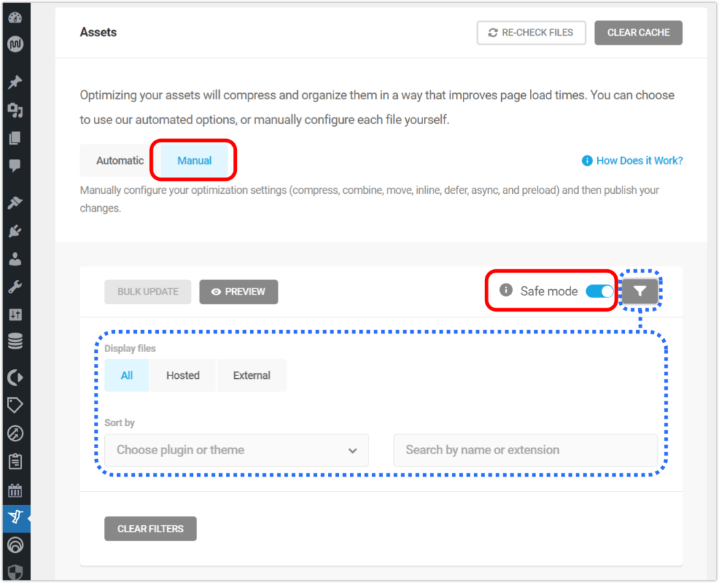
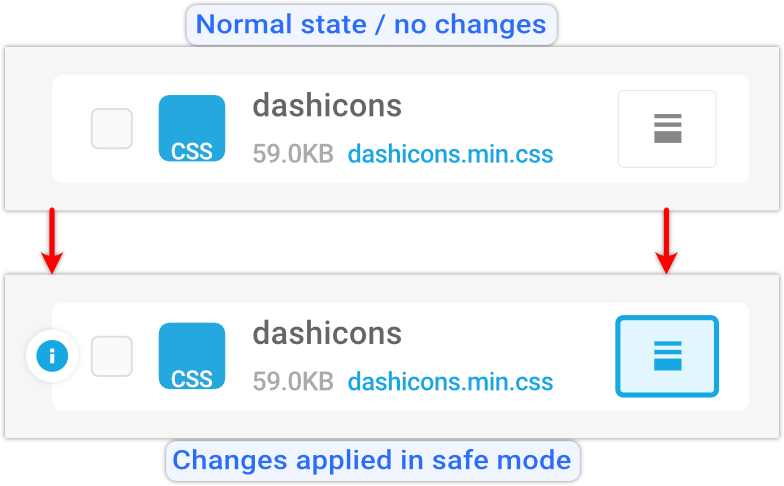


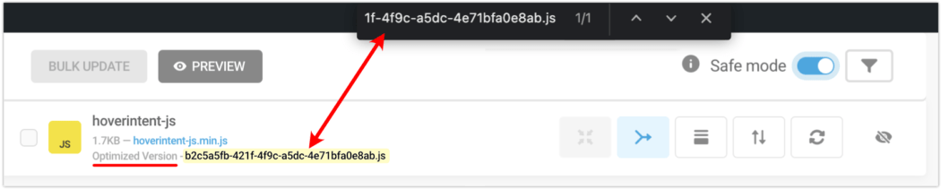


 ” into “F09F9882”?


