WaterBear: Building A Free Platform For Impactful Documentaries (Part 2)

In my previous article, I talked about Waterbear, a significant project I worked on as a newly-appointed lead developer, and the lessons I learned leading a team for the first time. In this second article, I’ll go over some key technical highlights from the project. Before we start, let’s quickly remind ourselves what WaterBear is all about and what makes it so interesting.

WaterBear is a free platform bringing together inspiration and action with award-winning high-production environmental documentaries covering various topics, from animals and climate change to people and communities. The WaterBear team produces their own original films and documentaries and hosts curated films and content from various high-profile partners, including award-winning filmmakers, large brands, and significant non-governmental organizations (NGOs), like Greenpeace, WWF, The Jane Goodall Institute, Ellen MacArthur Foundation, Nikon, and many others.

For context, I am currently working at a software development company called Q Agency based in Zagreb, Croatia. We collaborated with WaterBear and its partner companies to build a revamped and redesigned version of WaterBear’s web and mobile app from the ground up using modern front-end technologies.

In the first article, I briefly discussed the technical stack that includes a React-based front-end framework, Next.js for the web app, Sanity CMS, Firebase Auth, and Firestore database. Definitely read up on the strategy and reasoning behind this stack in the first article if you missed it.

Now, let’s dive into the technical features and best practices that my team adopted in the process of building the WaterBear web app. I plan on sharing specifically what I learned from performance and accessibility practices as a first-time lead developer of a team, as well as what I wish I had known before we started.
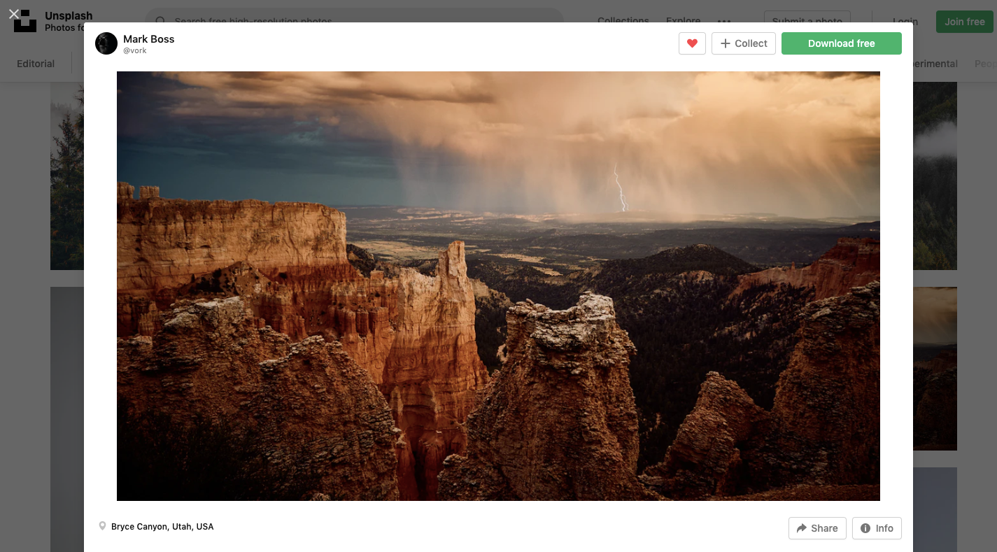
Image Optimization

Images are pieces of content in many contexts, and they are a very important and prominent part of the WaterBear app’s experience, from video posters and category banners to partner logos and campaign image assets.

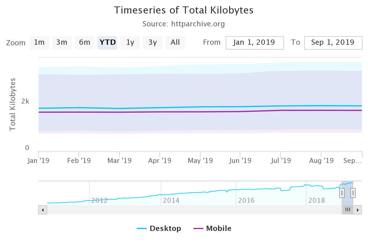
I think that if you are reading this article, you likely know the tightrope walk between striking, immersive imagery and performant user experiences we do as front-enders. Some of you may have even grimaced at the heavy use of images in that last screenshot. My team measured the impact, noting that on the first load, this video category page serves up as many as 14 images. Digging a little deeper, we saw those images account for approximately 85% of the total page size.

That’s not insignificant and demands attention. WaterBear’s product is visual in nature, so it’s understandable that images are going to play a large role in its web app experience. Even so, 85% of the experience feels heavy-handed.

So, my team knew early on that we would be leveraging as many image optimization techniques as we could that would help improve how quickly the page loads. If you want to know everything there is to optimize images, I wholeheartedly recommend Addy Osami’s Image Optimization for a treasure trove of insightful advice, tips, and best practices that helped us improve WaterBear’s performance.

Here is how we tackled the challenge.

Using CDN For Caching And WebP For Lighter File Sizes

As I mentioned a little earlier, our stack includes Sanity’s CMS. It offers a robust content delivery network (CDN) out of the box, which serves two purposes: (1) optimizing image assets and (2) caching them. Members of the WaterBear team are able to upload unoptimized high-quality image assets to Sanity, which ports them to the CDN, and from there, we instruct the CDN to run appropriate optimizations on those images — things like compressing the files to their smallest size without impacting the visual experience, then caching them so that a user doesn’t have to download the image all over again on subsequent views.

Requesting the optimized version of the images in Sanity boils down to adding query variables to image links like this:

https://cdn.sanity.io/.../image.jpg?w=1280&q=70&auto=format

Let’s break down the query variables:

  • w sets the width of the image. In the example above, we have set the width to 1280px in the query.
  • q sets the compression quality of the image. We landed on 70% to balance the need for visual quality with the need for optimized file sizes.
  • format sets the image format, which is set to auto, allowing Sanity to determine the best type of image format to use based on the user’s browser capabilities.

Notice how all of that comes from a URL that is mapped to the CDN to fetch a JPG file. It’s pretty magical how a completely unoptimized image file can be transformed into a fully optimized version that serves as a completely different file with the use of a few parameters.

In many cases, the format will be returned as a WebP file. We made sure to use WebP because it yields significant savings in terms of file size. Remember that unoptimized 1.2 MB image from earlier? It’s a mere 146 KB after the optimizations.

And all 14 image requests are smaller than that one unoptimized image!

The fact that images still account for 85% of the page weight is a testament to just how heavy of a page we are talking about.

Another thing we have to consider when talking about modern image formats is browser support. Although WebP is widely supported and has been a staple for some time now, my team decided to provide an optimized fallback JPG just in case. And again, Sanity automatically detects the user’s browser capabilities. This way, we serve the WebP version only if Sanity knows the browser supports it and only provide the optimized fallback file if WebP support isn’t there. It’s great that we don’t have to make that decision ourselves!

Have you heard of AVIF? It’s another modern image format that promises potential savings even greater than WebP. If I’m being honest, I would have preferred to use it in this project, but Sanity unfortunately does not support it, at least at the time of this article. There’s a long-running ticket to add support, and I’m holding hope we get it.

Would we have gone a different route had we known about the lack of AVIF support earlier? Cloudinary supports it, for example. I don’t think so. Sanity’s tightly coupled CDN integration is too great of a developer benefit, and as I said, I’m hopeful Sanity will give us that support in the future. But that is certainly the sort of consideration I wish I would have had early on, and now I have that in my back pocket for future projects.

Tackling The Largest Contentful Paint (LCP)

LCP is the biggest element on the page that a user sees on the initial load. You want to optimize it because it’s the first impression a user has with the page. It ought to load as soon as possible while everything under it can wait a moment.

For us, images are most definitely part of the LCP. By giving more consideration to the banner images we load at the top of the page, we can serve that component a little faster for a better experience. There are a couple of modern image attributes that can help here: loading and fetchpriority.

We used an eager loading strategy paired with a high fetchpriority on the images. This provides the browser with a couple of hints that this image is super important and that we want it early in the loading process.

<!-- Above-the-fold Large Contentful Paint image -->
<img
  loading="eager"
  fetchpriority="high"
  alt="..."
  src="..."
  width="1280"
  height="720"
  class="..."
/>

We also made use of preloading in the document <head>, indicating to the browser that we want to preload images during page load, again, with high priority, using Next.js image preload options.

<head>
  <link
    rel="preload"
    as="image"
    href="..."
    fetchpriority="high"
  />
</head>

Images that are “below the fold” can be de-prioritized and downloaded only when the user actually needs it. Lazy loading is a common technique that instructs the browser to load particular images once they enter the viewport. It’s only fairly recently that it’s become a feature baked directly into HTML with the loading attribute:

<!-- Below-the-fold, low-priority image -->
<img
  decoding="async"
  loading="lazy"
  src="..."
  alt="..."
  width="250"
  height="350"
/>

This cocktail of strategies made a noticeable difference in how quickly the page loads. On those image-heavy video category pages alone, it helped us reduce the image download size and number of image requests by almost 80% on the first load! Even though the page will grow in size as the user scrolls, that weight is only added if it passes through the browser viewport.

In Progress: Implementing srcset

My team is incredibly happy with how much performance savings we’ve made so far. But there’s no need to stop there! Every millisecond counts when it comes to page load, and we are still planning additional work to optimize images even further.

The task we’re currently planning will implement the srcset attribute on images. This is not a “new” technique by any means, but it is certainly a component of modern performance practices. It’s also a key component in responsive design, as it instructs browsers to use certain versions of an image at different viewport widths.

We’ve held off on this work only because, for us, the other strategies represented the lowest-hanging fruit with the most impact. Looking at an image element that uses srcset in the HTML shows it’s not the easiest thing to read. Using it requires a certain level of art direction because the dimensions of an image at one screen size may be completely different than those at another screen size. In other words, there are additional considerations that come with this strategy.

Here’s how we’re planning to approach it. We want to avoid loading high-resolution images on small screens like phones and tablets. With the srcset attribute, we can specify separate image sources depending on the device’s screen width. With the sizes attribute, we can instruct the browser which image to load depending on the media query.

In the end, our image markup should look something like this:

<img
  width="1280"
  height="720"
  srcset="
    https://cdn.sanity.io/.../image.jpg?w=568&...   568w,
    https://cdn.sanity.io/.../image.jpg?w=768&...   768w,
    https://cdn.sanity.io/.../image.jpg?w=1280&... 1280w
  "
  sizes="(min-width: 1024px) 1280px, 100vw"
  src="https://cdn.sanity.io/.../image.jpg?w=1280&..."
/>

In this example, we specify a set of three images:

  1. Small: 568px,
  2. Medium: 768px,
  3. Large: 1280px.

Inside the sizes attribute, we’re telling the browser to use the largest version of the image if the screen width is above 1024px wide. Otherwise, it should default to selecting an appropriate image out of the three available versions based on the full device viewport width (100vw) — and will do so without downloading the other versions. Providing different image files to the right devices ought to help enhance our performance a bit more than it already is.

Improving CMS Performance With TanStack Query

The majority of content on WaterBear comes from Sanity, the CMS behind the web app. This includes video categories, video archives, video pages, the partners’ page, and campaign landing pages, among others. Users will constantly navigate between these pages, frequently returning to the same category or landing page.

This provided my team with an opportunity to introduce query caching and avoid repeating the same request to the CMS and, as a result, optimize our page performance even more. We used TanStack Query (formerly known as react-query) for both fetching data and query caching.

const { isLoading, error, data } = useQuery( /* Options */ )

TanStack Query caches each request according to the query key we assign to it. The query key in TanStack Query is an array, where the first element is a query name and the second element is an object containing all values the query depends on, e.g., pagination, filters, query variables, and so on.

Let’s say we are fetching a list of videos depending on the video category page URL slug. We can filter those results by video duration. The query key might look something like this basic example:

const { isLoading, error, data } = useQuery(
  {
    queryKey: [
      'video-category-list',
      { slug: categorySlug, filterBy: activeFilter }
    ],
  queryFn: () => /* ... */
  }
)

These query keys might look confusing at first, but they’re similar to the dependency arrays for React’s useEffect hook. Instead of running a function when something in the dependency array changes, it runs a query with new parameters and returns a new state. TanStack Query comes with its dedicated DevTools package. It displays all sorts of useful information about the query that helps debug and optimize them without hassle.

Let’s see the query caching in action. In the following video, notice how data loads instantly on repeated page views and repeated filter changes. Compare that to the first load, where there is a slight delay and a loading state before data is shown.

We’re probably not even covering all of our bases! It’s so tough to tell without ample user testing. It’s a conflicting situation where you want to do everything you can while realistically completing the project with the resources you have and proceed with intention.

We made sure to include a label on interactive elements like buttons, especially ones where the icon is the only content. For that case, we added visually hidden text while allowing it to be read by assistive devices. We also made sure to hide the SVG icon from the assistive devices as SVG doesn’t add any additional context for assistive devices.

<!-- Icon button markup with descriptive text for assistive devices -->
<button type="button" class="...">
  <svg aria-hidden="true" xmlns="..." width="22" height="22" fill="none">...</svg
  ><span class="visually-hidden">Open filters</span>
</button>
.visually-hidden {
  position: absolute;
  width: 1px;
  height: 1px;
  overflow: hidden;
  white-space: nowrap;
  clip: rect(0 0 0 0);
  -webkit-clip-path: inset(50%);
  clip-path: inset(50%);
}

Supporting keyboard navigation was one of our accessibility priorities, and we had no trouble with it. We made sure to use proper HTML markup and avoid potential pitfalls like adding a click event to meaningless div elements, which is unfortunately so easy to do in React.

We did, however, hit an obstacle with modals as users were able to move focus outside the modal component and continue interacting with the main page while the modal was in its open state, which isn’t possible with the default pointer and touch interaction. For that, we implemented focus traps using the focus-trap-react library to keep the focus on modals while they’re opened, then restore focus back to an active element once the modal is closed.

Dynamic Sitemaps

Sitemaps tell search engines which pages to crawl. This is faster than just letting the crawler discover internal links on its own while crawling the pages.

The importance of sitemaps in the case of WaterBear is that the team regularly publishes new content — content we want to be indexed for crawlers as soon as possible by adding those new links to the top of the sitemap. We don’t want to rebuild and redeploy the project every time new content has been added to Sanity, so dynamic server-side sitemaps were our logical choice.

We used the next-sitemap plugin for Next.js, which has allowed us to easily configure the sitemap generation process for both static and dynamic pages. We used the plugin alongside custom Sanity queries that fetch the latest content from the CMS and quickly generate a fresh sitemap for each request. That way, we made sure that the latest videos get indexed as soon as possible.

Let’s say the WaterBear team publishes a page for a video named My Name is Salt. That gets added to a freshly generated XML sitemap:

Now, it’s indexed for search engines to scoop up and use in search results:

Until Next Time…

In this article, I shared some insights about WaterBear’s tech stack and some performance optimization techniques we applied while building it.

Images are used very prominently on many page types on WaterBear, so we used CDN with caching, loading strategies, preloading, and the WebP format to optimize image loading performance. We relied on Sanity for the majority of content management, and we expected repeating page views and queries on a single session, prompting us to implement query caching with TanStack Query.

We made sure to improve basic accessibility on the fly by styling focus states, enabling full keyboard navigation, assigning labels to icon buttons, providing alt text for images, and using focus traps on modal elements.

Finally, we covered how my team handled dynamic server-side rendered sitemaps using the next-sitemap plugin for Next.js.

Again, this was my first big project as lead developer of a team. There’s so much that comes with the territory. Not only are there internal processes and communication hurdles to establish a collaborative team environment, but there’s the technical side of things, too, that requires balancing priorities and making tough decisions. I hope my learning journey gives you something valuable to consider in your own work. I know that my team isn’t the only one with these sorts of challenges, and sharing the lessons I learned from this particular experience probably resonates with some of you reading this.

Please be sure to check out the full work we did on WaterBear. It’s available on the web, Android, and iOS. And, if you end up watching a documentary while you’re at it, let me know if it inspired you to take action on a cause!

References

Many thanks to WaterBear and Q Agency for helping out with this two-part article series and making it possible. I really would not have done this without their support. I would also like to commend everyone who worked on the project for their outstanding work! You have taught me so much so far, and I am grateful for it.
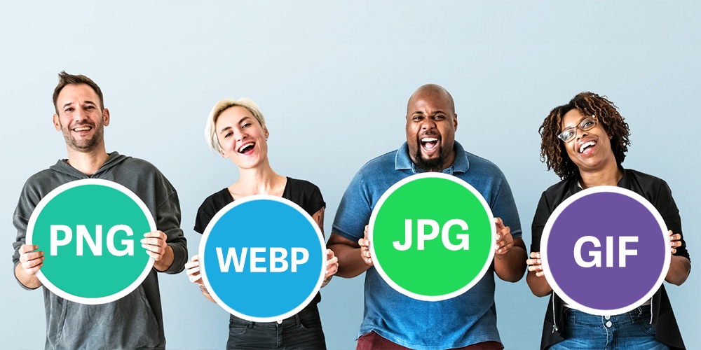
Useful Tools for Creating AVIF Images

AVIF (AV1 Image File Format) is a modern image file format specification for storing images that offer a much more significant file reduction when compared to other formats like JPG, JPEG, PNG, and WebP. Version 1.0.0 of the AVIF specification was finalized in February 2019 and released by Alliance for Open Media to the public.

In this article, you will learn about some browser-based tools and command line tools for creating AVIF images.

Why use AVIF over JPGs, PNGS, WebP, and GIF?

  • Lossless compression and lossy compression
  • JPEG suffers from awful banding
  • WebP is much better, but there’s still noticeable blockiness compared to the AVIF
  • Multiple color space
  • 8, 10, 12-bit color depth

Caveats

Jake Archibald, wrote an article a few years back on this new image format and also helped us to identify some disadvantages to compressing images, normally you should look out for these two when compressing to AVIF:

  1. If a user looks at the image in the context of the page, and it strikes them as ugly due to compression, then that level of compression is not acceptable. But, one tiny notch above that boundary is fine.
  2. It’s okay for the image to lose noticeable detail compared to the original unless that detail is significant to the context of the image.

See also: Addy Osmani at Smashing Magazine goes in-depth on using AVIF and WebP.

Browser Solutions

Squoosh

Screenshot of Squoosh.

Squoosh is a popular image compression web app that allows you to convert images in numerous formats to other widely used compressed formats, including AVIF.

Features
  • File-size limit: 4MB
  • Image optimization settings (located on the right side)
  • Download controls – this includes seeing the size of of the resulting file and the percentage reduction from the original image
  • Free to use

AVIF.io

Screenshot of AVIF.io.

AVIF.io is an image tool that doesn’t require any form of code. All you need to do is upload your selected images in PNG, JPG, GIF, etc. and it would return compressed versions of them.

Features
  • Conversion settings (located on the top-right of upload banner)
  • Free to use

You can find answers to your questions on the AVIF.io FAQ page.

Command Line Solutions

avif-cli

avif-cli by lovell lets you take AVIF images stored in a folder and converts them to AVIF images of your specified reduction size.

Here are the requirements and what you need to do:

  • Node.js 12.13.0+

Install the package:

npm install avif

Run the command in your terminal:

npx avif --input="./imgs/*" --output="./output/" --verbose
  • ./imgs/* – represents the location of all your image files
  • ./output/ – represents the location of your output folder
Features
  • Free to use
  • Speed of conversion can be set

You can find out about more commands via the avif-cli GitHub page.

sharp

sharp (also maintained by lovell) is another useful tool for converting large images in common formats to smaller, web-friendly AVIF images.

Here are the requirements and what you need to do:

  • Node.js 12.13.0+

Install the package:

npm install sharp

Create a JavaScript file named sharp-example.js and copy this code:

const sharp = require('sharp')

const convertToAVIF = () => {
    sharp('path_to_image')
    .toFormat('avif', {palette: true})
    .toFile(__dirname + 'path_to_output_image')
}

convertToAVIF()

Where path_to_image represents the path to your image with its name and extension, i.e.:

./imgs/example.jpg

And path_to_output_image represents the path you want your image to be stored with its name and new extension, i.e.:

/sharp-compressed/compressed-example.avif

Run the command in your terminal:

node sharp-example.js

And there! You should have a compressed AVIF file in your output location!

Features
  • Free to use
  • Images can be rotated, blurred, resized, cropped, scaled, and more using sharp

See also: Stanley Ulili’s article on How To Process Images in Node.js With Sharp.

Conclusion

AVIF is a technology that front-end developers should consider for their projects. These tools allow you to convert your existing JPEG and PNG images to AVIF format. But as with adopting any new tool in your workflow, the benefits and downsides will need to be properly evaluated in accordance with your particular use case.

I hope you enjoyed reading this article as much as I enjoyed writing it. Thank you so much for your time and I hope you have a great day ahead!


Useful Tools for Creating AVIF Images originally published on CSS-Tricks. You should get the newsletter.

Imagick to convert TIFF to JPG

Hi all,

I've got a site in PHP where I'd like to allow the user to add a picture with a blog post. The user has a few TIFF photos he'd like to upload but, at the moment, the form only allows jpg, png and gif formats.

On researching Google, I came across Imagick, which seems to be the solution to this problem. However, I'm having a bit of difficulty in getting my head around Imagick. Would you have any suggestions as to how I can incorporate a TIFF to JPG converter in my html form? At what stage would I conver the photo?

Many thanks in advance.

How to Trademark a Business

A trademark protects your brand identity from copycats. If you have a unique and impactful name, slogan, or design, you need to make sure no other business can profit from your property.

Intellectual property theft costs US businesses $225 to $600 billion a year. Having a trademark will help prevent your business from suffering any losses.

Filing for a trademark is a complex legal process. But it’s certainly worth it. 

In this guide, we’ll take you through the process step by step.

The Easy Parts of Trademarking a Business

Apply Online

You don’t have to deal with a bunch of paperwork that may get lost in the post. You can apply for your trademark online via the United States Patent and Trademark Office (USPTO), making the process convenient.

An Information-rich Application

The people at USPTO must know how difficult and intricate their application is. For this reason, there’s lots of information and guidance directly within the application to help you along the way. What’s more, its website contains detailed guidance, such as tutorials.

Even though the process can be complex, they’re trying their best to make it easier.

The Difficult Parts of Trademarking a Business

A Lengthy Process

You may not realize that preparing to file your trademark application takes a ton of time. Performing a clearance search to check that no other marks are similar to yours will eat up most of this time. 

The reason being there’s no room for mistakes. You don’t want to risk having your application rejected or legal struggles at a later date.

Then, when you file your application, USPTO needs to perform checks of its own and forward your application to an examining attorney. This whole process can also take several months.

And the annoying thing is there’s no guarantee that you’ll even get the trademark.

You May Make Mistakes

There’s a lot of key information about your business and the trademark you need to put in your application. You really need to make sure you’ve dotted your i’s and crossed your t’s. Because if your application is rejected, you won’t receive a refund of the application fee.

Hence, it may be worth hiring a professional to file the trademark application for you. This will make the complicated process go smoother and likely quicker. 

You can talk to your legal counsel or find a business formation service that offers trademark filing services. 

MyCorporation, for example, provides this service and includes an extensive clearance search.

Step 1: Know What Kind of Application You Need

Before you do anything, you should make sure you’re familiar with the options available to you. If you file the wrong kind of application, you may be in for a lengthier and more expensive process.

Trademark vs. Patent vs. Copyright

Each of these terms is a form of intellectual property. You need to know the difference between them to ensure you properly protect yourself legally.

To put it simply, a trademark covers your name and logo. But it also can protect any slogan, design, word, symbol, or similar that’s unique to your business.

A patent protects the rights of an inventor. And if you’ve watched Shark Tank, you’ll know that you can apply for a utility and/or design patent.

Copyright covers an original work, e.g., software, literature, or images.

The Types of Trademark

You must know precisely which type of trademark you need before you register. The four different types are:

  1. Trademark – for businesses that sell goods.
  2. Service mark – for businesses that offer services.
  3. Collective mark – to separate goods and services sold by members of a particular group from non-members.
  4. Certification mark – proof that a business has met certain standards and regulations.

TEAS Standard vs. TEAS Plus

You can also file two types of trademark applications with USPTO, the TEAS Standard and TEAS Plus.

If you can make a complete application right off the bat, you can use the TEAS Plus filing option. It’s the cheaper option at $250 and is usually quicker to go through. 

But if you don’t have all of the information you need to fill in the form, you’ll have to go with TEAS Standard, which costs $350.

Step 2: Carry Out a Clearance Search

You need to make sure that no other business has a similar name and/or design to yours. 

The USPTO does its own search for each application, and if it finds something similar, your application will be rejected. Moreover, if your trademark resembles another too closely, you may face legal action down the line. That’s why you have to put in your due diligence here.

Know Exactly What You Want to Trademark

It may seem obvious. But you really can’t go into this kind of thing half-assed.

You must explicitly define what you want to trademark. Is it only words, such as your business name? Is it stylized words and/or design, e.g., your logo?

You also must define the goods or services the trademark will represent.

Search the USPTO Database

Use the Trademark Electronic Search System (TESS) to see if there are any existing or pending trademarks confusingly similar to yours. 

If you don’t do this, then there’s a big chance your application will be rejected. 

When you visit TESS, you’ll see that she has three different search options:

Basic Word Mark Search

Use this to search for the words in your business name, slogan, or whatever it is you hope to trademark. 

Type your words in the Search Term bar and hit Submit Query. You’ll then get a list of word marks related to your query, like so:

Word and/or Design Mark Search (Structured)

You can use this form if you’re new to TESS. Though, the process is still rather complex. Again, this is why you may want to look into getting help from a business formation service.

First, choose a field from the dropdown menu to decide which category you want to search in. 

For example, you’d select Goods & Services to search for businesses with a similar offering to yours.

If you want to search for similar design elements to your logo, you’ll need to enter a design code into the search box and choose Design Code from the field menu. 

Use the USPTO Design Search Code Manual to find appropriate design codes.

To build on your search, use search operators. For instance, you may wish to search for trademarks with a name AND design similar to yours.

For instance, let’s say you have a bakery called Cute Cakes with a cupcake in the logo. 

You’d need to select Basic Index from the Field section and type in “Cute” to find any other businesses with the term “cute” in the title.

Select AND from the Operator menu.

Then select Design Code from the next Field menu. Type in the code for cupcakes which you find in the design code manual. And you’ll end up with something like this:

It turns out there are a couple of similar trademarks in existence:

Word and/or Design Mark Search (Free Form)

This kind of search is the most efficient but requires expert knowledge of using the TESS platform.

Decide if It’s Worth Moving Forward

During this process, you should search for both marks that are exactly the same as yours and also similar marks. For instance, there may be another company with the same name, but it has a slightly different spelling.

This kind of thing could lead to legal problems. Plus, it’s just not a good idea business-wise. You want a brand that stands out from the crowd, after all.

If, after a comprehensive search, you think your mark is too similar to another, you may wish to go back to the drawing board.

Step 3: File Your Trademark Application

Now you’re ready to file your application with USPTO. Go through the application carefully, and make sure you are thorough.

Create a JPG Image

You must attach a JPG image of what you wish to trademark if your mark includes stylized wording and/or a design. 

If you’ve already used the mark, symbol, or logo in a commerce transaction, you must also submit a specimen of it in action—for example, a label or tag attached to goods.

You don’t need to attach a specimen right away if you file a TEAS Standard application, but it is necessary for the TEAS Plus. This is a good example of how the two differ.

File Your Application Online

To apply for a trademark online, you must first create an account with USPTO.gov. Then select the type of application you wish to file for, i.e., TEAS Standard or TEAS Plus.

Fill out all of the mandatory fields and any additional areas you may require.

The information you must fill in includes basic applicant information, such as the mark owner, and personal details, like your business address.

You’ll also need to select the type of mark you wish to apply for, Standard Mark (words only) or Special Form (stylized words and design)

For the former, you’ll simply type in your words. For a Special Form mark, attach your JPG image.

Another important page is the Goods & Services page. Here you’ll describe the goods and services you want to trademark.

Use the USPTO ID manual to find the proper terms to describe your goods or services.

The trick is to be as specific as possible. As you can see here, in some cases, the term “T-shirts” may not suffice:

Then there’s the Filing Basis section which refers to why you’re making a trademark application. 

Most applicants select either Actually using mark in commerce now or No use of mark yet, intending to use. In other words, are you selling stuff with your logo on it now? Or do you intend to in the near future?

If you’re using the mark now, this is where you’ll need to submit your specimen JPG.

When you’ve filled in all of your info, be sure to double-check everything on the Validation Page. The last thing you want is to delay the already lengthy process or even get rejected because of silly mistakes.

Step 4: Follow-Up on Your Application

Once you’ve filed your application, your journey doesn’t end there. You’ll want to monitor the progress of your application and take swift action if anything goes wrong.

Monitor the Progress of Your Application

It’s up to you to keep an eye on the status of your trademark application. You can do this by visiting the Trademark Status & Document Retrieval system (TSDR).

To check the status of your application, you’ll need to enter your serial, registration, or reference number.

You’ll first need to confirm that your application has been received within three weeks. After that, you should check its status at least every six months. That way, if there’s a problem with your application, you can act quickly to find a resolution.

Respond to Office Action

You’ll receive a letter from USPTO (office action) if they decide not to register your trademark. It’ll outline the “substantive reasons” for the rejection in the letter, including any errors made when you completed the application.

There are a few different “substantive reasons” why you might be rejected. For example, a confusingly similar mark:

Alternatively, there may be some minor corrections you can make to get your application back on track.

You have to respond to the office action within six months, or your application will be abandoned. You’ll receive an email to inform you that a letter has been sent. The email contains a link to the form you need to use to respond to the office action.

After your response, you’ll either receive notice that your application has been accepted or a final notice from USPTO that your mark will not be registered.

How and When to Trademark a Business Name

You likely spent a lot of time thinking up the perfect name for your business–it’s one of the first and most exciting things you do when you start a new business.

So it would be beyond frustrating if another biz popped up with a similar name to yours. 

Plus, you’d potentially have to go through a tiresome and expensive rebranding process if you don’t have any protections. 

But when you register a trademark you have complete ownership over your business name.

The only problem is registering a trademark is not the easiest thing to do.

So this post will guide you through every step of registering a business name with the United States Patent and Trademark Office (USPTO).

The Easy Parts of Trademarking a Business Name

A Clear Application

Trademarking a business name is simpler than trademarking your branding, i.e. your logo, slogan, and so on. There are fewer steps involved in the prep and application phases.

Furthermore, the application you’ll complete to register your trademark is relatively clear and straightforward and contains a lot of explanatory information you can refer to as you go along.

Apply On Your Own Schedule

If you file for your trademark using TEAS Standard, you can submit some of the required information in the initial application and some at a later date. You can also pay the application fee in two installments.

These aspects take some of the pressure off. Plus you can get the ball rolling even if you don’t have all of the information for your trademark application ready yet.

The Difficult Parts of Trademarking a Business Name

Preparing Your Application

What some people don’t realize is there’s a lot of prep work involved before you even start a trademark application. The most complex and time-consuming part of your preparation will be the clearance search.

You must conduct a thorough search to see if any other business name confusingly similar to yours already exists in the trademark register. And there are many elements to what the examining attorney may deem as confusingly similar, such as similar sounding words even.

There’s always a chance that you’ll miss something that the examining attorney doesn’t. As a result, your application may be rejected.

So you may want to seek outside help from a business formation service. These services take care of legal matters, filing important documents, and the like for you. As such, many business formation services offer a trademark filing service which includes an extensive clearance search.

Playing the Waiting Game

It can take up to three weeks for USPTO to confirm they’ve received your application. And that’s just the start of it.

Next, they’ll conduct a series of checks and your form goes to an examining attorney who decides whether your application can move forward. This may take several months. 

Then you may have to deal with a back and forth with USPTO if there are any errors or conflicts with your application.

All in all, it’s just a lot. And when you consider how important it is to protect your intellectual property, the process can be a bit frustrating.

Step 1: Decide if You Need a Trademark

When should you trademark a business name? 

There are certain circumstances in which a trademark is necessary and others where it’s pretty much pointless. Knowing what these circumstances are will save you time, money, and hassle.

Local vs. Nationwide Businesses

If you only operate in your local area then you may not need to acquire a trademark for your business name. You’re protected in your geographic area by common law, so a trademark may be redundant. 

You don’t need to do anything special to get common law trademark rights. You simply need to operate your business under your business name.

If you’re the first business in the area to use the name then you can enforce your rights and prevent others from adopting it–but only in your region. 

Your business name is also protected statewide if you incorporate or form an LLC in your area. If this is the direction you want to take, a business formation service can take care of the legwork here, too. 

On the other hand, bigger businesses that operate or plan to operate across the US are more likely to need to register a trademark for their business name with USPTO. It’s the only way to protect your business name nationwide.

With a trademark, you can file lawsuits in federal court to protect your business name.

Will You Be Successful?

If it’s unlikely that you’ll be able to trademark your business name then there’s no point wasting your time and money. So it pays to know what kind of business names can’t be trademarked.

First, you can’t trademark a business name that’s confusingly similar to another. We’ll explain the details around exactly what this means later in this guide.

It’s also important to note that it’s highly unlikely you’ll get a trademark if you operate under a descriptive business name. 

This refers to personal names like Jenny’s Cupcakes, location names like Atlanta Daycare, and names that describe the goods or services you offer like Best Translation Agency.

The only way you can get a trademark with a name like this is if you can prove that the name is so widely used that people already associate it with your business. 

It is a good idea, however, to trademark a business name if your name, product, or service is unique. For example, it might be a made-up word that only refers to your business, such as Accenture. Or a business name that comes from a unique product, like Mooncup.

Step 2: Search the TESS Database

It’s vital you search USPTO’s Trademark Electronic Search System (TESS) for similar business names before you file your trademark application. The database contains every trademark registered in the US.

If you fail to do a proper clearance search and there’s already a similar business name out there, then your application may be rejected. Considering the fact that the application fee is non-refundable, a thorough search is definitely worthwhile.

Do a Basic Word Mark Search

When you visit TESS you’ll see that there are a few different search options. Begin with the Basic Word Mark Search.

Type your business name in the Search Term box and hit Submit Query.

You’ll then see a list of registered trademarks that contain your search terms.

You can use the columns on the right to see if the word marks are active. In this example, you wouldn’t be able to register the trademark as a live trademark already exists.

Check for Confusingly Similar Trademarks

When USPTO performs their own searches, they won’t just look for business names that are exactly the same as yours but also ones they deem confusingly similar

This means that the names are similar enough for consumers to think that the goods or services come from the same company.

First, two business names may sound confusingly similar even if they’re spelled differently:

Furthermore, two business names may be considered confusingly similar if they convey a similar meaning:

This means that when you perform your clearance search, you should also look out for variations on the wording of your business name, such as synonyms and other spellings.

Perform a More Advanced Search

There’s only a conflict between two confusingly similar word marks if the goods or services in question are also similar. To find such trademarks, use the Word and/or Design Mark Search (Structured) from the main menu.

From the first Field menu, choose Basic Index. This allows you to search for word marks. 

In the second, select Goods & Services

From the Operator menu, select AND

Then type in your search terms:

Find the proper terminology for your business category in USPTO’s Trademark ID Manual.

It’s also worth noting that even if the goods and/or services are similar, your application may be rejected, as in this example:

So you must also include similar goods and/or services within your industry in your clearance search.

Step 3: File Your Application Online

There are several pages to the online application. Some sections are simpler than others. 

But don’t fret – we’ll guide you through the most important stuff:

Choose TEAS Standard or TEAS Plus

If you haven’t already, you’ll need to create an account with USPTO.gov to be able to file your application online. Then decide whether you want to apply with TEAS Standard or TEAS Plus.

You can make an initial application with TEAS Standard for $350. This option allows you to submit certain pieces of information and supporting evidence at a later date. For example, your attorney’s details or a JPG image of your goods labeled with your trademark.

Alternatively, you can go with TEAS Plus which offers a quicker and cheaper application at $250. However, if you choose this option, you must submit a complete application right off the bat.

Identify Your Mark

After you’ve filled in your basic information, you’ll be asked to choose the type of mark that you wish to apply for. If you solely wish to register a trademark for your business name then select Standard Characters.

It’s worth noting that this covers your business name in any font, color, or design.

The other option is a Special Form mark. Here, you’ll submit your business name in a specialized font or as part of a design. Note that this only covers your business name in that particular style.

Name Your Goods and/or Services

Next, you’ll need to name the goods and/or services associated with your trademark. You have to be as accurate and specific as possible here, so utilize the Trademark ID manual.

In your application, you’ll find a search bar that you can use to search for the right goods or services. Check one or more appropriate services from the list that pops up. For some entries, you may be required to add more details.

It’s important that you use the correct terms to describe your goods and/or services. An error here may lead to rejection.

Select Your Filing Basis

This section of the application is basically asking you why you’re registering a trademark. Most companies will answer either Actually using mark in commerce now or No use of mark yet, intending to use.

If you’re already using the mark, you’ll have to submit a supporting specimen. Take a JPG image of your goods or packaging that clearly displays your mark in use.

Complete the Final Steps

Towards the end of the application, you’ll be able to review everything you’ve submitted thus far. Check your application carefully as any errors may lead to it being rejected. 

You should have the opportunity to correct any errors at a later date. But why draw out an already lengthy process?

Check that the total fee you’ll pay is correct. Note that if you have multiple classes of goods or services, you have to pay for each class.

Finally, sign the document before you submit it and pay the fee. There are a few ways you can sign but an electronic signature on the application form is the simplest method.

Check the Status of Your Application

You’re responsible for monitoring the progress of your application. You can do this via the Trademark Status & Document Retrieval system (TSDR).

It’s advisable to check your status every six months at the very least. This way, if there are any issues or if you must send additional documentation, you can take care of it in a timely manner.

If your application is rejected, perhaps because of a confusingly similar mark or errors in the application, you have a chance to remedy the issue. You’ll receive notification of what went wrong (office action) from USPTO. Be sure to respond within six months.

Time for Next-Gen Codecs to Dethrone JPEG

AVIF has been getting a lot of tech press, but Jon Sneyers is hot on JPEG XL (which makes sense as he’s the “chair of the JPEG XL ad hoc group in the JPEG Committee”). According to Jon’s comparison, JPEG XL comes out on top on everything, except low fidelity compression, and offers progressive rendering which none of the other next-gen codecs do. But WebP (not to be confused with the upcoming WebP2!) has something of a leg up now that it has support across all the major browsers.

There is a whole ecosystem around image formats that is way wider than websites, of course, and I’m sure that plays a big role in what ends up on websites. What format do you get when you make screenshots on your system? What does your digital camera export? What does your favorite design software export? Then, once people have images, does the website-making software you use support them? I think of how WordPress rejects SVG unless you force it; I just tried uploading an AVIF for this post and it won’t take that, either.

I also think of the UX of new formats, like when I have a .avif file on my desktop, my macOS computer doesn’t know what to make of it. It’s just a blank white document with no preview. The image ecosystem as a whole moves slower than the web. Inertia, as Jon puts it, is a good framing, but hopefully can be overcome:

Let’s just hope that the new codecs will win the battle, which is mostly one that’s against inertia and the “ease” of the status quo. Ultimately, unless JPEG remains a dominant force, regardless of which new codec will prevail, we’ll reap the benefits of stronger compression, higher image fidelity, and color accuracy, which translate to more captivating, faster-loading images.

I’d bet that image codecs evolve as long as displaying images on screens is a thing. There is no endgame. The blog post I’m linking to from Jon is on the Cloudinary blog, and I gotta give it to them: Cloudinary — and services like it — are a solution here. They provide a system where I don’t have to care about image formats all that much. I upload whatever I have (ideally: big and high-quality) and they can serve the best possible format, size, and quality for the situation. That job, to me, is just too damn hard to do manually, let alone stay on top of long-term.


I see JPEG 2000 is still hanging out, but whatever happened to JPEG XR? It wasn’t that long ago we talked about serving that, even with <source>. Was that just mostly an IE thing that died with IE?

Direct Link to ArticlePermalink


The post Time for Next-Gen Codecs to Dethrone JPEG appeared first on CSS-Tricks.

You can support CSS-Tricks by being an MVP Supporter.

Getting GPS EXIF Data With Python

Did you know that you can get EXIF data from JPG image files using the Python programming language? You can use Pillow, the Python Imaging Library's friendly fork to do so. You can read an article about that on this website if you want to.

Here is some example code for getting regular EXIF data from a JPG file:

How to Convert a PDF to PNG or JPG in Java

For sharing documents both in hardcopy and digitally, the PDF file format is the preferred choice. Because of its high-versatility and compatibility between different operating systems, the PDF format allows users to create, edit, encrypt, and lock important documents for viewing on any browser or with any PDF viewing application such as Adobe Acrobat. Furthermore, its flexibility means that almost any other file type can be converted into PDF format without loss of quality or corruption of formatting. This means that complex file types such as DOCX and XLSX documents can be converted and shared easily in a protected format that will limit the chance of accidental edits or formatting errors.

However, if you are planning to display examples or insert an image of a PDF document in a separate file or web page, converting your PDF files to an image array will be more useful. For example, if you are creating a PowerPoint showing the on-boarding process for your organization and need to include images of different documents or contracts associated with the process, converting your PDF files into JPG will allow you to quickly and effortlessly insert the image and scale or crop it according to the needs of your presentation. When performing a similar process for a web page, having your document available as a PNG image will optimize it for viewing online within your website. It also prevents users from downloading and editing the document as would be possible with a PDF.

Speed Up Your Website With WebP

Speed Up Your Website With WebP

Speed Up Your Website With WebP

Suzanne Scacca

(This is a sponsored post.) Spend enough time running websites through PageSpeed Insights and you’ll notice that Google has a major beef with traditional image formats like JPG, PNG and even GIF. As well it should.

Even if you resize your images to the exact specifications of your website and run them through a compressor, they can still put a strain on performance and run up bandwidth usage. Worse, all of that image manipulation can compromise the resulting quality.

Considering how important images are to web design, this isn’t an element we can dispose of so easily nor can we afford to cut corners when it comes to optimizing them. So, what’s the solution?

Here’s what Google suggests:

PageSpeed Insights WebP tips
PageSpeed Insights demonstrates how much storage and bandwidth websites stand to save with WebP. (Source: PageSpeed Insights) (Large preview)

Years ago, Google aimed to put a stop to this problem by creating a next-gen image format called WebP. You can see in this screenshot from PageSpeed Insights that Google recommends using WebP and other next-gen formats to significantly reduce the size of your images while preserving their quality.

And if .75 seconds doesn’t seem like much to you (at least in this example), it could make a big difference in the lives of your visitors, the people who sit there wondering how long is too long to wait. Just one less second of loading could make a world of difference to your conversion rate.

But is WebP the best solution for this problem? Today, we’re going to examine:

What is WebP?

Google developed WebP back in 2010 after acquiring a company called On2 Technologies. On2 had worked on a number of video compression technologies, which ended up serving as the basis for Google’s new audiovisual format WebM and next-gen image format WebP.

Originally, WebP used lossy compression in an attempt to create smaller yet still high-quality images for the web.

If .75 seconds doesn’t seem like much to you, it could make a big difference in the lives of your visitors, the people who sit there wondering how long is too long to wait.

Lossy Compression For WebP

Lossy compression is a form of compression used to greatly reduce the file sizes of JPGs and GIFs. In order to make that happen, though, some of the data (pixels) from the file needs to be dropped out or “lost”. This, in turn, leads to some degradation of the quality of the image, though it’s not always noticeable.

WebP entered the picture with a much more efficient use of lossy compression (which I’ll explain below) and became the much-needed successor to JPG.

You can see a great demonstration of this difference as KeyCDN compares the difference in file sizes of a compressed JPG vs. WebP:

KeyCDN compares original file size against compressed JPG and WebP
KeyCDN shows how five images differ in size between the original, a compressed JPG and a WebP. (Source: KeyCDN) (Large preview)

Notice how significant a difference this is in terms of file size, even after the JPG has been compressed to a comparable quality. As Adrian James explains here, though, you have to be careful with WebP compression.

“Compression settings don’t match up one-to-one with JPEG. Don’t expect a 50%-quality JPEG to match a 50%-quality WebP. Quality drops pretty sharply on the WebP scale, so start at a high quality and work your way down.”

Considering how much more file sizes shrink with WebP compared to JPG, though, that shouldn’t be too much of a sticking point. It’s just something to think about if you’re considering pushing the limits of what WebP can do even further.

Now, as time passed, Google continued to develop WebP technology, eventually getting it to a point where it would support not just true-color web graphics, but also XMP metadata, color profiles, tiling, animation, and transparency.

Eventually, Google brought lossless compression to WebP, turning it into a viable contender for PNG, too.

Lossless Compression For WebP

Lossless compression does not degrade image quality the way lossy does. Instead, it achieves smaller file sizes by removing excess metadata from the backend of the file. This way, the quality of the image remains intact while reducing its size. That said, lossless compression can’t achieve the kinds of file sizes lossy compression can.

That was until WebP’s lossless compression came along.

You can see some beautiful examples of how WebP’s lossy and lossless compression stands up against PNG in Google’s WebP galleries:

Google WebP Gallery comparison against PNG
The Google WebP Galleries show how PNG images compare in quality and size to compressed WebPs. (Source: Google) (Large preview)

If there’s any degradation in the quality of the WebP images, it’s going to be barely noticeable to your visitors. The only thing they’re really going to notice is how quickly your site loads.

What Are The Advantages Of Using WebP?

It’s not enough to say that WebP is “better” than JPG and PNG. It’s important to understand the mechanics of how WebP works and why it’s so beneficial to use over other file formats as a result.

With traditional image formats, compression always results in a tradeoff.

JPG lossy compression leads to degradation of the clarity and fineness of an image. Once applied, it cannot be reversed.

WebP lossy compression, on the other hand, uses what’s known as prediction coding to more accurately adjust the pixels in an image. As Google explains, there are other factors at work, too:

“Block adaptive quantization makes a big difference, too. Filtering helps at mid/low bitrates. Boolean arithmetic encoding provides 5%-10% compression gains compared to Huffman encoding.”

On average, Google estimates that WebP lossy compression results in files that are between 25% and 34% smaller than JPGs of the same quality.

As for PNG lossless compression, it does work well in maintaining the quality of an image, but it doesn’t have as significant an impact on image size as its JPG counterpart. And certainly not when compared to WebP.

WebP handles this type of compression more efficiently and effectively. This is due to the variety of compression techniques used as well as entropy encoding applied to images. Again, Google explains how it works:

“The transforms applied to the image include spatial prediction of pixels, color space transform, using locally emerging palettes, packing multiple pixels into one pixel and alpha replacement.”

On average, Google estimates that WebP lossless compression results in files that are roughly 26% smaller than PNGs of the same quality.

That’s not all. WebP has the ability to do something that no other file formats can do. Designers can use WebP lossy encoding on RGB colors and lossless encoding on images with transparent backgrounds (alpha channel).

Animated images, otherwise served in GIF format, also benefit from WebP compression systems. There are a number of reasons for this:

GIF WebP
Compression Lossless Lossless + lossy
RBG Color Support 8-bit 24-bit
Alpha Channel Support 1-bit 8-bit

As a result of this powerful combo of lossless and lossy compression, animated videos can get down to much smaller sizes than their GIF counterparts.

Google estimates the average reduction to be about 64% of the original size of a GIF when using lossy compression and 19% when using lossless.

Needless to say, there’s nothing that can beat WebP when it comes to speed while maintaining image integrity.

Acceptance Of WebP Among Browsers, Devices And CMS

As you can imagine, when WebP was first released, it was only supported by Google’s browsers and devices. Over time, though, other platforms have begun to provide support for WebP images.

That said, WebP still doesn’t have universal support, which can cause problems for web designers who use this image format by default.

Let’s take a look at where you can expect full acceptance of your WebP images, where you won’t and then we’ll discuss what you can do to get around this hiccup.

As of writing this in 2019, Can I use… has accounted for the following platforms that support WebP:

‘Can I Use’ data on WebP support
‘Can I Use’ breaks down which browsers and versions of those browsers provide support for WebP. (Source: Can I use...) (Large preview)

The latest versions of the following platforms are supported:

  • Edge
  • Firefox
  • Chrome
  • Opera
  • Opera Mini
  • Android Browser
  • Opera Mobile
  • Chrome for Android
  • Firefox for Android
  • UC Browser for Android
  • Samsung Internet
  • QQ Browser
  • Baidu Browser

The platforms that continue to hold back support are:

  • Internet Explorer
  • Safari
  • iOS Safari
  • KaiOS Browser

It’s not just browsers that are on the fence about WebP. Image editing software and content management systems are, too.

ImageMagick, Pixelmator and GIMP all support WebP, for instance. Sketch enables users to export files as WebP. And for software that doesn’t natively support WebP, like Photoshop, users can usually install a plugin which will allow them to open and save files as WebP.

Content management systems are in a similar spot. Some have taken the lead in moving their users over to WebP, whether they uploaded their files in that format or not. Shopify and Wix are two site builders that automatically convert and serve images in WebP format.

Although there are other platforms that don’t natively support WebP, there are usually extensions or plugins you can use to upload WebP images or convert uploaded ones into this next-gen format.

WordPress is one of those platforms. Drupal is another popular CMS that provides users with WebP modules that add WebP support. Magento is yet another.

It’s pretty rare not to find some sort of add-on support for WebP. The only example that I’m aware of that doesn’t accept it is Squarespace.

Challenges Of Converting And Delivering WebP

Okay, so WebP doesn’t have 100% support on the web. Not yet anyway. That’s okay. For the most part, we have some sort of workaround in terms of adding support to the tools we use to design and build websites.

But what do we do about the browser piece? If our visitors show up on an iOS device, how do we make sure they’re still served an image if our default image is WebP?

First, you need to know how to convert images into WebP.

Last year, front end developer Jeremy Wagner wrote up a guide for Smashing Magazine on this very topic. In it, he covers how to convert to WebP using:

  • Sketch,
  • Photoshop,
  • The command line,
  • Bash,
  • Node.js,
  • gulp,
  • Grunt,
  • webpack.

Any of these options will help you convert your PNGs and JPGs into WebPs. Your image editing software will only get you halfway to your destination though.

It’ll handle the conversion, but it won’t help you modify your origin server so that it knows when to deliver WebPs and when to deliver a traditional image format to visitors.

Some of these methods let you dictate how your server delivers images based on the restraints of your visitors’ browsers. Still, it takes a bit of work to modify the origin servers to make this happen. If you’re not comfortable doing that or you don’t want to deal with it, KeyCDN has a solution.

The Solution: Simplify WebP Delivery With KeyCDN

KeyCDN understands how important it is to have a website that loads at lightning-fast speeds. It’s what KeyCDN is in the business to do. That’s why it’s no surprise that it’s developed a built-in WebP caching and image processing solution that helps developers more easily deliver the right file formats to visitors.

What Is WebP Caching?

Caching is an integral part of keeping any website running fast. And WebP caching is only going to make it better. Essentially, it’s a form of content negotiation that takes place in the HTTP header.

It works like this:

Someone visits a website that has KeyCDN’s WebP caching enabled. The visitor’s browser sends an accept HTTP header as part of the request to the server with a list of asset types it prefers. But rather than go to the origin server (at the web host), the request is processed by the edge server (at KeyCDN). The edge server reviews the list of acceptable file types and sends a content-type header in response.

Here’s an example of how that might look:

curl -I 'https://ip.keycdn.com/example.jpg' -H 'accept: image/webp'
HTTP/2 200
server: keycdn-engine
date: Thu, 06 Jun 2019 08:29:50 GMT
content-type: image/webp
content-length: 56734
last-modified: Tue, 14 May 2019 23:36:28 GMT
etag: "5cdb50fc-1040a"
expires: Thu, 13 Jun 2019 08:29:50 GMT
cache-control: max-age=604800
x-ip: 1
x-ip-info: osz=56734 odim=700x467 ofmt=webp
x-cache: HIT
x-shield: active
x-edge-location: chzh
access-control-allow-origin: *
accept-ranges: bytes

An example of a content-type request that KeyCDN sends to browsers that accept WebP. (Source: KeyCDN)

So, for Google Chrome visitors, the content-type: image/webp would automatically be accepted and the cached WebP assets would be delivered to the browser.

For Safari users, on the other hand, the request would go unaccepted. But that’s okay. Your CDN will know which file format to send instead. In the first line in the example above, you can see that the original image format is JPG, so that’s the version of the file that would be delivered.

As you can see, there’s no need to modify the origin server or prepare multiple versions of your files in order to account for WebP compatibility. KeyCDN WebP caching handles all of it.

How Do You Use KeyCDN WebP Caching?

There are two ways in which KeyCDN users can take advantage of the WebP caching feature.

Image Processing Through KeyCDN

The first requires nothing more than flipping a switch and turning on KeyCDN’s image processing. Once enabled, the accept request header will automatically load.

You can, of course, use the image processing service for more than just WebP caching. You can use it to adjust the size, crop, rotation, blur, and other physical attributes of your delivered images. But if you’re trying to simplify your image delivery system and simply want to speed things up with WebP, just enable the feature and let KeyCDN do the work.

WebP Caching Through Your Origin Server

Let’s say that you generated your own WebP image assets. You can still reap the benefits of KeyCDN’s WebP caching solution.

To do this, you’ll need to correctly generate your WebPs. Again, here’s a link to the guide that shows you how to do that.

It’s then up to you to configure your origin server so that it only delivers WebPs when accept: image/webp is present. KeyCDN provides some examples of how you’ll do this with Nginx:

# http config block
map $http_accept $webp_ext {
    default "";
    "~*webp" ".webp";
}

# server config block
location ~* ^(/path/to/your/images/.+)\.(png|jpg)$ {
    set $img_path $1;
    add_header Vary Accept;
    try_files $img_path$webp_ext $uri =404;
}

KeyCDN demonstrates how you can modify the origin server with Nginx to deliver your own cached WebP assets. (Source: KeyCDN)

And with Apache:

<IfModule mod_rewrite.c>
    RewriteEngine On
    RewriteCond %{HTTP_ACCEPT} image/webp
    RewriteCond %{DOCUMENT_ROOT}/$1.webp -f
    RewriteRule ^(path/to/your/images.+)\.(jpe?g|png)$ $1.webp [T=image/webp,E=accept:1]
</IfModule>

<IfModule mod_headers.c>
    Header append Vary Accept env=REDIRECT_accept
</IfModule>

AddType image/webp .webp

KeyCDN demonstrates how you can modify the origin server with Apache to deliver your own cached WebP assets. (Source: KeyCDN)

Obviously, this option gives you more control over managing your image formats and how they’re served to visitors. That said, if you’re new to using WebP, KeyCDN’s automated WebP caching and image processing is probably your best bet.

An Alternative For WordPress And Magento Designers

If you design websites in WordPress or Magento, KeyCDN has plugins you can use to add WebP support and caching.

For WordPress, you’ll use KeyCDN’s custom Cache Enabler along with Optimus.

Cache Enabler plugin from KeyCDN
The Cache Enabler plugin offers delivery support for WebPs in WordPress. (Source: Cache Enabler) (Large preview)

Cache Enabler checks to see if your images have a WebP version. If it exists and the visitor’s browser supports it, that’s what it will deliver in the cached file. If it doesn’t exist, then it’ll simply turn to the JPG, PNG or GIF that’s there.

Magento developers have a simplified workaround for converting and delivering WebP, too. First, you’ll need to install the Webp extension. Then, you’ll have to configure the WebP binaries on your server.

Wrapping Up

There’s a reason why Google went to the trouble of developing a new image format and why more and more browsers, design systems and content management systems are supporting it.

Images can cause a lot of problems for websites that have otherwise been built to be lean and mean. If they’re not uploaded at the right size, if they’re not compressed and if caching isn’t enabled, your images could be the reason that your website’s speed is driving visitors away.

But with WebP, your website is sure to load more quickly. What’s more, there doesn’t need to be a tradeoff between image quality (or quantity!) in order to gain that speed. WebP efficiently compresses files while preserving the integrity of the image content.

If you’re really struggling to increase the speed of your website then WebP should be the next tool you turn to for help.

Smashing Editorial (ms, ra, il)

A Guide To Optimizing Images For Mobile

A Guide To Optimizing Images For Mobile

A Guide To Optimizing Images For Mobile

Suzanne Scacca

(This is a sponsored article.) You know how critical it is to build websites that load quickly. All it takes is for a page to load one second too long for it to start losing visitors and sales. Plus, now that Google has made mobile-first indexing the default, you really can’t afford to let any performance optimizations fall by the wayside what with how difficult it can be to get your mobile site as speedy as your desktop.

Google takes many factors into account when ranking a website and visitors take maybe a handful of factors into account when deciding to explore a site. At the intersection of the two is website speed.

It should come as no surprise that images cause a lot of the problems websites have with speed. And while you could always just trim the fat and build more minimally designed and content-centric sites, why compromise?

Images are a powerful force on the web.

Not only can well-chosen images improve the aesthetics of a site, but they also make it easier for your visitors to consume content. Of course, there are the SEO benefits of images, too.

So, today, let’s focus on how you can still design with as many images as you want without slowing down your website. This will require you to update your image optimization strategy and adopt a tool called ImageKit, but it shouldn’t take much work from you to get this new system in place.

The Necessity Of An Image Optimization Strategy For Mobile

According to HTTP Archive:

  • The median size of a desktop website in 2019 is 1939.5 KB.
  • The median size of a mobile website in 2019 is 1745.0 KB.
HTTP Archive desktop and mobile kilobytes
HTTP Archive charts how many kilobytes desktop and mobile websites are, on average. (Source: HTTP Archive) (Large preview)

If we don’t get a handle on this growth, it’s going to be impossible to meet consumer and Google demands when it comes to providing fast websites. That or we’re going to have to get really good at optimizing for speed.

Speaking of speed, let’s see what HTTP Archive has to say about image weight.

HTTP Archive image bytes desktop vs mobile
HTTP Archive plots out how much images weigh on desktop vs mobile websites. (Source: HTTP Archive) (Large preview)

As it stands today:

  • The median size of images on desktop is 980.3 KB out of the total 1939.5 KB.
  • The median size of images on mobile is 891.7 KB out of the total 1745.0 KB.

Bottom line: images add a lot of weight to websites and consume a lot of bandwidth. And although this data shows that the median size of images on mobile is less than their desktop counterparts, the proportion of images-to-website is slightly larger.

That said, if you have the right image optimization strategy in place, this can easily be remedied.

Here is what this strategy should entail:

1. Size Your Images Correctly

There are lots of tedious tasks you’d have to handle without the right automations in place. Like resizing your images.

But you have to do it, right?

Let’s say you use Unsplash to source a number of images for a website you’re working on.

Unsplash photo from Mark Boxx
An example of a photo you’d find on Unsplash, this one comes from Mark Boss. (Source: Unsplash) (Large preview)

Unlike premium stock repositories where you might get to choose what size or file format you download the file in, you don’t get a choice here.

So, you download the image and any others you need. You then have the choice to use the image as is or manually resize it. After looking at the size of the file and the dimensions of the image, you realize it would be a good idea to resize it.

Original dimensions of image from Unsplash
These are the original dimensions of the Unsplash image: 5591×3145 px. (Source: Unsplash) (Large preview)

This particular image exported as a 3.6 MB file and a 5591×3145 px image. That’s way too big for any website.

There’s no reason to upload images larger than 1 MB — and that’s even pushing it. As for dimensions? Well, that depends on the width of your site, but I think somewhere between 1200 and 2000 px should be your max.

You’re going to have to go through this same process whether images come from a stock site or from someone’s DSLR. The point is, no source image is ever going to come out the “right” size for your website, which means resizing has to take place at some point.

What’s more, responsive websites display images in different sizes depending on the device or browser they’re viewed on. And then there are the different use cases — like full-sized image vs. thumbnail or full-sized product photo vs. featured image.

So, there’s more resizing that has to be done even after you’ve gone through the trouble of manually resizing them.

Here’s what you shouldn’t do:

  • Resize images one-by-one on your own. It’s time-consuming and inefficient.
  • Rely on browser resizing to display your images responsively as it can cause issues.

Instead, you can integrate your existing image server (on your web host) or external storage service (like S3) with ImageKit. Or you can use ImageKit’s Media Library to store your files.

ImageKit Media Library upload
This is how easy it is to upload a new file to the ImageKit Media Library. (Source: ImageKit) (Large preview)

As you can see, ImageKit has accepted the upload of this Unsplash photo at its original dimensions and sizes. The same goes for wherever your files originate from.

However, once you integrate your images or image storage with ImageKit, the tool will take control of your image sizing. You can see how that’s done here:

ImageKit image URL endpoints
ImageKit image URL endpoints enable users to more easily control image resizing parameters. (Source: ImageKit) (Large preview)

Let me briefly explain what you’re looking at above:

  • The Image Origin Preference tells ImageKit where images need to be optimized from. In this case, it’s the ImageKit Media Library and they’ll be served over my website.
  • The Old Image URL is a reminder of where our images lived on the server.
  • The New Image URLs explains where your images will be optimized through ImageKit.

The formula is simple enough. You take the original URL for your image and you transform it with the new ImageKit URL.

The ImageKit URL alone will instantly shrink the size of your image files. However, if you want to do some resizing of your image’s dimensions while you’re at it, you can use transformation parameters to do so.

For example, this is the Unsplash photo as seen from the media library of my website. It lives on my own servers, which is why the address shows my own URL:

An Unsplash image without resizing
How a full-sized image from Unsplash might appear if you leave it as is on your server. (Source: Unsplash) (Large preview)

To see what it looks like once ImageKit has transformed it, I swap out my domain name with the endpoint provided by ImageKit. I then add my image resizing parameters (they allow you to do more than just resize, too) and reattach the remainder of the URL that points to my image storage.

This is what happens when I use ImageKit to automatically resize my image to 1000×560 pixels:

ImageKit endpoint image resizing
ImageKit endpoints enable users to define how their images are to be resized like in this example. (Source: ImageKit) (Large preview)

To create this resized image, I transformed the ImageKit URL into the following:

https://imagekit.io/vq1l4ywcv/tr:w-1000,h-560/…

It’s the width (w-) and height (h-) parameters that reduced the file’s dimensions.

Now, as you can see, this isn’t as pixel-perfect as the original image, but that’s because I have quite a bit of compression applied to the file (80%). I’ll cover how that works below.

In the meantime, let’s focus on how great the image still looks as well as the gains we’re about to get in speed.

ImageKit resizing example on original Unsplash photo
This is what can happen after ImageKit users resize their images. (Source: Unsplash) (Large preview)

Previously, this was a 3.6 MB file for the 5591×3145 px image. Now, it’s a 128 KB file for the 1000×560 px image.

To sweeten the deal further, ImageKit makes it easy to resize your images this way using URL-based image transformation. Essentially, it works like this:

  • You save one master image to ImageKit’s media library or your preferred server.
  • ImageKit automatically uses multiple techniques to bring down the image size significantly.
  • You can then use ImageKit’s resizing and cropping parameters to modify each image to cater to different device resolutions and sizes.

When 91mobiles took advantage of this form of image optimization, it saved its website 3.5 TB every month of bandwidth. And they didn’t have to do anything but integrate with the platform. There was no need to move their images to ImageKit or another third-party storage service. It all took place within their legacy infrastructure.

2. Use Faster-loading Image Formats

It’s not just the size of your images that drain storage space and bandwidth. The file types you use have an impact, too.

PNGs, in general, are used for things like logos, images containing text and other super-fine images that have a transparent background. While you can use them to save your photos, they tend to produce the largest sizes. Even when lossless compression is applied, PNGs still remain larger in size than other file types.

GIFs are the animated counterpart of PNGs and use lossless compression as well.

JPGs, on the other hand, are best suited for colorful images and photos. They’re smaller in size and they shrink down with lossy compression. It’s possible to compress JPGs enough to get them to a manageable size, but you have to be careful as lossy compression degrades the overall quality of a file and there’s no turning back once it’s been done.

WebPs have been gaining in popularity since Google introduced them in the early 2010s. According to a Google study, WebPs can be anywhere between 25% and 34% smaller than JPGs. What’s more, you can use both lossy and lossless compression on WebPs to get them down to even smaller sizes.

Something to keep in mind with WebPs is that they’re not universally accepted. As of writing this, WebPs aren’t accepted by iOS devices. However, the latest versions of all other browsers, Google or otherwise, will gladly display them.

As for how ImageKit helps with this, it’s simple really:

Image Kit image format settings
This ImageKit setting puts the responsibility on ImageKit to serve the best file format. (Source: ImageKit) (Large preview)

When this setting is configured, ImageKit automatically determines the best file format to deliver each of your files in. It takes into account what the original image format and content was along with whether or not the visitor’s device supports it.

JPGs, PNGs and GIFs will all be converted into WebPs when possible — say, if the visitor visits from Chrome (which accepts them). If it’s not possible — say, if the visitor visits from Safari (which doesn’t accept them) — ImageKit will convert to the best (i.e. smallest) format with the defined transformations. This might be a PNG or JPG.

Nykaa was able to capitalize on this image optimization strategy from ImageKit. Even though their website had already been designed using a mix of JPGs and PNGs and were stored in a number of places around the web, ImageKit took care of automating the image formats right from the original URLs.

3. Compress Images

Next, we need to talk about image compression. I’ve already referenced this a couple times, but it breaks down to two types:

Lossless

This form of compression is used on PNGs and GIFs. To compress the file, metadata is stripped out. This way, the integrity of the image remains intact, but the file shrinkage isn’t as substantial as you’d get with lossy compression.

Lossy

This form of compression is applied to JPGs and WebPs. To compress the file, some parts of the image are “lost”, which can give certain spots a granier appearance than the original image. In most cases, it’s barely noticeable unless you look closely at a side-by-side of the two images. But to your visitors, the degradation is easy to miss since there’s no original to compare against.

With lossy compression, you get to control what percentage of the file degrades. A safe range would be anything over 70% to 80%. ImageKit, by default, sets its optimization for 80% and it estimates that you can save at least 20% to 25% of your file size just from that. In reality, though, it’s probably more (we’re looking at upwards of 40% like in the Unsplash image example above):

ImageKit lossy compression settings
This ImageKit setting enables its users to decide how much lossy compression they want applied to their JPGs. (Source: ImageKit) (Large preview)

You can change this to whatever default you believe will maintain quality while giving you the image sizes that help your site load quickly.

Whether you use the default or your own optimization setting, remember to switch on the additional compression settings available under the Advanced tab.

ImageKit advanced optimization settings
ImageKit provides Advanced image optimization settings for JPGs and PNGs. (Source: ImageKit) (Large preview)

These three settings, in particular, will enable you to do as much compressing and as safely as possible.

The first setting “Save a Copy”, for instance, keeps your original images on the ImageKit server. That way, you have a copy of the image pre-compression without having to manage the burden of it on your own server.

The second setting “Preserve Image Metadata” enables you to apply lossless compression when feasible.

And the last setting “PNG Image Compression Mode” allows you to decide what level of lossless optimization you want to use on your PNGs: maximum, minimum or none.

When done, you’ll end up with results like this side-by-side comparison:

Comparison between compressed and original JPG from Unsplash
This side-by-side comparison of an Unsplash image from Luke Jeremiah shows a compressed file and an original JPG. (Source: Unsplash) (Large preview)

This is a JPG from Unsplash. Can you tell which is the original and which is the compressed and resized version from ImageKit?

The one on the left with the black trim is:

  • 1500×1005 px
  • 266 KB
  • Compressed at 95%

The one on the right with the white trim is:

  • 5444×3649 px
  • 2.5 MB
  • Original

It’s up to you to decide which of the ImageKit compression and optimization settings you’re most comfortable using and then configure accordingly.

4. Save to and Pull Images from External Server

There are two ways to run images through ImageKit.

The first is by uploading your images directly to its Media Library:

ImageKit Media Library
ImageKit allows users to store their images in its Media Library instead of their own servers. (Source: ImageKit) (Large preview)

The second is by integrating with your website or external storage service. We’ve actually already seen this part of ImageKit. It’s where you get your URL endpoints from so you can define your image parameters:

ImageKit integrations
ImageKit integrates with content management systems, third-party storage and Cloudinary. (Source: ImageKit) (Large preview)

Even with all of the optimizations above, you might still be having a hard time with image storage and maintenance — either because of how they affect your speed or how much storage you have to hold them.

For instance, if you store your images on your server, you’ll eventually be constrained for space (unless you have a monster-sized hosting account).

When you’re building massive e-commerce stores or business websites with thousands or even millions of images and corresponding image sizes, you can’t afford to be hosting those images on your own. Granted, there is a way to serve them more quickly to visitors (which I’ll explain in the next point), but why take on the burden and cost of additional storage if you don’t have to?

5. Add a CDN

A CDN is another essential optimization tool for large repositories of images. Think of it like a second server, only this one caches (copies) your website and serves them through data centers located significantly closer to your visitors around the world.

As a result, the time it takes to send your website and its thousands of product images from New York, New York to Bangladesh, India happens insanely fast.

With ImageKit, you get to enjoy the privilege of serving your images not just through its core processing servers, but through AWS CloudFront CDN (included in all plans) which has over 150 locations worldwide.

Sintra, a client of ImageKit, saw a big leap in performance after moving to ImageKit. With the ImageKit image CDN (which has delivery nodes all around the globe), it saw an 18% drop in page load times.

Wrapping Up

What’s especially nice about ImageKit is that it’s not just a preventative measure against slowdowns caused by images. You can use it to retroactively fix and improve mobile websites and PWAs, even if they already have millions of images on them. What’s more, the performance center makes it easy to keep an eye on your website’s images and identify opportunities for speed enhancements.

Plus, as you can see from the tips above, ImageKit has simplified a lot of the work you’d otherwise have to do, whether you’d handle it manually or configure it through a plugin.

With consumers and Google becoming pickier by the day about how quickly websites load on mobile, this is the kind of image optimization strategy you need. It’ll lighten your load while ensuring that any images added before or after ImageKit are optimized to the fullest. Even better, your clients will reap the benefits of more leads and greater conversions.

Smashing Editorial (yk)

Git Pathspecs and How to Use Them

When I was looking through the documentation of git commands, I noticed that many of them had an option for <pathspec>. I initially thought that this was just a technical way to say “path,” and assumed that it could only accept directories and filenames. After diving into the rabbit hole of documentation, I found that the pathspec option of git commands are capable of so much more.

The pathspec is the mechanism that git uses for limiting the scope of a git command to a subset of the repository. If you have used much git, you have likely used a pathspec whether you know it or not. For example, in the command git add README.md, the pathspec is README.md. However, it is capable of much more nuance and flexibility.

So, why should you learn about pathspecs? Since it is a part of many commands, these commands become much more powerful with an understanding of pathspecs. With git add, you can add just the files within a single directory. With git diff, you can examine just the changes made to filenames with an extension of .scss. You can git grep all files except for those in the /dist directory.

In addition, pathspecs can help with the writing of more generic git aliases. For example, I have an alias named git todo, which will search all of my repository files for the string 'todo'. However, I would like for this to show all instances of the string, even if they are not within my current working directory. With pathspecs, we will see how this becomes possible.

File or directory

The most straightforward way to use a pathspec is with just a directory and/or filename. For example, with git add you can do the following. ., src/, and README are the respective pathspecs for each command.

git add .      # add CWD (current working directory)
git add src/   # add src/ directory
git add README # add only README directory

You can also add multiple pathspecs to a command:

git add src/ server/ # adds both src/ and server/ directories

Sometimes, you may see a -- preceding the pathspec of a command. This is used to remove any ambiguity of what is the pathspec and what is part of the command.

Wildcards

In addition to files & directories, you can match patterns using *, ?, and []. The * symbol is used as a wildcard and it will match the / in paths — in other words, it will search through subdirectories.

git log '*.js' # logs all .js files in CWD and subdirectories
git log '.*'   # logs all 'hidden' files and directories in CWD
git log '*/.*' # logs all 'hidden' files and directories in subdirectories

The quotes are important, especially when using *! They prevent your shell (such as bash or ZSH) from attempting to expand the wildcards on their own. For example, let’s take a look at how git ls-files will list files with and without the quotes.

# example directory structure
#
# .
# ├── package-lock.json
# ├── package.json
# └── data
#     ├── bar.json
#     ├── baz.json
#     └── foo.json

git ls-files *.json 

# package-lock.json
# package.json

git ls-files '*.json'

# data/bar.json
# data/baz.json
# data/foo.json
# package-lock.json
# package.json

Since the shell is expanding the * in the first command, git ls-files receives the command as git ls-files package-lock.json package.json. The quotes ensure that git is the one to resolve the wildcard.

You can also use the ? character as a wildcard for a single character. For example, to match either mp3 or mp4 files, you can do the following.

git ls-files '*.mp?'

Bracket expressions

You can also use “bracket expressions” to match a single character out of a set. For example, if you'd like to make matches between either TypeScript or JavaScript files, you can use [tj]. This will match either a t or a j.

git ls-files '*.[tj]s'

This will match either .ts files or .js files. In addition to just using characters, there are certain collections of characters that can be referenced within bracket expressions. For example, you can use [:digit:] within a bracket expression to match any decimal digit, or you can use [:space:] to match any space characters.

git ls-files '*.mp[[:digit:]]' # mp0, mp1, mp2, mp3, ..., mp9
git ls-files '*[[:space:]]*' # matches any path containing a space

To read more about bracket expression and how to use them, check out the GNU manual.

Magic signatures

Pathspecs also have the special tool in their arsenal called “magic signatures” which unlock some additional functionality to your pathspecs. These “magic signatures” are called by using :(signature) at the beginning of your pathspec. If this doesn't make sense, don't worry: some examples will hopefully help clear it up.

top

The top signature tells git to match the pattern from the root of the git repository rather than the current working directory. You can also use the shorthand :/ rather than :(top).

git ls-files ':(top)*.js'
git ls-files ':/*.js' # shorthand

This will list all files in your repository that have an extension of .js. With the top signature this can be called within any subdirectory in your repository. I find this to be especially useful when writing generic git aliases!

git config --global alias.js 'ls-files -- ':(top)*.js''

You can use git js anywhere within your repository to get a list of all JavaScript files in your project using this.

icase

The icase signature tells git to not care about case when matching. This could be useful if you don't care which case the filename is — for example, this could be useful for matching jpg files, which sometimes use the uppercase extension JPG.

git ls-files ':(icase)*.jpg'

literal

The literal signature tells git to treat all of your characters literally. This would be used if you want to treat characters such as * and ? as themselves, rather than as wildcards. Unless your repository has filenames with * or ?, I don't expect that this signature would be used too often.

git log ':(literal)*.js' # returns log for the file '*.js'

glob

When I started learning pathspecs, I noticed that wildcards worked differently than I was used to. Typically I see a single asterisk * as being a wildcard that does not match anything through directories and consecutive asterisks (**) as a “deep” wildcard that does match names through directories. If you would prefer this style of wildcards, you can use the glob magic signature!

This can be useful if you want more fine-grained control over how you search through your project’s directory structure. As an example, take a look at how these two git ls-files can search through a React project.

git ls-files ':(glob)src/components/*/*.jsx' # 'top level' jsx components
git ls-files ':(glob)src/components/**/*.jsx' # 'all' jsx components

attr

Git has the ability to set “attributes” to specific files. You can set these attributes using a .gitattributes file.

# .gitattributes

src/components/vendor/*  vendored # sets 'vendored' attribute
src/styles/vendor/*      vendored

Using the attr magic signature can set attribute requirements for your pathspec. For example, we might want to ignore the above files from a vendor.

git ls-files ':(attr:!vendored)*.js' # searches for non-vendored js files
git ls-files ':(attr:vendored)*.js'  # searches for vendored js files

exclude

Lastly, there is the “exclude'” magic signature (shorthand of :! or :^). This signature works differently from the rest of the magic signatures. After all other pathspecs have been resolved, all pathspecs with an exclude signature are resolved and then removed from the returned paths. For example, you can search through all of your .js files while excluding the .spec.js test files.

git grep 'foo' -- '*.js' ':(exclude)*.spec.js' # search .js files excluding .spec.js
git grep 'foo' -- '*.js' ':!*.spec.js' .       # shorthand for the same

Combining signatures

There is nothing limiting you from using multiple magic signatures in a single pathspec! You can use multiple signatures by separating your magic words with commas within your parenthesis. For example, you can do the following if you’d like to match from the base of your repository (using top), case insensitively (using icase), using only authored code (ignoring vendor files with attr), and using glob-style wildcards (using glob).

git ls-files -- ':(top,icase,glob,attr:!vendored)src/components/*/*.jsx'

The only two magic signatures that you are unable to combine are glob and literal, since they both affect how git deals with wildcards. This is referenced in the git glossary with perhaps my favorite sentence that I have ever read in any documentation.

Glob magic is incompatible with literal magic.


Pathspecs are an integral part of many git commands, but their flexibility is not immediately accessible. By learning how to use wildcards and magic signatures you can multiply your command of the git command line.

The post Git Pathspecs and How to Use Them appeared first on CSS-Tricks.

Getting Netlify Large Media Going

I just did this the other day so I figured I'd blog it up. There is a thing called Git Large File Storage (Git LFS). Here's the entire point of it: it keeps large files out of your repo directly. Say you have 500MB of images on your site and they kinda need to be in the repo so you can work with it locally. But that sucks because someone cloning the repo needs to download a ton of data. Git LFS is the answer.

Netlify has a product on top of Git LFS called Large Media. Here's the entire point of it: In addition to making it all easier to set up and providing a place to put those large files, once you have your files in there, you can URL query param based resizing on them, which is very useful. I'm all about letting computers do my image sizing for me.

You should probably just read the docs if you're getting started with this. But I ran into a few snags so I'm jotting them down here in case this ends up useful.

You gotta install stuff

I'm on a Mac, so these are the things I did. You'll need:

  1. Git LFS itself: brew install git-lfs
  2. Netlify CLI: npm install netlify-cli -g
  3. Netlify Large Media add-on for the CLI: netlify plugins:install netlify-lm-plugin and then netlify lm:install

"Link" the site

You literally have to auth on Netlify and that connects Netlify CLI to the site you're working on.

netlify link

It will create a .netlify/state.json file in your project like this:

{
	"siteId": "xxx"
}

Run setup

netlify lm:setup

This creates another file in your project at .lsfconfig:

[lfs]
	url = https://xxx.netlify.com/.netlify/large-media

You should commit them both.

"Track" all your images

You'll need to run more terminal commands to tell Netlify Large Media exactly which images should be on Git LFS. Say you have a bunch of PNGs and JPGs, you could run:

git lfs track "*.jpg" "*.png"

This was a minor gotcha for me. My project had mostly .jpeg files and I got confused why this wasn't picking them up. Notice the slightly different file extension (ughadgk).

This will make yet another file on your project called .gitattributes. In my case:

*.jpg filter=lfs diff=lfs merge=lfs -text
*.png filter=lfs diff=lfs merge=lfs -text
*.jpeg filter=lfs diff=lfs merge=lfs -text

This time, when you push, all the images will upload to the Netlify Large Media storage service. It might be an extra-slow seeming push depending on how much you're uploading.

My main gotcha was at this point. This last push would just spin and spin for me and my Git client and eventually fail. Turns out I needed to install the netlify-credential-helper. It worked fine after I did that.

And for the record, it's not just images that can be handled this way, it's any large file. I believe they are called "binary" files and are what Git isn't particularly good at handling.

Check out your repo, the images are just pointers now

Git repo where a JPG file isn't actually an image, but a small text pointer.

And the best part

To resize the image on-the-fly to the size I want, I can do it through URL params:

<img 
  src="slides/Oops.003.jpeg?nf_resize=fit&w=1000"
  alt="Screenshots of CSS-Tricks and CodePen homepages"
/>

Which is superpowered by a responsive images syntax. For example...

<img srcset="img.jpg?nf_resize=fit&w=320 320w,
             img.jpg?nf_resize=fit&w=480 480w,
             img.jpg?nf_resize=fit&w=800 800w"
      sizes="(max-width: 320px) 280px,
             (max-width: 480px) 440px,
             800px"
        src="img.jpg?nf_resize=fit&w=800" alt="Elva dressed as a fairy">

The post Getting Netlify Large Media Going appeared first on CSS-Tricks.

Your WPMU DEV 2019 Quarter 2 Roadmap Roundup Just Landed!

We start each quarter visiting our product Roadmap and spilling the beans on what to look for moving forward.

When we published our roadmap nearly 2 years ago (can you believe it), it created a unique direct line of communication with our members. We knew it would help them make better business decisions and plan for the future. What we didn’t expect was the dramatic impact it would have on what we develop, when we develop, and how much our process would improve.

We’ll be first to admit we can still improve…I mean, what is a Roadmap but a path to improvement. But if you’re managing WordPress websites and are not a member, it’s time to give your products, services, business, support, and dare I say…hosting…an upgrade. Start today with a free trial and follow along as we cover what’s new and what you can expect in the months to come.

First, a Pat on the Back, High Fives all Around, and an “Almost There”

Q1 of 2019 was dedicated to polishing and knocking off those beta tags. Our Dev’s knocked a lot off the list:

  • Goodbye Ultimate Branding, Hello Branda! – Ultimate Branding got a complete hero makeover. The easiest and fastest way to White Label WordPress – Done and done. With more than 30 modules for customizing the WordPress CMS, Branda is enough of a reason to join WPMU DEV.
  • Smush Lazy Loading, CDN, and much more – Smush image optimization just keeps getting better and now she has her own CDN! This unlocked WebP conversion, automatic resizing, and blazing fast 40 Tbps image delivery from 45 share points around the globe.
  • Hustle + Gutenberg – Landed in glorious fashion including Gutenberg integration and reCAPTCHA for opt-in forms. Less spam more glam.
  • Forminator Quiz Booster Pack – Forminator Forms had some epic 3rd-party integration you wanted included for Quizzes so we delivered. Forminator now includes Quiz integrations, a new wizard, and multi correct answers.
  • Defender IP lockout upgrade – Geo IP blocking for stopping hackers by location. Shweet!
  • Hummingbird brings Uptime Reports to the dashboard – Hummingbird lets you schedule email reports that include Response Time data and any Downtime logs from the selected period.
  • Shipper set sale with our all hands on deck support crew – A site migration tool that makes it easy for users to move their WordPress install to our Hosting. Automation is cool but Shipper is backed by our crew of live agents to guarantee smooth sailing.
  • We’ve doubled the number of hosted sites – But what about that dang beta tag? The feedback for our new managed hosting solution has been astounding. Based on your feedback and our tests, hosting has been technically solid for months…we’re just polishing the upgrade process and integrations with the Hub. But more on that bellow.

That’s a happy list, but it’s old news ;) So, onward and upward my friends. Let’s explore what’s next in the queue so you can share your valuable feedback. Let’s save your business even more time and money.

The Future is Now…WPMU DEV 2019 Q2 Goals

Defender 2.1.2

Defender featured image for WordPress.org
Secure and monitor your sites with the keen watchful eye of Defender.

Defender is now protecting 100k sites! With 2.1.2 our pro members can white label Defender with the WPMU DEV Dashboard hero hider. Cover up Defender’s shirtless torso with your own branding and make sure your clients know the real hero behind their site is you!

We’re also bringing a new Settings tab into Defender’s dashboard, featuring options to reset-to-default settings, delete data, control uninstall options, and…wait for it…turn on Accessibility features.

Defender alongside Snapshot are a coveted security duo – and we ain’t done. If you want to know more about what we’ve got in the pipeline for Defender, then visit the Roadmap.

Hummingbird 2.0

Hummingbird featured image
Hummingbird brings your pagespeed closer to the perfect 100.

We’ve been running some tests with our performance plugins and the results have shocked even us (comparison post coming soon). But spoiler alert, Hummingbird is the best performance tool on the market.

We’ve got a few more tricks for Hummingbird in development as I write.

First, we are rewriting her performance recommendations. Better information that’s easier to understand.

Hummingbird is also getting Mobile performance testing! With Google’s move to mobile-first performance rankings, we’d be foolish to forget about the phones of the world. Needless to say…this one is kind of a big deal.

Along that line Hummingbird will soon let you pick the page you want to test! Did you know your PageSpeed check is not a site speed performance check? Test the pages that are important and optimize each page for the best results.

And of course, even better caching. Hummingbirds cache suite is already best in class. We’re adding support for some of the newer platforms, plus emoji cache, preloading, and scheduled clearing.

An upgrade worthy of her 2.0 semantic versioning.

Hustle 4.0

Hustle Roadmap Featured image
Hustle makes marketing and conversion optimization easy with pop-ups, slide-ins, opt-ins and social sharing tools.

Can you believe our Marketing overlord Hustle is turning 4.0? That’s basically 40 in plugin years. This is a big deal and we think it’s time he gets his shot at a superhero UI makeover. Hustle is getting a massive WPMU DEV UI/UX update, and…the hero hider.

Hustle can be a bit much for your clients. Just activate the Dashboard plugin hero hider, and voila! No more Hustle graphics.

Create email opt-in lists, pop-ups, and simple social media sharing in style with Hustle 4.0.

You’re welcome :)

SmartCrawl 2.3

SEO Audit - SmartCrawl SEO Plugin
SmartCrawl is queen of content optimization.

At the risk of sounding redundant SmartCrawl is also getting upgraded recommendations, some UX improvements, and you guessed it – integration with the WPMU DEV dashboard hero hider. It’s very, very sneaky.

We’re also bringing back Moz integration and improving your WP Checkup reports.

If you’re wanting world-class SEO that doesn’t interfere with your content creation, upgrade to SmartCrawl.

Hosting 1.0

WPMU DEV Hosting roadmap
Setup your free trial and get 3 sites of of WPMU DEV hosting.

We know you want hosting without that beta tag. We do too! But we won’t give it to you until we’re sure it is the premium hosting experience we’ve been promising. That’s everything from migration, site creation, multisite hosting, file management, billing, and upgrade packages.

Thank you for all your feedback!

Our performance, security, and uptime are already smoking the competition. Early adopters get 3 sites free with their membership, so go try it now.

As an added bonus, our Smush and Hummingbird CDN upgrade packages are live and ready for the big leagues. Give it a try and tell us what you think in the comments or in the forums.

Tell us What you Want (What You Really, Really Want)

We want to hear from you…especially if you are one of our members. Hop over to the Roadmap page, have a look-see, and let us know if there’s something we could do to make your wildest WordPress dreams come true (I’m not a fairy godmother but I can pull some strings).

Not a member yet, what are you waiting for? Try it now free for 30-days. You can’t beat that :)

10 Free Tools and Apps for Optimizing Images

In our never-ending quest to create websites that are as lightweight as possible, image optimization plays an important role.

Poorly optimized images not only increase load time, they also take up precious bandwidth from both users and networks alike. Larger websites with copious amounts of images and traffic can be especially impacted.

TinyPNG

TinyPNG is a web-based image optimizer that will shrink the size of your PNG and JPG images with minimal loss in quality. The service is especially adept at significantly lowering the size of complex transparent PNG files.

TinyPNG

ImageOptim

ImageOptim is a free, open source app for OS X that will optimize images while also deleting unnecessary meta info. Removing meta also has the side benefit of protecting your privacy. There’s also a lossy minification mode that will aggressively shrink PNG, GIF, JPG and SVG images – including animated PNGs and GIFs.

ImageOptim

gulp-image

If you use the Gulp task-runner, gulp-image will automatically optimize GIF, JPEG, PNG and SVG images through a script. It’s a great option for those who have lots of images to process. Prefer to use Grunt? Then grunt-image has you covered.

gulp-image

Pngcrush

Pngcrush is a command-line script that can run on both MSDOS and Linux. The utility will scan your PNG files and try various compression levels and filter methods to reduce file size.

Pngcrush

APNG Assembler

Use APNG Assembler to create highly-optimized animated PNG files. This standalone app includes versions for Windows, OS X and Linux.

APNG Assembler

Compressor.io

Compressor.io is a free online service that will optimize GIF, JPG, PNG and SVG files. You can choose from either lossless or lossy compression types.

Compressor.io

Simple Image Optimizer

With Simple Image Optimizer, you’ll be able to both optimize and resize your images through a basic web interface. There are also separate options to simply resize or convert images.

Simple Image Optimizer

Smush Image Compression and Optimization (WordPress)

Smush is a WordPress plugin that can automatically optimize and even resize your site’s images as you upload them. You can also bulk-optimize up to 50 images at once. It’s a very handy solution for ensuring images are optimized without having to lift a finger.

Smush Image Compression and Optimization

Image Optimize (Drupal)

Image Optimize is a module for Drupal websites that will utilize image optimization scripts already on your web server, such as OptiPNG or jpeglib. The module will also integrate with some 3rd party optimization services as well.

Image Optimize

Apptrian Image Optimizer (Magento)

Apptrian Image Optimizer is an extension for Magento that uses lossless compression to optimize GIF, PNG and JPG files. Images can be batch processed and a cron task can be set up to periodically scan for and optimize new uploads.

Apptrian Image Optimizer

Saving Time and Space

One of the great aspects of the free image optimization tools we looked at is the sheer variety of options available. There are solutions for advanced users who want to exercise a finer grain of control, while some of the more basic options require almost no user input at all. And with bulk image management, you’ll be able to quickly and easily optimize your entire image library.

Every bit of optimization counts. Taking a little time to bring your image sizes under control truly can make a difference. Your site’s users (and their data plans) will be glad you made the effort.

Best Image Formats for Websites Compared! PNG, JPG, GIF, and WebP

Image Optimization begins with choosing the best file format for your needs. This goes beyond PNG vs. JPEG. There is not one file format to rule them all. Everyone’s image needs are different, even the different images within a single site have different requirements. But no worries, we got you covered. In this post, I’m […]