Microsoft Edge is now used on 9.54 percent of desktops worldwide, a mere 0.3 percent behind Apple’s Safari, which stands at 9.84 percent. Google Chrome continues to hold first place with an overwhelming 65.38 percent of the market. Mozilla Firefox takes fourth place with 9.18 percent.
In January 2021, Safari held a 10.38 percent market share and appears to be gradually losing users to rival browsers over time. If the trend continues, Apple is likely to slip to third or fourth place in the near future.
Scoping the data down even by continent is entirely different. Like in Europe, Edge has already passed Safari, but in North America, the gap is still 5%.
What does it matter to you or me? Nothing, I hope. These global stats should mean very little to us, outside a little casual nerdy cocktail party chatter. Please don’t make decisions about what to support and not support based on global statistics. Put some kind of basic analytics in place on your site, get data from actual visits, and make choices on that data. That’s the only data that matters.
Globally, IE’s current market share is under 0.5%. And even in Japan, which has a higher market share of IE compared to other countries, IE’s market share is close to 2% and has a downward tendency.
Until now we kept supporting IE due to its market share. But now, there are basically no good reasons to keep supporting IE.
Again it seems so bizarre to me that any of us would make a choice on what to support based on a global usage statistic. Even when huge players make choices, they do it based on their own data. When Google “dropped” IE 11 (they still serve a perfectly fine baseline experience), they “did the math.” WordPress, famously powering somewhere in the “a third of the whole internet” range, factored in usage of their own product.
Even if you’re building a brand new product and trying to make these choices, you’ll have analytic data soon enough, and can make future-facing support choices based on that as it rolls in.
Twenty-plus years ago, tables were the main way web pages were created in HTML. It gave web builders consistent control of constructing pages with some “design.” No longer did sites only have to be top-to-bottom in a linear manner — they could be set up with columns that align left-to-right and top-to-bottom. Back then, it was seen as a huge breakthrough.
Tables, however, were never designed to lay out pages and, in fact, have all sorts of problems when used that way today. It was a convenient hack, but at the time, a very welcome one, particularly for those trying to achieve a super-specific layout that previous ways couldn’t handle.
Fast-forward to modern days and it’s now obvious that were tons of issues with the table layout approach. Accessibility is a big one.<table>, <th>, <tr> and <td> elements aren’t exactly accessible, especially when they’re nested several levels deep. Screen readers — the devices that read web content and serve as a measure of accessibility compliance — struggle to parse them into cohesive blocks of content. That’s not to say tables are bad; they simply were never intended as a layout mechanism.
Check out this table layout. Feel free to run it through VoiceOver or whatever screen reading software you have access to.
Yes, that example looks very much like a typical website layout, but it’s crafted solely with a table. You can see how quickly it becomes bloated and inaccessible the very moment we start using it for anything other than tabular data.
So after more than 20 years of being put through the ringer, you might think we should avoid tables altogether. If you’ve never shipped a table-based layout, you’ve undoubtedly heard war stories from those of us who have, and those stories are never kind. It’s like we’ve sort of made tables the “Internet Explorer of HTML elements.”
But that’s not totally fair because tables do indeed fill a purpose on the web and they are indeed accessible when they are used correctly.
Tables are designed to handle data that is semantically related and is best presented in a linear-like format. So, yes, we can use tables today in the year 2020, and that will likely continue to be true many years from now.
Here’s a table being used to display exactly what it’s intended to: tabular data!
With the push toward web standards in the early 2000s, tables were pushed aside as a layout solution in favor of other approaches, most notably the CSS float property. Designers and developers alike rejoiced because, for the first time, we had a true separation of concerns that let markup do the markup-y things it needs to do, and CSS to do the visual stuff it needs to do. That made code both cleaner and way easier to maintain and, as a result, we could actually focus on true standards, like accessibility, and even other practices, like SEO.
See (or rather hear) the difference in this example?
Many of us have worked with floats in the past. They were originally designed to allow content to flow around images that are floated either to the left or right, and still be in the document flow. Now that we’ve gotten newer layout features — again, like grid and flexbox — floats, too, have sort of fallen by the wayside, perhaps either because there are better ways to accomplish what they do, or because they also got the same bad rap as tables after being (ab)used for a long time.
But floats are still useful and relevant! In fact, we have to use them for the shape-outside property to work.
A legitimate float use case could be for wrapping content around a styled <blockquote>.
CSS features like grid, flexbox, and multicolumn layouts are among the wonderful tools we have to work with these days. With even more layout possibilities, cleaner and more accessible code, they will remain our go-to layout approaches for many years to come.
No hacks or extra code in this flexbox example of the same layout we’ve looked at throughout this article:
So, next time you find yourself considering tables or floats, reach for them with confidence! Well, when you know the situation aligns with their intended use. It’s not like I’m expecting you to walk away from this with a reinvigorated enthusiasm for tables and floats; only that, when used correctly, they are perfectly valid techniques, and even continue to be indispensable parts of our overall toolset.
What’s the first thing that comes to mind when you think of media queries? Maybe something in a CSS file that looks like this:
body {
  background-color: plum;
}


@media (min-width: 768px) {
  body {
    background-color: tomato;
  }
}
CSS media queries are a core ingredient in any responsive design. They’re a great way to apply different styles to different contexts, whether it’s based on viewport size, motion preference, preferred color scheme, specific interactions and, heck, even certain devices like printers, TVs and projectors, among many others.
But did you know that we have media queries for JavaScript too? It’s true! We may not see them as often in JavaScript, but there definitely are use cases for them I have found helpful over the years for creating responsive plugins, like sliders. For example, at a certain resolution, you may need to re-draw and recalculate the slider items.
Working with media queries in JavaScript is very different than working with them in CSS, even though the concepts are similar: match some conditions and apply some stuff.
Using matchMedia()
To determine if the document matches the media query string in JavaScript, we use the matchMedia() method. Even though it’s officially part of the CSS Object Model View Module specification which is in Working Draft status, the browser support for it is great going as far back as Internet Explorer 10 with 98.6% global coverage.
This browser support data is from Caniuse, which has more detail. A number indicates that browser supports the feature at that version and up.
Desktop
Chrome
Firefox
IE
Edge
Safari
9
6
10
12
5.1
Mobile / Tablet
Android Chrome
Android Firefox
Android
iOS Safari
84
79
3
5.0-5.1
The usage is nearly identical to CSS media queries. We pass the media query string to matchMedia() and then check the .matches property.
// Define the query
const mediaQuery = window.matchMedia('(min-width: 768px)')
The defined media query will return a MediaQueryList object. It is an object that stores information about the media query and the key property we need is .matches. That is a read-only Boolean property that returns true if the document matches the media query.
// Create a media condition that targets viewports at least 768px wide
const mediaQuery = window.matchMedia('(min-width: 768px)')


// Check if the media query is true
if (mediaQuery.matches) {
  // Then trigger an alert
  alert('Media Query Matched!')
}
That’s the basic usage for matching media conditions in JavaScript. We create a match condition (matchMedia()) that returns an object (MediaQueryList), check against it (.matches), then do stuff if the condition evaluates to true. Not totally unlike CSS!
But there’s more to it. For example, if we were change the window size below our target window size, nothing updates the way it will with CSS right out of the box. That’s because .matches is perfect for one-time instantaneous checks but is unable to continuously check for changes. That means we need to…
Listen for changes
MediaQueryList has an addListener() (and the subsequent removeListener()) method that accepts a callback function (represented by the .onchange event) that’s invoked when the media query status changes. In other words, we can fire additional functions when the conditions change, allowing us to “respond” to the updated conditions.
// Create a condition that targets viewports at least 768px wide
const mediaQuery = window.matchMedia('(min-width: 768px)')


function handleTabletChange(e) {
  // Check if the media query is true
  if (e.matches) {
    // Then log the following message to the console
    console.log('Media Query Matched!')
  }
}


// Register event listener
mediaQuery.addListener(handleTabletChange)

// Initial check
handleTabletChange(mediaQuery)
The one-two punch of matchMedia() and MediaQueryList gives us the same power to not only match media conditions that CSS provides, but to actively respond to updated conditions as well.
When you register an event listener with addListener() it won’t fire initially. We need to call the event handler function manually and pass the media query as the argument.
The old way of doing things
For the sake of context — and a little nostalgia — I would like to cover the old, but still popular, way of doing “media queries” in JavaScript (and, yes, those quotes are important here). The most common approach is binding a resize event listener that checks window.innerWidth or window.innerHeight.
You’ll still see something like this in the wild:
function checkMediaQuery() {
  // If the inner width of the window is greater then 768px
  if (window.innerWidth > 768) {
    // Then log this message to the console
    console.log('Media Query Matched!')
  }
}


// Add a listener for when the window resizes
window.addEventListener('resize', checkMediaQuery);
Since the resize event is called on each browser resize, this is an expensive operation! Looking at the performance impact of an empty page we can see the difference.
That’s a 157% increase in scripting!
An even simpler way to see the difference is with the help of a console log.
That’s 208 resize events versus six matched media events.
Even if we look past the performance issues, resize is restrictive in the sense that it doesn’t let us write advanced media queries for things like print and orientation. So, while it does mimic “media query” behavior by allowing us to match viewport widths, it’s incapable of matching much of anything else — and we know that true media queries are capable of so much more.
Conclusion
That’s a look at media queries in JavaScript! We explored how matchMedia() allows us to define media conditions and examined the MediaQueryList object that lets us do one-time (.matches) and persistent (addListener()) checks against those conditions so that we can respond to changes (.onchange) by invoking functions.
We also saw the “old” way of doing things by listening for resize events on the window. While it’s still widely used and a totally legit way to respond to changes to the size of the window.innerWidth, it’s unable to perform checks on advanced media conditions.
To finish the article here is a useful example that is not achievable in the old way. Using a media query I will check if the user is in the landscape mode. This approach is common when developing HTML5 games and is best viewed on a mobile device.
You want to set some text inside the shape of a circle with HTML and CSS? That’s crazy talk, right?
Not really! Thanks to shape-outside and some pure CSS trickery it is possible to do exactly that.
However, this can be a fiddly layout option. We have to take lots of different things into consideration, like character count, word count, typeface variations, font sizing, font formatting, and responsive requirements to name a few. One size, does not fit all here. But hey, let’s do it anyway.
Here’s the goal: we want to display a <blockquote> and an author citation inside a circle shape. We also want to make the layout as flexible as we can. This layout won’t require any additional files and keeps the HTML markup squeaky clean.
This is what we’re striving for:
The shape-outside feature is not supported in Internet Explorer or Microsoft Edge 18 and below at the time of this writing.
First up, the HTML
We’re going to end up needing a wrapper element to pull this off, so let’s use the semantic <blockquote> as the inner element. The outside wrapper can be a div:
<div class="quote-wrapper">
  <blockquote class="text" cite="http://www.inspireux.com/category/quotes/jesse-james-garrett/">
    <p>Experience design is the design of anything, independent of medium, or across media, with human experience as an explicit outcome, and human engagement as an explicit goal.</p>
    <footer>– Jesse James Garrett</footer>
  </blockquote>
</div>
If you’re interested in a deep-dive on the HTML of quotes, you’re in luck. We’re going to set the quote itself in a <p> and the name of the author inside a <footer>. We’ve got class names for the CSS styling hooks we’ll need.
Next, some baseline CSS
Let’s start with the div wrapper. First, we’ll set the minimum (responsive) square size at 300px so it fits on smaller screens. then, we’ll add relative positioning (because we will need it later).
Now we’ll make the blockquote fill the whole wrapper and fake a circle shape with a radial gradient background. (That’s right, we are not using border-radius in this example).
One thing to note is that 70% displays a much rougher edge. I manually added very small percentage increments and found that 70.3% looks the smoothest.
Notice the edge on the right is much smoother than the edge on the left.
Now we have our base circle in place. Add these additional style rules to .text.
Let’s use the blockquote’s ::before pseudo-element to create our shaping. This is where the shape-outside property comes into play. We plot out the polygon() coordinates and float it to the left so the text wraps inside the shape.
Let’s change the radial background color to red. The path editor polygon points and connecting lines are also blue. We are changing this color temporarily for greater contrast with the editor tool.
I like Firefox’s developer tools because it has super handy features like a shape-outsidepath editor. Click on the polygon shape in the inspector to see the active shape in the browser window. Big thumbs up to the Mozilla dev team for creating a very cool interface!
Those points along the shape are from Firefox’s editing tool.
We can do the same sort of thing for the paragraph’s ::before pseudo-element. We use the shape-outside to make the same polygon, in reverse, then float it to the right.
Looking good, but where did the footer go? It overflowed the <blockquote> (where the circular colored background is), so we’re unable to see that white text on a white background.
Styling the footer
Now we can style the <footer> and give it an absolute position to bring it back on top of the circle.
Again, feel free to change the background color to suit your needs.
This is where the fiddly part comes in. The text itself needs to be styled in such a way that the number of words and characters work inside the shape. I used these CSS rules to help make it fit nicely:
font-size
shape-margin (we have two exclusion areas to adjust)
line-height
letter-spacing
font-weight
font-style
min-width and min-height (to size of the .quote-wrapper container)
Adding the quote mark for some flourish
Did you see the giant quotation mark in the original demo? That’s what we want to make next.
We’ll take advantage of the ::before pseudo-element for .quote-wrapper. Yet again, this will take a fair amount of fiddling to make it look right. I found line-height has a huge effect on the mark’s vertical position.
There’s actually a difference between curly (“smart”) quote marks and straight (dumb) ones. I’d suggest using curly quote marks for dialogue and straight quote marks for coding.
Handling responsive styles
We should probably make our quote bigger on larger screens. I’m setting a breakpoint at 850px, but you may want to use something different.
We set HTML text inside a circular shape using a combination of old and new CSS techniques to make an appealing <blockquote> that commands attention. And we achieved our display goal without any additional dependencies, while still keeping the HTML markup clean and semantic.
I hope this article encourages you to explore new layout possibilities with shape-outside. Stay tuned for shape-inside.
I've been working closely with cross-browser compatibility issues for more than 5 years, and during that time, quite a few people changed on the project I'm working on. During this time, I noticed that developers are often only as proficient in CSS as they need to be to get a given job done, even if a person positions themself as a web developer. These issues are most often highlighted when it comes to supporting Internet Explorer.
For those who've never been deeply involved in such issues, I'll explain what makes IE so special and hard to work with. First of all, developers are not often using Windows as their OS on laptops/computers for development. To work with IE, to verify that it works as expected, you have to install VirtualBox with Windows on it.
The distance between Internet Explorer (IE) 11 and every other major browser is an increasingly gaping chasm. Adding support for a technologically obsolete browser adds an inordinate amount of time and frustration to development. Testing becomes onerous. Bug-fixing looms large. Developers have wanted to abandon IE for years, but is it now financially prudent to do so?
First off, we’re talking about a dead browser
Development of IE came to an end in 2015. Microsoft Edge was released as its replacement, with Microsoft announcing that “the latest features and platform updates will only be available in Microsoft Edge”.
Edge was a massive improvement over IE in every respect. Even so, Edge was itself so far behind in implementing web standards that Microsoft recently revealed that they were rebuilding Edge from the ground up using the same technology that powers Google Chrome.
Yet here we are, discussing whether to support Edge’s obsolete ancient relative. Internet Explorer is so bad that a Principal Program Manager at the company published a piece entitled The perils of using Internet Explorer as your default browser on the official Microsoft blog. It’s a browser frozen in time; the web has moved on.
Publications have spelled the fall of IE since 2015.
Browsers are moving faster than ever before. Consider everything that has happened since 2015. CSS Grid. Custom properties. IE11 will never implement any new features. It’s a browser frozen in time; the web has moved on.
It blocks opportunities and encourages inefficiency
The landscape of browsers has also changed dramatically since Microsoft deprecated IE in 2015. Google developer advocate Sam Thorogood has compiled a list of all the features that are supported by every browser other than IE. Once the new Chromium version of Edge is released, this list will further increase. Taken together, it’s a gargantuan feature set, comprising new HTML elements, new CSS properties and new JavaScript features. Many modern JavaScript features can be made compatible with legacy browsers through the use of polyfills and transpilation. Any CSS feature added to the web over the last four years, however, will fail to work in IE altogether.
Let’s dig a little deeper into the features we have today and how they are affected by IE11. Perhaps most notable of all, after decades of hacking layouts on the web, we finally have CSS grid, which massively simplifies responsive layout. Together with CSS custom properties, object-fit, display: contents and intrinsic sizing, they’re all examples of useful CSS features that are likely to leave a website looking broken if they’re not supported. We’ve had some major additions to CSS over the last five years. It’s the cumulative weight of so many things that undermines IE as much as one killer feature.
While many additions to the web over the last five years have been related to layout and styling, we’ve also had huge steps forwards in functionality, such as Progressive Web Apps. Not every modern API is unusable for websites that need to stay backwards compatible. Most can be wrapped in an if statement.
if ('serviceWorker' in navigator) {
// do some stuff with a service worker
} else {
  // ???
}
You will, however, be delivering a very different experience to IE users. Increasingly, support for IE will limit the choice of tools that are available as library and frameworks utilize modern features.
Take this announcement from Evan You about the release of Vue 3, for example:
The new codebase currently targets evergreen browsers only and assumes baseline native ES2015 support.
The Vue 3 codebase makes use of proxies — a JavaScript feature that cannot be transpiled. MobX is another popular framework that also relies on proxies. Both projects will continue to maintain backwards-compatible versions, but they’ll lack the performance improvements and API niceties gained from dropping IE. Pika, a great new approach to package management, requires support for JavaScript modules, which are not supported in IE. Then there is shadow DOM — a standardized part of the modern web platform that is unlikely to degrade gracefully.
Supporting it takes tremendous effort
When assessing how much extra work is required to provide backwards compatibility for a deprecated browser like IE11, the long list of unimplemented features is only part of the problem. Browsers are incredibly complex pieces of software and, despite web standards, browsers are inconsistent. IE has long been the most bug-ridden browser that is most at odds with web standards. Flexbox (a technology that developers have been using since 2013), for example, is listed on caniuse.com as having partial support on IE due to the "large amount of bugs present."
IE also offers by far the worst debugging experience — with only a primitive version of DevTools. This makes fixing bugs in IE undoubtedly the most frustrating part of being a developer, and it can be massively time-consuming — taking time away from organizations trying to ship features.
There’s a difference between support — making sure something is functional and looks good enough — versus optimization, where you aim to provide the best experience possible. This does, however, create a potentially confusing grey area. There could be differences of opinion on what constitutes good enough for IE. This comment about IE9 from Dave Rupert is still relevant:
The line for what is considered "broken" is fuzzy. How visually broken does it have to be in order to be functionally broken? I look for cheap fixes, but this is compounded by the fact the offshore QA team doesn’t abide in that nuance, a defect is a defect, which gets logged and assigned to my inbox and pollutes the backlog…Whether it’s polyfills, rogue if-statements, phantom styles, or QA kickbacks; there are costs and technical debt associated with rendering this site on an ever-dwindling sliver of browsers.
If you’re going to take the approach of supporting IE functionally, even if it’s not to the nth degree, still confines you to polyfill, transpile, prefix and test on top of everything else.
Twitter displays a banner informing IE users that they will not receive the best experience and redirects users to a much older version of the Twitter website. When we think of disruptive companies that are pushing the best in web design, Monzo, Apple Music and Stripe break horribly in IE, while foregoing a warning banner.
Stripe offers no support or warning.
Why the new Chromium-powered Edge browser matters
IE usage has been on a slower downward trend following an initial dramatic fall. There’s one primary reason the browser continues to hang on: ancient business applications that don’t work in anything else. Plenty of large companies still use applications that rely on APIs that were never standardized and are now obsolete. Thankfully, the new Edge looks set to solve this issue. In a recent post, the Microsoft Edge Team explained how these companies will finally be able to abandon IE:
The team designed Internet Explorer mode with a goal of 100% compatibility with sites that work today in IE11. Internet Explorer mode appears visually like it’s just a part of the next Microsoft Edge...By leveraging the Enterprise mode site list, IT professionals can enable users of the next Microsoft Edge to simply navigate to IE11-dependent sites and they will just work.
After using the beta version for several months, I can say it’s a genuinely great browser. Dare I say, better than Google Chrome? Microsoft are already pushing it hard. Edge is the default browser for Windows 10. Hundreds of millions of devices still run earlier versions of the operating system, on which Edge has not been available. The new Chromium-powered version will bring support to both Windows 7 and 8. For users stuck on old devices with old operating systems, there is no excuse for using IE anymore. Windows 7, still one of the world’s most popular operating systems, is itself due for end-of-life in January 2020, which should also help drive adoption of Edge when individuals and businesses upgrade to Windows 10.
In other words, it's the perfect time to drop support.
Performance costs
All current browsers support ECMAScript 2015 (the latest version of JavaScript) — and have done so for quite some time. Transpiling JavaScript down to an older (and slower) version is still common across the industry, but at this point in time is needed only for Internet Explorer. This process, allowing developers to write modern syntax that still works in IE negatively impacts performance. Philip Walton, an engineer at Google, had this to say on the subject:
Larger files take longer to download, but they also take longer to parse and evaluate. When comparing the two versions from my site, the parse/eval times were also consistently about twice as long for the legacy version. [...] The cost of shipping lots of unneeded JavaScript to low-end mobile browsers can be significant! We (on the Chrome team) have seen numerous occurrences of polyfill bloat adding seconds to the total startup time of websites on low-end mobile devices.
It’s possible to take a differential serving approach to get around this issue, but it does add a small amount of complexity to build tooling. I’m not sure it’s worth bothering when looking at the entire picture of what it already takes to support IE.
Yet another example: IE requires a massive amount of polyfills if you’re going to utilize modern APIs. This normally involves sending additional, unnecessary code to other browsers in the process. An alternative approach, polyfill.io, costs an additional, blocking HTTP request — even for modern browsers that have no need for polyfills. Both of these approaches are bad for performance.
As for CSS, modern features like CSS grid decrease the need for bulky frameworks like Bootstrap. That's lots of extra bites we’re unable to shave off if we have to support IE. Other modern CSS properties can replace what’s traditionally done with JavaScript in a way that’s less fragile and more performant. It would be a boon for both performance and cost to take advantage of them.
Let’s talk money
One (overly simplistic) calculation would be to compare the cost of developer time spent on fixing IE bugs and the amount lost productivity working around IE issues versus the revenue from IE users. Unless you’re a large company generating significant revenue from IE, it’s an easy decision. For big corporations, the stakes are much higher. Websites at the scale of Amazon, for example, may generate tens of millions of dollars from IE users, even if they represent less than 1% of total traffic.
I’d argue that any site at such scale would benefit more by dropping support, thanks to reducing load times and bounce rates which are both even more important to revenue. For large companies, the question isn’t whether it’s worth spending a bit of extra development time to assure backwards compatibility. The question is whether you risk degrading the experience for the vast majority of users by compromising performance and opportunities offered by modern features. By providing no incentive for developers to care about new browser features, they're being held back from innovating and building the best product they can.
It’s a massively valuable asset to have developers who are so curious and inquisitive that they explore and keep up with new technology. By supporting IE, you’re effectively disengaging developers from what’s new. It’s dispiriting to attempt to keep up with what’s new only to learn about features we can’t use. But this isn’t about putting developer experience before user experience. When you improve developer experience, developers are enabled to increase their productivity and ship features — features that users want.
Web development is hard
It was reported earlier this year that the car rental company Hertz was suing Accenture for tens of millions of dollars. Accenture is a Fortune Global 500 company worth billions of dollars. Yet Hertz alleged that, despite an eye-watering price tag, they "never delivered a functional site or mobile app."
Among the most mind-boggling allegations in Hertz's filed complaint is that Accenture didn't incorporate a responsive design… Despite having missed the deadline by five months, with no completed elements and weighed down by buggy code, Accenture told Hertz it would cost an additional $10m – on top of the $32m it had already been paid – to finish the project.
The Accenture/Hertz affair is an example of stunning ineptitude but it was also a glaring reminder of the fact that web development is hard. Yet, most companies are failing to take advantage of things that make it easier. Microsoft, Google, Mozilla and Apple are investing massive amounts of money into developing new browser features for a reason. Improvements and innovations that have come to browsers in recent years have expanded what is possible to deliver on the web platform while making developers’ lives easier.
Move fast and ship things
The development industry loves terms — like agile and disruptive — that imply light-footed innovation. Yet rather than focusing on shipping features and creating a great experience for the vast bulk of users, we’re catering to a single outdated legacy browser. All the companies I’ve worked for have constantly talked about technical debt. The weight of legacy code is accurately perceived as something that slows down developers. By failing to take advantage of what modern browsers have to offer, the code we write today is legacy code the moment it is written. By writing for the modern web, you don’t only increase productivity today but also create code that’s easier to maintain in the future. From a long-term perspective, it’s the right decision.
Recruitment and retainment
Developer happiness won’t be viewed as important to the bottom line by some business stakeholders. However, recruiting good engineers is notoriously difficult. Average tenure is low compared to other industries. Nothing can harm developer morale more than a day of IE debugging. In a survey of 76,118 developers conducted by Mozilla "Having to support specific browsers (e.g. IE11)" was ranked as the most frustrating thing in web development. "Avoiding or removing a feature that doesn't work across browsers" came third while testing across different browsers reached fourth place. By minimising these frustrations, deciding to end support for IE can help with engineer recruitment and retainment.
IE users can still access your website
We live in a multi-device world. Some users will be lucky enough to have a computer provided by their employer, a personal laptop and a tablet. Smartphones are ubiquitous. If an IE user runs into problems using your site, they can complete the transaction on another device. Or they could open a different browser, as Microsoft Edge comes preinstalled on Windows 10.
The reality of cross-browser testing
If you have a thorough and rigorous cross-browser testing process that always gets followed, congratulations! This is rare in my experience. Plenty of companies only test in Chrome. By making cross-browser testing less onerous, it can be made more likely that developers and stakeholders will actually do it. Eliminating all bugs in browsers that are popular is far more worthwhile monetarily than catering to IE.
When do you plan to drop IE support?
Inevitably, your own analytics will be the determining factor in whether dropping IE support is sensible for you. Browser usage varies massively around the world — from almost 10% in South Korea to well below one percent in many parts of the world. Even if you deem today as being too soon for your particular site, be sure to reassess your analytics after the new Microsoft Edge lands.
Stop threats before they can start with these tips
Browsers are the primary point of access to the World Wide Web. Every time you access the Internet, your browsers are exposed to potential online attacks. Browsers often provide an easy way for unauthorized users or hackers to access your private data, trace your daily activities or access your system directly.
Your browser is an entry point for all malware or suspicious activities. It also means that your browser is vulnerable to attacks. Hackers or malware producers identify various loopholes to exploit browser functionalities and sneak malware onto your system.
Animating elements, at its most basic, is fairly straightforward. Define the keyframes. Name the animation. Call it on an element.
But sometimes we need something a little more complex to get the right “feel" for the way things move. For example, a sound equalizer might use the same animation on each bar, but they are staggered to give the illusion of being animated independently.
I was recently building a dashboard and wanted the items in one of the widgets to flow into view with a staggered animation.
Just like the sound equalizer above, I started going down the :nth-child route. I used the unordered list (<ul>) as the parent container, gave it a class and employed the :nth-child pseudo selector to offset each list item with animaton-delay.
.my-list li {
  animation: my-animation 300ms ease-out;
}

.my-list li:nth-child(1) {
  animation-delay: 100ms;
}

.my-list li:nth-child(2) {
  animation-delay: 200ms;
}

.my-list li:nth-child(3) {
  animation-delay: 300ms;
}

/* and so on */
This technique does indeed stagger items well, particularly if you know how many items are going to be in the list at any given time. Where things fall apart, however, is when the number of items is unpredictable, which was the case for the widget I was building for the dashboard. I really didn’t want to come back to this piece of code every time the number of items in the list changed, so I knocked out a quick Sass loop that accounts for up to 50 items and increments the animation delay with each item:
.my-list {
  li {
    animation: my-animation 300ms ease-out;

    @for $i from 1 through 50 {
      &:nth-child(#{$i}) {
        animation-delay: 100ms * $i;
      }
    }
  }
}
That should do it! Yet, it feels way too hacky. Sure, it doesn’t add that much weight to the file, but you know the compiled CSS will include a bunch of unused selectors, like nth-child(45).
There must be a better way. This is where I would normally reach for JavaScript to find all of the items and add a delay but… this time I spent a little time exploring to see if there is a way to do it with CSS alone.
How about CSS counters?
The first thing I thought of was using a CSS counter in combination with the calc() function:
The browser support isn’t all that bad (pokes stick at Internet Explorer).
This browser support data is from Caniuse, which has more detail. A number indicates that browser supports the feature at that version and up.
Desktop
Chrome
Opera
Firefox
IE
Edge
Safari
49
36
31
No
16
9.1
Mobile / Tablet
iOS Safari
Opera Mobile
Opera Mini
Android
Android Chrome
Android Firefox
9.3
46
No
67
75
67
One of the great features of CSS is that it will ignore things it doesn’t understand, thanks to the cascade. That means everything will animate in into view together. If that’s not your bag, you can add a feature query to override a default animation:
.my-list li {
  animation: fallback-animation;
}

@supports (--variables) {
  .my-list li {
    animation: fancy-animation;
    animation-delay: calc(var(--animation-order) * 100ms);
  }
}
Vanilla CSS FTW
The more I stop and ask myself whether I need JavaScript, the more I’m amazed what CSS can do on its own. Sure, it would be nice if CSS counters could be used in a calc() function and it would be a pretty elegant solution. But for now, inline custom properties provide both a powerful and flexible way to solve this problem.
Šime posts regular content for web developers on webplatform.news.
Mozilla WebThings provides complete privacy for user data
If you, like many we surveyed, are also concerned about the security & privacy of you smart home check out @MozillaIoT's decentralized, open source solution for keeping your smarthome devices at bay—or learn more dropping by our Bay Area Maker Faire booth! https://t.co/rUcYpjBySH
Josephine Lau: Smart home companies require that users’ data goes through their servers, which means that people are giving up their privacy for the convenience of a smart home device (e.g., smart light bulb).
We’ve learned that people are concerned about the privacy of their smart home data. And yet, when there’s no alternative, they feel the need to trade away their privacy for convenience.
Mozilla WebThings is an alternative approach to the Internet of Things that stores user data in the user’s home. Devices can be controlled locally via a web interface, and the data is tunneled through a private HTTPS connection.
A diagram showing how Mozilla doesn’t store user data in the cloud, unlike smart home vendors.
An Internet Explorer mode is coming to Edge
Still have questions on the recently announced IE mode? Our very own Fred Pullen has all the answers. Check out his in-depth breakdown on how the new IE mode works, and the benefits it will bring to our enterprise community once it goes live.https://t.co/RgewXGC1G2
Fred Pullen: The next version of Edge will include an Internet Explorer mode for backward compatibility with legacy websites. Edge will also for the first time be available on older versions of Windows (including Windows 7 and 8.1).
By introducing Internet Explorer mode, we’re effectively blurring the lines between the browsers. From an end-user standpoint, it seems like a single browser. … You can use IE mode to limit the sites that instantiate Internet Explorer just to the sites that you approved.
Navigating from one page to another in a client-side web app provides no feedback by default in virtually all popular routing solutions across the client-side ecosystem.
Their goal is to make Ember’s router more accessible and screen reader friendly.
Read the last section ("Intrinsic and extrinsic sizing"). All three columns have the size 1fr but the middle one is wider because of its content. This can be prevented by using the size minmax(0, 1fr) instead.
Instead of loading from top to bottom, progressive images appear blurry at first and become sharper as more data loads.
The benefits of progressive rendering are unique to JPEG (supported in all browsers) and JPEG 2000 (supported in Safari). GIF and PNG have interlaced modes, but these modes come at a cost of worse compression. WebP doesn't even support progressive rendering at all. This creates a dilemma: WebP is usually 20%-30% smaller than a JPEG of equivalent quality, but progressive JPEG appears to load 50% faster.
Chris Zacharias published a few notes about why the team at YouTube added a banner that asked users to switch from IE6 to a more modern browser back in 2009:
The bittersweet consequence of YouTube’s incredible growth is that so many stories will be lost underneath all of the layers of new paint. This is why I wanted to tell the story of how, ten years ago, a small team of web developers conspired to kill IE6 from inside YouTube and got away with it.
I do not recall the exact triggering event that led to our web development team laying out plans to kill IE6 over lunch in the YouTube cafeteria. Perhaps it was the time I pushed out a CSS stylesheet that included an attribute selector on a semi-supported HTML element. Any reasonable web developer would expect this to be ignored by browsers not up to the task. This was not the case with older flavors of IE. Under very specific conditions, an attribute selector on an unsupported HTML element in IE would create an internal recursion that would at best, cause the browser to crash and at worst, trigger a blue screen of death.
There are a lot of interesting things to consider here. IE6 was notoriously difficult for developers to work with and would cause teams to spend a great deal of time fixing game-breaking bugs for what often represented a mere slither of their overall site traffic. However, it’s important to note that as soon as you make a call like this, where do you stop? It suddenly becomes easier to make a Chrome-only website, to ignore basic accessibility principles, to ignore semantic markup, and to make a website optimized for yourself. That leads us to more sticky topics, such as browser diversity and proprietary resources that seem at odds with an open, inclusive web.
If a website is built using progressive enhancement then it’s okay if a particular feature isn’t supported or fails to load: Ajax, geolocation, whatever. As long as the core functionality is still available, web designers don’t need to bend over backwards trying to crowbar support for newer features into older browsers.
And Jeremy quotes Mat Marquis, who happened to work on the responsive redesign of The Boston Globe, where he argued that:
Lots of cool features on the Boston Globe don’t work when JS breaks; “reading the news” is not one of them.
Maybe there’s a middle ground here; maybe there’s not. But I find Mat and Jeremy’s approach to be more inspiring and kinder to the overall health of the web.
There is always a pause here. The client knows what they're asking, and I know what they're asking, but putting it into words—saying it out loud—turns unexpectedly difficult.
In the moments before the asking, it was a purely technical question—no different from "can we do this when a user is on their phone." But there's always a pause, because this question doesn't come easy; not like all the other questions about browsers and connection speeds did. A phrase like "in an assisted browsing context" doesn't spring to mind as readily as "on a phone," "in Internet Explorer," or "on a slow connection." The former, well, that's something I would say—a phrase squarely in the realm of accessibility consultants. The latter the client can relate to. They have a phone, they've used other browsers, they've been stuck with slow internet connections.
“There isn't some way to know when—… a user is… using something like a screen reader…?”
An easy question that begets a complicated answer is standard fare for almost any exchange with a web developer. This answer has, for a long time, been a refreshing deviation from that norm: "no, we can't."
The matter is, I'll offer, technically impossible; computers, you see, can't talk to each other that way. Often, there's a palpable relief here: "no" to the technical part; "no" to the the computers part. That is, of course, all they had meant to ask. I truly believe that.
Even if we could, I'll explain, we wouldn't really want to. Forking our codebase that way would put more burden on us maintainers, not less. There's an easy parallel to the "when they're on a phone" conversation, here; one we've surely had already. We can never know a user's browsing context for certain, and making assumptions will only get us and our users into trouble. Whenever a feature, component, or new design treatment was added or changed, we'd be left having all the same conversations around how to translate it over to the "accessible" experience. If those features aren't essential in the first place, well, are they worth having at all? If those features are essential—well, we'll still need to find a way to make them work in both contexts.
It could seem like an enticing option for our users, at first glance: an enhanced, fully-featured website, on the one hand, a fully accessible alternative experience on the other. That unravels with even the slightest examination, though: if the fully-featured website isn't accessible, the accessible website won't be fully featured. By choosing to have the "accessible experience" deviate from the "real website," we end up drawing a sharper line between those two definitions, and we nudge the "accessible experience" closer to an afterthought—limited and frustratingly out-of-sync with the "real" website, like so many dedicated mobile sites quickly became.
There's never any disagreement, here. Again: this is all relatable. We've all found ourselves inescapably opted into using the "mobile" version of a website at some point. We've been here before as users; we've made these mistakes before as developers. We know better now.
But this isn't a strictly technical question. This isn't as simple as browser features and screen sizes—a question of one privileged browsing context or another. Technical questions come easy. Partway through the asking—in the hesitation, in the pause, in the word stumbled over—what was meant to be a mundane development question became something much more fraught. Because there was a word that fit.
“Is there a way we can know when a user has a disability?”
The easy "no" felt empowering; a cop-out. "It doesn't matter; it can't be done" in response to a deeply fraught question was an unexpected balm for both the asked and the answered. There was, again, that palpable relief—"no" to the technical part; "no" to the the computers part. That was, of course, all they had meant to ask.
We no longer have that easy answer. In iOS 12.2 and MacOS 10.14.4, a toggle switch has appeared in Apple's VoiceOver preferences, innocuously labeled "accessibility events." It was rolled out to no fanfare—short of a brief mention in Apple's iPhone User Guide—and we're still not sure how it's meant to be used. The most generous interpretation of the intention behind this feature is that it was developed with the same intention as a "UA string"-style identifier for users browsing via VoiceOver.
We do know this much: when this setting is enabled—and it is, by default—your browser will identify you as using VoiceOver to help you browse the web. If you're using Apple's VoiceOver, both your phone and your computer will broadcast your assumed disability to the entire internet, unless and until you specifically tell it to stop.
If you're not furious at this change, you should be—not just for what it means for users, but what it foists upon you. Apple has burdened you with the knowledge that, now, yes, you can know whether a user has a disability. We can use this information to serve up a limited alternative version of a website, into which we can very easily opt people of a protected class. And once we choose to start listening for "accessibility events," well, we can capture that information, as anything else broadcast to the web. A user's disability can and will be reduced to a single data point—a cold, impersonal true, inexorably bound to their name, stored in a database, perhaps destined to be sold, leaked, passed along to insurance providers, reduced to a targeted marketing opportunity. All under the auspice of inclusivity.
At some point, the developers responsible for the "accessibility events" feature were, I'm certain, asked whether such a feature were possible. Their answer was "yes." I don't doubt that they meant well. I'm just as certain that, in the moment, it felt like the right answer; a technical solution to a technical problem, and a simple matter of browsing context.
Someday—not far in the future, I trust—I'll be asked a similar question. It will be asked hesitantly, haltingly. The pauses will ring all too familiar. I will no longer have the easy, familiar comfort of technical impossibility—no easy "no" to insulate me from the uncomfortable conversations I should have been having with clients all along. Now, there's no technical reason that I can't know whether a user is using "something like a screen reader." I—my clients, their databases, their organizations, their parent companies, their partners, their VC funders, their advertisers, and so on unto infinity—can absolutely know when a user is disabled.
But I won't play a part in helping to propagate the mistake Apple's developers made. I'll let my answer hang heavy and uncomfortable in the air: no. Not because we can't—we can. Not because we shouldn't, though, no, we still shouldn't. No—now, I will allow the word to become as coarse as I had always wanted it to be, because I no longer have the cold comfort of "well, technically" to hide behind.
In December 2018, Microsoft announced that Edge would adopt Chromium, the open source project that powers Google Chrome. Many within the industry reacted with sadness at the loss of browser diversity. Personally, I was jubilant. An official release date has yet to be announced, but it will be at some point this year. With its release, a whole host of HTML, JavaScript and CSS features will have achieved full cross-browser support.
The preview build is now available for Windows, and coming soon for Mac.
Not so long ago, I penned an article titled "The Long Slow Death of Internet Explorer." Some of us are lucky enough have abandoned that browser already. But it wasn’t the only thing holding us back. Internet Explorer was the browser we all hated and Edge was meant to be its much-improved replacement. Unfortunately, Edge itself was quite the laggard. EdgeHTML is a fork of Trident, the engine that powered Internet Explorer. Microsoft significantly under-invested in Edge. The apple didn’t fall far from the tree. Edge’s User Voice website was a nice idea, allowing developers to vote for which features they wanted to be implemented. Unfortunately, as Dave Rupert put it, voting on the site was "like throwing coins in a wishing well." The most requested features were left unimplemented for years.
There are a lot of features that pre-Chromium Edge doesn’t currently support but are available in other modern browsers and, once they’ve made the switch, we’ll be able to use them. Many of them can’t be polyfilled or worked around, so this release is a big deal.
Features we can look forward to using
So just what are those features, exactly? Let’s outline them right here and start to get excited about all the new things we’ll be able to do.
Custom Elements and Shadow DOM
Together, custom elements and shadow DOM allow developers to define custom, reusable and encapsulated components. A lot of people were asking for this one. People have been voting for its implementation since 2014, and we’re finally getting it.
HTML details and summary elements
The <details> and <summary> elements are part of HTML5 and have been supported since 2011 in Chrome. Used together, the elements generate a simple widget to show and hide content. While it is trivial to implement something similar using JavaScript, the <details> and <summary> elements work even when JavaScript is disabled or has failed to load.
This one means a lot to some people. All modern browsers now support the CSS font-display property. However, you still might want to load your fonts with JavaScript. Font-loading monomaniac Zach Leatherman has an explainer of why you might want to load fonts with JavaScript even though we now have broad support for font-display. Ditching polyfills for this API is important because this JavaScript is, according to Zach:
[...] usually inlined in the critical path. The time spent parsing and executing polyfill JavaScript is essentially wasted on browsers that support the native CSS Font Loading API."
[...] browser-provided CSS Font Loading API has pretty broad support and has been around for a long time but is confoundedly still missing from all available versions of Microsoft Edge."
No longer!
JavaScript flat and flatMap
Most easily explained with a code snippet, flat() is useful when you have an array nested inside another array.
I can’t help feeling that not making people feel sick should be the default of a website, particularly as not all users will be aware that this setting exists. As animation on the web becomes more common, it’s important to recognize that animation can cause causes dizziness, nausea and headaches for some users.
CSS caret-color property
Admittedly a rather trivial feature, and one that could have safely and easily been used as progressive enhancement. It lets you style the blinking cursor in text input fields.
8-digit hex color notation
It’s nice to have consistency in a codebase. This includes sticking to either the RGB, hexadecimal or HSL color format. If your preferred format is hex, then you had a problem because it required a switch to rgba() any time you needed to define transparency. Hex can now include an alpha (transparency) value. For example, #ffffff80 is equivalent to rgba(255, 255, 255, .5). Arguably, it’s not the most intuitive color format and has no actual benefit over rgba().
Intrinsic sizing
I’ve not seen as much hype or excitement for intrinsic sizing as some other new CSS features, but it’s the one I’m personally hankering for the most. Intrinsic sizing determines sizes based on the content of an element and introduces three new keywords into CSS: min-content, max-content and fit-content(). These keywords can be used most places that you would usually use a length, like height, width, min-width, max-width, min-height, max-height, grid-template-rows, grid-template-columns, and flex-basis.
CSS text-orientation property
Used in conjunction with the writing-mode property, text-orientation, specifies the orientation of text, as you might expect.
placeholder-shown was even available in Internet Explorer, yet somehow never made it into Edge... until now. UX research shows that placeholder text should generally be avoided. However, if you are using placeholder text, this is a handy way to apply styles conditionally based on whether the user has entered any text into the input.
CSS place-content property
place-content is shorthand for setting both the align-content and justify-content.
The will-change property can be used as a performance optimization, informing the browser ahead of time that an element will change. Pre-Chromium Edge was actually good at handling animations performantly without the need for this property, but it will now have full cross-browser support.
CSS all property
all is a shorthand for setting all CSS properties at once.
For example, setting button { all: unset; } is equivalent to:
Sadly, though, the revert keyword still hasn’t been implemented anywhere other than Safari, which somewhat limits the mileage we can get out of the all property.
CSS Shapes and Clip Path
Traditionally, the web has been rectangle-centric. It has a box model, after all. While we no longer need floats for layout, we can use them creatively for wrapping text around images and shapes with the shape-outside property. This can be combined with the clip-path property, which brings the ability to display an image inside a shape.
If you want to apply special styles to an entire form when any one of its inputs are in focus, then :focus-within is the selector for you.
CSS contents keyword
This is pretty much essential if you’re working with CSS grid. This had been marked as "not planned" by Edge, despite 3,920 votes from developers.
For both flexbox and grid, only direct children become flex items or grid items, respectively. Anything that is nested deeper cannot be placed using flex or grid-positioning. In the words of the spec, when display: contents is applied to a parent element, "the element must be treated as if it had been replaced in the element tree by its contents," allowing them to be laid out with a grid or with flexbox. Chris goes into a more thorough explanation that’s worth checking out.
There are, unfortunately, still some bugs with other browser implementations that affect accessibility.
The future holds so much more promise
We’ve only looked at features that will be supported by all modern browsers when Edge makes the move to Chromium. That said, the death of legacy Edge also makes a lot of other features feel a lot closer. Edge was the only browser dragging its feet on the Web Animation API and that showed no interest in any part of the Houdini specs, for example.
Testing in BrowserStack (left) and various browser apps on my iPhone (right)
Of course, the other huge plus for web developers is less testing. A lot of neglected Edge during cross-browser testing, so Edge users were more likely to have a broken experience. This was the main reason Microsoft decided to switch to Chromium. If your site is bug-free in one Chromium browser, then it’s probably fine in all of them. In the words of the Edge team, Chromium will provide "better web compatibility for our customers and less-fragmentation of the web for all web developers." The large variety of devices and browsers makes browser testing one of the least enjoyable tasks that we’re responsible for as front-end developers. Edge will now be available for macOS users which is great for the many of us who work on a Mac. A subscription to BrowserStack will now be slightly less necessary.
Do we lose anything?
To my knowledge, the only feature that was supported everywhere except Chrome is SVG color fonts, which will no longer work in the Edge browser. Other color font formats (COLR, SBIX, CBDT/CBLC) will continue to work though.
Admittedly, Edge wasn’t the last subpar browser. All the features in this article are unsupported in Internet Explorer, and always will be. If you have users in Russia, you’ll need to support Yandex. If you have users in Africa, you’ll need to support Opera Mini. If you have users in China, then UC and QQ will be important to test against. If you don’t have these regional considerations, there’s never been a better time to ditch support for Internet Explorer and embrace the features the modern web has to offer. Plenty of PC users have stuck with Internet Explorer purely out of habit. Hopefully, a revamped Edge will be enough to tempt them away. An official Microsoft blog entry titled "The perils of using Internet Explorer as your default browser" concluded that, "Internet Explorer is a compatibility solution...developers by and large just aren’t testing for Internet Explorer these days." For its remaining users, the majority of the web must look increasingly broken. It’s time to let it die.
Is Google a megalomaniac?
Life is about to get easier for web developers, yet the response to the Microsoft’s announcement was far from positive. Mozilla, for one, had a stridently pessimistic response, which accused Microsoft of "officially giving up on an independent shared platform for the internet." The statement described Google as having "almost complete control of the infrastructure of our online lives" and a "monopolistic hold on unique assets." It concluded that "ceding control of fundamental online infrastructure to a single company is terrible."
Many have harked back to the days of IE6, the last time a browser achieved such an overwhelming market share. Internet Explorer, having won the browser war, gave in to total stagnation. Chrome, by contrast, ceaselessly pushes new features. Google participates actively with the web standards bodies the W3C and the WHATWG. Arguably though, it has an oversized influence in these bodies and the power to dictate the future shape of the web. Google Developer Relations does have a tendency to hype features that have shipped only in Chrome.
From competition to collaboration
Rather than being the new IE, Edge can help innovate the web forward. While it fell behind in many areas, it did lead the way for CSS grid, CSS exclusions, CSS regions and the new HTML imports spec. In a radical departure from historical behavior, Microsoft have become one of the world’s largest supporters of open source projects. That means all major browsers are now open source. Microsoft have stated that they intend to become a significant contributor to Chromium — in fact, they’ve already racked up over 300 merges. This will help Edge users, but will also benefit users of Chrome, Opera, Brave, and other Chromium-based browsers.
If you work on web applications that support older browsers, and have lusted after CSS Grid from the sidelines like I have, I have some good news: I've discovered a clever CSS-only way to use grid auto-placement in IE10+!
Now, it's not actually CSS Grid, but without looking at the code itself, you wouldn't be able to tell. The HTML structure looks like CSS Grid. It has a defined set of columns with an undefined amount of rows and it has gutters that support borders and shadows on the cells without hacks. But what’s actually happening behind the scenes is a combination of flexbox and margins.
In this article, I'll walk through the approach. Here’s a demo of what we’re looking at:
Getting the basic grid setup is very simple. If you're at all familiar with flexbox, I'm certain you've already guessed flex-wrap: wrap is the trick here. And you'd be right.
Let's get the HTML markup in place before we write any CSS. We want it to resemble the same structure as if we were using auto-placement — a .grid container and an undefined number of .grid__cells.
We set three grid breakpoints. A single-column, two-column, and three-column layout for mobile-devices, small screens, and medium screens, respectively. I'm using the breakpoints used in Bootstrap for this article, though we’d want to define them at actual points where the layout breaks if we were working with real content.
A mobile-first approach means our single-column layout is already complete since each .grid__cell is already a block. We set .grid to become a flexbox container after the first breakpoint, and wrap cells.
Our two- and three-column layouts need explicit widths and flex properties; otherwise they'll cram onto a single line. While testing IE10, I experienced unexpected behavior with the flex-basis property, and found setting an explicit width with flex-basis: auto was more consistent. This didn't seem to be a problem with IE11 though.
We don't need to wrap .grid__cell in a media query since its flex properties won't have the effect when the parent isn't a flexbox container. We also define an upper-limit to the two-column media query so it doesn't affect the three-column grid.
And that's it! We now have a responsive, fluid, wrapping flexbox grid. The easy part is done… well, as long as we only ever have items that are multiples of two and three. With flex: 1 1 auto, the last item will always take up any remaining space in the last row.
Two-column grid on smaller screensThree-column grid on large screens
Aligning cells in the last row
The elusive last row is why we're here, right? By default, each cell will stretch to the end of the row in a flexbox layout, but grid leaves a blank spot. How do we do that in flexbox? With pseudo-elements!
The trick is to add a pseudo-element to the .grid container and set it like a cell. We define the :after pseudo-element cell at each of our breakpoints with the same width as a real cell.
This creates a fake cell that will push against our real cells and align our two-column grid when the cells are odd. Leaving its height undefined allows it to collapse to nothing when the cells are even.
Two-column grid with odd cells, snapping into place
Our three-column grid is a bit more complex because we need to handle multiple states, like when there is one empty cell and when there are two empty cells.
Three-column grid with one empty cell
Our one empty cell state is already handled because it isn't really any different from one empty cell in two columns. The :after cell has its width set and completes the row. The story changes when there are two empty cells though because flex: 1 1 auto rears its head again: the last cell now stretches across 50% of the width when pushed against the pseudo-element.
Three-column grid with two empty cells
Using CSS :nth-of-type selectors, we can target the first column in each row. Since our rows are multiples of three, we target them with 3n then count backwards by 2 to get the first element in each row.
We're broadly targeting all the cells in the first column, but we need to limit the selection to only the last row. Actually, we need to limit it to when it's the last cell in the first column of the last row. Luckily, there's a handy pseudo-selector for targeting the last item of its kind. We chain :last-of-type to create the logical statement.
Now that we have the last cell in the first column of the last row selected, we use a margin to push the :after cell to the last column and fill the middle cell.
Here's our flexbox-defined-auto-placement-grid-imitator in full. Look at its beautifully lined up rows. I bet you can't even tell it's not CSS Grid!
Our complete three-column grid.
Adding gutters with margins
CSS Grid's spec has a column and row gap to provide space between each cell. Creating gutters in flexbox is much more challenging. It looks like it's coming to flexbox, but we're not there yet…and IE will never be.
In Daniel Tonon’s guide on CSS Grid in IE, he used an inner-cell div with negative margins, borders, a bit of padding, and overflow: hidden. While maybe a bit hacky, the effect works, but it breaks our desire to maintain CSS Grid-like HTML structure. The approach I prefer might feel a bit crude, but I also found it the easiest to read and understand. Further, it continues using :nth-of-type pseudo-selectors which makes the overall approach feel consistent.
We want gaps between the cells, but not around the outside. We also want our cells to sit flush with the container.
Gaps between the cells, not on the outside.
Our mobile or single-column grid only needs a bottom margin on the cells. We add that and override the very last cell with margin-bottom: 0 so the cell fits flush against the container. Normally I'd use initial, but there's no support in IE.
Our two- and three-column grids need margins on the right of the cells, no right margins in the last column, and no bottom margins on any of the last row's cells. Because of the margins, we'll also need to recalculate our widths since the cells will wrap if they don't fit.
In a two-column layout, getting the right (or second) column is fairly easy with :nth-of-type(2n) or :nth-of-type(even). I prefer an n-multiplier for consistency with our three-column grid and for calculating the last row.
Our last row is a bit more tricky. When we have odd cells our mobile-first CSS takes care of removing the bottom margins since the cell is the :last-of-type and our :after cell doesn't have margins applied.
Two-columns with even cells
When we have even cells we need to target the second last cell, but only when it is in the first column position. If we didn't qualify it, the second last cell will grow vertically with to match the height of the second last row. We can target it with :nth-of-type(2n-1):nth-last-of-type(2).
@media (min-width: $screen-sm-min) and (max-width: $screen-sm-max) {
  $width: calc(50% - #{$col-gap});

  .grid__cell {
    ...
    margin-right: $col-gap;

    // Remove margin in last column
    &:nth-of-type(2n) {
      margin-right: 0;
    }

    // For when the last row is complete
    // . .
    // * .
    &:nth-of-type(2n-1):nth-last-of-type(2) {
      margin-bottom: 0;
    }
  }
}
Two-columns with even cells that sit flush against the container
Our three-column gutters take the same approach. We add margin-right to all of them, remove it from the third column, and remove bottom margins from the last row. Again our last cell is handled by our mobile-first approach, but now we need to cover when there are two cells in the last row and when when there are three cells. We can qualify our selectors with nth-of-type and nth-last-of-type.
@media (min-width: $screen-md-min) {
  $width: calc(33% - #{$col-gap});

  .grid__cell {
    ...
    margin-right: $col-gap;

    // Remove margin in last column
    &:nth-of-type(3n) {
      margin-right: 0;
    }

    // For when there two items in the last row
    // . . .
    // * .
    &:nth-of-type(3n-2):nth-last-of-type(2) {
      margin-bottom: 0;
    }

    // For when the last row is complete
    // . . .
    // * * .
    &:nth-of-type(3n-1):nth-last-of-type(2),
    &:nth-of-type(3n-2):nth-last-of-type(3) {
      margin-bottom: 0;
    }
  }
}
Three-column grid with gutters and an empty cell
We need to adjust the margin of last cell in the last row when it's alone because of the columns. We use 33% plus a gutter on each side.
@media (min-width: $screen-md-min) {
  $width: calc(33% - #{$col-gap});

  .grid__cell {
    ...
    // When there is only one item in the last rpw
    // Fill the margin so it's like the last item is
    // double the width
    // . . .
    // *->
    &:nth-of-type(3n-2):last-of-type {
      margin-right: calc(33% + #{$col-gap * 2});
    }
  }
}
Now our gutters are installed and the grid is complete! Fill them borders, shadows, or whatever your heart desires.
Complete three-column grid with gutters using flexbox.
I believe this technique could also support IE9 with minor adjustments, like using inline-blocks instead of flexbox. We could also expand to a four-column grid by adding another breakpoint and using the same approach as the three-column grid. Feel free to use this approach and I hope it helps!
Selenium is a popular automation testing framework that is primarily used for the cross-browser testing. It is open source and is ideal for automating testing of web applications across different browsers like Firefox, Chrome, Internet Explorer, Microsoft Edge, etc. Selenium has become a renowned framework and is giving stiff competition to other test frameworks like HP QTP (Quick Test Professional) and AKA HP UFT (Unified Functional Testing). This look at Selenium WebDriver will help you develop the basic understanding of the components of the Selenium suite, Selenium WebDriver architecture, and show you how to run automated tests for cross-browser compatibility.
Components of the Selenium Suite
Below are the core components of the Selenium Test Suite
I think we’re headed for trouble, though I can’t say for sure. Trouble — trouble I know. The on-ramp to it, though; I’ve only heard about that. I’ve only been doing this for ten years. I missed all the lead-up the last time around. What I can say for sure — what I know from experience — is that I’ve never had a wish made in anger come true without regretting it.
Ten years (I don’t mind saying) is a pretty long time. Back when I first truth-stretched my way into a web design internship, good ol’ Internet Explorer was already a laughingstock.
“If you notice that a piece of your content appears and disappears, and sections of the page only get half-drawn, these are good indications that an element requires a layout. [...] A hasLayout fix involves nothing more than declaring a CSS property that causes an element to gain a layout, when it wouldn’t ordinarily have a layout by default.”
I hated IE. I feel like I can cop to that now. I tried not to; I really, sincerely did. I’d tell people it was fun to support, if you can believe it.
As all the other browsers got easier and easier to deal with, I attempted to convince myself that there was at least still a challenge to quirky old IE. That even became something of a point of pride: I had gotten so good at fixing obscure IE issues that I’d learned to dodge them during the course of my everyday development, leaving nothing (well, less) to dread come the big “open it up in IE and see what broke” phase.
It’s fun, in a way. Fun. That was the lie I told myself.
/* Fixes #2588: When Windows Phone 7.5 (Mango) tries
to calculate a numeric opacity for a select (including
“inherit”) without explicitly specifying an opacity on
the parent to give it context, a bug appears where
clicking elsewhere on the page after opening the select
will open the select again. */
I hated it. I full-on, bad-jokes-in-a-conference-talk hated IE, in every one of its incarnations. I hated it every bit as much everybody else did.
“Internet Explorer 6 has a puzzling bug involving multiple floated elements; text characters from the last of the floated elements are sometimes duplicated below the last float. ... The direct cause is nothing more than ordinary HTML comments, such as, <!-- end left column -->, sandwiched between floats that come in sequence.”
A waste of my goddamned time is what it was. All those hours I spent hunched over a janky virtual machine—reload, wait, throw a nonsense fix at a nonsense bug, reload, crash, open IE again, wait, double-check that caching wasn’t a factor, reload, wait, and repeat. I could have been doing so much more with my time — I could have learned so much more.
I was certain that it didn’t just hold back my work, and it didn’t just hold the web back, but it held me back, as a developer. On that second point, I guess I wasn’t entirely wrong — all the obscure IE 6-7 browser bug knowledge I accumulated is all useless now. All I have to show for it are an involuntary flinch at the word “filter,” an inscrutable preference for padding over margin, and a deep-seated but largely unfounded fear of z-index.
“…extra whitespace causes the wrong styles to be picked up if the actual class name is a substring (or superstring) of some other class name.”
I wished it would go away. Uninstalled by a clever and widespread virus, banned by law, Microsoft finally deciding to cut their shoddy rendering engine’s losses and switching to Firefox’s rendering engine, Gecko — whatever — just make it go away. But… no. The web kept evolving and we developers beat on, boats against the current, borne back ceaselessly into the past.
Chrome came along, Firefox kept getting better, new features kept rolling out, the exciting and endless possibilities presented by the advent of responsive web design spread out before us, and also (quick aside) remember that you’ll only have a couple of days to make it all more-or-less work in old IE, so don’t get too carried away.
“IF you are using IE8, AND you are using the CSS ordered list numbering approach described above, AND the HTML that has the classes that use the counter-reset and counter-increment CSS attributes is HIDDEN when the page loads, THEN whenever that hidden HTML is displayed, ALL of the automatic numbers will be ZERO, BUT ONLY IF THE CSS :hover PSEUDO-CLASS IS USED ON THAT PAGE!”
It’s hard to imagine experiencing that kind of frustration nowadays, at least for us relatively-old-timers. Not to say that there isn’t an incredible amount of work involved in tuning things up cross-browser these days, too — I know all too well that there is. But it’s tough not to feel the occasional pang of, “back in my day, all we had were floats, and let me tell you about IE’s double margin bug,” when you hear about a little difference in how CSS Grid works from one browser to another.
I was wrong; I want to be clear on that point. Not wrong for being frustrated. I don’t think anyone should be blamed for being frustrated with those old browser bugs, same as I don’t think anyone should be blamed for their frustration with any aspect of web development now. No, I was wrong for the conclusion that anger brought me to: the desire to see Trident burned to the ground and the earth where it once stood salted.
I suspect that only one dramatically-ironic thing grows out of that salted earth: those same frustrations, born anew, for a new generation of web developers. When I started my career, scant few years after the browser wars, those seeds had already taken root. Because, for a time — a time before my own — we web developers cursed Netscape the same way. The weaker, buggier, inarguably worse browser. But Internet Explorer — developers loved that browser. And they wished those other browsers — the bad browsers — would just go away: uninstalled by a clever and widespread virus, banned by law, Netscape finally deciding to cut their shoddy rendering engine’s losses and switch to IE’s rendering engine, Trident — whatever — just make it go away. Those inscrutable Internet Explorer bugs didn’t happen by coincidence or negligence. They came about because Internet Explorer had won, and we loved it for winning.
See, our frustration and our anger lied to us, as they usually do. They told us that supporting those other, worse browsers didn’t just hold back our work, and didn’t just hold the web back, but it held us back, as developers. A waste of our goddamned time is what it was. So, we told ourselves that it wasn’t only for our own good, but for the good of the entire web.
We weighed IE just a little more heavily. We gave it just a little more say in our decisions. And so, holding so many chips, Microsoft played their cards accordingly — who could blame them? Everyone built websites for them first, and the others second. Their word wasn’t law, but it was certainly more than suggestion. Sure, they deviated from web standards here and there (just a little bit), but after all, wasn’t something implemented by The Biggest Browser a sort of de facto standard anyway? Besides, supporting the better, faster, easier browser was doing the web itself a service! Together with Microsoft, we were pushing the web forward! Everybody wins.
The rendering engine that powers Microsoft’s Edge browser today — EdgeHTML — is a fork of gnarly old Trident. It’s a stripped-down and vastly improved fork of Trident, for sure, but it isn’t, let’s say, universally judged on its own merit. The EdgeHTML team has always been working with a couple of disadvantages: the first was technical, in that it took a tremendous amount of time and effort to catch up with the likes of Safari, Firefox, and Chrome. The second was emotional. It was us — you and me — jaded from years of Internet Explorer, staring down a cheery blue lowercase “e” with cold disdain.
A few weeks ago, the Edge team announced that they’d soon be abandoning EdgeHTML in favor of Blink, the rendering engine that powers Chrome. With this change, the last few remaining embers of Trident will be snuffed out forever. The wish I’d shared with so many will finally be granted. Ironically timed — as it turns out — EdgeHTML was becoming a pretty solid rendering engine.
Blink is an open-source project led and governed by Google. It powers both Chrome and Opera, the latter of which similarly abandoned their home-grown rendering engine a few years ago.
By an overwhelming margin, Blink is (and will increasingly be) the way the web is experienced the world over. Blink is fast, stable, packed with modern features, and — by comparison to development for the still-evolving EdgeHTML — painless.
It may have happened too late to save us from those ancient IE bugs, but our work will be easier now that there’s one less rendering engine to support. You and I will lose a little more of our collective “but does it work cross-browser” burden. Our projects will go more smoothly, and the web will lose just a little more of what was once holding it back.
As stewards of the engine powering so very much of the web, well, Google’s word won’t be law, but certainly more than suggestion. And maybe over the course of the next few years, they’ll deviate from web standards here and there (whether intentionally or accidentally) in the tiniest of ways. But after all, isn’t something implemented by The Biggest Browser a sort of de facto standard itself? Besides, how could you argue? Favoring the better, faster, more powerful browser is doing the web itself a service, after all. Together with Google, we’ll be pushing the web forward. Everybody will win.
That is, as long as little standards deviations and tiny, nagging bugs don’t grow bigger over time — thanks to the twin forces of entropy and complacency. Unless the decisions we’ve made for the good of the web (hand-in-hand with a notoriously privacy-hostile advertising company) begin to feel a little darker, and a new bogeyman begins to take shape in our minds — unless we find that our old fears and frustrations have risen again (like a phoenix that renders a couple hundred pixels away from where it should and flickers in a weird way when you scroll).
It doesn’t take much imagination to see newer, more exciting rendering engines appearing over the next handful of years. It takes just as little imagination to see them failing due to lack of support, as we favor “the browser that everyone uses” — first by choice, and later perhaps in grudging service of “the bottom line.”
Again, though, I don’t know. I’ve never seen this happen with a rendering engine myself. I’ve just heard the whole story, and I only know first-hand how it ends. I know the ending from the ache of old psychic scars; from an involuntary flinch at some bits of code, and muscle-memory that compels me to avoid others. I know it from the jokes in conference talks that always felt a little tired, but still resonated just the same in a way I wouldn’t allow myself to admit and still spoke to a secret wish that I held deep in my heart. A bitter, hateful wish.
But hey, listen. Not anymore. Now, I mean — I would never. I really do love a good rendering engine bug, now. I do.
“CSS 3D transforms with perspective() are rendered inside out.”


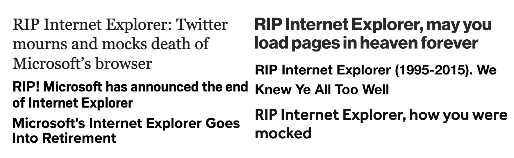
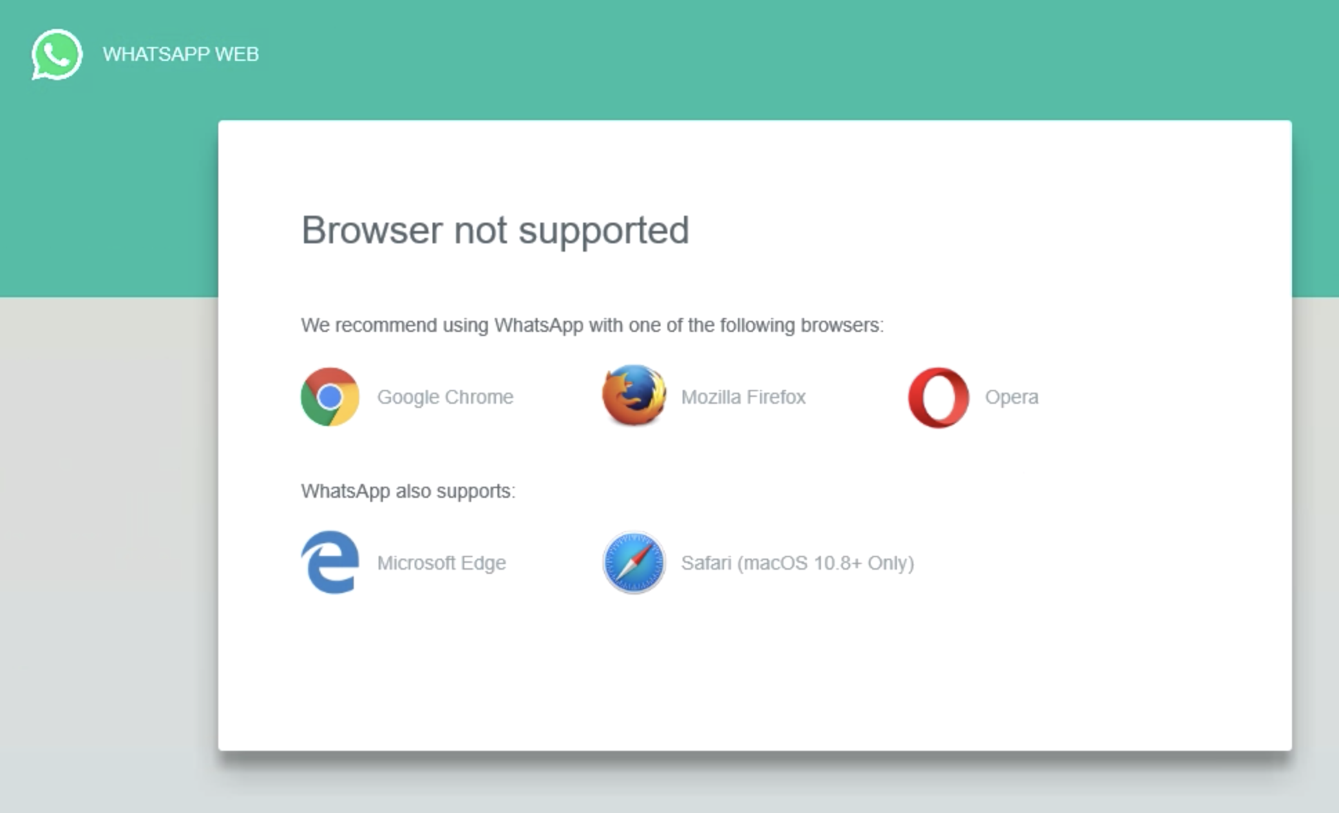
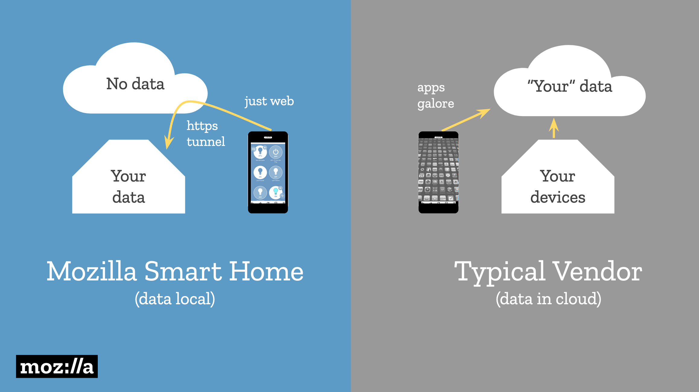
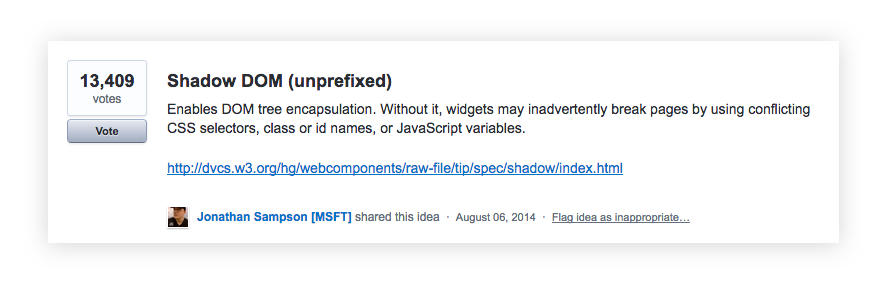
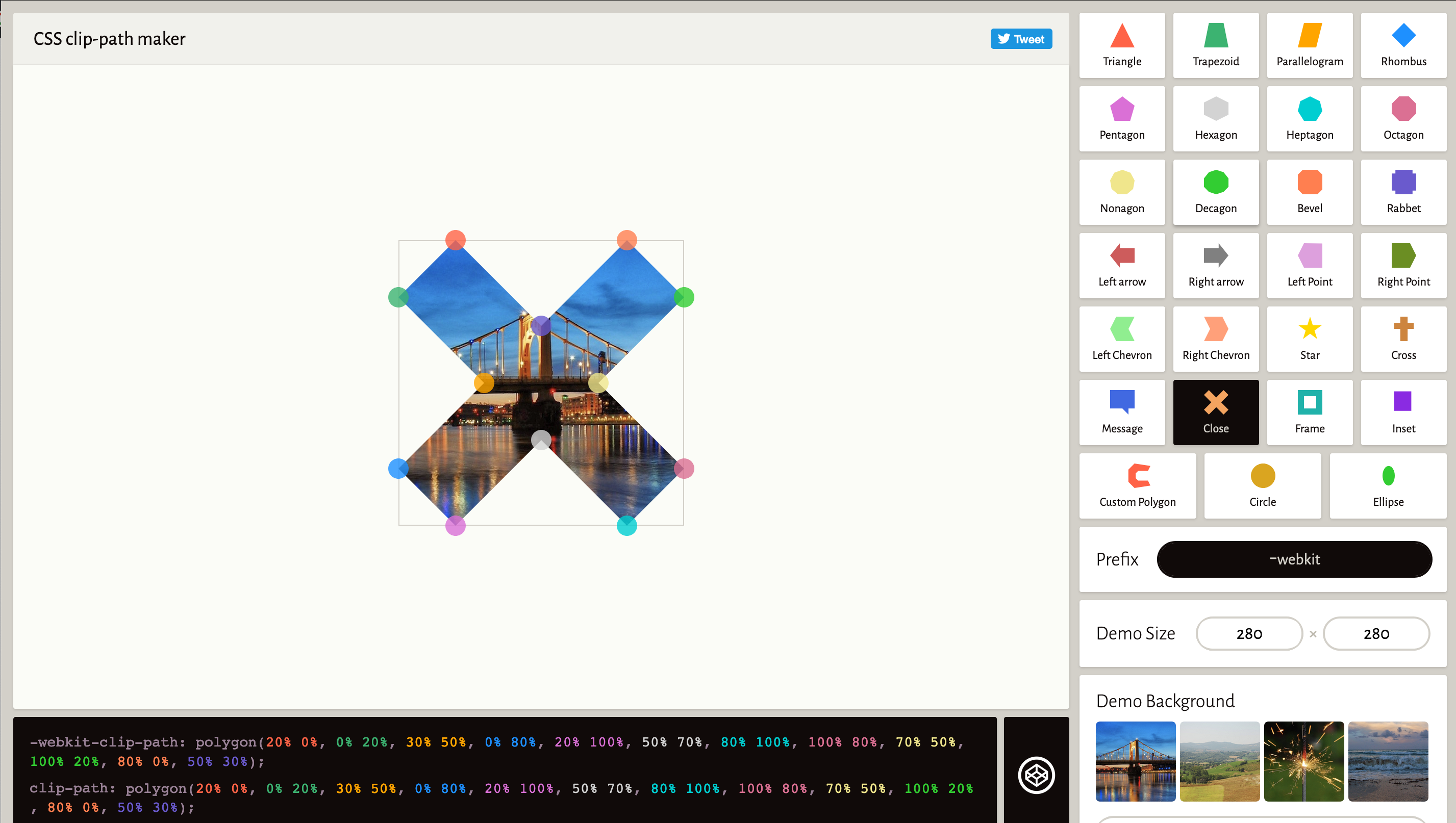
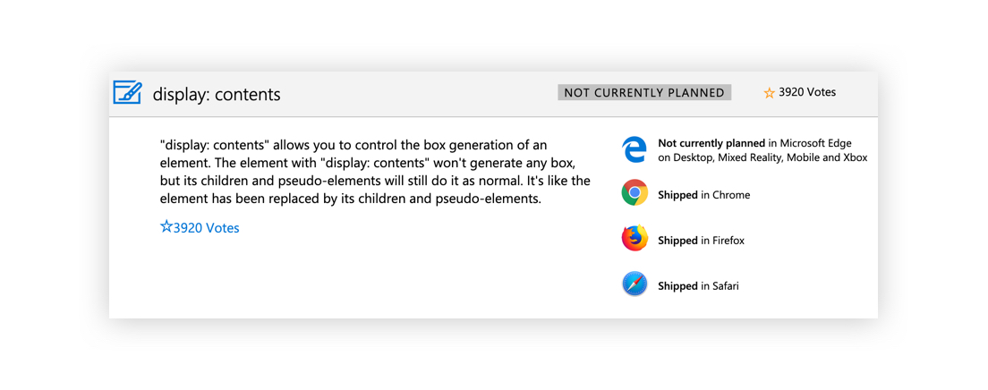


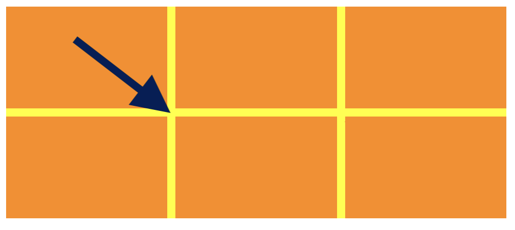


