Falling For Oklch: A Love Story Of Color Spaces, Gamuts, And CSS

I woke up one morning in early 2022 and caught an article called “A Whistle-Stop Tour of 4 New CSS Color Features” over at CSS-Tricks.

Wow, what a gas! A new and wider color gamut! New color spaces! New color functions! New syntaxes! It is truly a lot to take in.

Now, I’m no color expert. But I enjoyed adding new gems to my CSS toolbox and made a note to come back to that article later for a deeper read. That, of course, led to a lot of fun rabbit holes that helped put the CSS Color Module Level 4 updates in a better context for me.

That’s where Oklch comes into the picture. It’s a new color space in CSS that, according to experts smarter than me, offers upwards of 50% more color than the sRGB gamut we have worked with for so long because it supports a wider gamut of color.

Color spaces? Gamuts? These are among many color-related terms I’m familiar with but have never really understood. It’s only now that my head is wrapping around these concepts and how they relate back to CSS, and how I use color in my own work.

That’s what I want to share with you. This article is less of a comprehensive “how-to” guide than it is my own personal journey grokking new CSS color features. I actually like to this of this more as a “love story” where I fall for Oklch.

The Deal With Gamuts And Color Spaces

I quickly learned that there’s no way to understand Oklch without at least a working understanding of the difference between gamuts and color spaces. My novice-like brain thinks of them as the same: a spectrum of colors. In fact, my mind goes straight to the color pickers we all know from apps like Figma and Sketch.

I’ve always assumed that gamut is just a nerdier term for the available colors in a color picker and that a color picker is simply a convenient interface for choosing colors in the gamut.

(Assumed. Just. Simply. Three words you never want to see in the same sentence.)

Apparently not. A gamut really boils down to a range of something, which in this case, is a range of colors. That range might be based on a single point if we think of it on a single axis.

Or it might be a range of multiple coordinates like we would see on a two-axe grid. Now the gamut covers a wider range that originates from the center and can point in any direction.

The levels of those ranges can also constitute an axis, which results in some form of 3D space.

sRGB is a gamut with an available range of colors. Display P3 is another gamut offering a wider range of colors.

So, gamuts are ranges, and ranges need a reference to determine the upper and lower limits of those axes. That’s where we start talking about color spaces. A color space is what defines the format for plotting points on the gamut. While more trained folks certainly have more technical explanations, my basic understanding of color spaces is that they provide the map — or perhaps the “shape” — for the gamut and define how color is manipulated in it. So, sRGB is a color gamut that spans a range of colors, and Hex, RGB, and HSL (among others, of course) are the spaces we have to explore the gamut.

That’s why you may hear a color space as having a “wider” or “narrower” gamut than another — it’s a range of possibilities within a shape.

If I’ve piqued your interest enough, I’ve compiled a list of articles that will give you more thorough definitions of gamuts and color spaces at the end of this article.

Why We Needed New Color Spaces

The short answer is that the sRGB gamut serves as the reference point for color spaces like Hex, RGB, and HSL that provide a narrower color gamut than what is available in the newer Display P3 gamut.

We’re well familiar with many of sRGB-based color notations and functions in CSS. The values are essentially setting points along the gamut space with different types of coordinates.

  /* Hex */ #f8a100
  /* RGB */ rgb(248, 161, 2)
  /* HSL */ hsl(38.79 98% 49%)

For example, the rgb() function is designed to traverse the RGB color space by mixing red, blue, and green values to produce a point along the sRGB gamut.

If the difference between the two ranges in the image above doesn’t strike you as particularly significant or noticeable, that’s fair. I thought they were the same at first. But the Display P3 stripe is indeed a wider and smoother range of colors than the sRGB stripe above it when you examine it up close.

The problem is that Hex, RGB, and HSL (among other existing spaces) only support the sRGB gamut. In other words, they are unable to map colors outside of the range of colors that sRGB offers. That means there’s no way to map them to colors in the Display P3 gamut. The traditional color formats we’ve used for a long time are simply incompatible with the range of colors that has started rolling out in new hardware. We needed a new space to accommodate the colors that new technology is offering us.

Dead Grey Zones

I love this term. It accurately describes an issue with the color spaces in the sRGB gamut — greyish areas between two color points. You can see it in the following demo.

Oklch (as well as the other new spaces in the Level 4 spec) doesn’t have that issue. Hues are more like mountains, each with a different elevation.

That’s why we needed new color spaces — to get around those dead grey zones. And we needed new color functions in CSS to produce coordinates on the space to select from the newly available range of colors.

But there’s a catch. That mountain-shaped gamut of Oklch doesn’t always provide a straight path between color points which could result in clipped or unexpected colors between points. The issue appears to be case-specific depending on the colors in use, but that also seems to indicate that there are situations where using a different color space is going to yield better gradients.

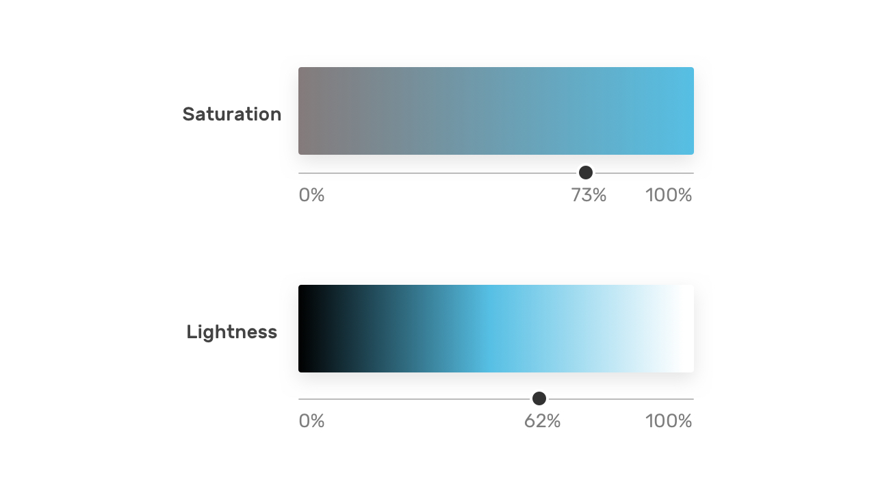
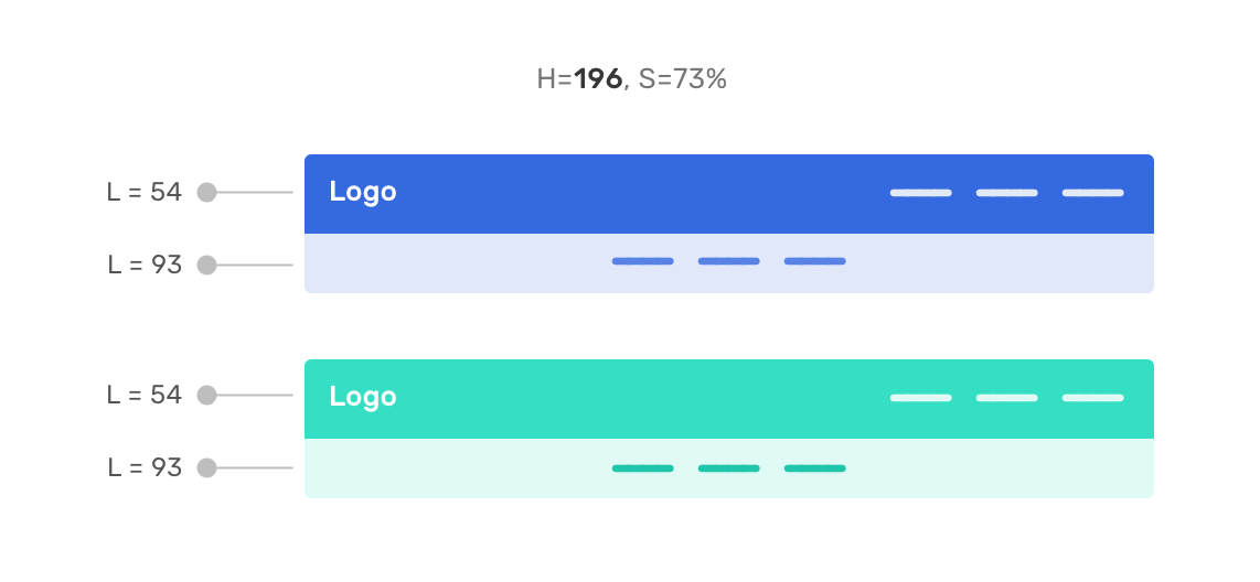
Consistent Lightness

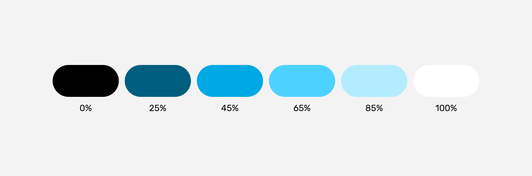
It’s the consistent range of saturation in HSL muddying the waters that leads to another issue along this same train of thought: inconsistent levels of lightness between colors.

The classic example is showing two colors in HSL with the same lightness value:

The Oklab and Oklch color spaces were created to fix that shift. Black is more, well, black because the hues are more consistent in Oklab and Oklch than they are in LAB and LCH.

So, that’s why it’s likely better to use the oklch() and oklab() functions in CSS than it is to use their lch() and lab() counterparts. There’s less of a shift happening in the hues.

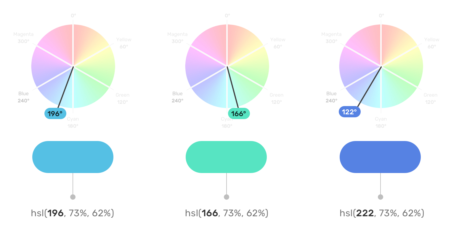
So, while Oklch/LCH and Oklab/LAB all use the same general color space, the Cartesian coordinates are the key difference. And I agree with Sitnik and Turner, who make the case that Oklch and LCH are easier to understand than LAB and Oklab. I wouldn’t be able to tell you the difference between LAB’s a and b values on the Cartesian coordinate system. But chroma and hue in LCH and Oklch? Sure! That’s as easy to understand as HSL but better!

The reason I love Oklch over Oklab is that lightness, chroma, and hue are much more intuitive to me than lightness and a pair of Cartesian coordinates.

And the reason I like Oklch better than HSL is because it produces more consistent results over a wider color gamut.

OKLCH And CSS

This is why you’re here, right? What’s so cool about all this is that we can start using Oklch in CSS today — there’s no need to wait around.

“Browser support?” you ask. We’re well covered, friends!

In fact, Firefox 113 shipped support for Oklch a mere ten days before I started writing the first draft of this article. It’s oven fresh!

Using oklch() is a whole lot easier to explain now that we have all the context around color spaces and gamuts and how the new CSS Color Module Level 4 color functions fit into the picture.

I think the most difficult thing for me is working with different ranges of values. For example, hsl() is easy for me to remember because the hue is measured in degrees, and both saturation and lightness use the same 0% to 100% range.

oklch() is different, and that’s by design to not only access the wider gamut but also produce perceptively consistent results even as values change. So, while we get what I’m convinced is a way better tool for specifying color in CSS, there is a bit of a learning curve to remembering the chroma value because it’s what separates OKLCH from HSL.

The oklch() Values

Here they are:

  • l: This controls the lightness of the color, and it’s measured in a range of 0% to 100% just like HSL.
  • c: This is the chroma value, measured in decimals between 0 and 0.37.
  • h: This is the same ol’ hue we have in HSL, measured in the same range of 0deg to 360deg.

Again, it’s chroma that is the biggest learning curve for me. Yes, I had to look it up because I kept seeing it used somewhat synonymously with saturation.

Chroma and saturation are indeed different. And there are way better definitions of them out there than what I can provide. For example, I like how Cameron Chapman explains it:

“Chroma refers to the purity of a color. A hue with high chroma has no black, white, or gray added to it. Conversely, adding white, black, or gray reduces its chroma. It’s similar to saturation but not quite the same. Chroma can be thought of as the brightness of a color in comparison to white.”

— Cameron Chapman

I mentioned that chroma has an upper limit of 0.37. But it’s actually more nuanced than that, as Sitnik and Turner explain:

“[Chroma] goes from 0 (gray) to infinity. In practice, there is actually a limit, but it depends on a screen’s color gamut (P3 colors will have bigger values than sRGB), and each hue has a different maximum chroma. For both P3 and sRGB, the value will always be below 0.37.”

— Andrey Sitnik and Travis Turner

I’m so glad there are smart people out there to help sort this stuff out.

The oklch() Syntax

The formal syntax? Here it is, straight from the spec:

oklab() = oklab( [ <percentage> | <number> | none]
    [ <percentage> | <number> | none]
    [ <percentage> | <number> | none]
    [ / [<alpha-value> | none] ]? )

Maybe we can “dumb” it down a bit:

oklch( [ lightness ] [ chroma ] [ hue ] )

And those values, again, are measured in different units:

oklch( [ lightness = <percentage> ] [ chroma <number> ] [ hue <degrees> ]  )

Those units have min and max limits:

oklch( [ lightness = <percentage (0%-100%)> ] [ chroma <number> (0-0.37) ] [ hue <degrees> (0deg-360deg) ]  )

An example might be the following:

color: oklch(70.9% 0.195 47.025);

Did you notice that there are no commas between values? Or that there is no unit on the hue? That’s thanks to the updated syntax defined in the CSS Color Module Level 4 spec. It also applies to functions in the sRGB gamut:

/* Old Syntax */
hsl(26.06deg, 99%, 51%)

/* New Syntax */
hsl(26.06 99% 51%)

Something else that’s new? There’s no need for a separate function to set alpha transparency! Instead, we can indicate that with a / before the alpha value:

/* Old Syntax */
hsla(26.06deg, 99%, 51%, .75)

/* New Syntax */
hsl(26.06 99% 51% / .75)

That’s why there is no oklcha() function — the new syntax allows oklch() to handle transparency on its own, like a grown-up.

Providing A Fallback

Yeah, it’s probably worth providing a fallback value for oklch() even if it does enjoy great browser support. Maybe you have to support a legacy browser like IE, or perhaps the user’s monitor or screen simply doesn’t support colors in the Display P3 gamut.

Providing a fallback doesn’t have to be hard:

color: hsl(26.06 99% 51%);
color: oklch(70.9% 0.195 47.025);

There are “smarter” ways to provide a fallback, like, say, using @supports:

.some-class {
  color: hsl(26.06 99% 51%);
}

@supports (oklch(100% 0 0)) {
  .some-class {
    color: oklch(70.9% 0.195 47.025);
  }
}

Or detecting Display P3 support on the @media side of things:

.some-class {
  color: hsl(26.06 99% 51%);
}

@media (color-gamut: p3) {
  .some-class {
    color: oklch(70.9% 0.195 47.025);
  }
}

Those all seem overly verbose compared to letting the cascade do the work. Maybe there’s a good reason for using media queries that I’m overlooking.

There’s A Polyfill

Of course, there’s one! There are two, in fact, that I am aware of: postcss-oklab-function and color.js. The PostCSS plugin will preprocess support for you when compiling to CSS. Alternatively, color.js will convert it on the client side.

That’s Oklch 🥰

O, Oklch! How much do I love thee? Let me count the ways:

  • You support a wider gamut of colors that make my designs pop.
  • Your space transitions between colors smoothly, like soft butter.
  • You are as easy to understand as my former love, HSL.
  • You are well-supported by all the major browsers.
  • You provide fallbacks for handling legacy browsers that will never have the pleasure of knowing you.

I know, I know. Get a room, right?!

Resources

Using HSL Colors In CSS

From my experience, most of the colors I see people using in CSS are hex and RGB. Recently, I’ve started seeing more usage of HSL colors, however, I still think that the full potential of HSL is overlooked. With the help of this article, I’d like to show you how HSL can truly help us work better with colors in CSS.

Introduction

Usually, we use hexadecimal color codes (hex colors) which are fine, but they have a couple of issues:

  • They are limiting;
  • They’re hard to understand from reading them.

By “limited”, I mean that it’s not easy to alter the color without opening a color wheel and picking a color yourself. Adding on that, it’s not easy to guess what color is from looking at the hex code.

Consider the following figure:

I picked a hex color for a sky blue, and a darker one. Notice that the hex colors are not related to each other. It’s hard to tell that they are both blue but with different shades.

In a real-life scenario, you might need to create a lighter or darker shade of a color to quickly test or validate something. With hex colors, this isn’t possible until you open the color picker.

Thankfully, HSL colors can help us in solving this specific problem, and it opens a lot of possibilities for us.

What Is HSL?

HSL stands for hue, saturation, and lightness. It’s based on the RGB color wheel. Each color has an angle and a percentage value for the saturation and lightness values.

Let’s take an example of the sky blue color that we discussed previously. First, we pick the color like we usually do from a color picker, and we make sure to get the HSL value for it.

Note: I’m using Sketch app, but you use whatever design tool you want.

Consider the following figure:

Notice that the HSL values in there. The first one is the angle, which represents the angle of the color we have. In this case, it’s sky blue. Once we have the angle, we can start tweaking the saturation and brightness as per our needs.

Saturation

Saturation controls how saturated the color should be. 0% is completely unsaturated, while 100% is fully saturated.

Lightness

As for lightness, it controls how light or dark the color is. 0% is is black, and 100% is white.

Consider the following figure:

With that, we have three values that are representing color, angle, saturation, and brightness. Here is how we can use the color in CSS:

.element {
    background-color: hsl(196, 73%, 62%);
}

By modifying the color angle, we can get colors that are similar in saturation and lightness to the base one. This is very useful when working on new brand colors as it can create a consistent set of secondary brand colors.

Consider the following figure:

Do you feel that the three colors are related to each other in terms of how the color is saturated, and how it’s dark or light it is? That has been achieved by only changing the color angle. This is what great about HSL colors. It’s more human-friendly to read and edit than any other color type.

Use Cases For HSL Colors

Changing Colors On Hover

When a color in a specific component needs to appear darker on hover, HSL colors can be perfect for this. It can be helpful for components like buttons and cards.

:root {
  --primary-h: 221;
  --primary-s: 72%;
  --primary-l: 62%;
}

.button {
  background-color: hsl(var(--primary-h), var(--primary-s), var(--primary-l));
}

.button:hover {
  --primary-l: 54%;
}

Notice how I combined CSS variables with HSL colors. On hover, I only need to alter the lightness value. Remember, the higher the value, the lighter. For a darker shade, we need to reduce the value.

A Combination Of Tinted Colors

HSL can be handy when we have a design that uses the same color but with different shades. Consider the following design:

The main header navigation has the primary color, while the secondary navigation has a lighter shade. With HSL, we can get the lighter shade easily by altering the lightness value.

This can be extremely useful while having a UI with multiple themes. I created two themes and switching from one to another only requires me to edit the hue degree.

First theme:

Second theme:

Color Palettes

By altering the lightness, we can create a set of shades for a color that can be used throughout the UI where possible.

This is useful for design systems where designers provide developers with the shades for each color of the brand.

Here is an interactive demo that shows that. The input slider only changes the hue value, and the rest of the shades change based on that.

Notice how the white on the right is too much. We can replace this with a custom white that is derived from a very light shade of the color we have. In my opinion, it’s much better.

Variations Of A Button

Another useful use case for HSL colors is when we have primary and secondary options that are from the same color but with different shades. In this example, the secondary button has a very light tint of the main color. HSL colors are perfect for that.

:root {
  --primary-h: 221;
  --primary-s: 72%;
  --primary-l: 62%;
}

.button {
  background-color: hsl(var(--primary-h), var(--primary-s), var(--primary-l));
}

.button--secondary {
    --primary-l: 90%;
    color: #222;
}

.button--ghost {
    --primary-l: 90%;
    background-color: transparent;
    border: 3px solid hsl(var(--primary-h), var(--primary-s), var(--primary-l)); 
}

Tweaking the primary button variations where fast and can be extended more for broader usage. Changing the hue value will change all the buttons’ themes.

Dynamic Washed-Out Effects

In some cases, we might need a gradient to have a very light shade of the other color stop. With HSL, we can use the same color but with a different lightness value for the second one.

.section {
  background: linear-gradient(to left, hsl(var(--primary-h), var(--primary-s), var(--primary-l)), hsl(var(--primary-h), var(--primary-s), 95%));
}

.section-2 {
  --primary-h: 167;
}

The gradient starts from the right with a solid color and then fades out to the lighter shade. This can be used for a decorative hero section, for example.

That’s all with the use cases. I hope that you learned something new and useful.

Conclusion

HSL colors are very powerful when we use them the right way. They can save us time and effort and even help us to explore options for how to apply color to design.

A Complete Guide To Accessibility Tooling

Learning to build accessible websites can be a daunting task for those who are just starting to implement accessible practices. We’ve pulled together a wide range of accessibility tooling, ranging from single-use bookmarklets to full-blown applications, in order to help you get started with building more accessible websites.

ARIA

The WebAIM Million survey found that home pages with ARIA present averaged 41% more detectable errors than those without ARIA. ARIA is an essential tool for creating complex web applications, but the specification is strict and can be tricky to debug by those who do not use assistive technology regularly. Tooling can help us ensure that we are using ARIA correctly and not introducing more errors to our applications.

The Paciello Group has created a WAI-ARIA bookmarklet which scans your page to make sure all elements and their given roles and ARIA attributes are valid. Upon activating the bookmarklet, the page is scanned for any errors, and a new tab will be opened with the results. The results include the total number of valid roles, any detected ARIA errors, and code snippets of where any errors were found so that you can easily debug your page.

One thing not explicitly tested in the above bookmarklet is the presence of duplicate ARIA roles. Certain landmark roles have names that sound like they might apply to several elements, but should only be used once per page, such as banner or contentinfo. Adrian Roselli has come up with a simple CSS-based bookmarklet to check if any of these ARIA roles have been duplicated. Activating the bookmarklet will add a red outline to any offending element.

NerdeRegion is a Chrome extension that logs all the output of any aria-live regions. Can’t figure out why your screen reader is announcing something unexpectedly? NerdeRegion can let you keep track of timestamped announcements and the source element they originate from, all within a panel in DevTools. Since there can be bugs and inconsistencies with how aria-live regions are announced with different screen readers, NerdeRegion can be a great tool to figure out if an issue is potentially caused by your code or by the device combination.

Automatic Testing Tools

This class of tools can be used by the developer or tester to run automated tests on the output of your code, catching errors that may not appear obvious in the source code. There are many high-quality paid services and other tools beyond what we’ve mentioned here, but we’ve focused on tools with comprehensive free offerings in order to reduce barriers to entry. All of the listed tools can be run on pages that are not on the public internet, allowing them to be more easily incorporated into a development flow. It is important to note that accessibility testing is complicated and always requires manual testing to understand the full context of the site, but these automated testing tools can give you a solid head start.

A lot of tools use axe-core under the hood, so it may be redundant to use a combination of tools. Ultimately, what kind of tool you choose is more about what kind of UI you prefer, and the level of comprehensiveness in the results. For example, Lighthouse, the tool built into Google Chrome, uses a partial selection of axe-core rules, so if you manage to get a clean scan with axe DevTools, you shouldn’t need to run a Lighthouse scan as well.

Axe DevTools is available as a Chrome or Firefox browser extension and shows up as a panel in the developer tools. You can test a whole page or just part of a page, and all detected issues are sorted by severity and come with code snippets for easier debugging. Axe also lets you catch more errors than other automated tools with its Intelligent Guided Tests feature. Intelligent Guided Tests identify areas to test and do as much heavy lifting as possible, before asking the tester questions in order to generate a result. Axe also allows you to save and export results, which is useful for working through fixing errors as part of a longer and more cooperative development process.

Accessibility Insights also runs on axe-core, but has several features that differentiate it from axe DevTools. It can be run on various platforms, including Android, Windows, or as a browser extension. All versions of Accessibility Insights feature an inspector-like tool for looking up individual element information, as well as a way of running automated checks. The web extension also contains an Assessment feature, which has a combination of automated, guided and manual tests in order to allow you to generate a full report.

WAVE by WebAIM has been an integral part of my tool kit. Available in extension form as well as a mass testing service and an API, I find this tool best for checking my work as I develop due to its simplicity and speed. Everything is loaded as a panel on the side of your page, and you can get a holistic view of errors by scrolling through the page. If an error is displayed in the side panel but you aren’t sure where in the DOM it is, you can turn off styles to locate it within the markup. WAVE’s heading and landmark feature is one of my favorite things about it as it ensures that my document semantics are correct as I build.

SiteImprove has a free Chrome extension in addition to their paid service offerings. Like WAVE, you run the extension on a page and it lists errors in a panel on the side of the page, including filters for things like conformance level, severity and responsibility. The severity filter is especially useful as automatic testing always tends to produce some false positives.

Colors

Low contrast text errors were found on a whopping 86.4% of homepages last year. Developers often have limited control over a color palette, so it is important to try to establish an accessible color palette as early on in the process as possible.

When you’re starting to design a color palette, an in-browser color picking tool may be helpful. Are My Colors Accessible is a tool that can help you figure out an accessible color palette. The basic mode calculates the contrast ratio between any two colors. The font size and font weight of your text can affect the contrast ratio required based on the level of conformance, and this tool helpfully lays out all the different standards it meets. It also features HSL range sliders so that you can tweak any of the colors, with the results automatically updating as you make adjustments. Palette mode lets you compare every color in a palette against each other and displays the contrast ratio and standards met, which is helpful for determining how you can combine different colors together. Making any color adjustments also updates the permalink, allowing you to easily share color combinations with your team. If you prefer a different interface for selecting colors, Atul Varma has built a similar tool that uses a color picker instead of HSL range sliders.

Geenes attempts to do it all by building out full tint/shade ranges for each color group you add, allowing you to design a full-color system instead of a limited palette. In addition to providing contrast ratios, Geenes also allows you to apply your palette to various mockups, and emulate different forms of color blindness. You can trial most features for free, and unlock multiple palettes with a donation.

Certain tools can help you solve specific color-related accessibility issues. Buttons in particular can be tricky, as not only do you have to worry about the text color with the background color, you also need to consider the button background with the page background, and the focus outline color with both backgrounds. Stephanie Eckles’s project ButtonBuddy explains these requirements in simple language and helps you pick colors for these individual parts.

Some color combinations may technically meet contrast requirements when viewed by people without color blindness but could pose problems for specific kinds of color blindness and low vision. Who Can Use applies a visual filter to emulate different types of color blindness and then calculates an approximate color contrast ratio.

If you would like to test your color combinations in the context of an existing site, Stark is a color picker extension for Chrome that lets you simulate certain kinds of color blindness. Additionally, Anna Monus has created a helpful writeup of color blindness tools already built into Chrome. While this kind of emulation can never fully replace testing with real users, it can help us make better initial choices.

Sometimes as developers, we start working on a project where we may need to design as we go and begin writing code without a full, pre-established brand palette. Once development has started, it can be tedious to keep importing color palettes back and forth into external tooling. There are many options for checking color contrast within a code environment. Alex Clapperton has developed a CLI tool where you pass in two colors and it outputs the contrast ratio and passing standards right in the terminal. The BBC has published a JavaScript color contrast checker that takes two colors and determines whether or not it meets your desired standard. A tool like this can live in your codebase with your tests, or be implemented in your design system library like Storybook, PatternLab, and so on.

A11y Color Tokens takes it a step further and lets you automatically generate complementary color tokens in CSS or SASS. You pass in a color and desired ratio to generate a shade or tint of that color that meets requirements. If you need to quickly check the contrast ratio of something, Chrome and Firefox now show the color contrast information within their respective developer tools color selectors as well. If none of these tools suit your fancy, Stephanie Walter has covered many other color-related tool options in her blog post on color accessibility.

Compatibility

Building for assistive technology can often add another level of complexity when it comes to debugging. Because assistive technology is essentially another layer of an interface on top of the browser, we now need to concern ourselves with combinations of browser and assistive technology. A bug may be present in either the browser or the assistive technology, or it may be present only in a particular combination. It’s a good idea to keep this list of bug trackers on hand when trying to fix a specific issue. Some of these are public so that you can see if others experience the bug you are having, but others only offer a means to report bugs in private.

Not all browsers and screen reader combinations work well together, and not all accessibility features are equally supported across browsers. These tools can help you check if you are experiencing a bug on a specific combination of devices. HTML5 Accessibility is a list of newer HTML features and whether or not the default browser implementation is accessibly supported. In a similar vein, Accessibility Support provides a list of ARIA roles and their support in the most popular browser and screen reader combinations.

Focus Management

Managing focus is a necessary but often difficult part of making complex applications accessible. We need to consider that the focus order is logical, that focus is moved around correctly on any custom components, and that each interactable element has a clear focus style.

This bookmarklet by Level Access labels every focusable element on the page, so that you can check that the focus order matches the reading order. For the Firefox users out there, Firefox’s Accessibility Inspector has added this feature since version 84.

In complex codebases, where different components or third-party code might be moving focus around unexpectedly, this little snippet by Scott Vinkle can help you see what element currently has focus. If I’m struggling with the focus being moved around by other parts of my application, sometimes I also like to replace console.log with console.trace to determine exactly what function is moving the focus around.

In order to test all focus styles on a web page, we can use Scott O’Hara’s script as a starting point. Tabbing through every element can get cumbersome after a while, so a script to rotate through each element can help us make sure our focus styles look consistent and work within the context of the page.

Setting a positive tabindex to try and fix the focus order is a common accessibility gotcha. Elements that have a positive tabindex will force the browser to tab to them first. While this may not technically be an error, this is often unexpected and can cause more problems than it solves. Paul J. Adam’s tabindex bookmarklet allows you to highlight all elements that have the tabindex attribute applied.

Layout Usability

The document reading order can sometimes fall out of sync with what a viewer might expect if a layout relies too heavily on the CSS Grid or Flexbox order property. Adrian Roselli has coded up a bookmarklet for keeping track of the reading order to help you make sure your site passes the meaningful sequence guideline.

The WCAG contains a text spacing criterion where all content should still work when certain text settings are applied. To test for this, Steve Faulkner has created a bookmarklet that automatically applies the required text spacing settings to all the text on a page. Avoiding things like fixed heights and allowing for overflow not only makes your site more accessible, it ensures that whatever content you put into your site won’t break the layout, something your content editors will thank you for.

Jared Smith built a bookmarklet to turn your cursor into a 44×44 pixel box so that you can hover it over your controls to make sure that they meet the recommended target size criterion.

Linters

Linters are a class of tools that catch errors by scanning the source code before the application is run or built. By using linters, we can fix smaller bugs before we even run or build the code, saving valuable QA time later.

Many developers already know and use ESLint in some capacity. Instead of learning new tooling, it’s possible to get a head start on your accessibility testing by including a new plugin into your existing workflow. Eslint-plugin-jsx-a11y is an ESLint plugin for your JSX elements, where any errors will be shown as you write your code. Scott Vinkle has written up a helpful guide on setting it up.

Deque has come out with axe Linter, available as a Github app or VS Code Extension. Axe Linter checks React, Vue, HTML and Markdown files against core rules without any configuration so it is easy to get up and running, although you are welcome to pass in your own options. One helpful feature is that it distinguishes between WCAG 2 and WCAG 2.1 which is useful if you are trying to meet a specific standard.

Markup

The web is built to be resilient. If you have broken markup, the browser will try its best to patch over any mistake. However, this can have unintended side effects, both from a styling perspective and an accessibility standpoint. Running your output through the W3C HTML validator can help catch things like broken tags, attributes being applied to elements that shouldn’t have them, and other HTML errors. Deque has created a W3C HTML Validator bookmarklet based on the same engine which lets you check the markup on localhost or password-protected pages that the regular validator cannot reach.

If you’re more of a visual person, Gaël Poupard’s project a11y.css is a stylesheet that checks for possible risks within your markup. Available in both extension or bookmarklet format, you can customize the language as well as the level of advice displayed. In a similar vein, sa11y is a tool that can be installed as a bookmarklet or integrated into your codebase. Sa11y is specifically designed for looking at the output of CMS content. It displays any warnings in non-technical language so that content editors can understand and make the necessary corrections.

Reading Level

An accessible site starts with accessible content. Cognitive accessibility has been a major focus of the ongoing WCAG 3 draft and is currently mentioned in Success Criterion 3.1.5, which suggests that authors aim for content to be understandable by a lower secondary (7-9th grade) reading level.

The Hemingway Editor calculates the reading level of your content as you write it, so that you can edit to make sure it is easily understandable. The panel on the side offers suggestions for how you can improve your content to make it more readable. If your site has already been published, Juicy Studio has produced a readability tool where you pass in a URL to the provided form and your site’s content is analyzed and graded using three different reading level algorithms. There is also a helpful explanation as to what each of these scores entails. However, one limitation of this particular tool is that it takes into account all the text rendered on the page, including things like navigation and footer text, which may skew the results.

Test Suites And Continuous Integration

The downside of most automated testing tools is that they require people to run them in the browser. If you are working on a single large codebase, you can incorporate accessibility testing into your existing testing process or as part of your continuous integration flow. When you write custom tests, you have an awareness of your application that automated testing tools don’t have, allowing you to perform customized, comprehensive testing in a more scalable way.

Once again, axe-core pops up as an open-source library that frequently underpins most of these tools, so whether or not a tool works for you will likely be based on how well it integrates with your code rather than any differences in testing results. Marcy Sutton has published a framework-agnostic guide for getting started writing automated tests for accessibility. She covers the difference between unit tests and integration tests and why you might want to choose one over the other in different scenarios.

If you already have a test framework that you enjoy, there’s a high chance that there is already a library that incorporates axe-core into it. For example, Josh McClure has written up a guide that uses cypress-axe, and Nick Colley has produced a Jest flavored version in jest-axe.

Pa11y is a tool that provides a configurable interface around testing that is also available in a CI version as well. Its many configuration options can let you solve complex issues that can come up with testing. For example, the actions feature lets you pass an array of actions before running the tests and can be useful for testing screens that require authentication before accessing the page.

User Preferences

There are many new media queries to help detect the user’s operating system and browser preferences. These days, developers are often detecting these settings in order to set the default for things like motion preferences and dark mode, but this may also lead to bugs that are difficult to reproduce if you do not have the same settings.

Magica11y is a set of functions that lets you determine your users’ preferences. Send the documentation page to non-technical testers or incorporate these into your app so that you can reproduce your user’s environments more accurately.

Wrapping Up

It’s estimated that automated accessibility testing can only catch 30% of all accessibility errors. Even as tooling continues to improve, it will never replace including disabled people in your design and development process. A sustainable and holistic accessibility process might involve having the whole team use tooling to catch as many of these errors as possible early on in the process, instead of leaving it all for testers and disabled users to find and report these issues later.

Need even more tooling? The A11y Project and Stark have curated lists of additional accessibility tools for both developers and users! Or feel free to leave any suggestions in the comments below, we’d love to hear what tools you incorporate into your workflow.

A Complete Guide to calc() in CSS

CSS has a special calc() function for doing basic math. Here's an example:

.main-content {
  /* Subtract 80px from 100vh */
  height: calc(100vh - 80px);
}

In this guide, let's cover just about everything there is to know about this very useful function.

calc() is for values

The only place you can use the calc() function is in values. See these examples where we're setting the value for a number of different properties.

.el {
  font-size: calc(3vw + 2px);
  width:     calc(100% - 20px);
  height:    calc(100vh - 20px);
  padding:   calc(1vw + 5px);
}

It could be used for only part of a property too, for example:

.el {
  margin: 10px calc(2vw + 5px);
  border-radius: 15px calc(15px / 3) 4px 2px;
  transition: transform calc(1s - 120ms);
}

It can even be a part of another function that forms a part of a property! For example, here's calc() used within the color stops of a gradient

.el {
  background: #1E88E5 linear-gradient(
    to bottom,
    #1E88E5,
    #1E88E5 calc(50% - 10px),
    #3949AB calc(50% + 10px),
    #3949AB
  );
}

calc() is for lengths

Notice all the examples above are essentially numbers-based. We'll get to some of the caveats of how the numbers can be used (because sometimes you don't need a unit), but this is for number math, not strings or anything like that.

.el {
  /* Nope! */
  counter-reset: calc("My " + "counter");
}
.el::before {
  /* Nope! */
  content: calc("Candyman " * 3);
}

There are many lengths of CSS though, and they can all be used with calc():

  • px
  • %
  • em
  • rem
  • in
  • mm
  • cm
  • pt
  • pc
  • ex
  • ch
  • vh
  • vw
  • vmin
  • vmax

You can also not perform any calculation and it is still valid:

.el {
  /* Little weird but OK */
  width: calc(20px);
}

Nope on media queries

When calc() is used correctly (length units used as a value to a property), it sadly calc() won't work when applied to media queries.

@media (max-width: 40rem) {
  /* Narrower or exactly 40rem */
}

/* Nope! */
@media (min-width: calc(40rem + 1px)) {
  /* Wider than 40rem */
}

It would be cool someday because you could do mutually exclusive media queries in a fairly logical way (like above).

Mixing units 🎉

This is perhaps the most valuable feature of calc()! Almost every example above has already done this, but just to put a point on it, here it is mixing different units:

/* Percentage units being mixed with pixel units */
width: calc(100% - 20px);

That's saying: As wide as the element is, minus 20 pixels.

There is literally no way to pre-calculate that value in pixels alone in a fluid width situation. In other words, you can't preprocess calc() with something like Sass as an attempted complete a polyfill. Not that you need to, as the browser support is fine. But the point is that it has to be done in the browser (at "runtime") when you mix units in this way, which is most of the value of calc().

Here's some other examples of mixing units:

transform: rotate(calc(1turn + 45deg));

animation-delay: calc(1s + 15ms);

Those probably could be preprocessed as they mix units that aren't relative to anything that is determined at runtime.

Comparison to preprocessor math

We just covered that you can't preprocess the most useful things that calc() can do. But there is a smidge of overlap. For example, Sass has math built into it, so you can do things like:

$padding: 1rem;

.el[data-padding="extra"] {
  padding: $padding + 2rem; // processes to 3rem;
  margin-bottom: $padding * 2; // processes to 2rem; 
}

Even math with units is working there, adding same-unit values together or multiplying by unitless numbers. But you can't mix units and it has similar limitations to calc() (e.g. like multiplying and dividing must be with unit-less numbers).

Show the math

Even you aren't using a feature that is uniquely possible only with calc(), it can be used to "show your work" inside CSS. For example, say you need to calculate exactly 17th the width of an element...

.el {
  /* This is easier to understand */
  width: calc(100% / 7);

  /* Than this is */
  width: 14.2857142857%;
}

That might pan out in some kind of self-created CSS API like:

[data-columns="7"] .col { width: calc(100% / 7); }
[data-columns="6"] .col { width: calc(100% / 6); }
[data-columns="5"] .col { width: calc(100% / 5); }
[data-columns="4"] .col { width: calc(100% / 4); }
[data-columns="3"] .col { width: calc(100% / 3); }
[data-columns="2"] .col { width: calc(100% / 2); }

The Math operators of calc()

You've got +, -, *, and /. But they differ in how you are required to use them.

Addition (+) and subtraction (-) require both numbers to be lengths

.el {
  /* Valid 👍 */
  margin: calc(10px + 10px);

  /* Invalid 👎 */
  margin: calc(10px + 5);
}

Invalid values invalidate the whole individual declaration.

Division (/) requires the second number to be unitless

.el {
  /* Valid 👍 */
  margin: calc(30px / 3);

  /* Invalid 👎 */
  margin: calc(30px / 10px);

  /* Invalid 👎 (can't divide by 0) */
  margin: calc(30px / 0);
}

Multiplication (*) requires one of the numbers to be unitless

.el {
  /* Valid 👍 */
  margin: calc(10px * 3);

  /* Valid 👍 */
  margin: calc(3 * 10px);

  /* Invalid 👎 */
  margin: calc(30px * 3px);
}

Whitespace matters

Well, it does for addition and subtraction.

.el {
  /* Valid 👍 */
  font-size: calc(3vw + 2px);

  /* Invalid 👎 */
  font-size: calc(3vw+2px);

  /* Valid 👍 */
  font-size: calc(3vw - 2px);

  /* Invalid 👎 */
  font-size: calc(3vw-2px);
}

I imagine it has to do with negative numbers somehow, as using negative numbers (e.g. calc(5vw - -5px)) is OK. I suppose that makes something like calc(5vw--5px) weird, especially in how custom properties use double-dashes (e.g. var(--padding)).

Multiplication and division do not need the whitespace around the operators. But I'd think good general advice is to include the space for readability and muscle memory for the other operators.

Whitespace around the outsides doesn't matter. You can even do line breaks if you'd like:

.el {
  /* Valid 👍 */
  width: calc(
    100%     /   3
  );
}

Careful about this, though: no spaces between calc() and the opening paren.

.el {
  /* Invalid 👎 */
  width: calc (100% / 3);
}

Nesting calc(calc());

You can but it's never necessary. It's the same as using an extra set of parentheses without the calc() part. For example:

.el {
  width: calc(
    calc(100% / 3)
    -
    calc(1rem * 2)
  );
}

You don't need those inside calc() because the parens work alone:

.el {
  width: calc(
   (100% / 3)
    -
   (1rem * 2)
  );
}

And in this case, the "order of operations" helps us even without the parentheses. That is, division and multiplication happen first (before addition and subtraction), so the parentheses aren't needed at all. It could be written like this:

.el {
  width: calc(100% / 3 - 1rem * 2);
}

But feel free to use the parens if you feel like it adds clarity. If the order of operations doesn't work in your favor (e.g. you really need to do the addition or subtraction first), you'll need parens.

.el {
  /* This */
  width: calc(100% + 2rem / 2);

  /* Is very different from this */
  width: calc((100% + 2rem) / 2);
}

CSS custom properties and calc() 🎉

Other than the amazing ability of calc() to mix units, the next most awesome thing about calc() is using it with custom properties. Custom properties can have values that you then use in a calculation:

html {
  --spacing: 10px;
}

.module {
  padding: calc(var(--spacing) * 2);
}

I'm sure you can imagine a CSS setup where a ton of configuration happens at the top by setting a bunch of CSS custom properties and then letting the rest of the CSS use them as needed.

Custom properties can also reference each other. Here's an example where some math is used (note the lack of a calc() function at first) and then later applied. (It ultimately has to be inside of a calc().)

html {
  --spacing: 10px;
  --spacing-L: var(--spacing) * 2;
  --spacing-XL: var(--spacing) * 3;
}

.module[data-spacing="XL"] {
  padding: calc(var(--spacing-XL));
}

Custom properties can come from the HTML, which is a pretty darn cool and useful thing sometimes. (See how Splitting.js adds indexes to words/characters as an example.)

<div style="--index: 1;"> ... </div>
<div style="--index: 2;"> ... </div>
<div style="--index: 3;"> ... </div>
div {
  /* Index value comes from the HTML (with a fallback) */
  animation-delay: calc(var(--index, 1) * 0.2s);
}

Adding units later

In case you're in a situation where it's easier to store numbers without units, or do math with unit-less numbers ahead of time, you can always wait until you apply the number to add the unit by multiplying by 1 and the unit.

html {
  --importantNumber: 2;
}

.el {
  /* Number stays 2, but it has a unit now */
  padding: calc(var(--importantNumber) * 1rem);
}

Messing with colors

Color format like RGB and HSL have numbers you can mess with using calc(). For example, setting some base HSL values and then altering them forming a system of your own creation (example):

html {
  --H: 100;
  --S: 100%;
  --L: 50%;
}

.el {
  background: hsl(
    calc(var(--H) + 20),
    calc(var(--S) - 10%),
    calc(var(--L) + 30%)
  )
}

You can't combine calc() and attr()

The attr() function in CSS looks appealing, like you can yank attribute values out of HTML and use them. But...

<div data-color="red">...</div>
div {
  /* Nope */
  color: attr(data-color);
}

Unfortunately, there are no "types" in play here, so the only thing attr() is for are strings in conjunction with the content property. That means this works:

div::before {
  content: attr(data-color);
}

I mention this, because it might be tempting to try to pull a number in that way to use in a calculation, like:

<div class="grid" data-columns="7" data-gap="2">...</div>
.grid {
  display: grid;

  /* Neither of these work */
  grid-template-columns: repeat(attr(data-columns), 1fr);
  grid-gap: calc(1rem * attr(data-gap));
}

Fortunately, it doesn't matter much because custom properties in the HTML are just as useful or more!

<div class="grid" style="--columns: 7; --gap: 2rem;">...</div>
.grid {
  display: grid;

  /* Yep! */
  grid-template-columns: repeat(var(--columns), 1fr);
  grid-gap: calc(var(--gap));
}

Browser tooling

Browser DevTools will tend you show you the calc() as you authored it in the stylesheet.

Firefox DevTools - Rules

If you need to figure out the computed value, there is a Computed tab (in all browser DevTools, at least that I know about) that will show it to you.

Chrome DevTools - Computed

Browser support

This browser support data is from Caniuse, which has more detail. A number indicates that browser supports the feature at that version and up.

Desktop

ChromeFirefoxIEEdgeSafari
19*4*11126*

Mobile / Tablet

Android ChromeAndroid FirefoxAndroidiOS Safari
8068806.0-6.1*

If you really needed to support super far back (e.g. IE 8 or Firefox 3.6), the usual trick is to add another property or value before the one that uses calc():

.el {
  width: 92%; /* Fallback */
  width: calc(100% - 2rem);
}

There are quite a few known issues for calc() as well, but they are all for old browsers. Can I use... lists 13 of them, here's a handful:

  • Firefox <59 does not support calc() on color functions. Example: color: hsl(calc(60 * 2), 100%, 50%).
  • IE 9 - 11 will not render the box-shadow property when calc() is used for any of the values.
  • Neither IE 9 - 11 nor Edge support width: calc() on table cells.

Use-case party

I asked some CSS developers when they last used calc() so we could have a nice taste here for for how others use it in their day-to-day work.

I used it to create a full-bleed utility class: .full-bleed { width: 100vw; margin-left: calc(50% - 50vw); } I'd say calc() is in my top 3 CSS things.

I used it to make space for a sticky footer.

I used it to set some fluid type / dynamic typography... a calculated font-size based on minimums, maxiums, and a rate of change from viewport units. Not just the font-size, but line-height too.

If you're using calc() as part of a fluid type situation that involves viewport units and such, make sure that you include a unit that uses rem or em so that the user still has some control over bumping that font up or down by zooming in or out as they need to.

One I really like is having a "content width" custom property and then using that to create the spacing that I need, like margins: .margin { width: calc( (100vw - var(--content-width)) / 2); }

I used it to create a cross-browser drop-cap component. Here's a part of it:

.drop-cap { --drop-cap-lines: 3; font-size: calc(1em * var(--drop-cap-lines) * var(--body-line-height)); }

I used it to make some images overflow their container on an article page.

I used it to place a visualization correctly on the page by combining it with padding and vw/vh units.

I use it to overcome limitations in background-position, but expecially limitations in positioning color stops in gradients. Like "stop 0.75em short of the bottom".

Other Trickery

The post A Complete Guide to calc() in CSS appeared first on CSS-Tricks.

Programming Sass to Create Accessible Color Combinations

We’re all looking for low-hanging fruit to make our sites and apps more accessible. One of the easier things we can do is make sure the colors we use are easy on the eyes. High color contrast is something that benefits everyone. It not only reduces eye strain in general, but is crucial for folks who deal with reduced vision.

So let’s not only use better color combinations in our designs but find a way to make it easier for us to implement high contrasts. There’s one specific strategy we use over at Oomph that lets a Sass function do all the heavy lifting for us. I’ll walk you through how we put that together.

Want to jump right to the code because you already understand everything there is to know about color accessibility? Here you go.

What we mean by “accessible color combinations”

Color contrast is also one of those things we may think we have handled. But there’s more to high color contrasts than eyeballing a design. There are different levels of acceptable criteria that the WCAG has defined as being accessible. It’s actually humbling to crack open the WebAIM Contrast Checker and run a site’s color combinations through it.

My team adheres to WCAG’s Level AA guidelines by default. This means that: 

  • Text that is 24px and larger, or 19px and larger if bold, should have a Color Contrast Ratio (CCR) of 3.0:1.
  • Text that is smaller than 24px should have a CCR of 4.5:1.

If a site needs to adhere to the enhanced guidelines for Level AAA, the requirements are a little higher:

  • Text that is 24px and larger, or 19px and larger if bold, should have a CCR of 4.5:1.
  • Text that is smaller than 24px should have a CCR of 7:1.

Ratios? Huh? Yeah, there’s some math involved here. But the good news is that we don’t need to do it ourselves or even have the same thorough understanding about how they’re calculated the way Stacie Arellano recently shared (which is a must read if you’re into the science of color accessibility).

That’s where Sass comes in. We can leverage it to run difficult mathematical computations that would otherwise fly over many of our heads. But first, I think it’s worth dealing with accessible colors at the design level.

Accessible color palettes start with the designs

That’s correct. The core of the work of creating an accessible color palette starts with the designs. Ideally, any web design ought to consult a tool to verify that any color combinations in use pass the established guidelines — and then tweak the colors that don’t. When our design team does this, they use a tool that we developed internally. It works on a list of colors, testing them over a dark and a light color, as well as providing a way to test other combinations. 

ColorCube provides an overview of an entire color palette, showing how each color performs when paired with white, black, and even each other. It even displays results for WCAG Levels AA and AAA next to each result. The tool was designed to throw a lot of information at the user all at once when evaluating a list of colors.

This is the first thing our team does. I’d venture to guess that many brand colors aren’t chosen with accessibility at the forefront. I often find that those colors need to change when they get translated to a web design. Through education, conversation, and visual samples, we get the client to sign off on the new color palette. I’ll admit: that part can be harder than the actual work of implementing accessible colors combinations.

The Color Contrast Audit: A typical design delivery when working with an existing brand’s color palette. Here, we suggest to stop using the brand color Emerald with white, but use an “Alt” version that is slightly darker instead. 

The problem that I wanted to solve with automation are the edge cases. You can’t fault a designer for missing some instance where two colors combine in an unintended way — it just happens. And those edge cases will come up, whether it is during the build or even a year later when new colors are added to the system.

Developing for accessibility while keeping true to the intent of a color system

The trick when changing colors to meet accessibility requirements is not changing them so much that they don’t look like the same color anymore. A brand that loves its emerald green color is going to want to maintain the intent of that color — it’s “emerald-ness.” To make it pass for accessibility when it is used as text over a white background, we might have to darken the green and increase its saturation. But we still want the color to “read” the same as the original color.

To achieve this, we use the Hue Saturation Lightness (HSL) color model. HSL gives us the ability to keep the hue as it is but adjust the saturation (i.e. increase or decrease color) and lightness (i.e. add more black or more white). The hue is what makes a green that green, or a blue that blue. It is the “soul” of the color, to get a little mystical about it. 

Hue is represented as a color wheel with a value between 0° and 360° — yellow at 60°, green at 120°, cyan at 180°, etc. Saturation is a percentage ranging from 0% (no saturation) to 100% (full saturation). Lightness is also a value that goes from 0% to 100%, where no lightness is at 0%, no black and no white is at 50%, and 100% is all lightness, or very light.

A quick visual of what tweaking a color looks like in our tool:

With HSL, changing the low-contrast green to a higher contrast meant changing the saturation from 63 to 95 and the lightness from 45 to 26 on the left. That's when the color gets a green check mark in the middle when used with white. The new green still feels like it is in the same family, though, because the Hue remained at 136, which is like the color’s “soul.”

To learn more, play around with the fun HSL visualizer mothereffinghsl.com. But for a more in-depth description of color blindness, WCAG color contrast levels, and the HSL color space, we wrote an in-depth blog post about it.

The use case I want to solve

Designers can adjust colors with the tools that we just reviewed, but so far, no Sass that I have found could do it with mathematical magic. There had to be a way. 

These are some similar approaches I have seen in the wild:

  • An idea by Josh Bader uses CSS variables and colors split into their RGB values to calculate whether white or black is the best accessible color to use in a given situation.
  • Another idea by Facundo Corradini does something similar with HSL values and a very cool “switch function” in CSS.

I didn't like these approaches. I didn’t want to fallback to white or black. I wanted colors to be maintained but adjusted to be accessible. Additionally, changing colors to their RGB or HSL components and storing them with CSS variables seemed messy and unsustainable for a large codebase.

I wanted to use a preprocessor like Sass to do this: given two colors, automagically adjust one of them so the pair receives a passing WCAG grade. The rules state a few other things to consider as well — size of the text and whether or not the font is bold. The solution had to take this into account. 

In code terms, I wanted to do this:

// Transform this non-passing color pair:
.example {
  background-color: #444;
  color: #0094c2; // a 2.79 contrast ratio when AA requires 4.5
  font-size: 1.25rem;
  font-weight: normal;
}


// To this passing color pair:
.example {
  background-color: #444;
  color: #00c0fc; // a 4.61 contrast ratio
  font-size: 1.25rem;
  font-weight: normal;
}

A solution that does this would be able to catch and handle those edge cases we mentioned earlier. Maybe the designer accounted for a brand blue to be used over a light blue, but not a light gray. Maybe the red used in error messages needs to be tweaked for this one form that has a one-off background color. Maybe we want to implement a dark mode feature to the UI without having to retest all the colors again. These are the use cases I had in mind going into this. 

With formulas can come automation

The W3C has provided the community with formulas that help analyze two colors used together. The formula multiplies the RGB channels of both colors by magic numbers (a visual weight based on how humans perceive these color channels) and then divides them to come up with a ratio from 0.0 (no contrast) to 21.0 (all the contrast, only possible with white and black). While imperfect, this is the formula we use right now:

If L1 is the relative luminance of a first color 
And L2 is the relative luminance of a second color, then
- Color Contrast Ratio = (L1 + 0.05) / (L2 + 0.05)
Where
- L = 0.2126 * R + 0.7152 * G + 0.0722 * B
And
- if R sRGB <= 0.03928 then R = R sRGB /12.92 else R = ((R sRGB +0.055)/1.055) ^ 2.4
- if G sRGB <= 0.03928 then G = G sRGB /12.92 else G = ((G sRGB +0.055)/1.055) ^ 2.4
- if B sRGB <= 0.03928 then B = B sRGB /12.92 else B = ((B sRGB +0.055)/1.055) ^ 2.4
And
- R sRGB = R 8bit /255
- G sRGB = G 8bit /255
- B sRGB = B 8bit /255

While the formula looks complex, it’s just math right? Well, not so fast. There is a part at the end of a few lines where the value is multiplied by a decimal power — raised to the power of 2.4. Notice that? Turns out that it’s complex math which most programming languages can accomplish — think Javascript’s math.pow() function — but Sass is not powerful enough to do it. 

There’s got to be another way…

Of course there is. It just took some time to find it. 🙂

My first version used a complex series of math calculations that did the work of decimal powers within the limited confines of what Sass can accomplish. Lots of Googling found folks much smarter than me supplying the functions. Unfortunately, calculating only a handful of color contrast combinations increased Sass build times exponentially. So, that means Sass can do it, but that does not mean it should. In production, build times for a large codebase could increase to several minutes. That’s not acceptable. 

After more Googling, I came across a post from someone who was trying to do a similar thing. They also ran into the lack of exponent support in Sass. They wanted to explore “the possibility of using Newtonian approximation for the fractional parts of the exponent.” I totally understand the impulse (not). Instead, they decided to use a “lookup table.” It’s a genius solution. Rather than doing the math from scratch every time, a lookup table provides all the possible answers pre-calculated. The Sass function retrieves the answer from the list and it’s done.

In their words:

The only part [of the Sass that] involves exponentiation is the per-channel color space conversions done as part of the luminance calculation. [T]here are only 256 possible values for each channel. This means that we can easily create a lookup table.

Now we’re cooking. I had found a more performant direction. 

Usage example

Using the function should be easy and flexible. Given a set of two colors, adjust the first color so it passes the correct contrast value for the given WCAG level when used with the second color. Optional parameters will also take the font size or boldness into account.

// @function a11y-color(
//   $color-to-adjust,
//   $color-that-will-stay-the-same,
//   $wcag-level: 'AA',
//   $font-size: 16,
//   $bold: false
// );


// Sass sample usage declaring only what is required
.example {
  background-color: #444;
  color: a11y-color(#0094c2, #444); // a 2.79 contrast ratio when AA requires 4.5 for small text that is not bold
}


// Compiled CSS results:
.example {
  background-color: #444;
  color: #00c0fc; // which is a 4.61 contrast ratio
}

I used a function instead of a mixin because I preferred the output of a single value independent from a CSS rule. With a function, the author can determine which color should change. 

An example with more parameters in place looks like this:

// Sass
.example-2 {
  background-color: a11y-color(#0094c2, #f0f0f0, 'AAA', 1.25rem, true); // a 3.06 contrast ratio when AAA requires 4.5 for text 19px or larger that is also bold
  color: #f0f0f0;
  font-size: 1.25rem;
  font-weight: bold;
}


// Compiled CSS results:
.example-2 {
  background-color: #087597; // a 4.6 contrast ratio
  color: #f0f0f0;
  font-size: 1.25rem;
  font-weight: bold;
}

A deeper dive into the heart of the Sass function

To explain the approach, let’s walk through what the final function is doing, line by line. There are lots of helper functions along the way, but the comments and logic in the core function explain the approach:

// Expected:
// $fg as a color that will change
// $bg as a color that will be static and not change
// Optional:
// $level, default 'AA'. 'AAA' also accepted
// $size, default 16. PX expected, EM and REM allowed
// $bold, boolean, default false. Whether or not the font is currently bold
//
@function a11y-color($fg, $bg, $level: 'AA', $size: 16, $bold: false) {
  // Helper: make sure the font size value is acceptable
  $font-size: validate-font-size($size);
  // Helper: With the level, font size, and bold boolean, return the proper target ratio. 3.0, 4.5, or 7.0 results expected
  $ratio: get-ratio($level, $font-size, $bold);
  // Calculate the first contrast ratio of the given pair
  $original-contrast: color-contrast($fg, $bg);
  
  @if $original-contrast >= $ratio {
    // If we pass the ratio already, return the original color
    @return $fg;
  } @else {
    // Doesn't pass. Time to get to work
    // Should the color be lightened or darkened?
    // Helper: Single color input, 'light' or 'dark' as output
    $fg-lod: light-or-dark($fg);
    $bg-lod: light-or-dark($bg);


    // Set a "step" value to lighten or darken a color
    // Note: Higher percentage steps means faster compile time, but we might overstep the required threshold too far with something higher than 5%
    $step: 2%;
    
    // Run through some cases where we want to darken, or use a negative step value
    @if $fg-lod == 'light' and $bg-lod == 'light' {
      // Both are light colors, darken the fg (make the step value negative)
      $step: - $step;
    } @else if $fg-lod == 'dark' and $bg-lod == 'light' {
      // bg is light, fg is dark but does not pass, darken more
      $step: - $step;
    }
    // Keeping the rest of the logic here, but our default values do not change, so this logic is not needed
    //@else if $fg-lod == 'light' and $bg-lod == 'dark' {
    //  // bg is dark, fg is light but does not pass, lighten further
    //  $step: $step;
    //} @else if $fg-lod == 'dark' and $bg-lod == 'dark' {
    //  // Both are dark, so lighten the fg
    //  $step: $step;
    //}
    
    // The magic happens here
    // Loop through with a @while statement until the color combination passes our required ratio. Scale the color by our step value until the expression is false
    // This might loop 100 times or more depending on the colors
    @while color-contrast($fg, $bg) < $ratio {
      // Moving the lightness is most effective, but also moving the saturation by a little bit is nice and helps maintain the "power" of the color
      $fg: scale-color($fg, $lightness: $step, $saturation: $step/2);
    }
    @return $fg;
  }
}

The final Sass file

Here’s the entire set of functions! Open this in CodePen to edit the color variables at the top of the file and see the adjustments that the Sass makes:

All helper functions are there as well as the 256-line lookup table. Lots of comments should help folks understand what is going on. 

When an edge case has been encountered, a version in SassMeister with debug output was helpful while I was developing it to see what might be happening. (I changed the main function to a mixin so I can debug the output.) Feel free to poke around at this as well.

Play with this gist on SassMeister.

And finally, the functions have been stripped out of CodePen and put into a GitHub repo. Drop issues into the queue if you run into problems. 

Cool code! But can I use this in production?

Maybe. 

I’d like to say yes, but I’ve been iterating on this thorny problem for a while now. I feel confident in this code but would love more input. Use it on a small project and kick the tires. Let me know how the build time performs. Let me know if you come across edge cases where passing color values are not being supplied. Submit issues to the GutHub repo. Suggest improvements based on other code you’ve seen in the wild. 

I’d love to say that I have Automated All the A11y Things, but I also know it needs to be road-tested before it can be called Production Ready™. I’m excited to introduce it to the world. Thanks for reading and I hope to hear how you are using it real soon.

The post Programming Sass to Create Accessible Color Combinations appeared first on CSS-Tricks.

So Many Color Links

There's been a run of tools, articles, and resources about color lately. Please allow me to close a few tabs by rounding them up here for your enjoyment.

Curated colors in context

Happy Hues demonstrates a bunch of color palettes in the context of the site itself. That's a nice way to do it, because choosing nice colors isn't enough — it's all about context. It can go bad, as the Refactoring UI blog demonstrates.

Dynamic, Date-Based Color with JavaScript, HSL, and CSS Variables

Rob Weychert shows off how he created date-based color schemes (so that every single day of the past 30 years would have a unique color scheme, each day looking slightly different than the day before).

Calculating Color: Dynamic Color Theming with Pure CSS.

Una Kravets creates color themes just with CSS. No JavaScript. No CSS preprocessing. Just Custom Properties, HSL colors, and some calc() in Calculating Color: Dynamic Color Theming with Pure CSS.

Color Tools

We've tweeted about color tools a lot. We've even threaded them up from time-to-time.

Visualizing Every Pantone Color of the Year

Adam Fuhrer took 20 years of top Pantone colors and matched them with wonderful photos. I love that the photos link to the personal sites of the actual photographers. It weirdly reminds me that you can browse Dribbble by color.

A Handy Sass-Powered Tool for Making Balanced Color Palettes

Stephanie Eckles blogged about using Sass to do math on colors to calculate and graph their luminance, saturation, and lightness, which can give you a by-the-numbers look to see if your color scheme is cohesive or not.

Leonardo

Leonardo is an interactive color palette tool that helps interpolate colors and generate variations based on contrast ratio.

Color Puns

Nice.

The post So Many Color Links appeared first on CSS-Tricks.

Collective #575


Collective item image

Steer the Deer

Hello Monday’s awesome Christmas gift: a game where you can fly Santa’s sled. On desktop you can steer the deer using nothing but your hands.

Play it


Collective item image

Crater

Crater is an open-source invoicing app made in Laravel, VueJS and React Native with many useful features.

Check it out


Collective item image

SVG Section Divider

Learn how to create SVG section dividers in Illustrator and how to import them into your web project. A video tutorial by Sebastiano Guerriero.

Watch it


Collective item image

On the origin of cascades

In this talk by Hidde de Vries at dotCSS 2019 you’ll learn how CSS came to be, and how the language’s simplicity and flexibility still make it stand out today.

Check it out


Collective #575 was written by Pedro Botelho and published on Codrops.