JavaScript frameworks like React, Angular and Vue have a very bad reputation when it comes to web accessibility. But is this due to inherent technical limitations or insurmountable problems of those tools? I think not. During the research phase of my book, “Accessible Vue,” I gained three insights regarding web app accessibility in general and the framework in particular. Considering these, perhaps it’s worth taking another perspective around accessible Vue apps.
Insight 1: JavaScript Framework Features For Accessibility Are Underused
Component-based design, enabled and enforced by modern JavaScript frameworks, does not only provide great developer experiences and project ergonomics when used in a smart way, but it can also offer advantages for accessibility. The first is the factor of reusability, i.e. when your component gets used in several places within your app (perhaps in different forms or shapes) and it only has to be made accessible only once. In this case, an increased developer experience actually helps the user and “baking accessibility into components” (as Hidde de Vries puts it) creates a win-win scenario for everyone.
The second aspect that comes with component based-designs are props — namely in the form that one component can inherit or get context from its parent environment. This forwarding of “environment data” can serve accessibility as well.
Take headlines, for example. A solid and comprehensible headline structure is not only good for SEO but especially for people using screen readers. When they encounter a sound document outline, constructed with headlines that structure a web page or app, screen reader users gain a quick overview of the web page they are on. Just like visually-abled users don’t read every word on a page but scan for interesting things, blind screen reader users don’t make their software read each and every word. Instead, they are checking a document for content and functionality they are interested in. Headlines, for that matter, are keeping pieces of content together and are at the same time providing a structural frame of a document (think timber frame houses).
What makes headlines providing a structure is not only their mere existence. It is also their nesting that creates an image inside a user’s mind. For that, a web developer’s headline toolbox contains six levels (<h1> to <h6>). By applying these levels, both editors and developers can create an outline of content and a reliable functionality that users can expect in the document.
For example, let’s take the (abridged) headline tree from the GOV.UK website:
1 — Welcome to GOV.UK
  2 — Popular on GOV.UK
  2 — Services and information
    3 — Benefits
    3 — Births, deaths, marriages and care
    3 — Business and self-employment
    // …etc
  2 — Departments and policy
    3 — Coronavirus (COVID 19)
    3 — Travel abroad: step by step
…etc
Even without visiting the actual page and without actually perceiving it visually, this headline tree created a table of contents helping you understand what sections can be expected on the front page. The creators used headline elements to herald data following it and didn’t skip headline levels.
So far, so familiar (at least in correlation with search engines, I guess). However, because a component can be used in different places of your app, hardwired headline levels inside them can sometimes create a suboptimal headline tree overall. Relations between headlines possibly aren’t conveyed as clear as in the example above (“Business and self-employment” does not stand on its own but is related to “Services and information”).
For example, imagine a listing of a shop’s newest products that can be placed both in the main content and a sidebar — it’s quite possible that both sections live in different contexts. A headline such as <h1>Our latest arrivals</h1> would make sense above the product list in the main content — given it is the central content of the whole document or view.
The same component sporting the same <h1> but placed in a sidebar of another document, however, would suggest the most important content lives in the sidebar and competes with the <h1> in the main content. While what I described above is a peculiarity of component-based design in general this gives us a perfect opportunity to put both aspects together — the need for a sound headline tree and our knowledge about props:
Context Via props
Let’s progress from theoretical considerations into hands-on code. In the following code block, you see a component listing the newest problems in an online shop. It is extremely simplyified but the emphasis is on line 3, the hardcoded <h1>:
To use this component in different places of the app without compromising the document’s headline tree, we want to make the headline level dynamic. To achieve this, we replace the <h1> with Vue’s dynamic component name helper called, well, component:
In the script part of our component, we now have to add two things:
A component prop that receives the exact headline level as a string, headlineLevel;
A computed property (headlineElement from the code example above) that builds a proper HTML element out of the string h and the value of headlineLevel.
Of course, adding checks and sensible defaults on the prop level is necessary — for example, we have to make sure that headlineLevel can only be a number between 1 and 6. Both Vue’s native Prop Validation, as well as TypeScript, are tools at your disposal to do just that, but I wanted to keep it out of this example.
If you happen to be interested in learning how to accomplish the exact same concept using React, friend of the show magazine Heydon Pickering wrote about the topic back in 2018 and supplied React/JSX sample code. Tenon UI’s Heading Components, also written for React, take this concept even further and aim to automate headline level creation by using so-called “LevelBoundaries” and a generic <Heading> element. Check it out!
Insight 2: There Are Established Strategies To Tackle Web App Accessibility Problems
While web app accessibility may look daunting the first time you encounter the topic, there’s no need to despair: vested accessibility patterns to tackle typical web app characteristics do exist. In the following Insight, I will introduce you to strategies for supplying accessible notifications, including an easy implementation in Vue.js (Strategy 1), then point you towards recommended patterns and their Vue counterparts (Strategy 2). Lastly, I recommend taking a look at both Vue’s emerging (Strategy 3) and React’s established accessibility community (Strategy 4).
Strategy 1: Announcing Dynamic Updates With Live Regions
While accessibility is more than making things screen reader compatible, improving the screen reader experience plays a big part of web app accessibility. This is rooted in the general working principle of this form of assistive technology: screen reader software transforms content on the screen into either audio or braille output, thus enabling blind people to interact with the web and technology in general.
Like keyboard focus, a screen reader’s output point, the so-called virtual cursor, can only be at one place at once. At the same time, one core aspect of web apps is a dynamic change in parts of the document without page reload. But what happens, for example, when the update in the DOM is actually above the virtual cursor’s position in the document? Users likely would not notice the change because do not tend to traverse the document in reverse — unless they are somehow informed of the dynamic update.
In the following short video, I demonstrate what happens (or rather, what not happens) if an interaction causes a dynamic DOM change nowhere near the virtual cursor — the screen reader just stays silent:
In this case, you need to establish at least two refs: One for the trigger button that opens the navigation (let’s call it navTrigger), and one for the element that gains focus as soon as the navigation is visible (navContainer in this example, an element which needs tabindex="-1" to be programmatically focusable). So that, when the trigger button is clicked, the focus will be sent into the navigation itself. And vice versa: As soon as the navigation closes, the focus must return to the trigger.
After having read the paragraphs above, I hope one thing becomes clear for you, dear reader: Once you understand the importance of focus management, you realize that all the necessary tools are at your fingertips — namely Vue’s this.$refs and JavaScript’s native .focus()
Conclusion
By highlighting some of my core findings regarding web app accessibility, I hope that I have been able to help reduce any diffuse fear of this topic that may have existed, and you now feel more confident to build accessible apps with the help of Vue.js (if you want to dive deeper into the topic, check out if my little ebook “Accessible Vue” can help you along the journey).
More and more websites are becoming more and more app-like, and it would be sad if these amazing digital products were to remain so barrier-laden only because web developers don’t know exactly where to start with the topic. It’s a genuinely enabling moment once you realize that a vast majority of web app accessibility is actually “good old” web accessibility, and for the rest of it, cowpaths are already paved.
When building components for a website, you don’t always know how that component will be used. Maybe it will be render as wide as the browser window is. Maybe two of them will sit side by side. Maybe it will be in some narrow column. The width of it doesn’t always correlate with the width of the browser window.
It’s common to reach a point where having container based queries for the CSS of the component would be super handy. If you search around the web for solution to this, you’ll probably find several JavaScript-based solutions. But those come at a price: extra dependencies, styling that requires JavaScript, and polluted application logic and design logic.
I am a strong believer in separation of concerns, and layout is a CSS concern. For example, as nice of an API as IntersectionObserver is, I want things like :in-viewport in CSS! So I continued searching for a CSS-only solution and I came across Heydon Pickering’s The Flexbox Holy Albatross. It is a nice solution for columns, but I wanted more. There are some refinements of the original albatross (like The Unholy Albatross), but still, they are a little hacky and all that is happening is a rows-to-columns switch.
I still want more! I want to get closer to actual container queries! So, what does CSS have offer that I could tap into? I have a mathematical background, so functions like calc(), min(), max() and clamp() are things I like and understand.
Next step: build a container-query-like solution with them.
Want to see what is possible before reading on? Here is a CodePen collection showing off what can be done with the ideas discussed in this article.
Why “Raven”?
This work is inspired by Heydon’s albatross, but the technique can do more tricks, so I picked a raven, since ravens are very clever birds.
Recap: Math functions in CSS
The calc() function allows mathematical operations in CSS. As a bonus, one can combine units, so things like calc(100vw - 300px) are possible.
The min() and max() functions take two or more arguments and return the smallest or biggest argument (respectively).
The clamp() function is like a combination of min() and max() in a very useful way. The function clamp(a, x, b) will return:
a if x is smaller than a
b if x is bigger than b and
x if x is in between a and b
So it’s a bit like clamp(smallest, relative, largest). One may think of it as a shorthand for min(max(a,x),b). Here’s more info on all that if you’d like to read more.
We’re also going to use another CSS tool pretty heavily in this article: CSS custom properties. Those are the things like --color: red; or --distance: 20px. Variables, essentially. We’ll be using them to keep the CSS cleaner, like not repeating ourselves too much.
Let’s get started with this Raven Technique.
Step 1: Create configuration variables
Let’s create some CSS custom properties to set things up.
What is the base size we want our queries to be based on? Since we’re shooting for container query behavior, this would be 100% — using 100vw would make this behave like a media query, because that’s the width of the browser window, not the container!
--base_size: 100%;
Now we think about the breakpoints. Literally container widths where we want a break in order to apply new styles.
--breakpoint_wide: 1500px;
/* Wider than 1500px will be considered wide */
--breakpoint_medium: 800px;
/* From 801px to 1500px will be considered medium */
/* Smaller than or exact 800px will be small */
In the running example, we will use three intervals, but there is no limit with this technique.
Now let’s define some (CSS length) values we would like to be returned for the intervals defined by the breakpoints. These are literal values:
--length_4_small: calc((100% / 1) - 10px); /* Change to your needs */
--length_4_medium: calc((100% / 2) - 10px); /* Change to your needs */
--length_4_wide: calc((100% / 3) - 10px); /* Change to your needs */
This is the config. Let’s use it!
Step 2: Create indicator variables
We will create some indicator variables for the intervals. They act a bit like boolean values, but with a length unit (0px and 1px). If we clamp those lengths as minimum and maximum values, then they serve as a sort of “true” and “false” indicator.
So, if, and only if --base_size is bigger than --breakpoint_wide, we want a variable that’s 1px. Otherwise, we want 0px. This can be done with clamp():
If var(--base_size) - var(--breakpoint_wide) is negative, then --base_size is smaller than --breakpoint_wide, so clamp() will return 0px in this case.
Conversely, if --base_size is bigger than --breakpoint_wide, the calculation will give a positive length, which is bigger than or equal to 1px. That means clamp() will return 1px.
Bingo! We got an indicator variable for “wide.”
Let’s do this for the “medium” interval:
--is_medium: clamp(0px,
  var(--base_size) - var(--breakpoint_medium),
  1px
); /*  DO NOT USE, SEE BELOW! */
This will give us 0px for the small interval, but 1px for the medium and the wide interval. What we want, however, is 0px for the wide interval and 1px for the medium interval exclusively.
We can solve this by subtracting --is_wide value. In the wide interval, 1px - 1px is 0px; in the medium interval 1px - 0px is 1px; and for the small interval 0px - 0px gives 0px. Perfect.
See the idea? To calculate an indicator variable, use clamp() with 0px and 1px as borders and the difference of --base_width and --breakpoint_whatever as the clamped value. Then subtract the sum of all indicators for bigger intervals. This logic produces the following for the smallest interval indicator:
We can skip the clamp here because the breakpoint for small is 0px and --base_size is positive, so --base_size - 0px is alway bigger than 1px and clamp() will always return 1px. Therefore, the calculation of --is_small can be simplified to:
Step 3: Use indicator variables to select interval values
Now we need to go from these “indicator variables” to something useful. Let’s assume we’re working with a pixel-based layout. Don’t panic, we will handle other units later.
Here’s a question. What does this return?
calc(var(--is_small) * 100);
If --is_small is 1px, it will return 100px and if --is_small is 0px, it will return 0px.
This will return 100px + 0px = 100px in the small interval (where --is_small is 1px and --is_medium is 0px). In the medium interval (where --is_medium is 1px and --is_small is 0px), it will return 0px + 200px = 200px.
Do you get the idea? See Roman Komarov’s article for a deeper look at what is going on here because it can be complex to grasp.
You multiply a pixel value (without a unit) by the corresponding indicator variable and sum up all these terms. So, for a pixel based layout, something like this is sufficient:
But most of the time, we don’t want pixel-based values. We want concepts, like “full width” or “third width” or maybe even other units, like 2rem, 65ch, and the like. We’ll have to keep going here for those.
Step 4: Use min() and an absurdly large integer to select arbitrary-length values
In the first step, we defined something like this instead of a static pixel value:
--length_4_medium: calc((100% / 2) - 10px);
How can we use them then? The min() function to the rescue!
Let’s define one helper variable:
--very_big_int: 9999;
/* Pure, unitless number. Must be bigger than any length appearing elsewhere. */
Multiplying this value by an indicator variable gives either 0px or 9999px. How large this value should be depends on your browser. Chrome will take 999999, but Firefox will not accept that high of a number, so 9999 is a value that will work in both. There are very few viewports larger than 9999px around, so we should be OK.
What happens, then, when we min() this with any value smaller than 9999px but bigger than 0px?
If, and only if --is_small is 0px, it will return 0px. If --is_small is 1px, the multiplication will return 9999px (which is bigger than --length_4_small), and min will return: --length_4_small.
This is how we can select any length (that is, smaller than 9999px but bigger than 0px) based on indicator variables.
If you deal with viewports larger than 9999px, then you’ll need to adjust the --very_big_int variable. This is a bit ugly, but we can fix this the moment pure CSS can drop the unit on a value in order to get rid of the units at our indicator variables (and directly multiply it with any length). For now, this works.
We will now combine all the parts and make the Raven fly!
Step 5: Bringing it all together
We can now calculate our dynamic container-width-based, breakpoint-driven value like this:
Each line is a min() from Step 4. All lines are added up like in Step 3, the indicator variables are from Step 2 and all is based on the configuration we did in Step 1 — they work all together in one big formula!
Want to try it out? Here is a is a Pen to play with (see the notes in the CSS).
This Pen uses no flexbox, no grid, no floats. Just some divs. This is to show that helpers are unnecessary in this kind of layout. But feel free to use the Raven with these layouts too as it will help you do more complex layouts.
Anything else?
So far, we’ve used fixed pixel values as our breakpoints, but maybe we want to change layout if the container is bigger or smaller than half of the viewport, minus 10px? No problem:
--breakpoint_wide: calc(50vw - 10px);
That just works! Other formulas work as well. To avoid strange behavior, we want to use something like:
…to set a second breakpoint at 500px width. The calculations in Step 2 depend on the fact that --breakpoint_wide is not smaller than --breakpoint_medium. Just keep your breakpoints in the right order: min() and/or max() are very useful here!
What about heights?
The evaluations of all the calculations are done lazily. That is, when assigning --dyn_length to any property, the calculation will be based on whatever --base_size evaluates to in this place. So setting a height will base the breakpoints on 100% height, if --base_size is 100%.
I have not (yet) found a way to set a height based on the width of a container. So, you can use padding-top since 100% evaluates to the width for padding.
What about showing and hiding things?
The simplest way to show and hide things the Raven way is to set the width to 100px (or any other suitable width) at the appropriate indicator variable:
…or some other way to hide things within a box of width: 0px. Completely hiding the box requires setting additional box model properties, including margin, padding and border-width, to 0px . The Raven can do this for some properties, but it’s just as effective to fix them to 0px.
Another alternative is to use position: absolute; and draw the element off-screen via left: calc(var(--is_???) * 9999);.
Takeaways
We might not need JavaScript at all, even for container query behavior! Certainly, we’d hope that if we actually get container queries in the CSS syntax, it will be a lot easier to use and understand — but it’s also very cool that things are possible in CSS today.
While working on this, I developed some opinions about other things CSS could use:
Container based units like cw and ch to set heights based on width. These units could be based on the root element of the current stacking context.
Some sort of “evaluate to value” function, to overcome problems with lazy evaluation. This would work great with a “strip unit” function that works at render time.
If we had that second one, it would allow us to set colors (in a clean way), borders, box-shadow, flex-grow, background-position, z-index, scale(), and other things with the Raven.
Together with component-based units, setting child dimensions to the same aspect-ratio as the parent would even be possible. Dividing by a value with unit is not possible; otherwise --indicator / 1px would work as “strip unit” for the Raven.
Bonus: Boolean logic
Indicator variables look like boolean values, right? The only difference is they have a “px” unit. What about the logical combination of those? Imagine things like “container is wider than half the screen” and “layout is in two-column mode.” CSS functions to the rescue again!
For the OR operator, we can max() over all of the indicators:
If (and only if) both indicators have the same value, both differences are 0px, and max() will return this. If the indicators have different values, one term will give -1px, the other will give 1px. max() returns 1px in this case.
If anyone is interested in the case where two indicators are equal, use this:
And yes, this is NOT(a XOR b). I was unable to find a “nicer” solution to this.
Equality may be interesting for CSS length variables in general, rather than just being used for indicator variables. By using clamp() once again, this might help:
Remove the px units to get general equality for unit-less variables (integers).
I think this is enough boolean logic for most layouts!
Bonus 2: Set the number of columns in a grid layout
Since the Raven is limited to return CSS length values, it is unable to directly choose the number of columns for a grid (since this is a value without a unit). But there is a way to make it work (assuming we declared the indicator variables like above):
Define the number of columns we want for each interval (lines 1, 2, 3)
Calculate the perfect width of the columns for each interval (lines 5, 6, 7).
What is happening here?
First, we calculate the available space for our columns. This is 100%, minus the place the gaps will take. For n columns, there are (n-1) gaps. This space is then divided by the number of columns we want.
Use the Raven to calculate the right column’s width for the actual --base_size.
…then chooses the number of columns to fit the value the Raven provided (which will result in our --number_of_cols_4_??? variables from above).
The Raven may not be able give the number of columns directly, but it can give a length to make repeat and autofit calculate the number we want for us.
But auto-fit with minmax() does the same thing, right? No! The solution above will never give three columns (or five) and the number of columns does not need to increase with the width of the container. Try to set the following values in this Pen to see the Raven take full flight:
Bonus 3: Change the background-color with a linear-gradient()
This one is a little more mind-bending. The Raven is all about length values, so how can we get a color out of these? Well, linear gradients deal with both. They define colors in certain areas defined by length values. Let’s go through that concept in more detail before getting to the code.
To work around the actual gradient part, it is a well known technique to double up a color stop, effectively making the gradient part happen within 0px. Look at this code to see how this is done:
background-image:linear-gradient(
  to right,
  red 0%,
  red 50%,
  blue 50%,
  blue 100%
);
This will color your background red on the left half, blue on the right. Note the first argument “to right.” This implies that percentage values are evaluated horizontally, from left to right.
Controlling the values of 50% via Raven variables allows for shifting the color stop at will. And we can add more color stops. In the running example, we need three colors, resulting in two (doubled) inner color stops.
Adding some variables for color and color stops, this is what we get:
But how do we calculate the values for --first_lgbreak_value and --second_lgbreak_value? Let’s see.
The first value controls where --color_small is visible. On the small interval, it should be 100%, and 0px in the other intervals. We’ve seen how to do this with the raven. The second variable controls the visibility of --color_medium. It should be 100% for the small interval, 100% for the medium interval, but 0px for the wide interval. The corresponding indicator must be 1px if the container width is in the small or the medium interval.
Since we can do boolean logic on indicators, it is:
Putting things together results in this CSS code to change the background-color based on the width (the interval indicators are calculated like shown above):
--first_lgbreak_value: min(
var(--is_small) * var(--very_big_int), 100%);
--second_lgbreak_value: min(
max(var(--is_small), var(--is_medium)) * var(--very_big_int), 100%);
--color_wide: red;/* change to your needs*/
--color_medium: green;/* change to your needs*/
--color_small: lightblue;/* change to your needs*/
background-image: linear-gradient(
  to right,
  var(--color_small) 0px,
  var(--color_small) var(--first_lgbreak_value),
  var(--color_medium) var(--first_lgbreak_value),
  var(--color_medium) var(--second_lgbreak_value),
  var(--color_wide) var(--second_lgbreak_value),
  var(--color_wide) 100%
);
While working with the Raven, I came across a strange problem: There is a limit on the number of nested variables that can be used in calc(). This can cause some problems when using too many breakpoints. As far as I understand, this limit is in place to prevent page blocking while calculating the styles and allow for faster circle-reference checks.
In my opinion, something like evaluate to value would be a great way to overcome this. Nevertheless, this limit can give you a headache when pushing the limits of CSS. Hopefully this problem will be tackled in the future.
There is a way to calculate the indicator variables for the Raven without the need of (deeply) nested variables. Let’s look at the original calculation for the --is_medium value:
The problem occurs with the subtraction of --is_wide . This causes the CSS parser to paste in the definition of the complete formula of --is_wide. The calculation of --is_small has even more of these types of references. (The definition for --is_wide will even be pasted twice since it is hidden within the definition of --is_medium and is also used directly.)
Fortunately, there is a way to calculate indicators without referencing indicators for bigger breakpoints.
The indicator is true if, and only if, --base_size is bigger than the lower breakpoint for the interval and smaller or equal than the higher breakpoint for the interval. This definition gives us the following code:
the first clamp() is “--base_size is bigger than --breakpoint_medium”
the second clamp() means “--base_size is smaller or equal than --breakpoint_wide.”
Adding 1px switches from “smaller than” to “smaller or equal than.” This works, because we are dealing with whole (pixel) numbers (a <= b means a < (b+1) for whole numbers).
The complete calculation of the indicator variables can be done this way:
The calculations for --is_wide and --is_small are simpler, because only one given breakpoint needs to be checked for each.
This works with all the things we’ve looked at so far. Here’s a Pen that combines examples.
Final thoughts
The Raven is not capable of all the things that a media query can do. But we don’t need it to do that, as we have media queries in CSS. It is fine to use them for the “big” design changes, like the position of a sidebar or a reconfiguration of a menu. Those things happen within the context of the full viewport (the size of the browser window).
But for components, media queries are kind of wrong, since we never know how components will be sized.
Heydon Pickering demonstrated this problem with this image:
I hope that the Raven helps you to overcome the problems of creating responsive layouts for components and pushes the limits of “what can be done with CSS” a little bit further.
By showing what is possible today, maybe “real” container queries can be done by adding some syntax sugar and some very small new functions (like cw, ch, “strip-unit” or “evaluate-to-pixels”). If there was a function in CSS that allows to rewrite “1px” to a whitespace, and “0px” to “initial“, the Raven could be combined with the Custom Property Toggle Trick and change every CSS property, not just length values.
By avoiding JavaScript for this, your layouts will render faster because it’s not dependent on JavaScript downloading or running. It doesn’t even matter if JavaScript is disabled. These calculations will not block your main thread and your application logic isn’t cluttered with design logic.
Our tools for vertical alignment have gotten a lot better as of late. My early days as a website designer involved laying out 960px wide homepage designs and aligning things horizontally across a page using a 12-column grid. Media queries came along which required a serious mental shift. It solved some big problems, of course, but introduced new ones, like dealing with alignment when elements wrap or are otherwise moved around in the layout.
Let’s take a look at just one particular scenario: a “bar” with some buttons in it. There are two groups of these buttons, each contained within a <fieldset> with a <legend>.
On a large screen, we’re all set:
And here’s a very basic CSS method that accomplishes that layout, and also breaks down onto two “rows” at a mobile breakpoint:
.accessibility-tools fieldset {
  width: 48%;
  float: left;
  margin-right: 1%;
}


/* Mobile */
@media only screen and (max-width: 480px) {
  .accessibility-tools fieldset {
    width: 100%;
  }
}
On a small screen, we end up with this:
This is the problem: lack of vertical alignment. Let’s say we want to align those buttons into a more pleasing arrangement where the button edges align with each other nicely.
To begin, we could go for fixed-width, pixel-based CSS solutions to force elements to line up nicely at various breakpoints, using magic numbers like this:
/* Mobile */
@media only screen and (max-width: 480px) {
  legend {
    width: 160px;
  }
  button {
    width: 130px;
  }
}
That does the trick.
But… this is not exactly a flexible solution to the problem. Aside from the magic numbers (fixed-pixel values based on specific content), it also relied on the use of media queries which I am trying to move away from when I can. I discussed this in a post called “Stepping away from Sass” on my blog.
As I moved towards some of the more modern features of CSS the need to target specific screen sizes with unique code was removed.
What I need is each button and label to respond to:
the space available
their content
and!
Other elements around them
Available space
The problem with using media queries is that they don’t take into account the space around the elements that are being realigned — a point perfectly demonstrated in this image from “The Flexbox holy albatross” by Heydon Pickering:
What I really want is for the second <fieldset> to wrap under the first only when they can no longer fit neatly on one row.
Can we get this done with flexbox?
A key selling point for flexbox is its ability to create elements that respond to the space around them. Components can “flex” to fill additional space and shrink to fit into smaller spaces.
For this situation, the flex-wrap property is set to wrap. This means as soon as both <fieldset> elements no longer fit on one line, they will wrap onto a second line.
The flex-wrap property has three available values. The default value is nowrap, leaving items on one line. The wrap value allows elements to flow onto multiple lines. Then there’s wrap-reverse, which allows items to wrap but — wait for it — in reverse (it is weird to see: when elements wrap, they go above the previous row in left-to-right situations).
Using flexbox stops the layout from being quite as rigid, but a min-width value is still needed to remove the vertical alignment problem. So: close but no cigar.
Can grid help us?
CSS Grid is the very first CSS module created specifically to solve the ongoing layout problems faced by web designers and developers. It is not a direct replacement for flexbox; rather the two modules usually work pretty well together.
Like flexbox, grid can be used to allow each <fieldset> to occupy as much or as little space as they need. Getting right to it, we can leverage the auto-fill and auto-fit keywords (within a repeat() function) to allow grid items to flow onto multiple lines without the need for media queries. The difference is a bit subtle, but well-explained in “Auto-Sizing Columns in CSS Grid: auto-fill vs auto-fit” by Sara Soueidan. Let’s use auto-fit:
Like the flexbox example, I still need to set an absolute value for the width of the label to align the <fieldset> elements as they stack.
Another approach with grid
CSS Grid also allows elements to respond based on their content using flexible grid tracks. In addition to other length values like percentages, relative units, or pixels, CSS Grid accepts a Fractional Unit (fr), where 1fr will take up one part of the available space, 2fr will take up two parts of the available space, and so on. Let’s set up two equal columns here:
Both of these demos work, and are free from any absolute values or device specific CSS. The results are far from ideal though, each grid now responds at different points. Maybe not a huge problem, but certainly not great.
This happens because when adding display: grid to a container, only the direct children of that container become grid items. This means the intrinsic sizing units we used only relate to elements in the same grid.
Using subgrid
To really achieve my goal, I need the buttons and labels to react to elements in sibling grid containers. CSS Grid Level 2 includes the subgrid feature. Although we have always been able to nest grids, the elements within each grid container have been independent. With subgrid, we get to set up nested (child) grids that use parent grids tracks.
This makes a number patterns that were previously difficult much easier, in particular the “card” pattern which seems to be the most popular example to show the benefits of subgrid. Without subgrid, each card is defined as an independent grid, meaning track sizing in the first card cannot respond to a change of height in the second. Pulling from an example Rachel Andrew used, here’s a simple group of cards:
Each card in this example still spans three row tracks, but those rows are now defined on the parent grid, allowing each card to occupy the same amount of vertical space.
For the example we’ve been working with, we do not need to use rows. Instead, we need to size columns based on content from sibling grids. First, let’s set the parent grid to contain the two <fieldset> elements. This is similar to the code we previously look at in the auto-fit demo.
All of the labels and buttons are now aligned to the tracks of their parent grid, keeping them consistent. They will each have an equal width based on the space that is available. If there is not enough space for each nested grid on one line, the second will wrap onto a new line.
This time, the two nested grid items align perfectly. The grid is also flexible if we introduce a longer title on a one of the buttons, the other elements will respond accordingly.
Browser compatibility
Support for subgrid is not great at the time of writing. It is only supported in Firefox 71+, although there are positive signals from other browsers. CSS feature queries can be used to provide alternative styling to Chrome and Edge.
This browser support data is from Caniuse, which has more detail. A number indicates that browser supports the feature at that version and up.
Meet “Inclusive Components”, A New Printed Book By Heydon Pickering
Meet “Inclusive Components”, A New Printed Book By Heydon Pickering
Vitaly Friedman
The web is full of interfaces that leave people out. Of course, it’s not designers’ malicious intent or developers’ lack of empathy that bring us there. It’s just really difficult to foresee a wide range of situations in which our users might find themselves in. We need to build robust and reliable solutions in a world that’s inherently chaotic and unpredictable. Where do we even start?
Because we often build and deploy under tough deadlines, we tend to break accessibility without even noticing it. Our products become slower, clunkier and more painful to use — often simply unbearable for keyboard- and screen reader users, and as such fragile and vulnerable for legal disputes. Let’s fix it.
Meet Inclusive Components, our new handbook for building fully accessible websites and apps.
Because accessibility matters. We've teamed up with one-and-only Heydon Pickering to create a handbook for building accessible, inclusive interfaces. The eBook is finished, and it's being printed this very moment.
About The Book
At its heart, Inclusive Components is a detailed, practical handbook for building fully accessible interfaces. The book examines 12 common interface patterns — accordions, tables, modals, notifications, tabs, toggles, and everything in-between — through the lens of inclusion. The result is accessible and robust components we author, plug in, and use daily.
For years, Heydon Pickering, a seasoned front-end developer with a focus on accessibility, has been writing about accessible solutions. We’ve teamed up with Heydon to produce a book with common challenges and solutions that he’s been refining over all these years.
For each component, the in-depth explorations are meticulously illustrated and all solutions are available as bulletproof code snippets, applicable to your work right away. Bonus: you’ll learn how to build your own accessible components with inclusive design in mind — all in a single book. Jump to table of contents.
332 pages. eBook already available as PDF, ePUB, Amazon Kindle. Printed book will be shipped early December. Written and designed by Heydon. Download a sample PDF (1.1 MB).
Print + eBook
$
29.00$
39.00
Quality hardcover. Free shipping worldwide, starting from early December.
Each chapter tackles a single component, addressing how different and vulnerable people might read and interact with it, and how they can be better accommodated. Download a sample PDF (1.1 MB).
1. Toggle Buttons
+
What does it take to make toggle buttons inclusive? To start off, Heydon takes a look at common pitfalls and what you need to keep in mind to do better.
2. A Todo List
+
You’ll learn how to build an integrated todo list component from the ground up. This doesn’t have to apply only to todo lists but also to making the basic creation and deletion of content inclusive.
3. Menus & Menu Buttons
+
Menus, dropdowns, subnavigation. There’s a lot of confusion happening around these terms. Why is this happening, why are WAI-ARIA semantics often misused here, how do we properly use “hamburgers” and “navicons,” and what do you need to consider to make your menus keyboard- and screen-reader-accessible?
4. Tooltips & Toggletips
+
Inclusive design is often about providing the user with the right tool for the job and the right kind of tooltip to go with that tool. In this chapter, we’ll be looking at situations which might call for a tooltip and learn how to formulate inclusive implementations for them.
5. A Theme Switcher
+
Offering alternative themes often represents a maintenance issue. This chapter explores how to make an efficient and portable React component that allows users to switch a default light theme into “dark mode”.
6. Tabbed Interfaces
+
What makes a tabbed interface a tabbed interface is in the ergonomics of its keyboard behavior. Heydon takes you step-by-step through the process of applying ARIA semantics to master the challenges that tabbed interfaces might bring along.
7. Collapsible Sections
+
Although implementing collapsible sections is rather simple, the interaction does not have a consistent native implementation across browsers. The tips in this chapter will help you turn your collapsible regions into web components that are easy to include as part of larger patterns and in content files.
8. A Content Slider
+
Carousels don’t have to be bad, but we have a culture of making them bad. This chapter explores how you can create something that fulfills a basic purpose without overloading it with features.
9. Notifications
+
When web pages undergo changes as you operate them, it’s important that users are kept abreast of changing states. This chapter looks at notification components and how they can increase confidence in the use of web applications, in an inclusive way.
10. Data Tables
+
Let’s explore what it takes to make your data tables screen reader accessible, responsive, and as ergonomic as possible for everyone. Plus a trick for fixing old layout tables that cause confusion for visually-impaired users.
11. Modal Dialogs
+
Modal dialogs are often contentious and problematic, so let’s reconsider if they really make sense for your use case and, if yes, examine them in the context of inclusive design thinking and performance.
12. Cards
+
The card component is the last component tackled in the book as it requires the most invention. So in this final chapter, we’ll look into a few permutations of a simple card component and find a balance between sound HTML structure and ergonomic interaction.
A preview of the book, with examples ranging from accordions to toggles, tables, notifications, dialogs etc. Download a sample PDF (1.1 MB). Large preview.
About The Author
Heydon Pickering (@heydonworks) has worked with The Paciello Group, The BBC, Smashing Magazine, and Bulb Energy as a designer, engineer, writer, editor, and illustrator. He was shortlisted for Designer Of The Year in The Net Awards.
Heydon previously wrote Inclusive Design Patterns which sold over 10,000 copies. Proceeds from this title were donated to the ACLU and The Democratic Socialists Of America, to help these organizations fight fascism and create a more inclusive society.
Testimonials
“Inclusive Components is a very deep and thorough explanation of development of accessible components with real world examples. Heydon Pickering shows several alternative approaches and explains pros and cons of each. It’s also a pleasure to read!”
“Inclusive Components is chock-full of practical and comprehensive advice on building accessible UI. It’s my go-to resource after the official WCAG and ARIA documentation. I’ve found it extremely helpful when building our design system!”
“What Heydon achieves with his work on Inclusive Components is a pragmatic, friendly and approachable set of guides that help you to generate not just accessible components, but also resilient and progressive starting-points that will help you to build better websites and web apps in general. I often describe this work as crucial learning material for this exact reason.”
The devil is in the detail and often the things you do with good intentions can impose accessibility barriers unknowingly. Inclusive Components is for every front-end developer who wants to learn how to detect and address potential accessibility issues in their work. The book will teach you:
How to use <button> elements, how to apply styles to your toggle buttons, and how to label them.
How to create managed lists that allow users to create and delete content — in an inclusive way.
How to address and resolve accessibility issues with navigation menus and submenus (aka “dropdowns”).
How to create accessible and keyboard-friendly tooltips and toggletips.
How to create a “dark mode” theme that’s both accessible and maintainable long-term.
How to build an accessible content slider to prevent harm for motion-sensitive people.
How to create inclusive notifications with live regions to communicate with your users through visual and aural channels simultaneously.
How to create data tables that are semantically correct, responsive, and sortable.
How to build accessible dialogs and modal dialogs with performance and inclusive design in mind.
How to create and group inclusive cards (e.g. for teasers).
With Inclusive Components, we've tried to create a very focused handbook with applicable, long-living solutions and strategies to create accessible and inclusive interfaces.
Our hope is that with Heydon's book, you will be able to make better design and coding decisions as you build your interfaces. Perhaps it will even become one of those reference books you'll reach to every time you need to build one of those common UI components.
Producing a book takes quite a bit of time, and we couldn't pull it off without the support of our wonderful community. A huge shout-out to Smashing Members for their ongoing support in our adventures. As a result, the eBook is and always will be free for Smashing Members. Plus, Members get a friendly discount when purchasing their printed copy.
Stay smashing, and thank you for your ongoing support, everyone!
Print + eBook
$
29.00$
39.00
Quality hardcover. Free shipping worldwide, starting from early December.
Inclusive Design And Accessibility: Live Stream With Heydon Pickering
Inclusive Design And Accessibility: Live Stream With Heydon Pickering
Vitaly Friedman
Accessibility can sometimes become an unfortunate afterthought as we race to meet deadlines and search for tips and tricks to meet client demands. We can cause problems for keyboard or screenreader users, and leave our products fragile and potentially vulnerable to legal action from people who find themselves locked out due to their accessibility needs. How can we get better?
One way to find out would be by joining our live stream with Heydon Pickering who will be sharing insights about the relationship between accessibility and design systems, and exploring how to build accessible components, and why he decided to write a book on accessible interface design patterns.
Live Stream On Inclusive Design: Nov 7, 5:00 PM GMT
The session will start today, November 7, at 6:00 PM Berlin time (12:00 PM New York time) — broadcasted live below! (If the video doesn’t play, you can also watch on YouTube.)
For a few years now, we’ve been running live sessions with respected professionals on Smashing TV — our video channel for our dear Smashing Members, who support our little team and our little adventures every month.
Starting from November, we’d like to try out something new. As the webinars have always been about sharing lessons learned with the community, we’d like to open them up to everybody, with Members having a chance to ask questions about the projects and their work right after the session.
From Smashing With Love
To help you stay on top of things, you can subscribe to our bi-weekly newsletter, in which we announce what’s happening in the Smashing universe. Each and every newsletter issue is written and edited with love and care. No third-party mailings or hidden advertising — promise!
You can also follow us on Twitter, Facebook, LinkedIn and even stay updated with our bi-weekly Smashing Podcast. Please do always feel free to reach out and share your thoughts with us — we love hearing from you!
We could use that skill to build some tabs, right? Right.
We got this.
Say we have this changing classes ability in our skillset now and we need to build a tabbed interface. If we just add a little more code that deals with click handlers, we could probably wire up some simple tabs, like this:
Totally functional tabs. I might pat myself on the back a little here. See how I used those anchor links to create jump links between the link and the tabbed section? That's mighty semantic, don't you think? The tabs are accessible with a keyboard, have focus styles, and can be activated with the Return key.
Did we win? Case closed? Perfect tabs?
Nothing is ever so easy, is it?
One issue here is that we didn't do anything special with keyboard handling, which tabbed interfaces may require. Heydon Pickering wrote about this:
Unlike a same-page link, a tab does not move the user to the associated section/panel of content. It just reveals the content visually. This is advantageous to sighted users (including sighted screen reader users) who wish to flit between different sections without having to wade back up the page each time they want to choose a new one.
This comes with an unfortunate side effect: If the user wishes to move to a section by keyboard and interact with its internal content, they have to step through any tabs to the right of the current tab, which are in focus order.
Turns out there is a whole checklist of other behavioral things tabs interfaces can and should be doing. In Heydon's explanation, the Tab key actually acts as a way to jump from the tab itself to the content related to that tab, actually moving the focus. Shift+Tab brings them back. Then the arrow keys are used to change tabs. All this requires more JavaScript and even some HTML to allow for the focus state... plus a sprinkle of aria-* attributes which I lack the expertise to explain you why they are important at all.
So the question becomes: are our class-changing skills actually a detriment to the web because they don't account for things like this? Is doing things with whatever basic tools we have a net loss for web accessibility? I dunno. Too big of a question for my little brain. It's interesting to consider, though.
Part of it comes down to muscle memory.
If we learn to code tabs like that first demo there, we'll tend to reach for that over and over so long as nobody bites our fingers off for doing it. I coded that demo in about three minutes because I've done it so many times. Creating those tabs is certainly part of my muscle memory.
There is plenty of talk about JavaScript frameworks being a scourge across the web because they seem to be ushering in an era of worst-in-class accessibility. But what if your muscle memory for building tabs was reaching for a pre-built tabs UI that brings along all the right functionality and left styling largely to you?
That's what Reach UI tabs are (which assumes we're working with React...).
I'm not telling you to go out and switch your projects to React so you can get some free tabs, but React is already massive. If good patterns like this become the defacto choice, then it's possible that the effect is a net gain on accessibility. Seems possible to me, anyway. It might just stop me from poorly hand-coding a tabbed interface for the 359th time.
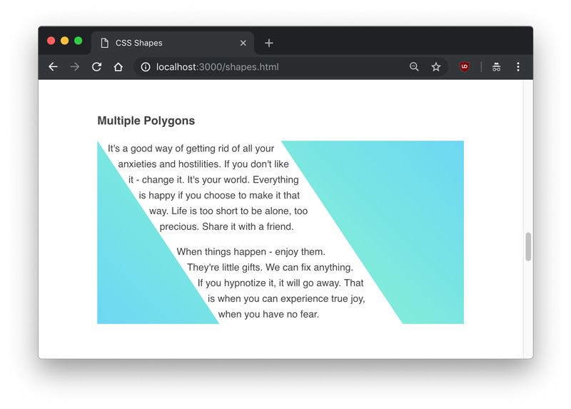
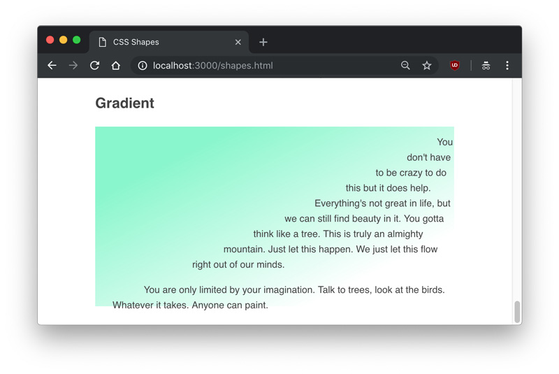
Codrops has a very nice article on CSS Shapes from Tania Rascia. You might know shape-outside is for redefining the area by which text is floated around that element, allowing for some interesting design opportunities. But there are a couple of genuine CSS tricks in here:
Float shape-outside elements both right and left to get text to flow between them.
You can set shape-outside to take an image and use shape-image-threshold to adjust where the text flows, meaning you could even use a gradient!
Shapes are in the water recently, as Heydon Pickering recently published a short video on using them. He also covers things like clip-path and canvas and such:
When we talk about CSS shapes, it's almost like we're talking about values moreso than properties. What I mean is that the value functions like polygon(), circle(), ellipse(), offset(), path(), etc. are more representative of "CSS shapes" than the properties they are applied to. Multiple properties take them, like shape-outside, clip-path, and offset-path.


