In this short video, Rudy de Busscher demonstrates how to use MicroProfile Config with etcd.
Eclipse MicroProfile has been created as a open source specification for Enterprise Java microservices. It's aim is to work on microservices patterns for Enterprise Java and to integrate applications with the infrastructures they run on, with patterns like health checks, metrics, etc. The MicroProfile project was launched in June 2016 as a collaborative effort between Java application server vendors and the enterprise Java community to enable fast innovation.
To further develop effective and customized solutions for Seek Scan, a low-cost thermal temperature screening solutions meeting FDA guidelines during the COVID-19 public health emergency, Seek Thermal today announced it has made APIs available for access control, VMS and other integrated network capabilities.
Do you want to sell group memberships for corporate teams?
Normally, membership websites only allow you to sell single user subscriptions. But what if you wanted to sell group memberships, so businesses can easily add their team members to the same account?
In this article, we will show you how to easily sell group memberships in WordPress for corporate teams.
Why Create Group Memberships in WordPress?
Selling membership subscriptions is a popular way to make money online blogging with WordPress. However, businesses may want to buy memberships for multiple people at once, such as an entire team or department.
Creating group memberships in WordPress makes it easier for companies to purchase your product licenses in bulk. It also allows the account administrator to easily add or remove licenses as needed.
Group memberships aren’t just useful for corporate teams. Volunteer groups and nonprofit organizations, church groups, or even families may find it easier to buy a group membership rather than multiple individual subscriptions.
You could also create this type of account to help teachers set up a virtual classroom for a group of students.
You may even allow members to re-sell your subscriptions. For instance, let’s say you run a membership site with healthy eating plans and online yoga classes.
Personal trainers or health and fitness experts could buy a corporate membership from your site and then sell access to their own clients.
That being said, let’s take a look at how to sell group memberships in a WordPress website.
Setting Up Group Memberships in WordPress for Corporate Teams
MemberPress Pro supports PayPal, Stripe, and Authorize.net. To add one of these payment gateways, simply click on ‘Add Payment Method’ and chose a payment method from the ‘Gateway’ dropdown.
MemberPress will now show all the settings you need to configure before you can use this payment gateway.
After adding one or more gateways, it’s time to enable the corporate membership features.
To do that, go to MemberPress » Add-ons and click on the ‘Install Add-on’ button next to the Corporate Accounts add-on.
Now it’s time to create a corporate membership level by going to the MemberPress » Memberships page.
Here, click on ‘Add New.’
To start, type a title for your corporate membership plan.
You can then set a price by typing into the ‘Price’ field.
Next, use the ‘Billing Type’ dropdown to create the billing cycle, for example you might charge a one-time fee for lifetime access or create a recurring monthly subscription.
In the following image, we’re charging $100 every 6 months.
Next, you need to scroll to the Membership Options area and click on the ‘Advanced’ tab. Here, check the box next to ‘Subscribers to this Membership are Corporate Accounts.’
After that, you will see a new field where you can set the maximum number of sub-accounts that the account owner can add to this subscription.
Anyone who purchases a corporate membership subscription will see a new ‘Sub Accounts’ link on their Account page.
If they click the link, then they’ll see how many sub-accounts they have left to use.
They can add people to their account by typing in information such as the person’s first name, last name, and email address.
By default, members can create an unlimited number of sub-accounts.
However, you’ll typically want to limit the number of sub-accounts to stop people from adding hundreds or even thousands of people to the same account.
To set a limit, type a number into the ‘Max Sub-Accounts’ field.
There are some more settings that you can use to further customize the membership level. However, this is enough to create a basic corporate membership subscription.
When you’re happy with how the plan is set up, go ahead and click on the ‘Publish’ button.
Restricting Content for the Corporate Team Members to Access
The next step is restricting your content so only people with the right subscription can access it. You do this by creating membership rules.
For example, you might lock all child pages of a ‘Corporate Membership’ parent page, or restrict access to all posts that have the ‘corporate’ category or tag.
To create a rule, go to MemberPress » Rules in your WordPress dashboard. Then, simply click the ‘Add New’ button.
The ‘Content & Access’ section allows you to restrict access in lots of different ways.
For example, you might make a single page members-only.
You can also restrict access to entire groups of content.
In this example, we’re going to restrict access to all content that has the ‘Corporate’ tag.
To do this, open the ‘Protected Content’ dropdown and choose ‘All Content Tagged.’ Then, type ‘Corporate’ into the field next to it.
After that, open the ‘Access Conditions’ dropdown and select ‘Membership.’
You can then open the second dropdown and choose the corporate membership level you created earlier.
There are lots of other settings that you can try, including showing a preview to non-members. For example, you might show the post excerpt to people who don’t have a corporate membership. This can encourage visitors to buy a subscription so they can read the entire post.
When you’re happy with how the rule is set up, scroll to the top of the screen and click on ‘Save Rule.’ You can create more content restriction rules, simply by repeating the same process described above.
We all agree that COVID has turned our lives upside down. Each one of us is now under house arrest and struggling to adapt to this new lifestyle of managing home and work simultaneously.
This new lifestyle has not only taken a toll on our physical health but also on our mental health. I am no different, with the added household responsibilities, it has become arduous for me to manage it along with the office work especially when it comes to maintain a grocery list. Every time a grocery item was missed out of the list, the task became more daunting.
There are many options when it comes to developing mobile apps; there’s Kotlin or Java for Android and Swift and Objective C for iOS. Additionally, you have Progressive Web Apps (that have the ability to work offline and look like mobile apps) and hybrid mobile apps (apps created with web technologies that look like native apps).
I’m a web developer, and I like to use the technologies I know to create apps. This screencast shows you how to use JHipster—along with its Ionic and React Native modules—to create a health tracking application.
Vericred, a data services company simplifying the exchange of information between health insurance and employee benefit carriers and InsurTech companies, today announced the immediate availability of level-funded plans through its Group Rating API. With this new functionality, Vericred is facilitating the distribution and quoting of these attractive alternatives to fully insured group plans.
Information And Information Architecture: The BIG Picture
Information And Information Architecture: The BIG Picture
Carrie Webster
We are living in a world exploding with information, but how do we find what is relevant to us at the time that we need it? I believe that good information architecture is key to helping us navigate through the mountains of data and information we have created for ourselves.
In this article, we will first describe what information architecture is, why it’s important, and approaches to effective implementation. Then we explore ideas around the broader view of the information age, how we use information, and how it impacts our world and our lives. These insights are designed to help you to understand the bigger picture, which enables us to grasp the value that good information architecture delivers to help our information-overloaded lives.
What Is Information Architecture And Why Is It Important?
“Information architecture is the practice of deciding how to arrange the parts of something to be understandable.”
From a user experience perspective, this really means understanding how your users think, what problems they are trying to solve, and then presenting information in a logical way that makes sense from within this context.
Whether it is a website, a software application or a smartphone app, it’s about first designing the structure of how your information is organized, and then translating this into a logical navigation hierarchy that makes sense to the users who will be accessing it. In this world where we can sometimes feel as though we are drowning in data, information architecture provides us with a logical way of organizing this data to make it easier to locate.
Here are some other reasons why good information architecture is important:
For The User
It reduces cognitive load.
Too much information on a screen with no clear pathway can make it difficult for a user to focus. Too many options can lead to choice deferral where a user chooses not to make a decision at all.
It speeds up the process of finding the right information.
This is the opposite of choice deferral, where the user is able to easily locate what they are looking for with clear navigation choices.
It can keep the user focussed on the task they are trying to achieve.
If the task a user is engaging in is easy to follow without additional non-contextual navigation elements, it’s less likely they will be distracted.
It makes it easier to analyze and understand information by the addition of context.
Providing a visual navigation path of exactly where the user is within a website can provide more context for the content they are viewing. For example, during an online bank account application, displaying the total number of steps in the process and visually indicating exactly which step you are at, and what the next steps may involve gives context to the flow.
Reduces frustration and contacting support.
If it is clear to the user where they can find what they need, there is no need to request help. For example, if a customer has received a purchased item that is faulty, without obvious instruction on how to rectify the situation, they may call the customer support center.
Below are a couple of examples helping to illustrate the points about the user.
The website example above, Punk Avenue shows another example of clear main navigation, with a brief summary of what you will find on each page. Below that is a series of tabs that keep you on the same page and visually indicate what information you are viewing.
For A Business
Keeps customers on their website for longer.
Research shows that visitors to a website will often leave within 10-20 seconds, but with a clear purpose, you can engage your visitors for a longer period. Although good design and messaging help to present the site’s value proposition, a well-designed navigation display can also contribute to demonstrate what kind of information supports this value proposition.
Increases the chance of customer conversion.
If your site visitor can find what they want via the navigation, and there are simple and minimal steps provided on how to acquire it, the chances of conversion are far higher than a site design that is unable to direct the user to the right information.
Reduces risk of customers going to a competitor.
If a visitor to your site can easily find what they are looking for through effective navigation and good design, chances are they’ll stay there rather than move onto the next Google search result.
Reduces duplication of information (by design).
Good information architecture can ensure that the same or similar content is not replicated. Understanding and documenting the content structure, particularly on information-heavy sites, can prevent these potential issues.
Better ROI through efficient use of the platform.
The investment spent on ensuring that the information architecture on your site is effective and makes sense to your users is a compelling way to increase your customer conversions and the income derived from those sales.
Reduces cost of support when a user can’t find something.
As described earlier, creating an unnecessary load on the customer support team is an additional cost that can be avoided by a site that functions well and provides assistance for customers when they need it.
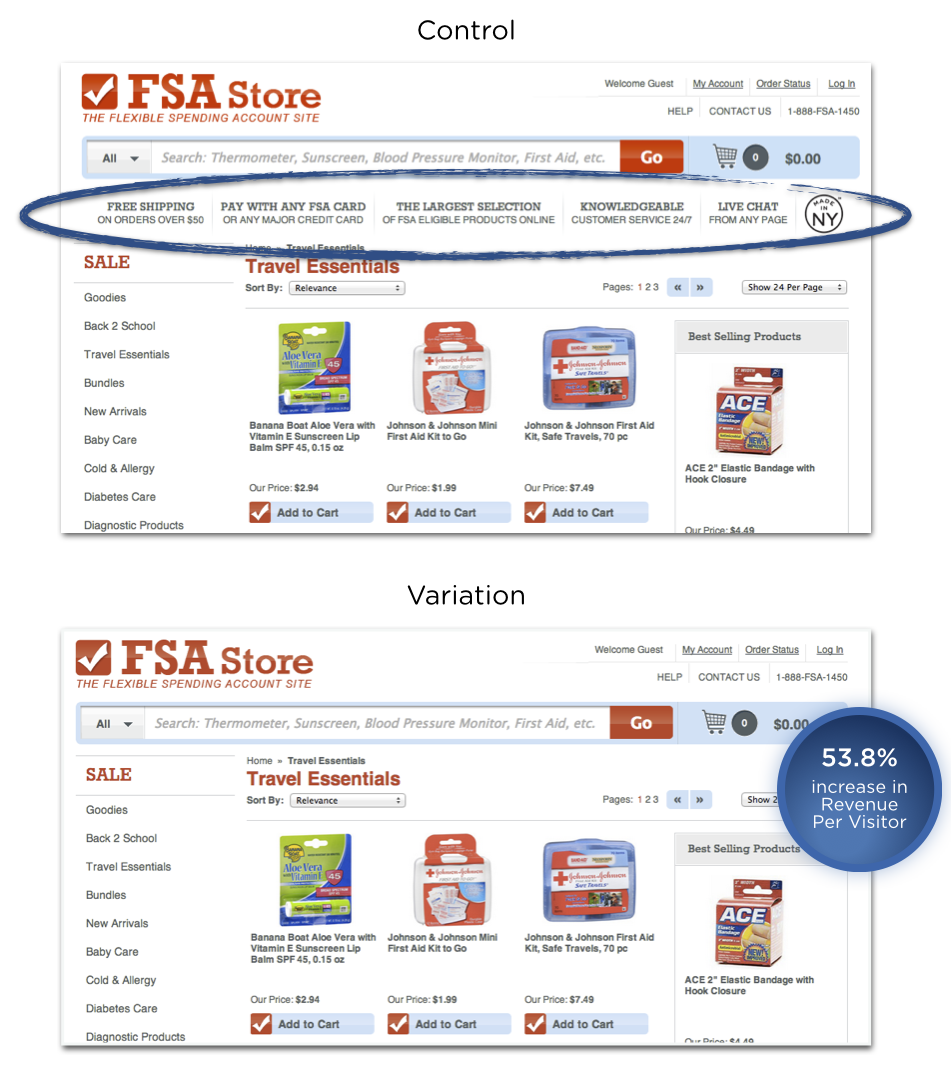
The example below helps to illustrate some of the points above about business.
The example above demonstrates how poor navigation displays can impact customer conversion. This case study shows an increase in customer revenue by 53.8%. The additional information in-between the search bar and the products was removed which also served to move the product display closer to the top of the page. The vertical information that was removed created the effect of what may have been perceived as a superfluous navigation bar, or maybe just information that was not considered relevant for a user in their product search.
When thinking about designing the information architecture for your website or app, efficient site navigation is crucial.
If your website is content-heavy, you may also consider the use of site search. Let’s explore some research around site search vs navigation.
Search vs Navigation
In 1997, Jakob Neilson conducted a study that showed over 50% of website users would use the search function over site navigation. In 2012, econsultancy.com reported that 30% of website visitors to e-commerce sites will use the site search, while a Kiss metrics study found that 40% of users preferred using search. In 2010, Gerry Mcgovern’s study demonstrated 30% of users preferring search.
Although the relationship between these findings may seem elusive, one thing is clear; and that is that users will use both site search and site navigation to find information, in varying proportions.
In order to provide the best user experience for your customers, you may need to consider integrating a site search, in conjunction with an effective and well-designed site navigation if your website has a complex structure and large amounts of information.
Here is a practical example of where a site search would be useful for site visitors. Let’s say you visit a website that sells cleaning and health products, and you were looking to buy some antibacterial hand wash. There are two categories you can see, “Body Washing Products” and “Skin Cleansers”. Which one do you choose?
And if you were to browse these categories that may have products listed alphabetically, there may be a large list to scan through. Below are some similar phrases that could be used, depending on what any individual’s idea of antibacterial hand wash could also be called:
hand sanitizer
sanitizing soap
hand disinfectant
disinfectant hand wash
hand sterilizer
hygienic soap
antiseptic handwash
If you are looking for “hygienic soap”, it may take you a while to scan the list to find the “antibacterial hand wash”. As it is difficult to cater to all possible synonym variations in the navigation structure of a site, a well-designed site search can allow users to search for these variations, by adding what we call metatags to each piece of content. For example, the “antibacterial hand wash” product could have additional hidden information or tags that include all the terms listed above, allowing users to search for any of these and return search results that match.
The Politico website below uses both navigation and a search function. It demonstrates an example of a content-heavy site that groups the information into categories making it easier to find topics. The site utilizes a “megamenu” which is accessed from the top left corner of the page. This is a common way to provide a menu of options with categories and subcategories that can be used for those visitors that want to browse content, and the search function can be used to locate a specific piece of information.
According to research from measuringu.com, about 14% of users will start with a search and the rest will start by browsing through the navigation options.
Good And Bad Information Architecture Examples
Let’s review some website examples demonstrating good and bad uses of information architecture. Great navigation is a reflection of well-designed information architecture that considers the target audience’s needs.
Useful Navigation
This Sears website makes good use of mega drop-down menus. These help to provide navigation options to sub-categories that are clearly grouped. It also uses images to provide much faster cognition for the user.
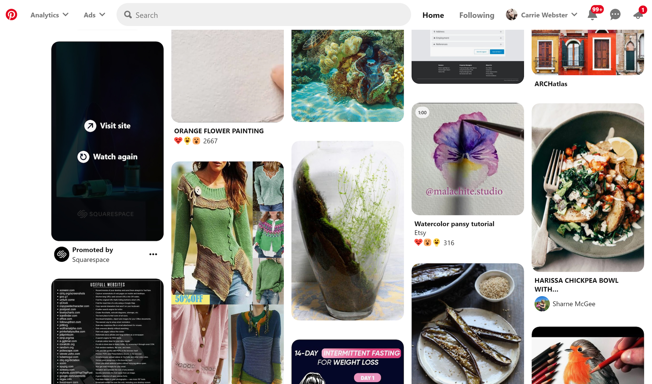
Pinterest demonstrates a useful way to present visual user-generated content based on search terms. The search is the navigation. This works well based on the sheer amount of content available on the site, which would make it difficult to provide a simple navigation system based on categories.
This website example is complete information overload with bad use of white space and way too many choices. It doesn’t help that the design of the website is cramped making it hard to identify all the options available.
Here is a brief list of considerations and processes to use when you are designing the information architecture for a product or service.
First understand your user’s needs and what tasks they are trying to achieve.
You can conduct user interviews to really understand what problems your product or service is solving. From here, think about how they might interact with your website and what pathways they could take to achieve their objectives.
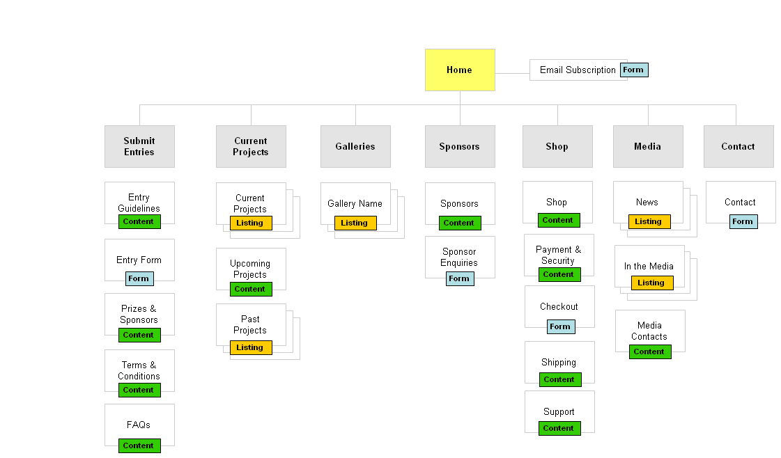
Try to create a hierarchy with minimal sub-levels.
If you can achieve this, then the user can access any information on your site with a maximum of two clicks.
Map out your site navigation to see if you can organise into a minimal number of sub-levels or categories. (Large preview)
Don’t use jargon in the navigation language.
Understand the language of your audience. Test with your users to ensure they understand the correct meaning of the language used.
Don’t rely on images or icons alone as a navigation tool.
There are very few universally understood icons, such as Help, Error, and Print, and these may differ culturally.
(Large preview)
Note that on smartphones, icons are always accompanied by a text label to help you navigate. (Large preview)
Always indicate to the user exactly where they are within the site so they can easily navigate back to a previous page. Breadcrumb navigation is one example of how to do this effectively as shown in the example below. It can sit below the main navigation showing you each page you have clicked on with the current location displaying as the last on the right.
Use design to create distinct visual differences between the hierarchy levels.
For example, a top-level hierarchy heading may be displayed with a larger font size. These visual differences can guide the user’s eye to more important information first. It can also be the job of the visual designer to help differentiate these areas.
Methods To Test Your Navigation
Card Sorting
Write out the name of each information section on paper, and have participants sort cards containing all your navigation sections into groups that make sense to them. Try doing this same sort with at least five participants so you can start to identify patterns and preferences for the categories and subcategories that are created. This is called an open card sort. A closed card sort can be used if you decide to have predetermined top-level categories that the participants place the cards under based on what makes sense to them.
By using a wireframe or prototype, ask participants to complete a specific task by navigating through the site. You can use a clickable wireframe to test this by observing how clear it is for a user to carry out the activity. An example task (refer to the wireframe below) might be to register on the website and then make a booking for a single event and publish it.
Treejack is a tool that allows you to validate your navigation structure. It asks the participants to indicate where they would look to find specific information and provides you with insightful actions.
You can use free tools to help to identify commonly used search terms that can help with language choice in your navigation. For example, answerthepublic.com is a free site that allows you to enter a search term to see what other related search terms are being used.
We’ve covered the basics of information architecture, and now it’s time to move onto the bigger picture, the Information Age. Understanding context around the massive amounts of data and information we are surrounded by can help to shape your outlook as a UX designer, as it has helped inform the direction and approach to my own design practice.
The Information Age
We live in a time where our access to information is unprecedented. It is instantaneous, it is global, it is everywhere, it is the Internet. News stories are broadcast as they unfold, communication with friends and family in other parts of the world has never been easier, and Google has become our personal library of virtually limitless topics. Information is king and queen.
This famous quote is often attributed to Uncle Ben from Spiderman. We can think of this in reference to how powerful information can be, but when in the wrong hands, there is an opportunity to abuse this power. Below is my perspective on how the power of information can manifest in our world, and why it is both a precious and dangerous commodity.
“Information Is Power”
Internet activist, Aaron Swartz, took his life in 2013 at the age of 26. Aaron was the original creator of Reddit, and among many achievements, his untimely death occurred when he was fighting felony charges for illegally accessing and downloading academic information. He wrote a manifesto that called for activists to “liberate” information secured by corporations, and campaigned against Internet censorship.
We recognize that information alone is useless if no one can find it. And then once it is made available, it needs to be acted upon. On a large scale, information can be shared to protect public health and safety, to help governments to create better policies and to empower individuals to live better lives. It can also be used for propaganda purposes for political gain, to create fear for the purpose of control, and to instill beliefs for the sole purpose of financial profit.
Information Can Change World Events In An Instant
How quickly have governments pivoted and changed their approach to the COVID-19 pandemic based on new information? Not to mention the release of conflicting information from alternate sources that has also created mass confusion.
An example of this pivot was seen in Australia, when our Prime Minister announced non-elective surgery would be suspended from March 26, but just hours later, it was moved to April 1st after the health minister met with the private hospital sector that afternoon. This was due to the updated information received that would see the stand-down of medical staff, even as hospitals prepared for a surge in COVID-19 cases.
Dangers Of Misinformation
In current times, examples: “Fake news” claims, presidential tweets, and allegations of misinformation coming from China around the COVID19 pandemic. Donald Trump who is attributed with the reference to “Fake News”, now more generally attributes incorrect news reporting to journalists and media outlets such as CNN.
Unfounded “conspiracy theories” are another example of ways to link seemingly related information points that have no solid relationship evidence. For example:
US Army Reservist Maatje Benassi has been accused of being patient zero in the COVID-19 pandemic by bringing the virus to Wuhan in 2019 in collusion with the US Government.
Information Security
In 2018, it was revealed Facebook was exposed to a massive security breach after hackers exploited a vulnerability to access user’s personal data. The impact of the access to this kind of personal information could have ramifications for those individuals impacted for years to come.
In July 2017, shortly after I left employment at Equifax (no connection whatsoever!), a data breach impacting over 147 million people occurred in the US. The data exposed included Social Security numbers, birth dates, and some credit card details. After spending $1.4 billion on security upgrades, it is still resolving ongoing class actions from consumers that were impacted.
The importance of protecting privacy and personal data has become increasingly important throughout the world. 132 of 194 countries currently have legislation in place to protect the sharing of personal information without consent, and the data and privacy of individuals. In 2017-18 there was a 10% rise in the number of countries enacting data privacy laws.
Based on the examples above, it is clear that information in itself doesn’t discriminate for good or for evil. That’s why it is so important to validate data sources and analyze information before taking it on board.
Conclusion
We have reviewed how we use information, the power it yields, the sheer volume of data we have created, the impacts of information overload, and how information architecture can be used to organize and structure this information for those seeking it. There is no denying that in this age of Information why it is so important to focus on information architecture as a solid foundation for delivering the right information to your customers to make their lives easier.
In Microservices architecture, COE (Container orchestration cluster) will support to run thousands of container. How do we see the Canary deployment strategy progress on graphicle dashboard in each container’s logs, traffic distribution, protocols, service endpoints, service health check, application behavior and distributed tracing.
Each company may or may not be using different type of own automation scripts/tools to monitor these areas and also very difficult to quickly find the issue type in production environment.
Program Statement: Designing mesmerizing, interactive timeline for the user’s weight loss journey.
For the past few months, we are working on a health app that helps users in their weight loss journey. Here we call it more of a Wellness Journey. This app keeps track of your weight, your inches, water intake, and of course your calories. We are creating a platform that acts as a personal assistant in their journey. Lately, our users have been asking us for a feature in the app where they can view their entire journey i.e what was their weight when they started, and how things progressed along the weeks, their major achievements (things like the 1st pound lost, after a month and so on….). So we decided to give it a go. Read along to see what we came up with.
Redox, a provider of an interoperability platform for healthcare data exchange, has recently teamed with FDA-authorized COVID-19 testing company Curative to send COVID-19 test results to various state public health departments. This partnership has seen projects launched in 24 states.
As front-end developers, our job is working with browsers. Knowing how many we have and the health of them is always of great interest. As far as numbers go, we have fewer recently than we have in the past. It’s only this month that Edge is starting to auto-update browsers to the Chromium version, yet another notable milestone in the shrinking number of browsers.
A few years back, Rachel Nabors likened the situation to a biological ecosystem and how diversity means health:
If we lose one of those browser engines, we lose its lineage, every permutation of that engine that would follow, and the unique takes on the Web it could allow for.
And it’s not likely to be replaced.
A huge consideration in all this is the open-source nature of what we have left. Remember that Microsoft’s browser technologies were not open-source. Brian Kardell:
In important ways, we are a more diverse, efficient and healthier ecosystem with the three multi-os, open-source engines we have left (Blink, Gecko, and WebKit) than when we had had more and were dominated by projects that weren’t that at all.
As a followup Stuart Langridge touches on another kind of diversity:
What’s really important is diversity of influence: who has the ability to make decisions which shape the web in particular ways, and do they make those decisions for good reasons or not so good?
Here’s hoping that the browsers we have left will continue to evolve, perhaps even fork, and find ways to compete on anything except standards. While the current situation isn’t as bad as perhaps some folks were worried about with the loss of Microsoft’s engines (and maybe it’s even a good thing), it would certainly be bad news if we lost even more browsers [nervously glancing at Firefox], both in shrinking numbers and shrinking diversity of influence.
In the ever-connected era, cloud computing is altering the way medics, nurses, and hospitals deliver quality, cost-effective services to their patients. The Health Insurance Portability and Accountability Act of 1996 (HIPAA) is a law in the US published to protect the privacy of patient’s medical records and health-related information provided by/to patients, also known as PHI (Personal Health Information).
HIPAA applies to “covered entities” and “business associates” including doctors, hospitals, health-related providers, clearinghouses, and health insurance providers. HIPAA is also applied to countries, all companies which are providing services related to health or they are handling or storing patient’s health information.
During this crisis, we’re all trying our best to keep ourselves and others healthy, manage chaotic homes, and prioritize our mental health. However, this can be difficult even when we’re not experiencing a pandemic. With the added stress, burnout is occurring at an alarming rate with people unable to separate home from work, the increased burden of keeping everything on and heightened on-call loads, and the strain on communication.
Somedays, you might find it difficult to unplug and relax. Others, you may dread logging on. However, this doesn’t mean you’re not good at your job or capable of remote work. Instead, this is likely a version of burnout that none of us have experienced before. It’s difficult to overcome, but there are some ways to combat this and keep yourself and your team from burning out.
Apple and Google announced in early April that they were collaborating on an API that would enable cross-platform data transfer, allowing governments around the world to create contact tracing applications that operate seamlessly on both Android and iOS. That API, which was later renamed the Exposure Notification API, is now generally available to public health agencies.
At the time of writing this text, in early April 2020, there were 1,348,628 people infected with COVID-19 worldwide, 367,758 across the States. A month later, the figure stands at 4.18 million cases of infection and 1.37 million cases in the US.
It’s been a little over three months since the WHO declared COVID-19 outbreak a global health emergency. In the meantime, the virus has managed to spread across the globe, taking lives, jobs, and families apart.
With full-site editing just around the bend, it is a fair question to ask whether the WordPress ecosystem is prepared for such a transition, particularly on the theme development side of things.
It is no secret that theme developers have struggled to keep up with the barrage of changes between Gutenberg plugin updates and, ultimately, major WordPress versions. It is also a fair question to ask who is steering the ship. Where are the site developers, theme authors, and other designers who spend every day crafting the front end of the web? Where are the forward-thinking solutions that make sure the project maintains backward compatibility?
There have been some efforts to mend the broken divide between the Gutenberg project and theme developers such as the fortnightly block-based themes meetings. However, those meetings, by and large, are general updates on things the Gutenberg team has already developed or will ship soon. Those meetings are a good stepping stone toward better communication, but the project needs a project planner with both the vision of the future landscape and a sense of the day-to-day issues that theme authors contend with.
The reality is that there are only 132 themes out of 7,455 that list block editor styles as a feature in the official repository. We are a year and a half into the lifespan of the block editor officially merging into WordPress, yet the face of the platform is made up mostly of themes that have shoehorned some basic block styles into mediocre designs. The themes that truly stand out with full block-editor support are few and far between. Many of those are also bidding heavily on Elementor or other page builders.
Whether you like the block editor is of little consequence when there is no buy-in from theme authors. Every week, I check the theme directory for new themes, hoping to find a hidden gem. Every week, I am disappointed to see new themes dropping in 2020 with no support for the block editor. There is an entire segment of users who might enjoy the editor if only they had something more than Twenty Twenty to play around with — it is a fine theme but is not everyone’s cup of tea.
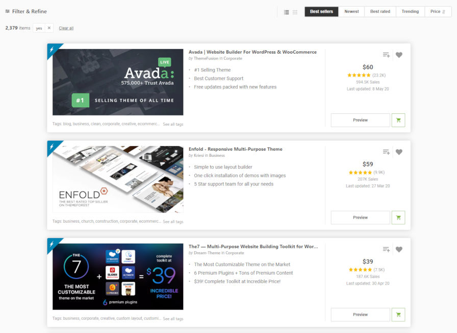
ThemeForest’s listing of block-styled themes.
ThemeForest sellers are besting free WordPress.org theme authors 18 to 1 in terms of support with over 2,300 themes listed as Gutenberg-optimized. Granted, themes from the massive marketplace are known to have every feature they can in an attempt to one-up the competition. Also, many of them either have built-in page builders or support third-party solutions.
Still, for the flagship feature of the platform, end-users should expect something more from the official theme directory. A third-party marketplace should not be the only game in town. At the moment, much of the offerings on WordPress.org feel lackluster at best. The handful that go the extra mile, such as the Rosa 2 and Go themes, have mature businesses funding the effort.
There is some broken trust between theme authors and WordPress at the moment. Some shout it loudly (as folks can attest from WP Tavern comments section). Others are more quietly trying to figure all this out.
Even Carolina Nymark, one of the representatives for the official Themes Team, shared some concern. “How do all of you theme authors keep up with the changes to Gutenberg?” she asked in a tweet. When the team leads are not up to speed, it is not good for the project as a whole.
“I don’t,” replied Anders Norén, the primary developer behind Twenty Twenty, to Nymark’s question. “I wait until something breaks (in the beta releases) and try to fix it then. Trying to support changes in the Gutenberg plugin while maintaining support for the block editor in Core is bad for your health.”
There is a major concern from theme authors about the future. It is hard to get excited about the current possibilities when there is uncertainty over what theme development will look like in 12 months. There is no clear and detailed roadmap about how things will work, and many theme designers feel like they are playing catchup from week to week. Instead, they should be able to more clearly look ahead and push early ideas into play.
My ultimate fear is that the Themes Team will one day flip the switch and require all themes going into the directory to support the block editor like it had to do with the customizer in 2015. If theme authors do not organically make the transition such a day may come. The team will be stuck as the bad guys in the middle.
Where Do We Go from Here?
It is easy to identify some of the major pain points for theme authors. Changes between updates will inevitably break something with the theme design.
Breaking HTML changes.
Breaking CSS changes.
Missing class names.
Different methods of handling alignment, depending on the block.
Dealing with inline styles after years of being taught to avoid them.
All of these issues are roadblocks for theme authors. And, when things get in the way of theme authors doing their jobs, they trickle down to end-users.
This is not the WordPress of the last decade. The WordPress that promised to not break things with updates. The WordPress where a one-off theme by a non-professional designer still worked four months later.
The Gutenberg project is still in its infancy. It can be fun to play with, but it can also be messy. I am as much of an evangelist for the block editor as anyone, but I can recognize when there is a clear and present issue of trust between theme authors and the developers of the project.
Currently, theme authors who are attempting to cover all of their bases are designing for at least a couple of versions of WordPress, multiple versions of Gutenberg, and the classic editor plugin. It is a dizzying array of testing for one theme. Those with a dozen or more themes…well, it is not an ideal situation.
A holistic approach needs to be taken toward theme and site design. Theme authors need to see the details of the roadmap and contribute to it, carving the features they see as relevant into stone for the coming years. They need to know that the buttons block design they sweated over for hours this past week will continue working next week.
It all starts at the project management level.
If a breaking HTML change needs to happen, theme authors need more than, “X change needs to happen for Y feature to work.” They need to see ownership of the mistake in the initial planning phase for X, backward-compatible code solutions, and a path toward fewer of the same mistakes happening.
Theme designers still need some sort of design framework. The current utility classes are like a poor man’s version of Tailwind that is being pieced together as the project adds new features without the foresight to look at the future landscape. Maybe the upcoming Global Styles feature can tackle that on a larger scale that provides compatibility across themes.
Ultimately, there needs to be more communication between the Gutenberg team and theme authors who are building themes for the official WordPress theme directory. Perhaps there should even be a new team or sub-team formed focused solely on theming in the block era and working directly with Gutenberg developers to identify pain points. Whatever happens, someone needs to inspire the next generation of themes into being. Until then, most theme authors are stuck wondering what they will need to fix next.
which code can i use to make enemy shoot at the player non stop and when the bullet catches the player the health decreases
any kind of help i appreciate - pygame
hello everyone iam kinda new with pygame. I wanted to create a one mans game which is similar to shoot and killl. i was able to move around my play but the issue is that whenever i press the K_space nothing is coming out and also i would like when the bullet collide health shows up and when the enemy reaches the player game over to be displayed.


